Asustor Drivestor 2 Lite network attached storage NAS with dual 2.5 Gbps ports

Asustor Drivestor 2 Lite NAS

Asustor has this week introduced the Drivestor 2 Lite, an entry-level NAS designed for home or small office use. The Drivestor Pro Gen 2 NAS, is powered by a Realtek RTD1619B Quad-Core CPU with a 1.7 GHz frequency, which enhances both CPU and GPU performance. The Pro Gen 2 offers network speeds up to 2.5 […]

The post Asustor Drivestor 2 Lite network attached storage NAS with dual 2.5 Gbps ports appeared first on Geeky Gadgets.

15 Awesome Apple Watch Apps For Health, Productivity and More

Apple Watch Apps

The Apple Watch has evolved into more than just a timekeeping device; it’s a personal assistant on your wrist. With an array of apps designed to enhance productivity, monitor health, and provide entertainment, it stands as a testament to technological advancement. If you’re keen to make the most out of your Apple Watch, here’s a […]

The post 15 Awesome Apple Watch Apps For Health, Productivity and More appeared first on Geeky Gadgets.

macOS Sonoma 14.4 Release Candidate released to developers

macOS Sonoma 14.4 Release Candidate

Apple has released macOS Sonoma 14.4 Release Candidate to developers and assuming that no issues are found in the Release Candidate, this should be the final version that Apple releases to everyone. The new macOS Sonoma 14.4 RC comes a week after the previous beta and it brings a range of new features to the […]

The post macOS Sonoma 14.4 Release Candidate released to developers appeared first on Geeky Gadgets.

Anthropic says its new Claude 3 AI chatbot scores better on key benchmarks than GPT-4

The battle between AI chatbots is more than a two-horse race. Anthropic, the company formed by several ex-OpenAI employees, claims its new Claude 3 language model outperforms ChatGPT and Google's Gemini in several key industry benchmarks. It even hit "near-human" levels on some tasks, the company wrote in a blog

There are three new chatbots under the Claude 3 umbrella, including Haiku, Sonnet, and Opus. Sonnet powers the Claude.ai chatbot and is offered for free with an email sign-in. Meanwhile, Opus is the largest and most powerful LLM and will be available with a $20 per month subscription via the "Claude Pro" service. It's also multi-modal, so it can work with both text and image inputs, unlike past versions.

All Claude 3 models "can power live customer chats, auto-completions and data extraction tasks where responses must be immediate and in real-time," the company said. On top of promising "near-instant results," they can supposedly handle longer, multi-step instructions with increased accuracy.

Anthropic says its new Claude 3 AI chatbot scores better on key benchmarks than GPT-4
Anthropic

Opus showed better graduate-level reasoning than GPT-4, scoring 14.7 percent higher in that test than GPT-4. It also beat OpenAI's chatbot in tasks involving math, coding, reasoning and knowledge. 

They also top past Claude models. "For the vast majority of workloads, Sonnet is 2x faster than Claude 2 and Claude 2.1 with higher levels of intelligence. It excels at tasks demanding rapid responses, like knowledge retrieval or sales automation. Opus delivers similar speeds to Claude 2 and 2.1, but with much higher levels of intelligence," according to Anthropic.

Meanwhile Haiku, the smallest version of Claude 3, is "the fastest and most cost-effective model on the market." To that end, it's capable of reading a dense research paper complete with charts and graphs in under three seconds. 

The company also noted that Claude 3 "can process a wide range of visual formats, including photos, charts, graphs and technical diagrams," aiding companies that use PDFs, flowcharts, or presentation slides. It'll also be less likely to refuse harmless content thanks to a more nuanced understanding of requests, while still recognizing "real harm."

Anthropic has said that Claude AI is guided by 10 secret foundational pillars of fairness. Claude 3 was trained on both nonpublic internal and public-facing data, using hardware from Amazon Web Services (AWS) and Google Cloud (Amazon recently invested $4 billion in Anthropic). 

Claude 3 Opus and Claude 3 Sonnet are available now through Anthropic's API, with Haiku set to follow soon. Sonnet is also accessible through Amazon Bedrock and in private preview on Google Cloud's Vertex AI Model Garden.

This article originally appeared on Engadget at https://www.engadget.com/anthropic-says-its-new-claude-3-ai-chatbot-scores-better-on-key-benchmarks-than-gpt-4-071343736.html?src=rss

Anthropic says its new Claude 3 AI chatbot scores better on key benchmarks than GPT-4

The battle between AI chatbots is more than a two-horse race. Anthropic, the company formed by several ex-OpenAI employees, claims its new Claude 3 language model outperforms ChatGPT and Google's Gemini in several key industry benchmarks. It even hit "near-human" levels on some tasks, the company wrote in a blog

There are three new chatbots under the Claude 3 umbrella, including Haiku, Sonnet, and Opus. Sonnet powers the Claude.ai chatbot and is offered for free with an email sign-in. Meanwhile, Opus is the largest and most powerful LLM and will be available with a $20 per month subscription via the "Claude Pro" service. It's also multi-modal, so it can work with both text and image inputs, unlike past versions.

All Claude 3 models "can power live customer chats, auto-completions and data extraction tasks where responses must be immediate and in real-time," the company said. On top of promising "near-instant results," they can supposedly handle longer, multi-step instructions with increased accuracy.

Anthropic says its new Claude 3 AI chatbot scores better on key benchmarks than GPT-4
Anthropic

Opus showed better graduate-level reasoning than GPT-4, scoring 14.7 percent higher in that test than GPT-4. It also beat OpenAI's chatbot in tasks involving math, coding, reasoning and knowledge. 

They also top past Claude models. "For the vast majority of workloads, Sonnet is 2x faster than Claude 2 and Claude 2.1 with higher levels of intelligence. It excels at tasks demanding rapid responses, like knowledge retrieval or sales automation. Opus delivers similar speeds to Claude 2 and 2.1, but with much higher levels of intelligence," according to Anthropic.

Meanwhile Haiku, the smallest version of Claude 3, is "the fastest and most cost-effective model on the market." To that end, it's capable of reading a dense research paper complete with charts and graphs in under three seconds. 

The company also noted that Claude 3 "can process a wide range of visual formats, including photos, charts, graphs and technical diagrams," aiding companies that use PDFs, flowcharts, or presentation slides. It'll also be less likely to refuse harmless content thanks to a more nuanced understanding of requests, while still recognizing "real harm."

Anthropic has said that Claude AI is guided by 10 secret foundational pillars of fairness. Claude 3 was trained on both nonpublic internal and public-facing data, using hardware from Amazon Web Services (AWS) and Google Cloud (Amazon recently invested $4 billion in Anthropic). 

Claude 3 Opus and Claude 3 Sonnet are available now through Anthropic's API, with Haiku set to follow soon. Sonnet is also accessible through Amazon Bedrock and in private preview on Google Cloud's Vertex AI Model Garden.

This article originally appeared on Engadget at https://www.engadget.com/anthropic-says-its-new-claude-3-ai-chatbot-scores-better-on-key-benchmarks-than-gpt-4-071343736.html?src=rss

This Ridiculously Simple Trick Can Transform Your Good Designs Into Great Designs

“A great design can’t be great if it doesn’t end up reaching its audience”

If people aren’t sharing/talking about your design, then it’s failed its first basic step: creating an impact. Most designers are so enamored (in a good way, obviously) with the idea of creation that they forget the next logical step – ensuring that the design reaches as many people as it can. The one secret you need to know, whether you’re a designer, a creator, a maker, a studio, or even a company looking to get eyeballs on your work… is to make your design project easy to share with others. The way you do it is simple – create a Press Kit.

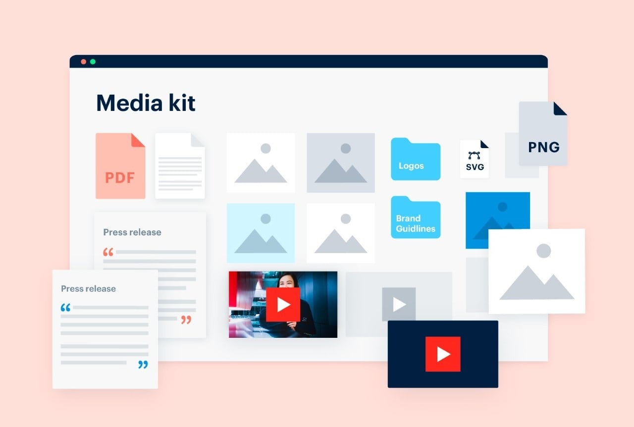
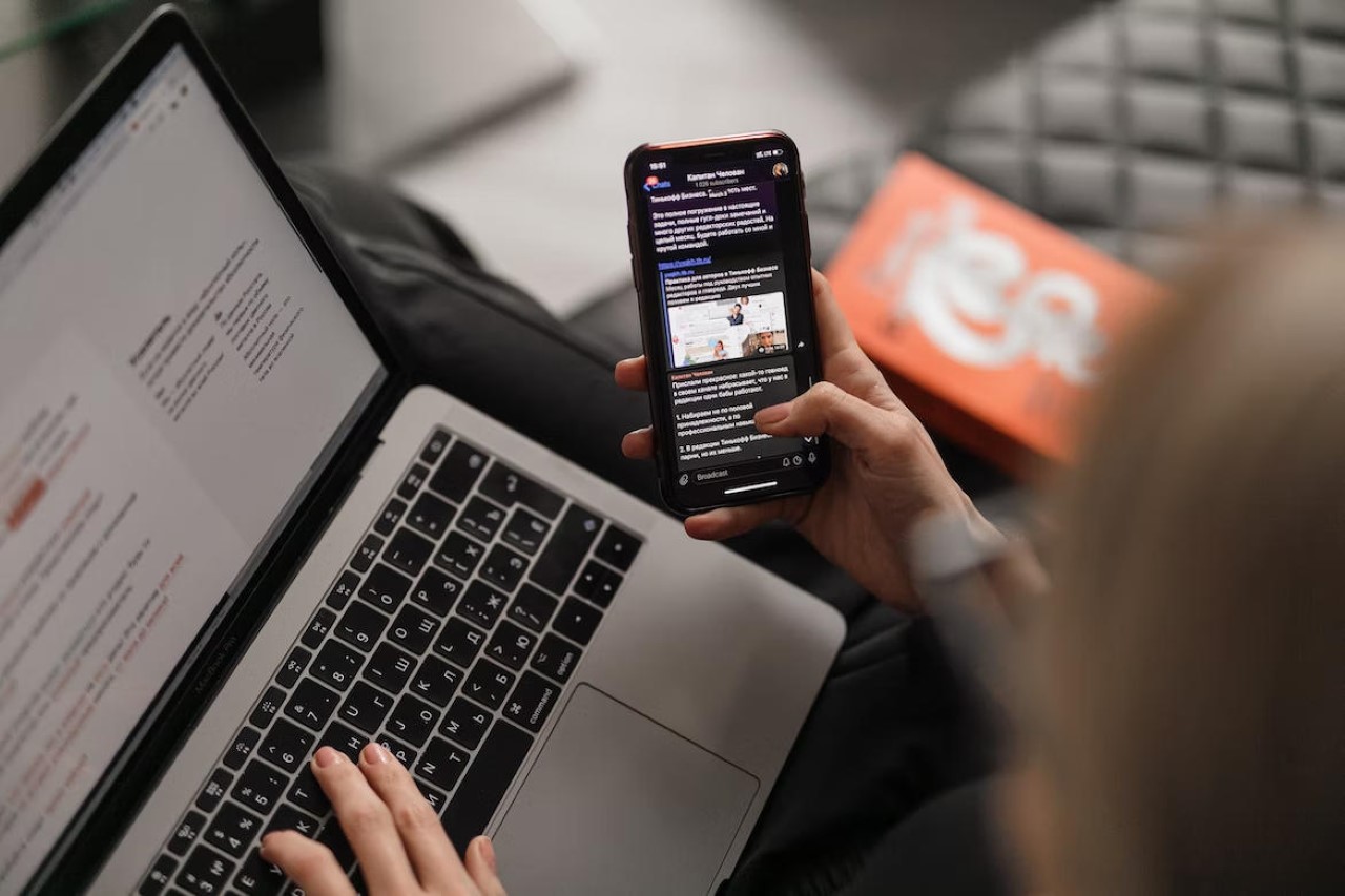
A Press Kit or a Media Kit is basically a kit/page/folder that contains high-resolution images, videos, GIFs of your design, and a written document describing your project in detail. It’s the basic raw material for journalists, bloggers, PR teams, marketers, and content creators to help them promote and broadcast your work. When people talk about your work, people notice your work. It’s that simple.

How To Make A Press Kit?

You know how a picture’s worth a thousand words? The press kit is quite literally those thousand words. Instead of leaving your work up to everyone’s interpretation, a Press Kit helps people understand your work so that they can then share it with others. It’s pretty much routine in the media world to have a press kit before writing about any project – the press kit (also known as the media kit) has three important aspects to it: Words, Images, and Videos. Every article you read online (or even offline), every social media post, every reel or TikTok is made up of these three things – Words, Images, and Videos. These three aspects are firmly within your control when you’re the creator, whether it’s a piece of furniture, an app, an electric vehicle, or any product/service/experience. Building a press kit to go with your creation is a great way of helping shape that narrative.

So how do you build a press kit? Simply collect all the information related to your project and present it in text form. On the side, also give people the option to view/download/share high-resolution images and videos regarding your project. You could compile all of these into a compressed folder (a .zip attachment in your email), or make them available via cloud storage or even directly on your website. The latter is a great way to track how many people access the press kit, giving you a unique metric to measure reach.

What To Include In Your Press Kit?

There are three aspects to a press kit – Words, Images, and Videos. The quantity and the emphasis on these three mediums is entirely up to you, but it’s essential to include a combination of all three aspects in your kit. The ‘Words’ element of the press kit is referred to as a press release, it contains all the information people need to know about your project. Hypothetically, you explain the background, the process/intent, the end result, the features, the human context, and other details like pricing and availability. Press releases also end with a note on the creator, giving media personnel a background on you so that they can use it to craft their narrative.

The words or text form the backbone of your press release, but arguably, the images and videos are what grab the attention of people in the first place. Your press kit needs to have great, high-resolution images to attract viewers, and preferably even a video to help people see your product in action, or get a sense of your product’s usage/features/background. The images need to be high-resolution for a variety of reasons – for starters, it just makes sense to not have blurry images in your press kit. Media outlets hate publishing bad-quality images because it reflects directly on their brand. Besides, sometimes a journalist/writer will crop a part of your image to focus on an element, so having good-quality images definitely goes a long way. Besides, search engines prioritize articles with great-quality media, so you want to make the best of that algorithm.

Tips And Tricks For Improving Your Existing Press Kit

As an ex-designer who’s been in the design+tech blogging world for nearly a decade, I think it’s time I share a few tips and tricks to help you build a stellar press kit.

Aspect Ratios – The Not-So-Secret Way To Easily Improve Your Kit

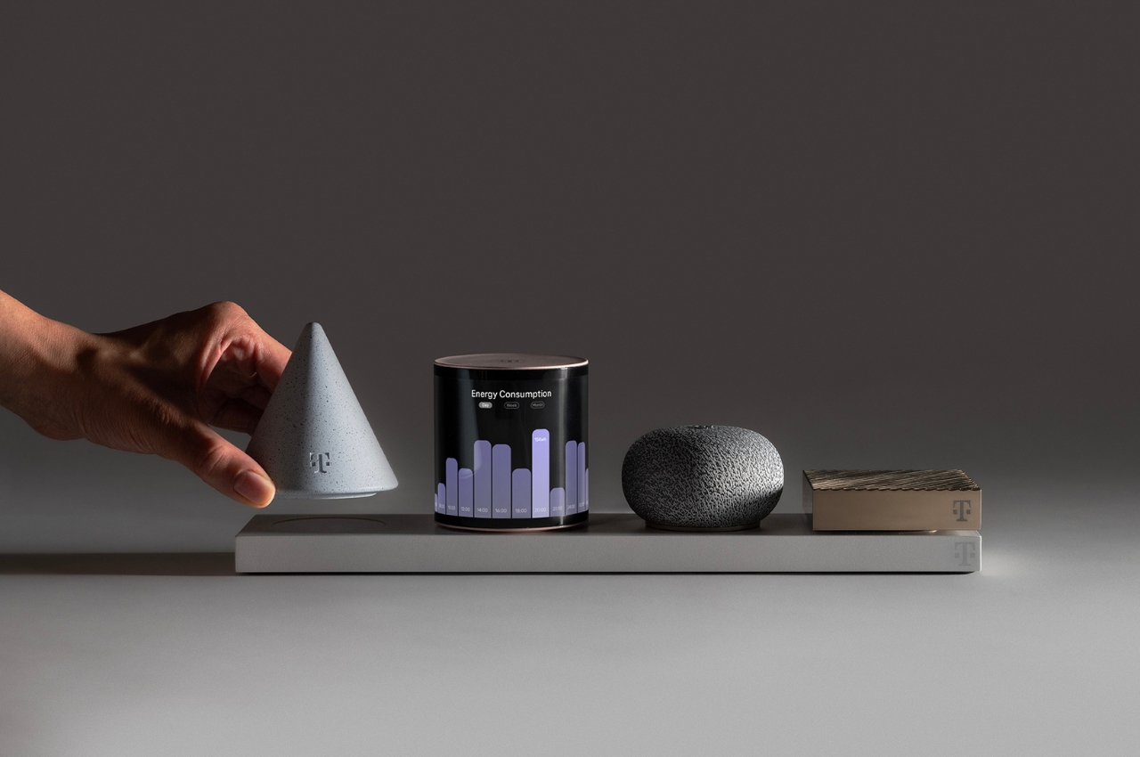
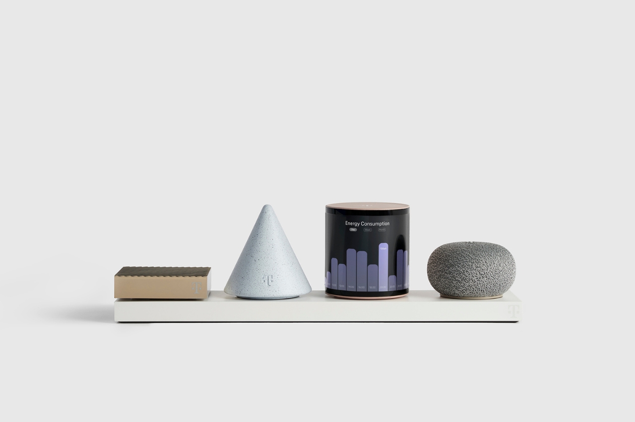
Ten years ago, this wouldn’t have mattered so much, but we’re now in an age of multiple aspect ratios. For years, landscape images and videos were the gold standard, but given the dawn of social media, a lot has changed. Landscape images and videos are still an absolute necessity, but they’re now a form of ‘legacy’ media. Portrait or vertical images and videos dominate apps like TikTok, Instagram, and YouTube Shorts, which people spend most of their time on, and if you want to play it safe, the Square image reigns supreme, working well everywhere, from print to online use, and even on platforms like Facebook, LinkedIn, Twitter (X), Pinterest, and Instagram. Make sure your press kit contains images of all aspect ratios, making it easy for everyone from journalists to influencers to broadcast and share.

Always consider multiple aspect ratios for your press kit so that your work can be viewed on multiple devices

The Human Context

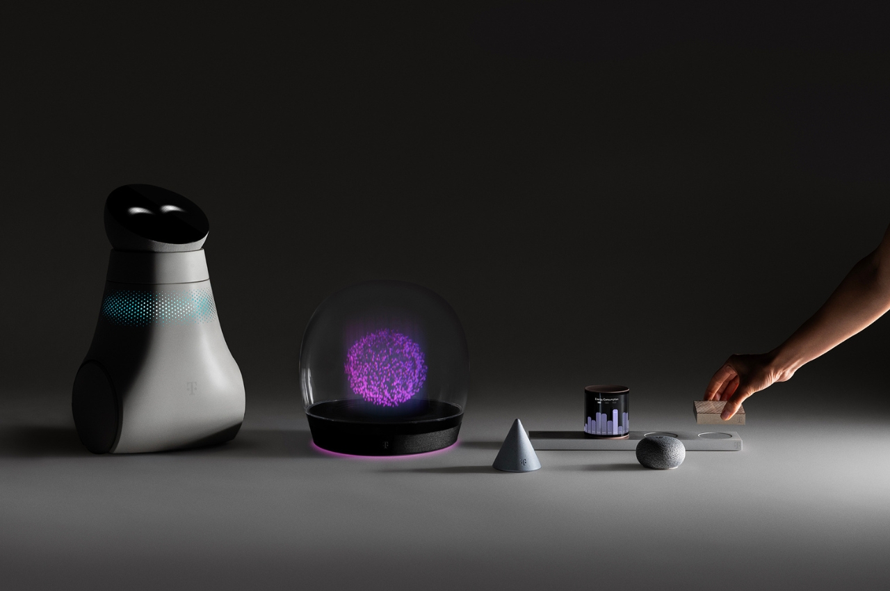
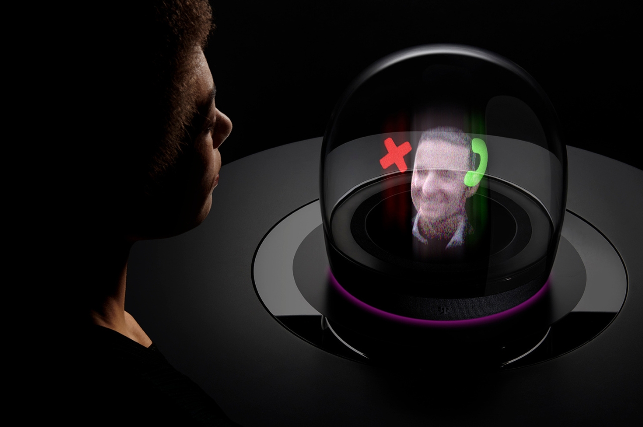
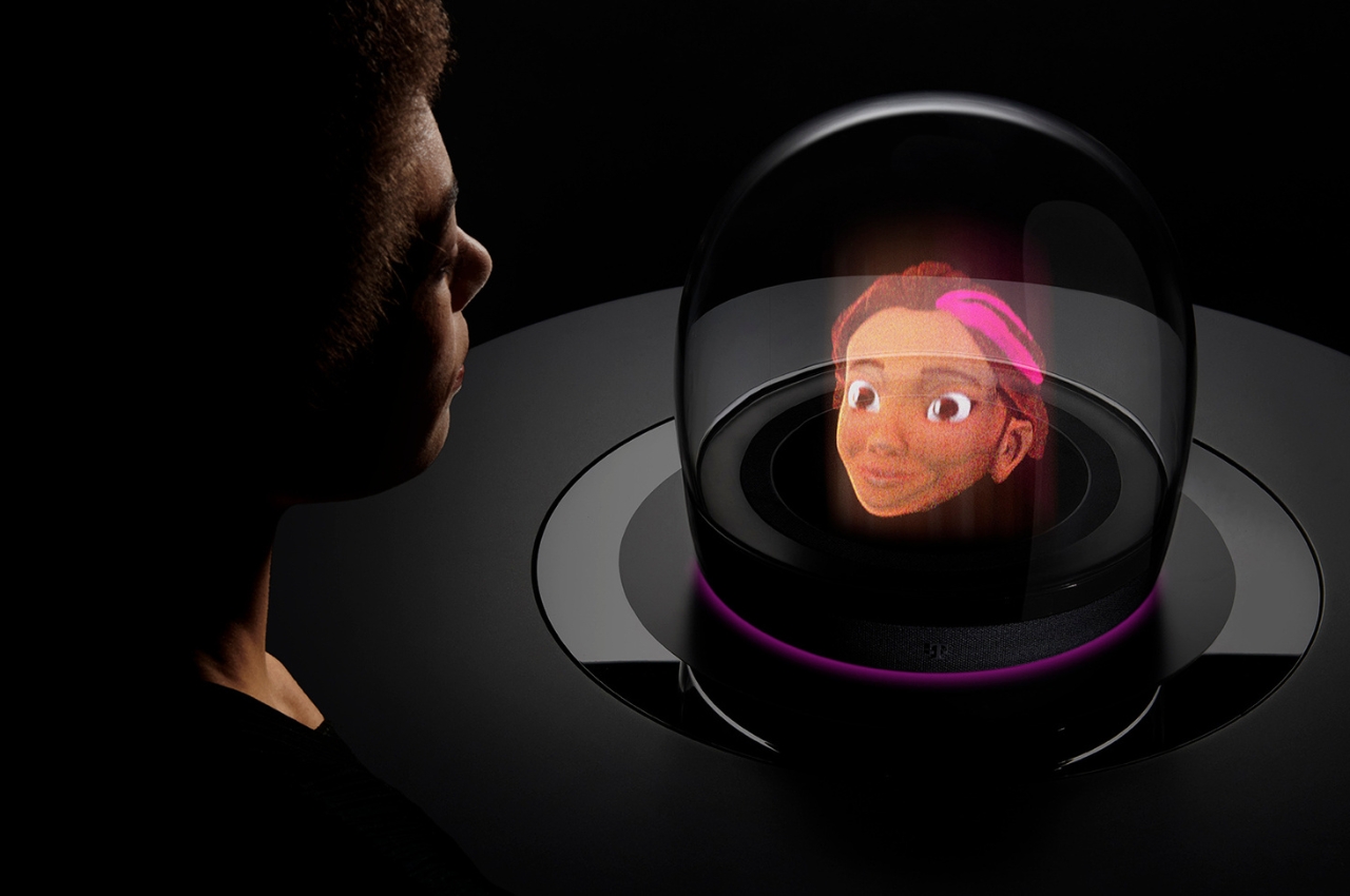
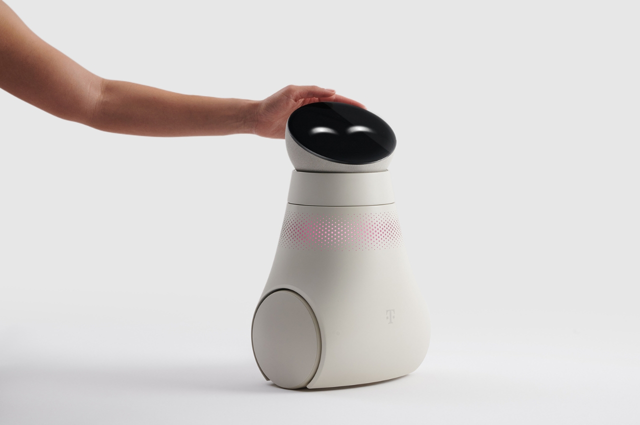
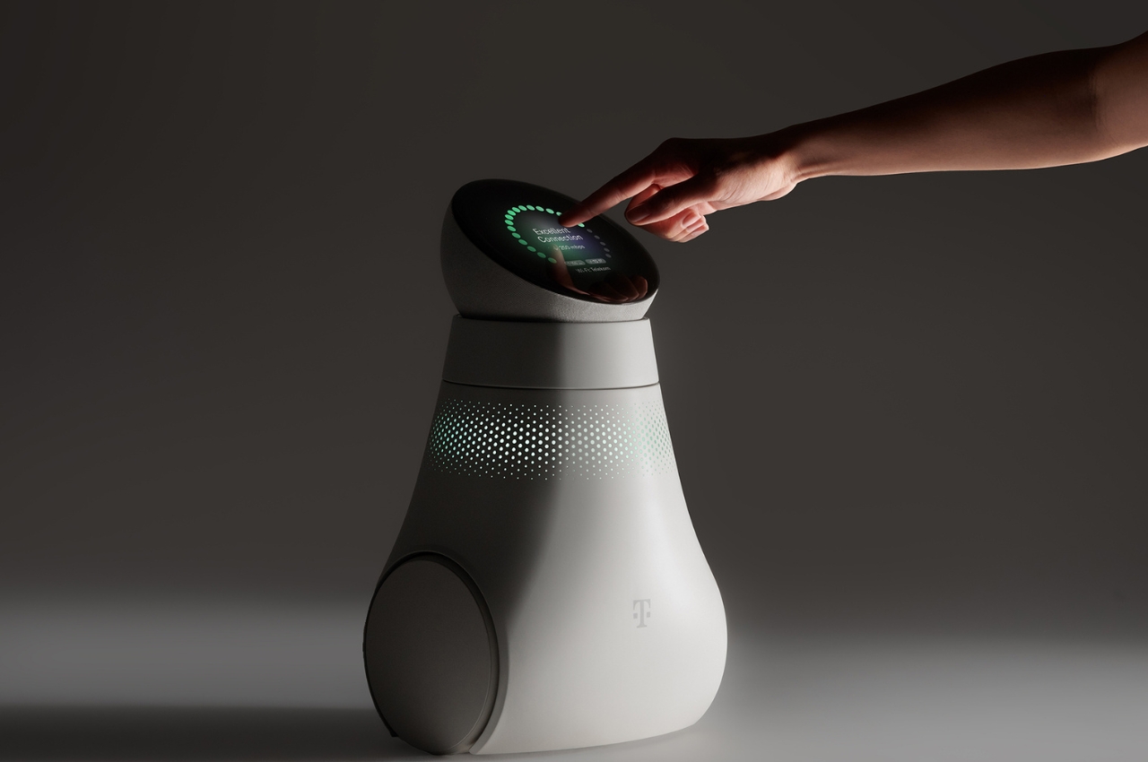
This may sound simple, but nothing makes a product more relatable/understood than actually showing it being used by a human. Flashy renders only go so far – if you’re designing for humans, you should show humans in your media too. An image or a video of a human using your product demonstrates a few things – it shows scale, so people know how big/small your product is, but it also acts as a proof of concept, showing that your product is real, and not a digital rendering.
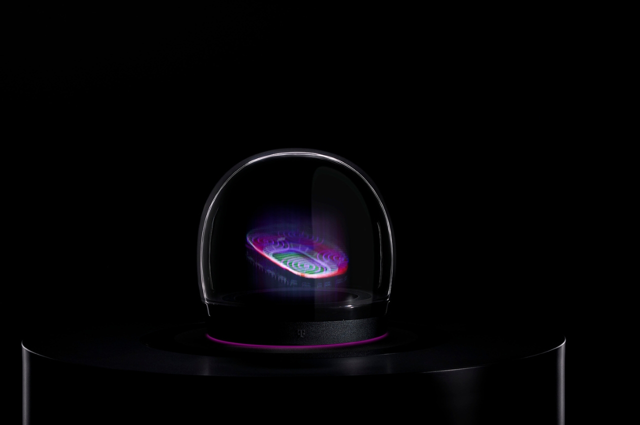
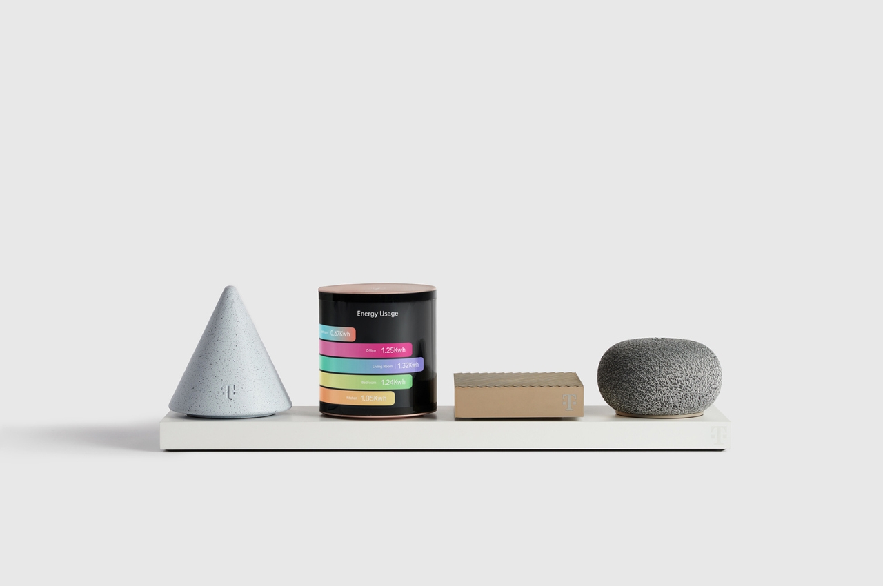
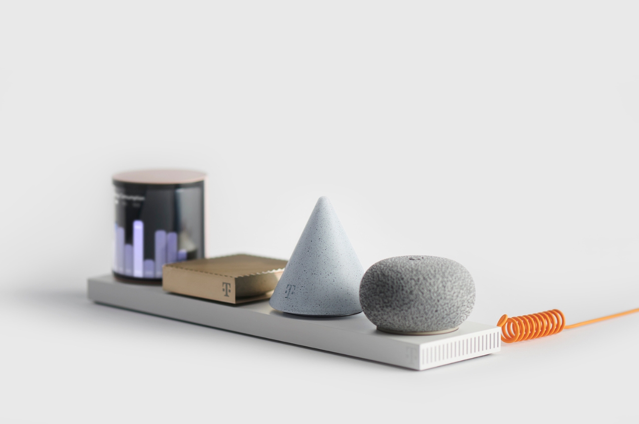
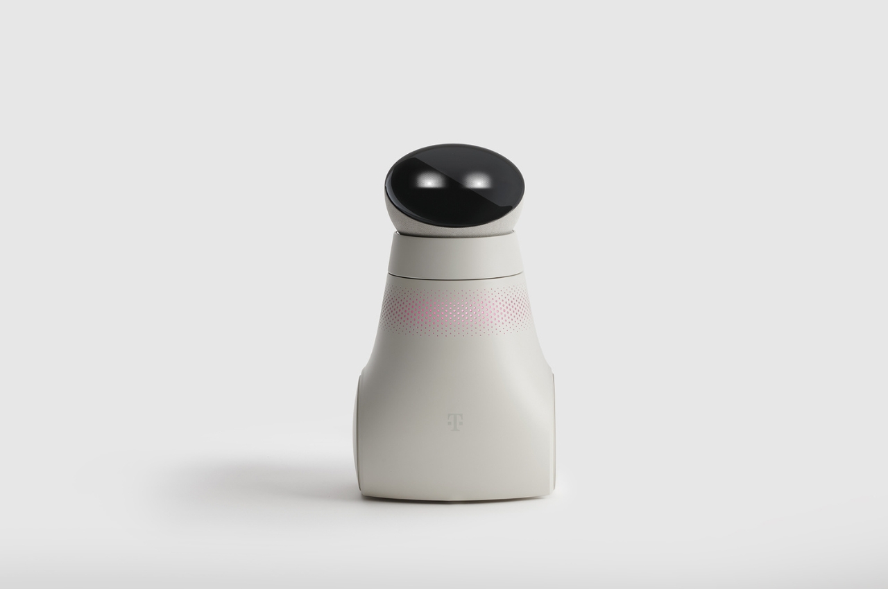
The ‘Hero’ Image

Books have covers, movies have posters, YouTube videos have thumbnails, and press kits have hero images. The hero image is an image that highlights your product while also creating curiosity or awe. It could be an image at a dramatic angle (especially for cars), showing your product in a dynamic view. Conversely, if your product is best demonstrated through actual usage, a photo of your product in use could be the hero image. It’s vital to make your product the most important subject of your image, so that it’s the first thing people see as they’re scrolling through the internet. Try to play with blurry backgrounds, vibrant images, or somewhat sensationalized imagery to help your hero image stand out. It’s important to remember, your hero image is about the hero – your product. Make your product big and visible, be clear, and try not to clutter your image with too much detail. Hint, if your product needs to be opened to show its functionality (like a folding knife), make sure you consider that too. This hero image will play a vital role for media organizations, allowing them to use it as cover photos, thumbnails, etc. A good hero image can sometimes completely transform your press kit, bringing more eyeballs to your work.

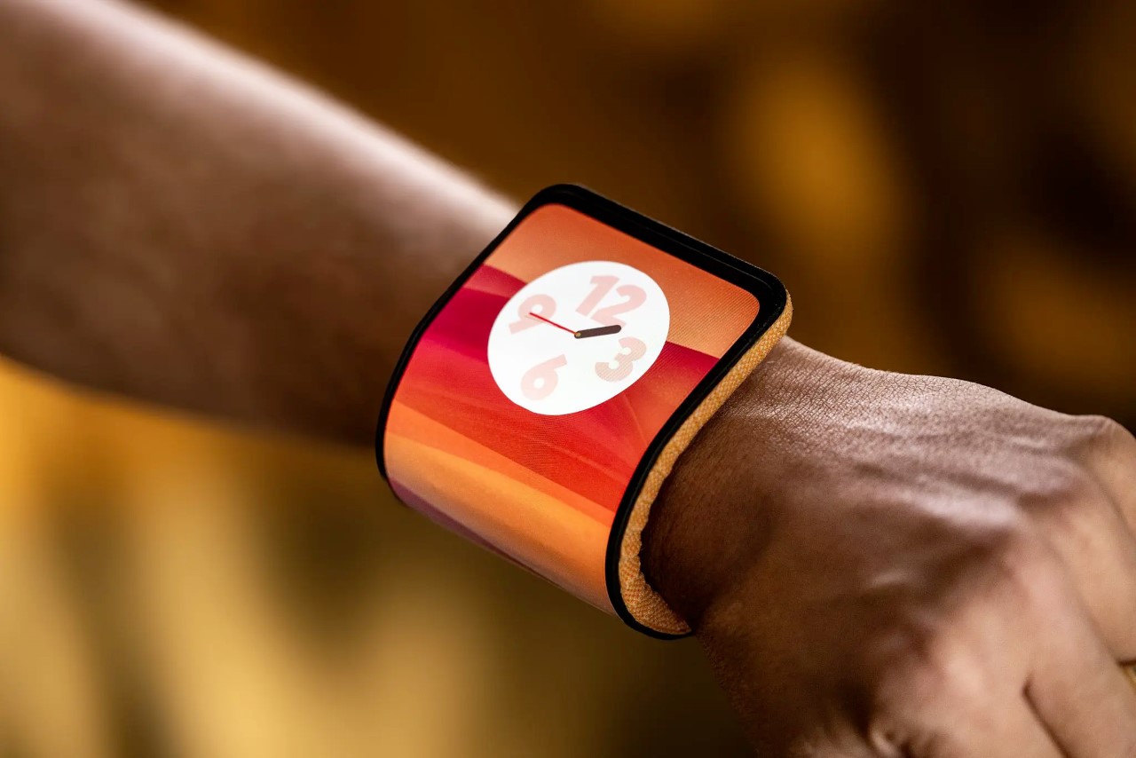
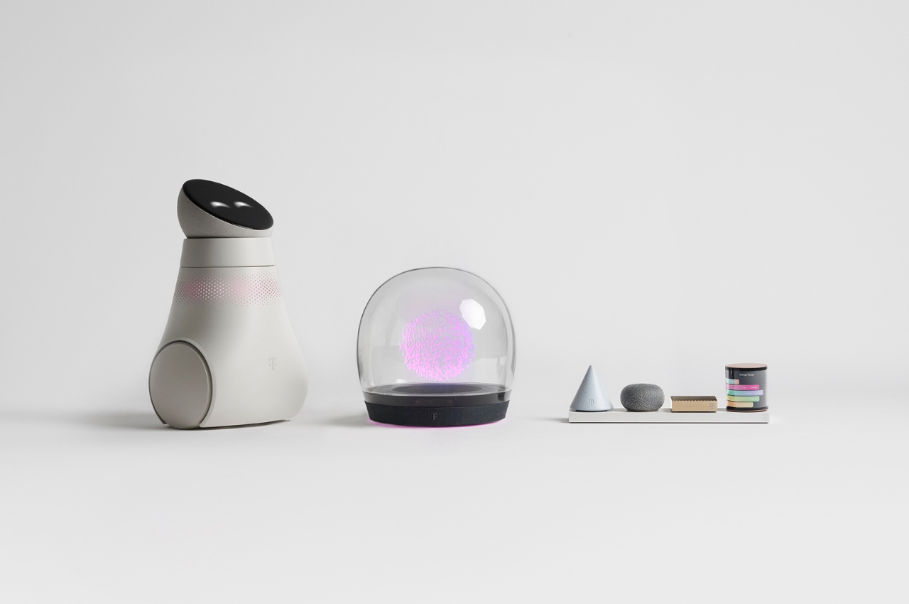
This photo of Motorola’s Bending Phone shows the power of ‘Human Context’ and ‘Hero Image’. It’s eye-catching yet explanatory, showing how the phone bends around your wrist.

The Text – More Is Always Better

Popular consensus will have you believe that with text, you have to be brief, to the point, and engaging. That’s true for almost all forms of writing, but not so much for press releases. Your press release is technically research material, so it NEEDS to be as detailed as possible. Include as much of your process in it, share all your findings (if a writer is viewing your press kit, chances are they’re definitely planning on writing about your project, so don’t worry about driving them away). Good writers love a lot of context because it gives them enough material to choose from. Pepper your release with interesting quotes that the writer can attribute to you as well, it helps get you visibility along with your work.

Get Yourself Visibility Along With Your Work

The press kit may be for your project, but ultimately, you want some of that spotlight on yourself too. Make sure the press release has an “About Me” section at the bottom. Add links to your website and social media that blogs/articles can use to tag/hyperlink you in their written material… and provide an email ID and phone number at the bottom to help writers get in touch with you just in case they want an interview. A press kit should elevate your design as well as your own profile so that people remember you when you launch your next project. Makes sense, right?

How To Distribute Your Press Kit?

Once you’re done building the press kit, this is honestly the easiest part. The press kit can be made available in a variety of ways – through emails. Most creators proactively share their work with people from the media, and personally, as a journalist, nothing feels better than to have good projects land right in my lap! You can reach out to prospective writers/reviewers/influencers via email or on social media with a .zip file or a link to DropBox, Google Drive, or any cloud storage. A great practice is to just have your press kit right at the bottom of your project page too, allowing journalists to quickly download the assets they need to write about your work. If you want to go a step further, embedding tracking into your outreach or your kits can help you understand how many people have viewed your message, checked the press kit, etc. Ideally, you also want to set up a Google alert with your or your project’s name on it so that you can find out when your work’s been shared online… and when that does happen, be sure to reach out to the author and thank them for sharing your work! It helps build a relationship because they’re sure to remember you when you reach out with your next project!

Remember, if nobody’s talking about your work, it’s failed its first step – creating an impact. A press kit makes it easy to generate that buzz so that people flock to your work and share it with others.

The post This Ridiculously Simple Trick Can Transform Your Good Designs Into Great Designs first appeared on Yanko Design.

LAYER Design and Deutsche Telekom unveil the future of communication devices

As a huge fan of science fiction content, from books to movies to TV shows, I am excited to see which things from what I’ve read and seen will come true one of these days. And with the advances in technology, a lot of them are not far-fetched ideas anymore. There are some things that may be scary or at least creepy but it’s still pretty interesting to see what we’ll see next which we thought were just works of science fiction before.

Designer: Layer Design for Deutsche Telekom

German telecommunications company Deutsche Telekom recently unveiled the Concept T project which is a collection of advanced technology and gadget concepts that will show consumers what may be the future of communications. Concept View is a home hub with a twist: it has a 3D holographic AI-equipped virtual assistant called Emma to guide you through things like video calls and other digital world activities. It looks like a cross between a crystal ball and the Palantirs from Lord of the Rings but instead of showing you what the future holds, it will show you the future of technology.

A Wi-Fi router isn’t the sexiest gadget out there but Concept Level definitely makes it more interesting. It is a re-configurable router that is made up of different interchangeable, modular elements. The set includes a display unit, Wi-Fi sensing element, mesh repeater, and computational module for Web 3 use cases. The elements are designed using different geometric forms so it looks like you have interesting mini sculptures rather than an actual router.

Concept Buddy is your own personal robot at home, similar to the ones you see in malls and airports. It’s an AI-based digital assistant companion that is able to communicate through the “emotion and information display”. It is able to give reminders like taking medication and household chores and can also assist in calls, online shopping, and other tasks you may need assistance. It can even warn you of potential hazards and contact emergency services if needed. It is able to adapt to your routine and will only “come alive” when it is engaged with.

The post LAYER Design and Deutsche Telekom unveil the future of communication devices first appeared on Yanko Design.

This Shipping Container-Based Tiny Home Features An Interesting Space Saving Layout

Shipping containers are widely used in the world of architecture, and they are used to build tiny homes, offices, or even soccer stadiums. However, they are predominantly used for tiny homes, and this debut model by UnContained Dreams is another great space-saving tiny home design. Called the Rising Sun, this high-cube shipping container provides a refreshing take on space-saving interior design, and it measures 40 feet.

Designer: UnContained Dreams

The tiny home has a height of 9.6 feet, with a width of 8 feet, making it a few inches smaller than most trailer-based tiny homes. It is difficult to fit a comfortable interior layout into such a home, but UnContained Dreams managed to do a great job. Large metal boxes also tend to have poor thermal performance, hence this is something UnContained Dreams had to deal with. To deal with this issue, they used closed-cell spray foam on the ceiling, floor, and walls. The home is also equipped with multiple windows and has doors cut into it, featuring wooden trim which creates a utilitarian look.

The home also features a mini-split air-conditioning unit which keeps the interior cool and comfy. As you enter the home, you are welcomed by a spacious living room. This is the focal point of the home, and it includes a custom walnut futon that can be transformed into a double bed. The living room also contains a handy table made from walnut. There is an entertainment center as well, with double glass doors that fill the space with light.

The kitchen is located next to the living room, and it contains quartz countertops, stainless steel appliances, a fridge/freezer, an oven with a propane-powered stove, a microwave, a sink, shelving, and cabinetry. It also includes a dining table for five adults. Since the home lacks some space, the studio installed a separate WC, shower, and a nearby vanity sink. This suits smaller homes quite well! The bedroom has a double bed with integrated storage space for clothes, shoes, and more. It also has two built-in nightstands and lighting, as well as a small wall-mounted standing desk area that can be used as a home office.

The post This Shipping Container-Based Tiny Home Features An Interesting Space Saving Layout first appeared on Yanko Design.

New 2024 13″ and 15″ MacBook Airs Give Apple’s Thinnest Laptops Their Biggest Performance Boost

Apple has launched the latest 13-inch and 15-inch MacBook Air models. These laptops have a gorgeous design and strong performance. Although slim, their M3 chip provides impressive performance. They handle tasks such as number crunching, video editing, and binge-watching series effortlessly. Apple has again shown the capabilities of laptops by combining appealing design with high performance.

Designer: Apple

Despite their high-performance features, the new MacBook Air models are quiet, thanks to a fanless design that maintains a thin, light design and offers up to 18 hours of battery life. Users can enjoy a Liquid Retina display with up to 500 nits of brightness and support for 1 billion colors, ensuring a visually captivating experience.

The new models can support two external displays and offer Wi-Fi speeds up to double that of previous models. They are available in four appealing colors: midnight, starlight, space gray, and silver. Midnight features an anodization seal to minimize fingerprints. Other significant features include a 1080p FaceTime HD camera, a three-microphone array, and an immersive sound system with Spatial Audio and Dolby Atmos.

Claiming up to 60% faster performance than their M1 predecessors and up to 13 times faster than the quickest Intel-based MacBook Air, the new MacBook Air models with the M3 chip are equipped with an 8-core CPU, up to a 10-core GPU, and support for up to 24GB of unified memory, promising a smoother and enhanced user experience.

Additionally, Apple has really stepped up the gaming experience by incorporating hardware-accelerated mesh shading and ray tracing, not to mention a beefed-up 16-core Neural Engine that takes AI capabilities to the next level. The new models even have the muscle to run big, brainy things like large language and diffusion models right on the device. It’s clear Apple is all in on weaving cutting-edge tech into the new laptops.

Running on macOS Sonoma, the new MacBook Air models introduce exciting features such as desktop widgets, better video conferencing, and a Game Mode that amps up gaming. Furthermore, they ensure a seamless connection with iPhone and other Apple devices, thanks to features like AirDrop, Universal Clipboard, Continuity Camera, and Handoff, enriching the overall experience within the Apple ecosystem for users.

Apple maintains its commitment to the environment. The new MacBook Air comprises 50% recycled content, including 100% recycled aluminum in the enclosure and 100% recycled copper in the main logic board. The packaging is 99% fiber-based, with a goal to eliminate plastic by 2025. Apple aims to achieve carbon neutrality across its manufacturing supply chain and product life cycle by 2030.

The 13-inch MacBook Air with M3 is priced at $1,099, with a special education discount of $999. The 15-inch model is priced at $1,299, or $1,199, with an education discount. Orders can be placed starting today, and the products will be available from March 8.

The newest MacBook Air models demonstrate Apple’s position in the laptop market. They provide quicker, more intelligent machines while adhering to environmental sustainability and integrating effortlessly with other Apple devices. Apple is evidently committed to advancing its tech experience.

The post New 2024 13″ and 15″ MacBook Airs Give Apple’s Thinnest Laptops Their Biggest Performance Boost first appeared on Yanko Design.