Discover the Galaxy S26 with Samsung’s Enhanced ‘Try Galaxy’ App Samsung has introduced a revamped version of its Try Galaxy app, designed to give users an immersive experience of the Galaxy S26 series and its ecosystem. This innovative tool allows you to explore the Galaxy S26 lineup, including the S26, S26+, and S26 Ultra, directly […]
Google DeepMind has introduced a new framework for evaluating Artificial General Intelligence (AGI), shifting from traditional benchmarks to a multidimensional approach. This framework examines AI systems across ten cognitive dimensions, including perception, reasoning and social cognition, to create a detailed profile of their capabilities. For example, an AI might demonstrate strong problem-solving skills but show […]
Powering down your iPhone for just five minutes may seem like an insignificant action, but it can have a meaningful impact on its performance, security, and overall functionality. This simple habit addresses common technical issues that accumulate over time, making sure your device operates efficiently and securely. Here’s a closer look at how this small […]
Staring at a phone screen for hours isn’t kind to your eyes, and more people are finally taking that seriously. The backlit displays on most modern smartphones are tuned for vivid color and fast scrolling, but sustained use can lead to real fatigue. That growing awareness has pushed E Ink displays into smartphone territory, where their paper-like readability makes a lot of practical sense.
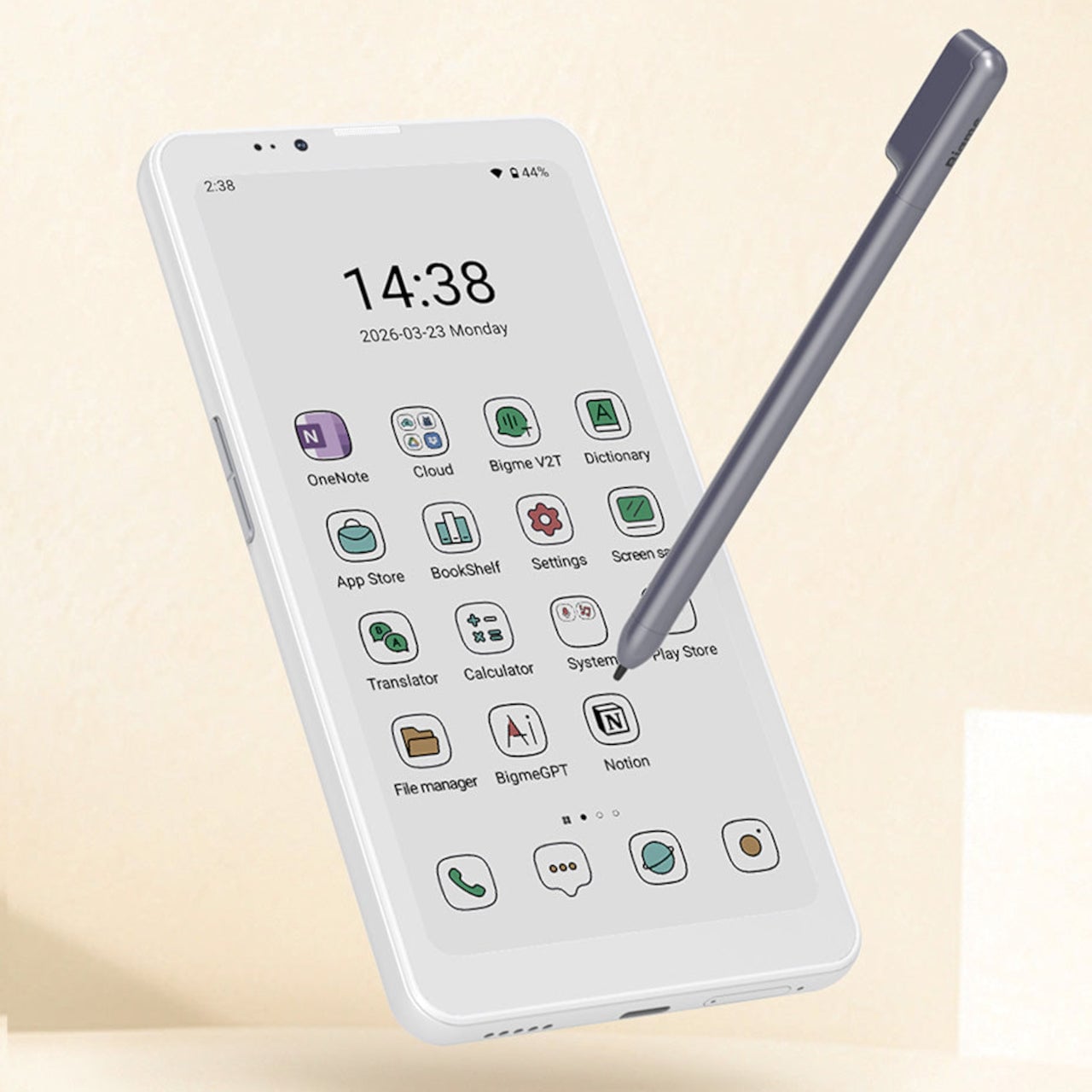
Bigme has been building its HiBreak series into a line of Android smartphones centered on E Ink displays, and the HiBreak Dual is its newest entry. Rather than simply updating the screen, Bigme gave this model two displays: a full-sized E Ink panel on the front and a compact circular LCD on the back, letting the phone handle information at two different levels of urgency.
The main display is a 6.13-inch E Ink screen at 824 by 1,648 pixels, delivering 300 pixels per inch in greyscale mode. The color model supports up to 4,096 colors, and a frontlight with 36 brightness levels covers both dim interiors and bright outdoor settings. Because E Ink reflects ambient light rather than emitting it, reading outdoors is comfortable in a way that backlit displays simply aren’t.
What sets the HiBreak Dual apart from the rest of the lineup is its stylus support, a first for the HiBreak series. A 4,096-level pressure-sensitive pen lets you write, sketch, and annotate directly on the E Ink surface, turning the phone into something closer to a digital notebook. The paper-like texture of the display makes the experience feel more tactile and far less clinical than a standard touchscreen.
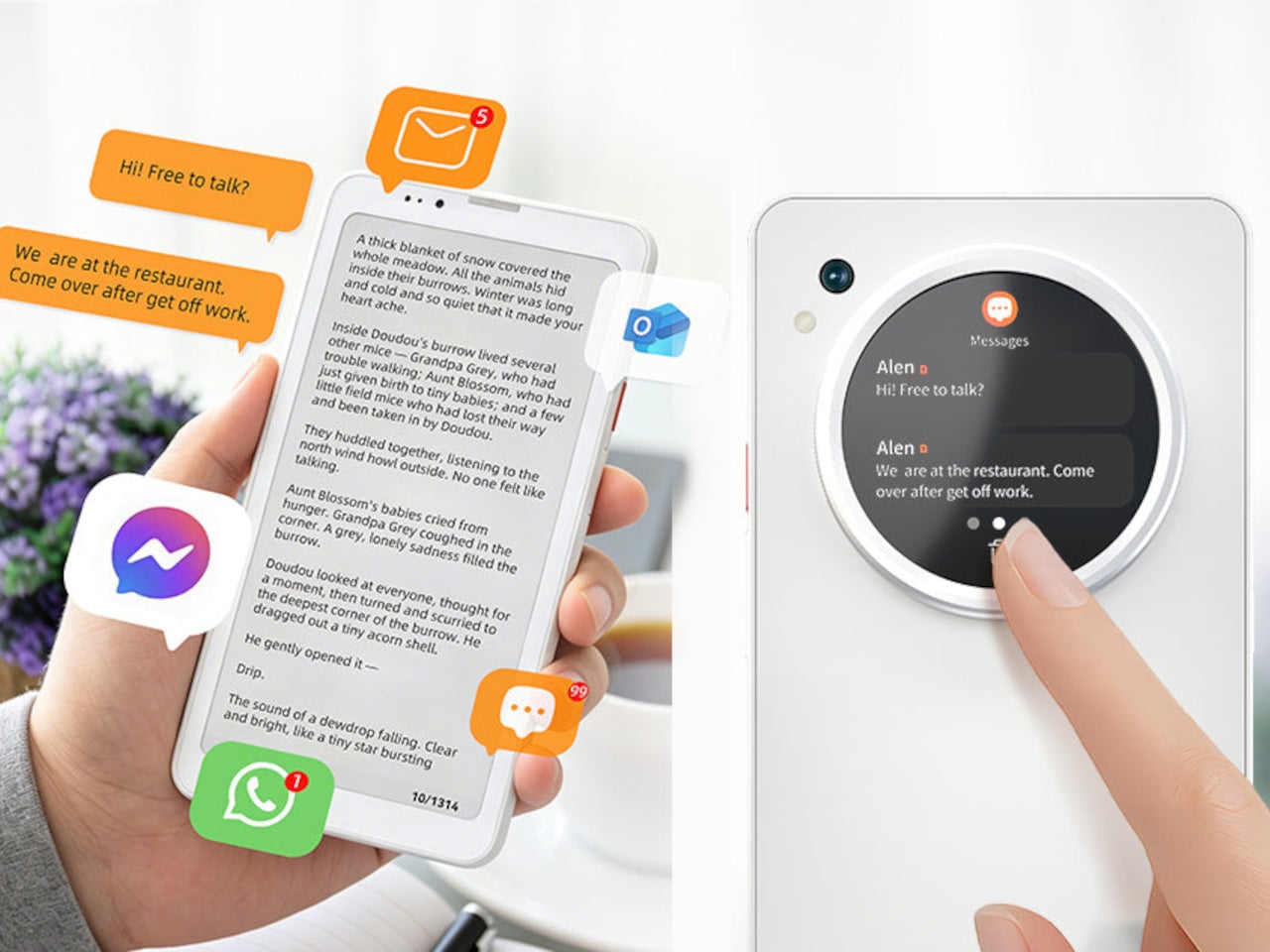
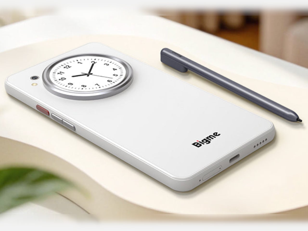
The circular LCD on the back measures 1.85 inches and pulls off a surprisingly wide range of tasks. It shows the time, notifications, music controls, and weather at a glance, and also doubles as a viewfinder for the 20MP main camera. Bigme even added an AI pet feature that generates an animated version of your actual pet from a photo, keeping it alive on that small round screen.
Despite the unconventional display setup, the HiBreak Dual doesn’t skimp on the fundamentals. Although dated, Android 14 with full GMS certification keeps the entire Google Play library accessible, and NFC support means Google Wallet and contactless payments work just as they would on any standard Android device. The 5MP front camera handles video calls and everyday selfies without issue, while a fingerprint sensor takes care of security.
Under the hood, the phone runs on a MediaTek Dimensity 1080 processor paired with either 8GB or 12GB of RAM and up to 256GB of internal storage, further expandable by an additional 2TB via microSD. A 4,500mAh battery gets through a full day without much drama, while 5G on dual SIM cards, Bluetooth 5.2, and dual-band WiFi take care of the rest.
Pricing starts at $519 for the 8GB/128GB model, with early bird options in the $359 to $409 range and a 12GB/256GB version also available. It’s a phone designed for people who spend a significant part of their day reading, writing, and staying on top of things through a mobile device, and who’d genuinely rather do it on a screen that asks a little less of their eyes.
Google’s newly released Gemma 4 challenges conventional assumptions about AI model size and performance. With just 2.3 billion parameters, this compact model rivals the capabilities of much larger systems, such as those with 70 billion parameters, while operating efficiently on low-power hardware. According to Better Stack, Gemma 4’s offline functionality and lightweight design make it […]
Since their release, the Ray-Ban Meta Gen 2 smart glasses have settled into the wearable tech landscape, offering a mix of style and functionality that appeals to a wide range of users. In his hands-on review, Steven Sullivan examines how these glasses perform in real-world scenarios after 6 months of use, highlighting both their strengths […]
Casely has reannounced a recall of its Power Pods 5,000mAh MagSafe E33A charger after dozens of people were injured and one even killed by the defective devices, the US Consumer Product Safety Commission (USCPSC) announced. It's recommended that you stop using the devices immediately, dispose of them safely and seek a replacement from the manufacturer.
A year ago, Casely and the USPSC published a recall of 429,000 units of the power bank with the model number E33A. That followed 51 incidents of the devices "overheating, expanding or catching fire" and burning users in multiple cases.
However, many of the devices have remained in use and are even more dangerous than initially thought. "In August 2024, a 75-year-old woman from New Jersey, was charging her cell phone with the power bank on her lap when it caught on fire and exploded," the USCPSC reported. "The victim suffered second and third degree burns and later passed away from complications from her injuries." In another incident this year, a 47-year-old woman was charging her phone on a plane when it caught on fire and exploded, giving her first degree burns.
As a result, the recall has been reissued due to "a risk of serious injury or death from fire and burn hazards to consumers," according to the Commission.
The defective Casely Power Pods 5,000mAh charger is identifiable by the Casely embossed logo on the front and model number E33A on the back. It was sold at various online retailers including getcasely.com and Amazon between 2022 and 2024.
Casely is offering free replacement units as a remedy (it's not clear if you can get a full refund). Those seeking one should write "recalled" on the battery pack in permanent marker and submit a photo, along with a second photo showing the E33A model number as pictured above. Owners are instructed to dispose of them by contacting a facility that handles lithium-ion batteries. Do NOT throw them away with regular household waste, recycling, or standard battery disposal bins due to the risk of fire and explosion.
This article originally appeared on Engadget at https://www.engadget.com/general/psa-stop-using-your-casely-power-pods-wireless-charger-immediately-062120825.html?src=rss
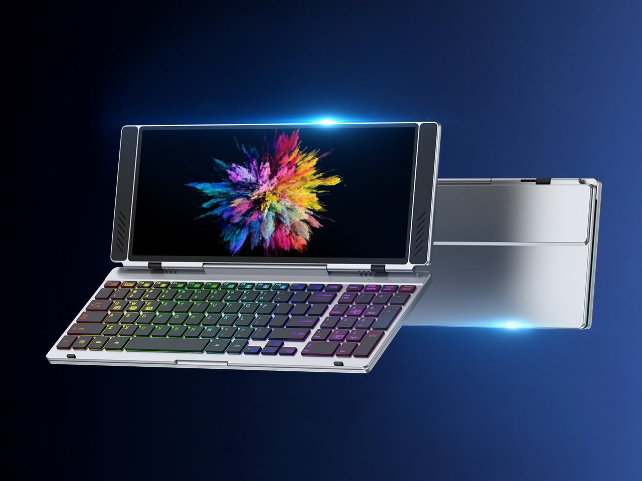
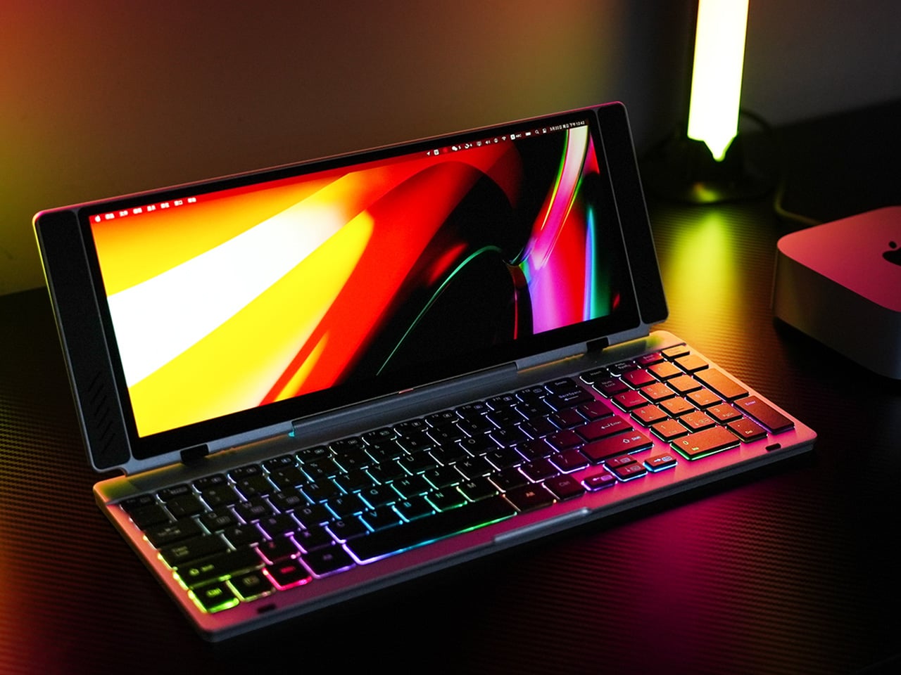
Working on the go rarely looks as tidy as productivity-tool adverts suggest. Most people who travel with serious work needs end up carrying at least two or three things that don’t quite fit together: a tablet or laptop, a compact keyboard if the touchscreen isn’t enough, maybe a portable monitor, and a cable situation that somehow multiplies every time you pack.
VitaLink is trying to simplify that. The concept combines a full-size keyboard and a large touch display into one foldable object in a CNC aluminum shell. Connect it to any USB-C device and your workspace expands immediately, without a separate stand, a monitor arm, or a bag pocket devoted to adapters. It folds down to 20mm and opens into something that feels genuinely designed.
The integrated 13-inch display sits directly above the keyboard in what amounts to a compact laptop form factor. The screen runs at a 3840×1600 pixel resolution, a 2.4:1 ultra-wide format rather than a standard 16:9 panel, giving it an unusual amount of horizontal room. There’s enough space to keep two apps open side by side without either feeling squeezed into a corner.
The 180-degree hinge is what makes the compact form actually practical. When you’re done, everything closes into a flat 20mm slab that slips into a laptop sleeve without awkward bulk. The open footprint sits at around 34 × 15 cm, compact enough for a plane tray table, a crowded café counter, or a hotel desk that never seems to fit anything comfortably.
The panel supports 10-point touch, runs at 60 Hz, and delivers 298 PPI pixel density with 100% sRGB color coverage. Touching a screen this size changes how you interact with content. You can swipe, drag, and tap directly on the display while still using the keyboard below, which means managing layers in an editor, scrubbing a timeline, or pulling up references doesn’t require switching between input modes.
The keyboard uses scissor-switch mechanisms with 0.8mm of key travel and wider-than-typical spacing. That added spacing sounds like a minor detail until you’ve spent an hour trying to type accurately on a portable board that prioritizes size above everything else. Three RGB backlight modes let you set the visual tone, and the keys are designed to stay quiet enough for cafés and shared offices.
Two USB-C ports handle video, data, and power delivery through a single cable, and the plug-and-play setup works across Windows, macOS, Linux, iOS, and Android without requiring additional drivers. That compatibility extends to mini PCs, tablets, and handheld gaming consoles, so VitaLink isn’t tied to one kind of device. You’re not locked into a single workflow or a single ecosystem, which is most of the appeal.
Think about what that actually means. You’re in a hotel room with just your iPad and need a proper keyboard and enough screen space to write, edit, and reference something at once. Or you’re at a café with a mini PC and want a setup that doesn’t take over the whole table. Those are the moments where having the keyboard and the display in one object makes a real difference.
The aluminum body does more than keep things thin. CNC-machined aluminum with a frosted anodized finish gives it a rigidity that plastic travel accessories rarely have, protecting the display in transit and keeping the keyboard deck from flexing during typing sessions. It carries more like a slim hardcover notebook than a peripheral, which is a meaningful difference for anyone who’s dealt with a flimsy portable monitor in a crowded bag.
There’s something worth noting in the fact that portable work setups have gotten faster without necessarily getting more cohesive. The bag is still a loose collection of things that don’t quite belong together. VitaLink is at least making a case that the keyboard and the display belong in a single intentional object, built from the start for people whose work doesn’t stay in one place.
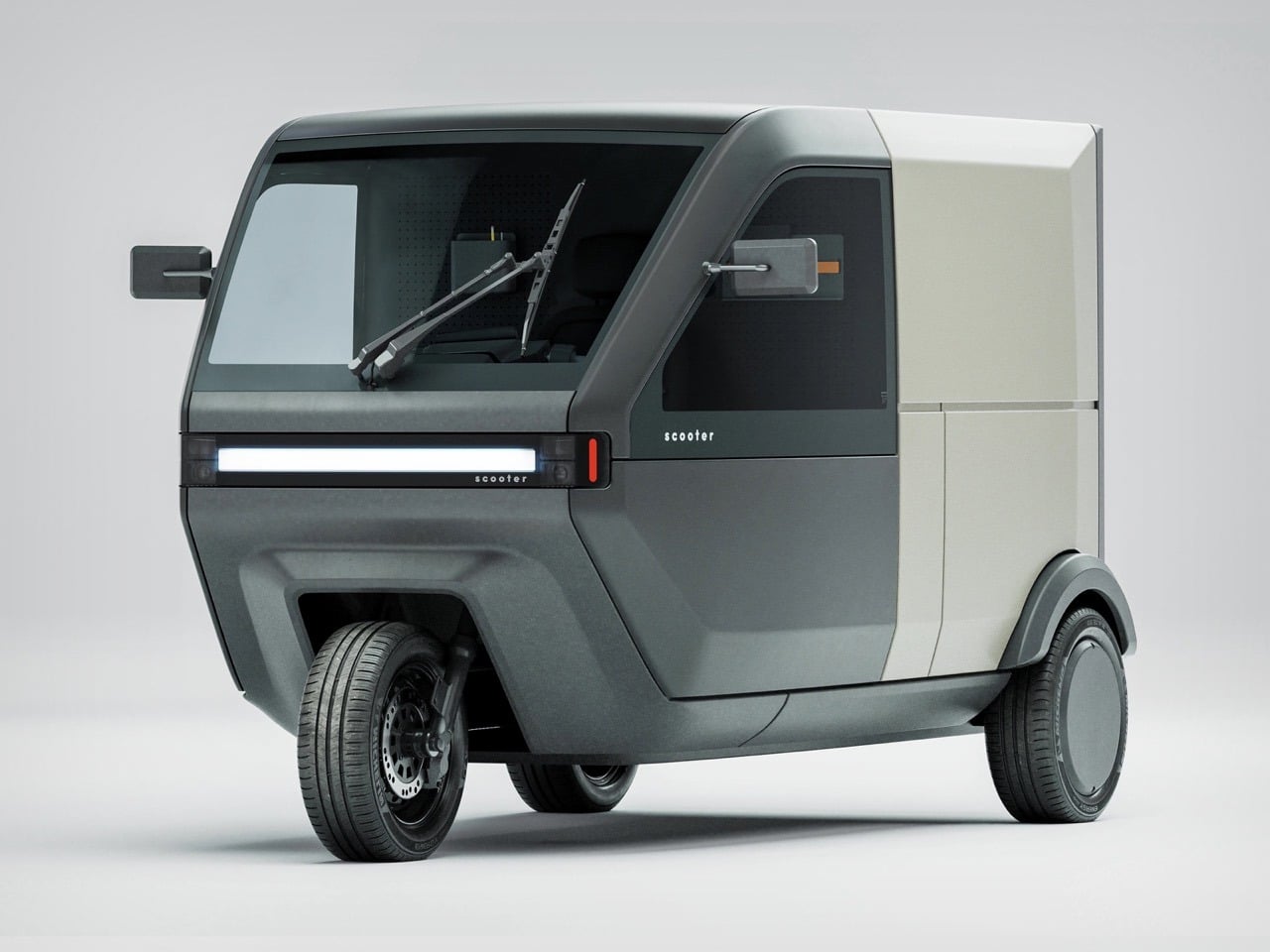
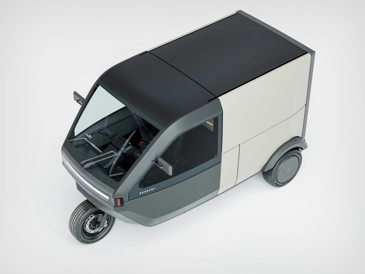
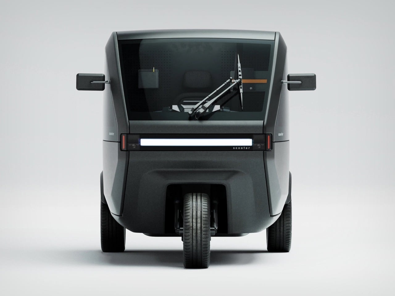
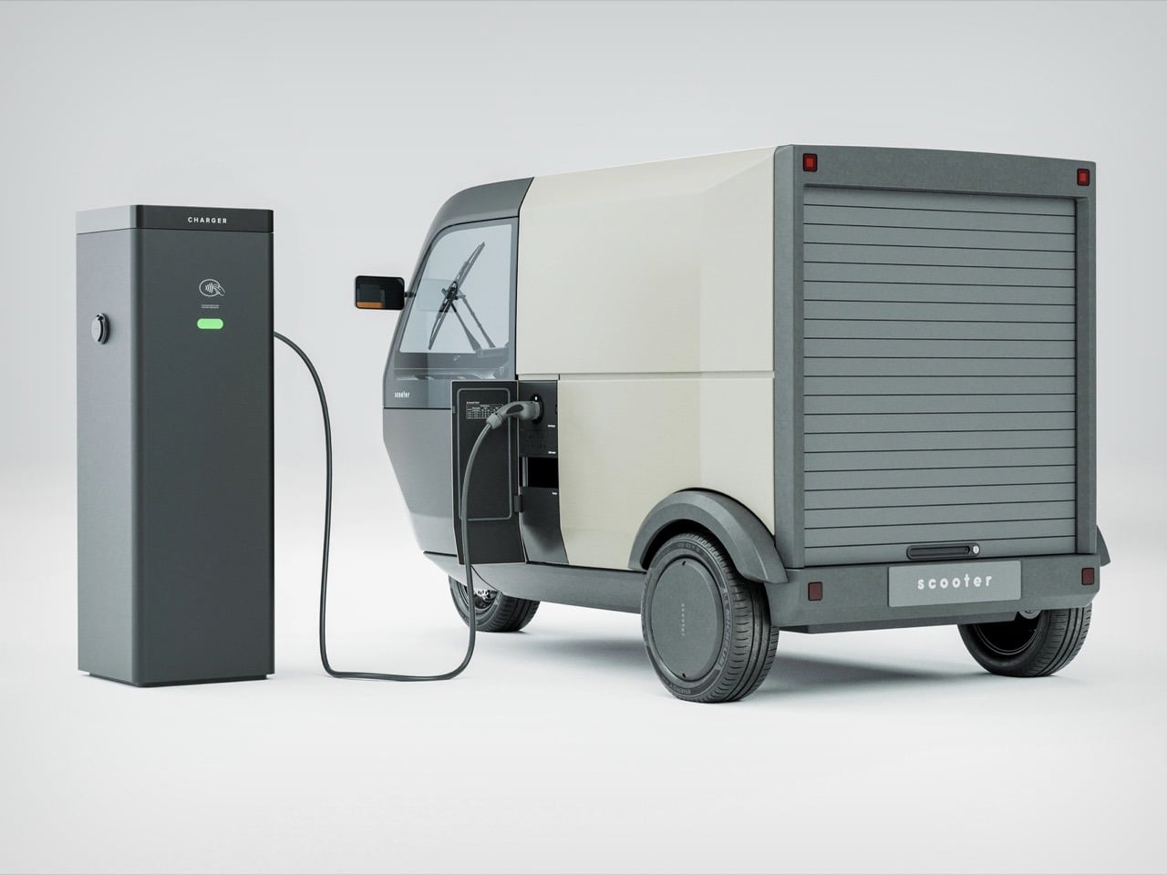
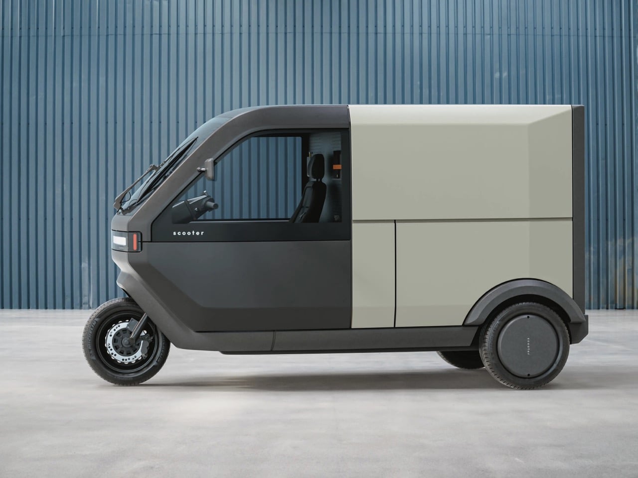
Three-wheeled vehicles occupy this weird liminal space in transportation design. Too substantial to park with bicycles, too small to merge confidently on highways, weird enough that most traffic laws forget they exist. The tuk-tuk owns this category in Southeast Asia, the Reliant Robin became a British punchline, and the Piaggio Ape dominates European deliveries despite looking like a Vespa that ate too much pasta. Most attempts to electrify and modernize this form factor end up either too expensive, too fragile, or too obviously designed by people who’ve never actually navigated a city during rush hour. The Scooter P-Two from Voyager feels different because it acknowledges these problems up front and builds around them.
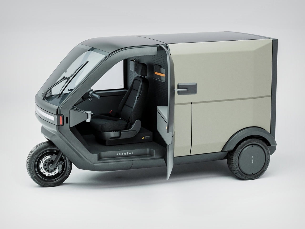
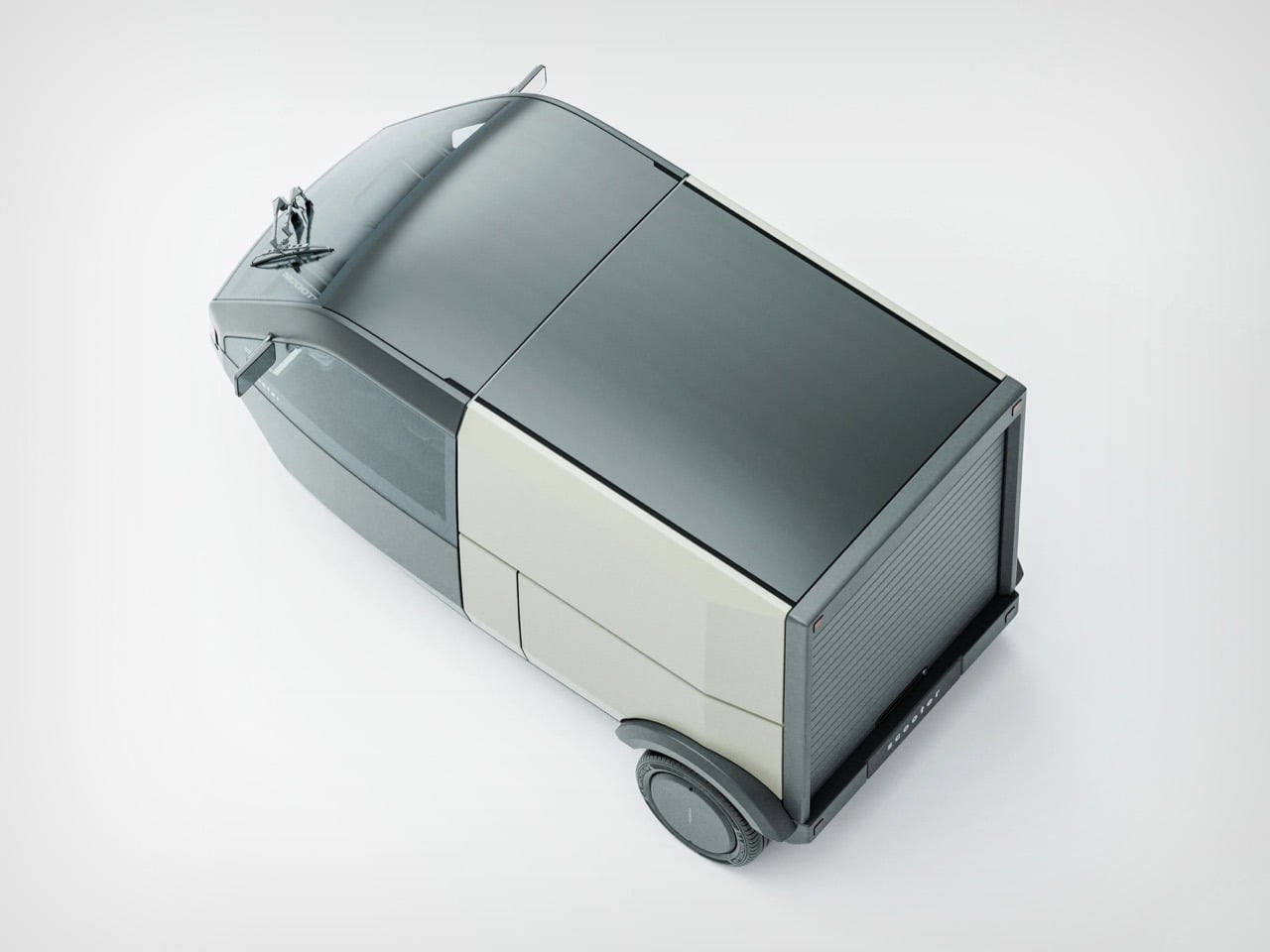
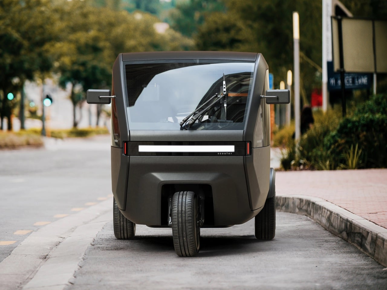
Belgian designers Jeroen Claus and Fabian Breës published this concept on Behance in February 2025, positioning it as purpose-built micro-mobility for dense urban environments. Enclosed cabin for weather protection, modular cargo area that adapts between hauling mode and passenger mode, classic trike geometry that keeps the profile narrow enough to slip through traffic. The styling borrows from Cybertruck’s angular vocabulary and Rivian’s adventure-utility aesthetic, but executed at a scale where those geometric moves actually make practical sense. Voyager describes the P-Two as small on the outside, spacious on the inside, which usually signals marketing delusion, but the visualizations suggest they might have actually solved that packaging puzzle through clever interior architecture and a glass area that doesn’t compromise sight lines.
Designers: Jeroen Claus & Fabian Breës
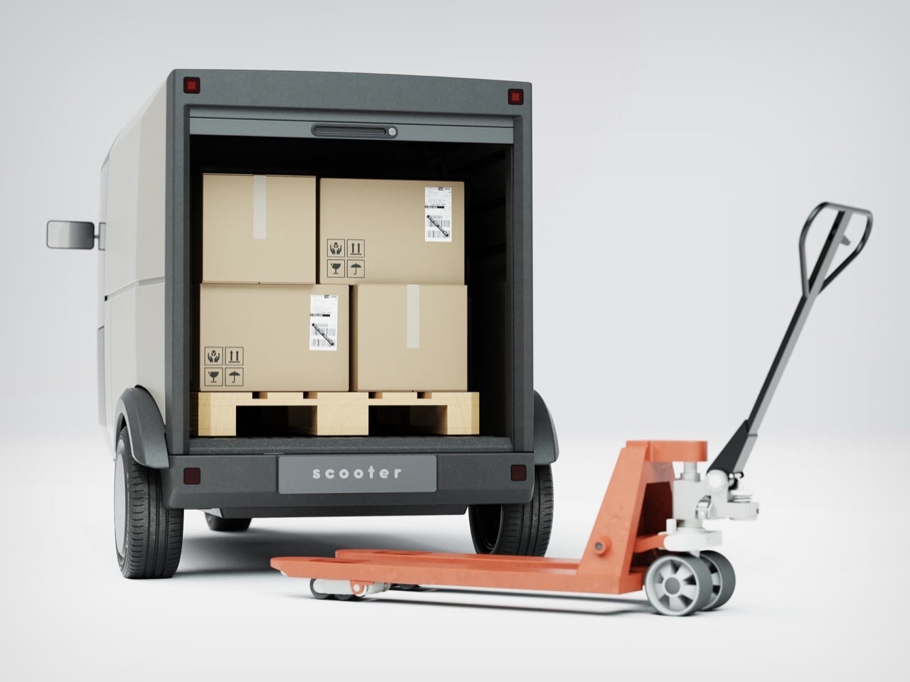
What’s interesting is how this tackles the last-mile problem from a completely different angle than Tesla’s robotaxi approach. Autonomous ride-hailing solves personal transportation, sure, but it does absolutely nothing for the grocer who needs to deliver three bags of produce, the courier hauling packages, or the mobile coffee vendor setting up at a street market. Those use cases require cargo capacity, weather protection, and the ability to park in spaces where a Model 3 would get towed. The P-Two addresses all three without requiring a silicon valley-scale AI development budget.
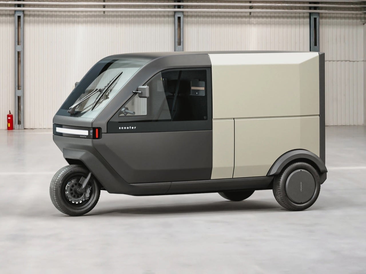
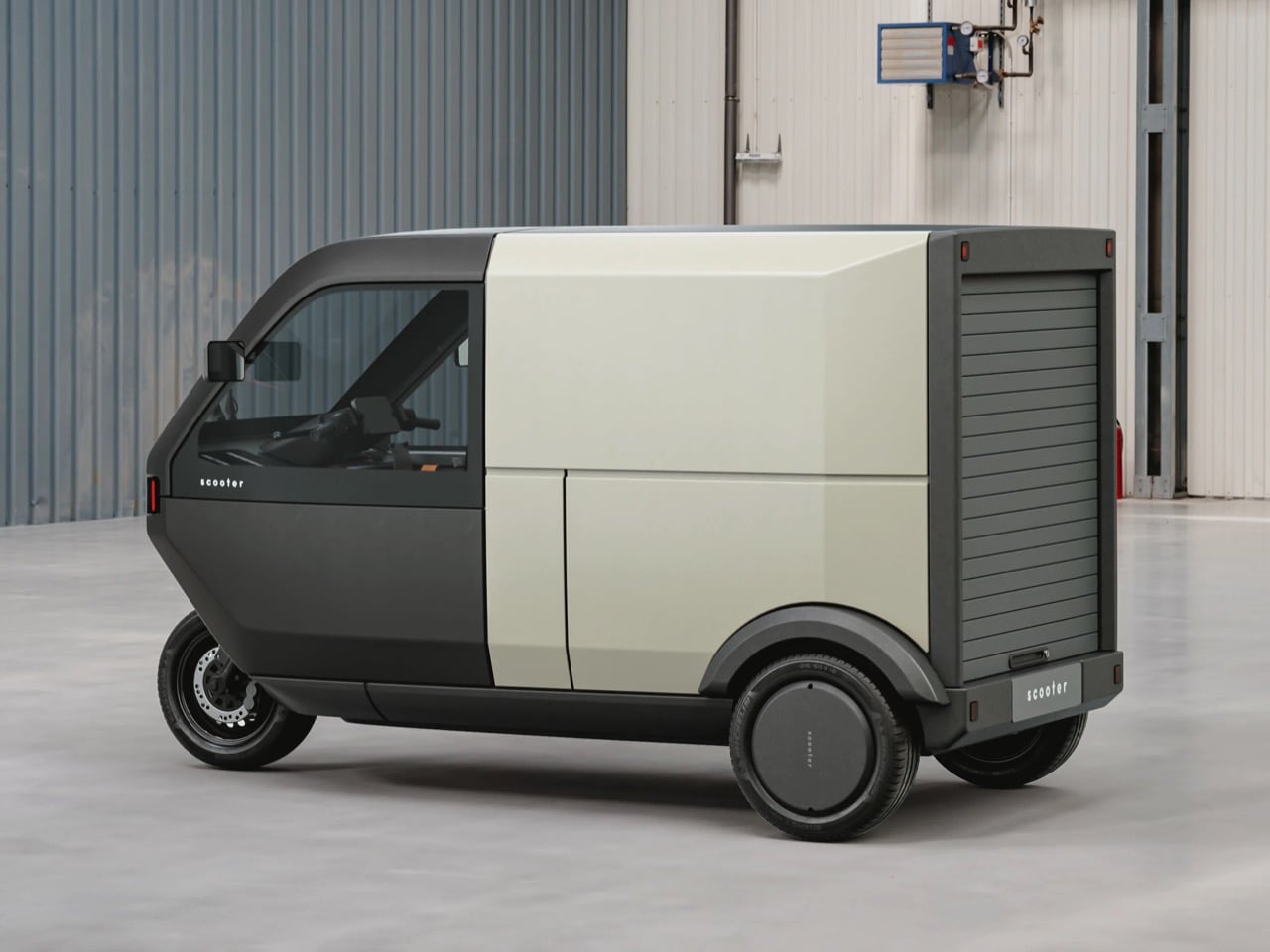
The front fascia carries that now-familiar horizontal light bar spanning the full width, a move Cybertruck popularized and every EV startup has since borrowed. A vertical red accent element breaks up the horizontal monotony and gives the face definition without resorting to fake grilles or busy details. That two-tone split (charcoal gray below, off-white above) does real visual work, breaking up what could read as a bulky form into something that feels lighter and more considered. The surfacing stays clean and geometric, channeling that angular confidence Tesla brought to trucks but rendered at tuk-tuk proportions where it actually looks intentional rather than confrontational.
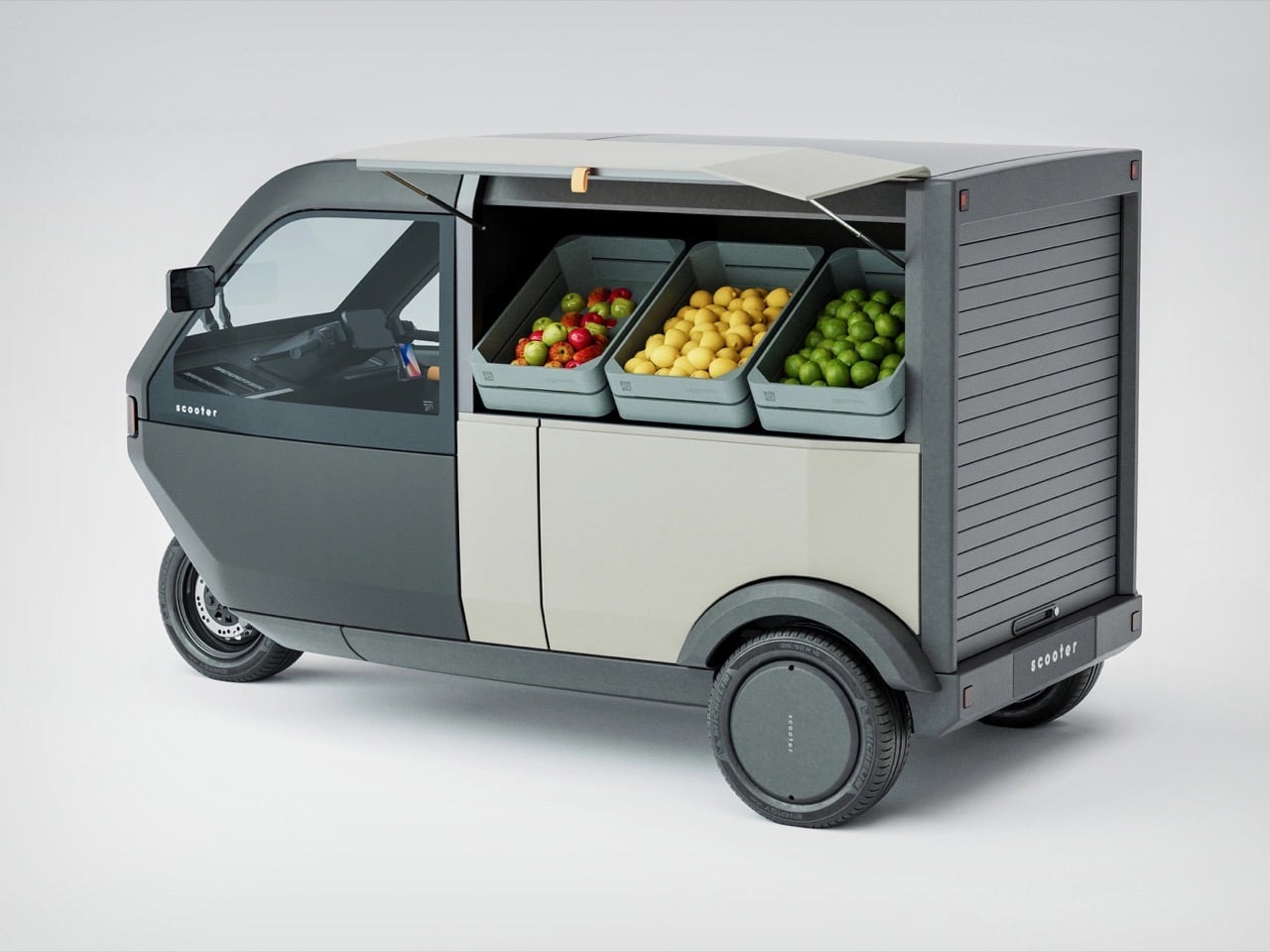
The cargo solution tells you these designers actually think about how people move things around cities. That roll-up door in back solves problems that hinged and sliding doors create. Hinges eat precious loading width and force awkward angles when you’re trying to maneuver boxes. Sliders need tracks, seals, and mechanisms that add cost and failure points. A simple roll-up shutter gives you the full cargo opening without mechanical drama, and the modularity extends beyond simple package hauling. The concept shows configurations for mobile retail, delivery work, passenger mode, which suggests the platform could adapt across use cases instead of forcing you to pick one function and stick with it forever.
The trike layout means this handles more like a powered two-wheeler than a micro-car, which changes the entire feel of how you’d navigate traffic. That exposed front wheel carries conventional tire sizing rather than the pencil-thin rubber most stand-up scooters use, which matters for stability over rough pavement and confident braking. The rear axle provides your planted base when stopped and your drive traction when moving. You trade four-wheel planted feel for genuine lane-filtering ability and a footprint that can actually navigate the spaces cars can’t reach. In dense European city centers where streets predate automobiles and parking costs more than rent, that tradeoff makes complete sense.
The intelligence here is how thoroughly Voyager avoided the usual micro-mobility compromises. Most concepts optimize ruthlessly for one metric and sacrifice everything else to hit it. Smallest possible size, maximum theoretical range, absolute lowest build cost. This feels like it started from actual urban movement patterns and built the vehicle around those needs. Enclosed cabin means rain stops being an excuse to drive the car. Cargo flexibility means the same machine handles your morning commute, afternoon grocery run, and weekend side hustle doing deliveries. The styling gives it enough visual mass to read as a legitimate vehicle in mixed traffic rather than an oversized toy or mobility-impaired golf cart.
Whether this actually reaches production, and at what price point, will determine if it reshapes anything or just becomes another beautifully considered concept that dies in the portfolio. But the thinking here is solid enough that I’d genuinely consider one if it showed up at competitive pricing against electric scooters. Cities need vehicles that acknowledge their actual density and infrastructure constraints instead of pretending everyone can just drive smaller cars forever.
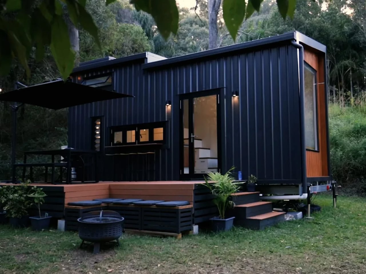
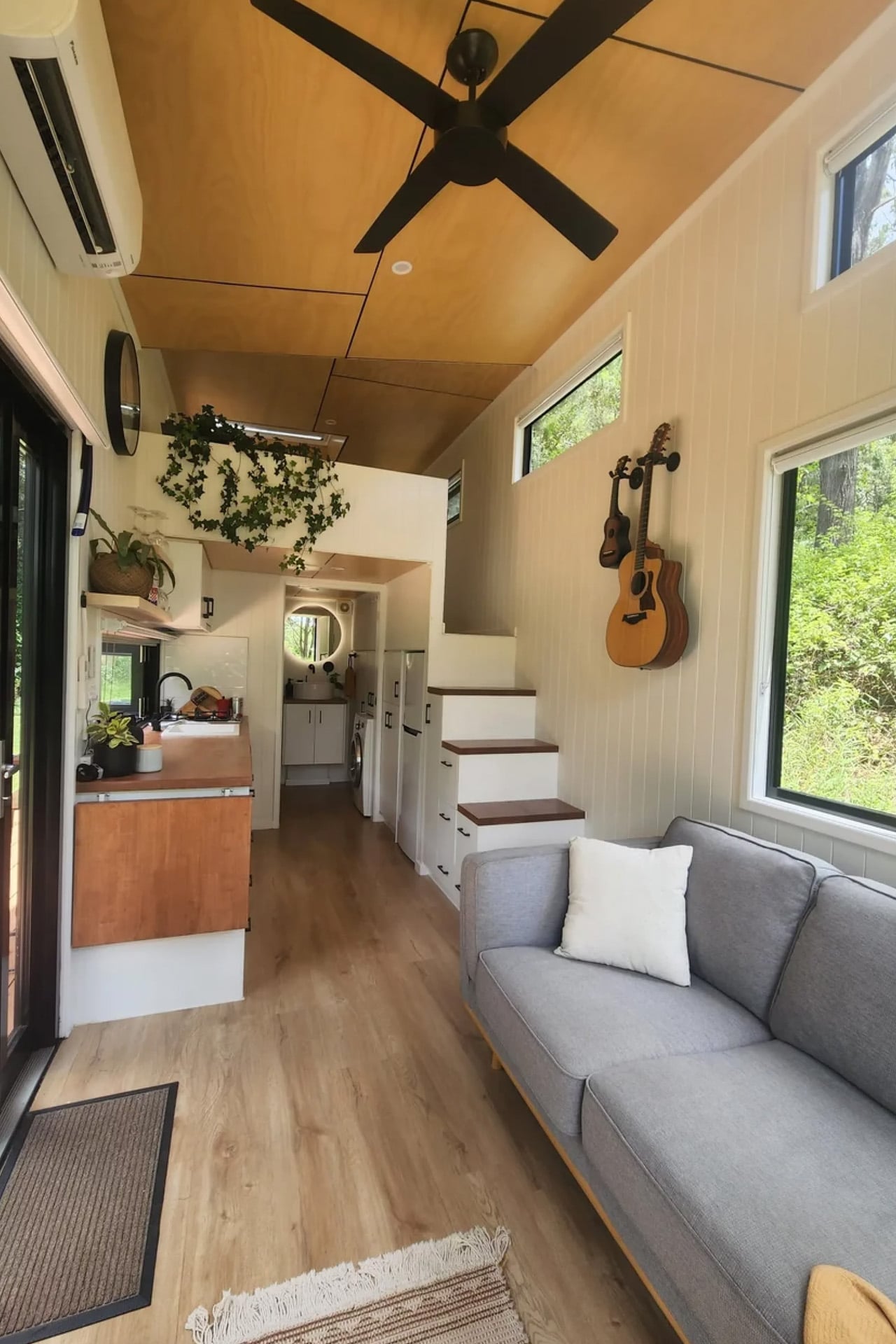
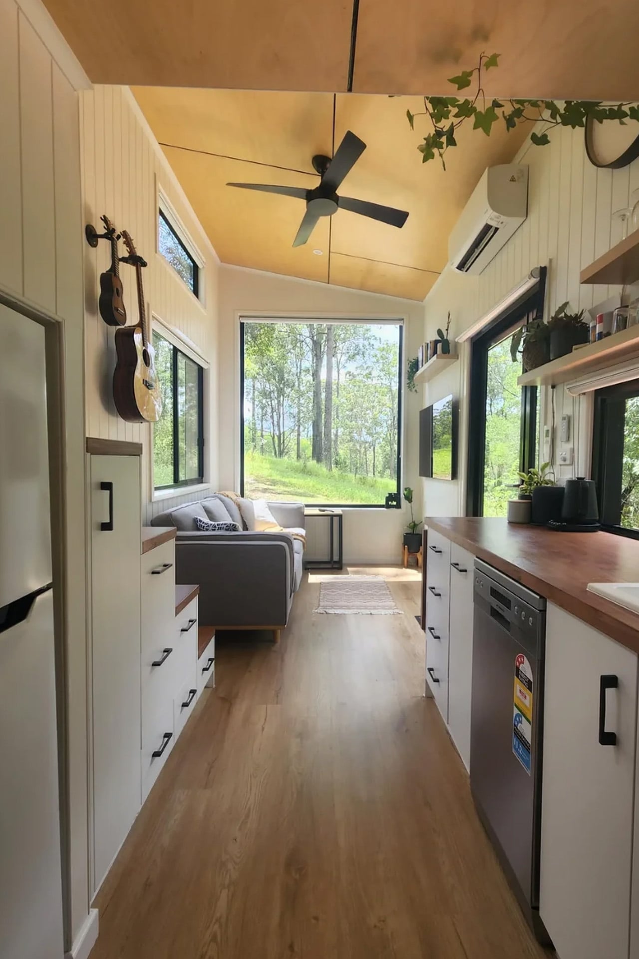
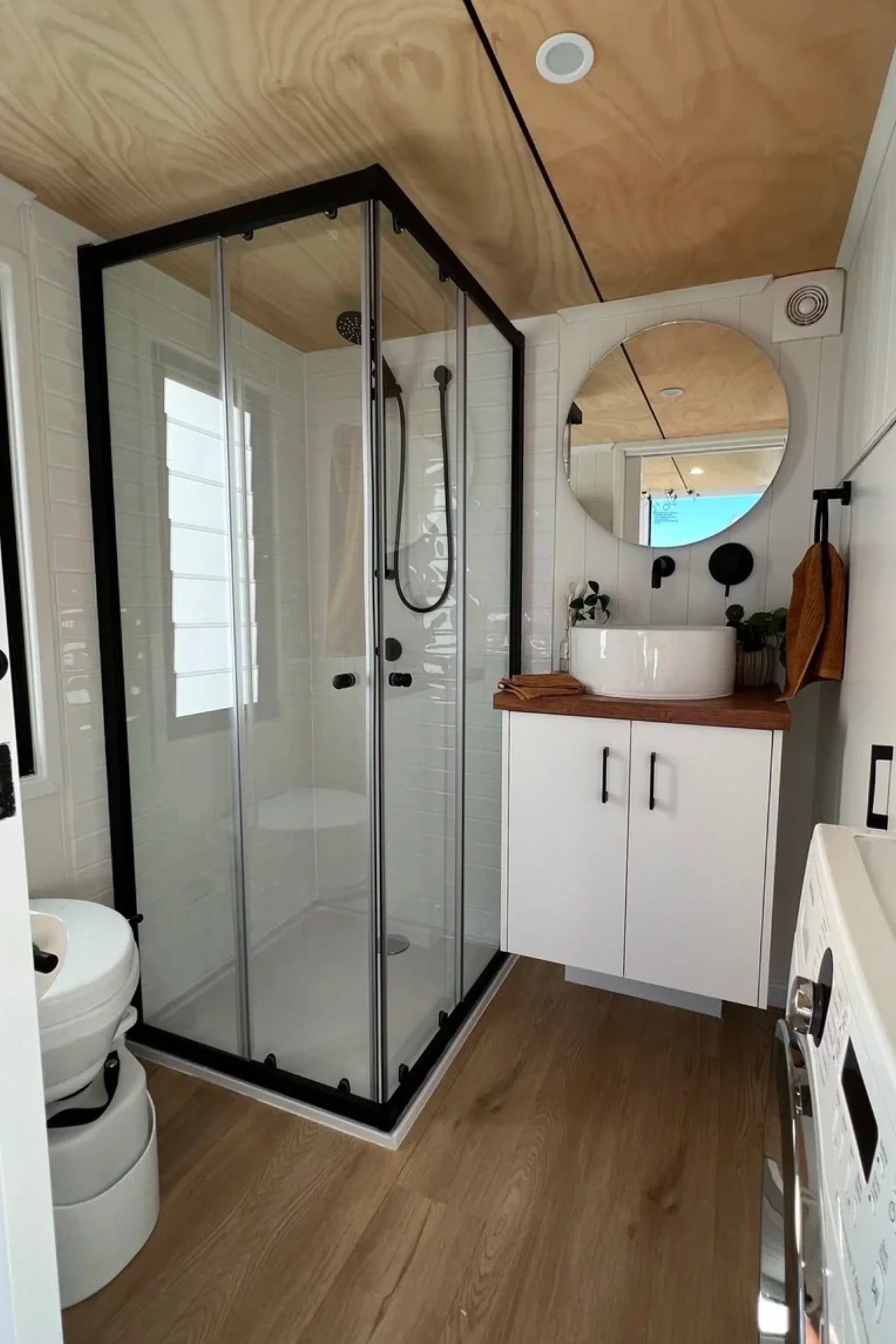
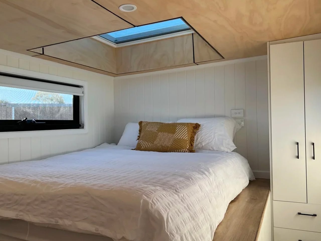
The best tiny homes don’t feel small; they feel edited. Removed Tiny Homes, a Queensland-based builder, has built its entire identity around that idea, and the Currumbin is arguably where it lands best. Named after the coastal suburb on the Gold Coast, the Currumbin is the most popular model in the builder’s lineup, and it’s easy to see why. Sitting on a triple-axle trailer, it measures 7.2 metres long, 2.4 metres wide, and stands 4.3 metres tall, coming in at 25 square metres of liveable space. For a home that technically fits on a trailer, it carries itself with surprising generosity.
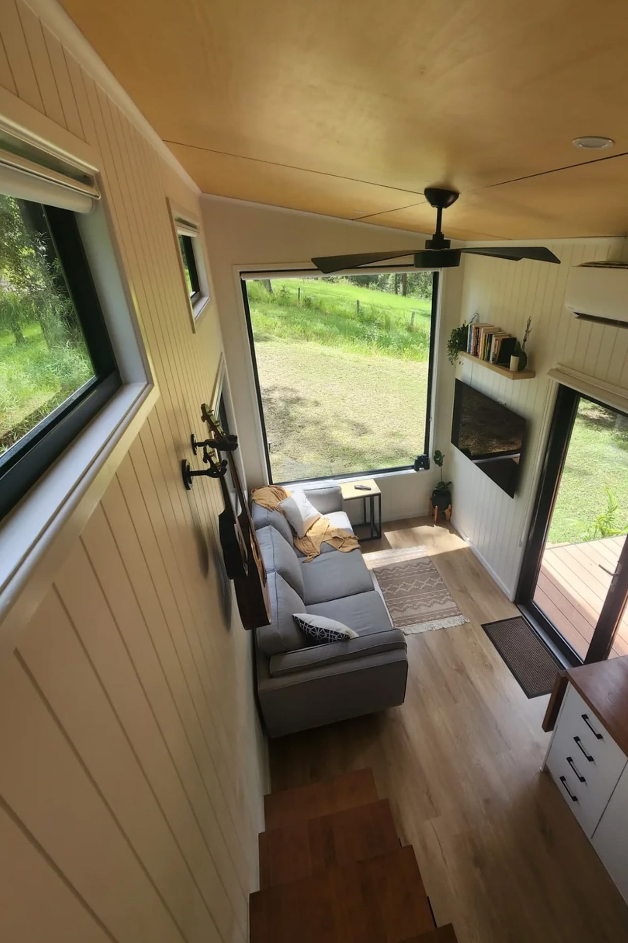
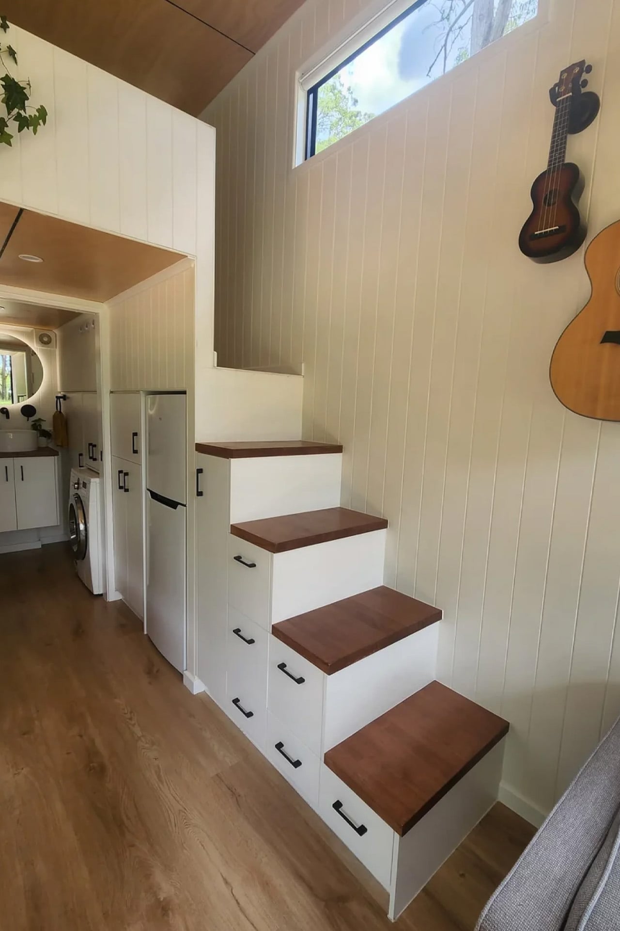
The layout is designed with couples and downsizers in mind. A loft bedroom sits above the living zone, accessed via a standing-height walkway and staircase, the kind of considered detail that separates a well-designed tiny home from a glorified caravan. A skylight overhead floods the sleeping area with natural light, giving the loft an almost meditative quality. Two layout options are available, letting buyers tailor the floor plan to how they actually live, rather than forcing a compromise.
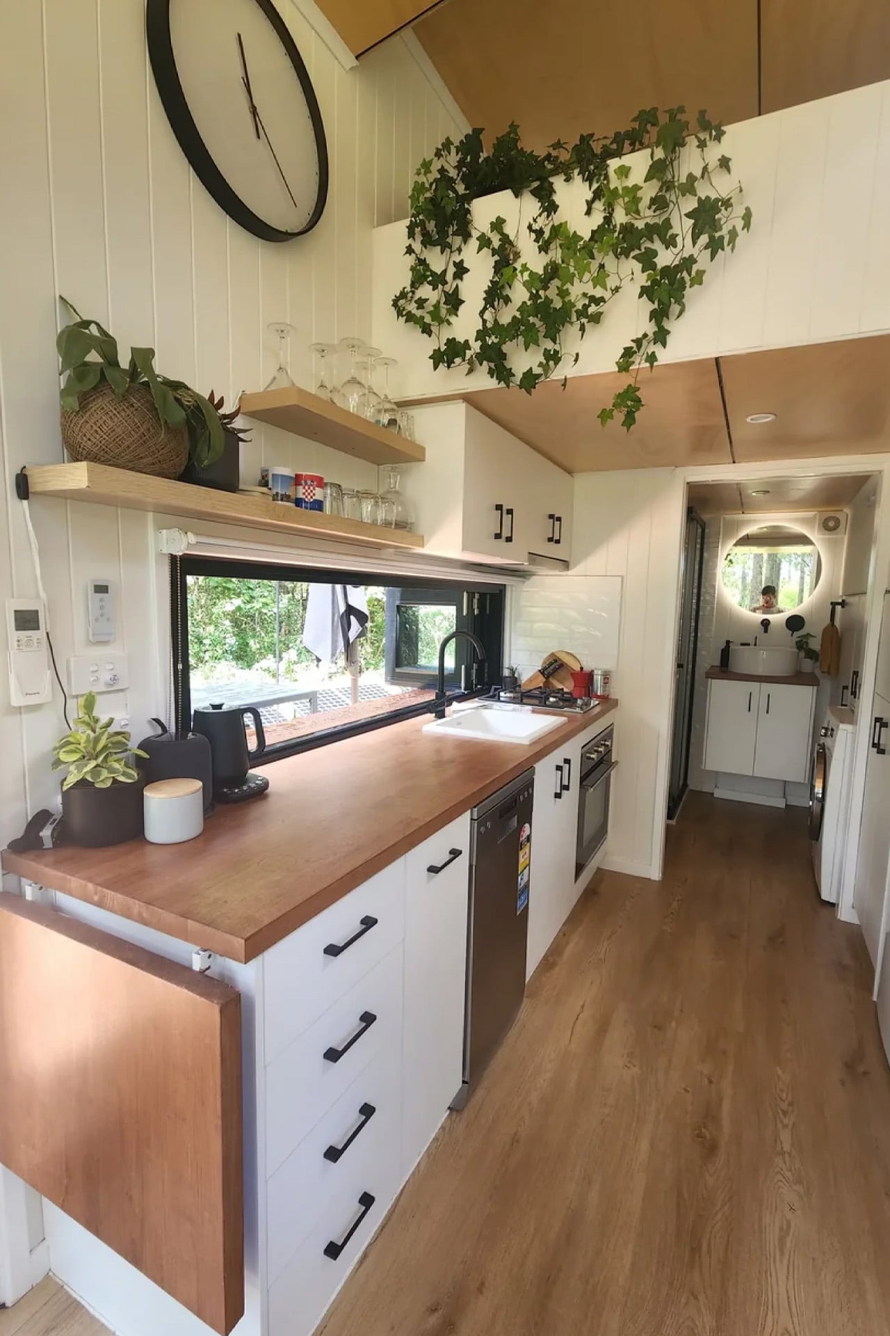
Downstairs, the kitchen takes centre stage. A large picture window anchors the cooking space, framing the outdoors like a piece of art. The interior features VJ panelling customisable in different tones, wood-like vinyl board flooring, and white walls and ceiling set against black windows, a palette that feels calm and resolved without trying too hard. It’s the kind of interior that photographs well, but more importantly, lives well.
Strategically placed expansive windows provide the interior with ample light, making it feel cosy and bright, a critical move in a home this scale, where the relationship between inside and outside does the heavy lifting. Priced from $128,990, the Currumbin sits at the entry point of Removed’s Classic range, yet it doesn’t feel like a starting point. It feels considered from end to end. The brand’s philosophy of building homes that help people “disconnect from the noise” with calm, clarity, and craftsmanship at the core is felt in every decision, from the stair storage to the picture window placement.
The Currumbin’s success has since led Removed to develop the Currumbin 9.6, a 31.4-foot follow-up that moves the bedroom downstairs with a full walkthrough en-suite bathroom, catering to those who’d rather skip the loft entirely. But the original 7.2 remains the sweet spot. Small enough to move, large enough to mean something.