A Neck Pillow That Actually Knows Your Neck

If you’ve ever landed from a 12-hour flight feeling like your neck staged a quiet protest against you, you already know the problem. Travel neck pillows have been around for decades, and for most of that time, they’ve been a category defined by compromise: too bulky, too generic, and offering okay-ish comfort at best. The kind of thing you grab at an airport kiosk, shrug, and hope works better than the last one.

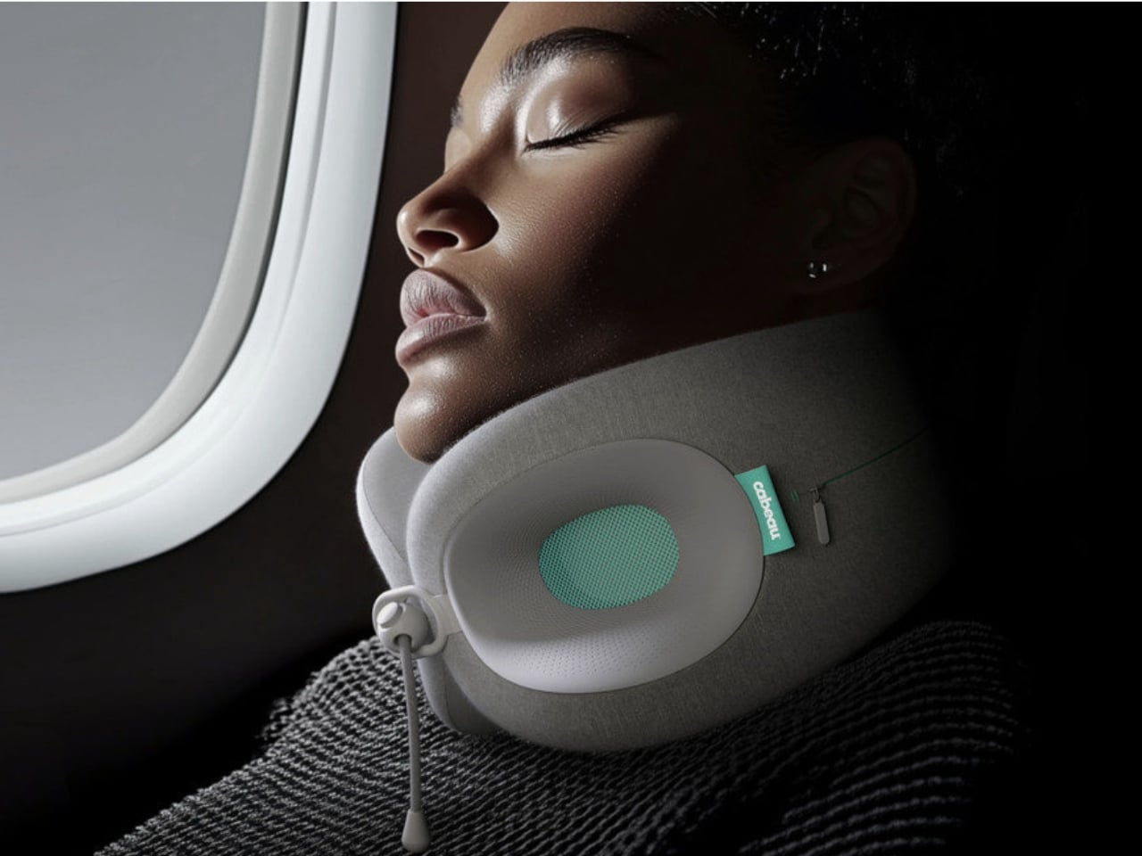
The Cabeau Evolution X challenges that reputation by attempting something the category has rarely bothered with: treating the person wearing it as if they have a body with specific dimensions and actual needs.

Designer: Ritual

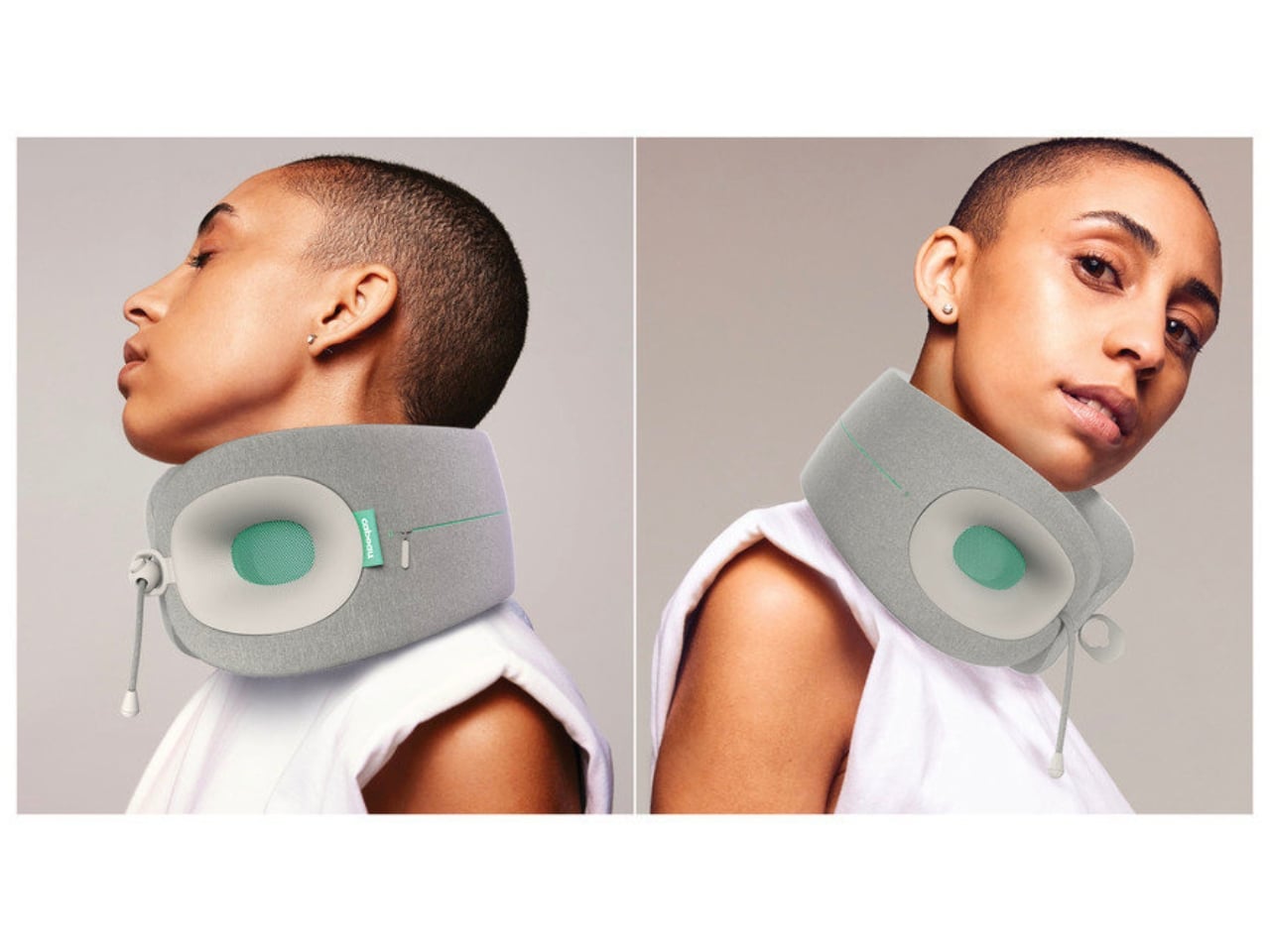
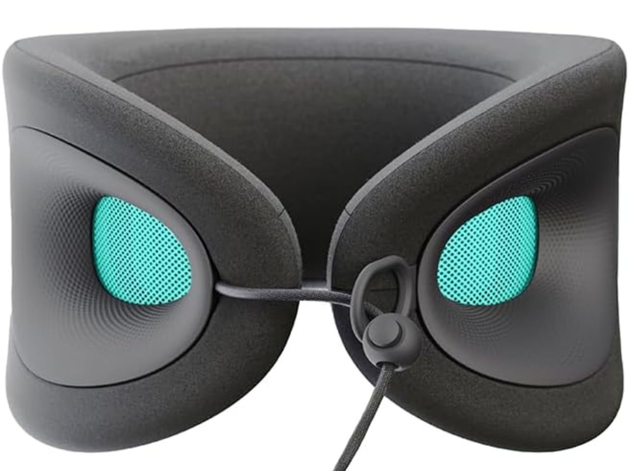
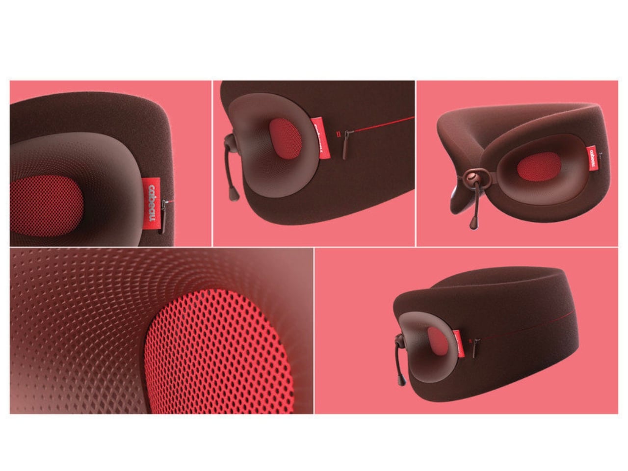
Designed by Ritual, a Los Angeles-based design studio led by Thorben Neu, the Evolution X was built through what Neu describes as “a human-centered, iterative process, continuously ideating, prototyping, testing, and refining, where each failure brought us closer to a more effective solution.” That sounds like design school language, but in this case, the results actually back it up. The pillow features proprietary three-way adjustability, meaning you can customize the height, circumference, and front clasp closure to your specific neck. Not a general neck. Yours.

The foam is dual-density memory foam with integrated ventilation channels, which addresses the overheating issue that plagues most travel pillows mid-flight. The outer fabric is a soft jersey knit that reviewers consistently describe as feeling more like a worn-in t-shirt than the scratchy synthetic material that passes for standard in this category. It also fits most neck sizes, ranging from 11 to 21 inches, which means it actually accounts for the fact that necks are not one-size-fits-all. Small things matter when you’re at 37,000 feet and running out of comfortable positions.

One of the more useful structural features is how the pillow is engineered to prevent head tilt beyond 10 degrees in any direction. That might read as a minor detail, but anyone who has woken up mid-flight with their head at a 45-degree angle and a sore neck that lingers for days will understand why it matters. The cervical spine doesn’t enjoy being yanked sideways during a long-haul nap, and the Evolution X addresses that through structural intention rather than just piling on more foam.

The broader design story here is also worth paying attention to. The wellness and comfort space has been growing steadily, and consumers are increasingly willing to invest in things that genuinely improve how they feel, not just how they look in a flat lay or carry-on photo. Cabeau, which was founded in 2010 by a 6’8″ pro basketball player who couldn’t find a neck pillow that actually worked for his frame, has always operated from a problem-first perspective. That origin story matters because it set a precedent: design choices are made in service of real discomfort, not aesthetics for their own sake. The Evolution X feels like a natural extension of that ethos, executed with a noticeably higher level of design fluency.

The 2026 Red Dot Design Award win matters for that reason. Red Dot is not the kind of recognition handed out generously. It stands among the most respected honors in product design globally, and the Evolution X earned it by standing out among thousands of submissions for its balance of functionality, comfort, and forward-thinking engineering. Travel accessories have long occupied a design blind spot: functional enough that people buy them, unremarkable enough that nobody writes seriously about them. That is clearly beginning to change.

At $50, the Evolution X sits at a price point that feels honest given what you’re getting. It comes with a travel bag, which matters because packability is half the battle with anything you actually want to bring on a plane. It compresses without losing its shape, which is the other half. Thorben Neu said the goal was to deliver comfort “through a form that feels both intuitive and refined.” For a category that has spent the better part of 30 years being neither of those things, that is a standard worth measuring against, and the Evolution X mostly meets it.

The post A Neck Pillow That Actually Knows Your Neck first appeared on Yanko Design.

The Desk That Leans on Your Wall and Weighs Less Than Your Bag

Most of us have made peace with the idea that a proper workspace takes up space. It claims a corner, demands a room, or at least stakes out a permanent spot in your home where it will sit indefinitely, collecting cables and coffee cups. The Leandesk, designed by Cornwall-based Henry Swanzy, politely disagrees.

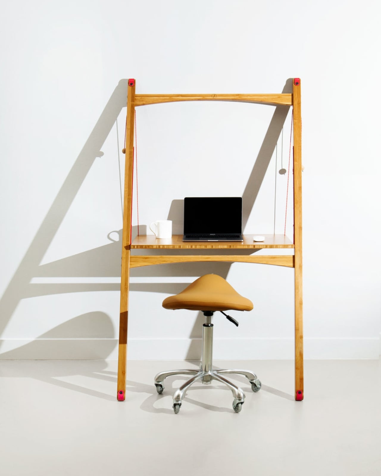
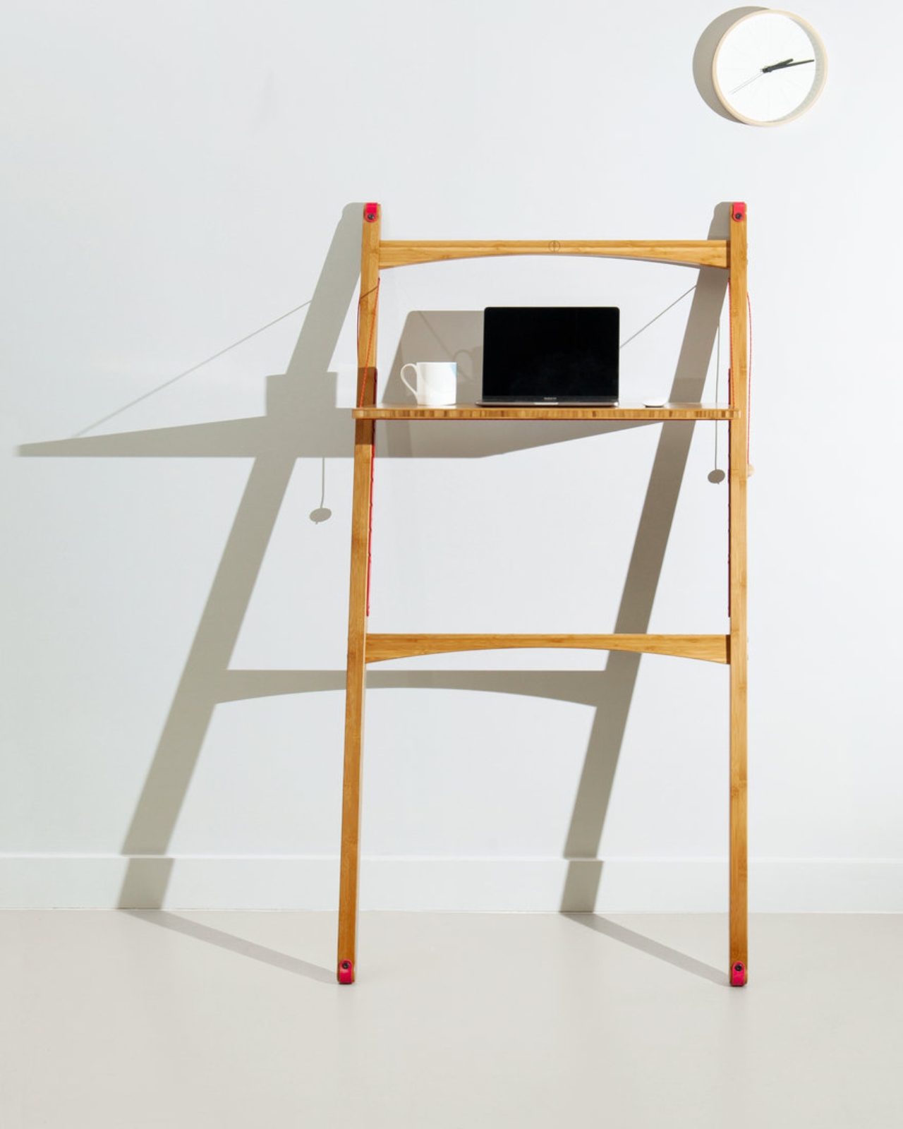
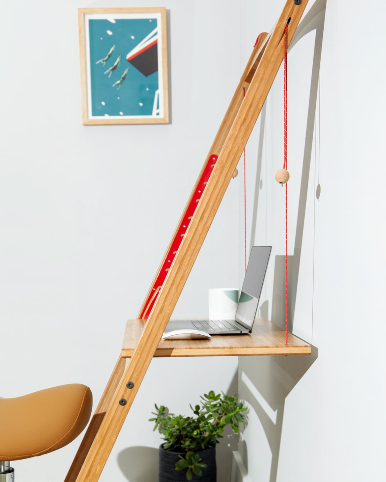
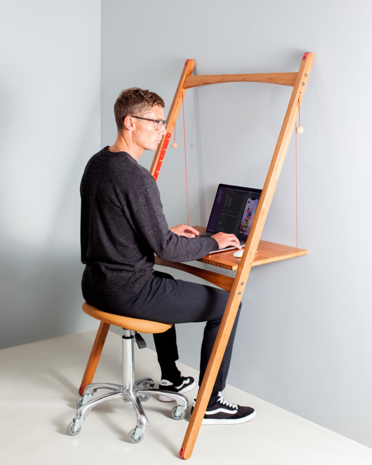
The concept is elegantly counterintuitive: a sit-stand desk that doesn’t sit on the floor. Instead, it leans against a wall or window using nothing more than physics, weight distribution, and a pair of non-marking rubber pads to hold itself in place. No drilling. No brackets. No landlord negotiations. The harder you lean into it, the tighter its grip. It’s the kind of mechanic that makes you wonder why we’ve been bolting things to walls for centuries.

Designer: Henry Swanzy

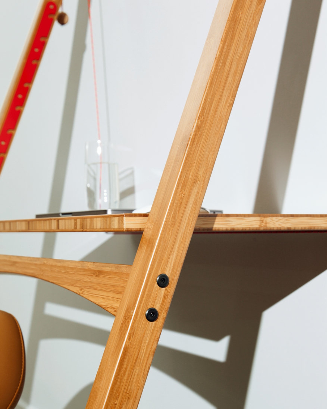
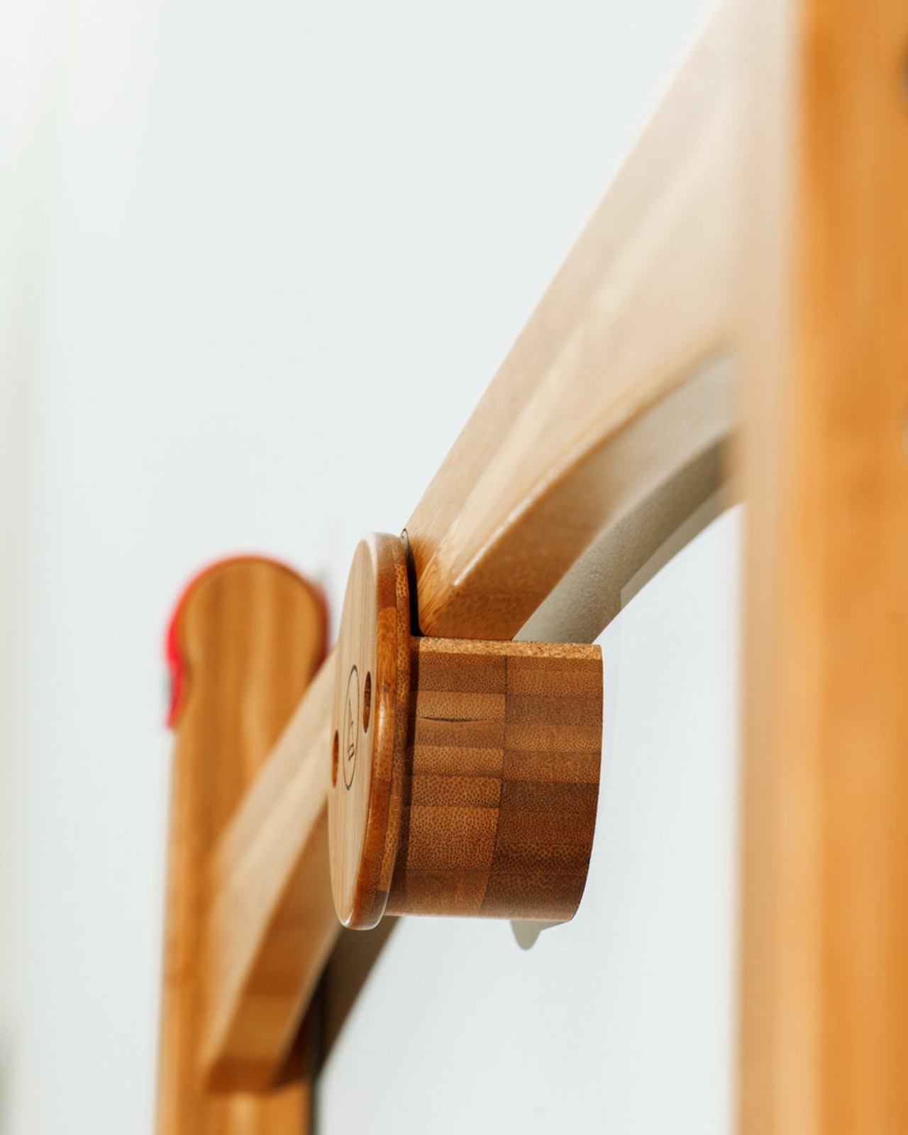
Swanzy’s background is in cabinet-making, which might explain why the Leandesk feels so considered in its construction. The desk is built from FSC-certified bamboo and uses Dyneema cord, a material borrowed from performance marine sports, to achieve its exceptional strength-to-weight ratio. The whole thing weighs under 8kg, yet it’s independently load-tested to hold 65kg. You can raise or lower the working surface, or tilt it to any angle, by simply pulling a cord through hidden alloy cleats, a mechanism drawn from maritime rigging. No motors, no buttons, no app required.

That last point matters more than it might seem. The design world has a complicated relationship with simplicity right now. We keep layering technology onto things that didn’t need it, calling it innovation when it’s often just addition. Swanzy went the other direction entirely. His philosophy is to pare down to essential elements and be as efficient with materials as possible, and the Leandesk is the full expression of that thinking.

The sustainability piece is genuinely impressive, and not in a vague, aspirational way. Over 97% of Leandesk’s components are reusable or recyclable, and its carbon footprint has been independently assessed at as low as 10.7 kg CO₂e over five years. Manufacturing runs on solar power, and there’s a take-back programme at end of life. It’s the rare product where the environmental claims have actual numbers attached to them.

When the workday is done, the desk folds flat to just 50mm deep. It can slide behind a door, tuck under a sofa, or hang on its own dedicated wall hook. That last detail, the fact that storage was designed into the product rather than treated as an afterthought, says a lot about how Swanzy approached the whole project. This is a desk that was designed to disappear when you need it to, which makes it remarkably well-suited to how many of us actually live.

It’s worth pausing on that, because it runs against a trend. The dominant image of the home office is still something maximalist: a dedicated room, a substantial L-shaped desk, a monitor stand, a ring light. The pandemic made that aspiration common, and the furniture industry followed accordingly. But a lot of people are working out of apartments, spare bedrooms that double as guest rooms, and living spaces that were never meant to absorb an office. The Leandesk was conceived exactly for those realities.

The desk is available in two widths, Original at 860mm and Compact at 660mm, both under 8.5kg. It has picked up recognition from serious design critics, including a longlist from Dezeen Awards, which is not the kind of accolade handed out for novelty alone.

I’ll be honest: I don’t think every person needs a Leandesk. If you have a dedicated office and love your setup, this isn’t for you. But if you’ve ever stared at a bulky desk that eats your room and wondered whether furniture has to work this hard against you, the Leandesk is a genuinely interesting answer. It’s proof that the best design solution isn’t always more. Sometimes it’s just less, leaned against a wall, and ready to fold away before dinner.

The post The Desk That Leans on Your Wall and Weighs Less Than Your Bag first appeared on Yanko Design.

The Photo Frame That Turns Color Into Temperature

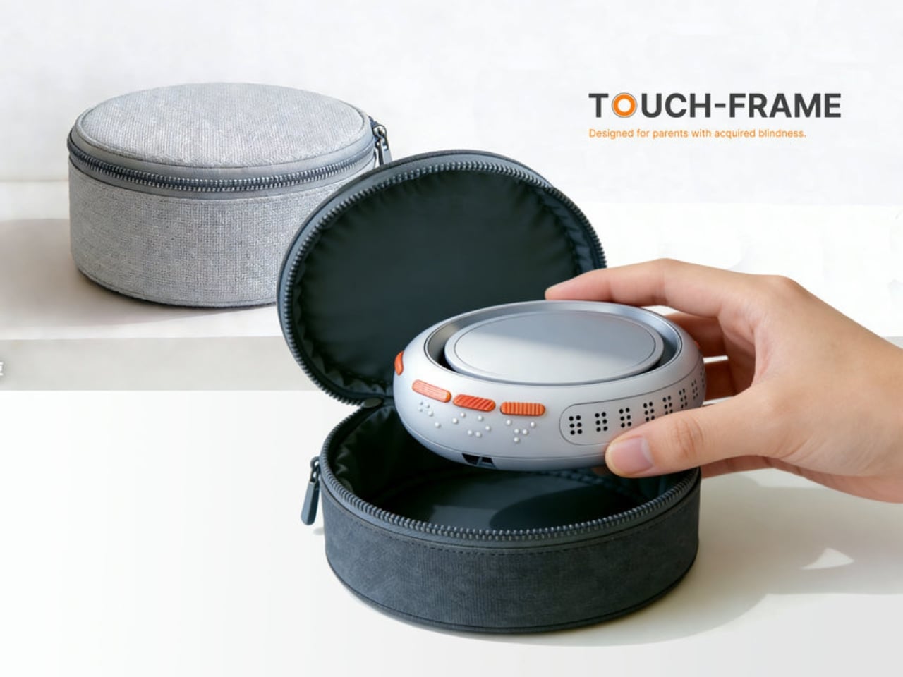
Every so often, a design concept stops you mid-scroll and makes you sit with an uncomfortable question. For me, Touch-frame by student designer Liang Han was exactly that kind of pause. It didn’t announce itself with a clever name or a slick render alone. It made me stop because of what it implied about how narrow our assumptions around photography really are.

The premise is deceptively simple: a smart photo frame designed for parents who have lost their sight. But the design challenge buried inside that premise is one most of us have never thought about. Photography, for all the innovation it has absorbed over the decades, remains a fundamentally visual medium. We build entire apps, devices, and rituals around looking at photographs. What happens when looking is no longer an option?

Designer: Liang Han

The most obvious answer to that question is AI narration, where a system describes what’s in an image and reads it aloud. It works. It’s useful. But Liang Han’s argument, embedded in the design itself, is that a verbal description of a photograph and the actual experience of a photograph are two very different things. When your child hands you a drawing they made at school, you don’t want a summary. You want to feel it.

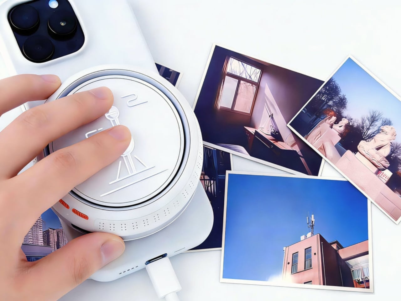
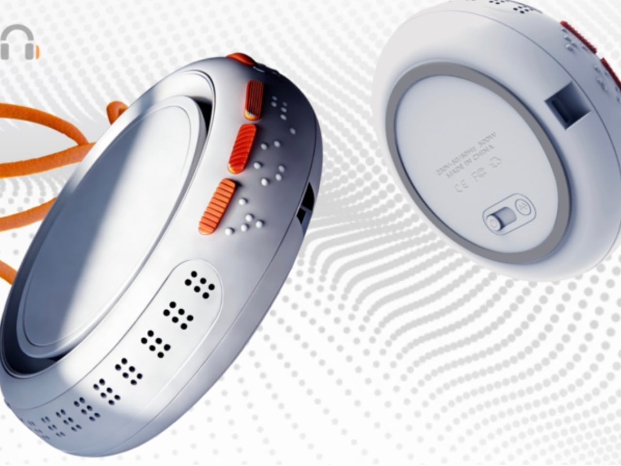
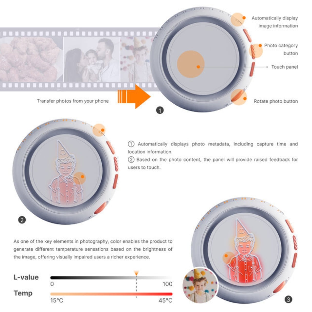
Touch-frame addresses that gap with a dynamic tactile dot matrix embedded in the panel. Instead of translating a photo into words, the frame translates it into texture, allowing users to physically trace the contours of a face, a landscape, or a meal. The surface also adjusts its temperature in real time based on the color saturation of the image, a detail that sounds technical until you realize what it means: warm tones feel warm, cool tones feel cool. A sunset photograph doesn’t just get described as golden. You feel something close to gold.

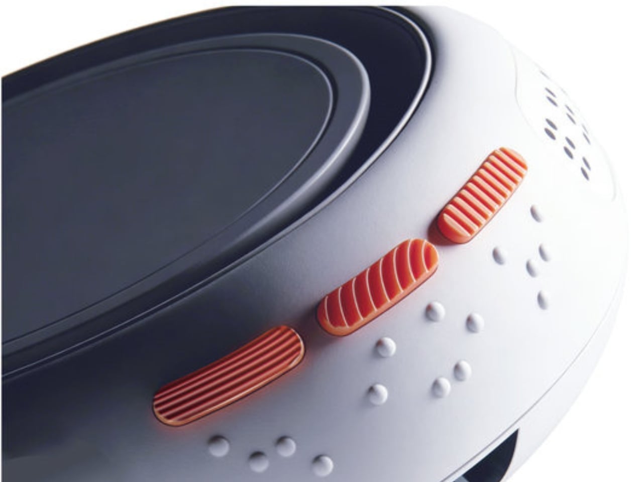
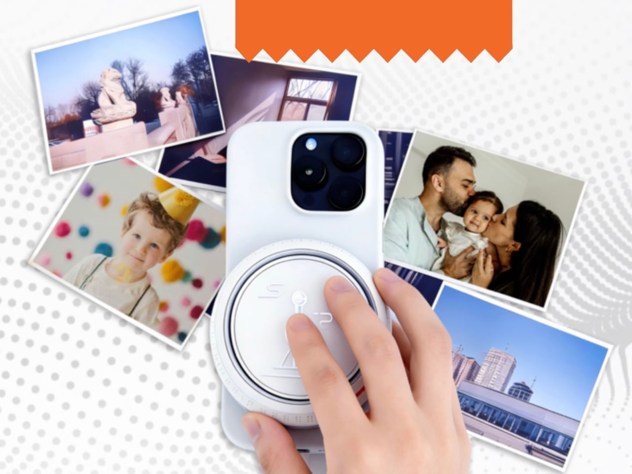
On top of the tactile experience, the device includes Braille annotations on the top surface, automatic photo categorization with textured tactile buttons (one for portraits, one for landscapes, one for food), voice metadata read-aloud with date and GPS location, and a recessed groove around the charging port so the entire device can be navigated independently without any sighted assistance. The fact that a student thought through all of these layers simultaneously, each reinforcing the others, says a great deal about where design education is headed.

What strikes me about Touch-frame isn’t just the technology. It’s the philosophy underneath it. Most assistive technology is built around compensation, giving people a workaround to approximate what they’ve lost. This design reaches for something more ambitious. It tries to restore the emotional richness of the experience itself. When a child can place their school photo or a drawing directly on the device and share it with a visually impaired parent, that’s not compensation. That’s connection. And the distinction matters enormously.

The design also consciously positions itself outside the clinical aesthetic that tends to dominate assistive products. Liang Han explicitly frames this as a shift from “medical equipment” to “personal electronics,” and the visual language of the renders backs that up. It looks like something you’d want on your shelf, not something that announces a medical condition the moment someone walks into the room. Dignity in design is still underrated, and it’s encouraging to see it treated as a deliberate intention rather than an afterthought.

You could argue that the concept still has gaps. A tactile dot matrix can only approximate so much, and thermal feedback as a color proxy has obvious limits. That’s fair. Concept designs exist in a space between aspiration and engineering reality, and not every detail survives contact with production. But the best concept designs do something valuable regardless: they reframe a problem in a way that makes you wonder why nobody thought to frame it that way before.

That, in the end, is what Liang Han has done. The photograph has been a sighted medium since its invention. Touch-frame quietly but firmly asks whether it has to be.

The post The Photo Frame That Turns Color Into Temperature first appeared on Yanko Design.

Motorola Edge (2026) Review: Beautiful, Brilliant, and an Acquired Taste

PROS:


  • Excellent compact form factor

  • Stylish and calm design

  • Sharp, vibrant 120Hz display

CONS:


  • 128Gb storage feels limiting

  • Software support is shorter than many rivals

RATINGS:

AESTHETICS
ERGONOMICS
PERFORMANCE
SUSTAINABILITY / REPAIRABILITY
VALUE FOR MONEY

EDITOR'S QUOTE:

The Motorola Edge 2026's compact size, clean software, and thoughtful design give it a charm that many rivals simply do not have, though it might not be the right fit for everyone.

Motorola’s comeback story is about more than nostalgia. The brand may still benefit from a familiar name and a long history in mobile, but its recent momentum has not come from recognition alone. Rather than simply trading on memory, Motorola has been building devices that feel stylish, approachable, and increasingly self-assured in a market that rarely makes room for second chances.

The Edge 2026 reflects that progress, even if it does not fully embody it. This is a phone with a clear sense of what it wants to prioritize, namely comfort, portability, and day-to-day ease, but it enters a crowded midrange field where those strengths have to work harder to justify the price. That makes the Edge 2026 easy to appreciate in some ways, but harder to justify in others. The real question is whether Motorola’s priorities here line up with what buyers at this price actually want.

Designer: Motorola

Aesthetics

There is something very Motorola about the way this device presents itself. The brand has become increasingly confident with phones that blend fashion-minded styling and mainstream usability, and the Edge 2026 continues that direction with ease. It looks premium without trying too hard, which is often one of the most difficult tricks to pull off in this category.
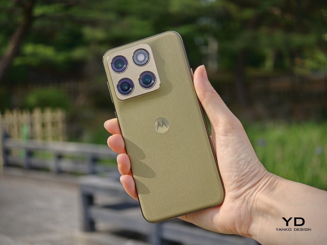
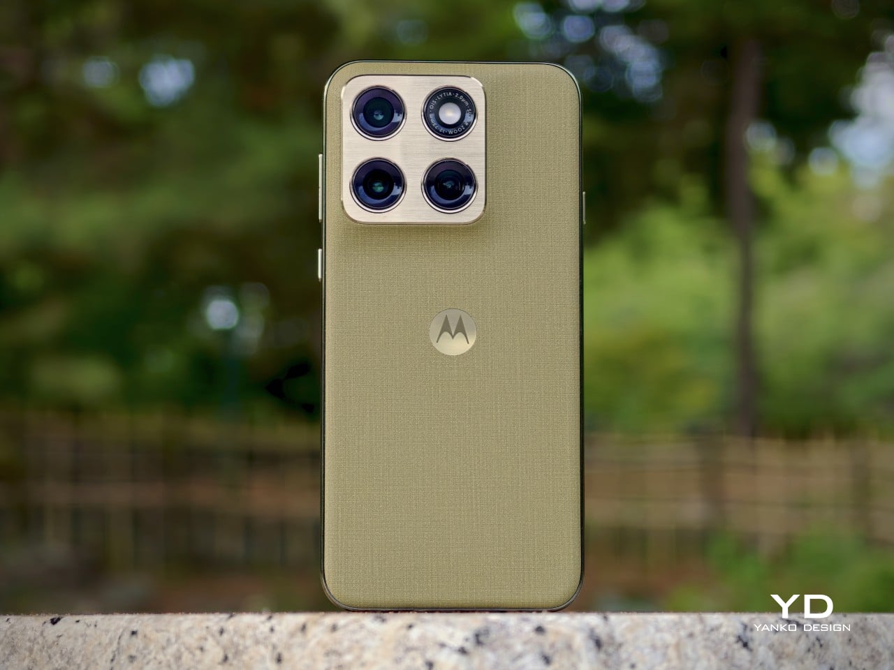
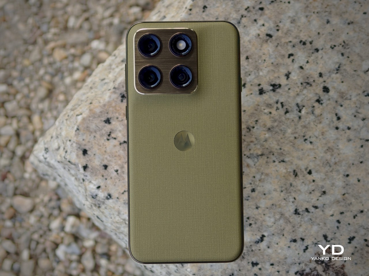
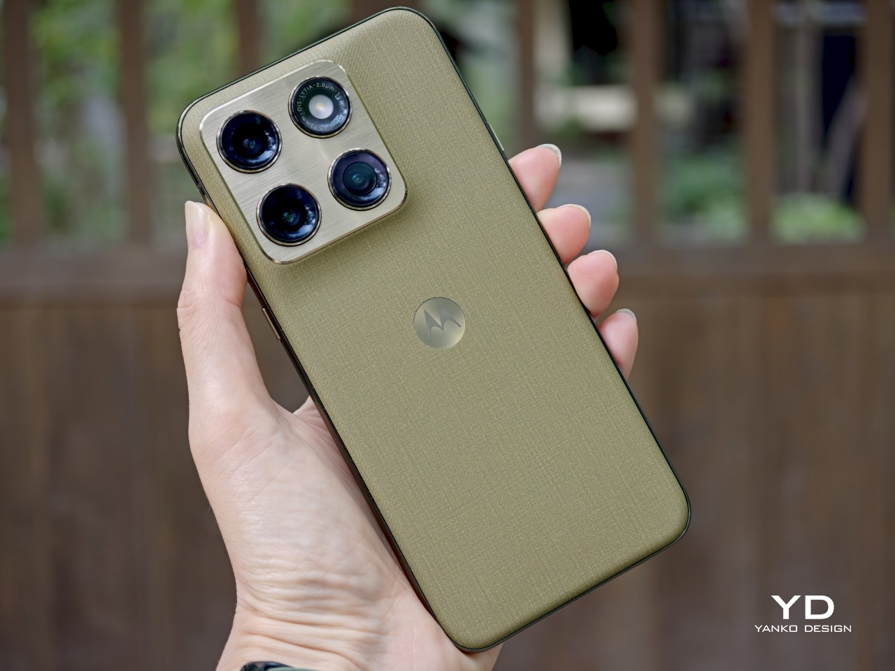
That confidence comes through clearly in the details. The back panel uses a twill-inspired finish in Pantone Martini Olive, and it gives the phone a softer, more composed visual character than the usual glossy midrange formula. Paired with the brushed gold camera bump, the centered Motorola logo, and the brushed finish frame, the whole design has a calm, almost zen-like quality. It feels restrained, but not plain, and that balance works in its favor.
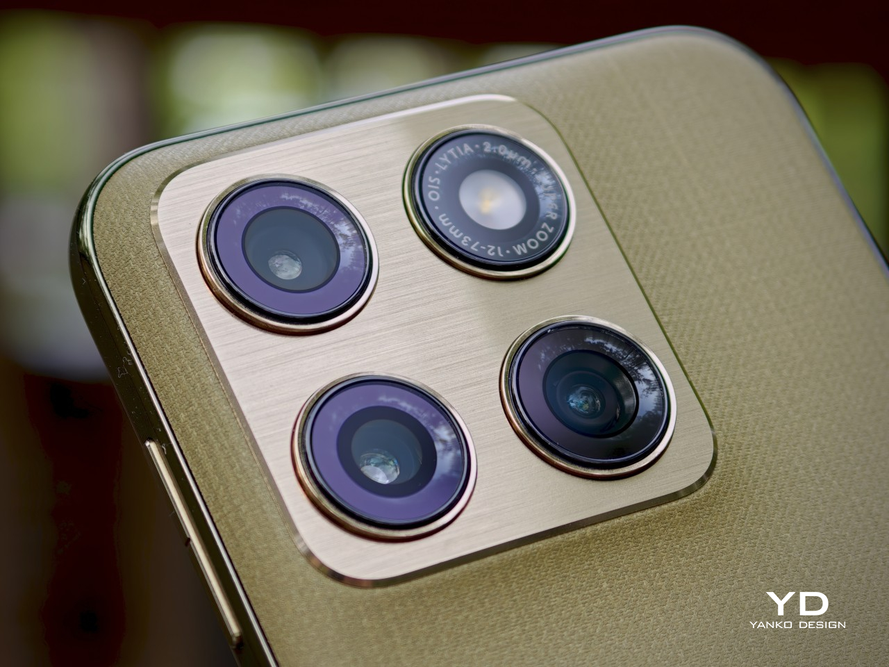
It also looks strikingly close to Motorola’s flagship Signature, which is not currently available in the U.S. That resemblance gives the Edge 2026 a more elevated presence than its price might suggest, even if it also makes the phone feel a touch less distinctive on its own terms. Unlike the Signature, which comes in both Pantone Carbon and Pantone Martini Olive, the Edge 2026 is limited to just this one color option, though some buyers may wish Motorola had offered a bit more variety.

Ergonomics

This is one of the most defining parts of the Edge 2026 experience. Motorola shrank the Edge from 6.7 inches to 6.3 inches, and that change has a bigger impact than it might seem on paper. With its more compact body, the phone feels noticeably easier to manage than many of the larger devices around it in this price range. The difference may sound small in theory, but in daily use, it changes a lot.
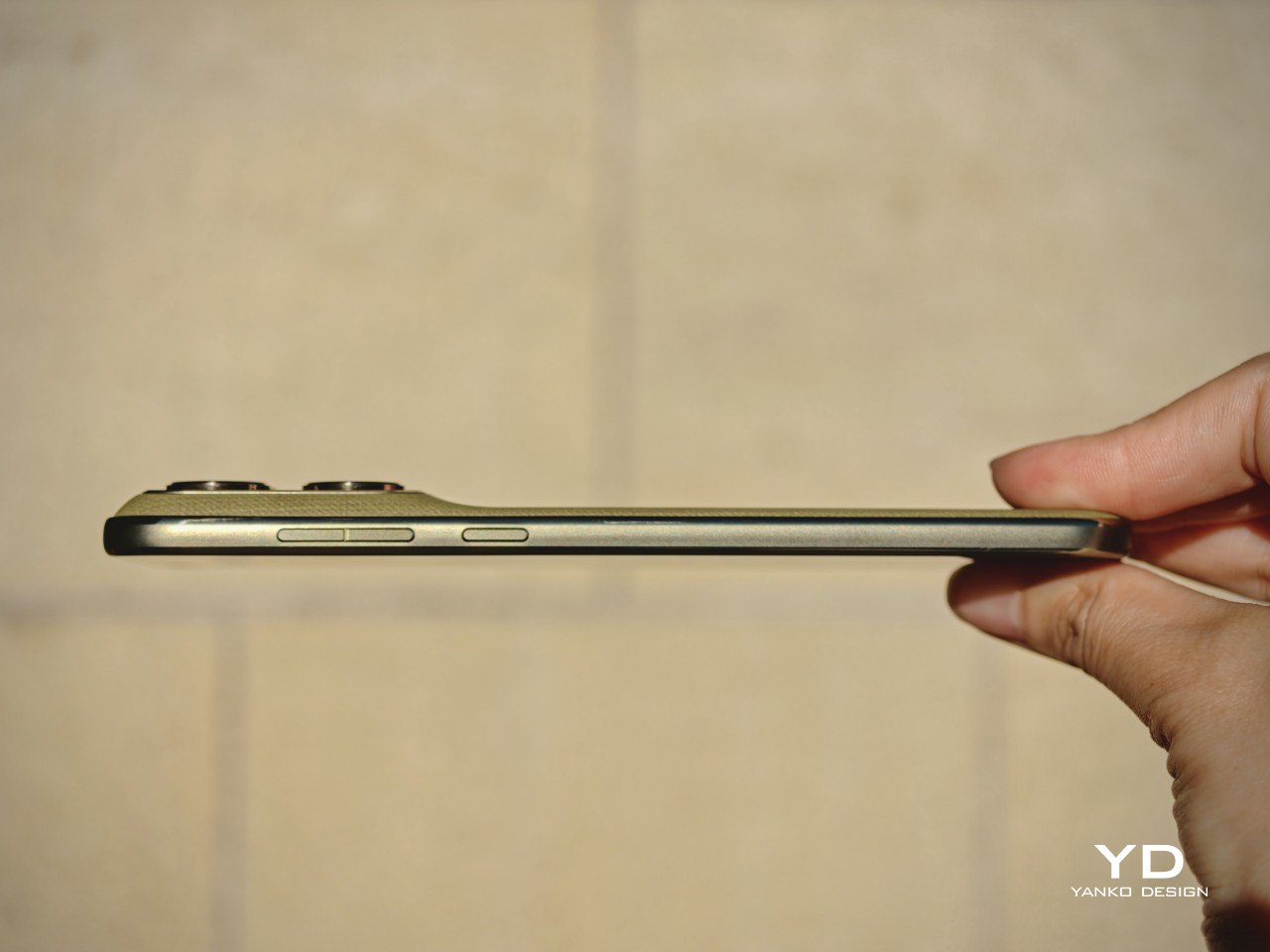
The Edge 2026 is genuinely pleasant to hold. It is easier to grip, easier to reach across, and easier to use one-handed without constantly adjusting your hold. In fact, it is one of the most pleasant phones I have tested in a very long time. The finish also helps in everyday use, because it does a good job resisting fingerprint smudges and light scratches, which makes the phone easier to keep looking clean over time.
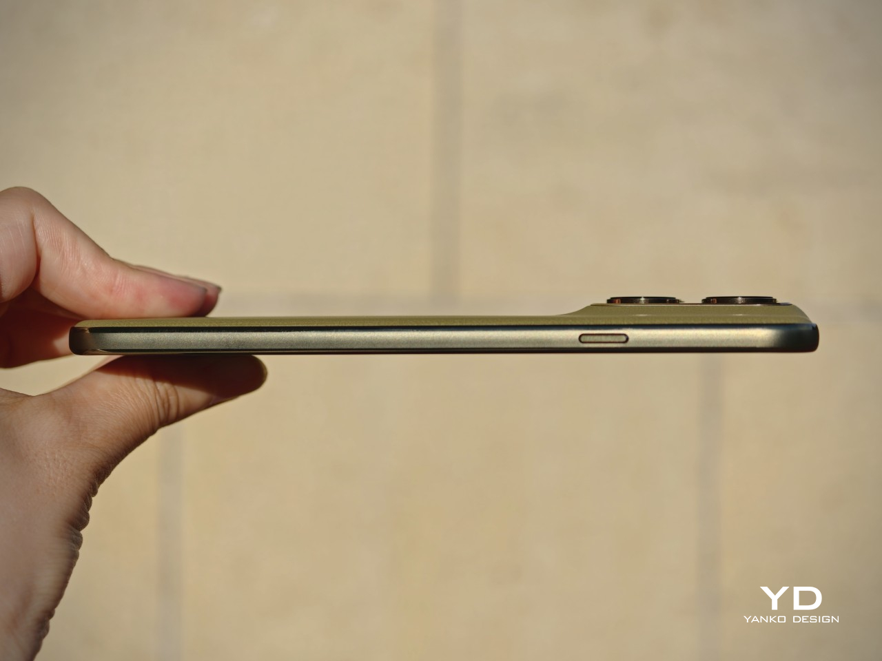
Personally, I do not mind a bulkier phone if that extra size delivers the best possible experience. I know not everyone feels the same way, though, and that is exactly why a phone like the Edge 2026 makes sense. What we want from smartphones is different, and for people who care more about getting the basics right in a device that feels super portable and genuinely comfortable in the hand, this one feels very well judged.

The one clear ergonomic drawback is the fingerprint scanner placement. It sits a little too close to the bottom edge, which can make it feel slightly awkward to reach at first. It is not a major flaw, and it becomes easier to adapt to over time, but it does stand out on a phone that otherwise feels so carefully shaped.

Performance

On paper, the Motorola Edge 2026 does not sound especially aggressive for the money. It runs on the MediaTek Dimensity 7450 chipset with 8GB of RAM and 128GB of storage in the U.S. model. While the chip is a modest upgrade over the previous generation, the drop from 256GB to 128GB feels less welcome.

In daily use, performance is solid without being especially impressive. Apps open quickly enough, scrolling feels smooth, and everyday tasks rarely cause much friction. For lighter users, 128GB should still be manageable, but anyone who takes lots of photos and videos, plays large games, or downloads media may run into storage limits sooner than expected.
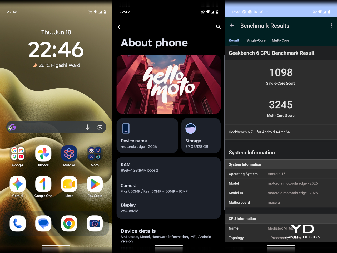
Motorola’s software remains one of the phone’s more appealing strengths. The interface feels clean, light, and relatively uncluttered, and it was refreshing to use a phone that does not come buried under bloatware. I also liked Motorola’s added gestures and shortcuts, especially the double chop to turn the torch on and off, the double twist to quickly open the camera, and the option to flip the phone over to enable Do Not Disturb.

The company’s added features feel more useful than intrusive, which makes the software easy to settle into from the start. That said, I do wish Motorola included its own gallery app with built-in editing tools instead of relying entirely on Google Photos. Google Photos works well enough, but it does not feel as tailored or as seamless as a dedicated first-party gallery experience.
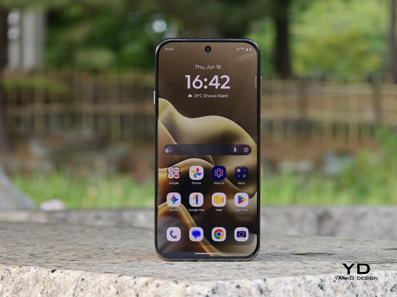
The 6.3-inch display is a big part of what makes the Edge 2026 feel great to use. With a resolution of 1216 x 2640 and a 120Hz refresh rate, the panel looks sharp, vibrant, and smooth, while the smaller size helps the phone feel more manageable without making the screen feel cramped. It also supports 1 billion colors and HDR10+, which gives content a richer and more lively look.

Colors have plenty of punch, and the display is enjoyable for everything from reading to streaming video. Audio is surprisingly rich and loud for such a compact phone, which adds to the overall media experience. Together, the screen and speakers make the Edge 2026 feel more immersive than its size might suggest.


Main Camera, 1x

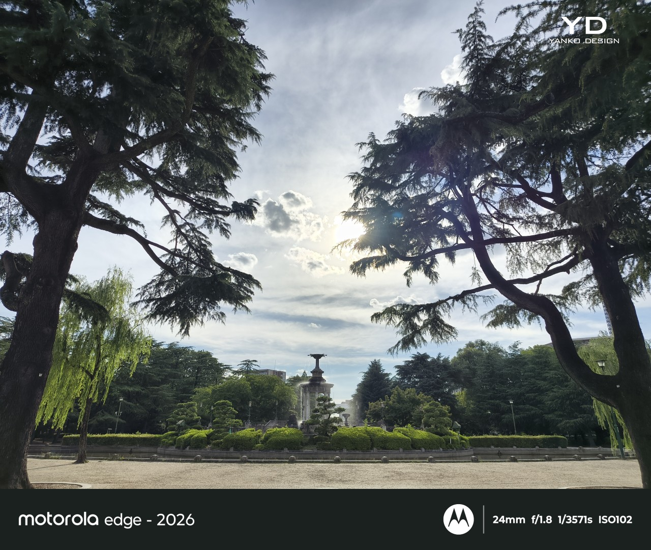
The camera setup seems largely unchanged from its predecessor. The main camera uses a 50MP 1/1.56 inch Sony LYT 710 sensor with an f/1.8 aperture and OIS, while the 10MP telephoto camera offers 3x optical zoom with an f/2.0 aperture and OIS. The LYT 710 should bring modest improvements in light sensitivity and noise reduction over the sensor used in the previous model.

Main Camera, 1x

Main Camera, 2x

Main Camera, 3x

There is also a 50MP ultra-wide camera with a 122-degree field of view and an f/2.0 aperture, and it doubles as the macro camera. On the front, Motorola includes a 50MP selfie camera with an f/1.95 aperture. All cameras can record video at up to 4K at 30fps.

Ultra-wide

It is a well-rounded setup overall, and I was pleasantly surprised by it. It is not on the same level as a true flagship camera system, of course, but I found the color tuning more pleasing in some situations. The main camera handles dynamic range well enough to feel reliable for everyday use.

Main Camera, Portrait Mode (24mm)

Main Camera, Portrait Mode (35mm)

Telephoto Camera, Portrait Mode

The telephoto camera adds some welcome flexibility, even if its limitations become more obvious once you push beyond 3x. The phone automatically switches between the main and telephoto lenses depending on the scene, and while the telephoto camera is not especially detailed, it tends to get exposure right even in difficult lighting. Low light performance is solid too, though the shutter speed can be frustratingly slow even outside of Night mode, which makes it easier to end up with blur if your subject moves or your hand is not perfectly steady.

Telephoto Camera, 3x
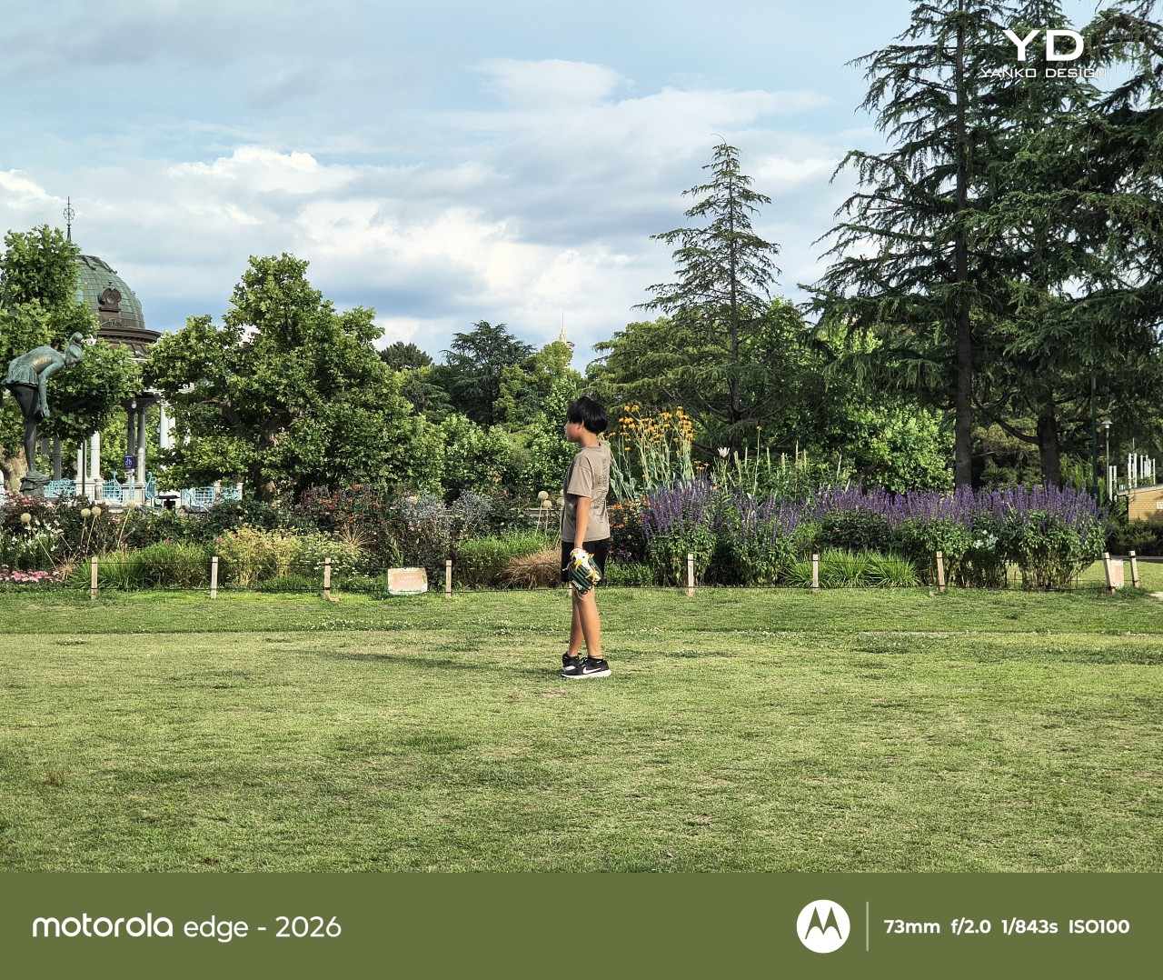
Telephoto Camera, 3x
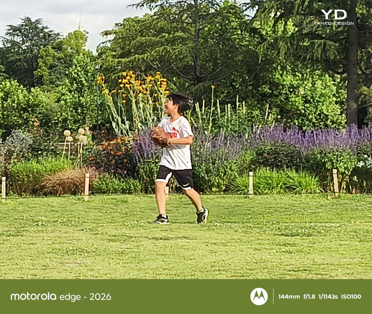
Main Camera, 6x

The battery has been reduced from 5200mAh on the previous model to 5000mAh, which is not especially exciting on paper. Even so, the phone remains efficient enough to last a full day comfortably, and light users may even be able to stretch it into a second day. That fits well with the Edge 2026’s broader focus on comfort and everyday ease.

Charging is solid, too. The 68W wired charging is quick enough to feel genuinely convenient, and 15W wireless charging adds a welcome bit of flexibility. Neither feature is especially headline-grabbing, but together they make the phone easy to live with.
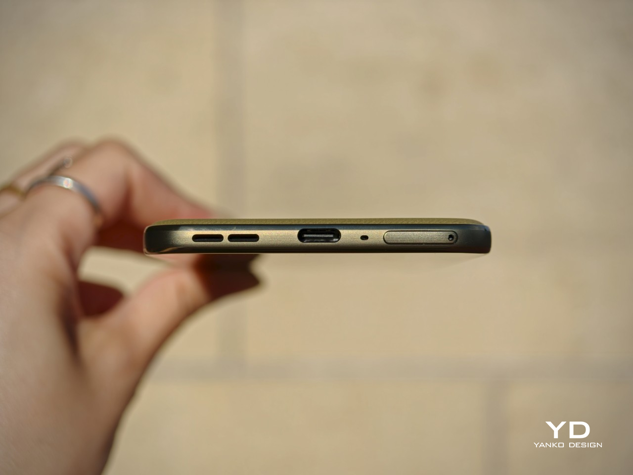
Sustainability

The Motorola Edge 2026 makes a solid case for itself on durability. It is rated IP68 and IP69, uses Corning Gorilla Glass 7i, and also meets MIL-STD-810H standards. Motorola says it is designed to survive drops from up to 1.22 meters and handle extreme temperatures and high humidity.

That toughness helps its long-term appeal. The software support, however, is less impressive. Motorola promises two major OS upgrades and three years of security updates, which falls short of what many rivals now offer at this price.
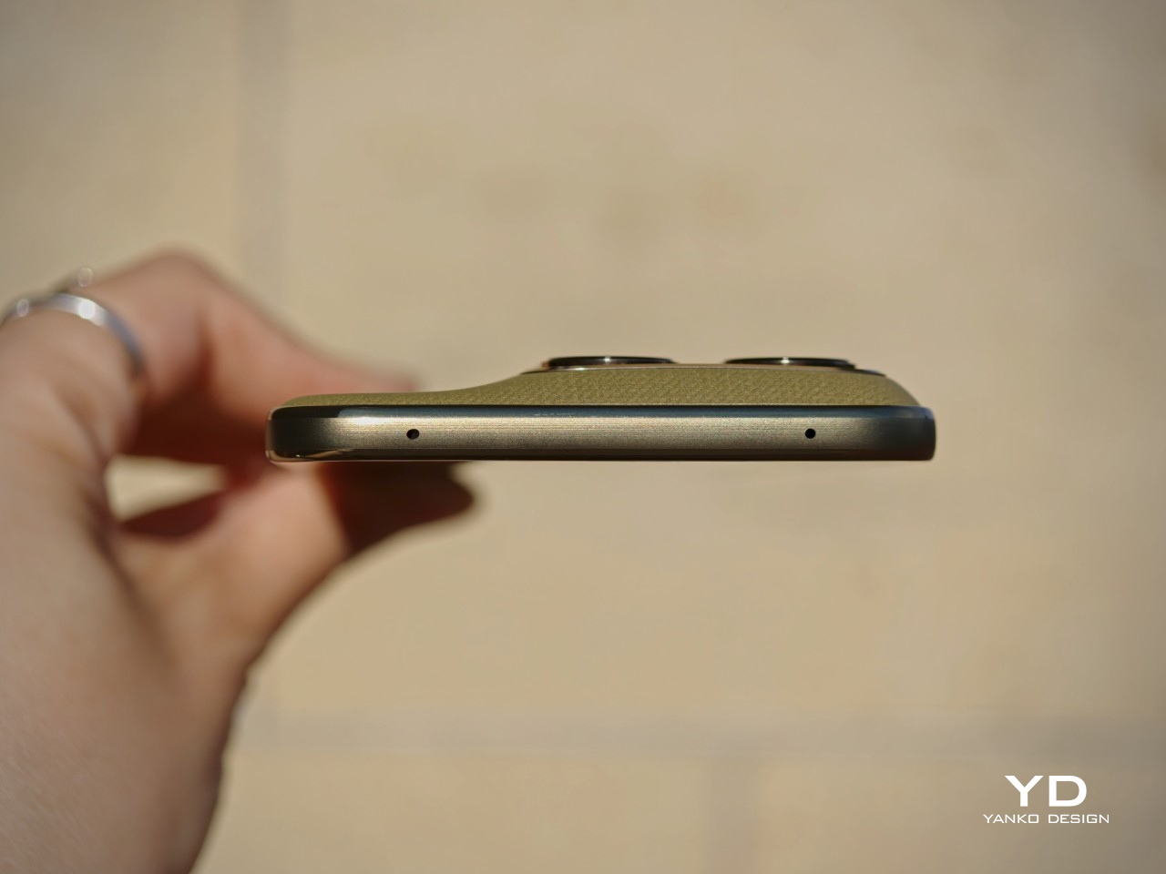
Value

At $599.99, the Motorola Edge 2026 sits in a competitive part of the market, but its value becomes easier to understand once you look beyond the spec sheet. This feels like a phone aimed more at lighter users, especially with 128GB of storage, and its compact form factor is a big part of the appeal. The size, comfort, and ease of use give it an everyday charm that many rivals simply do not have.

That said, value is also shaped by how long a phone is likely to feel current. Motorola only promises two major OS upgrades and three years of security updates, which is not especially generous at this price. If you tend to keep your phone for many years, that shorter support window may matter more, even if the hardware itself feels pleasant and durable enough to last.
Verdict

The Motorola Edge 2026 knows exactly what it wants to be. It prioritizes comfort, portability, and everyday ease, and that gives it a clearer identity than many midrange phones. Its compact form factor is easily one of its best qualities, and for people who want a phone that simply feels great in the hand, it is a strong contender.

That said, it is not without compromise. The 128GB storage feels limiting, the software support is shorter than some rivals, and the performance is solid rather than standout. Still, for the right user, especially someone who values portability and comfort above all else, the Edge 2026 remains an appealing option.
The post Motorola Edge (2026) Review: Beautiful, Brilliant, and an Acquired Taste first appeared on Yanko Design.