
Florida county finds 11 unpermitted Flock cameras with unidentified owners
St. Lucie County thought it had 52 Flock cameras, but found many more that were unaccounted for and unpermitted.

Most statement lighting presents a familiar dilemma. A lamp can give a room personality, but the more attention it demands, the harder it can be to live with everything around it. Furniture starts to feel like a supporting cast. Even the lamp’s glow can seem secondary to its silhouette. Gubi’s reissued Lotus lamp offers a more appealing proposition: a piece with enough presence to change the mood of a room, without making the room feel like a showroom.
Designed by Carlo Nason in 1969, the Lotus lamp belongs to a period when designers were willing to treat lighting as sculpture. Nason’s fluency with glass is central to its appeal, and Gubi’s reissue brings that idea back into view more than half a century later. It is easy to see why the design has returned now. Plenty of contemporary interiors look polished, yet oddly reluctant to have fun. A lamp with a little imagination can do more for them than another carefully chosen neutral.
Designer: Carlo Nason

What makes Lotus interesting to me is the difference between being distinctive and being loud. Its flower-inspired identity gives you a way into the design, but it does not require an entire room to follow the theme. You can appreciate the botanical reference without surrounding it with curved chairs, patterned wallpaper, and a vase of matching flowers. That restraint matters. The best objects leave space for the lives unfolding around them.
Glass also changes how we read a lamp. A metal shade tends to draw a firm outline; glass has a more elusive presence, especially when light enters the picture. It can feel substantial and delicate at once. Nason built a career around exploring what the material could do, and Lotus carries that curiosity into an everyday object. I like the idea of a lamp that rewards a second look when it is switched off, rather than disappearing until evening.


Of course, reissuing a decades-old design invites a fair question: Are we drawn to the lamp itself, or to the comforting idea of owning a piece of design history? Vintage references can become a shortcut to taste. A recognizable date and designer’s name do some of the work that the object should be doing on its own. Lotus earns more attention when you set that pedigree aside and imagine it in an actual home, beside the books you have not put away and the chair you sit in every night.
That is where its value as a design object becomes clearer. A good lamp changes a space twice: once as an object you notice during the day, and again when you turn it on. The Lotus makes a case for treating those experiences as connected rather than choosing one over the other. It asks to be seen, but the point of bringing a lamp home is still to live with its light.
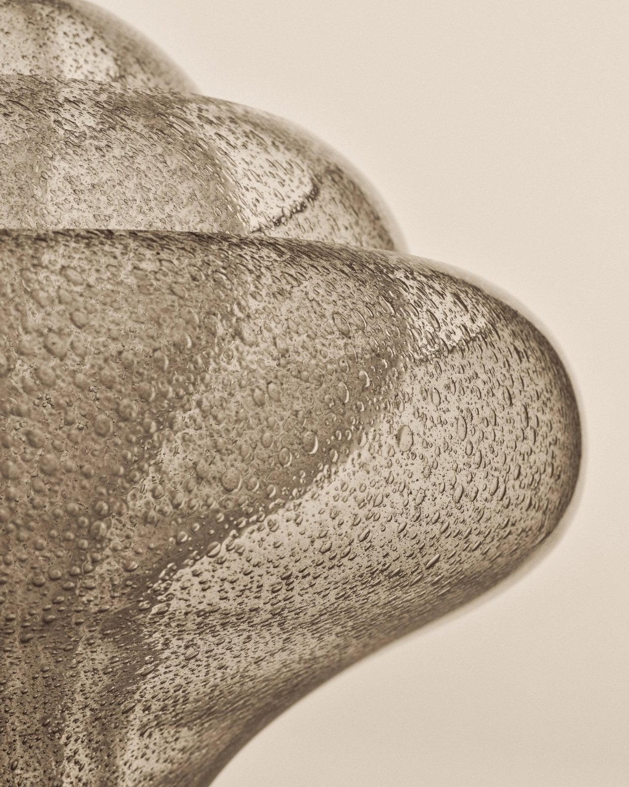
There is a broader reason this reissue feels timely. So much shopping for the home now happens through images that reward instant impact. A dramatic silhouette can stop a scroll, even if it would be exhausting across the room from your couch. The more useful test is slower. Would you want to see it on a rainy Tuesday? Would it still hold your attention once you stopped photographing it? Lotus strikes me as the kind of design that could pass both tests.
It also offers an alternative to the notion that a room has to speak in one consistent style. An older Italian design can sit comfortably among newer pieces if you let it be a point of contrast rather than the start of a complete makeover. That is a more personal approach to decorating. Most homes accumulate meaning over time, through choices made for different reasons and at different moments.

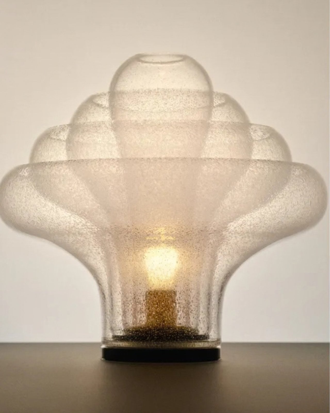
Gubi did not need to invent a new kind of lamp to make lighting feel fresh. Reintroducing Nason’s 1969 design is a reminder that an object can have a strong point of view without turning the rest of your home into a backdrop. For anyone caught between the sensible lamp and the memorable one, Lotus makes a persuasive argument for wanting both.
The post The 1969 Lamp Nobody Knew They Needed Is Back first appeared on Yanko Design.

Anyone who has seen me carry my huge tote bag probably wonders how I can find anything inside it. To be honest, it takes me a few seconds, and sometimes even a few minutes, to dig through the seemingly bottomless pit. The bag is deep, and I tend to carry a lot of stuff. Sure, bag organizers are available, but when I am in a hurry, it is easier to toss everything inside and sort through it later. You could say I sometimes go dumpster diving in my own bag when I need to find something.
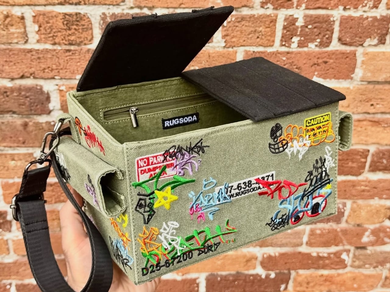
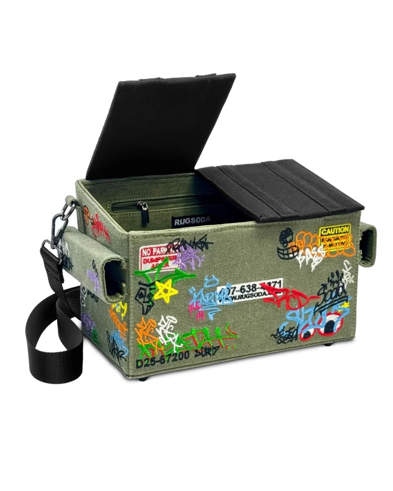
Rugsoda takes that idea literally with its unusual Dumpster Bag. The canvas shoulder bag is shaped like a miniature commercial dumpster, the kind you might see behind a restaurant, apartment building, or other business. Instead of holding garbage, however, it is designed to carry your everyday essentials. Its squared-off shape gives it a more structured appearance than a typical tote bag, while its relatively compact size makes it easier to search for your phone, wallet, keys, or other small items.
Designer: Rugsoda

The Dumpster Bag is indeed designed for everyday use, but it also functions as a fashionable and sculptural conversation piece. Its recognizable three-dimensional form transforms an object associated with clutter, waste, and urban back alleys into a wearable accessory. The design is especially eye-catching because it does not simply feature a printed dumpster graphic. The entire bag is constructed to resemble one, complete with flip-up lids, a boxy profile, and urban-inspired embroidered graffiti.
That graffiti treatment gives the bag a street-art sensibility and connects it to the real-world objects that inspired it. It also adds texture and visual interest to the canvas surface. The embroidery helps the design feel more like a crafted art piece than a novelty costume accessory, while the dumpster shape keeps its sense of humor intact. The flip-up lids feature magnetic closures that help keep your belongings secure while reinforcing the dumpster illusion. The magnetic fastening also allows for quick access when you need to reach inside. An adjustable shoulder strap gives you the option of carrying the bag over one shoulder or across your body, depending on how you want to wear it.

Several smaller details make the design even more enjoyable. Inside the bag, an embroidered raccoon serves as a hidden surprise, referencing the animals often associated with rummaging through trash. The bottom studs are more than decorative accents, too. They help keep the canvas base slightly elevated when you place the bag on a flat surface, which can reduce direct contact between the bottom of the bag and the ground.
Although the Dumpster Bag has a firm, boxy silhouette, its canvas construction gives it a softer, more tactile quality. The material keeps the bag from feeling like a rigid plastic container and contributes to its casual, handmade character. The canvas may also allow the shape to relax or lose some structure if the bag is heavily loaded, so it is better suited to everyday essentials than to carrying a large amount of gear.
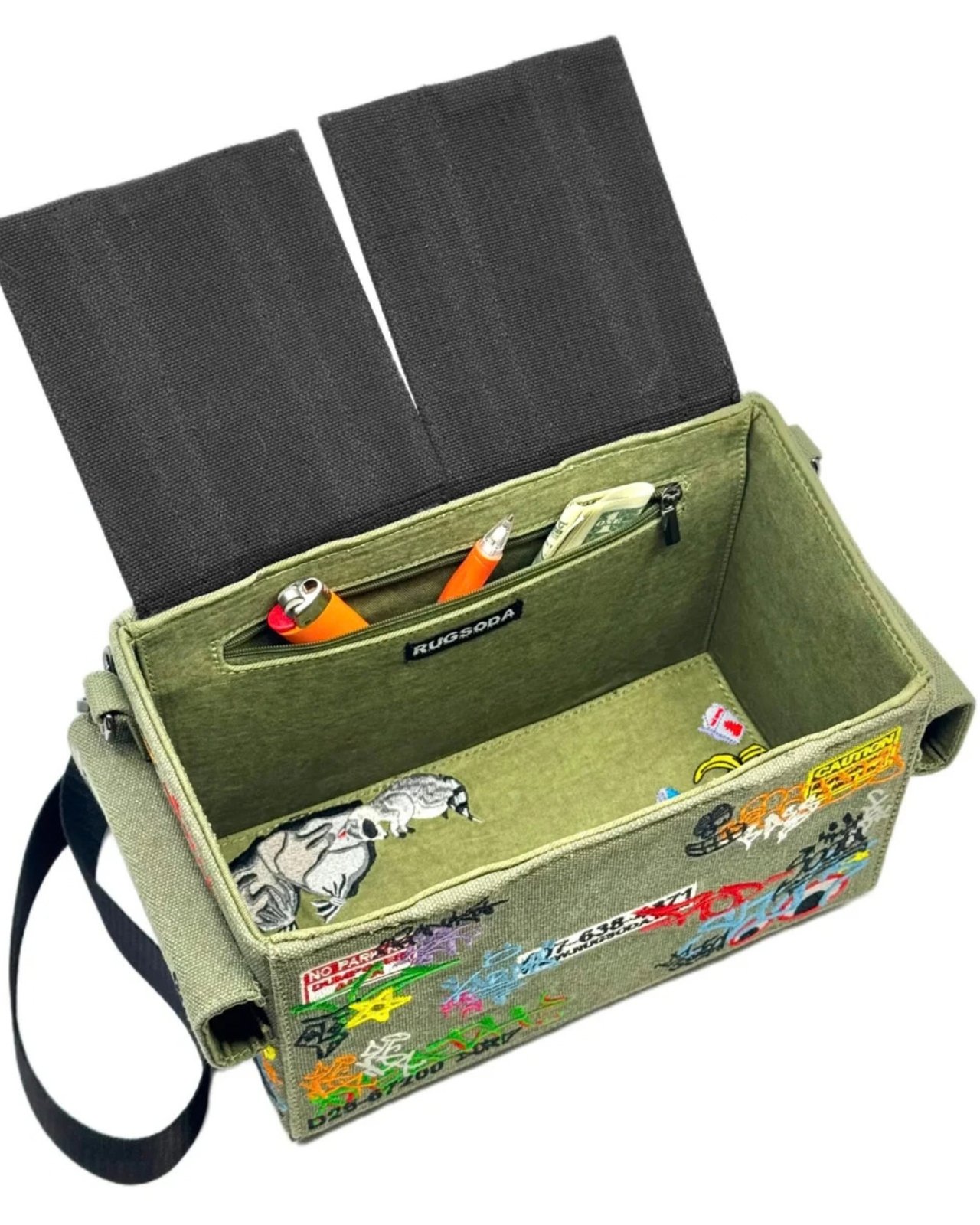


Measuring 12 by 7 by 6 inches, the bag is compact enough for daily use while offering more room than a tiny evening bag. That size should accommodate items such as a smartphone, wallet, keys, sunglasses, cosmetics, and other small necessities. It is not intended to replace a roomy tote or a practical work bag, but it can be a useful alternative for people who want to carry less without sacrificing personality.
Rugsoda’s Dumpster Bag is also part of a broader design approach that turns familiar objects into functional textile pieces. The designer has created other bags inspired by playful, everyday forms, including dice and spray-paint cans. In each case, the object’s identity is preserved through its shape rather than reduced to a surface pattern.


Dumpsters are not usually considered glamorous objects, which is precisely what makes this bag such an entertaining fashion statement. It takes something associated with waste and gives it a new purpose as a wearable accessory. The result is a bag that offers practical storage, a memorable silhouette, and plenty of opportunities for conversation. For anyone tired of carrying a shapeless tote or looking for an accessory that does more than blend into an outfit, the Dumpster Bag offers a literal alternative to the usual carryall.
The post Nobody Expected a Dumpster to Be the Coolest Bag first appeared on Yanko Design.


Imagine sitting at a table with friends and whipping your phone out. Your friends see it’s a foldable… then as you unfold it, the animation looks suspiciously like the iPhone Duo. Your friends are impressed, they designate you as the group photo taker… and you tell them regrettably that your iPhone Duo has no cameras. Then you add… not only does it not sport any cameras, it also costs fourteen grand.
To be honest, that scenario is entirely imaginary. Mainly for a bunch of key reasons. Caviar built this version of the iPhone Duo for privacy, championing what they call “Privacy, Minimalism, and a Refined Masculine Style.” Someone who sees truth in that ethos isn’t designated photographer material. And if they were, shelling 14k on a phone means you probably have a few extra grand to hire a photographer wherever you go. The only reason someone buys this hare-brained version of the iPhone Duo is because they can. Plain and simple.
Designer: Caviar Global
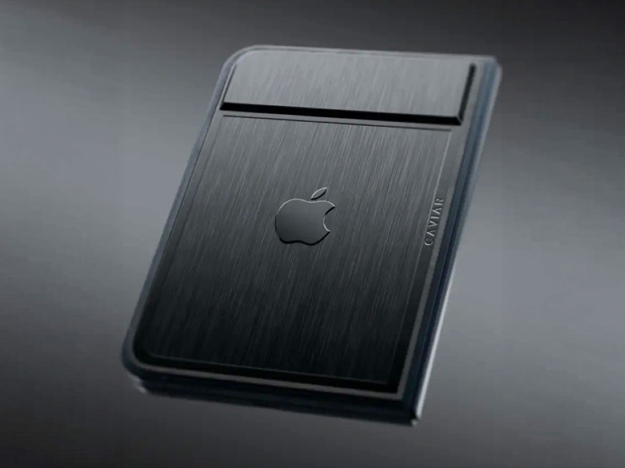
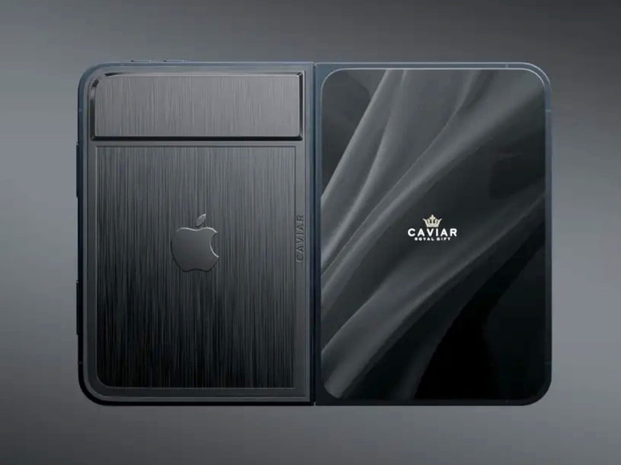
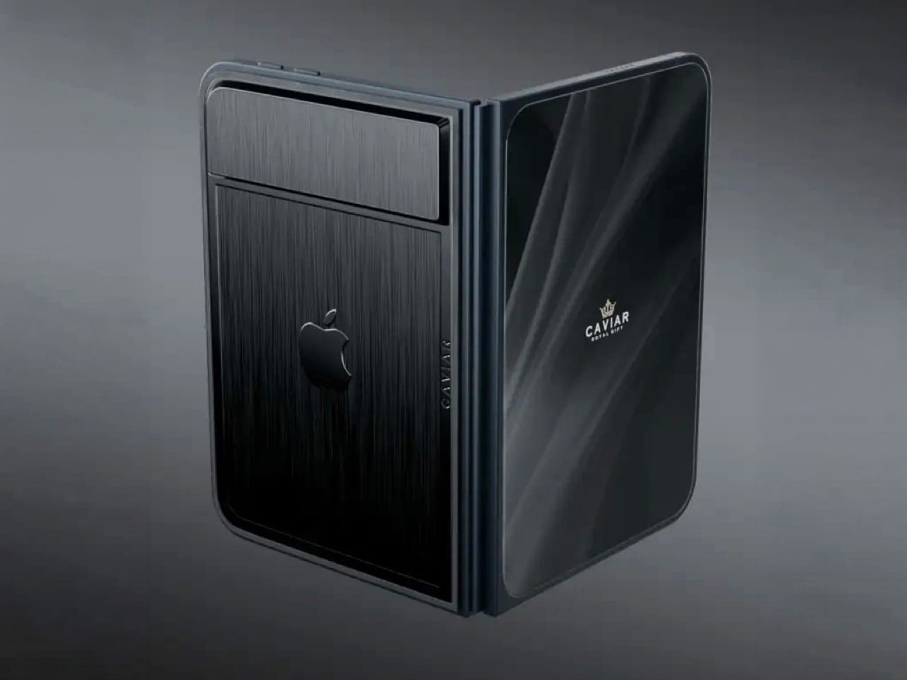
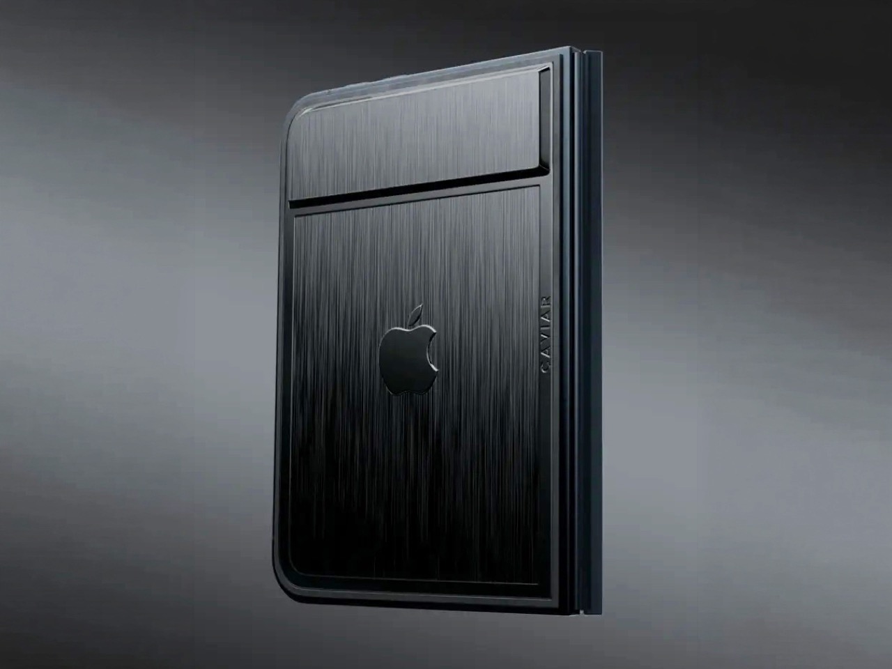
Removing the camera stack from the back of the iPhone Duo does something unexpected: the phone becomes genuinely beautiful. That rear panel, normally dominated by the triple-lens module, turns into a single flat sheet of satin-finished black titanium. No bumps, no rings, no glass circles competing for visual real estate, just one uninterrupted surface that shifts character depending on the light hitting it. Caviar calls the inspiration “supersonic aviation aesthetics,” which sounds like marketing speak until you actually look at the product photos. A blacked-out Apple logo sits flush in the titanium, the Caviar crown marks the opposite panel in a swept fabric-like texture, and the whole thing looks less like a phone and more like a prop from a very expensive spy film.
Apple’s decision to use Touch ID for the iPhone Duo, abandoning Face ID, turns out to be what makes Caviar’s camera-free execution actually hold up. A Face ID phone needs its front camera array to function as a biometric sensor, so pulling that out would mean a very pretty device that cannot unlock. Touch ID lives in the frame rather than behind the screen, so Caviar could strip the entire camera stack, front hole-punch and rear module both, without breaking anything fundamental. Based on product images, the inner display on the Ultimate appears completely clean, no hole-punch interrupting the screen, which makes the inside as seamless as the outside. Two separate design decisions from two separate companies ended up fitting together better than either could have planned.
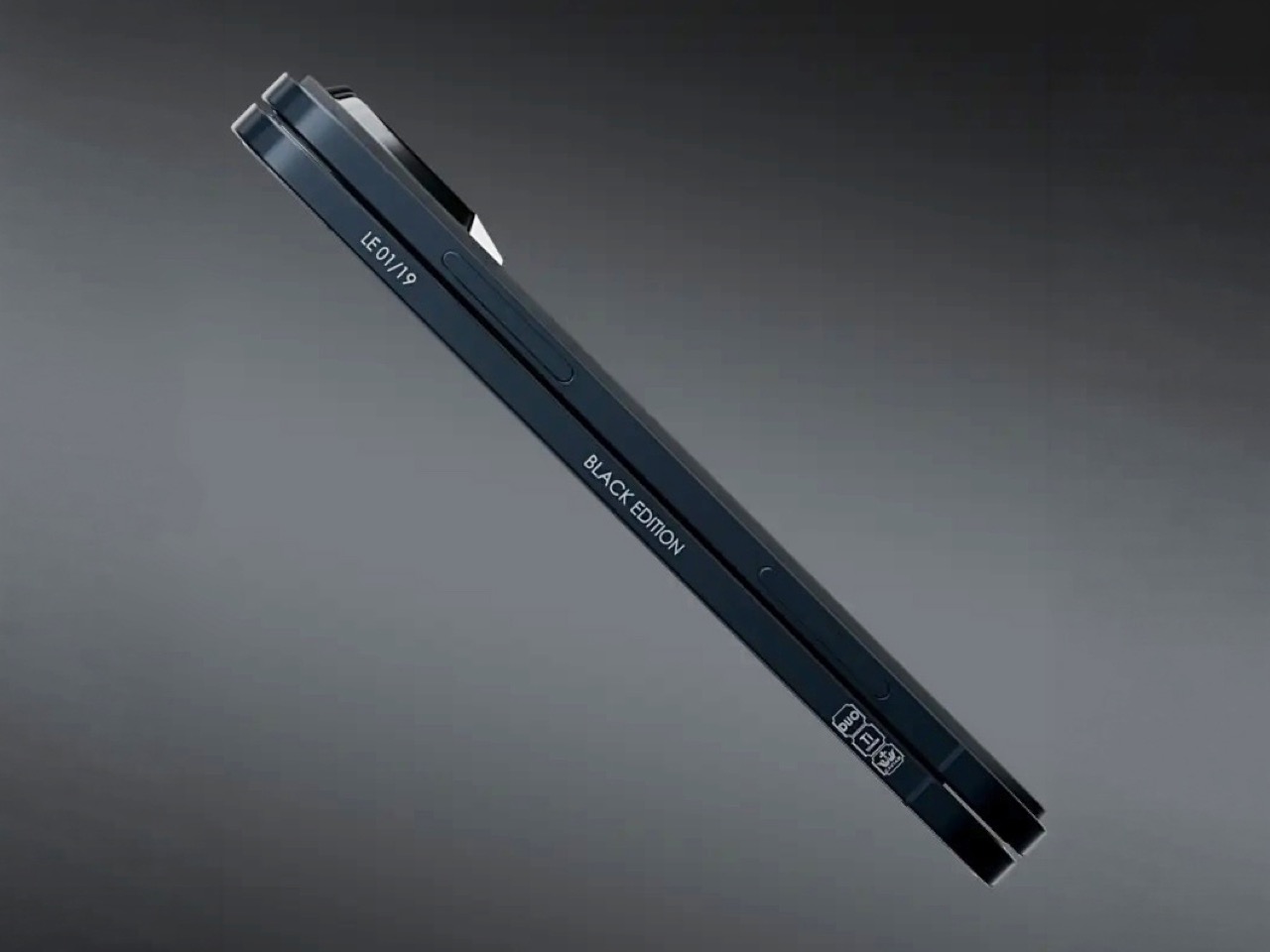
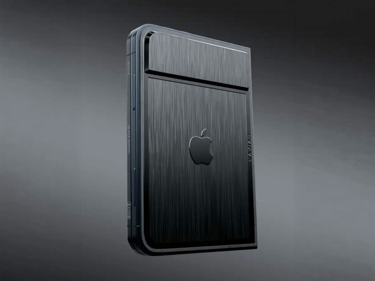
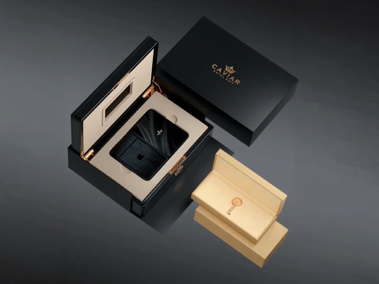
Caviar made 19 of these total. Each unit ships in a custom lockable black luxury box, presented the way a jeweler presents a watch rather than the way Apple ships a phone. A smaller gold-colored wooden case inside holds what appears to be a gold-plated commemorative coin, the kind of object that exists purely to make the unboxing feel like a ceremony. The side of the phone is engraved with a serial number too, for exclusivity. Caviar knows exactly who they are selling to, and made sure the packaging matches the energy.
Caviar has been doing this for years, taking flagship Apple hardware somewhere Apple would never go, for clients who appreciate the gesture. The formula is consistent: start with the most premium Apple product on the market, make it rarer, make it more dramatic, and let the price be the final statement. We have covered their gold-plated and titanium iPhone builds here before, and none of them committed this hard to stripping features as a form of self-expression. At $13,990 for 19 units (mind you, that’s just the 512GB variant), the Ultimate is the purest version of the Caviar argument: a phone that costs seven times its base price because it does less, and somehow makes that sound like the point.

The post Would you pay $14,000 for an iPhone Duo without any cameras? first appeared on Yanko Design.
Design Mindset, Yanko Design’s weekly podcast, premieres every week with a new guest and a single animating question: what does it actually take to think differently about a design problem. The show is 23 episodes in, and this episode turns its attention to fine watchmaking via someone who arrived in the industry with no allegiance to its conventions. If a mechanical watch didn’t exist today, and a designer received the brief cold, would they give it hands, a crown, a flat dial? That question opens the conversation and also describes exactly what our guest spent 16 years answering in practice. The result is Ressence, a brand whose watches look like nothing else on the wrist.
Benoît Mintiens is a Belgian industrial designer who, before he ever touched a watch, designed high-speed trains, aircraft cabins, medical devices, leather goods, and even hunting guns. He founded Ressence in 2010, the name a contraction of Renaissance of the Essentials. The Type Three BB2 won the 2024 Red Dot Award Best of Best, and 2026 brought the same recognition to the TMN. His watches are designed in Antwerp, made in Switzerland, produced in limited editions each year, and worn by people who believe the future is brighter than the past. He is a designer who walked into one of the world’s most convention-bound industries and simply refused to accept what he found there.
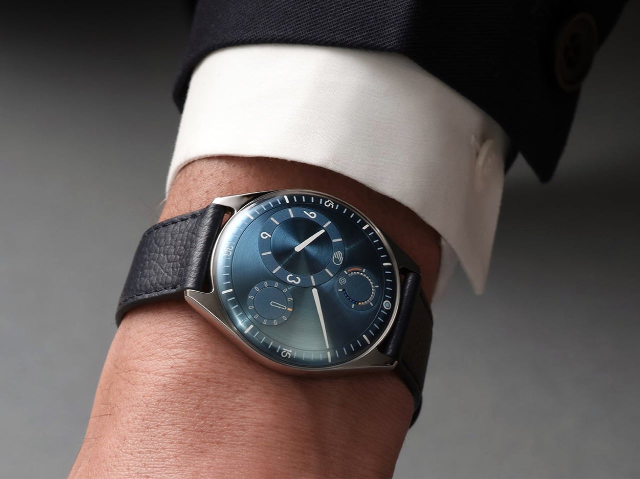
When people ask Benoît how he designs a watch, the answer he gives is never the one they expect, because he starts with the relation between the user and the watch rather than with the movement itself. “Usually I start not with the watch. I start with the relation between you and the watch, and that is, I think, a very important step that very often is forgotten.” Most brands were created by watchmakers who always build from the inside out, from the movement to the wearer. As a designer, Benoît works in the opposite direction, from the user inward to the movement. That physical 180-degree reversal of process changes everything about what a watch ends up looking and feeling like.
Designing the relationship is, in Benoît’s view, fundamentally an ergonomic exercise, rooted in a deep study of physiology and how people interact with objects. The ultimate measure of success is disappearance: “The best product is the one you forget when you use it. Invisible. I’m using it, but I’m not even aware of it.” He tells customers who buy a Ressence that he hopes they forget quickly that they are wearing it, and that forgetting is the proof the design worked. In the rapid-fire round, he completes the sentence “the future belongs to designers who stop asking how to make things and start asking” with five words: “How do you want to feel.” That question is where every Ressence begins.

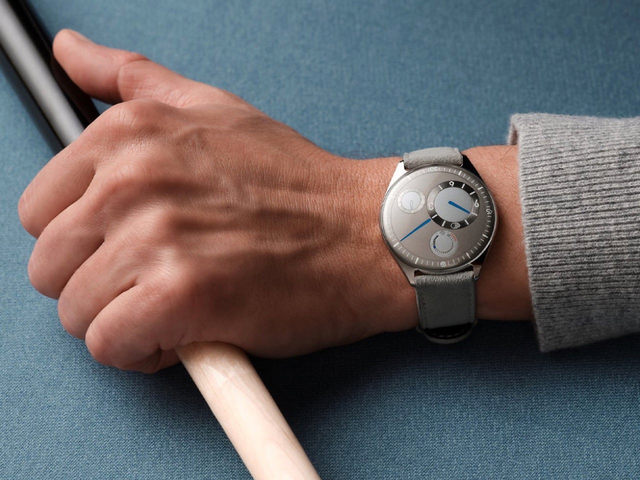
Until the quartz crisis of the 1970s, watchmaking was about precision, quality, and reliability. When quartz movements arrived at a fraction of the cost of mechanical ones, the industry had to reinvent itself to survive. “Watchmaking has found a way to survive by adding this emotional layer on top of their brands, on top of their physical products. It’s not so much about the physical product anymore. And that’s a pity, I think, as a designer.” Any product, Benoît argues, needs to pass through the survival-of-the-fittest logic of natural evolution to reach the next generation. Watchmaking’s functional evolution largely stopped at the quartz crossroads, and Ressence is attempting to pick it up from there.
A product is defined by multiple dimensions: aesthetics, ergonomics, technique, social context, and production. In watchmaking, only the aesthetic dimension has shifted from brand to brand, and the underlying system architecture has been frozen for two hundred years. Ressence repositions every dimension at once. “The way we show the time, the ergonomics, is actually what defines the aesthetics. Is actually the way we make them. Is actually the technique that lies behind. All these things are intertwined, and they all together create what I call this new paradigm.” The whole has to be logical and coherent, or as Benoît puts it, you end up with a Frankenstein.
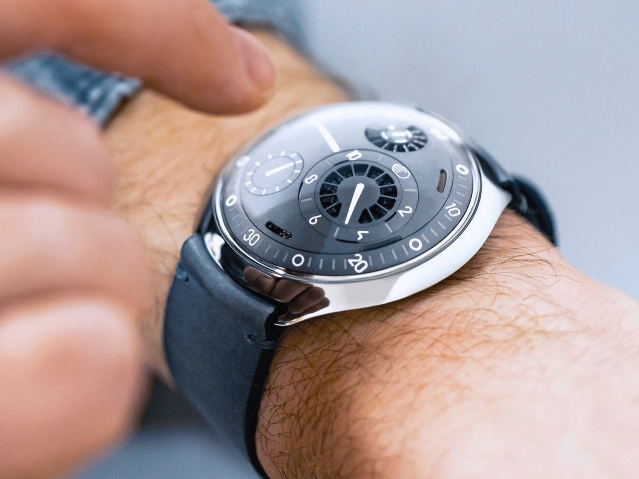
Asked why people still choose to wear mechanical watches when a phone tells time more accurately and without winding, Benoît offers a concept he has been developing for years. “I call it the empathy for gears. We have, as humans, we have empathy for gears.” He builds toward the idea through a Titanic thought experiment: a survivor on floating debris must choose which of two strangers in the water to save, the one he spoke with during the voyage, or the one whose language he could never understand. “As a human, you pick the one you have a relation with.” Products operate by the same logic, and we form bonds most naturally with what we can understand and relate to.
A circuit board is opaque; the workings of a mechanical watch are graspable, even to someone with no technical knowledge. “That is the magic of mechanical watches, is that we feel close to them. Let’s not forget, they tick, they make a sound. They need care. You need to wind them. All these elements will generate a bond between you and the product. And that is why I’m a strong believer in mechanical watches.” Each quality that makes a mechanical watch demanding, the winding, the servicing, the ticking, deepens the relationship between wearer and object. That depth of feeling, Benoît argues, is a human need, and it deserves to be designed for.
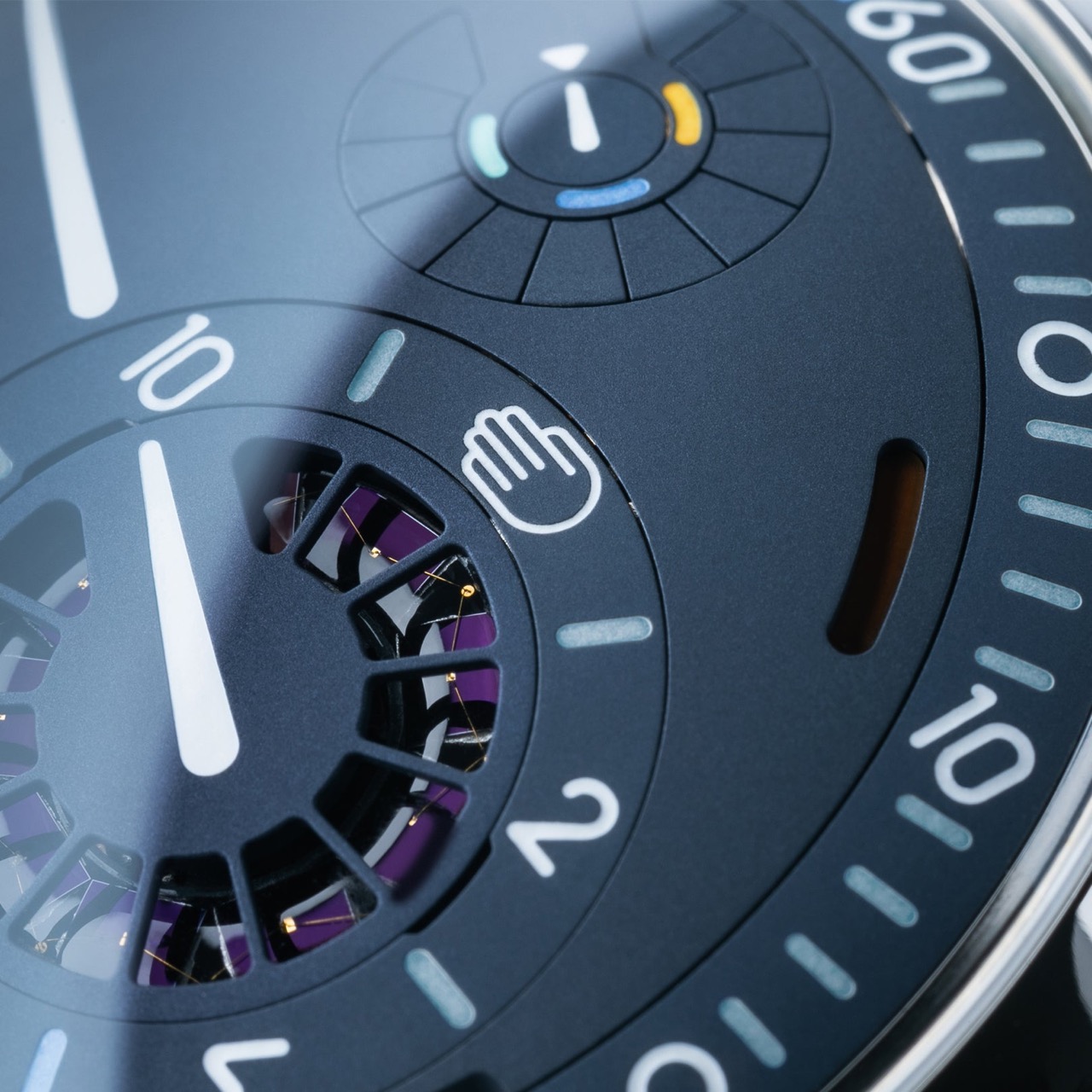
Ressence positions itself as a high-end brand, with Benoît drawing a specific distinction between high-end and luxury. Luxury is decorative and emotional, selling prestige and story; high-end means technically and functionally sophisticated, in service of the person using it. “We would believe that a product gets its relevance, its reason of existence, through the way or the quality the product is executing its function.” The most visible outcome of that philosophy is the Ressence Orbital Convex System, or ROCS, which replaces traditional hands with rotating discs requiring approximately 200 components where a standard watch uses four. The design brief Benoît imposed on himself back in 2008, years before the brand existed, made the mandate clear from the start: “Ressence needs to be original, but not marginal.”
The oil-filled dial, defining models from the Type 3 to the Type 7, has an origin in personal memory. Benoît traces it to childhood Mediterranean sailing trips, navigating overnight to Corsica guided only by an oil-filled ship’s compass in the days before GPS. “This image of the compass, an oil-filled system with inside a mechanical thing that turns around, showing the north. I’m pretty sure this has been the thing that has burned in my brains, and I believe the idea of the Type Three must have come from there.” Oil inside the Type 5 diver eliminates refractions between oil, sapphire, water, and dive mask, delivering a clear dial at any depth. The functional improvement is exactly the point: a diver watch you can actually read underwater.
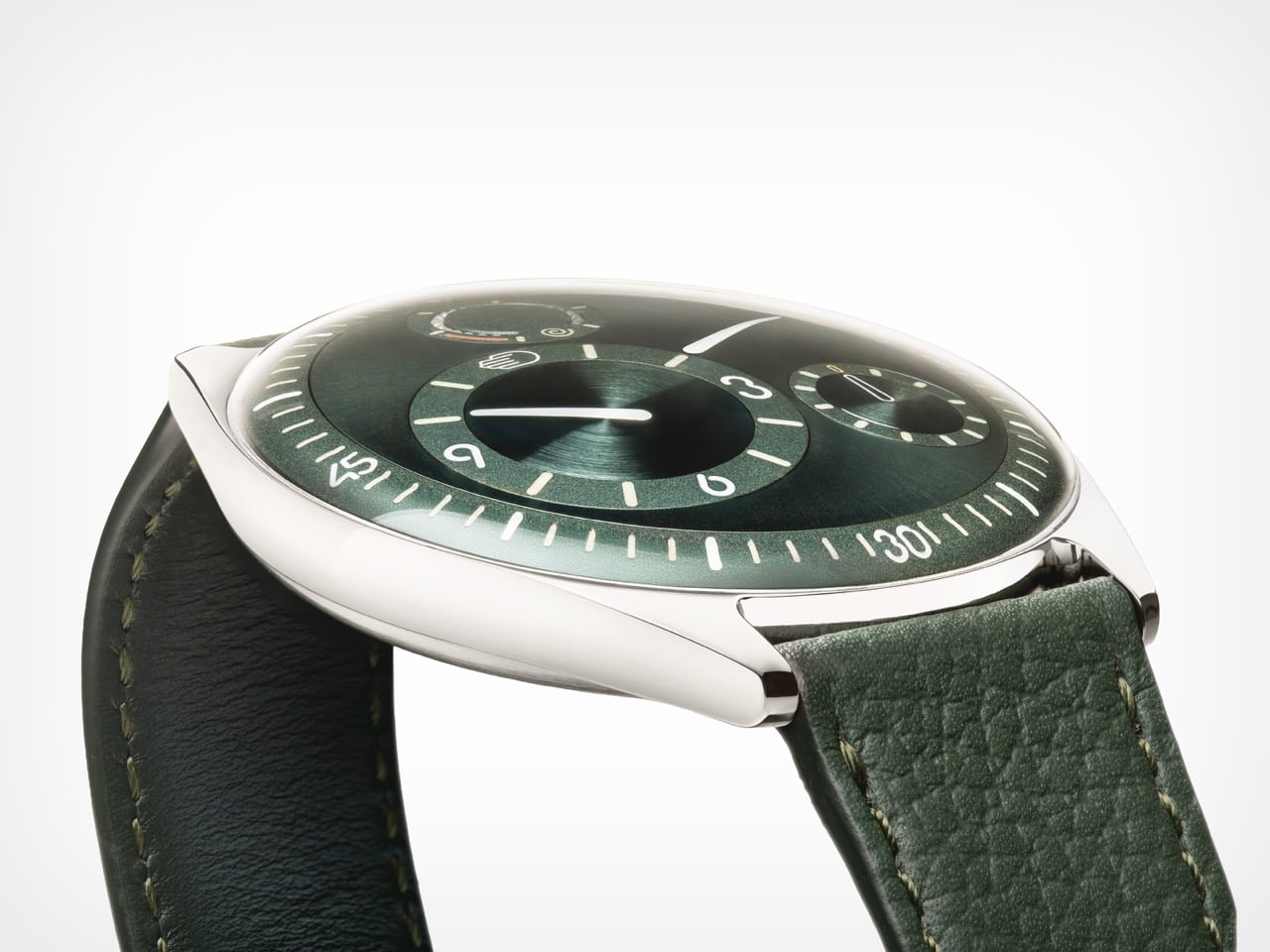
Getting enough watches from suppliers is, after 16 years of operation, still the hardest thing Ressence faces as an organization. A single watch contains around 400 custom-made parts at extreme precision tolerances, and the Ressence dial is curved in three dimensions where almost every other watch is flat, requiring five-axis machining. Some parts pass through twelve different specialized companies before reaching a watchmaker’s desk. “If today I need more watches and I order them, I will only have them in between nine months and two years. There is no industry like that.” Those lead times explain the prices, the waiting, and the limited annual runs; the scarcity is structural, a consequence of producing something this technically complex as an independent brand.
Benoît is clear-eyed about products and unhurried about brand moving forward. Ressence has a product plan mapped for the next eight years, but brand recognition is the harder work and cannot be forced. “Stick to your vision, and move on and be coherent. I think that’s the central thing.” The reference brands held up as aspirational in watchmaking took fifty years to reach that position, and it was a consequence of what they did, not something they actively pursued. On materials, Benoît describes a fascination with mammoth ivory recovered from Siberia, finding its structure “very, very, very beautiful.” Ressence can be found at ressencewatches.com, on Instagram, and in Antwerp, where visitors are always welcome.
The post Ressence Doesn’t Want Your Watch to Look Like a Watch first appeared on Yanko Design.