This Minimalist Bamboo Coffee Table Hides Everyday Clutter in Plain Sight

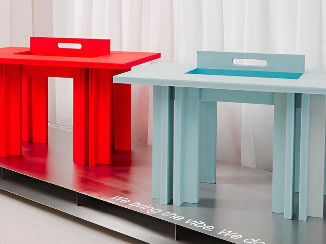
A coffee table usually has a fairly straightforward job: hold a cup of coffee, a few books, and whatever else happens to accumulate in the living room. But what if it could accommodate everyday clutter without putting any of it on display? Designed by Marek Kounovský of MK Designers in collaboration with Prague-based furniture company Frayer, the Handle Table takes this familiar piece of furniture and gives it a more considered purpose. Made primarily from bamboo, the table incorporates concealed storage, an integrated handle, and a restrained silhouette that allows its material and construction to take center stage.

The design takes inspiration from the Japanese principle of hodo-hodo, which loosely translates to the idea of “just enough.” Rooted in moderation and balance, the philosophy encourages appreciating things that serve their purpose without excess. Kounovský translates this thinking into furniture by reducing the table to its essential elements. Rather than introducing elaborate mechanisms or decorative features, he focuses on proportion, geometry, and the relationship between form and function. Every visible detail has a reason to exist, and the absence of unnecessary embellishment gives the table its distinct character.

Designer: MK Designers
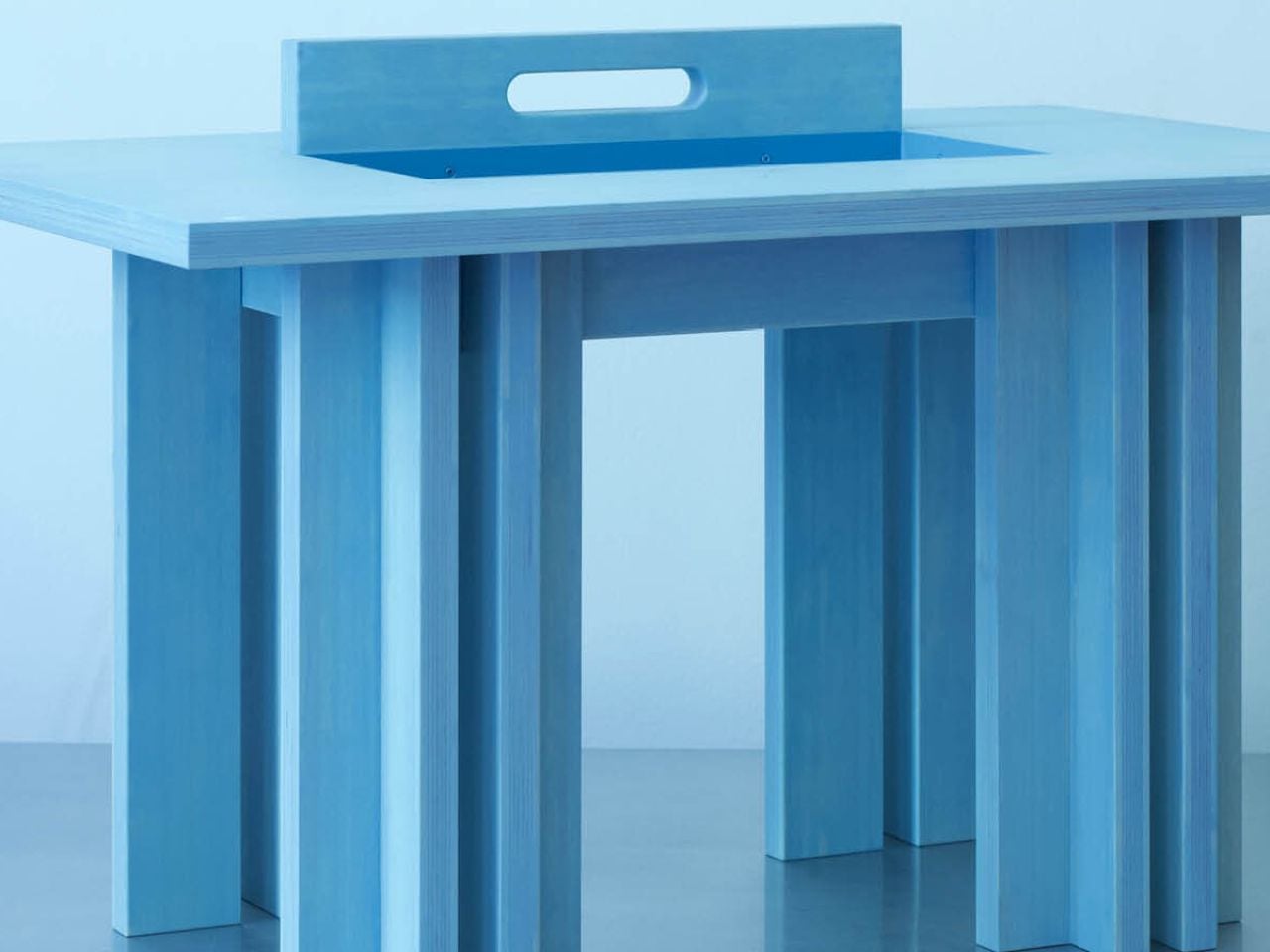
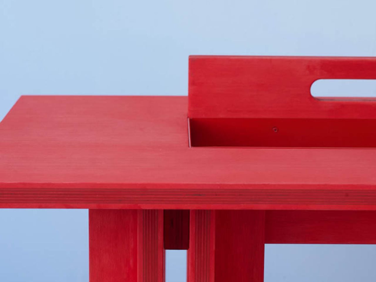
One of its most interesting features is the concealed storage compartment, which is incorporated directly into the table’s geometry. Coffee tables often become gathering places for remote controls, magazines, chargers, and other small objects that are useful to have nearby but can quickly make a room feel cluttered. Handle Table addresses this familiar situation by providing a dedicated space for everyday belongings while preserving its clean exterior. The compartment remains visually discreet, allowing the table to maintain its sculptural appearance even as it performs an additional function.

The integrated handle is another subtle yet important element of the design. Rather than appearing as a separate attachment, it is incorporated into the tabletop itself, creating a functional feature that feels consistent with the overall composition. This detail makes the table easier to move and reposition, an especially relevant consideration for contemporary interiors where furniture frequently accommodates different activities throughout the day. The table can shift between spaces and arrangements without demanding a permanent position, extending its usefulness beyond that of a conventional stationary coffee table.
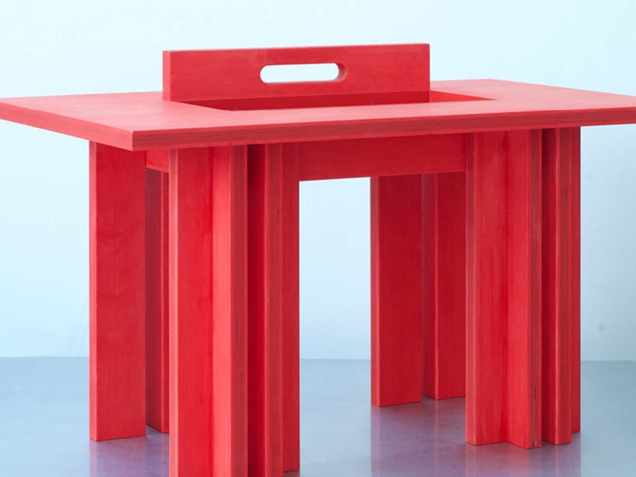
Material selection plays an equally significant role in the project. Bamboo forms the main structure, bringing its recognizable grain and natural texture into the otherwise reduced design. The surface is treated with an oil-based wood stain, developed through experimentation with application techniques suited specifically to bamboo. Instead of concealing the material beneath an opaque coating, the finish emphasizes its inherent structure and tactile qualities. The resulting surface gives the table a sense of depth while retaining the character of the bamboo itself.

This attention to finishing is particularly important in a design with so few visual elements. Without decorative distractions, the material becomes one of the primary ways the object communicates its identity. The stained bamboo, precise construction, and carefully controlled proportions work together to create visual interest through restraint. Even the concealed compartment contributes to this approach, demonstrating how practical considerations can become part of the furniture’s fundamental structure rather than additions made after the form has been established.
First presented at the 14th Czech Design Week international design festival in Prague, Handle Table reflects the collaboration between Kounovský’s design practice and Frayer’s approach to bamboo furniture. The project brings together an interest in thoughtful material treatment and an understanding of how furniture participates in everyday routines. Its simplicity is the result of deliberate decisions about what to include, what to conceal, and what can be left out altogether.

There is something appealing about furniture that makes room for the realities of daily life without constantly drawing attention to its cleverness. Handle Table does not attempt to reinvent the coffee table through an abundance of features. Instead, it refines the familiar object through a few carefully integrated gestures. The storage keeps essentials close, the handle makes movement easier, and the bamboo brings warmth and texture to its compact form. In a category where additional features are often presented as improvements, Kounovský offers a different proposition: perhaps a well-designed object needs only enough to do its job beautifully.

The post This Minimalist Bamboo Coffee Table Hides Everyday Clutter in Plain Sight first appeared on Yanko Design.


This pixel-covered MINI concept makes the Hyundai Ioniq 5 look subtle

Hyundai got everybody talking about pixels in 2019, when the 45 EV Concept showed up in Frankfurt with square-cut lights, and the Ioniq 5 carried the idea to showrooms in 2021. Hyundai even named the look Parametric Pixel and spread it across the headlights, taillights, and wheels. It was a smart move, and it gave the Ioniq 5 a face you could pick out of a parking lot from across the street. Still, Hyundai used pixels like a seasoning, a sprinkle here and a dash there. Somebody was bound to dump the whole shaker.

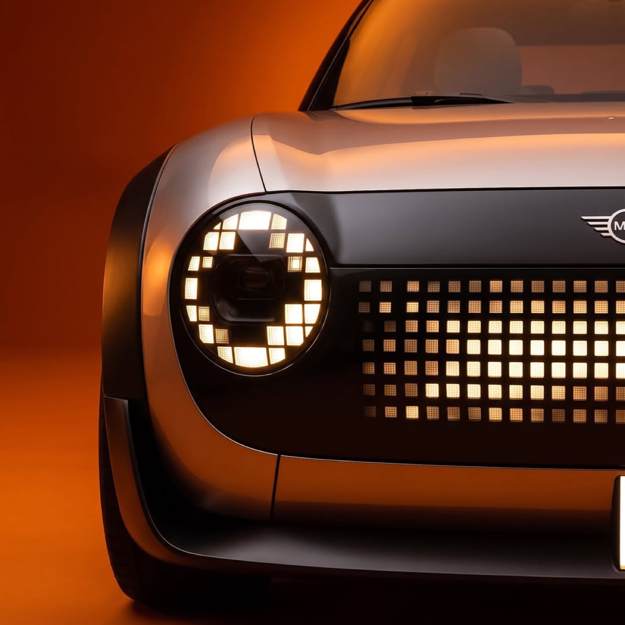
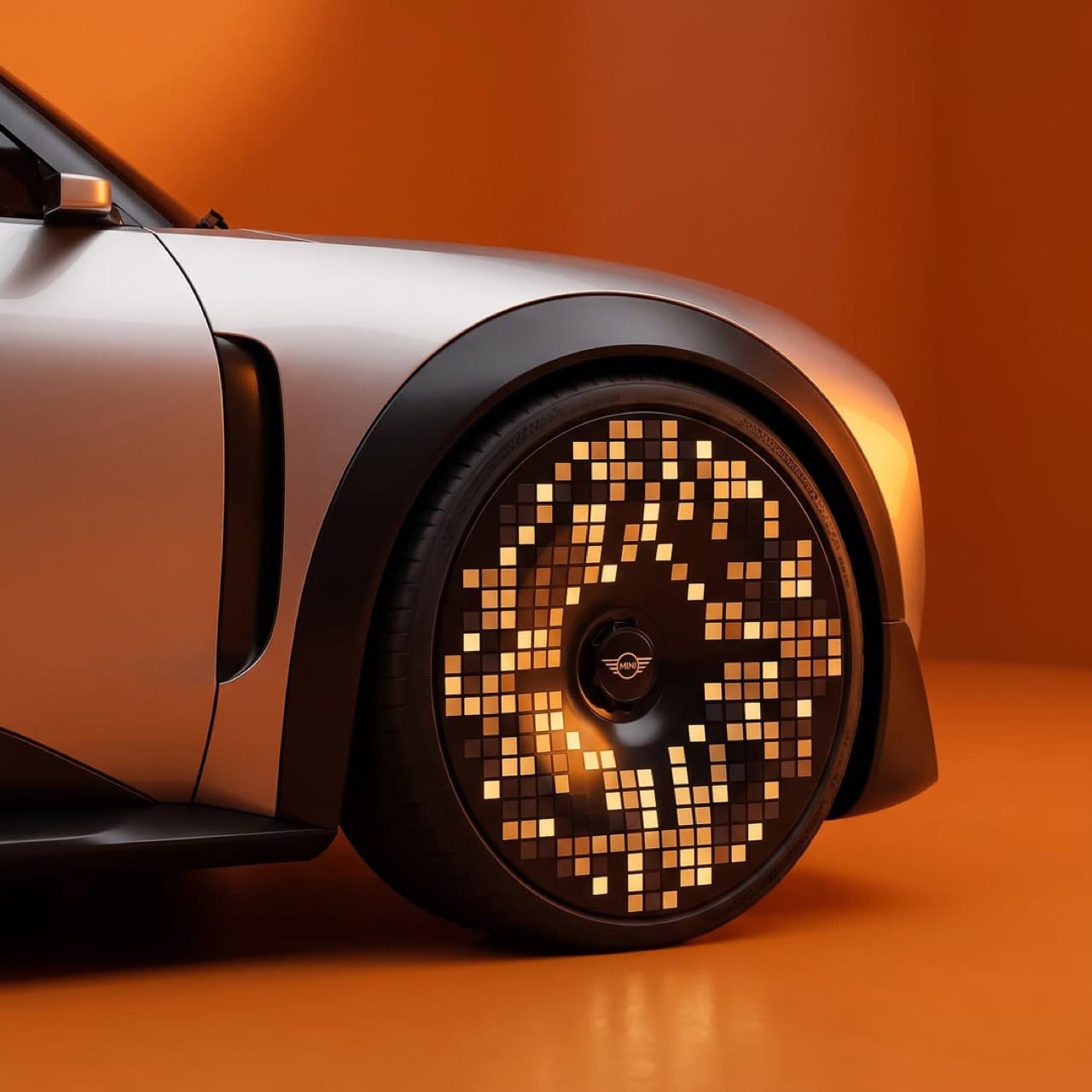
That somebody is Uygar, a Turkey-based designer who calls himself a professional daydreamer, and the shaker is a MINI. The headlights keep MINI’s round shape but fill the rings with squares, a dot-matrix grille owns the nose, and each wheel is a glowing mosaic disc. The Union Jack taillights are rebuilt out of red pixels, a nod to the flag lamps from MINI’s 2018 facelift. It’s a long-roof five-door with stubby overhangs, a dark roof, and satin champagne-silver paint, so the pixels do the talking. I tried counting the squares on one wheel and gave up when my coffee went cold.

Designer: Uygar (uygarspots)

Round headlights, square pixels, and a grille that glows

MINI’s round headlight is the closest thing the brand has to a signature, so Uygar leaves the circle alone and changes what it is made of. Each ring becomes a loop of little squares wrapped around a dark projector lens, like a digital eye with a very serious pupil. Below it, the closed grille is a dot-matrix field that glows brightest at the center and fades toward the edges. A thin vertical light bar drops from the bumper like a tiny exclamation mark. From a block away the face looks friendly, and up close you can count the grid.

Hyundai keeps its pixels inside the lamps, so the Ioniq 5 still reads as a car with a few digital accents. Here the whole nose becomes one display, so the face reads as a single graphic. That suits a brand whose cars have worn a cheeky expression since Alec Issigonis’s original Mini arrived in 1959. The production Cooper EV already lets owners pick from three light signatures, so a face that changes mood is hardly a leap. This one has far more dots to play with, and I suspect it would be a menace at red lights.

The wheels and taillights carry the pixel jewelry

The wheels are where the idea gets silly in the best way. Each one is a full disc covered in amber squares, arranged in a swirl that thins out toward the rim and bunches up around the MINI wings at the hub. Some squares glow bright while others sit nearly dark, so the whole disc looks caught mid-sparkle. Hyundai’s pixel wheels ask you to read the pattern in the metal, and these ask you to read it in light. Park one at night and you have a disco ball on each corner, minus the awkward dance lessons.

The rear is the cleanest trick in the set. A black glass band spans the tailgate and holds two Union Jack lamps built from red dots, with the MINI wings sitting between them. MINI introduced flag-style taillights in 2018, using the turn signals for the horizontal bars and the brake lights for the vertical ones. Then the 2022 Aceman concept drew a Union Jack across its grille in matrix LEDs. This render finishes the thought by building the flag from pixels, which is where a flag made of light was always headed.

MINI already flirted with pixels, and this is the follow-through

MINI did not wander into this blind. The Aceman concept appeared in July 2022 and made its first public showing at Gamescom in Cologne, which tells you exactly who the brand was flirting with. Its matrix LED headlights and grille drew Lite-Brite comparisons, a nod to the glowing peg toy Hasbro launched in 1967, and the right headlamp could even wink. The Cooper EV that followed took a calmer path, with round lamps, three light signatures, and a 9.4 inch (240mm) round OLED screen inside. The pixel face was the Aceman’s loudest idea, and production turned the volume down.

Uygar’s concept feels like the alternate timeline where nobody in the design review said “maybe a little less.” Hyundai sprinkled, MINI nibbled, and this render tips the whole shaker over the car. If I owned a MINI and somebody offered me these wheels, I would ask where to sign, then ask where the off switch is. The little British hatch has always been the brand most willing to act like a toy, and a toy with a glowing face is hard to argue with. Dump the whole shaker, I say, and let the pixels fall where they may.

The post This pixel-covered MINI concept makes the Hyundai Ioniq 5 look subtle first appeared on Yanko Design.

Scooby-Doo Birkenstock Concepts Actually Look Like the Gang

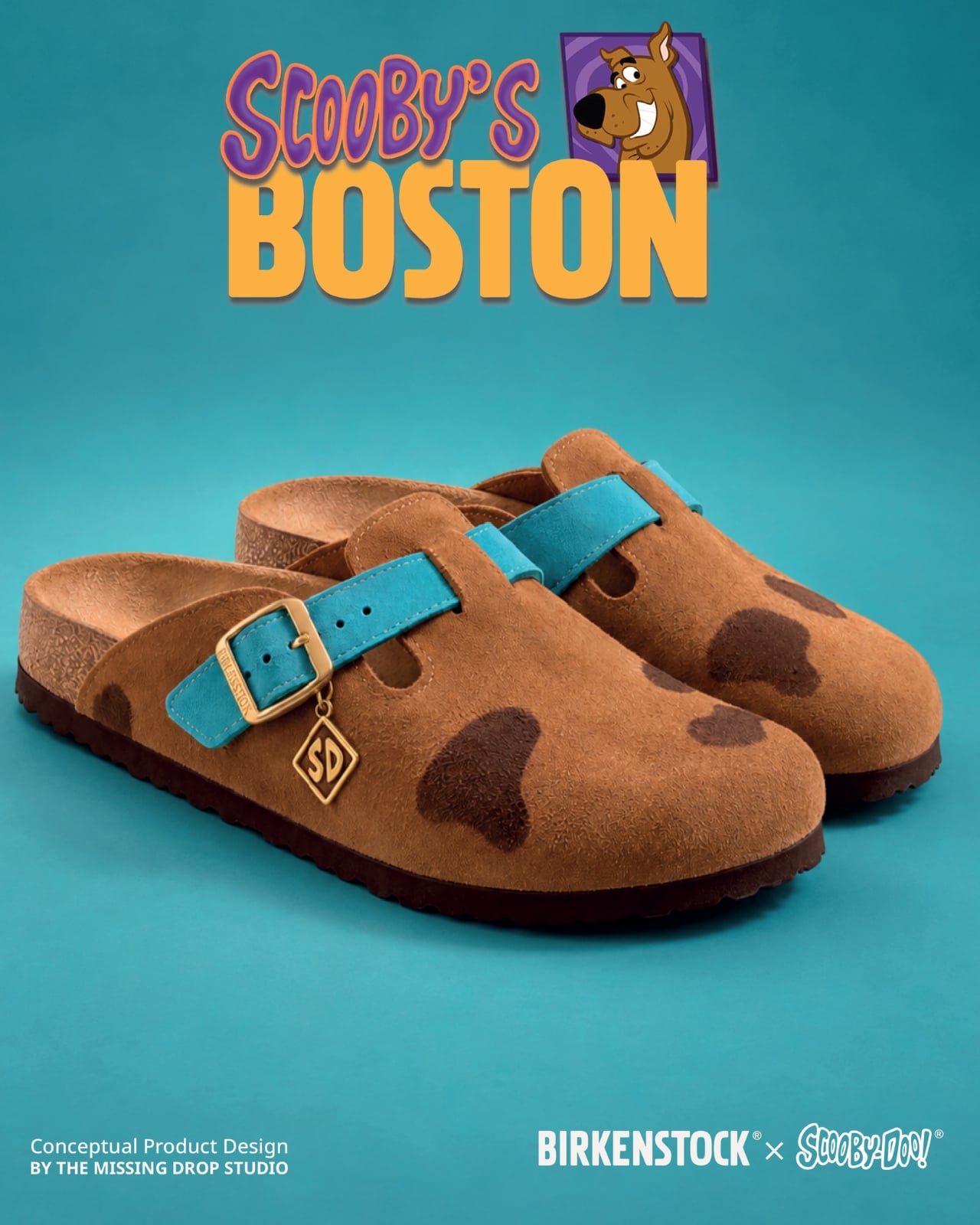
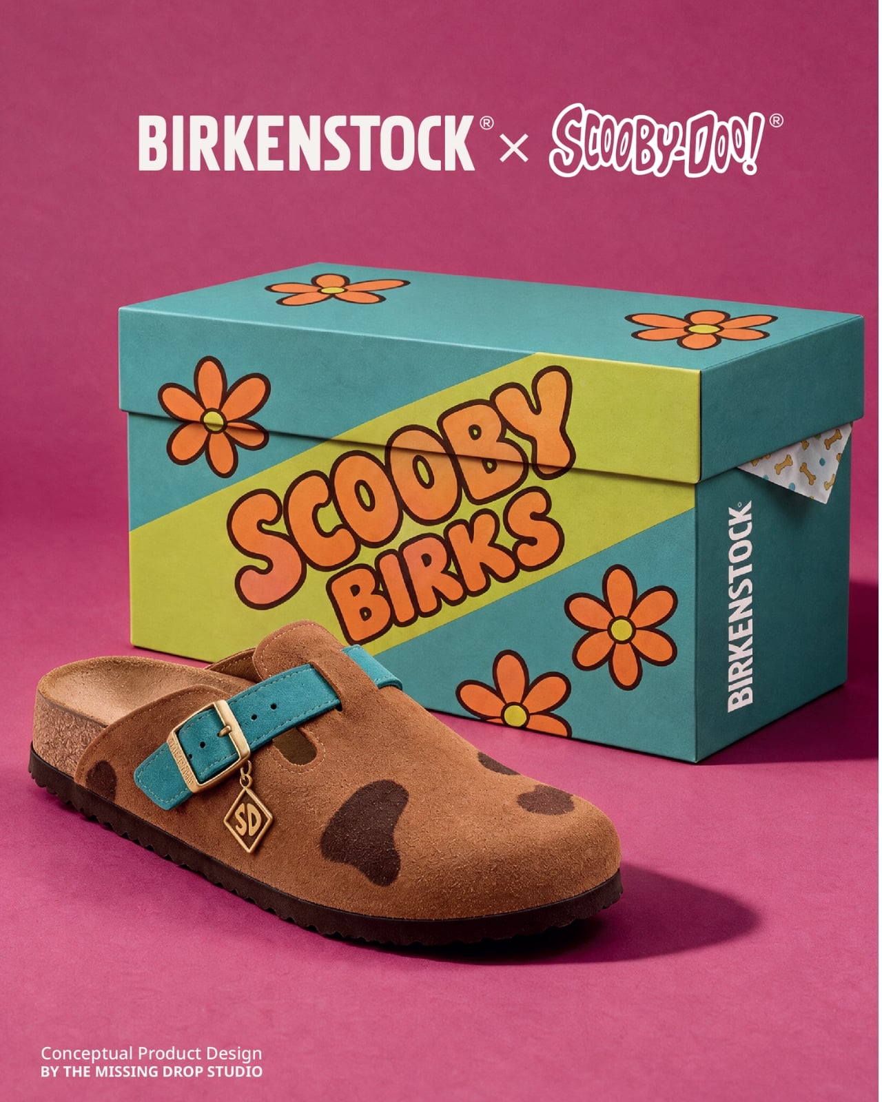
A turquoise strap and a tiny “SD” tag turn a caramel clog into Scooby-Doo before you even register the spots. That’s the appeal of “Scooby Birks,” an unofficial Birkenstock × Scooby-Doo concept collection by The Missing Drop. It addresses a familiar design problem: how to wear your affection for a cartoon without looking like you borrowed something from the costume aisle. I’d rather recognize a character through those details than a giant printed face.

Before anyone starts planning a purchase, these are imagined products, not manufactured prototypes. The project has no affiliation with or endorsement from Birkenstock or Warner Bros. Its six designs borrow familiar footwear silhouettes to interpret Mystery Inc. and the Mystery Machine. That distinction matters because the presentation, right down to the packaging, has the confidence of an actual retail campaign.

Designer: The Missing Drop

Scooby’s Boston is the clearest introduction to the idea. Its brown, suede-like surface carries irregular dark patches, while the turquoise buckle strap takes the place of his collar. The dangling gold-colored tag completes the reference. Moving a collar onto an existing shoe strap is an economical decision: the designer gives a familiar component another meaning without needing to reshape the entire clog. Even the rounded toe feels appropriate for this particular character.

Shaggy’s Boston would be my pick, partly because the joke is so pleasantly literal. The concept imagines olive-green shaggy shearling across the upper, paired with a rust-colored, corduroy-textured strap and a little biscuit charm. His green shirt and brown pants become a material palette. It’s deliberately scruffy, but the buckle and recognizable clog shape keep it from reading as a novelty slipper. I’d happily lose the charm and keep everything else.

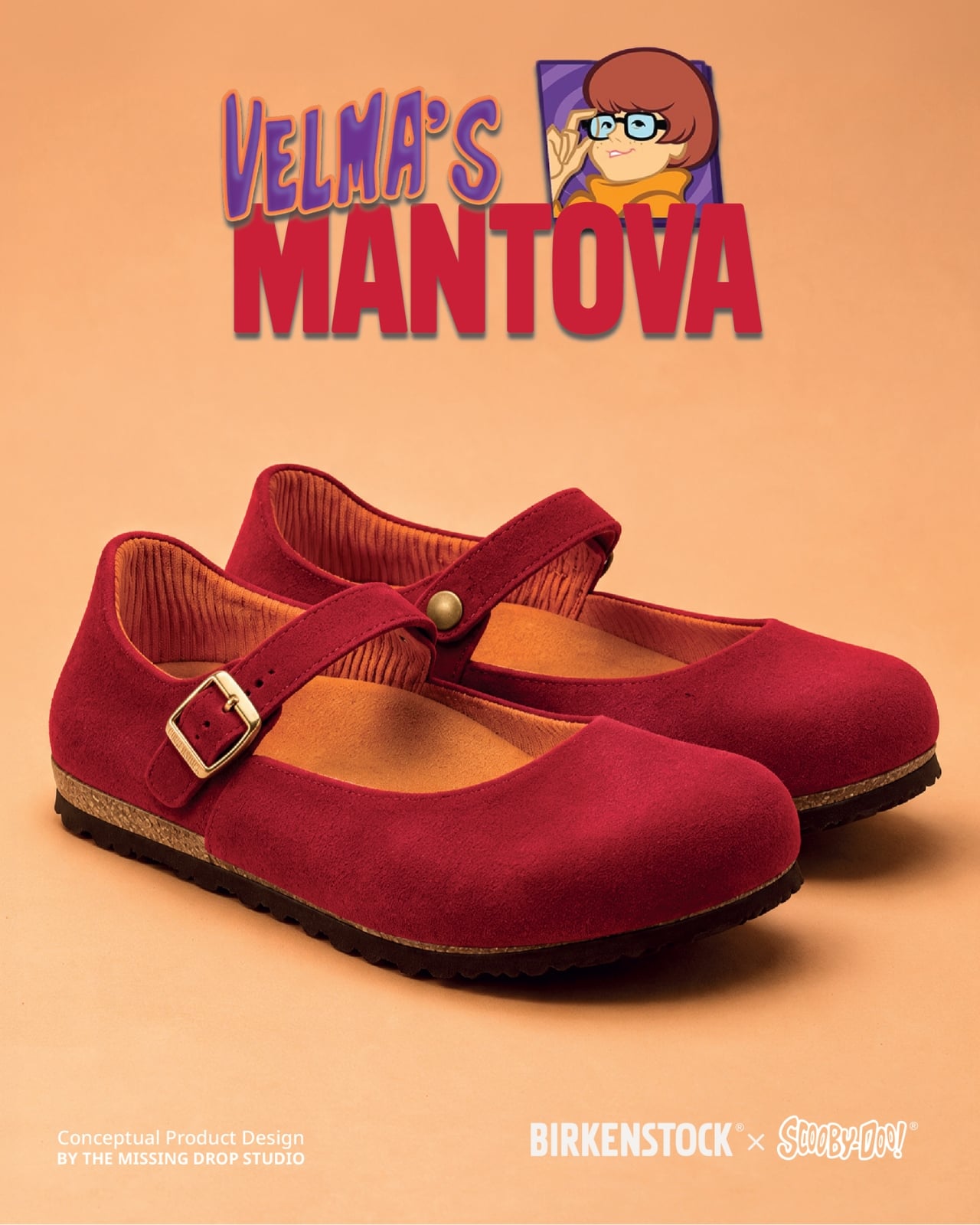
Velma gets a red Mantova Mary Jane with orange ribbing around the interior, a reference to her sweater that rewards a closer look. It’s probably the easiest design here to separate from its inspiration and wear as an ordinary shoe. Daphne’s purple Namica takes the opposite approach, adding a lavender sole band and a bright green scarf tied beside the buckle. The wedge gives her interpretation a dressier profile, although that dangling scarf raises a practical question about keeping it clear of the ground.

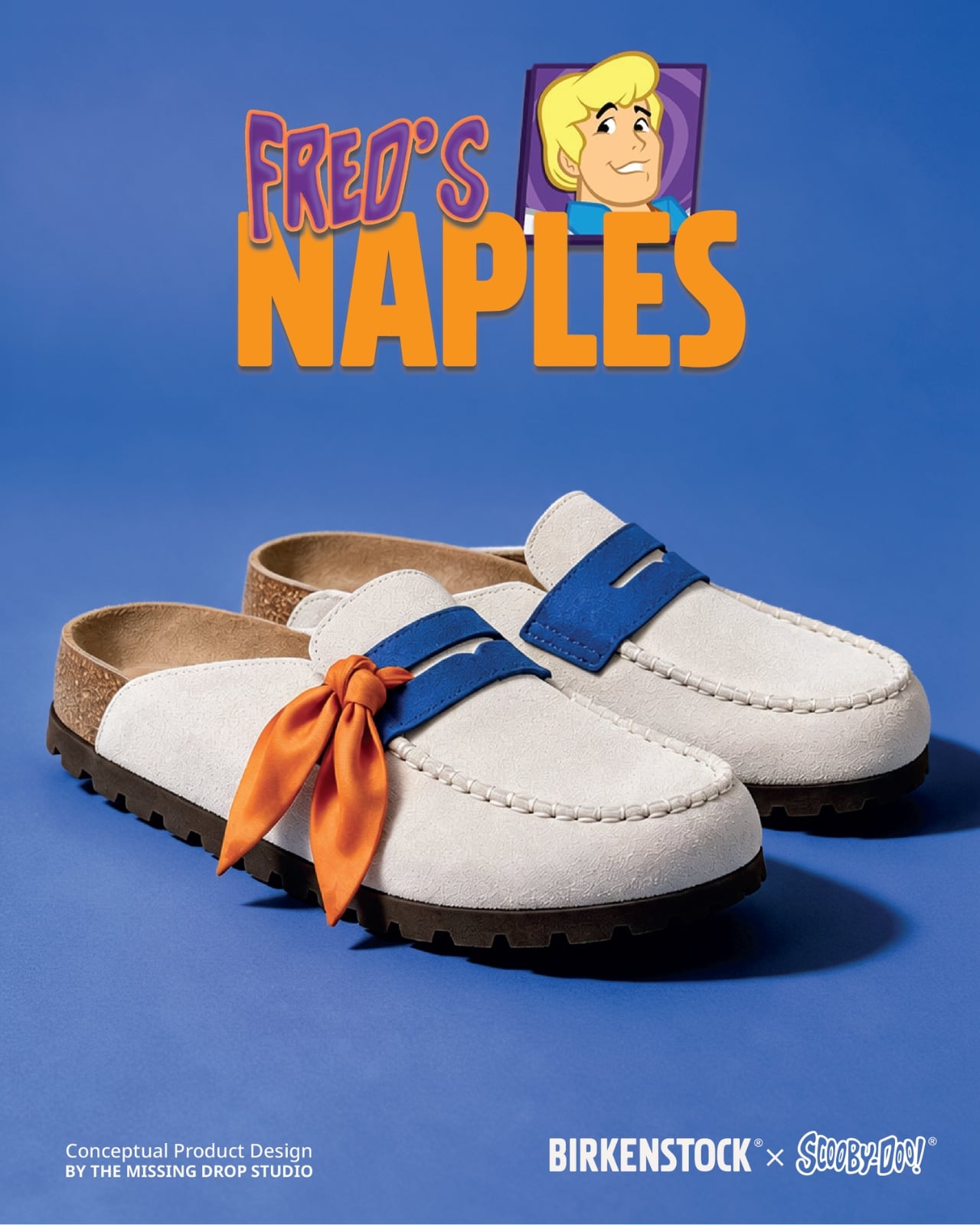
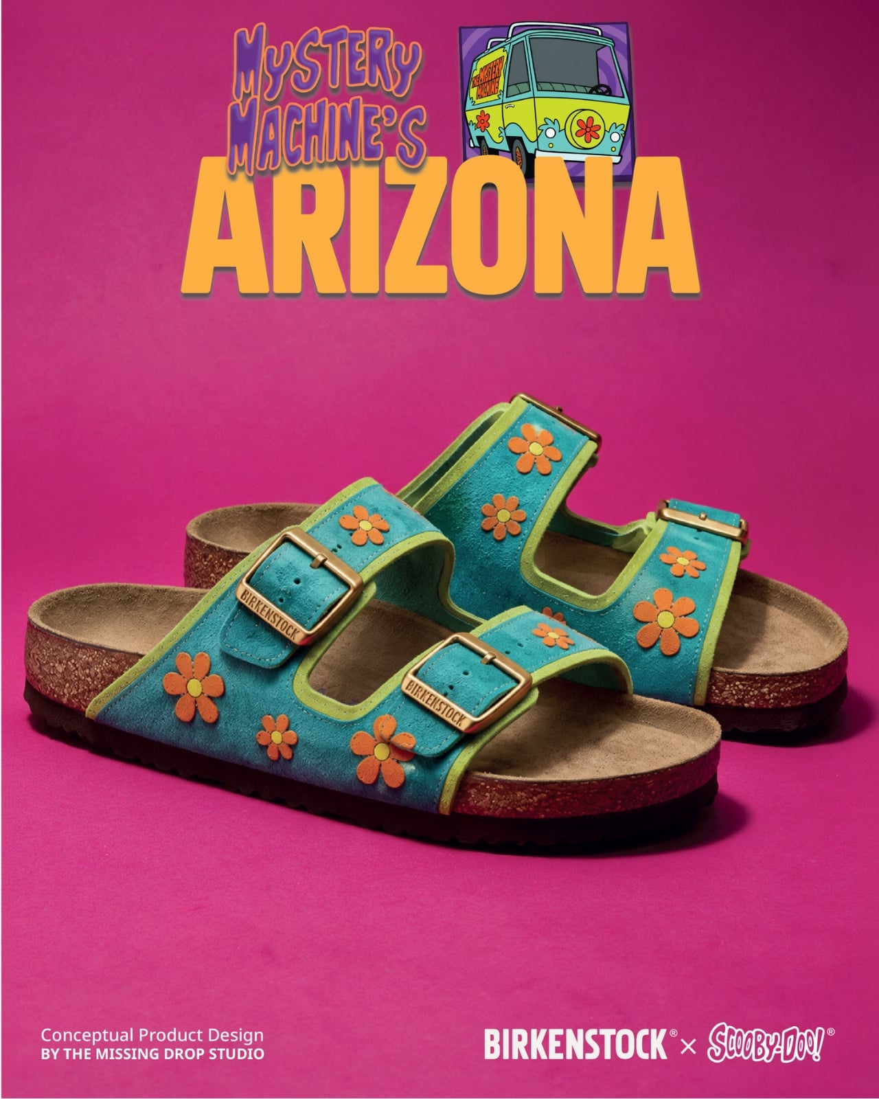
Fred’s Naples translates his outfit into a cream-colored loafer-style upper, blue detailing, and an orange scarf knot. I like the way the moccasin-style stitching gives that polished character a slightly more relaxed expression. Then there’s the Mystery Machine Arizona, with turquoise straps, lime edging, and orange flowers. Including the van is a smart expansion of the collection: it offers a recognizable reference for someone who loves the show but doesn’t particularly identify with one member of the gang.

The shoebox deserves attention, too. Inspired by Scooby Snacks, it uses turquoise, a broad lime diagonal, orange flowers, and oversized “Scooby Birks” lettering. The palette connects it to the van as well as the fictional treats. I like that the packaging allows itself to be louder than the footwear. A box can carry the full cartoon enthusiasm while the shoes get on with being something you might build an outfit around.

The response suggests that this visual shorthand travels well. Designer Julien Buisson-Fizellier, who identifies the project as his work, reported nearly 8 million TikTok views. That’s his reported figure, not evidence of purchase demand, but it helps explain the concept’s appeal as a shared image. You can recognize the reference, pick a favorite, and send it to someone without needing a lengthy explanation.

My reservation is how easily the campaign’s polish could outpace a viewer’s attention to its concept label. The more convincing an imaginary collaboration looks, the more important that disclosure becomes. Still, the design lesson is worth taking seriously. Scooby’s collar already behaves like a strap; Daphne’s scarf can sit beside a buckle. Those connections give the collection its personality. I’d want a real version to preserve that specificity, even if the loose accessories needed another pass before leaving the drawing board.

The post Scooby-Doo Birkenstock Concepts Actually Look Like the Gang first appeared on Yanko Design.

This porcelain Pioneer DJ setup belongs in a museum, not an Ibiza nightclub

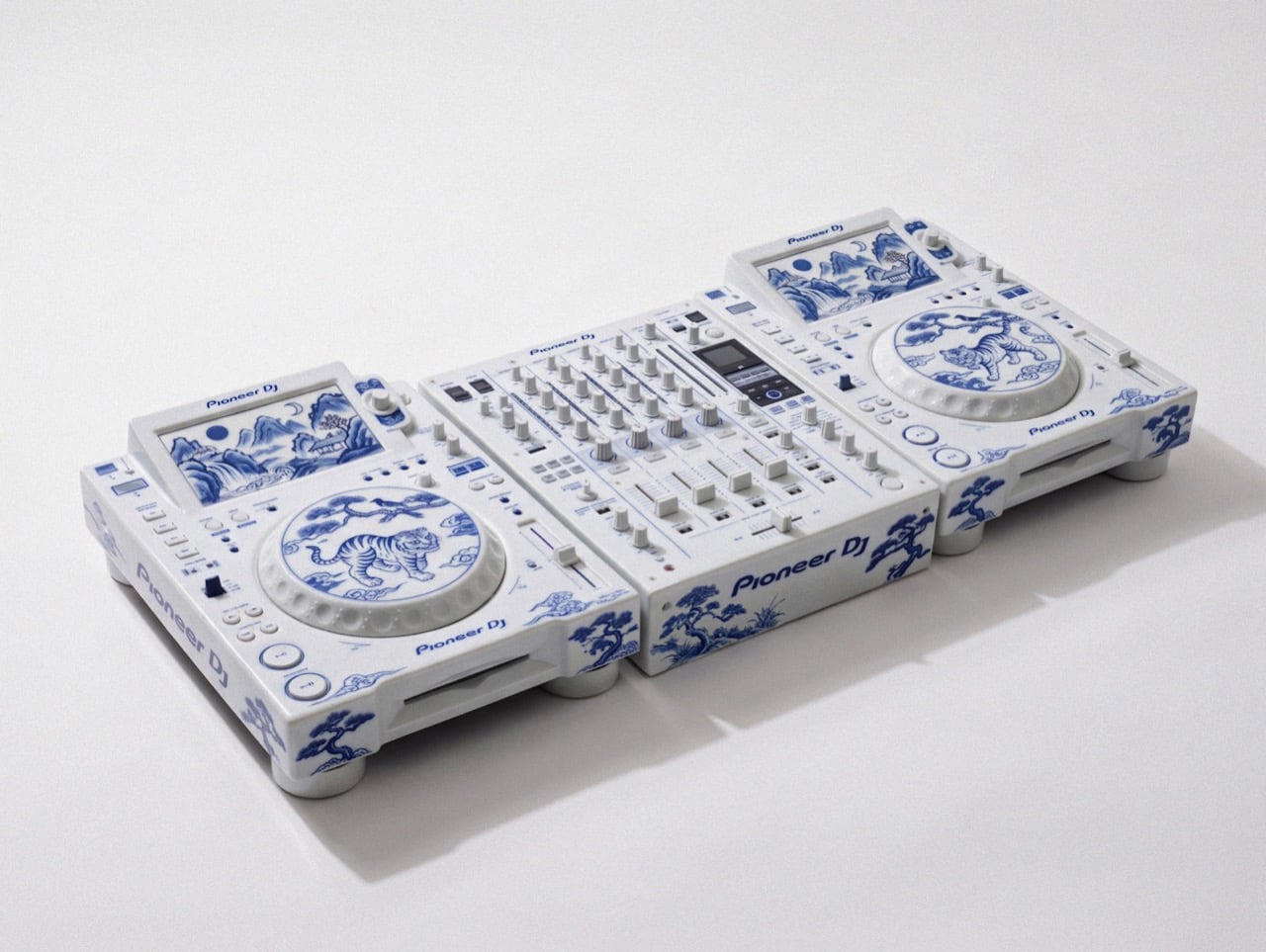
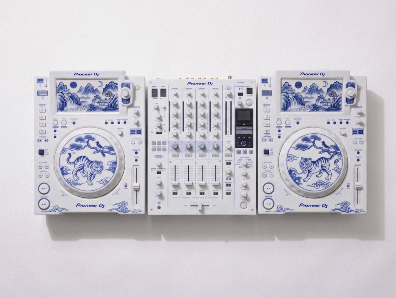
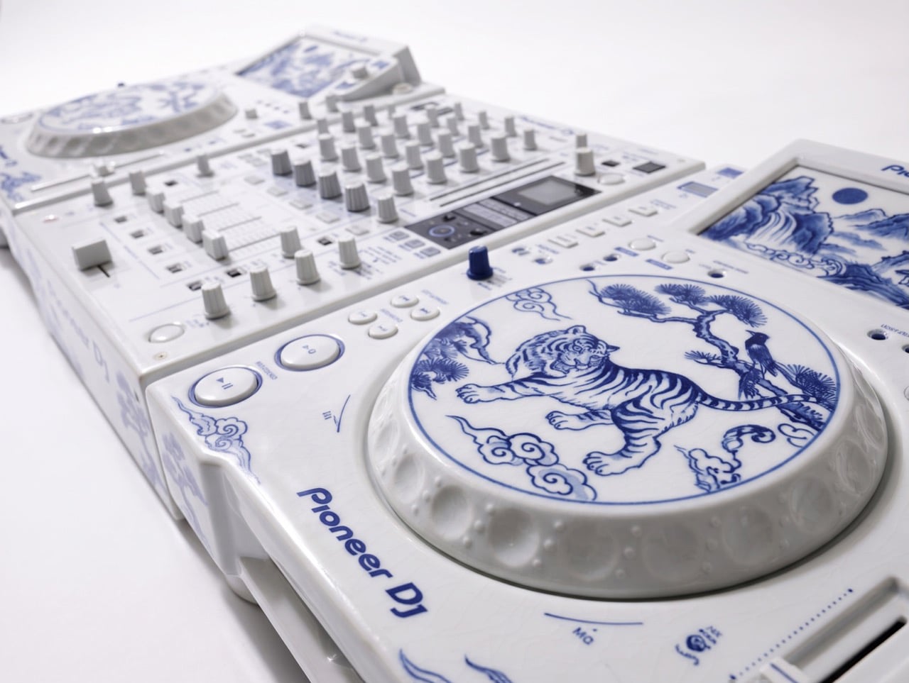
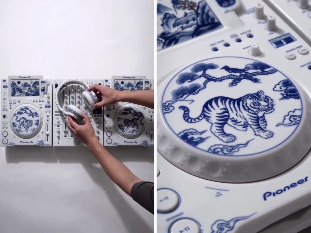
David Guetta just won DJ Mag’s Top 100 DJs poll for a record sixth time, and I have a very specific idea for his trophy shelf. Somebody on the internet has turned a Pioneer DJ setup into Korean blue-and-white porcelain, tigers and all. Two decks and a four-channel mixer, glazed bone white and hand-painted (well, AI-painted) in cobalt blue. It looks like something you’d find behind glass at the Met, right before a security guard asks you to step back. It’s also the most Guetta-coded object I’ve seen all year, because a guy who headlines weekly Ibiza residencies deserves a rig that looks as expensive as the bottle service.

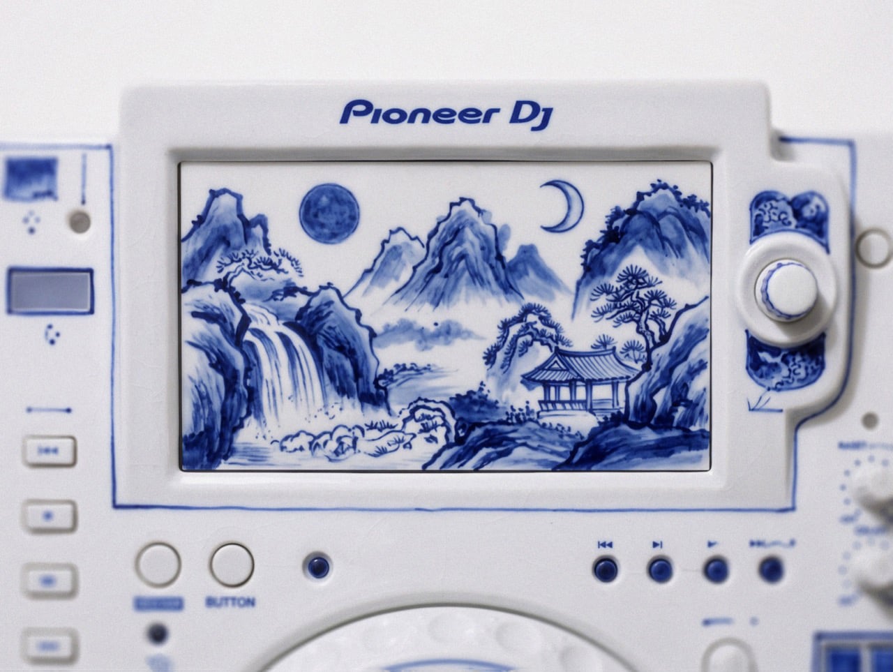
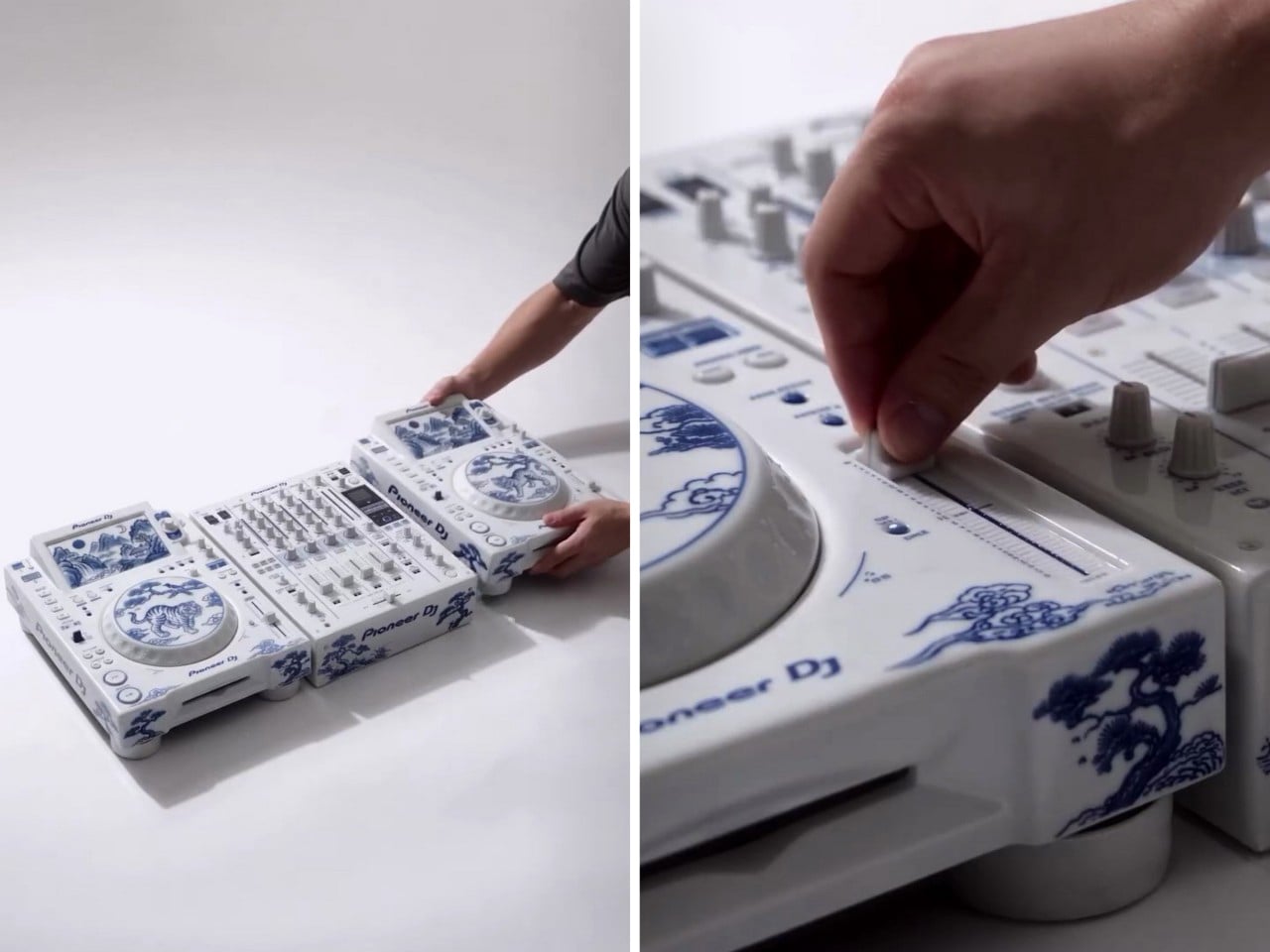
The setup comes from creators patchkims and takitani.lab, who posted it as the “Joseon Baekja Prototype,” complete with a “1 of 1, no restock” caption that reads like a sneaker drop. It’s an AI render, so nobody’s shipping it to Guetta’s villa anytime soon. The idea still lands, though. Each jog wheel carries a tiger and a magpie under a pine tree, lifted straight from Korean folk painting, and the screens swap waveforms for misty mountains and waterfalls. Suddenly your DJ gear graduates from booth equipment to living room centerpiece, which is a fun flex for anyone, let alone the world’s No. 1 DJ.

Designers: patchkims & takitani.lab

Kkachi horangi is a genre of Korean folk painting where a deliberately goofy tiger, nicknamed the idiot tiger, plays the aristocratic yangban, and a smug magpie in a pine tree speaks for the common people. Both jog wheels here carry that exact scene, with the cat prowling below and the bird looking unbothered above. The two decks get different tiger poses, so the platters work like a call and response. Joseon painters used the setup to poke fun at the ruling class, and now it sits under the palms of whoever runs the dance floor. That is either delicious irony or very on-brand for a king of the booth.

The screens trade waveforms for misty peaks, a waterfall, a pavilion, and a pair of moons, echoing Irworobongdo, the sun, moon and five peaks painting that stood behind the king’s throne in Joseon palaces. The sun and moon stood for the king and queen, so the painting doubled as a majesty backdrop. A headliner on a raised stage occupies similar real estate, so the throne comparison writes itself. The original sun burned red, and going cobalt turns it into a second moon, which suits a room that wakes up after midnight. Calling a DJ booth a throne room is a stretch, but watch a stadium crowd hang on a Guetta build-up and the royalty comparison stops feeling silly.

Joseon Korea made white its signature after the green celadon era of Goryeo, and cobalt-painted porcelain sat at the top of the pile. The pigment was rare and imported from China, so when supply dried up, court kilns improvised with iron-brown, and some banquet wares wore painted imitations of blue-and-white called gahwa, literally fake painting. A porcelain Pioneer rig conjured by AI is a 2026 gahwa, a convincing stand-in for an object nobody has actually fired in a kiln. I’m weirdly fine with that, because the Joseon court got there first. Meanwhile, Christie’s has estimated a genuine 15th-century cobalt jar at roughly $2 million to $3 million, so the real thing sets the bar high.

The real-world version of this lineup runs two AlphaTheta CDJ-3000X players at $2,999 each plus a Pioneer DJ DJM-A9 mixer at $2,899, roughly $8,900 in the US. The render looks closer to the older CDJ-2000NXS2 generation, disc slots and all. Pioneer did sell a limited white CDJ-2000NXS2-W run in 2017, so colorway flexes are old news for the brand. I imagine if such a product were to exist, it would probably cost in the hundreds of thousands. That being said, I’m sure an enthusiastic deejay with money to throw could acquire this for their den. Guetta, SHM, heck even Shaq… I’m looking at y’all.

The post This porcelain Pioneer DJ setup belongs in a museum, not an Ibiza nightclub first appeared on Yanko Design.

These retro-modern Headphones put audio adjustments on physical dials and tactile switches

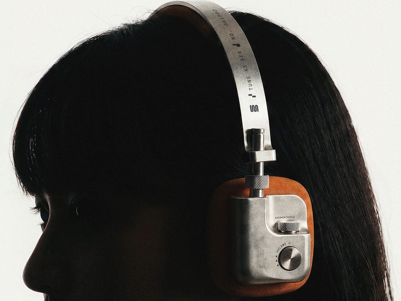
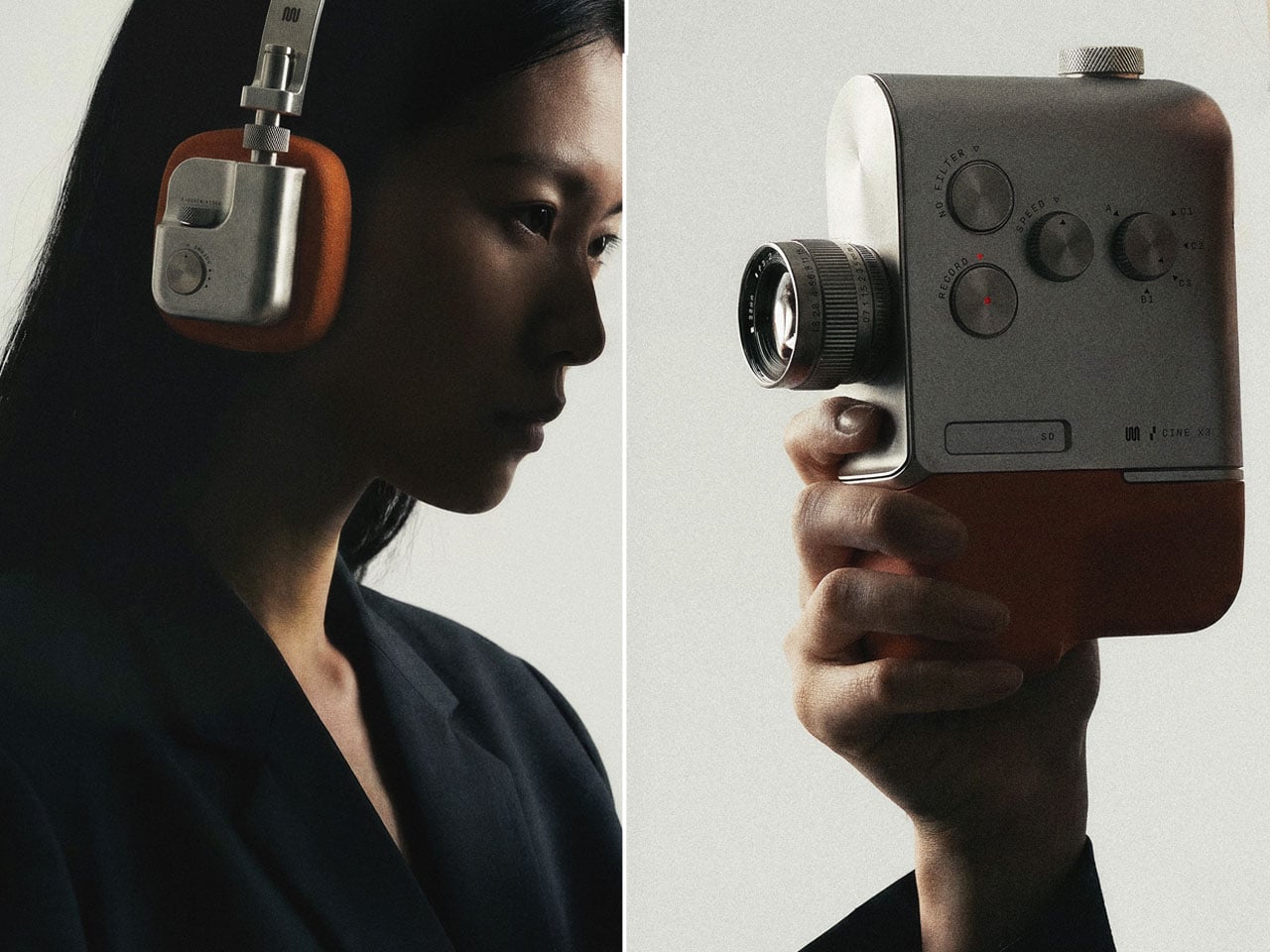
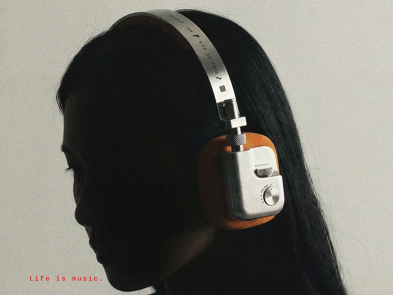
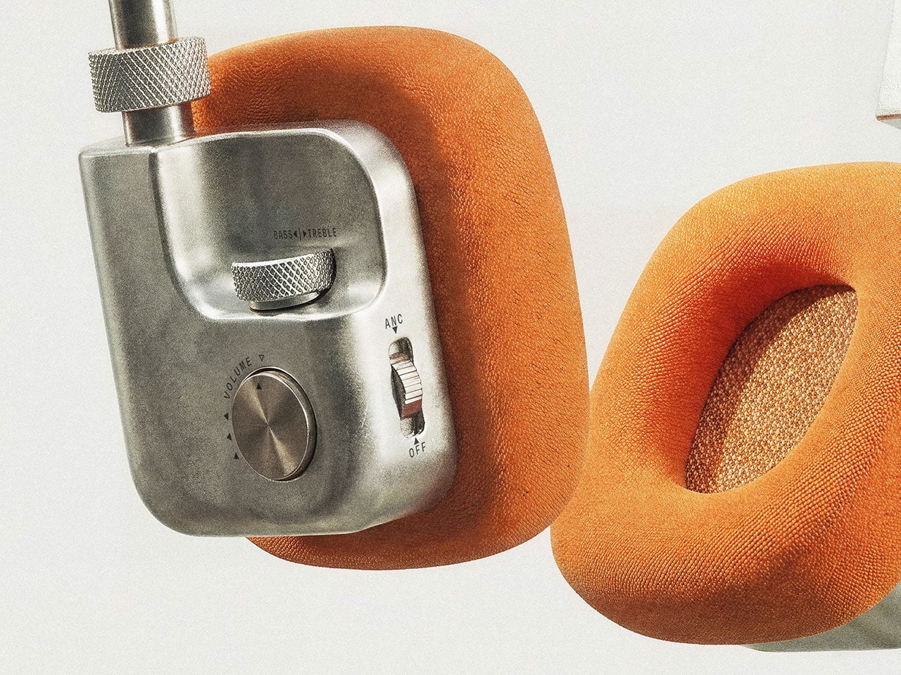
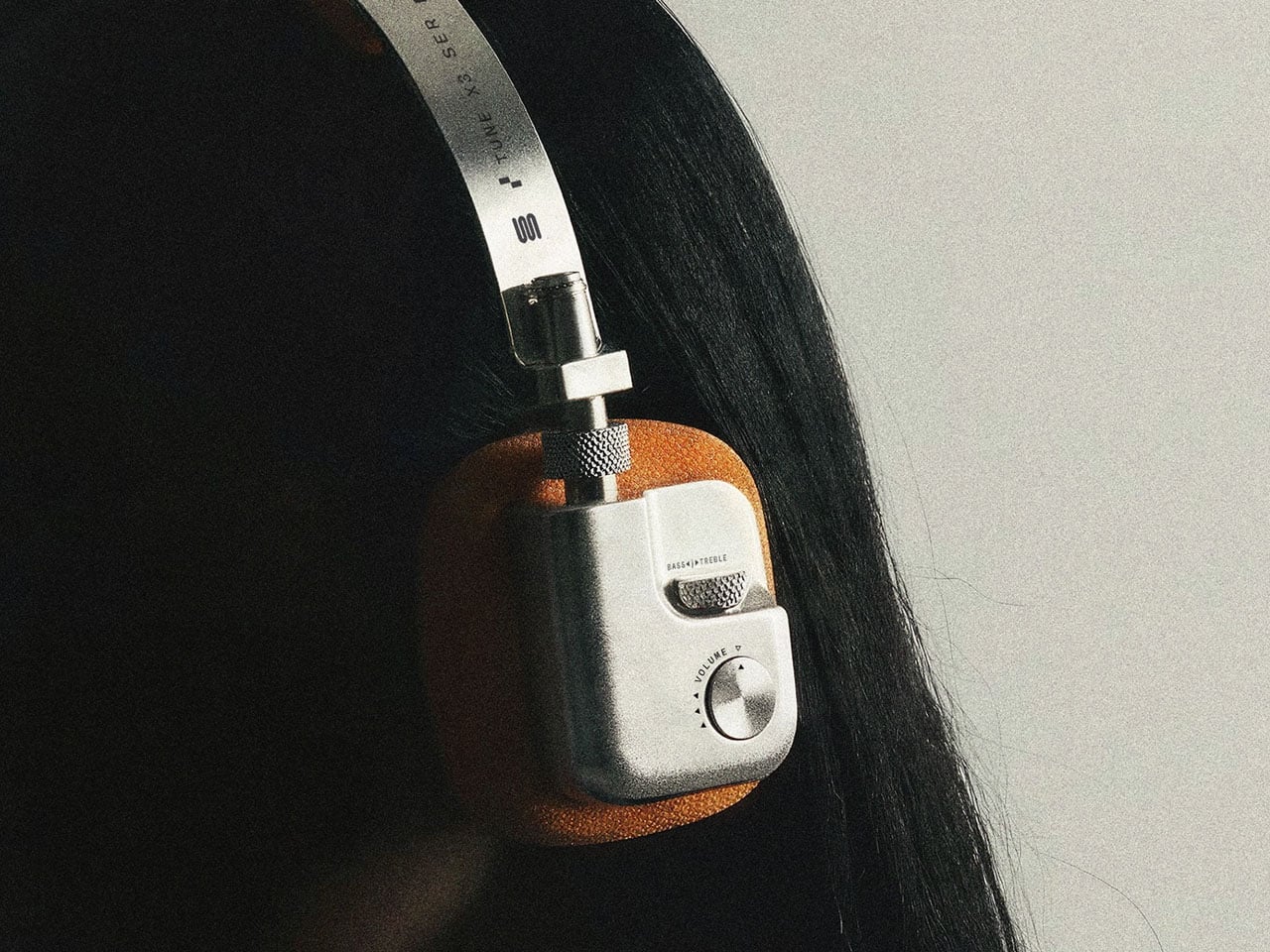
Adjusting your headphones shouldn’t mean searching for a tiny button or guessing where to tap a touch-sensitive surface. TUNE X3 explores a more hands-on approach, using knurled dials and physical switches that let users feel their way through everyday audio adjustments. Designed by Pressec Design as part of a fictional product family, these concept headphones make tactile interaction a defining feature of their industrial design.
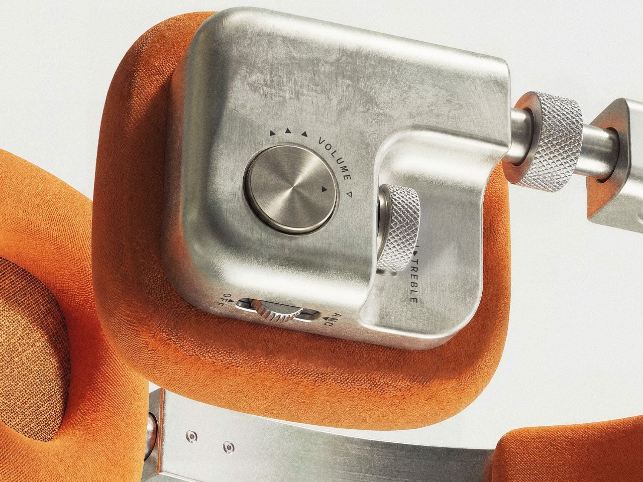
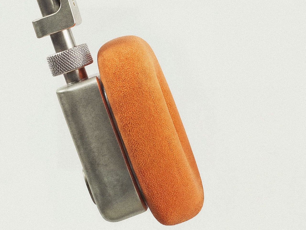
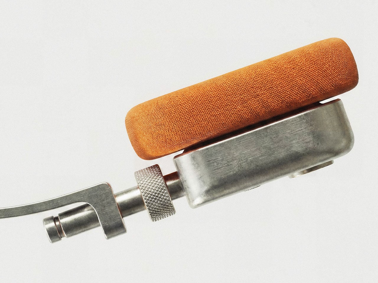
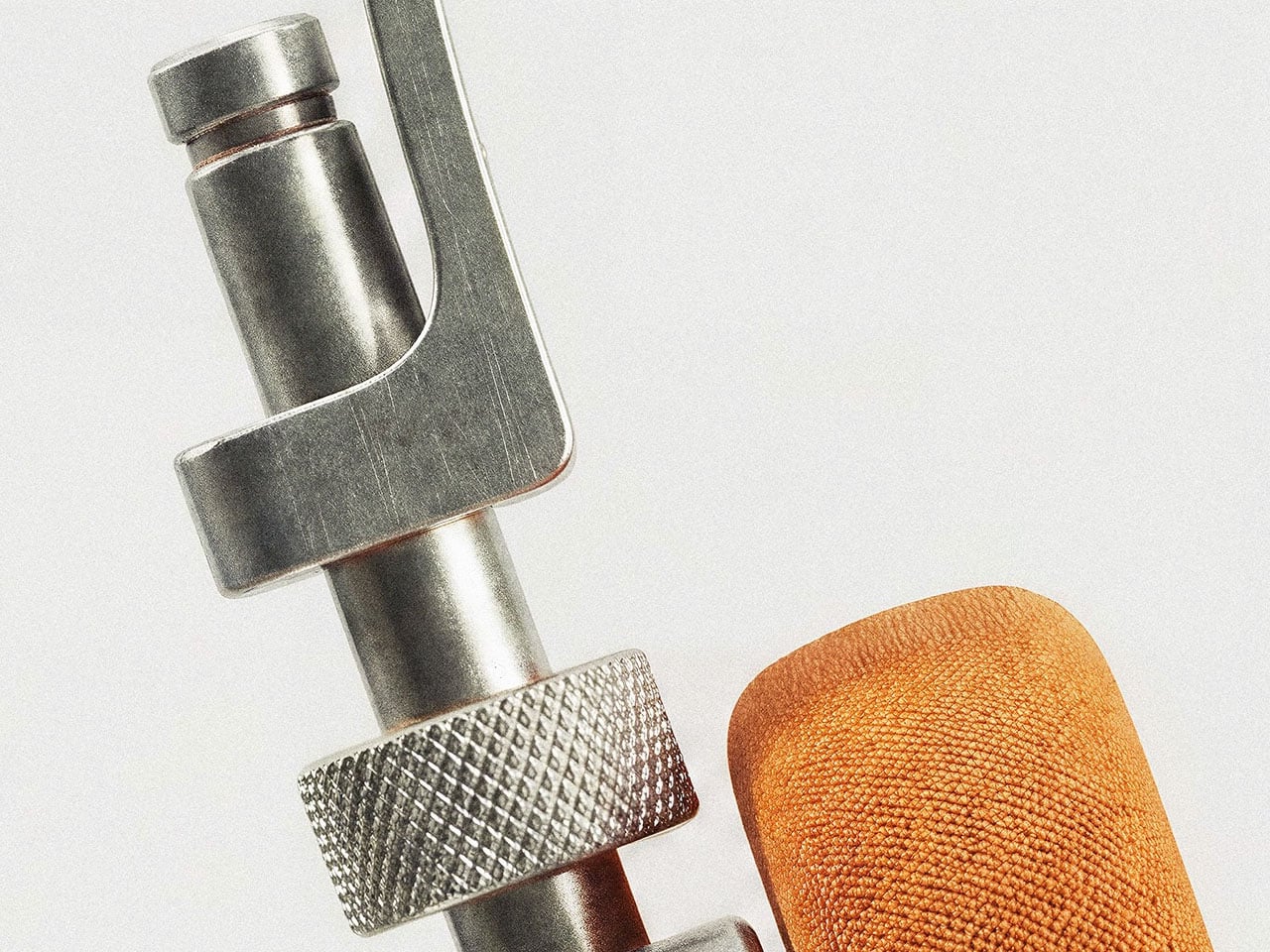
The headphones pair a brushed aluminium chassis with high-contrast orange textile padding across the ear cushions and headband. The raw metallic finish recalls mid-century studio equipment, while the saturated fabric creates a bold visual contrast. Exposed fasteners and a wide-profile headband reinforce the utilitarian character, giving TUNE X3 the appearance of precision equipment. This is a detour from the currently trending minimalist consumer gadgets. It’s like bringing in a muscle car in the era of Tesla EVs.

Designer: Pressec Design

The physical controls are the core of the niche concept. Dedicated dials and tactile switches handle volume, treble, and active noise cancellation (ANC), giving users distinct controls for common listening toggles. Their knurled surfaces provide texture under the fingers, making the interface feel more deliberate than a smooth touch panel. The design suggests a listening experience in which users can reach for a control, recognize it by touch, and make adjustments without navigating an onscreen menu. While the concept does not establish how the controls perform in practice, it places physical interaction at the heart of the headphone experience.

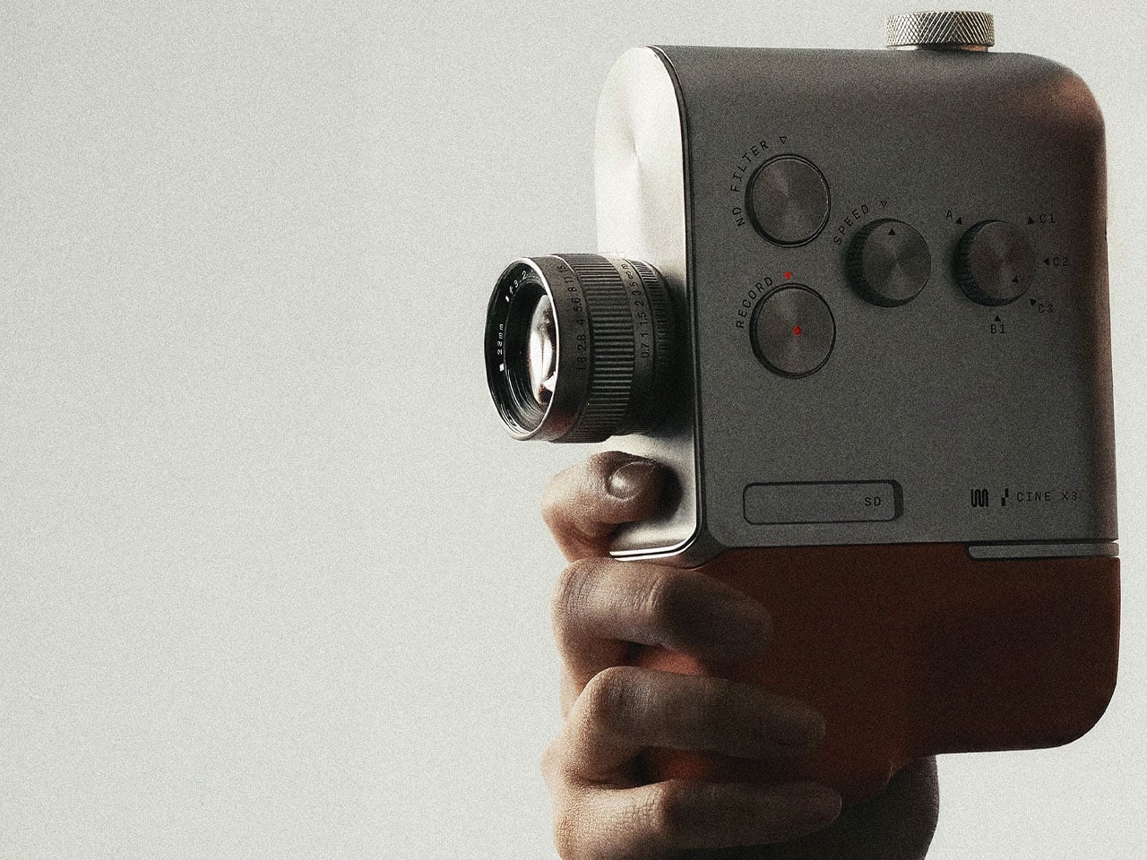
TUNE X3 is part of the same fictional product family as the CINE X3. The designer developed both concepts around a consistent visual language, carrying shared characteristics across the collection without simply repeating the same shapes. Materials, proportions, finishes, and hardware details establish continuity while allowing each product to retain its own identity.

The project also explores how Vizcom can support product-family development by using previous designs as references. This approach helps designers preserve a recognizable character across multiple concepts while continuing to explore distinct forms and functions.

TUNE X3 remains a conceptual design, with no confirmed release date, price, or technical specifications. Its core idea is straightforward – physical controls can make headphone interaction feel more immediate and intentional, while giving the product a distinctive identity shaped by the way users handle it.

The post These retro-modern Headphones put audio adjustments on physical dials and tactile switches first appeared on Yanko Design.