Scooby-Doo Birkenstock Concepts Actually Look Like the Gang

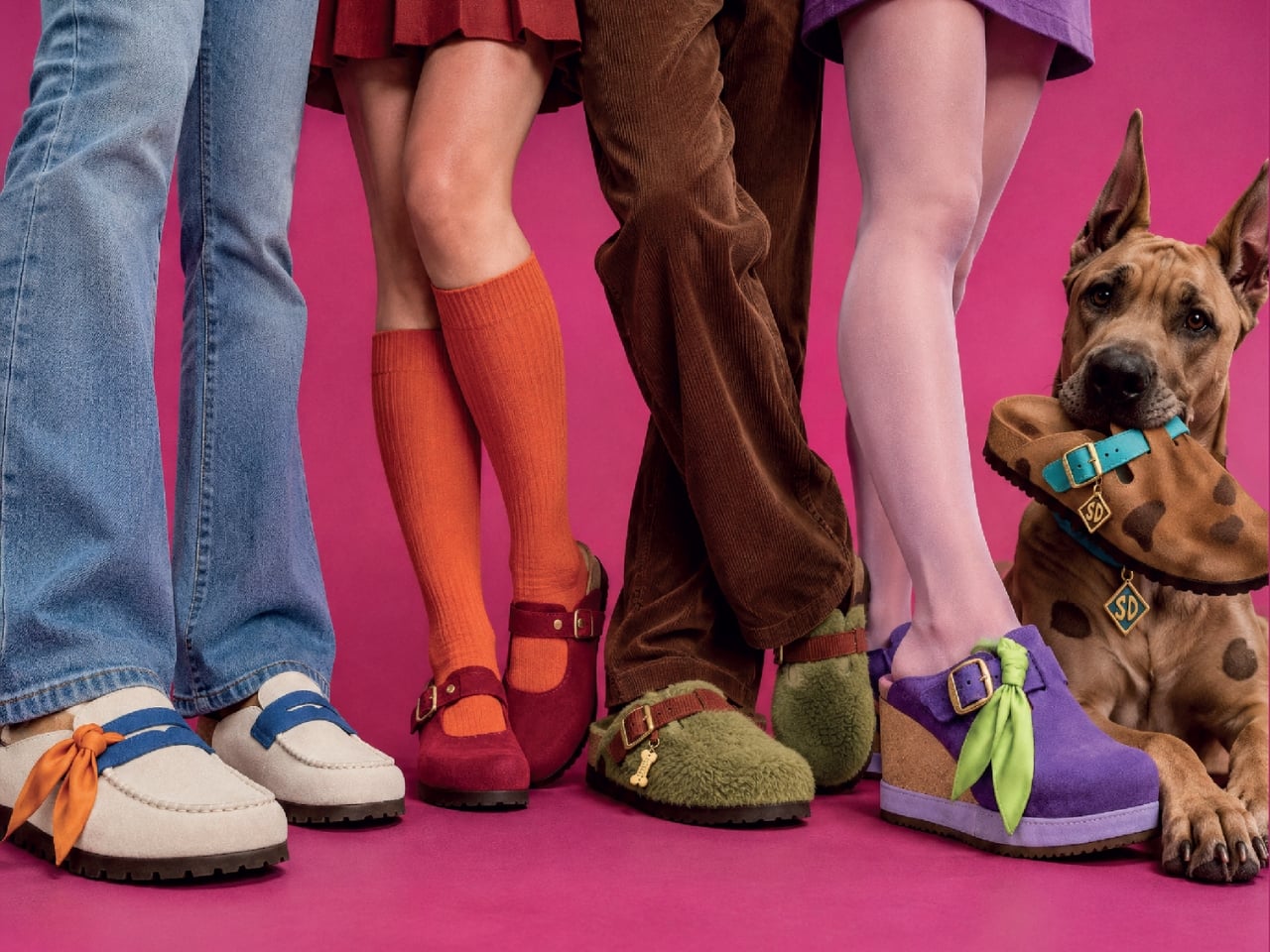
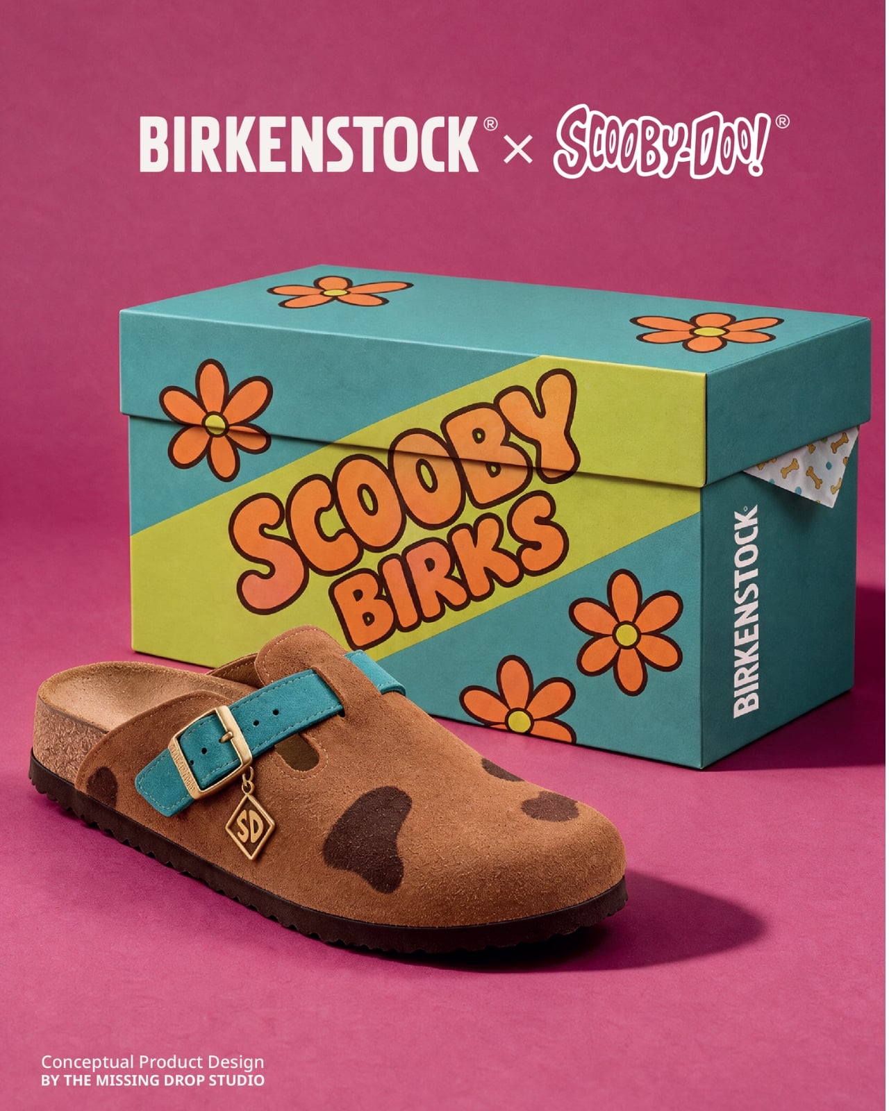
A turquoise strap and a tiny “SD” tag turn a caramel clog into Scooby-Doo before you even register the spots. That’s the appeal of “Scooby Birks,” an unofficial Birkenstock × Scooby-Doo concept collection by The Missing Drop. It addresses a familiar design problem: how to wear your affection for a cartoon without looking like you borrowed something from the costume aisle. I’d rather recognize a character through those details than a giant printed face.

Before anyone starts planning a purchase, these are imagined products, not manufactured prototypes. The project has no affiliation with or endorsement from Birkenstock or Warner Bros. Its six designs borrow familiar footwear silhouettes to interpret Mystery Inc. and the Mystery Machine. That distinction matters because the presentation, right down to the packaging, has the confidence of an actual retail campaign.

Designer: The Missing Drop
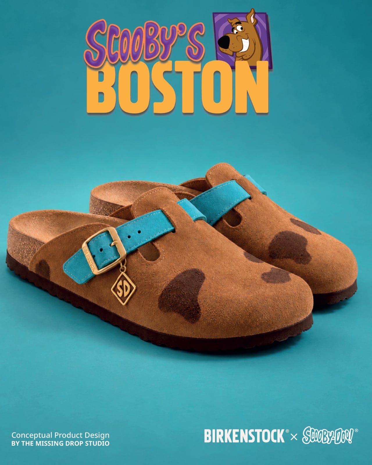
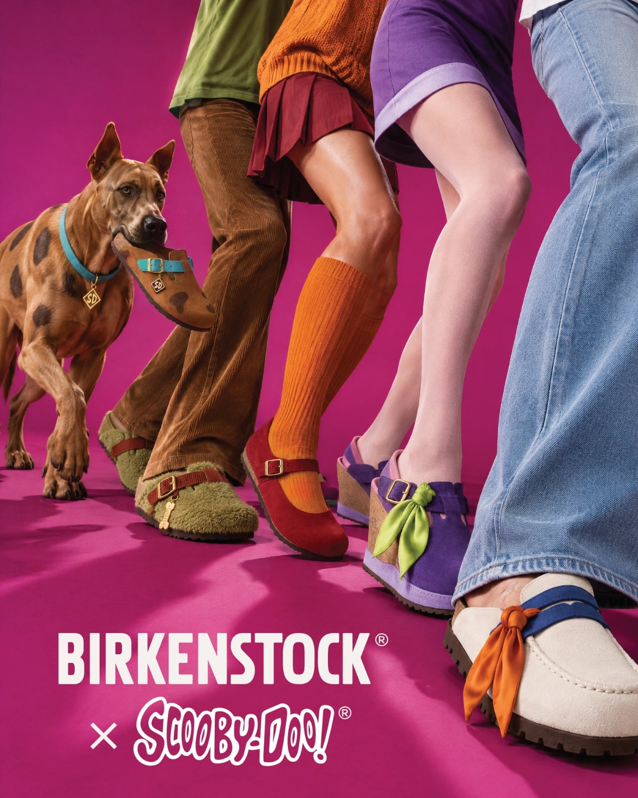
Scooby’s Boston is the clearest introduction to the idea. Its brown, suede-like surface carries irregular dark patches, while the turquoise buckle strap takes the place of his collar. The dangling gold-colored tag completes the reference. Moving a collar onto an existing shoe strap is an economical decision: the designer gives a familiar component another meaning without needing to reshape the entire clog. Even the rounded toe feels appropriate for this particular character.

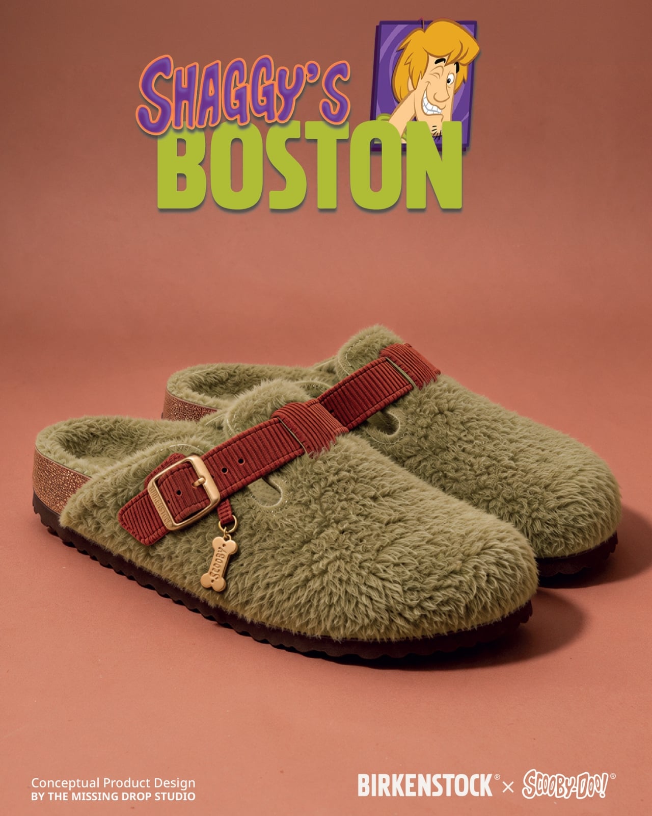
Shaggy’s Boston would be my pick, partly because the joke is so pleasantly literal. The concept imagines olive-green shaggy shearling across the upper, paired with a rust-colored, corduroy-textured strap and a little biscuit charm. His green shirt and brown pants become a material palette. It’s deliberately scruffy, but the buckle and recognizable clog shape keep it from reading as a novelty slipper. I’d happily lose the charm and keep everything else.
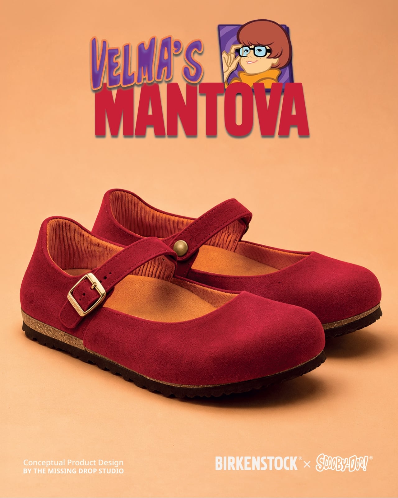
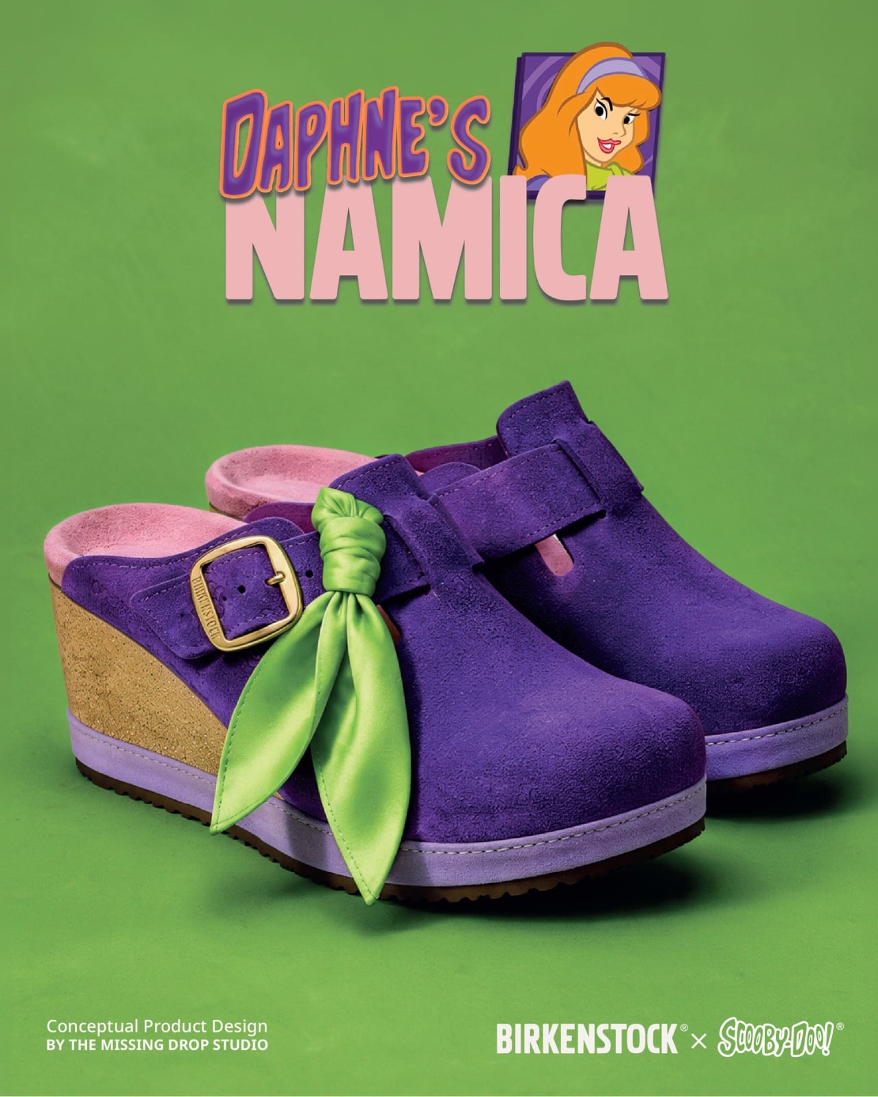
Velma gets a red Mantova Mary Jane with orange ribbing around the interior, a reference to her sweater that rewards a closer look. It’s probably the easiest design here to separate from its inspiration and wear as an ordinary shoe. Daphne’s purple Namica takes the opposite approach, adding a lavender sole band and a bright green scarf tied beside the buckle. The wedge gives her interpretation a dressier profile, although that dangling scarf raises a practical question about keeping it clear of the ground.

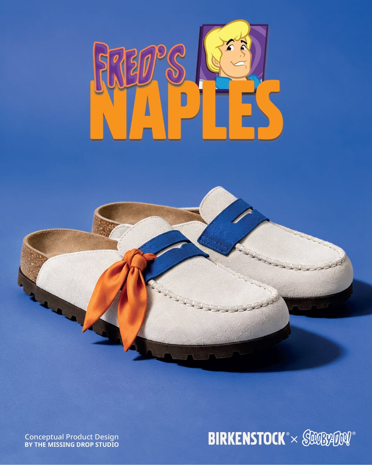
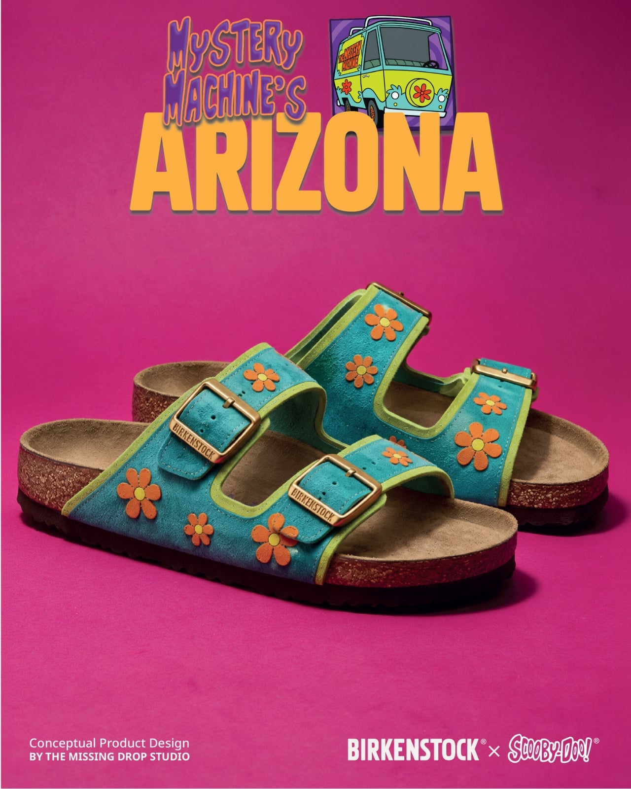
Fred’s Naples translates his outfit into a cream-colored loafer-style upper, blue detailing, and an orange scarf knot. I like the way the moccasin-style stitching gives that polished character a slightly more relaxed expression. Then there’s the Mystery Machine Arizona, with turquoise straps, lime edging, and orange flowers. Including the van is a smart expansion of the collection: it offers a recognizable reference for someone who loves the show but doesn’t particularly identify with one member of the gang.
The shoebox deserves attention, too. Inspired by Scooby Snacks, it uses turquoise, a broad lime diagonal, orange flowers, and oversized “Scooby Birks” lettering. The palette connects it to the van as well as the fictional treats. I like that the packaging allows itself to be louder than the footwear. A box can carry the full cartoon enthusiasm while the shoes get on with being something you might build an outfit around.

The response suggests that this visual shorthand travels well. Designer Julien Buisson-Fizellier, who identifies the project as his work, reported nearly 8 million TikTok views. That’s his reported figure, not evidence of purchase demand, but it helps explain the concept’s appeal as a shared image. You can recognize the reference, pick a favorite, and send it to someone without needing a lengthy explanation.
My reservation is how easily the campaign’s polish could outpace a viewer’s attention to its concept label. The more convincing an imaginary collaboration looks, the more important that disclosure becomes. Still, the design lesson is worth taking seriously. Scooby’s collar already behaves like a strap; Daphne’s scarf can sit beside a buckle. Those connections give the collection its personality. I’d want a real version to preserve that specificity, even if the loose accessories needed another pass before leaving the drawing board.

The post Scooby-Doo Birkenstock Concepts Actually Look Like the Gang first appeared on Yanko Design.
Birkenstock Just Went to Ballet Class With Repetto

If you had told me a year ago that two of the most culturally distinct footwear brands in the world would join forces for a collection, I would have been skeptical. A German orthopedic sandal brand and a Parisian ballet institution? On paper, it reads like the setup to a joke. In practice, it might just be one of the most thoughtfully designed collaborations of 2026.

Birkenstock’s 1774 line, the brand’s Paris-based special projects and collaborations unit, has been steadily building a portfolio that makes you reconsider what a sandal can be. Past partnerships with Rick Owens, Valentino, and Dior cemented the label on fashion’s most coveted list. The Repetto chapter, though, feels different. It feels like two brands that genuinely needed to meet, and the design bears that out at every level.

Designers: Birkenstock x Repetto

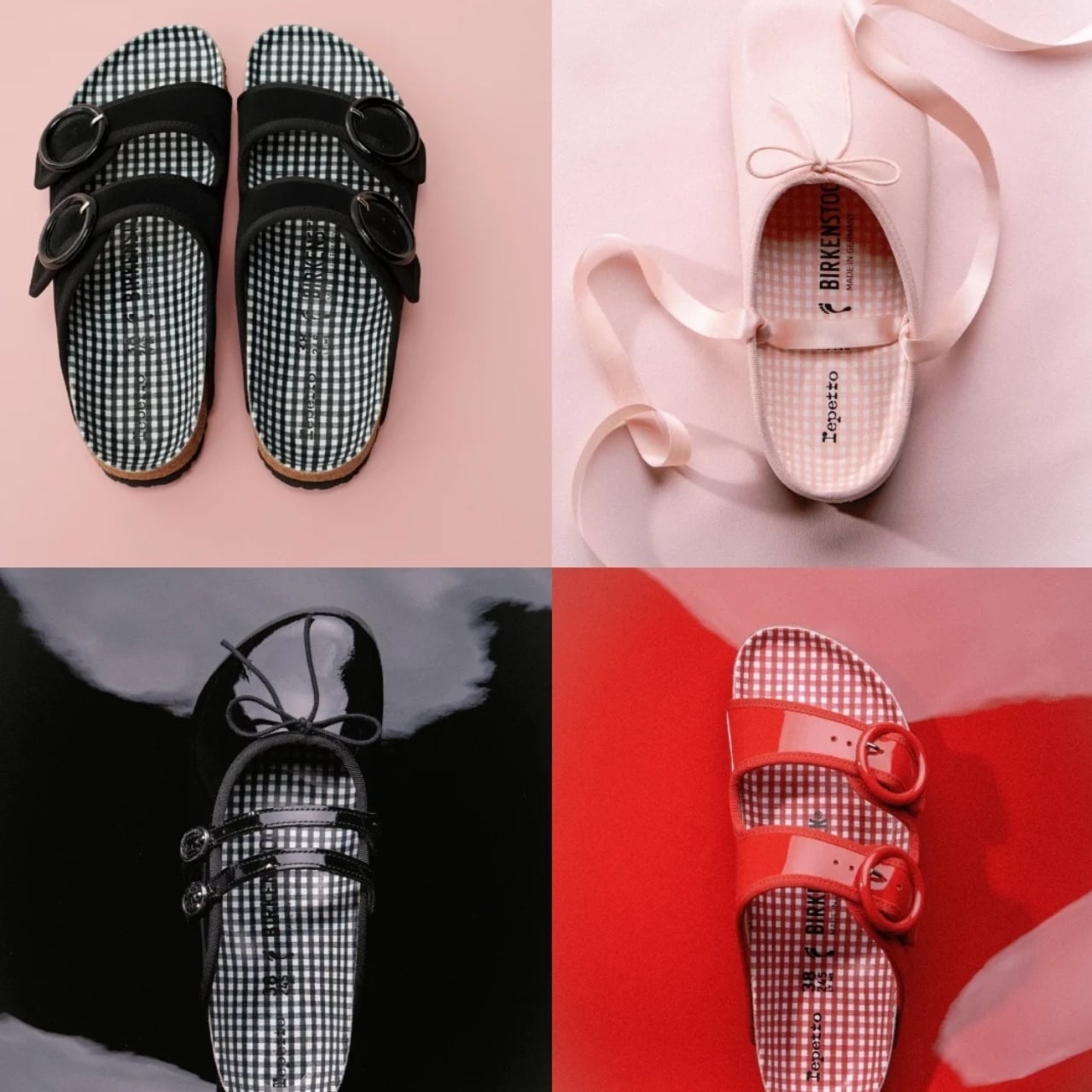
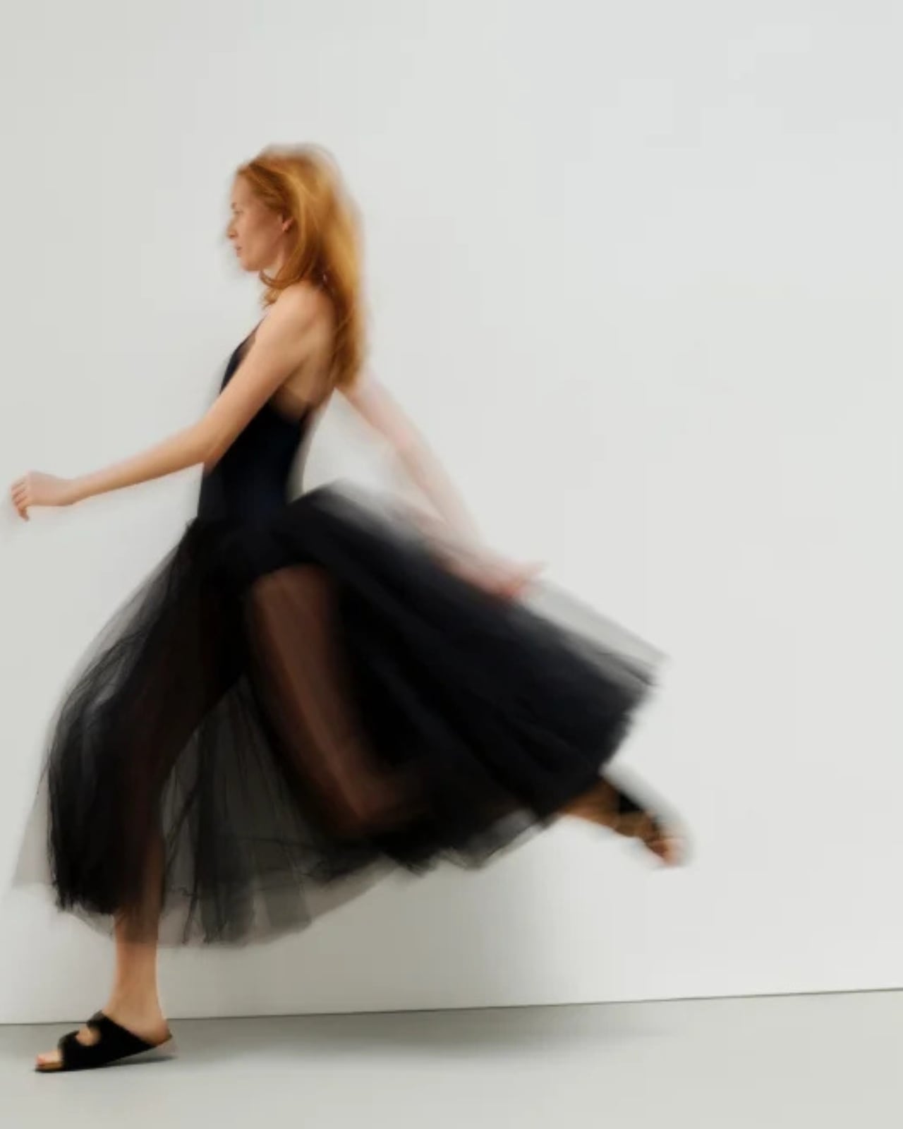
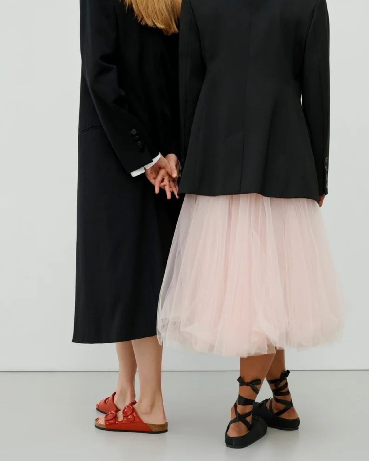
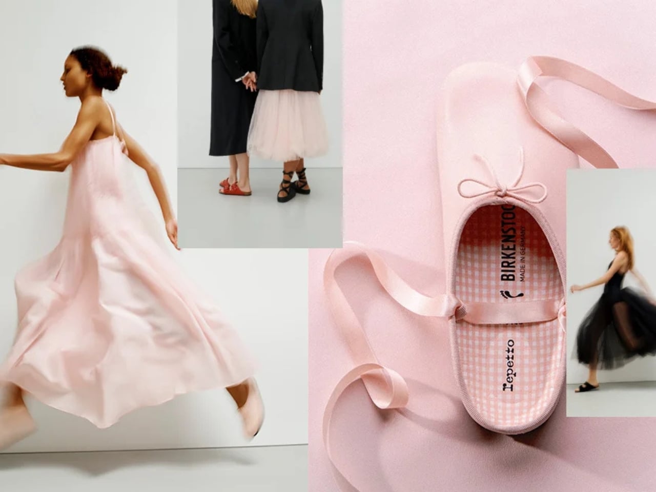
The collection spans three pieces, and each one tells a slightly different version of the same story. The Arizona sandal comes first, and it’s the most familiar entry point. Birkenstock kept the silhouette exactly as it is, which was the right call, but swapped the standard hardware for exclusive oversized round buckles. The scale shift is subtle but meaningful. The buckles read more sculptural than functional, borrowing the rounded, almost jewelry-like geometry that runs through Repetto’s aesthetic. It’s still unmistakably an Arizona. It just carries itself differently.

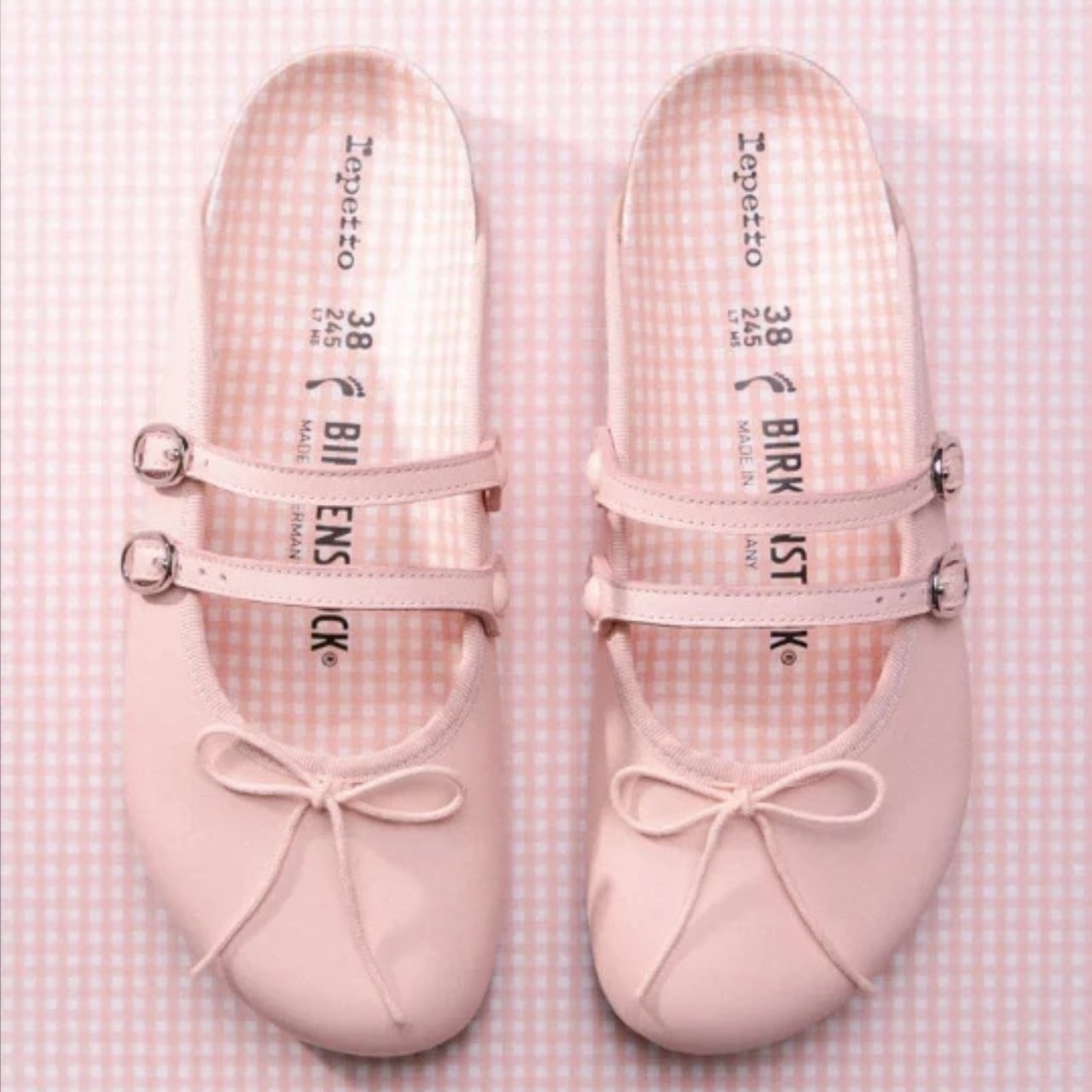
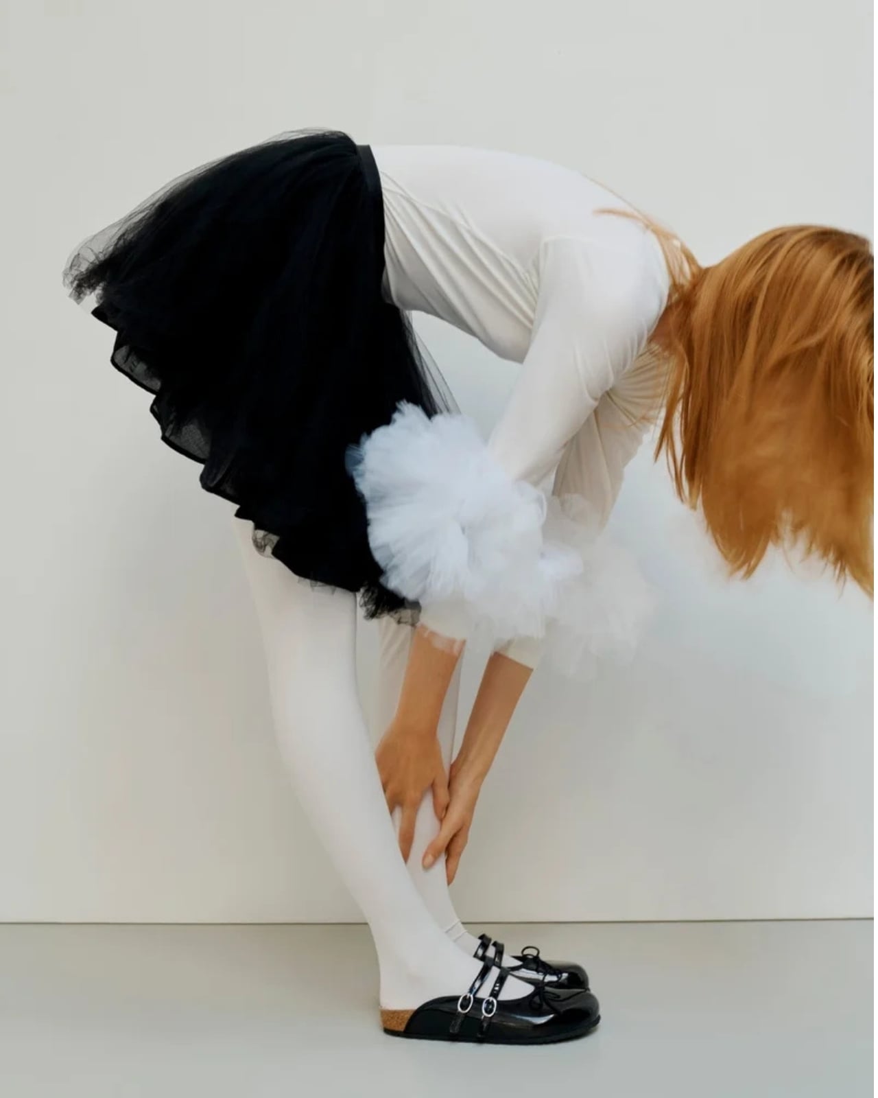
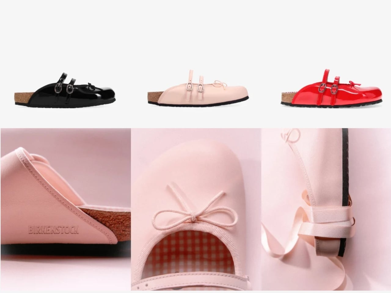
The Scala is where the ballet influence becomes most direct. Built on a round-toe base with two top straps and a laced bow at the front, it sits somewhere between a sandal and a ballet flat without fully committing to either. The bow is the kind of detail that could have easily felt costume-y or overdone, but the proportions keep it grounded. It’s small enough to feel considered rather than decorative, which is a harder balance to strike than it looks.

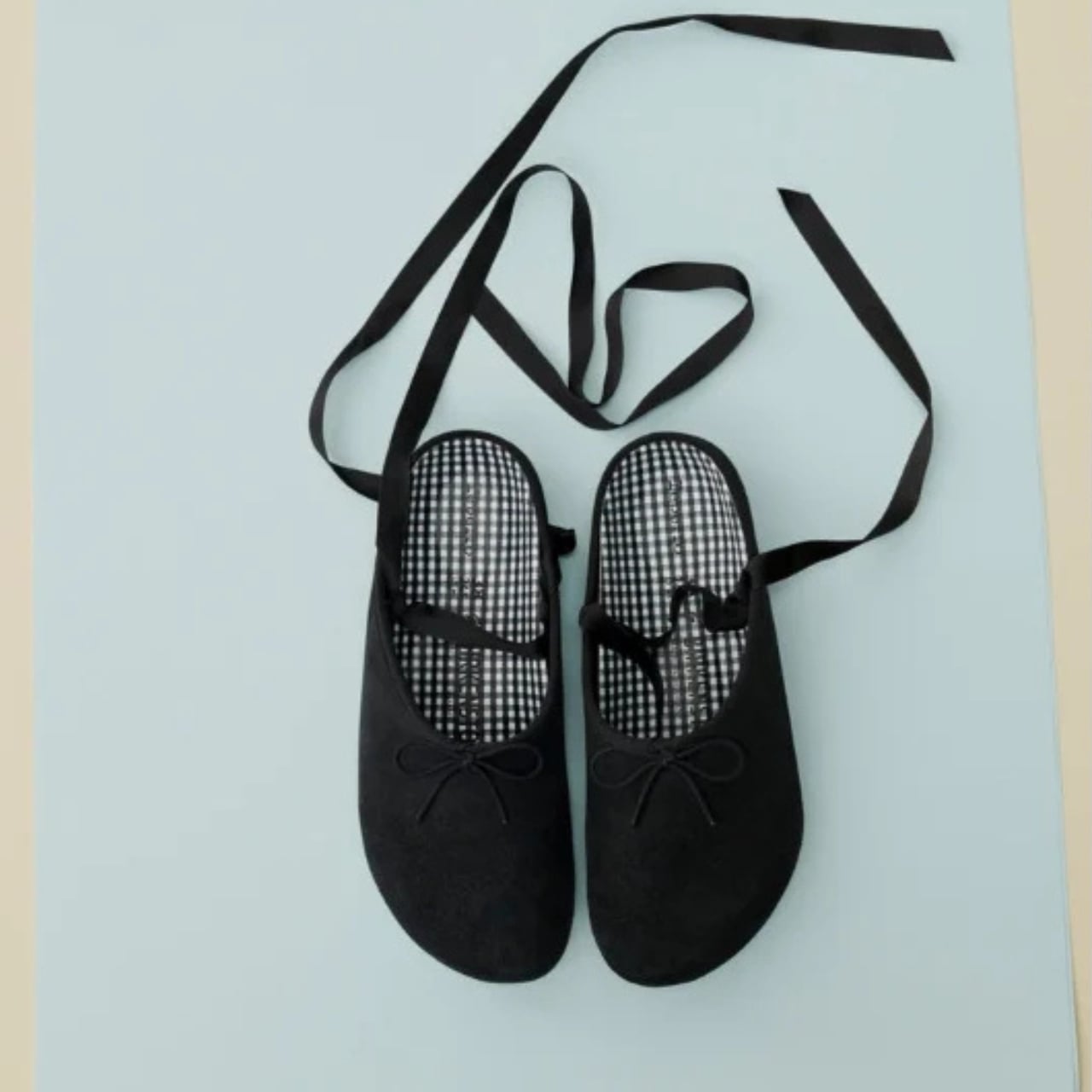
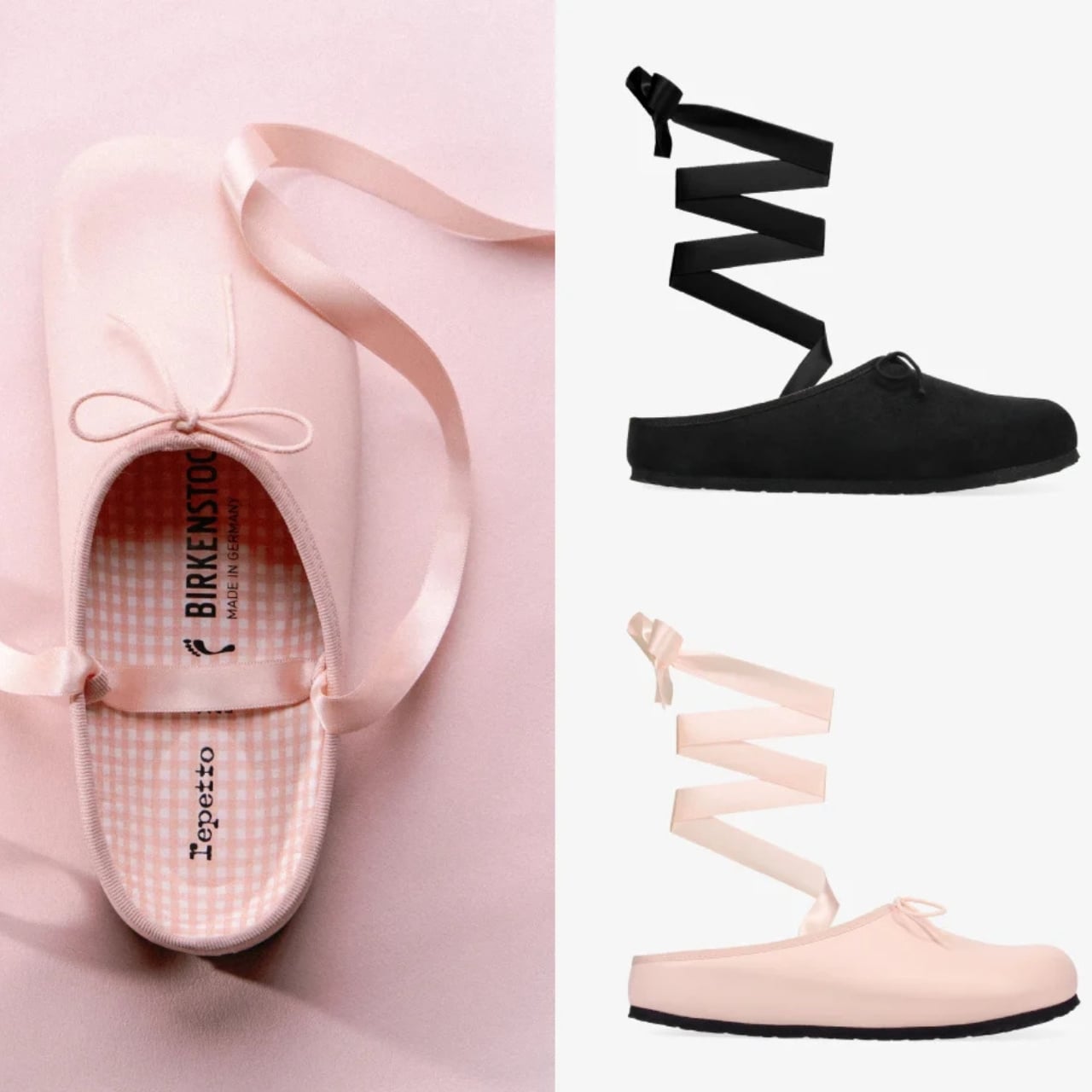
The Opéra sabot is the most adventurous piece of the three. It takes Birkenstock’s clog silhouette, one of the brand’s most architectural forms, and finishes it with long laces that wrap around the ankle the way a dancer’s ribbon would. The contrast between the solid, structured base of the clog and the softness of the wrapping lace is genuinely interesting from a design standpoint. It’s the piece that most clearly shows what happens when you treat a Birkenstock as a canvas rather than a finished object.

That framing came directly from Repetto CEO Charlotte Gaucher-Holmann, who described approaching Birkenstock’s silhouettes as a “blank canvas.” The result is a collection where neither brand disappears into the other. Birkenstock’s construction logic stays intact, the cork footbed, the contoured sole, the characteristic weight and proportion of each silhouette. Repetto layers its visual language on top without disrupting the architecture underneath.

That visual language is specific and consistent across all three pieces. The color palette draws from Repetto’s signature shades: Iconic Pink, Flame Red, and Profound Black. These are not trend colors. They’re house colors, the kind that have been associated with the brand long enough to carry their own meaning. The pink in particular has that very specific quality of being both soft and confident, which is harder to achieve in pigment than it sounds.

The Vichy-check gingham footbed lining is another detail worth pausing on. Hidden inside the shoe, it only reveals itself when worn. It’s a Repetto signature motif, and placing it at the footbed rather than on any visible exterior surface feels like a deliberate act of restraint. You know it’s there. It just doesn’t announce itself.

Grosgrain ribbon trim finishes the edges on key pieces, and again, the choice of material matters. Grosgrain has weight and structure. It doesn’t drape or flutter. For a collaboration rooted in dance, that tension between movement and structure runs all the way through the design decisions, from the buckle scale on the Arizona to the lace wrap on the Opéra.

The collection launches July 16 through 1774.com, Repetto’s own channels, and select retailers worldwide. Given how quickly 1774 collaborations have sold out historically, hesitating is probably not the strategy here. Iconic Pink alone is going to move fast.

The post Birkenstock Just Went to Ballet Class With Repetto first appeared on Yanko Design.