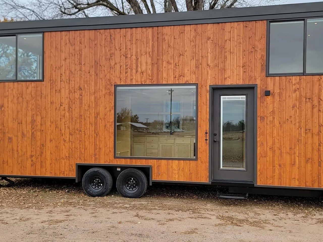
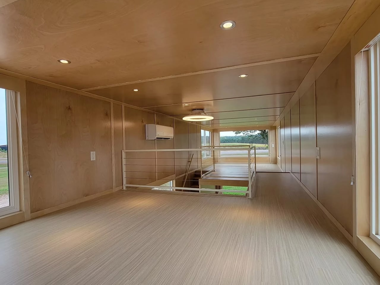
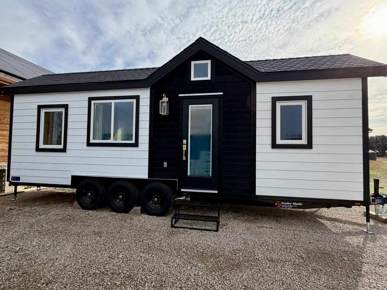
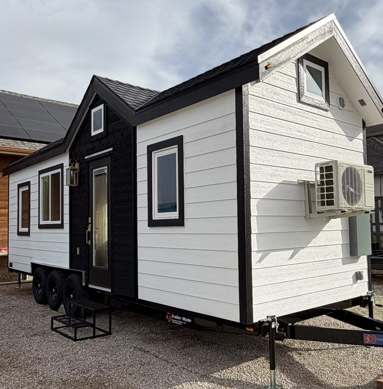
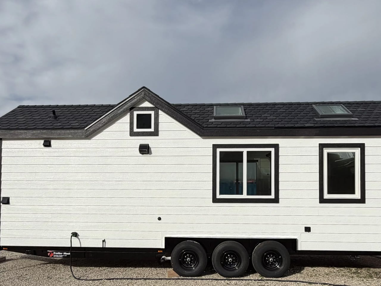
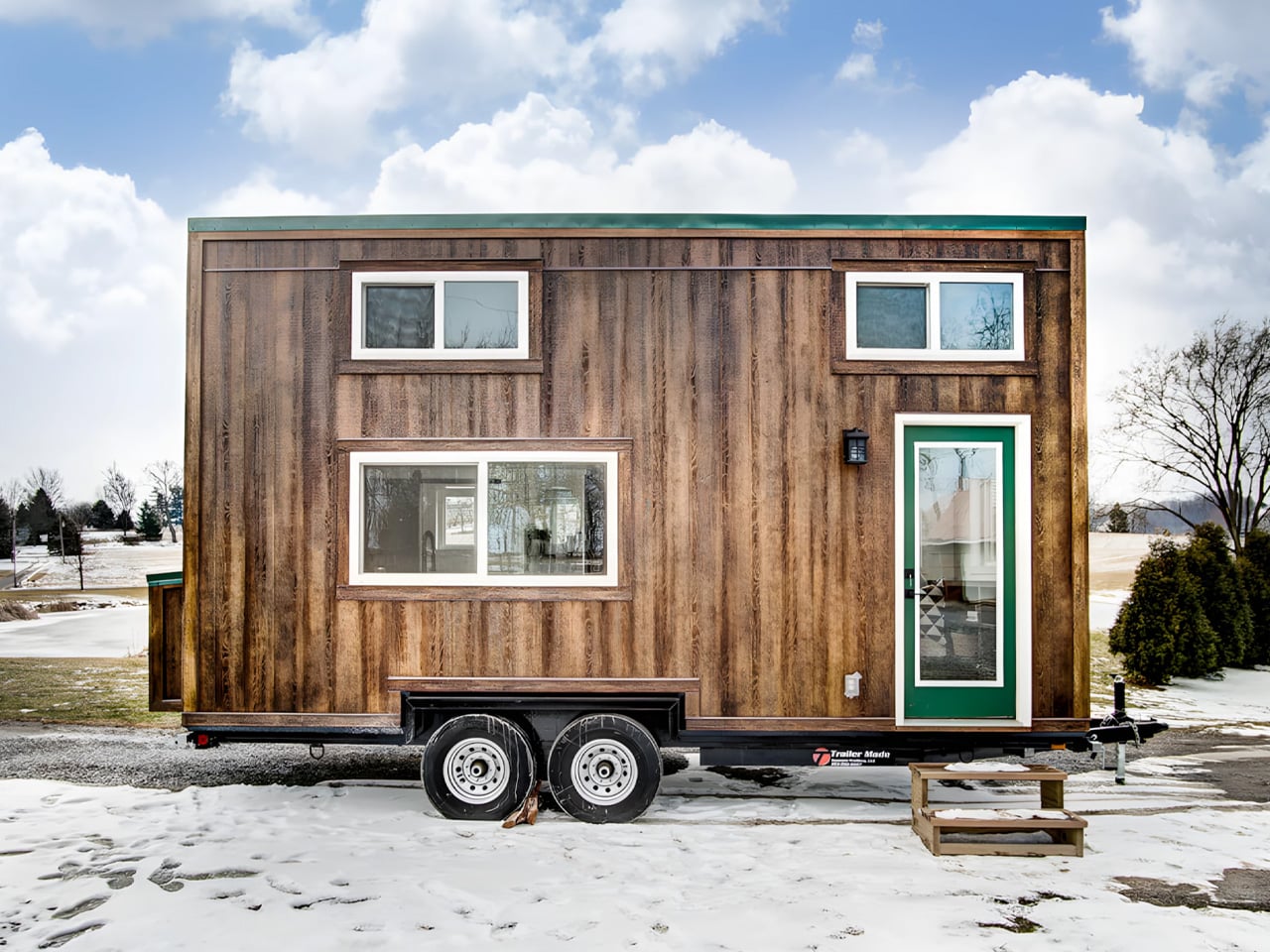
Most tiny houses on double-axle trailers share a common flaw. They prioritize portability over livability, squeezing interiors into standard widths that leave occupants navigating corridors rather than rooms. Escape’s eONE XL Wide & Tall rejects that compromise. At 9.6 ft (2.9 m) wide and 13.6 ft (4.2 m) tall, it exceeds standard tiny house dimensions on both axes, trading easy towing for something more difficult to find in this category: breathing room.
The trade-off is real, though. Those expanded dimensions mean a permit is required to tow it on public roads, which limits the spontaneous mobility that draws many buyers to trailer-based homes in the first place. Built on a double-axle trailer with a total length of 31 ft (9.45 m), the exterior is finished in custom-engineered wood siding topped by a metal roof. The eONE XL Wide & Tall is an upgraded version of Escape’s ONE XL, and the proportions immediately set it apart from the company’s other models.
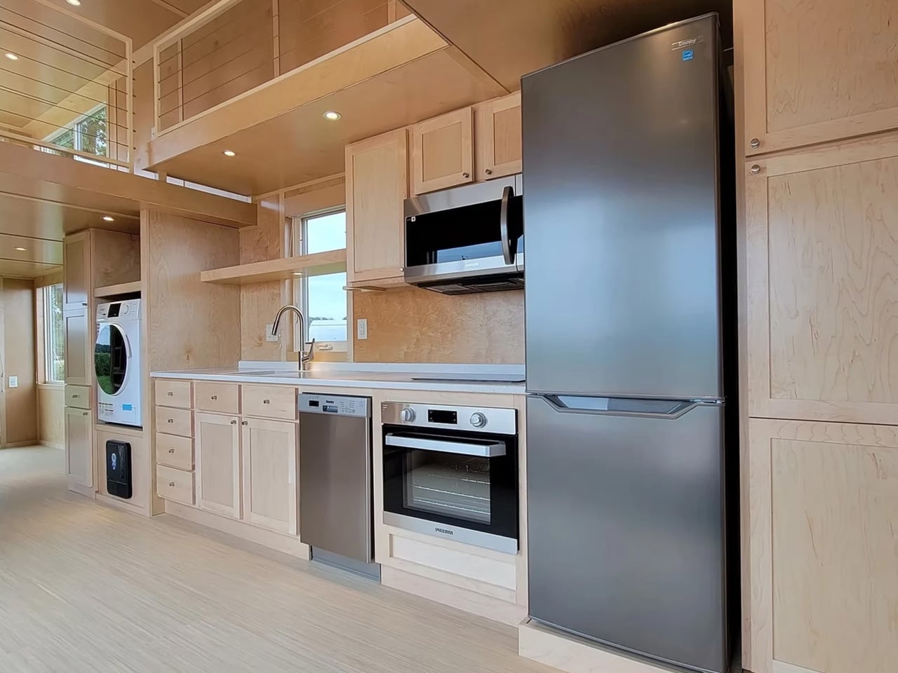
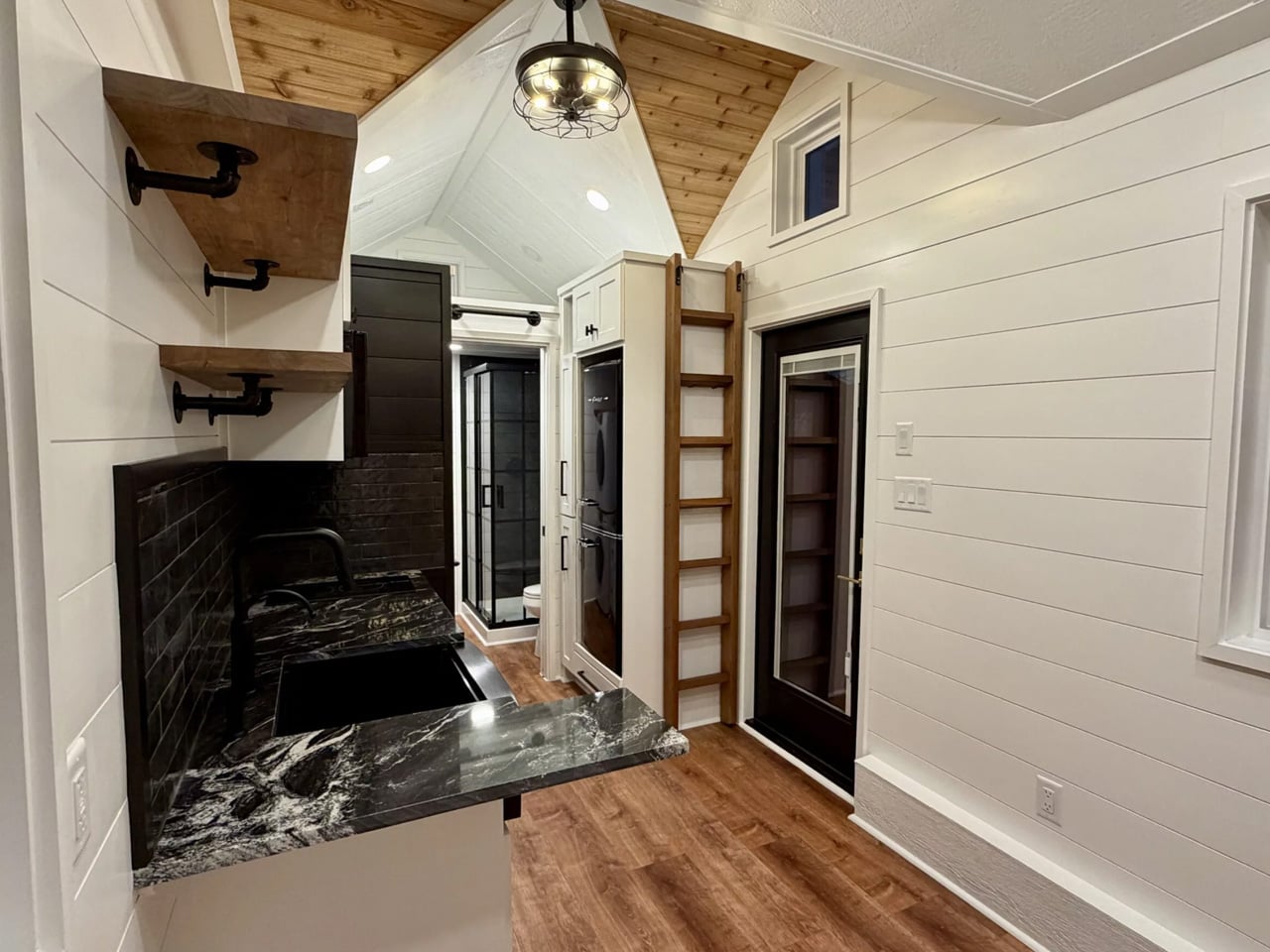
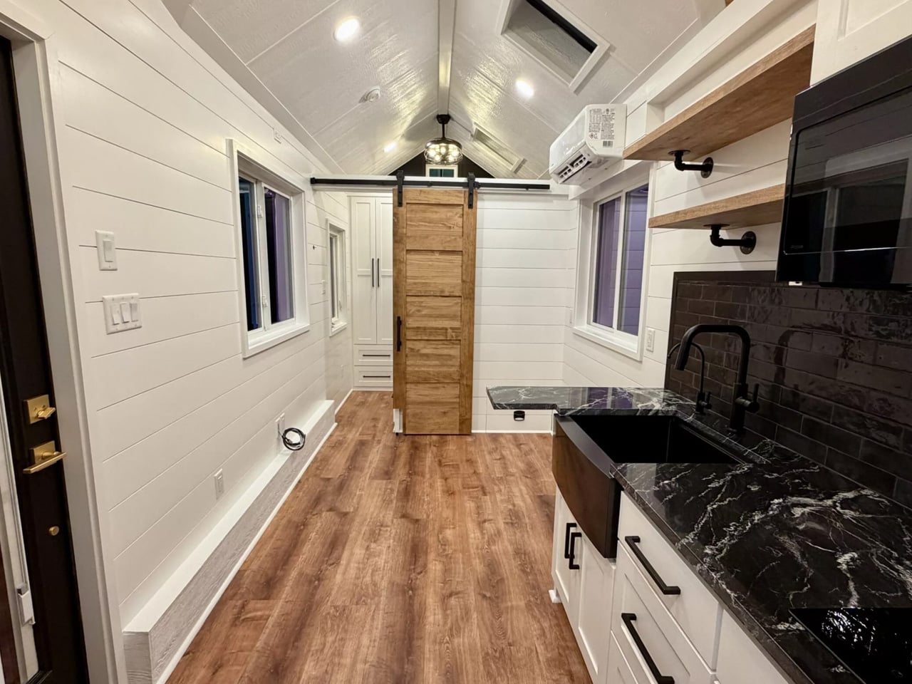
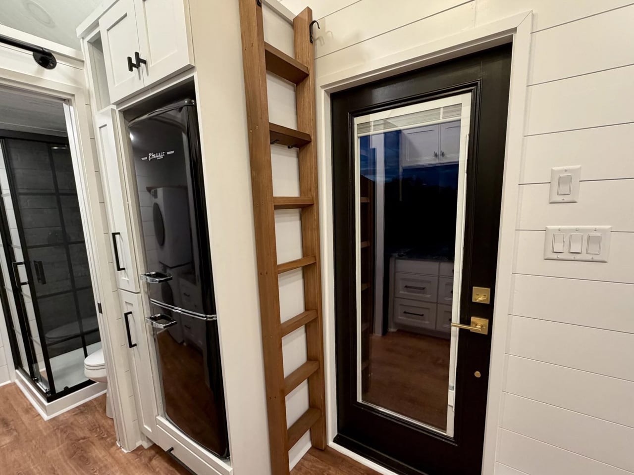
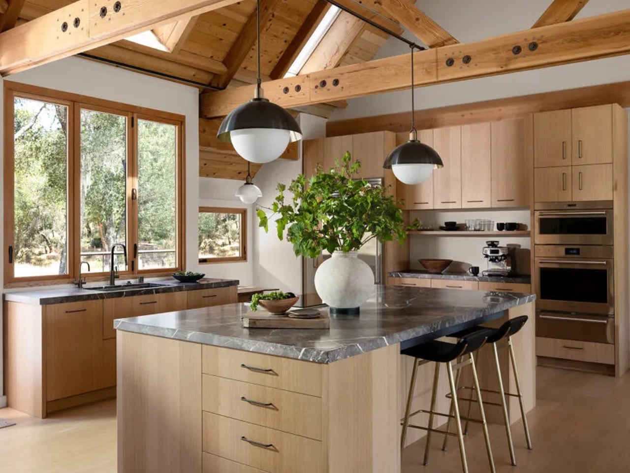
Step through the glass door entrance, and the kitchen occupies the first section of the ground floor. For a tiny house, the appliance list reads more like a residential spec sheet: electric oven, induction cooktop, sink, microwave, dishwasher, fridge/freezer, and a washer/dryer. Cabinetry lines the space generously. Where many tiny home kitchens force owners to choose between a cooktop and counter space, this layout accommodates both without the usual spatial tug-of-war. The dishwasher alone is a rarity at this scale, a small detail that signals Escape designed this for full-time habitation rather than weekend escapes.
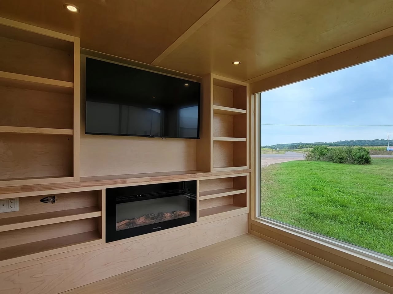
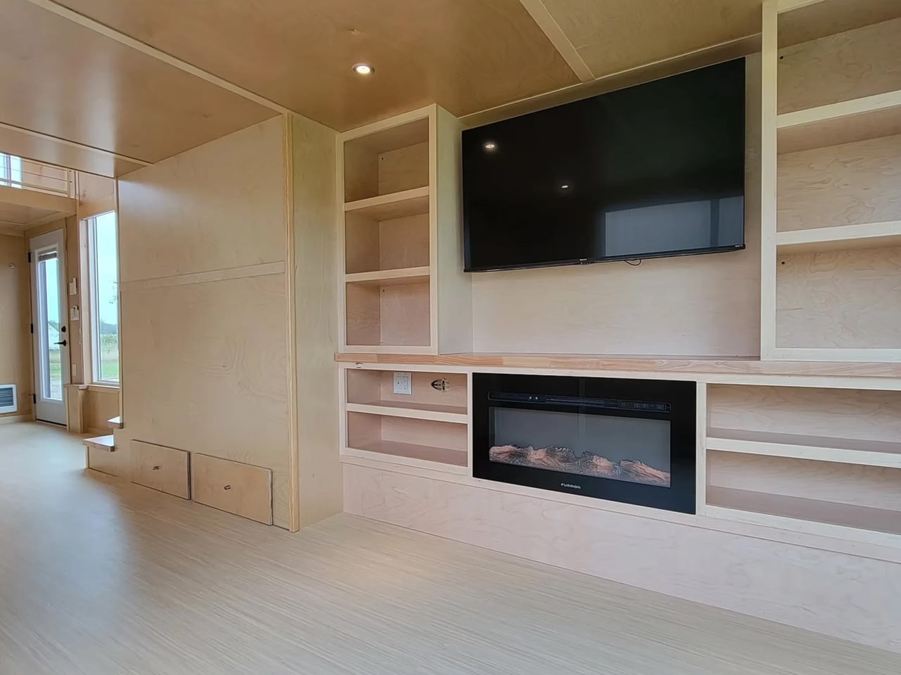
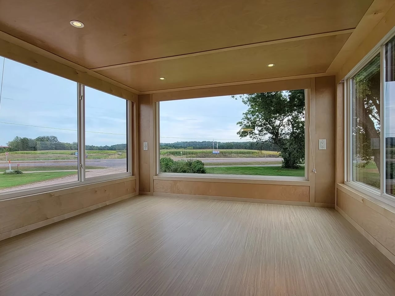
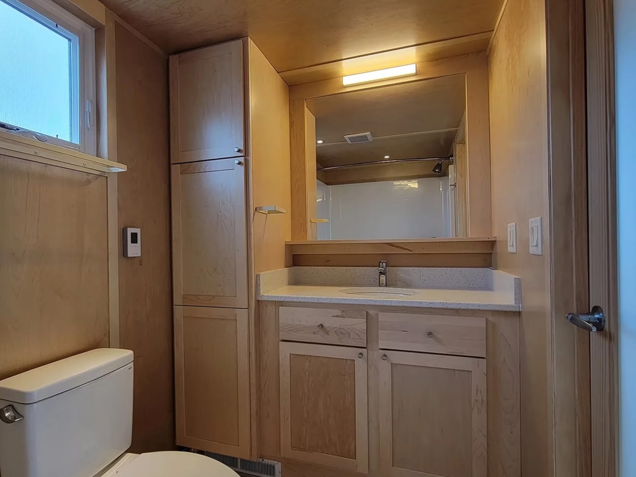
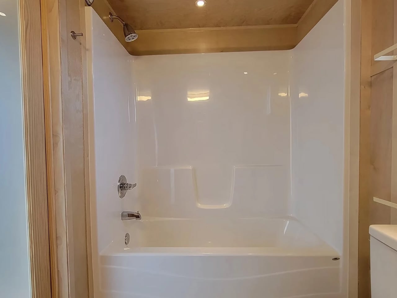
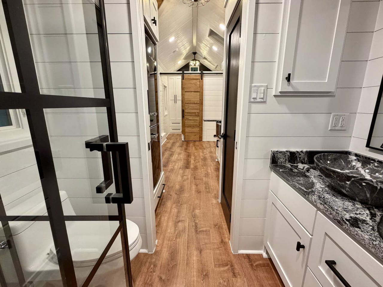
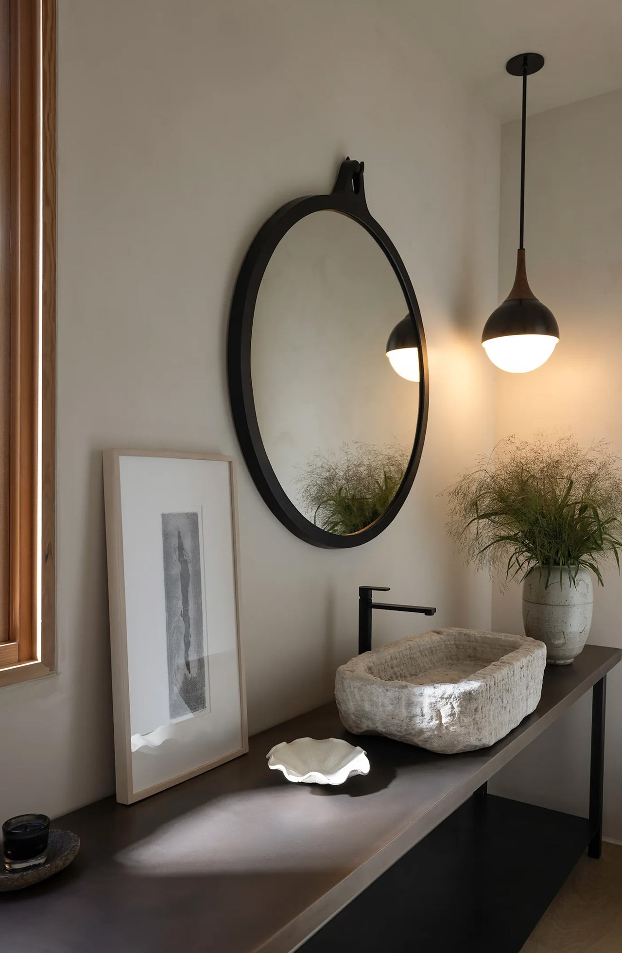
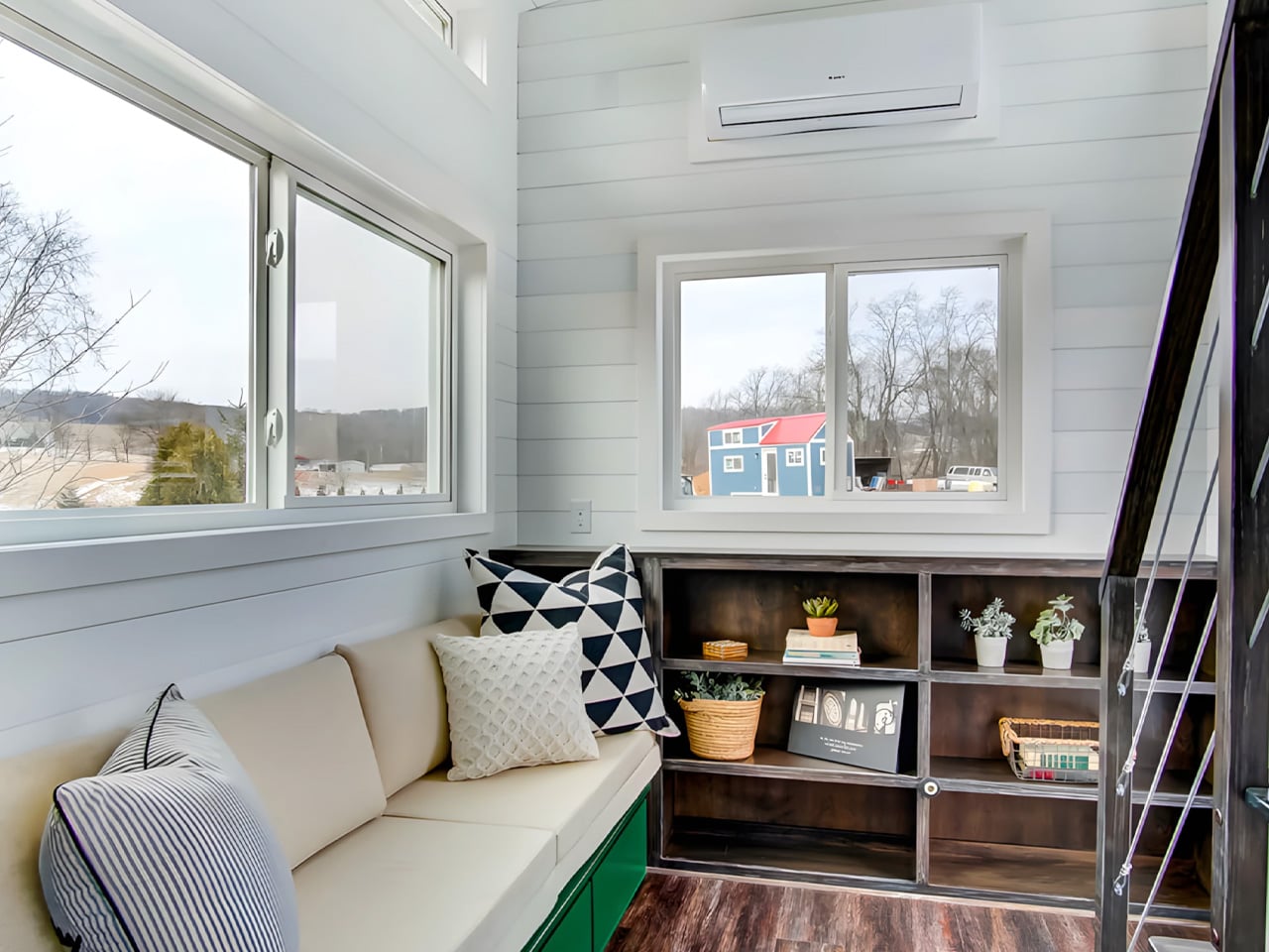
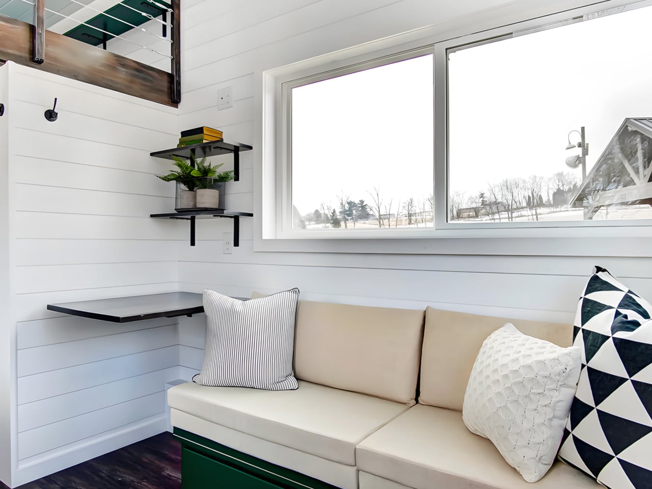
The kitchen flows into the living room, and the extra width becomes most apparent here. Generous glazing wraps a space large enough for a sofa, a full entertainment center with TV and electric fireplace, and additional storage. One large window frames the view and floods the room with daylight, turning what could feel like a dark box into something closer to a studio apartment. On the opposite end, the bathroom fits a vanity sink, flushing toilet, and a shower/bath combo, a feature that separates this from the shower-only compromises typical of the category.
A storage-integrated staircase (not a ladder, which matters for daily use) leads to the upper floor. The loft is a single open area divided into two connected sections joined by a small gangway. Ceiling height remains low, as expected in any lofted tiny home, but the extra overall height of the structure provides marginally more headroom than most competitors manage. The two sections can be configured as dual bedrooms or split between sleeping and storage, offering flexibility that a single undivided loft cannot match.
The eONE XL Wide & Tall is typically built to order, but the model shown is currently listed at $88,015. No delivery details have been published, so prospective buyers will need to contact Escape directly. At that price point, it sits in the upper range for trailer-based tiny homes, but the wider frame, full appliance suite, and dual-loft configuration position it closer to a permanent dwelling than a mobile novelty. Whether the permit-required towing is a dealbreaker depends entirely on how often the home will actually move.
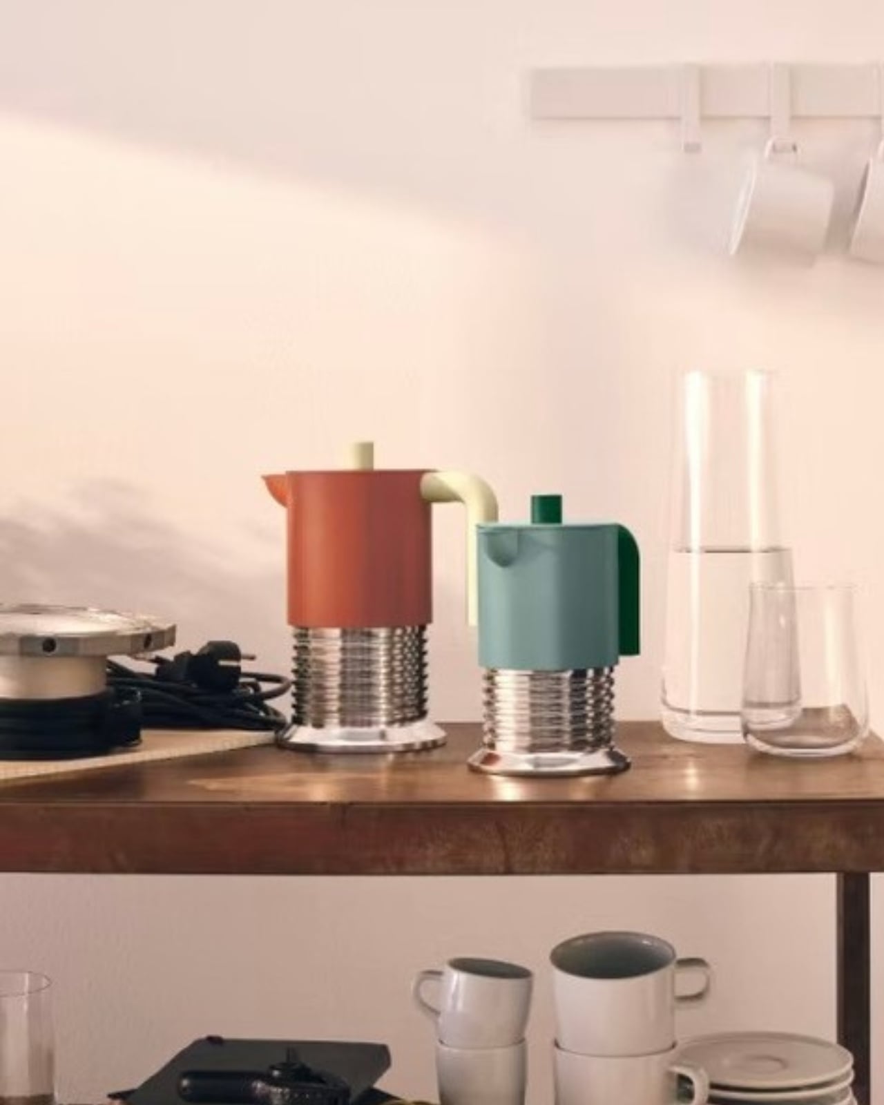
If you’ve ever watched someone twist the top half of a moka pot onto its base, you already understand the Vite. You just didn’t know it yet. That twisting motion, the one you do without thinking every morning, the mechanical ritual of threading metal against metal until it locks into place: that’s the entire design concept, made physical. Philippe Malouin took the gesture and turned it into the object itself, which is the kind of move that seems so simple you wonder why it took this long for someone to try it.
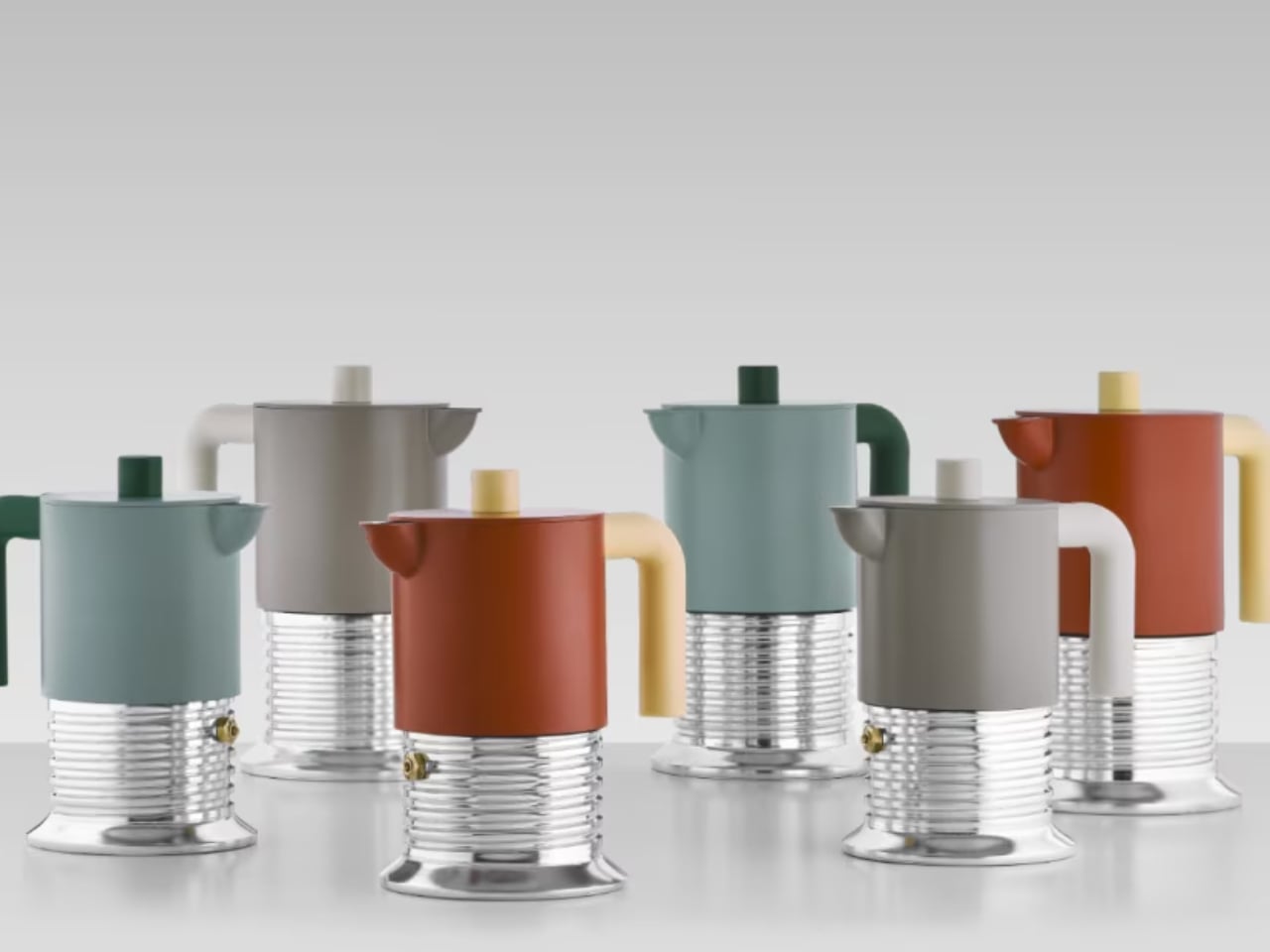
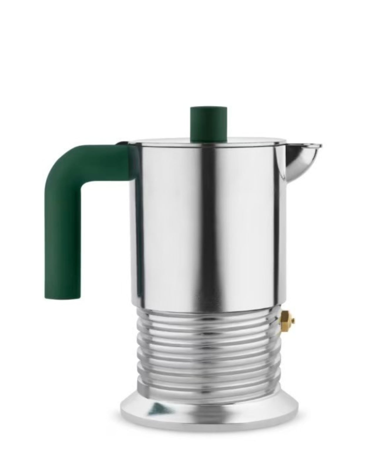
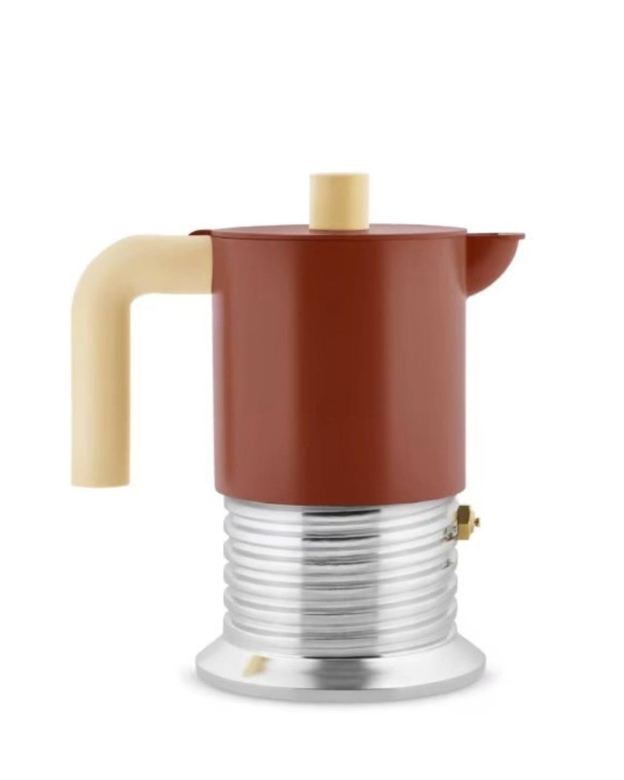
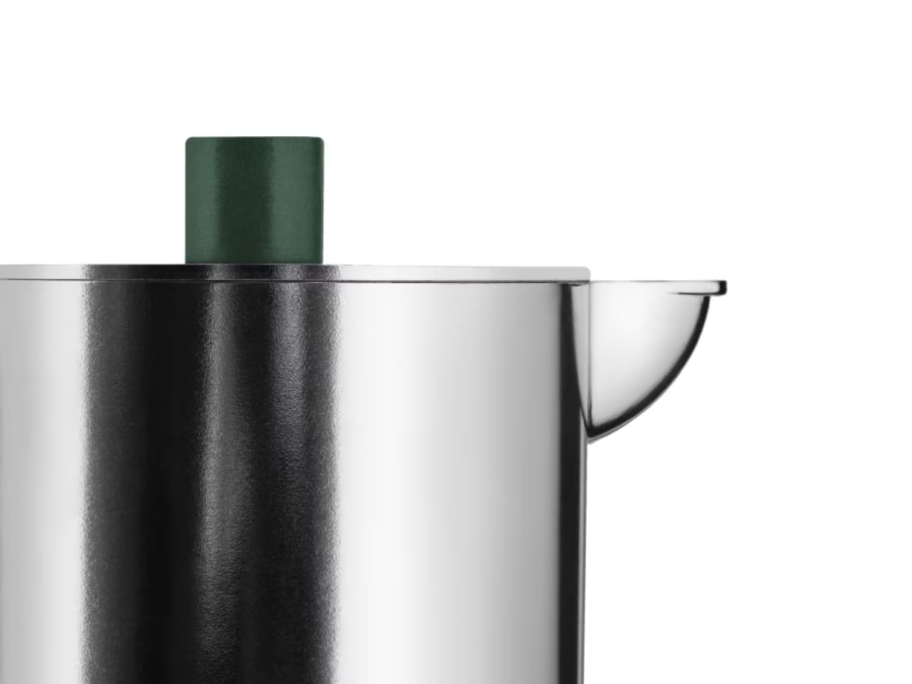
Alessi has just unveiled its latest moka pot, designed by Anglo-Canadian designer Philippe Malouin, and the concept is so obvious in hindsight that it’s almost frustrating nobody did it sooner. The pot is shaped like a screw. The boiler, which is the bottom chamber you fill with water, is wrapped in a pronounced helical thread that mirrors the exact twisting gesture you use to seal the two halves together. Form literally follows function, except here the form is the function, made visible and tactile and almost theatrical.
What makes the design work is how committed it is to the concept. Malouin didn’t soften the industrial reference or add decorative elements to make it friendlier. The thread is deep and aggressive, giving the aluminum body a tactile grip that feels engineered rather than styled. The upper chamber sits on top like a bolt head, clean and geometric, while a tapered pedestal at the base anchors the whole composition. That pedestal isn’t just aesthetic, it’s functional, designed to work on both gas flames and induction cooktops. Every element serves the central idea without compromise.
The construction is straightforward in the way good tools are straightforward. The helical form creates natural contours that make the pot easier to hold and twist, which means the design logic actually improves usability rather than sacrificing it for concept. The thread grooves catch light in a way that makes the object more visually dynamic depending on the angle, and the repetition of the spiral gives it a kinetic quality even when it’s sitting still on a counter.
Malouin has described his research process as drawing from “scrapyard works,” recovering discarded metal parts and recombining them into something new. That approach is visible here. The Vite looks like it was pulled from a bin of machine components and repurposed, which gives it an honesty that a lot of contemporary design lacks. It doesn’t try to hide what it is or smooth over its mechanical origins. The aluminum stays raw and utilitarian, the proportions stay true to hardware logic, and the result is something that feels more like a precision instrument than a kitchen accessory.
The name reinforces the concept. “Vite” is Italian for screw, but it also means “quickly” or “fast,” which layers in a reference to espresso culture and the speed of the brewing ritual. Whether that double meaning was intentional or accidental, it works. Good design tends to accumulate meaning like that, where the formal decisions align with the cultural context in ways that feel inevitable once you notice them.
What I find most compelling is how the design makes you pay attention to something you normally ignore. Every time you screw a moka pot shut, you’re performing the exact motion the Vite is built around, but the traditional design doesn’t acknowledge it. Malouin’s version does. It takes an unconscious gesture and makes it conscious, turns routine into ritual, and does it without adding complexity or decoration. The form just clarifies what was always there.
That clarity is what separates this from novelty design. The screw isn’t a gimmick. It’s the logic of the object, made legible. The thread pattern serves the function, the industrial aesthetic serves the origin, and the overall composition serves the experience of using it. Everything aligns, which is harder to achieve than it looks.
Tiny house living often demands tough trade-offs between mobility and livability, but Decathlon Tiny Homes aims to strike an appealing balance with its latest model, the Betty. At 28 feet long, this towable home sits comfortably in the mid-size category, offering enough room for a thoughtfully designed two-person layout without sacrificing the ability to hit the road.
Built on a triple-axle trailer, the Betty features an exterior clad in engineered wood with composite roof shingles — a combination that keeps things durable and low-maintenance. But the real story is what’s inside.
The heart of the Betty is its kitchen, which occupies the center of the floor plan and punches well above its weight class. Quartz countertops, a deep farmhouse-style sink, and generous cabinetry — including a sizable pantry — give the space a polished, functional feel. A breakfast bar provides a casual dining spot, while appliances include a microwave, a two-burner induction cooktop, and a fridge/freezer. Practical extras like a reverse-osmosis water filtration system and a garbage disposal round out the package.
Living and Sleeping Spaces
Adjacent to the kitchen, the living room is cozy but well-equipped, with room for a sofa, a mini-split air-conditioning unit, and a bit of additional storage. It’s a modest footprint, but it serves its purpose as a place to unwind. One of Betty’s best features is its ground-floor bedroom, accessed through a sliding barn-style door. Unlike loft bedrooms common in tiny homes, this space offers full standing headroom…a welcome luxury. The room includes a queen bed platform with two large integrated storage drawers, a built-in wardrobe, and generous glazing, including a skylight to flood the room with natural light. A wall-mounted TV completes the setup.
Bathroom and Loft
On the opposite end of the home, a pocket sliding door leads to the bathroom. Inside, residents will find a vanity sink topped with matching black quartz, a stacked washer/dryer, a flushing toilet, and a glass-enclosed shower. The Betty also includes a loft space, though it lacks the egress windows typically required for a legal sleeping area in most jurisdictions. Instead, it’s best suited as a storage zone or hobby room — still a useful addition in a home where every square foot counts.
Pricing
Decathlon Tiny Homes hasn’t released exact pricing for the Betty, but it’s based on the company’s Athena series, which starts at $79,500. For those interested in a closer look, the firm has published a detailed video walkthrough. For couples seeking a compact, well-organized home on wheels, the Betty makes a compelling case that downsizing doesn’t have to mean compromising on comfort or style.
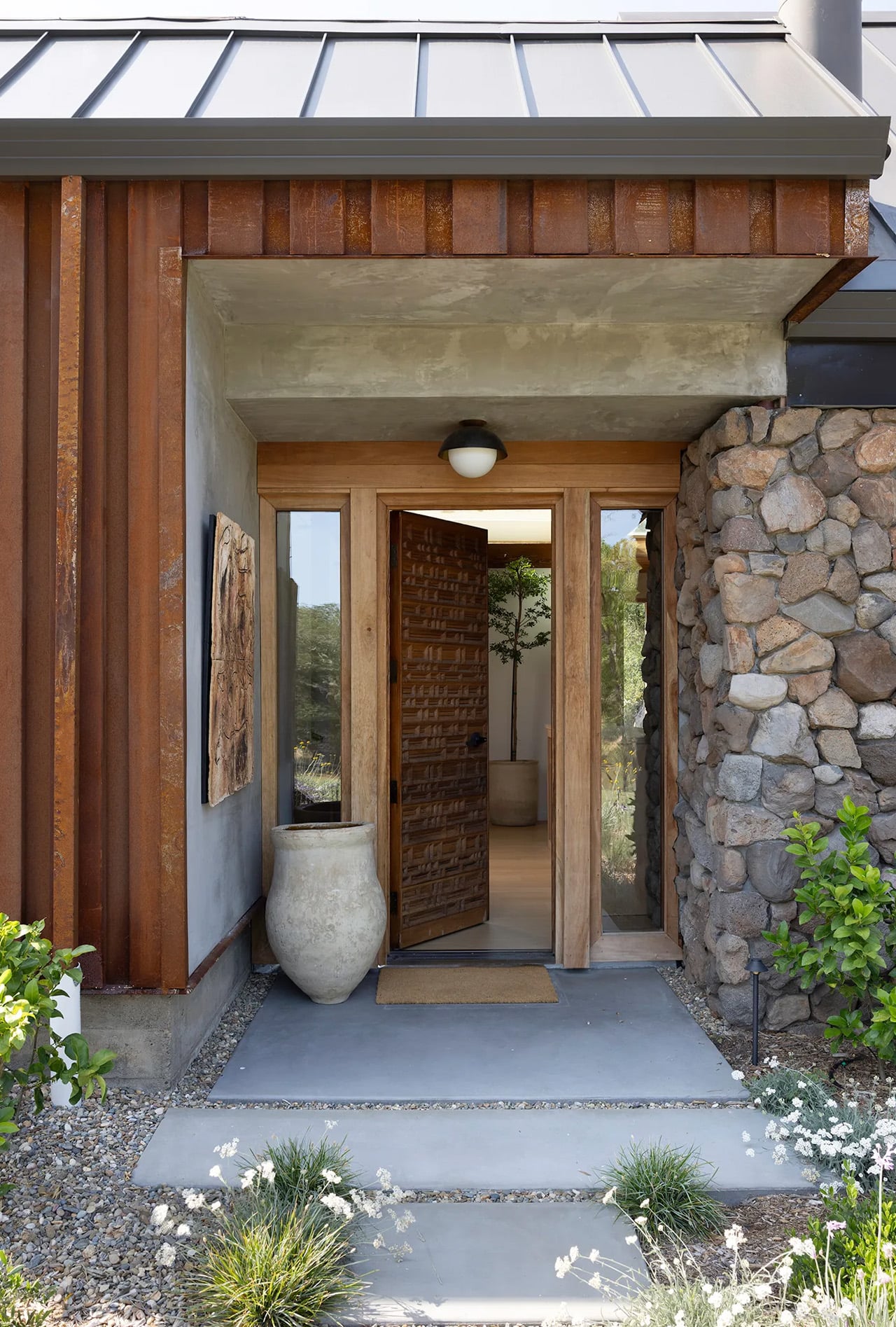
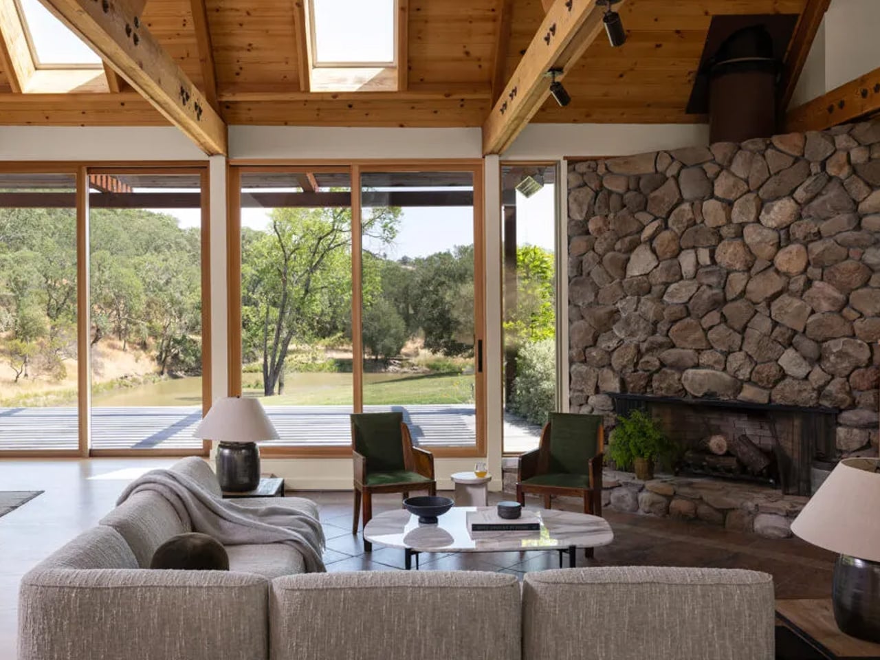
Tucked into the rolling hills of Glen Ellen in Sonoma County, a 14-acre estate carries the kind of stillness that most people spend a lifetime chasing. The land has its own private lake, wildlife moving freely at every hour, and a canopy of Northern California nature that presses in from every direction. At its center sits a house — modest in its ambitions but precise in its relationship to the ground beneath it.
That precision traces back to its original designer, J. Lamont Langworthy, an architect whose name sits just outside the mainstream conversation about California Modernism despite a body of work that more than earns a place in it. Langworthy spent a decade designing hillside homes in Laguna Beach, developing a philosophy rooted in site sensitivity and structural clarity. Architecture critic Alan Hess described his work as carrying a disciplined spatial intelligence — houses that didn’t impose themselves on their environments but instead grew out of them organically.
Designer: J.Lamont Langworthy
Langworthy himself is as layered as his architecture. A home winemaker, sculptor, painter, and self-published author, he eventually settled in Sonoma County, where he spent years managing a century-old building he had personally renovated. The Glen Ellen house represents an earlier chapter of his career — one that, by the time the current owners purchased the property in 2014, had quietly come to an end. The architecture still held its shape, but years of neglect had taken a toll on everything surrounding it.
The renovation was handed to Westward Atelier, whose approach mirrored the same instinct Langworthy brought to the original design — let the land lead. Principal Nikki spoke about the project with the reverence the setting demands, describing the property as something her clients recognized immediately as rare. The brief wasn’t to modernize or reimagine from scratch. It was to restore confidence to a house that had lost it, while preserving the spatial logic that made it worth saving in the first place.
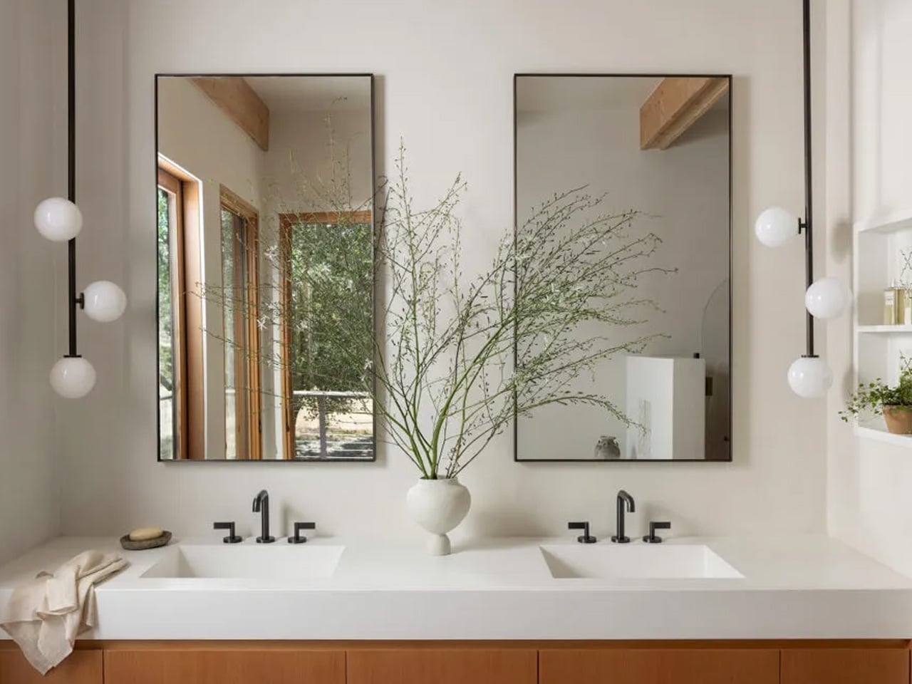
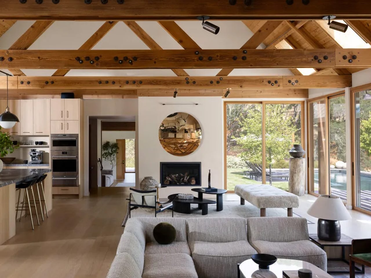
Inside, the most significant transformation occurred in the kitchen. What had been a closed, compartmentalized room was opened to the main living area, with a natural stone island becoming the new visual and social anchor of the space. Concrete countertops and timber cabinetry were paired with bronze hardware and brass fixtures, pulling warmth into what could have easily read as cold. A collection of Southwestern pottery arranged on open shelving added personality without noise, while white oak floors carried the palette quietly through the rest of the home.
The primary suite presented its own challenge. Rather than reconfigure the existing bedroom, the team added a new north-facing suite designed entirely around calm and privacy. The original master was then converted into a communal gathering space oriented toward the sweeping outdoor views — a decision that rebalanced the whole home around generosity rather than hierarchy. Creamy white walls, marble surfaces, and expansive glass throughout keep the interior quiet enough that the lake, the trees, and the wildlife beyond the windows remain, always, the main event.
Living small has a perception problem. Most people associate compact spaces with sacrifice, with the slow creep of clutter and the resignation that comes from owning less. But the best tiny home accessories flip that narrative entirely, turning constraints into opportunities for deliberate, considered living. The products on this list do not just fit into small spaces; they make small spaces feel intentional.
What separates a well-designed tiny home from a cramped apartment is not square footage. It is the objects inside it. Every item earns its place, or it does not belong. That principle drove our selection here: seven accessories that pull double duty, look better than they have any right to, and solve problems that only people who live in tight quarters truly understand.
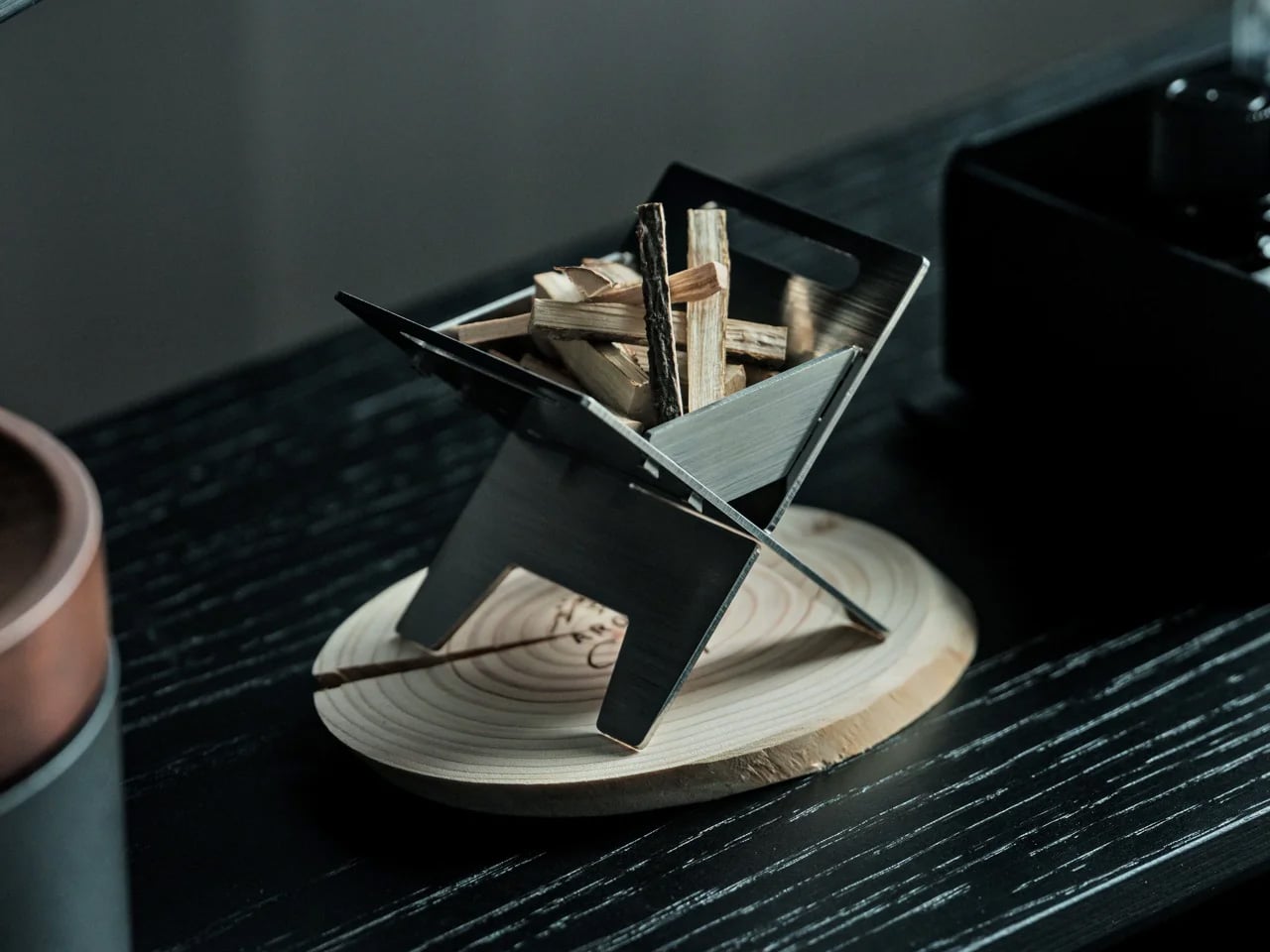
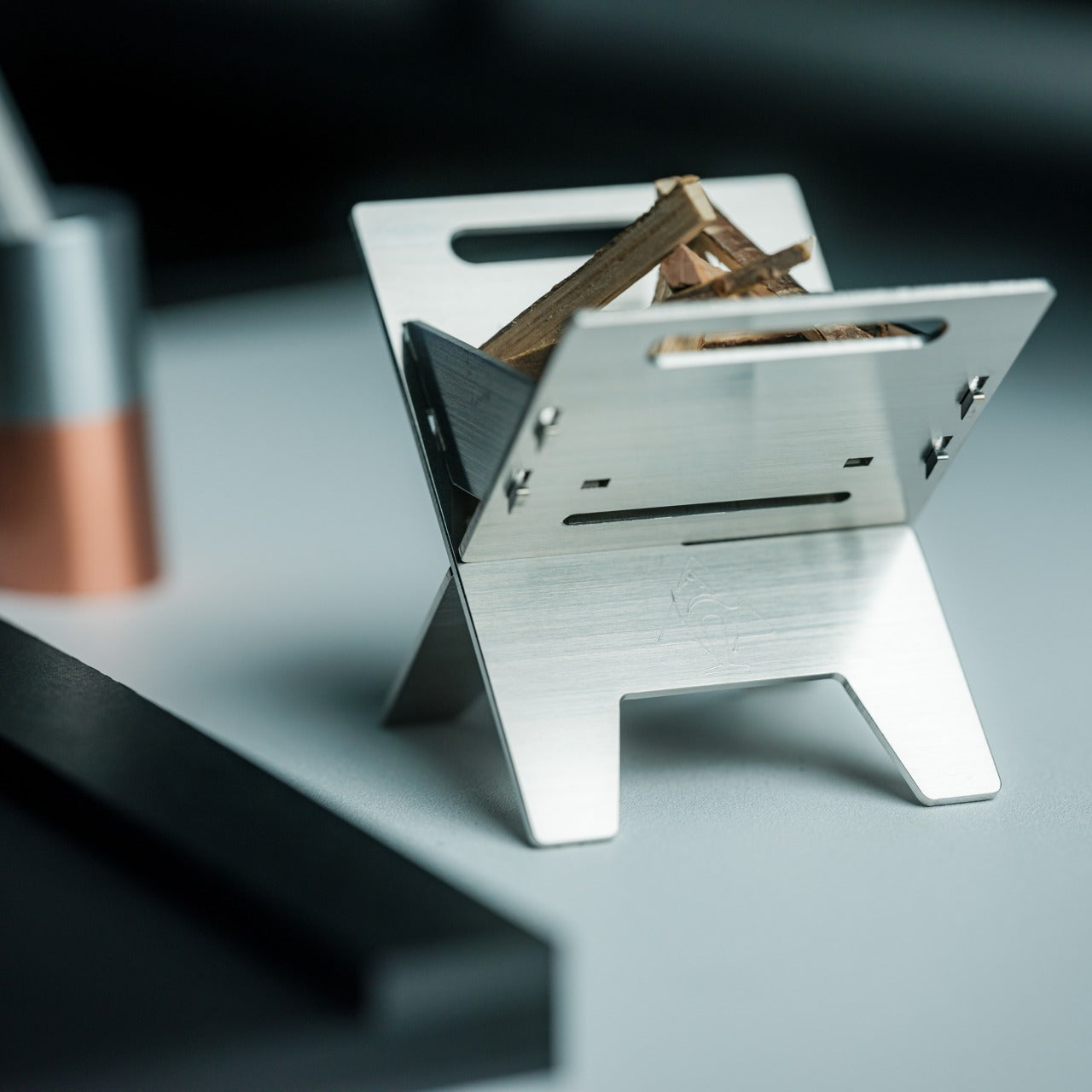
1. Miniature Bonfire Wood Diffuser- A tiny bonfire that never burns out.
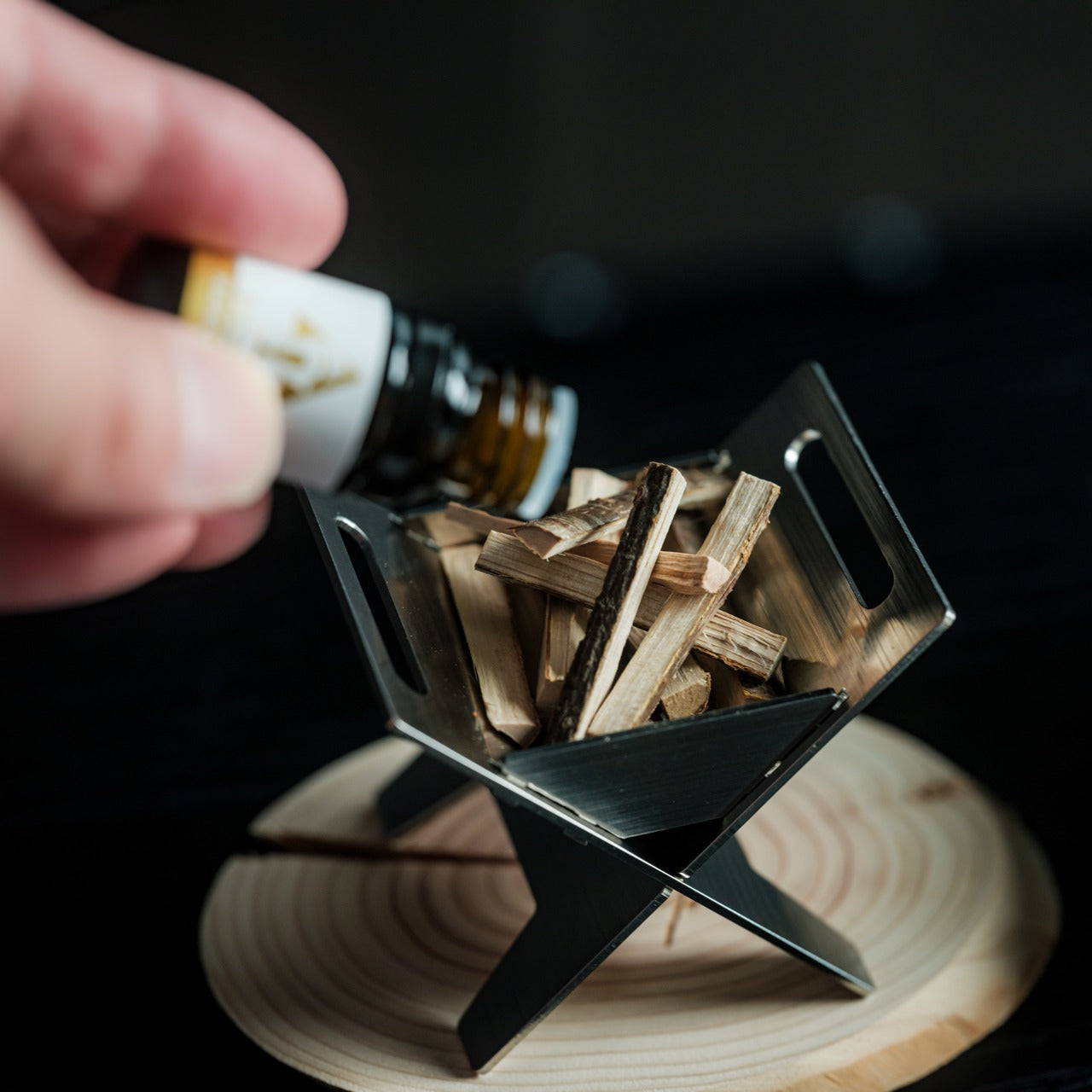
The miniature bonfire wood diffuser set does something rare for a home fragrance product: it gives you a reason to stare at it. Built from rust-resistant stainless steel, the set recreates a campfire scene at desktop scale, complete with miniature firewood bundled with a tying knot. The essential oil captures the scent of Mt. Hakusan, a Japanese mountain known for its dense cedar forests, and the firewood pieces distribute that fragrance with a slow, even release that synthetic plug-in diffusers cannot match.
In a tiny home, scent fills a room faster and lingers longer than it would in a larger space. That concentration works in this diffuser’s favor, but the real reason it belongs on this list is the trivets. Remove them from the base, and the diffuser transforms into a pocket stove capable of warming small portions of food. For anyone living in a space where every object needs to justify its existence, a centerpiece that doubles as a cooking surface is the kind of thinking that makes compact living feel clever rather than constrained.
Rust-resistant stainless steel construction means it ages well in humid or kitchen-adjacent environments
Trivets convert the decorative diffuser into a functional pocket stove, adding genuine utility to an ornamental object
What we dislike
The essential oil scent is specific to Mt. Hakusan, which limits fragrance variety without purchasing additional oils separately
The miniature scale, while charming, means the heat output of the stove is minimal to reheating rather than actual cooking
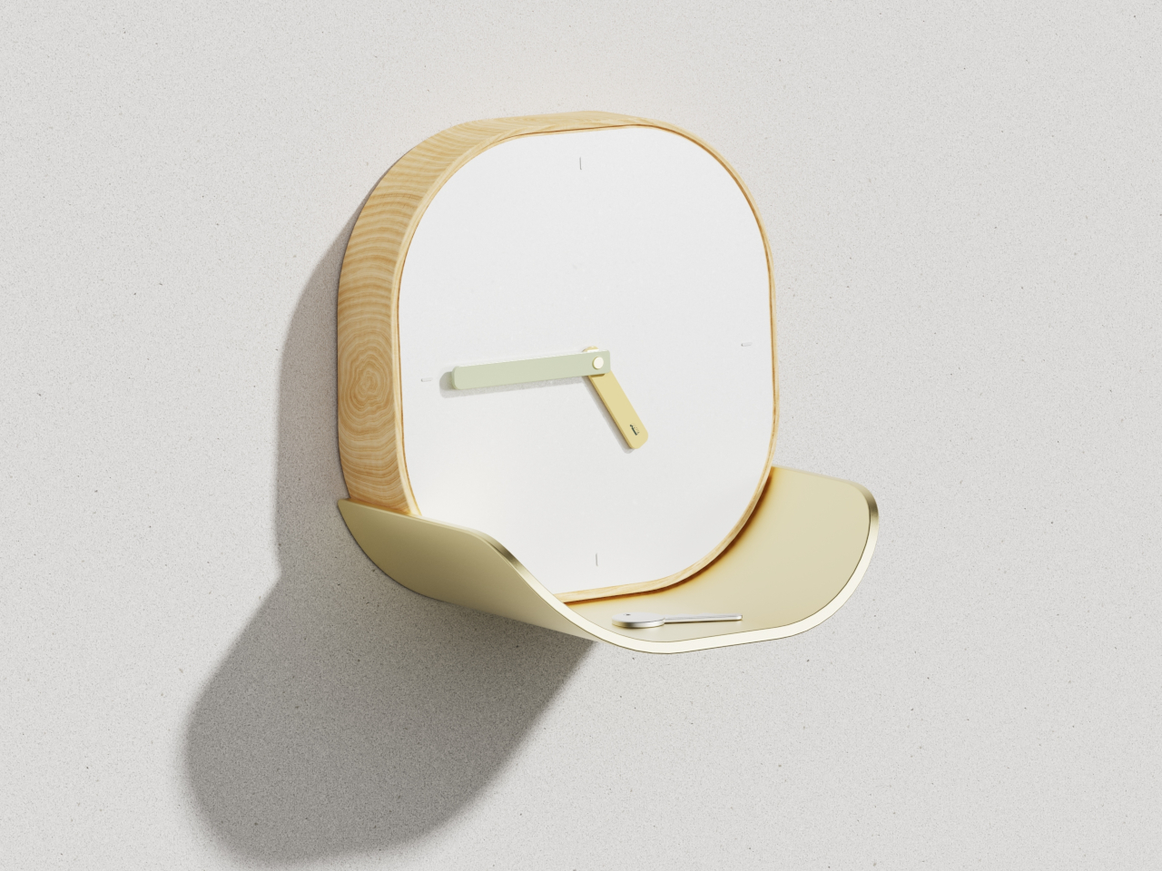
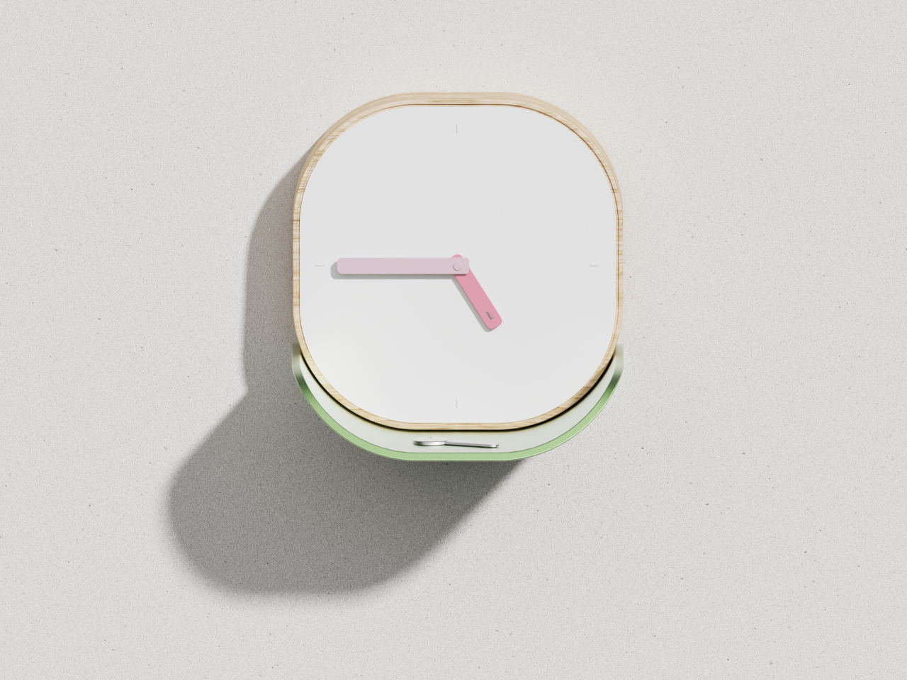
2. Lotus Clock – A wall clock that catches your keys.
The Lotus clock takes its cues from nature in a way that feels functional rather than decorative. Inspired by the way lotus leaves gather water in their gentle curves, the clock integrates a curved metal tray directly beneath its face, sized to hold keys, loose change, or other daily carry items. The wooden frame has soft, rounded corners, and the clean white face keeps time-reading effortless. Broad, flat hands coordinate with the tray’s finish, tying the clock’s two functions into a single visual statement.
Tiny homes struggle with the small-object problem: keys, coins, earbuds, and pens that scatter across every available surface and create visual noise. The Lotus clock solves this by assigning those objects a permanent home on the wall, freeing up counter and table space that compact kitchens and entryways cannot afford to lose. Available in soft gold or gentle green colorways, the piece complements different interior styles without competing for attention. The concept is a wall clock, but the execution is a storage solution disguised as one.
What we like
The biomimetic tray design turns a single-purpose wall object into a genuine organizational tool for daily carry items
Soft colorway options (gold, green) let it blend into varied interior palettes without adding visual clutter
What we dislike
As a concept design, availability and final production specs remain unconfirmed
The tray’s capacity is limited to lightweight, small items, so it will not replace a proper entryway organizer for larger households
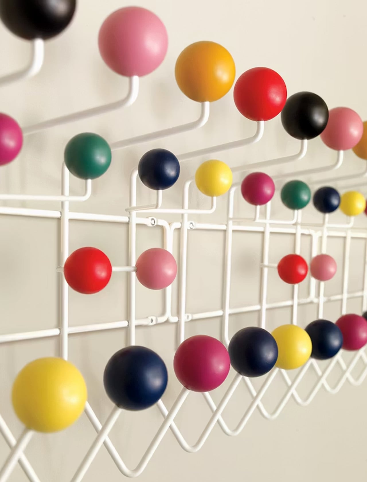
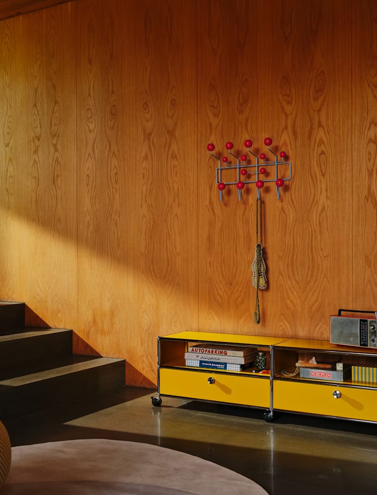
3. Eames Hang-It-All – Fourteen hooks wrapped in wooden spheres and wire.
The Eames Hang-It-All, designed by Charles and Ray Eames, is one of those rare objects that has remained in continuous production since 1953 for a reason no one can argue with: it works. The design uses a welded steel wire frame with fourteen lacquered wooden balls in various colors, each one with a hook. The structure mounts flat against the wall and occupies almost no depth, which makes it ideal for narrow hallways and entryways where a traditional coat rack would block the path.
In a tiny home, vertical storage is everything, and the Hang-It-All exploits wall space that would otherwise sit empty. The colored spheres turn utilitarian storage into something worth looking at, which matters in a space where every object is visible at all times. Originally designed to encourage children to hang up their belongings, the playful form has aged into an adult staple that brings warmth to minimalist interiors without the heaviness of a wooden coat rack or the coldness of bare metal hooks.
What we like
The welded wire frame sits almost flush against the wall, consuming minimal hallway depth in tight entryways
Multiple color combinations available, allowing the piece to function as both storage and wall art simultaneously
What we dislike
The price point through Design Within Reach positions it as a premium purchase for what is, functionally, a coat hook
Fourteen hooks sounds generous, but the spacing means heavy coats can crowd each other and obscure the design
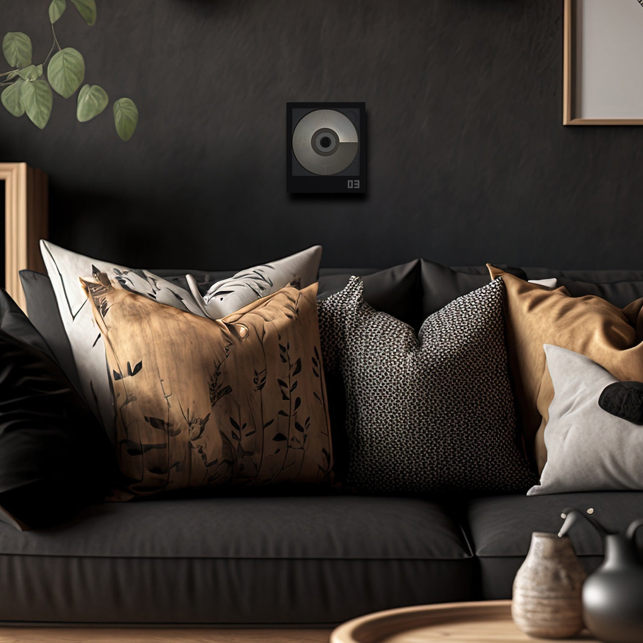
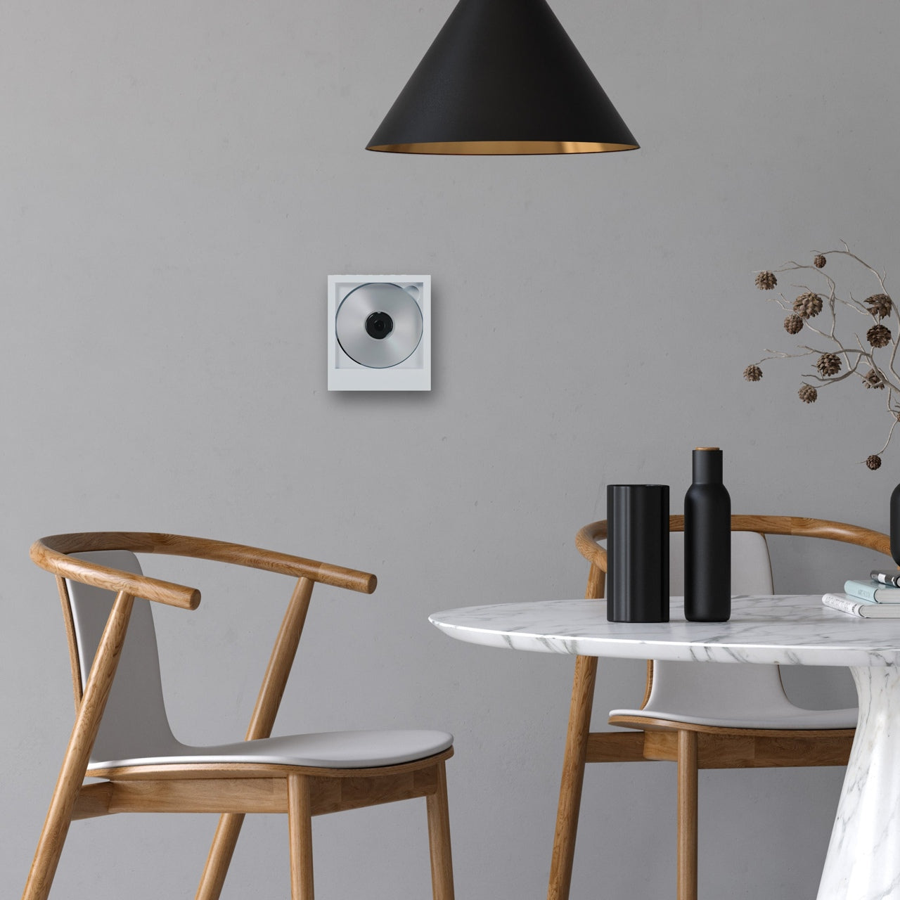
4. CD Jacket Player – Physical media turned into wall-mounted decor.
The CD jacket player does not pretend that CDs are making a comeback in any mainstream sense. Instead, it treats them as objects worth displaying, building a player around the album jacket rather than hiding it inside a drawer. The minimalist frame holds the CD’s cover art front and center, and a wall mount bracket lets the entire unit hang like a small piece of art. A built-in battery means it works on the go, and Bluetooth 5.0 connectivity lets it pair with wireless speakers and earphones.
Tiny homes demand that objects do more than one thing, and a music player that doubles as wall art earns its square footage in a way a Bluetooth speaker sitting on a shelf never could. The design acknowledges that people who still own CDs are emotionally attached to the physical format, to the artwork, and the ritual of selecting a disc. Mounting the player on the wall removes it from the counter, the nightstand, or whatever other surface it would otherwise claim. In a 400-square-foot space, that kind of reclaimed real estate adds up.
Wall-mount capability turns the player into displayable art, removing it from limited counter and shelf space
Bluetooth 5.0 means wireless pairing with existing speakers, so it does not demand its own audio setup
What we dislike
The audience for a physical CD player in 2026 is narrow, making this a niche purchase even among design-conscious buyers
Built-in battery life for portable use remains unspecified, and running both a motor and Bluetooth drains cells quickly
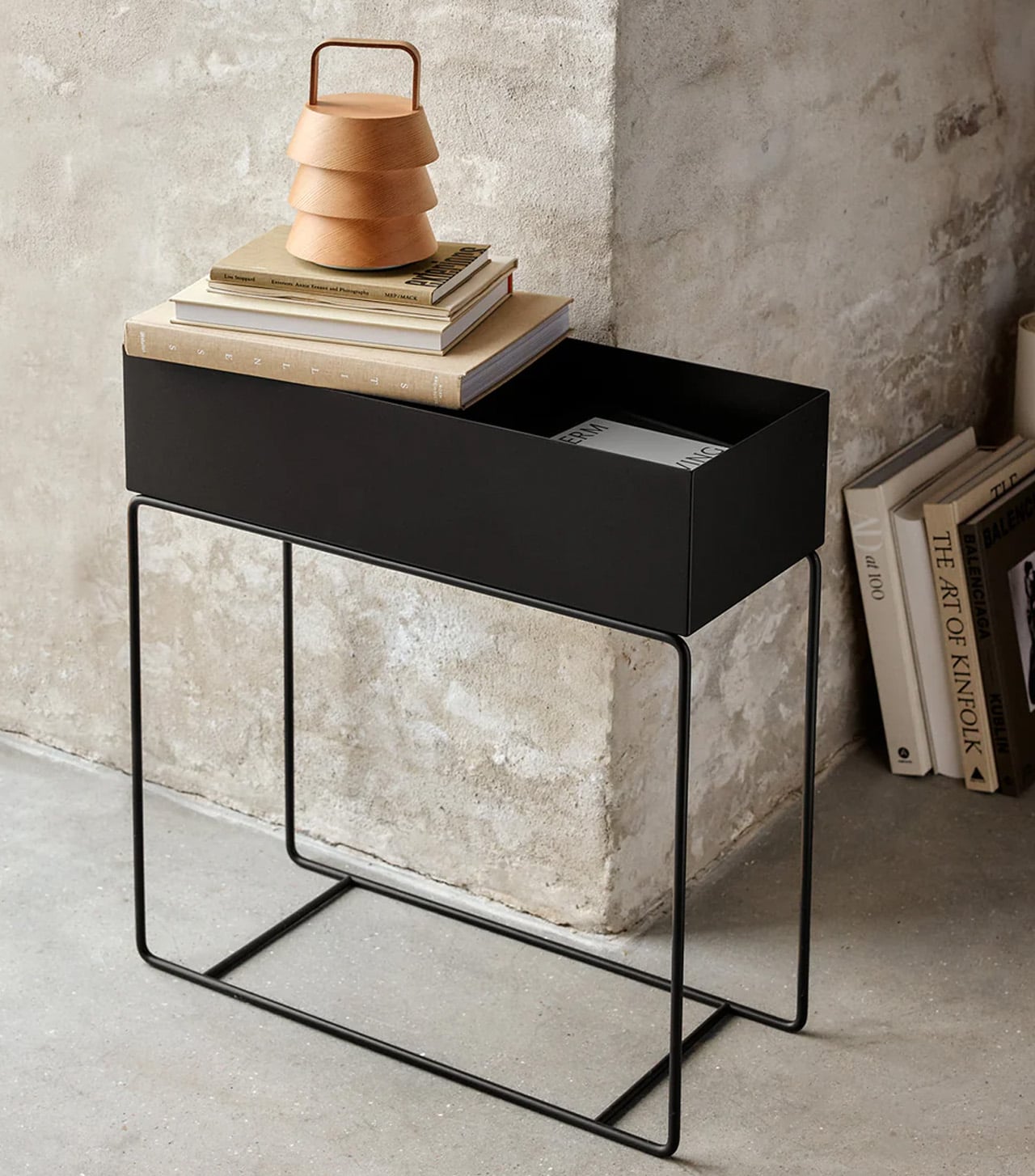
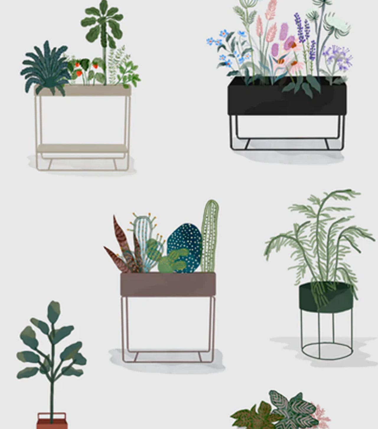
5. Ferm Living Plant Box – A planter that reorganizes your entire floor plan.
The Ferm Living plant box is, at its simplest, a rectangular metal box on thin legs with a powder-coated finish. But its real value in a tiny home has nothing to do with plants. The box’s proportions and height make it a room divider, a bookshelf, a toy bin, or a display surface that creates the illusion of separate zones within an open floor plan. The slim legs keep sightlines open at floor level, which is a small detail that makes a big difference in preventing a small room from feeling boxed in.
Studio apartments and single-room tiny homes rarely have the luxury of walls. The plant box fills that gap by creating what designers call “islands,” small zones of activity defined by furniture rather than architecture. Place it between a sleeping area and a desk, fill it with trailing plants or stacked books, and the eye reads two separate spaces where only one exists. The powder-coated metal is easy to wipe down, resistant to moisture, and available in black, a color that recedes visually and lets the objects inside take focus.
What we like
Thin legs preserve floor-level sightlines, preventing the visual weight that closed-base furniture adds to compact rooms
Multipurpose use as a planter, divider, bookshelf, or toy storage gives it a role in every room without redundancy
What we dislike
The open-top design means dust collects on whatever is stored inside, requiring regular maintenance in exposed layouts
Weight capacity is limited by the thin leg construction, so heavier items like large potted plants or dense book collections need caution
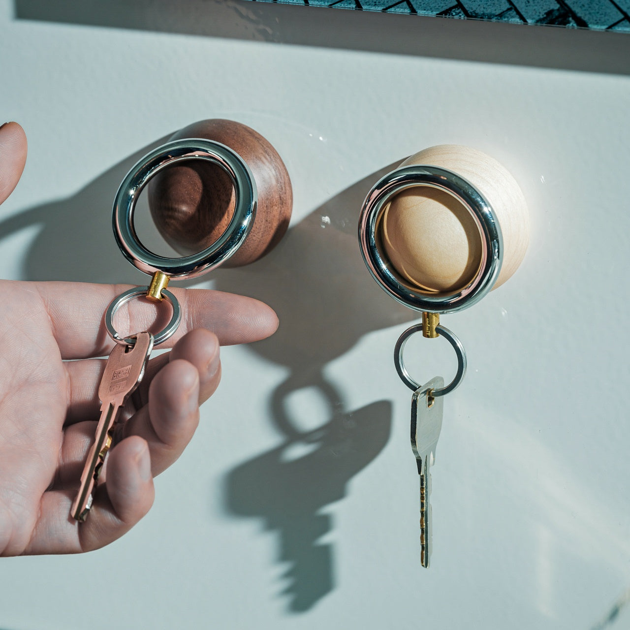
6. Key Holder Wakka – Neodymium magnet meets Japanese woodcraft.
The Key Holder Wakka turns the act of putting down your keys into something you look forward to. The system pairs a stainless steel, iron, and brass keyring with an elegant wooden base (available in maple or walnut). A neodymium magnet holds the ring securely in place, and separating the two produces a distinct, brisk tapping sound. That sound is the entire point. In a tiny home, where every habit compounds in visibility, a designated key spot eliminates the daily search-and-panic cycle.
The design logic here is behavioral rather than decorative. By making the act of placing keys enjoyable, the Wakka trains a habit through positive reinforcement rather than guilt. The wooden base is small enough to sit on a windowsill, a narrow shelf, or beside a door frame without claiming space that other items need. The material combination of warm wood and cool metal reads as considered rather than cluttered, which matters when every object on a surface contributes to the visual temperature of the entire room. Losing your keys in 300 square feet should be impossible, but anyone who has lived small knows it happens constantly.
The neodymium magnet holds the keyring firmly in place, preventing the drift that happens with open trays and bowls
Audible feedback when placing or removing keys creates a sensory ritual that reinforces the habit of using the holder
What we dislike
The system requires using the specific Wakka keyring, so existing keychains or fobs need to be transferred or replaced
At its core, this is a single-purpose object: it holds one set of keys, which limits utility for multi-person households
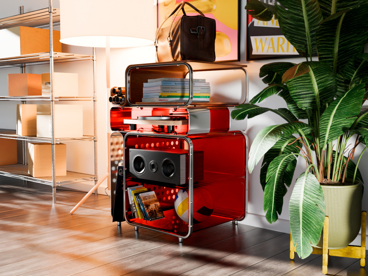
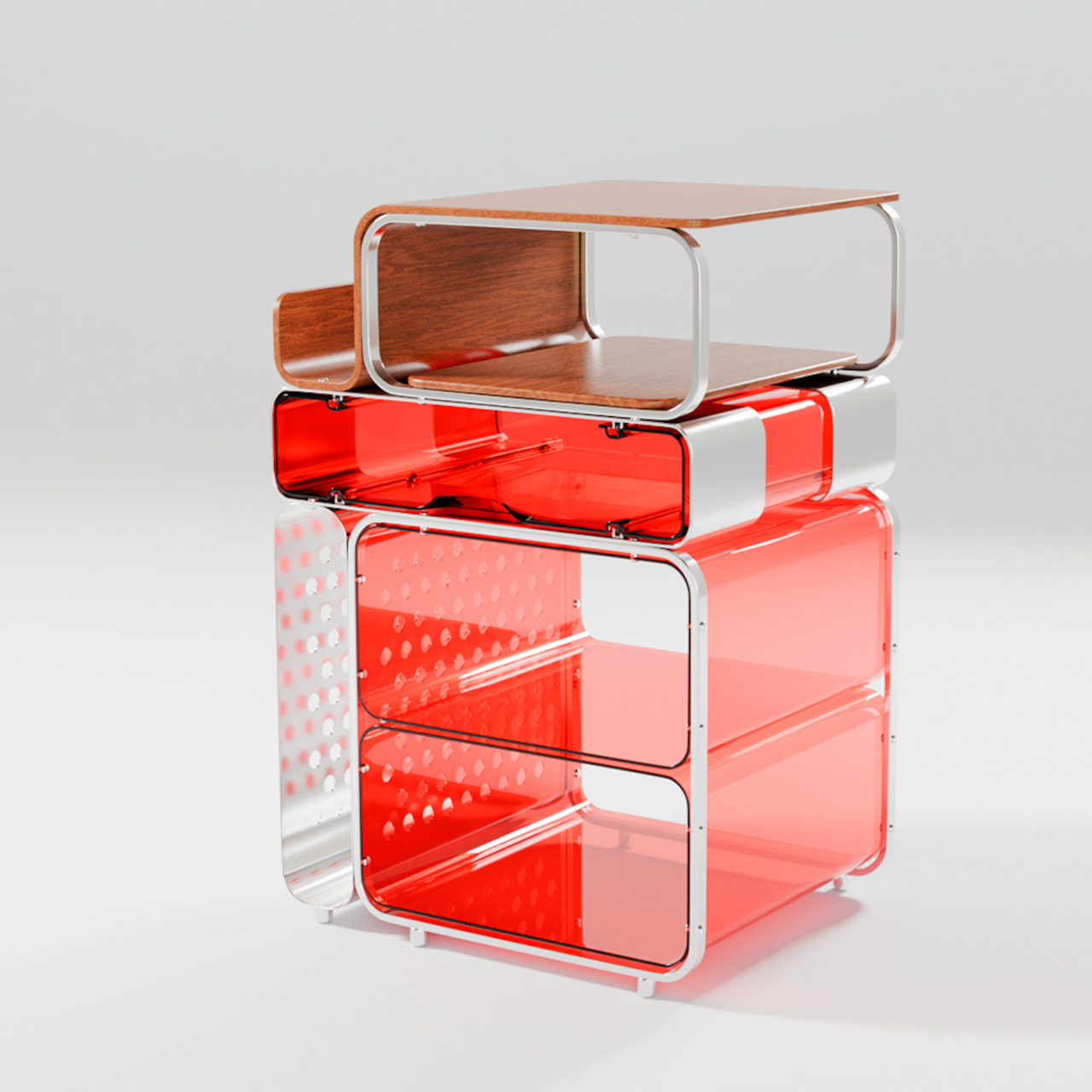
7. TUMBA Modular Shelf System – Lego logic applied to storage furniture.
The TUMBA modular shelf system addresses the single biggest frustration with flat-pack furniture: fixed dimensions. Where conventional shelving forces rooms to conform to predetermined sizes, TUMBA offers stackable modules made from recycled polymer that lock together without tools. High-strength plexiglass provides structural transparency, stainless steel connections snap securely into place, and the swirled textures in each panel carry visible traces of the material’s previous life. The bold colors and playful forms make the storage itself worth looking at.
Tiny homes change. A shelf configuration that works in January stops making sense after a furniture rearrangement in March, and traditional shelving punishes that flexibility with disassembly headaches and leftover hardware. TUMBA’s tool-free construction means reconfiguring takes minutes, and the modular format lets it grow vertically in tight corners or stretch horizontally along narrow walls. For renters in compact spaces who move frequently, a shelf system that breaks down and rebuilds without damage is less of a convenience and more of a necessity. The recycled material story is a bonus, but the real selling point is permission to change your mind.
What we like
Tool-free assembly and reconfiguration mean the shelf adapts to layout changes without the frustration of traditional flat-pack rebuilds
Recycled polymer construction gives each panel a unique swirled texture that standard particle board or MDF cannot replicate
What we dislike
Bold colors and playful forms may clash with more subdued or neutral interior palettes common in compact living spaces
Plexiglass panels, while visually light, are more prone to surface scratching than solid wood or metal shelving alternatives
Where Small Living Gets Interesting
The common thread across these seven products is not size. It is intent. Each one was designed with the understanding that small spaces do not need small thinking. They need objects that work harder, look better, and respect the reality that in a tiny home, there is no junk drawer to hide mistakes in. Every surface is a display, every object is a statement, and every purchase is a commitment.
What makes compact living feel like a design choice rather than a compromise has less to do with architecture and more to do with curation. The right diffuser, the right clock, the right shelf system: these are the decisions that turn 300 square feet into a space that feels chosen rather than settled for. And in a world that keeps building bigger, there is something satisfying about proving that less, when it is the right less, is more than enough.
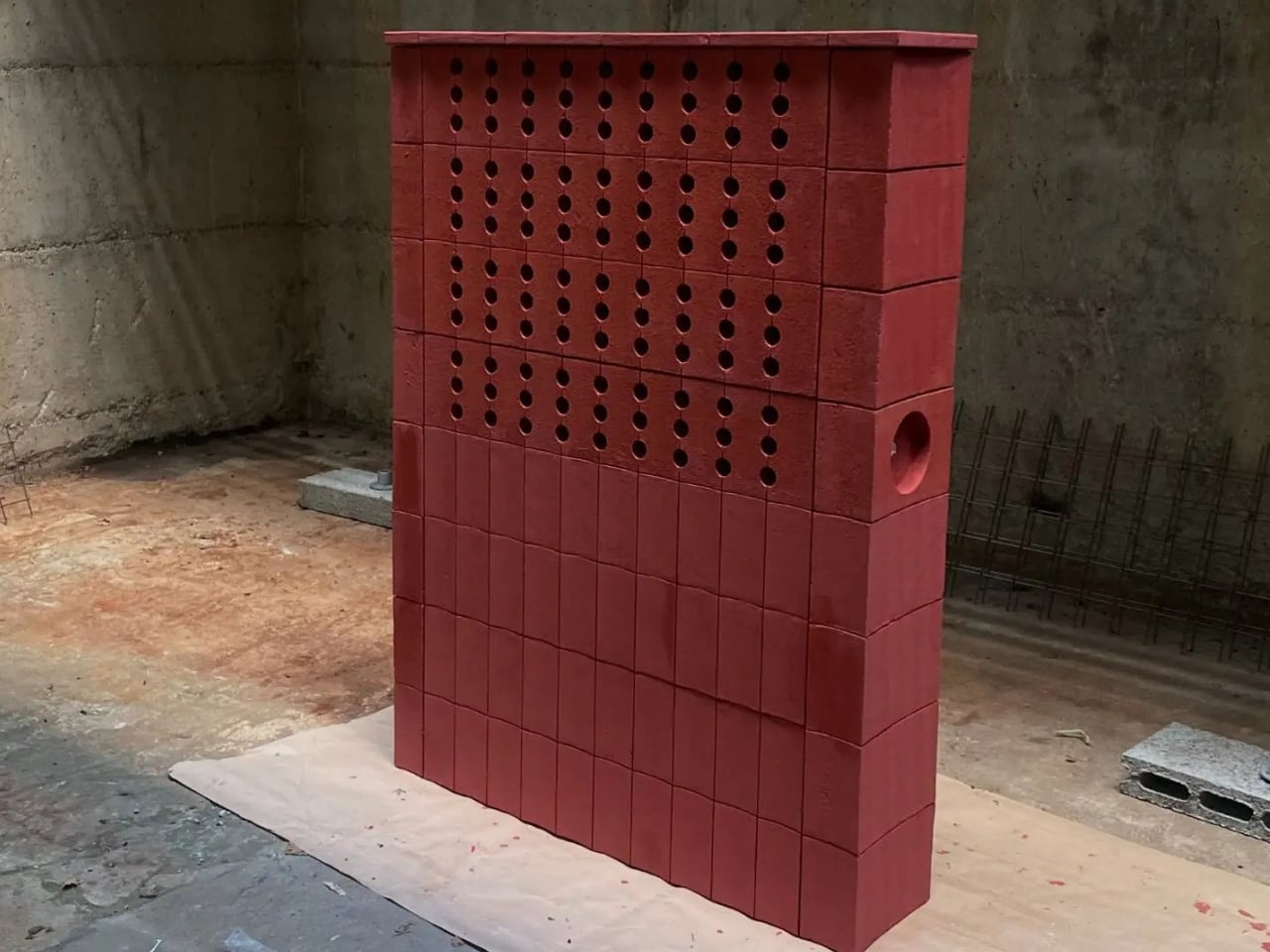
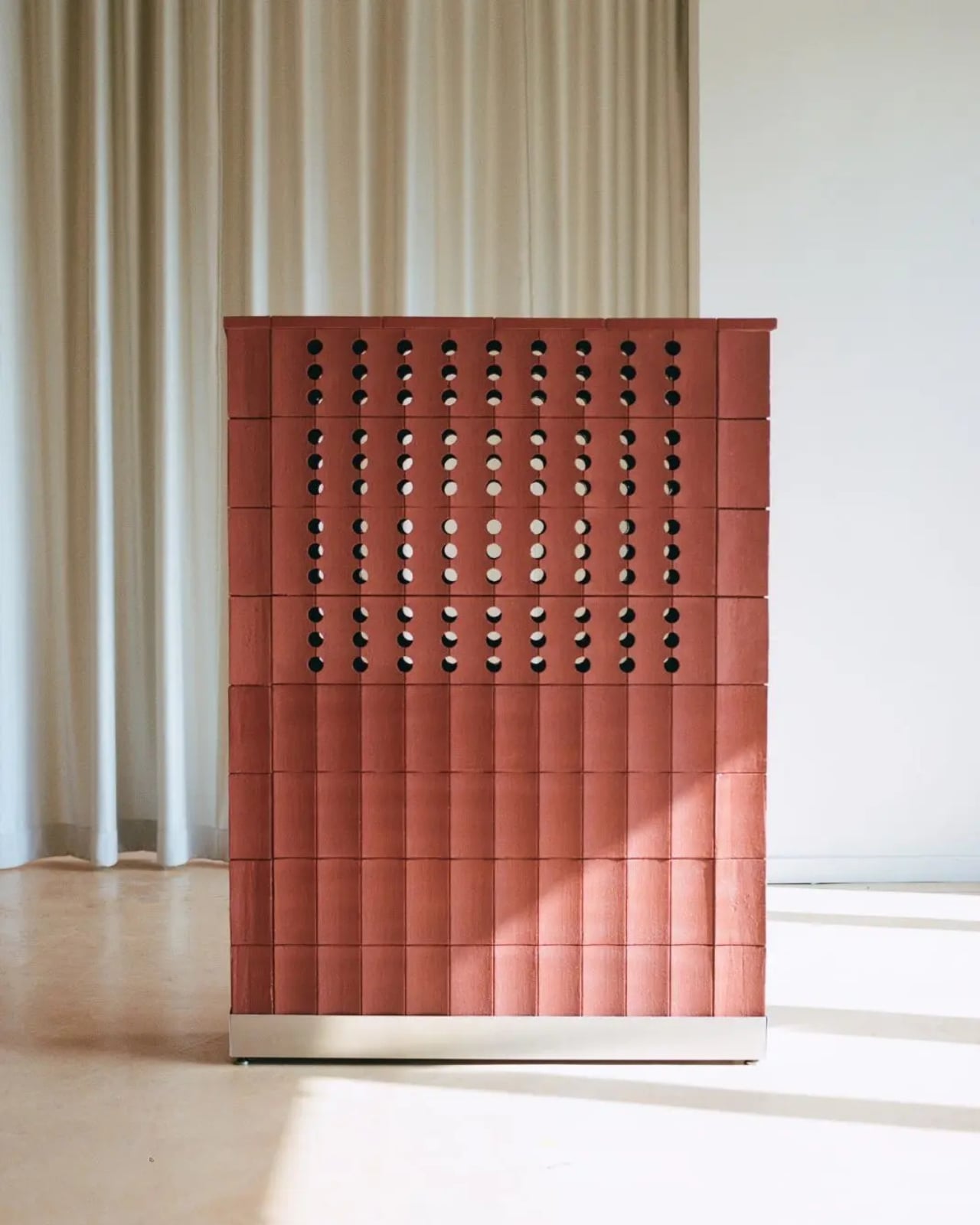
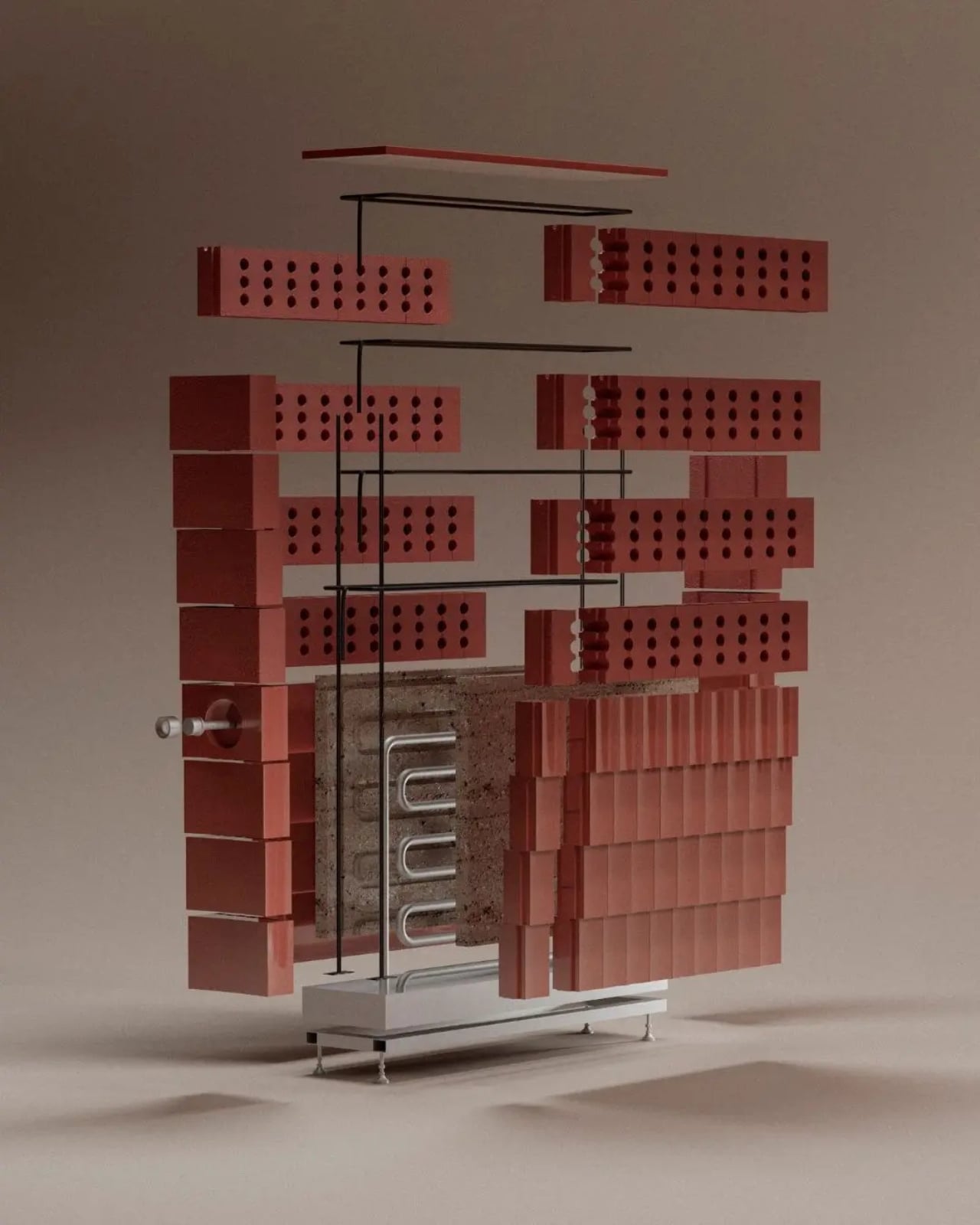
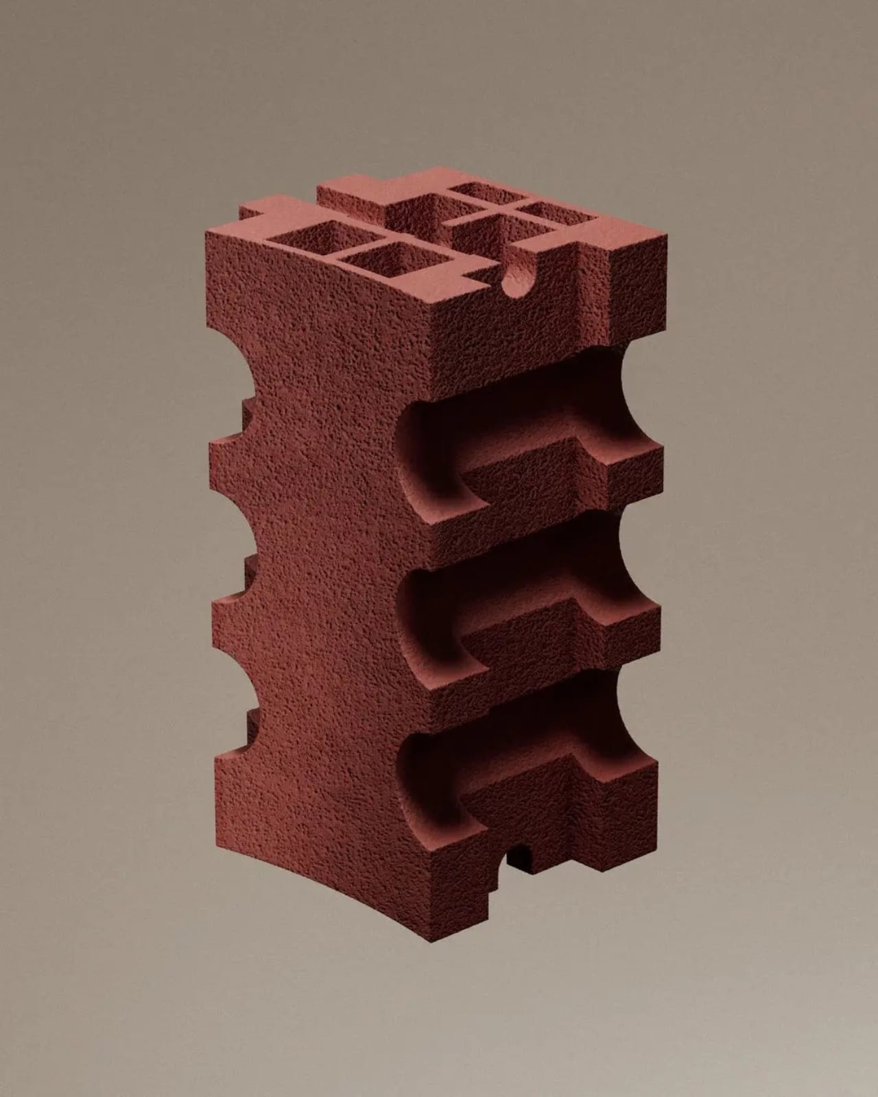
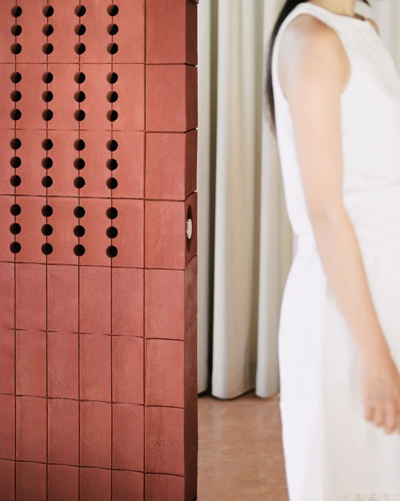
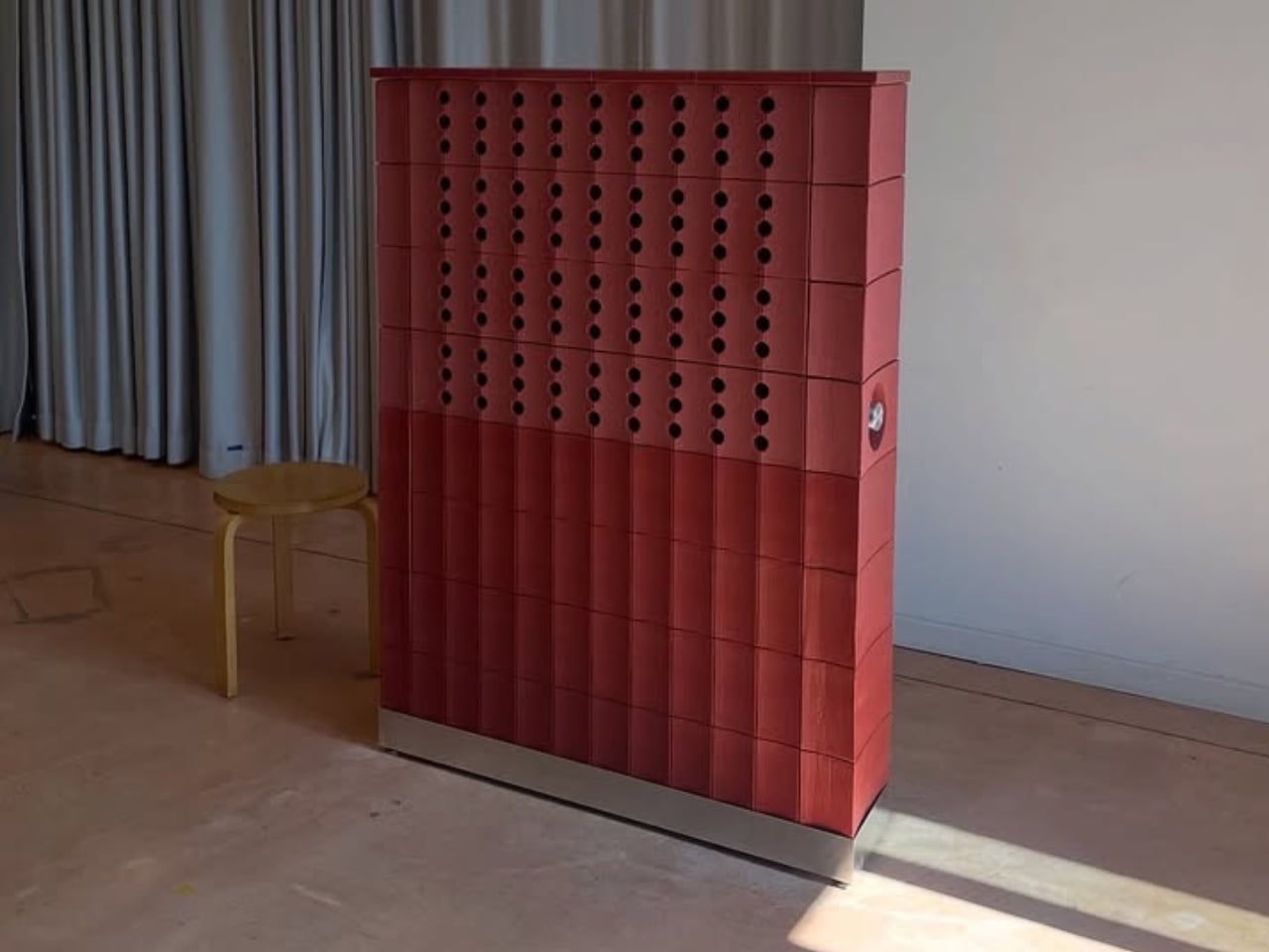
We spend a lot of time looking forward when it comes to solving the climate crisis. Better batteries, smarter thermostats, AI-optimized HVAC systems. And sure, some of that will matter. But I keep finding myself more drawn to designers who have the nerve to look backward, who dig through centuries of human ingenuity and ask why we ever stopped doing things that clearly worked. Salla Vallotton is one of those designers, and her project Celcius is one of the most compelling arguments I’ve seen for ancient technology dressed in modern form.
Celcius is a terracotta-based heating and cooling system developed at ECAL in Lausanne, Switzerland. At its core, the idea is almost absurdly simple. Terracotta absorbs heat slowly and releases it gradually, which means in winter it can soak up warmth from a small source and radiate it back into a room for hours. In summer, the same material’s porosity allows it to draw in water, and as that moisture evaporates from the surface, it pulls heat from the surrounding air. It’s the same physics behind why sweating cools you down. One object, two seasons, zero complexity.
What strikes me about this project isn’t the material science, which is well-established and has been for centuries. It’s the framing. Vallotton isn’t presenting Celcius as a nostalgic throwback or a craft exercise. She’s making a pointed observation about how we’ve organized our relationship with the spaces we live in. Buildings account for nearly 40 percent of global energy consumption, and in cold climates like Switzerland, heating eats up a disproportionate share of that number. Yet our systems remain stubbornly split: fossil-fuel heating that shuts off in June, air conditioning that kicks in to replace it. Two separate infrastructures for one continuous problem. Celcius merges them.
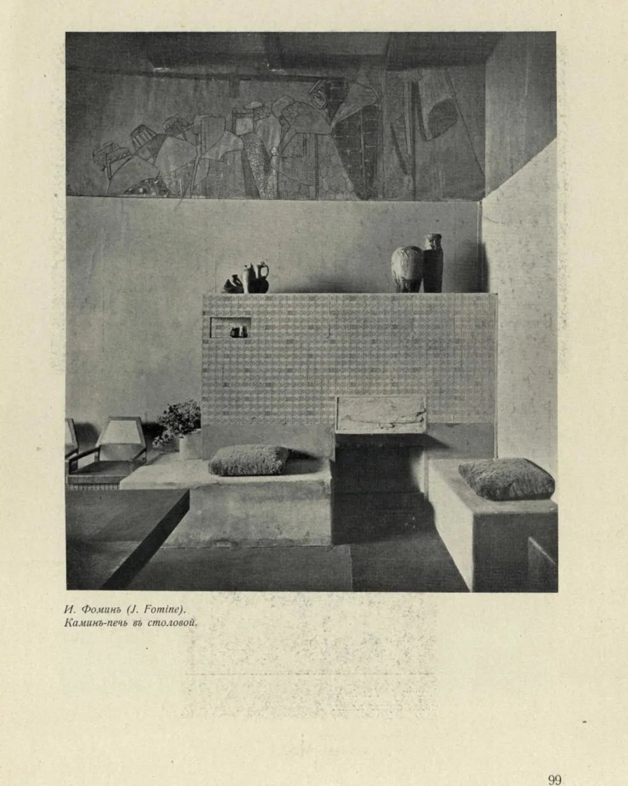
I think the cultural dimension is what elevates this beyond a clever prototype. Vallotton looked at the Alpine masonry stoves called Kachelofen, those massive ceramic structures that didn’t just heat a room but organized life around them. People understood how they worked. They could maintain them, repair them, build their daily rhythms around their cycles. There was a literacy to domestic technology that we’ve almost entirely surrendered. Today, our heating and cooling systems are hidden behind walls, managed by apps, and serviced by specialists. We’ve traded understanding for convenience, and I’m not sure we got the better end of that deal.
That’s the tension Celcius sits in, and it’s the reason the project sticks with me. It’s not anti-technology. It’s anti-invisibility. Vallotton places her terracotta system in the room as a physical, sculptural presence, something you live with rather than forget about. There’s a quiet radicalism in that choice. At a time when every product wants to disappear into the background, to be seamless and ambient and smart, here’s an object that insists on being seen, touched, and understood.
Of course, Celcius is still a prototype, and I don’t think Vallotton is claiming it will replace your furnace. The project operates more as a provocation than a product, a proof of concept that opens up questions rather than closing them. What if domestic infrastructure were legible again? What if the objects that regulate our comfort also had aesthetic and cultural weight? What would it mean to actually understand the systems that keep us warm?
These aren’t rhetorical questions. As European summers grow hotter and the pressure to decarbonize intensifies, the search for alternative thermal strategies is becoming urgent. And while the tech industry races to build ever more sophisticated solutions, projects like Celcius remind us that sophistication isn’t always the answer. Sometimes the most radical move is rediscovering something we already knew.
I find that idea genuinely exciting. Not because I think we should abandon modern engineering, but because the best design has always known how to hold the old and the new in the same hand. Vallotton does that with remarkable clarity, and Celcius is better for it.
There’s a particular kind of guilt that lives in the corner of a messy room. You see it, you know it needs to go, and somehow you still walk past it three more times before doing anything. Most of us don’t lack the ability to do chores. We lack the spark to begin them.
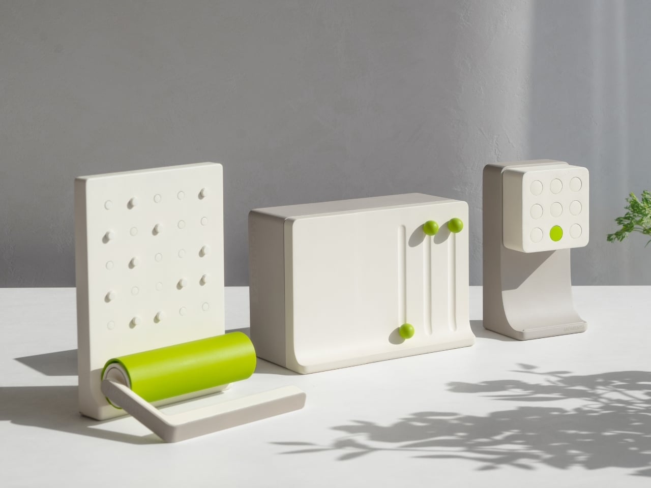
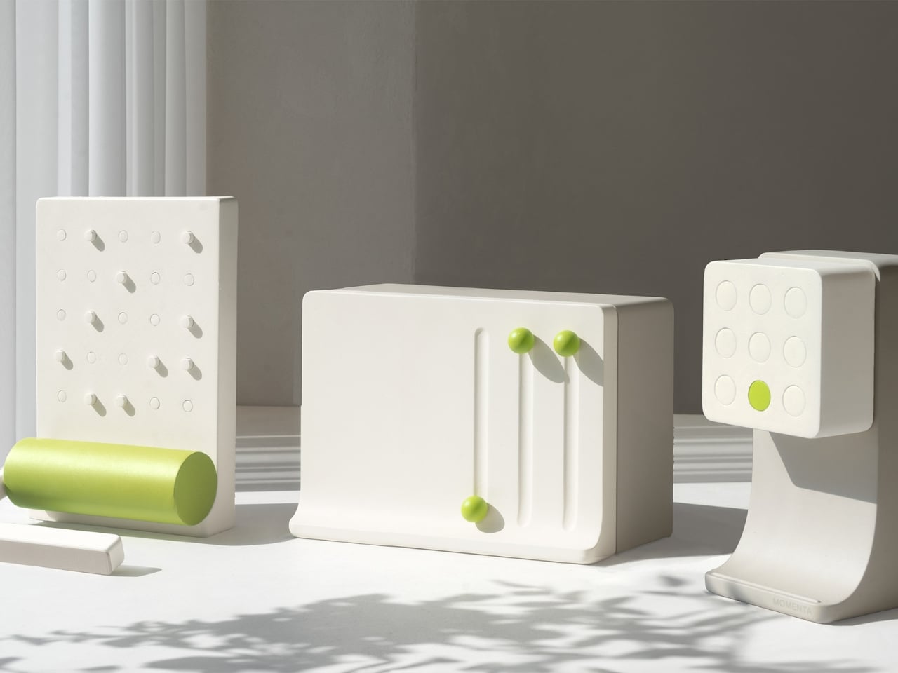
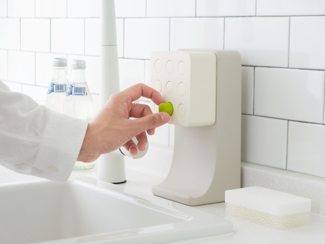
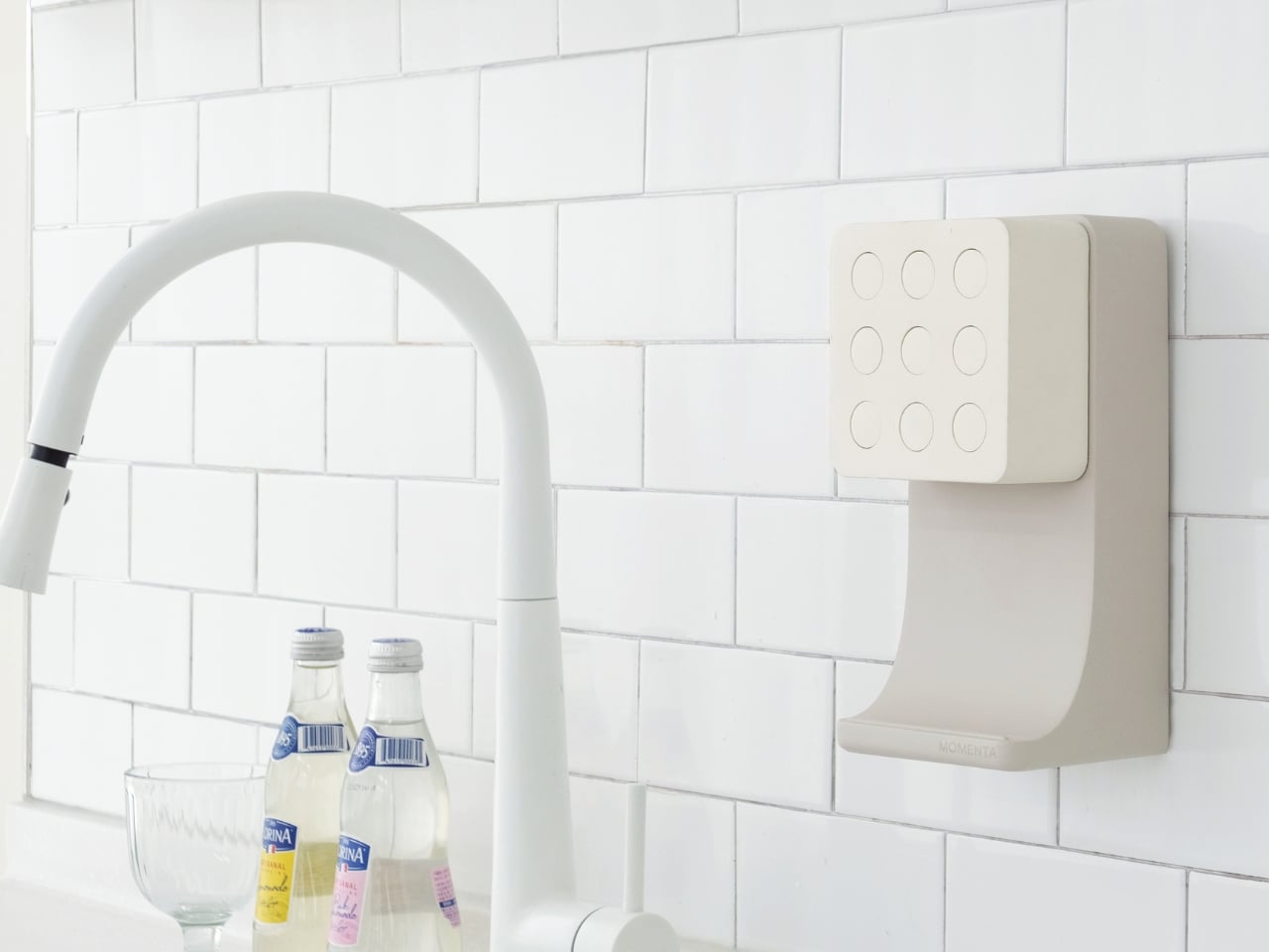
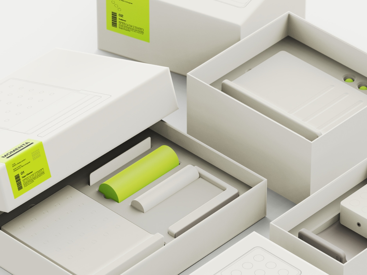
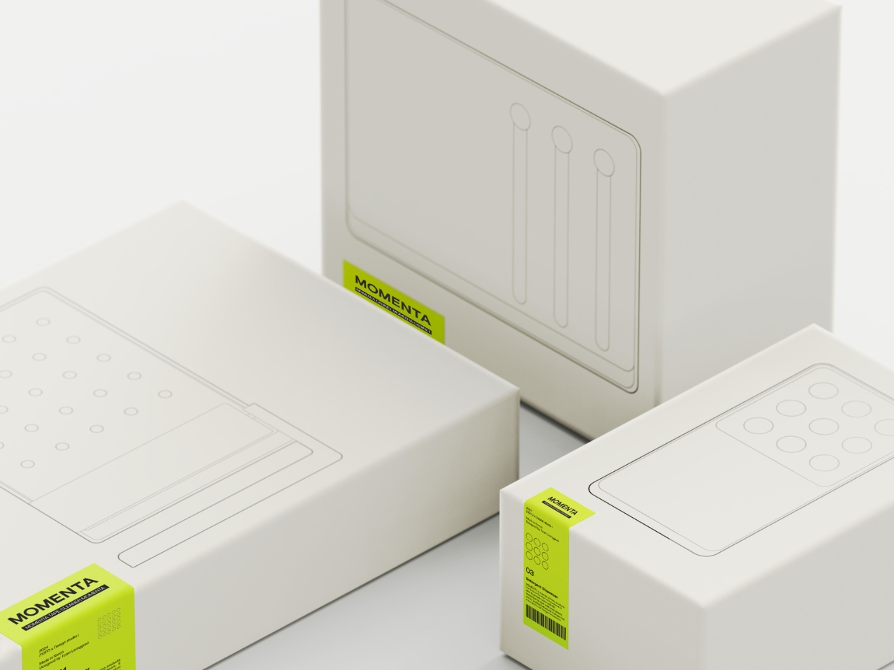
That’s the exact problem Gun Park, Gain Lee, Yangwoo Choi, and Jinha Hong set out to solve with Momenta, a concept collection of household products that uses behavioral psychology and deliberate design to nudge you into action. The collection consists of three pieces: a tape cleaner, a cabinet, and a detergent dispenser. Each one is quietly brilliant, and together they represent one of the more thoughtful takes on domestic product design I’ve seen in a while.
The concept behind Momenta is rooted in a simple but profound observation: incompleteness bothers us. Think about a crooked tile on a sidewalk or a puzzle missing a single piece. Something in your brain just wants to fix it. The designers tapped into this instinct, using what they call “deficiency triggers,” small physical cues that signal something is out of place, to make starting a chore feel less like a decision and more like a natural response.
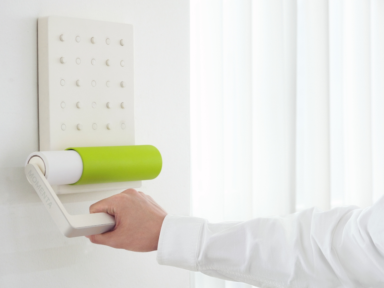
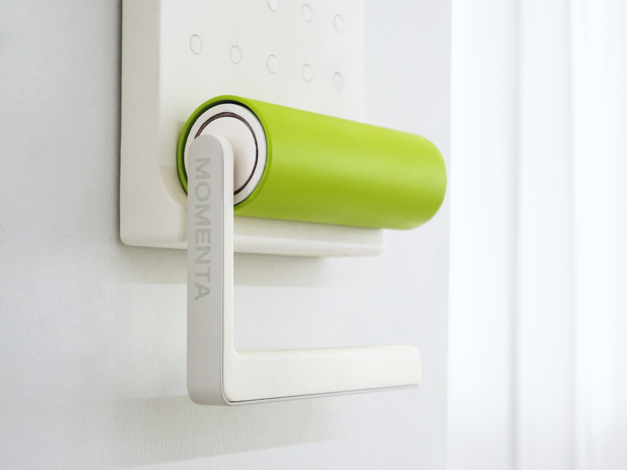
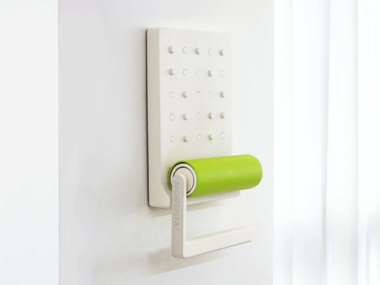
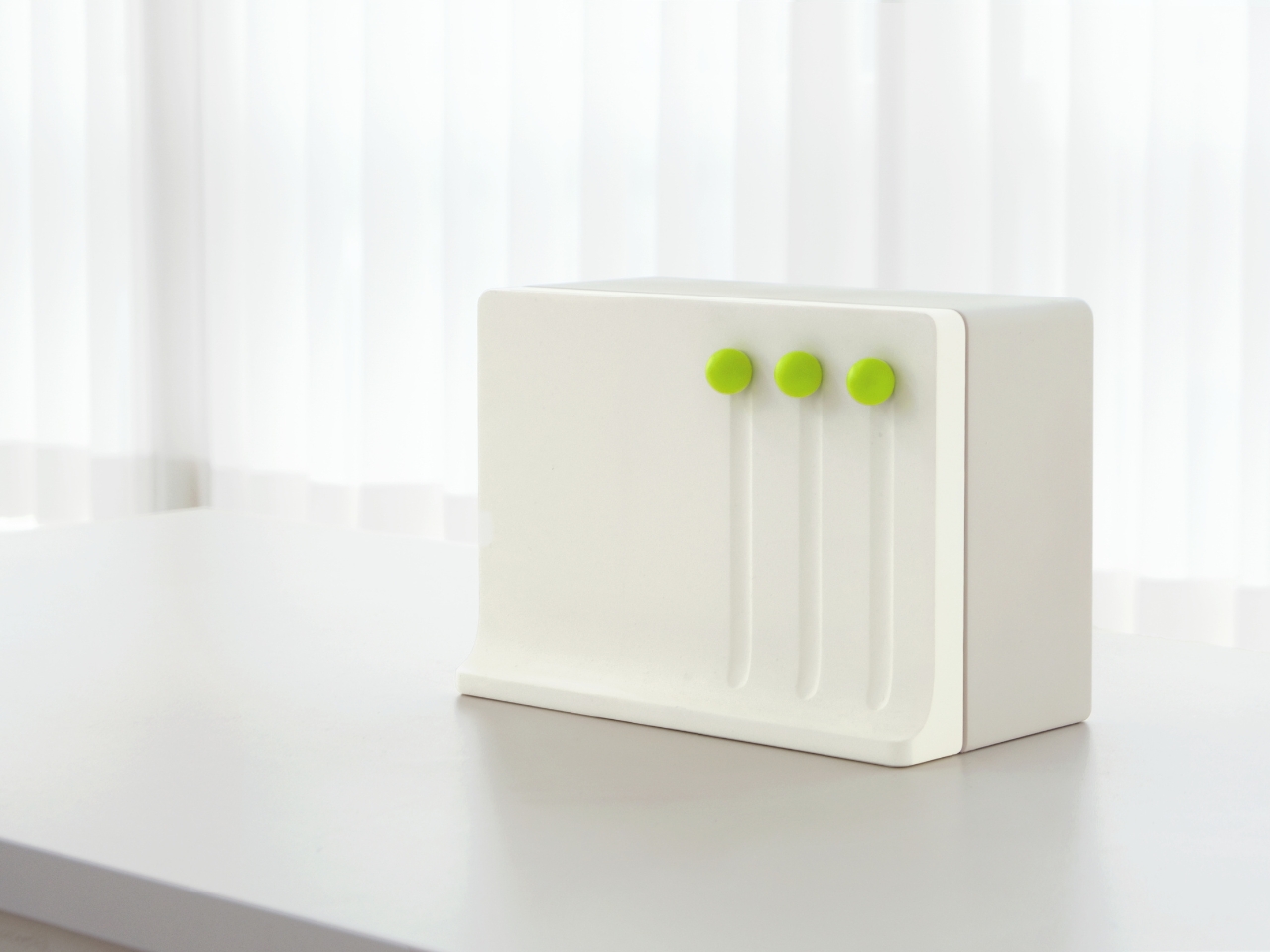
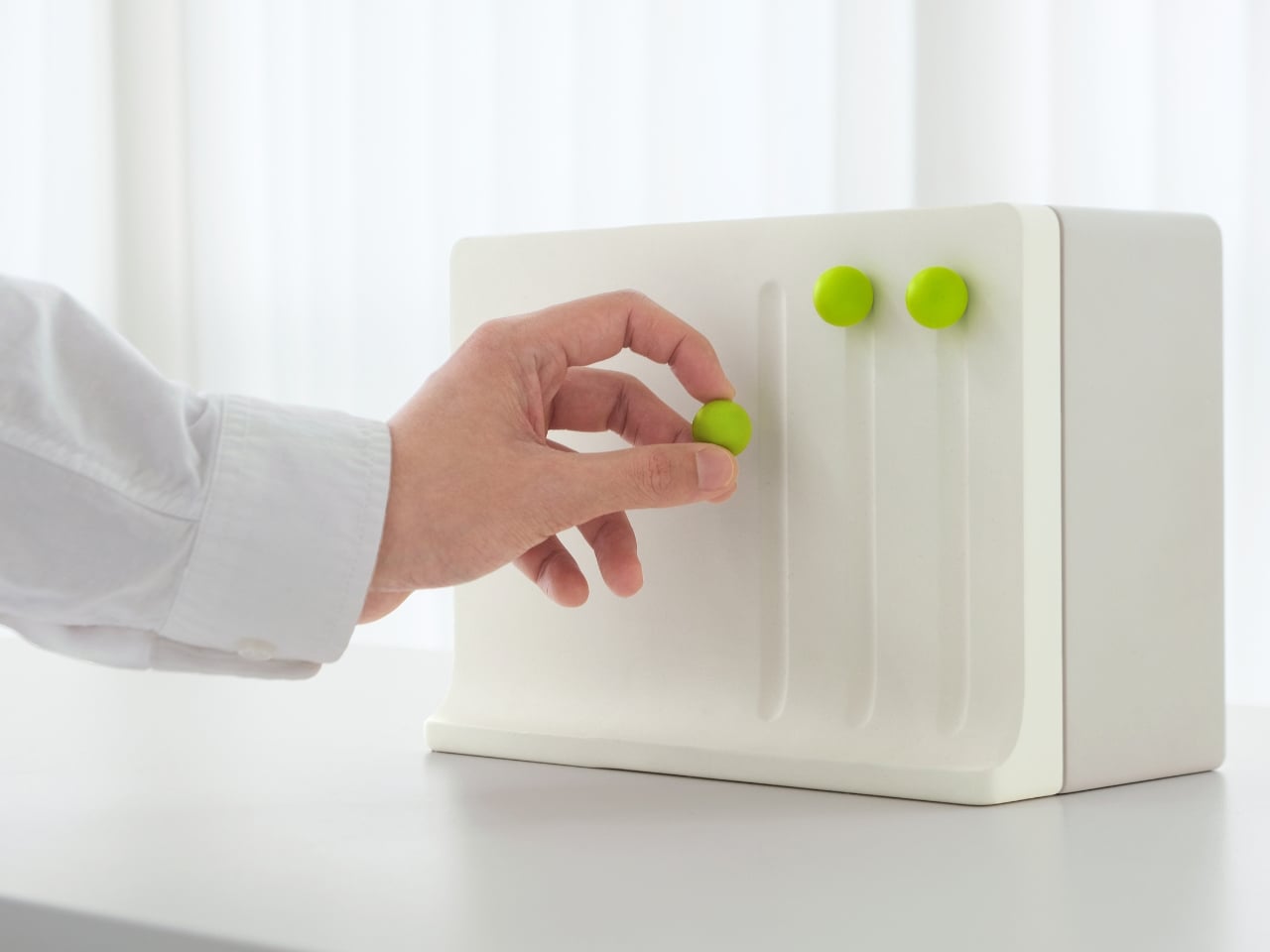
The tape cleaner is the most visually striking of the three. It mounts on the wall via a magnetic board, and at whatever cleaning interval you set, a small trigger pops out from the panel at a random spot. The visual effect mimics the look of a dusty, untidy surface. It doesn’t scold you or send a notification. It just sits there, slightly off, until you push it back in. And to push it back in, you have to grab the tape cleaner, which means you’re already cleaning. It’s almost sneaky in how seamlessly it works.
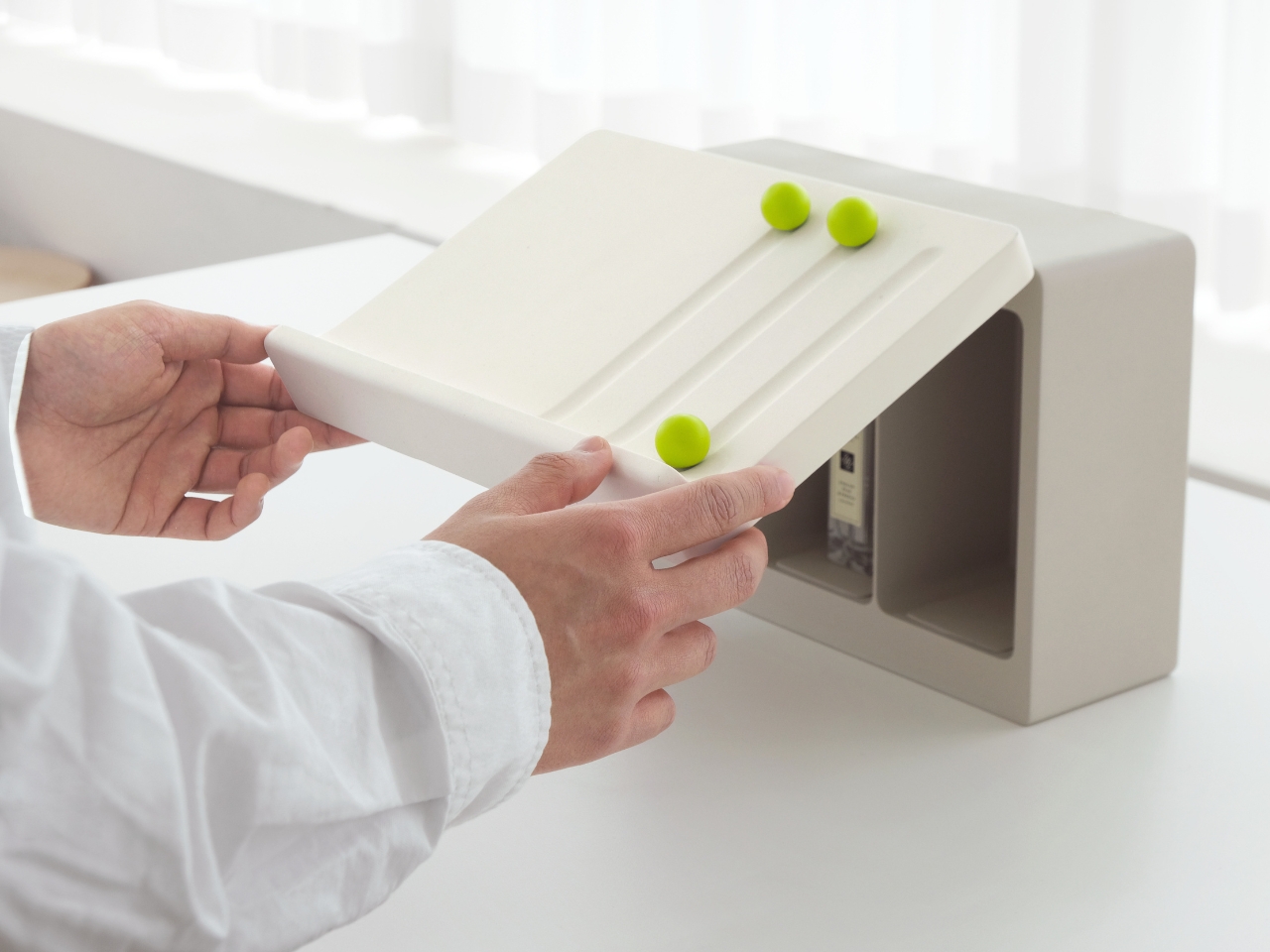
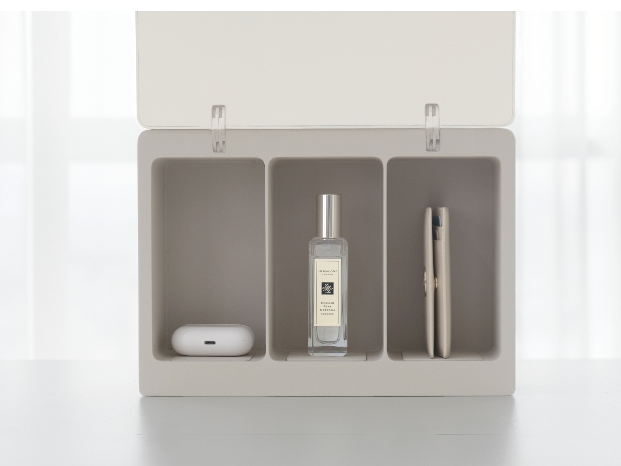
The cabinet follows a similar logic. When you take something out and don’t put it back, a spherical trigger drops down into the empty slot, making the absence visible. It’s the physical equivalent of a raised eyebrow. The item is missing. You know it. Now you feel the pull to return it. The trigger itself serves as a placeholder, holding the space and the guilt until the task is done.
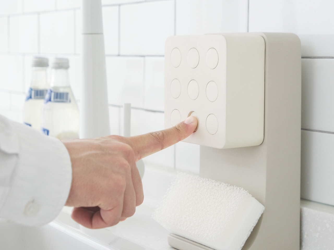
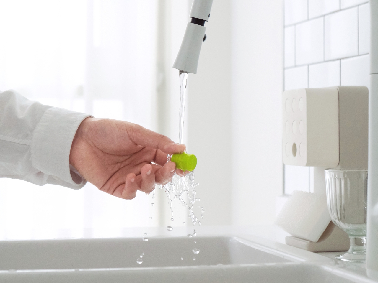
The detergent dispenser might be the most playful piece of the three. Nine small circular triggers sit in a grid on the face of the unit. When it’s time to do the dishes, one of them changes color. To reset it, you rinse it under water, which gets your hands wet, which is basically half the battle when it comes to starting the dishes. Once the trigger is placed back into its slot, detergent dispenses automatically. The whole sequence is almost gamified, and that feels intentional.
What makes Momenta genuinely interesting beyond its novelty is the layer of restraint in its design. Nothing here is loud or demanding. There’s no beeping, no blinking display, no app required. The products are minimal and clean, rendered in white with sharp pops of green for the triggers. They look like they belong in a thoughtfully curated home. The triggers do their work subtly, appealing to your instincts rather than interrupting your day.
There’s something worth celebrating about design that works with human nature rather than against it. So much productivity culture is built on willpower and discipline, which, for most people on most days, is simply in short supply. Momenta sidesteps that entirely. It doesn’t ask you to be a better, more motivated version of yourself. It just places a small, fixable imperfection in front of you and trusts that your own psychology will do the rest.
Whether the full collection ever reaches production, the concept stands on its own as a compelling piece of design thinking. It makes you reconsider what household objects are even for. Maybe the best ones don’t just hold or clean or organize. Maybe the best ones know exactly how to get you started.
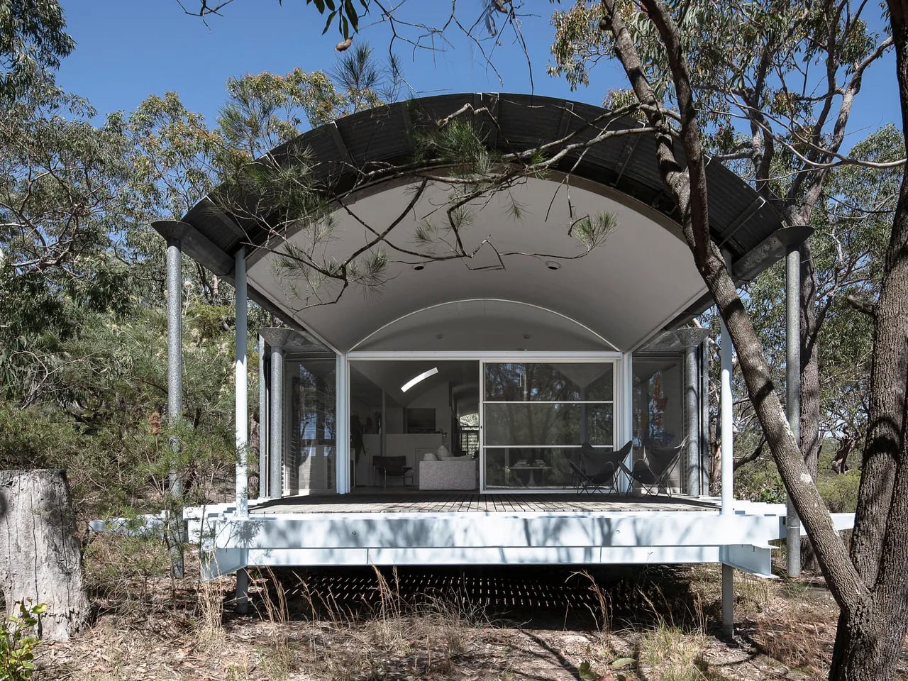
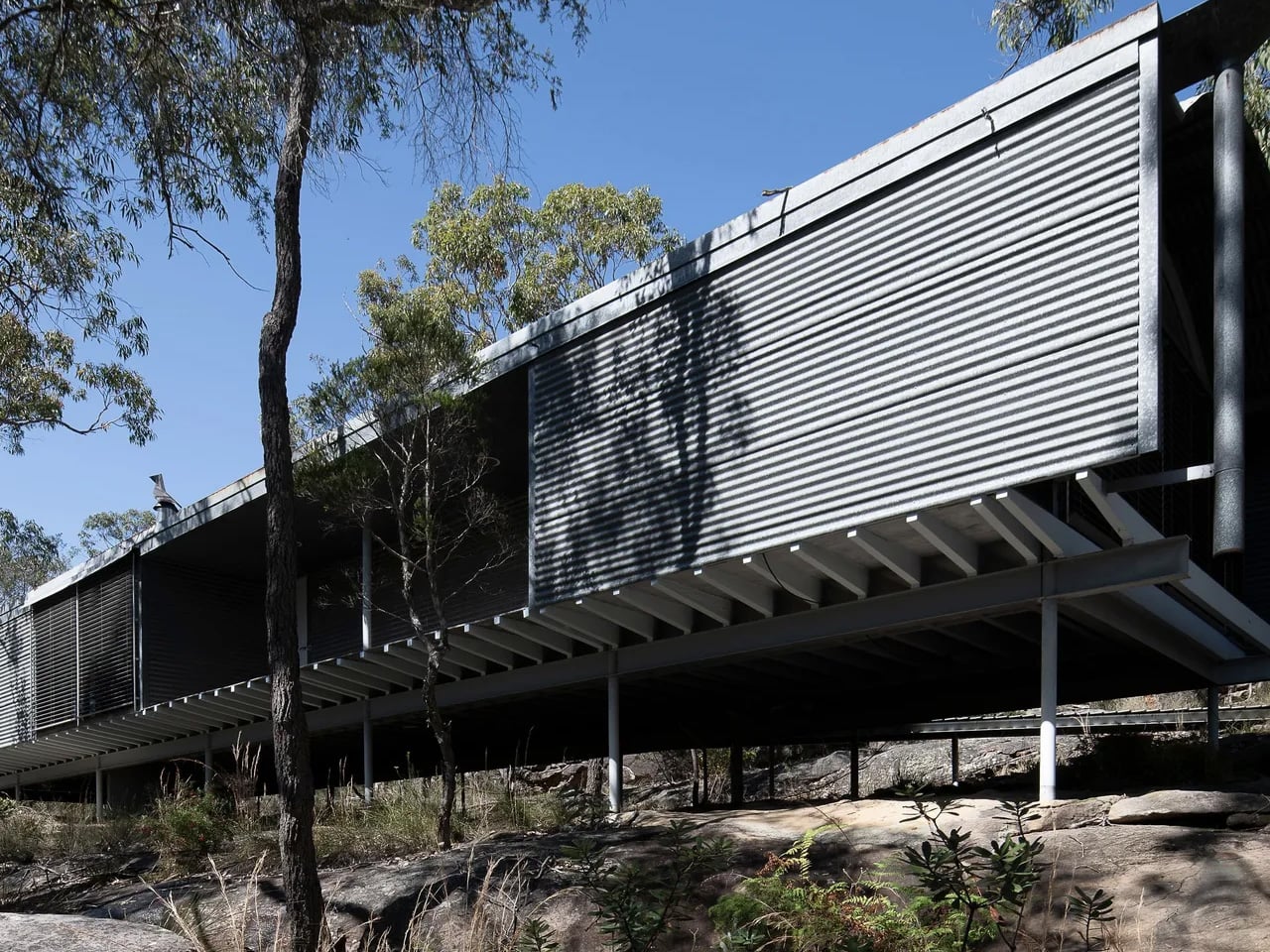
For the first time since its completion in 1983, one of Australia’s most architecturally significant homes is available to buy. The Ball-Eastaway House, designed by Pritzker Prize-winning architect Glenn Murcutt, has been listed with Modern House at a guide price of AUD 2.4 to 2.6 million, an extraordinary opportunity to own a piece of living architectural history.
Set on 25 acres of dry sclerophyll forest in Glenorie, roughly an hour northwest of Sydney, the property feels worlds apart from the city it neighbours. The rugged site presented Murcutt with a natural rock ledge that became the building’s platform, and rather than taming the land, the architect worked with it. Not a single tree was removed during construction, a commitment that shaped every decision made from the ground up.
The house sits elevated on slender steel pipe columns, its long, low form skimming the earth without disturbing it. Murcutt has long described this approach as “touching the earth lightly,” placing humanity within nature rather than above it. The exterior is clad in corrugated iron, marking the first time Murcutt used the material on a residential project, and its gently curved roofline reads almost like a topographical feature rather than a built structure.
Inside, the design is as considered as the form suggests. Aluminium shading devices and timber-lined interiors regulate heat and light throughout the seasons, while expansive north-facing glazed walls and skylights draw in the kind of soft, sustained light that painters depend on. The home was built specifically for abstract artists Sydney Ball and Lynne Eastaway, and their creative lives are woven into the architecture itself. Ball’s large-scale paintings run the length of an internal wall that forms the spine of the entire plan.
Behind that wall lies a concealed northwest verandah, originally conceived as a meditation space, and two generous studios where many of both artists’ most significant works were made. During a jury visit for the 1984 Wilkinson Award, which the house went on to win, the jury chair called it the most serene space he had ever encountered.
That quality of stillness hasn’t faded. The environmental intelligence built into the structure, passive ventilation, solar orientation, and minimal site intervention, was pioneering in the early 1980s and reads today as a quiet blueprint for how buildings should relate to the landscapes they occupy. The entire ten-hectare site has since been heritage listed, ensuring whatever comes next for the Ball-Eastaway House, its integrity remains protected.
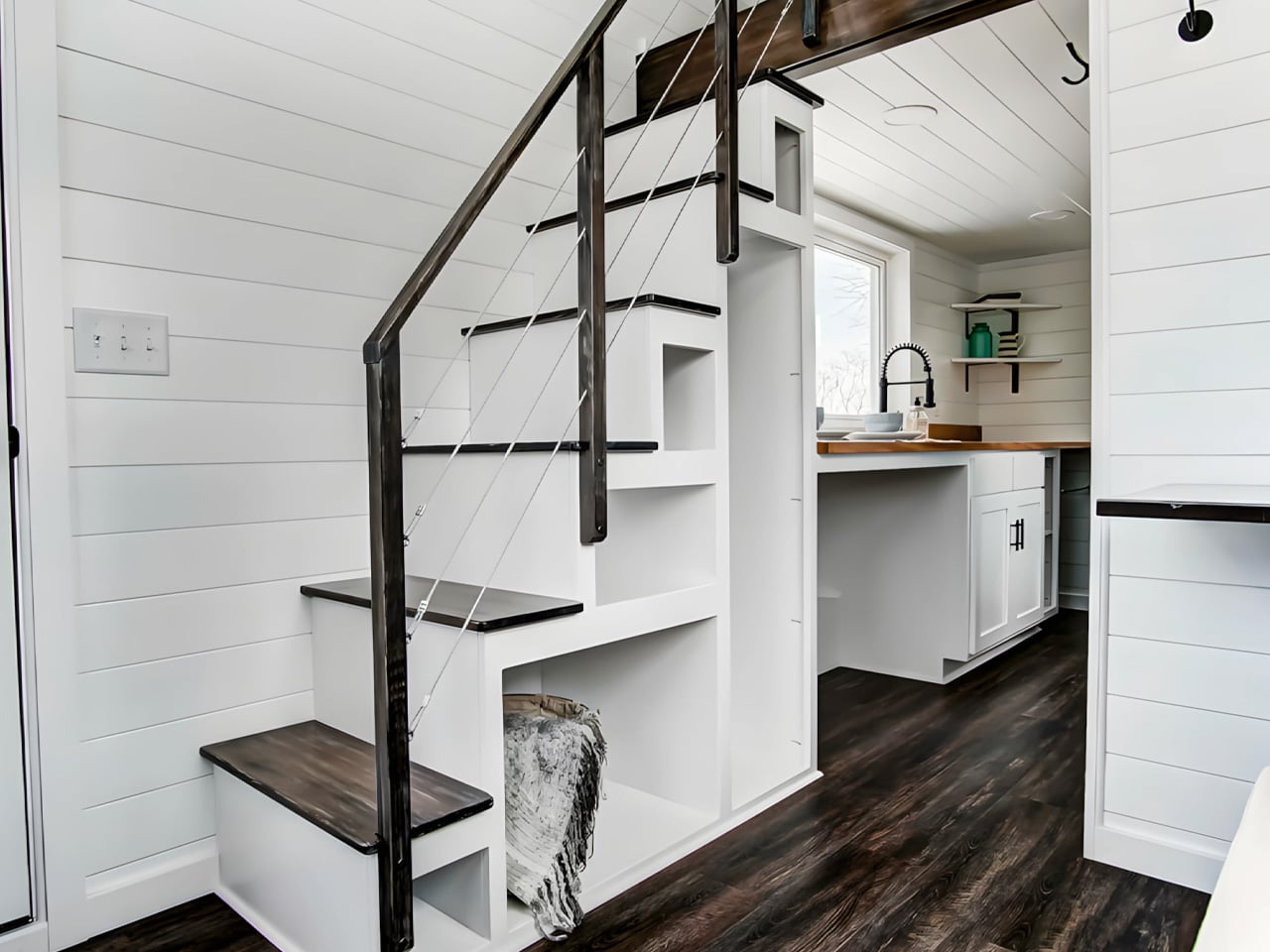
Twenty feet doesn’t sound like much until you step inside the Kinnakeet. Built by Ohio-based custom tiny home builder Modern Tiny Living, this road-ready dwelling packs a surprising amount of life into a footprint most people would walk past without a second thought.
The Kinnakeet is rooted in one of Modern Tiny Living’s most celebrated designs: the Mohican model, which earned a spot on HGTV’s Journey to the Tiny House Jamboree. While it inherits the Mohican’s clever bones, the Kinnakeet carves out its own identity with a crisp white interior, broad green accents, and dark floors that ground the whole aesthetic. The exterior is wrapped in engineered wood and capped with a metal roof, making it understated, durable, and sharp.
Step inside, and the first thing you notice is the light. The living area is anchored by two large windows that flood the space, paired with a sofa that doubles as a bed for two, with three storage drawers tucked underneath. A folding table doubles as a workspace or dining surface, and a large custom bookcase makes the room feel intentional rather than improvised. The staircase leading up to the loft doesn’t waste a single riser — each step hides a cubbyhole of varying sizes for shoes, books, or whatever you need within reach.
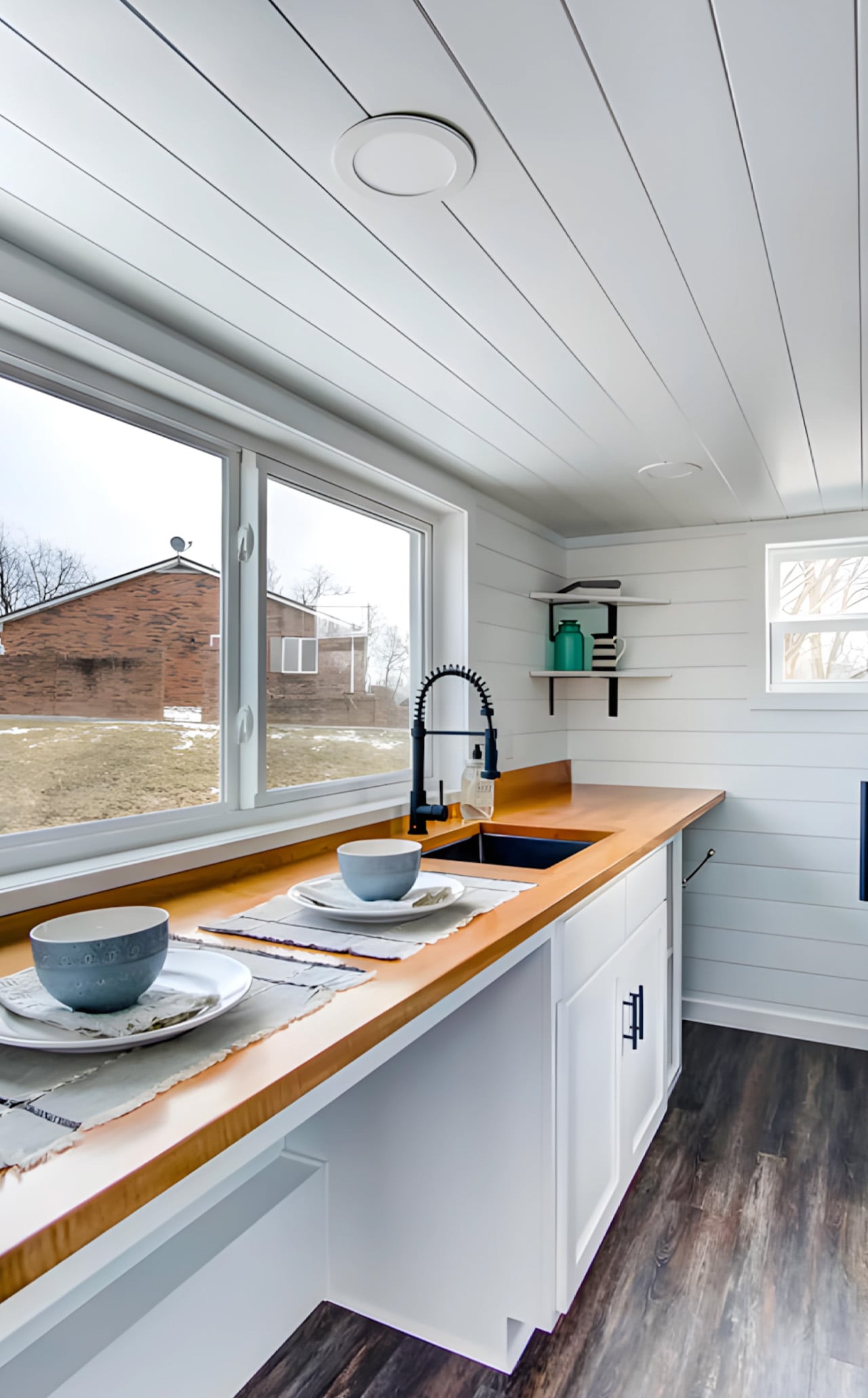
The kitchen is compact but thoughtful, featuring a sink, custom cabinetry, and open space that accommodates additional appliances depending on the owner’s needs. Since the Kinnakeet was originally designed for use as a vacation rental on Airbnb, it skips the full-size appliances found in Modern Tiny Living’s permanent residences — a deliberate choice that keeps the build flexible and the cost accessible.
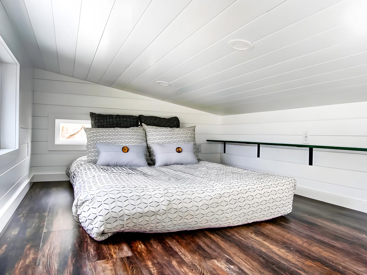
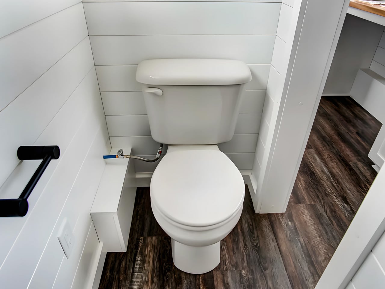
The bathroom is accessed through a sliding barn-style door off the kitchen and manages to fit in a walk-in shower and a flushing toilet without feeling squeezed. Up the storage staircase, the lofted bedroom fits a double bed with enough room to feel like a proper retreat, even if the ceiling keeps things cozy.
Priced at $79,000 as a starting point, the Kinnakeet is customizable, more or less depending on finishes, appliances, and personal priorities. Whether you’re looking for a full-time downsized lifestyle or a smart vacation rental investment, the Kinnakeet makes a compelling case that 20 feet is more than enough.