CRA-Carlo Ratti Associati’s Hospital of the Future Puts Nature at the Center of Healing

What if a hospital felt less like a clinical institution and more like a campus you actually wanted to spend time in? That’s the central idea behind the winning proposal for the Hospital of the Future in Brescia, developed by CRA-Carlo Ratti Associati, Park Associati, and Politecnica Building for Humans, alongside a multidisciplinary team including Openfabric, Dotdotdot, Eckersley O’Callaghan, and Studio Mattioli. Unveiled at Teatro Grande in Brescia and attended by regional government officials including the President of Lombardy, Attilio Fontana, the project carries significant institutional weight.

It’s designed around the principles of One Health — the idea that human health, environmental systems, and social infrastructure are fundamentally inseparable — and translates that philosophy directly into architecture. With construction set to begin in 2028 and an investment of approximately $300 million USD, with additional funding expected from the Lombardy Region, it is one of the most ambitious healthcare redesigns in Italy’s recent history.

Designer: CRA- Carlo Ratti Associati, Park Associati & Politecnica Building for Humans

The design takes its structural cues from engineer Angelo Bordoni’s early twentieth-century masterplan — specifically its hexagonal core and radial layout — and reinterprets them as the foundation for something far more porous and alive. Nature doesn’t decorate the edges here; it runs through the entire campus. Patients, staff, and visitors move through landscape as much as through architecture, with views of the Brescia Prealps framed from patient rooms and natural light pulled deep into the building’s core.

The Main Hospital organizes itself around three interconnected wings that open the complex toward the city. At street level, a continuous glazed lobby creates an urban threshold overlooking a new public square — the kind of civic gesture that signals the building belongs to its city, not just its institution. Inside, the logic is deliberately legible: clear circulation, acoustic comfort, calibrated daylight, and spatial proportions that reduce the psychological weight of being in a hospital. Each patient room is treated as a space of recovery first, with landscape connection as a measurable design strategy rather than an afterthought.

The Children’s Hospital takes a different formal approach — three cylindrical volumes of varying heights arranged around terraces and internal courtyards that function as therapeutic gardens. A full-height atrium anchors the entrance, housing play areas and consultation zones within a bright, protected space that reads more like a community building than a ward.

Connecting everything is the CareRing, a continuous ring stretching over one kilometre that separates operational and logistics flows below ground from a tree-lined public landscape above. It’s the project’s most conceptually elegant move: infrastructure that doubles as a park, connecting the campus to the city while embodying the One Health principle that human health and environmental health are the same conversation.

The structure itself uses hybrid timber-and-steel construction with dry assembly techniques, reducing embodied carbon and shortening build time. The modularity is intentional — the building is designed to reconfigure as medical technology and models of care evolve, which at this scale and investment horizon, they inevitably will. The new hospital delivers 60,500 square metres of clinical space and more than 745 beds, with historic pavilions repurposed for academic and research use in partnership with the University of Brescia’s Faculty of Medicine.

The post CRA-Carlo Ratti Associati’s Hospital of the Future Puts Nature at the Center of Healing first appeared on Yanko Design.

This GPS dog tracker uses Starlink satellites to work anywhere cell service doesn’t

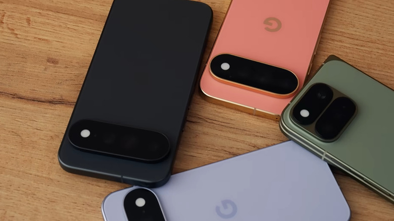
Satellite connectivity used to be reserved for phones, off-grid communicators, and specialized outdoor gear. Now it is showing up in far smaller devices, and Fi Ultra pushes that trend into pet care. The tracker taps into the Starlink satellite network to keep dogs locatable in places where cell towers never reach, a capability that would have sounded unrealistic in a consumer pet product only a few years ago. Hikers, hunters, and rural dog owners have spent years accepting blind spots in their tracking apps as a fact of life. Fi Ultra treats that blind spot as a problem worth solving with real infrastructure instead of a bigger antenna.

Fi built its business on GPS trackers that relayed location through LTE, a system that worked well until a dog wandered beyond cellular range. Fi Ultra closes that gap by adding satellite as a fallback layer, switching automatically between Bluetooth, Wi-Fi, LTE, and satellite depending on what is available. Priced at $199, with an additional $189 a year for satellite access, it signals how quickly satellite technology is trickling down into everyday consumer products. This is the same T-Satellite infrastructure conversation phone carriers have been having for the last two years, except here it is stitched into a dog collar instead of a flagship handset.

Designer: Fi

Satellite transmission is power hungry by nature, since the tracker has to punch a signal far enough to reach orbit rather than the nearest cell tower. Fi’s answer is a connection hierarchy that always defaults to the cheapest option available, quietly downgrading from satellite to LTE to Wi-Fi to Bluetooth the moment a lower power option exists. It is the same logic your phone uses when it prefers Wi-Fi over cellular data, just applied to a device with a fraction of the battery capacity. The result is a tracker that only reaches for its most expensive connection when nothing else will do the job.

An Apple AirTag runs for a year on its coin cell battery, and Fi’s own Fi 3+ lasts up to three months, but Fi Ultra is rated for only several days between charges. That is a steep drop, and it says something about how much energy satellite radios actually demand compared to the low power Bluetooth chips inside most trackers. Fi is betting that owners in genuinely remote areas will accept more frequent charging in exchange for a tracker that never goes dark, which is a reasonable bet for search and rescue dogs, hunting companions, and anyone hiking well outside cell coverage. It is a much harder sell for a dog that mostly patrols a suburban backyard.

Fi Ultra also carries over Fi Callback, a feature that lets owners send sound and vibration cues through the smartphone app to recall a dog from a distance, alongside standard support for both collar and harness mounting. None of that is revolutionary on its own. What makes Fi Ultra worth watching is the precedent it sets. Satellite hardware has spent years shrinking from ships and expedition gear down to phones, and now down to a dog collar. The next logical step is livestock tags, wildlife collars, and eventually anything small enough to wear that still needs to be found. Fi just got there first.

The post This GPS dog tracker uses Starlink satellites to work anywhere cell service doesn’t first appeared on Yanko Design.
The Folded Aluminum Kayak That’s Almost Too Beautiful to Use

When Guillaume Bloget arrived at France’s Rhizome Association for a research-creation residency, he was surrounded by lakes. Most people would have simply enjoyed the view. Bloget looked at the water and immediately started thinking about how to cut through it. The result is Sharp, a kayak built from folded aluminum sheet and cork, and it’s one of the more quietly compelling design objects I’ve come across recently.

It’s one of those designs that stops you cold the moment you see it. Not because it’s trying to be shocking or provocative, but because it gets the balance so right. The silhouette is clean and geometric, almost architectural, and yet it moves your eye the way a good piece of sculpture does. You keep looking at it, trying to figure out exactly why it works so well.

Designer: Guillaume Bloget

Kayak design, as a category, doesn’t get nearly enough attention. We tend to treat watercraft as purely functional objects, things that should perform and get out of their own way visually. Sharp pushes back on that assumption without making a big show of it. Bloget worked on a hydrodynamic hull to produce what he describes as “a good sliding sensation,” which tells you the function was never an afterthought. But the execution goes well beyond the purely practical.

The folded construction is where things get genuinely interesting. The kayak’s structure relies entirely on folding, and the double-wall design makes it unsinkable. That’s not just a clever engineering solution; it’s the kind of constraint-driven thinking that separates good design from great design. When a structural requirement also produces an aesthetic, you know the designer was really paying attention. The angular folds give Sharp its name and its personality. It looks sharp. It feels intentional in a way that a lot of so-called “design-forward” products don’t quite manage.

Cork makes a quiet but important appearance too. The seat is cork, mediating between the angular geometry of the aluminum hull and the organic curves of a human body. It’s a thoughtful detail. Cork is warm where aluminum is cool. Cork is soft where the hull is rigid. Placing it exactly where your body meets the boat is not an accident. It’s the kind of material decision that you might not consciously register the first time you look at the photos, but that you’d definitely feel the moment you sat down.

The aluminum itself is doing double duty. Beyond the structural logic of folded sheet metal, Bloget noted that the shine of the material plays with the reflections of the water. That’s a level of environmental awareness that most product designers don’t even consider. Sharp wasn’t designed for a studio backdrop. It was designed for a lake, where light and surface and movement are all part of the experience. The kayak is meant to participate in its environment, not just occupy it.

Sharp sits in an interesting space right now. It was produced during a 2023 residency in Ouroux-en-Morvan alongside craftsman Antoine Rivière, labeled as a Mushroom Edition, which suggests it was made in a very limited run. Whether it ever becomes commercially available at any real scale is unclear. And that’s a little frustrating, because designs like this deserve to actually exist in the world, not just in portfolios and Instagram posts. Residency projects often produce beautiful ideas that quietly disappear, and it would be a genuine loss if Sharp became one of them.

The broader point here is about what we expect from everyday objects. A kayak is a practical thing. You paddle it, you store it, you use it to get somewhere or to simply be somewhere on the water. None of that changes because it’s beautiful. But when a practical object is also genuinely well-designed, the experience of using it shifts. You treat it differently. You notice things you wouldn’t have otherwise. The aluminum catches the light and so do you, briefly, on a lake somewhere in France. Bloget gave something useful a little poetry. The least we can do is pay attention.

The post The Folded Aluminum Kayak That’s Almost Too Beautiful to Use first appeared on Yanko Design.