5 Floating Designs That Look Like Photoshop (But They’re Real)

Floating design is a product-led architectural approach that prioritizes spatial freedom and visual continuity. By lifting elements from the ground, spatial and product design achieves clarity, allowing products, surfaces, and volumes to read as lighter, more refined interventions within the space.

In contemporary interior architecture, this language of suspension reflects a precise balance between engineering and design intent. The absence of visible support elevates furniture, fixtures, and architectural components into sculptural products. Let’s understand how the structure recedes or the void gains value in interiors and product design, making the design feel effortless, modern, and intelligently resolved.

1. Cantilevered Design

Cantilevered architecture embodies structural bravery, transforming engineering into a bold tectonic statement. By extending built forms beyond conventional supports, you create a sense of controlled tension that redefines how stability is perceived. In interior and product architecture, this approach expresses confidence, precision, and mastery, where structure becomes an intentional design language rather than a hidden necessity.

Beyond its visual impact, the cantilever delivers measurable spatial and functional value. You preserve ground permeability, reduce visual mass, and form shaded, usable outdoor zones beneath the structure. This apparent levitation elevates aesthetic currency, enhancing experiential quality and market appeal. Homes that seem to float project innovation, command attention, and achieve a higher return through architectural distinction.


Set against the rolling green hills of Nashtarood, House Under the Hill creates a striking illusion of floating within the landscape. Although much of the structure is embedded into the terrain, the exposed edges appear to hover lightly above the ground, with curved forms extending outward as if suspended over the hillside. The living roof blends seamlessly with the earth, allowing the architecture to visually dissolve while selected volumes seem to glide above the terrain. This careful balance between concealment and elevation gives the home a weightless presence despite its substantial form.


Inside, expansive glass panels enhance the floating effect by erasing clear boundaries between floor, wall, and horizon. Living spaces open toward the pool and surrounding hills, creating the sensation of hovering within nature rather than sitting firmly on it. Open-plan interiors, restrained materials, and soft transitions between levels reinforce this sense of suspension, resulting in a home that feels light, fluid, and quietly detached from the ground.

2. Floating Forms

In product design-led interiors, floating elements are conceived as precision objects rather than static fixtures. Vanities, cabinetry, and platform beds are elevated using controlled shadow gaps, allowing each product to appear lighter and more intentional. You emphasize form, detailing, and material junctions while maintaining uninterrupted floor planes that visually expand the interior.

This sense of lift enhances both experience and energy. Light passing beneath products reduces visual weight and creates a soft, ambient glow that highlights craftsmanship. Elevated products prevent the feeling of heaviness, and the result is an interior where product design, spatial clarity, and well-being coexist.
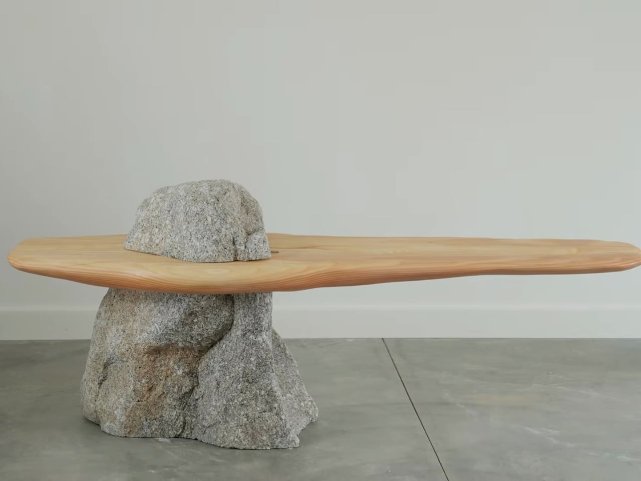

The idea of sitting atop a cloud-cutting mountain peak feels almost fantastical, so maker Miles Hass of Make With Miles has translated that vision into a striking piece of functional furniture. The bench appears as a solid rock emerging from the floor, with a slender wooden seat passing cleanly through it, creating the illusion of levitation. At first glance, the composition feels impossible, prompting a pause as the eye tries to reconcile weight, balance, and form. Inspired by mountaintops breaking through clouds, the piece captures an ethereal moment and grounds it within a contemporary domestic setting.


Behind its effortless appearance lies precise engineering and craftsmanship. Created in collaboration with Ben Uyeda in Joshua Tree, the bench balances structural integrity with sculptural elegance. The stone supports real weight, the wood remains functional, and together they form a dialogue between nature and modern design. Both artwork and seating, the bench exemplifies how furniture can be expressive, purposeful, and quietly provocative.

3. Use of Lightweight Materials

In advanced product design, material veracity defines visual ease. You increasingly rely on high-strength-to-weight materials such as carbon fiber, tempered glass, and performance polymers to achieve ultra-slender profiles. These materials enable products to appear almost weightless while retaining precision, durability, and structural confidence within contemporary interiors.

This material intelligence serves performance and responsibility. Slender, high-tensile legs and translucent supports visually recede, allowing products to blend seamlessly into space. By reducing material volume without compromising strength, you lower embodied carbon and reinforce a refined “less is more” philosophy—where sustainability, efficiency, and aesthetic clarity converge through thoughtful product engineering.


Novasis is a compelling floating design concept that redefines how architecture can exist on water. Conceived by designer Mohsen Laei and recognised with the Grand Prix Architecture and Innovation Award for the Sea, the project centres on a scalable floating platform engineered to operate entirely at sea. Rather than treating the ocean as a passive surface, Novasis is designed to float as an active, adaptive system—one that responds to marine conditions while remaining structurally stable, modular, and self-sufficient.
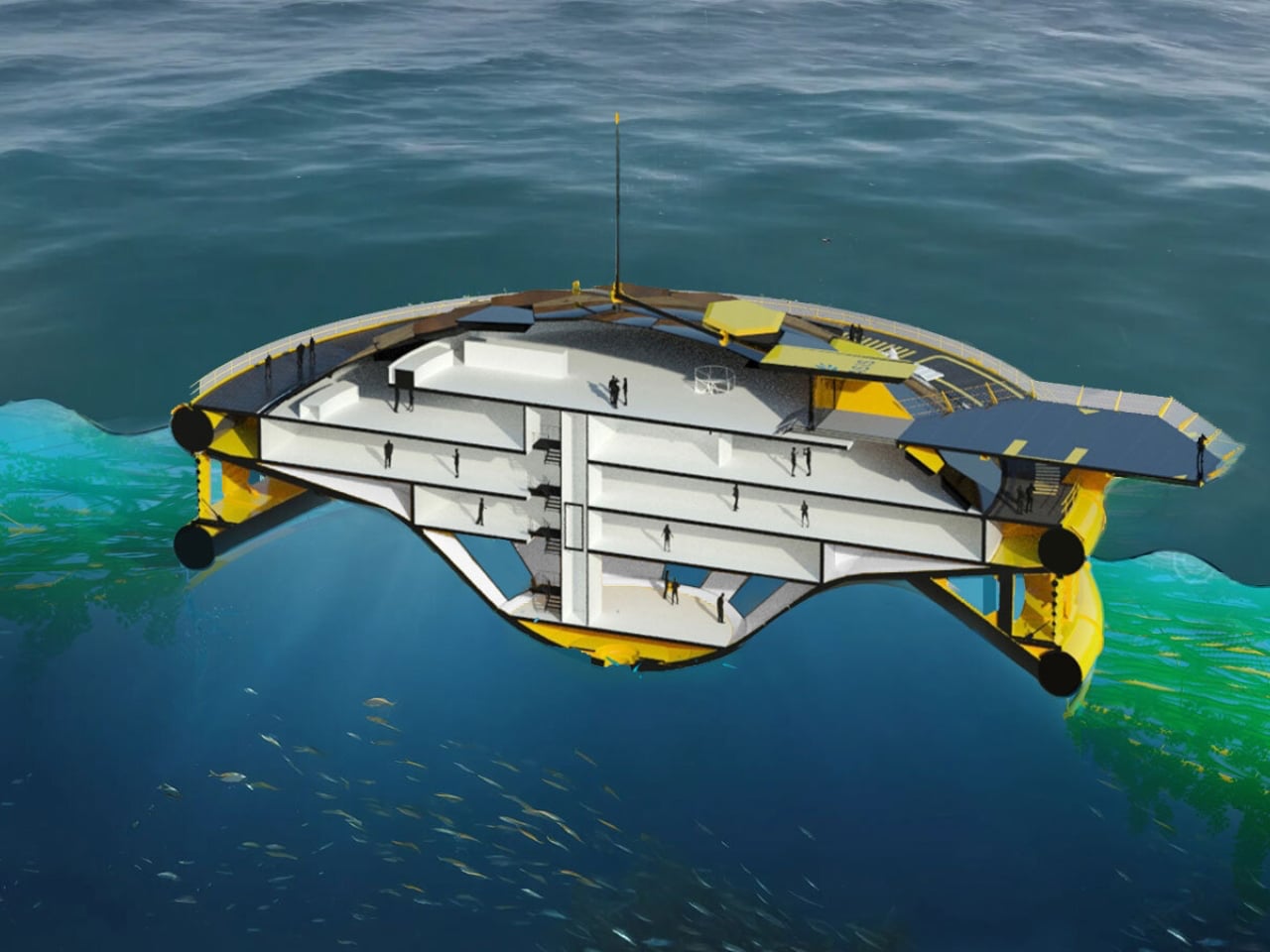
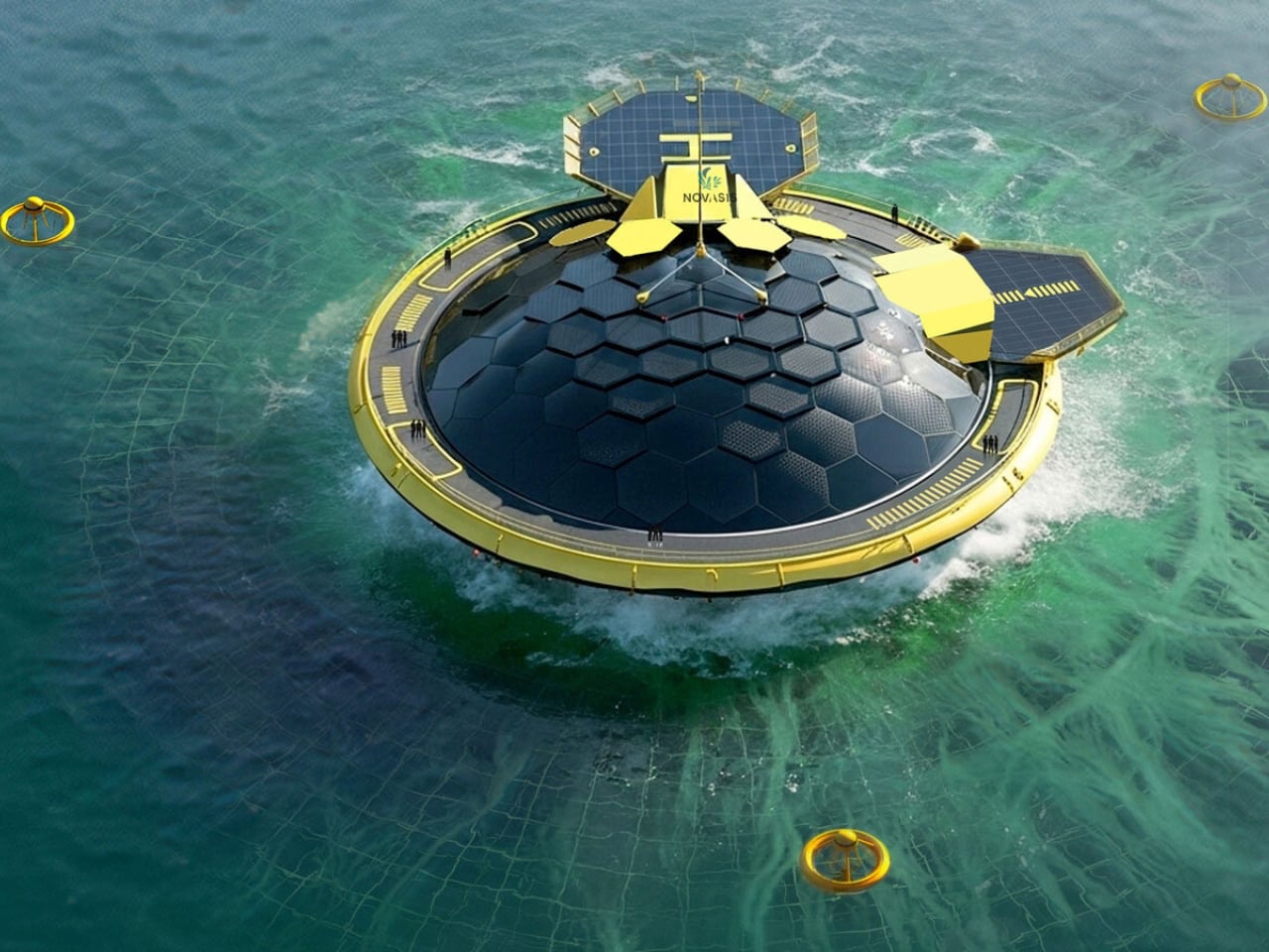
The floating platform integrates multiple functions into a single marine-based ecosystem. Its buoyant structure supports algae cultivation, renewable energy systems, and freshwater production without relying on land-based infrastructure. Floating and submerged recycled PET nets enable large-scale algae growth, while solar, wave, and desalination technologies operate directly on the platform. Modular by design, Novasis can exist as a standalone floating unit or connect with others to form larger networks, offering a flexible model for sustainable, ocean-based living and research.

4. Technological Product Levitation

In next-generation product design, levitation moves from illusion to reality through magnetic and electromagnetic integration. You now encounter products—speakers, lighting, and conceptual seating—that physically hover, dissolving the traditional relationship between object and surface. This marks a shift toward interiors where technology enables true visual freedom and heightened biophilic engagement.

While energy demand remains a technical consideration, the experiential return is exceptional. A floating product becomes an innovation statement, delivering sensory delight and intellectual intrigue. By suspending objects in mid-air, you interrupt habitual spatial perception, creating a moment of pause that redefines interaction, value, and the future language of design.

Gravity defying Tesla Cybertruck is a limited edition levitating gadget for your workstation
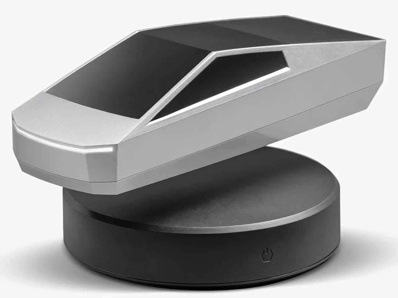
Levitating objects have a universal appeal, captivating attention with their illusion of defying gravity. Whether it is a lamp, planter, speaker, or mug, the floating effect instantly elevates everyday accessories into conversation pieces for desks, offices, or living spaces. Tesla extends this fascination into the automotive realm with a levitating version of its much-discussed Cybertruck. Known for its polarising, futuristic design, the all-electric pickup has dominated headlines, making a gravity-defying replica an unsurprising yet highly desirable collectible.
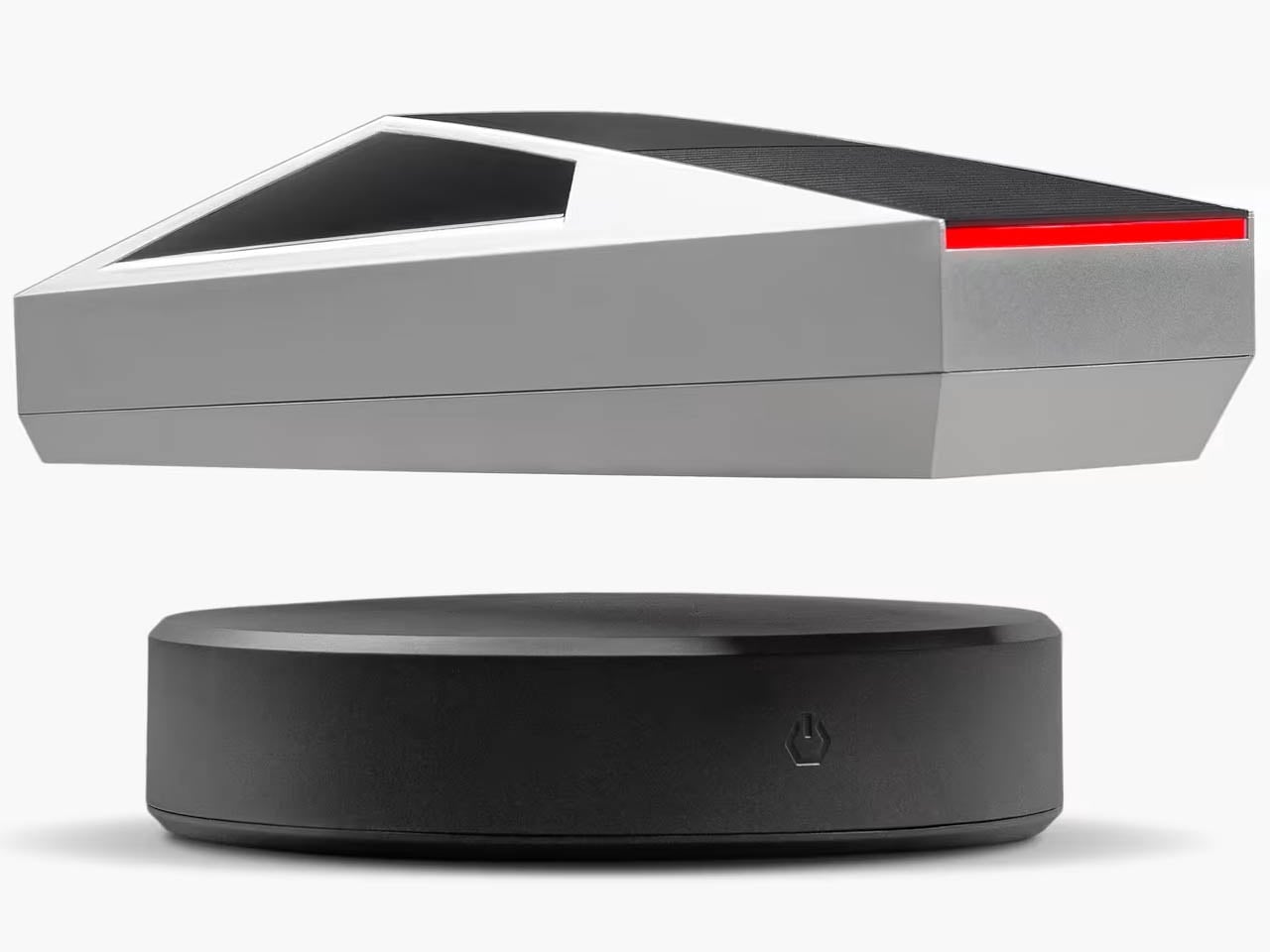
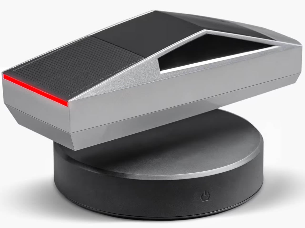
The 1:24 scale Levitating Cybertruck floats above a magnetic base using precisely calibrated electromagnetic levitation. Finished in a silver coating reminiscent of the original, it features functional headlights with 14 LED lights and realistic taillights. Measuring just under nine inches long, it can be gently spun while hovering, doubling as a kinetic desk object.

5. Form – Void Equilibrium

In future-forward architecture, product and interior design, visual ease emerges from a conscious dialogue between form and void. You achieve weightlessness when empty space is designed with the same intent as the object itself. By shaping and protecting these voids, products appear lighter, interiors feel breathable, and spatial perception expands beyond physical boundaries.

Technology sharpens this equilibrium. Subtle LED integration beneath floating products accentuates lift without visual noise, reinforcing clarity and precision. The result is a deliberate reduction of clutter and cognitive load. Spaces settle into a state of quiet balance delivering calm, focused, and mentally restorative – where design supports clarity of thought as much as visual refinement.


In the dense forests of Wakefield, Quebec, the MORE Cabin emerges as a striking architectural intervention, resembling a vision drawn from science fiction. Designed by Ottawa-based Kariouk Architects, this 900-square-foot retreat is dramatically elevated 60 feet above the forest floor on a single steel mast. Rather than disrupting its setting, the structure appears to hover lightly over the landscape, cantilevering over a cliff with uninterrupted views of a pristine lake. Architect Paul Kariouk positions the cabin as both a residential retreat and a critical exploration of how architecture can coexist sensitively with nature.


The cabin employs a refined hybrid structure of cross-laminated timber, glulam beams, and discreet steel reinforcements, allowing it to touch the ground at only one point. Fully off-grid, it generates its own power, manages water independently, and even integrates bat habitats within its steel framework. Internally, exposed timber and expansive glazing reinforce warmth and openness, underscoring a design philosophy that balances environmental responsibility with bold architectural ambition.

Floating design expresses architectural and product design poetry through precision and restraint. You balance form, void, material, and light to create spatial clarity and visual calm. For discerning homeowners, the return lies in interiors and products that feel lighter, breathable, and emotionally refined, where modern elegance is defined by effortless levitation and lasting visual ease.

The post 5 Floating Designs That Look Like Photoshop (But They’re Real) first appeared on Yanko Design.
5 Wildest Design Trends at MWC 2026: Nodding Phones and Tiny Robots

Every year, MWC arrives with the promise of seeing the future of mobile technology, or at least a very expensive approximation of it. The 2026 edition in Barcelona was the event’s 20th anniversary in the city, and while nearly 105,000 people showed up, there was a noticeable shift in what filled the booths. Fewer headline-grabbing product launches, more working concepts and proofs of concept across every category imaginable.

That’s not necessarily a bad thing. When manufacturers stop competing on a single spec and start showing what they’re thinking about next, the underlying patterns get easier to read. Five trends cut across product categories at MWC 2026, crossing from smartphones to laptops to robotic companions. None of them belongs to one company, and none of them is going away anytime soon.

Robots got a size reduction

For the past couple of years, humanoid robots have been stealing the show at tech events. They walk, they wave, they occasionally fall over, and everyone takes a video. The problem is that a bipedal robot that can fetch a package from across the room is not something most people actually need sitting in their office. MWC 2026 suggested the industry might be starting to figure that out.

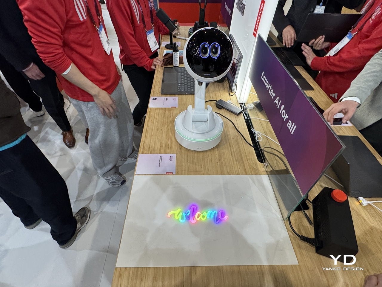
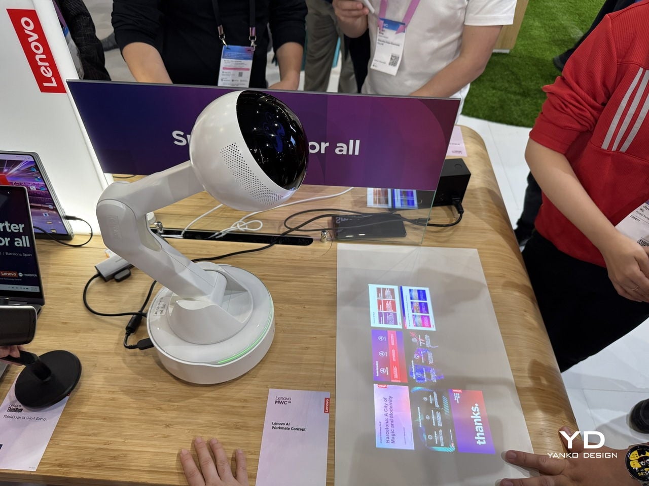
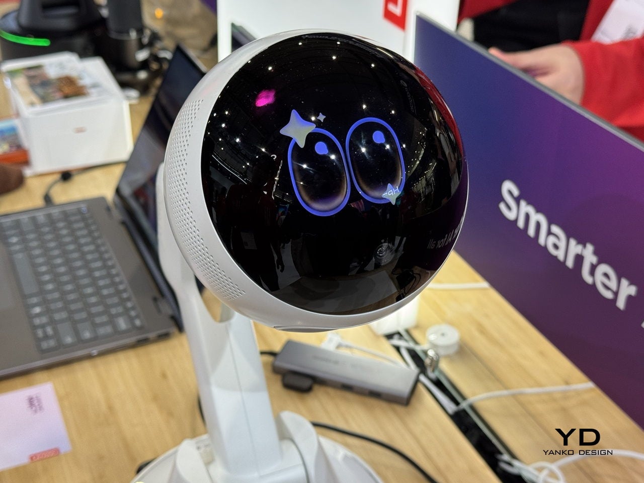
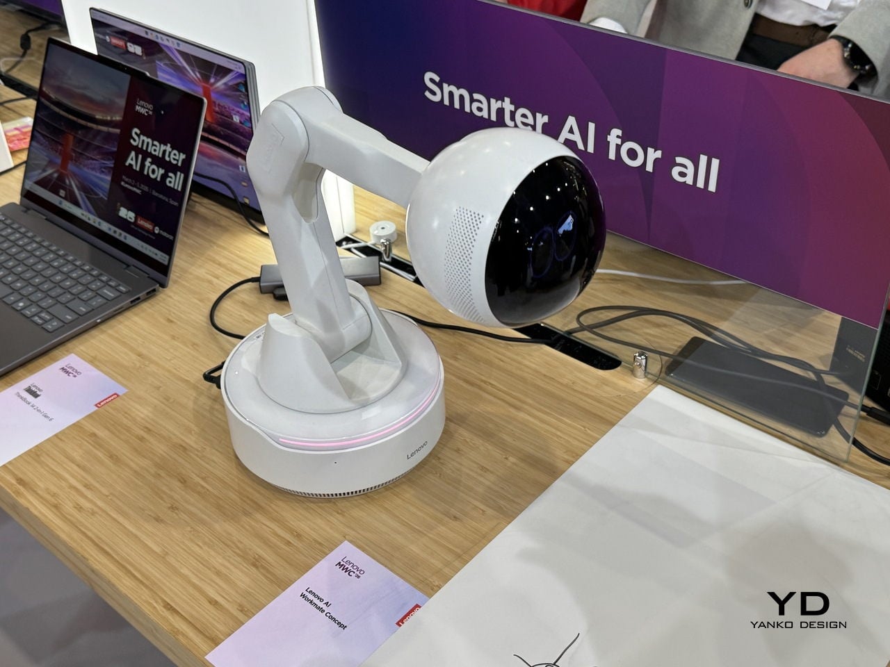
The robots worth talking about this year were small, desk-bound, and refreshingly honest about what they could do. Lenovo’s AI Workmate Concept is a desk-mounted unit that handles document scanning, note organization, and presentation help through voice, gesture, and spatial interaction, processing everything on-device. It can even project content onto your desk or a nearby wall, which sounds gimmicky until you think about how useful a hands-free reference surface actually is during a meeting.

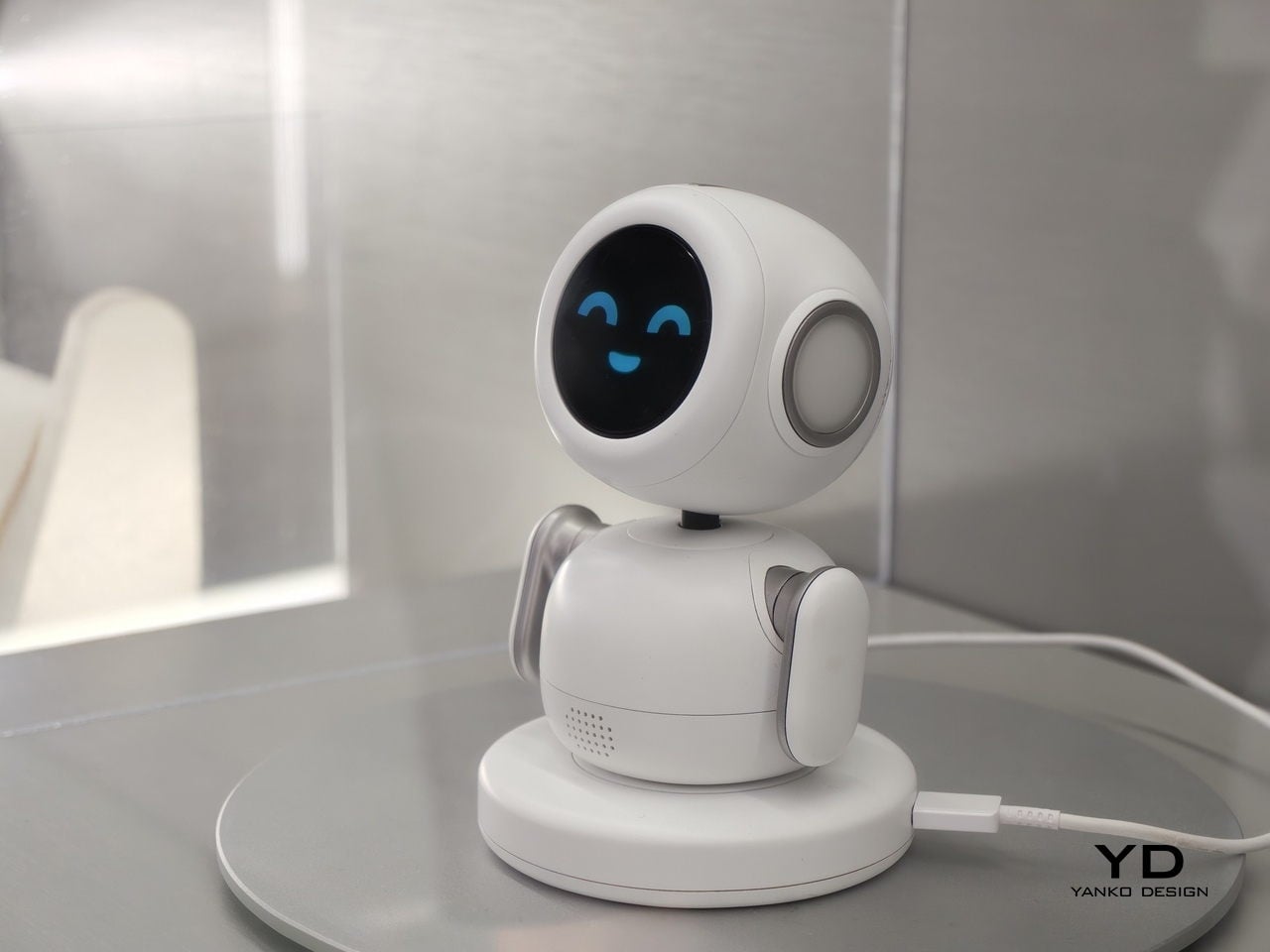
Samsung Display’s OLED AI Mini PetBot takes the idea in a more playful direction. It is a pocket-sized robot with a 1.34-inch circular OLED screen for a face, reacting to voice and touch with animated expressions. It comes from Samsung’s display division rather than its product team, so this is less a product announcement and more a demonstration of where the panel technology can go.

AI is learning to show its feelings

Most people’s experience of AI right now involves typing into a box and getting text back, or asking a question into empty air and hearing a voice that sounds like it was recorded in a server room. It works, but it does not feel particularly warm. A cluster of products at MWC 2026 was specifically trying to fix that, not by making AI smarter, but by making it more expressive.

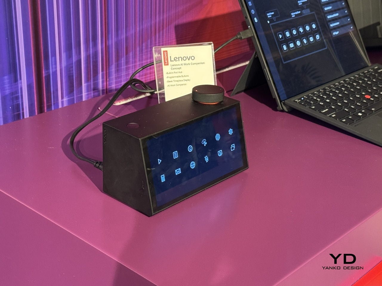
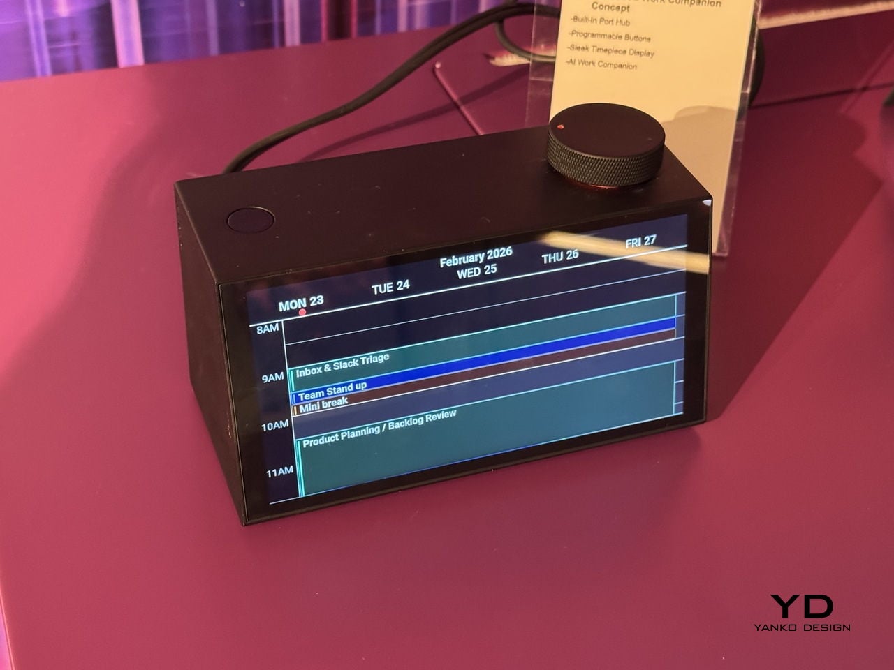
Lenovo’s AI Work Companion Concept looks like a desk clock, which is either a clever disguise or a statement about how unobtrusive AI should be. Its AI planning system, called Thought Bubble, syncs tasks and schedules from across your devices to build a daily plan, monitors screen time, nudges you to take breaks, and delivers an end-of-week summary of what you actually got done. The behavioral framing is deliberately light. The goal is to build a rhythm rather than manage a list, and the device is designed to feel like a presence in your workspace rather than another notification surface.

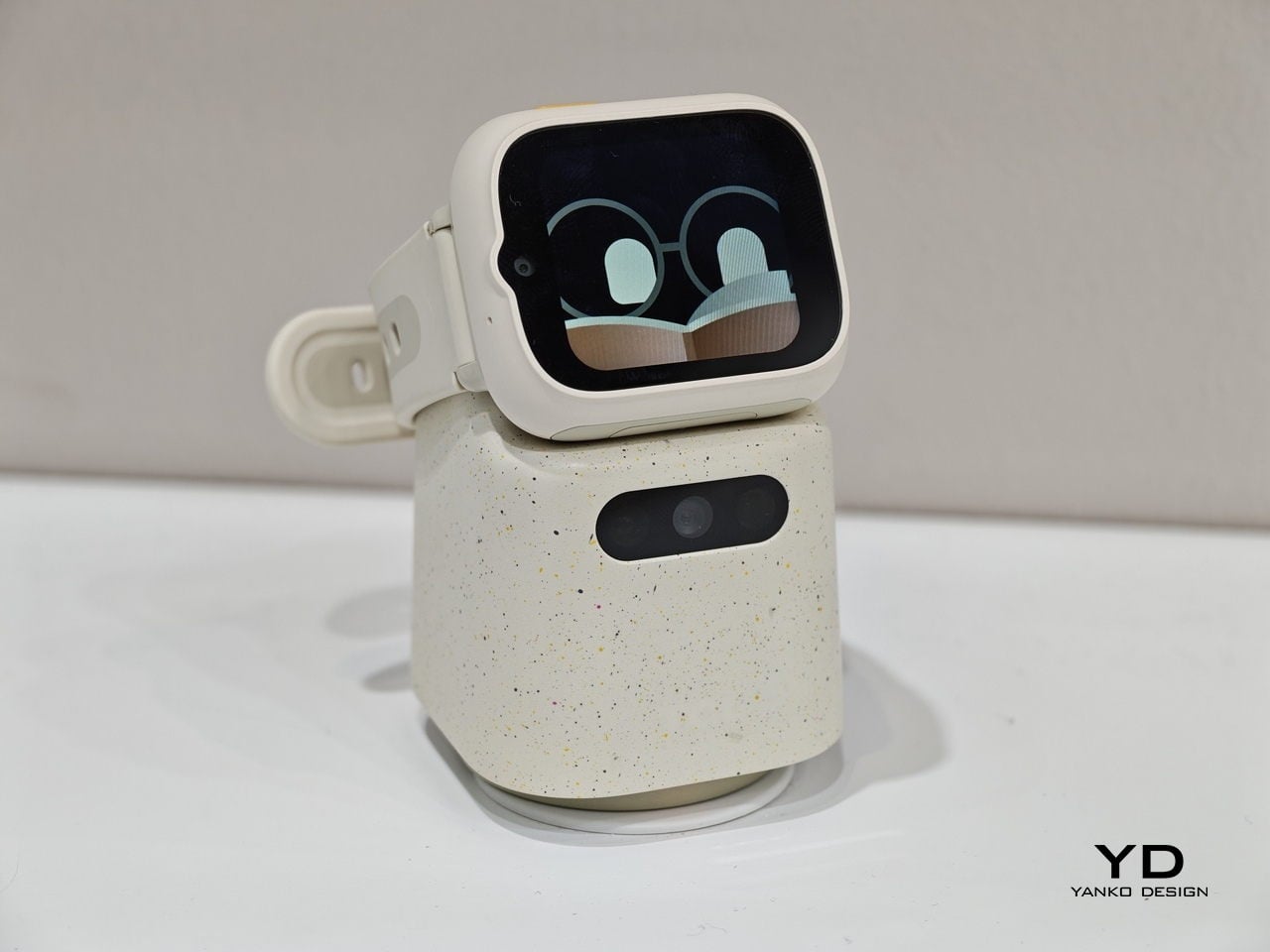
TCL’s Tbot takes a similar approach for a younger audience. It pairs with the company’s MOVETIME kids smartwatch, so when a child gets home and drops the watch onto Tbot’s magnetic dock, the robot comes to life as a study companion and bedtime storyteller. The physical handoff is a considered design decision, a tangible trigger rather than an app to open.

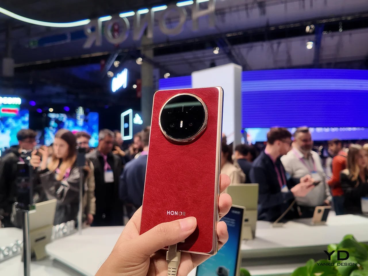
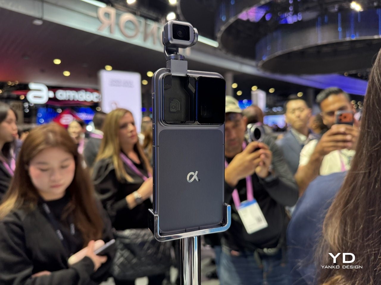
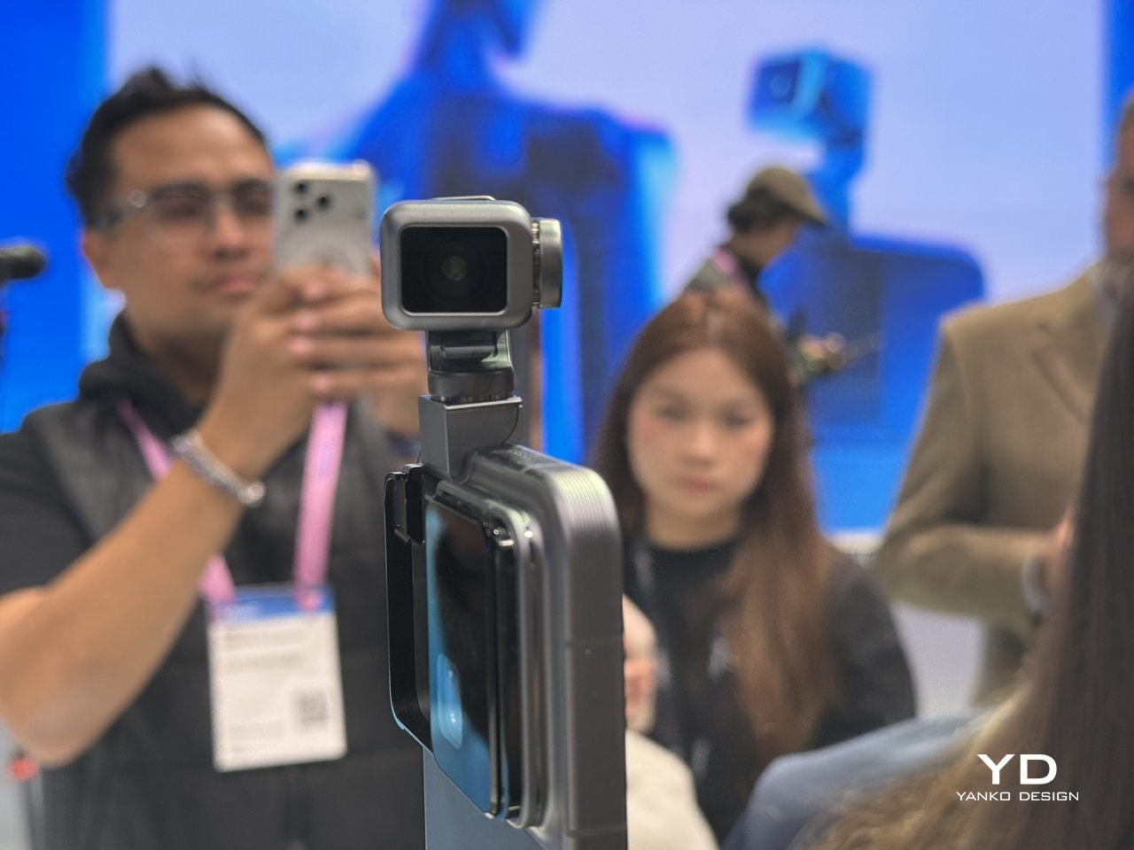
Honor’s Robot Phone extends the idea into the phone itself. A motorized titanium alloy gimbal arm holds a 200-megapixel camera that nods when it agrees, shakes when it doesn’t, and tracks you across the room. Honor plans to sell it in the second half of 2026, which means it will be the first of this particular batch of emotionally expressive AI devices to actually land in someone’s hands.

Modular design, this time as a practical argument

Modular phones have been promised before: Project Ara, LG G5, and Fairphone at various stages of their evolution. The pitch is always appealing: buy a base device, then upgrade the camera, swap the battery, add what you need. The reality has usually involved awkward connectors, software that doesn’t quite work, and products that disappear within two years. MWC 2026 had a notable cluster of modular devices, and what made them interesting is that each was solving a different version of the problem.

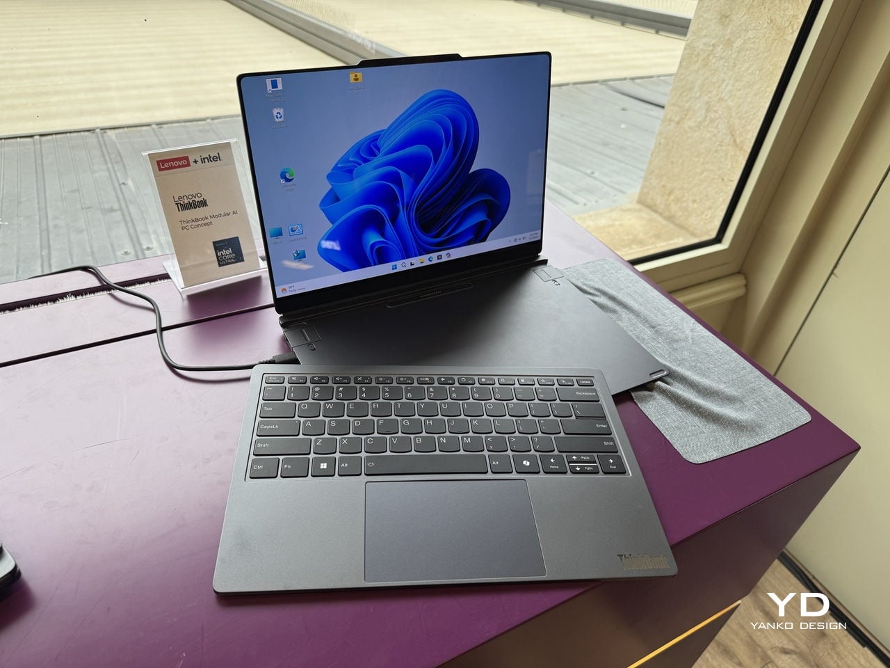
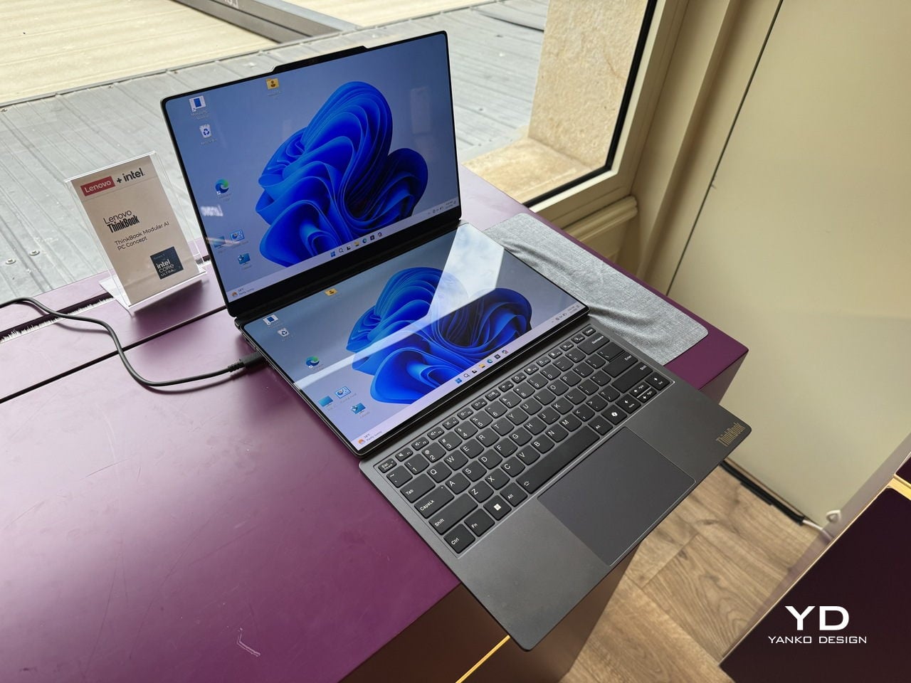
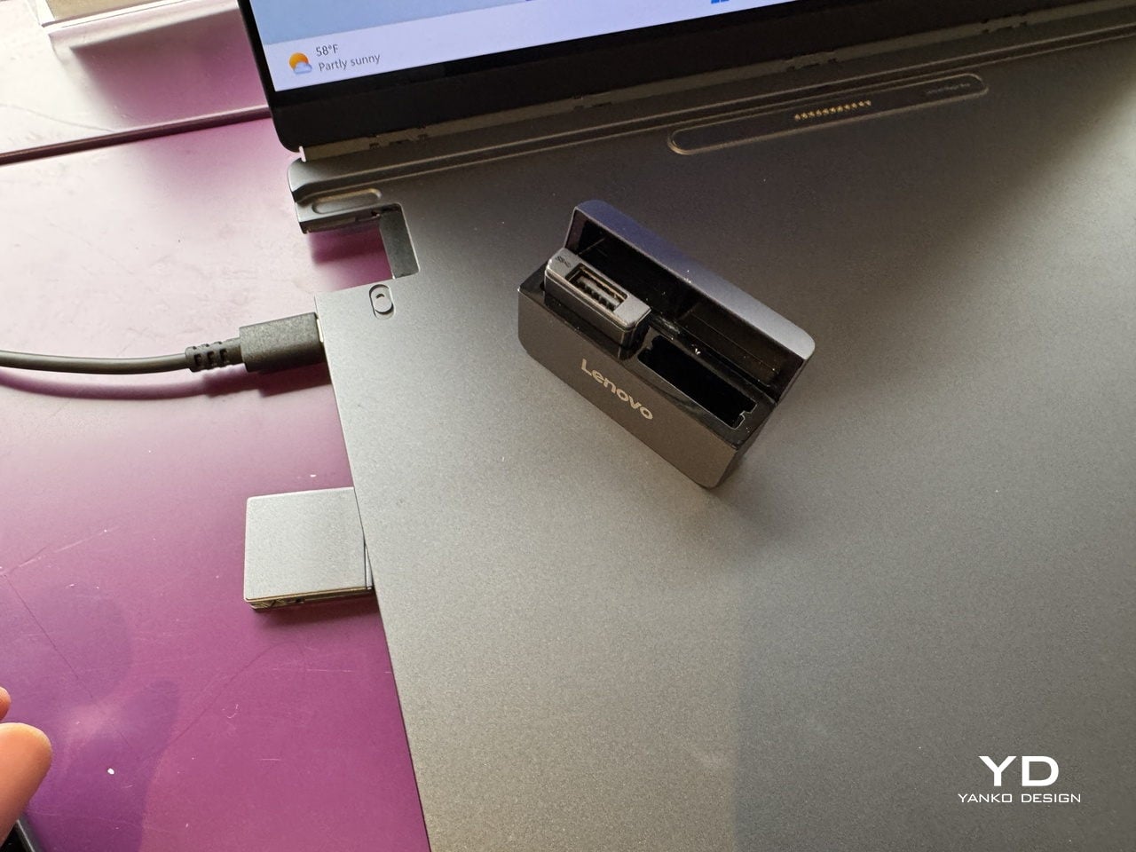
Lenovo’s ThinkBook Modular AI PC Concept approaches it from the laptop side. The 14-inch base connects to a secondary screen via pogo pins, and that screen can sit alongside the base as a travel monitor, mount on the lid for face-to-face sharing, or replace the keyboard to create a dual-display setup. Interchangeable I/O ports, covering USB Type-A, USB Type-C, and HDMI, mean the connection layout changes with the workflow. It’s a concept aimed at professionals who spend their day switching between contexts, and the argument is about longevity and flexibility rather than upgradeability for its own sake.

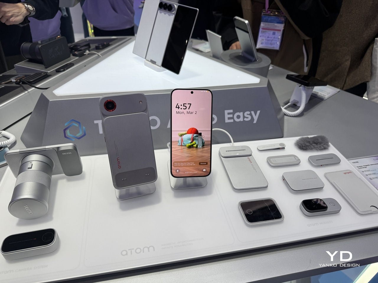
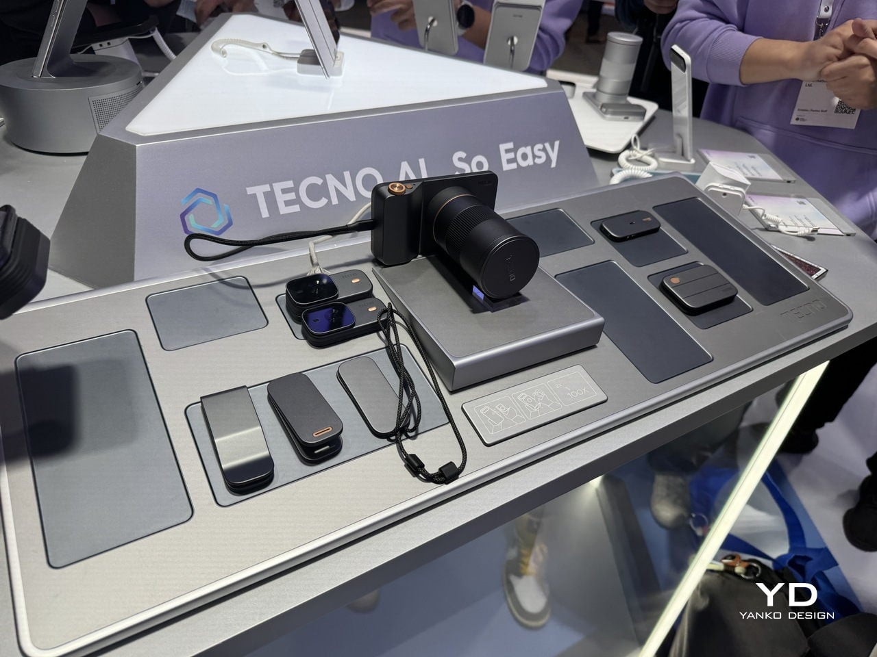
TECNO’s Modular Magnetic Interconnection Technology works from the phone outward. The base device is 4.9mm thick, which is thinner than anything Apple or Samsung currently sells, and that extreme thinness turns out to be the point. Modules, including telephoto lenses, battery packs, microphones, wallets, and speakers, attach magnetically to the rear without making the phone ungainly.

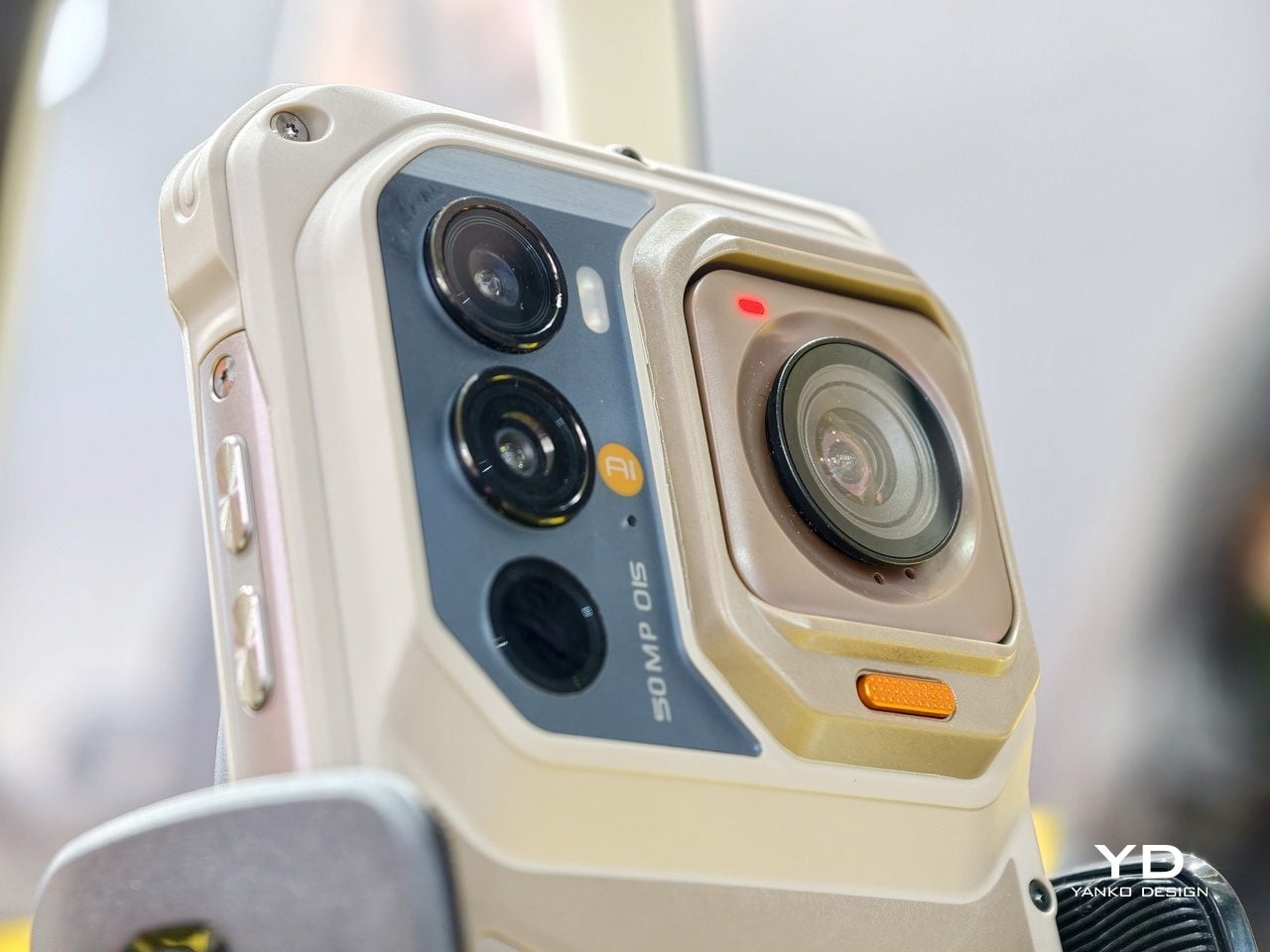
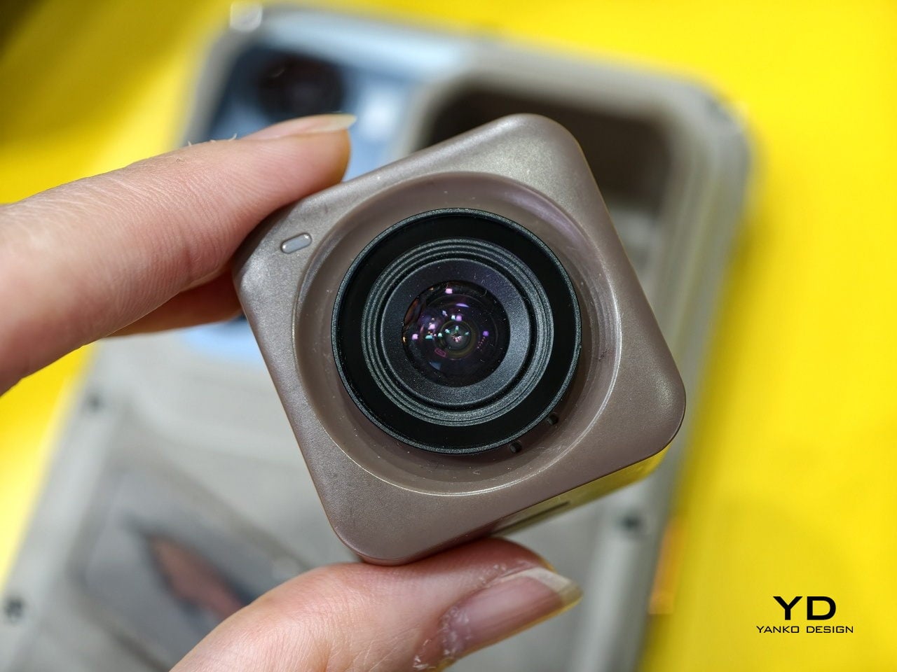
Ulefone’s RugOne Xsnap 7 Pro is less elegant but arguably more practical: a rugged phone whose rear camera detaches and operates independently as a wearable action camera. Three very different products, three different price tiers, and the same underlying idea. A device you can reconfigure is a device you keep longer.

The keyboard is making a serious case for itself

BlackBerry’s demise was supposed to be the end of physical keyboards on phones. Touch screens were better, the argument went, because they could be anything. And they were right, mostly. But they were also cold, imprecise for fast typing, and they ate half your screen every time you needed to type more than a sentence. A small but persistent group of users never fully made peace with that trade-off, and in 2026, they suddenly had options.

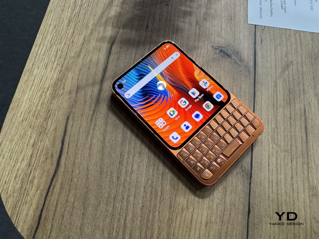
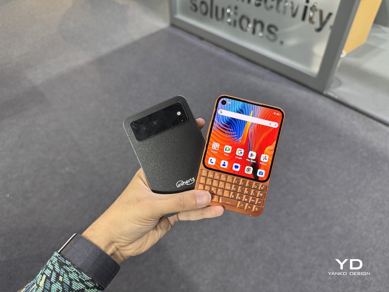
The Unihertz Titan 2 Elite was at MWC with a 4.3-inch AMOLED display at 120Hz above a physical QWERTY keyboard with touch-sensitive keys that also function as a trackpad. The aluminum body and slimmed-down proportions mark a clear departure from the chunky, ruggedized aesthetic of earlier Titan phones. This one is trying to look like something you would actually carry every day.

The Clicks Communicator comes from the opposite direction: Clicks already makes keyboard cases for iPhones, and the Communicator is a logical next step, a standalone Android phone built around the companion philosophy for people who want physical keys without abandoning modern smartphone basics.

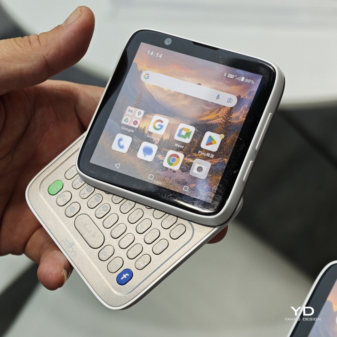
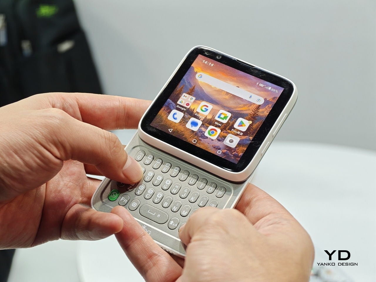
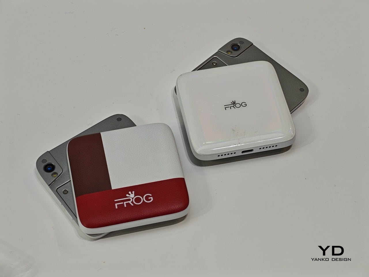
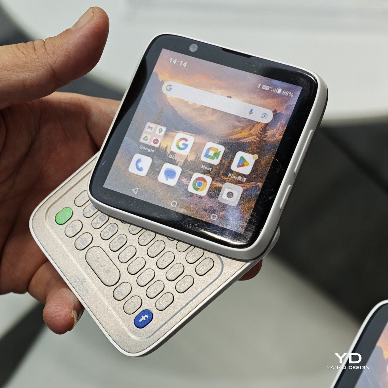
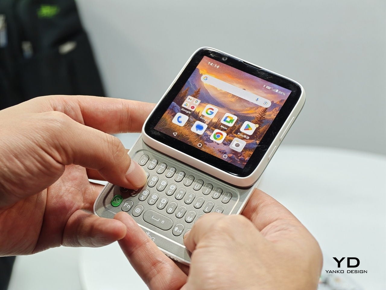
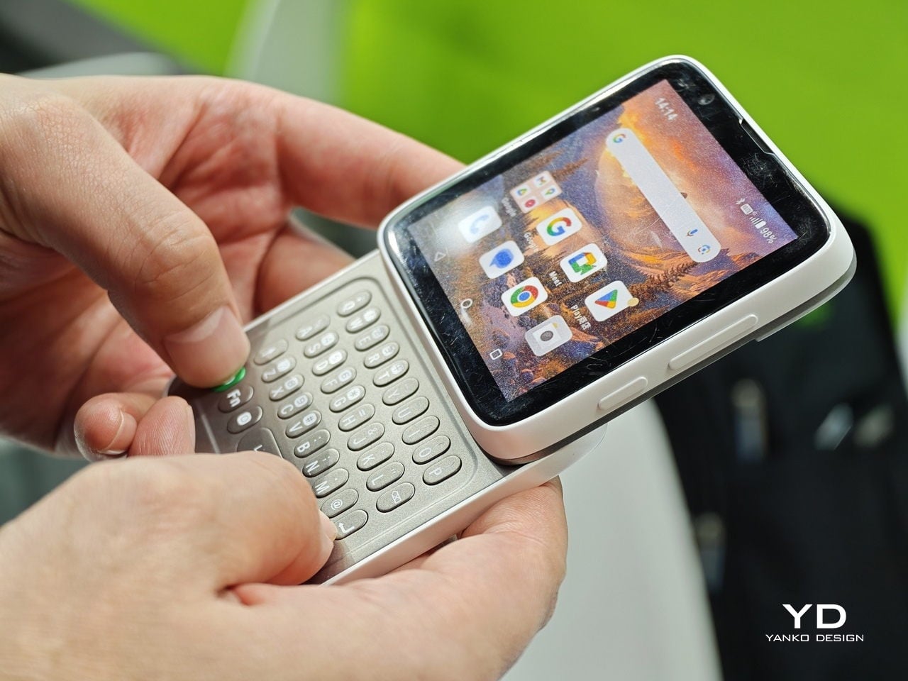
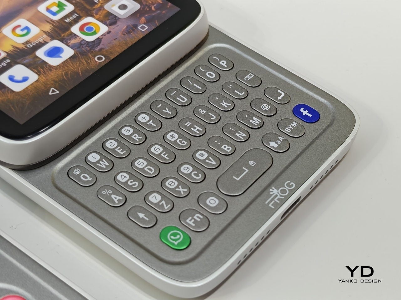
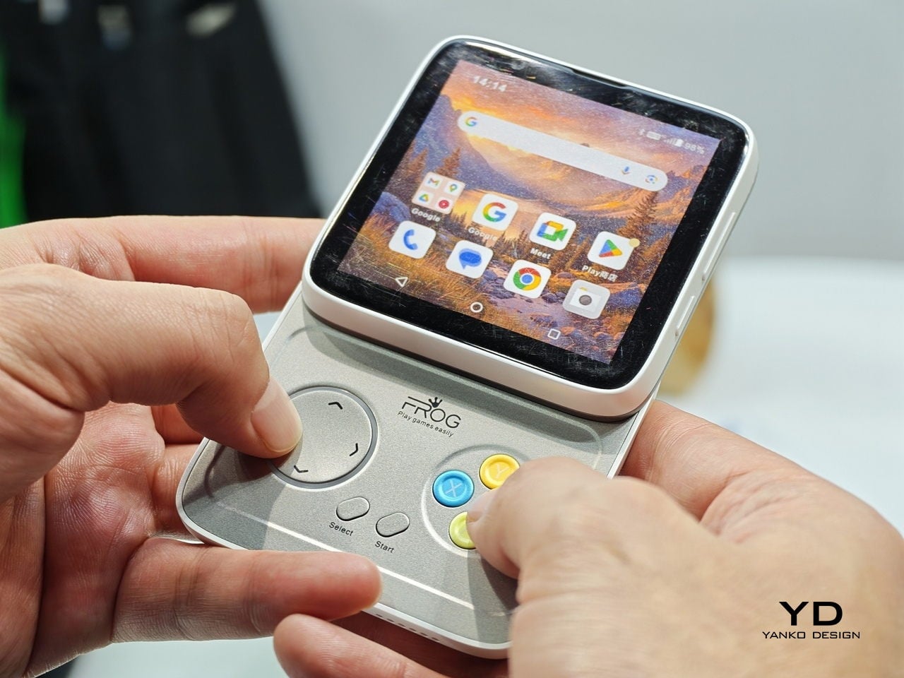
The iFROG RS1 is the strangest and most interesting of the three. It is a square phone with a 3.4-inch display that sits on top of a rotating lower section. Twist it one way, and you get a full QWERTY keyboard with tactile keycaps. Twist it the other way, and you get a gamepad with a D-pad and face buttons, which unavoidably recalls the Game Boy and the Motorola Flipout in equal measure. What all three of these share is a belief that tactile input has genuine ergonomic value that glass surfaces haven’t replaced, just obscured. Whether that belief translates into mainstream sales is a different question.

Design became the headline spec

Phones have always been designed objects. But for most of the last decade, the design conversation at launch events came after the camera specs, after the processor benchmark, after the battery capacity. At MWC 2026, a handful of manufacturers flipped that order. The design was the lead, and everything else followed.

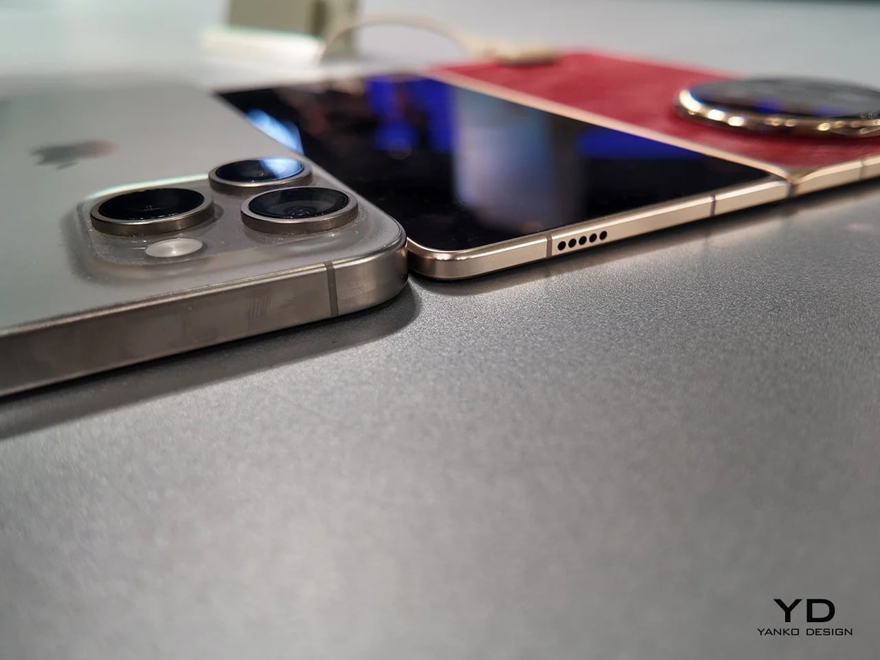
Honor’s Magic V6 is the most straightforward example. At 8.75mm closed, it is one of the thinnest foldables on the market, and Honor announced that measurement with the same emphasis as a performance figure might receive. The engineering behind it is genuinely impressive: IP68 and IP69 water resistance on a foldable, combined with a 6,660mAh silicon-carbon battery, means thinness was not achieved by sacrificing durability or endurance. It’s a difficult combination, and the design is doing real work to make it possible rather than just looking good on a spec sheet.

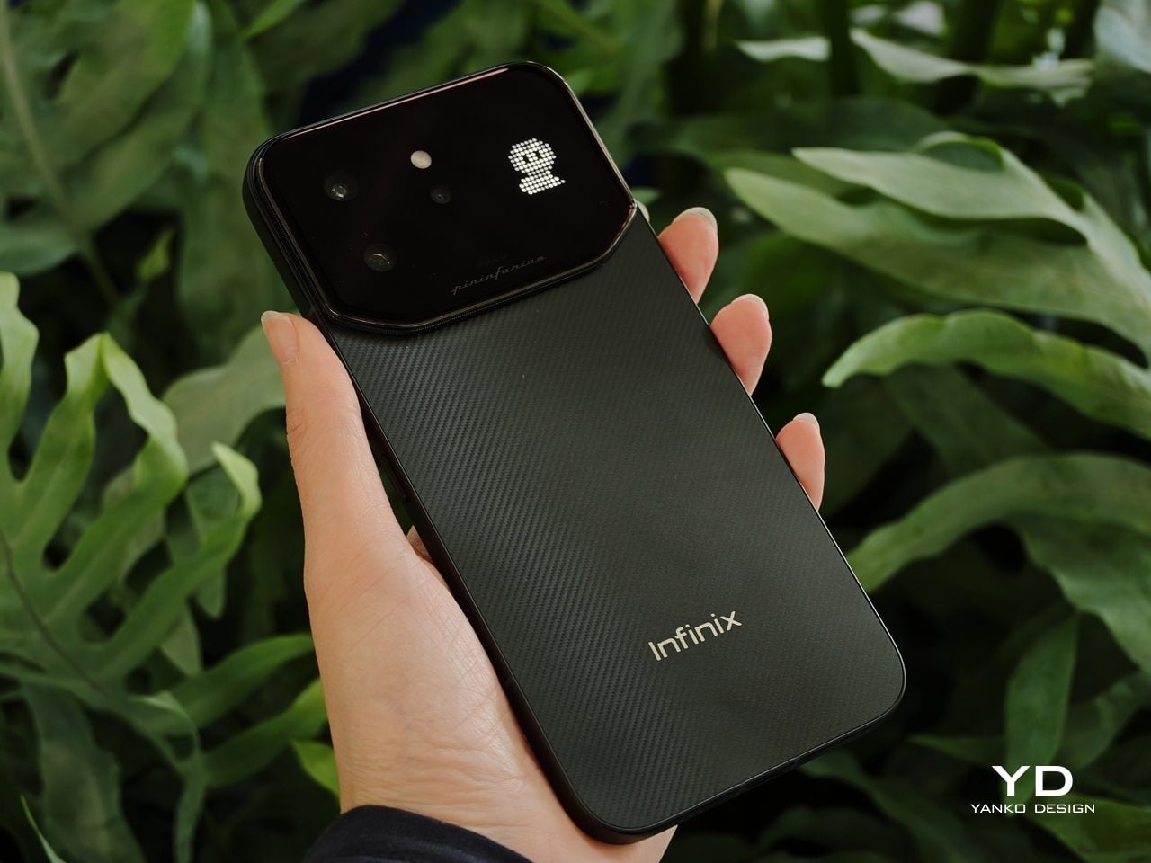
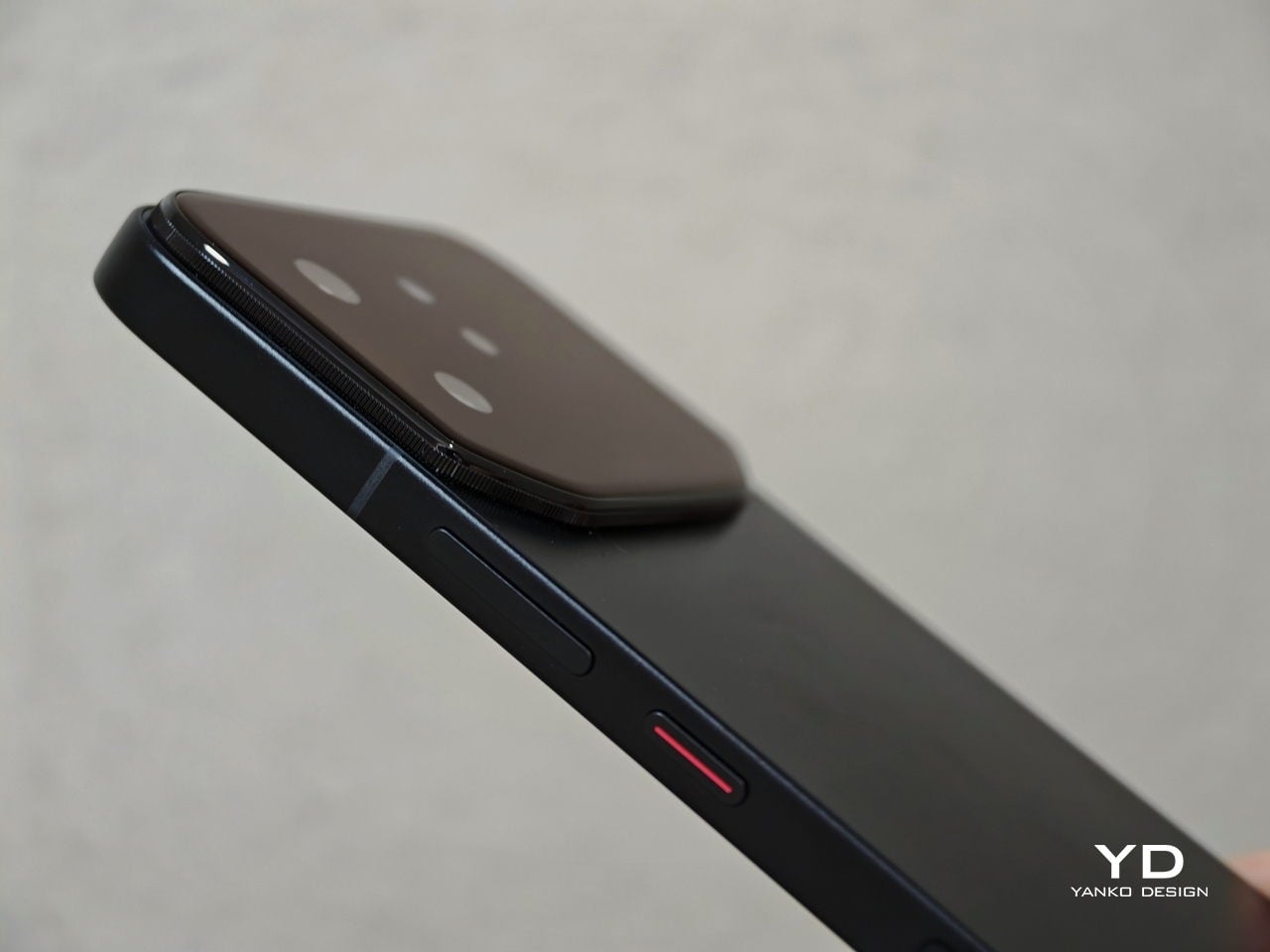
The CMF collaborations told a different story about design as positioning. Infinix’s NOTE 60 Ultra, developed with Pininfarina, applied the Italian studio’s automotive logic to the phone’s rear panel. The result is a single continuous sheet of Gorilla Glass Victus covering the triple camera array, a thin floating taillight strip, and a hidden active matrix notification display, all completely flush. No bump. The colorways, Torino Black, Monza Red, Amalfi Blue, and Roma Silver, are not accidental.

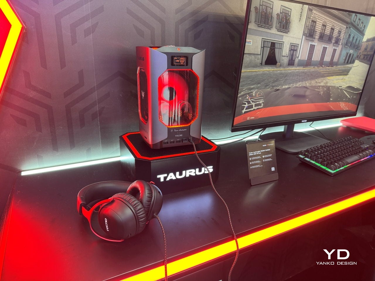
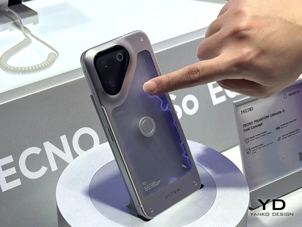
TECNO’s partnership with Tonino Lamborghini produced the TAURUS gaming PC, a water-cooled mini system with a 10,000mm² copper cold plate, and the POVA Metal phone, whose 241-pixel rear LED dot matrix turns the notification surface into a deliberate design feature. At the concept end, TECNO’s POVA Neon filled its rear panel with ionized inert gas to produce plasma patterns that chase your fingertip across the glass, which is either the most impractical phone feature ever conceived or a fascinating question about what a phone’s surface is actually for.

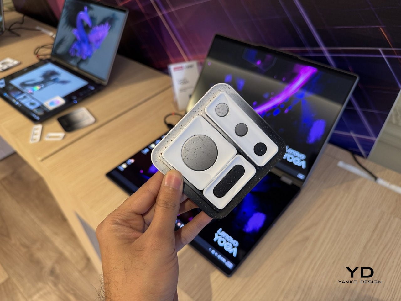
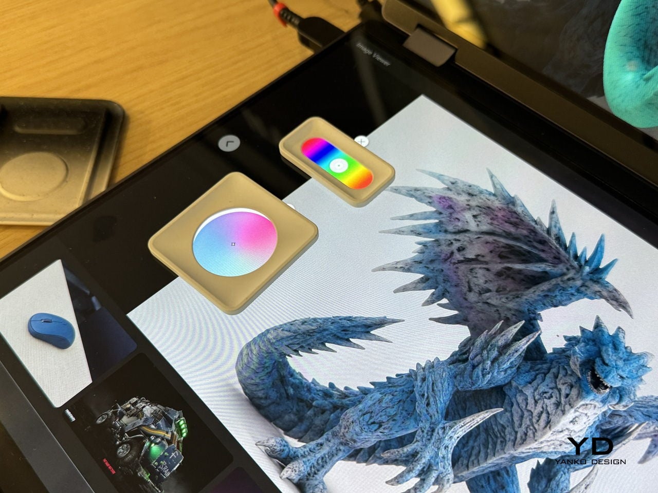
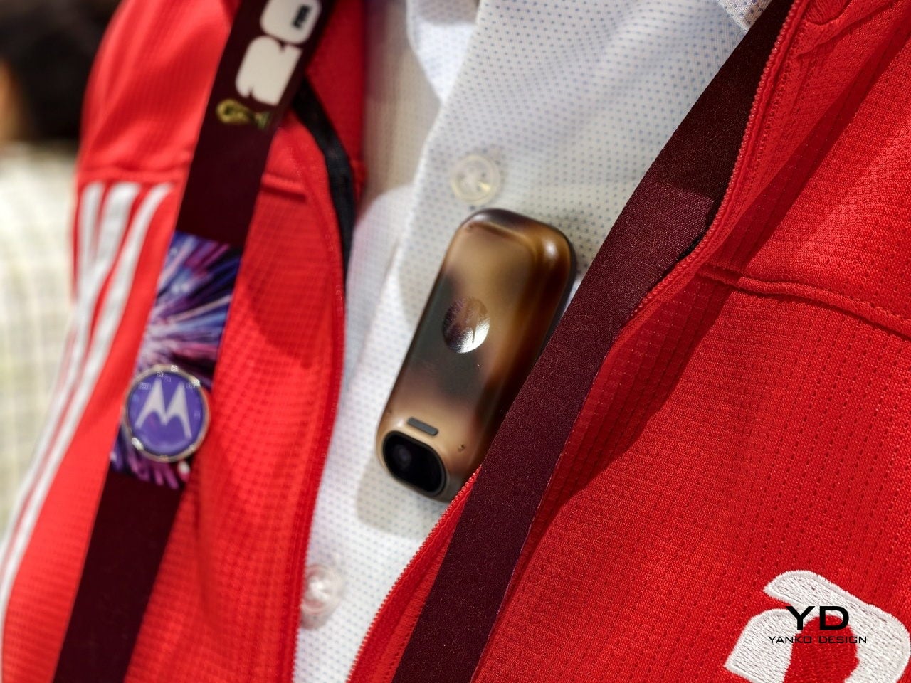
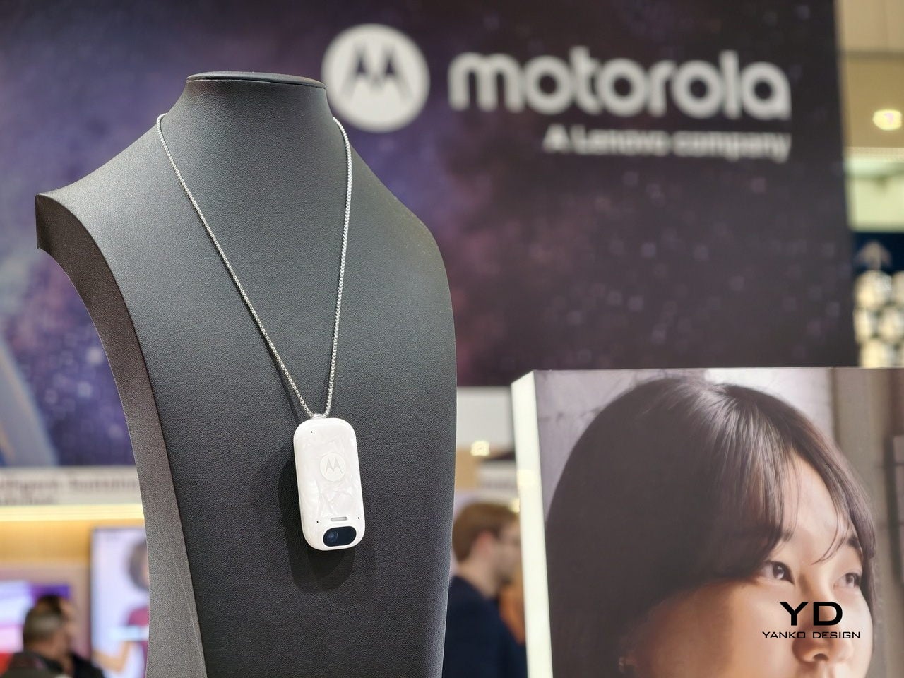
The Lenovo Yoga Book Pro 3D lets 3D creators sculpt directly on a dual-screen laptop without additional hardware. The Motorola Maxwell AI pendant turned conference transcription into something you wear around your neck. None of these are shipping products. At MWC 2026, that seemed less like a limitation and more like the whole point: showing what you think design can do, before you have to prove it.

The post 5 Wildest Design Trends at MWC 2026: Nodding Phones and Tiny Robots first appeared on Yanko Design.

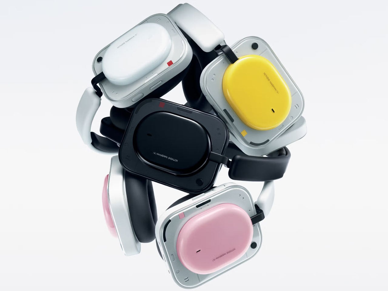
Nothing Headphone (a) promises flagship-level features and five-day battery life at budget price

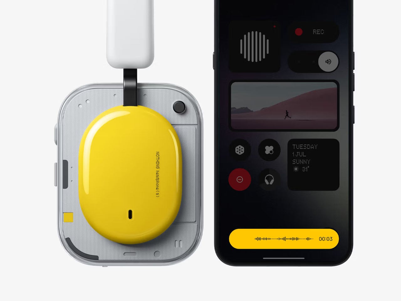
Nothing has steadily built a reputation for blending distinctive design with practical features. Now the Headphone (a) continues that philosophy by bringing many of the flagship features of the company’s earlier over-ear models to a more affordable price point. Positioned as a streamlined alternative to the Nothing Headphone (1), the new budget headphones aim to deliver strong battery life, customizable sound, and tactile controls while costing significantly less at $199.

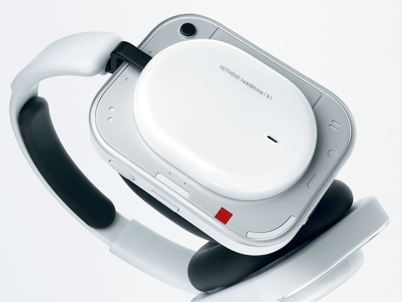
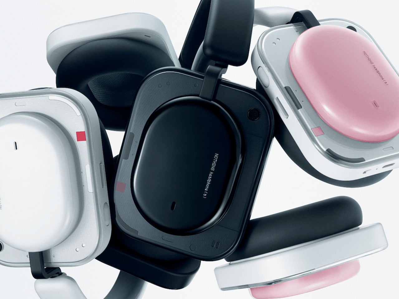
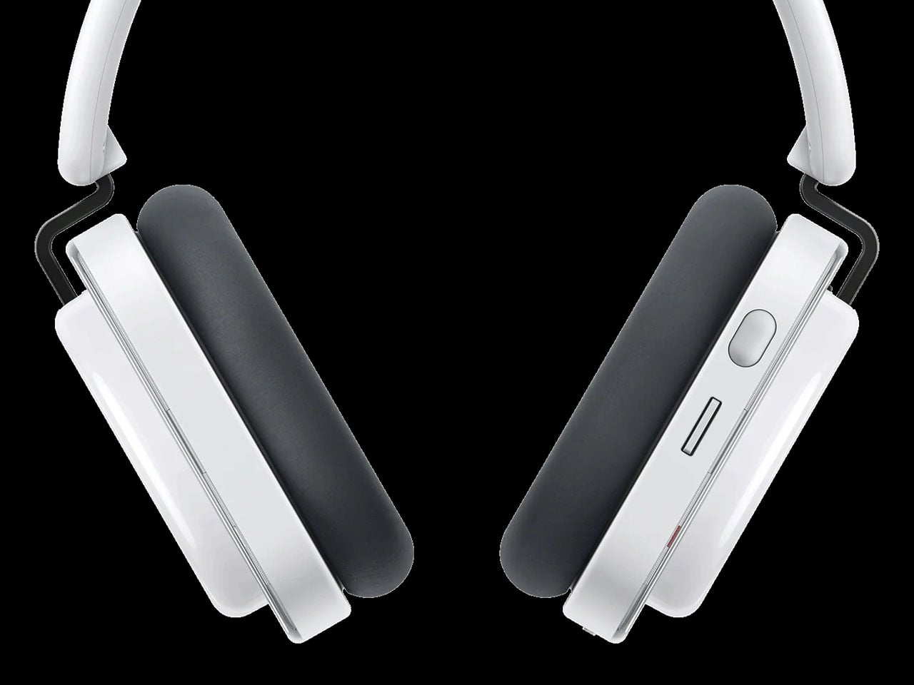
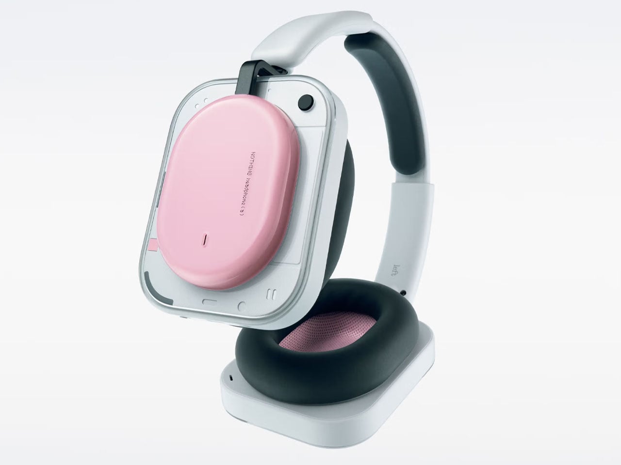
The Headphone (a) maintains Nothing’s recognizable industrial design language while introducing more expressive color choices for new-age buyers. Available in black, white, pink, and yellow, the headphones feature a boxy ear-cup structure and semi-transparent elements that align with the brand’s aesthetic identity. Despite being over-ear headphones, they weigh about 310 grams and include memory foam ear cushions designed for comfort during extended listening sessions.

Designer: Nothing

The model carries an IP52 rating, offering protection against dust and light splashes, which makes it suitable for everyday commuting or casual outdoor use. Audio performance is driven by 40mm dynamic drivers with titanium-coated diaphragms, engineered to deliver clean and controlled sound with reduced distortion. The headphones support Hi-Resolution Audio Wireless and the LDAC codec, allowing compatible devices to stream higher-quality audio over Bluetooth. Through the Nothing X companion app, users can further refine the listening experience with an eight-band equalizer and additional sound adjustments. This level of customization is uncommon at this price tier, giving listeners more control over their preferred sound profile.

Noise management is handled through adaptive active noise cancellation capable of reducing external sound by up to 40 decibels. Users can choose between multiple noise-cancellation levels depending on their surroundings, while a transparency mode lets ambient sounds pass through when awareness is needed. For voice calls, the headphones employ multiple microphones and AI-assisted noise reduction to isolate speech from background noise, improving clarity during conversations.

One standout feature of the Headphone (a) is its physical control system. Instead of relying on touch gestures, Nothing integrates tactile inputs directly into the ear cups through a Roller, Paddle, and Button interface. These controls allow users to adjust volume, skip tracks, answer calls, or change noise-cancellation modes without needing to look at their phone. The customizable button also supports a feature called Channel Hop, which enables quick switching between apps or functions. In addition, it can act as a remote camera shutter when paired with compatible smartphones, expanding the headphones’ functionality beyond audio playback.

Battery life is where the Headphone (a) stands out most clearly. Nothing claims up to 135 hours of playback without active noise cancellation and around 75 hours with ANC enabled. Even with the high-bandwidth LDAC codec, the headphones can deliver roughly 50 hours of listening. A quick five-minute charge provides several hours of playback, while a full charge takes about two hours via USB-C. This endurance significantly exceeds that of many competitors in the same category.

Compared with the earlier Nothing Headphone (1), the Headphone (a) offers a similar design and control scheme but removes some premium tuning elements and advanced features to reach a lower price. However, it retains most of the everyday functionality users expect, including ANC, customizable sound, and multipoint connectivity. When viewed against higher-end models like the Apple AirPods Max, the differences become clearer. Apple’s headphones deliver more advanced spatial audio and premium materials but cost considerably more, typically around $549. The Headphone (a), while less luxurious, focuses on practicality by offering dramatically longer battery life and simpler physical controls at a fraction of the price.

The post Nothing Headphone (a) promises flagship-level features and five-day battery life at budget price first appeared on Yanko Design.

The 5 Best Accessories That Look Like They Shipped in an Apple Box (They Didn’t)

Apple has always had this gravitational pull when it comes to design — clean lines, considered materials, and that unmistakable restraint that somehow still feels exciting. It’s the reason a whole ecosystem of third-party accessories exists that speaks the same visual language, sometimes so fluently you’d swear they came out of Cupertino.

The five products on this list sit right in that sweet spot. They’re designed for your Apple devices, they match that premium sensibility, and yet they each bring something Apple itself hasn’t thought of (or wouldn’t dare try). From a keyboard that brings BlackBerry nostalgia to your iPhone to a carabiner that turns your AirTag into a proper adventure companion, these are the accessories that deserve a spot in your setup.

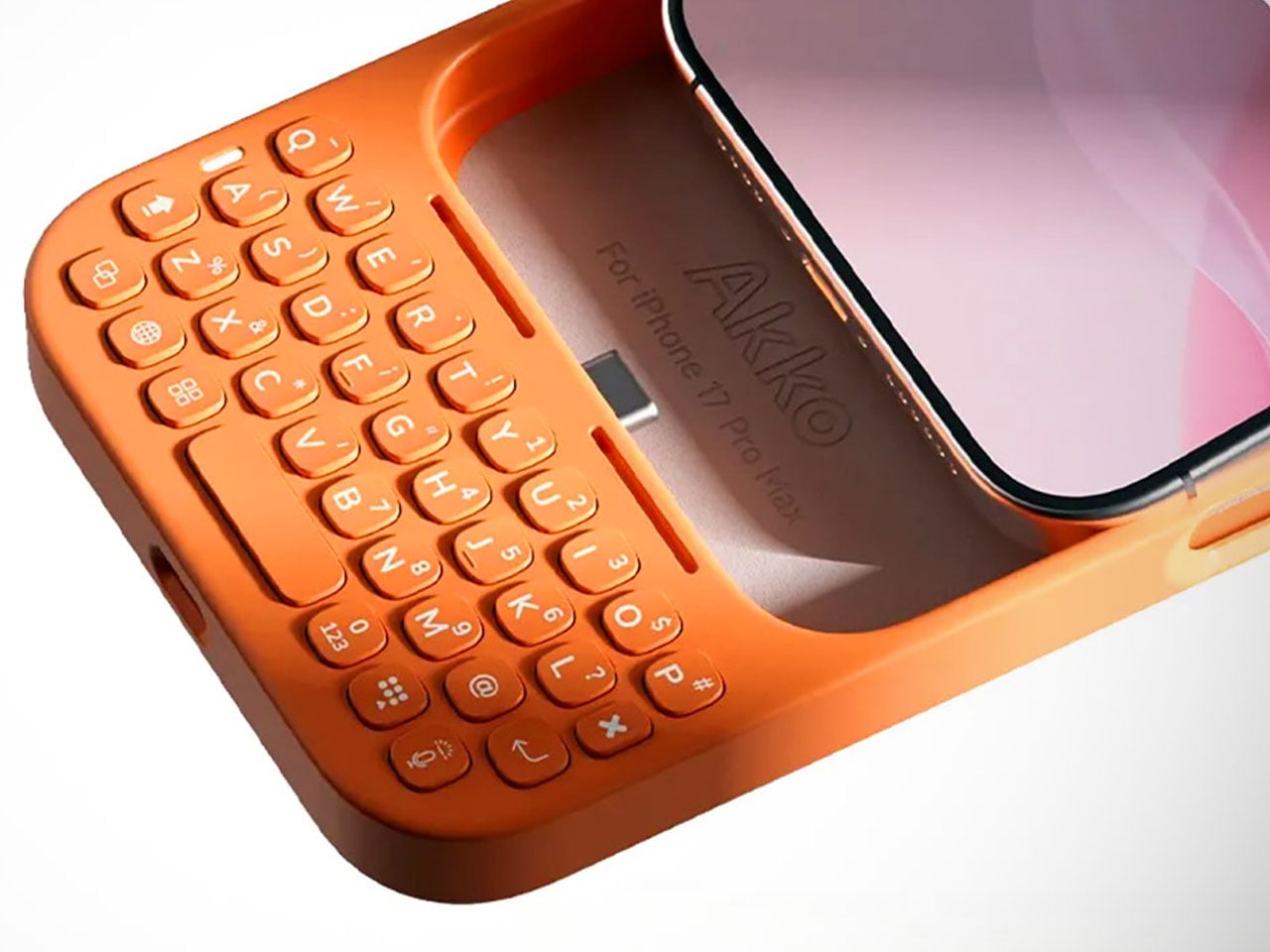
1. Akko MetaKey

There’s something almost rebellious about strapping a physical keyboard to an iPhone in 2026. Akko, a company celebrated in the mechanical keyboard community for its switches and keycap artistry, decided to do exactly that with the MetaKey. It connects to the iPhone 16 Pro Max and 17 Pro Max via USB-C and features a passthrough port, so you can still charge or transfer data without detaching the whole thing. It’s clever, it’s niche, and it’s built with the kind of intentionality that makes you pause and appreciate the craft.

The keyboard layout is compact and BlackBerry-inspired, with backlit keys that work comfortably in low light. What really sets it apart, though, is the thoughtfulness in the details — dedicated shortcuts for Siri, voice dictation, and number input, plus a scroll mode that transforms the top rows into navigation buttons for breezing through long feeds. Akko even includes a tiny nine-gram counterweight that clips behind the keyboard to keep your phone balanced in your hand. It’s the kind of consideration that separates a gimmick from a genuine tool for your Apple device.

What We Like

  • The USB-C passthrough is a smart move — you never have to choose between typing and charging your iPhone, which makes the MetaKey feel like a seamless extension of the phone rather than an inconvenient add-on.
  • The scroll mode is a surprisingly intuitive touch. Turning keyboard rows into navigation buttons for scrolling through social feeds or documents on your iPhone shows that Akko was thinking beyond just text input.

What We Dislike

  • The added length and weight, even with the counterweight, will take some getting used to. It shifts the balance of the phone noticeably, and one-handed use becomes a bit of a juggling act.
  • Compatibility is limited to just two iPhone models. If you’re on an older device or a non-Pro model, you’re out of luck — and that narrows the audience considerably for something this well-designed.

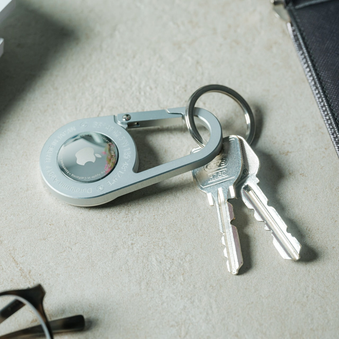
2. AirTag Carabiner

If you’ve ever attached an AirTag to something and felt like the holder was letting down the tracker, this one’s for you. The AirTag Carabiner is made from Duralumin composite alloy — the same material found in aircraft and marine vessels — so it’s as tough as it is minimal. It snaps onto bags, bikes, umbrellas, or whatever else you tend to misplace, and it lets Apple’s Find My network do the rest. There’s a quiet confidence in how understated this thing looks, like it was always supposed to be part of the AirTag’s story.

Each carabiner is individually handcrafted, which gives it a tactile quality that mass-produced holders simply can’t match. It’s also available in untreated brass and stainless steel finishes, so you can match it to your personal style or let it develop a patina over time. For anyone deeply embedded in the Apple ecosystem who uses AirTags on everything from luggage to keys, this is one of those small upgrades that quietly elevates the entire experience.

Click Here to Buy Now: $129.00

What We Like

  • The Duralumin construction means it’s lightweight yet remarkably strong — suitable for use in water and at high altitudes, which makes it a genuine companion for outdoor adventures, not just a desk accessory for your AirTag.
  • The handcrafted quality and multiple finish options (brass, stainless steel) add a personal, artisanal dimension that feels right at home next to Apple’s own hardware.

What We Dislike

  • The AirTag itself isn’t included, which is expected but still worth noting — you’re investing in the holder alone, and the overall cost of the tracker plus carabiner adds up.
  • For something this minimal, the design language is almost too subtle. If you like your accessories to make a visual statement, this one deliberately doesn’t — it disappears, which is the point, but not everyone wants that.

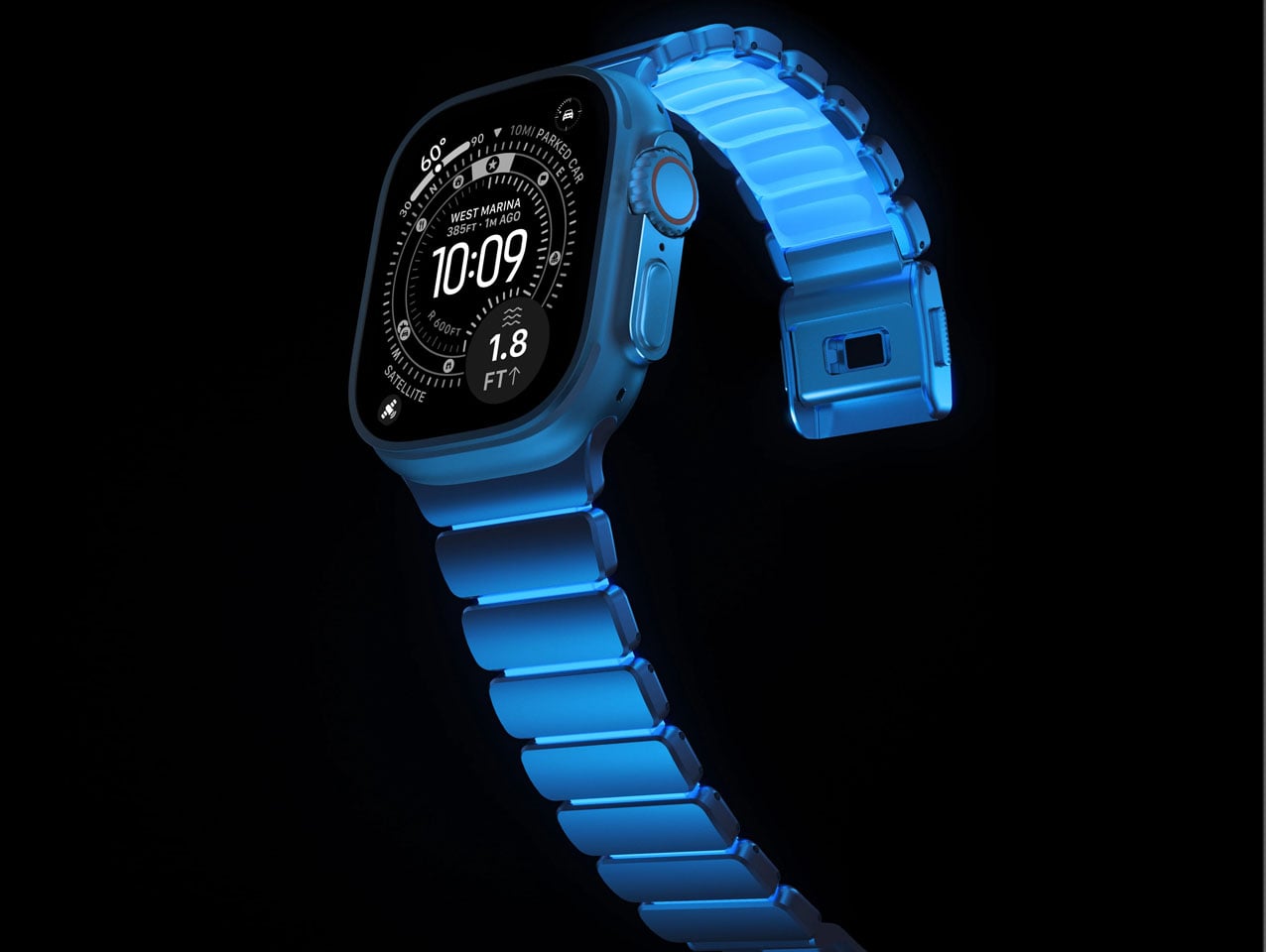
3. Nomad Icy Blue Glow Stratos Band

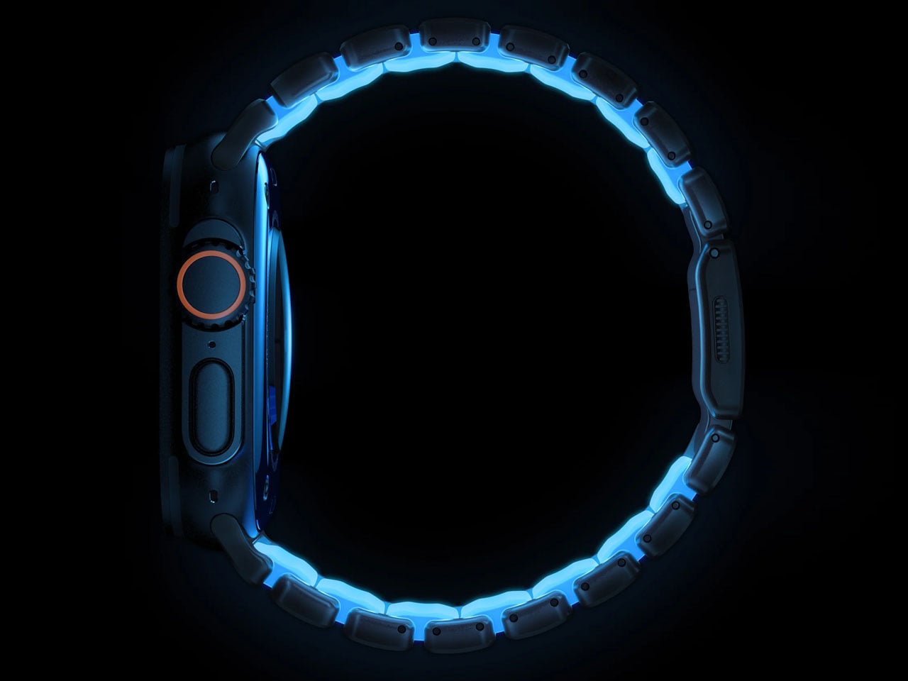
The Apple Watch Ultra was built for people who push limits, and Nomad’s Stratos Band has always matched that energy. But the Icy Blue Glow edition adds something unexpected — a fluoroelastomer cast that lights up in Tron-like hues after dark. It’s a limited-run release, and it bridges the gap between serious performance gear and something you’d actually want to show off at a dinner table. Nomad describes it as proof that performance and fun can coexist, and honestly, it’s hard to argue.

Underneath the glow, the engineering is just as considered. Grade 4 titanium hardware handles the structural work, while compression-molded FKM fluoroelastomer links sit against the skin for comfort and flexibility. The dual-material design creates natural ventilation spaces between the links, helping with moisture and breathability during workouts or just everyday wear. For Apple Watch Ultra owners who’ve cycled through the usual band options and want something that feels both premium and a little playful, this Stratos edition is a standout.

What We Like

  • The hybrid construction of titanium and FKM fluoroelastomer strikes a rare balance — you get the refined, metallic look that matches the Apple Watch Ultra’s hardware with the comfort of a sport band, all in one piece.
  • The glow-in-the-dark feature isn’t just a novelty. It adds genuine visibility during nighttime runs or low-light conditions, making it functional for the adventure crowd the Ultra was designed for.

What We Dislike

  • It’s a limited-run release, which means if you don’t move quickly, it’s gone. For a band this well-made, it would be nice to see it as a permanent option in Nomad’s lineup for Apple Watch Ultra.
  • The glow effect relies on light absorption, so its intensity fades over time in darkness. After a few hours, you’re back to a regular (still great-looking) band — manage expectations accordingly.

4. Battery-Free Amplifying iSpeakers

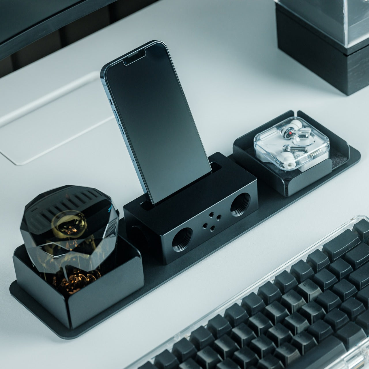
There’s an elegance to things that work without electricity. The Battery-Free Amplifying iSpeakers from Yanko Design Select take your smartphone’s built-in speaker and amplify the sound purely through acoustic design — no charging, no Bluetooth pairing, no cables. You simply place your iPhone into the cradle and let the Duralumin metal body do the work, channeling and projecting sound waves across the room. It’s the kind of product that makes you appreciate physics as a design material.

Beyond the clever engineering, the speaker itself is designed using the golden ratio, so its proportions feel inherently pleasing on a desk or shelf. The vibration-resistant Duralumin construction — the same aerospace-grade material — means the body stays stable even when the sound is full. There are also optional add-on modules called +Bloom and +Jet that let you direct the sound in different patterns, which is a nice touch for people who care about how audio fills a space. For your iPhone, it’s a zero-fuss, zero-power way to fill a room with music.

Click Here to Buy Now: $179.00

What We Like

  • The completely passive, battery-free design is refreshing in a world of chargers and cables. You just drop your iPhone in and go — no setup, no pairing, no power source needed.
  • The golden ratio proportions and aerospace-grade Duralumin make it as much a desk sculpture as an audio accessory. It genuinely enhances the look of whatever space it sits in alongside your Apple devices.

What We Dislike

  • Acoustic amplification has its limits. Don’t expect it to compete with a powered Bluetooth speaker — it’s best suited for casual listening and background music with your iPhone, not filling a large room for a gathering.
  • The +Bloom and +Jet sound-directing modules are sold separately, which means getting the full experience requires additional investment beyond the base speaker.

5. Triple Boost 14 Pro

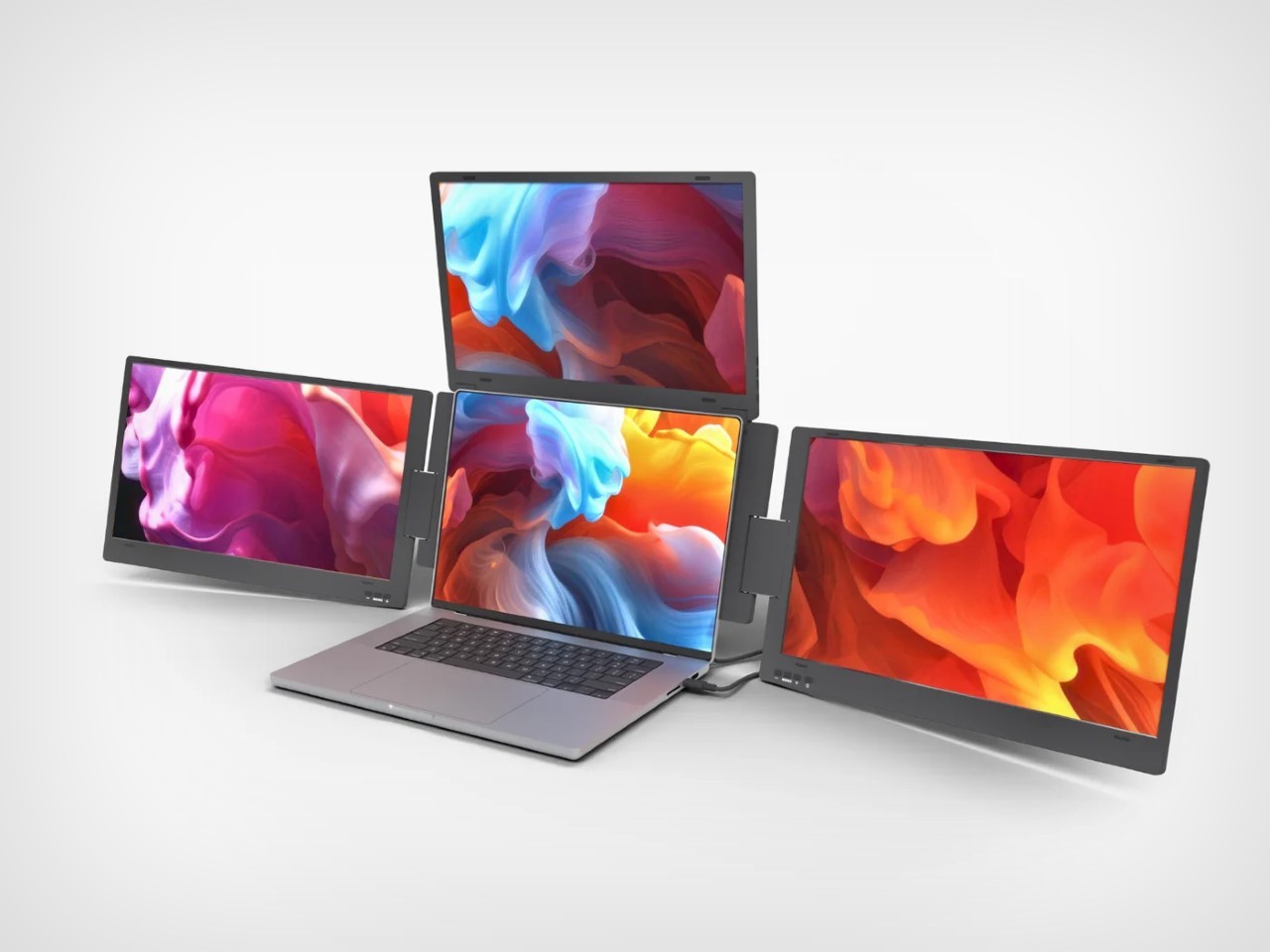
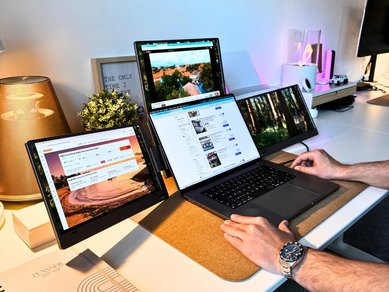
Dual monitors are fine. The Triple Boost 14 Pro thinks bigger. This accessory attaches to your MacBook and unfolds into three additional 14-inch IPS displays — two flanking the sides and one rising from the top — turning your laptop into a four-screen workstation that looks like it belongs in a mission control room. It connects via a single cable, and once you set it up, your MacBook’s workspace expands in a way that fundamentally changes how you multitask.

Each panel delivers 1920×1080 resolution at 60Hz with 300 nits of brightness and a matte finish that tames reflections. These aren’t color-accurate screens for photo editing or design work — they’re built for volume, for keeping your spreadsheets, code editors, Slack channels, browser tabs, and terminal windows all visible simultaneously on your MacBook. It’s a tool for people who work across multiple apps at once and hate the alt-tab dance. For MacBook users who’ve always wished their laptop could do more without being tethered to a desk setup, the Triple Boost 14 Pro is a compelling, portable answer.

What We Like

  • The sheer screen real estate is transformative for MacBook productivity. Going from one display to four means you can keep everything visible — no more cycling between windows or losing your place in a workflow.
  • The matte finish on all three panels is a smart, practical choice. It keeps reflections and glare under control, which matters when you’re staring at this much screen area on your MacBook for extended work sessions.

What We Dislike

  • At 1080p and 60Hz, the panels don’t match the Retina quality of your MacBook’s built-in display. The resolution difference is noticeable when you glance between screens, especially with text rendering.
  • Portability is relative here. While it technically travels with your MacBook, the bulk and setup process of three additional screens make this more of a semi-permanent desk solution than a true grab-and-go accessory.

Designed Different, But Designed Right

What ties all five of these accessories together isn’t just compatibility with Apple devices — it’s a shared design philosophy. They’re restrained where they need to be, bold where it counts, and built with materials and details that punch well above what you’d expect from third-party products. Each one feels like it belongs in the Apple ecosystem without trying too hard to imitate it, and that’s a difficult line to walk. These are products made by people who clearly care about craft.

If you’re particular about what sits next to your iPhone, MacBook, or Apple Watch, this list is for you. Not every accessory deserves a place in a carefully considered setup, but these five earn it. They solve real problems, they look good doing it, and they bring ideas that Apple hasn’t explored yet. Sometimes the best additions to your ecosystem are the ones that didn’t come from Cupertino at all.

The post The 5 Best Accessories That Look Like They Shipped in an Apple Box (They Didn’t) first appeared on Yanko Design.
The Best iPad Pro Accessories for 2026 Are Not What Apple Wants You to Buy

Apple has always had a talent for making hardware that feels complete right out of the box, and the iPad is perhaps the finest example of that philosophy. Sleek, powerful, and achingly well-designed, it arrives looking like the answer to every creative and productive need you could possibly have.

But here is the thing about potential: it needs the right conditions to fully bloom. The iPad’s best qualities, its precision display, its Apple Pencil sensitivity, its versatility as both a consumption and creation device, stay partially dormant until the right accessories step in. A great screen protector does not just guard glass. It transforms how the device feels in your hands, how your Pencil glides across the surface, how confidently you carry it into the world. The right accessories are where the iPad stops being impressive and starts being indispensable. That’s where ESR’s accessories come in.

ESR Shift Magnetic Case: Two Cases in One, Zero Compromises

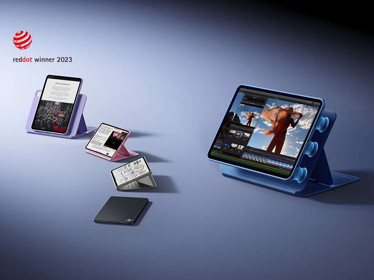
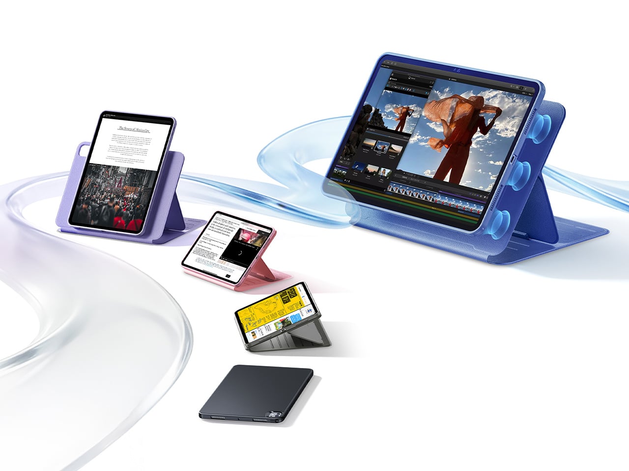
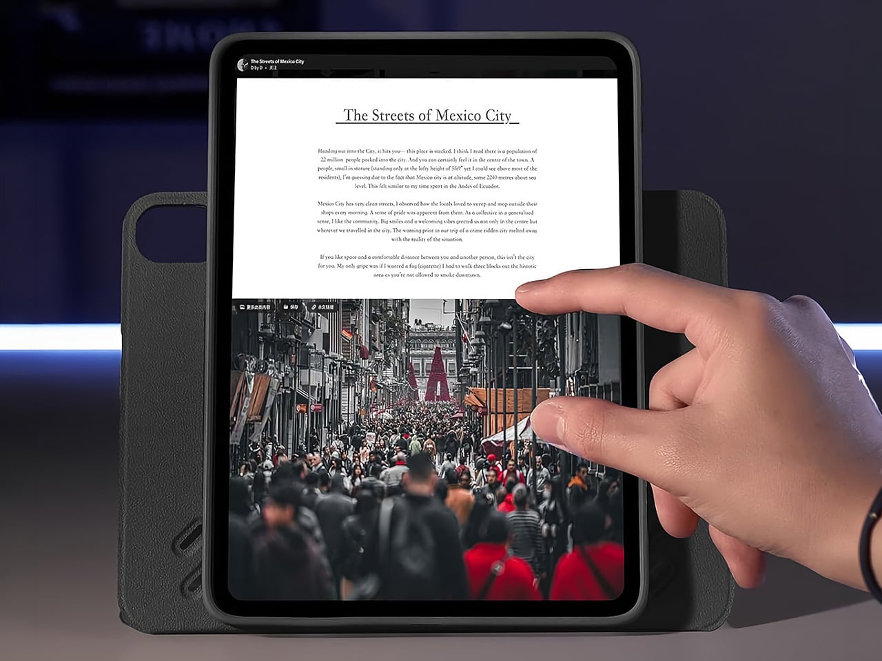
Most iPad cases make you choose between traveling light and having a proper stand. The Shift sidesteps that entirely with a two-piece magnetic system where the lightweight inner shell works as a standalone case for days when you are just carrying the iPad around, and the outer magnetic cover snaps on when you actually need to prop the thing up and get work done. The magnets are strong enough that the two pieces feel unified when together, but separating them takes about a second. For the 13-inch configuration the combined weight sits around 187 grams, which is not ultralight, but the payoff justifies it.

That payoff is nine stand configurations spread across landscape and portrait orientations. Six landscape viewing angles sweep from 30 to 75 degrees, covering everything from upright movie-watching to comfortable reading. Three shallower angles between 15 and 25 degrees are specifically tuned for Apple Pencil use, keeping the writing surface at a tilt that feels natural rather than flat. Apple Pencil charges magnetically straight through the case the whole time.

Wirecutter called it one of their two best iPad Pro cases of 2026, and it is easy to see why when you consider the sheer range of use cases it handles. It fits iPad Pro 11-inch and 13-inch M4 and M5, and iPad Air 11-inch and 13-inch M2 and M3. ESR covers it with a 12-month warranty that extends to 24 months with registration.

Why We Recommend It

The modular approach is the winner here, and it is one that very few case makers have executed well at this price point. At around $46, you are getting two genuinely functional products in one: a slim everyday carry case and a multi-angle stand system that covers more configurations than most dedicated stand cases do on their own. The nine stand angles are not a gimmick, they cover real use cases… so if you own an iPad Pro or iPad Air and use it across multiple contexts in a single day, the Shift is one of the few cases that actually keeps up.

Click Here to Buy Now: $45.99.

ESR UltraFit Armorite Screen Protector: Damage-proof Clarity for the iPad You Actually Use

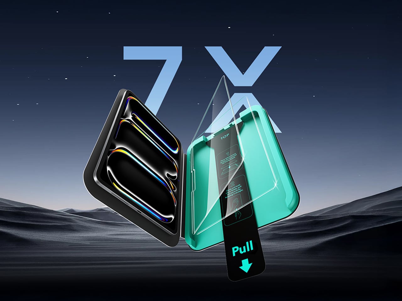
Screen protectors have a reputation problem. Most of them are thin sheets of mediocre glass that technically count as protection until something actually hits them, at which point you find out exactly how mediocre they were. ESR’s Armorite glass is built from high-alumina tempered material that withstands 110 pounds of pressure, hits 9H on the hardness scale, and absorbs impacts at seven times the rate of standard tempered glass. That impact figure comes from ESR’s own lab tests involving a 64-gram steel ball dropped from 5.7 feet, which is a more meaningful benchmark in this context. At 0.33mm thick, it adds virtually nothing to the profile of the iPad.

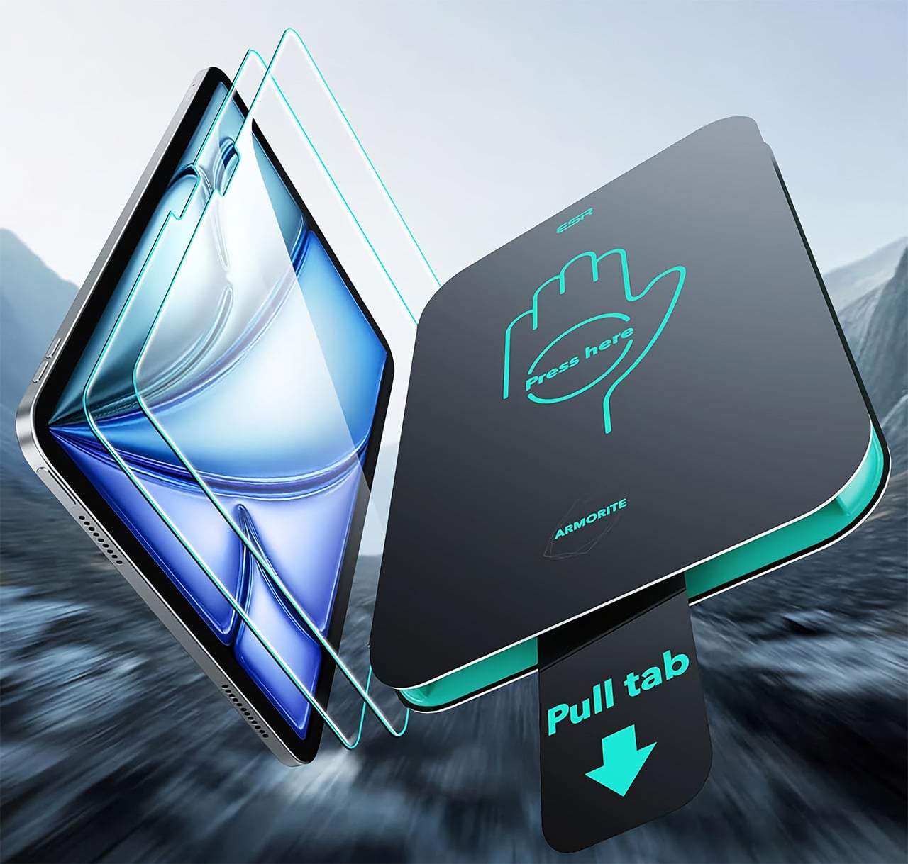
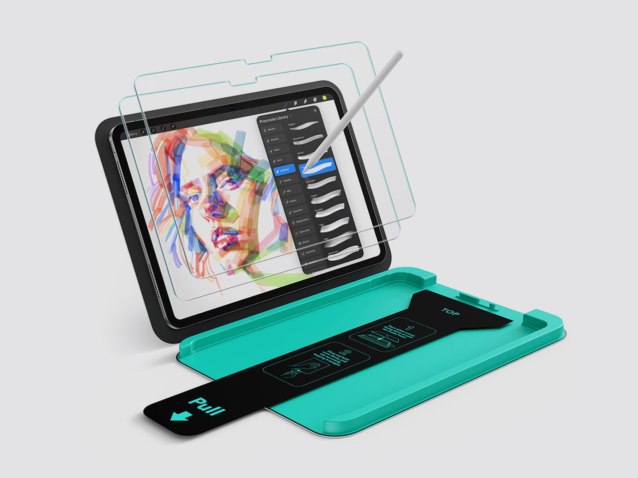
The UltraFit Tray installation system deserves its own mention because applying a screen protector to a large iPad without bubbles or dust is genuinely difficult, and ESR has basically solved it. You place the iPad face-down into a green plastic alignment frame, close the lid, press down, and pull a tab. Automatic dust removal and electrostatic adsorption do the rest. The result is a consistently clean, bubble-free application that takes about thirty seconds and requires no skill whatsoever. The tray is reusable, which is handy since each pack includes two protectors and two cleaning kits.

The finish here is high-gloss and fully transparent, preserving the iPad’s display exactly as Apple intended it. Colors stay accurate, brightness stays unaffected, and the oleophobic coating keeps fingerprints from building up in a way that is genuinely hard to wipe off. The one honest drawback is that glossy glass in direct sunlight becomes a mirror, which is less a product flaw and more just physics. The protector also stops just short of the device edges, though ESR’s own case lips cover that gap neatly. Pricing runs from $17.99 to $23.99 across the iPad Pro, iPad Air, and iPad 10th through 12th generation lineup.

Why We Recommend It

Seven times the impact absorption of standard tempered glass and a 110-pound pressure tolerance are numbers that matter on a device you are carrying daily and setting down on surfaces that are not always clean or soft. But the UltraFit Tray is equally significant, because a screen protector you apply badly is barely better than no screen protector at all, and ESR has made foolproof application genuinely accessible. For $17.99 for the iPad mini to $21.99 for the 11″ iPad Air going up to $28.99 for the 13″ iPad Pro, you are getting a level of protection and an installation experience that typically costs more when competing brands bother to offer it. The display stays completely unaffected. At this price, that combination is hard to beat.

Click Here to Buy Now: $18.69 $23.99 (22% off). Hurry, deal ends in 48-hours!

ESR UltraFit Armorite Paper-Feel Screen Protector: The Tempered Glass That Thinks It’s a Sketchbook

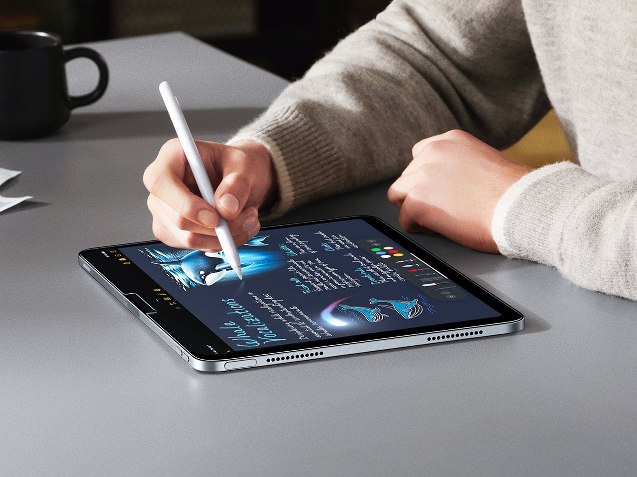
Anyone who has tried drawing seriously on a standard glass screen knows the feeling: the Pencil glides too fast, lines overshoot, and the whole experience feels slightly disconnected from what your hand is trying to do. The Paper-Feel Armorite fixes that with a matte surface texture that introduces just enough friction to slow the Pencil tip down and ground the drawing experience in something that actually feels tactile. Underneath that texture is the same high-alumina Armorite glass as the clear version, with the same 9H hardness, the same 110-pound pressure tolerance, and the same 5x impact absorption over generic competitors. The matte treatment sits on top of a material that is genuinely engineered to protect.

The texture does a second thing that has nothing to do with drawing. It scatters incoming light instead of bouncing it straight back at you, which cuts glare dramatically compared to the clear version and makes outdoor or bright-room use considerably more comfortable. The tradeoff is that the diffusion layer softens the display slightly, pulling a little brightness and color saturation out of the picture. For illustrators and note-takers working in mixed lighting conditions, that is a trade worth making without much hesitation. For photographers doing color-critical editing or people who watch a lot of HDR video, the clear Armorite is the better fit.

Installation uses the same UltraFit Tray system as the rest of the Armorite line, with the same dust-removal mechanism and the same reliably bubble-free results. The textured protector does come with a caveat – buy it only if you’re looking to emulate the feel of paper against your Apple Pencil. The clarity you get with the regular glossy UltraFit Armorite gets a slight downgrade thanks to the matte microtexture, but that barely noticeable downgrade pays its dividends in giving your stylus a pencil-on-paper-like effect.

Why We Recommend It

Paper-feel protectors have historically meant a choice between good texture and good glass, with most budget options compromising heavily on the latter. The Armorite Paper-Feel closes that gap by putting a quality matte surface on top of the same high-alumina tempered glass that anchors the clear version. You get the drawing experience and the structural protection in the same product, which used to require spending significantly more. The glare reduction is a legitimate bonus on top of the tactile benefit, especially on the larger iPad Pro and Air models where screen real estate makes reflections particularly distracting. Starting at $20.99 for the small iPad mini and topping out at $30.99 for the 13-inch Pro configuration, it sits at a price that makes the clear-versus-paper decision easy to revisit if your needs change.

Click Here to Buy Now: $24.29 $26.99 (10% off). Hurry, deal ends in 48-hours!

The post The Best iPad Pro Accessories for 2026 Are Not What Apple Wants You to Buy first appeared on Yanko Design.
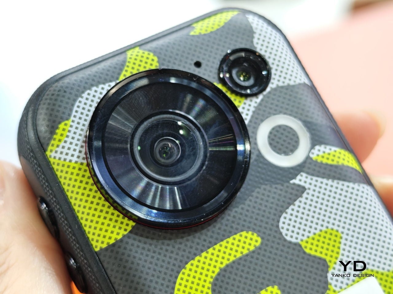
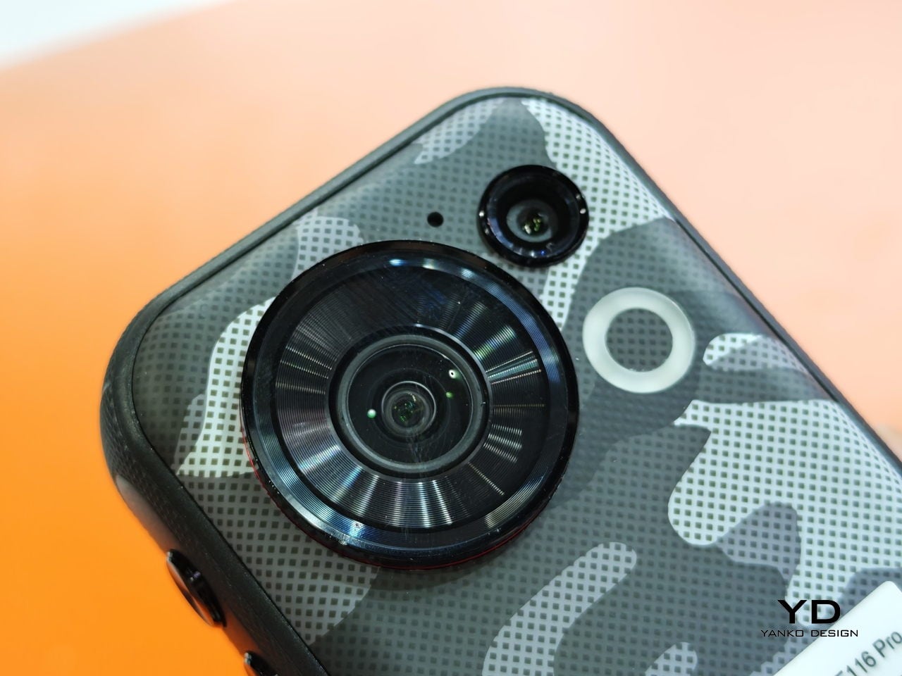
This Tiny Rugged Phone Has a 152° Action Camera and GoPro Mounts

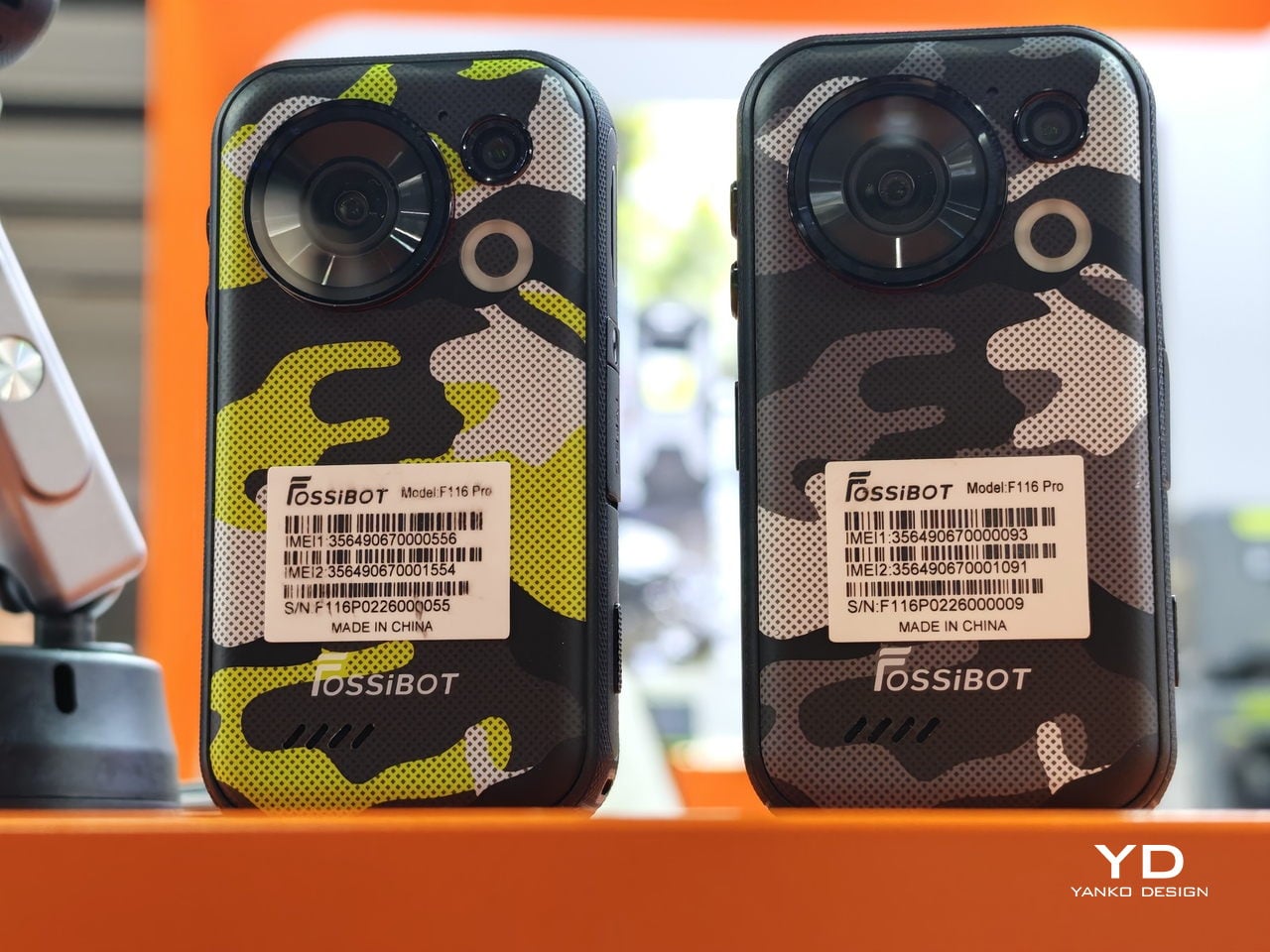
Action cameras are great until you realize you’ve left yours at home. Phones are always with you, but most of them are too big, too fragile, or too awkward to mount anywhere useful. The FOSSiBOT F116 Pro is a compact, rugged phone that tries to solve both problems at once, and the approach is specific enough to be interesting.

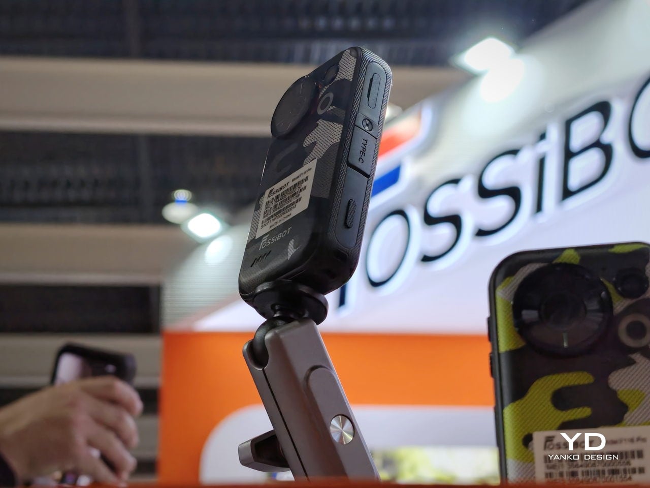
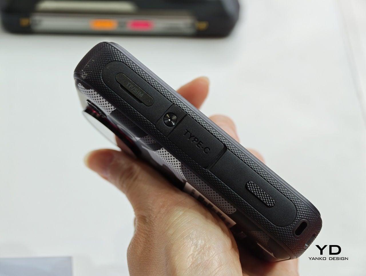
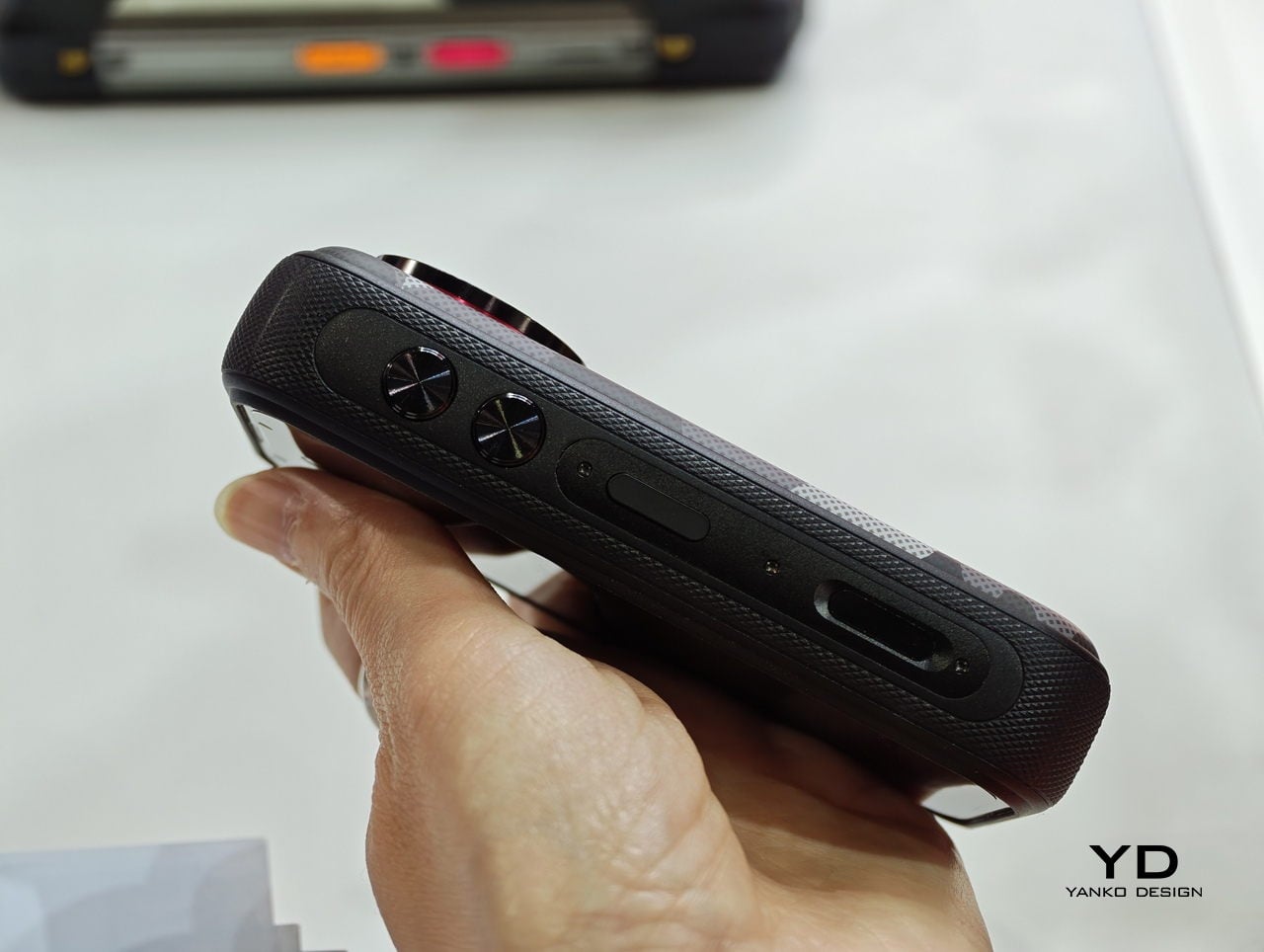
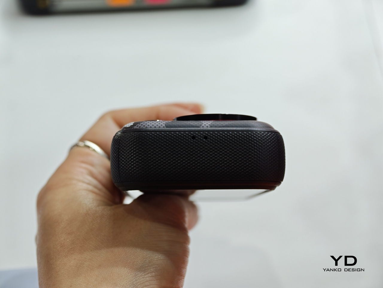
The F116 Pro is built around a 4.05-inch display and has a standard 1/4-inch screw socket at the bottom, the same thread you’d find on a tripod or a GoPro accessory. That means it works with the same ecosystem of mounts that action cameras already use: chest straps, suction cups, handheld grips, and neck mounts. The phone goes where the camera goes, instead of staying in your pocket while you film.

Designer: FOSSiBOT

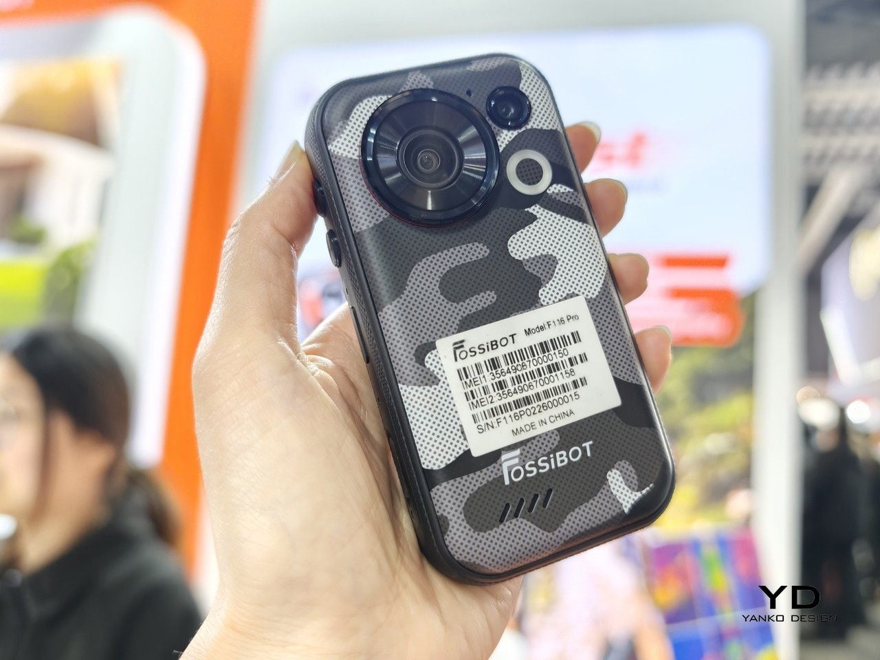
The camera is a 48 MP wide-angle unit with a 152.6-degree field of view, which is genuinely wide. Most smartphone ultrawide lenses sit somewhere between 70 and 90 degrees for comparison. Built-in stabilization smooths out footage on bumpy terrain, and a dedicated physical camera button on the body launches the camera instantly without unlocking the phone first, which matters more than it sounds when you’re actually moving.

Inside, the phone runs on a MediaTek Dimensity 7300 chipset built on a 4nm process, paired with 12GB of RAM and 256GB of storage, expandable up to 1TB with a now-rare microSD card slot. The display refreshes at 120Hz, 5G connectivity means footage can leave the device without hunting for Wi-Fi, and a 3,700 mAh battery with 33W charging keeps things moving. Modest numbers, but proportionate to a 4-inch screen and mid-range specs.

There’s also a rear circular LED that FOSSiBOT calls a “Light Signal Tower,” which cycles through colors and can be set to show notifications. It reads as a feature designed more for personality than practicality, but on a device this small, glancing at the back for alerts without waking the screen has some logic to it.

The compact body is the most interesting design choice here, and also the one that will define the experience. At 4.05 inches, the screen is smaller than almost anything else currently on the market. That’s a genuine advantage for one-handed operation and pocket carry, and a real limitation for anything that benefits from screen size: reading, navigation, video playback. The F116 Pro is betting its users want something small enough to forget they’re carrying it.

FOSSiBOT has been around since 2022 and claims more than 1.5 million users across its lineup. The F116 Pro showed up at CES earlier this year, and again at MWC 2026, which suggests the company is serious about getting it in front of people. The more honest question is whether a mountable, rugged, mini-format phone lands in a gap the market actually has, or one the market has already decided it doesn’t need.

The post This Tiny Rugged Phone Has a 152° Action Camera and GoPro Mounts first appeared on Yanko Design.
This Square Phone Rotates Open to a BlackBerry or Game Boy Setup

Smartphones have gotten pretty good at being the same thing. Every year, they get a little taller, a little thinner, and a little more difficult to tell apart in a lineup. That’s fine for most people, but it does make MWC 2026 feel like a bit of a slog, until you spot something genuinely weird on the show floor, like a square phone that rotates open to reveal either a physical keyboard or a game controller underneath.

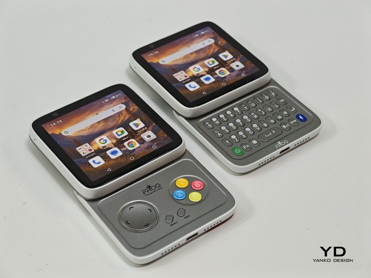
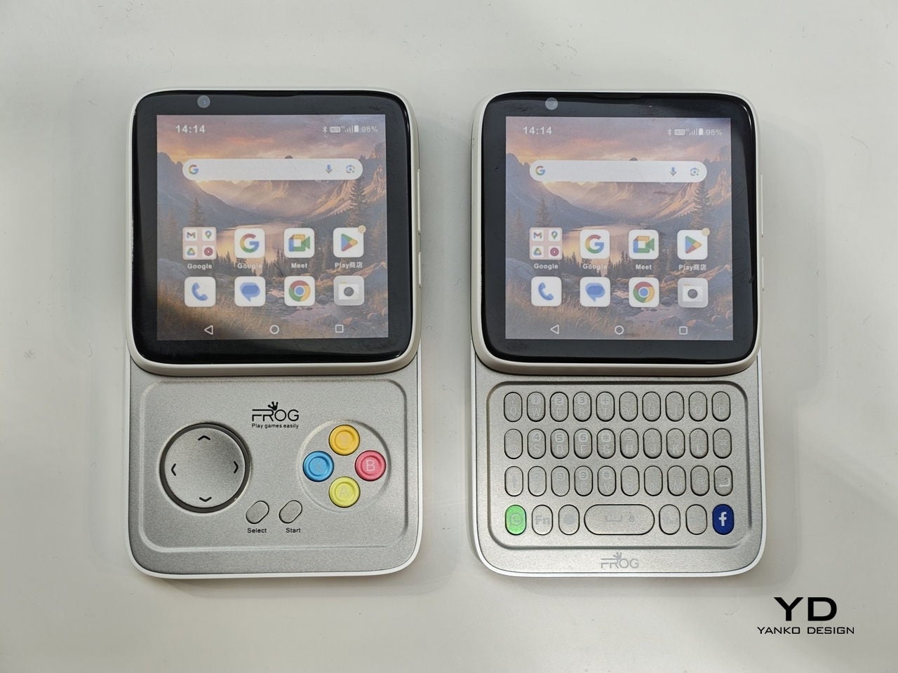
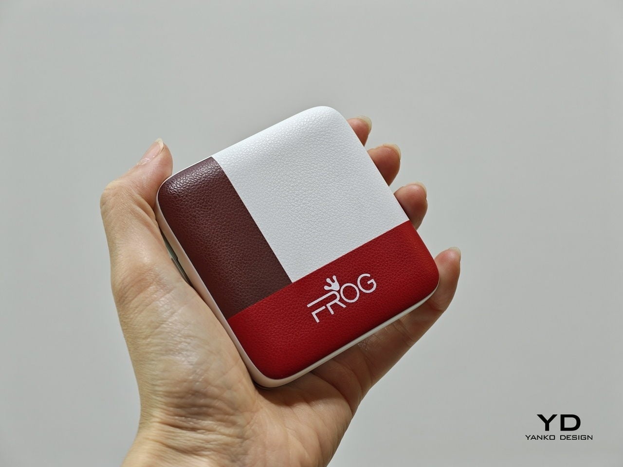
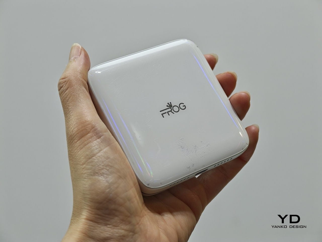
The iFrog RS1 is about the size of a closed fist, built around a 3.4-inch square display that sits on top of a rotating lower section. Twist it open, and you get one of two things depending on which variant you’re holding: a full QWERTY keyboard with raised, tactile keycaps, or a gamepad with a D-pad, a four-color face button cluster, and Select/Start buttons. Both run Android on a MediaTek Helio G18 chipset, with storage and RAM left open for whoever configures the platform.

Designer: FROG

That last part matters. iFrog is an ODM, or original design manufacturer, which means the RS1 is less a finished retail product and more a concept that carriers or brands can take and build on. The hardware is the pitch. Everything else is a conversation, which also explains why no pricing or release date was announced at MWC.

Of the two variants, the keyboard is the more predictable crowd-pleaser. There’s a genuinely underserved group of Android users who never stopped wanting physical keys. The BlackBerry crowd never fully disbanded, and phones like the Unihertz Titan have quietly built followings on exactly that. If you’ve ever tried composing a long email on a touchscreen while standing on a moving train, the appeal needs no further explanation.

The gamepad version is a stranger proposition, and honestly, the more interesting one. Running Android means emulation is an obvious draw, and the handheld gaming community noticed immediately. The visual comparison that kept surfacing online was the Motorola Flipout, a 2010 Android phone with a square body and rotating keyboard. There’s something both flattering and sobering in that parallel, since the Flipout was beloved by a small group and largely ignored by everyone else.

There are some caveats, though. No shoulder buttons on the gamepad variant rules out a lot of titles that need them. The swivel hinge is the structural heart of the design and also the part most likely to wear down. iFrog is new enough that questions about long-term software support are fair ones to ask, and the 3.4-inch screen is a genuine trade-off, not a quirk.

Still, the RS1 is a good reminder that the design space for phones is wider than what’s on shelves. It fits in a pocket and in the palm of a hand. It has buttons. It does a trick. What nobody knows yet is whether any of that adds up to something people actually want to live with.

The post This Square Phone Rotates Open to a BlackBerry or Game Boy Setup first appeared on Yanko Design.

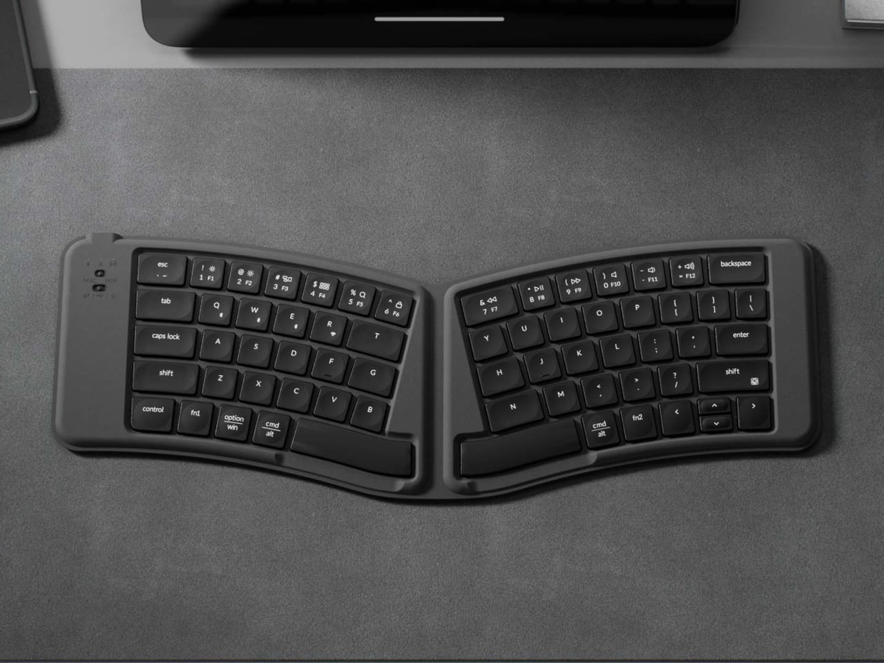
This $65 Ergonomic Split Keyboard Folds to Fit Your Jacket Pocket

There’s a particular kind of misery that comes with typing long documents on a tablet. The glass surface gives nothing back, autocorrect wages a quiet war against technical vocabulary, and by the third paragraph, the whole setup feels like a compromise that compounds. Bluetooth keyboards solve most of that, but most of them are still wide and flat enough that they need their own bag compartment.

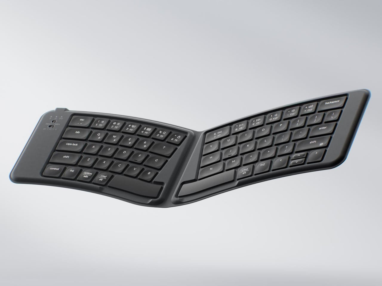
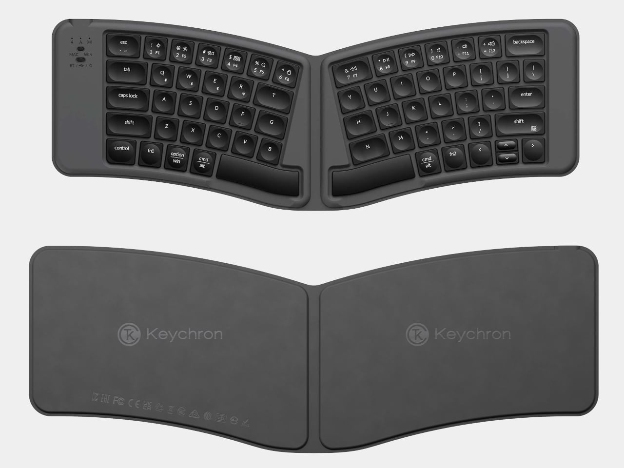
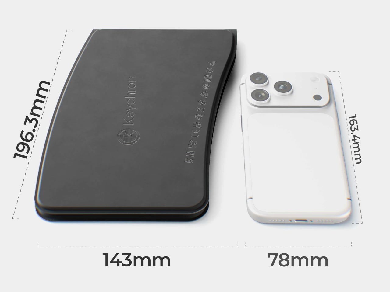
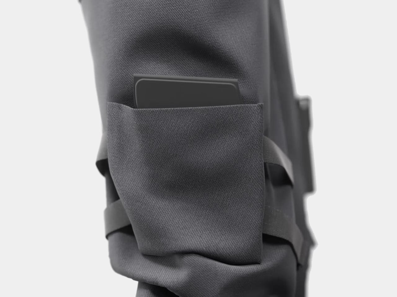
The Keychron B11 Pro takes a different approach by folding the keyboard in half when not in use. Unfolded, it uses a 65% Alice layout, splitting and angling the two key clusters slightly inward for a more natural wrist position. Folded, it collapses to 196.3 x 143 mm, closer in footprint to a paperback than a keyboard, and at 258 grams, it adds almost nothing to the weight of a bag already loaded with a laptop and a water bottle.

Designer: Keychron

The Alice geometry is the more interesting design decision here. Most portable keyboards default to a straight, compressed layout, treating compactness as the only ergonomic consideration on the road. The flat Alice angles both hands naturally inward, reducing lateral wrist strain that builds over a long writing session in a hotel room or a coffee shop. Keychron already uses this same geometry in its K11 Max, but that’s a desk-bound mechanical keyboard; putting it into a foldable form at $64.99 is a different proposition.

The folding mechanism doubles as the power switch. A Hall effect sensor detects when the board closes and shuts off automatically, then wakes the moment it’s opened again. There’s no power button to hunt for, no standby mode to manage. A 250 mAh battery backs up the rated 138-hour runtime, which means charging becomes a weekly or monthly consideration rather than a daily one, and the automatic power behavior helps preserve every hour of it.

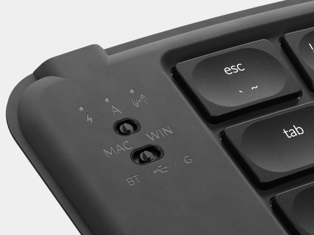
Connectivity covers three modes: USB-C wired, 2.4 GHz wireless at a 1,000Hz polling rate, and Bluetooth 5.3. The 2.4 GHz option matters for anyone who has experienced the occasional skip of a Bluetooth connection mid-sentence. Writers moving between a laptop and an iPad, or across multiple machines throughout the day, can switch inputs without re-pairing. The matte black PU leather rear provides grip on slick surfaces, while the ABS plastic body keeps weight low.

The scissor switches and concave ABS keycaps will feel immediately familiar to anyone who types on a MacBook. There’s no backlighting, which cuts battery drain and presumably helped reach that 138-hour figure, but it also limits use in dim rooms. What the Keychron B11 Pro leaves open is whether the Alice layout, which takes some adjustment even on a full-size keyboard, translates comfortably into a form factor most people reach for in 20-minute bursts between meetings.

The post This $65 Ergonomic Split Keyboard Folds to Fit Your Jacket Pocket first appeared on Yanko Design.
IKEA’s $10 Speaker Is Tiny, But You Can Pair 100 of Them Together

Bluetooth speakers have a curious problem. The ones worth owning tend to cost real money, and the ones that don’t cost much tend to sound exactly like they cost nothing. IKEA’s KALLSUP sits somewhere outside that tired formula entirely, not because it defies audio physics at $9.99, but because it was never really designed around audio physics in the first place.

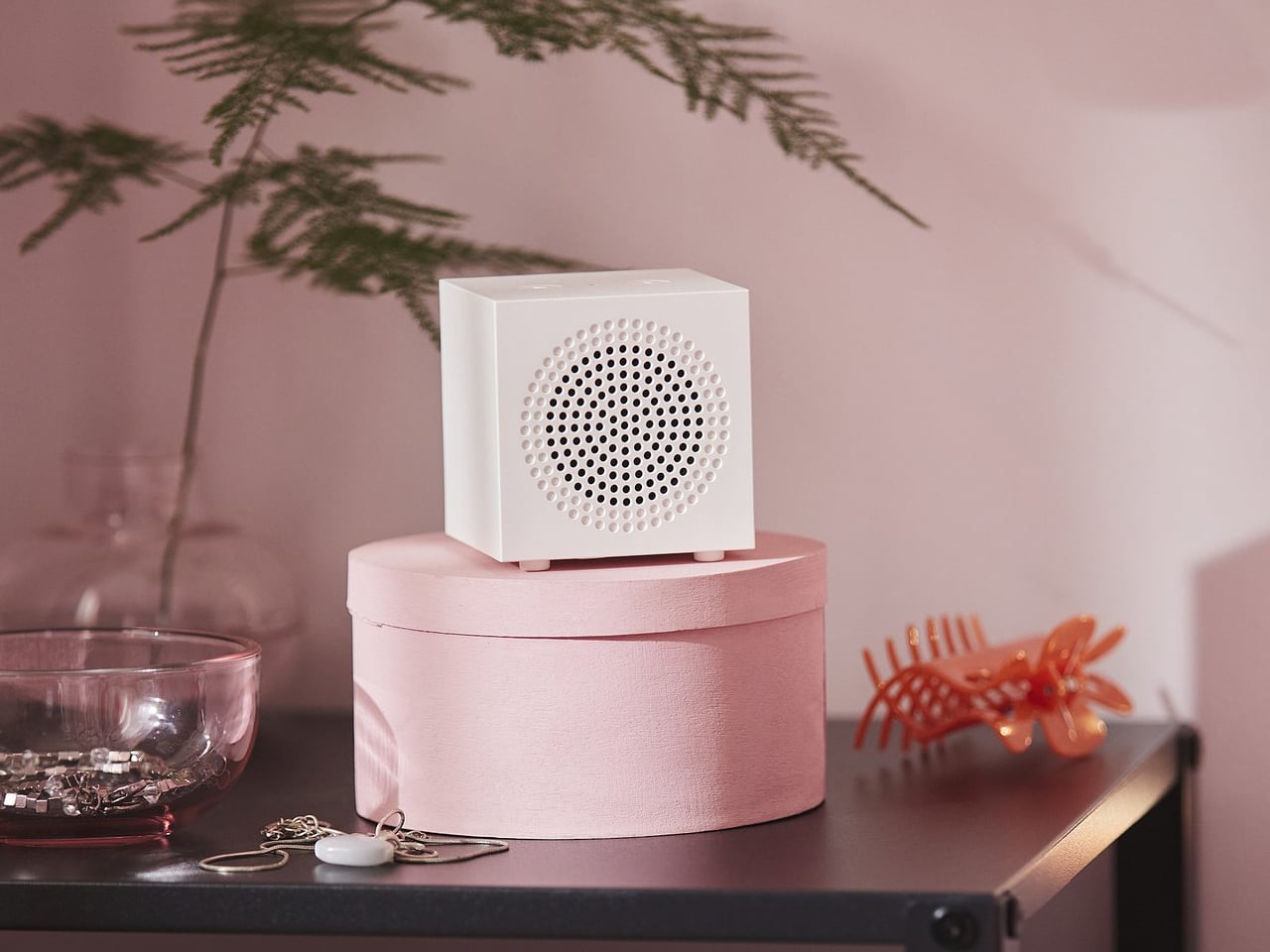
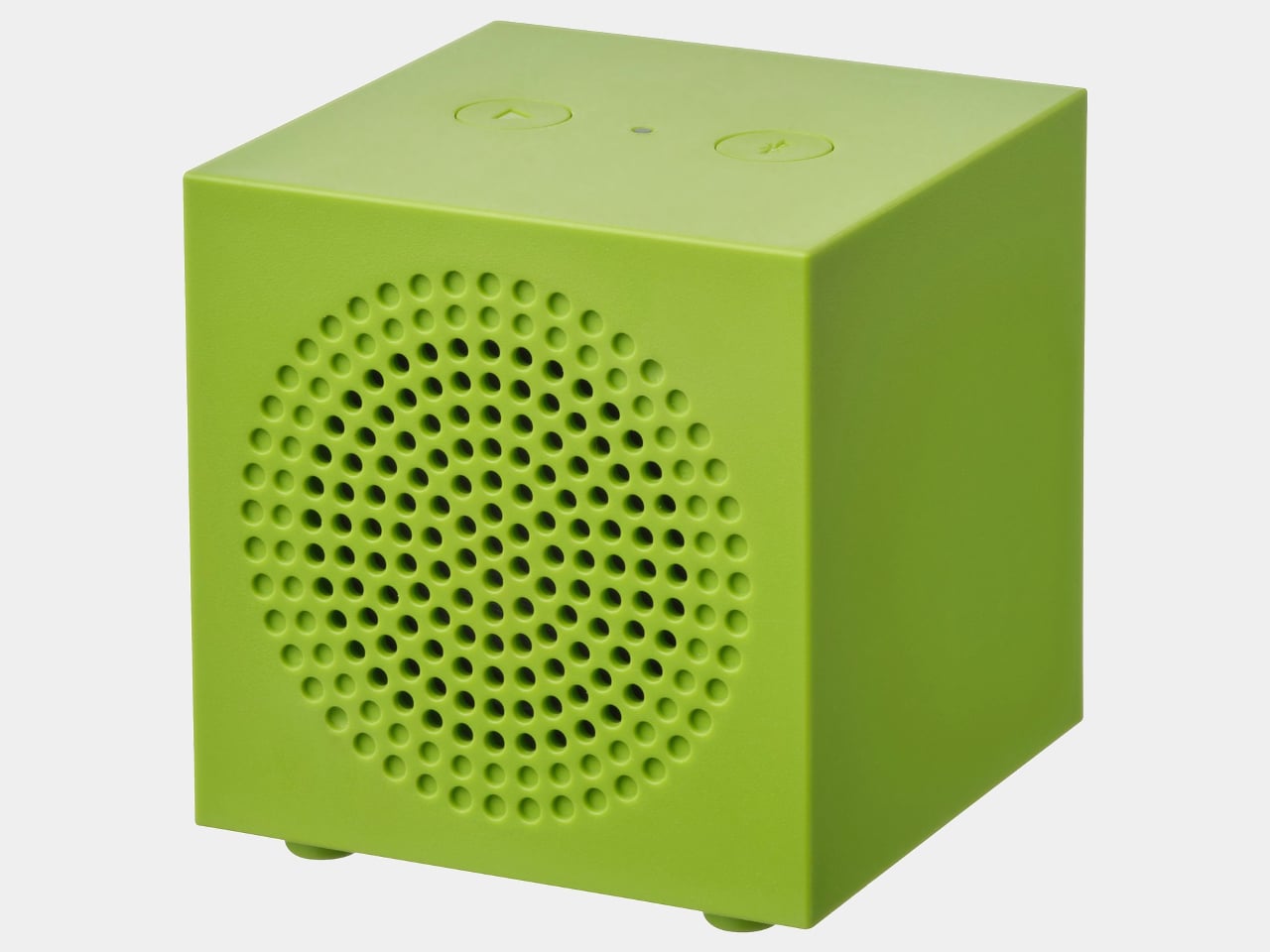
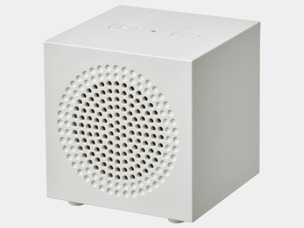
The KALLSUP is a cube, more or less. At 2.75 x 2.75 x 2.88 inches and built from ABS plastic, it has the proportions of a large sugar cube and a silhouette that wouldn’t look out of place on a shelf next to a small succulent. Designer Ola Wihlborg, who wanted the speaker to be “as small and simple as possible,” made something that reads less like audio equipment and more like an object that happens to produce sound when you connect your phone to it.

Designer: Ola Wihlborg (IKEA)

That framing matters. Most portable speakers broadcast what they are through a certain vocabulary: rubberized grilles, cylindrical barrels, carabiner clips, the unspoken suggestion that they’ve survived a kayaking trip. The KALLSUP makes none of those promises. Its face carries a circular grid of perforations, two buttons sit on top flanking a small LED, and the back has a USB-C port for charging. Nothing announces itself as a feature. It just exists, neatly, without fuss.

The minimalism extends to the controls, though that’s where things get slightly puzzling. There are only two buttons: one for Bluetooth and one for playback. No volume control sits on the unit itself, so the connected device handles all level adjustments. Pairing multiple units requires a long press of the play button, not the Bluetooth button, and there’s no manual power-off. These omissions read as deliberate simplicity, but they also feel like the kind of tradeoffs that made a $9.99 price tag achievable.

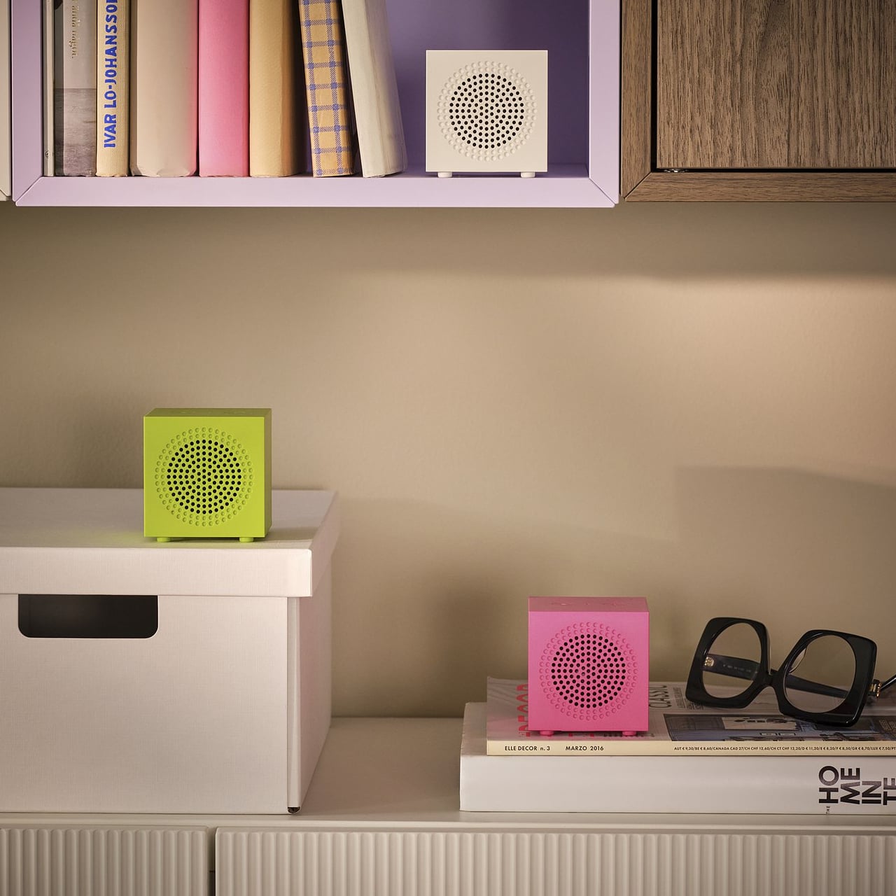
What the KALLSUP can do is genuinely surprise at this price. The rechargeable battery is advertised to run 9 hours at 50% volume, covering a full workday of background music. Bluetooth 5.3 holds up to 10 meters without interference. The real trick, the one that reframes the product’s logic entirely, is pairing up to 100 units together. One KALLSUP is a desk companion. Four of them, scattered across a room, start to approximate distributed audio.

The yellow-green colorway, one of three available alongside white and pink, sits in that particular register of color that’s neither subtle nor aggressive. It’s the kind of green that shows up in membrane keyboards and silicone phone cases aimed at people who want their objects to feel a little more alive.

The post IKEA’s $10 Speaker Is Tiny, But You Can Pair 100 of Them Together first appeared on Yanko Design.
Rotary Tools Can Damage Fine Details, HOZO’s 13,000 SPM Micro Sander Cleanly Sands 3D Prints and Miniatures

Scroll through any Gunpla forum, 3D printing subreddit, or miniature painting Discord, and you’ll find the same complaint surfacing like clockwork: detail sanding is the worst part of the hobby. Rotary tools spin too aggressively and melt plastic. Orbital sanders are physically too large to reach the spots that matter. And hand sanding with tiny strips of sandpaper taped to popsicle sticks or wrapped around toothpicks? It works, technically, in the same way that crossing an ocean in a rowboat technically works. Makers have been hacking together solutions for this problem forever, modifying dental picks, repurposing nail files, spending hours on finishing work that should take minutes. The tooling industry, meanwhile, has mostly responded by miniaturizing existing designs and hoping for the best. Smaller orbital. Smaller rotary. Same fundamental problems, just in a tinier package.

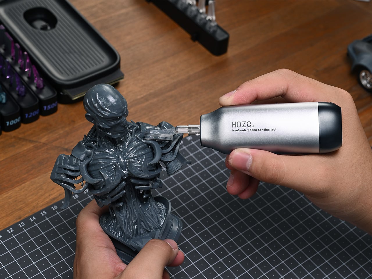
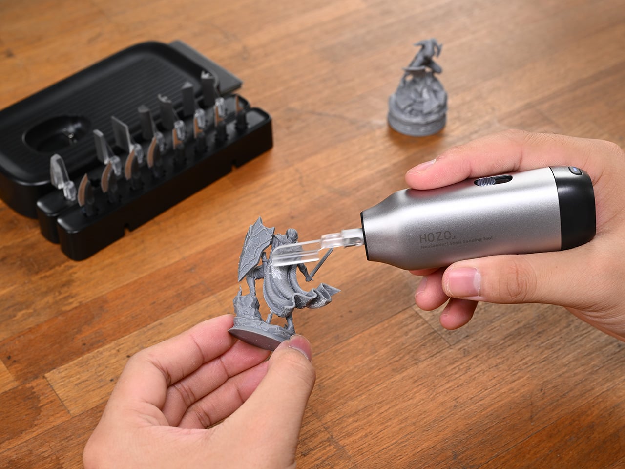
HOZO’s NeoSander takes a different route entirely. Rather than shrinking down a tool that was never meant for fine detail work, HOZO went back to the core question of what precision sanding actually requires and built around the answer. The result is a palm-sized, cordless reciprocating sander powered by a patented linear motor that delivers 13,000 strokes per minute of direct, gear-free motion, paired with a system of 8 swappable head shapes and 8 sandpaper grits that covers everything from rough shaping to mirror-smooth finishing. It’s the kind of purpose-built approach that makes you wonder why it took this long for someone to try it.

Designer: HOZO

Click Here to Buy Now: $69 $99 ($30 off). Hurry, only 291/2000 left! Raised over $2.2 million.
HOZO moves away from the traditional drivetrain; NeoSander’s vertically mounted reciprocating linear motor sends power straight to the tip with zero intermediary conversion from rotational to linear energy. That directness pays off in concentricity under 0.05mm, which in plain terms means the sanding head tracks true instead of wobbling like a bobblehead at speed. Competing sanders sit at 0.30mm or worse, and that difference is the gap between sanding where you intend and accidentally eating into a surface you just spent two hours painting.
The NeoSander holds a constant 13,000 SPM and lets you dial the stroke length between 0.6mm and 1.8mm, rather than using variable RPM that changes the tool’s rhythm and makes behavior harder to predict. Shorter strokes for delicate edges on resin prints, longer strokes when you’re leveling a seam line on a 1/100 scale kit. That translates to a linear speed range of 260 to 780 mm/s, giving you meaningful control over aggressiveness without the tool ever feeling inconsistent under your fingers. A counterweight inside the body moves opposite to the sanding head too, canceling out 85% of handle vibration, which matters enormously during the kind of 30-minute sanding sessions that detail work demands.

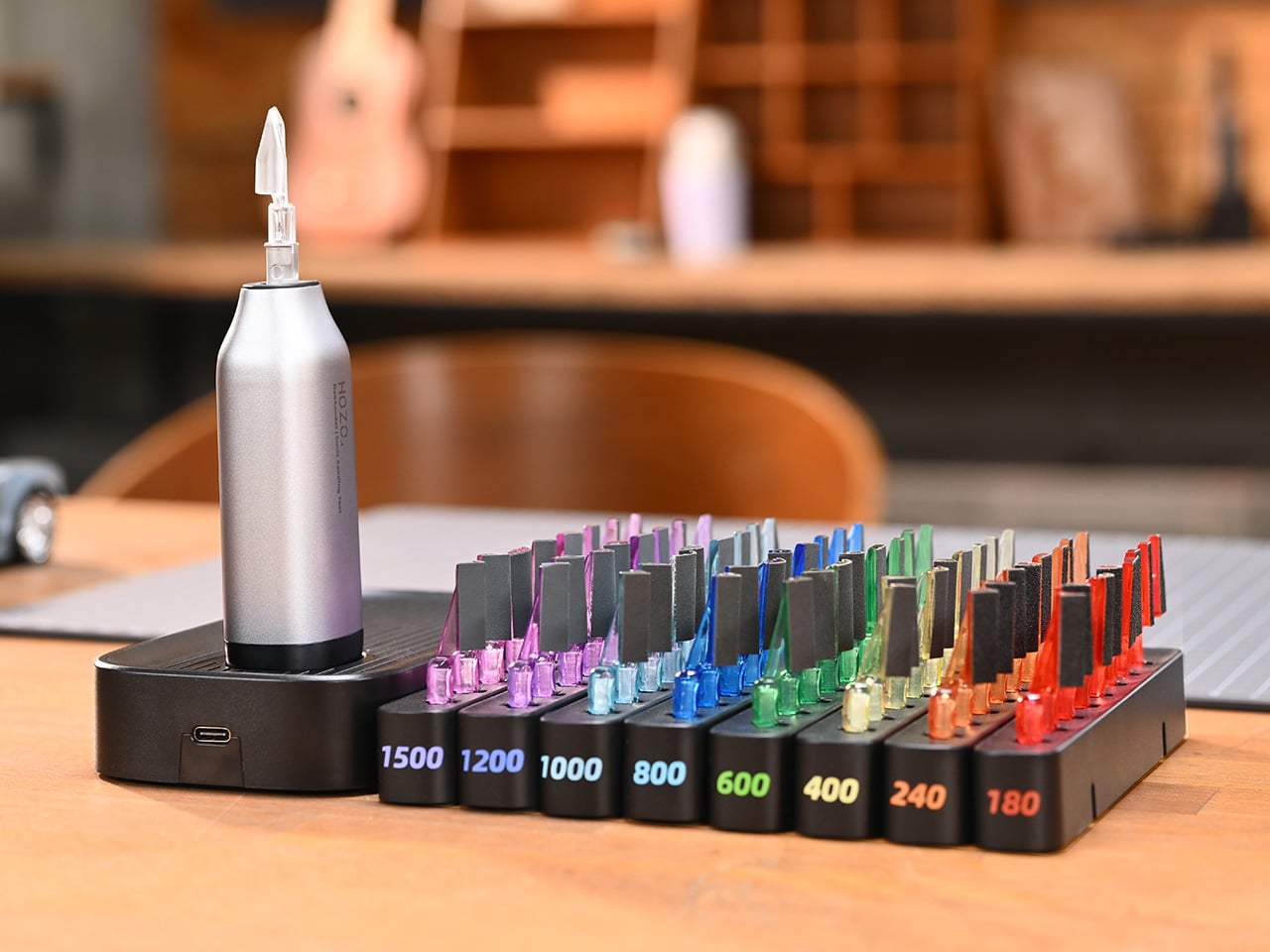
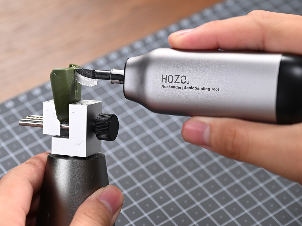
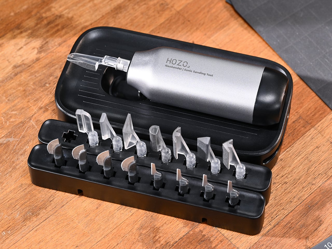
Eight sanding head shapes cover pointed tips for crevices, slim and wide flats for panel lines and broad surfaces, half-cylinders and arcs for curved geometry, and acute and right-angle heads for corners and recesses. Pair those with eight grits from coarse 180 all the way to 1500 for polishing, and you have up to 74 possible combinations when you factor in the optional foam-backed sandpapers that conform to irregular surfaces. A color-coded rack keeps everything sorted by grit so you’re not playing guessing games mid-session. HOZO also threw in two saw blades, a curved blade for rough cuts and a jigsaw blade for through-cuts, because the same reciprocating motion that sands also drives a 0.2mm micro-tooth saw with a patented anti-binding pattern.

The whole thing weighs 89 grams (3.13 oz) without a head attached, measures 104 x 53 x 28mm, and runs on a 3.7V 1,100 mAh battery that delivers 45 minutes of heavy use or up to 240 minutes of lighter work. The aluminum alloy and magnesium shell carries an IP54 splash rating, so wet sanding is on the table. Dock charging takes 30 minutes to full, and USB-C keeps things universal. HOZO has shipped eight successful products through Kickstarter before this, including the NeoBlade ultrasonic cutter, and they’ve built out companion tools like the NeoBlock for flat-surface sanding that pair with the NeoSander for a complete finishing workflow.

The NeoSander Pro starts at $69 (against a $99 MSRP) and includes the sander, a basic sanding head set, sandpaper kit, and a carrying case. The Premium Combo, priced at $129, comes with multicolor-coded heads, a saw collection, and a charging dock. For the deep-end makers, the $499 Maker Pro All-In Combo bundles the NeoSander, NeoBlock, and NeoBlade with their full accessory suites at 39% off retail. The campaign runs on Kickstarter with an estimated shipping date of May 2026.

Click Here to Buy Now: $69 $99 ($30 off). Hurry, only 291/2000 left! Raised over $2.2 million.

The post Rotary Tools Can Damage Fine Details, HOZO’s 13,000 SPM Micro Sander Cleanly Sands 3D Prints and Miniatures first appeared on Yanko Design.