
SpaceX Starship’s first orbital flight test on track after successful launch rehearsal
SpaceX has completed a wet dress rehearsal for Starship, in preparation for its first orbital test flight.

Meta’s newly announced VR glasses emphasize lightweight practicality, offering a compact alternative to traditional headsets. Weighing just 100 grams and designed to resemble regular eyewear, they incorporate custom pancake lenses and micro OLED displays for sharp visuals. According to Cas and Chary XR, adjustable nose pieces enhance comfort, while the $1,299 price and spring 2027 […]
The post Meta’s 100-Gram VR Glasses Replace Bulky Headset Designs appeared first on Geeky Gadgets.
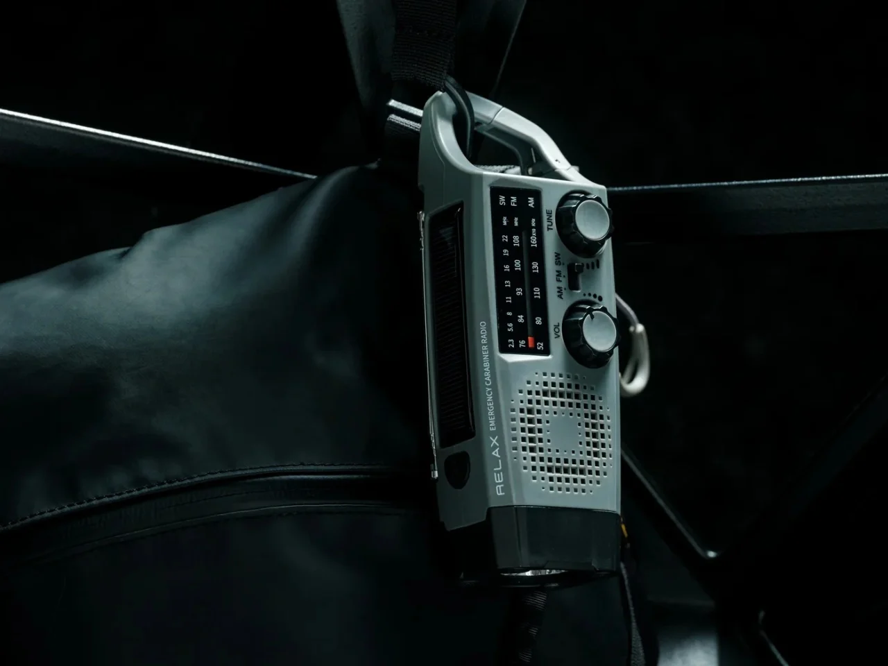
The bag you carry every morning is only as good as what is attached to it. Fall shifts the equation. Days get shorter, the light drops faster than expected, and the gap between “I’ll be fine” and “I wish I had that” narrows considerably. These five essentials share one qualifying rule: they attach to a bag, stay out of the way until needed, and solve something real without asking you to think about them first.
None of these were chosen for novelty. Each earns its place by doing exactly what it claims, consistently and without fuss. A radio for when signal fails. A carabiner built like a precision tool. A multitool that clips and cuts. A flashlight that hangs wherever you need a beam. A lantern small enough to forget it is there. Fall is a good season to be deliberate about what lives on your bag. These five make that an easy argument.
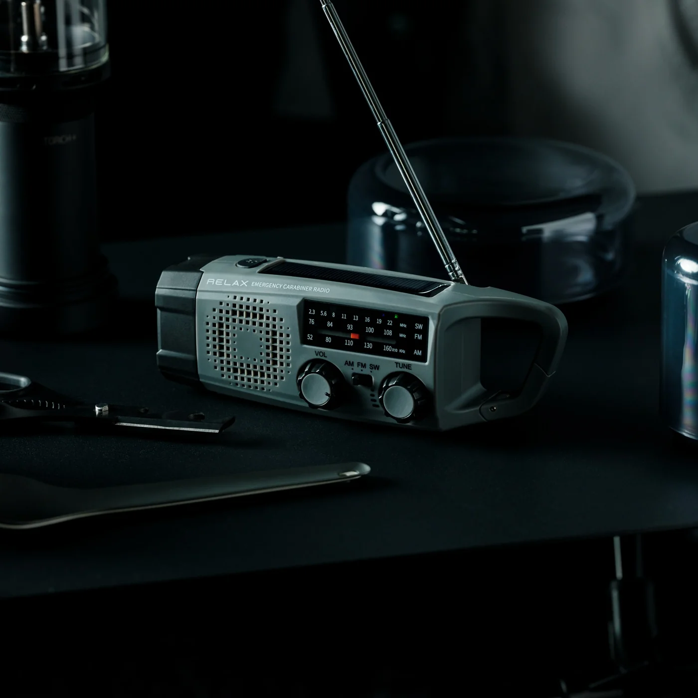
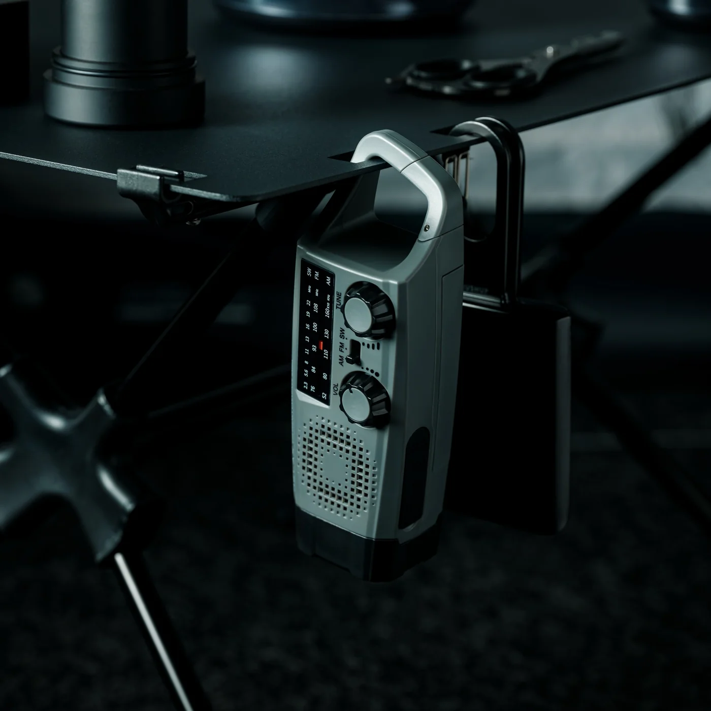
The Clip&Go Radio is one of those things that makes you wonder why you didn’t carry a radio sooner. It clips directly to a bag strap or belt loop, weighs almost nothing, and pulls in local stations without touching your phone. On a fall commute, that independence matters more than it sounds. When battery anxiety sets in, and you still want the weather update or something to cut the silence of a long walk, this earns its spot quickly.
The design keeps things deliberately simple. No screen, no menus to navigate, no charging routine to maintain. You clip it on in the morning and pull it off at the end of the day. That friction-free utility is harder to design than it looks. The clip is sturdy enough to trust on a bag in motion, and the compact form sits flush against a strap without snagging on anything. For a device that does one thing, it does that one thing remarkably well.
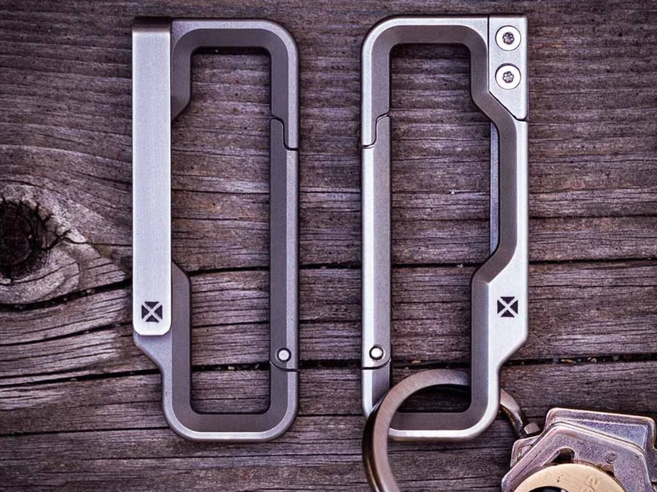
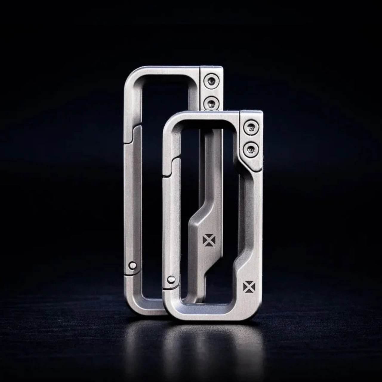
Eighty-four dollars is a lot to spend on a carabiner until you hold one built the way this is. The Blank Forces Carabiner is precision-machined titanium, and the difference between it and a hardware-store alternative is obvious the moment it is in your hand. The weight is almost imperceptible on a bag, but the quality of the construction announces itself immediately. It is the kind of object that justifies its cost by outlasting everything else clipped to the same strap.
What makes it worth writing about is the restraint. No unnecessary features, no multifunction gimmicks, no logo that announces itself. It is a carabiner that clips and holds, executed with a level of precision that makes a fundamentally simple object feel genuinely considered. Fall carries a lot of small gear, and a single clip point you trust completely is worth more than a bag full of things you second-guess every morning. This is the carabiner you stop replacing.

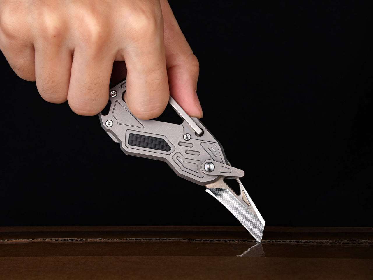
The Edrin 6-in-1 is what happens when a carabiner decides to earn more of its space. Built around a GR5 titanium frame with an integrated carabiner, a separate D-ring for keys, and a folding D2 blade tucked into the side, it consolidates everything the average person reaches for into one clippable object. For anyone who has ever patted four pockets looking for a knife or a key ring, the logic behind this is immediate and hard to argue with.
The six functions are not padding. Each one pulls its weight in a daily carry context, and the folding D2 blade turns the kind of frustrating moment most people just endure into something handled in two seconds. The GR5 titanium frame keeps the overall weight down, which matters when it lives on a bag all day. Clipping this on in the morning feels like a deliberate decision rather than just tossing another thing into the pile.
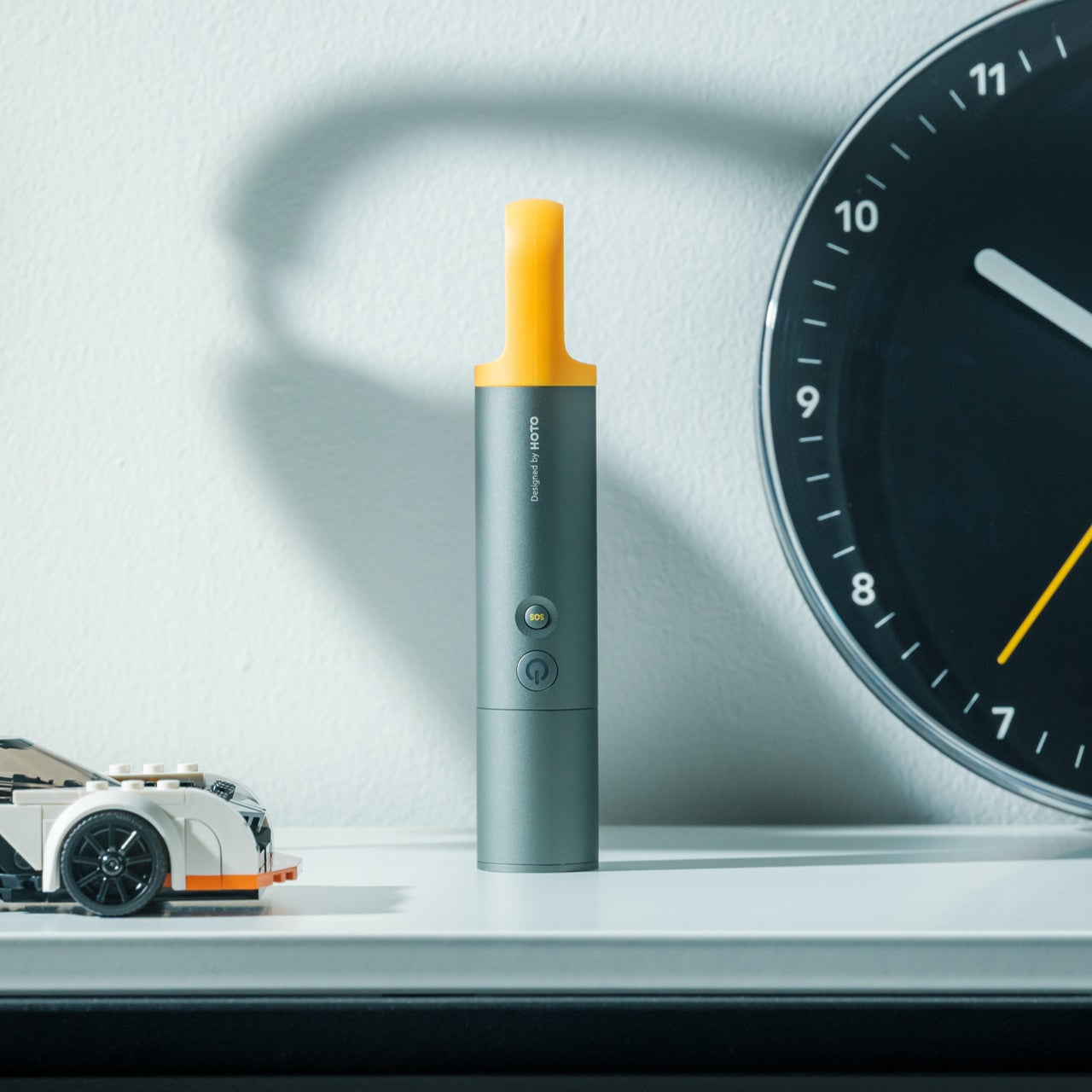
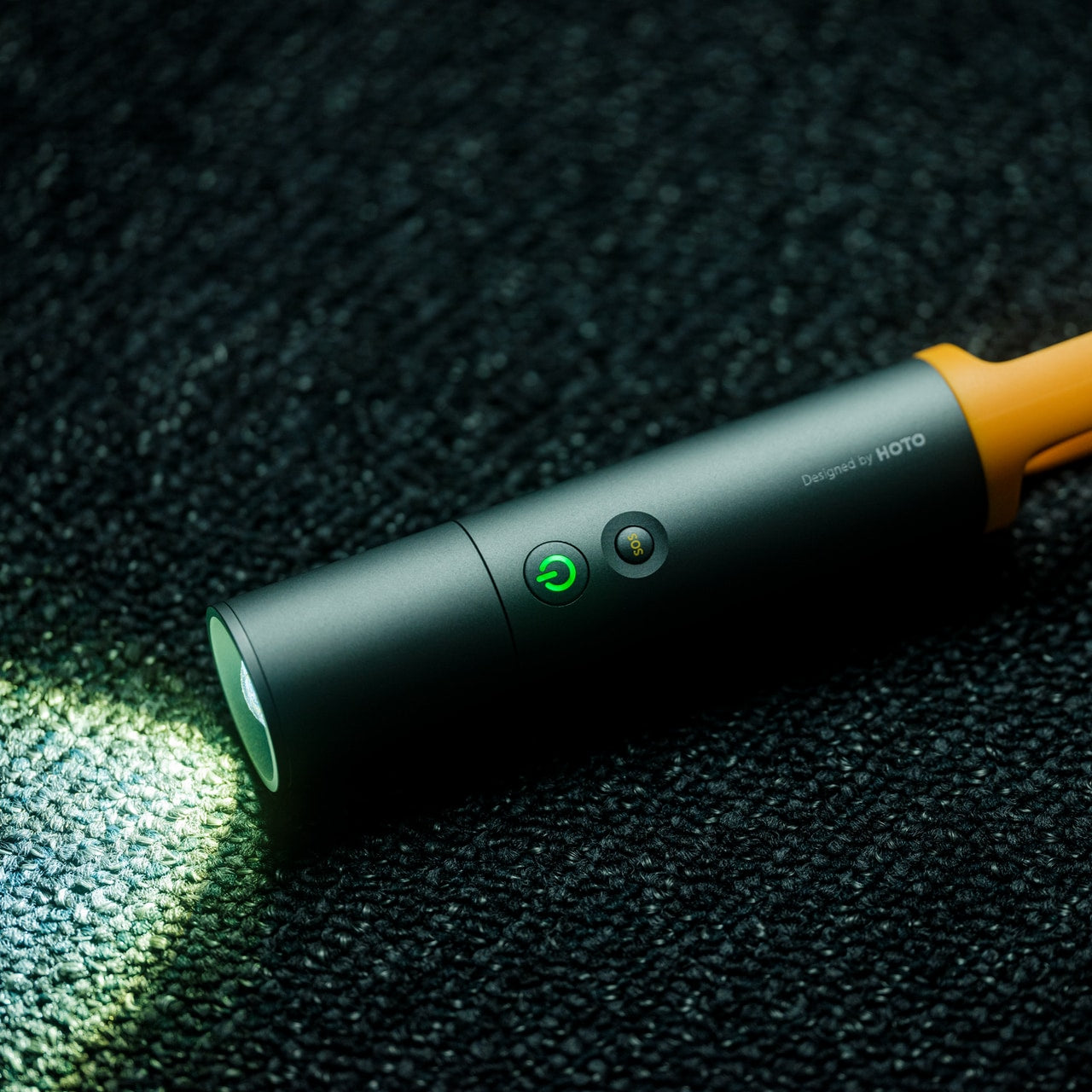
The CasaBeam Everyday Flashlight is not something you buy expecting to use every day, and then you do. The built-in loop lets you hang it from a bag, a tent, or a hook, keeping the beam exactly where you need it without holding anything. As fall shortens the days, the gap between sundown and when you actually get home gets surprisingly narrow, and this fills that gap without any drama or extra thought on your part.
What separates it from the flashlight already living in a drawer somewhere is intent. It is built to be carried daily, not stored for emergencies. The form factor is compact enough to forget it is there, and the loop works equally well from a tent zipper, a bag hook, or a coat hook at a trailhead. Reaching for it starts to feel natural within a week of first use, which is exactly what good everyday carry design is supposed to accomplish.
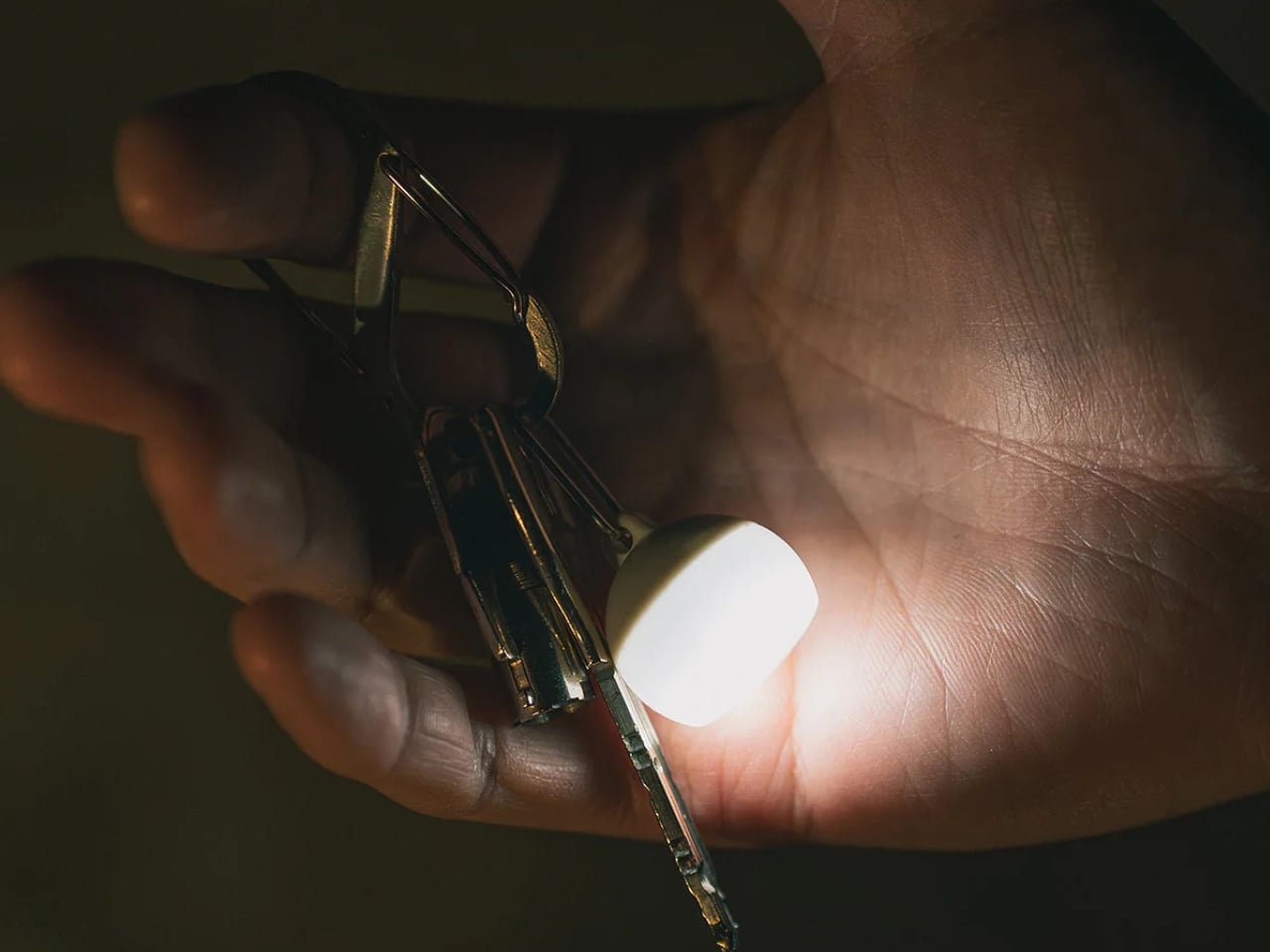
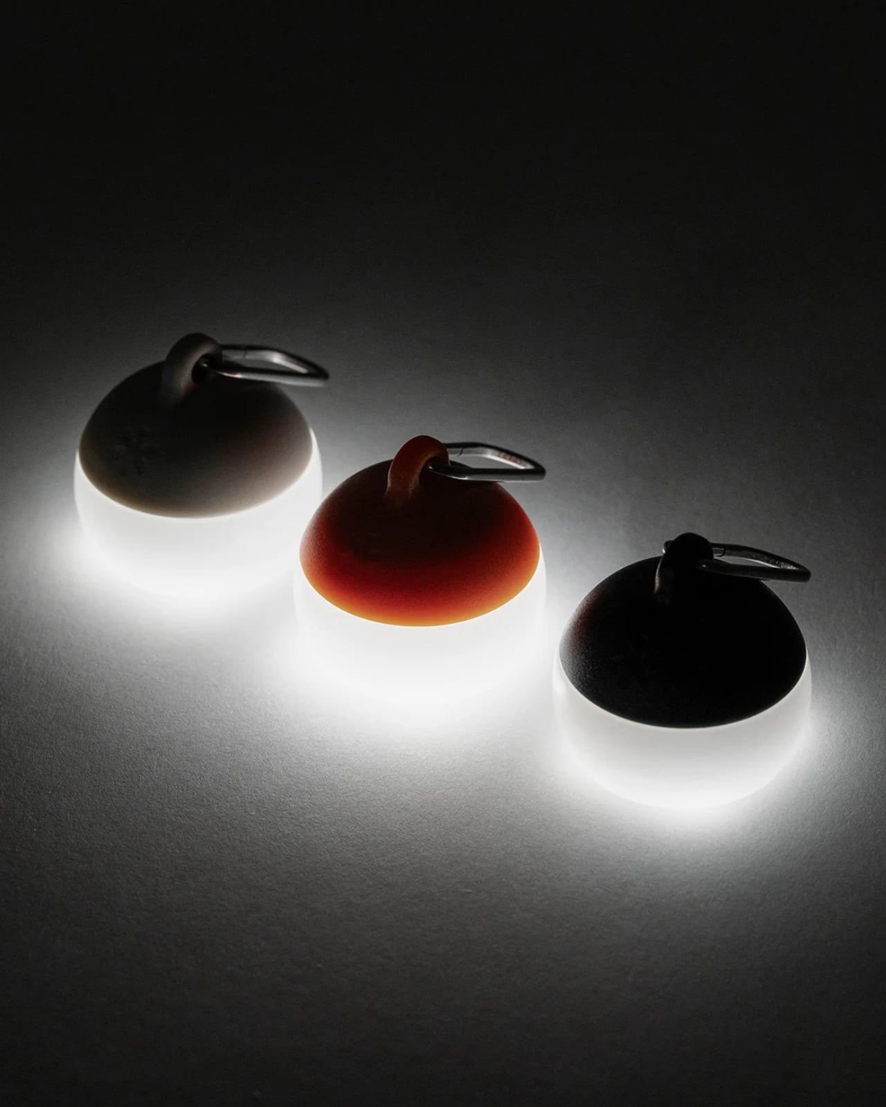
Fifteen dollars does not usually buy anything worth writing about, and the Snow Peak Hozuki Keychain Lantern is a useful exception. The included carabiner clips to a keychain, tent zipper, bag loop, or jacket pull without needing anything extra, and the soft ambient glow it produces is exactly right for moments when overhead light is too harsh but full darkness is not an option. It is not a task light. It is better than that at what it is actually designed to do.
The size is the thing. Small enough to forget it is on your keychain, which means it is always there and never in the way. Fall evenings have a way of going dark quickly, and in places you did not expect, and a soft lantern already clipped to you is a different kind of useful than a phone torch you have to hunt for. At fifteen dollars, Snow Peak built something that behaves like a far more considered object than the price would ever suggest.
A bag that carries the right things sits differently. The radio keeps you connected when your phone cannot. The carabiner holds everything together. The multitool handles the small moments that slow you down. The flashlight turns a dark evening walk into a non-event. The lantern covers what the flashlight doesn’t. Together, they address more daily situations than most people bother to plan for, and none of them ask very much in return for doing it.
None of these require a system change or a lifestyle adjustment. You clip them on, put the bag over your shoulder, and get on with the day. The best everyday carry works exactly like that: invisibly, until the moment it doesn’t. That moment arrives more often in fall than any other season. These are the five things worth having attached to your bag when it does.
The post 5 EDC Essentials Worth Clipping to Your Bag This Fall first appeared on Yanko Design.

The Apple Watch Ultra 4 builds upon the foundation laid by its predecessor, the Ultra 3, by introducing a series of thoughtful updates. While it doesn’t aim to transform wearable technology, it delivers meaningful enhancements in design, hardware, and software. At the same price point as the Ultra 3, the Ultra 4 offers improved functionality […]
The post Apple Watch Ultra 4: Is This Massive Battery Upgrade Worth It? appeared first on Geeky Gadgets.

Microsoft Excel has taken a bold step forward with its latest feature, now allowing cells to store lists, arrays, and even nested arrays. This update, currently in beta for Microsoft 365 Insiders, moves beyond the traditional single-value-per-cell structure, offering a more compact and versatile way to manage data. My Online Training Hub explores how these […]
The post Microsoft Excel Beta Lets Single Cells Store Nested Arrays appeared first on Geeky Gadgets.

Apple is reportedly working on a screenless fitness tracker, rumored to be called the Apple Watch Air, signaling a significant departure from its well-known Apple Watch series. This innovative device is designed for users who prioritize distraction-free health tracking while retaining the freedom to wear traditional watches. By combining a minimalist design with innovative health […]
The post Why Apple’s Secret “Watch Air” Project Is Giving Fitness Brands Nightmares appeared first on Geeky Gadgets.


Artificial intelligence has taken another leap forward in the realm of genomics. In a remarkable breakthrough, Claude, a general-purpose AI model, uncovered a novel DNA editing mechanism called ART (Array Associated Reverse Transcriptase). This mechanism, found within a type of virus known as a jumbo phage, enables programmable DNA editing with precision and versatility. Wes […]
The post Claude AI Discovers ART DNA Editing Mechanism in 21 Hours appeared first on Geeky Gadgets.

Google’s Project Suncatcher combines artificial intelligence with space-based technology to tackle the energy challenges posed by AI systems. Central to this effort are space-based solar panels, which operate in near-perpetual sunlight to generate more energy than their ground-based counterparts. This energy is wirelessly transmitted to Earth, while orbital data centers use microgravity to reduce hardware […]
The post Google Project Suncatcher Uses Space Solar Panels for AI appeared first on Geeky Gadgets.

Every gaming PC eventually reveals itself under load, fans spinning up, temperatures climbing, a quiet admission that something demanding is happening inside the case. Most builders spend their whole budget trying to hide that moment. AFTERSHOCK built an entire machine around celebrating it instead, planting a cherry blossom tree inside the chassis that physically opens its petals as the hardware gets hotter.
Seventy individual blossoms make up that tree, each one hand-formed and hand-painted from a titanium alloy engineered to react directly to heat. There’s no motor tucked behind the branches, no RGB lighting faking the motion, and no firmware quietly triggering an animation on cue. The metal itself just responds, curling open as the system’s internal temperature rises during a demanding session and folding shut again once things cool back down.
Designer: AFTERSHOCK

That mechanical honesty changes what “thermal performance” even means to look at. Most cooling systems exist purely to be invisible, judged only by numbers on a monitoring app nobody but the owner ever sees. Here, the exact opposite instinct wins out. Push the Ryzen 7 9800X3D and the Zotac RTX 5080 inside it through a genuinely demanding game, and the payoff is a slow, visible bloom happening in real time behind the glass.


AFTERSHOCK’s own demo reportedly shows the tree sitting fully closed at a resting 18°C, which suggests the blossoms don’t wait for some dramatic thermal spike before reacting. They likely ease open gradually as load builds, tracking the system’s actual temperature curve rather than snapping into a single dramatic pose. Idle back down to a lighter task, and the tree presumably eases shut again right along with it.


None of that sculpture would matter much sealed inside an opaque box, so the whole build sits inside an APNX V2 chassis wrapped in glass across a full 270 degrees. It’s a deliberate choice, given how little most case designers bother with rear or side visibility once a build is finished and pushed against a desk. This one seems built to be walked around and watched from nearly any angle in the room.


Underneath the sculpture sits a genuinely capable rig rather than a showpiece with hollow specs. Sixty-four gigabytes of DDR5-6000 memory, a 2TB PCIe Gen4 SSD, and a 1300W Platinum power supply all point to a machine with real upgrade headroom beyond its current configuration. A custom open-loop liquid cooling system handles the actual thermal load quietly, doing the unglamorous work that lets the titanium blossoms take the visible credit instead.

At roughly $14,200, converted from the AU$19,995 asking price, the Cherry Bloom is available to order now rather than teased as a future concept. That price does not include shipping, and next-business-day dispatch confirms this is a real commercial build rather than a one-off showpiece kept behind glass at a trade show somewhere.
Most of that cost is clearly going toward 70 hand-finished metal petals and the engineering needed to make them react correctly, not toward the Ryzen chip or graphics card sitting underneath. It’s a strange kind of luxury, paying handsomely for a gaming PC’s exhaust heat to finally look like something worth watching.

The post AFTERSHOCK Built a $14,200 Gaming PC Where 70 Petals Bloom With Heat first appeared on Yanko Design.