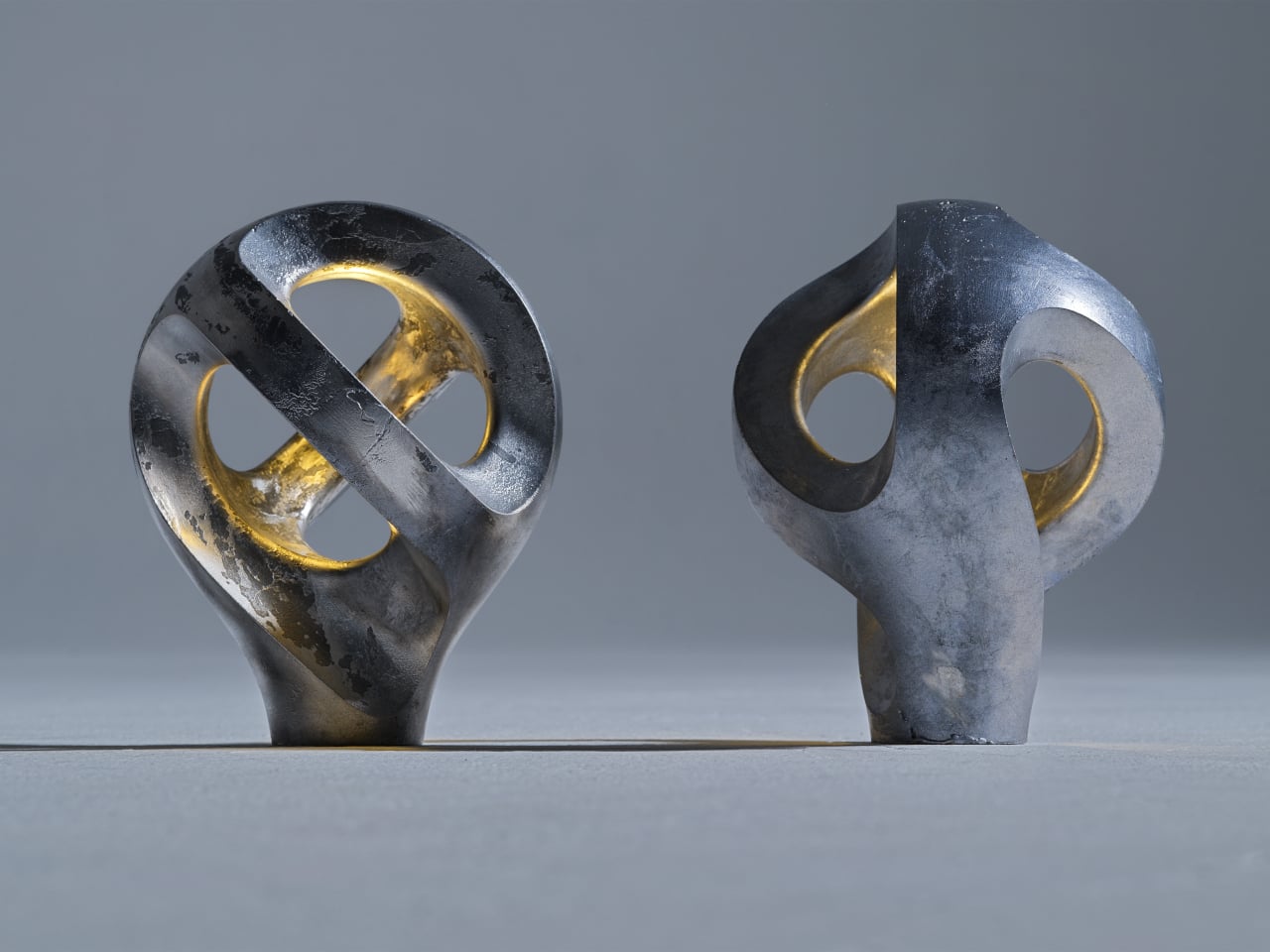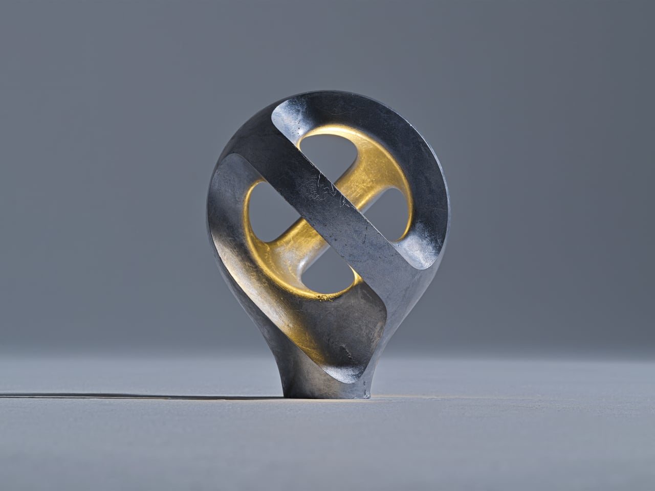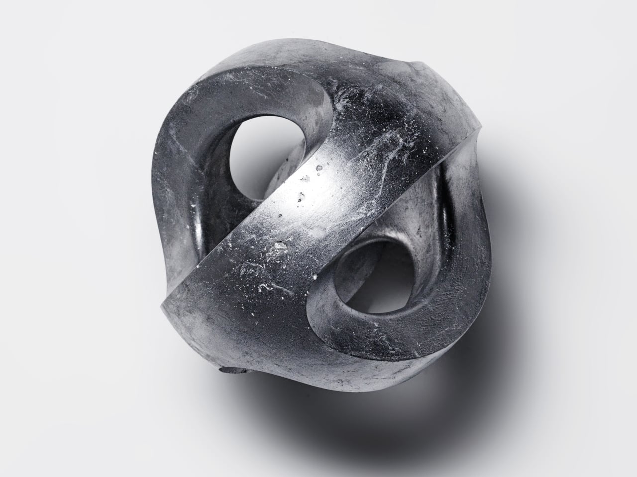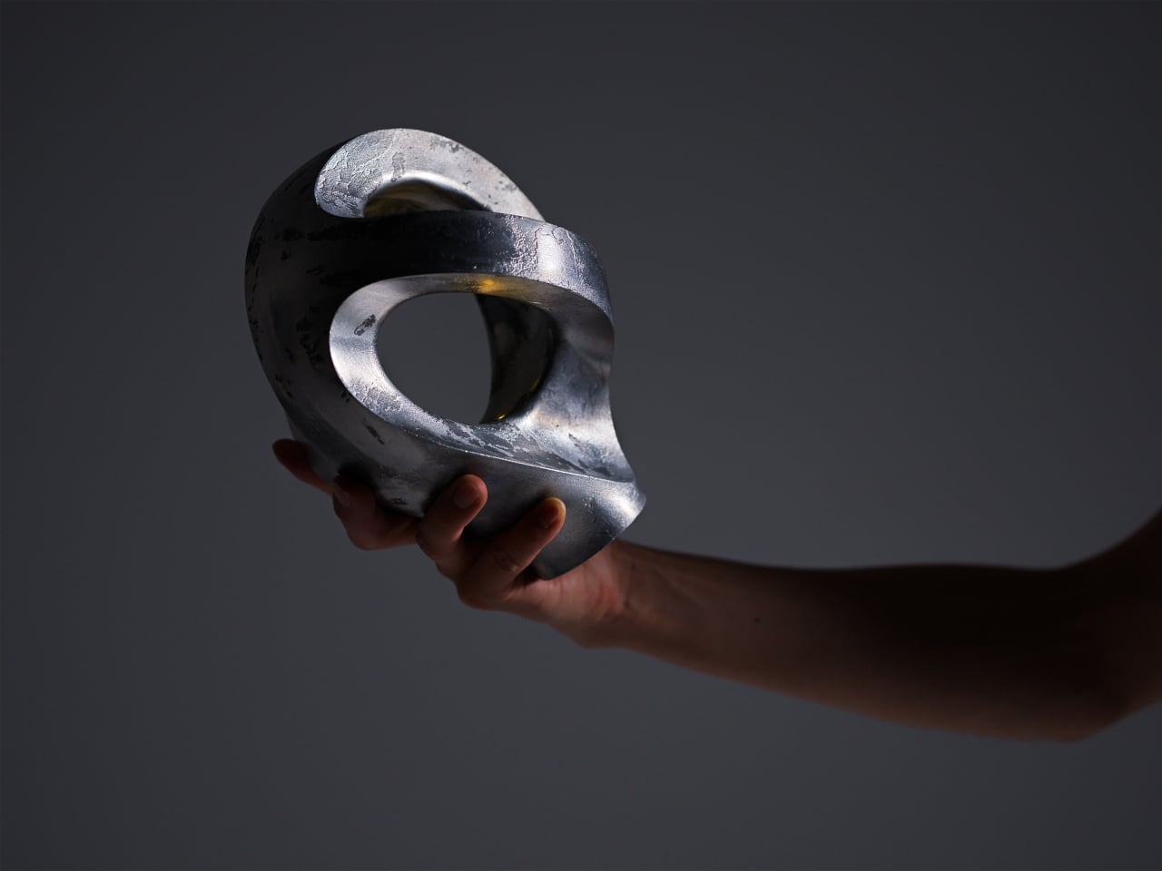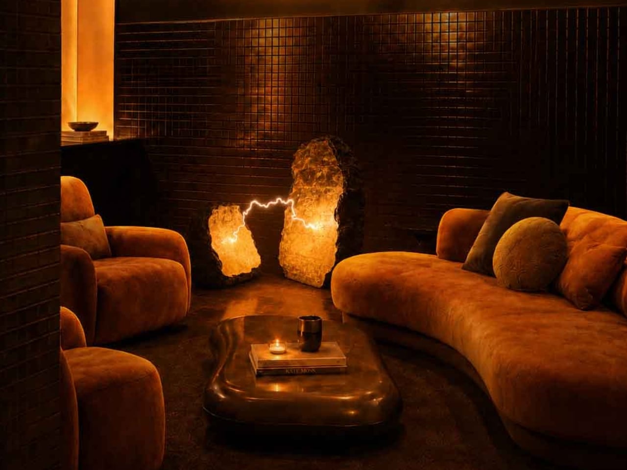
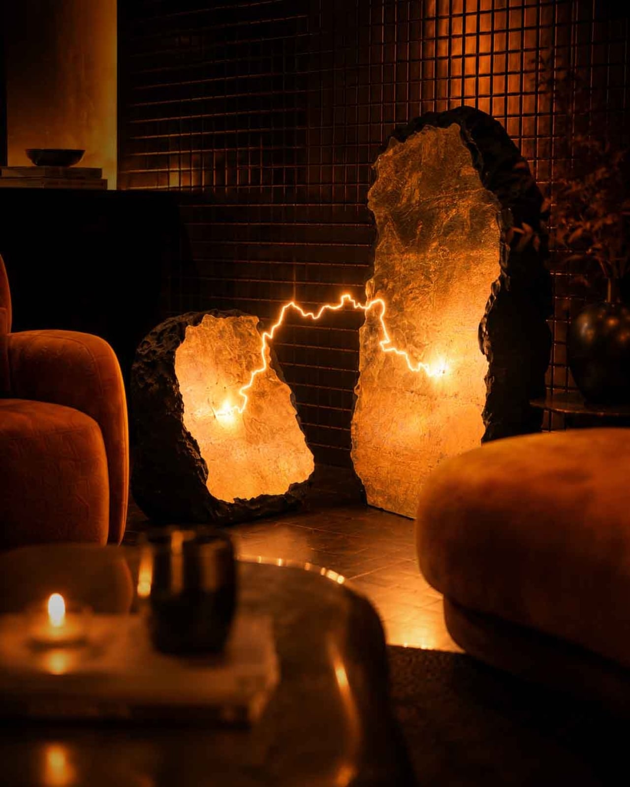
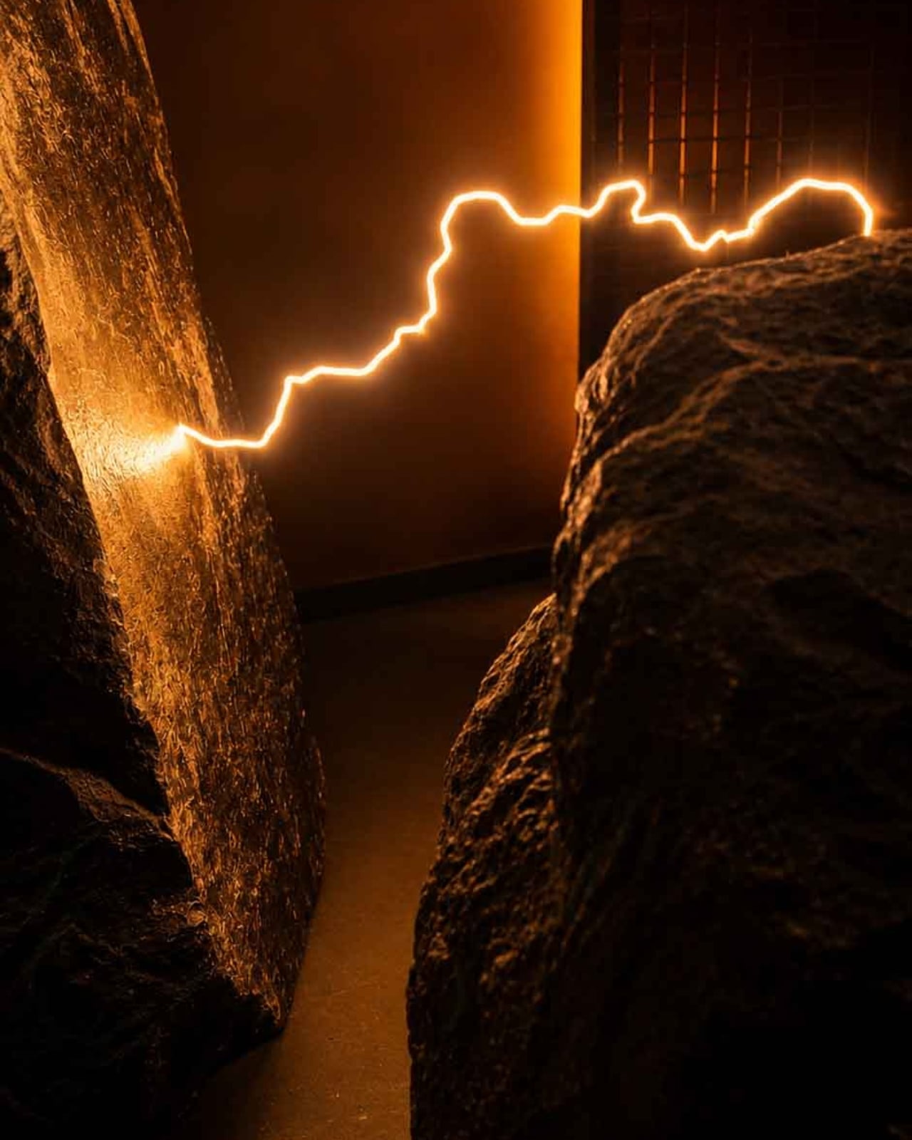
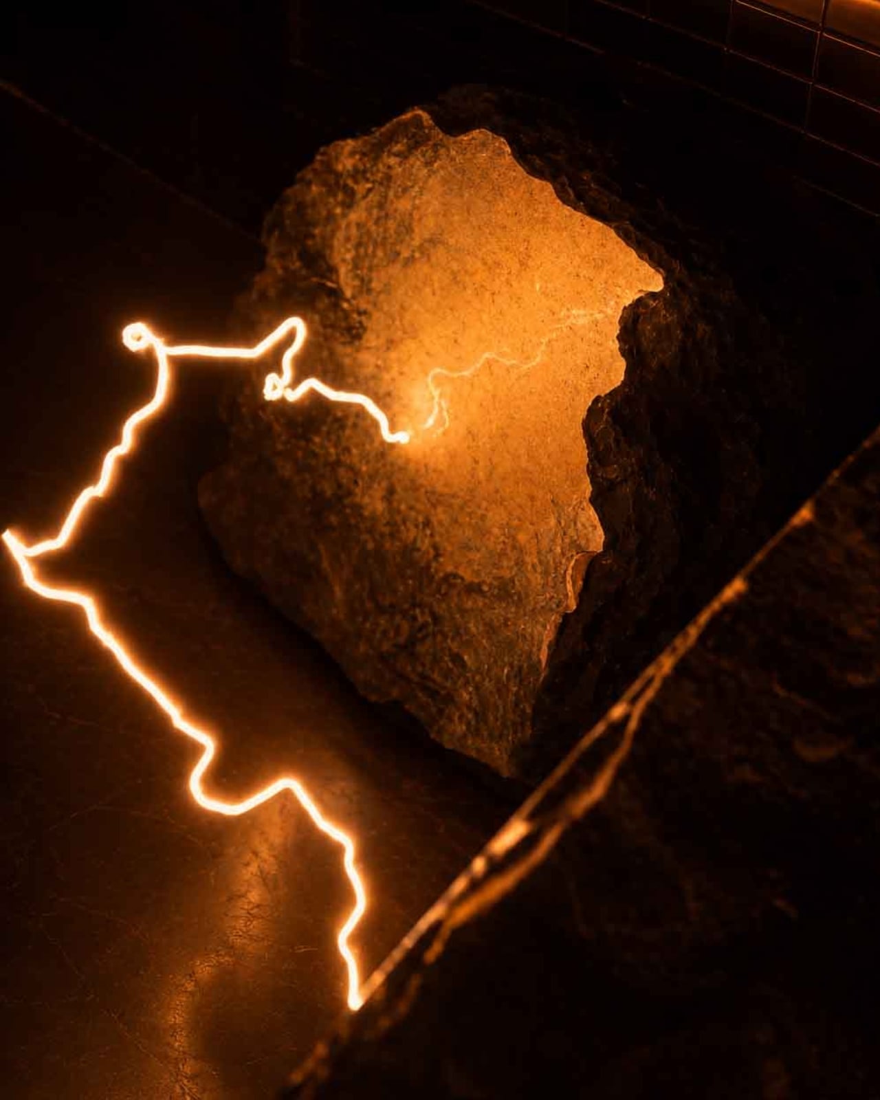
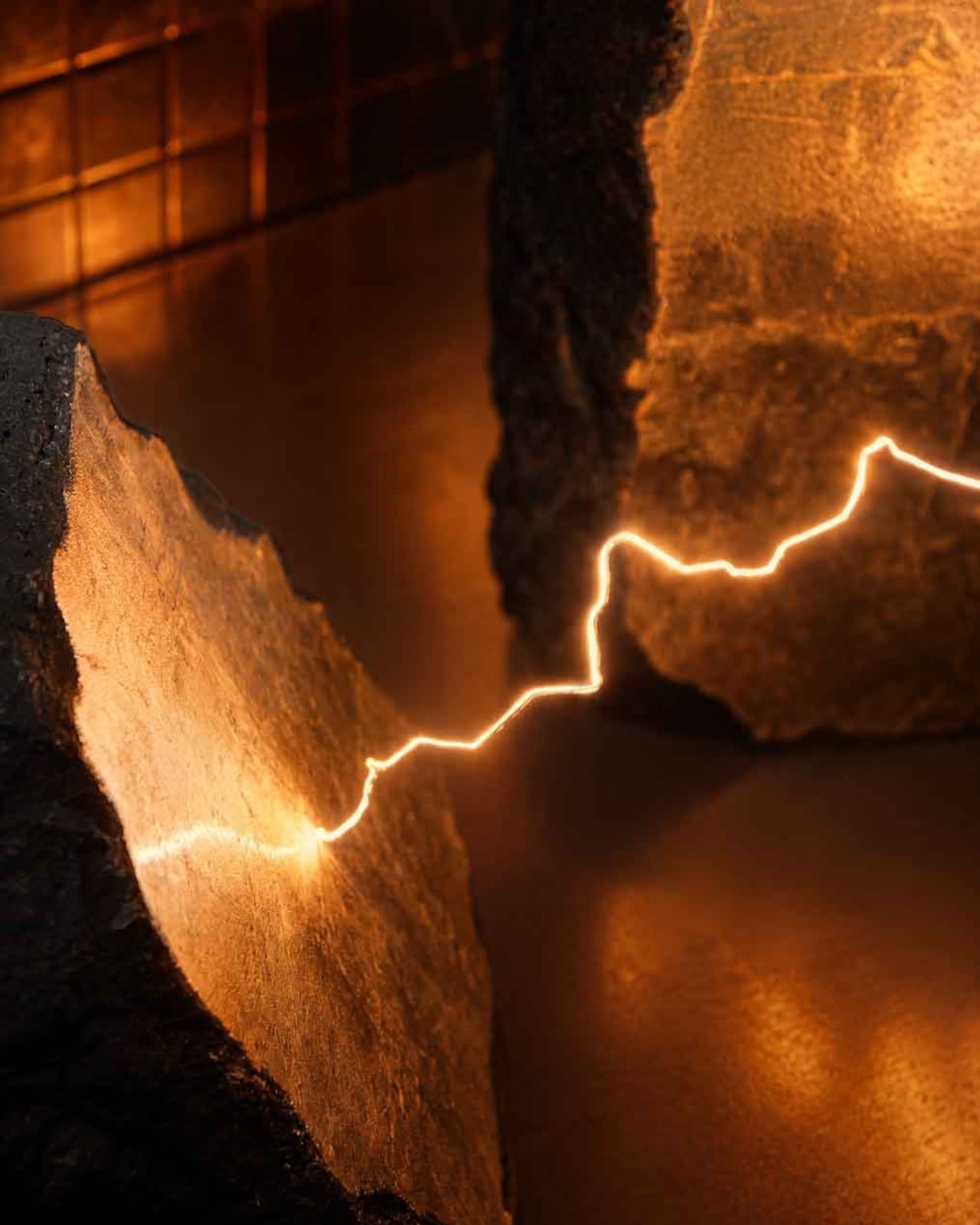
Most lamps ask very little of you. They sit in corners, cast light, get switched off. Electric Rocks, a new collectible luminaire by British designer Mark Mitchell for Italian marble company Serafini, refuses to be ignored. It is two blocks of marble split open by a bolt of lightning, and the lightning is still there, frozen between them, glowing warm and low like the aftermath of something ancient and violent.
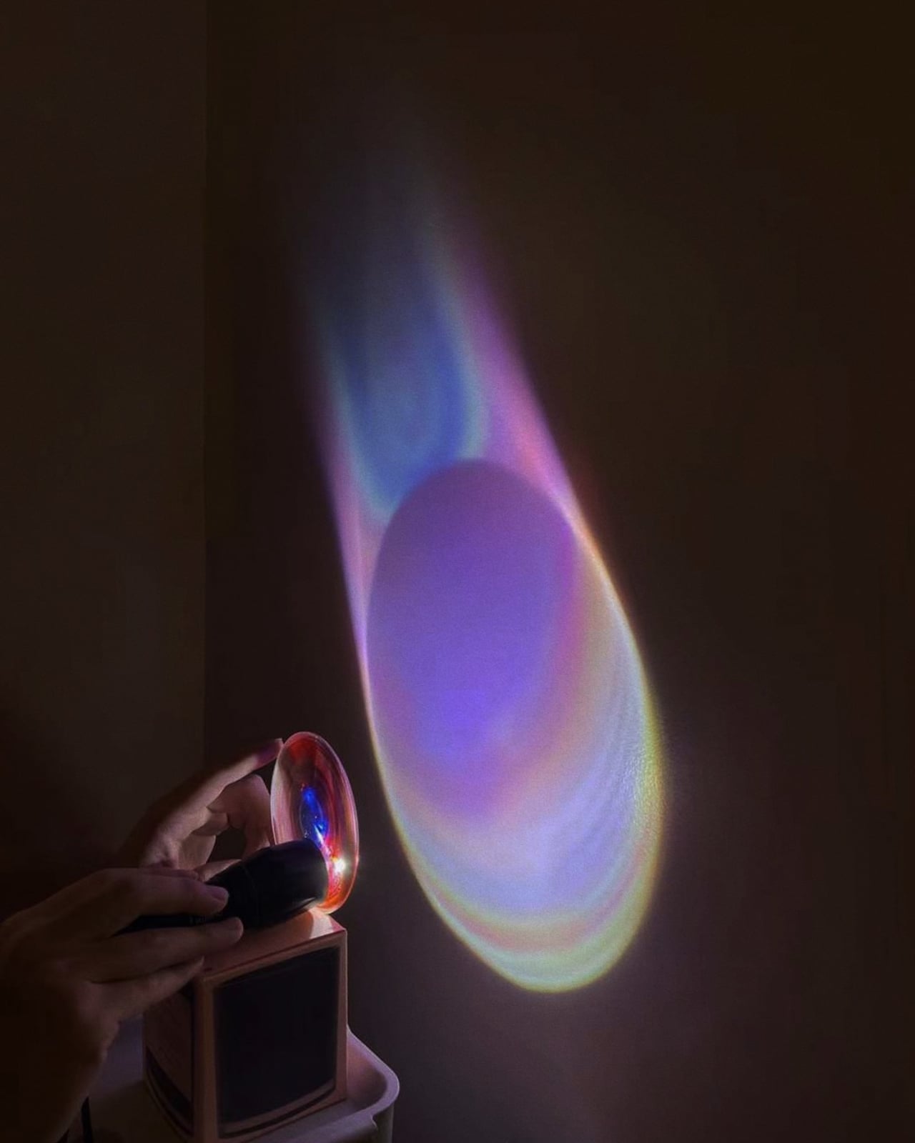
The concept is straightforward in theory and staggering in execution. Mitchell wanted to capture lightning at the exact moment of impact, not as decoration, but as event. “The electric arc appears to hang in the air, frozen at its most powerful point,” he says. “The bolt feels dangerous, but controlled. It is power held in stone.” That line does a lot of work, and it earns it.
Designer: Mark Mitchell for Serafini
What makes this piece land so hard is the contradiction it holds together. Lightning is the definition of fleeting, over in milliseconds, gone before you can fully process it. Marble is the opposite: dense, ancient, built to outlast everything we make. Placing one inside the other shouldn’t work, and yet it does, completely. The tension between those two materials is precisely what gives Electric Rocks its emotional weight. You’re standing in front of something that feels simultaneously permanent and urgent.
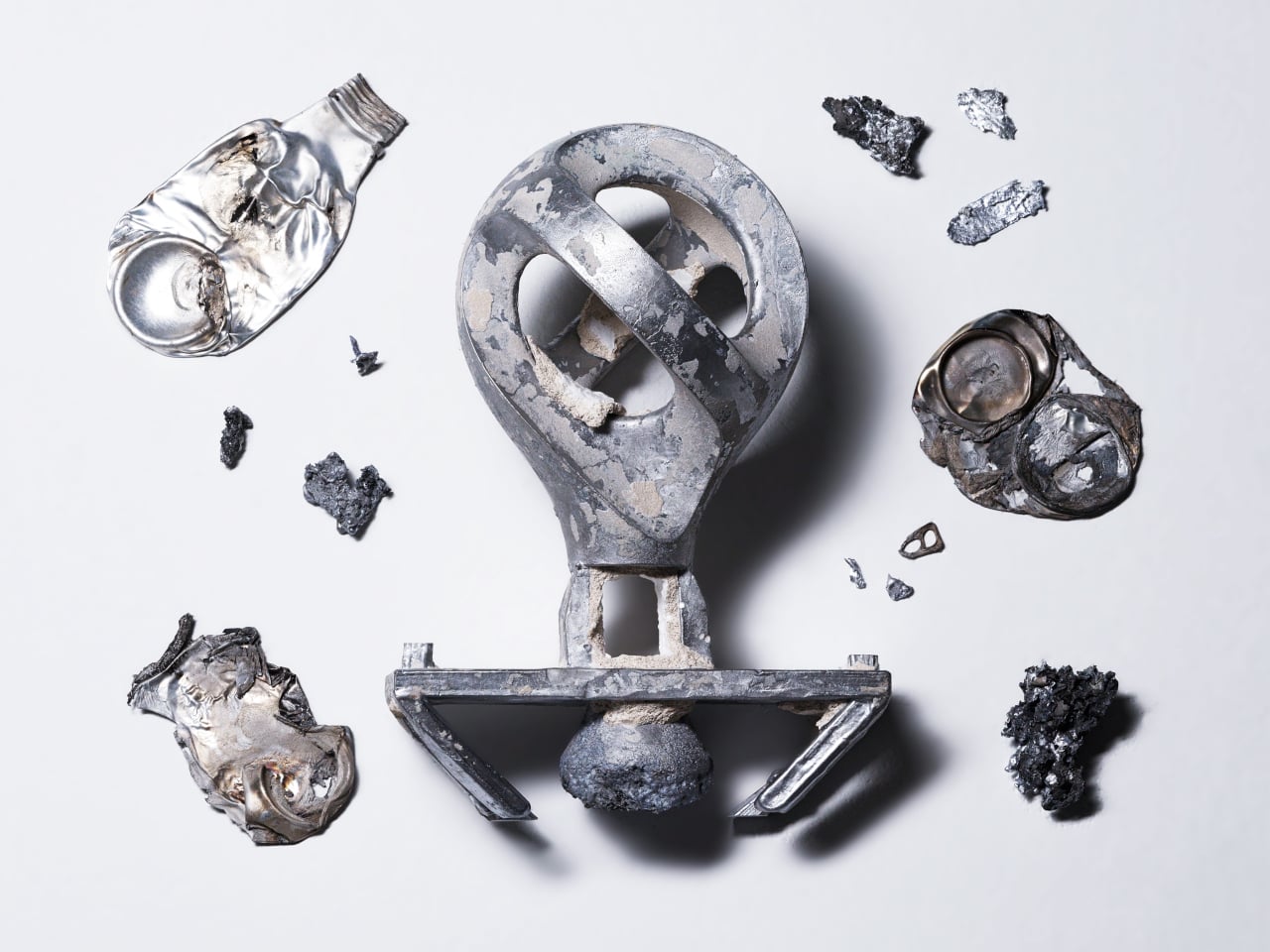
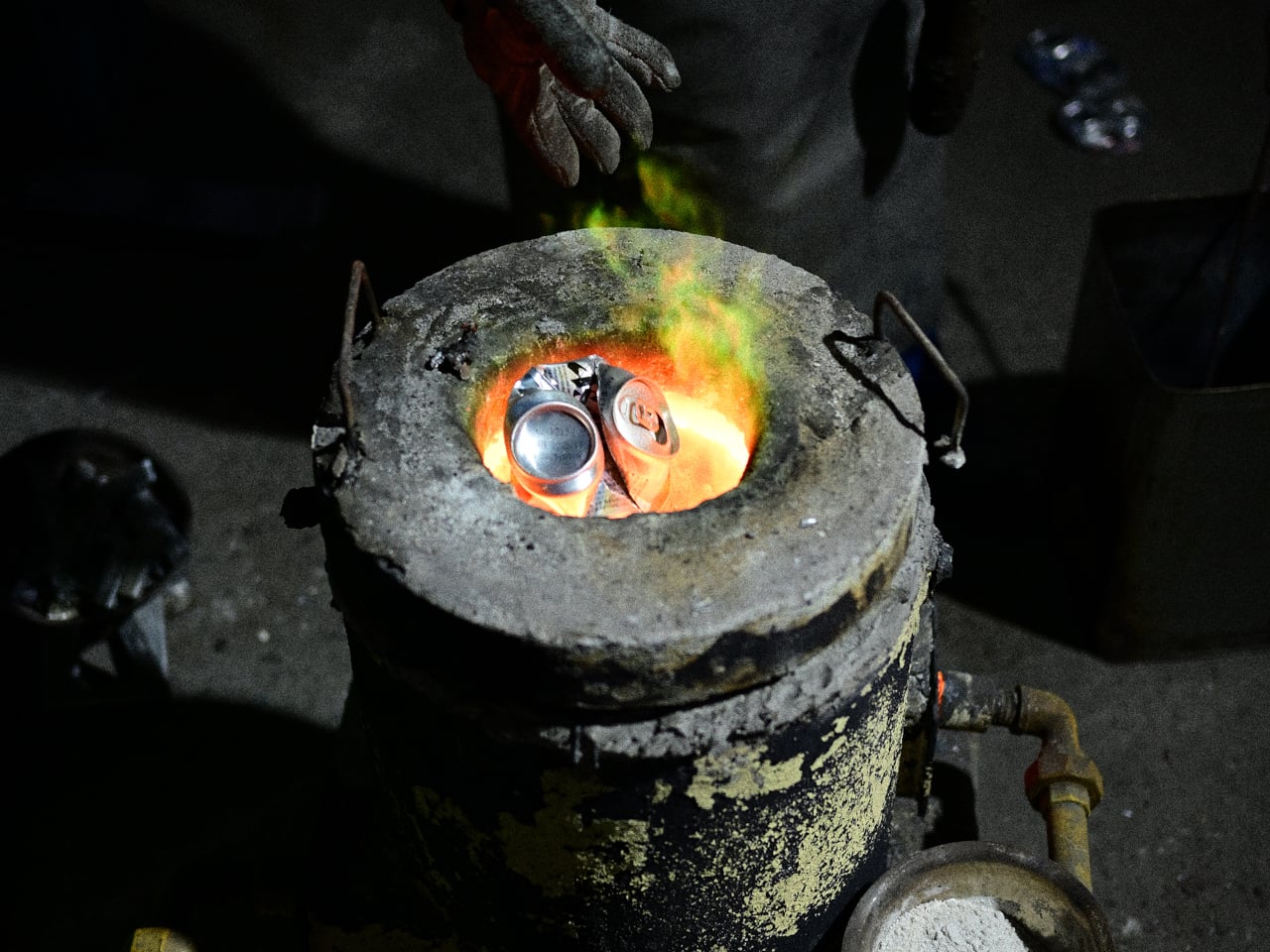
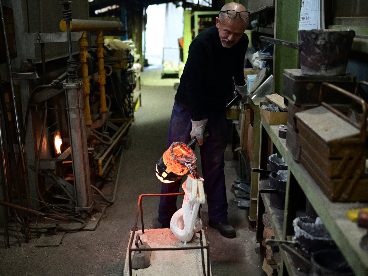
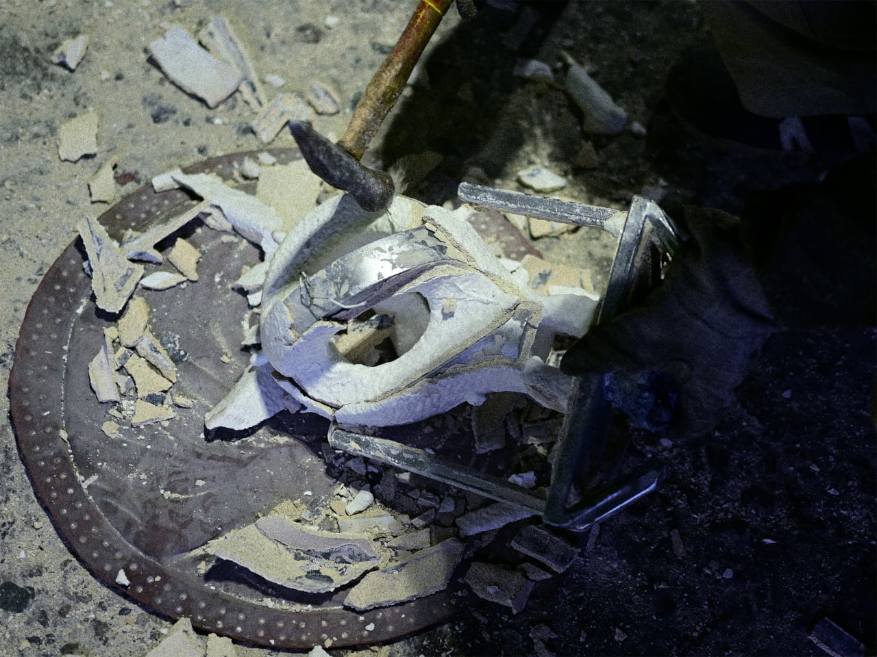
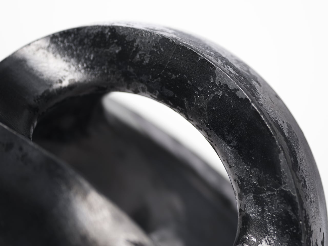
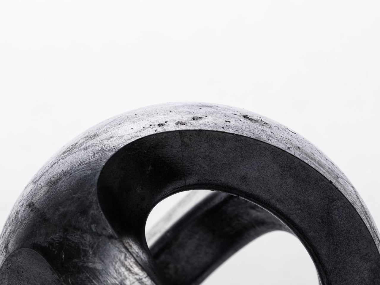
The craftsmanship behind it is genuinely serious. The stones are polished Italian marble, coated in gold leaf to intensify the presence of the bolt. The lightning element is entirely handcrafted from 2200K LEDs and stainless steel, engineered to replicate the jagged, irregular quality of a real electric arc. The warm amber glow reads less like interior lighting and more like geological heat, like light escaping from somewhere deep underground. At 96 x 56 x 97 cm, it’s a significant physical presence, not a table lamp you’d tuck beside a sofa but a sculptural object that changes the atmosphere of an entire room.
Mitchell, based in Cheshire, England, has built his practice around exactly this kind of poetic restraint. His work draws consistently on natural phenomena: the way light moves, the way materials age, the space between objects rather than the objects themselves. His design language is minimalist but never cold. Electric Rocks is perhaps his most dramatic statement to date, but it still carries that quality of stillness his work is known for. He describes it as “a space where power and calm coexist,” and that reads less like a press line and more like a genuine philosophy.
The historical dimension of the piece adds another layer worth sitting with. Across cultures and centuries, stones struck by lightning were considered sacred objects, permanently altered by extreme celestial force and sought after for the mythological weight they carried. Electric Rocks draws a quiet line from that ancient reverence to a contemporary luxury object without being heavy-handed about it. The mythology is embedded, not announced, which is how the best design references tend to work.
If I’m being honest about why this piece interests me beyond the aesthetics, it’s because it asks a real question about what luxury objects should do. The best ones don’t just signal taste or cost. They change the energy of a space. They make you feel something you weren’t expecting. Electric Rocks does that. Sitting in a dark room with those two glowing marble slabs and a thin thread of light stretching between them, you’re not thinking about function or finish. You’re thinking about storms, about deep time, about the strange quiet that follows something overwhelming.
For Serafini, commissioning this piece is a smart move creatively. The Italian marble industry has long understood that stone is not just a material but a story, millions of years compressed into surface and weight. Electric Rocks extends that story into something wilder and more elemental. It turns a lamp into a conversation about nature’s force and human craft working in the same breath. It is, without question, one of the most compelling collectible objects to emerge this year. And it casts a very beautiful light.
The post A Thunderstorm, Frozen in Marble and Gold Leaf first appeared on Yanko Design.