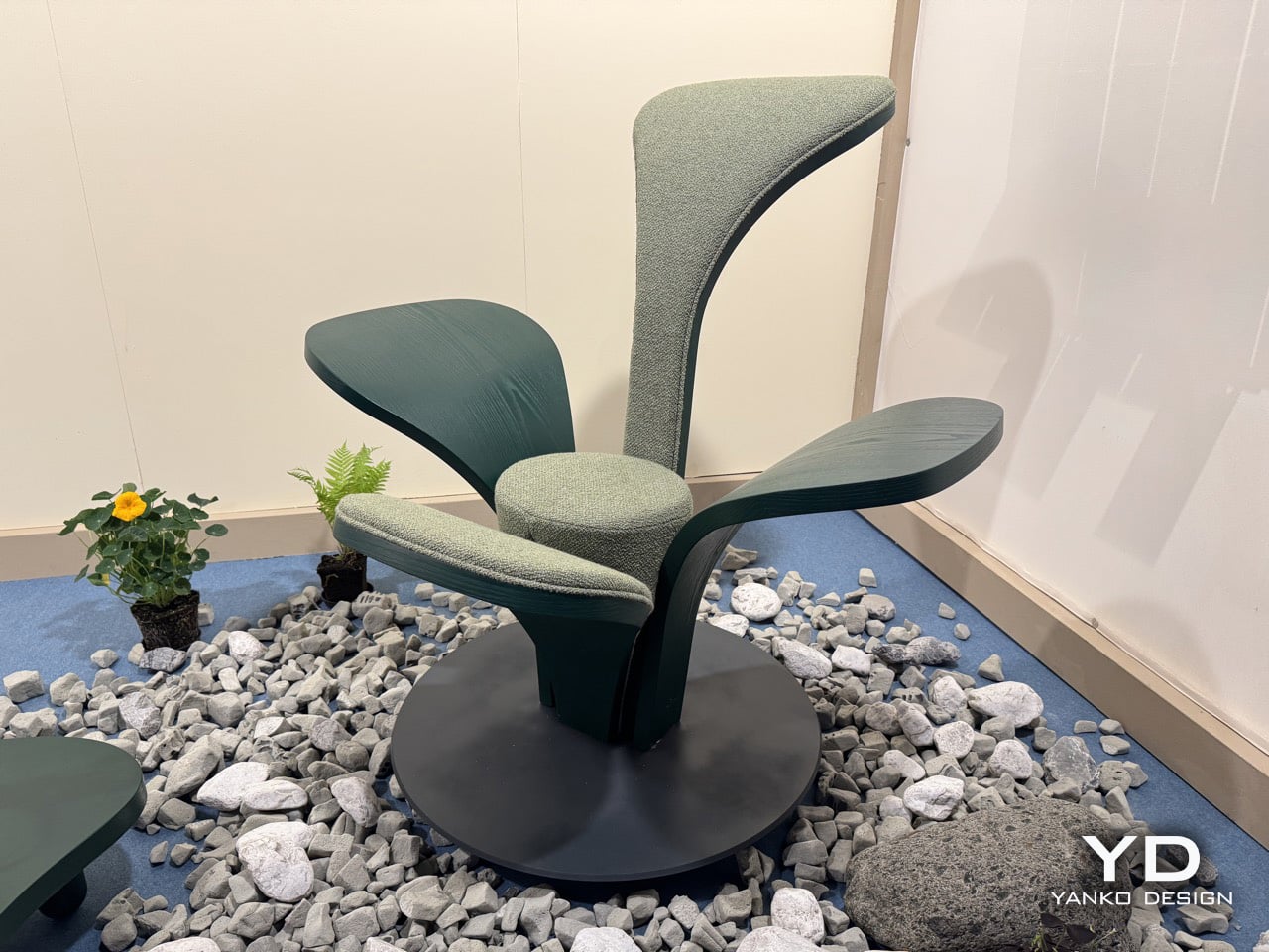
The armchair has been one of the most contested territories in furniture design for over a century, from Alvar Aalto’s bent plywood experiments to Arne Jacobsen’s Swan Chair. Designers keep returning to the seated form as a test of where material technology and formal imagination currently meet. Beltrame Breuil, an architectural practice based in Tarvisio and Vienna, took their turn at Salone Satellite 2026 with a chair that brings alpine botany directly into that conversation. Their furniture brand Picule presented CLVR, a seat assembled from four bent-wood leaf forms rising from a circular steel base, and it is the kind of debut that reminds you why Salone Satellite exists.
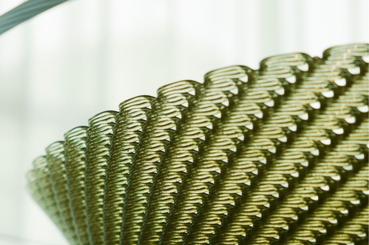
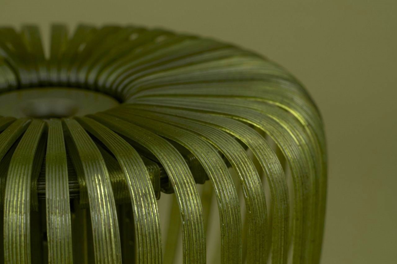
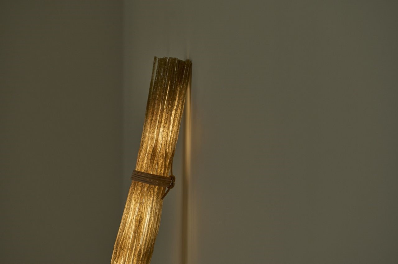
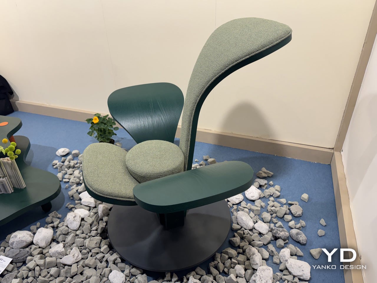
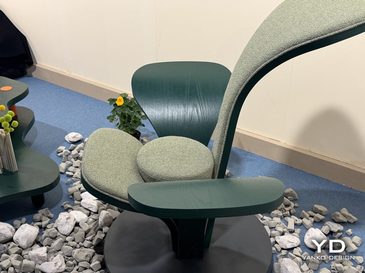
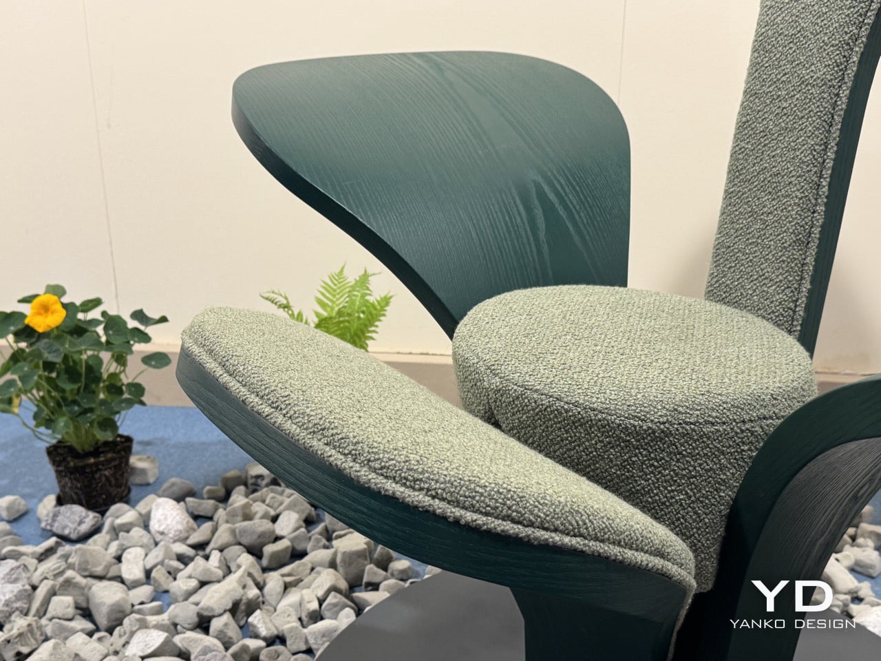
Two of CLVR’s four leaves are upholstered in a mossy, boucle-like forest green textile, covering the tall backrest and the lower front surface where the body settles. The other two are left as bare stained wood, their grain visible under the deep green finish, extending outward from the center like wings. All four share one curvature and one design logic, shaped by bent wood, which is what holds the composition together despite its apparent asymmetry. The design is coherent because its grammar is consistent, even as the function of each leaf changes.
Designer: Beltrame Breuil
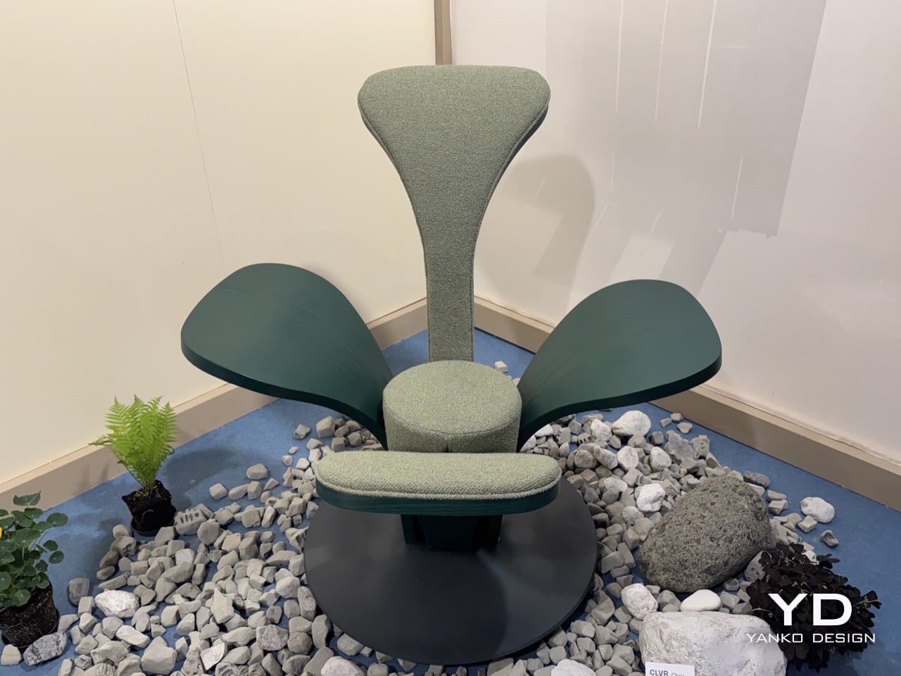
The circular steel plate at the base functions as a pedestal, grounding the organic spread of the leaves and lending the piece a measured architectural gravity. At 112 cm tall and 125 cm wide, CLVR reads as a statement lounge object first and a chair second. It has the presence of a small throne, designed to anchor a room rather than disappear into it. The scale is deliberate, positioning the chair as a piece of functional sculpture that occupies its space with confidence.
Picule is Beltrame Breuil’s way of funneling architectural discipline into objects scaled for domestic life. The studio’s Tarvisio base sits in Italy’s northeastern corner, where the Julian Alps press against the Austrian and Slovenian borders. That geography gives CLVR its conceptual grounding; this is a studio that builds in that landscape, not one pulling a leaf motif from a mood board. The alpine forest inspiration feels earned, and it gives the chair a story that goes beyond its form.
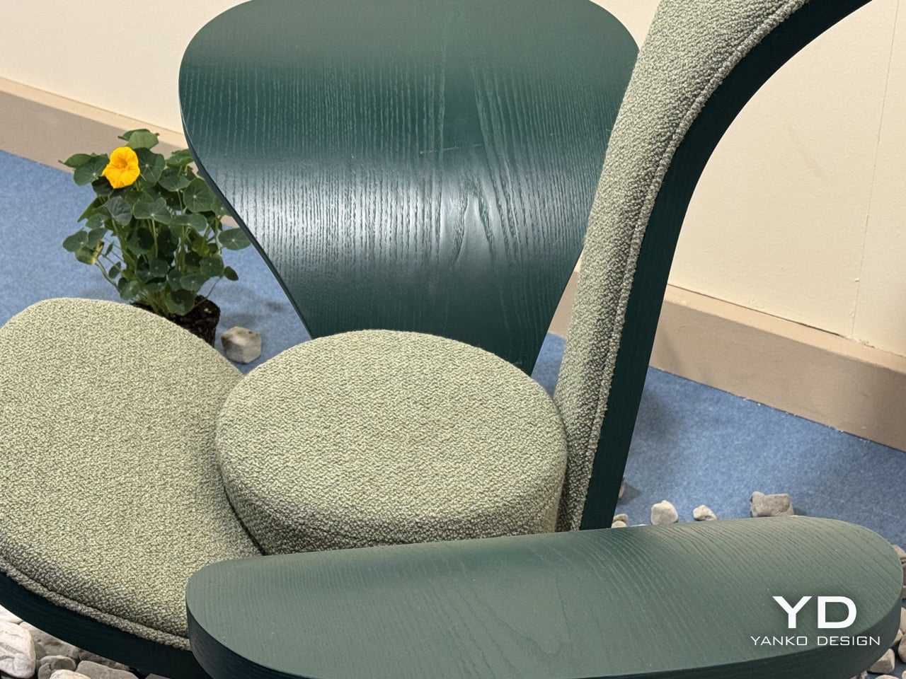
The bent-wood forming technique reinforces that connection, requiring an intimacy with the material that keeps the work tethered to craft. The chair’s forest green palette, running across bare wood and woven textile in two calibrated tones, holds the composition together as one chromatic idea rather than a collage of parts. It’s a thoughtful detail that shows how completely the studio considered the object from every angle, ensuring the material and color choices support the core concept.
Beltrame Breuil is presenting the full Picule collection, including the CLVR chair, at Salone Satellite 2026. You can find it in Hall 5 at Stand E10 at Fiera Milano, Rho, through April 26. The photos do a fair job of capturing the silhouette, but the bent-wood grain and the textile’s tactile quality are things that land most clearly when you are standing right in front of it. Go see it before the fair closes.
The post This Chair at Milan Design Week Looks Like a Forest Grew a Seat first appeared on Yanko Design.