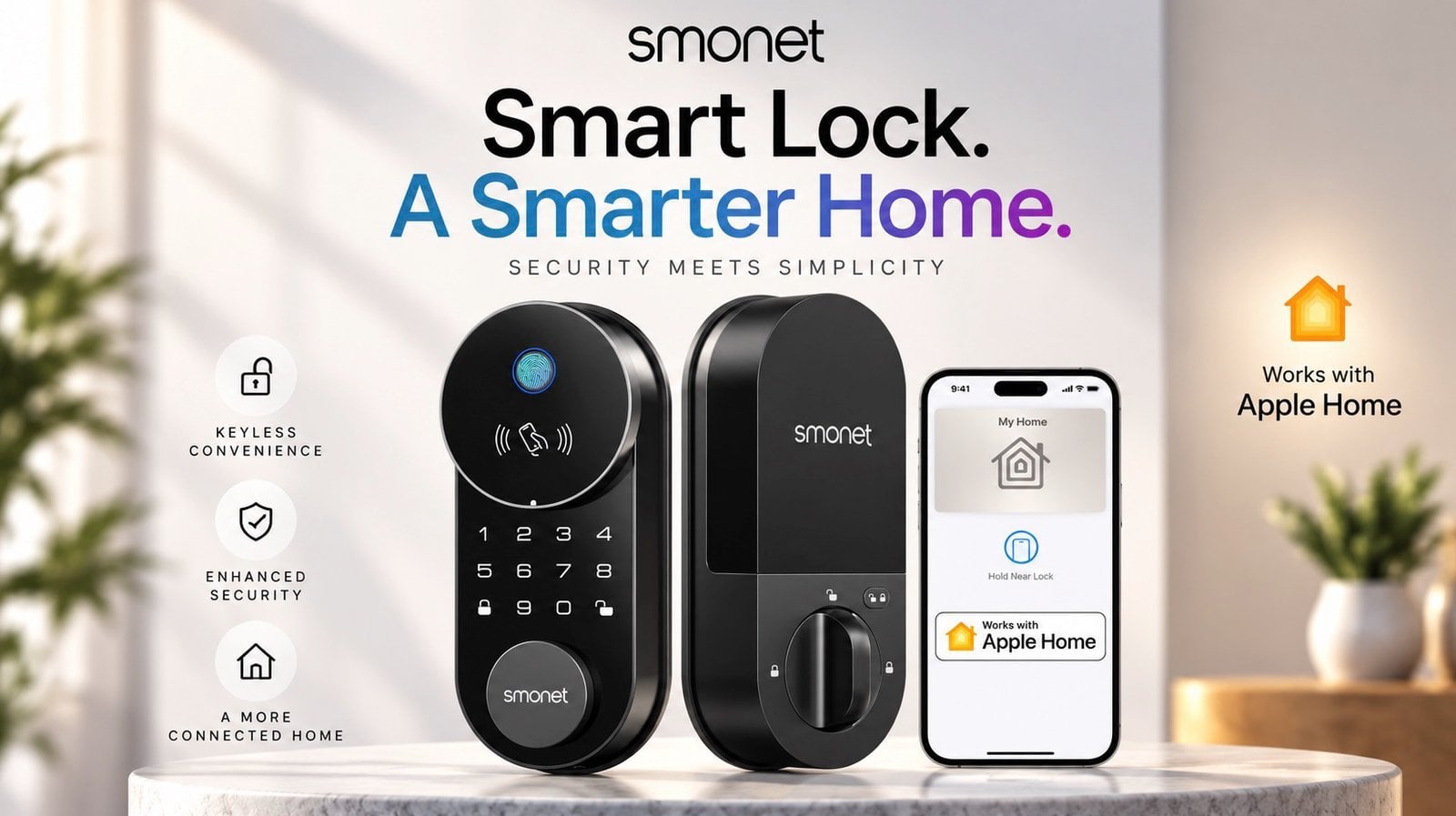
The SMONET AH1 is a $109 smart lock that integrates with Apple Home Key, allowing iPhone and Apple Watch users to unlock doors with a tap. According to Smart Home 101, it offers five entry methods, including a fingerprint scanner, proximity key cards and a traditional keyhole for backup. Designed for standard single-cylinder doors, the […]
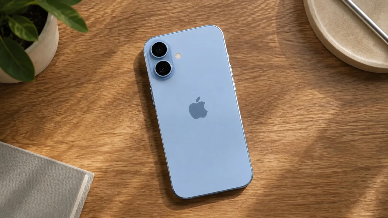
Apple’s iPhone 18 is poised to continue the company’s legacy of delivering refined technology and user-focused enhancements. While it doesn’t introduce an innovative redesign, it brings meaningful upgrades in performance, efficiency, and connectivity. Here’s a detailed look at what you can expect, from its anticipated release date to its standout features. The video below from […]
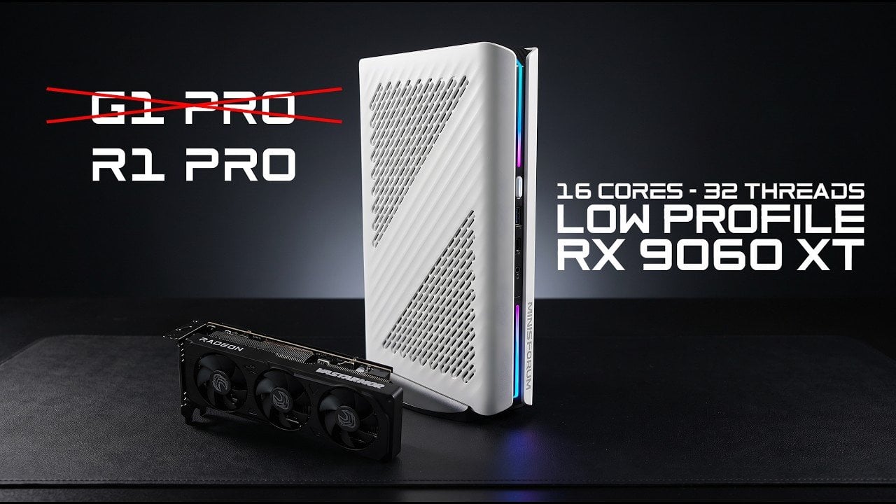
ETA Prime explores the transformation of the Minisforum G1 Pro into a custom “R1 Pro” by swapping its Nvidia RTX 5060 GPU for an AMD Radeon RX 9060 XT. This upgrade not only highlights the G1 Pro’s adaptability but also demonstrates the potential of an all-AMD configuration. With the RX 9060 XT’s triple-fan cooling system, […]
I’m not an artist or an architect, but I do love me some good quality pens, pencils, and markers. Since I’m just a casual user, though, I don’t mind tossing them into an ordinary pencil case or even just slipping them into my bag’s side pocket when I’m heading out and might use them somewhere. I know people who rely on these tools for their livelihood tend to be a lot more careful about how they carry them around, but the truth is, there just aren’t many quality cases built specifically for that job.
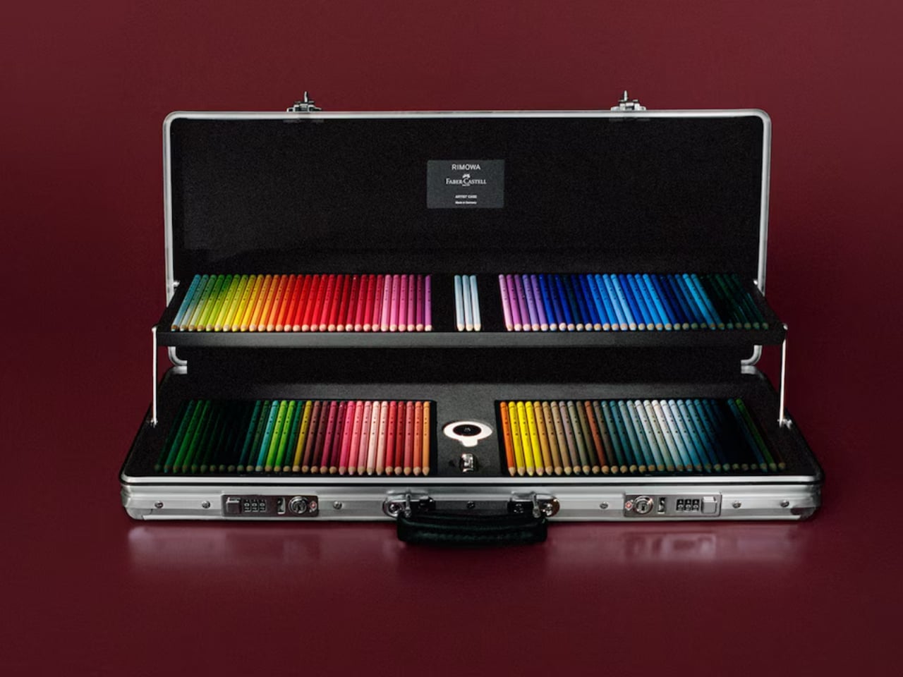
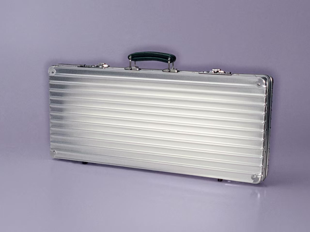
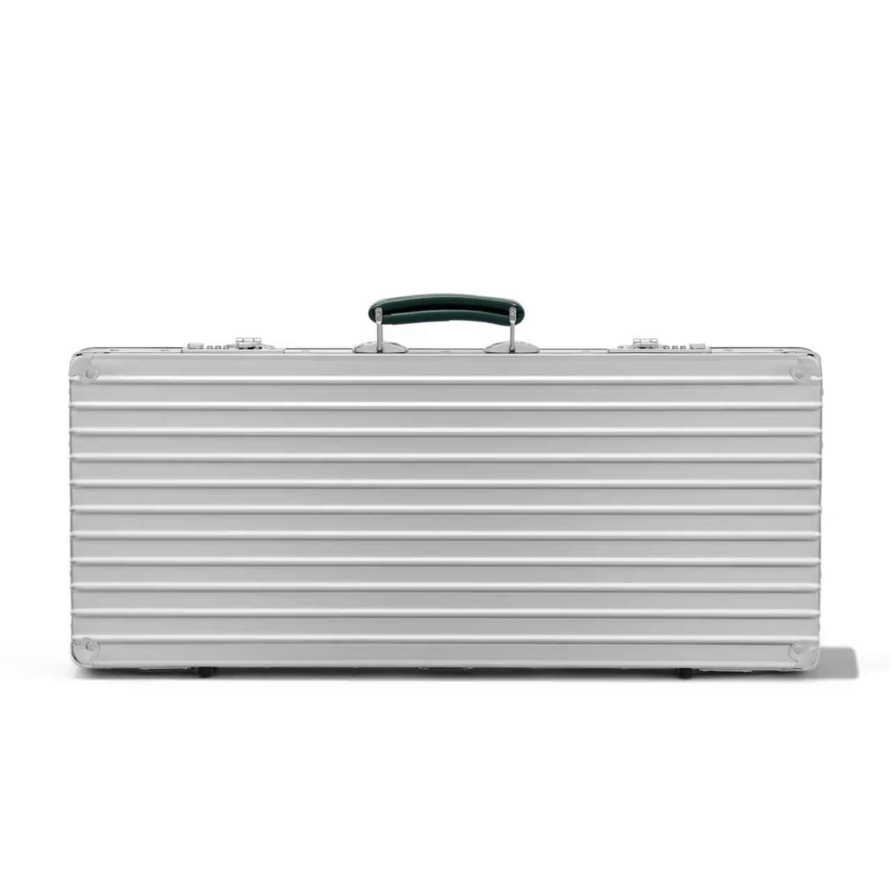
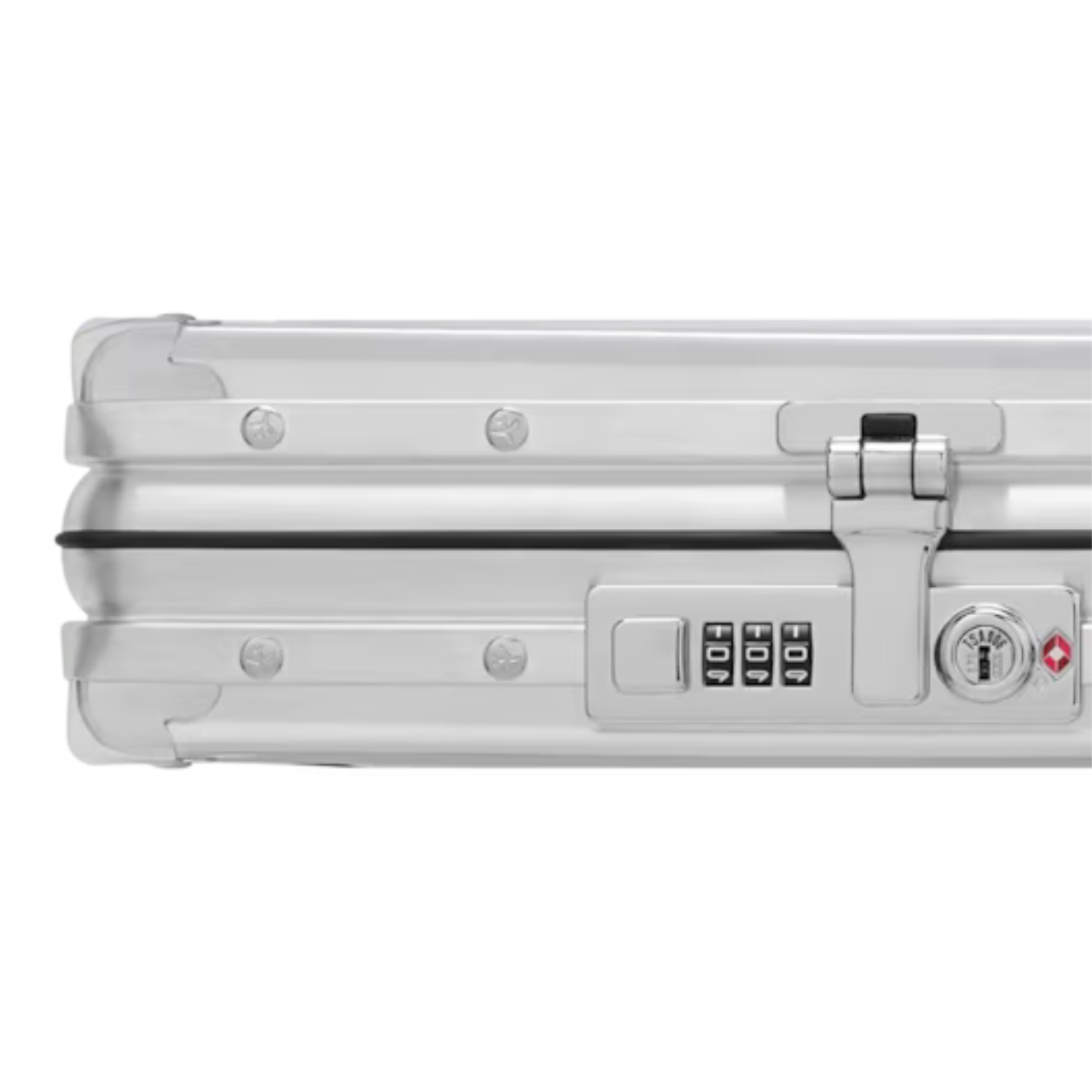
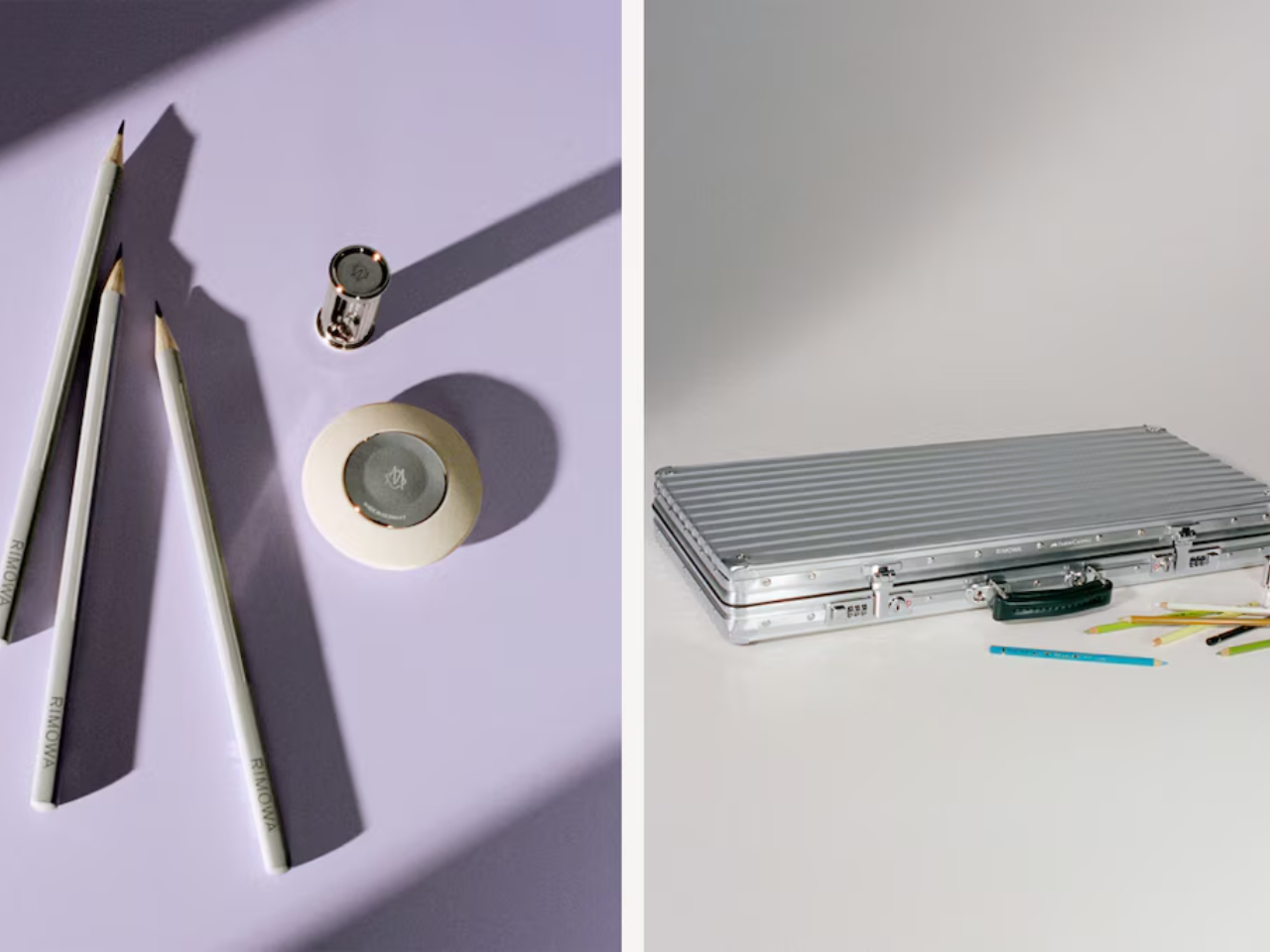
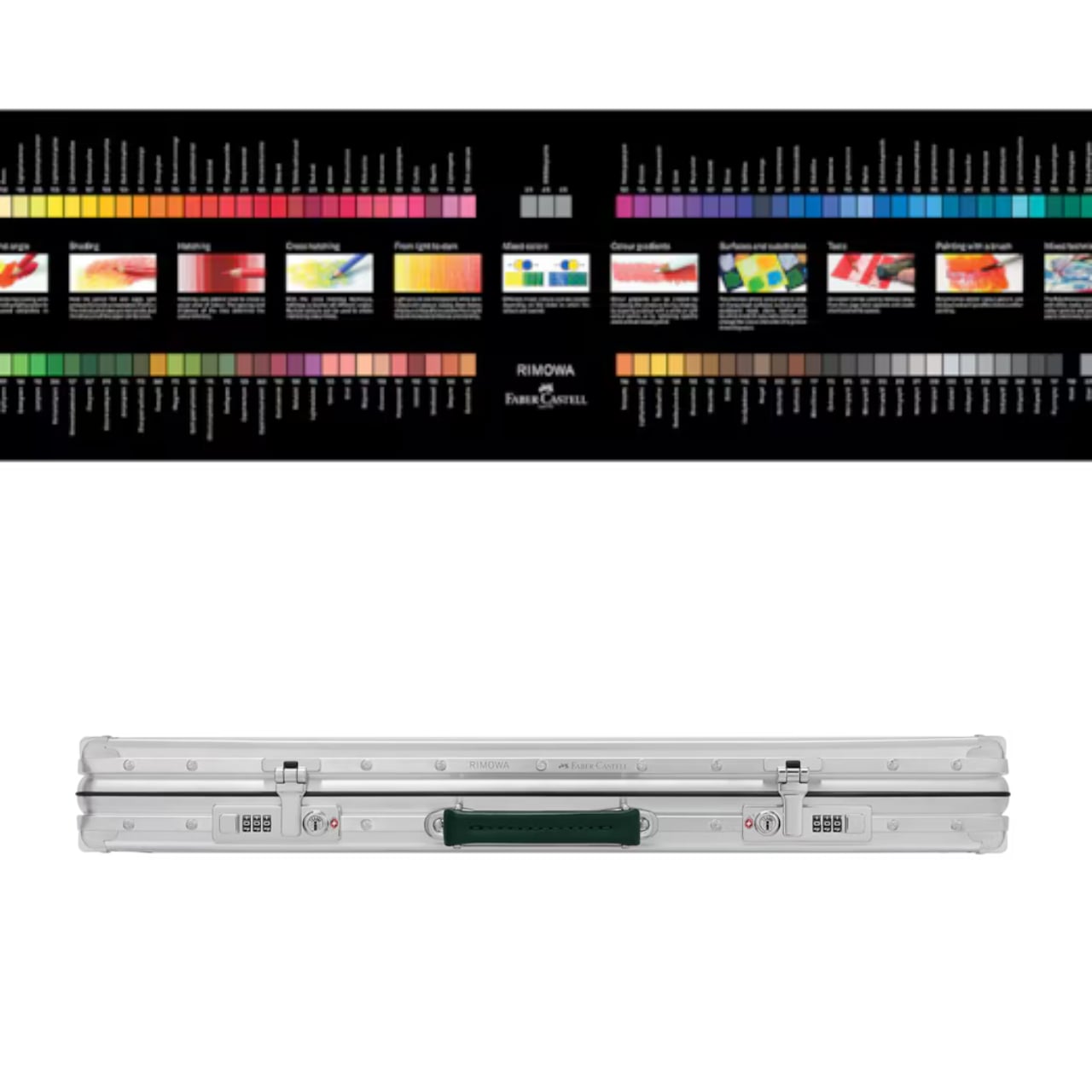
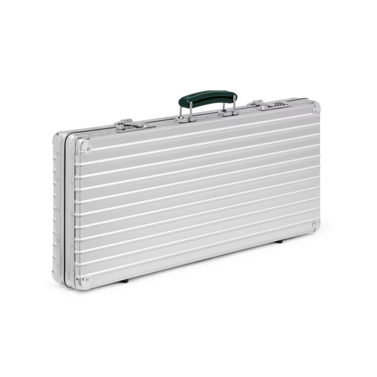
In a surprising collaboration, luxury luggage brand Rimowa and German pencil maker Faber-Castell have teamed up to create a suitcase specifically meant for carrying around your precious pens and pencils. It’s made from the same signature anodized, grooved aluminum shell that Rimowa uses on its actual luggage, with a colorful surprise waiting once you pop it open.
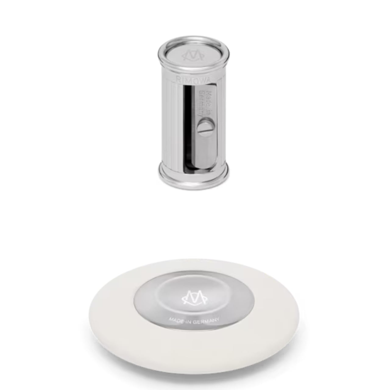
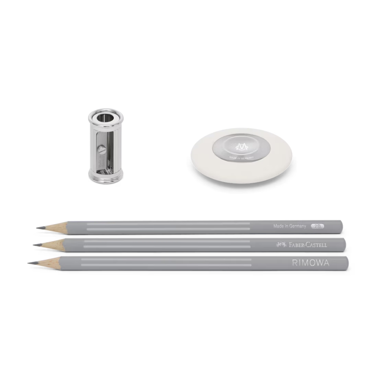
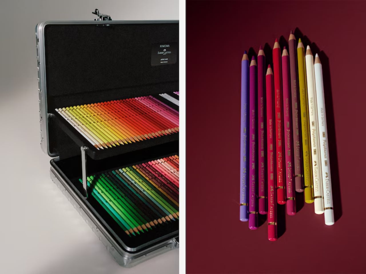
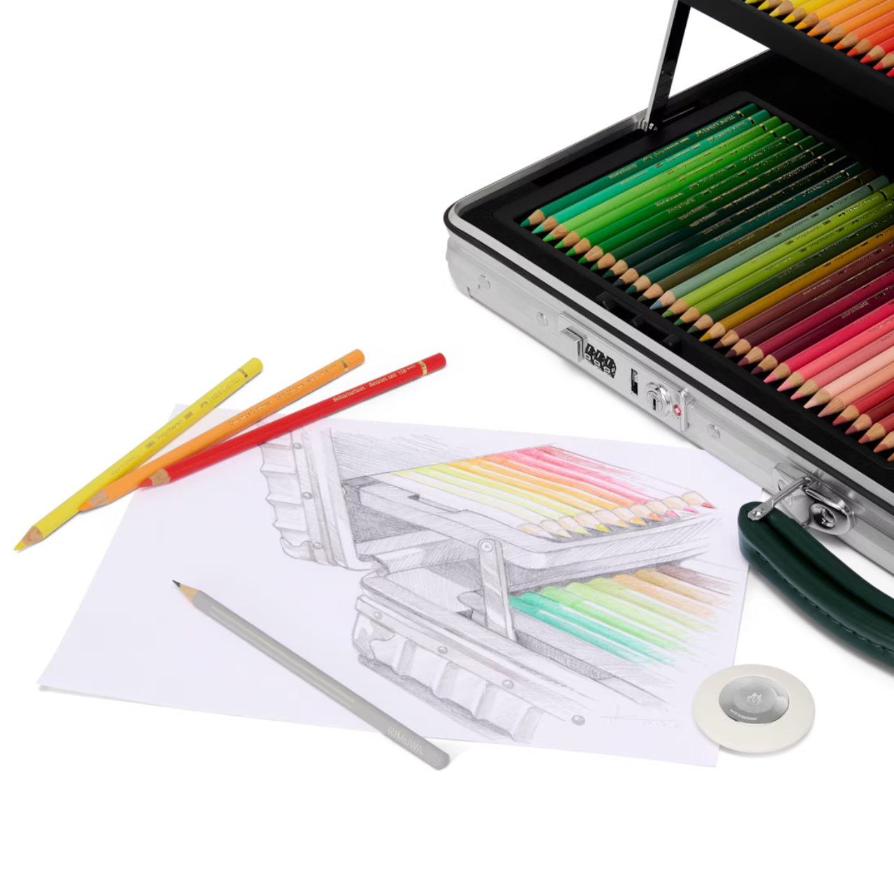
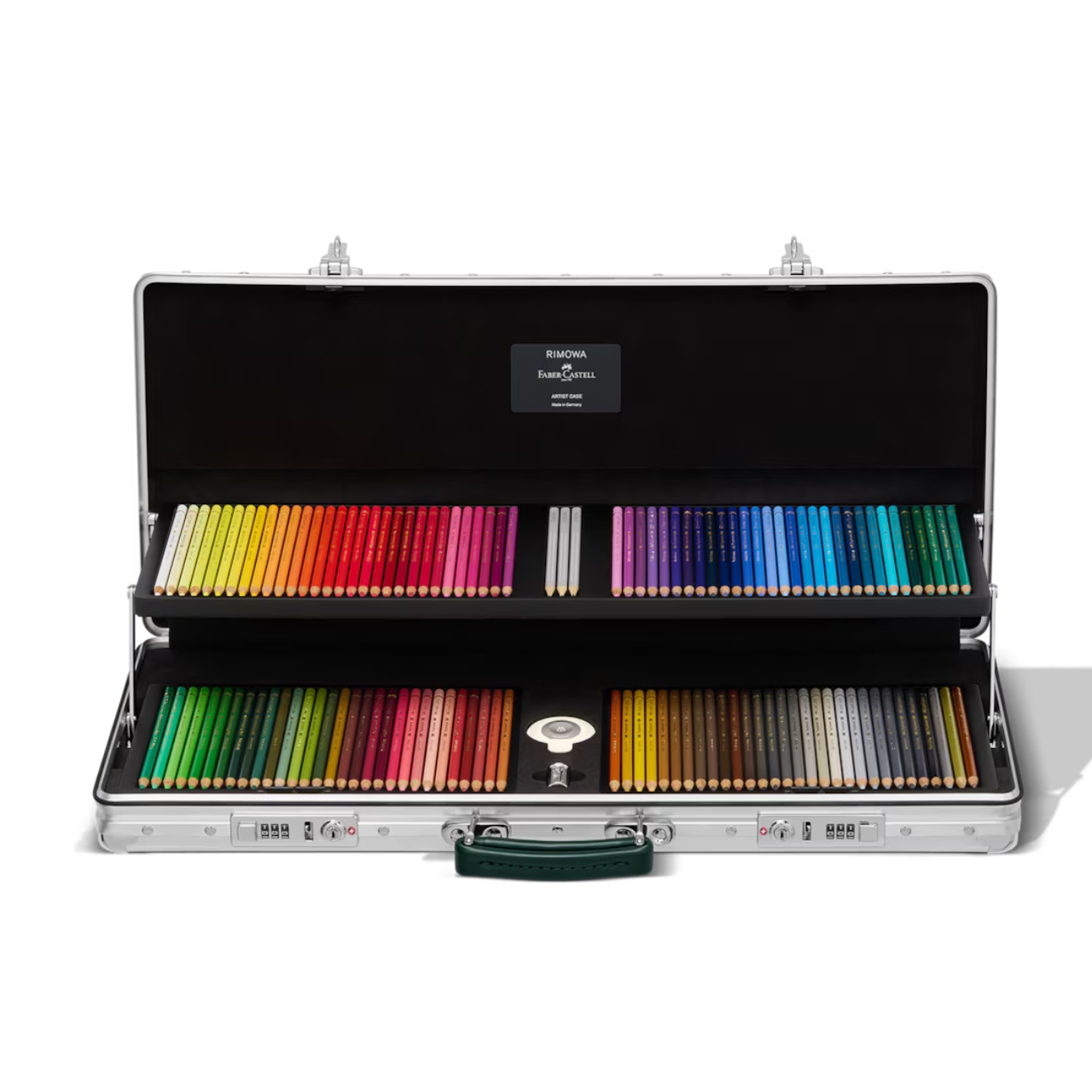
This limited-edition collector’s piece isn’t just a classy-looking suitcase, either. It’s a full kit that includes 120 Polychromos color pencils, custom-made grooved 2B Grip graphite pencils, and a Rimowa-branded platinum-plated sharpener and eraser. Everything is arranged in a two-level tray system that unfolds smoothly, so each piece stays visible and within reach. It’s a stationery lover’s stylish, fever dream and something worth adding to any artist or designer’s wish list.
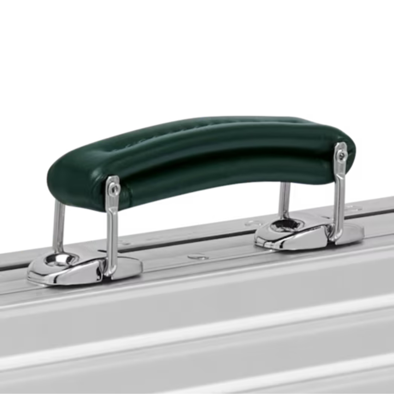
The case itself looks like a smaller sibling to Rimowa’s regular luggage line, using the same material and design language throughout. It also has the brand’s signature high-gloss aluminum corners and TSA-approved locks, which proves it’s actually travel-ready in case you’re flying somewhere with your supplies in tow. The leather carry handle comes in Faber-Castell’s signature green, a nice branding touch that ties the two icons together.
I said this was a surprising collaboration, but if you really think about it, the partnership makes perfect sense. Rimowa is famous for its sturdy aluminum suitcases, while Faber-Castell has a long history of crafting high-quality pens and pencils dating back to 1761. Both brands are essentially obsessed with precision and “honest materials,” so their craftsmanship philosophies line up more naturally than you’d expect.
So how does this stack up against what’s already out there? The closest comparison in the luxury space is probably Louis Vuitton, which sells its own Art & Craft Elizabeth Pencil Pouch for around $515. That’s already a steep price for something that’s essentially just a fancy fabric zip pouch, and it doesn’t come with any pencils, sharpeners, or organizational trays included. Rimowa and Faber-Castell’s Artist Case, by comparison, costs roughly $3,100, but you’re getting an entirely different category of product: a hard-shell, TSA-approved, aluminum case with a built-in two-tier tray system and a complete 120-pencil professional drawing kit already inside.
On the more affordable end, Faber-Castell’s own wooden Polychromos case with all 120 pencils runs about $700 on its own, no case included. So while the Rimowa collaboration is definitely priced for collectors and diehard fans rather than casual doodlers like me, it’s less “overpriced pencil box” and more “a piece of design furniture that happens to hold your pencils.” It occupies its own lane entirely, somewhere between fine luggage and fine art supplies.
If you’re hoping to snag one, the RIMOWA x Faber-Castell Artist Case officially releases on September 17, 2026, and will be available at Rimowa stores worldwide, on Rimowa.com, and at select Faber-Castell retail stores across Germany, Austria, France, and Italy. Given that it’s a limited-edition run, don’t expect it to stick around for long once it hits shelves.
At the end of the day, most of us don’t need a $3,100 aluminum suitcase just to keep our colored pencils from rolling around in a backpack. But that’s kind of the point. This isn’t really about function alone; it’s about two heritage brands proving that even the most humble everyday tools, the pencils we doodled with as kids, deserve the same obsessive craftsmanship as a suitcase built to survive a transatlantic flight. Whether you’re a professional illustrator, a serious hobbyist, or just someone who appreciates when two iconic names come together in a way that actually makes sense, the Artist Case is a reminder that good design doesn’t discriminate by price point or purpose. Sometimes it just shows up in the most unexpected shape: a pencil box dressed up like a suitcase.
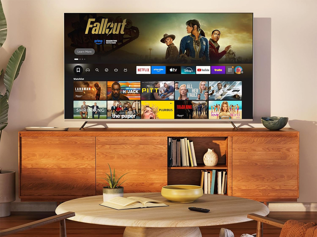
There used to be two ways to buy a TV. Go cheap and squint through a mediocre picture, or spend enough that your banking app sends a concerned notification. Hisense’s E7SF exists to blow up that choice entirely. It runs a native 144Hz MiniLED panel, Hi-QLED color, and as many as 260 local dimming zones, paired with Fire TV and Alexa+, across six sizes from 50 inches up to a genuinely massive 100. The 50 inch model has already been spotted selling for under $400.
That price point used to buy a TV that struggled in daylight and looked worse the second a game turned on. MiniLED is the technology that fixed most of that, and until recently it was reserved for sets that cost real money. Hisense’s approach over the past few years has been to move formerly premium display technology down the price stack faster than the rest of the industry, and the E7SF is that philosophy in its most direct form. The brand’s role as the Official Sponsor of the FIFA World Cup 2026 and its standing as the number one brand globally in 100-inch and larger TVs gave it a huge stage this year, but the bigger takeaway is simpler: everyone now wants a bigger, brighter screen at home, and far more people can actually afford one.
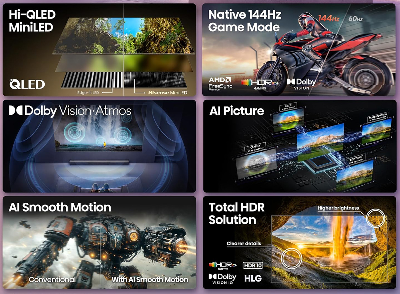
MiniLED backlighting replaces the standard LED array behind an LCD panel with a system that improves how light is managed across the screen and brings out more detail in every scene. More zones means tighter control over which parts of the image are bright and which go dark, producing better contrast, deeper blacks, and more vivid highlights across the panel. On the E7SF, that backlight scales to up to 260 dimming zones depending on the screen size selected. Hi-QLED color technology layers on top of that foundation, designed to keep every shade, scene, and skin tone looking true to life, rendering every scene convincingly real, just as the creator intended. The result is a picture that competes meaningfully with displays that cost significantly more just two or three years ago.
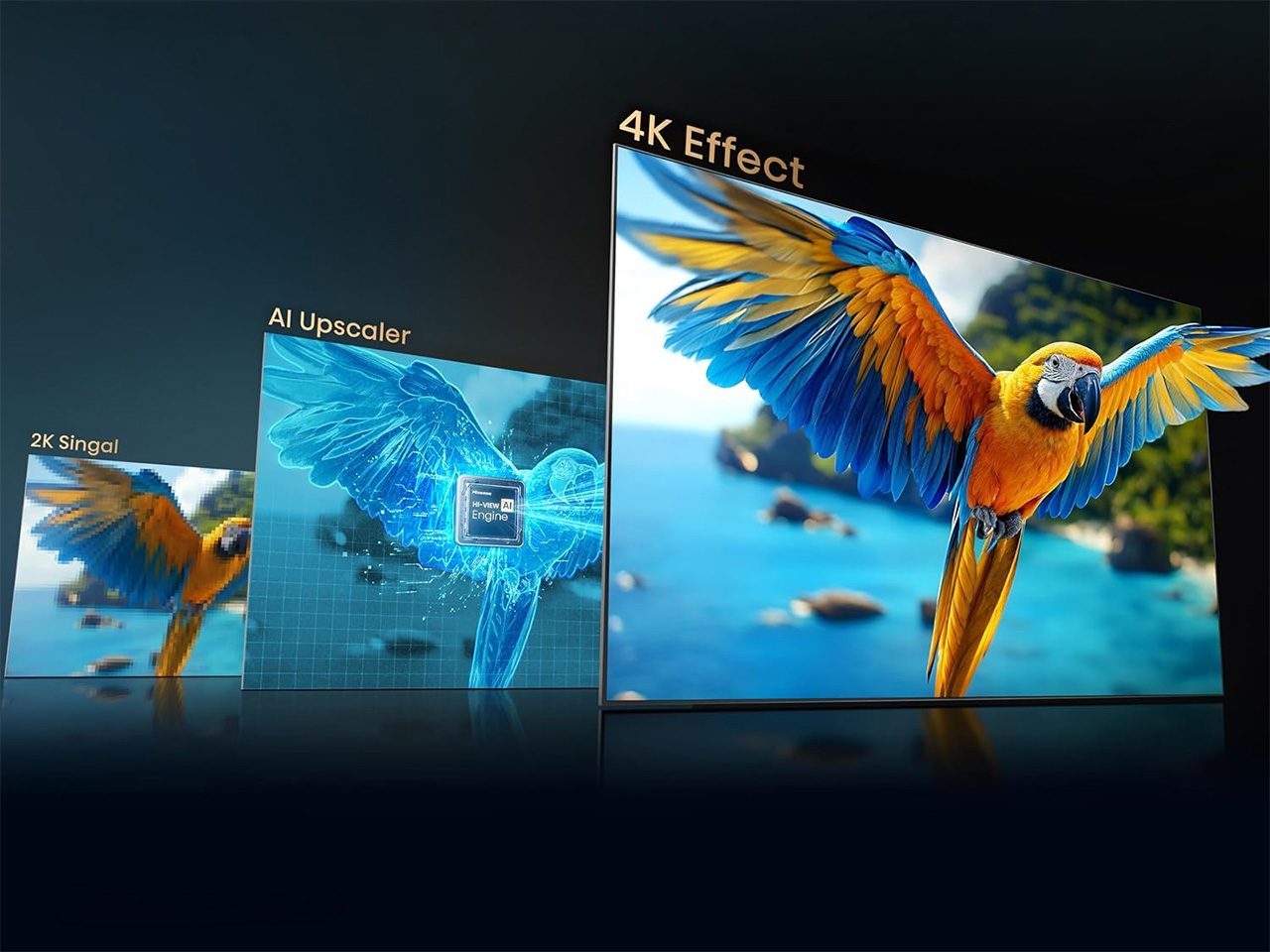
AI Picture runs continuously in the background, reading what’s on screen and instantly fine-tuning the picture so colors pop, details shine, and everything looks natural and clear, without any manual settings required. The E7SF supports Dolby Vision IQ, HDR10+ Adaptive, HDR10, and HLG, covering every major HDR format, which brings brighter highlights, deeper contrast, and richer color in every scene no matter what’s on screen. Dolby Vision IQ adjusts the picture based on ambient lighting in the room, keeping the image calibrated whether the curtains are open or the lights are off. Filmmaker Mode preserves the original aspect ratio, color, frame rate, and sound so viewers watch movies exactly as directors intended. The full HDR stack future-proofs the set against whatever content the studios push out over the next few years, which matters more than any single format badge on the box.
Sports content gets dedicated handling, with the TV automatically recognizing sports content and adjusting picture and sound settings for the action, delivering smoother motion, clearer details, and boosted crowd audio that recreates the excitement of being in the stadium. Dolby Atmos handles the immersive audio experience more broadly, pulling picture and sound together so viewers see, hear, and feel like they’re right in the middle of the action. The E7SF carries a 20W 2.0 multi-channel system on the 50 to 85 inch models and steps up to a 50W 2.1 system with a dedicated woofer channel on the 100 inch. Bluetooth Audio rounds it out for wireless headphone setups, and the whole audio package scales sensibly with the screen size it’s attached to.
Native 144Hz on a TV at this price tier does real work, particularly in gaming, where many competing sets still pad the marketed refresh number through motion interpolation rather than delivering it natively from the panel. Two HDMI 2.1 ports run at full 4K at 144Hz, keeping the signal chain from a PlayStation 5 or Xbox Series X completely uncompromised. AMD FreeSync Premium matches the TV’s refresh rate to the connected graphics card, delivering reduced lag, minimized tearing, and fluid motion for a more immersive gaming experience. Dolby Vision Gaming and HDR10+ Gaming keep HDR active during play without requiring a manual mode switch. Game Booster 240 and ALLM, which switches the set into game mode automatically when a gaming device is detected, round out a feature set that sits well above what most TVs at this price level bother to include.
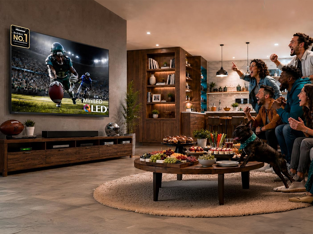
Hisense spent the World Cup cycle positioning itself as the brand for communal, big-screen viewing, and the E7SF still feels like the clearest expression of that idea after the tournament dust has settled. Fire TV manages the smart platform, with Alexa+ built into the voice remote for cross-app content search, smart home management, and watchlist sync, all handled through natural speech. Six sizes span from 50 to 100 inches, and a 100-inch MiniLED television at a mainstream price point is genuinely new territory. A screen that size used to require a custom installation budget. Now it’s an off-the-shelf decision. That shift is arguably the bigger story the E7SF is telling, and at the price Hisense is asking, it’s a hard argument to walk away from.
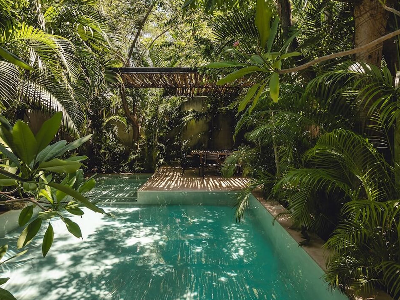
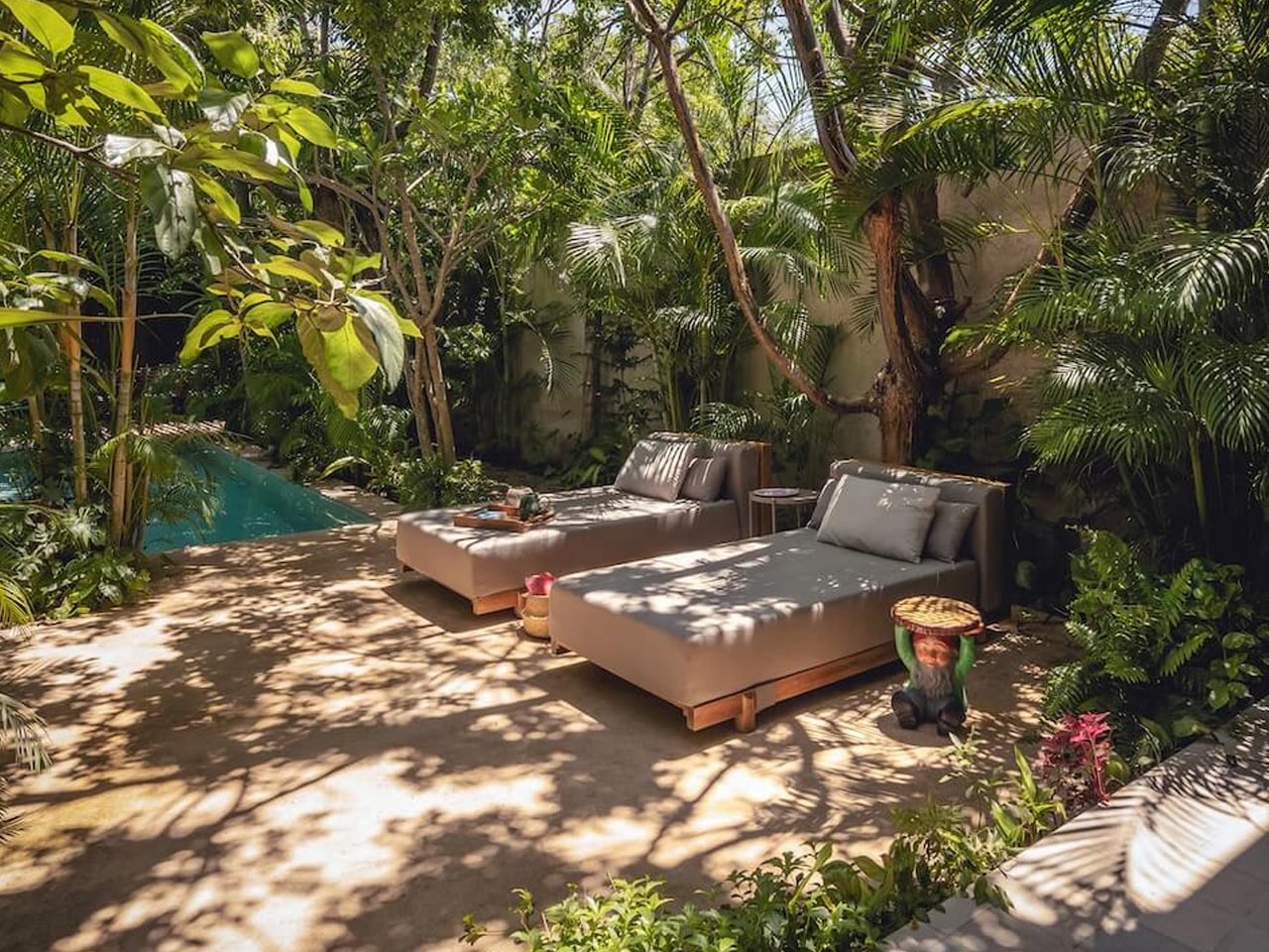
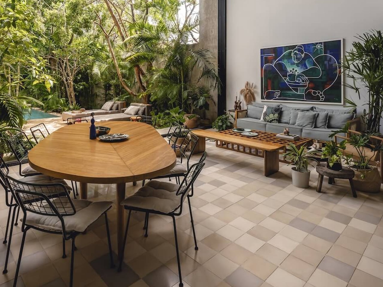
Casa del Loro translates to House of the Parrot. The name alone tells you where the heart of this project lives. Designed by Francisco Bernés Aranda and Fabián Gutiérrez Cetina of Workshop, Diseño y Construcción, the 360-square-meter studio-house sits on the outskirts of Mérida, Yucatán, carved into dense jungle steps away from a crumbling henequen hacienda. The owners’ deep affection for rescued wild birds didn’t just inspire the name — it shaped every architectural decision made.
The firm calls their approach “modern Yucatecan,” a phrase that does a lot of lifting. Contemporary volumes meet traditional regional elements, pulling the structure into a dialogue between what Mérida has always been and what it’s quietly becoming. The result doesn’t feel like architecture dropping into a landscape — it feels grown from one. The narrow, elongated form sequences domestic spaces, open patios, and two large aviaries in a single fluid sweep, letting humans and rescued birds share a roof without either feeling like a guest.
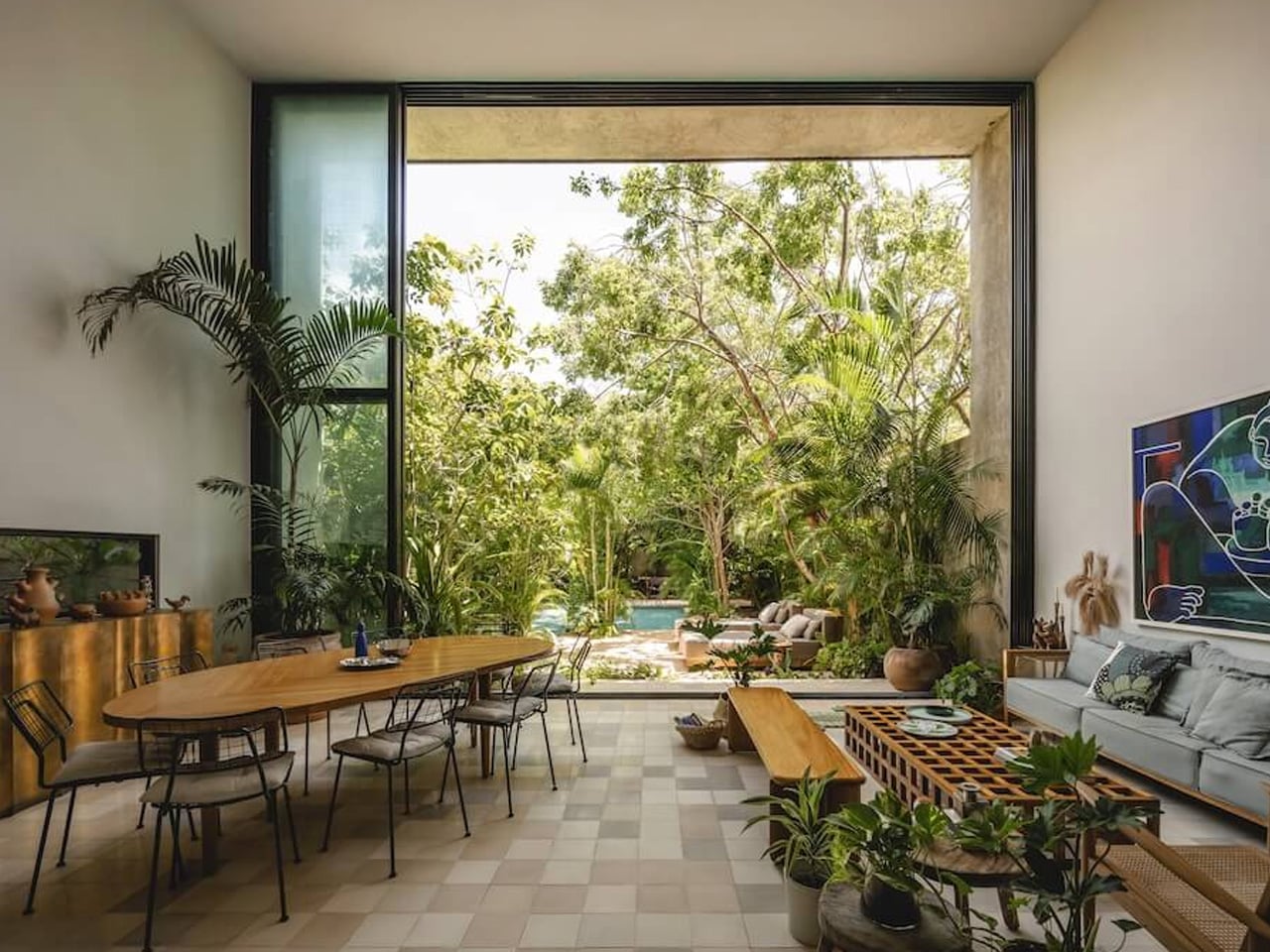
Cross-ventilation was non-negotiable. A clear north-to-south airflow runs throughout the entire property, achieved not through mechanical systems but through deliberate spatial logic — large windows, folding cedar wood doors, and double-height volumes that keep the jungle air moving. The main entrance sets the tone immediately: four cedar wood folding doors open the foyer completely to the entrance garden, dissolving the boundary between inside and out before you’ve even stepped through. It’s a gesture that reads as casual but is anything but.
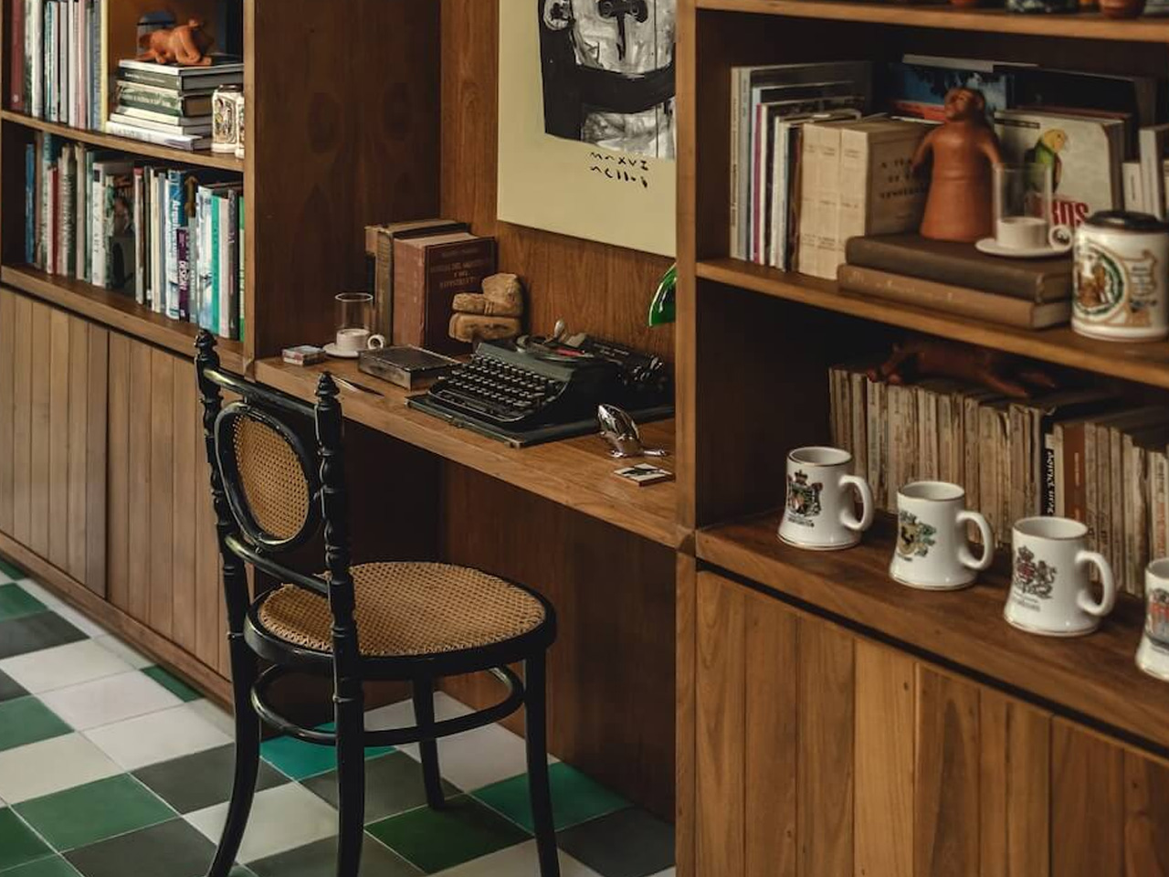
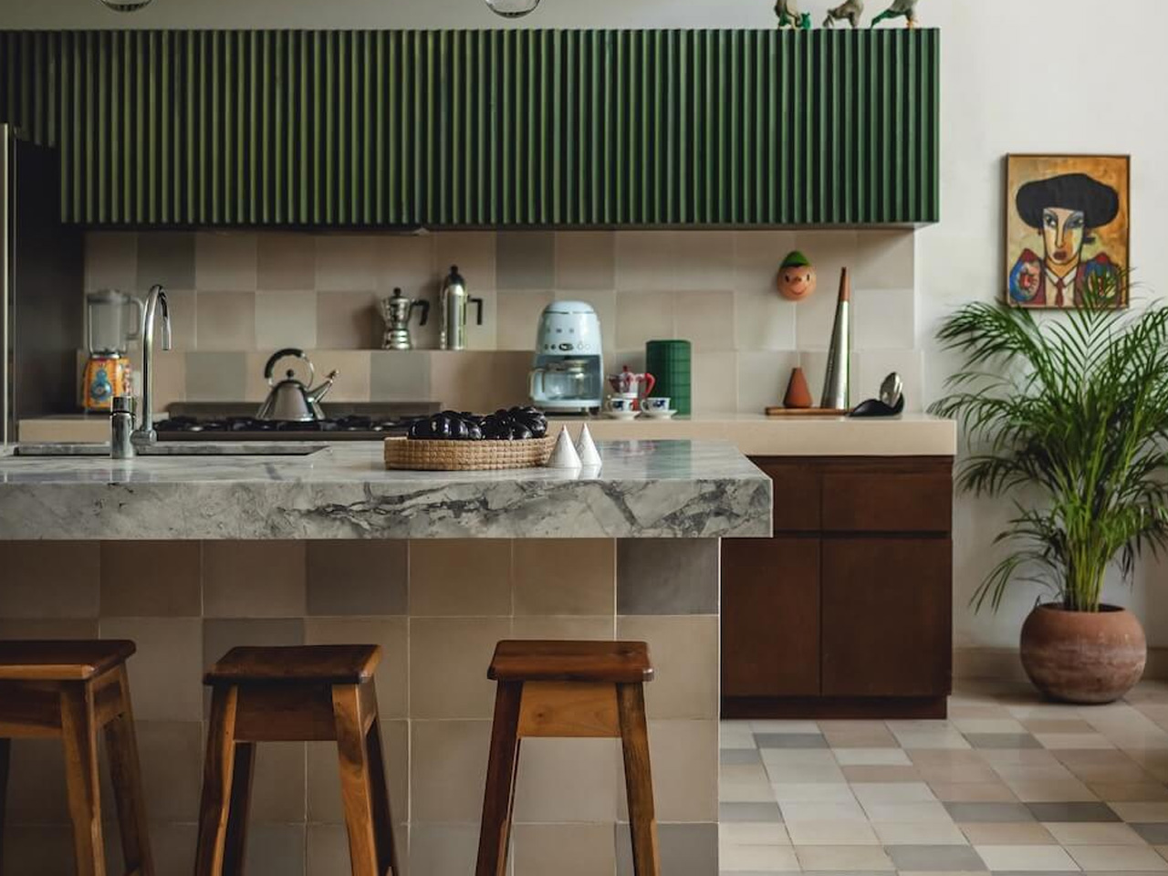
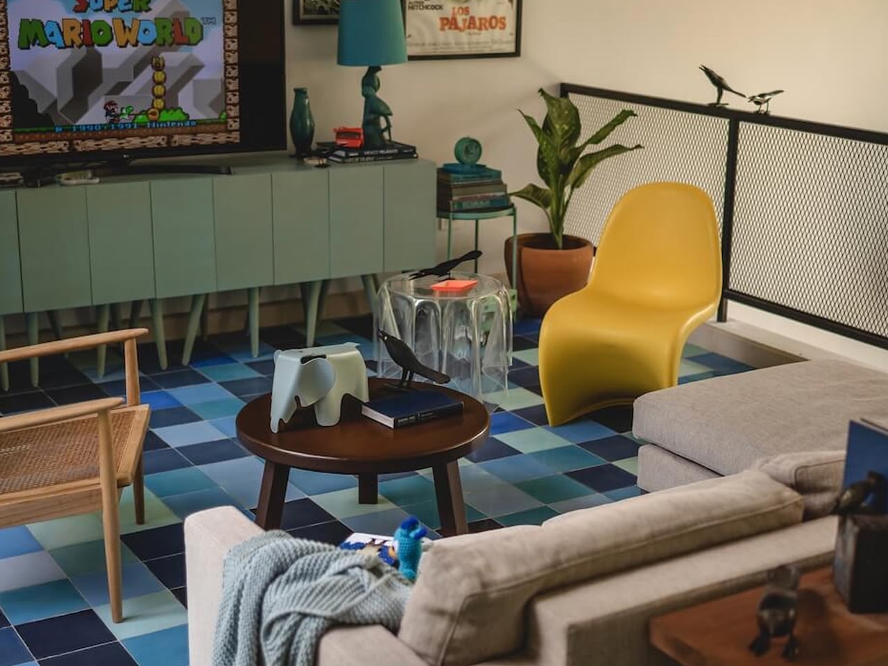
Inside, the curation is just as considered. Antiques, family heirlooms, European design pieces, and locally sourced crafts share walls and shelves without competing. The standout object is a custom tzalam wood bookshelf — a native hardwood — built specifically for the property, holding books alongside objects of personal significance. It’s the kind of detail that keeps a space from feeling like a showroom. The materials throughout — concrete, wood, glass, and metal — carry the same tension between refinement and rawness that defines the best tropical architecture.
Photographed by Manolo R. Solís, Casa del Loro landed on Domus in September 2026, which says something about its reach beyond regional architecture circles. But the project’s real resonance is quieter than press coverage. This is a house that was built around a love for birds, and you feel that — in every open door, every borrowed breeze, every inch of jungle left deliberately intact.
Most of us know the feeling. You pick up your phone to check one notification, and forty-five minutes later you’re three hundred posts deep into content you didn’t choose and can’t remember. It isn’t a willpower problem so much as a design problem. The apps on your phone are built by teams whose entire job is to keep your eyes on the screen a little longer, and they’re very good at it. Screen time limits and app blockers try to fight that with rules, and rules are easy to ignore when nobody’s watching. That’s the real gap. We need something that makes the cost of scrolling feel immediate and personal, not a stat buried in a settings menu.
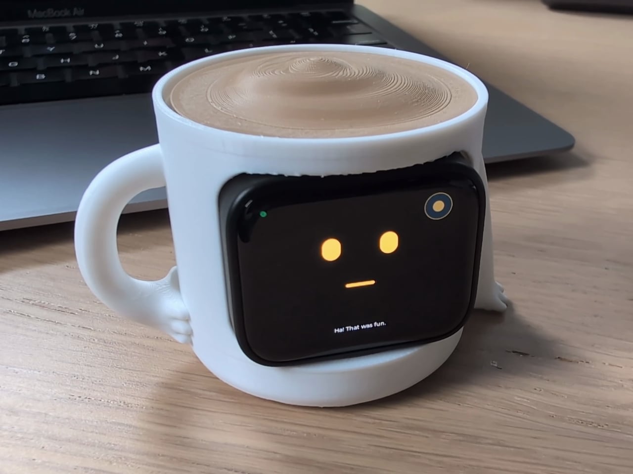
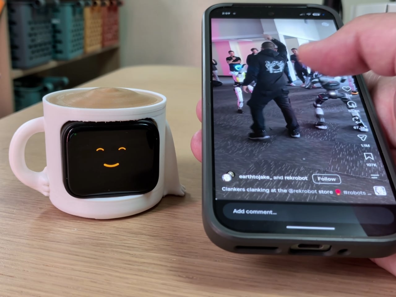
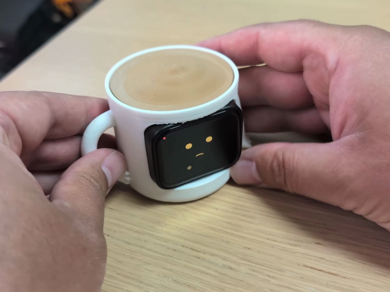
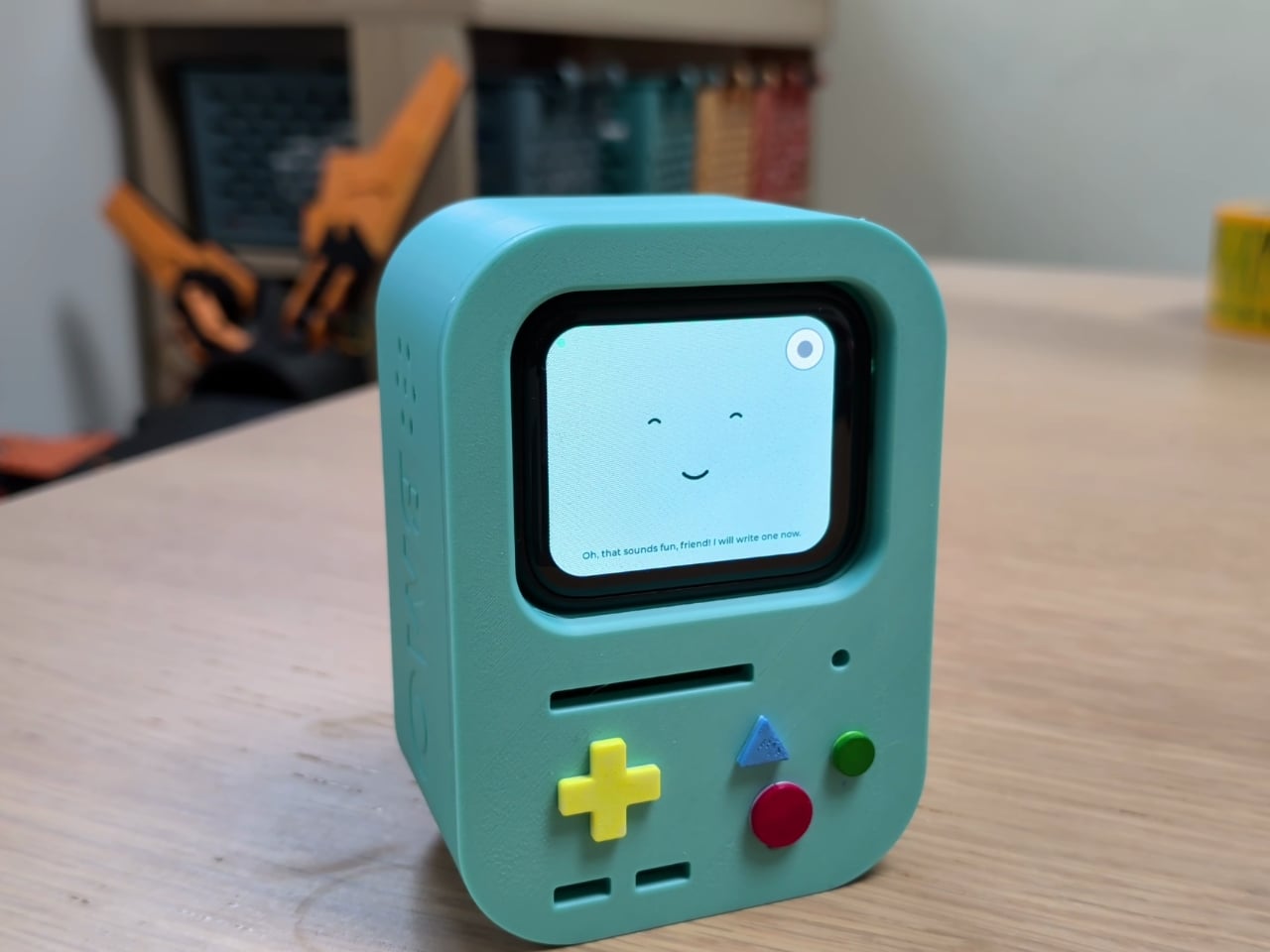
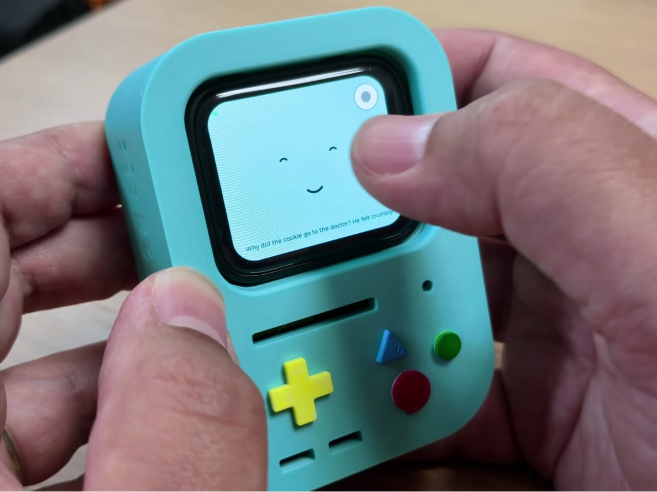
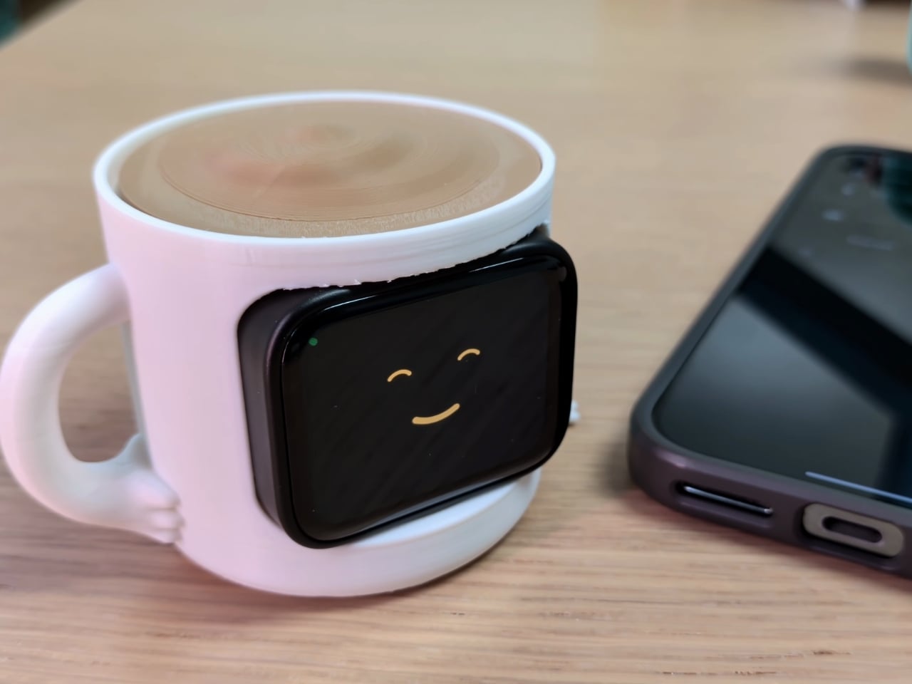
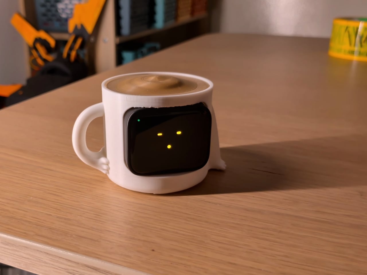
A YouTuber who goes by brenpoly figured out a clever way to do that, and it involves guilt-tripping you with a tiny plastic creature. The project is called PolyMO, and it works like a 90s Tamagotchi with a very different agenda. Feed it, talk to it, keep it company, and it thrives. Doomscroll for too long, and it gets visibly sick. Keep ignoring it, and it can die. If that sounds a little dramatic for a hunk of plastic and code, that’s kind of the point. Nostalgia is doing real emotional labor here, and it works because most of us who grew up with a Tamagotchi still remember the specific guilt of killing one.
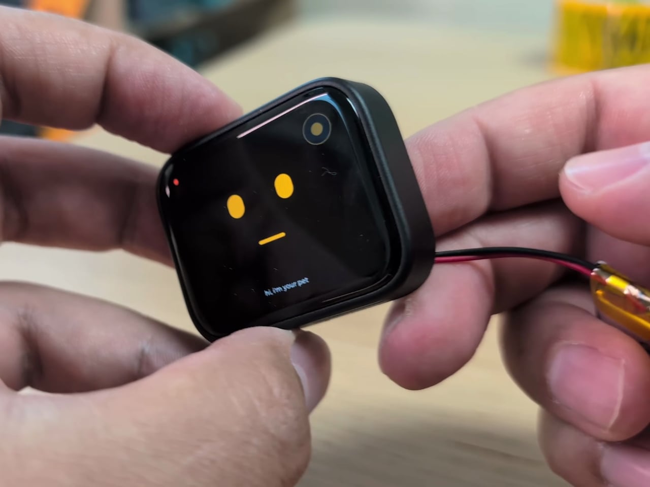
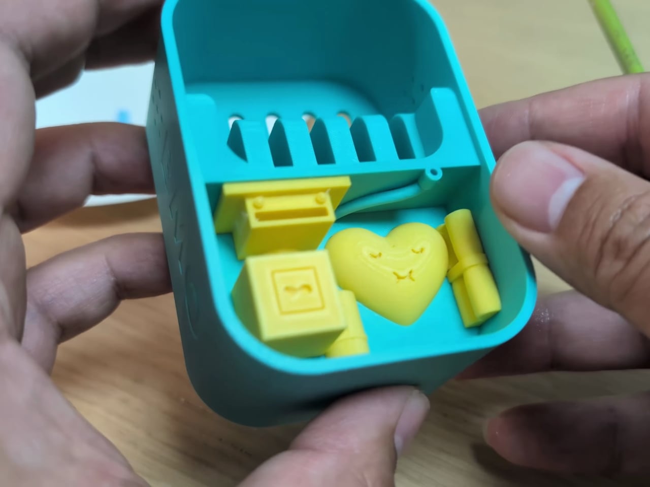
What makes PolyMO worth paying attention to isn’t the emotional trick alone, though. It’s the engineering underneath it. The device runs on a cheap ESP32 board tucked into a friendly 3D-printed shell, paired with an Android phone that handles the heavier computing. Brenpoly calls it a split-brain setup: the phone quietly runs a local language model, a Whisper speech recognition model, and a Piper text-to-speech model, while the ESP32 manages the pet’s face, its animations, and the Bluetooth link between the two. None of it touches a server. Every conversation, every mood swing, every “my tummy feels yucky” moment happens entirely on your own hardware.
That detail matters more than it might seem at first glance. We’ve spent years handing our data to companies in exchange for convenience, often without thinking too hard about where it goes. A project like this refuses that trade entirely. There’s no subscription, no cloud account, no company harvesting your screen habits to sell you something later. You build it once, for around fifty dollars in parts, and it belongs to you in the fullest sense of that word.
The personality layer is where it gets genuinely charming. You can pick from a handful of pet moods, set quiet hours so it isn’t nagging you at 2 a.m., and even flip on a dark mode for the display. It’s a small, playful layer on top of something that’s actually addressing a real problem, and that balance is hard to get right. Too preachy and people abandon it in a drawer. Too cute and it does nothing. PolyMO seems to land in between, closer to a companion than a scold.
I don’t think a virtual pet is going to single-handedly fix anyone’s relationship with their phone, and brenpoly doesn’t claim that either. He’s been open about the fact that this comes on the heels of real conversations about social media addiction, including recent lawsuits that put the industry’s design choices under a spotlight. A device like this isn’t a cure. It’s friction, and sometimes friction is exactly what a habit needs to break.
What I appreciate most is that the whole thing is open source. Brenpoly posted the build files, the code, and the assembly steps on GitHub, so anyone with a soldering iron and a free weekend can make their own version, or tweak it into something better. That’s a very different model from the apps we’re trying to escape, where the incentive is always to keep you inside a walled garden. PolyMO hands you the keys instead. It’s a strange kind of comfort, being kept honest by something smaller than your hand and dumber than your phone. But maybe that’s exactly why it works.