Every lamp in your home is tethered to a wall. Most of us have made peace with that, tucking cords under rugs, running them behind furniture, pretending they aren’t there. We’ve accepted the cord as the price of light. But Gantri and Ammunition just launched something that makes you realize how much quiet compromise we’ve been living with.
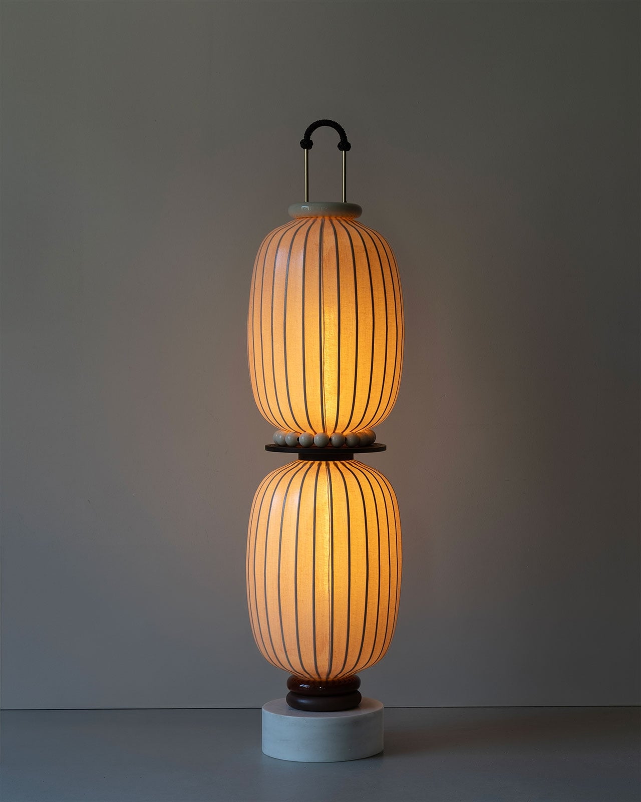
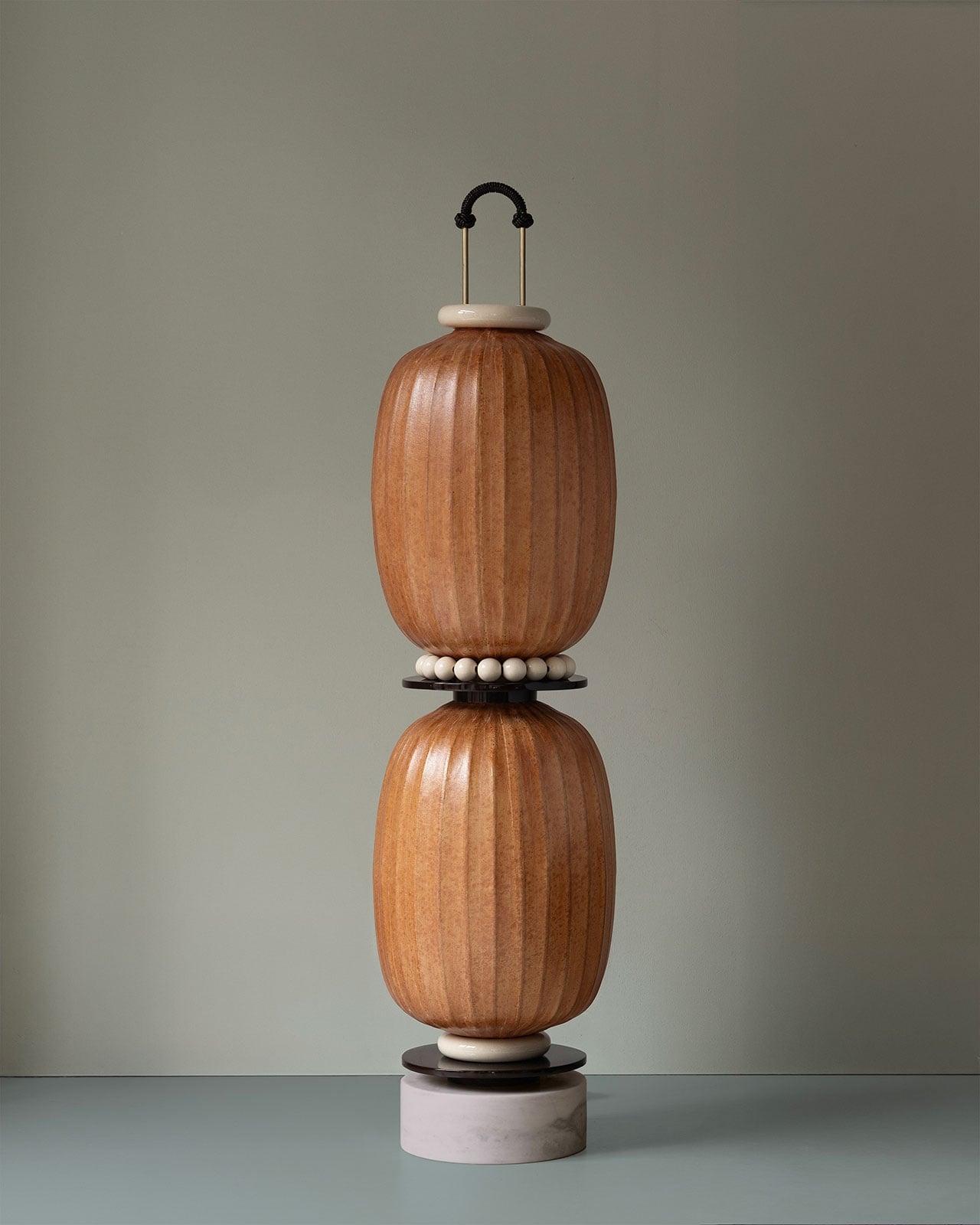
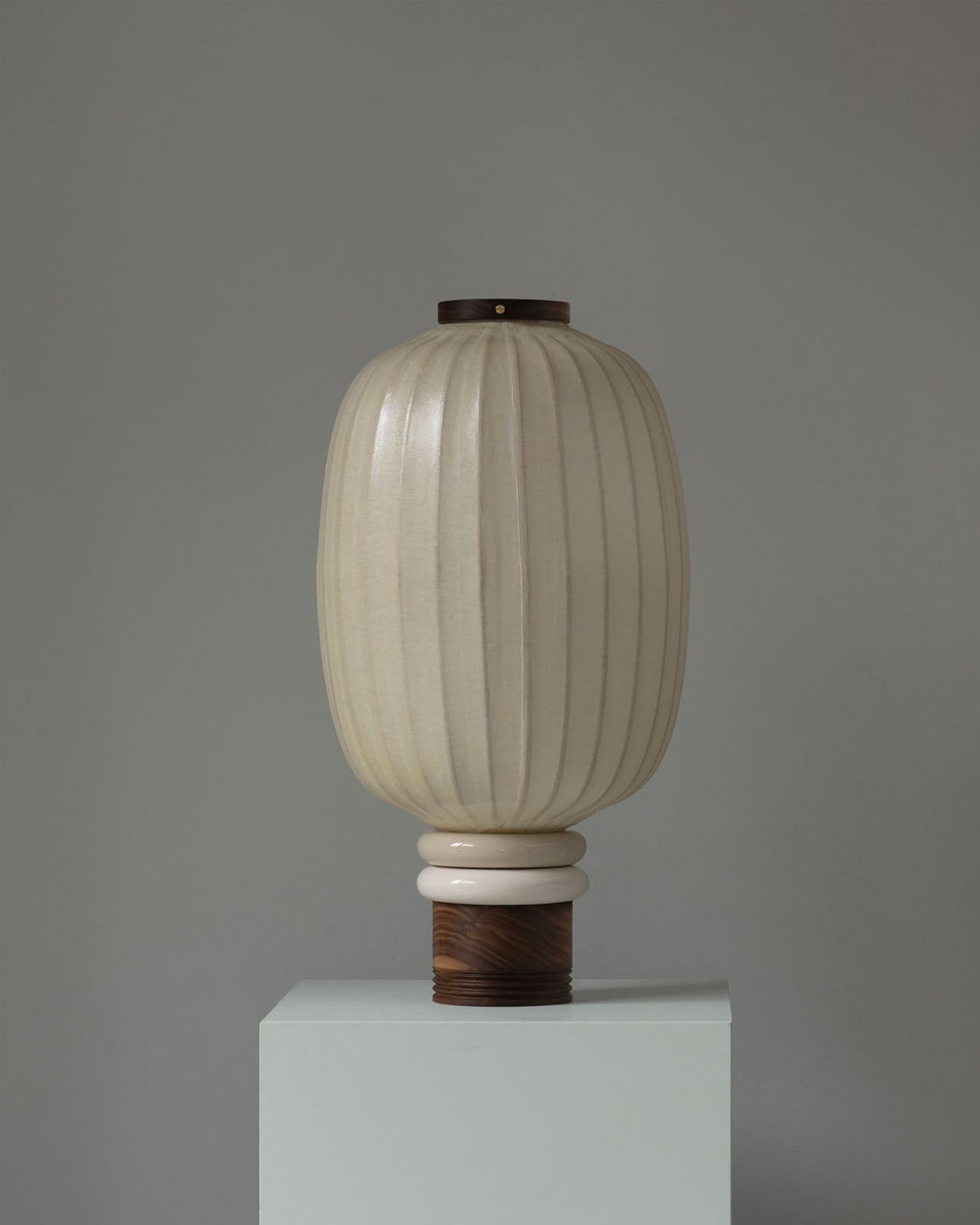
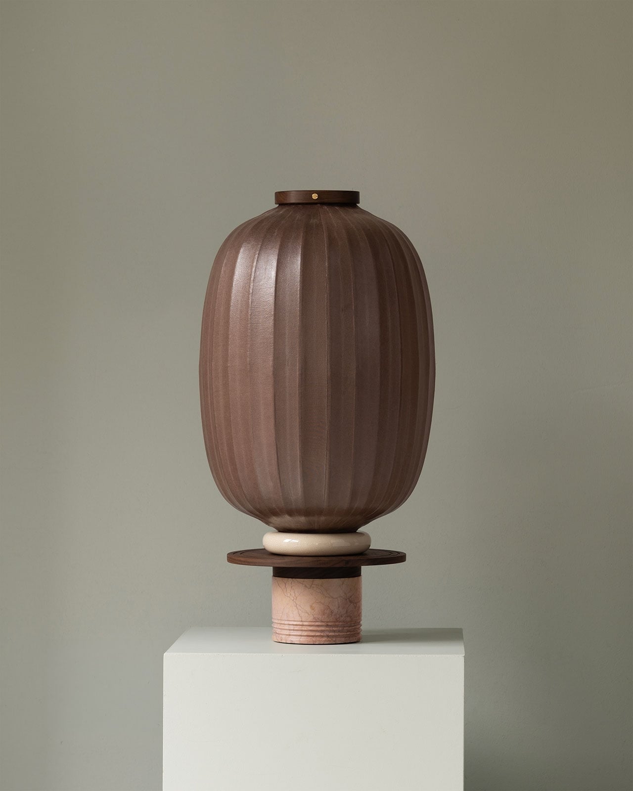
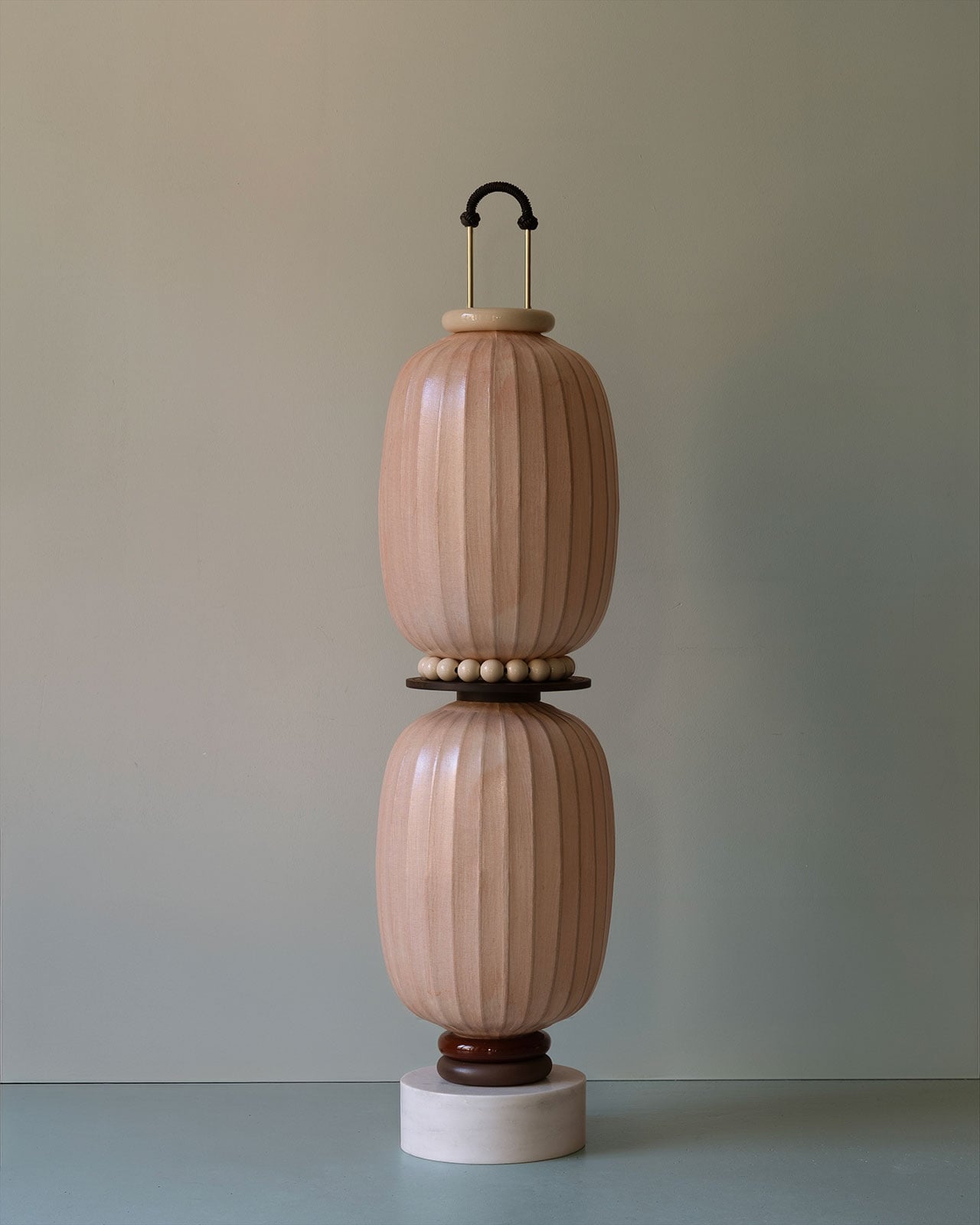
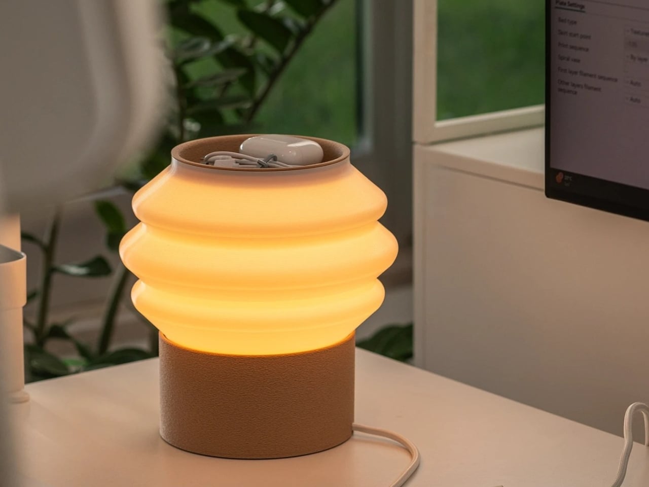
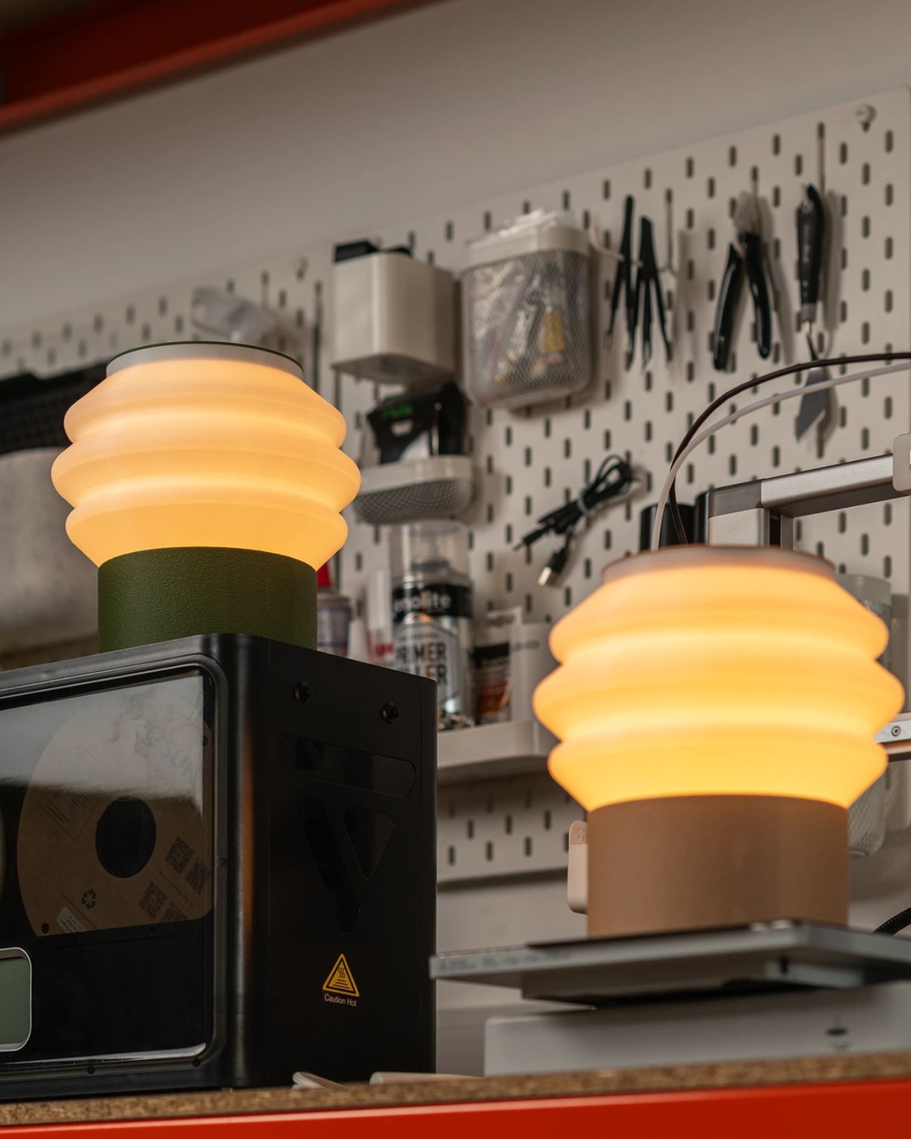
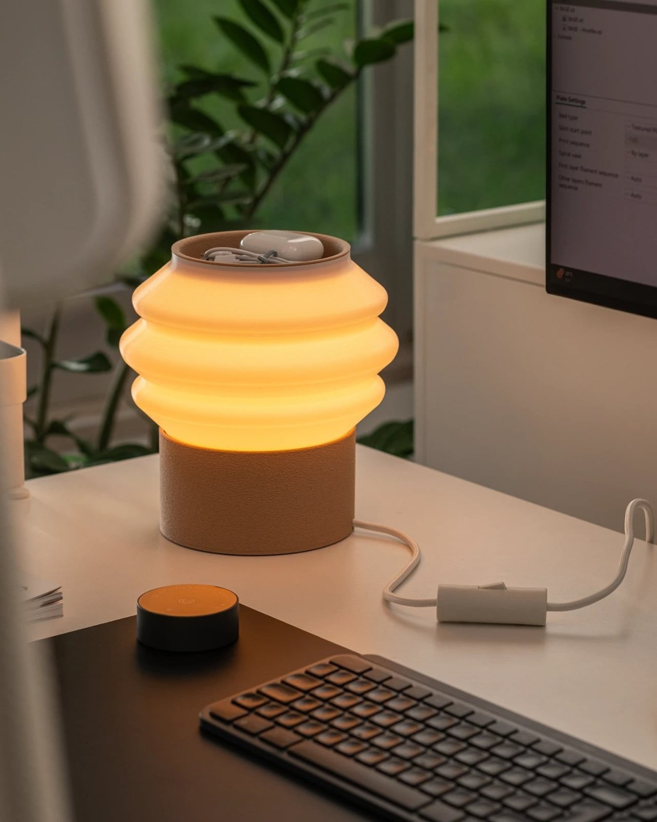
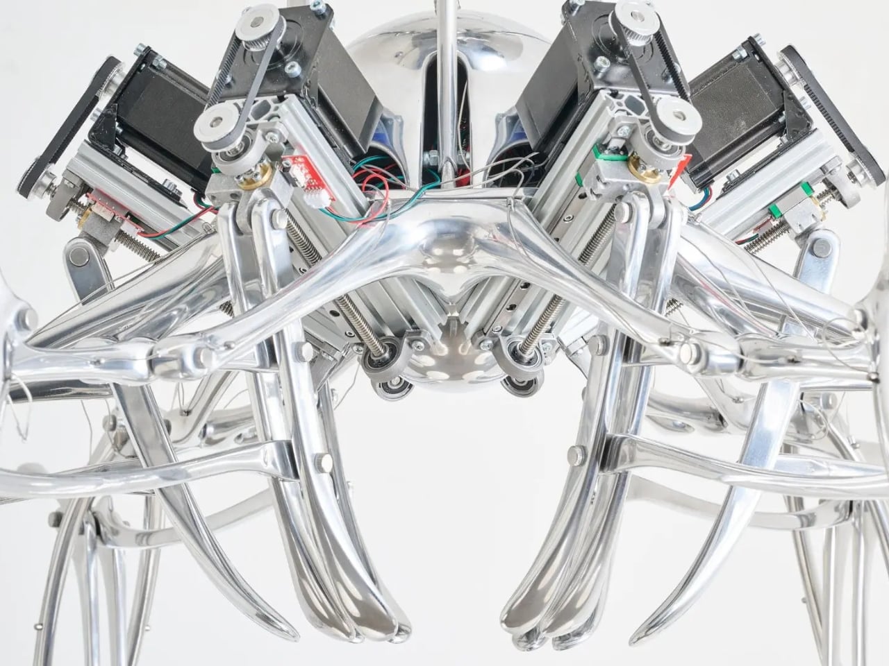
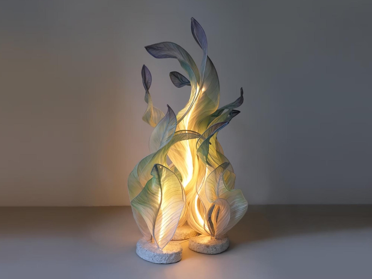
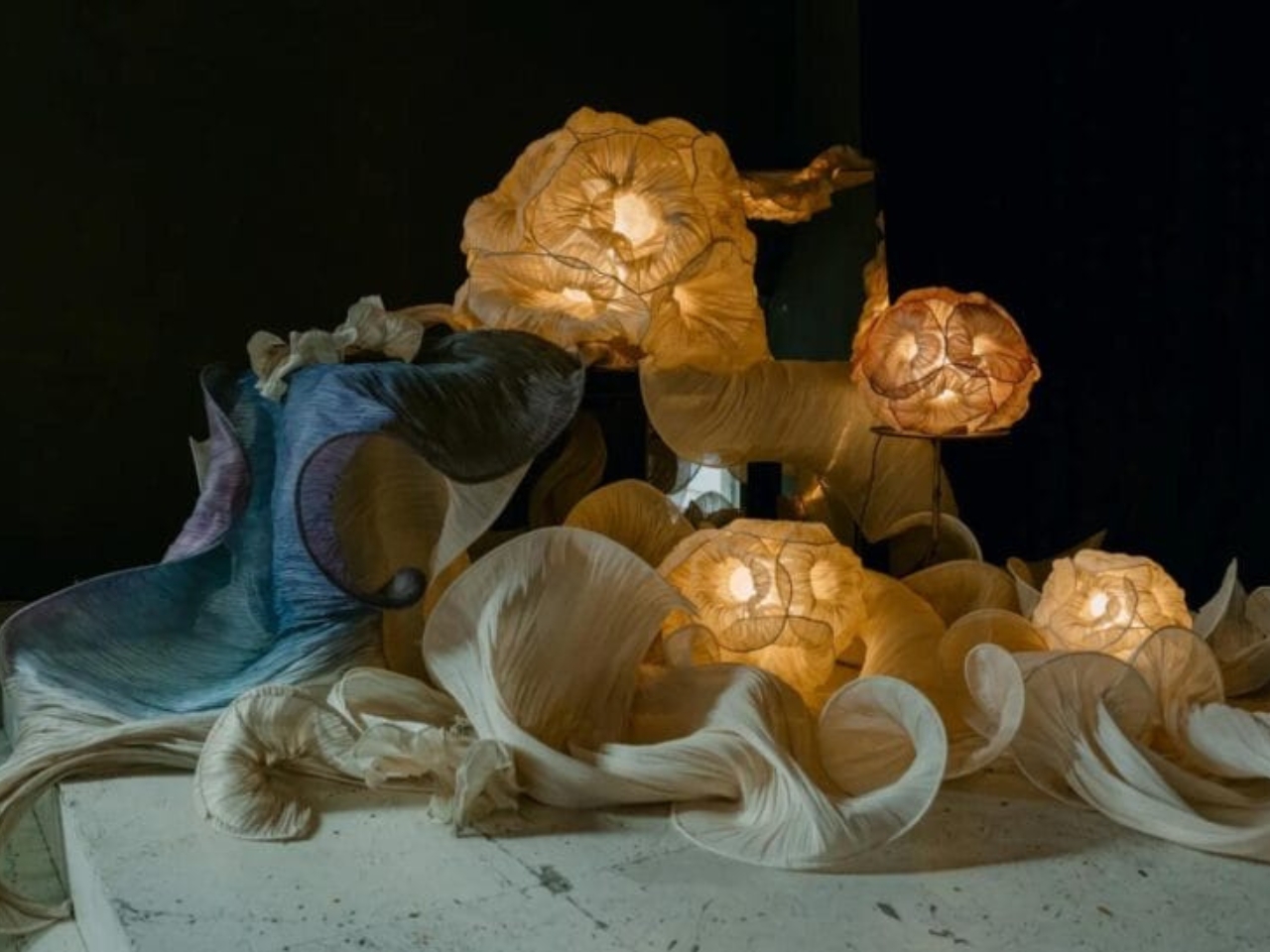
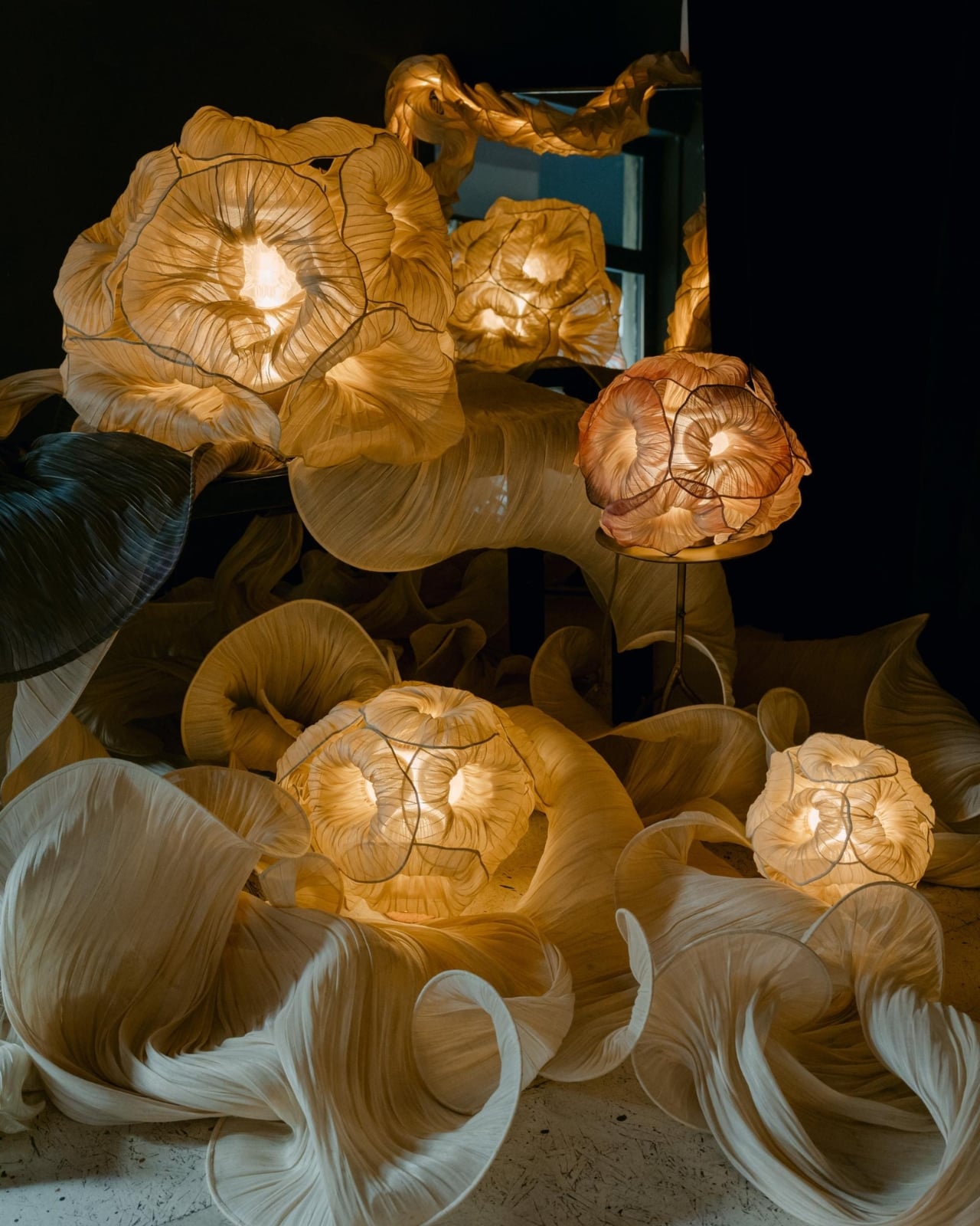
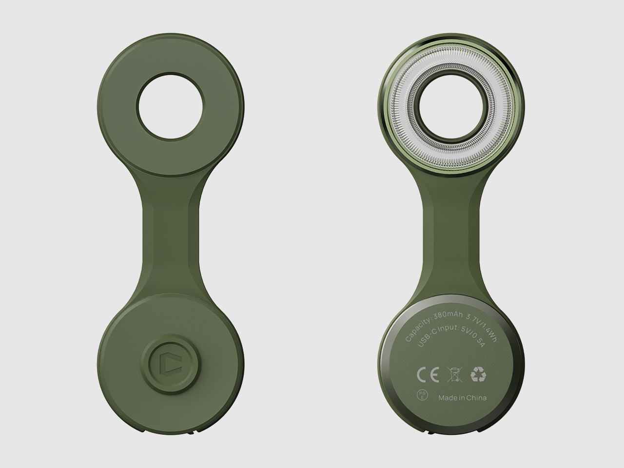
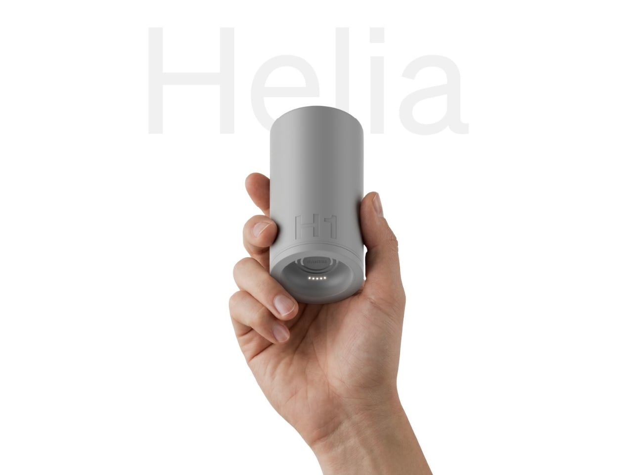
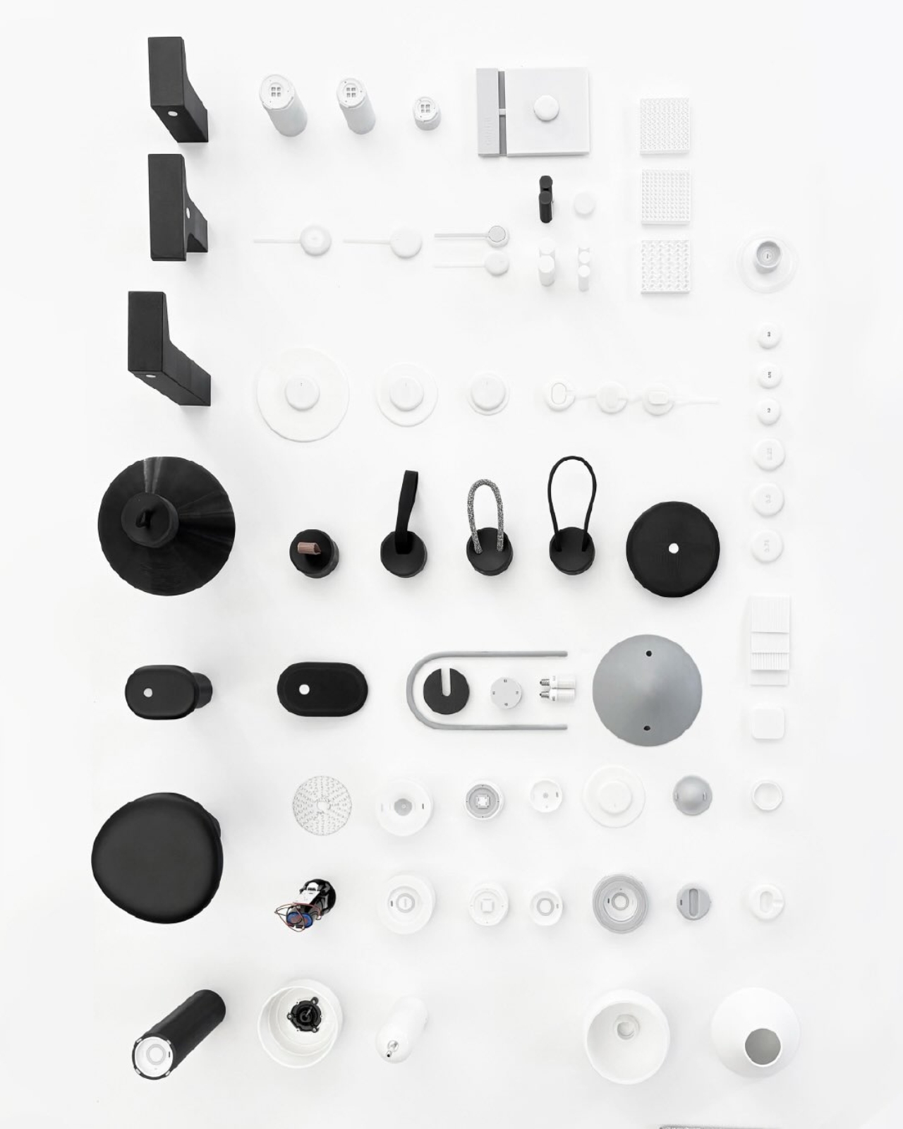
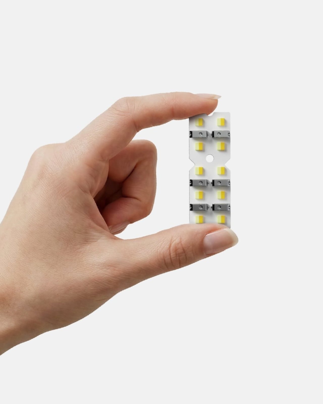
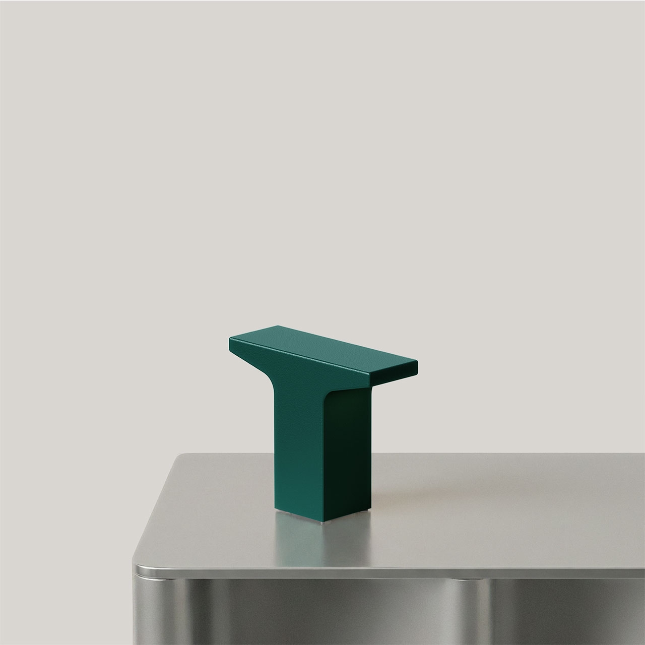
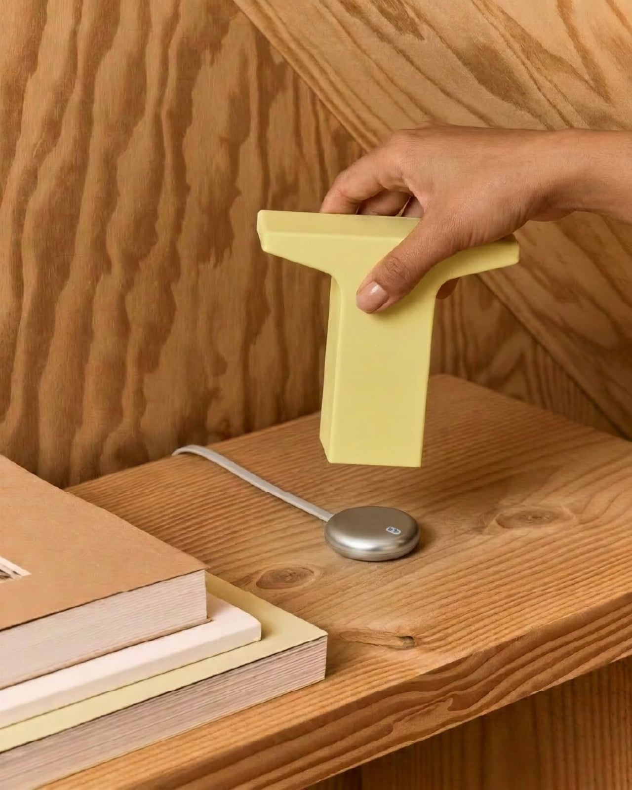
Helia is Gantri’s new wireless lighting platform, designed in collaboration with Ammunition, the San Francisco studio behind some of the most considered product design of the last decade. What makes Helia more interesting than your average rechargeable lamp is that it isn’t a product, it’s an architecture. A shared internal system that lives inside every light in the collection: a battery, customizable LED modules, a touch-sensitive control board, and a charging puck. The whole thing is modular, meaning the same technological core can be wrapped in an entirely different shell and still belong to the same family. Achille Biteau, director of industrial design at Ammunition, put it plainly: “all of a sudden you have that same platform that can be used on a range of designs. It could be in the hundreds or the thousands of designs.”
Designer: Gantri x Ammunition
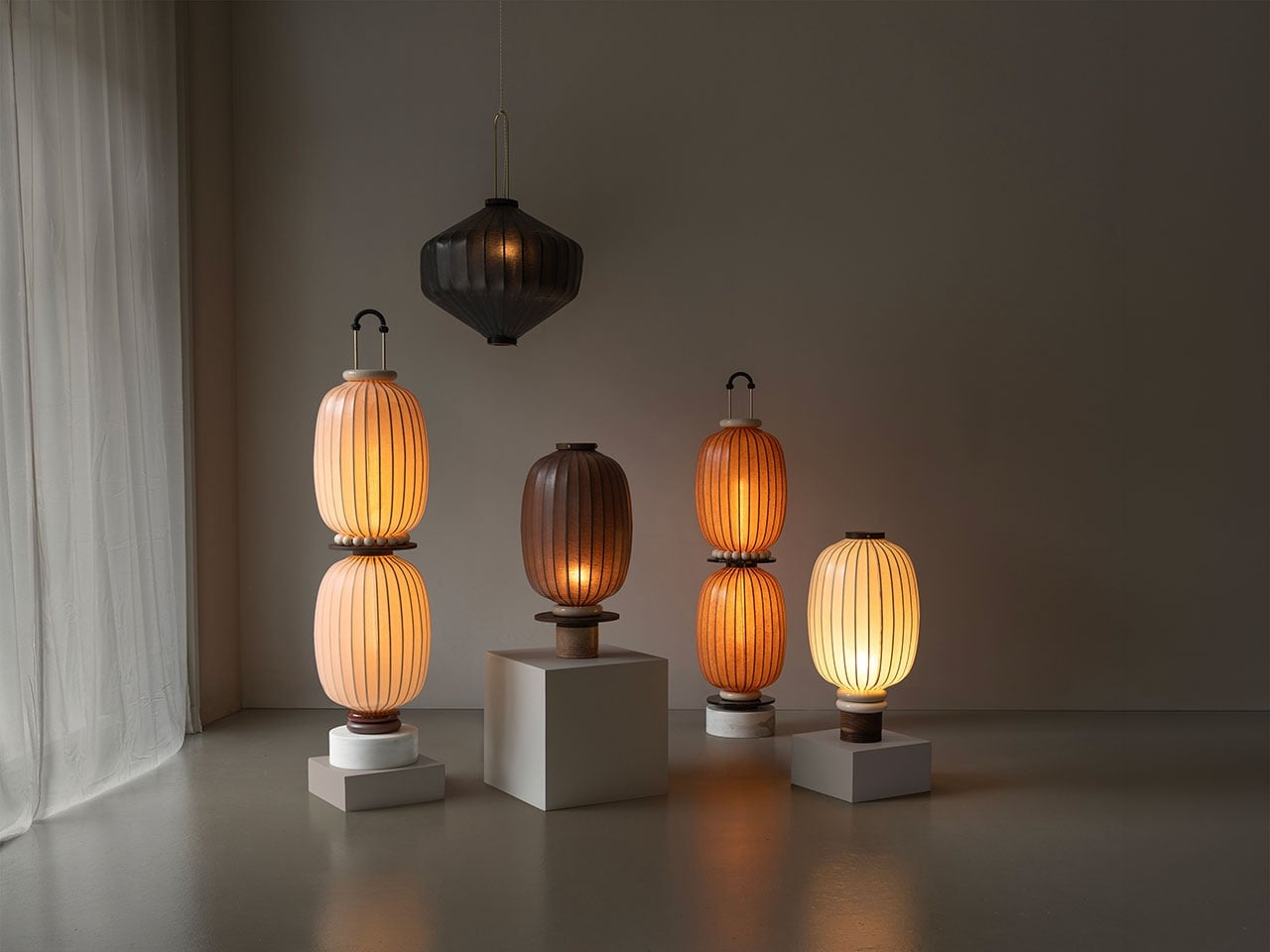
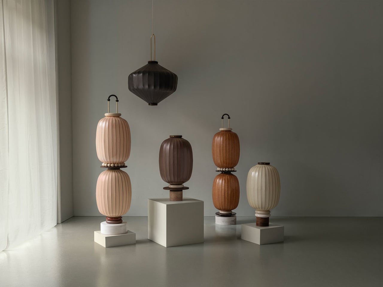
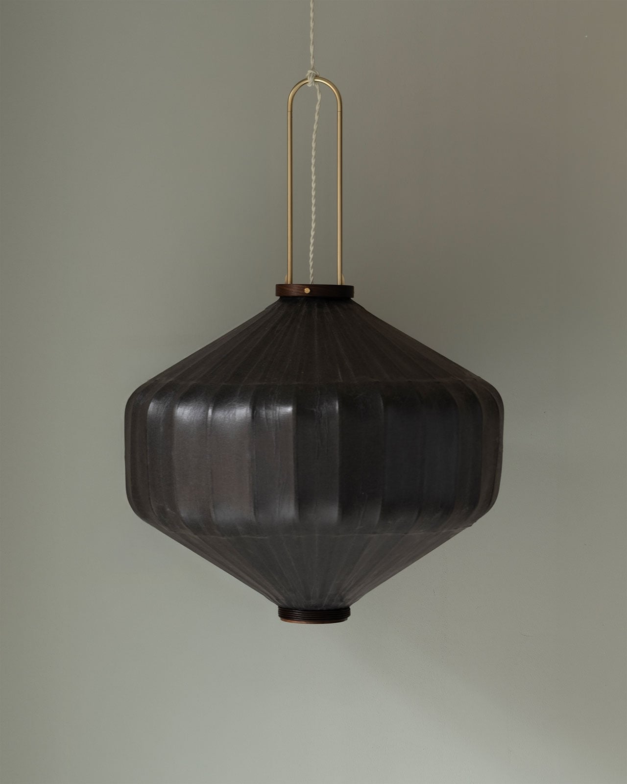
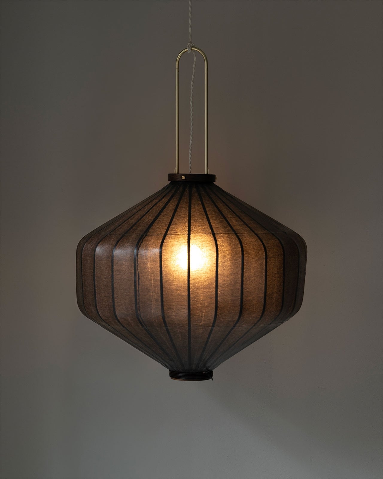
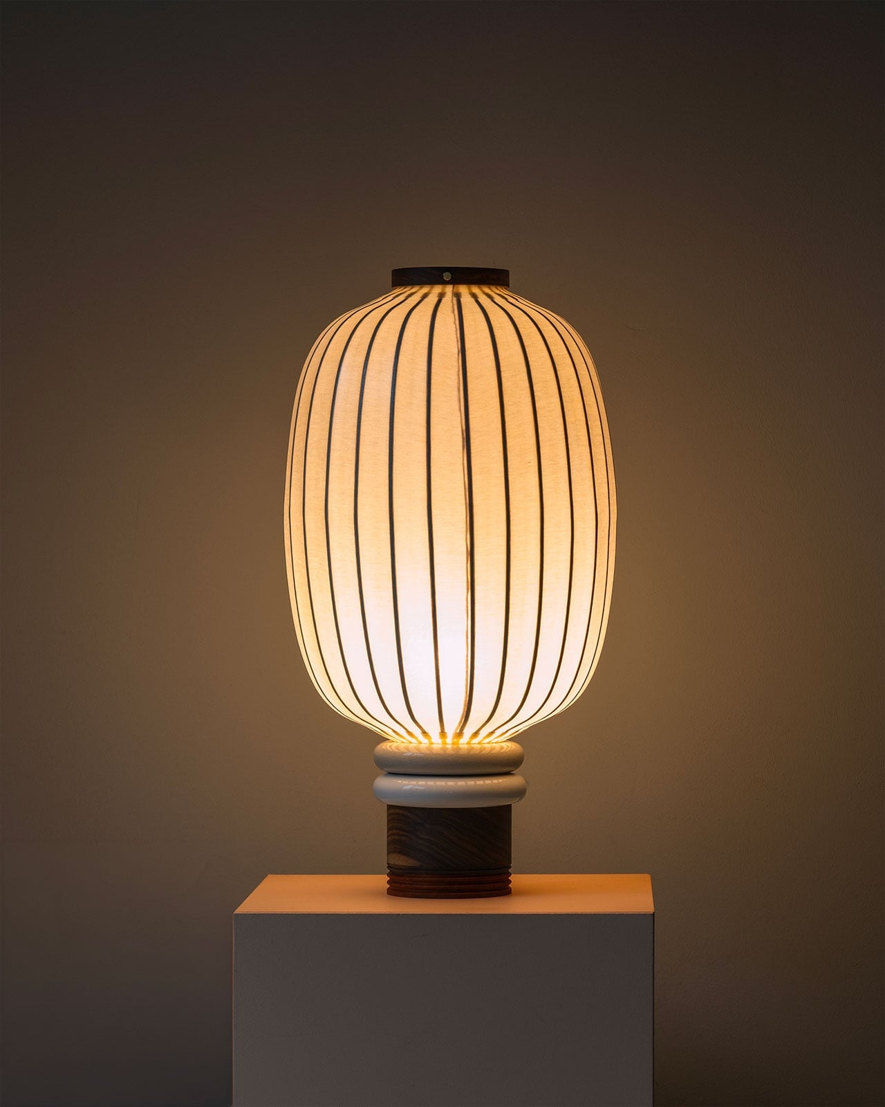
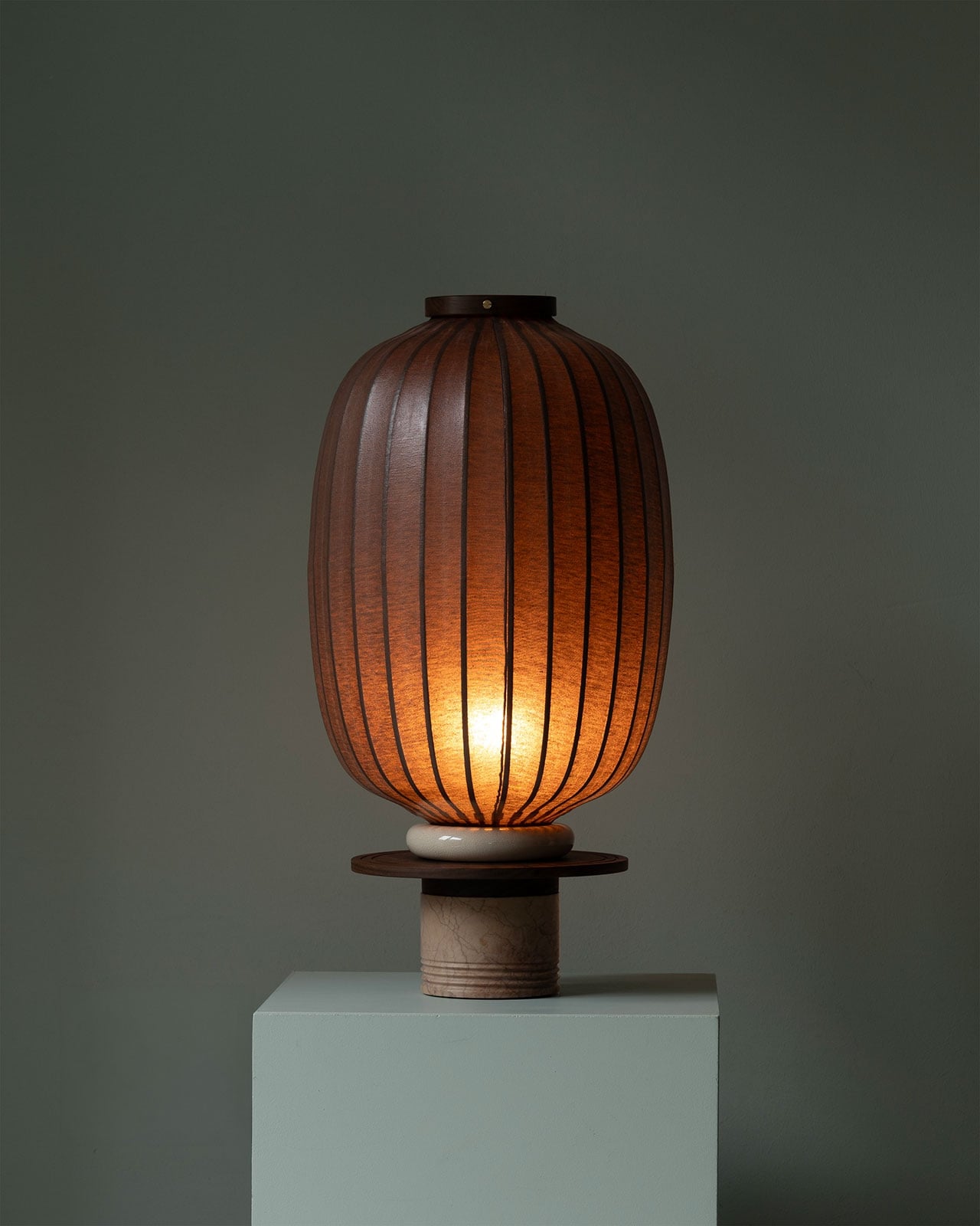
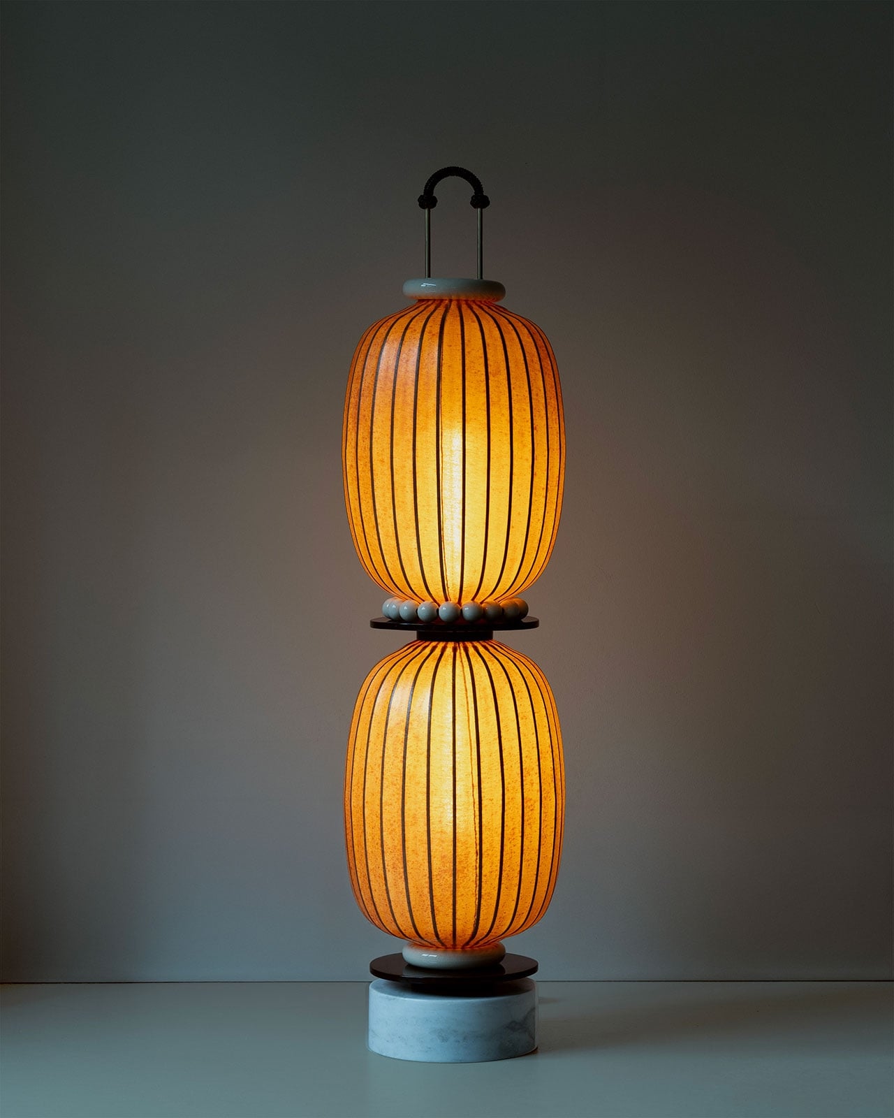
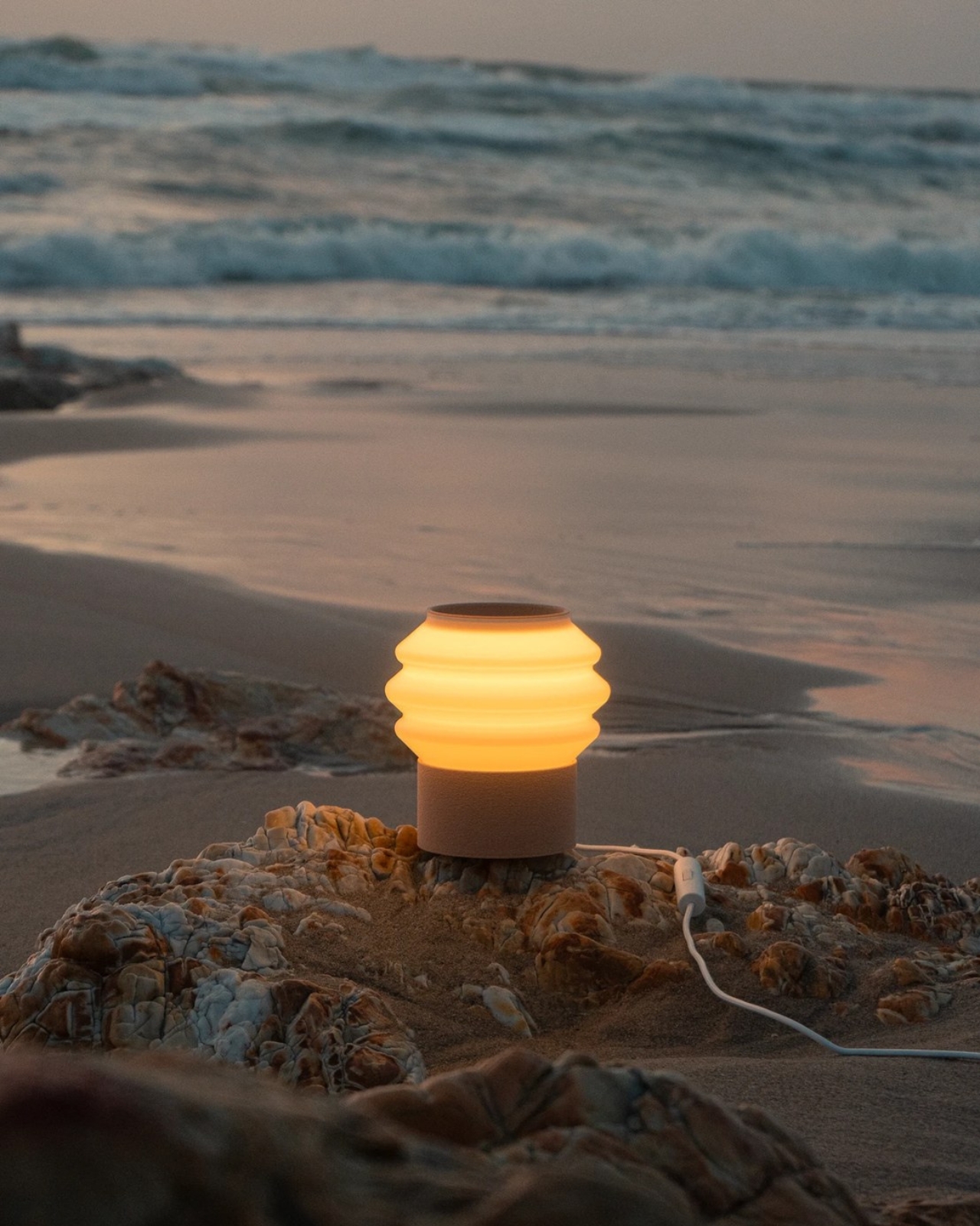
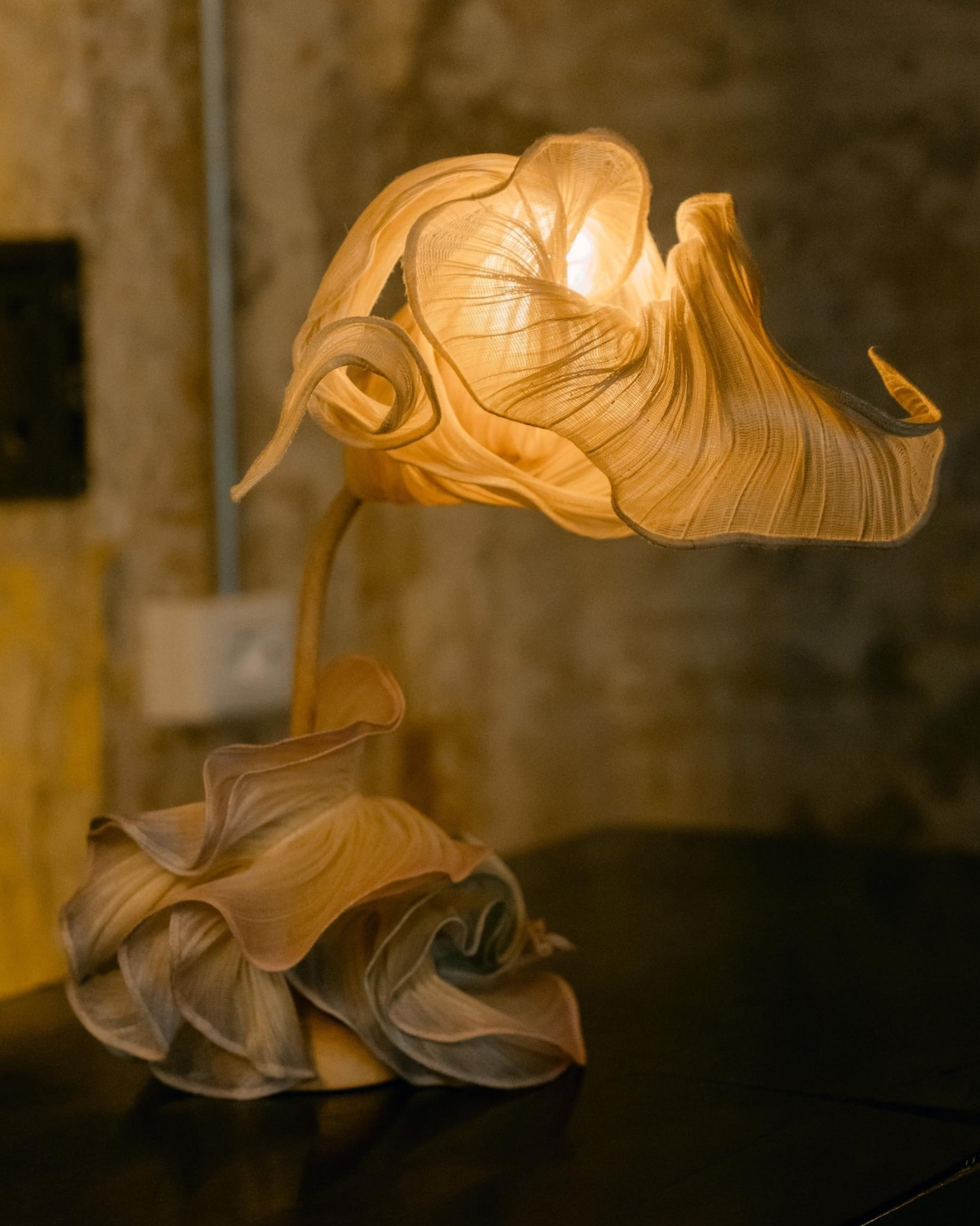
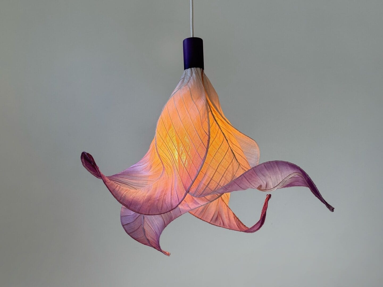
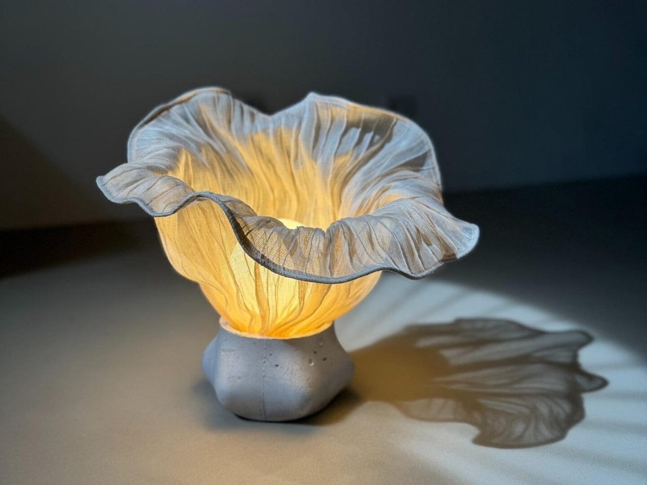
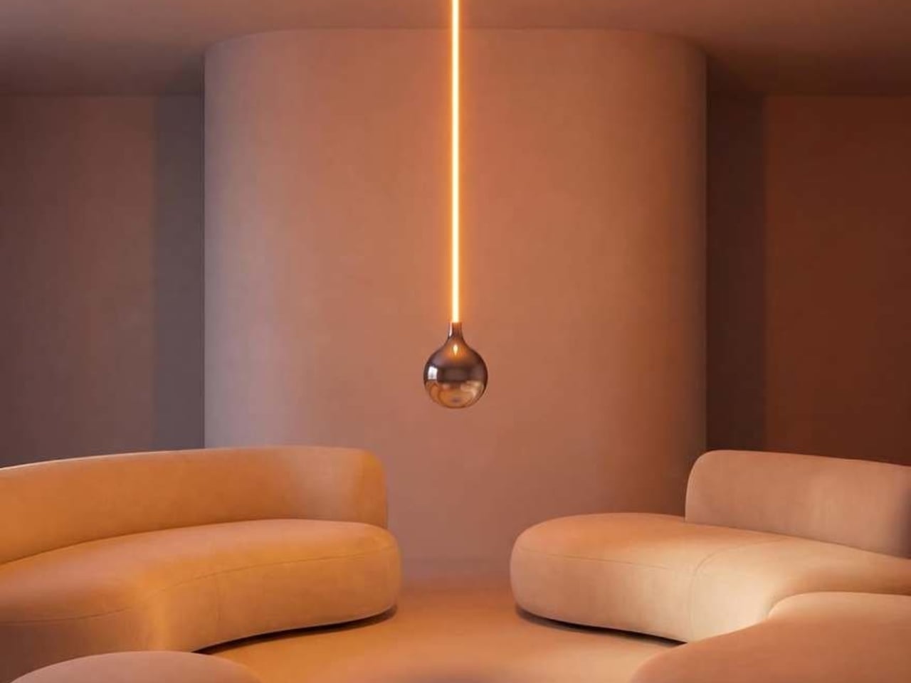
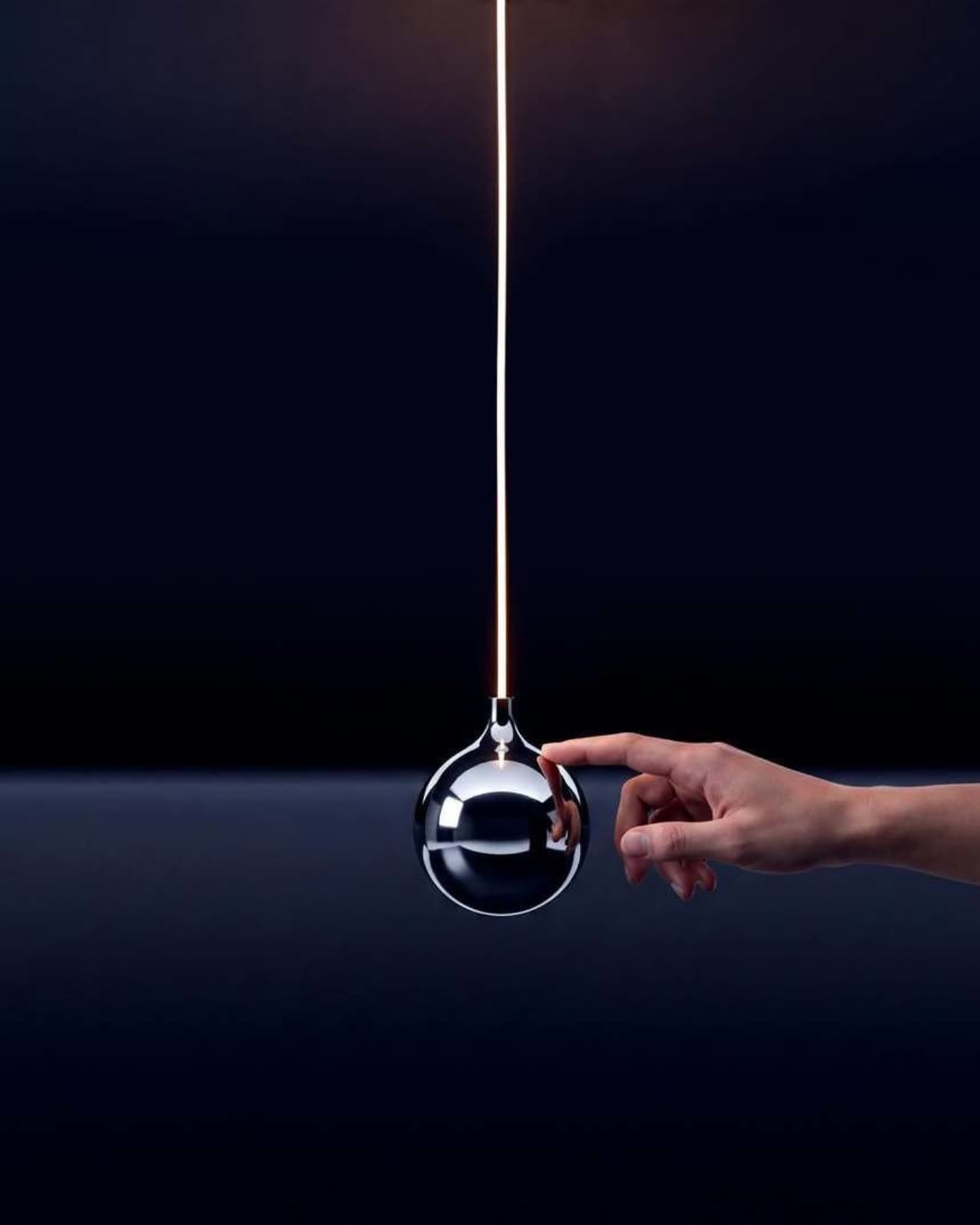
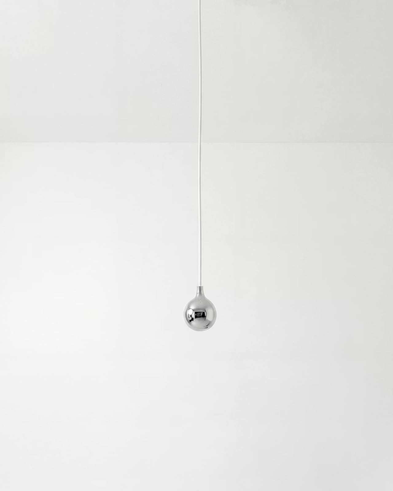
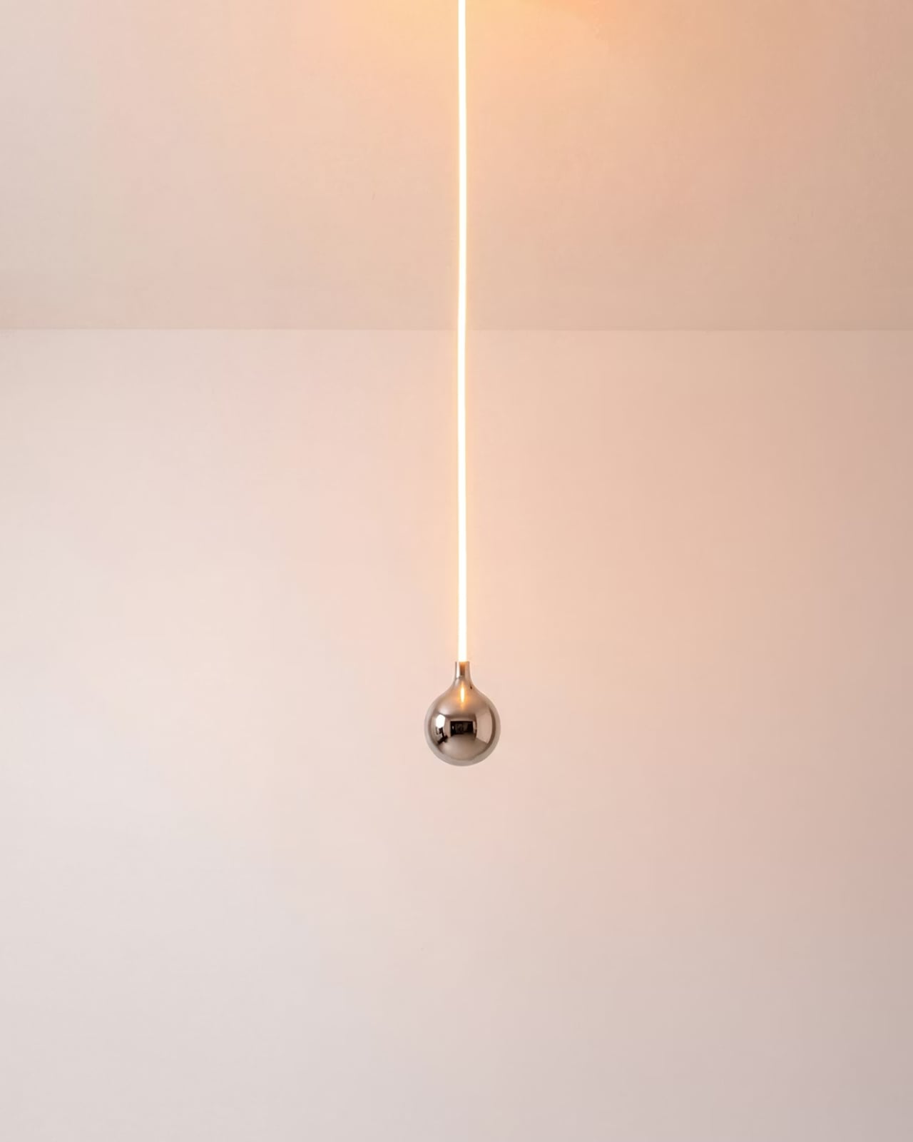
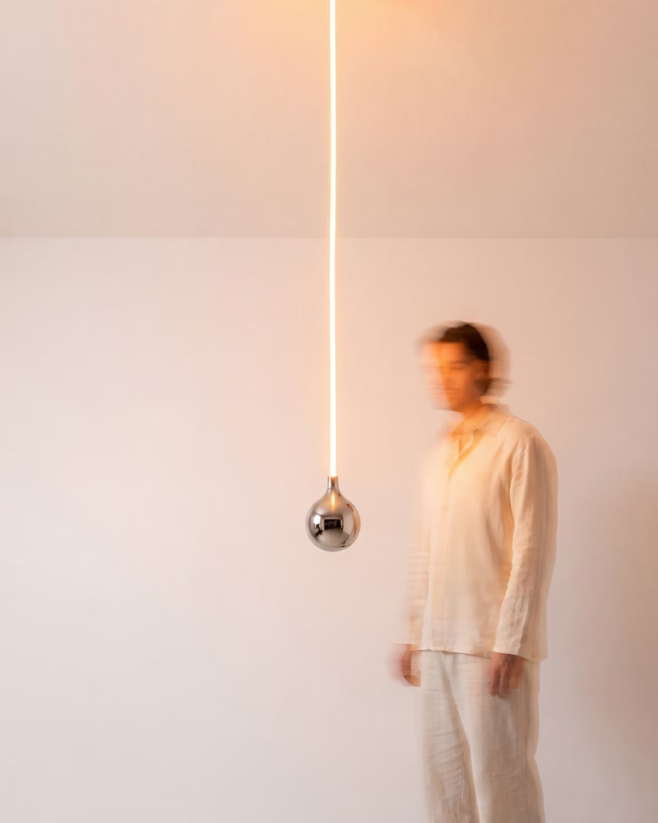
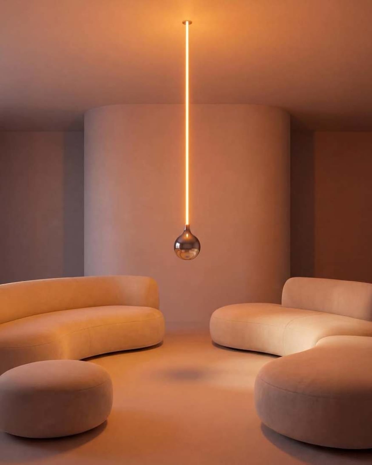
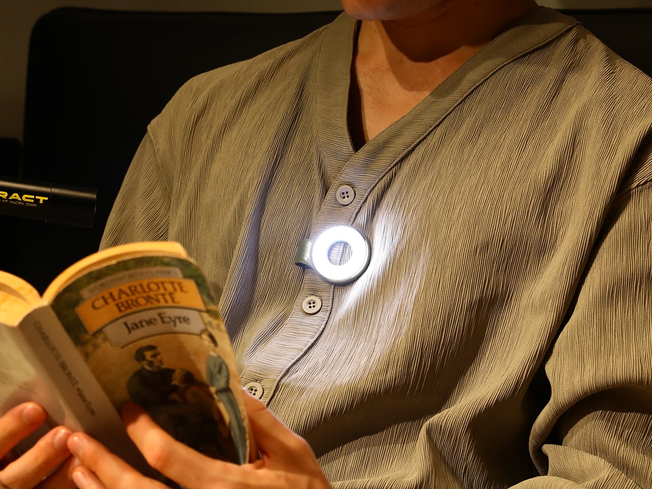
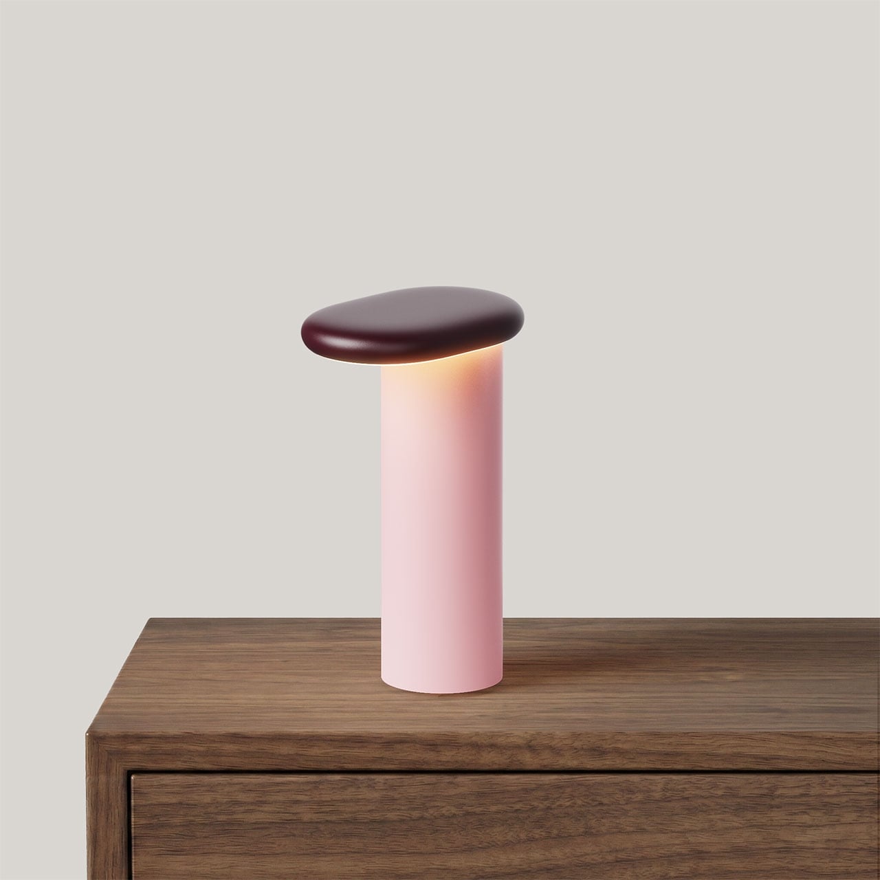
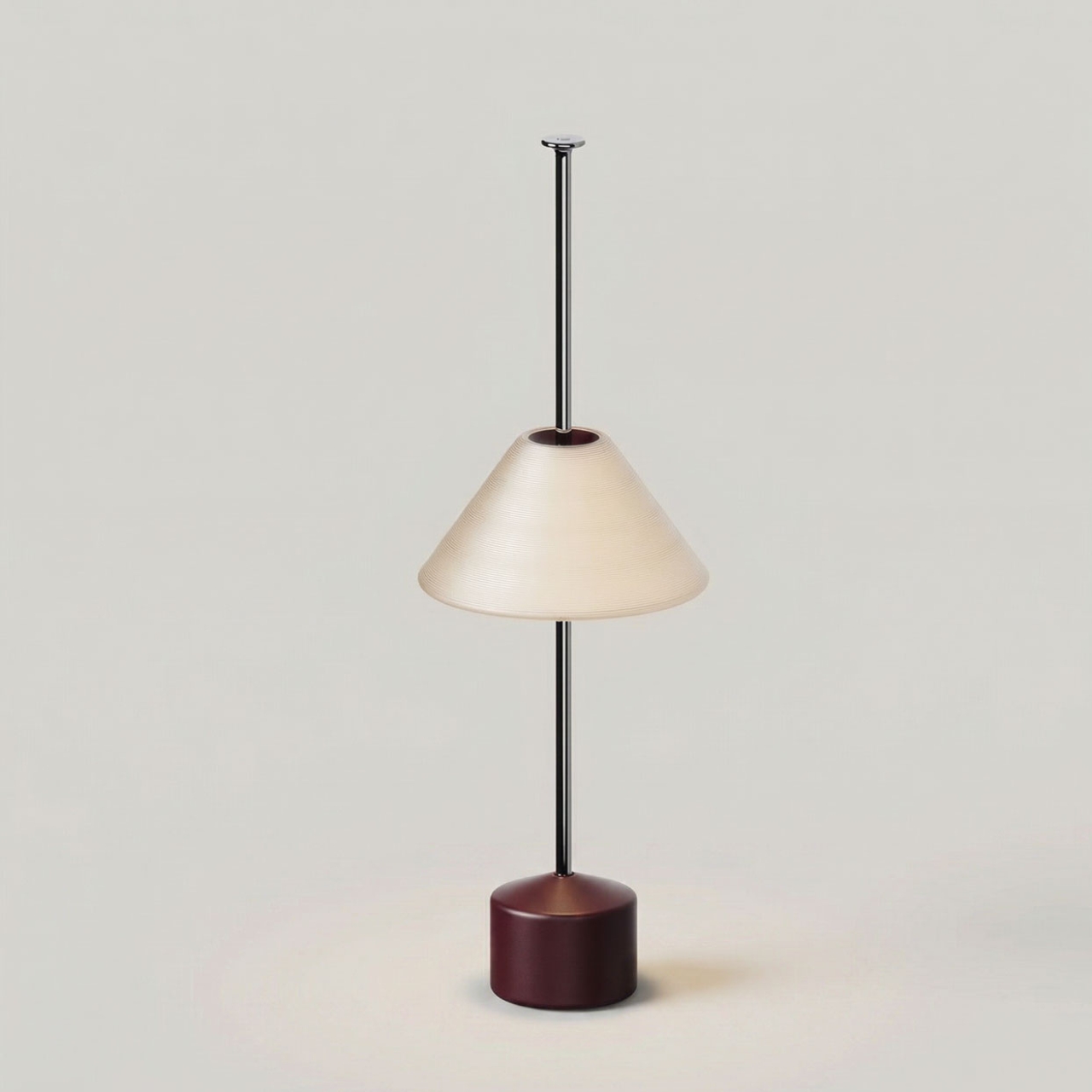
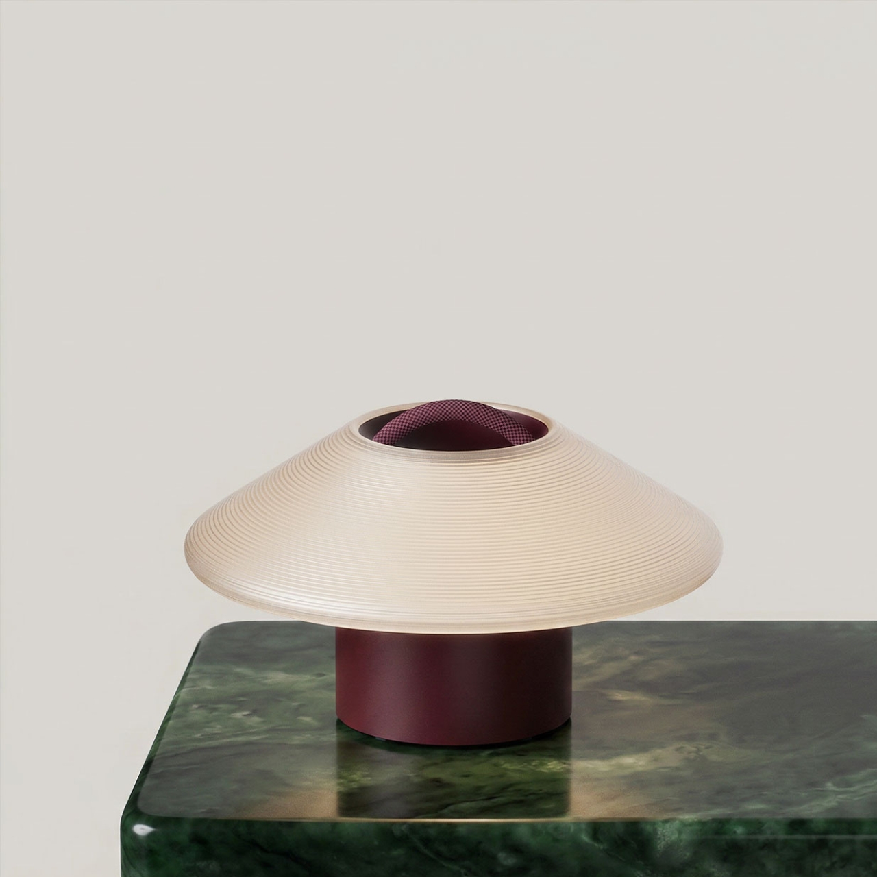
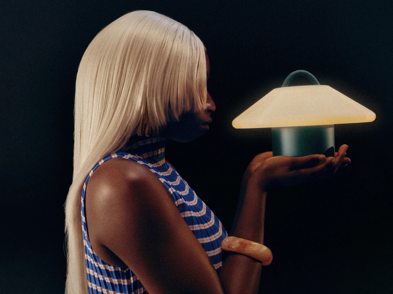
The practical result is a collection of lights that sit on small polished stainless steel charging pucks, lift off with a single gesture, and go wherever you need them. Beside the bed, across the room, out to the patio, onto the dining table. No unplugging. No relocating a power strip. Just pick it up and go. The interaction is so simple it almost feels obvious, which is usually the sign that something was designed very carefully.
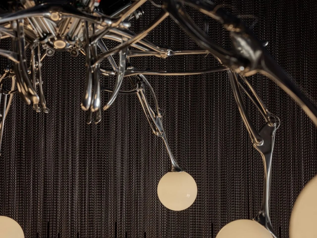
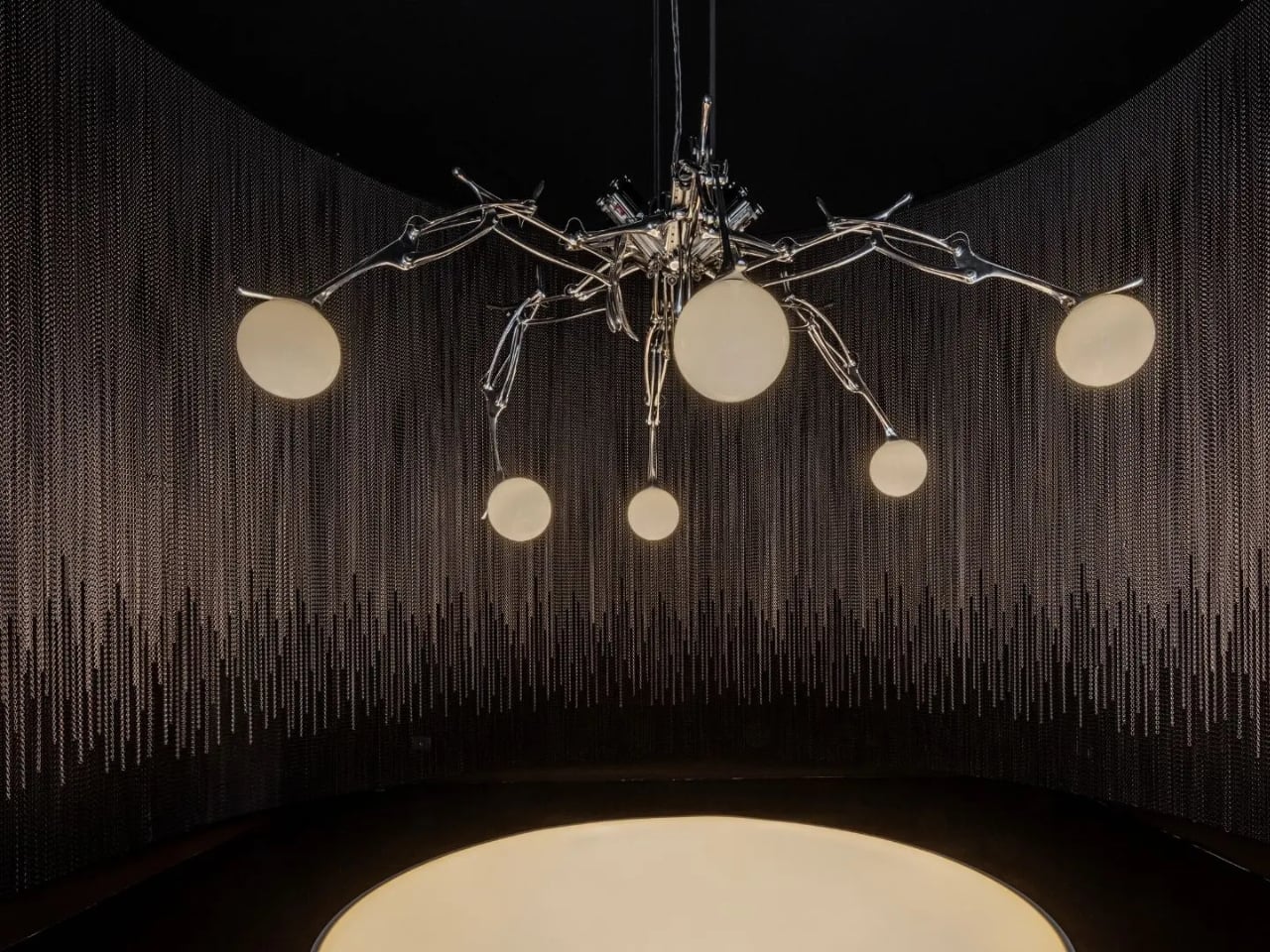
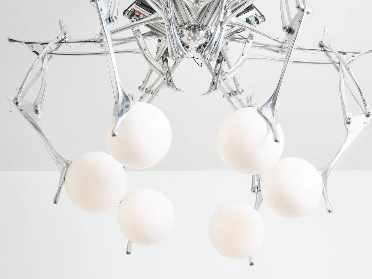
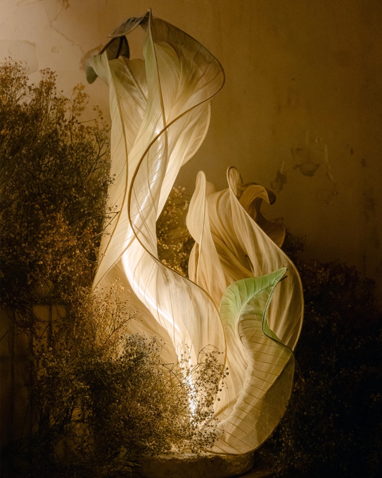
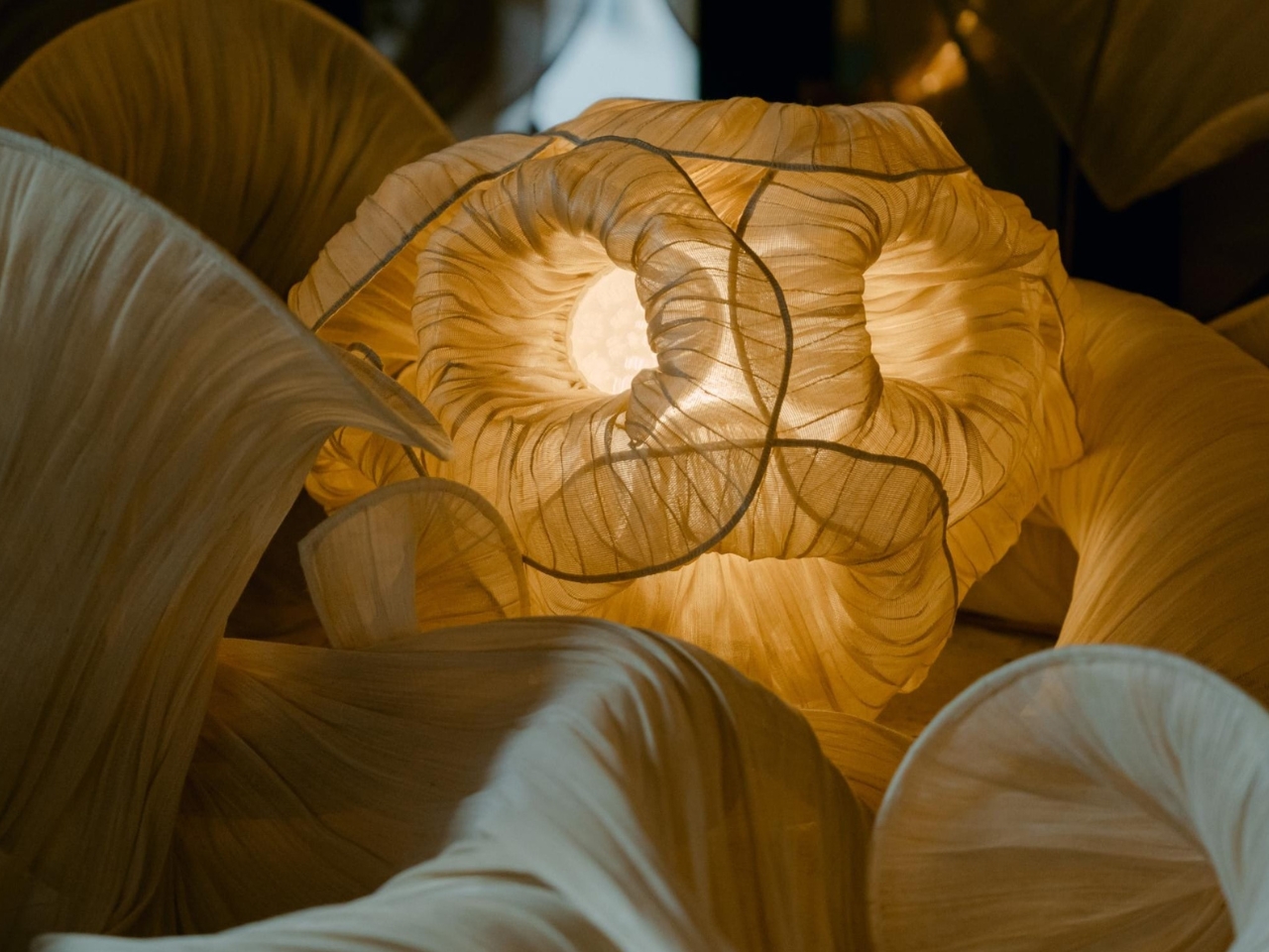
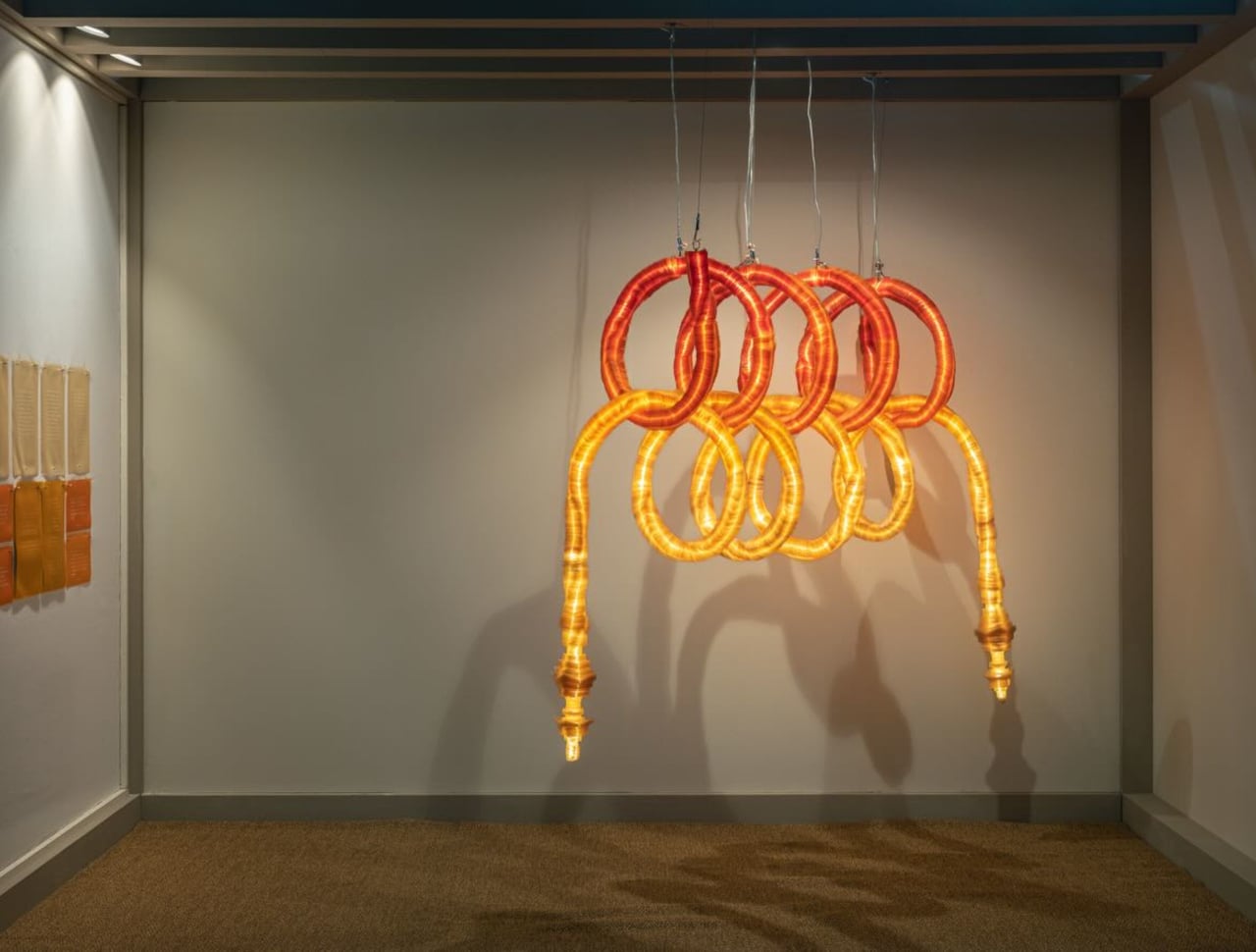
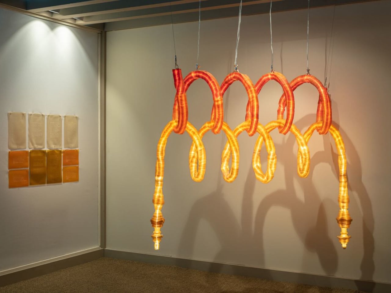
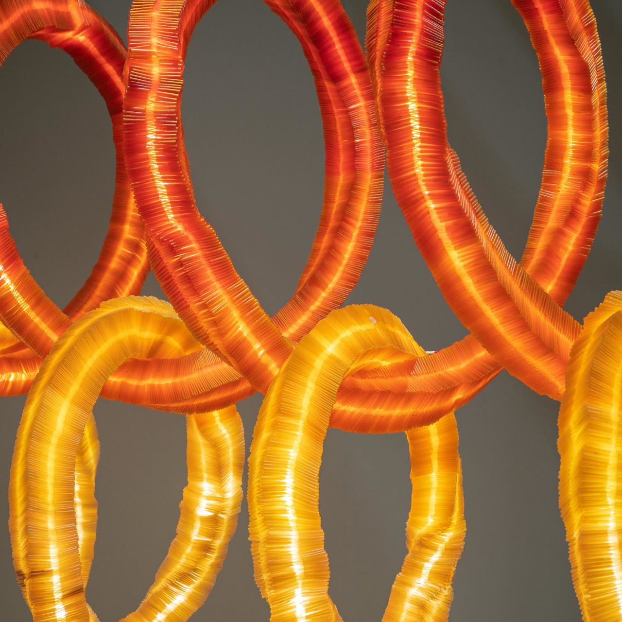
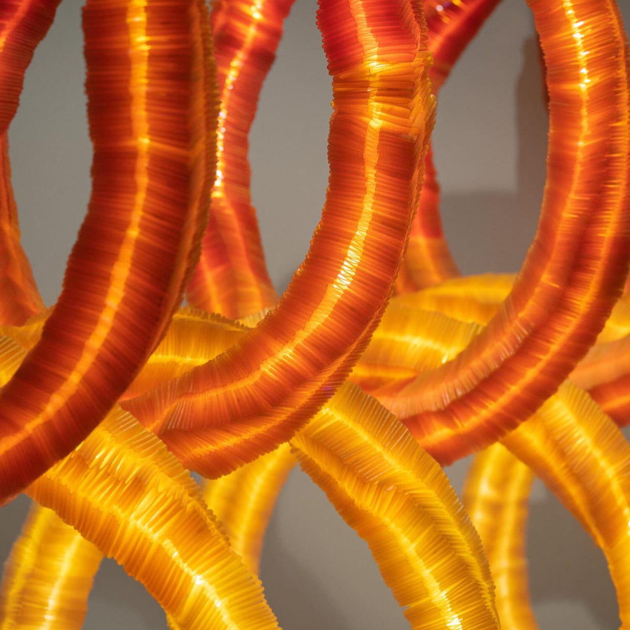
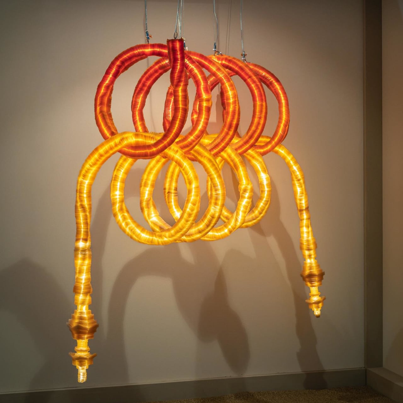
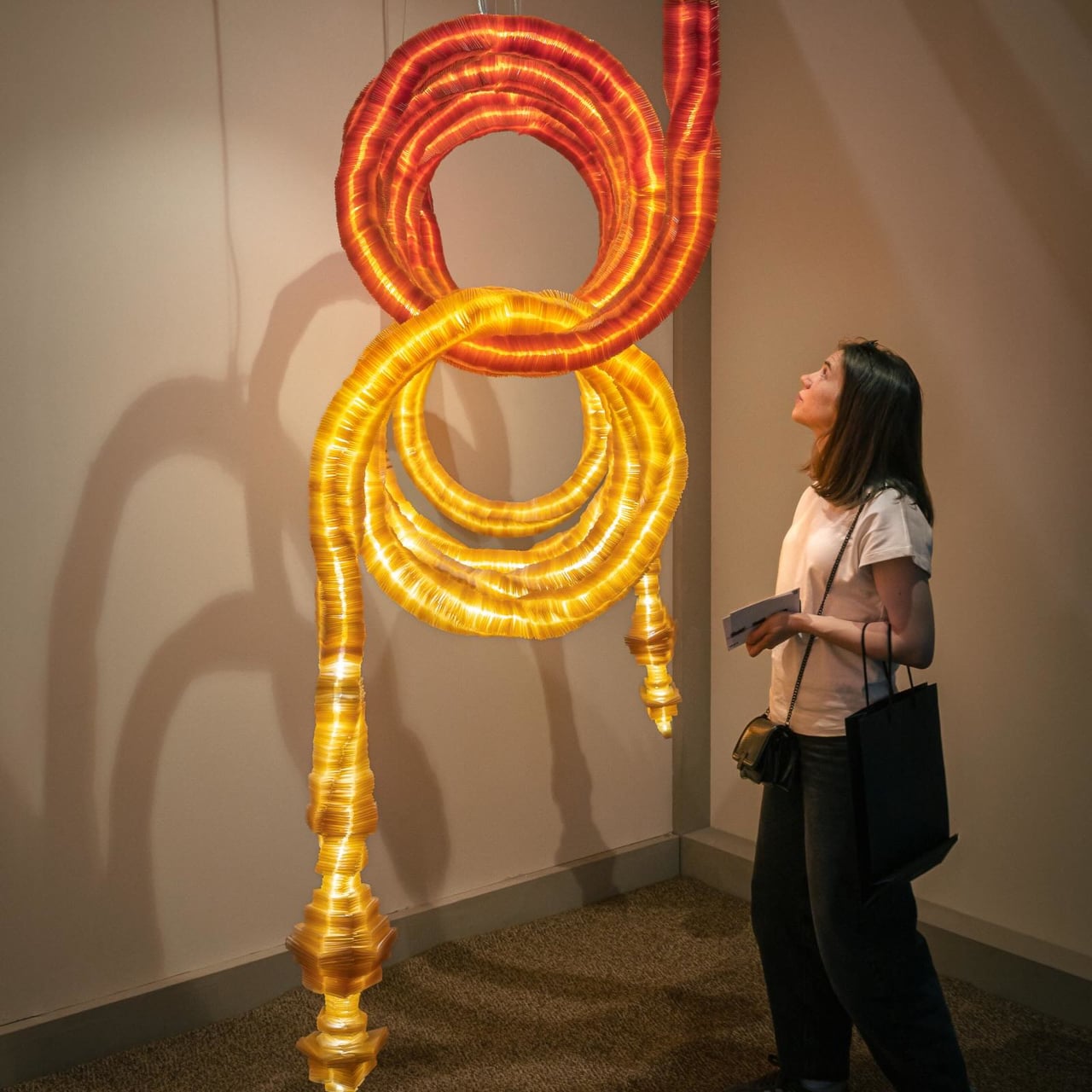
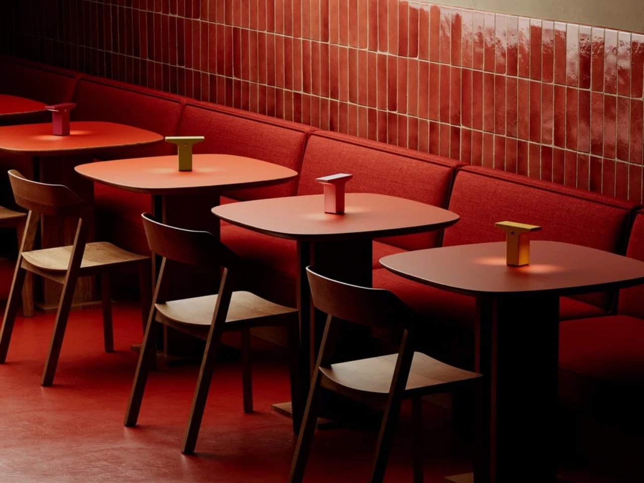
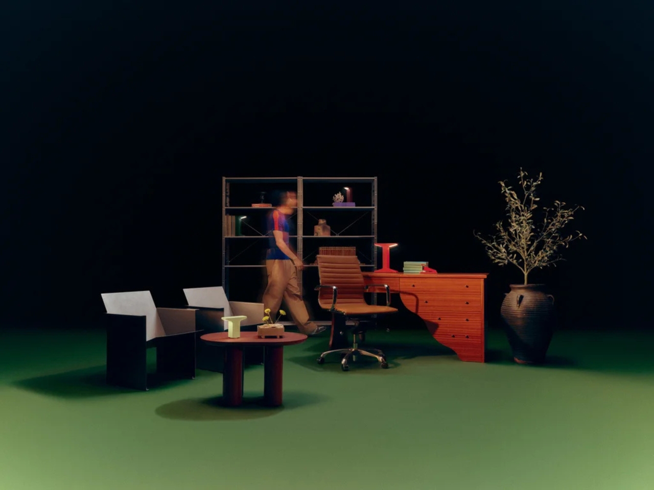
I’m going to be real: cordless lamps have existed for a while, but they’ve mostly been an exercise in compromise. They tend to be dim, plasticky, and styled like a product that knows it’s a second-rate option. The Helia-powered collection doesn’t feel like that. Ammunition brings a seriousness of intent to these forms that portable lighting rarely gets. The studio has won the Cooper Hewitt National Design Award for Product Design and has been named one of Fast Company’s Most Innovative Companies in Design five times over. That pedigree shows. The Drift collection feels sculptural, the Pier collection feels architectural, and the Eave reads almost like a proposition about what a lamp’s silhouette could be. These are lights that don’t look like they’re apologizing for not being plugged in.
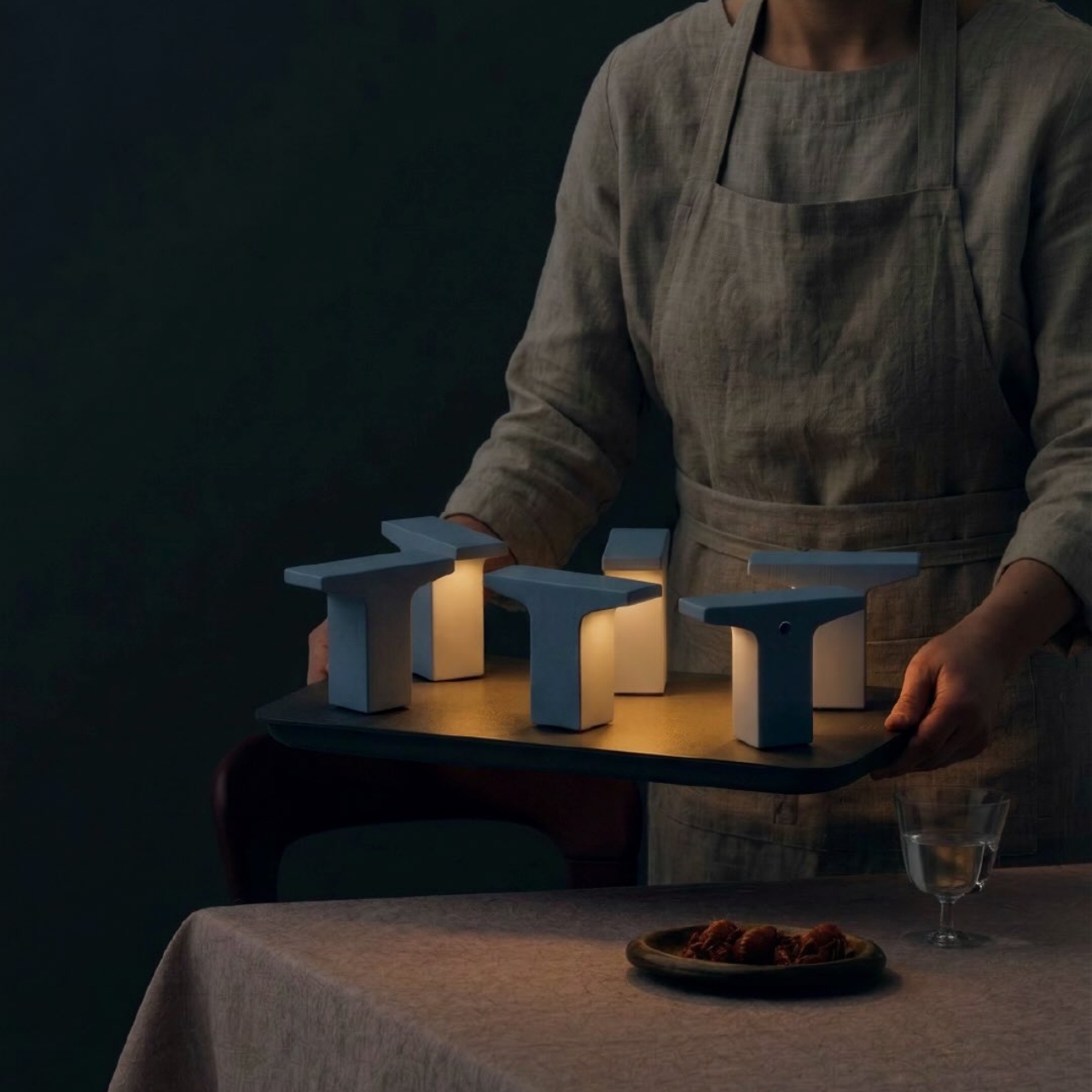
The system is also designed to scale, and that’s one of the details that separates a good product from a genuinely interesting platform. For homes, the single charging puck does the job perfectly. For restaurants, hotels, or any hospitality space that needs multiple lights ready at once, Gantri offers a six-port charging tray. The imagery of someone carrying a tray of softly glowing lights to a dinner table, like a modern version of candlelight service, is one of the most quietly compelling visuals to come out of a design launch in recent memory.
Gantri founder Ian Yang has described the project as returning light to what he calls its “older state,” one that lives with you, moves with you, and shapes how you experience a space in a more human way. That framing resonates. For most of human history, light was carried. Torches, lanterns, candles. We only stopped moving it around when electricity offered us a more convenient option. The cord was a feature that quietly became a limitation.
The bigger story here is that Helia isn’t just powering three collections. Gantri’s manufacturing platform is opening up so other designers can build their own wireless lights using the same internal system. That makes this less of a product launch and more of the beginning of an ecosystem, which is exactly the kind of ambition that tends to age well. Wireless lighting has been hovering at the edges of serious design conversations for years. Gantri and Ammunition may have just pulled it to the center.
The post Gantri’s Helia Finally Makes Wireless Lamps Worth Buying first appeared on Yanko Design.