No, it isn’t Phone (3), but to be honest, haven’t we had enough phone launches already?!
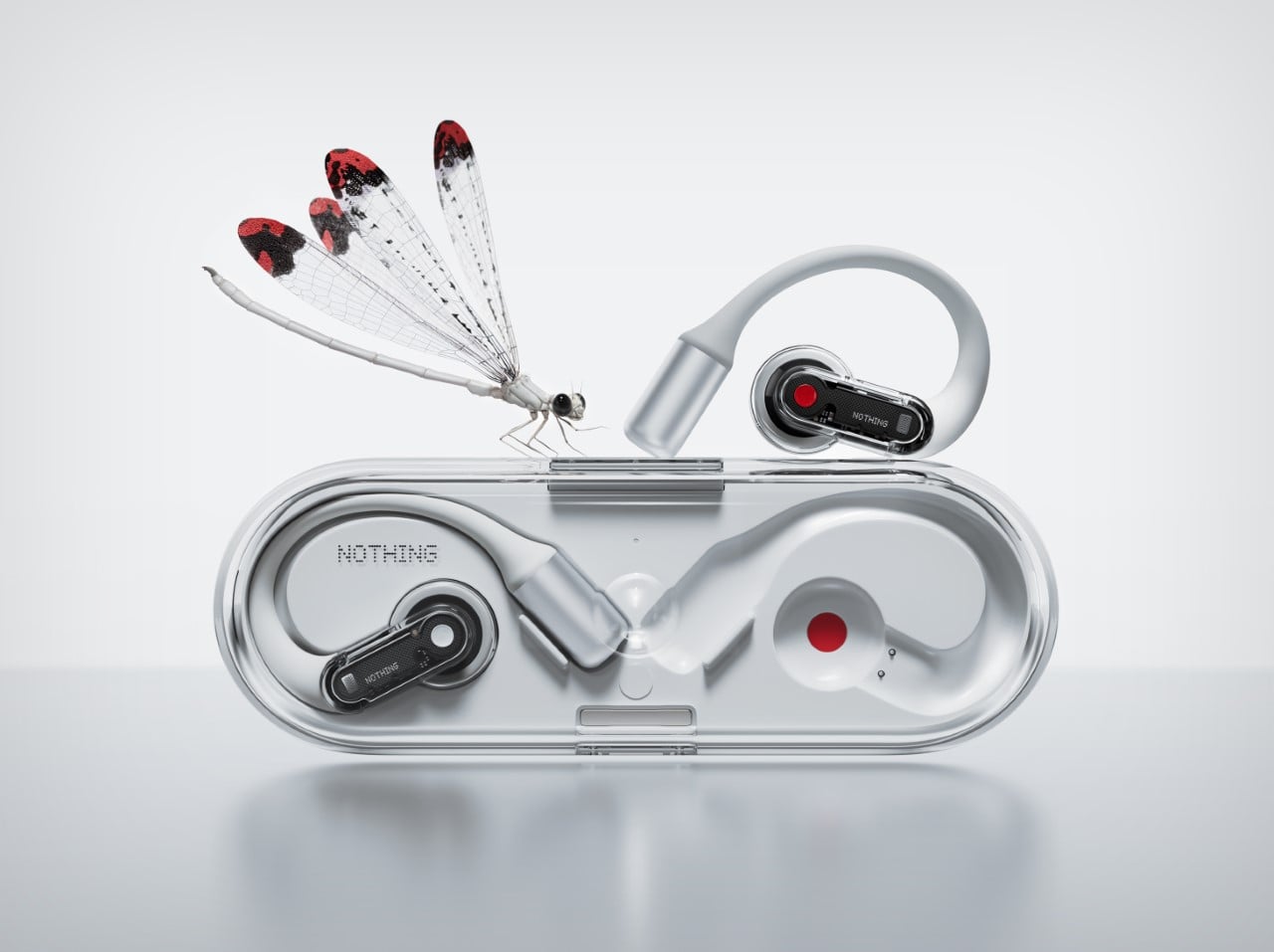
Say hello to the Nothing Ear (open), the latest ‘hearable’ from London-based tech-brand Nothing. Designed in vein with their existing Nothing Ear series, the Ear (open), as its name suggests, is an open-ear wearable and the first of its kind from the company. The newly launched device introduces a distinctive open-ear design that prioritizes comfort, situational awareness, and superior sound quality. This marks the company’s fourth mainline set of earbuds, not counting special editions (like the Nothing Ear (stick)) and their CMF budget line. Known for pushing the boundaries of audio tech with a bold design, Nothing seems intent on revolutionizing the way we experience audio on the move.
Designer: Nothing
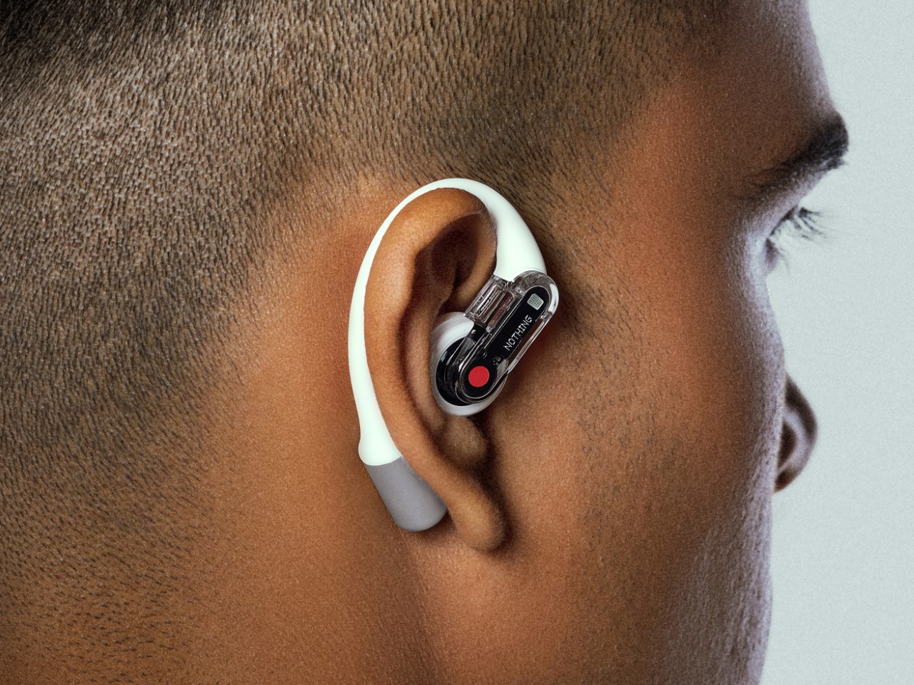
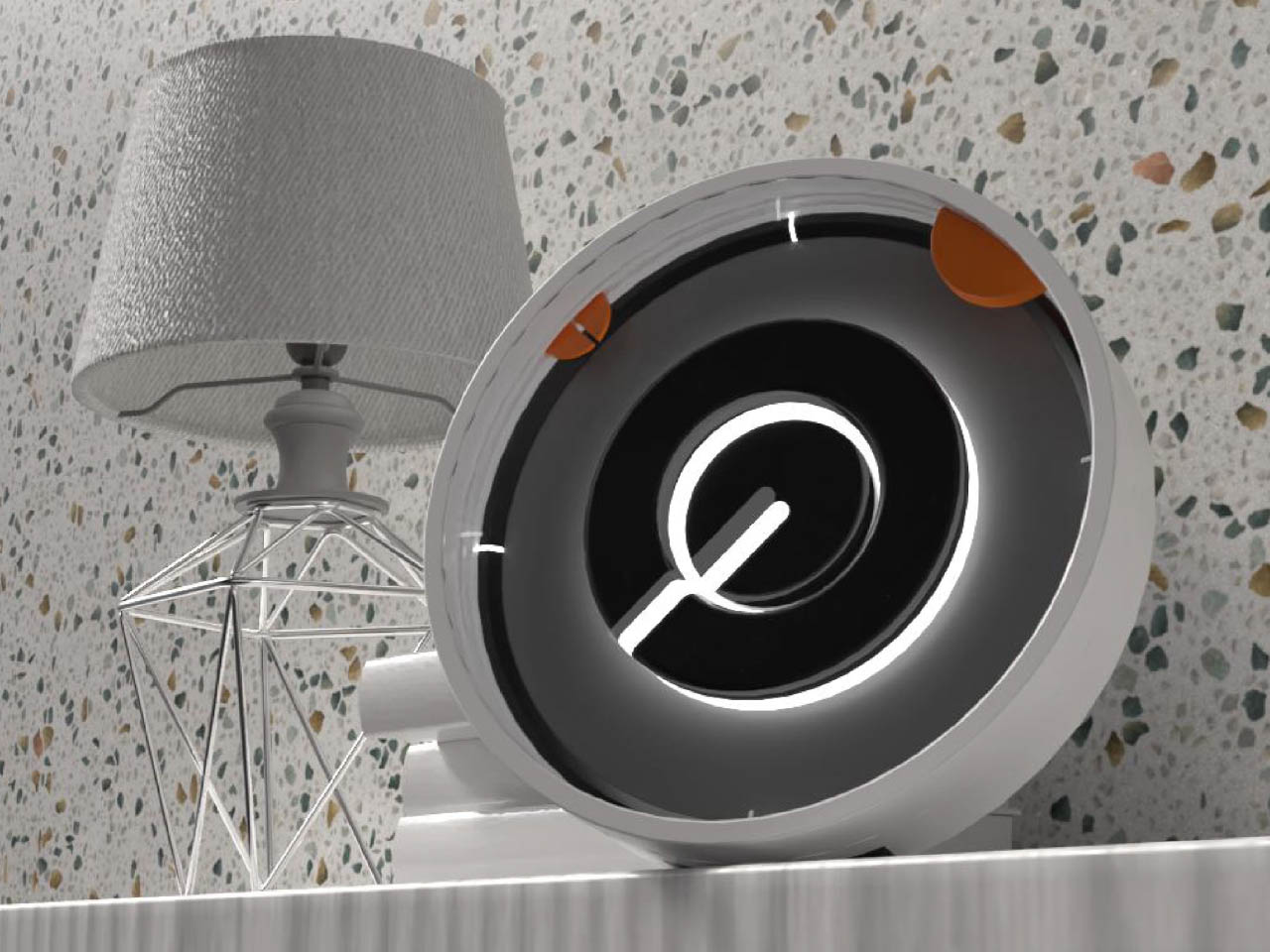
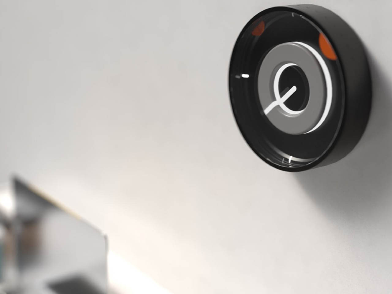
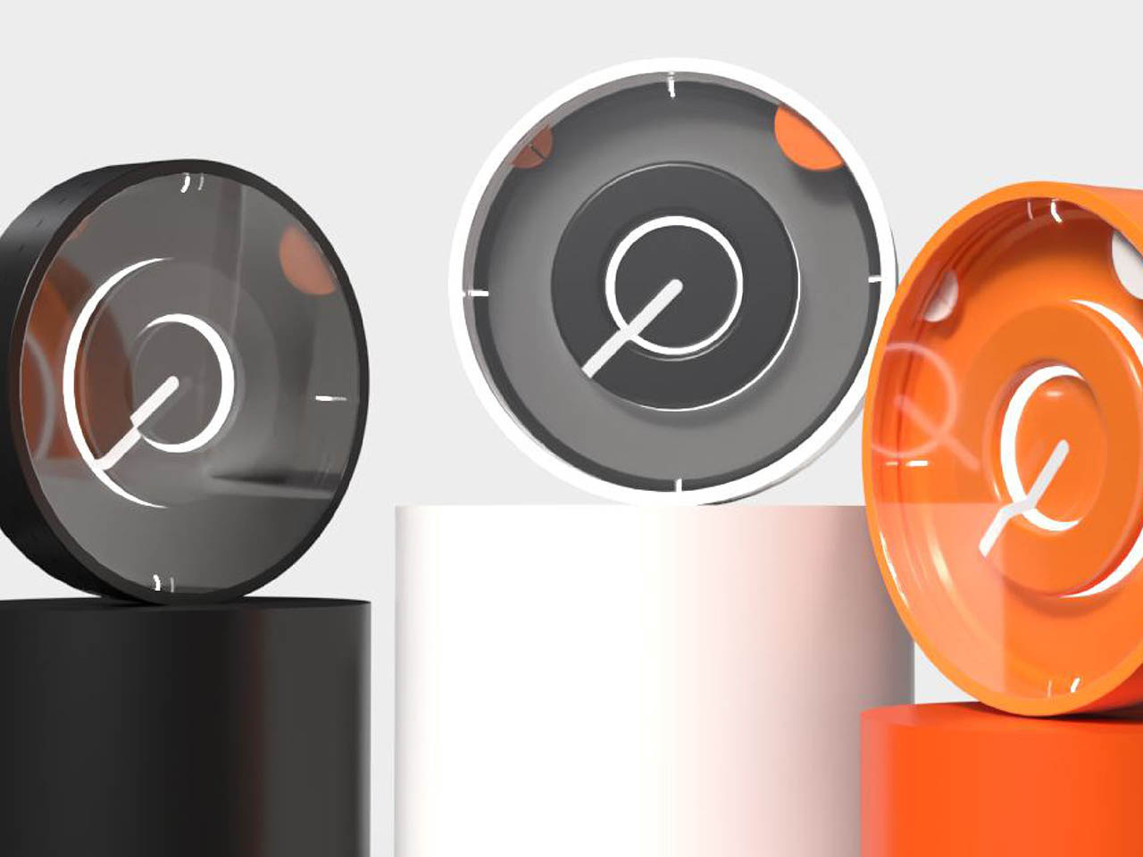
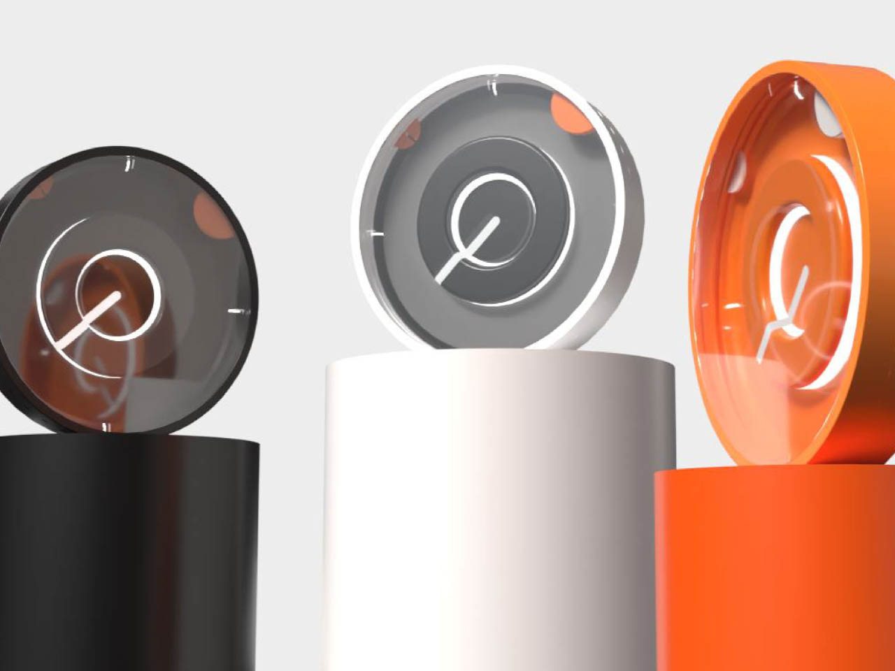
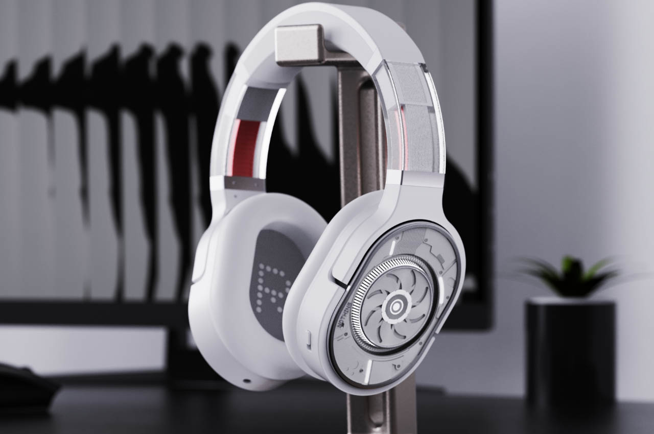
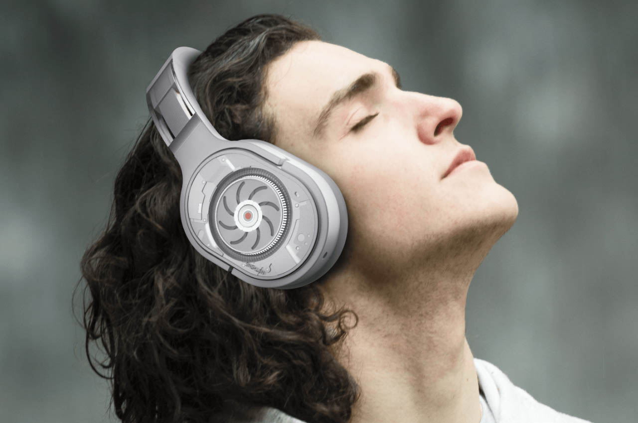
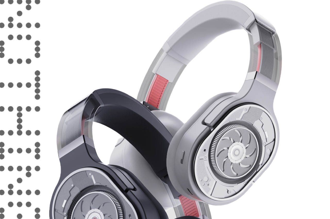
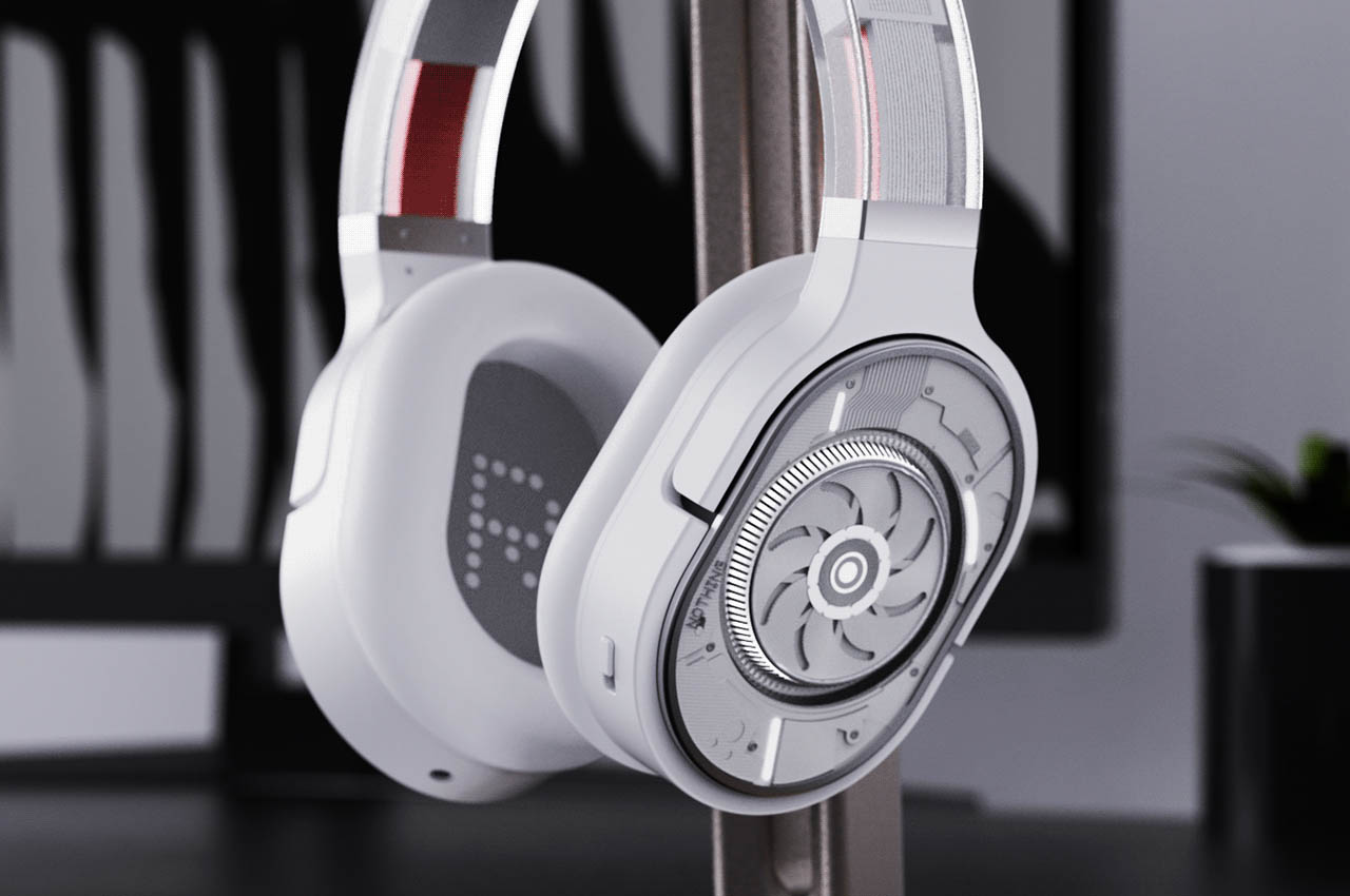
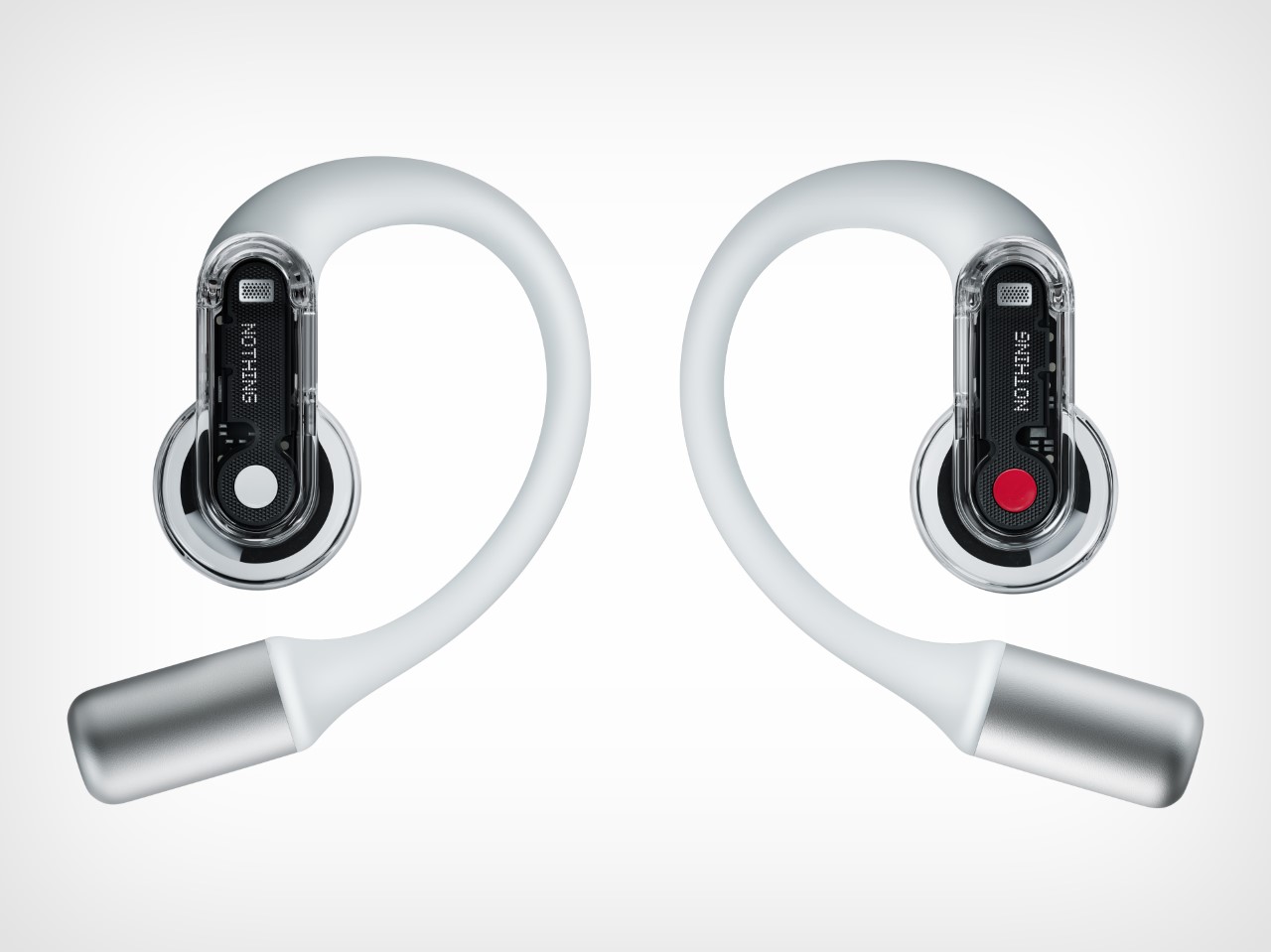
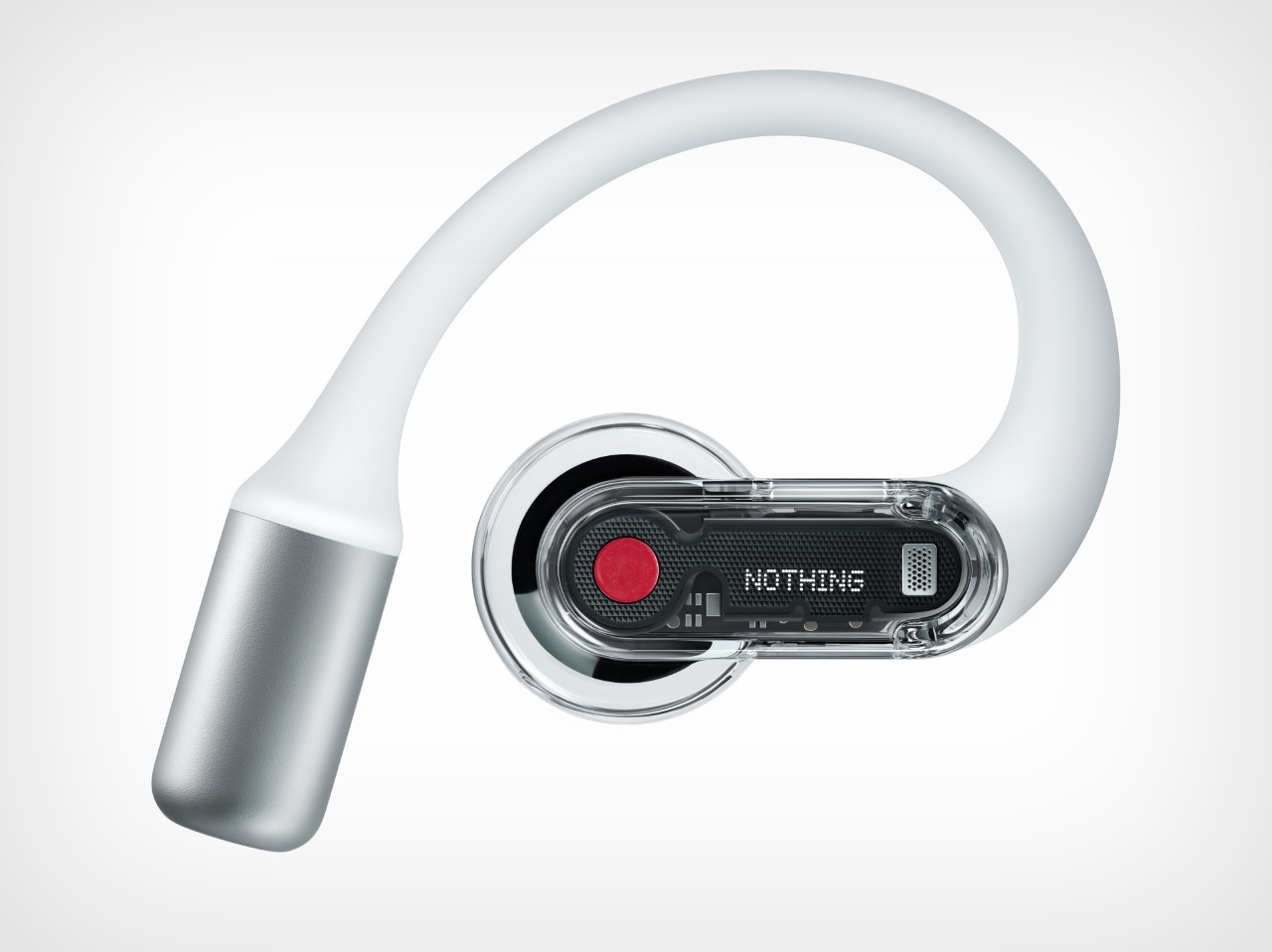
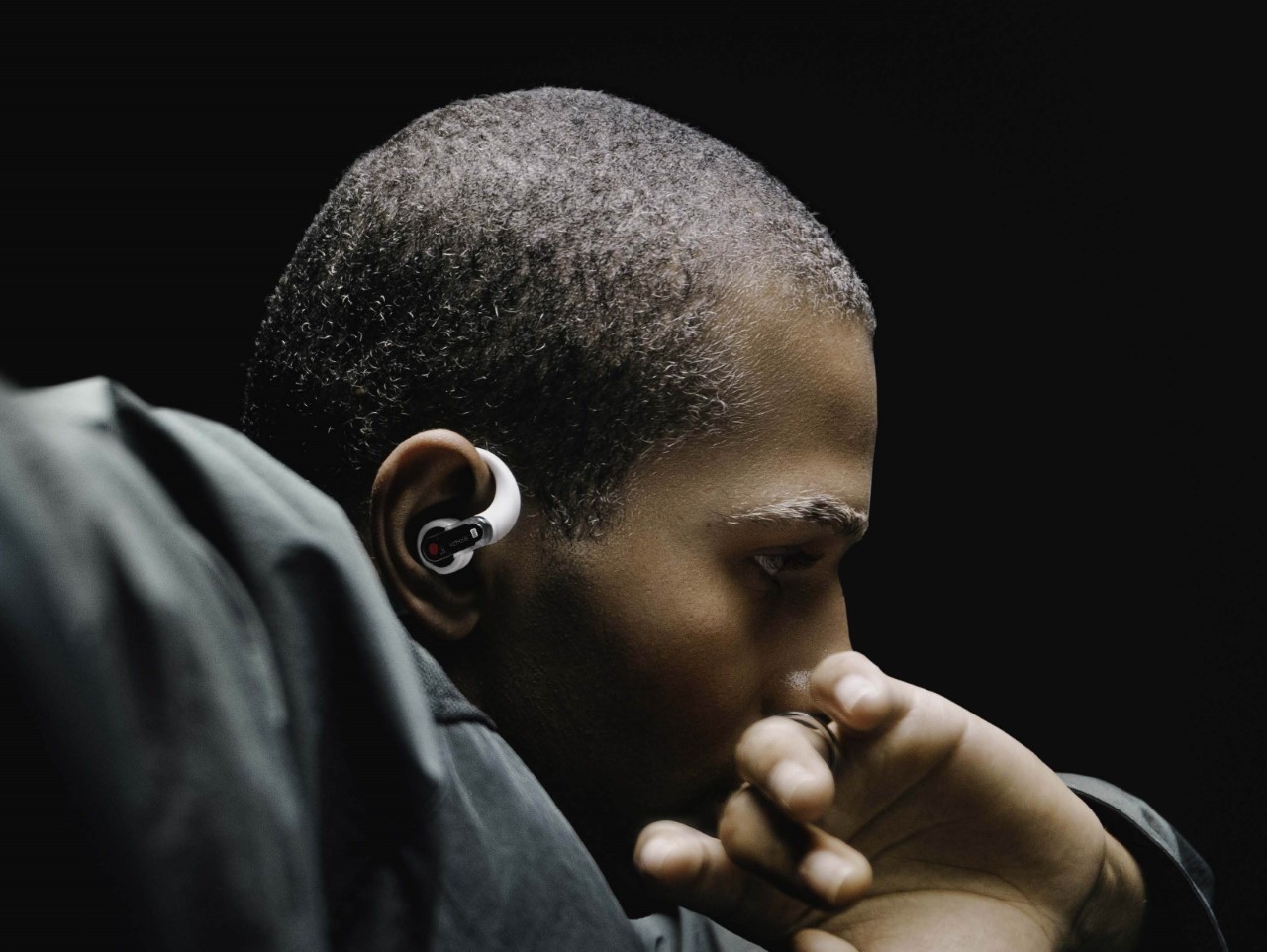
One glance at the Nothing Ear (open), and you immediately notice the company’s signature minimalist aesthetic. Transparency is the name of the game here. Rather than having earpieces with silicone tips that create an airtight seal to lock in sound and minimize audio leakage, these open-ear wearables rest against your ear canal, firing audio directly in without compromising your ability to hear the world around you. Sort of like how holding your phone up to your ear lets you hear calls but also lets environmental sounds to make it to your ear so you’re aware of your surroundings. “A lot of people were skeptical internally, but I was really bullish on this form factor because you see people wearing regular earbuds these days, and sometimes they only wear earbuds with one bud in the ear and the other one out… because they want to what’s, you know, happening all around them”, says Nothing founder Carl Pei. “But this form factor opens up, so that you can hear all your surroundings without having to do that.”
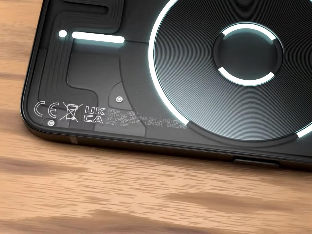
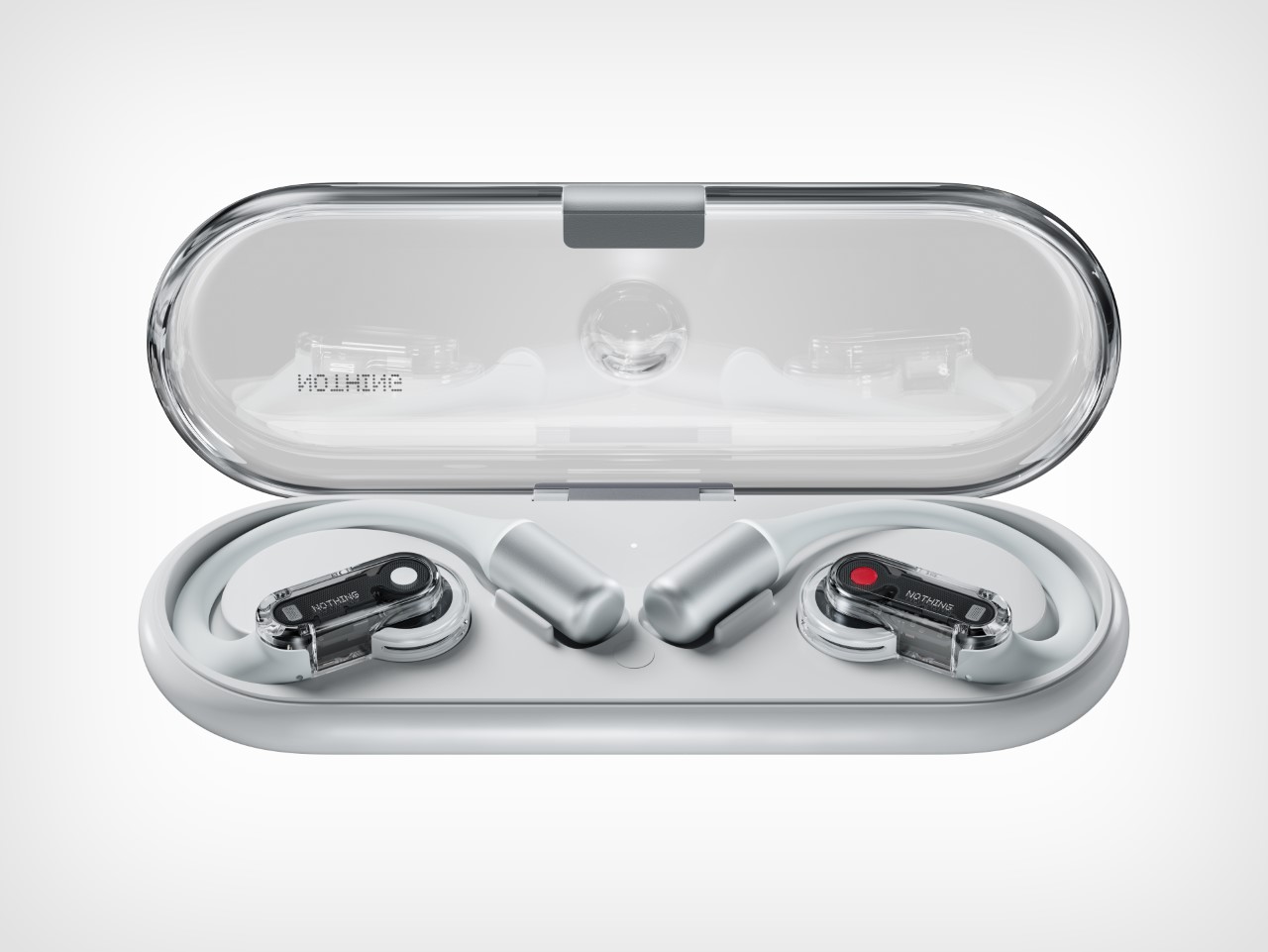
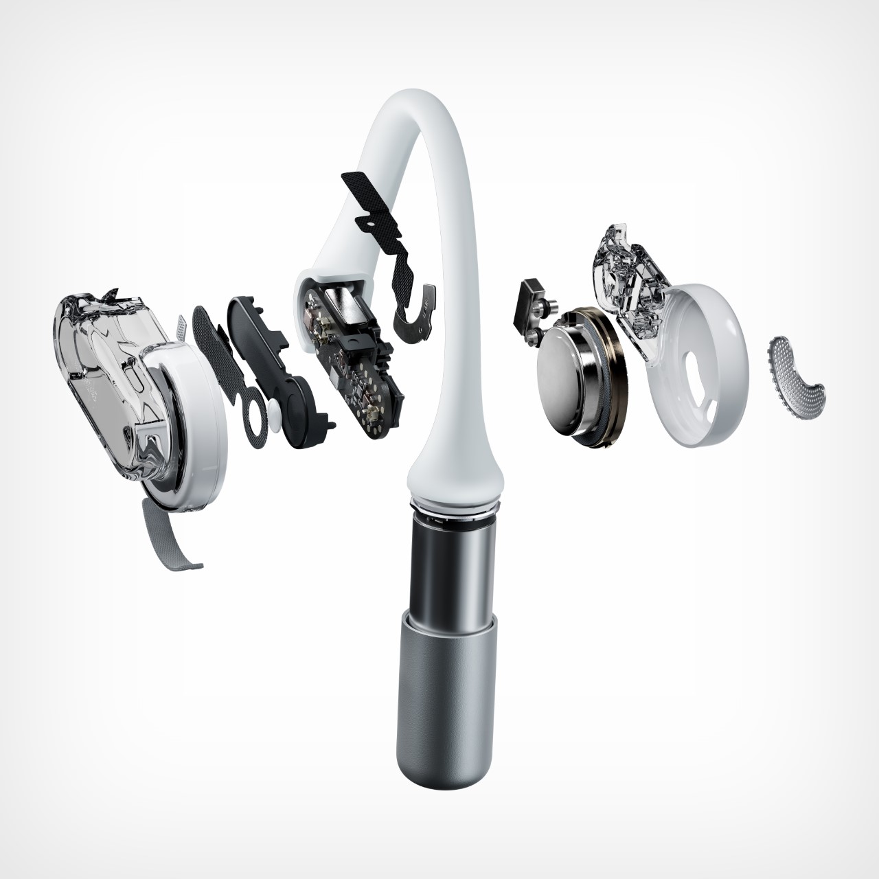
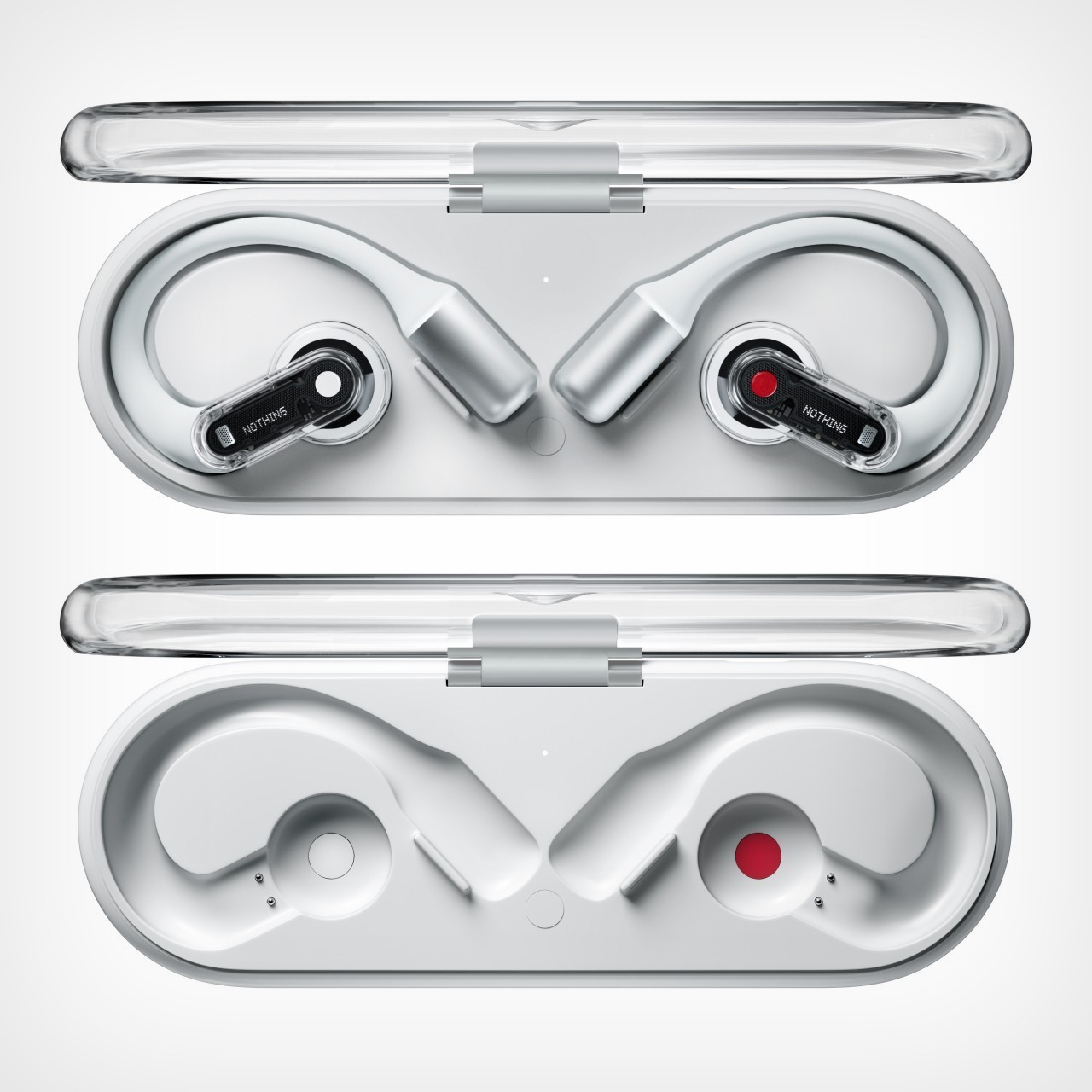
Staying true to their design philosophy, the Ear (open) showcases a slim, see-through form factor that emphasizes the craftsmanship behind its sleek exterior. Weighing just 8.1 grams per earbud, these are designed to be lightweight and portable, and with the case measuring a mere 19 mm in thickness, you can easily slip them into your pocket. The buds also come equipped with a smart case that mirrors the same transparency-focused design the company has come to be known for, along with a dimple in the center of the lid for fidgeting purposes. Obviously, the case acts as a charging dock for the earphones when not in use.
The Ear (open) shines with its Open Sound Technology, a software feature that aims to let users enjoy immersive sound while staying connected to their environment. Whether you’re on a busy city street or in a park, these earbuds let ambient sounds like traffic or birdsong through, without drowning out your music or calls. This makes them ideal for those who want to stay aware of their surroundings—whether for safety reasons or just to feel more present.
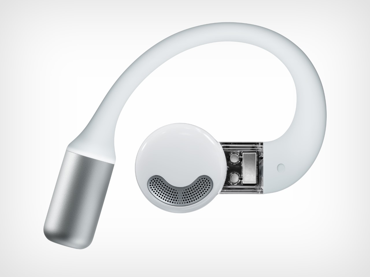
Supplementing the open-ear design is the Sound Seal System and directional speakers. These features work together to minimize sound leakage, ensuring that you get a rich, personal listening experience without disturbing those around you. This system’s privacy-oriented design addresses one of the common pain points with open-ear earbuds, giving you the best of both worlds—situational awareness and high-quality sound.
The earbuds feature a three-point balance system that, alongside flexible silicone ear hooks, ensures the earbuds sit securely in your ears. Designed with the intent of being worn while running, exercising, cycling, or just walking through the city, the Ear (open) promises a secure fit that won’t fall out during your activities. Combined with their feather-light weight, these earbuds are designed to make you forget you’re even wearing them.
On the performance front, the Ear (open) delivers with its custom patent-pending diaphragm, titanium coating, and ultra-light driver setup. These earbuds are built to handle both the deep lows and the crisp highs, offering a balanced soundstage that’s sort of rare for open-ear designs (although we intend to verify this when we get our review unit!) The bass is further enhanced by an automatic Bass Enhance algorithm, giving the low frequencies an extra punch without distorting the sound quality… something we’ll definitely confirm once we try these bad-boys on.
You’ll get 8 hours of continuous playback on a single charge, with the total extending to 30 hours when factoring in the charging case. And if you’re pressed for time, a quick 10-minute charge provides an additional 2 hours of playback. For those who take a lot of calls on the go, the Clear Voice Technology uses AI-enhanced processing to deliver crystal-clear call quality, even in noisy environments. Trained on over 28 million noise scenarios, this tech ensures that your voice comes through loud and clear, regardless of your surroundings. Additionally, Dual Connection allows seamless switching between devices, and a Low Lag Mode is designed specifically for gaming, ensuring minimal audio delay during gameplay.
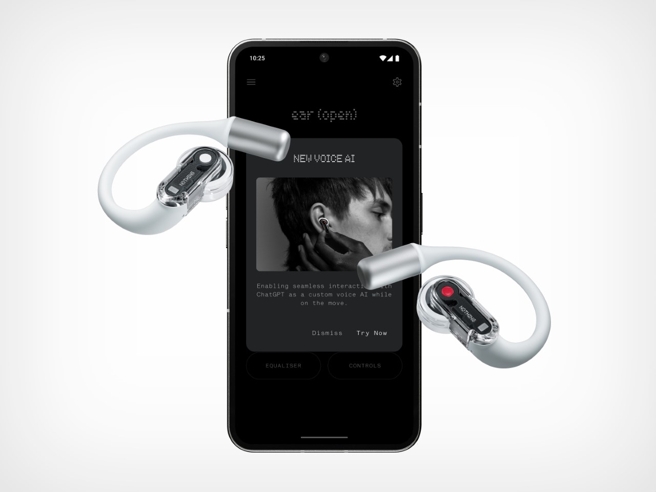
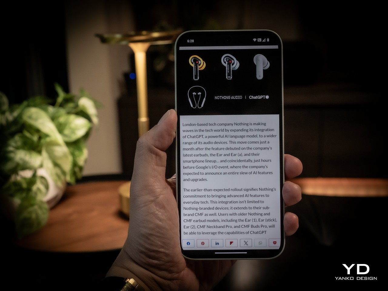
Earlier in the year, Nothing announced it was bringing ChatGPT to all its earphones, and the Ear (open) gets this feature too, allowing you to tap into GPT instead of your phone’s assistant for a more intuitive, intelligent conversation. Need to check the weather before heading out or quickly look up an answer to that random question nagging at you? Just ask—no need to fumble for your phone. The ChatGPT feature is accessible directly from your earbuds via the Nothing X app, making real-time information just a voice command away. Whether it’s getting directions, solving a debate, or grabbing quick updates on the go, ChatGPT turns your earbuds into more than just audio devices. That’s more than you can say for a pair of AirPods that are still yet to get Apple Intelligence.
The Nothing Ear (open) will be available for pre-order starting September 24th, with the official launch on October 1st. Priced at $149 USD (£129/€149), these earbuds are positioned to offer great value for those who want cutting-edge technology and user-friendly design without breaking the bank. If you’re the kind who needs music while exercising or training, these open-ear wearables might just be perfect to give a try. Especially at that affordable price point.
The post Nothing launches sports-friendly Ear (open) earphones with built-in ChatGPT for just $149 first appeared on Yanko Design.