Side tables rarely demand much attention. They hold a drink, a lamp, or a book, and that’s essentially all anyone expects from them. The more ambitious ones add a drawer or a second tier, but the core formula stays the same. It’s one of those furniture categories where function has long settled into convention, quietly waiting for someone to rethink the structure itself.
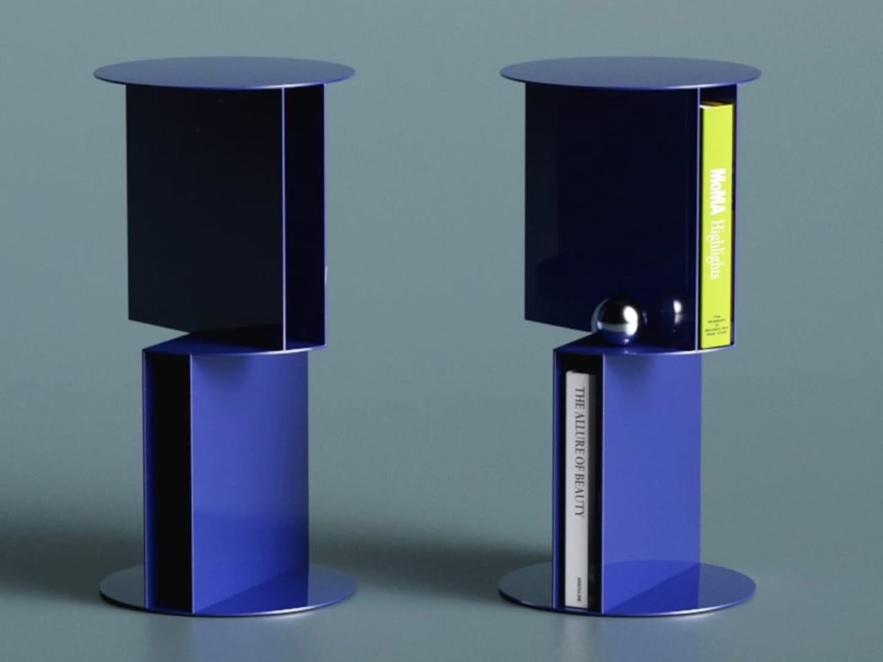
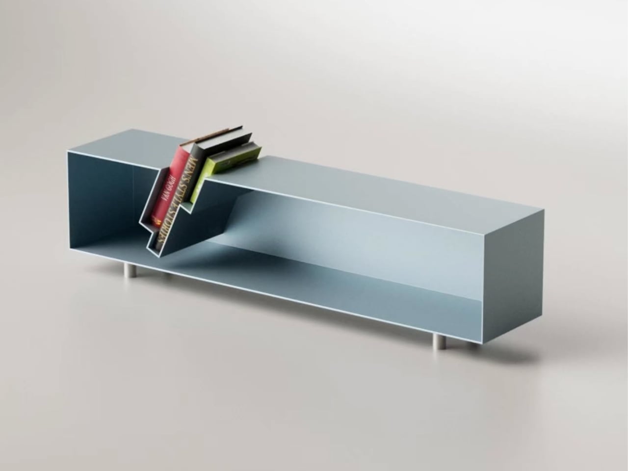
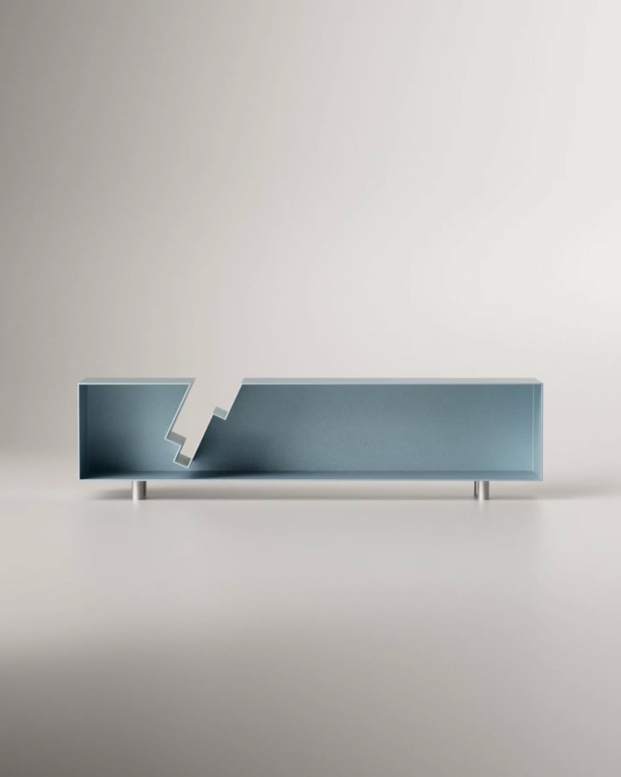
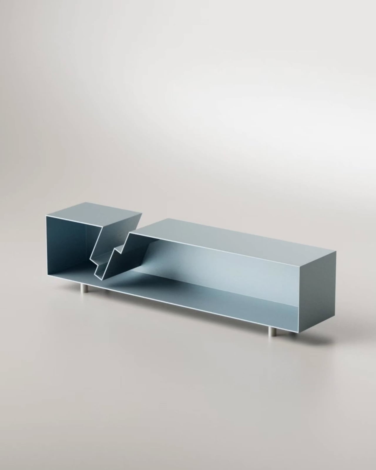
Designer Deniz Aktay has been doing exactly that kind of rethinking through his designs. His latest concept, the Torque High Side Table, takes the structural question seriously, proposing a pedestal that isn’t really a pedestal at all. The table’s support comes entirely from two metal storage units that carry the weight of the design, both literally and visually, stacked and rotated against each other.
Designer: Deniz Aktay
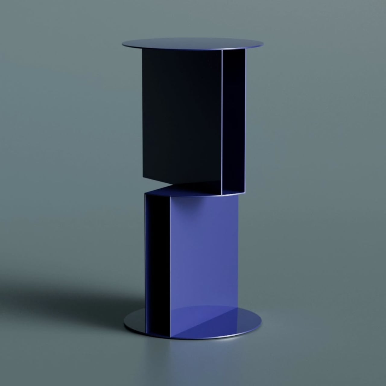
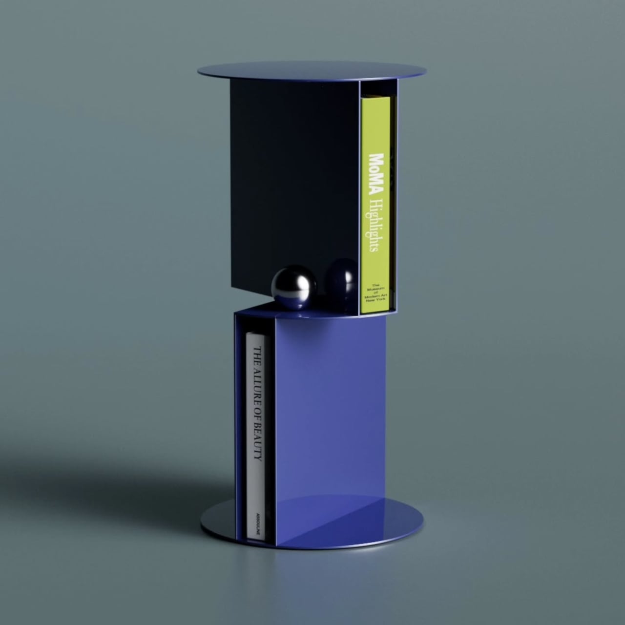
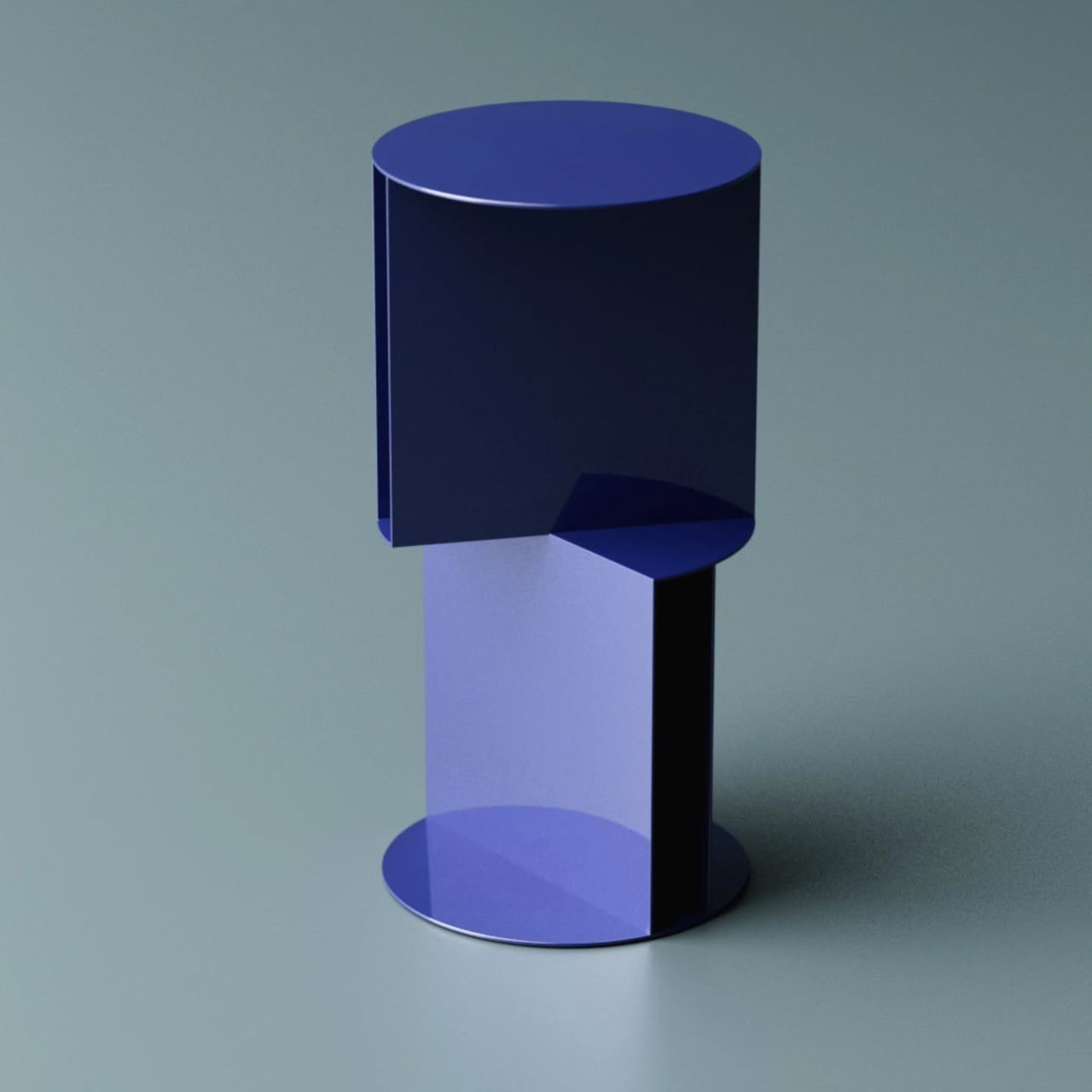
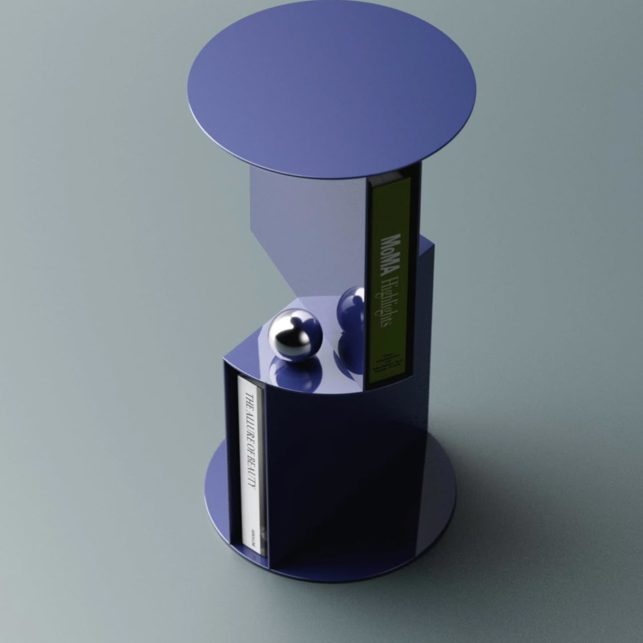
The idea of torque, that mechanical tension created by rotation, becomes the organizing principle here. Each storage unit opens in a different direction, offset against the other to create the visual friction the name implies. It makes the structure feel active, as if the table is caught mid-turn. The two-tone blue colorway reinforces that, with a dark navy upper section against a brighter blue lower.
That rotation also creates something practically useful. Where the two units meet, a small shelf platform projects outward between them, adding a third storage level beyond the two main compartments. It reinforces the visual logic of the twist while giving you somewhere to set smaller objects. Three storage spots from a single structural idea is a tidy outcome for a table of this size.
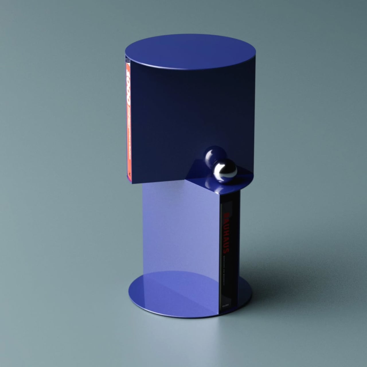
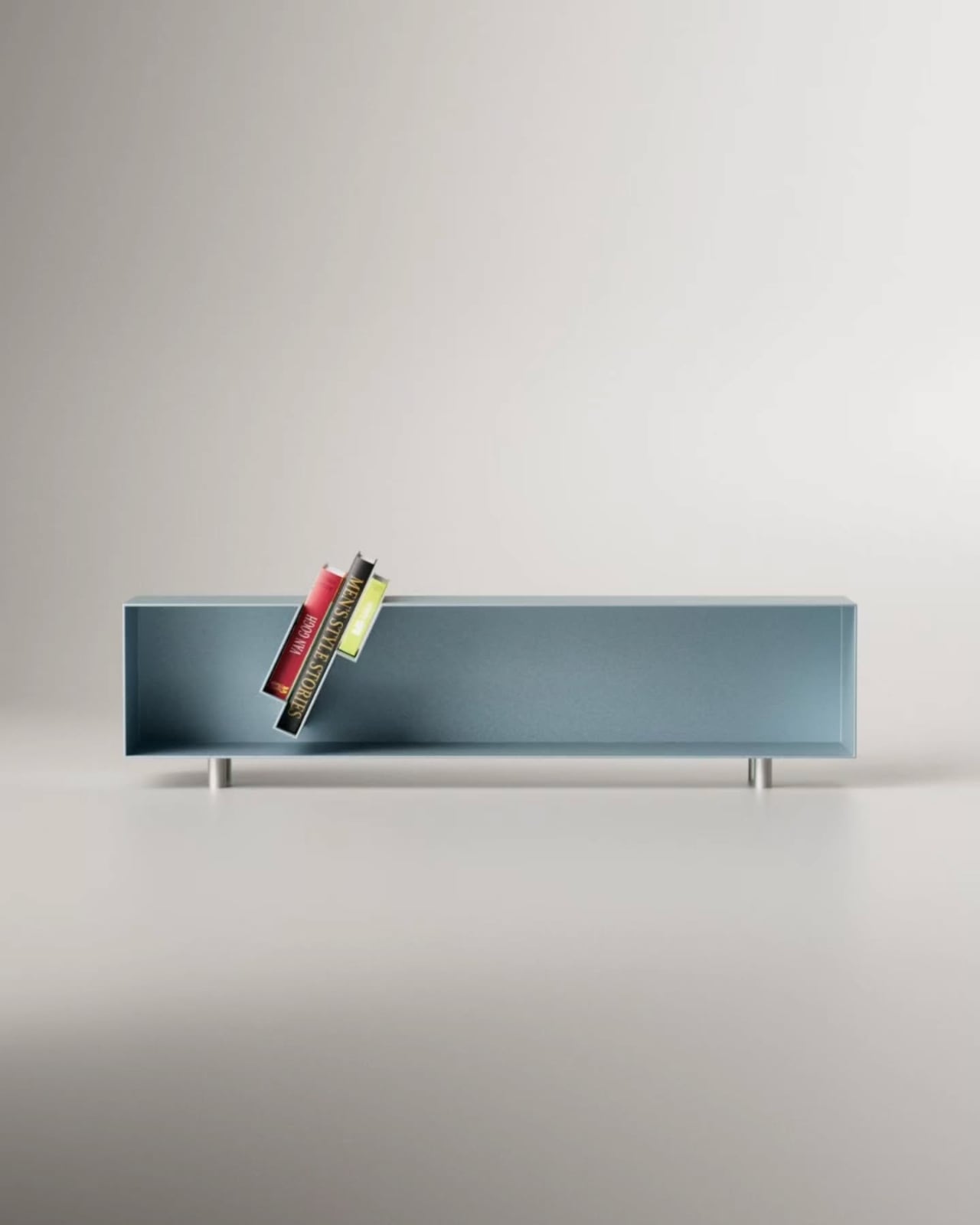
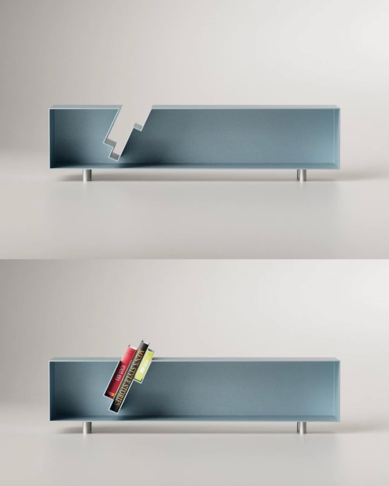
Books sit naturally in each compartment, held upright in the curved enclosures without needing brackets or dividers. Each section holds a small collection without effort, turning what might otherwise be a purely decorative object into something you’d interact with daily. That balance between use and visual statement is where this kind of furniture concept tends to either land well or feel entirely theoretical.
The storage-as-structure approach means the Torque table looks interesting from every angle. There are no legs, no base panel, and no conventional framing hardware. The two open-faced volumes do all the work, with a circular disc on top forming the table surface and a matching flat disc at the bottom serving as the foot. Everything between them is either storing something or making a structural point.
Aktay has built a body of work around this kind of thinking, concepts that start with a formal problem and arrive somewhere genuinely practical. The Torque High Side Table fits that approach well. It doesn’t need to announce its cleverness because the structure speaks on its own, and anyone who tucks a book into one of the compartments and sets a cup on top will feel the logic in it.
The post This Side Table Has No Legs: Its Two Storage Units Are the Structure first appeared on Yanko Design.
 `
` `
` `
`