Before streaming queues and binge-watching algorithms rewired how we consume film and television, there was a ritual. You drove to the video store, walked the aisles, made your pick, and came home to slide that chunky black cassette into a slot that swallowed it with a satisfying mechanical thunk. The VCR wasn’t just a piece of consumer electronics. It was the centerpiece of a whole cultural ceremony, the thing that turned an ordinary Tuesday night into a genuine event. Polar-Angel_UA, a LEGO builder and 10K Club Member from Ukraine, has captured exactly that feeling in brick form with the Video Home System.
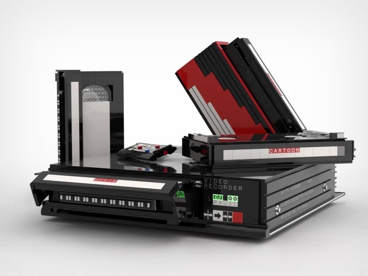
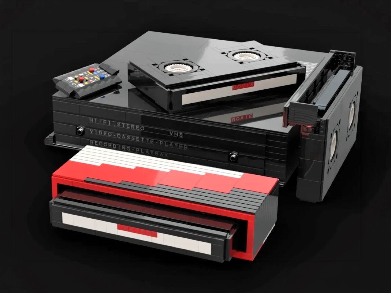
The build recreates a classic VHS setup with the kind of specificity that only someone who actually lived through the era could pull off. The main unit nails the flat, utilitarian slab aesthetic of a proper 80s or 90s VCR deck, complete with a cassette slot, a row of playback controls, and a PAUSE indicator rendered in green. A top-loading lid flips open to reveal the tape mechanism inside, and the real delight here is in that interaction. The tapes go in. The tapes come out. For a build that’s ostensibly a static display piece, that single interactive element transforms the whole experience.
Designer: Polar-Angel_UA

Four items accompany the main unit: a movie cassette, a cartoon cassette, a remote control, and a VHS case. The distinction between the movie tape and the cartoon tape is a quietly brilliant design decision because if you grew up in that era, you absolutely had a dedicated shelf section for each. Saturday morning cartoons lived in their own plastic sleeve, carefully rewound and stacked away from the movie collection. Polar-Angel_UA understands the taxonomy of the VHS-era household intimately, and it shows.
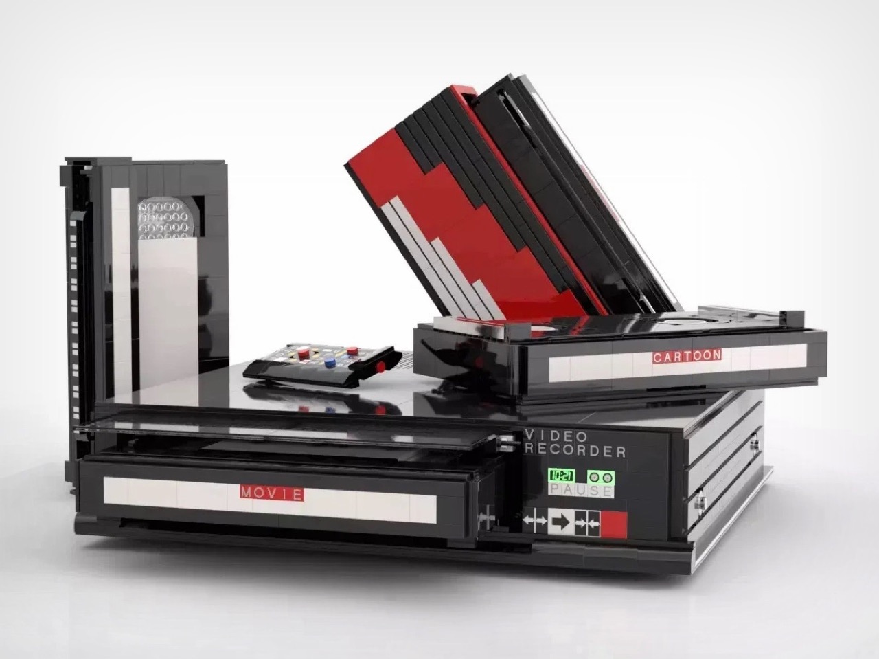
The MOC’s inherently block-ish nature (thanks to the LEGO bricks) works well for this product. VCRs were not delicate objects. They were heavy, deliberately black, and looked like they meant business sitting under your television set, blinking 12:00 in perpetuity because nobody ever set the clock. This LEGO version carries that same hulking, I-mean-business energy, with the cassettes propped against it like they’re already queued up for a double feature. The remote control sitting casually beside the deck is a small touch that completes the tableau perfectly. You can almost feel the carpet under your feet and smell the takeaway boxes.

The Video Home System is currently gathering votes on the LEGO Ideas platform, where fan-created builds compete for the chance to become official retail sets. Cross the 10,000 vote threshold and LEGO’s internal team reviews the submission for potential production. With 688 supporters on the board right now and 422 days left on the clock, there is plenty of runway here. Head to the LEGO Ideas page and cast your vote!
The post This LEGO VHS Player Actually Has Cassettes You Can Insert and Remove first appeared on Yanko Design.