Watch the NASA SpaceX Crew-12 mission dock with the ISS

The Crew-12 mission, SpaceX’s 20th human spaceflight, launched at 5:15 AM Eastern on February 13 from Cape Canaveral in Florida. It’s expected to dock with the International Space Station today, February 14, at 3:15 PM, and you can watch the event below as it happens. By the time the mission’s Dragon capsule docks with the ISS, it will have traveled approximately 34 hours since lift off. Inside are NASA astronauts Jessica Meir and Jack Hathaway, European Space Agency’s Sophie Adenot and Roscosmos cosmonaut Andrey Fedyaev.

The four spacefarers are joining the three remaining passengers onboard the ISS after Crew-11 flew back to Earth a month earlier than planned. If you’ll recall, NASA made the decision to cut their mission short after one of the crew members had a medical issue that instruments on the ISS aren’t capable of diagnosing. While the crew member was stable, the agency decided to bring the whole mission home out of an abundance of caution.

Crew-12 will be staying on the ISS for eight months and will conduct a number of scientific experiments, including ones related to human health and ones meant to advance technologies for future missions to the moon and Mars. They will study how pneumonia-causing bacteria can lead to long-term heart damage, for instance, and will also look into how a person’s physical characteristics can affect blood flow during spaceflight. NASA’s live coverage for the docking starts at 1:15 PM.

This article originally appeared on Engadget at https://www.engadget.com/science/space/watch-the-nasa-spacex-crew-12-mission-dock-with-the-iss-180000450.html?src=rss

5 Design Products Made in Germany That Made Modern Design Look Cheap

German design embodies a philosophy of durability, efficiency, and understated elegance. From cars to kitchen appliances, these qualities reflect a carefully refined approach that has developed over centuries, prioritizing function and thoughtful craftsmanship over mere decoration.

At its core, this design ethos values simplicity, removing unnecessary elements to reveal a product’s true character. Applied to interiors, it shows that spaces do not need to be filled with clutter to be beautiful. True elegance comes from well-chosen materials, purposeful design, and how effectively a space serves those who live in it.

1. Form Follows Function in Bauhaus Design

German design draws heavily from the Bauhaus school, an early 20th-century movement that emphasized practicality and timelessness. Its central principle, “form follows function,” ensures that an object’s shape and appearance are guided by its purpose. Clean lines, geometric shapes, and minimal ornamentation define this approach, resulting in designs that are both enduring and inherently useful.

This philosophy makes German products intuitive and effortless to use. A Bauhaus-inspired chair, for instance, prioritizes comfort, stability, and simplicity over decoration. By focusing on utility, these designs remain functional and visually appealing, offering a lasting lesson in choosing items that serve homes practically and beautifully.
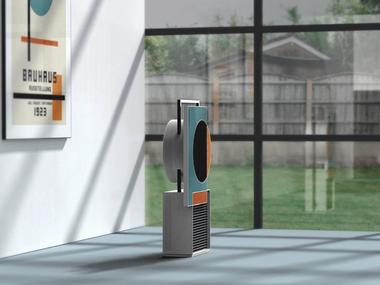
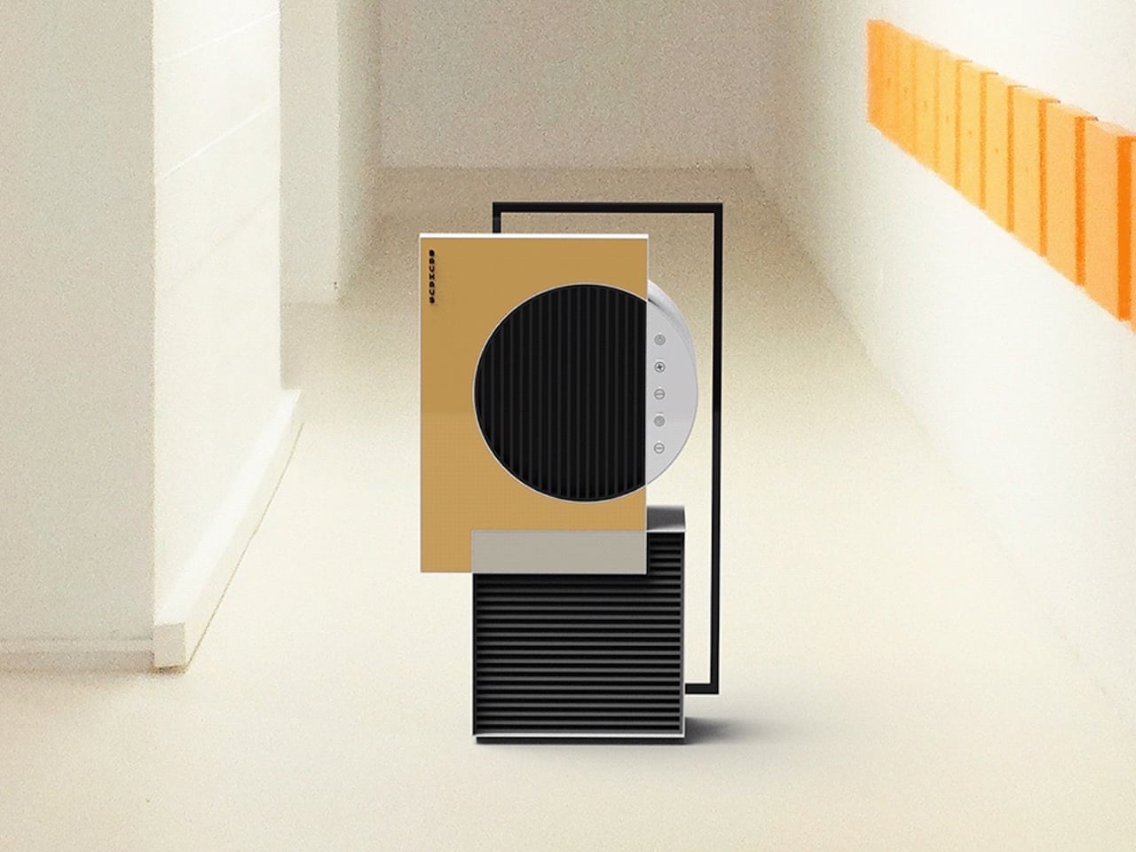
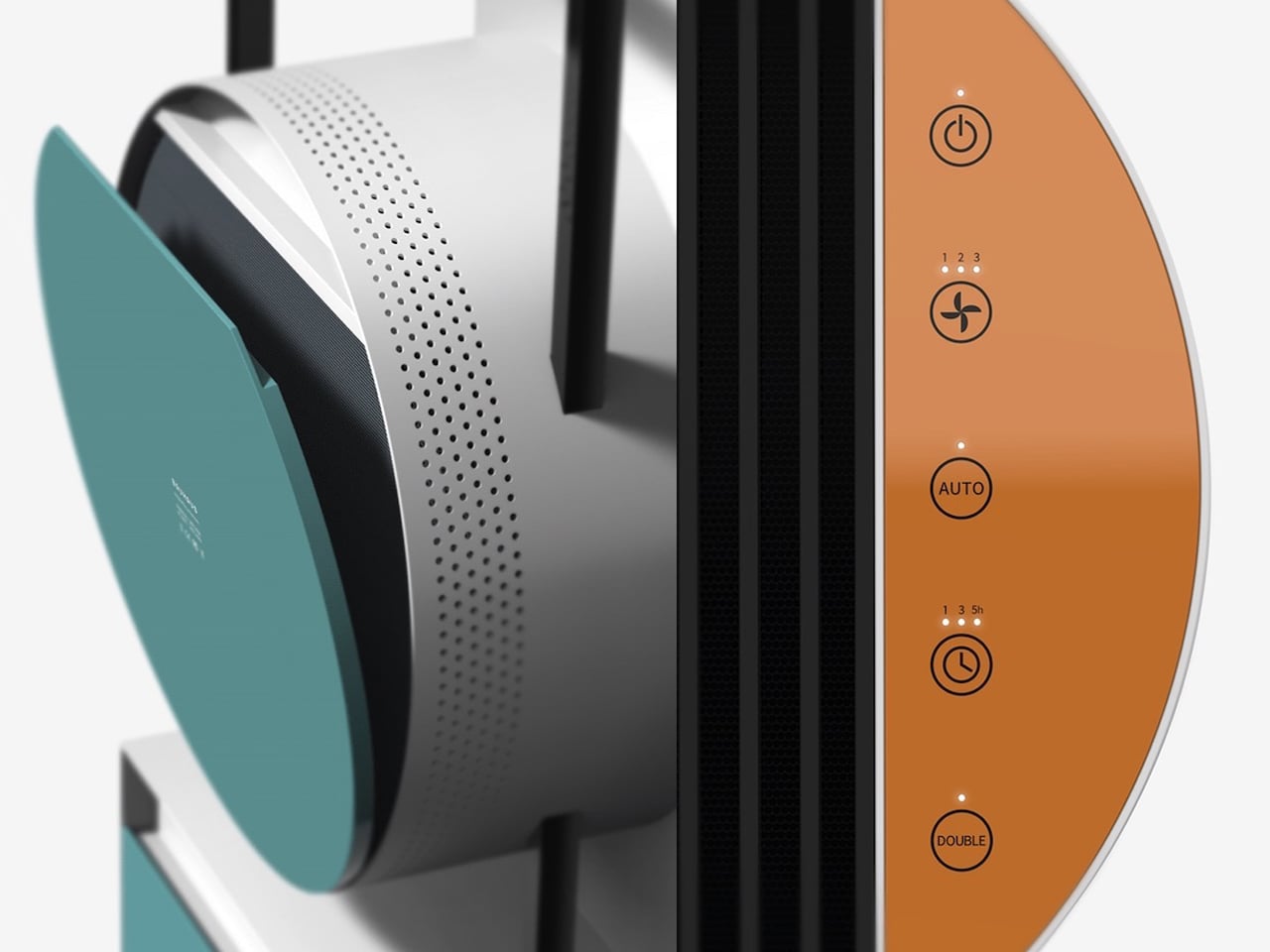
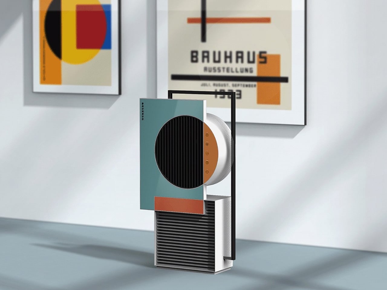
The Bauhaus Air Purifier concept perfectly embodies the Bauhaus philosophy of combining art and function. Focused on simplicity and sophistication, it uses basic shapes, circles, lines, and squares, paired with minimalist colors to create a retro-modern, industrial aesthetic. Inspired by a Bauhaus poster, the design brings two-dimensional art into three-dimensional form while promising impressive air purification performance.
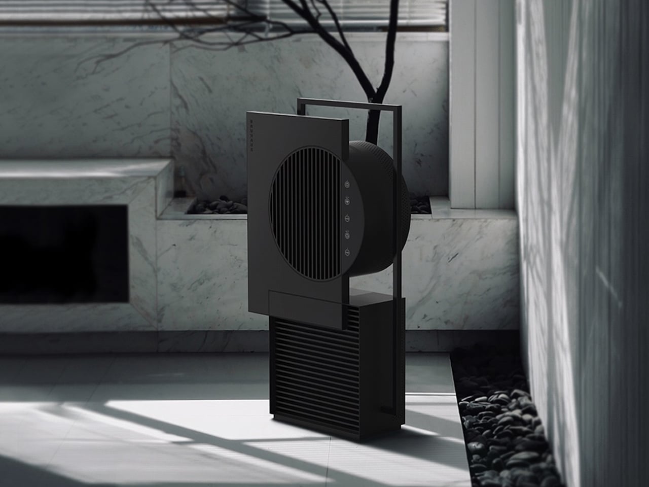
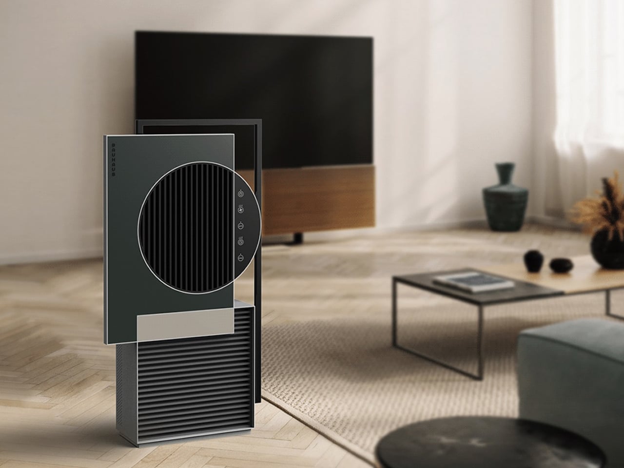
Color customization allows the purifier to suit different interiors. Options like Forest Sunlight, Rapeseed Flower, Pure Snow, and Silent Night provide moods ranging from tranquil greens to bright, playful tones. Designed by Keereem Lee, the concept demonstrates his ability to blend aesthetics and practicality.

2. A Commitment to Quality Materials

A defining feature of German design is its respect for high-quality materials. Products are chosen not only for their appearance but for their durability, sustainability, and ability to age gracefully. This focus on integrity ensures that items endure daily use while developing character over time, reflecting thoughtful craftsmanship.

This philosophy embraces a “less is more” mindset. Instead of accumulating disposable items, German design encourages investing in a few lasting pieces like solid wood, stainless steel, or other enduring materials. Such choices create homes that are sustainable and filled with objects that can be cherished for years to come.
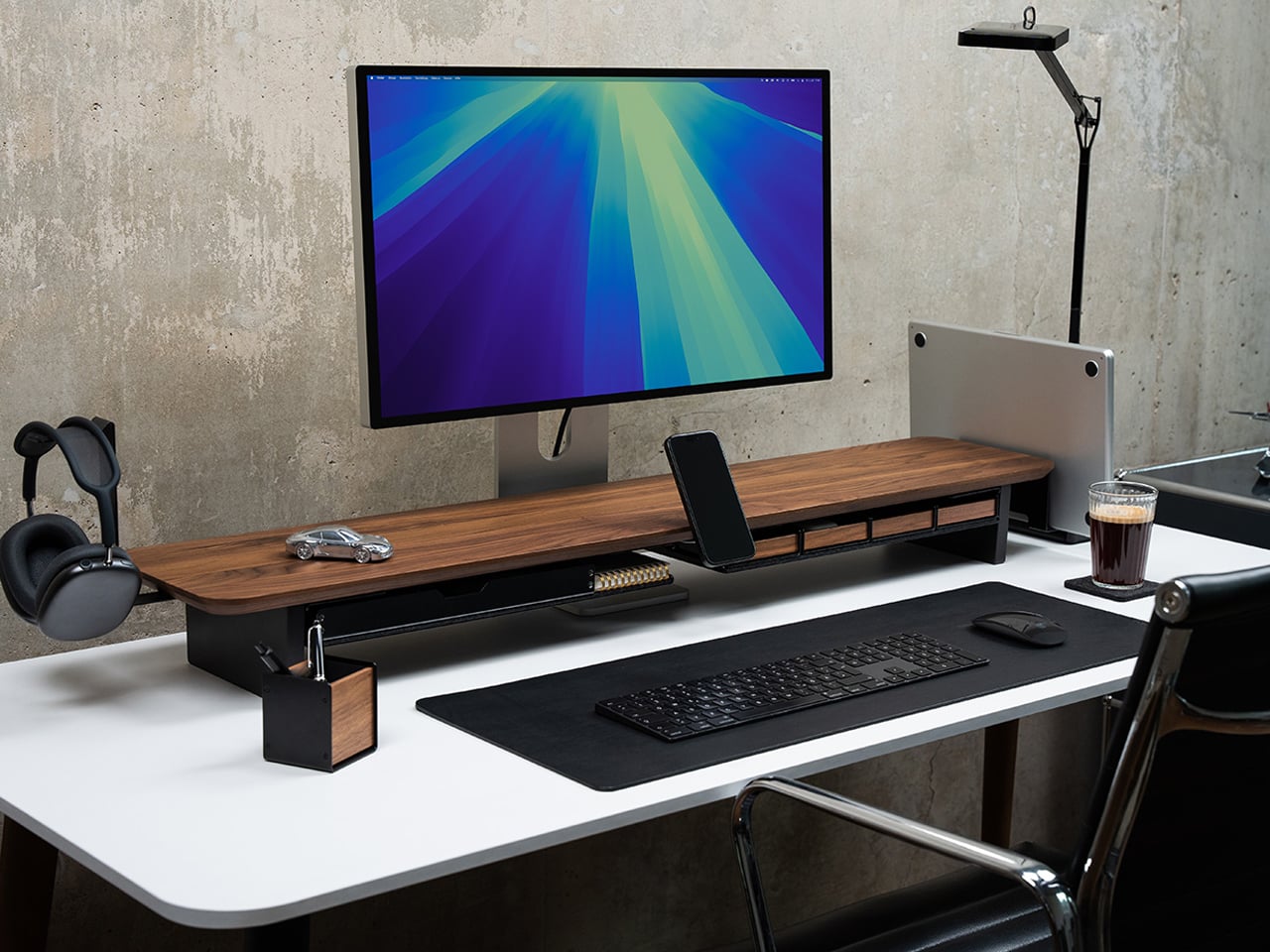
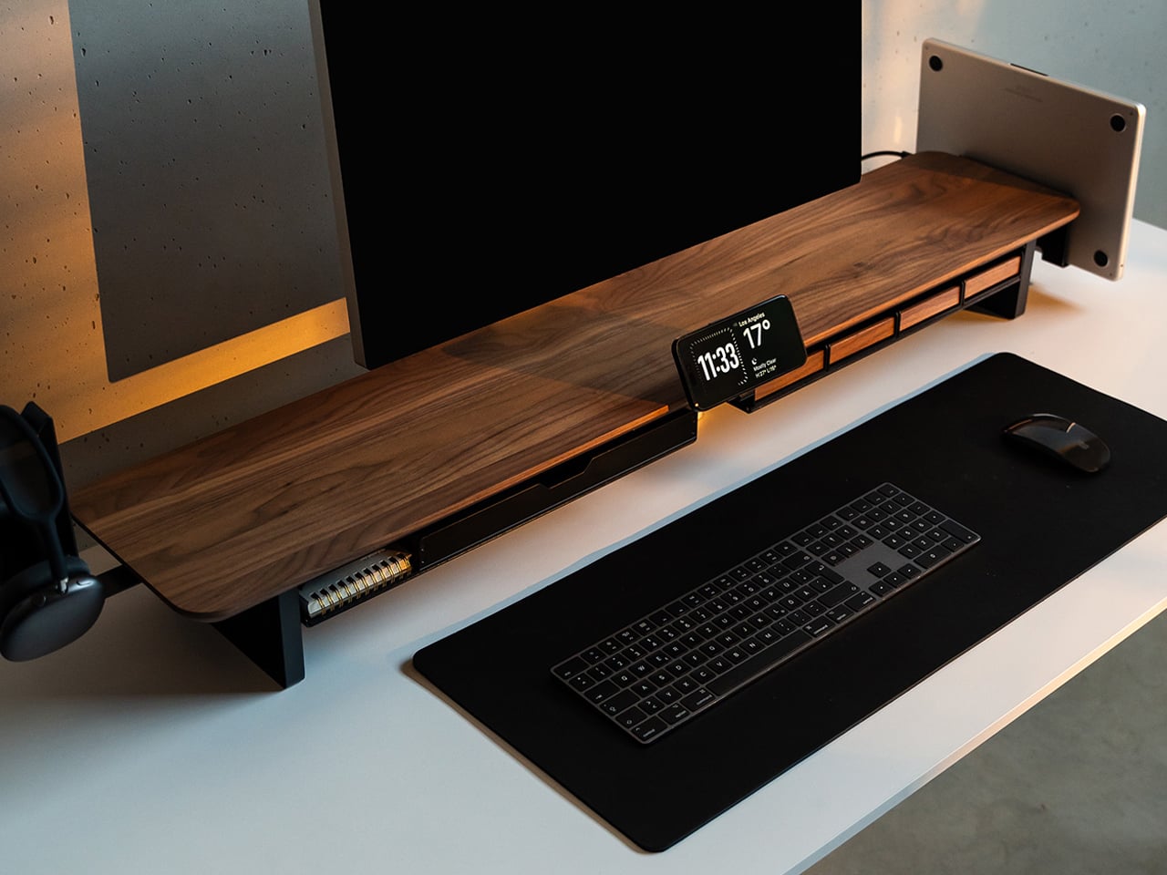
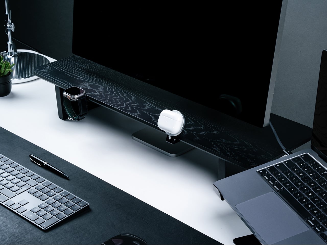
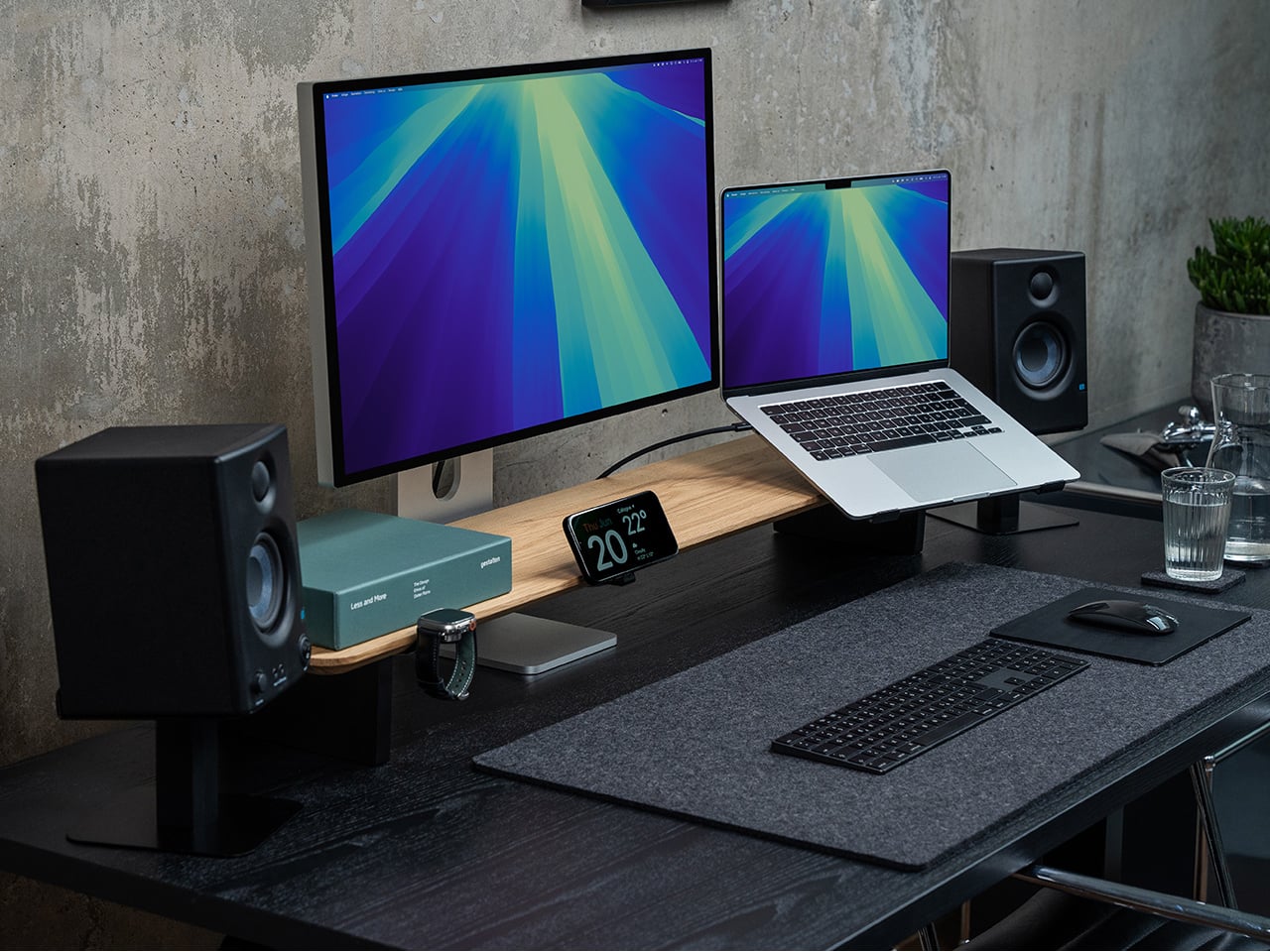
The Setup Cockpit steps beyond a monitor stand into a versatile tabletop platform designed to declutter and organize workspaces. Its patented mounting grid with 28 threaded holes allows users to attach accessories such as phone mounts, drawers, headphone stands, and laptop holders, turning the desk into a fully customizable setup. The cockpit accommodates up to two monitors, while the space underneath stores keyboards, multiport hubs, and essentials, keeping the tabletop minimalist and functional. Two sizes cater to both compact and dual-monitor setups, making it adaptable to any workspace.
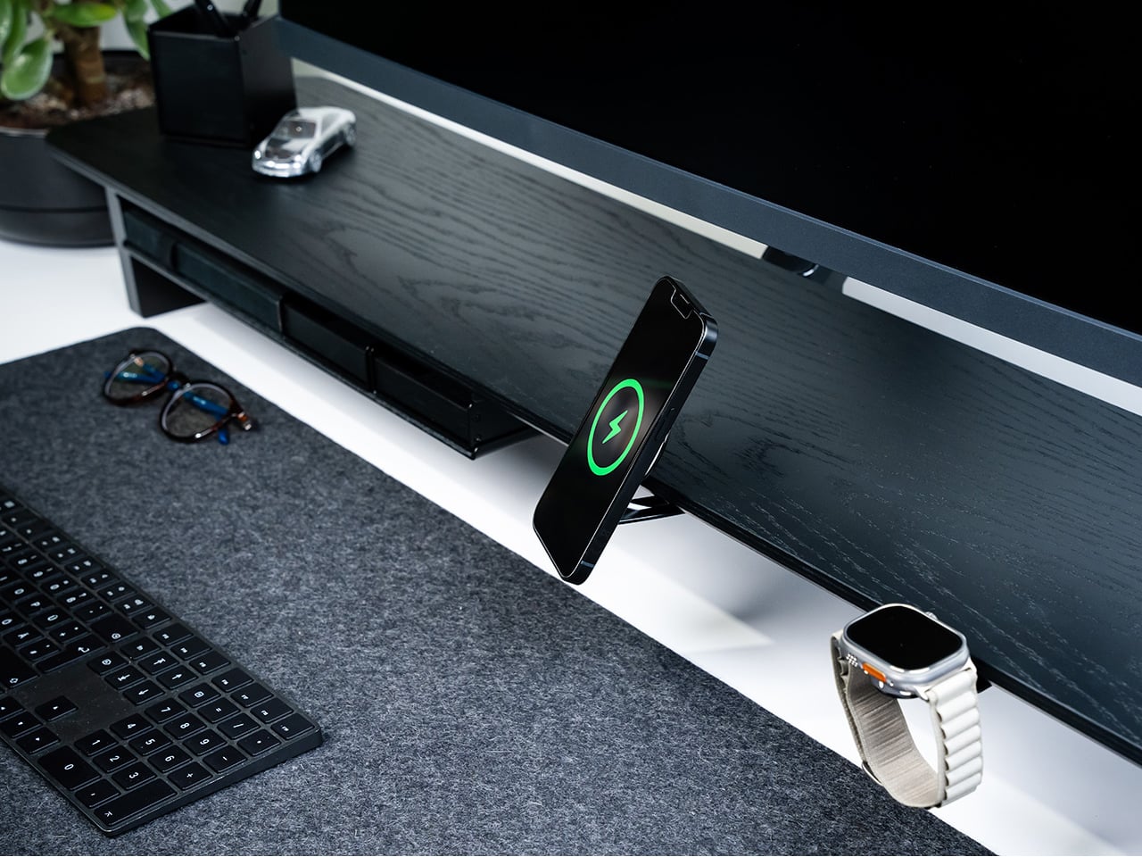
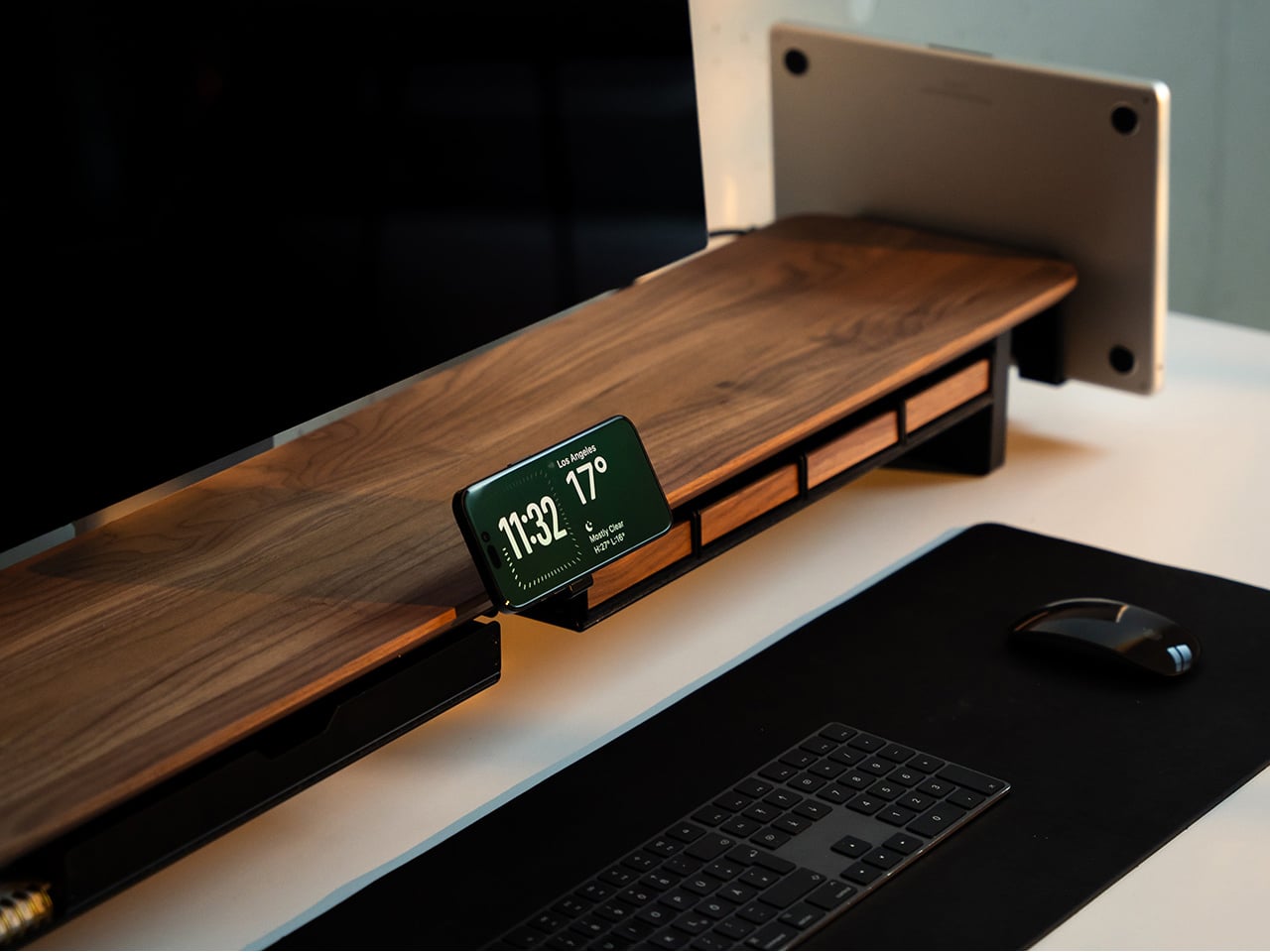
Crafted from premium materials including American walnut, oak, and powder-coated steel, the Setup Cockpit blends Scandinavian minimalism with German precision. Hand-finished surfaces add warmth and durability, while the modular design allows users to personalize their setup with an expanding ecosystem of add-ons. Designed and crafted by BALOLO in Cologne, it delivers a sophisticated, functional, and enduring solution for productivity, creativity, and a clutter-free workspace.

3. Uncompromising Craftsmanship

German design is celebrated for its meticulous craftsmanship. Every detail, from the precise seams of a leather sofa to the smooth operation of a hinge, is carefully executed. This dedication ensures products are both visually striking and flawlessly functional.

This focus on craft reflects a respect for skill and the dignity of work. Owning such pieces fosters a deeper connection to the objects in a home, encouraging mindfulness and intentional living. By valuing quality and longevity, German design inspires a thoughtful approach to choosing items that are not only beautiful but built to endure.
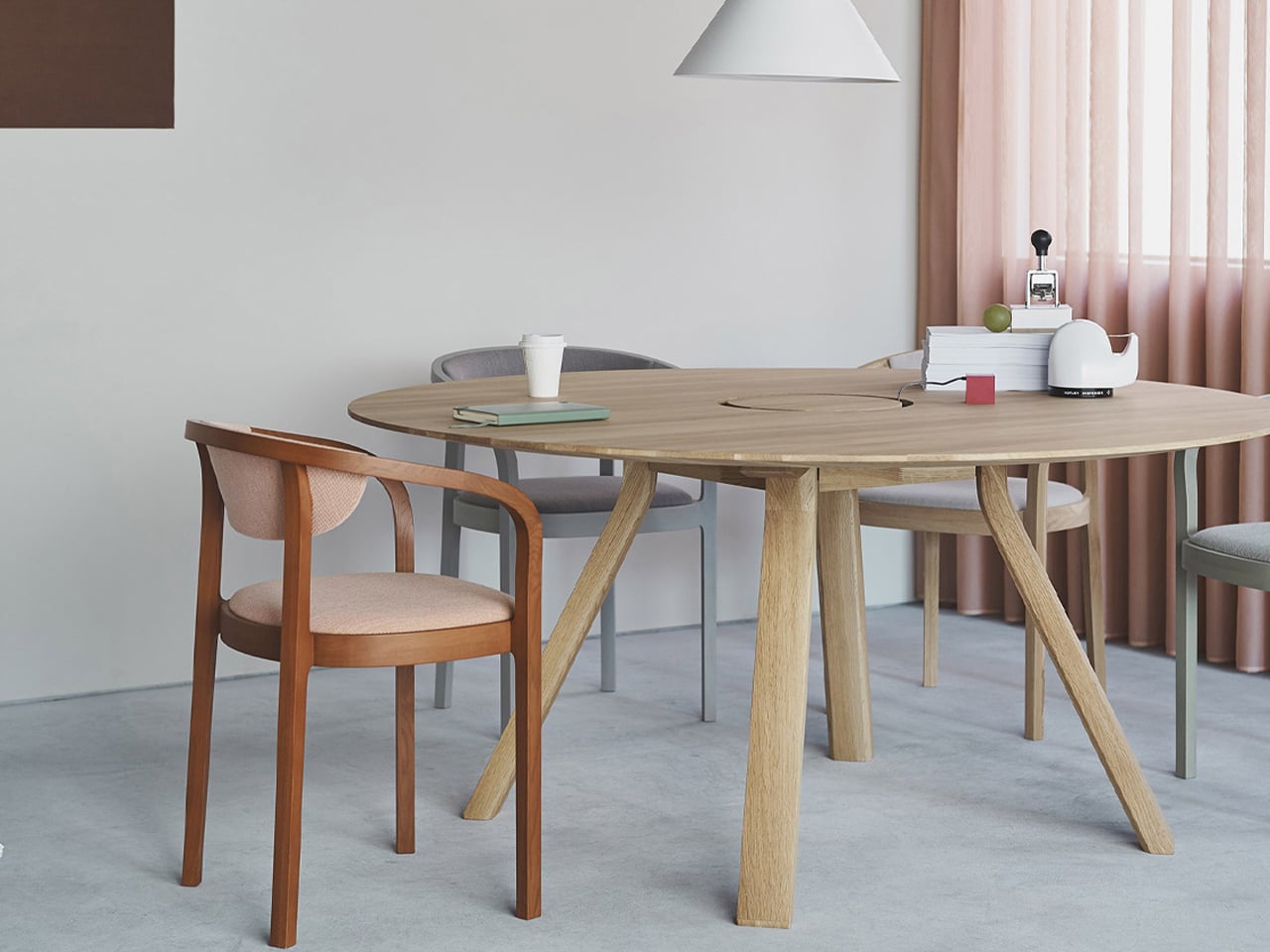
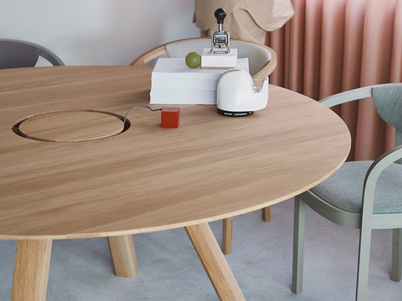
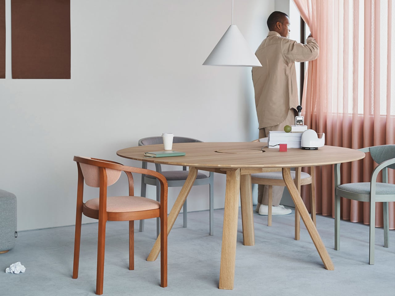
With hybrid work models becoming increasingly common, both home and office workspaces need to be functional, ergonomic, and visually appealing. The Spectrum Workstation Round ST160 by Geckeler Michels, designed for Karimoku New Standard, perfectly embodies this need by combining Japanese craftsmanship with German design principles. Crafted from solid Japanese oak, the workstation brings calm and balance to busy environments while supporting dynamic, flexible workstyles. Its circular central cable tunnel ensures easy access to charging and keeps desks organized, promoting productivity without clutter.
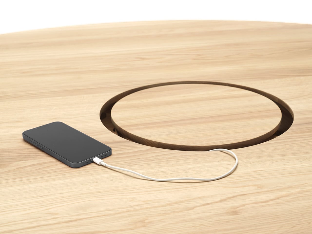
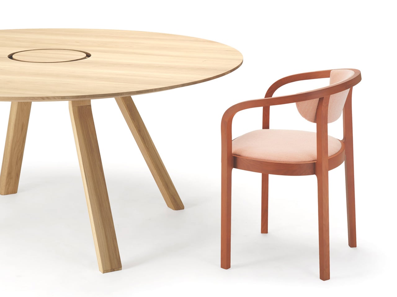
The Spectrum Workstation comfortably accommodates up to six people, making it ideal for collaboration or casual meetings. Available in black or natural finishes, it adapts to a variety of interior styles. The broader Spectrum series includes additional tables in varying sizes and heights, all crafted from sustainably sourced Japanese hardwoods.

4. The Beauty of Minimalism

German design embraces minimalism as a warm, inviting simplicity. By focusing on what is essential and removing the unnecessary, it creates spaces and products that feel calm, uncluttered, and effortlessly elegant. Clean lines, neutral tones, and balanced forms define this approach, resulting in a serene and harmonious environment.

Applied to homes, minimalism offers a solution to modern clutter. Thoughtful selection of each item and allowing room for quiet moments fosters clarity and peace. It is not about emptiness but about having exactly what is needed, creating interiors that nurture rest, rejuvenation, and a lasting sense of harmony.
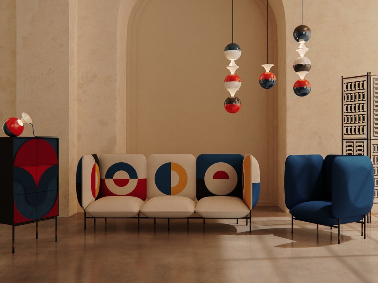

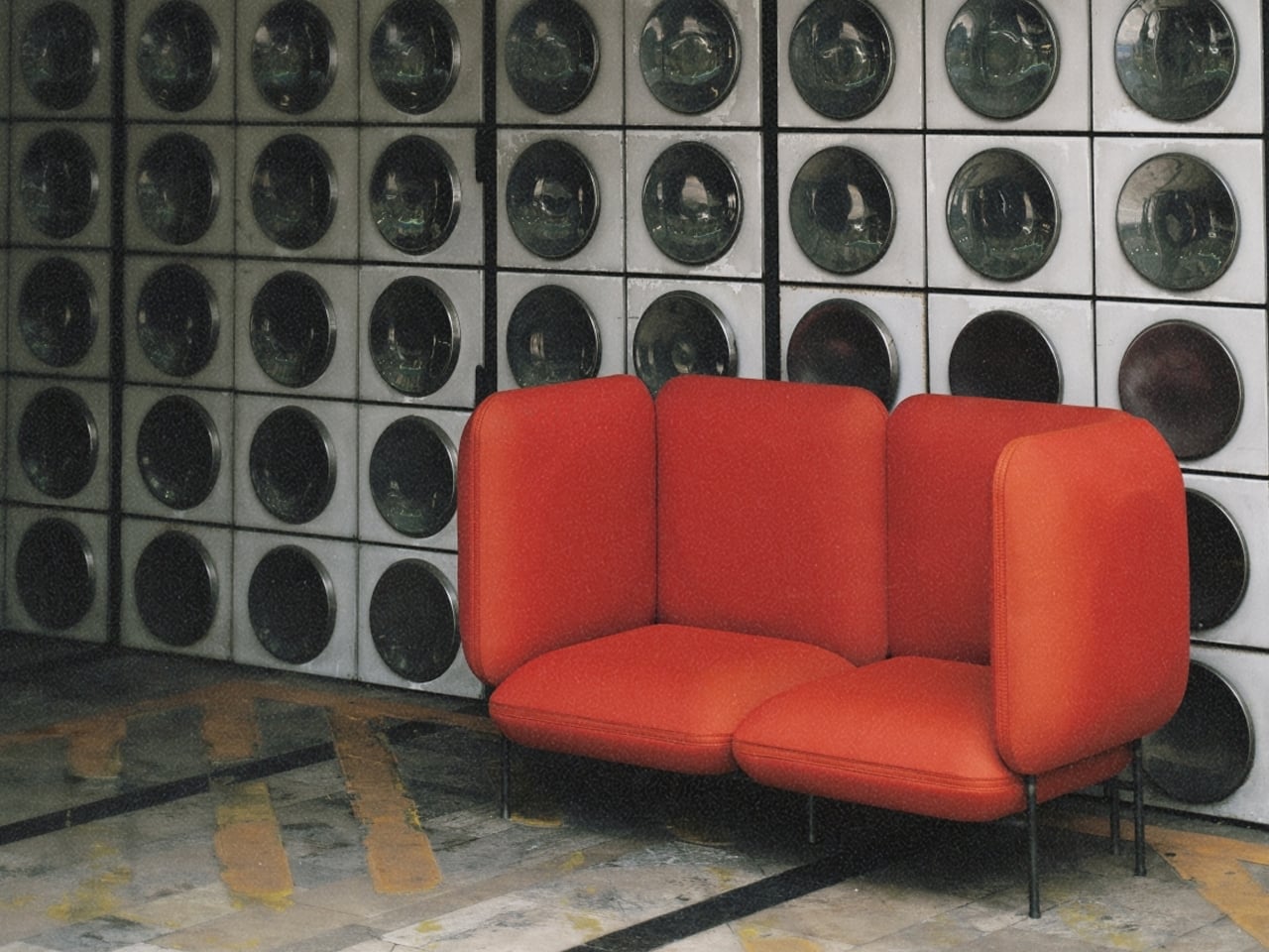
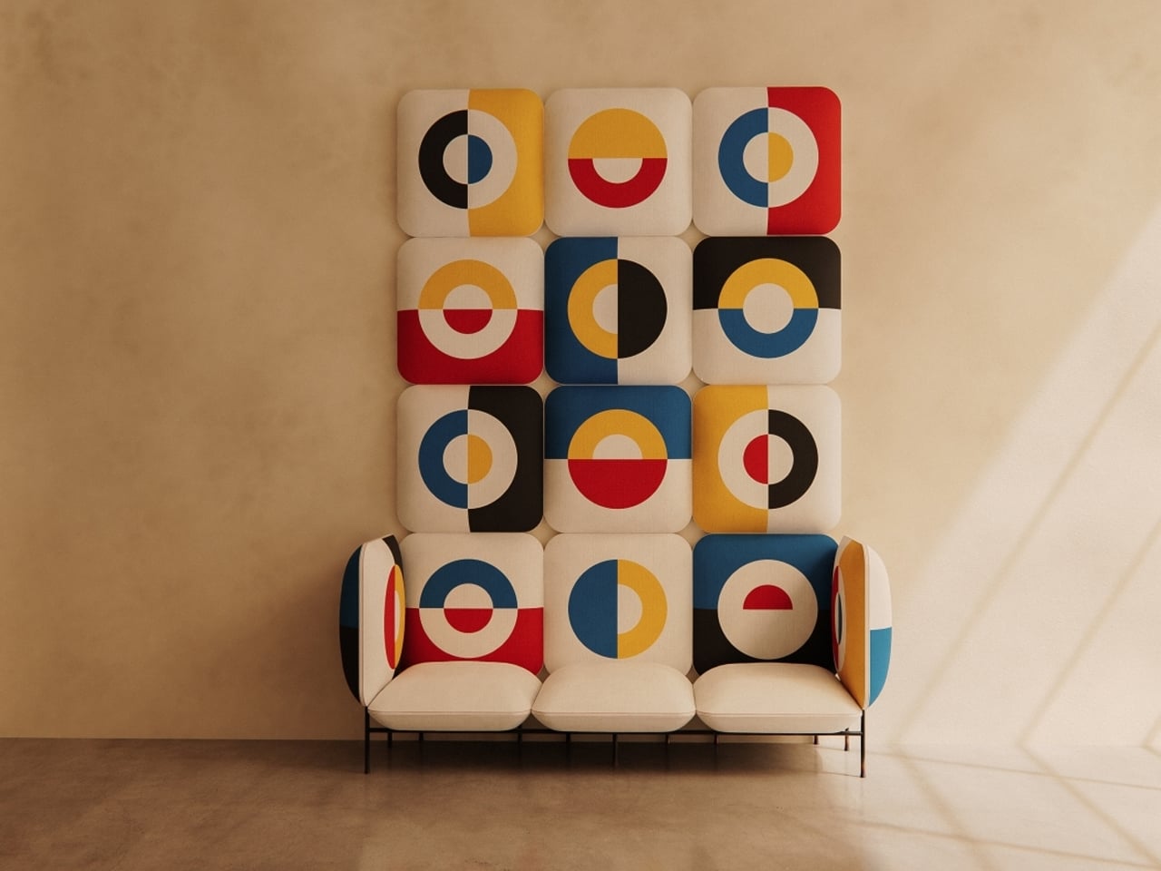
The Dedas seating system fuses comfort with German design principles of precision, functionality, and visual clarity, deeply rooted in Bauhaus aesthetics. Inspired by geometric forms and Hungarian artistic motifs, the collection features one-, two-, and three-seater sofas that balance form and function. The flagship model incorporates structured seating zones, tall backrests, and clean lines, creating an intimate and ergonomic experience while maintaining an artistic, Bauhaus-inspired appeal.
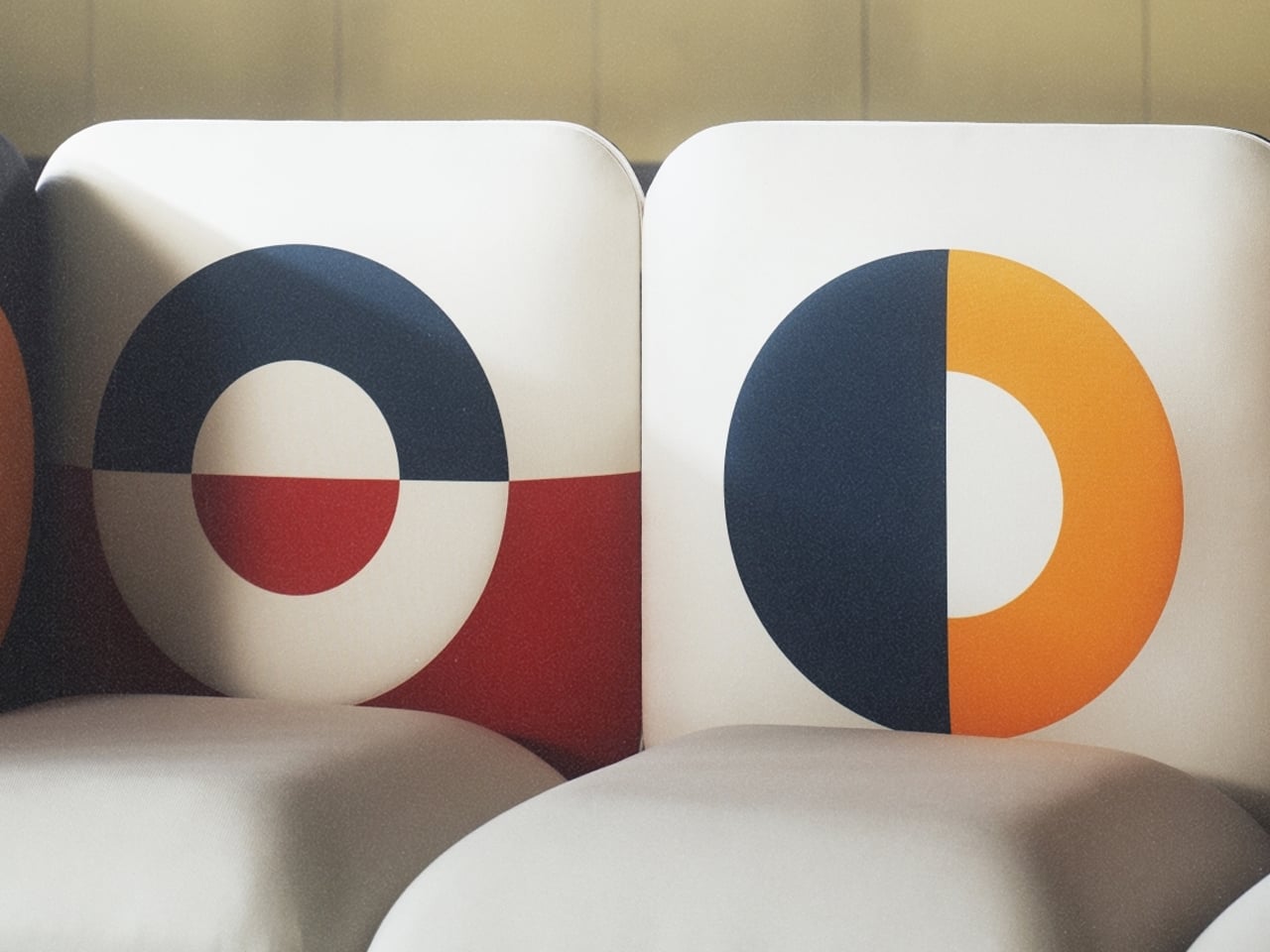
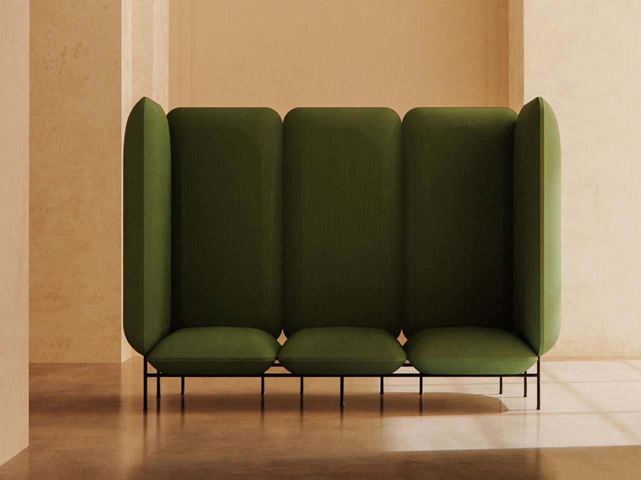
Sustainability and craftsmanship further define the Dedas sofas. Hexagonal CLIMATEX upholstery stretches seamlessly over curves, and recycled foam ensures durability and eco-friendliness. Iridescent legs, finished through a burn technique reminiscent of enamel art, add refined visual interest. Perfect for public or modern interiors, the Dedas seating system demonstrates how German Bauhaus-inspired design can combine comfort, practicality, and cultural expression into a striking, functional furniture piece.

5. Timeless, Not Trendy

German design emphasizes timelessness over fleeting trends. Products are crafted with classic, understated aesthetics and exceptional build quality, designed to last for decades. This approach resists disposable culture, creating pieces that are both enduring and quietly elegant.

Applied to the home, this philosophy encourages thoughtful choices. Selecting items that remain meaningful and durable ensures spaces evolve gracefully rather than needing constant updates. Investing in well-made, classic pieces creates interiors that balance contemporary style with lasting appeal, building a home that grows with its occupants and reflects a legacy of quality, comfort, and beauty.
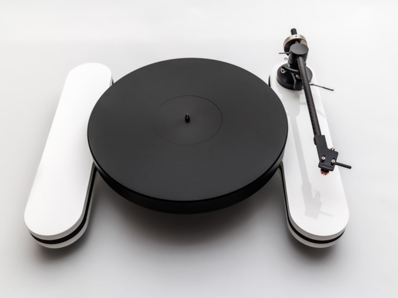
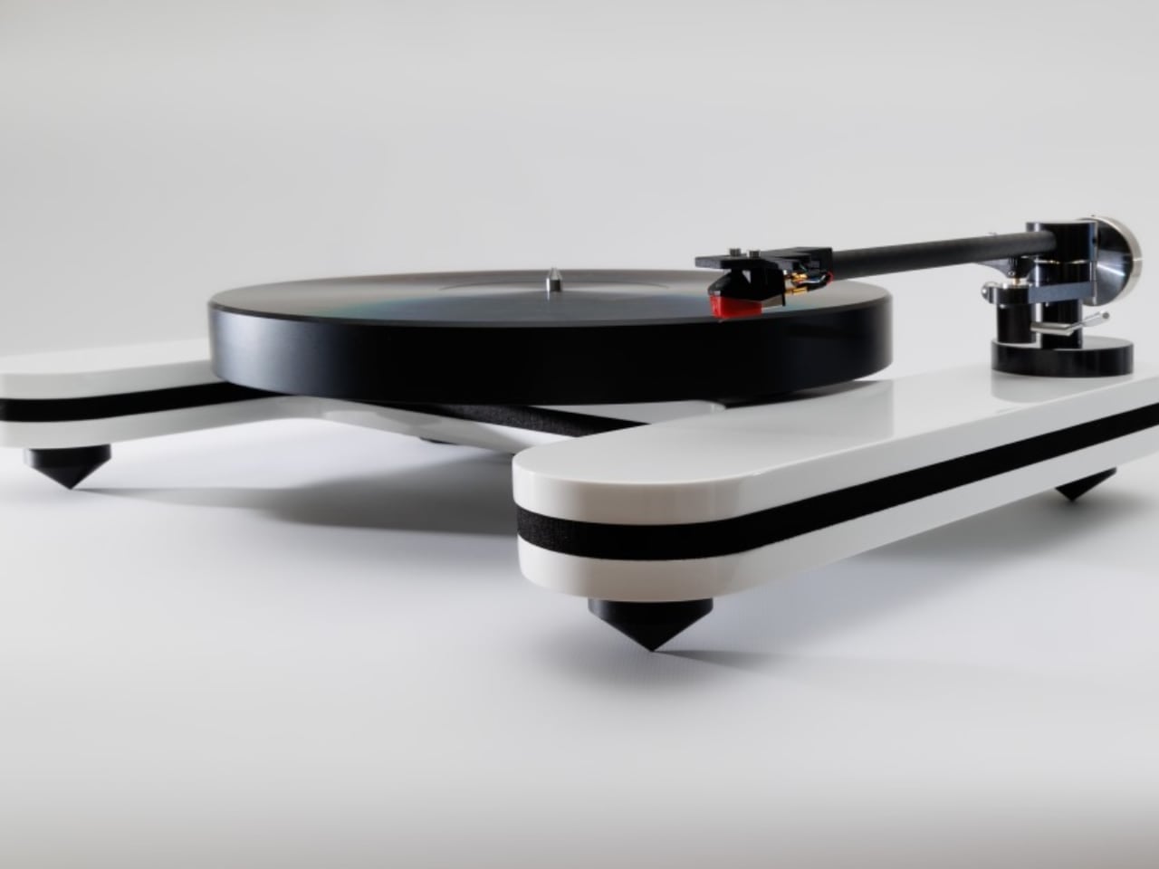
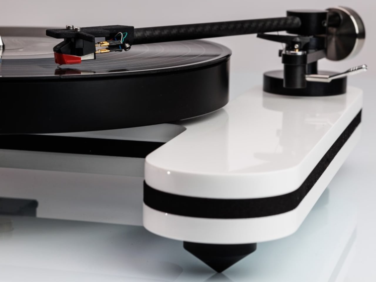
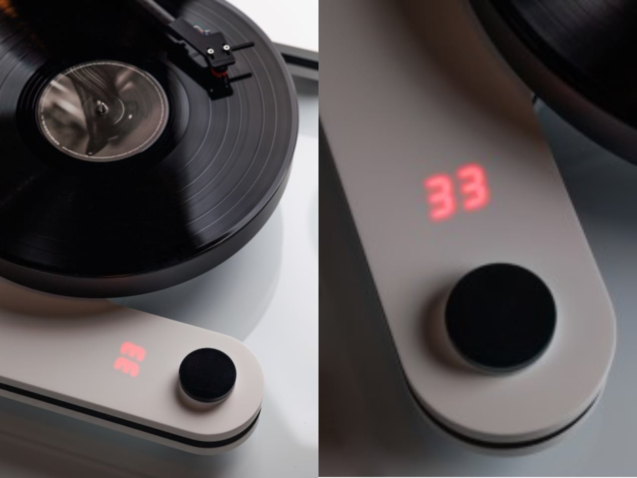
The Luphonic H2 turntable exemplifies the clarity and precision of German design. Traditional speed changes on vinyl often disrupt the listening experience, but the H2 simplifies it with an innovative coin-sized puck: black for 33 RPM, white for 45 RPM, and removing it stops playback. Red LED digits clearly display speed, combining intuitive functionality with striking minimalism.
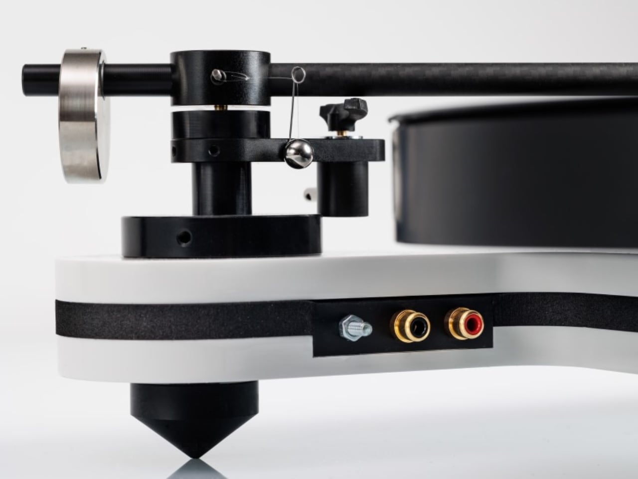
The turntable’s H-shaped Corian chassis and three-layer sandwich construction isolate motor vibrations, while the in-house K2 tonearm employs carbon fiber and advanced composites for precise tracking and low resonance. Adjustable VTA, azimuth, and anti-skating ensure optimal performance. It delivers audiophile-grade sound with clean aesthetics, demonstrating that precision engineering and intuitive user experience can coexist in a sophisticated analog system.

German design provides a practical blueprint for living well, emphasizing quality, purpose, and enduring beauty. More than a style, it is a philosophy that encourages thoughtful choices, creating homes that are functional and meaningful. By embracing its principles, interiors become harmonious spaces that enhance daily life, offering lasting peace, elegance, and a sense of well-being.

The post 5 Design Products Made in Germany That Made Modern Design Look Cheap first appeared on Yanko Design.

Samsung’s Secret Weapon: How the Galaxy Z Wide Fold 8 Plans to Beat Apple’s Foldable iPhone

Samsung’s Secret Weapon: How the Galaxy Z Wide Fold 8 Plans to Beat Apple’s Foldable iPhone Galaxy Z Wide Fold 8 Plans

  Samsung is preparing to expand its foldable smartphone lineup with the highly anticipated Galaxy Z Wide Fold 8. This device is poised to redefine multitasking and usability in the foldable phone market. While official details remain limited, early reports suggest that the Galaxy Z Wide Fold 8 will feature a wider cover screen, advanced […]

The post Samsung’s Secret Weapon: How the Galaxy Z Wide Fold 8 Plans to Beat Apple’s Foldable iPhone appeared first on Geeky Gadgets.

Posted in Uncategorized

Reachy Mini Open Source Robot Kit Review & Setup Guide for Beginners

Reachy Mini Open Source Robot Kit Review & Setup Guide for Beginners Reachy Mini Open Source Robot Kit Review

The Reachy Mini is an open source robot developed collaboratively by Hugging Face and Pollen Robotics, designed to provide hands-on learning opportunities in robotics and programming. Powered by a Raspberry Pi, this modular robot offers both local control and internet-connected functionality, making it adaptable for various technical setups. As explained by Jeff Geerling, the Reachy […]

The post Reachy Mini Open Source Robot Kit Review & Setup Guide for Beginners appeared first on Geeky Gadgets.

Posted in Uncategorized

FlowSence Just Built the Coffee Scale That Teaches You to Brew

Making good pour-over coffee feels like being asked to juggle while blindfolded. You’re managing water temperature, grind size, pouring rhythm, and extraction time all at once, but you can’t actually see what any of those variables are doing to your final cup. You taste the result, shrug, and wonder if you should have poured slower or used hotter water. Then you try again tomorrow with a completely different outcome.

FlowSence, designed by Hyeokin Kwon, is built around a simple insight: brewing doesn’t have to stay invisible. Most of us learn coffee through trial and error because we lack the sensory training to connect what we taste with what we did. We might know our coffee tastes weak or bitter, but translating that into actionable changes requires experience we haven’t built yet. Tools like TDS meters offer numbers, but numbers without context just add another layer of confusion.

Designer: Hyeokin Kwon

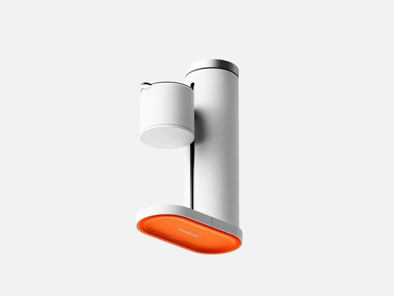
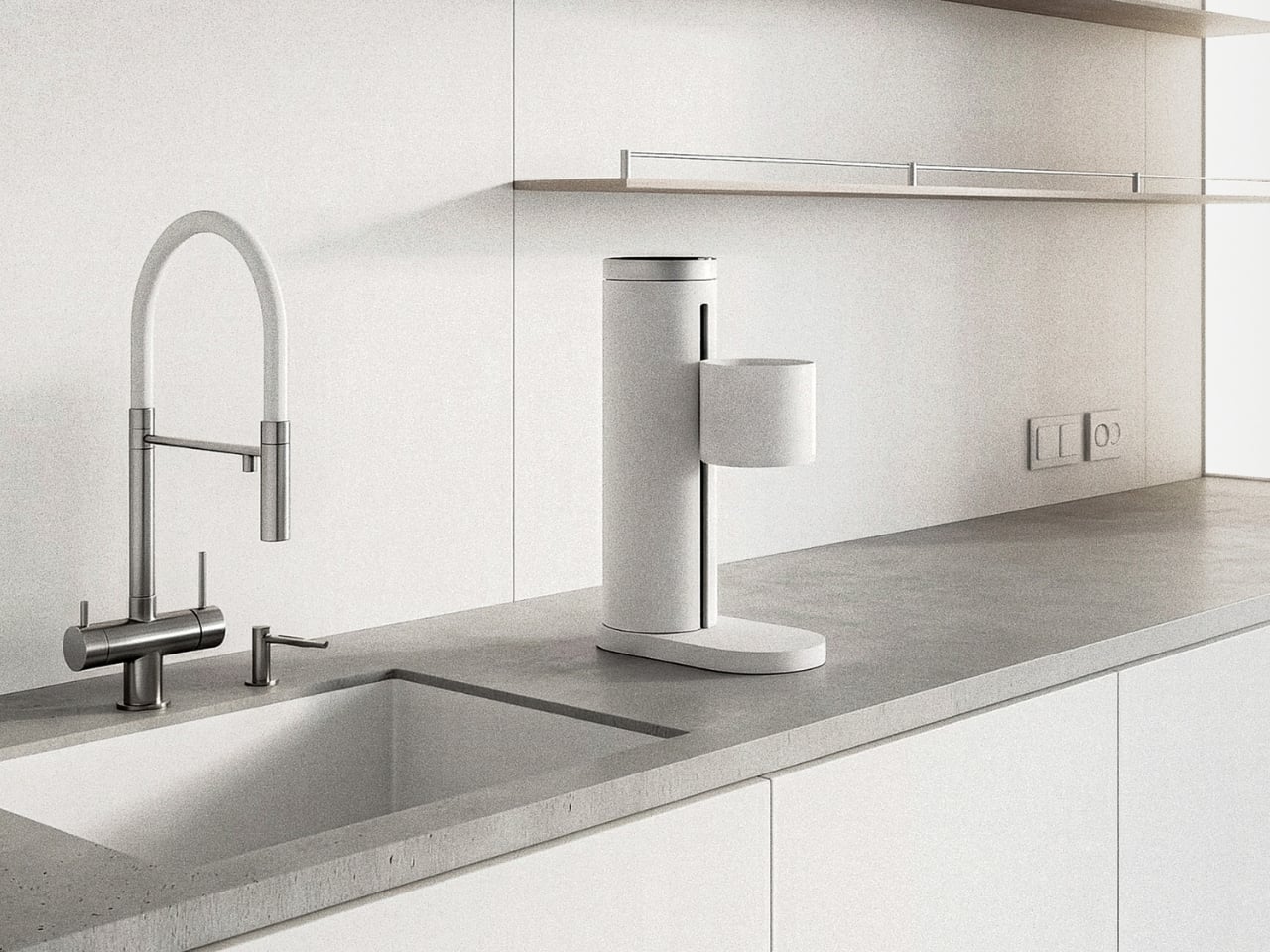
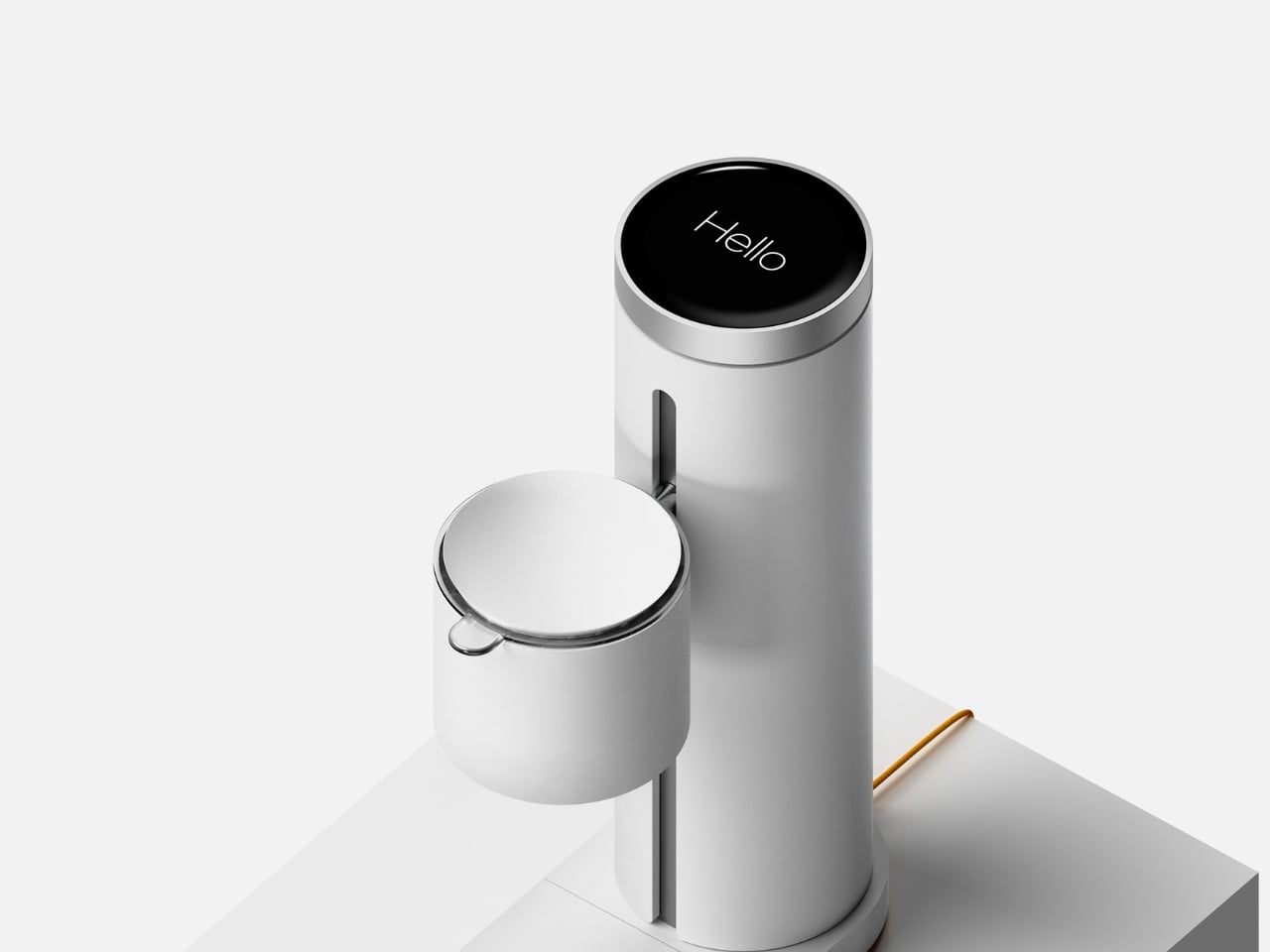
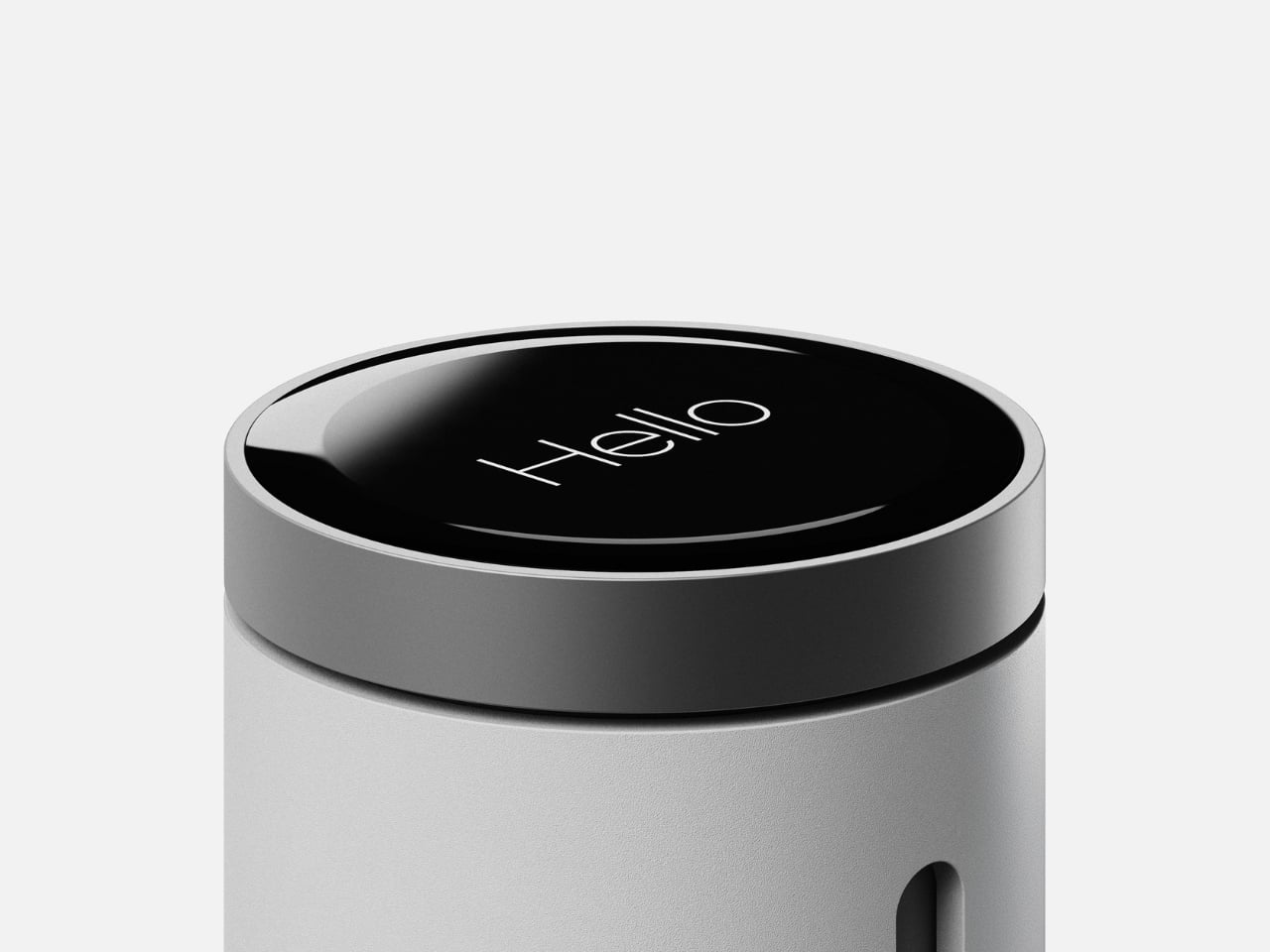
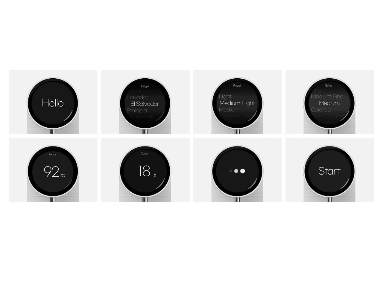
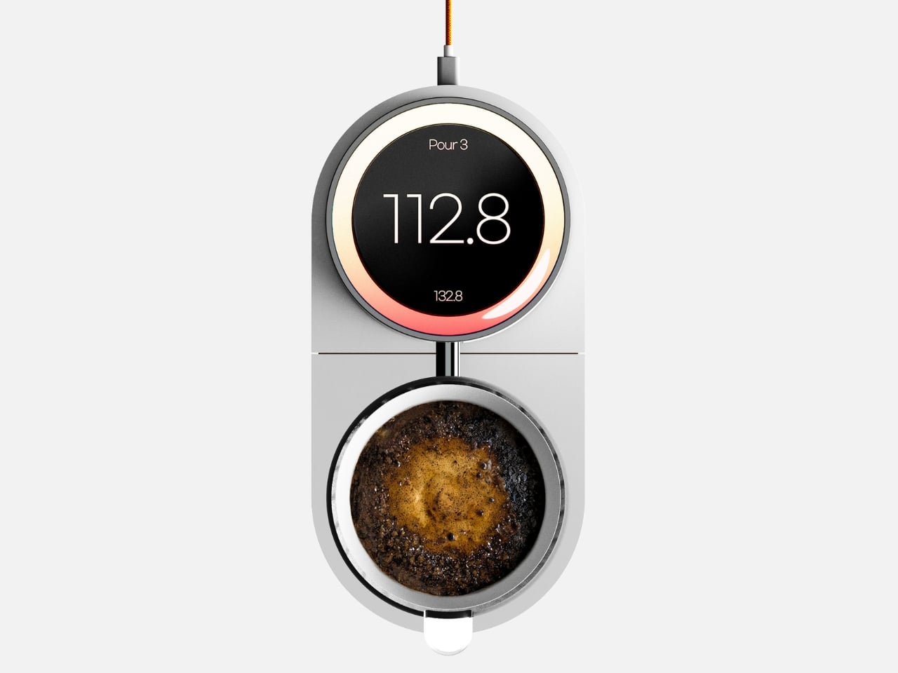
What makes FlowSence different is that it refuses to automate your brewing. Instead, it acts like a patient coach standing beside you, translating the invisible parts of extraction into something you can actually see and understand. While you pour, it measures weight, temperature, and flow in real time, then visualizes those changes on a 4-inch round OLED display. You stay in control of the kettle, but now you can watch your pouring rhythm, notice when your flow rate drops, and start connecting your physical movements to what’s happening in the cup.

The interface starts with a rotary dial that lets you input the basics: coffee origin, roast level, grind size, water temperature, and dose. Turn to adjust, press to confirm. Once you’ve set your parameters, an AI-generated recipe appears, giving you a suggested approach based on what you’ve told it about your beans. From there, brewing begins, and the screen shifts into feedback mode.

This is where the learning happens. Instead of just showing you a timer and a weight, FlowSence tracks your pouring behavior and presents it visually. You can see whether you’re pouring steadily or in uneven bursts. You can spot the moment your water temperature drops too much. You start to notice patterns in your technique, which means you can actually correct them. Over time, your pours become more consistent, not because the machine took over, but because you’ve learned what consistency looks like.

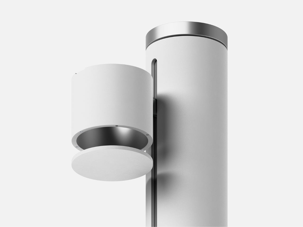
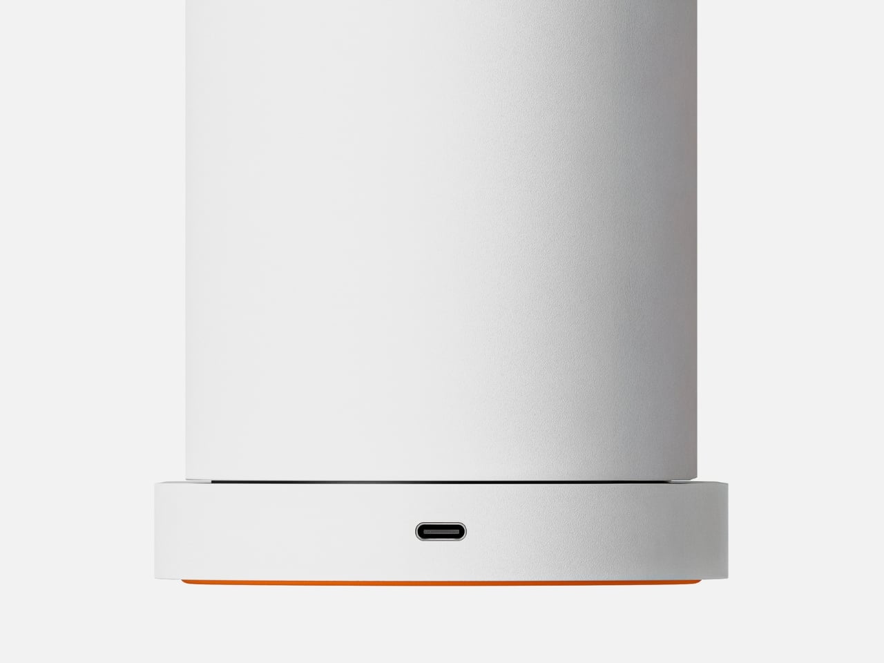
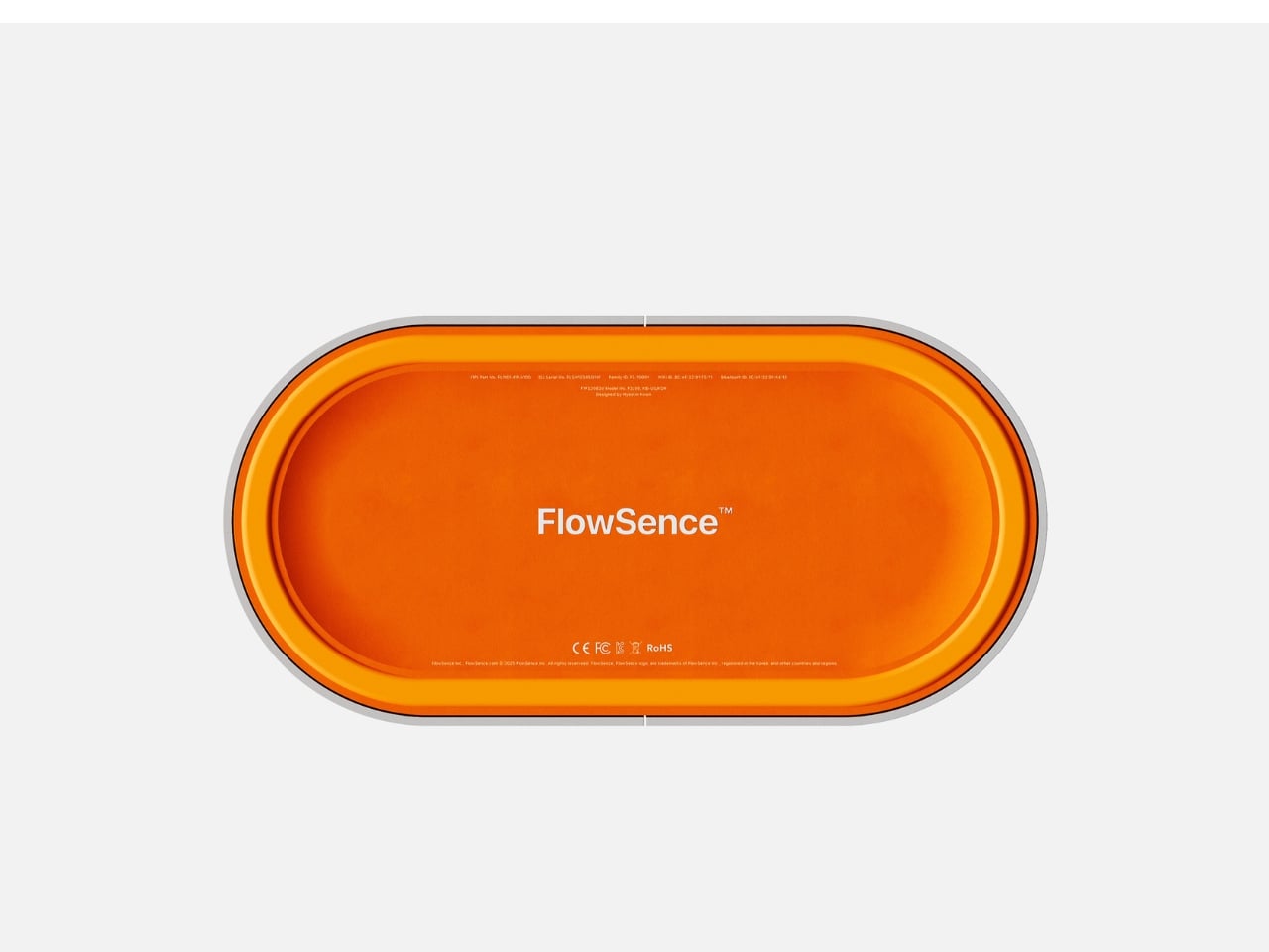
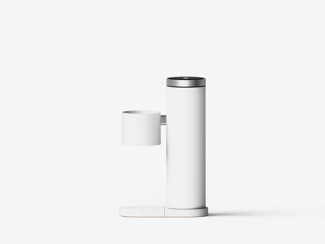
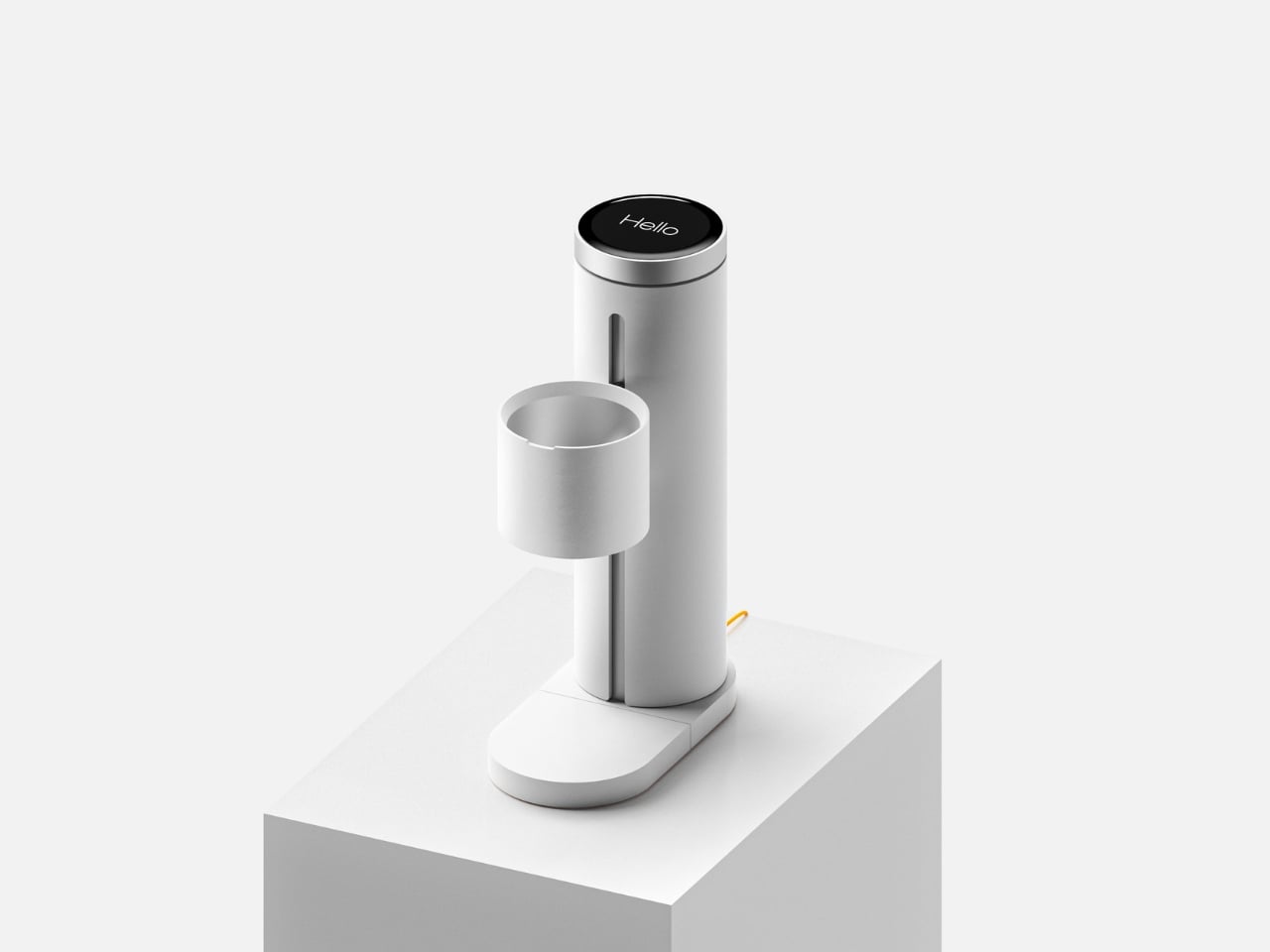
The physical design supports this learning-centered philosophy. The machine is compact and vertical, built from aluminum alloy and heat-resistant composite materials. A cylindrical body houses the measurement tech, with a side-mounted cradle holding your brewing vessel and a weighted base that keeps everything stable. That pop of orange on the base isn’t just aesthetic, it’s a visual anchor that makes the tool feel approachable rather than clinical. The whole thing connects via Wi-Fi and Bluetooth, runs on USB-C power, and draws less than 10 watts. It’s not trying to dominate your counter or complicate your setup.

The packaging reflects the same clarity. When you open the box, the side profile of FlowSence is immediately visible, showing you its structure before you’ve even lifted it out. Components are arranged in sequence, so the unboxing process doubles as an introduction to how everything fits together.

What FlowSence really offers is a shift in how we think about coffee tools. Most brewing gadgets either do everything for you or leave you completely on your own. FlowSence lives in the middle. It gives you real-time information and visual feedback, but it doesn’t take the kettle out of your hand. The goal isn’t a perfect robotic pour. The goal is helping you understand what a good pour feels like so that eventually, you don’t need the screen anymore.

For people who’ve felt stuck in their coffee routine or intimidated by the complexity of manual brewing, that’s a meaningful difference. You’re not just making coffee. You’re learning a skill that actually sticks, supported by a tool designed to make the invisible visible. And maybe that’s the kind of coffee gadget we’ve been missing all along.

The post FlowSence Just Built the Coffee Scale That Teaches You to Brew first appeared on Yanko Design.
12 Essential iOS 26.3 Settings for Better Battery Life and Privacy

12 Essential iOS 26.3 Settings for Better Battery Life and Privacy Guide to essential iOS 26.3 settings for privacy and performance

The release of iOS 26.3 brings a range of new features and updates designed to enhance your iPhone’s privacy, security, and overall functionality. By adjusting key settings, you can ensure your device runs efficiently while safeguarding your personal data. Below is a detailed guide to the most important settings you should review and update to […]

The post 12 Essential iOS 26.3 Settings for Better Battery Life and Privacy appeared first on Geeky Gadgets.

Posted in Uncategorized

Homeland Security has reportedly sent out hundreds of subpoenas to identify ICE critics online

The Department of Homeland Security (DHS) has reportedly been asking tech companies for information on accounts posting anti-ICE sentiments. According to The New York Times, DHS has sent hundreds of administrative subpoenas to Google, Reddit, Discord and Meta over the past few months. Homeland Security asked the companies for names, email addresses, telephone numbers and any other identifying detail for accounts that have criticized the US Immigration and Customs Enforcement agency or have reported the location of its agents. Google, Meta and Reddit have complied with some of the requests

Administrative subpoenas are different from warrants and are issued by the DHS. The Times says they were rarely used in the past and were mostly sent to companies for the investigation of serious crimes, such as child trafficking. Apparently, though, the government has ramped up its use in the past year. “It’s a whole other level of frequency and lack of accountability,” Steve Loney, a senior supervising attorney for ACLU, told the publication.

Companies can choose whether to comply with the authorities or not, and some of them give the subject of a subpoena up to 14 days to fight it in court. Google told The Times that its review process for government requests is “ designed to protect user privacy while meeting [its] legal obligations” and that it informs users when their accounts have been subpoenaed unless it has been legally ordered not to or in exceptional circumstances. “We review every legal demand and push back against those that are overbroad,” the company said.

Some of the accounts that were subpoenaed belong to users posting ICE activity in Montgomery County, Pennsylvania on Facebook and Instagram in English and Spanish. The DHS asked Meta for their names and details on September 11, and the users were notified about it on October 3. They were told that if Meta didn’t receive documentation that they were fighting the subpoena in court within 10 days, Meta will give Homeland Security the information it was asking for. The ACLU filed a motion for the users in court, arguing that the DHS is using administrative subpoenas as a tool to suppress speech of people it didn’t agree with.

In late January, Meta started blocking links to ICE List, a website that lists thousands of ICE and Border Patrol agents’ names. A few days ago, House Judiciary Committee member Jamie Raskin (D-MD) also asked Apple and Google to turn over all their communication with the US Department of Justice to investigate the removal of ICE-tracking apps from their respective app stores.

This article originally appeared on Engadget at https://www.engadget.com/big-tech/homeland-security-has-reportedly-sent-out-hundreds-of-subpoenas-to-identify-ice-critics-online-135245457.html?src=rss

OpenClaw Beginners Guide : Timers, Webhooks, Markdown & Continuous Loops Explained

OpenClaw Beginners Guide : Timers, Webhooks, Markdown & Continuous Loops Explained Diagram showing OpenClaw gateway routing messages and triggers to agents that process queued events in a loop.

OpenClaw is an open source AI framework designed to automate tasks through a structured combination of inputs, triggers, and a continuous processing loop. As outlined by Damian Galarza, its architecture relies on an event-driven model where specialized components, called agents, handle tasks based on predefined instructions. These agents communicate with one another, using persistent state […]

The post OpenClaw Beginners Guide : Timers, Webhooks, Markdown & Continuous Loops Explained appeared first on Geeky Gadgets.

Posted in Uncategorized

How to customize your iPhone home screen with iOS 26

Apple has steadily expanded home screen customization on the iPhone over the past few years, and iOS 26 continues that trend with more visual control over app icons. Building on the changes introduced in iOS 18, the latest update lets you resize icons, remove app labels, apply system-wide color tints and make icons translucent using Apple’s new Liquid Glass design language.

Most of these options live in one place: the Customize menu, which appears after entering edit mode on the home screen. While iOS still doesn’t allow total freeform icon placement or third-party icon packs without shortcuts, the tools Apple provides are now flexible enough to dramatically change how an iPhone looks and feels. This guide walks through how to customize app icons and layouts using the options available in iOS 26, with a focus on icon size, color, appearance and arrangement.

All home screen customization starts the same way.

  1. Go to the Home Screen.

  2. Touch and hold an empty area of the Home Screen background until the apps begin to jiggle.

  3. Tap Edit in the top left corner, then select Customize from the menu.

A customization panel appears along the bottom of the screen. Changes made here apply across all home screen pages at once, rather than on a per-page basis.

From the Customize menu, you can:

  • Adjust icon size

  • Change appearance (e.g., Dark)

  • Make icons translucent with a clear look

  • Add a color tint to icons and widgets

One of the simplest changes in iOS 26 is also one of the most visually impactful. From the Customize menu, tap the icon showing two app squares of different sizes. This switches the home screen to Large App Icons mode.

When large icons are enabled, app labels disappear entirely and the icons themselves expand to fill more of the grid. This creates a cleaner look and makes apps easier to tap, particularly on iPhone models with larger screens. The tradeoff is that fewer icons fit on each screen and spacing between rows becomes more pronounced.

To revert to standard icons with labels, repeat the steps and tap the same button again.

undefined

iOS 26 offers four icon appearance styles: Default, Dark, Clear and Tinted. These options are available from the top row of the Customize panel. From the Customize panel, you can tap the sun icon across all options in the top left-hand corner to toggle wallpaper dimming. This generally makes app icons and labels easier to read. 

The Default option keeps icons looking as the developers intended, with no system-wide color or transparency applied.

Selecting Dark applies a darker background to supported app icons and widgets. Apple’s own apps fully support this mode, and some third-party apps do as well, though many retain their original colors. When Dark is enabled, iOS can also dim the wallpaper slightly, which may help reduce power usage on OLED displays.

The Clear option enables translucency across all apps on the Home Screen. This removes all color but retains app labels. The layered, frosted-glass effect changes depending on the background image. Clear icons can be paired with Light, Dark or Auto styles using the options along the bottom of the Customize panel.

Tinted mode allows all supported app icons and widgets to take on a single color scheme. After selecting Tinted, color and saturation sliders appear at the bottom of the screen. Adjusting these changes the hue applied across icons, creating a uniform look that can range from subtle pastels to high-contrast monochrome themes.

If you want a specific color from your iPhone’s wallpaper, select the eyedropper tool, then tap and hold while dragging the cursor across the screen until you land on your chosen color. Like the Clear option, you’ll be able to select from Light, Dark or Auto when adjusting the Tinted settings.

The Auto option allows icons to switch between light and dark appearances based on system-wide light or dark mode.

App placement works the same way it did before iOS 26, but the visual changes introduced by larger icons and spacing make layout choices more noticeable.

Apps can be rearranged by accessing an empty space on the Home Screen, then tapping and holding until the apps start jiggling. From here you can drag icons to new positions. The grid remains fixed, meaning icons cannot overlap or be placed freely, but there is more flexibility in how empty space is used.

Icons can be clustered toward the bottom of the screen, aligned to one side or arranged to frame a wallpaper. With large icons enabled, the gap between the dock and the first row of apps becomes more pronounced, but it cannot be filled with additional icons.

Changes apply across all home screen pages, so reorganizing one page does not affect icon size or appearance on another.

Despite expanded customization, some long-standing limitations remain. iOS 26 does not support per-app icon color selection, custom icon packs without shortcuts or freeform icon placement outside the grid. Icon appearance settings apply globally, not per page or per app.

Widgets, lock screen customization and focus mode filters add additional layers of personalization, but those tools sit outside the scope of the home screen Edit menu.

iOS 26 gives iPhone users more control over the look of their home screen than ever before, even if Apple’s approach remains structured. By combining icon resizing, appearance modes and careful app arrangement, it’s possible to create a layout that feels cleaner, more personal and easier to use without relying on workarounds.

This article originally appeared on Engadget at https://www.engadget.com/mobile/smartphones/how-to-customize-your-iphone-home-screen-with-ios-26-130000798.html?src=rss

7 Best LEGO Creations of February 2026

February 2026 promises an exceptionally good month for LEGO fans, blending nostalgia with genuine innovation in ways that feel long overdue. We’re seeing long-awaited franchise collaborations finally materialize alongside fan-designed projects that earned their retail spots through sheer creativity. These aren’t background pieces you assemble once and forget about. They’re conversation starters that remind you why clicking plastic bricks together never really gets old, even when you’re old enough to have a mortgage.

What stands out this month is the range. Sports fans, comedy nerds, wizarding world collectors, Star Wars enthusiasts—everyone gets something worth displaying. LEGO keeps proving they understand their audience isn’t just kids anymore. These builds respect your time, your shelf space, and your wallet while delivering that specific joy that only comes from watching a pile of bricks transform into something you actually care about.

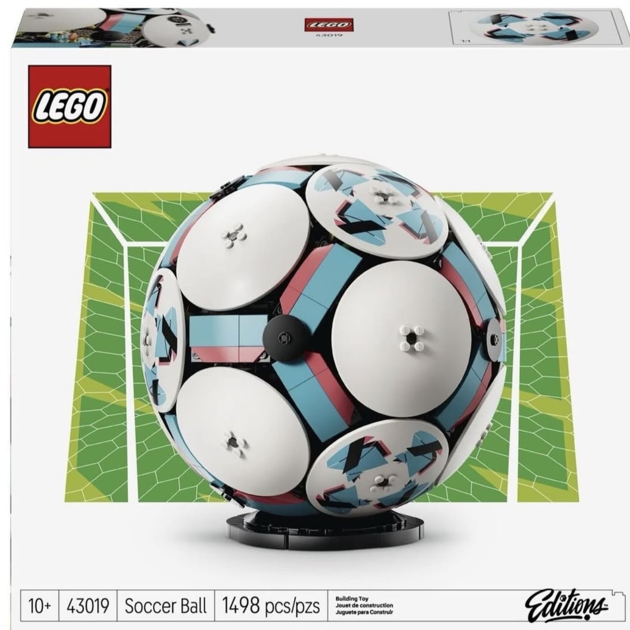
1. LEGO Editions Soccer Ball with Hidden Stadium (43019)


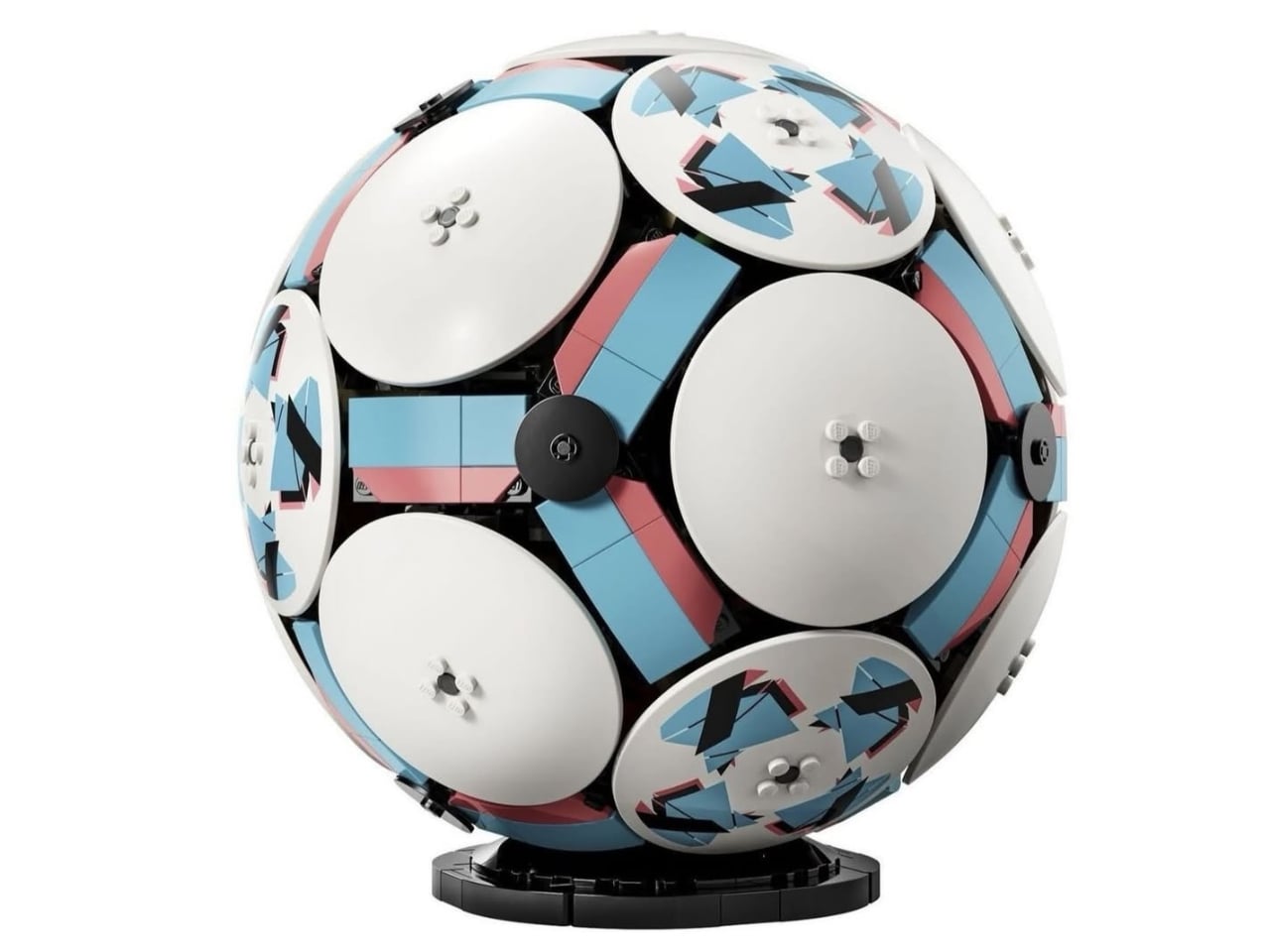
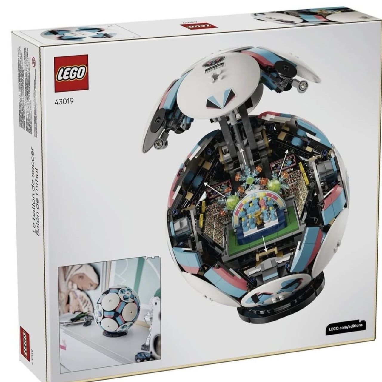
This 1,498-piece spherical build stretches 15 inches long and sits 10.3 inches wide once you’re done with it. The exterior mimics a soccer ball’s paneling well enough that anyone walking past knows exactly what they’re looking at. But here’s where it gets interesting—the whole thing splits open to reveal a complete miniature stadium tucked inside. We’re talking stands, pitch markings, tiny spectators frozen mid-cheer, even miniature players positioned on the field. The engineering required to nest an entire stadium inside a curved exterior without making it feel hollow or cheap is genuinely impressive.

You get two completely different display options here, which matters more than it sounds like. Show it closed, and it reads as a soccer ball replica that happens to be made of LEGO. Crack it open, and suddenly you’ve got an architectural achievement that rewards closer inspection. The dual functionality means you’re essentially getting two builds for your money, which helps justify the investment. The tiny fan figures and pitch details show the kind of attention LEGO saves for sets they actually care about, rather than phoning in another licensed property cash grab.

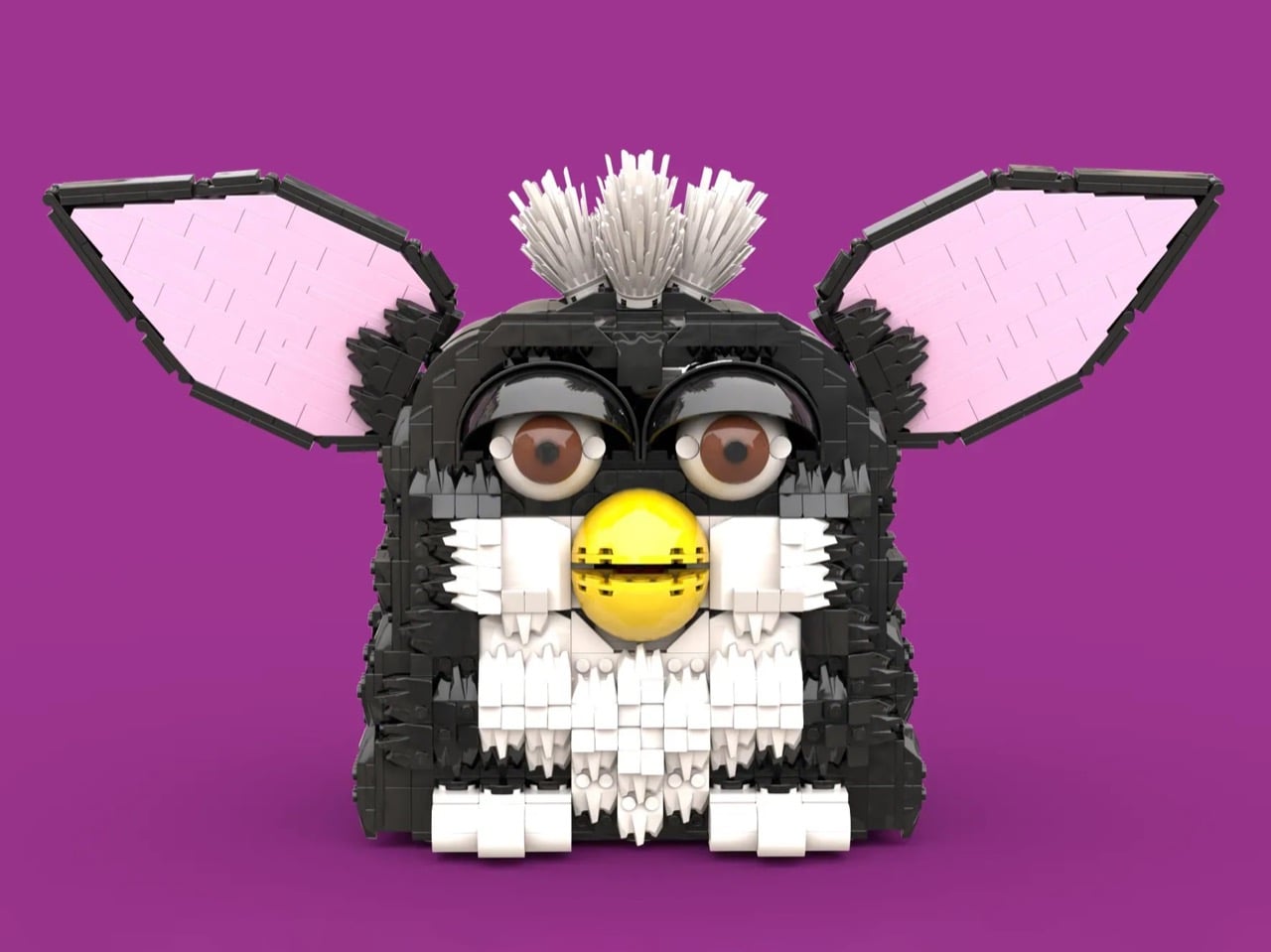
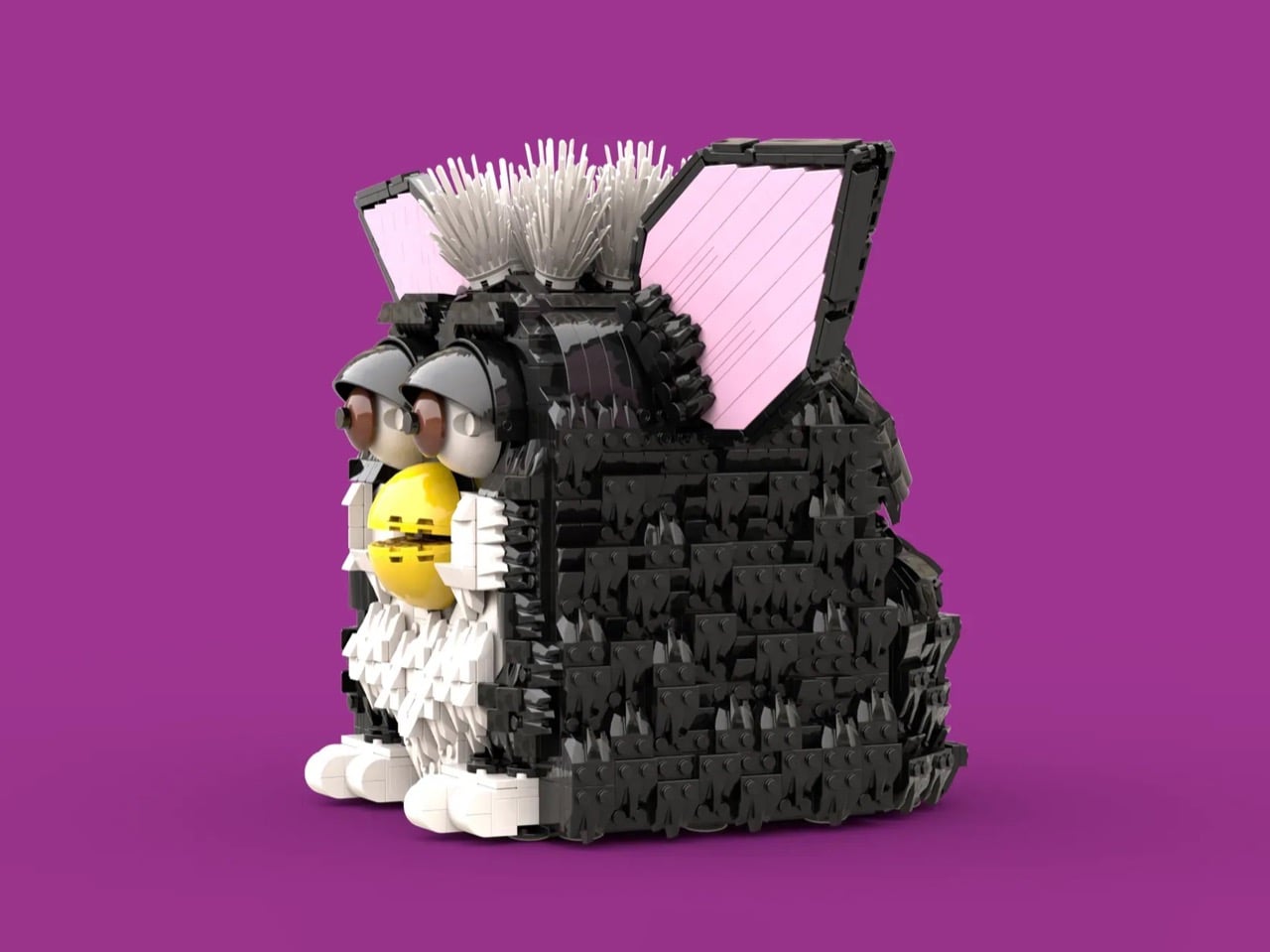
2. LEGO Ideas Furby 30th Anniversary Build with Working Features

Rancor1138’s 1,700-piece Furby stands nearly 19 inches tall in classic black and white, complete with working eyelids, articulated ears, and a movable mouth. The back panel opens to reveal two Easter eggs that perfectly nail the Furby’s bizarre cultural legacy. One is a brick-built heart representing what these things were supposed to be—lovable electronic pets teaching kids basic Furbish. The other is a man in black hiding in the head with recording equipment, acknowledging the paranoia that convinced parents these fuzzy toys were actually surveillance devices operated by shadowy government agencies.

This build speaks directly to anyone who grew up with Furbys and remembers both the genuine affection and the genuine unease. The NSA really did have to issue statements denying that these things were spying on American families. Kids really did wake up at 3 AM to unprompted Furbish babbling and wonder if their toy had become sentient. Twenty-eight years later, those kids are adults with disposable income and a deep appreciation for the absurdity of it all. The nearly 19-inch height creates an imposing presence that captures the original’s slightly unsettling charm without requiring you to change batteries or wonder what it’s saying about you when you’re not home.

3. LEGO Ideas Shrek’s Swamp Display Model

Memorph packed roughly 1,300 pieces into a display model that treats Shrek like he deserves museum-quality treatment. While you can already buy Shrek minifigures, this project goes way beyond that—it’s a fully brick-built sculpture that captures the character through smart part selection and building techniques rather than just printing his face on a yellow head. Donkey ends up in a friendly headlock while Gingerbread Man perches on Shrek’s shoulder, both scaled smaller to create an actual composition instead of just three figures standing next to each other.

The swamp base completes the scene with textured vegetation and that iconic “BEWARE OGRE” warning sign, grounding everything in the environment that made Shrek who he is. This feels like a love letter to the DreamWorks franchise rather than just cashing in on IP recognition. The layered approach to the build mirrors the movie’s whole thing about ogres and onions having layers, which might be reading too much into it, but also feels intentional. For anyone who grew up with these movies, it’s a chance to own something more substantial than a Happy Meal toy while still celebrating characters that somehow managed to age well despite being over two decades old.

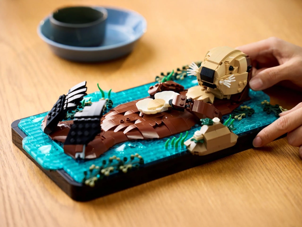
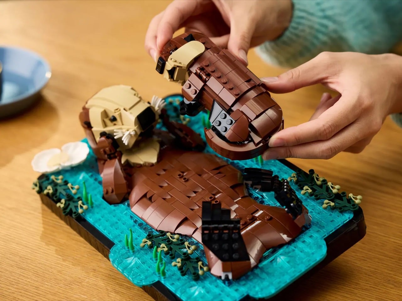
4. LEGO Floating Sea Otters with Paw-Holding Feature (21366)

Maximilian Lambrecht’s original fan design featured a single otter floating in kelp, but LEGO designer McVeigh saw room to make it even more charming. The retail version brings a mother cradling her pup, complete with articulated arms and a feature that lets two sets connect so the otters can hold paws. That last detail recreates the real-world behavior that makes sea otters impossibly endearing—they hold hands while sleeping so they don’t drift apart. The design evolution required serious rethinking. Making the mother fully reclined to cradle her baby naturally meant her arms needed to articulate underwater, which meant thickening the base to fit elbow joints, which meant extending water elements over the edge to maintain visual balance.

Each decision triggered the next in that iterative process that separates fan concepts from actual retail products. What you end up with captures a genuinely tender moment from nature, with attention usually saved for architecture sets or complicated vehicles. The articulation gives you real control over the mood—peaceful floating, active swimming, or that distinctive hand-holding pose that protects sleeping otters from oceanic separation. You need two sets to access the paw-holding feature, which doubles your investment but also doubles the wholesome factor. Some builds justify their existence through technical complexity. This one just makes you feel good looking at it.

5. LEGO Ideas Monty Python Ministry of Silly Walks

John Cleese’s Mr. Teabag shows up in LEGO form through Packatrix’s engineering, capturing every ridiculous knee-flinging motion from the 1970 sketch that became comedy history. The exaggerated proportions work perfectly for recreating those impossibly precise movements, with Technic joints allowing a legitimate range of silly walk customization. The build started with the bowler hat, which set the scale for everything else. From there, spindly limbs and jutting features took shape through the kind of careful part selection that makes LEGO Ideas submissions either brilliant or frustrating failures.

The facial expression nails Mr. Teabag’s deadpan seriousness in a way that deserves genuine credit. The silhouette reads instantly from across a room, making this perfect for displaying alongside more traditional LEGO architecture or vehicle sets. The bowler hat and umbrella complete the bureaucratic aesthetic, turning this into a celebration of British absurdist comedy that works whether you know every Python sketch by heart or just appreciate builds with actual personality. The umbrella even serves as extra support to prevent workplace accidents that could result in funding cuts for the Ministry—practical engineering wrapped in thematic humor. Some builds make you admire the technique. This one makes you laugh while admiring the technique.

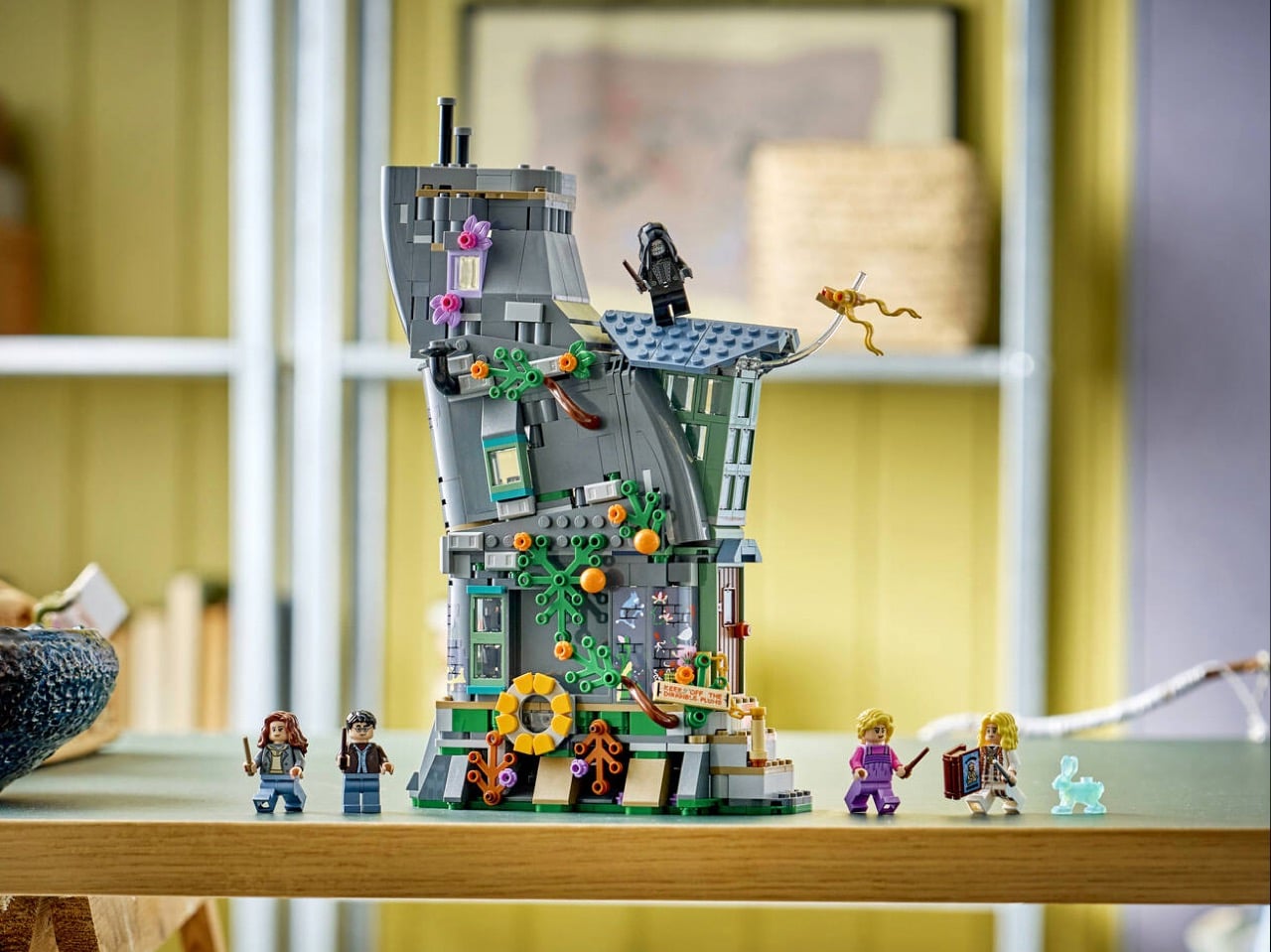
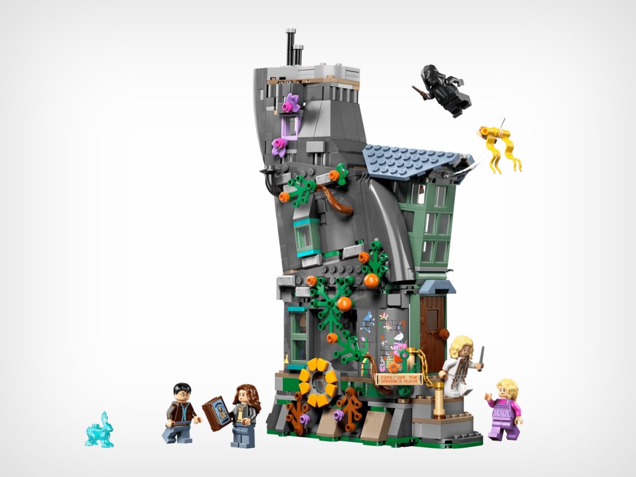
6. LEGO Harry Potter Luna Lovegood’s House with Light Projector (76467)

The Lovegood house only appeared in one film, but carried serious narrative weight throughout Deathly Hallows. Within those curved walls, Harry, Ron, and Hermione learned the truth about the Deathly Hallows while discovering how far a desperate father would go to save his daughter. The location became tied to both revelation and betrayal, making it cinematically significant despite limited screen time. LEGO’s version shows half the cylindrical structure, allowing access to detailed interior spaces across multiple floors. This cutaway approach gives you dollhouse visual storytelling while keeping architectural integrity intact.

Five minifigures, including Luna in her distinctive purple outfit and a menacing Death Eater, let you recreate the tense confrontation that defined this chapter. The working light projector adds actual functionality, casting the Deathly Hallows symbol just like it appeared in the film. That practical feature transforms this from a static model to something you can actually interact with, recreating key moments with real light effects. The multi-floor interior rewards close inspection with details that show LEGO took this seriously rather than just banking on Potter fans buying anything with the franchise logo. Each room tells part of the story, from lived-in domestic spaces to the moment everything changed.

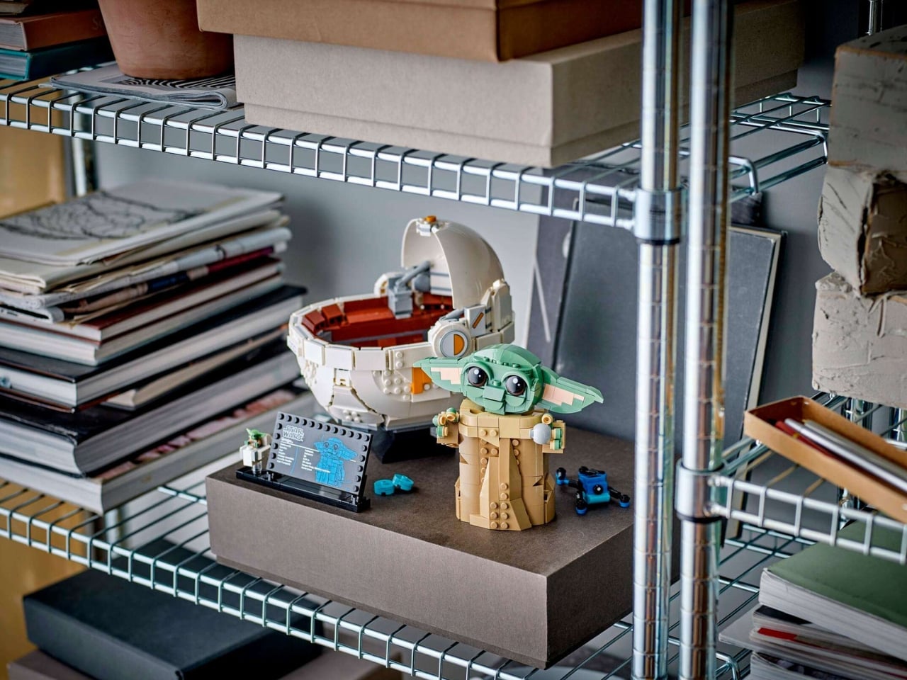
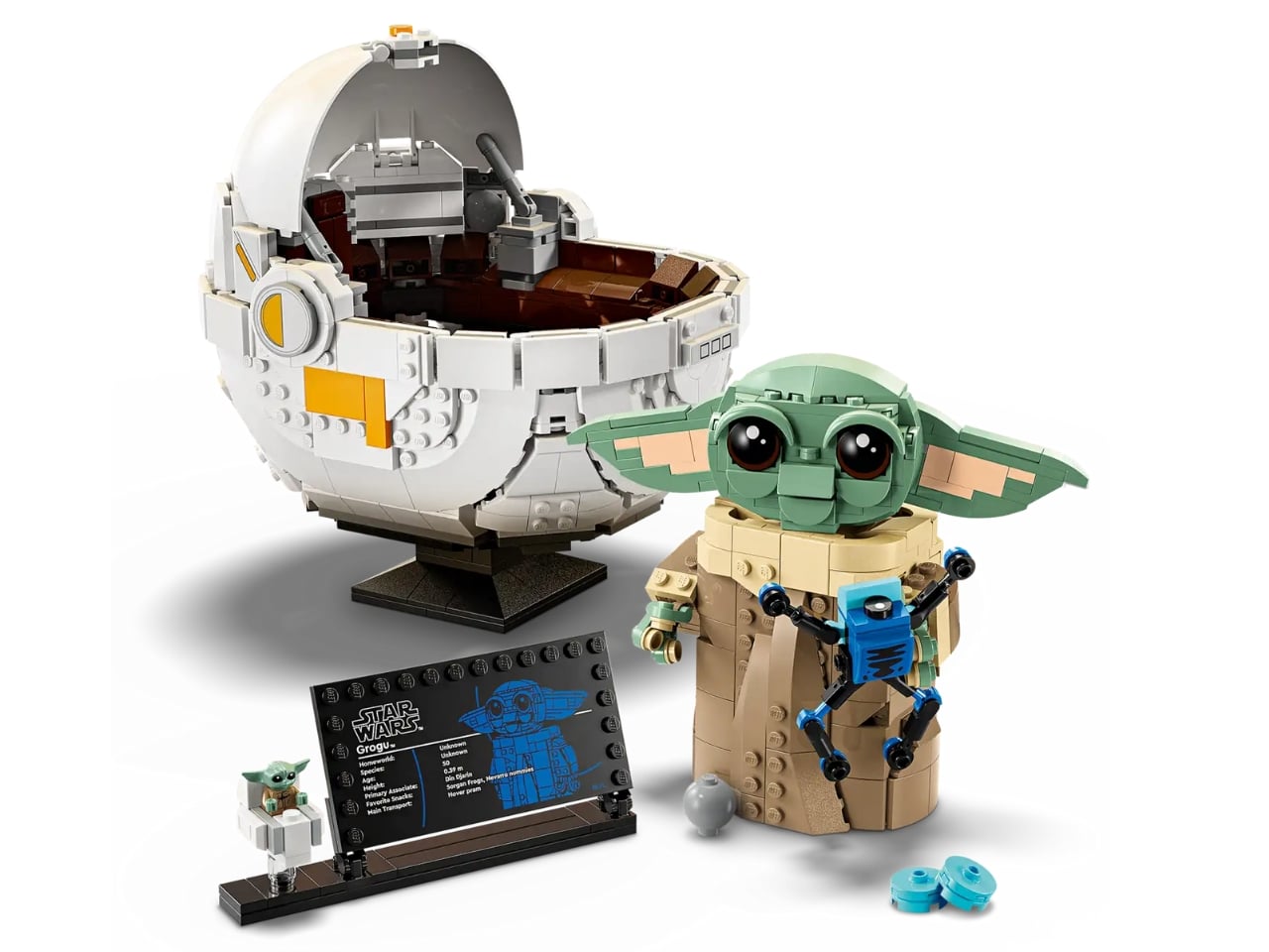
7. LEGO Star Wars Grogu with Hover Pram Display (1,048 Pieces)

Those enormous eyes, the tiny green hands, that perfectly timed head tilt—Grogu became universally irresistible the moment he appeared on screen. This 1,048-piece build captures his personality through design choices that go beyond just making him recognizable. Standing 7.5 inches tall in his hover pram, he’s got posable ears, a tiltable head, and dial-operated arms that let you recreate specific moments from the series. Want him reaching for the shifter knob? Done. Prefer him clutching a cookie with both hands? Easy. The articulation gives you genuine creative control over how you display him.

The genius here is how different poses change the whole emotional tone. The reaching pose captures his mischievous curiosity. The cookie clutch emphasizes his food obsession. The neutral position plays up his vulnerability. Each configuration tells a different story, which keeps this from feeling stale six months after you build it. With The Mandalorian and Grogu hitting theaters this year, the timing works perfectly for celebrating everyone’s favorite Force-sensitive toddler. The hover pram base provides stability while staying character-accurate, solving that eternal LEGO challenge of keeping top-heavy builds from face-planting off your shelf. This isn’t just merchandise. It’s a tribute to a character that somehow transcended his show to become an actual cultural phenomenon.

Why February 2026 Matters

These seven builds demonstrate how LEGO continues to evolve while honoring what made these bricks special in the first place. Fan-designed Ideas sets like the Furby, Sea Otters, Silly Walks, and Shrek prove LEGO listens to community voices instead of just mining focus groups. Each build rewards both the construction process and the final display with actual attention to character, detail, and functionality rather than just slapping licensed properties onto generic brick templates.

What makes February special isn’t just release quantity but the diversity of appeal. Sports fans get their stadium surprise. Potter collectors gain a pivotal location. Star Wars enthusiasts celebrate their favorite foundling. Comedy nerds honor British absurdism. Nature lovers find wholesome companionship. Animation fans get sculptural tributes. Nostalgia seekers confront their childhood paranoia. Every release speaks to specific passions while maintaining broad enough appeal to attract curious builders from adjacent interests. That balance between niche and accessible keeps LEGO culturally relevant across generations, creating bridges between childhood nostalgia and adult appreciation for engineering and design that actually respects your intelligence.

The post 7 Best LEGO Creations of February 2026 first appeared on Yanko Design.