Nike Just Turned Air Into a Fabric, and It Actually Works

There are moments in design when a product looks so strange that you can’t stop staring at it, and then you find out how it works and it suddenly makes perfect sense. That’s exactly what happened when trail runner Caleb Olson crossed the finish line at the 2025 Western States Endurance Run in the second fastest time in the race’s history. People clapped. Then they immediately started asking: what is he wearing?

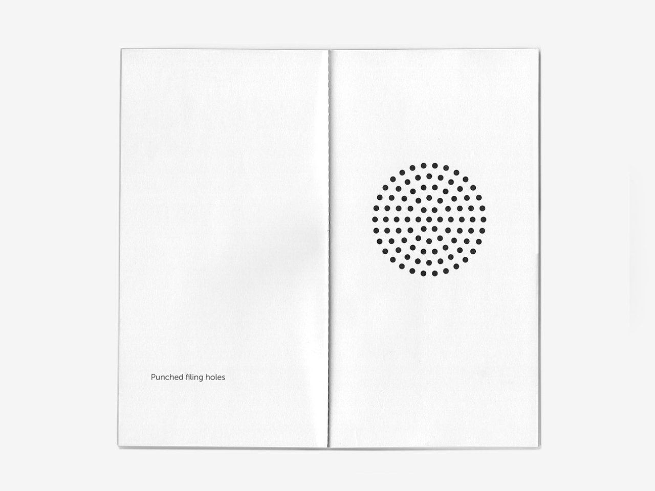
The shirt is the Nike ACG Radical AirFlow, and calling it a “shirt” feels generous. It looks more like a sweater that had an encounter with a drill press. Cone-shaped holes punctuate the fabric in deliberate patterns, creating what Nike calls airducts. They’re not just decorative (though they definitely are that, too). They’re functional in a very specific, physics-driven way. The design harnesses the Bernoulli principle and the Venturi effect, two concepts most of us haven’t thought about since a physics class we may or may not have paid attention to. The short version: as air moves through a narrowed opening, it speeds up and pressure drops. Nike essentially engineered that phenomenon into a fabric layer sitting on your body while you run.

Designer: Nike

The result, according to Nike’s own testing, is a top that absorbs and retains 50% less sweat than DriFit, the brand’s long-trusted performance fabric. It’s also 25% less resistant to the evaporation of sweat. For those of us not running ultramarathons in the California mountains, those numbers might sound abstract, but the principle holds whether you’re hiking a trail in August or doing anything remotely active in heat. The body cools itself through sweat, and anything that helps that process happen faster is worth paying attention to.

What makes this interesting beyond the performance specs is how it got here. The Radical AirFlow came out of Nike’s All Conditions Gear line, a sub-brand with a very specific purpose: designing for the outdoors, not the gym. ACG lives by the motto “Designed, Tested, and Made on Planet Earth,” which sounds like a marketing line until you realize the top was debuted mid-race at one of trail running’s most grueling events. The testing wasn’t a controlled brand activation. It was a competitive ultra-marathon.

The design itself doesn’t pretend to be subtle. It’s a cropped silhouette, worn long-sleeved, with large cutouts under the arms and at the elbows for mobility. The airducts are visible and intentional. It reads more like a prototype from a materials science lab than a rack piece at your local athletic retailer. And I think that’s the point. Nike ACG has always occupied that niche space between gear and fashion, performance and provocation. The Radical AirFlow leans all the way into that tension.

It also went viral in a way that athletic apparel rarely does, because the response was split. Some people immediately understood it. Others were convinced it was a joke. Trail runner Drew Holmen, an ACG athlete who tested the garment, said it plainly: “When I first saw the product, it was like nothing I had ever seen before.” That reaction, repeated by thousands of people online, is actually a good sign in design. If no one’s confused, nothing is new.

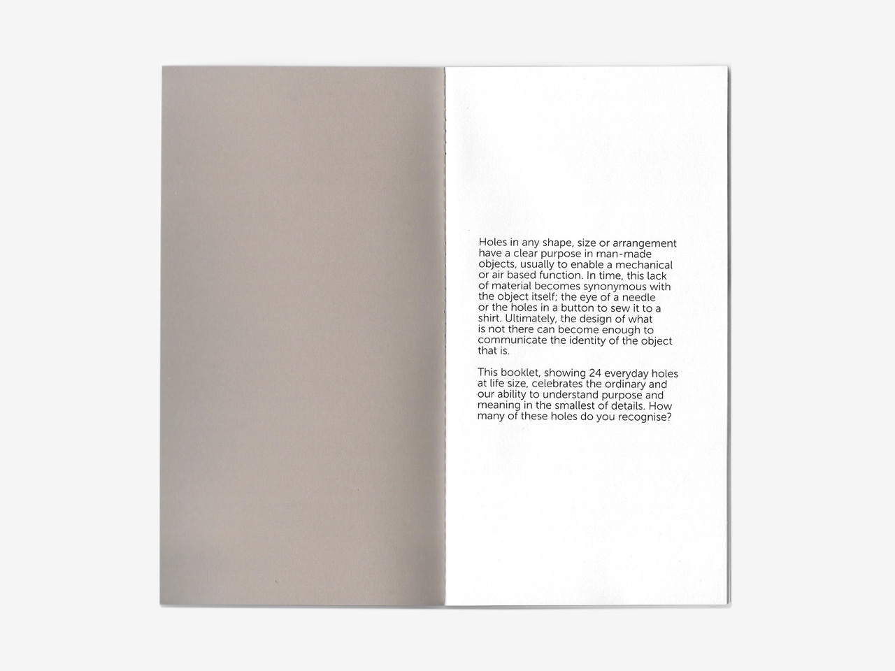
The broader conversation Radical AirFlow opens up is one about where performance apparel is headed. For a long time, innovation in this space meant better synthetic blends, tighter weaves, smarter seam placement. The Radical AirFlow goes in the opposite direction. It removes material entirely, then structures the absence of it. The holes aren’t a compromise or a cost-cutting measure. They’re the technology.

Whether you’d actually wear it outside of a race context is a fair question, and a cap version built on the same technology is already on the way, which might make the concept more accessible. But the full racing top is a genuine design statement, one that prioritizes function in a way that can’t be hidden. You can see it working. That kind of transparency, in design, is rarer than it should be.

The post Nike Just Turned Air Into a Fabric, and It Actually Works first appeared on Yanko Design.
10 Minimalist Desk Accessories That Earn Their Footprint

The minimalist desk setup has become one of the most documented trends in home office design, particularly as hybrid work continues pushing people to invest more seriously in the spaces where they spend their days. Most products marketed toward that crowd lean hard on the visual side, neutral finishes, restrained forms, nothing that draws attention to itself. What they’re less reliable at is spatial logic.

The ten accessories on this list were chosen with that in mind. Each one has to pass a practical test, not just look calm on a desk, but actually justify the space it occupies. That means hiding clutter, combining functions, freeing surface area, or removing a small friction before it turns into a habit.

KNOB. Pen Tray

Most pen trays solve a narrow version of the problem. They give you a fixed layout, usually a rectangle divided into two or three compartments, and expect you to work around it forever. That’s fine until your tools change, and they always do. Changho Lee’s KNOB. Pen Tray takes a different approach by making the interior of the tray something you can actually reconfigure.

Designer: Changho Lee

The dividers are controlled by knobs that take their cues from gas burner controls, a design reference that also gives the tray its name. Turn them and the internal layout shifts, letting you organize pens alongside rulers, adapters, or whatever else needs a place. One tray handles what might otherwise require three, which makes a convincing case for its footprint. The mechanism can feel fiddly if you reorganize often.

Inseparable Notebook Pen

There’s a particular kind of frustration that comes with reaching for a pen and finding it’s no longer where you left it. It’s small enough to ignore once, but it happens often enough to become a genuine irritant. The Inseparable Notebook Pen doesn’t try to solve desk organization broadly. It solves this one specific problem by keeping the pen attached to the notebook it belongs with.

Click Here to Buy Now: $19.95

A magnetic clip secures the pen directly to the notebook cover, so the two travel as a unit and stay that way on the desk. There’s also a built-in silencer that softens the attach-and-release motion, which sounds like a small detail until you use it daily. The pen works best when paired with its intended notebook, so it’s less convincing as a standalone writing instrument.

Orbitkey Desk Mat

Desk mats often get treated as the last layer of a setup, something you add once everything else is in place to make the whole thing look polished. The Orbitkey Desk Mat earns more than that role. It addresses one of the quieter problems on any active desk, the gradual spread of loose papers, sticky notes, and reference sheets that slowly take over the surface.

Designer: Orbitkey

A document hideaway built beneath the top layer lets you slip papers out of view without throwing anything away. They stay flat and within reach, invisible until you need them. A toolbar along one edge keeps stationery and smaller tools from drifting. Available in Black and Stone across two sizes, the mat works whether you’re running a compact home setup or a larger studio table.

ME-1 U-shaped Power Strip Concept

Cable management is one of those desk problems that most solutions only partially solve. You gather the cords, clip them together, maybe run them through a box, and the result is still visible, still part of the desk’s noise. Michael Kritzer’s ME-1 power strip concept takes a different position, arguing that the power strip itself should hang below the work surface rather than claim space on top of it.

Designer: Michael Kritzer

Curved into a U-shape, it can hang under a table or stick to metallic surfaces, while its two legs give you somewhere to wrap cables so they don’t trail freely. There’s also enough spacing between the alternating three-prong sockets and USB ports to fit bulky chargers without blocking each other. It’s still a concept, and questions about how far it protrudes remain, but the logic behind it is sound.

Oakywood Desk Shelf Pro

Monitor risers are supposed to help, and usually they do, but only as far as ergonomics go. The desk surface often ends up just as crowded as before, just with a platform sitting in the middle of it. The Oakywood Desk Shelf Pro approaches the problem differently, treating the riser not as an accessory but as furniture that earns its size by doing more than one job.

Designer: Oakywood

The shelf spans desk width, lifting the monitor to eye level while clearing space underneath for a keyboard or laptop, with steel legs at each end creating a floating effect. Built-in drawers tuck away stationery and small tech, and a felt-lined open shelf handles tablets or a closed laptop. It’s built from solid oak or walnut, not MDF with a plastic skin, and can hold up to 100 kg without flexing.

Practiko Otis Hanger 3.0

Minimalist desks look clean partly because many of them don’t come with built-in drawers. That’s a reasonable design choice until the pens, sticky notes, charging cables, and paper clips have nowhere to go and start accumulating on the surface instead. The Practiko Otis Hanger 3.0 adds that missing storage back without a single screw or permanent alteration.

Designer: Practiko

The system clips onto the desk edge and hangs beneath the work surface, giving you three trays and the full top plane back. The 3.0 version features more perforation points for finer divider adjustments, and three nested mini trays handle smaller items like paper clips, thumbtacks, or earbuds. Larger handles on each tray let you pull them out smoothly without looking down, which makes more of a difference in daily use than it sounds.

Nuka Eternal Stationery

There’s a version of minimalism that’s about owning as little as possible. There’s also one that’s about how much the things you do own keep asking of you. Nuka’s Eternal Stationery belongs to the second kind. Built around permanence rather than disposability, it’s a notebook-and-writing-tool system designed to stop demanding replenishment, which is its own quiet argument for staying on a well-edited desk.

Designers: Nikolay Lozinskiy (3D animation & Product Design), O0 design (Branding, 3D animation & Product Design), Evgenija Medvedeva (Product Design), vennndii (Product Shootings)

The notebook is waterproof and tear-proof, and pairs with a metal alloy tip that writes with the consistency of a traditional pencil but requires no sharpening and never breaks. Pages clear completely with the Nuka Magic Eraser, ready to be written on again. For anyone who writes regularly, the appeal is straightforward, though writers accustomed to ink on paper may need some adjustment time with the metal alloy tip.

Quiver Ruler

A ruler is one of the few tools that earns a place in a minimalist setup by compressing several small tasks into a single flat form. Tunir Maity’s Quiver does that more thoroughly than most. It’s an anodized aluminum ruler designed primarily for people who actually cut with one, not just measure. It treats shaky hands and imprecise cuts as design problems worth solving, not limitations the user is expected to compensate for.

Designer: Tunir Maity

A clip mechanism holds paper in place, a blade slit guides the cut in a straight line, and the weight distribution favors the cutting end, so you don’t have to press down as hard. It also includes a carabiner attachment for clipping to a bag. Quiver is currently a concept, so availability hasn’t been confirmed, and it’s more specialized than what a casual desk user would reach for day to day.

Ichi Portable Lamp

Desk lamps rarely fail in the obvious ways. Most give off enough light and last long enough. What they tend to get wrong is the base, which on wider models claims an entire desk corner, and the cord, which invariably ends up somewhere visible. The Ichi Portable Lamp, born from the collaboration between Fujita Kinzoku and TENT Design, keeps the form slim and goes cordless, addressing both without turning the lamp into a statement piece.

Click Here to Buy Now: $149

Powered by four standard AA batteries, it runs cordless without the limitations of proprietary chargers. Its warm, high-color-rendering CRI 95 LED creates a soft, radiant glow suitable for task work or winding down. The modular design disassembles into three parts and packs down to a slim 20mm thickness. It’s more portable than a permanent desk fixture, which is worth knowing if you need sustained, high-output lighting for long stretches.

Satechi 3-in-1 Foldable Wireless Charging Stand

Getting a phone stand onto a minimalist desk requires a stronger argument than just holding the phone upright. The Satechi 3-in-1 Foldable Wireless Charging Stand with Qi2 25W makes that argument by doing three jobs at once, replacing the tangle of separate charging pads that Apple users typically accumulate. Wireless charging was supposed to simplify things, but most setups end up with a different kind of mess instead.

Designer: Satechi

Set the iPhone down, and Qi2 snaps it into position, the Apple Watch gets its own fast-charge arm, and the AirPods rest on a pad below, all drawing from a single cable to the wall. The stand folds flat for travel and fits easily in a carry-on. A 45W USB-C adapter with US, EU, and UK plugs ships in the box. It’s most compelling for people already working within the Apple ecosystem.

Building a cleaner desk comes down to the same question applied to every object on it: what is it giving back for the space it takes? Color and material can make things look minimal, but they don’t make them earn their place. That’s a footprint budget, and it’s a much better framework for deciding what stays than any mood board, setup guide, or neutral palette.

The post 10 Minimalist Desk Accessories That Earn Their Footprint first appeared on Yanko Design.
Samsung’s Bold Gamble: Why the Galaxy Z Fold 8 Might Drop These Fan-Favorite Features

Samsung’s Bold Gamble: Why the Galaxy Z Fold 8 Might Drop These Fan-Favorite Features Close up of the Galaxy Z Fold 8 display crease

The Samsung Galaxy Z Fold 8, once positioned as a leader in foldable smartphone technology, has sparked significant debate among tech enthusiasts and industry analysts. Samsung has long been at the forefront of the foldable market, but this latest release raises questions about the company’s strategic direction. While the device offers incremental improvements in battery […]

The post Samsung’s Bold Gamble: Why the Galaxy Z Fold 8 Might Drop These Fan-Favorite Features appeared first on Geeky Gadgets.

Posted in Uncategorized