Xbox has announced a major price reduction for its Game Pass subscription services, marking the first adjustment in over eight years. As detailed by Colt Eastwood, the new pricing structure lowers the cost of Xbox Game Pass Ultimate to $22.99 per month and PC Game Pass to $13.99 per month, with regional adjustments to ensure […]
Apple is reportedly preparing to launch its highly anticipated smart glasses, a wearable device designed to integrate seamlessly into your daily life. Unlike the Vision Pro headset, which focuses on immersive AR/VR experiences, these glasses aim to deliver a more practical and socially acceptable augmented reality (AR) solution. By using the robust Apple ecosystem, the […]
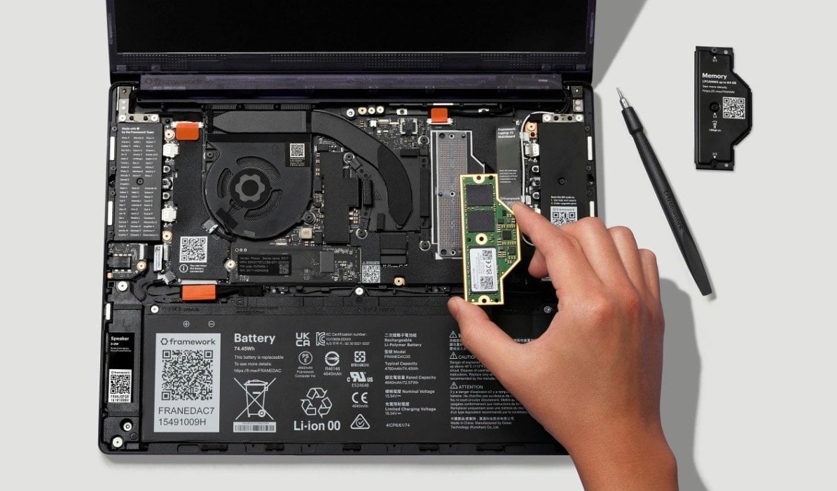
Framework has introduced the Framework Laptop 13 Pro, a modular laptop that prioritizes both performance and sustainability. It features a CNC-machined aluminum chassis, weighs 1.4 kilograms and measures under 16 millimeters in thickness. The device is also backward-compatible with components from earlier Framework Laptop 13 models, allowing users to upgrade or repair their laptops more […]
Anthropic is investigating potential "unauthorized access" to its Claude Mythos model that has been touted for its ability to find cybersecurity flaws, the company told Bloomberg. A group gained access to the model through a third-party contractor portal and by using internet sleuthing tools, according to the report. However, the group is only interested in trying the models and not using them maliciously, according to a person familiar with the matter.
"We're investigating a report claiming unauthorized access to Claude Mythos Previous through one of our third-party vendor environments," Anthropic said in a statement.
The Claude Mythos Preview arrived earlier this month as part of "Project Glasswing" with significant fanfare. Anthropic limited the preview release to a small number of trusted test companies including Amazon, Microsoft, Apple and Cisco. Another was Mozilla, which said the model helped it find and patch 271 Firefox vulnerabilities. A growing number of banks and government agencies have been seeking access as well in order to safeguard their own systems.
However, several unauthorized users (who reportedly have a private chat on Discord), supposedly gained access to Mythos through a developer portal and by making an educated guess as to where the model might be located. That same group may also have access to other unreleased Anthropic models, according to the report.
The new Mythos model has gained notoriety of late for its supposed ability to sniff out security flaws in operating systems and internet browsers. This has prompted some skepticism among security researchers but also fear that AI-generated cyber attacks could become a "real threat," CTO of cloud security firm Edera Alex Zenla recently told Wired. Anthropic was recently designated as a "supply chain risk" by the US Department of Defense, but has been in talks with the Trump administration of late to have that label removed.
This article originally appeared on Engadget at https://www.engadget.com/ai/anthropic-is-investigating-unauthorized-access-of-its-mythos-cybersecurity-tool-091017168.html?src=rss
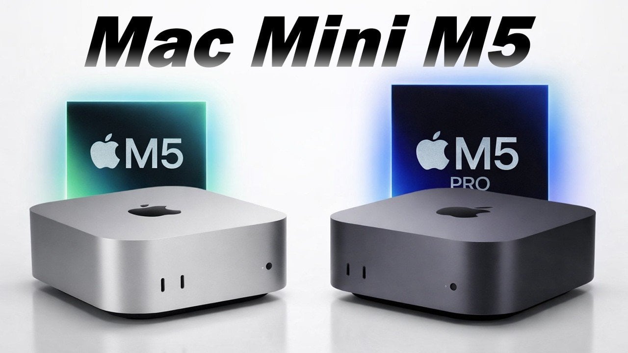
The Mac Mini is poised for a significant upgrade, with leaks suggesting the introduction of the M5 and M5 Pro chips at Apple’s WWDC 2026. This highly anticipated release could redefine compact, high-performance computing, offering a blend of power and efficiency in a small form factor. If you’re considering an upgrade, here’s a detailed look […]
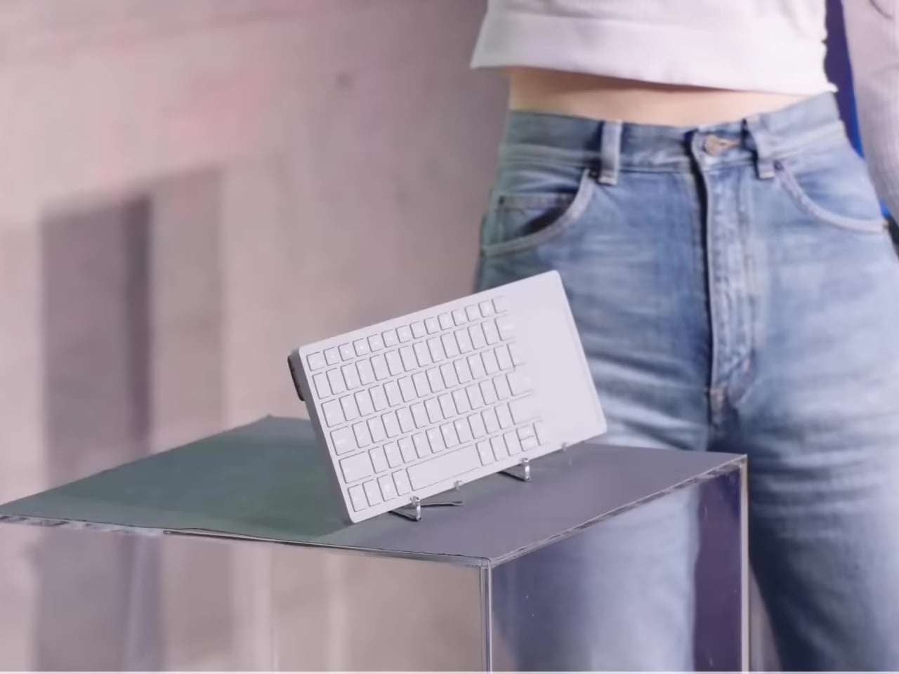
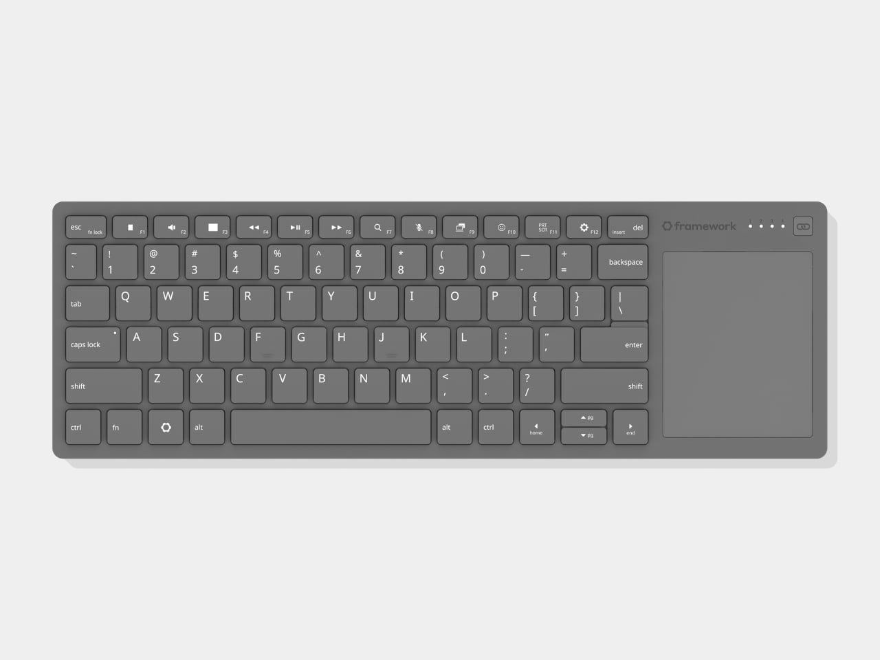
If you’ve spent any time using a home theater PC from the couch, you’ve probably already met the Logitech K400 Plus. It’s been the go-to couch keyboard for years, not because it’s particularly good, but because nothing better has come along. The touchpad is cramped, the keys feel cheap, and anyone who’s used one knows it’s a device you tolerate rather than enjoy.
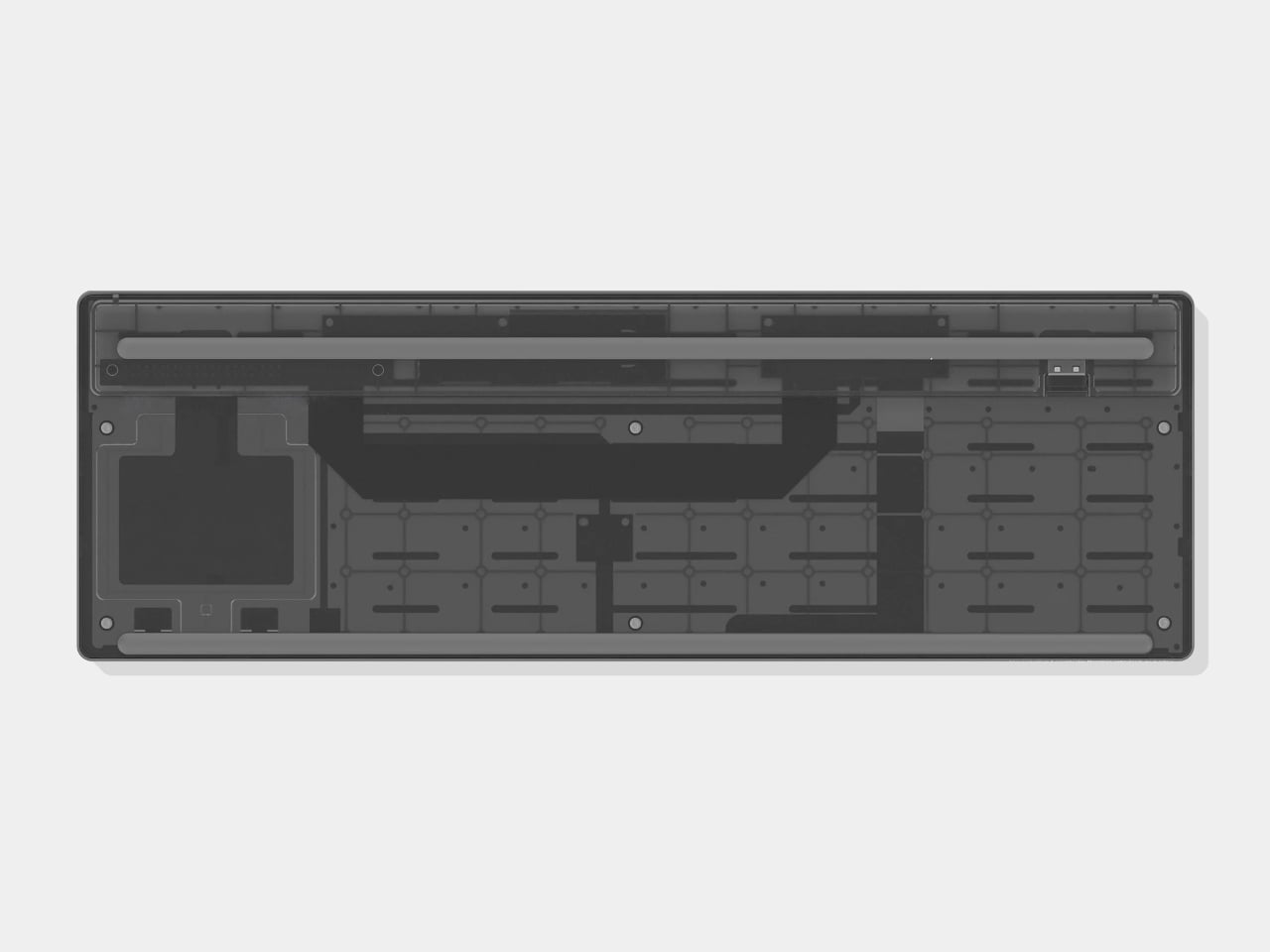
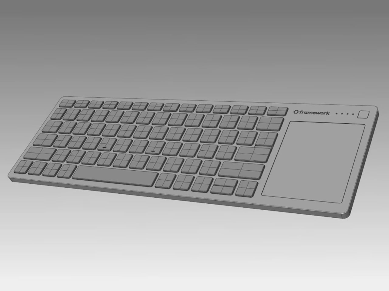
Framework ran into this same frustration while developing and testing the Framework Desktop for living room use. Their team kept reaching for the same underwhelming keyboard until they decided to stop tolerating it and build something better. The Framework Wireless Touchpad Keyboard is the result, borrowing the same keyboard and touchpad design from Framework’s laptops and packaging them into a compact wireless unit.
The keys use the same chiclet-style, low-profile design as Framework laptops, with 1.5mm of key travel and full 19mm key spacing. That’s a higher standard than this product category usually bothers with, and it shows in how the keyboard feels to type on, even while holding it in one hand. The slim body doesn’t sacrifice the typing experience for the sake of portability.
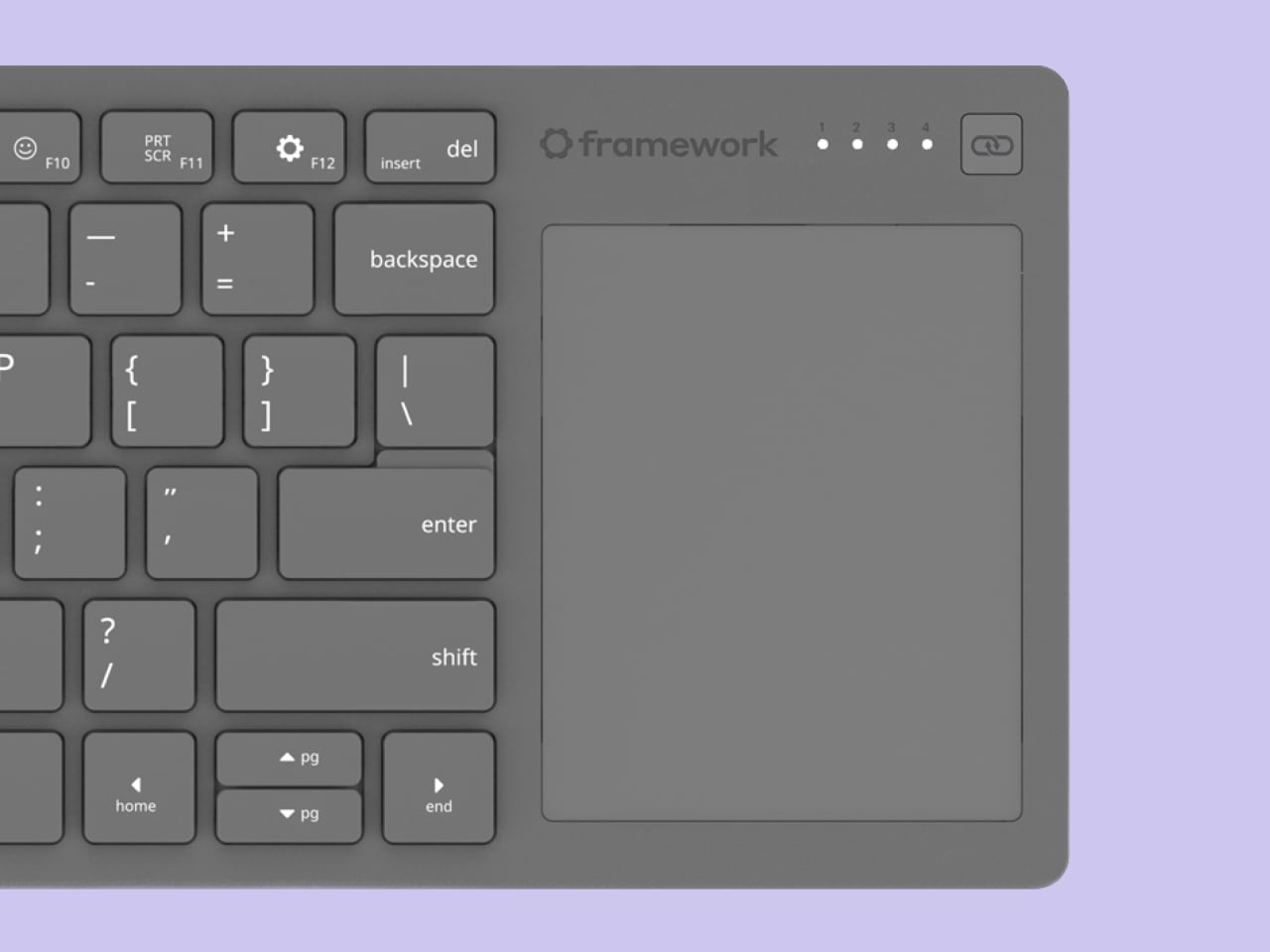
The touchpad is where this keyboard makes its most meaningful departure from what’s currently available. At 68.8 x 85.6mm, it’s a clickable Windows Precision Touchpad with full multi-touch gesture support for Windows and Linux alike. That’s the same touchpad architecture found in Framework’s laptops, which means the precision and responsiveness are genuinely comparable to what you’d expect from a proper laptop trackpad.
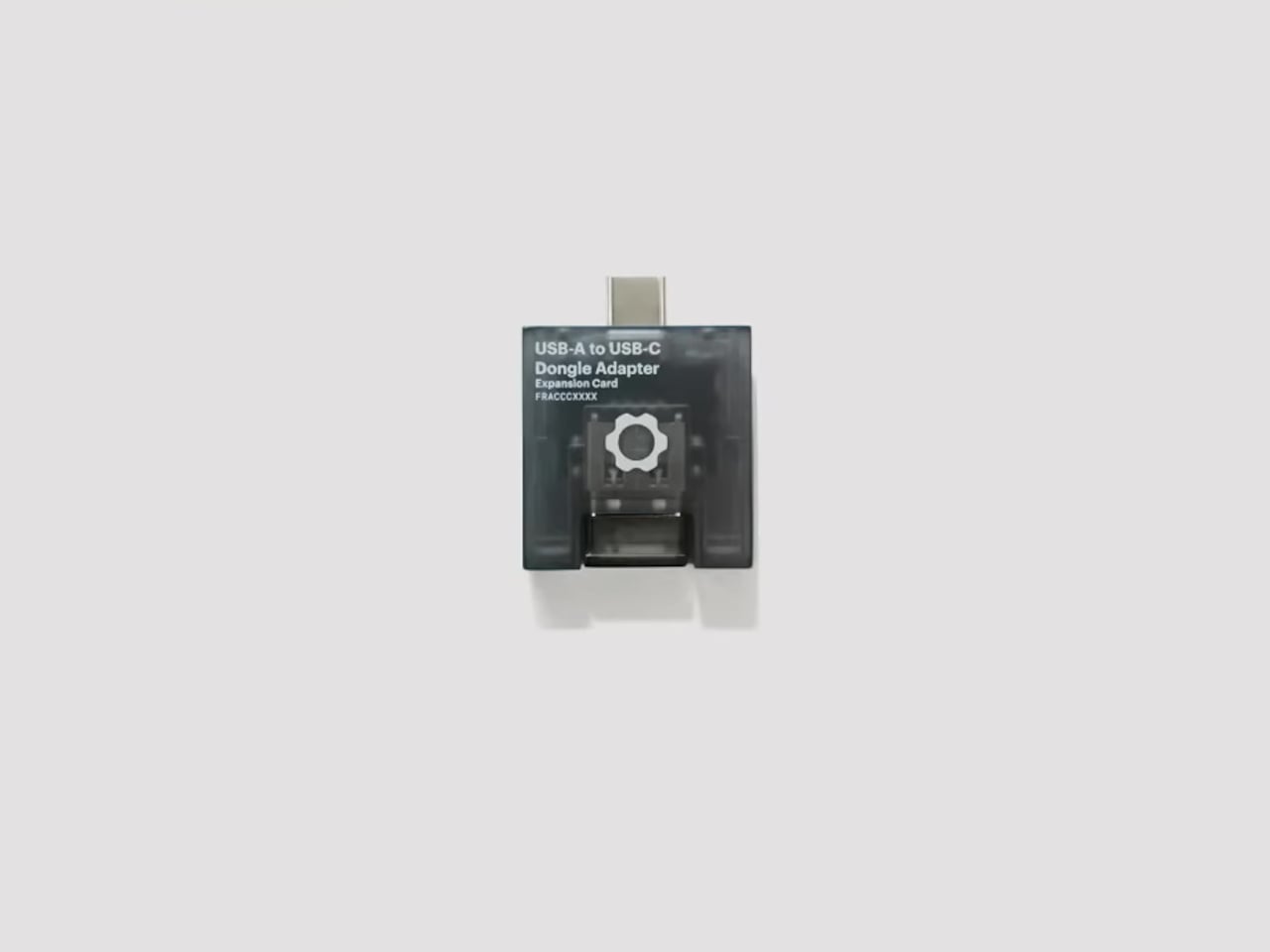
Connectivity covers everything you’d reasonably want. You can pair up to four devices simultaneously over Bluetooth, plug in via USB-C for a wired connection, or use the USB-A dongle, which stores neatly in a slot on the back of the keyboard. Framework is even developing a USB-A Adapter Expansion Card so the dongle can sit flush inside a Framework laptop or desktop.
For living room setups, having a touchpad built directly into the keyboard changes how you interact with everything on screen. Pulling up a browser, adjusting playback settings, or scrolling through a queue from across the room becomes far less awkward when you’re not hunting for a mouse on the coffee table. It’s a small shift in workflow that makes a noticeable difference in day-to-day comfort.
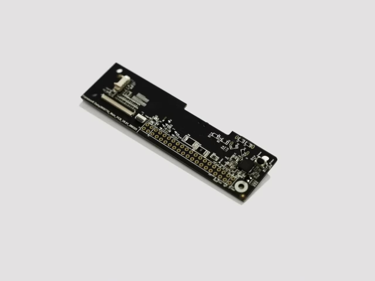
Sim racers who mount keyboards into cockpit frames will appreciate the integrated touchpad even more, since a separate mouse is barely practical there. Of course, Framework being Framework, the hardware is fully open-source, with design files already on GitHub. The firmware runs on ZMK, and the Control Board exposes 28 I/O pins for custom configurations, with Framework even offering the board free to developers who apply early.
The Framework Wireless Touchpad Keyboard is expected to ship later in 2026, with pricing still to be confirmed. It came from genuine frustration rather than a gap in a product roadmap, and that tends to show in the details. The couch keyboard category has been stuck with one mediocre option for far too long, and this one finally gives people something worth reaching for.
Framework’s 2026 launch event unveiled advancements in modular computing with a focus on sustainability and user customization. One standout announcement was the Framework Laptop 16, which features a redesigned one-piece haptic touchpad and keyboard for improved usability. This model also introduces the Expansion Bay system, allowing users to easily upgrade discrete graphics and peripherals. Additionally, […]
Apple’s iPhone 18 lineup introduces a bold and strategic evolution in its product offerings, blending refined design with innovative technology. At the forefront of this lineup are the iPhone 18 Pro Max and the highly anticipated iPhone Ultra foldable, each catering to distinct consumer preferences. This dual-path approach highlights Apple’s commitment to delivering premium products […]
Managing token usage is crucial for avoiding session limits when working with Claude, as explained by Nate Herk. One key detail he highlights is how Claude processes conversation history, rereading the entire context with each interaction. This can lead to excessive token consumption, especially in longer sessions. By applying strategies like manual compaction, where you […]
Apple is preparing to unveil seven highly anticipated devices at its May event, offering a preview of the company’s latest advancements in hardware. As a precursor to the software-focused WWDC in June, this event underscores Apple’s commitment to enhancing performance, connectivity, and seamless ecosystem integration. Here’s a detailed look at what you can expect from […]