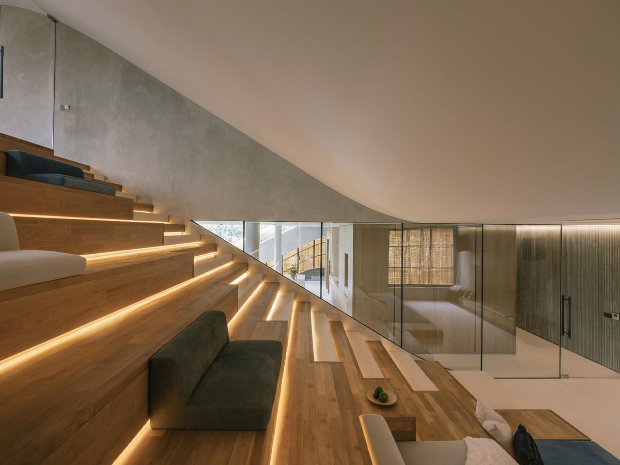
Some houses are designed to be looked at. Split Mass Residence, completed in 2026 by K-Thengono Design Studio, is designed to be moved through — a 712-square-metre home in BSD, South Tangerang, Indonesia, where every architectural decision is in service of movement, togetherness, and the slow pull of the outdoors.
Founder Kelvin Thengono built the project around a single, quietly radical idea: “The main design goal was to allow a seamless sequence of spaces that keeps the family connected, while also staying closely aligned with the surrounding landscape.” The house sits on a corner — what architects call a hook site condition — and rather than treat that exposure as a problem, the studio used it as the engine for the entire massing strategy. Volumes are split, pulled apart, and repositioned so that no single path through the house feels accidental.
That split is where the project gets interesting. Tiered, sloping garden roofs connect indoor living spaces directly to the planted outdoor setting, blurring the line between ceiling and garden in a way that feels more organic than architectural. From the open-plan kitchen, living, and dining area on the first floor, a glass door opens straight onto a grassy rooftop slope. An outdoor staircase continues upward to a swimming pool and barbecue area — the roof isn’t just a lid; it’s the social core of the house.
On the exterior, two materials do the heavy lifting. Concrete anchors the structure, giving it weight and presence on the streetscape. PE rattan panels wrap across the facade in woven screens that soften everything — filtering light, adding texture, and offering just enough visual privacy without closing the house off from its surroundings. The contrast is deliberate: one material says permanence, the other says warmth. Together they give the house a character that’s grounded and tactile rather than slick.
What Thengono has built here isn’t really a house in the traditional sense — it’s a system of encounters. Divided volumes, green roofs, and internal and external staircases create different scenarios for family interaction, so the architecture itself nudges people toward each other without ever forcing it. The rooftop garden crowning the whole composition reinforces that layered approach — landscape as architecture, architecture as landscape.
In a region where residential design often defaults to gated grandeur or tight minimalism, Split Mass Residence lands somewhere more considered. It’s a house that knows exactly where it wants you to be — and makes getting there feel like the whole point.
The Apple ecosystem runs deep, but the devices themselves only go so far. The iPhone, Apple Watch, and iPad are remarkable pieces of hardware on their own, and yet a small category of accessories has figured out exactly what each one is missing. Not cases that just protect or cables that just charge, but objects that change the way a device feels, sounds, looks, or works from the moment you pick it up.
These five accessories do exactly that. They come from different corners of the Apple world, covering the watch, the phone, the iPad, and the kind of audio experience Apple never built its own hardware around. Each one earns its place not because it carries a name worth recognizing, but because it solves a specific frustration that was always there waiting to be noticed. Here are the ones worth knowing about right now.
1. NightWatch
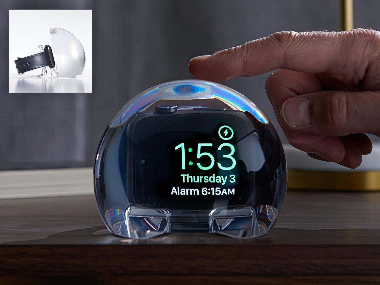
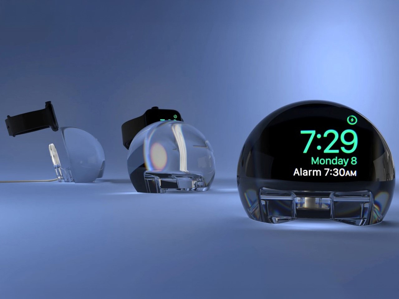
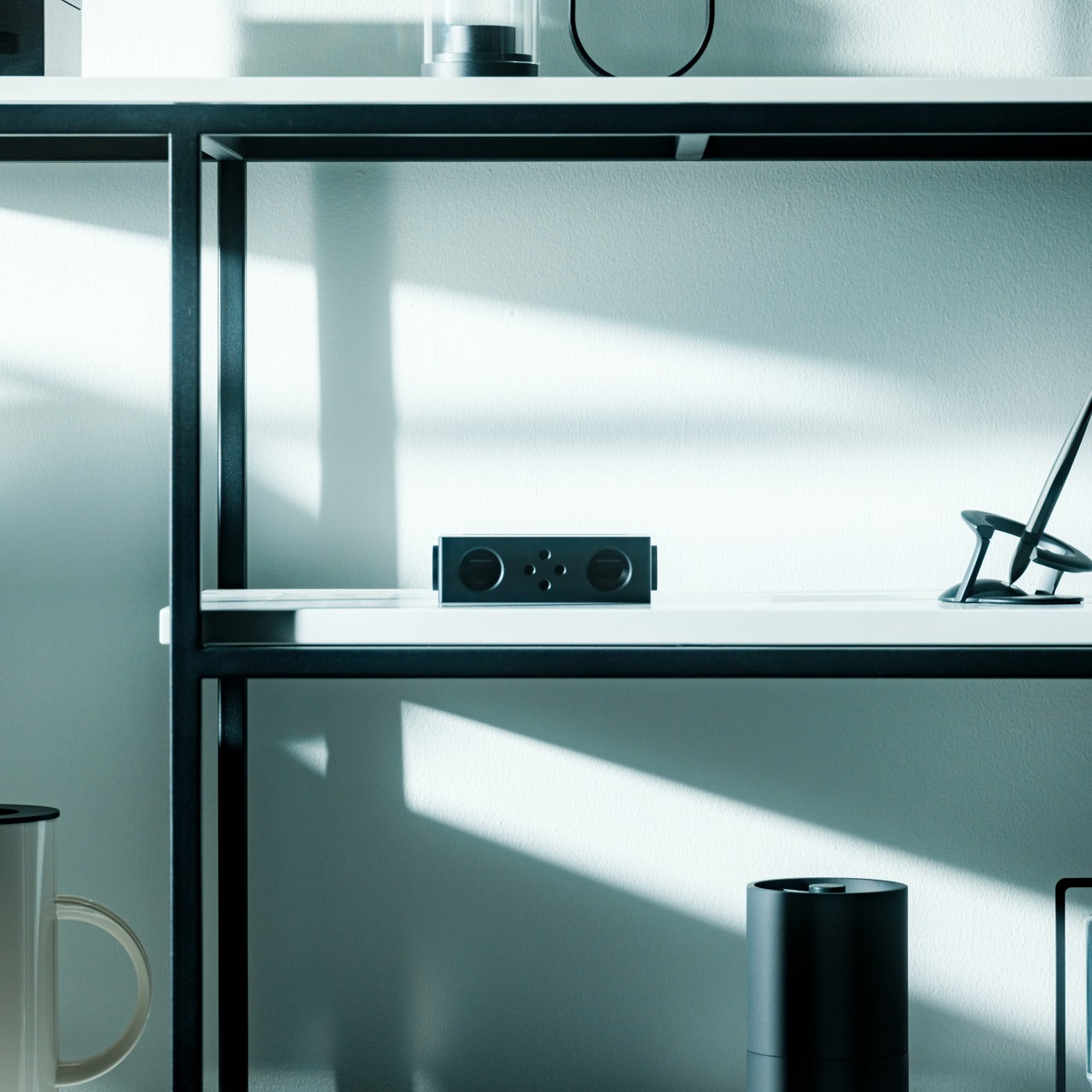
Most Apple Watch docks are functional and forgettable, a plastic puck with a magnetic charger and no ambition beyond getting your watch off your wrist for the night. The NightWatch is not that. It is a clear glass orb, roughly the size of a generous paperweight, that you set your Apple Watch inside at night. The result transforms the watch’s nightstand charging face into a magnified, glowing clock that is genuinely easier to read from across a dark room than the device alone would ever allow.
The dock works by treating the Apple Watch display as a light source and the glass sphere as a lens, drawing the time out of a small wrist-bound rectangle and spreading it into a real visual presence on the nightstand. It also includes a built-in audio amplifier that boosts the sound of your alarm, so quiet mornings stay that way until you actually need them not to be. At $69.99, it is priced more like a considered object than a cable management solution, which is exactly the spirit it deserves to be received in.
What we like
The magnification effect turns the Apple Watch display into a legitimate bedside clock without additional screens, apps, or setup
The built-in audio amplifier addresses the one genuine weakness of relying on Apple Watch nightstand mode as a morning alarm
What we dislike
The orb form factor is visually dominant enough that it will not suit minimalist nightstands where a small footprint matters
At $69.99, it costs more than several competing dock designs that handle charging equally well without the visual statement
2. Rock Paper Pencil 4.0
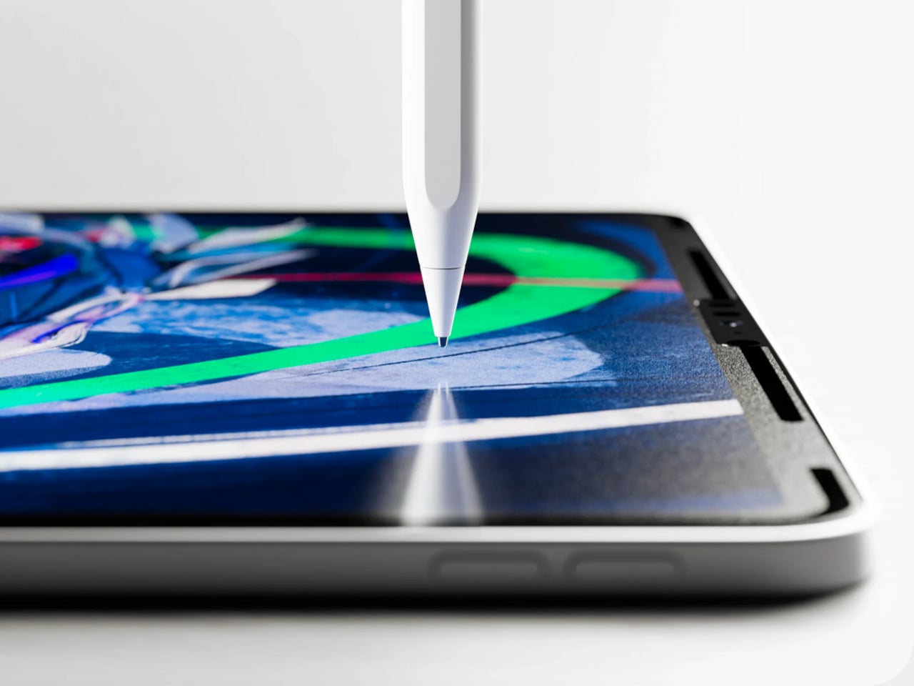
The Apple Pencil is a precision instrument that has never quite figured out how to feel like one. The glass surface beneath it is smooth and frictionless, and while that works fine for certain tasks, illustrators and note-takers spending hours drawing have always wanted something closer to real paper. Astropad’s Rock Paper Pencil addresses that gap directly: a removable, reusable nano-texture screen protector paired with custom Apple Pencil tips, and version 4.0 makes the system meaningfully better than it has ever been.
The upgrade introduces a new graphite POM tip alongside the existing steel ballpoint option, and the difference is immediately legible. The graphite tip mimics the toothy drag of a 2B pencil, a sensation that makes expressive sketching and shading feel deliberate and controlled rather than slippery and approximate. Each kit now ships with four tips in total, two graphite and two ballpoint, alongside a screen cleaning kit that should have been included from the beginning. The protector attaches via NanoCling static cling rather than adhesive, meaning it lifts off without residue and goes back on without a bubble.
What we like
The NanoCling system is genuinely removable and reusable, giving iPad owners a paper-feel surface on demand without permanently altering the display
Having both graphite and ballpoint tips in a single kit covers two distinct working styles without requiring a separate accessory purchase
What we dislike
The graphite tip wears down noticeably faster than the ballpoint option, which will matter to anyone putting in long, intensive drawing sessions regularly
The friction that makes sketching feel natural also makes smooth, fast swiping across the screen feel slightly resistant during ordinary everyday use
3. Battery-Free Amplifying iSpeakers
Every speaker you own asks something of you before it makes a sound. The Bluetooth speaker needs charging, and the charging case needs its own cable. The smart speaker needs a wall outlet, a WiFi password, and a company’s servers to stay online on a random Tuesday. The Battery-Free Amplifying iSpeakers, designed by Ooi Masato of Pit-A-Pat for Shimawa and made in Japan, need none of it. They need your iPhone and the physics of a sound wave moving through precision-machined metal, and that is the complete brief.
The design is straightforward: a Duralumin metal body with a slot for the phone and golden-ratio speaker apertures that channel and amplify sound through acoustic resonance, the same principle that powered phonographs before electricity reached most homes. There is no pairing, no app, no battery level to check. You set your phone in the slot, and your music gets louder and fuller, immediately.
Zero setup and zero charging requirements make it the simplest speaker in any room, with no ritual standing between you and better sound
The precision-machined Duralumin construction means there is nothing to break, replace, update, or charge, ever
What we dislike
At $179, it competes on price with capable Bluetooth speakers that offer far more volume, range, and flexibility for larger spaces or outdoor use
The phone slot is sized for specific handsets, so case thickness and phone dimensions will determine how well it actually cradles your device
4. Nomad Leather Folio
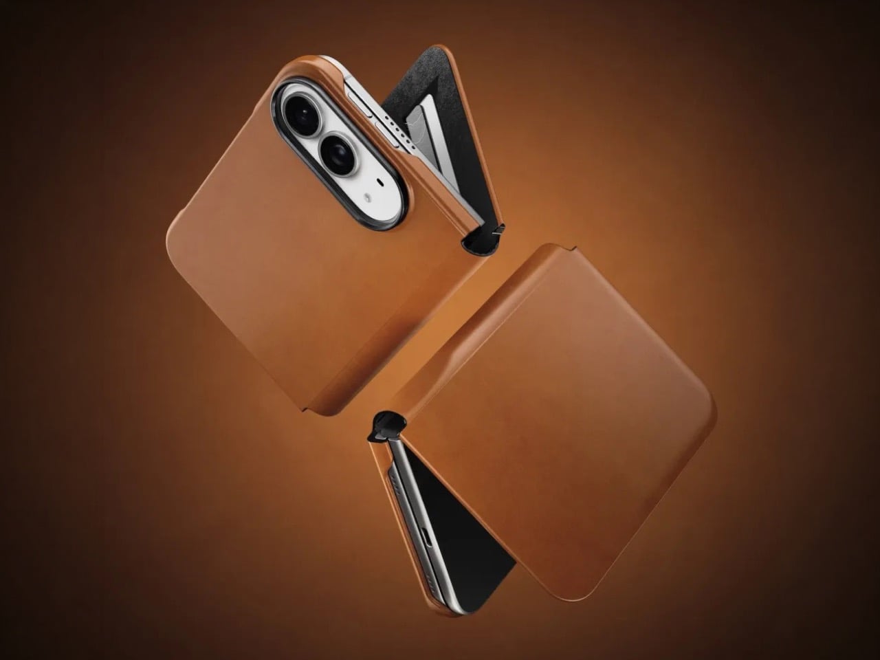
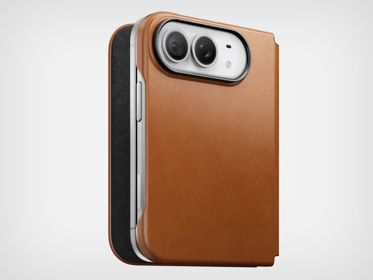
Phone cases tend to fall into two camps: those that protect the device and those that try to say something. Nomad’s Leather Folio attempts something harder: a single object that does both without looking like it is trying to do either. Crafted from Horween leather inside and out, with MagSafe compatibility and RFID blocking built in, it folds over the front of the iPhone Duo and turns what is already an expensive device into a combination that reads less like a phone and more like something a person who still carries a leather notebook would reach for without thinking twice.
Priced at $129, it is not a cheap case, but it is not pretending to be. The leather cover closes over the screen, which is either a feature or a nuisance depending entirely on how you use your phone, though for anyone who already drops it face-down out of habit, the protection is real and the payoff is legitimate. MagSafe integration means the phone charges normally through the case, and the RFID blocking handles the handful of situations where that actually matters. The overall effect is a device that feels deliberately considered in a way most cases never manage to pull off.
What we like
Horween leather develops a patina with use rather than aging badly, which gives the case a genuinely long useful life most materials cannot match
MagSafe compatibility and RFID blocking are both included without any visible hardware bulk or added thickness to the profile
What we dislike
The full front flap adds a step to every screen interaction that will feel like friction until the habit settles, and that adjustment can take longer than expected
At $129, it sits in an awkward price band between affordable everyday cases and truly premium leather goods, which makes the value case harder to land cleanly
5. RePod C1
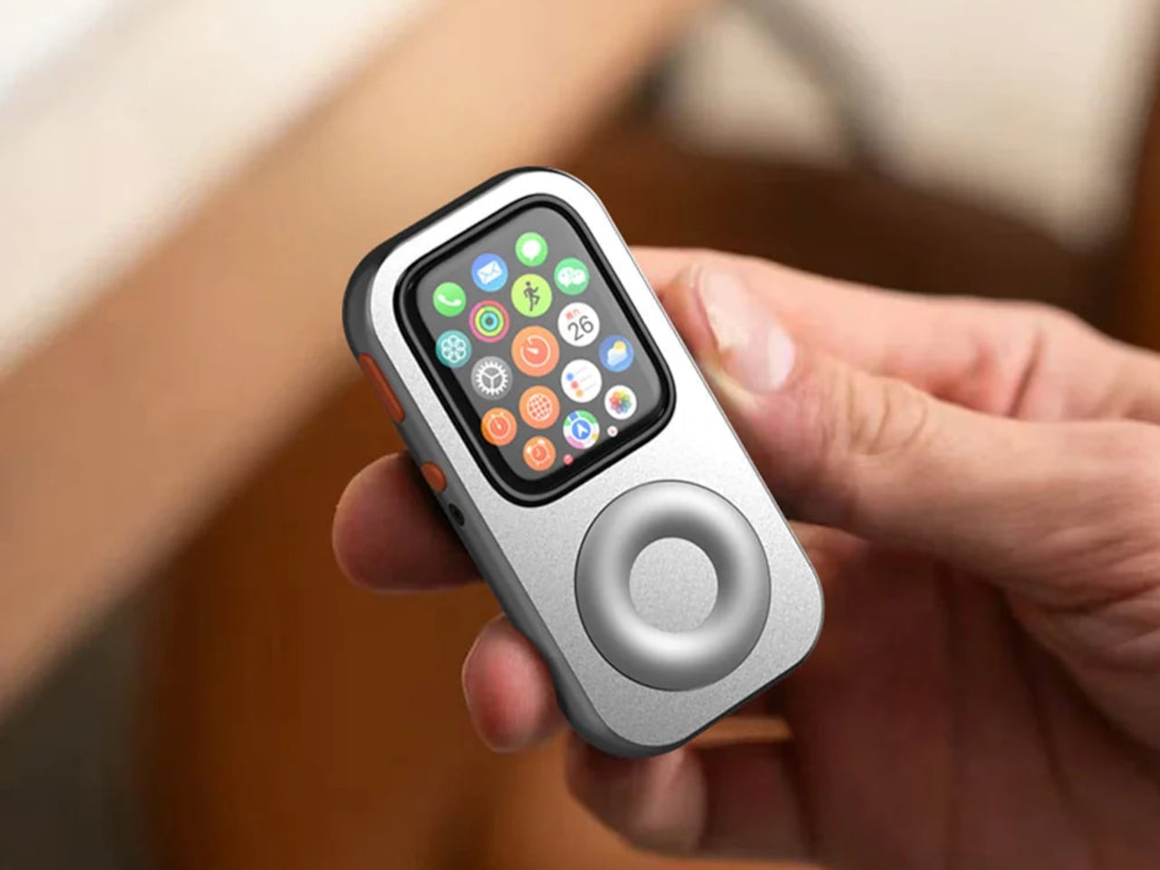
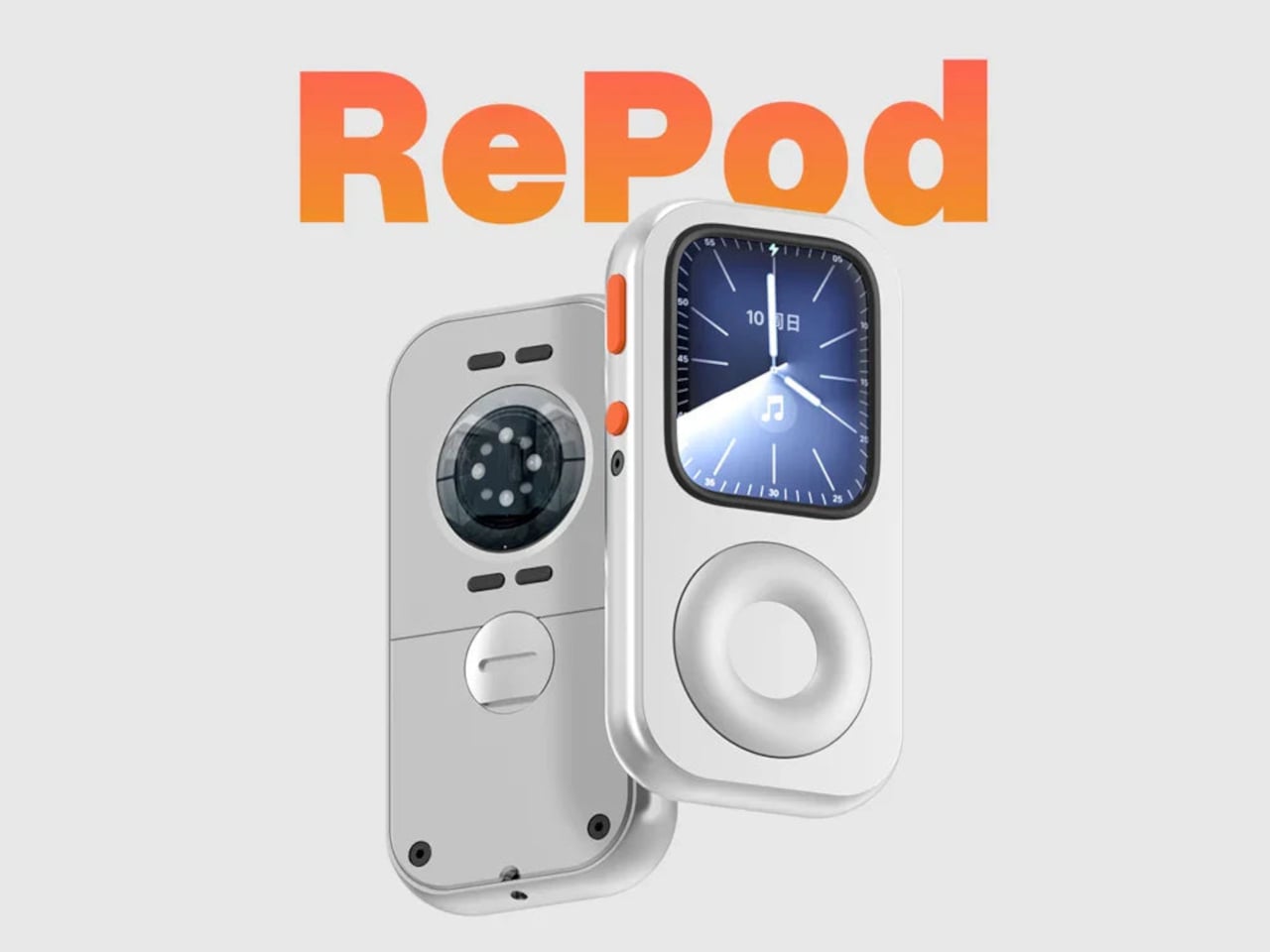
The click wheel was never just an interface. It was a tactile experience that gave early iPods a sense of ceremony that touchscreens have never quite replaced, a physical scroll mechanism that made navigating a playlist feel like it was worth doing slowly. Techpod’s RePod C1 is a $60 Apple Watch case that wraps the watch in an iPod-style shell and brings that wheel back, and what keeps it from being a novelty is one mechanical detail: the click wheel connects directly to the Apple Watch’s Digital Crown, so turning it actually does something real.
The case uses an open-back design that leaves all of the watch’s sensors fully accessible, meaning heart rate monitoring, ECG, and Apple Pay all continue to work normally. Antenna cutouts preserve Wi-Fi, Bluetooth, and cellular connectivity without compromise. The more interesting side effect is what it does to the device’s identity: sliding the watch into a pocket during a run or a commute and navigating with the Crown from inside the shell turns the Apple Watch into something that feels far more like a small, deliberate music player than a wrist-worn notification machine.
What we like
The mechanical connection between the click wheel and the Digital Crown makes the nostalgia functional rather than cosmetic, which is a meaningful distinction
The open-back design keeps every sensor and connectivity feature fully intact, so nothing about the watch’s capabilities changes when the case goes on
What we dislike
Adding any case to the Apple Watch introduces bulk to a device whose appeal partly depends on being thin and unobtrusive on the wrist
The iPod aesthetic lands clearly for one generation and reads as entirely opaque to anyone who came to Apple after the click wheel era ended
The Best Accessories Are the Ones Apple Didn’t Think to Make
Apple’s hardware is precise enough that the accessories worth paying attention to are the ones that noticed a gap the company chose not to fill. The NightWatch saw a dim nightstand clock. Astropad saw a frictionless drawing surface. Ooi Masato saw a speaker that required too much setup before it made a sound. Nomad saw a phone that could carry itself differently. Techpod saw a scroll mechanism nobody had brought back with anything real underneath it.
None of these are essential in the way a charging cable is essential. They are optional in the best sense, the kind of thing that makes a device feel more considered in the hands of whoever chose it. Whether your Apple device is a watch, a phone, or an iPad, something on this list has already figured out what was missing before you had the words for it.
Not every house is built to be seen. The Milo House, designed by Vermont-based studio Elizabeth Herrmann Architecture + Design, is exactly that kind of building. Perched on a hillside in Cornwall, Vermont, the home was conceived for a couple relocating from Boston — and named, warmly, after their dog.
The site set the agenda from day one. Orchards, a dense tree canopy, and long western views stretching toward the Adirondack Mountains shaped every decision Herrmann made. The result is a composition of irregular, offset volumes that feel less like a house imposed on a hillside and more like one that grew there. The forms respond directly to topography, pushing and pulling against the terrain to create what Herrmann describes as moments of “compression and release” that unfold as you move through the home.
The exterior material choice is where the design gets its clearest statement. Facades are clad in Nakamoto Forestry’s Gendai® yakisugi — Japanese cedar charred using an ancient technique that enhances the wood’s durability, rot resistance, and dimensional stability. The Gendai® variation is brushed once after charring to soften the soot, letting the cedar’s natural grain surface beneath the carbonized skin. Up close, it has depth. From a distance, it reads almost exactly like bark. That’s not coincidental. “We were really interested in having the house feel natural — almost bark-like in tone and texture,” says Herrmann. “We love working with natural materials that have texture, patina, and depth of character.”
The material also carries an implicit philosophy about time. Yakisugi isn’t meant to stay static — it weathers, shifts, and evolves. “The point of yakisugi isn’t for it to stay frozen in time. It’s a living material designed to evolve. The clients really embraced that idea,” Herrmann notes. For a home built around slower living, remote work, and genuine connection to place, that mindset runs all the way through.
Step inside and the dark exterior gives way to cathedral-like rooms, earthy finishes, and an abundance of natural light. Cross-ventilation moves through the offset volumes efficiently, and the siting frames views rather than competes with them. A detached sauna, clad in the same yakisugi siding, anchors the property and completes the picture — a full retreat, not just a house. The Milo House isn’t trying to be a landmark. It’s trying to belong. And it does.
Small apartments don’t fail because of square footage. They fail because the things you need to live in them- a speaker, a vacuum, somewhere to work out- were designed for rooms twice the size. You end up with a robot dock that reads like a utility object in the middle of your living space, a rowing machine eating an entire corner, and three devices on a nightstand doing three things that one should be doing.
The five products here take the opposite approach. Each one earns its footprint or removes it entirely, doing more with less floor space without requiring you to reorganize your life around the purchase. The measure of anything in a small apartment is simple: does it disappear into the room, or does the room start disappearing around it? These five clear that bar in noticeably different ways.
1. Portable CD Cover Player
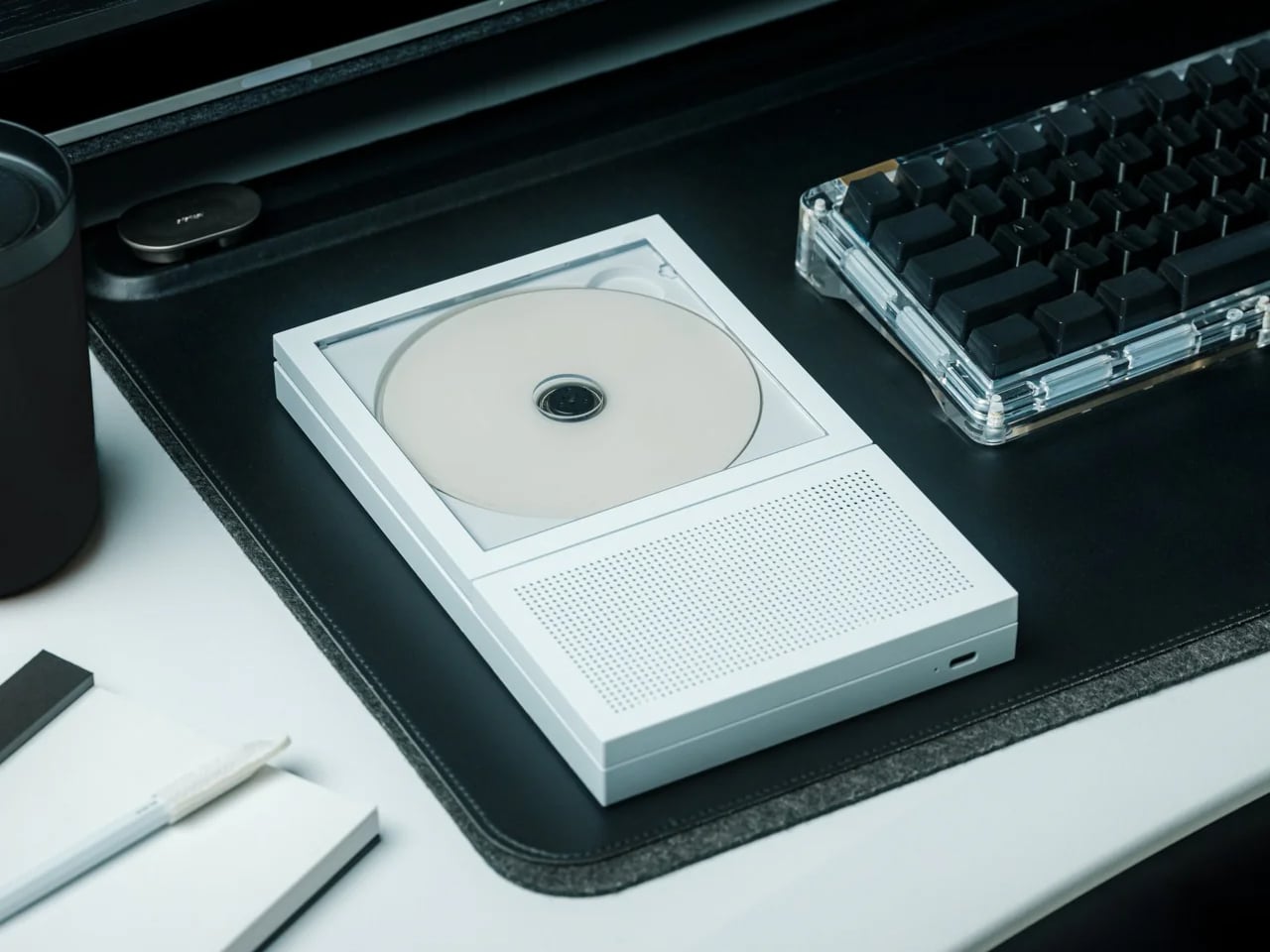
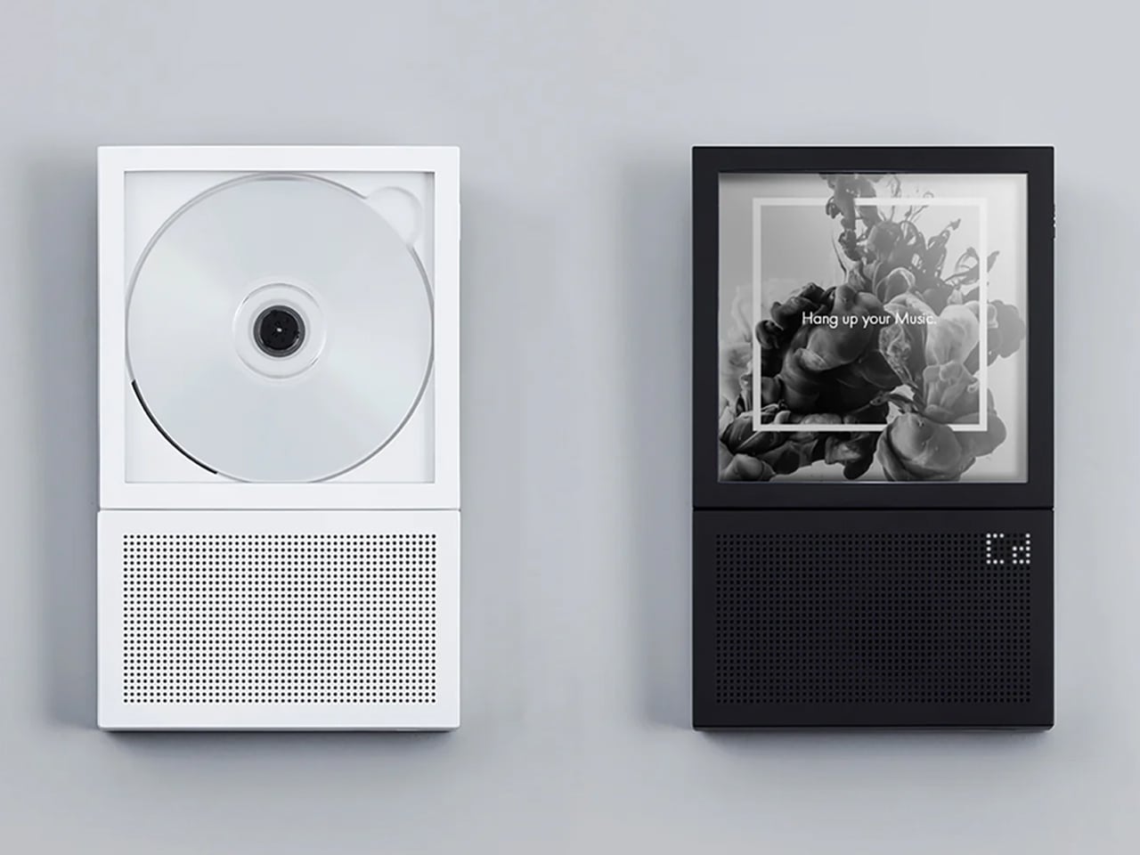
The Portable CD Cover Player costs $199 and takes up no horizontal surface at all. It mounts directly to the wall, leaving every shelf, table, and counter below it available for something else. In a small apartment, that trade earns itself back in freed real estate almost immediately. Physical media also takes you away from algorithm-driven listening, and in a room where every surface and every sound competes for attention, that turns out to feel like a feature rather than a compromise.
What changes in practice is the relationship between music and the room. The Cover Player doesn’t sit on anything. It doesn’t need a corner or a dedicated shelf. It mounts, plays, and disappears into the wall in a way that most audio objects never quite manage. The wall mount bracket is sold separately from the base price, which is worth factoring in, but the outcome is a speaker setup that reads as an intentional design choice rather than something you found space for.
Mounts to the wall entirely, removing itself from every horizontal surface in the room
Encourages deliberate, album-led listening rather than passive background playback
What we dislike
The wall mount bracket is sold separately, adding to the $199 base price
CD-only playback works best for those already invested in physical media
2. Narwal Freo 20
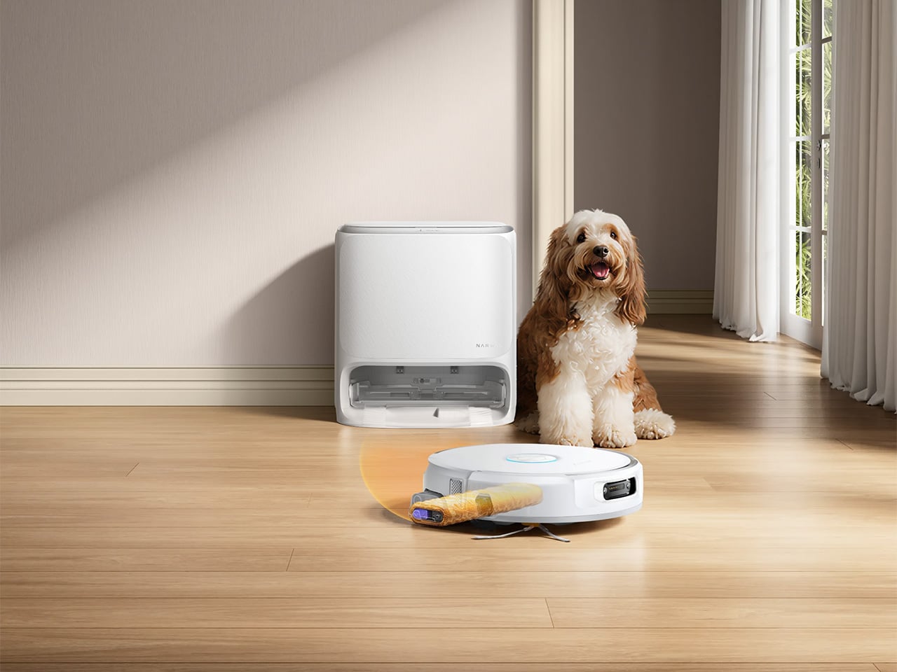
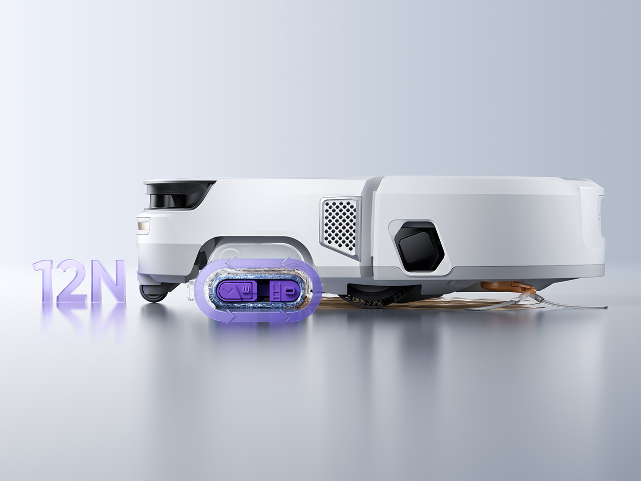
The Freo 20 addresses the two problems robot vacuums have quietly carried since the beginning. The first is the mop, which on most machines drags the first room’s dirt through every room that follows. Narwal’s Track Mop cleans itself mid-run using 16 precision nozzles, 140°F water, and a built-in scraper that routes dirty water into a separate tank, so the floor it finishes on is genuinely cleaner than the one it started. The second problem is the dock, and the woven fabric texture Narwal wraps it in is the first of its kind in the category.
In a small apartment, both issues land harder. A dirty mop re-running on three hundred square feet means the whole floor carries whatever it picked up in the first pass. A dock that reads as a utility object means hunting for a corner to store it in, which in a studio is usually a corner you’d rather use. The Freo 20’s 120-day maintenance interval and 31,000Pa suction make the performance case directly. The dock being genuinely livable alongside rather than tolerated is the detail that separates it from the rest of the category at any price.
The Track Mop self-cleans in real time with 140°F hot water and a separate dirty water extraction tank
The woven-texture dock is designed to sit beside furniture rather than be hidden behind it
What we dislike
At $1,099.99 MSRP, it represents a significant investment relative to the wider robot vacuum market
Thirty Amazon ratings is a thin review count for a product at this price point
3. Compact Folding Rowing Machine
A rowing machine is one of those fitness purchases that tends to exist in a small apartment as a statement of intent rather than a piece of equipment. It claims a corner, it demands clearance on both sides, and the commitment it asks for from the room is usually larger than the commitment it gets from the person who bought it. The Home Gym Cube Rower changes that equation by folding down to the size of a side table, making it something you can actually live alongside rather than continuously negotiate with.
Folded, it stores flat against a wall or inside a closet without permanently claiming the room. Unfolded, it offers a complete rowing workout without a gym membership, a separate fitness space, or the friction that usually makes skipping a session too easy. For anyone working out of a studio or one-bedroom, the calculation shifts from whether you can fit a rowing machine at all to whether you actually want to use one, which is a significantly more useful question to be spending your energy on.
What we like
Folds to side-table size, removing the spatial penalty that normally keeps rowing machines out of small apartments
Functions as a standalone full-body workout without requiring any additional equipment alongside it
What we dislike
Compact rowing machines typically offer a narrower resistance range than full-size models
Requires cleared floor space when in use, which in a studio may mean rearranging other furniture first
4. Practiko Otis Hanger 3.0
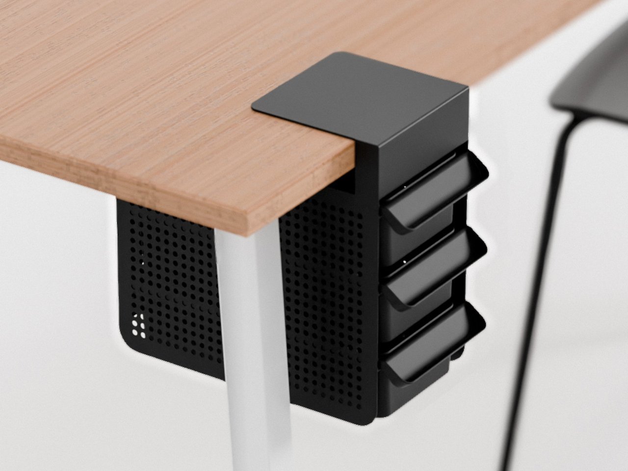
Most desk organizers solve the clutter problem by making clutter more vertical. The Otis Hanger 3.0 takes a different position: it hangs a full drawer beneath the desk surface without a screw, adhesive, or any permanent alteration to the furniture. For renters, which describes most people living in small apartments, that matters. You are not committing to a hardware modification for furniture you don’t own in an apartment you are not permitted to drill into. It clips on, holds things, and comes off clean when you leave.
In practice, it means the desk surface stays clear. Cables, chargers, notebooks, and the collection of small items that colonize any workspace have somewhere to go that stays entirely out of sightlines and video call frames. In a small apartment where the desk often doubles as the dining table, the morning coffee surface, and the only flat working area in the room, keeping the top uncluttered is one of the more useful upgrades you can make without touching a single wall or piece of furniture permanently.
What we like
Attaches to any desk without screws, drills, or permanent changes, making it fully renter-friendly
Under-desk placement keeps stored items out of sightlines and video call backgrounds entirely
What we dislike
Compatibility depends on desk edge overhang depth, which can exclude some desk designs
5. Divoom FlowToo
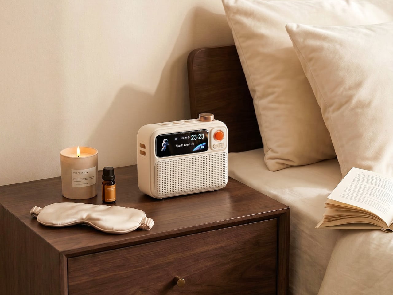
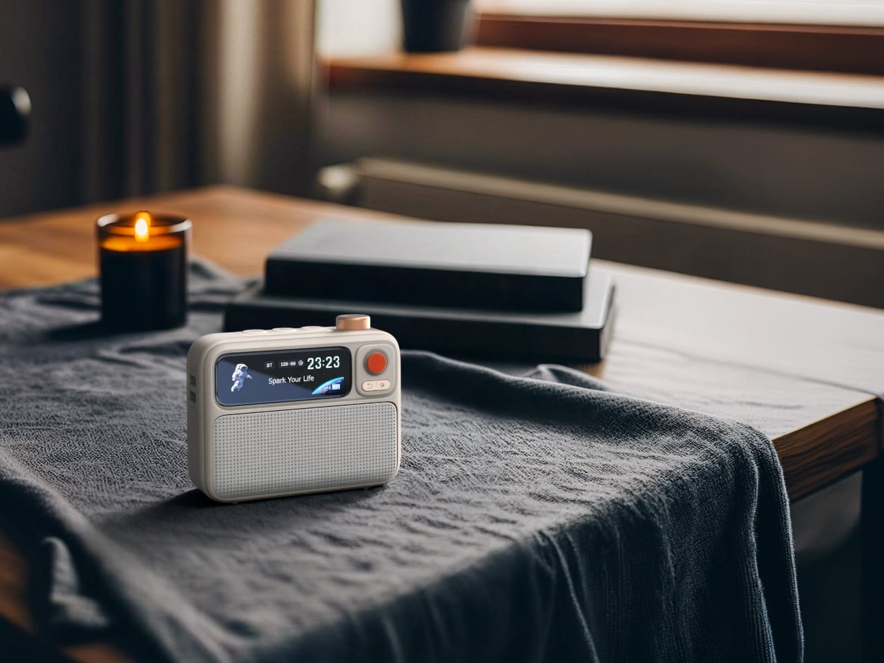
A nightstand in a small apartment runs out of surface faster than almost anywhere else in the room. The usual setup- white noise machine, alarm clock, Bluetooth speaker, phone charger- is four separate objects doing four separate things on a surface that doesn’t comfortably hold two. The Divoom FlowToo consolidates three of those into a single compact body: a 10W Bluetooth speaker with a 45mm full-range driver, 90-plus soothing and white noise sounds, a smart alarm, and a Pomodoro timer, all in one object that draws $99.99 from your wallet and returns significant nightstand real estate in exchange.
The design reads like a retro desk object rather than a tech gadget, which matters in a room where everything left out is also part of how the space looks at eight in the morning. At $99.99, it costs less than most standalone Bluetooth speakers of comparable output while replacing the white noise machine and alarm clock entirely. The Pomodoro timer makes it genuinely useful during working hours too, which gives it a reason to stay out on the desk rather than get stashed in a drawer the moment the alarm goes off.
What we like
Replaces a Bluetooth speaker, white noise machine, and alarm clock with a single object that earns its nightstand space
The retro-inflected design reads as a considered object rather than an appliance in a small room
What we dislike
10W output fills a bedroom well but will not scale to larger open-plan living spaces
Customization of display and routines requires the Divoom app, creating ongoing phone dependency
Small Living Made Big
Outfitting a small apartment well is less about finding products that fit and more about finding products that don’t ask too much. The best ones earn their square footage by solving something real: a dock that belongs in the open, a speaker that stands in for three devices, a rowing machine that stops being an obstacle the moment you fold it up. None of these require you to rearrange your life to accommodate them.
That is what separates the five here from most of what fills a small-space shopping list. They work with the room rather than demanding the room work around them. Whether it’s the wall-mounted CD player freeing every surface below it, or the Narwal dock sitting beside the couch without apology, the common thread is the same: good design in a tight space isn’t about fitting more in. It’s about needing less room to begin with.
Small apartments don’t fail because of square footage. They fail because the things you need to live in them- a speaker, a vacuum, somewhere to work out- were designed for rooms twice the size. You end up with a robot dock that reads like a utility object in the middle of your living space, a rowing machine eating an entire corner, and three devices on a nightstand doing three things that one should be doing.
The five products here take the opposite approach. Each one earns its footprint or removes it entirely, doing more with less floor space without requiring you to reorganize your life around the purchase. The measure of anything in a small apartment is simple: does it disappear into the room, or does the room start disappearing around it? These five clear that bar in noticeably different ways.
1. Portable CD Cover Player
The Portable CD Cover Player costs $199 and takes up no horizontal surface at all. It mounts directly to the wall, leaving every shelf, table, and counter below it available for something else. In a small apartment, that trade earns itself back in freed real estate almost immediately. Physical media also takes you away from algorithm-driven listening, and in a room where every surface and every sound competes for attention, that turns out to feel like a feature rather than a compromise.
What changes in practice is the relationship between music and the room. The Cover Player doesn’t sit on anything. It doesn’t need a corner or a dedicated shelf. It mounts, plays, and disappears into the wall in a way that most audio objects never quite manage. The wall mount bracket is sold separately from the base price, which is worth factoring in, but the outcome is a speaker setup that reads as an intentional design choice rather than something you found space for.
Mounts to the wall entirely, removing itself from every horizontal surface in the room
Encourages deliberate, album-led listening rather than passive background playback
What we dislike
The wall mount bracket is sold separately, adding to the $199 base price
CD-only playback works best for those already invested in physical media
2. Narwal Freo 20
The Freo 20 addresses the two problems robot vacuums have quietly carried since the beginning. The first is the mop, which on most machines drags the first room’s dirt through every room that follows. Narwal’s Track Mop cleans itself mid-run using 16 precision nozzles, 140°F water, and a built-in scraper that routes dirty water into a separate tank, so the floor it finishes on is genuinely cleaner than the one it started. The second problem is the dock, and the woven fabric texture Narwal wraps it in is the first of its kind in the category.
In a small apartment, both issues land harder. A dirty mop re-running on three hundred square feet means the whole floor carries whatever it picked up in the first pass. A dock that reads as a utility object means hunting for a corner to store it in, which in a studio is usually a corner you’d rather use. The Freo 20’s 120-day maintenance interval and 31,000Pa suction make the performance case directly. The dock being genuinely livable alongside rather than tolerated is the detail that separates it from the rest of the category at any price.
The Track Mop self-cleans in real time with 140°F hot water and a separate dirty water extraction tank
The woven-texture dock is designed to sit beside furniture rather than be hidden behind it
What we dislike
At $1,099.99 MSRP, it represents a significant investment relative to the wider robot vacuum market
Thirty Amazon ratings is a thin review count for a product at this price point
3. Compact Folding Rowing Machine
A rowing machine is one of those fitness purchases that tends to exist in a small apartment as a statement of intent rather than a piece of equipment. It claims a corner, it demands clearance on both sides, and the commitment it asks for from the room is usually larger than the commitment it gets from the person who bought it. The Home Gym Cube Rower changes that equation by folding down to the size of a side table, making it something you can actually live alongside rather than continuously negotiate with.
Folded, it stores flat against a wall or inside a closet without permanently claiming the room. Unfolded, it offers a complete rowing workout without a gym membership, a separate fitness space, or the friction that usually makes skipping a session too easy. For anyone working out of a studio or one-bedroom, the calculation shifts from whether you can fit a rowing machine at all to whether you actually want to use one, which is a significantly more useful question to be spending your energy on.
What we like
Folds to side-table size, removing the spatial penalty that normally keeps rowing machines out of small apartments
Functions as a standalone full-body workout without requiring any additional equipment alongside it
What we dislike
Compact rowing machines typically offer a narrower resistance range than full-size models
Requires cleared floor space when in use, which in a studio may mean rearranging other furniture first
4. Practiko Otis Hanger 3.0
Most desk organizers solve the clutter problem by making clutter more vertical. The Otis Hanger 3.0 takes a different position: it hangs a full drawer beneath the desk surface without a screw, adhesive, or any permanent alteration to the furniture. For renters, which describes most people living in small apartments, that matters. You are not committing to a hardware modification for furniture you don’t own in an apartment you are not permitted to drill into. It clips on, holds things, and comes off clean when you leave.
In practice, it means the desk surface stays clear. Cables, chargers, notebooks, and the collection of small items that colonize any workspace have somewhere to go that stays entirely out of sightlines and video call frames. In a small apartment where the desk often doubles as the dining table, the morning coffee surface, and the only flat working area in the room, keeping the top uncluttered is one of the more useful upgrades you can make without touching a single wall or piece of furniture permanently.
What we like
Attaches to any desk without screws, drills, or permanent changes, making it fully renter-friendly
Under-desk placement keeps stored items out of sightlines and video call backgrounds entirely
What we dislike
Compatibility depends on desk edge overhang depth, which can exclude some desk designs
5. Divoom FlowToo
A nightstand in a small apartment runs out of surface faster than almost anywhere else in the room. The usual setup- white noise machine, alarm clock, Bluetooth speaker, phone charger- is four separate objects doing four separate things on a surface that doesn’t comfortably hold two. The Divoom FlowToo consolidates three of those into a single compact body: a 10W Bluetooth speaker with a 45mm full-range driver, 90-plus soothing and white noise sounds, a smart alarm, and a Pomodoro timer, all in one object that draws $99.99 from your wallet and returns significant nightstand real estate in exchange.
The design reads like a retro desk object rather than a tech gadget, which matters in a room where everything left out is also part of how the space looks at eight in the morning. At $99.99, it costs less than most standalone Bluetooth speakers of comparable output while replacing the white noise machine and alarm clock entirely. The Pomodoro timer makes it genuinely useful during working hours too, which gives it a reason to stay out on the desk rather than get stashed in a drawer the moment the alarm goes off.
What we like
Replaces a Bluetooth speaker, white noise machine, and alarm clock with a single object that earns its nightstand space
The retro-inflected design reads as a considered object rather than an appliance in a small room
What we dislike
10W output fills a bedroom well but will not scale to larger open-plan living spaces
Customization of display and routines requires the Divoom app, creating ongoing phone dependency
Small Living Made Big
Outfitting a small apartment well is less about finding products that fit and more about finding products that don’t ask too much. The best ones earn their square footage by solving something real: a dock that belongs in the open, a speaker that stands in for three devices, a rowing machine that stops being an obstacle the moment you fold it up. None of these require you to rearrange your life to accommodate them.
That is what separates the five here from most of what fills a small-space shopping list. They work with the room rather than demanding the room work around them. Whether it’s the wall-mounted CD player freeing every surface below it, or the Narwal dock sitting beside the couch without apology, the common thread is the same: good design in a tight space isn’t about fitting more in. It’s about needing less room to begin with.
Xi’an is a city that carries the weight of history on every street corner. As the ancient capital of thirteen dynasties and the eastern terminus of the Silk Road, it is not a place where new buildings go unnoticed. Chang’an Academy, situated on the west bank of the Ba River in Xi’an’s Chanba Ecological Area, sits across the water from the Xi’an Olympic Sports Center — a position that demanded both confidence and restraint. The result, delivered by China Northwest Architectural Design and Research Institute with interior design by HONG Designworks, is one of the most quietly commanding civic buildings to come out of China in recent memory.
At 70,016 square meters, the scale could easily have turned cold. Most buildings of this ambition solve the problem with spectacle. This one solves it with empathy. A sweeping roofline gently unfolds along the riverbank, echoing the upward-curving silhouette of traditional Chinese architecture, dipping at its center before extending outward to soften the building’s imposing frontage. Viewed from the opposite bank, the profile reads unmistakably as an open book — a symbolic gesture that feels earned rather than forced. The structure appears to float above the landscape, its mass dissolved by the precision of that single continuous gesture.
Designer: Hong Designworks & China Northwest Architectural Design and Research Institute
HONG Designworks, founded in 2002 by Zhiyong Fan and Ming Dang, operates with a human-centered philosophy at its core. That philosophy is visible in every interior decision. The complex integrates spaces for reading, art exhibitions, educational programs, cultural activities, and public interaction — but what makes it work is how naturally those functions flow into one another. Atrium stairs invite drift. Daylight moves through the building with the ease of someone who belongs there. Circulation feels less like a floor plan and more like a suggestion.
The collaboration between the two firms reflects how serious civic architecture gets made: structural ambition from China Northwest Architectural Design and Research Institute, spatial warmth from HONG Designworks. Neither function cancels the other out. The building is monumental without being alienating, contemporary without severing its ties to the city’s deep cultural memory.
What Chang’an Academy ultimately demonstrates is that landmark architecture doesn’t have to announce itself. A building can carry 5,000 years of Chinese cultural lineage in its roofline, open its arms to a river, and still feel like somewhere you’d want to spend an afternoon doing nothing in particular. That balance — between civic weight and everyday ease — is harder to achieve than it looks. Here, it looks effortless.
The Curious House in Zagreb doesn’t try to win you over immediately, and that’s exactly the point. Designed by Croatian studio FORVM arhitektura, it’s a family residence perched on a steep hillside, slightly pulled back from the main road and swallowed by dense urban vegetation — orchards, spruces, pines, cedars. The house doesn’t announce itself. It settles in.
Rather than drop a single mass onto the slope, FORVM broke the program into three distinct elements, each responding to a different register of the site. It’s a compositional decision that reads as both pragmatic and poetic, dissolving the usual tension between building and terrain into something more like a conversation. The topography shapes the architecture. The architecture shapes how you live inside it.
Designer: FORVM
The ground floor is fully glazed — a deliberate move to keep the resident in constant dialogue with the world outside. Green cascades past the glass. The tree canopies filter sunlight and block sightlines, doing the work that walls might otherwise do. Privacy here isn’t enforced by opacity; it’s offered by nature. The forest earns its place as an active participant in the spatial experience, not just a backdrop.
The upper floor shifts register. Where the ground level opens up, the upper volume turns more inward, more considered. Roof windows cut directly to the sky, and through them, tree silhouettes remind you again that you’re inside a forest. The building keeps finding ways to return you to the landscape — not through grand gestures, but through quiet architectural moves that accumulate into something genuinely atmospheric.
From the outside, the Curious House plays a different game. Its smooth, reflective surfaces don’t reveal the interior so much as they absorb the green world around it. You expect transparency; instead, you get a mirror. The observer looks for signs of life within the envelope and finds it harder than the glazing might suggest. It’s a house that hides in plain sight.
Designed by Dinko Uglešić, Ina Vlahović, and Marijana Rančić, and photographed by Bosnic+Dorotic, the Curious House exemplifies a strain of European residential architecture that takes landscape seriously — not as an amenity to be framed, but as a logic to be followed. FORVM, founded in 1991 by Ante Uglešić, has long worked within the specifics of Croatian terrain and climate, and that attentiveness shows here in every decision, from the fragmented massing to the calibrated relationship between glass and canopy.
A dorm room rarely arrives with any intention behind it. The furniture is standard issue, the lighting is whatever the university installed, and the walls belong to someone else’s lease. None of that stops you from shaping how the space feels. Japanese design has always found calm not through more, but through better. These seven objects apply that same thinking to the smallest rooms most people will ever live in.
None of these picks need a drill, a landlord’s approval, or a subscription to anything. They are small, portable, and built around the same logic that shapes a good ryokan room: comfort comes from restraint, not accumulation. Each entry here handles one of four things — scent, light, sound, or surface — extremely well. Start with one, give it a few weeks, and notice how quickly the rest of the room reorganizes around it.
1. Battery-Free Aroma Diffuser
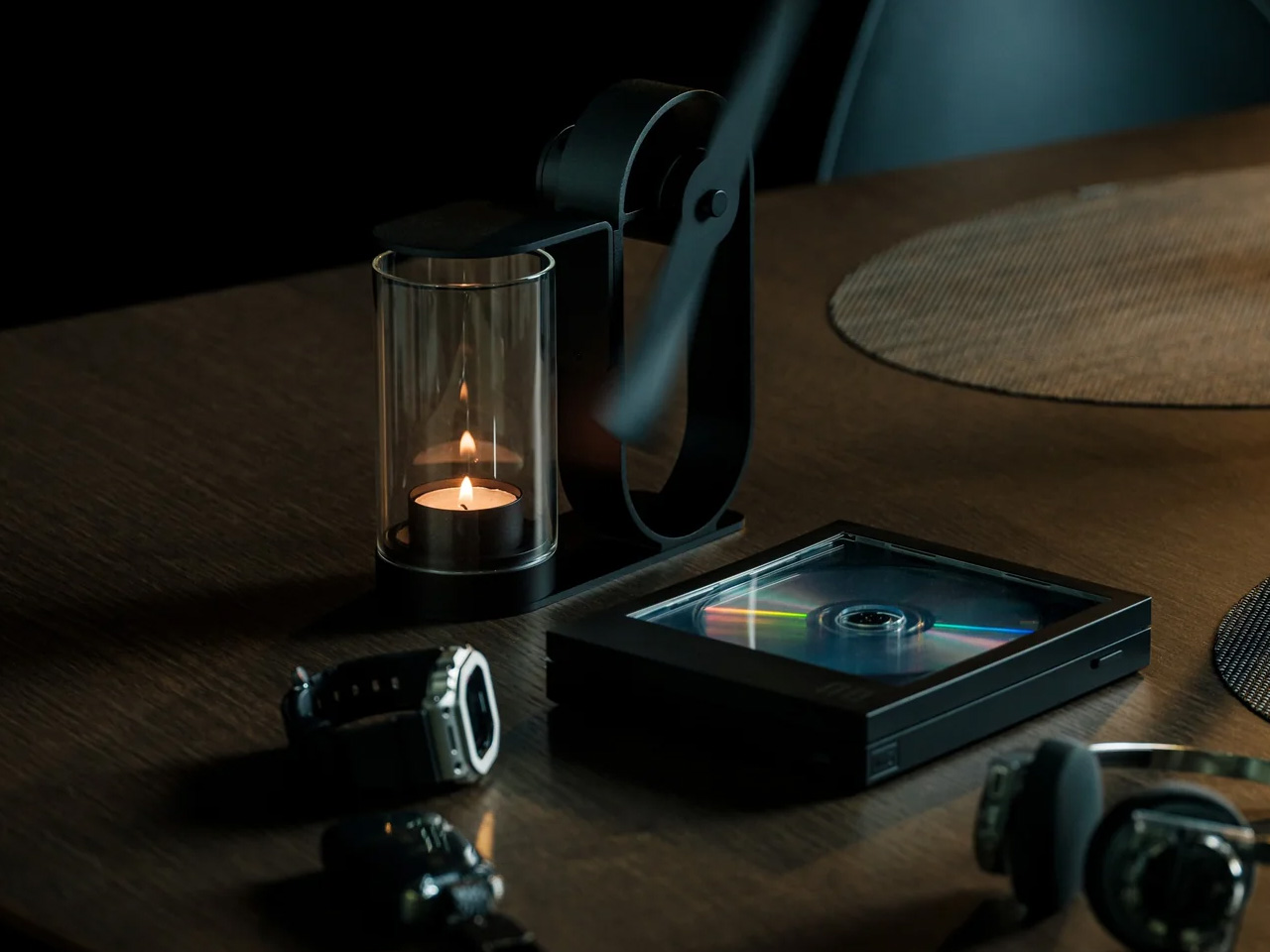
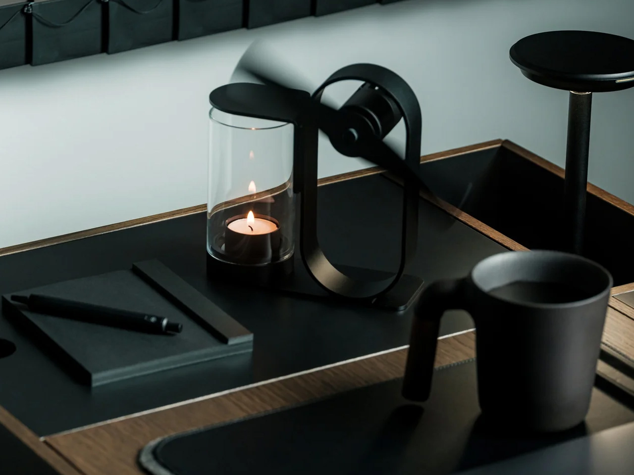
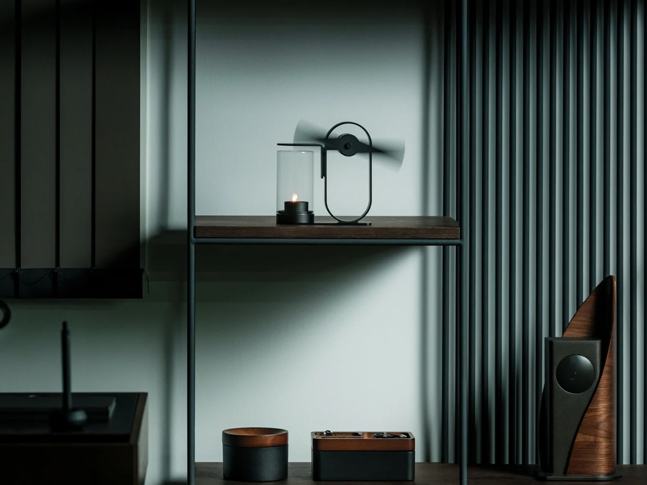
The most obvious thing about the Battery-Free Aroma Diffuser is right there in the name. No cord to manage, no batteries to replace, no USB port to compete with your laptop. A small candle sits inside a shielded housing, and the heat it generates spins a single fan blade that pushes scent further into the room than a standard candle would alone. The whole mechanism is visible from the outside, which is part of what makes it worth keeping on a nightstand in the first place.
There is something meditative about watching it work. The fan blade turns without any electricity, the scent builds slowly rather than blasting the room at once, and the exposed metalwork turns what is usually a plastic object into something closer to a piece of craft. In a dorm room where most objects compete for attention, this one earns it quietly.
No batteries or cords means it works anywhere, including the awkward corner beside your bed
The exposed mechanism makes it look closer to a small kinetic sculpture than a gadget
What We Dislike
Scent only diffuses while the candle burns, so the effect does not last through the night
Open flame requires supervision and may conflict with dorm fire safety policies
2. REBORN PULP Acoustic Panel
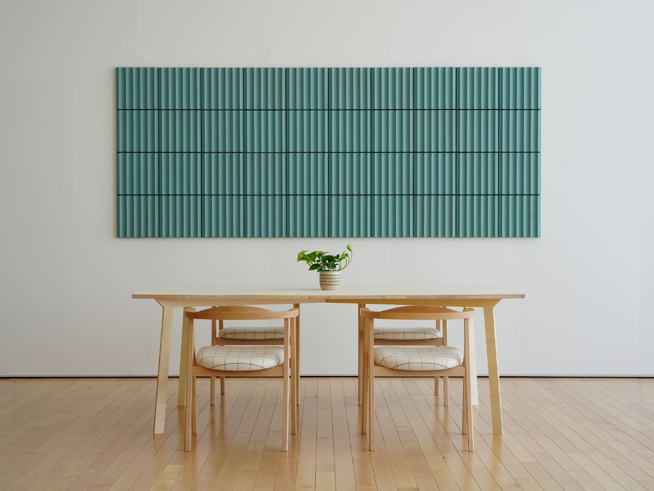
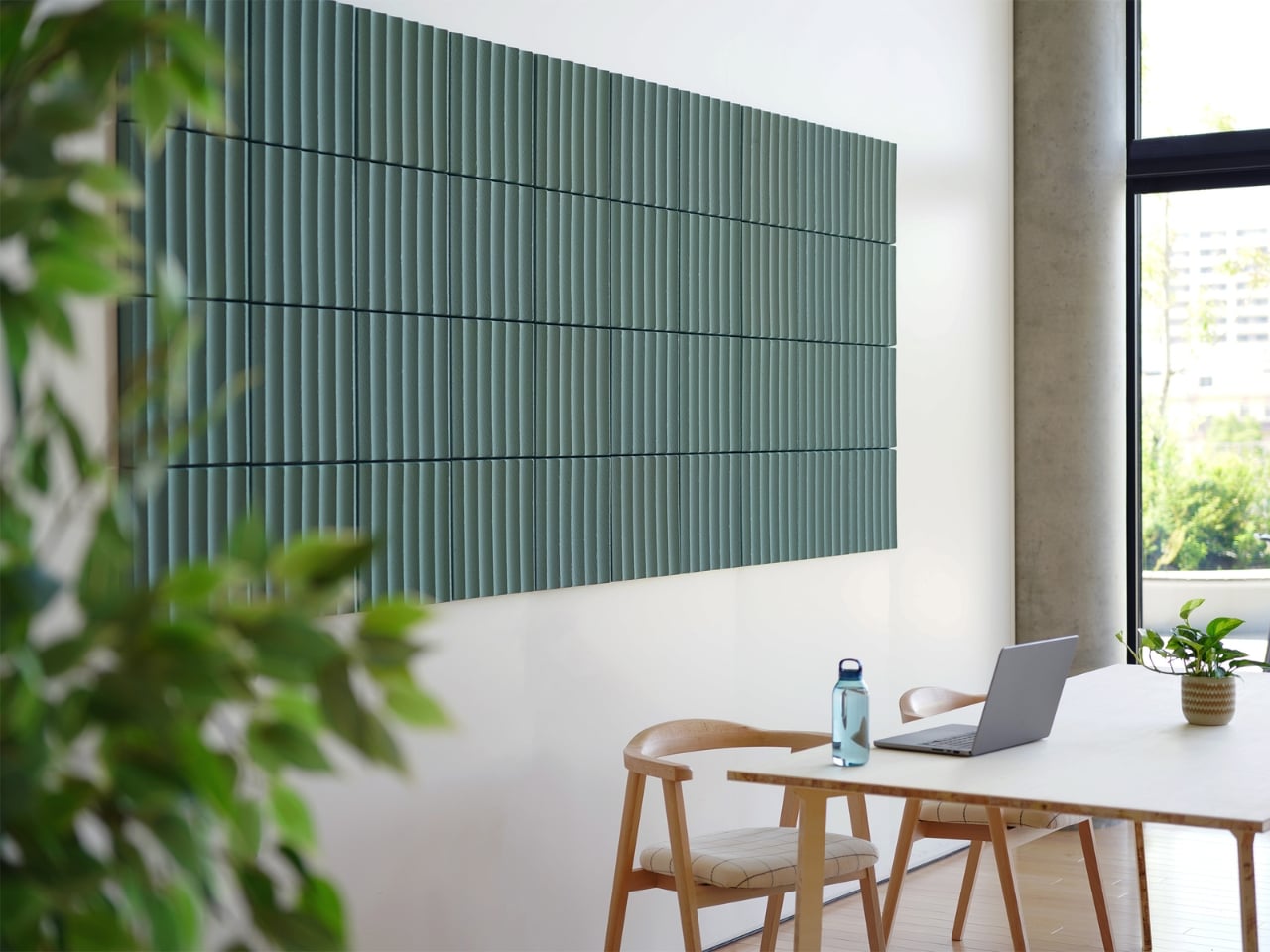
Most acoustic panels solve one problem while creating another. They dampen sound but look like something salvaged from a recording studio, and nobody wants a room that looks like that. LIBGRAPHY’s REBORN PULP takes a different position entirely. Made from 100% recycled paper pulp with no plastics and no synthetic adhesives, it is fully biodegradable. The surface carries ridges and textures that reference a raked zen garden, available in colors drawn from traditional Japanese naming: natural, pale grey, celadon, and indigo.
What that means in practice is a panel that absorbs sound and reads as intentional decor at the same time, a combination almost nothing else in the acoustic category manages. The name Reborn refers to the material itself: paper that would otherwise be discarded, pressed into panels and returned to something useful. In a dorm room where wall decor is usually a poster or nothing, a REBORN PULP panel brings texture, quiet, and a considered material story from one object on the wall.
What We Like
The raked surface texture reads as genuine wall art, not acoustic treatment hiding behind decor
100% recycled paper pulp construction with no plastics, no synthetic adhesives, fully biodegradable
What We Dislike
Availability outside Japan is still limited, making international purchasing complicated
Pricing is not publicly listed, which makes budgeting harder before you commit to inquiring
3. Portable CD Cover Player
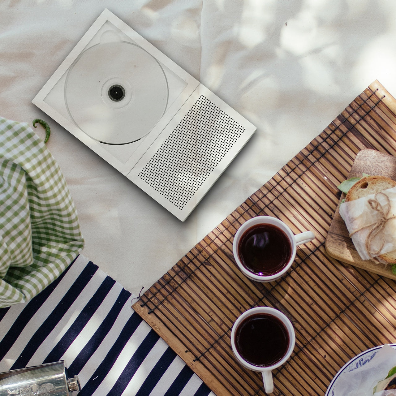
Music in a dorm room usually comes from a phone propped against a glass. The Portable CD Cover Player changes the ritual entirely. You slot an actual CD into the body of the player, slide the album jacket into a front-facing pocket, and the artwork becomes part of what sits on your desk or hangs on the wall while the music plays. A built-in rechargeable battery and speaker mean it works anywhere you put it, no outlet or external speaker needed.
The design logic here is genuinely Japanese in its thinking: one object, handled well, replaces three. A phone stand, a music player, and wall art collapse into the same device. Priced from $199, it reintroduces the physical ritual of choosing and loading a disc, which is a deliberate act in a way that queueing a playlist never quite is. That small moment of intention is exactly what separates a ryokan from a hotel.
Album art display turns a music player into a piece of rotating wall decor
Battery-powered and portable, so it moves freely around the room without hunting for an outlet
What We Dislike
Requires owning physical CDs, which most students no longer have on hand
The built-in speaker suits a small room but is not a substitute for dedicated audio
4. Pattern as Structure Shelf
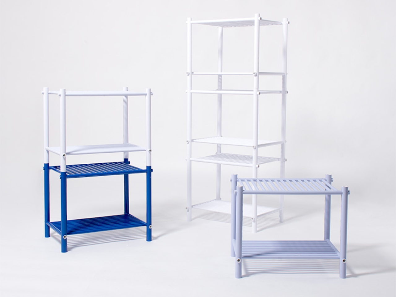
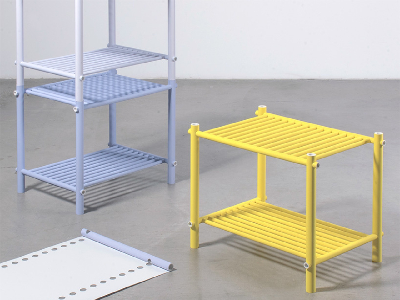
When Japanese designer Muto Yumi set out to make furniture from paper, the result was not what most people would picture. No papier-mâché, no origami folding, no salvaged cardboard called art. What she built is a modular shelf system so structurally sound and visually precise that it makes you question most of what you assumed about material strength. The whole structure is built from rolled paper rods, and the pattern printed across each rod is not decoration. It is the joint itself.
Other paper rods slot through the pattern holes, linking each piece to the next without glue or hardware. The aesthetics and the engineering are the same thing, which is a level of design clarity rare in furniture of any material. Paper does not pretend to be something else. You can see the rolled layers at the cut ends. The pattern on each rod is both surface and structure, decoration and joint, and that indivisible coherence is what makes the shelf feel genuinely resolved.
What We Like
The pattern doubles as both decorative surface and structural joint, a design coherence almost nothing else achieves
Fully modular and hardware-free, meaning it can be reconfigured or disassembled without tools
What We Dislike
As a concept project, it is not yet available as a retail product to purchase
Paper furniture requires careful handling, and a shared dorm environment adds more risk than most
5. Infinite Solas Lamp
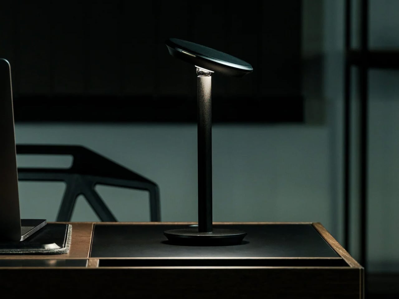
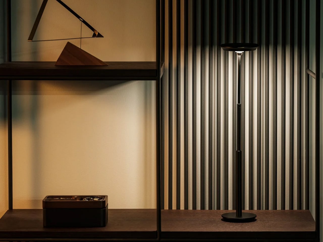
A dorm desk pulls double duty as dining table, reading surface, and workspace, often within the same hour. The Infinite Solas Lamp is built for that kind of restless room. It is fully wireless, running on a rechargeable battery that lasts up to 70 hours at low brightness or 6 to 7 hours at full, and the height adjusts between 22.5cm and 50cm so it fits wherever the moment calls for it, without the usual cord hunt before every use.
The color temperature runs from 2500K to 4000K with full dimming across the range, which means the same lamp that pushes you through a late assignment can settle into something much softer for reading in bed. The machined aluminum body with its anodized finish weighs just over a kilogram, enough to anchor a corner without needing shelf space.
Battery life of up to 70 hours at low brightness means days between charges in normal use
Height adjusts from 22.5cm to 50cm so it functions equally well on a desk or nightstand
What We Dislike
At $325, it is one of the more expensive items on this list, which strains a dorm budget
Full brightness lasts only 6 to 7 hours per charge, so heavier use means more frequent recharging
6. Hinoki Bath Stools
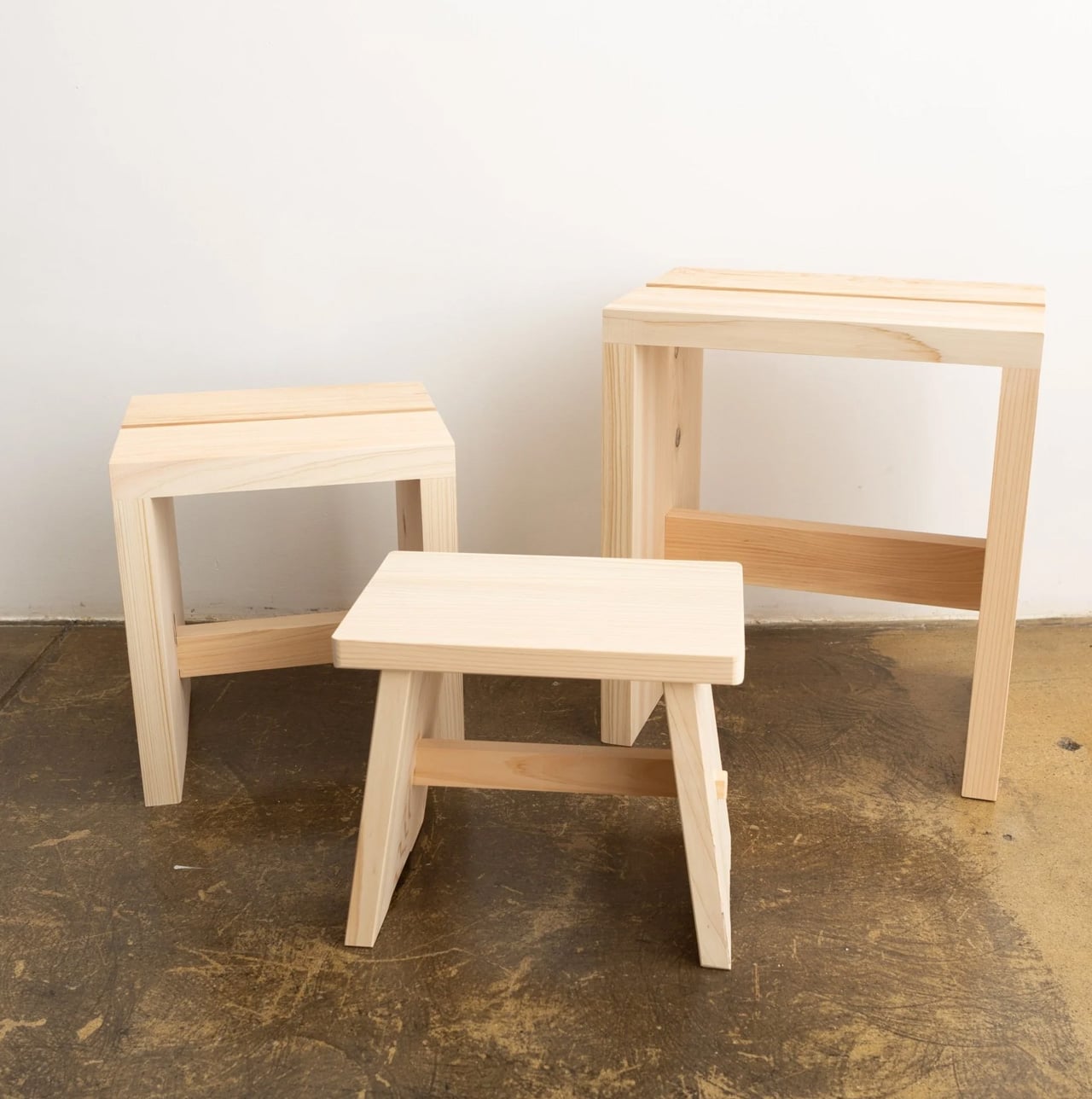
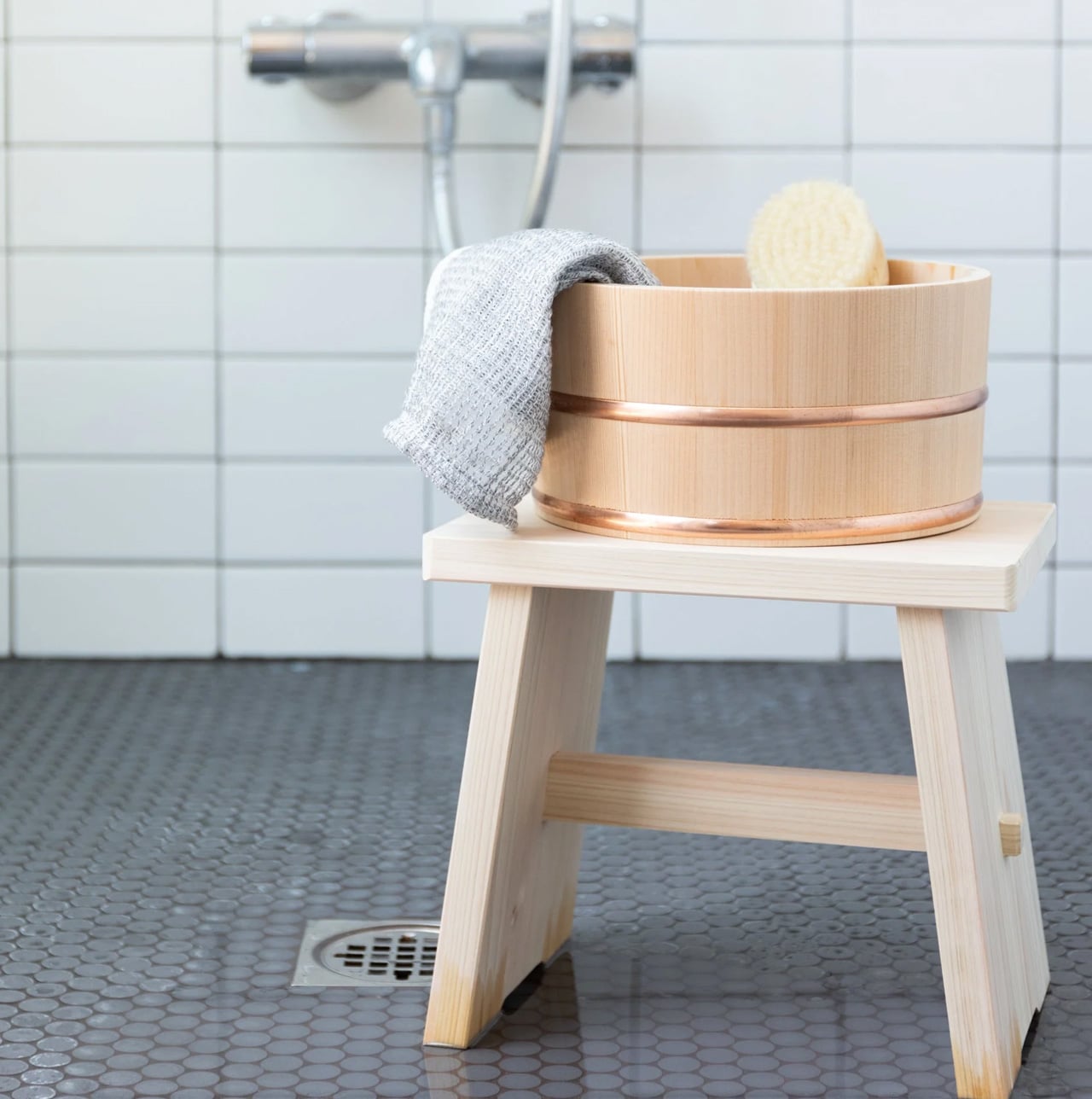
A dorm shower is not typically where design decisions get made, but that does not mean the space is beyond improvement. Hinoki cypress lines traditional Japanese bathing rooms, carrying a natural oil that resists moisture and releases a gentle, forest-like scent that intensifies with warmth and steam. Tortoise General Store stocks these stools from $90, in three sizes, from the compact Umezawa at 10.5 inches long to the taller High Stool at nearly 15 inches.
The woodworkers of Tosaryu have perfected their craft in the mountains of Kochi, Japan since the 1970s, which matters for an object used every morning. The solid hinoki does not turn slippery underfoot the way plastic bath accessories do, and the natural oil within the wood keeps releasing scent each time it gets wet. Bringing one into a shared dorm bathroom is a small change with an outsized effect on how the space starts to feel.
What We Like
Natural hinoki oil releases a forest-like scent with heat and steam, making every shower more intentional
Three sizes available to suit different shower setups, from compact corners to wider stalls
What We Dislike
Solid wood requires occasional oiling to prevent drying and cracking in dry indoor climates
In a shared dorm bathroom with communal use, the stool will need consistent care and personal supervision
7. Aji Stone Book End Large
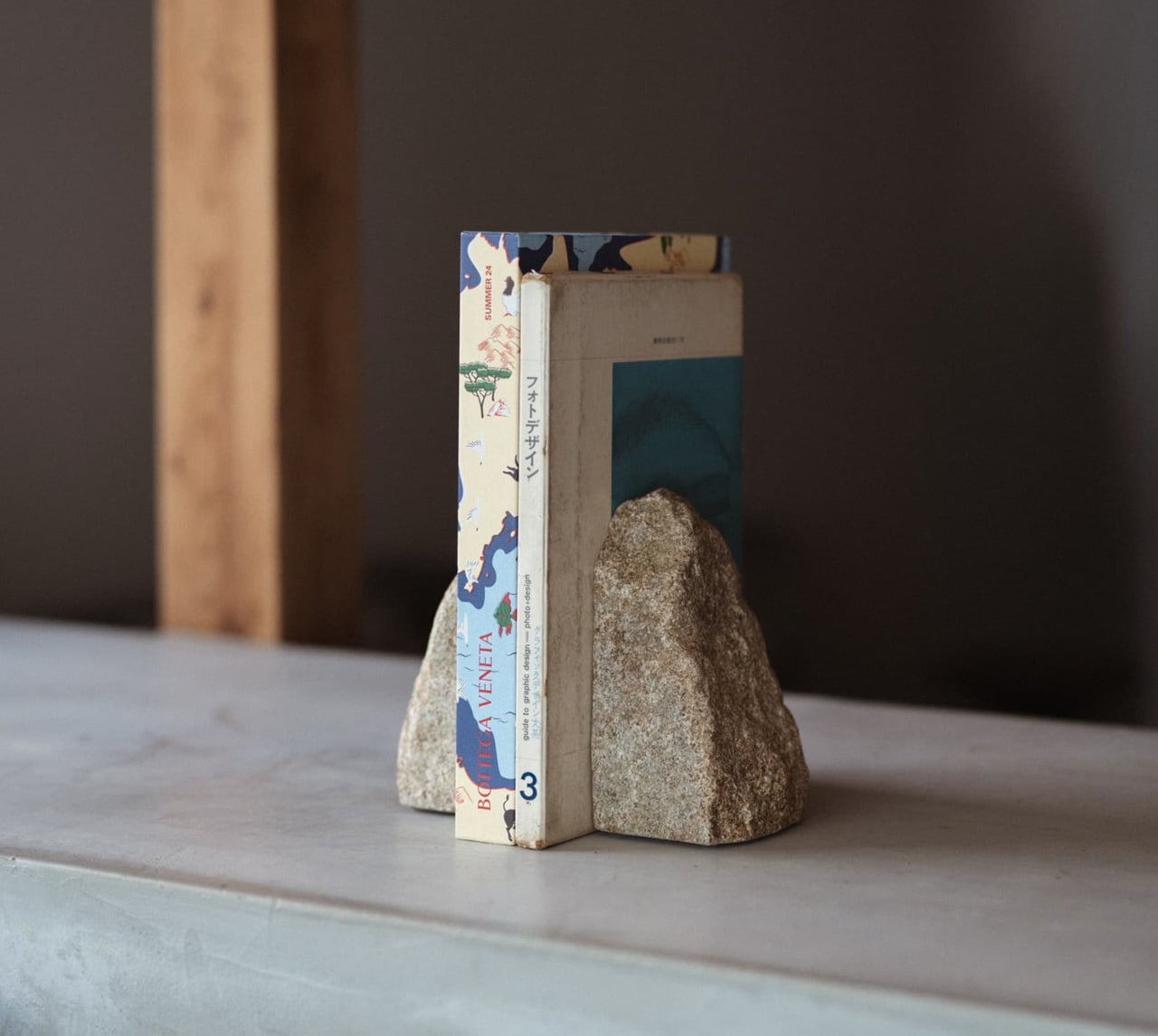
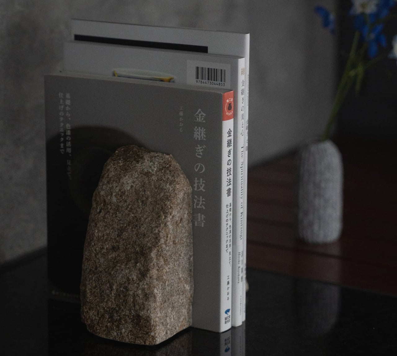
Most objects on a dorm desk either do a job or look good doing it. This one does both at once, without announcing either. The Aji Stone Book End Large is cut by Aoishima artisans from a single piece of granite quarried exclusively in the Aji and Mure regions of Kagawa Prefecture — a stone so dense and fine-grained it has been called the Diamond of Granite for over a thousand years. At 5.9 inches tall and 5.9 inches wide, it holds a shelf of design books in place with the kind of quiet authority that comes from actual mass, not styling.
The material itself is what makes it worth placing in a room. Aji stone is composed of quartz, feldspar, and biotite, and its tightly bonded crystals produce a polished surface with a speckled cloud pattern — called “ban” — that is unique to this stone alone and shifts subtly under different light. A ryokan room earns its calm partly through the weight and texture of real materials left to speak for themselves. One granite bookend on a shelf, holding a small stack of books, does more for a room’s mood than a shelf full of objects trying harder.
What We Like
Cut from a single piece of Aji granite by Kagawa artisans, so every surface marking is unique to that specific stone
The polished “ban” pattern shifts under different light conditions, making it a surface worth looking at even when nothing is leaning against it
What We Dislike
At $240, this is the highest price-per-square-inch object on the list, which is a real ask for a desk accessory
Genuine stone weight means it is not something to repack or move frequently, which matters in a room you vacate once a year
The Room You Sleep In Should Earn the Rest It Promises
A ryokan room earns its reputation not through luxury but through restraint. Nothing in it is accidental, and nothing is there simply to fill space. That same principle scales to a dorm room just as well. The objects on this list work because each one handles a single function with more care than the default version of that thing, and that care accumulates into something the room actually starts to feel like.
Start with light, since it does the most emotional work in the smallest footprint. Add scent next, because it transforms a room’s character without touching a single surface. Sound comes third. Surfaces come last, and they come slowly. The point is not to recreate a ryokan from scratch in a rented room. The point is to bring enough of that thinking with you that the place you sleep actually earns the rest it is supposed to give you.
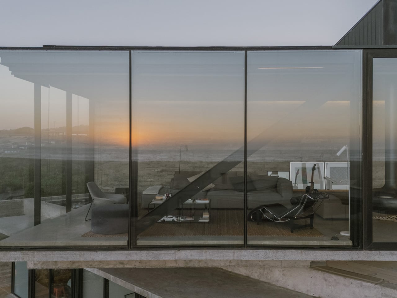
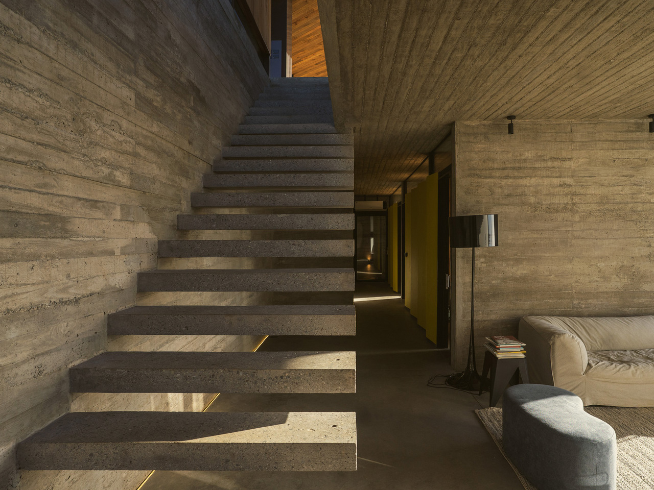
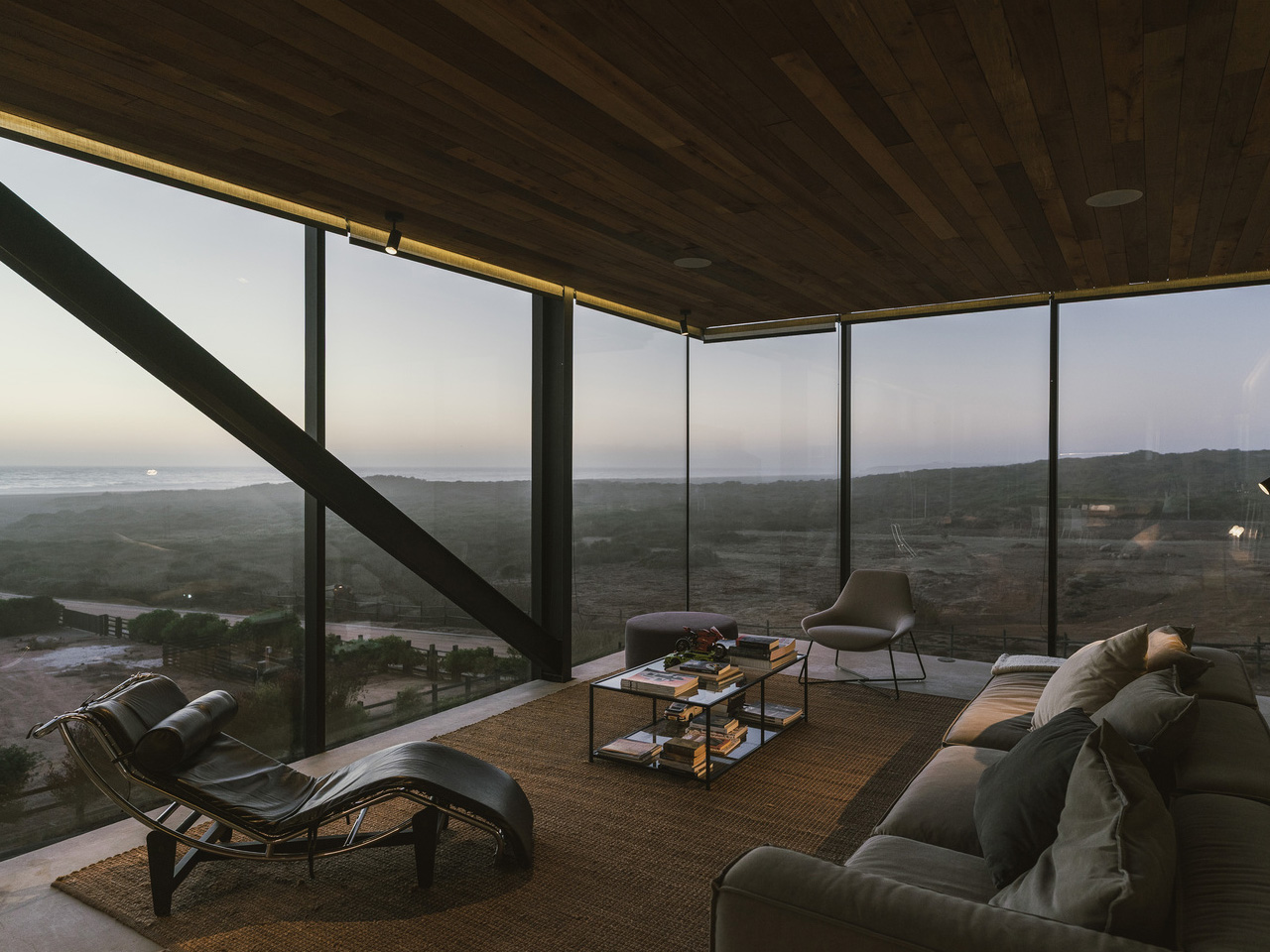
House 22, designed by Chilean studio Loft7 and completed in 2023, sits on a sloping coastal lot south of Punta de Lobos — a stretch of Chilean coastline known for dramatic surf and untouched native scrubland. The lot descends toward the northwest, and rather than resisting that gradient, the architecture follows it, letting the terrain pull the building naturally toward an uninterrupted view of the Pacific Ocean.
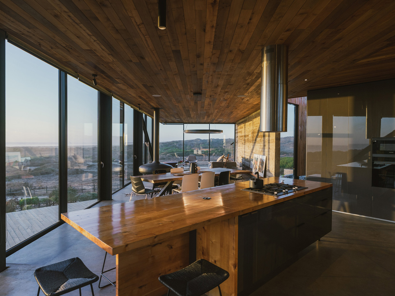
At 320 square meters, the residence is generous without being excessive. Loft7 structured the build using a combination of reinforced concrete and steel frames — a technical pairing that allows the house to hold its ground on a challenging slope while keeping the interior language warm and tactile. Exposed timber beams run through the living spaces, the dining area, and the kitchen, grounding each room in material honesty. There’s no attempt to disguise how the building is put together. That transparency is the design.
Designer: Loft7
What makes House 22 worth studying isn’t a single dramatic gesture — it’s restraint applied consistently. The interiors lean on wood, natural light, and sightlines that always resolve at the ocean. No surface fights for attention. The beam grid overhead becomes rhythm rather than decoration, and the open-plan social spaces feel like they’re orientated by the view rather than by a floor plan. Spaces breathe because the architecture got out of the way.
Pichilemu is famous in surfing circles, but architecturally it’s a place where the Chilean coast has quietly been producing some of the country’s most considered residential work. Loft7 fits that lineage — a studio that has built its reputation around sites where nature already has the upper hand. Their approach with Casa 22 trusts the land and the light, deploying materials that age well in a coastal climate and a massing that reads modestly from the outside while delivering on every expectation from within.
Photographed by Fabián Acuña, the project looks different at every hour of the day. Morning light hits the timber and fills the interiors with warmth; the Pacific turns silver in the afternoon. That relationship between material, orientation, and time of day is never accidental in good coastal architecture — and here it feels entirely intentional. House 22 isn’t trying to be the loudest house on the Chilean coast. It’s trying to be the most honest one. On both counts, Loft7 delivers.
Move into a dorm room, and the first thing you learn is that space decides everything. Drawers fill fast, surfaces disappear under notebooks and cables, and whatever doesn’t earn its spot in the first month ends up in a box under the bed. Everyday carry gear gets judged harder here than anywhere else, because there is no junk drawer to hide in and no car trunk to quietly store the things that didn’t make the cut.
The five picks below passed that test. Each one solves a specific friction point that shows up constantly once the semester starts, whether that is a package piling up at a dorm door, a dark campus path at midnight, a desk that swallows small objects whole, furniture that wobbles on move-in day, or a box that needs opening without scissors nobody can find. Form that earns its place through use, not novelty.
1. Olight Baton 4 Flashlight
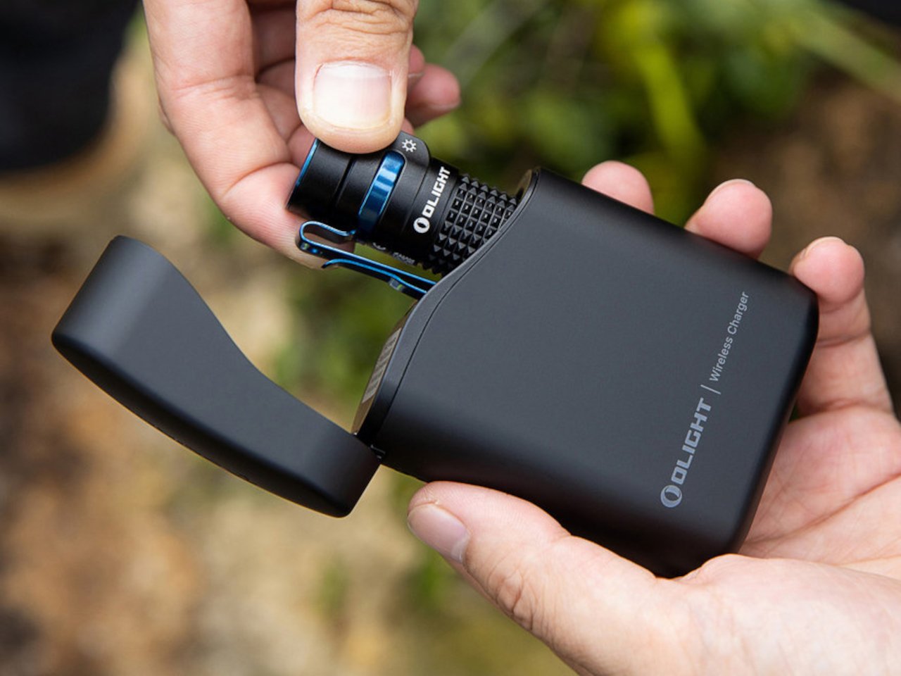
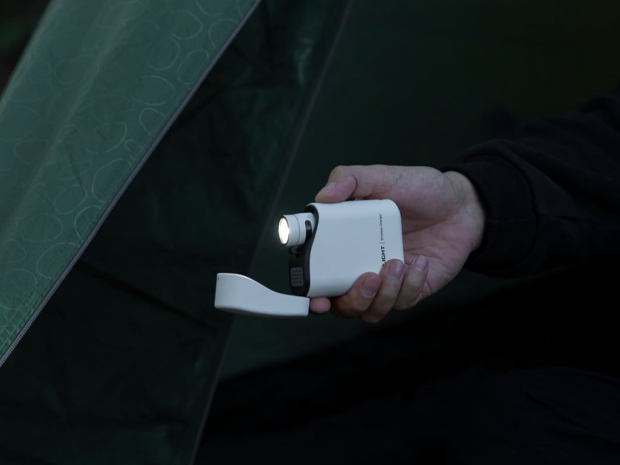
A phone flashlight is a dead end. It drains the battery you need for everything else and delivers a washed-out circle of light that barely reaches ten feet. The Olight Baton 4 solves that with 1,300 lumens in a body that measures 2.48 inches long and weighs 1.85 ounces, small enough to pocket next to a chapstick. A 170-meter throw covers a dark campus path, a parking lot, or a hallway that lost power during a finals week study session.
Five modes handle the full range of real use cases, from the 0.5-lumen moonlight setting that reads battery level without waking a sleeping roommate, all the way up to the turbo burst for actual emergencies. A magnetic base lets it stand upright on a metal desk surface and double as a hands-free lantern, and the two-way clip keeps it on a bag strap without adding meaningful bulk. Charging runs through a proprietary magnetic cable that snaps into position flush with the body, leaving no exposed port to collect dust or wear out.
What We Like
1,300 lumens in a sub-3-inch, 1.85-ounce body means it genuinely replaces a larger light without compromise on output or carry weight
The magnetic base converts it from a directional flashlight into a standing lantern, covering two distinct use cases with one object
What We Dislike
The proprietary magnetic charging cable means a lost cable is a real problem, with no USB-C fallback to borrow from a classmate
Turbo mode steps down automatically after a short burst to manage heat, so sustained maximum brightness requires cycling back up manually
2. CraftMaster EDC Utility Knife
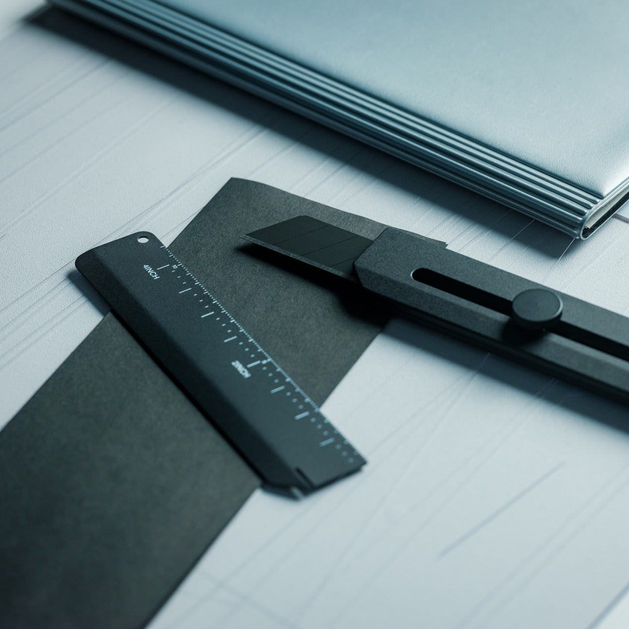
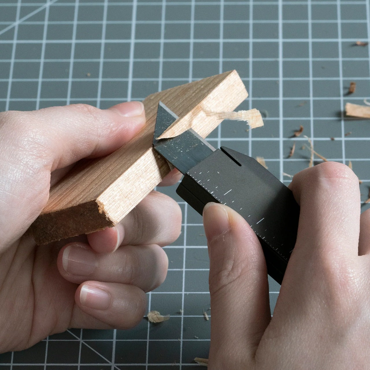
Most utility knives are an afterthought, a plastic slider from a hardware store that lives forgotten in a junk drawer until the blade rusts shut. The CraftMaster treats the utility knife as a precision instrument. At 4.72 inches long and just 8mm thick, it carries like a pen and sits on a desk without looking out of place beside a laptop. The rotating knob that deploys the OLFA blade adds a deliberateness that a standard slider simply never delivers.
The magnetic back docks a companion metal scale, turning a single object into a two-piece system with a built-in blade-breaker for snapping off dull edges without hunting for a separate tool. A 15-degree curvature on the ruler protects fingers during cuts, and the 45-degree inclination geometry handles box opening without risk to whatever is packed inside. OLFA blade compatibility keeps replacement costs low and means refills are available at any hardware store, with no proprietary cartridge system to track down mid-semester.
The magnetic scale dock creates a two-piece cutting system without requiring a separate case, sleeve, or additional carry weight
OLFA blade compatibility keeps long-term costs minimal and replacements universally available without planning around a proprietary format
What We Dislike
The utility blade format limits versatility outside of cutting and scoring tasks compared to a folding knife with a more general-purpose tip geometry
The 8mm profile, while genuinely slim for a utility knife category, still feels rigid compared to a traditional folding knife for one-handed carry
3. Orbitkey Grid Organizer
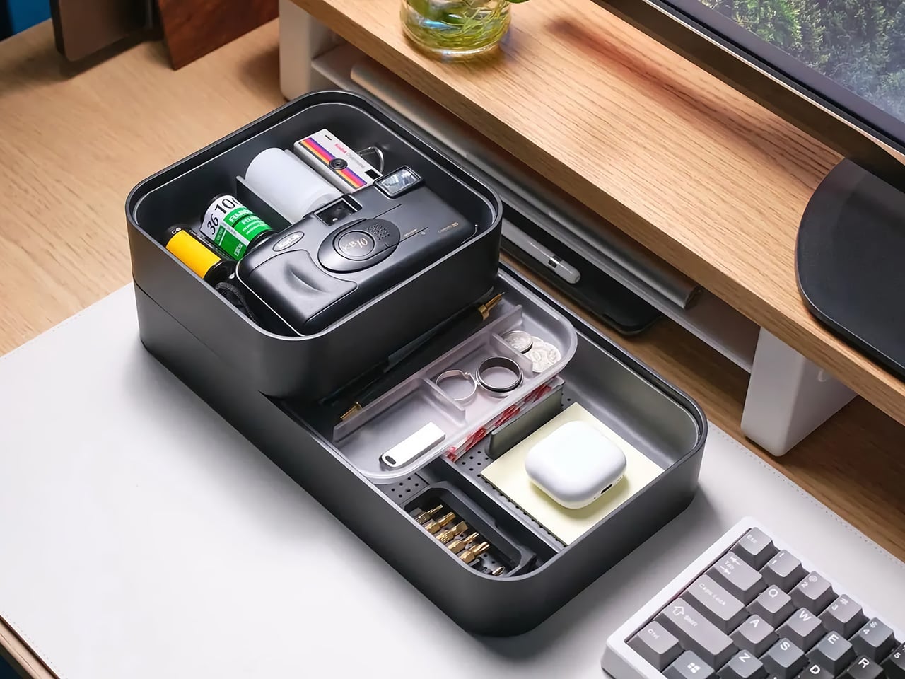
Every dorm desk looks the same by the second week of classes: a charging cable coiled around a pen, loose change mixed with an SD card, and two pens that stopped working sometime during the first lecture. The Orbitkey Grid Organizer is a modular tray built around that exact situation, with a customizable divider layout that separates small objects by category rather than letting everything pool into an indistinguishable pile at the corner of a desk that doubles as a living space.
Orbitkey spent years refining the idea of contained carry, beginning with its key organizer and continuing through the Nest desktop tray. The Grid Organizer applies the same logic to desk surfaces rather than pockets, with soft tactile materials and a compact footprint that fits even the smallest dormitory desk without eating the working area under a laptop. The understated color palette reads as intentional rather than as office supply clutter, which matters considerably when a desk is simultaneously a workspace, a dining surface, and the only flat space in the room.
What We Like
The modular grid layout adapts to what you actually own rather than forcing a fixed compartment system onto objects that don’t fit neatly
The compact footprint fits a dorm desk without consuming the working area directly under a laptop or monitor
What We Dislike
Dividers follow a fixed grid pattern rather than a fully freeform arrangement, so oddly shaped items still end up wedged at uncomfortable angles
It solves desktop organization at home base but contributes nothing once you step out the door, which limits its usefulness to a single context
4. ClearSlide Box Opener
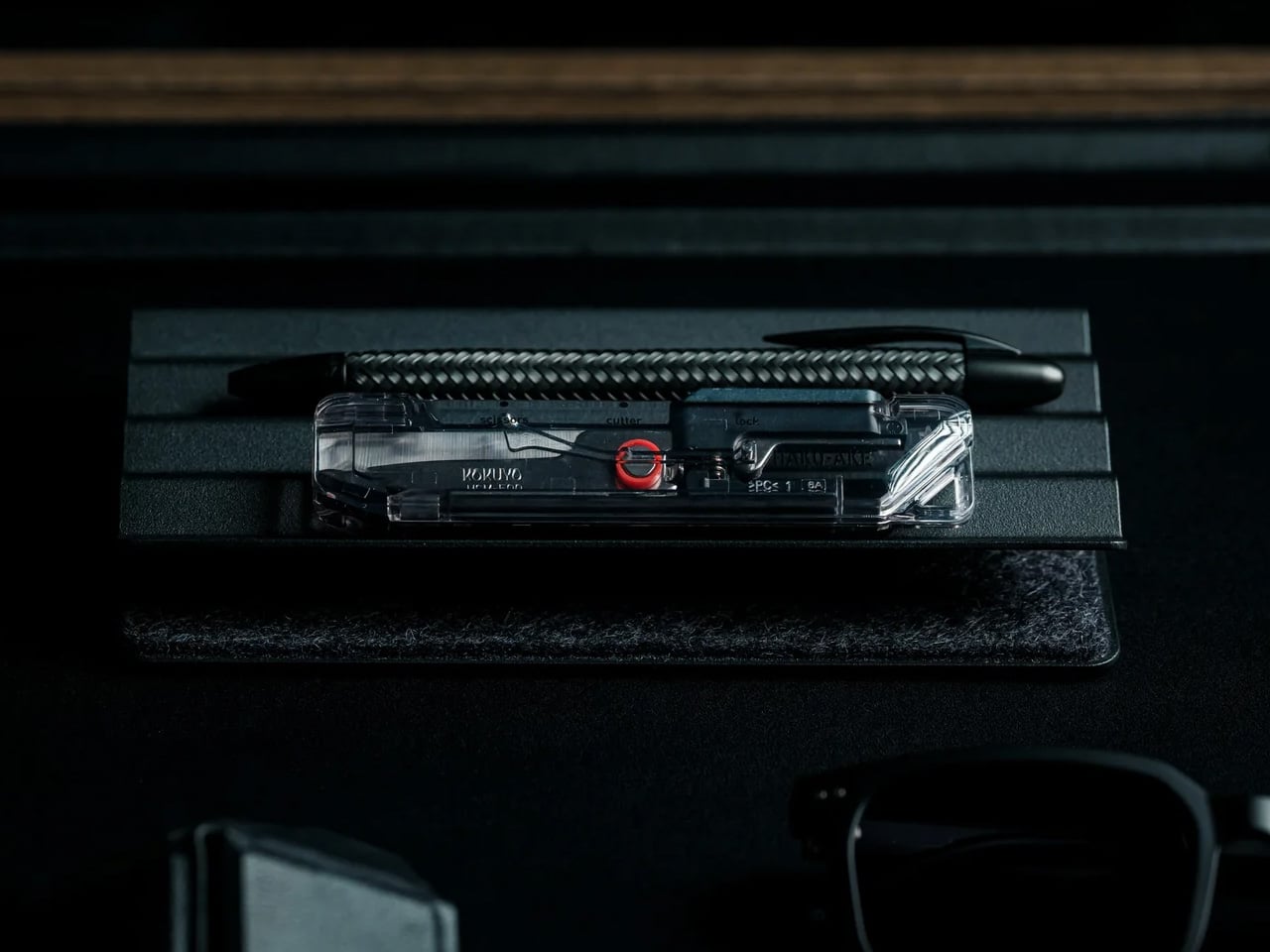
Every semester opens with the same ritual: a stack of deliveries outside a dorm door, a search for scissors, then a search for a box cutter, then giving up and tearing tape by hand. The ClearSlide exists specifically for that recurring problem. A transparent polycarbonate body lets you watch the internal mechanism shift between lock, cutter, and scissors modes with a single thumb motion, and each position locks in with a distinct click before the blade engages. Nothing is guessed at or fumbled.
The blade extends only 0.12 inches, deep enough to slice through packing tape without threatening whatever is packed inside, and a strap hole at the base means it clips to a backpack rather than disappearing into a drawer until the next delivery arrives. The transparent shell is the detail that separates it from every other box opener in this category. Watching the mechanism move is genuinely satisfying in a way that makes it the tool you actually reach for, rather than the one you remember only after the package is already open.
The transparent polycarbonate shell reveals the internal mechanism shifting in real time, making a mundane daily task feel considered and deliberate
The 0.12-inch blade depth protects package contents during cuts without requiring a guard, a cover, or any extra step before use
What We Dislike
The shallow blade depth requires two or three passes on thick double-taped moving boxes rather than delivering one clean, single-motion slice
The strap hole keeps it accessible, but there is no integrated pocket clip, so keeping it truly on-person requires a carabiner or lanyard to make it work
5. CRKT Septimo Multi-Tool
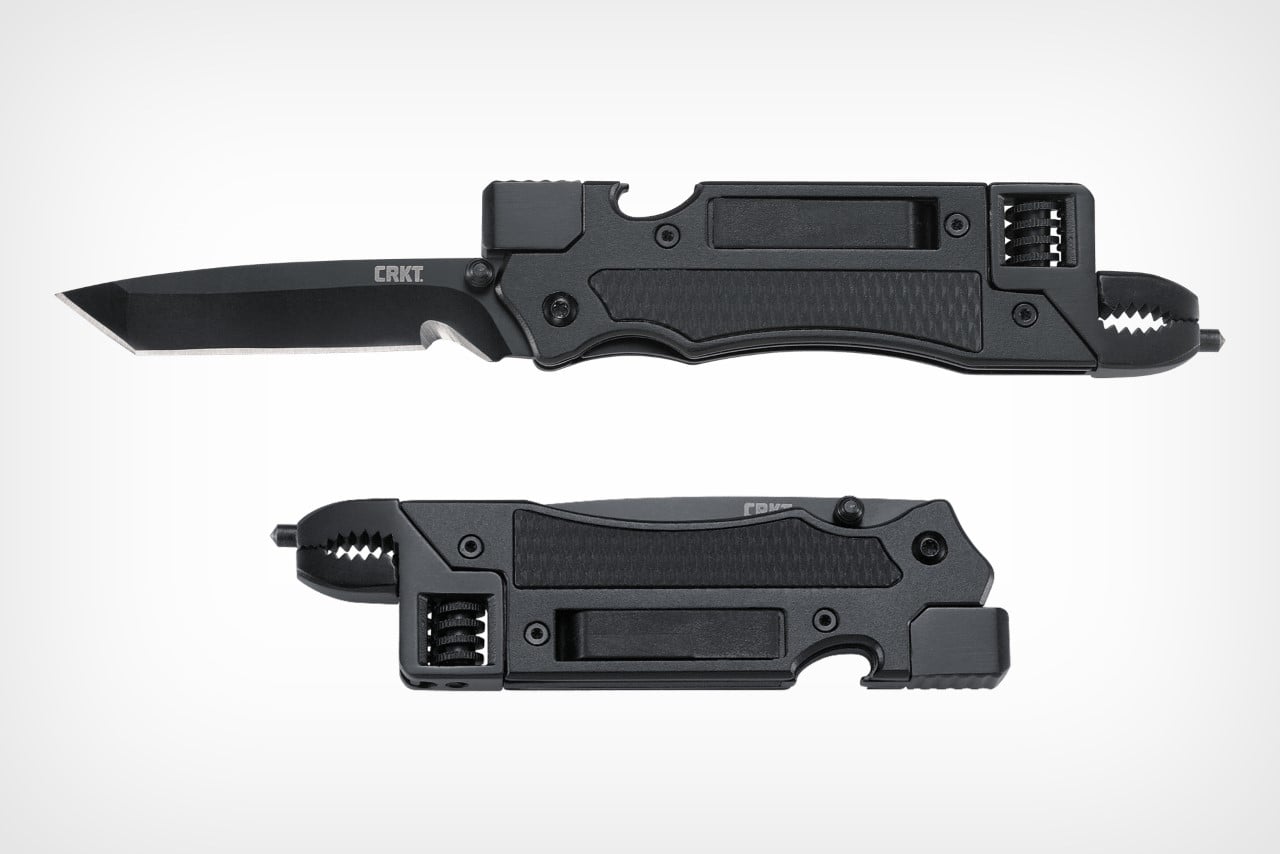
Dorm furniture wobbles. Bottles need opening. Something always requires a screwdriver that nobody in the building seems to own. The CRKT Septimo was designed by Jeremy Valdez, a veteran of the 7th Special Forces Group, around the premise that a folding knife alone cannot cover the situations a student actually encounters week to week. Fold it open, and a bottle opener, a flathead and Phillips screwdriver, and an adjustable wrench are all present in a single body that fits in a jeans pocket.
The 2.86-inch American Tanto blade uses a liner lock and Veff serrations for cutting tasks from trimming cord to opening shipping tape, while a glass breaker tip and black oxide finish give it the durability that a cheap multi-tool never manages past the first semester. At 4.4 ounces with a pocket clip, it carries without becoming dead weight in a bag side pouch, and the adjustable wrench alone covers the kind of furniture fixes and move-in assembly tasks that a standard pocket knife is simply not built to handle.
What We Like
A real adjustable wrench folded into a knife-sized body covers furniture repairs and hardware tasks that a standard pocket knife ignores entirely
The liner lock and Veff serrations add genuine cutting utility without inflating the overall profile or carry weight
What We Dislike
The screwdriver covers only one Phillips size and a small flathead, which limits usefulness for anything requiring a larger or more specific bit
The Tanto tip excels at piercing and cord cutting but handles general everyday slicing tasks less elegantly than a drop point or clip point geometry would
The Gear That Actually Stays
None of these five objects is designed to impress at first glance. A flashlight, a utility knife, a desk tray, a multi-tool, and a box opener do not photograph like a product launch, and that is the point. They photograph like what they are: tools that solve specific, recurring problems without asking you to think about them. That kind of restraint is genuinely harder to design than it looks, and considerably more valuable in a dorm room than gear that costs twice as much.
What ties them together is the same quality that makes good everyday carry work in a small shared space: each one earns its place through repeated use rather than novelty, and none of them needs a junk drawer to disappear into. They stay out on the desk or clipped to the bag because they get reached for often enough to justify it. That is the real standard for EDC, and it is harder for most products to meet than their marketing ever admits.