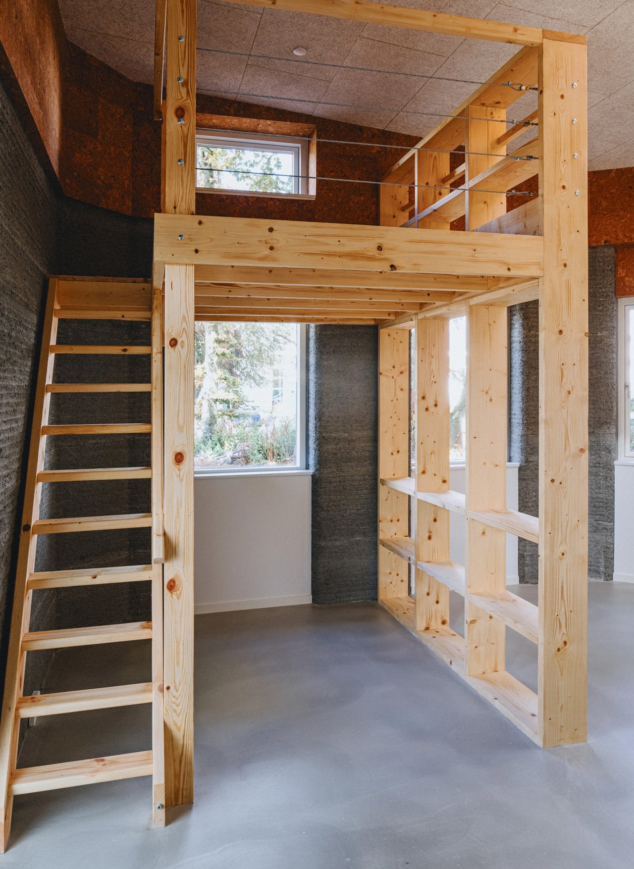
Vagabond Haven’s Evergreen XL Is the Tiny Home That Stopped Pretending to Be Small

Most tiny homes are built around compromise. It doesn’t perform the usual tiny-house tricks — the Murphy beds that fold into walls, the loft you access by ladder, the dining table that doubles as a coffee table that doubles as a desk. Vagabond Haven’s latest modular home simply gives you a proper house, just in a more deliberate package.

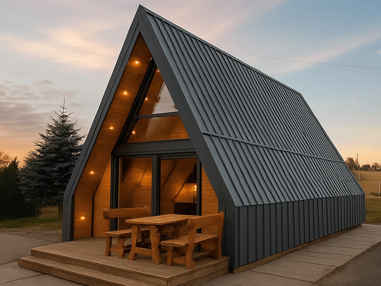
The Scandinavian brand built its reputation on the original Evergreen, a two-module design that offered 41 square meters of single-floor living. The XL takes that same structural logic and stretches it. Length extends to 11.8 meters (38 feet), and the width comes in just under 6 meters (20 feet) — more than double that of most tiny houses. The result is 59 square meters (635 square feet) of interior space that reads, honestly, more like a compact apartment than a cabin on a trailer.

Designer: Vagabond Haven

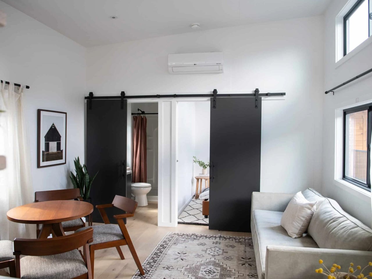
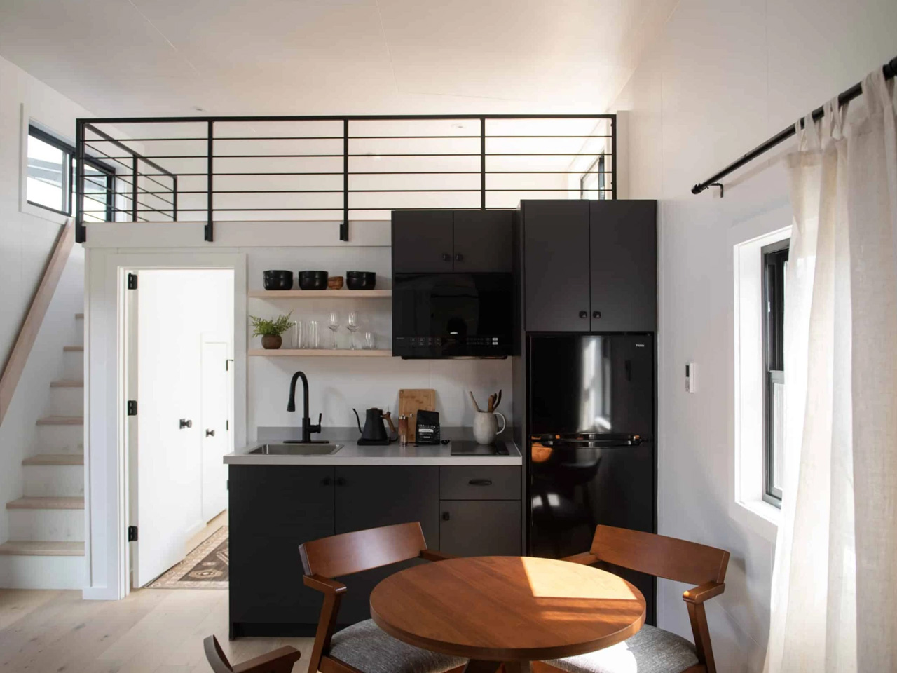
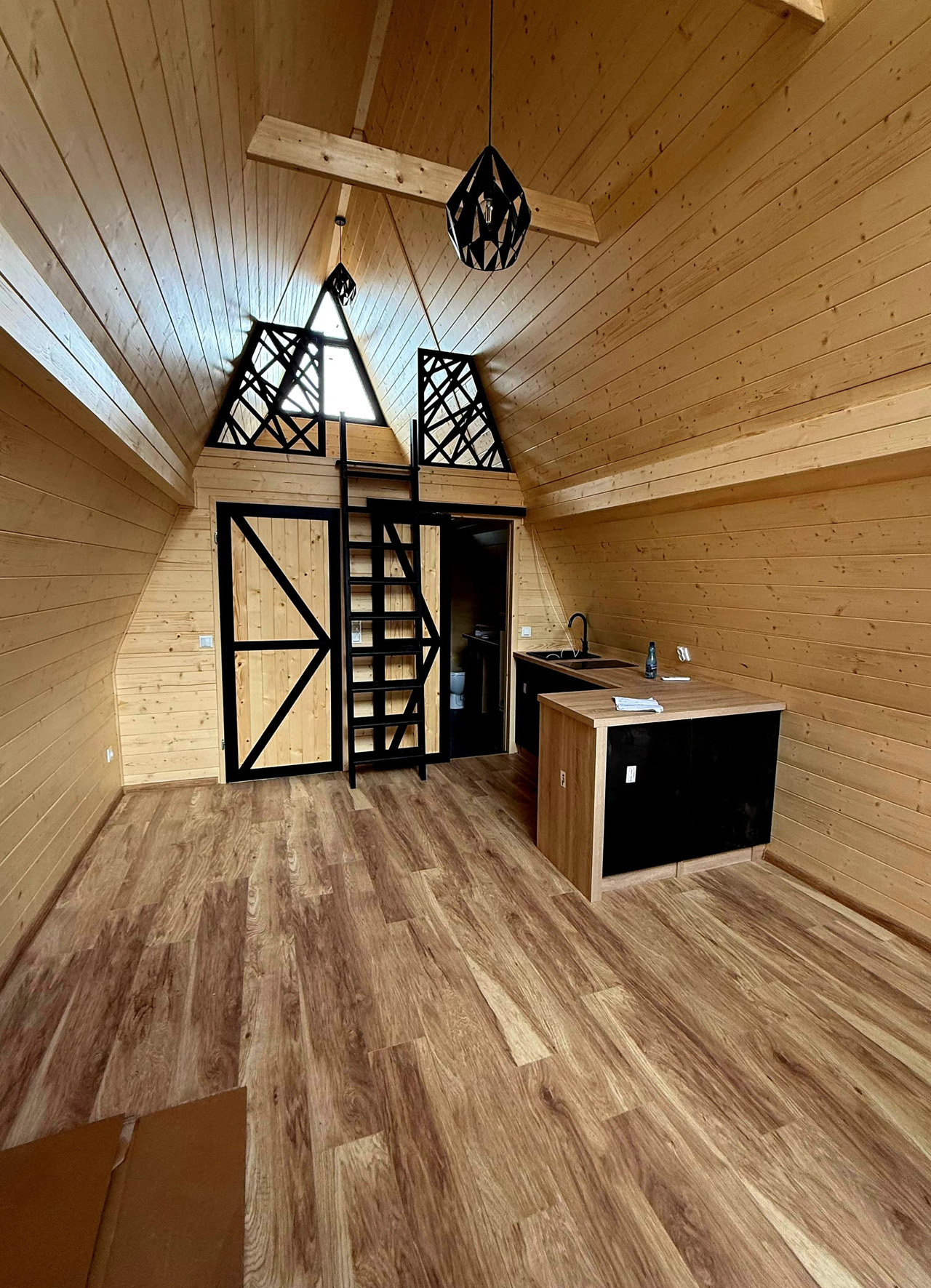
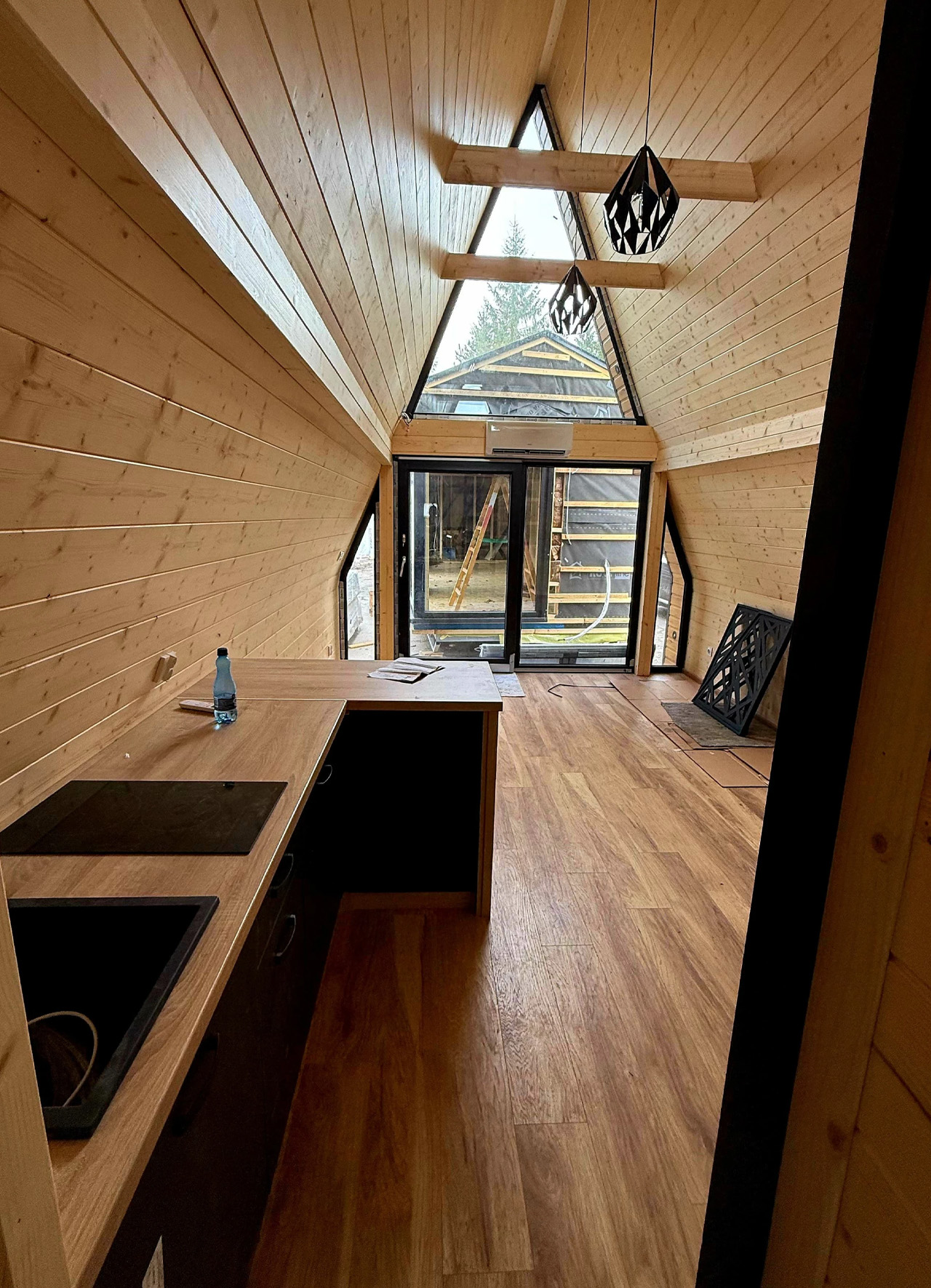
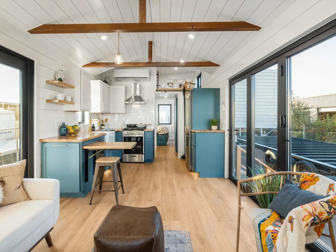
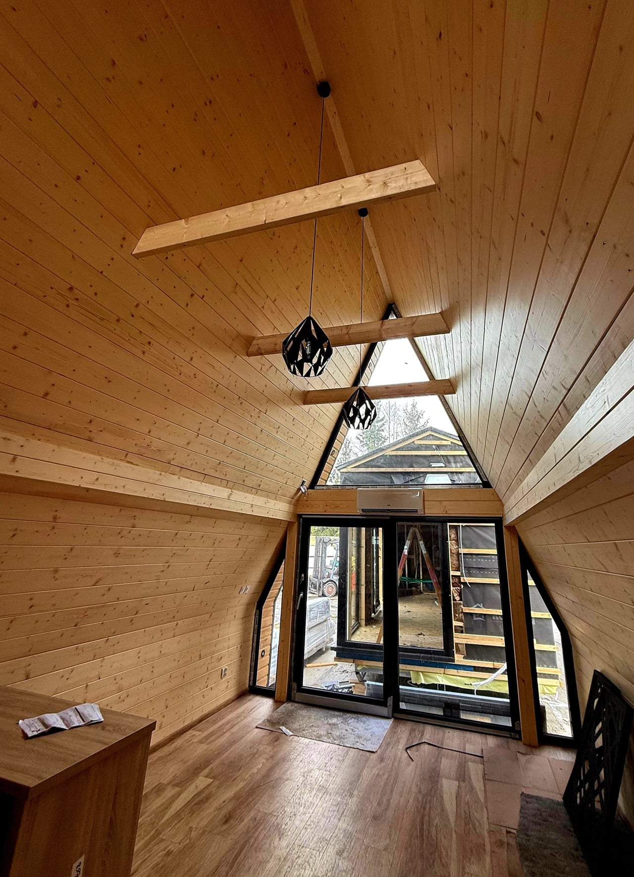
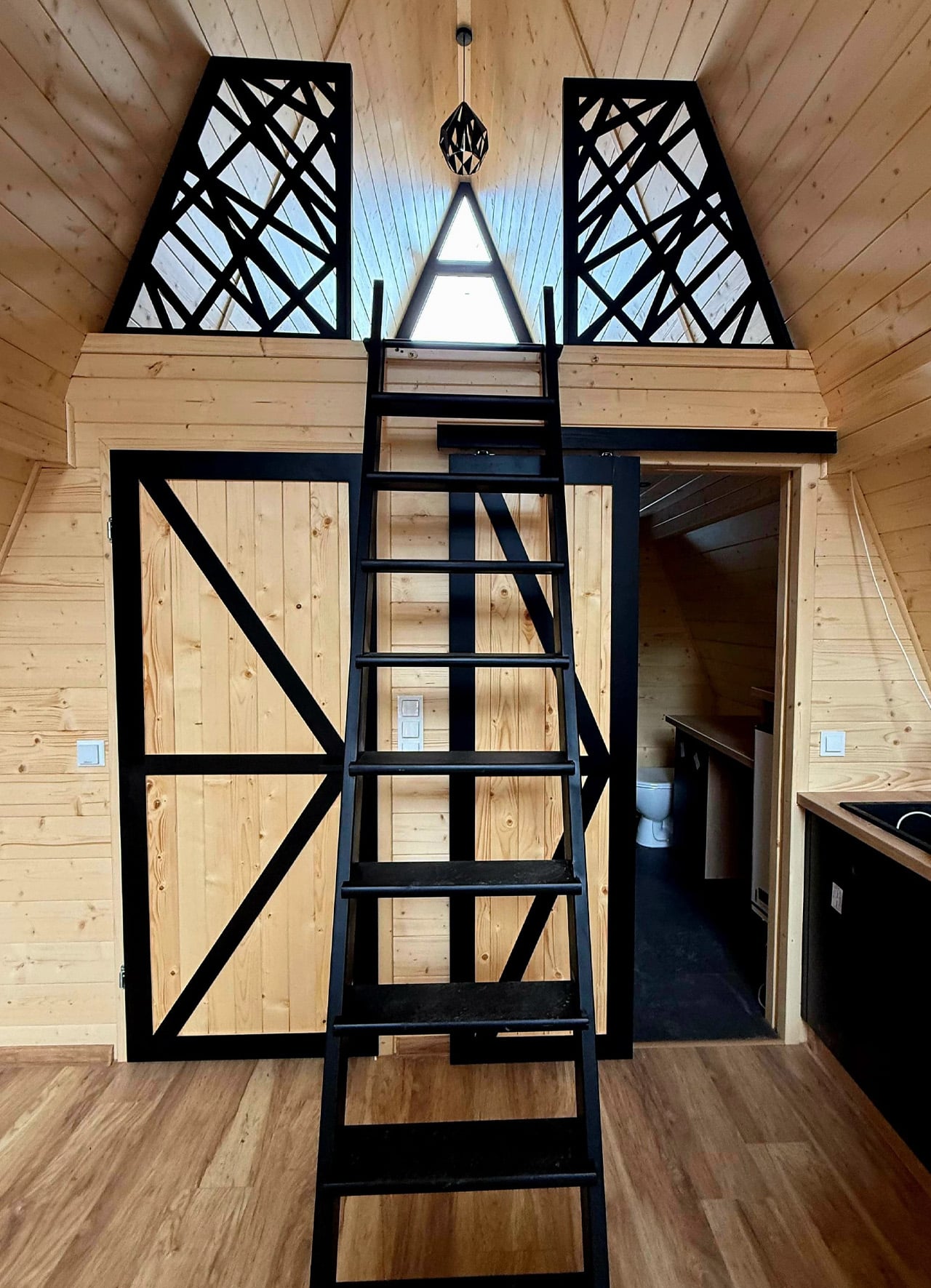
That extra width is where the design earns its keep. Wide homes feel categorically different from narrow ones. Light moves differently. Furniture can breathe. The open living and kitchen area here accommodates an L-shaped sofa, a wood-burning stove, a full entertainment setup, and a six-person dining table — items that typically don’t share the same zip code in a tiny home. The kitchen is equipped with an induction cooktop, a fridge/freezer, a dishwasher (still a genuine rarity in this segment), and both upper and lower cabinetry. It’s a working kitchen, not a galley you tolerate.

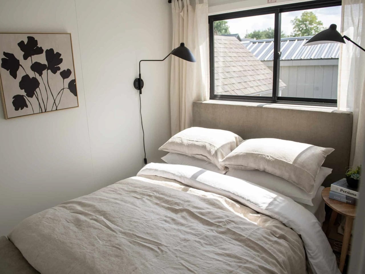
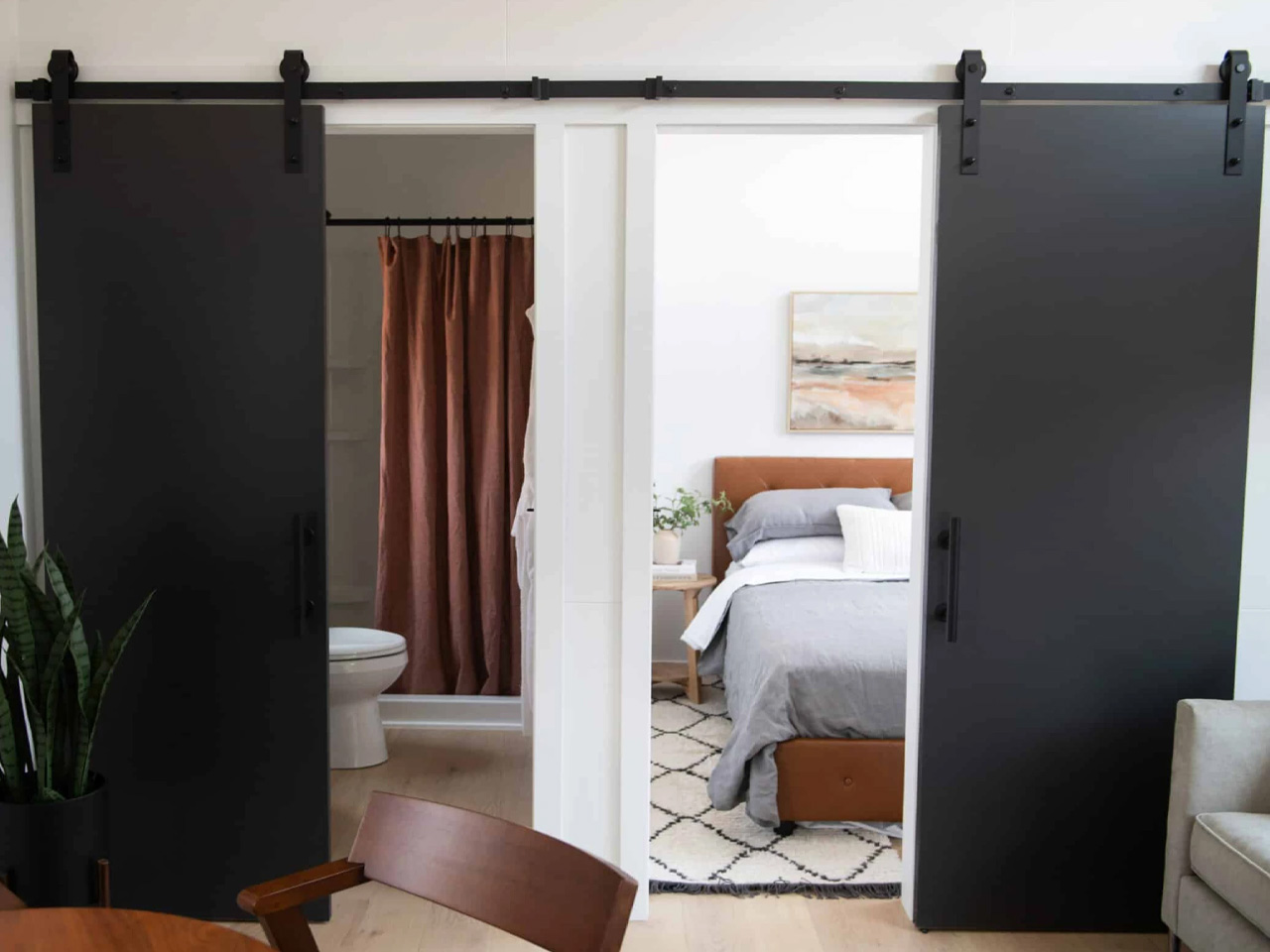
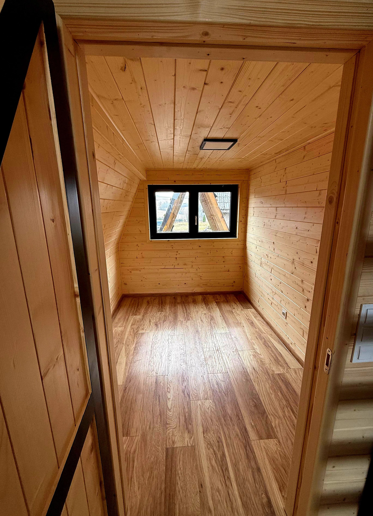
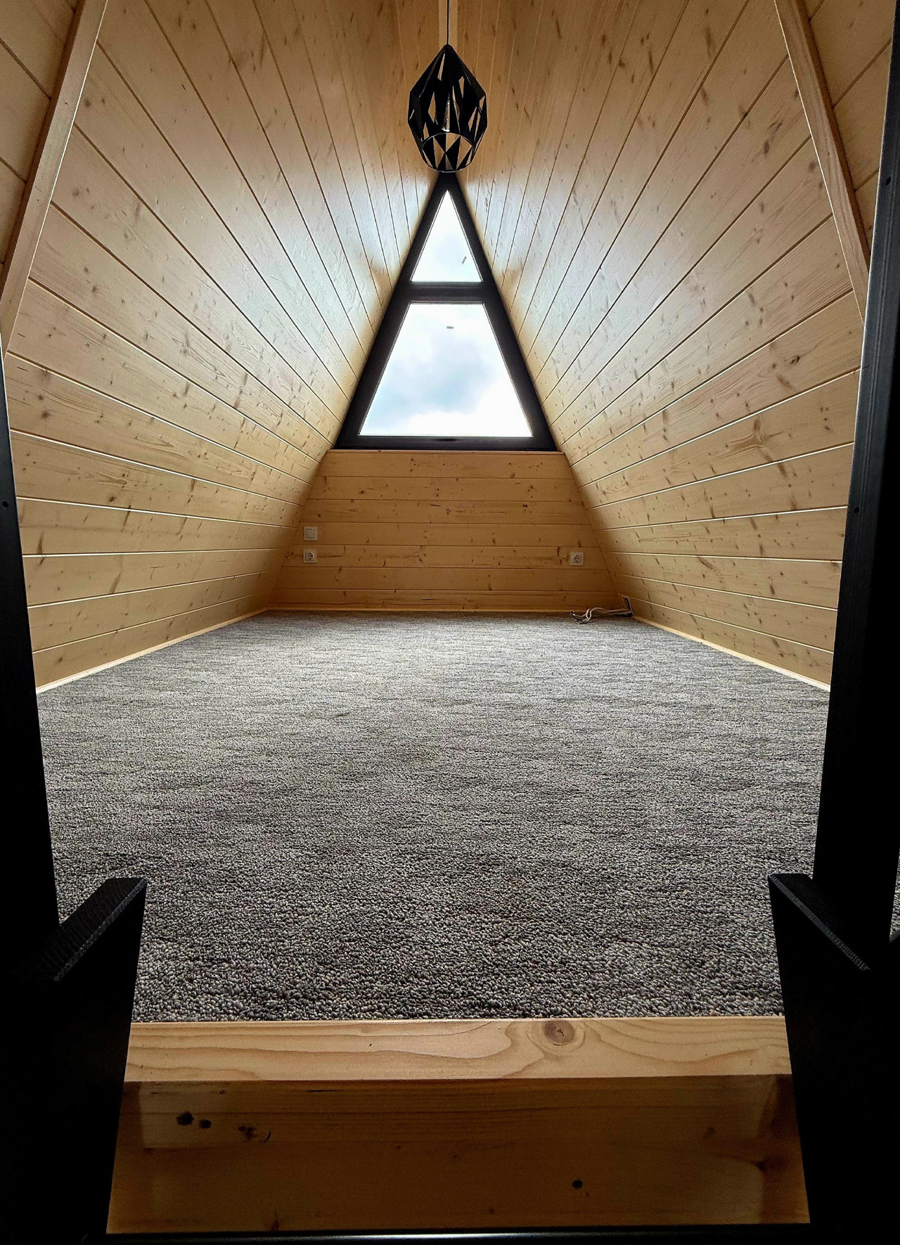
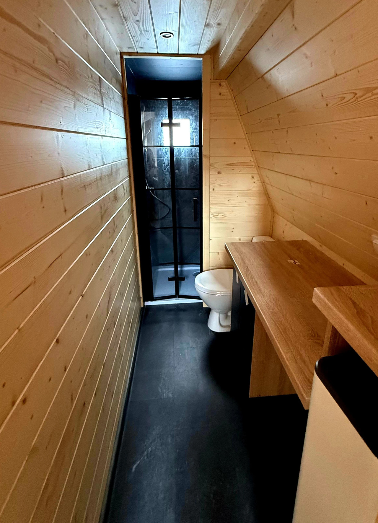
The two bedrooms are separated in function as much as form. The master bedroom features a double bed, a built-in wardrobe, and a TV unit. The secondary bedroom doubles as a home office, with a single bed, a desk, dedicated shelving, and its own exterior entrance — which opens up interesting possibilities for a guest room, a studio, or a live/work setup. The bathroom doesn’t cut corners either: a glass-enclosed shower, vanity sink, and a choice between flushing, composting, or incinerating toilet. A dedicated technical room houses the water heater, washing machine, and dryer — appliances that usually get crammed into a closet.

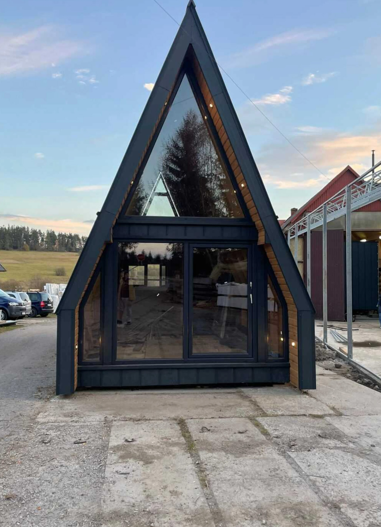
Outside, engineered timber and metal cladding wrap a steel roof, and generous glazing keeps the interior in conversation with the landscape. The home arrives in two sections via truck and is assembled on site — no wheels, no tow hitch, no pretense of mobility. Off-grid solar capability is available as an option, along with flexibility in materials, furnishings, and appliances.

The Evergreen XL starts at around €108,000 (approximately $123,000). For a full-time home that arrives pre-designed and ready to configure, that number is harder to argue with than it might first appear.

The post Vagabond Haven’s Evergreen XL Is the Tiny Home That Stopped Pretending to Be Small first appeared on Yanko Design.
This Handcrafted Brass Fireplace Brings Real Fire to Any Room & Needs No Installation to Get Started

Most fireplaces require a great deal in exchange for a little warmth. A gas line. A flue. A weekend cleared for installation that ends up becoming two. The Harmony Flame asks for none of it. A brass fireplace that runs on bioethanol and sits on any surface you choose, it brings real fire to a dining table or a patio without smoke, without odor, and without anything that needs to be built into a wall.

What makes it worth owning is the craft behind it. The Harmony Flame is made by hand by craftsmen who build brass musical instruments, and that background changes everything about the object. The finishing, the fit, and the way brass behaves in firelight are not accidents of manufacturing. They are the result of people who understand the material at a level that most decorative product makers simply do not.

Click Here to Buy Now: $240.00

Brass That Earns Its Keep

The decision to build this fireplace in brass is not purely aesthetic, though the aesthetics are difficult to argue with. Brass holds heat well, develops a patina over time that makes each piece distinct, and responds to flame the way few other materials can. The craftsmen behind the Harmony Flame come from instrument-making, where precision and finish are non-negotiable because the material reveals everything. That same discipline carries into this fireplace, across every seam and surface, and the result is an object that gets better the longer it is used.

The reflective interior is where the design genuinely separates itself. Fire inside a brass box does not simply burn. It bounces. Light moves across the surface differently with every shift of air in the room, casting shadows that a candle cannot produce and a printed flame never will. The Harmony Flame is not trying to replicate a built-in fireplace. It creates its own atmosphere, and the quality of light it generates is specific enough to change the character of whatever room or table it sits on.

Bioethanol, Any Surface, Anywhere

Bioethanol burns clean. No smoke rises from it, no odor lingers after an evening of use, and nothing accumulates on the ceiling or the curtains over time. The Harmony Flame runs on it directly, which means it qualifies as indoor-safe without ventilation requirements and outdoor-ready without any modification. Move it from the dining table to the patio as the evening shifts, or keep it fixed in one place and let the fire do what fire does naturally to any room it occupies.

There is no installation because none is required. No plumber, no electrician, no mounting hardware, no manual written in four languages. Fill the reservoir with bioethanol, light it, and the fire starts. When the fuel runs out, refill and repeat. For a product designed to bring warmth to a space, the lack of friction in getting it started is one of the more considered details here. Complicated setup and a beautiful object rarely coexist well, and the Harmony Flame seems aware of that.

What We Like

  • Brass construction by instrument craftsmen: the level of finishing and attention to material that comes from instrument-making carries into every surface and joint of this fireplace, and it is immediately apparent in the way the object sits and holds itself
  • Bioethanol fuel system: burns without smoke, odor, or residue, making it genuinely safe for indoor use and equally capable outdoors without any modification or secondary equipment
  • Zero installation required: fill it, light it, use it — the absence of any setup barrier is a design decision as much as it is a convenience, and it removes every reason to leave the fireplace in a cabinet
  • Ambiance that earns its place: the reflective brass interior creates a play of light and shadow that neither a candle nor an electric flame can produce, which is the actual reason to own it

What We Dislike

  • Fuel not included: bioethanol is widely available, but first-time buyers will need to source it separately before the first use, which adds a step to an otherwise immediate experience
  • No cover or case specified: there is no mention of a protective lid or carry solution for storage or transport, which matters when moving the fireplace between indoor and outdoor settings regularly

Harmony Flame Fireplace

Fire Without the Complications

The Harmony Flame was built for spaces that want real warmth and cannot accommodate a traditional fireplace. A dining table where the evening deserves something more than candlelight. A covered patio where the temperature drops late and the conversation keeps going. It works in both settings without modification, without smoke, and without the installation that a fixed fireplace requires. The craftsmanship behind it ensures it earns its place wherever it ends up sitting.

If the rooms and evenings you share feel like they are missing one quiet element and you have not been able to name it, this is likely it. The Harmony Flame does what a good fire has always done. It changes the quality of a space. Pick one up and find out what an open brass flame does to the feeling of a dinner that was already good.

The post This Handcrafted Brass Fireplace Brings Real Fire to Any Room & Needs No Installation to Get Started first appeared on Yanko Design.
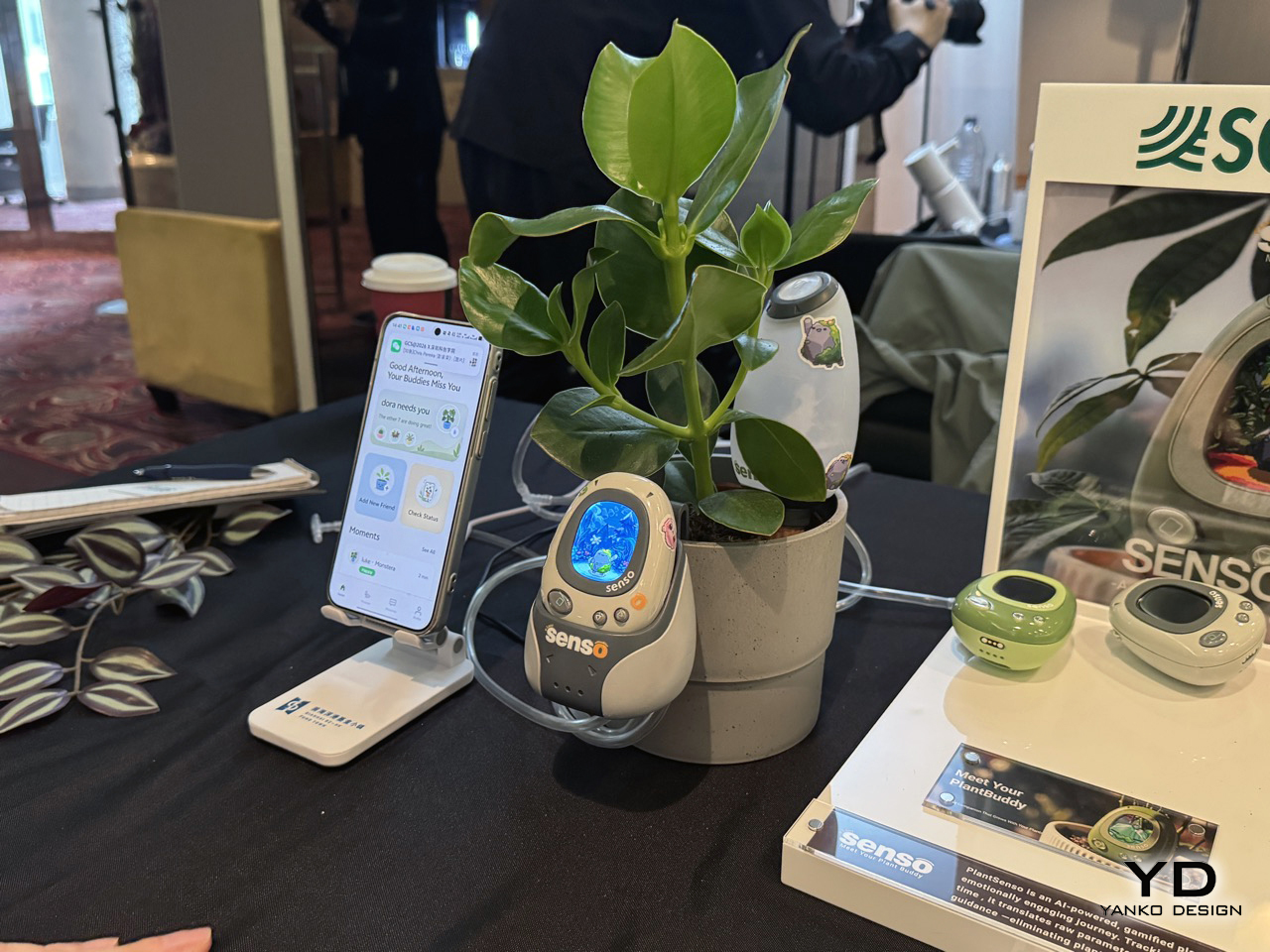
5 Best Nightstand Gadgets That Turn Your Bedroom Into the Setup You Actually Want

The nightstand is one of the most underestimated surfaces in any home. It accumulates cables, three chargers doing the job of one, a lamp chosen in five minutes, and a rotating cast of objects that never formally earned their place. Most people accept this as normal. The result is a space that begins every evening and ends every morning with the kind of visual noise that makes a room feel smaller and less intentional than it actually is.

The five products below were chosen because each one solves a specific nightstand problem without introducing three new ones. None of them overlap in function. Start with the one that addresses your most pressing problem first, and the case for the next one tends to become clear in about a week.

1. Anywhere-Use Lamp

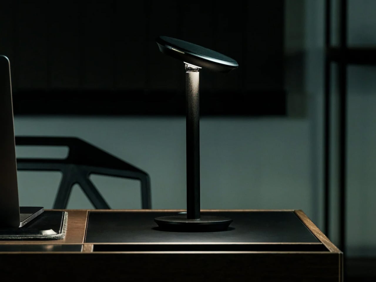
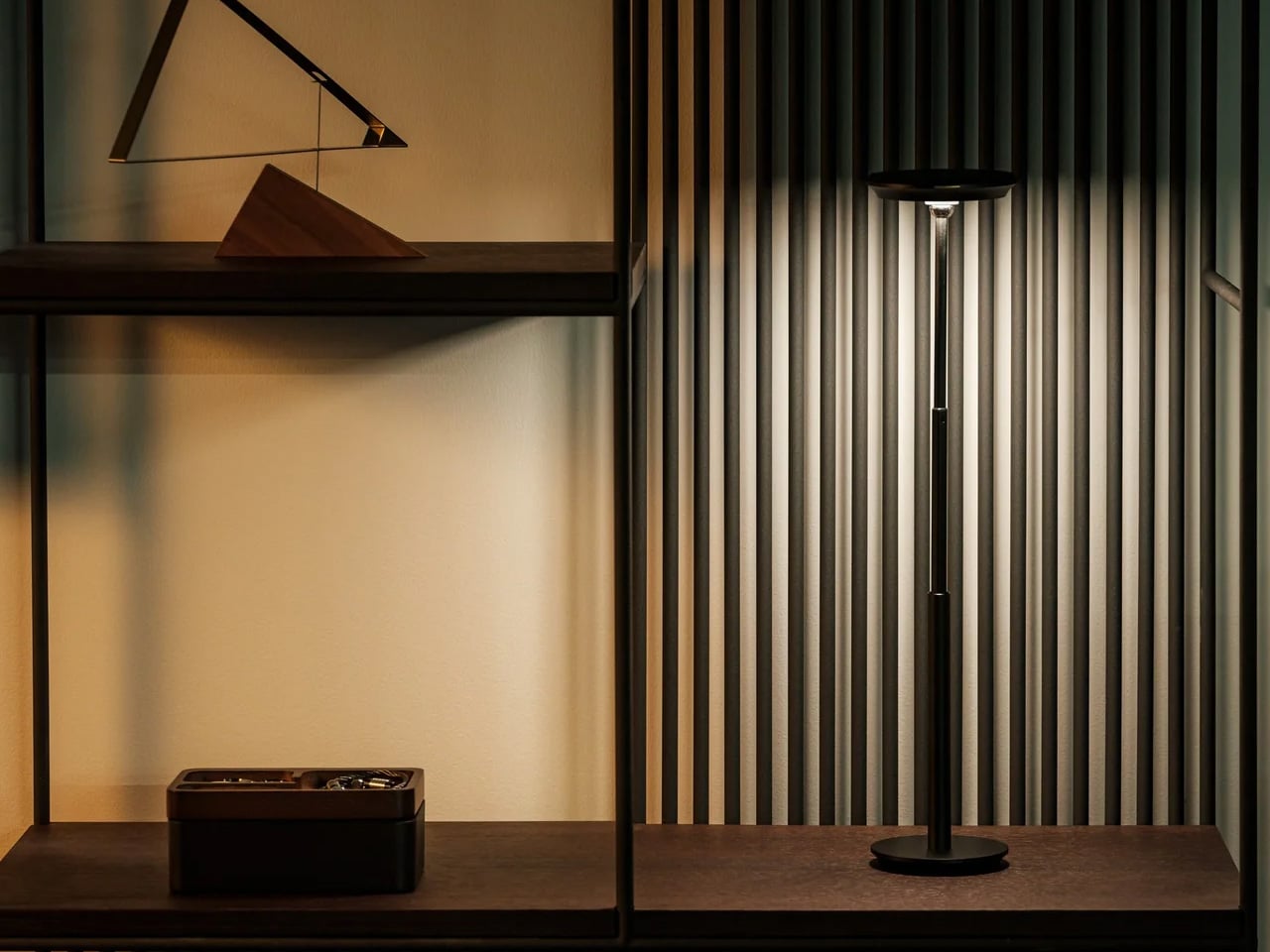
Most nightstand lamps are compromises. The color temperature drifts toward clinical white at exactly the wrong hour, the base requires an outlet placement that dictates where everything else goes, or the design was selected in poor lighting at a furniture store and has been quietly resented ever since. The Anywhere-Use Lamp removes most of those friction points from the equation. Available in black, white, and a new Industrial edition, it is a portable, cord-free table lamp with a clean minimalist silhouette and a warm, contained glow that changes the character of a bedroom after the main lights go off.

Ambient light quality at bedtime is one of the most underrated variables in how quickly a bedroom shifts from a room you happen to be in to a place that actually invites rest. Warm, directionless light at eye level, rather than overhead, does a significant portion of that work without requiring any configuration. There is no companion app, no color temperature slider, and no smart home integration to set up. The Anywhere-Use Lamp delivers exactly the quality of light a nightstand surface deserves.

Click Here to Buy Now: $149.00

What We Like

  • Portable and cord-free — works on a nightstand, in a travel bag, and on a hotel desk without adapters or outlets
  • Industrial edition offers a raw material finish that integrates well into modern and minimal bedroom aesthetics

What We Dislike

  • At $149, it occupies the premium end of portable lamp pricing, a harder case to make without seeing the build quality in person

2. ADAM elements Mag 3 Ultra

The Mag 3 Ultra addresses the charging problem Apple created and never solved. When Apple canceled AirPower in 2019, it left iPhone users managing three separate charging solutions on one surface: a MagSafe puck for the phone, a dongle for the Watch, and a Qi pad for the AirPods. This aluminum alloy dock collapses all three into a single folding station that snaps into position magnetically and arrives in a copper-orange colorway that reads more like a considered desk object than a utility accessory hiding under a lamp.

The engineering detail that separates it from most competitors is the elevated phone pad, which keeps the iPhone camera module completely clear of the stand body so the phone sits flush and upright without an awkward tilt. With Qi2 support and up to 25W magnetic fast charging, the Mag 3 Ultra handles all three devices simultaneously without any of them competing for priority. StandBy mode works properly through the night. Foreign Object Detection protects both the dock and whatever else lands on the surface. A three-year warranty backs a product designed to stay in one place permanently.

What We Like

  • Folds completely flat for travel, collapsing all three charging positions into a square barely thicker than a deck of cards
  • Elevated phone pad prevents camera module contact, solving a real alignment problem most flat docks quietly introduce

What We Dislike

  • Peak 25W performance requires a 45W or higher single-port USB-C adapter, sold separately and adding to the total cost
  • Ships with one cable, so integrating it cleanly into an existing setup may require an additional purchase

3. Divoom FlowToo

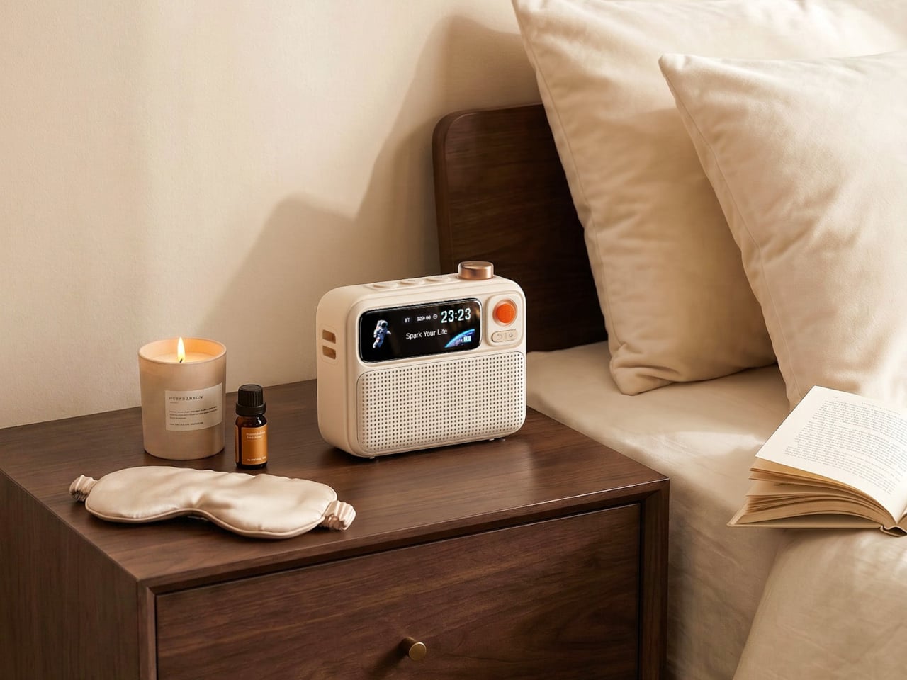
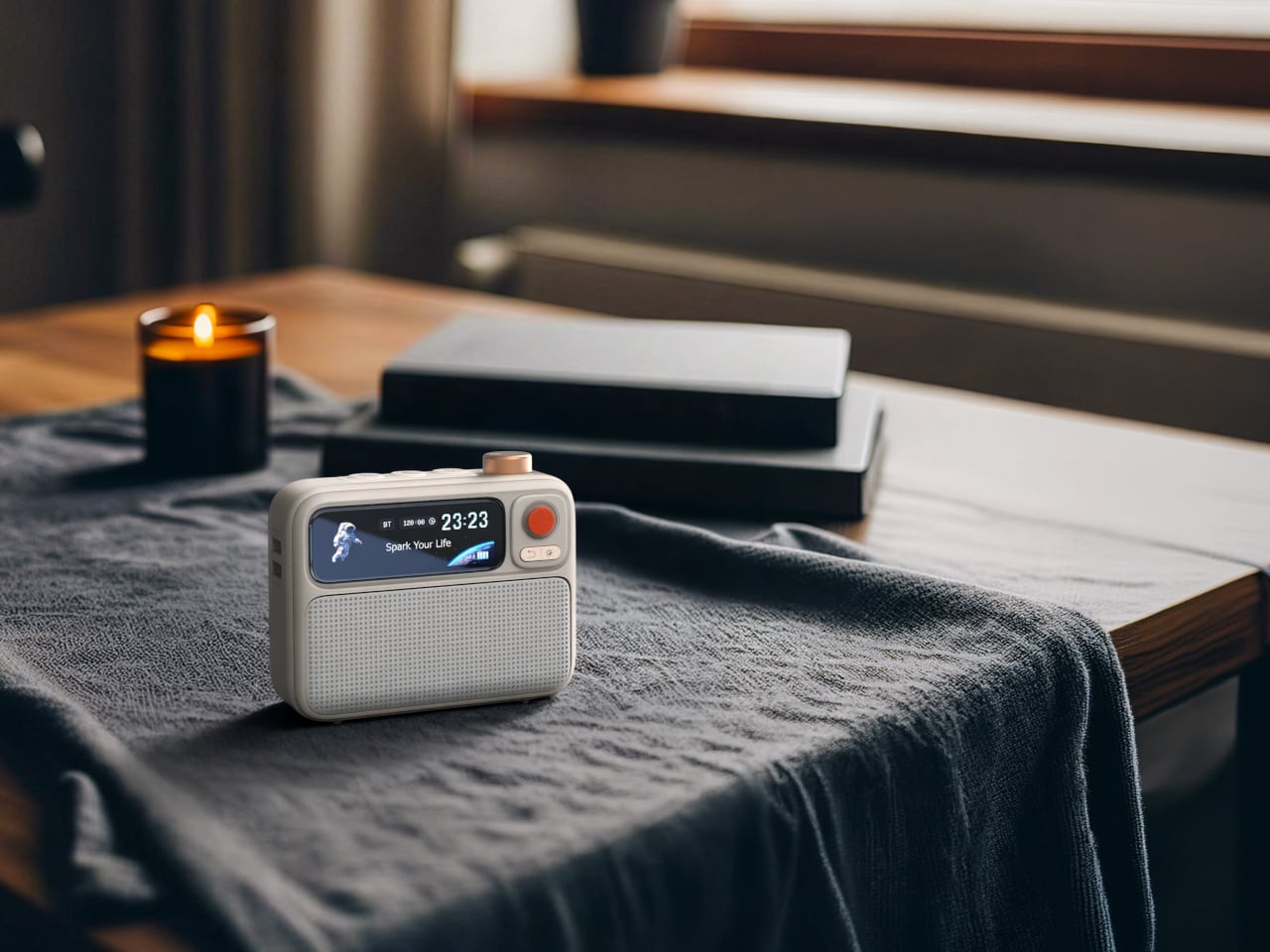
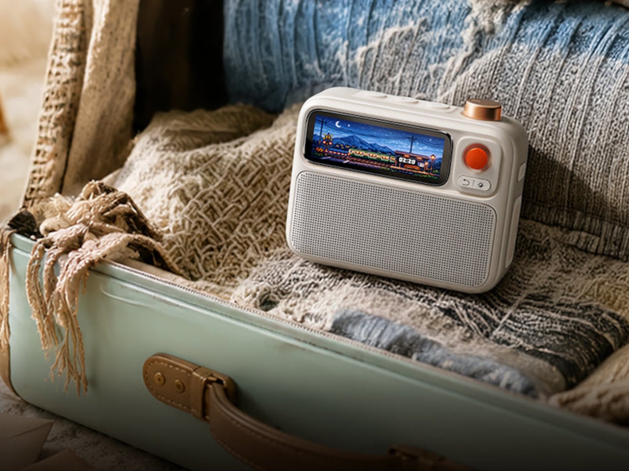
Three devices disappear from the nightstand for under a hundred dollars. The Divoom FlowToo combines a Bluetooth speaker, white noise machine, and alarm clock in a single compact unit, and handles each of those functions with more care than most products that attempt the combination. Its 10W amplifier and 45mm full-range driver are genuine audio hardware, not the obligatory speaker feature most alarm clocks bolt on as an afterthought. More than 90 built-in sounds cover the most-used sleep and focus categories, and the Divoom app keeps alarm scheduling and sound selection manageable from your phone without requiring physical interaction in the dark.

The 2.26-inch smart display does more than show the time. It runs multiple clock face designs, music visualizers that respond to whatever is playing, sleep scene animations, and a mood lighting mode that shifts the character of the room across the evening. The wake system layers natural sounds and soft light simultaneously, so the morning alarm builds gradually rather than firing at full volume from silence. It comes in black and white, both clean enough to sit beside almost any existing bedroom setup without visual conflict. For a first nightstand upgrade, this is the most efficient starting point.

What We Like

  • Gradual wake system combines natural sound and light simultaneously, removing the cortisol spike of a standard alarm entirely
  • Smart display handles mood lighting and timekeeping in one surface, so no additional ambient screen is needed

What We Dislike

  • Alarm management requires the Divoom app, which means keeping the phone nearby and partly contradicts a phone-free sleep routine
  • 10W speaker output suits a nightstand well but will not satisfy listeners who prioritize audio quality as the primary function

4. Dreamie by Ambient

Dreamie is built around one design argument: the phone does not belong beside the bed. Ambient’s founder Adrian Canoso, who brings an industrial design and audio engineering background to the company, built Dreamie to consolidate every legitimate reason a phone lives on a nightstand — alarm, ambient sound, light, podcasts, simulated sunrise — into a single device that offers none of the reasons phones keep people awake. There are no notifications, no feeds, no accounts, and no subscription fee. The Calm Tech Institute awarded it their highest certification, a signal that carries real weight in a category full of vague wellness claims.

The 50mm speaker with a 360-degree grille diffuses sound into the room rather than projecting it forward, creating an ambient quality that wraps the space during wind-down. A hidden volume dial and a touch strip for lamp brightness handle all physical interaction without requiring a menu or a screen tap. All sensor data stays on-device. Contactless sleep tracking arrives as a free over-the-air update later this year. At $249.99, the value case is most honest when compared to a wearable you already charge every night: Dreamie costs about the same, stays on the nightstand, and keeps the phone across the room where it belongs.

What We Like

  • No subscription, no account, no data collection — everything runs on-device and stays there indefinitely
  • Tactile controls function reliably in complete darkness without triggering a screen or making any sound

What We Dislike

  • At $249.99, the value argument requires genuinely committing to leaving the phone elsewhere, not supplementing existing nightstand devices
  • Audio output is Bluetooth only, so wired headphone use for partner-friendly late-night listening is not an option

5. 3-in-1 Luminous Mirror Diffuser

The 3-in-1 Luminous Mirror Diffuser follows this design philosophy — an object that earns permanent placement by doing several things with uncommon care, rather than one thing with a list of compromises attached. The oval anodized aluminum body houses three genuinely distinct functions: a customizable lamp, a 360-degree rotatable mirror, and a patented aroma plate that uses aluminum matrix technology to gently diffuse fragrance from a few drops of essential oil. None of the three feels like an afterthought added to justify a price point.

The lighting system moves between three color temperatures — 2400K warm amber for wind-down, 3800–3250K neutral for calm focus, and 6000K daylight clarity for precision — across four brightness levels, which makes it the one lamp on this list that adapts to both ends of the evening. A wireless charging pad integrated into the base handles device power without adding a cable to the surface. The mirror eliminates the separate grooming mirror that occupies nightstand real estate in most bedrooms. And the aroma diffuser, with its washable aroma plate and temperature-controlled heating, replaces a plug-in ultrasonic unit with something that requires no water tank, no misting, and no countertop clutter.

Click Here to Buy Now: $800.00

What We Like

  • Three color temperatures and four brightness levels make it genuinely useful at every stage of the evening, from bright grooming light to dim amber wind-down
  • Wireless charging pad built into the base means the charging dock and lamp footprint collapse into a single object on the surface

What We Dislike

  • At $800, it sits in a different spending bracket from the rest of this list and requires treating it as a long-term investment rather than an upgrade purchase
  • The mirror function adds real utility for grooming but may feel surplus to requirements in bedrooms where a bathroom mirror is steps away

The Nightstand You Actually Want Starts With One Good Decision

The nightstand is the last surface you interact with before sleep and the first thing you look at when you wake up. What lives there shapes both experiences more than most people give credit for. Each product here earns its place by solving something specific: warm light that belongs in the space, three devices charging cleanly, a room filled with gradual sound, a phone that stays across the room where it always should have been, and a single object that handles light, scent, and reflection with equal care.

The best nightstand setups are not minimal out of discipline. They are minimal because every object on the surface was actually chosen. None of these five products overlap in function, and none requires the others to justify its place. Start with the one that solves the most visible problem on your nightstand today, and the argument for the next one tends to present itself without much effort.

The post 5 Best Nightstand Gadgets That Turn Your Bedroom Into the Setup You Actually Want first appeared on Yanko Design.

Snøhetta’s Theodore Roosevelt Presidential Library Looks Like It Was Carved From the Badlands Themselves

Some buildings sit on a landscape, and then there are buildings that seem to belong to it. The Theodore Roosevelt Presidential Library, designed by Oslo and New York-based studio Snøhetta, is firmly the latter. Rising from the dramatic terrain of Medora, North Dakota — just outside the boundaries of Theodore Roosevelt National Park — the structure feels less like architecture imposed on the land and more like something the Badlands quietly exhaled.

Snøhetta won the international design competition for the project in 2020, and it is easy to understand why. The firm has long demonstrated a rare ability to make monumental buildings feel humble, from the Oslo Opera House, where the roof doubles as a public plaza, to the National September 11 Memorial Museum in New York. With TRPL, the challenge was different: how do you honor a president whose greatest legacy was the preservation of wild land, without contradicting that legacy with your building?

Designer: Snøhetta

Their answer was to look at the geology beneath their feet. The Badlands are a study in layered time — striated buttes, eroded canyons, and sedimentary formations that read like pages of a very old book. The library’s form echoes this language directly. The building’s curving silhouette mirrors the surrounding ridgelines, and its material palette draws from the warm ochres and earth tones of the regional rock. From certain angles, the structure practically dissolves into the horizon.

The interior logic follows the same idea. Visitors move through the building in a sequence meant to mirror Roosevelt’s own relationship with the West — arriving from the cultivated, ordered world and gradually moving deeper into something wilder and more elemental. The spatial progression is deliberate, cinematic, and designed to make the surrounding landscape the dominant feature at every turn. Windows are positioned not just for light but for framing: a specific butte, a stretch of prairie, a sky that goes on longer than feels reasonable.

Beyond the architecture, TRPL is positioned to become the first net-zero presidential library in the United States. Solar energy, geothermal systems, and a building envelope optimized for the extreme temperature swings of North Dakota all contribute to that goal. The commitment feels right for a library honoring a man who signed into protection of over 230 million acres of public land.

What Snøhetta has designed here is not a monument to power. It is something quieter and, ultimately, more resonant: a building that asks you to look past it, toward the land Roosevelt spent his life trying to protect. In a genre prone to grandeur for its own sake, that restraint is the most radical design choice of all.

The post Snøhetta’s Theodore Roosevelt Presidential Library Looks Like It Was Carved From the Badlands Themselves first appeared on Yanko Design.
8 Best Back to School EDC Essentials That Actually Make Showing Up Feel Like You Mean It

Back to school has a version where you scramble for a notebook and a pen that works, and a version where everything you reach for during the day does its job cleanly, looks like someone cared about it, and disappears into your pocket without complaint. The gap between those two versions is smaller than a full semester’s worth of regret. It mostly comes down to the eight things you carry every single day.

EDC — everyday carry — was never designed specifically for students, but it should have been. Campus life is its own particular design problem: long days across multiple environments, limited pocket space, and the constant friction of tools that underperform at the exact moment you need them most. These eight picks solve that friction. Each one earns its space on a keychain or in a bag pocket on its own terms, without needing to be explained.

1. Pininfarina Aero Ethergraf

Most pens run out at the worst possible moment: mid-exam, mid-note on a page that actually mattered. The Pininfarina Aero Ethergraf solves that by removing ink entirely. The writing tip is an Ethergraf metal alloy engineered to leave a permanent graphite-like mark on paper through oxidation, a technique older than the ballpoint by centuries. The result is a line that is precise and smudge-proof, will not bleed through paper, will not dry out when left uncapped, and will never need a refill.

Pininfarina built the Aero from aerospace-grade aluminum at 17 grams and 160mm long. The same studio responsible for decades of Ferrari and Maserati bodies brought that same design language to the pen form: a single confident shape, a blue accent that catches light at the right angle, and nothing that does not need to be there. The pen ships with a raw concrete cradle that sits on a desk without pretending to be anything other than what it is: a writing instrument built to stay rather than be replaced.

What we like

  • No ink or refills means this pen performs identically on the first day of term and the last, which is the most honest promise a writing tool can make.
  • The aerospace aluminum body and Italian construction give it the kind of material presence that makes it worth keeping across a career, not just a semester.

What we dislike

  • The Ethergraf line is lighter than ballpoint or gel output, which requires more deliberate pressure on thinner paper stocks to achieve confident, consistent marks.
  • The metal tip performs best on standard paper; coated or glossy surfaces produce inconsistent results.

2. Fantom X Wallet

A wallet is the one carry item almost nobody replaces until it fails, which is why most students spend three years sitting on something thick enough to tilt their posture. The Fantom X makes the case for replacing it before that happens. Built on a slim aluminum or carbon fiber chassis, it carries your most-used cards in a front-pocket profile that does not print through fabric, does not soften and stretch over time, and does not demand you excavate it to find what you are looking for.

The design philosophy here is subtractive: strip the wallet back to what it actually needs to do, then build those functions with enough precision that none of them fail quietly. For students moving between campus buildings, transit cards, and a student ID that needs to appear in under three seconds, that clarity matters. Drop it in a front pocket on the first day, and it becomes the kind of object you stop noticing, which is the highest compliment a wallet can earn.

What we like

  • The aluminum frame holds its shape across an entire degree program without softening, stretching, or accumulating the debris that leather wallets quietly collect over time.
  • The front-pocket profile is genuinely slim enough to change how you move through a crowded lecture hall or a packed transit car.

What we dislike

  • Fixed capacity suits a minimalist carry well but creates friction for anyone who still relies on cash for campus cafeterias or weekend markets.
  • The rigid form does not adapt as card count grows, which becomes a real limitation by the time senior year adds a work badge to the rotation.

3. Personal Whiteboard

The notebook has one flaw that nobody talks about: every page you write on is gone from active use the moment you turn it. Campus life generates a specific kind of thinking that does not need to be permanent — a rough sketch before a presentation, a formula to hold in working memory for twenty minutes, a quick to-do list that expires by lunch. The Personal Whiteboard is built for exactly that. Compact enough to carry anywhere, it opens to a clean dry-erase surface that works with any standard marker, requires no app, no sync, and no battery.

What separates it from a whiteboard bolted to a wall is the complete carry system built into the form: an eraser, pen holder, stand, and storage pocket all housed in one portable unit. Jot an idea down, snap a photo with your phone to send it wherever it needs to go, and wipe the surface clean before the next lecture. For students who think visually — sketching diagrams, mapping out arguments, working through problems spatially — this is the analog scratchpad that a phone notes app can never fully replace.

Click Here to Buy Now: $49.00

What we like

  • The all-in-one build — eraser, pen holder, stand, and storage pocket — means nothing is left behind and nothing rattles loose in a bag.
  • No battery, no app, no sync: it works the moment you open it, every single time.

What we dislike

  • Dry-erase surfaces require a marker that lives with the board; losing the pen turns it into a decorative object until a replacement is found.
  • The reusable format is not suited for notes that need to be kept; the photo-to-cloud workflow adds a step that some students will skip and regret.

4. 8-in-1 EDC Scissors

Scissors are the carry tool almost nobody thinks to include until the moment they cannot find them and spend fifteen minutes looking for something that does the job less cleanly. The 8-in-1 version addresses that by folding eight functions into a flat-pack form that opens in a single motion and weighs almost nothing in a bag. For students working across studio space, labs, and a dorm room across a single week, the cutting tasks stack up faster than any back-to-school supply list would suggest.

The real case for scissors in your EDC is that a knife cannot handle every task with the same grace: opening a sealed envelope cleanly, trimming a loose thread from a collar before a presentation, cutting a document to size, working through the tape on a textbook that arrived shrink-wrapped. The 8-in-1 handles all of those and brings enough additional functions that it earns its flat-pack space even on days when you reach for it exactly zero times. It is there on the days you do.

Click Here to Buy Now: $59.00

What we like

  • Eight functions in a flat-pack form that most people will actually carry consistently, rather than a dedicated pair that stays in a desk drawer.
  • The profile means it does not compete with other tools for space in a pencil case or bag.

What we dislike

  • Scissors remain the one tool people most reliably leave behind on the assumption they will not need them that particular day.
  • The multi-function format means none of the eight tools reaches the specialist performance of a dedicated single-purpose version.

5. Olight Baton 4 Premium Edition

Flashlights are the EDC carry people dismiss until a power outage turns a campus building into a dark maze, or a late walk back from the library asks more of a phone screen than it should reasonably deliver. The Olight Baton 4 Premium Edition is the version of this argument that earns a permanent pocket position. The Premium finish options, stainless and copper variants in particular, read as desk objects as readily as tools, which changes what you are willing to carry every day without a second thought.

For students, the Baton 4 brings dependable illumination to the scenarios campus life generates more regularly than anyone plans for: power infrastructure that goes out during finals week, a trail run where daylight ends mid-route, a parking structure at midnight after a late seminar. The build quality means it lives in a pocket through an entire semester without corroding, scratching, or developing the rattle that cheaper lights accumulate over months. It stops being noticed after the second week, which is precisely where well-designed EDC should land.

What we like

  • The Premium Edition finish reads as a considered object in a professional or social setting, without the visual aggression most tactical flashlights lead with.
  • Build quality holds through a full semester’s worth of varied conditions without requiring any deliberate maintenance.

What we dislike

  • Premium Edition pricing sits at the higher end of what most students budget for pocket carry in the opening weeks of a new year.
  • The charging method may feel dated alongside newer competitors offering wireless or more streamlined options.

6. Anywhere Use Lamp

Dorm lighting is one of the specific miseries of freshman year that nobody adequately warns you about. The overhead fixture is fluorescent and institutional. The desk lamp that came with the room is the cheapest unit the university could justify sourcing. Studying under either of them for three hours produces a particular kind of low-grade fatigue that gets blamed on the subject matter rather than the light quality. The Anywhere Use Lamp moves between a bedside table, a study desk, and an outdoor session without requiring any adjustment whatsoever.

What makes portable lighting genuinely matter for students is the range of settings a single week creates. Late reading in a room where a roommate is already asleep. A library corner where the overhead has been out for three weeks and the work order remains unfiled. A study session outside that started in afternoon light and ran well into the evening. The Anywhere Use Lamp handles all of those and reads as a design object rather than a utility purchase, which is the difference between something that stays out on a desk and something that lives in a closet.

Click Here to Buy Now: $149.00

What we like

  • The portable form factor transitions from dorm desk to outdoor table to bedside table without any adjustment or setup.
  • The aesthetic reads as a designed object worth displaying, rather than a lamp that gets hidden when guests arrive.

What we dislike

  • Output works best as supplementary or mood lighting rather than a primary source for demanding, extended work sessions.
  • At $149, it sits at the premium end of the student carry budget for what might initially read as a secondary light.

7. MetMo Pocket Grip

The MetMo Pocket Grip started as a 113-year-old patent that nobody had properly built until MetMo did. The result is a precision grip multi-tool measuring 95.5 by 45.5mm that disappears into a front pocket alongside a phone. The mechanism is what makes it worth paying attention to: Victorian-era engineering applied to a current material palette, which gives it a tactile character that most modern multitools — machined to tight tolerances with no analog history behind them — tend to completely lack. Old thinking, re-executed for actual daily use.

Carrying the Pocket Grip changes what you notice. Bolts that need tightening. Mechanisms that need adjusting. The tool gives you confidence to engage with the physical world in a way that most EDC does not, because most EDC prepares for emergencies rather than enabling daily interaction. For a student who spends time in studio environments or maker spaces where small physical interventions happen throughout the week, that quiet engagement matters. The fact that it looks like something a craftsman from 1913 would recognize is not nostalgia. It is just durable design.

What we like

  • The design origin story gives it depth of character that purely modern multitools, designed entirely from scratch, cannot replicate.
  • The 95.5 by 45.5mm footprint fits a front pocket without competing with a phone for space.

What we dislike

  • The patented mechanism takes a few uses to feel fully intuitive in the hand before it becomes second nature.
  • The precision grip application makes it more specialized than a general-purpose multitool for anyone looking for broader day-to-day utility.

8. CraftMaster EDC Utility Knife

The utility knife is the most underestimated tool in everyday carry, which is why most people settle for a disposable box cutter until they need to make a clean cut and immediately remember why that choice was wrong. The CraftMaster comes in at 8mm thick and 12cm long, with a tactile rotating-knob blade deployment and an OLFA blade angled at 45 degrees: the specific geometry that makes box opening clean rather than torn. A companion metal ruler scale docks magnetically to the back of the knife body.

At 0.3 inches thick, this slides into a pocket alongside a phone without announcing itself. The ruler scale adds imperial and metric markings alongside a blade-breaker for snapping off dull OLFA segments, with a 15-degree curvature along the ruler edge that keeps fingers clear during cuts. OLFA blades are available at any hardware store on earth, which means this knife avoids the proprietary-consumable trap that quietly ruins otherwise good knives when the included blades run out halfway through a semester with no obvious replacement.

Click Here to Buy Now: $80.00

What we like

  • The magnetic ruler scale transforms the knife into a measuring tool without adding any bulk or requiring anything else in the bag.
  • OLFA blade compatibility keeps replacements cheap, universal, and available anywhere.

What we dislike

  • The rotating knob deployment is slower than a thumb-stud or flipper mechanism for one-handed operation under any kind of time pressure.
  • At 12cm, cutting depth stays appropriate for light and medium work; heavy-material tasks will need something else.

The Only EDC Rule That Actually Matters: Carry What You’ll Use

None of these eight things require a lifestyle change to carry. They sit in a pocket, clip to a bag strap, or live on a desk without demanding attention. What they do require is a single decision: that the things you reach for every day are worth choosing deliberately. One or two of these will solve a specific friction point you encounter this week. Start there and let the rest of the list find its moment when the semester makes it obvious.

The best EDC stops being noticed after the first month, which is the whole point. These eight cover the functional range of a full year at campus: writing, carrying, cutting, lighting, measuring, organizing. Together they represent the version of back to school where everything you touch works exactly as expected, and nothing in your bag exists simply because it was on a generic supply list at the campus bookstore.

The post 8 Best Back to School EDC Essentials That Actually Make Showing Up Feel Like You Mean It first appeared on Yanko Design.
This 48-Sq-Ft Tiny House by A Canadian Charity Strips Shelter Down to Its Purest Form

There is a version of shelter that asks nothing of you — no monthly mortgage anxiety, no utility juggling, no lease renewal dread. It is just four walls, a roof, a bed, and warmth. Tiny Tiny Homes, a Canadian tiny house builder and charity, has built exactly that with its 48-sq-ft model: a towable dwelling so stripped of excess that it forces you to reconsider what a home actually needs to be.

At 48 square feet (4.46 sq m), this is not a tiny home in the aspirational Instagram sense. It sits on a single-axle trailer, measures roughly 6 feet in length, and arrives on site ready to shelter someone immediately. The exterior is clad in insulated metal panels, painted blue and white, and features a small folding deck at the entrance that folds flat during transport. That last detail alone speaks to the level of considered design packed into something this compact.

Designer: Tiny Tiny Homes

Inside, the single room is finished in metal panels. A bed and daybed occupy the primary footprint, with storage tucked underneath. A long storage unit runs alongside. Overhead, a skylight pulls natural light into what would otherwise feel suffocating. An optional window-mounted air conditioning unit and an electric heater handle climate year-round — a non-negotiable for deployments across Canada’s winters. There is no kitchen. There is no bathroom. And that is entirely intentional.

The 48-sq-ft model is conceived as emergency accommodation for people experiencing homelessness, positioned as a step above roughing it in a tent rather than a replacement for a conventional home. It is installed alongside shared facilities — communal kitchens, bathrooms, support services — which is what makes the stripped-back interior not a compromise, but a design decision. A pair of these units were recently delivered to the Seeds of Hope Farm Project, a transitional housing development in Toronto.

What Tiny Tiny Homes has achieved here is a lesson in design clarity. When the brief is pure shelter rather than lifestyle, every square inch earns its place. The skylight is not a luxury; it is a psychological necessity. The folding deck is not an amenity; it is a threshold between inside and outside that gives the dwelling a sense of arrival.

The organization also produces a 96-sq-ft sibling model that adds a desk and a kitchenette for situations where a more self-contained setup is needed. But the 48-sq-ft version, precisely because it does so little, says something more honest about what design is for — not to impress, but to protect.

The post This 48-Sq-Ft Tiny House by A Canadian Charity Strips Shelter Down to Its Purest Form first appeared on Yanko Design.
This 492-Square-Foot Canadian Tiny Home Has a Mud Room, a Bathtub, and Zero Apologies

Rover Tiny Homes built the Apex for people who want to live smaller — not people who want to live with less. The British Columbia-based family-run builder has spent years crafting portable cottages that challenge the compromises typically written into tiny living — and the Apex might be the clearest statement of that philosophy yet.

At 492 square feet with an additional 80-square-foot loft, the Apex sits at the larger end of the park model category. It’s non-towable, built to live on a site rather than chase one, and designed with the sensibility of a mountain cabin that’s been quietly upgraded from the inside out. The exterior is clad in engineered wood and dark cedar shingles beneath a Prolok metal roof — restrained and confident, as good materials tend to be.

Designer: Rover Tiny Homes

The interior opens onto a living room through double glass doors, defined by intersecting vaulted ceilings and two soaring A-frame windows that draw the landscape inside. Tongue and groove pine runs overhead, and reclaimed barn wood trim — over a century old — adds a warmth that no amount of staged furniture could manufacture. A fireplace with a custom mantle anchors one wall. A mini-split handles the rest of the climate, backed by insulation rated R24 in the walls and up to R31 in the floors.

The kitchen is where the Apex most directly rejects the idea of compromise. Quartz countertops, custom slow-close cabinetry, a four-burner propane cooktop, a dishwasher, and a fridge-freezer sit alongside a breakfast bar that seats three. It looks and functions like a real kitchen, because it is one.

Past the kitchen, a hallway leads somewhere most tiny homes don’t bother going — to a dedicated mud room with its own separate entrance. For anyone returning from a trail, a paddle, or a wet afternoon, that distinction matters more than any spec sheet can convey. The bathroom beyond it includes a full bathtub, a vanity, and a stacked washer-dryer, which rounds out a level of domestic functionality that genuinely surprises.

The bedroom at the far end of the home is spacious enough to stand upright in without performing any spatial calculus. Built-in storage, a double bed, his-and-hers closets, and a ceiling fan keep it calm and considered. The Apex starts at roughly US $150,000. Rover Tiny Homes delivers within three hours of Chilliwack, BC, and the model is available in A277, Z240-MH, and Z241 certifications to suit different site and foundation requirements.

The post This 492-Square-Foot Canadian Tiny Home Has a Mud Room, a Bathtub, and Zero Apologies first appeared on Yanko Design.
This Lithuanian Forest Retreat Glows Like a Lantern at the Edge of the Trees

There’s a moment, just after dusk, when the Sanctum nature retreat reveals its most compelling quality. The gabled timber structures, dark and quiet against the Lithuanian woodland all day, begin to glow from within — large lanterns at the forest edge, warm light spilling through panoramic glass toward the treeline. It’s the kind of image that makes the architecture feel less like a building and more like an invitation.

Designed by Vilnius-based studio Arches and completed in 2026, Sanctum sits in a forest clearing near Bezdonys, Lithuania. The project spans 1,035 square metres and was conceived as a nature therapy retreat — a place where architecture actively participates in slowing people down, rather than simply providing shelter while they do it themselves.

Designer: Arches

The studio’s approach to form is rooted in familiarity. The silhouette of a traditional rural building is taken as a starting point, then stretched — proportions shifted, rooflines extended upward — until the gabled shapes enter a quiet conversation with the silhouettes of the surrounding treetops. The rhythm feels deliberate. Nothing about Sanctum is trying to announce itself.

Material choices reinforce that restraint. The exterior is clad in ecologically modified pine using Kebony technology, left entirely untreated to weather naturally over time — no maintenance, no intervention, just timber doing what timber does. Natural copper cladding runs alongside it, and together the two materials give the buildings their characteristic dark, almost monastic exterior. Inside, the same pine timber and cross-laminated timber panels are softly whitewashed, shifting the mood entirely from exterior to interior: severe outside, warm within.

The spatial organisation centres on a semi-covered inner courtyard, partially sheltered by coffered timber structures with glazing that draws natural light into the heart of the complex. It’s designed for communal outdoor activities — yoga, movement sessions, shared time. From there, the space connects directly to a transformable main hall: an elevated room filled with natural light, panoramic glazing opening toward the forest, and an acoustic partition that allows it to split into two independent spaces when needed.

What Arches has built here is not particularly loud. There are no dramatic cantilevers, no glass boxes engineered to shock. The ambition is subtler — to create architecture that makes you feel the wood, notice the shifting light, and register the silence. Sunlight filtering through the buildings casts moving shadows across the timber volumes throughout the day. By evening, the glow takes over. For a retreat that promises to return attention to fundamental human needs — nature, emotion, perception — Sanctum makes a convincing case with almost every surface it shows you.

The post This Lithuanian Forest Retreat Glows Like a Lantern at the Edge of the Trees first appeared on Yanko Design.
7 Best Gadgets & Gear for Digital Nomads in 2026 That Turn Any Café Into a Proper Studio

The bag you carry into every shared space tells a story before the laptop opens. For years that story was functional at best, a charger shaped like a building block, a mouse borrowed from the budget shelf, a phone that looked underdressed next to the work it was doing. Something has shifted. The tools nomads carry in 2026 are beginning to look as considered as the work they produce. The standards have moved, and the products have followed.

What separates a setup that earns the table from one that simply occupies it is rarely one product. It is the accumulation of small, deliberate choices made across everything you reach for during a session. Each of the seven products here earns its slot not by being the loudest option in its category, but by being the most resolved. The café table becomes a studio when every object placed on it was designed to be there.

1. Nothing Phone (4a)

Most work phones carry a quiet contradiction: chosen for a camera or a price point rather than anything that makes them genuinely pleasant to hold for eight hours. The Nothing 4a disrupts that at the industrial design level. A transparent rear that reveals its internal architecture rather than concealing it, a Glyph interface that surfaces notifications without demanding the screen, and a material language borrowed from industrial design more than consumer electronics. It is the phone that actually earns its place on a considered desk.

For you, the benefit is a device that reads as intentional in every environment it enters. Boardrooms, airport lounges, café counters: the Nothing 4a does not look borrowed or accidental. The Glyph system means you can leave the phone face-up and receive the information you need without performing a full screen unlock, keeping your attention where the work is. A phone that manages your attention rather than capturing it is a different category of tool entirely, and that distinction compounds across a full working day.

What we like:

  • The transparent rear turns the phone into a design object without adding a single gram or millimeter of unnecessary material
  • The Glyph interface filters information at a glance, reducing the number of times you unlock the screen during a focused session

What we dislike:

  • The aesthetic confidence that makes the Nothing 4a distinctive will read as a deliberate signal in environments where understated hardware is the professional norm
  • Transparent backs accumulate fingerprints more visibly than opaque finishes, which means the phone looks its best roughly twenty seconds after you set it down

2. OrigamiSwift Mouse

Travel mice have been solved in the wrong direction for decades. The industry shrank them, which created smaller cramps rather than better tools. The OrigamiSwift is built around a different premise: transformation rather than compression. It collapses to card-sized flatness via magnetic clips, then opens into a fully contoured ergonomic mouse that fills a palm the way a stationary mouse does. At 40 grams, it disappears into a jacket pocket. Its polygonal geometry earns its grip through structure rather than rubber texture.

For you, the value is arriving at any surface with precision input that a trackpad cannot replicate without penalty. Extended editing sessions, dense spreadsheets, precise layout work: the OrigamiSwift removes every excuse for not carrying a proper mouse. Bluetooth 5.2 connects without a dongle. A three-month battery life on a single USB-C charge takes it out of the daily rotation of things to remember to charge.

Click Here to Buy Now: $85.00

What we like:

  • Card-flat in the bag, full ergonomic profile on the desk, with no intermediate configuration that compromises either state
  • Three months of battery life on USB-C removes it from the daily charging conversation entirely

What we dislike:

  • The hinge is the most structurally complex component, and daily fold cycles over years could introduce wear that a solid-body mouse accumulates more slowly
  • Scroll feedback is softer than premium stationary alternatives, something certain users register immediately, and others never notice

3. ASUS ZenScreen OLED MQ16FC

Portable monitors have become standard nomad equipment. The trade-off nobody advertises is the power drain: every secondary screen draws from the laptop it is connected to, shortening the session it was brought along to extend. The ASUS ZenScreen OLED MQ16FC addresses that at the port level. Two USB-C connections that send power in either direction mean plugging a wall charger into the monitor and running a single cable to the laptop charges the notebook while the display runs. One cable, one outlet, both devices fed.

For you, this changes the arithmetic of a café setup. One power outlet handles everything; the laptop charges through the monitor while the session continues uninterrupted. A 16-inch OLED panel at 9mm thin and 0.68 kilograms weighs less than most hardcover books you would carry alongside it. The 16:10 aspect ratio returns the vertical screen space that widescreen layouts consistently remove.

What we like:

  • Bidirectional USB-C power routing means one wall adapter charges both the monitor and the laptop through a single cable, a simplification the portable monitor category should have standardized years ago
  • A 16:10 OLED panel at 9mm thin makes this genuinely portable without the visual compromise that IPS alternatives at the same size still carry

What we dislike:

  • The glossy OLED surface is not your ally on café terraces or near windows, where reflections compete with the content the screen is trying to show you
  • The kickstand-only stand is limiting on uneven or narrow surfaces, and without a wall charger in the loop the bidirectional power advantage disappears entirely

4. Stillframe Headphones

The over-ear headphone has become standard café furniture, which means the design bar is simply to not look like every other pair at the adjacent table. Stillframe takes a quieter approach than most: a minimal frame with a material story that holds up to extended handling, and passive isolation that removes the ambient noise layer without requiring battery charge as an entry fee to concentration. The headphones do what the category promises and rarely delivers: they get out of the way, and they look considered while doing it.

For you, the argument for Stillframe in a nomad kit is as much about weight and packability as it is about sound. Headphones that collapse flat and travel without a dedicated case free up bag volume that protective cases have been quietly borrowing for years. Paired with a phone that manages notifications intelligently, the combination removes the two most consistent interruptions to a working session: ambient noise and screen pulls. The setup earns back the attention that open environments routinely take without asking.

Click Here to Buy Now: $245.00

What we like:

  • Passive isolation that works without battery dependency means the headphones perform equally on a plane, in a café, and in a dead-battery situation
  • A minimal design language holds up across every professional environment without announcing the brand or the price

What we dislike:

  • Over-ear passive designs sacrifice some of the seal that active noise cancellation provides in genuinely loud environments like airport terminals or open-plan offices
  • Without a dedicated case, the finish accumulates contact wear more quickly, which is a real consideration over years of daily travel use

5. Satechi OntheGo Foldable Stand Hub

The laptop stand problem has never been about ergonomics alone. It is the deal that comes with raising the screen: a separate keyboard, a separate dock, and a surface cluttered enough to look like you moved in for the week. The Satechi OntheGo Foldable Stand Hub collapses that negotiation into a single 187.5-gram unit. Folded flat at under 20mm, it carries a laptop stand, USB-C dock, SD card reader, and HDMI output, with a 17cm integrated cable that connects everything in one motion.

For you, the value is what it removes from the bag rather than what it adds. Three accessories become one object that fits flat in a laptop sleeve pocket at $79.99, adding no dedicated volume to the packing equation. Deploy it at a table, and the laptop rises to eye level, the dock connects, the screen real estate doubles without a second cable appearing from somewhere. The borrowed surface stops feeling improvised. That shift, from occupying a table to owning one, is what a kit built around intention produces every time.

What we like:

  • Four accessories in one 187.5-gram flat unit means the stand-dock combination adds virtually no bag weight over carrying the laptop alone
  • The 17cm integrated USB-C cable removes the cable that would otherwise need locating from the bottom of the bag before the setup is usable

What we dislike:

  • Stand height is fixed, which suits most working postures but offers none of the angle adjustability that dedicated stands designed for extended sessions provide
  • The port selection is minimal enough that a heavier workflow with multiple peripherals will still need a second hub alongside it

6. MagSafe Power Bank (Qi2.2)

The power bank category has been solving the same problem the same way for a decade: more capacity, same shape, same ritual of fishing a cable from the bottom of a bag before anything charges. The Qi2.2-compatible version changes the interaction at the surface level. At 10,000mAh with 25W wireless output through the Qi2.2 standard and 45W wired through its integrated port, it delivers wall-adapter-speed charging from a device that weighs less than a paperback. Magnetic attachment means placing the phone on it is the complete action.

For you, the practical gain is charging speed that works on a deadline. Previous wireless standards topped out at 15W, useful for overnight top-ups but not for the forty minutes before a meeting starts. At 25W wireless, this bank changes that calculation. At $54.99, it sits at the price where the convenience case is easy to make without the qualifier that it barely charges faster than waiting. The 45W wired port covers everything the wireless standard does not yet reach, including laptops under lighter loads.

What we like:

  • Qi2.2 at 25W is the first wireless standard fast enough to substitute for a wired connection in time-sensitive situations, not just overnight sessions
  • Magnetic attachment removes the cable-to-phone connection from the charging workflow entirely, a small interaction change that compounds across every session

What we dislike:

  • 10,000mAh handles phones and earbuds cleanly but offers only marginal support for laptop charging under any real workload
  • Full Qi2.2 speeds require a compatible recent device; older phones receive standard Qi output that brings the $54.99 proposition back to ground level

7. Inseparable Notebook Pen

Digital tools handle the work that scales: files that duplicate without cost, edits that undo freely, documents that update across every device at once. None of them handle the moment when the idea arrives faster than the interface. The Inseparable is built for that gap: a pen and notebook designed as a single object, each incomplete without the other. The pen stores magnetically against the notebook’s spine, removes in one gesture, and returns the same way. No cap to misplace. No drawer to search before the thought is gone.

For you, the benefit is analog capture that travels without the compromise of a pen that ends up loose in the lining of a bag. The Inseparable stays together because it was designed to: the magnetic bond holds across the movement a bag accumulates through a full day of travel without releasing unless you intend it to. On a desk built around precision and intention, a notebook and pen that belong together without effort carry exactly the same design logic as everything else placed on the surface. The last object in the kit earns its place the same way the first one did.

Click Here to Buy Now: $19.95

What we like:

  • Magnetic attachment between pen and notebook keeps the analog layer of the kit complete without a separate sleeve, clip, or loop to manage
  • The combined object makes a quiet argument about paired tools that every other notebook and pen combination treats as an afterthought

What we dislike:

  • The magnetic bond strength that holds the pen through a day of travel is the same resistance you pull against when you reach for it quickly: a tension the design resolves in most situations but not all
  • As a paired product, replacing one half when the other wears out means sourcing within the same ecosystem rather than reaching for any compatible alternative

The Studio Is the Kit You Carry Into It

The setup that makes a borrowed table feel chosen does not require ten accessories and a cable management plan. It requires seven products that each solved a specific problem in a way that leaves nothing clumsy behind. A phone that manages your attention. A mouse that folds to a card. A monitor that charges the laptop while it runs. An analog layer that stays together because it was designed to. The whole is more than the parts, but the parts have to earn it first.

Nomad work in 2026 is no longer defined by what you can endure on a borrowed surface. The tools exist to make the temporary feel permanent, the accidental feel deliberate, the afternoon productive without apology. Every object here was designed with that intention, and the desk they build together reflects the same judgment you bring to everything else the work asks you to care about. The studio is not a place. It is the kit you carry into it.

The post 7 Best Gadgets & Gear for Digital Nomads in 2026 That Turn Any Café Into a Proper Studio first appeared on Yanko Design.
The 8 Best Kitchen Tools for Summer 2026 So Well-Made They Make Cooking Feel Like an Art Form

Japanese summer cooking has a quality that’s hard to name but easy to feel. Less rush, more presence. The kind of prep where you’re not trying to get dinner onto the table but genuinely inhabiting the act of making it. These eight tools are built for that pace. Each carries design decisions that reward attention, and together they make a summer kitchen feel less like a production and more like a practice.

What connects all eight is a commitment to material honesty. No chemical coatings, no plastic handles, no surfaces that approximate what they should be rather than simply being it. Carbon graphite that has never touched a coating. High-carbon steel forged at extreme temperatures and cooled to minus 196 degrees. Hinoki cypress that builds character through use. These tools don’t promise convenience. They promise that the effort you bring to them will be worth every minute.

1. Iron Frying Plate

Western plating separates cooking from eating with an extra step nobody examines. Food leaves the pan, sits on a plate, and temperature and texture leave with it. The JIU Iron Frying Plate removes that step entirely. Made from rust-resistant mill scale steel with a detachable wooden handle, it moves from burner to table as a single object. You cook in it, you eat from it, and food arrives the way it was always meant to.

That might sound like a shortcut, but the effect is closer to a revelation. Eggs arrive still sizzling. Fish comes off the heat and stays at temperature while you decide what to pour over it. The uncoated surface develops natural non-stick properties through regular cooking, meaning it gets better the more you use it. The wooden handle attaches and detaches with one hand, and the transition becomes so fluid that going back to a separate plate feels like a small, unnecessary loss.
Click Here to Buy Now: $69.00

What We Like

  • The cook-and-serve design preserves the temperature and texture that are lost the moment food transfers to a separate plate
  • The uncoated mill scale steel develops natural non-stick properties through use, improving with every session rather than degrading like coated alternatives

What We Dislike

  • The iron construction retains heat well past the point of serving, which requires careful handling at the table
  • Heavier than a standard serving dish, which takes some adjustment if you’re accustomed to lightweight ceramics

2. ANAORI Kakugama

Carbon graphite is not a material you encounter in a kitchen, which is precisely why the ANAORI Kakugama stops you the moment you look at it. Crafted from solid carbon graphite in Japan, its matte black surface distributes heat with an evenness that coated pans cannot match, reducing the risk of scorching while preserving the natural flavors of whatever is being prepared. It steams, poaches, simmers, grills, and fries without complaint, the kind of vessel that earns a permanent position rather than a seasonal one.

The detail that elevates it from impressive to irreplaceable is the Japanese cypress lid. As it heats, hinoki releases a faint, earthy aroma that no synthetic lid can replicate. This is cookware that approaches the act of cooking with genuine respect for the ingredient. The carbon graphite body develops no off-flavors, imparts nothing to the food, and responds to heat with a consistency that makes it worth learning to cook around.

What We Like

  • Carbon graphite distributes heat with an evenness that coated pans cannot replicate, making scorching a near non-issue across every cooking method
  • The Japanese cypress lid releases a faint hinoki aroma during cooking, adding a sensory dimension that no synthetic material produces

What We Dislike

  • The premium material and craft place this vessel at a price point considerably above conventional cookware
  • Carbon graphite requires more attentive handling and storage than standard kitchen materials

3. JIA Inc. Rolling Mortar

The mortar and pestle has been functionally unchanged for roughly 35,000 years. JIA Inc., a Taiwan-based design brand, chose to examine that assumption rather than honour it. Their Rolling Mortar replaces the vertical pounding motion with a rolling one: a stone sphere moves across a curved ceramic base, grinding herbs and spices through rotation rather than force. The gesture is more intuitive, considerably less tiring, and far more interesting to watch from across the kitchen.

Pesto comes out smoother. Spices release their oils more completely. The method produces results that standard crushing does not, because shearing and rolling extract differently from the same ingredient than pressure alone does. On the counter, the sphere and base form a sculptural composition that earns its space whether in use or not. It cleans easily, stores without cases or drawer space, and sits somewhere between a useful tool and a gallery object that happens to make excellent pesto.

What We Like

  • The rolling mechanism shears rather than crushes, extracting oils and flavors from herbs and spices in a way that traditional pounding cannot replicate
  • The sphere-and-base composition is sculptural enough to justify permanent counter display without looking out of place

What We Dislike

  • The rolling action is slower than a food processor for coarse or particularly hard spices, and requires patience
  • The sphere needs adequate clearance to move freely during use, demanding more counter space than a standard mortar

4. Sakura Petal Grater

There is a specific moment in Japanese cooking that changes what you think condiments are. It arrives the first time you grate fresh wasabi at the table and realize that the paste in the tube and the root you’ve just reduced to a pale green cloud are, functionally, different ingredients. The Sakura Petal Grater is built around that realization. Its circular stainless steel surface is designed for tableside use, turning fresh ginger, daikon, and wasabi from prep tasks into part of the meal itself.

The form deserves attention separately from the function. The sakura petal shape is considered rather than merely decorative, a compact round that fits naturally at a table setting without crowding adjacent plates. The anti-slip silicone base stabilizes the grater during use and doubles as a protective cover during storage. The circular grating motion has a quality that other tools don’t offer. Once you’ve grated fresh ginger over miso soup this way, the action becomes something you look for reasons to repeat.

Click Here to Buy Now: $45

What We Like

  • Tableside grating turns fresh garnish preparation into part of the dining ritual rather than kitchen prep done in advance and left to oxidize
  • The compact sakura petal form sits naturally at a table setting, and the silicone base doubles as a protective cover when stored away

What We Dislike

  • The small surface area makes this a garnish tool rather than a volume grater; larger quantities require a different piece of equipment
  • The circular design works best with firm roots and vegetables and is not suited to soft produce

5. Hesslebach Dutch Oven

Most Dutch ovens are either functional objects that have no business being visible, or expensive pieces of cookware that work beautifully and look exactly like every other expensive Dutch oven on the market. HK Kim’s Hesslebach is neither. The design treats the vessel as an object worth placing rather than simply setting down. Its form communicates something deliberate about the kitchen it occupies, a quality that genuinely few pieces of cookware achieve regardless of price.

It retains and distributes heat in the way a good Dutch oven should. Braises develop deeper flavor, bread develops a crust that rivals a professional deck oven, and summer soups reach a depth that lighter pots cannot match over the same time. What makes it fit summer cooking specifically is the cook-to-table quality it enables. It moves from the hob to the dining table without looking like it traveled, and left out between sessions, it functions as an anchor for the kitchen around it.

What We Like

  • Heat retention and distribution deliver results that lighter cookware cannot approach, regardless of the recipe or technique
  • A form confident enough to move from stovetop to dining table without apology, functioning as a serving piece as much as a cooking one

What We Dislike

  • The weight and material density demand more deliberate handling than lighter everyday cookware, particularly when the pot is full
  • The investment required places it firmly above casual kitchen upgrade territory

6. BALMUDA The Kettle

Tokyo-based BALMUDA makes objects that look like they were designed by someone who could not tolerate the gap between how a thing functions and how it should look while doing it. The Kettle is the clearest expression of that position. A wide base tapers to a narrow gooseneck spout engineered for controlled, targeted pouring, and the proportions at every point feel considered rather than arrived at by convention. It handles the temperature precision that Japanese cooking requires with the same authority it handles the counter.

For summer cooking specifically, precise water temperature matters in ways that general-purpose kettles don’t accommodate. The difference between green tea brewed at 70 degrees and 90 degrees is the difference between something delicate and something sharp. The BALMUDA The Kettle gives you that control with a visual design that makes it worth leaving on the counter permanently. At the price it carries, it is an object that asks to be bought once and never thought about again.

What We Like

  • The precision gooseneck spout allows the controlled, targeted pour that dashi preparation and temperature-sensitive tea brewing both require
  • BALMUDA’s build quality and proportions make it as worthy of permanent counter display as it is of daily use

What We Dislike

  • The premium brand carries a price considerably higher than functional alternatives with comparable temperature control
  • Some users may want more granular degree-specific settings than the kettle’s temperature range provides out of the box

7. Hinoki Essence Cutting Board

Most cutting boards argue for one virtue at the expense of another. Plastic is easy to clean and destroys knife edges. Bamboo is harder than it should be. Soft wood is forgiving but turns into a bacterial harbor within a month of regular use. Hinoki cypress is the material Japanese knife makers recommend because it sits at the right point on the hardness scale: firm enough to hold ingredient position cleanly, soft enough to absorb rather than blunt the cutting edge.

The Hinoki Essence Cutting Board adds a water-resistant silicone treatment that penetrates the wood fibers rather than sealing the surface, preserving the material’s natural aroma and feel. Hinoki has a clean, resinous scent that rises faintly during prep and turns the act of cutting into something more sensory than mechanical. The integrated handle facilitates hanging storage, keeping air circulating the board and preventing the trapped moisture that shortens the life of most wooden surfaces.

Click Here to Buy Now: $75.00

What We Like

  • Hinoki’s position on the hardness scale protects knife edges while delivering cutting feedback that plastic and bamboo cannot replicate
  • The silicone treatment penetrates rather than coats the wood, preserving its natural aroma and texture through regular use

What We Dislike

  • Wood requires more care than plastic, including thorough drying after washing and occasional oiling to prevent surface cracking
  • The premium cypress material commands a higher price than most cutting boards at this size

8. Yin Mo Star Kui Chef Knives

Most kitchen knives make a quiet case for themselves. The Yin Mo Star Kui make a loud one. Designed by Beijing Wang Mazi Technology and awarded the A’ Design Award, this set is built from high-carbon steel using a hot and cold forging method that few manufacturers attempt. The steel is heated to 1,040 degrees Celsius, then cooled to minus 196 degrees. Hot forging eliminates internal imperfections and improves toughness; the cold treatment reorganizes the crystal structure to increase resistance to deformation.

The texture is where the design earns its place in this article. The upper half of each blade carries a deliberately cratered surface, a visual decision that is as practical as it is dramatic. The rough texture creates micro air pockets that prevent starchy or sticky foods from adhering to the blade during slicing. Below the cratered zone, the surface transitions into a clean, polished cutting edge. Each knife comes with a display holder that exposes the cratered surface rather than concealing it, treating the blade’s most distinctive feature as exactly what it is.

What We Like

  • The dual hot-cold forging process produces edge retention that standard manufacturing methods cannot replicate at this visual design level
  • The cratered surface creates air pockets that release sticky and starchy foods cleanly from the blade during slicing

What We Dislike

  • The textured upper blade requires more deliberate cleaning than a smooth surface, as residue can collect in the deeper craters over time
  • The display holder does not conceal the cutting edge, which requires careful handling when accessing the knives

The Kitchen Is Already Enough

The tools above don’t share a common category. A carbon graphite pot, a flat iron plate, a kettle built like a sculpture, a grater shaped like a flower petal. What they share is design intelligence that reveals itself the moment you use them rather than the moment you look at them. Each was made with the understanding that the person cooking would notice, and that the noticing would change how the kitchen feels from one session to the next.

Summer is a good season to pay more attention in the kitchen. The ingredients ask for it: fresh fish that needs a clean blade, rice that deserves even heat, ginger best grated at the table rather than hours before. These tools create the conditions for that attention to become habitual, not through effort or instruction, but through objects designed well enough to make you want to keep returning to them.

The post The 8 Best Kitchen Tools for Summer 2026 So Well-Made They Make Cooking Feel Like an Art Form first appeared on Yanko Design.