Summer is a season that selects for you. The heat strips every bag to its absolute minimum, and what stays tells you something honest about what you actually value. This list isn’t built around a unified theme. It’s built around intention: five pocket-sized objects that each solve something different without competing for space. None of them is there to fill a slot. Each one earns its position by being genuinely hard to leave behind.
The common thread isn’t material or category. It’s the quality of being designed for a life that doesn’t pause for weather, plans, or inconvenience. A camera that rethinks how a gimbal folds. A flashlight the size of a lighter. A speaker that belongs at the beach as naturally as on a shelf. A bottle that brews, infuses, aerates, and chills with equal conviction. A carabiner that tracks what it carries. Five objects, one honest summer bag.
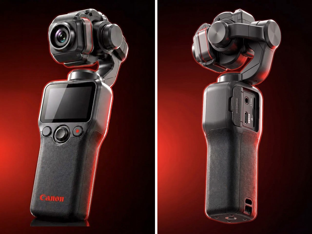
1. Canon Gimbal Camera
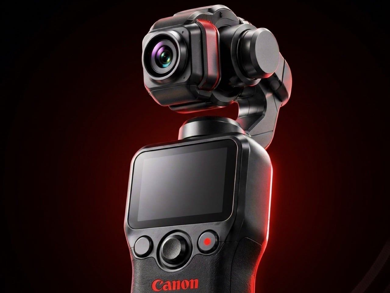
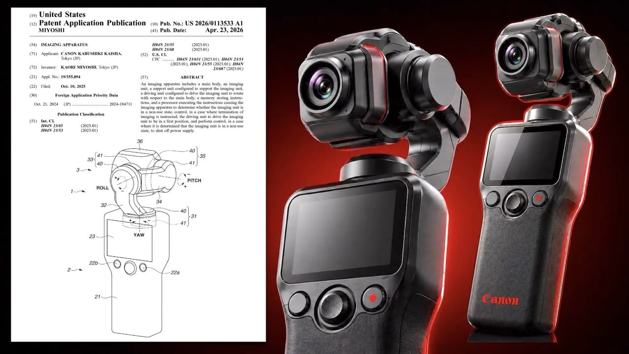
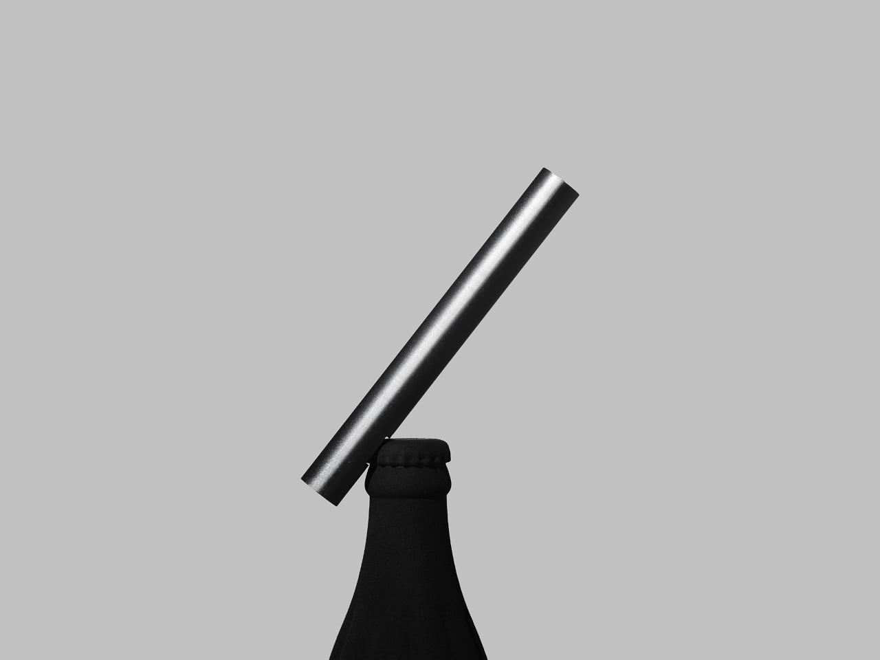
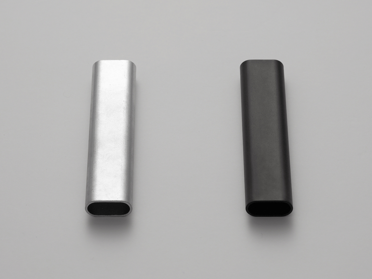
Canon has spent five years building toward this moment through a deliberate sequence of three patents, each one more product-ready than the last. The April 2026 filing describes a compact handheld body with a fixed lens, three-axis stabilization, a grip-mounted screen, and a folding mechanism that guides the gimbal head into a safe resting position before cutting motor power. That shutdown sequence is smarter than it sounds. Mechanical wear from limp-motor shutdowns is the quiet reason cameras in this category age faster than they should.
What the patent arc reveals is a company that spent its early filings dreaming wide and its later ones getting practical. The 2021 version imagined an interchangeable-lens cinema device. The 2025 follow-up solved for uninterrupted shooting. This filing drops the interchangeable lens entirely and focuses on fixed-lens portability with intelligent motor behavior baked into the design. Summer light is the most demanding light there is, and Canon’s color science has always handled it with more warmth and more restraint than anything else competing in this category.
What We Like
- The smart folding shutdown mechanism addresses a real mechanical failure point that the rest of the pocket gimbal category has consistently overlooked
- Canon’s five-year patent arc signals a product shaped by sustained R&D rather than a reactive response to market pressure
What We Dislike
- This remains a patent with no confirmed release date or pricing, making it the most compelling item on this list and also the only one you cannot buy
- Canon’s track record in premium compact categories suggests a launch price that will give most buyers reason to pause before committing
5. Wuben G5
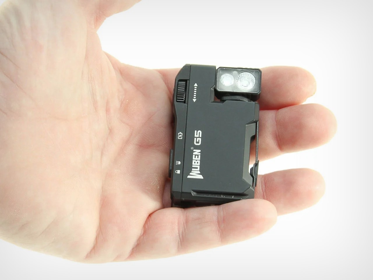
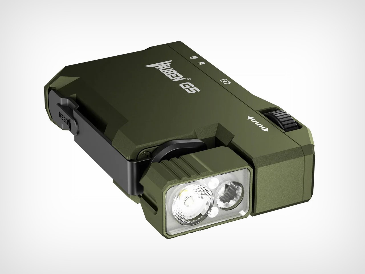
Most flashlights solve for brightness or runtime. The Wuben G5 solves for carry, and that turns out to be the harder design problem. The body is flat and squarish, sized closer to a lighter than any conventional torch, and weighs 52 grams. A 180-degree rotating head lets you angle light wherever it needs to go without repositioning your hand. The spring-tensioned clip grips fabric, straps, and pocket edges with reliable force. A magnetic base sticks it to any metal surface hands-free.
At $25, the G5 delivers 400 lumens, an 82-metre beam, RGB color modes, IP68 waterproofing rated to 2 metres, and an emergency beacon that flashes blue and red. USB-C charging hides neatly behind the tactile rotary switch, a deliberate design choice that keeps the profile clean. Summer makes every feature feel obvious: evening trails, beach bags, festival fields after dark, and camping trips where a headlamp feels like too much and a phone torch never quite feels like enough. It carries like nothing and performs like something far more expensive.
What We Like
- The 180-degree rotating head and spring-tensioned clip solve the hands-free lighting problem with mechanical elegance rather than extra accessories
- IP68 waterproofing, magnetic attachment, and USB-C charging at $25 is a combination that flashlights three times the price often fail to match
What We Dislike
- Battery runtime at full 400-lumen output runs around 50 to 60 minutes, which requires some planning on longer outings or extended sessions
- The blue-and-red emergency beacon is designed for genuine distress situations, and using it casually creates a real risk of being misread by people nearby
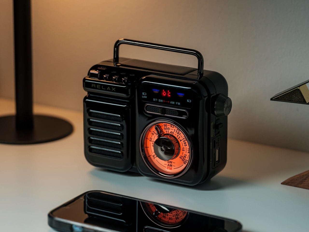
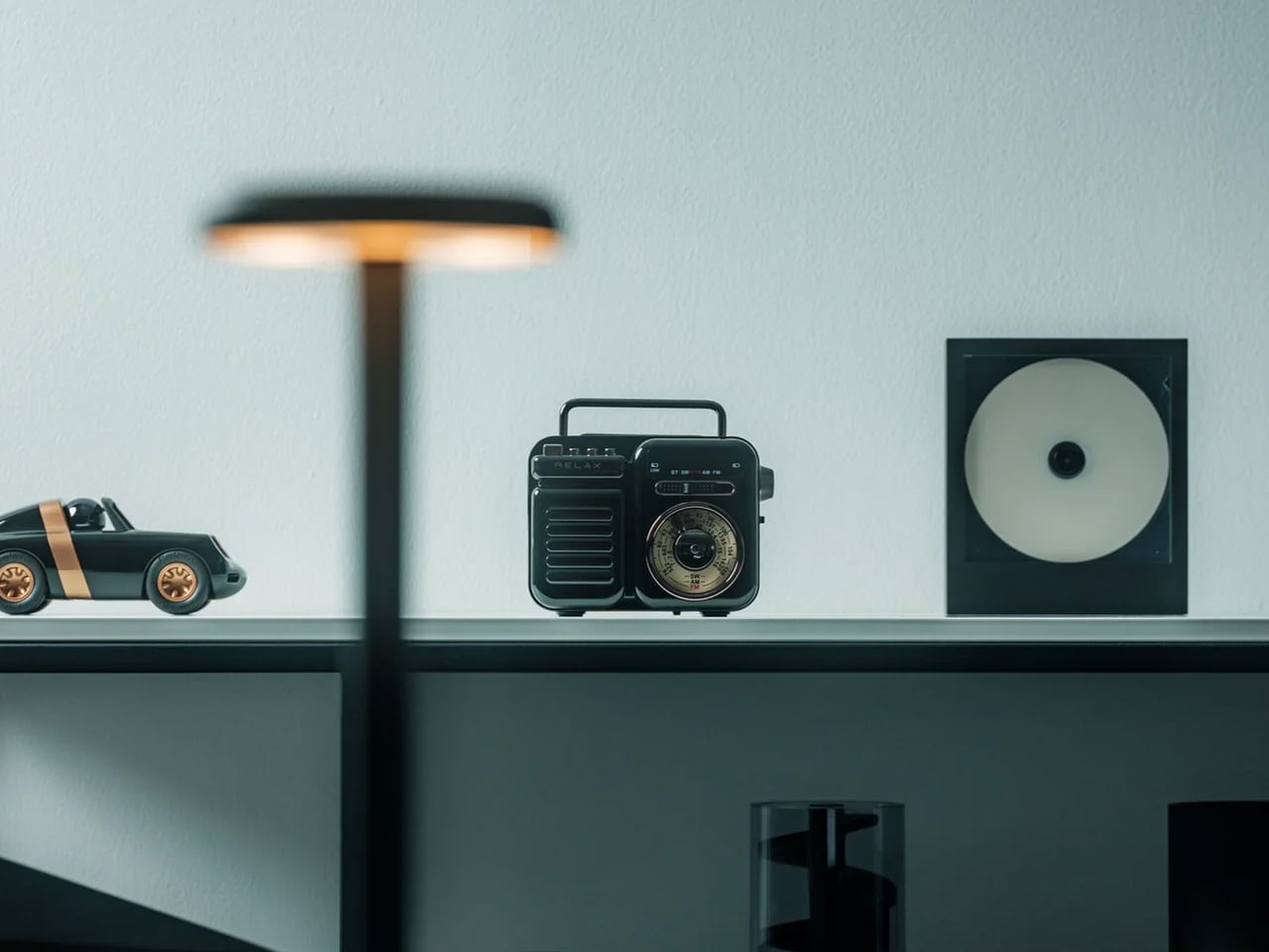
3. Side-A Cassette Speaker


There is a specific pleasure in a speaker who has a point of view. The Side-A wears its design intention openly, taking the cassette tape as its structural reference and arriving at something that sits between functional object and collected artifact. Bluetooth audio in a body that references one of the most culturally significant formats in sound history: it is a design brief that could have landed in a dozen wrong places, and it does not. The form has restraint, which is what separates a considered design reference from a costume.
What makes it a summer essential is its willingness to be present without announcing itself. It belongs on a table outside as naturally as it belongs on a shelf. The cassette format has always carried a sense of intentionality around music, the feeling that someone made a deliberate selection and committed to it. The Side-A carries that quality into Bluetooth territory without apology. Summer listening deserves something with genuine character, and this brings character alongside the sound without asking you to compromise on either.
What We Like
- The cassette tape aesthetic is specific enough to be genuinely distinctive without crossing into novelty design territory
- The form reads as a collected object rather than consumer electronics, which is a rare quality at any price point
What We Dislike
- The retro design language is strong enough that it may feel tonally out of place for buyers who want their audio hardware to read as visually neutral
- Buyers who prioritize raw audio specifications over design intention will find more technically competitive options at a similar price
4. All-Day Adventure Flask
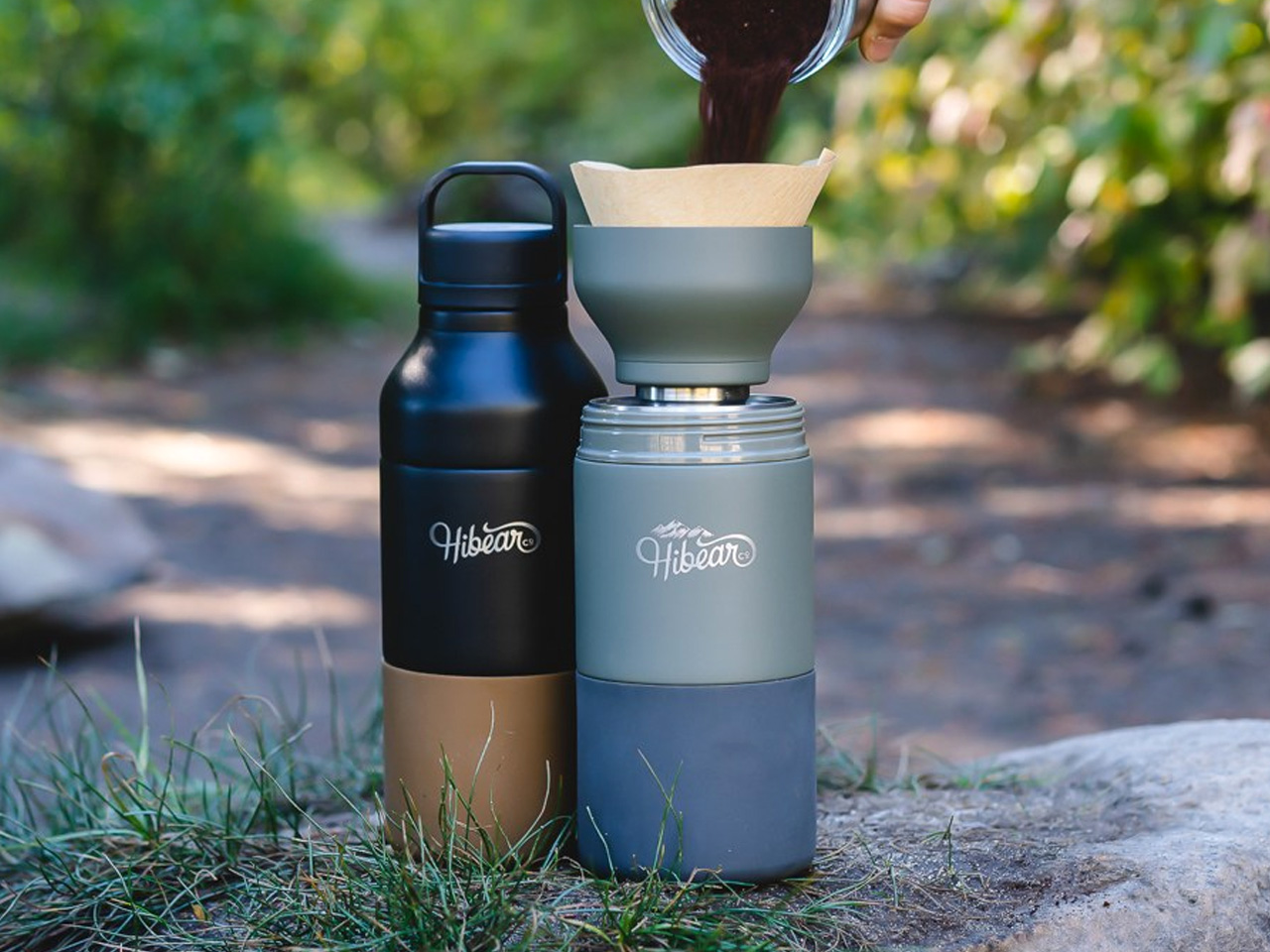
The All-Day Adventure Flask is built around a single useful idea: one vessel, every drink the day asks for. The 32-ounce insulated stainless steel body keeps drinks hot or cold for hours, which is the baseline. What lifts it past every other flask on the market is the split-body design. Unscrew the top, invert it, line it with a filter, and you have a wide-mouth pour-over coffee kit. The same configuration decants wine, aerating it without the taste compromise that stainless interiors typically introduce, because the inside is finished in non-breakable glass that stays flavor-neutral regardless of what you put in it.
The modular system extends that range even further. A mesh container brews tea, infuses water, or cold-brews coffee, depending on how long you leave it. A slatted lid converts the whole flask into a cocktail shaker. A thermal core chills drinks without diluting them with ice. A silicone tumbler is built into the base and pops out as a cup, doubling as a shock absorber when the flask gets dropped. It won a Red Dot Design Award in 2020, comes with a 5-year warranty, is built to be carbon neutral, and Hibear commits a percentage of every sale to 1% for the Planet. The flask that carries all of summer, one mode at a time.
What We Like
- The split-body pour-over and wine decanting function solves two completely different outdoor rituals in the same design move, with zero additional kit
- The built-in silicone tumbler and non-breakable glass interior address both the drinking experience and long-term durability in one considered detail
What We Dislike
- The full modular system involves multiple components that need tracking, cleaning, and reassembling, which adds friction on days when simplicity is the priority
- The range of functions is genuinely impressive, but most users will find themselves returning to two or three of them regularly and barely touching the rest
5. AirTag Carabiner
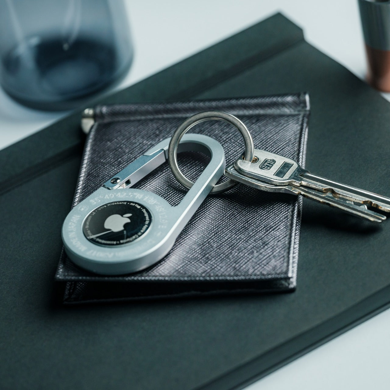
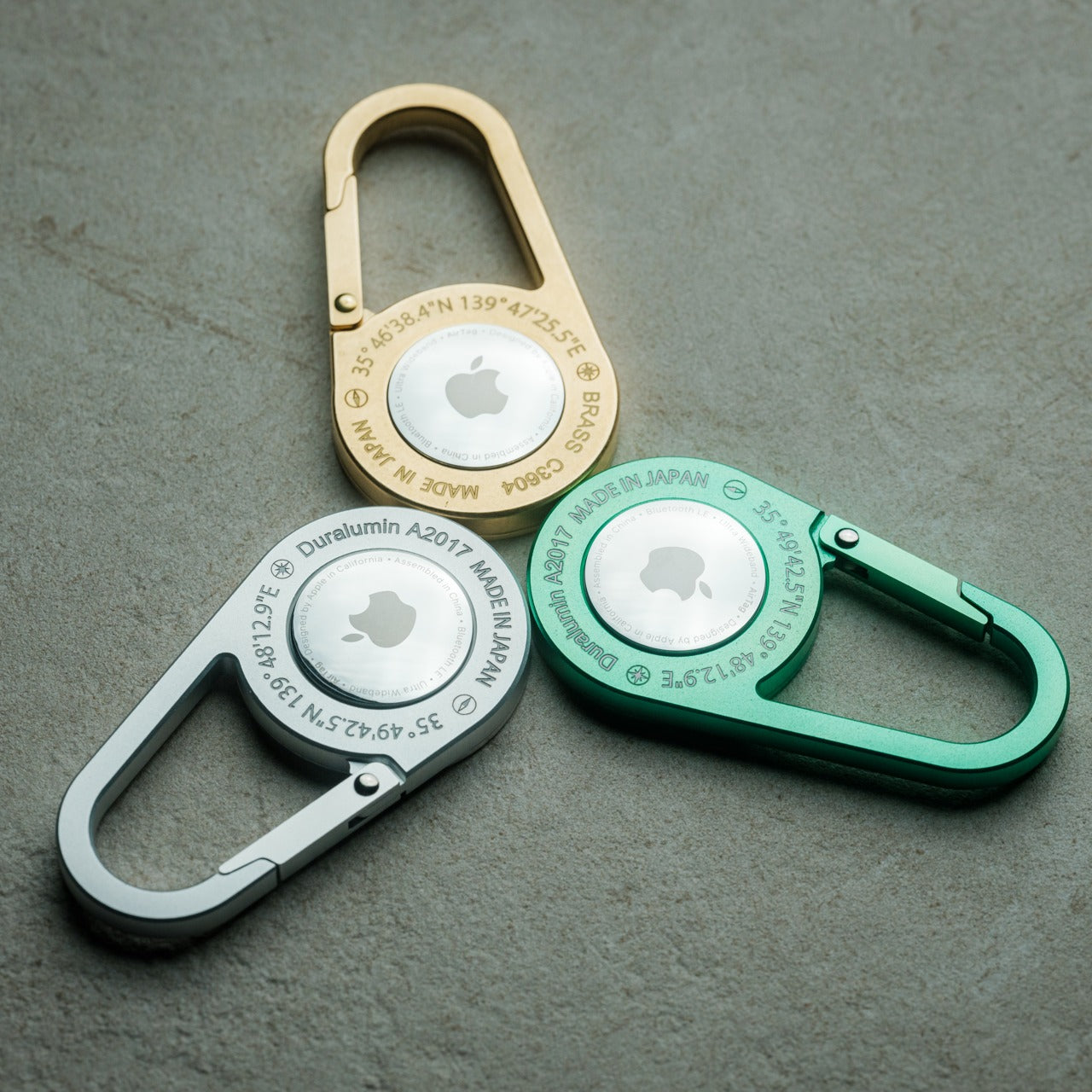
The weakest version of any tracking solution is one you forget to use. An AirTag left loose in a bag pocket, or sitting on a key ring that stays home when the bag leaves, solves nothing. The AirTag Carabiner earns its place by removing the forgetting entirely: the tracking is built into the clip mechanism, so the moment it is attached to something, the Apple Find My network is engaged. No secondary step, no separate attachment decision, no choosing whether today is the day you bother.
Summer creates more opportunities to misplace things than any other season. Bags move between people. Keys get set down at the beach and claimed by the wrong table. Gear left on a trail gets collected by the person walking faster. The AirTag Carabiner sits at the intersection of utility and peace of mind without adding weight or bulk to anything it clips onto. Bags, straps, belt loops, keyrings: it clips to all of them. Summer is unforgiving to the disorganized, and this is the most considered possible answer to that specific problem.
Click Here to Buy Now: $149.00
What We Like
- Integrating the AirTag directly into the carabiner mechanism removes the secondary step that makes most tracking setups feel optional or easy to skip
- Find My network coverage means location data is available across virtually any populated environment without additional hardware or ongoing costs
What We Dislike
- Full functionality is locked to the Apple ecosystem, which limits the product’s value significantly for anyone outside of it
- Find My operates through a network of nearby devices rather than live GPS, which means there is always a lag between an item moving and its location updating
The Right Five Things Make Summer Easier
The five products on this list share one quality that never makes it onto a spec sheet: they do not complain about summer. They are waterproof, pocket-sized, or designed to adapt, and none require a protective case or a separate pouch to survive a day that gets more complicated than planned. That quiet durability is exactly what the season demands, and it is what separates a genuinely considered kit from a collection of things you meant to bring.
Pick the two or three that close the gaps in what you already carry. The Canon will arrive when Canon is ready, and based on five years of increasingly precise engineering, it will be worth the wait. Everything else on this list is available now, none of it requires much justification, and all of it is designed to stay out of your way while doing its job. Summer does not want to be curated. It wants to be lived. The right five things make that easier.
The post 5 Compact Pocket Essentials Built for a Summer That Never Slows Down first appeared on Yanko Design.