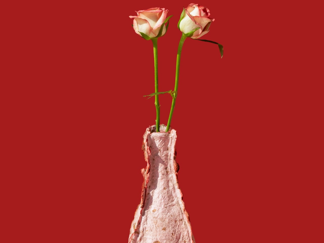
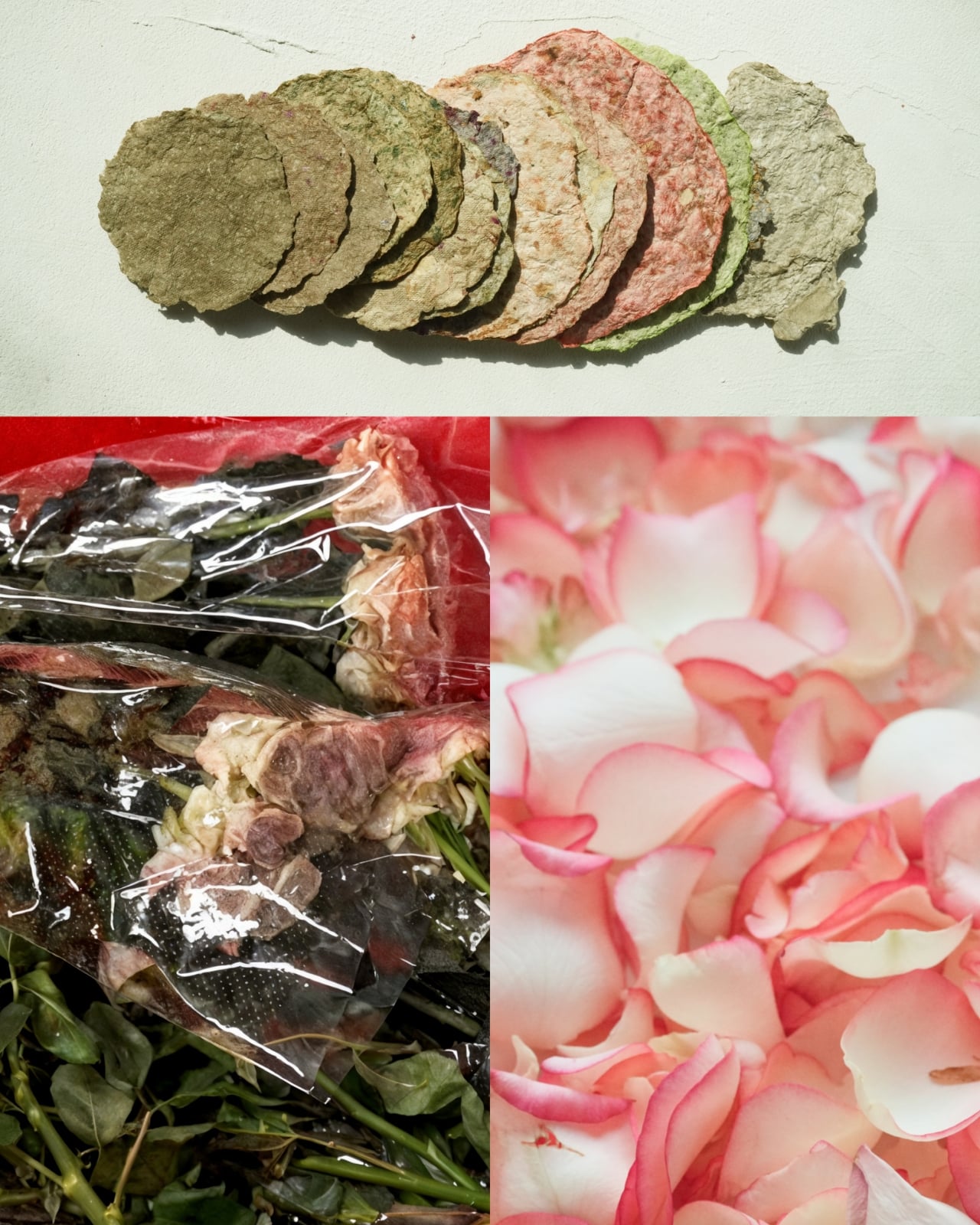
Most vases hold flowers. This one is made of them, specifically the ones that never got the chance to be admired. Rebloom Studio, a Korean design studio, has been quietly working on a problem that most people don’t think twice about: the staggering volume of flowers incinerated or discarded at flower markets every day. Because of their short shelf life, thousands of tons of cut flowers are thrown out before they ever reach a buyer, contributing to environmental pollution in a way that feels almost cruelly ironic. The flowers get grown, transported, arranged in stalls, and then burned or dumped because no one got there in time. Flowers, of all things, become waste.
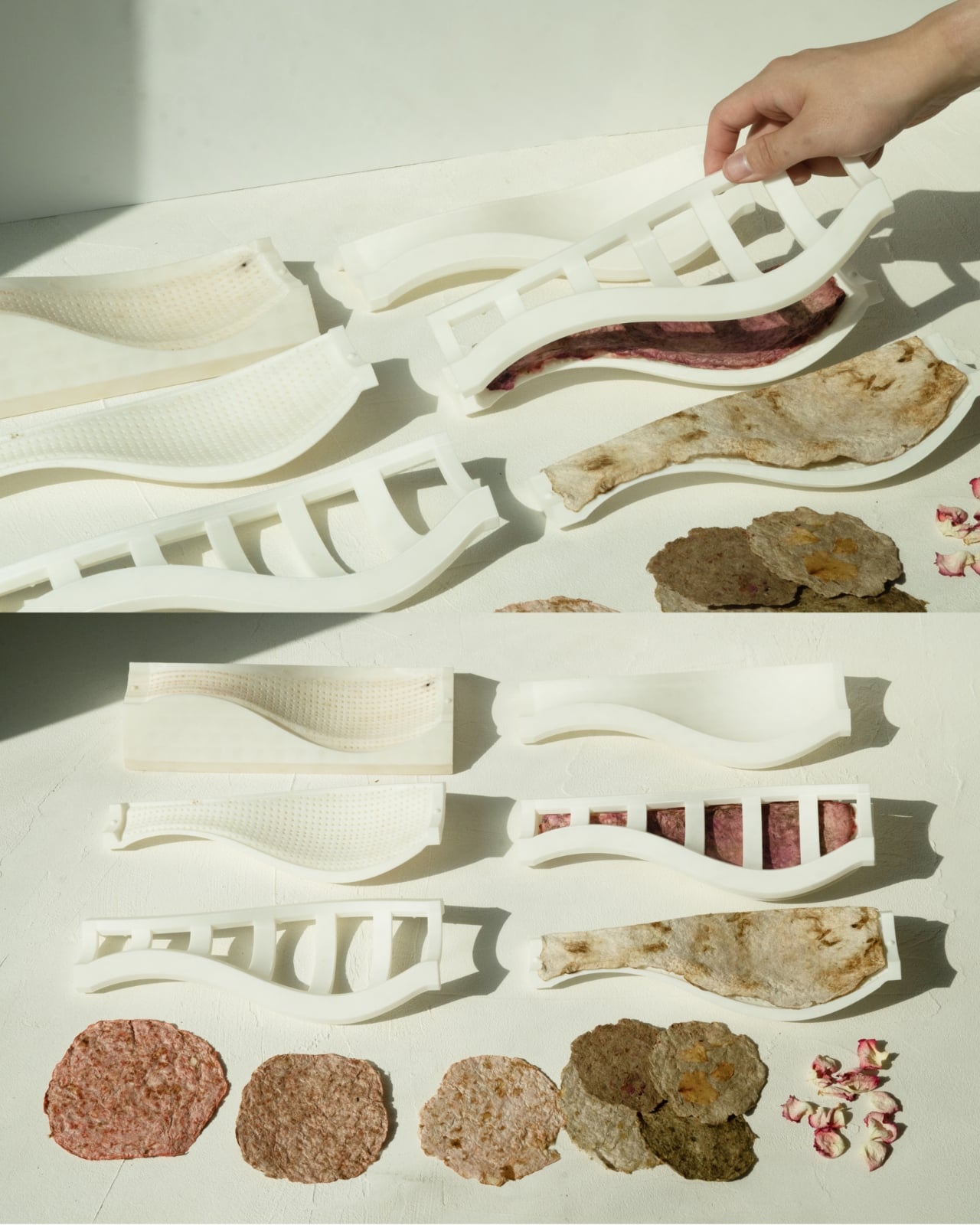
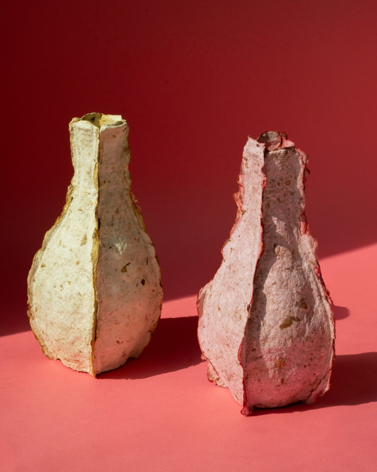
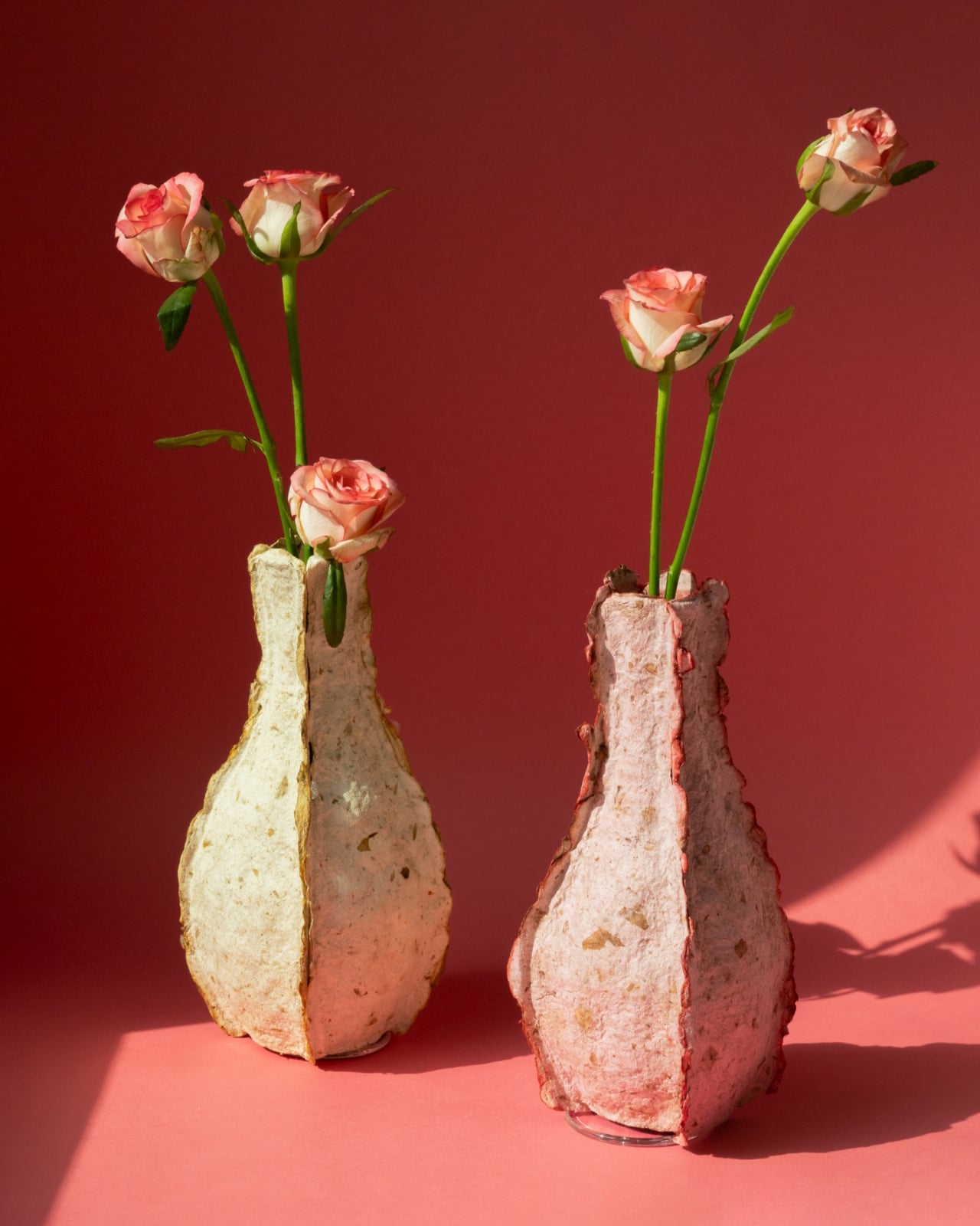
The Petal Vase is Rebloom Studio’s answer to that. Discarded flowers are collected, processed into pulp, combined with Korean paper pulp and a natural binder, and then molded into a vase form. The result is a sculptural object that carries its origins in every surface. Irregular edges, pocked textures, and soft blush and cream tones make it look less manufactured and more like something you’d find washed ashore after a long journey. Each vase is genuinely one of a kind because the flowers used to make it determine its final color and texture. No two will ever look exactly alike, which is either poetic or just good design. Probably both.
Designer: Rebloom Studio
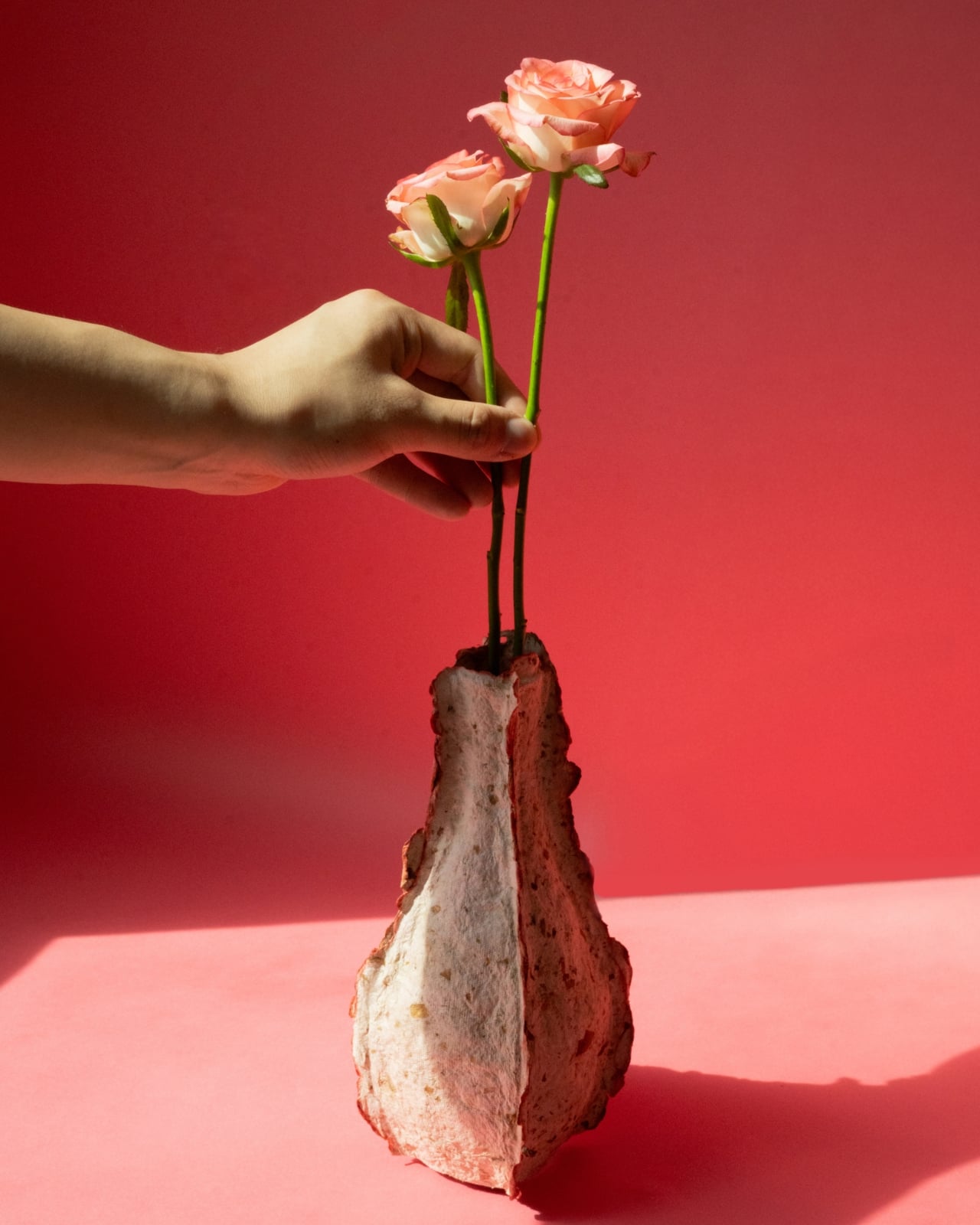
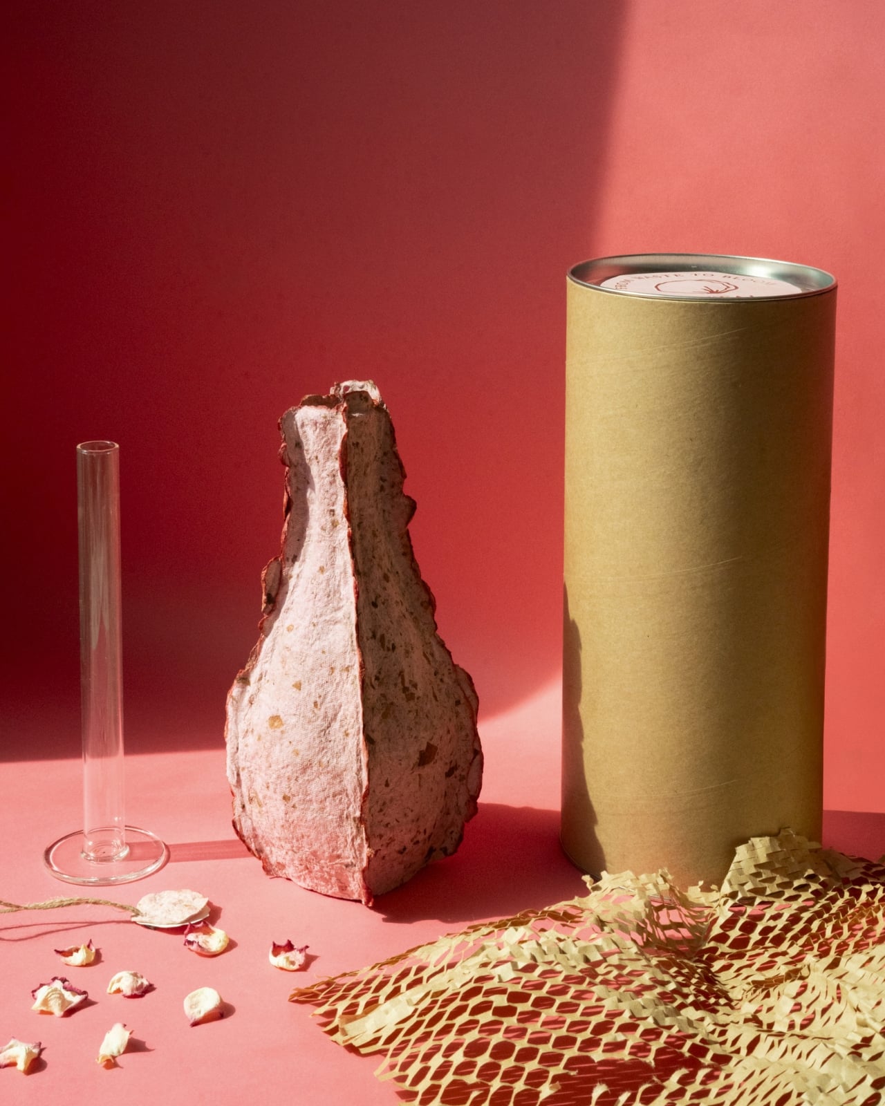
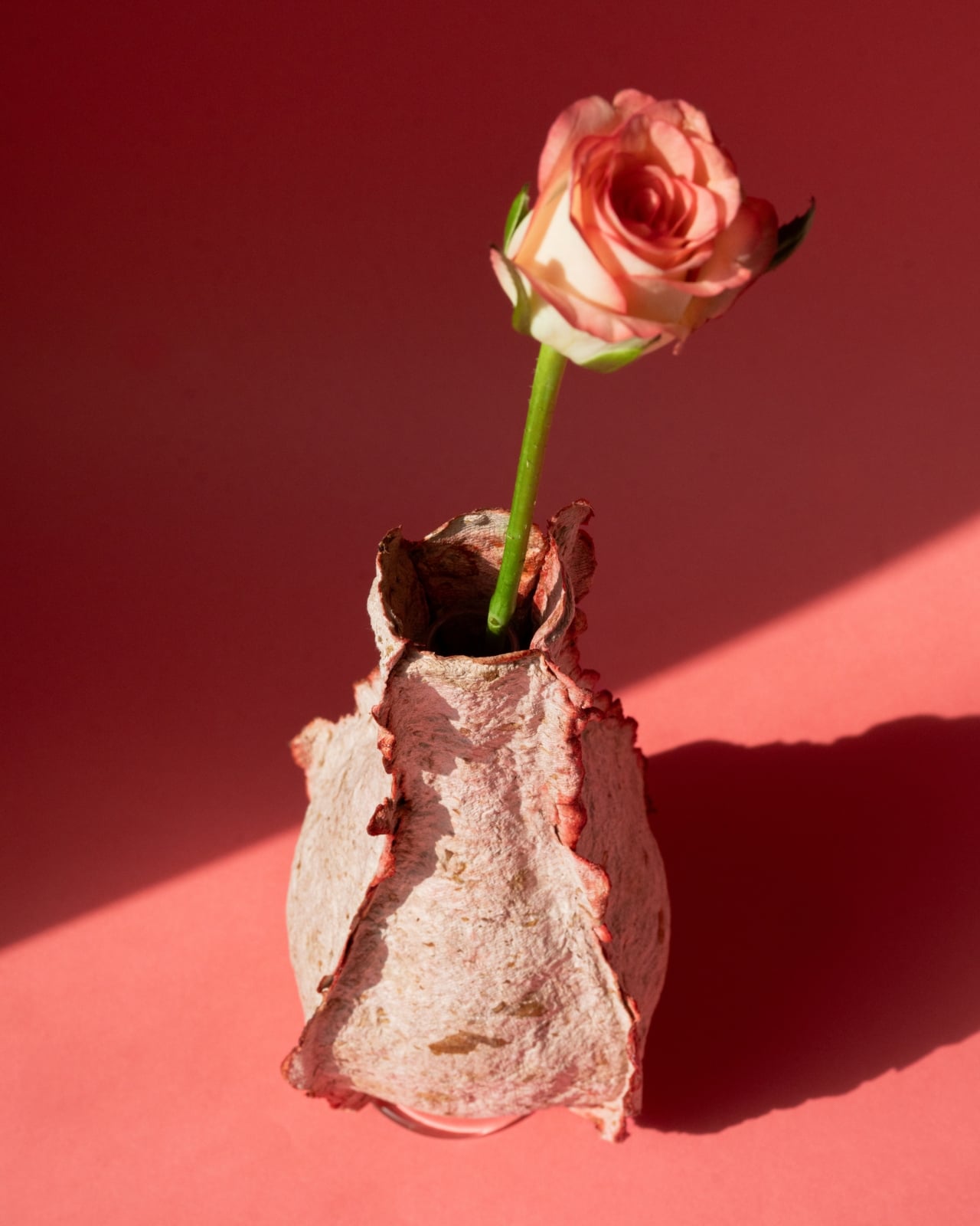
Structurally, it’s smart. The outer shell, built from the flower pulp composite, wraps around a slender glass cylinder insert that holds the water and the stems, keeping the biodegradable exterior dry and intact while fresh flowers bloom inside. When the vase has run its course, it returns to the earth. No trash pile. No incineration. No contradiction.
I’ll be honest: sustainable design can sometimes feel like a pitch dressed up as a product. The concept lands cleanly in a press release but wobbles the moment you actually have to live with the object. The Petal Vase sidesteps that trap. The material story is compelling on its own, but the vase also earns its place aesthetically, full stop. Looking at the photographs, it reads like something between a craft relic and an art object, rough where ceramics would be smooth, warm where glass would be cold. It has weight and quiet character, and it doesn’t try to look like anything other than what it is.
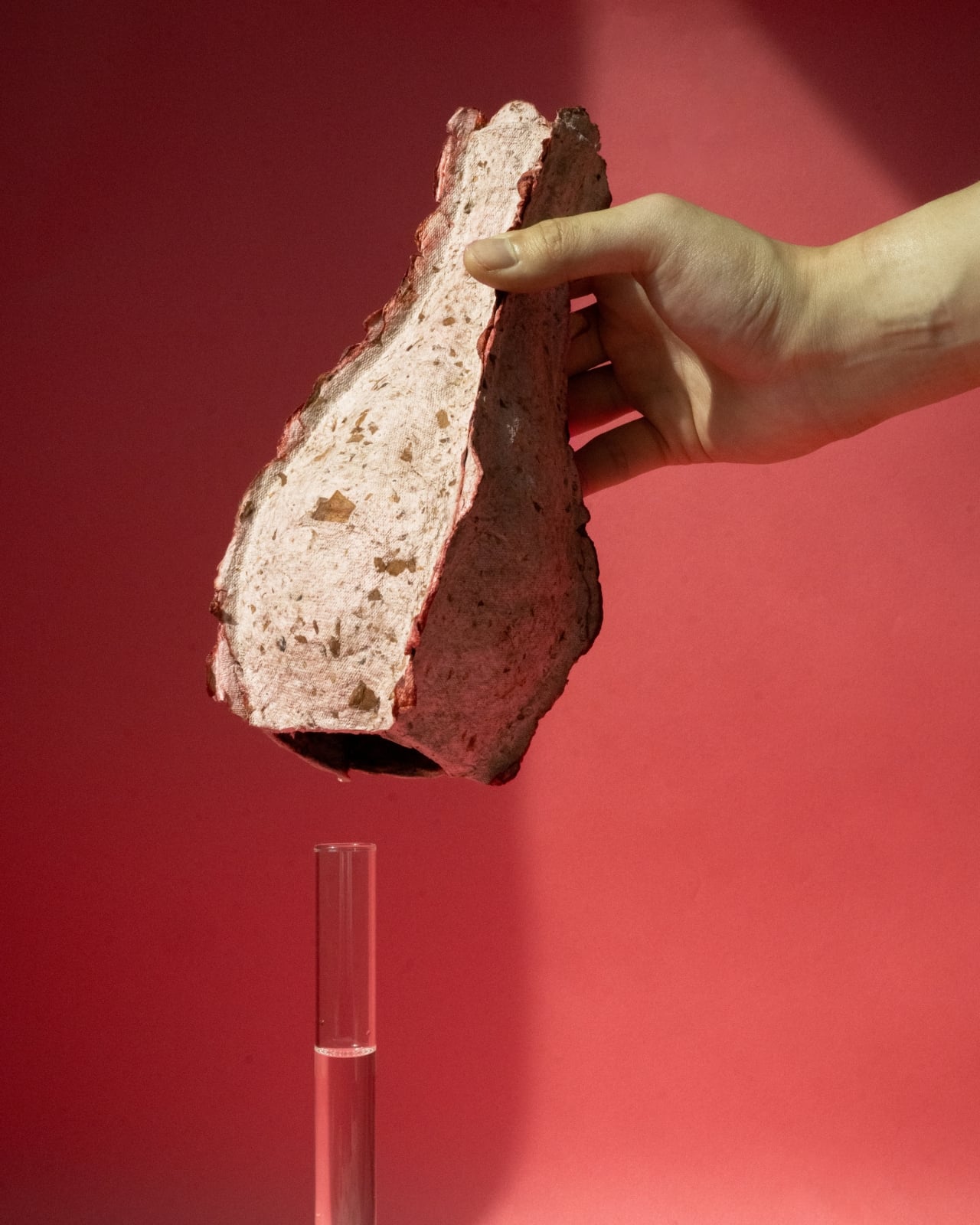
That honesty feels intentional. Rebloom Studio didn’t smooth down the imperfections or disguise the process. The jagged edges at the mouth of the vase, the visible compression of petals and pulp in the walls, the slight asymmetry in the silhouette, all of it stays visible. It’s design with nothing to hide because the entire point is transparency: this object was made from something the industry had already written off.
The floral trade’s waste problem is much larger than most people realize. Supply chains built around freshness and speed leave very little room for error, and unsold flowers don’t get a second chance. That loss isn’t only environmental. It also represents agricultural labor, water use, and energy that went into growing and transporting flowers that never met a buyer. Rebloom Studio doesn’t claim to fix any of that, but the Petal Vase does something important anyway: it makes the invisible visible and puts the problem in your hands, literally, in a way that tends to stick with you.
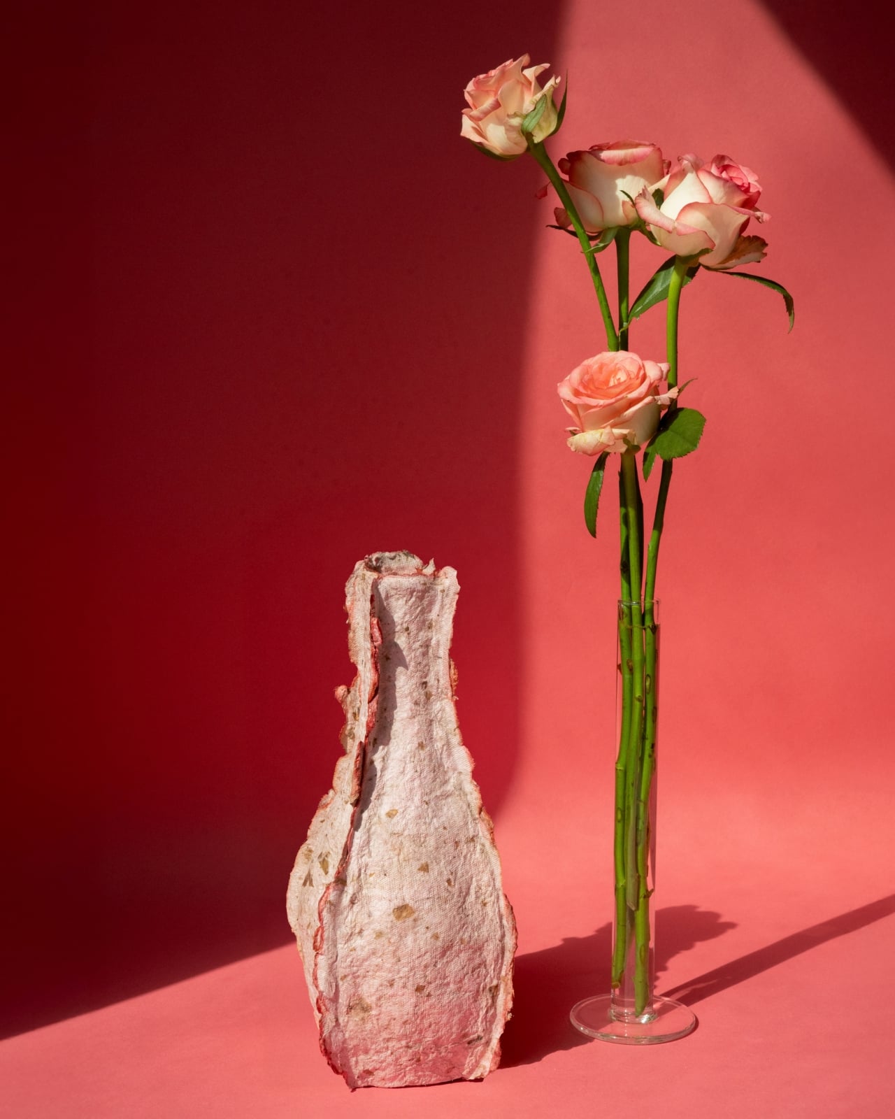
The vase measures 120 x 120 x 230mm and weighs 200 grams. It comes packaged with the glass cylinder insert in a cylindrical box. It was released in July and August of 2025. Compact. Considered. Purposeful. At a moment when the design world is full of objects that use sustainability as marketing language, the Petal Vase makes its case through the object itself. You can see where it came from. You can feel it. And eventually, it disappears back into the ground, leaving room for something new to grow. That’s not just a concept. That’s a complete design idea.
The post Rebloom Studio Just Turned Flower Market Waste Into Art” first appeared on Yanko Design.