LEGO has a way of taking things you already love and making you love them in a completely new format. Formula 1 has been getting a lot of that treatment lately, and the brand’s latest direction is hard to argue with: brick-built driver helmets, sized for your shelf and detailed enough to stop anyone mid-step.
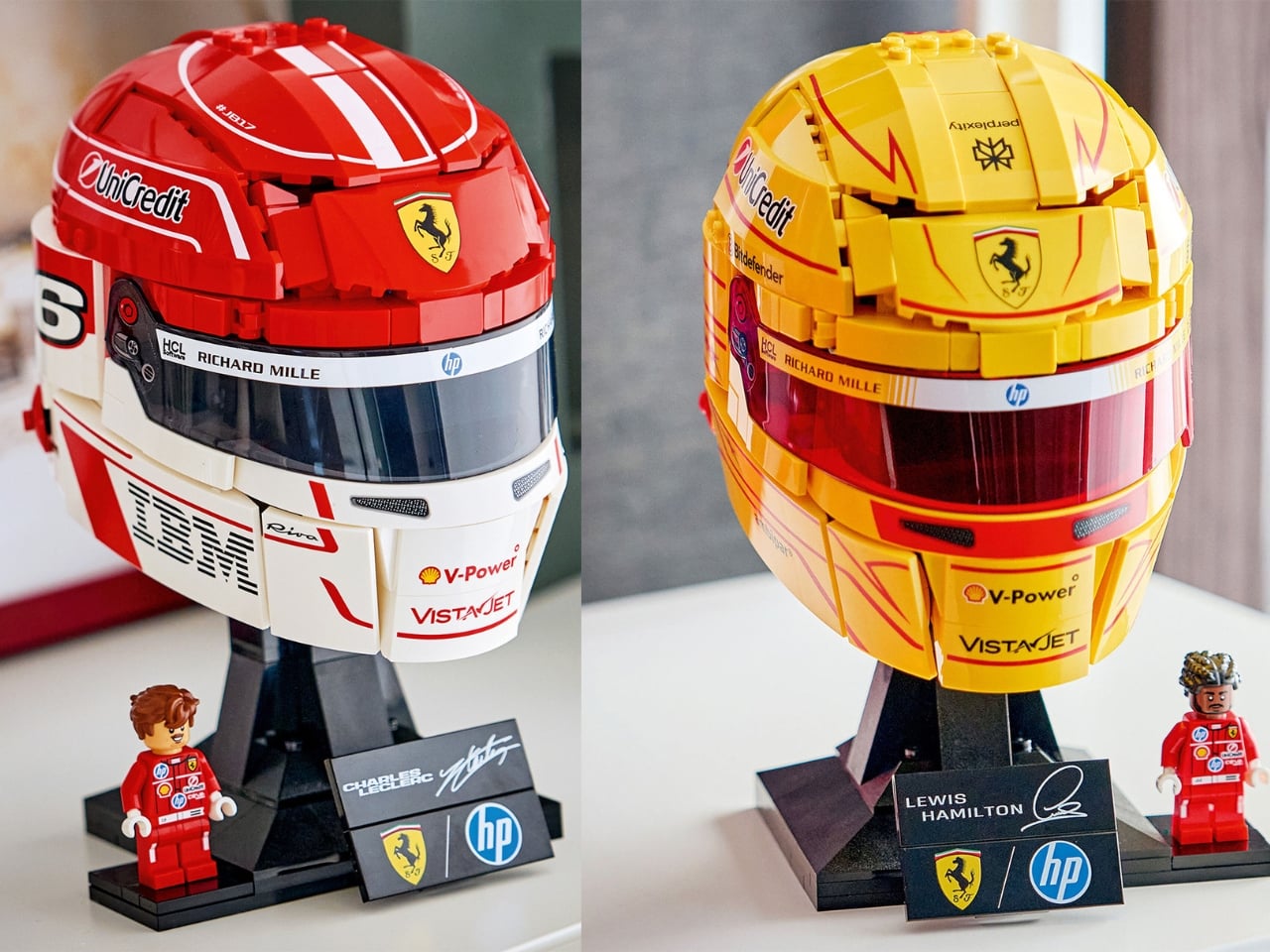
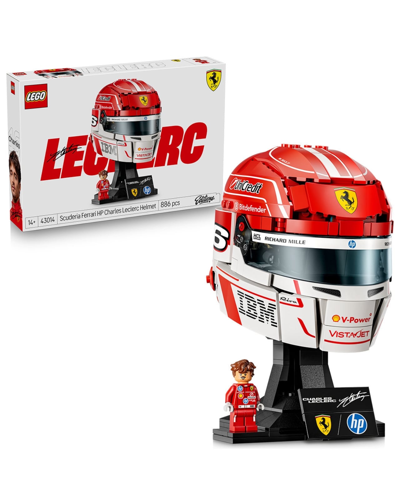
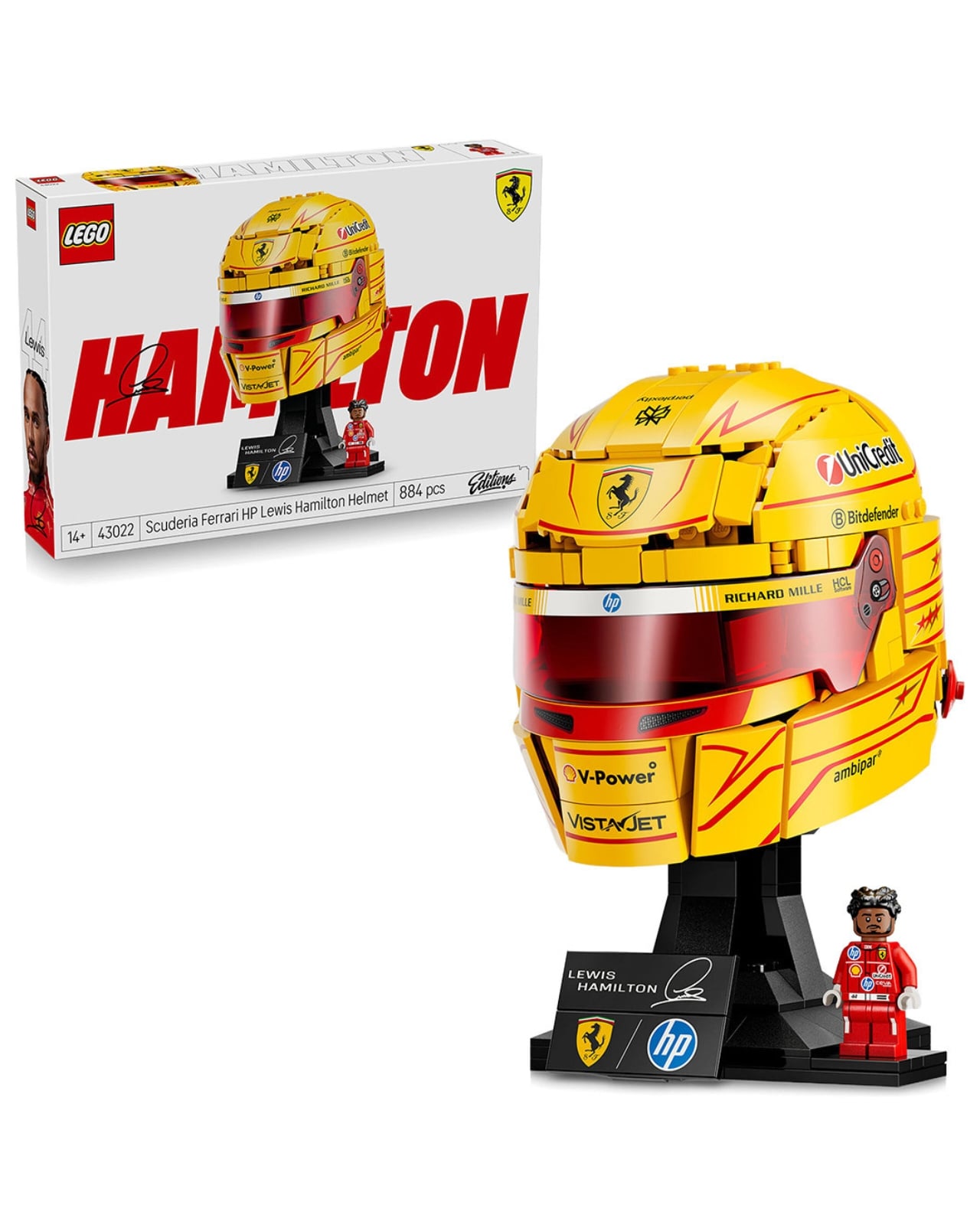
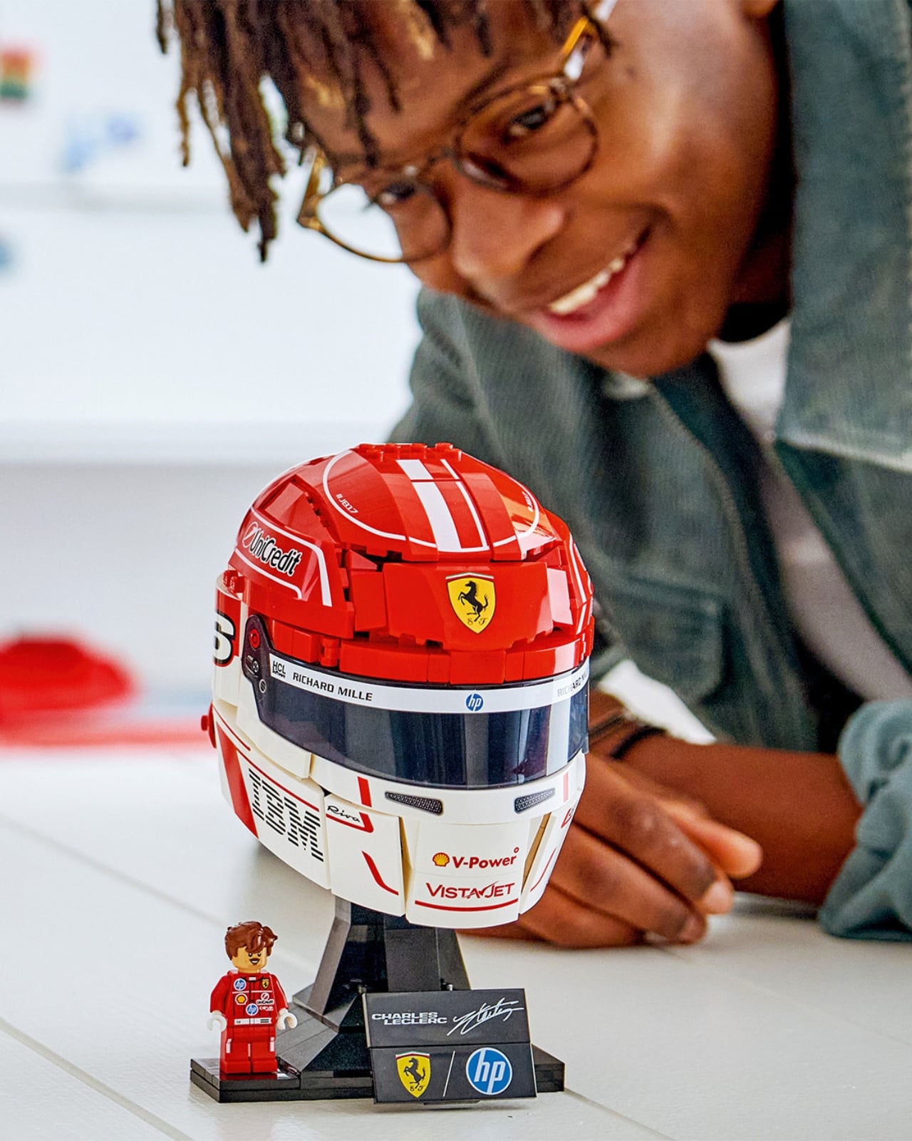
The Scuderia Ferrari HP Lewis Hamilton Helmet (43022) and the Scuderia Ferrari HP Charles Leclerc Helmet (43014) are the first two confirmed entries in what looks like a full F1 Helmet series from the LEGO Editions line. Both sets turned up on FuelForFans.com with official hi-res images after blurry leaks circulated a few weeks prior. Now that we can actually see them clearly, the level of detail here is genuinely impressive.
Designer: LEGO
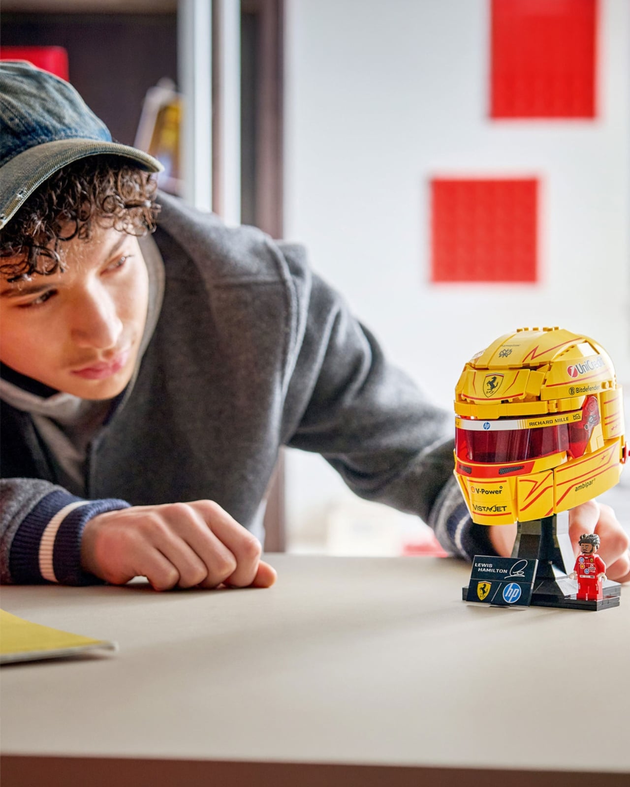
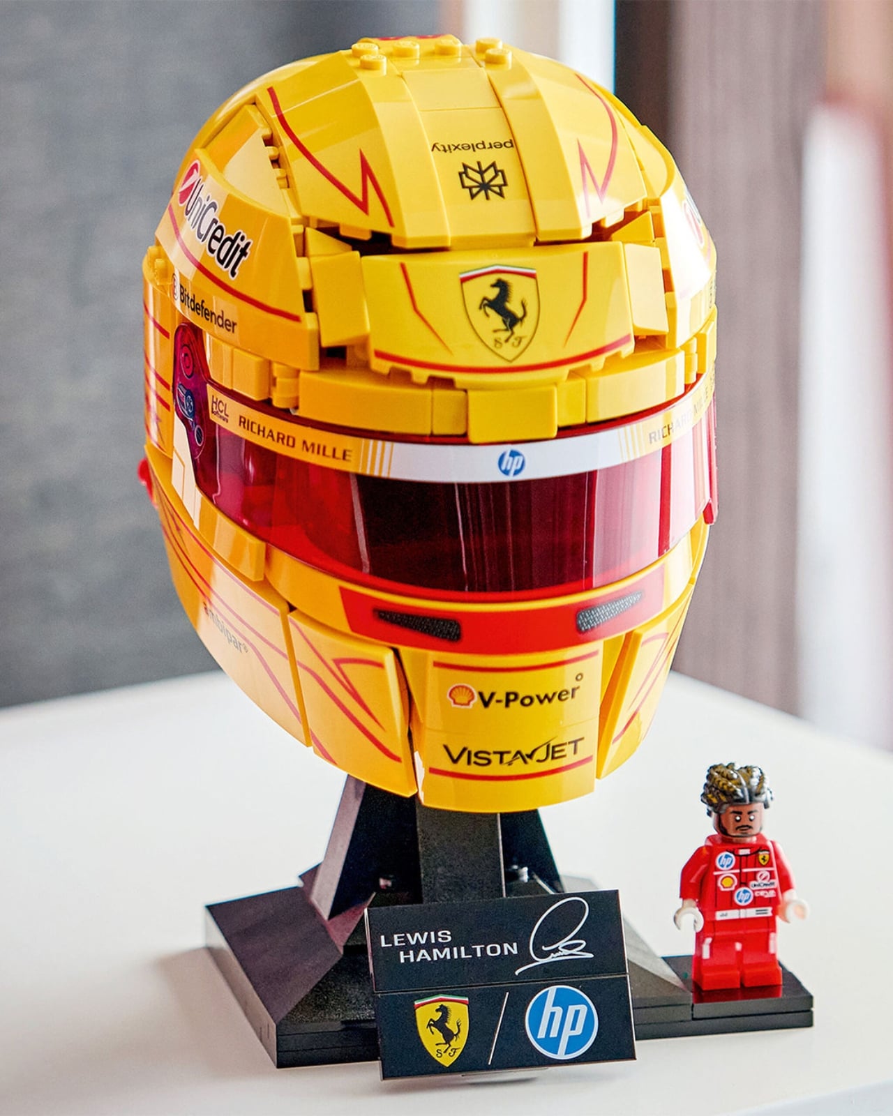
Hamilton’s helmet comes in the kind of golden yellow that makes Ferrari’s livery feel unexpectedly bold. The 2025 season graphics are recreated across the bricks with sponsor decals for UniCredit, Shell V-Power, VistaJet, Richard Mille, HP, and Bitdefender distributed with a surprising degree of accuracy. The deep red visor pulls the whole thing together. Leclerc’s goes in the opposite direction, predominantly red and white with a cleaner, more structured aesthetic. The #JB17 tribute detail sits at the crown, IBM branding runs across the chin, and the smooth white band at the visor line is almost architectural in how it divides the piece.
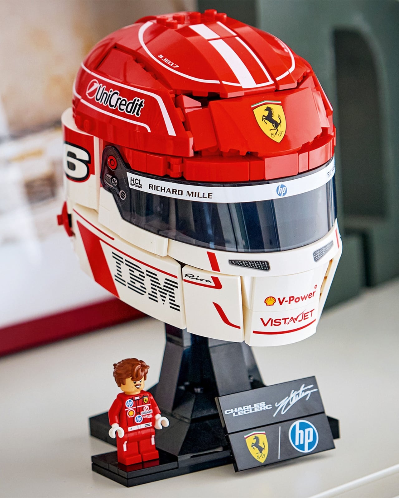
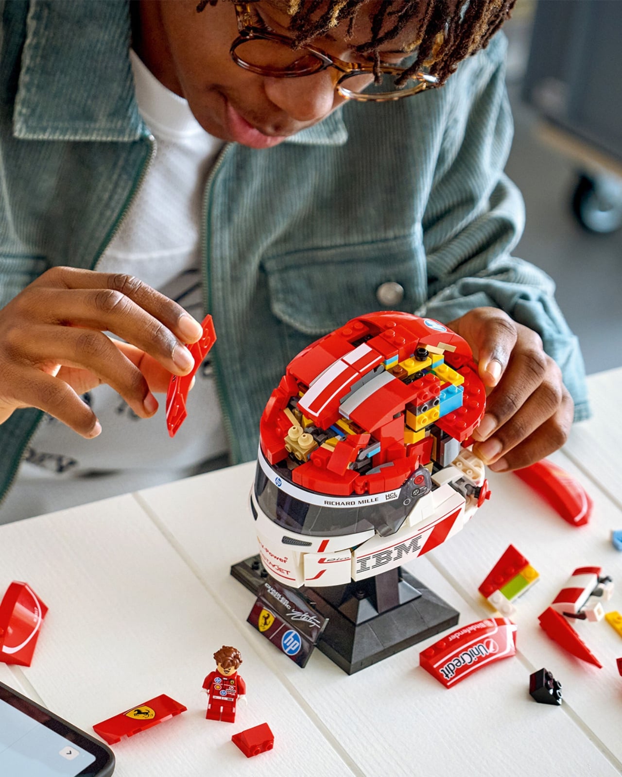
What makes both helmets compelling from a design standpoint is how LEGO’s engineers handled the curvature. Helmet shapes are notoriously difficult to replicate in bricks. Slightly irregular curves require precision in the build sequence that can look awkward if the angles don’t land right. Both sets pull it off well. The geometry holds. They read as helmets, not just helmet-adjacent objects, and that distinction matters when you’re paying for a display piece.
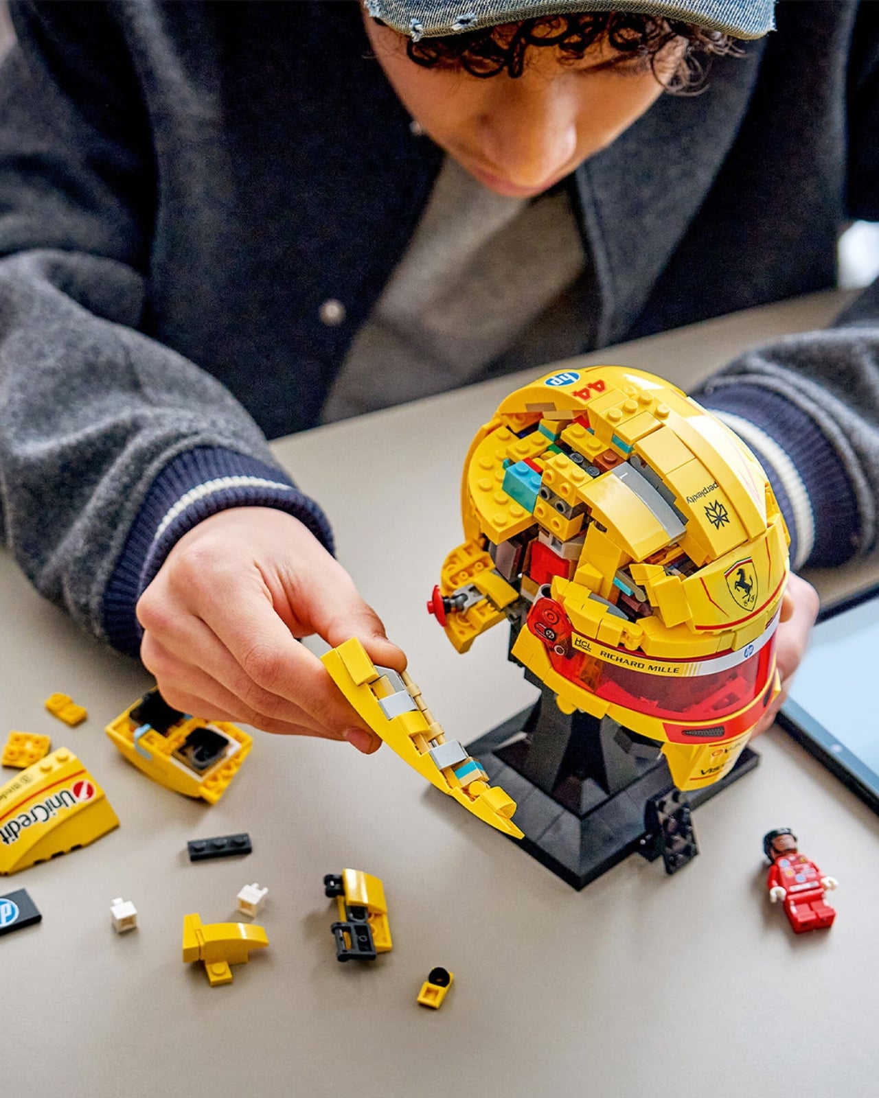
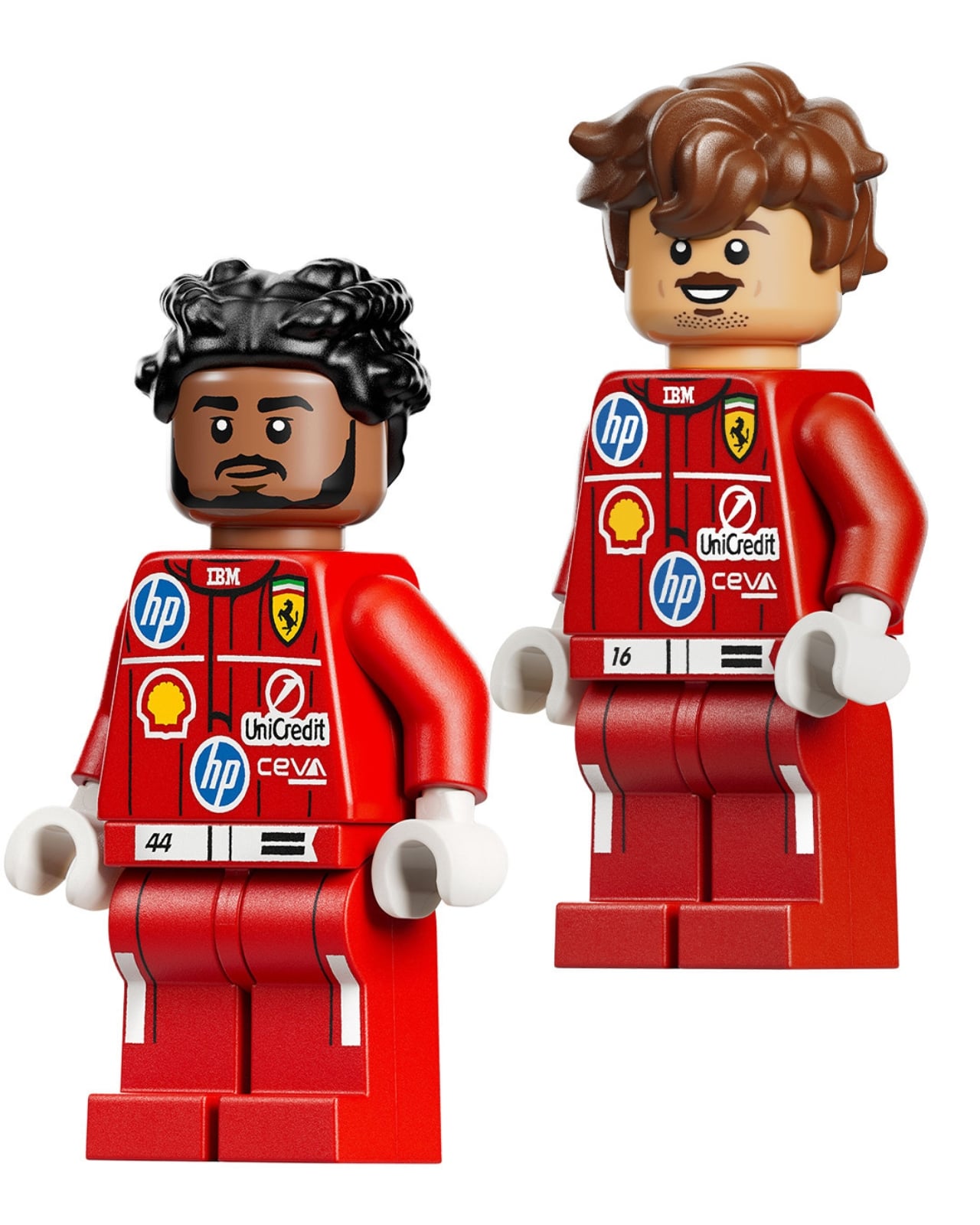
Each set clocks in at around 884 to 886 pieces and is priced at $89.99. Included with each build is a matching driver minifigure and a branded display stand carrying the driver’s name and signature. The minifigures themselves are a thoughtful detail rather than an afterthought. The Hamilton figure has the curly hair, the beard, and the red Ferrari race suit printed with his car number. Leclerc’s captures that warm, approachable expression the driver is known for. They work on their own as desk companions.
LEGO has rated both sets for ages 14 and up, which is accurate. These aren’t Speed Champions quickbuilds. They sit in the Editions category, LEGO’s answer to adult collector culture, sitting alongside the Botanical Collection and Icons line in terms of ambition and finish. Putting F1 driver helmets in that space is a smart call. The sport’s audience has expanded considerably over the past several years, and the overlap between LEGO collectors and motorsport fans is significant. This drop lands in the middle of that Venn diagram with confidence.
What I appreciate most is that this isn’t just a license slapped onto a generic product. Translating a helmet into a brick build is a specific creative challenge, and the result feels like a genuine collectible rather than a promotional item. The display stands with driver signatures and team branding look like something you’d find in a motorsport memorabilia shop. Place both helmets side by side and they read like a proper installation.
Rumors are already circulating about Max Verstappen and Ayrton Senna editions joining the lineup, which would elevate this into a series worth collecting in full. A Senna helmet in LEGO form carries obvious historical weight, and if LEGO executes it with the same attention to detail shown here, it would be a remarkable piece. The potential for this series is real.
Both helmets are expected to drop on May 1, 2026. If you’re an F1 fan, a LEGO collector, or simply someone who wants a well-designed object on a desk, the case for picking one up makes itself.
The post LEGO Just Built the F1 Helmets Ferrari Fans Have Dreamt Of first appeared on Yanko Design.


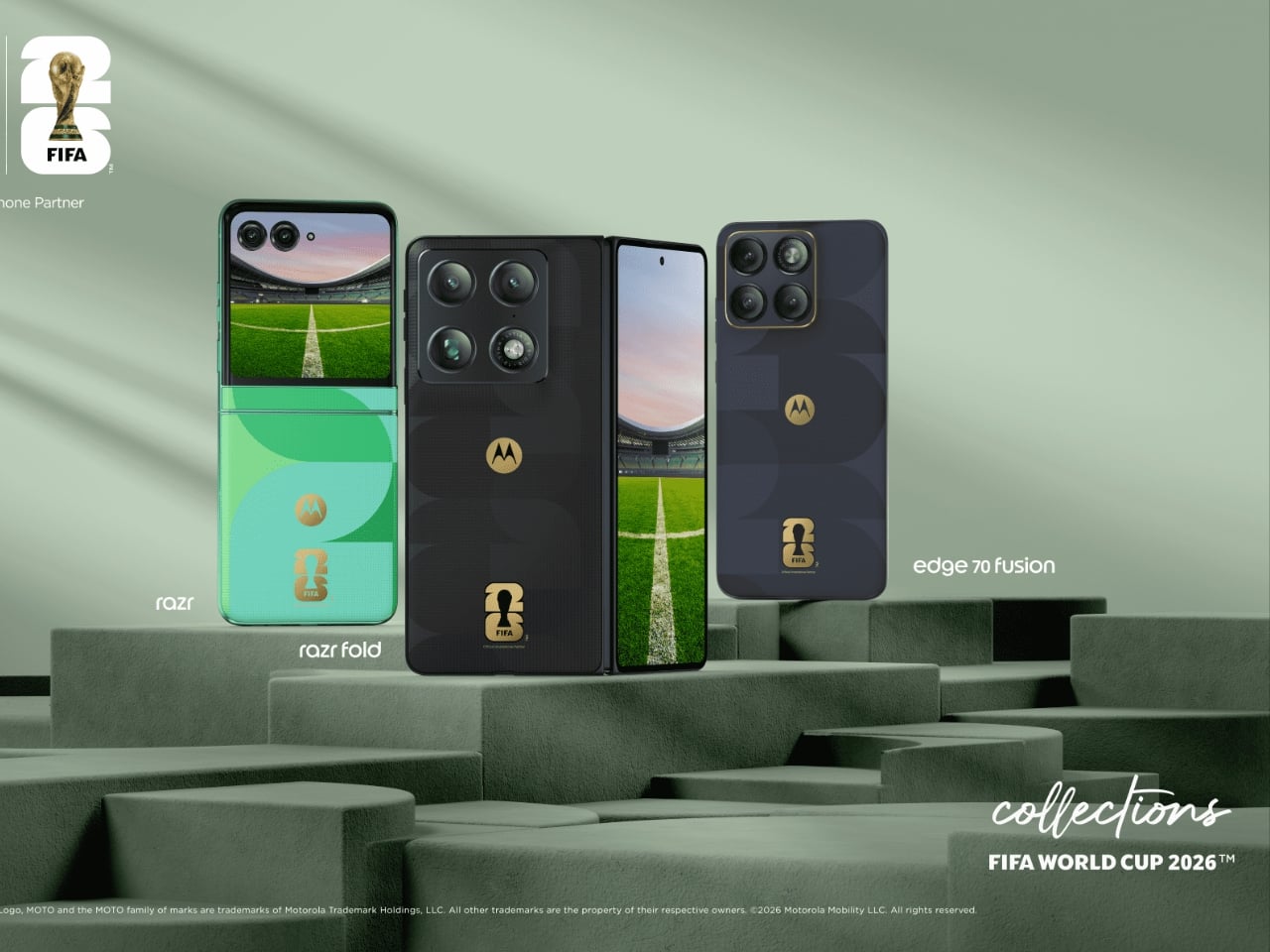
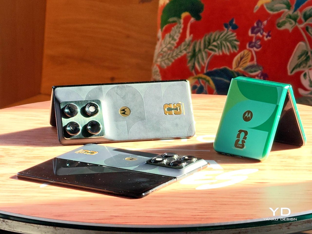
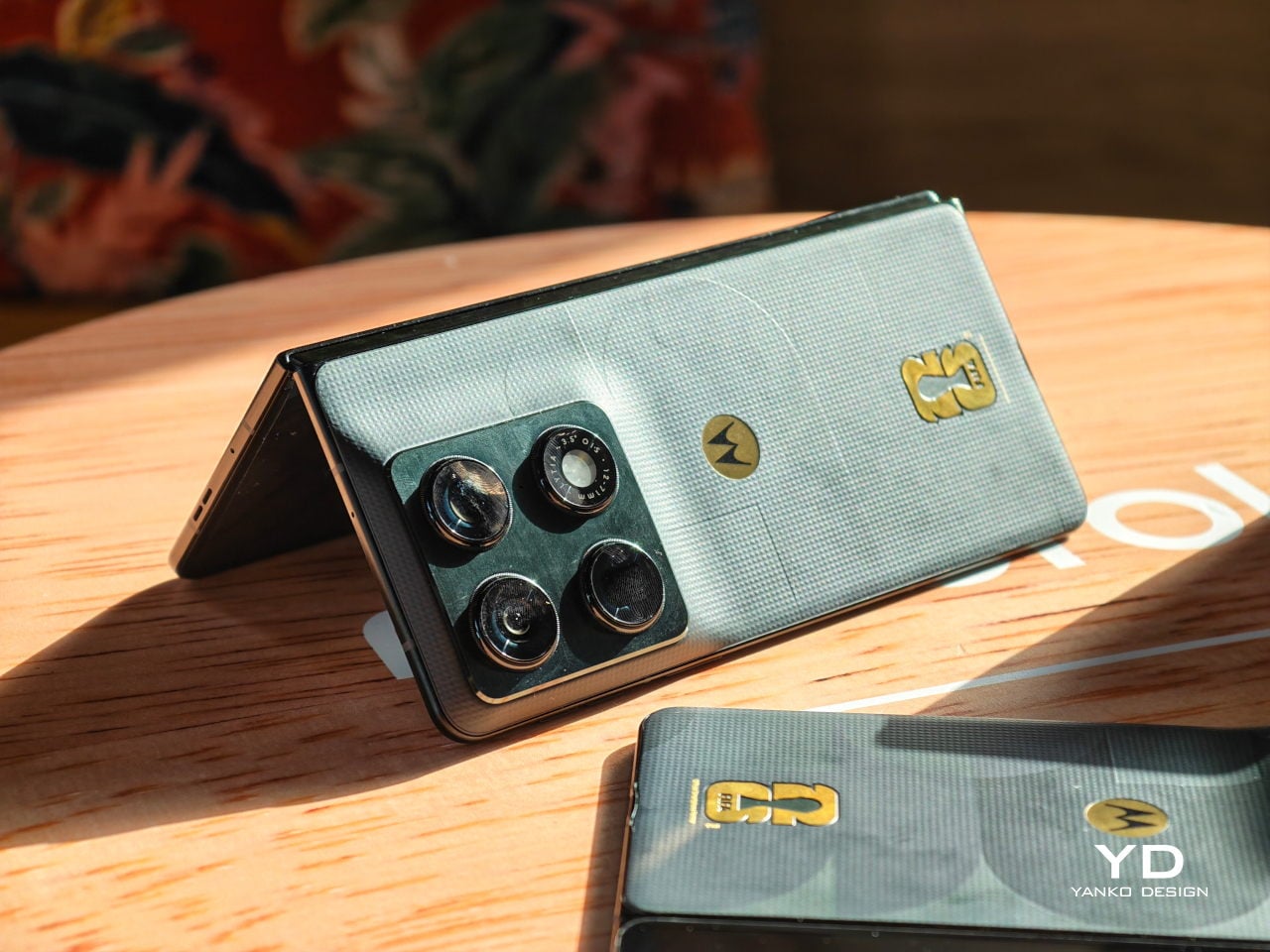
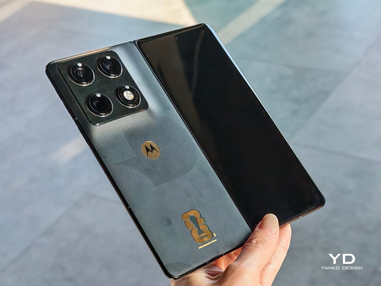
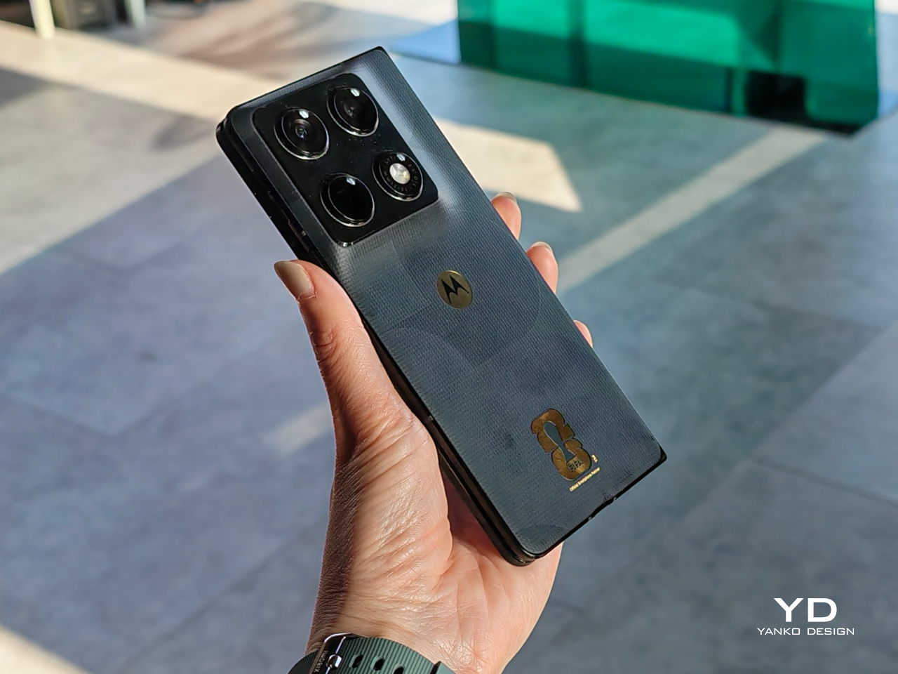
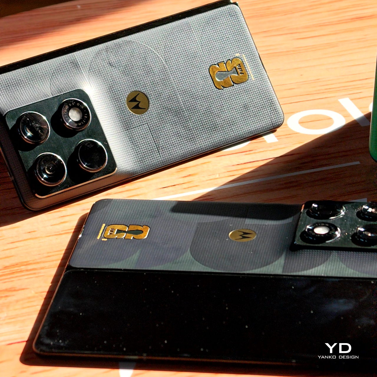
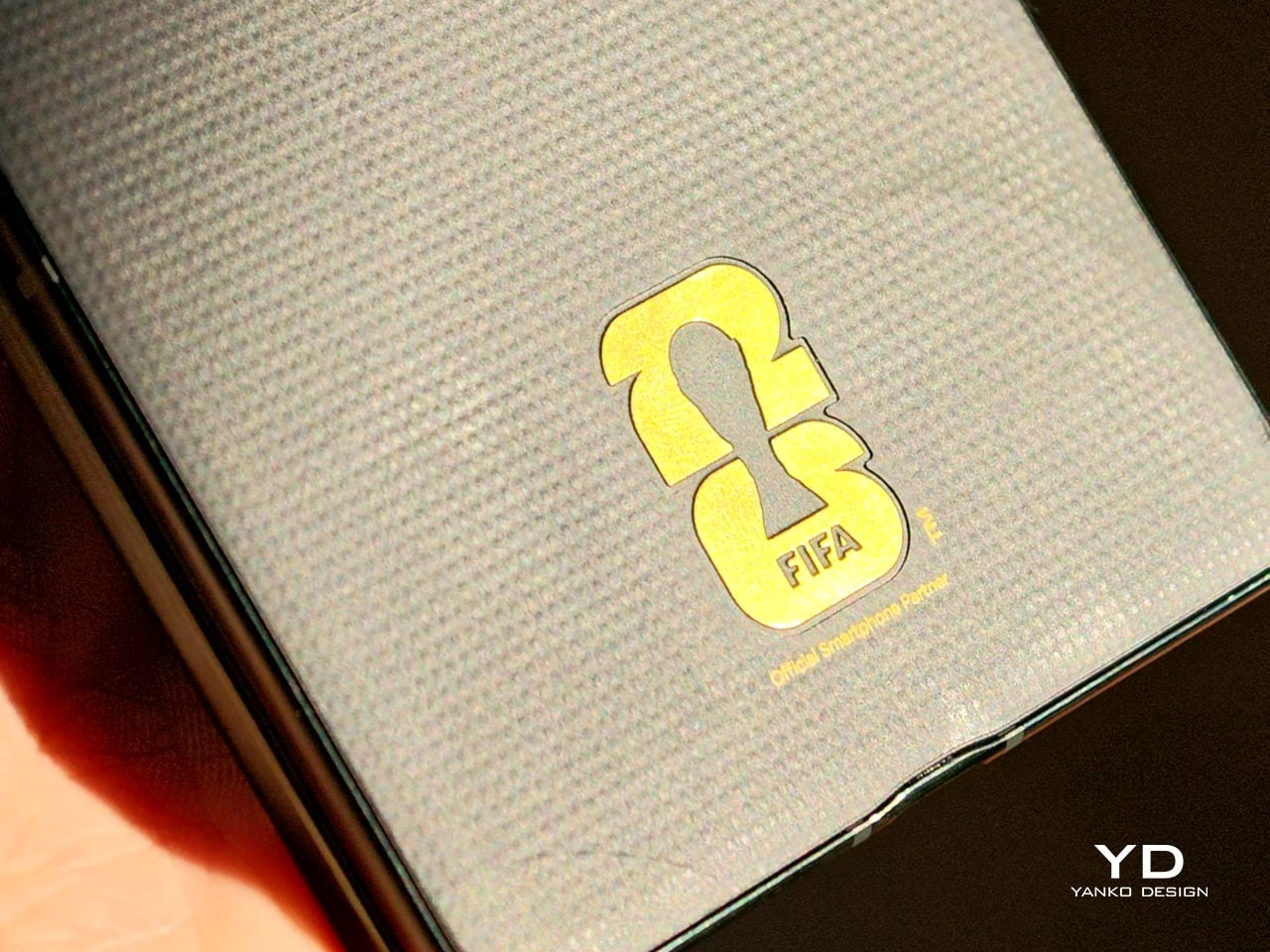
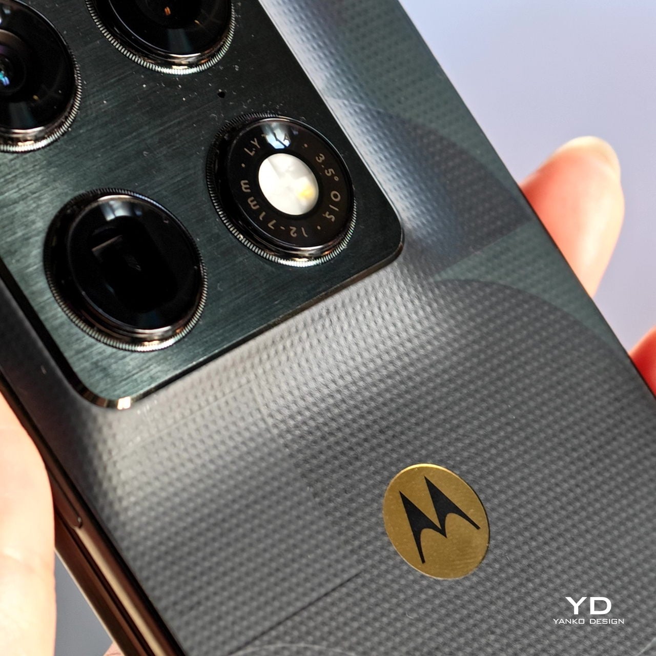
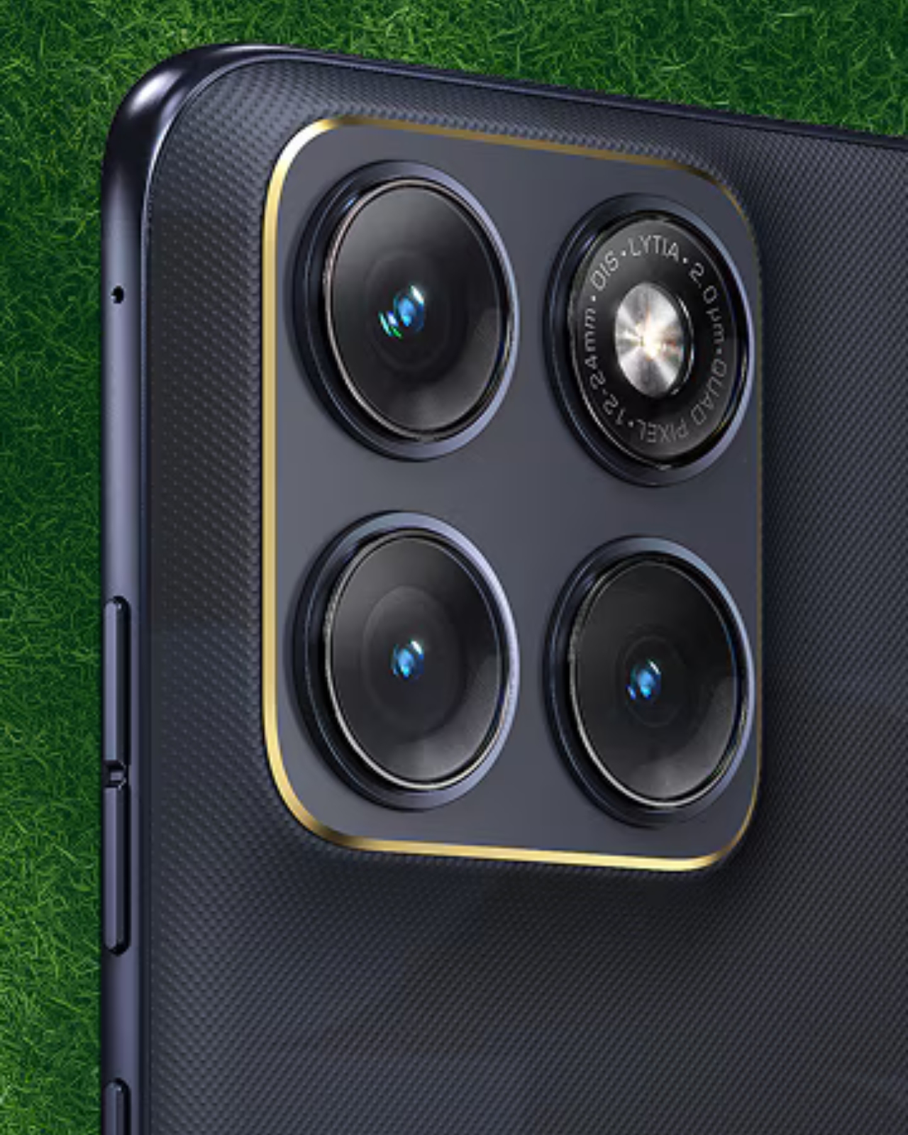
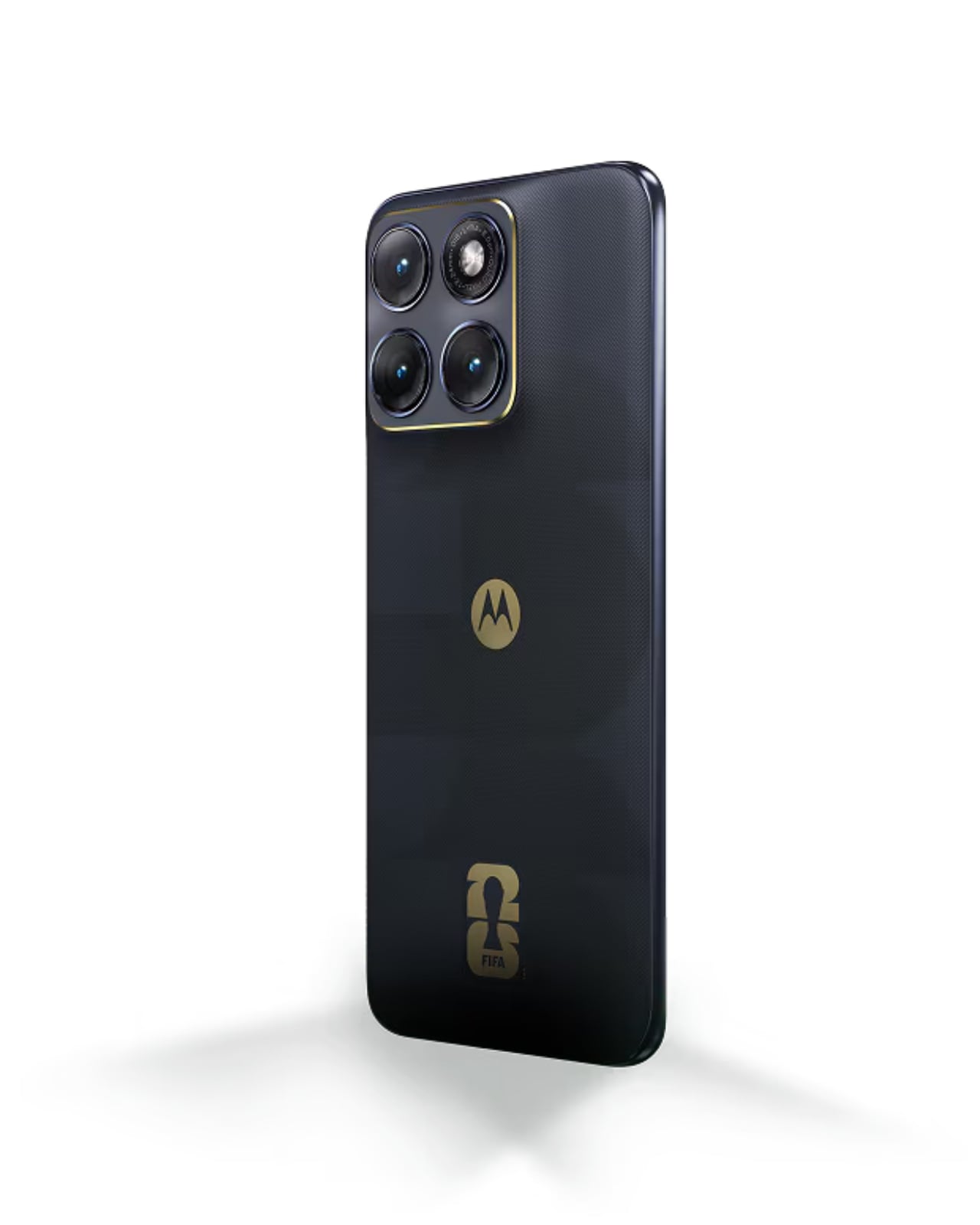
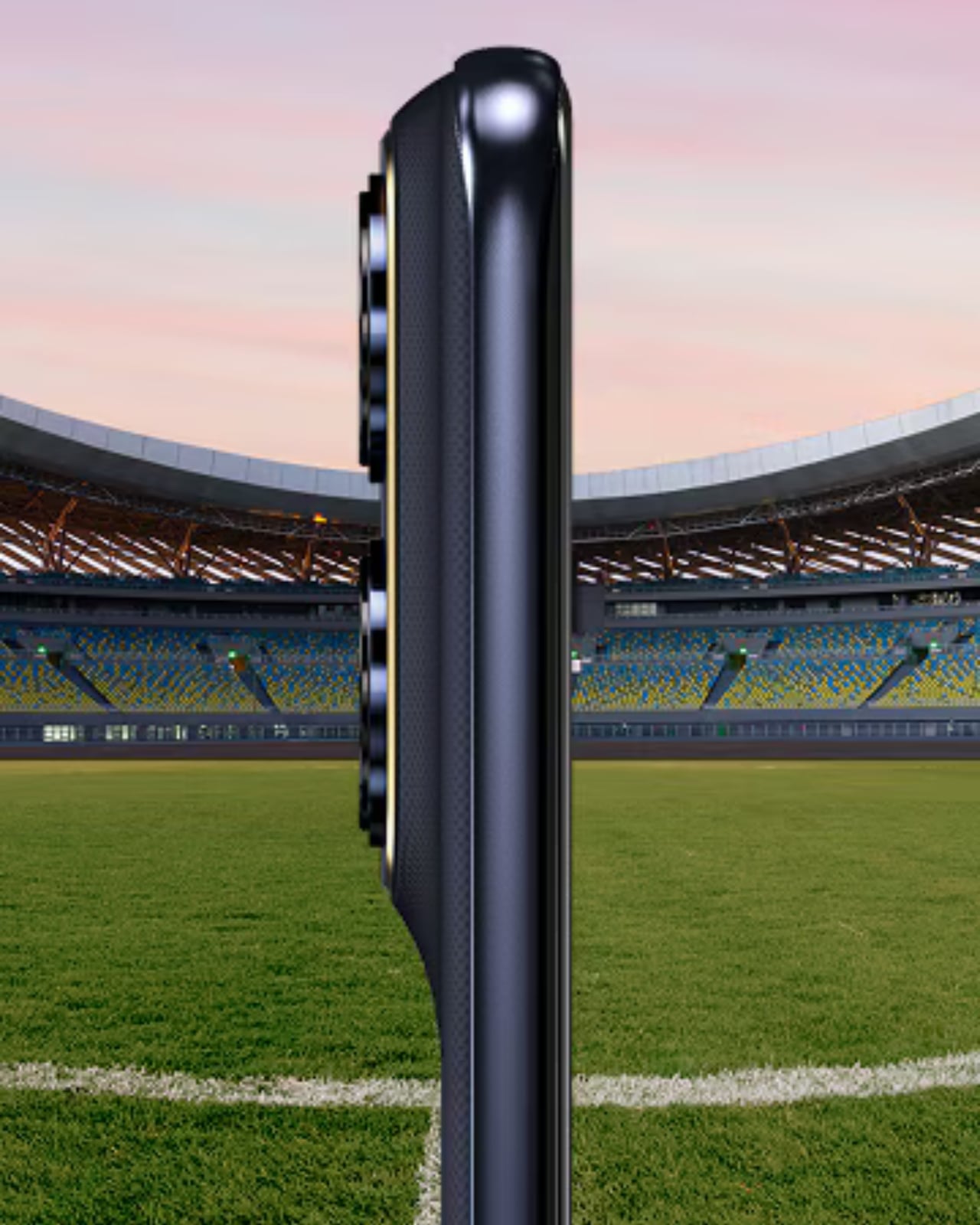
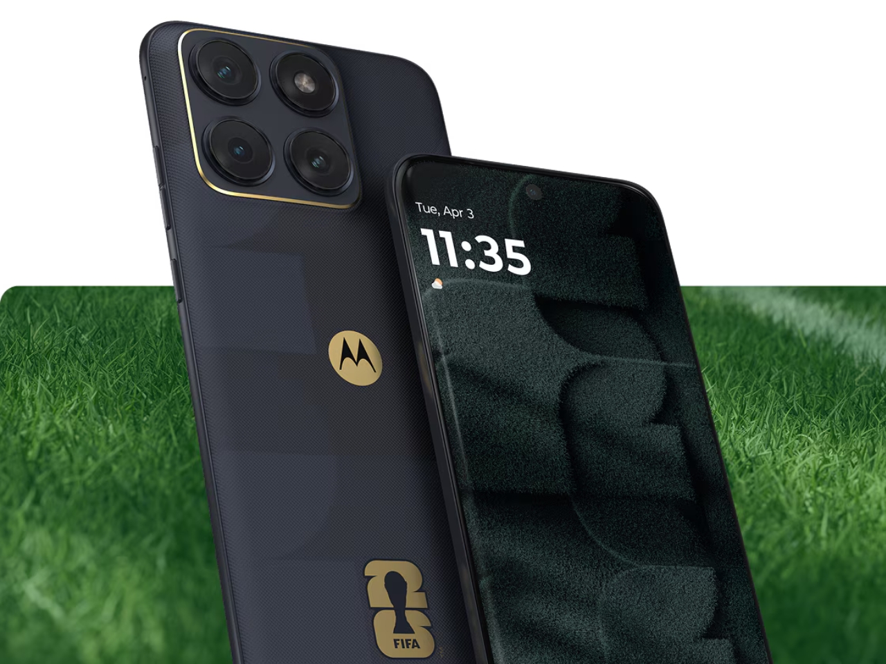
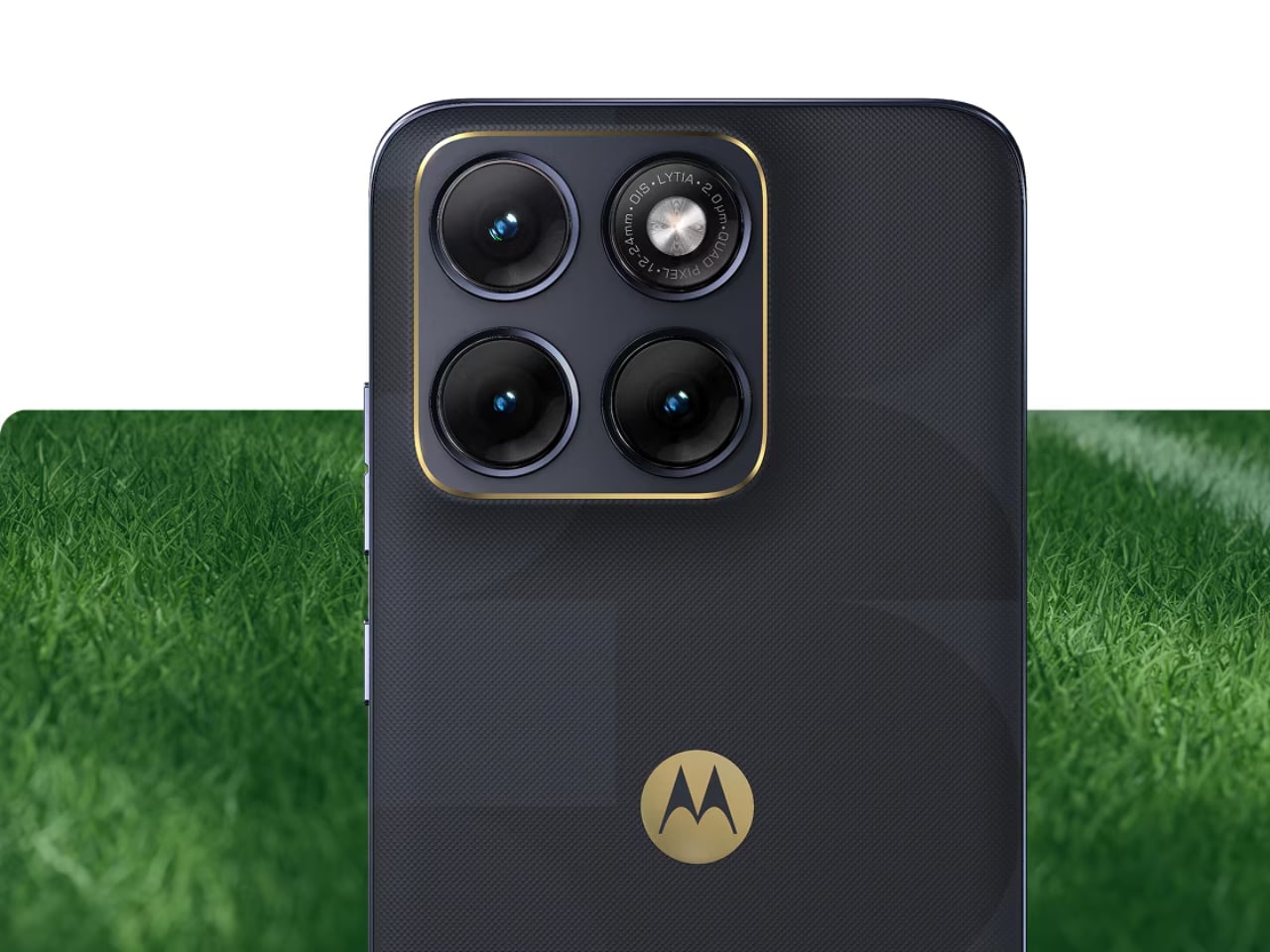
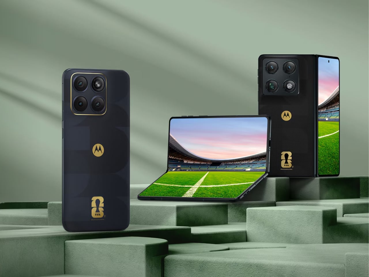
 Collection, and they are exactly the kind of phones that make you stop scrolling. The Razr Fold and Edge 70 Fusion now have limited edition versions draped in football-inspired design and 24K gold accents, and whether you follow the sport or not, the craftsmanship here is genuinely worth paying attention to.