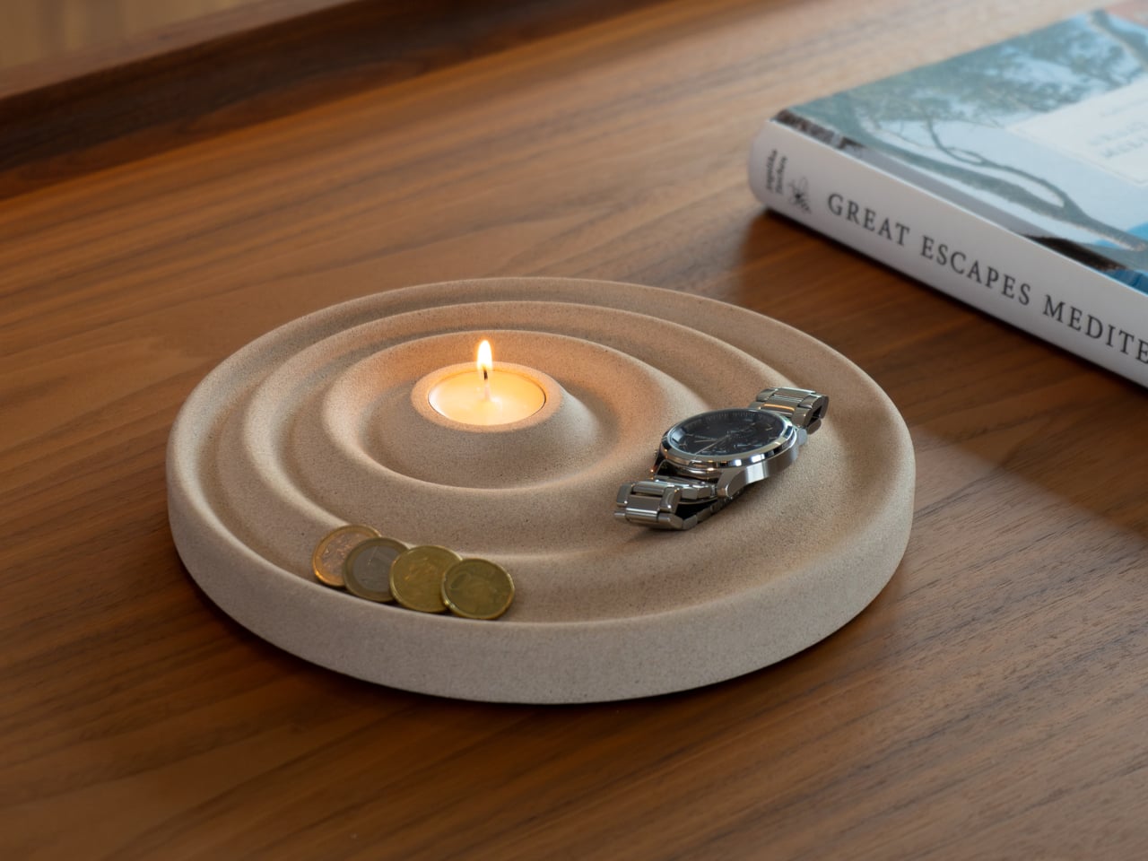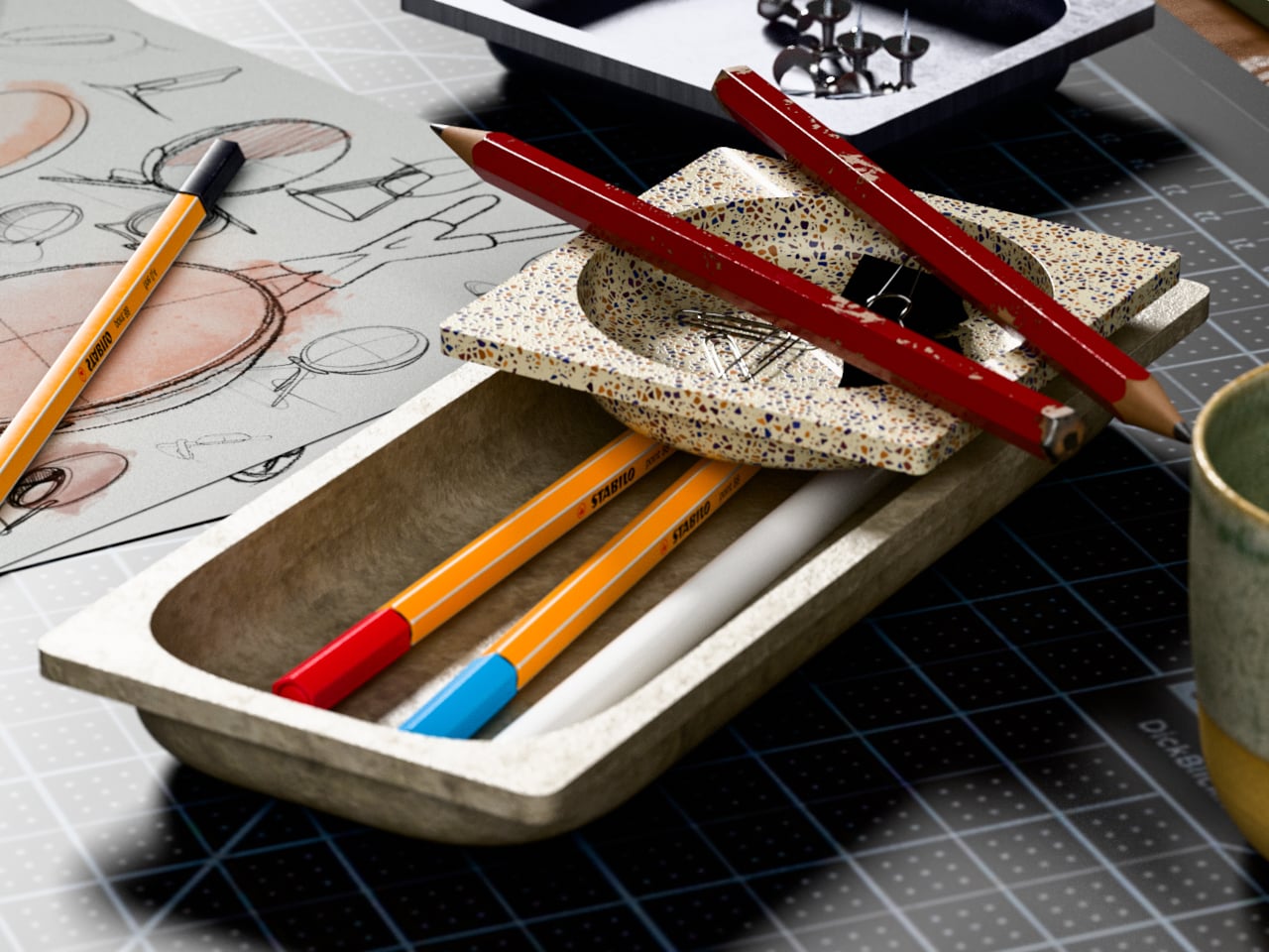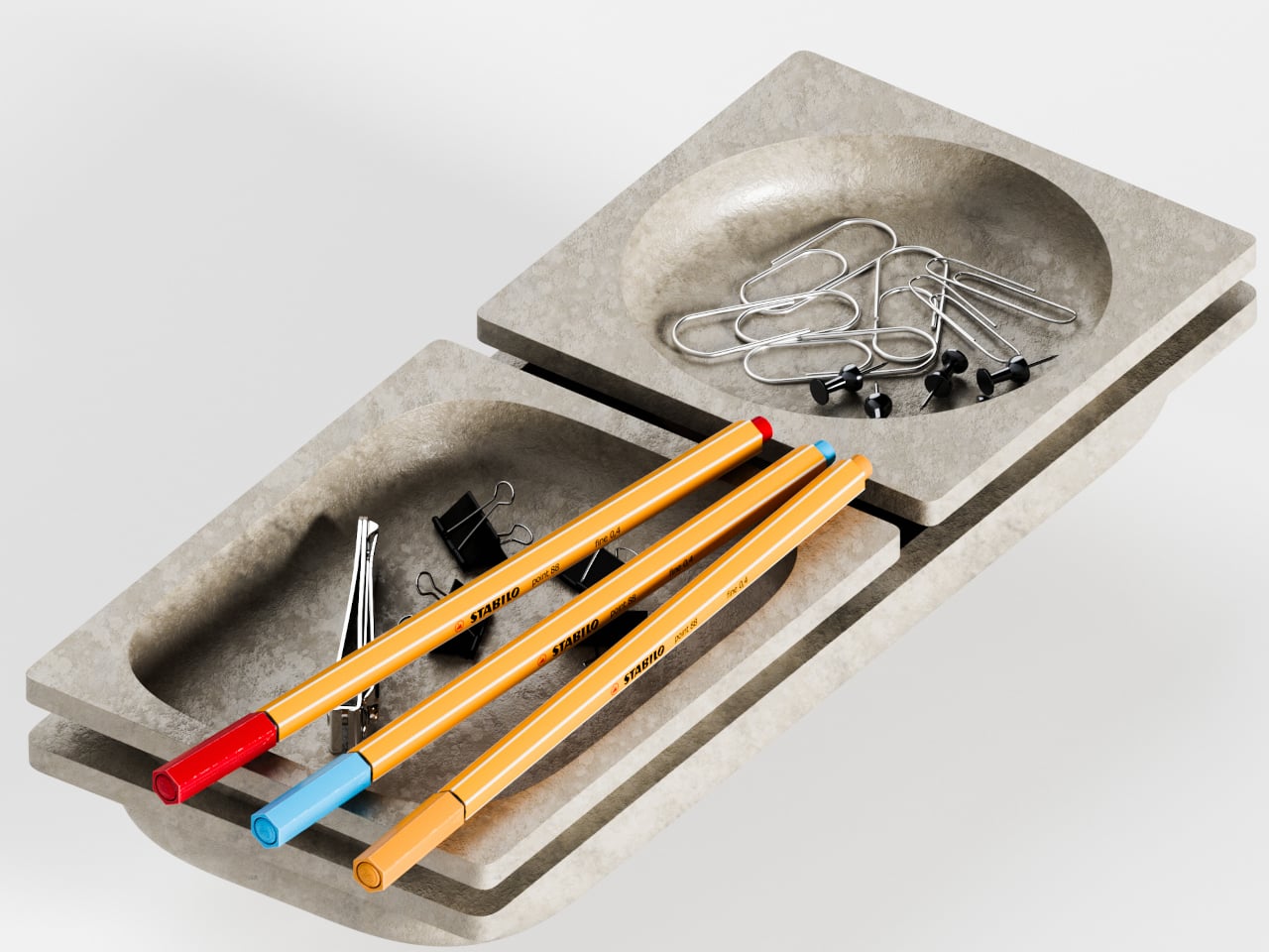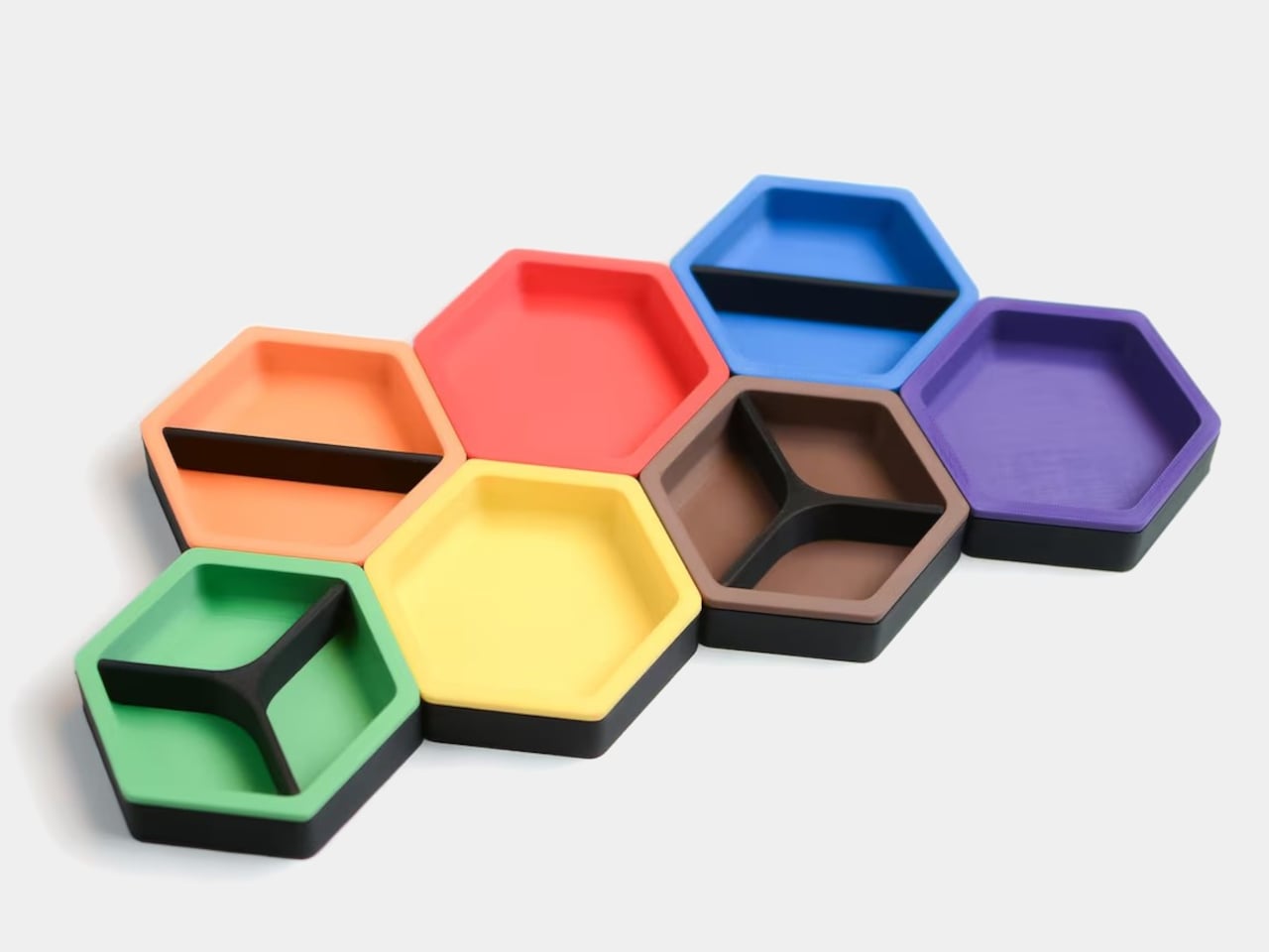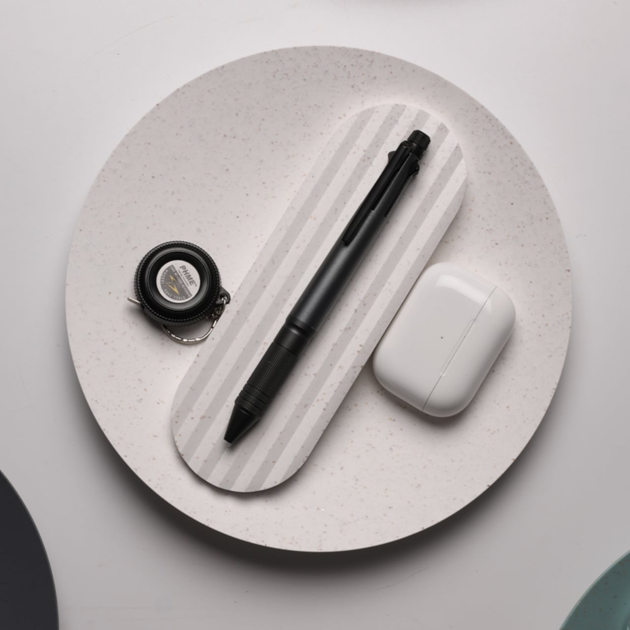
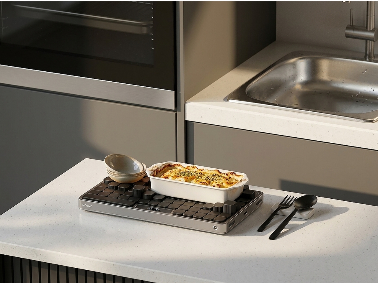
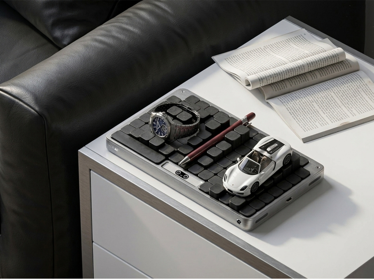
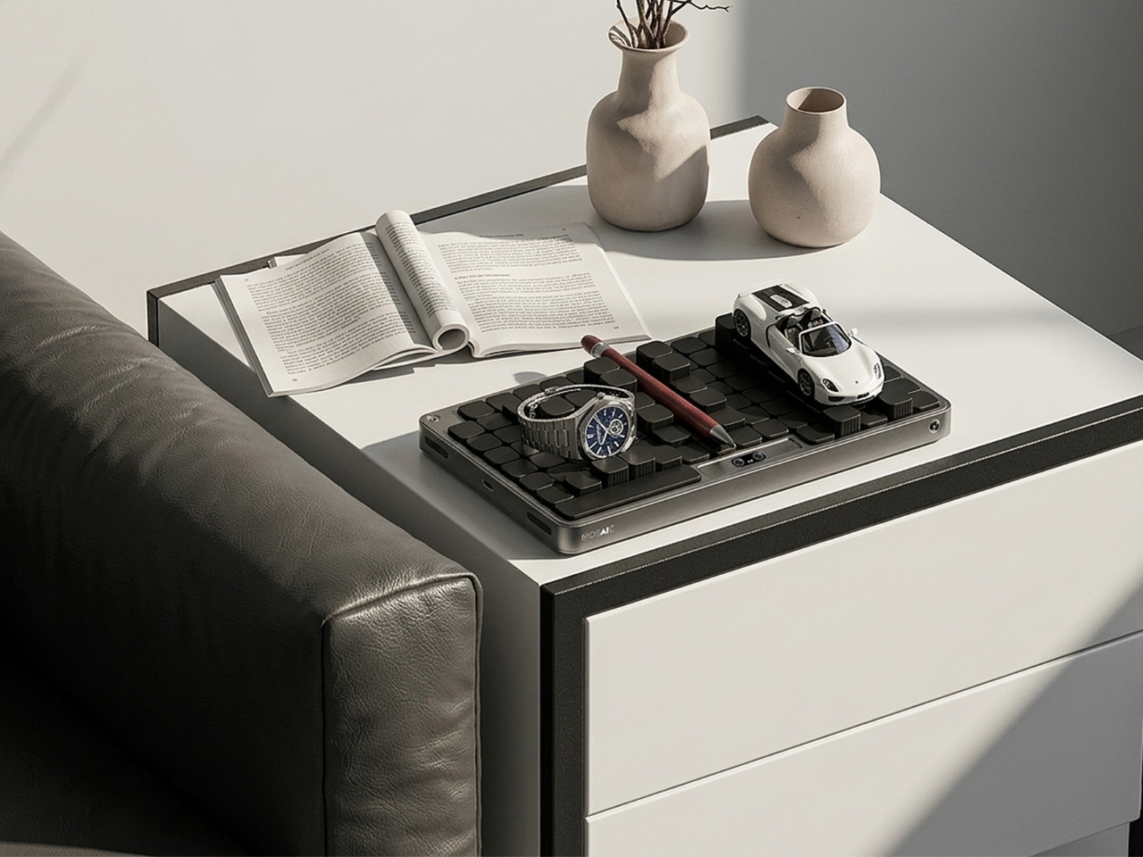
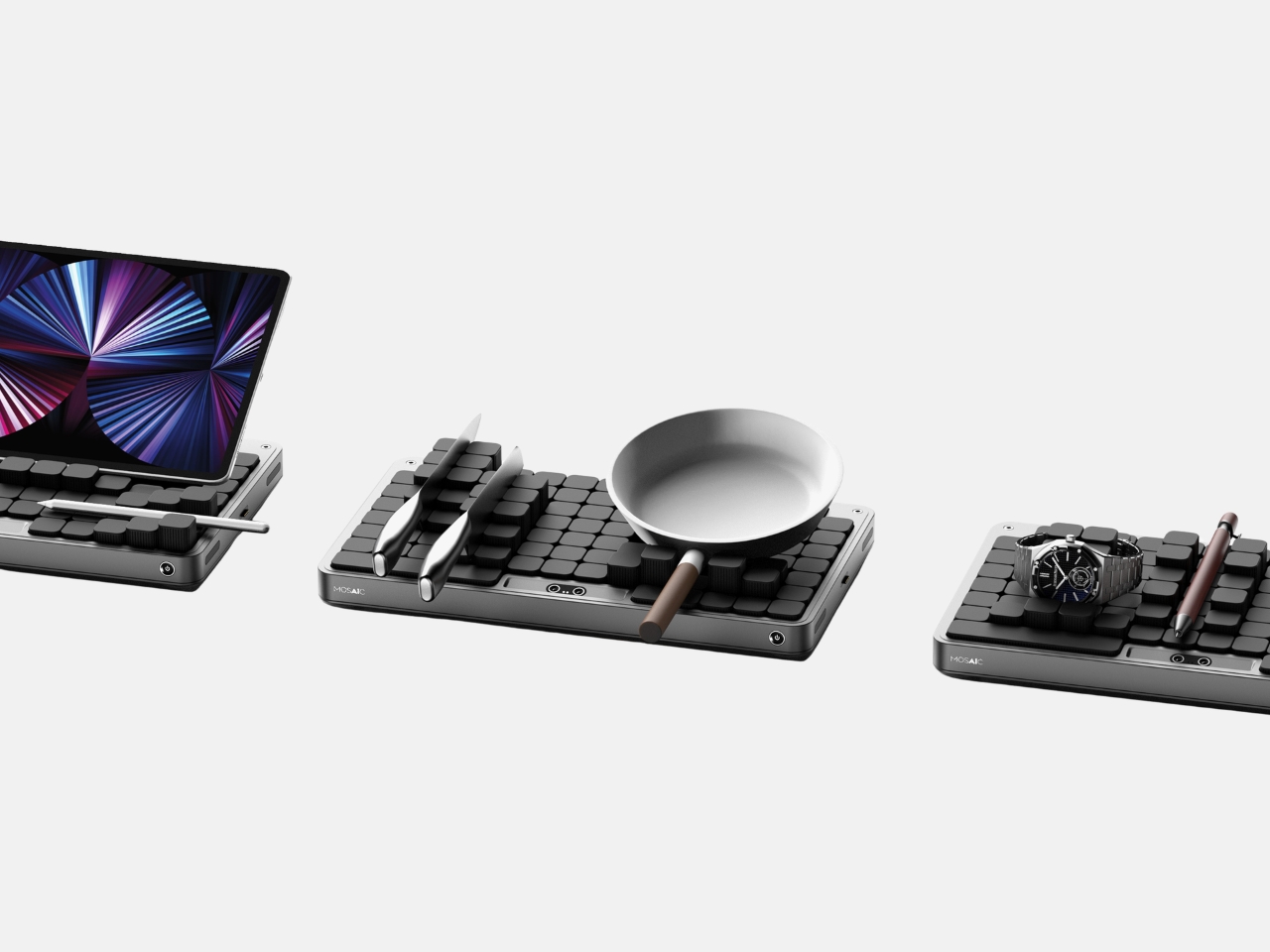
Most desk organizers ask you to adapt to them. You get a tray with fixed compartments, you shove your stuff in, and either it fits or it doesn’t. Then you give up, and everything ends up in a pile again. Seoul-based industrial designer Youngbin Kwon decided that the tray should be the one doing the adapting, and the result is Mosaic, a concept that’s quietly one of the more genuinely smart ideas to come out of the AI-meets-product-design conversation this year.
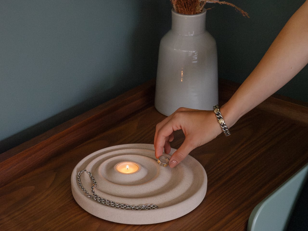
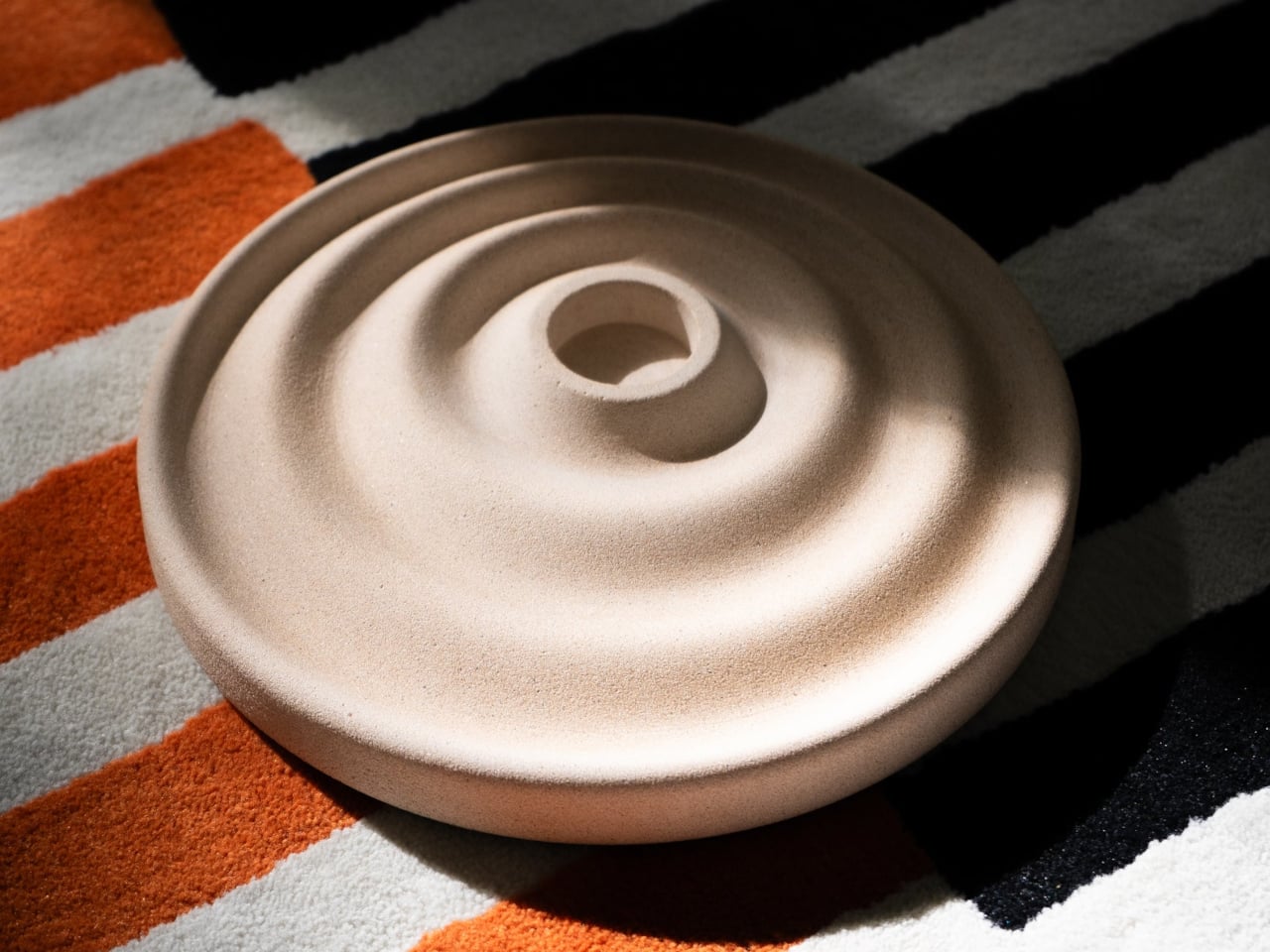
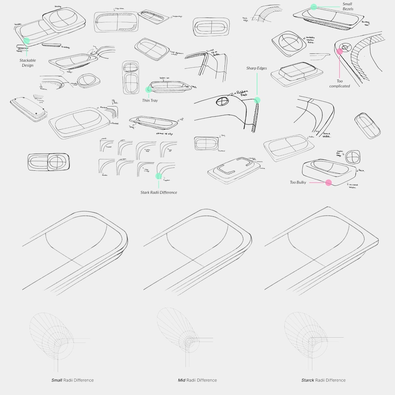
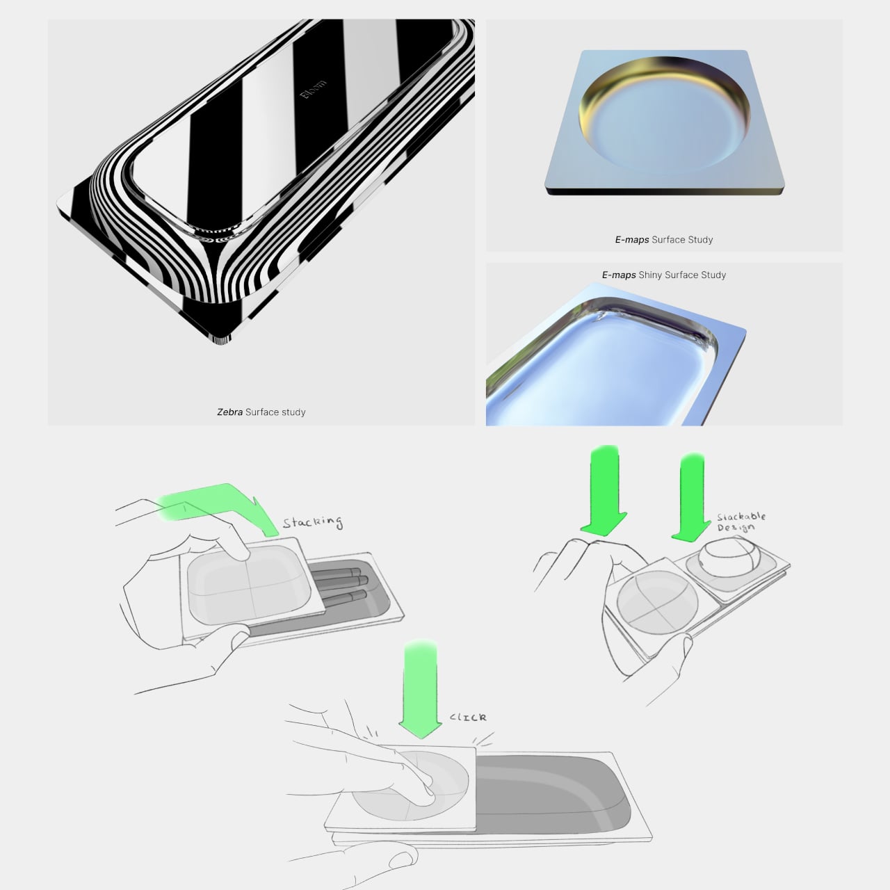
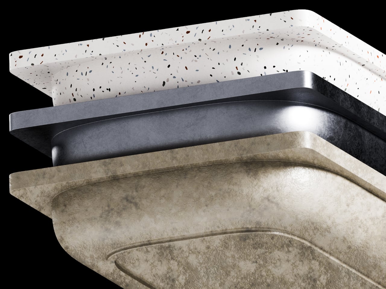
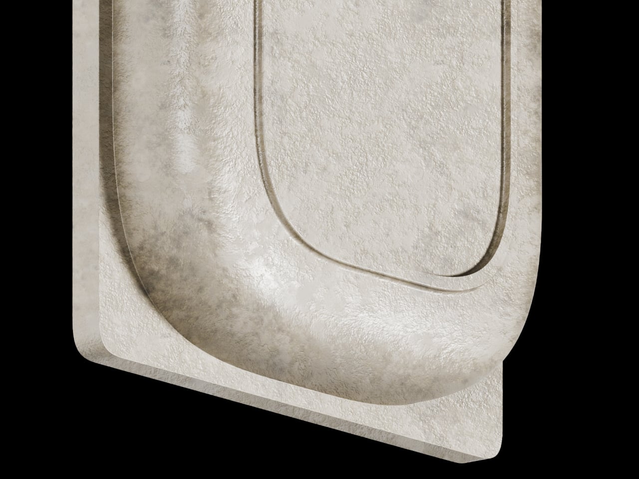
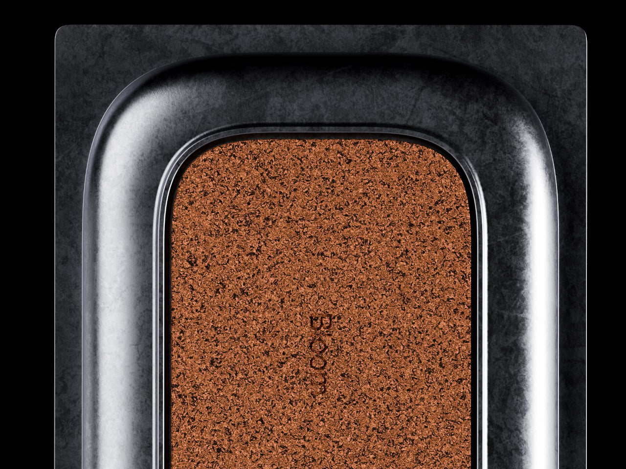
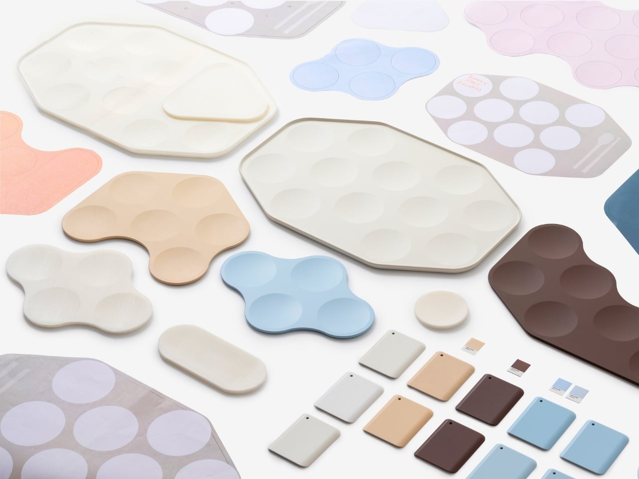
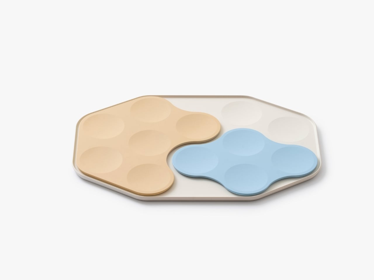
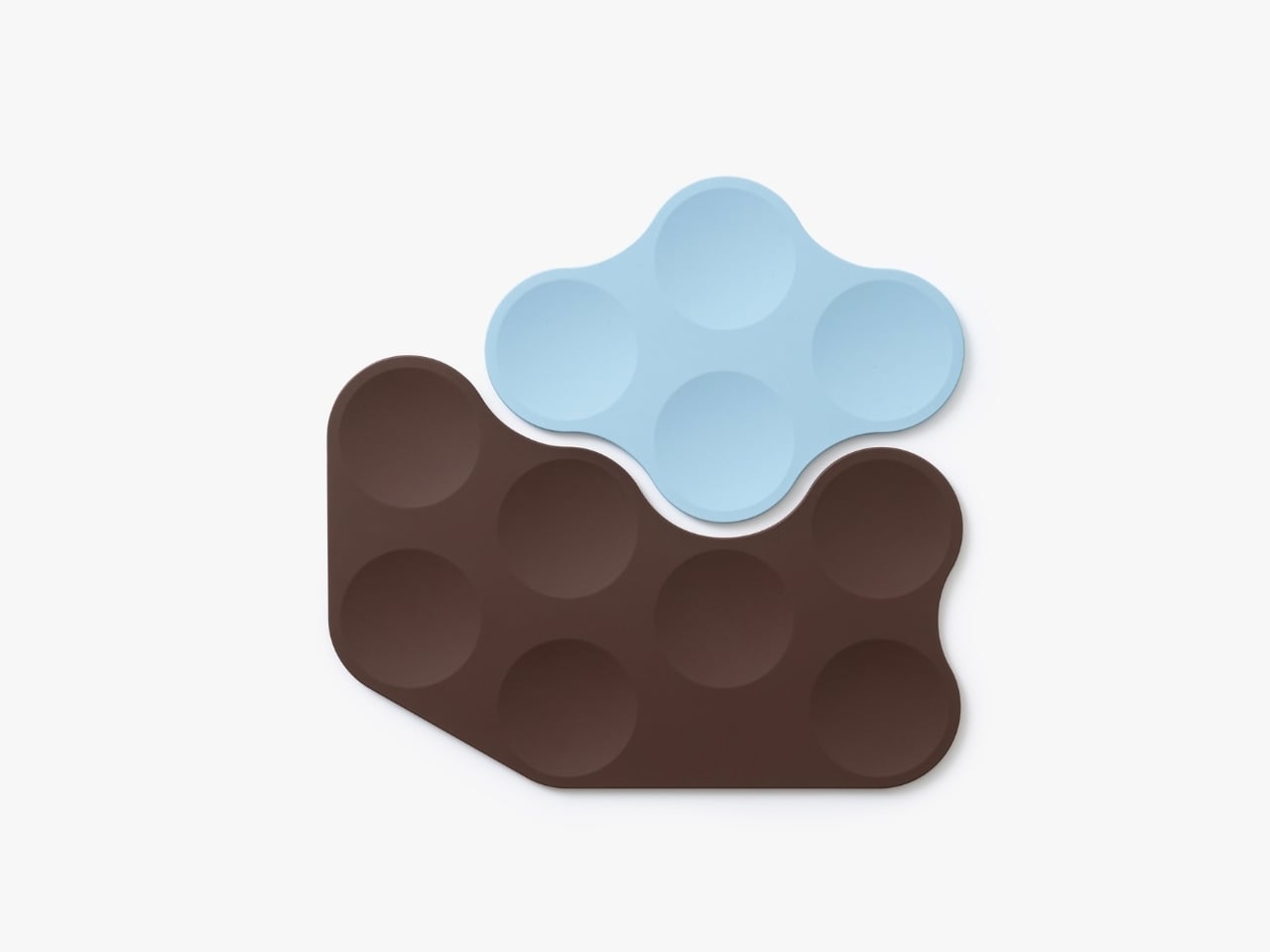
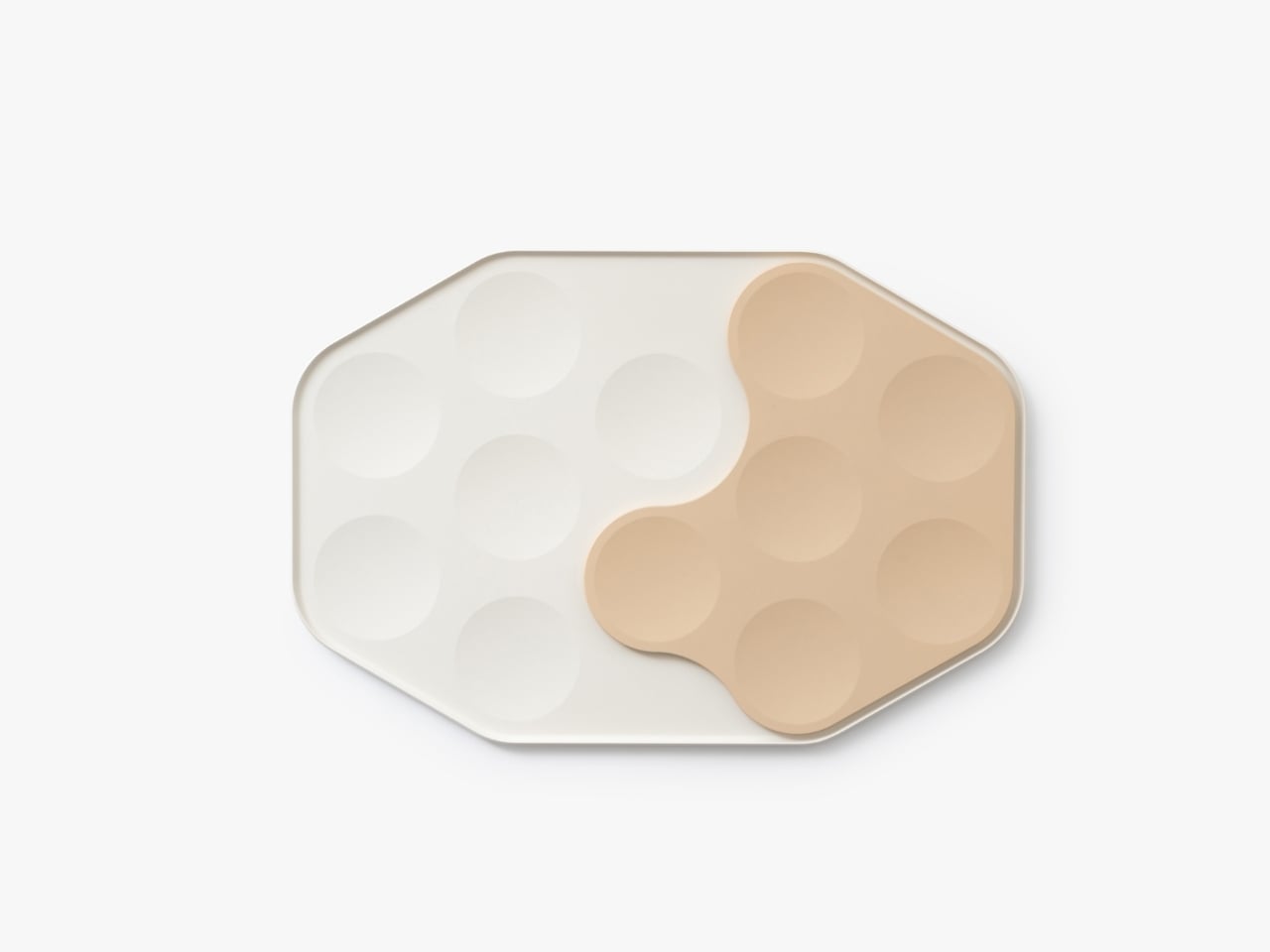
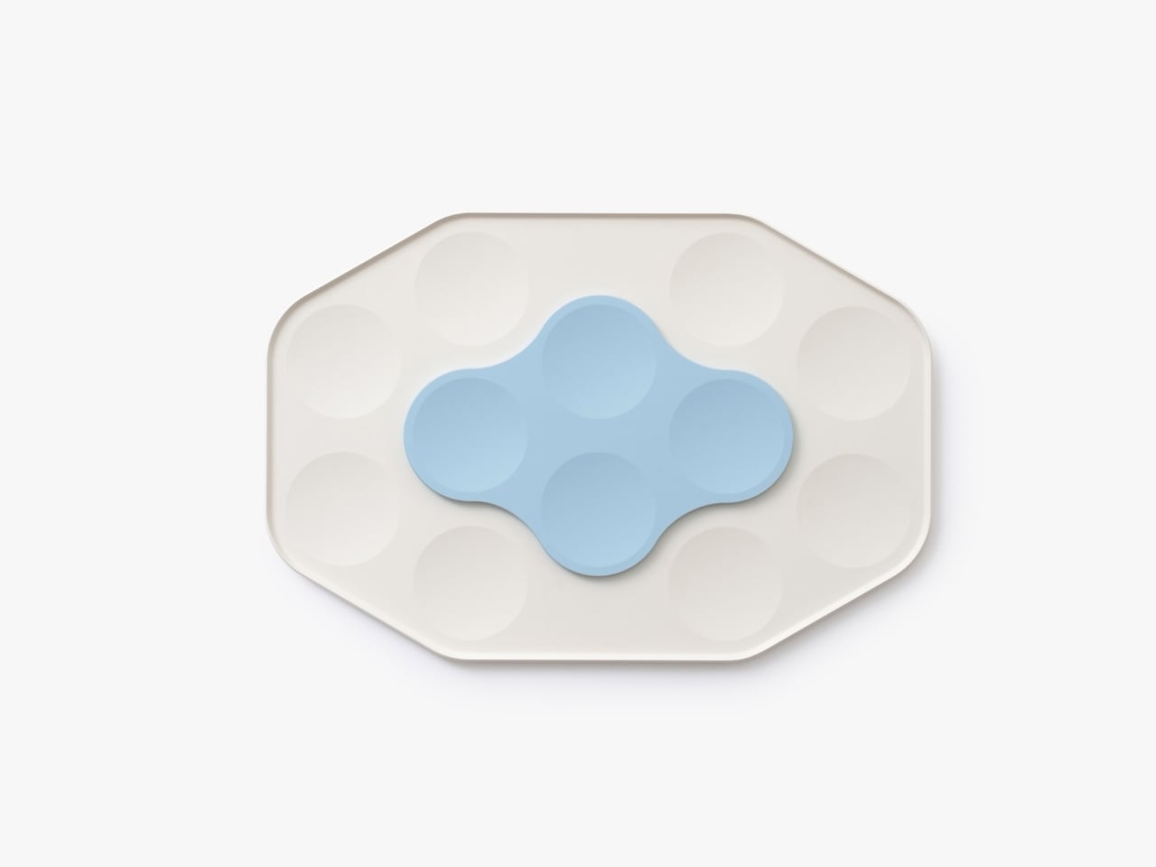
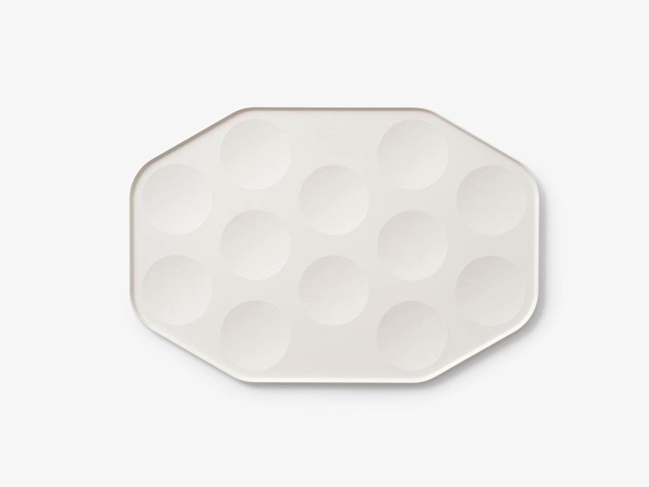
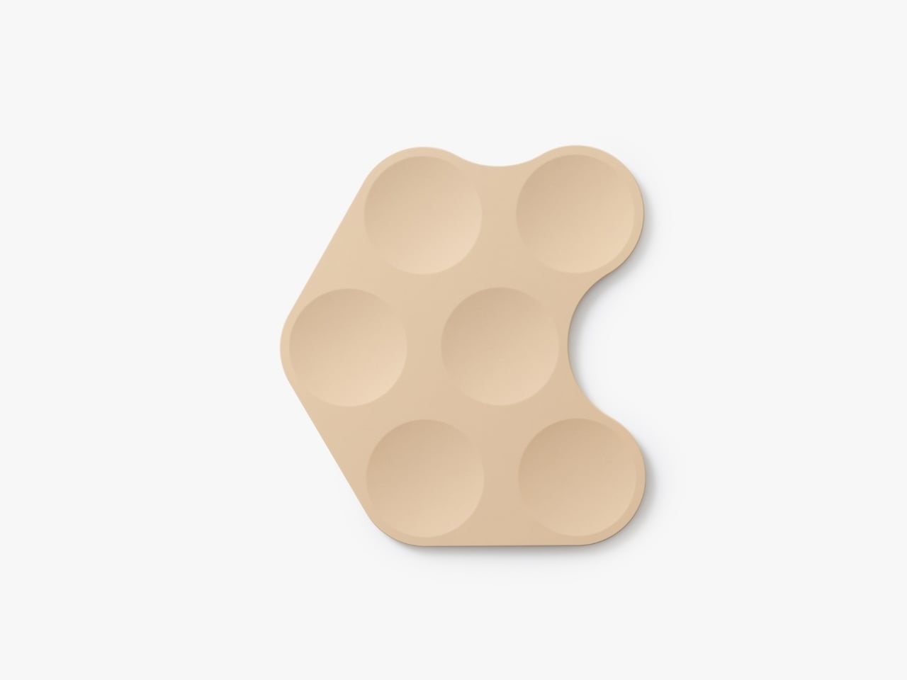
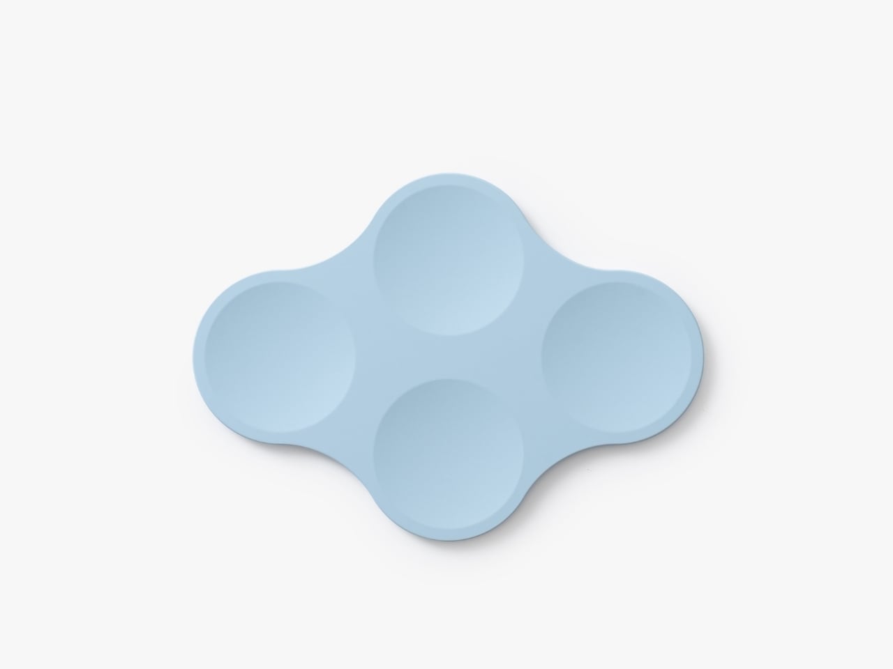
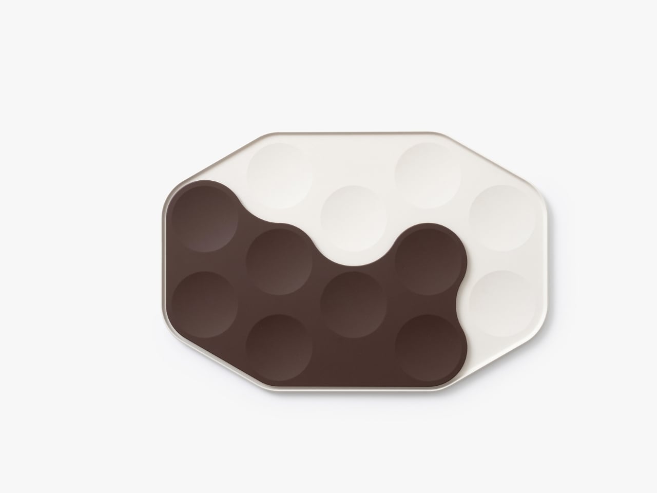
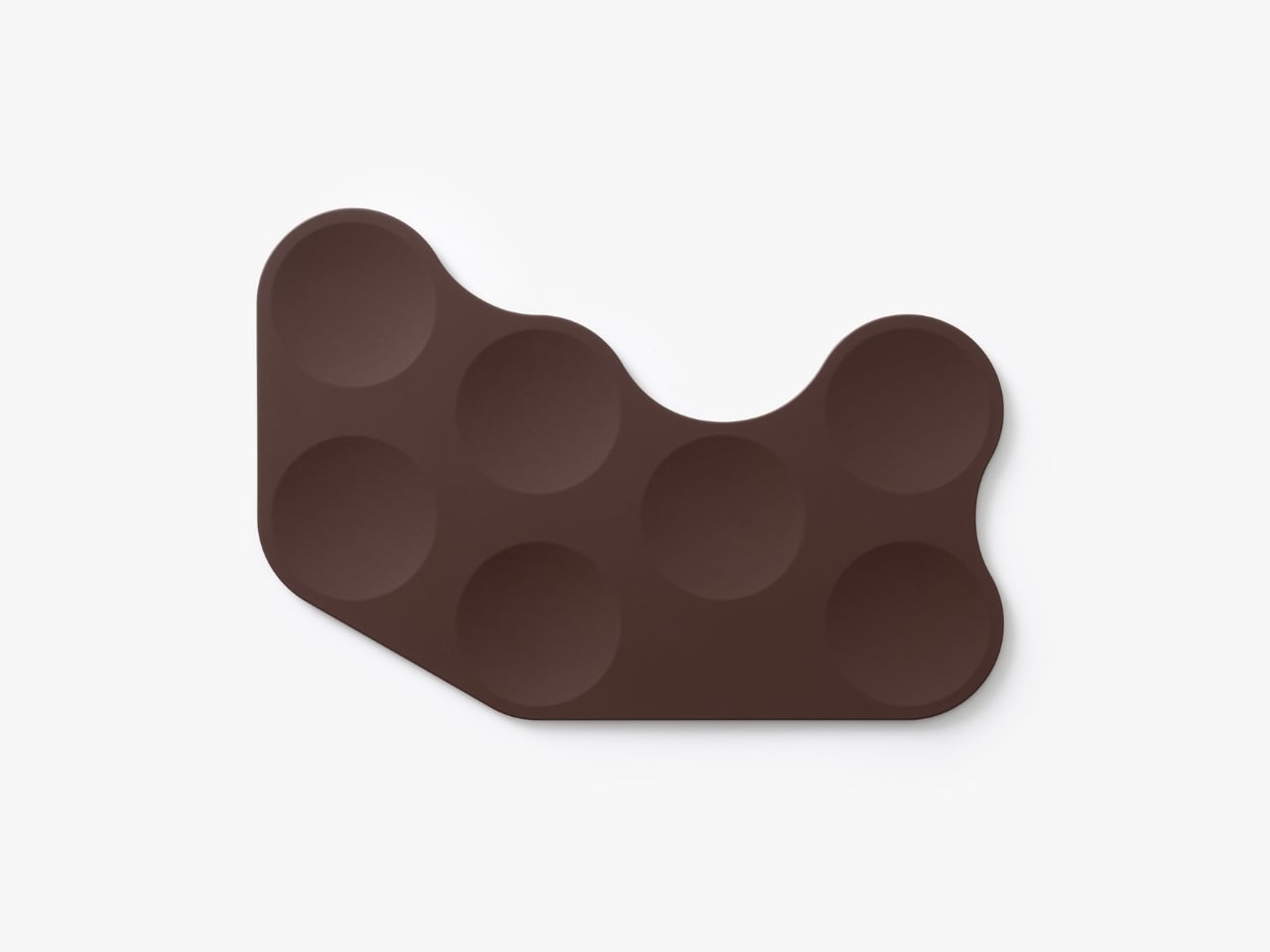
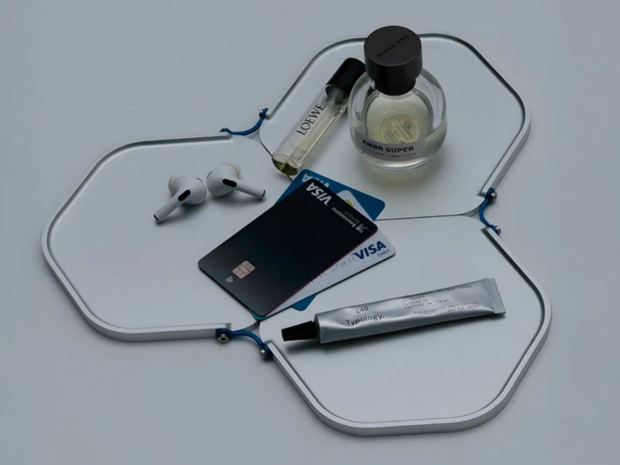
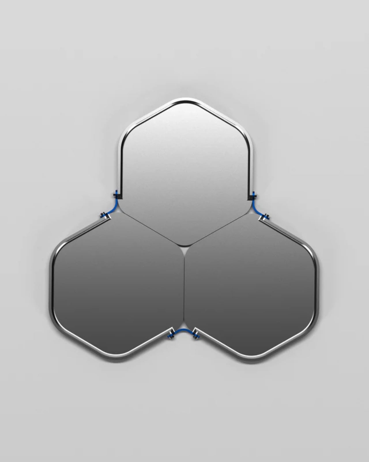
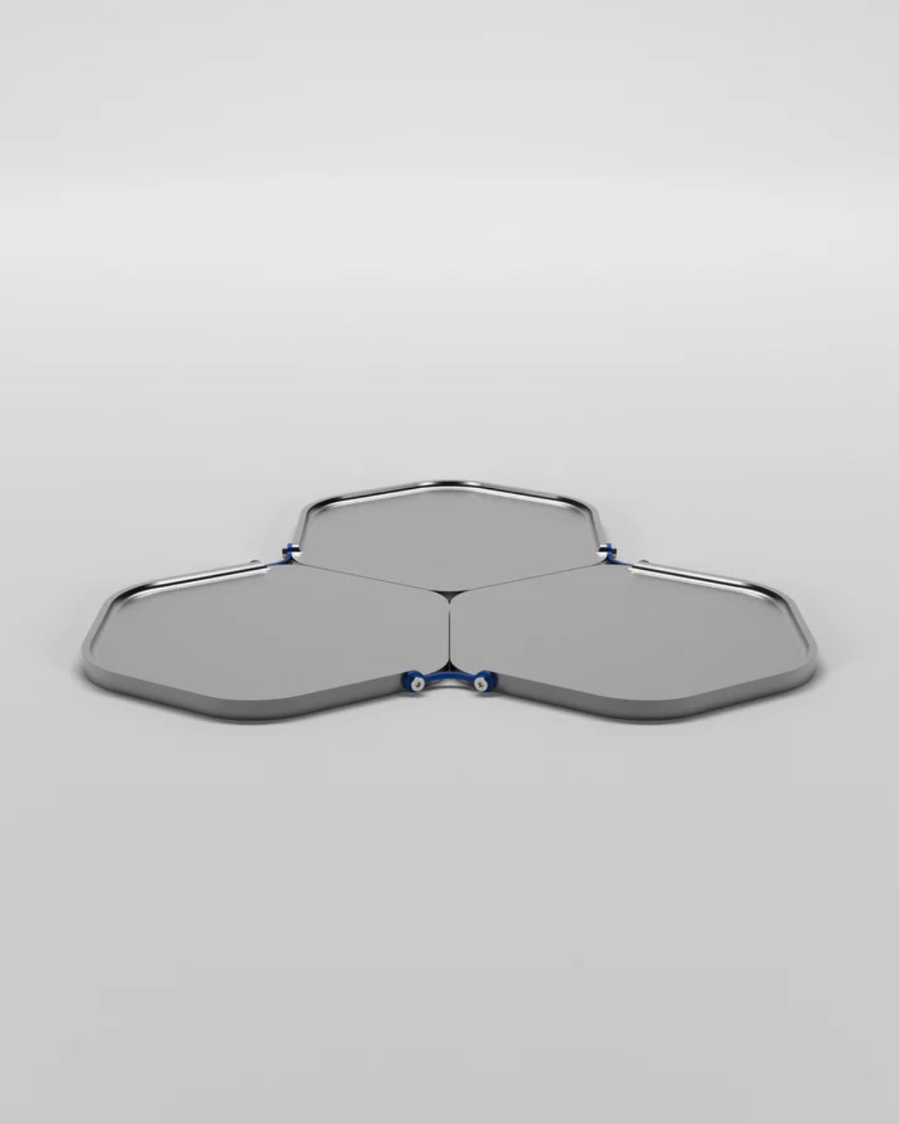
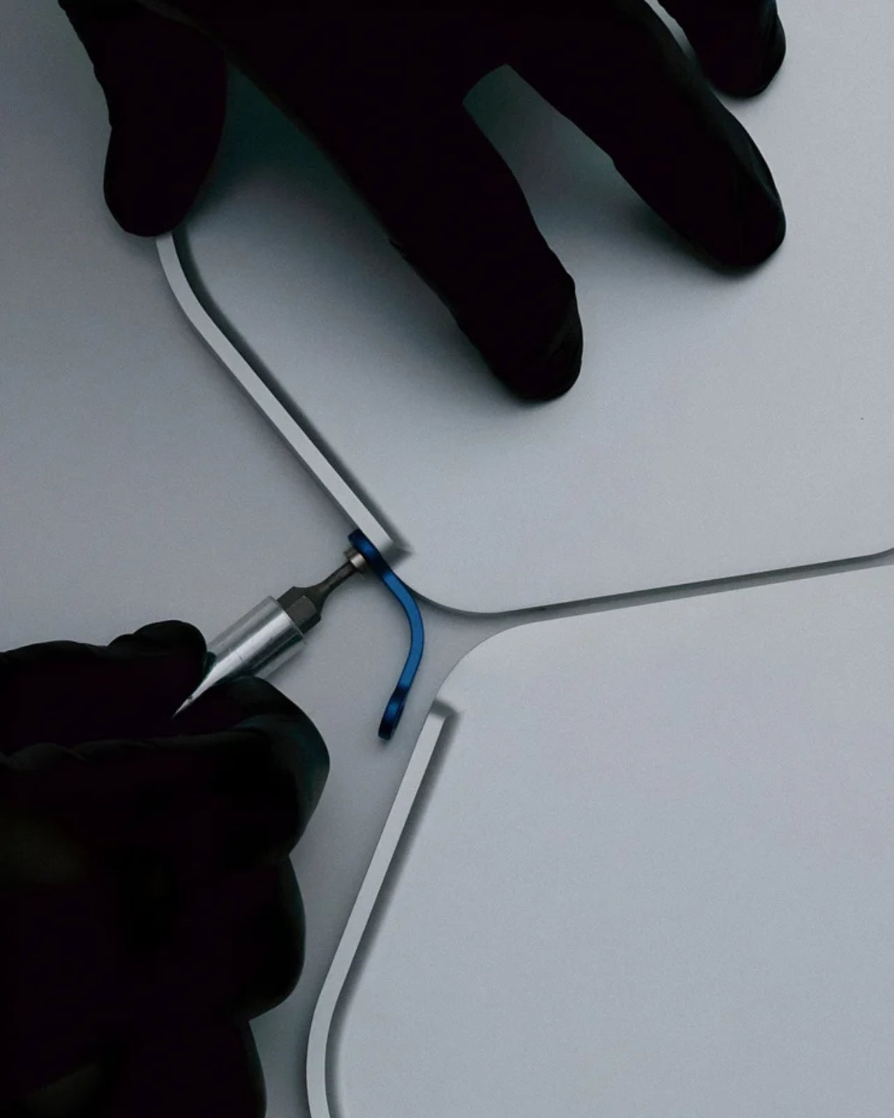
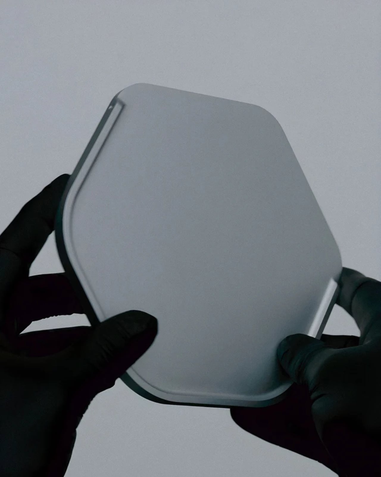
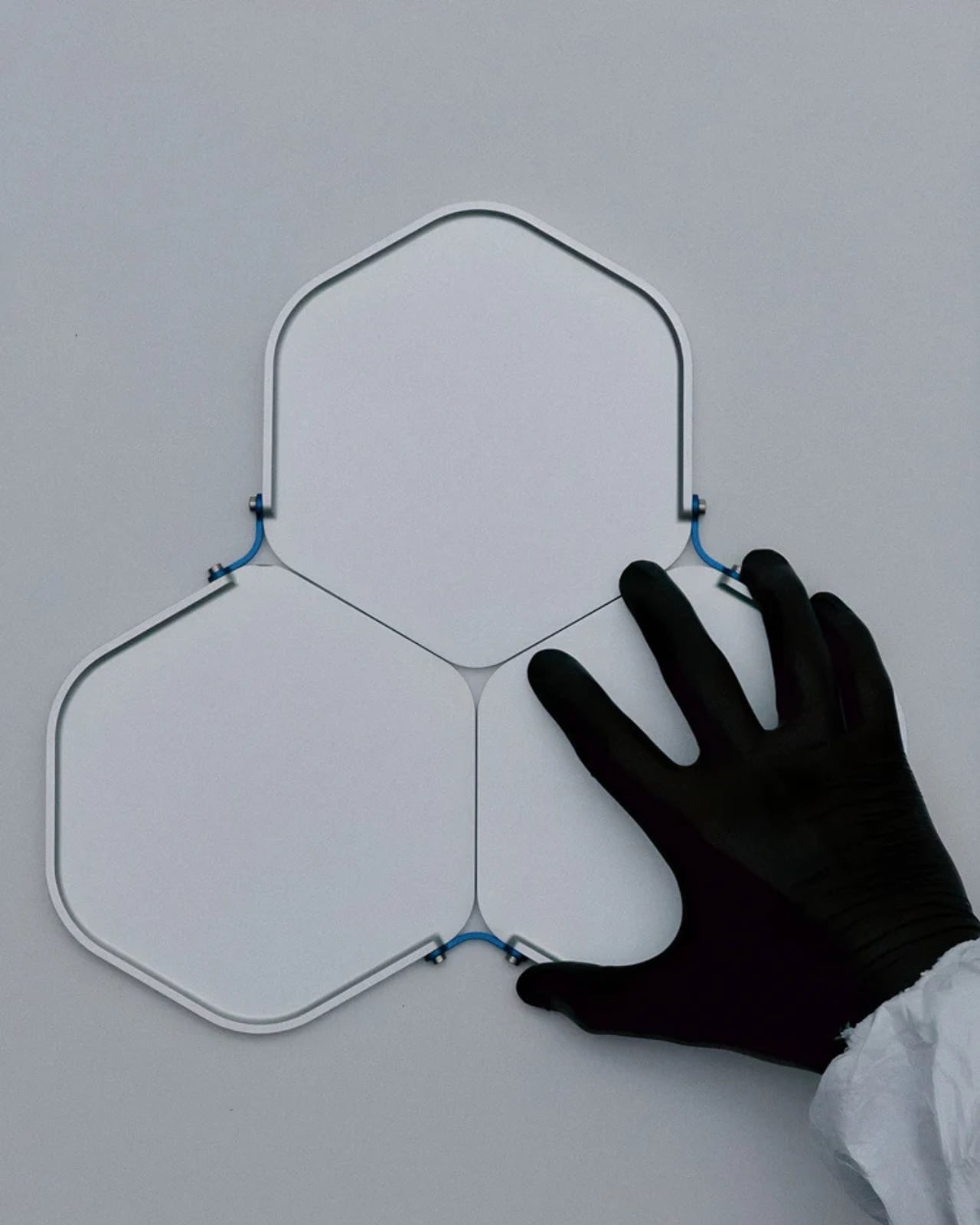
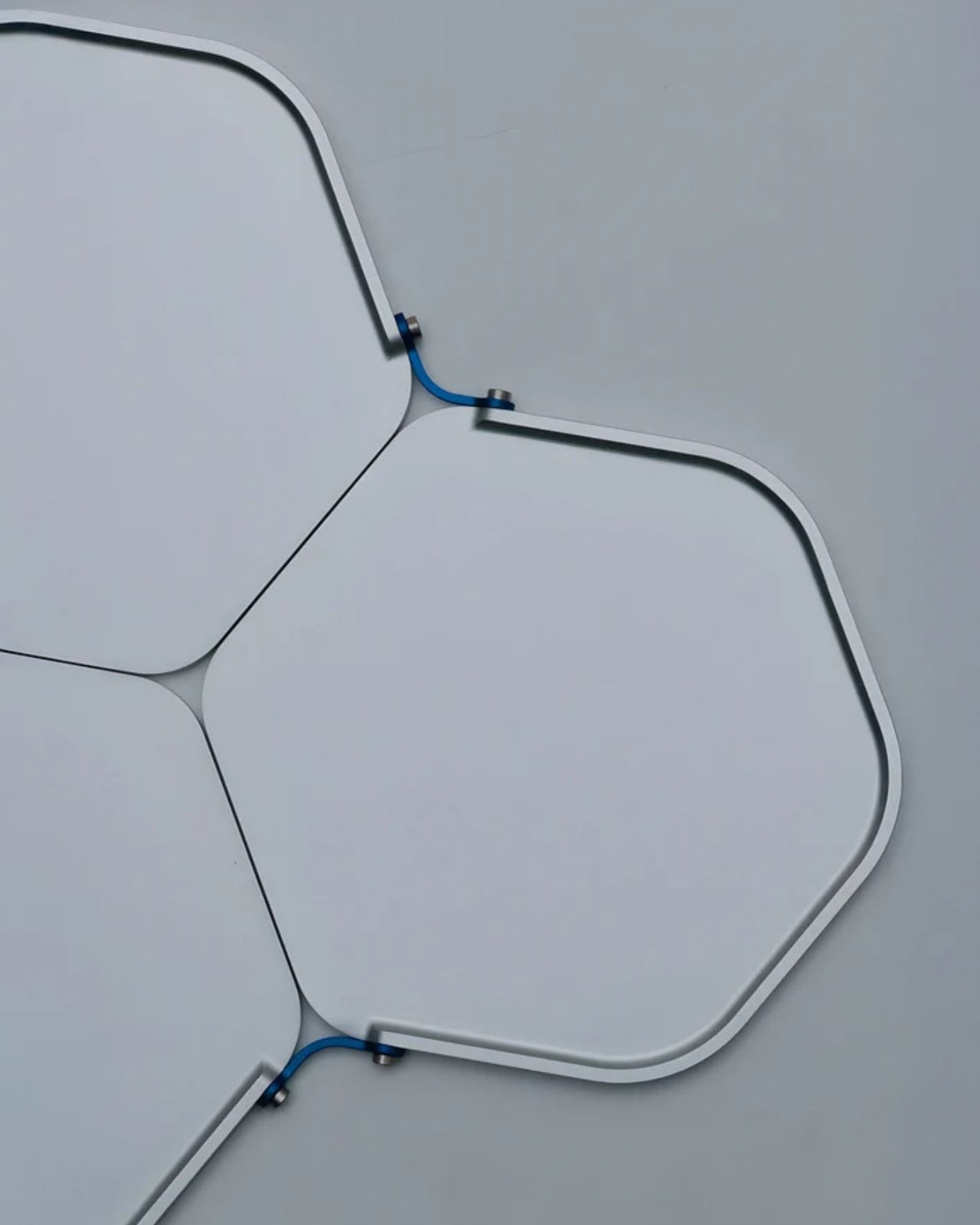
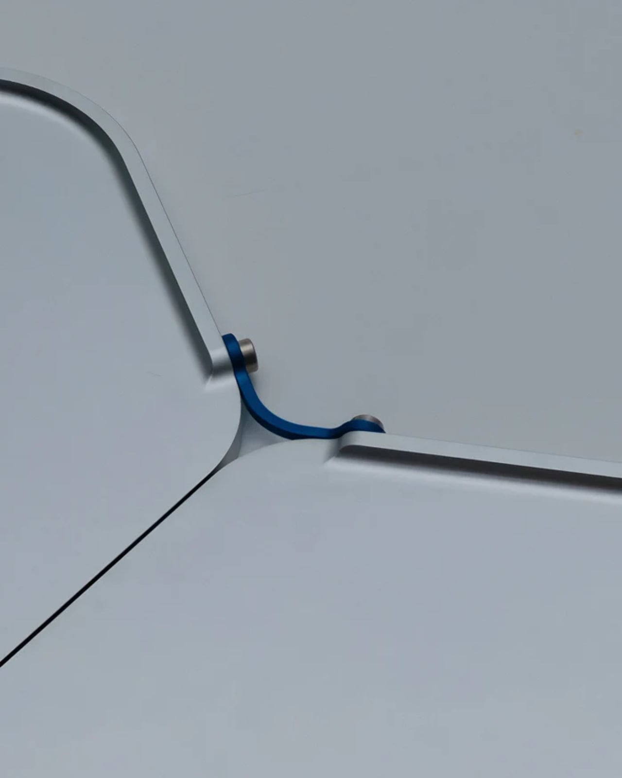
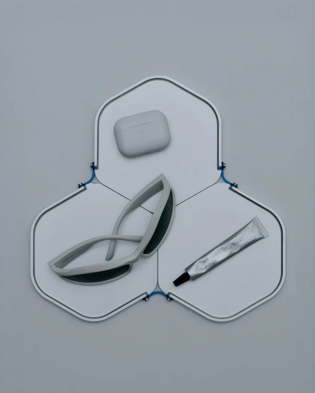
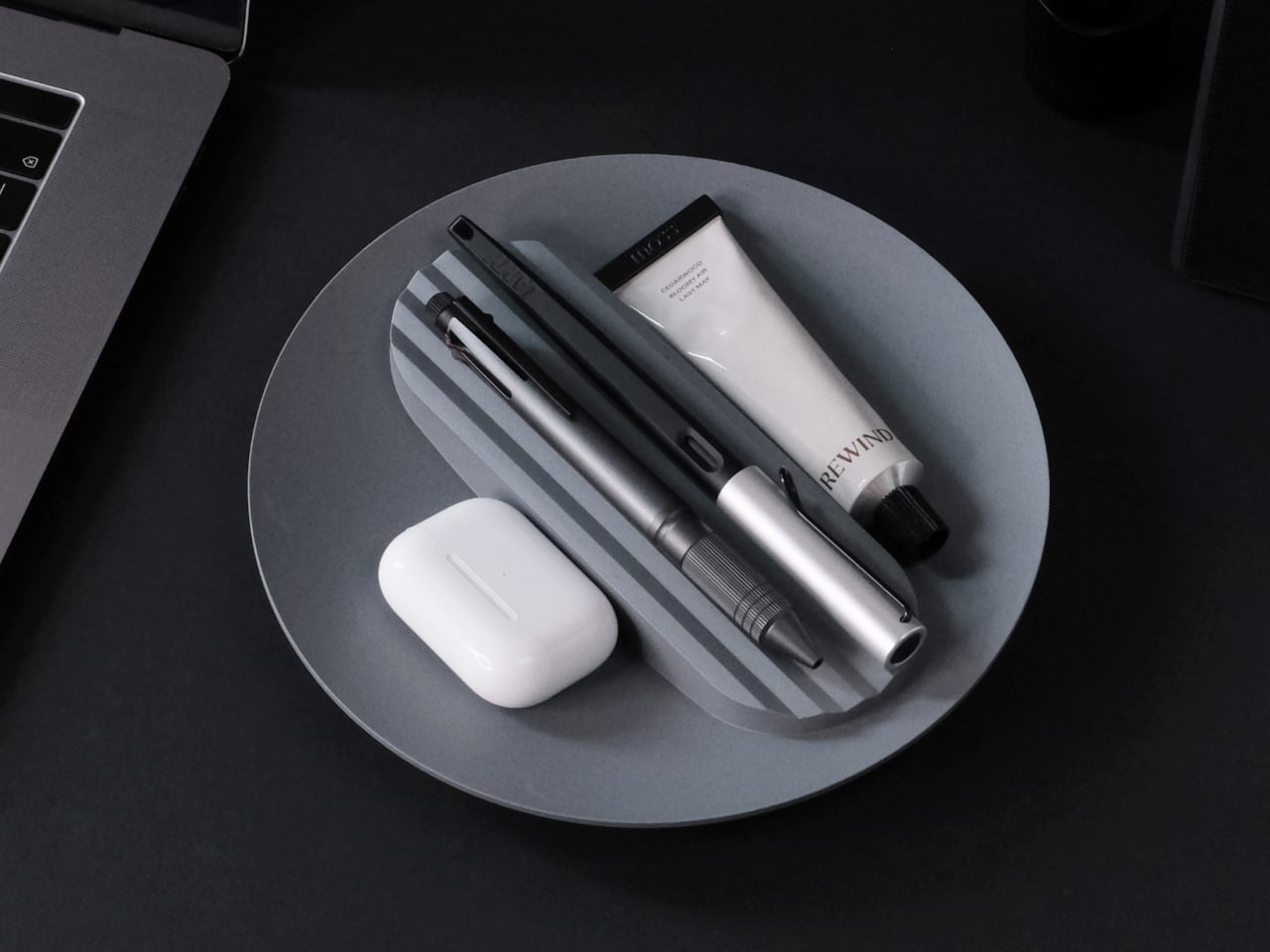
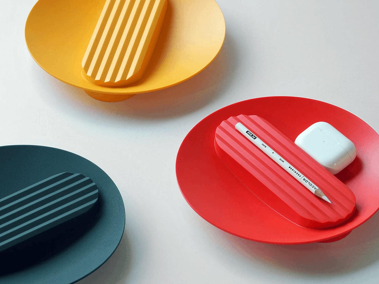
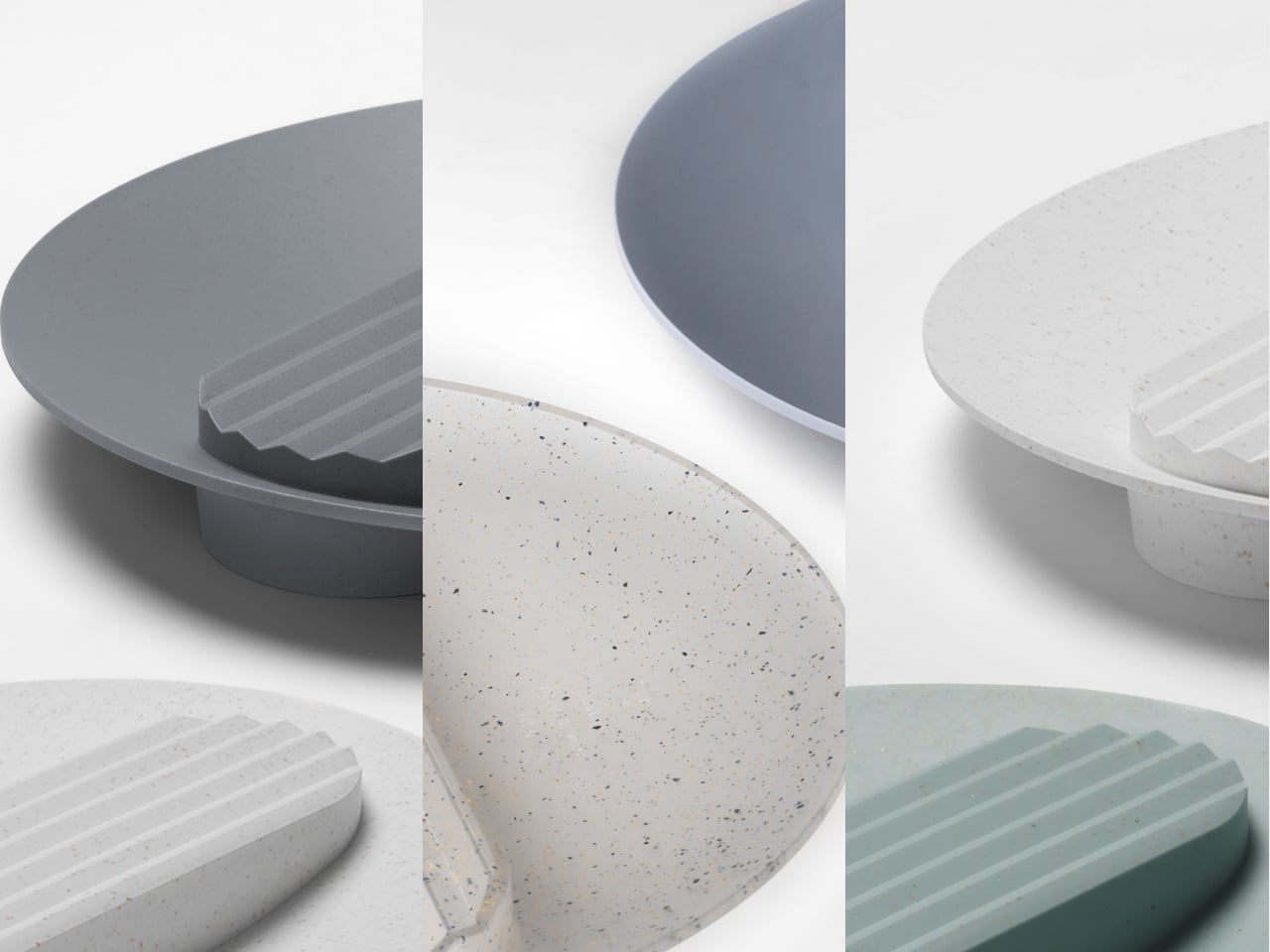
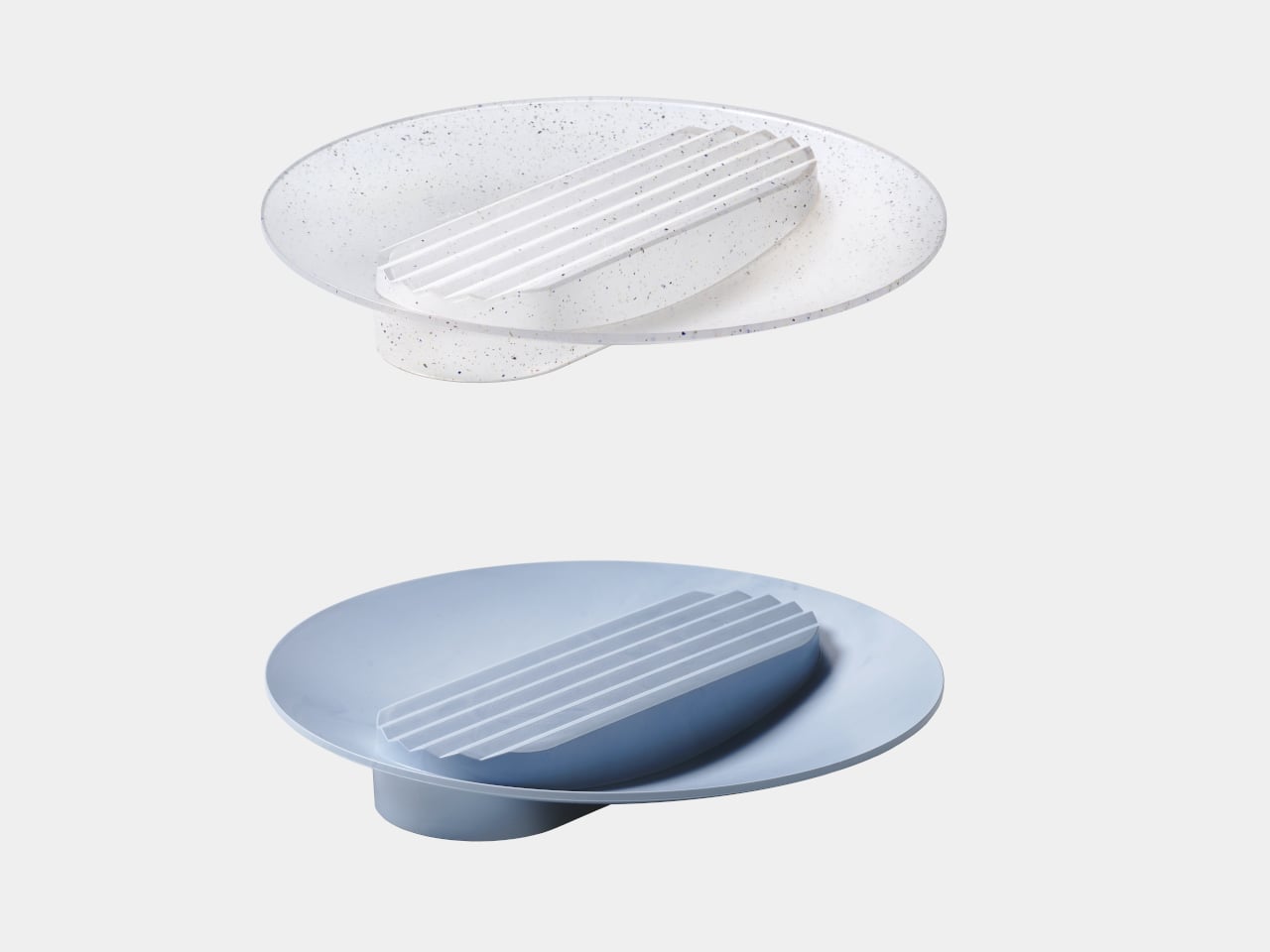
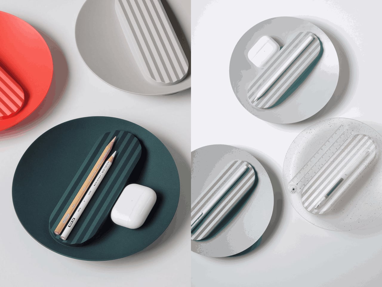
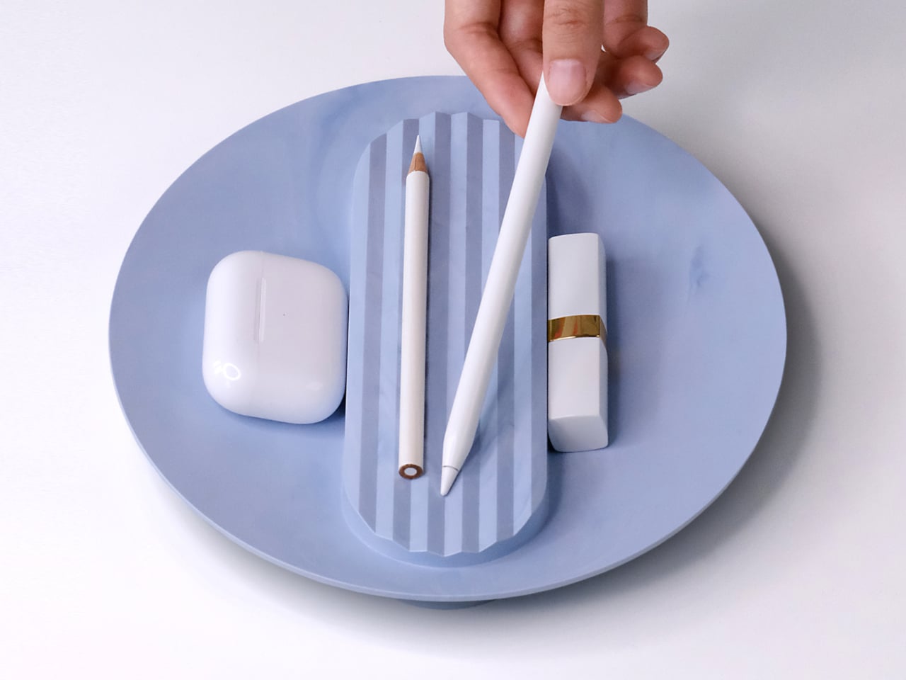
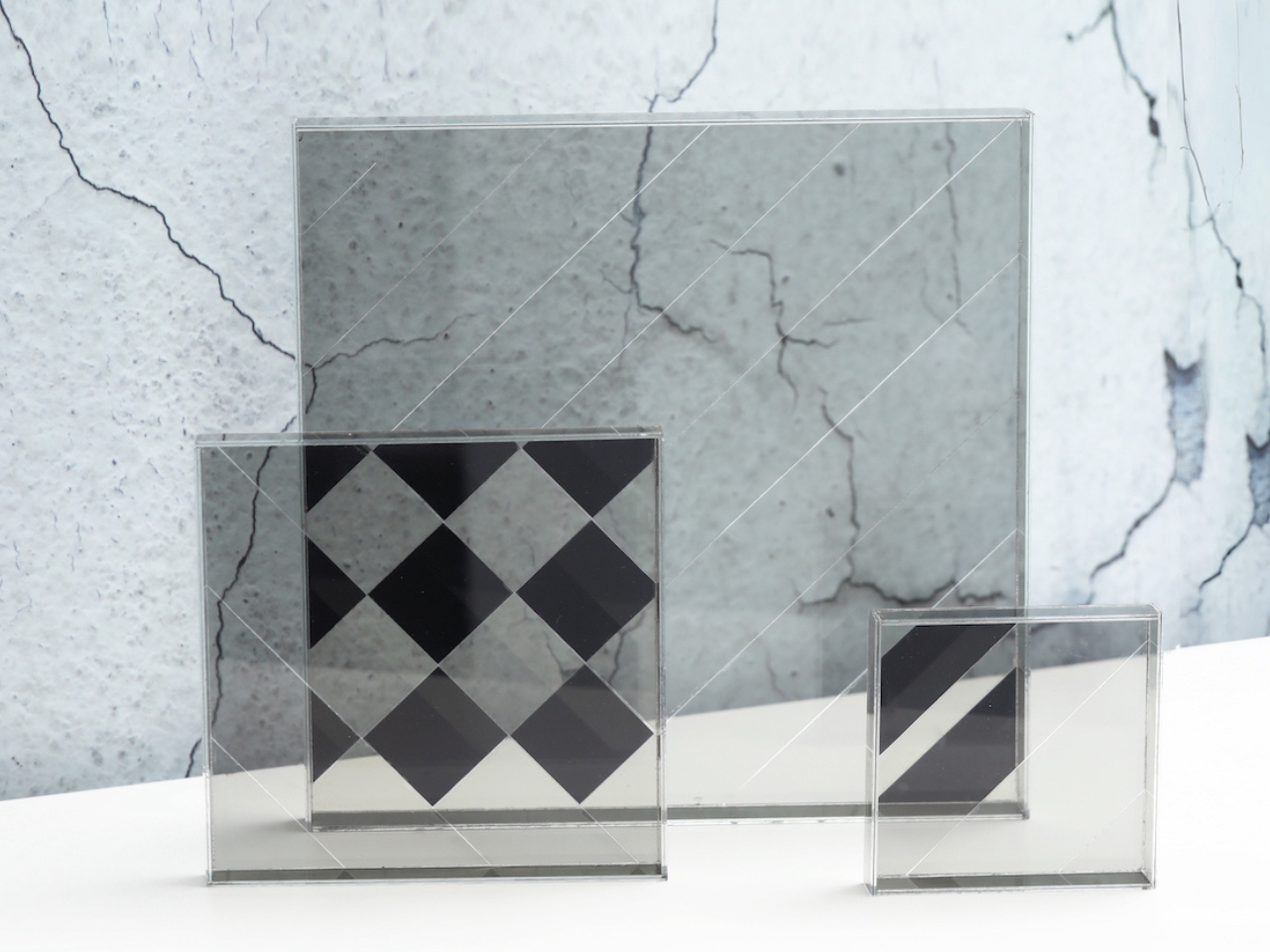
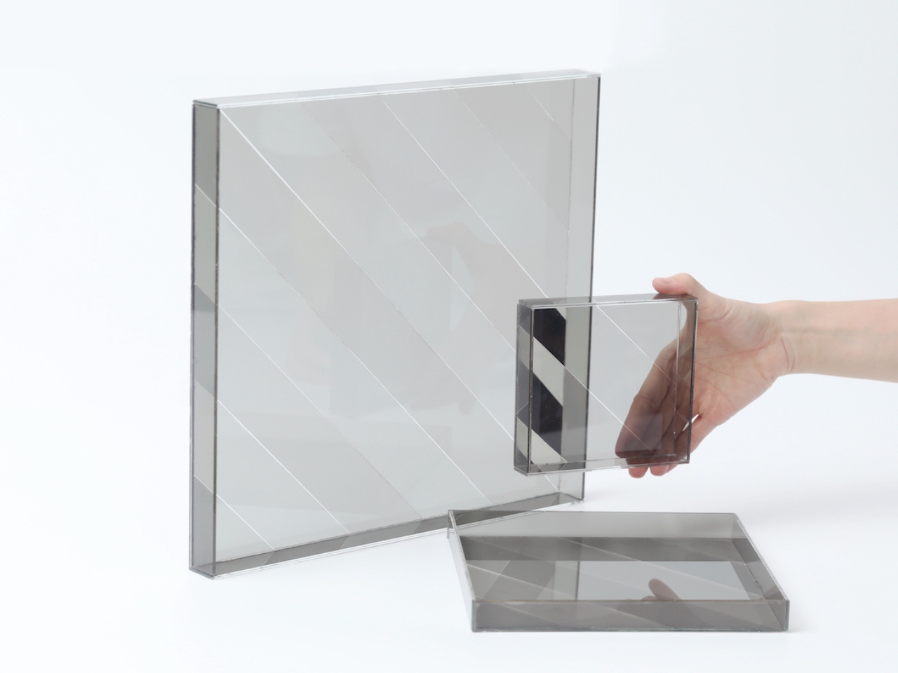
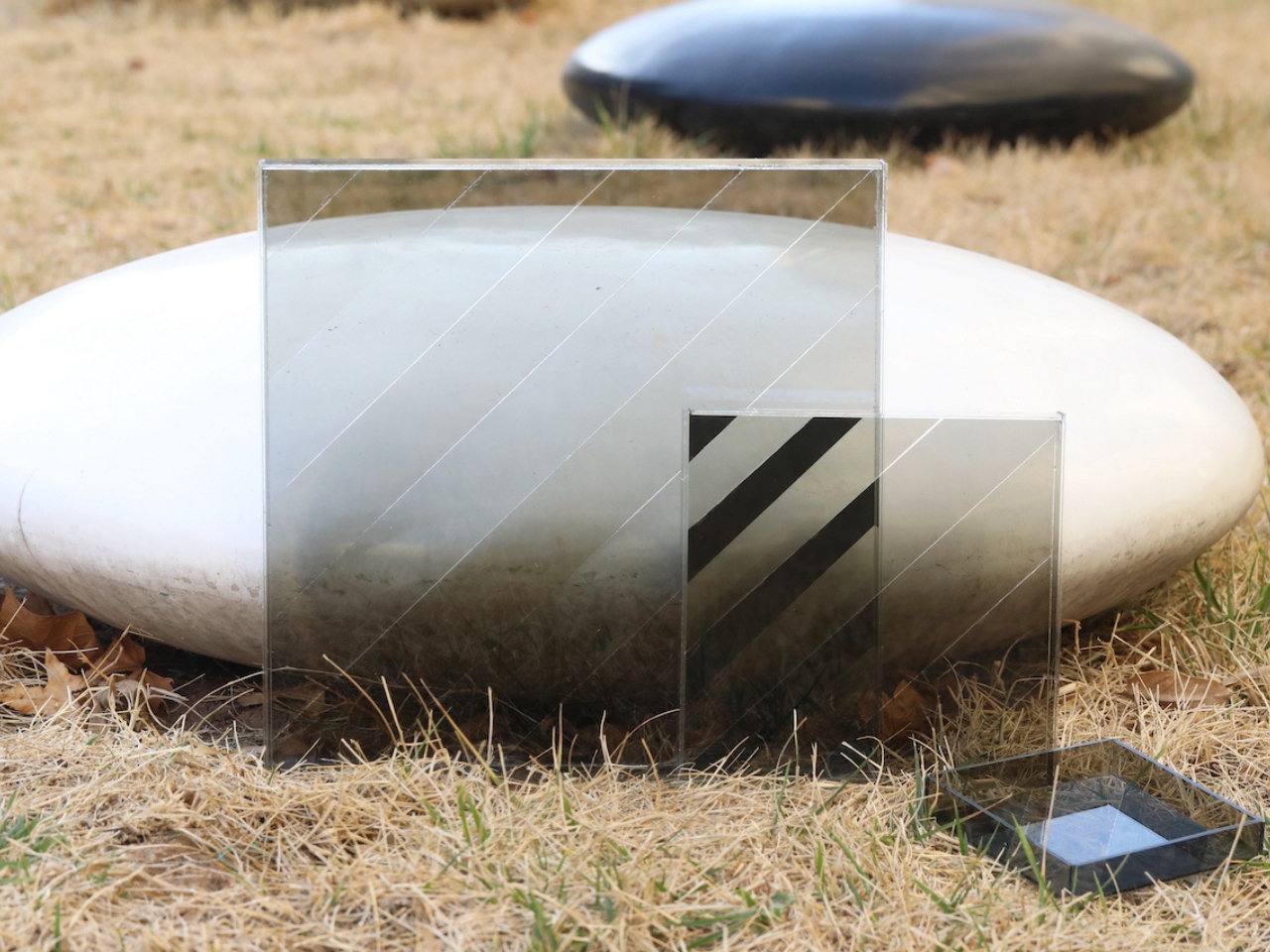
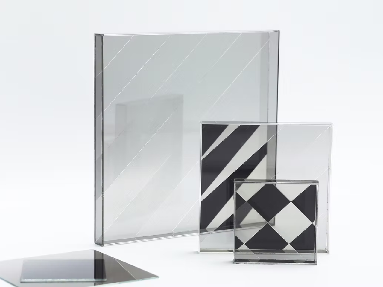
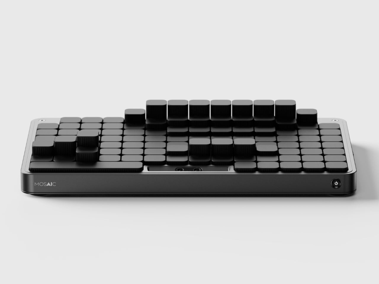
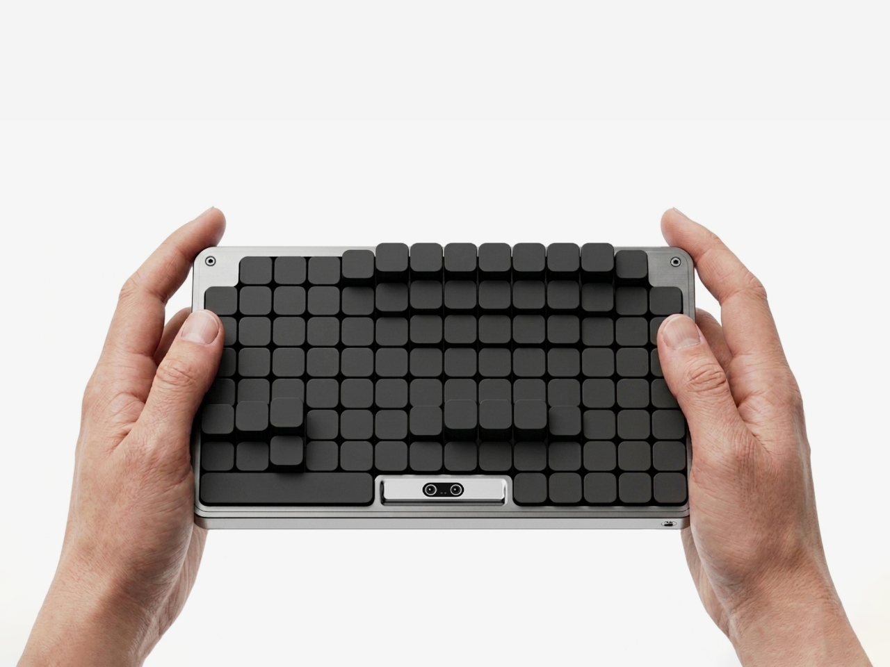
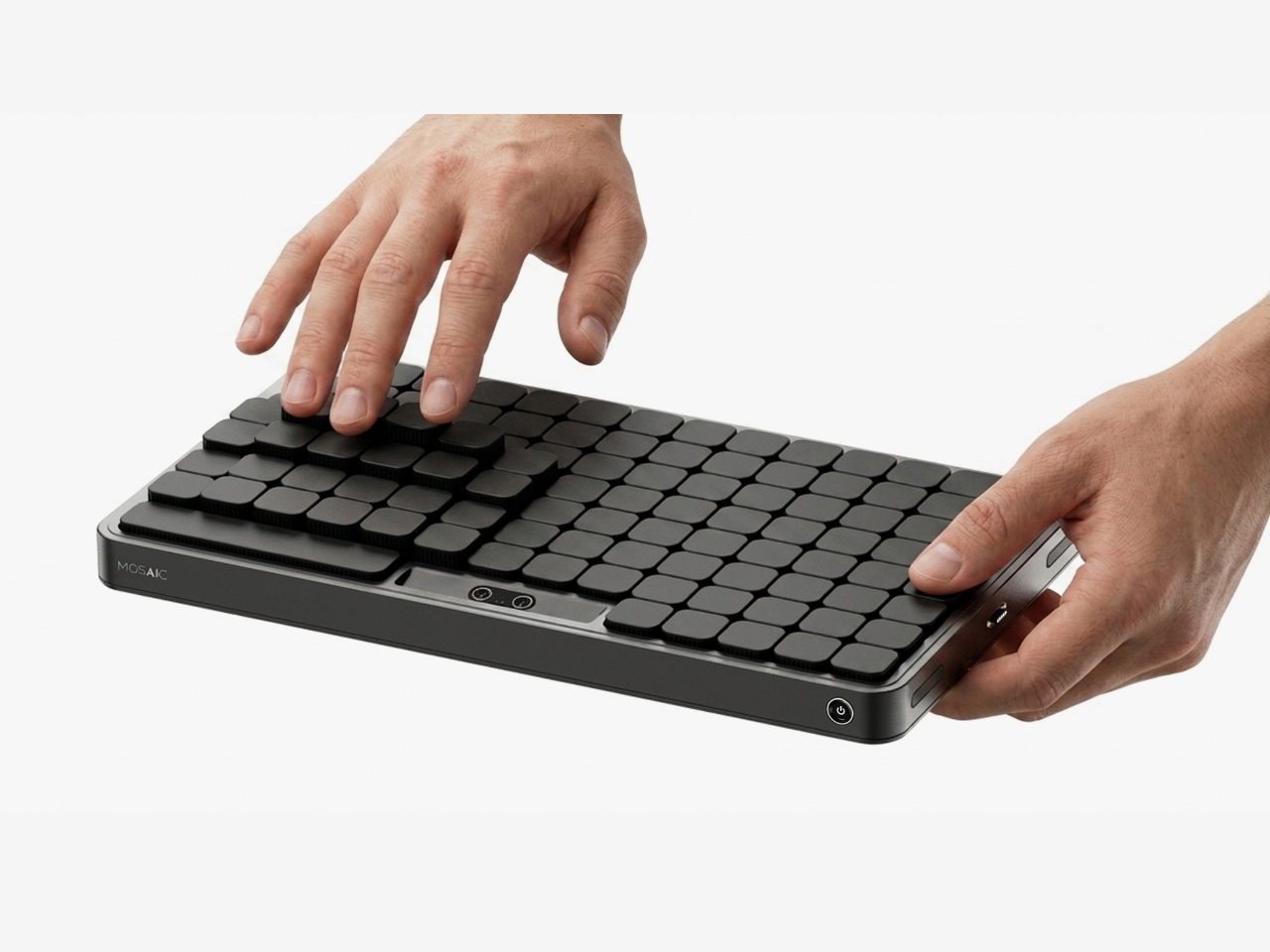
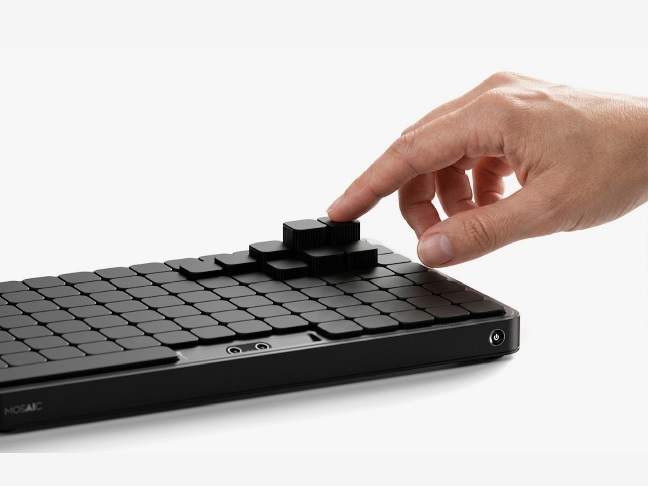
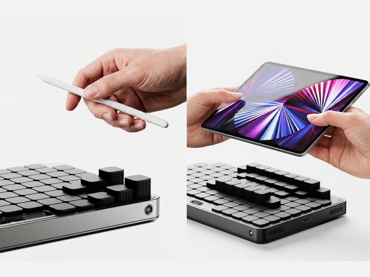
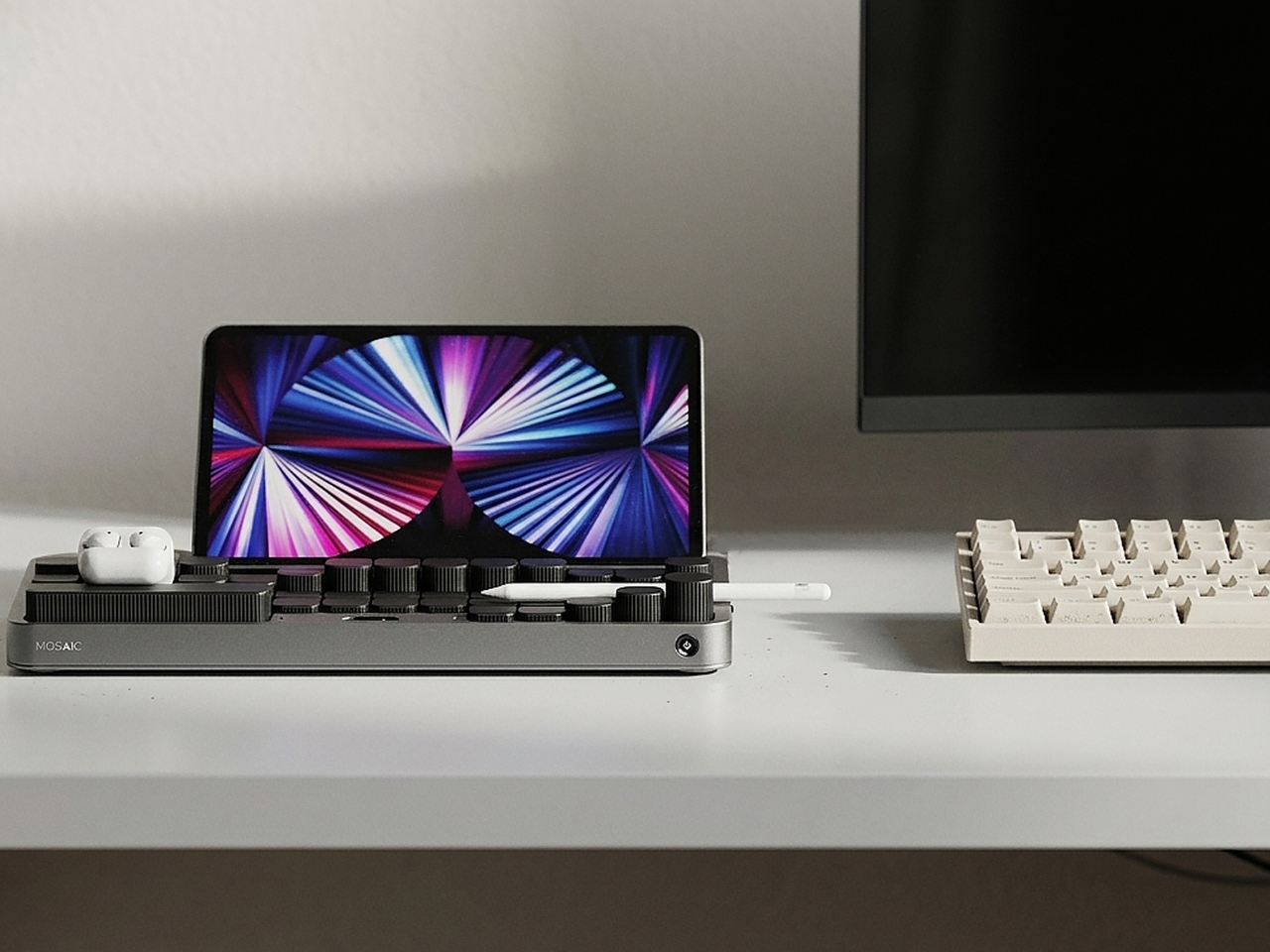
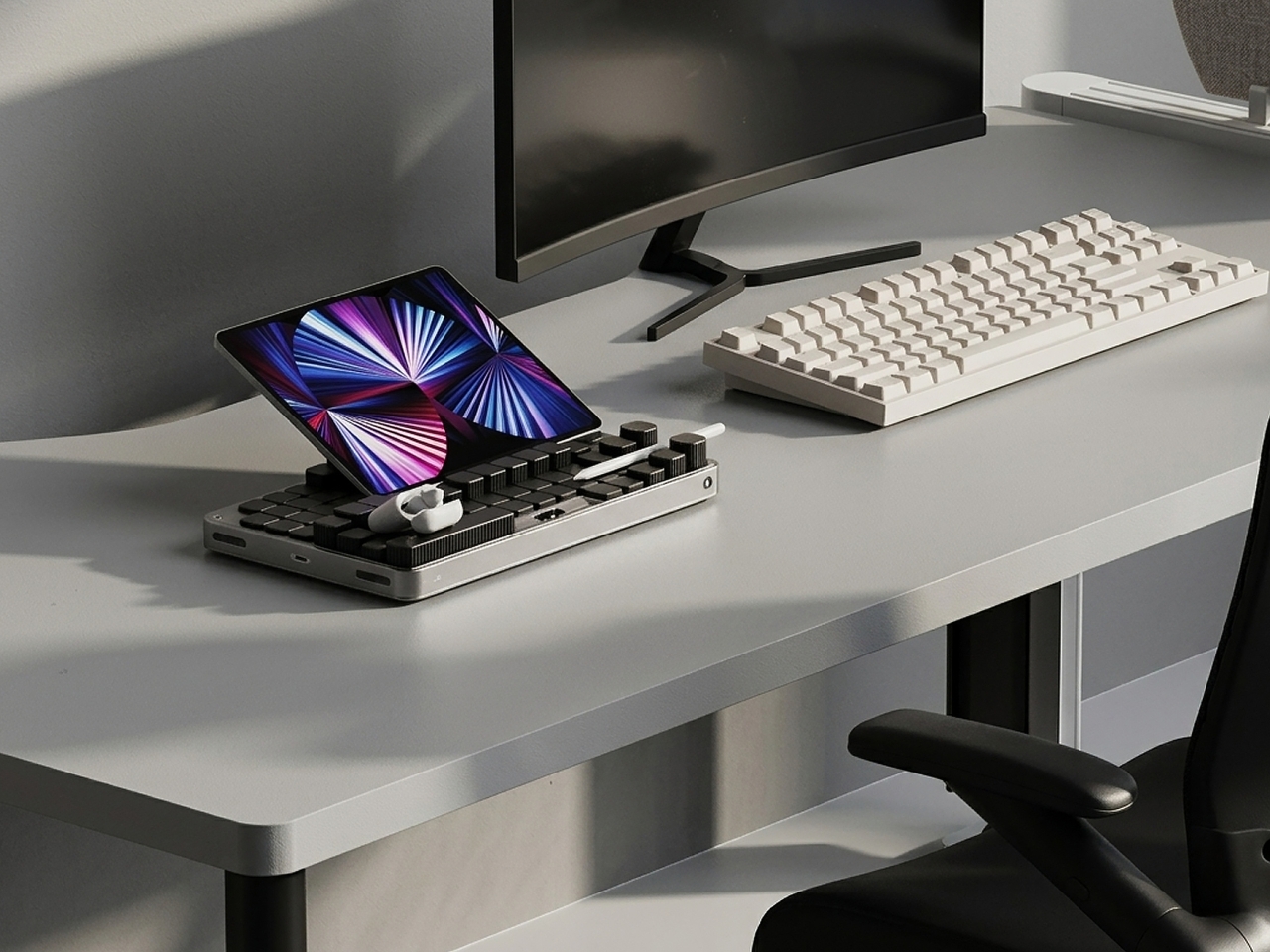
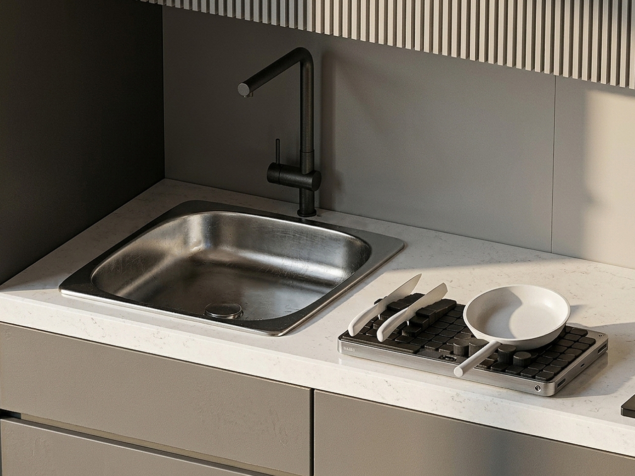
Mosaic is an AI tray that transforms its shape depending on what you place on it. The idea, at its simplest: put your things down, and the tray reconfigures around them. The modular structure shifts and reorganizes to accommodate whatever you’re dropping in: your phone, your keys, a charging cable, a stray lip balm. It reads the objects and makes room for them. What the concept proposes is essentially the end of the one-size-fits-all desk organizer, and I think that’s a very good thing.
Designer Name: Youngbin Kwon
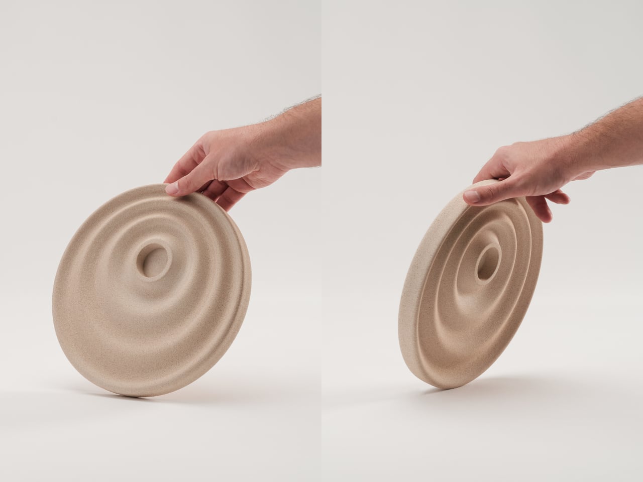
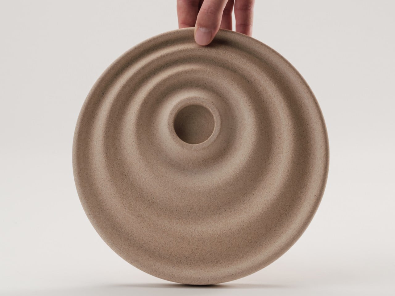
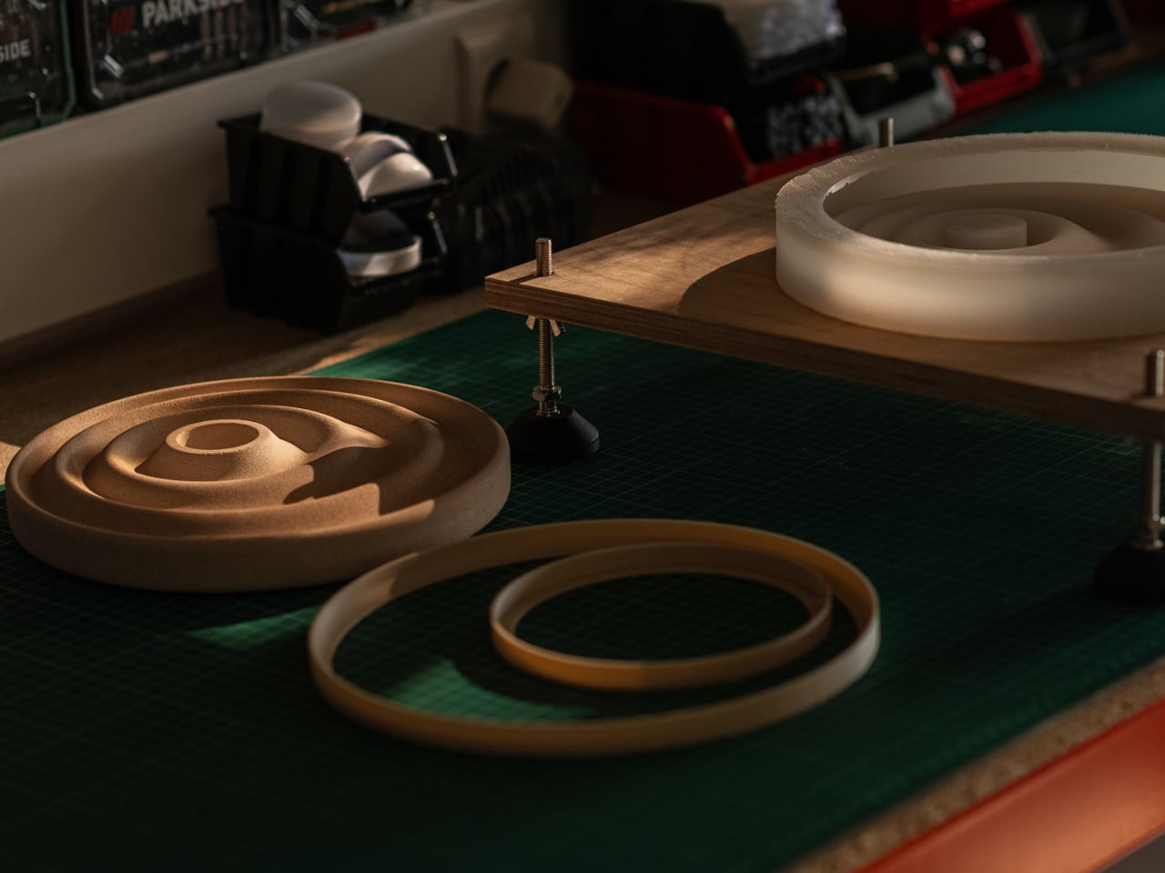
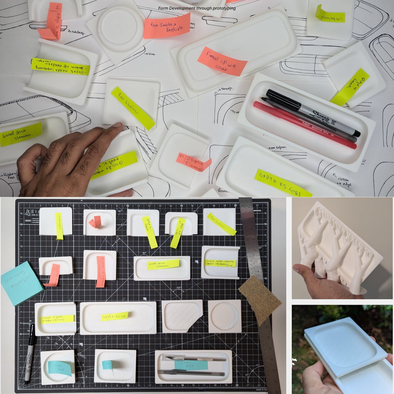
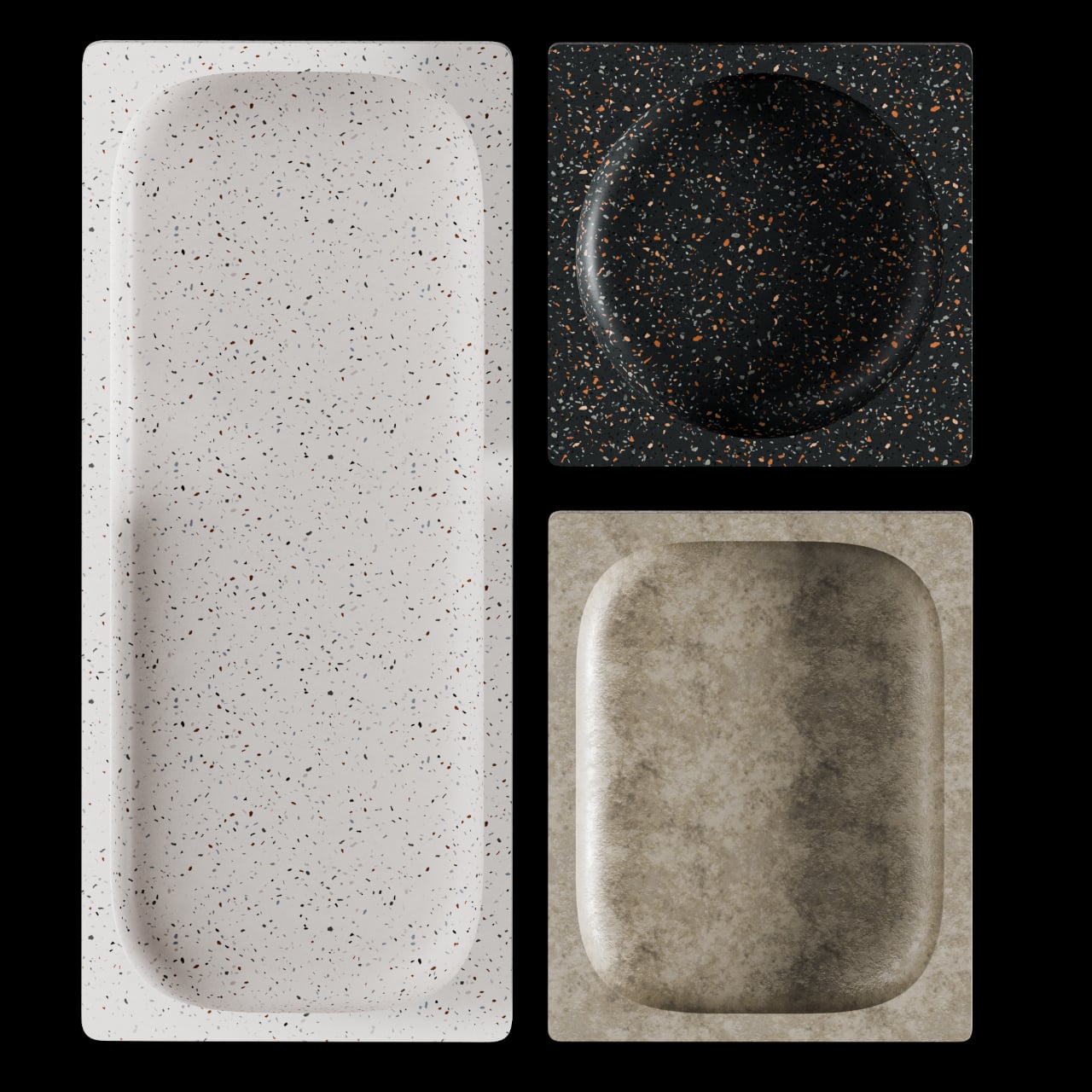
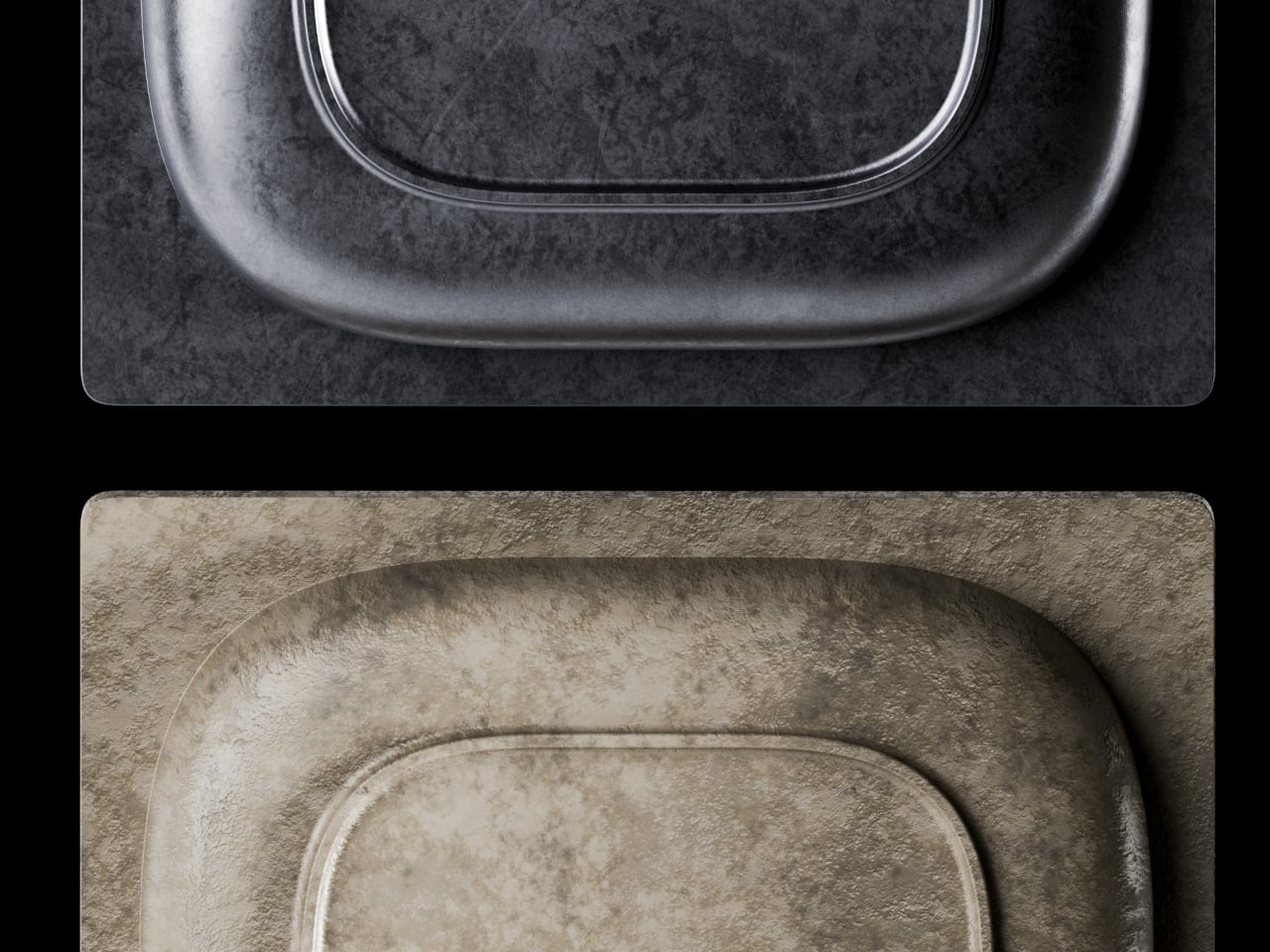
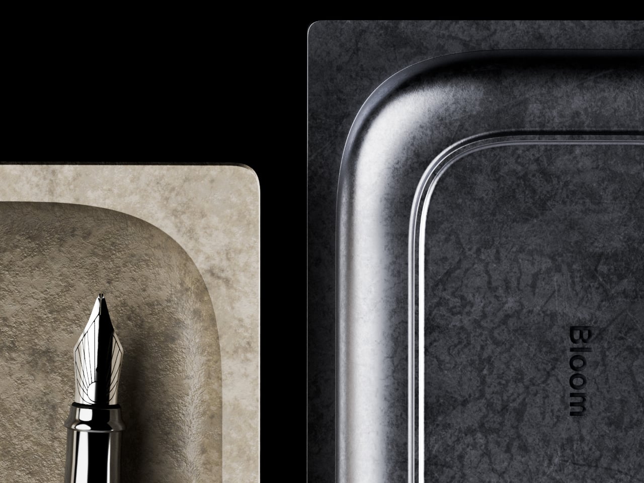
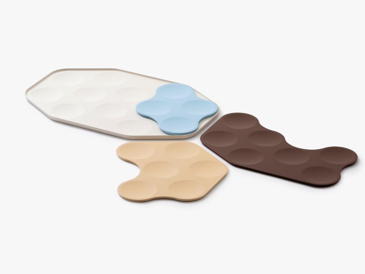
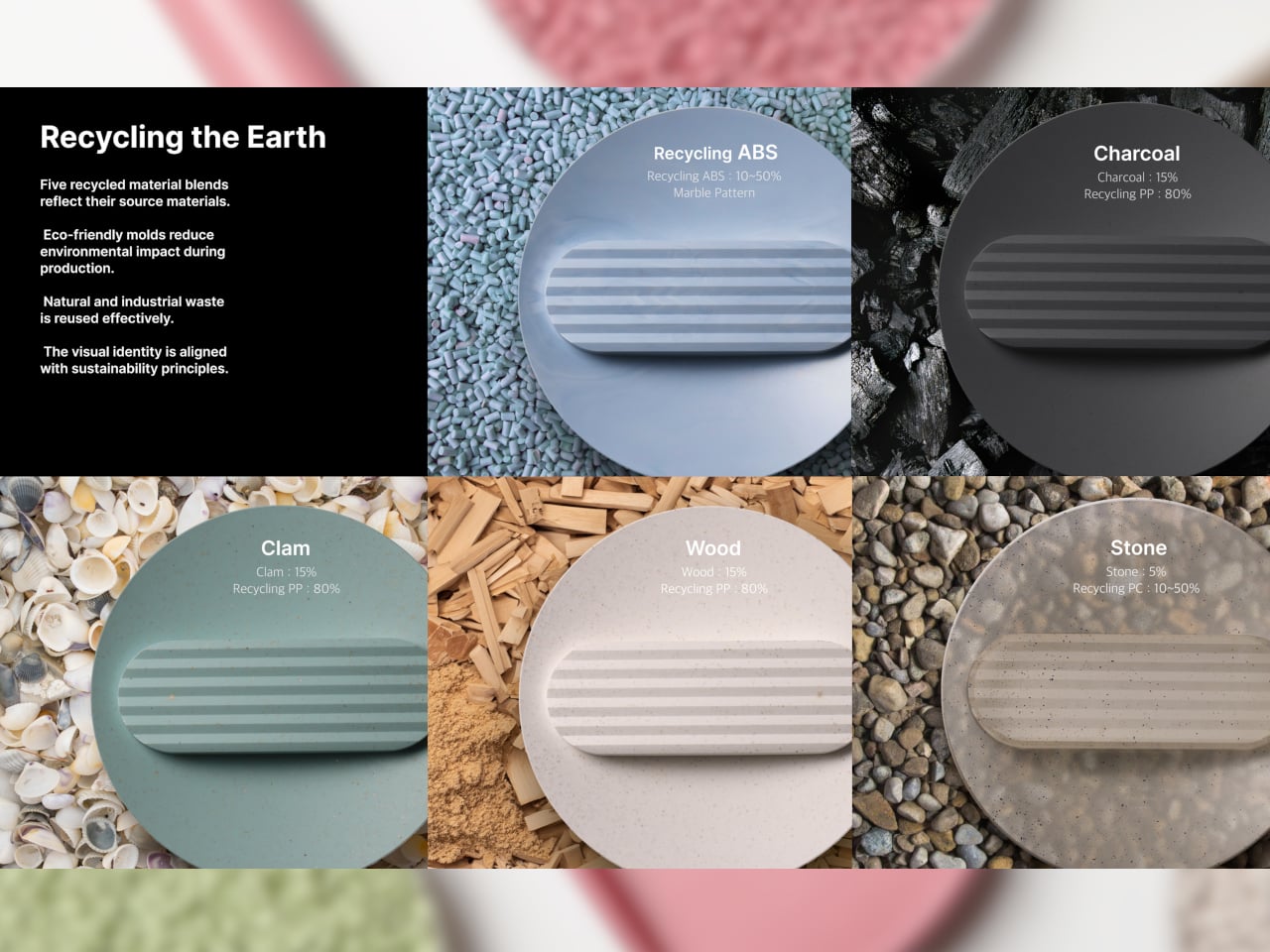
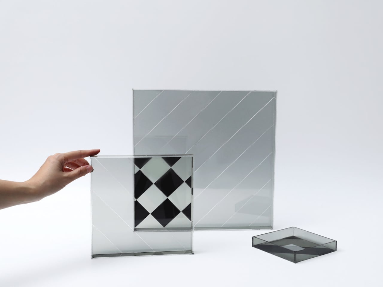
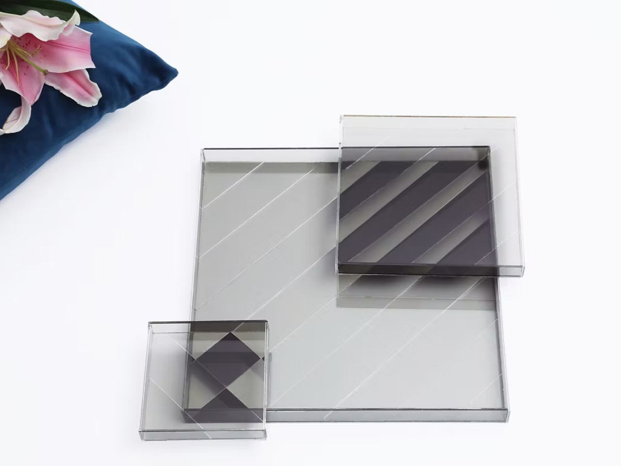
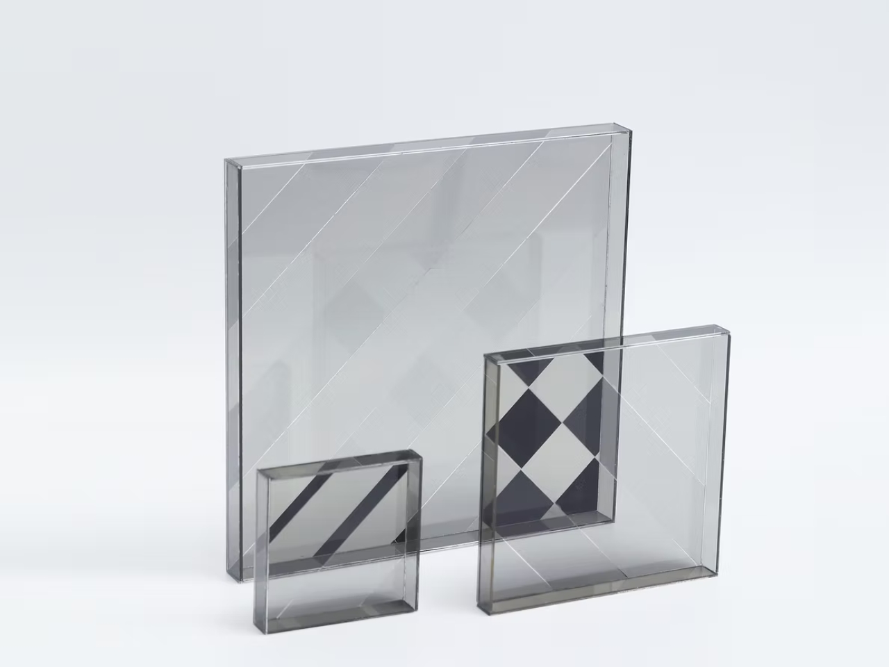
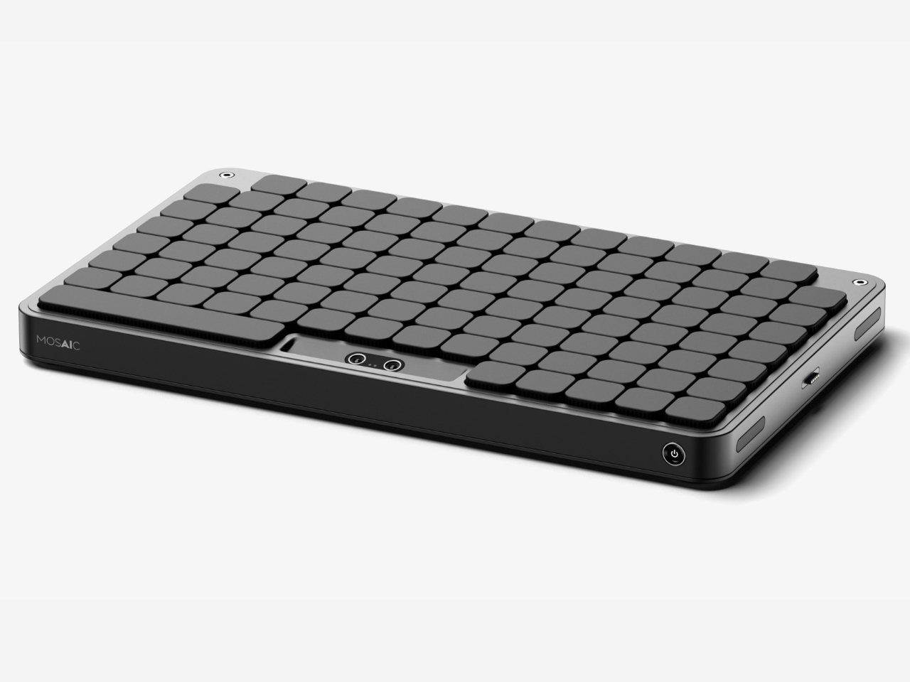
The design is the work of Kwon, an industrial design student from Chung-Ang University in Seoul, published this May on Behance, where it’s been pulling in appreciations at a rate that suggests the design community noticed. Built in Rhinoceros and rendered in Keyshot, the concept is visually clean and grounded, with a restraint that keeps the focus on the idea rather than the spectacle. This isn’t speculative design that lives only in dreamland. It feels like something that could exist with the right engineering team behind it.

But the part of the concept that deserves more attention than the mechanics is the philosophy behind it. Kwon describes the act of placing objects with AI assistance as being “as if playing,” and the idea is that this playfulness is exactly what leads people to actually develop organizational habits over time. Not guilt. Not a beautiful, aspirational flat-lay that makes you feel bad about your desk. Just play. That distinction is easy to underestimate.
That reframing matters more than it might seem at first. The market for organization products is enormous, and so is the gap between things people buy to get organized and how long they actually stay organized. That gap usually comes down to friction. The system is too rigid, or too much effort to maintain. Mosaic proposes that if the system flexes with you instead of demanding you flex with it, you’re far more likely to stick with it. Gamification applied to the most mundane domestic task. It’s clever.
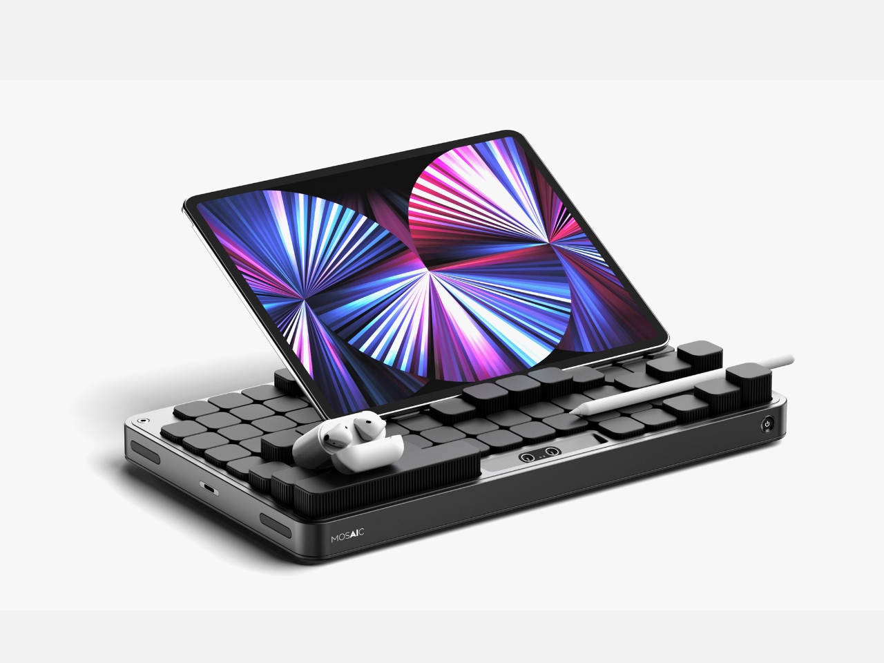
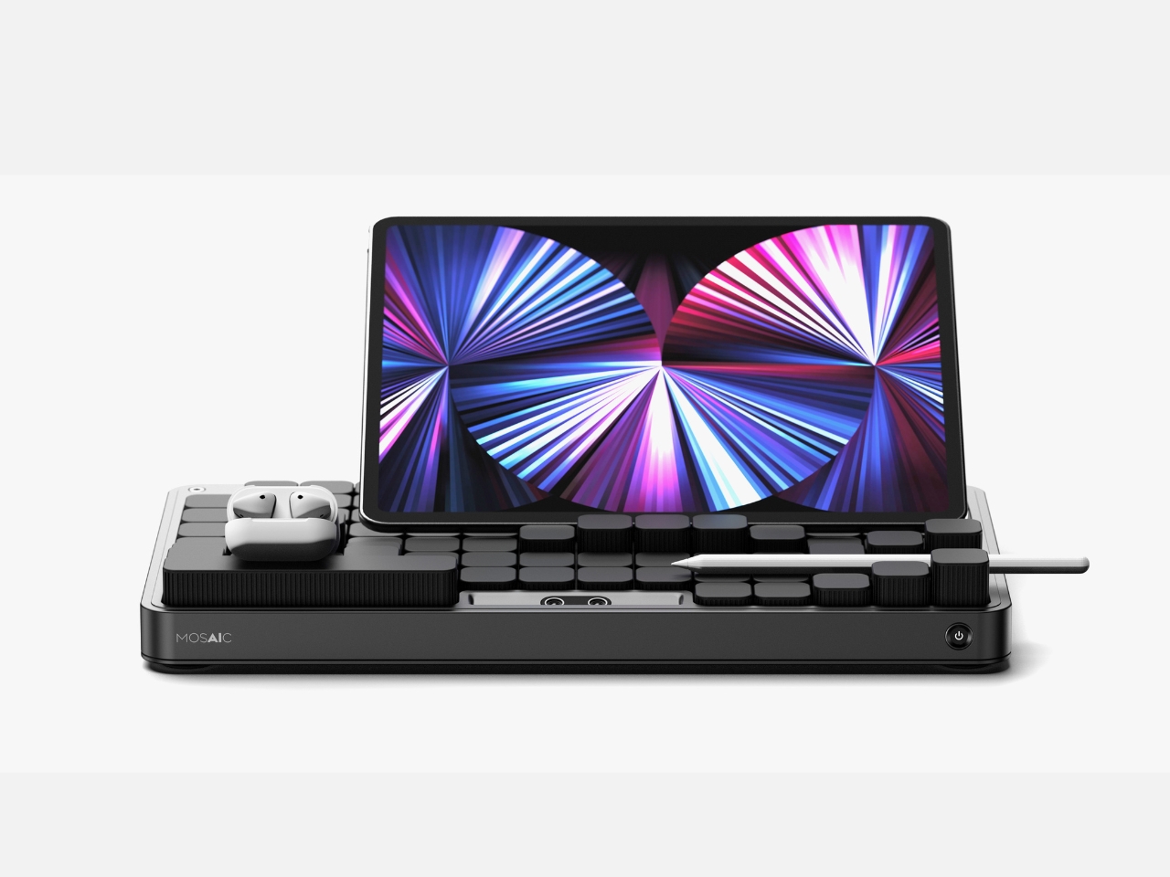
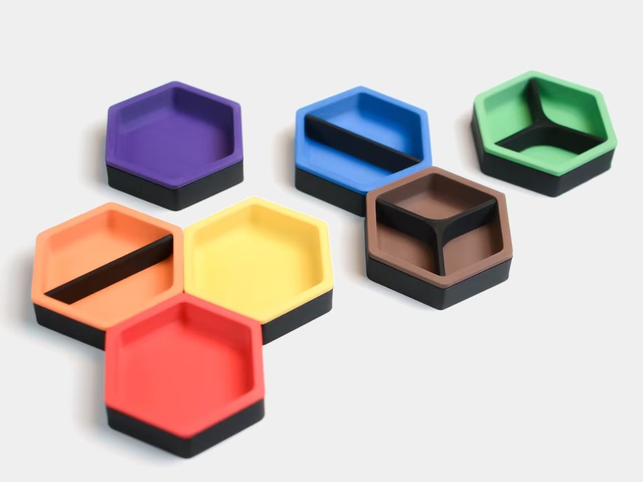
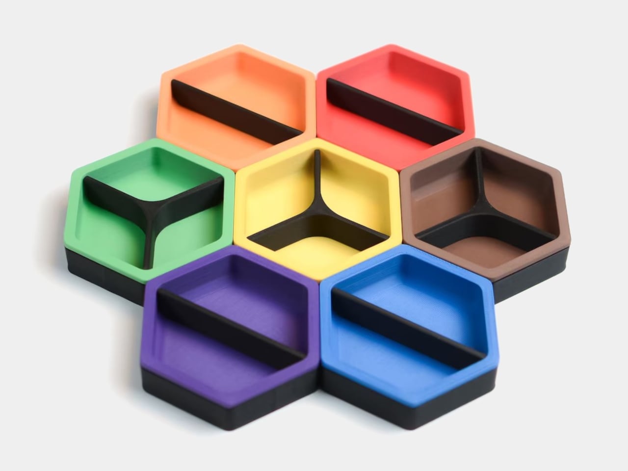
I’ll admit that the name Mosaic might be the most elegant thing about it. A mosaic is a picture made of small, individually unremarkable pieces that together create something intentional and whole. That’s exactly what the tray does. The modular components rearrange into a layout that looks curated, even when you’ve just dropped everything in at the end of a long day. The name does real conceptual work, and that’s rarer than you’d expect from a student project.
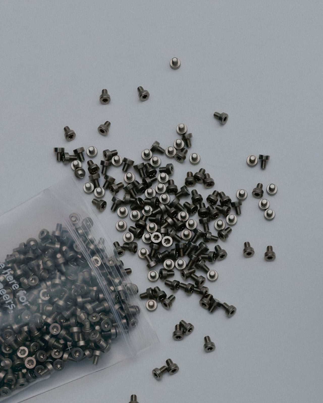
There are real questions left unanswered, as there always are at the concept stage. How exactly the AI identifies objects, whether it uses cameras, weight sensors, or something else, isn’t detailed in the project. The durability of moving parts in a daily-use context is worth thinking about. Whether the transformation happens visibly and slowly, like something mechanical, or snaps quickly into place, would change the entire experience of using it. These are the things that turn a concept into a product, and Kwon’s Mosaic is still very much a concept.
But good concepts don’t need to be finished products to be worth paying attention to. What Mosaic does well is identify a real and relatable failure mode, the organizational system that doesn’t survive contact with actual human behavior, and propose a solution that works with people rather than against them. The tray that meets you where you are. That’s not a small idea dressed up in a sleek render. That’s a fundamental rethink of what we expect everyday objects to do, and it’s worth watching where it goes.
The post AI Finally Solved the Desk Organizer Nobody Actually Uses first appeared on Yanko Design.