There’s a quiet arrogance built into most tools. Someone in a design studio somewhere decided how your hand should hold a screwdriver, how long the shaft should be, how thick the grip ought to feel. They tested it on a handful of people, ran the ergonomic studies, picked a shape, and shipped it to millions. The assumption is always the same: one form, optimized for an average that doesn’t actually exist, should work for everyone.
Siddhant Rai Garg’s final-year project at Central Saint Martins, titled Not Just Another Screwdriver, starts from a different place entirely. It asks a question that most product designers avoid because the answer is inconvenient: what if the person holding the tool is actually the best person to decide what it should feel like?
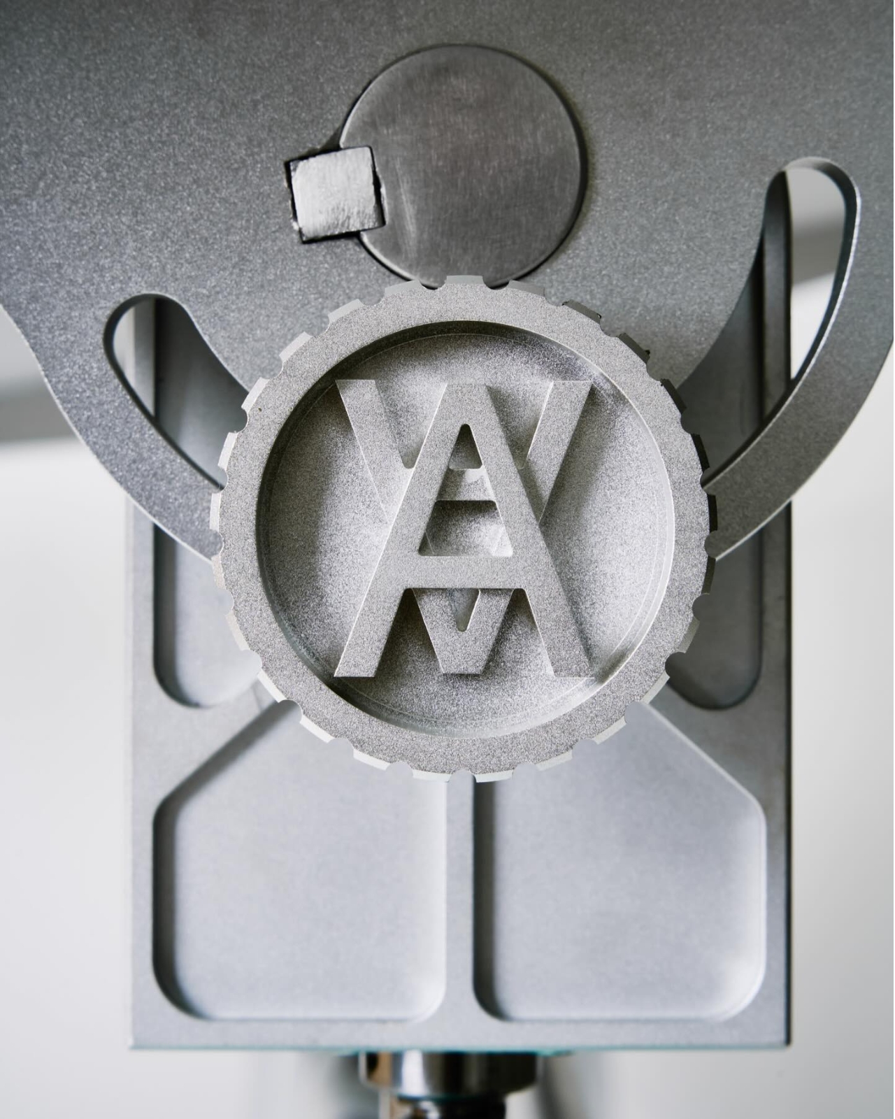
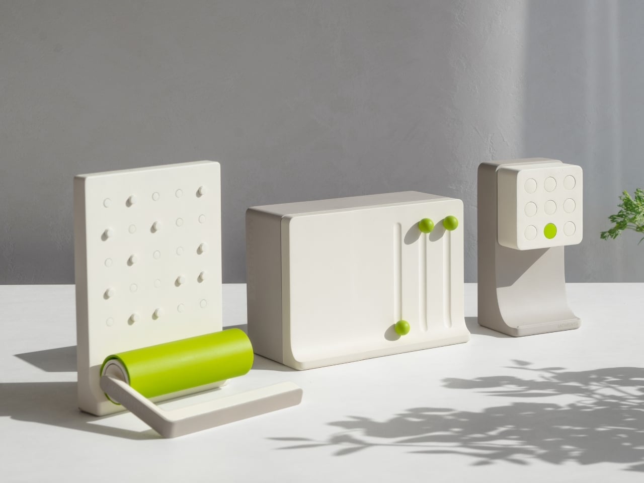
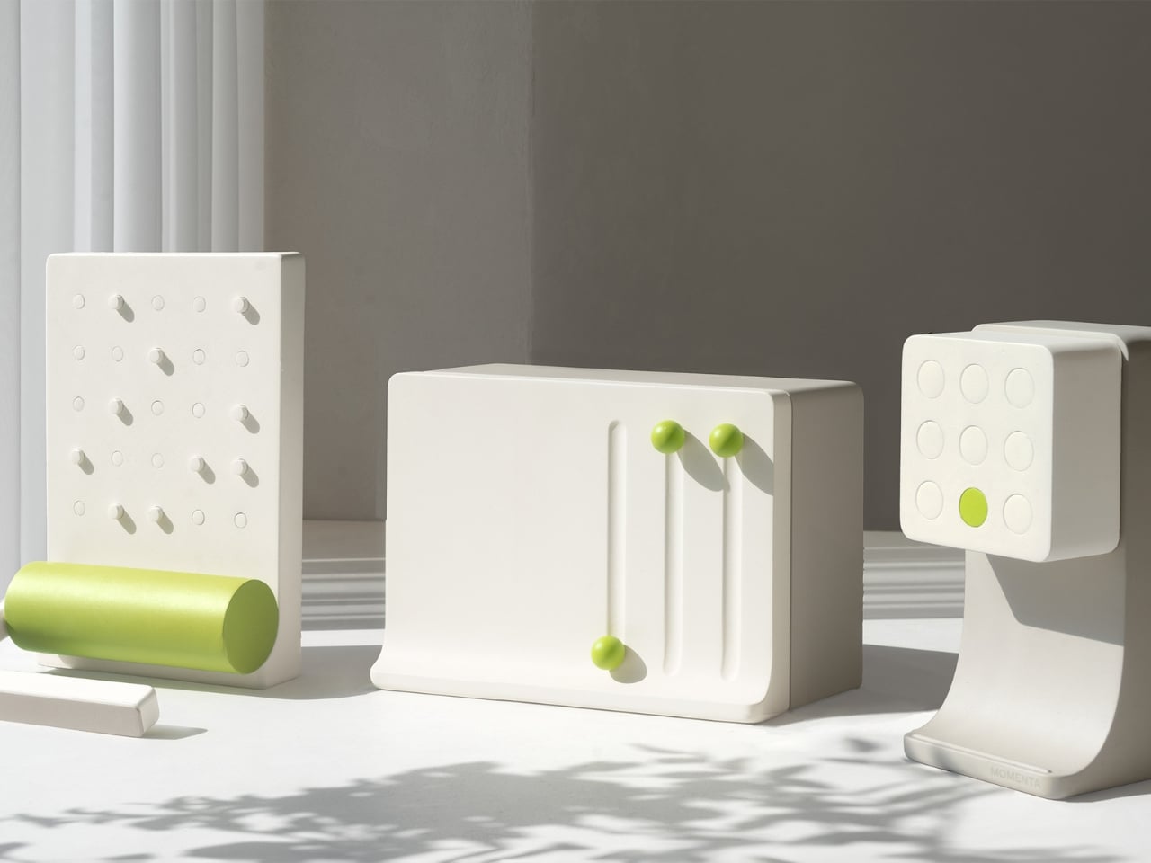
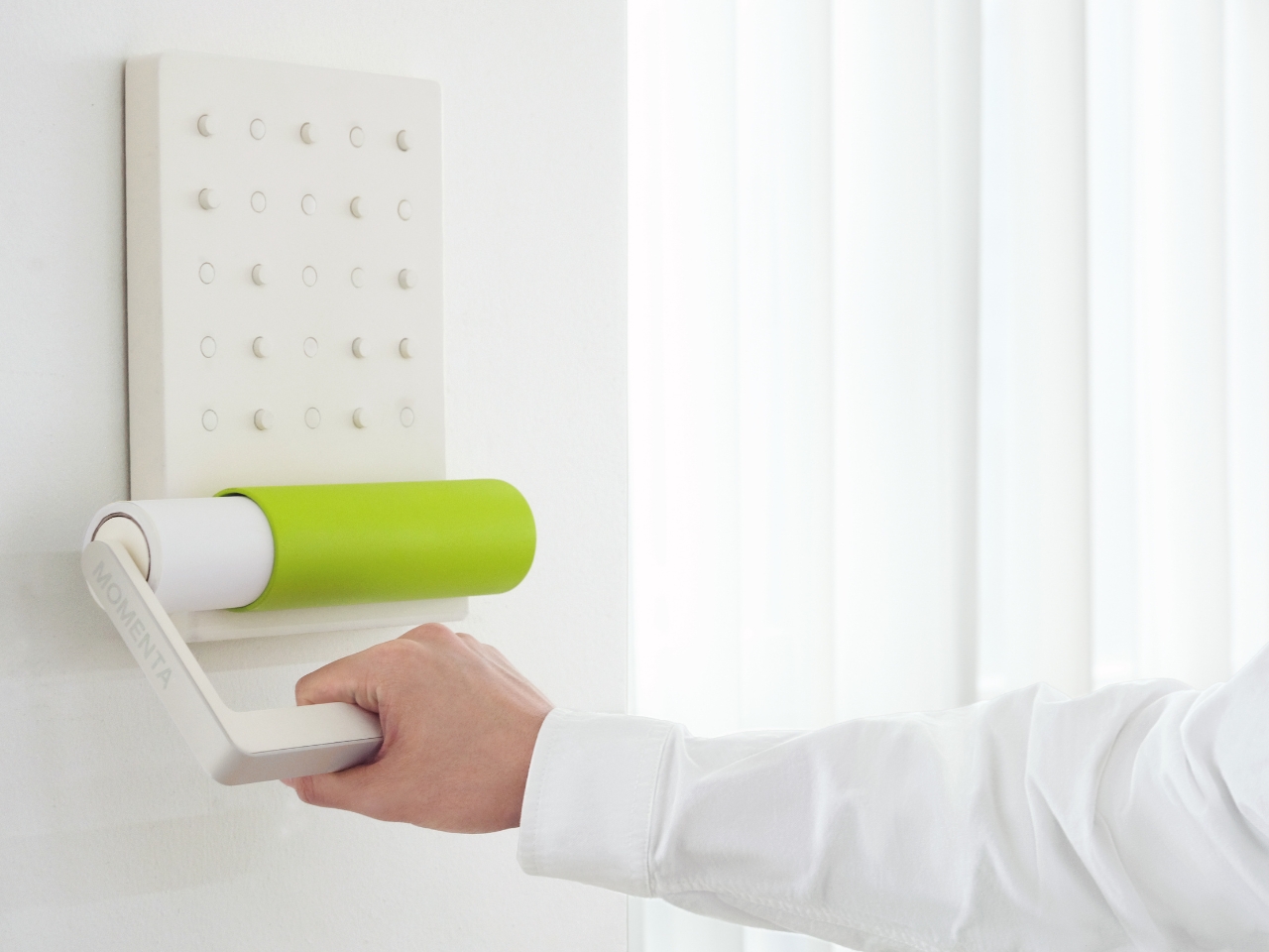
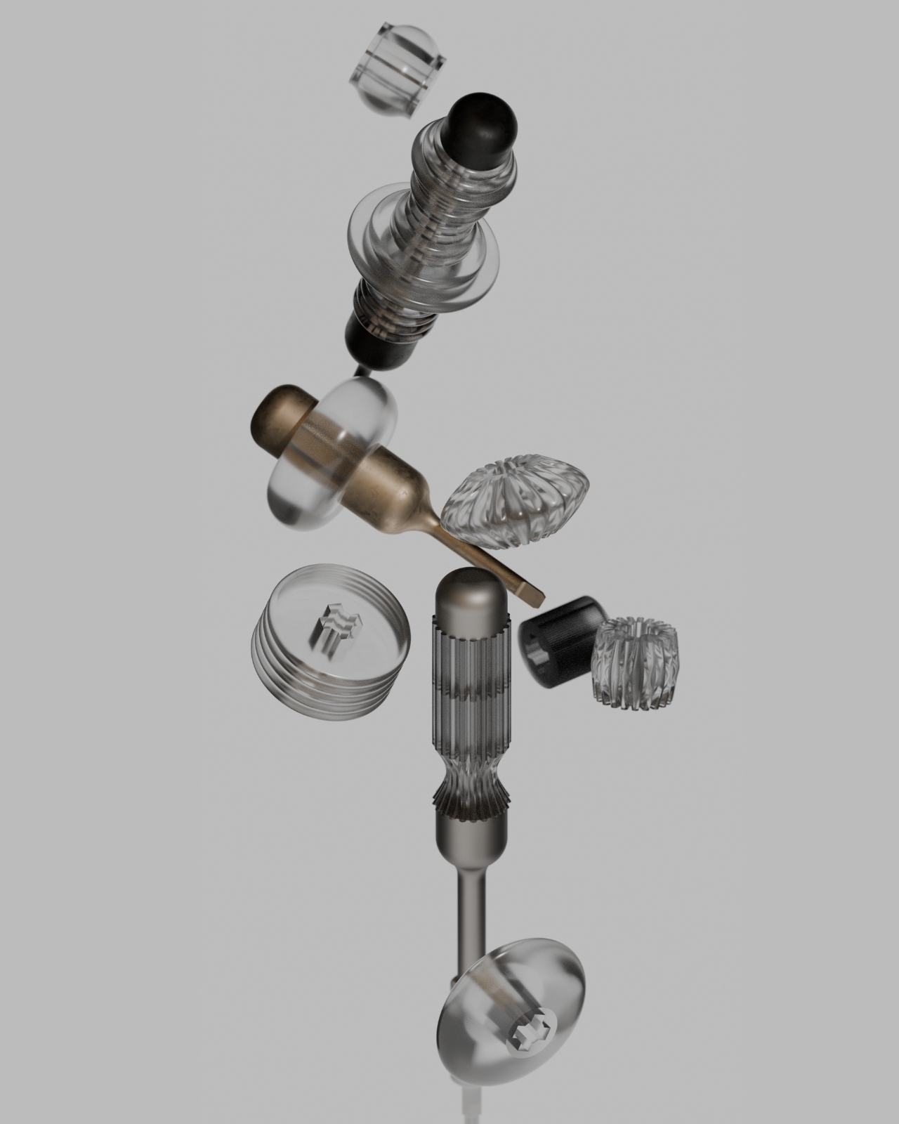
Designer: Siddhant Rai Garg
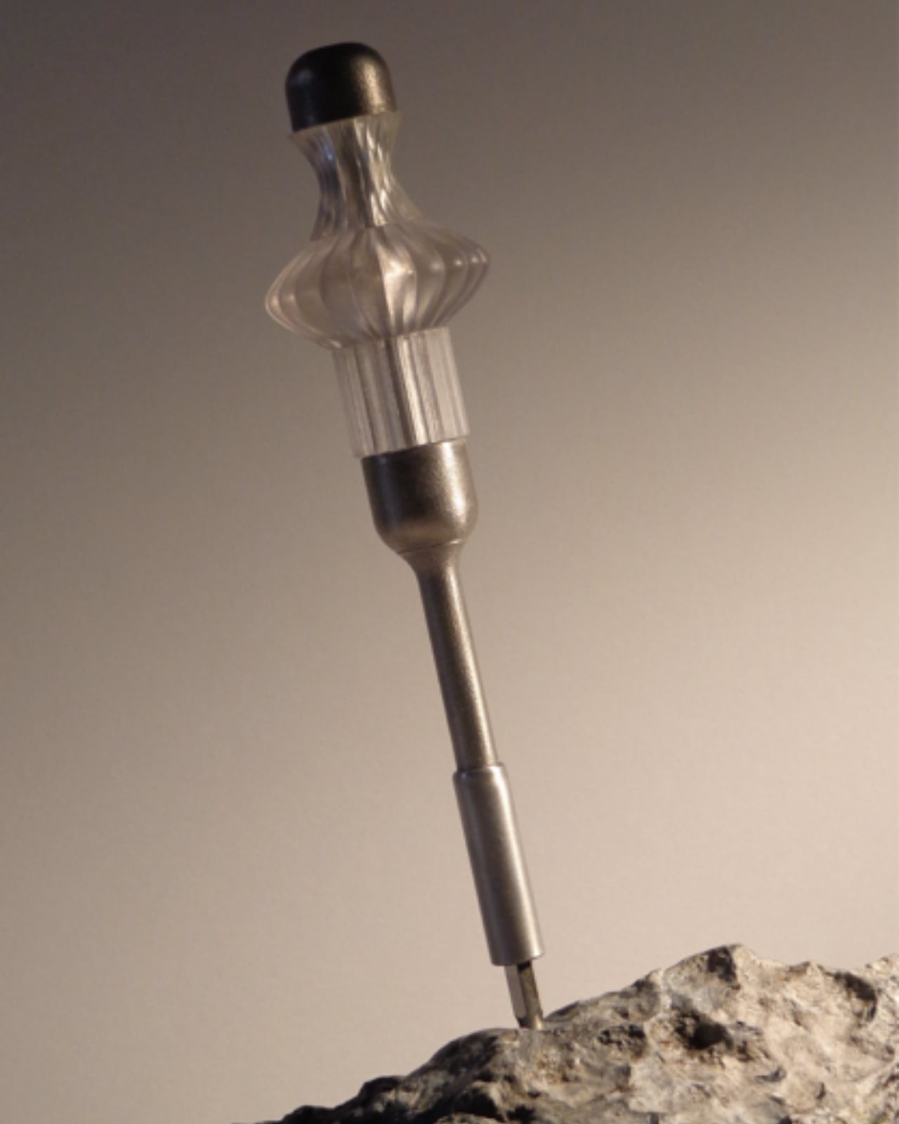
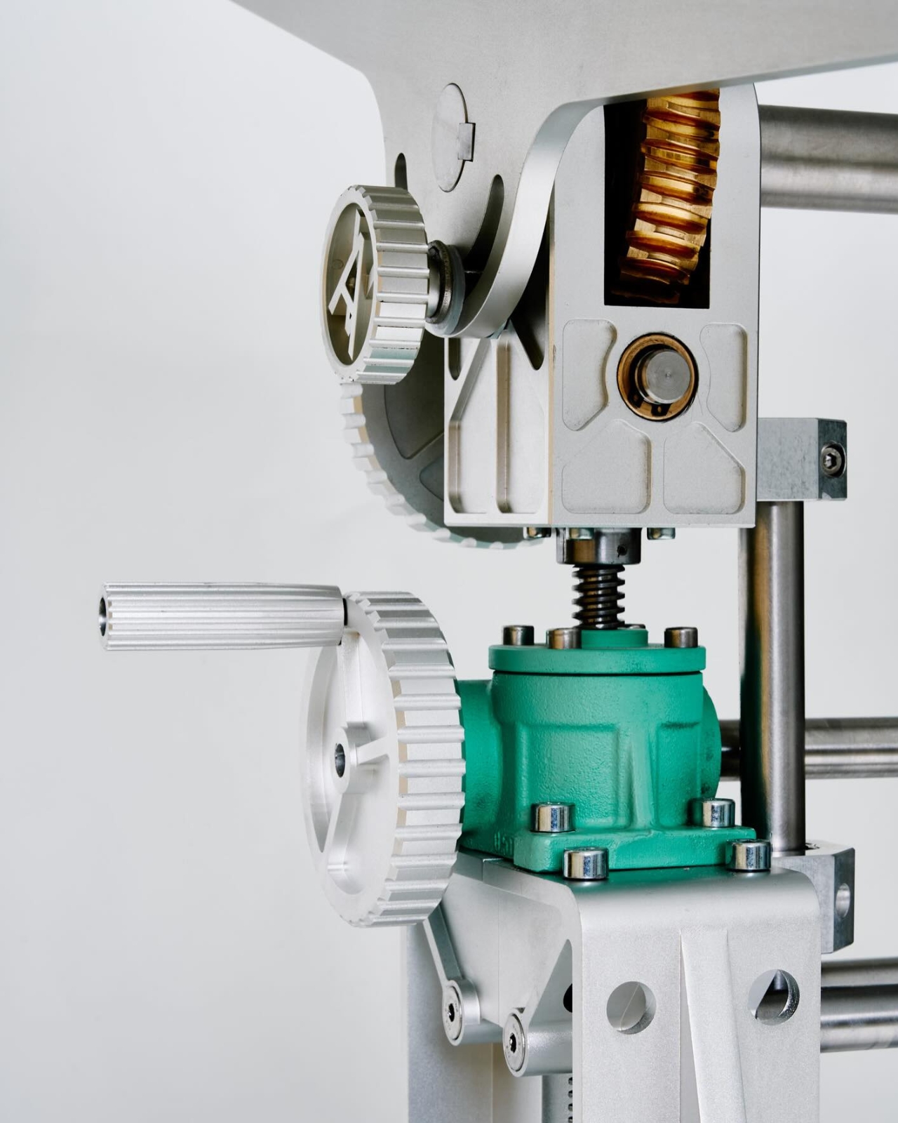
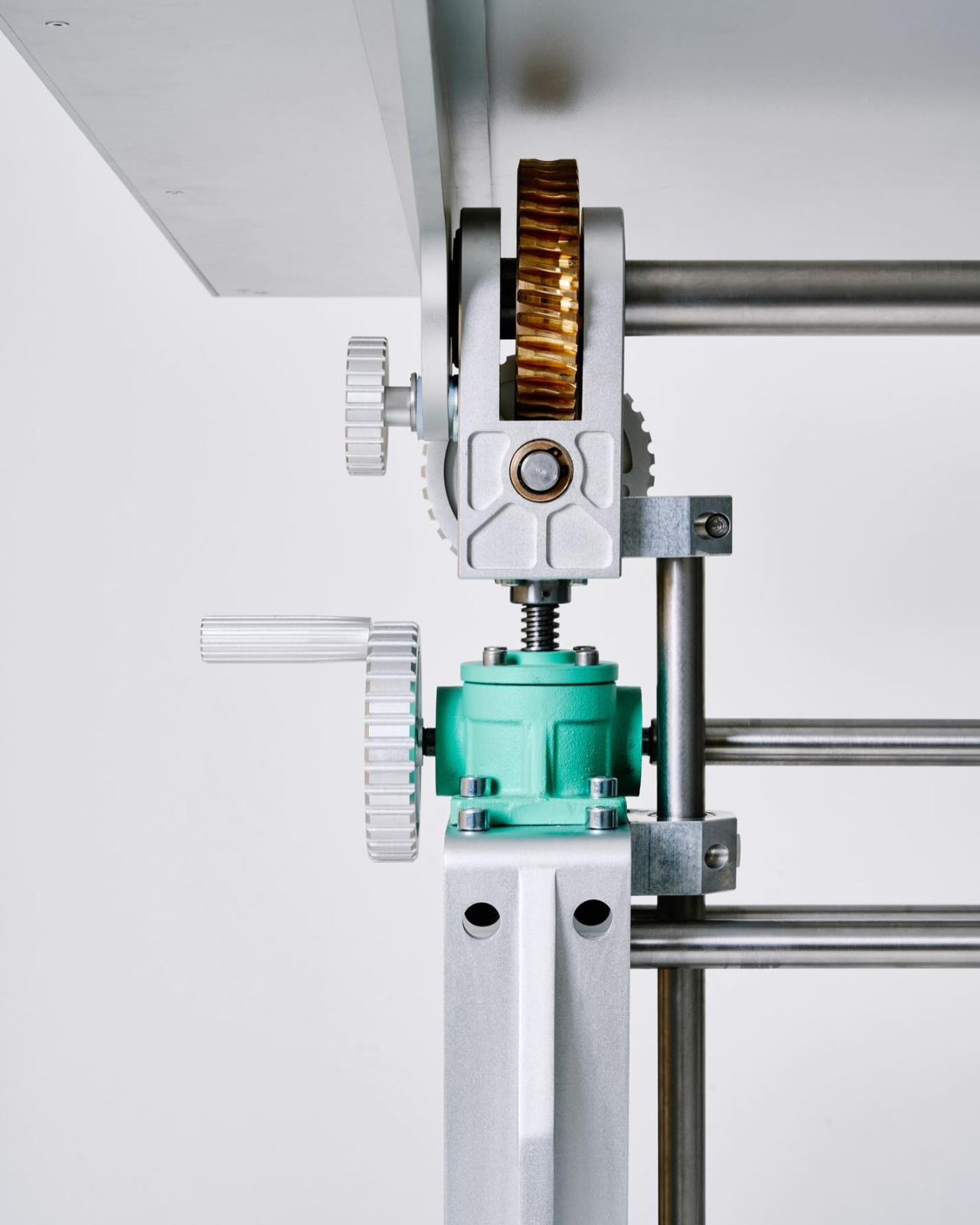
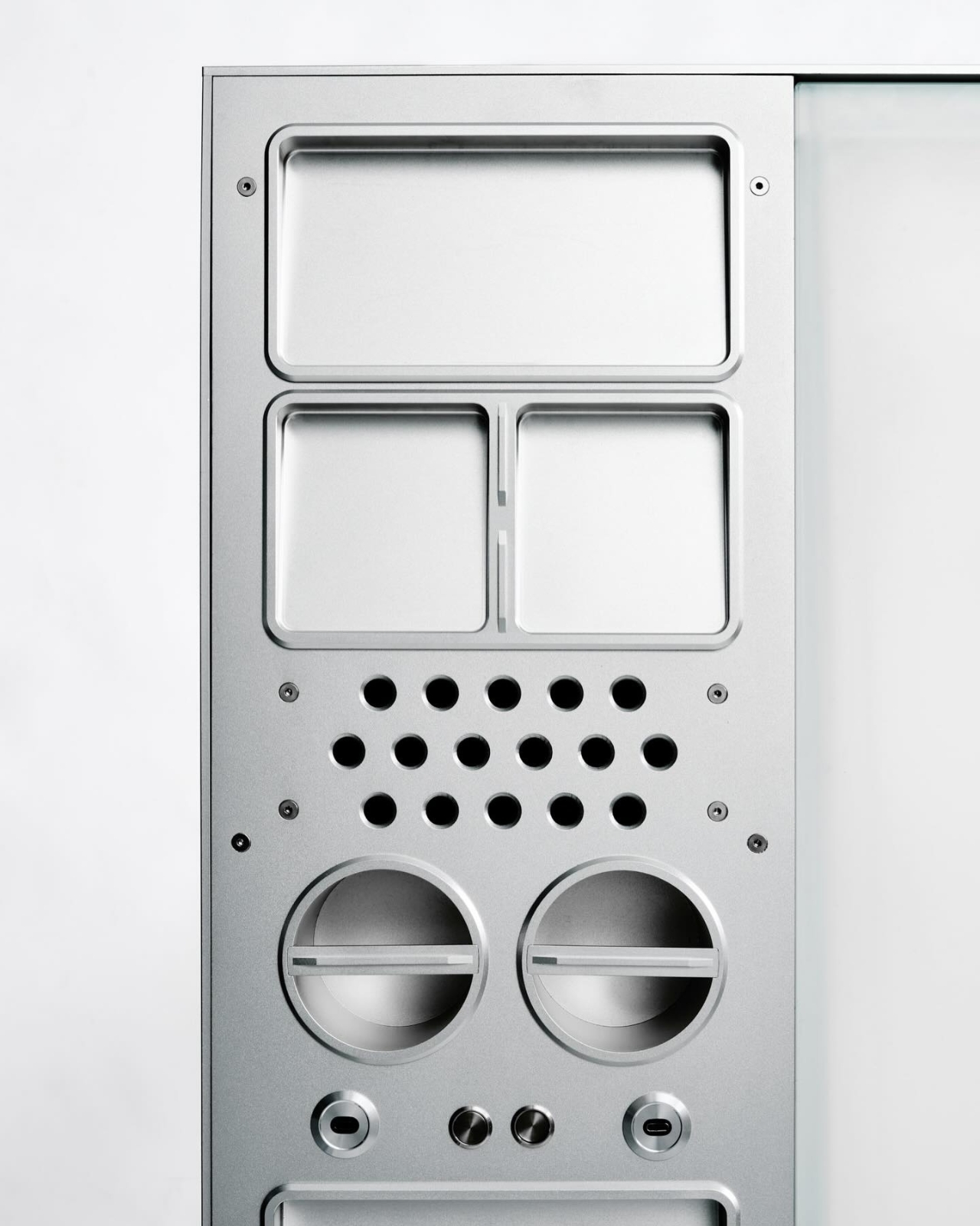
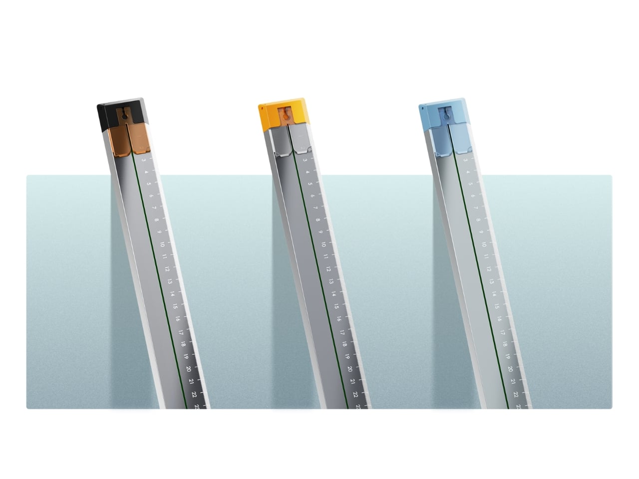
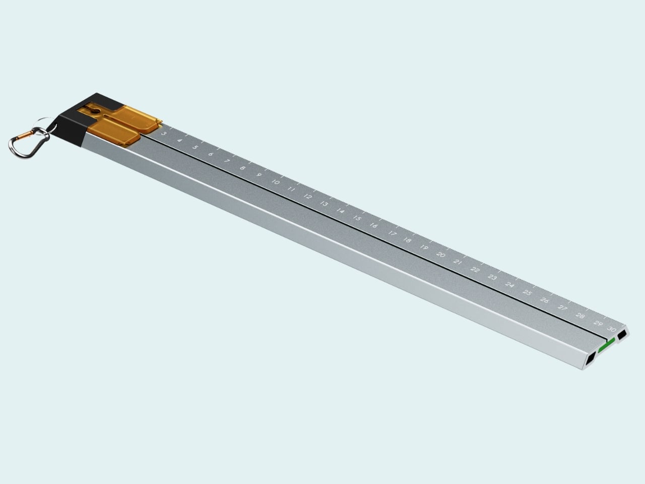
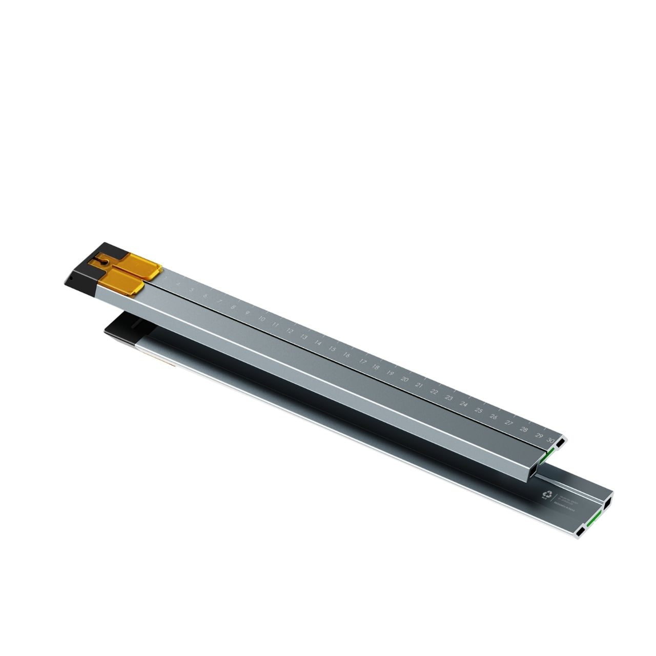
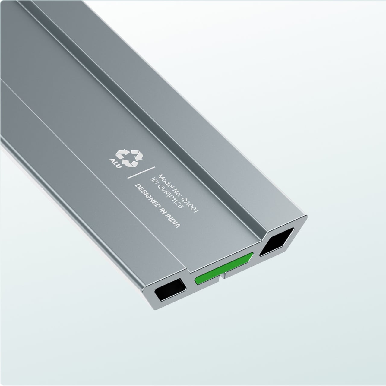
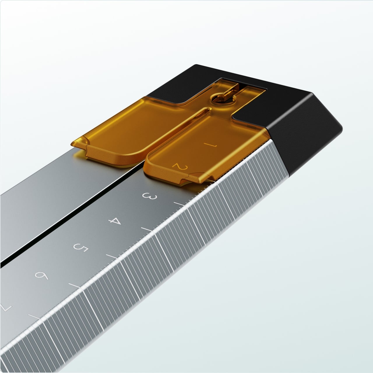
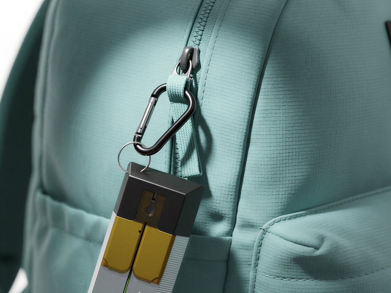
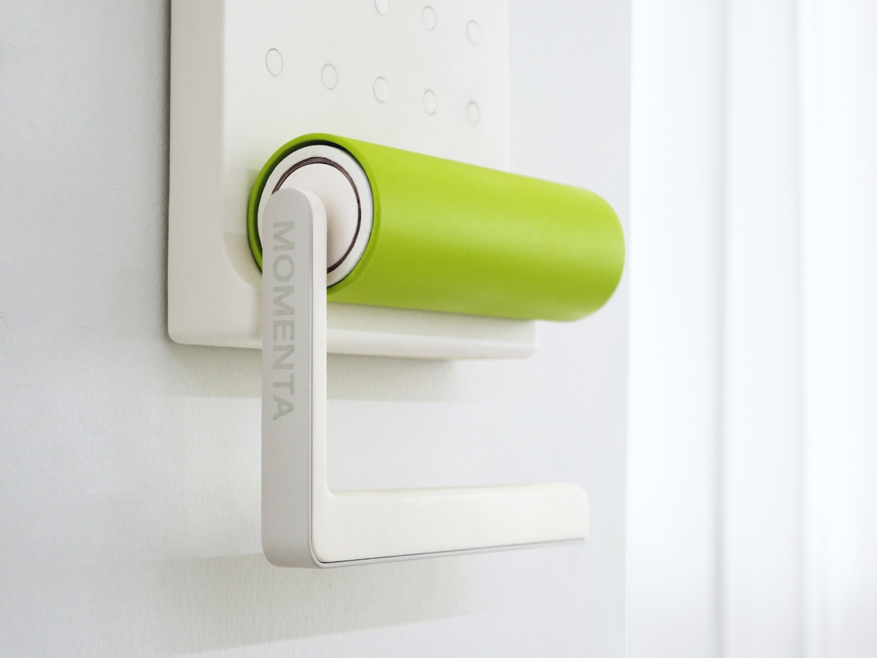
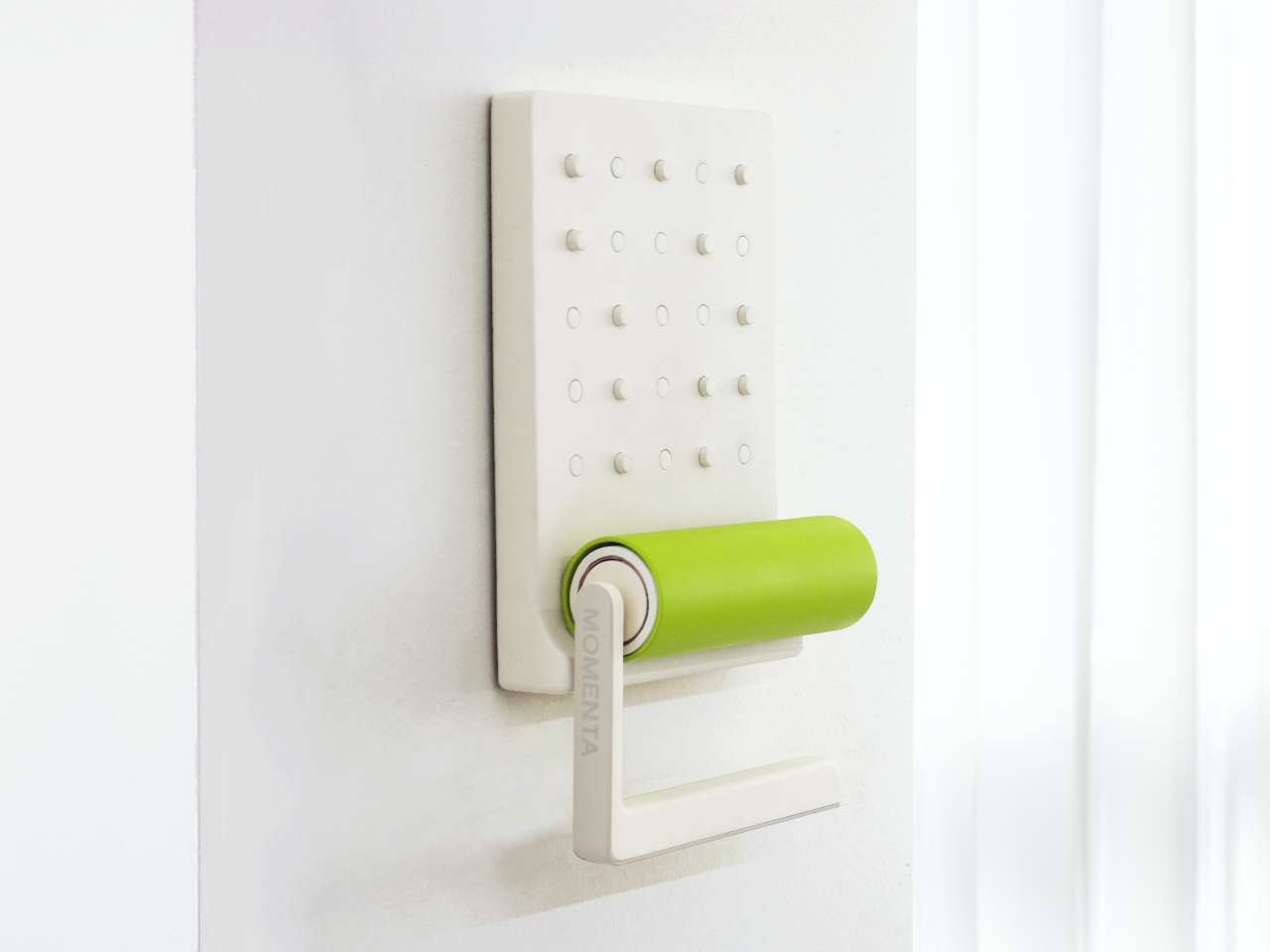
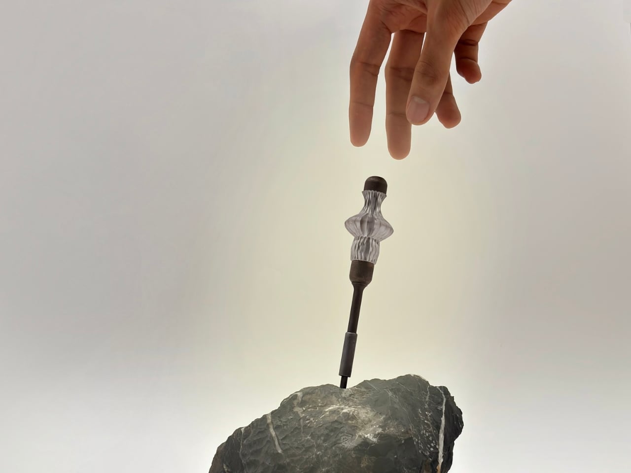
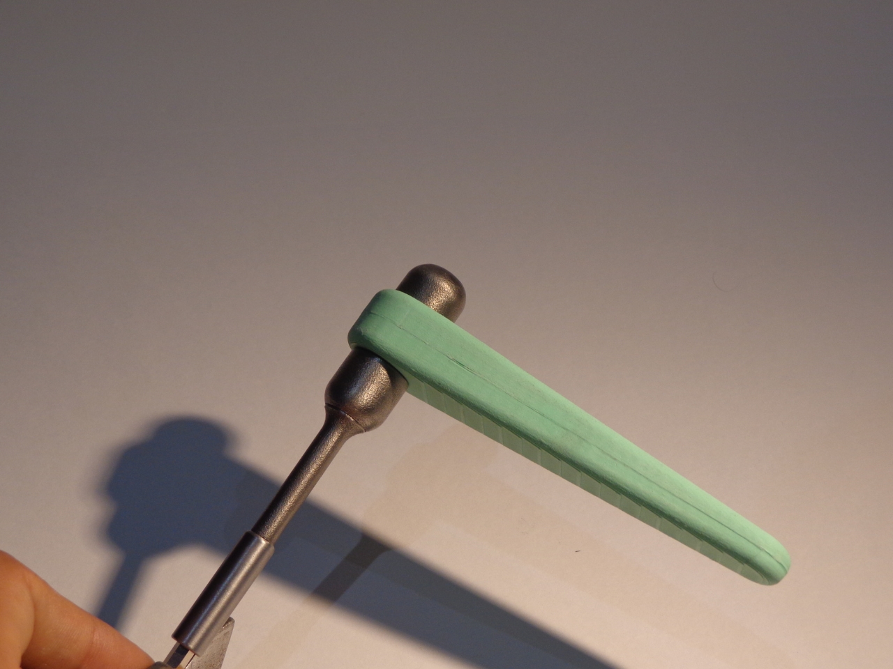
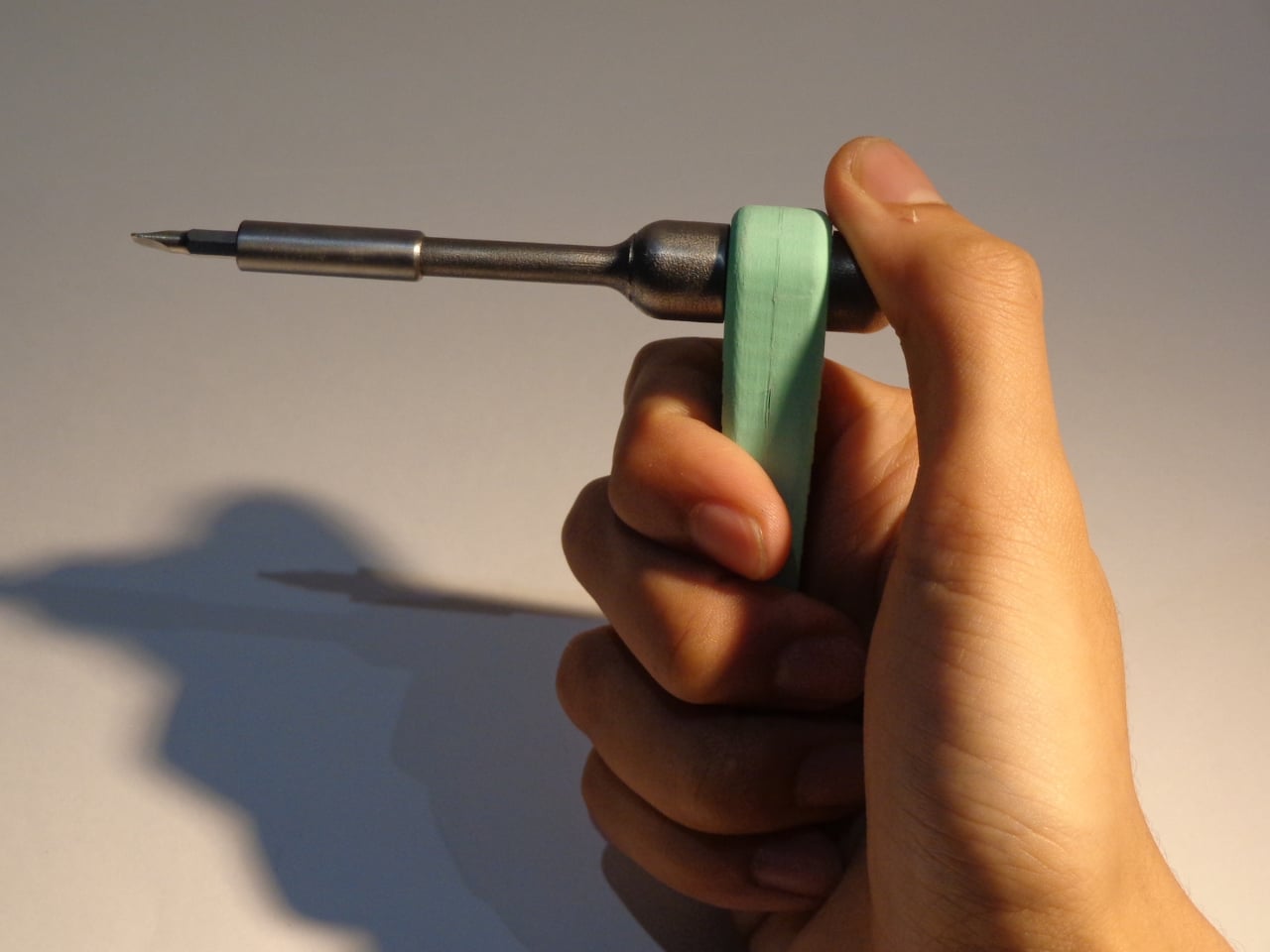
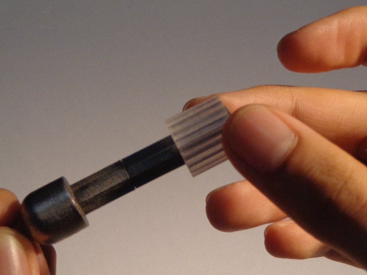
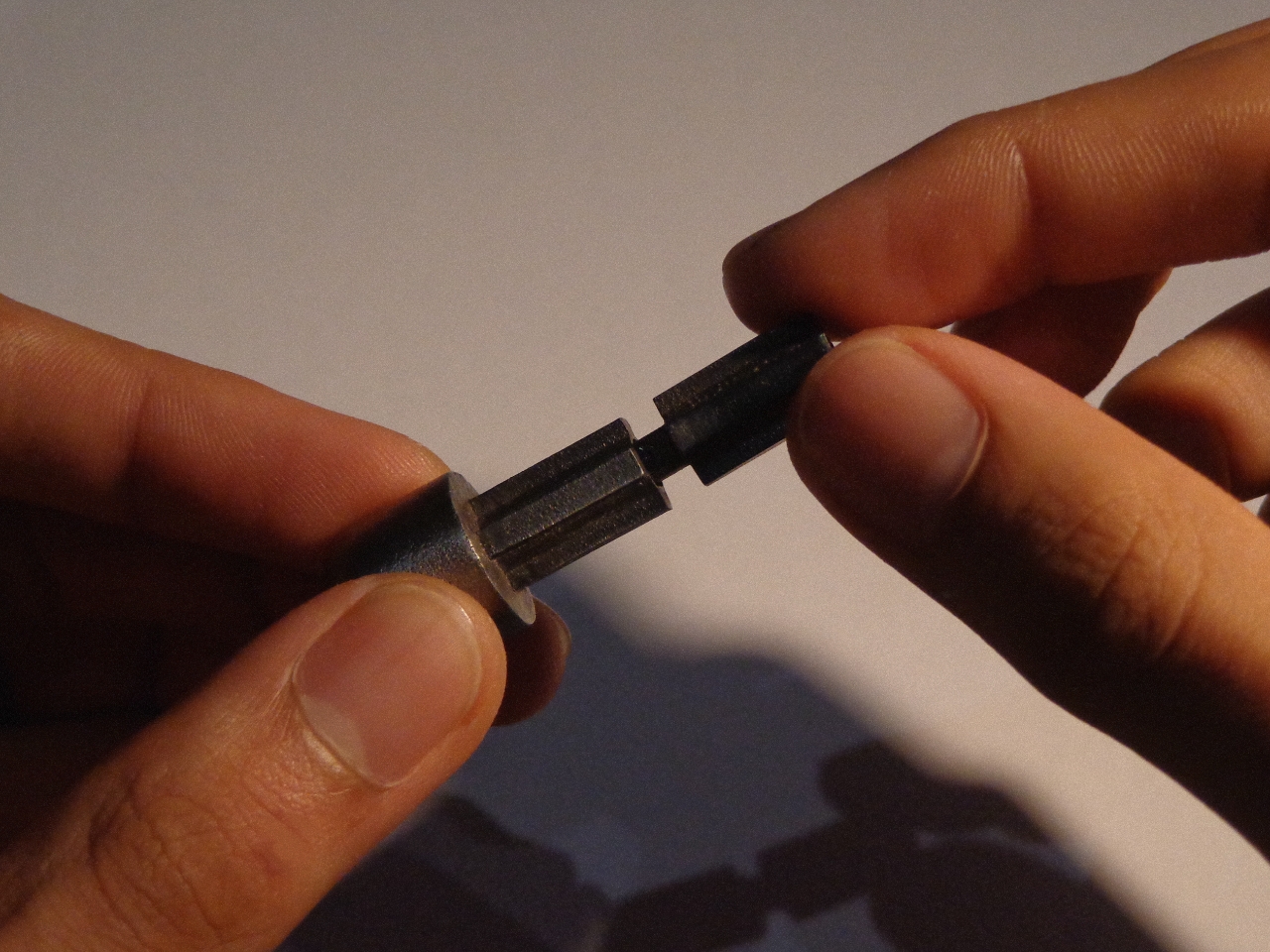
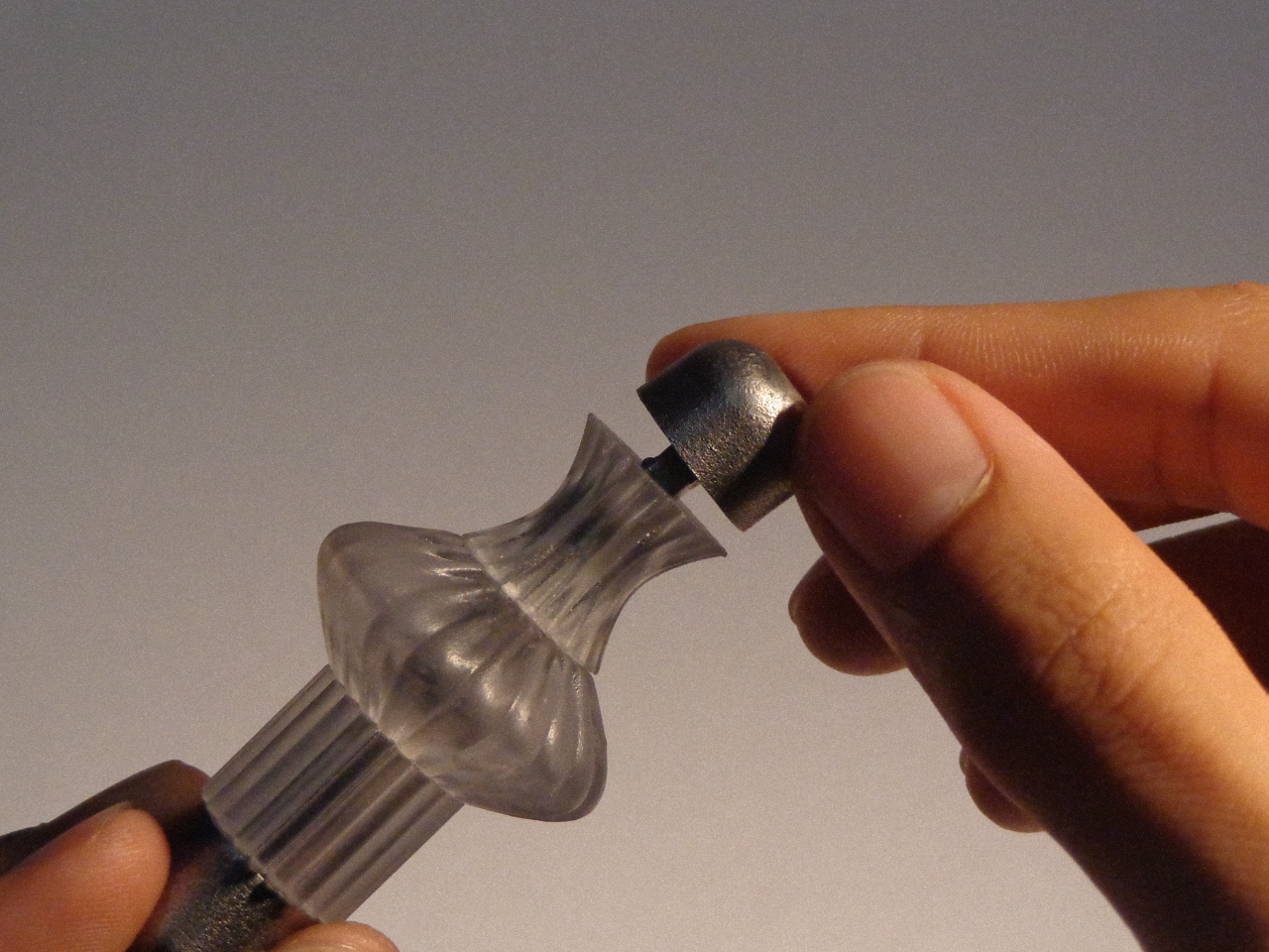
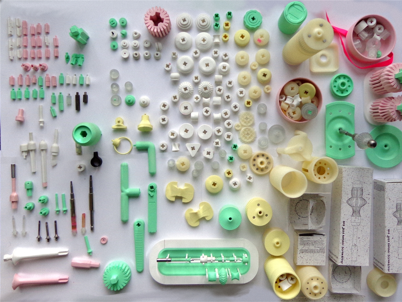
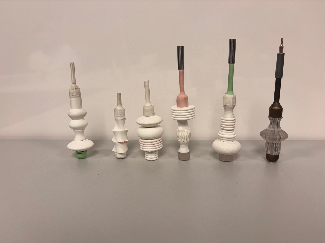
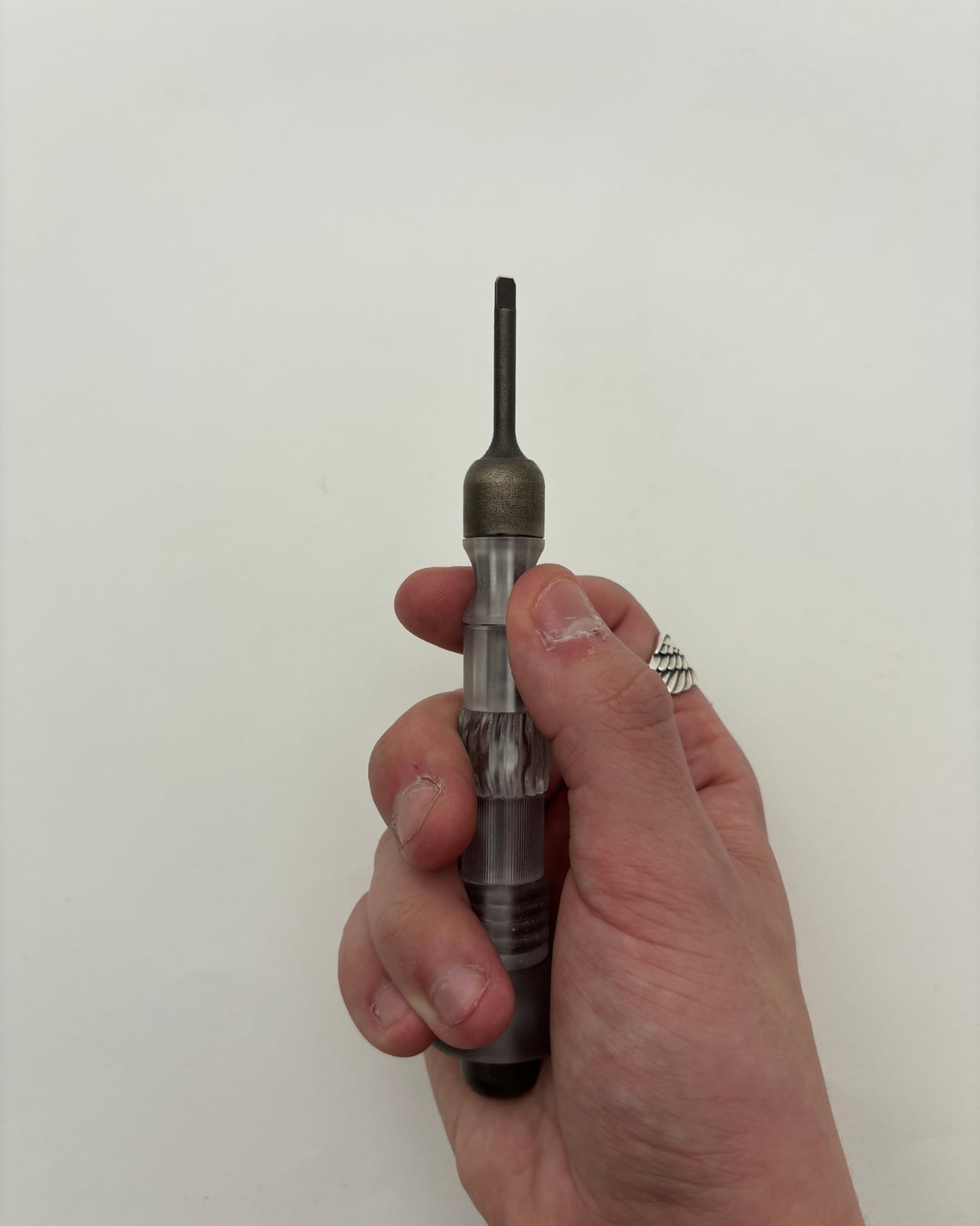
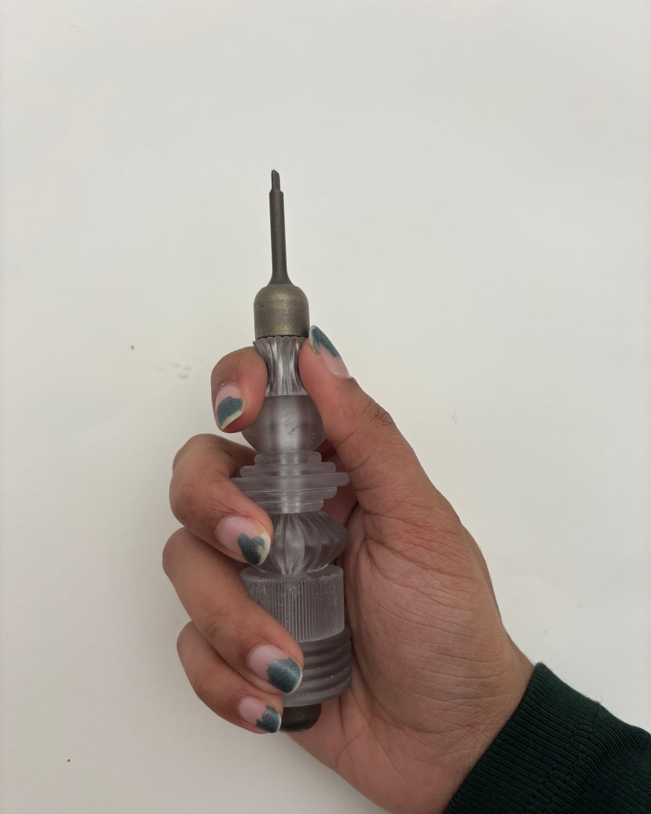
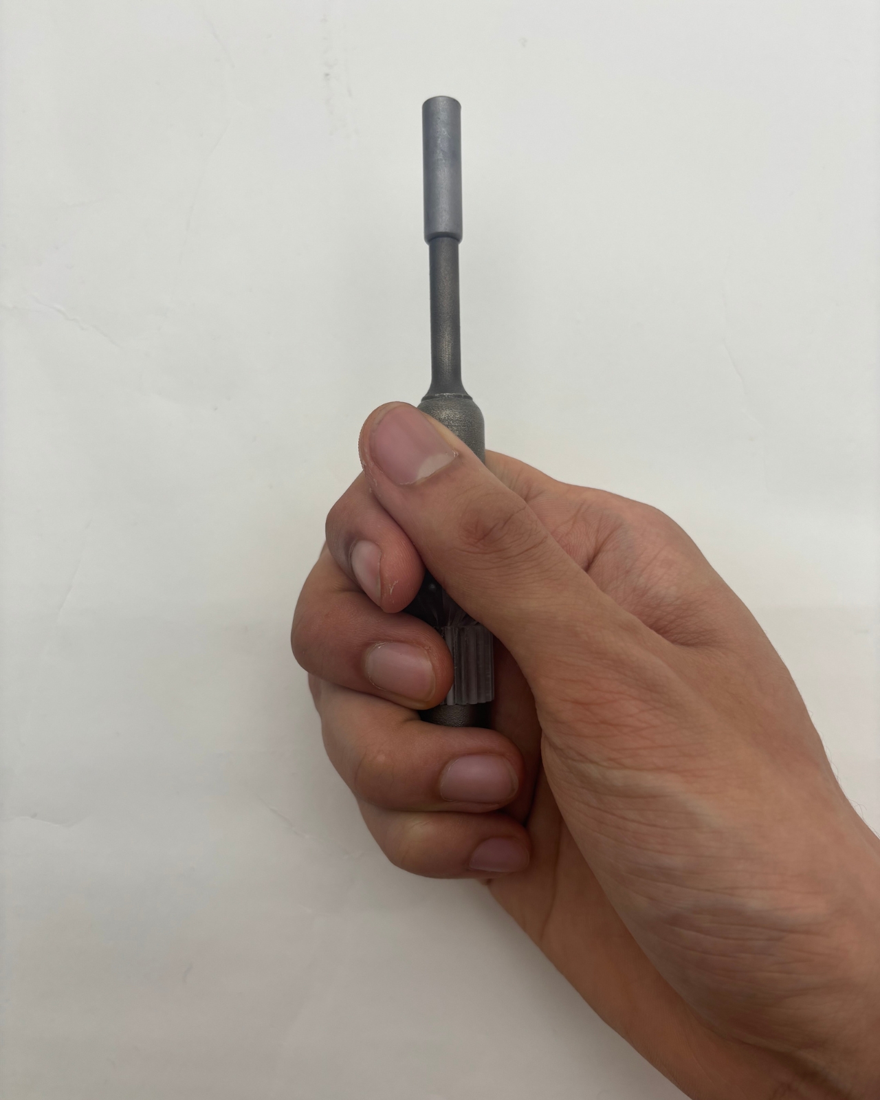
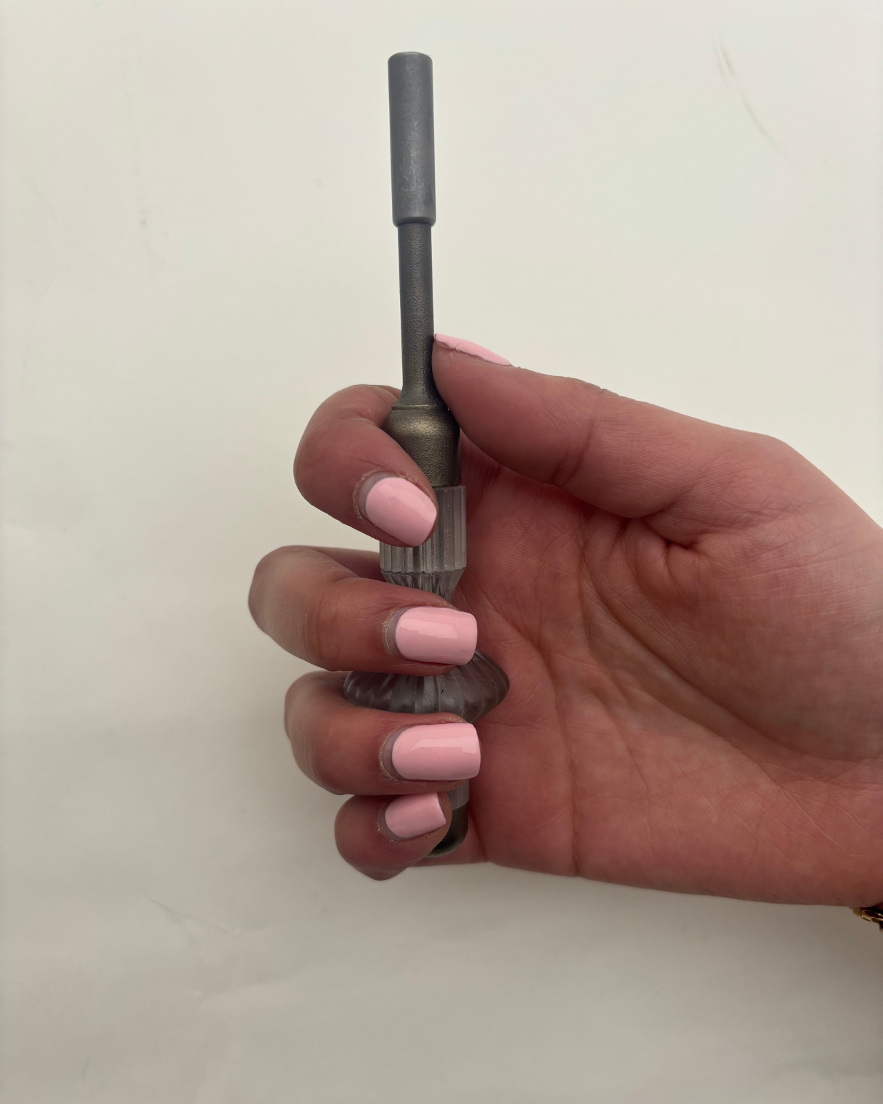
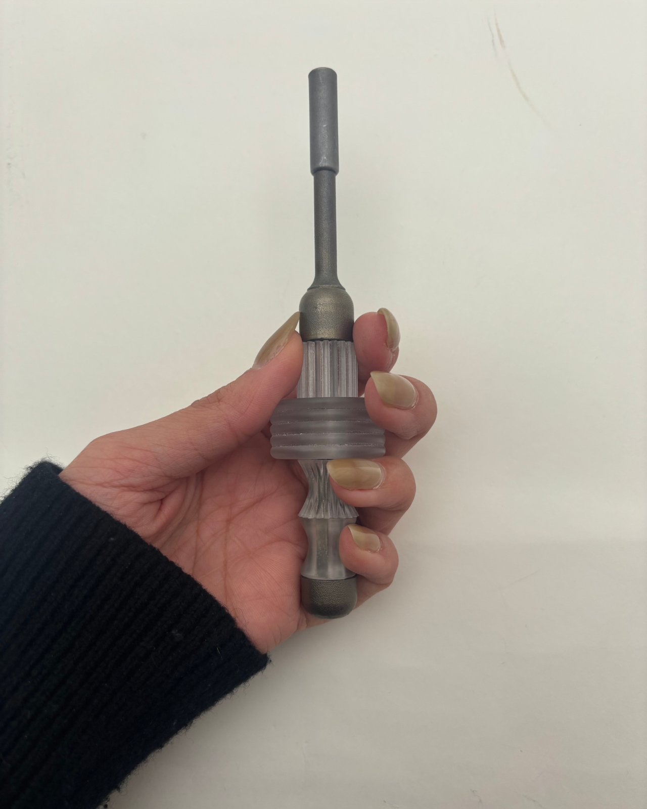
The system is deceptively simple in concept. A permanent titanium spine handles all the structural work, the torque, the load, the mechanical reality of driving a screw. Everything else around it, the grip, the length, the feel, is modular and replaceable. Segments can be added or removed to change the tool’s reach. Grip files are open-source, meaning anyone with access to a 3D printer or a block of wood and some patience can shape their own handle. The titanium core stays. Everything around it is yours to define.
What makes this interesting isn’t really the engineering, though the material separation between structural and non-structural components is genuinely clever. It’s the philosophical shift. Most product design operates on a model of authority: the designer knows best, the user receives the finished object, and any modification is either warranty-voiding or just plain weird. Garg’s project flips that relationship. The designer provides a skeleton and a set of rules. The user provides the identity.
I find this compelling because it confronts something the design world talks about constantly but rarely acts on: sustainability through longevity. We’ve all heard the pitch about buying fewer, better things. But “better” almost always means “more expensive and more permanent,” which assumes the first version of a product will remain the right version forever. That’s not how people work. Our hands change, our tasks change, our preferences change. A tool that can’t change with us eventually becomes waste, no matter how well it was made.
Not Just Another Screwdriver sidesteps this by making the most resource-intensive part, the titanium spine, the permanent element, while letting the lightweight, low-cost components around it evolve freely. It’s not asking you to commit to one perfect screwdriver for life. It’s asking you to keep the bones and swap the skin whenever you need to.
There’s also something worth noting about the open-source dimension. Releasing grip designs as downloadable, modifiable files is a deliberate act of giving up control. In an industry that guards intellectual property fiercely, choosing to let users become co-designers is a statement about where value actually lives. It suggests that a tool’s worth isn’t locked into its factory finish but grows through use and adaptation.
Of course, a final-year project isn’t a product on shelves. There are real questions about whether most people want this level of involvement with their screwdriver, whether the modularity holds up under years of heavy use, and whether open-source grip files would actually build a community or just sit on a server somewhere. These are fair challenges.
But the idea itself feels like it belongs to a larger shift happening across design, one that treats users less like consumers of finished objects and more like participants in an ongoing process. We’re seeing it in modular electronics, in open-source furniture, in customizable prosthetics. Garg’s contribution is taking that thinking and applying it to something so ordinary, so taken-for-granted, that most of us never think to question it.

A screwdriver is a solved problem. Except it isn’t, not if you believe that the person using it deserves a say in how it feels in their hand. That’s what makes this project worth paying attention to. Not because it reinvents the screwdriver, but because it reconsiders who gets to decide what a screwdriver is.
The post The First Screwdriver With an Open-Source Handle You Redesign Yourself first appeared on Yanko Design.