If you’ve ever wished your lamp could double as a sculpture, or that a piece of Venetian craft could actually travel with you from room to room rather than stay anchored to the nearest outlet, Flowers in Wonderland might just ruin every other lamp you’ve ever owned. Not dramatically. Just quietly, the way really good things do.
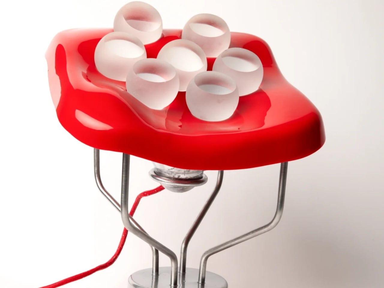
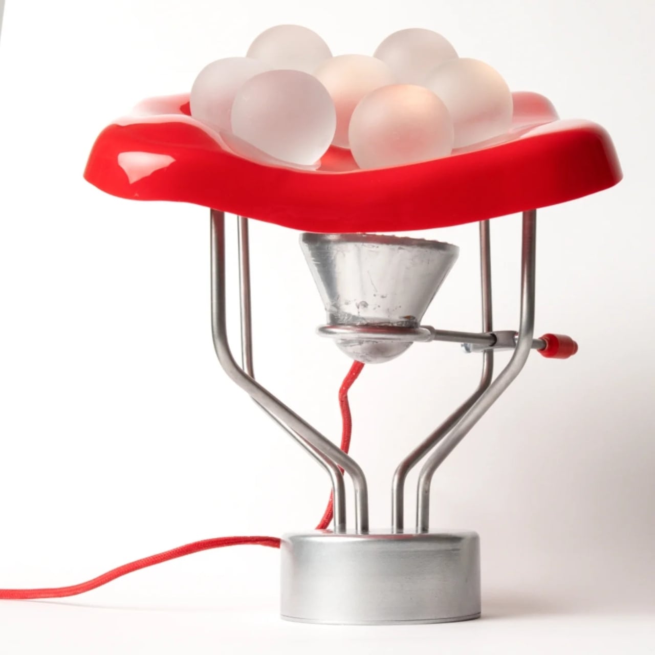
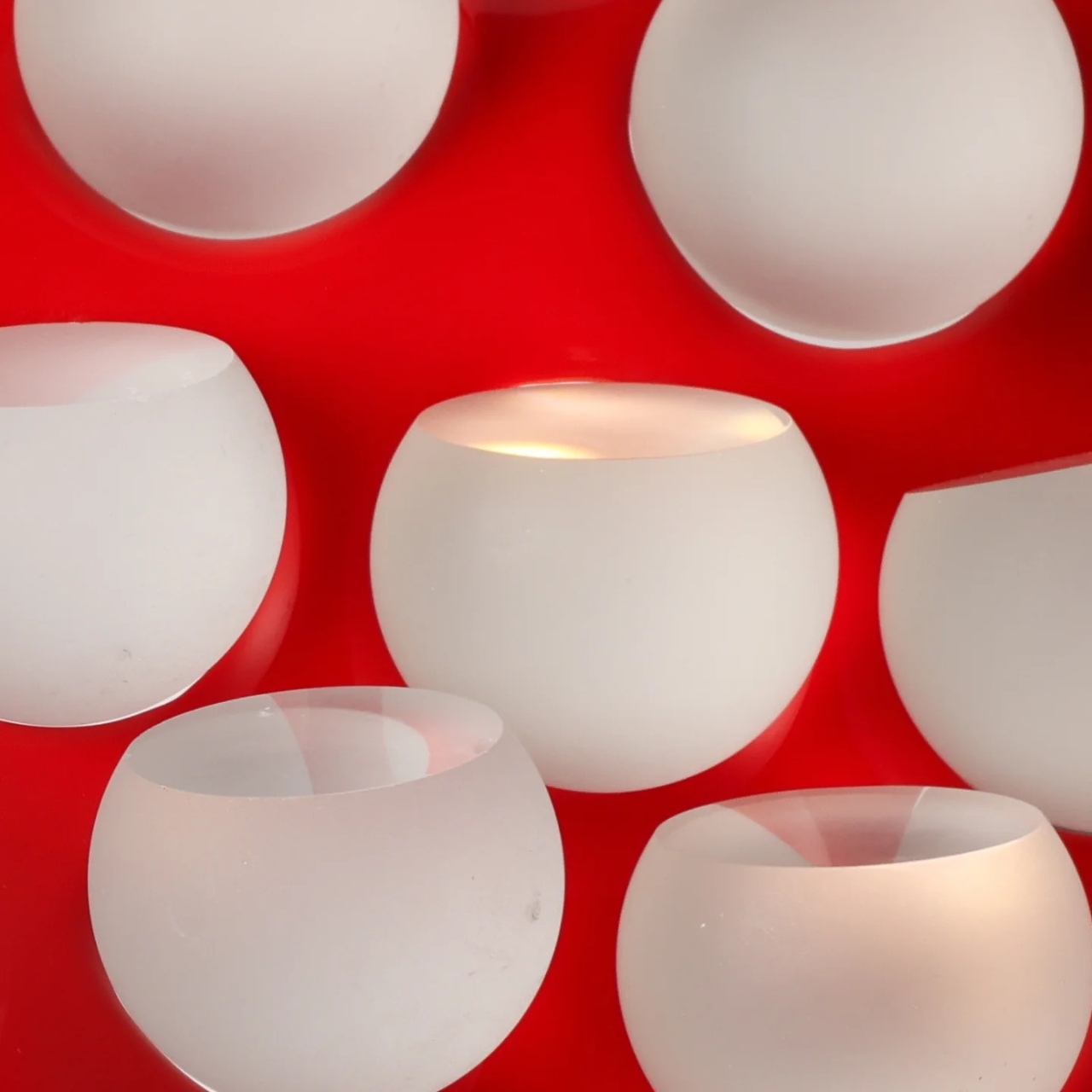
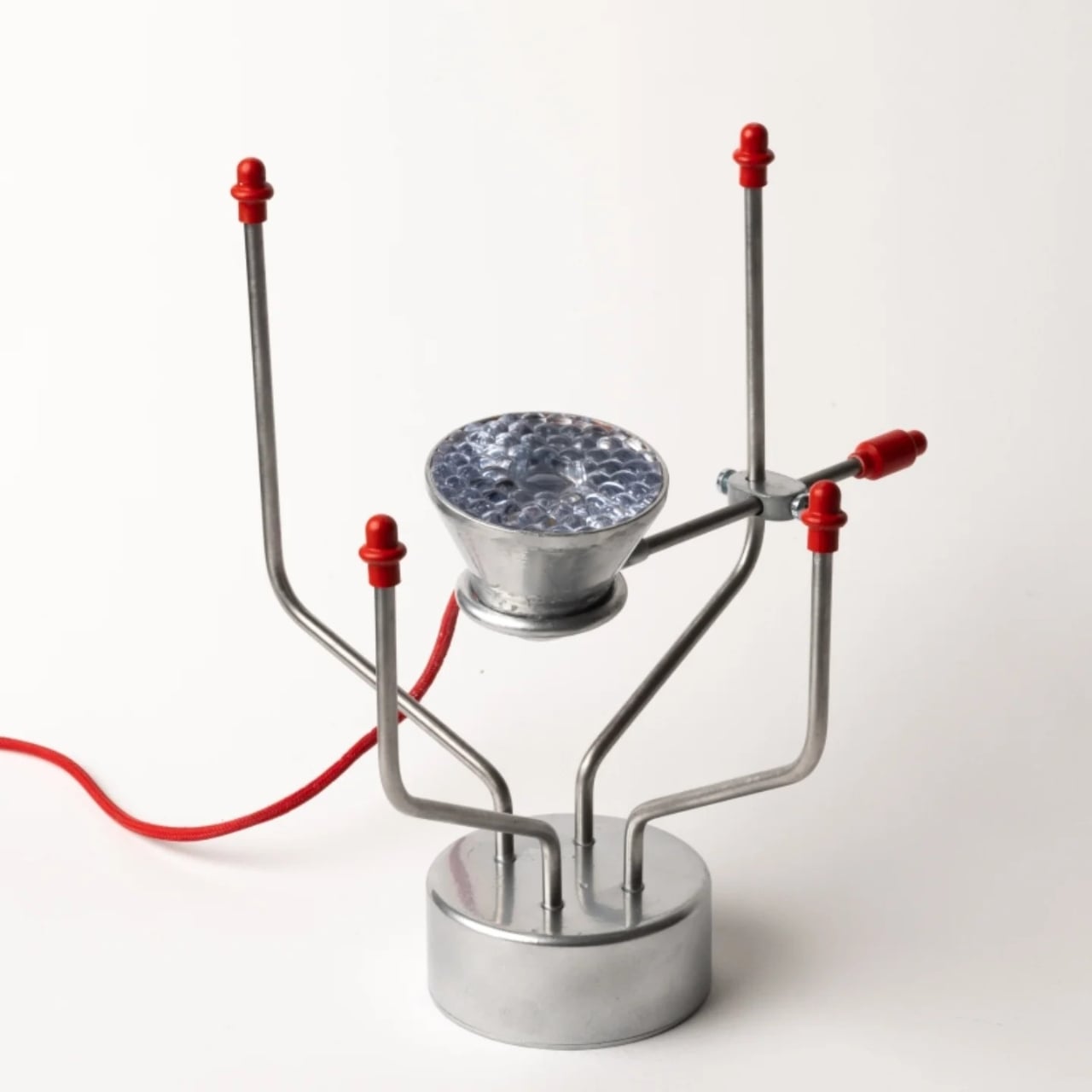
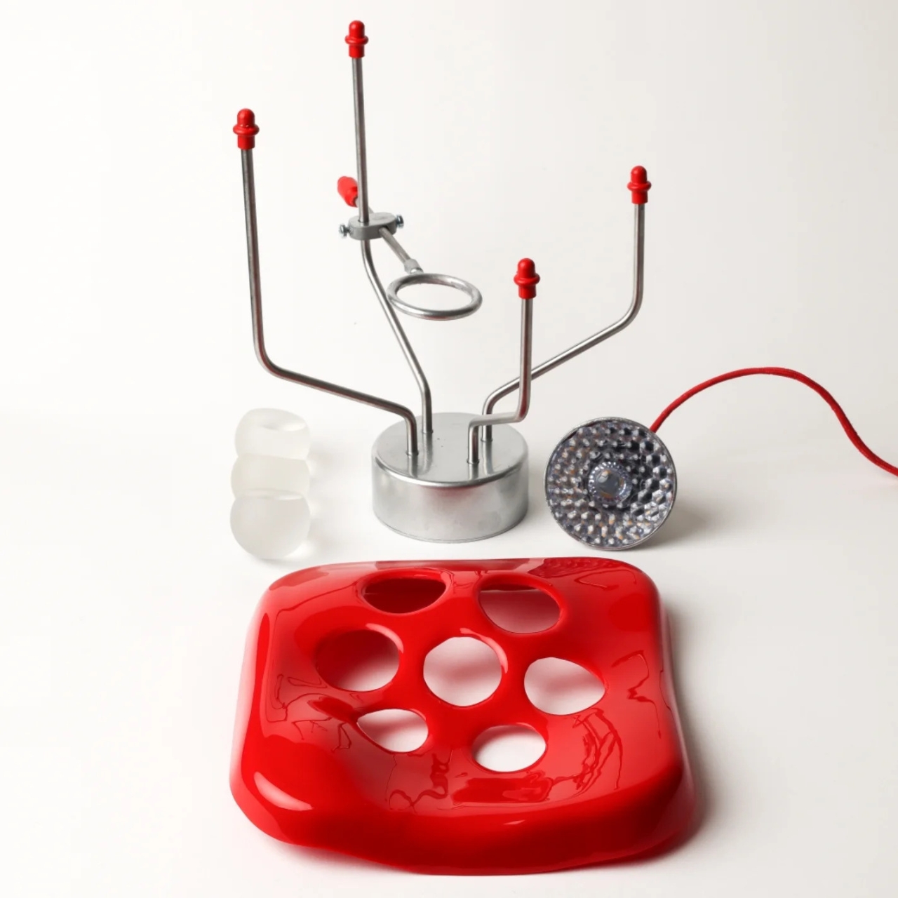
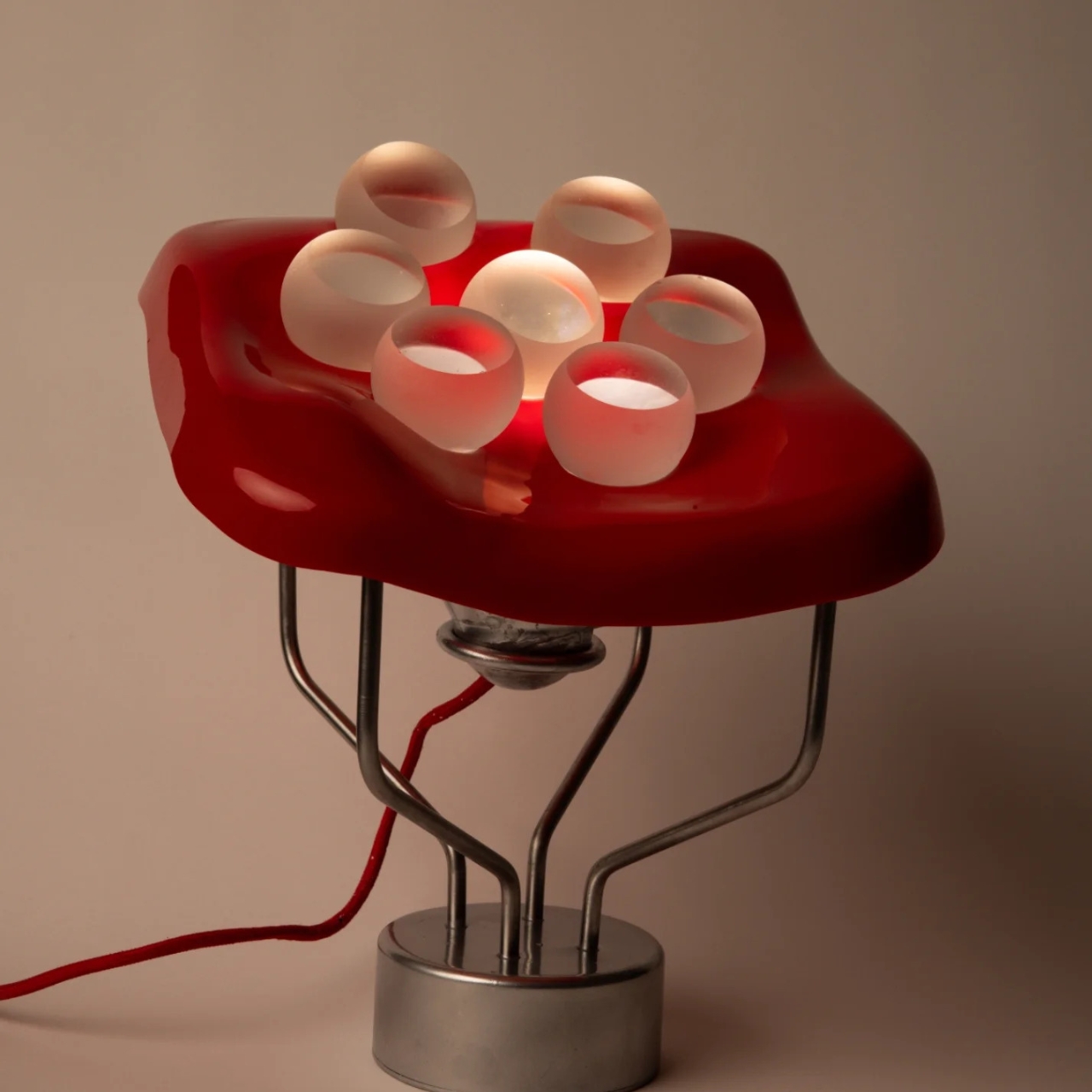
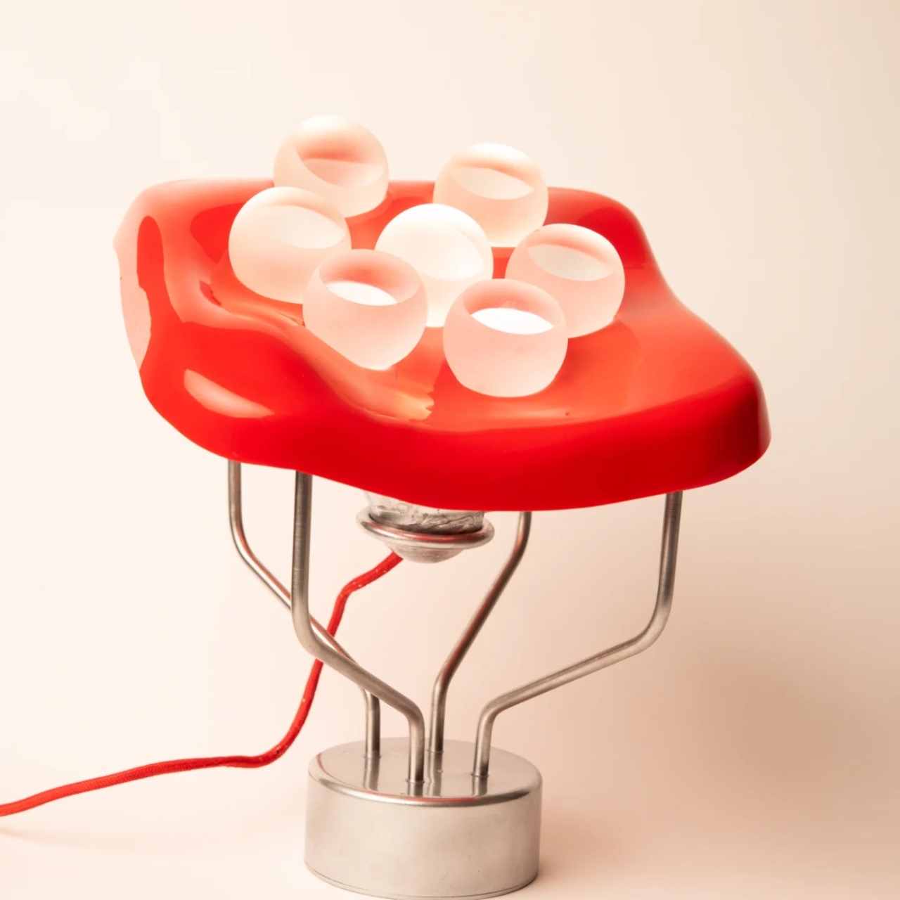
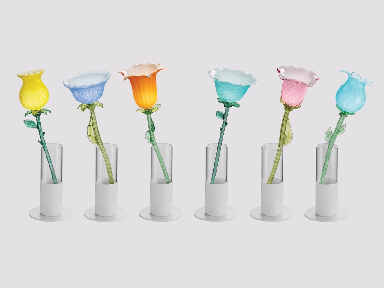
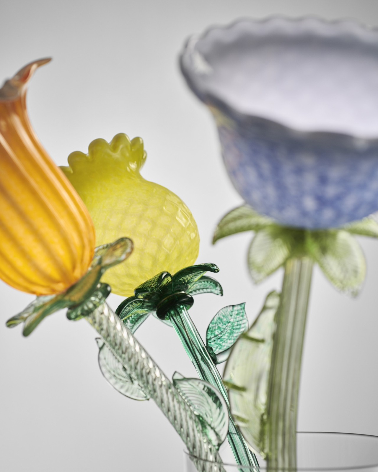
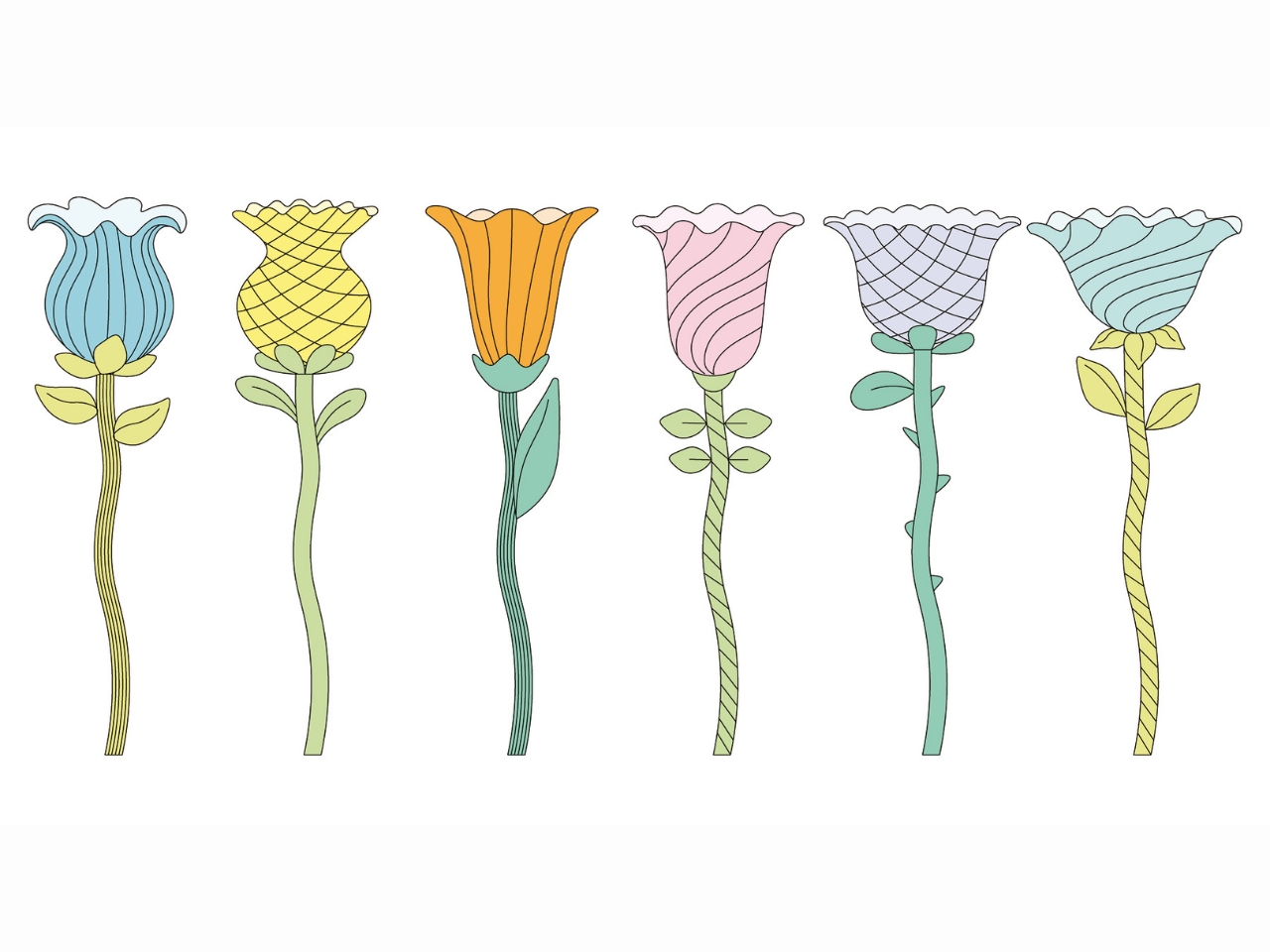
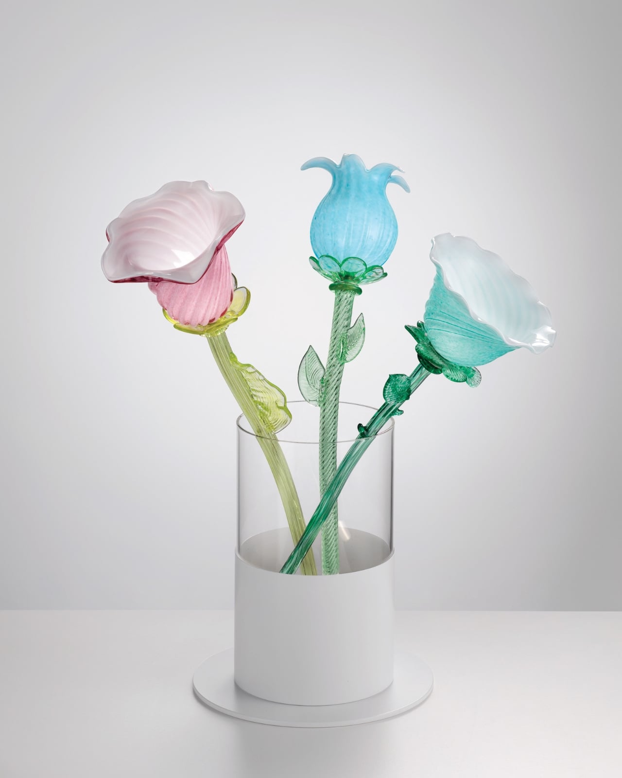
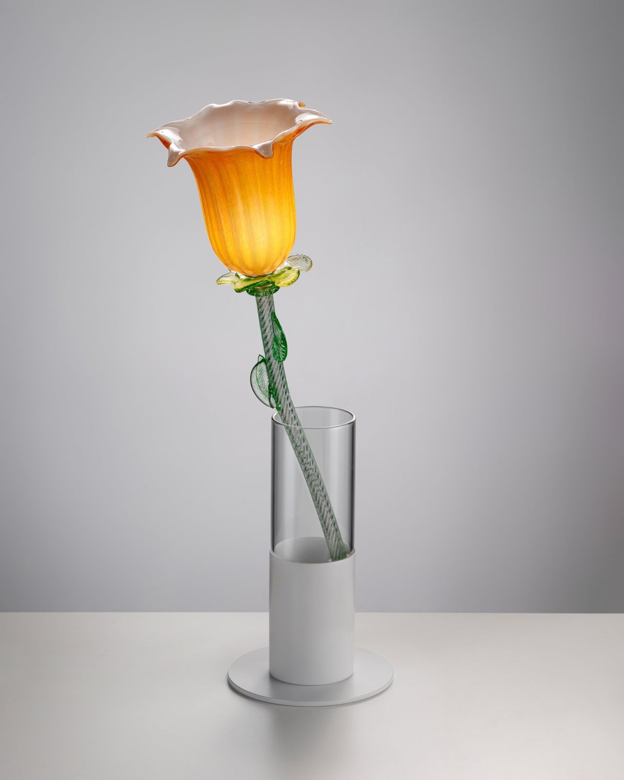
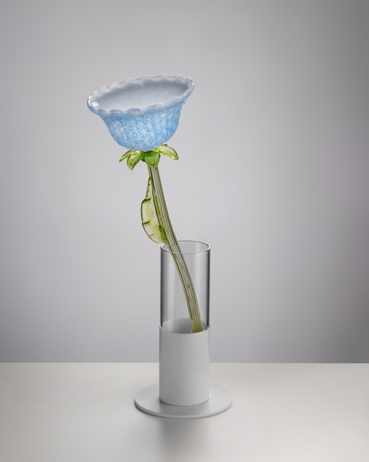
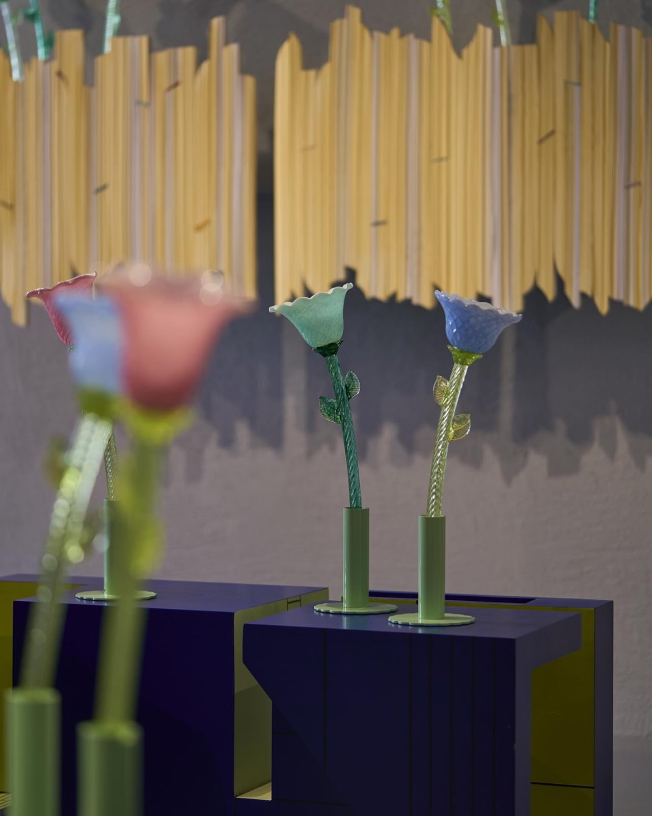
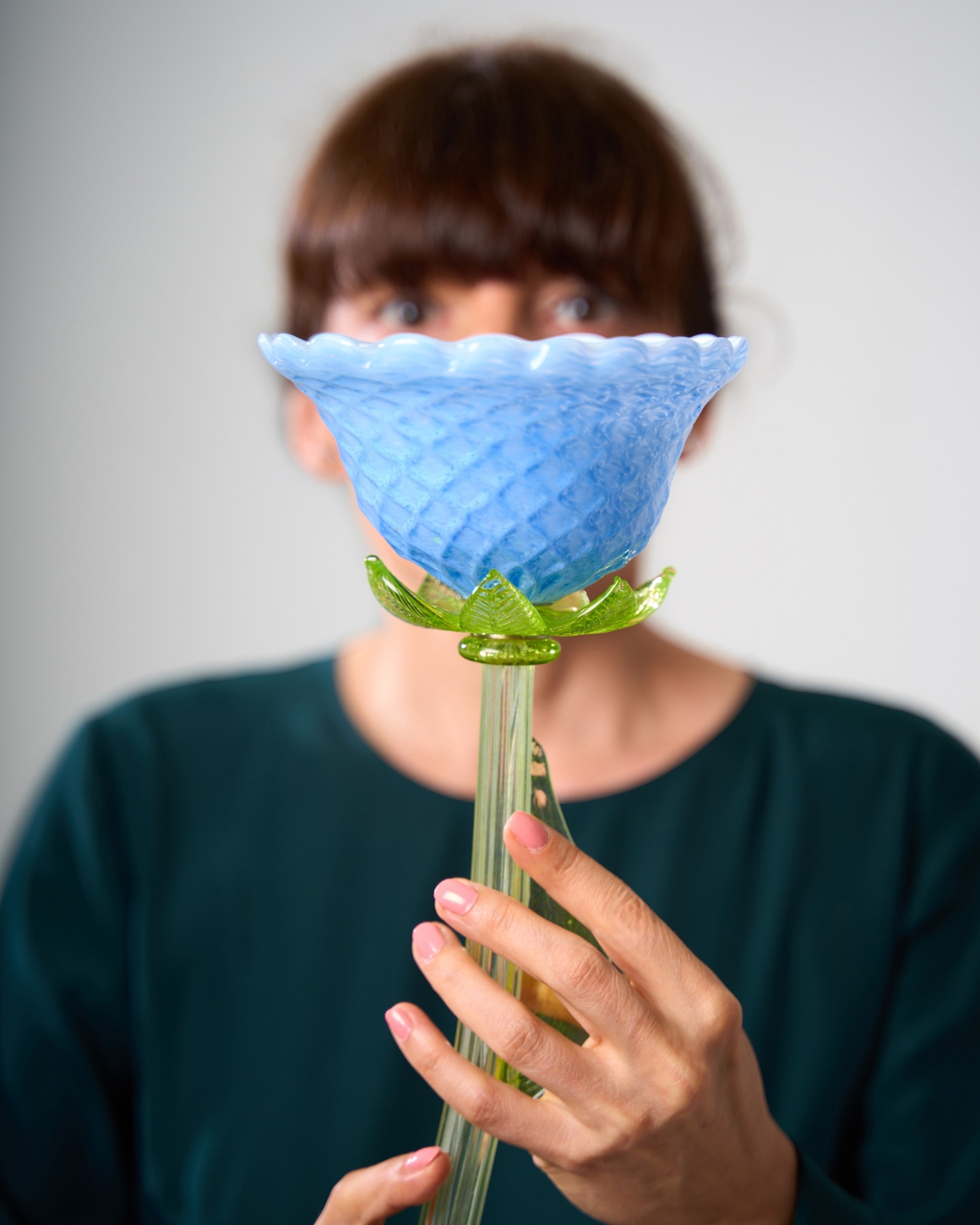
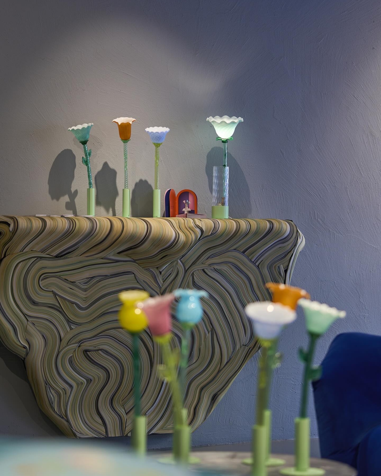
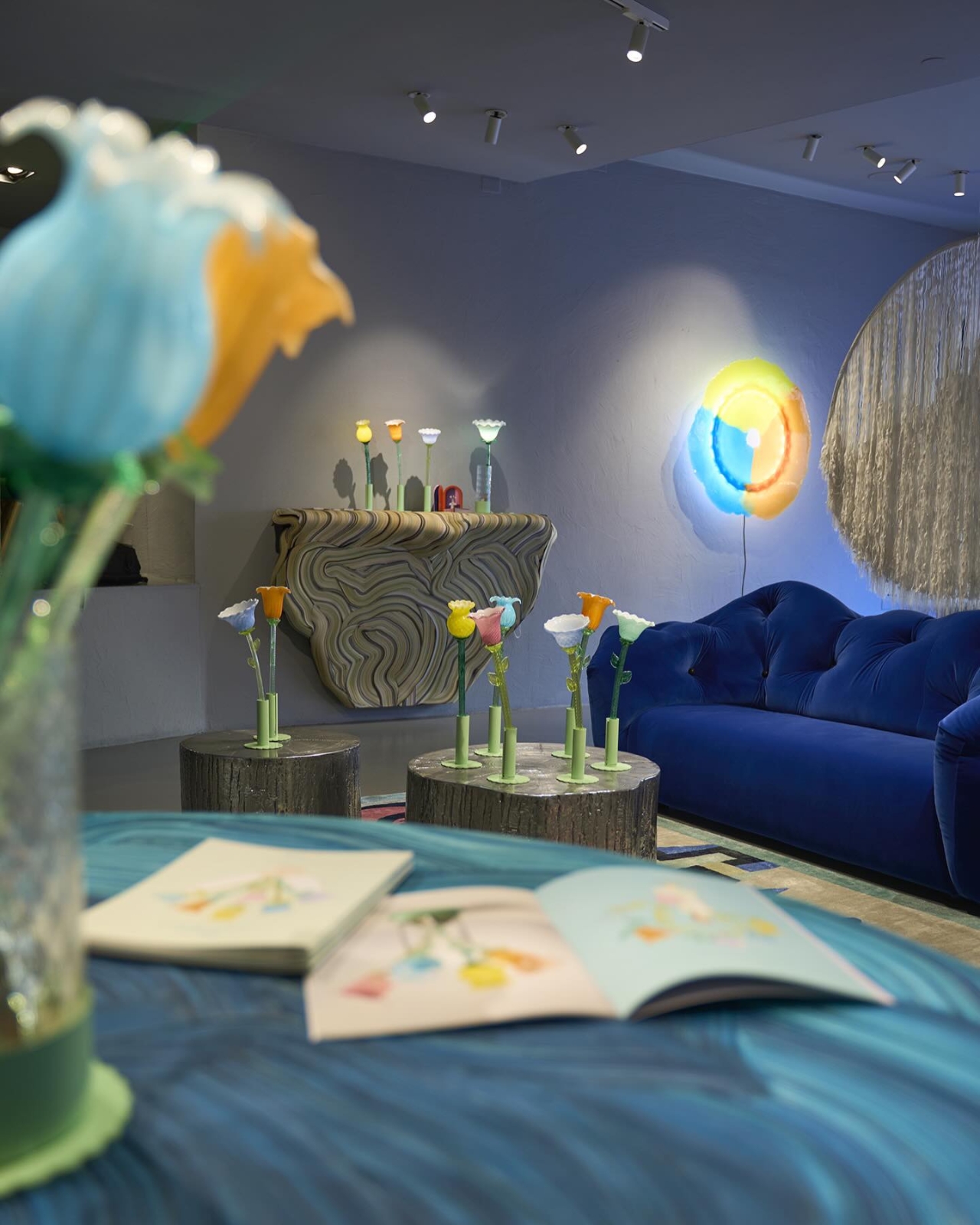
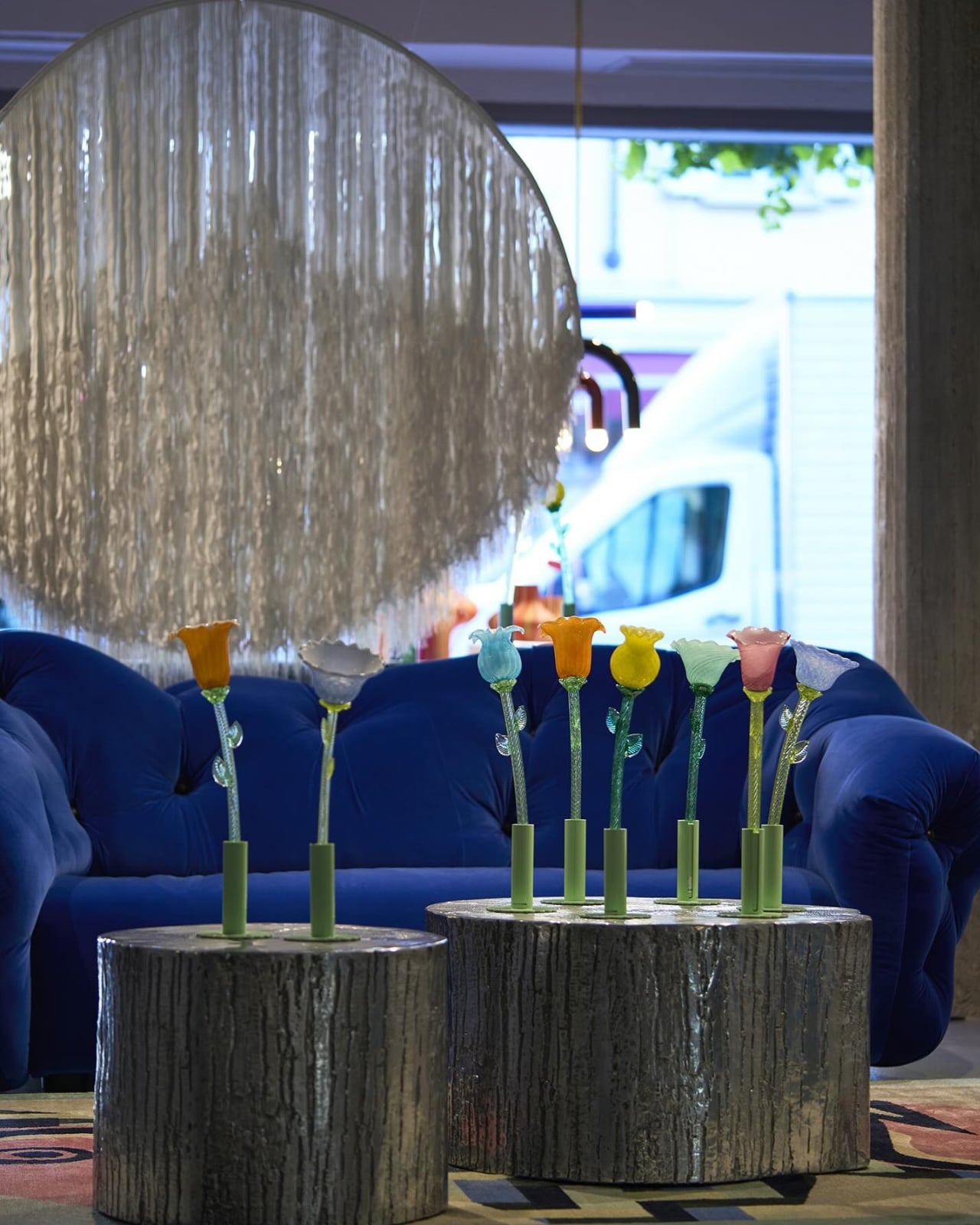
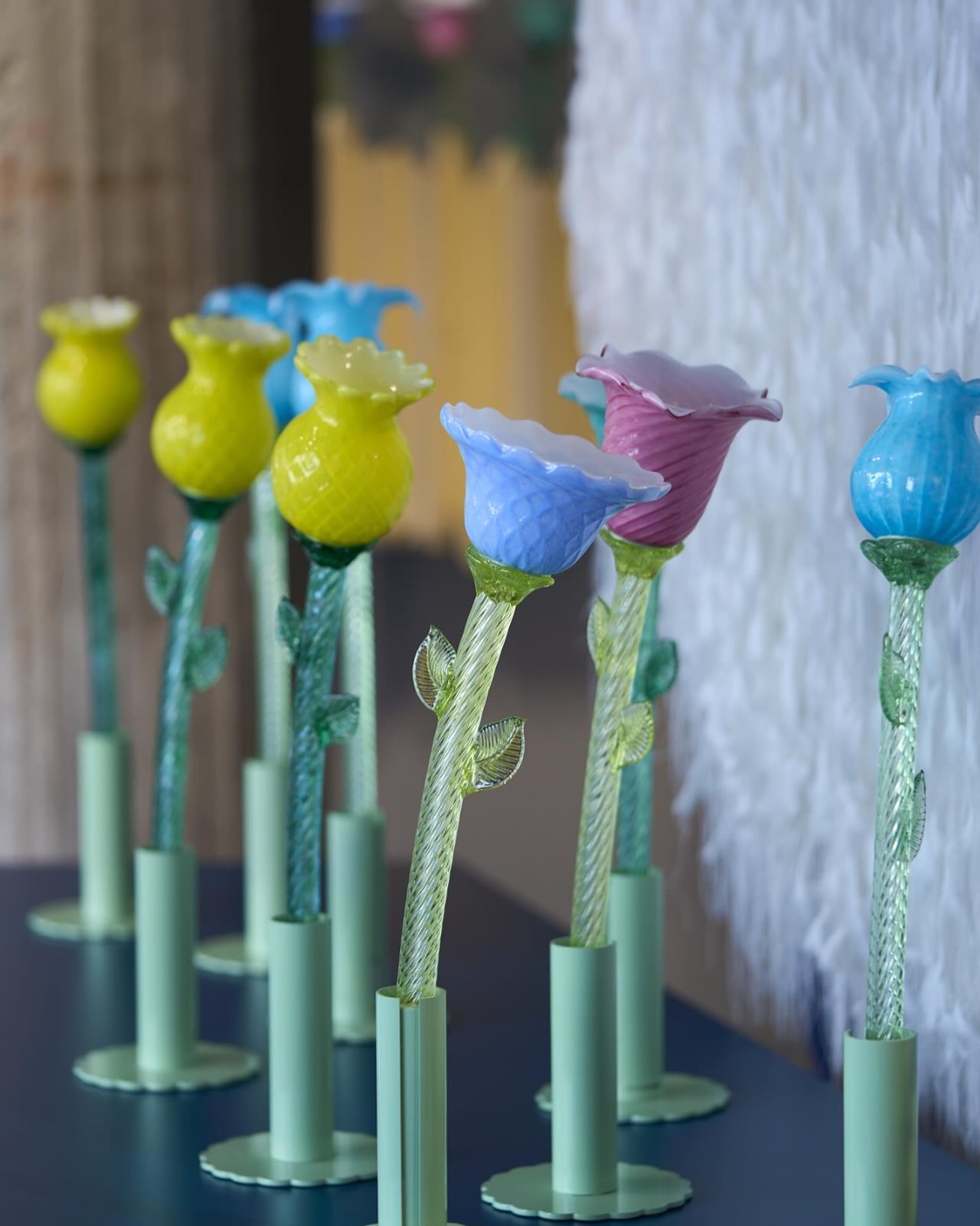
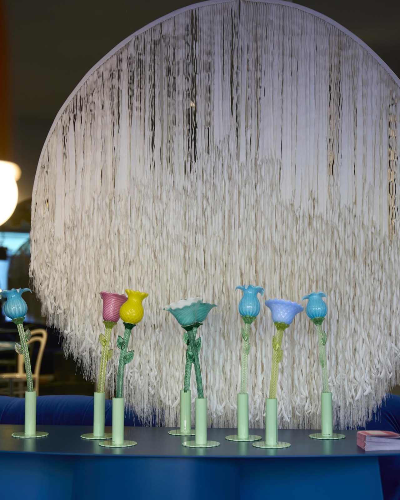
Designed by Alessandra Baldereschi for Multiforme, the collection is made up of six table lamps, each shaped like an unopened flower bud and hand-blown in artistic Murano glass. They come in soft pastel tones, they’re touch-activated, and they glow. Quietly, beautifully, and completely without a cord.
Designer: Alessandra Baldereschi
That last part matters more than it sounds. Portable lighting has been around for a while, but most of it still skews practical or industrial. A camping lantern. A rechargeable desk light you forget to charge. The cordless lamp category hasn’t exactly been known for elegance, or for the kind of visual impact that makes you actually want to own one. Baldereschi’s Flowers in Wonderland steps into that gap with a very different idea of what a portable lamp can look and feel like. These are objects you place somewhere because they’re beautiful, and the light just happens to be part of that.
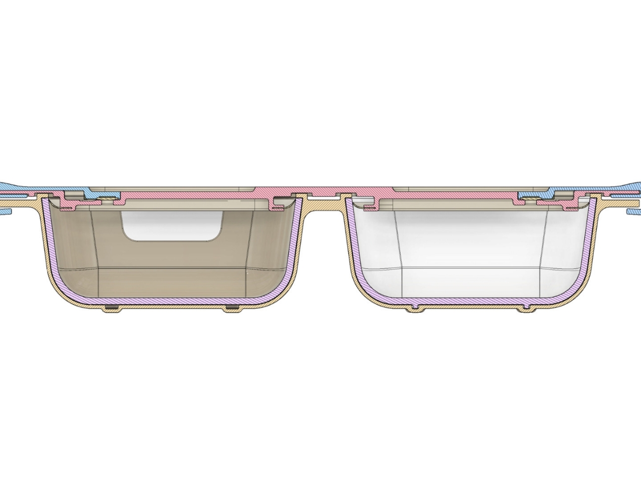
The Murano glass angle is worth sitting with. Venice’s glassblowing tradition goes back to the 13th century, when the city relocated its glassmakers to the island of Murano to reduce the risk of fire in its densely packed streets. The craft has stayed there ever since, producing work that ranges from decorative to ceremonial to, yes, commercially mass-produced. What Multiforme does differently is keep the handmade core alive while pushing the design language somewhere genuinely contemporary. Each piece in the collection is hand-blown, which means no two are exactly alike, and the light that filters through the glass carries a warmth and depth that manufactured materials simply can’t replicate.
Baldereschi herself is a Milanese designer with a sensibility that’s harder to pin down than most. She trained at Domus Academy in Milan, one of the more rigorous design schools in Europe, and then spent time in Japan developing ceramic tableware with companies in the Gifu district. That combination of Italian craft tradition and Japanese restraint shows up quietly in her work. She brings a precision to how she handles materials, but also a kind of playfulness that keeps things from ever feeling stiff. Her portfolio spans glassware, décor, and lighting, and she’s shown at the Triennale di Milano, the Seoul Design Festival, and the Moss Gallery in New York. She’s not a newcomer with a single viral moment. She’s a designer who’s been building a coherent body of work for decades.
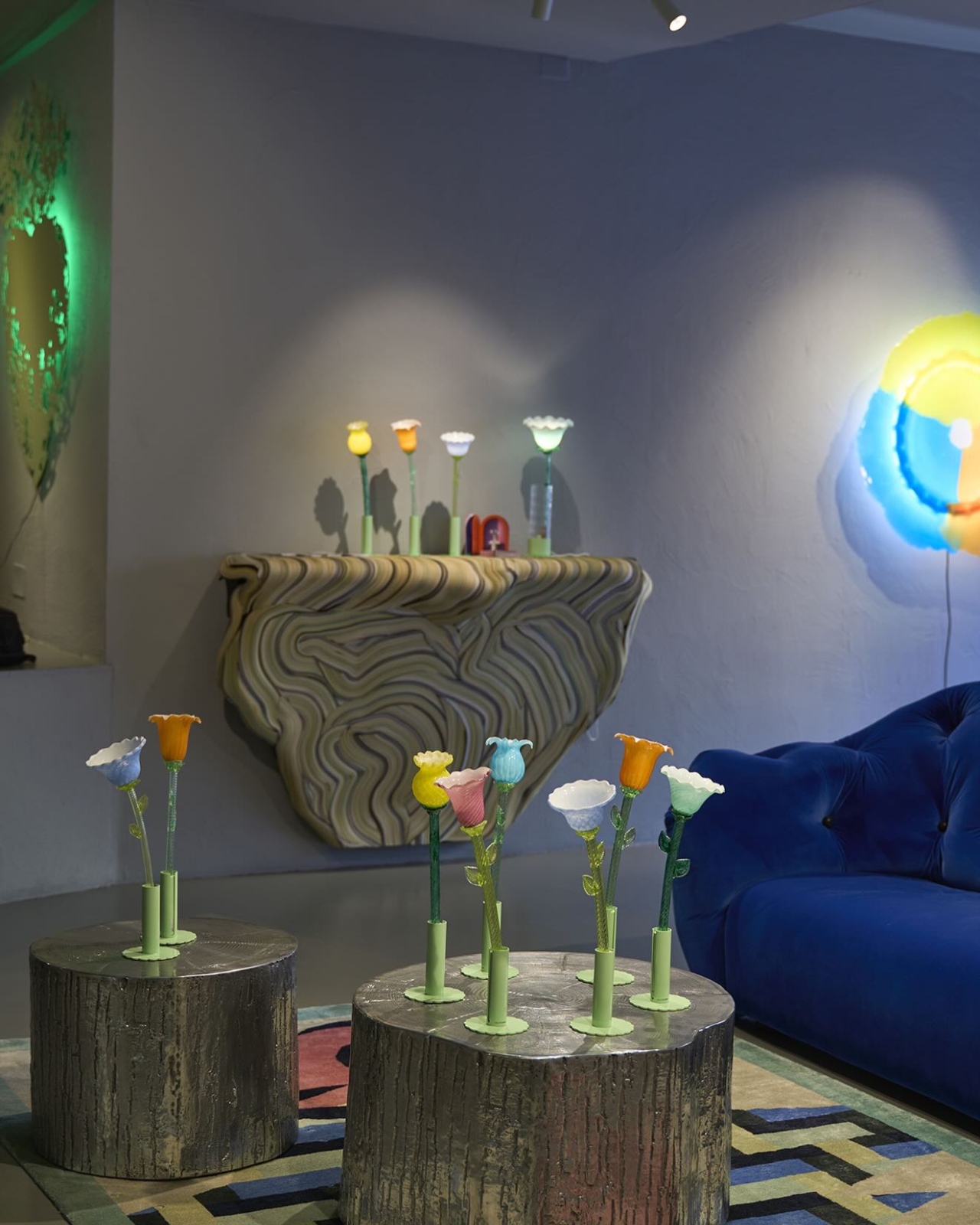
Flowers in Wonderland premiered at Fondaco dei Tedeschi in Venice, which is already a statement. It then went on to win the Curiouz Award at Venice Design Week 2025, a recognition dedicated to the most innovative projects in contemporary design. The win acknowledged the collection’s ability to combine technology and craftsmanship in a way that doesn’t feel like a compromise. Usually, when a product leans hard into one, it sacrifices the other. Here, the battery-powered portability and the centuries-old glassblowing technique feel like they belong together.
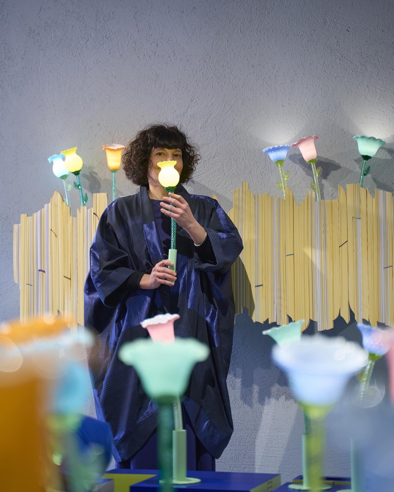
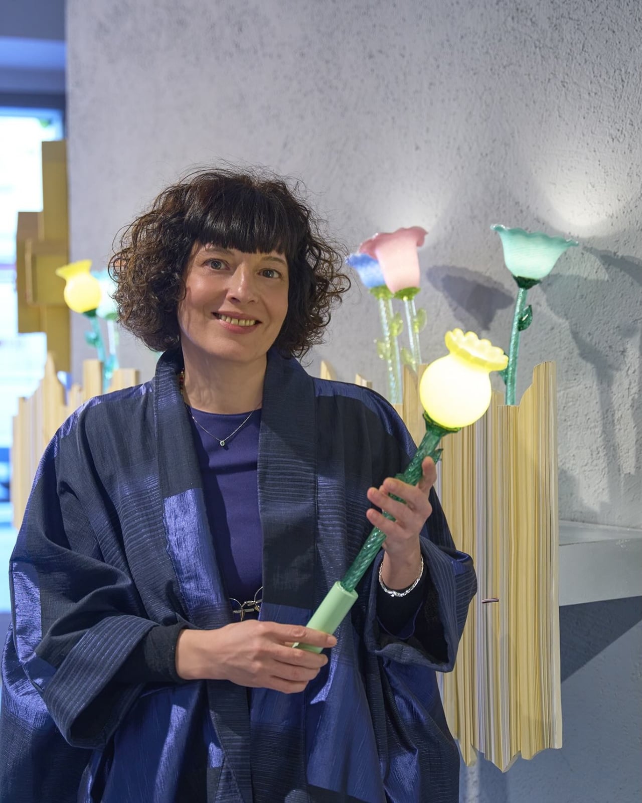
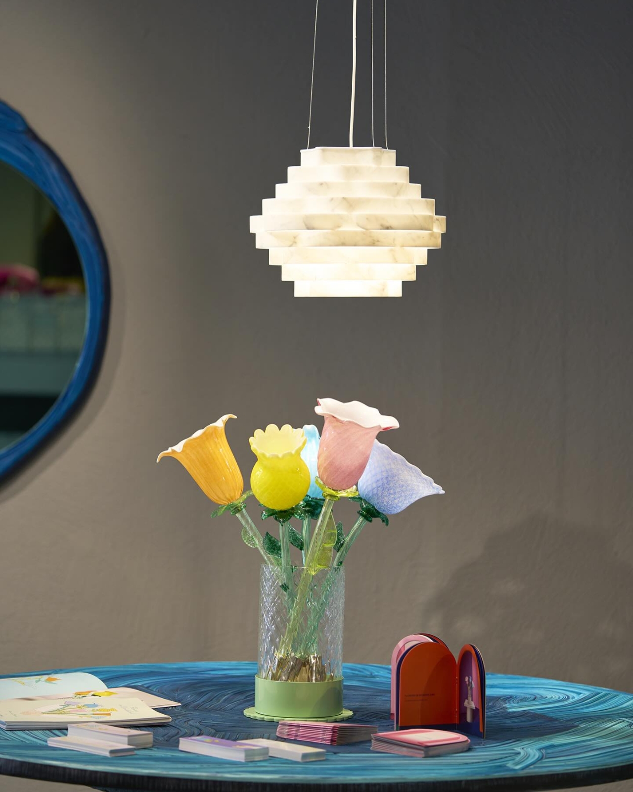
The collection comes in six flower shapes, each capturing a bud that’s almost open. Not fully bloomed, not completely closed. That specific in-between moment is where Baldereschi seems most interested, and it translates beautifully into objects that feel like they’re holding their breath. You want to place them on a windowsill, a dining table, or a nightstand, and then just watch the light shift as the day changes around them.
Lighting design rarely gets the cultural attention it deserves. We spend a lot of time talking about furniture and architecture, and considerably less thinking about how the quality of light in a room actually shapes the way we experience it. A lamp like this makes that conversation unavoidable. You can’t ignore it. You don’t really want to.
The post 6 Murano Glass Lamps That Glow Without a Single Cord first appeared on Yanko Design.