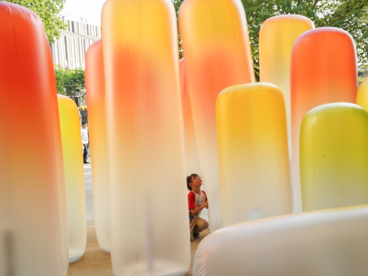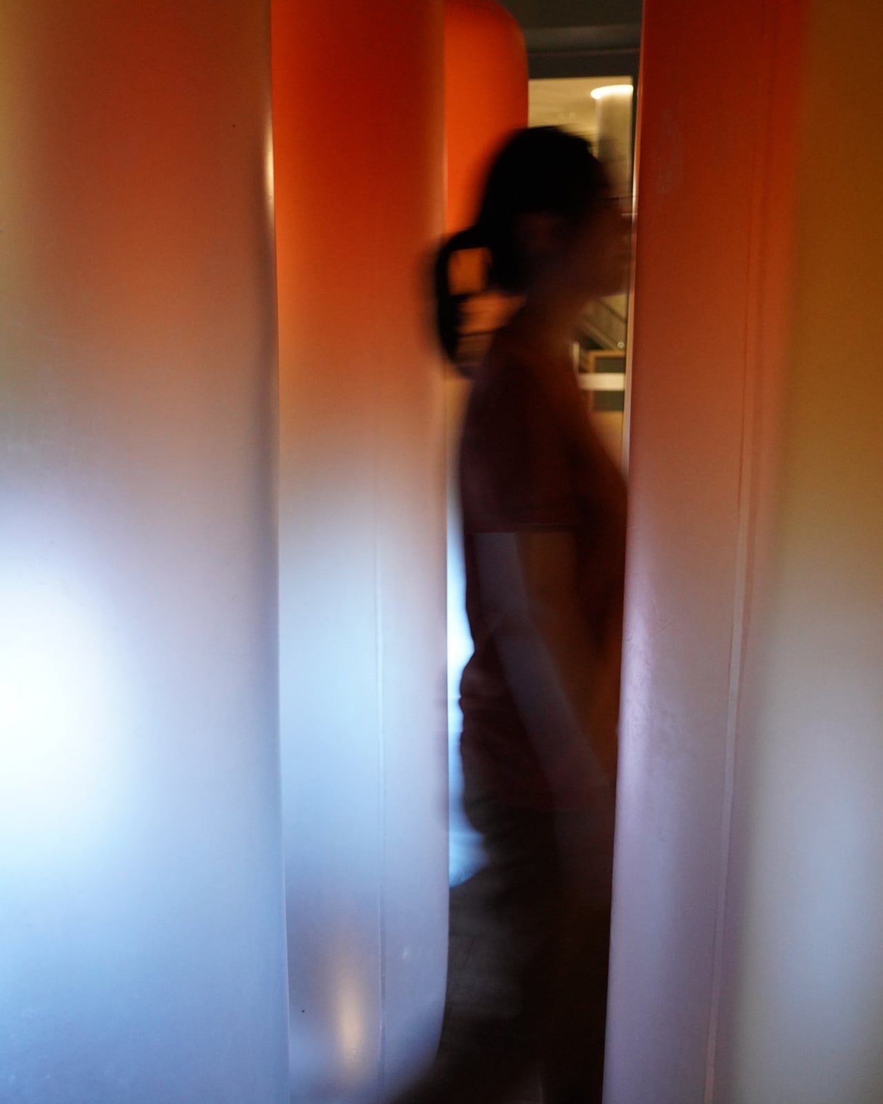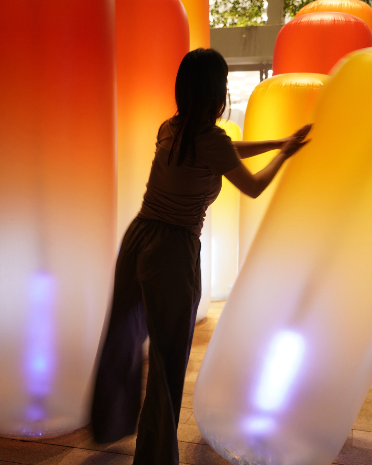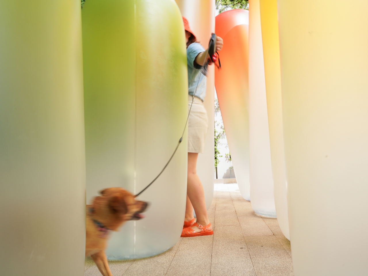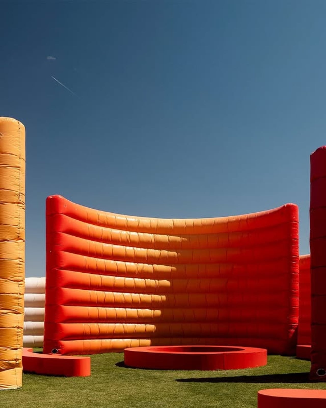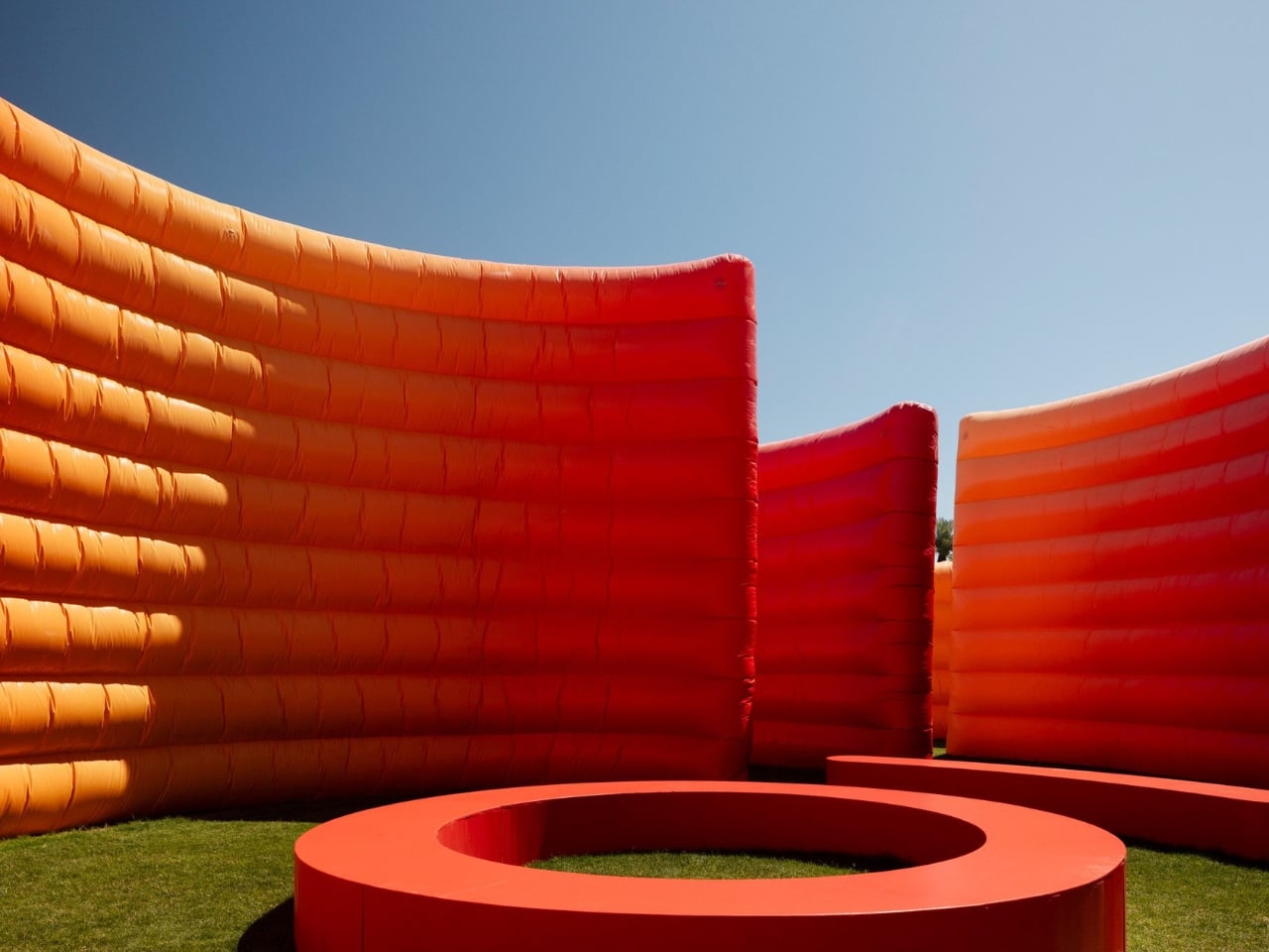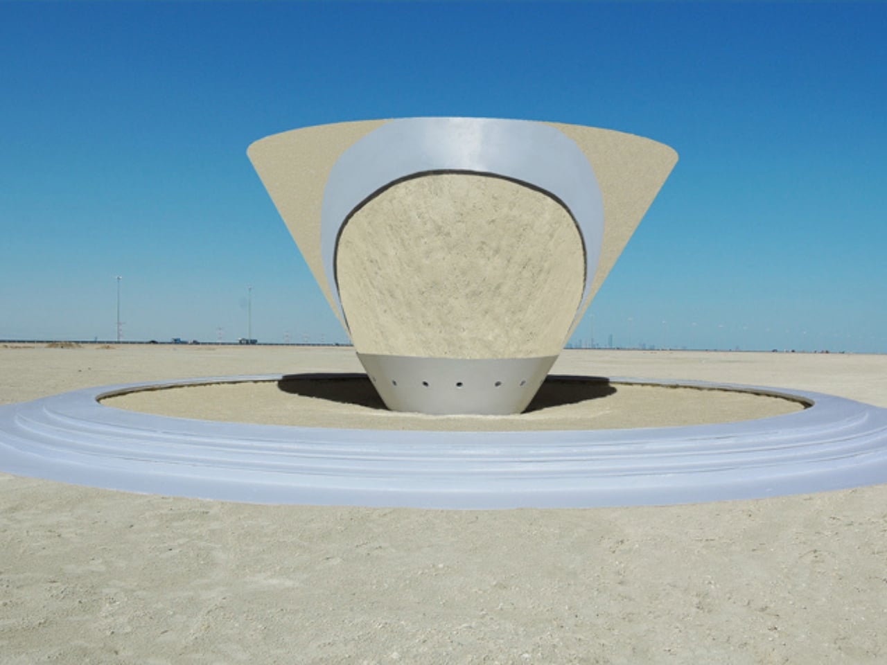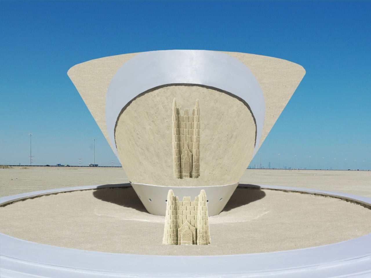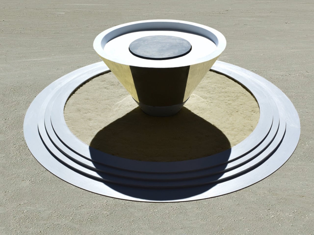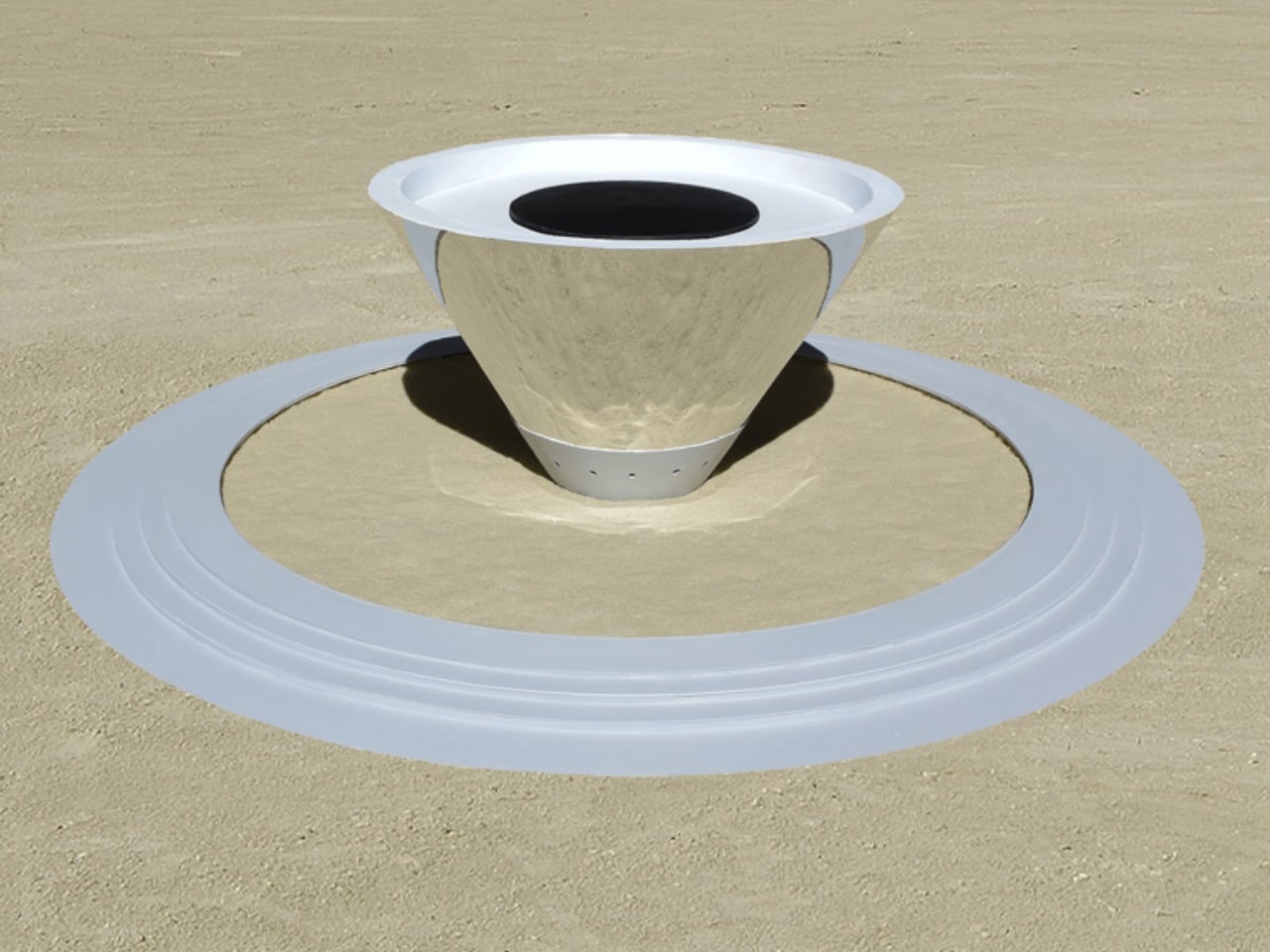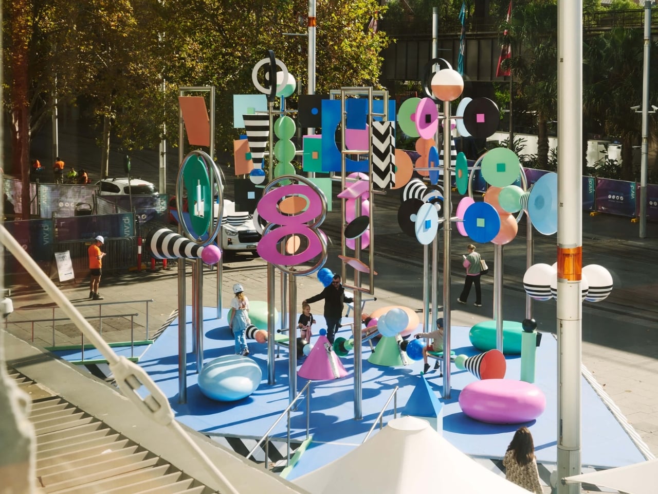
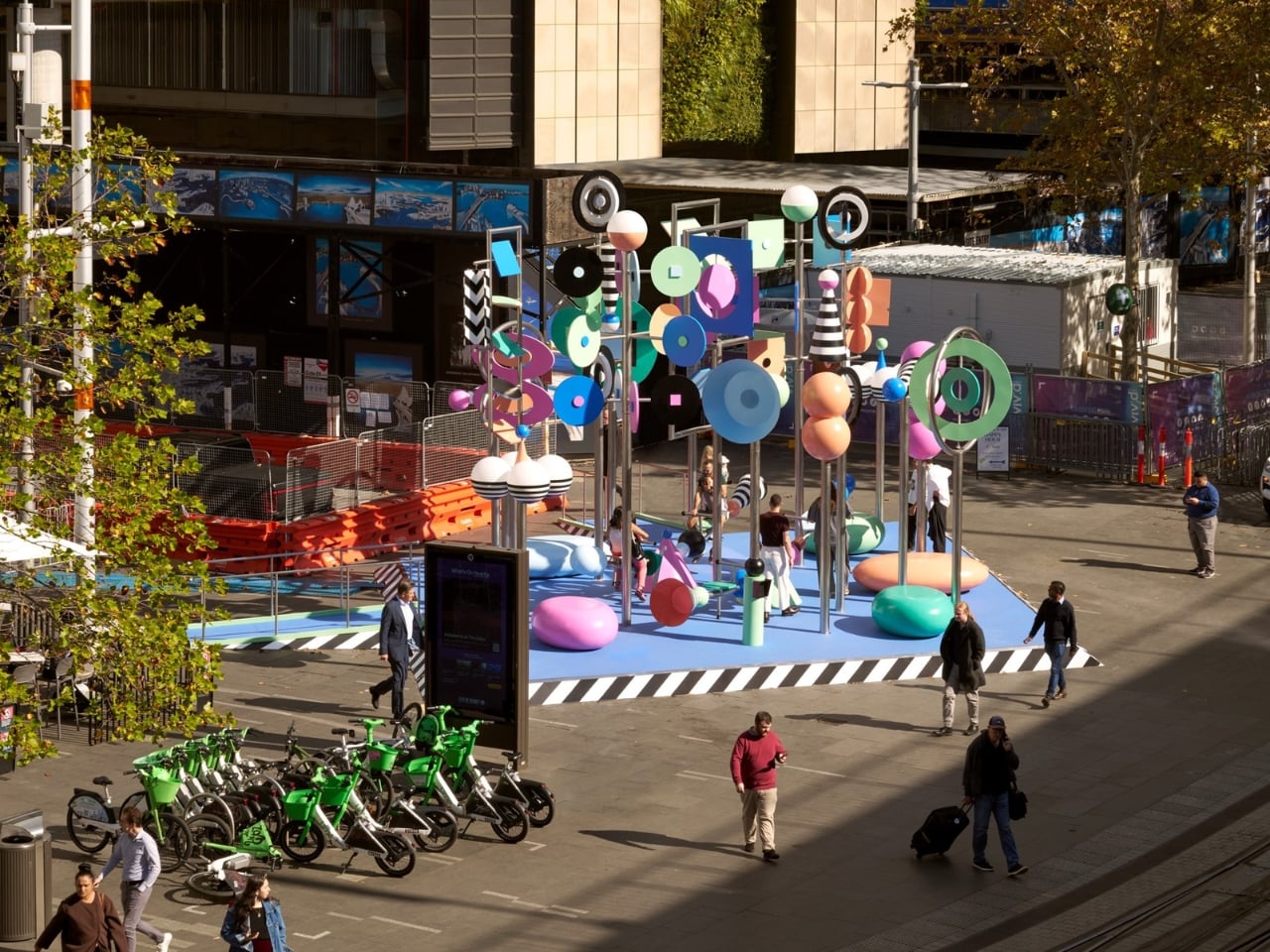
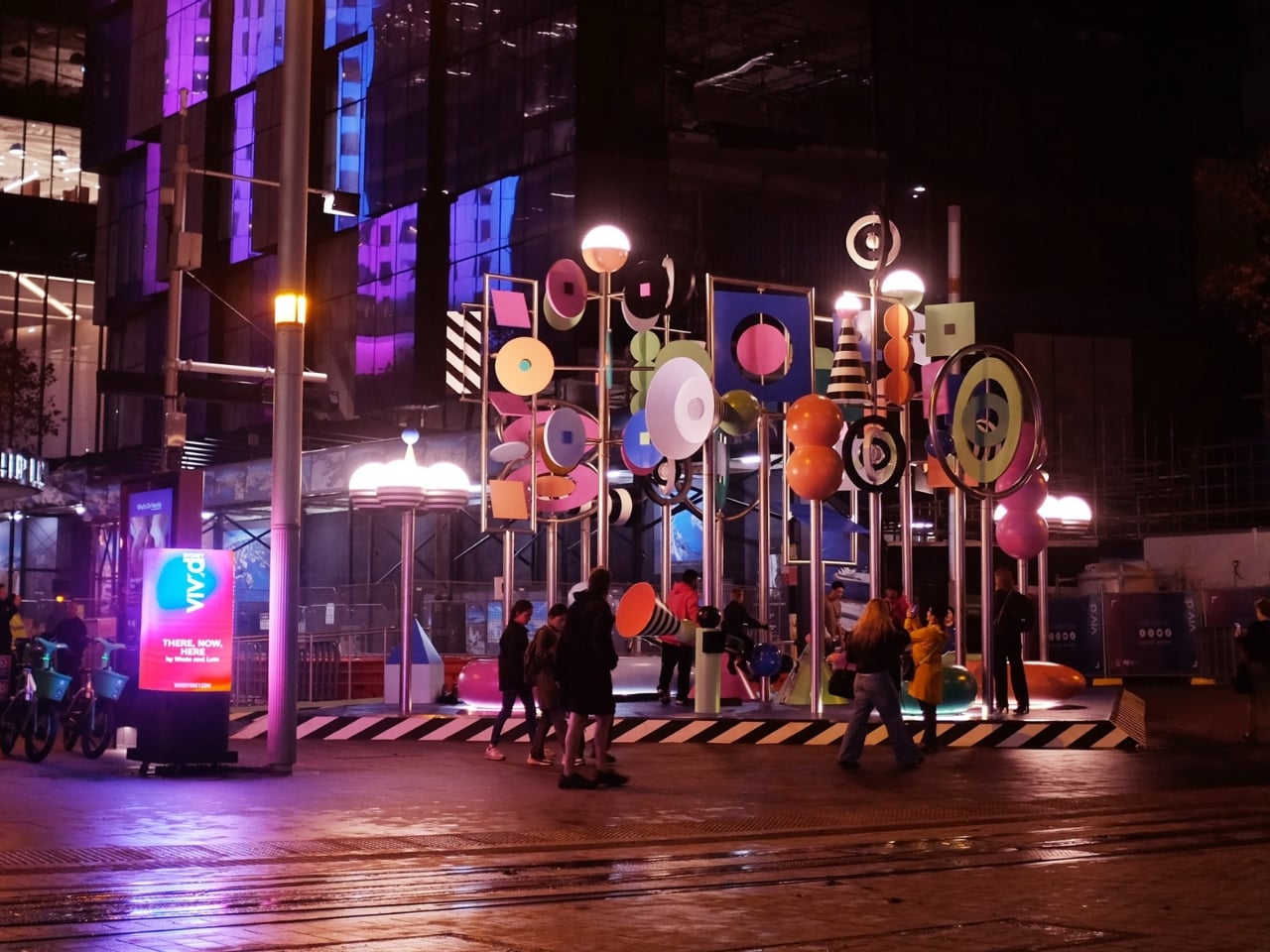
Public art often asks you to stop and stare. There, Now, Here asks you to grab a see-saw and get involved. At 6.5 meters tall, the kinetic installation from Brooklyn-based duo Wade and Leta is currently spinning, twirling, and tottering through Vivid Sydney at Circular Quay. It moves thanks to a combination of wind, motors, and willing passersby who hop on the see-saw built into its structure. The result is a sculpture that is never quite the same twice, always catching new angles of light, always mid-motion, always alive in the truest sense of the word.
That’s the kind of public art I love to see. Not something roped off and reverent, demanding a certain posture of appreciation, but something that genuinely asks the city to participate. When you can physically change the state of a piece of art just by sitting down and pushing off the ground, the line between audience and author starts to blur in the best possible way. Most public installations settle for being looked at. This one wants to be felt. That distinction matters more than it might seem.
Designers: Wade and Leta
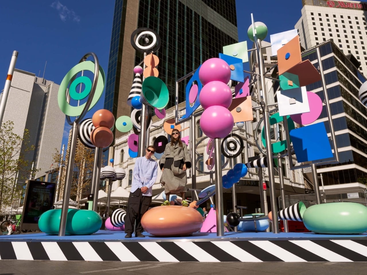
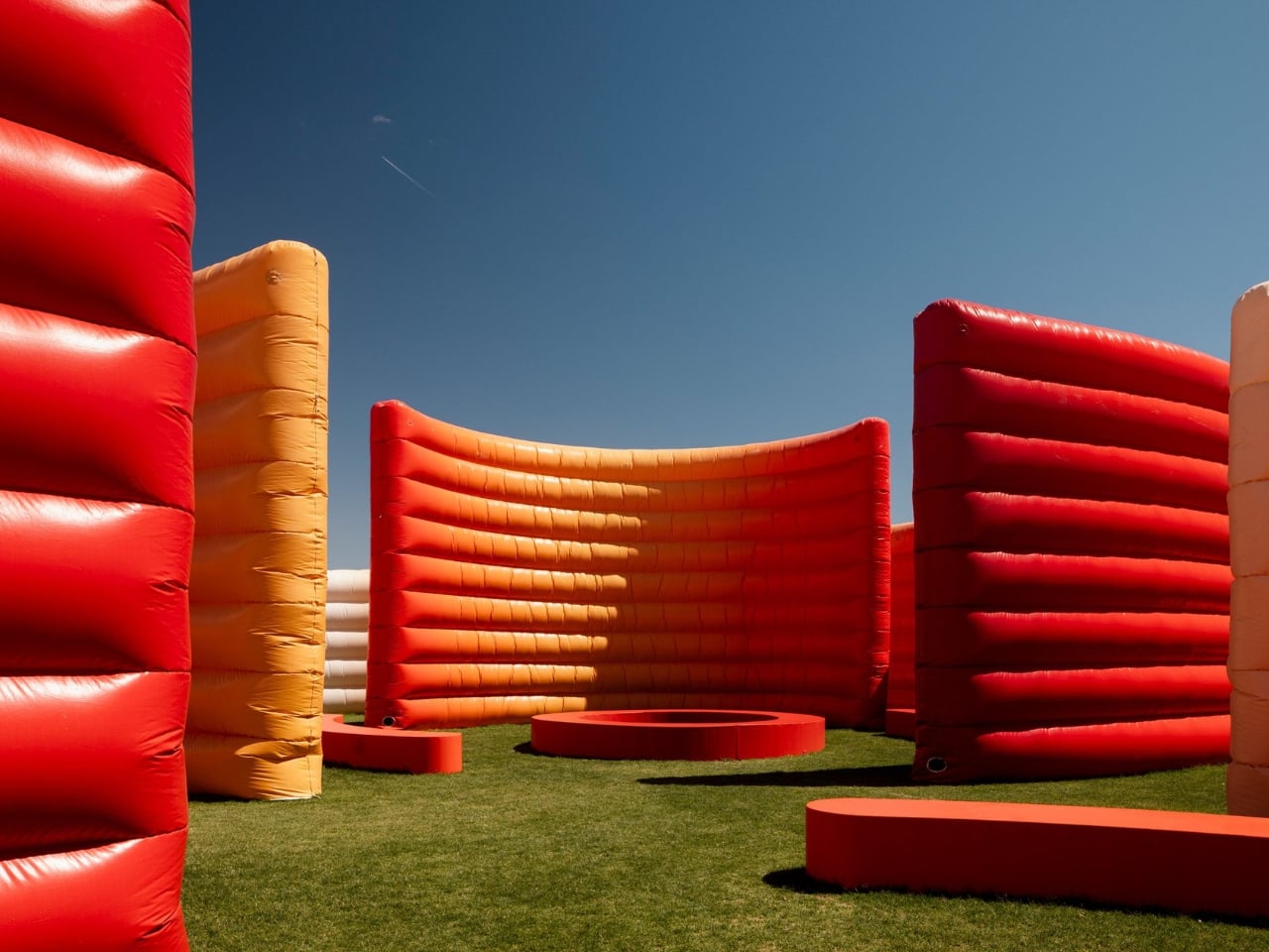
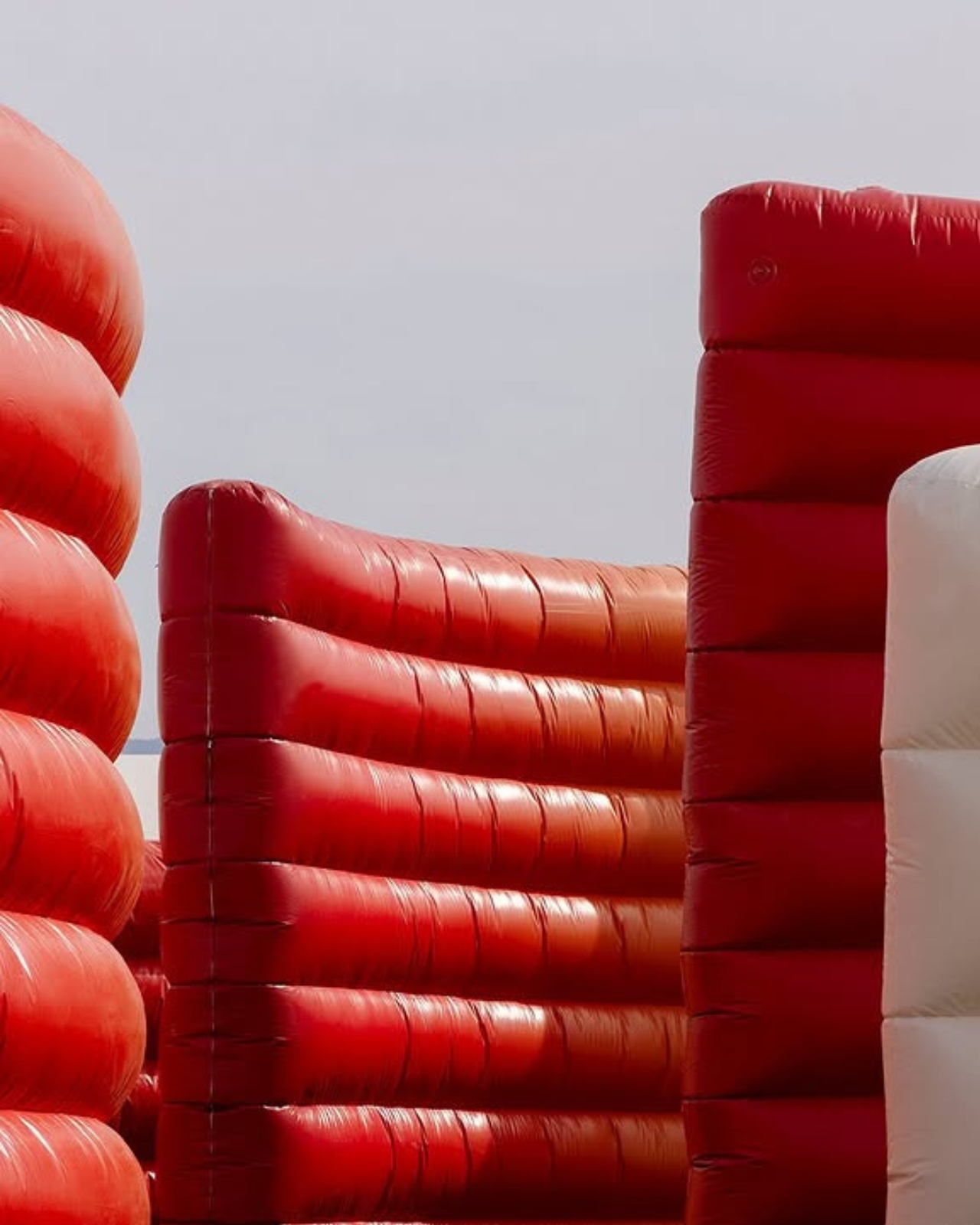
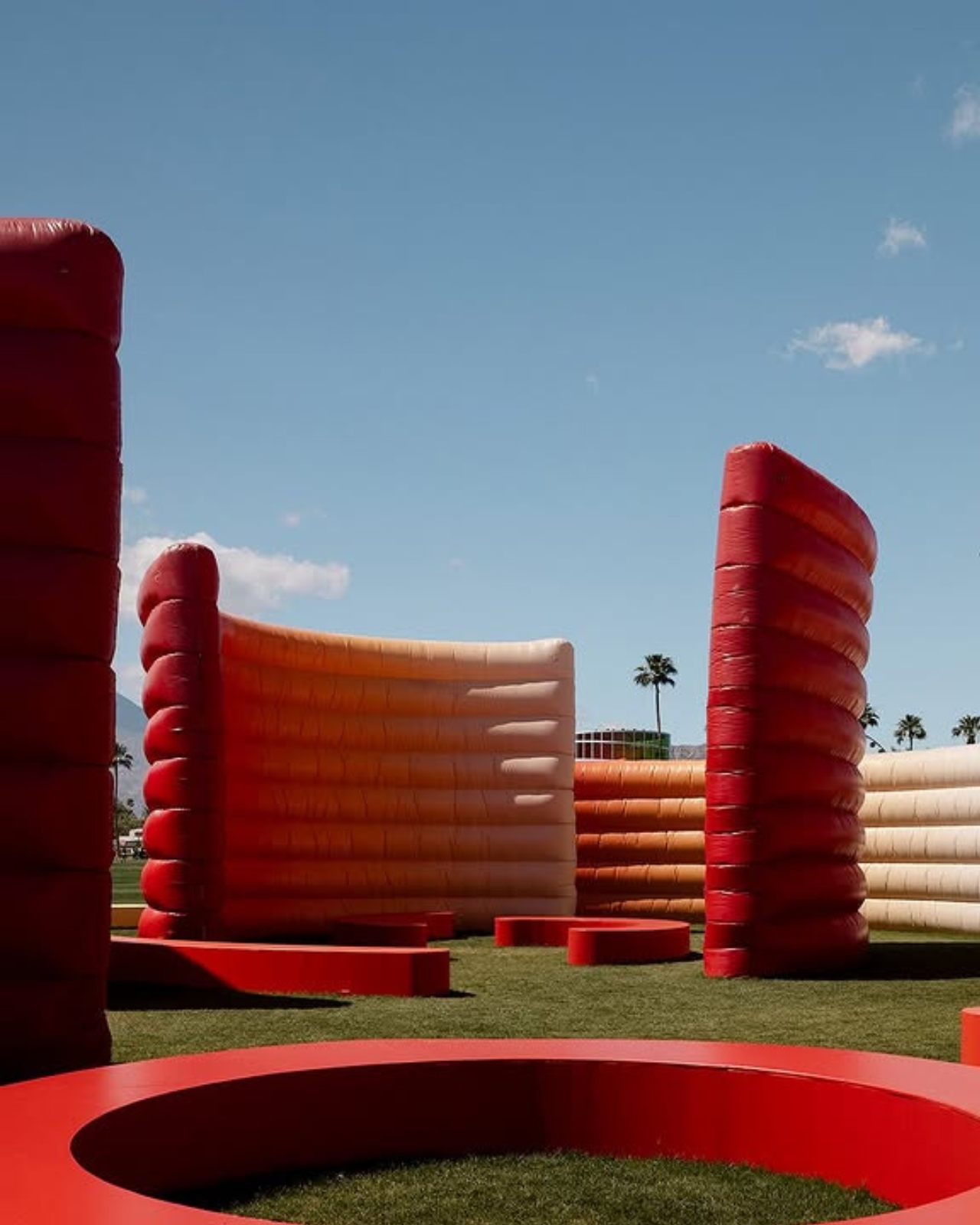
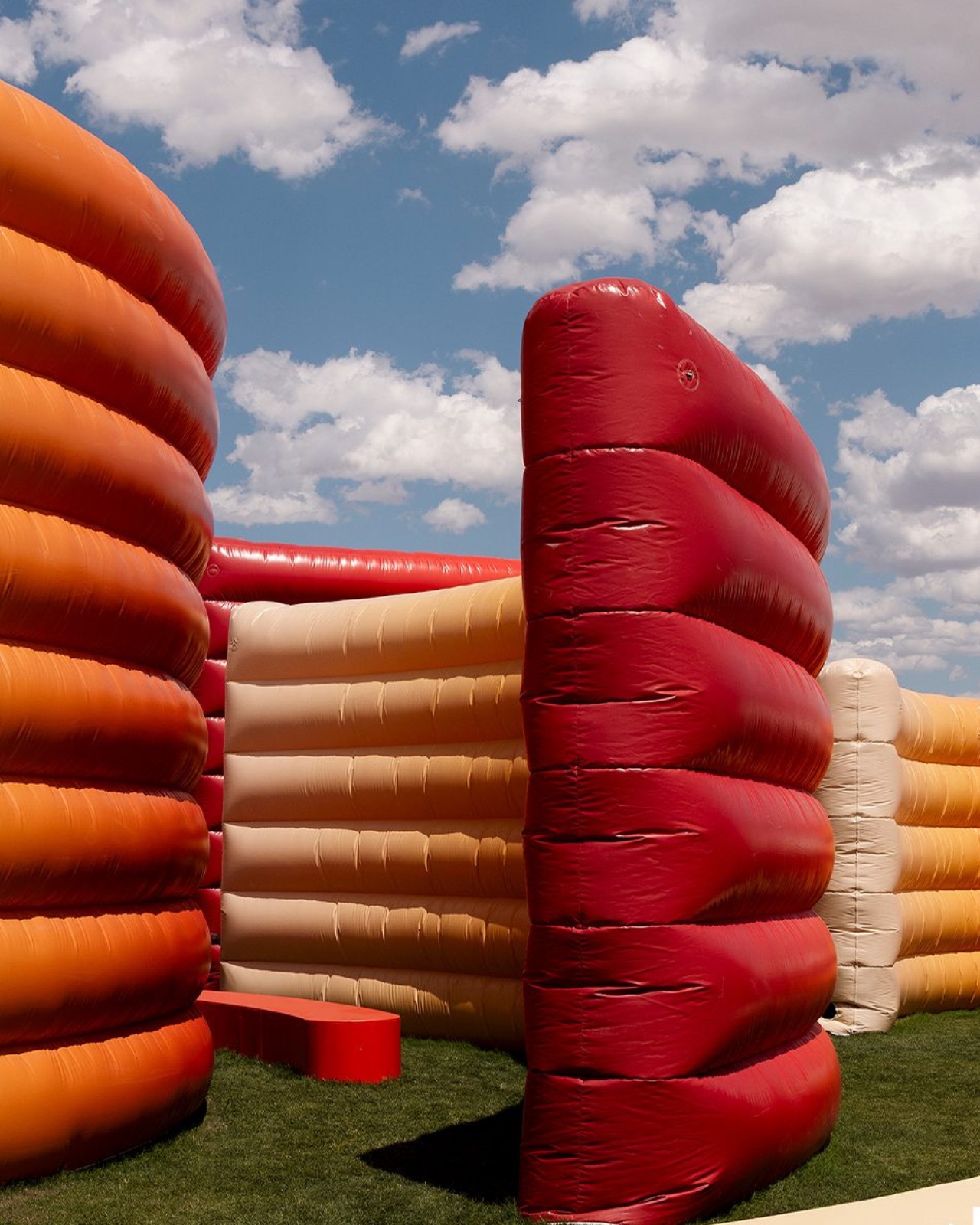
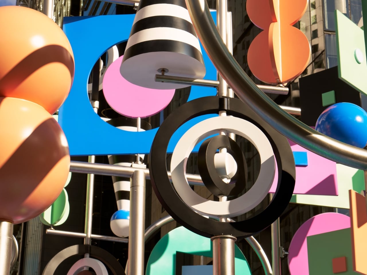
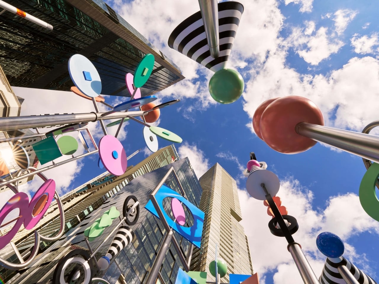
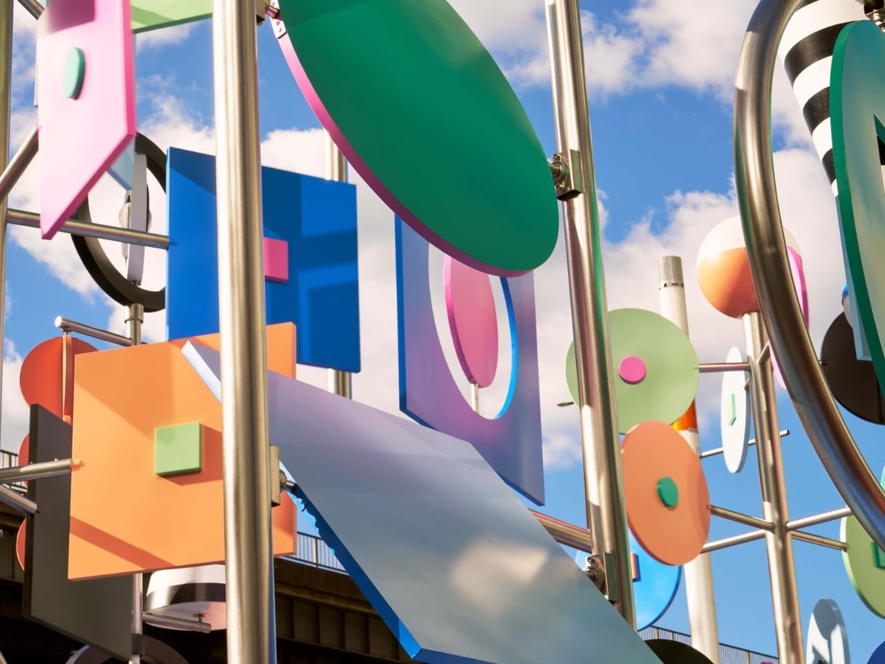
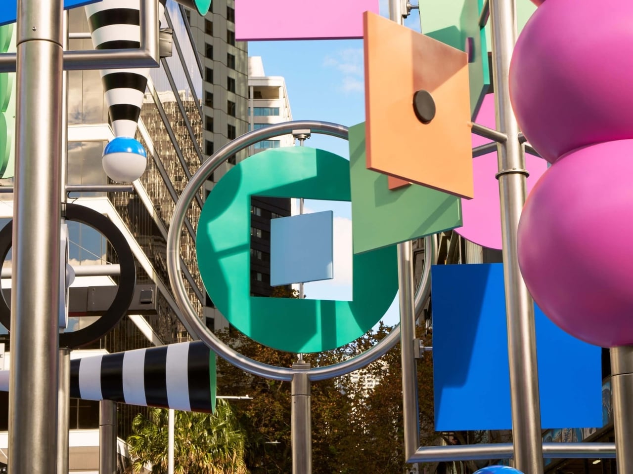
The colors don’t just look good. They mean something. Wade and Leta pulled their palette from Dorothea Mackellar’s 1908 poem “My Country,” one of the most celebrated pieces of Australian writing and a poem many Australians know by heart. Mackellar’s famous “sunburnt country” inspired the installation’s muted, washed-out tones and black and white stripes, and the whole effect reads like a love letter to the Australian landscape written in a purely visual language. Two New York designers traveled to the other side of the world, studied a century-old poem, and turned it into spinning kinetic sculpture. That’s not lazy work. That’s genuine creative homework, and it shows.
Then there’s the sound component, designed by Josh Burgess, which takes the concept somewhere even more interesting. It captures the sonic texture of Circular Quay itself: the rush of water on rocks, the ding of the light rail, the chirp of the pedestrian crossing signal. Visitors can manipulate these sounds through accessible controls built into the installation, making the experience as interactive as you want it to be. But the lyrebird is the detail that really lands for me. Wade and Leta describe it as a nod to the “bush doof,” with the lyrebird’s sounds serving as the structural backbone of the whole audio experience. The lyrebird, for anyone unfamiliar, is an Australian bird so extraordinary at mimicry that it can replicate chainsaw sounds, camera shutters, and other birds with unnerving accuracy. Using one to anchor a soundscape about place and memory is not just a quirky design choice. It’s a quietly sharp observation about how culture and environment echo through each other in ways we haven’t always quite put into words.
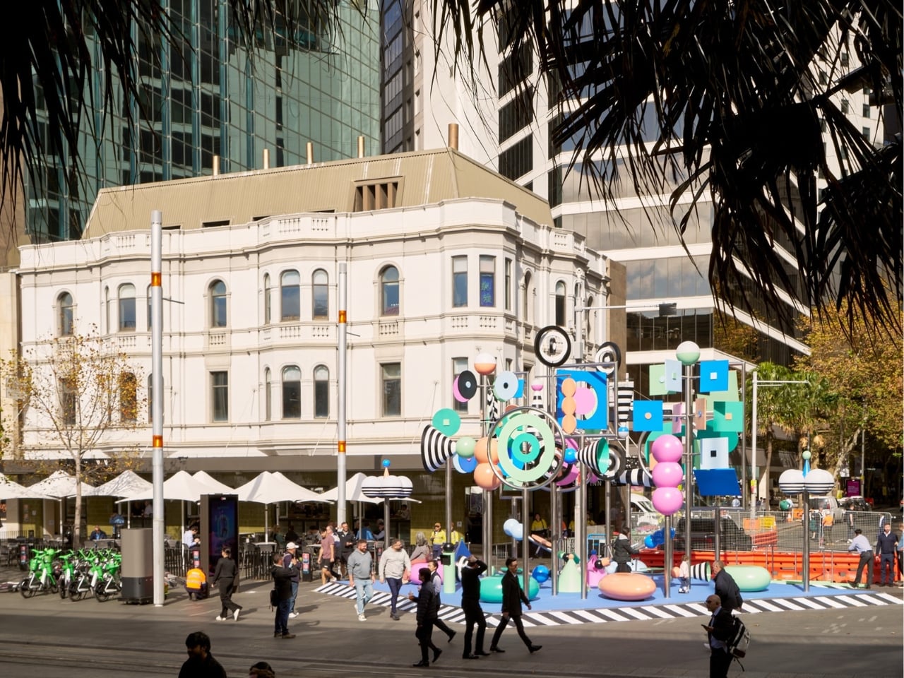
Wade and Leta, the husband-and-wife creative studio known for large-scale work that balances rigorous design thinking with an almost giddy sense of play, are making their first public debut in Australia with this piece. As debuts go, it’s a confident one. Circular Quay is not a quiet corner of the city. It’s high-traffic, high-stakes public space, the kind of place where installations either disappear into the surrounding noise or assert themselves with real authority. There, Now, Here asserts itself. It doesn’t compete with the harbor for attention. It earns it.
Vivid Sydney has a strong track record of pulling in impressive international talent, but this feels like more than a festival commission. It feels like a genuine conversation between two outsiders and a place they took the time to understand, between movement and stillness, between a Brooklyn studio and the Australian bush. The title says it all in just three words. You don’t have to be from somewhere to make work that genuinely honors it. You just have to pay attention. The installation runs as part of Vivid Sydney’s 2026 program at Circular Quay. If you’re anywhere near it, go ride the see-saw.
The post The 6.5-Meter See-Saw Sculpture Sydney Can’t Stop Talking About first appeared on Yanko Design.