Rope Replaced Every Screw and Dowel in This $77 Wooden Folding Stool

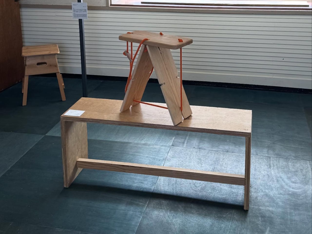
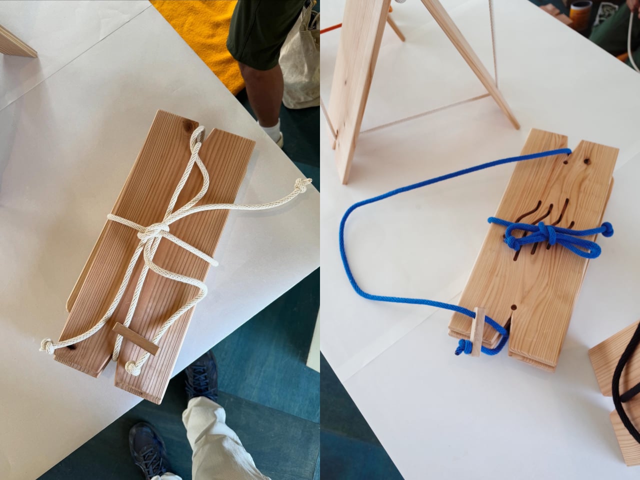
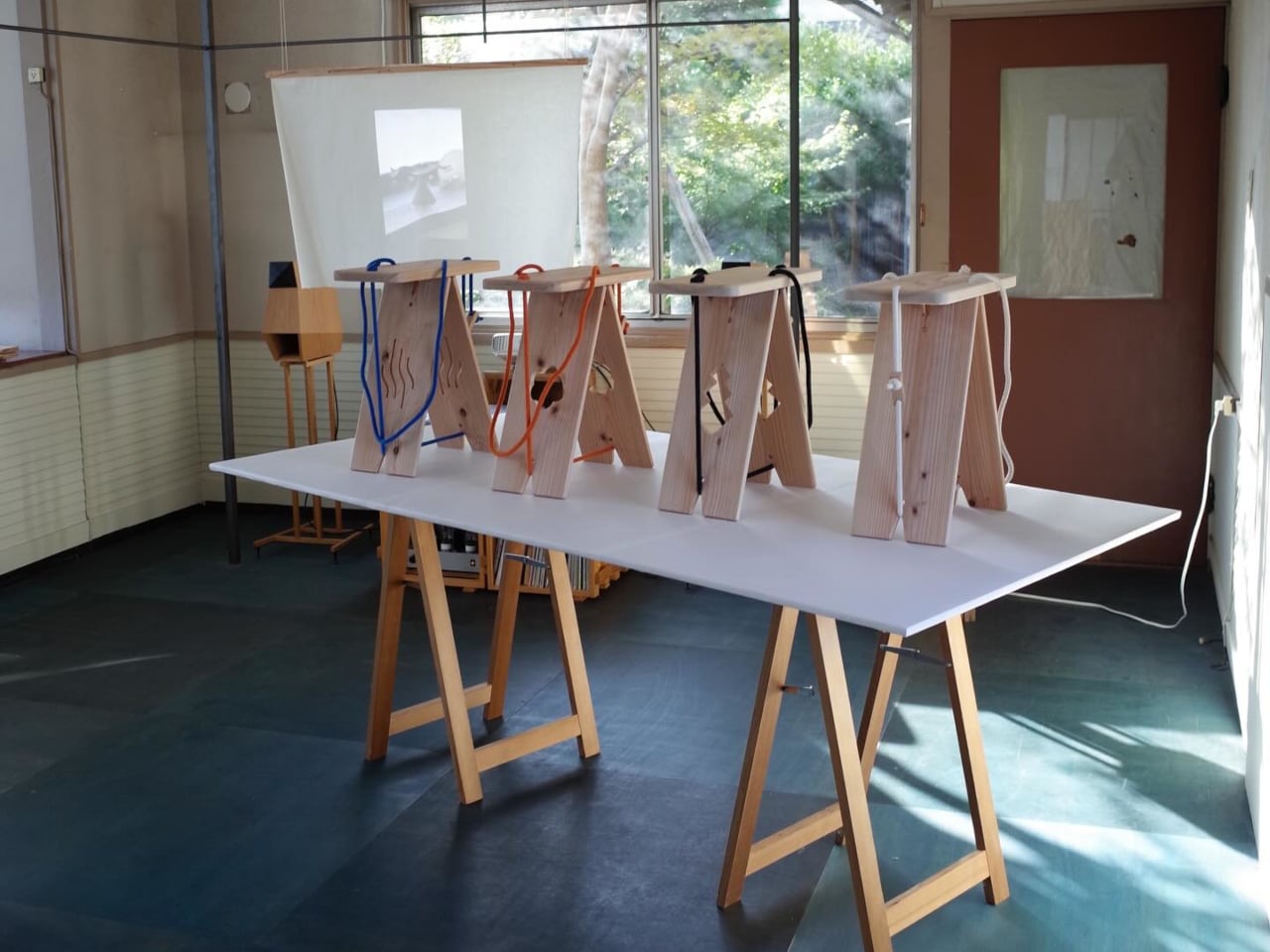
Most furniture relies on hardware you can’t see to hold everything together. Screws, bolts, dowels, and adhesives do the invisible work that keeps chairs and stools from coming apart. The Rope Stool does without all of it. Designed as part of a craft exchange between Tottori, Japan, and Gothenburg, Sweden, it holds its flat cedar boards together through rope tension alone, and it folds flat when it’s done.

The exchange that produced it ran for three weeks in Tottori Prefecture, where six Swedish creatives came to collaborate with local Japanese craftspeople. The initiative was organized by Oshinsha, a Japanese retailer dedicated to promoting the work of local artisans, with funding from both countries. It was structured as a genuine creative residency, not a cultural showcase, and the stool that came out of it reflects that difference.

Designers: Esbjorn Grip, Junsei Fujimoto
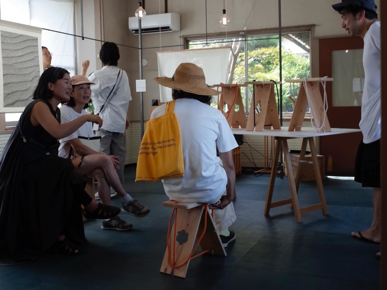
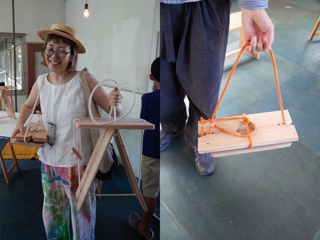
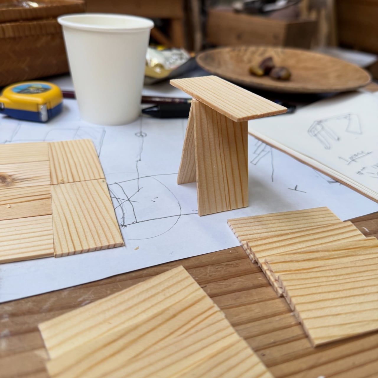
The brief handed to the pair who made the Rope Stool was deliberately restrictive: create a piece of furniture from a single, repeatable wooden element. What they arrived at is a seat made entirely from identical flat boards of Japanese cedar, no custom-cut components, no specialized hardware. The rope pulls them into formation and holds them there, tight enough to carry a person’s weight, loose enough to release when you want to pack up and leave.
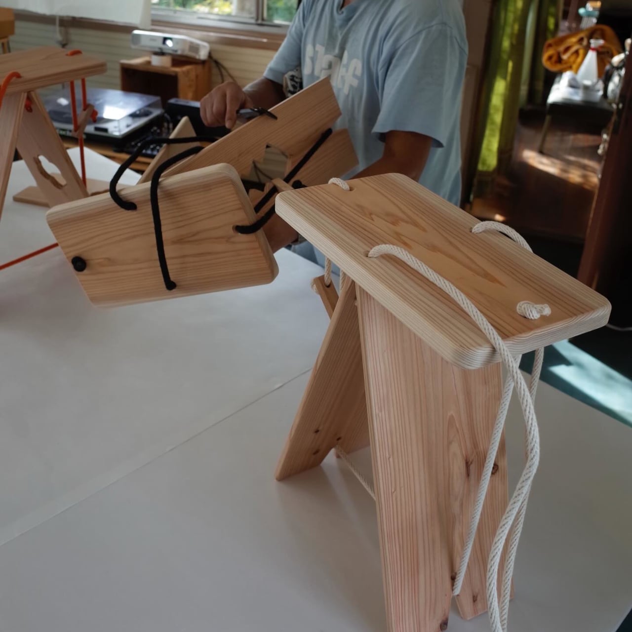
That packing-up quality is one of the things that makes the stool more than a design exercise. A seat that disassembles into a flat bundle of boards and a length of rope is genuinely portable in a way that most stools aren’t. You can bring it to a market stall, a workshop, an outdoor event, or anywhere that needs a seat more than it needs a chair stored permanently in the corner. The rope tension is what creates the rigidity; without it, the parts stay separate and flat.
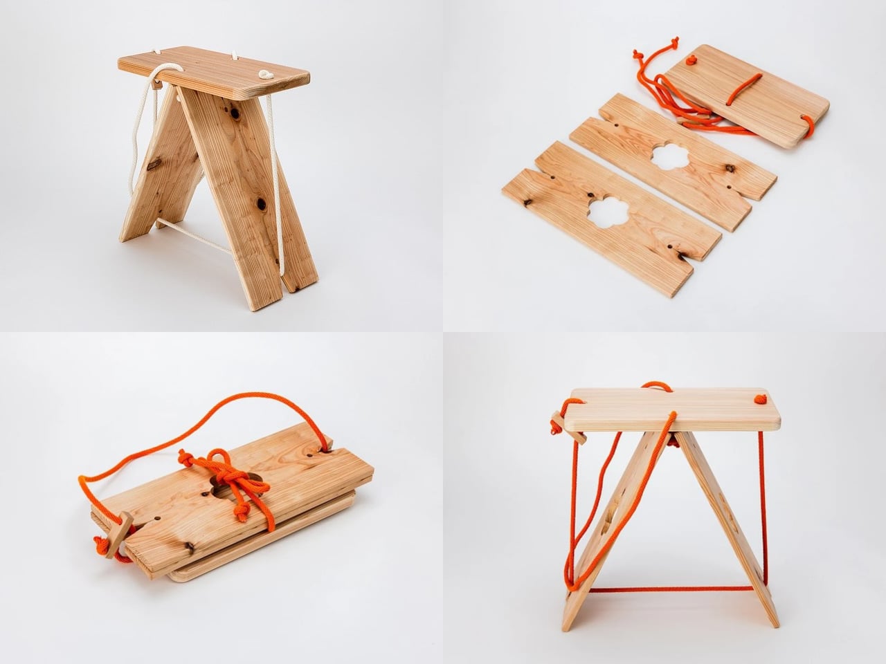
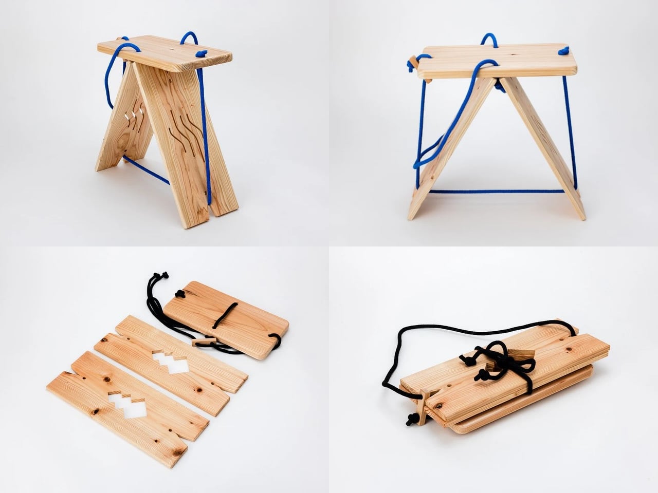
The cedar itself is a considered choice. Japanese cedar, or sugi, is one of the most widely used traditional wood materials in Japan, valued for its light weight, straight grain, and durability. Flat boards cut from it are uniform enough to be truly interchangeable, which is the point of the single-repeatable-element brief. Each board in the stool is the same as the others, and the rope is what differentiates a pile of boards from something you can sit on.
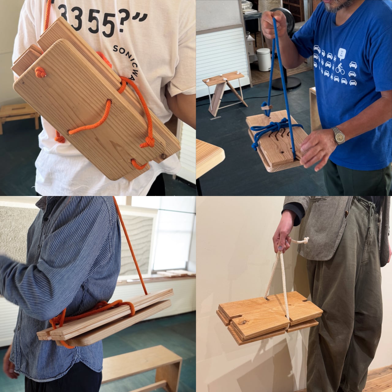
There’s a conceptual clarity to the construction that most furniture doesn’t achieve. The structure is visible, the logic is readable, and nothing about how it stays together is concealed. Pull the rope, and it assembles. Loosen it, and it comes apart. The simplicity isn’t a limit on what the stool can do: it’s the thing itself, expressed as directly as the brief demanded.
The post Rope Replaced Every Screw and Dowel in This $77 Wooden Folding Stool first appeared on Yanko Design.
4 Ancient Japanese Crafts Reborn as Furniture You Can Actually Own

Japan has always had a complicated relationship with the new. On one hand, the country gave us bullet trains, robot hotels, and vending machines that sell everything from hot soup to umbrellas. On the other hand, it is also home to some of the world’s most painstakingly preserved craft traditions, techniques passed down through generations with almost stubborn devotion. What Kyoto-based designer Kenta Yoshizawa has done with his Red Craft collection, known in Japanese as Akai Kogei, is sit right in the middle of that tension and make it look beautiful.

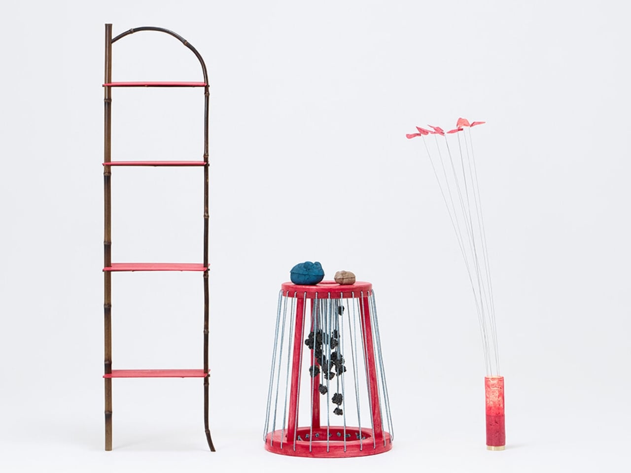
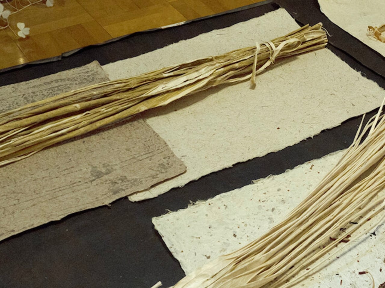
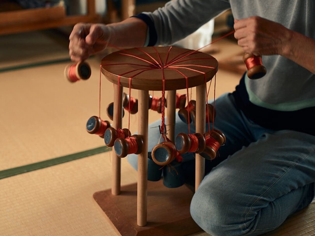
The collection pulls from four traditional Japanese craft practices: bamboo fencing, kumihimo braided cord, washi paper, and urushi lacquer. These are not fringe techniques or obscure hobbies. Kumihimo dates back centuries and was once used to lace samurai armor. Urushi lacquer has been found on artifacts over 9,000 years old. Washi paper holds UNESCO Intangible Cultural Heritage status. Yoshizawa is not working with forgotten relics. He is working with the spine of Japanese material culture, and the result is a set of objects that feel both deeply rooted and genuinely fresh.

Designer: Kenta Yoshizawa

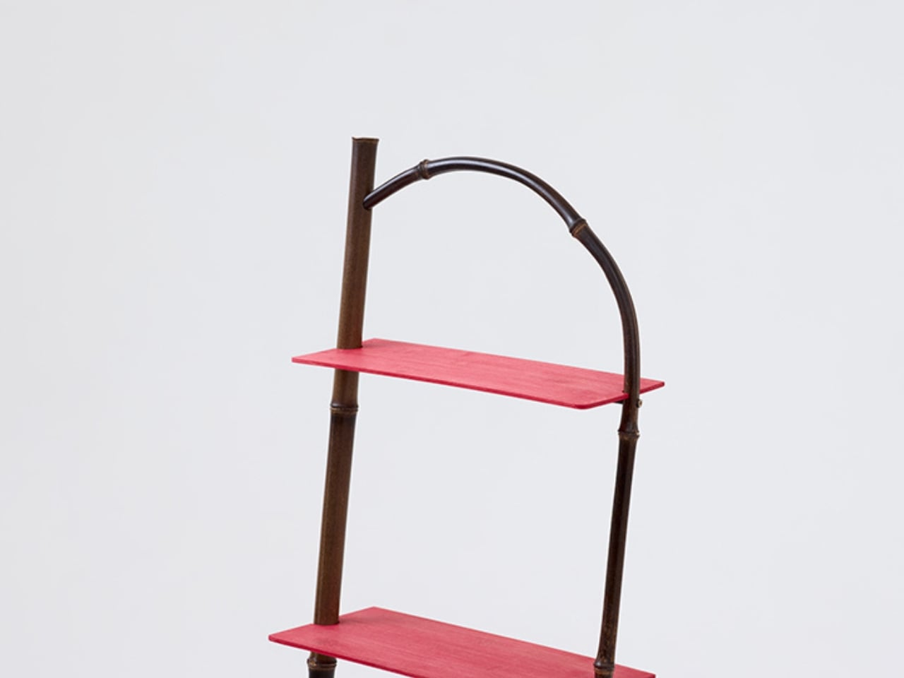
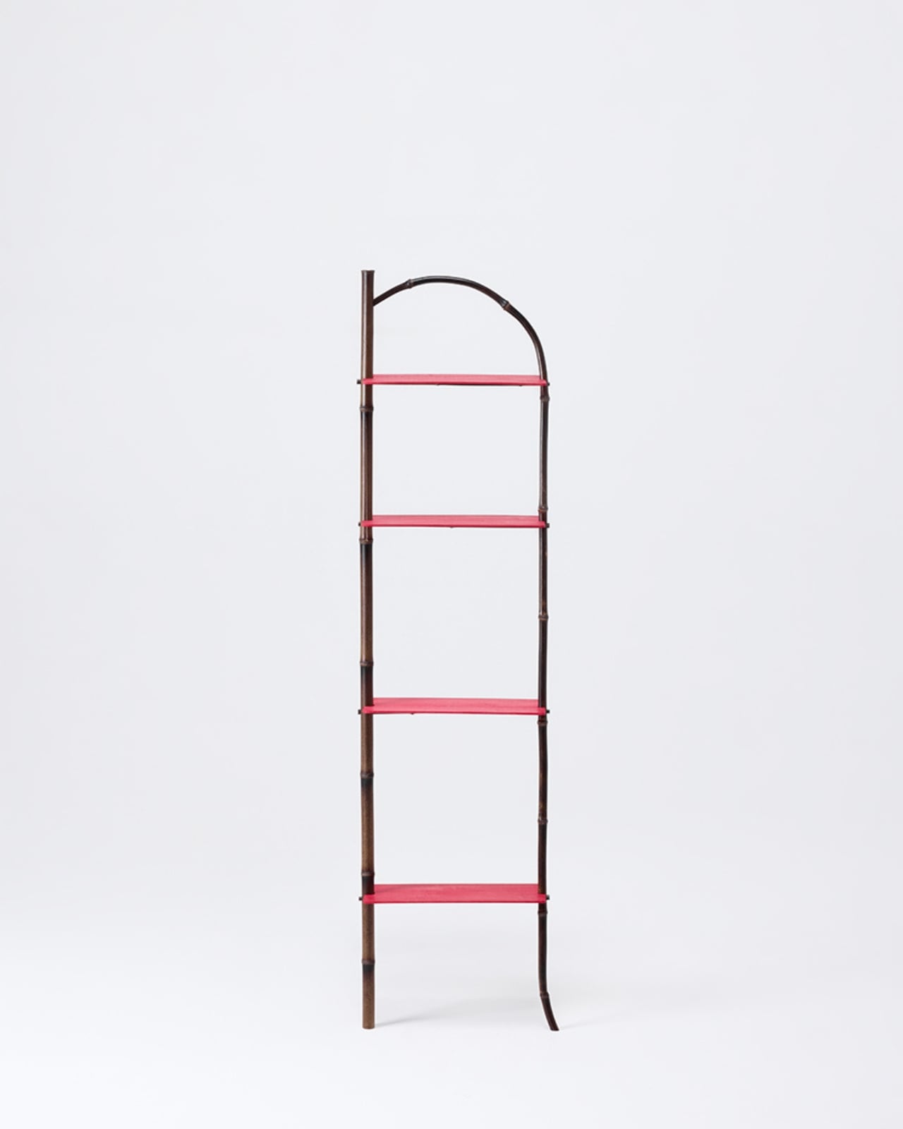
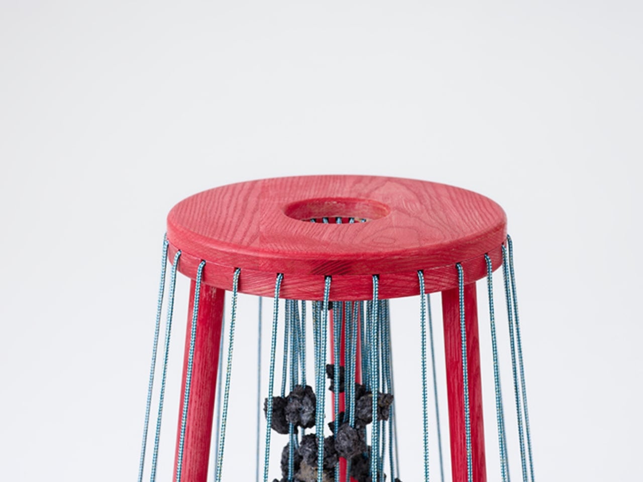
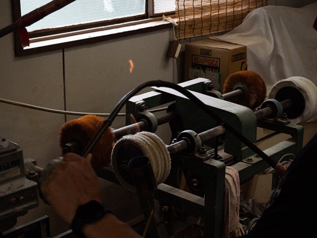
Each piece in the collection has a name that reflects its origins without being heavy-handed about it. The “n shelf” is a leaning shelf that takes the n-shaped profile of a Sodegaki, a traditional bamboo screen, and translates it into a freestanding furniture piece. The bamboo is shaped by hand using a gas burner to heat and bend the material, a process that is as physical and present as any studio practice can get. It is not mimicking the past. It is using the past as a blueprint, then deciding where to go from there.

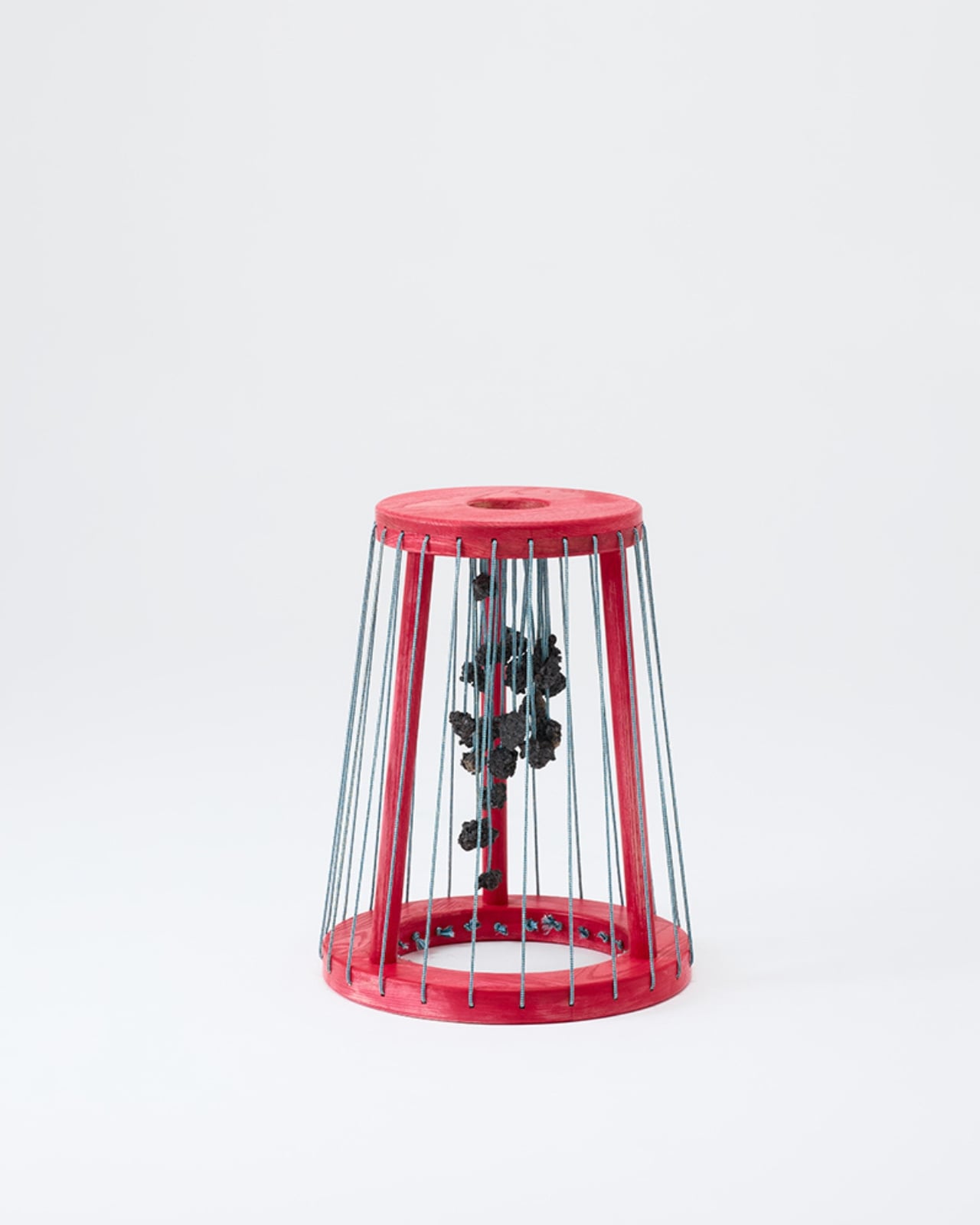
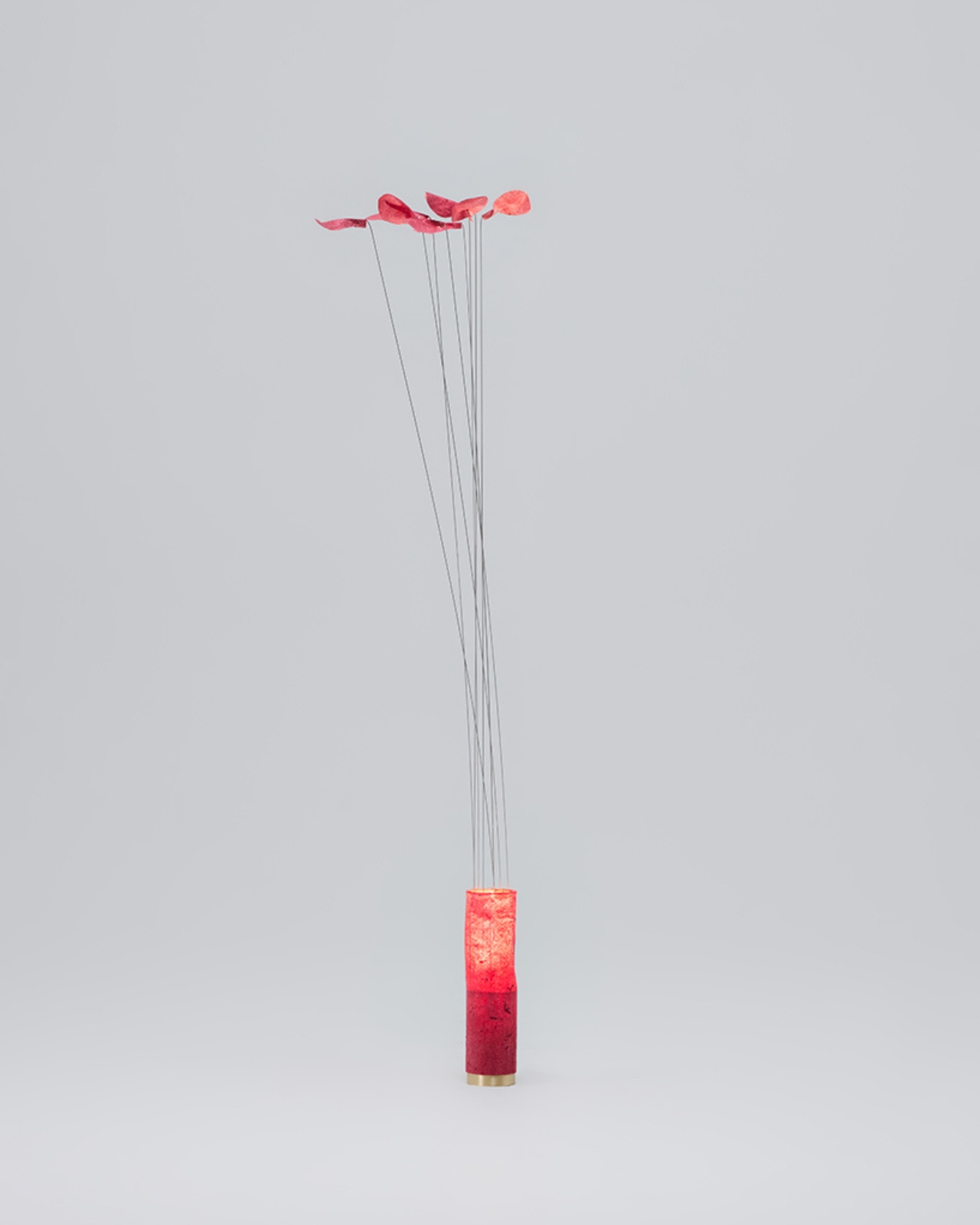
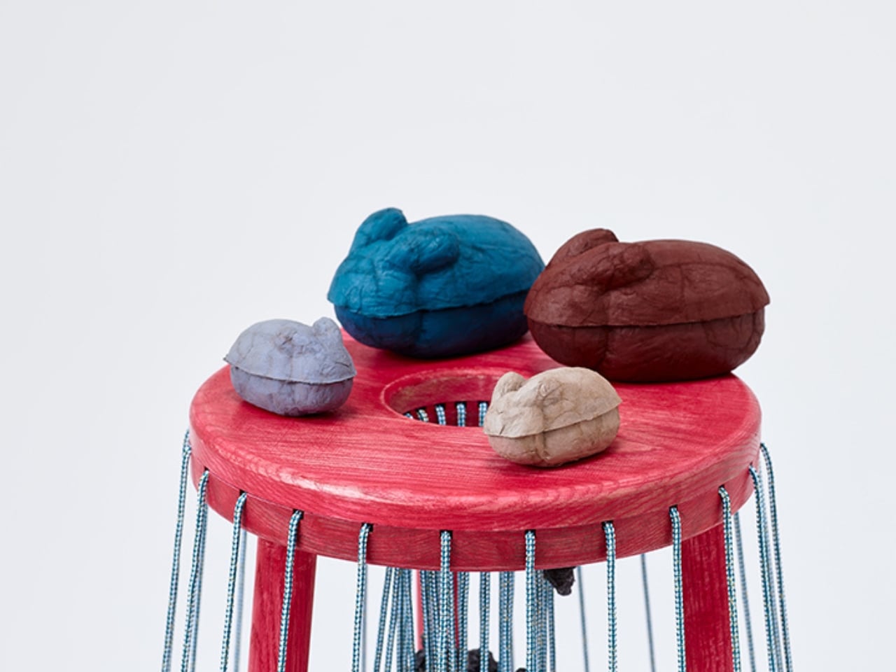
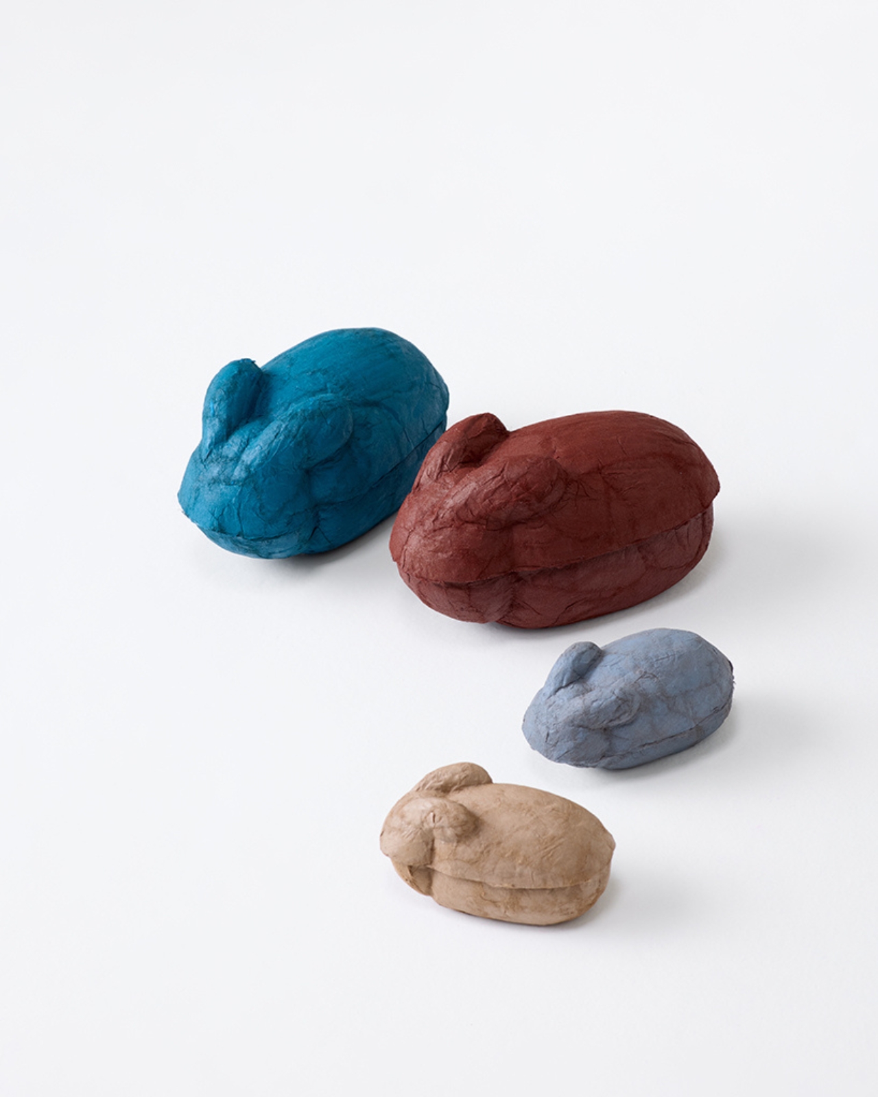
The kumino piece works with braided cord in a way that makes you see kumihimo differently, less as decoration and more as structure with genuine weight and tension. The stickstick and usahako round out the series, incorporating washi paper and urushi lacquer into objects designed for everyday domestic use. All four pieces share the same vibrant red palette, which is both a visual signature and a quiet conceptual statement. Red in Japan carries layered meaning, connected to protection, vitality, and ceremony. Painting an entire collection in it is not an accident.

To pull this off with integrity, Yoshizawa worked with actual craft specialists, including Nagaoka Meichiku for the bamboo shelf and Shoen Kumihimo for the braided cord work. That collaboration matters more than it might seem. So much design that attempts to “revive” traditional craft ends up looking like a tribute act, aesthetically referencing a process without truly engaging with it. Having the masters involved, having people who have spent their lives learning these techniques actually make the objects, keeps Red Craft honest. The craft is not a veneer. It is the point.

My honest take is that Red Craft is exactly the kind of design we need more of right now. Not because it is nostalgic, but because it refuses to treat tradition as a museum piece. Yoshizawa’s collection asks what these techniques become when they are not preserved behind glass but allowed to do actual work in a contemporary home. The answer, as it turns out, is that they become furniture, lighting, storage. Objects you actually live with.

The things we choose to put in our homes say something about what we value, what we want near us. Choosing an object made with a centuries-old technique, shaped by hand, infused with craft that requires skill and time and human attention, is a different kind of choice than clicking “add to cart” on something designed, manufactured, and shipped in six weeks. That difference matters, even if we do not always articulate why.

Red Craft does not ask you to choose the past over the present. It asks whether there is a version of the present that makes room for both. Given how much of contemporary design feels disposable, the answer Yoshizawa offers feels like a small but genuine relief.

The post 4 Ancient Japanese Crafts Reborn as Furniture You Can Actually Own first appeared on Yanko Design.
G-Shock Just Turned a Japanese Paper Lantern Into Wearable Art

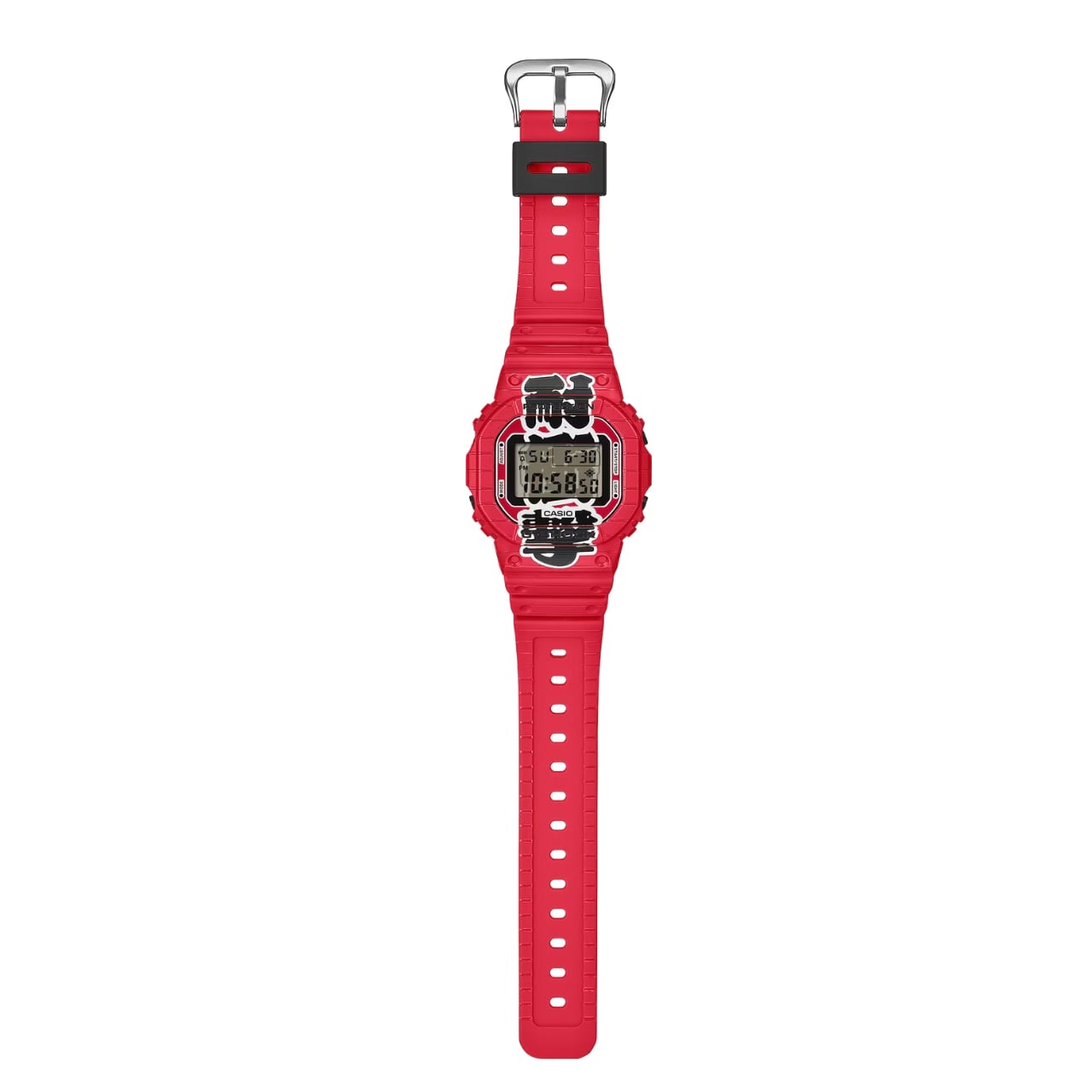
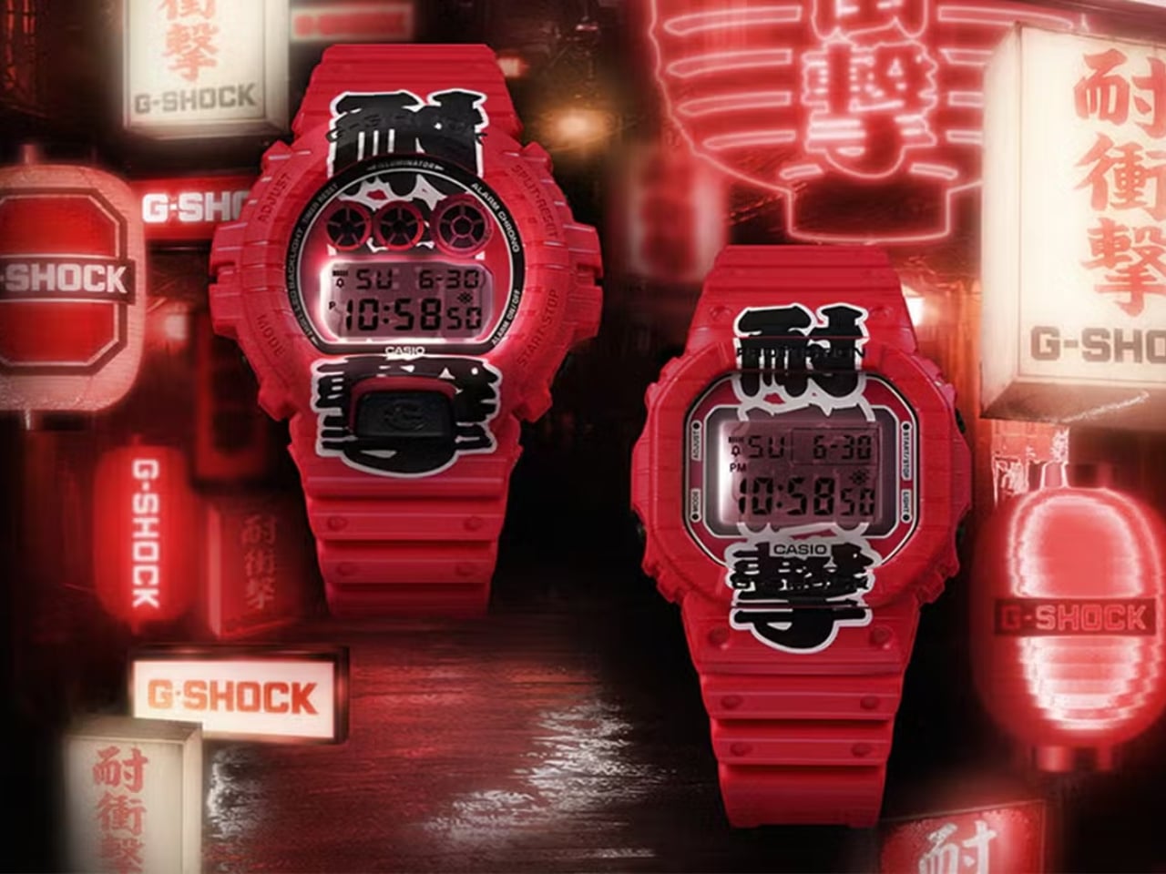
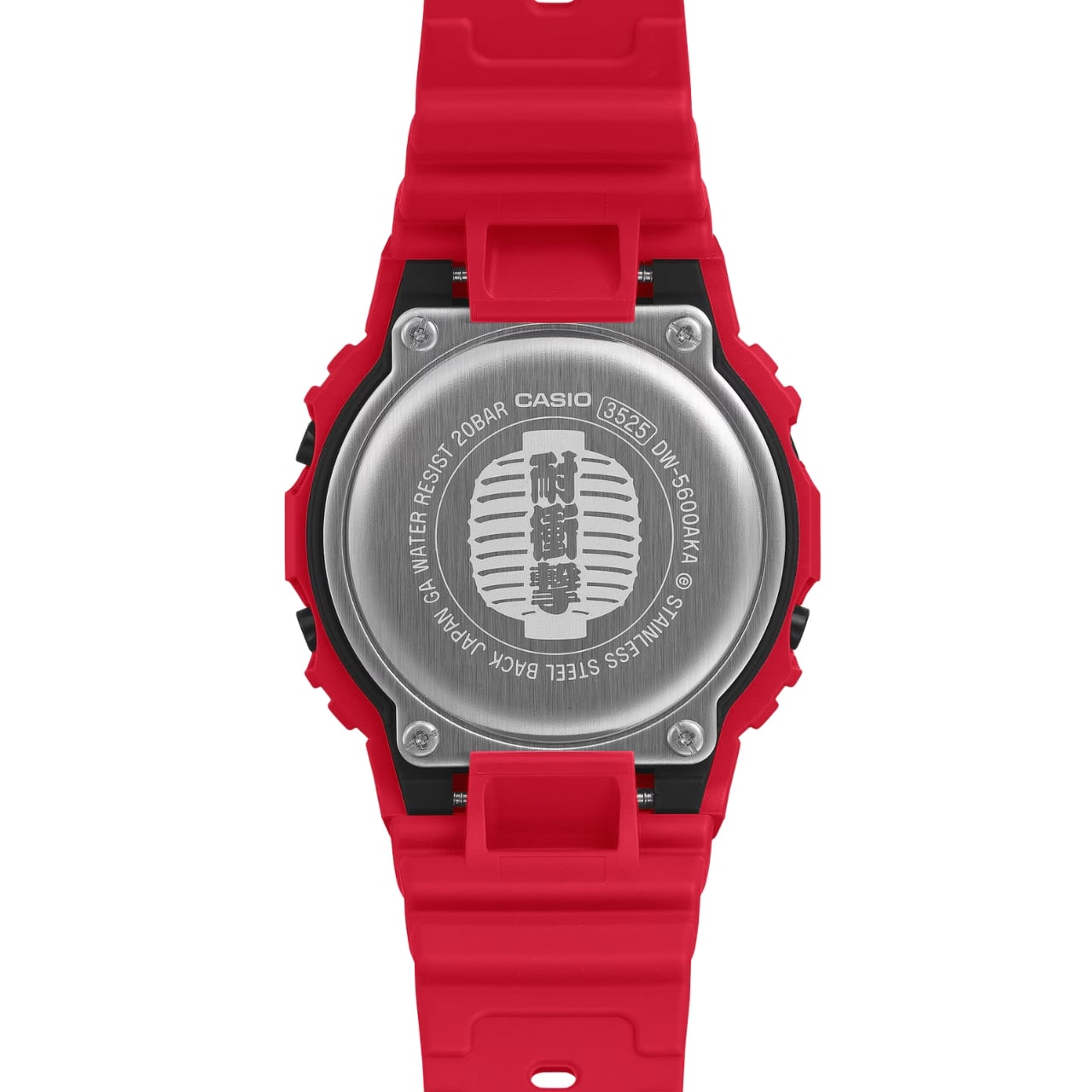
G-Shock has always known how to make a statement. From its reckless-by-design origins in 1983 to its cult status across military barracks, skate parks, and high-fashion runways, the brand has never really needed to justify itself. It just shows up. But with the new Aka-Chochin collection, built around the DW-5600AKA-4 and DW-6900AKA-4, G-Shock isn’t just showing up. It’s glowing.

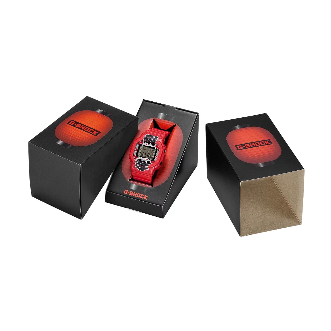
The concept behind these two watches is, genuinely, one of the more thoughtful design moves I’ve seen from the brand in a while. “Aka-Chochin” translates to “red lantern,” a reference to the traditional paper lanterns that hang outside izakayas, the beloved Japanese taverns where people gather after long days for food, drinks, and the kind of conversation that only happens past 9 p.m. These lanterns, which date back to the early Edo period in the 17th century, weren’t decorative in the precious sense. They were practical and symbolic at once, signaling warmth, welcome, and the specific pleasure of slowing down. Casio took that idea and pushed it into two of its most iconic silhouettes.

Designer: G-Shock

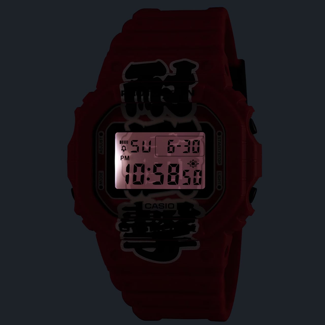
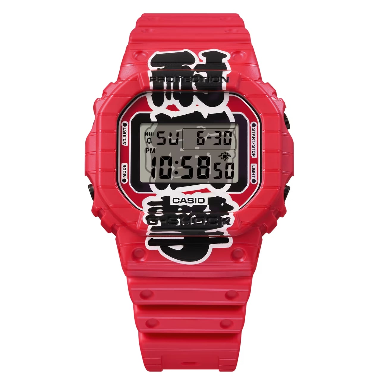
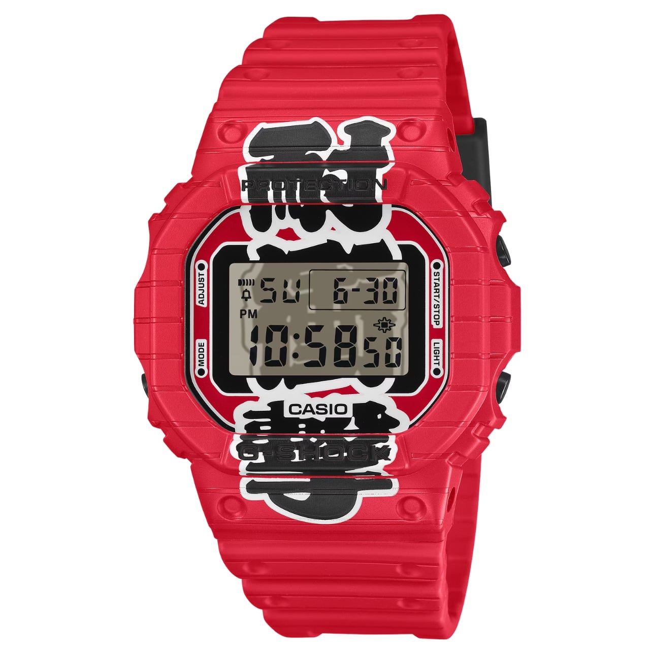
The result is unapologetically red. Not a subtle, wine-at-dinner red. A full-on, stop-what-you’re-doing red that covers the resin case, bezel, and band from top to bottom. On paper, it sounds like a lot. In practice, it earns its confidence. Both watches carry kanji characters down the face of the dial, reading “耐衝撃,” which means “shock resistance,” one of G-Shock’s founding promises. The characters are split between the bezel and the LCD display, and when the LED backlight activates, the two halves complete each other like a puzzle piece lighting up from within. It’s a detail you have to see in person to fully appreciate, and it’s the kind of thing that elevates a colorway from a gimmick to a genuine design choice.

The bezels on both models also feature hot-stamped grooves that mimic the ribbed texture of a paper lantern, and that same motif carries through to the edges of the strap. It’s not subtle, but it is cohesive. G-Shock committed to the bit, and the commitment pays off.

Now, I’ll say this upfront: the Aka-Chochin aesthetic is polarizing. All-red anything tends to divide opinion, and a digital watch in this colorway is not trying to blend in. If your instinct is to gravitate toward muted, understated timepieces, these are probably not for you, and that’s fine. But if you’ve ever wanted a watch that reads as confident and culturally curious at the same time, the DW-5600AKA-4 and DW-6900AKA-4 make a genuinely compelling argument.

The choice of silhouettes is also worth noting. The DW-5600 is essentially G-Shock’s origin story made physical, the square case that started everything, a design so clean and deliberate it has barely needed updating in four decades. The DW-6900 is its more expressive sibling, with that distinctive triple-window dial and wider case presence. Pairing both with the same concept gives collectors and casual buyers alike an entry point, whether you’re drawn to the classic restraint of the 5600 or the bolder graphic energy of the 6900.

At $190 each, neither watch is a budget impulse buy, but it’s not a stretch, either. G-Shock has always occupied that interesting middle ground between functional tool watch and cultural artifact, and the Aka-Chochin collection lands squarely in that territory. You’re not just buying a watch that tells time reliably. You’re buying into a very specific idea about where design, heritage, and streetwear culture converge.

Red lanterns were built to be seen at night, to cut through the dark and draw people in. G-Shock’s interpretation of that idea works for the same reason. Bold doesn’t have to mean reckless. Sometimes it just means knowing exactly what you want to say and saying it clearly, wrist and all.

The post G-Shock Just Turned a Japanese Paper Lantern Into Wearable Art first appeared on Yanko Design.
Japan’s Cleverest $7 Kitchen Gadget Puts Produce Bags to Work

Most of us have a drawer, a cabinet corner, or a crumpled bag stuffed inside another bag where we hoard the thin plastic produce bags from the supermarket. We keep them with the best of intentions, planning to use them for lining small bins, picking up after pets, or wrapping shoes in a suitcase. Then we forget they’re there until they’ve multiplied into a soft, crinkly heap that takes up more space than it probably should. Japanese housewares brand Marna has a different idea about what to do with those bags, and it fits in the palm of your hand.

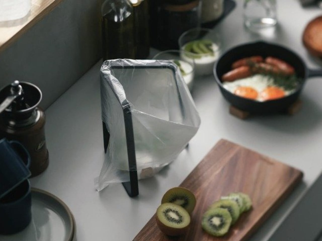
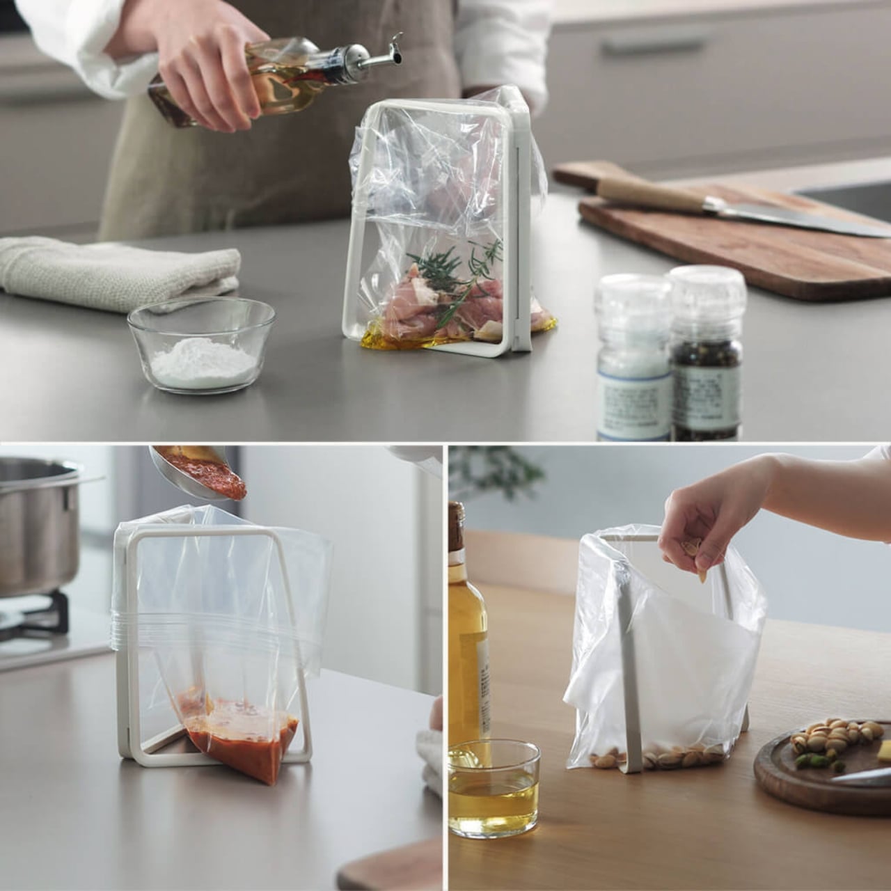
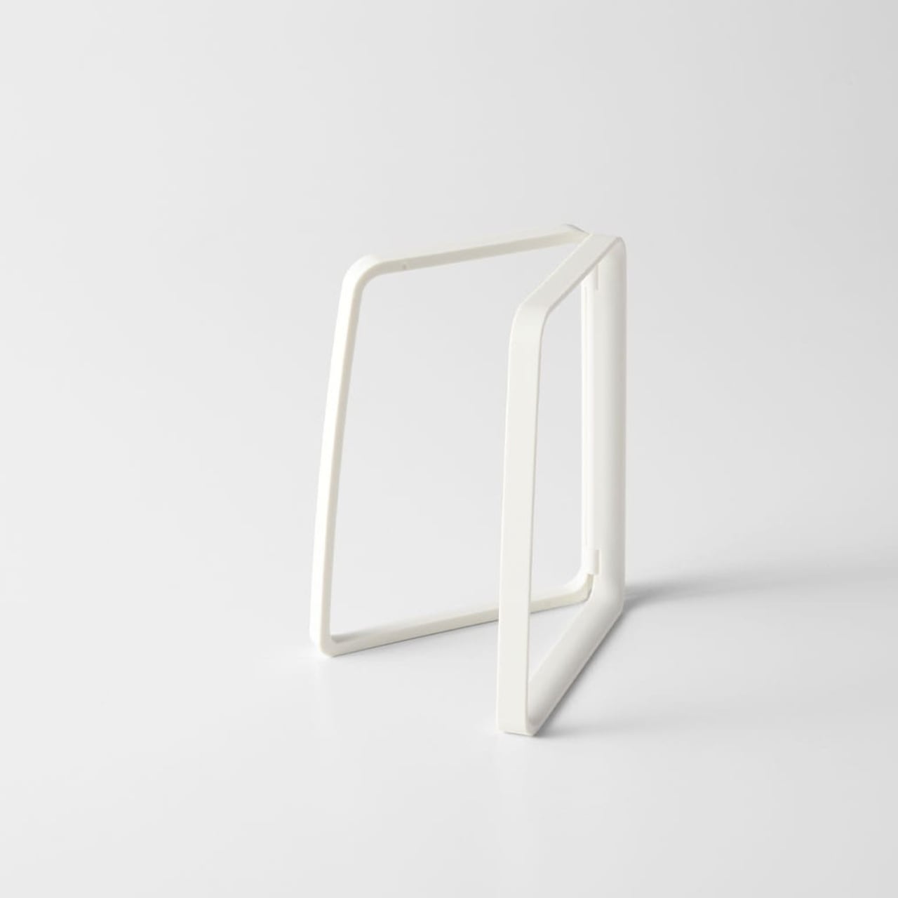
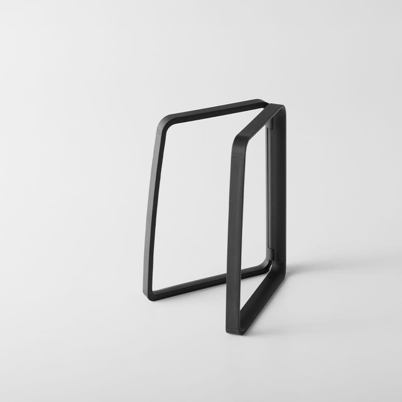
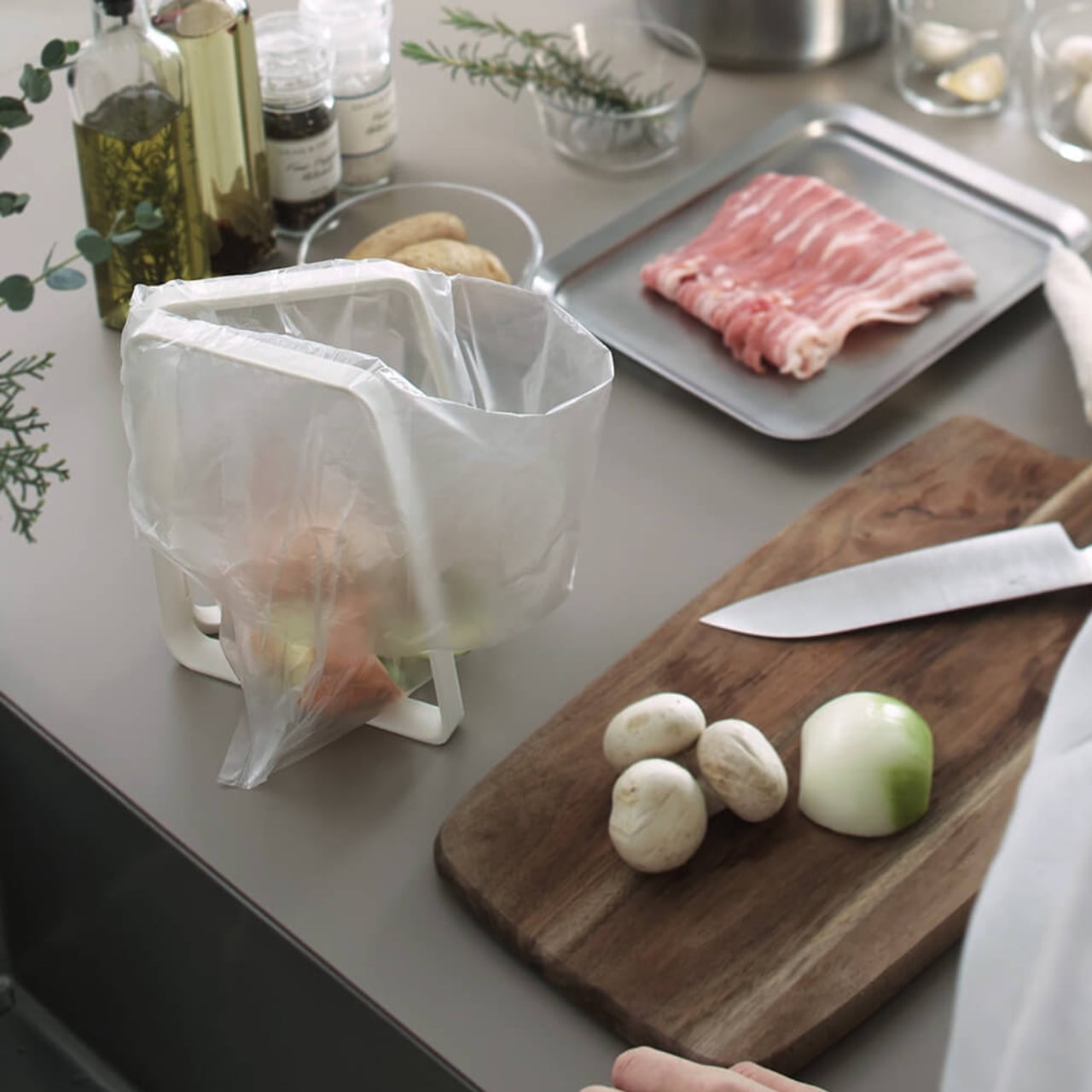
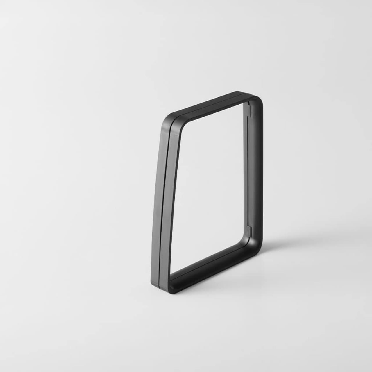
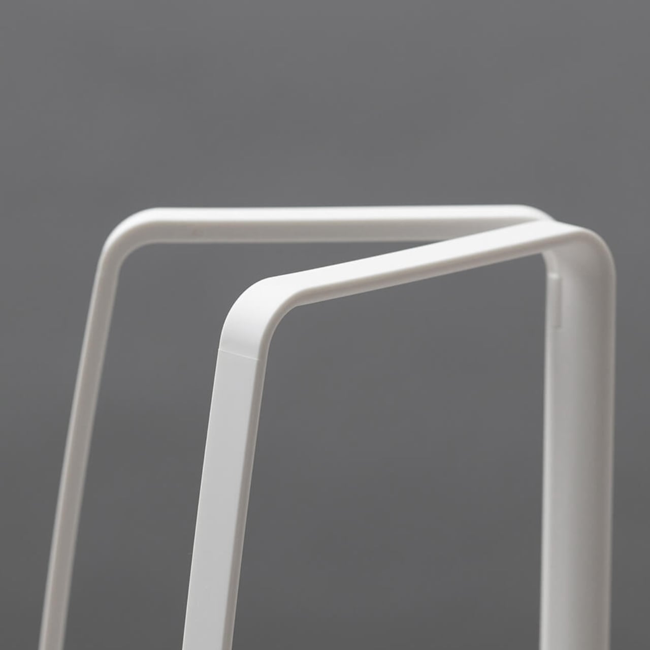
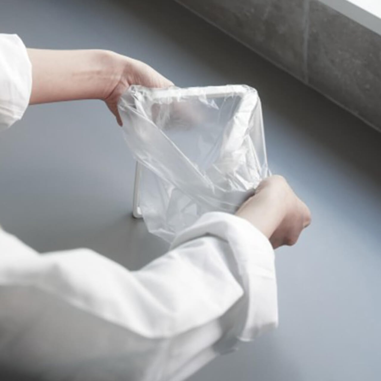
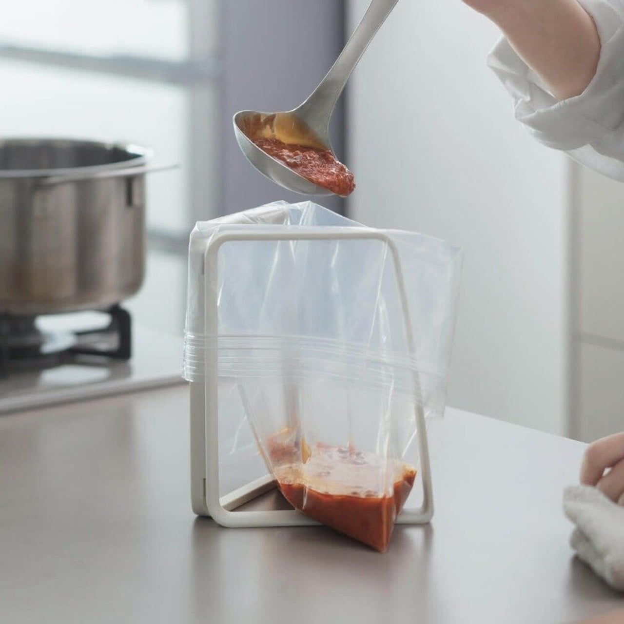
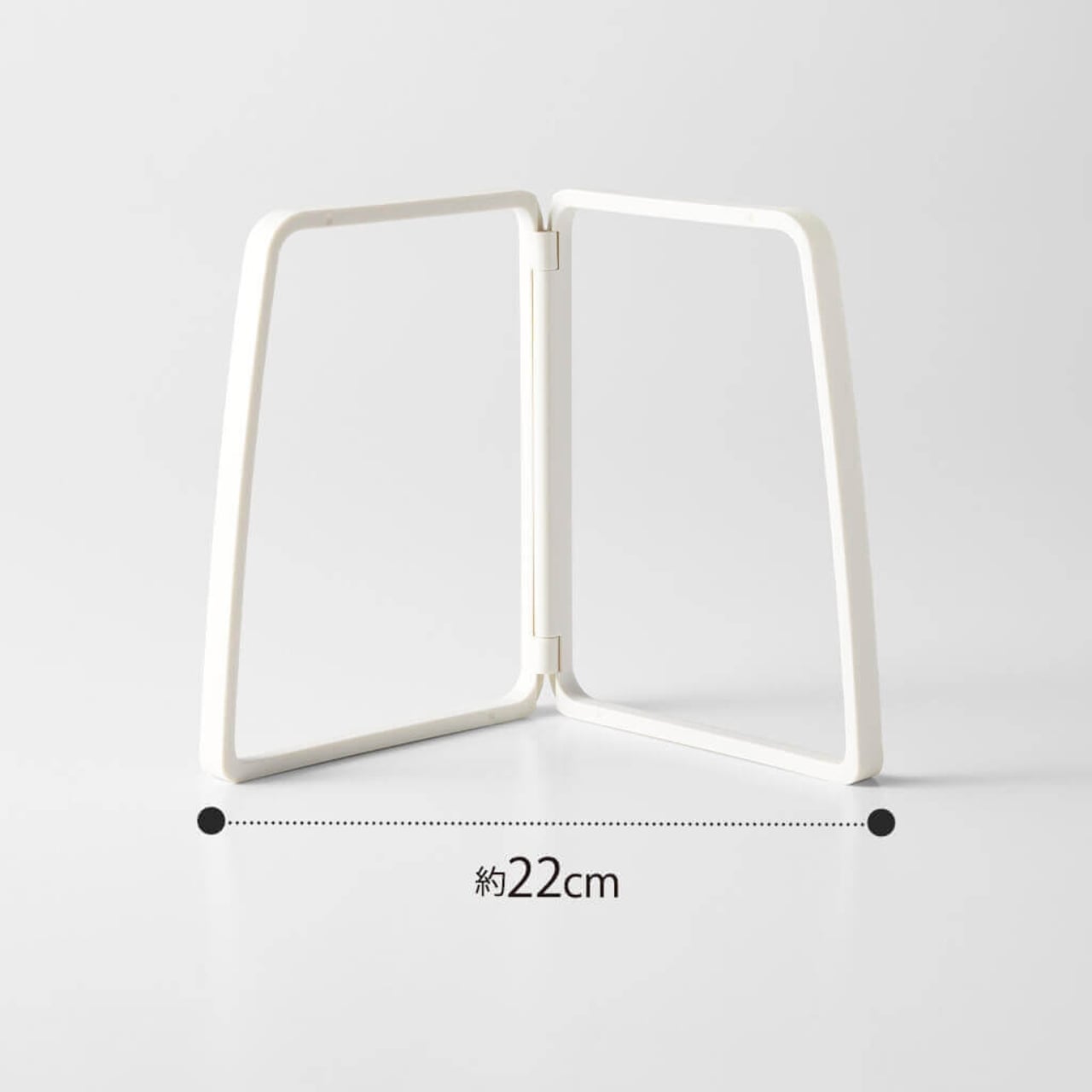
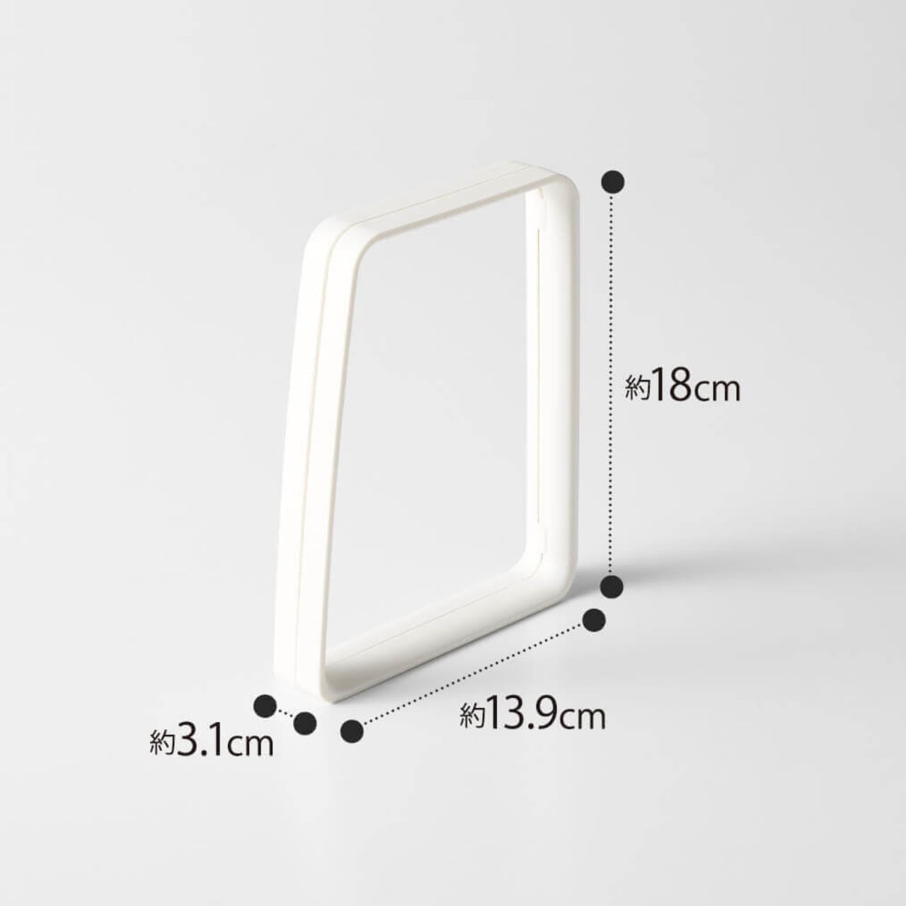
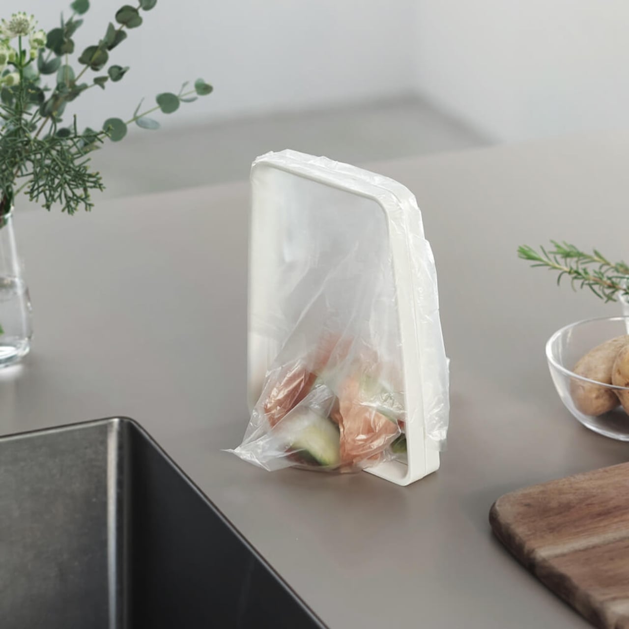
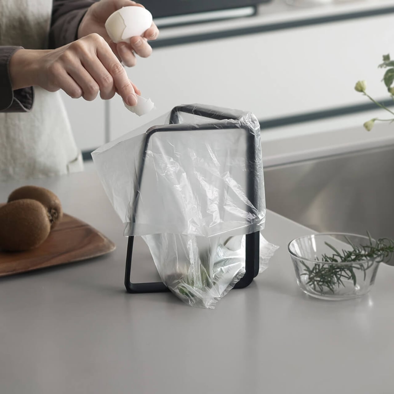
The K821 Trash Bag Holder is a compact, foldable frame, the kind of small object that makes a specific problem visible the moment you see the solution. You open it up, drape a produce bag over it, and suddenly that flimsy bag has structure. It becomes a functional mini trash container, perfect for food scraps, small kitchen waste, or anywhere you need a quick, low-stakes bin that won’t take over your counter space. When you’re done, fold the holder flat and tuck it away. That’s it. That’s the whole thing. And that restraint is exactly what makes it brilliant.

Designer: Marna

Marna has been making products like this since 1872, when they were founded in Tokyo as Japan’s first Western-style brush manufacturer. Over 150 years later, their guiding principle is still “Design for Smiles,” and the company has collected wins from the iF Design Award, the Red Dot Design Award, and Japan’s Good Design Award. They’re not a brand trying to disrupt anything or rebrand your lifestyle. They make small, careful objects that quietly solve the friction points of daily living, the kind of things you only notice when they work.

The Trash Bag Holder is a perfect example of that approach. It doesn’t reinvent anything. It just notices something most designers walk past without a second thought: produce bags are already in your kitchen, you already feel mildly guilty about them, and right now you’re probably doing nothing about it. Marna offers a bridge between that guilt and some actual action, and the bridge costs almost nothing.

The design also functions in multiple directions, which is easy to underestimate at first. Open it up for trash, yes, but you can also hold it open while you bag sauce or liquid scraps you want to contain before tossing. It closes too, which means if you’re not ready to empty it yet, bugs stay out. Each feature on its own seems minor, but together they feel almost generous.

The broader conversation this taps into matters, even if the product itself is almost aggressively humble. Kitchen waste habits are one of those areas where the gap between what we intend and what we actually do is enormous. People buy elaborate composting systems, zero-waste starter kits, and countertop canisters they find charming in October and abandon by February. Marna’s approach is the opposite: meet people where they already are, with the materials they already have, and just make it slightly easier to do the right thing. No subscription required.

It’s also worth pausing on the visual language here. The K821 doesn’t announce itself. It doesn’t come in eight colorways or sit on your countertop as a design statement. It folds flat and disappears when not in use, and that kind of modesty is a form of design confidence I genuinely respect. Not everything needs to perform.

I have a real soft spot for Japanese kitchen objects, and this falls squarely into the category of things I didn’t know existed until I saw them and then immediately thought: obviously. The best small-scale design tends to feel inevitable in hindsight. It solves a problem so cleanly that you forget the problem ever existed in the first place.

The Marna K821 is available on Marna’s website. It will not change your life. It will probably just make one corner of your kitchen slightly less annoying, and your produce bags slightly more purposeful. In 2026, that feels like more than enough.

The post Japan’s Cleverest $7 Kitchen Gadget Puts Produce Bags to Work first appeared on Yanko Design.
These Sculptural Japanese Lamps Come in 100 Colors for $150

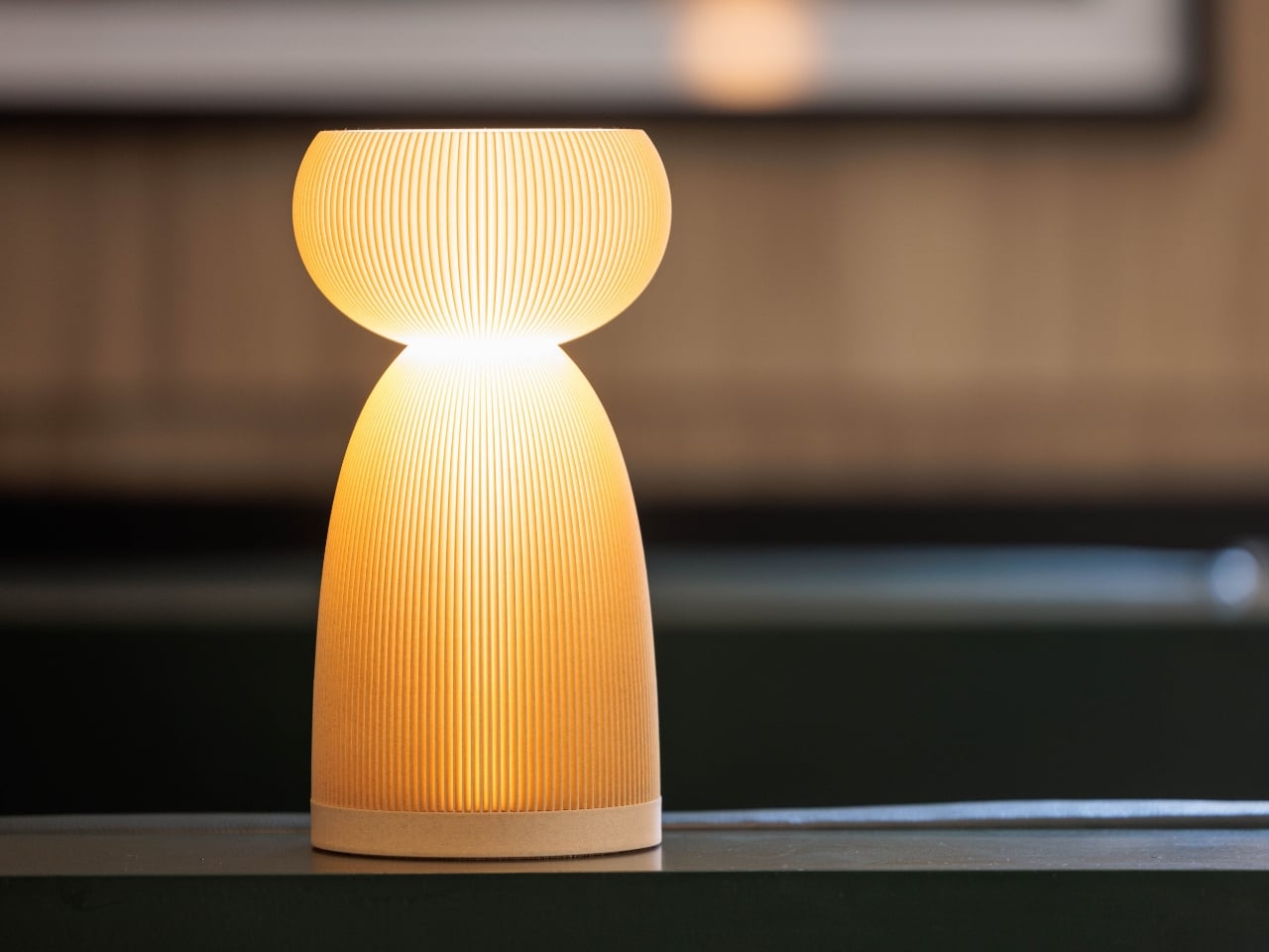
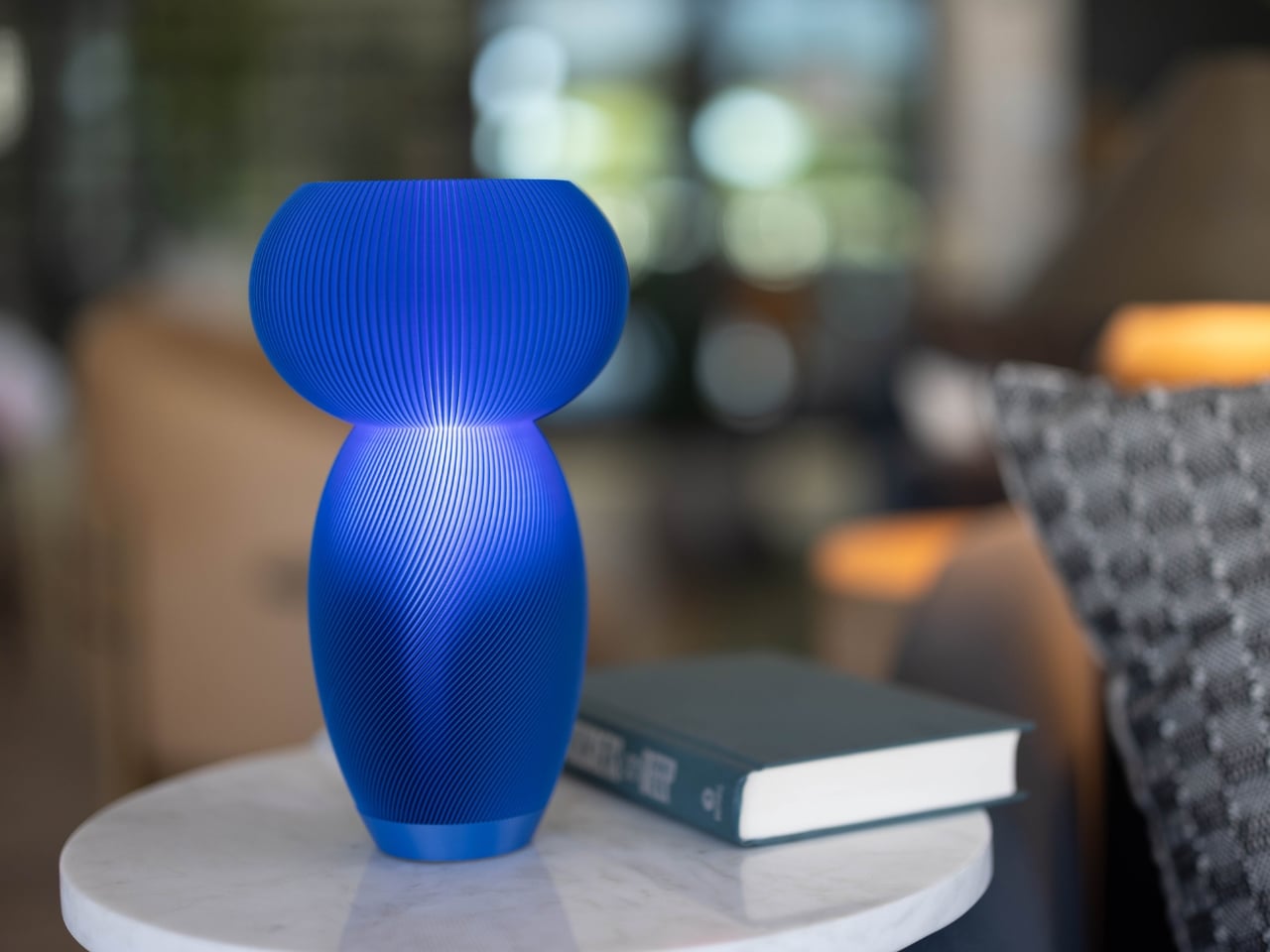
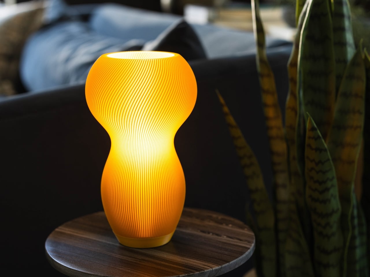
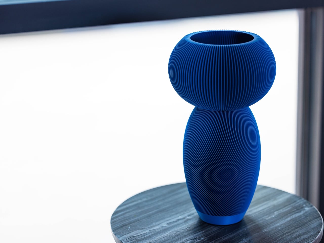
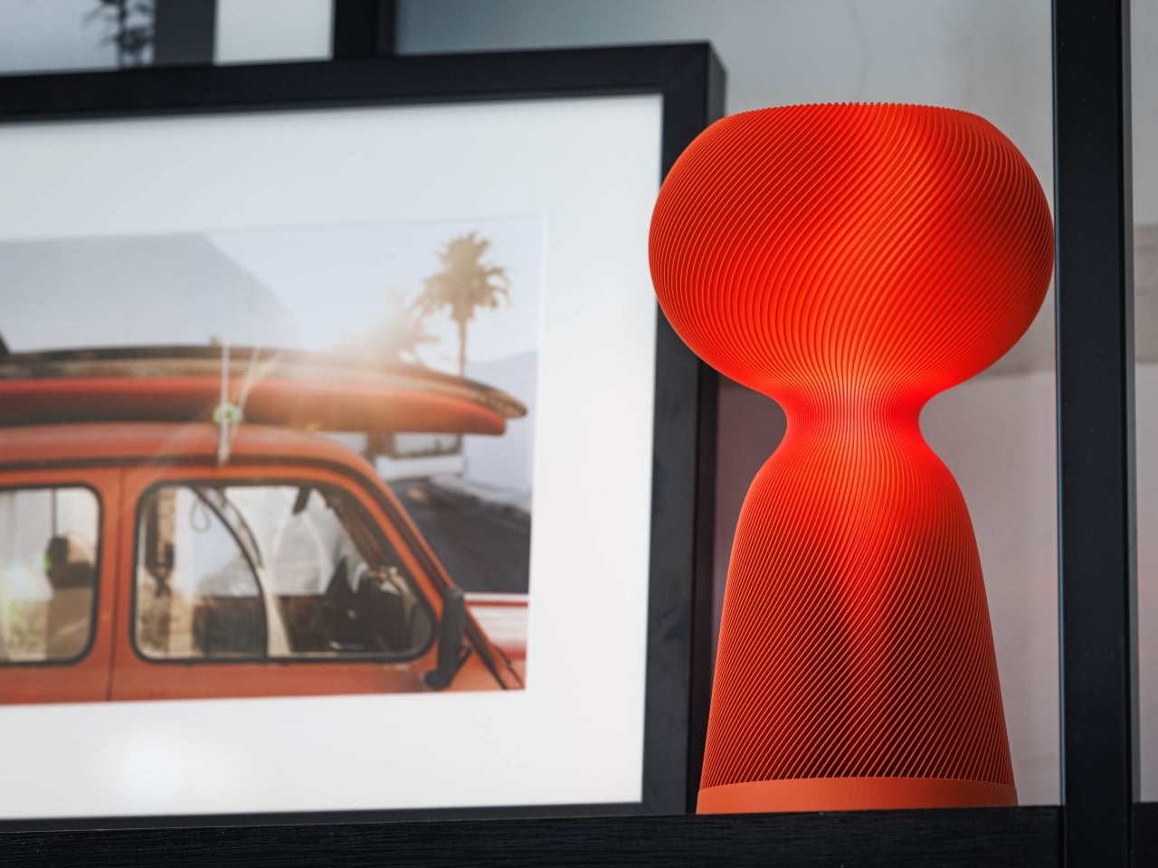
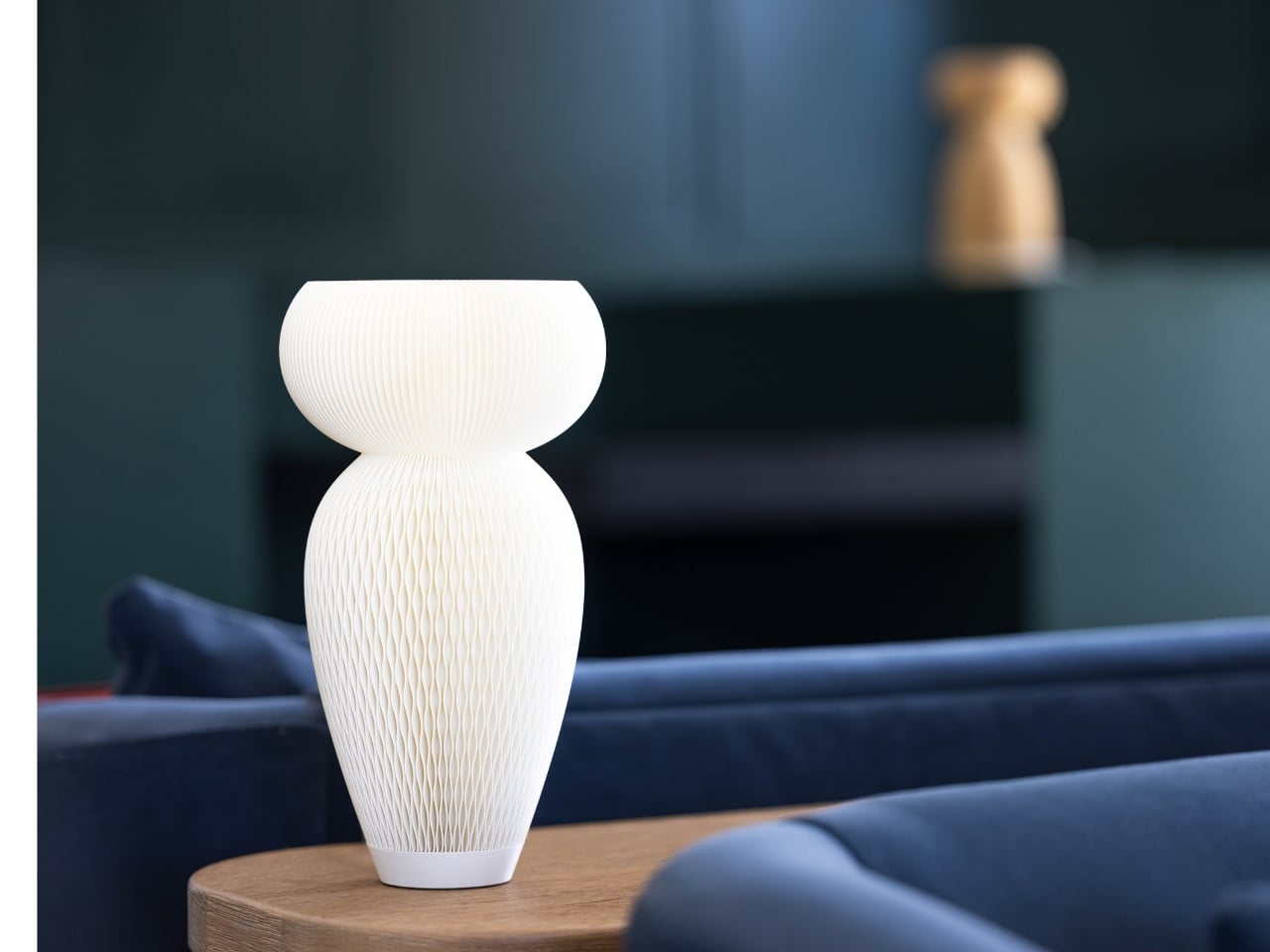
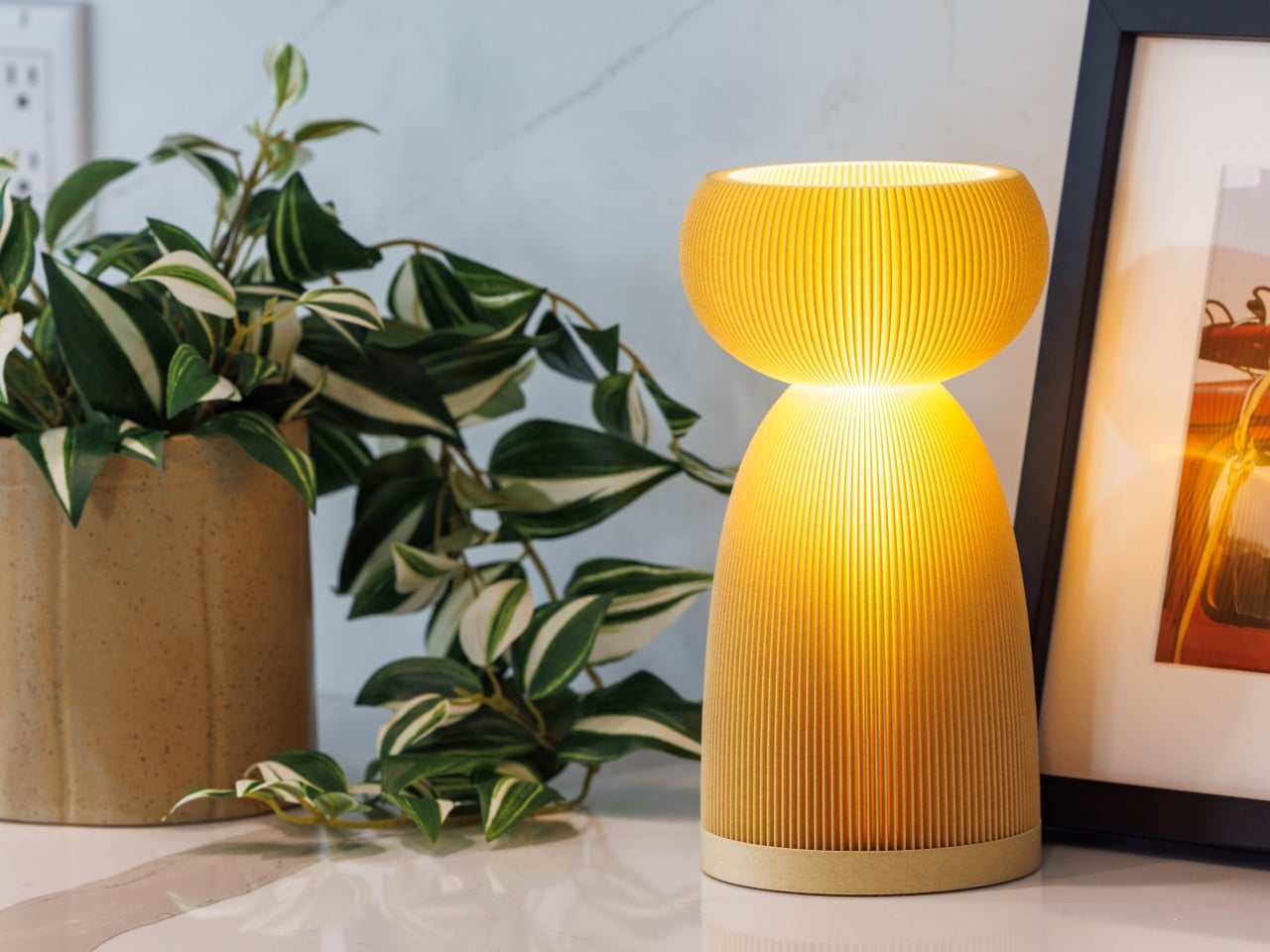
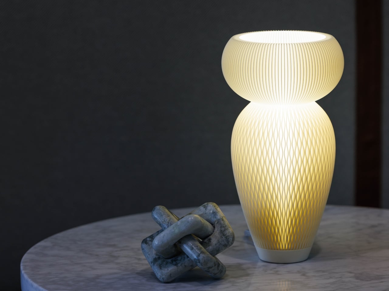
Some design objects earn their place on your table through sheer visual presence. The Dollight series from dolop does exactly that: a collection of sculptural table lamps that somehow manage to be playful, sophisticated, and deeply personal all at once. They’re the kind of lighting that makes you rethink what a lamp can be.

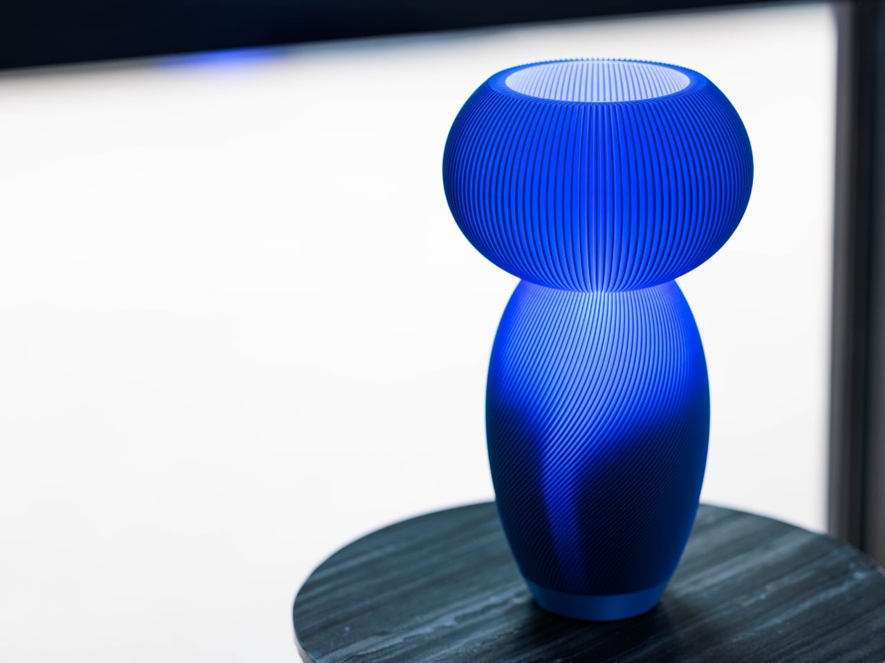
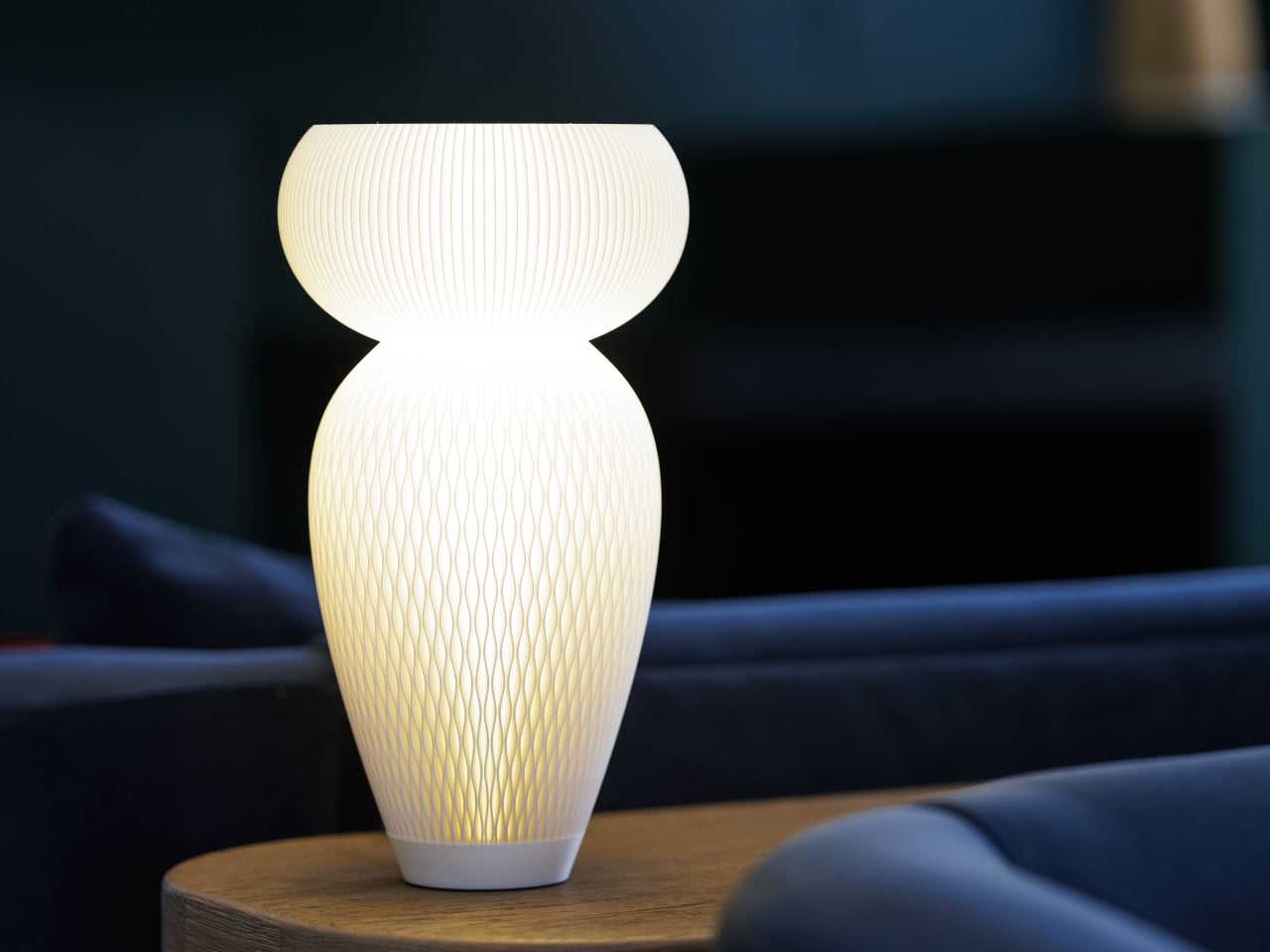
Designed by Michael Kritzer, an industrial designer with Red Dot, iF, and Cannes Lions awards to his name, Dollights are inspired by creative Kokeshi dolls, those beautifully varied Japanese wooden figures that range from traditional to wildly expressive. The connection isn’t literal. You won’t mistake these for dolls on a shelf. But the DNA is there in the proportions, that satisfying relationship between a rounded head and a tapered body, the way each silhouette feels like it has its own quiet personality.

Designer: Michael Kritzer

The origin story is a good one: Kritzer traveled to Japan with the woman who would become his wife, Sveta, and fell for the creative Kokeshi tradition. That trip first produced a Kokeshi-inspired porcelain line (which won the Red Dot), and eventually evolved into what we’re looking at now: five distinct lamp designs called Sweet, Bright, Savory, Rich, and Smooth. The names alone tell you something about the sensibility here. This isn’t a brand that takes itself too seriously, but it takes the work very seriously.

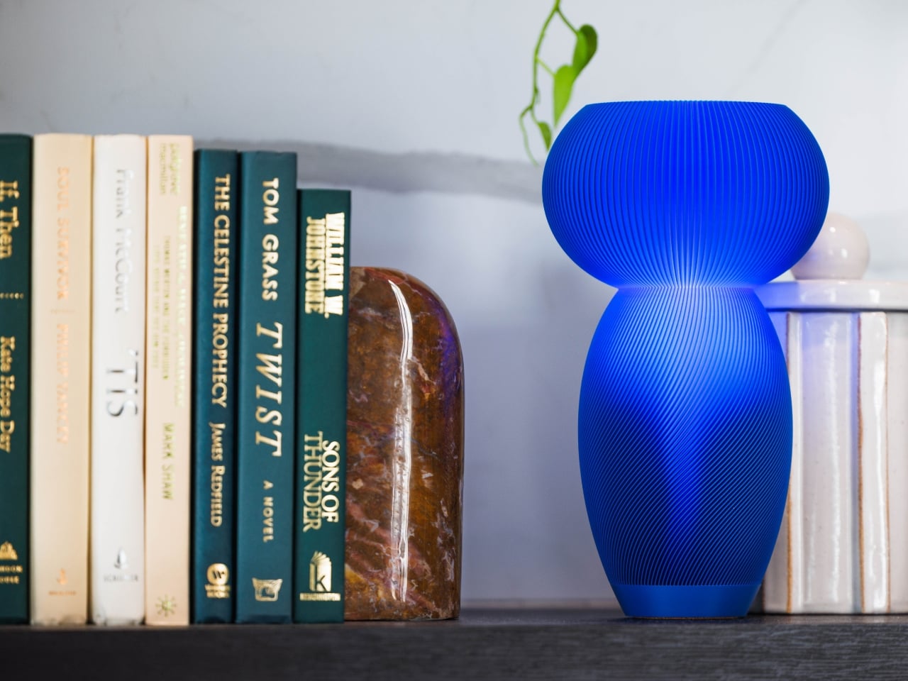
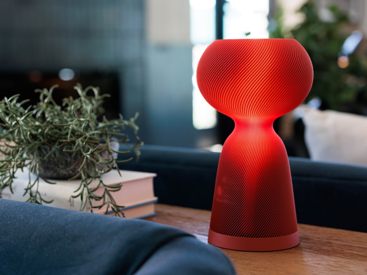
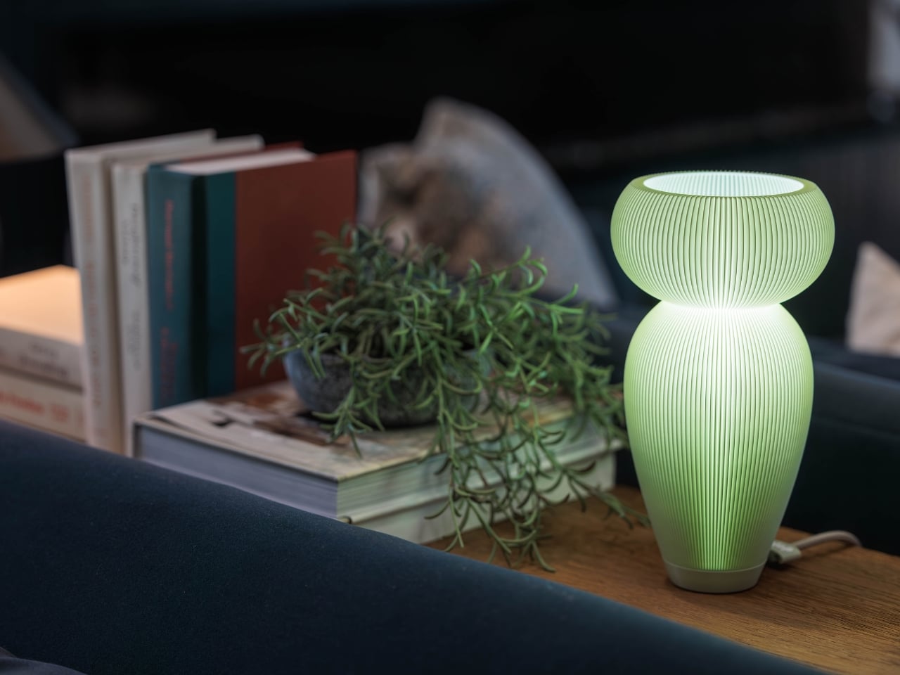
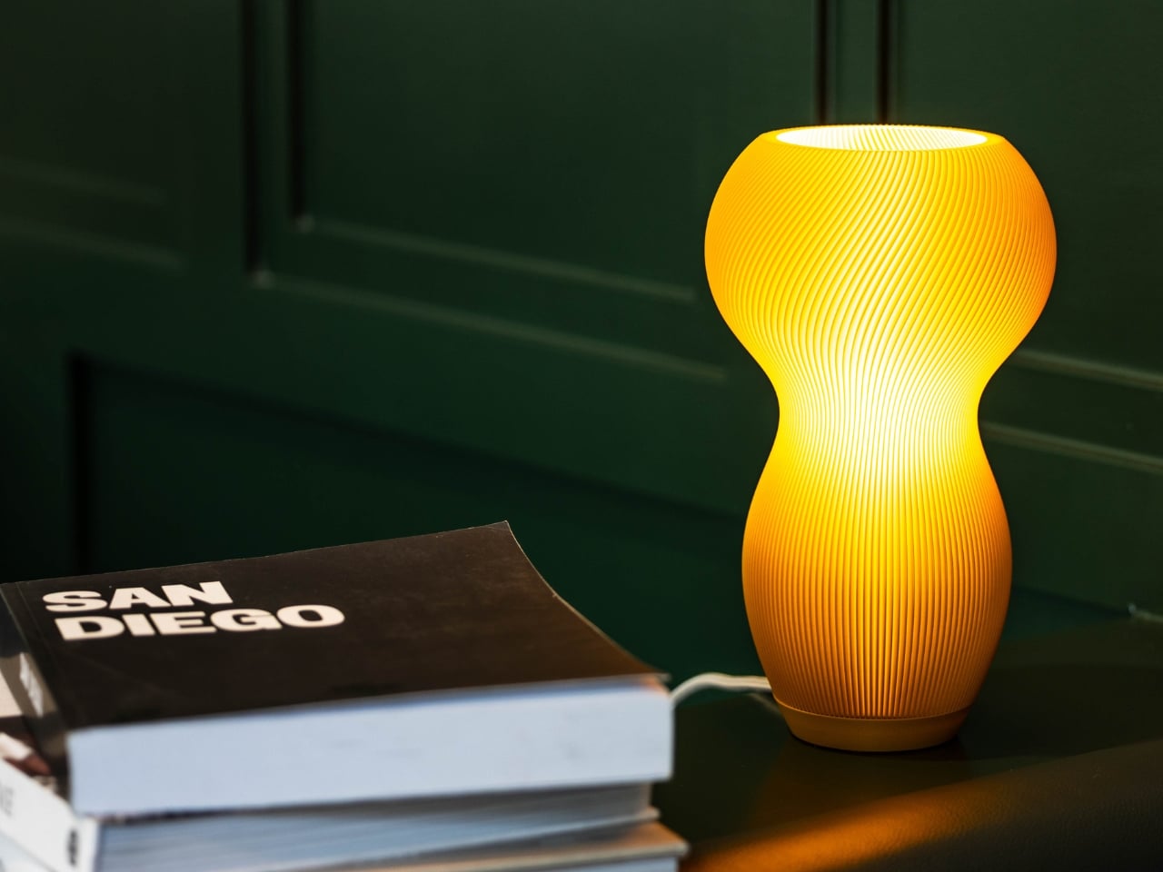
What makes Dollights genuinely interesting beyond their forms is the customization model. Each of the five designs can be configured in different colors (dolop calls them “flavors”) and textures, yielding close to 100 combinations per design. That’s a staggering amount of choice for a product in this price range, which sits between $150 and $250. We’re not talking about picking between white and black. We’re talking about making a real decision about what you want this object to be in your space: a bold red statement piece on a console table, a soft green glow on a nightstand, a warm golden accent next to a stack of books.

Every lamp is made to order in Kritzer’s San Diego workshop and ships in five to ten days. The production-on-demand approach is what enables all that variety without the waste of holding massive inventory in dozens of colorways. It also means each one is made fresh, which carries a certain appeal. There’s something satisfying about knowing an object was produced because you wanted it, not because a factory in another country bet that someone might.

The materials are worth noting too. Kritzer uses premium PLA sourced from the USA and recycled PLA from Europe. It’s a responsible choice that also happens to produce beautiful results. The ribbed and lattice textures across the collection catch and diffuse light in ways that make these lamps look completely different depending on whether they’re switched on or off. That duality is intentional. Kritzer describes them as “useful sculpture,” and I think that framing is exactly right. A Dollight earns its spot on your table around the clock, not just after sunset.

I find myself drawn to design that rewards close looking, and these lamps deliver on that front. The surface patterns are intricate without being busy. The forms are organic but clearly considered. There’s a confidence to the shapes that comes from someone who has spent real time studying proportion and knows when to stop refining.

A portion of every sale supports local San Diego charities through dolop’s Sweetest Slice program, which adds a layer of community intention that feels genuine rather than performative. It’s consistent with the overall ethos: small-batch, locally made, thoughtfully designed, and priced so that owning something special doesn’t require a bespoke budget or a six-month wait.

In a market flooded with either disposable lighting or unattainably expensive design objects, Dollights occupy a sweet spot that more brands should be aiming for. They’re accessible without being generic, personal without being precious, and beautiful without demanding that you build a room around them. That’s a harder balance to strike than it looks.

The post These Sculptural Japanese Lamps Come in 100 Colors for $150 first appeared on Yanko Design.
What Happens When a Bag’s Inside Becomes Its Outside

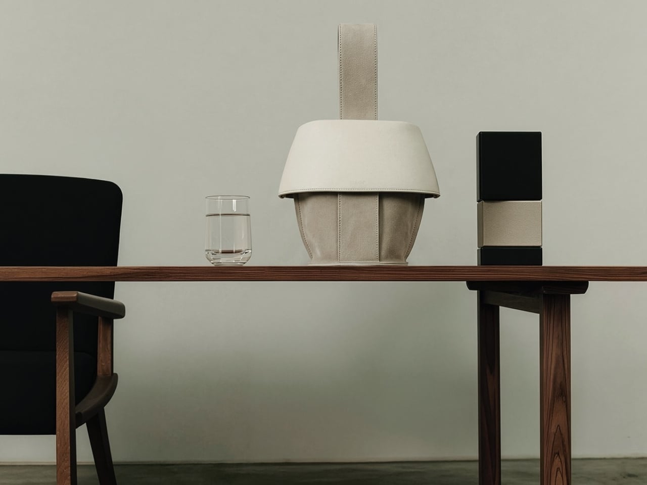
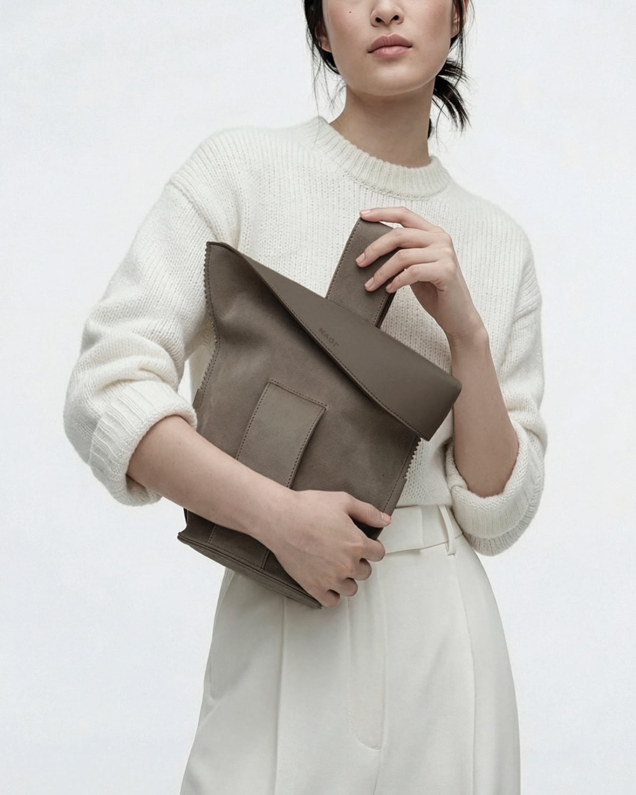
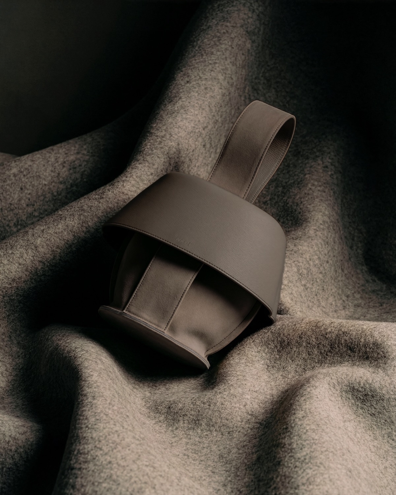
The first thing you notice about MAQL is how deliberately sculptural it looks. The handbag sits with an almost architectural presence, its curved body and rolled edges creating a form that feels more like a ceramic vessel than a typical leather accessory. That impression isn’t accidental. This is a bag designed to be looked at as much as it’s meant to be used.

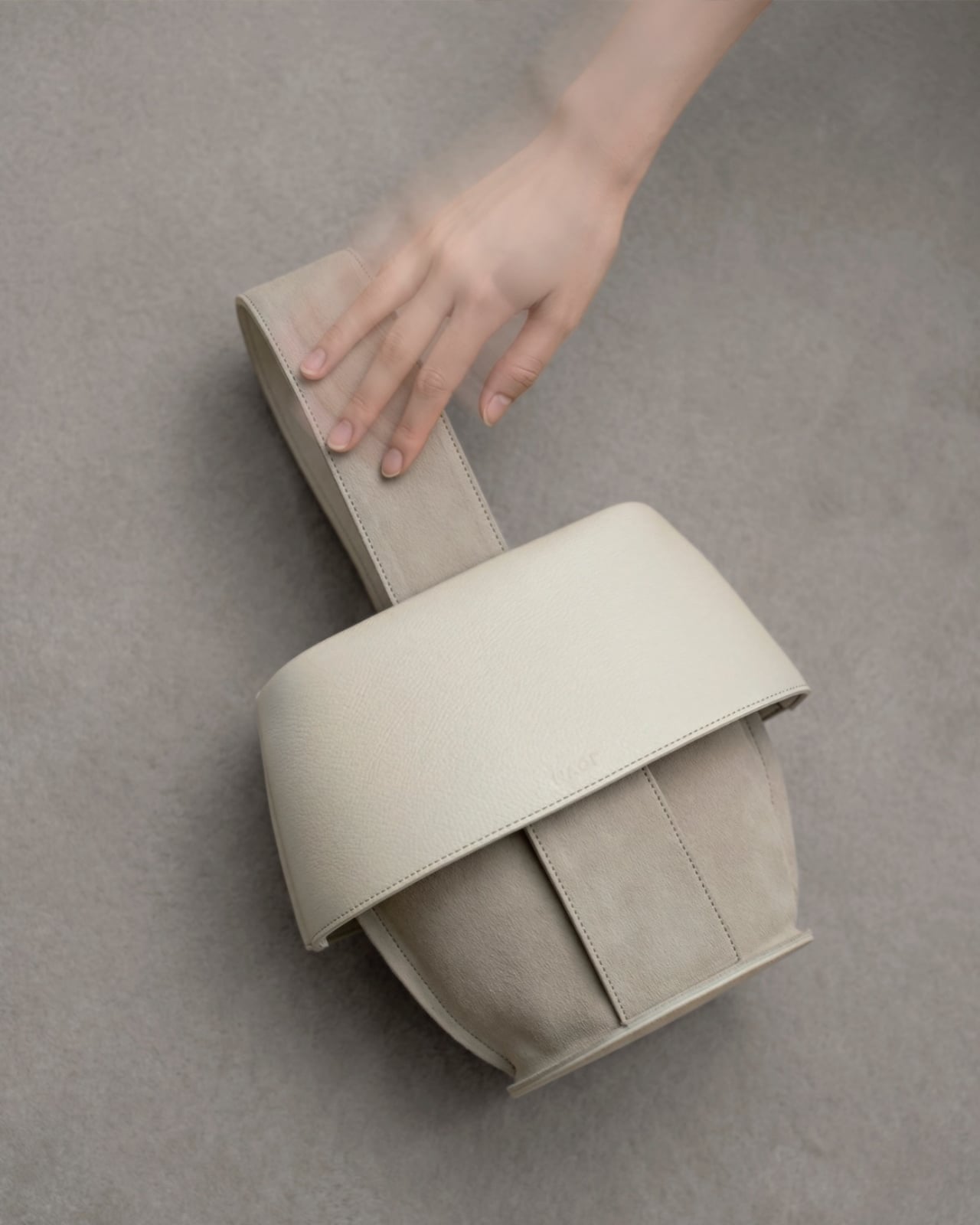
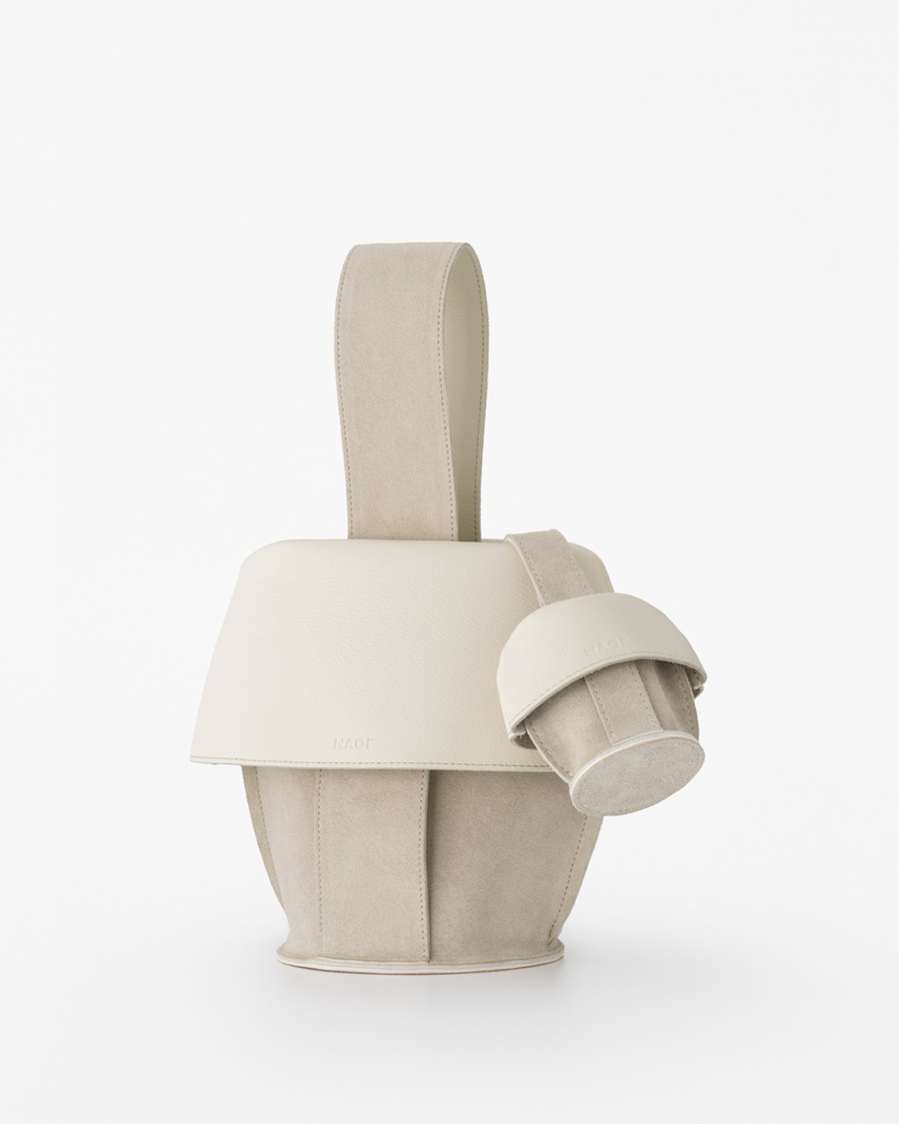
Created through a collaboration between Tokyo-based design studio Nendo and leather artisans Bag Makers Tokyo, MAQL is constructed from a single laminated piece of leather with grain leather on one side and suede on the other. The entire structure emerges from a process of strategic folding and peeling, where the rim is turned back on itself to gradually reveal what becomes the exterior surface and handles. It’s a bit like watching origami in reverse, where the final form contains evidence of every fold that brought it into being.

Designers: Nendo and Bag Makers Tokyo

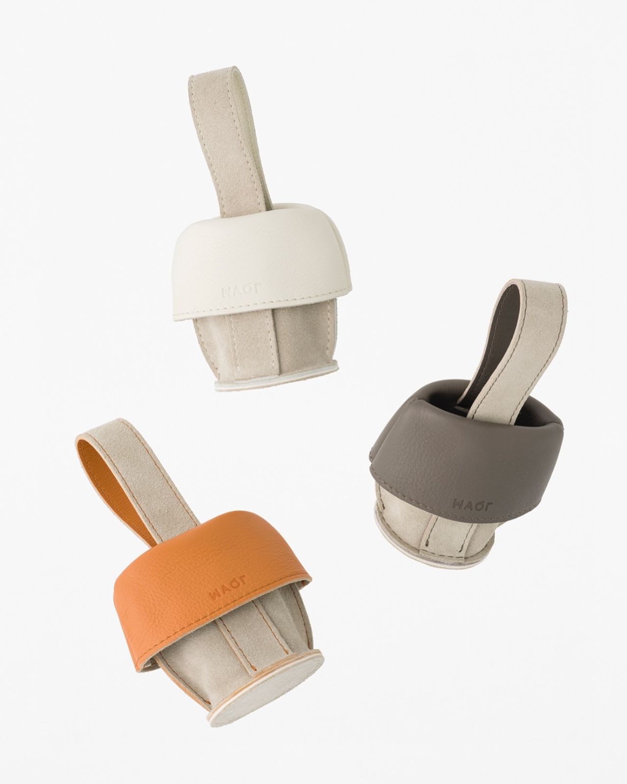
The name comes from makuru, meaning “to peel, to reveal” in Japanese, and that action is visible in every part of the bag’s construction. Where the leather rolls back, you see both textures at once: the smooth, structured grain leather meeting the softer suede underneath. The handles aren’t attached separately. They’re continuous with the body, formed by the same peeling motion that creates the bag’s opening. There are no hidden seams trying to disguise how this was made. The stitching is exposed where it needs to be, marking the transitions between surfaces.

What makes the design compelling is how it plays with the idea of inside versus outside. Traditionally, a bag’s interior is something you only see when you open it, a hidden space with different materials and construction than what’s visible to the world. MAQL eliminates that boundary. The suede that would typically be tucked away as lining becomes part of the exterior surface. The grain leather that forms the outer body curves inward to create the interior walls. You’re constantly seeing both sides at once, which changes how you relate to the object.

This isn’t just conceptual posturing. There’s a practical elegance to the construction. Because the bag is formed from a continuous piece of material rather than multiple panels stitched together, it has a structural integrity that feels substantial in your hands. The rounded bottom gives it stability when set down. The rolled edges create a soft, almost cushioned grip. And because both leather surfaces are visible, you’re touching different textures depending on how you hold it, smooth grain on one side, soft suede on the other.

Nendo, the studio founded by Oki Sato in 2002, has built its reputation on creating these kinds of quiet surprises, designs that reveal themselves through use rather than immediate visual impact. MAQL fits that approach perfectly. It’s minimalist without being stark, sculptural without being impractical.

The design also taps into something deeper in Japanese aesthetics, this long-standing appreciation for craftsmanship that doesn’t need to announce itself. Think of the way a kimono’s lining might be more elaborate than its exterior, seen only in glimpses, valued by those who know to look. MAQL takes that same philosophy but inverts it, bringing hidden construction to the surface where it becomes part of the design language.

The bag comes in a muted palette, mostly earth tones and soft neutrals that let the form and texture do the talking. There’s a larger version that works as a proper handbag and smaller iterations that function almost like pouches. Each size maintains the same folded construction, the same interplay between grain and suede, the same sense of a form that emerged organically from the material itself rather than being imposed upon it.

In a market saturated with bags that compete on logos and brand recognition, MAQL stands out by offering something different: visible craftsmanship, thoughtful construction, and a form that asks you to pay attention to how things are made. It’s not trying to signal anything beyond its own careful execution. For people who care about design, that’s more than enough.

The post What Happens When a Bag’s Inside Becomes Its Outside first appeared on Yanko Design.
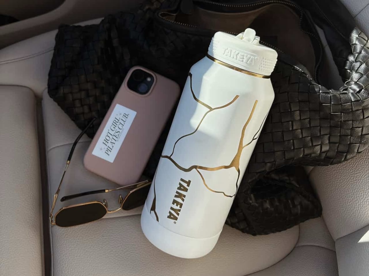
Water Bottle Inspired by Japanese Kintsugi Celebrates Cracks

Water bottles rarely carry meaning beyond their function. Most exist purely to hold liquid, stay cold, and survive daily wear without much thought given to what they represent or how they make you feel. They’re tools that disappear into routines, useful but forgettable, designed for efficiency rather than connection. Few products in this category attempt to add narrative or emotional weight to something as ordinary as staying hydrated throughout the day.

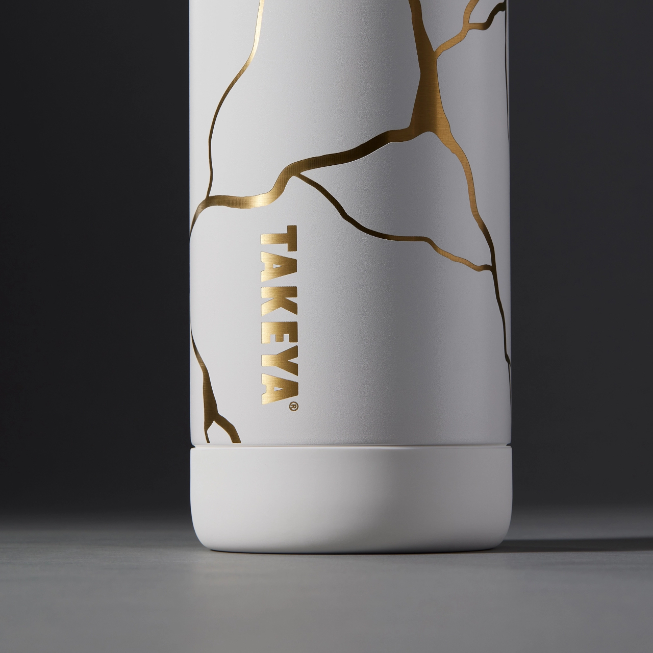
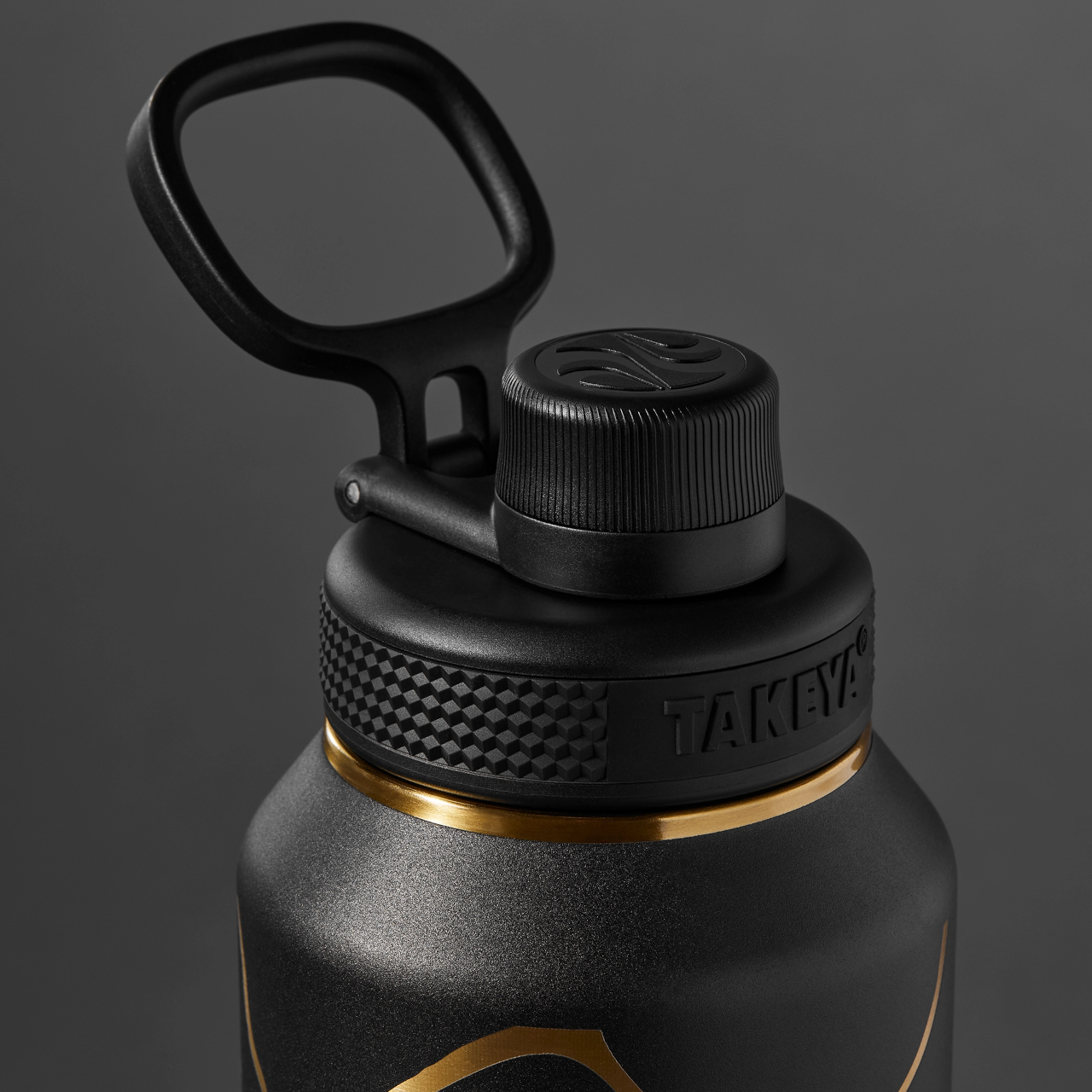
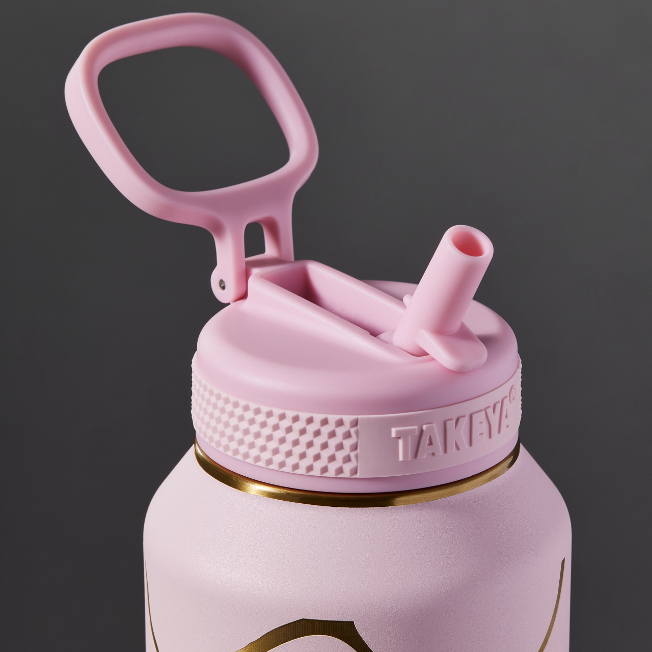
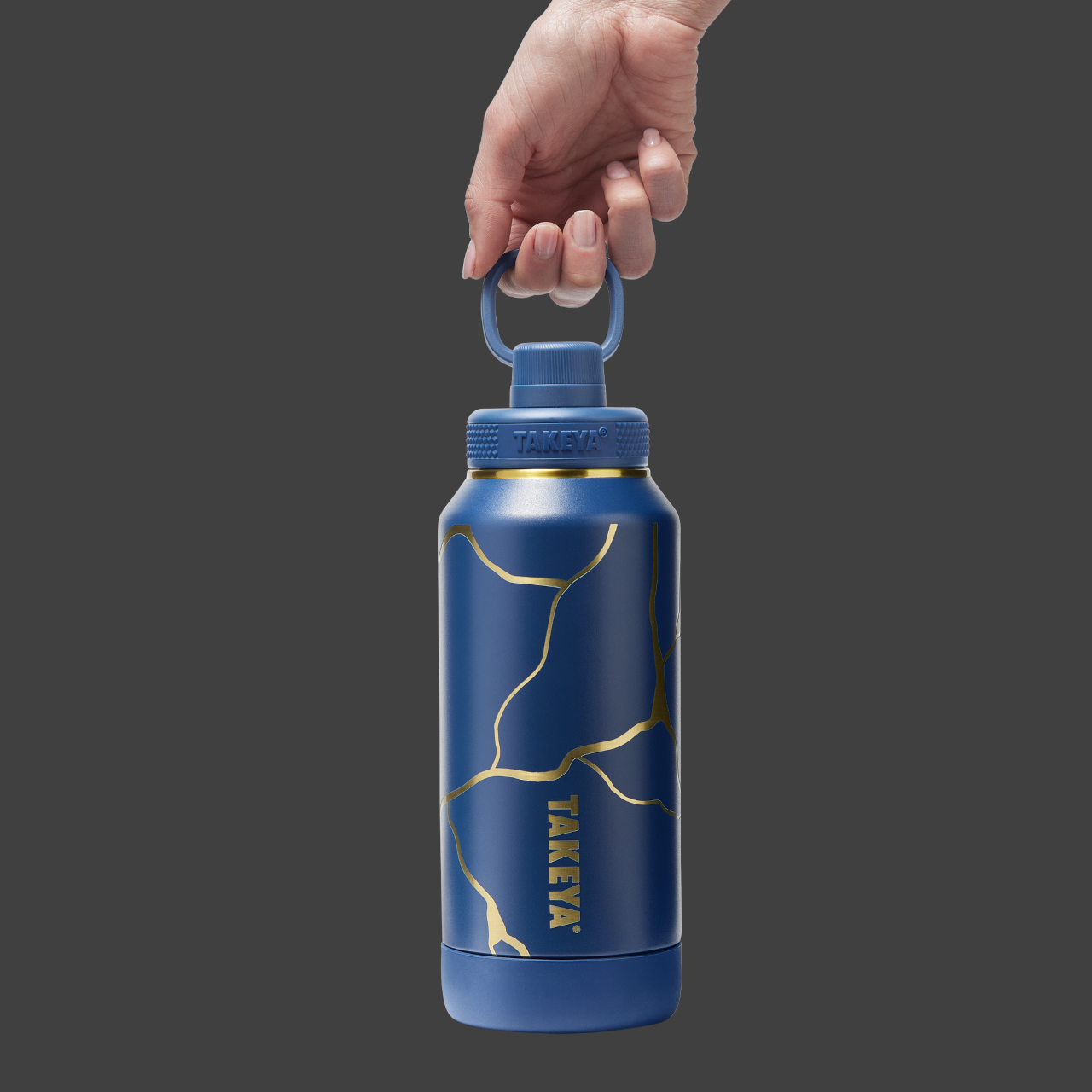
The Takeya Kintsugi Collection draws from the Japanese art of repairing broken ceramics with gold, a practice that treats fractures as features worth highlighting rather than flaws to hide. Instead of concealing damage, Kintsugi transforms cracks into golden seams that tell stories of resilience and renewal. The collection applies this philosophy to water bottles through gold-accented crackle patterns that wrap around the surface, turning each one into a small meditation on strength found through imperfection.

Designer: Takeya

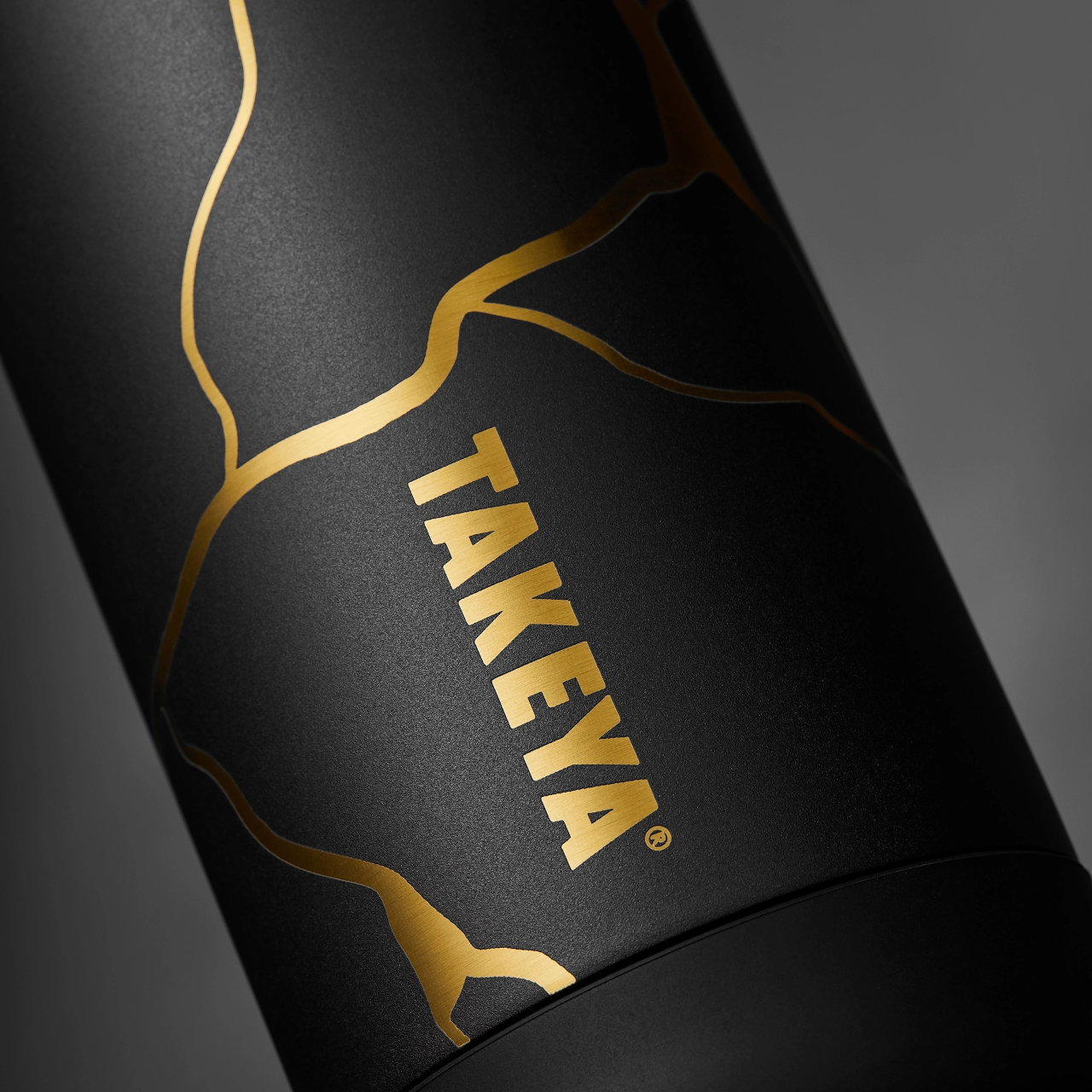
Gold lines branch across the matte finish in patterns that catch light differently depending on angle and movement. The effect feels deliberate rather than decorative, like each bottle carries its own history of breaks and repairs even though they arrive new. The visual reference works because it doesn’t just borrow aesthetics but commits to the underlying philosophy.

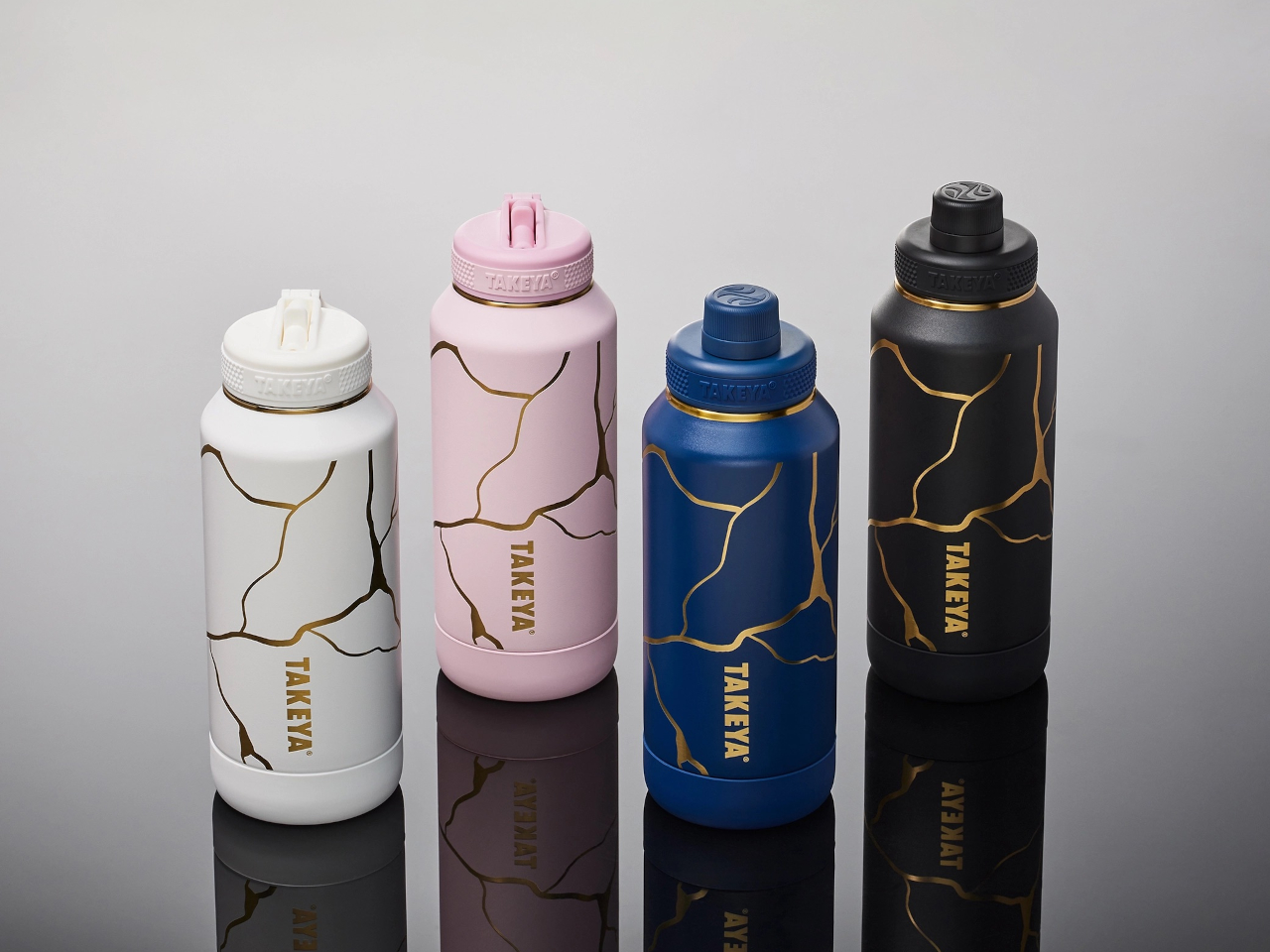
Four colorways offer different personalities while maintaining the same gold crackle treatment. Blanc presents soft and minimal. Rose adds warmth through its blush tones. Bleu Marine brings depth and boldness. Noire creates dramatic contrast where gold lines feel most pronounced against the matte black surface. Each color changes how the Kintsugi pattern reads visually, giving the same design language multiple emotional registers depending on what resonates personally.

The bottles hold meaning beyond their appearance through how they’re built to withstand actual use. Triple-wall insulation keeps water cold for thirty-six hours, which matters during long days when refilling isn’t convenient. The silicone bumper protects against drops and impacts that inevitably happen when objects get carried everywhere. These protective features align with the Kintsugi metaphor perfectly, the bottle is designed to endure damage gracefully rather than pretend damage won’t occur.

Using the bottle becomes a small daily ritual that carries more weight than typical hydration. The gold lines serve as visual reminders that imperfection doesn’t diminish value but can enhance it when embraced intentionally. Every scratch or ding the bottle accumulates over time adds to its story rather than detracting from its appearance, which inverts how we typically think about wear and aging in consumer products.

The Kintsugi Collection makes hydration feel less mechanical and more mindful by connecting a simple daily act to a philosophy that’s survived centuries. The bottles function as practical tools while serving as small, portable reminders that strength often comes from what we repair and carry forward rather than what remains pristine and untouched.

The post Water Bottle Inspired by Japanese Kintsugi Celebrates Cracks first appeared on Yanko Design.
A Side Table That Doubles as a Bookmark for Your Favorite Reads

Side tables typically end up holding whatever gets set down near them. Coffee mugs accumulate next to half-read novels that slide beneath remote controls and charging cables. Books in progress disappear into this visual clutter, creating friction between the intention to read and the reality of finding where you left off. Most furniture treats books as afterthoughts rather than priorities, offering no dedicated space that keeps them visible and within reach.

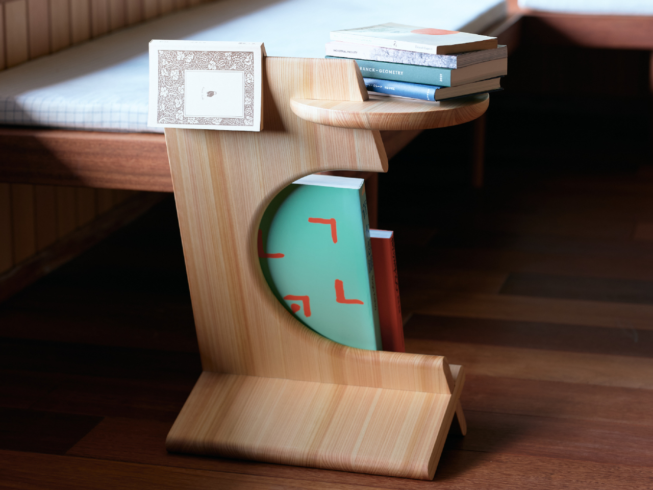
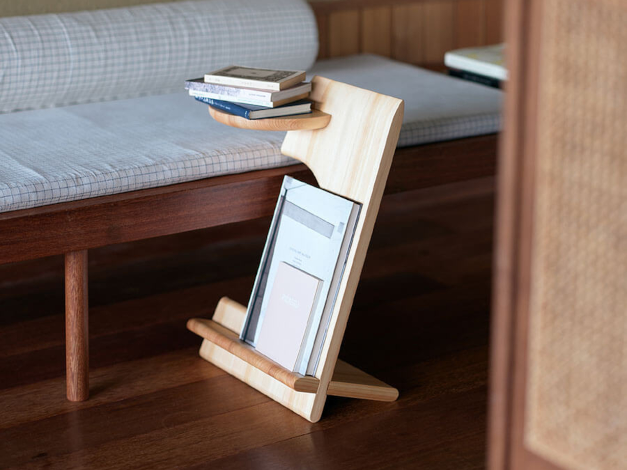
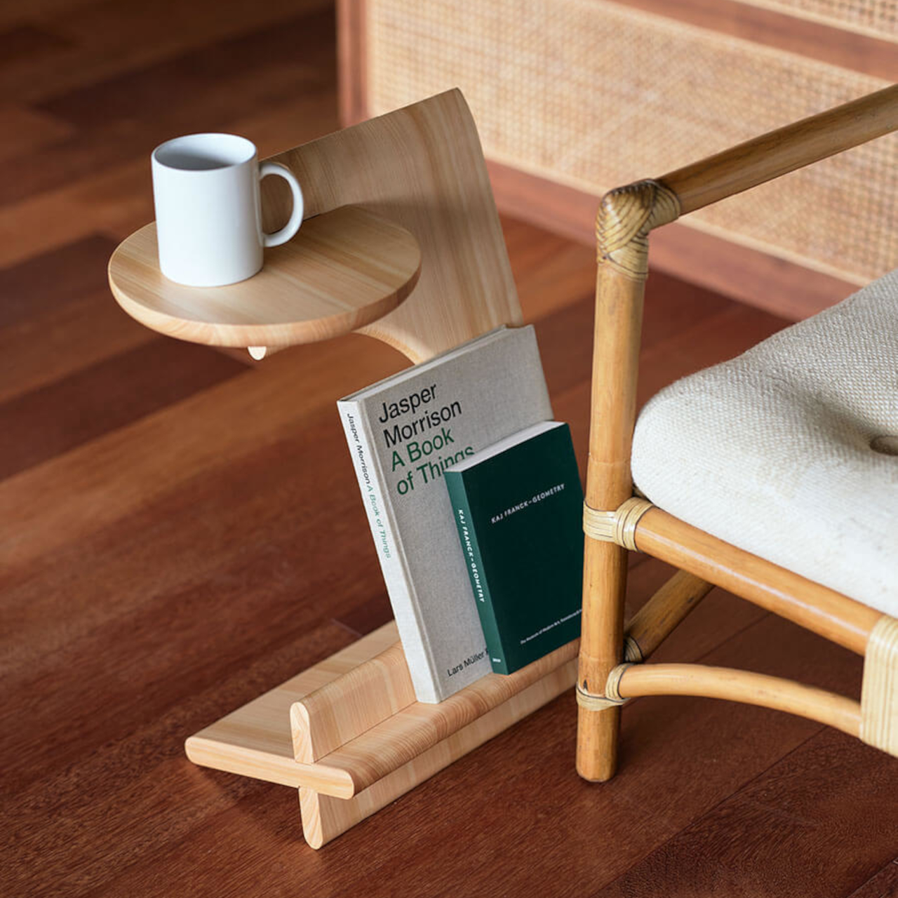
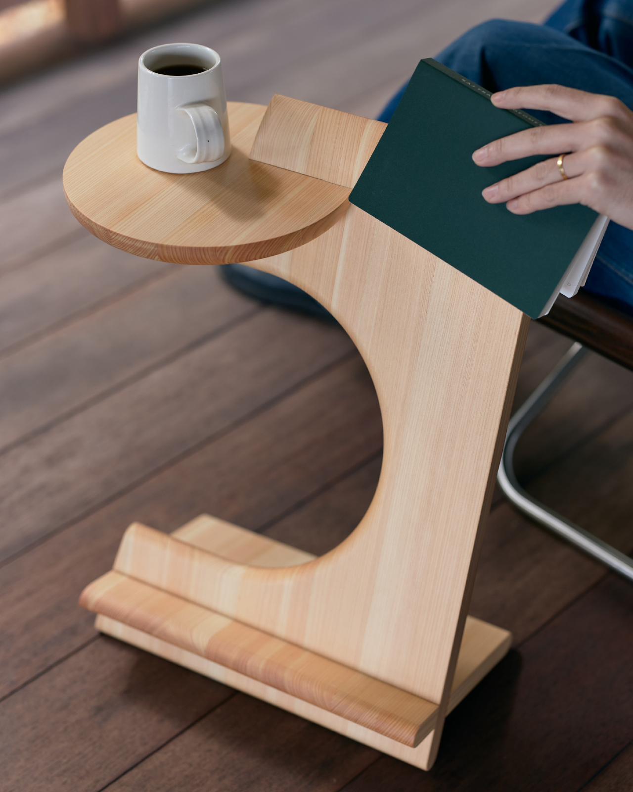
Bookmarker addresses this by treating reading as an activity worth designing for specifically. The table’s form creates a clear place for books in progress, making them visible rather than buried. Japanese cypress construction gives it a warm, tactile presence that reads as furniture first, while its cutouts and slots serve the practical needs of someone settling in with a novel and a drink.

Designer: studioYO for Bito

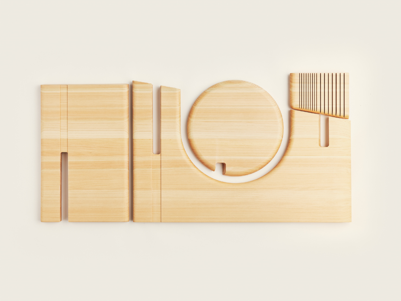
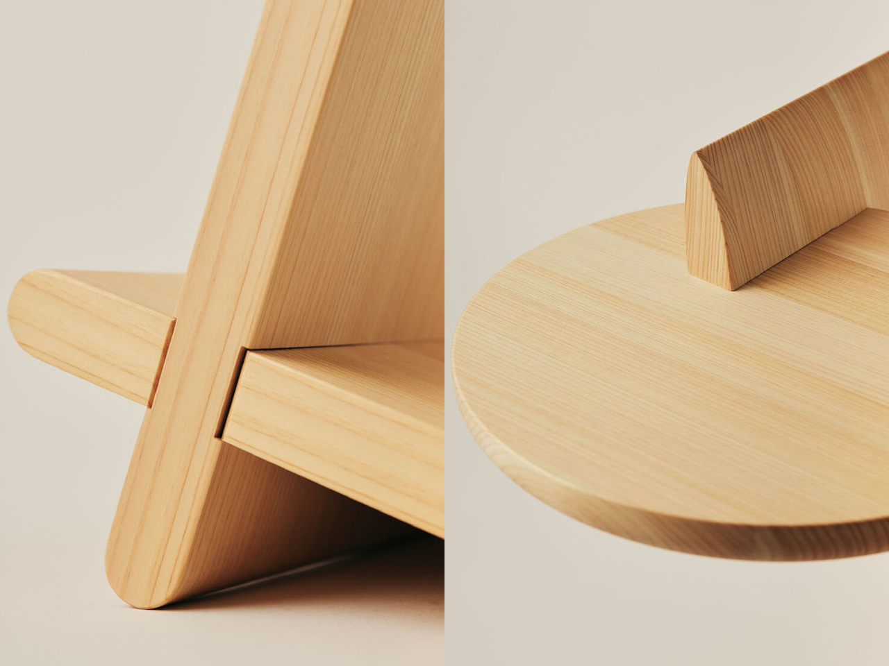
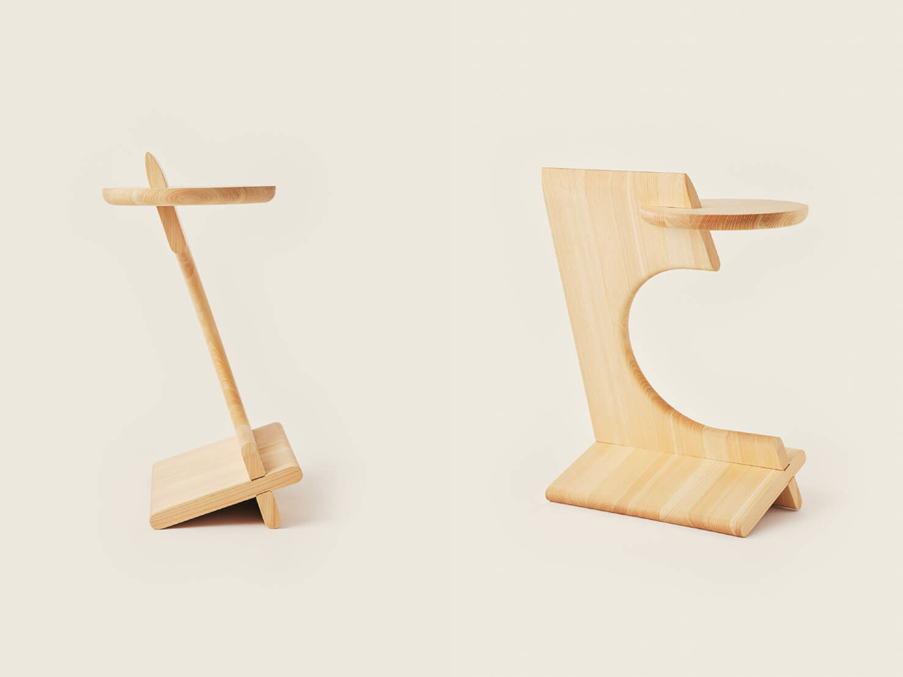
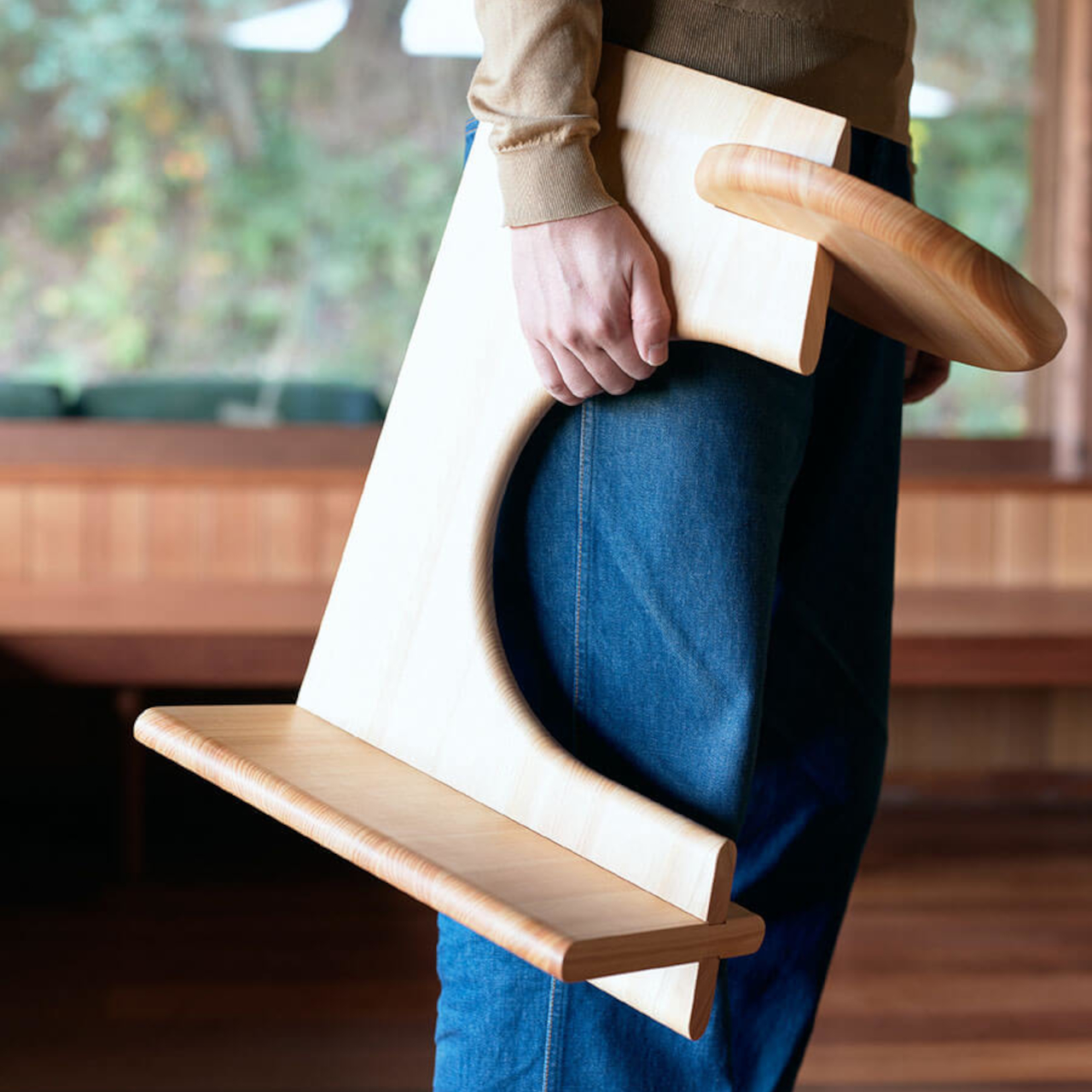
The entire piece cuts from a single board of vertically laminated cypress, producing three interlocking parts with minimal waste. This efficient approach allows the table to ship flat and assemble without hardware, reducing both material use and packaging volume. The cutouts that enable this nesting also define the table’s visual character, creating geometric negative space that feels intentional rather than incidental.

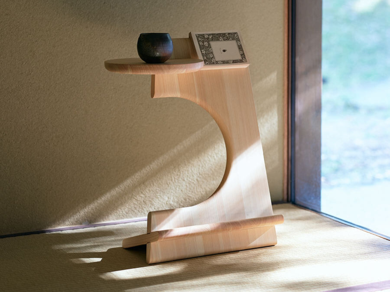
Assembled, the table forms a C-shaped profile with a circular opening and a vertical slot running through its center. Books slide into that slot and rest upright, accessible from either side depending on where you’re sitting. The circular cutout provides another grab point for reaching volumes stored within. This dual access removes the awkward leaning or reaching that happens with conventional side tables when you want a book stored underneath.

The top surface holds a mug, small plate, or reading glasses without crowding the book storage below. Water-repellent ceramic coating protects the cypress from condensation rings and accidental spills, which matters when hot drinks sit directly on wood. The coating maintains the natural wood finish rather than creating a glossy sheen that would feel out of place.

Leftover material from production becomes small cardholders included with each table, extending the zero-waste philosophy to packaging and accessories. The flat-pack design collapses the assembled table back into its three nested components, making storage or relocation straightforward if living situations change.

What distinguishes Bookmarker from typical side tables is how it makes reading visible in daily spaces. Books stored vertically in the slot create a small display of current interests rather than hiding beneath surfaces or leaning against walls. The table becomes a physical reminder of reading intentions, turning background clutter into foreground presence.

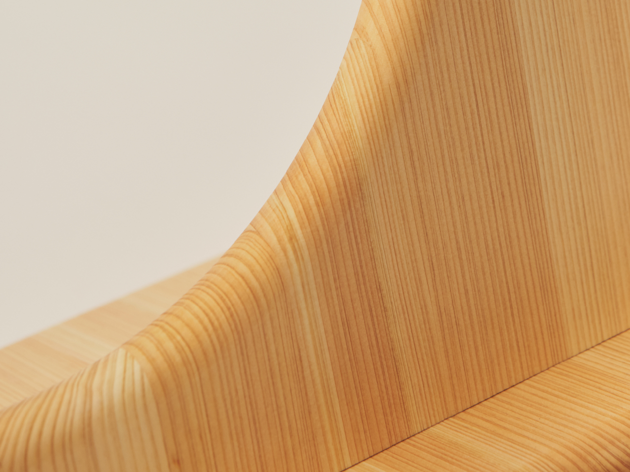
The cypress grain varies across each piece, ensuring no two tables look identical. Wood’s natural characteristics mean some sections show tighter grain while others spread wider. This variation reinforces the handmade quality and material honesty. The light tone works across different interior palettes without demanding specific color schemes.

Bookmarker occupies a specific niche between purely decorative furniture and purely functional storage solutions. It handles the practical needs of readers who want books and drinks close at hand while maintaining a sculptural quality that justifies its presence even when not in use. The table makes reading visible in daily spaces without forcing aesthetic compromises or demanding reorganization of existing routines.

The post A Side Table That Doubles as a Bookmark for Your Favorite Reads first appeared on Yanko Design.
Gorgeous titanium-coated drinking glass makes every drink a visual and gustatory treat

It’s almost too easy to take for granted the vessel we’re drinking from. After all, we’re definitely more interested in the taste of our drink, unaware that the material our glass or cup is made of can actually have an adverse effect on the very taste we’re so fixated on.

And that glass you’re drinking from? It might not even be pure glass but mixed with some metals to reinforce the material, metals that also affect the taste or, worse, affect our bodies.

If you’re searching for the perfect glassware, you don’t have to look far because we have just the perfect design for this very purpose. Stunningly beautiful and faithful to your flavors, this small piece of glassware is able to recreate the magnificent Aurora lights right in your hand, turning every sip into a memorable experience.

Designer: Progress Design

Click Here to Buy Now: $58.50 $65 (10% off at checkout). Hurry! Black Friday deals end in 48 hours.

Drinking glasses are a common sight in many households, whether they’re for “regular” beverages or alcoholic drinks. Clear as they might appear, some of these are mixed with some metals to produce certain colors or effects.

And while these metals aren’t so dangerous to our health, they do have negative effects on the taste of the drink.

It is almost as if you can’t combine beauty and taste in a glass, but that theory has been proven false with PROGRESS’ Rex Rock glassware.

Skilled craftsmen from Shizuoka, Japan harness the same technologies and processes used in making space-grade equipment like satellites to process titanium of the highest purity to reinforce the glass and coat its inner surface.

This rare form of pure titanium doesn’t release metal ions that mess with the flavor of the drink inside. In fact, it actually works to enhance the taste by breaking down unpleasant flavors.

Pure titanium is also regarded to be the most human-friendly and safest kind of metal because it rarely changes over time. That means no staining, no odors, and completely hygienic.

Pure titanium alone, as impressive as it already might be, isn’t enough to create an unforgettable drinking experience. This drinking glass takes the design even further by reproducing the mesmerizing colors of the rainbow and of the majestic Aurora lights.

This feat is made possible by making extremely precise cuts and changes to the glass’ thickness down to nano levels. Pouring drink into the glass results in a shimmering effect that’s comparable to the soothing glow of the aurora, a bonfire, or a murmuring stream, imagery that calms the heart and soothes the soul.

Stop worrying about the safety and taste of your drink and start enjoying the flavors and the dazzling visuals offered by this pure titanium-reinforced glassware. Whether it’s liquor, soda, or even just ice-cold water, this stunning drinking glass will turn the activity into a joyful and reinvigorating experience, rich in flavor and color.

Click Here to Buy Now: $58.50 $65 (10% off at checkout). Hurry! Black Friday deals end in 48 hours.

The post Gorgeous titanium-coated drinking glass makes every drink a visual and gustatory treat first appeared on Yanko Design.
Transform Business Cards into Cherished Memories with This Minimalist Log Book

Business cards and shop cards are often regarded as boring, impersonal representations of people and places, but that’s partly because we often forget to associate the person with the name on the card. It’s easy enough to forget the first encounter with a stranger who hands you their business card, not unless you actually turn that card into an unforgettable memory. Rather than keep those cards in some container that you forget inside a drawer, why not slip them into this minimalist and profound log book that lets you write down your own thoughts and memories about people, encounters, and events, turning them into small stories that let you cherish these memories and remember them better for days to come.
Designer: Replug

Click Here to Buy Now: $19

Some people and events definitely leave a lasting impression, but our frail human minds can easily forget them as well. Photos and even business cards offer tangible triggers to jog our memories, but they can still end up feeling distant and impersonal, more like watching a film from the eyes of an outsider rather than from your own perspective. What better way to ensure you’ll remember the poignant details of that memory than by writing it down? And that’s exactly the kind of space that this Memories Log Book provides, allowing you to make every business card, shop card, or photo a truly personal and memorable encounter.

Using the log book is genius in its simplicity. You simply insert the two corners of a card into the slits and it will stay in place without the need for messy adhesives or cumbersome pockets. It can fit business cards, shop cards, and even small Instax photos, anything you might collect from brief but memorable encounters. Beside each card is an empty space, a blank canvas where you can write your own reflections on the person or event, helping your future self remember what made the card worth keeping. You can even draw on it, if you’re so inclined, creating a stronger association with those people you’ve only just met.

This A5-sized business card file log book can hold up to 120 cards, but you can add, remove, and rearrange pages just as easily as you add cards. An elastic band serves as the binding, running across the height of the book and through cutouts on the top and bottom edges. This innovative system makes it trivial to organize those cards the way you like that you might actually find yourself losing time just personalizing the pages.

The Log Book’s minimalist design extends to its choice of material. High-quality paper is simple yet holds deep meaning, both for our minds and especially our hands. The tactile warmth of each page creates a bond between the person and the cards on that page, and its elegant yet unassuming appearance is a perfect fit for any setting, whether it’s at home, in the office, or even in a meeting. It’s definitely a great gift idea not just for workers but for anyone who loves collecting memories in a more meaningful and personal way.

Click Here to Buy Now: $19

The post Transform Business Cards into Cherished Memories with This Minimalist Log Book first appeared on Yanko Design.