Yanko Design’s Best of MWC 2026: When Engineering Gets Obsessive

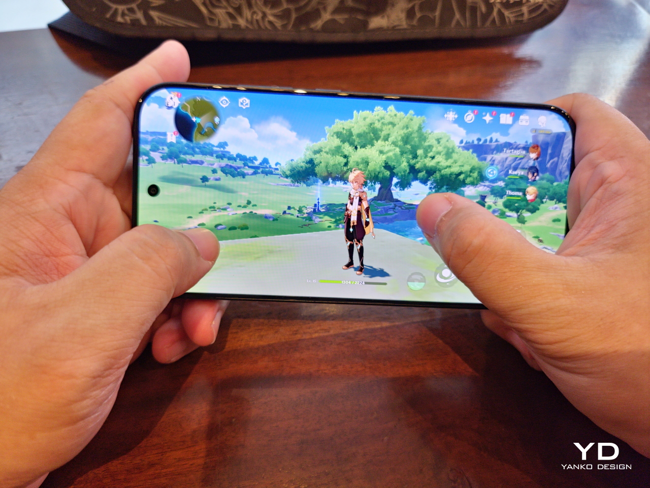
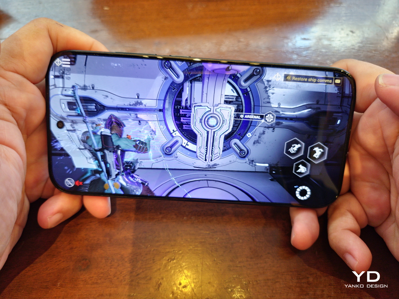
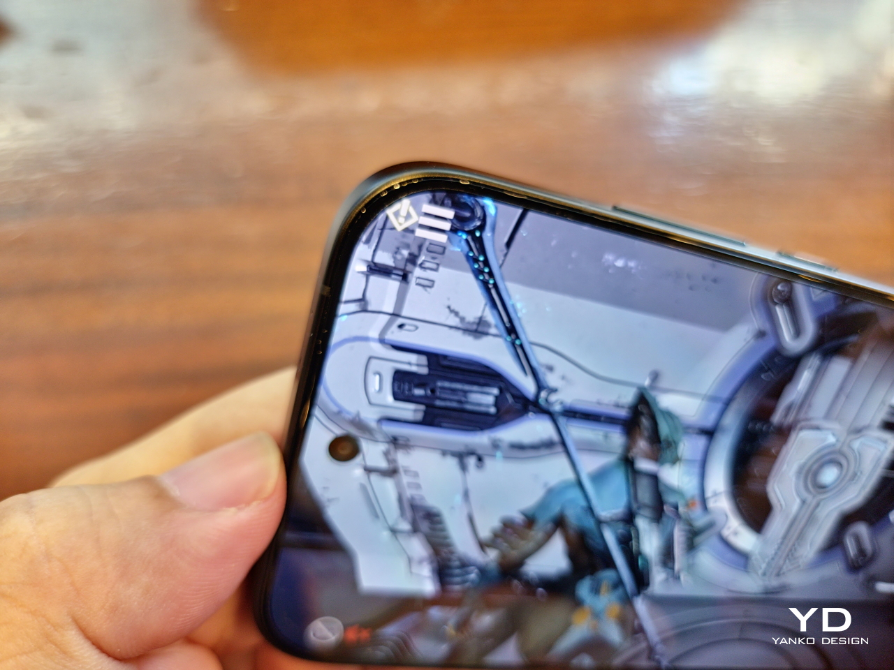
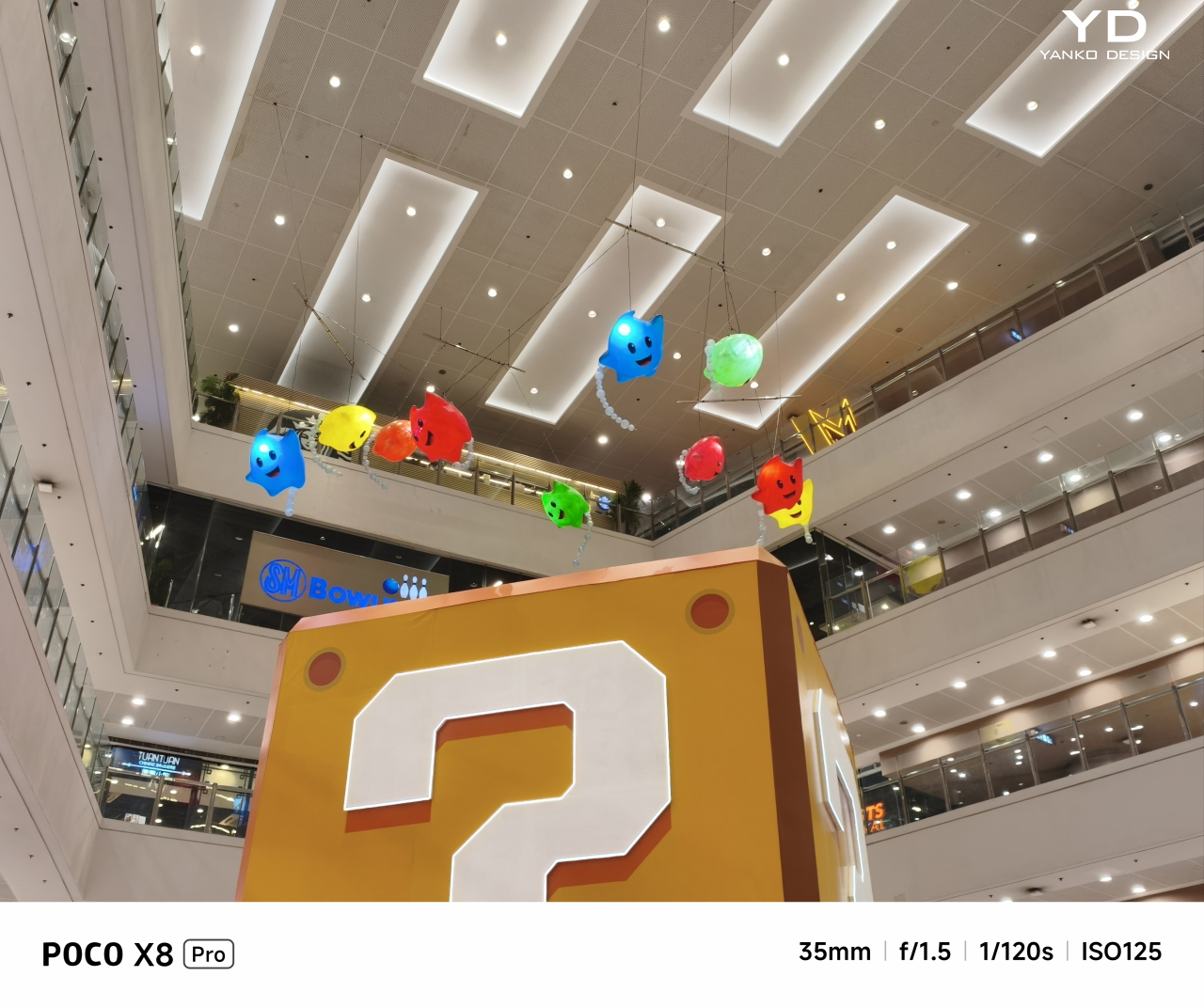
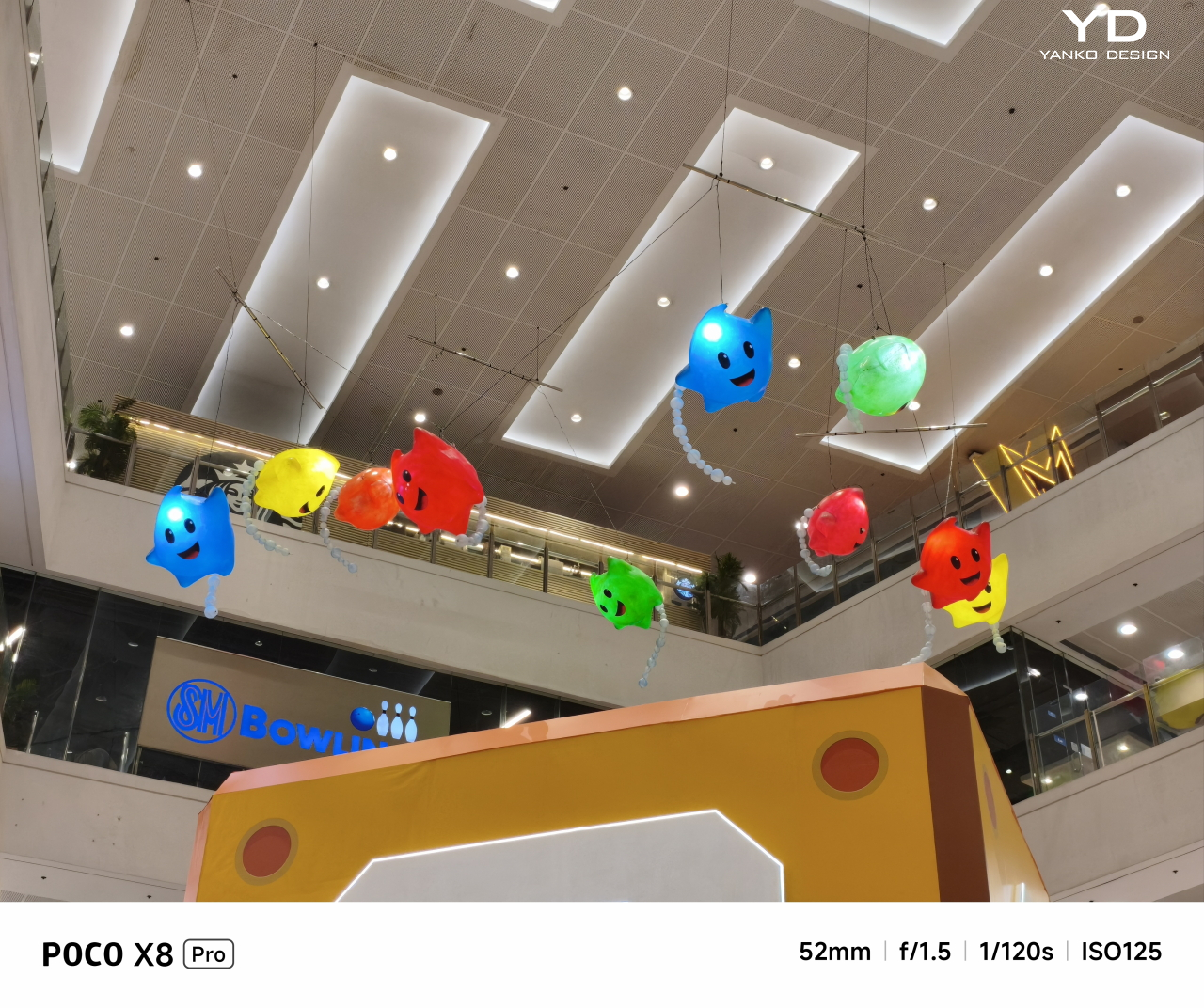
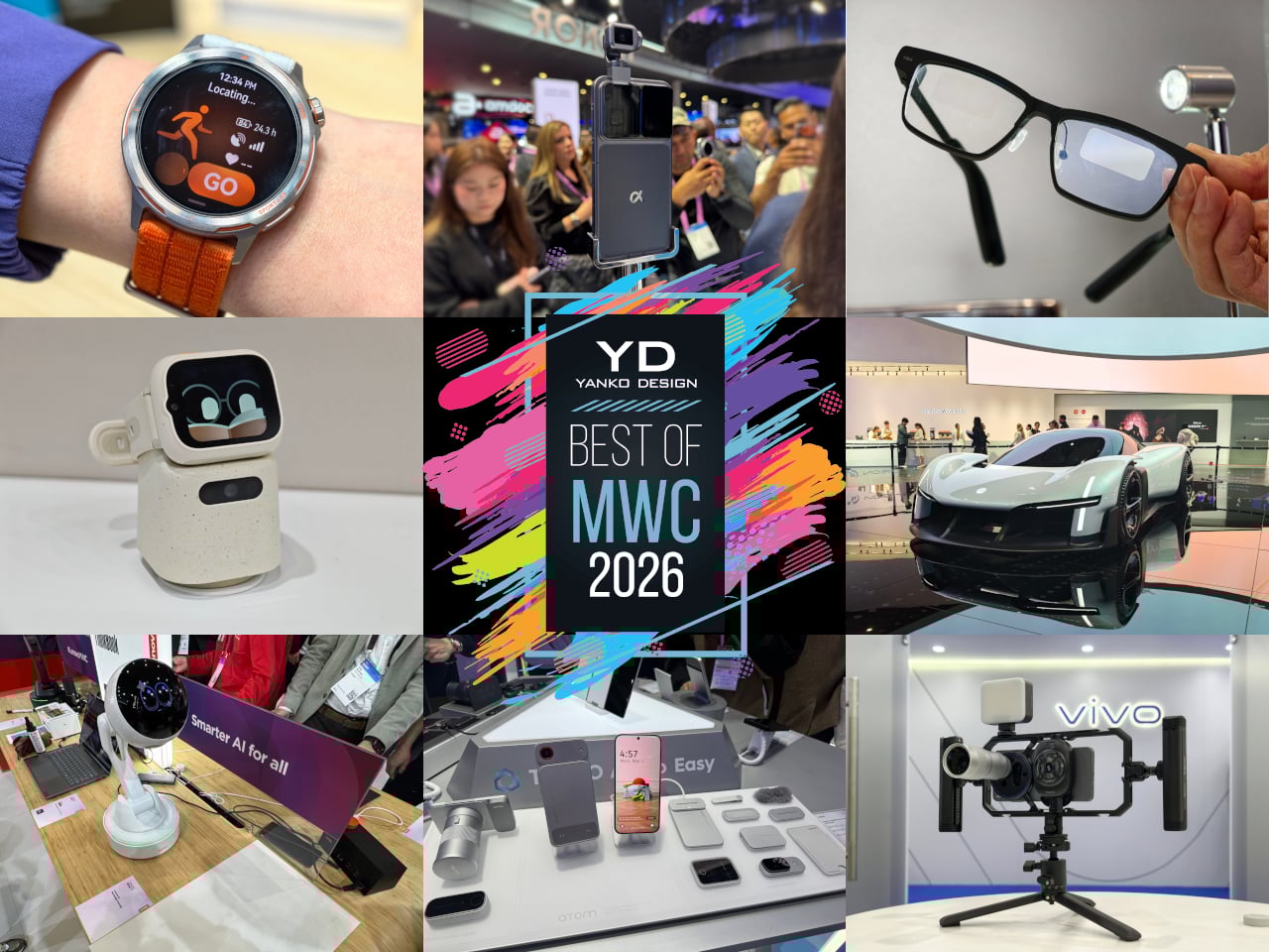
Every year, MWC arrives like a controlled flood of announcements, each one louder than the last. Cameras with more megapixels, batteries with bigger numbers, screens with higher refresh rates than the human eye can meaningfully appreciate. It’s easy to walk away from Barcelona with a head full of specs and no clear sense of what any of it actually felt like to hold, use, or live with. The products that matter don’t always win the spec sheet battle.

The ones worth paying attention to are the ones built around a specific, almost stubborn design conviction. A team that decided thinness wasn’t a compromise but the whole point. Engineers who spent years rethinking how a GPS antenna sits inside a running watch. Designers who asked what a laptop would look like if it finally adapted to the user instead of demanding the opposite. Those are the products that stopped people on the MWC 2026 show floor, and these are the design decisions that made them worth stopping for.

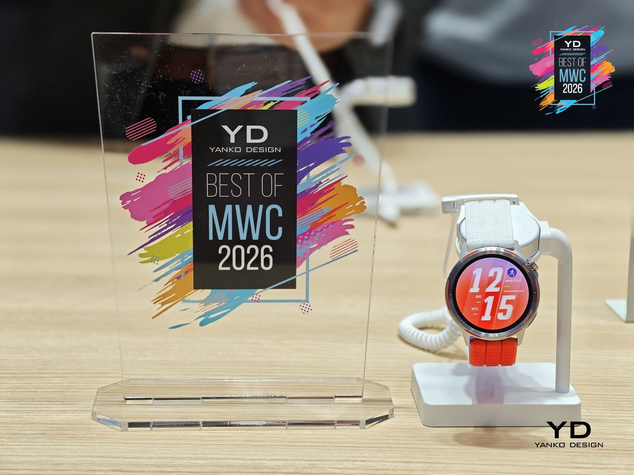
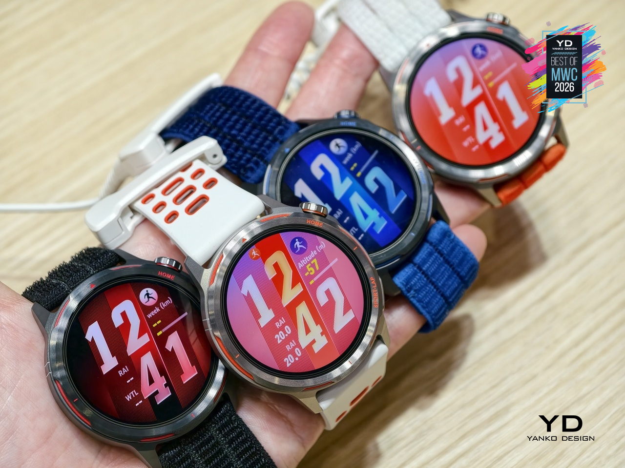
HUAWEI WATCH GT Runner 2 Smartwatch

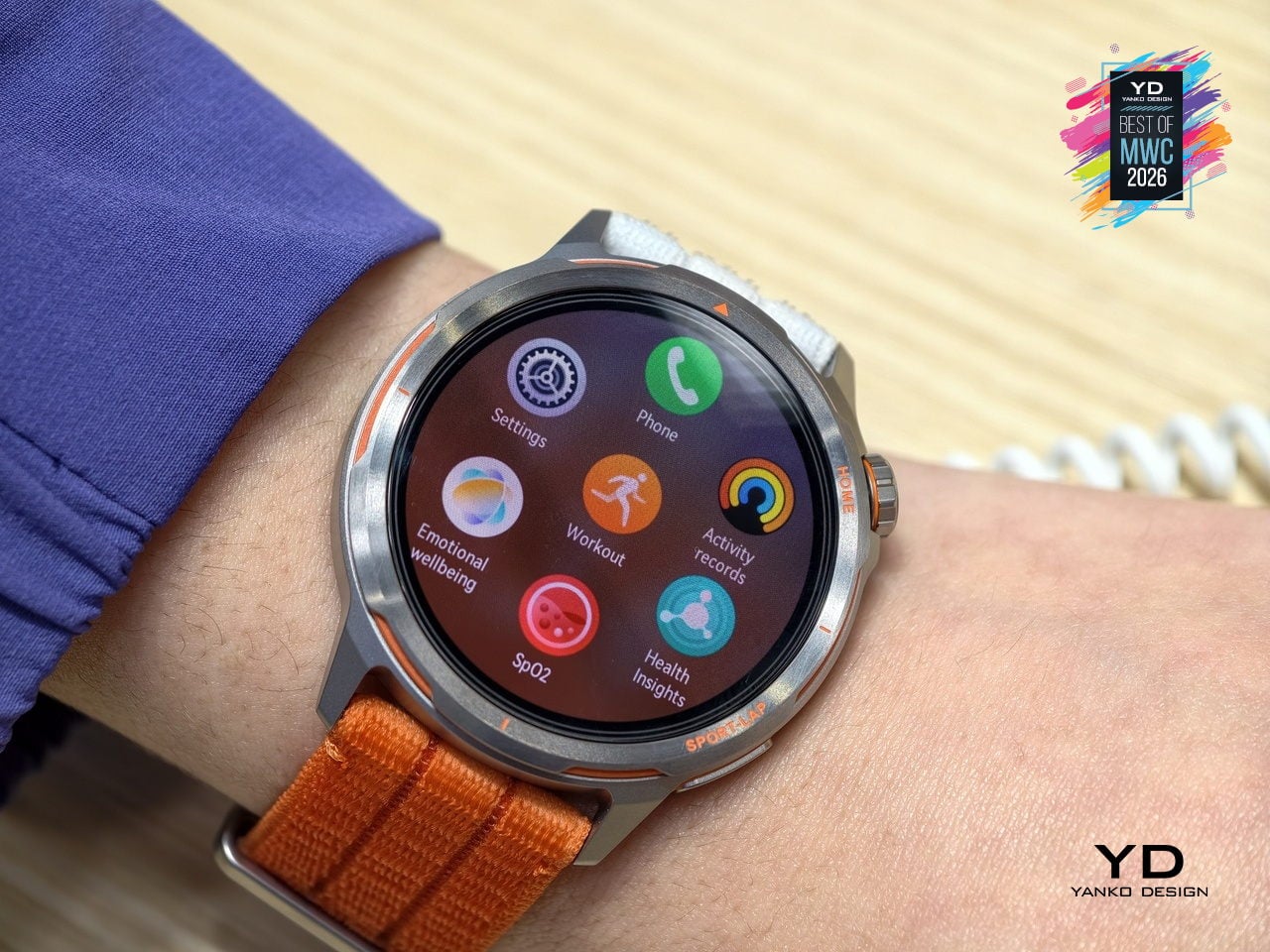
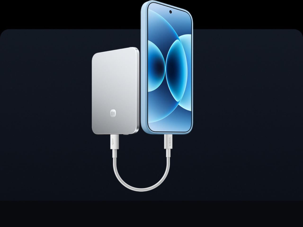
GPS watches for runners have always played both sides of a strange contradiction: the more seriously you take running, the more you end up wearing a small computer that weighs down your wrist and distracts you with irrelevant notifications. Huawei’s answer to that tension is the Watch GT Runner 2, a dedicated running watch built around the single question of what a wrist-worn device actually needs to do well for someone logging serious miles.

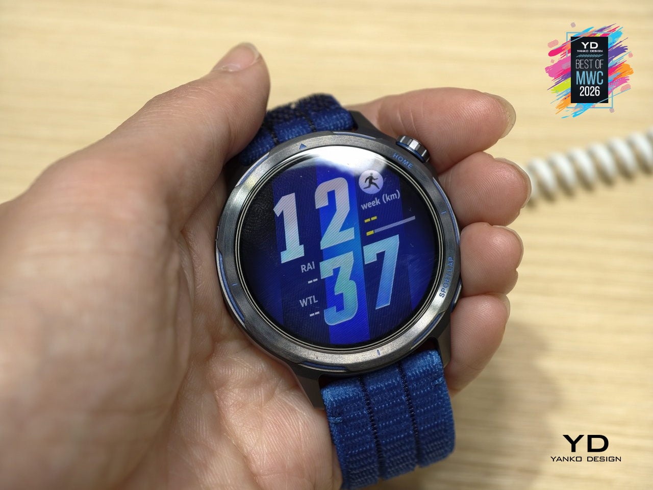
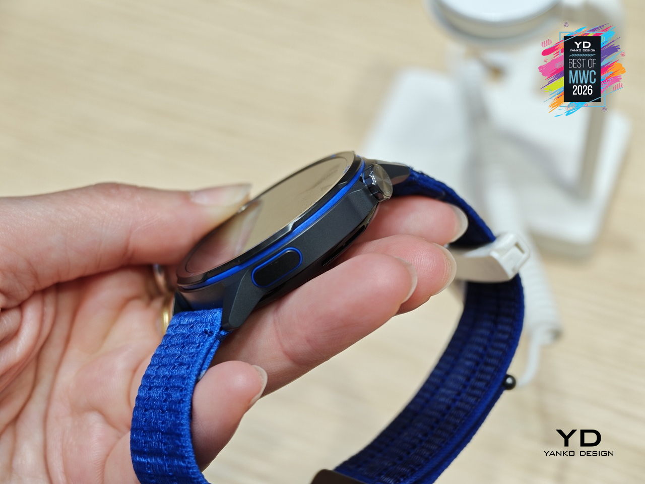
Five years of development went into the GPS architecture, which tells you where Huawei’s engineering priorities landed. The 3D floating antenna design, paired with an intelligent converged positioning algorithm, claims 20% better accuracy than its predecessor, holding signal through tunnels and tree cover where most watches lose the thread. The body itself is nanomolded aerospace-grade titanium at just 34.5 grams, with a 10.7mm profile that doesn’t fight the wrist wearing it.

Designer: Huawei

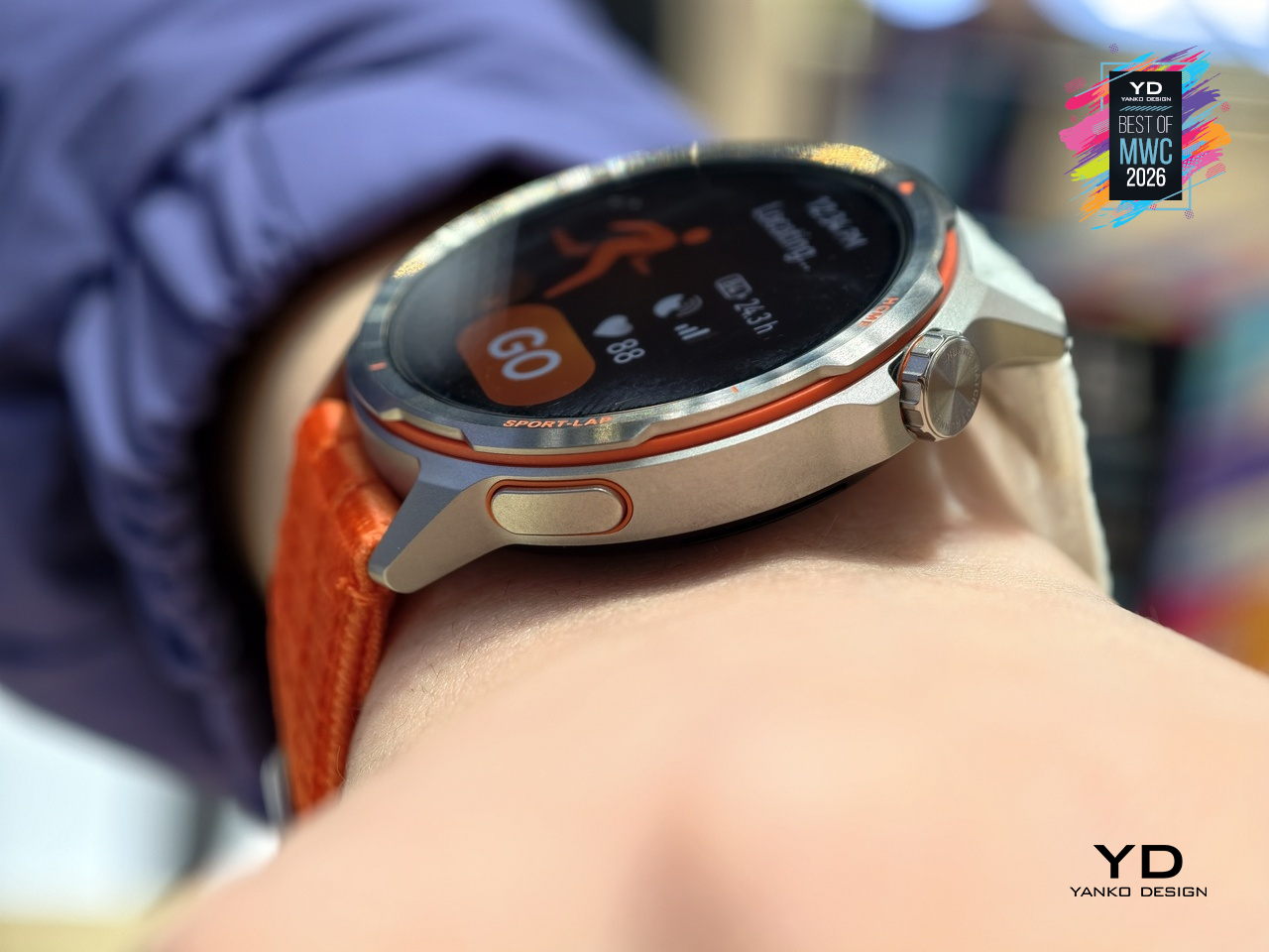
The Intelligent Marathon Mode is where the Huawei Watch GT Runner 2 really shines. Developed alongside the dsm-firmenich Running Team, it functions as an on-wrist coach with customized training plans, real-time pace charts, a digital pacer showing how far ahead or behind your target you are, and a personalized fueling reminder so you don’t bonk at kilometer 30. Performance prediction uses your Running Ability Index and physical data to estimate finish times, which either motivates you or quietly humbles you.

Health monitoring goes beyond the usual heart rate and step counts. ECG analysis triggers 30 minutes post-exercise, HRV is tracked throughout the day, and the PPG sensor can flag potential atrial fibrillation risks. Battery life reaches 32 hours in outdoor workout mode with GPS active, backed by a cell with 68% higher energy density than the previous generation. Curve Pay integration also lets you leave your phone and wallet behind on long runs entirely.

The Huawei Watch GT Runner 2 covers both ends of the spectrum, from amateurs wanting a smart training companion to athletes chasing records with lactate threshold and power metrics. At 34.5 grams with a breathable AirDry woven strap, it’s built to disappear on your wrist. What remains to be seen is whether marathon coaching calibrated with elite runners translates meaningfully to the rest of us.

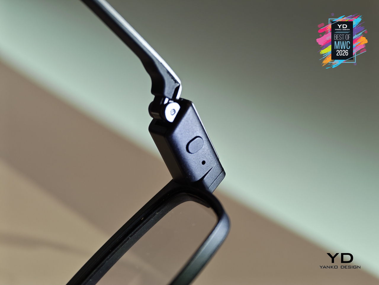
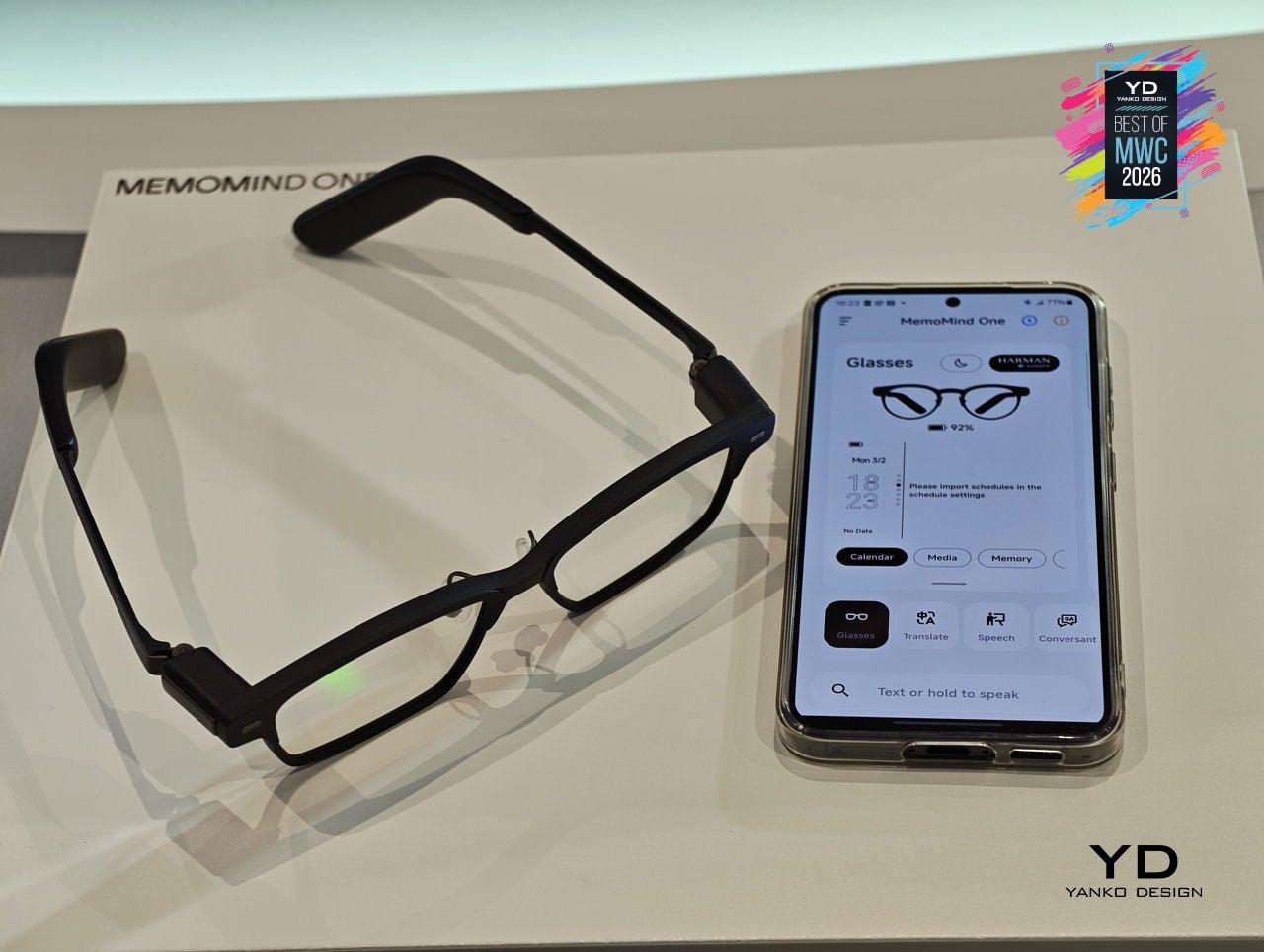
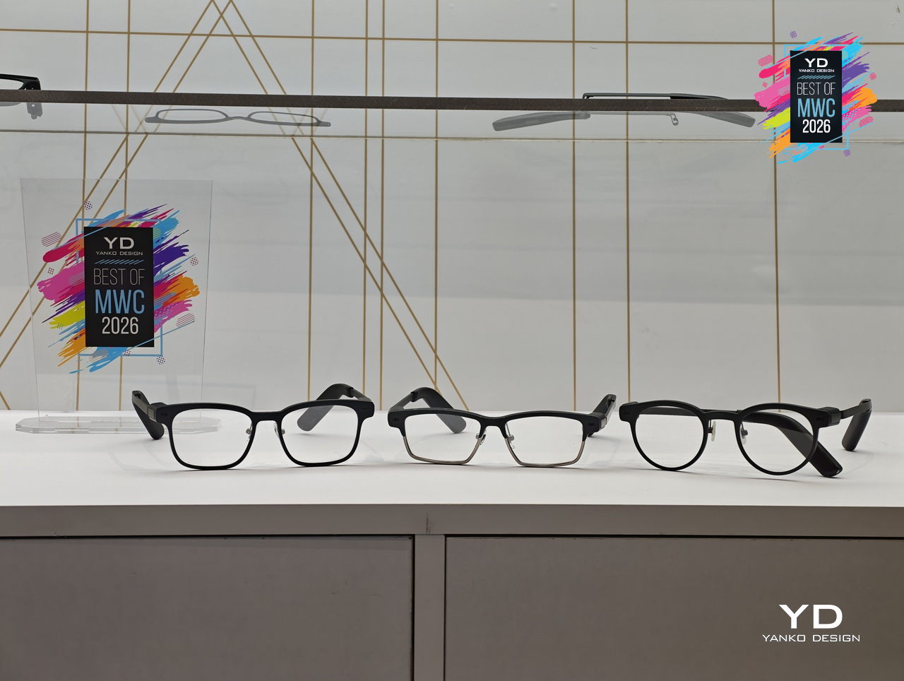
MemoMind One AI Glasses

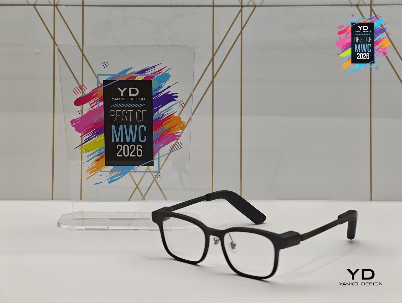
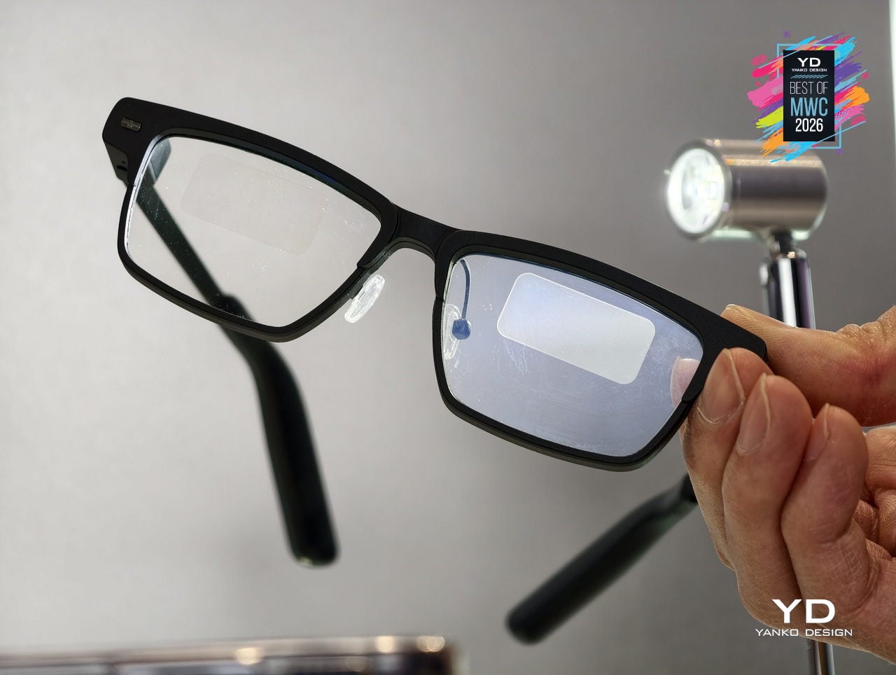
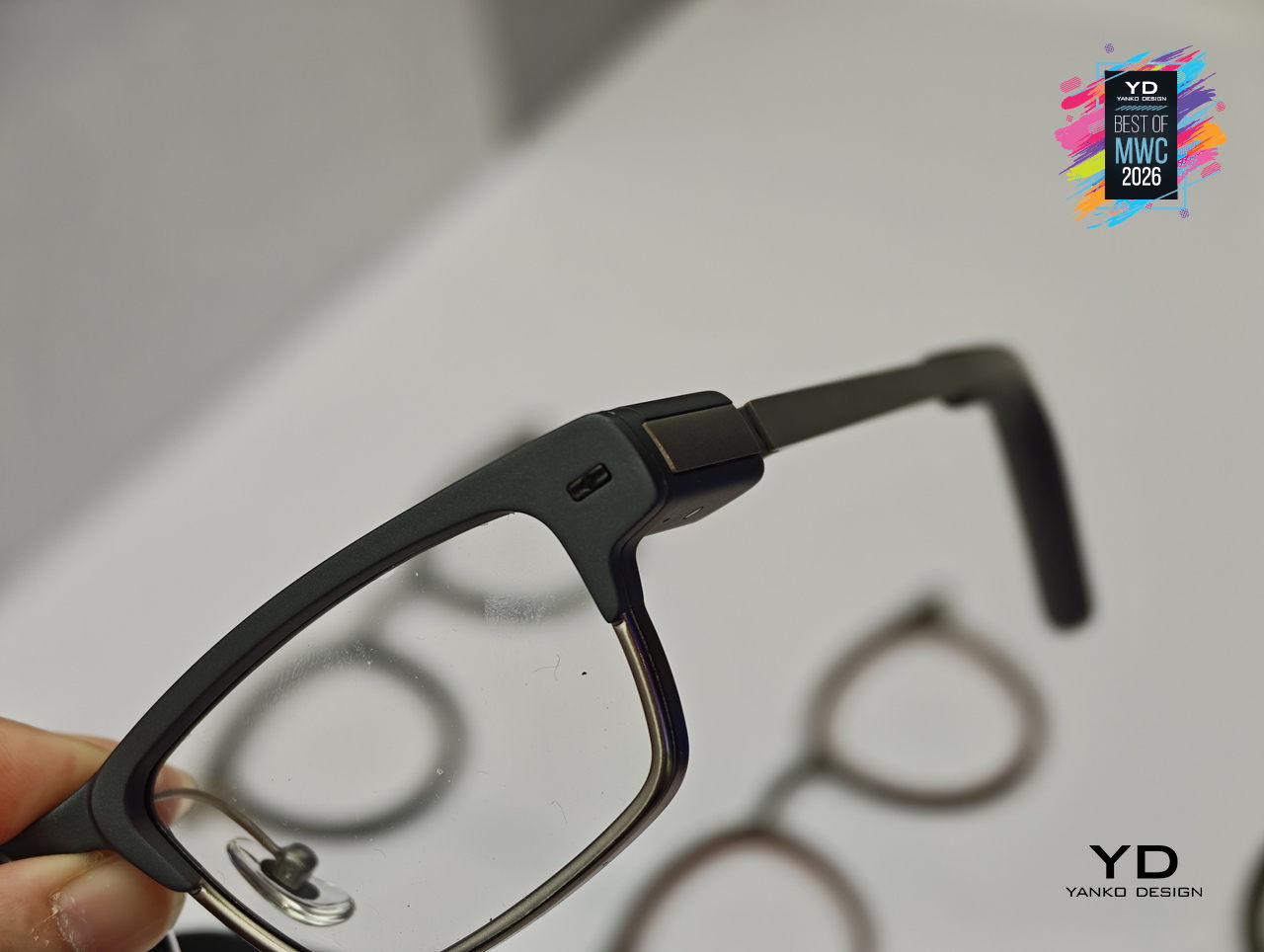
Most AI glasses have made the same mistake: designing around the technology first and hoping the wearability sorts itself out later. The result is eyewear that signals to everyone around you that something unusual is happening on your face. MemoMind, a new AI hardware brand incubated by projector company XGIMI, took the opposite approach with its debut product, building from a decade of optical engineering experience to make glasses that simply look like glasses.

The MemoMind One is the flagship of the lineup, combining integrated speakers with a dual-eye air display that layers information over your field of view without demanding your full attention. The multi-LLM hybrid operating system handles real-time translation, voice summaries, transcription, and contextual reminders, all accessible through head-motion controls and a conversational interface. Since its CES 2026 debut, software updates have expanded navigation integration and refined how the AI delivers information without interrupting natural interaction.

Designer: XGIMI

Personalization sits at the center of the MemoMind design philosophy in a way most wearable tech ignores entirely. Frames are fully customizable, temples are interchangeable, and the glasses support prescription lenses, meaning you can actually wear them as your everyday eyewear rather than carrying a second pair of frames. That design decision alone separates MemoMind from most competitors, where the hardware dictates the look and the wearer adapts accordingly.

The broader MemoMind lineup shows how deliberately the brand has thought through different user needs. The MemoMind Air Display weighs just 28.9 grams and uses a single-eye monocular display for a lighter-touch AI presence, aimed at commuters and minimalists who want information without visual density. The MemoMind Air goes further still, dropping the display entirely for a microphone-only model that makes the AI presence nearly invisible, present when useful and undetectable when not.

MemoMind One is set for preorder in April 2026, with the Air Display and Air models following later in the year. What XGIMI has built here is a clear and considered answer to the question of how AI should sit on your face: quietly, comfortably, and without announcing itself to the room. The design conviction behind MemoMind is that the best wearable AI is the kind you stop noticing you’re wearing.

Honor Robot Phone Concept

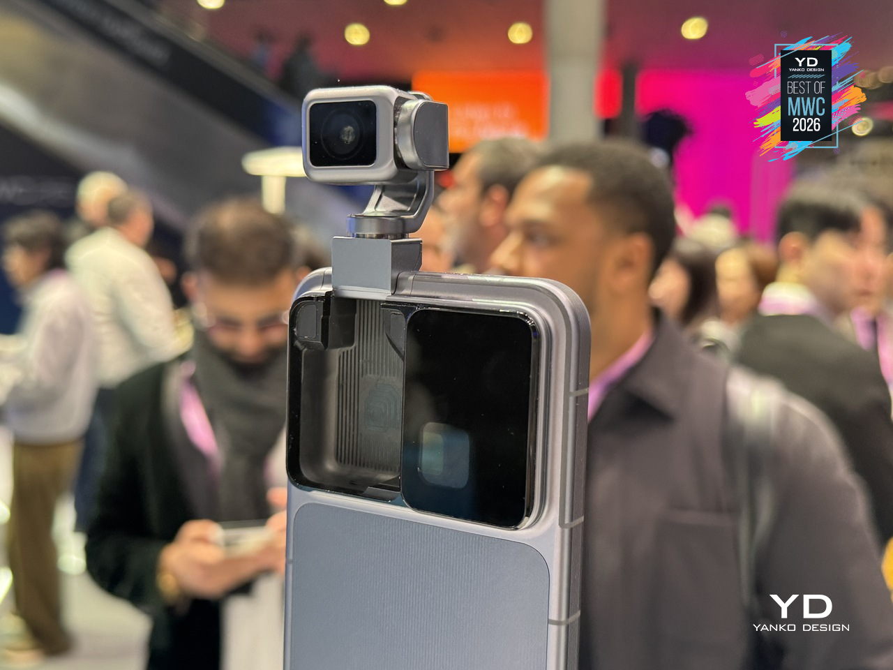
Smartphones have been flat rectangles for so long that the design conversation around them has largely shifted to cameras, refresh rates, and how thin the bezels are. Honor arrived at MWC 2026 with a genuinely different question: what if the phone itself could move? The Robot Phone concept puts a 4DoF gimbal system inside a handheld device, built around what Honor calls the industry’s smallest micro motor, with the motor size reduced by 70% compared to existing solutions.

Designer: Honor

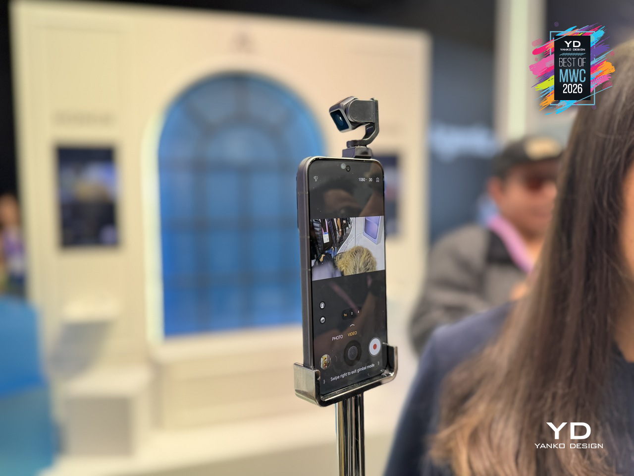
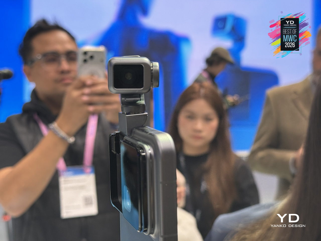
The gimbal does two distinct things, and they pull in interestingly different directions. On the imaging side, three-axis mechanical stabilization works alongside an AI stabilization engine to keep footage steady through complex, dynamic movement. A double-tap locks the AI onto any subject, tracking it even through sudden changes or brief obstructions. Honor also introduced an AI Spinshot mode, supporting 90-degree and 180-degree rotations, a move that borrows directly from cinema camera rigs and scales it down to one hand.

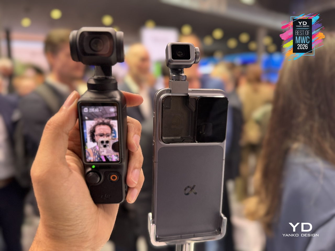
The second application is where the concept gets harder to categorize. Honor has designed the gimbal to express what it calls embodied AI interaction, meaning the phone physically responds to what’s happening around it. It nods during agreement in video calls, adjusts its orientation to keep you in frame automatically, and moves to the rhythm of music playing through its speakers. These are features that a spec sheet cannot really describe, and that makes the Robot Phone one of the more genuinely curious things shown at MWC 2026, even as a concept still working toward a commercial release.

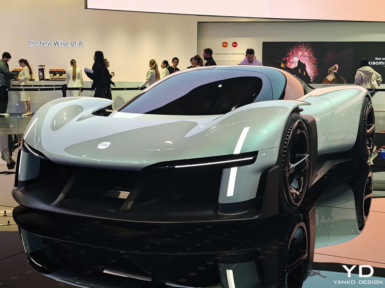
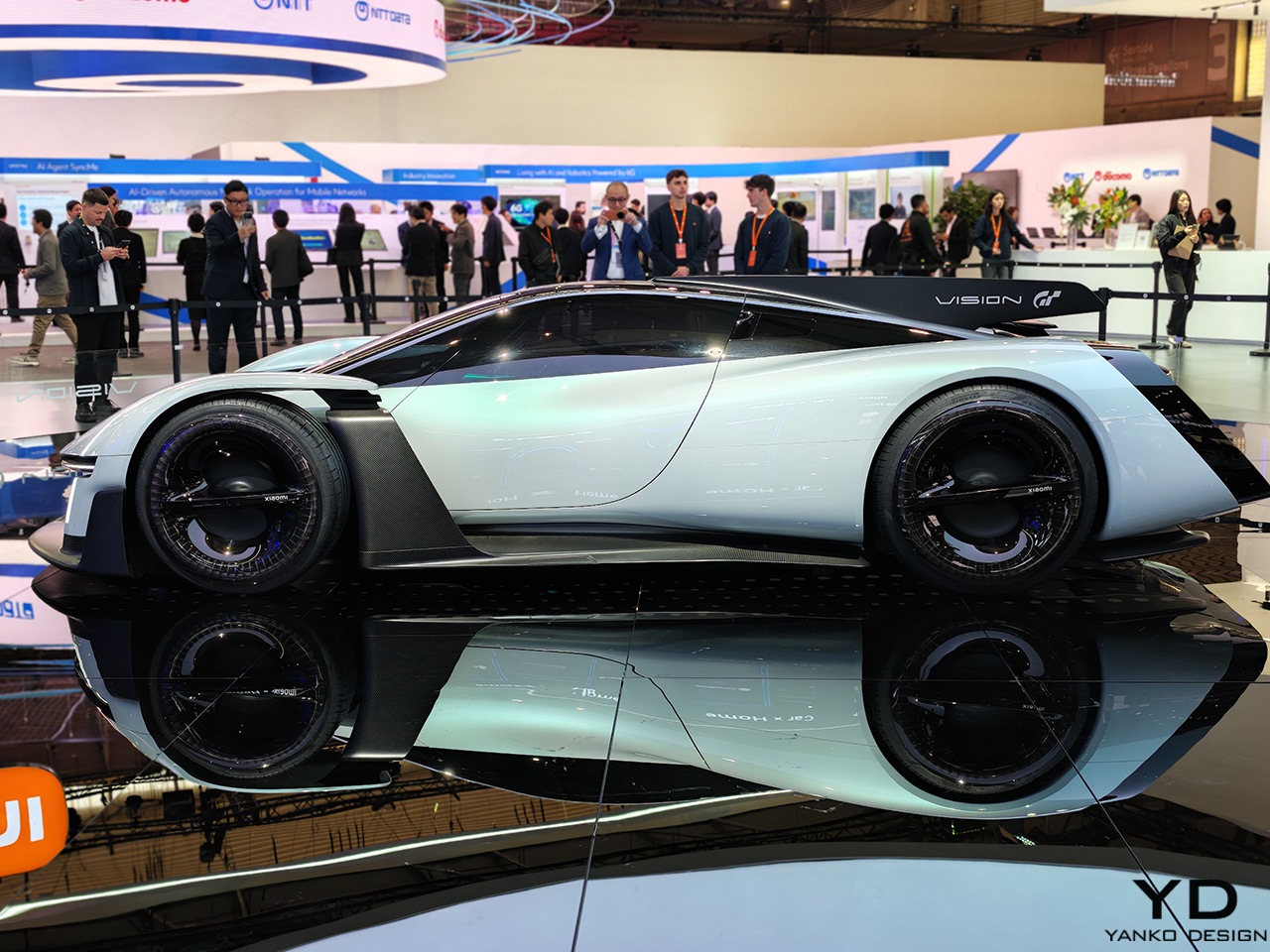
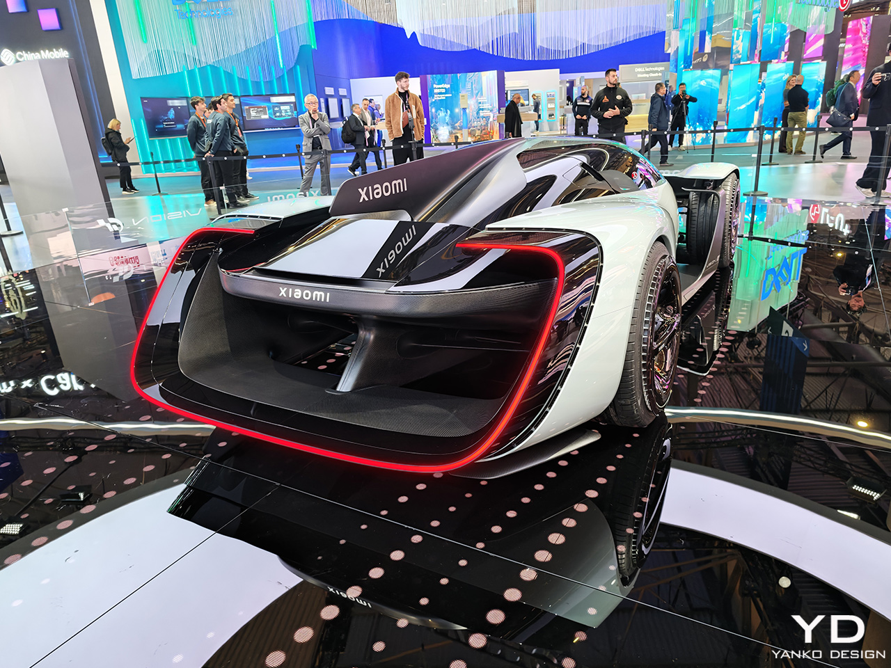
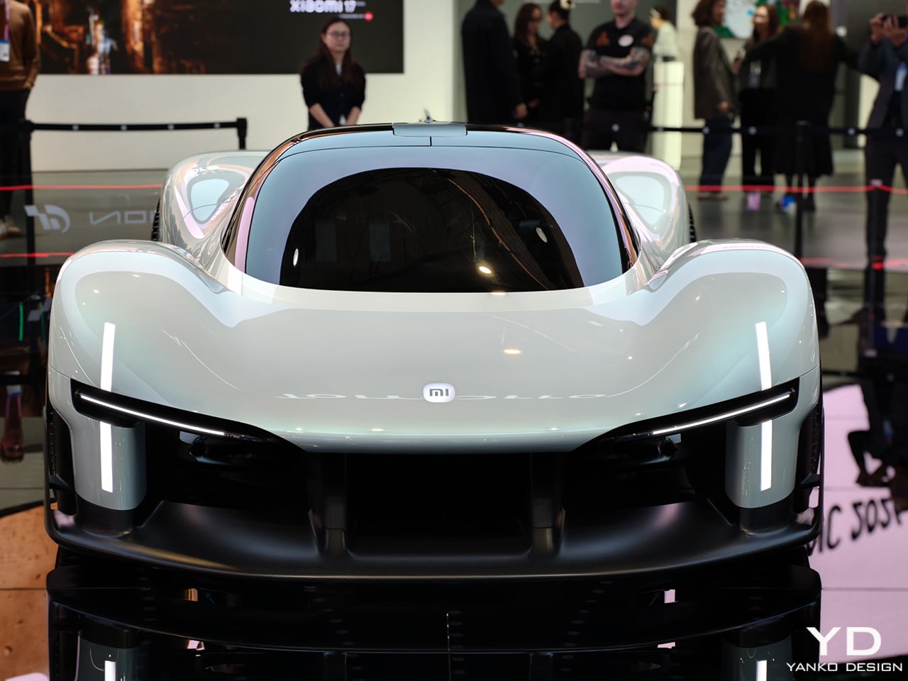
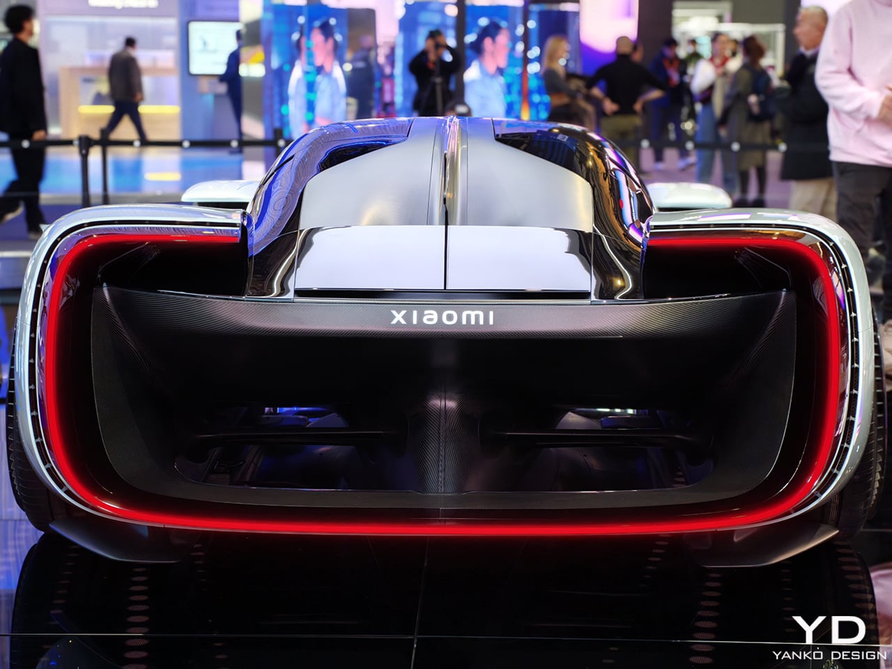
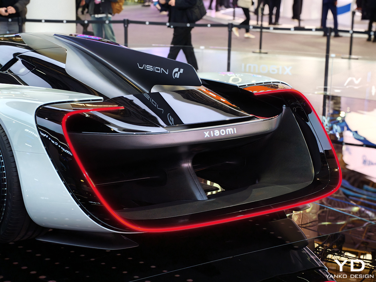
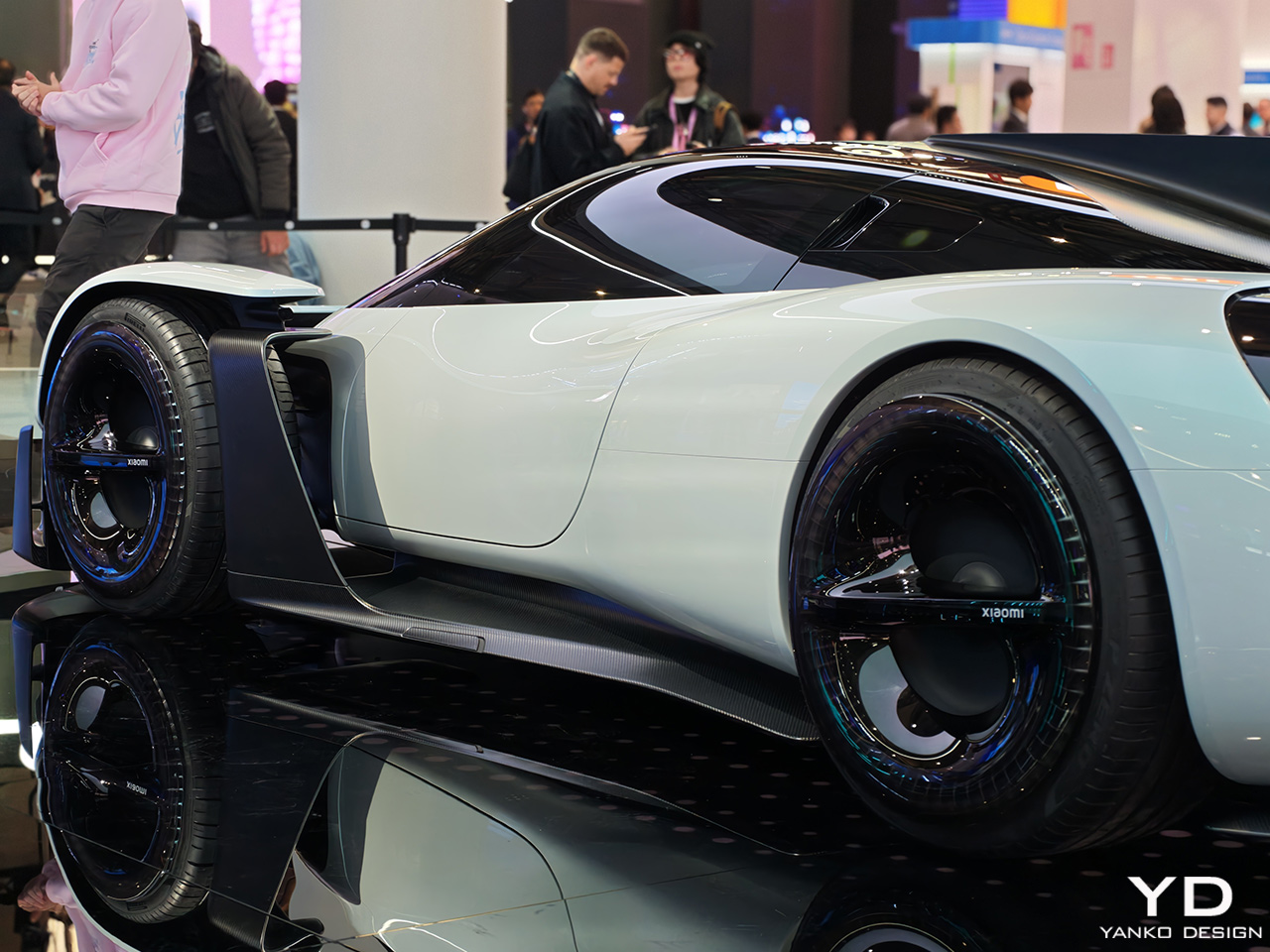
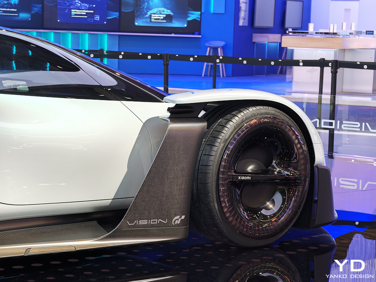
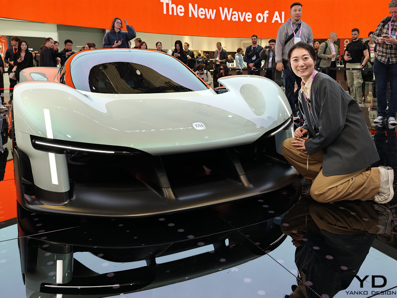
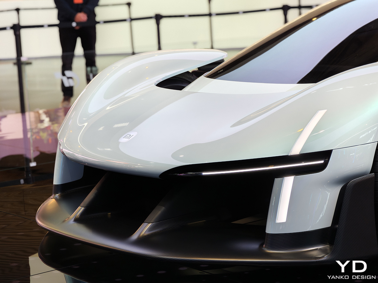
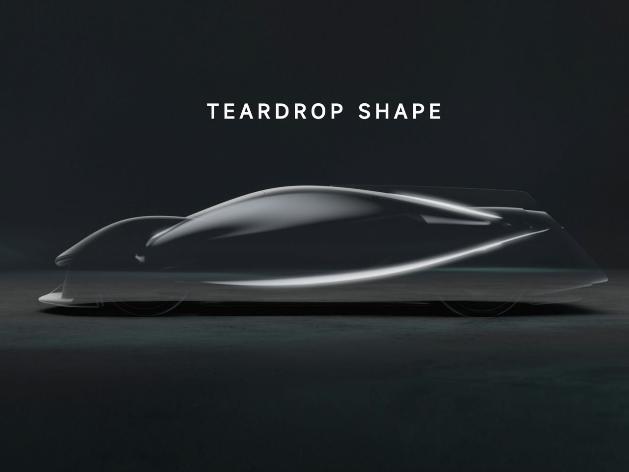
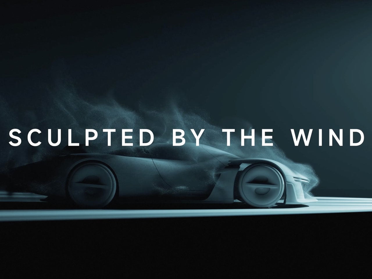
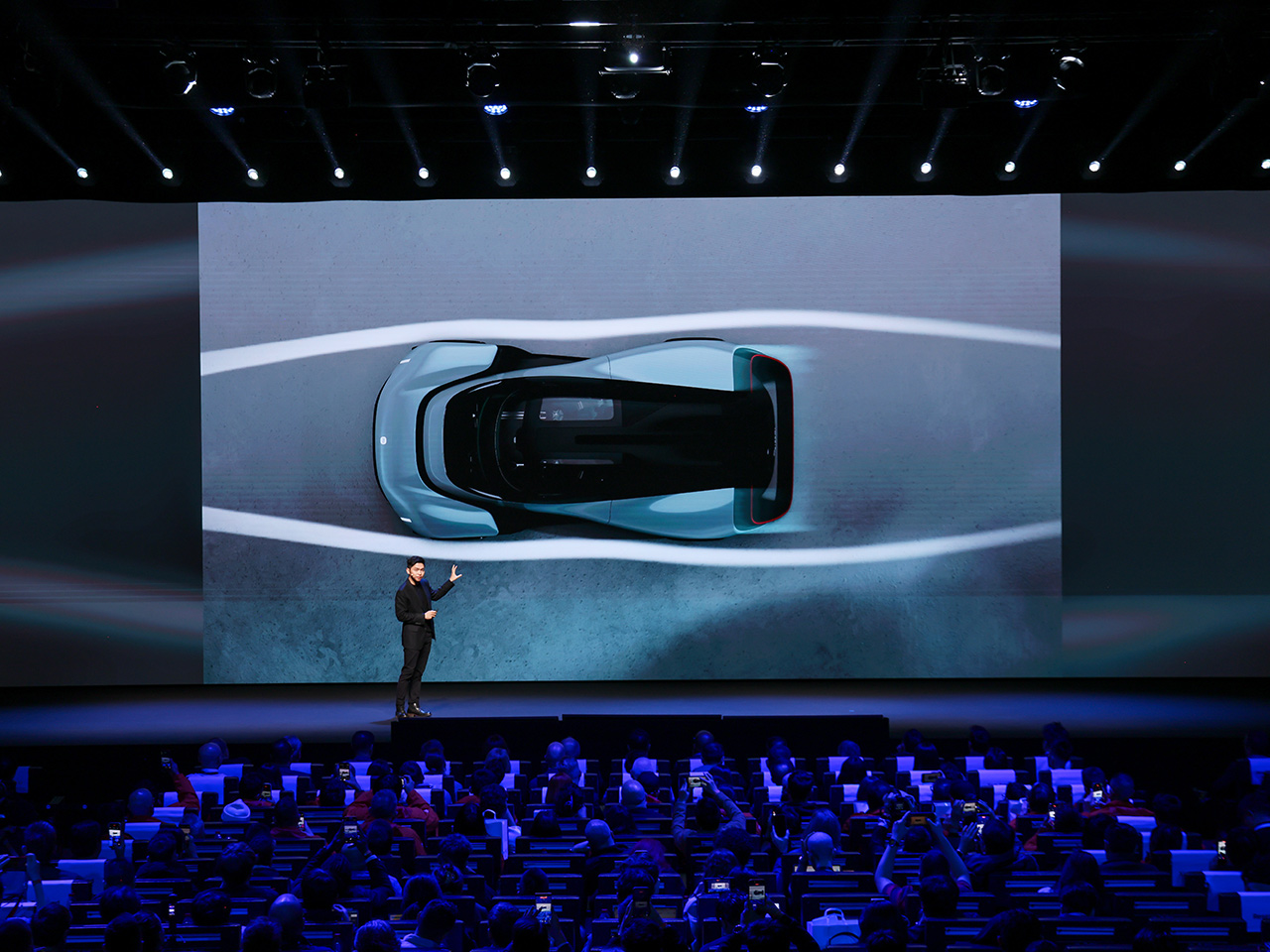
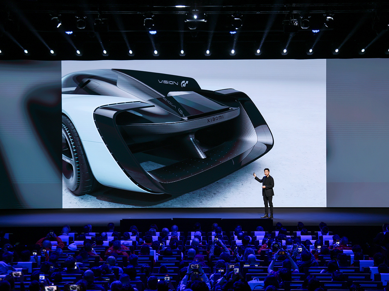
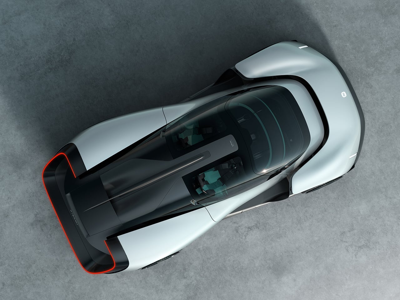
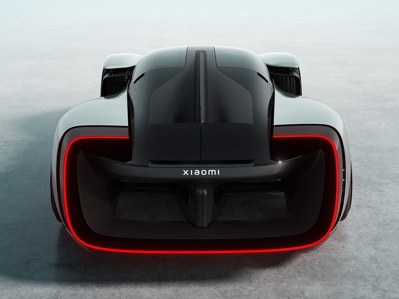
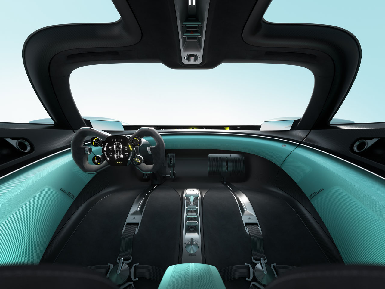
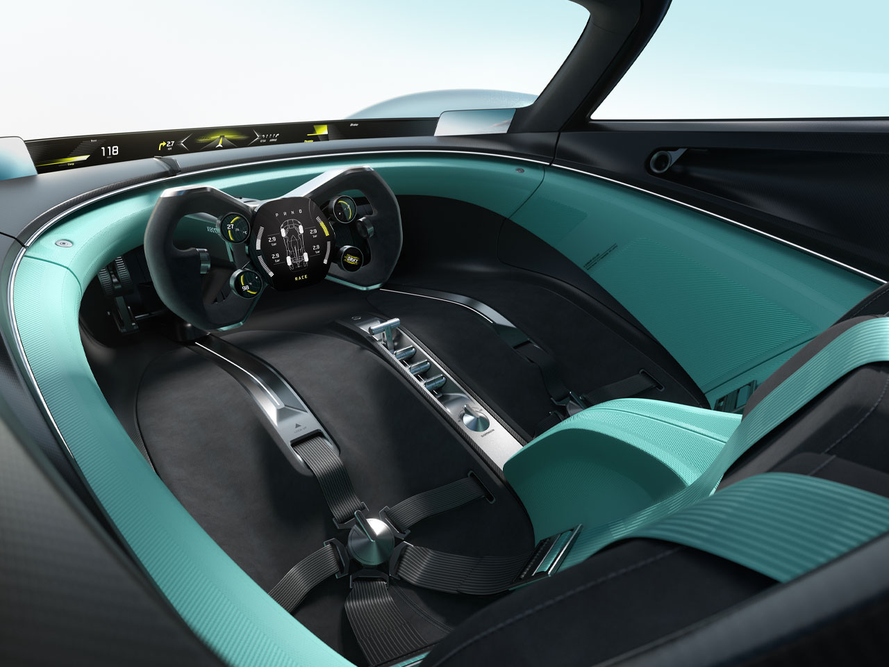
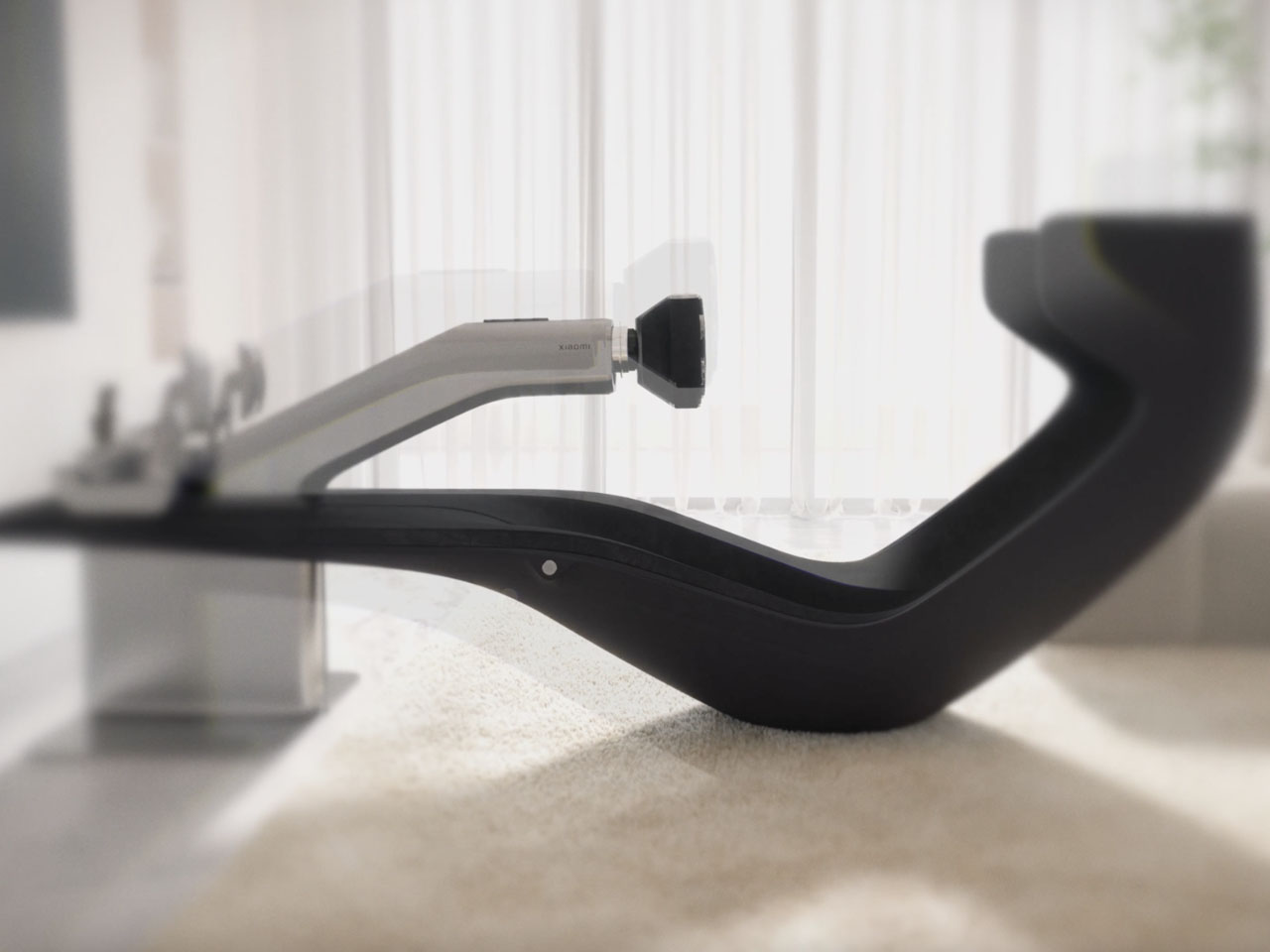
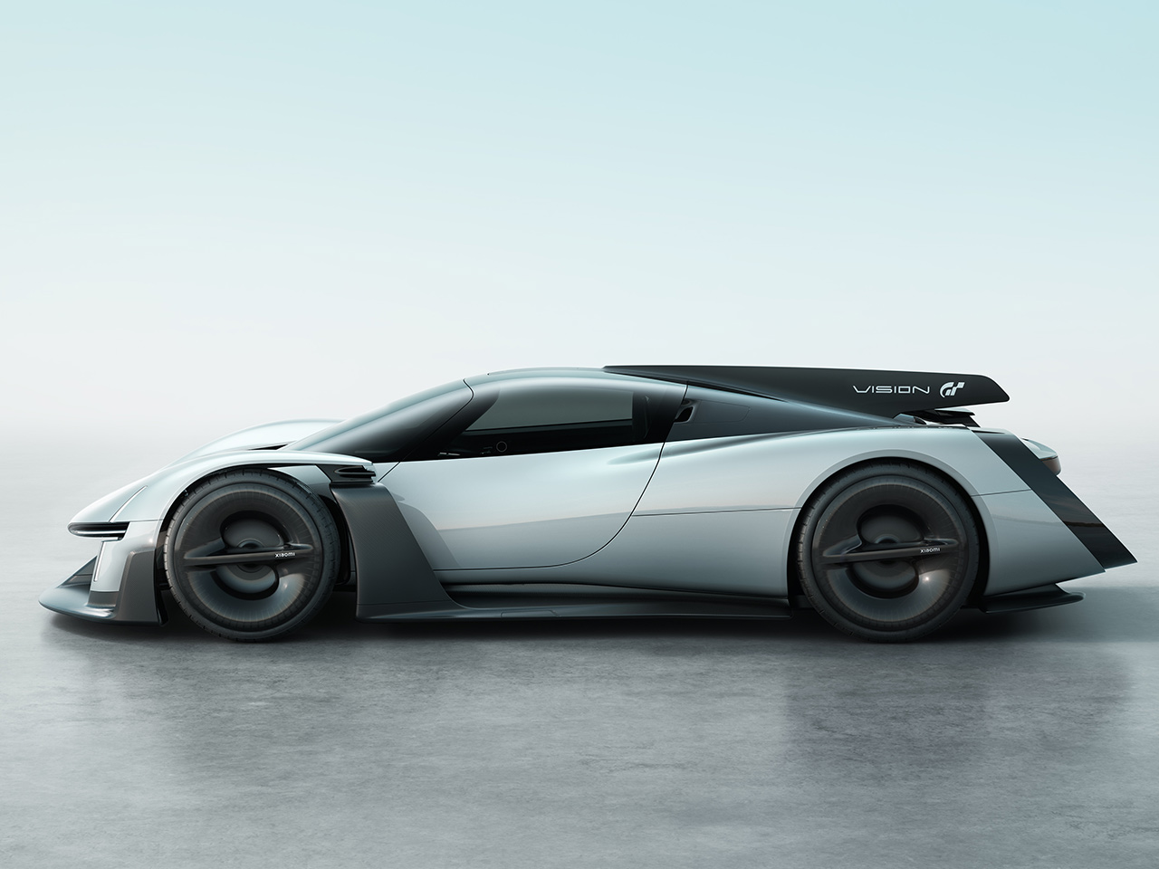
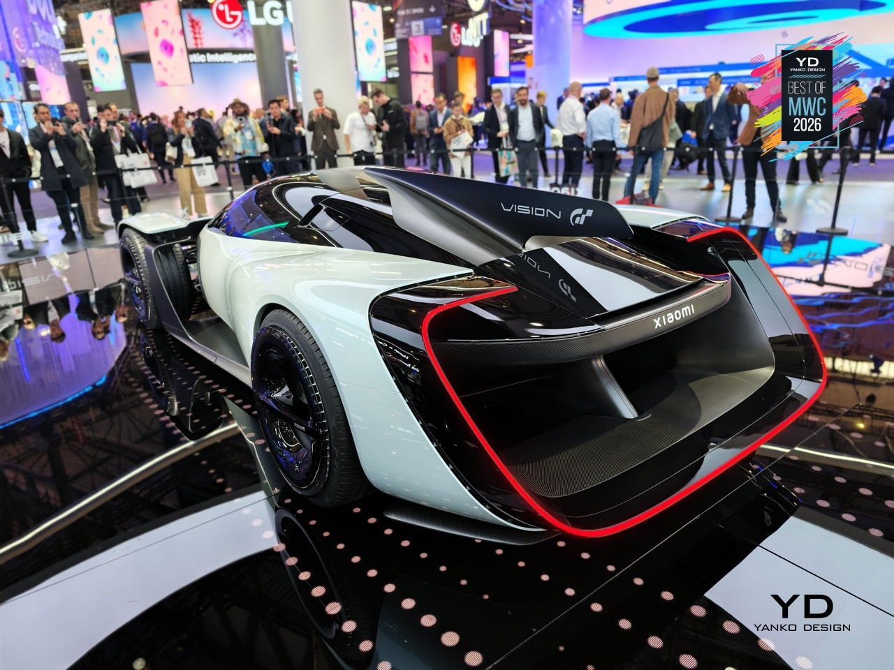
Xiaomi Vision Gran Turismo EV Concept

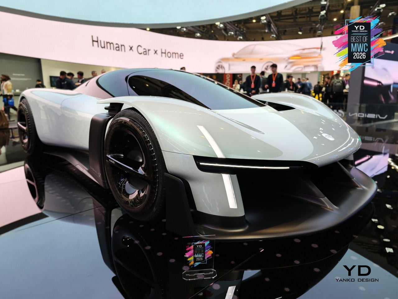
The Vision Gran Turismo program is where car brands go to design without consequences. No production targets, no crash tests, no accountants in the room. Ferrari has done it. Porsche has done it. Now Xiaomi, a company that started by selling smartphones and rice cookers, has become the 36th brand to join and the first technology company ever invited. Gran Turismo producer Kazunori Yamauchi extended the invitation personally at the GT World Series in London.

Designer: Xiaomi

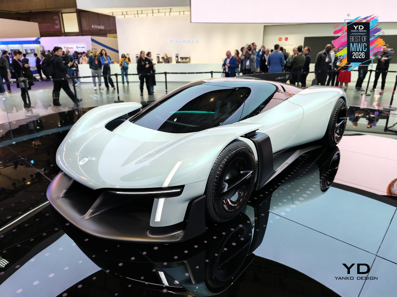
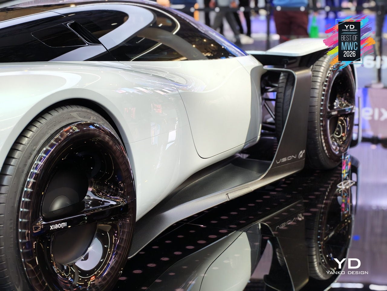
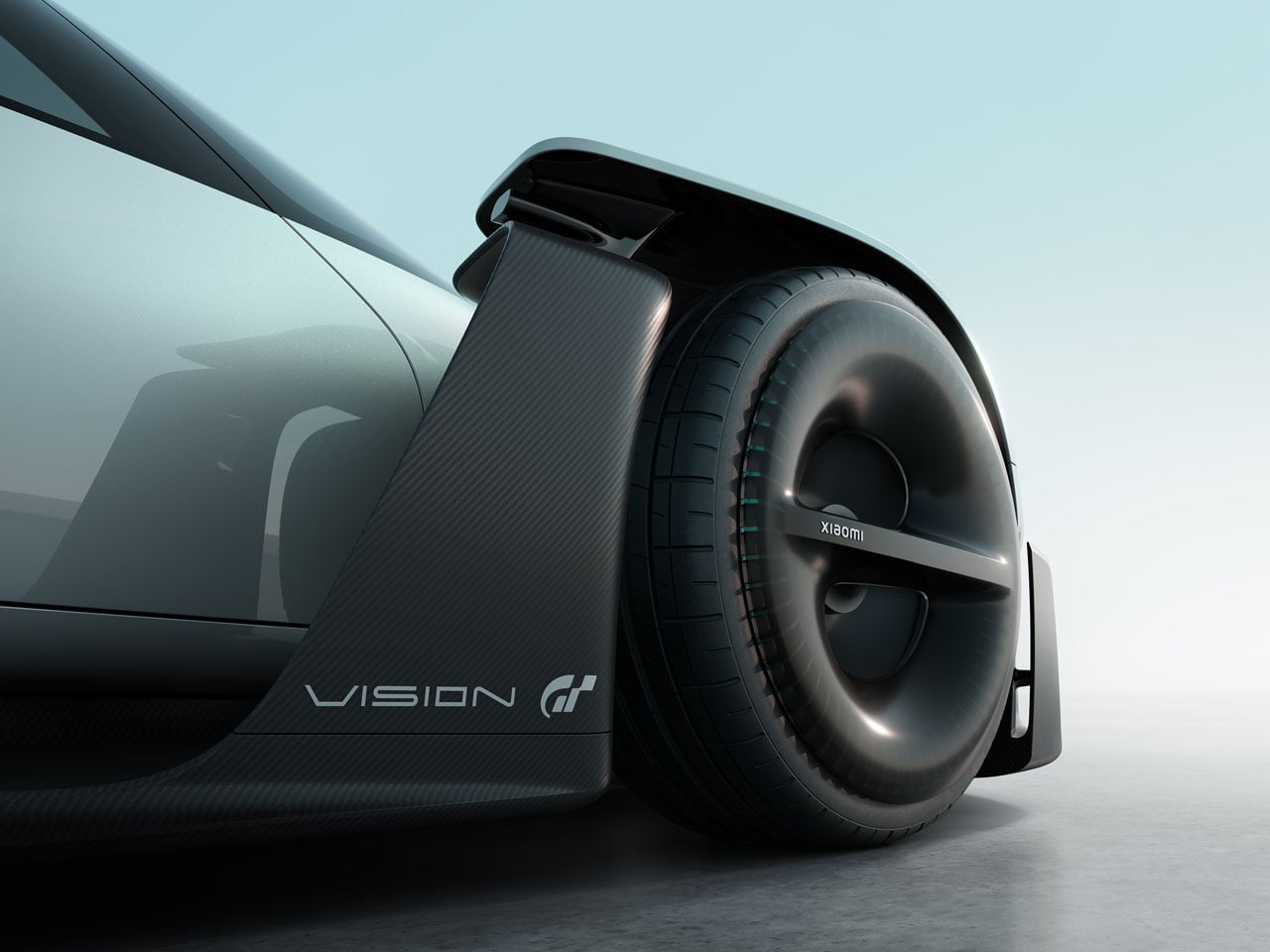
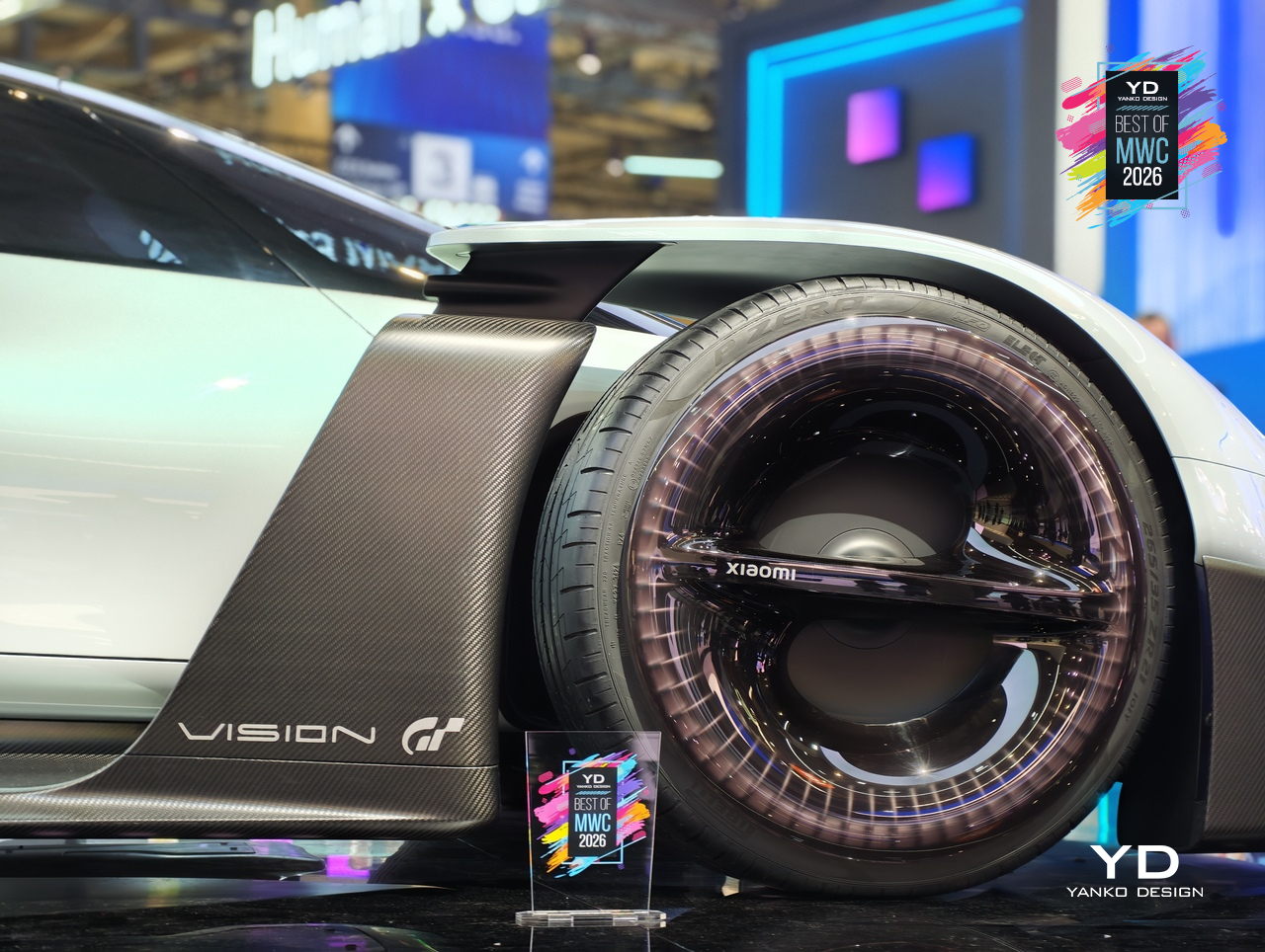
The design problem Xiaomi decided to obsess over is one every hypercar team faces: low drag gives you straight-line speed, high downforce gives you corners, and optimizing hard for either one usually compromises the other. Xiaomi’s answer was to eliminate the trade-off entirely by building aerodynamics into the body itself. No bolted-on wings, no add-on splitters. A teardrop cockpit, airfoil-shaped structural members, and embedded channels that guide air from nose to tail. The Accretion Rims are the detail worth pausing on: magnetically held wheel covers that stay perfectly still while the wheels rotate beneath them, cooling the brakes through internal turbine fins while cutting drag from spinning surfaces.

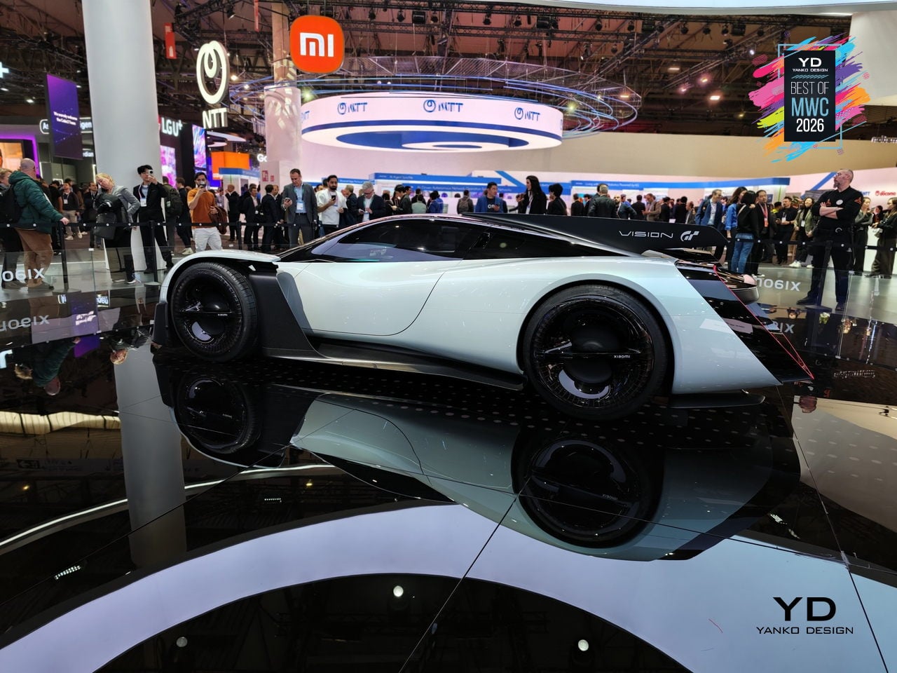
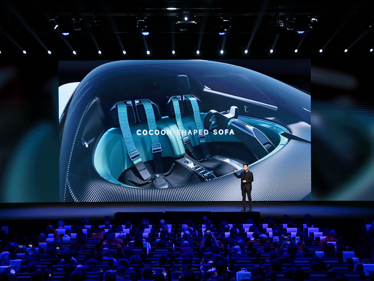
Inside, Xiaomi replaced the usual carbon-and-leather tension of a hypercar cockpit with something it calls the Sofa Racer, a continuous loop of dashboard, doors, and seating upholstered in 3D-knitted fabric pulled from sportswear manufacturing. The Xiaomi Pulse system reads driver state through sensors and responds through light and sound rather than screens and alerts. It all connects to Xiaomi’s broader Human x Car x Home ecosystem, which is either a genuinely interesting idea about how cars fit into a connected life, or a lot of ecosystem language wrapped around a very beautiful virtual concept car.

TECNO Modular Magnetic Interconnection Technology

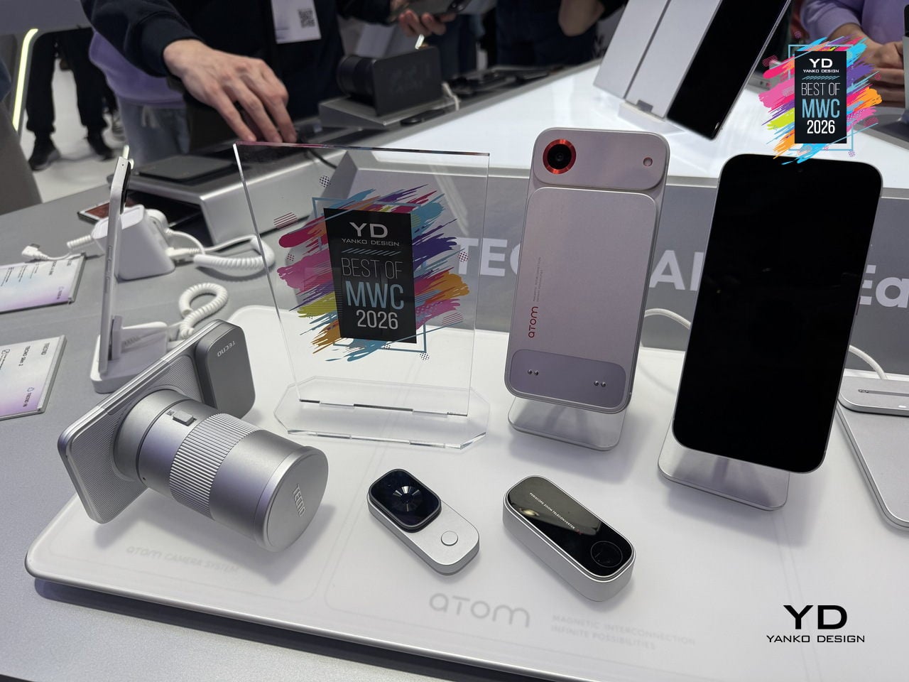
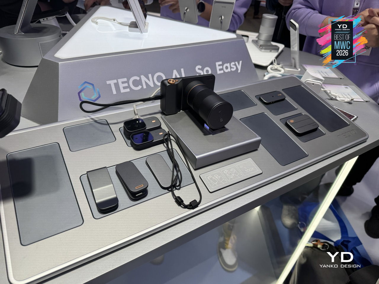
The modular phone idea has been attempted before, most famously by Google’s Project Ara, which spent years promising a phone you could rebuild like Lego before quietly disappearing in 2016. The premise was compelling, and the execution proved stubborn. TECNO’s approach at MWC 2026 is different in one important way: rather than replacing the phone’s internal components, the Modular Magnetic Interconnection Technology keeps the phone slim and complete on its own, then lets you snap additional hardware onto it magnetically when you actually need it.

Designer: TECNO

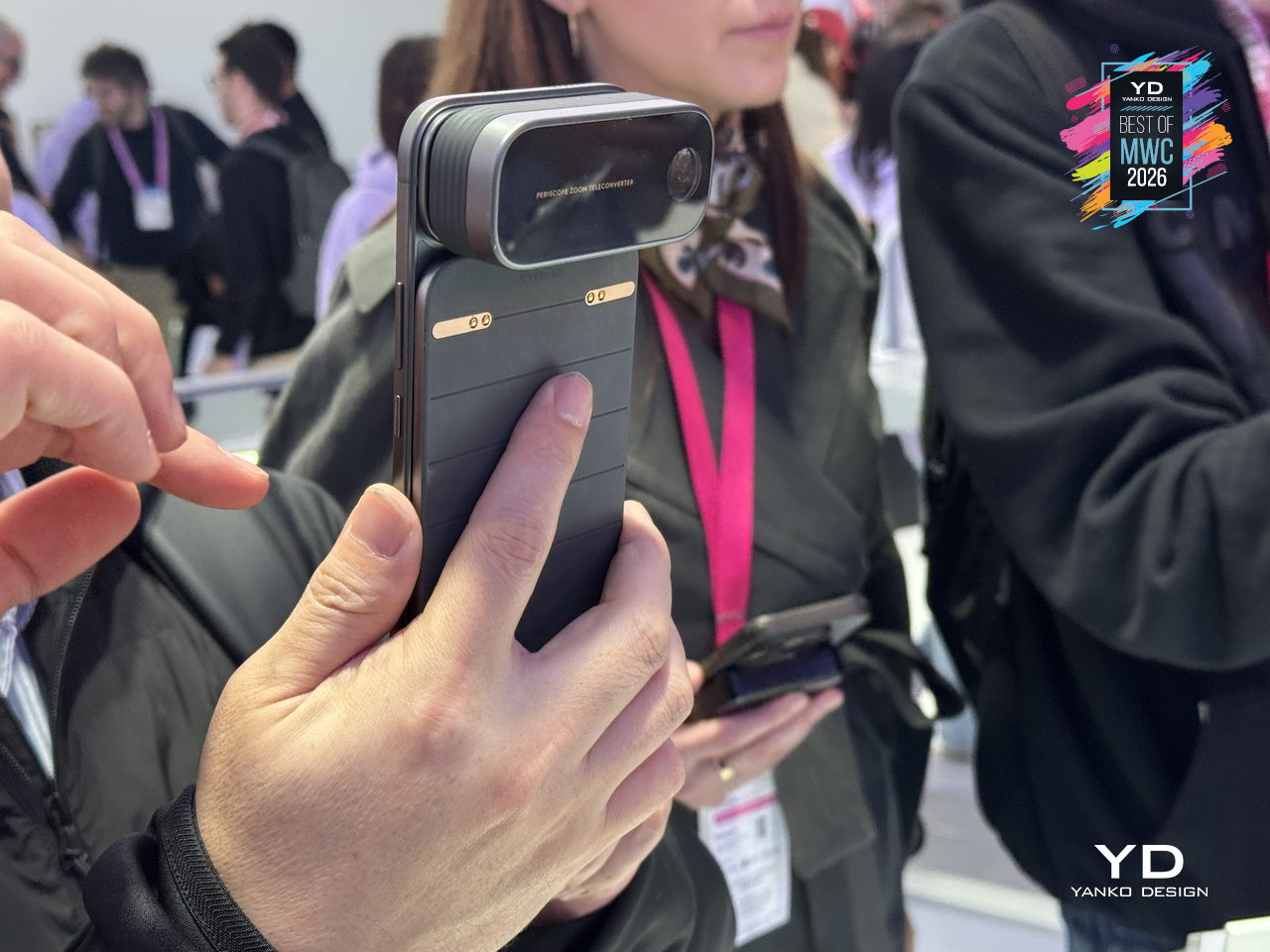
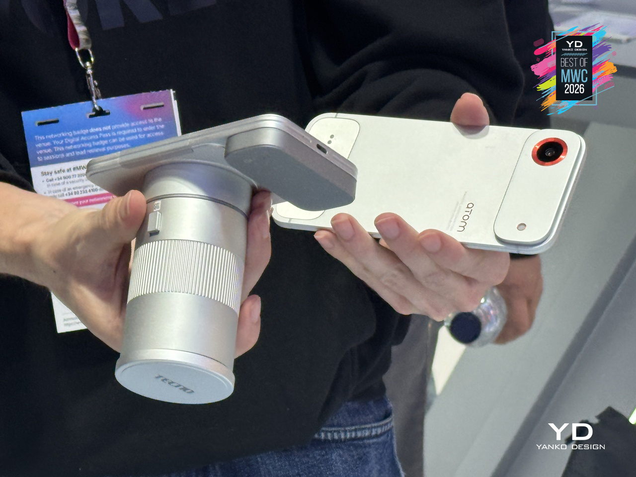
The concept arrives in two visual flavors, ATOM and MODA, but the underlying system is the same across both. Over a dozen modules compose the Customizable Modular Suite, covering stackable battery packs, action cameras, telephoto lenses, and more, each attaching and communicating through the magnetic interconnection system. The scale and visual coherence of the accessory ecosystem is genuinely striking. Everything shares a design language, sits flush when attached, and reads as a single object rather than a phone with things stuck to it.

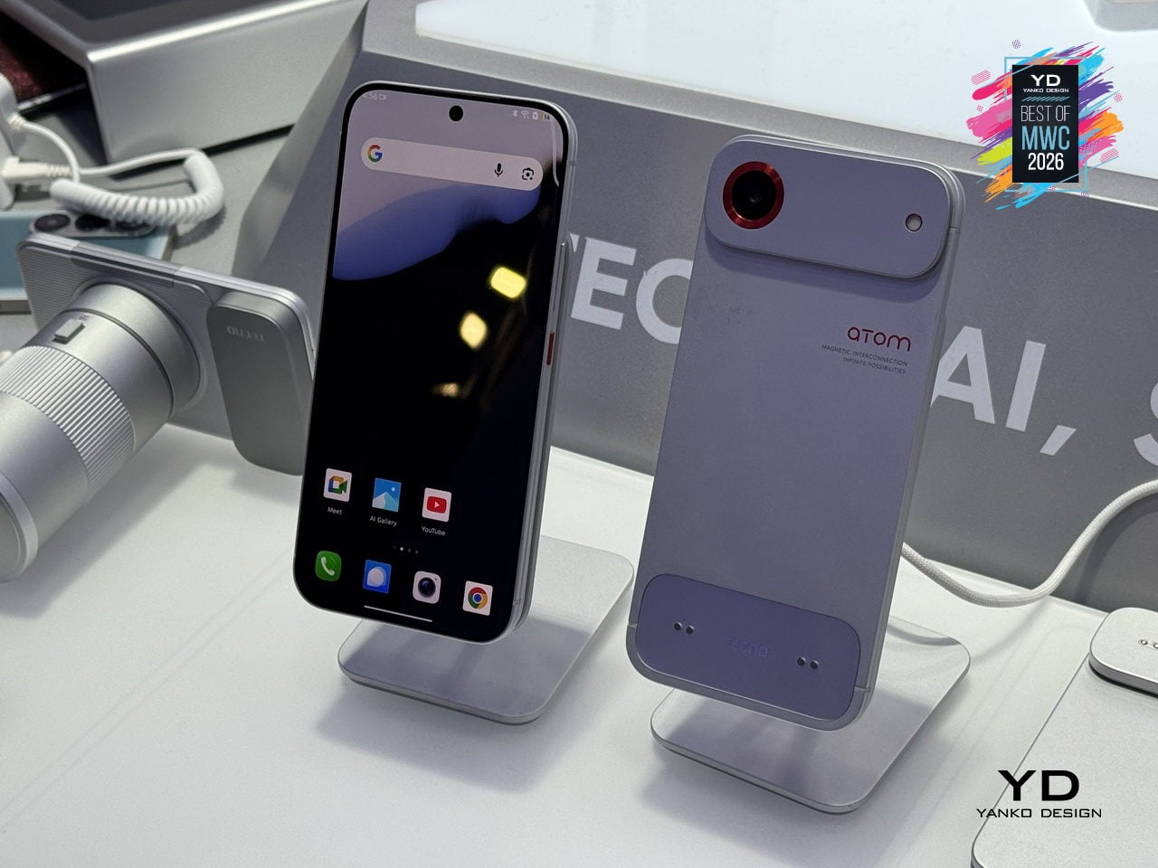
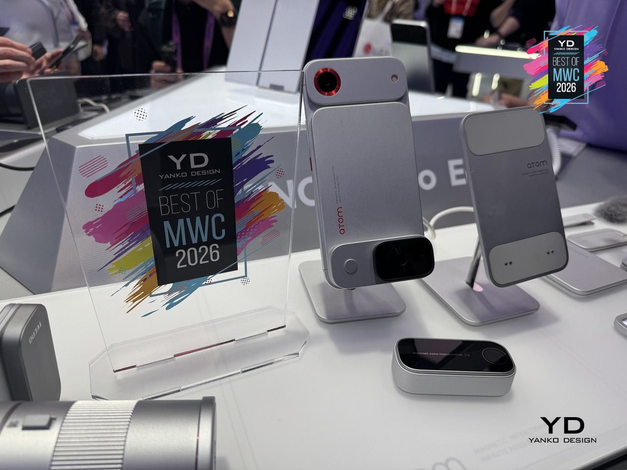
The ATOM edition makes the clearest design statement of the two, with its white and red palette, ribbed surfaces, and a camera module that looks pulled straight from a mirrorless system. TECNO’s core argument is that keeping the phone genuinely slim in daily use, while letting the modules handle the heavier lifting on demand, sidesteps the trade-off that has defined smartphone design for years. Add what you need, remove what you don’t, and the phone adapts to the moment rather than trying to anticipate every one of them in advance.

T10 Bespoke Luxury Custom IEM

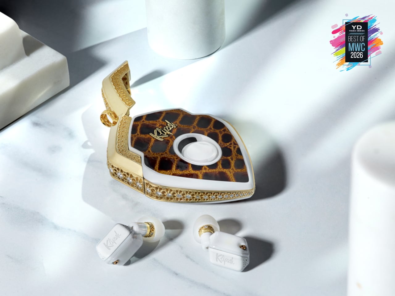
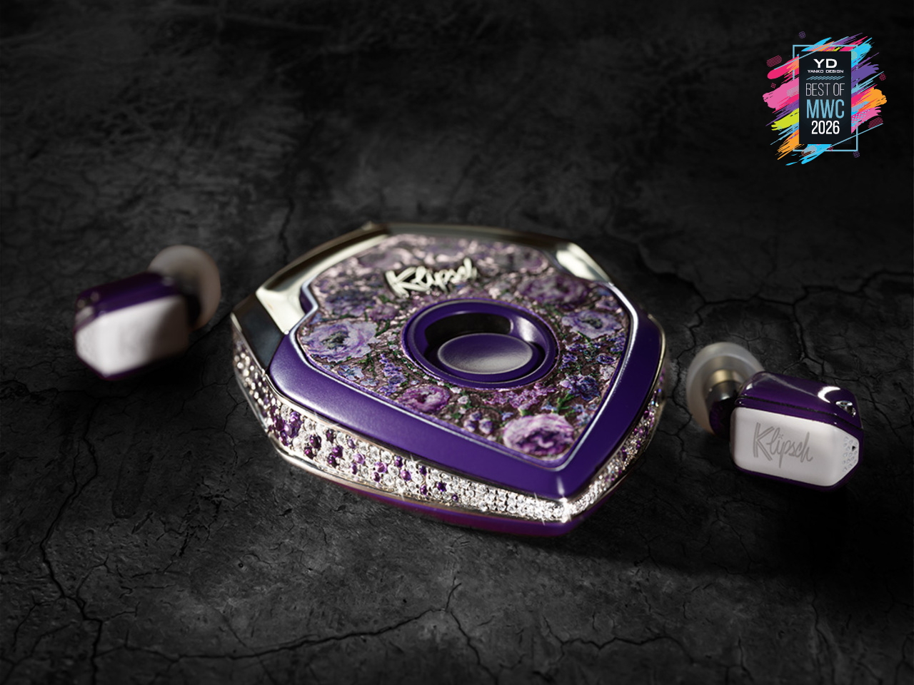
There are 150 of these made each year. That’s it. Each one starts as a conversation, not a product listing, where you sit down with the team and work through finishes, metals, and sculptural forms until the result is entirely yours. The chassis is ceramic zirconium, machined to roughly half the volume of an AirPod and assembled with micro-screws and gaskets the way a Swiss watchmaker approaches a movement. Some configurations arrive in mirror-polished obsidian black YTPZ ceramic with 24k rose-gold plating over solid bronze. Others wear navy-blue Cerakote over polished zirconia with hand-rubbed tung-oil burl wood inserts. The newest collection reaches into diamonds, amethysts, and fine metals, with one-of-a-kind builds priced past $115,000. These aren’t earbuds that happen to look expensive. They’re objects you’d keep in a case and hand down.

Designer: EAR Micro, Klipsch

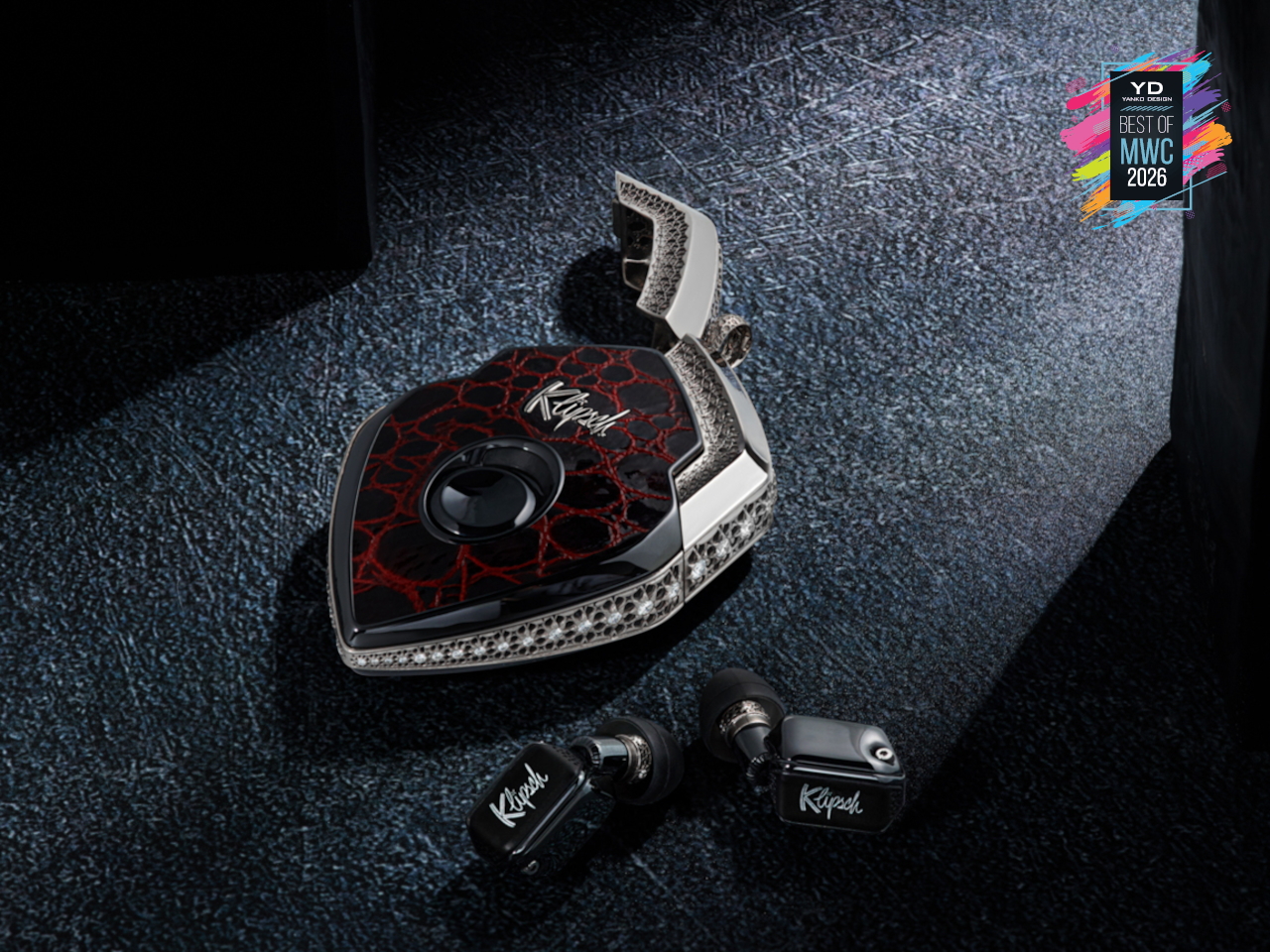
What separates the T10 Bespoke from anything else isn’t just the materials. It’s what’s packed into that tiny chassis. An ARM primary processor runs alongside a dedicated co-processor, with twin Cadence Tensilica Hi-Fi DSPs handling the signal chain. You get selectable amplifier modes, Class D for efficiency, and Class A/B when you want the fuller analog character. The Sonion Balanced Armature driver, tuned with Klipsch from the X10 lineage, feeds from a signal path that supports Sony LDAC at 24-bit/96kHz. That resolution matters because the hardware can actually deliver it. The PCB inside spans less than 1.13 square centimeters, with folding wings to fit the geometry. It’s the kind of engineering that usually stays behind a rack somewhere. Here it’s in your ear.

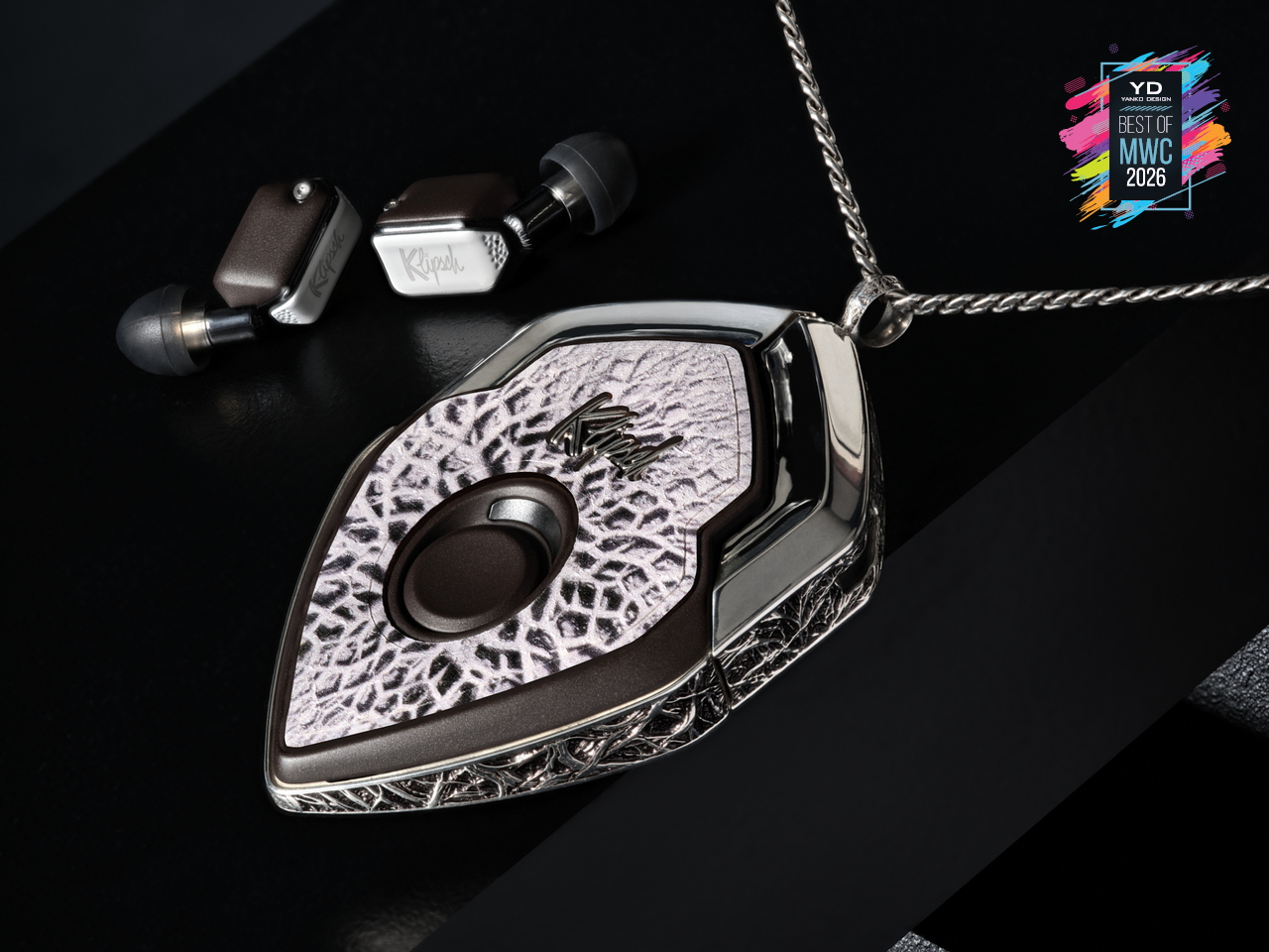
The interaction layer is equally thoughtful. Bragi OS powers the whole thing, supporting touch controls, voice commands, and head-motion gestures so you rarely have to reach for your phone. Battery life runs 8 to 9 hours per earbud, stretching past 30 hours with the case, and a 15-minute fast charge gets you to 85%. ANC is tuned in-house, and the founder calls it best in class, which is a claim that holds up in context, given the hardware underneath it. The deeper point is that this isn’t a product built to a price point or a roadmap. The chassis is replaceable. The battery is replaceable. The shell is replaceable. You’re not buying a device with a two-year lifespan. You’re buying something designed to stay with you, improve over time, and still be relevant long after everything else has been recycled.

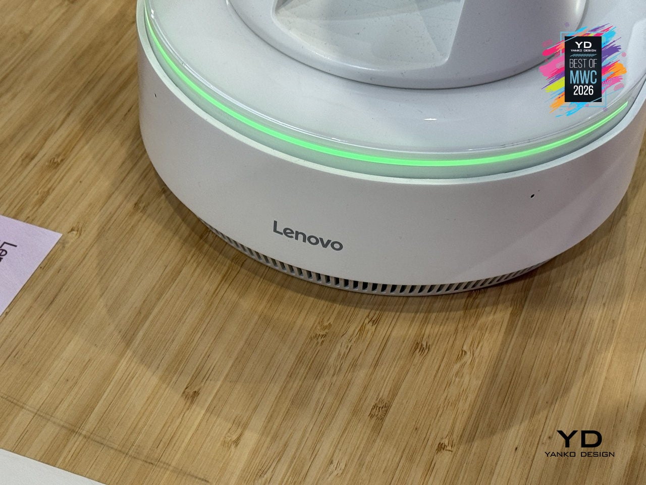
Lenovo AI Workmate Concept

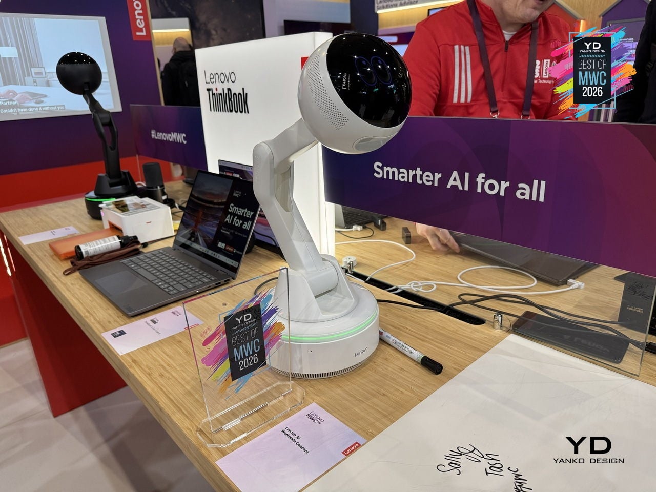
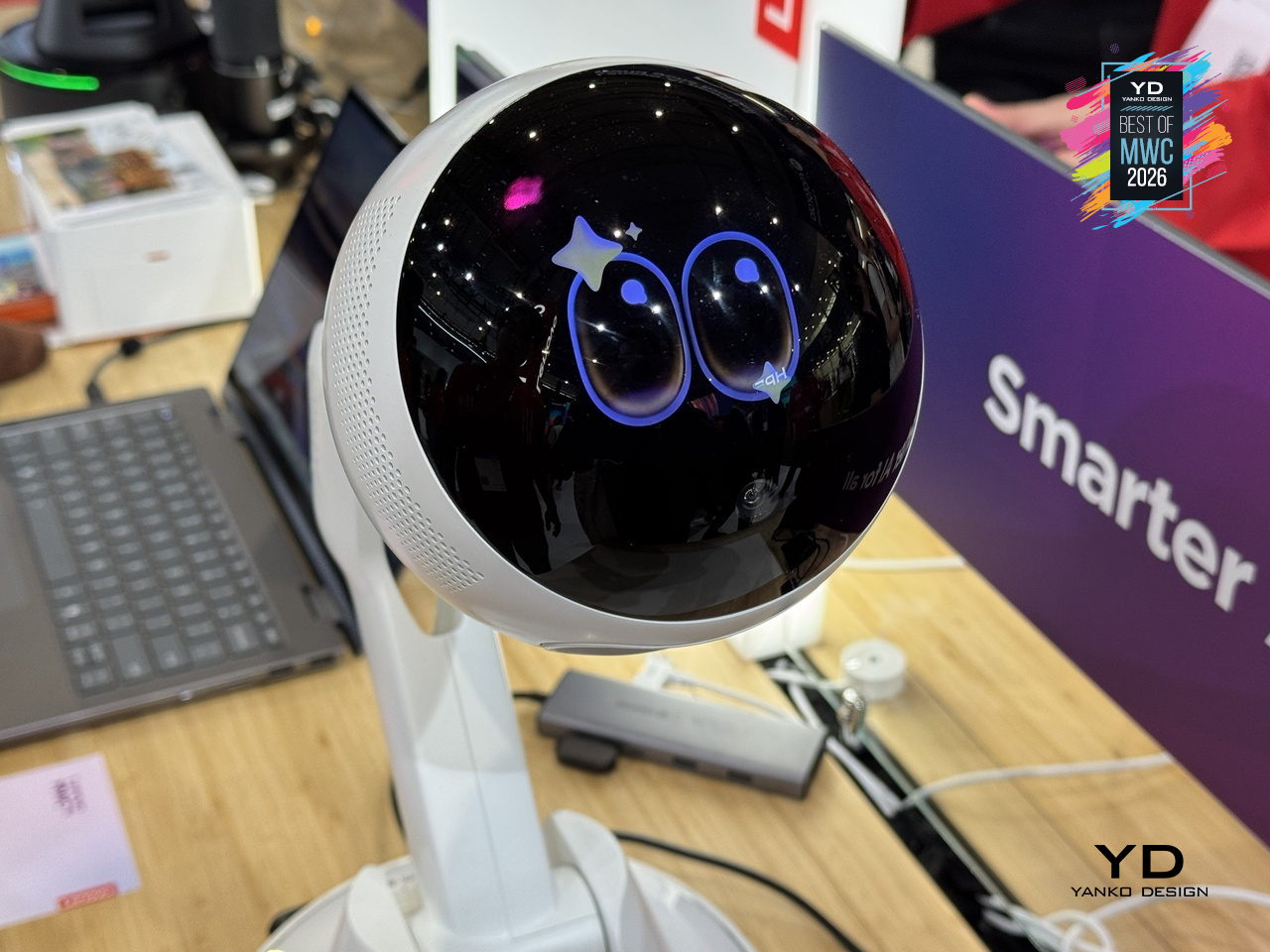
Most AI assistants live inside a screen, which means interacting with them still involves picking up a device, unlocking it, and navigating to something. Lenovo’s AI Workmate Concept takes a different position, literally: it sits on your desk as a physical object, a spherical head on an articulated arm mounted on a circular base, designed to be always present and always on without requiring you to go looking for it.

Designer: Lenovo

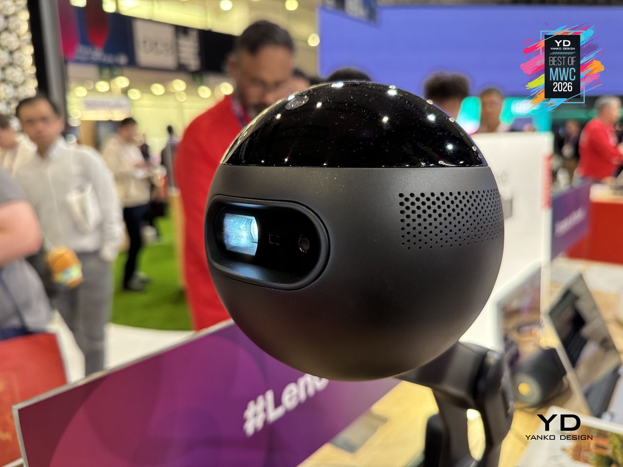
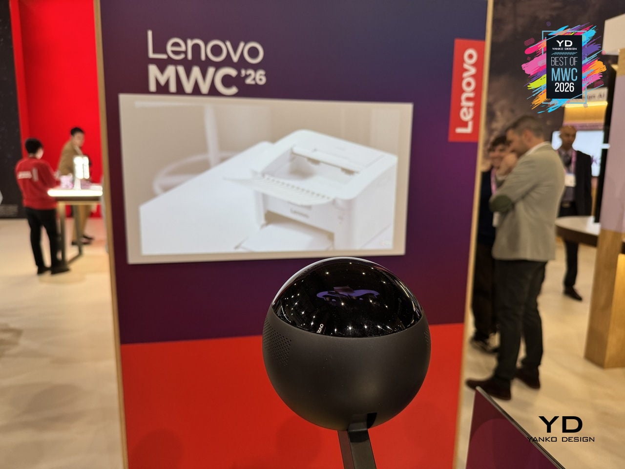
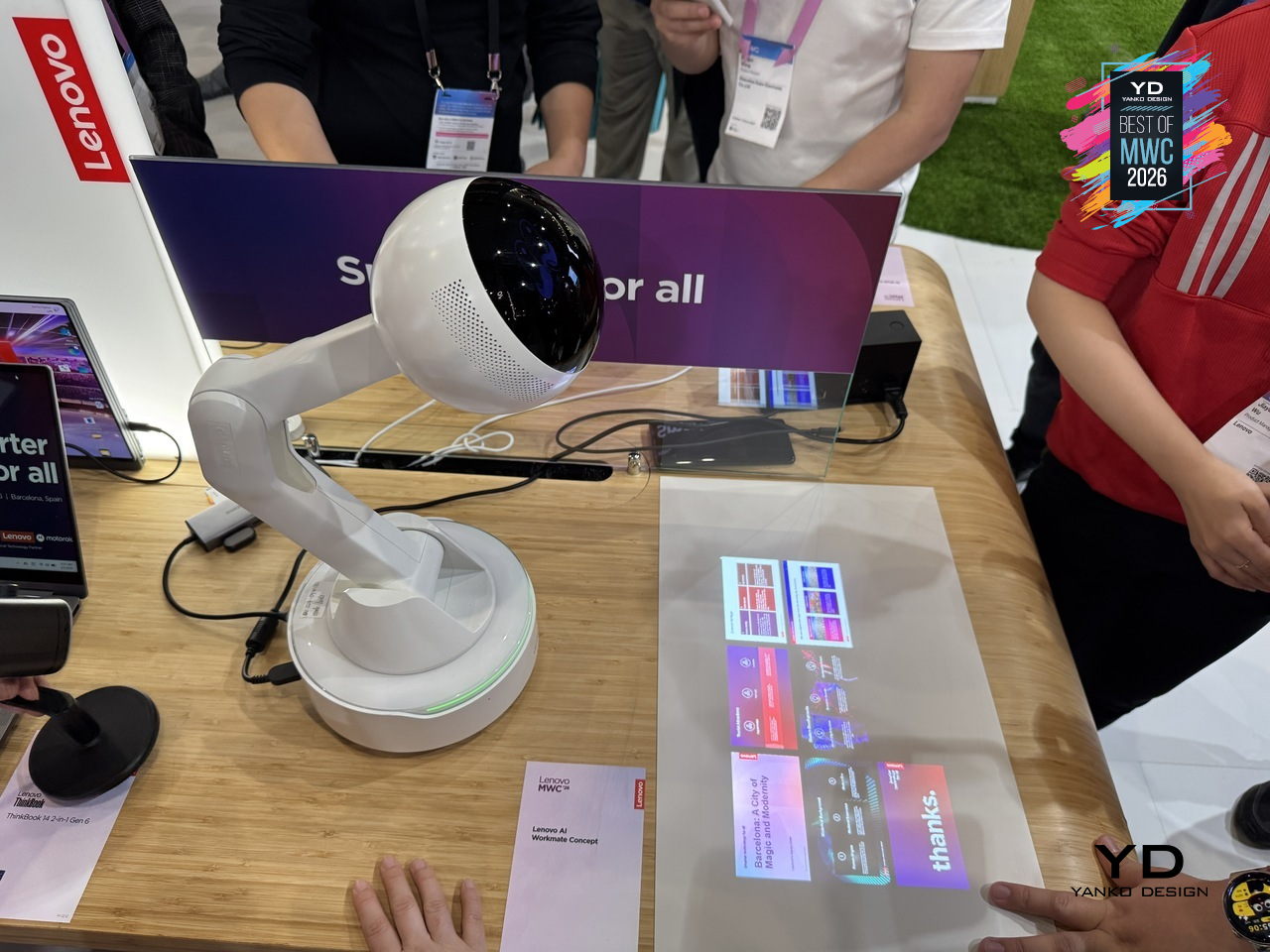
The design is built around natural interaction rather than typed commands or app interfaces. It responds to voice, gesture, and writing, with on-device AI processing inputs locally for privacy. The more distinctive capability is spatial output: the Workmate can project content directly onto a nearby surface, turning a desk or wall into a temporary display for documents, presentations, or notes. It also handles practical business tasks like scanning and summarizing documents and assisting with content creation, positioned as a desk companion rather than a novelty.

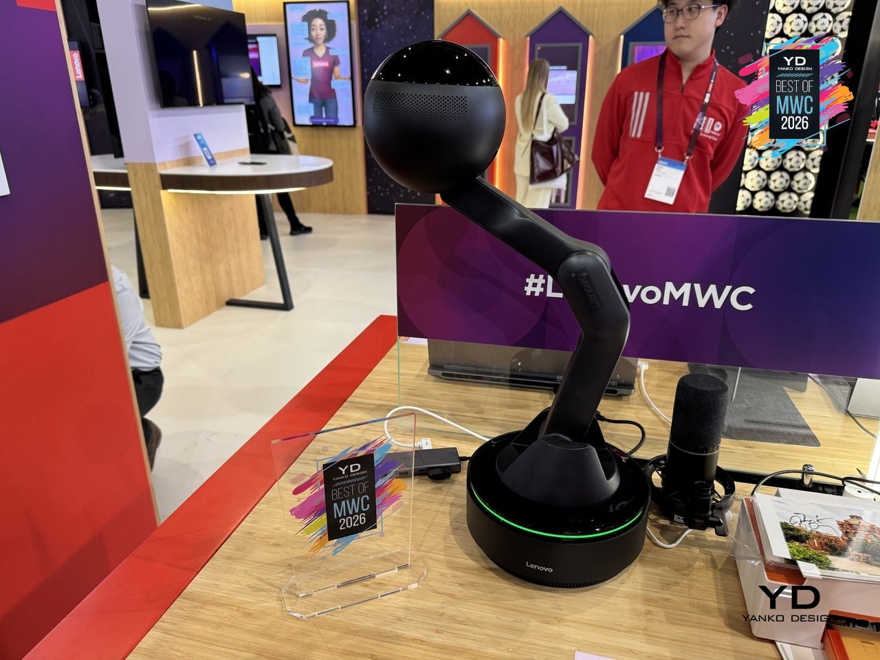
The physical form is what makes the concept worth paying attention to as a design argument. The spherical head, articulated arm, and glowing base ring give the device a clear presence and orientation, somewhere between a desk lamp and a friendly robot, without tipping into either. It acknowledges you spatially rather than waiting to be summoned from a notification panel. Whether a desk companion with animated eyes and a projector becomes something people actually want next to their laptops is the real design question Lenovo is exploring here, and MWC 2026 was its first public test of that answer.

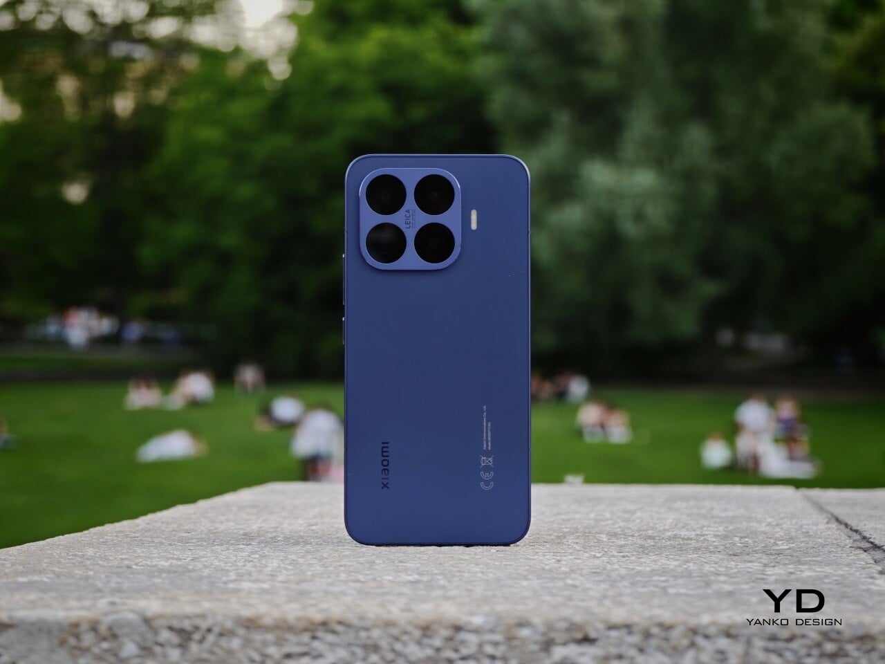
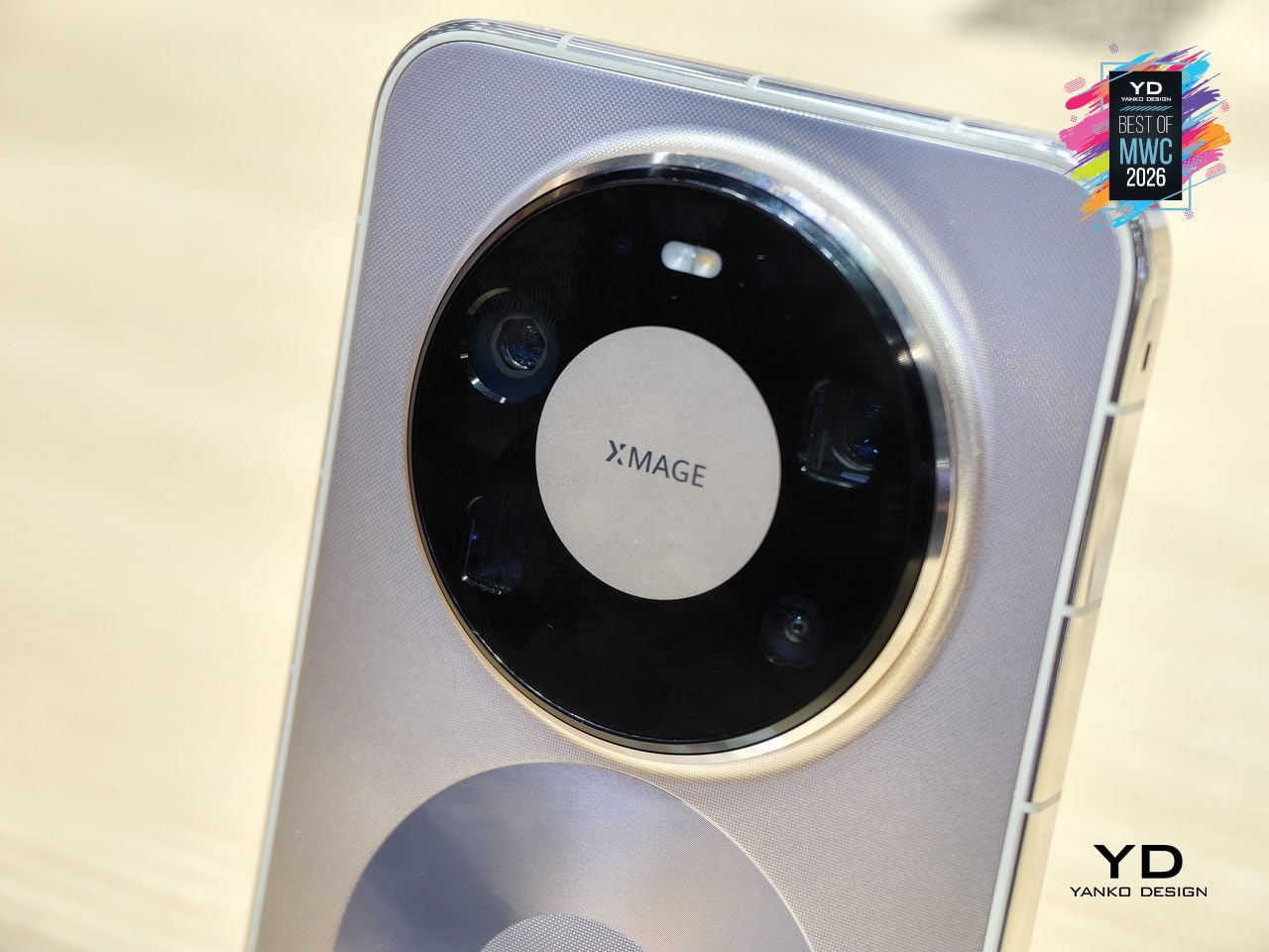
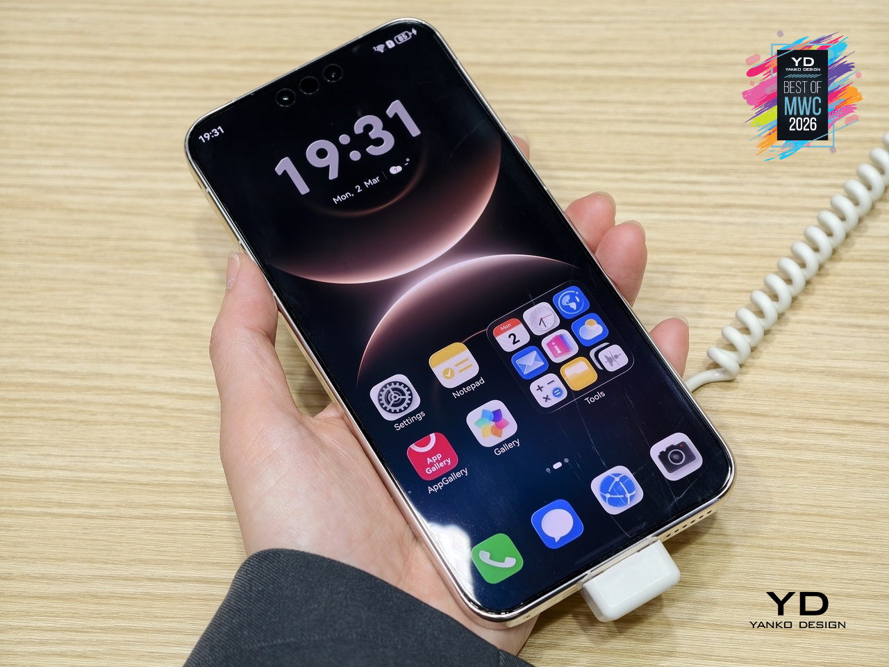
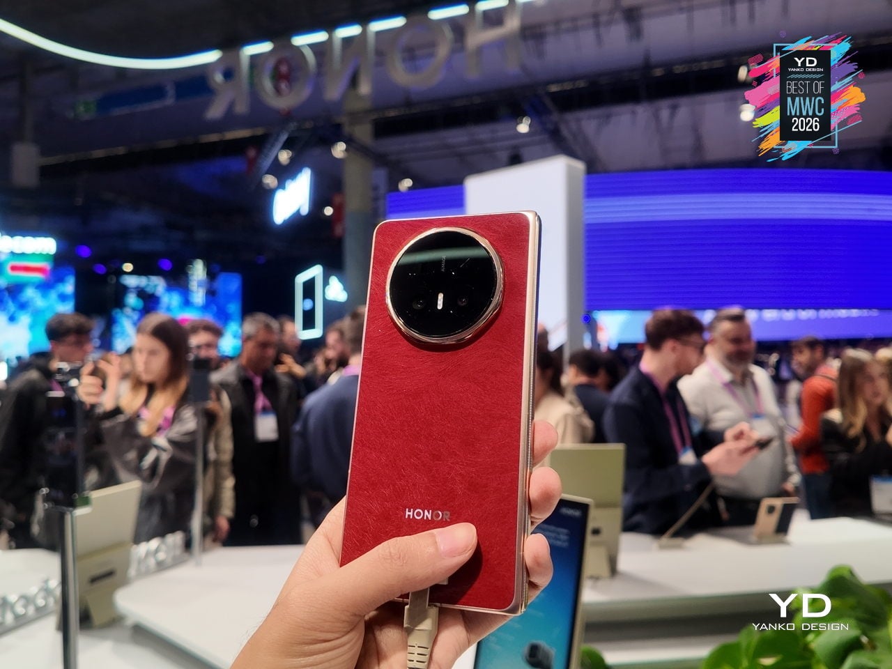
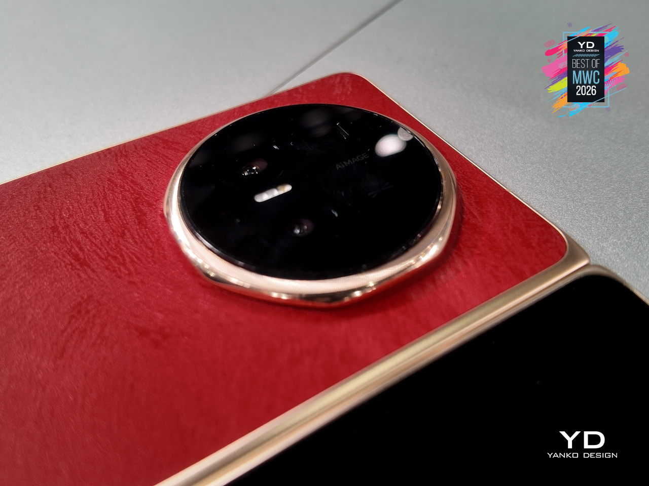
Huawei Mate 80 Pro Max

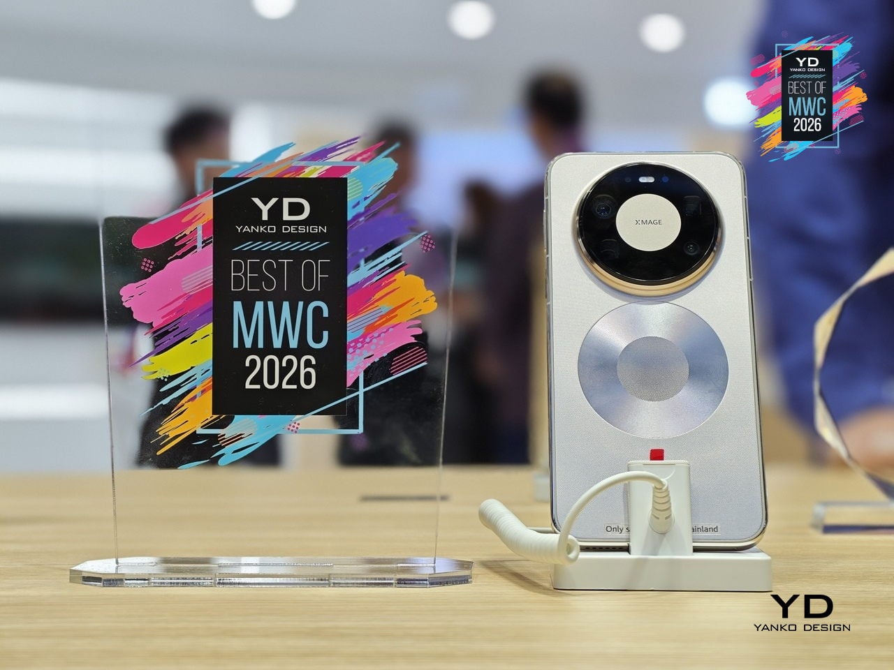
Huawei’s Mate series has always been the line where the company makes its clearest design statements, and the Mate 80 Pro Max carries that further with a body that steps away from the fiber-reinforced plastic back of the standard Pro in favor of an aluminum alloy construction throughout. The result is a phone with more physical presence and a slightly larger footprint. Both share the same Dual Space Rings camera module design that has become the Mate family’s most recognizable feature, two concentric rings framing the rear cameras in a configuration that reads as intentional rather than incidental.

Designer: Huawei

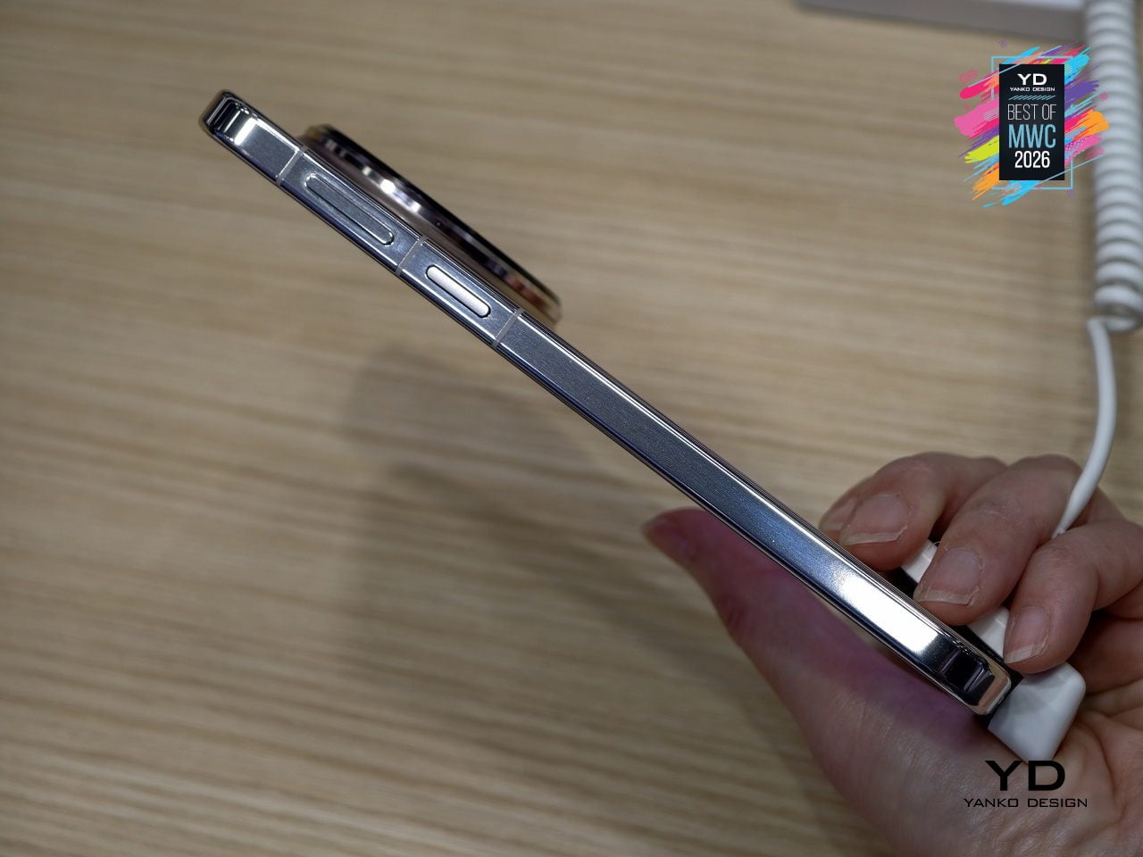
The display on the Pro Max stretches farther to 6.9 inches while keeping the same LTPO OLED panel with 1440Hz PWM dimming and Kunlun Glass 2 protection. Powered by the same Kirin 9030 Pro chipset in their top configurations, the Max differentiates itself through physical scale and materials rather than raw internals. The battery also steps up to 6000mAh, though paired with the same 100W wired charging. The color options shift too: where the Pro comes in Black, White, Green, and Gold, the Max trades the softer tones for Black, Silver, Blue, and Gold.

What the Mate 80 Pro Max represents is a familiar kind of product logic: take the established design, make it bigger, make the materials more premium, and add the battery capacity to match the larger chassis. The Dual Space Rings identity carries across both models intact, so the design conversation between the two is less about direction and more about degree. With a significantly higher price tag, the Pro Max is considered step up for buyers who want the full physical expression of what the Mate 80 series is about.

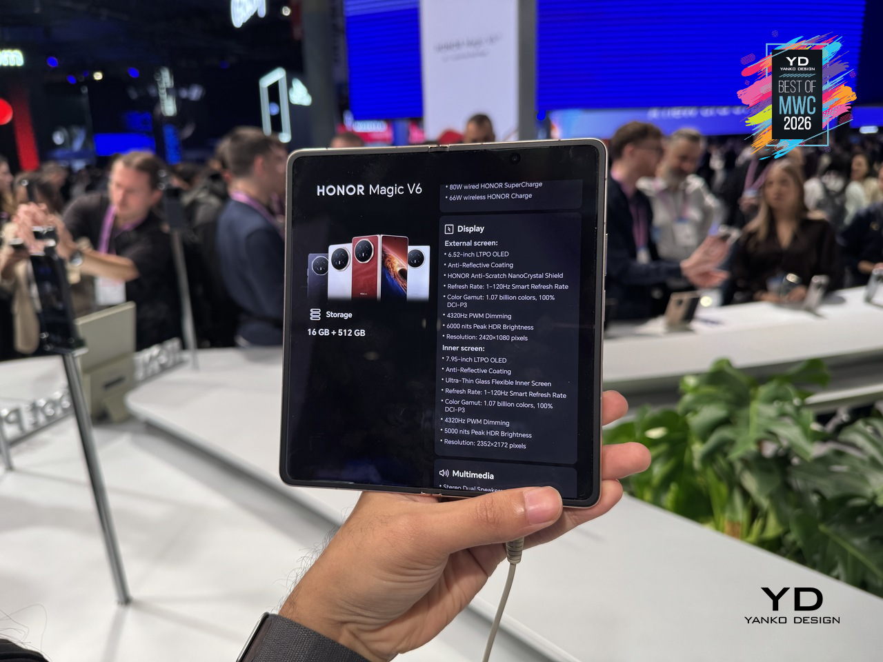
Honor Magic V6 Foldable phone

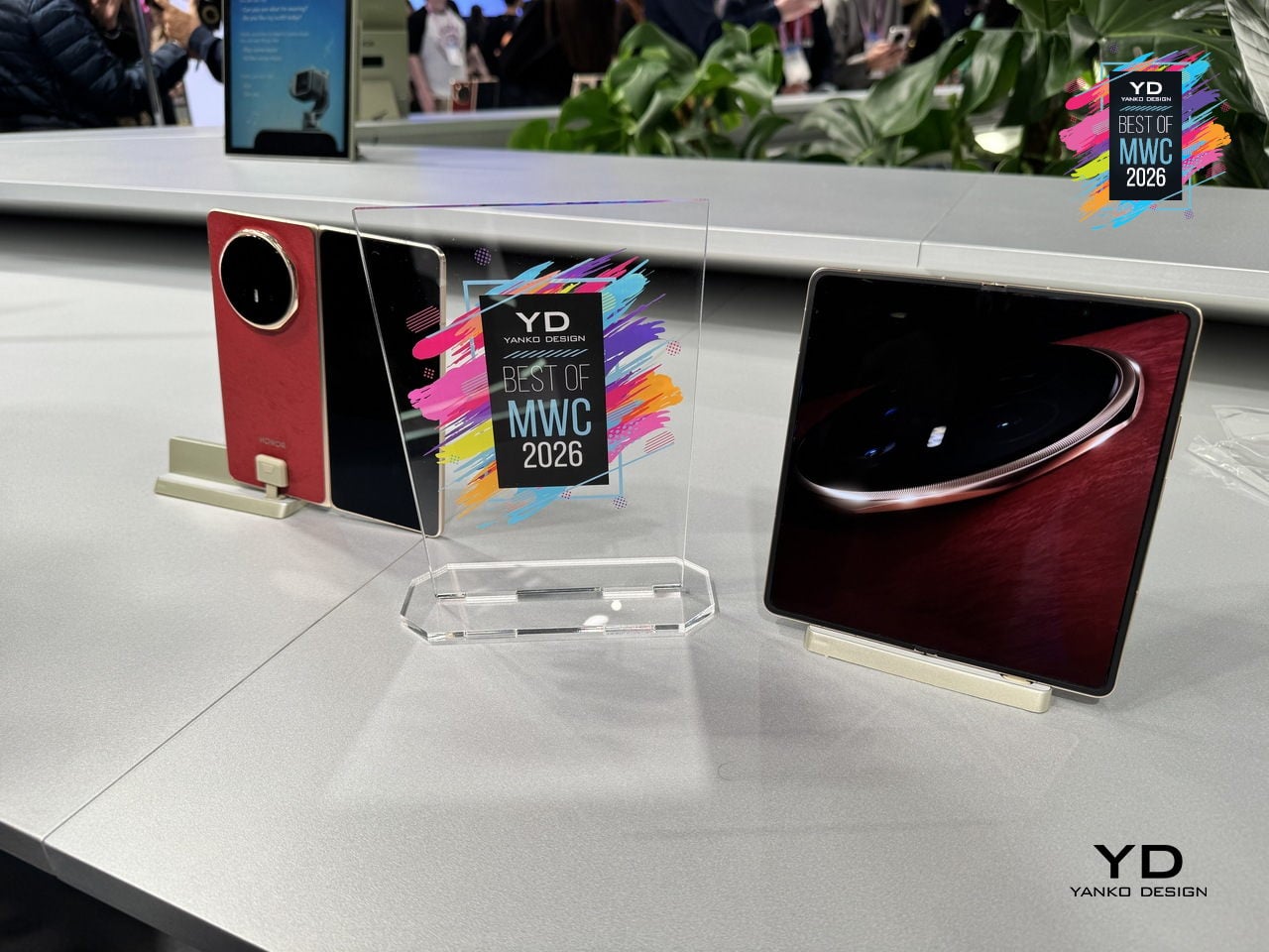
Foldable phones have spent years promising the future while feeling fragile, bulky, and anxious about rain. Honor’s design obsession with the Magic V6 was to solve all three problems at once without letting any of them compromise the others. The result is an 8.75mm folded profile, putting it in iPhone-thin territory, paired with a 6,660mAh silicon-carbon battery, the largest ever fitted into a foldable at this thickness.

Designer: Honor

That battery figure is where the real engineering story lives. Silicon-carbon cells pack more energy into less space than conventional lithium-ion, but higher silicon content creates expansion stress that can crack cells over charge cycles. Honor’s fifth-generation silicon-carbon material, developed with ATL, reaches 25% silicon content. That’s what allows the capacity and the thinness to coexist without one compromising the other.

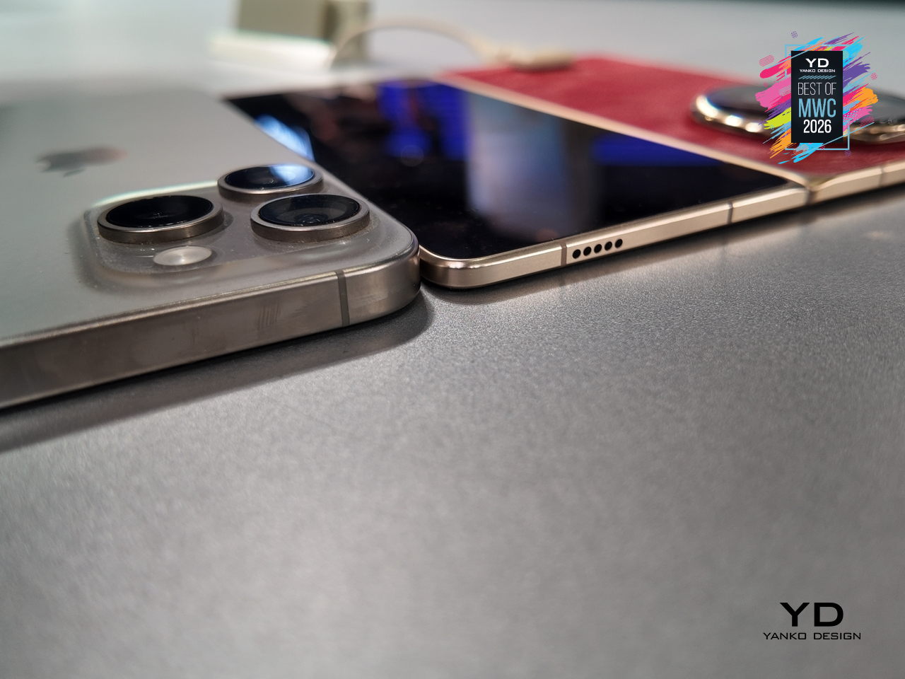
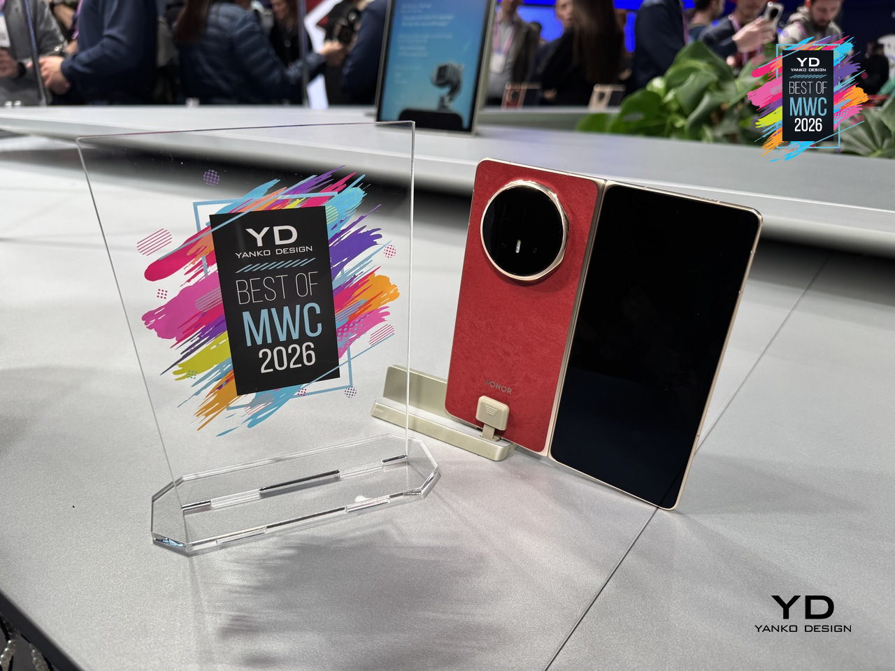
The Magic V6 also carries both IP68 and IP69 ratings, a first for any foldable. IP68 handles submersion; IP69 covers high-pressure, high-temperature water jets. Getting both on a device with a moving hinge, a crease depth reduced by 44% over the previous generation, and a display reflectivity as low as 1.5%, reflects how much structural engineering went into something that still opens and closes hundreds of times daily.

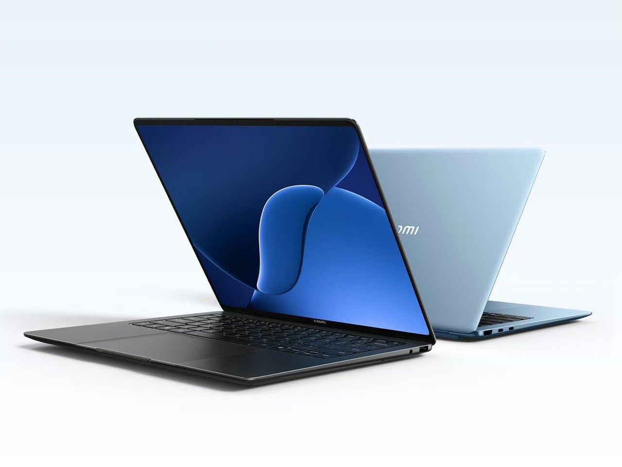
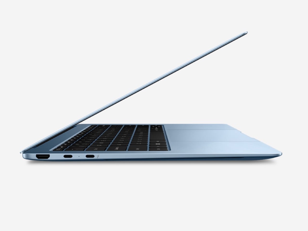
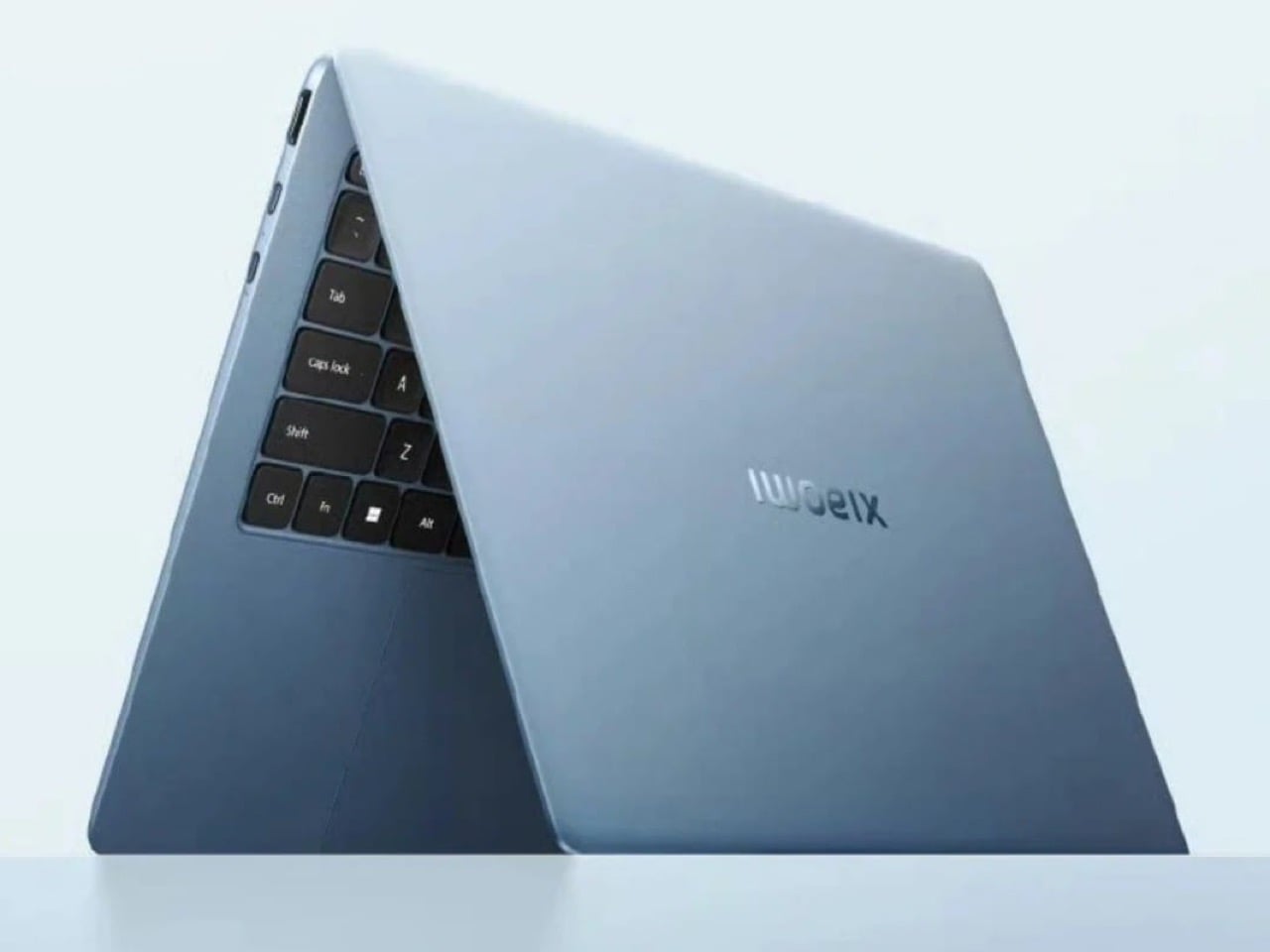
Lenovo ThinkBook Modular AI PC Concept

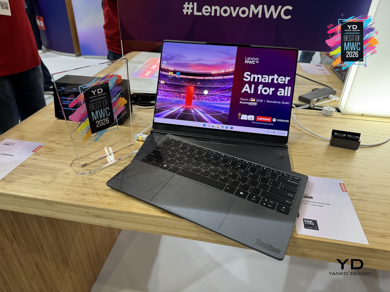
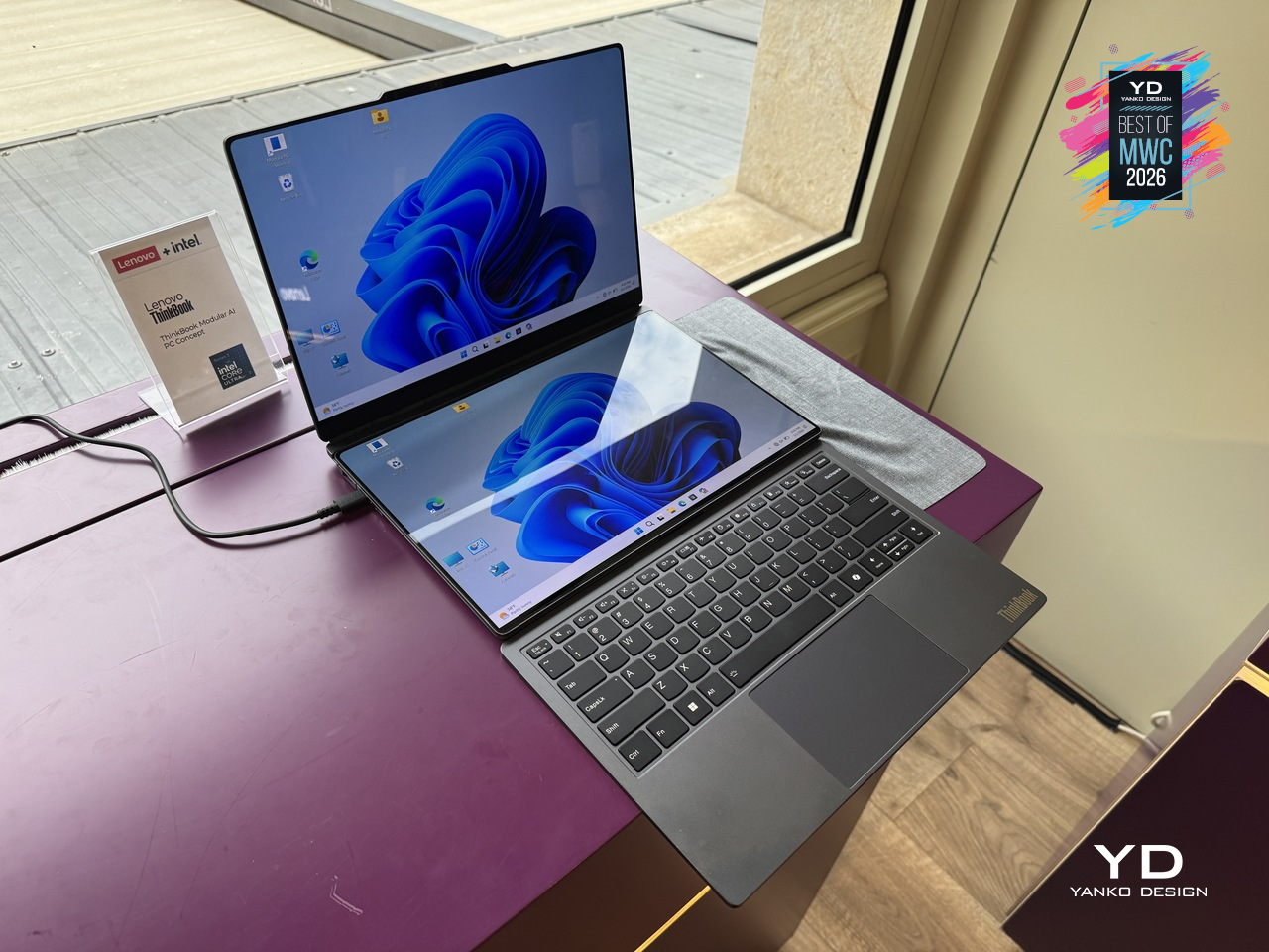
Laptops have been making the same basic promise for decades: here is one device that does everything, carry it everywhere. The trade-off has always been that “everything” means compromises, a screen too small for real work, a body too thick for a bag, a keyboard that disappears when you want a tablet. Lenovo’s ThinkBook Modular AI PC Concept at MWC 2026 takes a different position entirely, built around a “carry small, use big” philosophy that lets a single 14-inch base system reconfigure itself depending on where you are and what you’re doing.

Designer: Lenovo

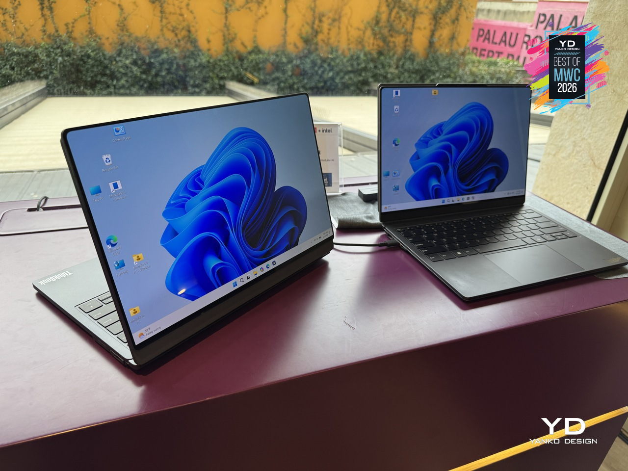
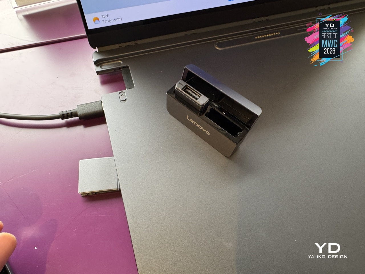
The modularity here is practical rather than speculative. A secondary display attaches to the top cover for face-to-face sharing or closed-lid use, sits alongside the base on an integrated kickstand as a portable travel monitor in portrait or landscape, or swaps with the keyboard to create a dual-screen setup stretching the combined workspace to roughly 19 inches. The Bluetooth keyboard detaches entirely. IO ports, including USB Type-A, USB Type-C, and HDMI, are interchangeable depending on what a given day requires. Pogo-pin connectors handle power and data transfer between modules, keeping the system stable and self-contained throughout all the rearranging.

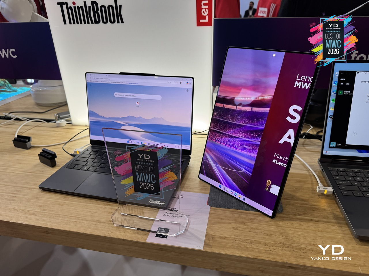
What makes the ThinkBook Modular concept worth paying attention to as a design argument is the restraint behind it. Rather than trying to anticipate every scenario inside one fixed chassis, Lenovo accepted that the device itself should be the smallest possible useful thing and let the user decide what gets added to it. A laptop that adapts to the workflow instead of the other way around is an old idea that has never quite landed in a form people actually use. This concept is still exactly that, a proof of concept with no confirmed release date, but the underlying logic is more considered than most modular hardware that has come before it.

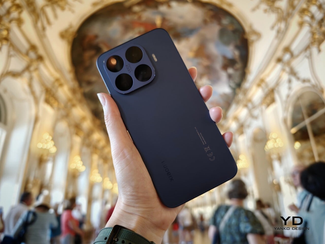
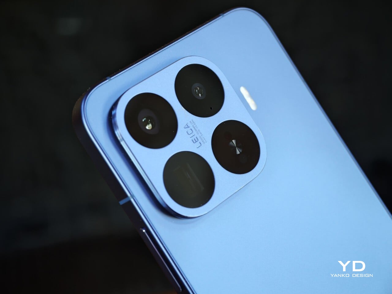
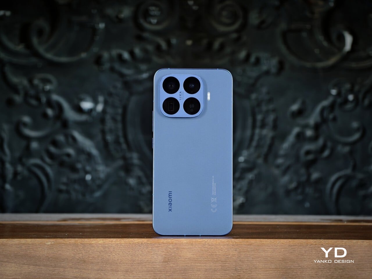
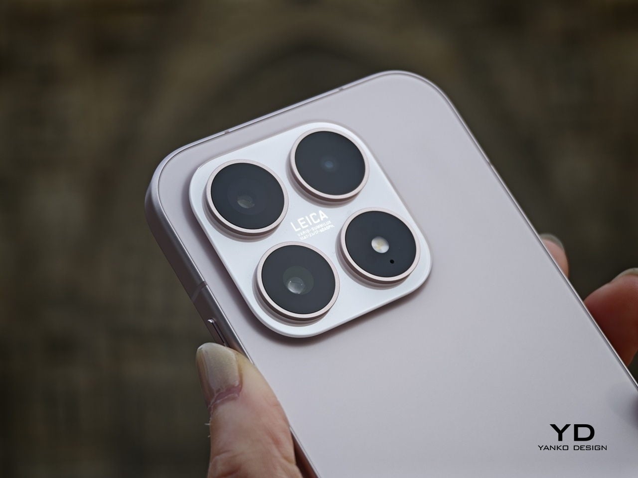
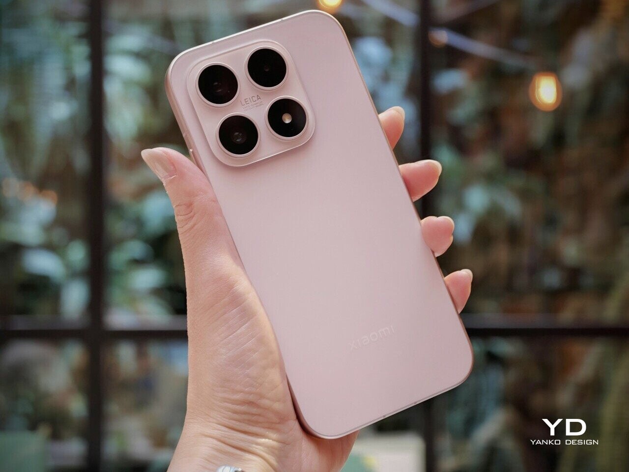
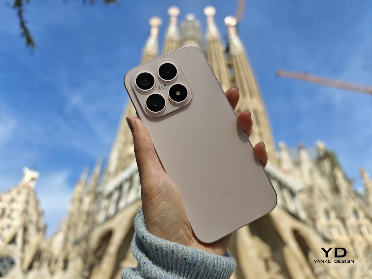
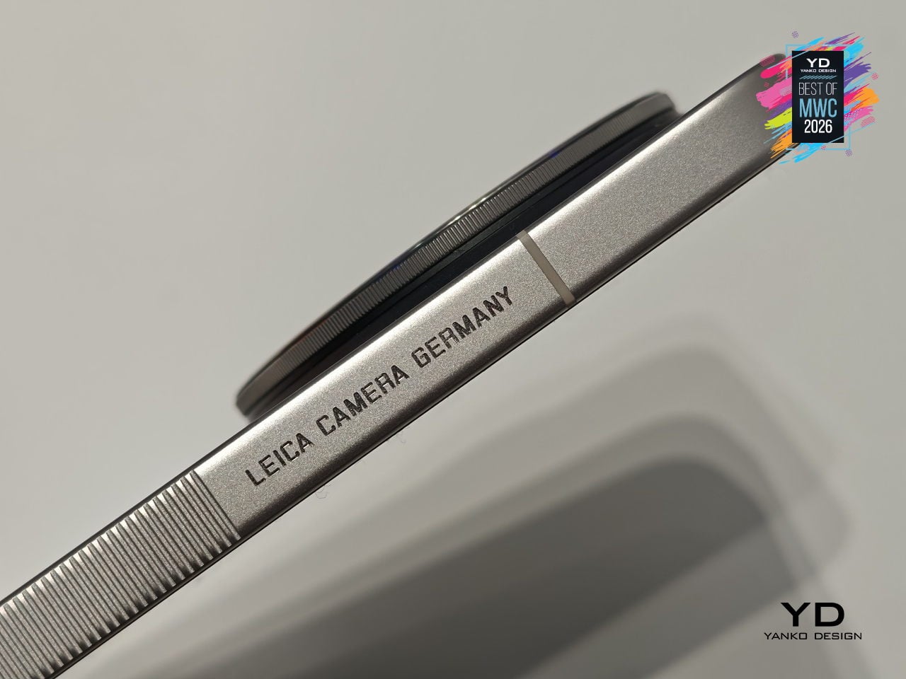
Leica Leitzphone by Xiaomi

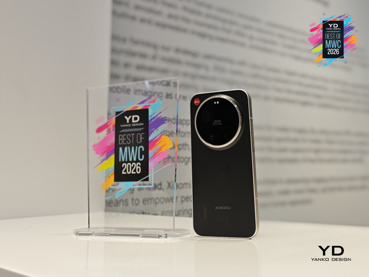
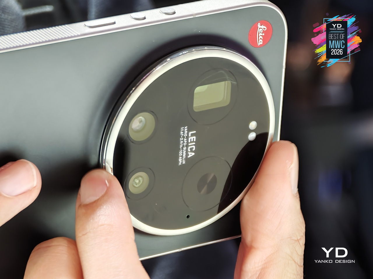
Xiaomi has made plenty of capable camera phones, but the Leica Leitzphone takes a different approach entirely, treating the smartphone less like a spec competition and more like an extension of Leica’s century-old obsession with optical craft. The silver aluminum frame carries tactile knurling, a rotatable camera ring, and the iconic Leica Red Dot, sitting against a black fiberglass back pulled directly from classic Leica rangefinder design language.

Designer: Xiaomi x Leica

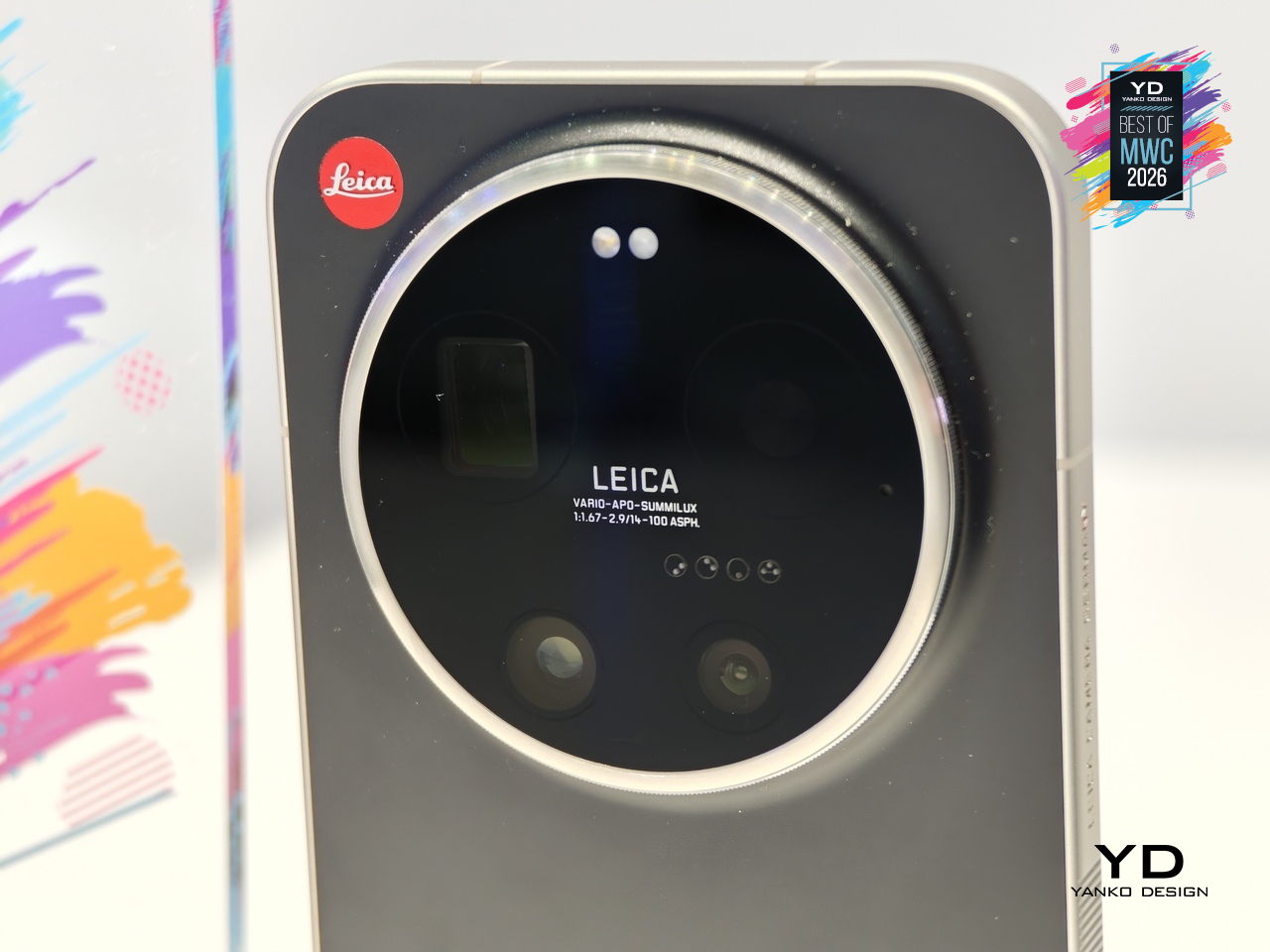
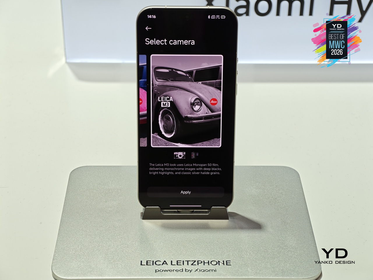
That camera system is where the conviction becomes most legible. A 1-inch sensor with LOFIC HDR technology handles the main shooting duties, alongside a 200MP telephoto at 75 to 100mm and a 14mm ultra-wide. The rotatable physical camera ring, assignable to focal length, focus, or bokeh, gives the experience a tactile dimension that touchscreen sliders simply cannot replicate. Thirteen Leica color styles and a dedicated Essential Mode recreating the Leica M9 and M3 look complete the package.

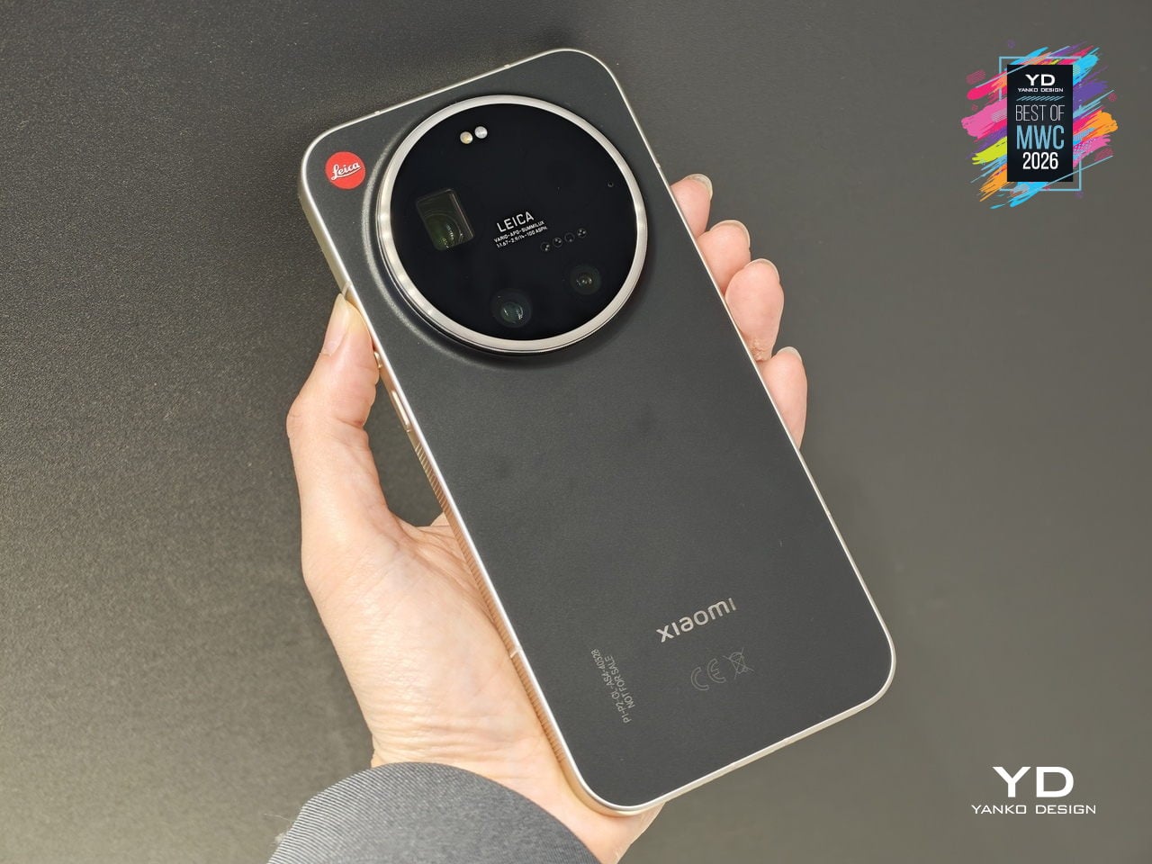
The rest of the hardware keeps pace: Snapdragon 8 Elite Gen 5, a 6.9-inch 3500-nit OLED display, and a 6000mAh battery with 90W wired charging. The Leica UX layer goes further than a cosmetic theme, reshaping system fonts, icons, and widgets into a coherent visual identity rooted in Leica’s design language. For anyone who has wanted smartphone photography to feel less like operating software and more like handling a real camera, this is the most direct answer yet.

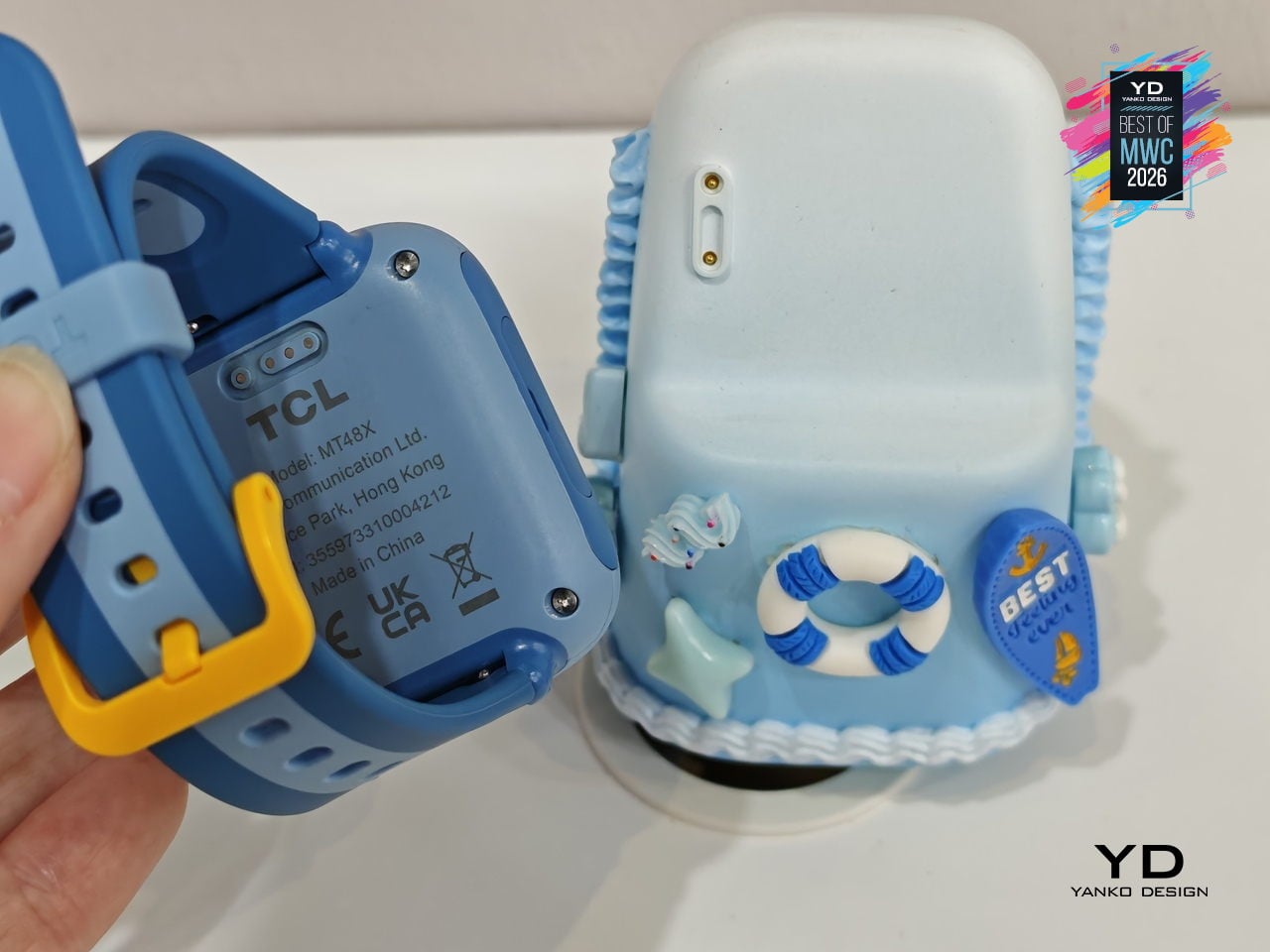
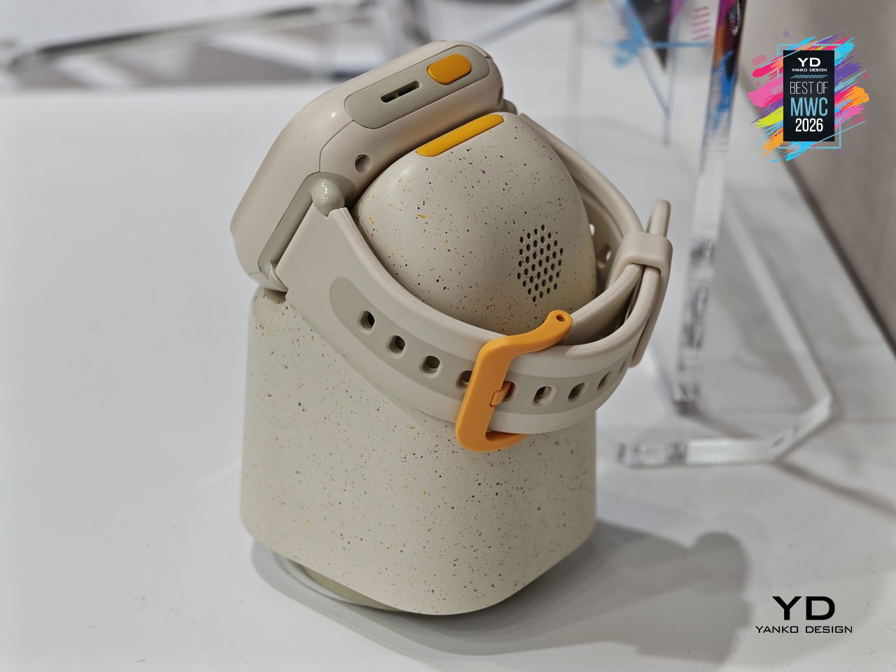
TCL Tbot Smartwatch Desktop Companion for Kids

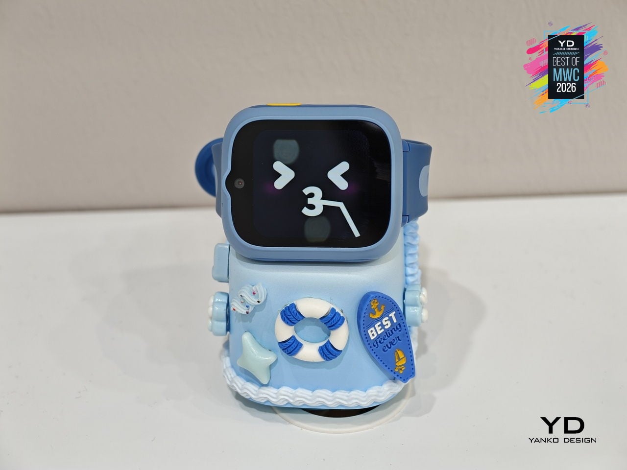
Kids’ smartwatches have gotten good at keeping children connected to parents while they’re out, but they go dark the moment they come off the wrist. That’s the gap TCL is trying to close with the Tbot, a magnetic desktop dock that pairs with TCL’s kids’ watches, like the MoveTime MT48, to keep the experience going at home during charging. Rather than letting the device sit idle on a nightstand, the Tbot turns that downtime into something more purposeful.

Designer: TCL

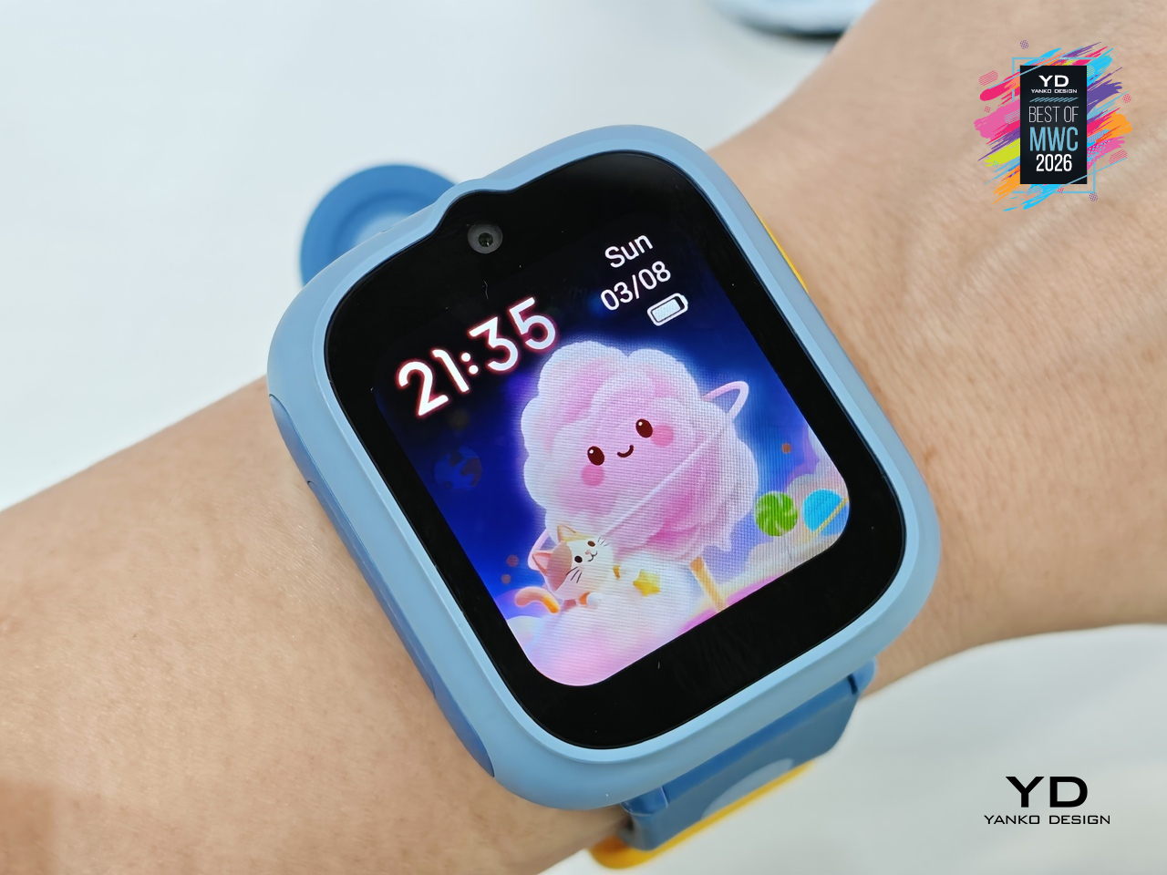
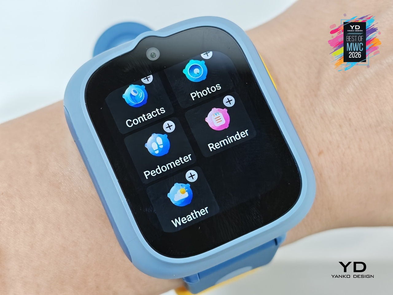
The companion functions as an AI assistant shaped around a child’s daily rhythm, setting wake-up alarms, bedtime reminders, and Pomodoro-style study timers through age-appropriate guidance. It also doubles as a learning partner for guided discovery, a sleep companion that tells bedtime stories, and a parental alert hub that sends configurable notifications when parents need to stay in the loop. The idea is continuity between the outdoors and the home, with the watch and dock working as two parts of the same connected experience.

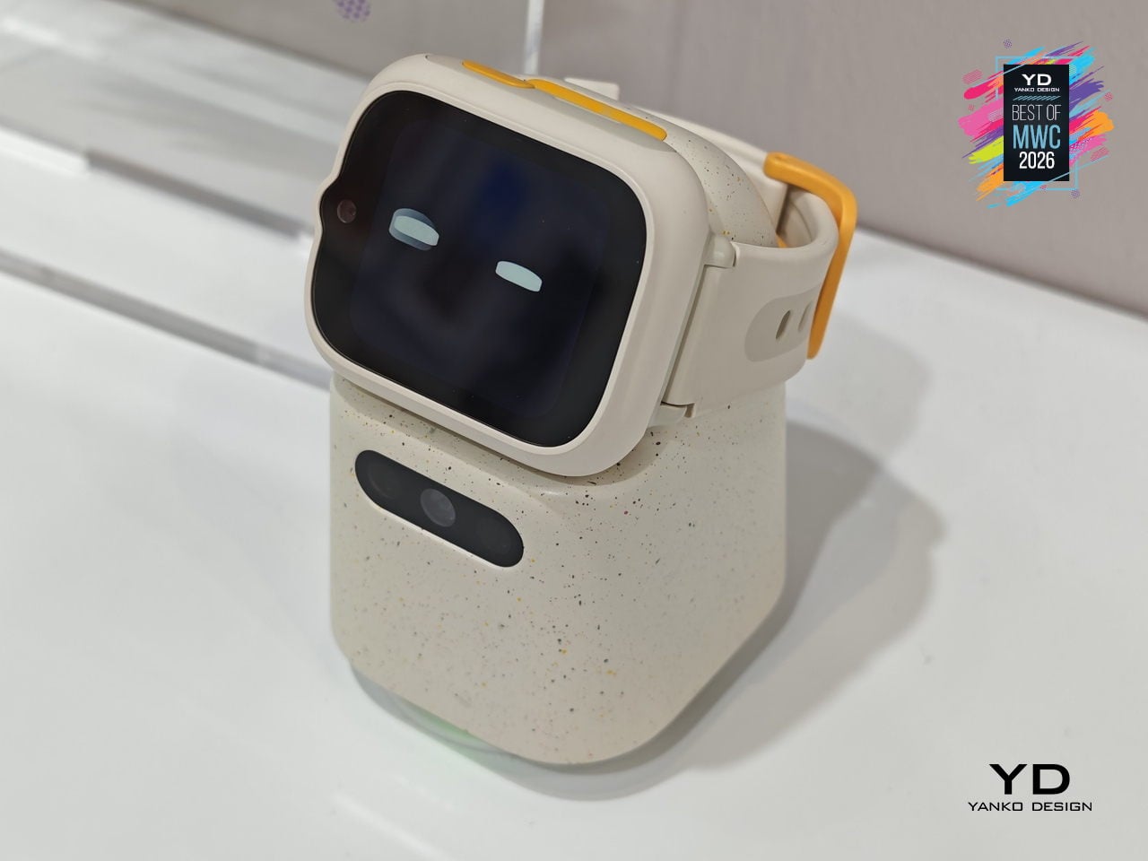
TCL is positioning the Tbot as a concept for now, still in its development phase while the company works through applicable regulations around AI features for children. That measured approach actually makes sense given the audience, since parental permission and age-appropriate guardrails are built into its design from the start. Getting that balance right between a helpful AI companion and appropriate boundaries for kids is exactly the kind of design problem worth taking slowly.

Lenovo Yoga Book Pro 3D Concept

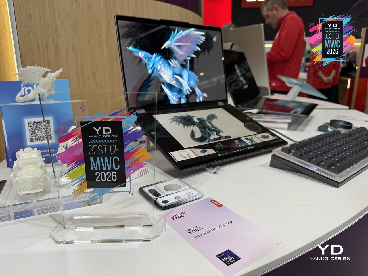
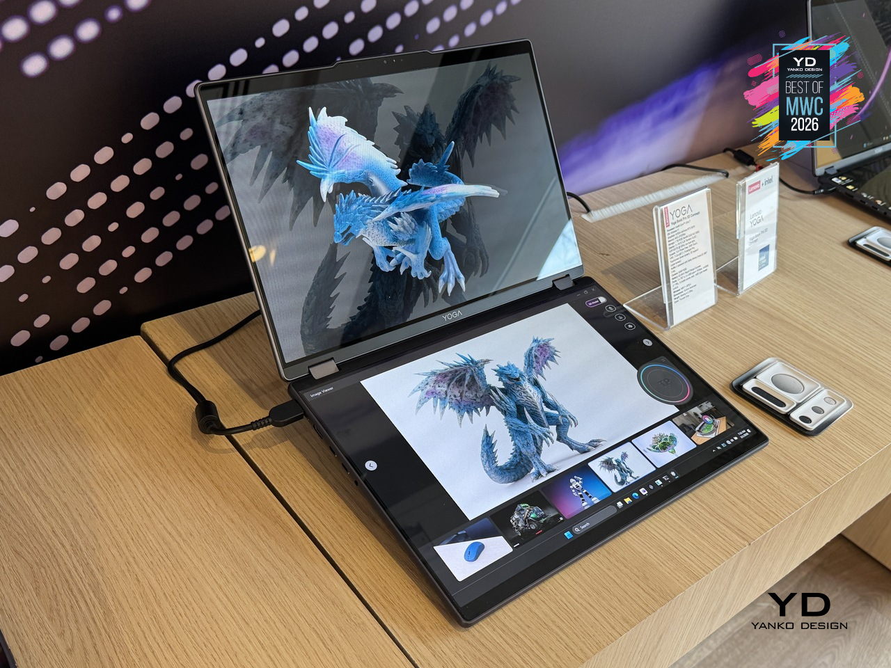
3D creation on a laptop has always involved a certain amount of peripheral management, between mice, styluses, and the occasional spacemouse bolted to the side of the desk. The Yoga Book Pro 3D Concept takes aim at that setup by building a glasses-free 3D display directly into a dual-screen laptop, letting creators view depth, form, and spatial relationships on screen without any additional equipment. Lenovo’s AI software handles 2D to 3D conversion on the upper PureSight Pro Tandem OLED display, and can even generate an environment around the converted object on command.

Designer: Lenovo

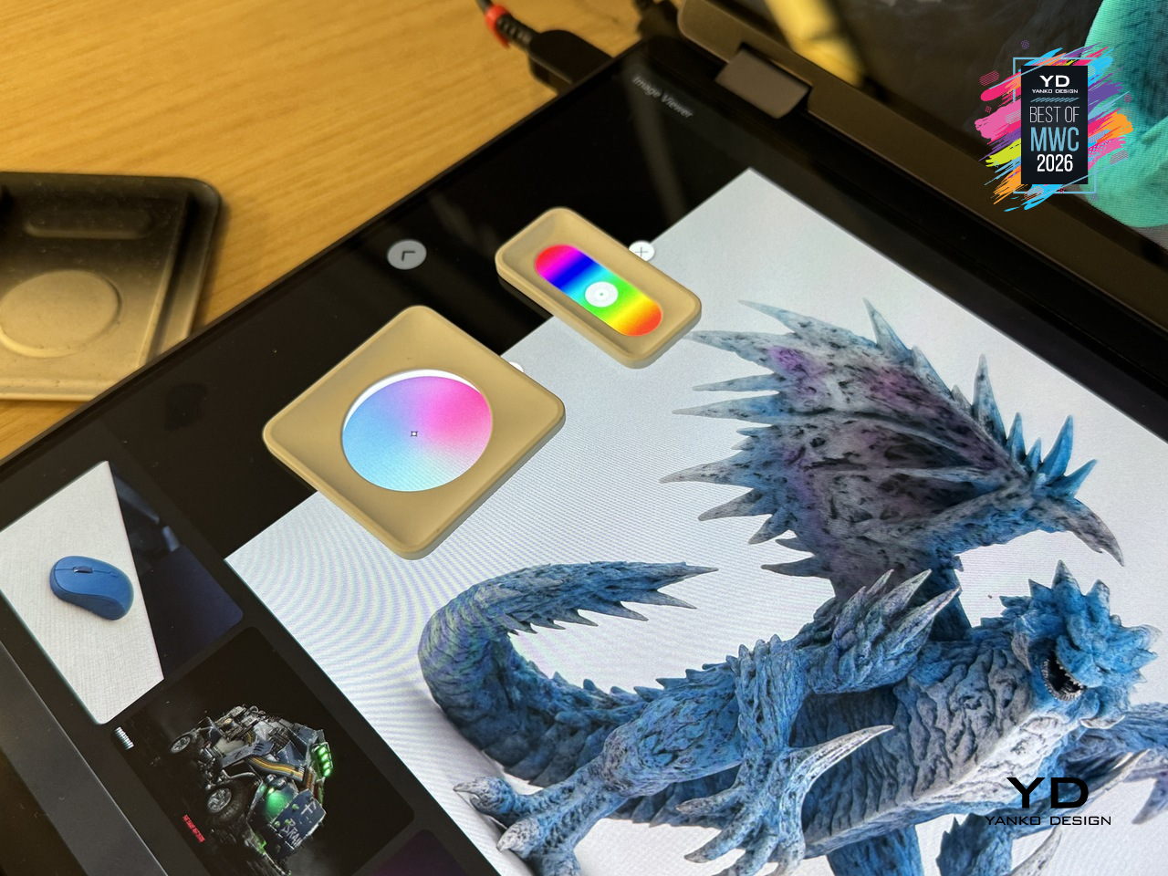
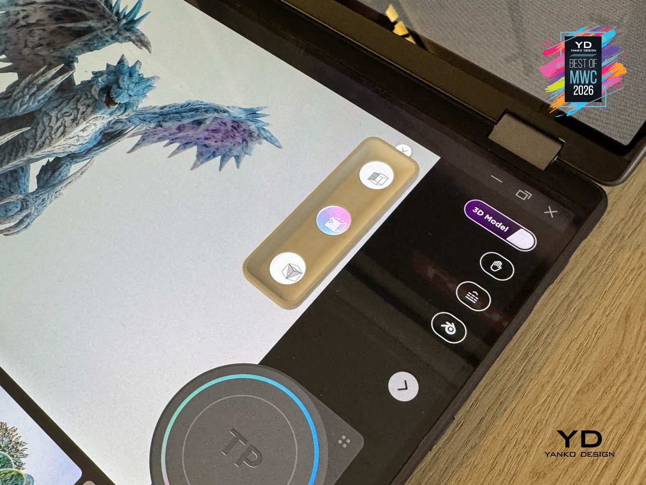
The dual-screen concept laptop also offers a rather interesting interaction feature. Zero-touch gestures read hand movements in front of the RGB camera, letting users zoom and rotate 3D objects without touching the screen at all. The lower display acts as a touch surface with snap-on physical pads that pop up adjustment controls, like lighting and viewing angle, wherever they’re placed. It’s a workflow designed to keep creators in the work rather than hunting through menus.

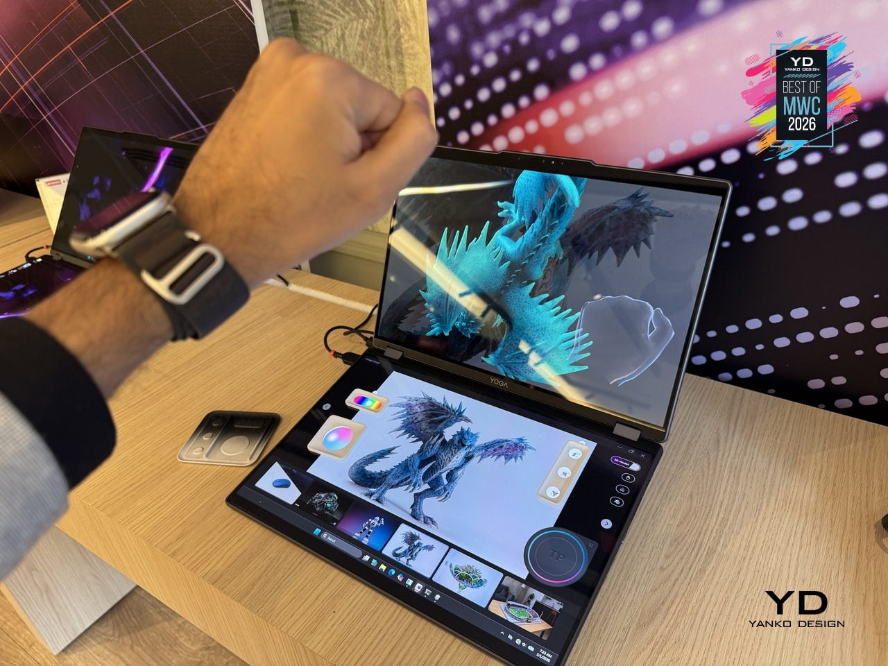
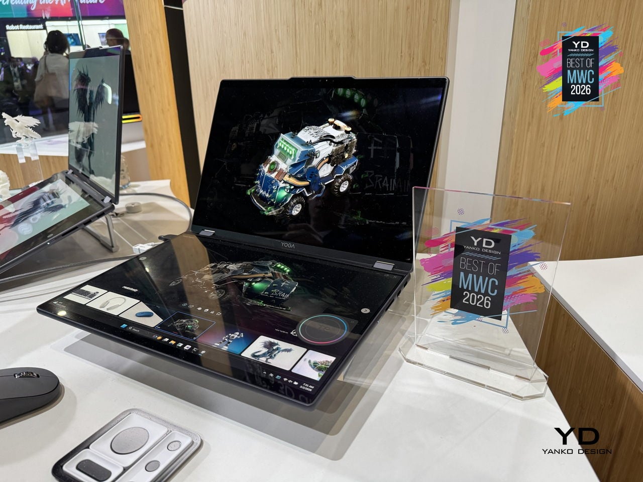
As a concept, the Yoga Book Pro 3D is still a proof of intent rather than a product you can buy, but it represents a genuinely specific design problem solved with unusual conviction. Glasses-free 3D displays have struggled to convince outside of niche applications, so how well the actual display holds up for extended professional use will be the real test when this moves closer to production.

Vivo X300 Ultra and Camera Cage

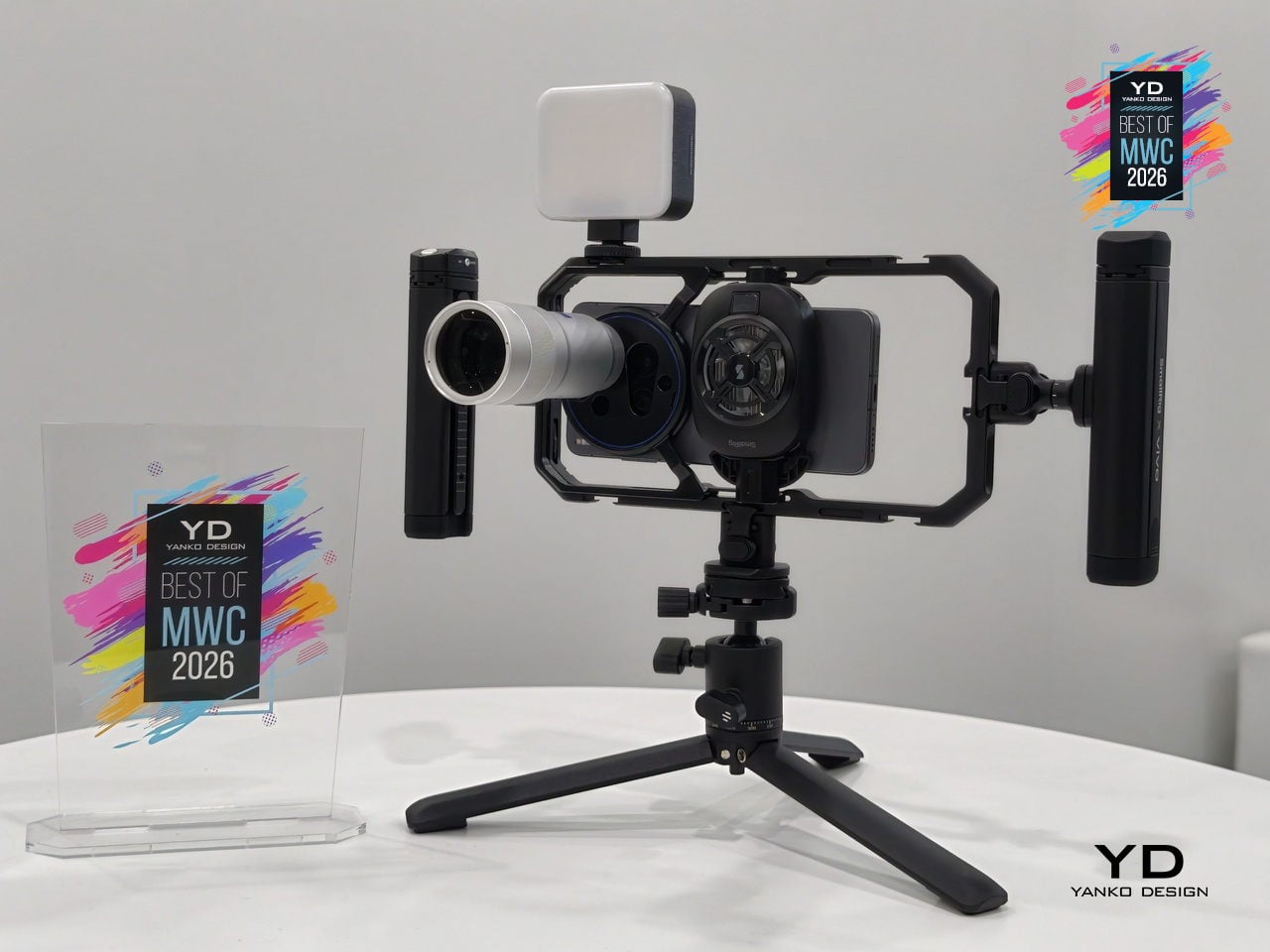
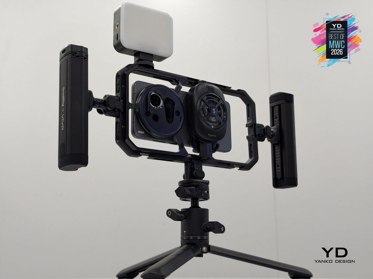
Most smartphone camera rigs are an afterthought, a collection of third-party mounts and adapters held together by optimism. Vivo is taking a different approach with the X300 Ultra’s dedicated Camera Cage, a pro-grade frame designed specifically around the phone rather than adapted from generic cinema accessories. Dual grip handles, cold shoe mounts, quick-release ports, and dedicated physical buttons for shutter and zoom come built into one coherent system.

Designer: vivo

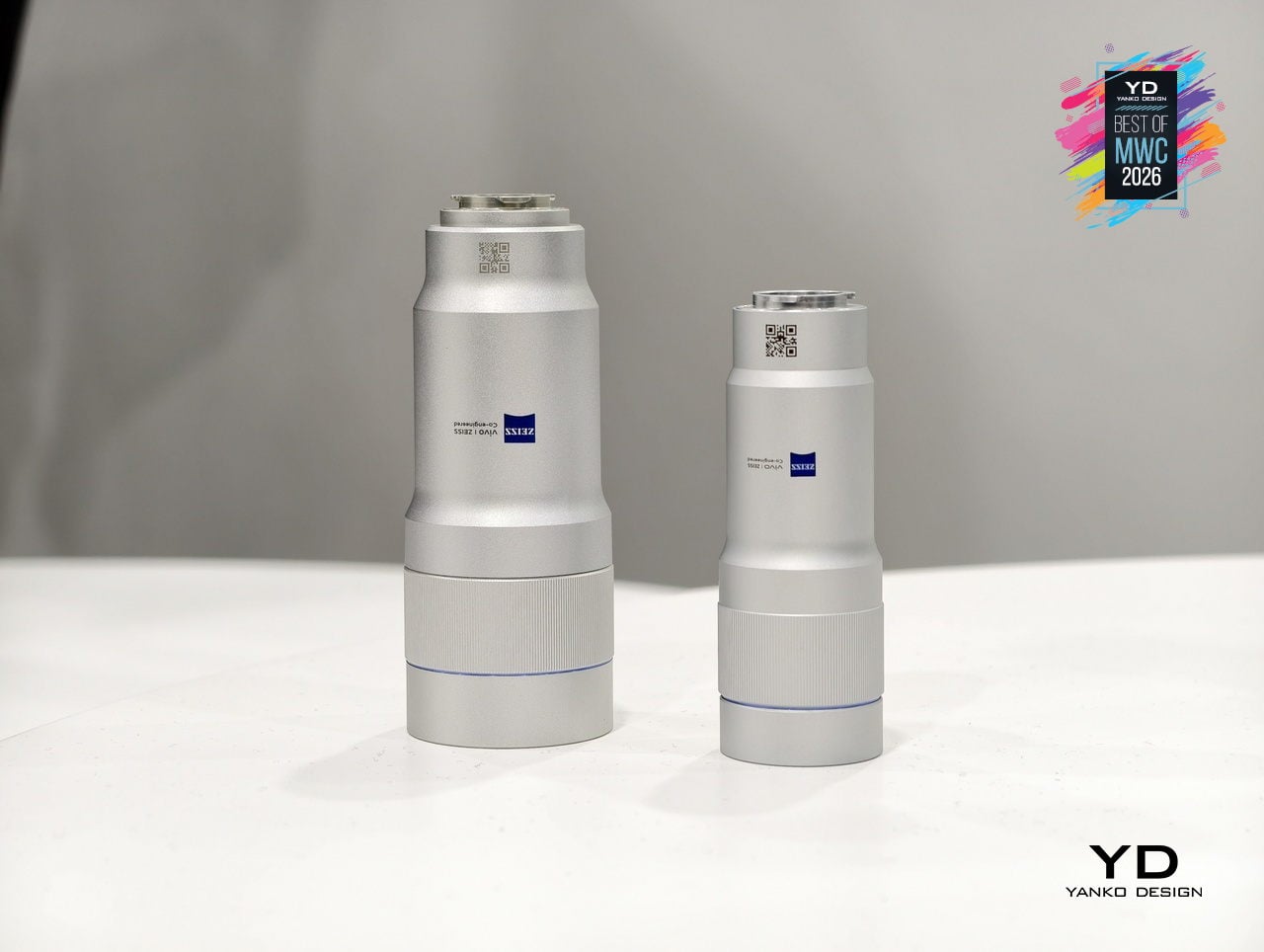
The cage is also where the ZEISS Telephoto Extender Gen 2 Ultra slots in, an APO-certified lens co-engineered with ZEISS that pushes the X300 Ultra to a 400mm equivalent focal length with full 200MP optical output. Gimbal-grade optical image stabilization and motion-tracking focus sit underneath all of that reach. An integrated multi-level cooling fan handles thermal load during extended video shoots, solving the problem that turns most “pro mobile video” sessions into a race against an overheating warning.

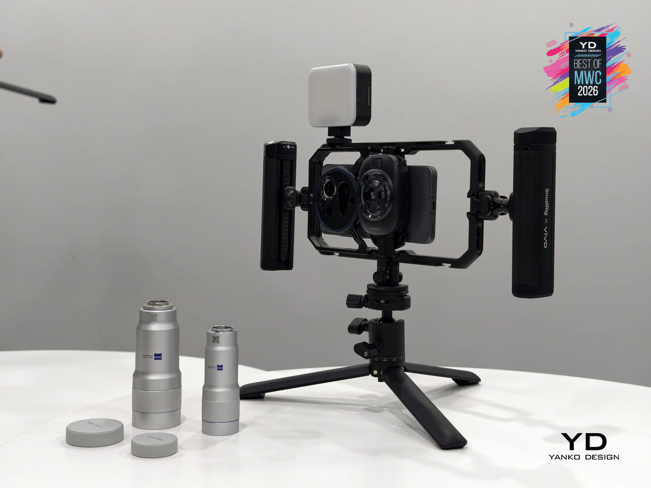
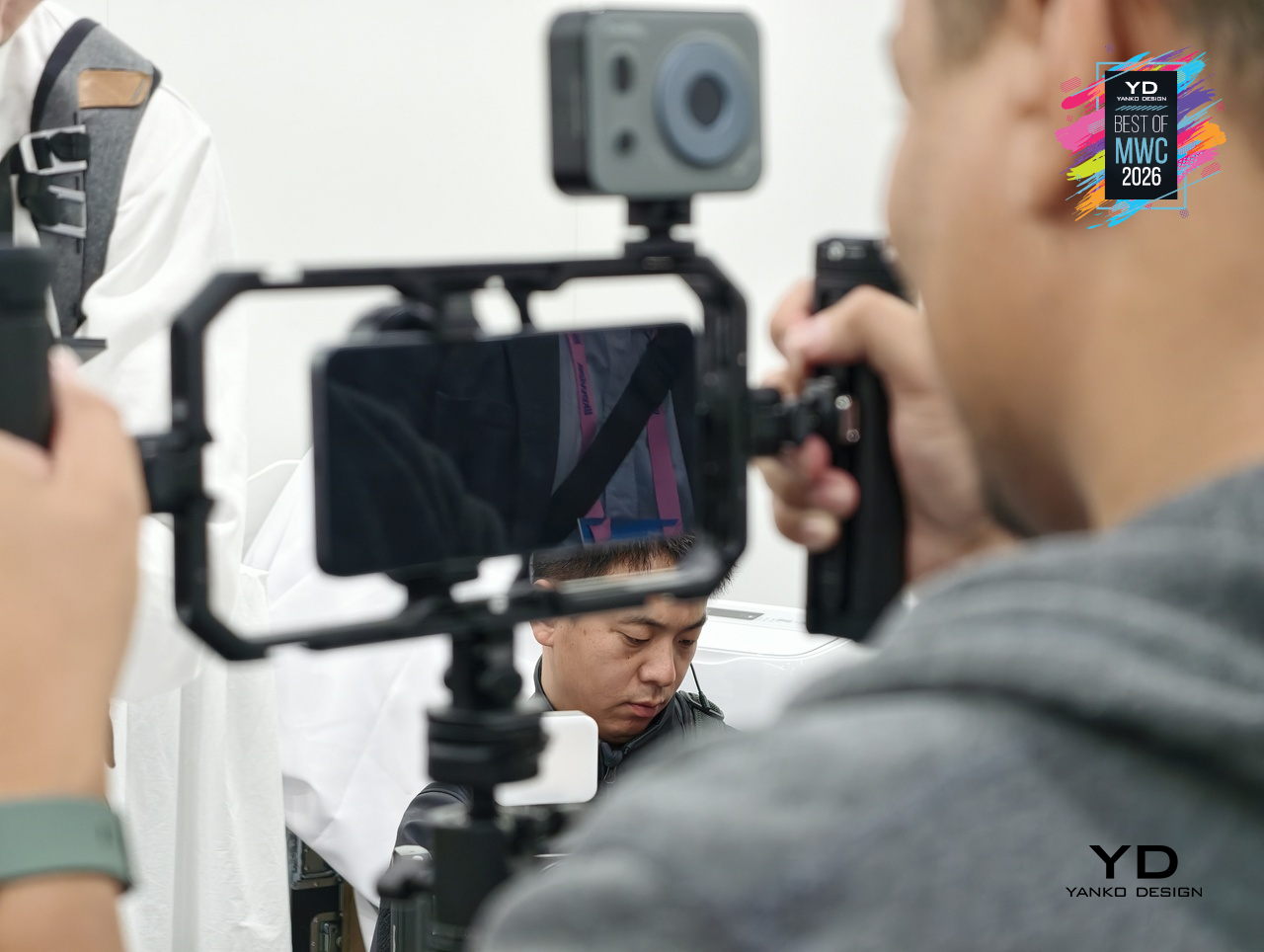
What makes the setup genuinely interesting is the conviction behind it. Vivo isn’t treating the cage as a novelty accessory but as the central argument for how a smartphone can function as a serious production tool. The phone alone is one thing; inside this cage, with the extender attached and physical controls in hand, it becomes a fundamentally different experience.

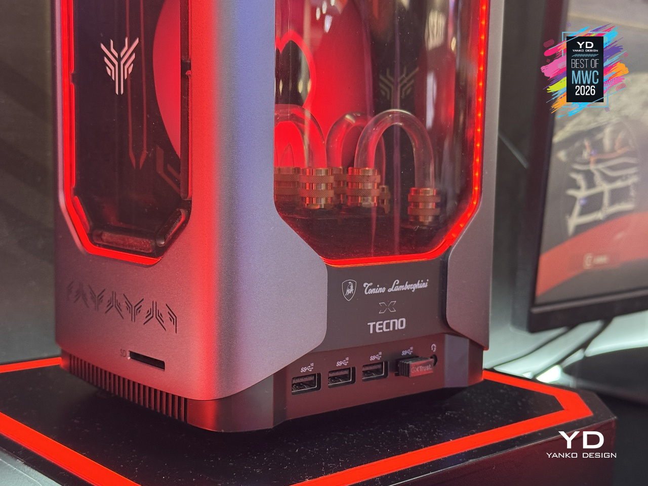
TECNO x Tonino Lamborghini TAURUS Mini Gaming PC

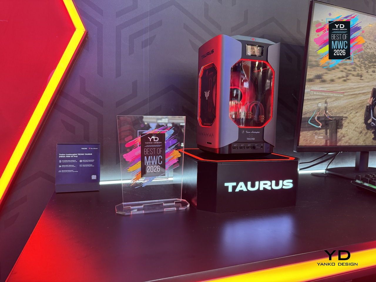
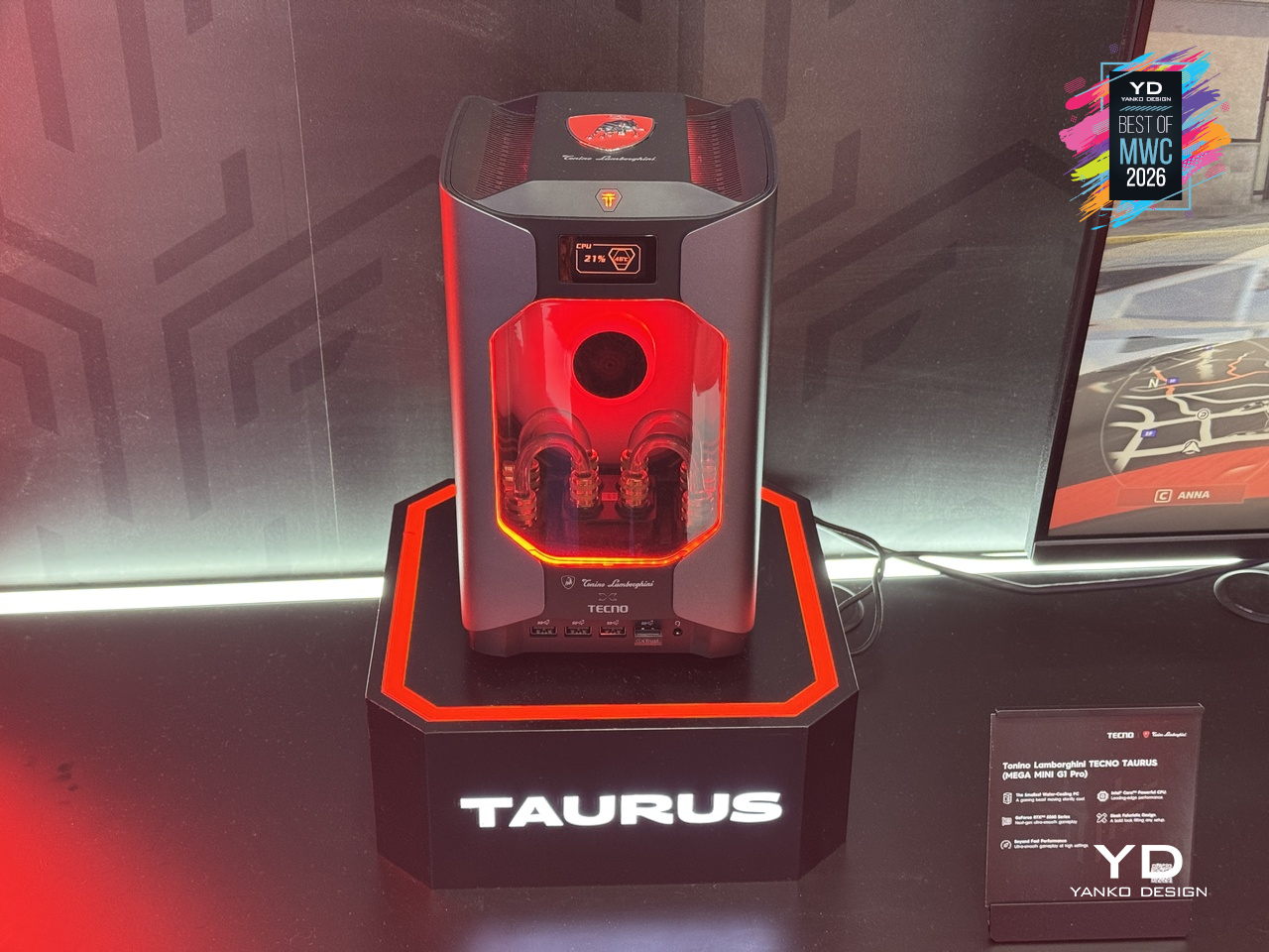
Gaming PCs have never been shy about their presence, big towers, aggressive angles, and enough RGB to illuminate a small runway. The Tonino Lamborghini TECNO TAURUS compresses all of that energy into a mini PC chassis, with an all-metal body, red-accented lighting, and see-through panels that put the water-cooling loop on full display. It’s unapologetically theatrical, and that’s clearly the entire point of the exercise.

Designer: TECNO

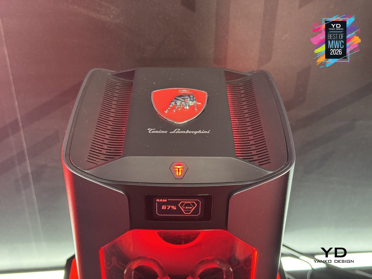
Under that showpiece exterior sits an Intel Core i9-13900HK with 14 cores running up to 5.4GHz, alongside an NVIDIA GeForce RTX 5060 on the Blackwell architecture at 145W total graphics power. A roughly 10,000mm² pure copper water-cooled cold plate and triple-fan setup handle thermals in that compact body. A real-time performance monitor on the chassis lets you watch CPU and GPU loads without opening a single app, which feels very on-brand for a machine this self-aware.

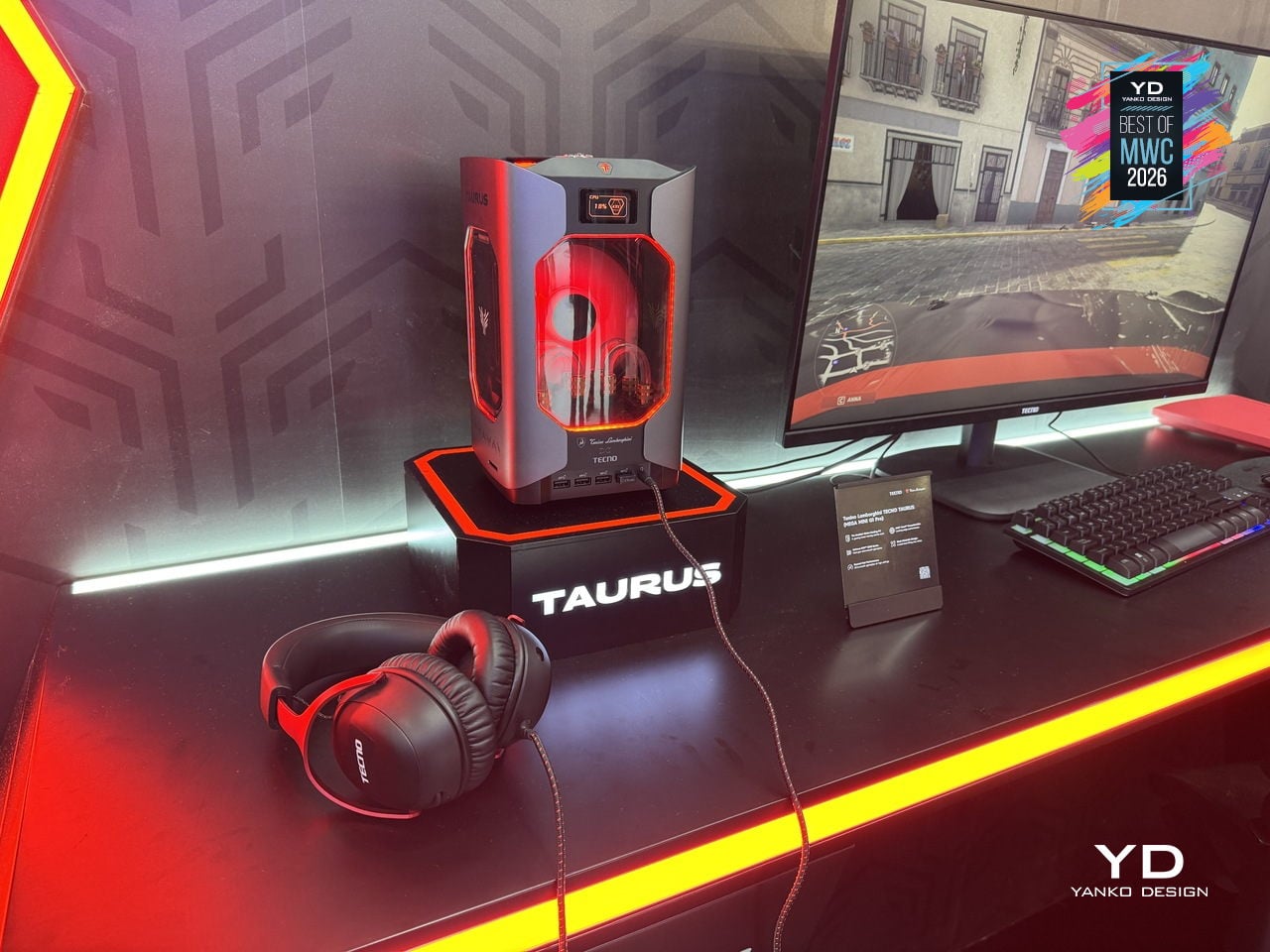
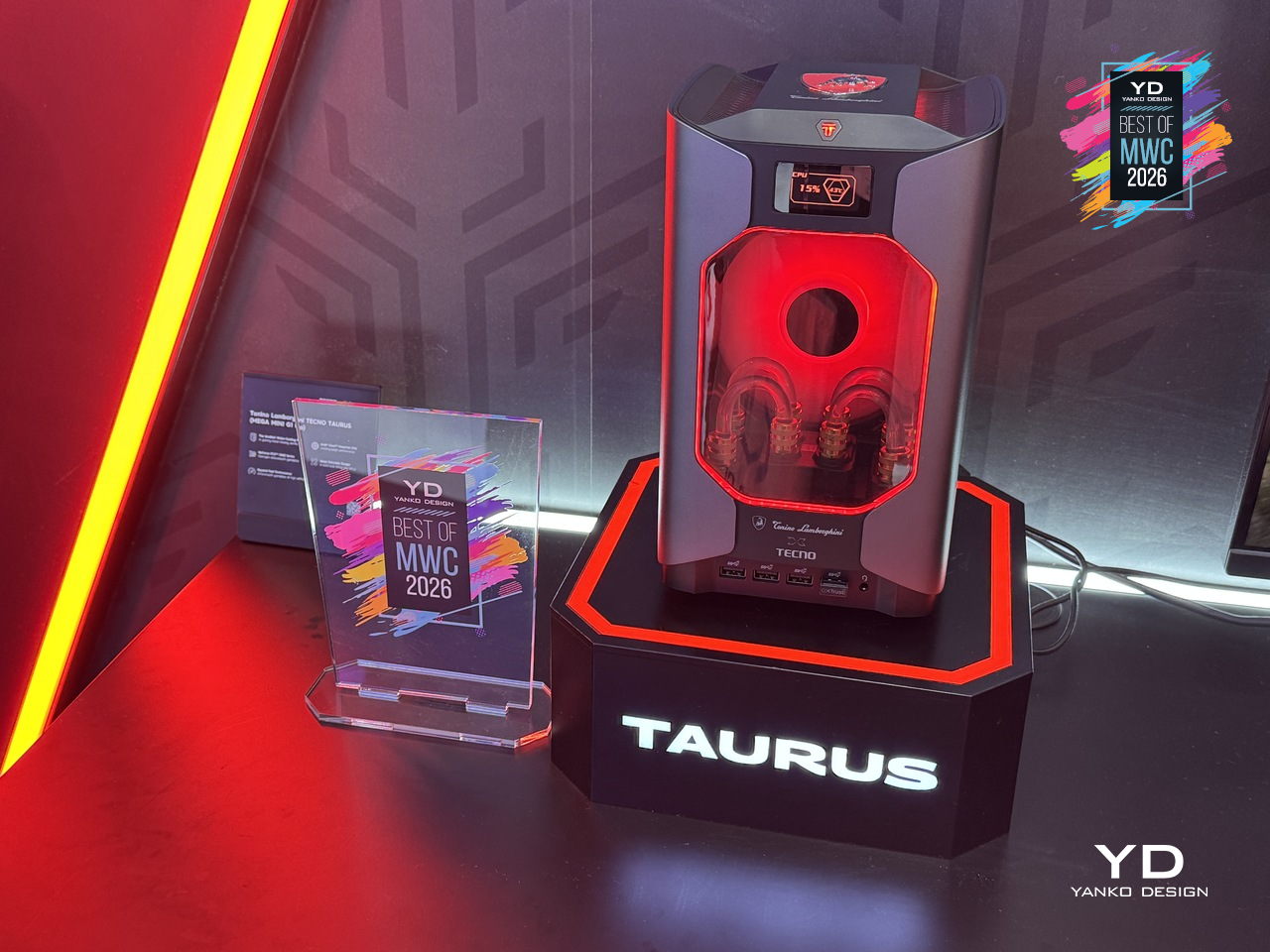
TECNO’s first collaboration with Tonino Lamborghini positions this as a desktop you’d put on your desk rather than under it, treating the machine as a design object as much as a gaming rig. Fifteen ports and WiFi 6E keep the practical side well covered. What’s genuinely interesting is how much of the design budget went into making the cooling system the visual centerpiece, turning thermal engineering into the main aesthetic argument.

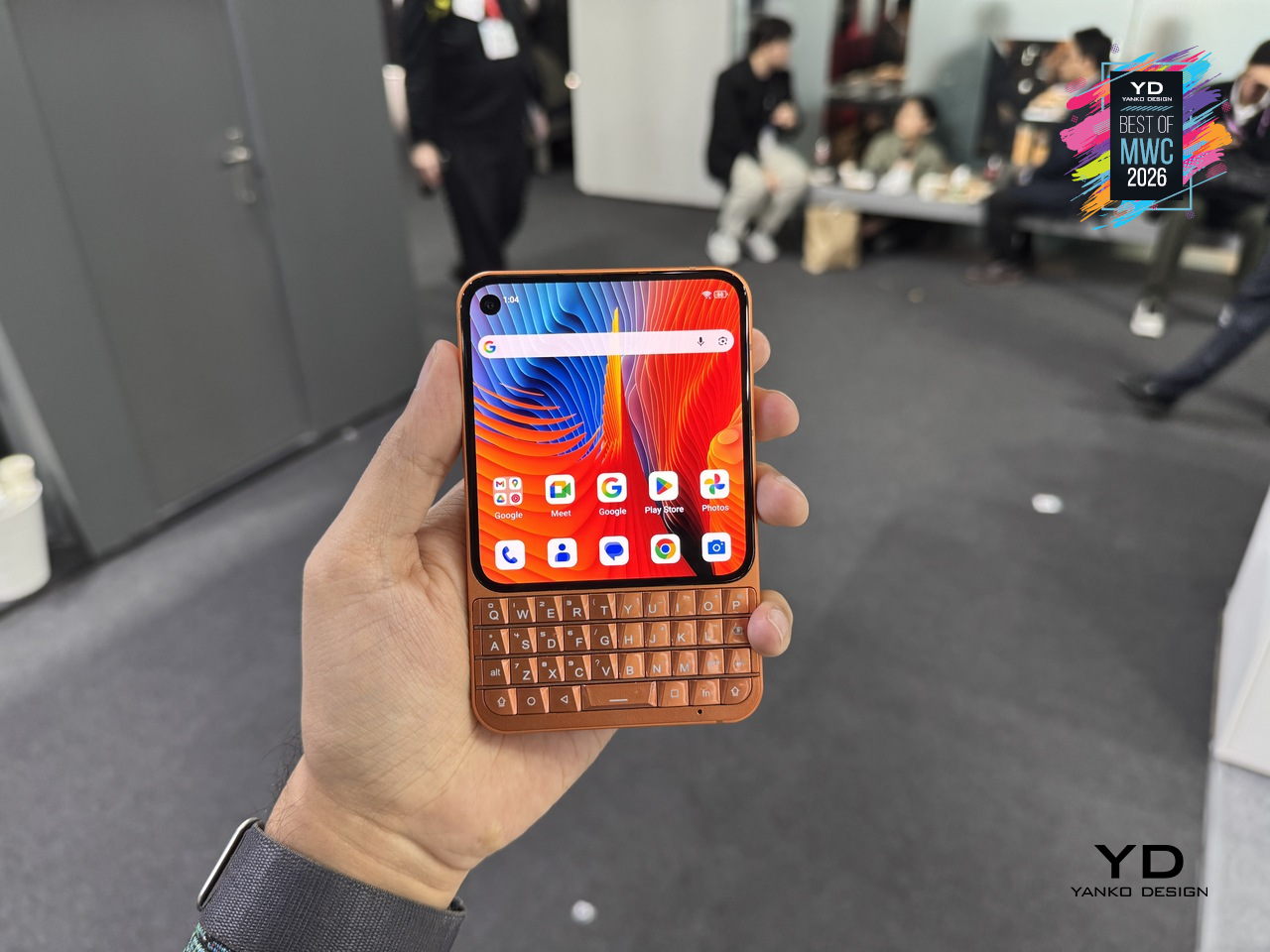
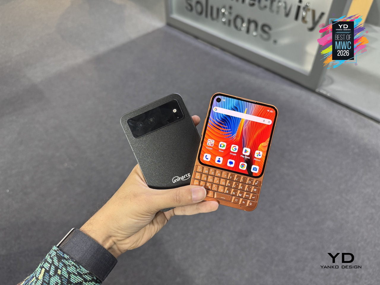
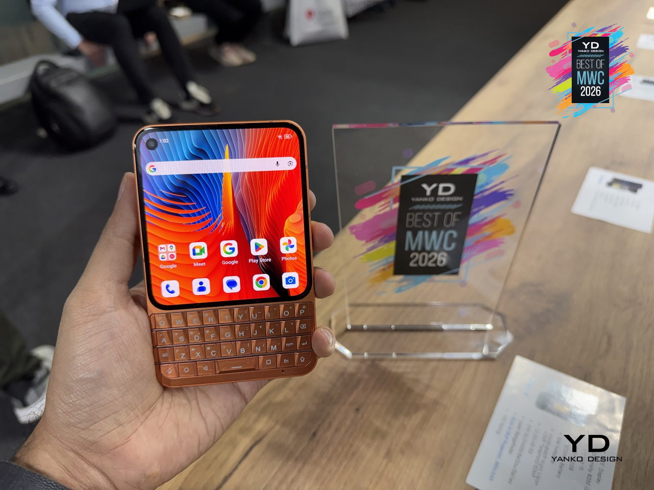
Unihertz Titan 2 Elite QWERTY Phone

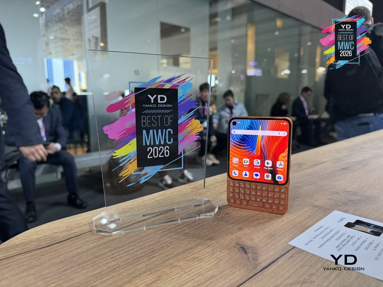
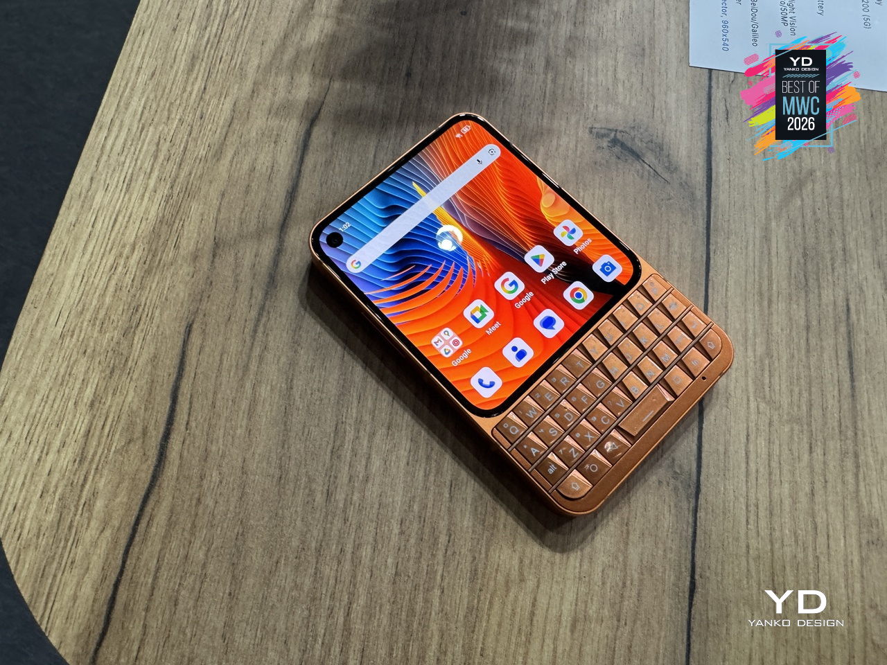
Physical keyboard phones never really died; they just quietly retreated to a corner of the internet where people complained loudly about touchscreen autocorrect. Unihertz has been serving that corner for years with its Titan series, and the Titan 2 Elite is the most refined version yet. Gone is the chunky frame of its predecessor; in its place comes a slimmer 75mm-wide body, a 4.03-inch 120Hz AMOLED display with a punch-hole camera, and the same four-row QWERTY keyboard that the series built its following on.

Designer: Unihertz

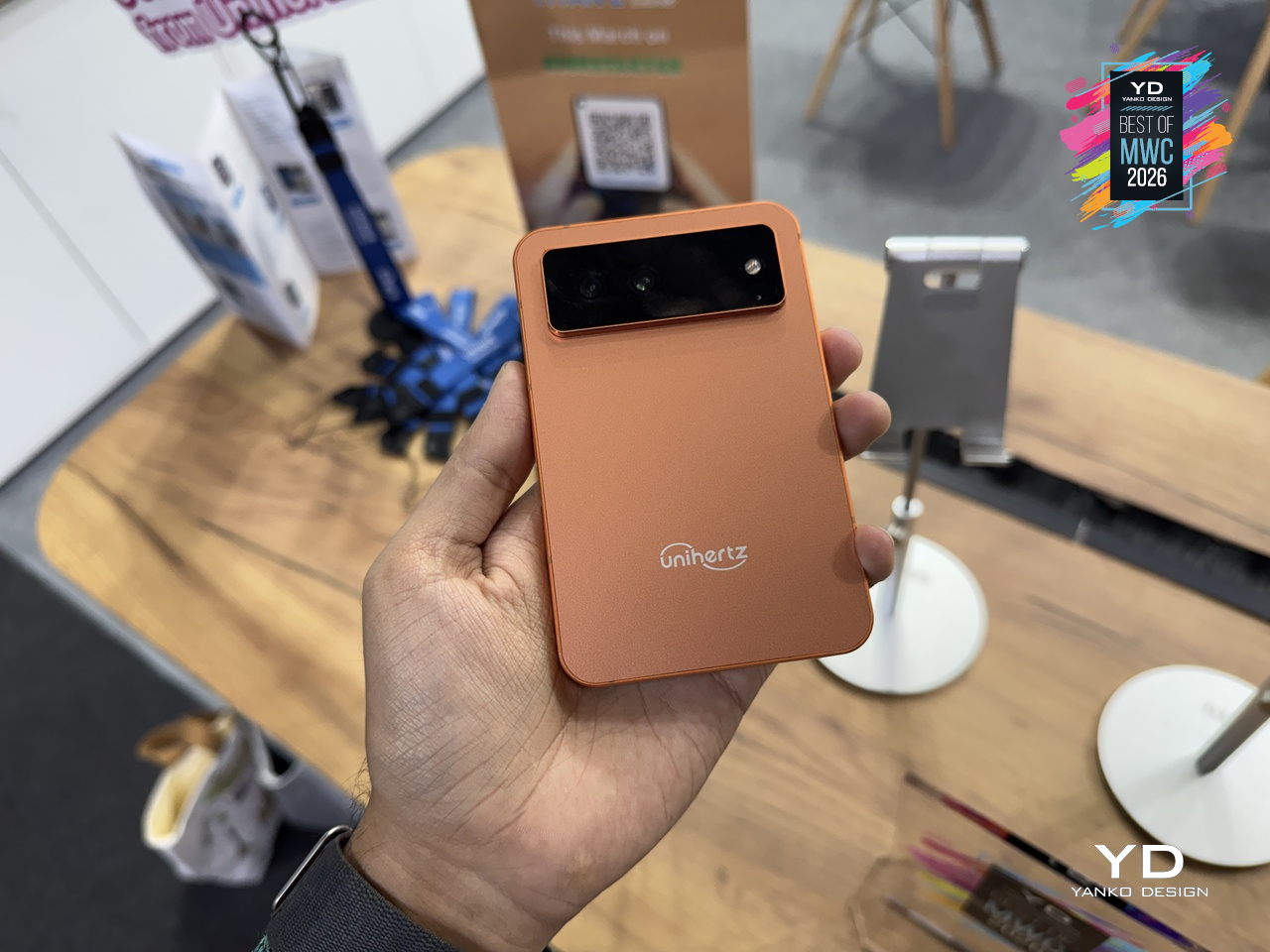
The keyboard itself doubles as a touchpad, letting you scroll and navigate with a thumb swipe across the keys, a trick carried over from earlier Titans that still feels genuinely useful. Although nothing’s confirmed yet, it’s expected to run on a MediaTek Dimensity 7300 with 12GB of RAM and 512GB of storage, which is a solidly capable mid-range setup for a phone that’s really selling you on input, not raw performance. More notable is the software commitment: Android 16 out of the box, updates promised through Android 20, and security patches running until 2031, a rare five-year horizon for a device in this price range.

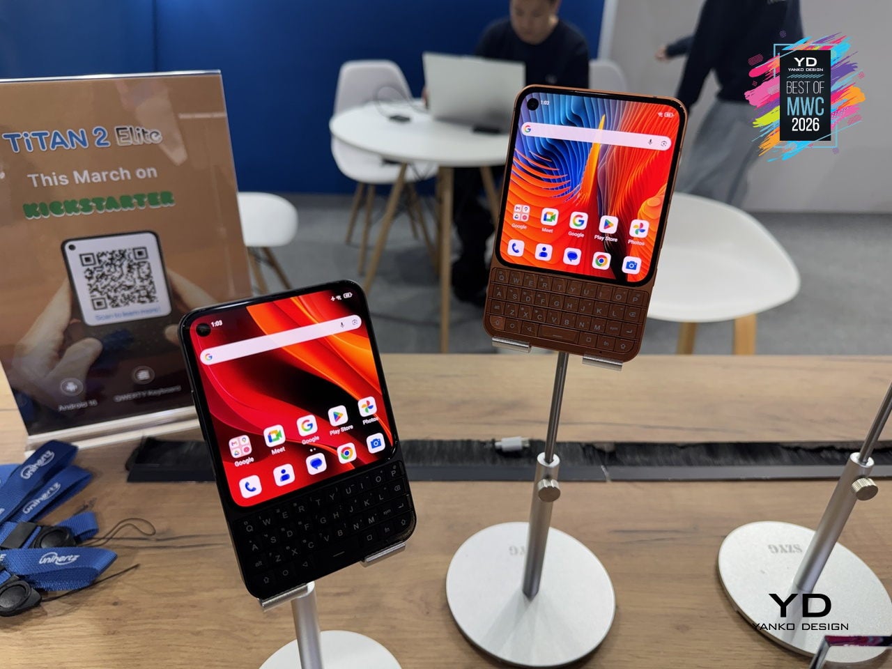
The Titan 2 Elite arrives at an interesting moment, with the Clicks pulling attention toward keyboard accessories for iPhones and Unihertz countering with a dedicated standalone device instead. There’s a meaningful difference between treating the keyboard as an add-on and building an entire phone around it, and that’s the bet Unihertz is making here.

The post Yanko Design’s Best of MWC 2026: When Engineering Gets Obsessive first appeared on Yanko Design.

Xiaomi unveils power-laden Vision Gran Turismo electric hypercar concept at MWC 2026

Xiaomi has just entered the Gran Turismo world with its Vision Gran Turismo (VGT) concept car at Mobile World Congress 2026. This electric hypercar follows the reveal of the SU7 Ultra supercar that was developed last time around. This year’s event saw the hypercar, which Xiaomi claims is sculpted by the wind. The idea is to make the performance vehicle aerodynamically tuned with airflow channels and moving parts to achieve optimal efficiency. We got our first glimpse of the hypercar at Mobile World Congress, and it does impress on the outside and inside.

This is the first-ever Chinese Gran Turismo performance racer to be materialized, and the air flow obsession goes beyond everything you would imagine. Although one cannot drive it for real anytime soon, you can explore the two-door performance car in Gran Turismo 7, using the company’s dedicated simulator with exact racing seats as the concept car. With the VGT hypercar, Xiaomi joins an elite list of automakers like Porsche, Ferrari, and Mercedes-Benz that have their futuristic concept cars designed for Gran Turismo.

Designer: Xiaomi

Given it is a concept, the technical aspects are wild – there’s a 900V Silicon Carbide (SiC) platform which ultimately delivers 1,900 horsepower. To handle that amount of power at high speeds, the car gets advanced components, including carbon-ceramic brakes and center-lock wheels. The two-door hypercar has a very linear profile with a very low ride height and only the cabin’s teardrop-shaped cockpit, with only the encapsulating bubble disrupting the aerodynamic performance. The shark-fin roofline architecture balances out things, though.

VGT has wheel covers that are magnetically attached (a.k.a. Accretion Rims) so that they don’t rotate when the car moves forward, reducing drag. The halo-style taillights are straight out of the TRON universe as they also double as an air outlet for aerodynamic performance, along with the large rear diffuser, which levels up the futuristic appeal. All this aerodynamic engineering results in a drag coefficient of 0.29 and downforce of -1.2.

On the inside, Vision GT is a nest of tech-laden comfort and luxury. It has a cocooned Sofa Racer cabin, which holistically blends the dashboard, seats, and the scissor doors into one. The butterfly steering wheel is designed for maximum driver precision, and the overlaying display has a panoramic screen and the Xiaomi Pulse system that utilizes light and sound for interaction. The central console on the two-seater GT has physical button controls, a circular pointer knob, and a shifter mostly seen on an aircraft throttle.

Since this hypercar is a top-of-the-line creation by the Chinese tech giant, it seamlessly integrates the in-house Human x Car x Home ecosystem for a personalized experience depending on the rider’s mood and current state of mind. Although the Vision Gran Turismo is only a virtual hypercar that you may not drive in the real world, it shows Xiaomi’s growing confidence in the highly technical automotive world. If those horsepower figures are true, the hypercar could be one of the most powerful Gran Turismo creations, overshadowing the likes of Ferrari, which churns out 1,337 hp.
For racing fanatics who want to experience the VGT in a virtual world, it’ll soon be available in Gran Turismo 7, and Xiaomi’s dedicated driving simulator for a more immersive experience.

The post Xiaomi unveils power-laden Vision Gran Turismo electric hypercar concept at MWC 2026 first appeared on Yanko Design.

A 6mm 5,000 mAh Power Bank: Xiaomi Built One Thinner Than Any Phone

I’ve carried a lot of power banks over the years. Bulky ones that weigh down my pockets, chunky bricks that barely fit in a crossbody bag, and a few “compact” options that still felt like lugging around a deck of cards. So when Xiaomi announced a magnetic power bank that measures just 6mm thick and weighs 98 grams, I’ll admit my first reaction was skepticism. That’s thinner than most smartphones on the market right now, including the iPhone 17. A power bank isn’t supposed to be thinner than the device it charges.

But here we are, and the Xiaomi UltraThin Magnetic Power Bank 5000 15W is very real. It launched in Japan earlier this year at roughly $50, has since expanded to Australia, Singapore, South Korea, and Europe, and was officially showcased at MWC 2026 in Barcelona. The European pricing sits around €60 for the Glacier Silver and Graphite Black versions, with a slightly more expensive Radiant Orange option at €65. For what it delivers in terms of sheer industrial design, those prices feel reasonable.

Designer: Xiaomi

Let’s talk about what makes this thing genuinely interesting from a design perspective. Xiaomi is using a silicon-carbon battery with 16% silicon content, which is the kind of battery chemistry that allows for higher energy density in a slimmer package. That’s how they’ve managed to squeeze 5,000mAh into something that resembles a metal business card more than a traditional power bank. The aluminum alloy shell has a smooth, understated finish, and the phone-facing surface uses fire-resistant fiberglass with an excimer coating for heat management. A photolithographically etched logo on the back adds a subtle detail that signals this product was designed with care, not just assembled to a spec sheet.

The charging specs are solid if unspectacular. You get up to 15W wireless charging when paired with the Xiaomi 17 series, though iPhone users are limited to 7.5W due to Apple’s MagSafe restrictions. There’s also a USB-C port pushing up to 22.5W for wired charging, and the option to charge two devices simultaneously. It’s not going to win any speed records, but for a device this thin, the versatility is appreciated. You snap it onto the back of your phone magnetically, and it just works. No cables, no fuss.

What I find most compelling about this product isn’t any single feature. It’s the way it challenges the assumption that portable power has to mean portable bulk. For years, the power bank category has been stuck in a cycle of incrementally larger capacities packed into roughly the same uninspired form factors. Xiaomi has taken a different approach here, prioritizing the experience of carrying and using the thing over raw capacity. Five thousand milliamp-hours won’t fully recharge most flagship phones anymore, but it will get you through an emergency afternoon or a long commute, and you’ll barely notice it’s there.

The safety engineering deserves a quick mention too. Xiaomi built in ten layers of protection covering overvoltage, overcurrent, overheating, short circuits, and foreign object detection. Dual NTC temperature sensors monitor heat in real time. A 4,369mm² graphite sheet handles thermal dissipation. For a product this thin, that level of safety infrastructure is reassuring rather than excessive.

Of course, nothing is perfect. Early reviews suggest the Xiaomi power bank delivers slightly less usable charge than competitors with the same rated capacity, likely due to efficiency losses in the ultra-thin design. And the 7.5W cap for iPhones feels limiting when Apple’s own ecosystem is moving toward faster MagSafe speeds. These are fair tradeoffs, but they’re tradeoffs nonetheless.

Still, I think this power bank represents something meaningful about where consumer electronics design is heading. The best accessories are the ones you forget you’re carrying until you need them. Xiaomi seems to understand that, and the UltraThin Magnetic Power Bank is one of the most elegant expressions of that philosophy I’ve seen in a while. It’s a small product that makes a big argument: portability should actually mean portable.

The post A 6mm 5,000 mAh Power Bank: Xiaomi Built One Thinner Than Any Phone first appeared on Yanko Design.

Leica and Xiaomi Built a Phone With a Rotatable Camera Ring

Most of us carry a capable camera in our pockets every day, yet somehow the act of taking a photo still feels like wrestling with a piece of software rather than making an actual picture. You tap, swipe, wait for the AI to decide what the scene should look like, and end up with something technically perfect and faintly anonymous. That’s the frustration the Leica Leitzphone powered by Xiaomi is trying to address, arriving at MWC 2026 as a phone designed around the idea that shooting should feel deliberate.

The most telling detail is the rotatable camera ring around the lens module. It’s a physical control you can assign to focal length, focus, or bokeh depth, borrowing directly from the tactile language of Leica’s rangefinder cameras. There’s something telling about that choice: at a time when every interaction is a touch gesture, adding a ring you can actually turn is a quiet argument that the best interface for a camera might not be a flat sheet of glass.

Designer: Leica x Xiaomi

The hardware behind that ring is genuinely serious. The primary sensor is a 1-inch format with LOFIC HDR technology, which gives it a real optical size advantage over the smaller sensors in most flagship phones, particularly in high-contrast or low-light situations. A 200 MP telephoto covering 75–100 mm and a 14 mm ultra-wide complete the system, so the focal length range maps fairly naturally onto how photographers tend to think rather than how smartphone specs sheets tend to read.

Software is where it gets more interesting, and where you’re asked to trust the collaboration a little more. Leica Essential Mode simulates the output of two specific cameras: the Leica M9 and the M3 with MONOPAN 50 film. For people who know those cameras, that’s a specific and meaningful promise. For everyone else, it’s an aesthetic reference that requires some faith, and there’s a gap between “inspired by classic Leica lenses” and actually using one that the marketing doesn’t quite close.

The rest of the phone is exactly what a 2026 flagship should be. Qualcomm’s Snapdragon 8 Elite Gen 5 handles the processing, a 6,000 mAh battery supports 90W wired and 50W wireless charging, and the 6.9-inch 120 Hz OLED display hits 3,500 nits peak brightness. Leica also redesigned the entire UI, with custom fonts, icons, and two interface themes running across every system element, which is more thoroughgoing than a co-branded phone usually gets.

One feature that doesn’t make the headline but probably should is the built-in Content Authenticity Initiative metadata support, which embeds provenance data in every image to confirm its origin and integrity. As AI-generated imagery gets harder to distinguish from photographs, having a phone that can prove a picture is real starts to feel less like a niche feature and more like an actual need.

The post Leica and Xiaomi Built a Phone With a Rotatable Camera Ring first appeared on Yanko Design.

Xiaomi Built a Tracker That Works on Apple Find My and Google

Losing your keys right before you have to leave is one of those small disasters that feels disproportionately catastrophic. Bluetooth trackers were supposed to fix that, and they mostly have, except for one nagging issue: the good ones tend to work best inside a single ecosystem. Apple’s AirTag is excellent if everyone around you has an iPhone. Most of the world, however, does not. That’s the gap Xiaomi is aiming at with its new Tag, unveiled at MWC 2026.

The Xiaomi Tag supports both Apple Find My and Google Find Hub, which matters more than it might sound. Bluetooth trackers don’t locate your lost bag on their own. They rely on other people’s phones nearby to silently ping the tag’s location back to you. The larger the network of phones, the better your odds of actually finding something. Android outnumbers iPhone significantly across most of the world, so a tracker that taps both networks has a meaningful practical advantage over one that doesn’t.

Designer: Xiaomi

The two networks don’t run at the same time, so the Tag operates on one or the other depending on your setup. Still, the flexibility alone puts it ahead of most alternatives. Connectivity runs on Bluetooth BLE 5.4, and for Lost mode, Apple Find My users can tap any NFC-enabled phone to pull up the owner’s contact details without downloading a single app. That last part is a small but genuinely thoughtful detail.

Physically, the Tag weighs 10g and measures 46.5 x 31 x 7.2 mm, compact enough to slide into a wallet without creating a noticeable lump. IP67 dust and water resistance means rain and accidental puddle encounters are not going to be a problem. The battery is a removable CR2032 button cell, rated for over a year of life based on four sound searches per day, and the app sends a low-battery alert before it dies on you.

There’s an accelerometer inside, and the app can send left-behind alerts when the Tag separates from a location you frequent, though that feature currently works only on Apple Find My. Lost mode lets you attach your contact details and a message, so a stranger who finds your luggage can get that information either through an Android pop-up or an NFC tap on an iPhone, no app required on their end. It’s the kind of friction-reduction that makes the difference between someone actually returning your bag and just walking past it.

An anti-tracking alert is also built in, notifying you if an unknown Tag appears to be following your movements. Xiaomi notes that coverage depends on the Find network’s own implementation, which is an honest caveat that most trackers quietly bury. The Tag is available as a single unit or a four-pack, which is useful if your wallet, keys, backpack, and luggage all feel equally likely to disappear at any given moment.

The post Xiaomi Built a Tracker That Works on Apple Find My and Google first appeared on Yanko Design.

Redmi Buds 8 Pro Review: This €69.90 Earbud Punches Way Above Its Weight

PROS:


  • Clear and balanced sound with rich bass

  • Strong ANC performance for the price

  • Comfortable, stable fit in the ears

  • Responsive touch controls with the slide for volume

CONS:


  • Not integrated with Google Find My Device

RATINGS:

AESTHETICS
ERGONOMICS
PERFORMANCE
SUSTAINABILITY / REPAIRABILITY
VALUE FOR MONEY

EDITOR'S QUOTE:

At this price, the combination of triple drivers, solid ANC, and excellent fit makes the Redmi Buds 8 Pro hard to beat.

Redmi Buds 8 Pro arrives as Redmi’s more ambitious take on everyday wireless earbuds. They aim to combine punchy sound, serious noise cancellation, and gaming-friendly latency in a package that still feels relatively affordable. This is not a basic budget pair built only for casual background listening, and it clearly wants to feel like a step up the moment you start using it.

What makes them interesting is how they chase premium style features without making the experience feel intimidating. The triple driver setup is the headline, but the real promise is a well-rounded daily companion that can handle commuting, workouts, and long listening sessions with minimal fuss. At 399 CNY in China, the value story is hard to ignore, and the key question is whether the real-world experience matches that strong first impression.

Designer: Xiaomi

Aesthetics

Redmi Buds 8 Pro follows a familiar stem style layout, but the visual language leans clean and modern rather than flashy. The earbuds have smooth, flowing lines, with a compact in-ear body that blends into a slim, rounded stem. Most of the earbud surface is finished in a soft matte texture that hides fingerprints and keeps the look understated. On the outside-facing side of each stem, Redmi adds a shiny strip that catches the light, with a small Redmi logo at the bottom as a neat visual anchor. This contrast between matte and gloss gives the buds a touch of sophistication while still keeping them low-key.

The charging case continues that restrained approach with a compact, pebble-like shape that slips easily into a pocket or bag. Its semi-matte shell feels smooth and resists smudges, while a subtle Redmi logo and “triple driver sound” text on the back quietly nod to the hardware inside. On the front, a slim bar of LEDs offers at a glance battery and pairing information but remains discreet when off, so the case still looks clean.

Color options and small accents may vary by region, yet the overall design clearly targets a wide audience. These are earbuds you can wear at the office, on public transport, or at the gym without drawing much attention. If you like bold, statement-making designs, they may feel a bit too reserved, but if you prefer tech that looks tidy and well finished, Redmi Buds 8 Pro sit in a very comfortable sweet spot.

Ergonomics

While the design focuses on clean lines and visual calm, the build of Redmi Buds 8 Pro focuses on comfort and practicality. Each earbud weighs about five point three grams, which helps them feel light enough for long listening sessions without that dragging sensation some heavier buds can cause. Of course, fit and comfort are different from person to person, but Redmi Buds 8 Pro fit my ears very well and never felt like they were about to fall out.

The medium-sized silicone tips come preinstalled, and Redmi also includes small and large tips in the box so you can fine-tune the seal. I usually go with medium-sized tips and sometimes switch to small tips on certain earbuds, but with Redmi Buds 8 Pro, the medium size worked best for me. Some earbuds struggle to stay put even when I am not moving or talking, yet here I had no problem with fit or comfort, even when I talked, ate, did yoga, or went for a jog with the earbuds in.

The charging case weighs about 47 grams, which keeps the full kit small and light enough to disappear into a jeans pocket or a slim sling bag. The rounded shape and smooth finish make it easy to grip and open, and the lid snaps shut with a reassuring click. Magnets inside guide the earbuds into place so they line up with the charging contacts without much effort. In everyday use, that means you can carry the case all day and quickly pop the buds in or out whenever you need them, without really noticing the extra bulk.

Performance

Redmi Buds 8 Pro pack impressive specifications for their price range, and the audio hardware is the main reason why. They use a coaxial triple driver configuration that combines an 11 mm driver with a titanium diaphragm and twin 6.7 mm PZT ceramic tweeters. In listening, the sound comes across as clear and nicely balanced, with bass that feels full and satisfying without overpowering vocals or detail.

Redmi Buds 8 Pro carry Hi-Res Audio Wireless certification and support codecs such as LDAC, but in day-to-day use, the bigger story is simply that the tuning feels well judged. Dolby Audio and Xiaomi Dimensional Audio are also supported, giving you extra options to change the sense of space and presentation, especially for movies and shows.

Active Noise Cancellation works great overall, especially considering the price. It does not completely block out train noise or airplane engine rumble, but it comes close, which makes music and podcasts easier to enjoy at lower volumes. With higher-pitched sounds like a baby crying, it still does not fully cancel everything out, yet it reduces the sharpness enough that you are less likely to get distracted from what you are doing.

One comfort note is heat. I felt the earbuds get slightly warm at first when ANC was on, but it did not seem to build up over time. It is also possible I simply got used to the sensation after wearing them for a while, so I would not call it a major issue, but it is worth mentioning if you are sensitive to heat on hot days.

Battery life is solid on paper and practical in daily use. Each earbud houses a 54 mAh battery, with rated playback of up to about eight hours on a single charge when ANC is off. Turn ANC on and use higher volumes, and actual listening time will drop somewhat, which is typical for this type of product, while the 480 mAh charging case extends total listening time up to roughly 33 hours across multiple top-ups.  

Touch controls on the stems worked great in my use, and the biggest usability upgrade is that volume control is supported via sliding on the stem. The controls support single tap, double tap, triple tap, press and hold, and swipe, which gives you a lot of flexibility without needing to reach for your phone. You can customize these gestures in the Xiaomi Earbuds app, so the controls can match your habits instead of forcing you into a fixed layout.

The app also gives you practical sound tuning options without making things feel overly technical. You can pick from preset audio profiles like Balanced sound, Enhanced bass, Enhanced treble, and Enhanced voice, depending on what you are listening to. If you want more control, there is also a custom EQ option that lets you adjust eight separate bands, with each slider running from plus six to minus six, so you can fine-tune the sound without guessing too much.

Sustainability

For a product category like true wireless earbuds, sustainability is rarely a strong point, and Redmi Buds 8 Pro are no exception. The compact, sealed design means the internal batteries are not user-replaceable, so once overall battery health drops, most people will end up replacing the whole set rather than repairing it. That pattern is common across almost all TWS earbuds today, but it still makes this a product that is easier to discard than to keep alive for many years.

The IP54 rating does offer a small positive by protecting against dust and splashes, which can reduce early failures from sweat, light rain, or accidental spills. One small feature that nudges in a better direction is the “find your earphones” function, which lets you play a tone from the left, right, or both earbuds via the app to help you track them down when they go missing. It is not a full integration with Google Find My Device, yet anything that helps you avoid losing a bud and replacing the whole set still counts as a quiet step toward better longevity.

Value

Redmi Buds 8 Pro is priced at 69.90 Euros, which works out to roughly $83. That puts them in the affordable end of the true wireless market. They still cost more than the absolute cheapest buds, but remain very accessible for anyone looking to step up from basic or bundled earphones.

From a value perspective, they make the most sense if you care about sound quality and noise cancellation more than simply paying the lowest possible price. Cheaper options can handle calls and casual listening, but usually lack the triple driver setup, stronger ANC, and more polished overall experience you get here. For many buyers, Redmi Buds 8 Pro will feel like a worthwhile upgrade that adds clear benefits without demanding a luxury-level budget.

Verdict

Redmi Buds 8 Pro is an easy recommendation if you want strong everyday performance without paying flagship prices. The triple driver setup delivers clear, balanced sound with bass that feels full but controlled, and the ANC is effective enough to make commutes and busy spaces noticeably calmer. Touch controls are reliable, and the volume slide gesture is a genuinely useful upgrade that makes daily listening feel smoother.

They are not perfect, with ANC that cannot fully erase the loudest train or plane noise and weaker results on some high-pitched sounds, plus the usual sealed battery limitations for sustainability. Still, the fit was excellent in my ears, the case is easy to carry, and the “find your earphones” tone feature helps prevent frustrating losses. If you care most about sound quality, noise cancelling, and a polished experience at a very competitive price, Redmi Buds 8 Pro hit a sweet spot.

The post Redmi Buds 8 Pro Review: This €69.90 Earbud Punches Way Above Its Weight first appeared on Yanko Design.

Xiaomi 17 Ultra Review: Lighter, Flatter, and Sharper Than Ever

PROS:


  • Excellent main and telephoto photo quality

  • Big and bright 6.9-inch LTPO AMOLED display

  • Strong performance

  • Improved ergonomic and stylish design

CONS:


  • Limiting macro use with a minimum focus distance of 30 cm

  • Noticeable warmth during camera use

RATINGS:

AESTHETICS
ERGONOMICS
PERFORMANCE
SUSTAINABILITY / REPAIRABILITY
VALUE FOR MONEY

EDITOR'S QUOTE:

The Xiaomi 17 Ultra is a camera-first flagship that finally feels balanced in the hand, and even more balanced in its image processing.

Within the renamed family, the Xiaomi 17 Ultra is the boldest expression of what Xiaomi thinks a 2026 flagship should be. It arrives globally as a big, confident phone that refuses to blend into the background. It is unapologetically camera-centric, and it is packed with specs that read like a wish list.  

On paper, Xiaomi has the ingredients to back that up. You get a 6.9-inch LTPO AMOLED display, a Leica-tuned triple camera system with a 200 MP periscope telephoto, and Qualcomm’s Snapdragon 8 Elite Gen 5. The global model carries a 6,000 mAh battery with 90W wired and 50W wireless charging, which is still a serious setup even before real-world testing.

Designer: Xiaomi

The camera hardware also shifts in meaningful ways, with the main sensor switching from Sony to OmniVision, and the zoom strategy changing from two telephoto cameras to one lens with continuous 75 mm to 100 mm optical zoom. So does the Xiaomi 17 Ultra deliver ultra-level performance where it counts. After two weeks with it, here is what I found.

Aesthetics

The Xiaomi 17 Ultra is not a phone that tries to disappear in your hand or your pocket. The gigantic circular Leica camera island still dominates the rear panel, just like on the previous model, but there is a subtle shift in design language. With a flatter back panel and flat side frame, the 17 Ultra leans into a cleaner, more minimal look than the Xiaomi 15 Ultra. The small Ultra logo with its red underline sitting above the camera bump adds a bit of character without turning the phone into a billboard.

The color palette for the global model leans into classic tones. Xiaomi focuses on black, white, and green for most markets, skipping the violet shade that appears in China. The Starlit Green unit I received is the standout, with a deep moss green base and speckling that catches the light like a dusting of stars, which makes the name feel earned. The black option looks stealthy, but the red accent on the camera ring keeps it from feeling flat, while the white version goes for a high contrast look with the black camera bump and a silver ring and side frame to tie it all together. If you are coming from the Xiaomi 15 Ultra, the evolution feels more like refinement than reinvention, yet the 17 Ultra looks more cohesive and more modern from the rear.

Ergonomics

The first thing I expected to notice when I pick up the Xiaomi 17 Ultra is the weight and thickness. The phone uses a large battery, a complex camera stack, and a sturdy frame, and all of that adds up in the hand. That said, I was pleasantly surprised. At 8.29mm thickness and about 219g, Xiaomi managed to make the 17 Ultra the slimmest and lightest among its Ultra series. The device is still big and not exactly a lightweight phone, but it feels a lot more comfortable to hold than your eyes perceive.

Ergonomically, the device feels well-balanced in the hand, which is a welcoming improvement from the top-heavy feel you get from holding the Xiaomi 15 Ultra. Xiaomi 17 Ultra adapts a flat display, for the first time for its Ultra line, and helps with the grip. Because it’s well-balanced, the camera bump becomes a natural resting point on the back, which can actually improve grip. At the same time, this is not a one-handed phone in any universe, and if you are coming from something smaller, you will need to adjust how you hold it, how you pocket it, and even how you reach for the top corners of the screen.

The global Xiaomi 17 Ultra uses a 6,000 mAh silicon-carbon battery instead of the 6,800 mAh cell in the China model. Even with the smaller capacity, it should still be enough for a full heavy day for most people. Charging is excellent with 90 W wired and 50 W wireless, and the 90 W wired mode supports PPS or Programmable Power Supply, so you can get true fast charging with any PPS-compatible USB-C charger, not only Xiaomi’s own adapter.

Performance

The display on the Xiaomi 17 Ultra is built to impress at first sight. It is a 6.9-inch LTPO AMOLED panel with 120 Hz refresh, a 1.5K class resolution at around 1200 x 2608 pixels, and a claimed 3500 nits peak brightness. It looks sharp and vibrant, and the huge screen makes movies, games, and photo editing feel more immersive. Xiaomi also adds TUV Rheinland certifications for low blue light, flicker-free performance, and circadian-friendly tuning, which are designed to reduce eye fatigue during long viewing sessions.

The Xiaomi 17 Ultra is powered by Qualcomm’s Snapdragon 8 Elite Gen 5 chipset, and the global configurations come with 16GB of RAM paired with either 512GB or 1TB of storage. It is genuinely nice to see a 1TB option offered globally, since that is still not something every flagship brings outside China. The phone flies through heavy multitasking, high refresh rate gaming, and demanding camera workloads without stutter. On the software side, it runs Android 16 with Xiaomi’s HyperOS 3, which is Xiaomi’s unified platform designed to feel lighter and more connected across phones, tablets, and other devices.

The camera system is where the Xiaomi 17 Ultra really tries to separate itself. Xiaomi drops the older quad camera approach and commits to a triple setup. The main camera is a 23-mm equivalent 50 MP unit with an f/1.67 aperture, OIS, and OmniVision’s Light Fusion 1050L sensor. The 75-100mm equivalent telephoto is a 200 MP periscope with OIS using Samsung’s HPE sensor, with a f/2.39-2.96 aperture. Rounding it out is a 50 MP 14-mm equivalent ultra-wide with an f/2.2 aperture using Samsung’s JN5 sensor.

23mm, Leica Authentic

75mm, Leica Vibrant

100mm, Leica Vibrant

On the main camera, Xiaomi pairs the Light Fusion 1050L sensor with LOFIC technology. LOFIC stands for Lateral Overflow Integration Capacitor, and it is designed to reduce highlight clipping by giving each pixel extra headroom before bright areas turn into flat white. In practice, it helps keep texture in skies and reflections while still holding onto shadow detail in high contrast scenes.

23mm, Leica Vibrant

200mm, Leica Authentic

Zoom is the other headline change. Instead of dual telephoto cameras, Xiaomi uses a floating lens structure to deliver continuous optical zoom from 75 mm to 100 mm, which makes it easy to pick between framing without obvious digital cropping. The limitation is that the range is fairly tight, so it is more about fine-tuning perspective than dramatically pulling faraway subjects closer. There is also a close-up trade-off, since the telephoto now focuses down to about 30 cm rather than the 10 cm I could get on the Xiaomi 15 Ultra, so it is less useful as a pseudo macro lens.

45mm, Leica Vibrant

100mm, Leica Vibrant

In real use, both the main camera and the telephoto produce excellent images with wide dynamic range, natural color, and strong detail in various lighting conditions. The images look clean rather than overprocessed or oversharpened. Portrait mode is especially flexible, offering eight focal lengths from 23 mm through 100 mm equivalents, with pleasant bokeh and strong separation, even if it can occasionally miss a fine strand of hair when I pixel peep. I also noticed the phone can get warm even after relatively short camera use, and hopefully Xiaomi can improve this with future updates.

75mm, Leica Vibrant

75mm, Leica Vibrant

100mm, Leica Vibrant

The ultrawide is solid but a step behind the main and telephoto in refinement. The upgraded 50 megapixel front camera with autofocus is a nice quality of life improvement, and it looks great in good light. In backlight or low light, selfies can come out a bit soft as the processing works harder to control noise.

The Xiaomi 17 Ultra’s triple camera system can shoot video up to 8K at 30 fps, and it also offers 4K at up to 120 fps, although the ultrawide tops out at 4K at 60 fps. The front camera can record up to 4K at 60 fps, which is plenty for vlogs and high-quality selfies. Dolby Vision is supported across the cameras, and Xiaomi also includes creator-friendly tools like LOG recording up to 4K at 120 fps with stabilization on, plus LUT import for quicker grading and a more consistent look.

100m, Leica Portrait

100mm, Leica Portrait,

100mm, Leica Portrait, B&W Hig Contrast Filter

In performance, the 17 Ultra generally produces sharp, well-exposed footage with a fairly wide dynamic range, and stabilization stays strong when I am walking or panning. Low-light video also holds up well, with impressive detail for a phone, thanks in part to the large main sensor. Autofocus is usually smooth, but it can struggle in tricky conditions like backlit scenes or low light, where it may hesitate or hunt before it locks.

The Xiaomi 17 Ultra China version gets a 6,800mAh battery, but globally, it comes with a 6,000mAh battery. It should last you a full day, even with heavy use. It supports 90W wired charge and 50W wireless charge. 90W wired charge is PPS, so you can take full advantage of fast charging with a PPS compatible charger, not just with Xiaomi’s proprietary brick.

Sustainability

Xiaomi’s sustainability story for the 17 Ultra is mostly about longevity rather than eco materials. The phone uses Xiaomi Shield Glass 3.0 on the front, and it carries an IP68 rating, which should help it survive years of drops, rain, and daily wear without needing an early replacement. That kind of durability matters because the most sustainable phone is often the one you do not have to replace early.

Software support strengthens that long-life angle. Xiaomi promises five major OS updates and six years of security updates, which is not class-leading, but it is enough to make long-term ownership feel realistic at this price. It also makes the phone a safer buy if you plan to keep it for several years or pass it on later. What Xiaomi does not really emphasize, at least from what I can find, is the use of recycled or more sustainable materials in the phone itself.

Value

For global buyers, the Xiaomi 17 Ultra starts at EUR 1,499, which is roughly $1,620 USD, for 16GB/512GB, with the 16GB plus 1TB configuration expected around EUR 1,699, roughly $1,840 USD. That puts it directly in the same bracket as the most expensive Samsung Galaxy and iPhone models. If you look at what the Xiaomi 17 Ultra offers, it is easy to see the value in hardware alone, especially in cameras, battery, and storage.

The challenge is that Xiaomi is not only competing with Samsung and Apple, but also with other camera-focused Android flagships that are expected to land this year. That means the 17 Ultra has to win on the full experience, not just its spec sheet, especially when buyers are cross-shopping within the same premium price tier. Even so, the 17 Ultra can justify its price if you care most about its Leica-tuned imaging, huge display, and fast charging rather than ecosystem lock-in.

Verdict

The Xiaomi 17 Ultra is one of the most complete camera-first flagships Xiaomi has shipped for the global market. It nails the fundamentals with a huge, bright display, top-tier performance, and charging that makes most rivals feel slow and old-fashioned. The bigger story is how coherent the imaging experience feels, since the main and telephoto cameras deliver natural color, wide dynamic range, and consistent results across lenses.

Of course, there are real trade-offs, too. The new 75 mm to 100 mm continuous zoom is great for framing, but it is not a massive jump in reach, and the longer minimum focus distance makes the telephoto less useful for pseudo macro shots than the Xiaomi 15 Ultra. The global price also puts it in direct competition with the biggest names, so this is no longer a value flagship by default.  Still, there is no doubt the 17 Ultra earns its Ultra name. It delivers a huge, gorgeous screen, genuinely fast charging, and one of the most enjoyable still photo experiences you can get on a phone, with Leica-tuned color that looks natural rather than overcooked. If those are your priorities, the Xiaomi 17 Ultra is an easy flagship to love.

The post Xiaomi 17 Ultra Review: Lighter, Flatter, and Sharper Than Ever first appeared on Yanko Design.

Xiaomi Made a 6mm Magnetic Battery That’s Thinner Than Most Phone Cases

Watching your phone battery slide toward single digits on a late commute is a familiar kind of dread. The usual answer is a chunky 10,000mAh brick plus a cable, great for weekend trips, but it lives in your bag rather than on your phone. You pull it out, plug it in, and wait, tethered to an accessory that feels more like emergency gear than something you want to carry daily.

Xiaomi’s UltraThin Magnetic Power Bank offers a different trade. It measures just 6 mm thick and weighs 98g, closer to a slim phone case than a battery pack. The 5,000mAh cell snaps onto the back magnetically and supports 15W wireless charging on Xiaomi 17 series devices, 7.5W on iPhones, and up to 22.5W over USB-C when you need a faster wired boost.

Designer: Xiaomi

That 6mm profile matters once you start carrying it. Most magnetic packs are comfortable for a few hours, but eventually feel like strapping a deck of cards to your phone. This one reads closer to a thin case, so the phone still slides into a pocket without turning into a sandwich. The aluminum alloy shell and fiberglass phone side keep it rigid and cool, with four LEDs and a button handling the basics.

The appeal becomes clear when you spend a day with it snapped on. You can top up during a train ride or while answering emails at a café, wireless charging happening in the background without cables snagging on jackets. The 5,000mAh capacity is not a weekend solution, but it rescues a modern flagship from the red and carries it through the evening without hunting for an outlet.

Charging behavior splits along ecosystem lines. Xiaomi’s own phones get the full 15W wireless speed, while iPhones are capped at 7.5W, which lines up with how Apple treats non-MagSafe Qi chargers. You can also plug a second device into the USB-C port for up to 22.5W, turning the pack into a tiny hub when you are carrying earbuds or a second phone that needs a quick wired charge.

Xiaomi built in a graphite sheet and dual NTC temperature sensors to manage heat, along with ten layers of protection covering overvoltage, overcurrent, and foreign-object detection. This is the quiet engineering that lets you forget the pack is there, rather than something you babysit, especially when it is charging wirelessly against glass and metal in a pocket or on a crowded train where airflow is minimal.

The UltraThin Magnetic Power Bank leans hard into comfort and daily carry, accepting a modest 5,000mAh capacity to hit that 6 mm profile. People who live in cities often bounce between power sources all day, and mostly need a safety net rather than a suitcase battery. This battery pack that feels like part of the phone instead of an accessory might be the more useful kind of upgrade, even if it means plugging in overnight.

The post Xiaomi Made a 6mm Magnetic Battery That’s Thinner Than Most Phone Cases first appeared on Yanko Design.

Poco Pad X1 & Poco Pad M1 Review: Budget Tablets That Challenge the iPad

PROS:


  • Strong display for the money

  • Complete accessory ecosystem

  • Big batteries

CONS:


  • Neither tablet is light enough for comfortable one-handed use

  • Fully kitted-out X1 with Floating Keyboard and Focus Pen gets expensive fast

RATINGS:

AESTHETICS
ERGONOMICS
PERFORMANCE
SUSTAINABILITY / REPAIRABILITY
VALUE FOR MONEY

EDITOR'S QUOTE:

Poco Pad X1 and M1 are not perfect, but together they deliver more screen, battery, and versatility than almost any other budget tablet pair right now.

Poco built its name on phones that punch above their price, and now it wants to do the same on your coffee table. With Poco Pad X1 and Poco Pad M1, the brand is not just throwing out a couple of cheap tablets. It is trying to turn its budget DNA into a fuller ecosystem that covers gaming, work, and everyday media.

You can feel that ambition in how these two models are drawn. The Poco Pad X1 is a slightly more compact, high refresh performance slate, tuned for games and quick multitasking on an 11.2-inch 3.2K display. The Poco Pad M1 steps up to a 12.1-inch 2.5K panel and the largest battery Poco has ever shipped in a global device, aiming to be the big screen that carries you through movies, sketching sessions, and long days away from a charger.

Designer: Poco

If you have been eyeing an affordable Android tablet for gaming, streaming, or light work, should you reach for the sharper, faster Poco Pad X1, or the larger, more relaxed Poco Pad M1? In this review, we will live with both, compare their strengths, and help you decide which one actually fits your desk, your bag, and your budget.

Aesthetics

Poco Pad X1

Poco is not trying to reinvent tablet hardware with Poco Pad X1 or Poco Pad M1. Both follow a familiar rectangle with rounded corners, flat sides, and a camera module that sits quietly in one corner. On Poco Pad X1, the focus is clearly on framing its 11.2-inch display as efficiently as possible. Poco Pad M1 takes the same basic formula and scales it up with a 12.1-inch panel.

Color choices on the Pad X1 and the Pad M1 are simple. They both come in Grey and Blue. Grey leans more gunmetal and understated with a contrasting yellow accent around the camera module, while Blue reads a little more casual and friendly, but neither option is loud or experimental. Both tablets use a metal unibody design for the main shell, with separate parts for the camera island and buttons, and a big Poco logo stamped in the center for instant brand recognition. The Poco Pad X1 uses a square camera island, while the Poco Pad M1 switches to a softer oval, which gives each model a slightly different signature when you flip them over.

Poco Pad M1

Taken together, the two tablets look exactly like what they are meant to be. They are straightforward, modern Android slabs that fade into the background and let their screens and specs do the talking. For budget-friendly hardware, that quiet, functional design approach feels like the right call.

Ergonomics

In the hand, the main ergonomic difference between Poco Pad X1 and Poco Pad M1 is simply size and weight, but neither is a true one-handed tablet for long stretches. The Poco Pad X1, with its 11.2-inch footprint and 500 g weight, is the more compact of the two. It is easier to manage on a sofa or in bed than the larger Poco Pad M1, but you will still want a second hand or some support if you are holding it for a long time. Even though the Poco Pad X1 is relatively slim and light for an aluminum unibody tablet with an 8,850 mAh battery, with dimensions of 251.22 x 173.42 x 6.18 mm, it does not quietly disappear in one hand the way a smaller 8 or 9-inch device might.

Poco Pad M1

Poco Pad M1 stretches that template out to a 12.1-inch diagonal with dimensions of 279.8 x 181.65 x 7.5 mm and a weight of about 610 g, which puts it clearly into big tablet territory. It is still slim, but the larger footprint makes it even less suited to long one-handed use, especially if you are moving around. Instead, it feels more like a tablet you rest on a table, prop up with a cover, or pair with its official keyboard, where the extra screen real estate really pays off for split-screen apps, video, and drawing.

The accessory ecosystem around the Pad X1 and the Pad M1 makes them versatile, but in slightly different ways. Poco Pad M1 is compatible with the optional Poco Pad M1 Keyboard, Poco Smart Pen, and Poco Pad M1 Cover, a trio that turns it into a very capable small-screen workstation. The cover folds into a stand and adds a built-in holder for the pen, which makes it easy to move between bag, desk, and sofa without worrying about where the stylus went. The keyboard is lightweight and easy to carry, but the keys feel a bit plasticky in use, which slightly undercuts the otherwise solid metal body of the tablet.

Poco Pad X1

Poco Pad X1 has its own dedicated set of accessories. It supports the Poco Pad X1 Floating Keyboard, the Poco Pad X1 Keyboard, the Poco Focus Pen, and the Poco Pad X1 Cover, which together give it a surprisingly flexible setup for both work and play. The cover folds like origami and doubles as a stand, letting you enjoy the tablet vertically or horizontally, and for horizontal use, you can choose between two different viewing heights.

The Floating Keyboard is the standout here. It adds some weight and only offers a modest tilt range, but the key feel is excellent for this class, and the trackpad is responsive and accurate enough that you quickly forget you are on a tablet accessory. Clipped together, the Poco Pad X1 and the Floating Keyboard behave much more like a compact laptop than a budget slate with an afterthought keyboard, which makes it far easier to treat this smaller tablet as a real writing and work machine when you need it.
 

Performance

Living with Poco Pad X1 and Poco Pad M1 quickly shows how differently they lean, even though they share a lot of DNA. The Poco Pad X1 is the sharper and faster option, with an 11.2-inch 3.2K display at 3,200 x 2,136 px, around 345 ppi, and refresh up to 144 Hz in supported apps. It can hit about 800 nits peak brightness, supports Dolby Vision and HDR10, and uses a 3:2 aspect ratio that feels very natural for reading, web browsing, and document work, helped by TÜV eye care, DC dimming, and adaptive colors to keep things comfortable.

Poco Pad M1

The Poco Pad M1, on the other hand, trades a bit of sharpness and speed for sheer size and flexibility. Its 12.1-inch 2.5K panel runs at 2,560 x 1,600px with around 249 ppi and up to 120 Hz refresh, plus 500 nits typical and 600 nits in high brightness mode. You still get Dolby Vision, DC dimming, and TÜV certifications for low blue light, flicker-free behavior, and circadian friendliness, along with wet touch support that keeps it usable with damp fingers.

Poco Pad X1

Both tablets use quad speakers with Dolby Atmos and Hi-Res support, so you get surprisingly full sound from either. Crucially, the Poco Pad M1 also adds a 3.5 mm headphone jack and a microSD slot for up to 2 TB of expandable storage, which makes it a much easier media hoarder and a better fit for wired headphones and speakers. The X1 relies on its internal storage and wireless audio instead, which suits its more performance-driven, travel-friendly role.

Poco Pad X1

Poco Pad M1

Performance and gaming clearly favor the Poco Pad X1. It uses the Snapdragon 7+ Gen 3 with 8 GB of RAM and up to 512 GB of storage, and combined with the 144 Hz panel, it feels like a handheld console that also happens to be good at multitasking and productivity. The Poco Pad M1 steps down to the Snapdragon 7s Gen 4 with 8 GB of RAM and 256 GB of storage, which is still more than enough for apps and casual gaming, but clearly tuned more for streaming, browsing, and note-taking than for chasing every last frame. In practice, the Poco Pad X1 is the one you reach for when you care about smooth, high refresh gameplay, while the Pad M1 is the one you leave on the coffee table for everyone to use.

Poco Pad M1

Battery life follows the same logic. The Poco Pad X1 pairs its 8,850 mAh battery with 45 W turbo charging, which Poco says can go from zero to full in about 94 minutes, and my experience matches that claim in day-to-day use. The Poco Pad M1 leans into a 12,000 mAh pack, billed as the largest battery in a global Poco device, with up to 105.36 hours of music playback, around 83 days of standby, 33 W charging, and up to 27 W wired reverse charging so it can top up your other devices.

Poco Pad M1

Poco Pad X1

On the software side, both run Xiaomi HyperOS with Xiaomi Interconnectivity and Google’s AI hooks, so you get shared clipboard, call and network sync, Circle to Search, and Gemini support whichever size you choose. As for cameras, Poco Pad X1 pairs a 13 MP rear camera and an 8 MP front camera, while Poco Pad M1 sticks to 8 MP sensors on both sides. The results are perfectly fine for video calls, document scans, and the odd quick snap, but nothing special, which is exactly what you would expect from tablets at this price bracket.

Poco Pad M1

Poco Pad X1

Sustainability

Poco is not making a big environmental branding play with Poco Pad X1 and Poco Pad M1, but there are a few practical touches that matter if you plan to keep a tablet for several years. The most important one is long-term software support. Both Pad X1 and Pad M1 are slated to receive four years of security updates, which gives you a clearer runway for safe everyday use. For budget tablets, that commitment is still not guaranteed across the market, so it is good to see Poco spell it out.

Poco Pad M1


That longer support window pairs well with the hardware choices. The aluminum unibody shells on both models feel sturdy enough to survive several upgrade cycles, and the generous storage options, plus microSD expansion on the Poco Pad M1, reduce the pressure to replace them early just to fit more apps or media. It is not a full sustainability story with recycled materials and carbon tracking, but if your definition of sustainable starts with buying something that will not feel obsolete or unsafe in two years, these tablets are at least pointed in the right direction.

Value

The Poco Pad X1 and Poco Pad M1 both land in the affordable bracket, but they scale very differently once you add accessories. The Poco Pad X1 with 8 GB of RAM and 512 GB of storage is $399 USD, which feels fair for the Snapdragon 7+ Gen 3 and high-end 3.2K 144 hertz display. Its accessories are priced like mini laptop gear, with the Floating Keyboard at $199 USD, the X1 Keyboard at $129 USD, the X1 Cover at $49 USD, and the Poco Focus Pen at $99 USD. A fully loaded X1 setup quickly pushes past $600 USD, but in return, you get a compact tablet that can genuinely stand in for a small laptop and drawing pad.

Poco Pad X1

The Poco Pad M1 starts cheaper at $329 USD for 8 GB and 256 GB, and its add-ons stay firmly in value territory. The M1 Keyboard is $99 USD, the M1 Cover is $29 USD, and the Poco Smart Pen is $69 USD, so even a complete kit undercuts an equivalently kitted X1 by a healthy margin. Factor in the microSD slot and 3.5 millimeter headphone jack, and M1 clearly aims to be the better deal for big screen media, note-taking, and family use, while X1 makes more sense if you are willing to pay extra for performance, storage, and that excellent Floating Keyboard experience.

Verdict

The Poco Pad X1 and Poco Pad M1 end up serving two somewhat different roles. If you prioritize performance, the Poco Pad X1 is the clear choice. The Snapdragon 7+ Gen 3, 3.2K 144 Hz display, 512 GB storage, and excellent Floating Keyboard make it feel like a serious little work and gaming machine, even if the full setup gets expensive and you give up the headphone jack and SD slot. If you care more about big-screen comfort and value, the Poco Pad M1 quietly wins. The 12.1-inch 2.5K screen, quad speakers, 3.5 mm jack, microSD expansion, huge battery, and cheaper accessories make it a better fit for big-screen media and everyday productivity.

Poco Pad X1

Whichever way you lean, you are getting more tablet than the price suggests. For context, Apple’s base iPad costs $449 with only 64 GB of storage and a 60 Hz screen. The iPad still has a faster processor and a tighter app ecosystem, but Poco gives you bigger batteries, sharper displays, and a lot more storage for less money. Pick the Poco Pad X1 if you want compact power and a great keyboard experience. Pick the Poco Pad M1 if you want maximum screen, battery, and flexibility for the money. Either way, you end up with a tablet that feels more considered than most of what you will find at this price.

The post Poco Pad X1 & Poco Pad M1 Review: Budget Tablets That Challenge the iPad first appeared on Yanko Design.