Rimac’s Verne Turns the Robotaxi Into a Private Lounge on Wheels

Mate Rimac built his reputation on speed. The Nevera hypercar, with its 1,914 horsepower and sub-two-second sprint to 60 mph, represents everything traditional car enthusiasts worship: acceleration, cornering, the primal connection between human and machine. So when the same company unveils a vehicle designed to never exceed city speeds, one without a steering wheel or pedals, the contrast demands attention. The Verne robotaxi is not a departure from Rimac’s engineering ambitions. It is a redirection of those ambitions toward a question the automotive industry has been avoiding: what does a vehicle become when you delete the driver entirely?

Designer: Rimac

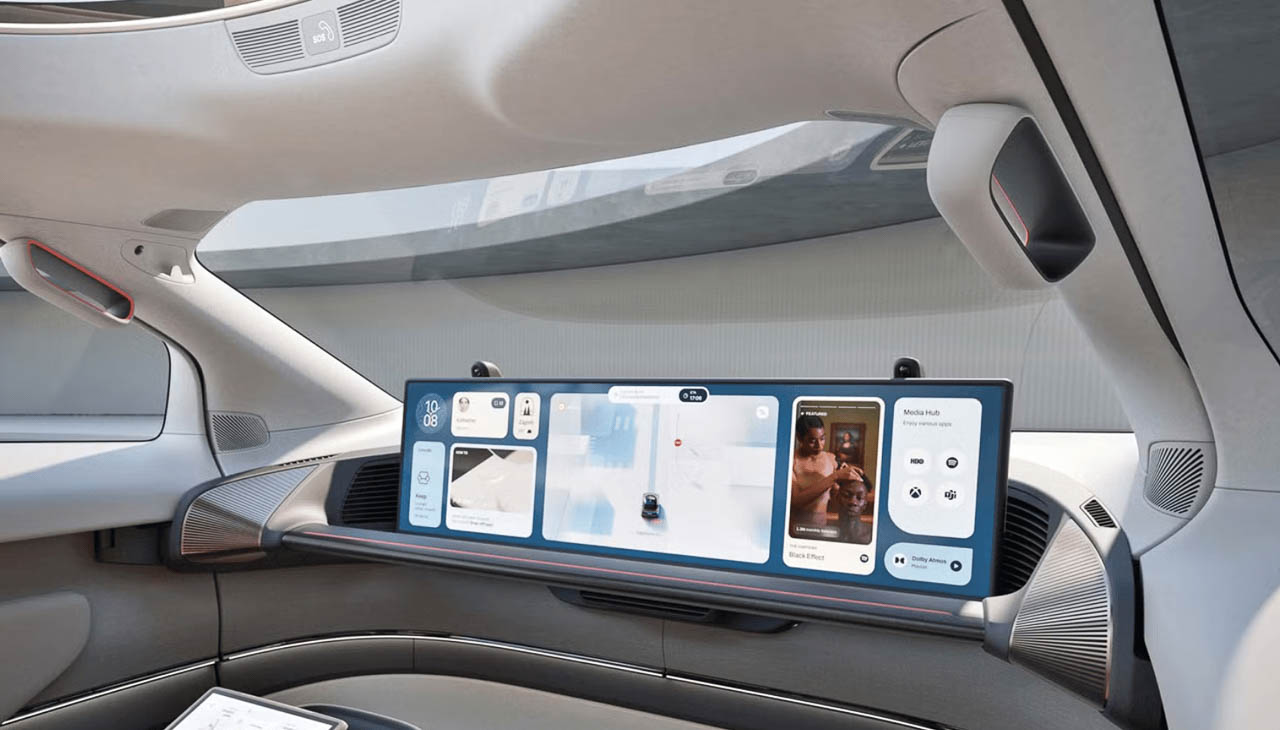
The answer, according to Rimac, looks more like a hotel room than a car. The Verne’s interior abandons the dashboard-centric layout that has defined automobiles for over a century. In its place sits a 43-inch ultra-wide display that stretches across the cabin like a digital horizon line, flanked by lounge seats that recline through five positions including fully flat. Rimac describes the space as “less automotive and more like a living room,” and the company means this literally. There are no controls to learn, no interfaces to master, no traditional automotive vocabulary at all.

Designing From the Inside Out

Most vehicles begin as an engine bay connected to a passenger compartment. The proportions follow predictable rules: hood length communicates power, wheelbase suggests stability, and the cabin fits whatever space remains after mechanical necessities claim their real estate. The Verne inverts this hierarchy completely.

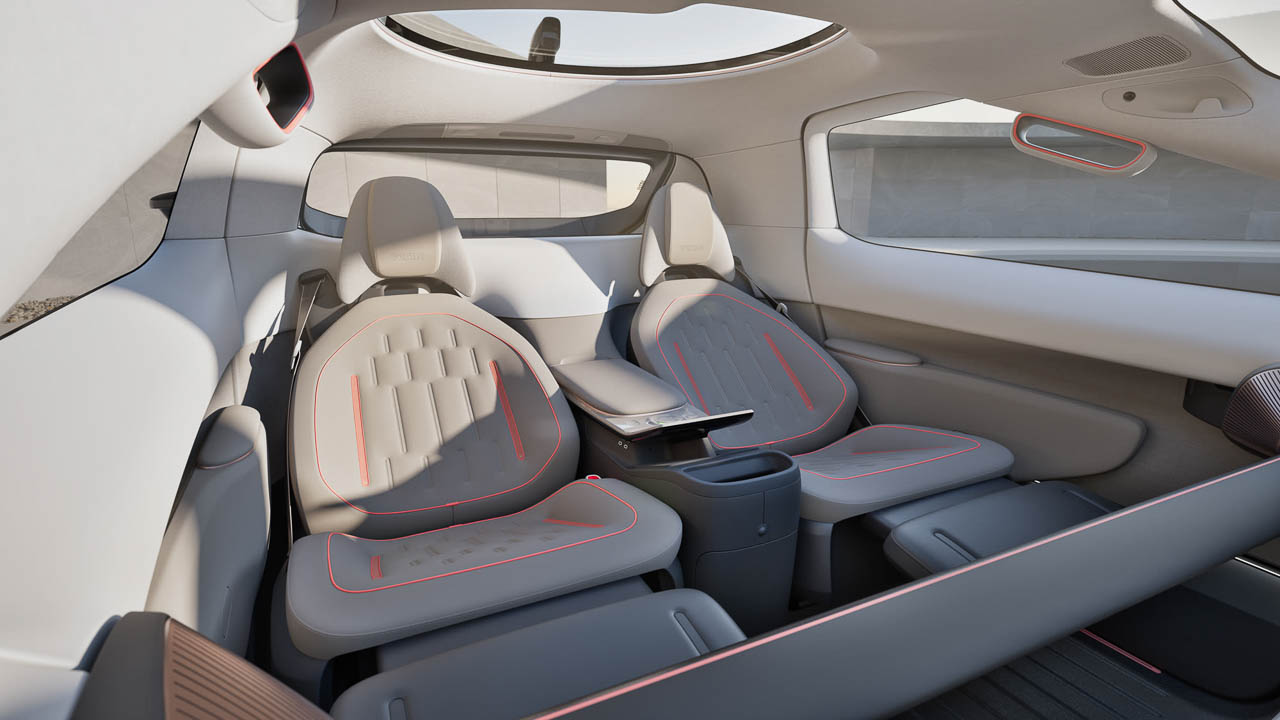
Rimac’s design team started with a two-person living room brief and worked outward. The result is a compact exterior with a trapezoidal profile, short overhangs, and a tall cabin that claims more legroom than a Rolls-Royce despite fitting easily on narrow European streets. This is not marketing exaggeration. When you remove the engine bay, transmission tunnel, and driver’s cockpit, the remaining volume can be redistributed entirely toward passenger comfort.

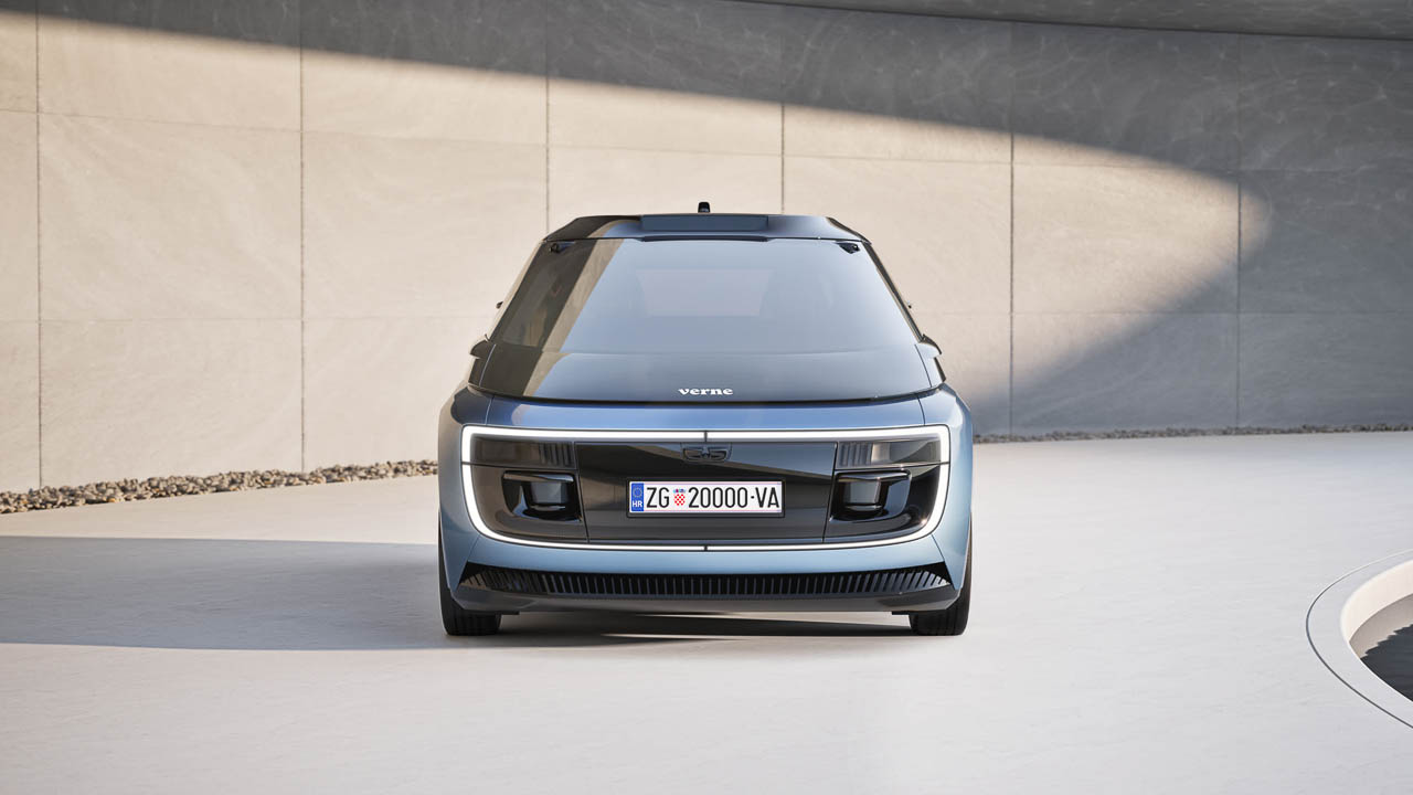
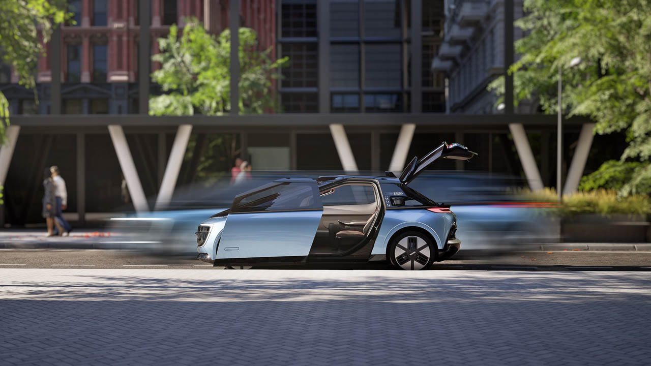
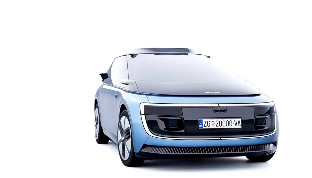
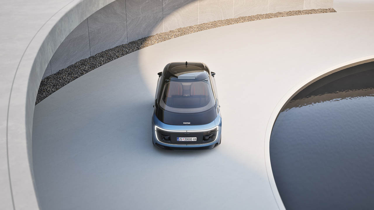
The exterior reads as a clean monovolume pod, almost architectural in its simplicity. Unlike many autonomous test vehicles, which wear their sensor arrays like medical equipment strapped to the roof, the Verne integrates its Mobileye hardware directly into the bodywork. The lidar, radar, and camera systems that enable Level 4 autonomy remain invisible from the passenger’s perspective. This design choice reflects a deeper philosophy: the technology should enable the experience without announcing itself.

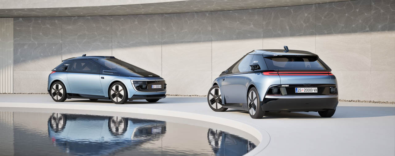
Twin sliding doors reinforce this architectural thinking. Rather than swinging outward into traffic or requiring passengers to squeeze past a door edge, Verne’s doors glide along the body, opening a full entry that lets you step in and sit down in a single motion. For a vehicle designed to operate in dense urban environments, picking up passengers along crowded curbs, this is not merely convenient. It is the kind of detail that separates mobility design from automotive styling.

The Lounge Cabin as a New Typology

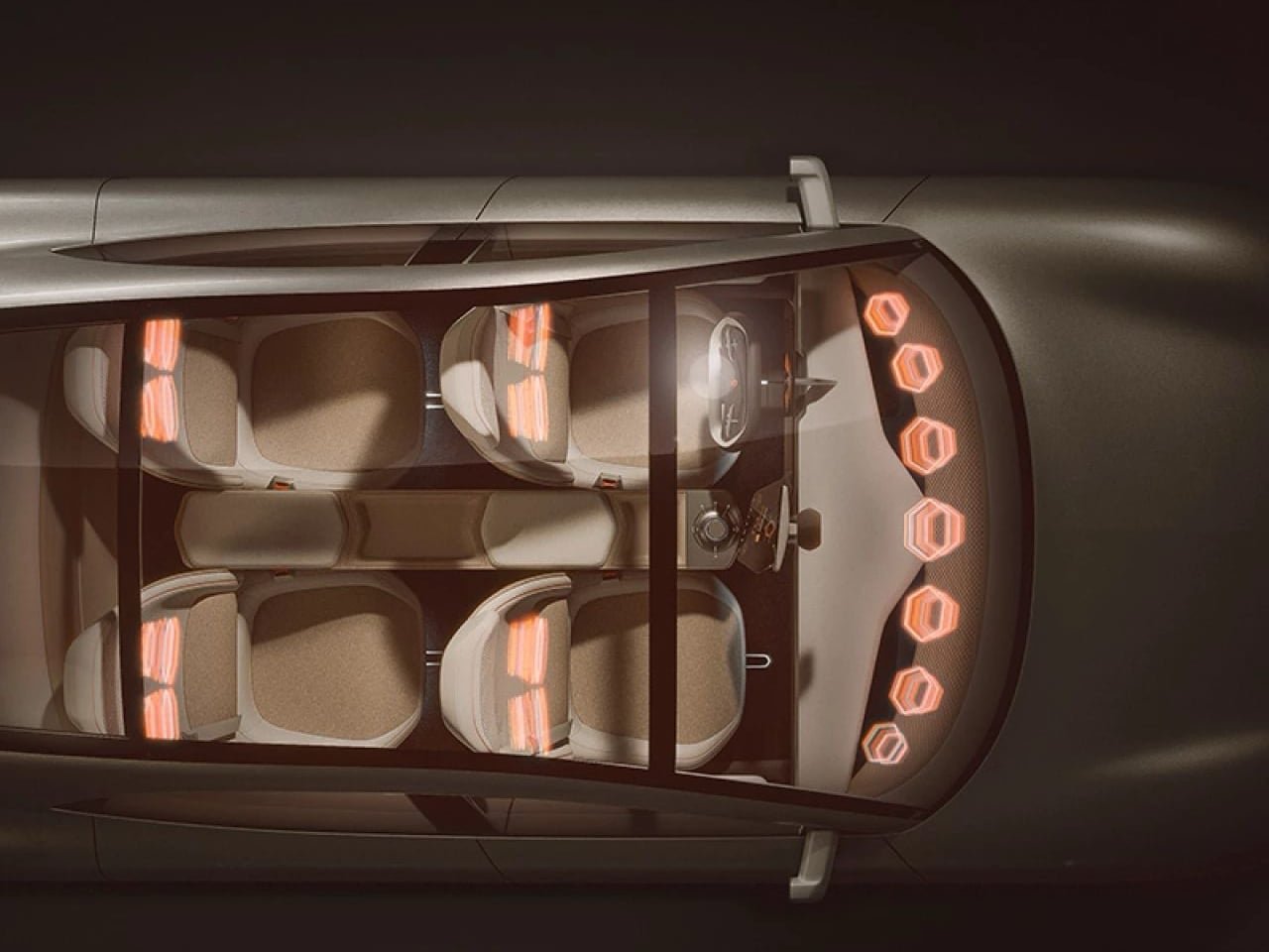
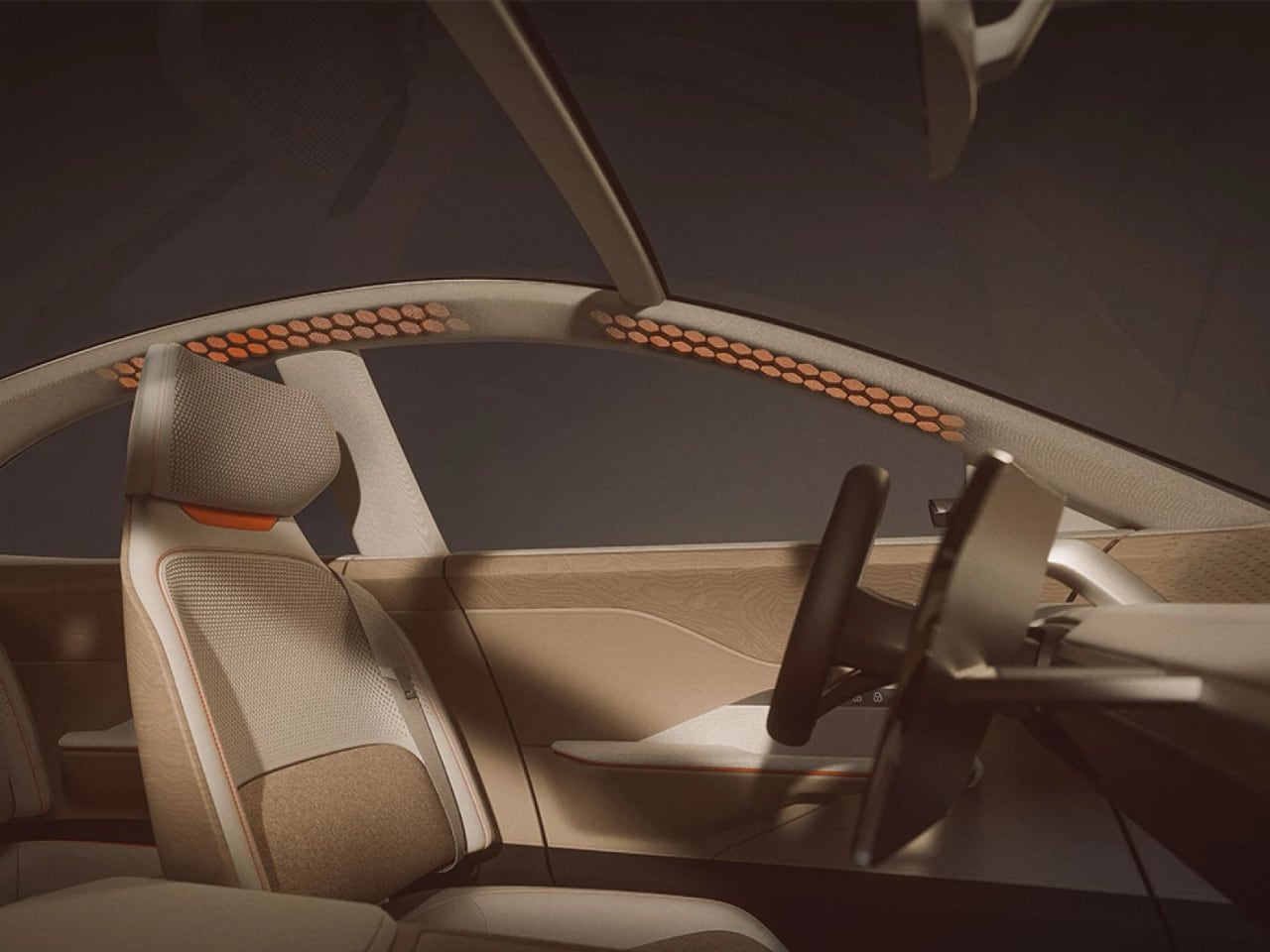
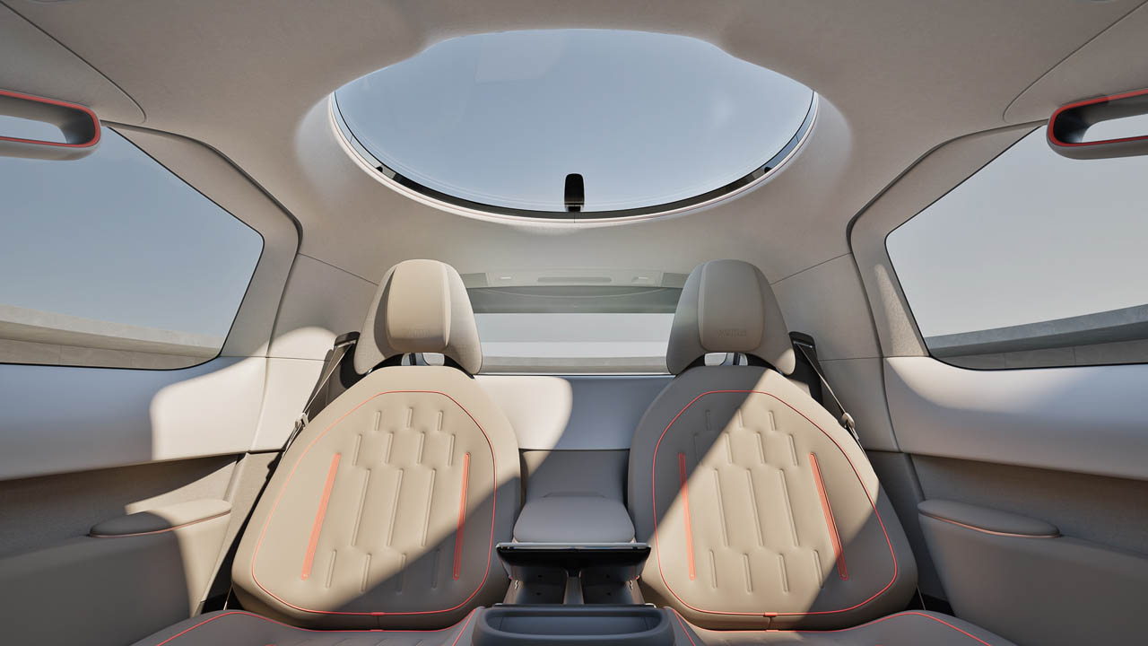
Step inside the Verne and the absence of traditional automotive elements creates an immediate spatial shift. There is no steering column to navigate around, no center console dividing driver from passenger, no dashboard cluttering the forward view. The cabin feels less like sitting in a car and more like settling into a premium railway compartment or private jet. The 43-inch display serves multiple functions depending on context: cinema screen, workspace, or simply a window to curated content during transit.

A 17-speaker audio system surrounds the cabin, and the circular Halo ring sunroof overhead washes the space in ambient light that Rimac calibrated to feel warm and residential rather than automotive. The seats themselves draw more from airline business-class design than traditional car buckets, with deep recline options that transform the vehicle into a genuine nap pod. What makes this interior approach significant is not the individual features. Large screens and reclining seats exist in luxury vehicles already. The significance lies in the coherence: without a driver to accommodate, every design decision can optimize for passenger experience alone. The seating geometry, the display placement, the ambient lighting, the acoustic tuning all work toward a single purpose rather than competing with driver-centric requirements.

Rimac included one deliberate exception to the screen-dominated interface. A physical “Median” control sits within reach, providing a tactile way to start and end rides. In a cabin stripped of mechanical controls, this single physical interaction point offers psychological reassurance. You are still in control of something, even when the vehicle handles everything else. This is furniture design meeting transportation design, with transportation losing its traditional priority.

Why Two Seats Is a Design Choice, Not a Limitation

The Verne’s two-seat configuration will strike many observers as restrictive. Conventional automotive thinking says more seats equal more utility, more potential passengers, more flexibility. Rimac’s research led them to a different conclusion.

Analysis of ride-hailing data reveals that approximately 90% of trips involve one or two passengers. The rear bench seat in a typical sedan, the one that supposedly provides flexibility, sits empty on nine out of ten journeys. This is not an argument against four-seat vehicles. It is an argument for purpose-built alternatives. By eliminating that largely unused rear space, Rimac freed up volume for stretch-out legroom, substantial luggage capacity, and a sense of openness that a cramped four-seat cabin cannot provide.

Right-Sizing Performance for Cities

The powertrain specification tells a story of intentional restraint. Where the Nevera produces nearly 2,000 horsepower, the Verne makes do with approximately 150 kW. The battery pack holds 60 kWh compared to the Nevera’s 120 kWh setup. Range reaches roughly 240 kilometers, modest by EV standards but more than sufficient for urban fleet operation where vehicles return to charging hubs between shifts.

This represents a deliberate rejection of the spec-sheet competition that dominates electric vehicle marketing. Rimac could have installed larger batteries and higher-output motors. The company certainly has the engineering capability. Instead, they optimized for city duty: lower material consumption, easier charging cadence, reduced manufacturing complexity, and a lighter footprint for the urban environments where Verne will operate. The performance numbers are not a compromise. They are a design decision as intentional as the sliding doors or the lie-flat seats.

Autonomy as Invisible Infrastructure

The Verne runs on Mobileye Drive, a purpose-built autonomous driving platform that integrates multiple lidar units, radar arrays, and over thirteen cameras. This sensor architecture enables Level 4 autonomy, meaning the vehicle can handle all driving tasks within its operational domain without human intervention or supervision. For design purposes, the important word is “invisible.” The entire autonomous stack exists to enable the clean cabin experience. Every sensor, processor, and software system works toward a single goal: erasing the need for human attention to the road.

Rimac extended this invisible infrastructure philosophy to the user experience layer. An app lets riders configure their preferred environment before the vehicle arrives: temperature, seat position, ambient lighting, music selection, even scent. When the Verne pulls up, your ride is already personalized. You do not adjust anything. You simply enter a space that was curated for you. This shifts the experience from operating a vehicle to inhabiting one. The entry system reinforces this transition: instead of a door handle, you unlock via keypad or app, a gesture more architectural than automotive, closer to entering a hotel room than climbing into a car.

A New Species of Urban Object

The Verne represents something the automotive industry has been circling for years without quite achieving: a vehicle designed entirely around passengers rather than drivers. Previous attempts at autonomous concepts retained too much conventional automotive vocabulary. They looked like cars that happened to drive themselves. The Verne looks like something else entirely, a mobile room that happens to move through cities.

Rimac plans initial deployments in European and Middle Eastern cities starting around 2026, with service hubs and charging infrastructure designed as extensions of the Verne’s visual language. The vehicle becomes part of a larger system, a fleet of identical pods circulating through urban environments, picking up passengers, delivering them, returning to charge. This is not personal transportation in the traditional sense. It is infrastructure that feels personal.

The questions this raises extend beyond Rimac’s specific implementation. What happens to automotive identity when the driver disappears? How do cities redesign curb space for vehicles that open sideways? Does the two-seat configuration represent a constraint or an intentional intimacy that larger vehicles cannot offer? The Verne does not answer all of these questions. But it is the first production-intent vehicle that forces the industry to ask them seriously.

The hypercar maker from Croatia has delivered something unexpected: a slow, quiet pod that may influence urban mobility design more profoundly than any 250-mph supercar ever could. Sometimes the most ambitious engineering is knowing when to stop.

The post Rimac’s Verne Turns the Robotaxi Into a Private Lounge on Wheels first appeared on Yanko Design.

Hiroshi Fujiwara’s TAG Heuer Carrera Chronograph Is Minimalism With Purpose

What happens when a Swiss racing watch is redesigned by the godfather of Japanese street culture? TAG Heuer answers that question with the Carrera Chronograph x Fragment Limited Edition, a collaboration with Hiroshi Fujiwara that transforms the brand’s flagship racing chronograph into something that looks more at home paired with Japanese selvedge denim and minimalist sneakers than pit-lane timing equipment.

Designer: TAG Heuer + Hiroshi Fujiwara

This is TAG Heuer’s third partnership with Fujiwara’s Fragment label, following earlier Carrera and Autavia projects, and it represents the most thorough application of his design philosophy to date. Fujiwara built Fragment into a cult streetwear imprint over decades of work in Tokyo’s fashion underground, and his aesthetic has always favored reduction over addition. The result is a chronograph that reads as much like a gallery piece as a timing instrument.

From Tool Watch to Tuxedo

The visual transformation begins with the glassbox crystal, a boxed sapphire design that gives the watch a more polished, architectural presence than traditional tool-watch bezels allow. Underneath sits a matte black opaline dial paired with a chalk-white raised flange carrying a silver tachymeter scale. The combination is loosely reminiscent of a tuxedo dial, formal and restrained where most chronographs lean into busy, information-dense layouts.

Fujiwara’s most striking intervention is the near-total elimination of numerals. The subdials lose their snailing texture and numeric markers entirely, replaced by pure graphic dashes: 12 on the small seconds, 30 on the minute counter, 24 on the hour totalizer. These read as abstract timing scales rather than conventional registers, turning functional displays into visual rhythm.

The standard baton hour markers disappear as well, replaced by tiny raised white pyramidal dots finished with gray Super-LumiNova. Even the lume dots that typically run along the seconds track are gone, leaving the dial remarkably clean.

Where the standard glassbox Carrera reads as a refined sports watch, the Fragment edition presents itself as something closer to wearable industrial design. The dial still reads unmistakably as a Carrera: the proportions, the subdial layout, the tachymeter flange all telegraph the model’s identity. But the calm, logo-light execution feels gallery-ready in a way few limited editions achieve. This is minimalism with purpose, not minimalism as marketing shorthand.

Hidden Graphics: The Fragment Easter Eggs

Fragment collaborations have always rewarded close looking, and this watch continues that tradition through subtle logo placement. Previous Fragment x TAG pieces positioned the double-bolt Fragment logo at 12 o’clock, but the glassbox Carrera places its date window at that position. Rather than abandon the signature branding, Fujiwara moves it into the date wheel itself: on the first of each month, a single lightning bolt appears in the date window, and on the 11th, the full Fragment double-bolt logo takes its place. The calendar becomes a hidden Easter egg, a detail that only reveals itself twice monthly and rewards those who know to look.

Fragment’s name appears as printed text at 6 o’clock on the dial, while the full double-bolt-in-circle logo occupies the sapphire exhibition caseback. The center links of the seven-link steel bracelet receive black PVD coating, echoing the blacked-out aesthetic that Fragment fans recognize from countless sneaker and apparel collaborations.

The fun here is not in loud colors or obvious branding but in discovering these almost-secret cues over time. Wearing the watch becomes an ongoing conversation with its design, a quality that aligns perfectly with Fragment’s approach to product collaborations across fashion, footwear, and now horology.

Serious Watch, Playful Surface

Beneath the minimalist aesthetic sits genuine horological engineering. The TH20-00 automatic movement features a column wheel and vertical clutch, representing TAG Heuer’s modern approach to chronograph mechanics. The 4 Hz beat rate enables smooth seconds-hand sweep, while the 80-hour power reserve means the watch can sit unworn over a long weekend and still keep time when picked up Monday morning. The 39 mm stainless steel case hits a sweet spot for contemporary tastes: large enough to read clearly but compact enough to slide under a shirt cuff. Water resistance reaches 100 meters, positioning this as a genuine daily-wear chronograph rather than a display-only collectible.

The engineering backbone matters because it anchors the aesthetic story. This is not a fashion watch with movement as afterthought, but a serious chronograph that happens to wear a limited-edition design collaboration on its surface.

Context for Design Enthusiasts

Compared to past Fragment x TAG pieces, this edition pushes furthest into reduction. Earlier collaborations applied Fragment’s aesthetic to vintage-inspired designs, but the glassbox Carrera is already a contemporary reinterpretation, and Fujiwara’s work here strips it even further. Where other Japanese-inspired limited editions in watchmaking have experimented with color, texture, or material contrasts, this one commits to graphic restraint as its central idea.

Limited to 500 pieces at $9,050, with pre-orders opening December 3 at 6:00 AM, the Carrera Chronograph x Fragment Limited Edition arrives individually numbered on the caseback ring. Each comes on the steel seven-link bracelet with butterfly clasp, no strap alternatives offered.

The watch poses a question worth considering: Is this the future of high-end collaborations? Fashion designers have traditionally brought color palettes and material experiments to watch partnerships. Fujiwara instead quietly rewrites the visual language of an iconic object, keeping its proportions, its engineering, and its heritage while fundamentally shifting how it communicates.

The post Hiroshi Fujiwara’s TAG Heuer Carrera Chronograph Is Minimalism With Purpose first appeared on Yanko Design.

Sony Alpha 7 V Integrates AI Processing Into Its Imaging Engine, Rewrites Full-Frame Expectations

Sony’s Alpha 7 line has defined full-frame mirrorless photography for over a decade. The fifth generation arrives with a fundamental change: the AI processing unit now lives inside the BIONZ XR2 imaging engine rather than running on a separate chip. Every imaging function shares the same processing backbone, and the performance gains cascade through autofocus, subject recognition, color science, continuous shooting, and video.

Designer: Sony

The Alpha 7 V (ILCE-7M5) pairs that integrated processing architecture with a new partially stacked Exmor RS CMOS sensor. At approximately 33 megapixels, it strikes a balance between resolution and file manageability, but the real story is readout speed: 4.5 times faster than the Alpha 7 IV. Faster readout means reduced rolling shutter distortion during fast panning. It means blackout-free continuous shooting up to 30 fps with full AF/AE tracking. It means 14-bit RAW capture at that same 30 fps speed without compromising autofocus performance. Sony also announced the FE 28-70mm f/3.5-5.6 OSS II (SEL28702), a compact standard zoom designed to match these capabilities.

The Pre-Capture function deserves its own attention. It records up to one second before you press the shutter, storing frames in a rolling buffer until you commit to the shot. For unpredictable subjects (pets, children, sports action), this changes the timing equation entirely. Still image performance reaches 16 stops of dynamic range in mechanical shutter mode, ensuring tonal detail across highlights and shadows even in scenes with extreme contrast.

The Real-time Recognition AF system now identifies humans, animals, birds, insects, cars, trains, and airplanes. Sony claims a 30% improvement in eye recognition performance compared to the Alpha 7 IV, measured through internal testing. The 759 phase-detection points cover 94% of the frame, and low-light autofocus extends down to EV -4.0. AF/AE calculations run 60 times per second, continuously adjusting both parameters during high-speed shooting.

Color science gets its own AI treatment. A newly introduced AI-driven Auto White Balance leverages deep learning technology for light source estimation, automatically identifying the shooting environment’s light source and adjusting color tones for natural, stable color reproduction. This should reduce post-production workload for photographers who shoot across varied lighting conditions.

Video capabilities expand significantly for hybrid creators. The Alpha 7 V introduces 7K oversampled 4K 60p recording in full-frame mode and 4K 120p recording in APS-C/Super 35mm mode. Full pixel readout without pixel binning enables highly detailed footage. Dynamic Active Mode provides smooth stabilization for handheld shooting. An Auto Framing function automatically maintains optimal subject composition during recording. New in-camera noise reduction and improved internal microphone functionality address the audio side.

The operability improvements read like a professional wish list: Wi-Fi 6E GHz compatibility, dual USB Type-C ports, vertical format support, adjustable electronic shutter sound, a 4-axis multi-angle monitor combining tilt and vari-angle design, and an improved grip. Battery life reaches approximately 630 shots using the viewfinder (CIPA standards), with a Monitor Low Bright mode extending that further. Thermal management supports extended 4K recording at approximately 90 minutes at 25°C and 60 minutes at 40°C.

The Companion Lens and What It Costs

The FE 28-70mm f/3.5-5.6 OSS II earns attention beyond its kit lens positioning. When paired with compatible cameras, it offers up to 120 fps AF/AE tracking, continuous shooting up to 30 fps, seamless body-lens coordinated image stabilization, AF available during zooming, and built-in breathing compensation support. This addresses the original 28-70mm kit lens’s sharpness and autofocus speed criticisms while maintaining the lightweight profile that full-frame mirrorless shooters expect.

Sony aligned this release with its Road to Zero environmental initiative. Manufacturing facilities for imaging products operate at 100% renewable energy. The packaging uses Sony’s Original Blended Material (bamboo, sugarcane fibers, post-consumer recycled paper) instead of plastic.

The Alpha 7 V body arrives by the end of December 2025 for approximately $2,899 USD ($3,699 CAD). The kit with the SEL28702 lens follows in February 2026 for approximately $3,099 USD ($3,899 CAD). The lens alone: $449 USD ($599 CAD), also February 2026. All products will be sold through Sony and authorized dealers throughout North America.

The post Sony Alpha 7 V Integrates AI Processing Into Its Imaging Engine, Rewrites Full-Frame Expectations first appeared on Yanko Design.

Yelp’s 2026 Design Forecast: The Trends Reshaping How We Live

The numbers tell a story that design magazines have been hinting at for months. Yelp’s latest trend report, analyzing millions of consumer searches between 2023 and 2024, confirms what forward-thinking designers already suspected: the home is becoming a deliberate statement of values, not just a collection of furniture.

Conversation pits are leading the charge. Searches for these sunken living areas surged 369%, signaling a fundamental rejection of the open-plan uniformity that dominated the 2010s. People want intimacy again. They want spaces that pull them together rather than spreading them across vast, undifferentiated square footage. The mid-century roots of this trend run deep, with searches for mid-century furniture climbing 319% and curved furniture up 124%. These aren’t isolated preferences. They represent a cohesive design philosophy centered on human-scale spaces that encourage actual conversation.

The Texture Revolution

Flat walls are dying. Roman clay finishes saw searches explode by 312%, while lime paint climbed 162%. Fabric wallpaper rose 123%, and wall stencils increased 68%. This collective movement toward tactile surfaces reveals a deeper truth about contemporary design priorities.

People have spent years staring at screens. Their homes responded by becoming increasingly smooth, minimal, and digital-friendly. Now the pendulum swings. Hands want something to touch. Eyes want variation and depth. The Roman clay trend is particularly telling because it demands imperfection. Each application creates unique texture, mottled color, and surfaces that change with light throughout the day. This is the opposite of the perfectly smooth drywall that builders have standardized for decades.

The avocado bathroom deserves attention here too. Searches for ’70s bathrooms jumped 124%, with green countertops following at the same rate. Bathroom remodeling searches increased 84%. But this isn’t nostalgia for nostalgia’s sake. Modern interpretations use nuanced jade and sage tones with contemporary fixtures. The color brings warmth. The execution stays current.

Japandi’s Second Wave

The fusion of Japanese and Scandinavian minimalism refuses to fade. Japandi searches climbed 105%, but the supporting data reveals where this trend is evolving. Fluted panels exploded by 459%. Natural stone rose 51%. Biophilic design increased 124%, alongside woven window shades at the same rate and jute rugs at 60%.

This second wave of Japandi moves beyond the surface aesthetics that defined its first popularity cycle. The emphasis shifts toward materiality and texture rather than mere visual simplicity. Fluted panels create rhythm and shadow play. Natural stone introduces geological time into domestic spaces. Woven materials connect interiors to craft traditions that predate industrial manufacturing. The philosophy remains minimalist, but the execution has matured. Spaces built on these principles feel grounded rather than sparse, considered rather than empty.

Travel plays a role in this evolution. As more people visit Japan and experience its design sensibilities firsthand, they return with refined understanding of how restraint and material quality work together. Tourism shapes taste, and taste shapes the search bar.

The Invisible Technology Thesis

Smart home technology is going underground. Searches for smart windows rose 49%, smart lighting increased 32%, and smart appliances climbed 40%. But the real story lies in the concealment searches. Built-in bookshelves surged 124%. Invisible kitchens with hidden storage jumped 68%.

The design community spent years debating whether technology should be celebrated or hidden. The data suggests resolution: people want capability without visual intrusion. They want lights that respond to voice commands from fixtures that look like ordinary fixtures. They want kitchens that function as high-tech command centers but photograph like serene minimalist spaces. Jennifer Aniston’s illuminated onyx sink basin represents the apex of this thinking. The surface glows. The technology disappears.

This invisible technology trend connects directly to the broader texture movement. When appliances hide and screens retract, walls become the primary visual element. Those walls better be interesting. Roman clay and fluted panels fill the visual space that technology once occupied. The home becomes a gallery of surfaces rather than a showroom of gadgets.

Black as Design Strategy

Black countertops rose 123%. Black furniture increased 12%. These numbers underscore a shift toward intentional contrast as a design strategy rather than an afterthought.

Interior design expert Taylor Simon’s “unexpected red theory” has influenced how designers think about strategic color deployment. Black operates on similar principles. A black countertop against light cabinetry creates visual anchor points. Black furniture pieces become sculptural elements that organize surrounding space. The approach requires restraint. Too much black collapses into monotony. Applied surgically, it transforms ordinary rooms into composed environments where the eye knows where to rest.

The contrast philosophy extends beyond color. It manifests in the juxtaposition of textured and smooth, natural and manufactured, vintage and contemporary. Curved mid-century furniture against rectilinear architecture. Woven jute against polished concrete. The design language emerging from this data prioritizes tension and dialogue between elements rather than uniform harmony.

Memory as Material

Shadowbox searches increased 34%. Film lab searches rose 88%. Film developing climbed 54%. Together, these numbers reveal a design trend that treats personal history as raw material.

Custom framing services report growing demand for memory displays that transform scrapbook contents into wall art. Travel mementos, film photographs from analog cameras, keepsakes from significant moments. These aren’t arranged in albums anymore. They’re composed into visual statements that hang alongside purchased art.

This trend intersects with the broader rejection of generic decor. Mass-produced wall art serves a function, but it doesn’t tell a story. A framed collection of Polaroids from a specific trip, ticket stubs from meaningful concerts, pressed flowers from important occasions: these objects carry narrative weight that manufactured decor cannot replicate. The home becomes autobiography.

Where This Leaves Us

The throughline connecting these trends points toward a single thesis: design in 2026 will prioritize meaning over minimalism, texture over sleekness, and personal narrative over trend compliance.

The conversation pit revival matters because it privileges human connection over architectural showmanship. The texture movement matters because it restores sensory richness to spaces flattened by digital life. Japandi’s evolution matters because it demonstrates how design philosophies mature beyond their initial aesthetic expressions. Hidden technology matters because it resolves the long tension between capability and beauty. Strategic contrast matters because it treats composition as seriously as color.

None of these trends exist in isolation. They form a coherent vision of domestic space as refuge, as expression, as carefully curated environment that reflects inhabitant values rather than developer defaults. The search data quantifies what designers intuit. People want homes that feel like themselves, not like everyone else’s Pinterest board. The numbers say they’re willing to invest, to research, to seek professional help in achieving that goal.

The 2026 home will have texture you can feel, spaces that pull people together, technology that serves without announcing itself, and walls decorated with personal history. It will reference the past without copying it. It will embrace natural materials while leveraging smart systems. It will be, in short, deliberately designed rather than passively accumulated. The data says so.

The post Yelp’s 2026 Design Forecast: The Trends Reshaping How We Live first appeared on Yanko Design.

Every MoonSwatch Cold Moon Has a One-of-a-Kind Laser-Engraved Snowflake

Swatch looked at December and thought: what if a watch could feel like the quiet before snowfall? The MoonSwatch Mission to Earthphase Moonshine Gold “Cold Moon” drops the navy-and-white palette of its predecessor for something bolder in its restraint. Pure white Bioceramic. White crown. White pushers. White strap. The effect is startling, almost clinical, until you notice the blue hands catching light like ice crystals at dawn.

Designer: Swatch

The moonphase disc carries two Moonshine Gold moons, and this is where the Cold Moon earns its place in the MoonSwatch lineup. One wears Snoopy’s face (the beagle’s NASA credentials run deep). The other? A laser-engraved snowflake. And here is the trick: every single snowflake pattern is unique. Swatch somehow turned quartz mass-production into something resembling one-of-a-kind craft. Your Cold Moon is literally not like anyone else’s.

The earth phase complication at 9 o’clock shows our planet as seen from the lunar surface. It cycles backward compared to a traditional moonphase, which is the kind of detail that rewards the people who actually think about what they’re wearing. Below it, Snoopy and Woodstock in winter gear watch Earth spin. Playful? Yes. But also weirdly poetic for a $450 watch.

Blue printing appears throughout the design: tachymeter text, dial markings, the “dot over ninety” detail Speedmaster collectors obsess over. Against all that white, the blue reads like ink on fresh paper. Grade A Super-LumiNova on the hour markers glows green in darkness, adding functional contrast to the monochromatic scheme.

There is also a UV-reactive hidden detail somewhere on the dial. Swatch is not saying what or where, which is exactly the kind of Easter egg that turns casual owners into obsessive hunters. You will need a black light and some curiosity.

The theatrics extend to availability. It launches December 4, 2025 (the actual Cold Full Moon) and stays in stores until the last day of winter. But after launch day, it only goes on sale when snow is falling in Switzerland. Social media will absolutely lose its mind tracking Swiss weather forecasts. Swatch knows exactly what it is doing.

The Design Read

Seasonal watch releases usually fail because they treat “theme” as decoration. Slap some snowflakes on the dial, call it winter, move on. The Cold Moon succeeds because the design team inverted an entire color system. The white Bioceramic case (a plant-derived ceramic-plastic composite with a matte, almost powdery texture) becomes the dominant material story. Everything else, the blue accents, the gold moons, the starry moonphase backdrop, exists in service to that white.

The 42mm case at 13.75mm thick carries the familiar Speedmaster asymmetry. The biosourced crystal has a box shape with an etched “S” at center. None of this is new to MoonSwatch. What is new is how different these familiar elements feel when the entire palette shifts to winter.

It is still a quartz chronograph. It still costs a fraction of the Omega original. But this one might actually be the most considered design the collaboration has produced.

Spec Detail
Case 42mm x 13.75mm, white Bioceramic
Lug-to-lug 47.30mm
Movement Quartz chronograph, earth phase, moon phase
Crystal Biosourced plastic, box-shaped
Water resistance 3 bar
Strap White rubber, Velcro closure

The post Every MoonSwatch Cold Moon Has a One-of-a-Kind Laser-Engraved Snowflake first appeared on Yanko Design.

New electrostatic car speakers create a massive soundstage

Car audio has operated under a fundamental constraint for decades: speakers need cones, cones need depth, and depth requires space that automotive interiors simply cannot spare. Warwick Acoustics, a UK-based hi-fi company known for headphones that cost as much as a used car, believes it has solved this problem by abandoning cone speakers entirely. The company’s electrostatic speaker system for automobiles measures just 1mm thick and weighs 90% less than conventional units, yet Warwick claims it produces a soundstage that feels ten times larger than the physical cabin.

Designer: Warwick Acoustics

The technology relies on electrostatic principles rather than the traditional cone-and-voice-coil arrangement found in virtually every car speaker today. An ultra-thin, electrically charged diaphragm sits sandwiched between two perforated metal plates that function as electrodes. When audio signals pass through these plates, they generate a varying electrostatic field that pushes and pulls the diaphragm, producing sound waves. This approach eliminates the heavy magnets and moving coils that make conventional speakers bulky and placement-dependent.

The Physics of Perceived Space

The perceived soundstage expansion stems from how electrostatic speakers generate planar, or near-flat, sound waves. According to Warwick Acoustics CCO Ian Hubbard, these planar waves initially sound flat, lacking the soaring highs and booming bass of traditional speaker output. However, human hearing interprets this flatness as distance. “We then perceive this as a sound that has begun further away, in some cases up to 30 meters from our ears, and thus representative of a venue much bigger than the physical size of the car cabin,” Hubbard explains. The brain essentially interprets the acoustic characteristics as originating from a concert hall rather than a cramped interior.

This perceptual trick addresses a persistent limitation of automotive audio. Sound waves naturally flatten and spread as they travel through air, and human ears detect both directionality and apparent distance. Inside a car, speakers positioned in door panels and dashboards create a compressed listening experience because the sound has nowhere to go. Warwick’s approach tricks the auditory system into perceiving space that physically does not exist.

The speaker’s minimal profile enables placement options that conventional units cannot achieve. Warwick suggests mounting points in A-pillars and roof linings, positioning audio sources at or above ear level rather than below it. This elevated placement further enhances the perception of listening to music in a large space, since concert halls and performance venues typically feature speakers or acoustic sources above the audience rather than at floor level.

Material and Manufacturing Advantages

Beyond the acoustic benefits, Warwick’s electrostatic speakers contain no rare earth elements, a notable departure from conventional speaker construction that relies on powerful permanent magnets. The company manufactures its automotive speakers entirely from upcycled and recycled materials, addressing sustainability concerns that increasingly influence automotive purchasing decisions. While the environmental impact of a car’s audio system ranks low on most buyers’ priority lists, the material choices eliminate supply chain vulnerabilities associated with rare earth sourcing.

The thin profile and light weight also translate to potential reductions in digital signal processing requirements. Warwick claims the speed and accuracy of electrostatic speaker response reduces the need for electronic manipulation of audio signals, potentially allowing automakers to use smaller, less power-hungry DSP components. Whether this translates to meaningful cost or efficiency gains at the vehicle level remains to be seen, but the company presents it as an additional benefit beyond pure audio quality.

Market Timing and Production Reality

Warwick Acoustics has been developing this automotive application for years, and the technology appears close to production readiness. The company confirms that a “global luxury car maker” will debut the electrostatic speaker system in a vehicle sometime in 2026, though it declines to identify the manufacturer. Given Warwick’s existing reputation in high-end audio (the company’s headphone and amplifier combinations sell for approximately $50,000), the partnership with a luxury automotive brand aligns with the company’s market positioning.

The luxury segment makes strategic sense for initial deployment. Premium car buyers expect audio systems that justify six-figure vehicle prices, and the ability to market a ten-times soundstage expansion provides compelling differentiation. Whether the technology eventually scales to mainstream vehicles depends on manufacturing costs and whether the perceived audio benefits translate across different listening preferences and cabin configurations.

The post New electrostatic car speakers create a massive soundstage first appeared on Yanko Design.

Rike Predator: When Integral Construction Defines the Future of EDC Knife Design

There’s a peculiar tension at work when CNC machines create objects that look grown rather than made. The Rike Predator exists in this liminal space, where five-axis precision milling produces curves that read as biological. Richard Wu has weaponized this contradiction. His knife appears to have evolved rather than been designed, yet every surface betrays the obsessive control of someone who measures in microns.

Designer: Richard Wu / Rike Knife

I keep returning to the handle’s topology. The curves don’t reference any specific natural form, which is precisely why they feel organic. Wu avoided the trap of biomimicry, that lazy design shortcut where everything becomes a leaf or a bone or a seed pod. Instead, he created something that triggers our pattern recognition without satisfying it. The brain reads “living thing” without being able to name what living thing. That ambiguity generates visual tension that more literal designs cannot achieve.

The manufacturing reality makes this even stranger. This handle began as a rectangular billet of 6AL4V titanium, the same alloy bolting together airframes and replacing human joints. Industrial material. Industrial process. Yet the output suggests something pulled from the ocean floor or excavated from amber. Wu has essentially tricked titanium into forgetting what it is.

The Vanishing Act

Most folding knives announce their construction. Screws dot the handle scales. Pivot hardware protrudes. Pocket clips bolt on as afterthoughts. The Predator refuses this transparency. Wu has hidden nearly every piece of evidence that this object was assembled at all.

The presentation side shows nothing but unbroken titanium flowing from bolster to pommel. No screw heads. No seams where separate pieces meet. No liner peeking through. The knife could have been cast from liquid metal or 3D printed as a single unit for all the visual information available. This absence reads as confidence. Wu doesn’t need to show you how clever the engineering is because the engineering has made itself invisible.

What remains visible carries meaning precisely because so much has been eliminated. The pivot, rendered in contrasting gold on the darker variant, becomes a focal point by default. The thumb studs, shaped into sculptural teardrops rather than utilitarian cylinders, register as deliberate design choices rather than functional necessities. When you subtract everything possible, what survives better be worth looking at. Wu understood this calculus.

The frame lock mechanism deserves mention here because it reinforces the vanishing act. Typically a separate component, Wu machined it directly from the handle’s titanium. One less part. One less seam. One less interruption in that flowing surface. The lock becomes the handle becomes the knife. Boundaries dissolve.

Material Honesty and Its Complications

Designers love talking about material honesty, that modernist principle where materials should look like what they are. Titanium should read as titanium. Steel should read as steel. The Predator complicates this framework in productive ways.

The titanium handle is honest about being titanium in its weight, its temperature response, its surface hardness. But its form lies constantly about how titanium typically behaves. The material wants to be sheet metal and structural tubing and medical implants. Wu forced it into something approaching sculpture. The honesty exists at the molecular level while the dishonesty operates at the formal level. Both readings are valid.

The blade tells a simpler story. Böhler M390, a powder metallurgy steel from Austria that knife obsessives treat as holy writ. Exceptional edge retention. Genuine corrosion resistance. The ability to take a working edge sharp enough to push-cut newspaper. At 3.74 inches, the drop-point geometry handles utility tasks without crossing into intimidation territory. This is honest tool steel doing honest tool steel work.

The two-tone gunmetal variant introduces another layer to consider. Gold-finished pivot and thumb studs against dark titanium creates deliberate contrast, a conversation between components that the all-silver version deliberately avoids. Neither approach is more correct. They represent different arguments about how materials should relate to each other within a single object.

The Ritual of Manual Deployment

In an era of assisted opening mechanisms and spring-loaded deployment, the Predator demands something old-fashioned: your direct participation. Those sculptural thumb studs aren’t decorative accidents. They’re the interface between your intention and the blade’s movement.

Opening this knife requires a deliberate act. Thumb finds stud, applies pressure, rotates blade through its arc until the frame lock engages. No flippers throwing the blade open with wrist momentum. No buttons triggering compressed springs. The mechanism is your hand, your muscle memory, your learned technique. Wu has made opening the knife into a small daily ritual, a moment of conscious interaction with an object that rewards attention.

This choice filters the audience. Buyers wanting tactical speed and one-handed drama should look elsewhere. The Predator speaks to people who find satisfaction in deliberate action, who treat their tools as partners rather than servants. The deployment method functions as a values statement encoded in mechanical form.

Value Proposition

Four hundred fifty-five dollars for a knife. Four hundred eighty-five for the darker finish. These numbers require justification beyond brand markup and lifestyle positioning.

The integral construction explains much of the cost. Machining a handle from solid titanium billet wastes enormous amounts of material. The cutting time alone dwarfs what conventional folder assembly requires. Add M390 blade steel, heat treatment, hand finishing, and quality control obsessive enough to satisfy Wu’s standards, and the price begins making sense as simple manufacturing economics.

Whether that manufacturing investment produces equivalent value depends entirely on what you’re buying. As a cutting tool, the Predator performs well without dramatically outperforming knives costing half as much. As a design object, a piece of industrial sculpture you happen to carry daily, the value proposition shifts entirely. Some buyers will use their Predator to break down cardboard and slice apples. Others will mostly just hold it, feeling those curves against their palm, appreciating what happens when someone applies genuine design thinking to the oldest tool category humans possess.

Both groups are buying the same knife. They’re just not buying the same thing.

The post Rike Predator: When Integral Construction Defines the Future of EDC Knife Design first appeared on Yanko Design.

Oracle’s Lensless LED Headlight: Killing the Century-Old Lens

For 125 years, every headlight ever made has included one fundamental component: a clear outer lens. Oracle Lighting just deleted it. The world’s first lensless LED headlight system debuting on the 3rd Gen Toyota Tacoma doesn’t just eliminate a component. It removes the single most failure-prone element in automotive lighting, solving problems that have plagued drivers since acetylene flame lamps lit up dirt roads in the 1880s. No more fogging. No more cracking. No more yellowing, hazing, or moisture intrusion. The lens, that seemingly essential protective cover, turns out to be optional after all.

Designer: Oracle Lighting

What Happens When You Remove the Lens

Here’s the immediate visual impact: the headlight housing itself becomes the design statement. Without a clear plastic layer covering the front, the sculpted housing sits exposed, proud, and remarkably customizable. You can paint-match it to your vehicle. Think about that for a moment. Every headlight you’ve ever owned was stuck with whatever clear or slightly tinted lens the manufacturer chose. This system lets you integrate the housing into your truck’s color scheme, creating an OEM-level finish or going full custom for show builds.

The exposed housing showcases the modular Bi-LED emitter pods inside. These aren’t hidden behind foggy plastic or obscured by lens distortion. They’re visible design elements, each pod a precisely engineered component that contributes to the overall visual character. The technical architecture makes this design approach possible. Each LED emitter pod carries IP68-rated ingress protection, meaning dust can’t penetrate it and neither can water under pressure. That’s the same rating you’d expect from the lens itself, except now every individual light component shares that protection level.

Active thermal management keeps each pod operating within optimal temperature ranges. Overheating kills LEDs faster than anything else, so Oracle built cooling directly into the modular system. The pods breathe, dissipate heat, and maintain consistent performance without relying on a lens to trap heat or create condensation. The bracket system reinforces this modular philosophy. Everything mounts to replaceable, reinforced brackets that ship flat for compact packaging, cutting freight costs and reducing shipping damage. Minor collision damage that would normally require a complete replacement becomes a bracket swap.

Why This Actually Matters

Traditional LED headlights trap you in an expensive cycle. One failed LED often means replacing a $1,000+ assembly because manufacturers seal everything together. You can’t access the failed component. You can’t swap it out. You buy the whole unit again.

Oracle’s lensless system flips that model completely. Each Bi-LED pod is individually serviceable and replaceable. DRL fails? Replace that pod. Low beam goes out? Swap that specific emitter. You can often perform these replacements without removing the entire headlight from the vehicle. This isn’t just convenient. It’s sustainable. It reduces electronic waste by letting you repair instead of replace, saving money over the headlight’s lifespan while transforming a traditionally disposable product into something genuinely maintainable.

The 3rd Gen Toyota Tacoma launch makes perfect sense for this technology. Tacoma owners take their trucks off-road, into environments where rocks, mud, and trail debris destroy regular headlights. Cracked lenses are a common casualty on serious trail runs, and moisture intrusion follows shortly after. Without a lens to crack, that failure mode disappears. The IP68-rated pods handle dust and water directly. The modular design means trail damage becomes a quick repair instead of a major replacement.

The paint-matched housing option also appeals to the modification culture around trucks like the Tacoma. Show builds can integrate headlights seamlessly into custom paint schemes. Daily drivers can maintain factory aesthetics while upgrading performance and durability. Installation follows standard headlight replacement procedures, mounting to existing points and connecting to factory wiring without custom fabrication.

The Platform Play

Oracle calls this a technology platform, not just a product. That distinction matters. The lensless architecture works for any vehicle, any lighting application. After the Tacoma debut in early 2026, Oracle plans fitments for the Toyota 4Runner and Ford F-150, with more applications following.

If the lensless design proves as durable and serviceable as Oracle claims, other manufacturers will face pressure to match that capability. Drivers who experience hassle-free maintenance won’t want to return to sealed, disposable assemblies. The $800-$900 price point positions this between budget replacements and premium lighting upgrades, accessible enough for serious enthusiasts while maintaining quality expectations.

Oracle Lighting has spent 25 years developing automotive lighting technology. The lensless system represents years of development, testing, and refinement. The Tacoma launch in early 2026 will be the proof point. Trail abuse, weather exposure, and daily use will test whether eliminating the lens actually delivers on the durability and serviceability promises. If the system performs as designed, expect rapid expansion across vehicle applications.

Follow @oraclelights for behind-the-scenes development updates, application announcements, and pre-order access when the launch window opens.

Product Specifications:

  • Launching on 3rd Gen Toyota Tacoma (early 2026)
  • Future fitments: Toyota 4Runner, Ford F-150
  • Price: $800-$900 per set
  • Modular Bi-LED emitter pods with IP68 protection
  • Active thermal management on all pods
  • Serviceable and replaceable individual components
  • Paint-matchable housing for custom finishes

The post Oracle’s Lensless LED Headlight: Killing the Century-Old Lens first appeared on Yanko Design.

How BMW Designworks Turns Circularity Into Creative Fuel

BMW’s design philosophy operates on a simple premise: emotion first, specs second. Adrian van Hooydonk, head of design, doesn’t mince words about this. Customers feel a product before they ever parse a data sheet.

Designer: BMW

This creates tension when sustainability enters the frame. Circular design has historically meant compromise, a sense of settling for less in service of doing good. The Neue Klasse series, especially the all-electric iX3, flips that script entirely. Van Hooydonk’s team treats circularity as a creative constraint that opens doors rather than closing them. “Circular products can’t feel like a compromise,” he explains. “They need to feel like more, not less.” The circular strategy addresses CO2 reduction at every manufacturing touchpoint, but the real shift happens upstream, in how designers conceptualize materials before a single prototype gets built. Sustainability becomes narrative architecture rather than regulatory compliance.

Designworks and the Benefit Mindset

Julia de Bono runs Designworks. The studio has shaped aircraft interiors, digital interfaces, and consumer products across every category imaginable.

Her philosophy centers on what she calls “benefit mindset,” and she draws an unexpected parallel to make the point. The Impossible Burger didn’t succeed by marketing sacrifice to environmentally conscious consumers. It succeeded by delivering an experience that stood alone. De Bono applies identical logic to automotive design: “Our role is to make the sustainable option not just equal, but superior in customer experience. We want circularity to bring more richness, more presence, more value.”

This reshapes everything about material selection at Designworks. The studio isn’t swapping petroleum plastics for recycled alternatives and calling it progress. Every material choice gets evaluated through tactile experience, visual storytelling, emotional resonance. The circular story becomes brand experience. Design maturity, in de Bono’s view, means infusing narrative from the start rather than bolting sustainability messaging onto finished products.

Materials That Tell a Story

The iX3 cabin demonstrates practical application of circular thinking at scale. PET-based mono-material seat covers deliver expected tactile comfort while radically simplifying end-of-life recycling. Secondary raw materials appear in dashboard surfaces, structural components, chassis elements. The real intelligence shows in disassembly optimization, where BMW engineers separation into products from day one, designing each element for clean post-use extraction.

Traditional luxury interiors layer materials in ways that make recycling contamination nearly inevitable. Leather bonds to foam bonds to structural substrate in combinations that defy clean separation. BMW’s approach designs for that moment fifteen years out when this vehicle reaches end of life. The seat foam separates from fabric covering separates from structural support. Each generation becomes feedstock for the next.

Luxury automotive has always communicated status through abundance. Leather, exotic woods, brushed metals stacked in combinations that signal premium positioning. BMW’s test: can circular materials carry that emotional weight while telling a different story? The mono-material fabrics, advanced eco-plastics, engineered weaves become new vocabulary. Early market response suggests buyers respond when sustainability weaves into ownership experience rather than presenting as trade-off.

Emotion as Strategy

Luxury buyers purchase stories, and BMW understands this dynamic better than most automakers. The circular narrative offers differentiation where performance specs have largely converged across competitors. Someone choosing the iX3 isn’t just acquiring efficient electric mobility. They’re buying into a design philosophy that treats resource consciousness as creative advantage rather than limitation.

Designworks extends this thinking to every touchpoint. Haptic feedback from interior controls, interface animations on cabin displays, the sound design of door closures: all reinforce circular narrative. Materials get selected for emotional response as much as technical performance. De Bono describes the result as “responsible abundance,” luxury that doesn’t require excess to register as premium.

Performance Through a Different Lens

Performance usually means horsepower and acceleration times, but BMW’s circular lens reframes the conversation entirely. Electric drivetrains deliver instant torque and low center of gravity, which liberates designers from packaging constraints that shaped combustion vehicles for a century. Skateboard platform architecture creates interior volumes that would have demanded much larger exterior dimensions in traditional layouts. The performance advantage becomes spatial, experiential, narrative.

Regional markets interpret this differently. American buyers equate automotive strength with physical presence, the ability to command road space and project capability. European and Asian markets often prioritize individual identity, advanced user experience, tech-forward interfaces. Circularity adapts to regional priorities by shaping silhouette, proportion, stance as carriers for localized story. “For us, circularity means shaping the silhouette, the proportions, and the presence,” notes a senior Designworks designer. “It’s not just technical. It’s aesthetic leadership.”

Global Design, Local Values

Designworks runs focus groups across China, North America, Europe, the Middle East. The question: how does sustainable design resonate differently across cultures?

In China, rapidly evolving tastes push toward bolder, more tech-driven expressions. North American markets still value physical presence, which sustainable materials and production must emphasize rather than diminish. BMW resists the temptation of unified global design language. Circularity becomes flexible toolkit, adapting to local values while maintaining consistent material philosophy underneath.

The Competitive Edge

BMW positions sustainability as competitive advantage rather than compliance cost, and the ambition extends well beyond current models. Circularity will shape silhouettes, interior architectures, the ways customers interact with vehicles across the next decade. For design observers tracking automotive evolution, the lesson reaches beyond Munich: sustainability constraints unlock creative solutions when treated as design opportunities rather than regulatory burdens.

Advanced materials combine with emotional storytelling and reimagined performance to create differentiation that competitors struggle to replicate. Resource consciousness becomes precursor to market leadership rather than barrier to it. The rest of the industry would benefit from studying how BMW weaves sustainability, narrative, and design freedom into something that registers as progress rather than sacrifice.

The post How BMW Designworks Turns Circularity Into Creative Fuel first appeared on Yanko Design.

Huawei’s 8,000-Nit Display Is a Design Statement Disguised as a Spec Sheet

Smartphones have become spec sheet battlegrounds. Bigger megapixels. Faster charging. Higher refresh rates. The numbers climb while the actual user experience often stays flat.

Designer: Huawei

Huawei’s Mate 80 Pro Max arrives with an 8,000-nit peak brightness claim that obliterates every competitor on paper. But peel back the marketing headline and something more interesting emerges: a deliberate design philosophy that treats the display as the phone’s defining character trait, not just another specification to maximize.

When Engineering Becomes Industrial Design

The dual-layer OLED panel represents Huawei’s answer to a fundamental physics problem. Traditional OLED displays push a single emissive layer harder to achieve brightness, generating excess heat and potentially shortening panel lifespan. Huawei’s solution stacks two OLED layers, distributing thermal and electrical load across twice the surface area while hitting brightness numbers that single-layer panels cannot match. The engineering choice has profound visual consequences that extend far beyond the headline specification.

HDR content transforms on a dual-layer panel. Highlights carry genuine intensity while shadows retain depth rather than washing out, creating an almost three-dimensional quality to images that photographers and videographers will immediately recognize. The smartphone has become our primary camera, editor, and viewing screen, and Huawei designed this display to serve all three roles simultaneously.

Eye comfort gets attention too. The 1440Hz PWM dimming rate eliminates the invisible flicker that causes strain during extended low-brightness use, addressing one of OLED technology’s persistent criticisms that cheaper panels still struggle with.

Most users will never consciously notice this detail. Their eyes will thank them anyway.

The “8” That Defines Everything

Huawei’s design team turned the model number into a visual identity, and the boldness of that choice deserves recognition in an industry addicted to safe rectangles and generic camera bumps.

The rear panel features a prominent circle highlighting the wireless charging coils, positioned directly above the circular camera module. Together, these two circles stack vertically to form a figure eight that reads as both functional diagram and brand statement. The phone announces itself at twenty feet. Most manufacturers treat rear panel design as an afterthought, a surface to slap logos onto after engineering finishes the real work. Huawei flipped that relationship entirely, making the wireless charging coils a design feature rather than hiding them under featureless glass.

The flat display edges and squared-off sides follow a broader industry shift away from curved screens. Curves looked elegant but created durability problems and made edge interactions imprecise, and Huawei clearly listened to actual user complaints rather than chasing visual trends. The Mate 80 Pro Max prioritizes function over flowing aesthetics, which reads as mature design confidence rather than trend abandonment.

Materials as Message

Kunlun Glass 2 protects the display. Basalt-infused elements reinforce the frame. Polyamide fiber adds structural rigidity. These materials come from aerospace and automotive applications where failure means more than a cracked screen, and Huawei wants you to know it.

The material palette communicates something specific: this phone is built to survive. Whether the exotic composition actually outperforms conventional aluminum and Gorilla Glass remains unproven through real-world abuse testing, but the conceptual intent lands clearly. Huawei wants buyers to feel they’re holding something more substantial than another fragile glass sandwich that shatters on the first drop.

Competitor Philosophies Compared

Apple’s iPhone 17 Pro Max peaks at 3,000 nits outdoors, emphasizing color accuracy, response time, and ProMotion integration instead. Samsung’s Galaxy S25 Ultra settles at 2,600 nits peak, focusing on S Pen ecosystem integration where stylus latency matters more than brightness records.

Realme’s GT 8 Pro pushed to 7,000 nits before Huawei arrived, representing the aggressive spec-chasing that defines much of the Chinese smartphone market where headline numbers drive purchasing decisions more directly than in Western markets. Different priorities produce different design choices, and Huawei one-upped everyone on brightness while wrapping the achievement in more considered industrial design than the pure spec-chasers typically deliver.

Trade-Offs Hidden in Marketing: 8,000 nits requires power.

More power means bigger batteries, shorter runtime, or aggressive throttling when capacity drops. Huawei’s 6,000mAh battery seems modest against Chinese competitors pushing past 7,000mAh, which suggests either extreme confidence in dual-layer efficiency or accepted runtime compromises that won’t appear until real-world testing begins.

Thermal management creates even thornier long-term concerns that no launch event mentions. Excessive heat degrades organic compounds in OLED panels over time, potentially causing permanent brightness loss and color shift in heavily-used screen areas. The dual-layer architecture should help by spreading thermal load across more surface area, but durability implications won’t become clear for years of actual use. And then there’s the practical question: who actually needs 8,000 nits? Screens above 2,000 nits handle direct sunlight adequately for most tasks, and the extreme peak brightness matters primarily for tiny HDR highlights representing blinding light sources like the sun or reflections.

Real value or marketing trophy? Probably both, depending entirely on how you use the device.

What the Brightness Obsession Reveals

The Mate 80 Pro Max embodies a specific philosophy: the display IS the device, and everything else exists to support the viewing experience. The logic tracks, since smartphones evolved into portable screens that occasionally make calls, and optimizing the primary interaction surface makes intuitive sense. But brightness as the defining metric risks missing what actually makes displays pleasant to use: color accuracy, viewing angle consistency, touch response precision, eye comfort across hours of use. A 2,000-nit panel with superior color science might deliver better daily experience than an 8,000-nit screen with mediocre calibration. Huawei historically nails calibration alongside technical specs, so there’s reason for optimism, but the proof requires hands-on time that marketing materials cannot provide.

For Design-Conscious Buyers

The Mate 80 Pro Max succeeds as a design object beyond its brightness claims. The “8” motif creates genuine visual identity. The material choices communicate premium durability. The dual-layer OLED architecture represents meaningful innovation rather than incremental improvement. HarmonyOS remains the elephant in the room for international users, with no Google Play Services meaning no Gmail, no Maps, no YouTube without workarounds, and limited global availability makes the device theoretical for many potential buyers regardless of how compelling the hardware appears.

For those who can access and actually use the Mate 80 Pro Max within its intended market, the display technology offers real advantages for outdoor use, HDR content, and photography demanding accurate highlight reproduction. The design language makes a statement that Apple and Samsung’s safer approaches simply don’t attempt. The brightness arms race continues, and competitors will push toward and beyond Huawei’s record within months.

What matters more than any single number is whether manufacturers use these capabilities to create genuinely better experiences, or simply chase specifications for their own sake. The Mate 80 Pro Max suggests Huawei understands the distinction, even if the marketing still leads with the biggest number.

Display Technology Comparison

Specification Huawei Mate 80 Pro Max iPhone 17 Pro Max Samsung Galaxy S25 Ultra Realme GT 8 Pro
Peak Brightness 8,000 nits 3,000 nits 2,600 nits 7,000 nits
Display Technology Dual-layer OLED Single-layer OLED Single-layer OLED Single-layer AMOLED
PWM Dimming 1440Hz 480Hz Variable 2160Hz
Refresh Rate 1-120Hz LTPO 1-120Hz ProMotion 1-120Hz LTPO 1-120Hz LTPO
Resolution 1320 x 2848 1320 x 2868 1440 x 3120 1264 x 2780
Glass Protection Kunlun Glass 2 Ceramic Shield Gorilla Armor 2 Gorilla Glass Victus 2
Design Philosophy Brightness as identity Color accuracy first Stylus integration Spec leadership

The post Huawei’s 8,000-Nit Display Is a Design Statement Disguised as a Spec Sheet first appeared on Yanko Design.