Outside Parties is the creepiest Playdate game yet, and I’m kind of obsessed

Never underestimate the chilling powers of grainy grayscale imagery and ethereal whooshing sounds. Outside Parties asks, "What if I Spy, but in an alien hell dimension?", and it is impressively unnerving despite the fact that nothing's really happening at any given time. It goes all in on atmosphere, to great effect. This is the Playdate horror game that I've been waiting for. 

Adams Immersive's Outside Parties is a sort of scavenger hunt across a massive image of a realm called the Outside, which can only be visited by astral travel, according to the lore. There are lots of unknowns about what or where it really is, though explorers have mapped it fairly extensively through out-of-body excursions and they've encountered thousands of different entities there, including the spirits of the dead. As the player, you have come across a Hellscryer K5 — the communication device, psychic camera and recorder used for these trips — and now you're combing through the mission logs, getting sucked into the mystery of it all. Think of the K5 as your Playdate, except powered by blood and runes.

At the center of Outside Parties is a 1.44 gigapixel, 360-degree panoramic HDR image which has dozens of eerie scenes hidden within it: skeletons of human, animal and paranormal origin; scary robed figures and occult symbols etched all around; what appear to be fountains and rivers of blood; a Stonehenge of teeth. These are the targets you're meant to track down, and as you hone in and check them off your list, voice signals attached to each one will reveal more and more of the explorer's spellbinding story. 

But this isn't a straightforward "find the object" puzzle game by any means. When you first look at the zoomed-out photo, it's akin to a strip of TV static with some heavily shadowed areas throughout. You can zoom to up to 64 times magnification to get a better look at specific zones, but you also have to adjust the image brightness using the crank to improve the clarity of the objects. Making it brighter or darker will reveal more objects in certain spots while simultaneously obscuring others. There are 150 targets according to the developer, which should take players somewhere from 10-20 hours to complete. I've been at it for hours and still have plenty left to find. (If you're stuck, you can turn to the helpful target lookup page, which provides hints with varying degrees of specificity.) 

All the while as you're hunched over your Playdate, laser-focused on the screen to find targets that are buried in a sea of fuzz, unsettling audio transmissions are cutting in and out, disturbing images are flashing on-screen at random and a constant atmospheric whooshing is playing in your ear. The sound design of this game is seriously brilliant — it's worth playing for that alone, not to mention all the other cool stuff. From the startup page to the menus where you'll find bits of a background story, to the creepy clips of people wailing and ominously reciting numbers, the sounds of Outside Parties make for a truly immersive, disconcerting experience that I previously wouldn't have thought possible on a Playdate. It's really something special. 

Outside Parties also comes with a screensaver that once again makes me yearn for the Playdate Stereo Dock. Pop on the Void Monitor, sit back, and enjoy the horrifying sights and sounds of the Outside. 
This article originally appeared on Engadget at https://www.engadget.com/gaming/outside-parties-is-the-creepiest-playdate-game-yet-and-im-kind-of-obsessed-213142541.html?src=rss

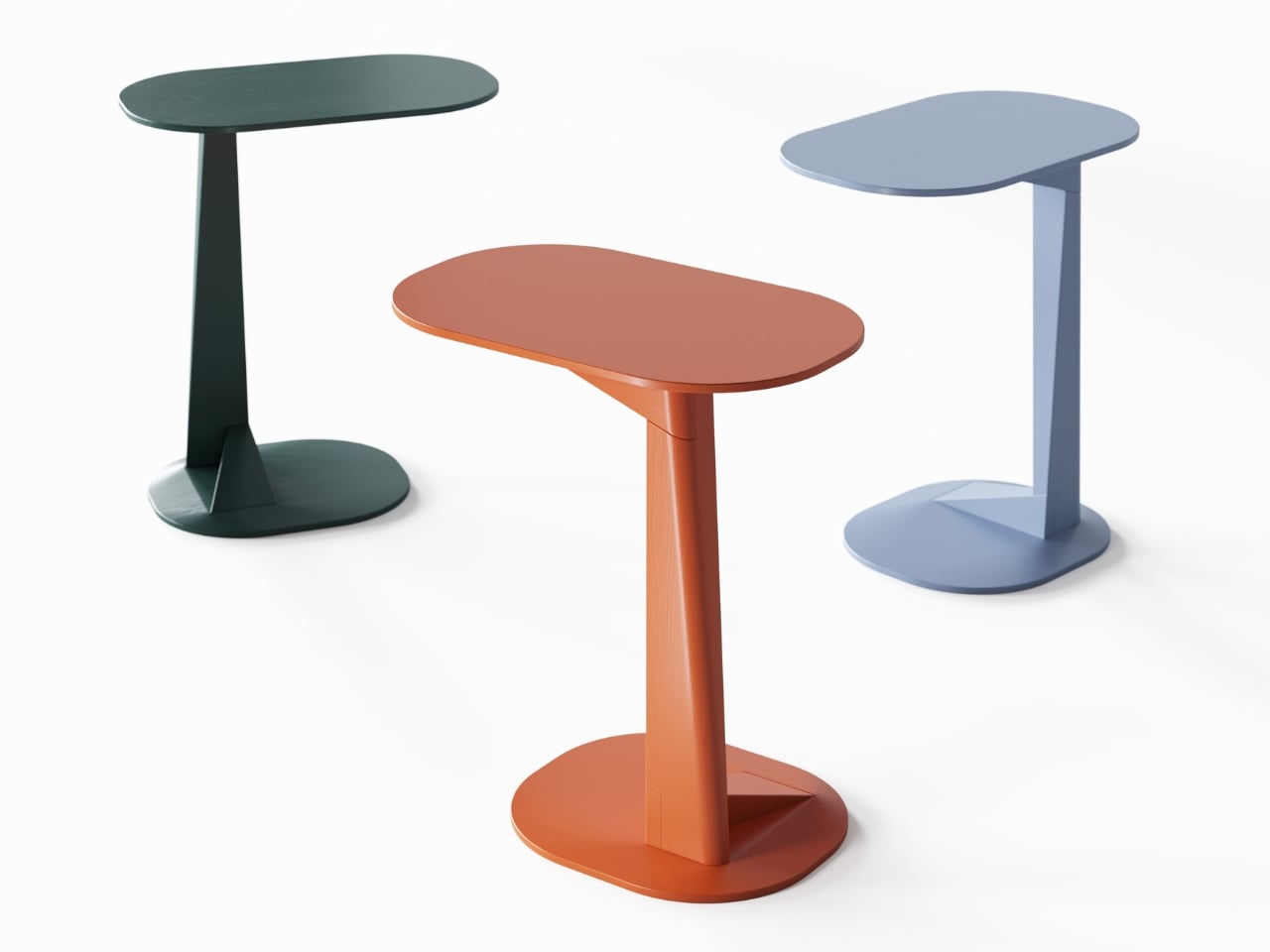
The Tong Side Table Turns Geometry Into Good Company


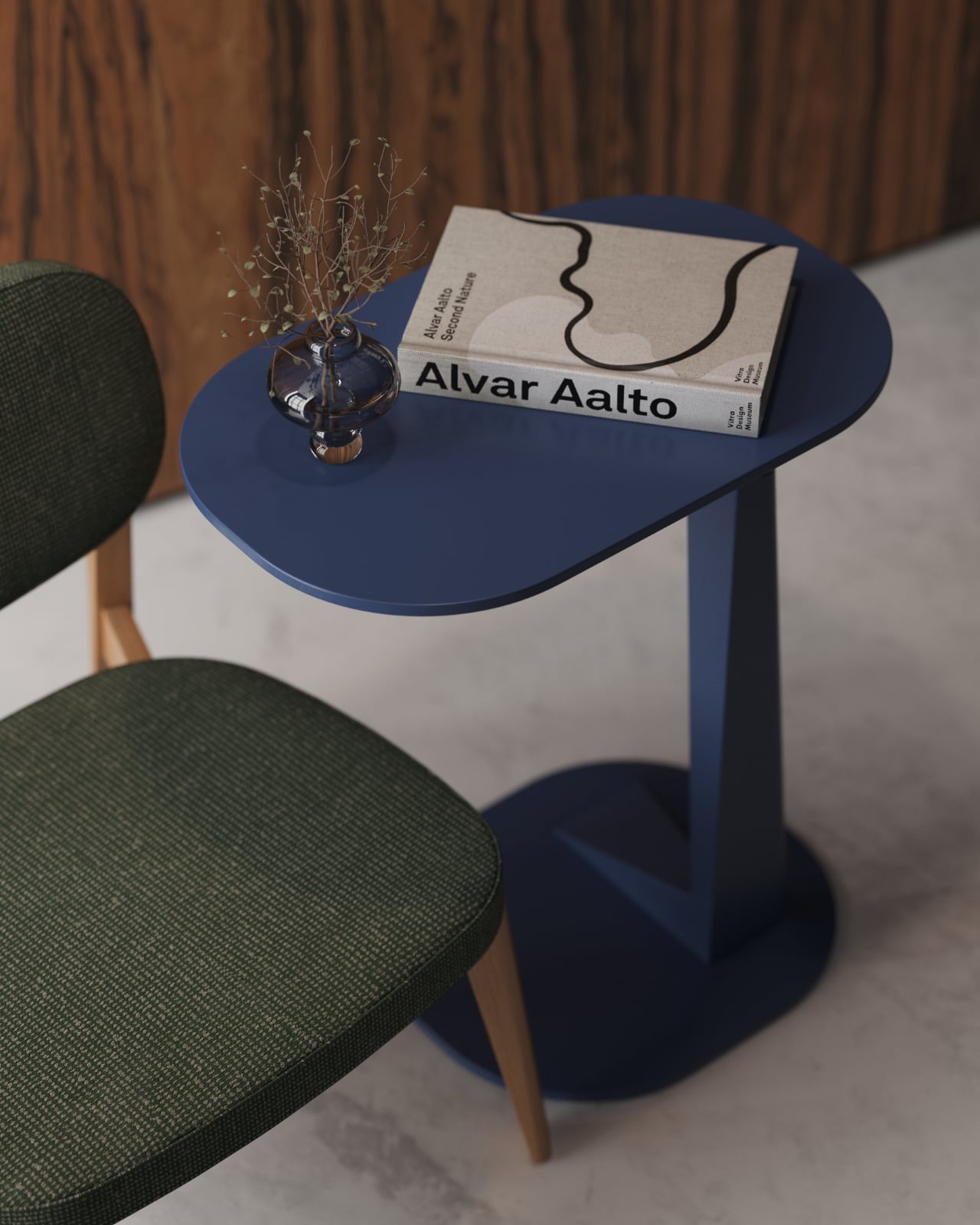
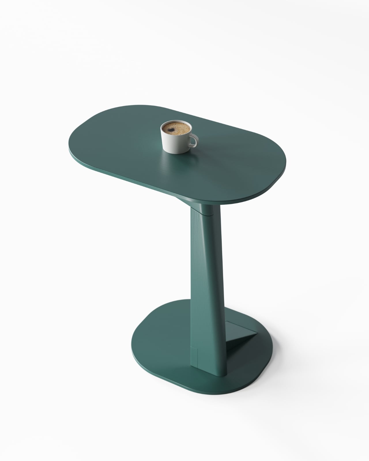
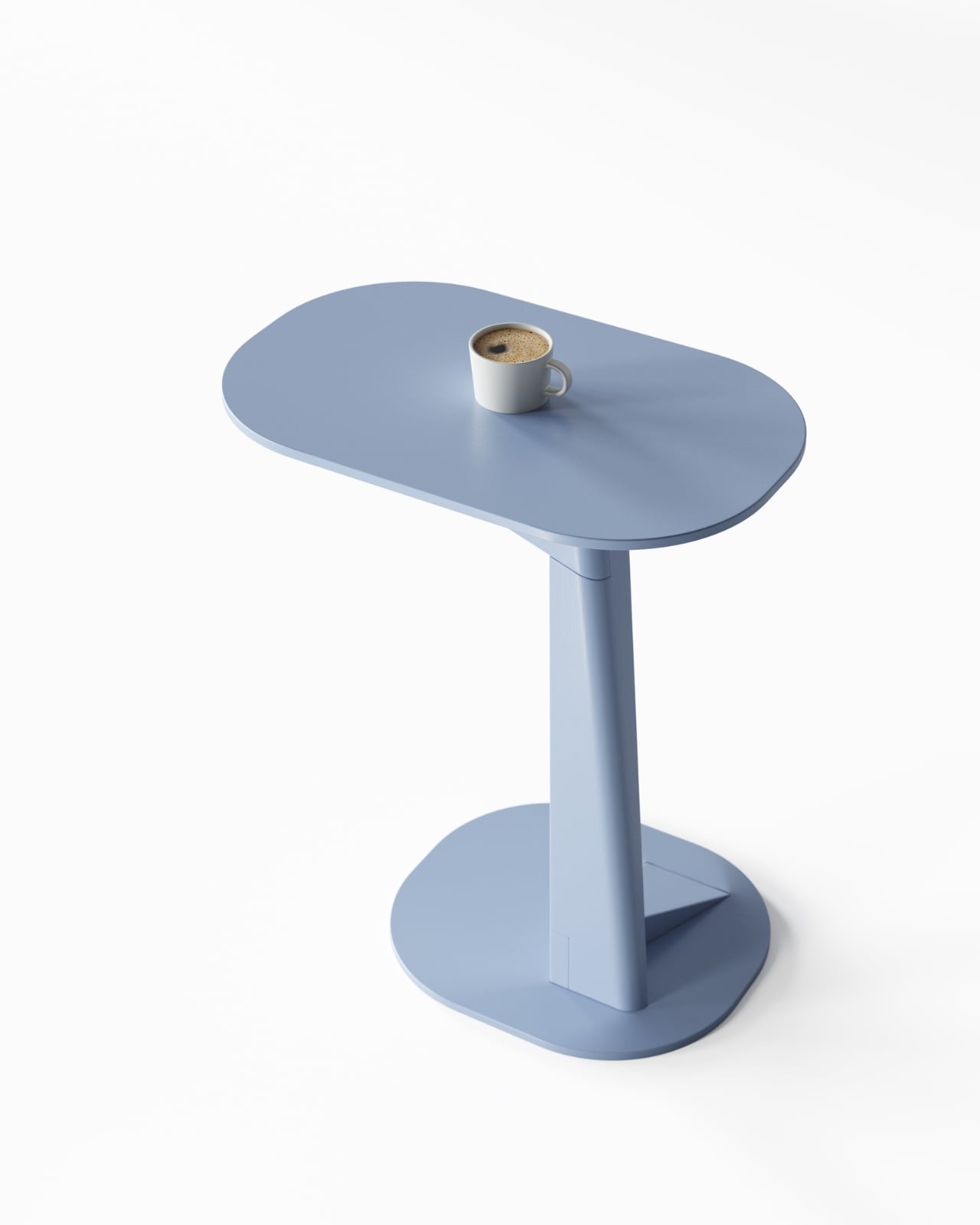
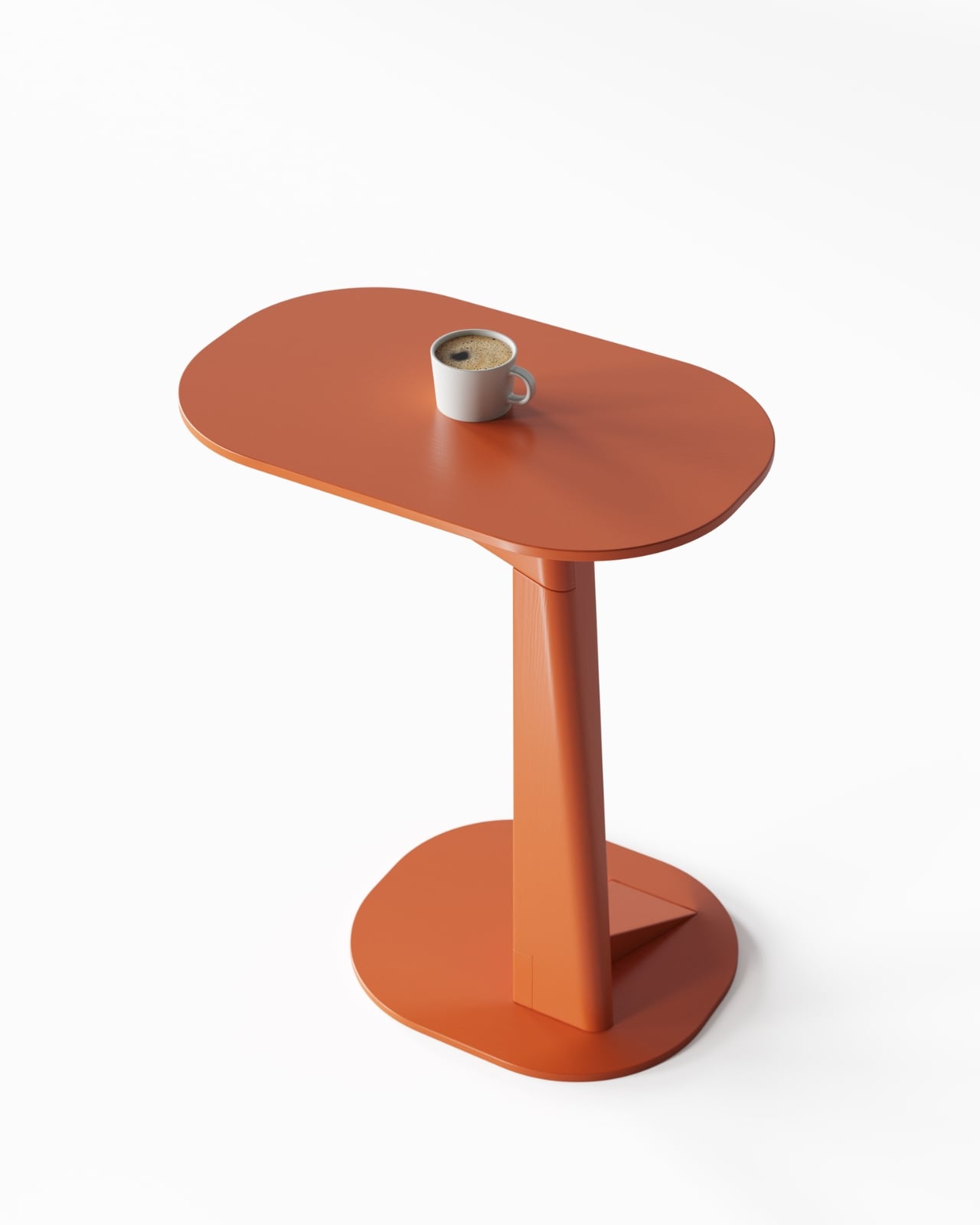
There’s something refreshing about furniture that doesn’t take itself too seriously while still being completely serious about design. The new Tong side table from designer Zelimhan Hamitsaev walks that line beautifully, bringing a playful sculptural presence to a piece that’s fundamentally about function.

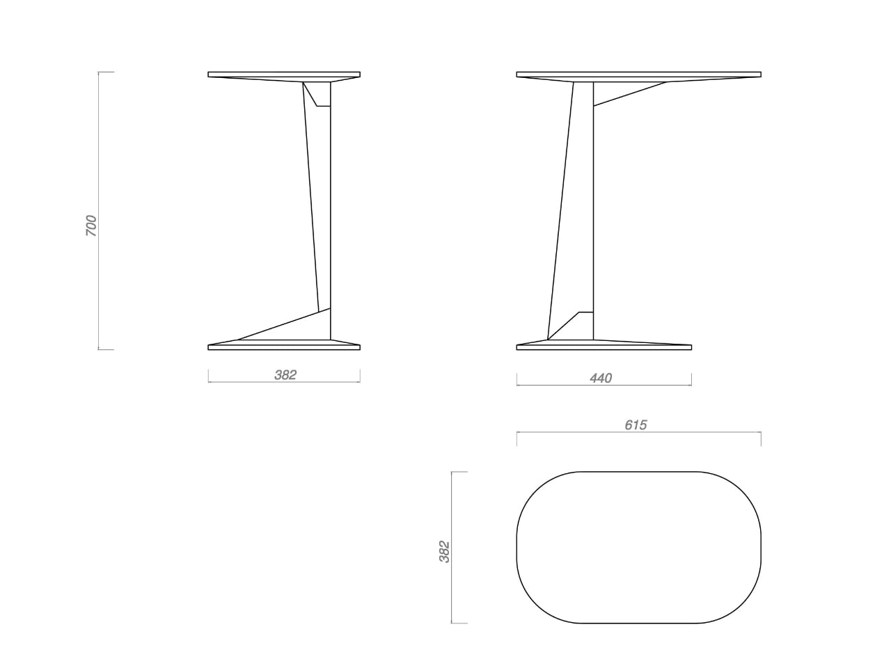
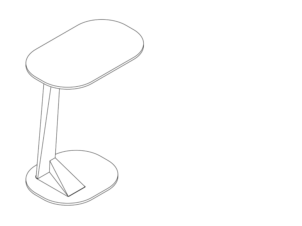
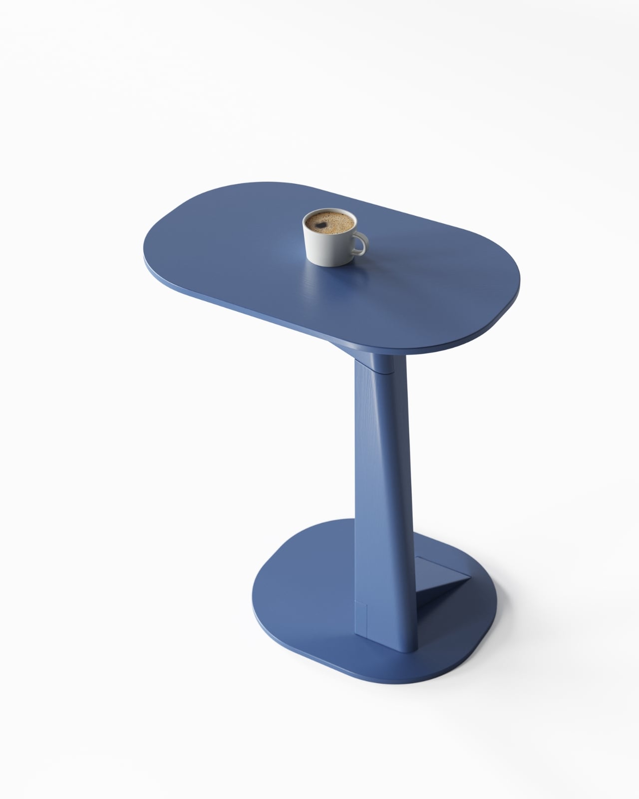
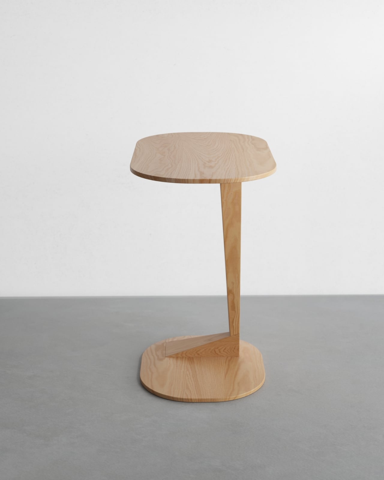
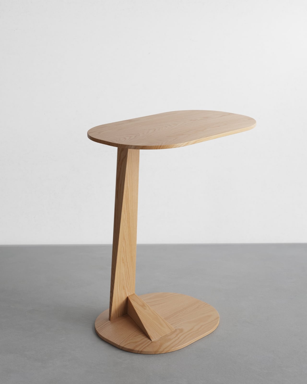
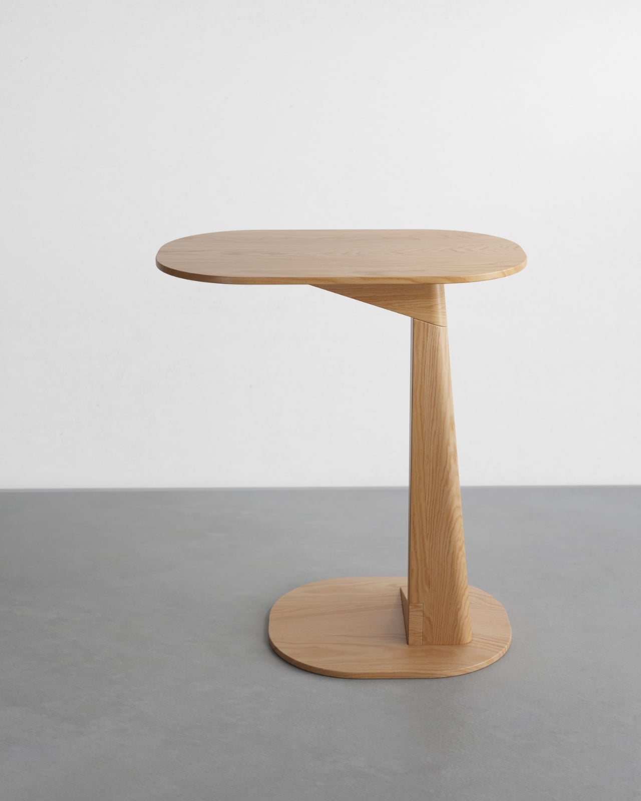
At first glance, the Tong looks like it might topple over. That angled wooden wedge connecting the circular base to the kidney bean-shaped top seems to defy logic, like it’s mid-lean in some elegant furniture ballet. But that’s exactly what makes it so visually compelling. The geometry creates this sense of movement and lightness, even though the piece is crafted from solid wood and stands a confident 700 mm tall (that’s about 27.5 inches for those of us still mentally translating).

Designer: Zelimhan Hamitsaev

The tabletop itself deserves attention. It’s not quite oval, not quite rectangular. Instead, it has this organic, almost pebble-like shape with softly rounded edges that feel like they’ve been worn smooth by water over time. There’s something inherently friendly about curves like these. They invite you to set down your coffee cup, your phone, that book you’ve been meaning to finish. The surface area is just right for those essentials that need a home within arm’s reach of your favorite reading chair or sofa.

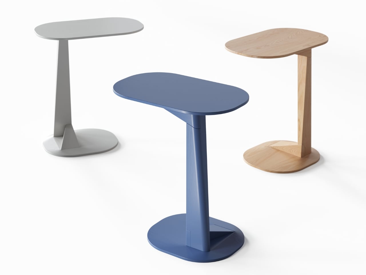
What really sets the Tong apart is its commitment to solid wood construction. In an era when so much furniture relies on veneers, particle board, and shortcuts, there’s something grounding about a piece that embraces natural material through and through. You can see it in the natural wood version, where the grain patterns tell their own story across the surface. But the collection also offers painted finishes in a palette that feels both contemporary and timeless: dusty blue, forest green, terracotta orange, and soft grey. These aren’t the shouty colors of trend-chasing design. They’re the kind of hues that feel right now but won’t feel dated in five years.

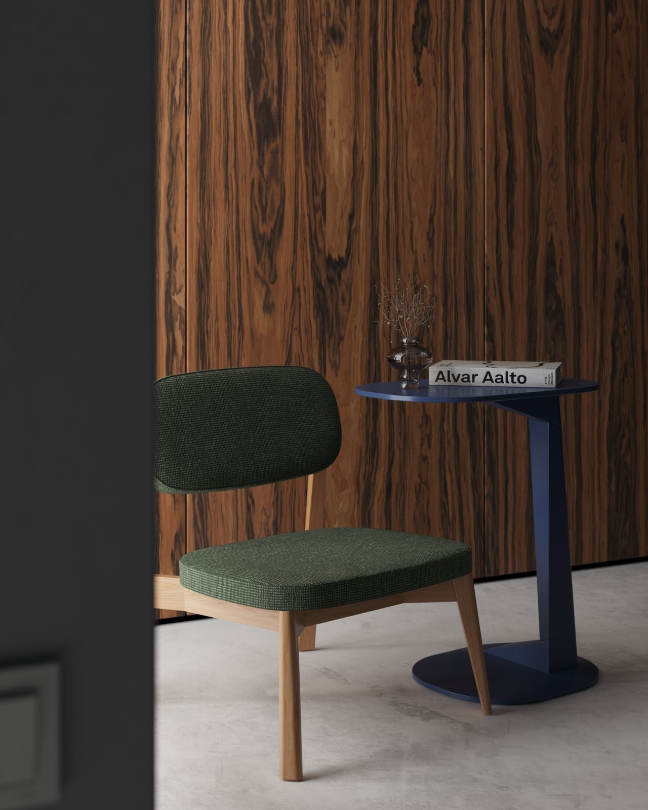
The Tong side table joins a family that’s been steadily growing. The collection already includes an armchair, three coffee tables, a dining chair, and three dining tables. What’s clever about the range is how each piece maintains the same design DNA, that distinctive angled support element and organic shapes, without being matchy-matchy. You could absolutely style multiple Tong pieces together for a cohesive look, or let a single side table be your conversation starter in an eclectic space.

That sculptural quality makes the Tong more than just functional furniture. It’s the kind of piece that changes how a room feels. Place it next to a mid-century armchair, and it adds contemporary edge. Put it beside a minimalist sofa, and it introduces warmth and personality. The design is confident enough to hold its own but humble enough to play well with others.

There’s also something to be said for furniture that looks like it has a point of view. The Tong doesn’t try to disappear into the background or apologize for taking up space. That dramatic support angle makes a statement, but it’s a statement about thoughtful engineering and creative problem-solving rather than empty theatrics. It’s the difference between design that screams for attention and design that earns it.

For anyone navigating the overwhelming world of furniture shopping, pieces like the Tong offer a middle path between disposable fast furniture and investment heirlooms that require a second mortgage. It’s thoughtfully made, visually interesting, and genuinely useful. The kind of side table that makes you happy every time you reach for your morning coffee or set down your evening glass of wine.

In smaller living spaces where every piece needs to pull its weight aesthetically and functionally, the Tong’s compact footprint and vertical emphasis make it particularly smart. It provides surface area without eating up valuable floor space, and that eye-catching silhouette gives you decorative impact without requiring additional styling. The Tong side table proves that everyday objects can have personality without sacrificing practicality. It’s furniture that works hard and looks good doing it, which is really all we can ask from the pieces we live with every day.

The post The Tong Side Table Turns Geometry Into Good Company first appeared on Yanko Design.

Microsoft releases second emergency Windows 11 update to fix Outlook crashes

Microsoft issued another out-of-band update to fix a bug that caused Outlook to crash for Windows 11 users. This second emergency patch addresses issues seen with Outlook and files stored in the cloud following Microsoft's January 2026 Windows security update.

According to Microsoft, this update fixes a bug where some apps that "open or save files stored in cloud-backed locations" became unresponsive or displayed error messages. Some users also experienced Outlook crashing or not opening when PST files are stored in cloud-based options like OneDrive.

This is the second time this year that Microsoft had to issue a last-minute fix for bugs related to its January security update. Last week, some Windows 11 devices couldn't shut down or hibernate, while other devices running Windows 10 or 11 couldn't log in through remote connections. For more context, Microsoft only issues out-of-band updates when there's a serious issue that can't wait until its regular update cycle. Fortunately, the latest out-of-band update is cumulative, so you only need to download and install this one to fix the issues seen with the January update.

This article originally appeared on Engadget at https://www.engadget.com/computing/microsoft-releases-second-emergency-windows-11-update-to-fix-outlook-crashes-192012812.html?src=rss

What If Your Spoon Could Evolve? This Designer Found Out

We use spoons dozens of times a day without giving them a second thought. They’re just there, scooping soup, stirring coffee, delivering cereal to our mouths with mechanical reliability. But BKID co asked a question that sounds almost absurd at first: what if spoons were alive? What if they could evolve like living organisms, adapting to their environment through the same forces that shaped every creature on Earth?

The result is Evolving Spoon, a project that treats cutlery like a species subject to Darwin’s rules. It’s part design experiment, part philosophical thought exercise, and entirely fascinating to look at.

Designer: BKID co

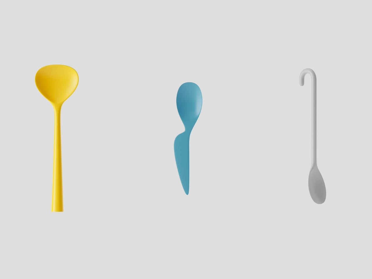
The premise starts with a simple observation. Spoons exist in a constantly changing ecosystem of human behavior. We eat different foods, adopt new dining styles, and our household compositions shift over time. If a spoon were a living thing responding to these environmental pressures, how would it transform? Would it grow branches to grip noodles better? Develop a hook for hanging? Split into multiple heads for sharing?

BKID co applied four key principles of Darwinian evolution to answer these questions. Recombination, where traits from different “parent” spoons merge to create hybrid offspring. Mutation, introducing random variations that might prove useful or utterly bizarre. Natural selection, where the most functional forms survive while impractical ones fade away. And the handicap principle, the counterintuitive idea that sometimes a costly trait signals quality, like a peacock’s unwieldy tail.

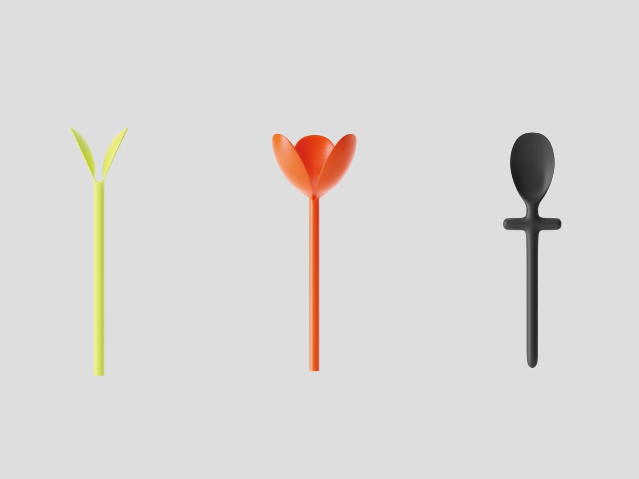
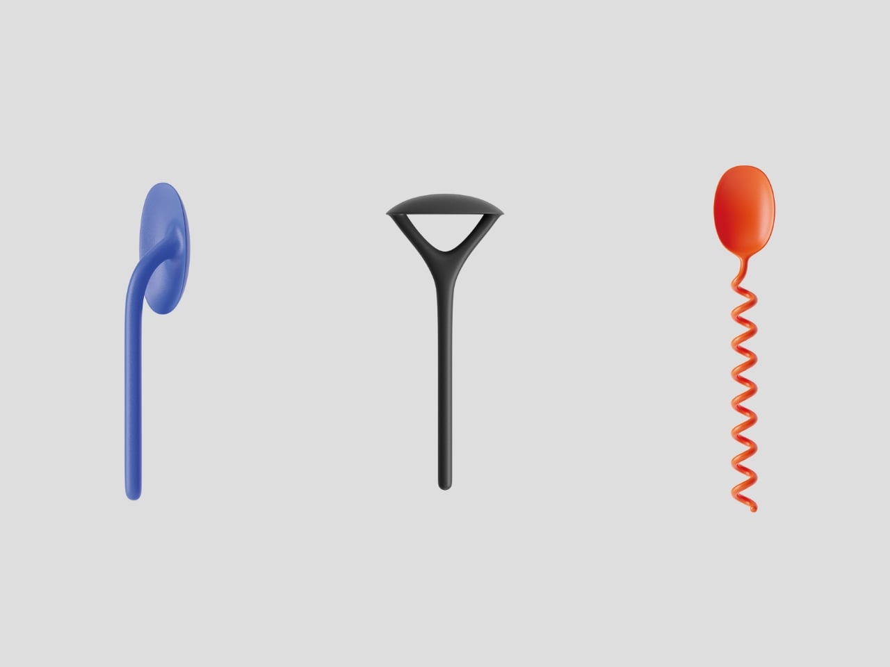
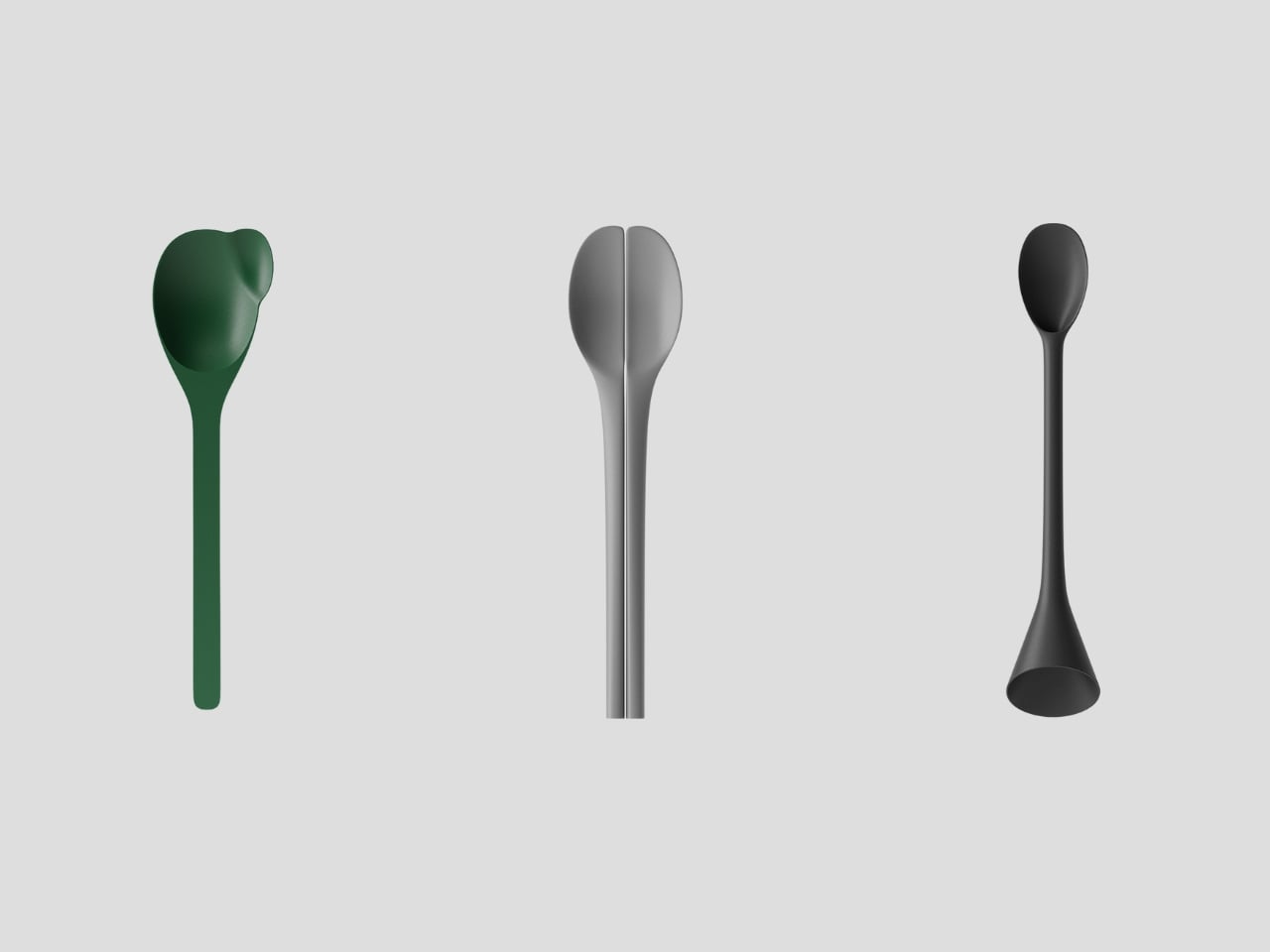
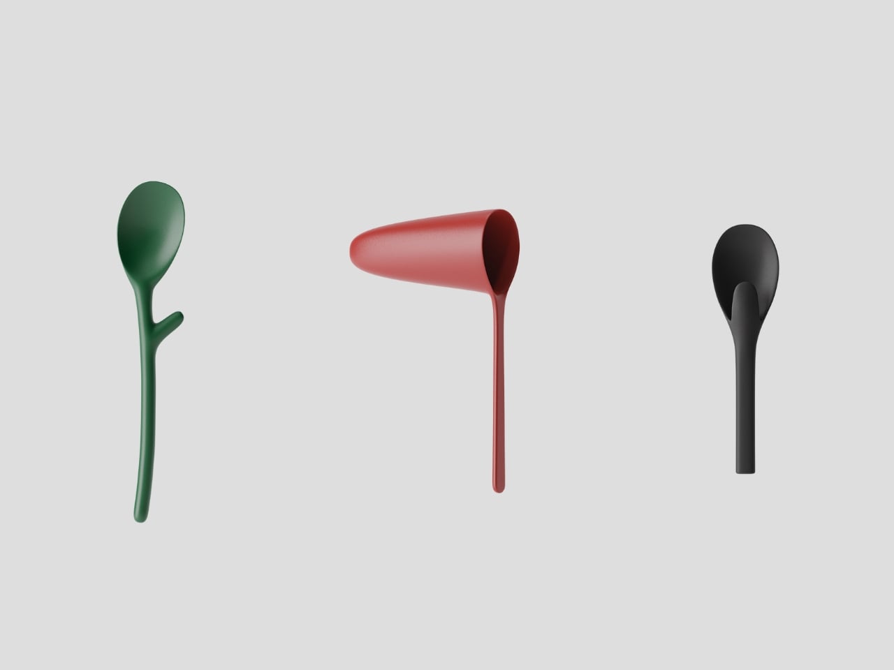
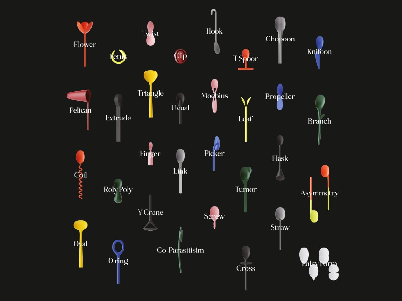
What emerges from this framework is a collection of spoons that look like they belong in a natural history museum of an alternate universe. There’s one with a spiraling corkscrew handle, as if it adapted to stir thick liquids with maximum efficiency. Another splits into a tulip shape at the bowl, perhaps “evolving” to let multiple people eat from the same dish. A green spoon sprouts a small branch from its handle, like it’s halfway between cutlery and plant life.

Some designs feel almost uncomfortably organic. A pink spoon curves with an hourglass figure that suggests it mutated for ergonomic grip. A black spoon with a triangular cutout in its handle looks like it underwent natural selection for lighter weight and material efficiency. Others border on the absurd, which is precisely the point. Evolution doesn’t always produce sleek perfection. Sometimes it creates the platypus or the blobfish, creatures that work despite looking deeply weird.

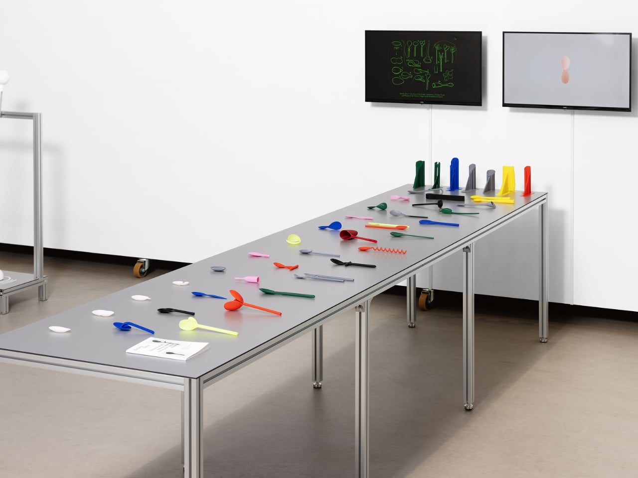
The technical execution deserves attention too. BKID co used FDM 3D printing, a process that deposits material layer by layer, making each spoon a physical artifact of a future that doesn’t exist. The designers describe it as creating fossils of imaginary life forms. That framing transforms these objects from mere design experiments into something more poetic. They’re evidence of parallel evolution, proof that form follows function even in hypothetical scenarios.

The project’s real brilliance lies in how it makes us reconsider the ordinary. We think of spoons as finished objects, perfected centuries ago and now simply manufactured in endless identical copies. But Evolving Spoon suggests that even the most mundane tools exist in dialogue with their environment. They could adapt, specialize, diversify. A spoon for soup doesn’t need to look like a spoon for ice cream, which doesn’t need to resemble a spoon for medicine.

It also raises questions about design philosophy in an age of digital fabrication. When 3D printers can produce any shape as easily as they produce standard forms, why do we keep making the same objects over and over? Evolution thrives on variation. Maybe our material culture should too. Displayed together, these mutant spoons create a taxonomy of possibilities. Some would actually work better than conventional designs for specific tasks. Others are pure speculation, beautiful or strange but not particularly functional. All of them challenge the assumption that objects are static, that a spoon in 2026 should look identical to a spoon from 1926.

BKID co hasn’t just designed weird spoons. They’ve built a bridge between biology and product design, using evolutionary theory as a creative engine. The result is playful, thought-provoking, and visually arresting. It reminds us that even in the mundane act of eating, there’s room for imagination, adaptation, and a little bit of evolutionary chaos.

The post What If Your Spoon Could Evolve? This Designer Found Out first appeared on Yanko Design.

Apple reportedly plans to reveal its Gemini-powered Siri in February

A new and improved Siri may finally make an appearance, but this time, it could be with a Google Gemini glow up. According to Bloomberg's Mark Gurman, Apple wants to announce a new Siri in "the second half of February" that will show off the results of its recently announced partnership with Google and offer demonstrations of the Gemini-powered capabilities.

After this reveal, Gurman reported that the new Siri will make its way to iOS 26.4, which is also slated to enter beta testing in February before its public release in March or early April. Apple has been meaning to launch its next-gen Siri ever since its announcement at WWDC 2024, but now we know that this Gemini-powered Siri will behave more like an AI chatbot, similar to OpenAI's ChatGPT, thanks to another Bloomberg report from last week. 

Following the reported demo that's scheduled for late February, Gurman said Apple will have a grand reveal of the new Siri, which is currently codenamed Campos, at its annual developer conference in the summer. After that, the latest Siri and the accompanying Gemini-powered Apple Intelligence features are expected to arrive with iOS 27, iPadOS 27 and macOS 27, which are expected to be available as beta releases in the summer.

This article originally appeared on Engadget at https://www.engadget.com/ai/apple-reportedly-plans-to-reveal-its-gemini-powered-siri-in-february-174356923.html?src=rss

These LEGO Brick Crocs Cost $150 and Look Exactly as Weird as You’d Expect

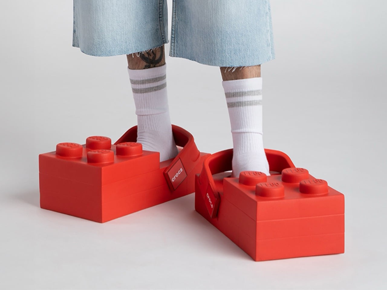
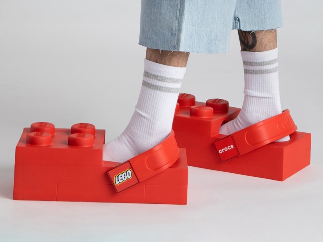
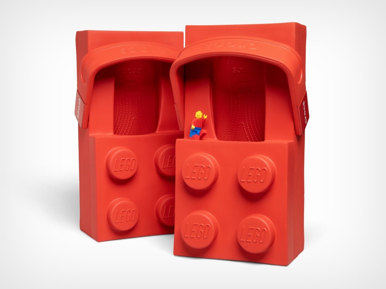
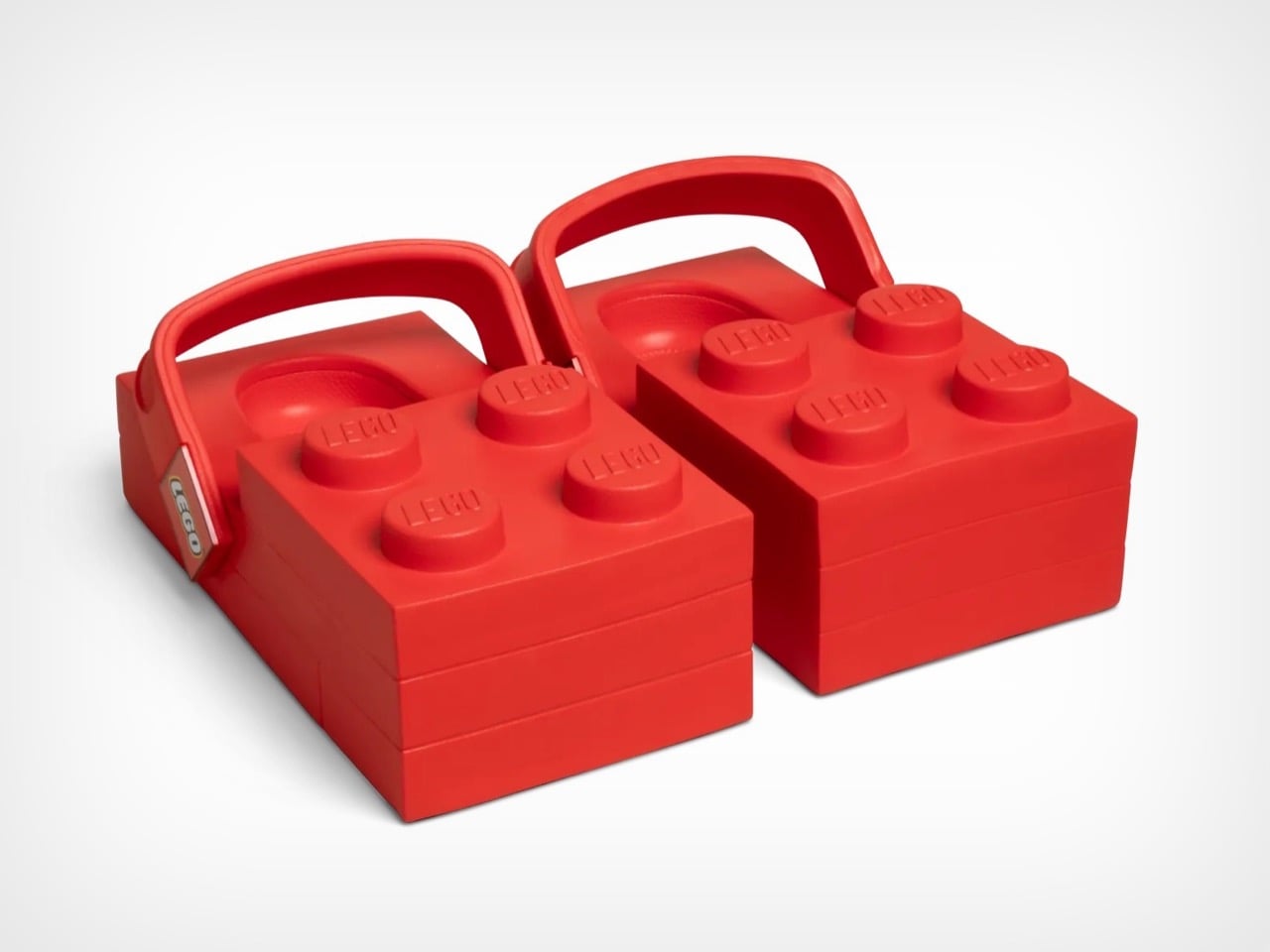
The LEGO Brick Clogs are not subtle. They are not refined. They are giant red rectangles that you strap to your feet, complete with four oversized studs jutting from the top like a toddler’s building block scaled up for adult wear. This is footwear that makes no apologies for its absurdity. Your feet disappear entirely into chunky brick shapes that add inches of height and pounds of visual weight, transforming your lower legs into what looks like a sight gag from a cartoon.

Both LEGO and Crocs seem thrilled by how ridiculous this looks. The design commits fully to the brick concept, maintaining the rectangular shape from every angle and ensuring that yes, you will absolutely look like you raided a giant’s toy chest. The studs aren’t decorative accents. They’re prominent, impossible to miss, and stamped with the LEGO logo so everyone knows exactly what you’ve done to your feet. Crocs even admits these aren’t meant for all-day wear, which feels like the understatement of the year when you’re essentially walking on building blocks.

Designers: LEGO X Crocs

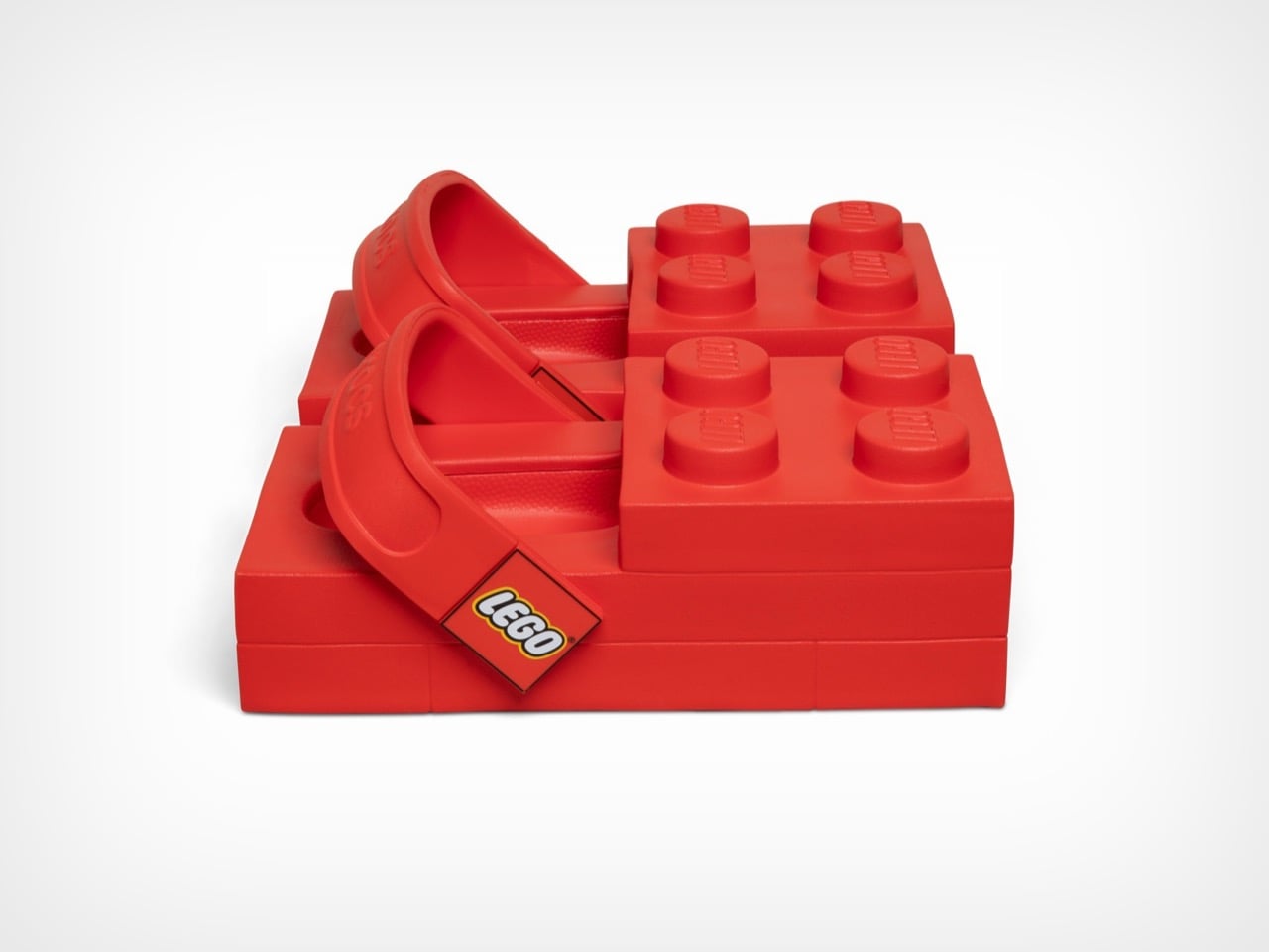
These launch February 16th at $149.99 on Crocs’ site and $199.99 on LEGO’s store, a price discrepancy nobody seems able to explain. They’re available in women’s sizes 7 through 12 and men’s sizes 5 through 13, which means a decent range of people can participate in this social experiment. Each pair includes a LEGO minifigure wearing matching tiny brick clogs because apparently the joke needed extending beyond your actual feet. The shoes use Crocs’ standard Croslite foam material, so they’ll presumably be comfortable despite looking like orthopedic nightmares. The heel strap pivots just like regular Crocs, with one side branded LEGO and the other Crocs, because why choose when you can advertise both brands simultaneously.

From a design perspective, these things are fascinating disasters. The 2×4 brick silhouette creates a platform that extends well beyond normal shoe boundaries, adding considerable visual bulk to an area of the body that most footwear tries to streamline. The four studs on top serve zero functional purpose but dominate the entire aesthetic, sitting roughly where your toes would be if your feet were actually brick-shaped. Inside, you get standard Crocs Croslite foam, the same cushioned EVA material that made the brand famous for comfort. The heel strap pivots like any other Croc, with Crocs branding on one side and LEGO on the other, a small detail that somehow makes the whole package feel even more committed to the bit.

Rapper Tommy Cash debuted them at Paris Fashion Week on January 21st, which tracks perfectly. These needed a runway moment, needed to exist in a context where people expect the unexpected. The fashion world has spent decades normalizing increasingly bizarre footwear, from Balenciaga’s platform Crocs to various luxury brands’ takes on chunky dad shoes. The LEGO Brick Clogs fit right into that lineage while simultaneously mocking it. They’re high fashion and low culture colliding at maximum velocity, wrapped in a bright red package that costs as much as a decent pair of running shoes.

The multi-year partnership promises more releases beyond this initial brick clog, with additional drops planned for spring 2026. Both companies hint at customizable Jibbitz charms made from actual LEGO brick plastic, which could genuinely be interesting if they figure out the attachment mechanism. The collaboration might seem random until you consider that both brands built empires on letting people express themselves through unconventional means. LEGO gives you infinite creative possibilities with plastic bricks. Crocs gave the world permission to prioritize comfort over convention and then added holes for decorative charms. Put them together and you get footwear that dares you to take it seriously while simultaneously proving it doesn’t care if you do.

The post These LEGO Brick Crocs Cost $150 and Look Exactly as Weird as You’d Expect first appeared on Yanko Design.

How iOS 26.4 Finally Fixes the iPhone’s Biggest Flaws

How iOS 26.4 Finally Fixes the iPhone’s Biggest Flaws

Apple is set to transform its virtual assistant, Siri, with the upcoming releases of iOS 26.4 and iOS 27. These updates aim to address long-standing user concerns by introducing advanced artificial intelligence (AI) features, enhanced personalization, and seamless integration across Apple’s ecosystem. With these advancements, Siri is positioned to become a more competitive and capable […]

The post How iOS 26.4 Finally Fixes the iPhone’s Biggest Flaws appeared first on Geeky Gadgets.

Posted in Uncategorized

Yoshi and Birdo arrive in new trailer for The Super Mario Galaxy Movie, along with an earlier release date

There's a new trailer for the upcoming Super Mario movie, The Super Mario Galaxy Movie, and it confirms some beloved characters are joining the crew for its latest adventure. The trailer provides our first official look at Yoshi in the new movie, whose appearance was leaked back in the fall by a Pillsbury cookie box design. And, just as exciting, we also see Birdo in the mix. The trailer was released during Nintendo's The Super Mario Galaxy Movie Direct.

The short event also confirmed that the movie is now in post-production. While a previous trailer set the release date at April 3, the movie is now scheduled to come out two days earlier, on April 1. The Super Mario Galaxy Movie stars Chris Pratt voicing Mario, Anya Taylor-Joy as Peach and Charlie Day as Luigi, along with Jack Black (Bowser), Keegan-Michael Key (Toad), Benny Safdie (Bowser Jr.), Kevin Michael Richardson (Kamek) and Brie Larson (Rosalina).

This article originally appeared on Engadget at https://www.engadget.com/entertainment/tv-movies/yoshi-and-birdo-arrive-in-new-trailer-for-the-super-mario-galaxy-movie-along-with-an-earlier-release-date-154455021.html?src=rss

Quadrillion FPS Camera : Capture the Unseen: Light, Electrons & Ultra-Fast Frames

Quadrillion FPS Camera : Capture the Unseen: Light, Electrons & Ultra-Fast Frames

What if you could slow down time so much that the invisible became visible? Veritasium takes a closer look at how advancements in high-speed imaging have unlocked a hidden world, revealing phenomena that occur in mere fractions of a second. Imagine watching a bullet pierce an apple, not as a blur, but as a series […]

The post Quadrillion FPS Camera : Capture the Unseen: Light, Electrons & Ultra-Fast Frames appeared first on Geeky Gadgets.

Posted in Uncategorized

IndigoGo! Proves You Don’t Need a Loft to Go Tiny

The IndigoGo! by Indigo River Tiny Homes redefines what compact living can look like. This single-level tiny house eliminates the typical loft bedroom found in most mobile dwellings, creating an accessible design that prioritizes ease of movement and travel convenience. Everything is arranged on one level without any lofts, making it an ideal choice for those who want to avoid climbing ladders or navigating stairs in their daily routine. This thoughtful approach opens up tiny living to a broader audience, including those with mobility concerns or anyone who simply prefers the convenience of single-floor living.

Measuring between 10.5 and 11 feet at its tallest point, the IndigoGo! maintains a low profile that makes towing significantly easier than taller models. The interior ceiling height ranges from 8 to 8.5 feet, providing comfortable headroom throughout the home without the climbing required by traditional tiny home designs. This lower roofline not only improves travel convenience but also reduces wind resistance on the road, making the home more fuel-efficient to transport. The single slope roof comes standard, though buyers looking for a more traditional aesthetic can upgrade to a gable roof design.

Designer: Indigo River Tiny Homes

The model’s flexibility stands out as its greatest strength. Available in seven different lengths starting at 16 feet and extending up to 40 feet, the IndigoGo! can accommodate various lifestyle needs and preferences. The 24-foot version offers a sweet spot for those seeking something easy to transport, while the larger configurations approach apartment-sized living spaces. All models are available in a 10-foot width, providing generous space compared to narrower alternatives and making the interior feel more like a traditional home. This range means buyers can select exactly the right size for their needs, whether they’re looking for a minimalist retreat or a more spacious full-time residence.

Indigo River Tiny Homes positions the IndigoGo! as their most economical option when choosing wood framing. For buyers planning frequent moves, the company also offers a SIPs Traveler’s Package, providing lightweight construction paired with enhanced durability that can withstand the rigors of regular travel. The exterior features engineered wood with cedar accents, creating visual warmth while maintaining practical weather resistance against the elements. A small exterior storage box provides additional space for outdoor equipment or travel necessities. These thoughtful design choices balance aesthetics with functionality, ensuring the home looks beautiful while performing well on the road.

Inside, the design maximizes every inch of available space with clever storage solutions and thoughtful layouts. The sleeping area incorporates a queen-sized bed with integrated storage underneath, addressing one of tiny living’s biggest challenges: finding room for belongings. The bathroom doesn’t compromise on quality, offering custom tile and stone surround options that bring a touch of luxury to the compact space. An anti-fogging lighted mirror adds both practicality and ambiance, while custom window shades come standard throughout the home, allowing owners to control light and privacy as needed. The interior layout creates one large multifunctional living area that can be customized based on individual needs and preferences.

Built by the veteran-owned Indigo River Tiny Homes in Texas, each IndigoGo! reflects over 18 years of construction and home-improvement experience. The company emphasizes craftsmanship over cookie-cutter production, creating custom builds designed to withstand daily living for decades rather than serving as occasional vacation retreats. The IndigoGo! rides on a double-axle trailer and is fully road legal, making it easy to tow whether you handle it yourself or hire professionals. One limitation to note: the IndigoGo! doesn’t accommodate a gooseneck upgrade, which some buyers use to create additional overhead space in larger models. For those interested in downsizing without giving up ground-level convenience, the IndigoGo! offers a practical and economical entry point into mobile living, with customization options that let buyers find the perfect balance between portability and living space.

The post IndigoGo! Proves You Don’t Need a Loft to Go Tiny first appeared on Yanko Design.