Fujifilm’s $170 Instax mini Link+ printer now lets you directly print moodboards from Pinterest

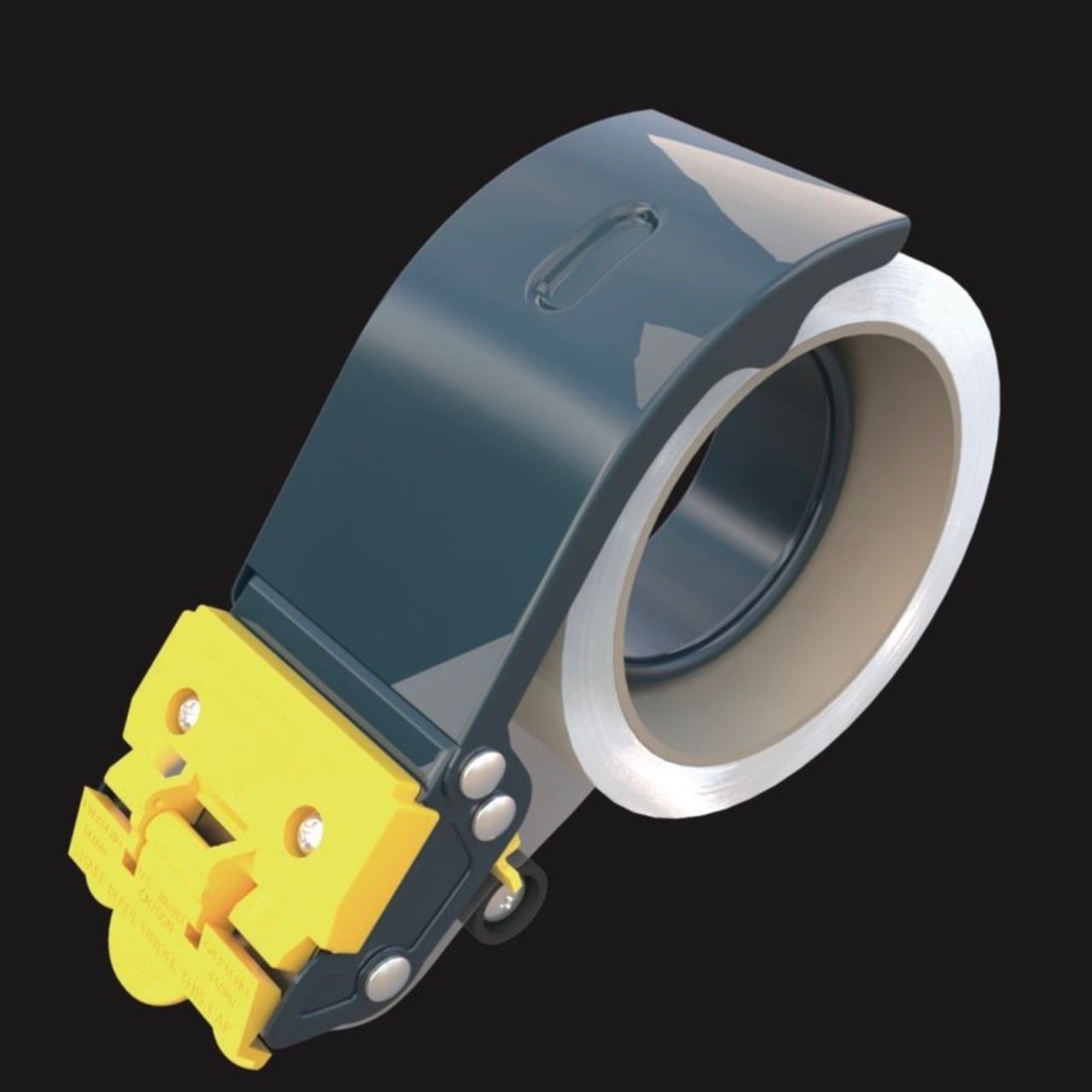
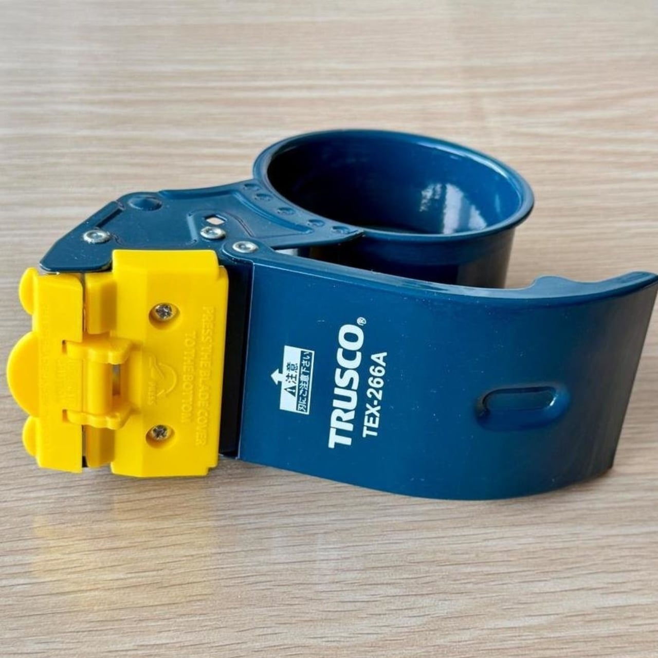
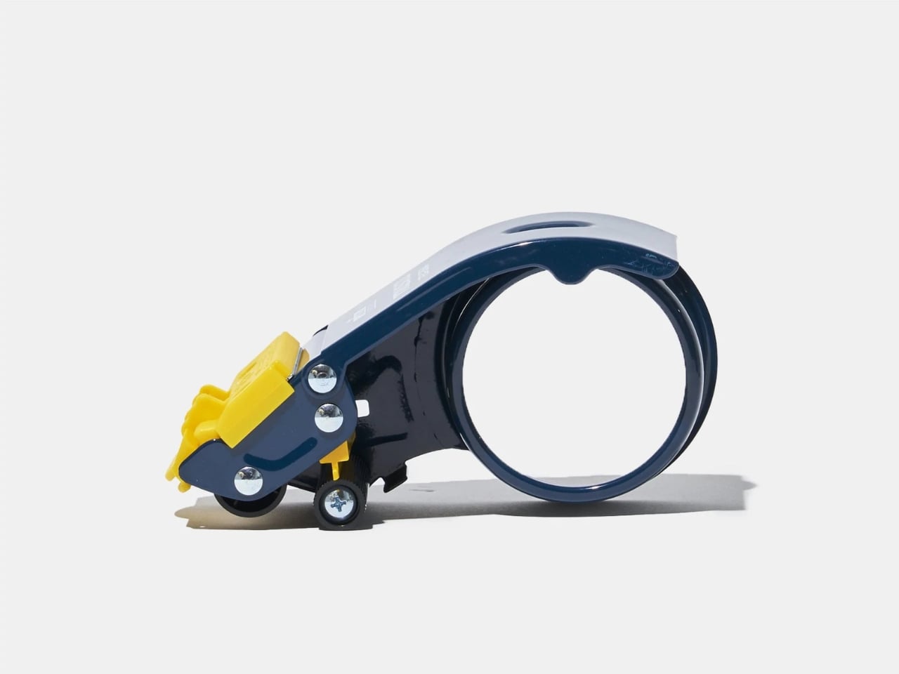
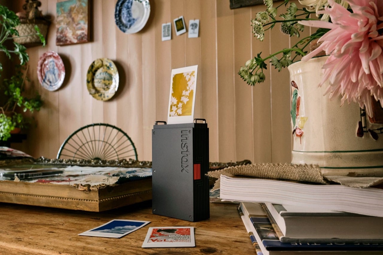
The smartphone has killed the photo album, turned memories into infinite scrolls, and made physical prints feel almost quaint. But there’s something about holding a tangible photograph that a camera roll of 10,000 images can’t replicate. Fujifilm’s new Instax Mini Link+ smartphone printer bridges this gap with a sophistication that previous models lacked, trading playful pastels for matte black and orange industrial design.

What sets the Link+ apart isn’t just its grown-up aesthetic. The printer introduces a Design Print Mode specifically engineered for text-heavy layouts, graphic work, and intricate illustrations. Whether you’re printing Pinterest inspiration boards, magazine layouts, or poster designs, the enhanced resolution captures fine details that earlier models struggled to render. At $169.95, it positions itself as the premium option in Fujifilm’s smartphone printer lineup, targeting creators who want more than just snapshot printing.

Designer: Fujifilm

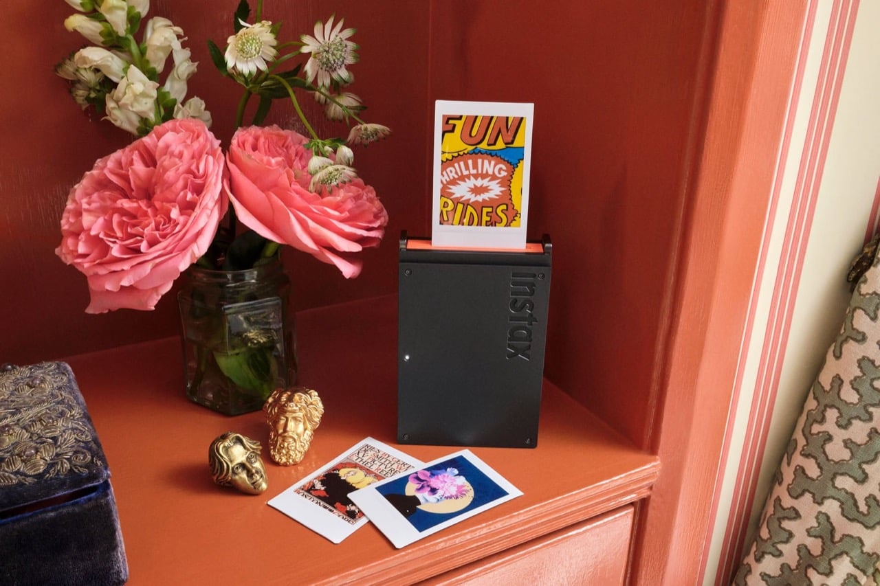
Here’s the thing about instant film printers: they’ve always been terrible at text. The Link 3 and its predecessors could handle photos decently enough, but try printing anything with small type or fine line work and you’d get a blurry mess. The Link+ solves this with what Fujifilm calls Design Print Mode, which optimizes the 318 dpi OLED exposure system for sharp edges and clean letterforms. I’ve seen the sample prints, and the difference is immediately obvious. That “FUN THRILLING RIDES” graphic they keep showing in the promo shots actually maintains readability, which sounds basic but represents a genuine technical improvement over previous models.

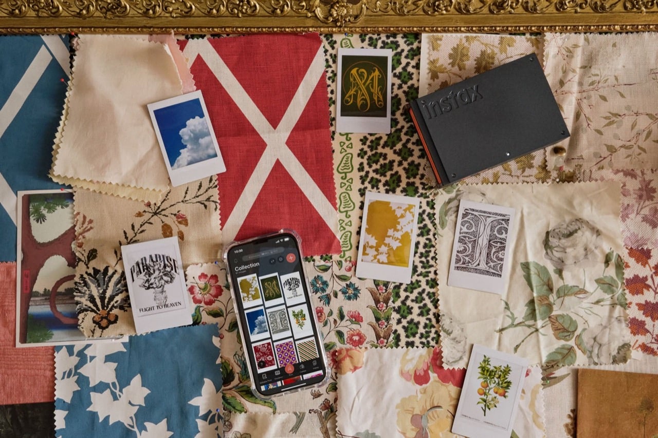
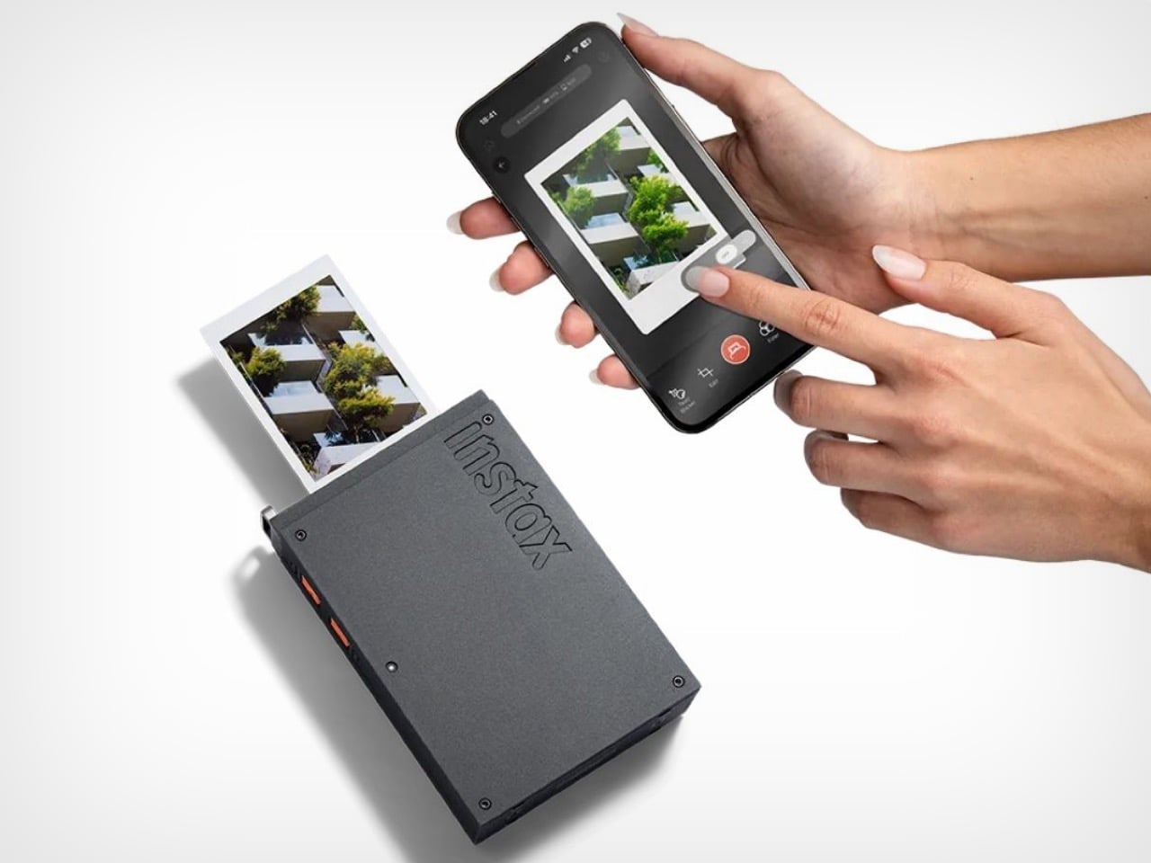
The printer outputs on standard Instax Mini film, so you’re working with a 2.4 by 1.8 inch image area. Small, yes, but that constraint forces you to think carefully about composition. The app now includes two color modes: instax-Natural for muted, film-like tones, and instax-Rich for saturated colors that pop. You can batch print up to 10 images at once, which makes creating a cohesive series actually practical instead of tedious. Each print takes about 12 seconds from exposure to ejection, and a full charge gives you roughly 100 prints.

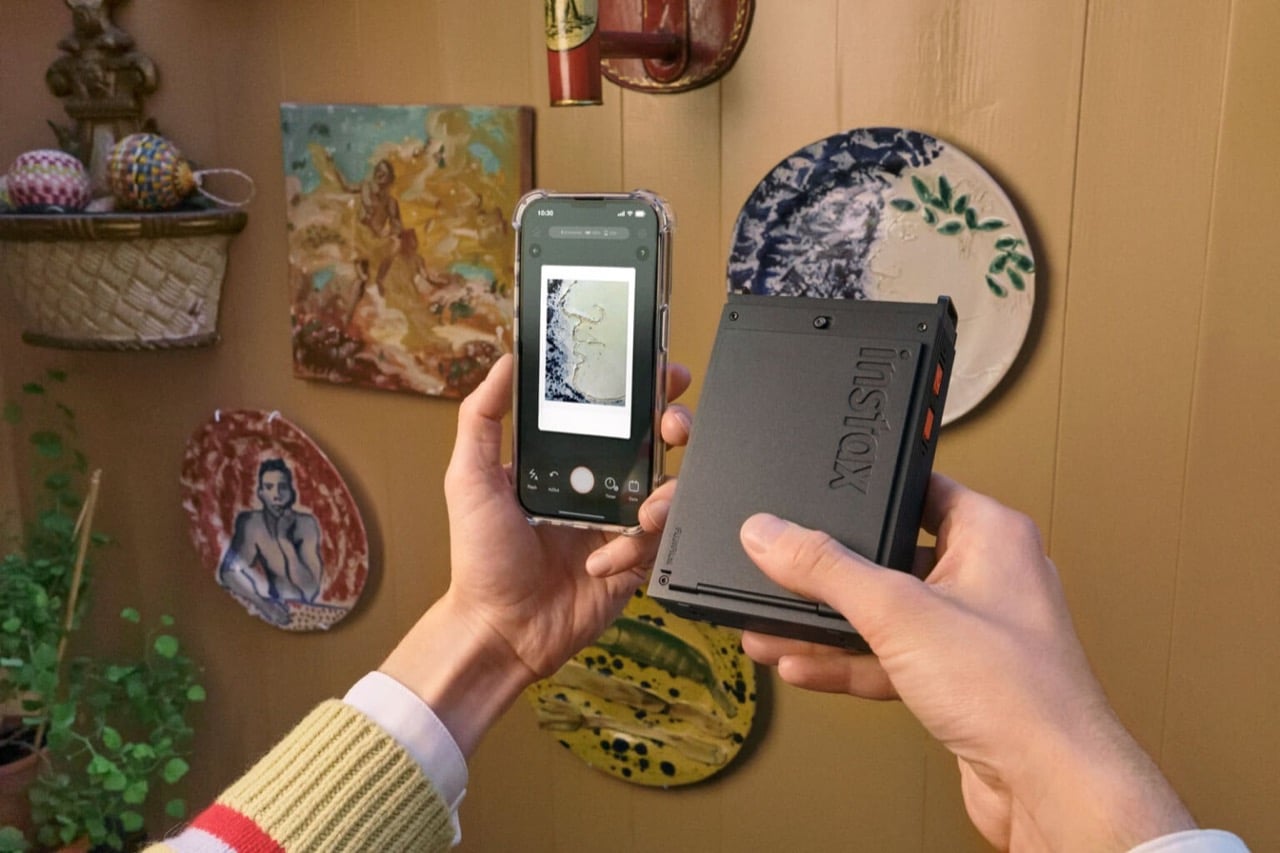
And here’s the surprising part – the camera comes with Pinterest integration. You can pull images directly from your boards and print them as mini mood boards or inspiration cards. The app also lets you extract frames from videos, which opens up interesting possibilities for grabbing stills from footage without needing a separate video editor. Frame it, add a text caption or sticker if you want, then print. The whole process happens via Bluetooth 4.2, which means no cables but also means you’re limited to the bandwidth and occasional connectivity hiccups that come with wireless protocols.

The Link+ It measures slim enough to toss in a bag without much bulk, and the vertical printing orientation means you can watch your image emerge from the top slot like a tiny vending machine dispensing art. Fujifilm clearly wants this in design studios and on styled shelves, not just at birthday parties.

The question becomes whether the improvements justify the price premium over the Link 3, which still works perfectly fine for standard photo printing and costs about $30 less. If you primarily print snapshots, probably not. But if you’re printing graphics, working with text, or treating instant film as a legitimate creative output medium, the $169.95 Link+ delivers capabilities the older models simply cannot match. Sometimes maturity means gaining new skills, not just changing your outfit.

The post Fujifilm’s $170 Instax mini Link+ printer now lets you directly print moodboards from Pinterest first appeared on Yanko Design.

This $12.5B Cross-Shaped Airport Will Become Africa’s Largest by 2030

Ethiopia has embarked on a transformative journey with the groundbreaking of Bishoftu International Airport, a $12.5 billion megaproject designed by Zaha Hadid Architects that will redefine the continent’s aviation landscape. Prime Minister Abiy Ahmed Ali laid the cornerstone on January 10, 2026, marking the official start of what officials describe as the largest aviation infrastructure project in Africa’s history. Located 40 kilometers south of Addis Ababa, the airport will eventually boast a capacity four times greater than Ethiopia’s current main airport, which is projected to reach its operational limits within the next two to three years. The ambitious development positions Ethiopia as Africa’s premier aviation gateway, connecting the continent to global destinations through Ethiopian Airlines, Africa’s largest carrier.

The architectural design draws profound inspiration from Ethiopia’s geological wonder, the Great Rift Valley, which passes near Bishoftu as it traverses through the country. A single central spine organizes the terminal’s facilities and aircraft piers, creating an intuitive flow that minimizes transfer distances for the estimated 80 percent of passengers who will transit through without leaving the airport. The terminal features a distinctive cross-shaped form spanning 660,000 square meters, with each pier showcasing unique interior materials and color palettes inspired by Ethiopia’s diverse environments, from its highlands to lowlands and valleys. This thoughtful integration of regional identity into functional design reflects Zaha Hadid Architects’ signature parametric approach, transforming natural landscapes into architectural expression.

Designer: Zaha Hadid Architects

Construction will proceed in multiple phases, with the initial opening targeted for 2030. Phase One includes two independently operating Code 4E parallel runways and a terminal designed to accommodate 60 million passengers annually. Subsequent phases will expand capacity to 110 million passengers per year, supported by four runways and parking facilities for 270 aircraft. This phased approach allows Ethiopian Airlines to incrementally meet rising demand, responding to International Air Transport Association forecasts predicting over 200 percent growth in East African air travel demand over the coming decade. The strategic expansion plan demonstrates careful consideration of both immediate needs and long-term growth trajectories.

The airport prioritizes the transit passenger experience with extensive amenities, including a 350-room airside hotel, diverse dining and entertainment facilities, plus outdoor courtyards landscaped with native drought-resistant plants. Natural ventilation and effective solar shading take advantage of the Oromia region’s temperate subtropical highland climate, creating semi-enclosed spaces where passengers can enjoy warm summers and mild winters. The design targets LEED Gold certification, incorporating locally sourced concrete and steel to reduce carbon footprint while supporting regional economic development. Photovoltaic arrays throughout the campus will enable on-site energy production, while stormwater management systems channel runoff into new wetlands and bioswales.

Bishoftu’s location delivers significant operational advantages, situated nearly 400 meters lower in elevation than the existing Bole Airport. Combined with longer runways, this enables aircraft to operate at higher maximum take-off weights while consuming less fuel, optimizing Ethiopian Airlines’ modern fleet for longer non-stop routes. A planned high-speed rail link will connect Bishoftu with central Addis Ababa and Bole Airport, forming the cornerstone of an integrated regional transport network. The surrounding Airport City, featuring mixed-use buildings, will serve approximately 80,000 residents and operate 24 hours without curfew restrictions, establishing a vibrant new urban district.

The post This $12.5B Cross-Shaped Airport Will Become Africa’s Largest by 2030 first appeared on Yanko Design.

The Tape Dispenser That’s Too Smart to Be This Simple

You know that dusty tape dispenser sitting on your desk right now? The one with the wobbly base and serrated blade that’s dull as a butter knife? Yeah, TRUSCO looked at those sad excuses for office supplies and decided there had to be a better way.

The Japanese company’s TEX-266A tape cutter is what happens when someone actually thinks about how people use tape instead of just churning out another plastic widget. It’s one of those products that makes you wonder why nobody figured this stuff out decades ago.

Designer: TRUSCO

Let’s start with the most frustrating part of using regular tape dispensers: that moment when your tape curls back onto itself and you’re stuck there, desperately picking at the roll with your fingernails like some kind of office goblin. TRUSCO solved this with an anti-backflow stopper. It’s such a basic feature, but try finding it on your average tape dispenser. This thing prevents the tape from rewinding itself back onto the roll, which means you can actually grab the end when you need it.

The design also includes two rollers, and here’s where it gets clever. One of these rollers has a 360-degree static cling strip. This helps guide the tape smoothly and keeps it from twisting or bunching up as you pull. If you’ve ever dealt with cloth tape or craft tape that seems to have a mind of its own, you’ll appreciate this detail. The TEX-266A can handle OPP tape, cloth tape, and craft tape up to 50mm wide.

Now, about that blade. Most tape dispensers have these exposed serrated edges that are genuinely dangerous. You’re basically waving your fingers near a row of tiny teeth every time you tear off a piece of tape. TRUSCO said “absolutely not” and added a safety cover over the stainless steel blade. The blade itself is made from SUS420 stainless steel, which stays sharp enough to cut cleanly through various tape types without requiring you to saw back and forth like you’re trying to escape from prison.

There’s also a side guard on the roll cover, which is one of those features you don’t think about until you realize how annoying it is when tape rolls go sliding off their spindle. It’s these tiny frustrations that TRUSCO seems to have catalogued and systematically eliminated.

The body is made from steel, not flimsy plastic, which gives it enough heft (about 0.31 kilograms) to stay put on your desk when you’re pulling tape. That might sound heavy compared to those lightweight dispensers, but that weight is actually the point. You want something that doesn’t skitter across your workspace every time you use it. Customer reviews mention that this moderate weight makes it perfect for sealing cardboard boxes without having to hold the dispenser down with your other hand.

TRUSCO NAKAYAMA is a specialized trading company that supports Japan’s manufacturing industry, and you can tell this dispenser was designed for people who actually work with their hands. It’s built for 3-inch paper tubes, which is the standard size for most packing and shipping operations.

The whole thing measures about 10.47 x 0.63 x 2.83 inches, so it’s substantial but not bulky. Users who sell on flea market websites and other e-commerce platforms have called it a game-changer for their packing routines. Once you understand the setup (and yes, there are instructions), it becomes one of those tools you reach for automatically.

What makes the TEX-266A interesting from a design perspective is that it’s not trying to reinvent tape dispensers. It’s not flashy or overly complicated. Instead, it takes all the small annoyances that make tape dispensers frustrating to use and methodically addresses them. The anti-backflow mechanism, the safety cover, the weighted body, the dual rollers with that static cling strip. These are solutions to real problems that people actually experience.

It’s the kind of thoughtful industrial design that doesn’t always get attention because it’s not sexy or trendy. But it’s the difference between a tool that works with you and one that fights you every step of the way. And if you’ve ever been in the middle of packing twenty boxes and your tape dispenser decides to have a meltdown, you know that difference matters.

The post The Tape Dispenser That’s Too Smart to Be This Simple first appeared on Yanko Design.

This Invasive Weed Now Builds What It Once Destroyed

There’s something poetic about turning your worst problem into your best solution. That’s exactly what’s happening at Delhi’s Sunder Nursery, where a stunning new pavilion is literally made from one of India’s most hated plants.

The Aranyani Pavilion looks like a small spiral rising from the lawns, but get closer and you’ll realize its walls are woven from lantana, a plant that’s basically the uninvited guest that took over the whole house. Brought to India centuries ago as an ornamental plant, lantana camara has spread like wildfire across the country. Today, it covers over 13 million hectares and has invaded 44 percent of India’s forest cover, choking native species and creating dense, impenetrable barriers that prevent new growth. But here’s where it gets interesting. Instead of just cursing this invasive species, conservation scientist Tara Lal and Colombian-Cypriot design firm T__M.space decided to do something radical: build with it.

Designers: Aranyani and T__M.space (photos by Lokesh Dang)

The pavilion occupies a 200-square-meter footprint and features a bamboo skeleton that holds up walls crafted entirely from upcycled lantana stems. The structure spirals inward, creating a rib-like cage that guides visitors toward the center, where a nine-ton rock that was once mining waste sits in a shallow, reflective pool. Above it all, a living canopy of jasmine, neem, tulsi, and bakul plants creates a roof that breathes and grows.

What makes this project so compelling isn’t just the clever upcycling angle. It’s the entire philosophy behind it. The pavilion is inspired by India’s tradition of sacred groves, those ancient forest sanctuaries where communities protected nature as a spiritual act. By using the very plant that destroys these ecosystems and transforming it into something that honors them, the designers have created a kind of architectural karma.

Guillaume Lecacheux of The Works, who led the fabrication, captured it perfectly: “Aranyani captures the dialogue between structure and spirit, a pavilion that stands without grounding, held together by the tensile intelligence of bamboo and the quiet strength of nature.”

The project arrives during India Art Fair as part of a 10-day event curated by Lal’s ecological restoration initiative, also called Aranyani after the Hindu goddess of forests and wild animals. The timing couldn’t be better. As cities like Delhi grapple with pollution, urban sprawl, and disconnection from nature, projects like this offer a different model, one where design doesn’t just create beauty but actively participates in healing.

What’s particularly smart about this approach is that it tackles a real environmental problem while creating something culturally resonant. Lantana removal is already part of forest restoration work across India. Rather than letting those harvested stems become waste, they become building material. It’s a circular solution that makes both practical and symbolic sense. The living canopy above the structure reinforces this regeneration narrative. Those indigenous plants, tulsi, neem, jasmine, and bakul, aren’t just decorative. They’re rooted in India’s ecological and cultural memory, species that have meaning beyond aesthetics. They represent what should be growing in these landscapes, what lantana has pushed out.

This kind of project feels important right now because it pushes back against the idea that sustainability has to look rough or unfinished. The Aranyani Pavilion is gorgeous. It proves you can create something elegant and thought-provoking while still being environmentally responsible. The spiral pathway, the play of light through the woven walls, the reflection in the water, these aren’t compromises. They’re integral to the design.

There’s also something refreshing about seeing international collaboration on a project so deeply rooted in local context. T__M.space brought architectural rigor and conceptual clarity, while Lal’s conservation background ensured the ecological narrative remained authentic. This wasn’t just slapping some green elements onto a pretty structure. It was a genuine integration of environmental science and spatial design.

Maybe the most powerful thing about the Aranyani Pavilion is what it suggests about how we might approach other environmental challenges. What if we stopped seeing invasive species, mining waste, and other ecological problems as things to simply dispose of and started seeing them as materials with potential? What if design became a tool for transformation rather than just decoration The pavilion offers a literal and metaphorical space to pause and reconsider our relationship with the natural world. It’s architecture that asks questions as much as it provides answers.

The post This Invasive Weed Now Builds What It Once Destroyed first appeared on Yanko Design.

This Luxury GT Concept Speaks Every Electric Luxury Design Language at Once

Modern luxury automotive design has developed a visual shorthand. Horizontal LED treatments. Fastback silhouettes. Minimalist interiors dominated by screens and ambient lighting. The AC Luxury GT by Alex Casabo takes this established vocabulary and speaks it fluently, proving that working within constraints doesn’t mean sacrificing identity.

The car presents a masterclass in thematic consistency. Those layered horizontal light bars don’t just appear on the front fascia and disappear. They inform the wheel design, echo in the rear lighting, and establish a rhythmic visual language that unifies the entire form. It’s the kind of disciplined approach that separates thoughtful design from hasty pastiche. Rendered in both sterile studio environments and glamorous European backdrops, the AC Luxury GT maintains its composure. Some concepts need drama to convince you. This one relies on refinement.

Designer: Alex Casabo

The front end borrows heavily from Lincoln’s recent concept work, particularly that Star concept’s grille treatment where horizontal lines create sculptural depth. But where Lincoln went full theatrical with their execution, Casabo dials it back just enough to feel plausible for 2027 production. The striated LED treatment works because it’s geometric without being fussy, creating genuine visual interest through light and shadow play rather than relying on complex surface modeling. Stand this next to a Hyundai Ioniq 5 and you’ll spot the parametric pixel influence immediately, but the AC Luxury GT translates that Korean confidence into something that reads distinctly more Western luxury.

The wheels, however, are pure concept car audacity. Illuminated elements integrated into the spokes, geometric cutouts that would make any aerodynamicist nervous, and proportions that suggest this thing rolls on 22s minimum. They’re completely impractical for production and utterly perfect for their intended purpose. The “AC” logo on the steering wheel appears on the wheel centers too, maintaining brand consistency in a way that feels intentional rather than slapped on. You can almost hear the tire noise those open spoke designs would generate at highway speeds, but that’s tomorrow’s problem.

The fastback roofline creates a silhouette that splits the difference between grand tourer and luxury sedan. There’s cab-forward proportions here that suggest electric skateboard platform packaging, which makes sense given the visual language Casabo is working within. The rear haunches have just enough muscle to suggest performance credentials without veering into Dodge Challenger testosterone territory. Surface transitions are smooth, almost organic, letting the form speak through curvature rather than aggressive character lines. It’s a very 2020s approach to surfacing, this idea that restraint signals confidence.

That rear lighting treatment deserves its own discussion. Full-width taillight bars have become the luxury car equivalent of a required signature, but the horizontal striations here give it actual depth and texture. The way light filters through those layers creates genuine visual complexity, transforming what could have been a generic LED strip into something with presence. Below it, that carbon fiber diffuser and quad exhaust setup (probably fake on an EV, but we’ll suspend disbelief) provides the performance visual cues that the rest of the design deliberately avoids. It’s the mullet principle applied to automotive design: serene luxury up top, track-ready aggression below.

The interior (or whatever we can see of it) follows the playbook established by Lucid and Mercedes with their EQ lineup. Horizontal dashboard architecture, integrated screen real estate that flows into the IP rather than bolting on as an afterthought, light materials that suggest Scandinavian serenity over German precision. The steering wheel is refreshingly simple, avoiding the temptation to festoon it with capacitive buttons and haptic zones. Sometimes a wheel should just be a wheel. What’s interesting is how the exterior’s horizontal theme continues inside through that dashboard treatment, maintaining design language consistency in a way that many concepts forget about entirely.

Casabo created this as an exploration of AI tools in the design workflow, using Midjourney, Vizcom, and Photoshop to iterate rapidly on forms and contexts. It shows. The quality of these renders, the variety of lighting conditions and environments, the speed at which a designer can now visualize ideas across multiple scenarios, that’s the real story here. The AC Luxury GT works as a design exercise precisely because the tools allowed for the kind of rapid refinement that traditionally required weeks of studio time.

The post This Luxury GT Concept Speaks Every Electric Luxury Design Language at Once first appeared on Yanko Design.

Bipartisan SCAM Act would require online platforms to crack down on fraudulent ads

Without meaningful deterrents, Big Tech companies will do what's profitable, regardless of the cost to consumers. But a new bipartisan bill could add a check that would make them think twice, at least in one area. On Wednesday, Senators Ruben Gallego (D-AZ) and Bernie Moreno (R-OH) introduced legislation that would require social platforms to crack down on scam ads.

The Safeguarding Consumers from Advertising Misconduct (SCAM) Act would require platforms to take reasonable steps to prevent fraudulent or deceptive ads that they profit from. If they don't, the Federal Trade Commission (FTC) and state attorneys general could take civil legal action against them.

L: Arizona Sen. Ruben Gallego, R: Ohio Sen. Bernie Moreno
The bill's sponsors, Ruben Gallego (L) and Bernie Moreno
Ruben Gallego / Bluesky / Bernie Moreno

The backdrop to the SCAM Act is a Reuters report from last November. Meta reportedly estimated that up to 10 percent of its 2024 revenue came from scam ads. The company is said to have calculated that as much as $16 billion of its revenue that year was from scams, including "fraudulent e-commerce and investment schemes, illegal online casinos and the sale of banned medical products."

Making matters worse, Meta reportedly refused to block small fraudsters until their ads were flagged at least eight times. Meanwhile, bigger spenders were said to have accrued at least 500 strikes without being removed. Executives reportedly wrestled with how to get the problem under control — but only without affecting the company’s bottom line. At one point, managers were told not to take any action that could cost Meta more than 0.15 percent of its total revenue. (See what I mean about needing meaningful deterrents?)

According to the FTC and noted in the text of the bill, Americans’ estimated total loss from fraud in 2024 (adjusted for underreporting) was nearly $196 billion. An estimated $81.5 billion of that came from seniors.

"If a company is making money from running ads on their site, it has a responsibility to make sure those ads aren't fraudulent," Sen. Gallego said in a statement. "This bipartisan bill will hold social media companies accountable and protect consumers' money online."

"It is critical that we protect American consumers from deceptive ads and shameless fraudsters who make millions taking advantage of legal loopholes," Moreno added. "We can't sit by while social media companies have business models that knowingly enable scams that target the American people."

Correction, February 5, 2026, 8:18AM ET: This story originally stated that Americans’ estimated loss from fraud in 2024 was $19 billion. It was nearly $196 billion. We apologize for the error.

This article originally appeared on Engadget at https://www.engadget.com/big-tech/bipartisan-scam-act-would-require-online-platforms-to-crack-down-on-fraudulent-ads-210316594.html?src=rss

Chopard and Zagato collaborate for the breathtaking Lab One Concept watch, limited to just 19 examples

Cars and watches share a lot in common; the biggest intersection point is, of course, design. Inspired by the automotive brilliance of Zagato, the Chopard Lab One concept watch is a fine example of what I mean. This collaborative watch from Chopard and Zagato is a manifestation of automotive thinking realized in a wrist-sized form factor, highlighting structure, lightness, and engineering – the three main stakes of the Italian coachbuilding brand, founded by Ugo Zagato in 1919.

Of course, when something so impressive and open-worked shows up on the horology map, you begin to wonder how the manufacturer has pulled it off. Before I could sit down and ponder, I realized that is not the first time the two stalwarts from their respective niches have come together. If you remember, the two brands previously collaborated in 2020 on the Mille Miglia Lab One, which was also inspired by high-performance race cars.

Designer: Chopard x Zagato

Arguably, haute horlogerie collides at the peak of innovation with the Zagato Lab One Concept, which is not really a conventional production model but a technical study of the application of motorsport engineering principles in watchmaking. The racing car image instantly comes to mind at the first glimpse at this 42mm case watch, which is made from ceramicised titanium and exudes tubular architecture characteristic of the car chassis.

The Chopard x Zagato Lab One Concept watch – owing to its construction – is exceptionally robust and scratch-resistant. The watch weighs only 43.2 grams (including the strap) and features a box-shaped sapphire, giving you a completely unobstructed view of the chrome-toned skeletal dial integrated right into the movement. It is also machined from ceramicised titanium also, and has a raised interpretation of Zagato’s stylised “Z” motif, which is finished with rhodium-plated bevels.

The watch ditches traditional lugs and replaces them with pivoting tubular loops that can rotate up to 45 degrees. This design allows the case to sit flush with the wrist, delivering exceptional wearing comfort. On the dial, the open-worked hour and minute hands and the gauge-style power reserve at 12 o’clock are reminiscent of the motorsport theme. This mechanical marvel is powered by a hand-wound L.U.C 04.04-L calibre movement offering COSC-certified chronometer-level accuracy, operating at 28,800 vph, and has a 60-hour power reserve. The bridges and mainplate are also made from ceramicised titanium.

The Zagato Lab One Concept watch has a 60-second tourbillon positioned at 6 o’clock and protects the movement against shock via silent-block elastomer dampers and four lever arms. Water resistant up to 50 meters, the watch comes with two strap options: a fabric strap with hook-and-loop fastening, and the other is a calfskin leather strap. According to press information, only 19 examples of the watch are available, and each is priced at CHF 130,000 (approximately $170,000).


The post Chopard and Zagato collaborate for the breathtaking Lab One Concept watch, limited to just 19 examples first appeared on Yanko Design.

Games Done Quick’s Back to Black 2026 event kicks off tomorrow

Hot on the heels of AGDQ in January, Games Done Quick is hosting its second speedrunning event of the year, Back to Black 2026, starting tomorrow, February 5. The four-day event is organized by Black in a Flash and is raising money for Race Forward, a nonprofit that works across communities to address systemic racism.

Back to Black is timed to the start of Black History Month and highlights the deep bench of talent in the Black speedrunning community. A few runs, like ones for Hades II, Donkey Kong Country and Silent Hill 4, were teased when Back to Black 2026 was announced last year. The full schedule has plenty of other runs worth checking out, though, like a co-op run through Plants vs Zombies: Replanted on February 5 or an Any% run of The Barbie Diaries: High School Mystery on February 6.  

Back to Black 2026 will be live on Games Done Quick's Twitch and YouTube channels from Thursday, February 5 through Sunday February 8.

This article originally appeared on Engadget at https://www.engadget.com/gaming/games-done-quicks-back-to-black-2026-event-kicks-off-tomorrow-194147068.html?src=rss