Loop Is the Marble Calendar That Never Runs Out of Pages

Digital calendars have made keeping track of the date nearly frictionless, which sounds like a good thing until you realize how thoroughly that frictionlessness has stripped the experience of any meaning. The date appears in a corner of your screen, on a lock screen, or in a quick glance at a smartwatch, but you don’t actually interact with it. You just absorb it, briefly, and move on.

Elif Karaca’s Loop, a finalist in both the fifth International Novel Natural Stone Design Competition and the Değişik Design Award 2023, pushes back against that passivity. Crafted from marble and structured around two concentric rotating rings in contrasting stone tones, it reframes the calendar as a physical object you’re meant to touch and adjust each day, not something to glance at and forget.

Designer: Elif Karaca

The mechanism draws from the orbital relationship between the Earth and the Moon. The inner ring, carved from dark marble, represents the months. The outer ring, in a lighter stone, tracks the days and rotates around the center as time passes. Advancing the date requires an intentional turn, which is exactly the point: the act of updating it becomes a small, grounding gesture built into the day.

Most people who keep a physical calendar treat it as a reference document rather than something they engage with. Loop approaches that differently. The marble surface carries natural veining and texture that make each piece distinct, and the weight and cool smoothness of the stone change the character of the interaction entirely. You don’t click a button or tap a screen; you rotate something solid.

The choice of marble is also a response to a wider problem in stone processing. Only about 25 to 30 percent of extracted natural stone ends up as usable product; the rest becomes dust and fragments, which generate both environmental and economic waste if left unaddressed. Karaca’s position is that good design can make the most of this material by turning it into something long-lasting and genuinely valued.

A calendar that lasts indefinitely doesn’t generate packaging waste or run out of pages. There’s no annual replacement, no recycling bin at the end of December. The marble rings carry the same numbers and months year after year; the owner simply rotates them back to the start. For a material already associated with permanence, that kind of continuity feels entirely appropriate.

Sitting on a desk, Loop occupies the same territory as a clock or a well-chosen paperweight, objects that do something quietly useful while also holding their own aesthetically in the space. The circular form keeps the footprint compact, and the contrast between the two marble tones, one dark and veined, one pale and matte, gives it enough visual weight to register without demanding attention. The idea that checking the date could become a ritual rather than an afterthought is less ambitious than it sounds when the object itself makes that ritual easy to want.

The post Loop Is the Marble Calendar That Never Runs Out of Pages first appeared on Yanko Design.

Sydney Just Opened a 42-Metre Steel Lookout Over a Former Quarry

If you told me a 42-metre platform made of weathering steel, suspended over a former rock quarry, would be one of the most compelling pieces of public architecture right now, I’d say I believe you completely. The Southern Lookout at Hornsby Park in Sydney is exactly that. And it is worth every bit of attention it’s getting.

Designed by AJC Architects in collaboration with Clouston Associates, the structure sits on the northern edge of Sydney, overlooking the dramatic topography of Hornsby Quarry. The site itself has a remarkable backstory. For over a century, the quarry was completely inaccessible to the public. A place that had been carved out and worked, left to become something between ruin and wilderness, invisible to the city that had grown up around it. The Southern Lookout is the first completed architectural piece of a much larger 60-hectare landscape masterplan. It is, in the most literal sense, an opening.

Designer: AJC Architects

The choice of weathering steel is the first thing that makes you stop and think. Cor-Ten, as it’s commonly known, is a material that rusts deliberately. It forms a stable oxidized layer on its surface that protects the steel beneath while giving it that signature warm, amber-brown tone. It is a material that ages visibly and honestly, and for a project like this one, placed on the edge of a quarry whose story is entirely about time and transformation, it feels less like a design decision and more like a point of view.

The platform runs 42 metres through the forest canopy, anchored into the embankment and balanced on four angled columns that converge on a single central footing below. That minimalism is intentional. The architects worked specifically to keep ground disturbance on the sensitive slope to a minimum. The result is a structure that feels both bold and careful, which is a hard balance to get right, and one AJC Architects manages convincingly.

Walking it is designed to be as much of an experience as looking at it. The rhythmic sound of footsteps on the metal, the glimpses of the falling topography beneath one’s feet, the steady build of height as you move further along the platform create a physical connection to the sheer scale of the man-made canyon. Every design choice is oriented toward making you feel exactly where you are. That kind of sensory engagement is something the best public infrastructure delivers and so rarely does. Most walkways just take you somewhere. This one makes you reckon with the place itself.

The entrance is framed by steel portals and gabion stone walls, the kind of raw structural language that references the quarry’s industrial character without cosplaying it. It doesn’t try to look cute or approachable. It looks like something that belongs to the site. That restraint is refreshing at a time when so many public design projects err on the side of spectacle for its own sake.

The broader context matters here too. The Southern Lookout is the inaugural phase of an ambitious plan to open Hornsby Quarry up as a 60-hectare public park. That kind of urban regeneration project usually moves at a pace that frustrates everyone involved, so the fact that this lookout is already open, already drawing visitors, already giving people a reason to show up, feels like a meaningful start rather than a placeholder.

AJC Architects, working in collaboration with Hornsby Shire Council, has delivered something that respects the complexity of the site without over-explaining it. The architecture doesn’t lecture you about the quarry’s history. It simply places you inside it. It gives you the height, the steel, the sound, the view, and leaves you to do the thinking.

Public architecture at its best creates a relationship between a person and a place they might not have noticed otherwise. The Southern Lookout does exactly that. Sydney has always had dramatic natural geography. Now, at the edge of a former quarry, it has something that finally lets you see it.

The post Sydney Just Opened a 42-Metre Steel Lookout Over a Former Quarry first appeared on Yanko Design.
The colorful Audemars Piguet x Swatch Bioceramic Royal Pop watch can be worn in multiple ways

Since 1875, Audemars Piguet has been at the core of Swiss watchmaking, relentlessly blending luxury with bold designs in the Royal Oak. The avant-garde craftsmanship is now shared with Swatch to deliver a collaboration first Royal Pop in eight different models. The watch, designed to be worn in multiple ways, is not a traditional wristwatch, but a vision of an Instagram-worthy pocket watch. Don’t miss the pop of colors and the innovative audacity that underlie the ethos of this new collaborative timepiece when sharing a picture of it on your profile.

The eight colorful pocket watches by Audemars Piguet and Swatch are inspired by the former’s Royal Oak and the latter’s POP watches from the 1980s. This may be Swatch’s first partnership with AP, but the watchmaker has a history of making exciting collaborative models such as the Omega x Swatch MoonSwatch. While the new watches share the same Bioceramic case as the MoonSwatch, there are many differences, lets learn them in detail below.

Designer: Audemars Piguet  x Swatch

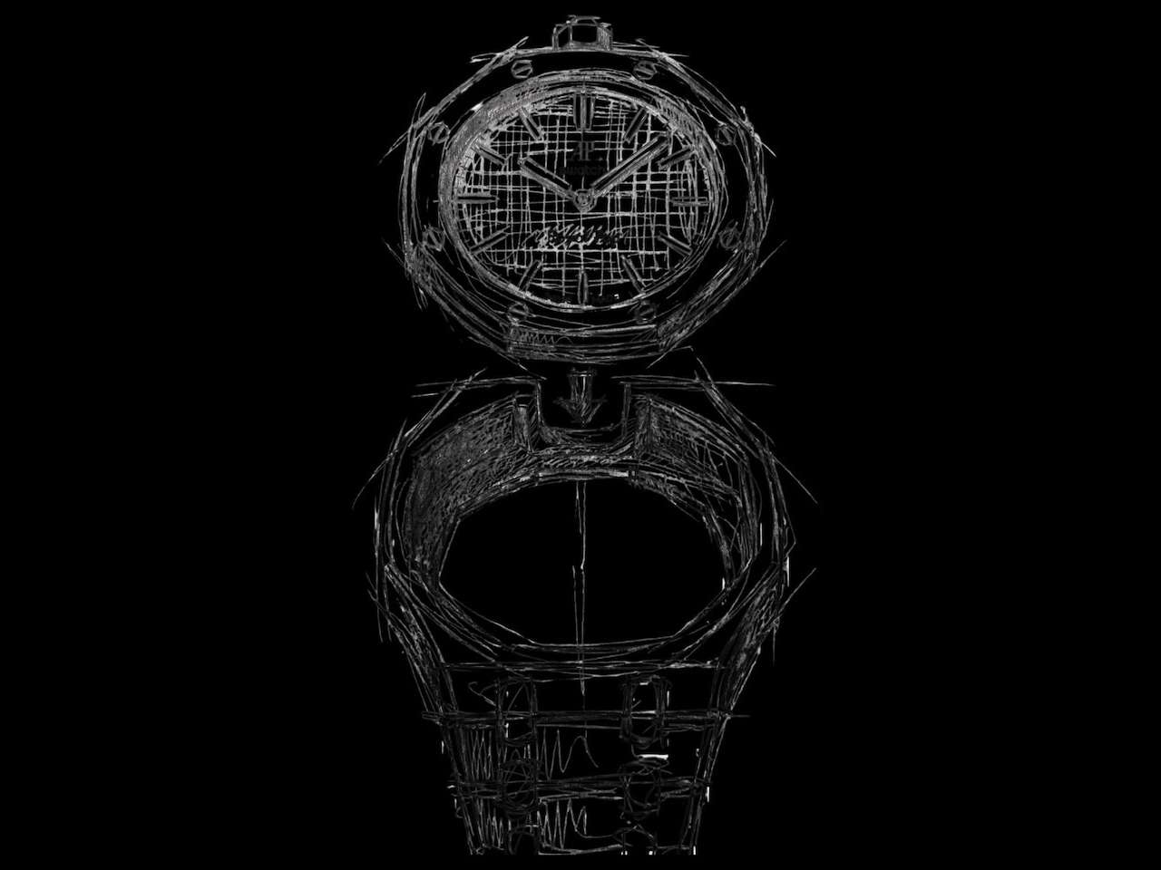
The joyful collaborative Royal Pop makes a statement with its bold colorways and the intent to give a new vision to the traditional way of wearing a watch. The watch features Swatch’s patented Bioceramic (a composite material) case, but the larger distinction – or similarity, if you may – is its Royal Oak inspiration. It has an octagonal bezel slapped with eight hexagonal screws, ‘Petite Tapisserie’ pattern on the dial, and comes with three lanyard lengths to wear it in different ways.

The colorful Bioceramic Royal Pop pocket watch with Royal Oak pedigree measures 40mm in diameter, and it is only 8.4mm thick. The hour and minute hands under the sapphire crystal feature Super-LumiNova for readability in the dark. Other interesting aspects of the Royal Pop are its see-through caseback and its innovative SISTEM51 movement, designed by Swatch.

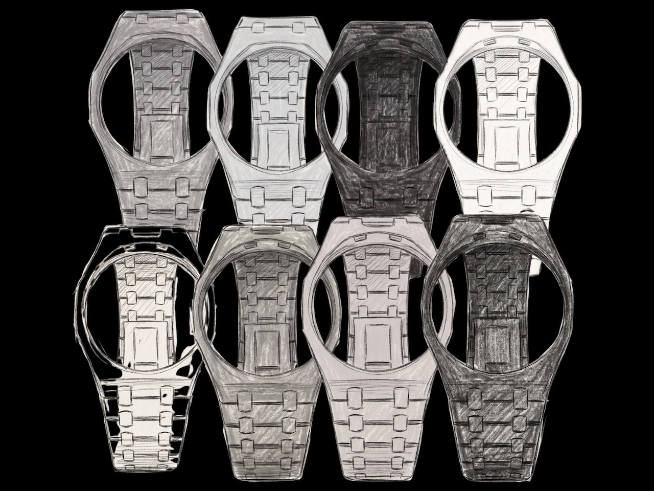
As noted, the Audemars Piguet x Swatch Royal Pop comes in eight different models. These are further divided into two distinct configurations: Lépine and Savonnette. The six Lépine-style pocket watches feature hour and minute hands and a crown at 12 o’clock. Two Savonnette-style watches, on the other hand, have a crown placed at a more recognizable 3 o’clock position, and in addition to the hour and minutes, also have a small second hand at 6 o’clock.

Bioceramic Royal Pop pocket watch, as mentioned, is powered by Swatch’s hand-wound SISTEM51 movement, which is reportedly the only mechanical movement with a “100% automated assembly.” The movement features an anti-magnetic Nivachron balance spring along with laser-based precision adjustment set directly at the factory. It will provide the pocket watch with up to 90 hours of power reserve. The Bioceramic Royal Pop Collection is now available for purchase through selected Swatch stores, starting at $400 for the hour-and-minute versions. The model with a small second hand will cost you $420 before taxes.

The post The colorful Audemars Piguet x Swatch Bioceramic Royal Pop watch can be worn in multiple ways first appeared on Yanko Design.
Su Yang Choi Made a Glowing Lamp From Seaweed, Paprika, and Gardenia

Sustainable design has spent years negotiating an awkward identity crisis. The moment a material gets labeled biodegradable or plant-based, it tends to be filed under “eco-alternative,” which is shorthand for “almost as good as the real thing, but greener.” That framing puts the worth of the material almost entirely on what it replaces, rather than what it can become as something genuinely new.

Designer Su Yang Choi has been pushing back against that assumption with the Slow Project series, an ongoing investigation into seaweed-derived agar as a material with its own aesthetic voice. Slow2, the series’ second work, was presented at Salone Satellite 2026 in Milan as a pair of glowing tubular light installations that don’t quite look like anything industrial design or nature has produced before.

Designer: Su Yang Choi

The structural idea comes from baramgil, a spatial principle in traditional Korean hanok architecture where doors and windows line up along a single axis, letting the gaze pass through layered planes and create the impression of depth. Choi translates that logic into two vertically interlocking circular tubular structures, which build perceived depth through repetition and overlap rather than any physical expansion.

The tubes are built around a steel armature wrapped in layers of seaweed-derived agar, a biodegradable biopolymer Choi formulated independently without any synthetic additives. LED strips run through the core alongside insulating tubing, and the light passes outward through the semi-translucent material. The agar’s own surface texture, tight ridges spiraling along each curved section, reads as integral to the form rather than incidental.

Color comes entirely from natural pigments, specifically gardenia and paprika, which produce a gradient from warm amber and gold at the lower sections to a deeper red toward the top. The shift isn’t applied in flat bands but moves gradually across the form, and the LED light amplifies those variations differently through each layer of agar, so the coloration changes depending on where you look from.

Hung from the ceiling, the installation casts shadows on the wall behind it, the overlapping loops producing a secondary layer of visual information that extends the work beyond its physical boundaries. That doubling mirrors the baramgil idea at a different scale. Seen from the front, the structures read as a single unified form; shift to an angle and the depth between the interlocking sections opens up considerably.

What makes Slow2 compelling is what Choi is actually arguing through it. The Slow Project series isn’t about demonstrating what seaweed agar can replace; it’s an inquiry into whether the material can develop enough formal character to stand on its own. The baramgil reference, the natural pigments, the hand-wrapped tubes, none of it reads as sustainable messaging but as decisions the material itself invites. The concept, the form, and the substance aren’t three separate layers but one coherent thing, which is precisely where the Slow Project series seems to be heading.

The post Su Yang Choi Made a Glowing Lamp From Seaweed, Paprika, and Gardenia first appeared on Yanko Design.