
Mamdani announces new Click-to-Cancel rule for New York City
The rule revives a proposed FTC protection that was abandoned last year.
Satellite connectivity used to be reserved for phones, off-grid communicators, and specialized outdoor gear. Now it is showing up in far smaller devices, and Fi Ultra pushes that trend into pet care. The tracker taps into the Starlink satellite network to keep dogs locatable in places where cell towers never reach, a capability that would have sounded unrealistic in a consumer pet product only a few years ago. Hikers, hunters, and rural dog owners have spent years accepting blind spots in their tracking apps as a fact of life. Fi Ultra treats that blind spot as a problem worth solving with real infrastructure instead of a bigger antenna.
Fi built its business on GPS trackers that relayed location through LTE, a system that worked well until a dog wandered beyond cellular range. Fi Ultra closes that gap by adding satellite as a fallback layer, switching automatically between Bluetooth, Wi-Fi, LTE, and satellite depending on what is available. Priced at $199, with an additional $189 a year for satellite access, it signals how quickly satellite technology is trickling down into everyday consumer products. This is the same T-Satellite infrastructure conversation phone carriers have been having for the last two years, except here it is stitched into a dog collar instead of a flagship handset.
Designer: Fi
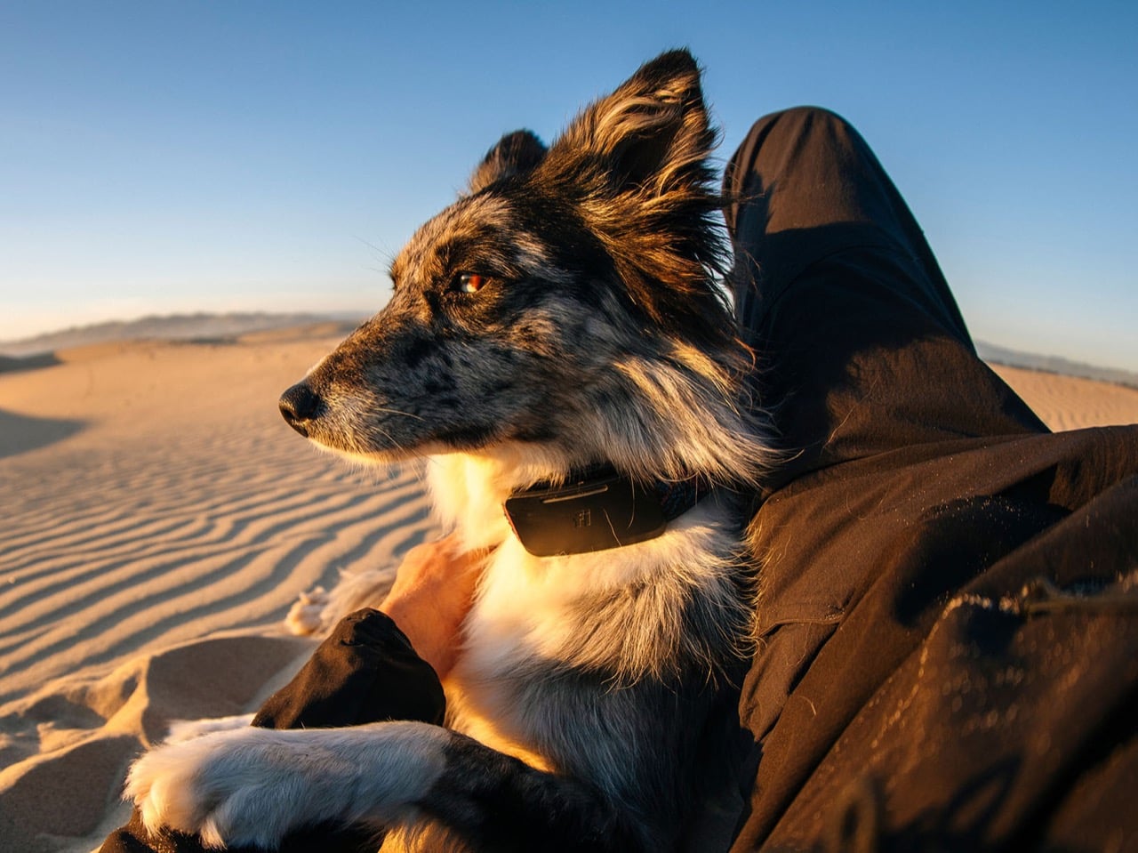
Satellite transmission is power hungry by nature, since the tracker has to punch a signal far enough to reach orbit rather than the nearest cell tower. Fi’s answer is a connection hierarchy that always defaults to the cheapest option available, quietly downgrading from satellite to LTE to Wi-Fi to Bluetooth the moment a lower power option exists. It is the same logic your phone uses when it prefers Wi-Fi over cellular data, just applied to a device with a fraction of the battery capacity. The result is a tracker that only reaches for its most expensive connection when nothing else will do the job.
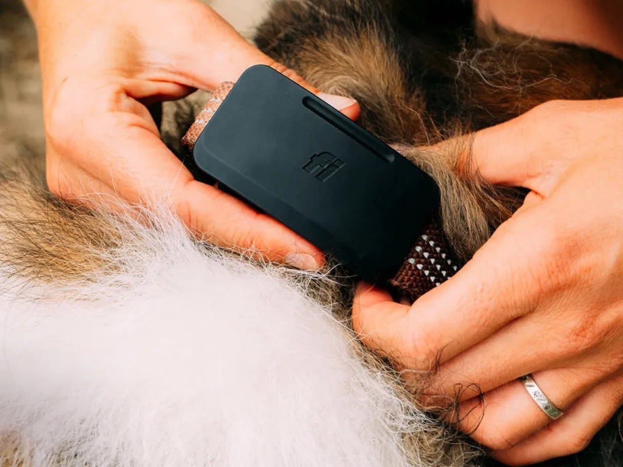
An Apple AirTag runs for a year on its coin cell battery, and Fi’s own Fi 3+ lasts up to three months, but Fi Ultra is rated for only several days between charges. That is a steep drop, and it says something about how much energy satellite radios actually demand compared to the low power Bluetooth chips inside most trackers. Fi is betting that owners in genuinely remote areas will accept more frequent charging in exchange for a tracker that never goes dark, which is a reasonable bet for search and rescue dogs, hunting companions, and anyone hiking well outside cell coverage. It is a much harder sell for a dog that mostly patrols a suburban backyard.
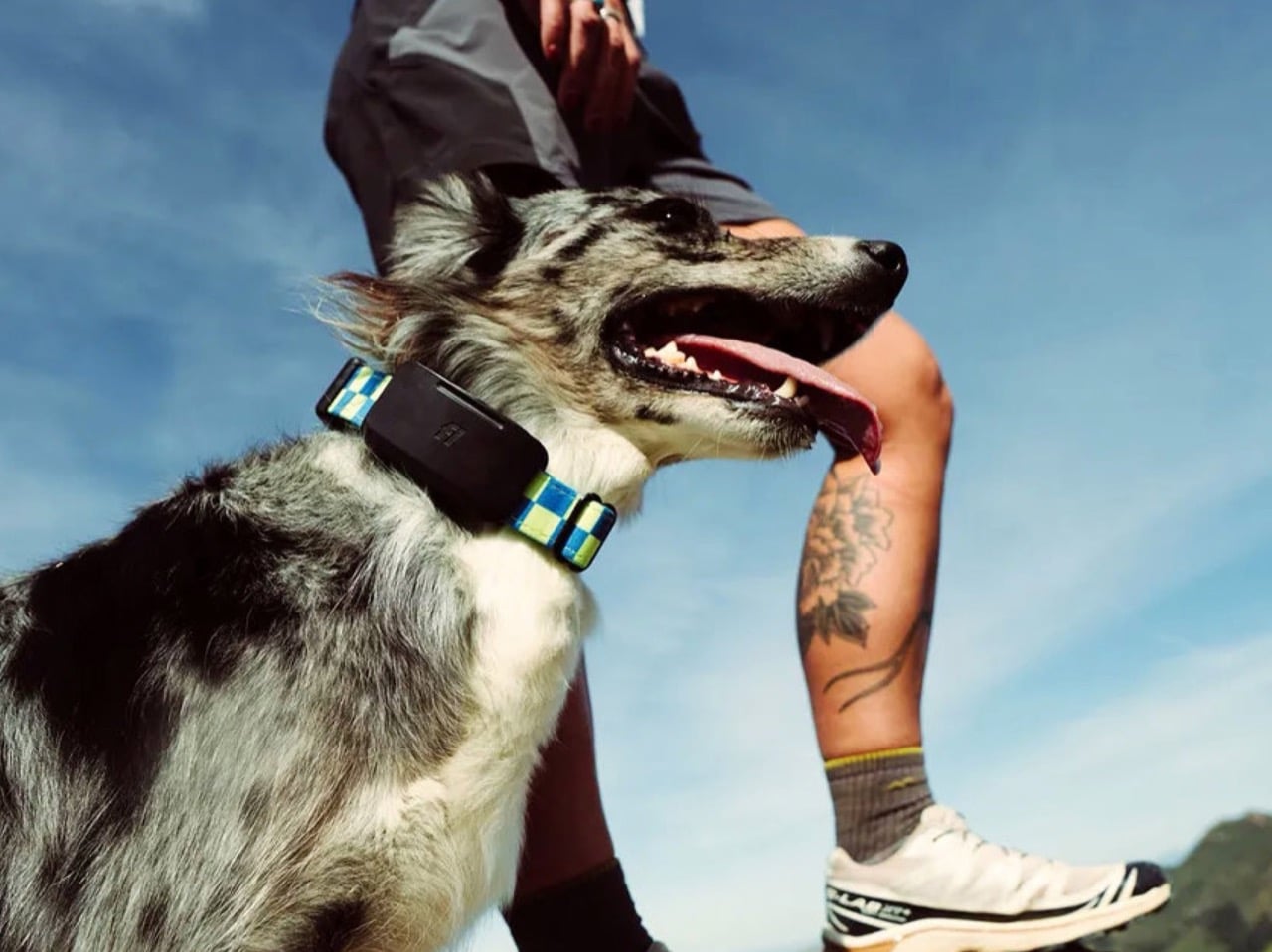
Fi Ultra also carries over Fi Callback, a feature that lets owners send sound and vibration cues through the smartphone app to recall a dog from a distance, alongside standard support for both collar and harness mounting. None of that is revolutionary on its own. What makes Fi Ultra worth watching is the precedent it sets. Satellite hardware has spent years shrinking from ships and expedition gear down to phones, and now down to a dog collar. The next logical step is livestock tags, wildlife collars, and eventually anything small enough to wear that still needs to be found. Fi just got there first.
The post This GPS dog tracker uses Starlink satellites to work anywhere cell service doesn’t first appeared on Yanko Design.


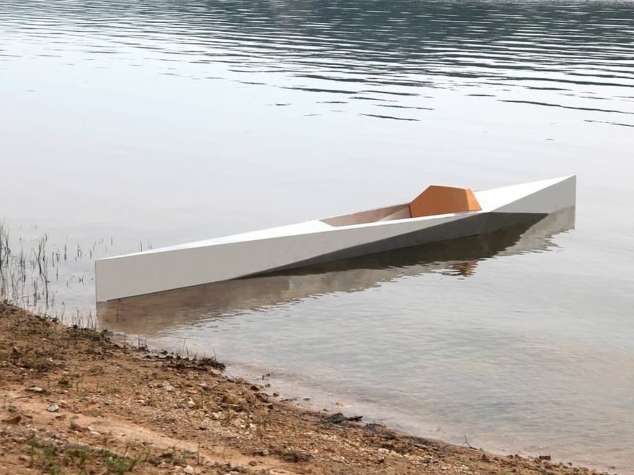
When Guillaume Bloget arrived at France’s Rhizome Association for a research-creation residency, he was surrounded by lakes. Most people would have simply enjoyed the view. Bloget looked at the water and immediately started thinking about how to cut through it. The result is Sharp, a kayak built from folded aluminum sheet and cork, and it’s one of the more quietly compelling design objects I’ve come across recently.
It’s one of those designs that stops you cold the moment you see it. Not because it’s trying to be shocking or provocative, but because it gets the balance so right. The silhouette is clean and geometric, almost architectural, and yet it moves your eye the way a good piece of sculpture does. You keep looking at it, trying to figure out exactly why it works so well.
Designer: Guillaume Bloget
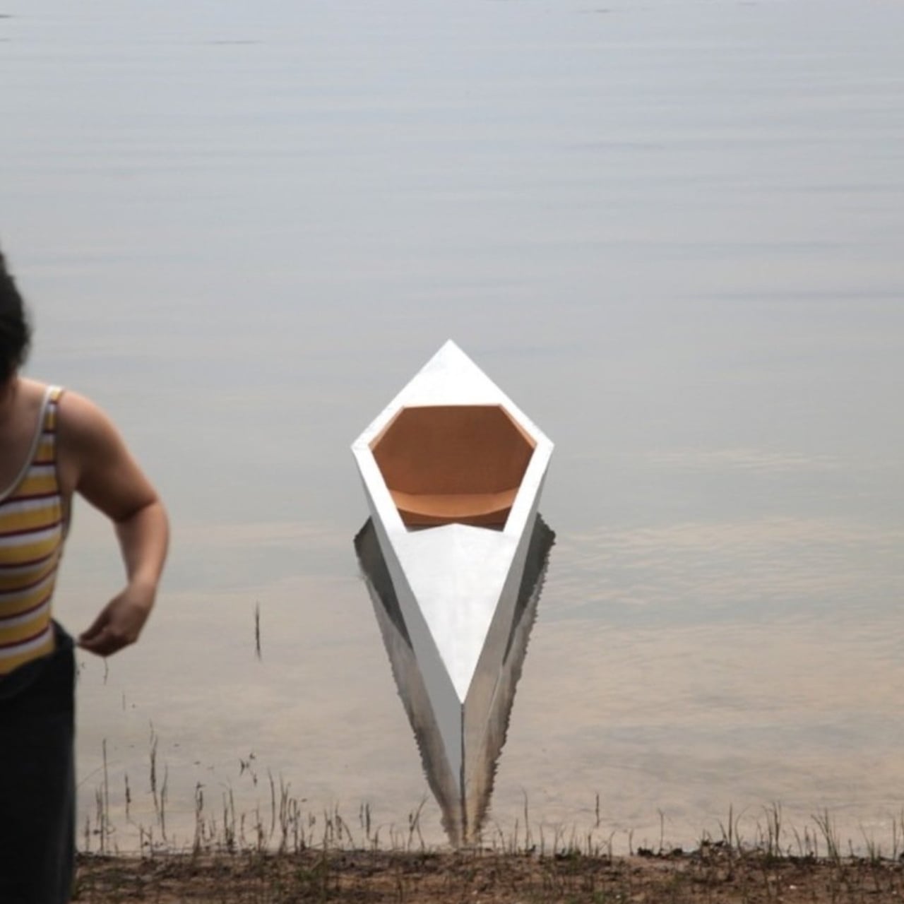
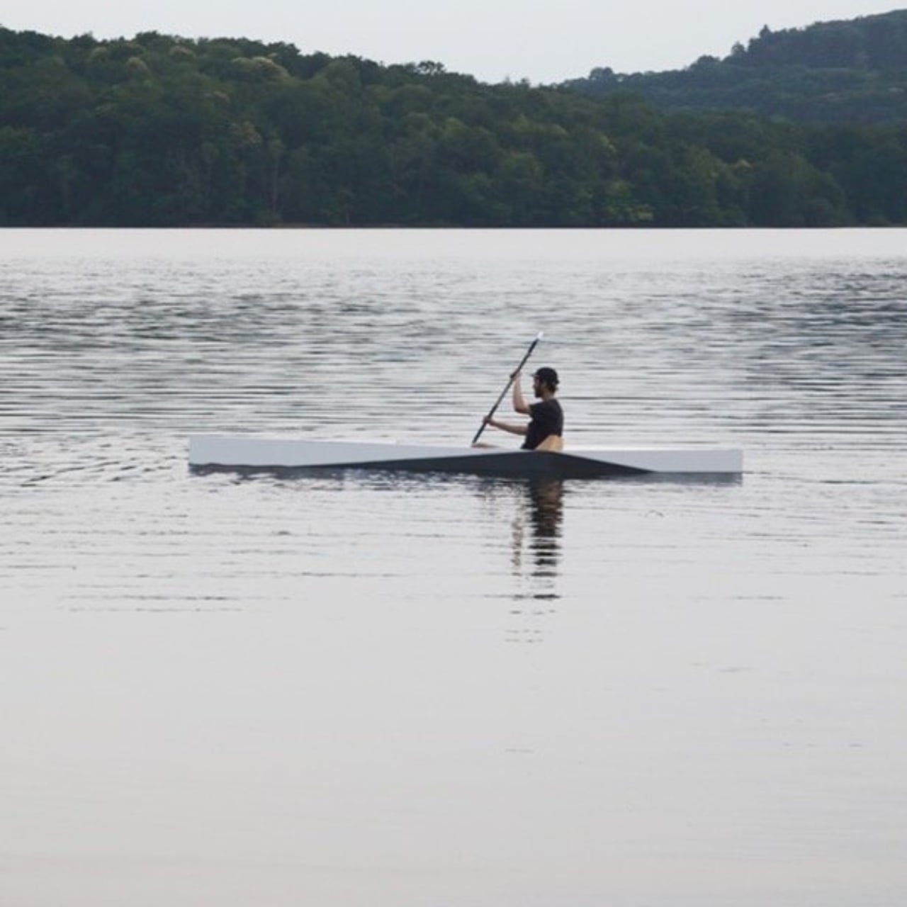
Kayak design, as a category, doesn’t get nearly enough attention. We tend to treat watercraft as purely functional objects, things that should perform and get out of their own way visually. Sharp pushes back on that assumption without making a big show of it. Bloget worked on a hydrodynamic hull to produce what he describes as “a good sliding sensation,” which tells you the function was never an afterthought. But the execution goes well beyond the purely practical.
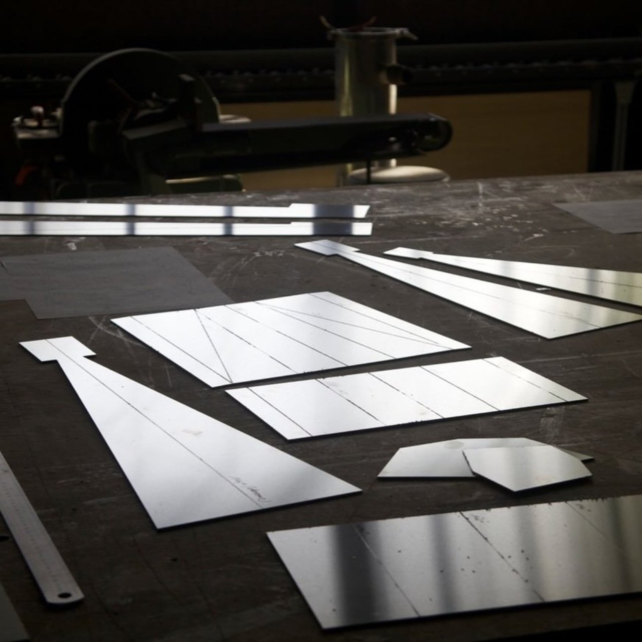
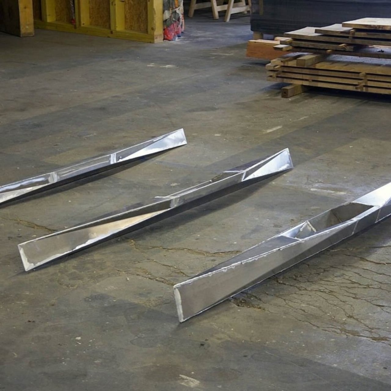
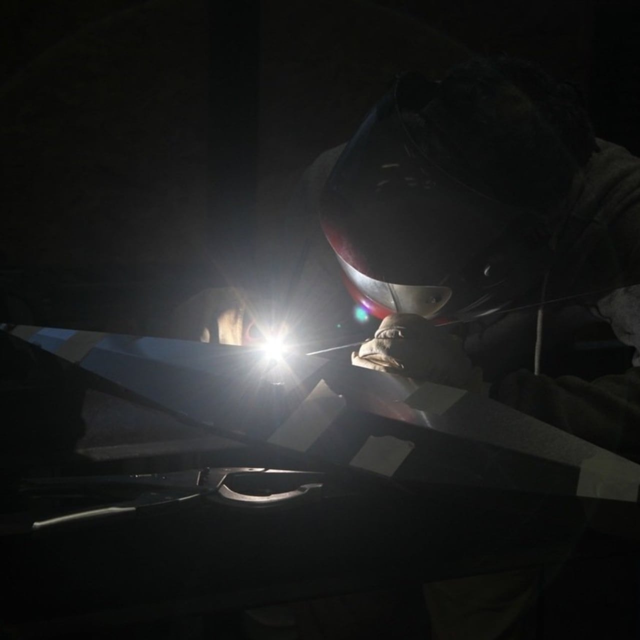
The folded construction is where things get genuinely interesting. The kayak’s structure relies entirely on folding, and the double-wall design makes it unsinkable. That’s not just a clever engineering solution; it’s the kind of constraint-driven thinking that separates good design from great design. When a structural requirement also produces an aesthetic, you know the designer was really paying attention. The angular folds give Sharp its name and its personality. It looks sharp. It feels intentional in a way that a lot of so-called “design-forward” products don’t quite manage.
Cork makes a quiet but important appearance too. The seat is cork, mediating between the angular geometry of the aluminum hull and the organic curves of a human body. It’s a thoughtful detail. Cork is warm where aluminum is cool. Cork is soft where the hull is rigid. Placing it exactly where your body meets the boat is not an accident. It’s the kind of material decision that you might not consciously register the first time you look at the photos, but that you’d definitely feel the moment you sat down.
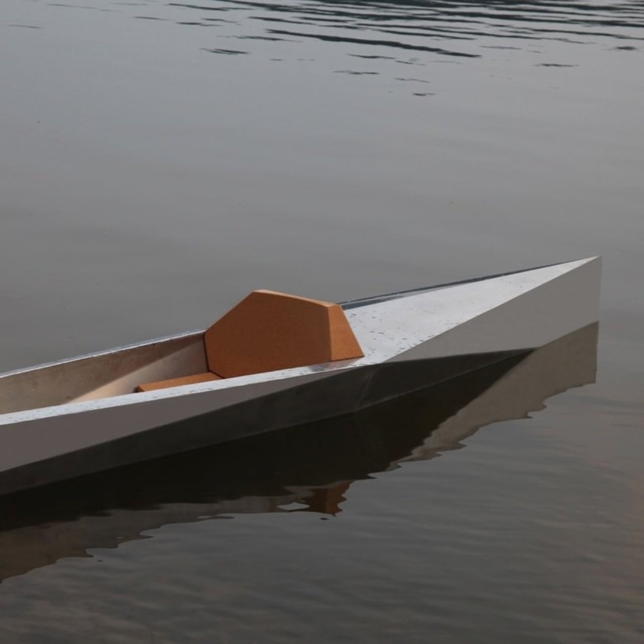
The aluminum itself is doing double duty. Beyond the structural logic of folded sheet metal, Bloget noted that the shine of the material plays with the reflections of the water. That’s a level of environmental awareness that most product designers don’t even consider. Sharp wasn’t designed for a studio backdrop. It was designed for a lake, where light and surface and movement are all part of the experience. The kayak is meant to participate in its environment, not just occupy it.
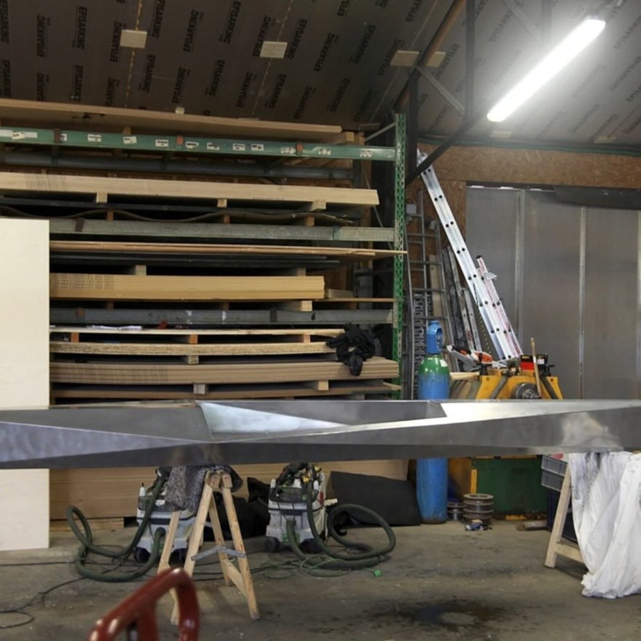
Sharp sits in an interesting space right now. It was produced during a 2023 residency in Ouroux-en-Morvan alongside craftsman Antoine Rivière, labeled as a Mushroom Edition, which suggests it was made in a very limited run. Whether it ever becomes commercially available at any real scale is unclear. And that’s a little frustrating, because designs like this deserve to actually exist in the world, not just in portfolios and Instagram posts. Residency projects often produce beautiful ideas that quietly disappear, and it would be a genuine loss if Sharp became one of them.
The broader point here is about what we expect from everyday objects. A kayak is a practical thing. You paddle it, you store it, you use it to get somewhere or to simply be somewhere on the water. None of that changes because it’s beautiful. But when a practical object is also genuinely well-designed, the experience of using it shifts. You treat it differently. You notice things you wouldn’t have otherwise. The aluminum catches the light and so do you, briefly, on a lake somewhere in France. Bloget gave something useful a little poetry. The least we can do is pay attention.
The post The Folded Aluminum Kayak That’s Almost Too Beautiful to Use first appeared on Yanko Design.
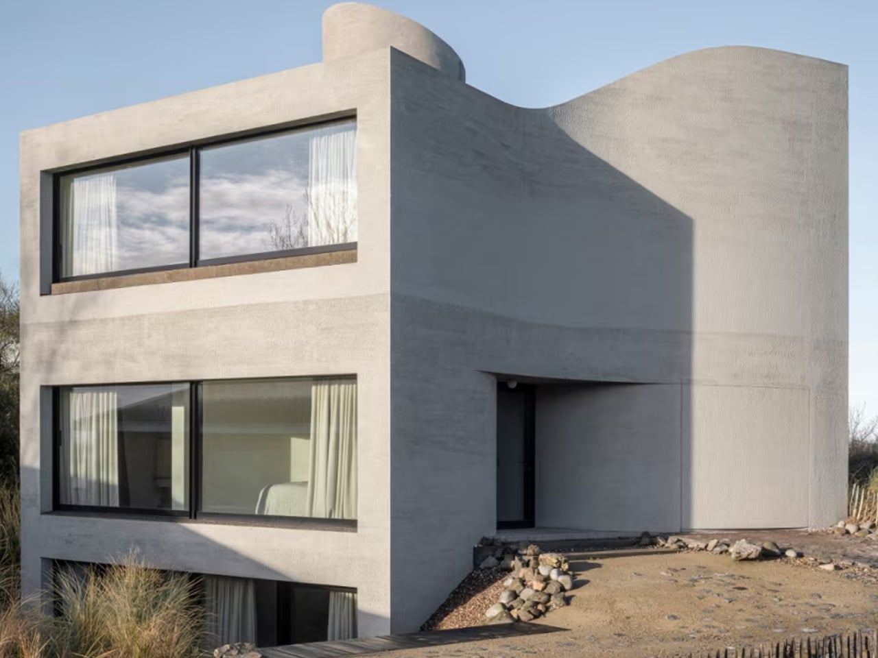
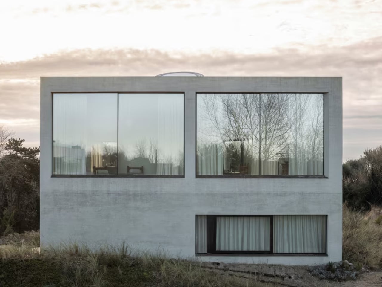
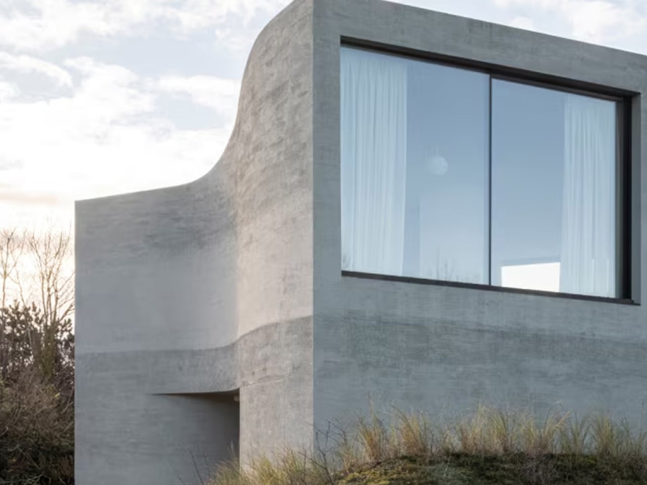
The Belgian coast has always attracted the slightly surreal — fishermen on horseback, a ship-shaped restaurant, and now, a concrete villa that looks like it was carved out of the dune rather than built on top of it. In Oostduinkerke, on a corner plot at the edge of a protected dune reserve along Belgium’s North Sea coast, architect Magalie Munters has built a home that appears to have emerged from the ground rather than been placed upon it. Completed in 2025, Villa Nouvelle Vague is 330 square metres of sculpted concrete — shaped by terrain, wind, and light rather than by facade composition.
The name borrows from the French New Wave cinema movement, and the reference earns its place. There is something filmic in how the house builds narrative as you move through it — compressed thresholds that open into volume, light sweeping across curved walls, deeply set openings that frame the dune landscape like a held shot. This is architecture with a point of view.
Designer: Magalie Munters Architecture
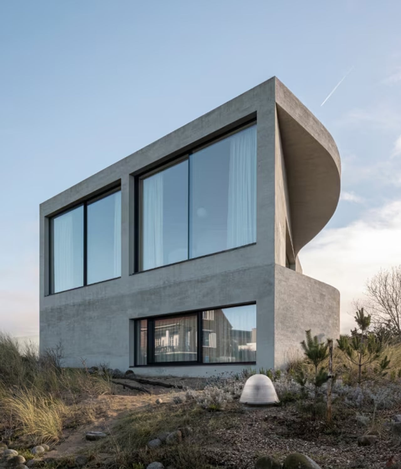
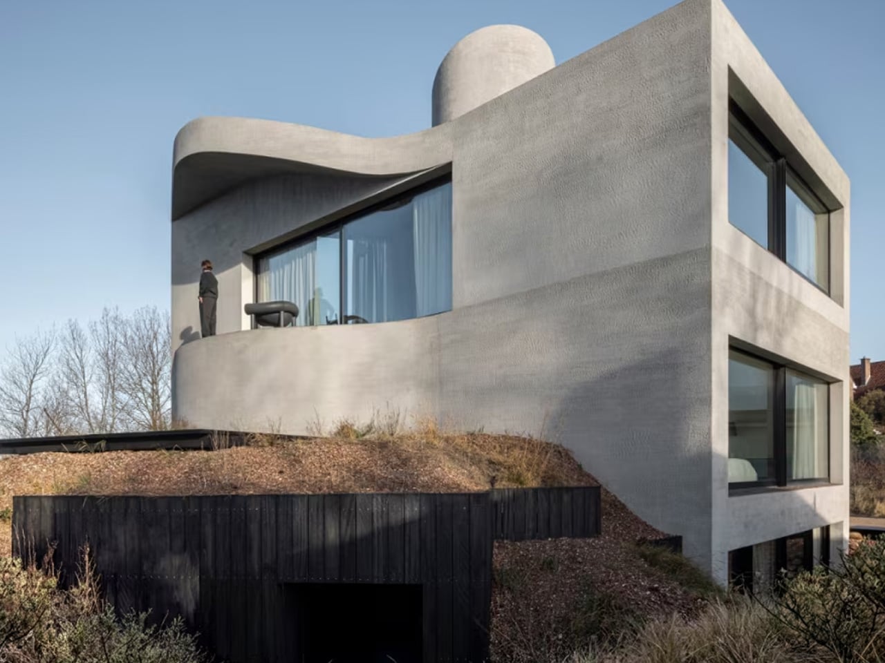
From the street, the facade reads as a protective shell. Munters gave the concrete surface a horizontal grain that recalls the striations left in wet sand when the North Sea withdraws at low tide. The texture is not decorative. It is a structural character — the surface behaves as if it has been sedimented rather than cast. The volume tapers toward the rear of the plot, a subtle geometric decision that creates a generous garden while allowing sunlight to reach both the southern and western facades simultaneously. In a compact building, that kind of continuous light is earned, not given.
The bedrooms sit half-buried in the dunes, anchored and sheltered. Above them, the living space rises toward the horizon — a vertical shaft cuts through the mass toward the roof, organizing movement and pulling light down through the interior. Munters cites Le Corbusier as a touchstone, specifically in how spaces contract and expand, and in the logic of a rooftop solarium that turns the roof into usable terrain. The ceiling is not incidental. It descends toward the kitchen, which sits lower and more intimate, and rises again over the main living space, where the curved walls catch the evening light with near-tactile presence.
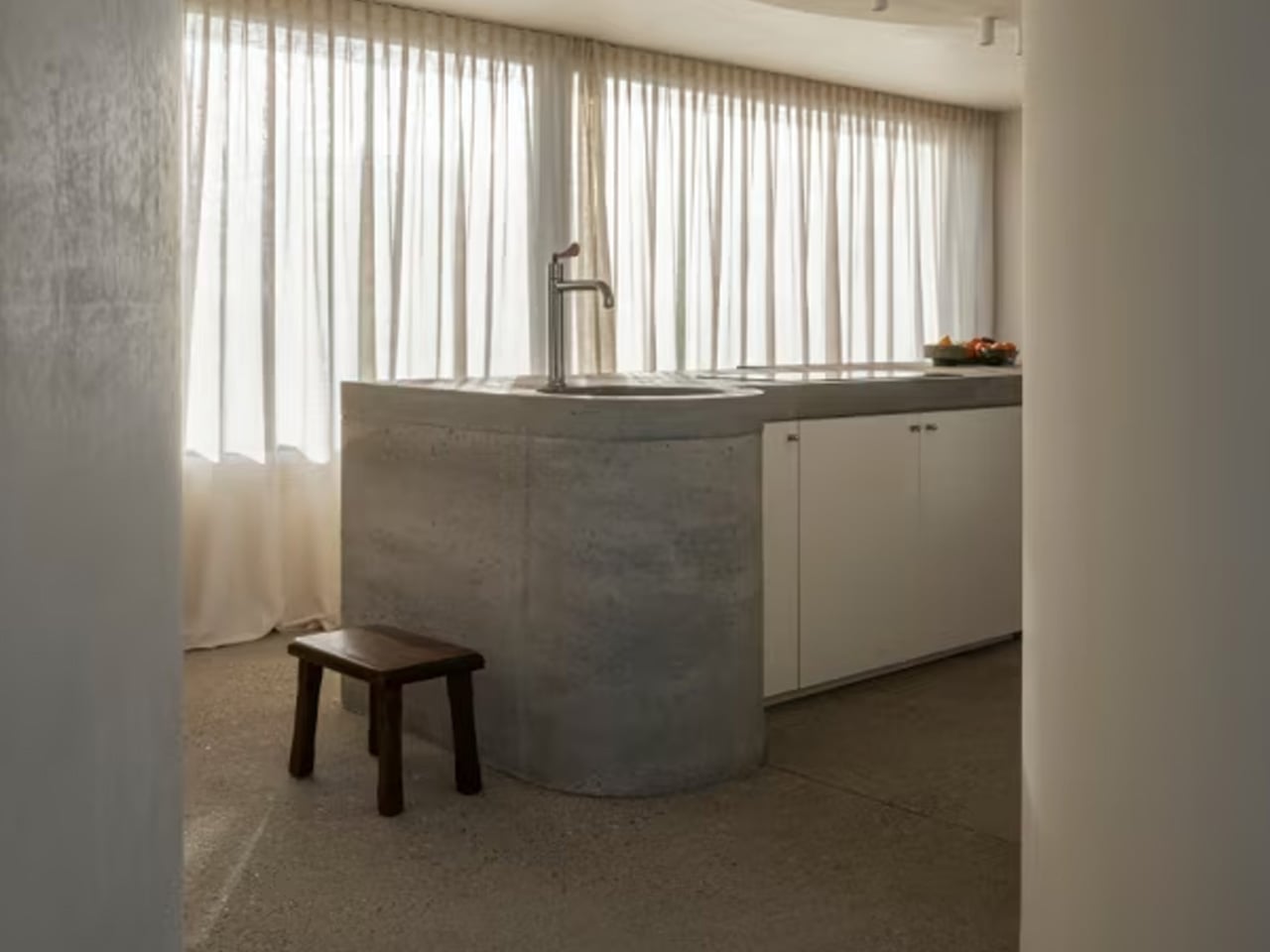
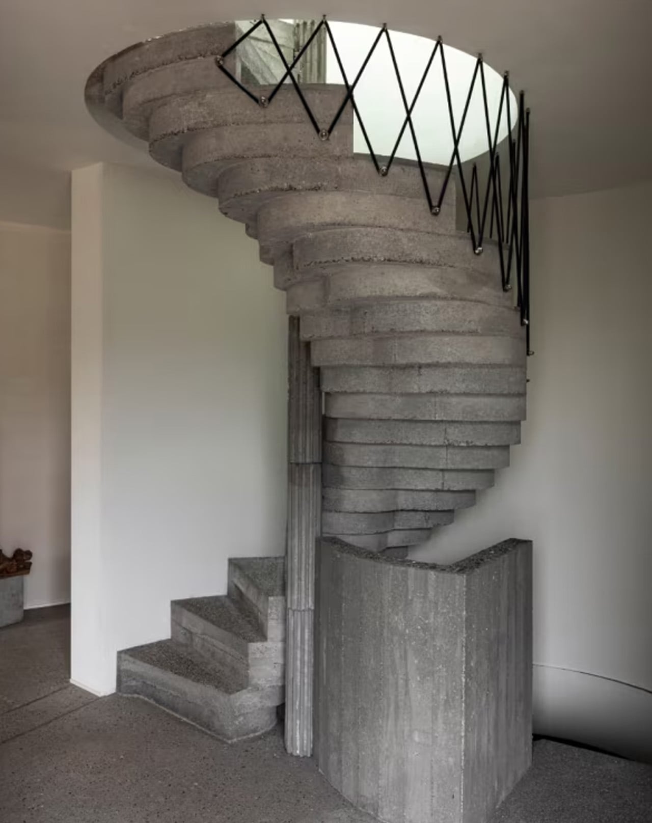
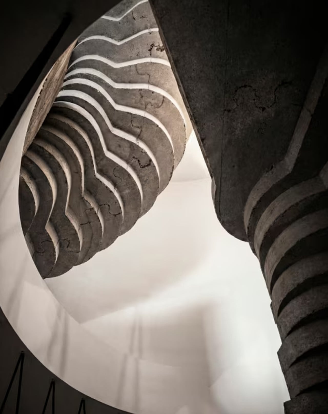
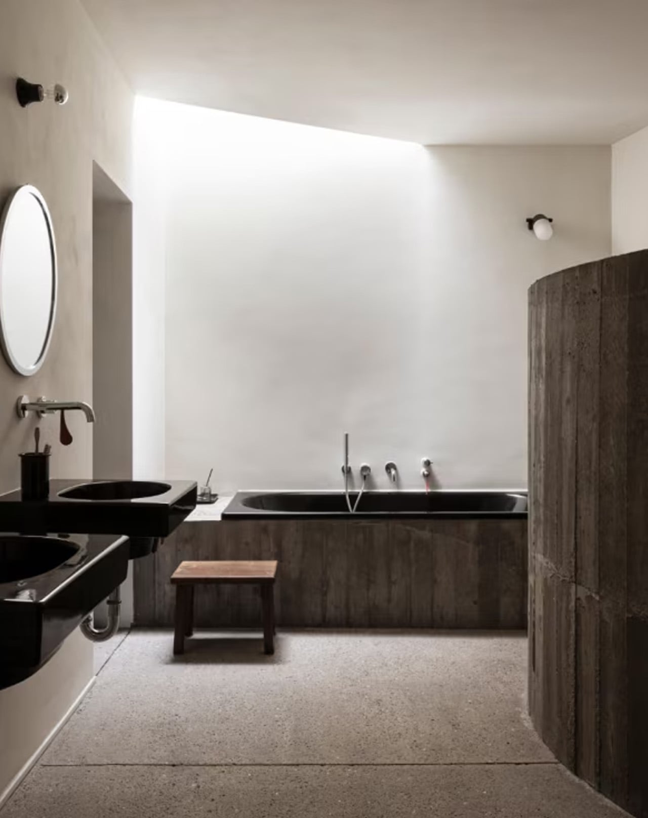
Inside, concrete is a spatial substance, not cladding. The staircase, bathrooms, built-in seating, and kitchen are each conceived as carved elements within the monolithic body — robust and unadorned. Lime-washed surfaces and sandblasted oak furniture soften the mineral presence without undermining it. The rooms feel less like interiors and more like the inside of a shell: enclosed, resonant, precise.
Munters describes the tension at the heart of the project as one between a hidden, highly controlled building logic and a more archaic material expression. That tension, held rather than resolved, is exactly what makes Villa Nouvelle Vague worth studying.
The post This Belgian Brutalist Villa Doesn’t Sit on the Dunes — It Grew Out of Them first appeared on Yanko Design.