Samsung Galaxy Buds Enter the US Market: A Blend of Open-Ear Comfort and Everyday Durability Samsung has officially introduced its Galaxy Buds to the US market, offering a unique combination of comfort, situational awareness, and durability. These earbuds feature an open-ear design and an IP54 dust and water resistance rating, making them a practical choice […]
The iconic see-through trend of the 90s saw many big brands dress up their most trusted products in translucent hues. For me, that was the coolest era of gadgets from an aesthetics point of view. Remember how cool the iMac G3, Game Boy, Nintendo, and the portable CD players looked?
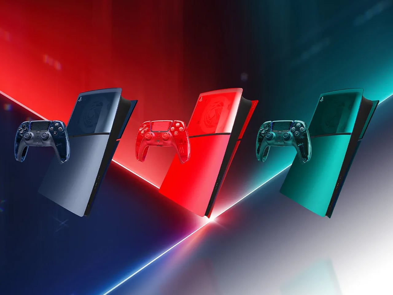
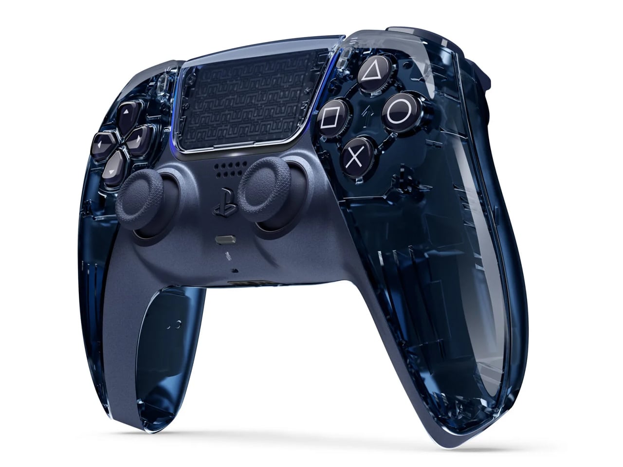
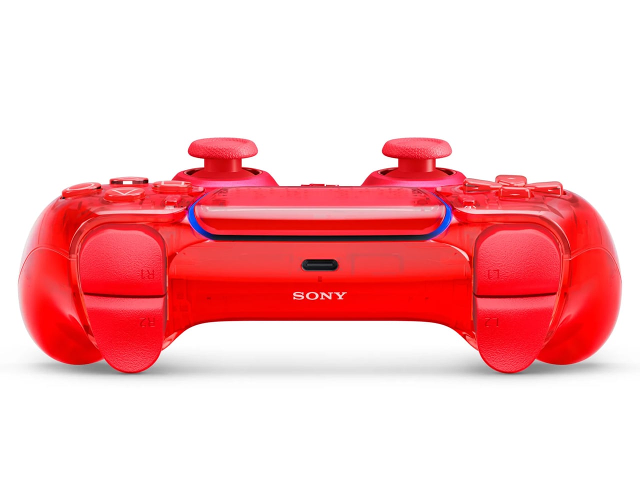
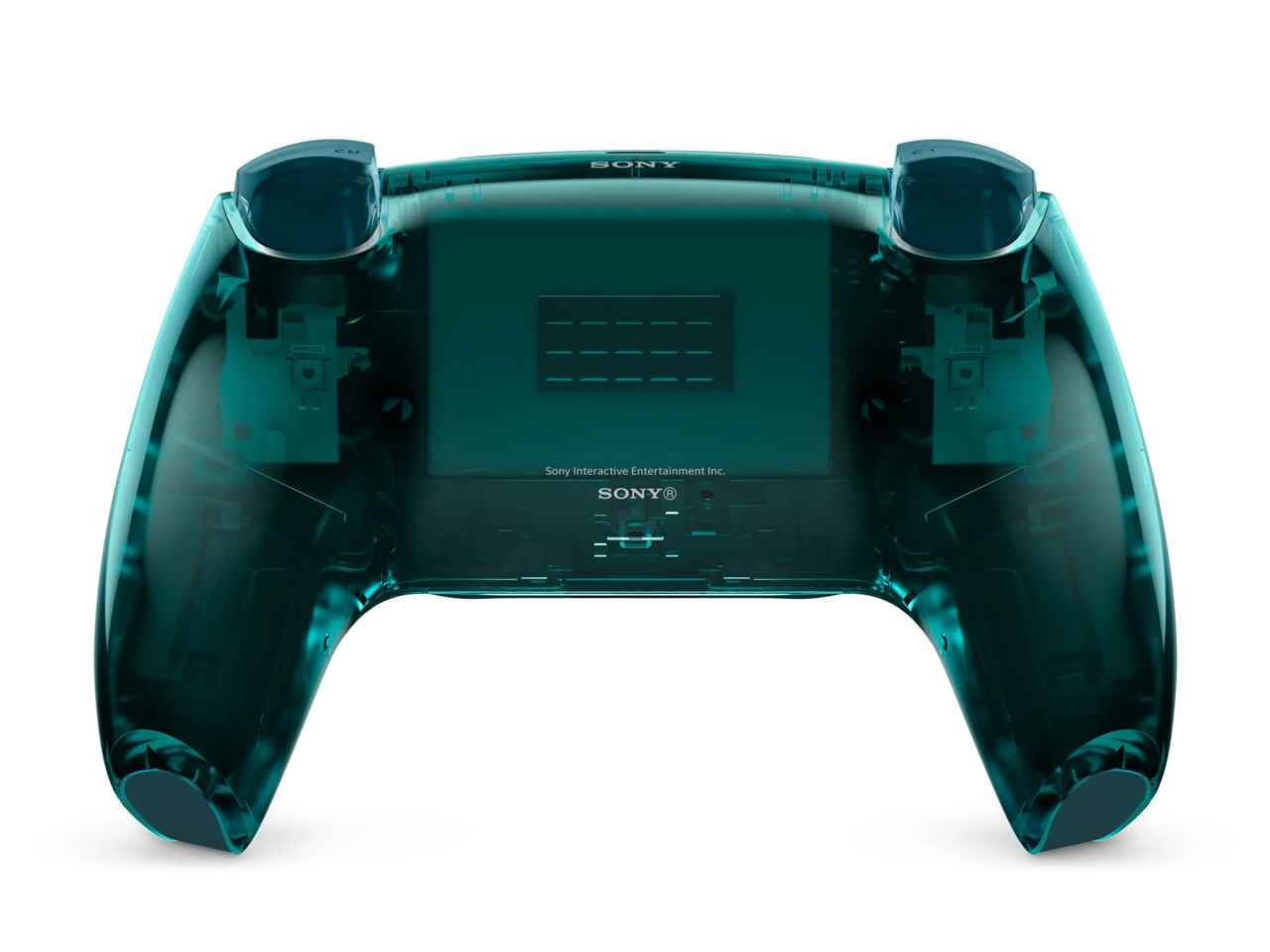
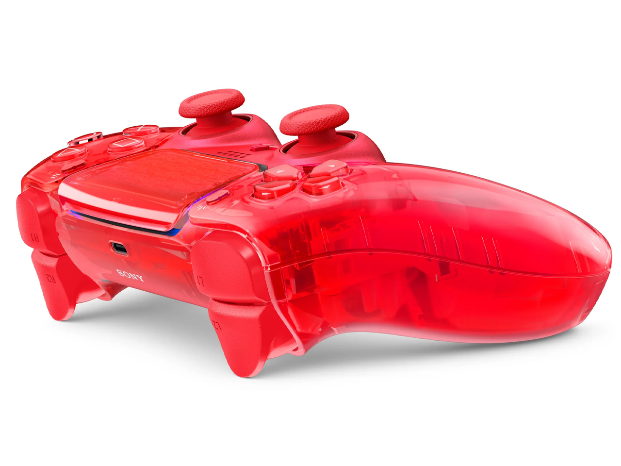
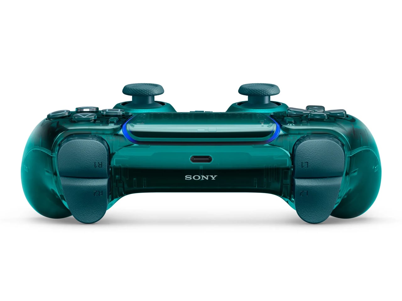
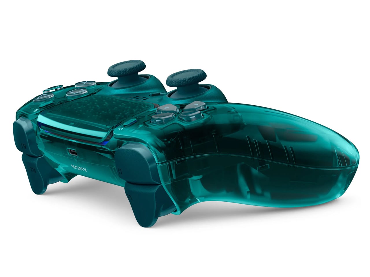
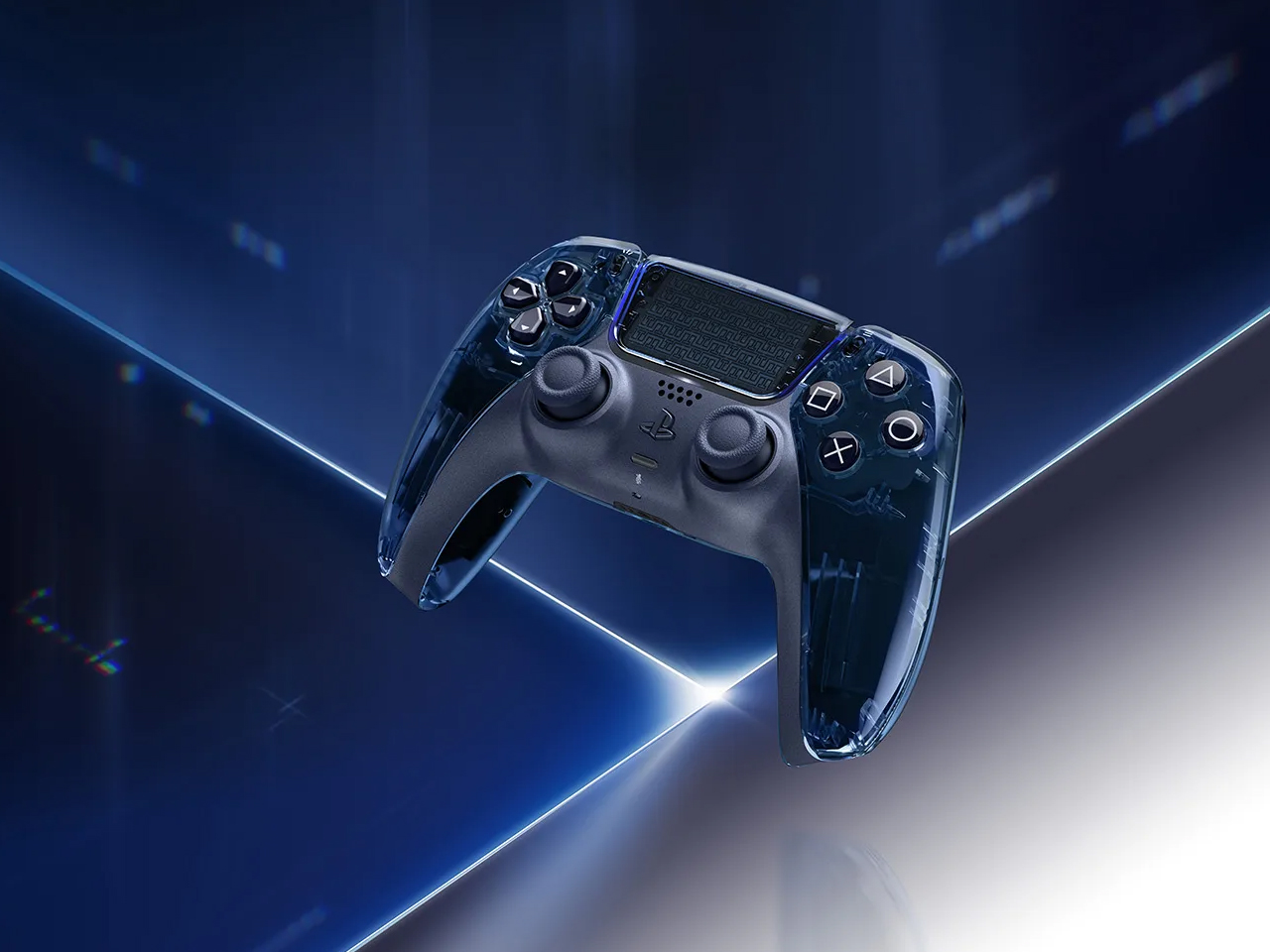
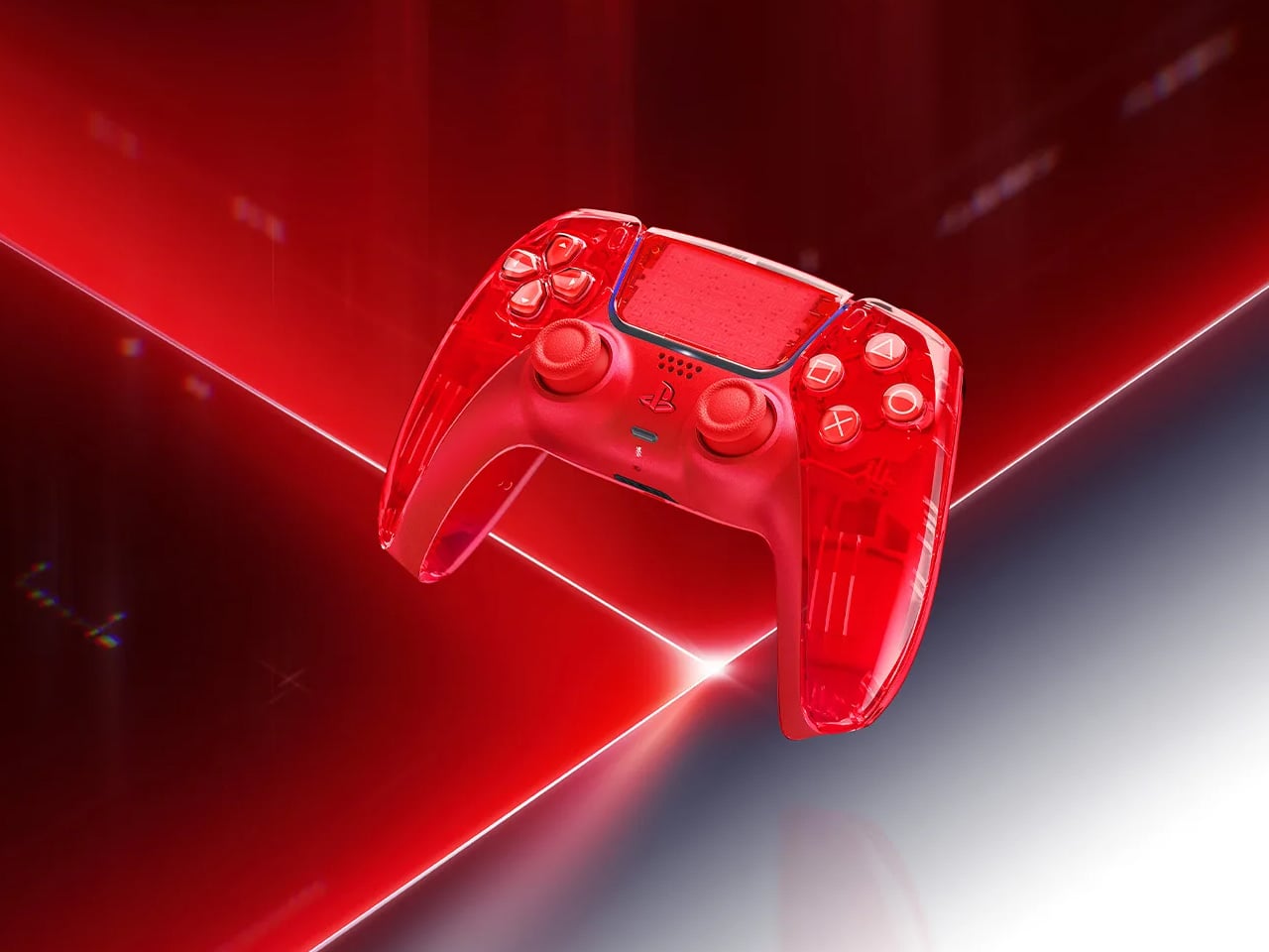
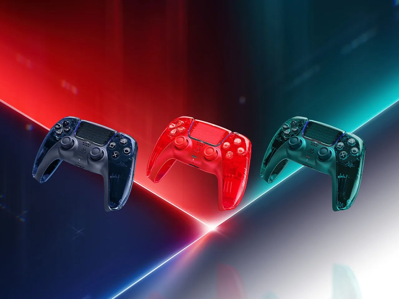
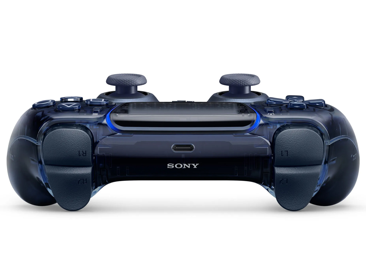
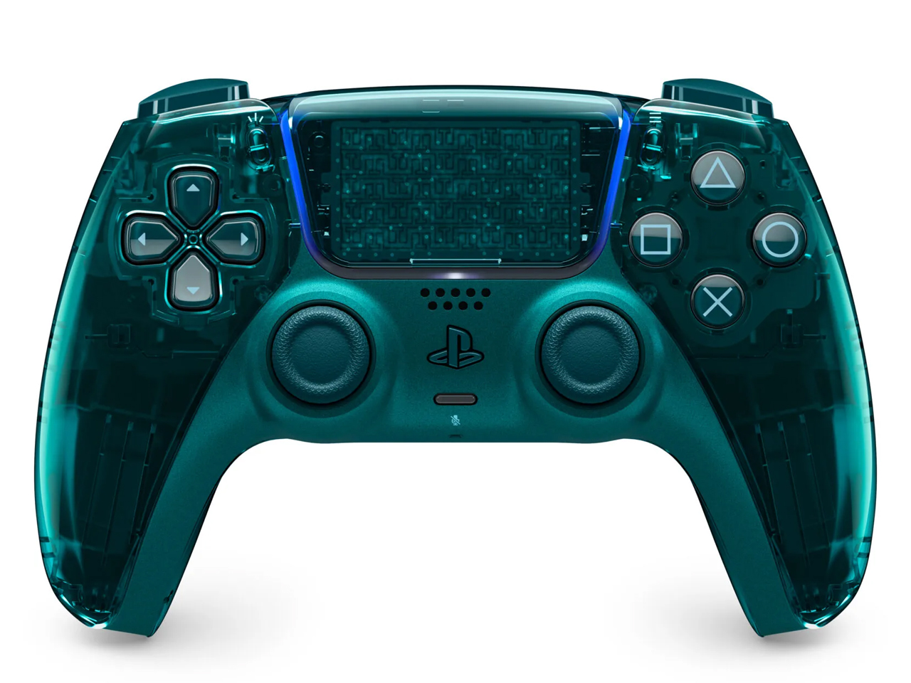
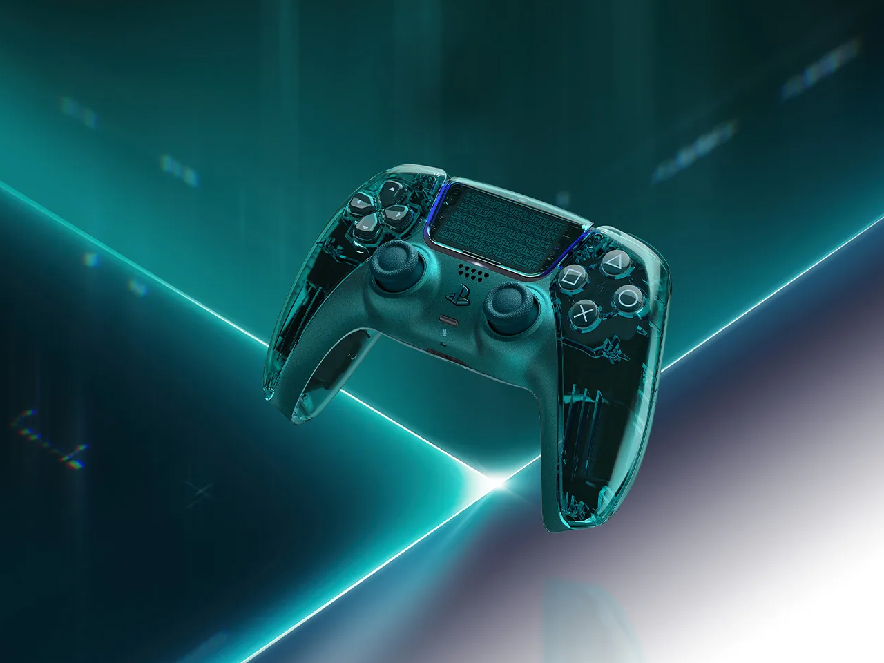
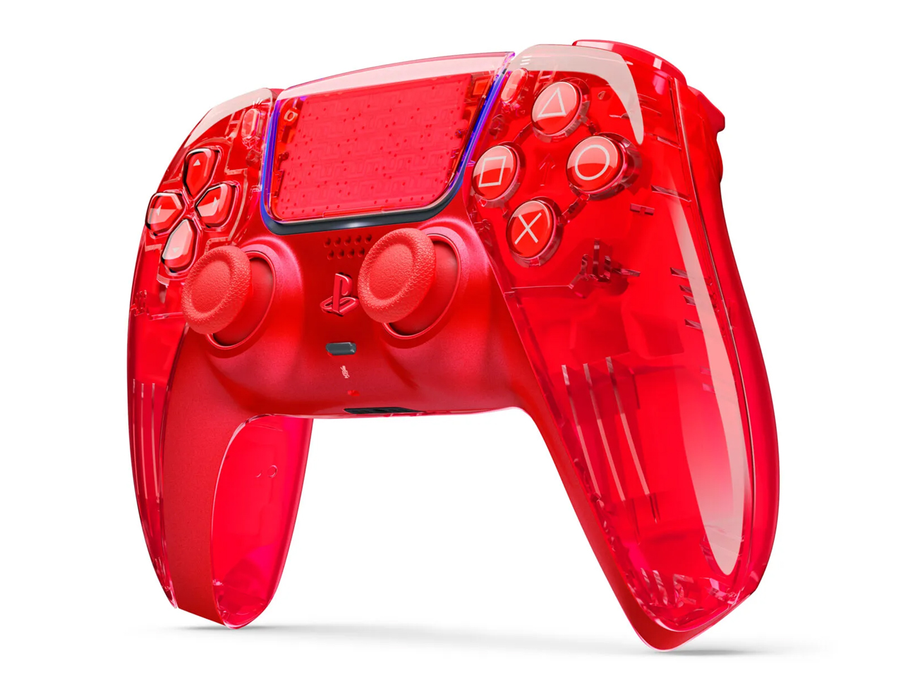
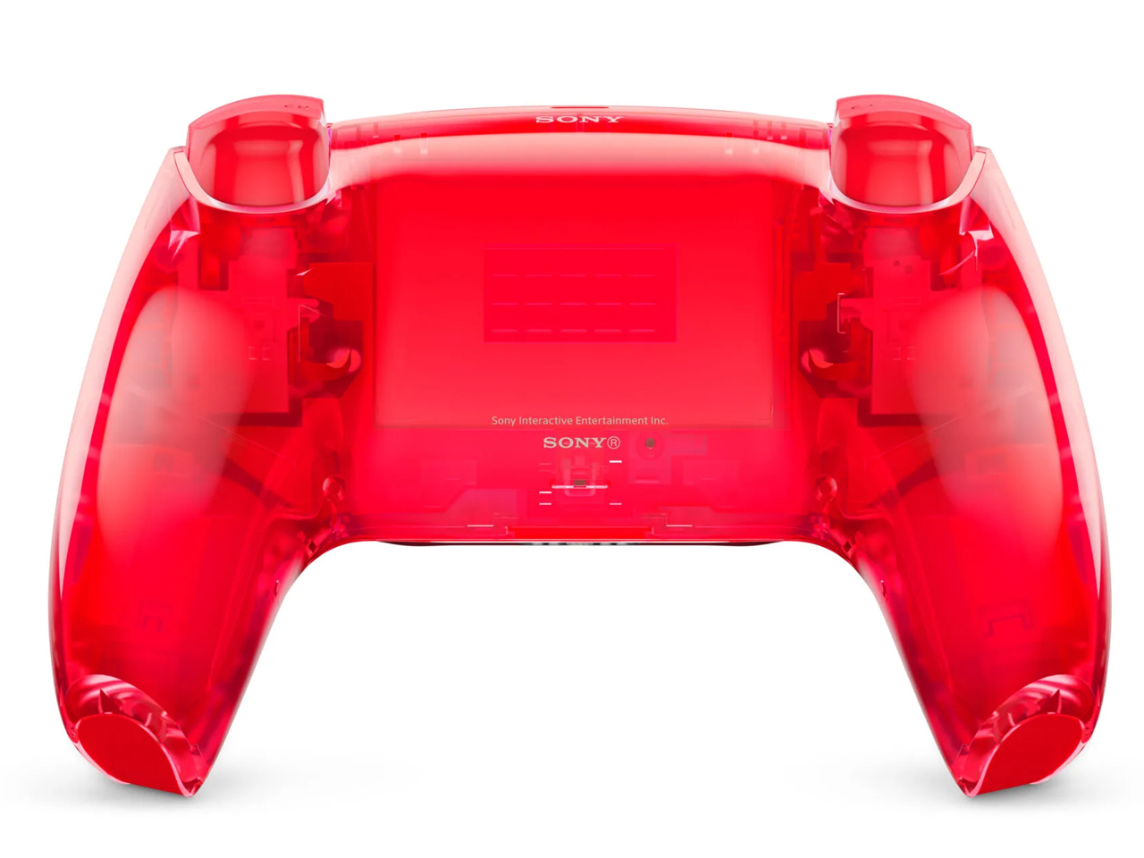
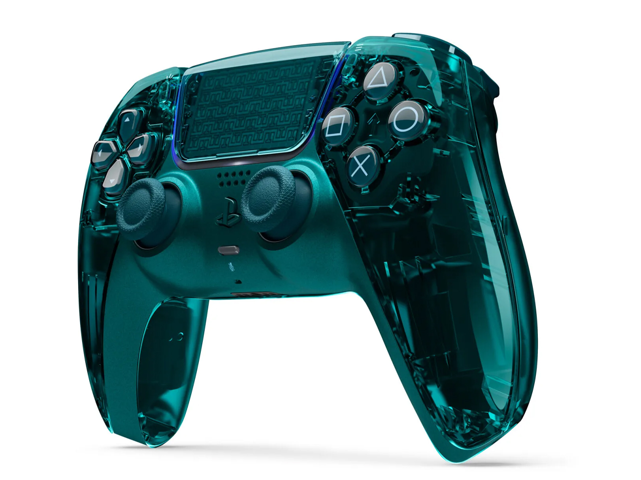
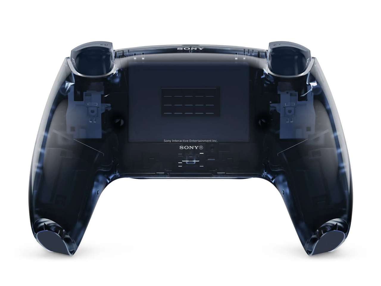
Sony found it hard to resist diving deep into the nostalgia of transparent gadgets, and they’ve finally revealed the official see-through DualSense wireless controller and face plates for the PlayStation 5 console. Dubbed the Prism Collection, the accessory for your gaming console revives the trend in a modern way just in time for the mega release of GTA 6. According to the PlayStation’s design team, the collection is developed in response to fans’ eagerness for the return of transparent designs in their PS5 setup.
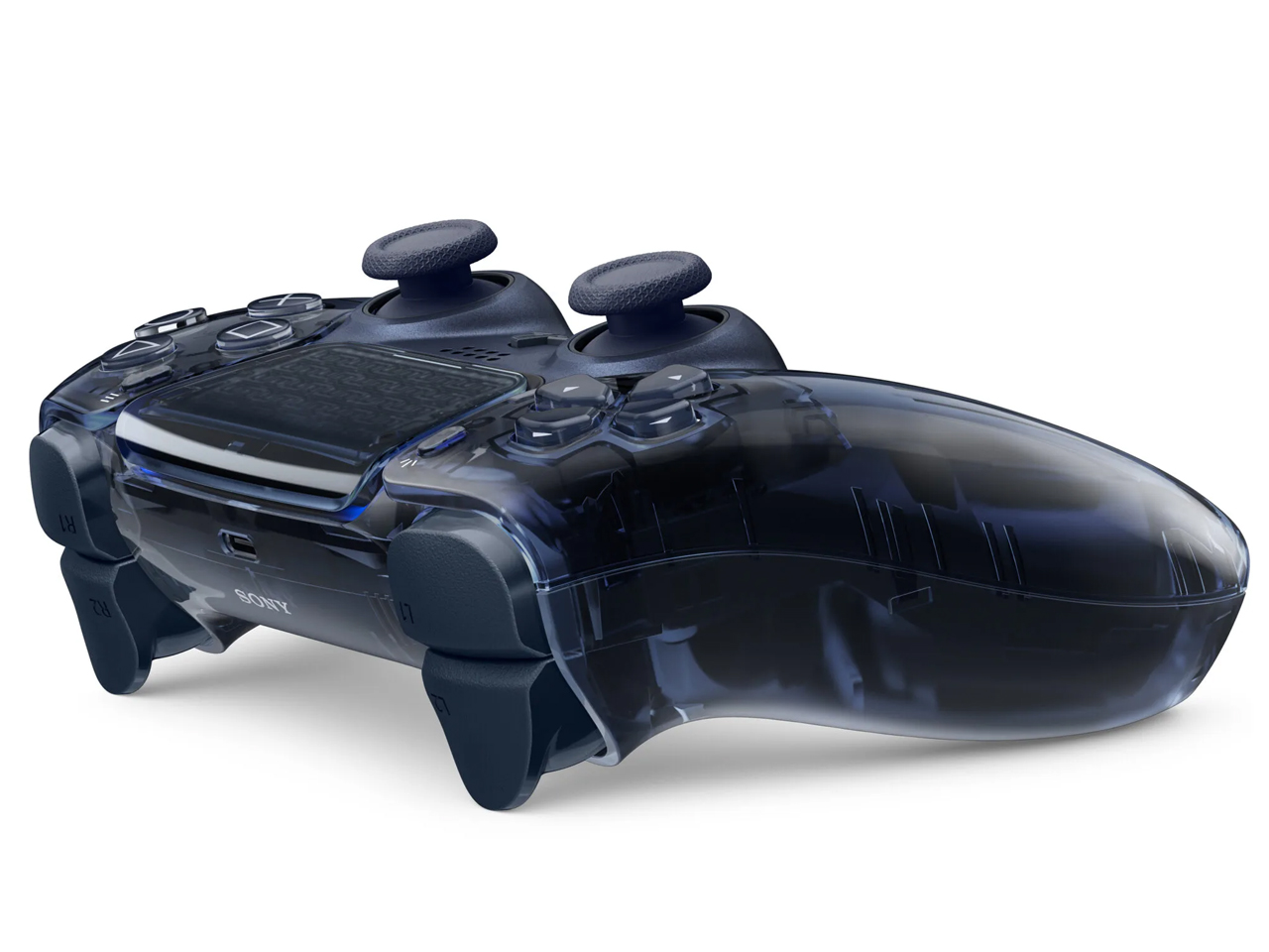
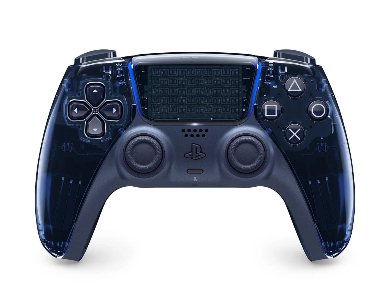
These translucent controllers and the matching console covers bring a futuristic interpretation of Sony’s trusted gaming machine. The specifications and the hardware inside the three new colored controllers remain the same, with each one priced $15 more than the standard models. The high-gloss treatment on the controllers reveals the innards and the structural assembly, which is dope to look at. They are available in Flare Orange, Emerald Green, and Graphite Gray. I like the Emerald Green, which has a very deep hunter green hue with a touch of smoothness. Show me the understated Graphite Gray in a very smoky yet cool tone, and I’m surely going to buy that one as the second controller for my buddies to play with.
Sony has kept the central metallic panel opaque for a contrasting design ethos and to add a refined industrial touch to the controllers. According to PlayStation, “We wanted to bring back the iconic see-through trend of the late ’90s in a fresh, modern way that complements the PS5’s industrial design.” For the console covers the complementing face plate hues bring the PS5 to life.
The Prism Collection DualSense controllers and their matching console covers are set to arrive on February 4, 202. Pre-orders are going to kick off on November 10, so you better mark your calendars. The controllers will be priced at $85, and the console covers come for $75. For those looking to get new DualSense controllers for their setup, this is a no-brainer. The console covers are an option that you can weigh in on if you have some spare cash to buy goodies.
Apple’s upcoming iPhone Air 2 is generating significant anticipation, promising to address the limitations of its predecessor while introducing a range of thoughtful enhancements. With improvements spanning battery life, processing power, thermal management, camera technology and connectivity, the device aims to deliver a seamless blend of performance and design. Here’s a detailed look at what […]
Stopping for a few minutes shouldn’t always require buying a coffee. Yet a walk through a neighborhood can offer plenty of places to spend money and surprisingly few places to simply sit. I have a soft spot for design that takes that small inconvenience seriously. A bench might not sound like an ambitious architectural assignment, but giving people somewhere to pause is a worthwhile starting point.
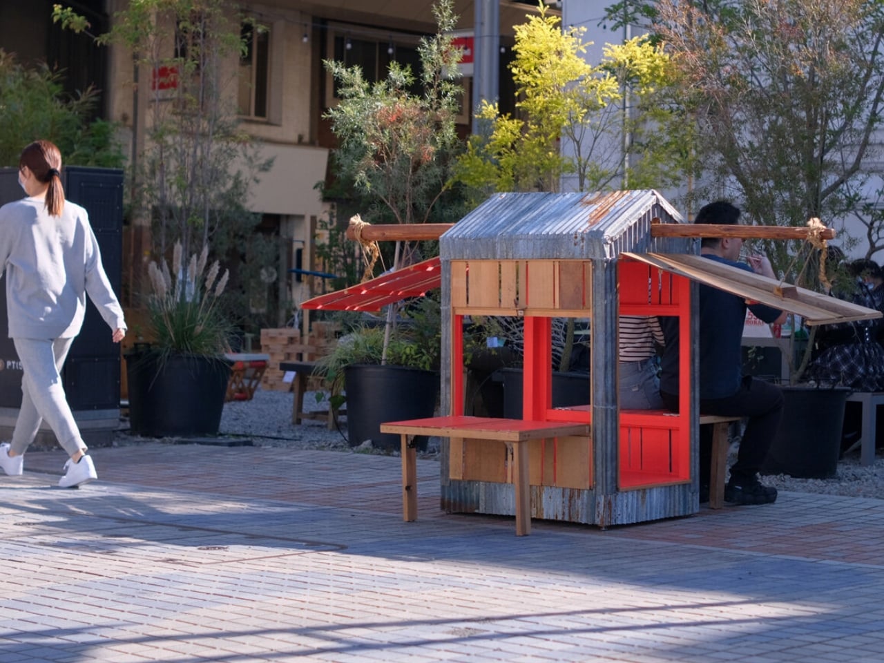
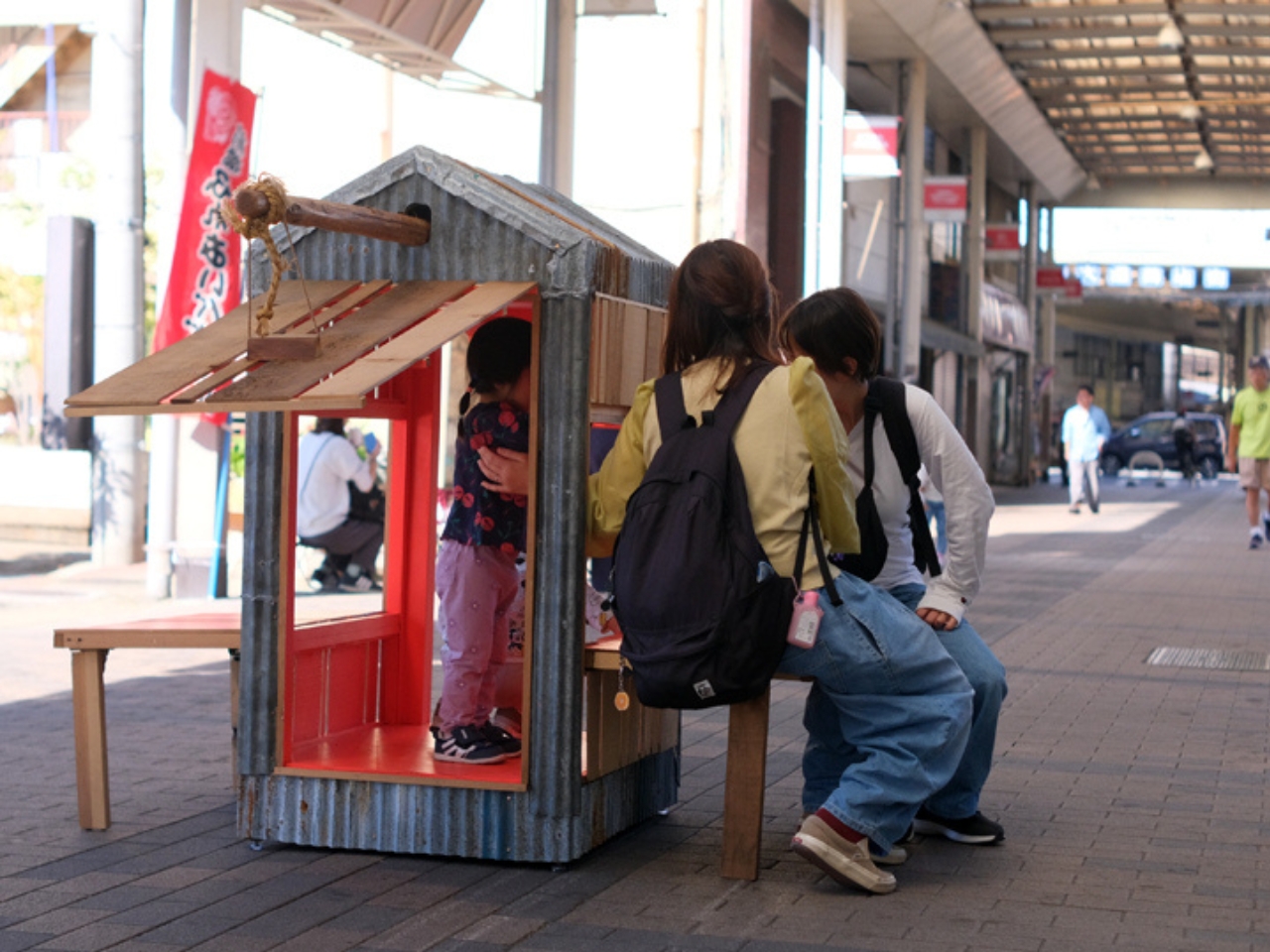
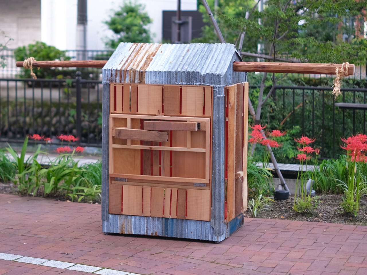
Japanese practice dobedo studio approaches that problem with ehho!², a built, portable pavilion whose wooden sides fold down into benches. Two people carry the structure between locations, bringing seating to wherever it stops. Its materials come from an agricultural barn dismantled in Gunma Prefecture, Japan. Reclaimed boards, structural logs, corrugated iron, and hand-woven ropes give pieces of that building another job, this time at a much smaller scale.
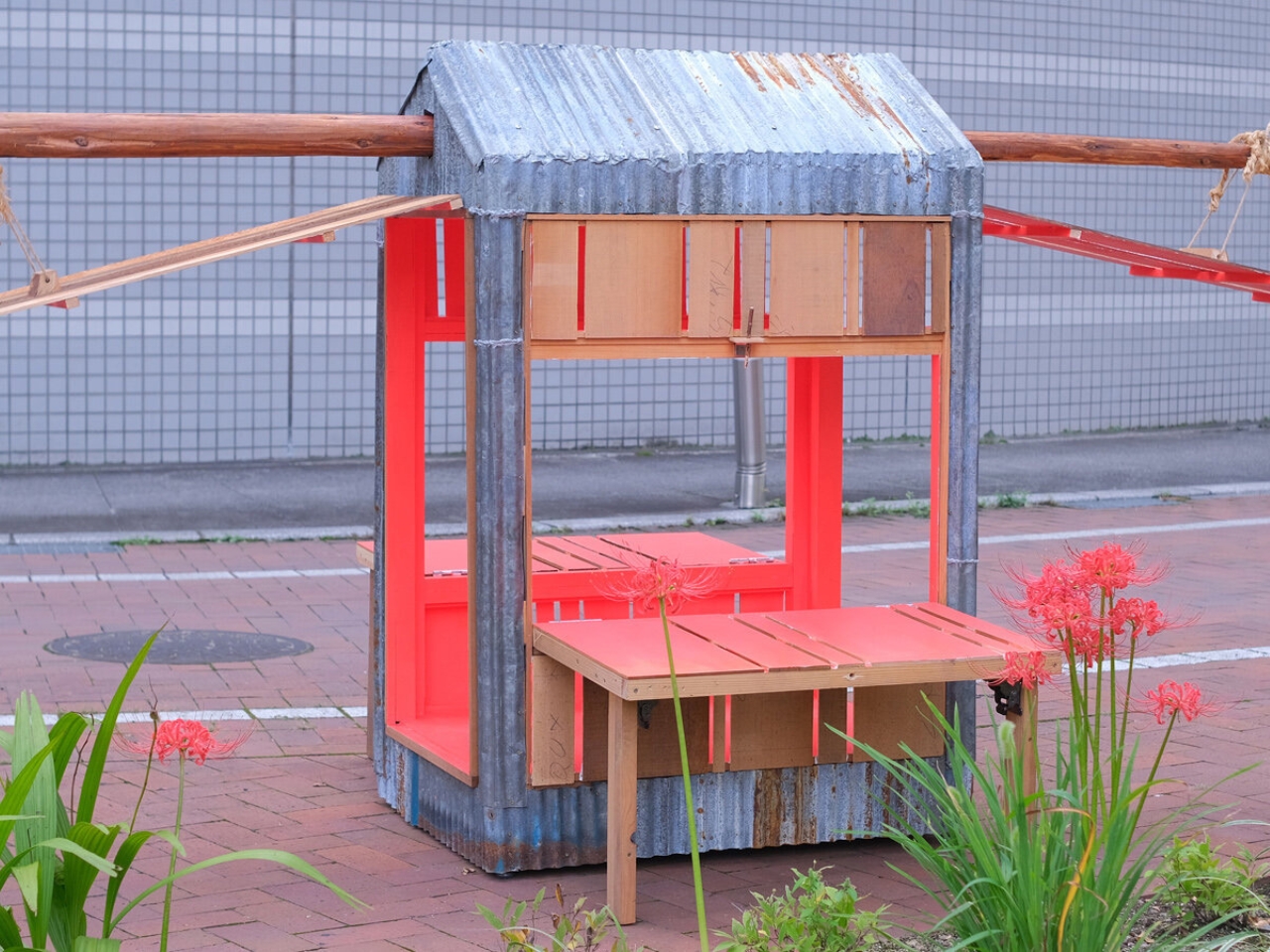
The folding panels are the central design move. Closed, they form the sides of a miniature building beneath a curved metal roof. Lowered on their hinges, they become exterior seats and open the structure to people around it. I like how plainly the transformation communicates its purpose. You don’t need to understand the project’s architectural references to recognize that a wall has become somewhere you’re welcome to sit.
That change also reveals a crimson-painted interior. The studio connects the color to local red spider lilies, known as higanbana, giving the pavilion a reference to its surroundings beyond the reclaimed materials. It’s a welcome interruption to the weathered exterior. An entirely muted palette would have been the obvious choice here, but the red makes opening the panels feel like a deliberate reveal rather than a purely practical operation.
The transportation method takes inspiration from the traditional Japanese kago, a hand-carried palanquin. Here, the passengers arrive after the carrying is over. Two people move the pavilion, then unfold its seating for others to use. There’s an appealing social logic to that sequence, although it also establishes a real constraint. This is portable architecture that needs cooperation, not something one person casually picks up on the way out the door.
My favorite detail is considerably smaller: pieces of tree branch serve as latch pins, holding the folding panels closed during transport. According to the studio, a lost pin can be replaced with a suitable fallen twig. That’s an unusually approachable replacement strategy. Rather than requiring an exact proprietary component, the mechanism allows some flexibility in what can do the job. “Suitable” still matters, of course. Any random stick shouldn’t be assumed to secure a moving structure safely.
The material reuse is similarly direct. Corrugated iron becomes the curved roof, while reclaimed timber forms the pavilion’s structure and panels. Their previous life remains part of the project without preventing a different use. I prefer that approach to treating every salvaged board as too precious to alter. Keeping old materials useful can involve cutting, painting, and rearranging them, not simply displaying their age.
It would be easy to imagine ehho!² at a neighborhood gathering or a temporary street event. Those are possibilities, not documented applications, and a successful outing would depend on more than its charm. Weight, carrying distance, seating capacity, and stability on uneven ground would all influence where it makes sense. Accessibility deserves attention, too. An inviting appearance alone doesn’t establish that a seat will work comfortably for everyone who might need it.
Still, I don’t think an experimental pavilion has to answer every public-furniture question to offer a useful observation. Fixed benches serve an essential purpose, but temporary gatherings can create a need for seating elsewhere. Bringing an entire little structure rather than a stack of chairs adds complexity, yet it also creates a recognizable meeting point. The architecture gives the stop an identity.
That feels like the most persuasive reason for ehho!² to exist. It makes a place to pause out of materials from a building that could no longer stay standing. The hinges let it welcome people; the carrying arrangement limits how easily it gets there. Between those two facts is a modest, thoughtful experiment in where a bench can belong.
Creating an Excel dashboard with Microsoft Copilot allows you to streamline the process of turning raw data into actionable insights. Kevin Stratvert demonstrates how to use Copilot to automate key steps, such as generating interactive charts and calculating essential metrics like total revenue and average order value. For example, by providing a clear prompt like […]
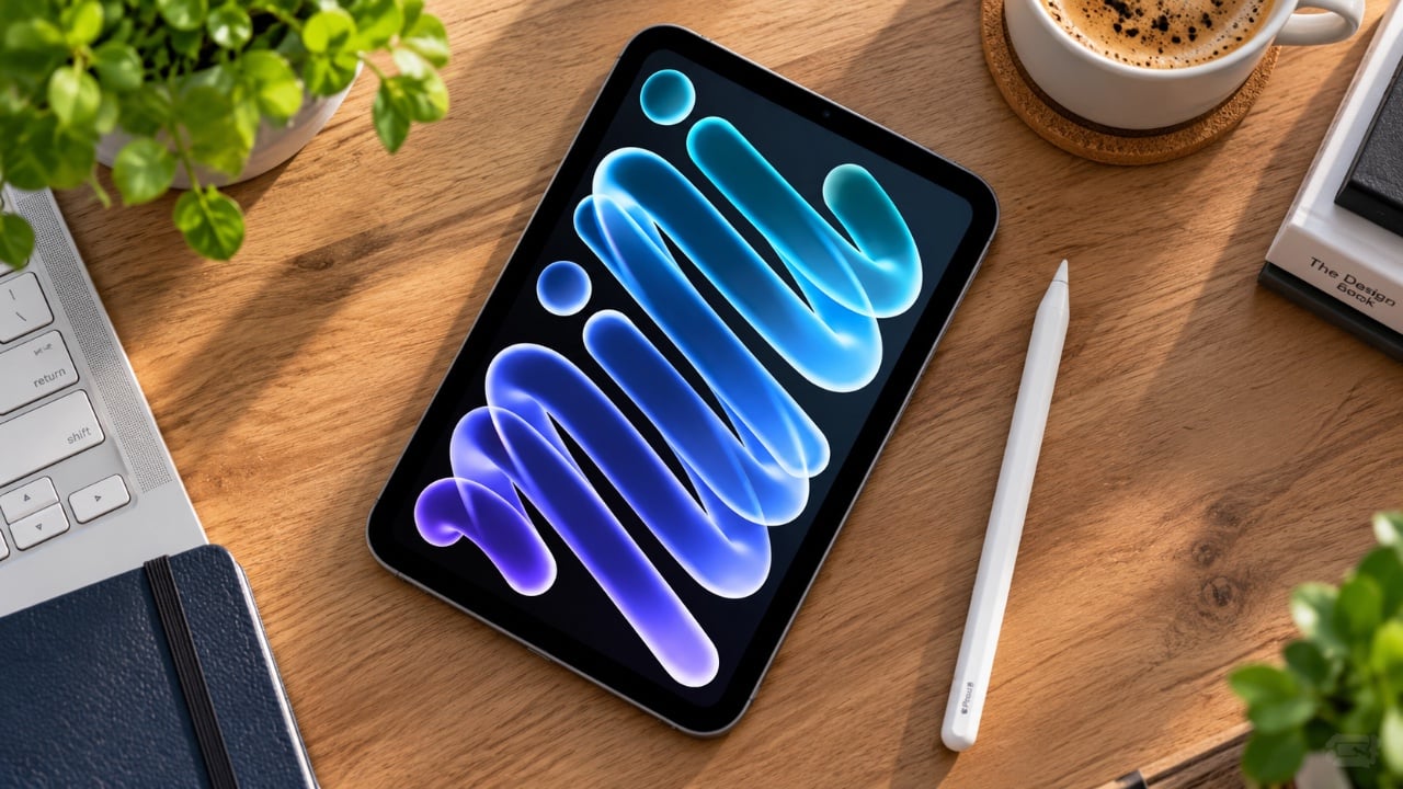
The OLED iPad Mini represents a significant advancement in compact tablet technology, combining a sleek design with innovative features. While it introduces notable upgrades, it also comes with certain compromises. To help you make an informed decision, this guide explores its standout features, performance capabilities and potential limitations. The video below from ZONEofTECH gives us […]
The XREAL One Pro+ and One Pro augmented reality glasses share a foundation of advanced flat prism optics, but they diverge in several key areas that cater to different user needs. Kola explores these distinctions, highlighting how the Pro+ offers a sharper 1200p resolution compared to the One Pro’s 1080p, delivering crisper visuals for tasks […]
Apple has unveiled its latest MacBook Pro and iMac models, both powered by the new M6 chip. While the external designs remain consistent with their predecessors, the internal advancements are anything but ordinary. These devices promise faster performance, enhanced AI capabilities, and improved connectivity, making them a compelling choice for users seeking innovative technology. […]
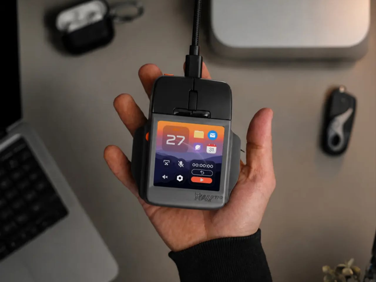
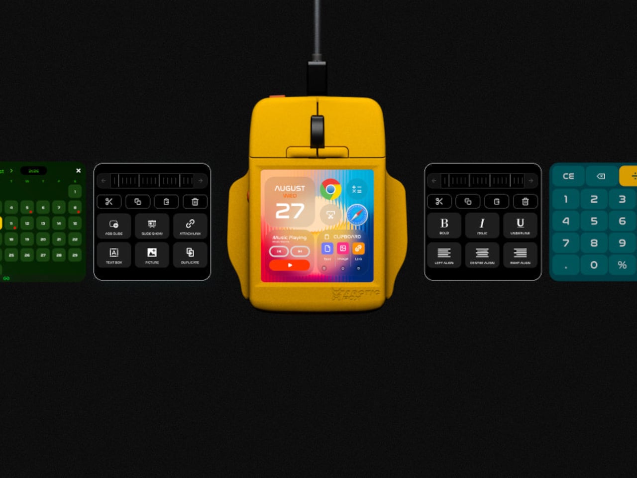
Computer mice have gained extra buttons and faster sensors, but most still leave the complicated work to your keyboard. Arctic Fox’s Super Mouse takes a rather different approach, putting a 3.1-inch touchscreen where you’d normally expect a plain palm rest. The idea is to bring shortcuts, quick typing, and even your calendar onto the device sitting underneath your hand throughout the working day.
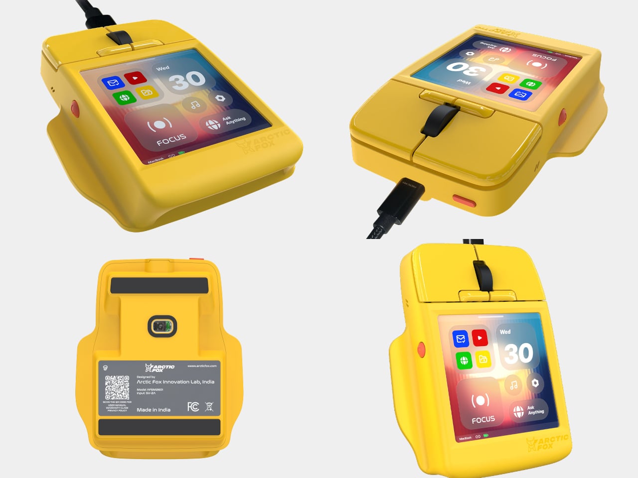
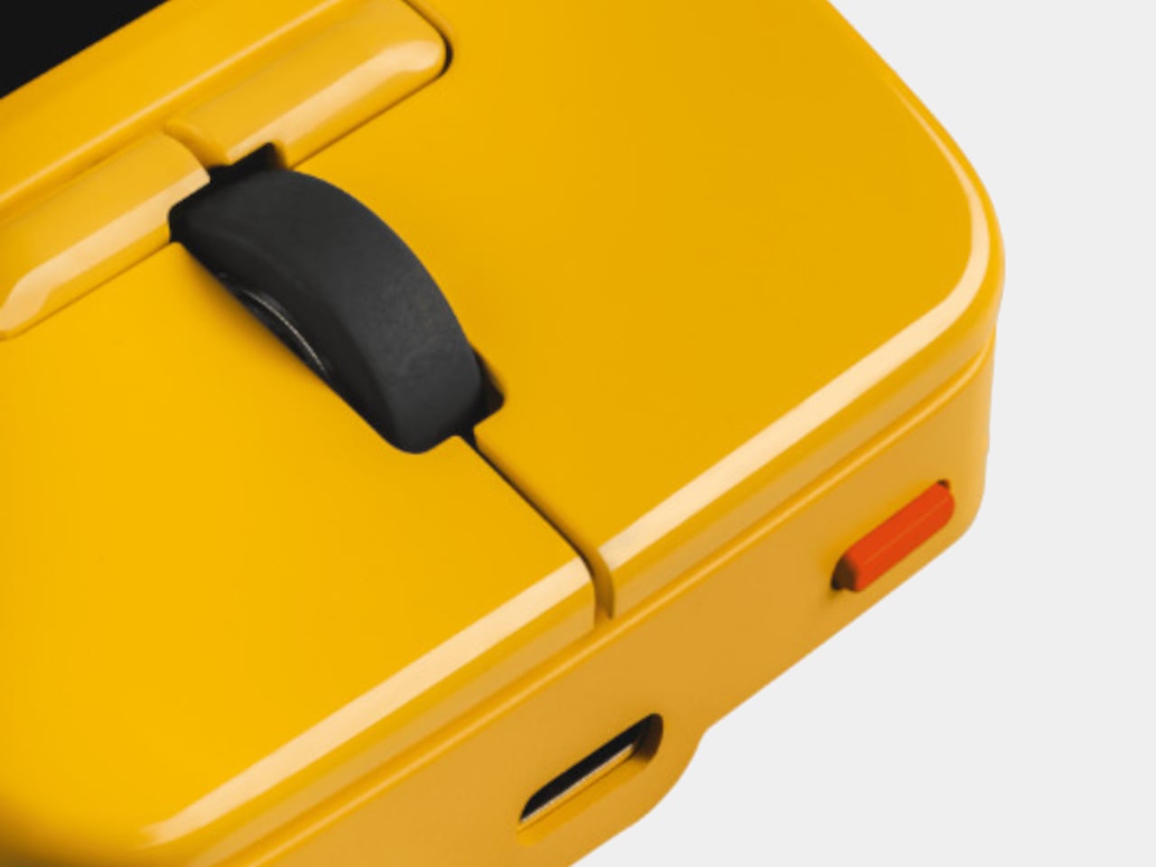
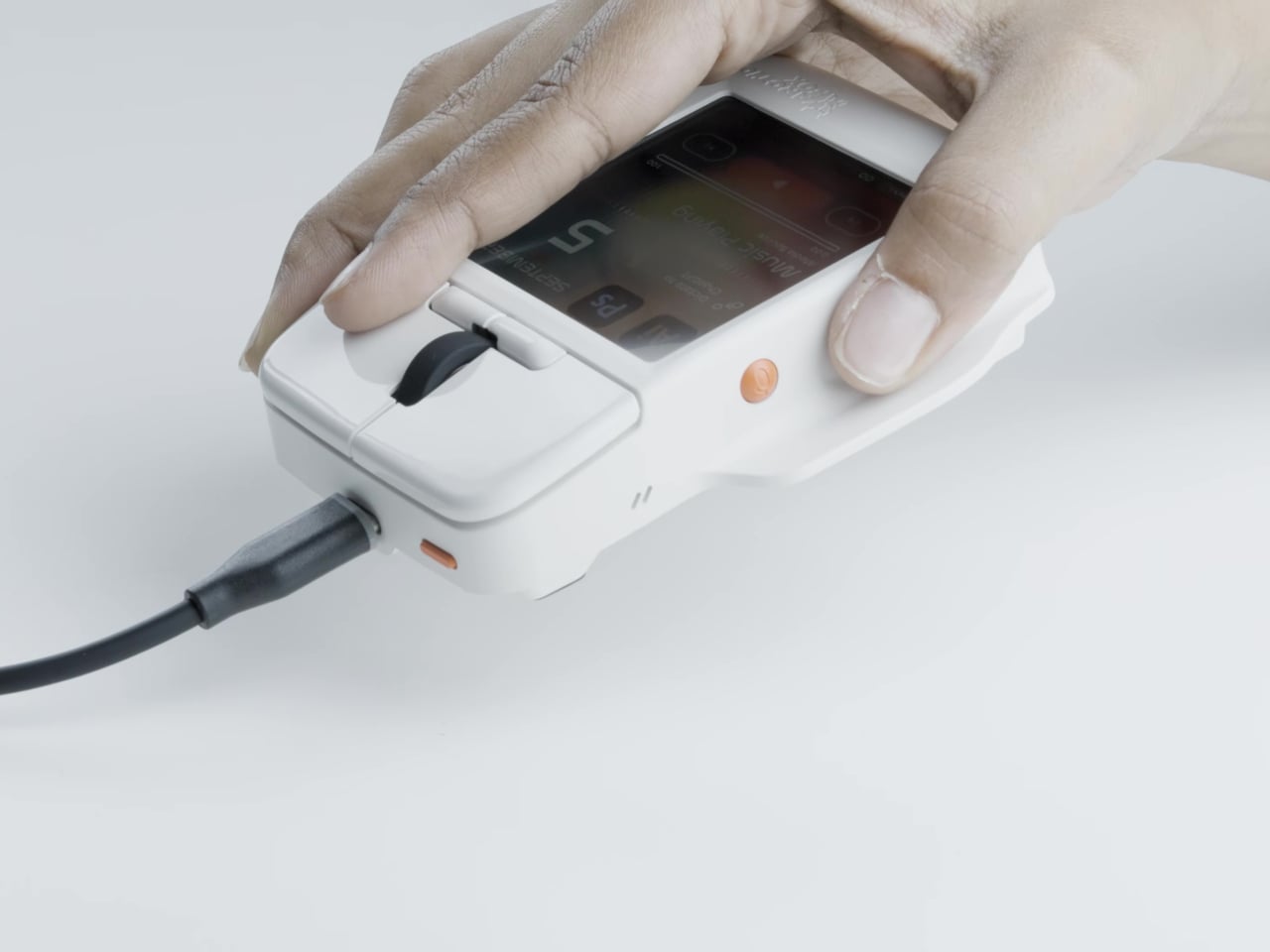
That screen gives the mouse an unusual silhouette, closer to a tiny control console than the rounded pebble many of us are accustomed to. A broad, almost rectangular body has flared sides, with conventional click buttons and a black scroll wheel at the front. Yellow, white, and gray finishes offer personalities, although the yellow version isn’t interested in disappearing into your desk.
The 720×720 display changes what those fingers can do once they’ve finished clicking. Through the Flow app, you can build layouts for different programs, assign shortcuts, and create macros for repeated tasks. A designer could keep editing commands nearby, then switch to playback controls for another project. Two physical Hyper Keys offer another way to trigger commands without tapping the glass.
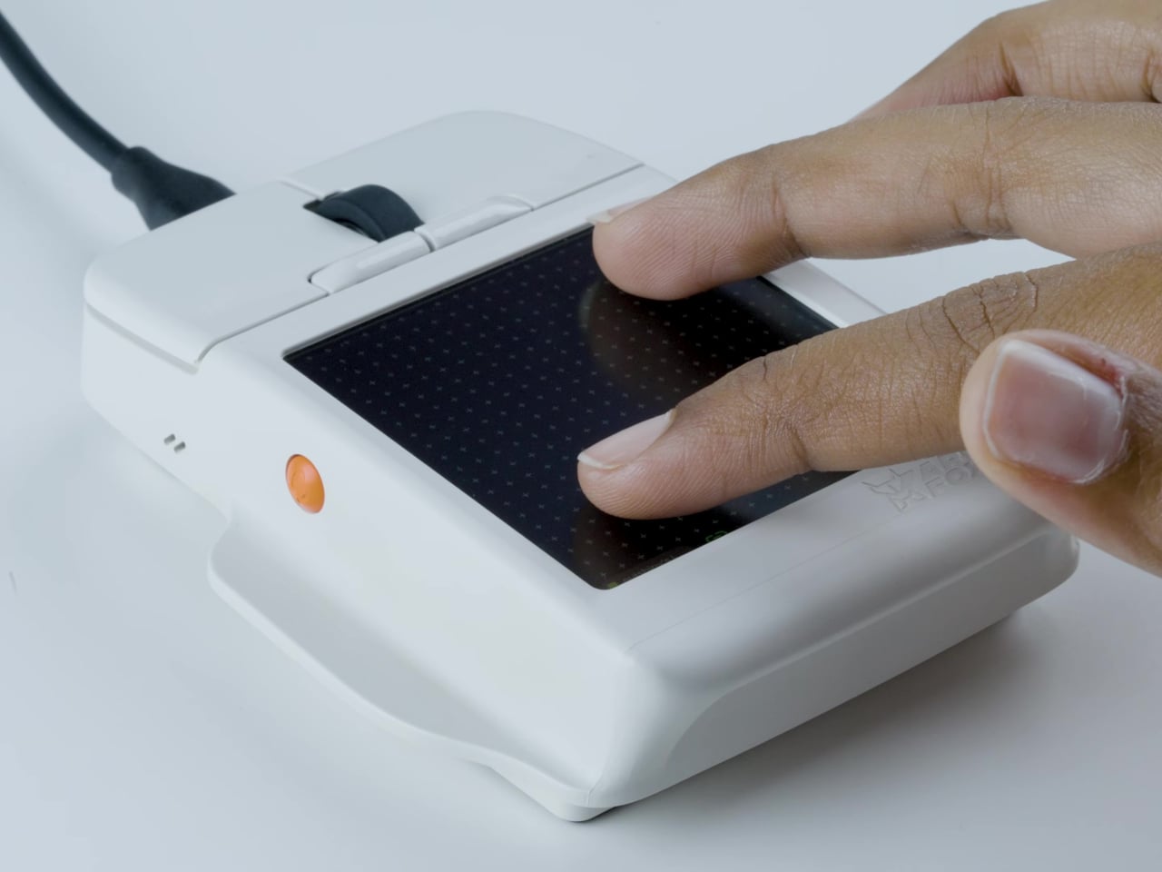
That same surface can become a multitouch trackpad, letting you navigate without sliding the mouse around. An on-screen keyboard offers swipe typing for short messages or quick edits, though squeezing a keyboard onto a mouse doesn’t make it a sensible place to write a novel. Arctic Fox promises haptic feedback, giving touchscreen interactions a physical response instead of relying on visual confirmation.
There’s more ordinary housekeeping tucked into that little screen, too. Google Calendar integration is intended to put appointments and reminders within reach, while a calculator saves you from opening another window just to check a number. The Rapid Task feature goes further, launching multiple browser tabs together. Preparing a familiar workspace could become one action, rather than the same routine repeated every morning.
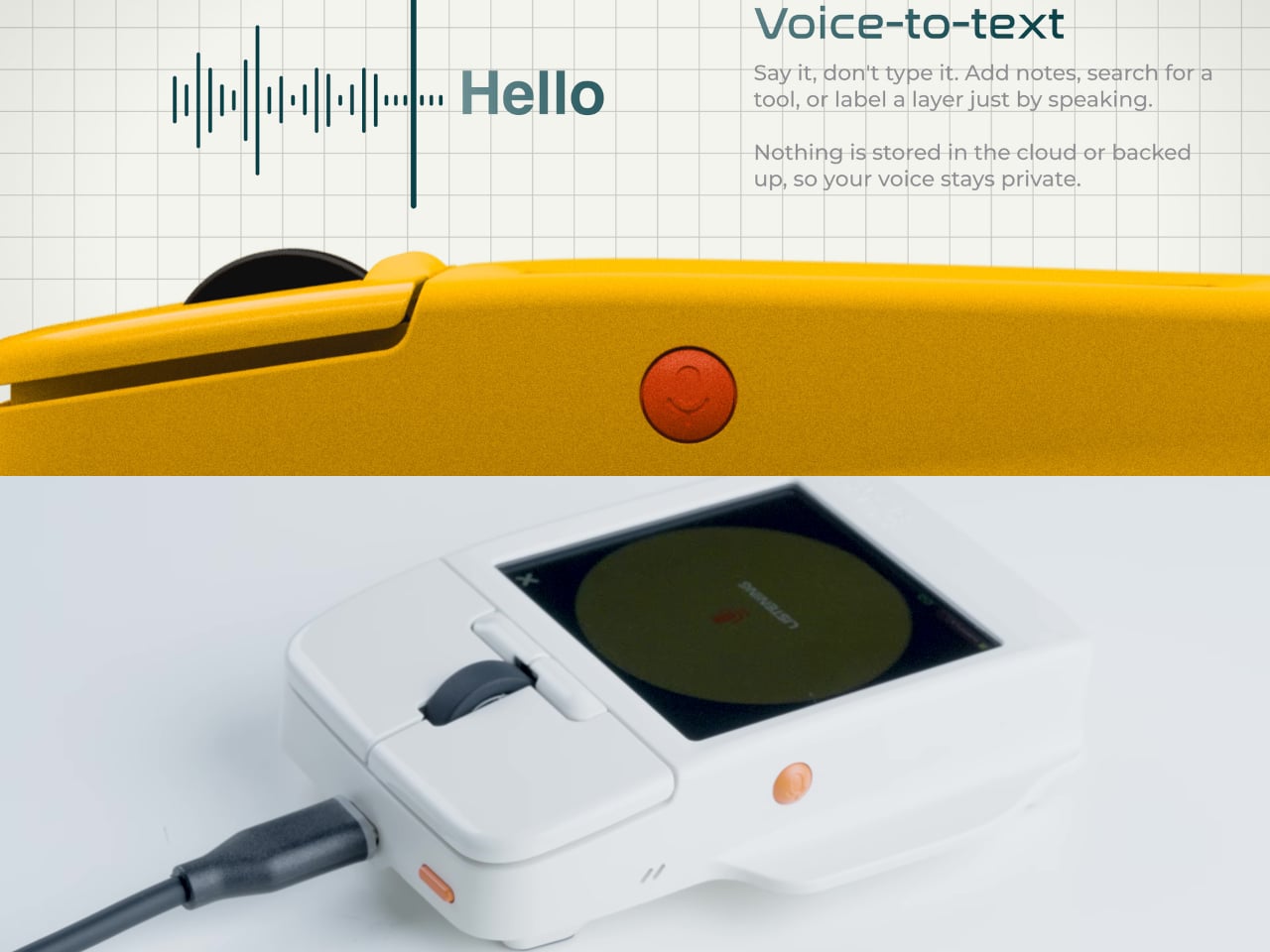
Some controls don’t involve the screen at all. Built-in microphones support voice-to-text for notes or labels, while gyro controls let tilting and rotating the mouse trigger commands for presentations or media. These are different ways of interacting with the same object, rather than more buttons to memorize. Their usefulness, however, depends on how reliably the software translates those movements and spoken words.
The Super Mouse connects through a USB-C cable, with Windows and macOS listed as supported platforms. Flow handles the customized layouts and integrations, so this isn’t a miniature computer you can use independently. That cable might feel rather old-fashioned beside the colorful touchscreen, but it also makes the relationship clear. The software behind the screen matters as much as anything you can press.
Of course, putting more controls underneath your hand doesn’t automatically make them any easier to use. Reading a calendar or choosing an unfamiliar shortcut still means looking down, and that broad screen changes where your palm can rest. The interesting test will be finding which tasks deserve a place on the mouse before another collection of tiny icons becomes its own distraction.