
What do foldable phone cases actually protect?
Foldable phones inherently have more weak points than bar phones, and the hinge mechanisms are susceptible to dust. Getting the right case matters.
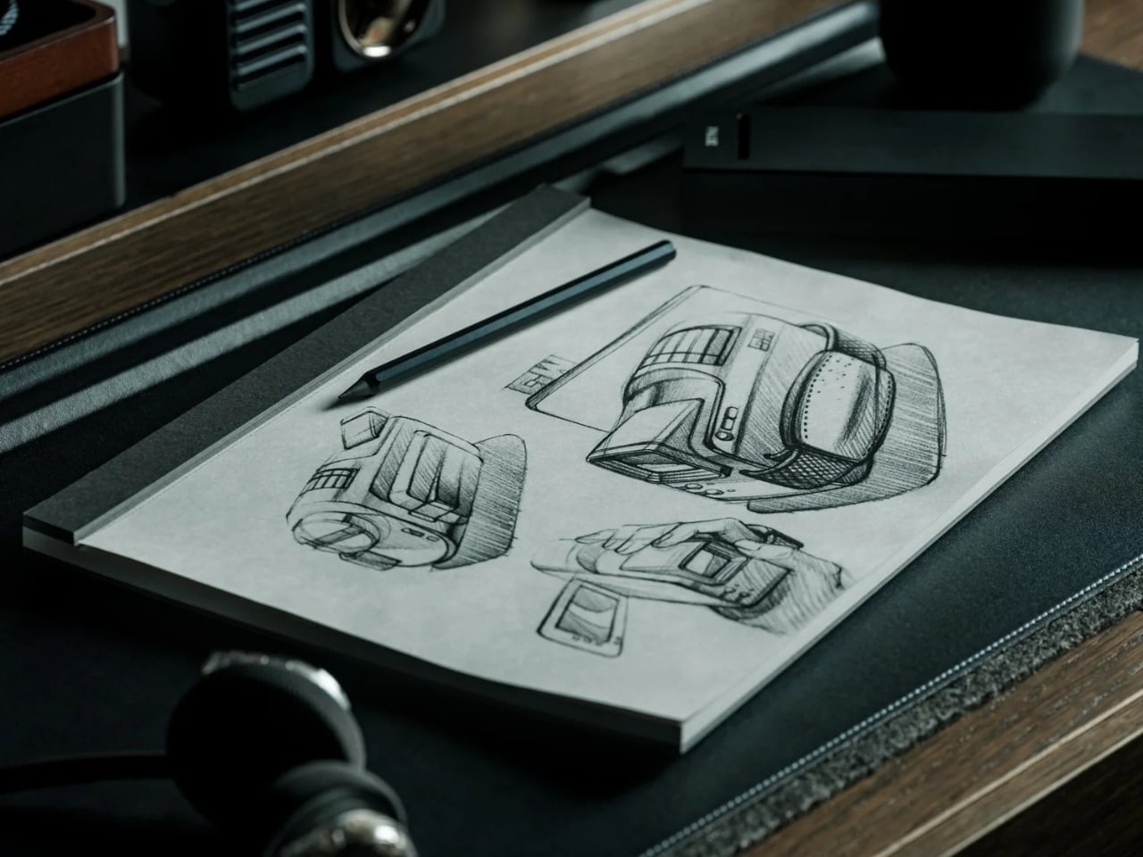
I’ve established in my previous articles that I’m not an artist and can only draw stick figures, or maybe follow paint-by-numbers-style sketches. That hasn’t stopped me from buying and collecting drawing pads and notebooks of all kinds, though. Of course, I’m not hoping I’ll eventually learn to draw or become the next Andy Warhol or anything like that. I like having these writing surfaces because I have a lot of things to write down, whether it’s for productivity, as part of my numerous journaling tools, or just somewhere to randomly write or sketch things out.
The Japanese Drawing Pad, despite having “drawing” in its name, isn’t just an art tool for artists, architects, and other visual creatives. It’s a blank, tactile surface that can be useful for anyone who likes to write, think, plan, or organize. And in a world that’s becoming an increasingly digital-analog hybrid, having a tool like this by your side whenever you need it is always a plus. It’s not just a regular drawing pad, though. It’s simply designed, but expertly crafted by masters in the bookbinding and papermaking industries, giving you paper that helps you create your own masterpiece, whether visual or written.
Click Here to Buy Now: Starting at $40. Get Everlasting All-metal Pencil Free ($19.95 Value). Hurry, this is a limited-time launch gift.
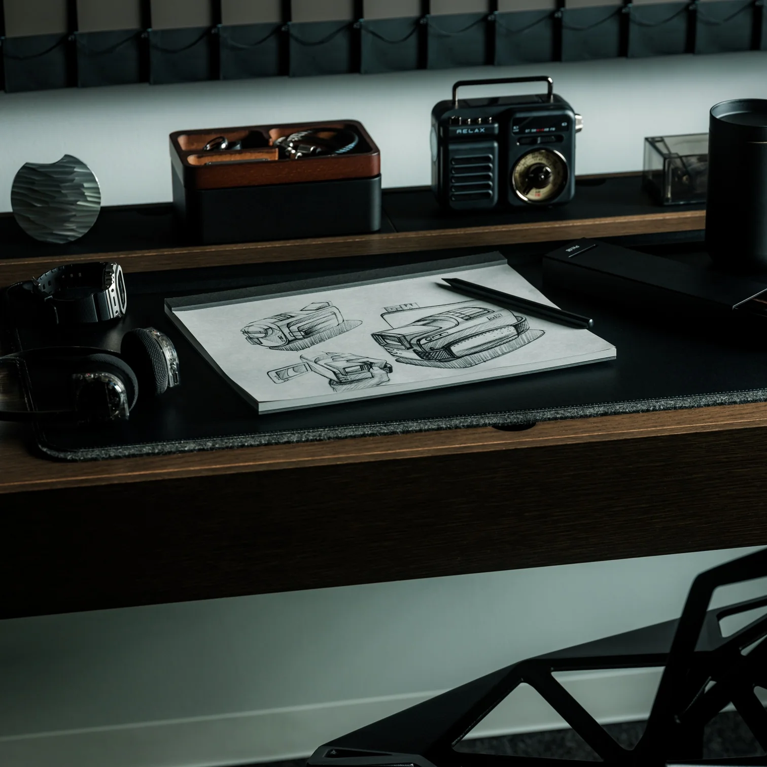
So if you’re like me and don’t need it for actual drawing, here are a few ways to get your money’s worth out of the Japanese Drawing Pad. No drawing skills needed.
For those times when you just need to mindlessly dump out all your tasks, lists, and thoughts, this is the perfect place to do it. It doesn’t have a cover, so you get straight to the blank page you need. The tear-away pages make it easy to toss the list once you’re done, or stick it somewhere you’ll actually see it.
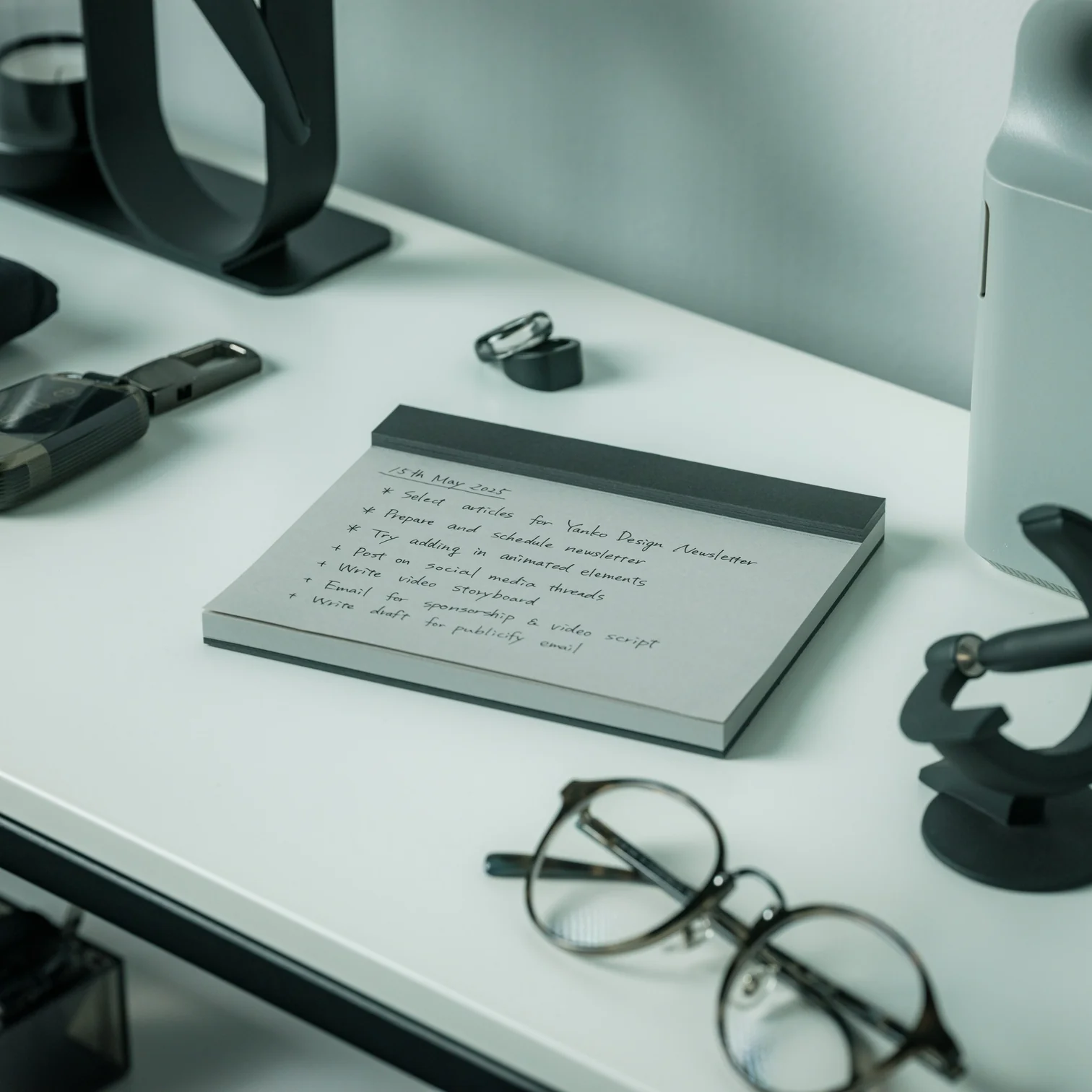
The drawing pad can also serve as your analog Pinterest board. Use it to brainstorm a trip itinerary, visualize an outfit for an upcoming event, or build a vision board for your next few months. The microperforated pages tear easily and cleanly, so you can arrange them side by side on a wall or corkboard.

Meetings can drag on forever, but having a unique tool to take notes with can make them feel a little less like a slog. The Drawing Pad’s gray paper and black base give it a sleeker, more distinctive look than your average notepad, so pulling it out mid-meeting feels less like a chore and more like an upgrade.
Having a freeform space without any lines is ideal for when you need to jot down branching ideas, bubbles, and connections. It also comes in different sizes (A6, A5, and A4), so you can choose how much space you need for these brainstorming sessions, even if the meeting is just with yourself.
Whether you need a space for habit tracking, junk journaling, or creative writing prompts, the premium feel of the paper will make your journaling ritual more satisfying. If you tear off the pages, you can attach them to your other journals or use the loose-leaf sheets to build a journal of your own.
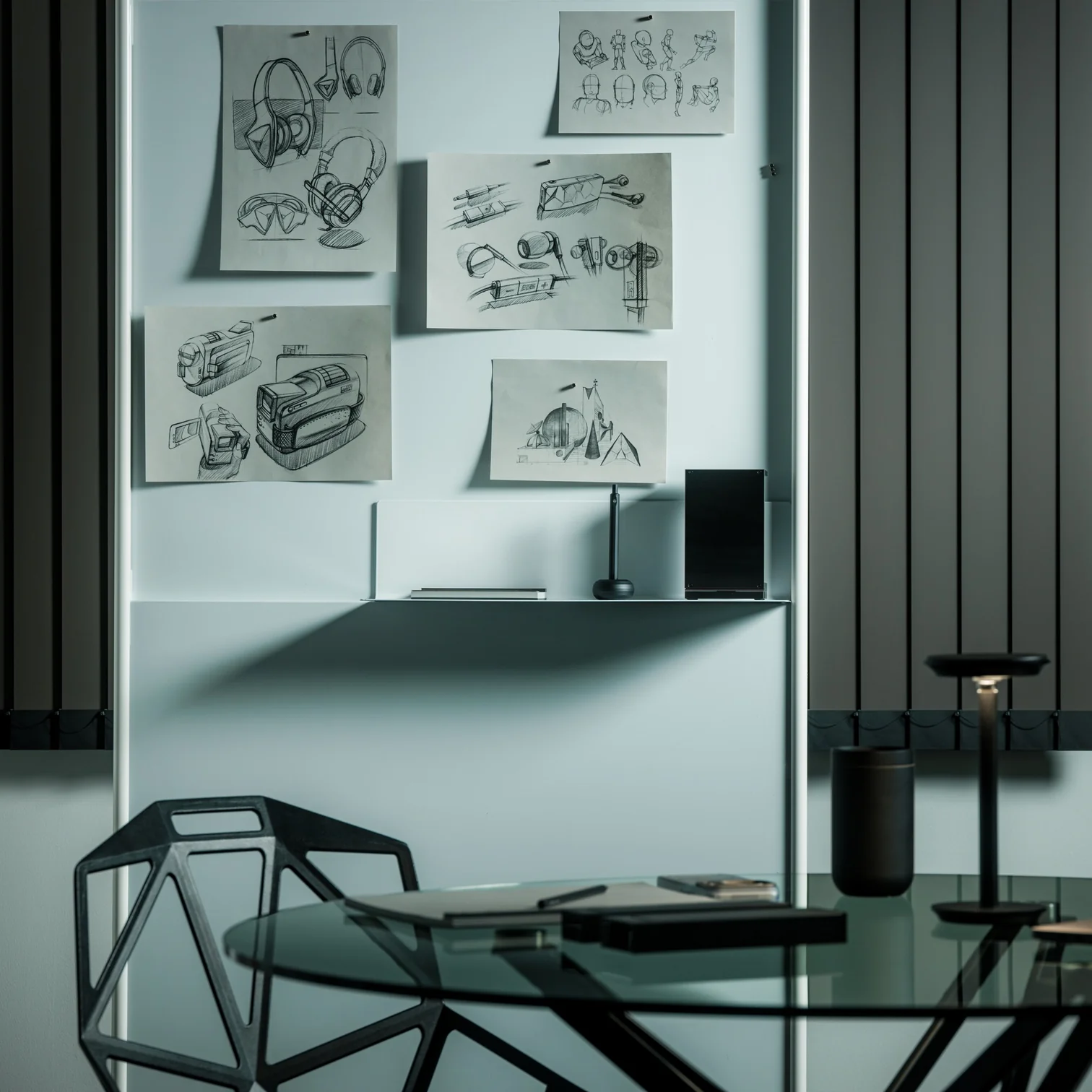
The pad can also double as a lesson space for kids who are still learning to write their letters, numbers, or shapes, offering a low-pressure surface with no stakes attached. And if you’re learning a new language that uses characters different from what you’re used to, it can be your practice space, too.
Even if you’re not an artist who can draw well, there may be times when you just want to doodle your stress away. Whether you’re sketching the meal you just ate, dreaming up an imaginary creature to fight off boredom, or scribbling whatever abstract shapes come to mind, the pad puts no pressure on you to be “good.” It’s simply a tactile stress outlet.
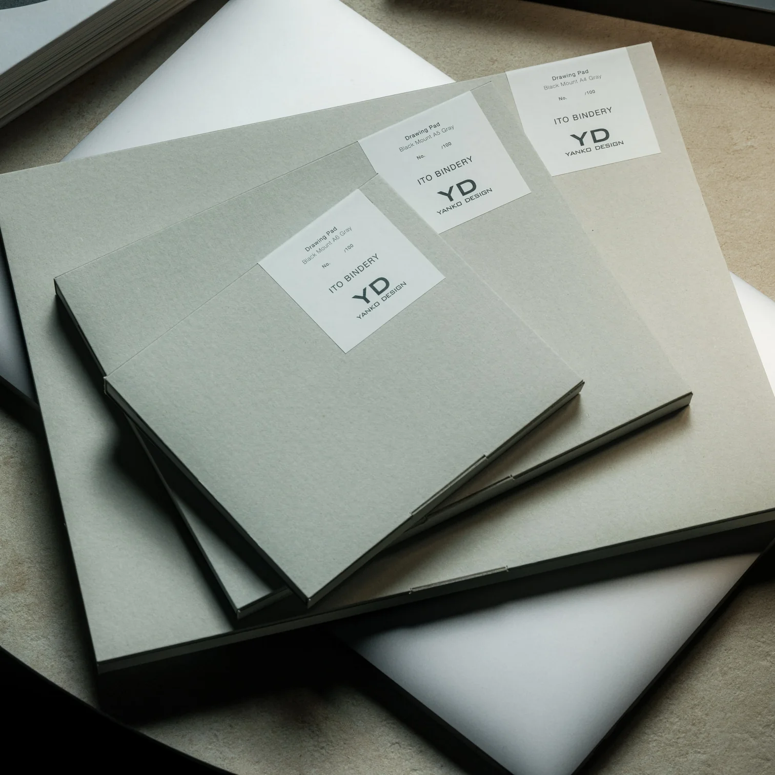
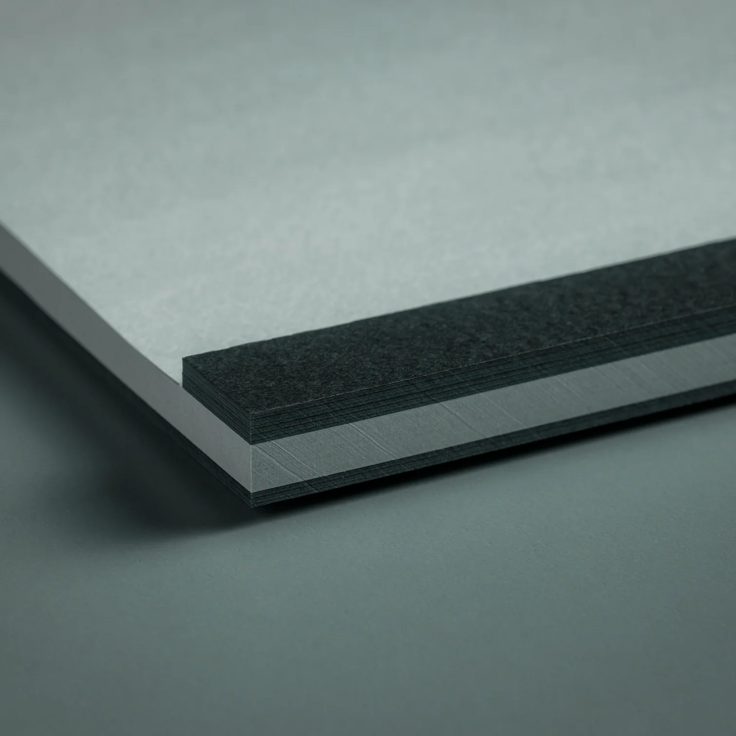
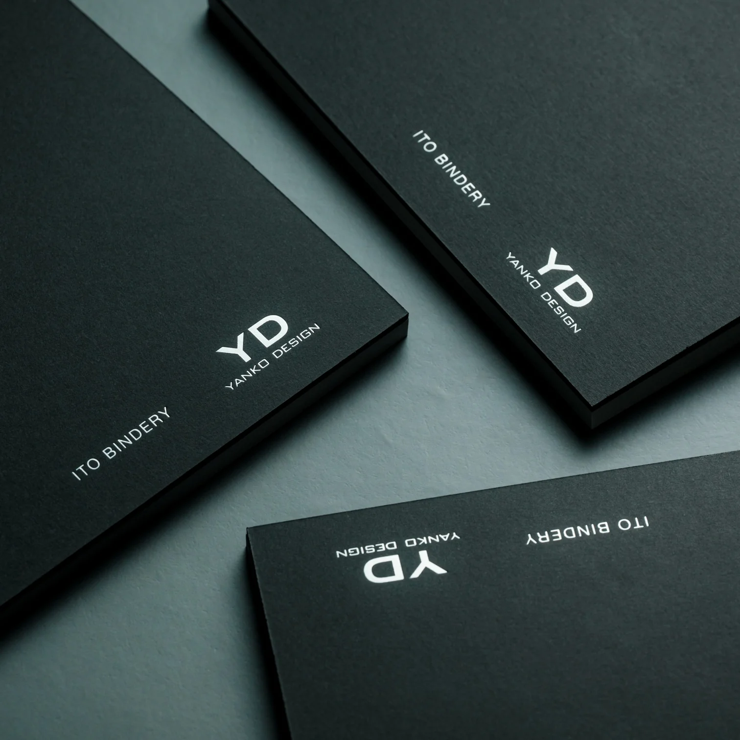
Beyond what’s already been covered, the Japanese Drawing Pad has a few more details worth knowing. Every pad is handmade by ITO Bindery, a Japanese bookbindery that’s been at it since 1938. The binding glue is still brushed on by hand, and each microperforation is checked for consistency by trained craftspeople rather than left entirely to machines. The pages themselves are premium paper (81.4 g/m²) mounted on a sturdy, recycled cardboard base, and each sheet tears away cleanly without leaving any strays behind on the page. This particular edition is also limited to just 100 individually numbered pads per size, which makes the pad feel less like a disposable notepad and more like a small, functional collectible.
At the end of the day, you don’t need to be able to draw to justify owning something this well made. A design like the ITO BINDERY × YANKO DESIGN Drawing Pad earns its keep simply by being there, ready on your desk for the next to-do list, doodle, or half-formed idea you don’t want to lose. And that’s really the beauty of building an analog habit into an otherwise digital life: it doesn’t ask much of you, just a pen, a blank page, and a few free minutes. Whether it ends up full of to-do lists, mind maps, or terrible stick-figure doodles, this drawing pad might just become one of those small, everyday objects you didn’t know you needed until it’s part of your routine.
The post 7 Reasons Non-Artists Need a Drawing Pad on Their Desk first appeared on Yanko Design.



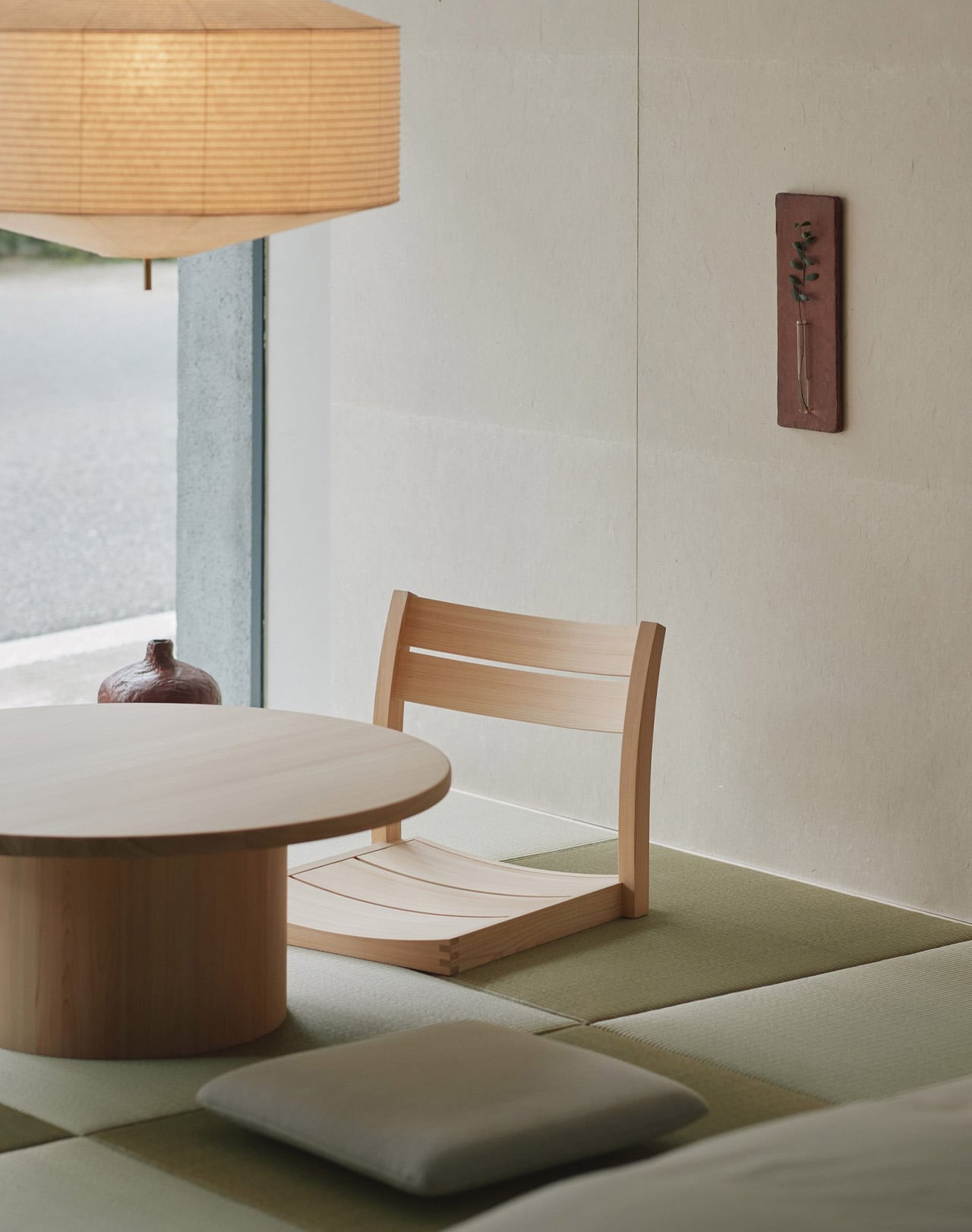
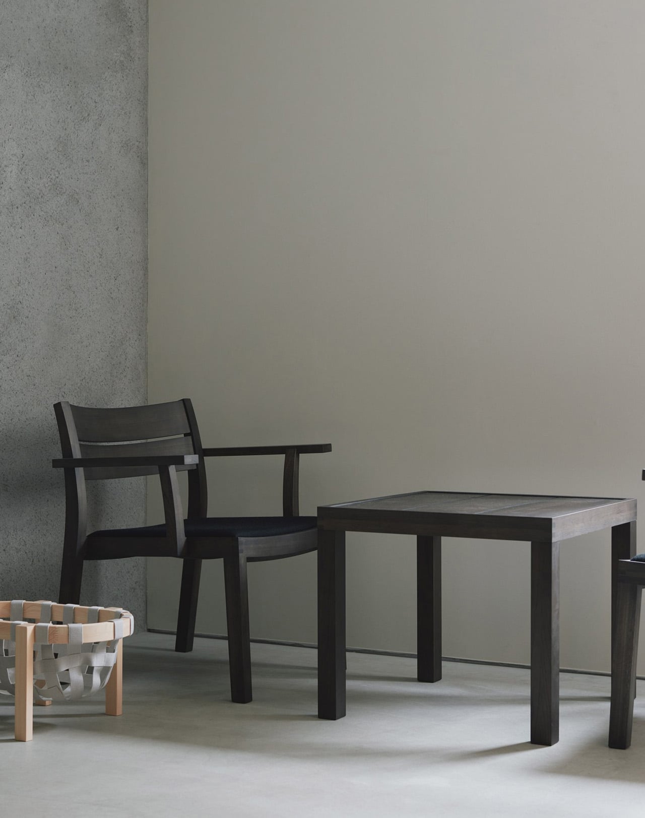
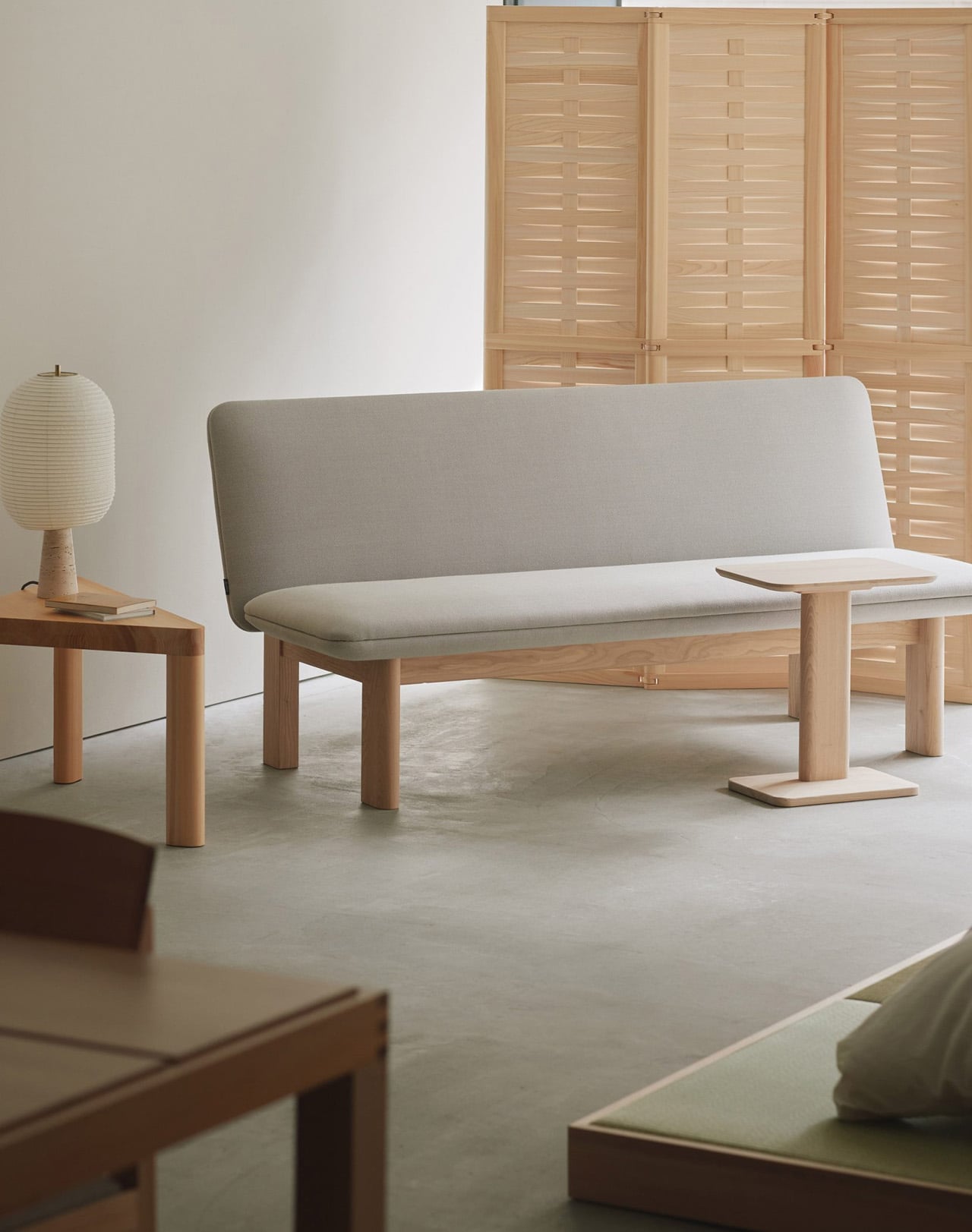
A noren hangs at the entrance of Karimoku Commons Tokyo. Step past it and the showroom disappears, replaced by something closer to memory: the quiet hallways, worn timber, and particular warmth of a Japanese inn. That is the premise of Oyado MAS, an exhibition conceived by MAS, Karimoku’s design label, and staged in collaboration with spatial director Wataru Kumano. Running from September 19 to October 20 at the Aoyama venue, the installation moves visitors through a sequence of inn-like settings: reception, lounge, sleeping area. Each space is built around MAS furniture rather than placing it on a pedestal.
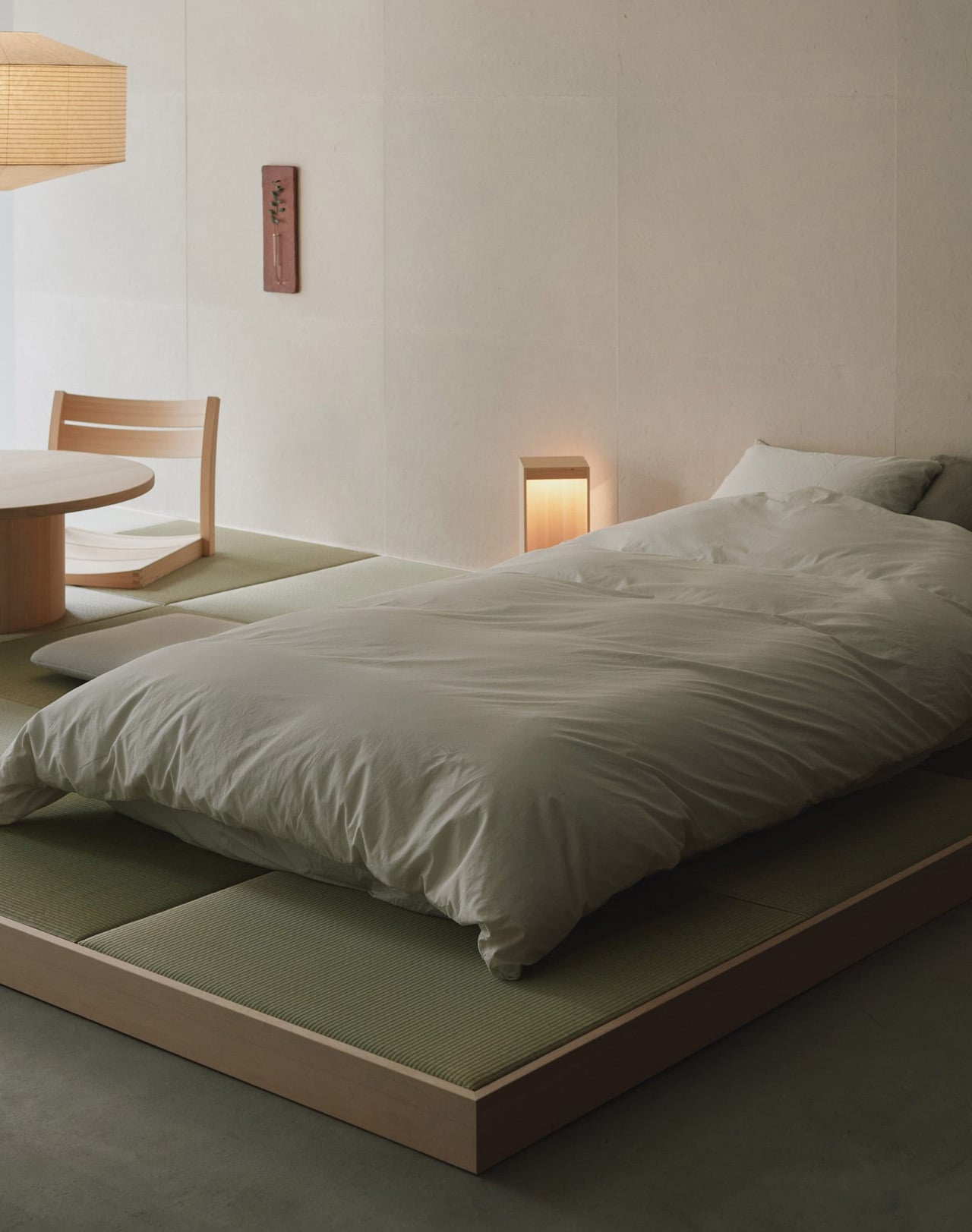
Kumano’s choice of an oyado over a hotel is deliberate. Oyados carry a distinct cultural intimacy, a slowness that international hotel formats rarely hold. The sleeping area doesn’t mimic an inn so much as distill the feeling of one, using MAS pieces to frame how a body might move through morning light, settle into reading, or reach across a low table. Furniture earns its place through use rather than display.
Designer: Karimoku

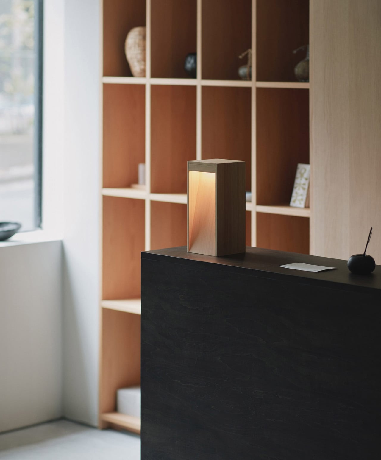
The materials follow the same logic. MAS works with Japanese-grown woods, and the exhibition doesn’t conceal the grain. Visible knots, color shifts, and tonal variation across surfaces are left intact rather than sanded away. Where a conventional showroom presents furniture as finished objects defined by flawless surfaces, Oyado MAS treats the wood’s natural character as part of the experience, a quiet reminder of origin.
Collaborators extend the atmosphere beyond furniture. New Light Pottery contributes lighting; Nao Tesuki Washi brings handmade paper to the space. A fragrance developed with Sheep carries notes drawn from Japanese forests, connecting the olfactory layer to the material one. Tea brewed from forest plants is served to visitors, folding touch, scent, and ritual into a single walkthrough.
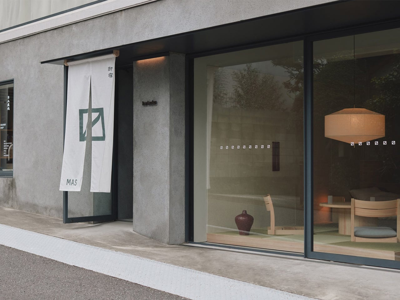
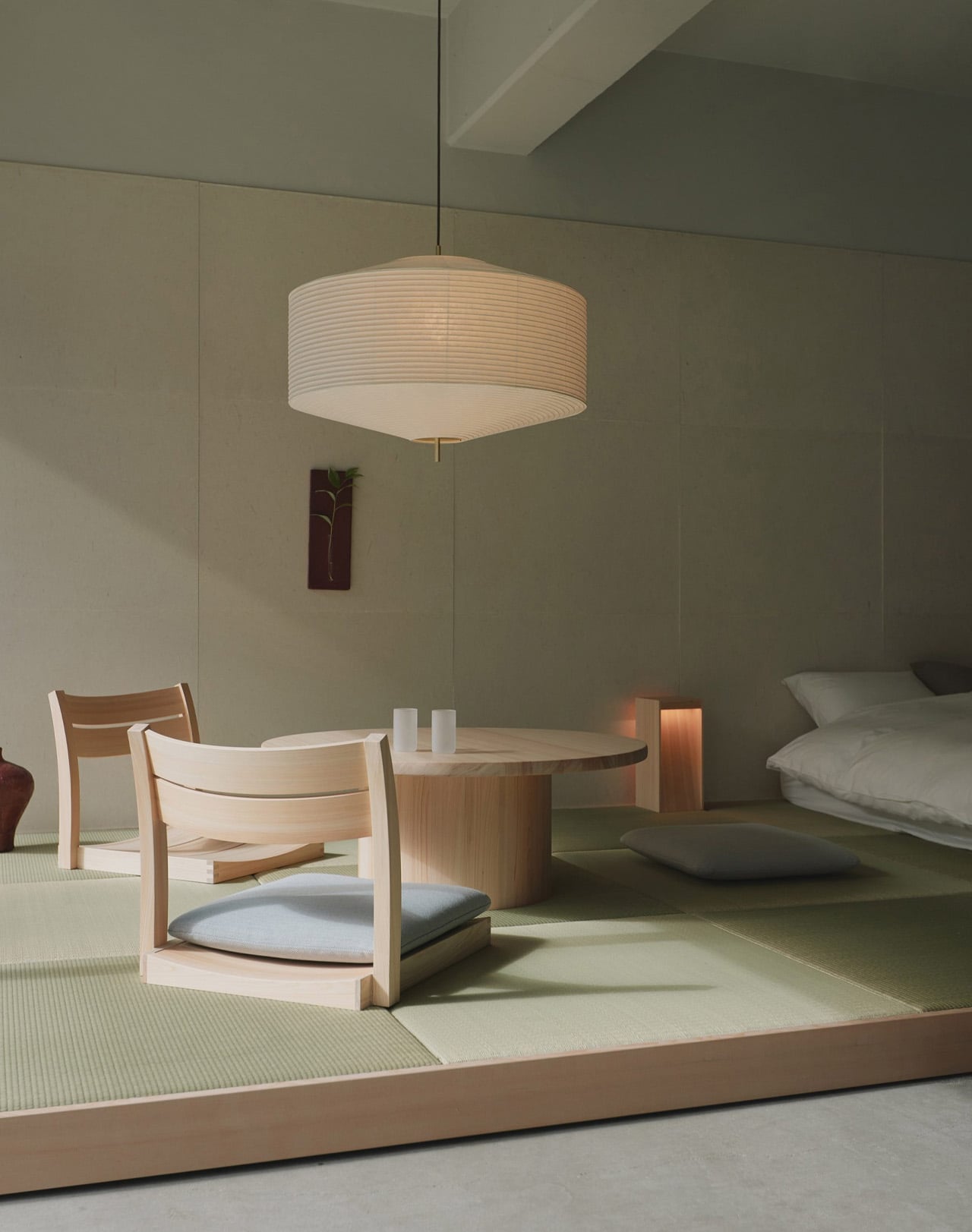
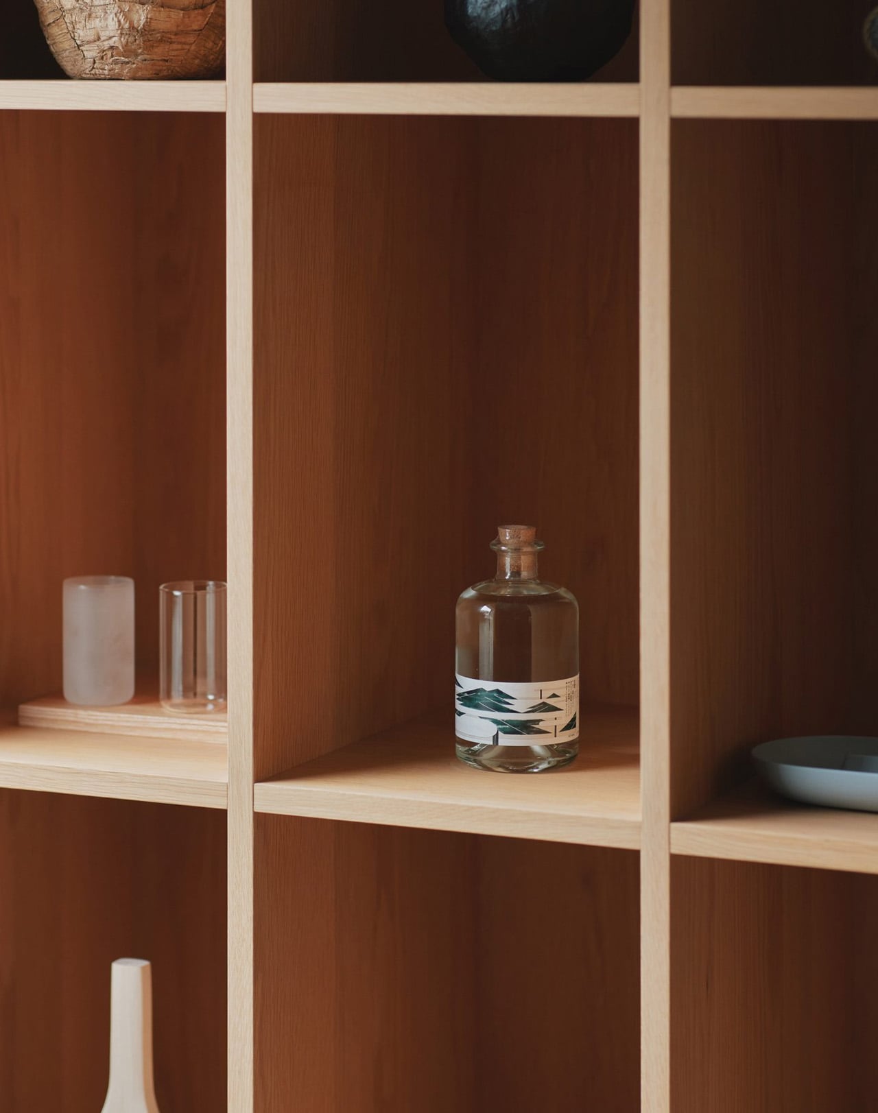
Among the pieces available for purchase are the WK Stool by MAS and a spoon by Sekisaka. A new fragrance by MAS and Sheep is also on sale. But the exhibition isn’t really a shopping proposition. It’s a sequencing argument: that furniture reveals itself differently when placed inside the rhythm of a stay, experienced through context and time rather than pulled from the neutral floor of a showroom.
The noren at the entrance marks the shift from retail logic to something slower and more considered, where scale, storage relationships, and the texture of Japanese craftsmanship become readable only through the movement of a body through a room. That’s a lesson most showrooms never figure out how to give. Oyado MAS runs Tuesday through Saturday, 13:00 to 18:00, and closes October 20, 2026. Karimoku Commons Tokyo is located in Aoyama.
The post This Tokyo Furniture Showroom Vanished Into a Traditional Japanese Inn first appeared on Yanko Design.



Every city has one view that ends up on the fridge magnets, and San Francisco settled that argument a long time ago. It’s the row of Victorians on Steiner Street facing Alamo Square, seven Queen Anne houses put up between 1892 and 1896 by a developer named Matthew Kavanaugh, who liked them enough to move in next door. They’ve since appeared in roughly 70 movies, shows and ads, most famously as the establishing shot of Full House, a sitcom whose cast never actually lived there. The houses have a nickname (Postcard Row), a backup nickname (the Seven Sisters), and a level of fame most buildings would commit crimes for.
Wonderbrick_design went to California a few months ago, came home charmed, and built the whole street. The San Francisco Street runs to roughly 4,200 pieces and stretches 50cm across, with three Victorian facades on a sloping baseplate and a cable car climbing the hill beside them. Each house opens from the back like a dollhouse, the roofs lift off, and there’s a jazz dance academy, a surfer’s place and an artist’s home waiting inside. He built it with his sister, who teaches modern jazz, so one of those houses is hers. It’s a Staff Pick already sitting at 6,491 supporters.
Designer: Wonderbrick_design

Worth knowing before you look too closely at the colours: they’re a 1960s remix. The architecture is 1890s Queen Anne, all gingerbread trim and bay windows and Victorian restraint. Then in 1963 a local artist called Butch Kardum started repainting grey facades in lime, vermilion, gold and turquoise, other colourists piled in, and the city quietly redecorated itself. The term “Painted Ladies” only arrived in 1978, via a book. So the most photographed houses in America are a century-old building wearing a sixty-year-old outfit, and this MOC (My Own Creation) nails the outfit. Salmon pink, curry yellow and sand blue, white trim on everything, with a sand-green conical turret capped by a tiny gold finial.
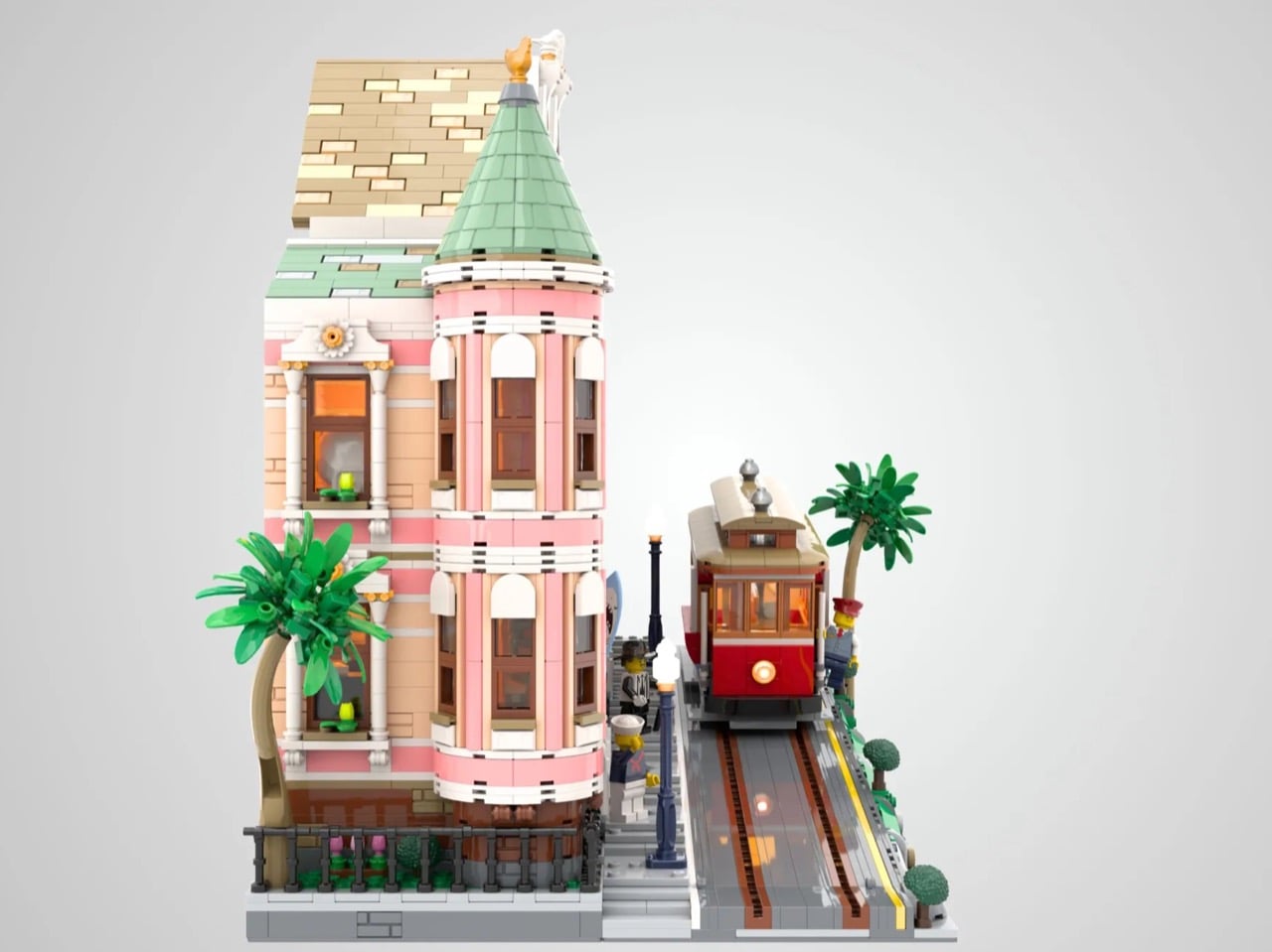

That turret is my favorite thing here. Cones are miserable to build in LEGO because the system hates anything that tapers, and Wonderbrick_design has shingled the whole thing, stacked three storeys of bay windows underneath it, and then still found room for a wrought-iron fence over the basement level. Behind it, the dance academy occupies the ground floor with a black upright piano and a mirror upstairs, the yellow house holds a surfboard with a shark mouth painted on it leaning against an armchair, and the blue house has an artist at work with an easel, canvases and paint tins.
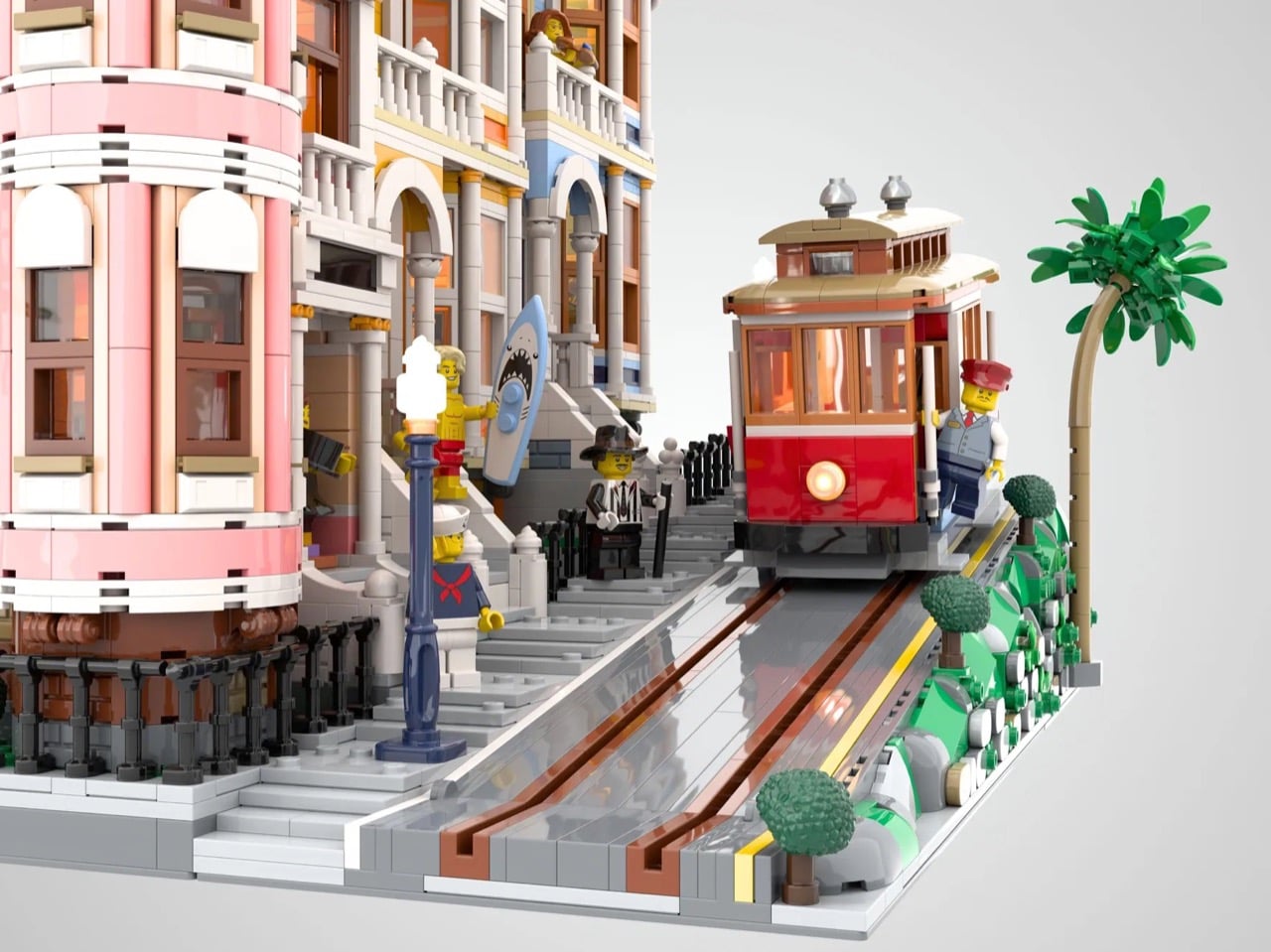
The whole baseplate is pitched, so the sidewalk, the stone retaining wall, the curb tiles and the track all descend together, and the cable car sits at a genuine angle rather than parked on a flat road pretending. Look at the rails and there’s a slot running down the middle, which is exactly how the real thing works. San Francisco cable cars carry no engine. A steel rope moves under the street at a constant 9.5 mph, powered from a building on Mason Street, and the gripman works a lever that clamps onto it. Andrew Hallidie got the system running in September 1873, and it survives today as the only moving National Historic Landmark in America.

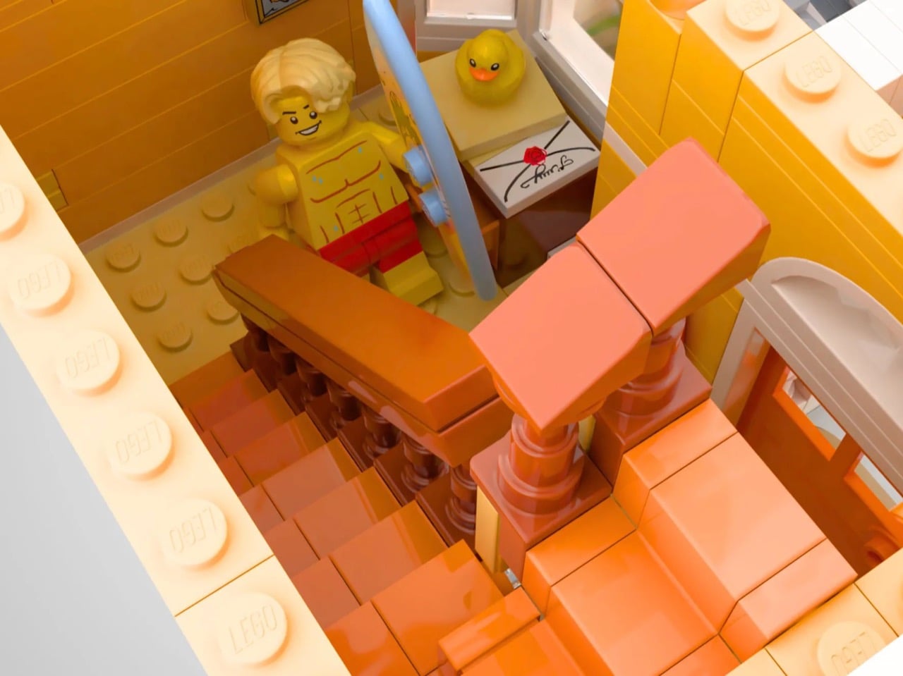
LEGO has flirted with this material before, tucking a microscale Postcard Row into the 2019 Architecture skyline set, and builders keep proving the appetite is real. Peter_Designs pitched a 2,997-piece Ascensor da Bica at 20.5 degrees to match Lisbon’s hills a couple of years back. Minifig-scale San Francisco remains unclaimed territory.


With 766 days on the clock and 6,491 supporters banked, the climb to 10,000 looks very doable. You can head to the LEGO Ideas page and cast your vote here. The only thing missing is a string and a winch to pull that cable car up the hill for real.
The post San Francisco’s most iconic buildings are now a 4,200 brick LEGO diorama first appeared on Yanko Design.
Smart home hardware has a quiet, persistent problem nobody bothers fixing: physical switches and sliders forget the truth the moment someone changes a light from their phone instead. A dial stays wherever it was left, even after the bulb it supposedly controls has dimmed to nothing through a voice command in another room. One maker’s walnut console solves that mismatch directly, using motorized faders that physically move themselves to match whatever’s actually happening in the house.
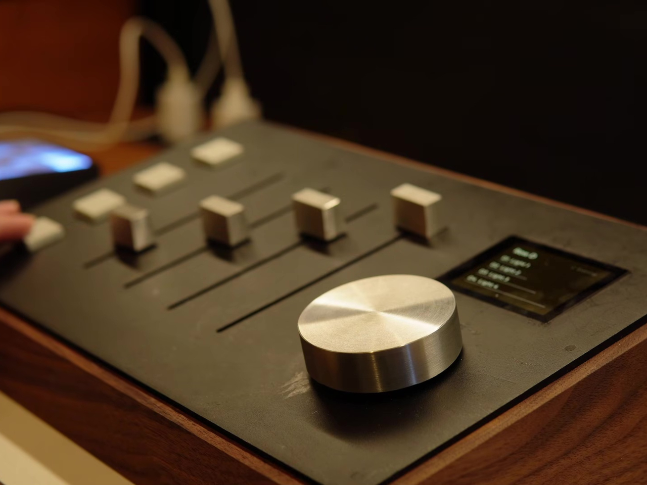
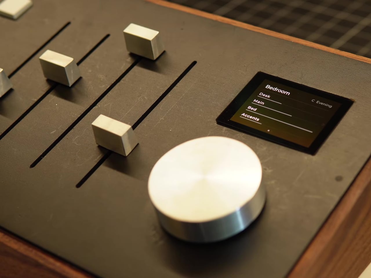
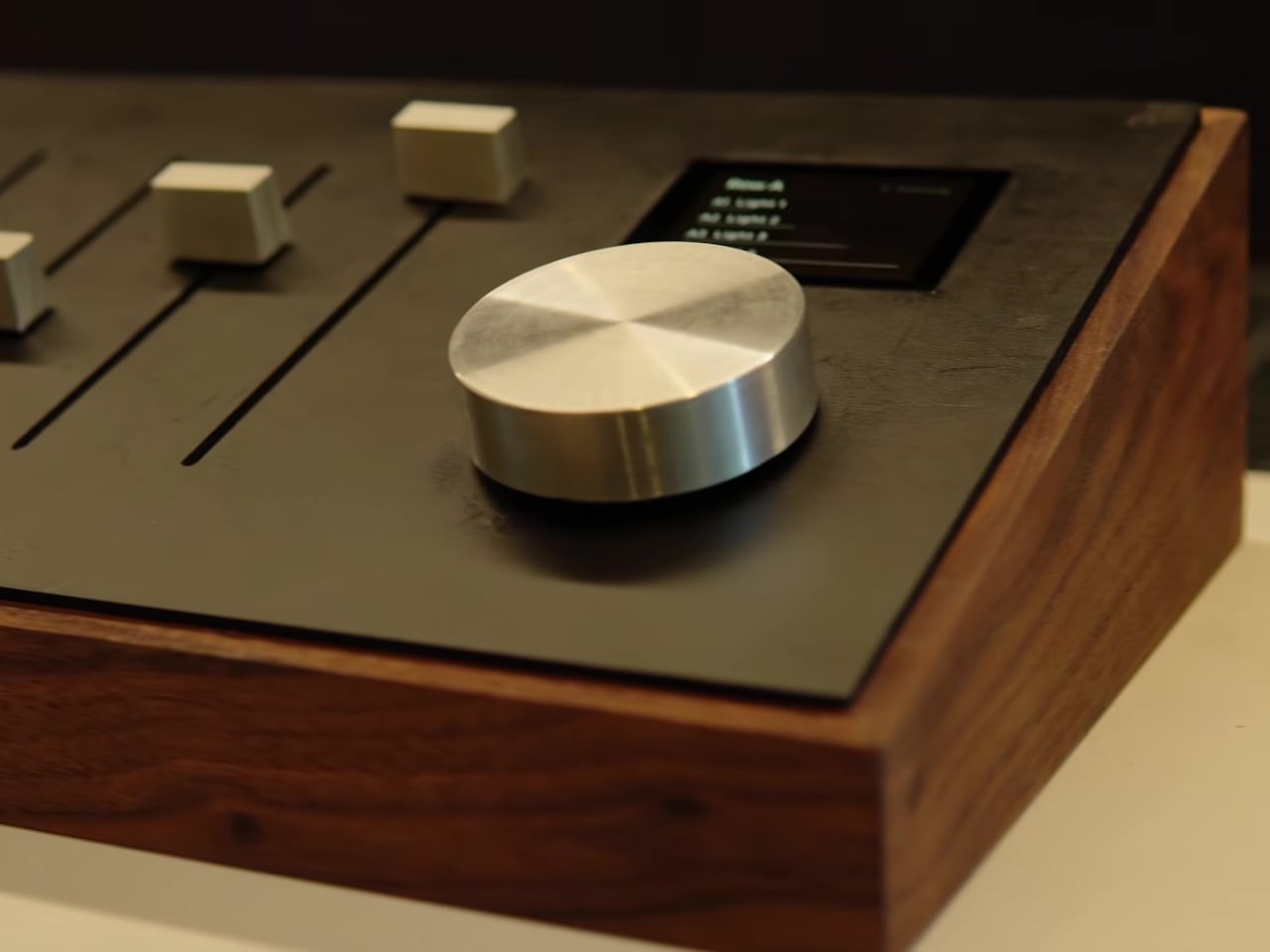
The mechanism borrows straight from professional audio mixing desks, where motorized faders have handled exactly this kind of state tracking for decades. A large aluminum knob on the console cycles through banks, each one representing a different room or light group, shown on a small built-in display. The moment a new bank gets selected, all four faders glide on their own to wherever that room’s lights currently sit, no manual resetting required.
Designer: Alex Dufetel (Sacreblue Studio)
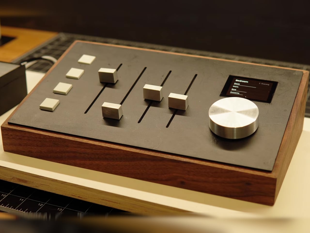
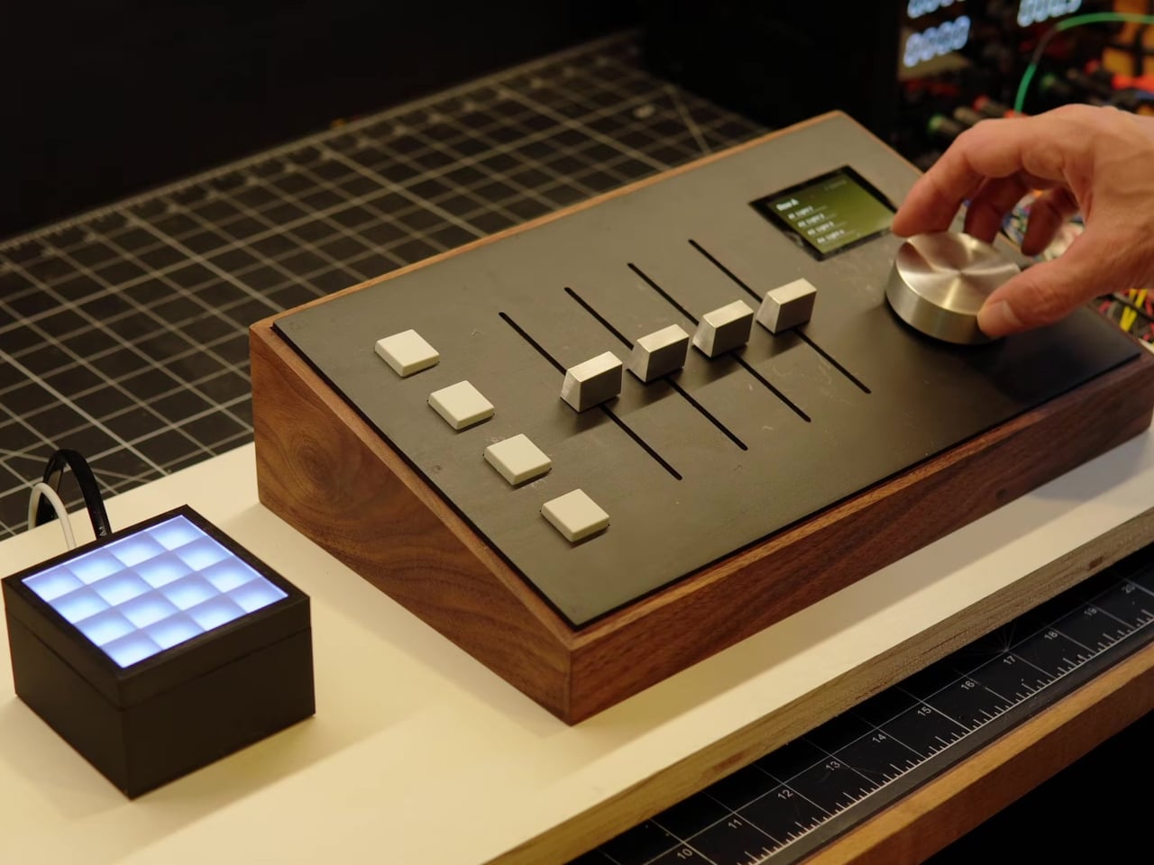
That synchronization runs in both directions, which is the detail that actually matters here. Dim a bedroom light from a phone app while sitting on the couch, and the console’s fader for that room quietly slides to match, entirely unprompted. It’s a small piece of choreography that turns a static piece of furniture into something that stays honest about the state of a house, rather than just accepting whatever position it was left in.
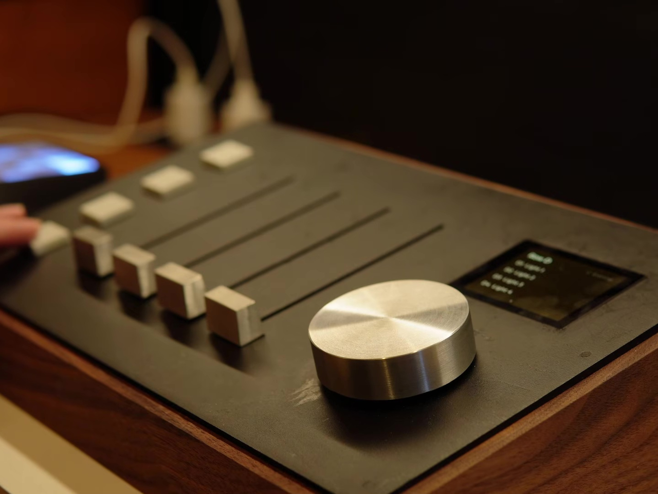
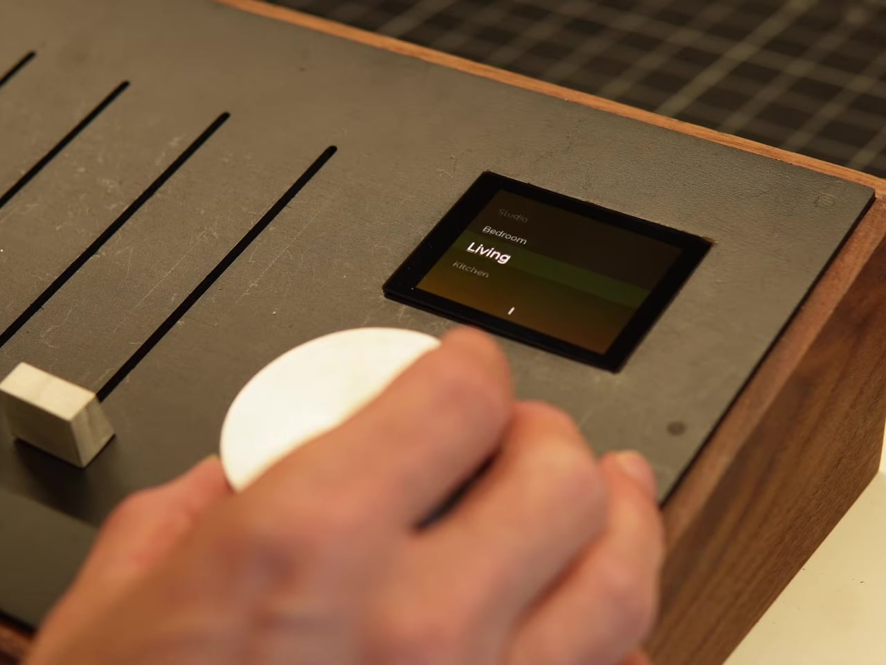
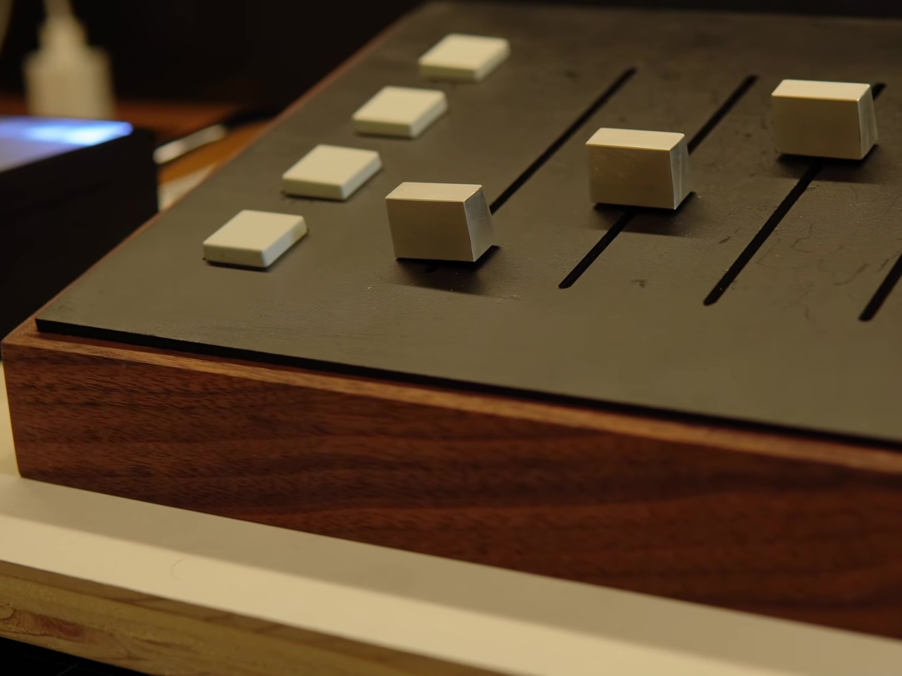
Four buttons sit beside the faders, handling lighting presets rather than individual brightness levels. Their assigned function changes depending on which room bank happens to be active, so a single row of buttons effectively serves every room in the house without needing a dedicated switch panel screwed into every wall. Pressing the same physical button in different rooms triggers a completely different lighting mood each time.
Building and testing all of this against sixteen actual light fixtures scattered through a house would slow any project down considerably. Instead, a compact 4×4 grid of small diffused LEDs stands in for the real thing, with each row representing one room’s bank of four lights. That miniature rig let the whole system get debugged safely on a desk before ever touching a single fixture wired into the house’s actual power.
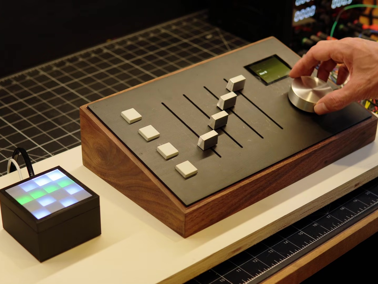
Materials do plenty of the storytelling here too. The body is solid walnut rather than injection-molded plastic, and the rotary knob along with the fader caps came off a CNC machine cut straight from aluminum stock. Even the current painted-wood faceplate, a placeholder ahead of a planned black anodized aluminum version, already reads closer to a finished audio interface than a hobbyist circuit board bolted into a project box.
The post This Walnut Console Has Faders That Move Themselves to Match Your Lights first appeared on Yanko Design.