This Oak Sideboard Has Doors You Can’t Stop Touching

You know that feeling when you run your fingers across something and the texture makes you stop in your tracks? That’s exactly the vibe British furniture maker Nick James is going for with his sideboard featuring sculpted doors. And honestly, it’s the kind of piece that makes you rethink what furniture can be.

At first glance, it looks like a solid oak sideboard. Clean lines, classic proportions, nothing too flashy. But then you get closer and realize those doors aren’t just doors. They’re carved with flowing, wave-like patterns that transform the flat surface into something that feels almost alive. The sculpting reveals the oak’s grain in ways you’d never see otherwise, creating shadows and depth that shift as you move around the piece.

Designer: Nick James

This isn’t Nick James’s first dance with texture. The British designer has built a reputation for bringing tactile interest to traditional furniture forms. His approach is about celebrating the material itself, letting the wood grain become the star of the show rather than hiding it under layers of paint or veneer. In a world where so much furniture feels mass-produced and anonymous, there’s something refreshing about a piece that proudly shows off its origins.

The sideboard itself is practical in all the ways you’d want. It measures a generous size, perfect for dining room storage or as a living room statement piece. Inside, you’ll find a height-adjustable shelf, so whether you’re storing wine bottles or board games, you can configure it to fit your life. The hardware is minimal, keeping the focus on those sculptural doors that really deserve center stage.

What makes this piece particularly interesting is how it straddles different design worlds. There’s a mid-century modern sensibility to the proportions and the floating quality of the case. But the textured doors feel almost Art Deco, with their geometric repetition and emphasis on craftsmanship. And then there’s an undeniably contemporary edge to the whole thing, because let’s face it, most traditional furniture makers aren’t carving wave patterns into cabinet doors.

The price point sits at £2,950, which puts it firmly in the investment furniture category. But here’s the thing about pieces like this: they’re made to order from solid oak, hand-finished, and designed to last decades. In an era when we’re all supposed to be buying less but buying better, a sideboard like this makes the case for choosing quality over quantity. Plus, it’s the kind of furniture that only gets better with age as the oak develops its patina and character.

Some design purists might argue about the use of CNC technology to create the repetitive carved pattern. There was even a comment on Core77 suggesting that precision CNC texturing lacks soul. But I’d push back on that. The technology is just a tool, like a chisel or a lathe. What matters is the design vision behind it and the quality of execution. James uses the precision to reveal something beautiful about the material itself, not to disguise it as something it’s not.

The sideboard also speaks to a broader trend we’re seeing in contemporary design: texture is having a major moment. Whether it’s fluted glass, ribbed wood, scalloped tiles, or carved surfaces, designers are moving away from the ultra-minimalist smooth finishes that dominated the 2010s. People want furniture that invites touch, that creates visual interest through shadow and form, that makes you want to get up close and really look.

What I love most about this piece is that it doesn’t shout for attention. It’s not trying to be the loudest thing in the room. Instead, it rewards the people who take time to notice the details. The way the light catches the carved surface. How the grain pattern emerges from the sculpting. The contrast between the textured doors and the smooth frame. These are the kinds of subtle pleasures that make living with good design so satisfying.

The post This Oak Sideboard Has Doors You Can’t Stop Touching first appeared on Yanko Design.

Someone Made a Flat-Pack Stool from Glass That Loops Like Frozen Water

Flat-pack furniture is usually shorthand for budget compromises, cardboard boxes stuffed with dowels, and Allen keys that disappear the moment you need them. It is something you tolerate for convenience rather than admire, defined by getting furniture to your door cheaply rather than making you excited about assembly. The tension between wanting sculptural pieces and needing things that can actually ship and fit through narrow stairwells rarely gets resolved gracefully.

Tide Stool treats flat-pack as a starting point for luxury instead of a constraint. Designed by Vinayak Syam for DreamDeadline Works and produced by House of Sach, it is built from toughened glass legs, precision 3D-printed joinery, and hand-finished upholstery. The structure rises from a flat kit into a flowing form, shaped by curves and loops rather than brute-force mass, with the name being very much intentional.

Designer: Vinayak Syam

Instead of chunky wooden legs, Tide uses transparent glass fins that fold and loop around a central axis, carrying load through geometry. The panels curve out and back in, sharing weight across their profiles, so strength comes from the path the glass takes rather than thickness. It flips the usual hierarchy where glass is treated as fragile skin and heavier materials are trusted with structural work.

Receiving Tide as a flat set of glass pieces and joinery turns assembly into a building ritual rather than a chore. Slotting the fins into 3D-printed nodes lets you watch the structure emerge from motion, where overlapping curves and visible joints become part of the composition. The design makes those connections part of the visual language, so engineering reads as an aesthetic feature rather than something to hide.

The upholstered top sits above the glass base as a soft disc that comes in more than thirty colour finishes. Upholstery is offered in fabric and vegan leather, with Deep Sienna being the leather option and the rest using elevated textiles. That palette lets the same glass base feel quiet and monochrome in one space or warm and expressive in another, without losing its sculptural identity.

Flat-pack construction makes shipping and moving easier, especially for people who rearrange or relocate often, yet once assembled, the stool reads as a single object rather than a kit. The toughened glass and looping geometry give real load-bearing confidence while keeping the footprint visually light. It is the rare piece that respects both logistics and living rooms without asking you to choose between practicality and presence.

Tide turns apparent fragility into a quiet expression of resilience. The transparent legs, visible joinery, and soft seat work together to make strength feel like a product of balance and flow rather than heaviness. For anyone tired of choosing between sculptural furniture and flat-pack practicality, a glass stool that arrives as parts and stands like a tide frozen mid-rise feels like a surprisingly thoughtful middle ground.

The post Someone Made a Flat-Pack Stool from Glass That Loops Like Frozen Water first appeared on Yanko Design.

This Umbrella Stand Disappears When You Don’t Need It

You know that metal umbrella stand gathering dust in your entryway? The one that’s been repurposed into a catch-all for tennis rackets, dog leashes, and that broken tripod you keep meaning to fix? Yeah, that one. Designer Aishwarya Ajith looked at this universal furniture problem and asked a brilliantly simple question: why do we need a permanent umbrella stand when rain is seasonal?

Enter Coilo, an umbrella stand that challenges everything we assume about furniture. It’s not a traditional stand at all. Instead, it’s a rollable mat that transforms into a temporary umbrella holder only when you actually need it. When the skies clear and your umbrellas are tucked away, Coilo returns to its flat form, practically disappearing from your space entirely.

Designer: Aishwarya Ajith

The concept is rooted in what Ajith calls “situational furniture,” objects that exist only when needed and remain visually unobtrusive the rest of the time. It’s a refreshingly honest approach to design that acknowledges how we actually live rather than clinging to outdated notions of what furniture should be.

The inspiration came from observing life in compact spaces, particularly in Indian hostels and shared dormitories where every square foot matters. In these environments, people routinely lay out mats on the floor for group discussions and social gatherings. During monsoon season, wet umbrellas demand immediate attention, dripping all over entryways and creating puddles. But once the rain passes, that urgency evaporates. So why should the solution take up permanent real estate?

Coilo’s design is deceptively simple yet remarkably clever. The mat is crafted from flexible, water-resistant EVA foam that can be rolled into a cylindrical form. Thanks to a simple joint system, the coiled structure achieves surprising stability without requiring complex mechanisms or hardware. Supporting flaps button together in a distinctive pattern that gives the stand character and allows it to accommodate umbrellas of varying heights.

The base plate deserves special mention. It’s made from terracotta clay, a material choice that’s both practical and thoughtful. Terracotta is naturally absorbent, wicking away moisture from wet umbrellas rather than letting it pool on your floor. It’s the kind of detail that reveals genuine problem-solving rather than purely aesthetic decision-making.

What makes Coilo particularly fascinating is how it fits into broader conversations about sustainable design and conscious consumption. We’re living in an era where urban apartments are shrinking, minimalism is trending, and people are questioning whether they really need all the stuff previous generations accumulated. Coilo doesn’t just save space; it challenges the assumption that furniture must be static and permanent.

This philosophy resonates especially with younger generations navigating shared living situations, frequent moves, and smaller living quarters. Students in dormitories, young professionals in co-living spaces, and anyone dealing with limited square footage will immediately grasp Coilo’s appeal. It’s furniture that adapts to your life rather than demanding you adapt to it. The visual design also breaks from traditional umbrella stand aesthetics. Those buttoned flaps create a sculptural quality that makes Coilo a conversation piece when deployed. It looks intentional and interesting rather than purely utilitarian. When rolled flat, it could easily pass as a decorative floor mat or yoga mat, maintaining a presence without announcing itself as single-purpose furniture.

Ajith’s exploration opens up fascinating possibilities for the future of home furnishings. What else could transform and disappear? Could we design coffee tables that fold into wall art? Dining chairs that become storage? Desks that morph into room dividers? Coilo represents more than just a clever umbrella solution. It’s a prototype for how we might rethink everyday objects in an age where flexibility, adaptability, and space efficiency matter more than ever.

The post This Umbrella Stand Disappears When You Don’t Need It first appeared on Yanko Design.

This Chair Looks Like a Material Swatch Book

You know those material swatch books at fabric stores where every color fan out in perfect rainbow order? Designer Fatih Demirci apparently looked at one and thought, “What if that was a chair?” The result is the Kartela Chair, a concept design that turns the humble material sample into something you’d actually want to sit on.

Let’s be real. Most furniture design either plays it safe with neutrals or goes so wild that you’d only see it in a modern art museum. The Kartela Chair manages to walk this delightful line between practical and playful. Looking at it feels like stumbling upon a design secret, where function meets whimsy in the most unexpected way.

Designer: Fatih Demirci

The concept is brilliantly simple yet visually striking. The chair features layers upon layers of cushioned upholstery stacked together, creating this incredible rainbow effect along the edges. Each layer represents a different color or texture, much like flipping through pages in a designer’s sample book. It’s the kind of thing that makes you do a double take. From one angle, you see a sophisticated seating piece with a clean, minimalist frame. From another, you catch those vibrant cascading layers that give it personality and depth.

What really gets me about this design is how it celebrates the materials themselves. Usually, upholstery is hidden away, tucked and stapled underneath where no one sees the construction. Demirci flips that script entirely. Here, the layers become the main event. Every fold, every color transition, every texture is on full display. It’s like the chair is saying, “Hey, look how I’m made, and isn’t it beautiful?”

The Kartela Chair comes in different colorways, which honestly makes it even more fun. There’s a lime green version that practically vibrates with energy, perfect for someone who wants their furniture to make a statement. Then there are softer pastel combinations in lilacs, blues, and creams that feel more serene but still maintain that playful edge. And for those leaning toward earthy vibes, there are warm tones in mustards, tans, and terracottas that bring all that visual interest without overwhelming a space.

The frame itself keeps things grounded. Slim metal legs in either white or black powder coat give the chair an airy, almost floating quality. It’s a smart move. With all that cushioned drama happening above, a heavy base would make the whole thing feel clunky. Instead, the minimal structure lets those colorful layers take center stage while still providing solid support.

From a practical standpoint, this concept is interesting because it challenges how we think about customization. Imagine being able to choose your layer combinations like picking nail polish colors. Want more blues? Go for it. Prefer a monochromatic fade? That works too. The design naturally lends itself to personalization in a way that most furniture doesn’t.

There’s also something nostalgic about the aesthetic. Those tufted buttons on the seat and back cushions give off vintage vibes, like something your cool aunt might have had in her 70s living room, but updated for today. It’s retro without being costume-y, which is a hard balance to strike.

Of course, this is still a concept design, which means we’re looking at rendered images rather than something you can order online tomorrow. But that’s part of what makes furniture concepts so exciting. They push boundaries and make us reconsider what’s possible. Even if the Kartela Chair never makes it to mass production, it’s already done its job by sparking conversation and inspiring other designers to think outside the traditional furniture box. Whether this chair ever graces showroom floors or remains a digital darling, Fatih Demirci has created something that makes people smile. And in the end, isn’t that what good design should do?

The post This Chair Looks Like a Material Swatch Book first appeared on Yanko Design.

This Furniture Looks Like It’s Growing and Evolving

There’s something unsettling and deeply fascinating about furniture that looks back at you. Not literally, of course, but in that way certain objects seem to have presence, personality, almost a pulse. That’s exactly the vibe French designer Vincent Decat is going for with his Living Series, a collection of sculptural furniture pieces that feel less like static household items and more like strange, beautiful companions sharing your space.

Decat, who studied at the prestigious Design Academy of Eindhoven, has built his practice around a provocative idea: what if our furniture behaved like living beings? What if instead of just using objects, we formed relationships with them, caring for them the way we might care for a pet or a plant? It’s a concept that might sound precious or overly conceptual, but when you see the pieces themselves, something clicks. These aren’t just conversation starters. They’re genuinely compelling objects that make you reconsider what furniture can be.

Designer: Vincent Decat

The Living Series includes three main pieces, each exploring different aspects of biological growth and organic development. First up is “One Thing Led To Another,” a sculptural chair that looks like a landscape caught mid-transformation. With its irregular contours and vivid orange elements sprawling across the surface, it suggests something being colonized or regenerated, like coral spreading across rock or moss creeping over stone. The piece combines wood, steel, resin, acrylic paint, and varnish, standing 80 centimeters tall and measuring 70 by 60 centimeters. It’s handcrafted in a way that emphasizes the materiality and the sense that this object has evolved rather than simply been constructed.

Then there’s “Came Uninvited,” a side table that feels like it wandered into your living room from some other dimension. This piece evokes what Decat describes as a “transformed organism,” something that references human impact on natural systems. There’s an element of the uncanny here, the way the forms seem both familiar and alien, organic yet artificial. It’s 60 centimeters tall with a 46 by 50 centimeter footprint, crafted from PLA (a biodegradable plastic often used in 3D printing), resin, acrylic paint, and varnish. The colors and textures suggest something living that has adapted, mutated, or been fundamentally altered by its environment.

The third piece, “Stage One,” takes the biological metaphor to its logical beginning: embryonic development. This tray adopts compact, evolving geometry that suggests growth over time. Fabricated through 3D printing and available in two hand-finished variations (one with acrylic paint, another with aluminum leaf), Stage One feels like witnessing the earliest phases of life. It’s the smallest and most contained piece in the series, but it carries perhaps the most conceptual weight, asking us to see even the humblest domestic objects as things in process, things with potential.

What makes Decat’s work particularly relevant right now is how it taps into our growing awareness of materiality, sustainability, and our relationship with the objects we surround ourselves with. In an era of disposable IKEA furniture and Amazon basics, the idea that furniture could be something you bond with, something that deserves care and attention over time, feels almost radical. The designer positions his work against the throwaway culture of contemporary consumption, suggesting that durability isn’t just about how well something is built, but about whether it can sustain an emotional connection over years.

The Living Series also reflects broader trends in contemporary design, where the boundaries between art, craft, and function are increasingly blurred. These pieces work as furniture (you can actually sit on that chair, use that table, place things on that tray), but they also function as sculptural objects that transform a space. They’re conversation pieces that happen to be useful, or useful pieces that happen to start conversations.

Decat’s approach involves extensive material experimentation and surface treatment. Each piece is carefully finished by hand, which means every one is unique, with its own particular character and quirks. The combination of traditional techniques like woodworking with cutting-edge technology like 3D printing creates objects that feel simultaneously ancient and futuristic.

Ultimately, the Living Series asks us to slow down and reconsider our relationship with the everyday objects we live with. In Decat’s vision, furniture isn’t just something you buy, use, and eventually replace. It’s something you live alongside, something that changes as you change, something that becomes part of your story. Whether that sounds appealing or pretentious probably depends on your tolerance for design philosophy, but there’s no denying the pieces themselves have a compelling, almost magnetic quality that makes you want to reach out and touch them, to understand what they’re made of and how they came to be. And maybe that’s the point: furniture that makes you curious, that invites interaction and care, that refuses to disappear into the background of daily life.

The post This Furniture Looks Like It’s Growing and Evolving first appeared on Yanko Design.

This Elegant High-Top Table Hides Wine Bottles In Its Placemats

You know that moment when you’re setting up for a dinner party and realize you have nowhere to put the wine bottle except awkwardly on the table or tucked under a chair? Miray Özlem Er just solved that problem in the most unexpectedly elegant way possible.

Meet the Placemat hightop table, a piece of furniture that makes you wonder why nobody thought of this sooner. At first glance, it looks like a sleek, minimalist high-top table with felt placemats secured by thin metal rails. Clean lines, transparent acrylic legs, simple construction. Pretty standard stuff for contemporary furniture design. But then you notice something curious hanging beneath the table surface. Those placemats? They keep going, draping down to create fabric pockets that perfectly cradle wine bottles.

Designer: Miray Özlem Er

It’s one of those designs that makes you pause and smile because it’s so ridiculously practical yet completely unexpected. The placemats serve double duty, marking your dining space while simultaneously creating storage that’s right there when you need it. No more getting up to grab the bottle from across the room. No more wine rings on your beautiful table surface. Just reach down, grab what you need, and keep the conversation flowing.

The engineering here is surprisingly sophisticated for something that looks so simple. The placemats are made from thick felt material that provides just enough structure to hold a bottle securely while maintaining that soft, draped aesthetic. Metal rails run along the table’s edge, keeping everything aligned and preventing the fabric from shifting during use. The transparent legs give the whole thing a floating quality, making what could have been a bulky piece feel light and airy.

What really gets me about this design is how it challenges our expectations about what furniture can do. We’re so used to tables being flat surfaces with maybe a shelf underneath if we’re lucky. But Miray looked at the entire vertical space and asked, “What if we used all of it?” The result is furniture that works harder without looking like it’s trying too hard.

The color options show real thoughtfulness too. The classic black version has that sophisticated, gallery-ready vibe. The sage green feels fresh and contemporary, perfect for spaces that embrace color without shouting about it. And the warm brown brings an organic, grounded feeling that would work beautifully in all kinds of interiors. Each colorway completely changes the personality of the piece, which means it can adapt to different aesthetic preferences while maintaining its core functionality.

There’s also something quietly luxurious about the whole concept. Think about high-end restaurant design or boutique hotel details where every element serves multiple purposes without announcing itself. This table has that same energy. It’s the kind of piece that sparks conversation not because it’s loud or flashy, but because it’s genuinely clever.

For small space dwellers, this design is particularly genius. Studio apartments and compact dining areas often require furniture that multitasks, but most storage solutions are pretty obvious about what they’re doing. This table stores things while looking like a sculptural object. The bottles become part of the design rather than clutter you’re trying to hide. The social aspect shouldn’t be overlooked either. When you’re hosting, having the wine right there creates a more relaxed, communal atmosphere. Guests can help themselves without navigating your kitchen or interrupting the flow of dinner. It’s the furniture equivalent of being a thoughtful host who anticipates needs before anyone has to ask.

Miray has created something that sits comfortably at the intersection of art, furniture, and problem-solving. It’s not trying to reinvent the table entirely, just reimagining what a table could be if we paid attention to the negative space around it. In a world of increasingly complex design solutions, there’s something refreshing about an idea this straightforward executed this well. Sometimes the best innovations aren’t about adding more features or technology. They’re about looking at everyday objects with fresh eyes and asking better questions. The Placemat hightop table does exactly that, turning a simple dining essential into an elegant storage solution that makes your space more functional and more beautiful at the same time.

The post This Elegant High-Top Table Hides Wine Bottles In Its Placemats first appeared on Yanko Design.

This Designer Turns Abandoned Bikes Into Museum-Worthy Furniture

There’s something poetic about seeing a lonely bicycle chained to a pole, slowly rusting away in the rain. Most of us walk past these urban ghosts without a second thought. But Dublin-based designer Cara Campos sees something entirely different: potential.

Her Objects from Frames collection, which has earned her recognition as a Wallpaper* Future Icon for 2026, transforms abandoned bicycle parts into sleek, minimalist furniture that looks like it belongs in a design museum. And honestly? It’s kind of genius.

Designer: Cara Campos

Campos didn’t grow up in Dublin. Raised in Saudi Arabia to a French father and Irish mother, she brings a multicultural perspective to her work that makes it feel both globally conscious and locally grounded. Now based in Ireland, she’s developed a design philosophy rooted in sustainability, adaptability, and what she calls “the lives of objects.” It’s this last bit that makes her work so compelling. She’s not just recycling materials. She’s honoring their stories.

The Objects from Frames collection started, like many great ideas, as a university project. Campos kept noticing abandoned bicycles scattered across different cities, slowly deteriorating, and wondered if she could give them a second act in Dublin. The bicycle, after all, holds a special place in human innovation. American writer William Saroyan once called it “the noblest invention of mankind,” and Campos clearly agrees. Why let such noble machines end their days as scrap metal?

What she’s created is a collection of furniture that feels impossibly light and modern while celebrating the inherent beauty of industrial design. Her Steel Lounge Chair incorporates front triangles from road bikes, transforming the most recognizable part of a bicycle into something you’d want in your living room. There are also table lamps and side tables, each piece maintaining the elegant lines and structural integrity that made bicycles such revolutionary machines in the first place.

But here’s what makes Campos’ approach different from your typical upcycling project. She’s adamant that her work goes beyond simply repurposing discarded materials. As she explains it, the collection “pays homage” to the intangible value these objects carry. Each bicycle frame has history. It carried someone to work, helped a student get to class, maybe even facilitated a first date. That emotional and practical legacy doesn’t disappear just because the bike gets abandoned. Campos captures it, preserves it, and gives it new purpose.

The technical execution is impressive too. Steel is one of the most recyclable materials on the planet. More steel gets recycled annually than aluminum, paper, glass, and plastic combined. It’s a true cradle-to-cradle material, which means it can be recycled infinitely without losing its properties. By working with bicycle frames specifically, Campos taps into structures that were already engineered for strength, lightness, and efficiency. She’s not starting from scratch. She’s remixing existing excellence.

The collection also arrives at a perfect cultural moment. We’re increasingly aware of how much waste our consumption habits generate, and we’re hungry for alternatives that don’t require us to sacrifice style for sustainability. Campos proves you can have both. Her furniture looks contemporary and sophisticated, not like something cobbled together from trash. The clean lines and minimalist aesthetic would fit seamlessly into any modern space, and the origin story only adds to the appeal.

There’s also something refreshingly honest about furniture that wears its past life openly. In an era of mass production and throwaway culture, these pieces stand as quiet rebellion. They celebrate repair, reuse, and reinvention. They ask us to look differently at the objects around us and consider what else might be hiding in plain sight, waiting for transformation. Campos’ work joins a growing movement of designers who see waste not as an endpoint but as a starting point. Her approach reminds us that good design doesn’t always mean creating something entirely new. Sometimes it means recognizing the potential in what already exists and having the vision to set it free.

So next time you pass an abandoned bicycle slowly oxidizing in the weather, maybe you’ll see it differently. Maybe you’ll see a future lamp, a potential chair, a table waiting to happen. That’s the gift of designers like Cara Campos. They don’t just make beautiful things. They change how we see the world.

The post This Designer Turns Abandoned Bikes Into Museum-Worthy Furniture first appeared on Yanko Design.

Concrete Furniture Just Got Soft: 5 Designs That Feel Like Art

Brutalism once suggested stark, monumental forms, with raw concrete presented in uncompromising honesty. Today, that legacy is evolving into a softer interior design language: Soft Brutalism. Rather than a contradiction, it becomes a thoughtful fusion where concrete is shaped into gentler, more human-centered forms. This shift responds to a culture saturated with disposable design and offers a return to authenticity, weight, and permanence.

Design studios increasingly agree that real luxury now lies in longevity and the tactile bond between people and material. Soft Brutalism embraces concrete’s structural clarity while softening its presence through refined casting, subtle tones, and smooth contours, transforming a once cold material into a warm, grounding element in contemporary spaces.

1. Texture As Poetic Expression

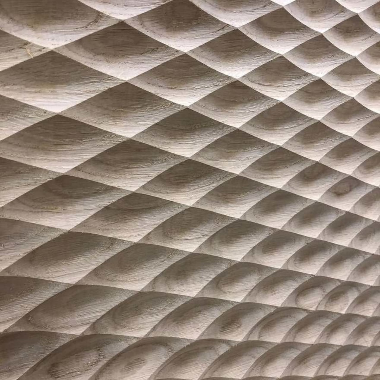
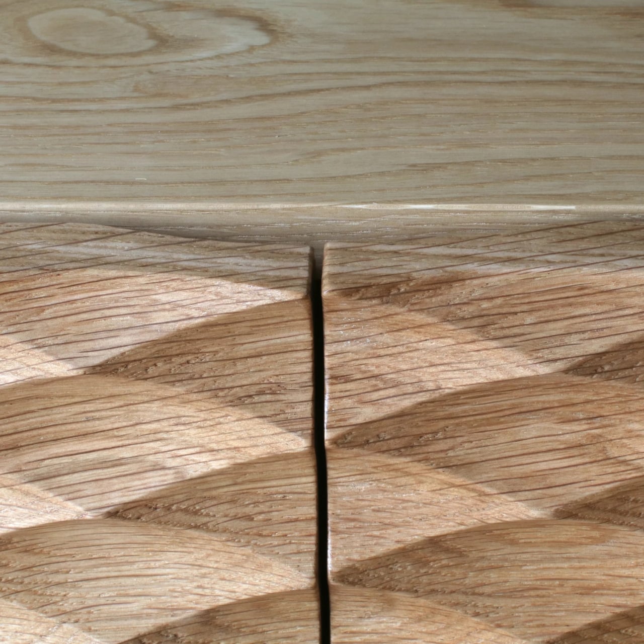
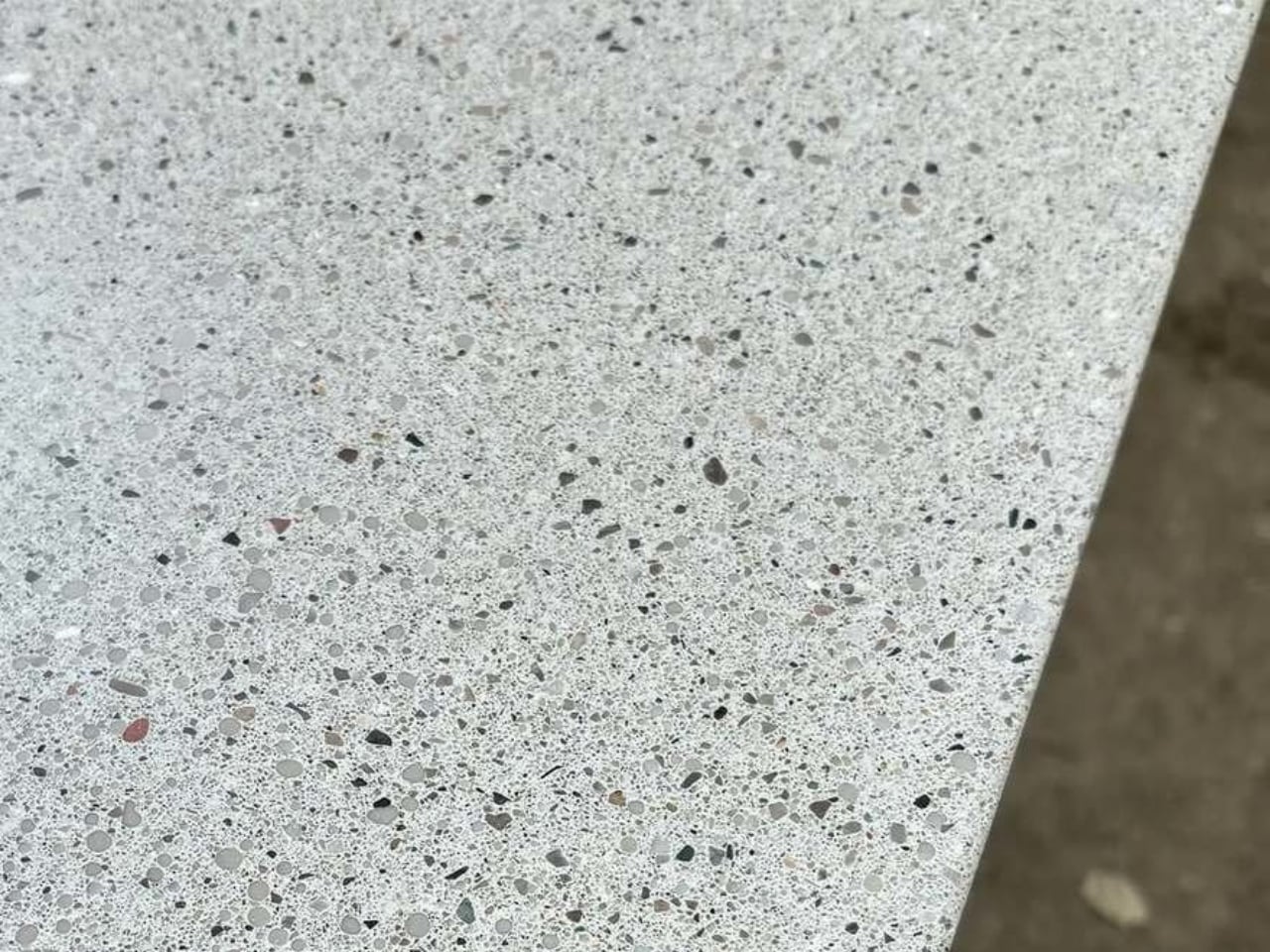
Soft Brutalism reimagines the concrete surface as a sensory landscape. Instead of the coarse, exposed finishes of classic Brutalism, this approach introduces a gentler, more tactile vocabulary. Ultra-high-performance concrete and advanced admixtures allow surfaces to feel like polished stone or soft, leathered marble, shifting concrete from industrial to intimate.

Subtle natural pigments bring earthy tones that warm the material visually, while delicate pores and faint aggregate patterns preserve its authenticity. This balance of refinement and imperfection creates a presence that feels grounded, crafted, and emotionally resonant – inviting touch and elevating concrete into a poetic element of contemporary design.

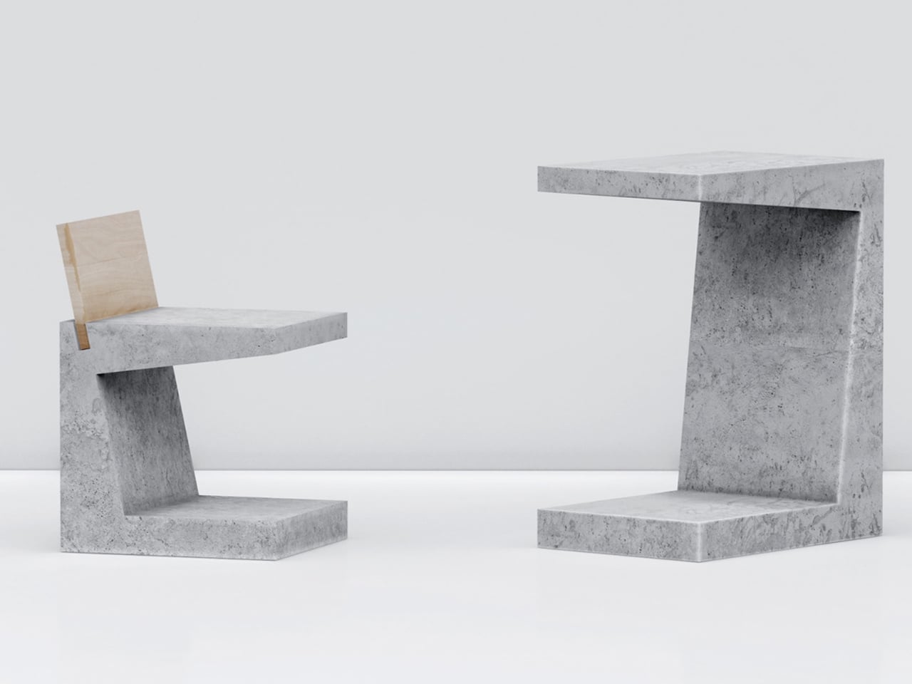
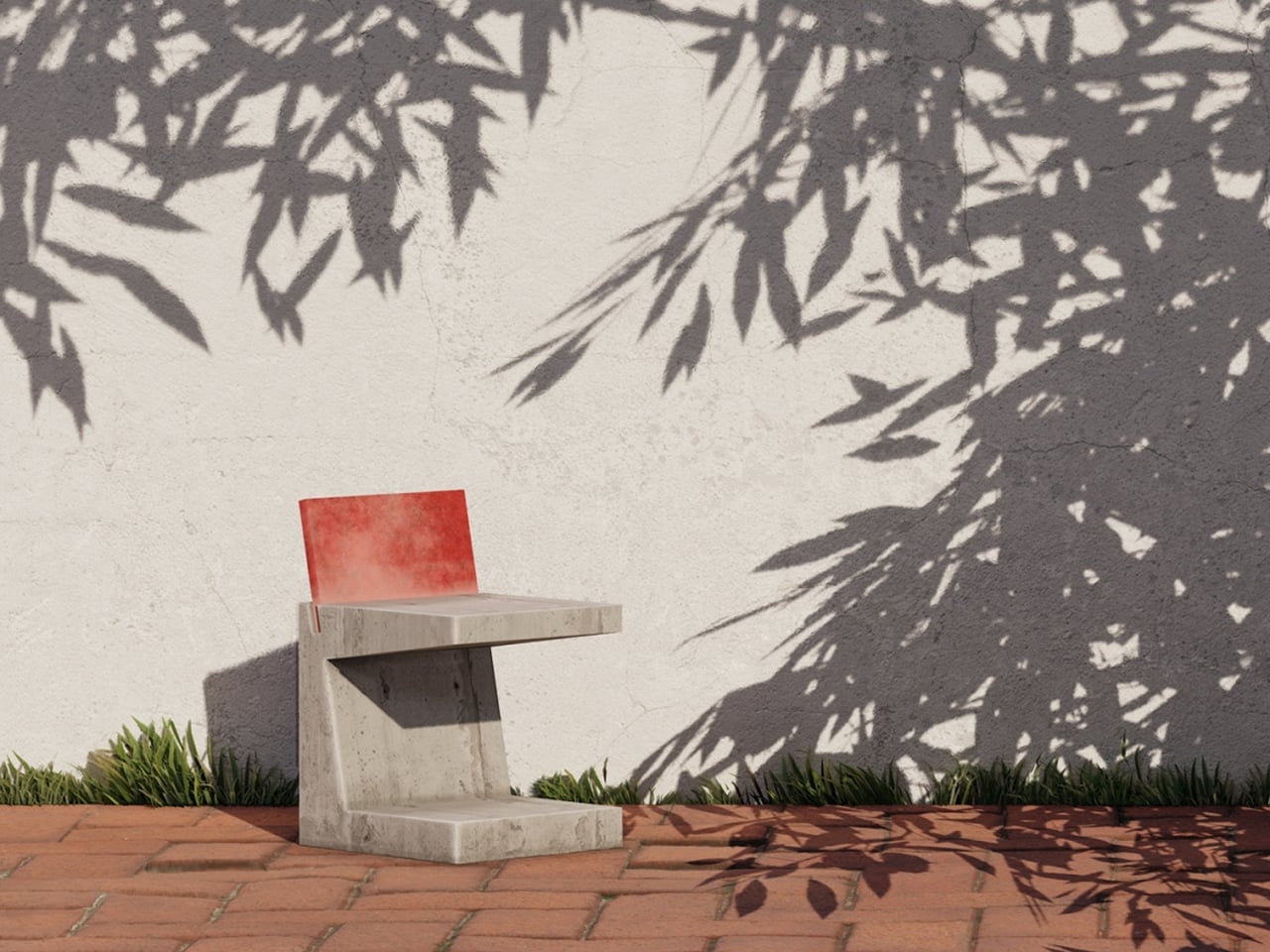
The Brute concept reinterprets outdoor furniture through a raw concrete expression of minimalism. Instead of the polished wooden surfaces often associated with minimalist design, these pieces embrace the unrefined character of concrete, inspired by brutalist architecture. The collection includes a chair and a table, each shaped like an enlarged square bracket. The chair features a recessed groove that holds a thick plywood backrest, creating a warm, natural contrast against the cool exposed concrete. Its form remains intentionally austere while highlighting the structural honesty of the material.

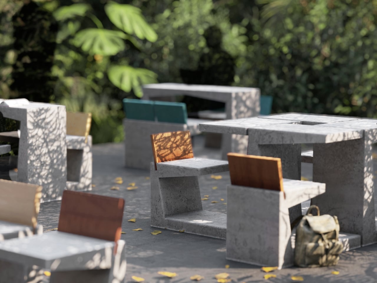
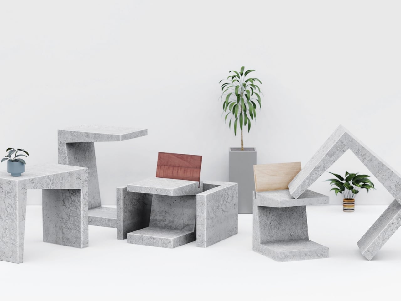
The table echoes the chair’s geometry but can be positioned in two orientations. It may be placed horizontally for a sculptural presence or stood upright for a more familiar table profile. Both pieces incorporate openings at their base that allow them to be linked using milled steel rods, creating multiple configurations. This modular system enables varied seating arrangements, giving the Brute furniture set practicality and visual impact within outdoor environments.

2. Sculpted Concrete Forms

Soft Brutalism preserves the inherent weight of concrete while reshaping it into forms that feel gentle and approachable. Instead of sharp right angles, the furniture relies on organic curves and softened edges that create calm, sculptural silhouettes. These substantial pieces ground a space, offering quiet stability while inviting touch and reducing visual intensity.

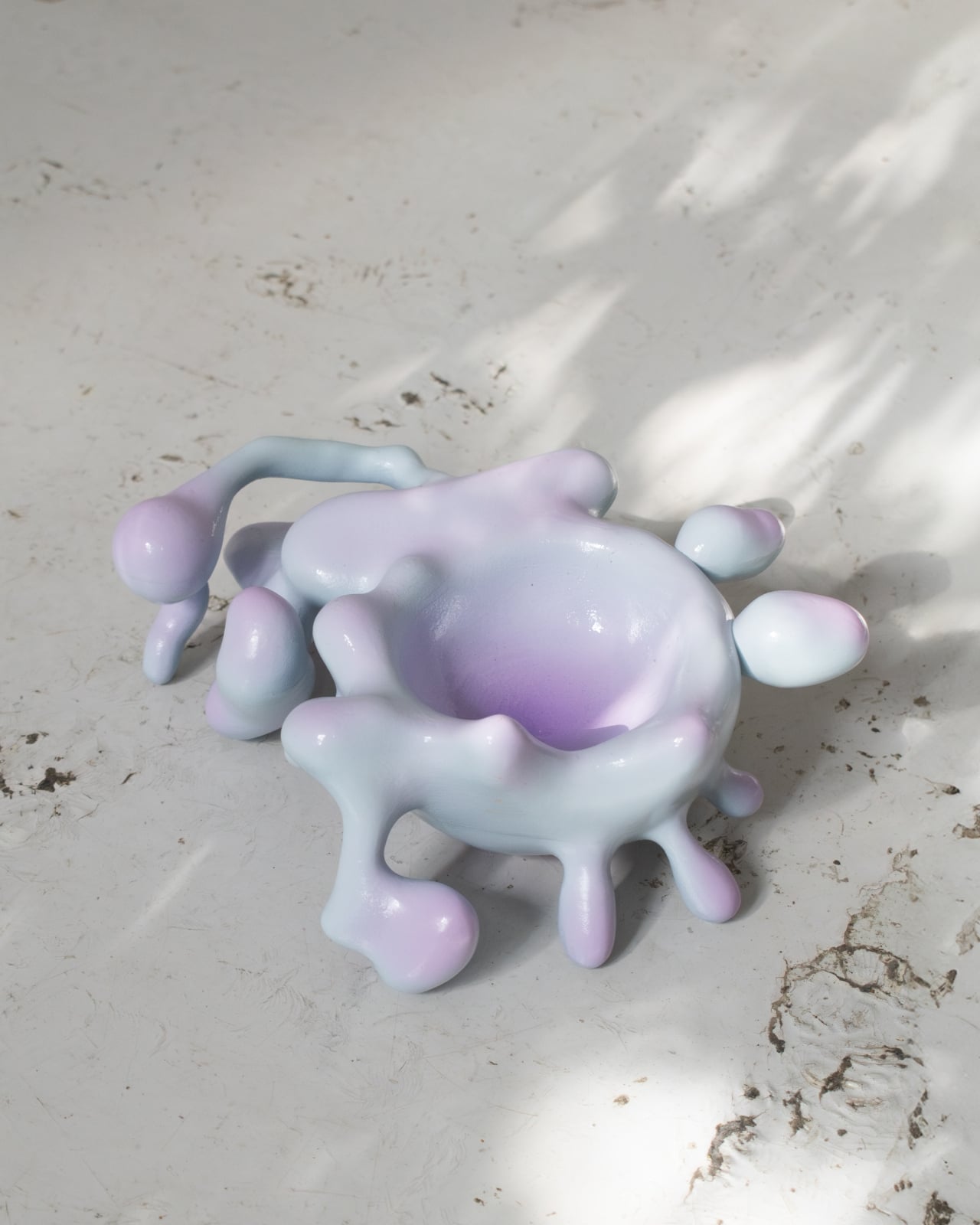
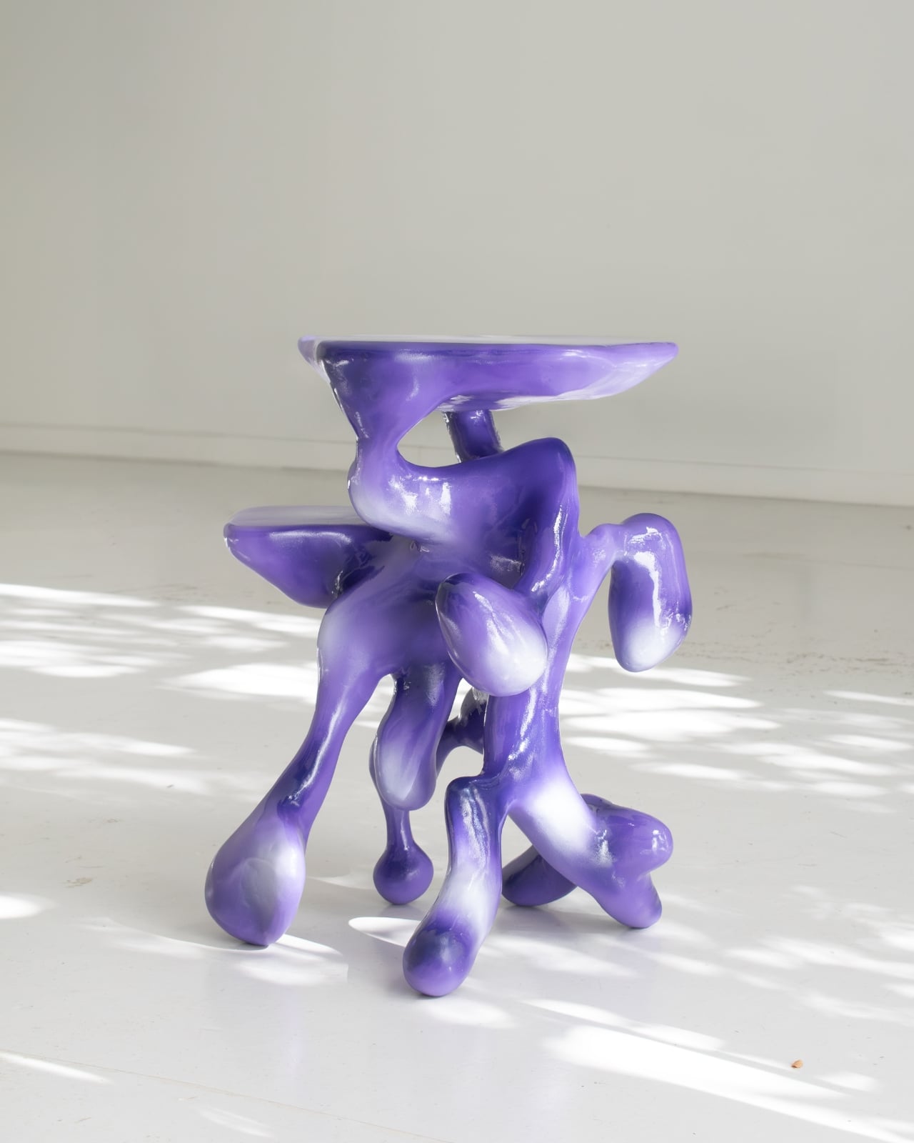
Drawing inspiration from nature, many forms echo river stones or stacked cairns, strengthening a biophilic connection within interiors. Their smooth, continuous surfaces interact beautifully with light, diffusing shadows and highlights so the material feels alive. This interplay transforms concrete into a warm, human-centred design language.

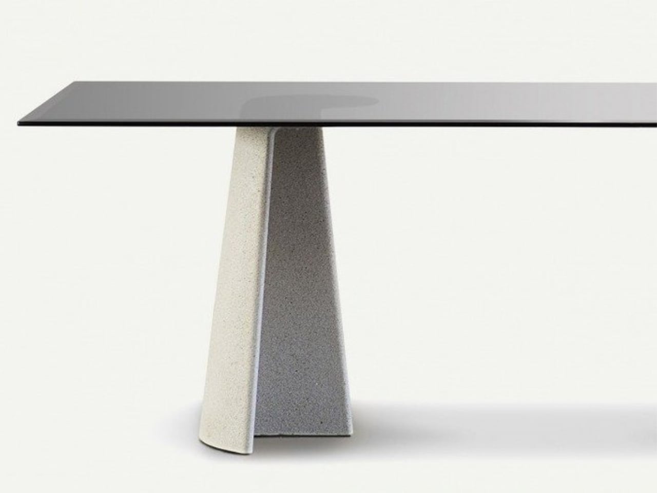
Ronan Bouroullec’s Ancora tables for Magis reframe concrete with an unexpected sense of refinement. Each piece is defined by a sculptural anchor-shaped base where a curved edge meets a central rib, giving the form both stability and visual lightness. The collection includes rectangular and round dining tables, as well as low and side tables, designed for indoor and outdoor settings. The rectangular model measures 220 × 90 cm, while the round version is 130 cm in diameter, offering two distinct spatial expressions.

Materiality sits at the core of Ancora. The concrete base establishes a quiet architectural presence, while the tabletop options, like tempered glass in clear or smoked finishes, or oak-veneered MDF, allow for different aesthetic directions. With its clean geometry and absence of decorative flourishes, the design relies on proportion, curvature, and structure to express character. Ancora demonstrates how concrete can shift from industrial to poetic when shaped with precision and restraint.

3. Warm Material Contrast

Soft Brutalism balances concrete’s cool, dense character with warm, organic materials, creating both visual and sensory harmony. Instead of relying solely on mass, this approach pairs concrete with richly grained woods, supple leathers, and hand-woven textiles, bringing an inviting counterpoint to the material’s inherent solidity.

Thoughtful placement of wood, cushions, and softer textures ensures that human touchpoints feel warm, ergonomic, and comfortable. This pairing transforms each piece from a purely industrial object into a crafted work of art, highlighting the precision of concrete casting alongside the refined joinery and material richness that elevate its presence in contemporary interiors.

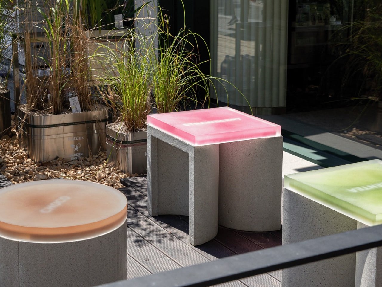
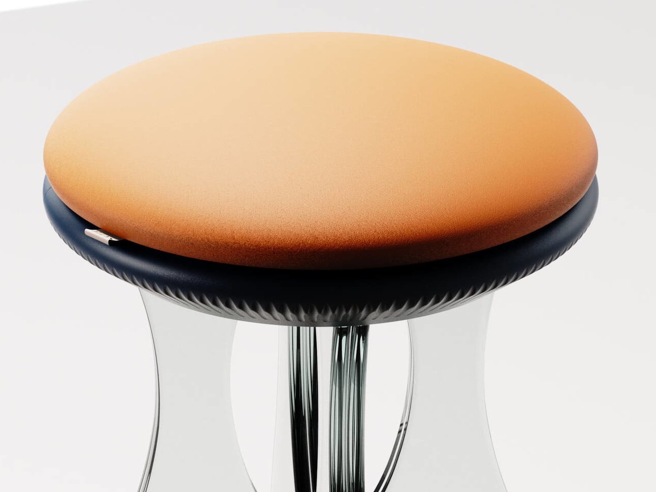
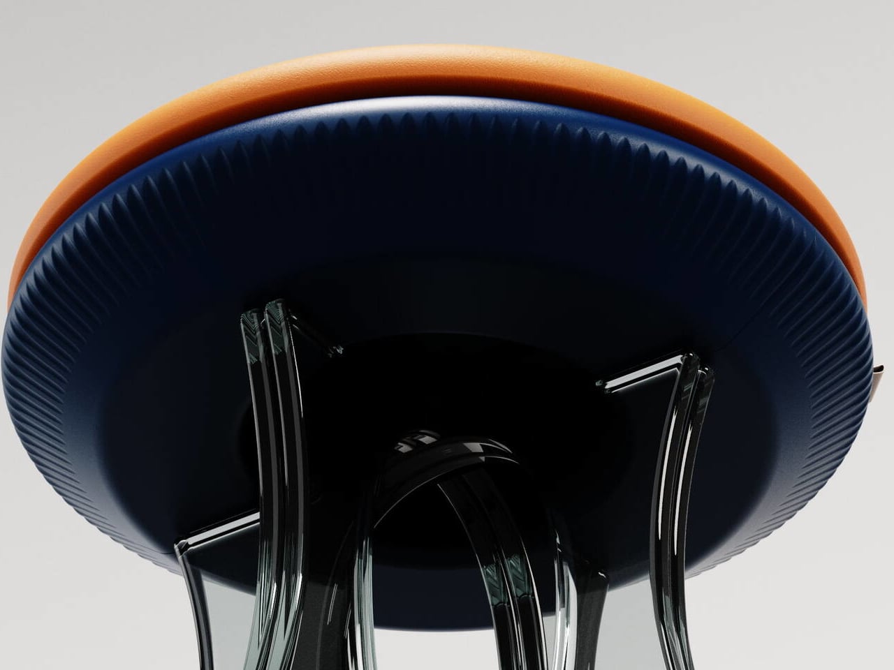
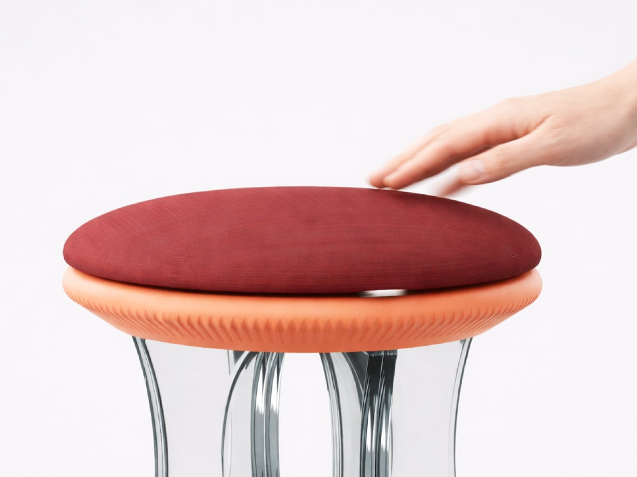
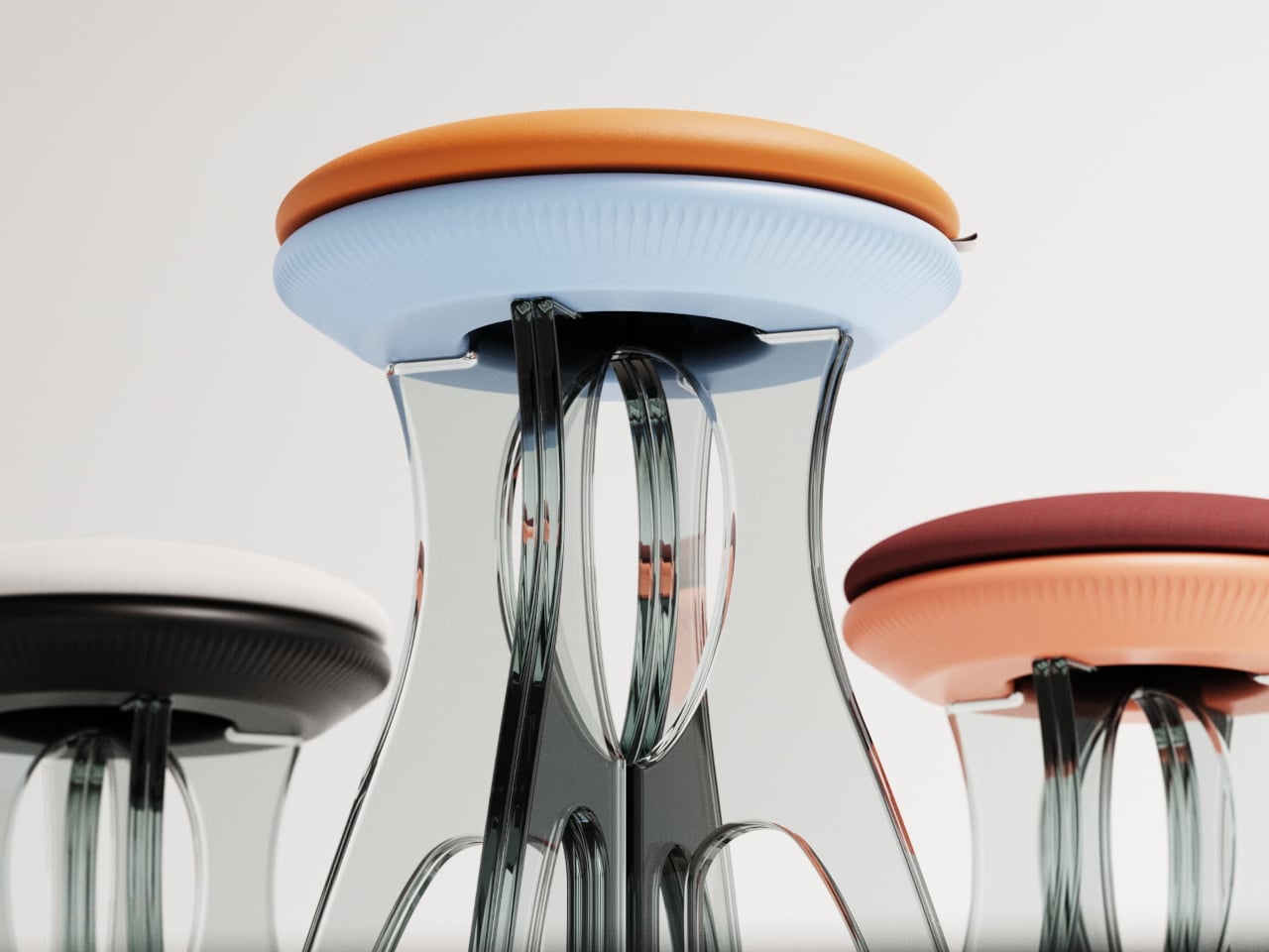
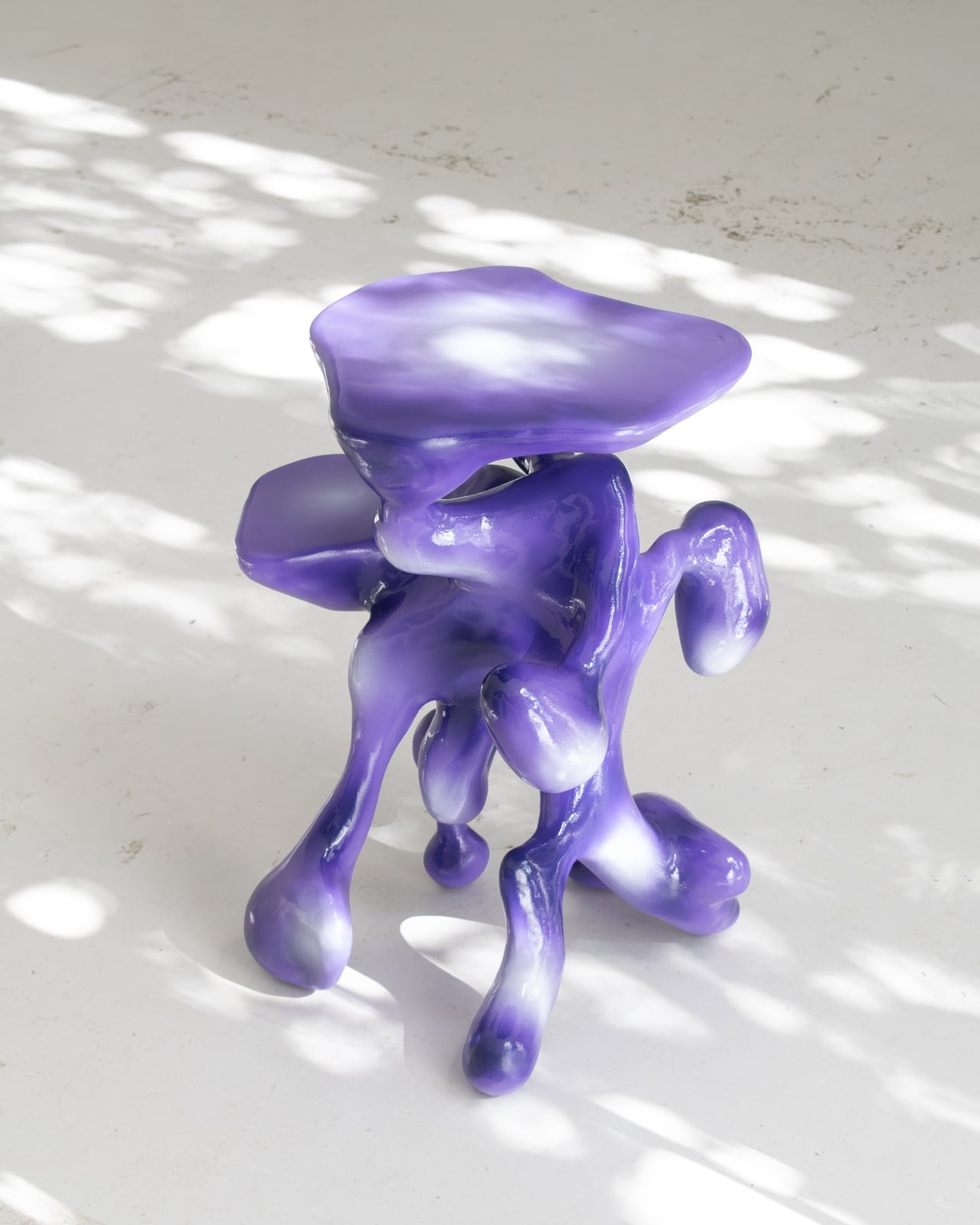
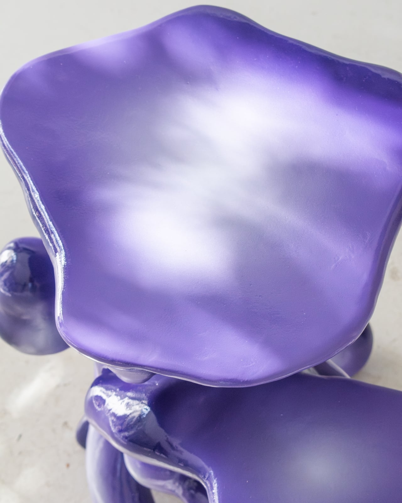
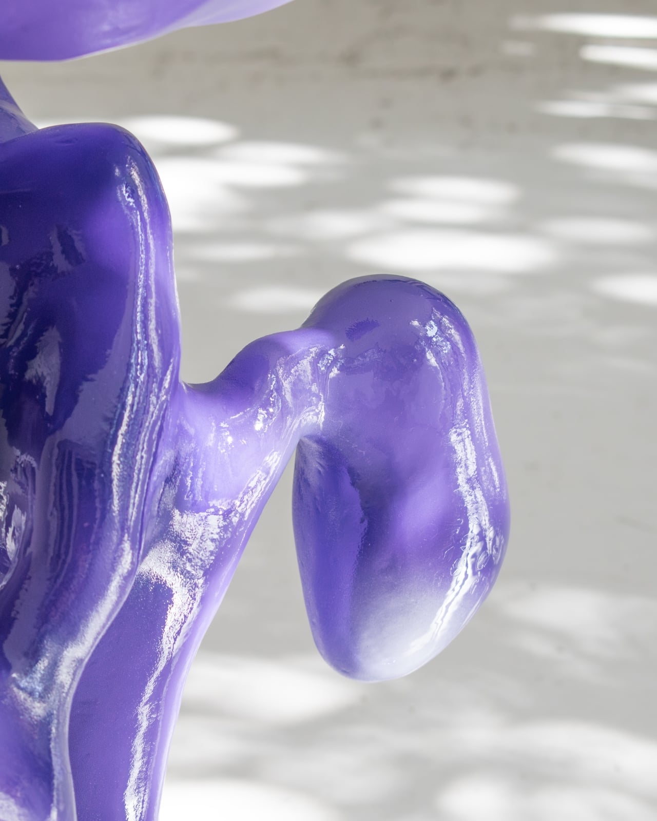
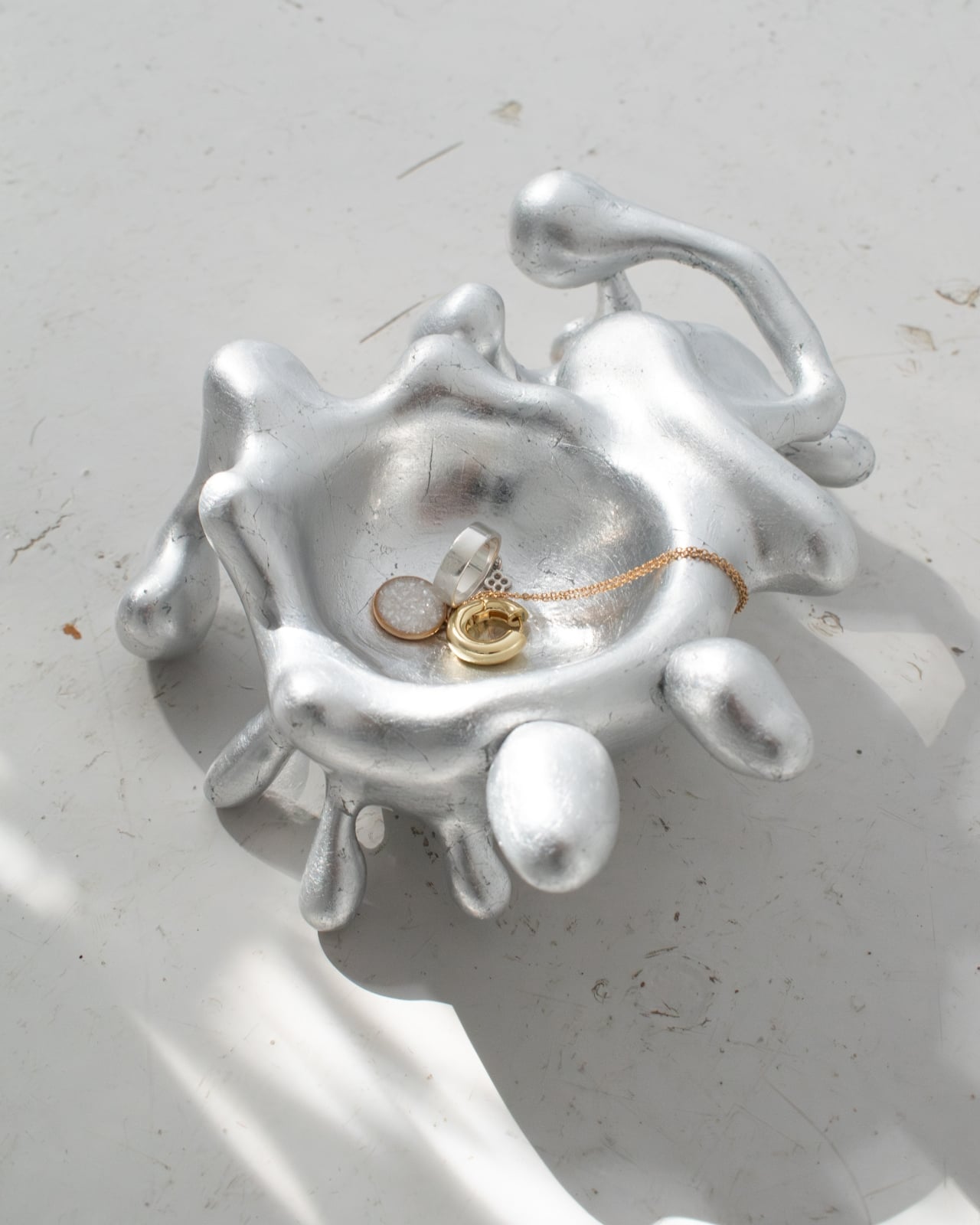
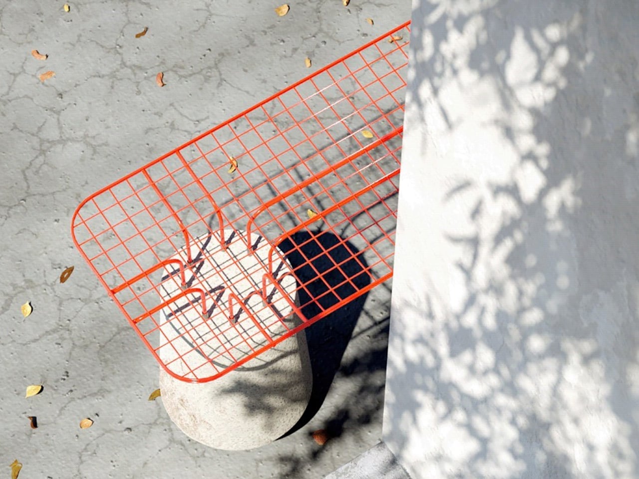
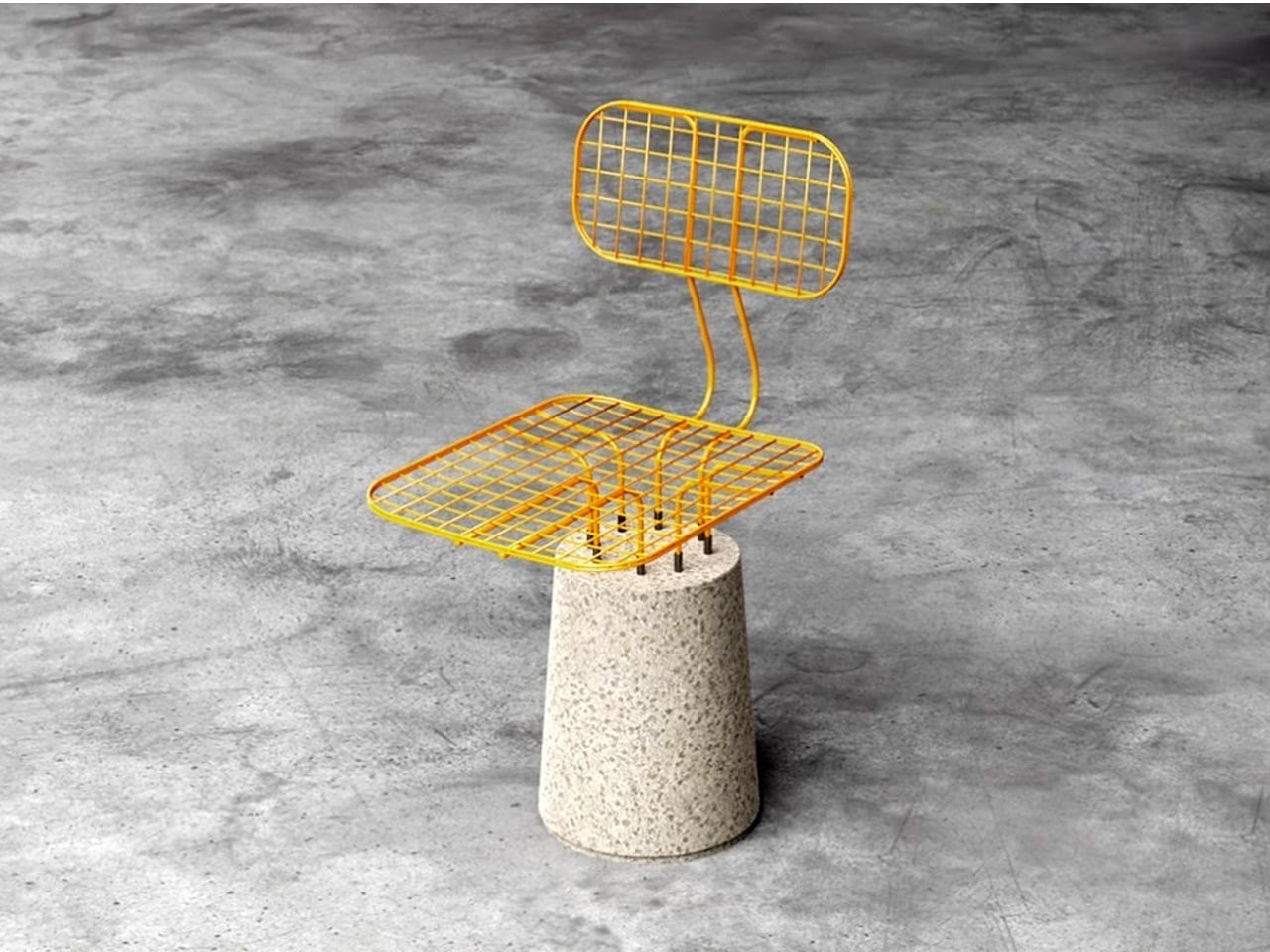
The CONECTO system reconsiders how concrete can function within outdoor furniture by using the material in a modular rather than static way. At first glance, the stool appears as a simple cylindrical form topped with a coloured acrylic surface. In reality, the base consists of two half-cylinders joined along their flat sides, allowing each segment to be repositioned and combined with others. This modular approach enables multiple configurations: a single unit as a compact stool, two halves arranged to support a square top, or extended arrangements that create elongated seating. When three full cylinders are grouped, the system forms a triangular bench suitable for multiple users.

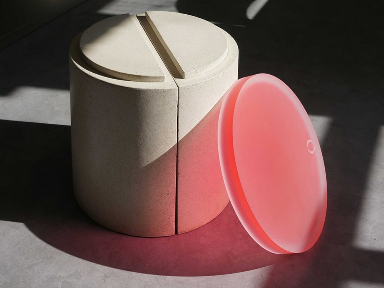
Acrylic plays a functional and visual role, acting as the connector between concrete elements while adding colour and translucency that contrast with the raw, tactile base. The design’s aesthetic merges minimalism with a subtle brutalist influence, resulting in a visually engaging outdoor piece. Developed in high-strength UHPC concrete, the system also incorporates sustainable intent, with future versions planned to integrate recycled materials for enhanced environmental performance.

4. Timeless Design Value

Soft Brutalism positions concrete furniture as a long-term investment rather than a trend-driven purchase. For high-net-worth homeowners, its appeal lies in permanence: pieces built to endure physically and aesthetically. When treated and sealed correctly, concrete becomes exceptionally durable, resisting wear and retaining its visual integrity for decades, making longevity itself a form of luxury.

Choosing locally cast, high-quality concrete also reduces carbon footprint and supports regional craftsmanship. These pieces are conceived as future heirlooms that are robust, architectural, and timeless enough to remain relevant across shifting styles. Their lasting presence offers both emotional and material return on investment.

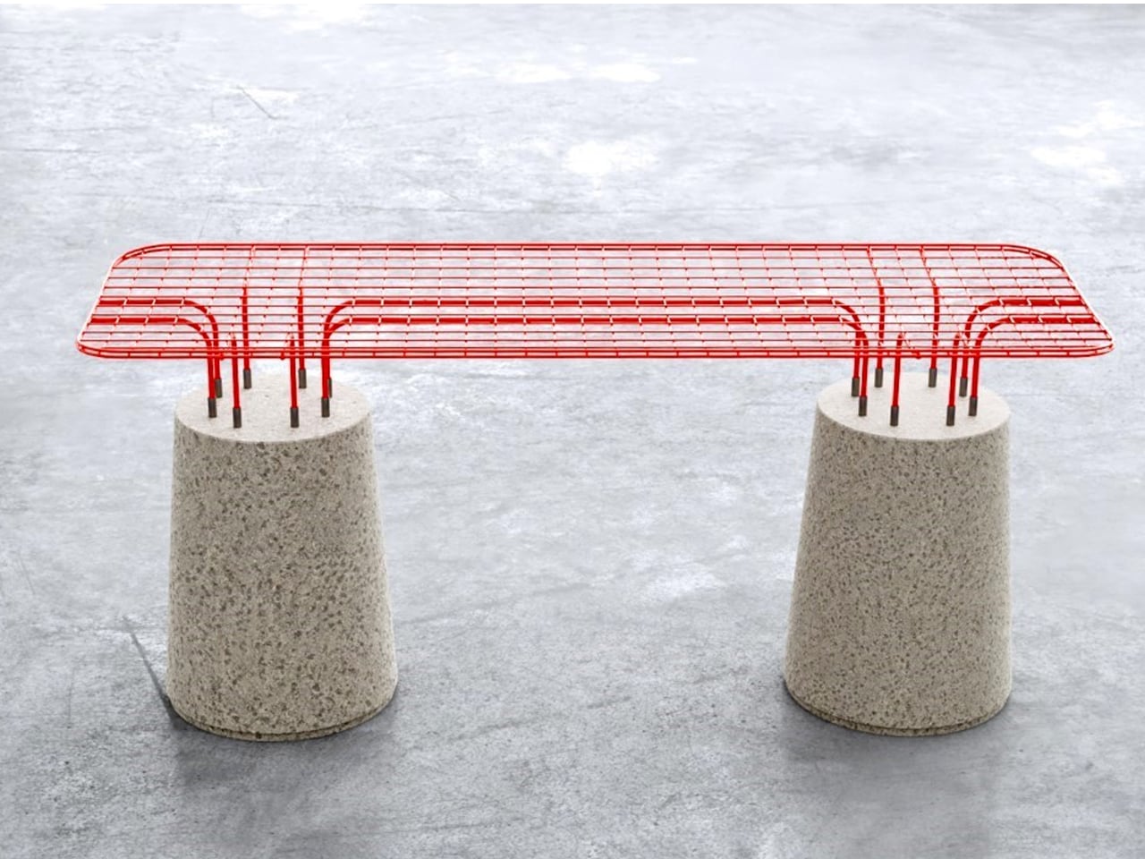
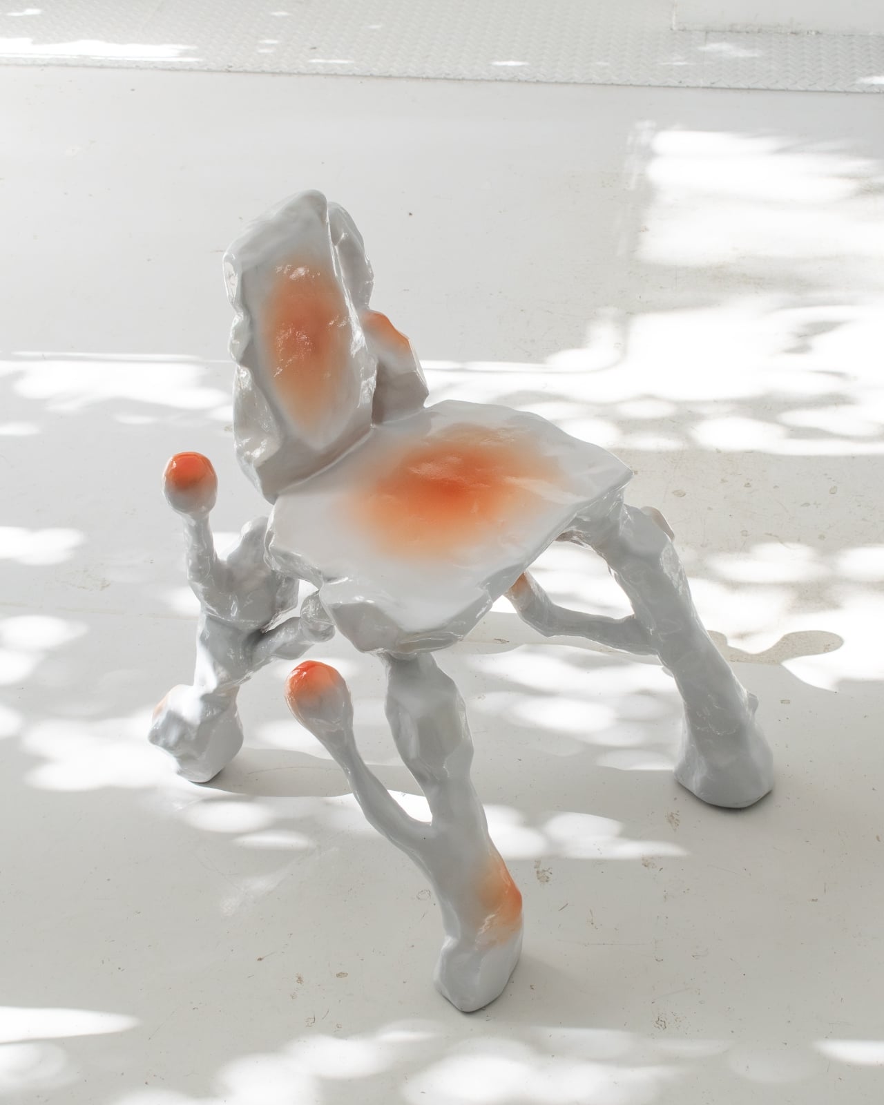
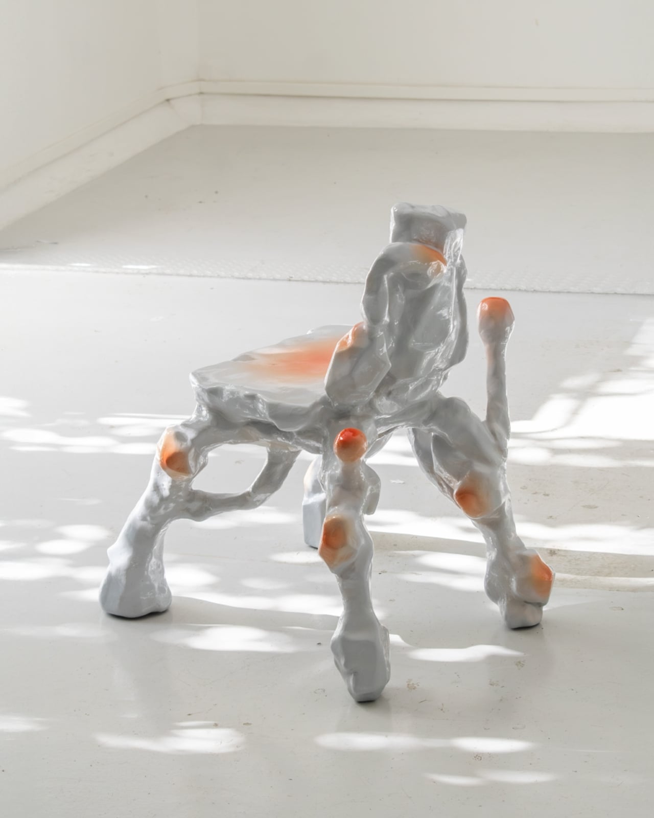
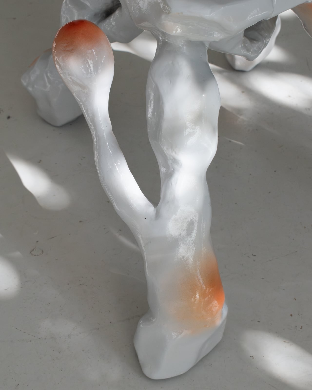
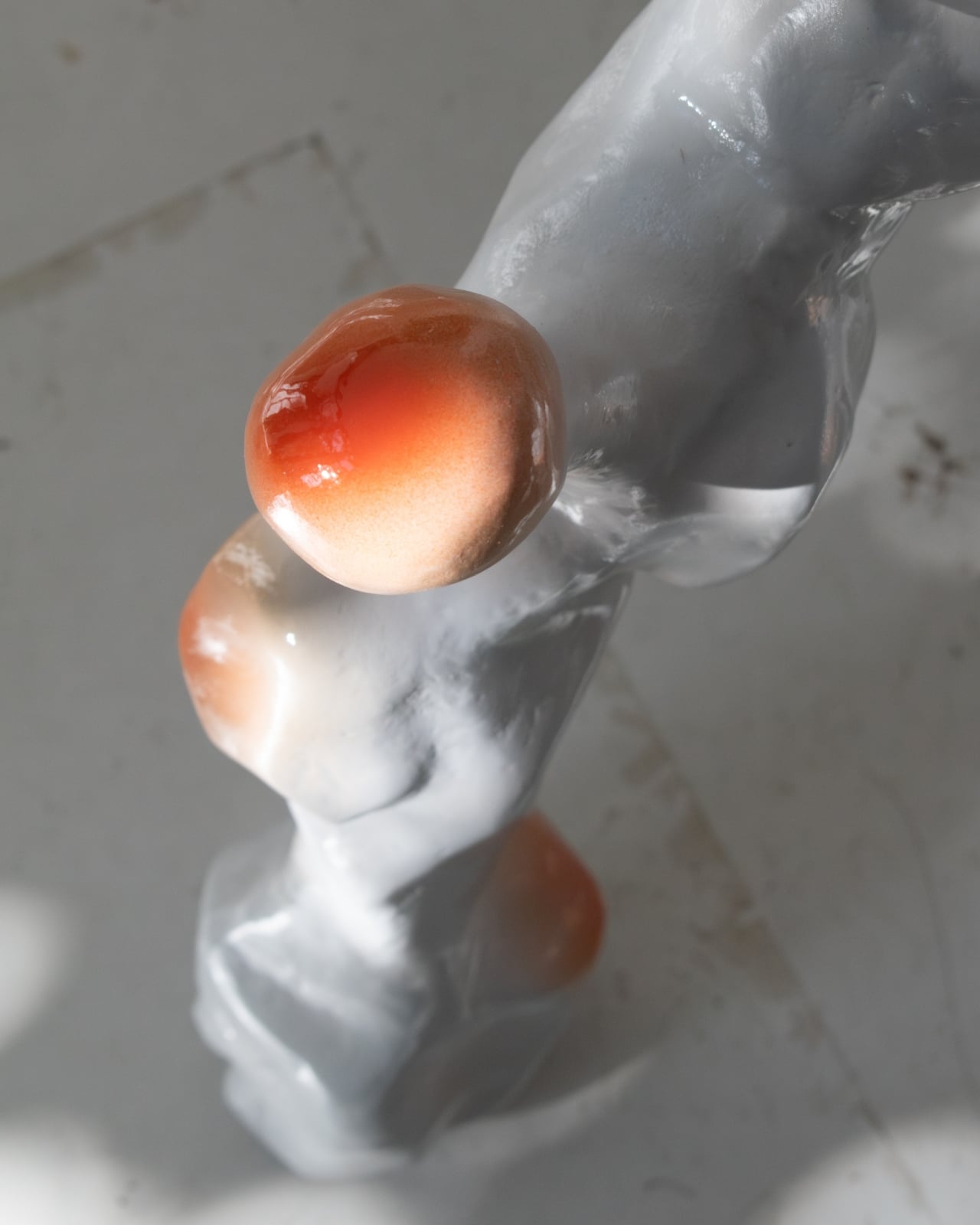
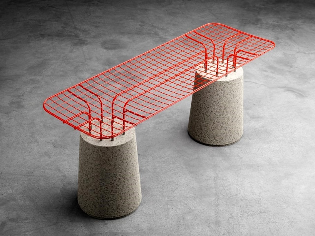
The MESH seating series explores contrast through form, material, and colour. Each piece pairs a solid tapered concrete base with a lightweight powder-coated metal wireframe, creating a striking balance between heaviness and visual transparency. The concrete element grounds the design with a muted grey tone, while the vivid wireframe seat introduces colour and energy. This interplay gives the seating a sculptural presence suited to outdoor environments, where durability and weather resistance are essential. The combination of industrial materials also lends the pieces a distinctive character that merges playful expression with a subtle nod to brutalist design.

Construction remains deliberately simple. The wireframe upper plugs directly into the concrete base, producing a secure structure that is both functional and visually refined. The open metal pattern casts dynamic shadows that enhance the aesthetic appeal, while the ergonomically shaped seat offers unexpected comfort despite its materials. With its bold silhouette and vibrant finishes, the MESH series stands out as a practical yet artistic outdoor seating solution.

5. Concrete as Spatial Architecture

In Soft Brutalism, furniture functions as micro-architecture, shaping the home’s spatial rhythm rather than merely occupying it. Monolithic pieces like concrete dining tables or consoles become purposeful anchor points, establishing stability and directing how movement and energy flow through the room. Their presence offers both visual weight and emotional grounding.

These elements also echo the architectural philosophy of the space, emphasizing honesty, material integrity, and substance over ornamentation. For those mindful of Vastu principles, the natural weight and earth-derived composition of concrete enhance grounding and positive spatial energy, reinforcing harmony and stability within the home’s overall design.

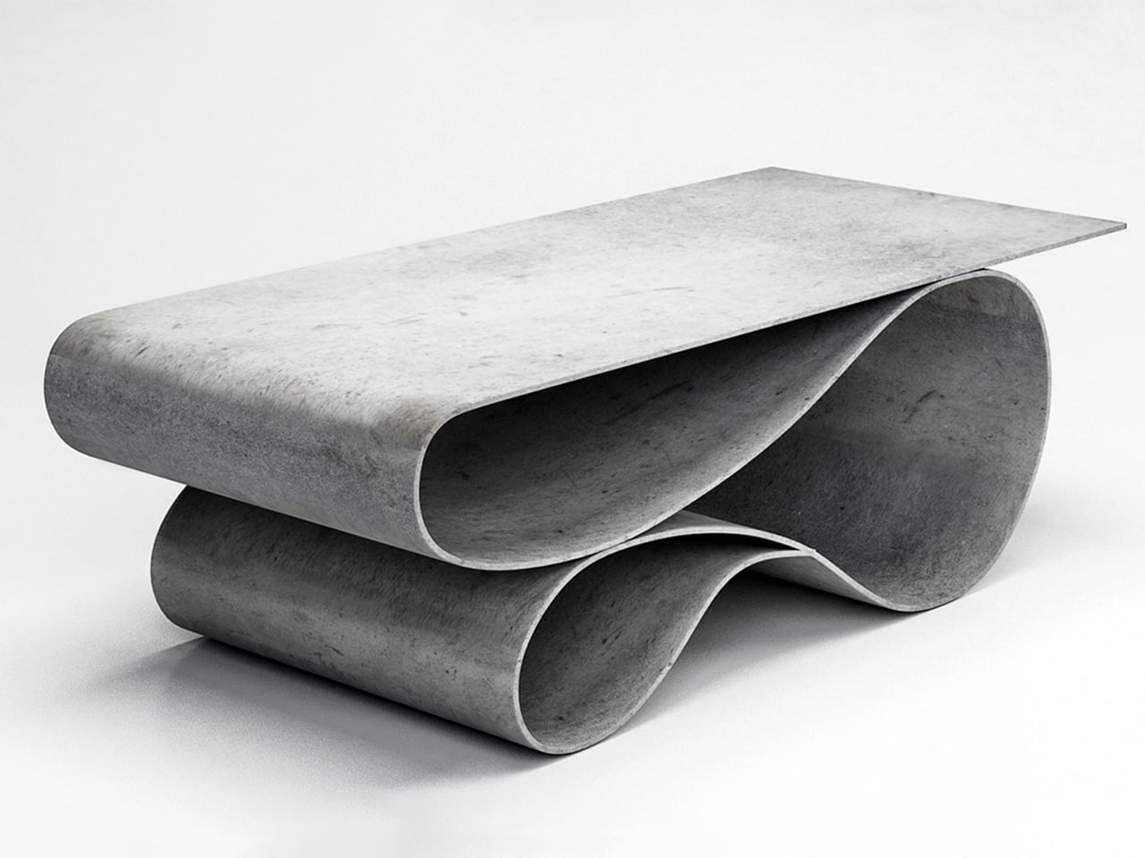
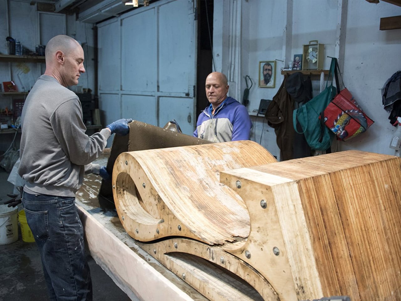
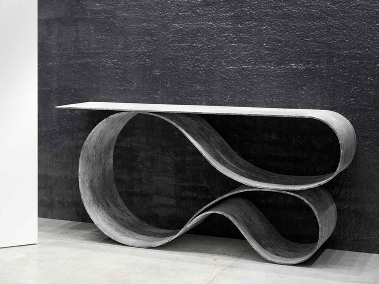
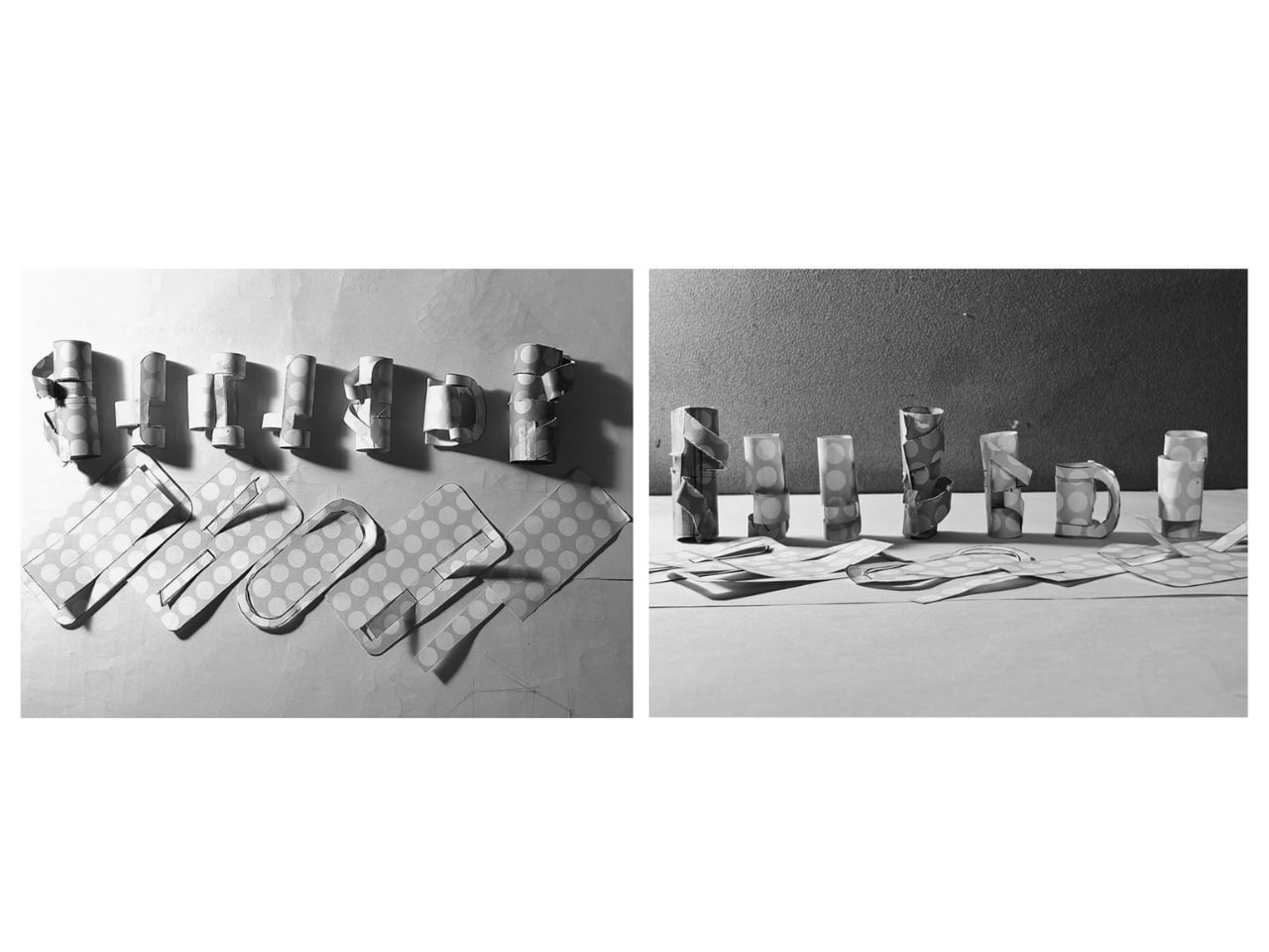
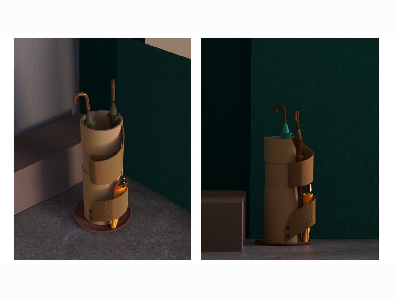
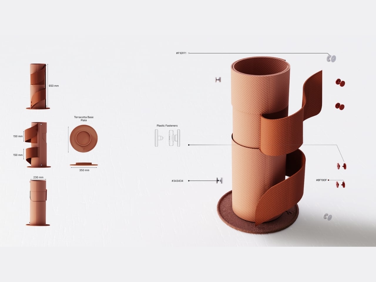
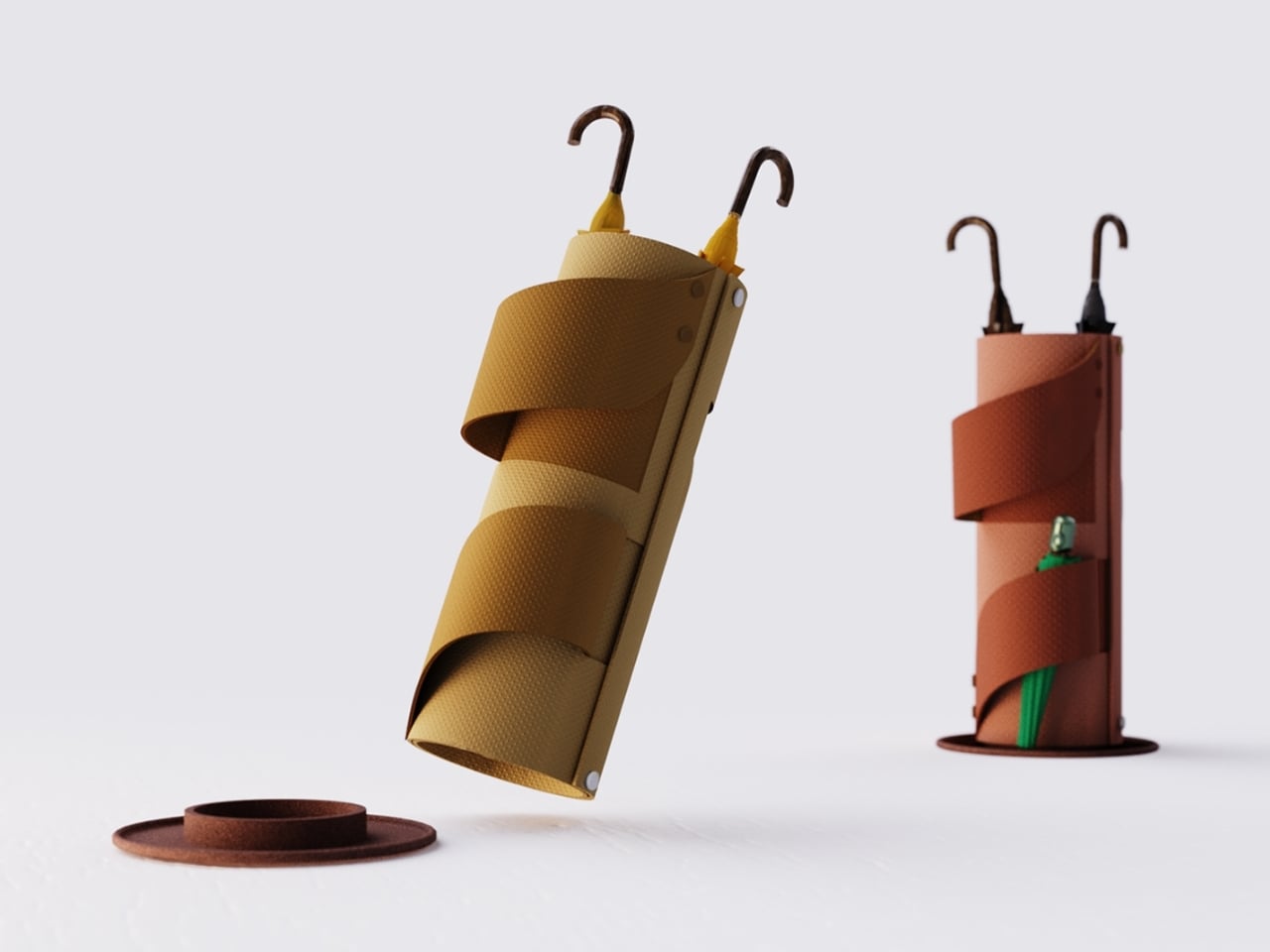
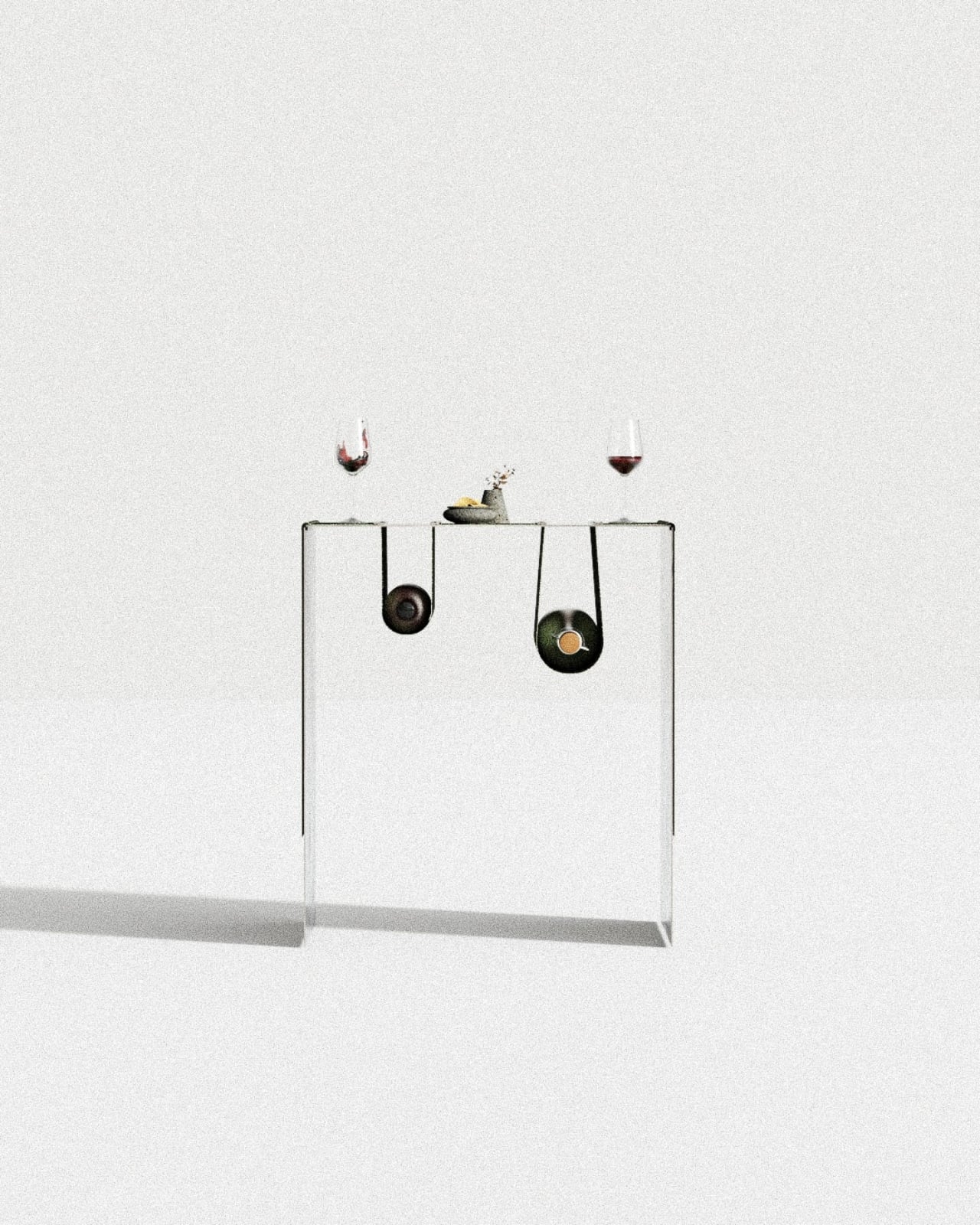
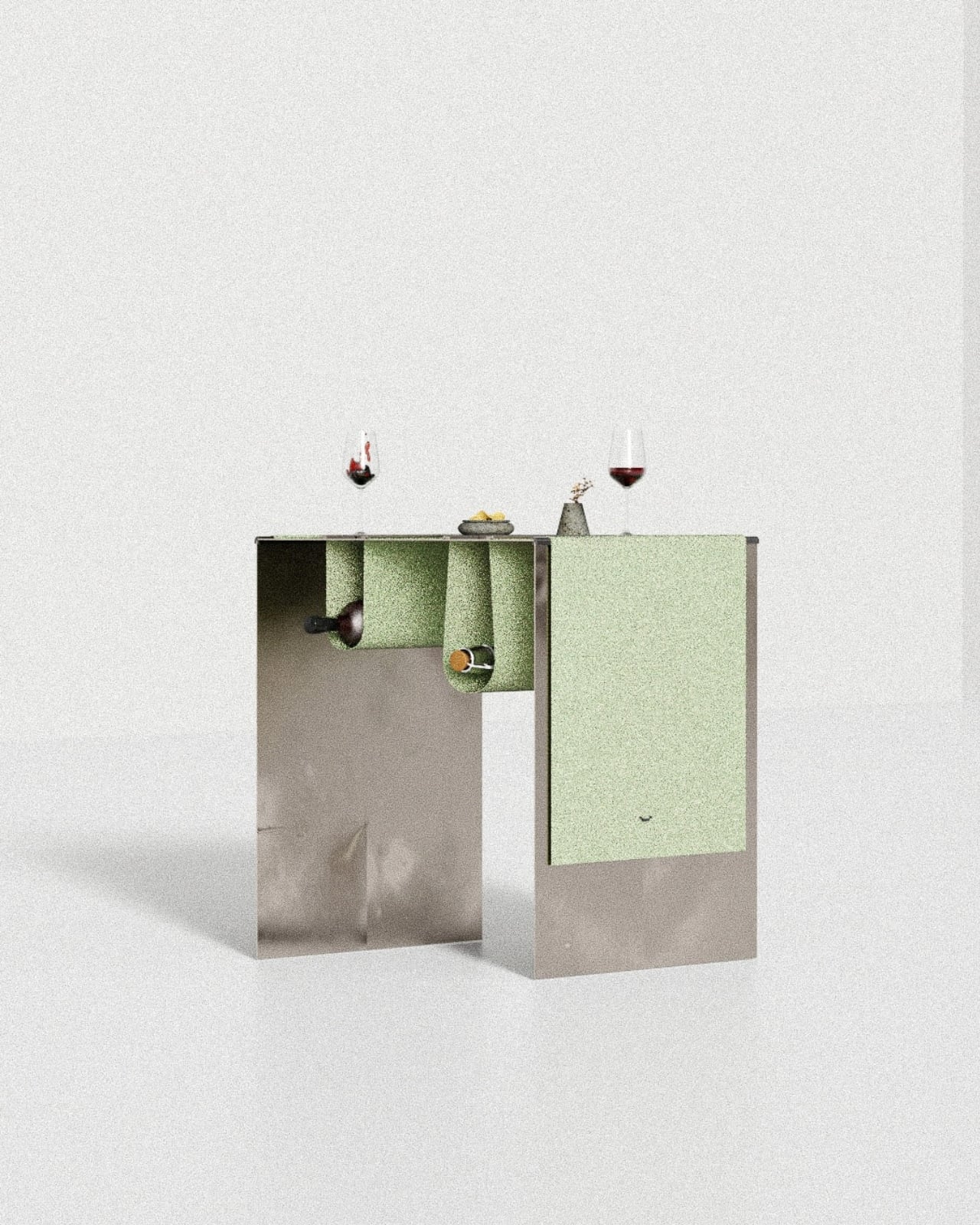
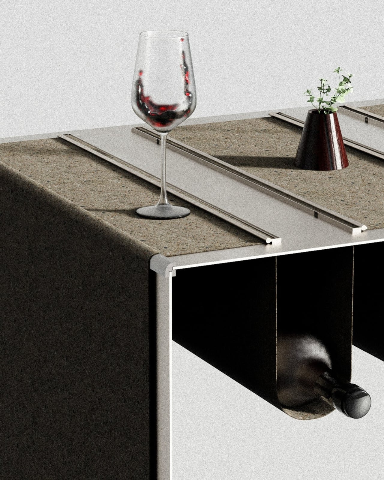
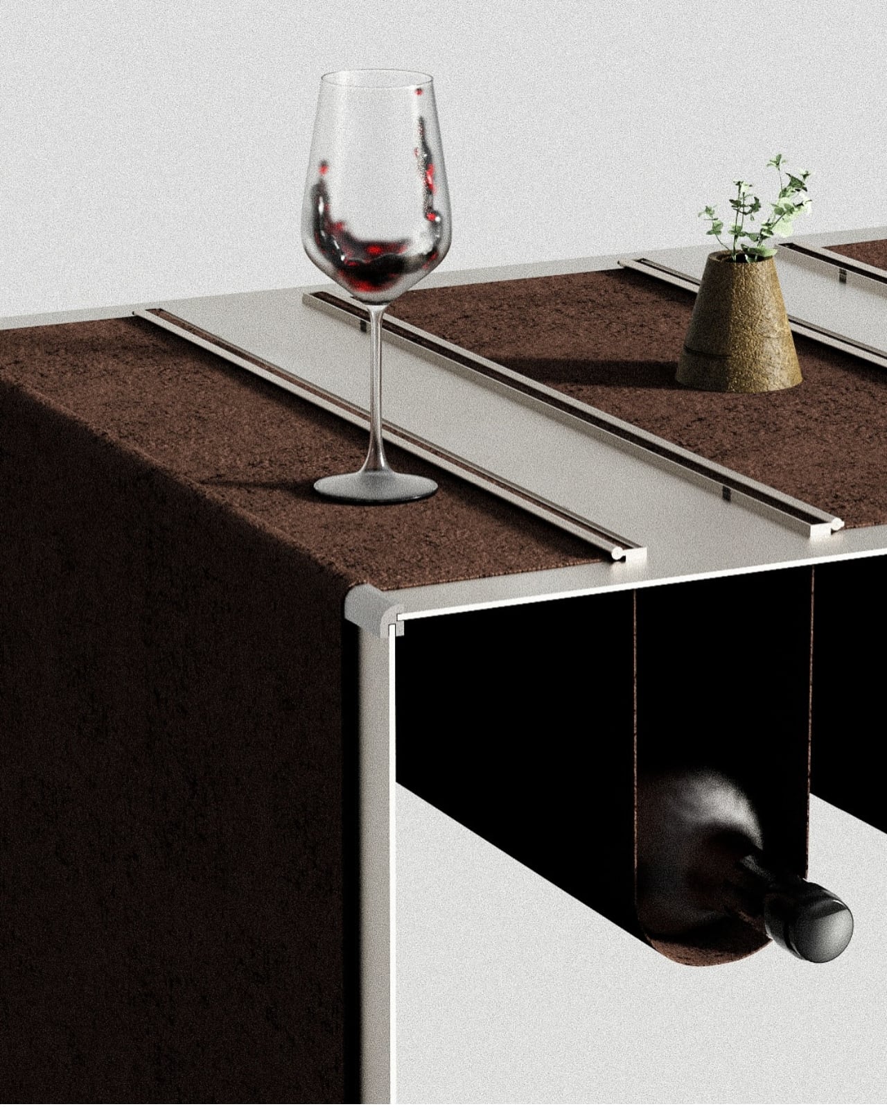
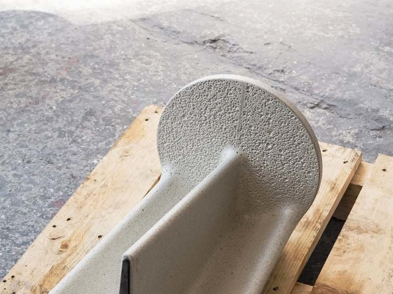
Designer Neil Aronowitz reimagines concrete through an innovative material called Concrete Canvas – a flexible, waterproof, fabric-and-cement composite developed by the UK company Concrete Canvas. By manipulating this thin, durable “concrete cloth,” he created a furniture series that highlights concrete’s unexpected fluidity. The collection includes the Whorl Console, Whorl Table, and Enso Table, each formed by stretching the concrete cloth over sculptural molds before it cures into a rigid, lightweight shell. Aronowitz developed custom casting and shaping techniques to achieve these complex geometries, using the material’s structural properties to shift concrete from a dense, static medium to one that appears almost weightless.

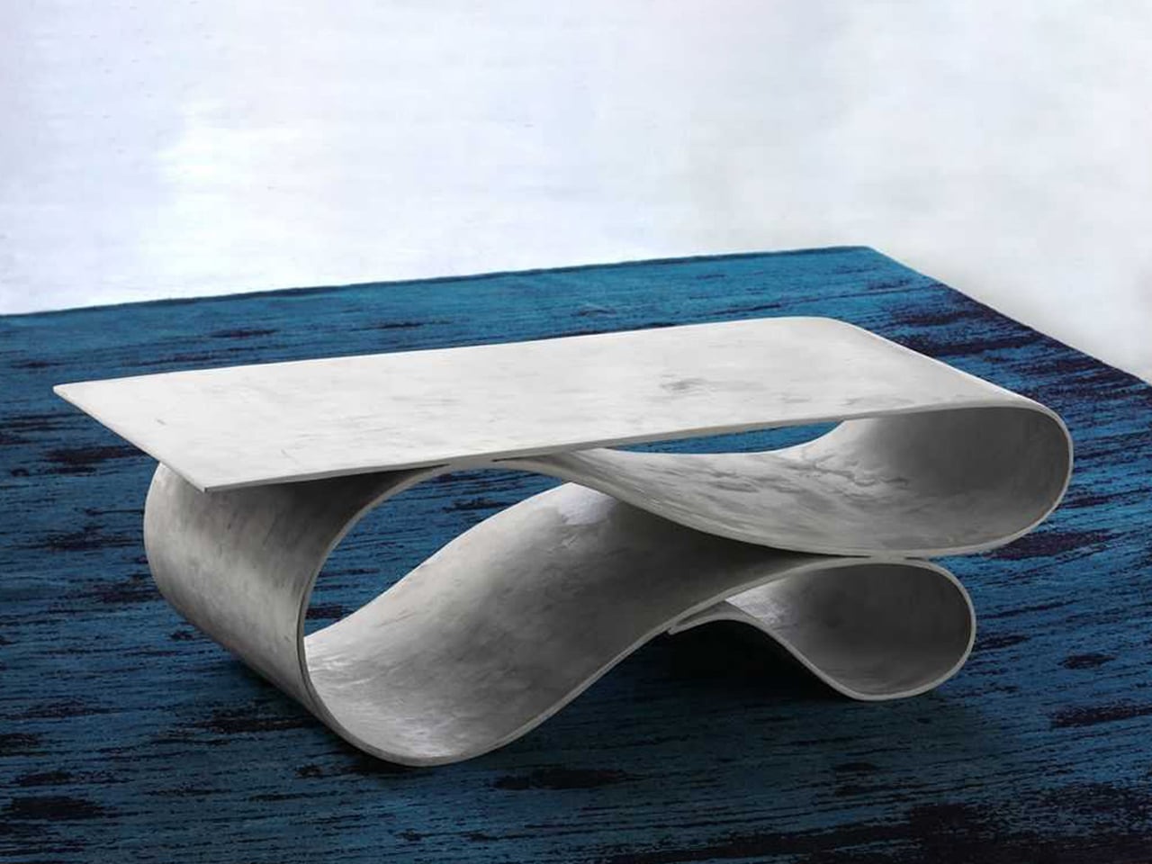
The Whorl pieces, with their ribbon-like curves, balance function with sculptural presence and feature smooth, pigmented cement surfaces that echo Japanese minimalism. The Enso Table continues this language with a form inspired by the single brushstroke of traditional ink paintings. Wall-mounted and restrained in expression, it complements the collection’s emphasis on fluid lines and quiet, crafted elegance.

Soft Brutalism in concrete furniture represents more than an aesthetic, as it expresses a modern interior philosophy rooted in authenticity and permanence. By softening form and elevating texture, it transforms a primal material into one of warmth, light, and calm. Here, true luxury emerges from integrity and the quiet harmony between nature’s rawness and human craftsmanship.

The post Concrete Furniture Just Got Soft: 5 Designs That Feel Like Art first appeared on Yanko Design.

This Hemp Room Divider Looks Like Art You Can Actually Use

There’s something about a really good room divider that just makes sense. It’s like the furniture equivalent of a Swiss Army knife: part privacy screen, part statement piece, part space definer. But most dividers we see today are either clunky corporate leftovers or flimsy fabric panels that look like they belong in a college dorm. Enter the Breeze Divider by sa rina, and suddenly the conversation gets a whole lot more interesting.

At first glance, this piece looks like it escaped from a modern art gallery. Those circular, fan-shaped panels arranged in an organic pattern? They’re giving sculptural installation vibes. But here’s where things get really cool: this isn’t just another pretty piece of furniture that sacrifices function for form. The Breeze Divider is made entirely from natural hat-making hemp fabric, and every single component can be taken apart.

Designer: sa rina

Yes, you read that right. Hat-making hemp. It’s one of those materials that sounds both ancient and impossibly trendy at the same time, and honestly, that’s exactly what makes it perfect for this project. The fabric has this gorgeous translucent quality that reminds you of sunlight filtering through overlapping leaves. When you layer the panels, you get this depth and dimensionality that changes depending on where you’re standing and how the light hits it. It’s moody, it’s textured, and it’s way more visually interesting than your standard office partition.

But let’s talk about what really sets this design apart: the sustainability angle. We’re living in an era where “eco-friendly” gets slapped on everything, often with little substance behind it. The Breeze Divider actually walks the walk. Because everything detaches completely, the whole thing can be packed flat, which means significantly lower shipping costs and a smaller carbon footprint. It’s the IKEA philosophy taken to its logical, more elegant conclusion.

And here’s where the design gets genuinely smart: those fan-shaped panels aren’t just decorative. You can configure them however you need, creating different patterns and formations based on your space. Need a tall barrier for maximum privacy? Stack them high. Want something more open and airy? Keep it low and spread out. The adjustable height means you’re not locked into one look forever, which is kind of revolutionary when you think about how static most furniture is.

The translucency of the hemp fabric also serves a practical purpose beyond looking beautiful. Unlike solid dividers that block everything out and make spaces feel dark and cramped, the Breeze lets light and air flow through. It creates separation without isolation, privacy without stuffiness. In our post-pandemic world where so many of us are rethinking how we use our spaces (home offices, anyone?), this kind of flexible, breathable design feels incredibly relevant.

There’s also something refreshing about seeing traditional materials used in contemporary ways. Hemp has been around forever, used in everything from rope to clothing to, yes, hat-making. But here it’s been reimagined as this sophisticated, architectural element. It’s a reminder that innovation doesn’t always mean inventing something completely new. Sometimes it’s about looking at what’s already there and asking, “What else could this be?” The monochromatic black palette keeps things sophisticated and versatile. This isn’t a piece that’s going to clash with your existing aesthetic or feel dated in five years. It’s got that timeless quality that good design should have, where you can imagine it fitting just as easily into a minimalist loft as a bohemian studio or a sleek corporate space.

The Breeze Divider recently won recognition at the International Design Awards, which makes total sense. It’s exactly the kind of thoughtful, multi-functional, sustainable design that deserves attention. In a world overflowing with stuff, it’s nice to see something that actually earns its place in your space, both functionally and aesthetically. This is what happens when designers really think about the entire lifecycle of a product, from materials to shipping to how it actually gets used in real life. The result is furniture that feels less like an object you own and more like a tool that adapts to your needs. And honestly? That’s the kind of design we need more of.

The post This Hemp Room Divider Looks Like Art You Can Actually Use first appeared on Yanko Design.

Furniture That Dances: The Moon Series Reimagines Seating

There’s something almost poetic about furniture that moves. Not in the literal sense, but in the way it invites you to play, rearrange, and reimagine your space. The Moon Series from Craft of Both and MADE does exactly that, and honestly, it’s one of the most captivating furniture concepts I’ve seen in a while.

Picture this: a chair that unfolds like a Chinese paper fan, its pleated form spreading out in a graceful arc. That’s the essence of the Moon Series, designed by Christina Standaloft and Jay Jordan. The collection features two core pieces, the Moon Chair at 60 degrees and the Moon Bench at 120 degrees, both built on radial geometry that gives them this incredibly sculptural quality.

Designers: Christina Standaloft, Jay Jordan

What makes these pieces special isn’t just how they look (though they’re absolutely stunning). It’s how they work. The designers describe the interaction as a “meditative fan dance,” which might sound a bit flowery until you actually see someone adjusting the modules. There’s something genuinely calming about sliding those pleated panels along the wooden framework, customizing the backrest to exactly how you want it. It’s tactile design at its finest.

The modularity here goes way beyond what we usually see in flexible furniture. Each piece can be constantly redefined, changing both its physical form and the amount of space it occupies. Want more privacy? Add modules. Need a more open feel? Remove some. The radial structure means every adjustment changes not just comfort but the entire aesthetic of the piece.

But here’s where it gets really interesting. When you start combining multiple Moon Chairs or Benches together, you’re essentially creating sculptural landscapes in your living space. The arrangement of those fan-like elements determines everything: how the pieces orient toward each other, how much privacy each seating area has, the comfort level, and the overall visual impact. It’s like being handed a set of beautiful building blocks and being told to go wild.

The technical execution is impressive too. Those 60-degree and 120-degree angles aren’t arbitrary. They’re precisely calculated to allow the pieces to connect and configure in multiple ways. A full circle is 360 degrees, so you could theoretically arrange six Moon Chairs or three Moon Benches to create a complete circular seating area. Mix and match them, and the possibilities multiply exponentially.

What strikes me most about the Moon Series is how it bridges Eastern and Western design sensibilities. The inspiration from Chinese paper fans brings this delicate, almost ceremonial quality to the pieces. Yet the execution feels very contemporary, with clean lines and that minimalist aesthetic we’ve come to associate with modern Scandinavian or Japanese design. The wooden slats radiate outward like sunbeams, and those pleated paper or fabric panels catch the light beautifully.

There’s also something refreshingly honest about the design. You can see exactly how it works. The structure is exposed, the modularity is obvious, and the craftsmanship is on full display. In an era where so much furniture hides its mechanics behind upholstery and veneers, this transparency feels almost rebellious. From a practical standpoint, this kind of modular system makes a lot of sense for how we actually live today. Smaller spaces, frequent moves, evolving needs… furniture that can adapt alongside us isn’t just clever, it’s necessary. But the Moon Series doesn’t sacrifice beauty for function. If anything, the functionality enhances the beauty.

The partnership between Craft of Both and MADE brings together thoughtful design philosophy with production expertise, and it shows. These aren’t concept pieces that will never make it past the design blog circuit. They’re real, functional furniture that you could actually live with. I keep coming back to those images of someone adjusting the fan modules, their hands gently pulling the pleated material into place. There’s an intimacy there, a personal relationship between user and object that most furniture just doesn’t offer. Your Moon Chair becomes uniquely yours through how you configure it, day by day, mood by mood.

The Moon Series offers something different when we’re used to flat-pack sameness. It’s furniture that invites participation, rewards creativity, and somehow manages to be both statement piece and practical seating. That’s not an easy balance to strike, but Standaloft and Jordan have done it with grace.

The post Furniture That Dances: The Moon Series Reimagines Seating first appeared on Yanko Design.