Exit 8 is cinema for the livestreaming era

The rules of Exit 8, both the cult indie game and the recent film adaptation, are simple: You're stuck in a subway station that loops around endlessly. If you notice any anomalies on your current loop, you turn around. If everything is the same, you keep going forward. Each successful guess takes you to a new entrance where the loop recurs, until you reach the end of the labyrinth, Exit 8 itself. 

It's a setup that perfectly suits a first-person video game, where you can fully control where your character looks and moves. And it's also something director Genki Kawamura deftly replicates in the film through long tracking shots and sweeping camera movements. Even without a controller, or a keyboard and mouse, the viewer remains immersed, looking and listening for any minor changes. Within just a few minutes, the film makes it clear it's not just another thoughtless video game adaptation like The Mario Galaxy Movie — it's an attempt to translate the experience of the game to an entirely new medium.

That's a daunting challenge for most artists, but Kawamura is no stranger to jumping between formats. He's known for producing popular anime films from the likes of Makoto Shinkai and Mamoru Hosoda, including Your Name and Belle. He's also made a name for himself as a best-selling author, with books including the novelization of Exit 8.

Kawamura's perspective for the film came from a conversation with Nintendo's legendary game designer Shigeru Miyamoto, who had mentioned that the greatest games are both fun for the players and people watching them. "So what I tried to do in the film is to really place the audience in the shoes of the player in certain shots... almost like they were watching a live stream of a video game in other scenes," he said in an interview with Engadget (via a translator). "That's kind of structurally the through-line of the film."

The Exit 8 adaptation balances that sense of immersion with a more traditional narrative structure, something the game lacked entirely. As the film begins, we're introduced to a young man standing in a crowded train. A drunken businessman shouts at a mother to quiet crying baby down. Instead of telling the belligerent salaryman to fuck off, the young man plugs in his earbuds and tries to ignore the situation, just like everyone else. He eventually steps off, while the tearful mother suffers through the verbal assault.

It's a scene that anyone who's lived in a crowded city can relate to — the moments where you know you should try to help a stranger, but fear, cowardice or embarrassment hold you back. 
Exit 8
Exit 8
NEON

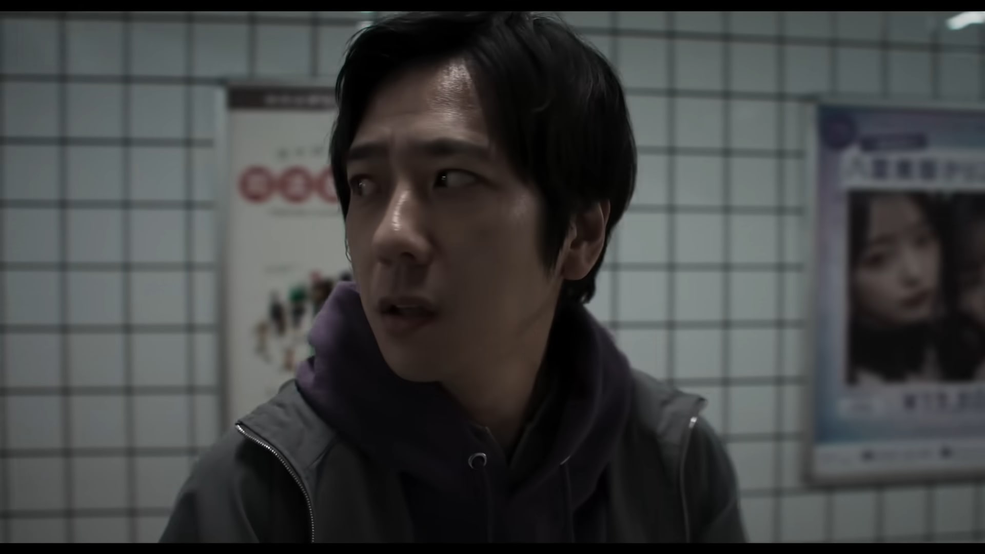
Shortly after receiving a call from his ex-girlfriend, who reveals that she's pregnant, the young man stumbles into the Exit 8 loop. At first, it's just a normal subway station, with large poster ads, a photo booth and random maintenance doors. But he quickly notices that the room repeats itself. Thanks to a helpful set of instructions on the wall, he learns that his only way out is to start tracking anomalies, like slight changes in text, or the way a robotic businessman walks past him. And yes, things get freaky quickly. 

Kawamura points to his experience working in animation as a major influence for Exit 8. In particular, the works of Satoshi Kon and Katsuhiro Otomo influenced how he externalized what characters were thinking and feeling, as well as how he depicted the interaction of dream and real worlds. 

" When we were filming, I told my DP [director of photography] that the main character of this film is the corridor," he said. "And all of our human characters, they have no names, so therefore they're NPCs in this corridor, which is the main character. So I wanted the corridor to almost evoke this feeling in the audience that it has a will of its own. And this yellow Exit 8 sign is almost like this divine God-like being."

Kawamura says he personally views it as the corridor challenging humans who have a guilty conscience, but you can easily read in other meanings. More importantly, Exit 8 isn't merely a faithful recreation of the source material — it adds enough to make a case for existing a separate medium, a challenge many video game adaptations fumble.

This article originally appeared on Engadget at https://www.engadget.com/entertainment/tv-movies/exit-8-is-cinema-for-the-livestreaming-era-151112907.html?src=rss
Anthropic now has a design assistant too

In hindsight, I suppose it was only a matter of time after Anthropic made Claude capable of generating charts and diagrams that the company would then begin offering a more robust image editor. Now, a little more than a month after that release, Anthropic has announced Claude Design, a new research preview that allows subscribers to use Claude to generate designs, prototypes, slides and more.  

"Claude Design gives designers room to explore widely and everyone else a way to produce visual work," Anthropic says of its newest product. As with its previous forays into image generation, the company isn't calling this, well, an image generator. Instead, Anthropic describes Opus 4.7, the system powering the app, as its most capable vision model to date. In other words, you won't be using Claude Design to whip up a picture of a cat in space eating a lasagna.  

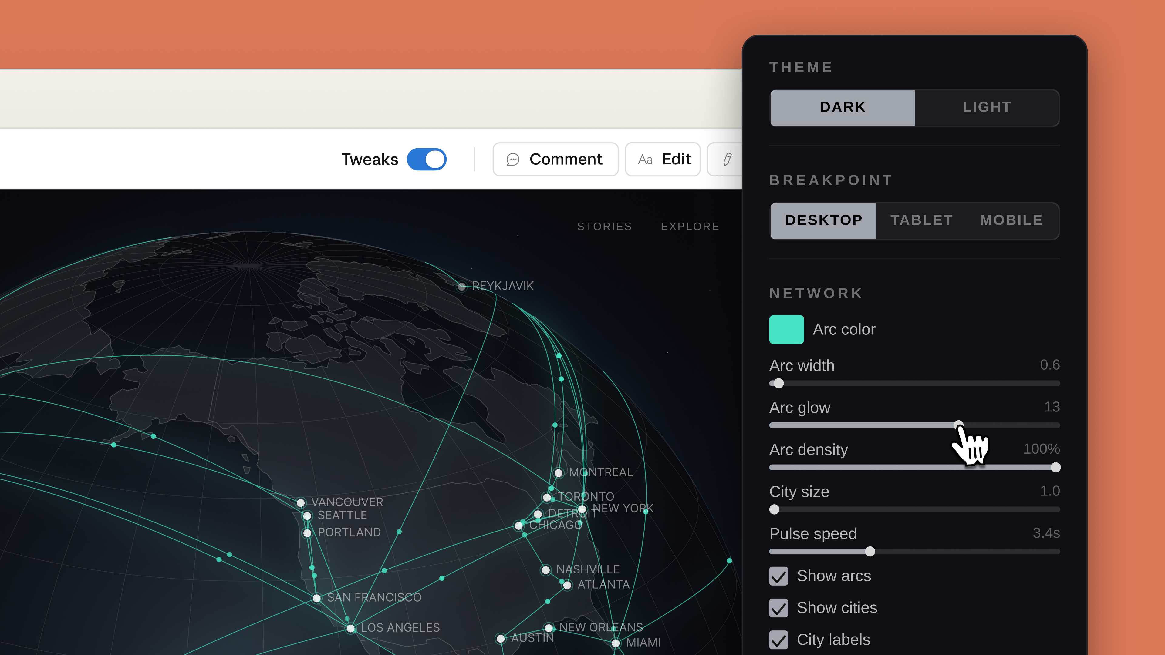
As you might expect, every project in Claude Design starts with a prompt. From there, Anthropic notes users can refine Claude's outputs through conversation, inline comments and direct edits. Like Adobe's recently announced AI assistant, Claude will also generate custom sliders that correspond to specific elements in a design, which the user can push and pull to modify those elements. For instance, in the screenshot below, you can see how Claude has tweaked the interface to allow the user to adjust the glow and density of arcs it used to illustrate a connected network.

Claude Design will generate custom sliders you can use to adjust specific visual elements.
Anthropic

Anthropic has also built an onboarding process that allows Claude to build an internal visual language after reading your organization's codebase and existing design documents. "Every project after that uses your colors, typography, and comments automatically," according to the company. Outside of text prompts, there's also support for image and document uploads, and Anthropic has even included a web capture tool so enterprise customers can snapshot elements from their company's website. There's also built-in sharing, and you can export a design directly to Claude Code. In the coming weeks, Anthropic has promised to make it easier to build integrations with its new app. 

Claude Design arrives in the same week that both Adobe and Canva released their own visual AI assistants. If Anthropic is preparing to eat Canva’s lunch, it's doing so in a strange way given that you can export your Claude Design projects to Canva. If you want to try the new app for yourself, it's available as part of Anthropic's Pro, Max, Team and Enterprise subscriptions, with usage running up against your usage limits.

This article originally appeared on Engadget at https://www.engadget.com/ai/anthropic-now-has-a-design-assistant-too-150000903.html?src=rss

Roblox agrees to a $12 million settlement with Nevada

Amidst ongoing legal trouble with several states and more than 100 pending lawsuits, this week Roblox announced a $12 million settlement with Nevada, allowing the company to avoid going to trial in this case.

Following the agreement, Nevada Attorney General Aaron Ford said "this settlement will create a safer environment for our children online, and I hope that it will serve as a bellwether for how online interactive platforms allow our state's youth to use their products." As part of the deal, Roblox has agreed to give $10 million over three years to local children's support programs like the Boys and Girls Club and other nondigital groups while spending another $2.5 million to fund a law enforcement liaison position and awareness campaigns regarding online safety.

Additionally, Roblox will also implement more rigorous safety protocols including an age verification system that combines a facial age estimation system with government-issued IDs that will only allow children to talk with other players of a similar age. Furthermore, users under 16 will not be allowed to message adults unless they have been designated as a "trusted friend," which can be assigned via QR code. This is intended to ensure that any adults who talk to minors on the platform have an existing relationship with the child.

Parental controls will be available for accounts of users up to 16 years old (previously the limit was 13). The company says it will also create children's accounts for anyone under 16 that will restrict access to adult content and provide a list of games that have been vetted to be appropriate for younger players. These changes come after a recent update that established new guidelines for Roblox Kids accounts (for children between five and eight years old) and Roblox Select accounts (for children between nine and 15), which come with varying content and chat restrictions. 

However, while Roblox has settled with Nevada, the company is still facing a number of lawsuits from other parties and states including Kentucky, Iowa, Louisiana, Texas and more, regarding claims that the platform has knowingly facilitated child sexual exploitation.

This article originally appeared on Engadget at https://www.engadget.com/gaming/roblox-agrees-to-a-12-million-settlement-with-nevada-142842421.html?src=rss

Donut Lab’s battery claims reportedly subject of whistleblower complaint

Startup Donut Lab made a splash at the start of the year with some astonishing — and suspicious — claims about its solid state batteries. Now Finnish newspaper Helsingin Sanomat reports an individual has filed a criminal whistleblower complaint against the company over those claims.

Until recently, Lauri Peltola was listed as the Chief Commercial Officer at Nordic Nano — the firm reportedly contracted to handle portions of the manufacturing on Donut's behalf, and which Donut Lab has invested in. He reportedly filed a criminal complaint that Donut Lab’s promises of energy density and longevity have been overstated and that the company lacks the production capacity previously claimed.

HS suggests it has seen copies of internal communications between Donut Lab and two partner companies, CT-Coating and Nordic Nano. The paper says that CT-Coating’s first-generation battery is the one that Donut Lab has been advertising, and is the model it handed to Finnish national lab VTT to test. But, according to the emails viewed by HS, CT-Coating had abandoned development on that cell in favor of a one still in early development, despite Donut Lab’s claim in January that it had a technology ready to enter mass production.

Donut Lab CEO Marko Lehtimäki reportedly told HS he had no knowledge of Peltola’s complaint. Nordic Nano CEO Esa Parjanen, meanwhile, denied Peltola’s accusations, saying that his views were not shared by the company and that Peltola had no involvement with Nordic’s battery project. In a joint public statement Donut Lab and Nordic Nano stated they "do not know the exact nature of the complaint" but denied "having committed any crime or misleading investors." They also describe the complainant (presumably Peltola, though the statement does not name him) as not having "the necessary knowledge of battery technology or the overall picture of the development work."

This article originally appeared on Engadget at https://www.engadget.com/transportation/donut-labs-battery-claims-reportedly-subject-of-whistleblower-complaint-142133269.html?src=rss

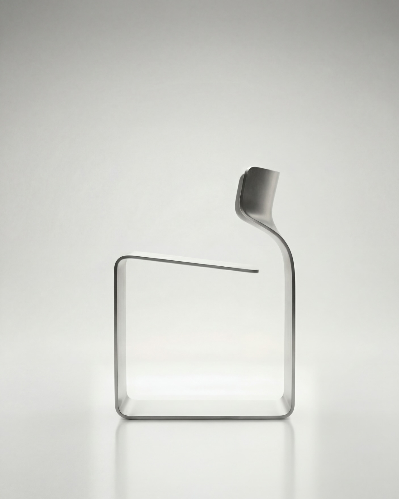
The ZERO Chair Has No Welds, No Joints, No Apologies

Most chairs are built on compromise. You stack the legs, screw the seat, bolt the back, and somewhere in that assembly, a little bit of the original idea gets lost to the necessity of structure. Davide Bozzo’s ZERO Chair refuses to play that game entirely.

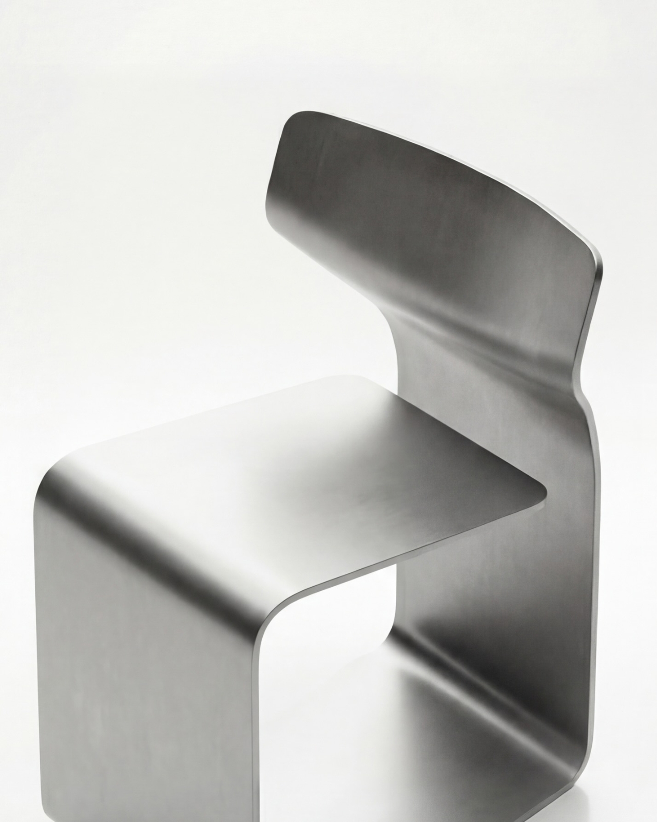
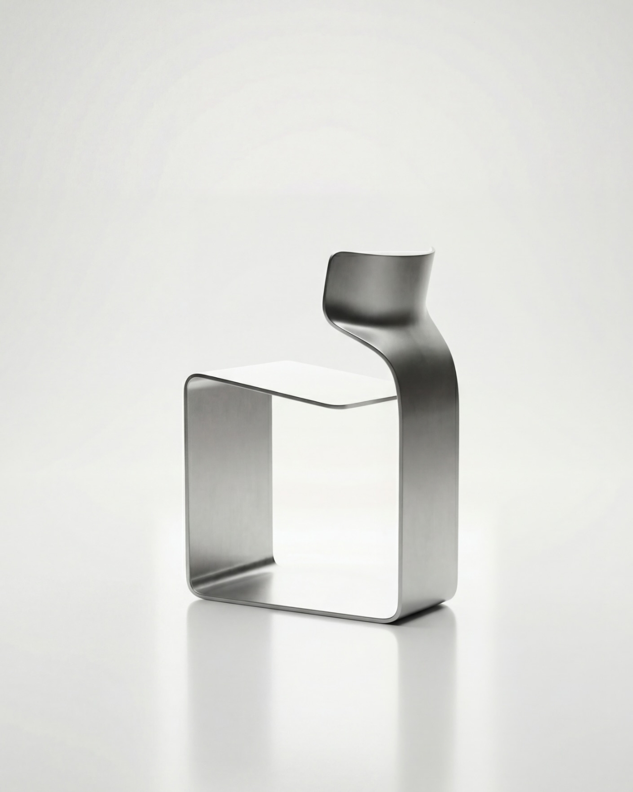
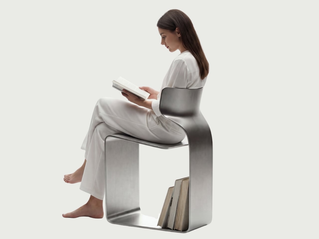
The concept is almost confrontationally simple: one single ribbon of metal, bent and curved into a complete chair. No welds holding two pieces together. No joints disguised under upholstery. No hardware quietly doing the heavy lifting behind the scenes. Just one continuous piece of material pushed into a form that includes the base, the cantilevered seat, and the backrest all at once. The name isn’t branding. It’s a philosophy.

Designer: Davide Bozzo

Looking at the photographs, the first thing I kept circling back to was the sheer audacity of the backrest. It doesn’t connect to the base through hidden brackets or clever joinery. It simply rises from the same ribbon, curving upward and backward in a motion that looks more like a wave caught mid-break than anything you’d typically call furniture. It’s graceful in a way that makes you slightly suspicious of it. How is this thing holding anyone’s weight?

The answer lies in what Bozzo describes as structural tension. Form doesn’t just follow function here. It is the function. The material itself carries the engineering logic. Every curve has a reason, and every bend is calculated to distribute load through the continuity of the form rather than through added components. It’s the same principle behind suspension bridge cables or the way a curved shell is structurally stronger than a flat panel. Applied to a chair, it feels almost radical.

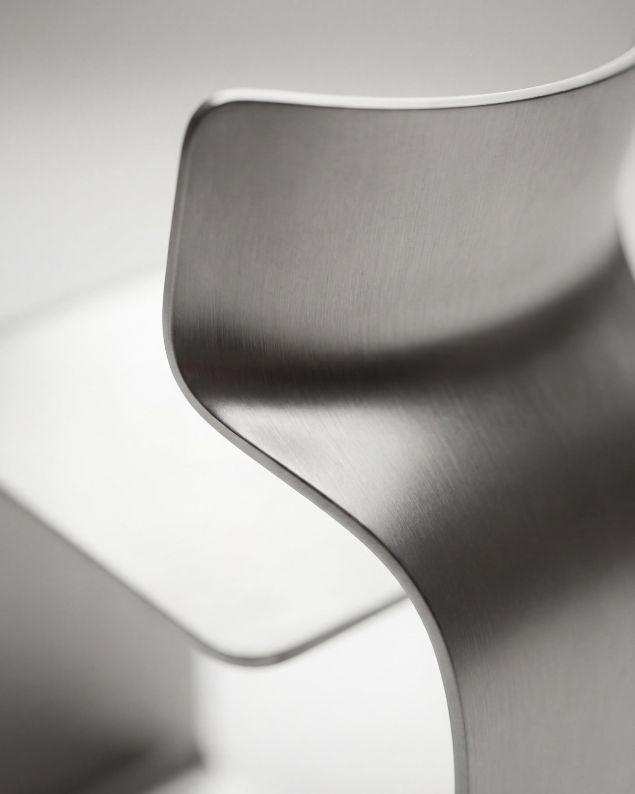
I’ll be honest. My first instinct was skepticism. A single-piece metal chair sounds like one of those design school exercises that makes for great renderings but falls apart under real scrutiny. But looking at the close-up photographs, especially the one capturing the S-curve where the seat meets the backrest, you start to believe it. The brushed metal finish shows actual material depth and actual intentionality in how the surface was treated. This isn’t a concept render floating in a void. It has weight and presence.

That said, I do have questions. Comfort is conspicuously absent from the conversation. Metal, even beautifully formed metal, is hard. The cantilevered seat gives some flexibility, which should help, but a chair without cushioning asks something significant of the person sitting in it. Bozzo’s design makes a statement about material honesty and structural purity, which I respect deeply, but at some point a chair has to be sat in. That’s the tension that makes it interesting rather than just pretty.

The piece also reads as a quiet counterargument to the current era of maximalist furniture. We’ve spent years surrounded by bouclé armchairs, curved velvet sofas, and furniture dressed up in layers of texture and warmth. Bozzo’s chair strips all of that away and asks whether furniture can earn your attention through restraint and engineering alone. My honest opinion? It can. Whether it earns a place in your living room is a different question entirely.

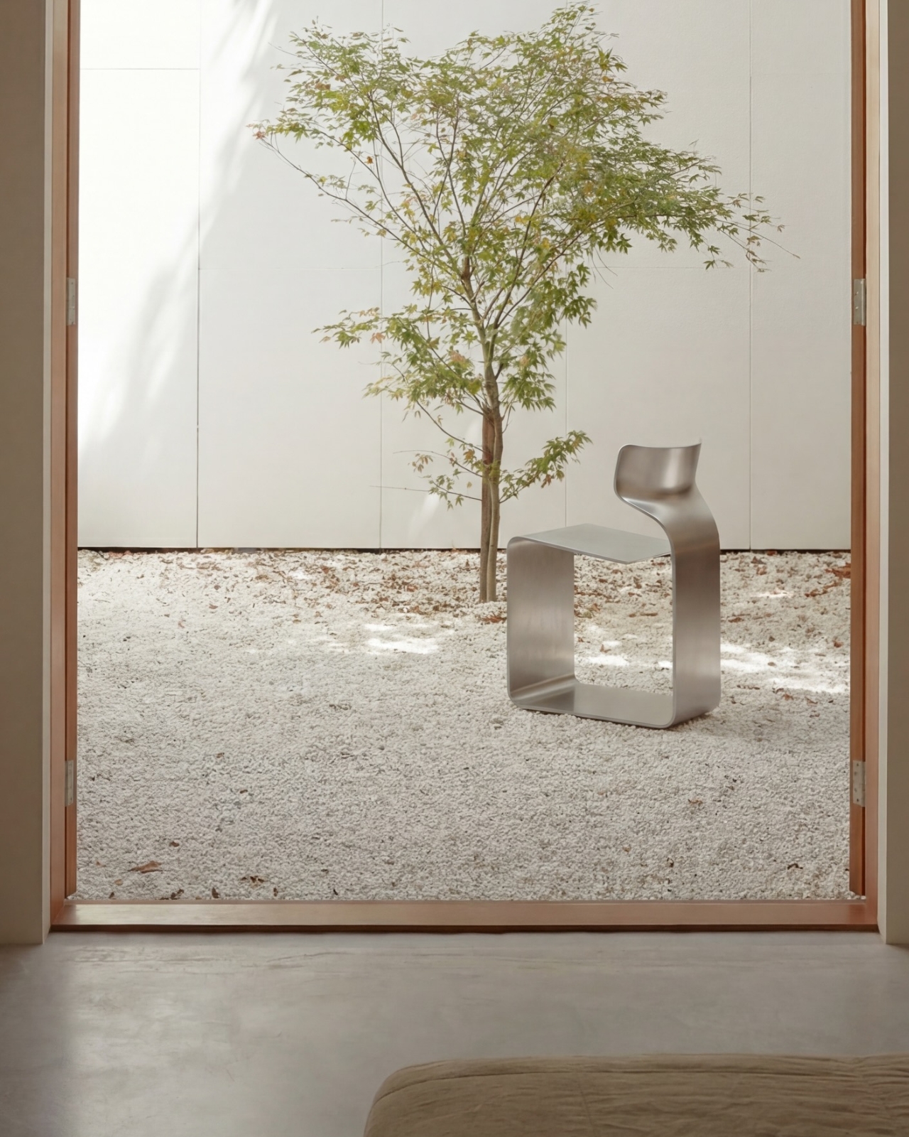
The chair also does something that doesn’t get discussed enough in design coverage: it makes the negative space part of the design. The open rectangle formed by the base creates a void that’s almost as deliberate as the metal itself. In the lifestyle image set against a Japanese garden backdrop, that void frames the gravel and ground beyond it. The chair becomes a viewfinder. That’s not accidental. That’s a designer who understands that what you leave out is just as powerful as what you put in.

Bozzo has been building a reputation for material-forward work. His stainless steel pet bowl Dune explored similar ideas around fluid curves in a single medium, but the ZERO Chair feels like a significant step up in ambition. It’s the kind of piece that stops you mid-scroll, makes you set your phone down, and actually think. That, more than any material specification, is probably the point.

The post The ZERO Chair Has No Welds, No Joints, No Apologies first appeared on Yanko Design.

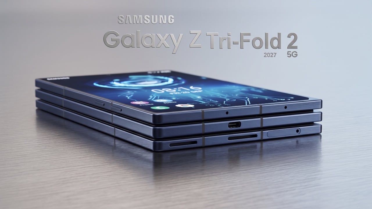
New Samsung Galaxy Z TriFold 2 Leak Reveals Wider Design

New Samsung Galaxy Z TriFold 2 Leak Reveals Wider Design Samsung Galaxy Z TriFold 2

Samsung’s decision to discontinue the Galaxy Z Tri Fold shortly after its release was not a failure but a calculated move. By treating the device as a limited-edition experiment, Samsung tested consumer interest in premium foldable devices. This strategy has paved the way for a new chapter in foldable innovation, with the company now focusing […]

The post New Samsung Galaxy Z TriFold 2 Leak Reveals Wider Design appeared first on Geeky Gadgets.

Posted in Uncategorized

Foshan’s Forgotten Warehouses Got a Rooftop Park Under Floating Domes

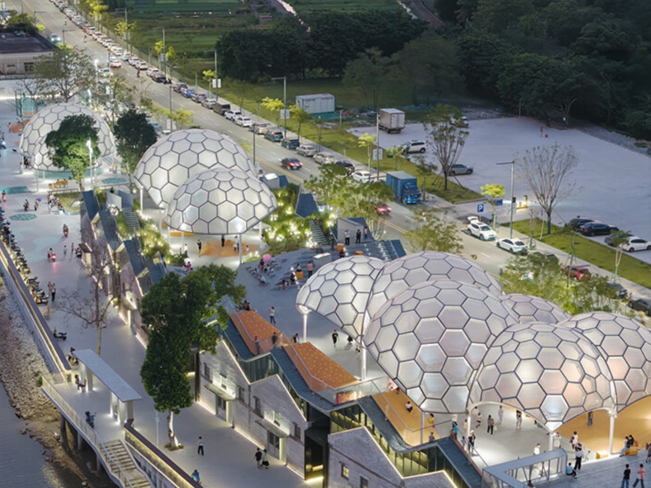
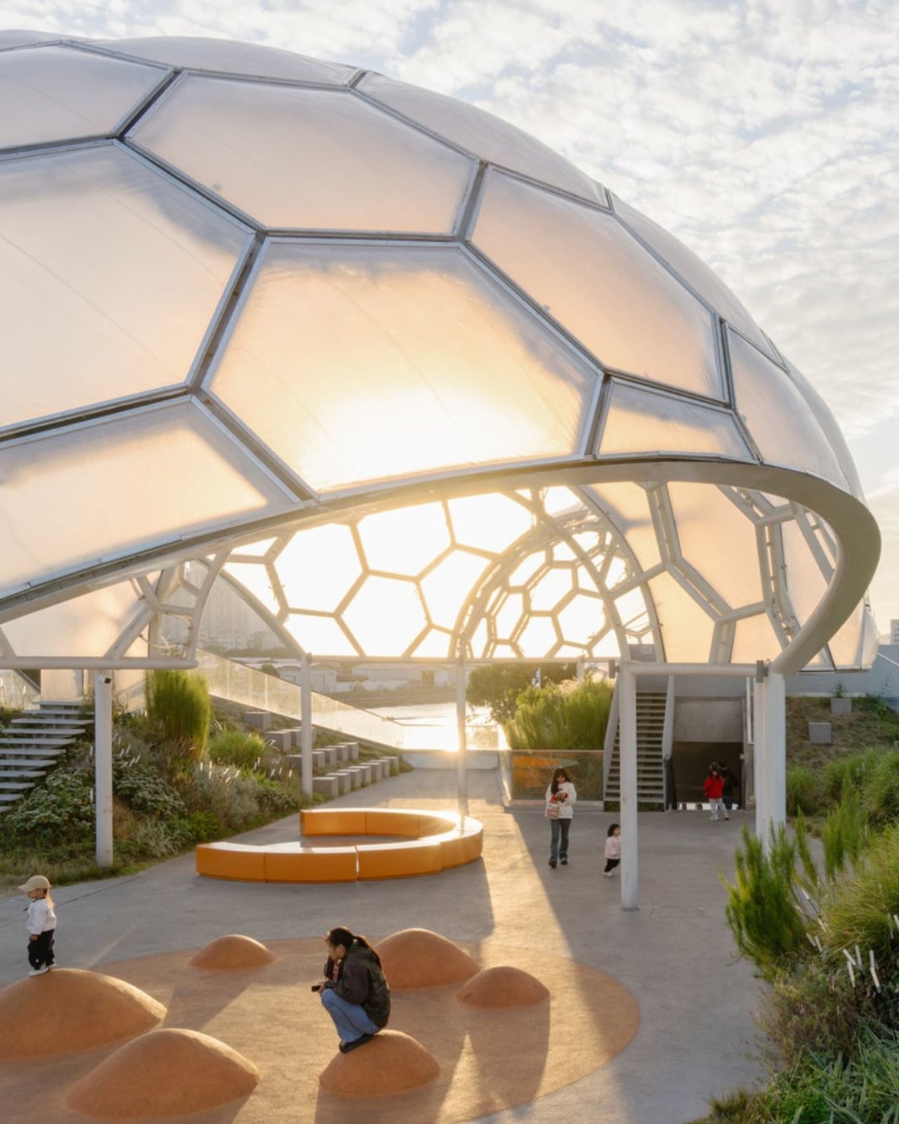
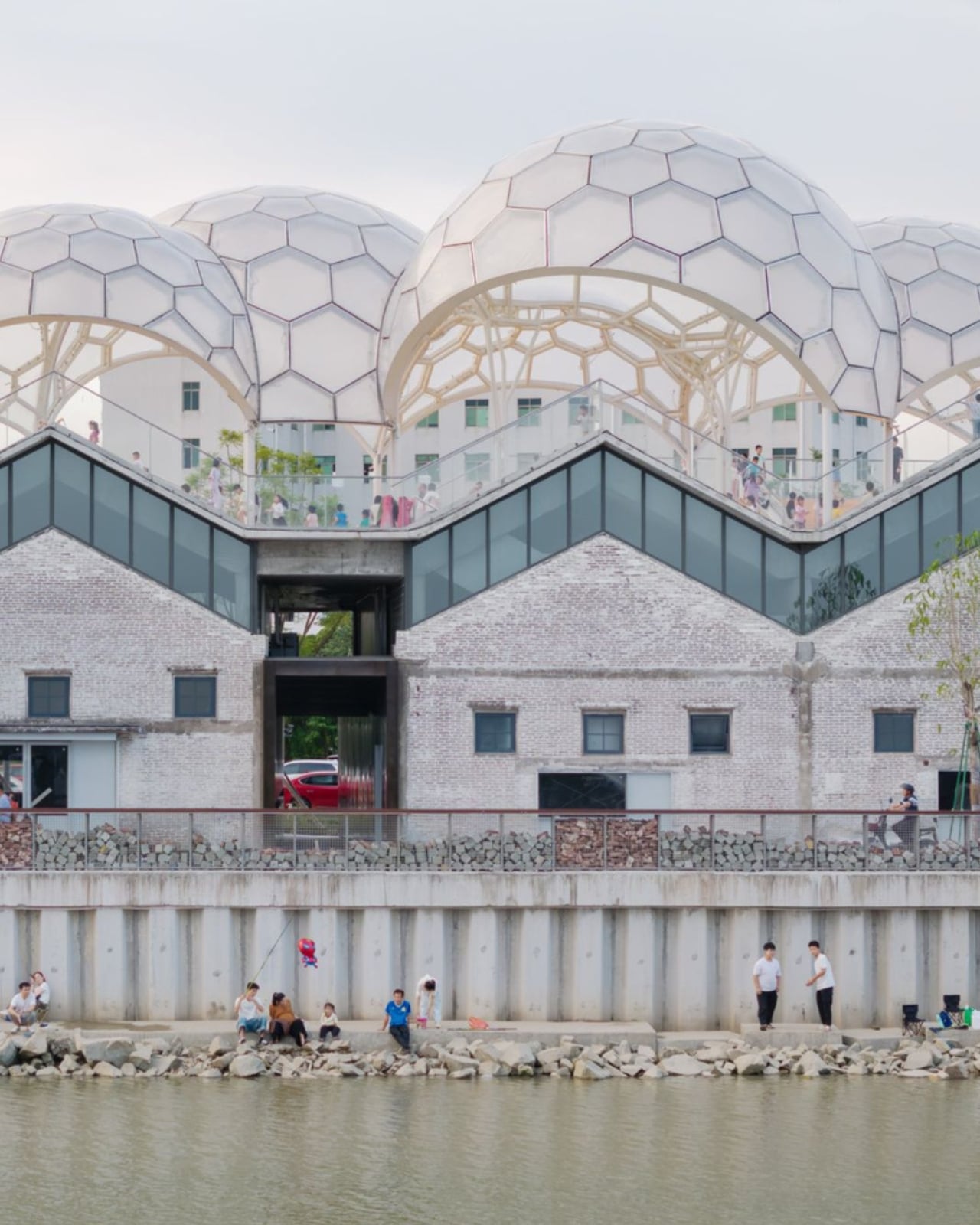
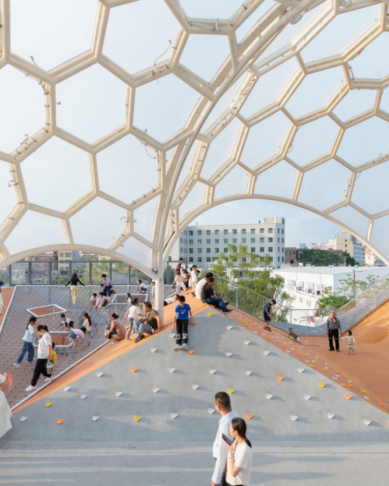
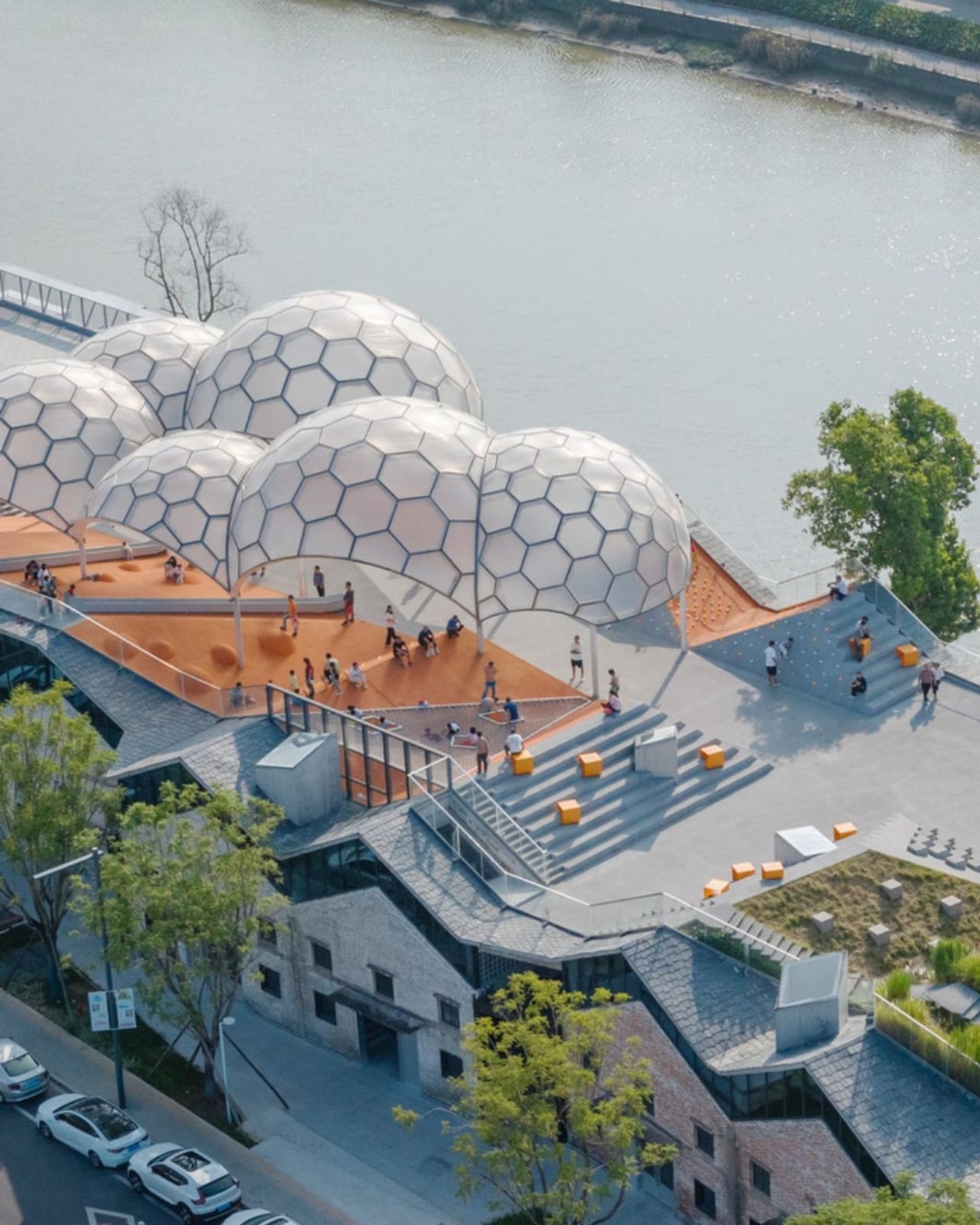
Somewhere along the Huadi River in Foshan, China, a cluster of old grain storage warehouses has been turned into one of the most quietly poetic pieces of architecture I’ve seen all year. The Yongping Warehouse Renovation, completed in 2025 by Guangzhou-based Atelier cnS, is exactly the kind of project that makes you stop scrolling and actually look.

The site sits in Dali Town, Nanhai District, a former industrial pocket of the Pearl River Delta that’s been gradually shedding its factory-town skin in favor of something more livable and publicly accessible. These particular warehouses, lined up along the riverfront, were derelict grain storage buildings with no obvious future. Not exactly glamorous source material. But Atelier cnS didn’t flinch, and the result is a project that earns its attention without asking for it loudly.

Designer: Atelier cnS

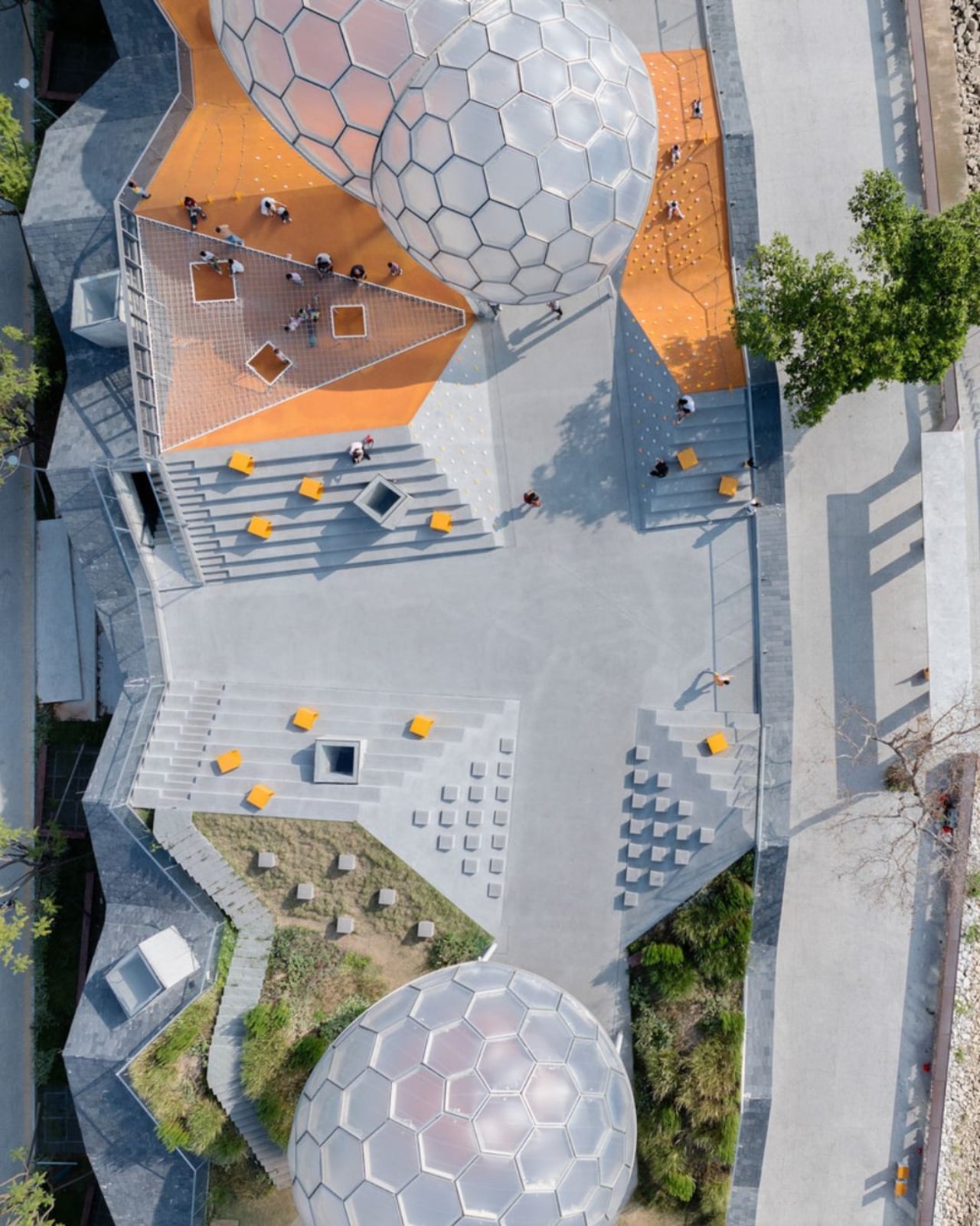
Because the site has a narrow footprint, the architects pushed the public space upward, placing a landscaped rooftop park above the commercial interiors below. Vertical programming isn’t a new idea, but what makes Yongping feel different is how thoughtfully the transition between levels was handled. The gaps between warehouse blocks weren’t sealed or filled in. Instead, they were preserved and widened into passageways, so as you move through the building, you catch glimpses of the river framed by walls before the whole view opens up at the top. It’s a slow reveal, and it’s deliberate.

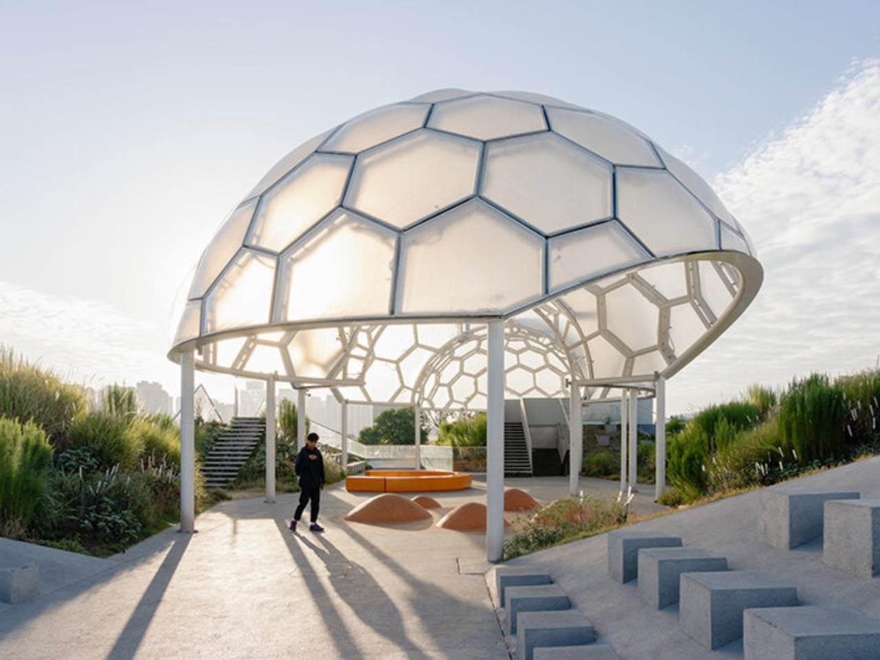
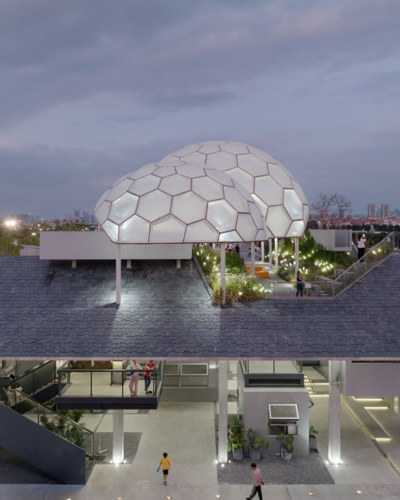
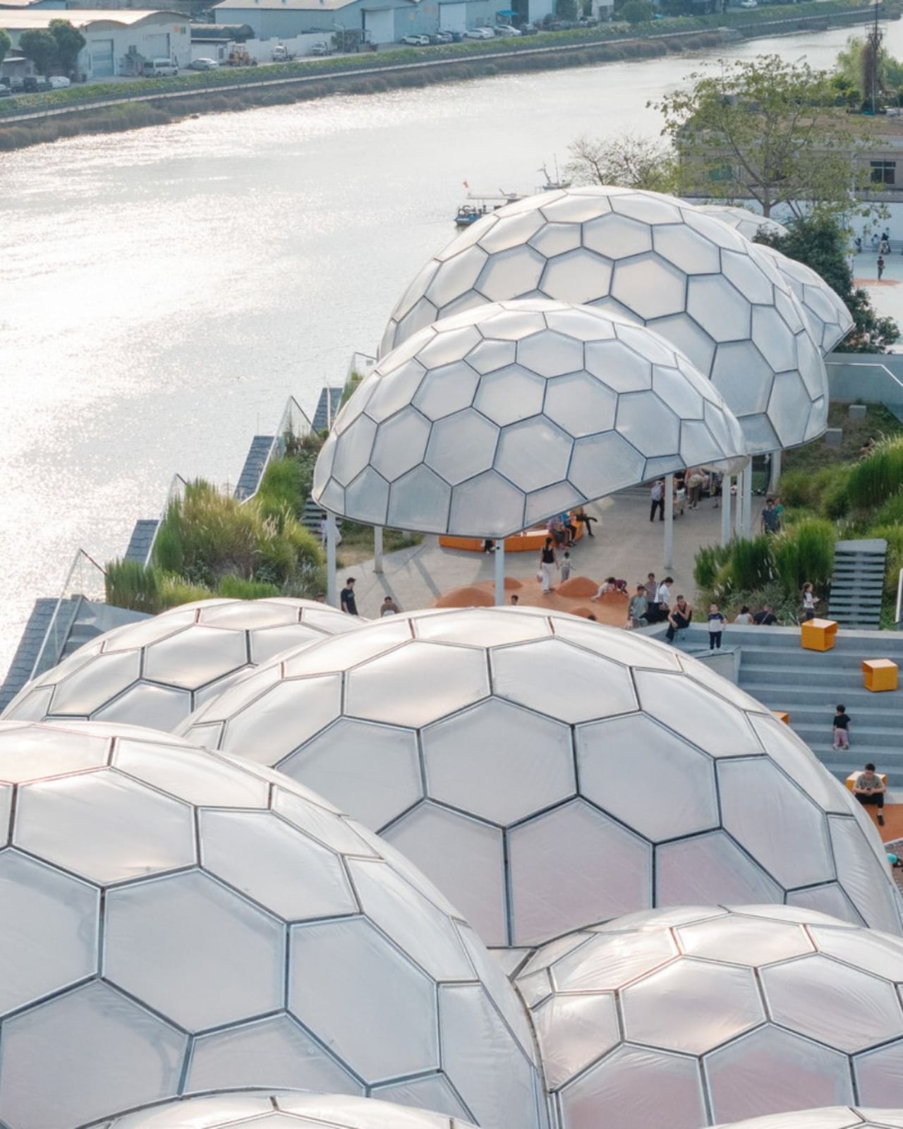
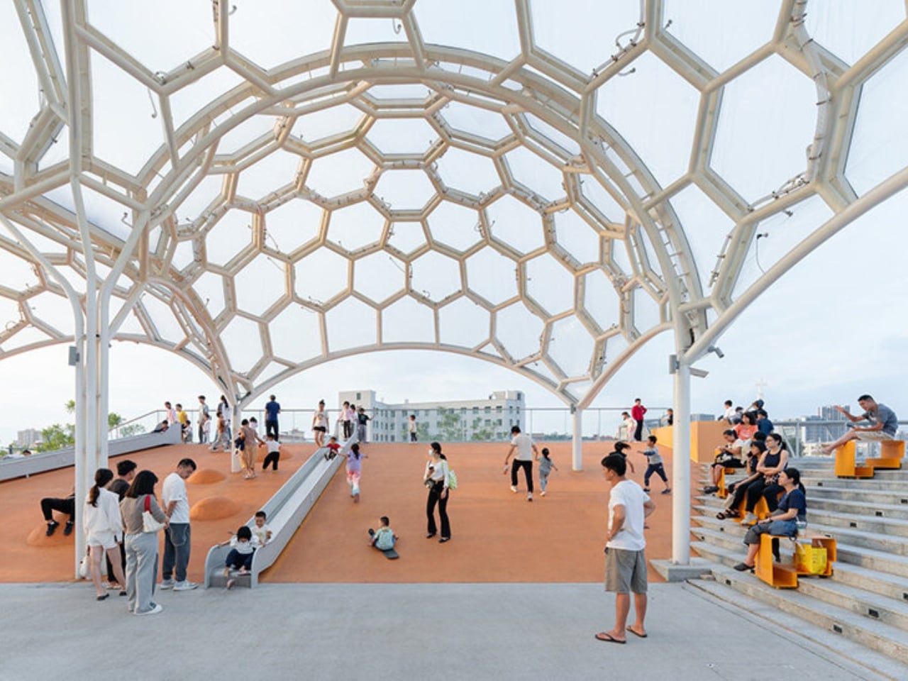
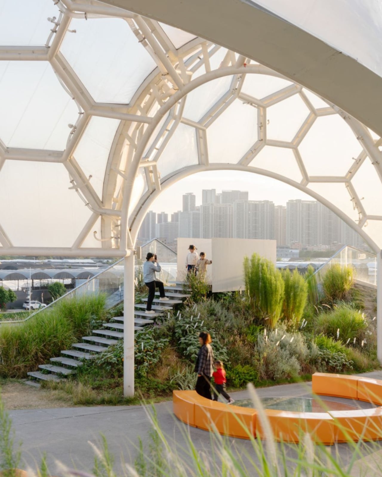
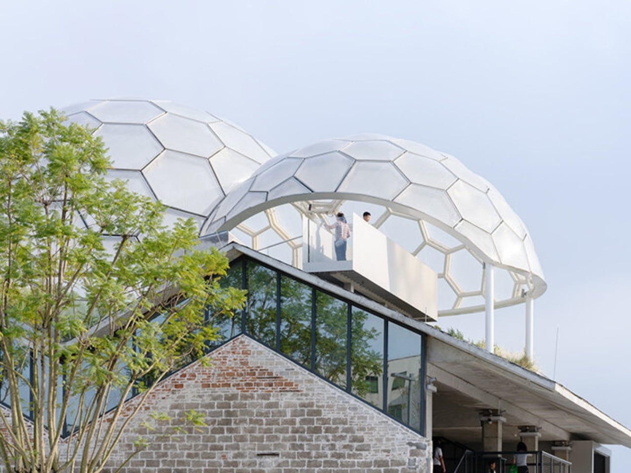
And then there are the canopies. A series of translucent, domed structures built from hexagonal frames cluster across the roofline like a quiet gathering of clouds. Atelier cnS actually named the project “A Wisp of Cloud” over Huadi River, and the photos earn that name completely. The domes are light-diffusing, casting shade without blocking river views. They create zones for sitting, moving, and play without ever feeling like they’re closing the space in. They look like they arrived gently, rather than being imposed on the building below them.

The rooftop itself is shaped into slopes, steps, and play surfaces that echo the original pitched forms of the warehouse roofs. It’s one of those details that most visitors probably won’t consciously register, but it’s exactly the kind of architectural memory that makes a renovation feel grounded rather than gratuitous. The old buildings aren’t being pretended out of existence. The new design is in active conversation with what was there before.

I’m genuinely drawn to this project because it gets the balance right in a way that many adaptive reuse projects don’t quite manage. Too often, the renovations that attract the most attention are the ones where the new design overwhelms the original structure, turning the old building into nothing more than a convenient shell. Yongping avoids that trap. The warehouses are still very much present. Their bones dictate the rhythm, the circulation, and some of the visual language of the final result. You can feel the history of the place without having to read about it first.

Atelier cnS has been developing this kind of thinking for years. The studio’s earlier work on elevated public circulation, including a “roof-hopping” design approach explored in their White House Guesthouse project, signals a long-running interest in finding new life in existing structures. Yongping feels like a maturation of that sensibility. More refined, more integrated, and more tuned in to the texture of a neighborhood mid-transition.

The project spans 4,311 square meters, and it’s worth noting what it does beyond the architecture itself. Turning a commercial renovation into a publicly accessible rooftop park, in a district shifting away from its industrial past, is a real act of generosity. A park on a roof could easily read as a private amenity. Here, it reads like a gift to the neighborhood, a place to walk, rest, and look out at the river without needing a reason to be there.

Architecture doesn’t always need to announce itself to be worth paying attention to. The Yongping Warehouse Renovation is understated, purposeful, and lit from above by a cluster of translucent domes that look, from a distance, exactly like a wisp of cloud over the river.

The post Foshan’s Forgotten Warehouses Got a Rooftop Park Under Floating Domes first appeared on Yanko Design.

Why Upgrading to Claude Opus 4.7 Might Break Your Current Prompts

Why Upgrading to Claude Opus 4.7 Might Break Your Current Prompts Split screen showing high resolution image input and the corresponding Opus 4.7 multimodal output

Anthropic’s latest release, Cloud Opus 4.7, introduces significant updates aimed at improving coding, multimodal understanding and instruction-following. While these advancements enhance performance in areas like extended-sequence programming and high-resolution image analysis, they also come with notable trade-offs. For instance, the updated tokenizer increases token usage by 1 to 1.35 times, which could impact workflows reliant […]

The post Why Upgrading to Claude Opus 4.7 Might Break Your Current Prompts appeared first on Geeky Gadgets.

Posted in Uncategorized