Bird.zzz Turns Sleep Tracking into a Calm Earbud and Bedside Lamp Ritual

Most sleep gadgets feel like they belong in a gym or a lab: chunky watches, bright screens, and apps that want you to stare at charts before bed. There is a disconnect between wanting a soft, quiet bedroom and plugging in devices that blink, buzz, and look like mini computers parked on your nightstand. Sleep tech rarely starts from the mood of the room it lives in, focusing instead on metrics and dashboards that feel clinical.

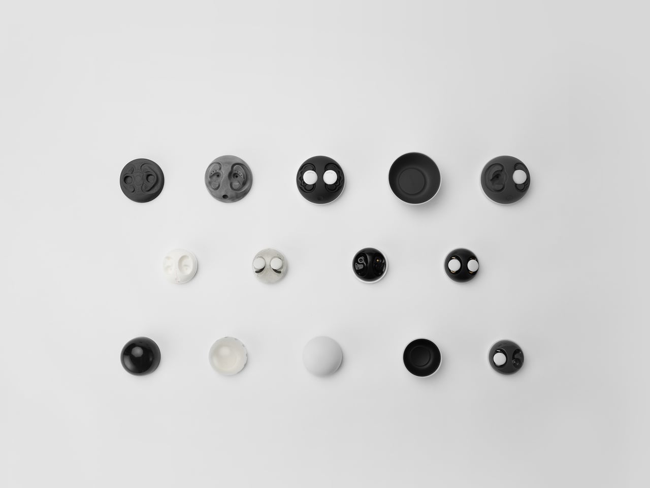
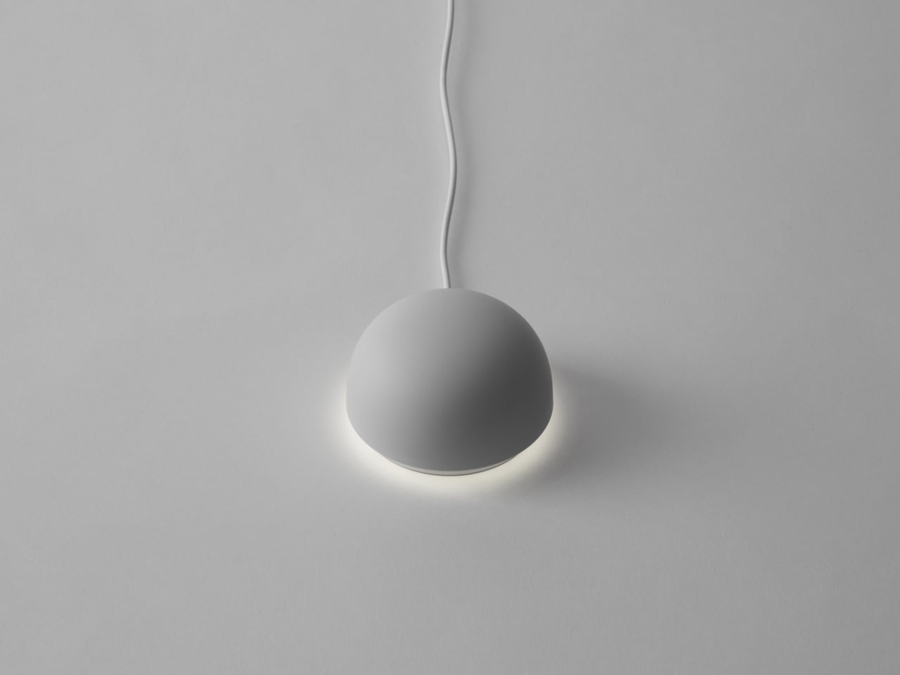
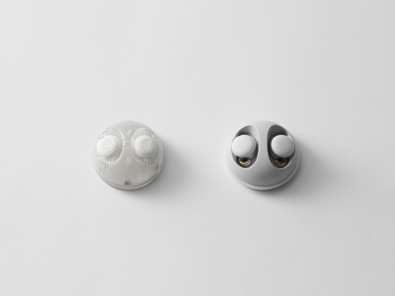
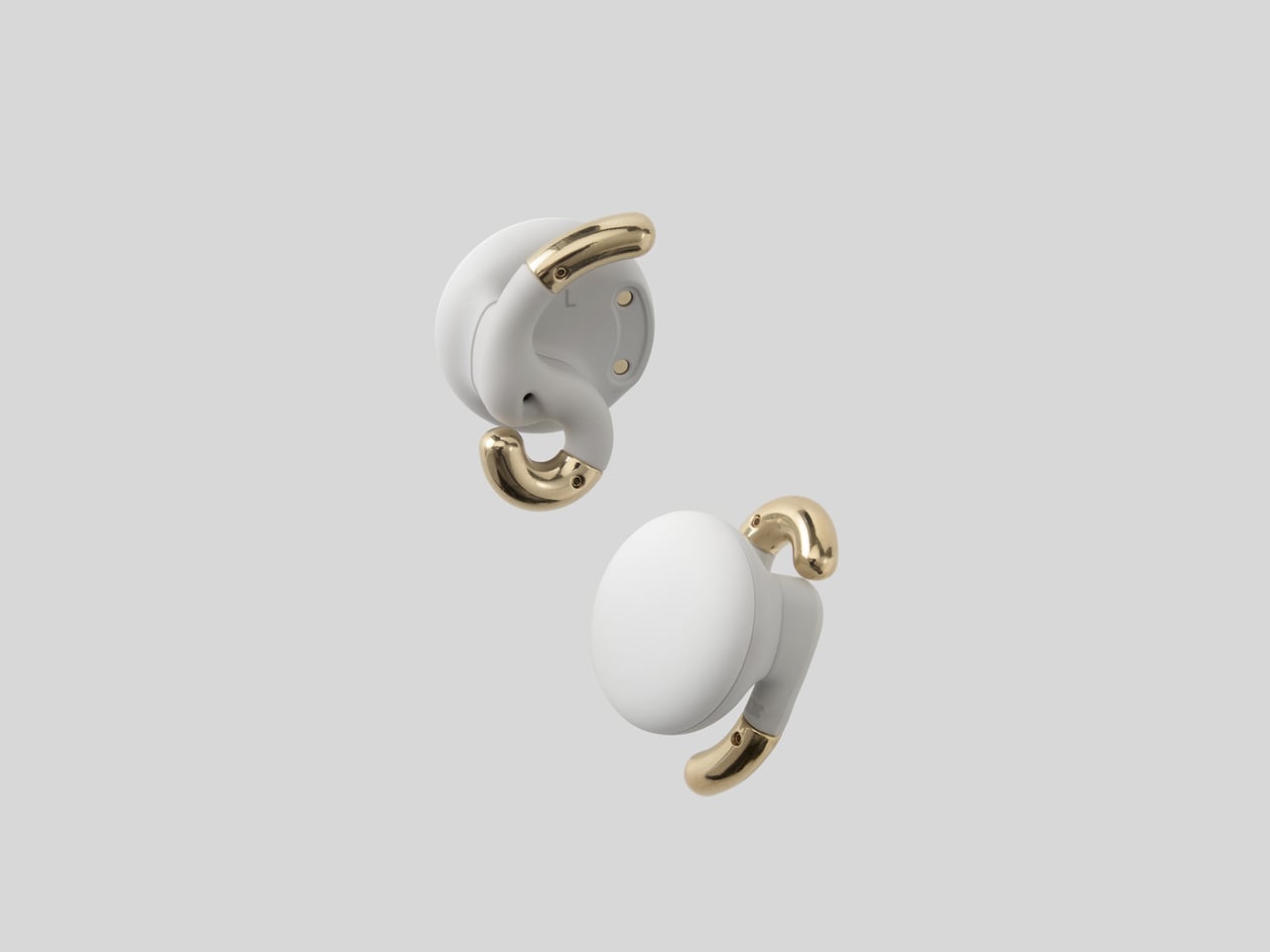
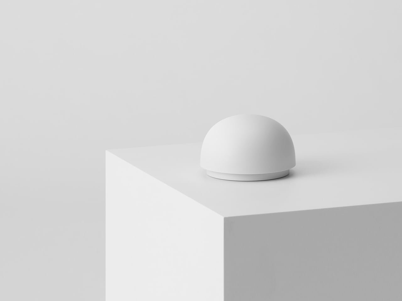
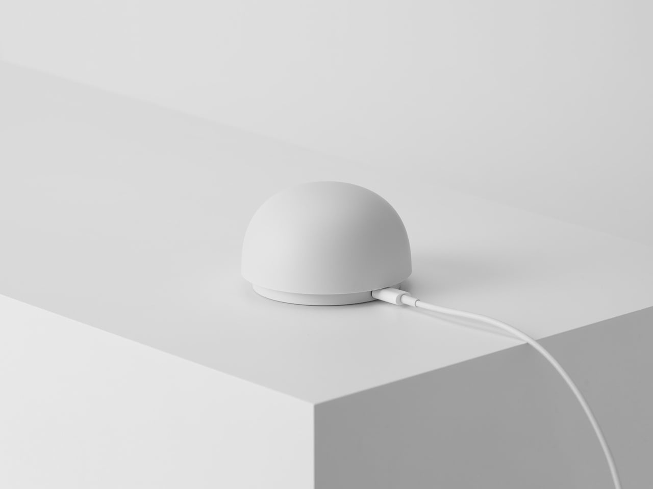
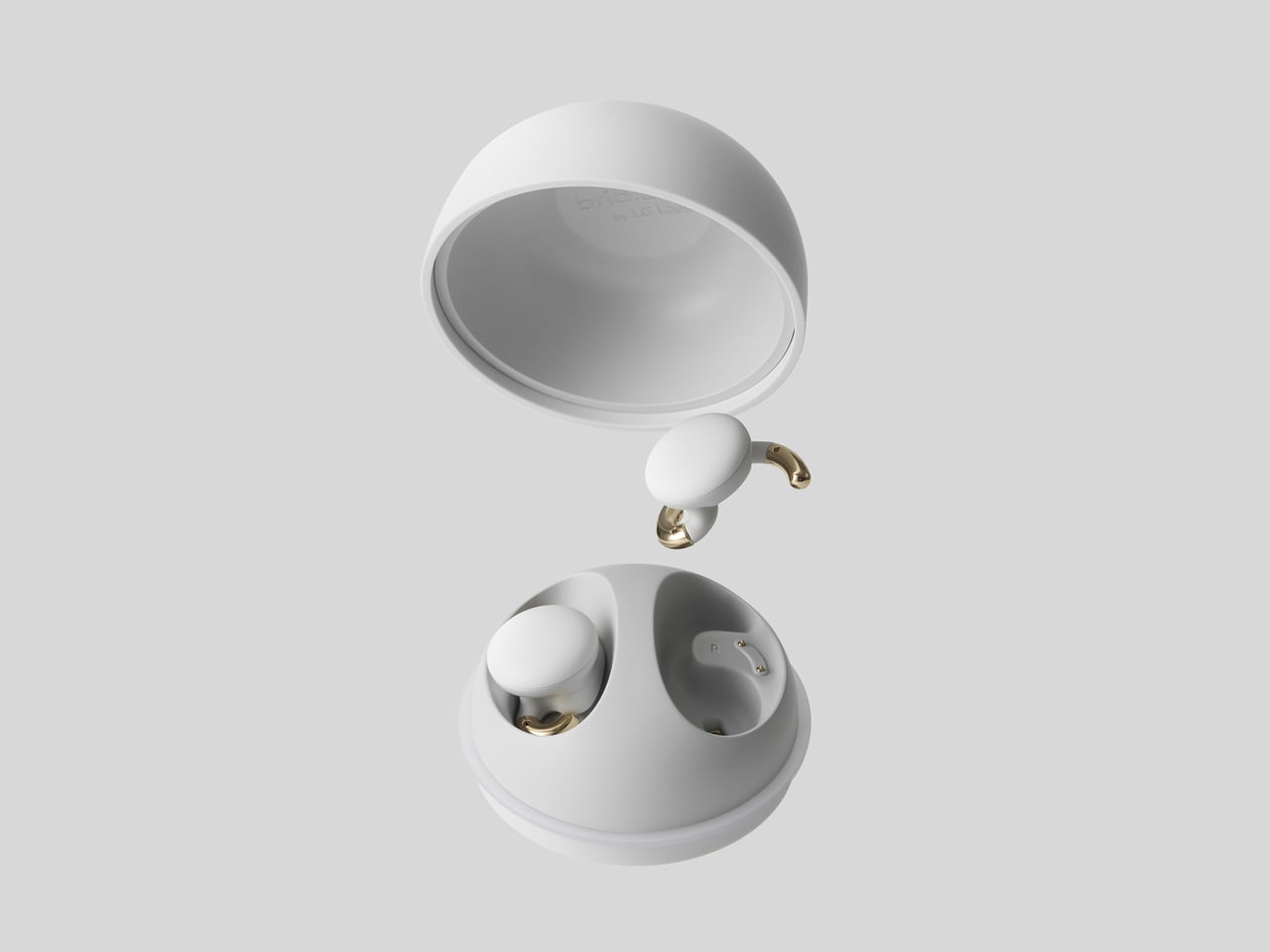
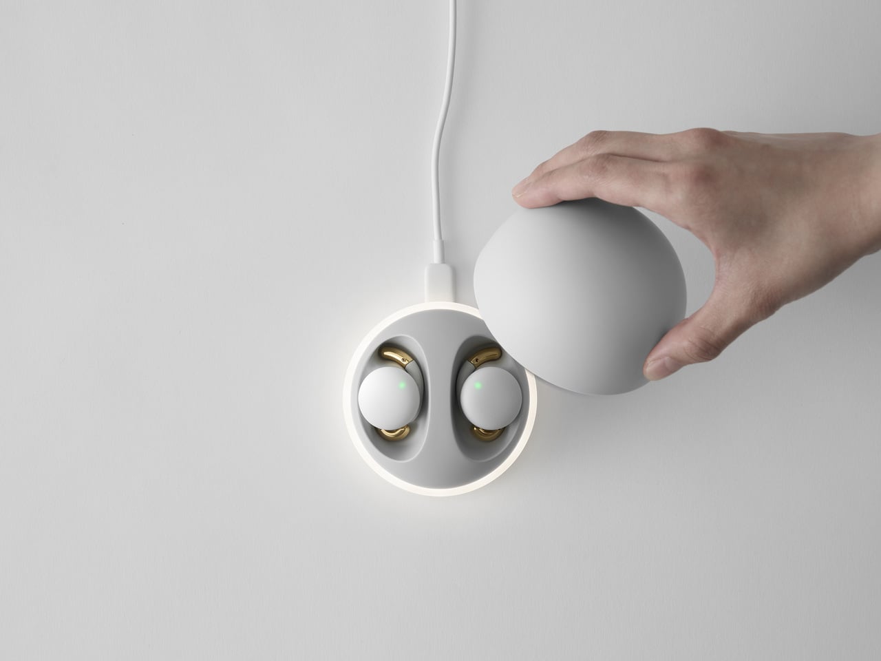
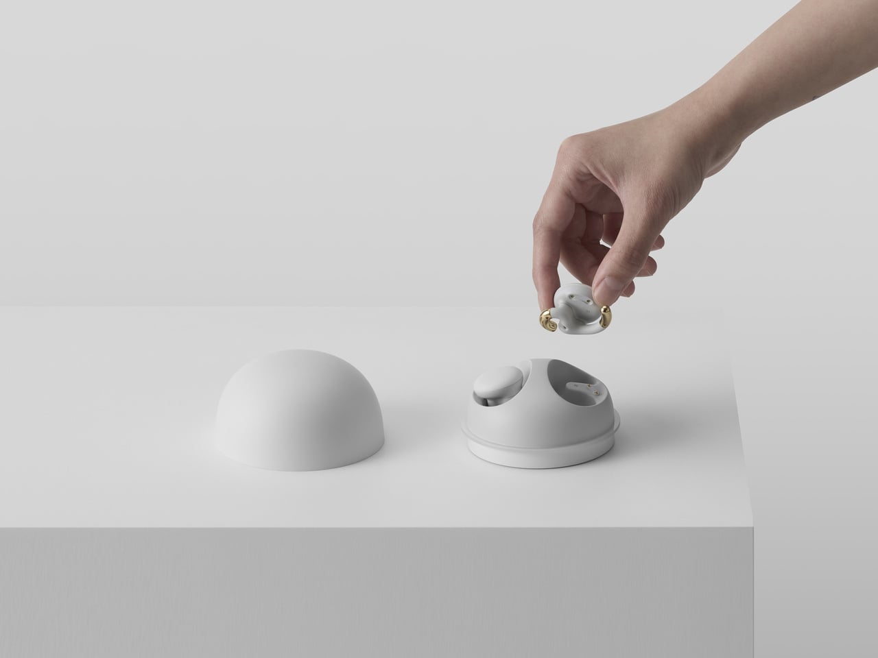
Bird.zzz is a project from Jiyoun Kim Studio and LG Labs that begins with a softly lit, cozy bedroom. It is a sleep wellness earbud paired with a dome-shaped bedside cradle that doubles as a knock-on lamp. The earbuds measure sleep via EEG and physical data, then use that analysis to deliver sound designed to improve sleep quality, all while sitting on your nightstand like a small sculpture rather than a charging puck.

Designer: Jiyoun Kim

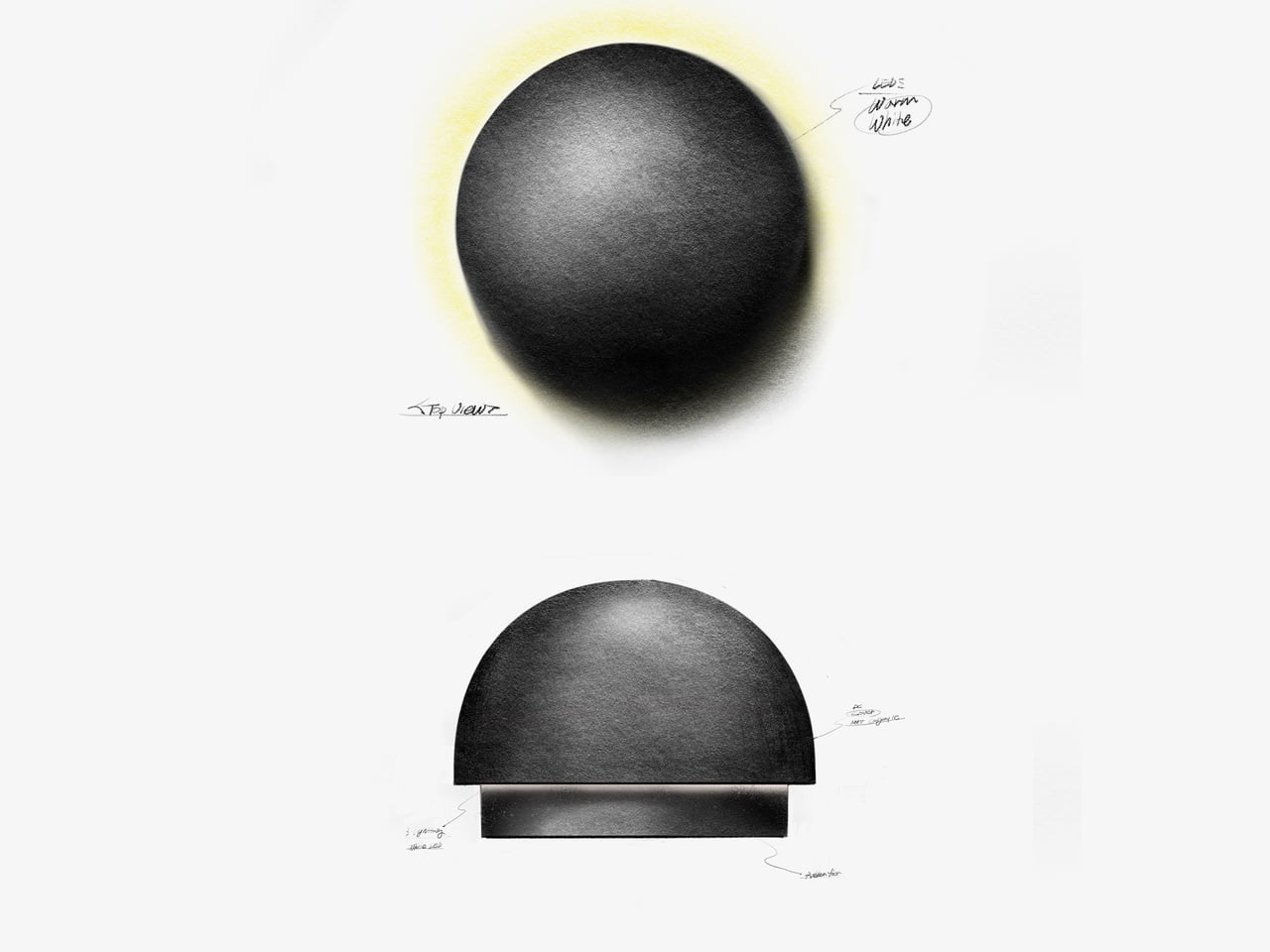
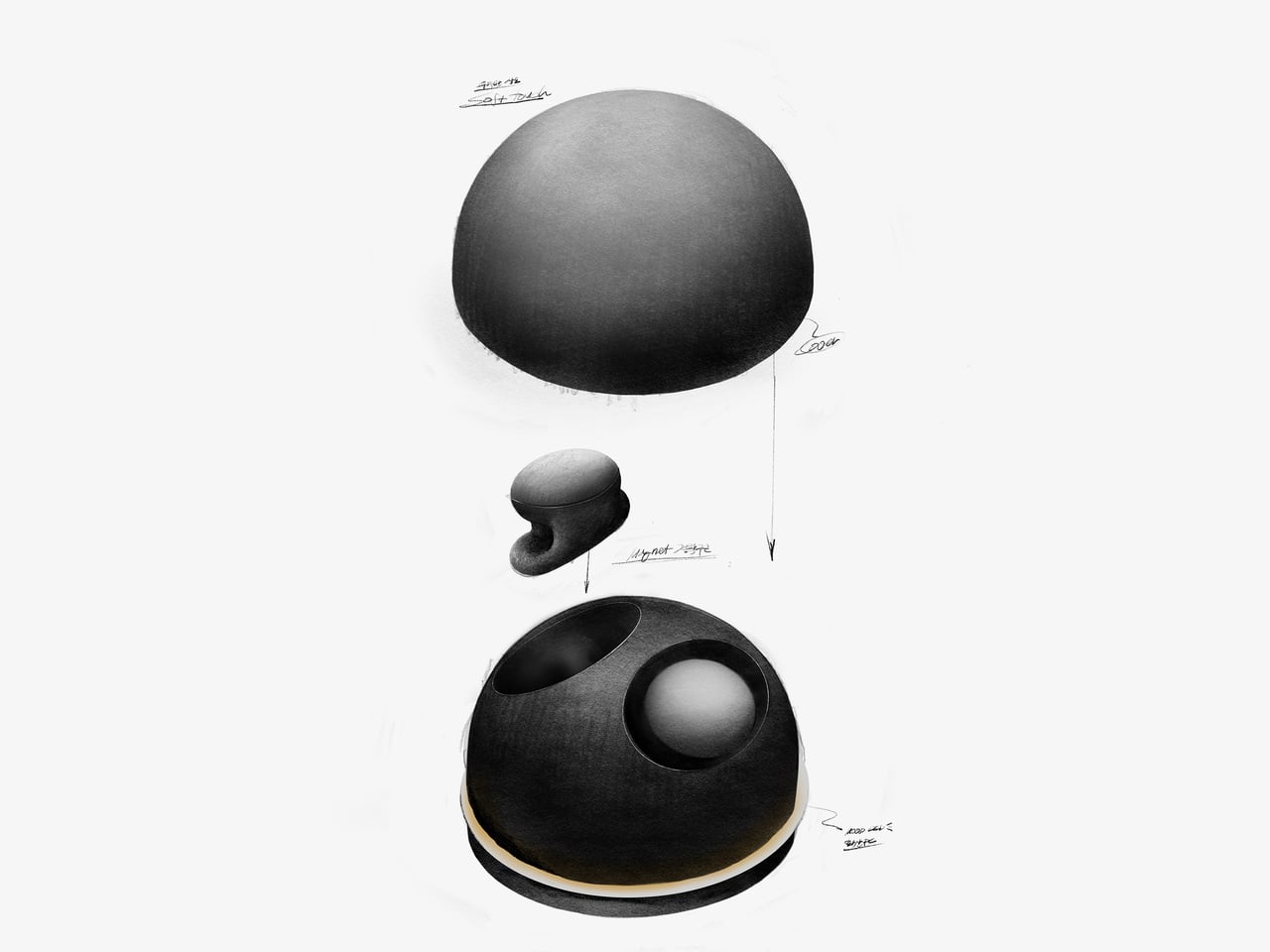
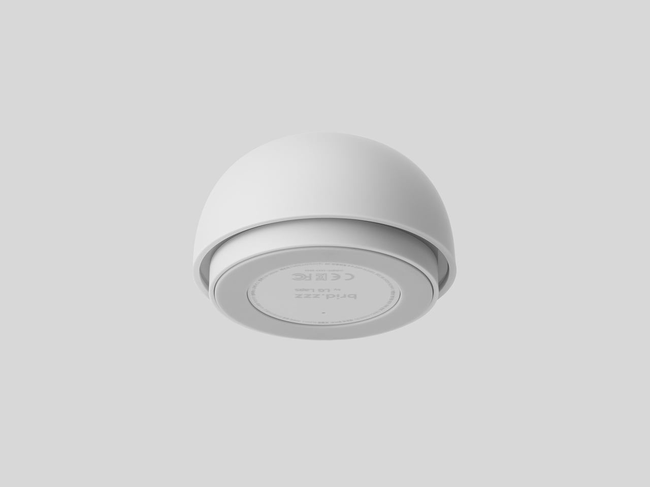
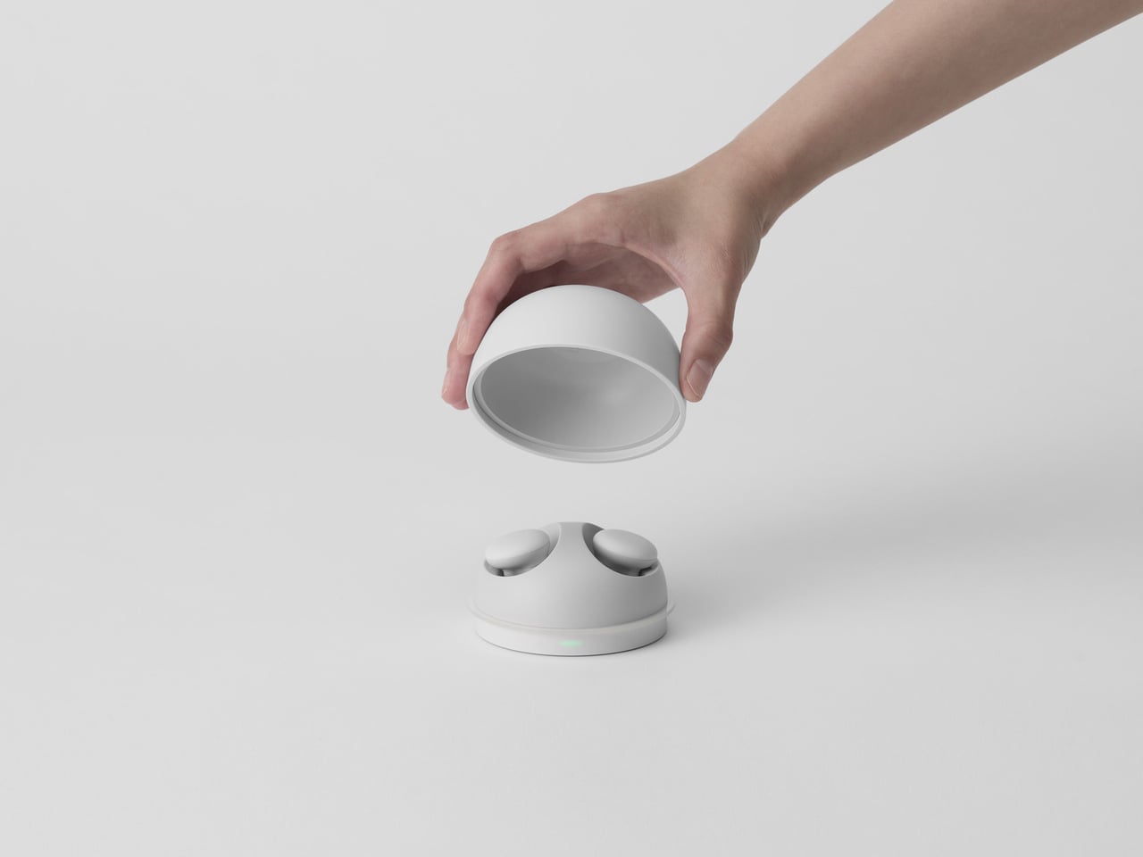
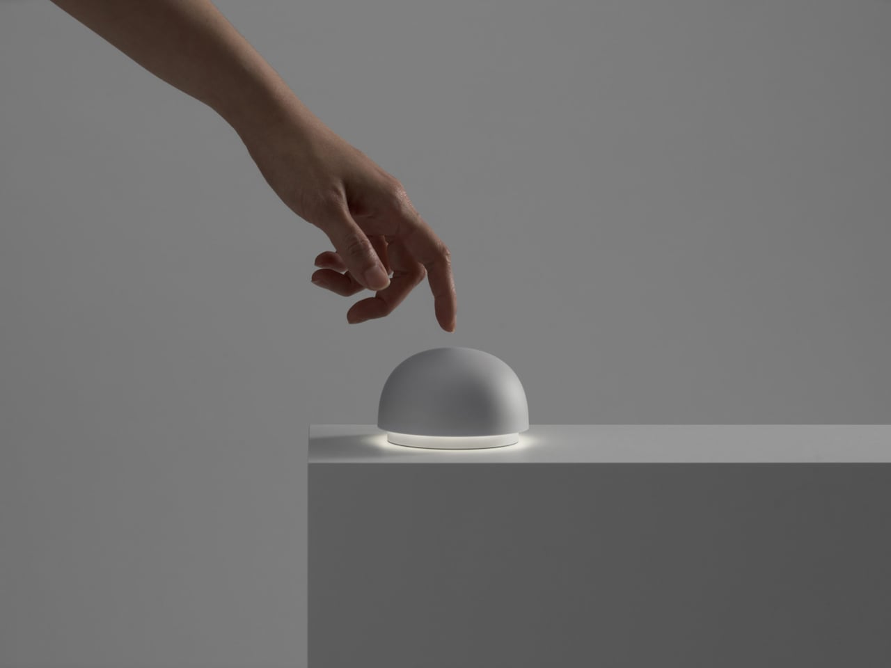
The design started from the cradle, imagined as a small object on a nightstand rather than a tech dock. It works as a bedside lamp using LG’s knock-on technology; a tap on the cover turns a warm, indirect LED halo on or off. The magnet-fixed top lifts to reveal the earbuds, and the weight is tuned so it feels stable and reassuring when you reach for it half-awake in the dark.

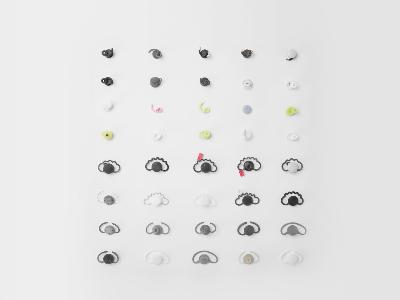
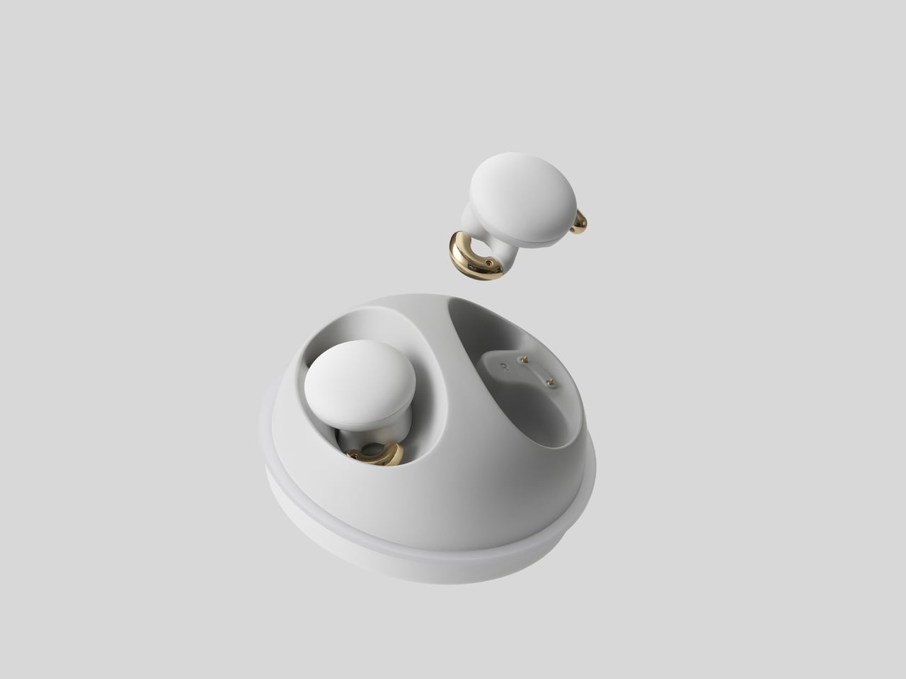
The earbuds had a specific challenge, needing skin contact for EEG sensing while staying loose enough for comfortable sleep. The team explored numerous forms and landed on a novel S-shaped ear tip, a hybrid of open and closed designs that keeps sensors in place without pressing hard into the ear canal. It borrows benefits from both types while avoiding the pressure points that make most in-ear devices unbearable after 20 minutes.

A typical evening means placing the earbuds in the cradle, tapping the dome to turn on a soft light, then lifting the lid to put the earbuds in as you settle into bed. As you fall asleep, the system reads brain activity and physical signals, adjusting soundscapes or audio cues based on your patterns. In the morning, the earbuds go back into their dome, and the object returns to being a quiet lamp.

The project covered product, packaging, and manual design, so the experience runs from unboxing to nightly use with consistent, minimal language. The warm white LED, indirect lighting, and knock-on interaction follow calm technology principles, asking for as little attention as possible. Bird.zzz launched after CES 2023, but it looks more like a small piece of bedroom architecture than a trade show gadget you plug in reluctantly.

Bird.zzz treats sleep as an environment to design for, not just a graph to optimize. The dome cradle, the S-shaped ear tip, and the soft interactions all point toward tech that respects the bedroom as a place to wind down. For anyone wary of strapping more screens to their body at night, an earbud and lamp combo that tries to disappear into the ritual of going to bed feels like a more thoughtful direction.

The post Bird.zzz Turns Sleep Tracking into a Calm Earbud and Bedside Lamp Ritual first appeared on Yanko Design.

The plan for a gaming-themed Atari hotel in Las Vegas has reportedly been scrapped

Six years after the announcement of plans to build Atari Hotels in eight cities across the US, including Las Vegas, only one now seems to be moving forward, in Phoenix, Arizona. The Las Vegas deal ultimately "didn't come to fruition," spokesperson Sara Collins told Las Vegas Sun this week, and Atari Hotels is putting its focus into the Phoenix site "for the time being."

Phoenix was always meant to be the first site, followed by other hotels in Austin, Chicago, Denver, Las Vegas, San Francisco, San Jose and Seattle. But Las Vegas is now apparently off the table, and there haven't been any signs of life around the other planned locations. The FAQ on the Atari Hotels website notes, "Additional sites, including Denver, are being explored under separate development and licensing agreements." The Atari Hotel project was announced in 2020 just before the onset of the COVID-19 pandemic and consequently experienced development delays. Construction on the Phoenix hotel, which was supposed to break ground in 2020, is expected to begin late this year, with its opening now planned for 2028. 

But maybe don't hold your breath. According to a December press release, the company is still trying to raise $35 million to $40 million to fund the "playable destination" for gamers in Phoenix.

This article originally appeared on Engadget at https://www.engadget.com/gaming/the-plan-for-a-gaming-themed-atari-hotel-in-las-vegas-has-reportedly-been-scrapped-214212269.html?src=rss

Amazon’s live-action God of War adaptation adds Teresa Palmer

Amazon is reportedly adding Teresa Palmer (The Fall Guy, Warm Bodies, Hacksaw Ridge) to its pantheon of Norse gods for its God of War TV show adaptation. As first reported by Deadline, Palmer will play Sif, Thor's wife and eventual leader of the Aesir, in the live-action adaptation. It may not carry as much weight as the casting of the video game's protagonist that was revealed earlier this week to be Ryan Hurst, but it could hint at the direction the TV show may take.

While Sif plays a minor role in the God of War Ragnarok game, the early casting confirmation could indicate that the showrunner, Ronald D. Moore, may give the character a more involved role. In God of War Ragnarok, Sif is known as Odin's diplomat before the events of Ragnarok, where she becomes the new leader of the Aesir, one of two tribes of Norse gods. Notably, Amazon's adaptation is still missing the casting confirmations for Atreus, Thor, Odin and many other Norse gods seen in the video game. Even so, the God of War TV show has already secured at least two seasons.

This article originally appeared on Engadget at https://www.engadget.com/entertainment/tv-movies/amazons-live-action-god-of-war-adaptation-adds-teresa-palmer-201604602.html?src=rss

5 Interior Design Trends That Just Made Minimalism Obsolete in 2026

Architects today see the home as more than just a place to live. It is now understood as a space that affects how people think, feel, and live each day. By 2026, the field has clearly moved away from cold, uniform minimalism. Instead, design choices such as color, shape, and proportion are made with clear intent, helping to create spaces that support everyday life.

Many leading firms now describe the human-centered home as a biophilic cocoon. This means using honest materials along with natural light, balanced proportions, and thoughtful forms. Let’s decode how the goal is to create homes that do not just look well-designed but feel comfortable and meaningful, supporting emotional well-being rather than focusing only on appearance.

1. Bold Color Authority

In 2026, color is no longer decorative; it is treated as a structural design tool. Designers are increasingly using deep, confident shades such as rich pinks and earthy ochres to give spaces character and visual weight. These strong palettes help anchor interiors, making homes feel intentional, expressive, and memorable rather than neutral or generic.

Such colors also offer clear psychological value. They create a sense of stability, warmth, and emotional comfort, adding long-term value to a space. When applied to key architectural elements—like columns, niches, or feature walls—bold colors guide movement and define zones within the home, bringing clarity and purpose to the overall spatial experience.
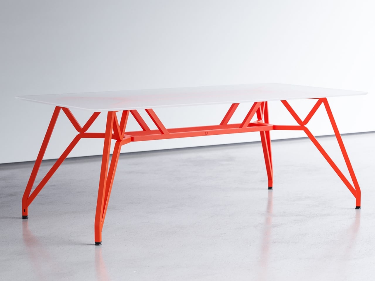
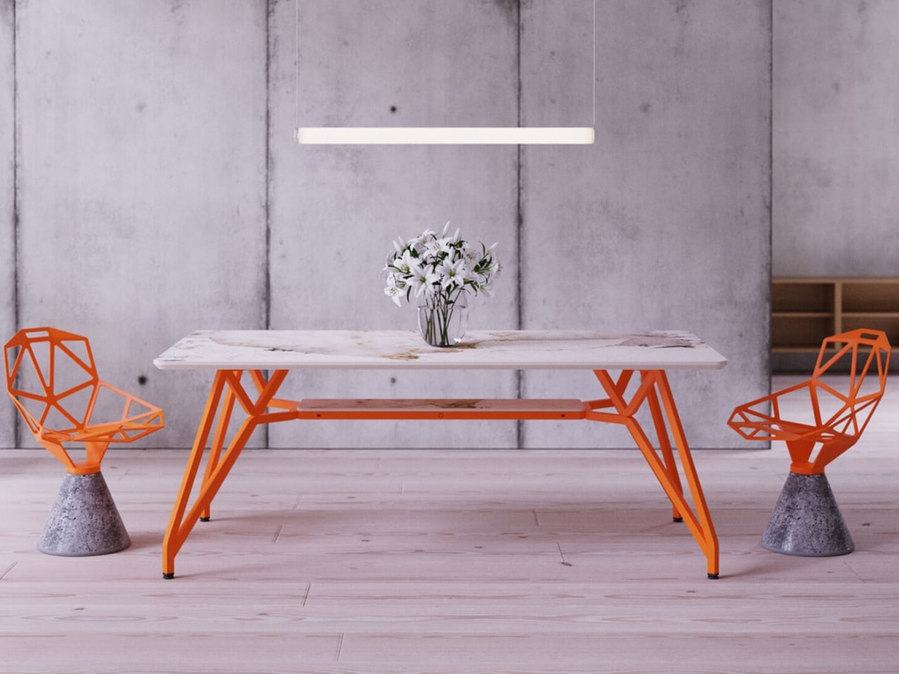
The Landr dining and conference table is engineered with a singular focus on strength, stability, and visual clarity. Designed to eliminate wobble, it offers a firm, unmoving surface suited for everyday use as well as more demanding tasks. Its modular construction is precise and robust, ensuring easy assembly without compromising structural integrity. The steel frame and intelligently engineered leg geometry distribute weight evenly, allowing the table to remain steady under pressure while maintaining a clean, confident presence in any setting.
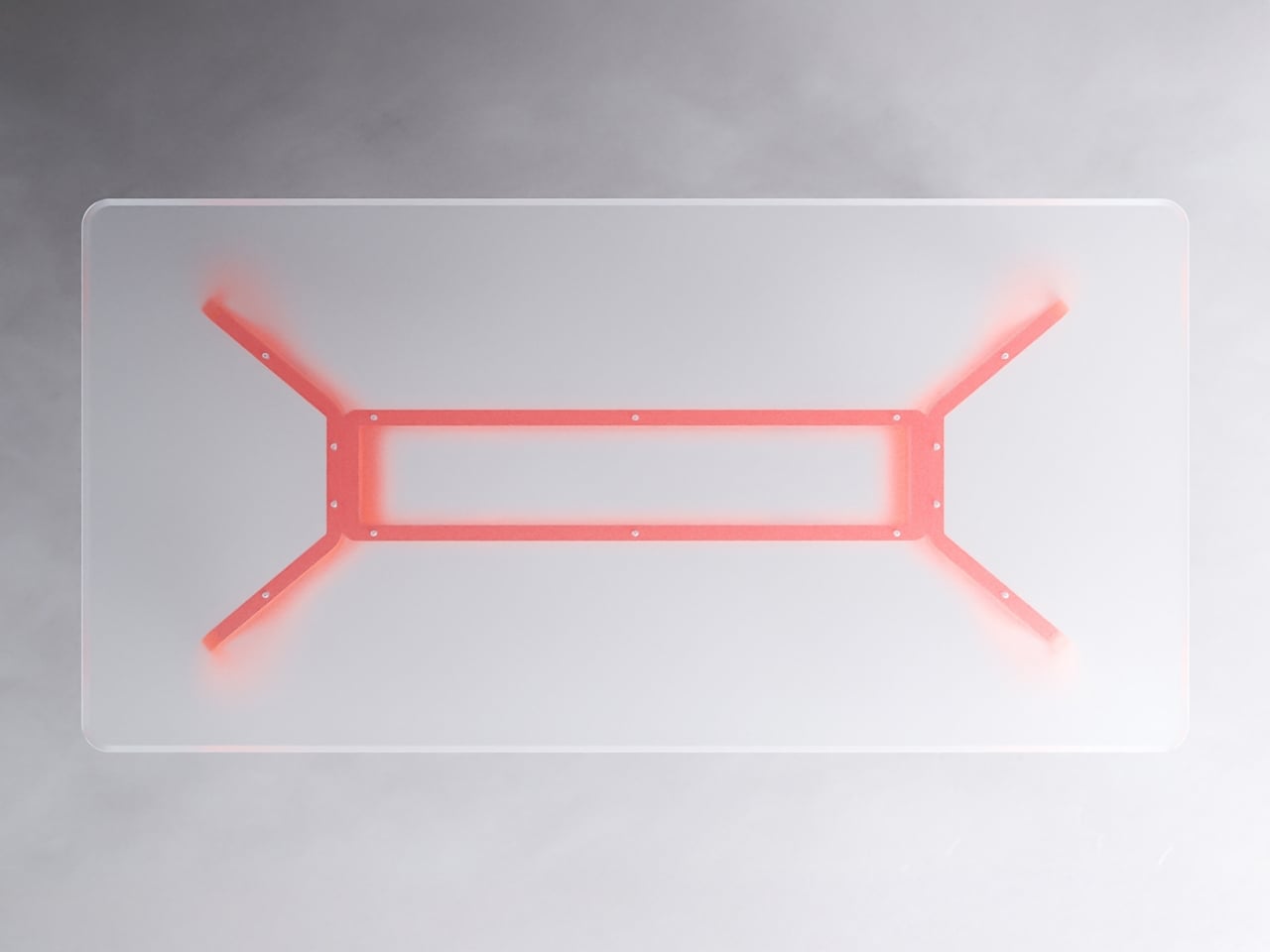
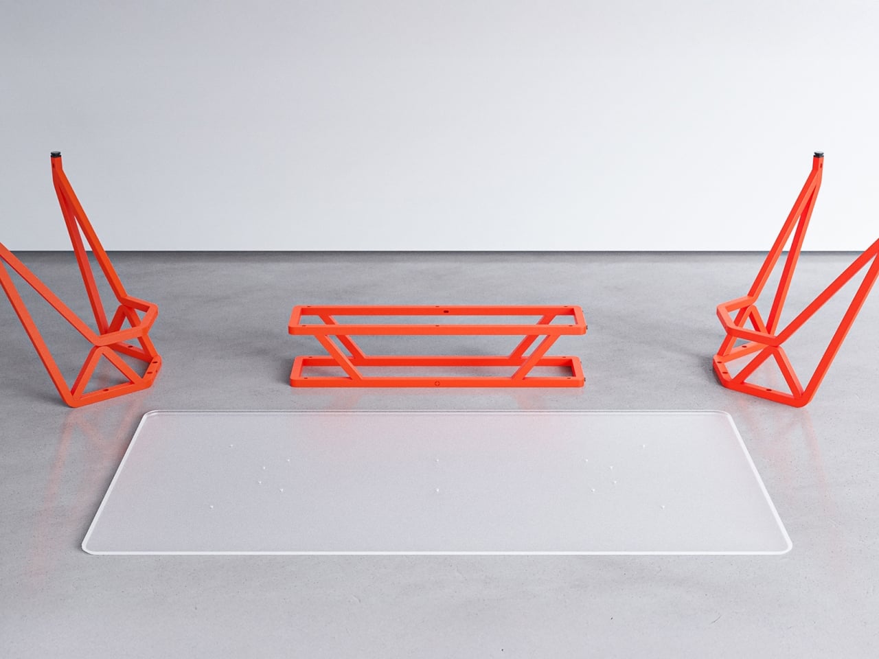
What sets Landr apart visually is its bold use of bright, contemporary color finishes applied through durable powder coating. These vivid tones enhance the table’s architectural form while adding energy and character to interiors that favor modern expression. Paired with tabletop options in ceramic, wood, or glass, the bright steel frame becomes a statement feature rather than a background element. Functional, expressive, and long-lasting, the Landr table balances performance with color-forward design.

2. Softened Minimal Geometry

Design has clearly shifted away from dramatic, exaggerated curves toward calm and disciplined forms. Instead of flamboyant sculptural shapes, architects now employ gentle arcs and controlled radii to soften the rigid edges of contemporary construction. Curved thresholds, joinery, and soffits introduce refinement while maintaining visual restraint.

At the center of this 2026 approach is improved spatial flow and comfort. Features such as double-height glazing framed by softly curved soffits guide the eye smoothly through the interior. This reduces the visual tension of strict rectilinear layouts, enhances the movement of diffused light, and creates spaces that feel balanced, composed, and naturally welcoming.

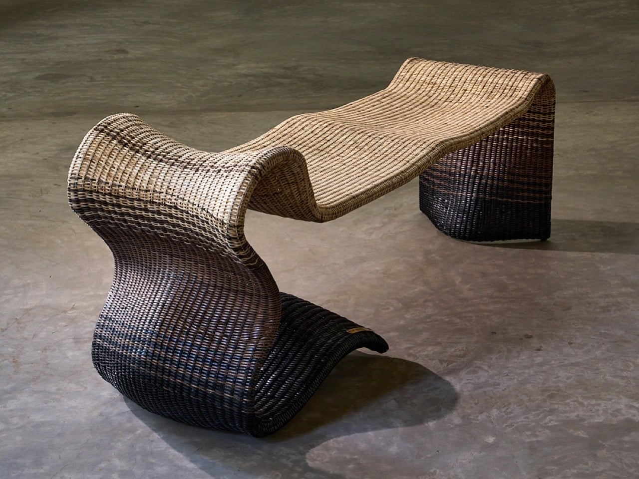
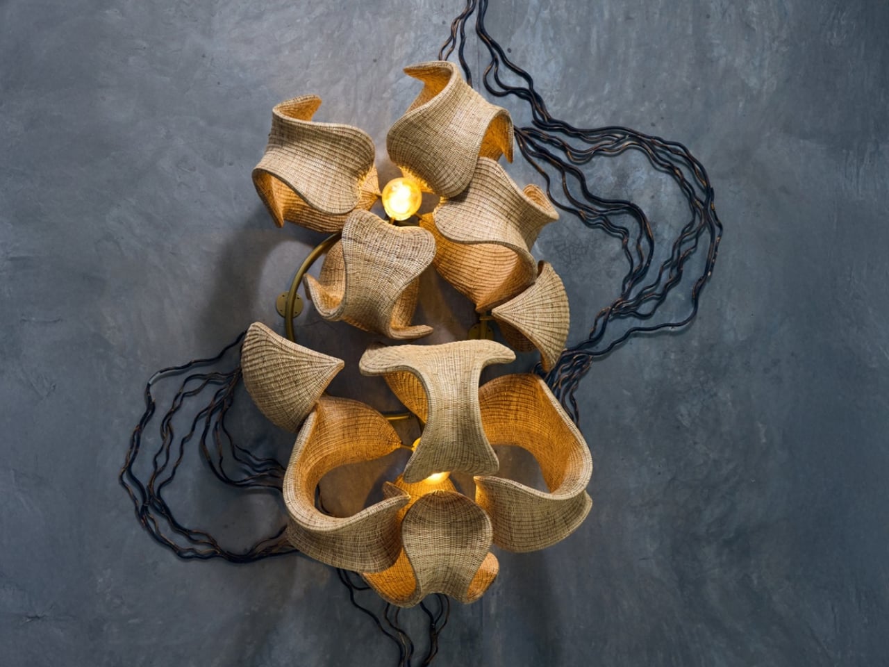
Whispers of the Wildwood is a contemporary wicker collection by Hyderabad-based design studio The Wicker Story, led by designer Priyanka Narula. Rooted in traditional Indian weaving techniques, the collection reinterprets wicker through a modern, sculptural lens. Drawing inspiration from natural landscapes such as forest canopies, flowing paths, and organic growth patterns, the pieces move beyond conventional furniture typologies to become refined design objects that balance function with artistic expression.
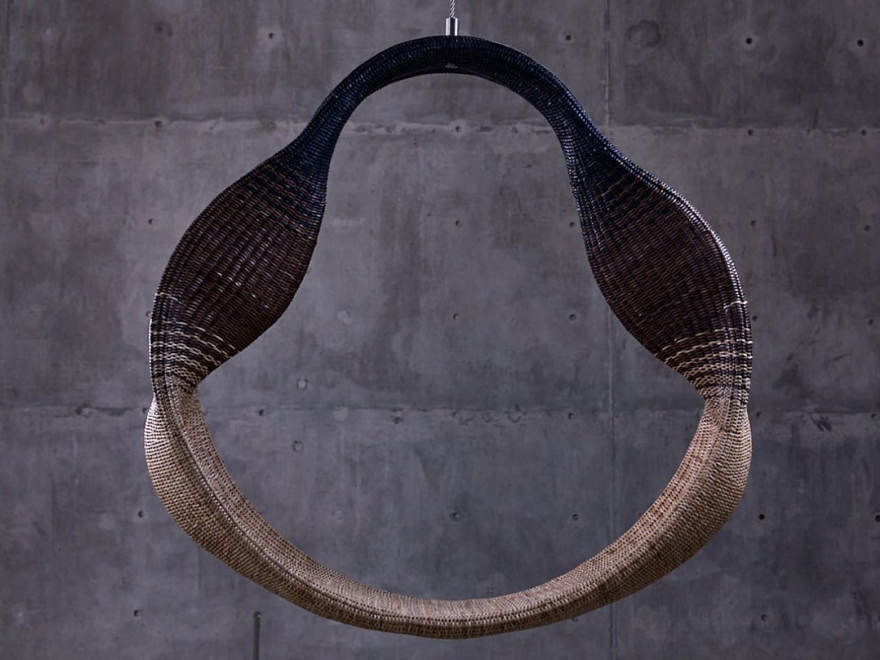

The collection is defined by fluid forms, intricate textures, and a restrained material palette that allows the natural warmth of wicker to take center stage. Designs such as the Pagdandi wall unit exemplify this approach, translating the irregular rhythm of nature into woven structures with visual lightness and depth. Research-driven and craft-focused, Whispers of the Wildwood demonstrates how traditional materials can evolve into sophisticated, contemporary forms while retaining their tactile and cultural authenticity.

3. Human-Centered Spatial Core

Spatial planning is being redefined to place human experience above rigid, formal layouts. At the center of this approach is performance-driven comfort. Successful floor plans now prioritize acoustic privacy and thermal efficiency, recognizing that true luxury lies in how well a space responds to the human body.

Homes are designed to adapt to daily rhythms, offering quiet, comfort, and environmental balance rather than relying solely on visual order.
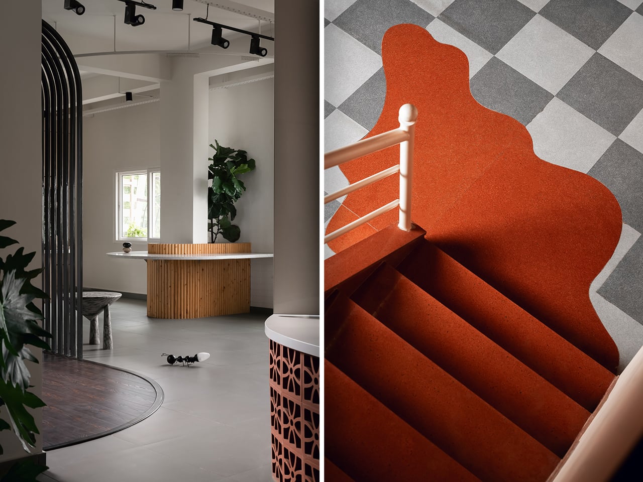
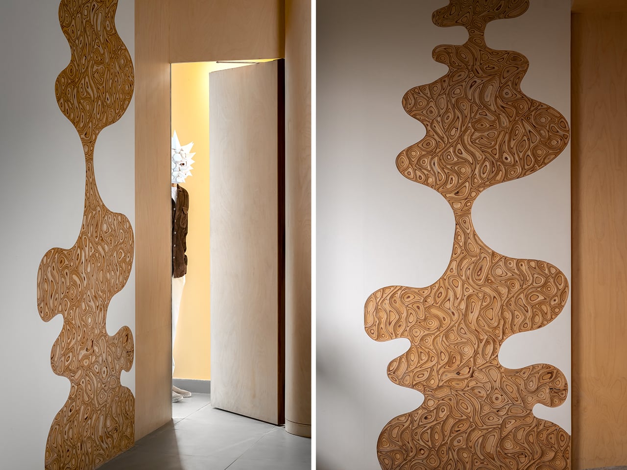
The planning strategy showed in this Warehouse Space transforms a conventional 2,500-square-foot warehouse into a carefully choreographed spatial sequence. Rather than relying on fixed walls, the layout is organized through visual cues, circulation paths, and deliberate zoning. Each area unfolds gradually, encouraging movement and discovery while maintaining spatial continuity. Color transitions, curved architectural elements, and material changes are used as planning tools to define functions without fragmenting the open volume.
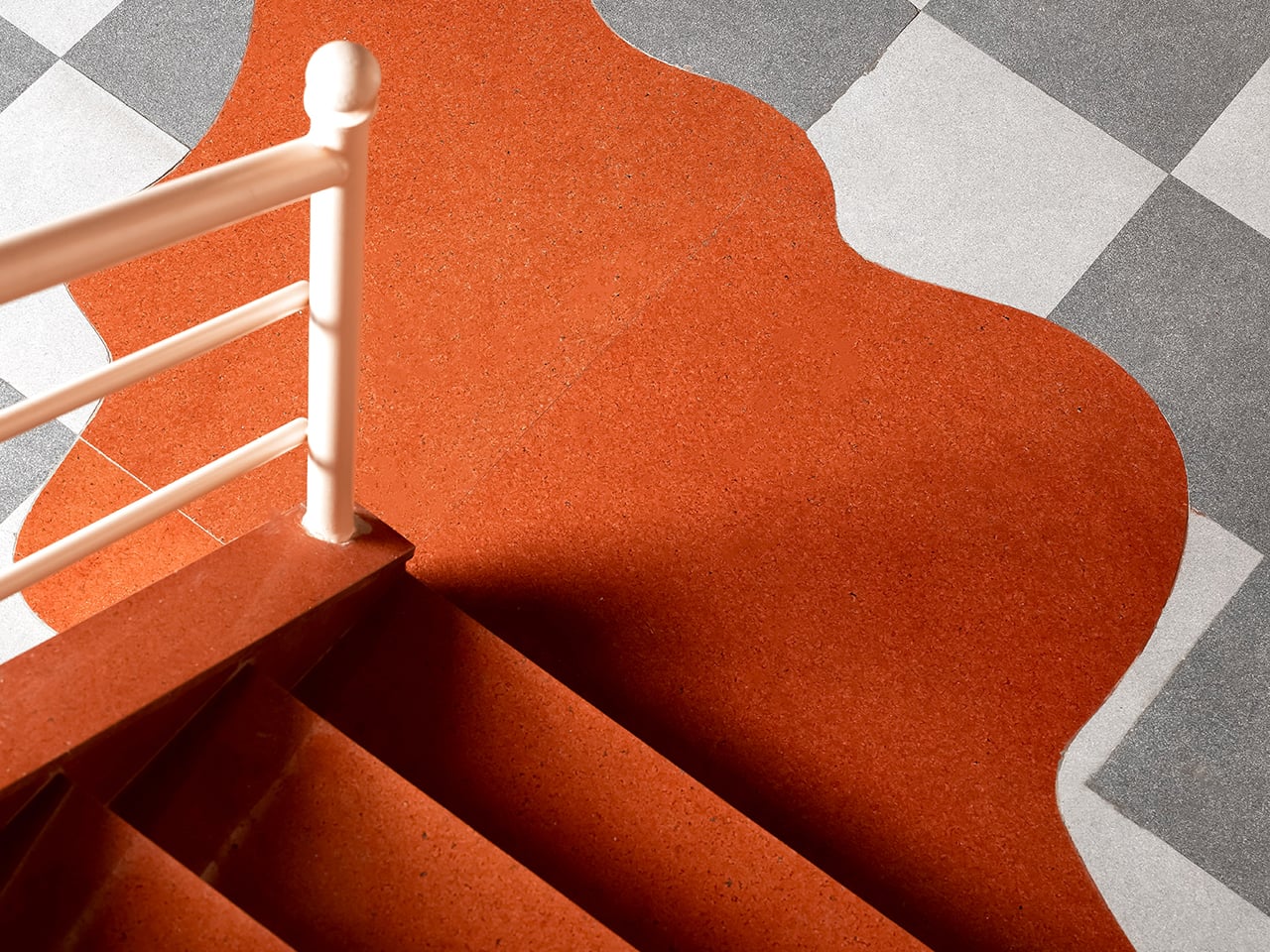
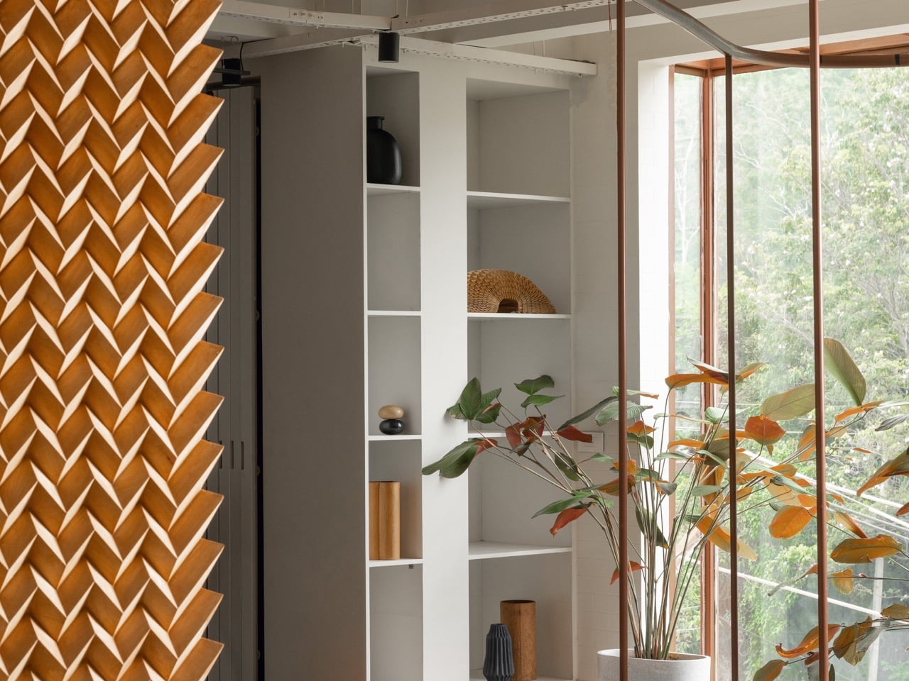
This approach allows the space to function as a cohesive whole while accommodating varied uses. Active zones are positioned to feel dynamic and engaging, while quieter areas are subtly set apart through restrained finishes and controlled visual breaks. Repeating motifs and aligned sightlines guide users intuitively, reinforcing orientation and flow. The planning balances structure with flexibility, ensuring clarity without rigidity. Through thoughtful sequencing and layered spatial relationships, the design demonstrates how strategic planning can redefine an industrial shell into an immersive, purpose-driven environment.

4. Raw Material Honesty

Design is witnessing a clear return to materials that express their true nature, moving away from artificial and imitation finishes. Elements such as hand-worked metal, lime-wash plaster, and natural stone are valued for the stories they carry and the sensory richness they offer. These materials bring depth, texture, and authenticity to interior spaces.

This approach also supports sustainability and longevity. Using materials in their natural or minimally processed state reduces manufacturing impact and improves durability over time. The tactile experience such as the feel of a raw timber handrail, adds a layer of quiet luxury, reflecting a growing preference for honest, lasting materials over polished superficiality.

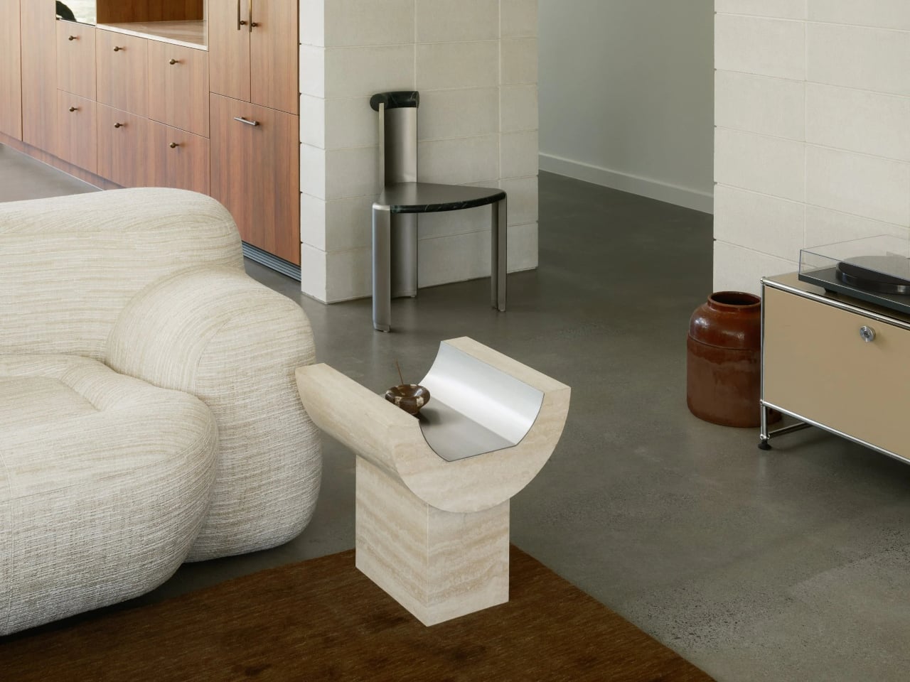
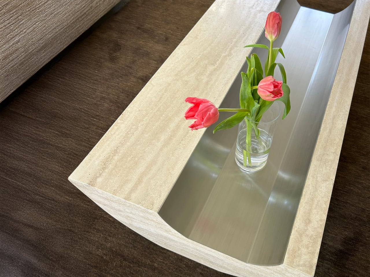
Stone coffee tables are often conceived as heavy, monolithic objects defined by mass rather than refinement. The Coffee Table and Side Table by Tom Black adopt a more considered approach, treating Italian travertine as a material to be carved, balanced, and visually lightened. A single curved gesture defines both pieces, creating an impression of elevation, while a contrasting brushed metal inlay introduces intentional voids within the stone. This dialogue between solid and negative space reframes stone as something sculptural rather than purely structural.
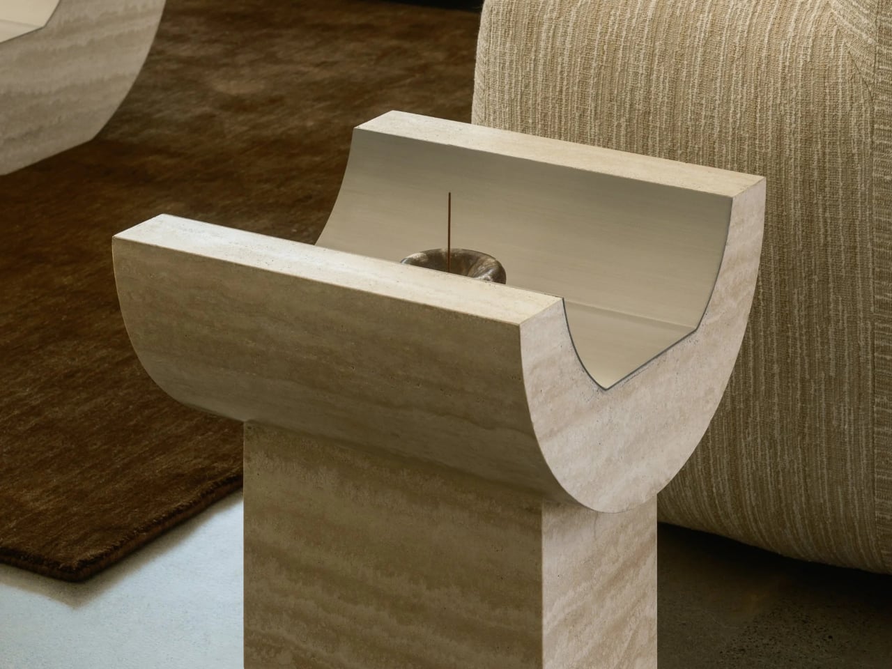
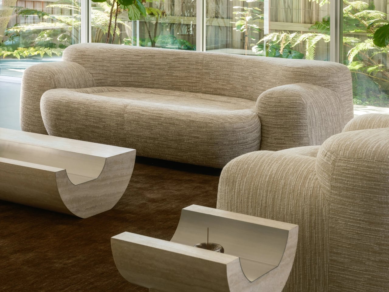
The Coffee Table features a softly curved underside that lifts the form from the floor, paired with a recessed metal-lined trough on the surface that mirrors this curvature. The Side Table translates the same language into a more vertical composition, combining a curved travertine element with a rectilinear base. Together, the two pieces function as architectural furniture, unified by material, proportion, and a restrained yet expressive formal clarity.

5. Built – Landscape Dialogue

Design is increasingly dissolving the boundary between inside and outside. Architects are creating transitional spaces such as semi-covered verandas, internal courtyards, glass walls and shaded thresholds that allow the landscape to flow into the heart of the home. These zones soften the built form and create a natural connection with light, air, and greenery.

Beyond aesthetics, design now focuses on lived experience—how materials, light, and climate affect comfort and emotion. The emphasis has shifted from glossy surfaces to meaningful, biophilic spaces that reduce environmental impact while supporting mental, emotional, and spiritual well-being.
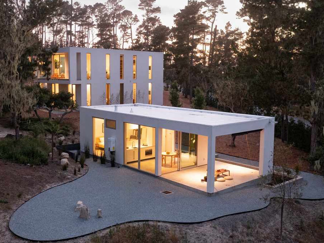
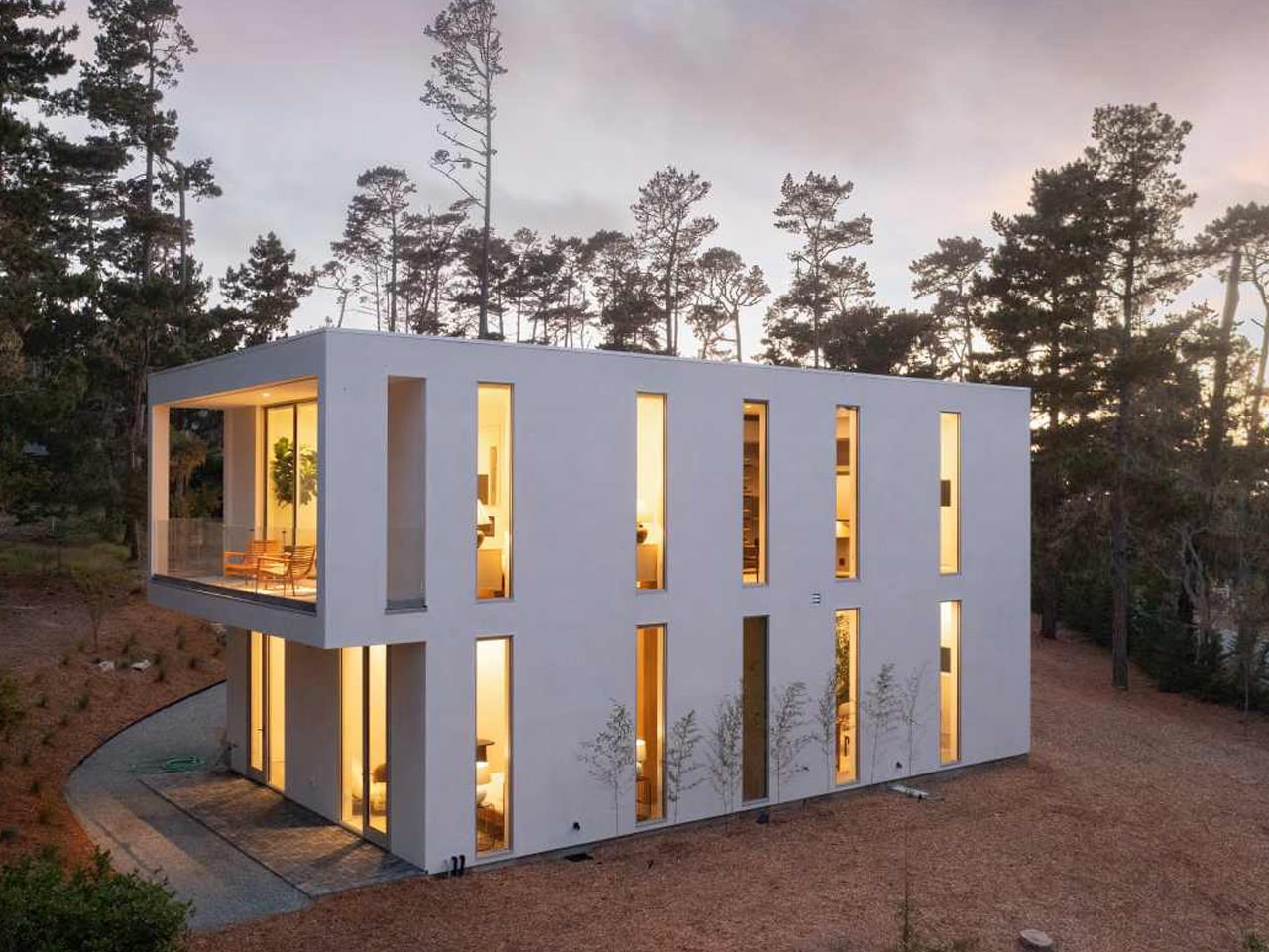
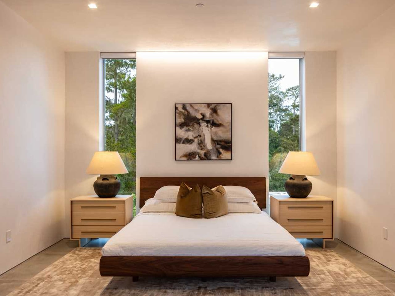
Waterbridge House is conceived as a seamless extension of its natural setting, balancing architectural clarity with a strong indoor–outdoor connection. Set among the pine trees of Pebble Beach, the glass-dominated structure appears to hover above the landscape, defined by clean lines and a restrained material palette. Influenced by Japandi principles, the design blends Japanese serenity with Scandinavian simplicity, resulting in spaces that feel calm, light-filled, and closely attuned to their surroundings.
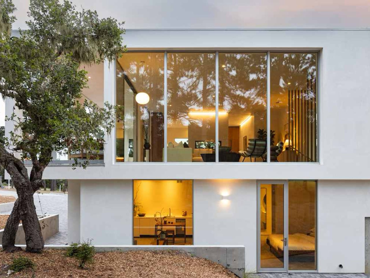
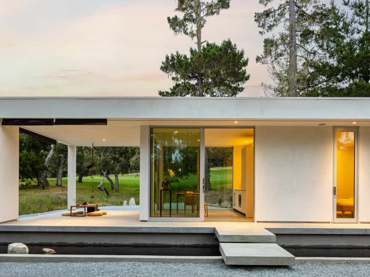
A defining planning element is the glass corridor that bridges a reflective pool, acting as both an entry sequence and a spatial pause. This transparent link connects two distinct wings: one dedicated to open-plan living and social interaction, the other organized around privacy with bedrooms and quiet retreats. Expansive glazing, sliding walls, and layered decks dissolve boundaries between interior and exterior, allowing light, water, and forest views to shape everyday experience.

Interior design now reflects a deeper focus on authenticity and human connection. Through confident color, softened geometry, and people-first planning, spaces move beyond decoration toward meaning. The true measure of architecture lies in its ability to create calm, light-filled sanctuaries that support emotional well-being while remaining visually refined and environmentally responsible.

The post 5 Interior Design Trends That Just Made Minimalism Obsolete in 2026 first appeared on Yanko Design.
TikTok’s latest spinoff app feels a lot like Quibi, but with shorter and cornier content

In another attempt to reduce our attention spans to mush, TikTok has released the PineDrama app, which offers serialized drama series that are roughly a minute per episode. As first spotted by Business Insider, the app is designed exactly like TikTok, but instead of trendy dance videos, you can scroll through and watch "micro dramas."

For those new to the category, micro dramas are bite-sized TV shows shot in vertical video and available in minute-long episodes. Don't expect any nominations for Best Original Screenplay with series like The Officer Fell For Me or Married to my past life's nemesis, since they typically offer soap opera vibes with cliffhangers that keep users scrolling to the next episode. The app is designed to keep people on it with a Discover tab, a place to save favorites and the ability to react in real time alongside other viewers.

Right now, the micro dramas on PineDrama are all free to watch and don't have any ads. It's unclear if TikTok will introduce any costs or ads to the app, since other micro drama options like DramaBox or ReelShort have a paid structure. Late last year, TikTok also introduced a way to watch micro dramas within its own app, with a section called Minis. It's not the first time we're seeing shorter TV show formats, since Quibi made waves with a format of episodes that were less than 10 minutes long. However, maybe even 10 minutes was too long since the startup eventually called it quits after eight months.

This article originally appeared on Engadget at https://www.engadget.com/entertainment/tv-movies/tiktoks-latest-spinoff-app-feels-a-lot-like-quibi-but-with-shorter-and-cornier-content-185702010.html?src=rss

TikTok’s latest spinoff app feels a lot like Quibi, but with shorter and cornier content

In another attempt to reduce our attention spans to mush, TikTok has released the PineDrama app, which offers serialized drama series that are roughly a minute per episode. As first spotted by Business Insider, the app is designed exactly like TikTok, but instead of trendy dance videos, you can scroll through and watch "micro dramas."

For those new to the category, micro dramas are bite-sized TV shows shot in vertical video and available in minute-long episodes. Don't expect any nominations for Best Original Screenplay with series like The Officer Fell For Me or Married to my past life's nemesis, since they typically offer soap opera vibes with cliffhangers that keep users scrolling to the next episode. The app is designed to keep people on it with a Discover tab, a place to save favorites and the ability to react in real time alongside other viewers.

Right now, the micro dramas on PineDrama are all free to watch and don't have any ads. It's unclear if TikTok will introduce any costs or ads to the app, since other micro drama options like DramaBox or ReelShort have a paid structure. Late last year, TikTok also introduced a way to watch micro dramas within its own app, with a section called Minis. It's not the first time we're seeing shorter TV show formats, since Quibi made waves with a format of episodes that were less than 10 minutes long. However, maybe even 10 minutes was too long since the startup eventually called it quits after eight months.

This article originally appeared on Engadget at https://www.engadget.com/entertainment/tv-movies/tiktoks-latest-spinoff-app-feels-a-lot-like-quibi-but-with-shorter-and-cornier-content-185702010.html?src=rss

Elon Musk is looking for a $134 billion payout from OpenAI and Microsoft

We now have some idea of what's at stake in the longstanding feud between Elon Musk and OpenAI. As first reported by Bloomberg, the latest filing, as part of a lawsuit that accuses the AI giant of abandoning its non-profit status, claims that Musk is owed anywhere between $79 billion and $134 billion in damages from the "wrongful gains" of OpenAI and Microsoft.

Musk claimed in the filing that he's entitled to a portion of OpenAI's recent valuation at $500 billion, after contributing $38 million in "seed funding" during the AI company's startup years. Along with providing "roughly 60 percent of the nonprofit's seed funding," Musk offered recruiting of key employees, introductions with business contacts and startup advice, according to the filing. The monetary estimate comes from C. Paul Wazzan, a financial economist who's serving as Musk's expert in the case. According to Wazzan's calculations, OpenAI earned between $65.5 billion and $109.43 billion in wrongful gains, while Microsoft saw between $13.3 billion and $25.06 billion.

The lawsuit between Elon Musk and OpenAI dates back to March 2024, when the xAI CEO first filed a legal action claiming that OpenAI violated its non-profit status. Musk later added Microsoft as another defendant and even tried to get an injunction when OpenAI announced efforts to reorganize its corporate structure. Besides this suit, Musk has named OpenAI in another legal battle, accusing the company, along with Apple, of monopolistic practices that prevent xAI from getting a fair shot in the App Store.

This article originally appeared on Engadget at https://www.engadget.com/big-tech/elon-musk-is-looking-for-a-134-billion-payout-from-openai-and-microsoft-171824945.html?src=rss

MG Raiser Doubles Up Your Manga Shelf Without Hiding the Back Row

Bookshelves quietly go from single row to double row, especially for manga where volumes multiply quickly. The front row looks great, the back row disappears behind it, and you end up playing memory games to remember which volume is hiding behind which spine. Collectors accept this as the price of a growing library, even though it makes browsing and rearranging annoying and means half your collection is essentially invisible unless you pull out the front row.

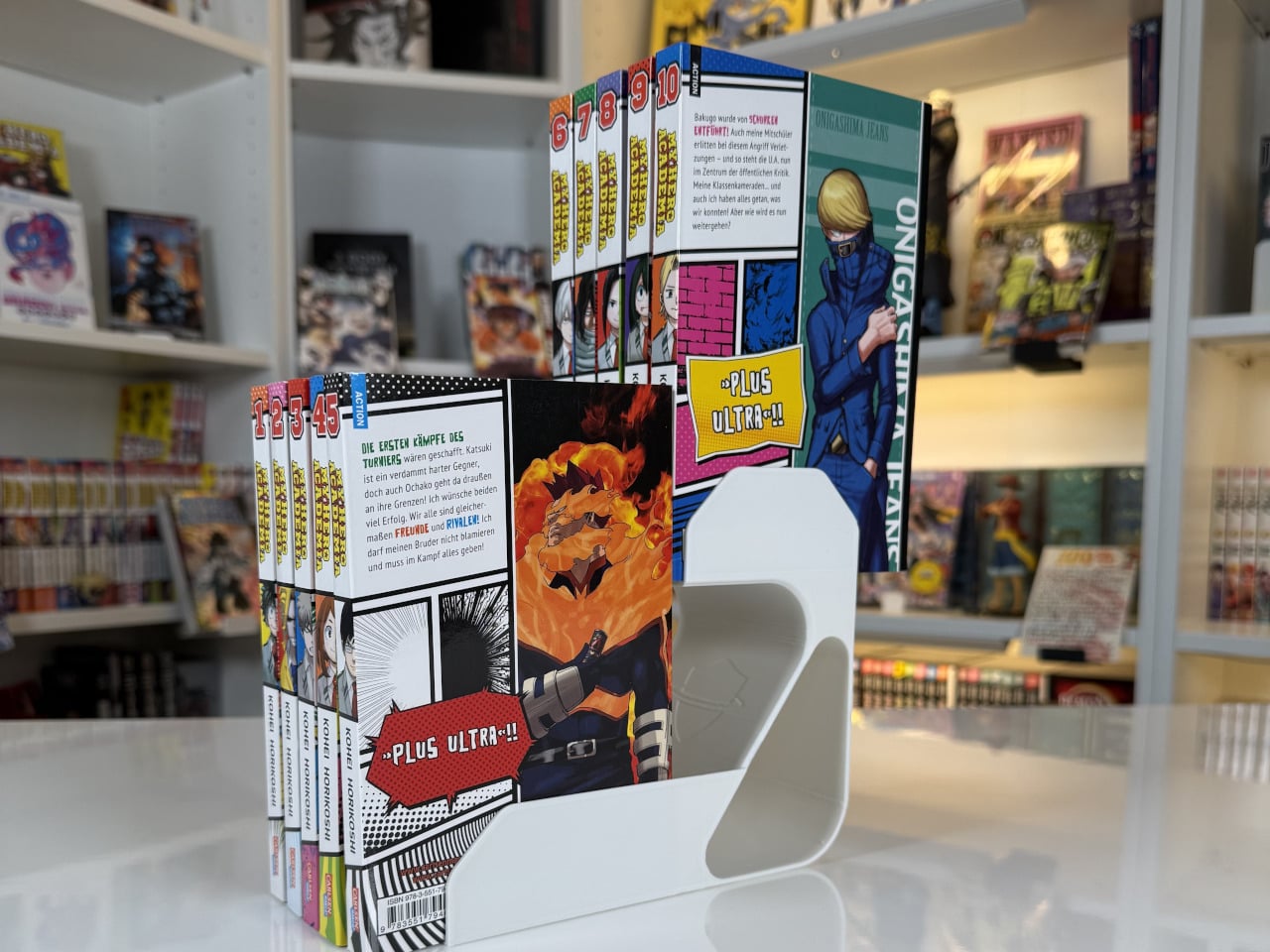
MG Raiser from MangaGuardian is a tiny shelf adapter that takes that double-row habit and makes it less painful. It is a compact L-shaped stand that lets you display two rows of manga in the same footprint, with the back row raised just enough to stay visible. Simple plastic geometry aimed squarely at overcrowded shelves, it solves a niche problem that anyone with more than 20 volumes has quietly dealt with at some point.

Designer: MangaGuardian

Sliding a few MG Raisers onto a shelf and lining up volumes, the front row sits where it always has, but the back row now rides on a small platform. You can still read every spine, which makes it easier to grab the next volume or rediscover something you forgot you owned. You get roughly twice the capacity in that section without turning the back row into a black hole where titles go to be forgotten.

The block-lift function is where the design gets a bit more clever. The back row and the Raiser act as a single movable unit, so when you want to reorganize you can pull out the entire raised row at once and drop it somewhere else on the shelf. For people who like to re-theme shelves, group arcs, or rotate what is on display, that small interaction saves time and keeps stacks from collapsing mid-move.

Each MG Raiser holds up to 10 items, typically five in front and five in back, with 84 mm width, 170 mm depth, and 150 mm height tuned for standard tankōbon-sized manga. The same proportions work for other similarly sized things, small paperbacks, light novels, or even game cases, so the design quietly extends beyond its original niche and could help anyone trying to squeeze more out of limited shelf space.

MangaGuardian sells other components like MG Tana and MG Sora for more elaborate setups, but MG Raiser stands on its own as a drop-in upgrade. You can use a couple in a single cube, line up several across a long shelf, or mix them with plain rows. It respects whatever furniture you already have, which is important when your shelves are already full of things you care about.

MG Raiser is unapologetically aimed at manga fans, yet the underlying idea, a raised second row that moves as a block, could help anyone trying to squeeze more out of a bookshelf without turning it into chaos. It is the kind of small, almost remedial design move that feels obvious once you see it, and that is usually a sign the designers were paying attention to how people actually live with their stuff instead of just offering another decorative shelf cube.

The post MG Raiser Doubles Up Your Manga Shelf Without Hiding the Back Row first appeared on Yanko Design.

5 iOS 26 Tricks to Make Your iPhone 17 Look and Feel Brand New

5 iOS 26 Tricks to Make Your iPhone 17 Look and Feel Brand New

With the release of iOS 26, organizing your iPhone has become more intuitive and visually engaging than ever before. Apple’s latest update introduces advanced customization tools that allow you to balance functionality with style. Whether you’re aiming for a sleek, minimalist design or a highly organized layout, these five strategies will help you optimize your […]

The post 5 iOS 26 Tricks to Make Your iPhone 17 Look and Feel Brand New appeared first on Geeky Gadgets.

Posted in Uncategorized

From Templates to Gmail, How Claude Cowork Handles Office Tasks

From Templates to Gmail, How Claude Cowork Handles Office Tasks

Wouldn’t it be incredible if your office tasks could practically manage themselves? David Ondrej explains how Claude Cowork, an AI-powered application by Anthropic, is designed to make that vision a reality. Imagine effortlessly organizing files, tracking invoices, and streamlining workflows, all without needing any technical expertise. But here’s the catch: while Claude Cowork promises simplicity […]

The post From Templates to Gmail, How Claude Cowork Handles Office Tasks appeared first on Geeky Gadgets.

Posted in Uncategorized