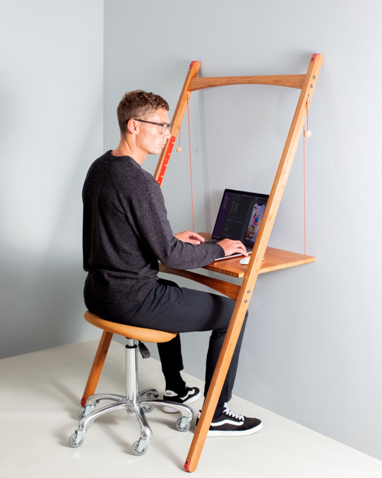
There was a time when the desk was just a surface. One more flat space to pile things on – a laptop, a charger, a cold coffee, a tangle of cables you stopped seeing years ago. No system. No intention. Just the low hum of “good enough.”
But as more of us rethink the spaces we work in this year – decluttering our setups, upgrading what we touch every day, and trading disposable gadgets for objects built to last – something has quietly shifted. Mechanical keyboards are surging again. Design-led desk pieces sell out faster than they restock. And the desk, of all things, has become the one place we’re finally willing to treat with a little care.
It isn’t about productivity hacks or another ergonomic chair. It’s about presence. The handful of objects you reach for, look at, and live beside during the hours you’re most focused. Here are seven that understand the assignment. Build it slowly, piece by piece.
1. MelGeek Centauri80 – the keyboard that grew up
Best for the centerpiece of a serious setup.
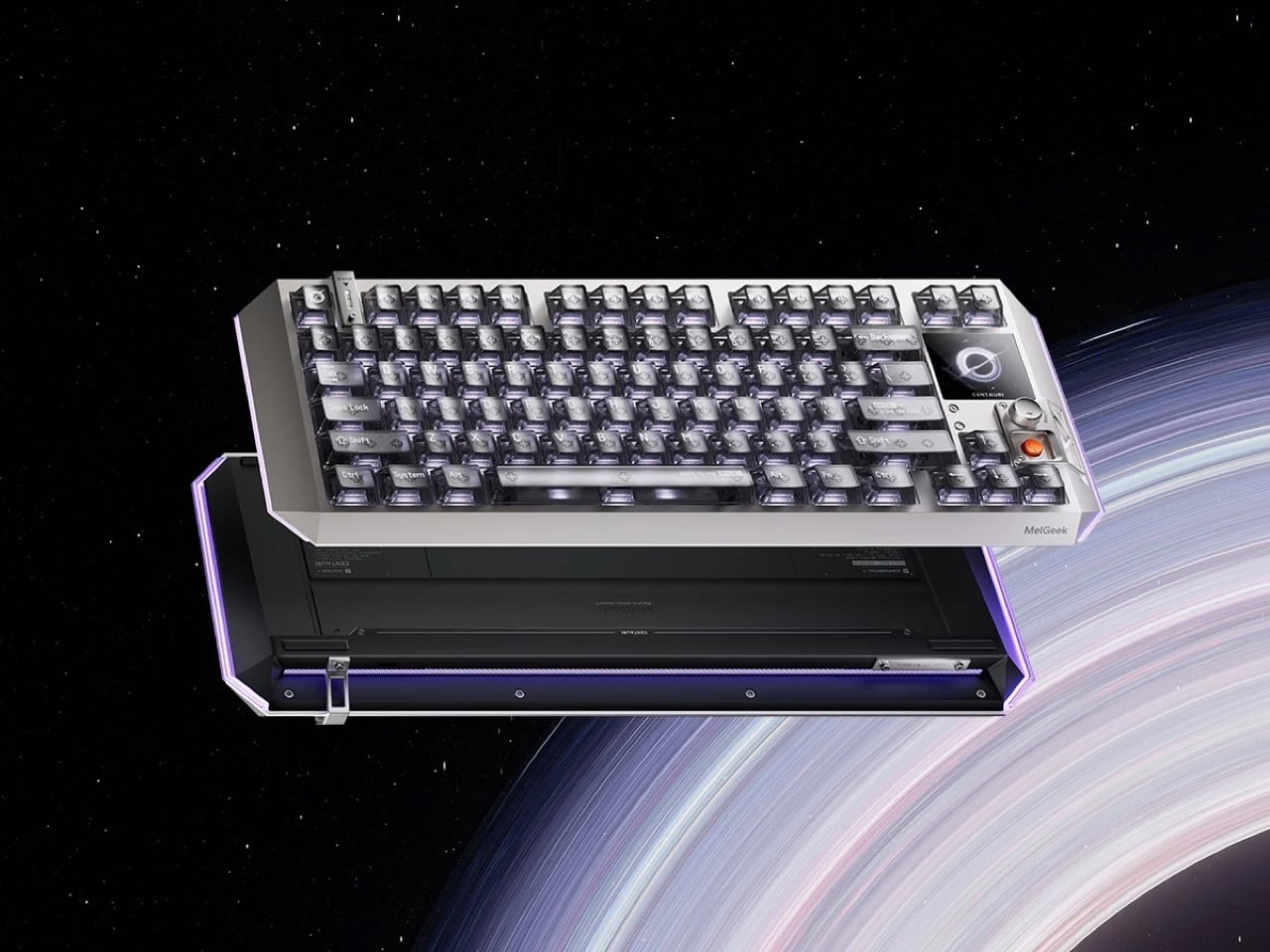
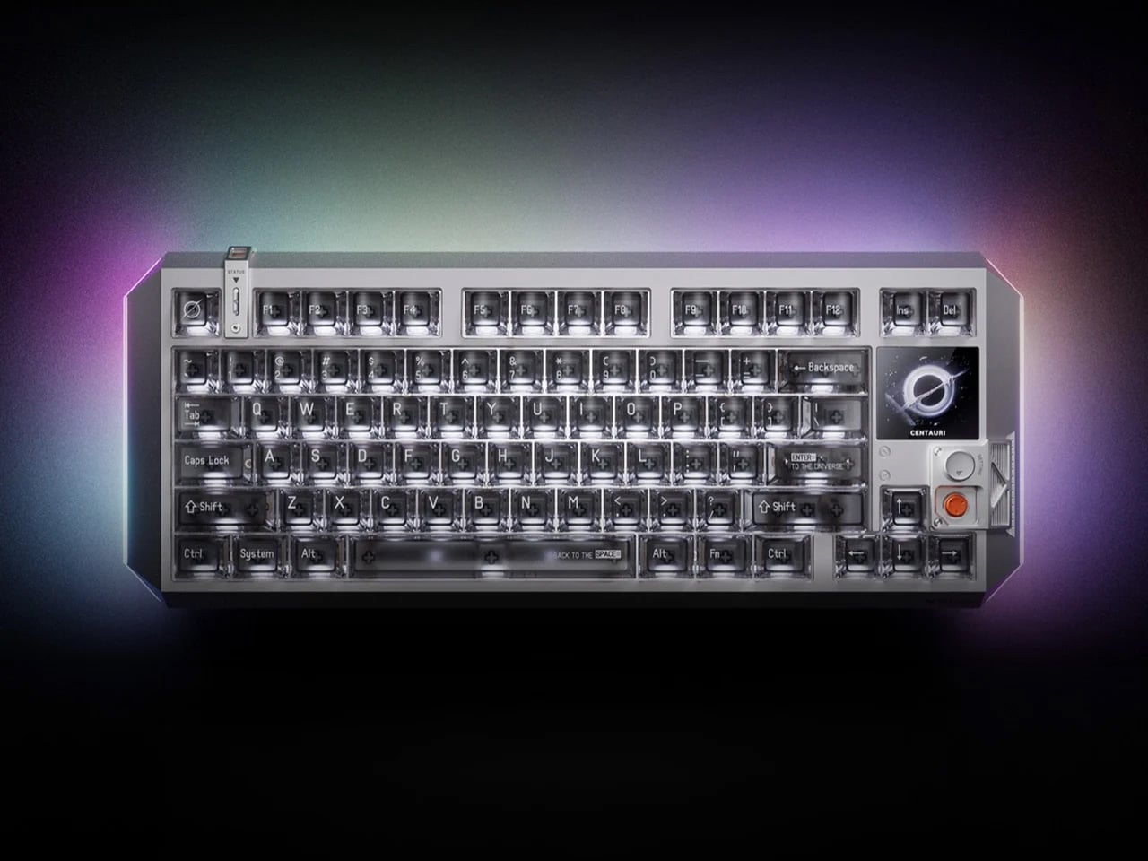
For fifty years, the keyboard kept the same quiet contract. Switches under keycaps, keycaps under fingers. Functional. Forgettable. Then MelGeek asked a different question – what if the thing you touch most all day could also be the thing you most want to look at?
The MelGeek Centauri80 is the answer. It’s an 80% Hall Effect board with a tiny 1.78-inch OLED set into one corner, sharp as an Apple Watch face, and a rotary dial called the Super Dock beside it. Swap a wallpaper. Toggle a macro. Dial in the light. All without ever leaving your work. Underneath, a suspended aluminum body and a five-layer gasket mount turn every keystroke into a deep, controlled thud – the sound keyboard people chase for years.
It isn’t cheap at $299. But this was never about typing faster. It’s about a tool that finally feels like it belongs on a desk you actually care about.
Why it earns desk space:
This keyboard sits next to a budget keyboard the way a machined mechanical watch sits next to a Casio – both keep time, but only one is also a statement about what an object is allowed to be.
2. Everlasting All-Metal Pencil – the last pencil you’ll buy
Best for the daily tool you’ll actually reach for.
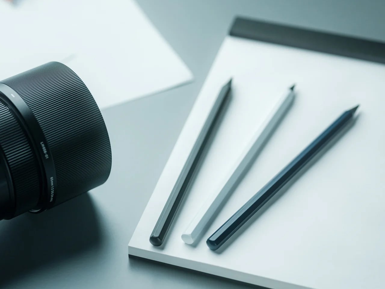
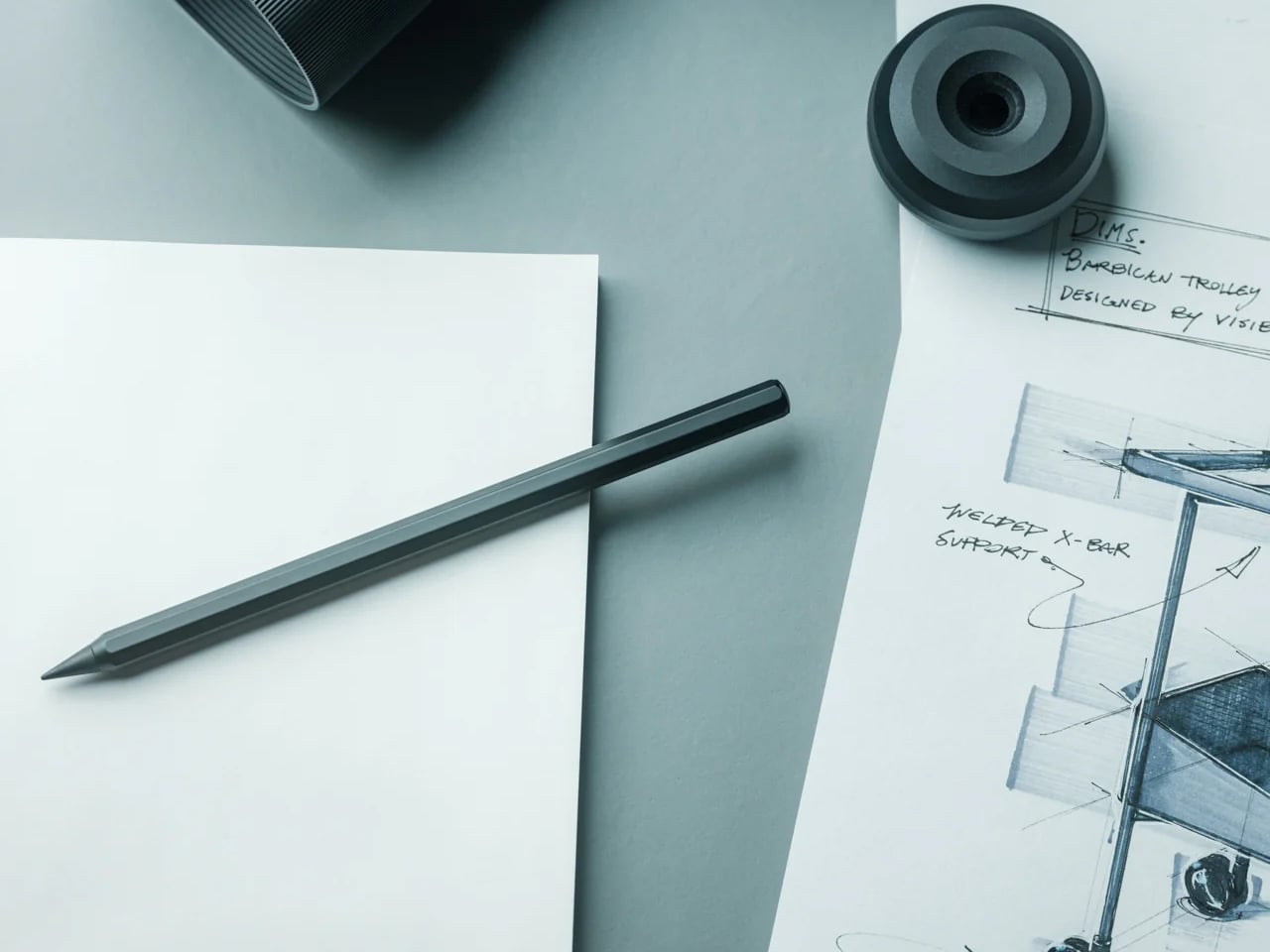
The premise sounds too good to be true, so here it is straight: a pencil that never needs sharpening and never runs out.
It writes with a special alloy core in an aluminum body, leaving a faint, graphite-like line as you go – an estimated ten miles of writing before the tip shows real wear. No lead to snap. No sharpener to hunt for. No sad little stub at the end. And yes, it erases like an ordinary pencil.
It’s the cheapest thing on this list, and somehow the one you’ll reach for most. Balanced, matte, quietly heavier than it looks – the all-metal cousin of an Apple Pencil, for twenty dollars.
Why it earns desk space:
It replaces the thing you constantly replace with something you never have to replace again. That’s the whole brief, delivered completely.
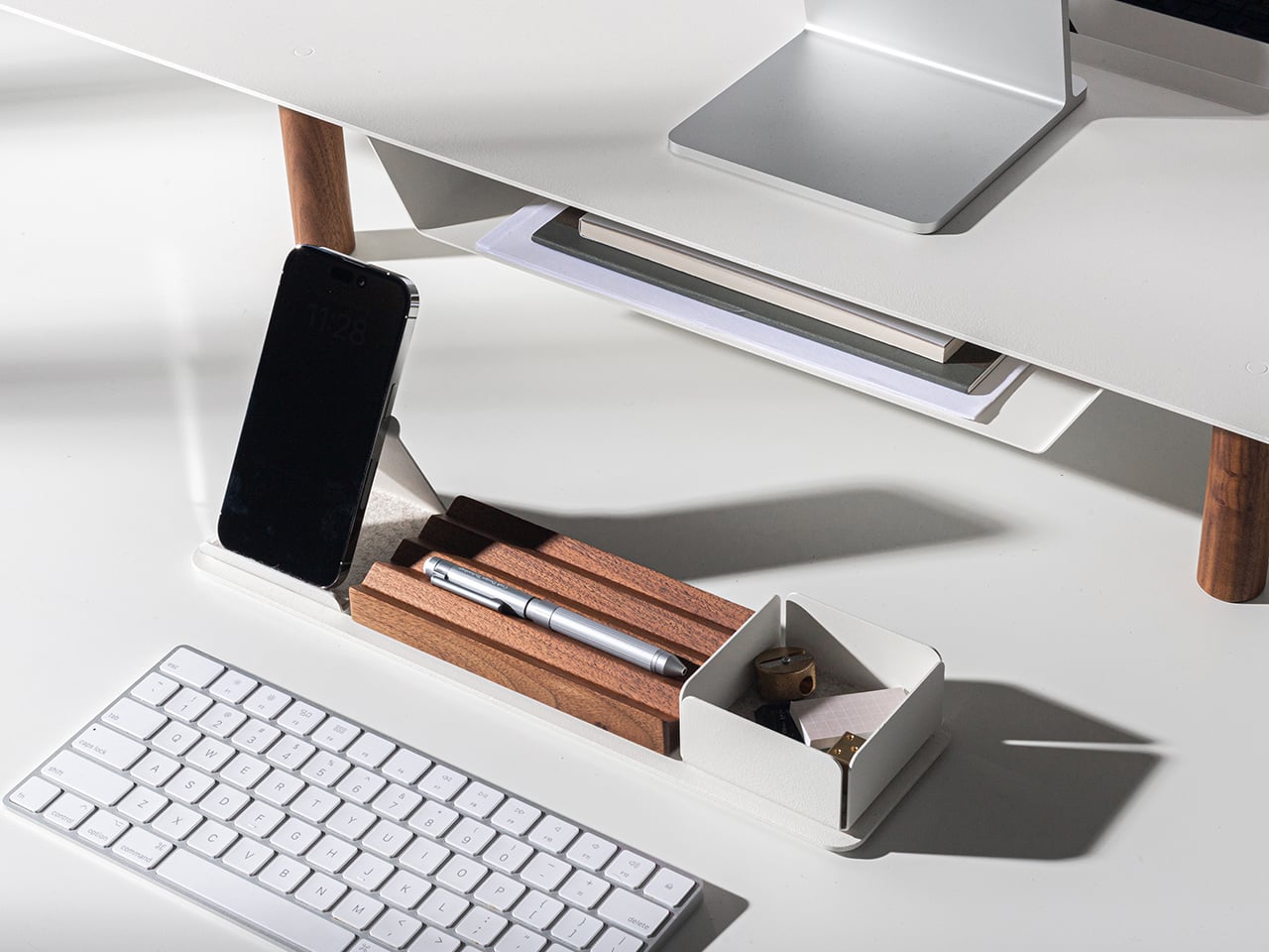
3. Gather by Ugmonk – organize your desk the way a designer would
Best for the foundation everything else sits on.
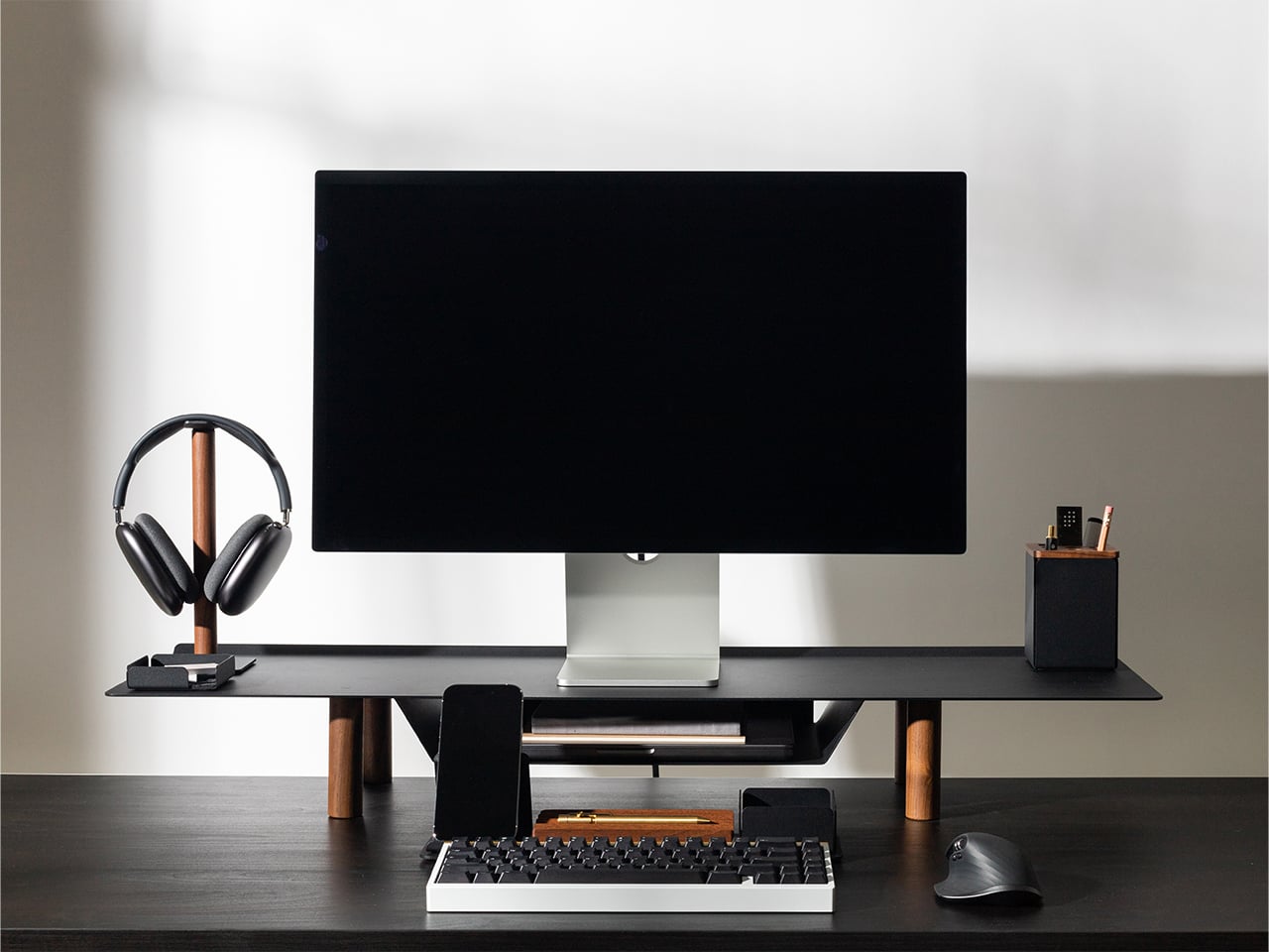
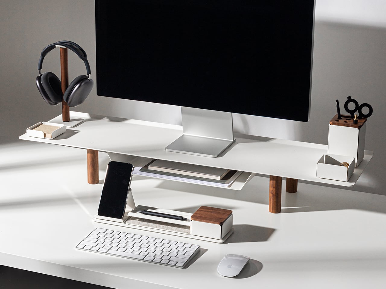
Most desk organizers are built around storage. Gather is built around use – and that one difference changes everything.
Designer Jeff Sheldon made it in powder-coated steel and solid walnut, by hand, in Pennsylvania. Every tray and stand clicks onto a magnetic base, so you can rearrange the whole thing in seconds and nothing ever slides out of place. No branding. No noise. Just the essentials, finally given a home.
Buy the pieces you need now. Add more when your days change. It’s the rare accessory you set up once and never think about replacing.
Why it earns desk space:
It’s not a storage solution. It’s a workflow solution that happens to look exactly the way a well-edited desk should.
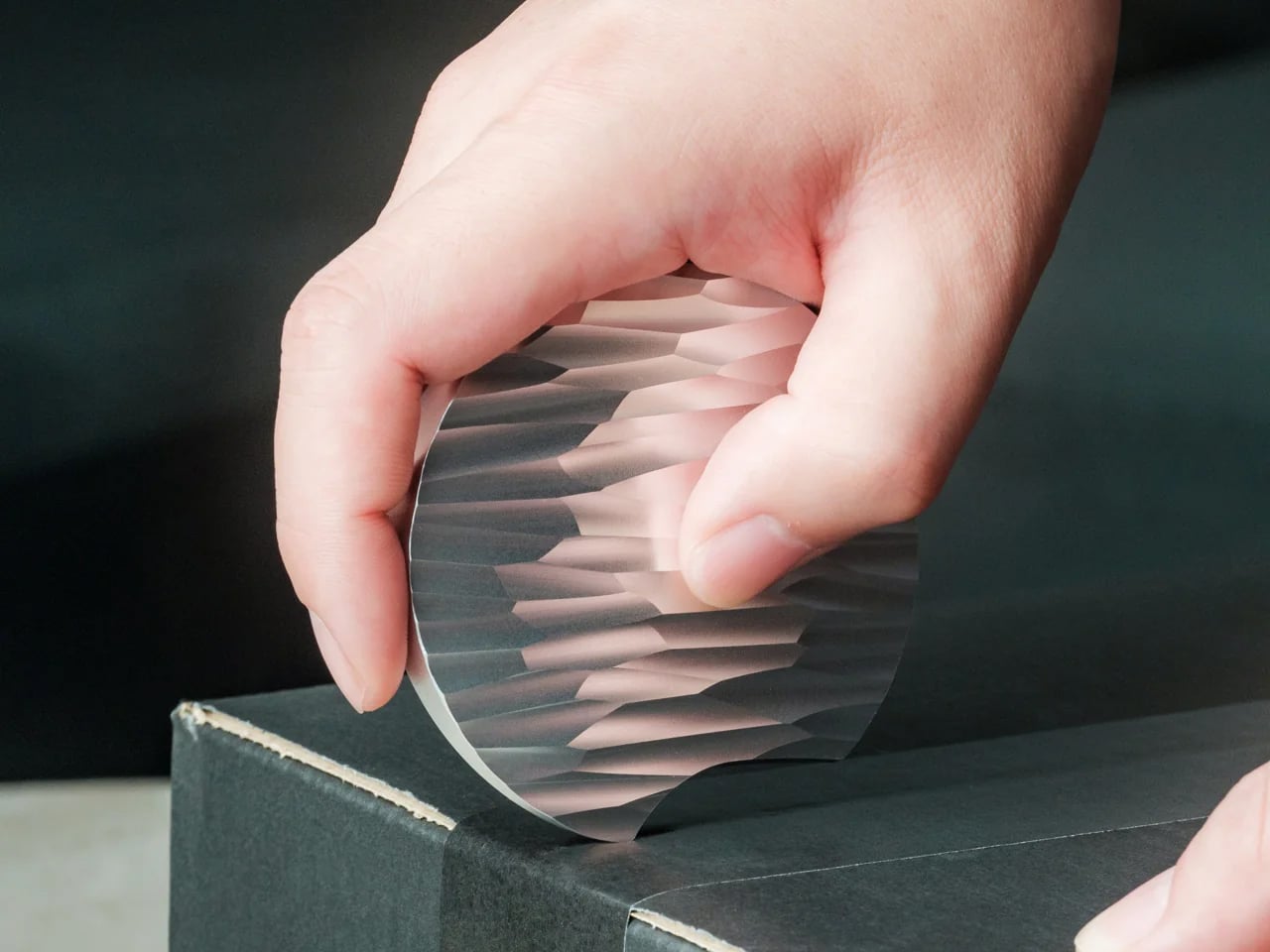
4. Rolling World Clock – time zones made tactile
Best for anyone working across cities.
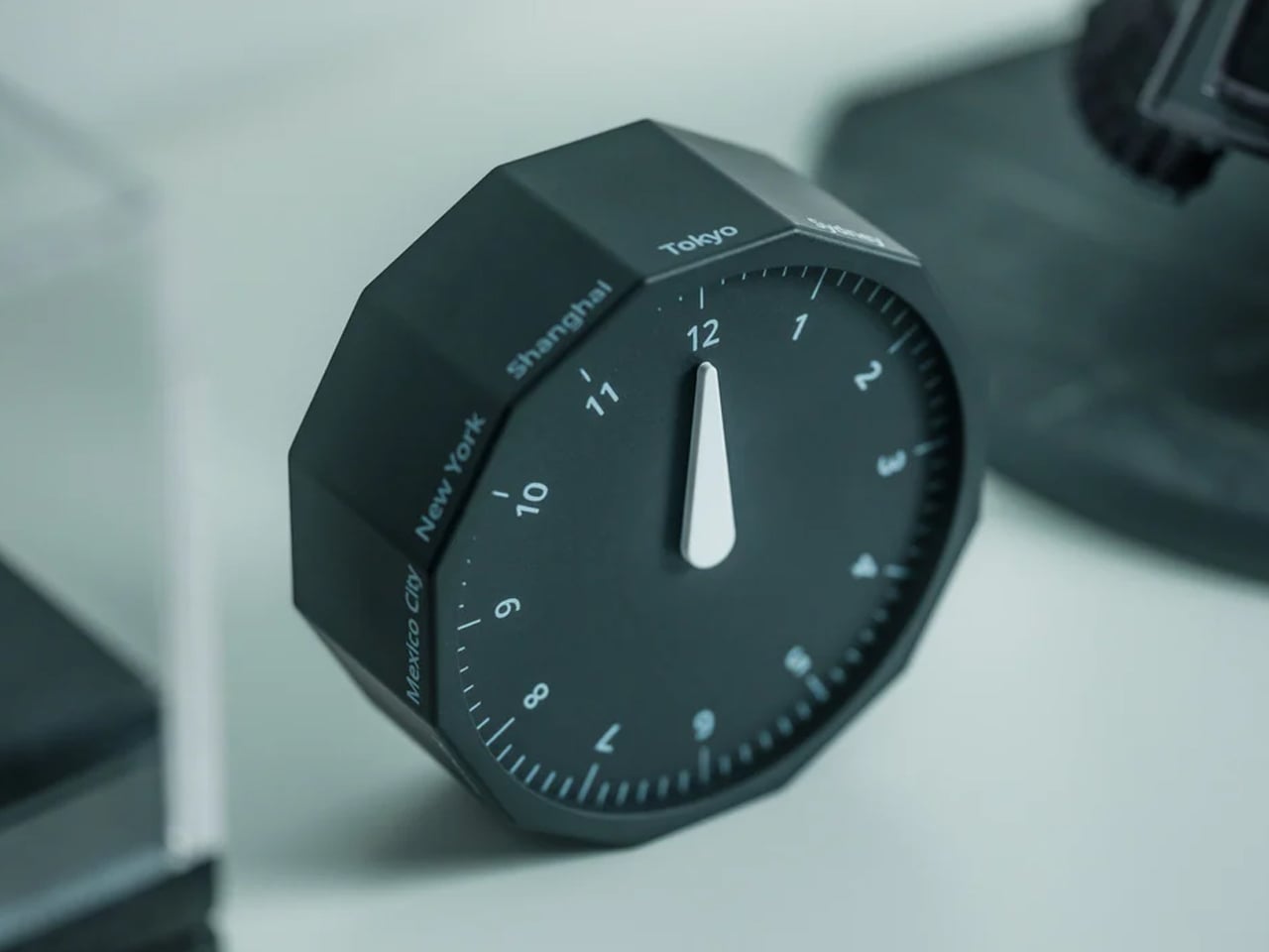

If you work with people in other cities, you’ve built some private system for the time-zone math. It works. It just isn’t beautiful.
The Rolling World Clock replaces it with a single, satisfying motion. Twelve faces, each one a major city – London, Tokyo, New York, Sydney. Roll the one you want face-up, and a single hand tells you the hour there. No screen. No app. No menu buried three taps deep.
Designed by Masafumi Ishikawa and made in Japan, it’s about the size of a hockey puck and quiet enough to leave out between glances. A small thing that turns a tedious habit into something you reach for on purpose.
Why it earns desk space:
It turns a slightly tedious daily need – knowing what time it is on the other side of the world – into something you actually want to pick up and use.
5. The Oloid – a mathematical sculpture that makes thinking visible
Best for the finishing flourish and is cast in stainless steel, brass, or copper.
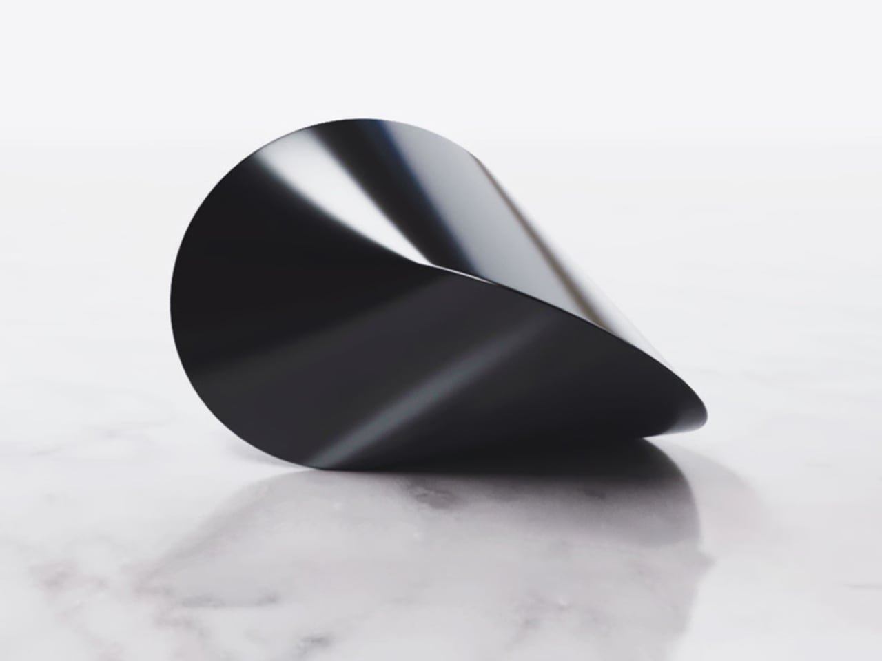
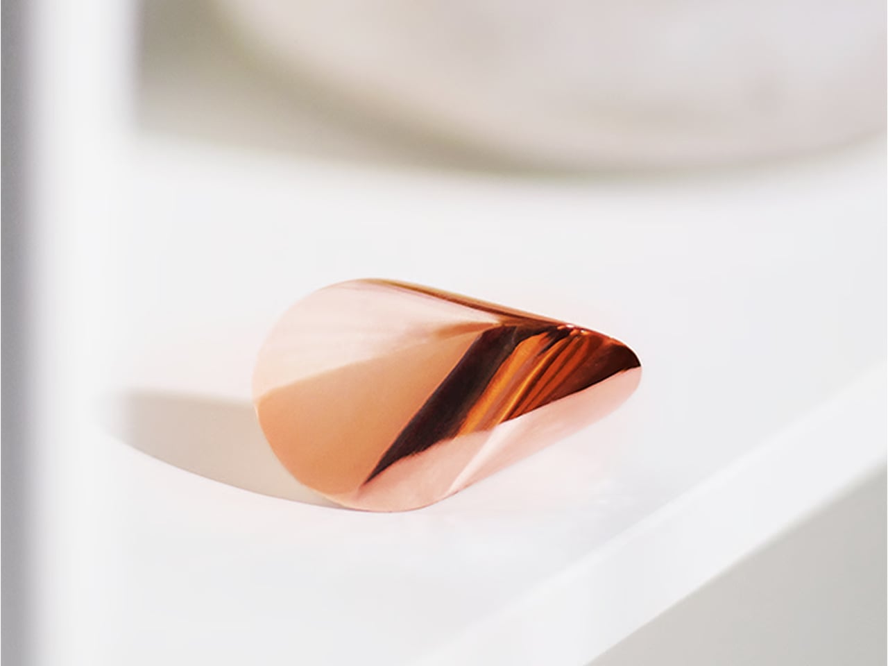
The one object nobody can walk past without picking up.
The Oloid is a piece of geometry first described by German mathematician Paul Schatz in 1929. It isn’t round – and yet it rolls, in a straight, hypnotic line, touching every point on its surface as it moves. No motor. No battery. Just math made solid, cast in mirror-polished stainless steel, brass, or copper.
It does nothing, and that’s the point. You reach for it when you’re stuck, turn it over while you think, and slowly it becomes the quiet center of the desk. Presence, in the palm of your hand.
Why it earns desk space:
It turns the act of thinking – which is invisible – into something you can hold in your hand.
6. Heritage Craft Unboxing Knife – the detail that changes the ritual
Best for the WFH delivery pile.
Every remote worker opens packages all day. Most of us reach for scissors, a key, a thumbnail – and leave the box looking like it lost a fight.
The Heritage Craft Unboxing Knife treats that small moment as something worth doing well. It’s milled from a single block of aluminum into a circular form shaped after a Paleolithic hand axe, sized to settle into your palm. The wave-like ridges aren’t decoration; they’re grip. The blade is angled to glide through tape without ever reaching what’s inside.
On the desk, it reads as a sculpture. In the hand, it reminds you that even the most ordinary ritual can be done with a little more care.
Why it earns desk space:
It’s the most frequently used object here that most people haven’t thought to upgrade yet – which is exactly why it makes such an immediate impression once they do.
7. Author Clock – the clock that tells time through literature
Best for the literature lover’s desk statement piece.
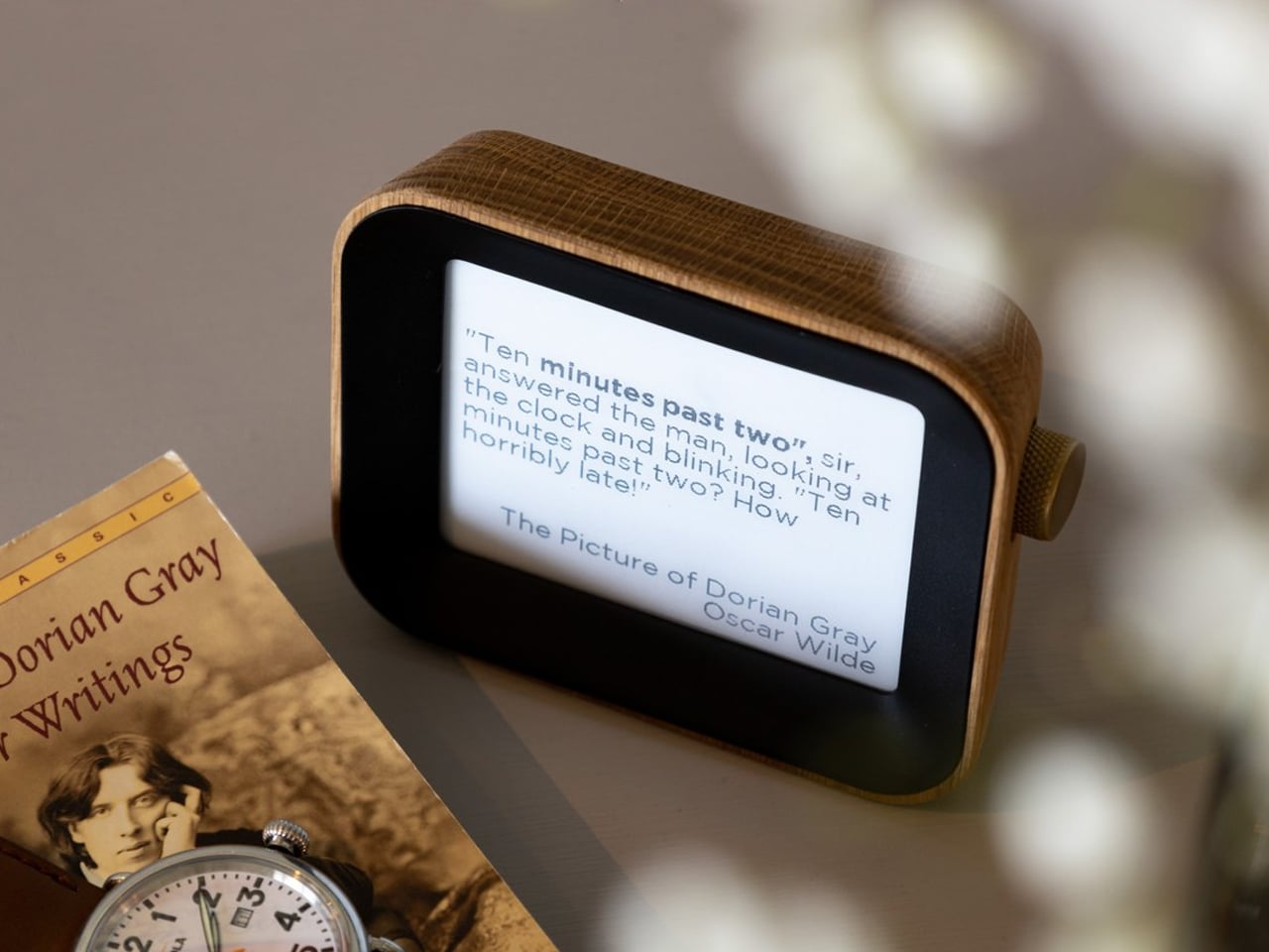
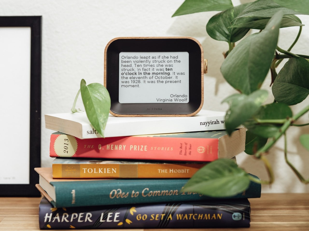
Most clocks tell you the time. This one tells you the time and hands you a sentence worth reading.
Instead of digits, the Author Clock shows a hand-picked literary line with the current hour woven into it – a fresh passage every minute, pulled from more than 13,000 lines across centuries of books. Glance over near eleven at night and you might catch something from Mrs Dalloway. The housing is solid white oak with a brass dial on the side; the e-paper screen is paper-white and never glares.
It pulled in more than $1.3 million from over 8,000 backers, which tells you something. Checking the time stops being a reflex. It becomes a pause.
Why it earns desk space:
It makes the most unremarkable moment of a workday, checking the time, worth noticing.
Your desk is a design statement whether you mean it to be or not
A desk quietly communicates how seriously you take your work, your space, and your time – whether you’ve thought about it or not.
These seven products aren’t a formula for the “perfect” setup. They’re a starting point for thinking about the objects you surround yourself with during the hours you’re most focused and most present. Some solve practical problems beautifully. Some are just worth having nearby while you think. All of them treat the desk as more than a surface.
Start with the foundation, add the daily tools, then let the statement pieces earn their spots over time. That’s the whole point of a design moment: it isn’t about buying more. It’s about choosing better.
The post You Stopped Seeing Your Desk. These 7 Objects Finally Change That first appeared on Yanko Design.