Nevi Brings a Little Playfulness to the Serious Desk Lamp

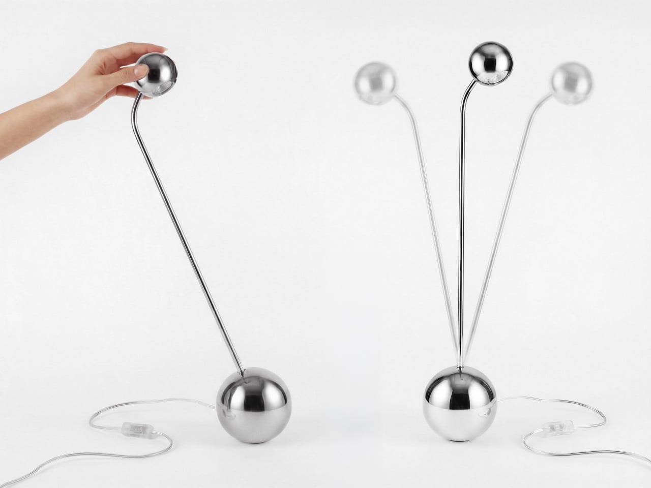
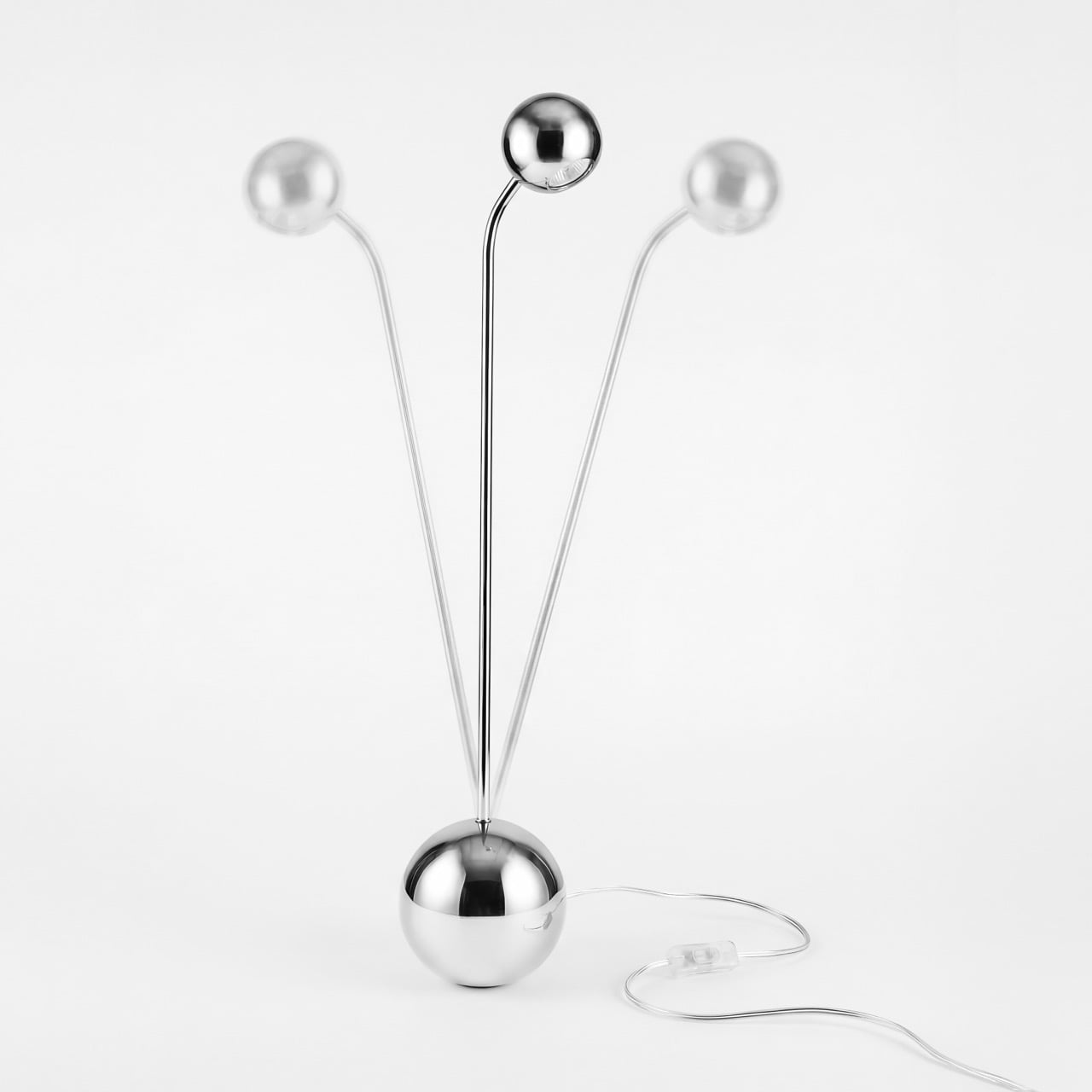
There is something oddly comforting about an object that can lose its balance and find its way back. Nevi takes that small, almost childlike pleasure and turns it into a sculptural desk lamp. Inspired by the classic roly-poly toy, it borrows the familiar idea of wobbling, recovering, and returning upright, then translates it into a much quieter and more refined design language.

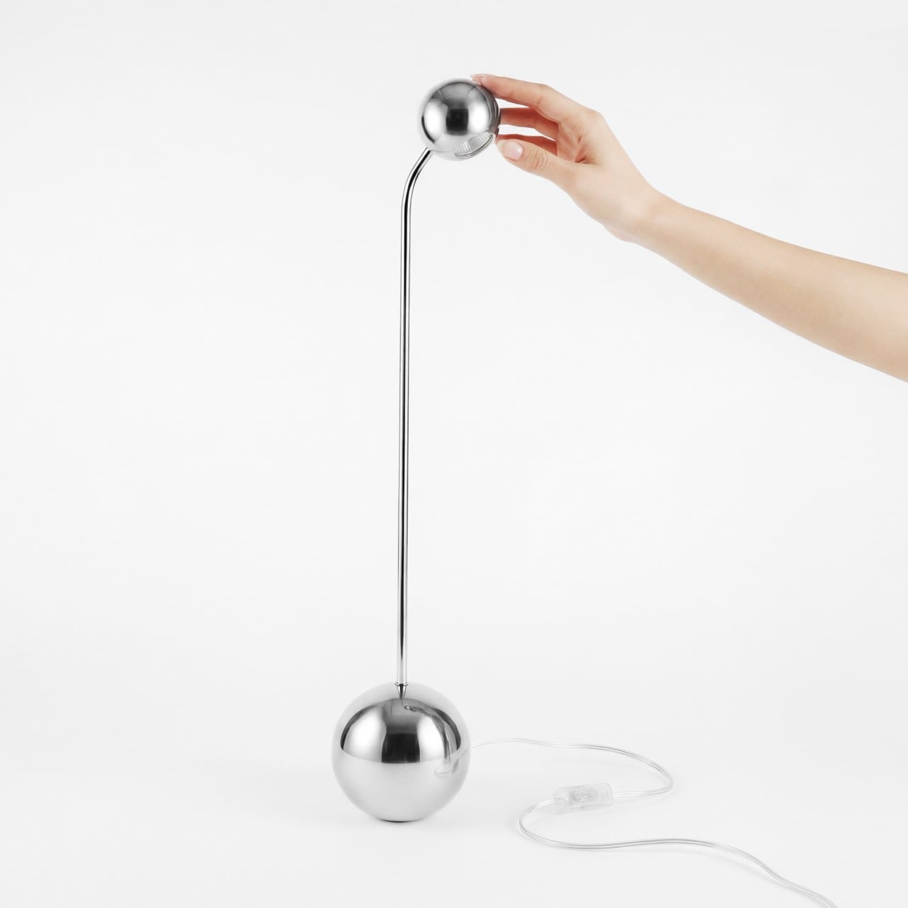
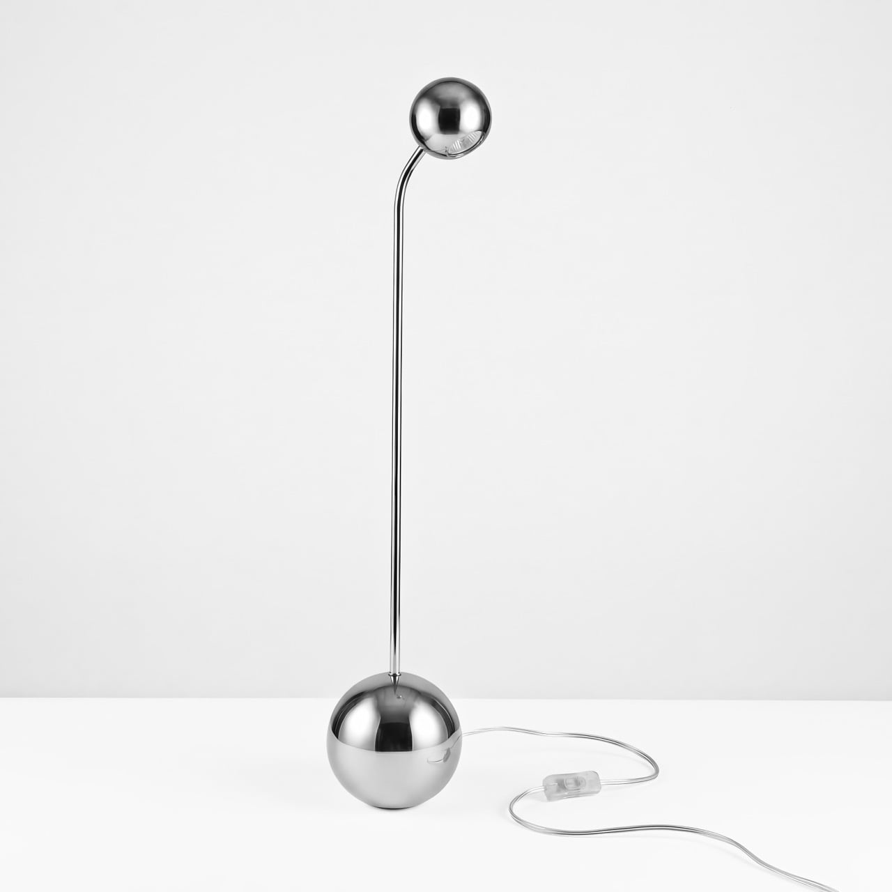
At rest, Nevi feels calm and almost architectural. A rounded stainless-steel base anchors a slender vertical stem, creating a silhouette that feels minimal without becoming cold. But the lamp is not meant to simply sit still. Give it a gentle touch, and it begins to sway, moving smoothly before gradually returning to its upright position. That subtle interaction gives Nevi a personality that most task lights never attempt to have. Instead of being an object that disappears into the background of a desk, it responds to the person using it.

Designer: Andrei Ananenka
The movement is deliberately restrained. Nevi does not perform tricks or demand attention. Its appeal lies in the small moment of interaction: the slight push, the controlled oscillation, and the satisfying return to equilibrium. It makes something as ordinary as a desk lamp feel tactile and surprisingly alive.

Material plays an important role in that experience. The lamp is made from AISI 304 stainless steel and finished entirely by hand. The lower portion of the spherical base has a satin-brushed finish that feels soft and durable, while the upper section is mirror-polished. When Nevi moves, that polished surface catches fragments of the room around it, making reflections shift across the base as the lamp rocks from side to side. The combination of brushed and reflective metal gives an otherwise simple form a sense of depth and movement even before the light is switched on.
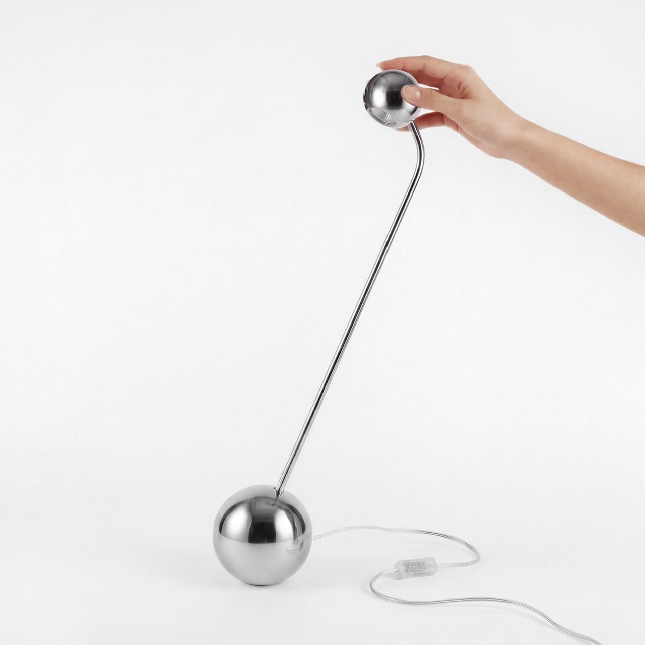
For all of its sculptural qualities, Nevi remains a functional desk light. Its focused beam is designed for activities such as reading, writing, and working, with high color fidelity that keeps illuminated surfaces looking natural. The lighting itself is kept intentionally precise rather than flooding the surrounding space, which suits the lamp’s controlled and disciplined character.

Much of the complexity required to create that simplicity remains hidden inside. The designers had to carefully balance the lamp’s internal weight so that its tall, slender body could move freely without ever feeling unstable. The proportions, center of gravity, and duration of each movement were all studied to make the oscillation feel smooth rather than awkward or mechanical. Even the stainless-steel body quietly performs another role by helping manage the heat created by the light source, allowing the clean silhouette to remain uninterrupted.
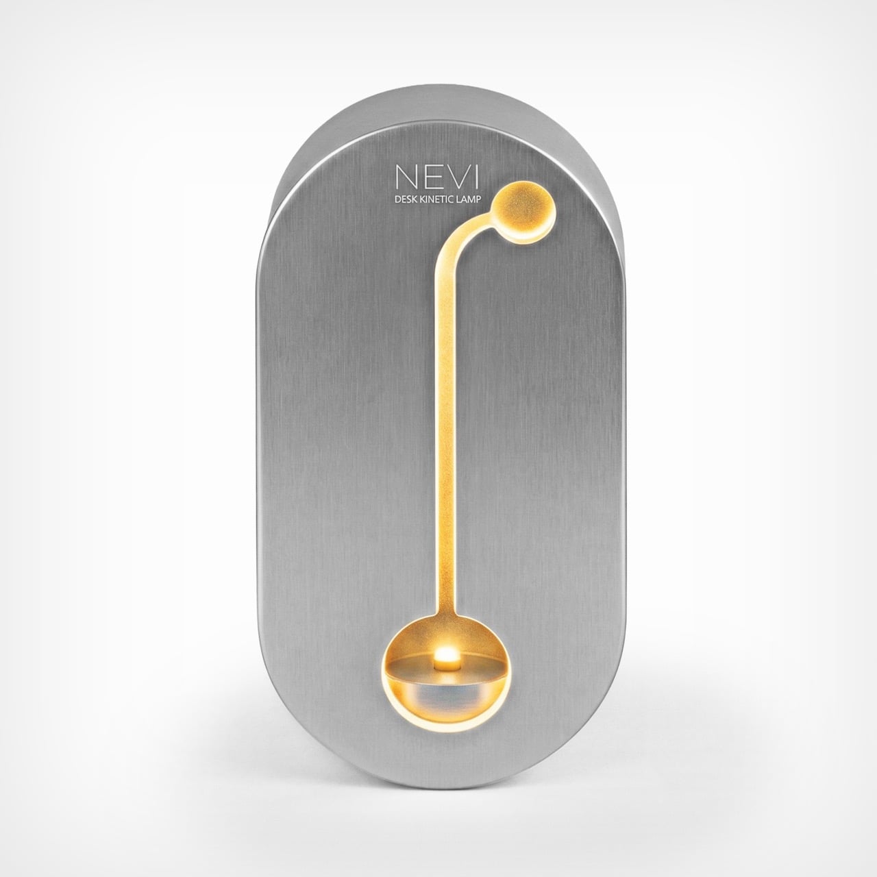
Perhaps Nevi’s most interesting idea, however, arrives before the lamp itself is even revealed. Its packaging was designed with the same self-centering behaviour as the product inside. Rather than becoming an elaborate box that is admired for a few minutes and then stored away or discarded, the high-grade aluminum package has a second life as an ambient light.

After unboxing, a wireless warm LED illuminates a CNC-milled silhouette of the Nevi lamp on the lid, turning the packaging into a small illuminated object for the interior. It can also rock and return upright, echoing the movement of the lamp itself. The package therefore becomes part of the product story rather than an accessory that immediately loses its purpose.
That approach makes the sustainability thinking behind Nevi feel particularly natural. Instead of asking the user to feel responsible for disposing of premium packaging correctly, the design simply gives them a reason to keep it. The box becomes another useful and visually considered object within the home.

The research behind Nevi focused heavily on movement and perception. The designers explored how far an object could tilt, how quickly it should recover, and how long the motion should continue before returning to stillness. Optical studies helped refine the quality and direction of the light, while material experimentation informed the contrast between the satin and mirror-polished finishes. Each decision seems to support the same broader idea: making the lamp feel calm, responsive, and almost instinctive to interact with.
Nevi is ultimately compelling because it brings emotion into a category that is usually defined by utility. It does not reinvent the desk lamp through screens, smart controls or complicated technology. Instead, it uses something much simpler, the pleasure of touch, movement, and return.

There is a quiet metaphor embedded in it too. Push Nevi away from its natural position, and it does not fight the movement. It follows it for a moment, sways, adjusts, and eventually comes back to where it belongs. What began as the behaviour of a childhood toy becomes the defining character of a sophisticated lighting object, turning balance itself into part of the experience.

The post Nevi Brings a Little Playfulness to the Serious Desk Lamp first appeared on Yanko Design.
Mud, Bamboo, and a Big Idea for Rural Senegal

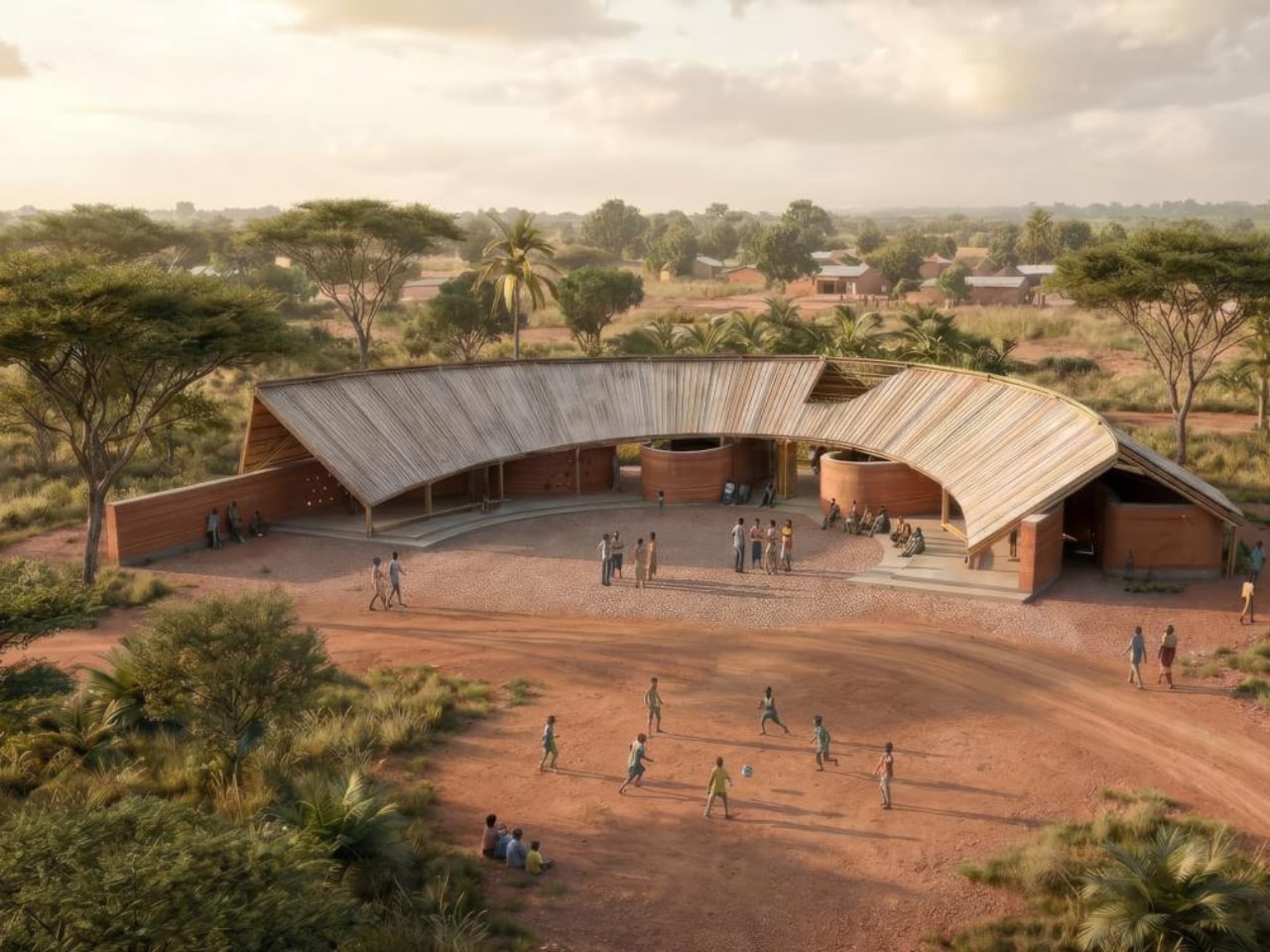
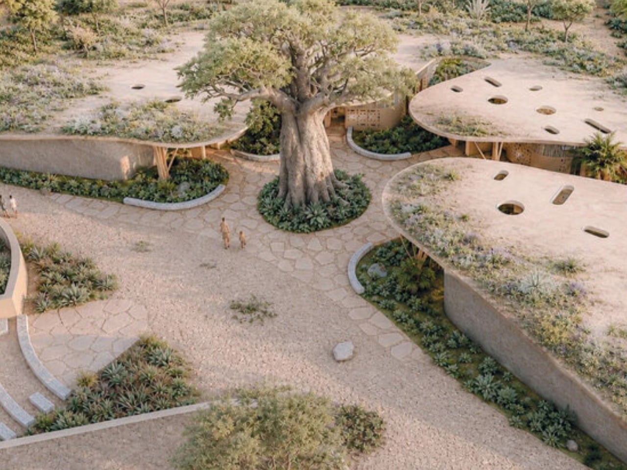
Every so often, a piece of architecture comes along that makes you question what the job of a building really is. The winning design for the Kaira Looro 2026 competition is one of those rare projects that does exactly that. Created by Greek designers Afroditi Ioannidou and Vladimir Gligorovski, the proposal for a community center in rural Senegal took first prize in one of architecture’s most socially focused competitions, and it deserves more attention than it’s getting.

The Kaira Looro competition, organized by the international non-profit Balouo Salo, is not your typical design brief. Each year, it invites young architects, students, engineers, and designers from around the world to imagine structures for communities in Sub-Saharan Africa that are actually built, or at the very least, seriously considered for construction. This year’s challenge drew entries from over 125 countries, with participants tasked with designing a multifunctional civic space for a rural community in southern Senegal, one that could support educational, cultural, and social life using local materials, self-construction techniques, and low-impact methods. That’s a narrow lane to design within, which is precisely why what Ioannidou and Gligorovski came up with feels so impressive.

Designers: Afroditi Ioannidou, Vladimir Gligorovski

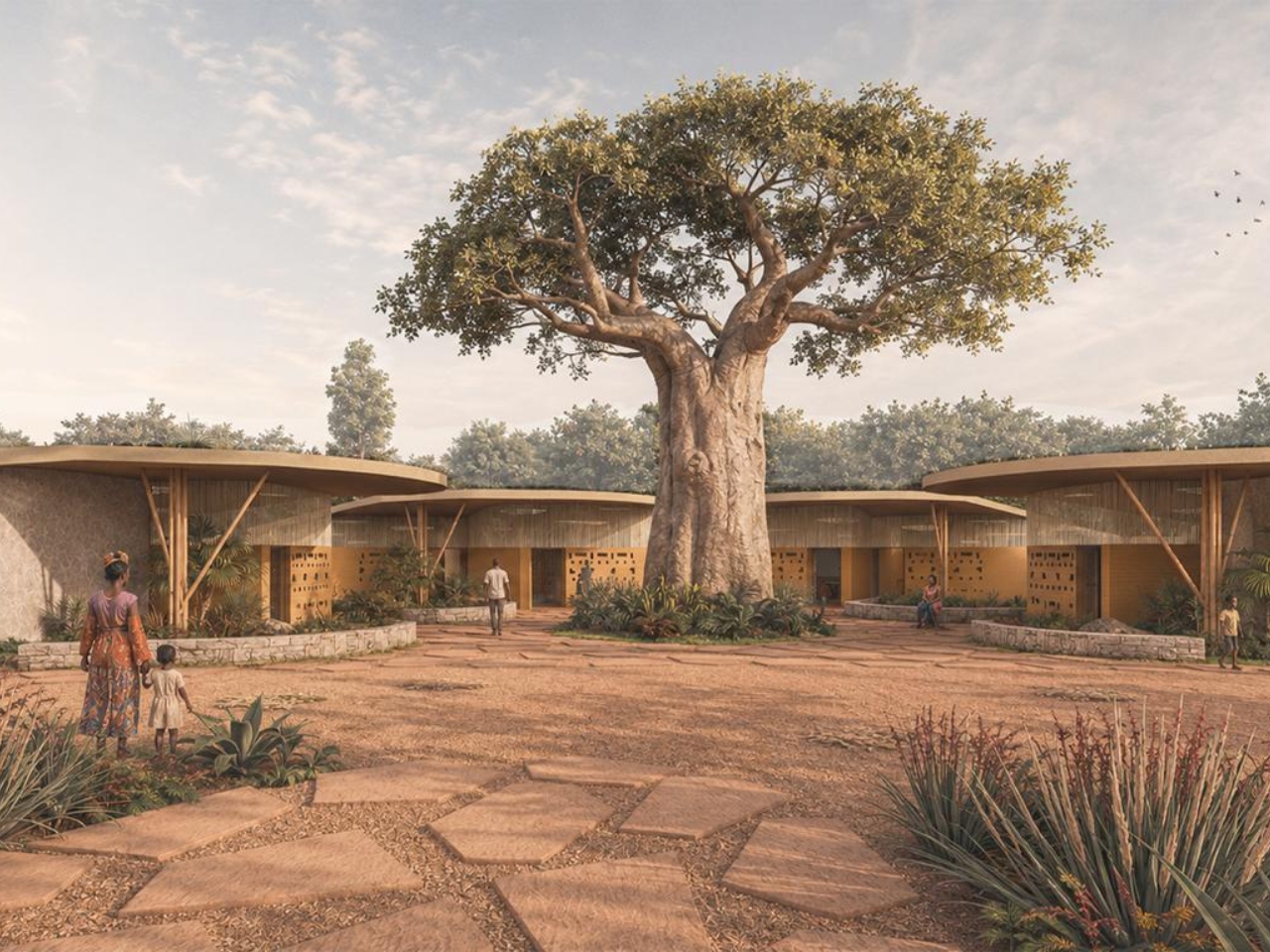
Their starting point wasn’t a sketching pad. It was a centuries-old architectural typology from the Casamance region: the impluvium house. The impluvium is organized around a central open courtyard where rainwater collects, light filters in, and daily life unfolds. Rather than import a foreign design idea, the two designers took that logic and scaled it up to serve a whole village. The result is a community center that feels born from the place rather than placed onto it, a distinction that matters enormously when we talk about design for underserved communities.

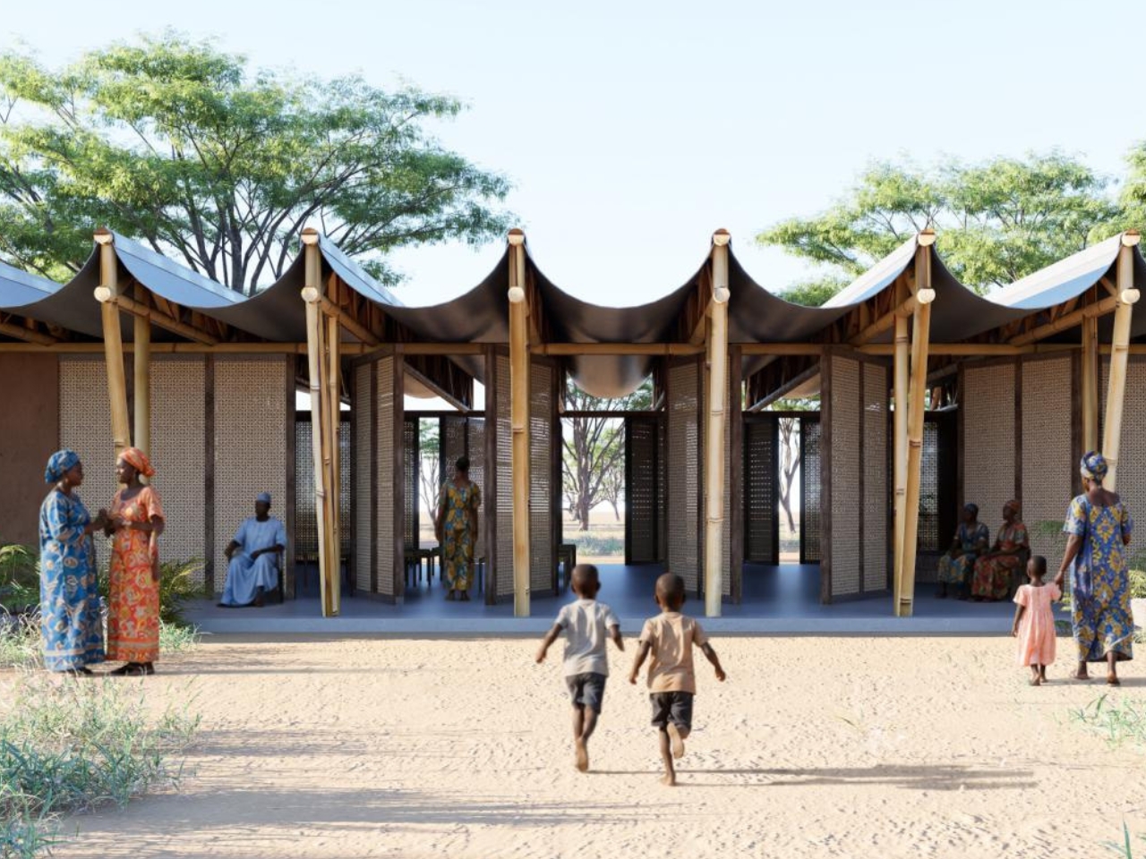
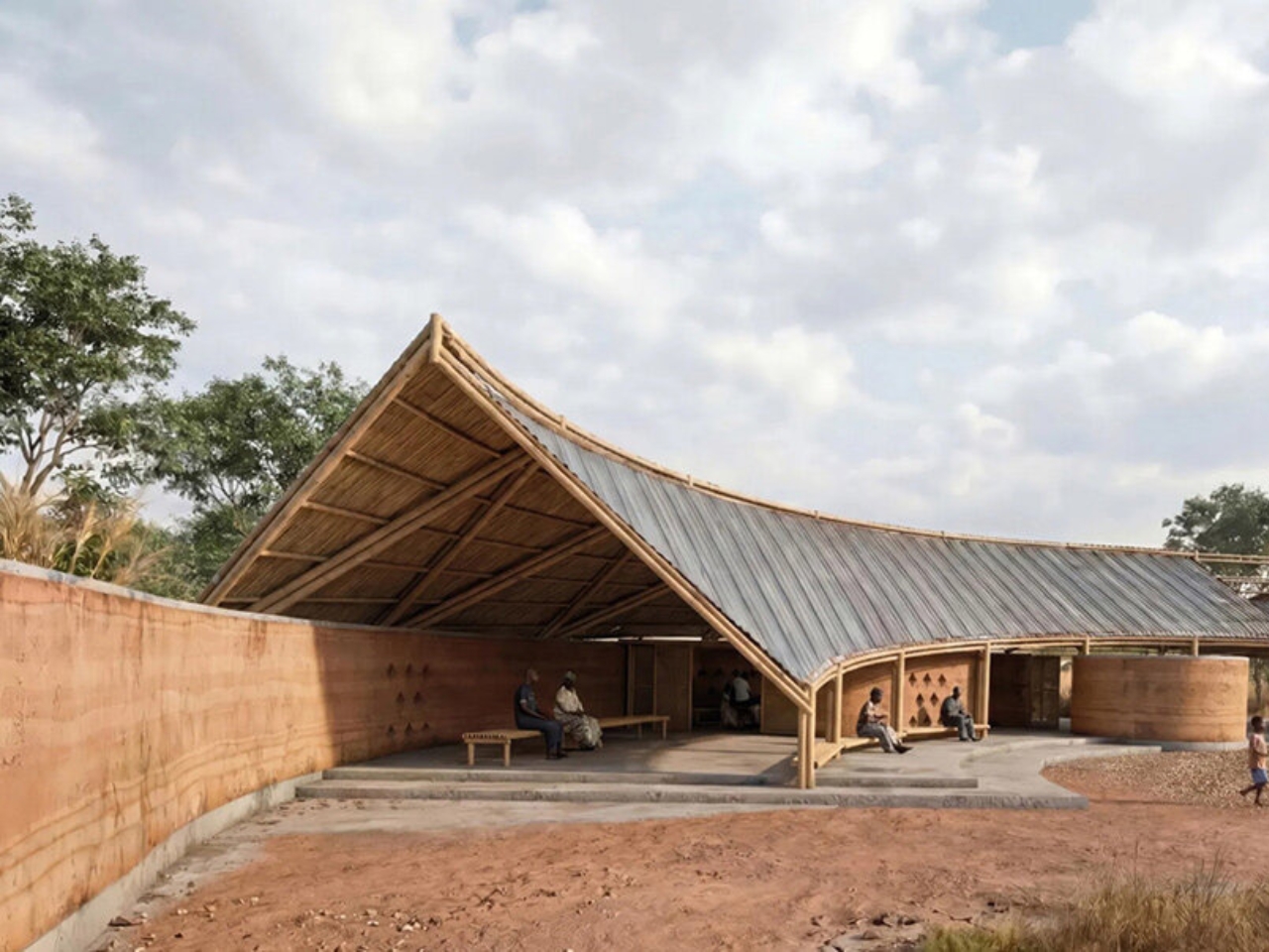
The materiality is just as considered. The primary structure uses tapia, a rammed earth technique that draws on red laterite soil dug directly from the site. It’s a building material with deep roots in West African construction, practical, thermally efficient, and locally executable without heavy machinery. Above it, the roof is a bamboo truss system, lightweight and renewable, assembled in a way that allows for natural ventilation and keeps the interior cool in a climate that demands it. Together, the materials tell a cohesive story: this structure was designed to be built by the people who will use it and to age gracefully within the landscape it sits in.

The prize package reflects just how seriously the competition takes its mission. Ioannidou and Gligorovski walked away with €6,000 and an internship at Kengo Kuma & Associates in Tokyo, one of the most formally inventive firms in contemporary architecture. It’s a combination of recognition and opportunity that points to what Kaira Looro does well: it doesn’t just celebrate ideas, it cultivates careers while centering humanitarian impact.

If you’re not already following this competition, it’s worth understanding what sets it apart. Previous winners haven’t just gathered dust on a portfolio page. The Children House, which took top honors in an earlier edition, is now in the final stages of construction as a medical center specializing in childhood malnutrition treatment in rural Senegal. The designs are meant to become real buildings for real people, and that raises the stakes considerably for everyone involved.

What makes Ioannidou and Gligorovski’s proposal so satisfying isn’t just its elegance on paper. It’s the philosophy underpinning every decision. The building belongs to the village first and to specific programs second. That’s a line straight from their own concept, and I think it should be printed and pinned above the desk of every architecture student right now. Architecture has a long and complicated history of showing up in communities it doesn’t understand, building things that look impressive in renderings but fail to serve the people they were supposedly designed for. This project pushes back against that instinct quietly, without grandstanding. The best design, at its core, listens before it speaks. This community center for rural Senegal does just that.

The post Mud, Bamboo, and a Big Idea for Rural Senegal first appeared on Yanko Design.

Razer Turned Its Snake Logo Into a $90 Keycap and It Sold Out in 8 Minutes

Every major brand consultancy on earth will tell you the same thing right now: flatten your logo, go monochrome, simplify for digital. BMW listened. Volkswagen listened. Mastercard, Burberry, Warner Bros., all of them listened, and all of them emerged from their rebrands looking vaguely like they were designed by the same committee in the same week. The industry calls it blanding. The internet calls it something less polite. Razer, apparently, calls it an opportunity.

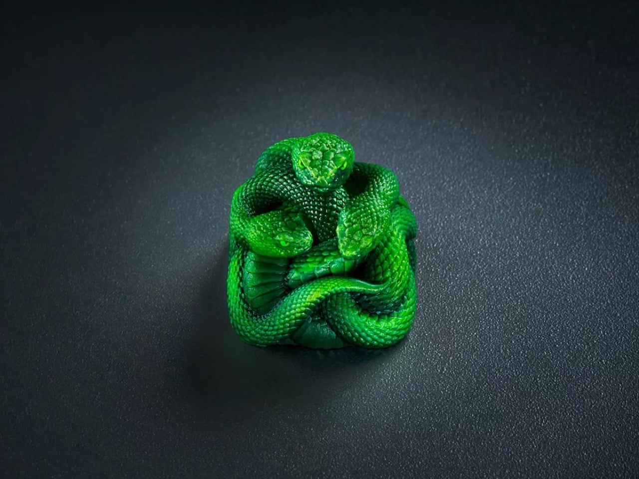
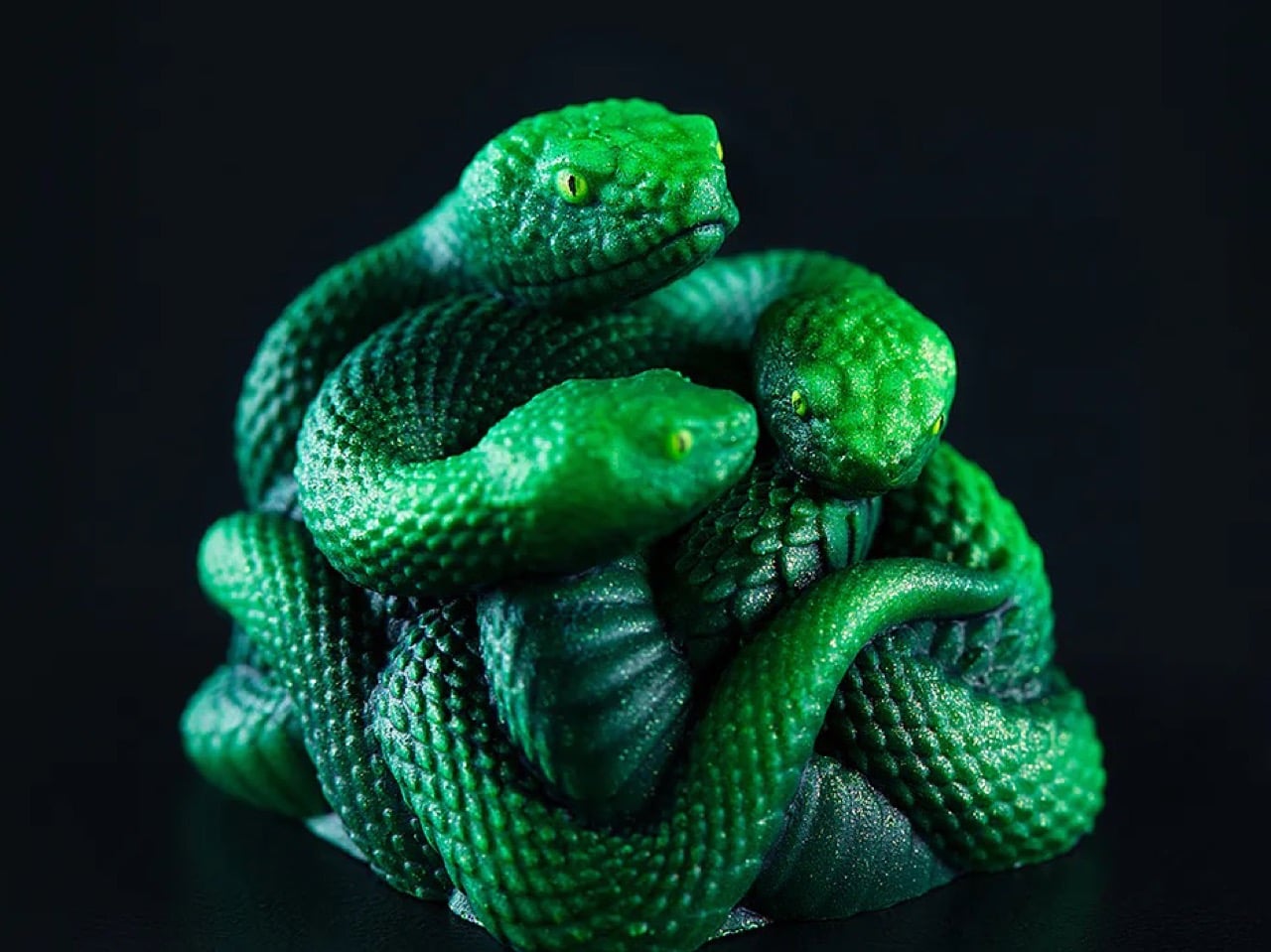
The Artisan Keycap Triple-Headed Snake Edition is the brand’s first artisan keycap, and it is about as far from a flat logo as physically possible. The triple-headed snake emblem that has lived as a 2D print on Razer products for nearly three decades has been turned into a full sculptural form: resin-cast, painted by hand, and detailed down to the tiny yellow irises in each snake’s eyes. It went on sale on August 22nd, 2026, priced at $89.99, and was gone in eight minutes.

Designer: Razer

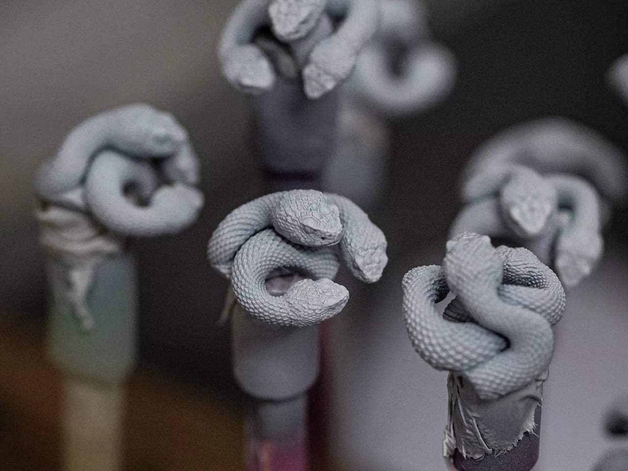
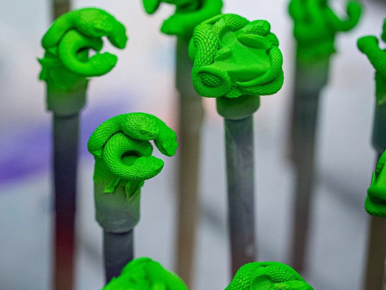
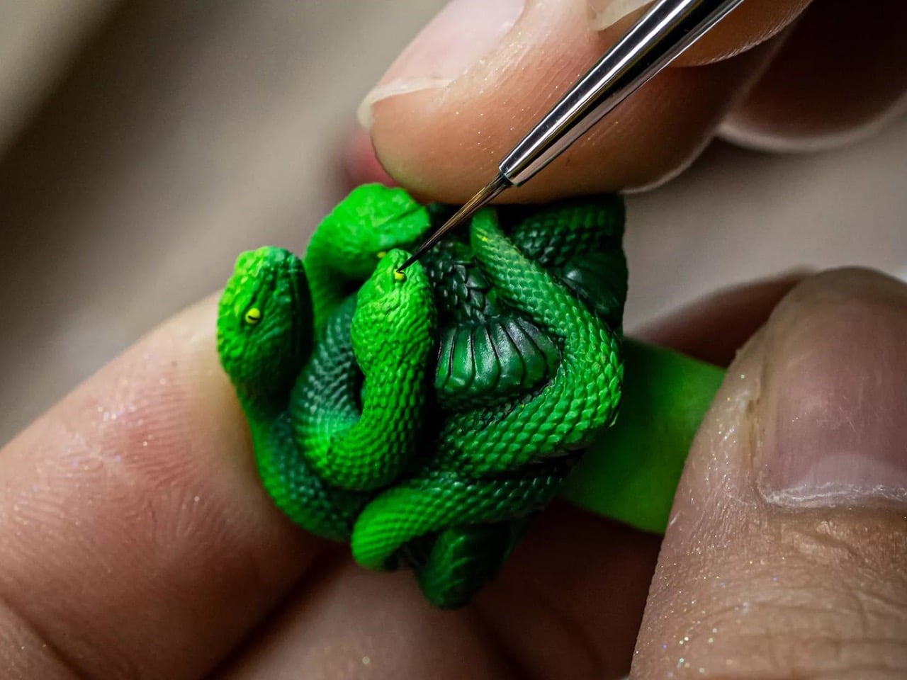
Razer’s first product was the Boomslang gaming mouse, named after a venomous green snake from sub-Saharan Africa, with the brand’s now-iconic acid green pulled straight from the animal’s coloring. The triple-headed emblem grew out of that, and has been staring out from mice, keyboards, and headsets ever since. What nobody had done, until now, was give it a body. The Artisan Keycap starts from a precision 3D model built to hold detail at close range from every angle, then gets cast in resin mixed and cured to maximum hardness so the color won’t fade with daily use. After that, a human being sits down and paints each one individually, which means no two come out identical. Razer runs a two-stage quality check against the original model before anything ships.

The result, as seen in the process shots from Razer’s own production workflow, is genuinely impressive at this scale. Grey primed sculpts on painting stands give way to base-coated Razer green, and then a detail brush places the yellow eye dots with the kind of precision you’d normally associate with Warhammer miniature painters, not gaming peripheral makers. The GamesRadar reviewer who got a sample a week before it sold out noted that even the snakes’ tiny nostrils had been painted, which is a level of detail nobody strictly asked for and is therefore exactly the kind of detail worth celebrating.

On the practical side, the keycap fits any cross-stem (MX-style) switch, which covers most mechanical keyboards on the market, not just Razer’s own lineup. Razer recommends dropping it on a lower-traffic key like F12, partly because the three-dimensional snake heads sit noticeably proud of the surrounding keys, and partly because solid resin won’t let RGB backlighting through. The Chroma lighting on your other keys stays unaffected. You can technically use it on any key you want, but putting it on Escape and then accidentally hammering it during a tense moment in CS2 seems like tempting fate.

The keycap is currently sold out, exclusive to Razer.com and RazerStores. Whether Razer runs another batch is unconfirmed, so if the secondary market is your only option right now, just know that resellers have been asking considerably more than $89.99 since about eight minutes after the drop.

The post Razer Turned Its Snake Logo Into a $90 Keycap and It Sold Out in 8 Minutes first appeared on Yanko Design.