Ayaneo Pocket VERT reimagines Game Boy form factor with a touchpad and long-lasting 6,000mAh battery

In the rapidly evolving landscape of handheld gaming, Ayaneo continues to stand apart by treating portability as an experience rather than a specification. Its newest handheld embodies that philosophy with quiet confidence, merging high-end performance with a level of craftsmanship and material intention that feels decidedly premium. Every curve, texture, and component has been considered not just for function, but for how the device lives in the hand, resulting in a compact form factor that feels effortlessly capable and thoughtfully designed.

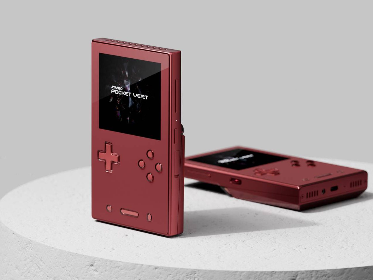
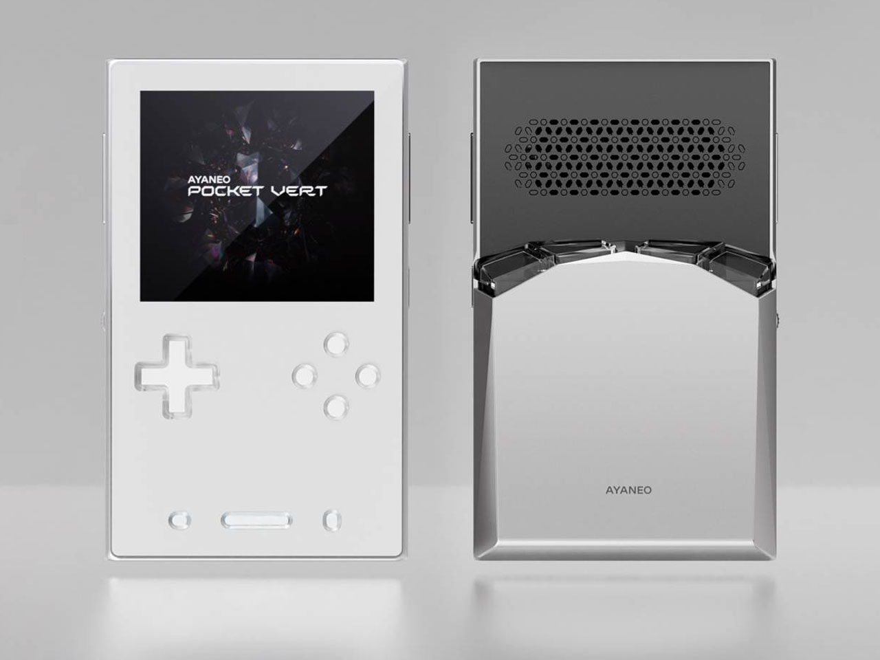
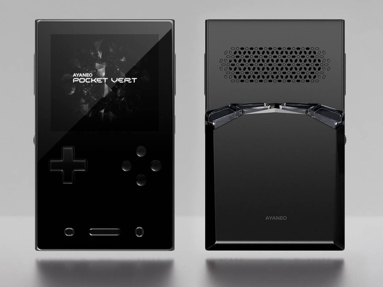
Meet the upmarket Pocket Vert, which has an Android-powered handheld that’s crafted out of a full CNC-milled unibody construction. The handheld has a full glass front panel fitted with a 3.5-inch high-resolution LTPS display having 1600×1440 resolution (at 615 ppi), 60Hz refresh rate, and 450 nits peak brightness level. In their latest teaser video, Ayaneo has revealed that the device will be positioned flush in between the flagship Pocket DMG and budget gaming controllers like Anbernic RG40XX V. This certainly will fill the gap, and the sweet spot mobile gamers were craving.

Designer: Ayaneo

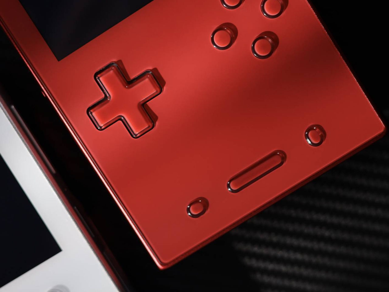
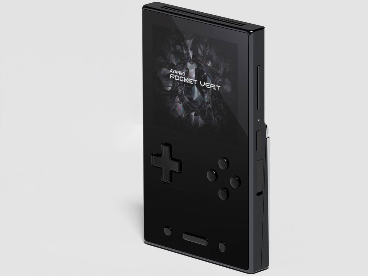
The company teased the handheld earlier this month on November 5, revealing the design and some specifications. Now, in a fresh Product Sharing Session, they’ve revealed multiple prototypes that’ll ultimately morph into the compact handheld. Touted as a premium Game Boy clone, it’ll come in three color options: Black, White, and Red, with matching buttons. Measuring 86x143x20mm, the classy little gadget is smaller than the Pocket DMG. Despite the petite form factor, it has a 3.5mm jack and a USB-C port at the bottom. The Pocket Vert should have enough power under the hood as it is seen running the God of War title, which requires a good amount of processing fuel.

Section below the D-Pad and buttons is a touchpad, which the player can map to various button configurations or sticks. The touchpad is completely invisible and beyond the physical buttons for a less intrusive functionality. Just like the DMG, this one has a wheel called the MagicSwitch key for added functionality. It is used to toggle the volume control levels, short-pressed to mute, and long-pressed to trigger the function menu. As is clear from the naming convention, the handheld is targeted towards vertical retro handheld enthusiasts.

Ayaneo has confirmed the device packs a 6,000mAh battery and bottom-firing speakers for a satisfying playing experience. Depending on the processor fitted inside, the battery life could be excellent for such a small gadget. That said, there is no detail about the release date and other vital hardware information. We can expect the remaining fog to clear with another official sharing session in the coming days.

The post Ayaneo Pocket VERT reimagines Game Boy form factor with a touchpad and long-lasting 6,000mAh battery first appeared on Yanko Design.

YouTube is once again trying to make DMs happen

YouTube has started a renewed effort to integrate direct messaging into its platform. According to a support page, the service has started testing DMs as a way for users to share and discuss videos. The test is for users aged 18 and up in Ireland and Poland. But while a DM usually comes with some expectation of privacy, Google noted that "messages may be reviewed to ensure they follow our Community Guidelines."

This isn't the video platform's first attempt to provide a messaging angle. YouTube added DMs to its app in 2017, then removed the feature in 2019 in order to emphasize public conversations in comments sections. The new test for sharing within YouTube's ecosystem won't mean any change to other ways you might send people videos. Re-introducing the same system six years after cutting it seems like an odd choice, but Google claims this is "a top feature request," so maybe it'll get a broader adoption this time around.

This article originally appeared on Engadget at https://www.engadget.com/entertainment/youtube/youtube-is-once-again-trying-to-make-dms-happen-205724221.html?src=rss

OpenAI made a free version of ChatGPT for teachers

It's well-documented that many students use ChatGPT to do their homework for them, and now OpenAI would like teachers to use it to write those student's homework, too. The company hopes to entice K-12 school employees to work with its AI models via the newly announced ChatGPT for Teachers, a version of the AI assistant that's secure enough to be used in a school environment and free until June 2027.

OpenAI pitches this new ChatGPT as a way for educators to create material for the classroom, "and get comfortable using AI on their own terms." ChatGPT for Teachers includes unlimited messages with GPT-5.1 Auto, connectors to other apps, file uploads, image generation and memory features, just like the consumer version of the AI.

Where this version differs is in its compliance with the Family Education Rights Act, which governs how schools store student information, and in the ways OpenAI is pushing collaboration features. Besides being able to share a chat with colleagues, OpenAI says it'll also populate fresh chats with suggestions of ways other teachers have used ChatGPT.

Before it began targeting teachers specifically, OpenAI made several passes at getting more students to use its AI models. The company's ChatGPT Edu gives institutions a way to offer ChatGPT access in the same way they do an email account. There's also Study Mode, a feature available in all versions of ChatGPT, that focuses the chatbot's answers on explaining things step-by-step.

OpenAI isn't alone in trying to own the education market — Google has offered aggressive discounts on Gemini for students — but clearly it thinks appealing to teachers could help cement its position.

This article originally appeared on Engadget at https://www.engadget.com/ai/openai-made-a-free-version-of-chatgpt-for-teachers-202937994.html?src=rss

Monocoque Drone with Hubless Rotors is designed to withstand any extreme flying conditions

Ask any experienced drone pilot about their worst crash, and you’ll likely hear a story that ends with a collection of fragmented parts. The conventional quadcopter design, while effective at flying, is notoriously poor at surviving the unexpected kinetic events that come with operating in the real world. Whether it’s a sudden gust of wind, a GPS error near a structure, or a simple pilot miscalculation, the result is often the same: a compromised frame and a costly repair.

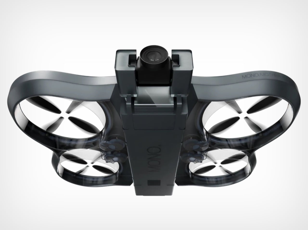
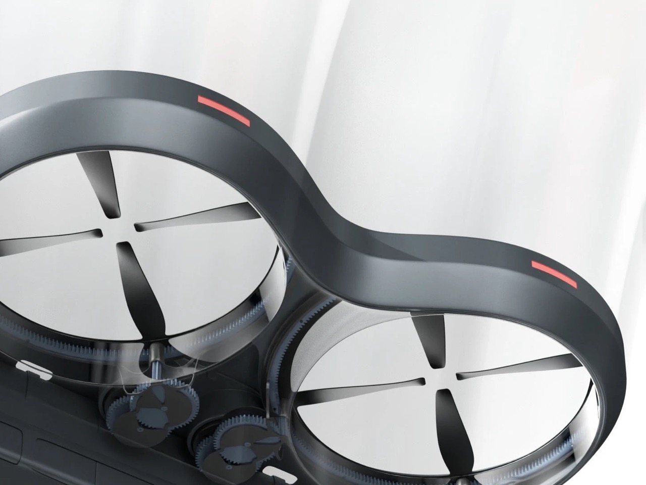
With the Mono Mothra, we see a design that fundamentally rethinks this vulnerability. The concept’s strength lies in its two core principles: a load-bearing monocoque shell and protected, ducted rotors. Instead of discrete arms that can snap and motors that can be damaged, the entire structure is designed to absorb and distribute impact forces. It’s a “what if” exploration into a different kind of aerial platform, one where resilience isn’t an afterthought but the very cornerstone of its design philosophy.

Designers: Rify Studio® & Martunis

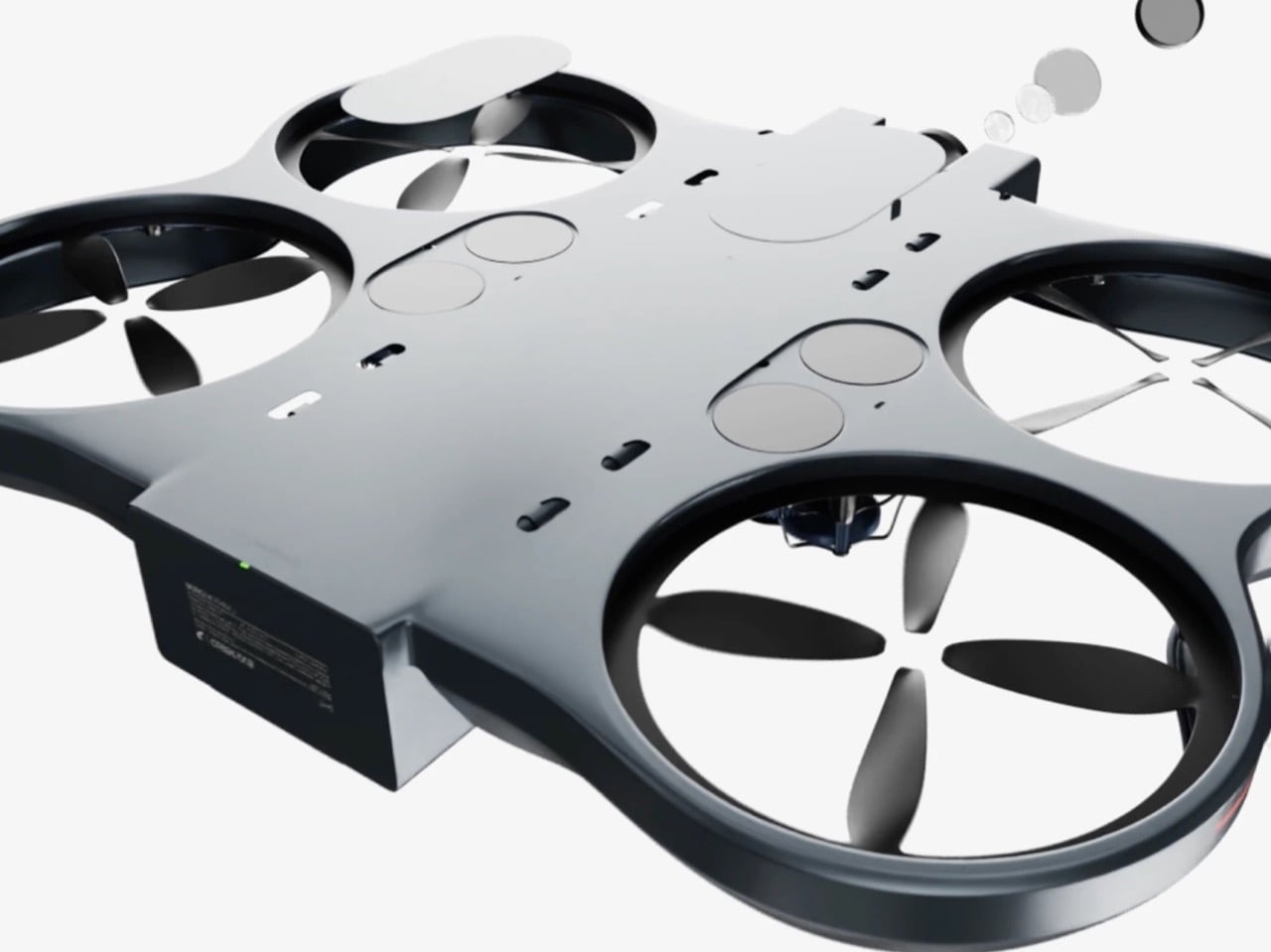
Unlike the familiar bolted-together cross-frame of most drones, the Mono Mothra is conceived as a single, continuous unibody. This monocoque approach, common in automotive and aerospace applications, means the outer skin is the primary structure. There are no joints between the central body and the rotor housings to act as fracture points. An impact on the outer ring doesn’t concentrate stress on a single screw or plastic weld; the force is spread across the entire continuous surface. This not only creates a far more durable machine but also allows for a cleaner, more holistic form where every curve is both aesthetic and structural.

This philosophy of integration extends directly to the propulsion system. The outer ring of the monocoque doubles as a set of four substantial propeller guards, completely enclosing the rotors. This ducting provides an obvious and immediate layer of protection against side impacts with walls, branches, or the ground. The renders hint at a clever mechanical solution for the hubless look, with a gear-driven system hidden beneath the rotors. While a gear-driven system introduces complexity compared to a direct-drive motor, it allows the design to maintain its clean top profile and fully protected rotors, reinforcing the drone’s identity as a ruggedized tool.

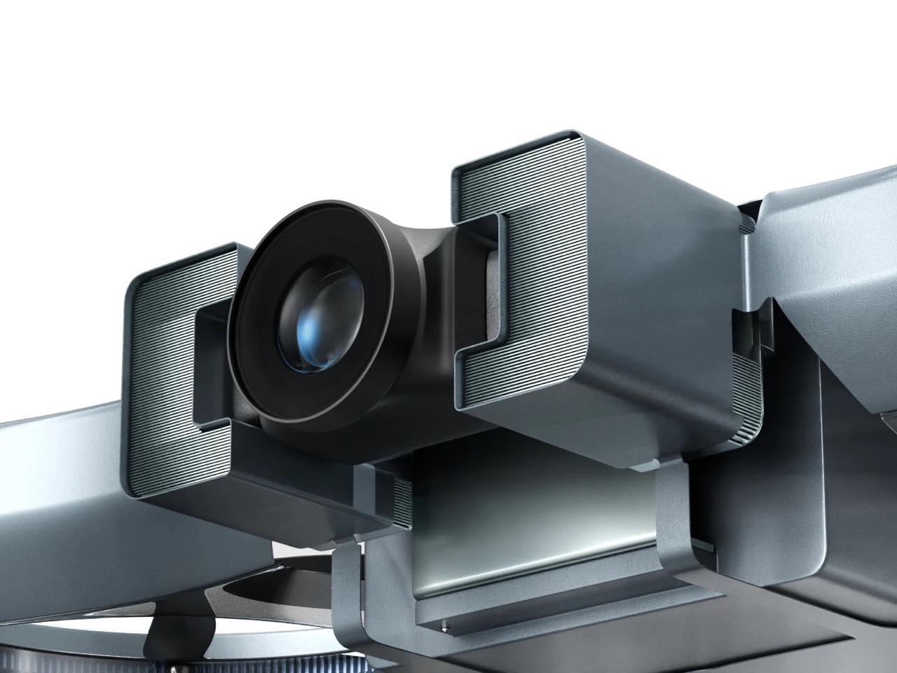
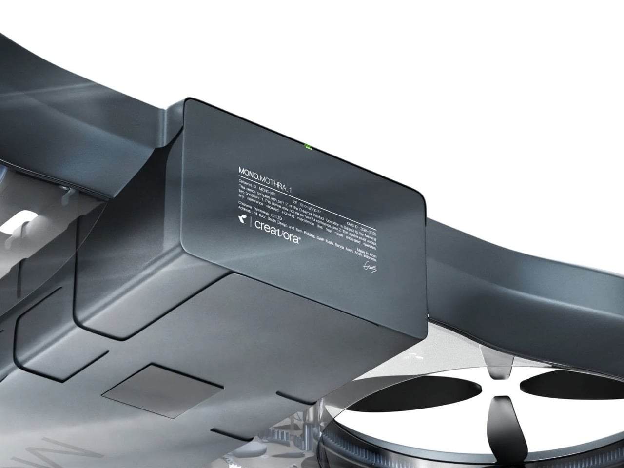
The camera module itself rejects the fragile, exposed gimbal common on consumer and prosumer drones. Instead, the lens is bunkered within a solid, purpose-built housing that appears to be just as robust as the main body. Whether the ribbed side panels are functional heat sinks for a high-performance sensor or purely an aesthetic choice, they communicate a sense of durability. The entire unit is mounted securely to the forward section of the frame, suggesting it is an integral part of the drone’s hardened structure rather than a delicate payload that has been simply attached.

What a concept like Mono Mothra truly demonstrates is the necessary evolution for drones to mature beyond their hobbyist origins. The industry’s current focus on modularity has created a landscape of capable but delicate machines. This design, by contrast, argues for a future built on structural integrity, where a drone’s ability to withstand the environment is as important as its ability to fly. It’s a shift from disposable components to a resilient, unified whole – a critical step if these devices are to become the indispensable, all-weather tools promised to professionals.

The post Monocoque Drone with Hubless Rotors is designed to withstand any extreme flying conditions first appeared on Yanko Design.

Stargate is coming back to TV, thanks to Prime Video

Disney+ has Star Wars and Paramount+ has Star Trek, so it's about time Amazon gets its own sci-fi franchise with "star" in the title. Prime Video has just greenlit a TV revival of the iconic Stargate franchise, according to a report by Deadline. This will be the fourth major TV show in the series, following the first movie.

We don't know anything about the plot and where it fits into the decades-long mythology but we do know that the showrunner is Martin Gero. He's a veteran of the IP, having cut his teeth in the industry while working on Stargate: Atlantis back in the early 2000s. He also created the show Blindspot and was showrunner on the recent reboot of Quantum Leap, which was actually kind of nifty (RIP.)

Franchise creators Dean Devlin and Roland Emmerich are on board as executive producers, as are Brad Wright and Joe Mallozzi. That last duo were behind most of the Stargate TV projects, including the most recent live action show Stargate Universe.

This makes a lot of sense for Prime Video. Amazon did recently buy MGM, after all, and the Stargate IP came along with that purchase. It's not the first time the platform will have dabbled with science fiction. Prime Video most famously saved The Expanse after it was originally cancelled by SyFy. There are three more books in that series that have yet to be adapted. Just saying.

For the uninitiated, the Stargate franchise involves the titular Stargates. These are transportation devices created by ancient aliens that act as galaxy-spanning wormholes. It all started with a movie from 1994.

This article originally appeared on Engadget at https://www.engadget.com/entertainment/tv-movies/stargate-is-coming-back-to-tv-thanks-to-prime-video-200049713.html?src=rss

Bluesky revamps its moderation and reporting tools with transparency in mind

Bluesky is looking to make its moderation and reporting systems more transparent as part of its efforts to forge a healthier social media ecosystem than some of the alternatives out there. The platform's userbase has doubled in size to 40 million over the past year, and with more users come more instances of toxicity and other types of harmful content. Bluesky is also subject to more regulatory requirements in certain jurisdictions. The team has been working to address those factors, and changes to the moderation system should help.

The platform is revamping how it enforces and tracks violations of its policies. In the latest version of the Bluesky app, the system for reporting posts now includes more granular options with specific options to flag content related to things like false information about elections, human trafficking and bullying. "This granularity helps our moderation systems and teams act faster and with greater precision," the Bluesky team wrote in a blog post. "It also allows for more accurate tracking of trends and harms across the network."

Rather than tracking community guidelines violations across individual policies as it did in the past, Bluesky will automatically track everything in a single system. As part of that, the platform will provide users clearer information about enforcement actions. Starting in the coming weeks, users whose accounts are actioned will learn which policy they violated, the severity level of their violation and how many times they’ve broken the rules. They'll also be notified as to the length and end date of any suspension, as well as how close they are to more severe penalties being applied to their account for repeated violations. There are appeals processes for both post takedowns and account suspensions.

Looking ahead, Bluesky plans to add a moderation inbox to the app rather than dealing with moderation decisions by email. The team says this will improve transparency and enable it to send a higher volume of notifications to users.

"These updates are part of our broader work on community health," the team wrote. "Our goal is to ensure consistent, fair enforcement that holds repeat violators accountable while serving our growing community as we continue to scale."

There are some other changes in the latest version of the app. The team says that a redesign makes the "who can reply" settings easier to use, including the option to save your selection as the default for future posts. There's also a dark mode app icon available. 

This article originally appeared on Engadget at https://www.engadget.com/social-media/bluesky-revamps-its-moderation-and-reporting-tools-with-transparency-in-mind-193629692.html?src=rss

Tesla receives ride-hailing approval in Arizona

Tesla has received a permit to operate its ride-hailing service in Arizona. But don't get too excited, as this is far from the level 4 autonomy that CEO Elon Musk envisions for the company's robotaxis. The certification requires a human to sit in the front seat to supervise the ride. Tesla's operations in Austin and California have the same requirement.

Reuters reported that Tesla applied for the permit on November 13 and received approval on Monday. In September, the automaker received certification to begin testing autonomous vehicles (also with a safety monitor) in Arizona. The new permit allows those vehicles to start carrying paying passengers.

In Tesla's quarterly earnings call last month, Elon Musk said the company's "robotaxis" would operate in eight to 10 metro areas by the end of 2025. However, that term is used loosely. For now, the service is far from the kind of "robot chauffeur" you'd get in a Waymo. Think a plain old Uber, except the driver or safety operator is using a version of Tesla's full self-driving software, which has been the subject of numerous safety complaints.

This article originally appeared on Engadget at https://www.engadget.com/transportation/tesla-receives-ride-hailing-approval-in-arizona-192756065.html?src=rss

Google Maps will use AI to predict if EV chargers will be available on arrival

Google is rolling out an update to Maps that brings some new tools to the table, including the ability to check on EV charger availability. The app already showed the location of EV chargers, but not if they were available or not. In other words, it was entirely possible to roll up to a charging station only to find a line of EVs waiting for juice.

The tool in action.
Google

The updated tool will soon show "how many chargers will likely be available upon your arrival." This uses a combination of AI wizardry and real-time charger availability to predict how many chargers are likely to be open and ready for use at a particular point in time. Google says this will help users "avoid lines and save time." The charger tracker drops next week, but only via Android Auto and cars with Google built-in.

The Explore tab has gotten a revamp, making it easier to find curated lists from local influencers and companies like OpenTable. All you have to do is swipe up to see "trending and popular restaurants, activities and sights near you." The updated Explore tab rolls out this month globally on both Android and iOS.

The company is also stuffing more Gemini into Maps because it's 2025 and that's the way things are done now. The AI chatbot will be able to whip up "know before you go" tips before visiting restaurants, hotels, concert venues and other locations of interest. Google says Gemini will be like "having a knowledgeable guide show you the way." We'll have to see how that works out in real life. This AI-powered tips feature is already available for many users in the US on Android and iOS.

Finally, reviewers can now change their display names when providing feedback to local businesses. Google says this can be used to review nearby shops with names like "Eager Elf" or "Julia Loves Sweets." Despite the user name change, it'll still be your Google account making the remark, so keep things polite.

This is just the latest update for Google Maps. The app is adding live lane guidance for Polestar 4 owners and is also coming to Garmin smartwatches.

This article originally appeared on Engadget at https://www.engadget.com/apps/google-maps-will-use-ai-to-predict-if-ev-chargers-will-be-available-on-arrival-191808879.html?src=rss

Amazon adds AI-generated video recaps for select Prime Video shows

If the idea of a custom-made "previously on" video for every show you watch is attractive to you, Amazon is taking steps to make it happen. The company has announced that it'll now include AI-generated "Video Recaps" for select series on Prime Video so it's easier to hop back into a show after taking a break. The feature expands on text-based X-Ray Recaps the company started experimenting with in 2024, and the Kindle Recaps it already offers for some series sold through the Kindle Store.

Amazon's Video Recaps combine clips, synchronized narration, select dialogue, music and sound effects into a short video that refreshes you on the characters and plot of a show. You can access the recaps through a new Recaps button on a show's page. Clicking it will either pull up a text-based X-Ray Recap or a Video Recap, depending on what Amazon's generated. At least for now, if you're interested in seeing a Video Recap for yourself, Amazon says the feature is available in beta for Fallout, Tom Clancy's Jack Ryan, Upload, Bosch and The Rig.

Recaps are essentially a repackaged version of the summarizing skill that companies have decided AI excels at. Amazon's Video Recaps are decidedly more complex than an email summary, but the basic premise is the same. Adding the feature to media apps and devices, as Amazon and Spotify have done, seems like low-hanging fruit that other companies will pursue. 

AI-generated recaps aren't without their detractors, though. Many indie authors were against Kindle Recaps because of their potential to misrepresent the plots and characters of books. The same possibility could theoretically exist for Video Recaps, as well.

This article originally appeared on Engadget at https://www.engadget.com/entertainment/streaming/amazon-adds-ai-generated-video-recaps-for-select-prime-video-shows-190758346.html?src=rss

OMEGA’s Ceramic Gambit: How the Seamaster Planet Ocean Challenges Rolex’s Design Dominance

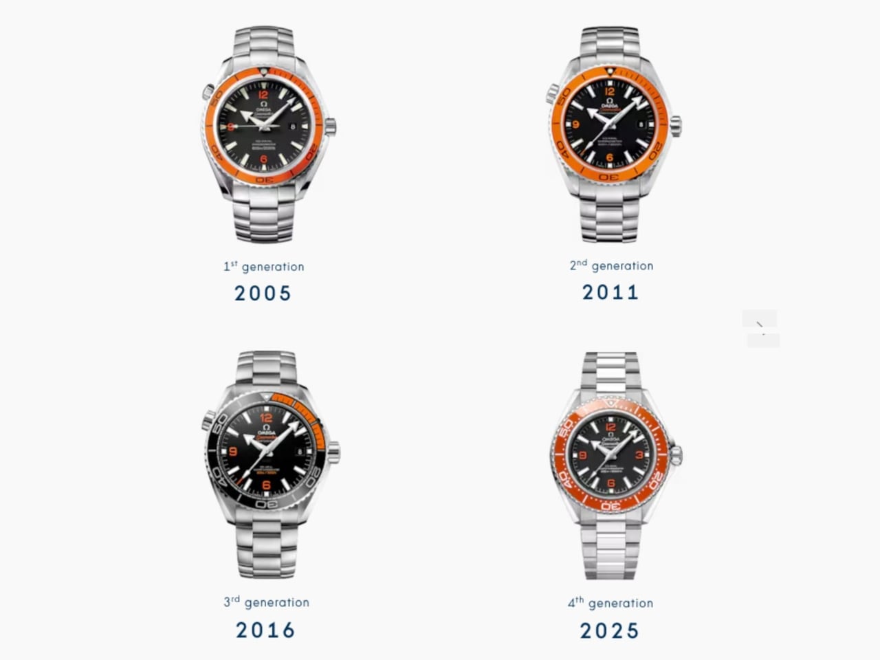
Twenty years after launching the Planet Ocean, OMEGA just made the boldest design move in luxury dive watches: bringing back orange ceramic at full production scale. Not as a limited edition. Not as a boutique exclusive. As a core offering that positions this collection directly alongside Rolex’s Submariner in the everyday luxury category.

Designer: OMEGA

This is the design story of how OMEGA spent years perfecting a single color, reworked an entire case architecture, and created three distinct visual personalities that finally give the Planet Ocean the design refinement it always deserved.

The Orange Ceramic Challenge

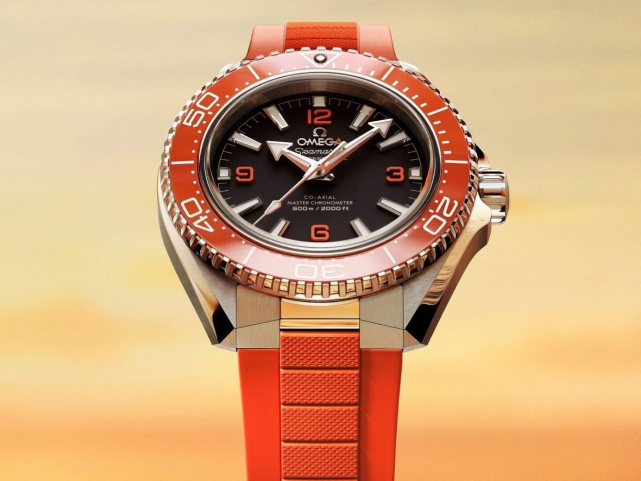
Let’s address the headline design achievement first. OMEGA’s new orange ceramic bezel represents years of Swiss atelier development to perfect a hue that most brands avoid entirely. The reason? Orange ceramic is notoriously difficult to execute without looking like cheap plastic film.
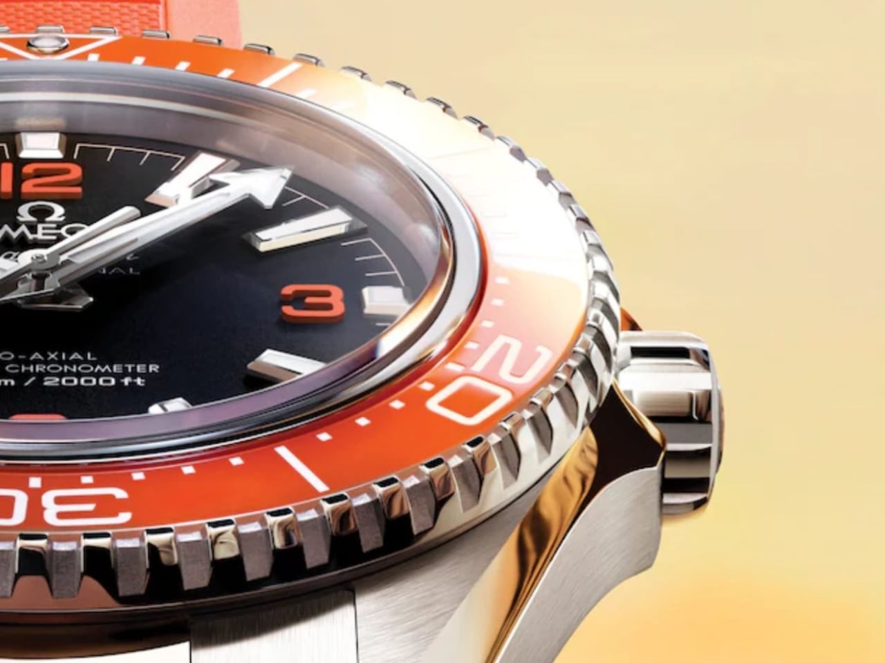
The chemistry of ceramic materials resists certain wavelengths. Getting that specific orange tone, the one that references the 1957 Seamaster 300 heritage pieces, requires precise control over sintering temperatures and material composition. OMEGA clearly cracked the formula. The result hits like a flare on the wrist: bold, bright, and unmistakably intentional.

The orange accents aren’t arbitrary nostalgia. The 1957 Seamaster 300 pieces carried orange through the hands, indices, and bezel. Those cues resurfaced in the very first Planet Ocean models in 2005, giving the watch its early cult status. Twenty years later, OMEGA had the confidence to bring that color back at impressive scale.
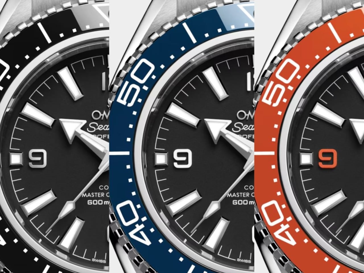
This represents thoughtful heritage integration. Rather than creating a vintage reissue or limited anniversary piece, OMEGA wove that 1957 DNA into a thoroughly modern design. The matte dial finish, the arrowhead hands, the white enamel bezel scales: these are pure Planet Ocean signatures, simply executed with contemporary precision.

What makes this move significant isn’t just the technical achievement. It’s the scale. Bringing this level of material complexity to a core production model, not a limited run, signals confidence in the design direction. OMEGA is betting that luxury watch buyers want personality and heritage, not just another black bezel diver.

Three Personalities, One Refined Architecture

The collection splits into three distinct visual identities, each serving different aesthetic preferences while sharing the same dramatically reworked case.
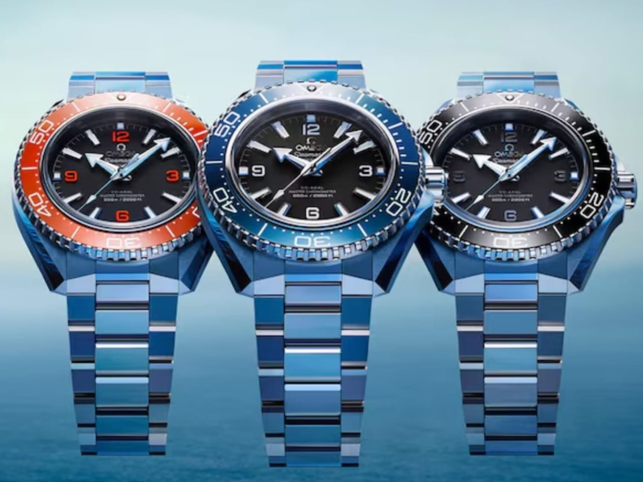
The black variant is the purist’s pick. Matte black dial, rhodium-plated numerals, white enamel bezel scale. This feels closest to the original professional dive watch brief, the option for someone who thinks color belongs in galleries rather than on expensive timepieces. It’s the no-nonsense tool watch executed with Swiss precision.

The blue edition becomes the everyday option, what I’d call The Bond Watch. That ceramic bezel catches light differently than the matte black version, creating visual interest that works equally well at Bondi brunch or a business dinner. Paired with the steel bracelet, it has that elevated everyday look. Swap to the blue rubber strap, and it transforms into something more pragmatic yet still effortlessly appealing.

Then there’s the orange variant, designed for people who want their Planet Ocean to make a statement while keeping it classy. This is where that years-long ceramic development pays off aesthetically. The bezel doesn’t just add color; it fundamentally changes the watch’s visual weight and presence. Doxa pioneered orange bezels in the 20th century for pure underwater legibility. OMEGA’s move here is for aesthetics, and it’s paid off completely.

The Case Evolution

Beneath those three color personalities sits a more subtle but equally important design refinement: the case architecture itself.

The new Planet Ocean case is sharper and more angular than the outgoing generation. You can see it in the lug transitions and the crown guard geometry. But here’s where OMEGA’s design team showed restraint: they made the watch sit flatter on the wrist by reworking the sapphire crystal profile.
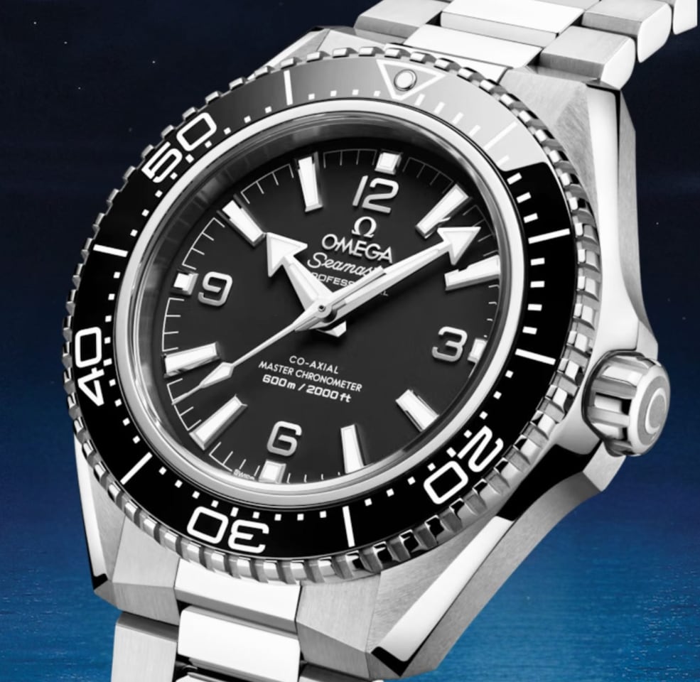
That’s a crucial detail. Dive watches often suffer from excessive height, creating awkward wrist presence and limited shirt-cuff clearance. By addressing the crystal geometry, OMEGA created the most refined Planet Ocean silhouette to date. The 42mm diameter stays manageable, but the flatter profile changes how the watch wears entirely.
The Grade 5 titanium caseback contributes to this refinement. Titanium is NASA’s preferred material for a reason: exceptional strength-to-weight ratio and resistance to environmental extremes. For a watch rated to 600 meters, that caseback choice represents functional design thinking, not just material showcase.

Why This Design Matters

Glen Powell wearing the orange variant and Aaron Taylor-Johnson stepping into the blue and black references signals OMEGA’s positioning strategy. These aren’t just ambassador choices; they’re design communication. Powell can sell a high-visibility ceramic bezel with charm. Taylor-Johnson, as a 007 frontrunner, anchors the collection with leading-man polish.

The message? This Planet Ocean generation positions directly against Rolex’s Submariner in design sophistication, material innovation, and everyday luxury appeal. Not through imitation, but through distinct visual personality. Where the Submariner trades on timeless restraint, the Planet Ocean offers choice. Three distinct design directions, bold material decisions, and heritage integration that feels earned rather than borrowed.

For a brand of OMEGA’s scale to bring back orange ceramic as a core offering, not a boutique exclusive or limited run, reveals where luxury dive watch design is heading. Buyers want options beyond black and blue. They want material innovation that’s visible and meaningful. They want heritage that informs design rather than constraining it.

This Planet Ocean looks tougher. It wears better. It feels more resolved. The sharper case, the flatter profile, the perfected orange ceramic: these represent two decades of learning what worked and what needed refinement.

OMEGA didn’t just update the Planet Ocean. They gave it three distinct personalities, perfected a notoriously difficult material, and created the design refinement this collection always deserved. Twenty years after launch, this is the Planet Ocean that challenges Rolex’s design dominance with confidence and craft.

The post OMEGA’s Ceramic Gambit: How the Seamaster Planet Ocean Challenges Rolex’s Design Dominance first appeared on Yanko Design.