$199 Galaxy A17 Beat the Galaxy S22 to One UI 8.5

Budget smartphones have always existed in a sort of software slow lane. Manufacturers have typically prioritized their flagship and upper-midrange lines when rolling out major updates, leaving the cheaper devices to wait months, sometimes longer, before seeing the same software features. That pecking order has been so consistent for so long that it’s practically become an unspoken rule of the Android ecosystem, especially within Samsung’s own Galaxy lineup.

Samsung’s Galaxy A17 5G is changing that, at least for now. The $199 phone, which only made its way to US store shelves earlier this year, began receiving One UI 8.5 before several pricier Galaxy models, including the Galaxy S22, the A55, and the A35. That makes it not only the cheapest Galaxy phone on the new software, but also a very unexpected one to lead the charge.

Designer: Samsung

The rollout began in South Korea on May 26, 2026, with firmware version A175NKSU5CZE9, before expanding to other regions. Samsung releases updates to multiple devices at a time, so getting new software the same week as other phones isn’t remarkable. The order, however, tells a different story. The Galaxy S22 was once a top-tier flagship, and both the A55 and A35 sit comfortably above the A17 in Samsung’s current lineup.

On paper, the Galaxy A17 5G doesn’t have much to shout about. It runs on Samsung’s Exynos 1330 chip, pairs that with a 6.7-inch display, and backs everything up with a 5,000 mAh battery. Those are solidly mid-tier numbers, and at $199.99, the phone was never going to compete with the Galaxy S25 or even the A55 on raw performance. That was never really the point, though.

Samsung promises six years of OS and security updates for the Galaxy A17 5G, which is genuinely compelling at this price. Google’s Pixel 9a offers seven years of support but costs $499 to start. At $199, the A17 gets surprisingly close to that coverage level, putting it in a different conversation entirely, one that’s less about what the hardware can do today and more about how long it’ll stay relevant.

One UI 8.5 brings a range of new features and interface improvements, including enhancements to Gemini AI. Not everything will run at full capacity on the A17’s Exynos 1330, since some of the more demanding AI tools favor higher-end chipsets. But for someone who bought a $199 phone expecting years of use, getting a meaningful software update rather than just a security patch is the kind of thing that counts.

Android 17 is also expected to hit stable release in the coming weeks, based on where Google’s release notes currently stand, which means Samsung will soon have to decide which phones get One UI 9. The A17 just showed it’s on the list for timely updates, and with six years of committed support on the books, there’s good reason to think it’ll be there when that time comes.

The post $199 Galaxy A17 Beat the Galaxy S22 to One UI 8.5 first appeared on Yanko Design.

Xiaomi 17 Pro Review: Refined in All the Right Places

PROS:


  • Capable camera setup with excellent 5x telephoto camera

  • Great battery life from the big 7,000mAh battery

  • Refined, premium design with rich color options

  • Bright, smooth display with strong eye-care features

CONS:


  • Telemacro mode is not especially sharp

  • Fingerprint sensor sits too close to the bottom edge of the display

RATINGS:

AESTHETICS
ERGONOMICS
PERFORMANCE
SUSTAINABILITY / REPAIRABILITY
VALUE FOR MONEY

EDITOR'S QUOTE:

The Xiaomi 17T Pro is a confident refinement of an already strong formula, pairing elegant design with excellent battery life and one of the best telephoto cameras in its class.

Xiaomi is bringing back its T series with the Xiaomi 17T and Xiaomi 17T Pro, but this time the schedule feels unusually aggressive. Instead of the typical September-style annual launch, the new models arrive only about six months after the 15T series. That shorter gap also brings the T series closer to the Xiaomi 17 and 17 Ultra launch window, which usually falls between late February and early March, making the company’s flagship lineup feel more cohesive across the year.

The Xiaomi 15T Pro was one of my favorite affordable flagships of the past year, particularly for its design and camera performance. So I was pleased to see that Xiaomi has not abandoned that formula. The design language remains largely the same, and so does the familiar triple camera setup.

Designer: Xiaomi

On paper, the Xiaomi 17T Pro still makes a strong case for itself. It features a 6.83-inch 144Hz display with peak brightness of up to 3,500 nits, a triple camera system with a 5x periscope telephoto camera, and a larger 7,000mAh battery with 100W wired charging. Continuing a partnership with Leica that is now in its fifth year, Xiaomi also introduces Leica Live Moment with the 17T series, adding a new layer of visual storytelling shaped by Leica’s photographic look.

I have been testing the Xiaomi 17T Pro for about a week to get an early sense of how this year’s T series performs. Even at this stage, it already feels like a phone that knows exactly what made its predecessor appealing. The question is not whether Xiaomi changed everything, but whether it refined the right things.

Aesthetics

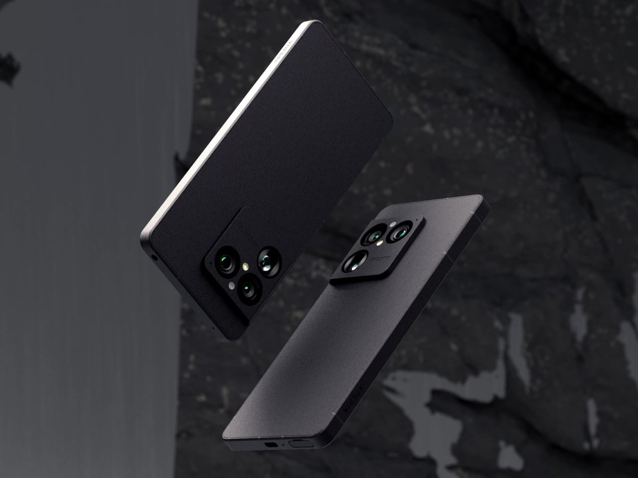
At first glance, the Xiaomi 17T Pro looks almost identical to its predecessor, and that is not a bad thing at all. When a design language already works, refinement can be more valuable than reinvention. Rather than chasing a dramatic visual reset, Xiaomi builds on a form that already felt resolved, keeping the same restrained character while sharpening the details that made the earlier model appealing.

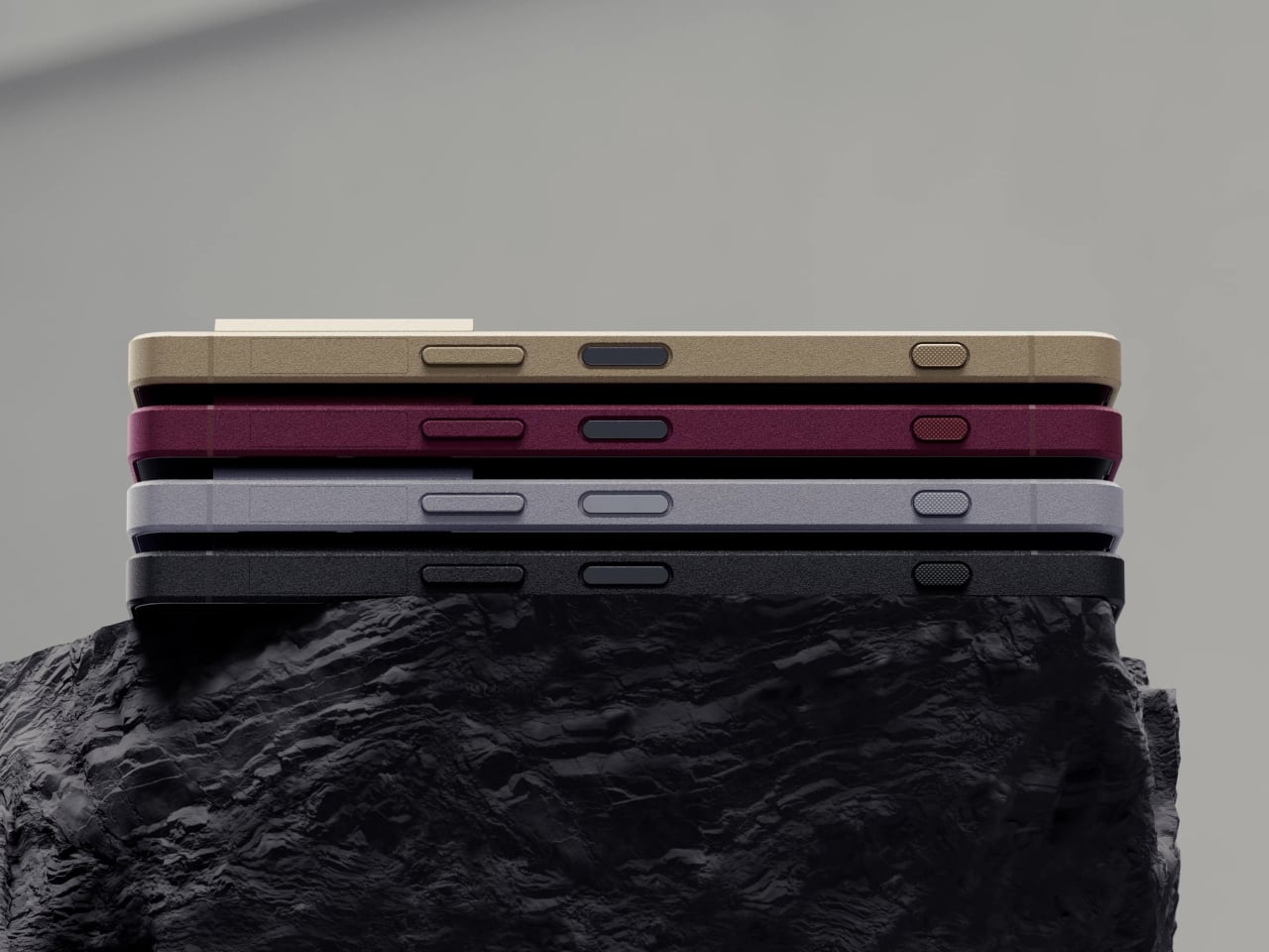
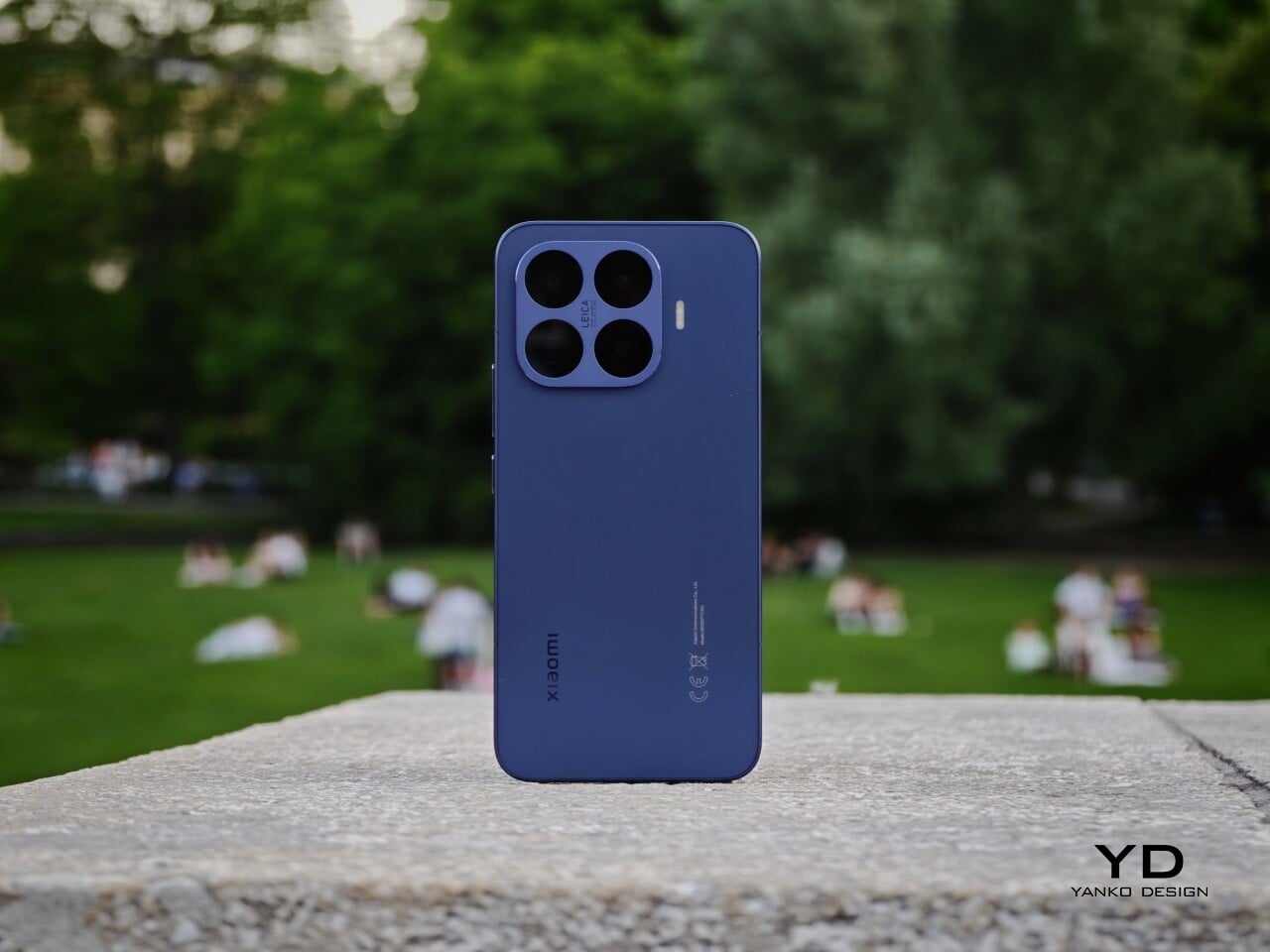
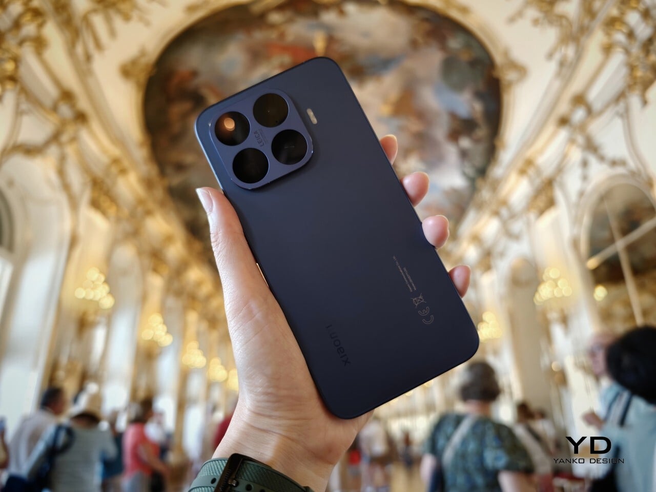
What continues to make this T series design stand out is the way restraint is paired with color. The silhouette remains minimalistic, but it is lifted by finishes that feel subtle yet premium. Instead of relying on loud textures or flashy accents, the phone creates presence through tone, depth, and gentle shifts in light, giving it a more personal quality.

Compared to the 15T Pro, there is also a clear shift in the finish itself. The older model had more of a shimmer, while the 17T Pro moves toward a sheen finish instead. Both have their appeal. The shimmer of the 15T Pro feels lively and expressive, while the sheen of the 17T Pro feels smoother and more understated.

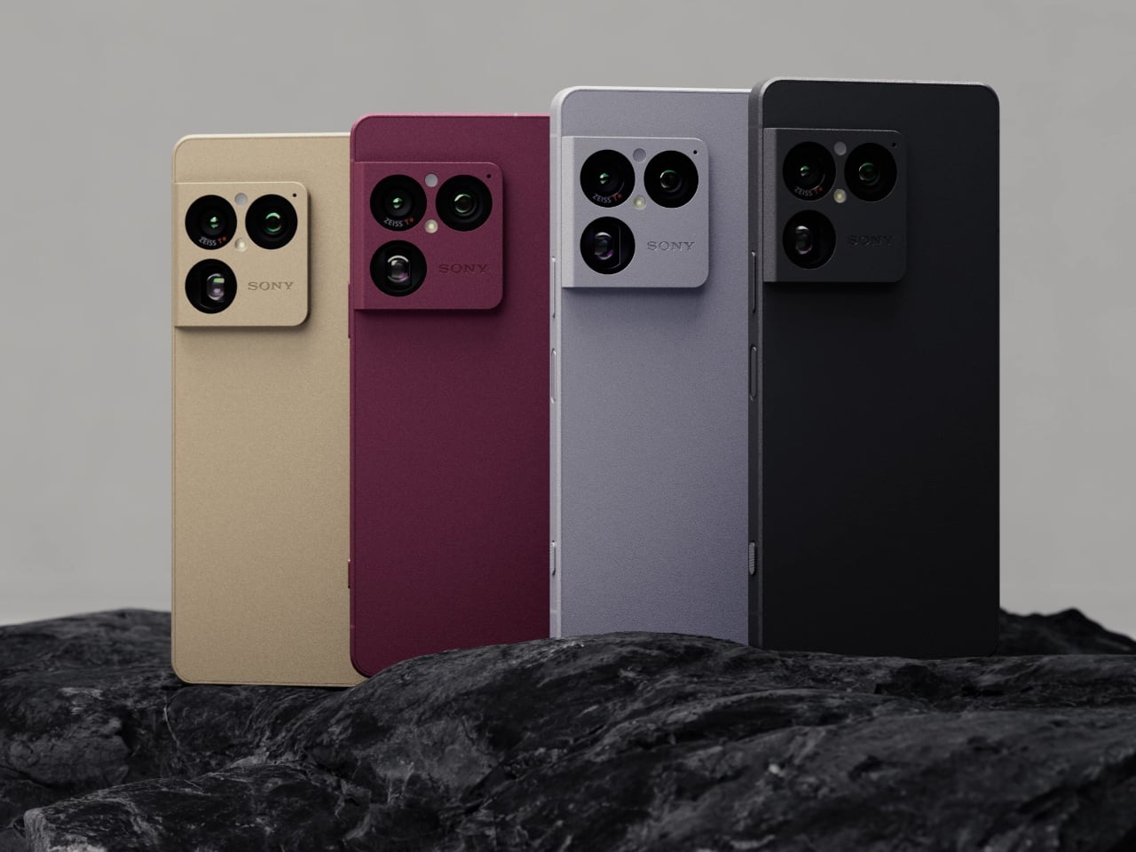
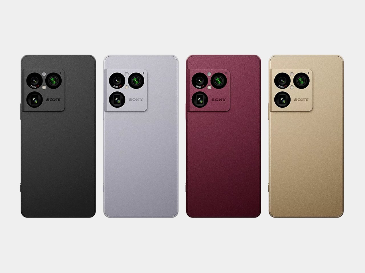
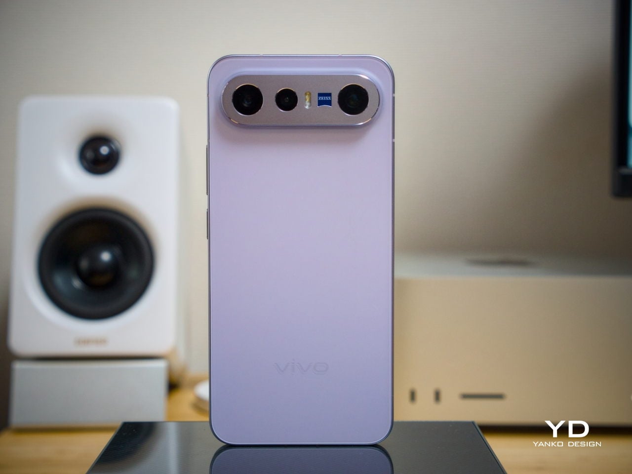
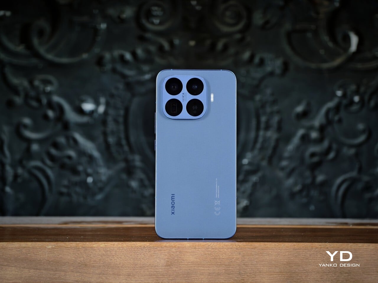
The Xiaomi 17T Pro comes in Deep Blue, Deep Purple, and Black. I received the Deep Blue variant, and it made the strongest first impression with its deep purple undertone, which adds richness and subtle variation depending on the light. Deep Purple feels a little warmer and more expressive, while Black is the most understated of the three, though it still has a deep navy undertone that keeps it from looking flat.

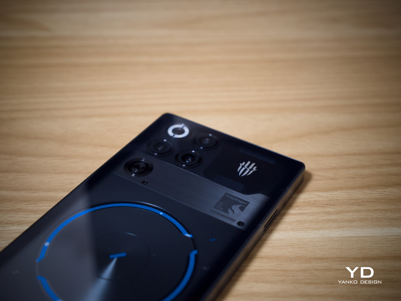
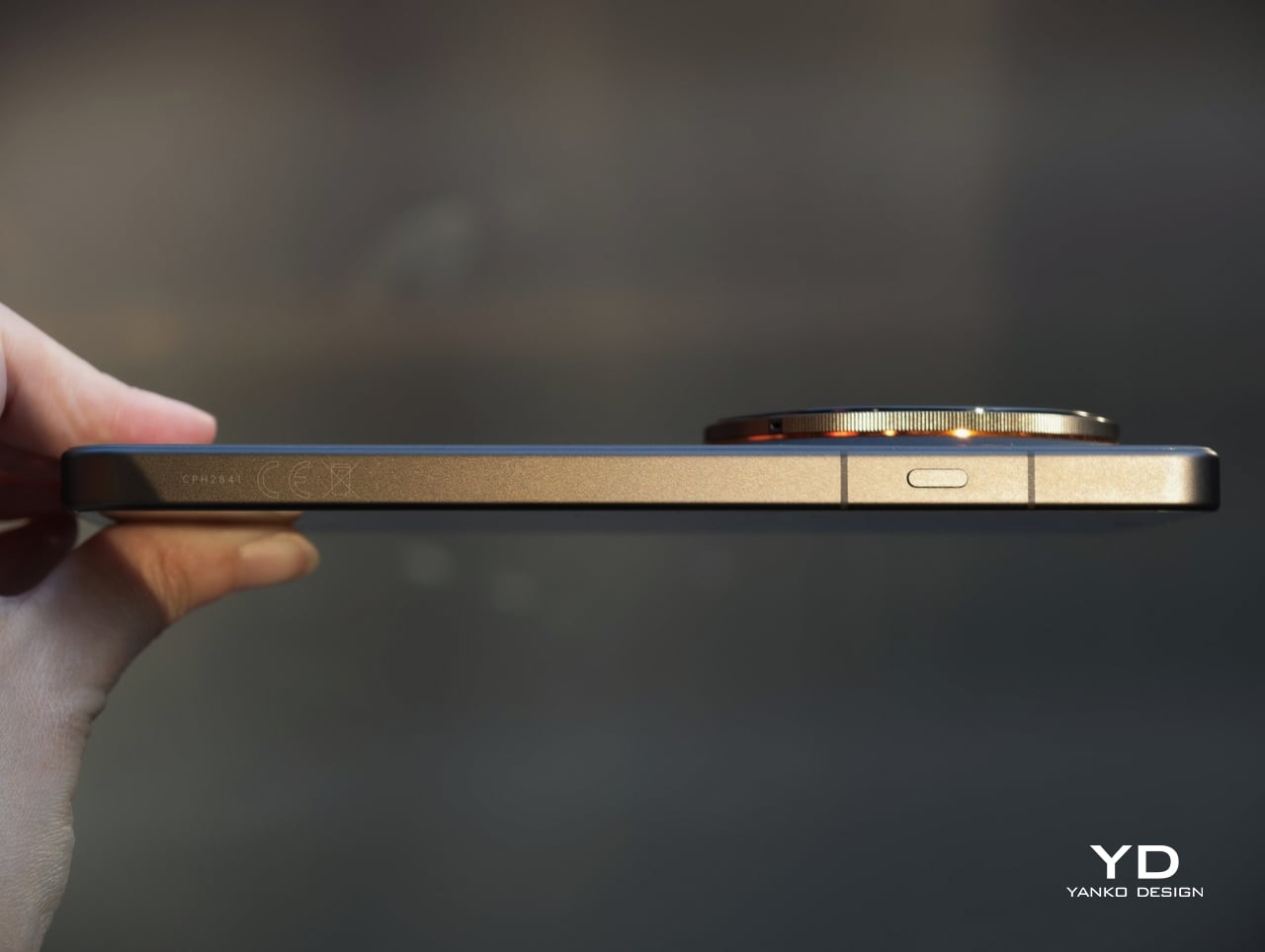
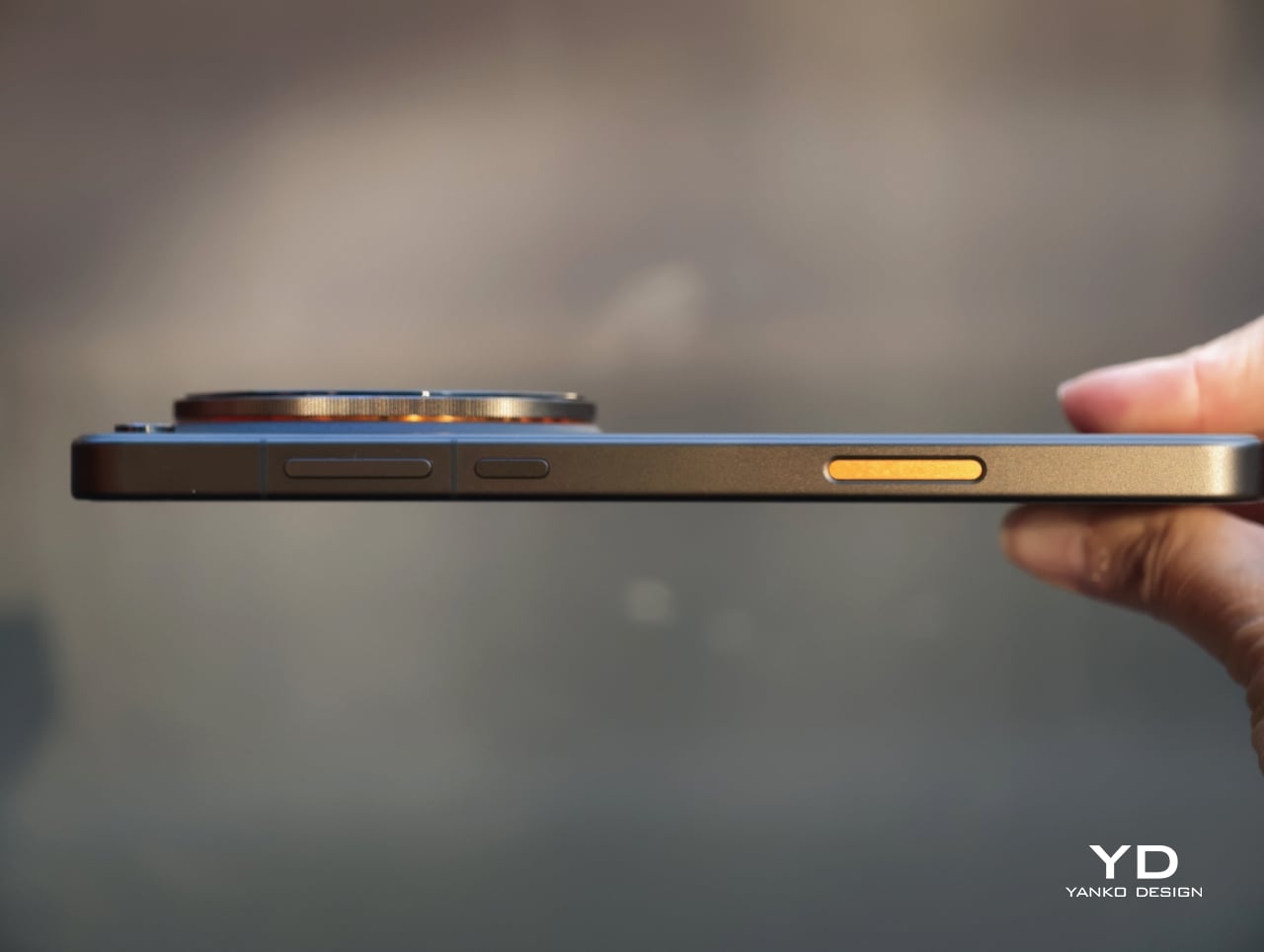
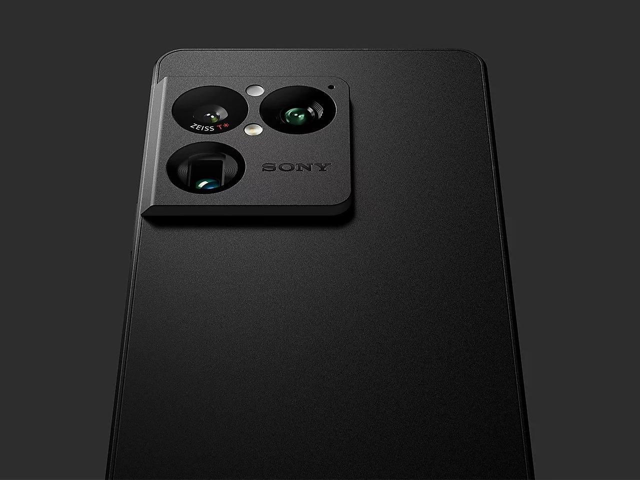
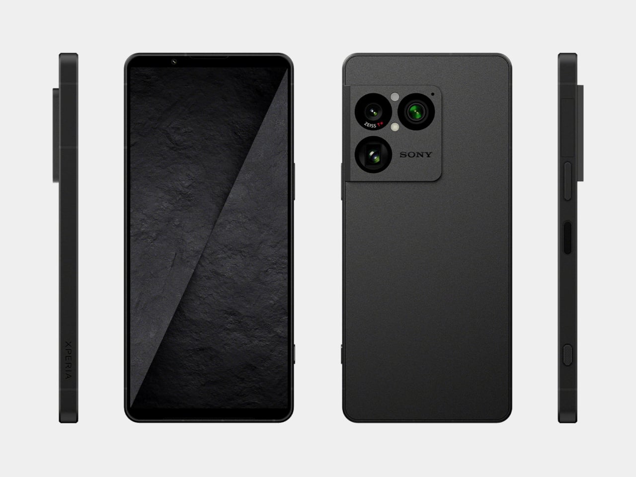
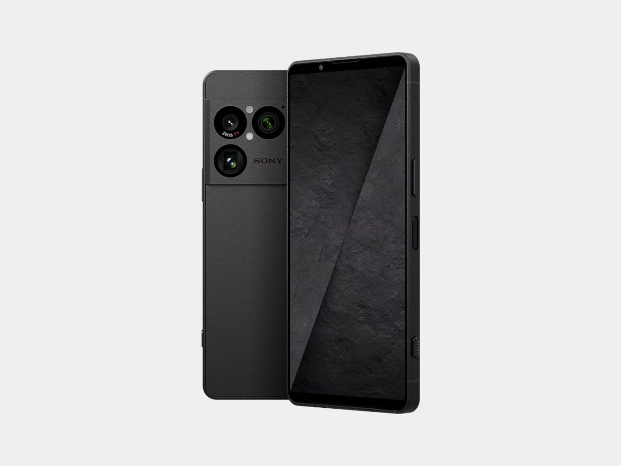
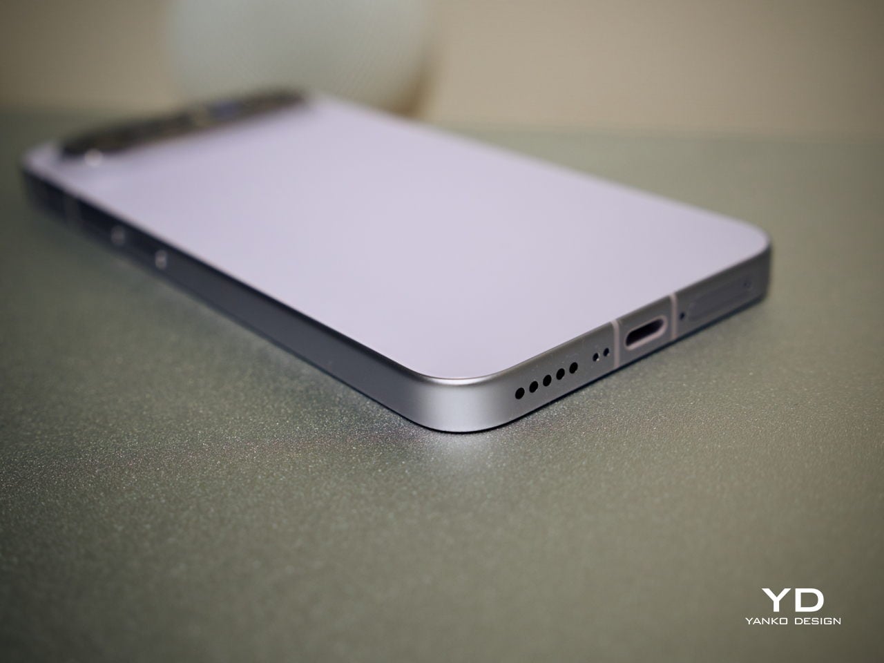
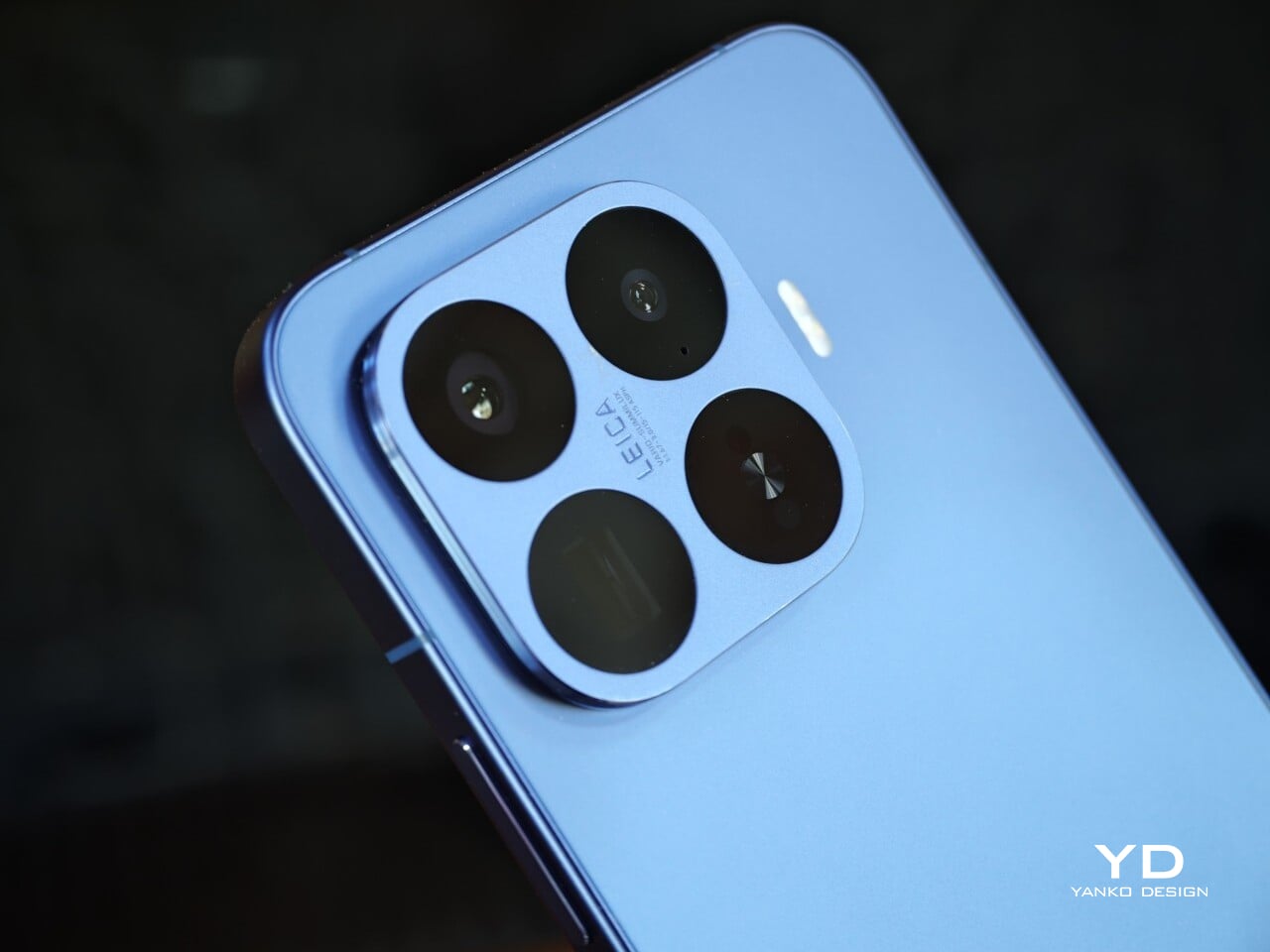
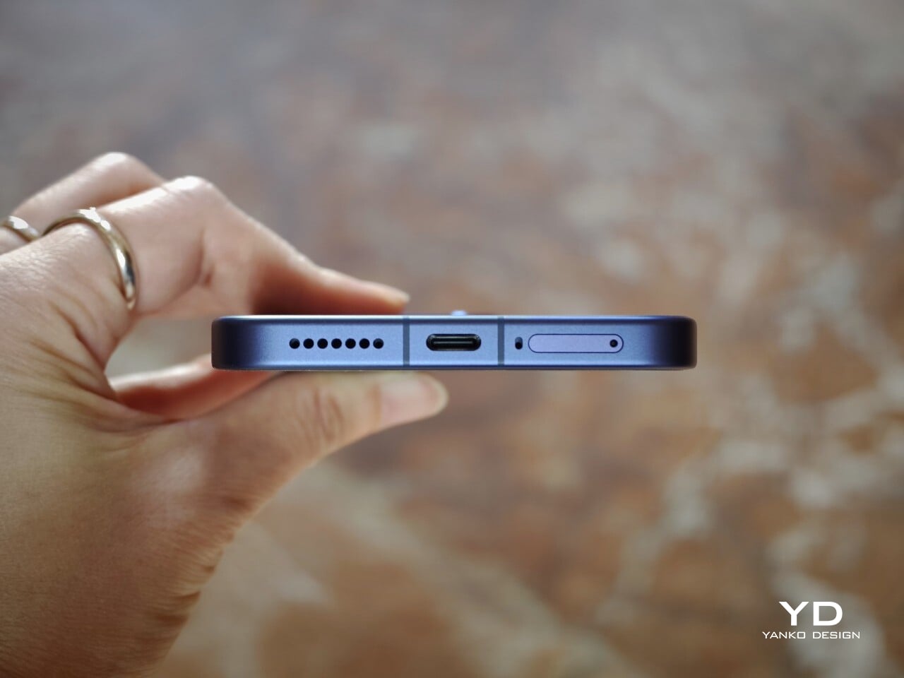
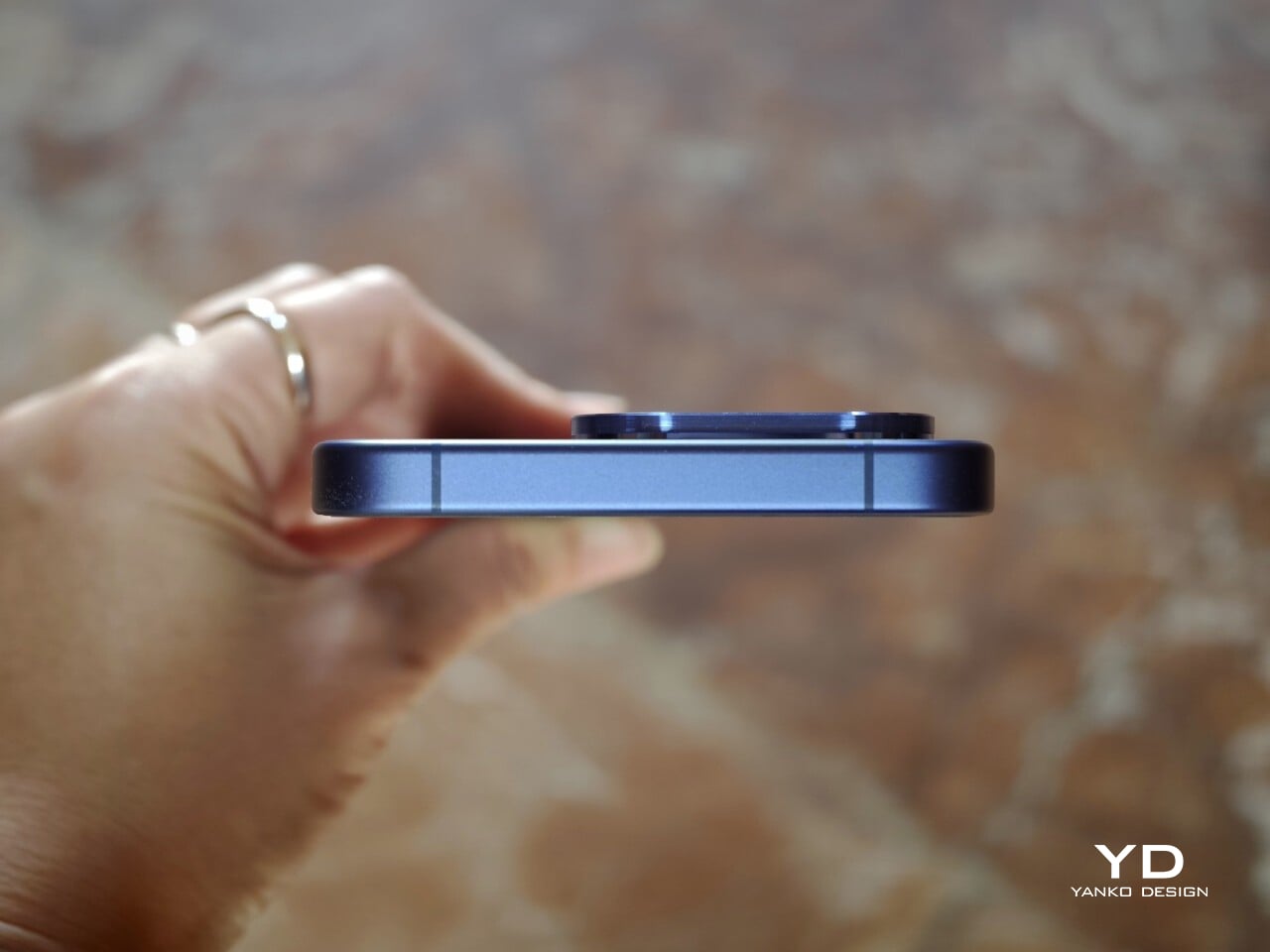
Another key part of the visual identity is the square camera housing, which is color-matched to the rest of the body. The continuous side frame and matching buttons also help the device feel more unified and architectural. The only minor distraction is the regulatory markings on the lower right of the back panel, which are a bit more noticeable than I would like on an otherwise very clean design.

Ergonomics

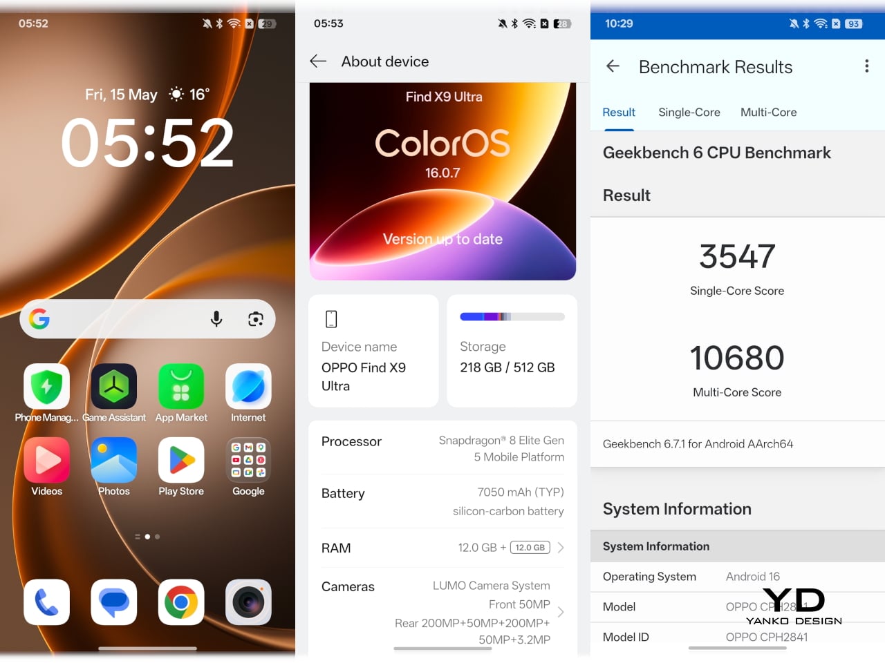
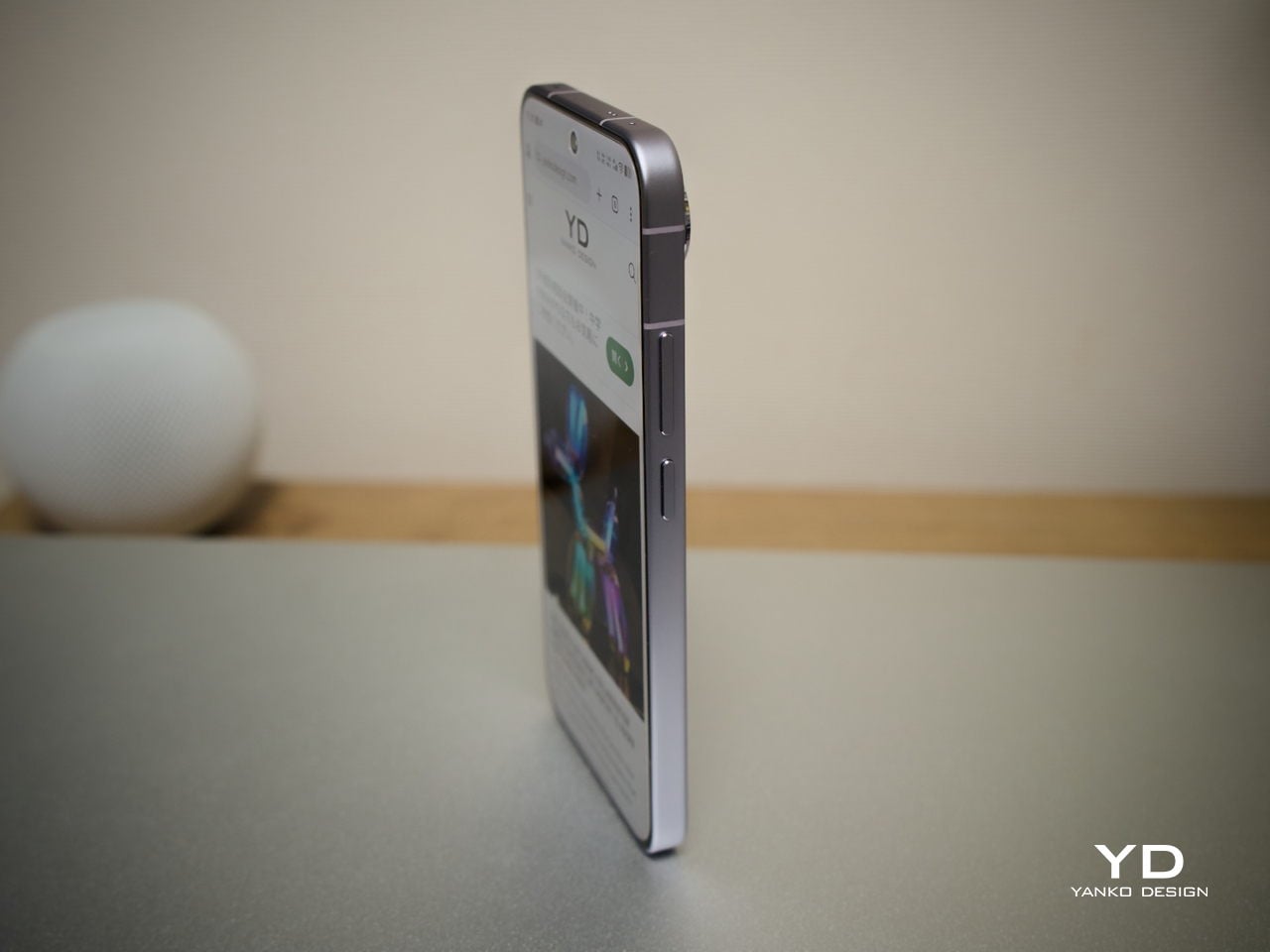
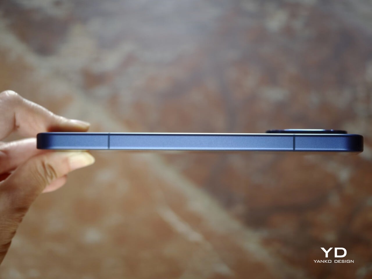
The Xiaomi 17T Pro remains close to its predecessor in both size and weight, measuring 162.2 x 77.5 x 8.25mm and weighing 219g. Those numbers are substantial, but they make sense for a phone with a 6.82-inch display, 7,000mAh battery, and a capable camera system. Given the hardware it packs in, Xiaomi has done a good job balancing flagship ambition with everyday usability.

This is not really a one-handed phone unless you have large hands, but it avoids feeling awkward. The smooth pebble-like texture of the back panel helps here, making the phone feel softer and more natural in the hand. Combined with the frame and the gentle transitions from the back panel, the edges do not dig into the palm even when you are using it a little awkwardly with one hand. The weight is also well balanced, which makes the phone feel more controlled than its size might suggest.

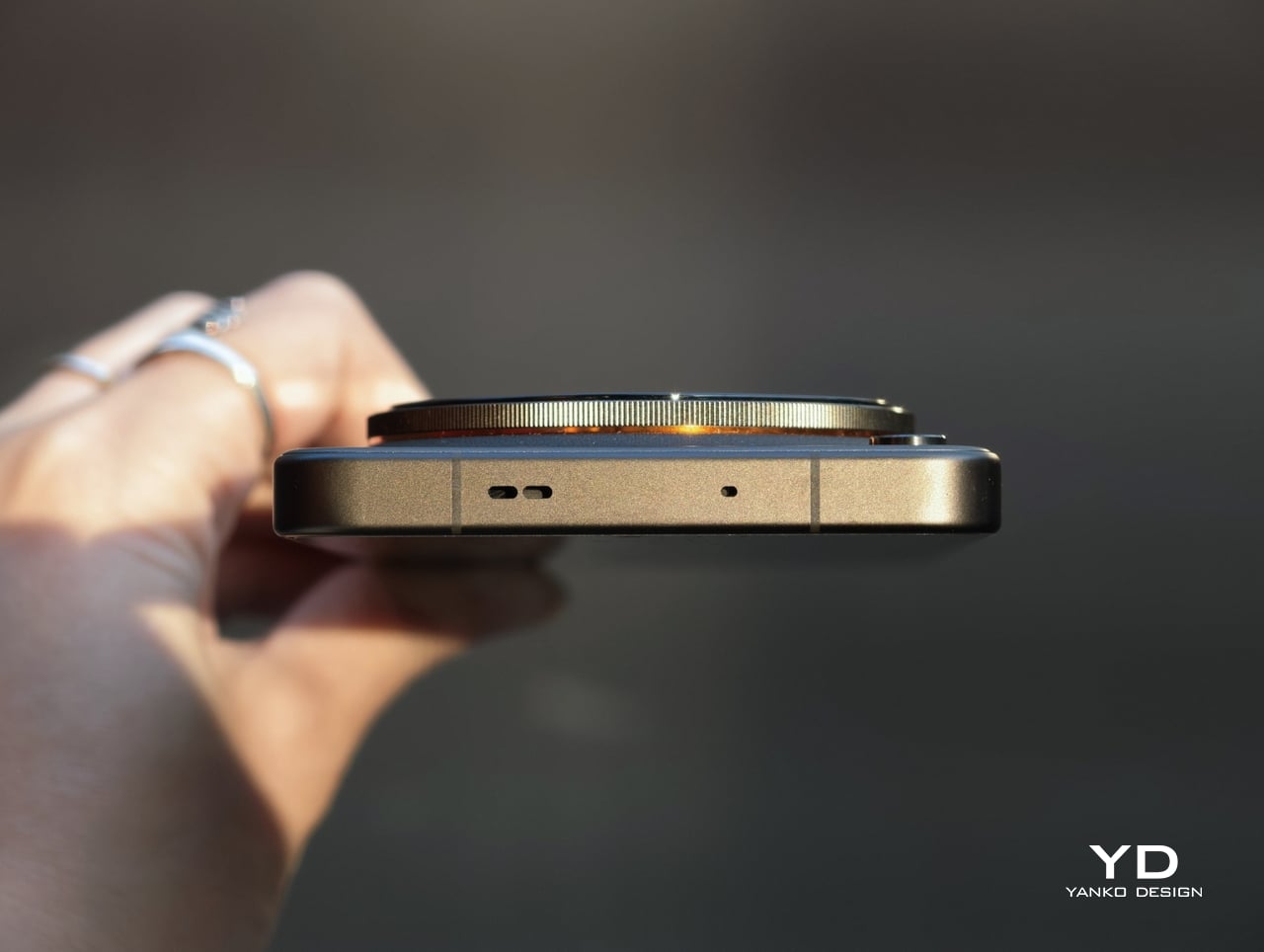
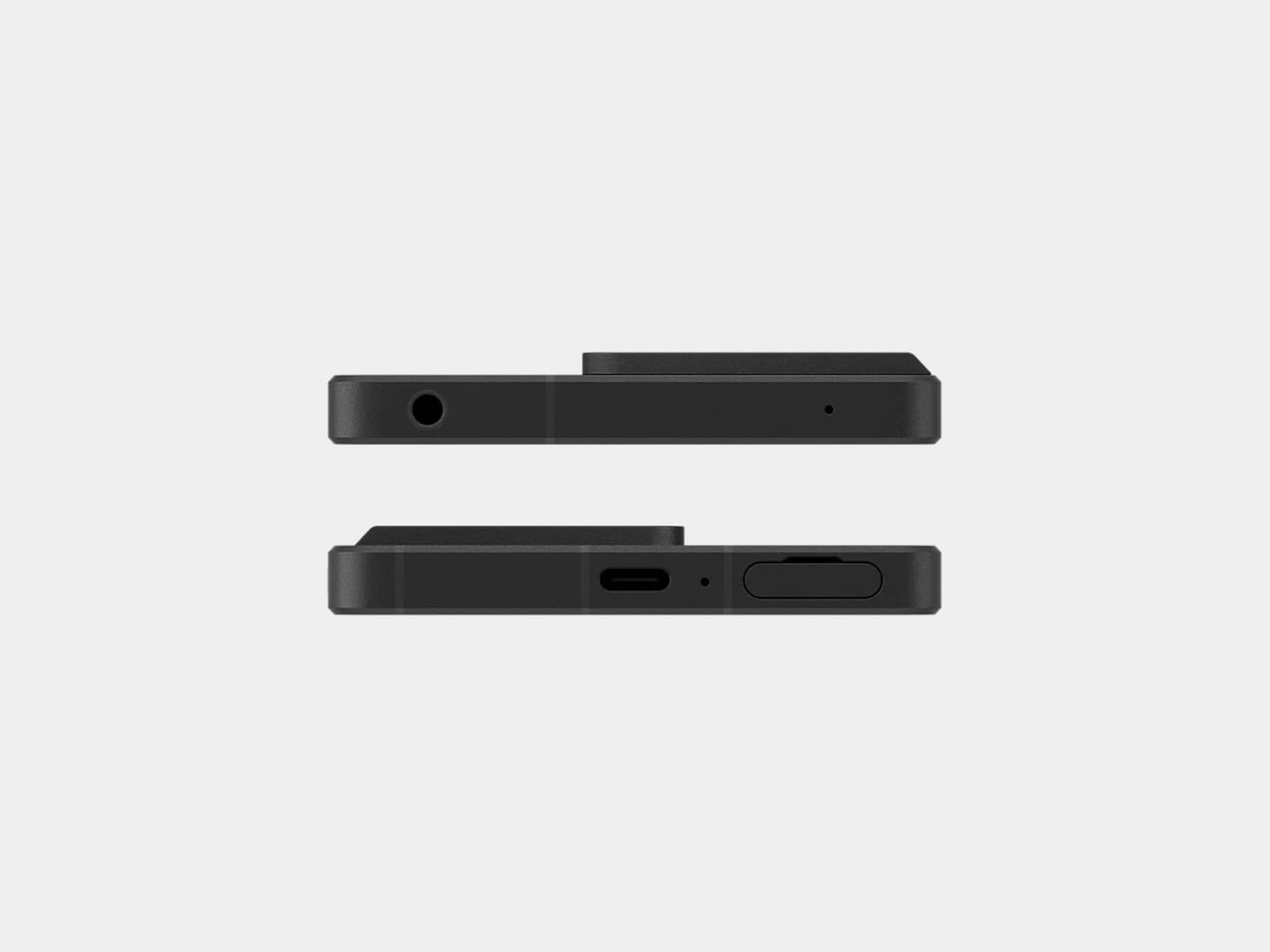
One detail that could be improved is the fingerprint sensor placement. It sits quite close to the bottom edge of the display, which makes unlocking the phone feel a bit awkward at times. It is something you can get used to, but a slightly higher position would have felt more natural.

Performance

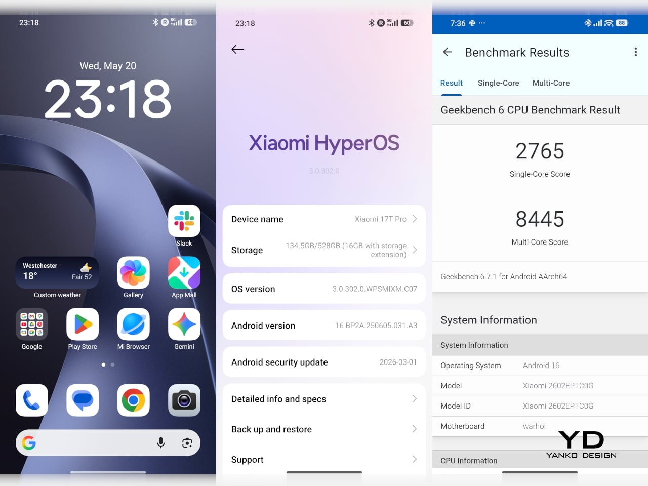
The Xiaomi 17T Pro feels fast and responsive in everyday use, which is exactly what you would hope for from a flagship built around the MediaTek Dimensity 9500. Paired with LPDDR5X RAM and UFS 4.1 storage, the phone has more than enough headroom for smooth navigation, quick app launches, and fluid multitasking. The phone runs Xiaomi HyperOS 3 based on Android 16 out of the box, and so far, the overall experience feels snappy and polished rather than overly busy.

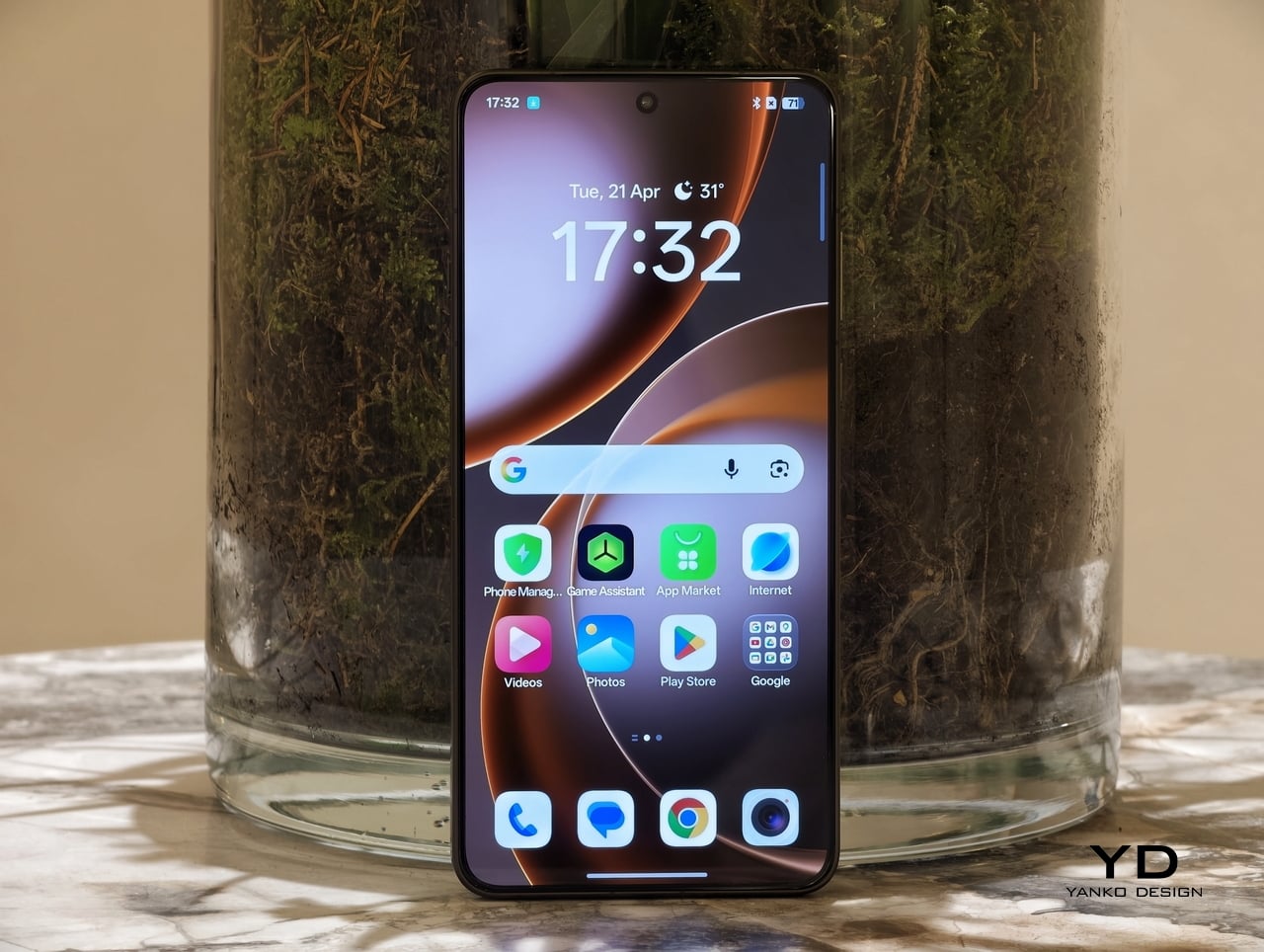
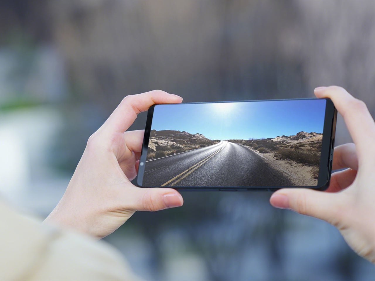
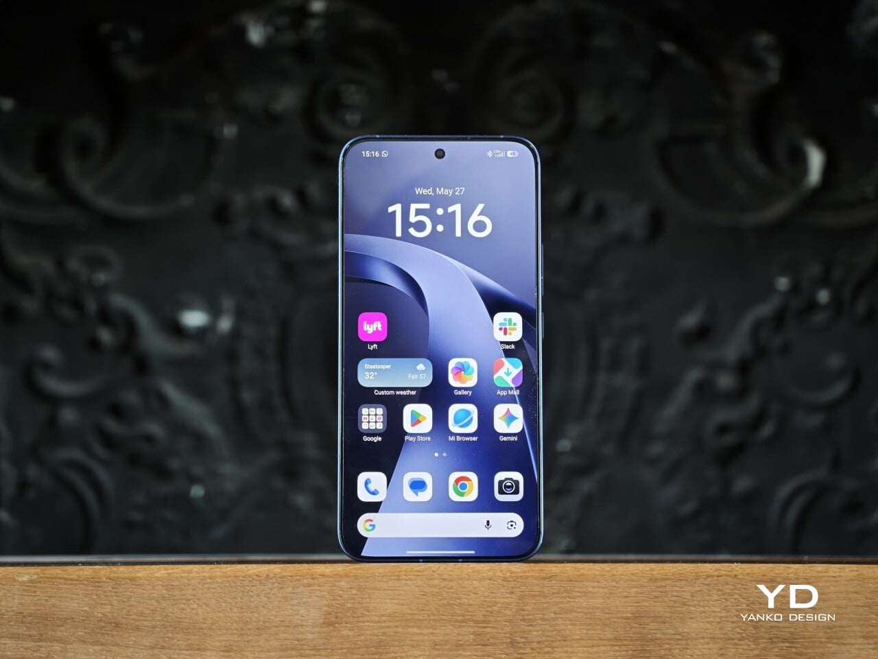
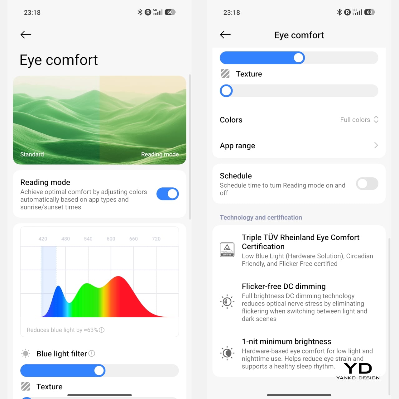
A big part of that impression comes from the display. The 6.83-inch AMOLED panel has a 1.5K resolution of 2772 x 1280, a refresh rate of up to 144Hz, and peak brightness of up to 3,500 nits. It also supports HDR10+ and Dolby Vision, which helps content look vivid and high contrast when the source material allows. Xiaomi includes both DC dimming and PWM dimming and introduces Xiaomi Vision Care with the 17T Pro. The 17T series is also the first in the industry to receive TÜV Rheinland quadruple eye care certification, including Low Blue Light, Circadian Friendly, Flicker Free, and Intelligent Eye Care, with the display designed to deliver a more comfortable viewing experience over longer sessions.

The camera system builds on what already worked well on the 15T Pro rather than trying to reinvent the formula. On the back, you get a 50MP main camera, a 50MP telephoto camera, and a 12MP ultra-wide camera, while the front houses a 32MP selfie camera. All three rear cameras carry Leica branding, and as usual, Xiaomi lets you choose between Leica Vibrant and Leica Authentic color profiles. I usually prefer Leica Authentic because it delivers that signature Leica look, though Leica Vibrant tends to work better for food photography, where a little extra punch can be welcome.

1x Main, Leica Authentic

1x Main, Leica Authentic

5x Telephoto, Leica Vibrant

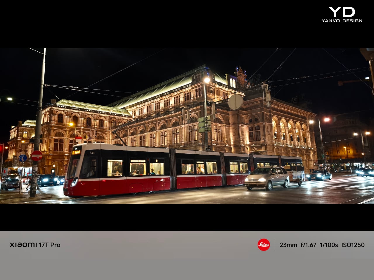
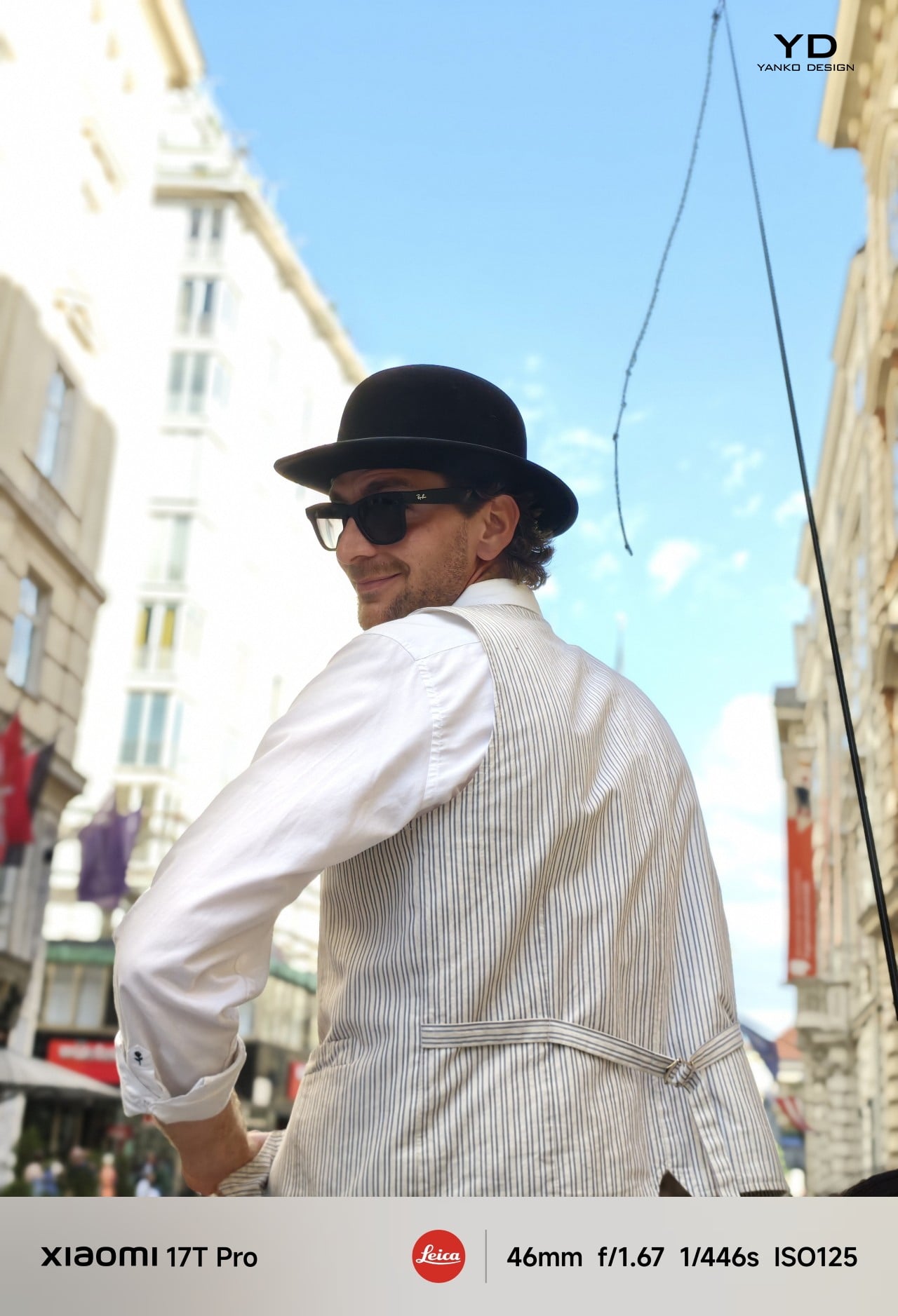
The 23mm-equivalent main camera with its f/1.67 aperture takes great photos with a pleasing level of detail, good exposure, and a wide dynamic range in good lighting. Colors look realistic rather than overly processed, which gives the images a more natural feel. Low-light performance is also strong overall, with good detail retention and very little visible noise. It feels like a dependable main camera that can handle a wide range of situations without much fuss.
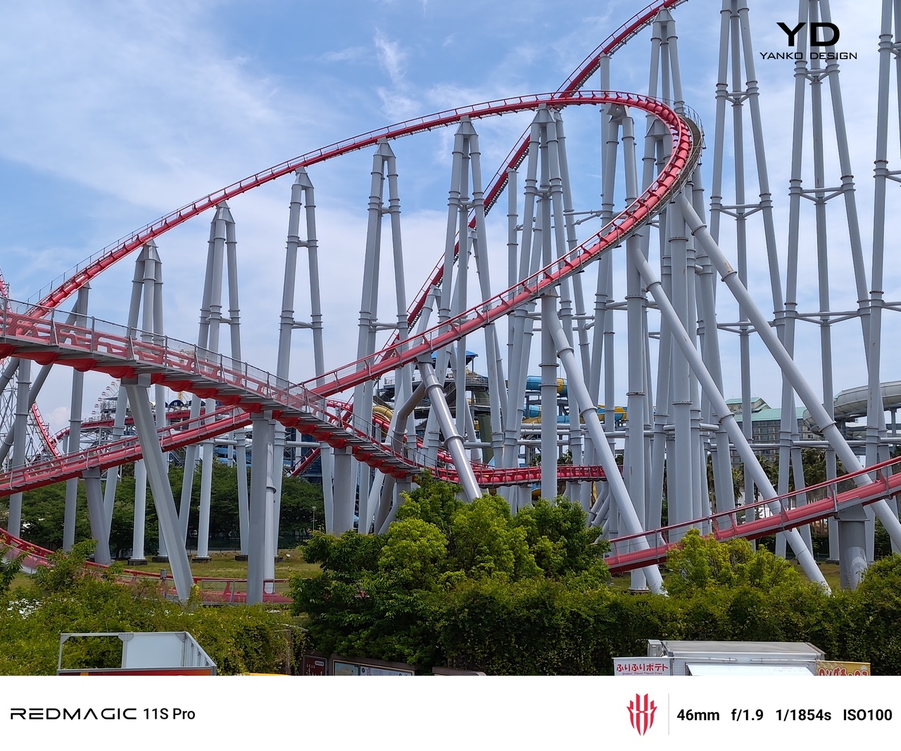
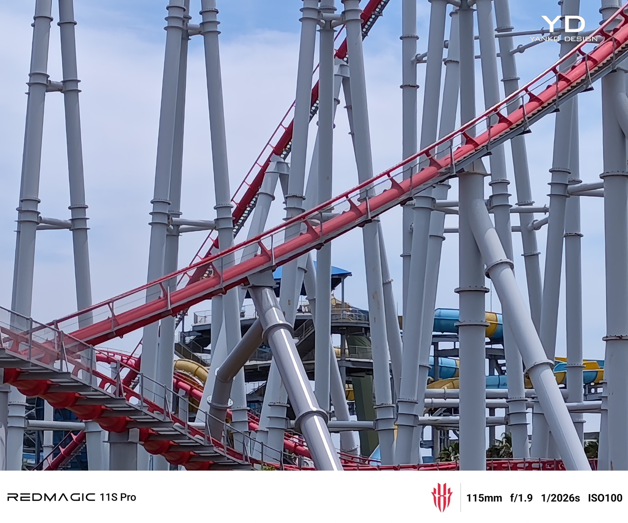
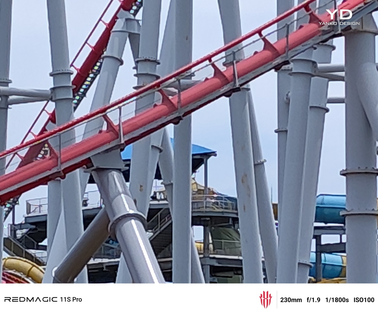
5x Telephoto

10x Telephoto

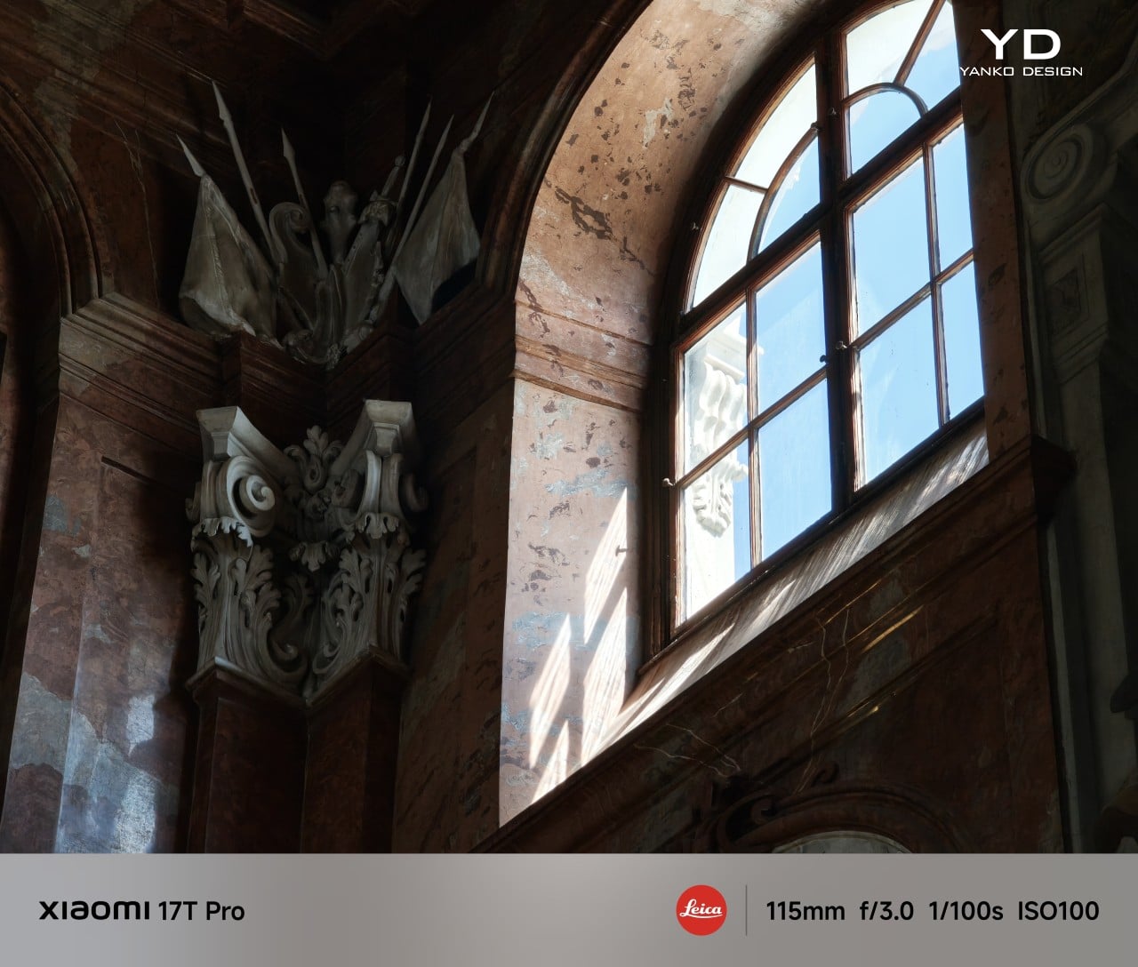
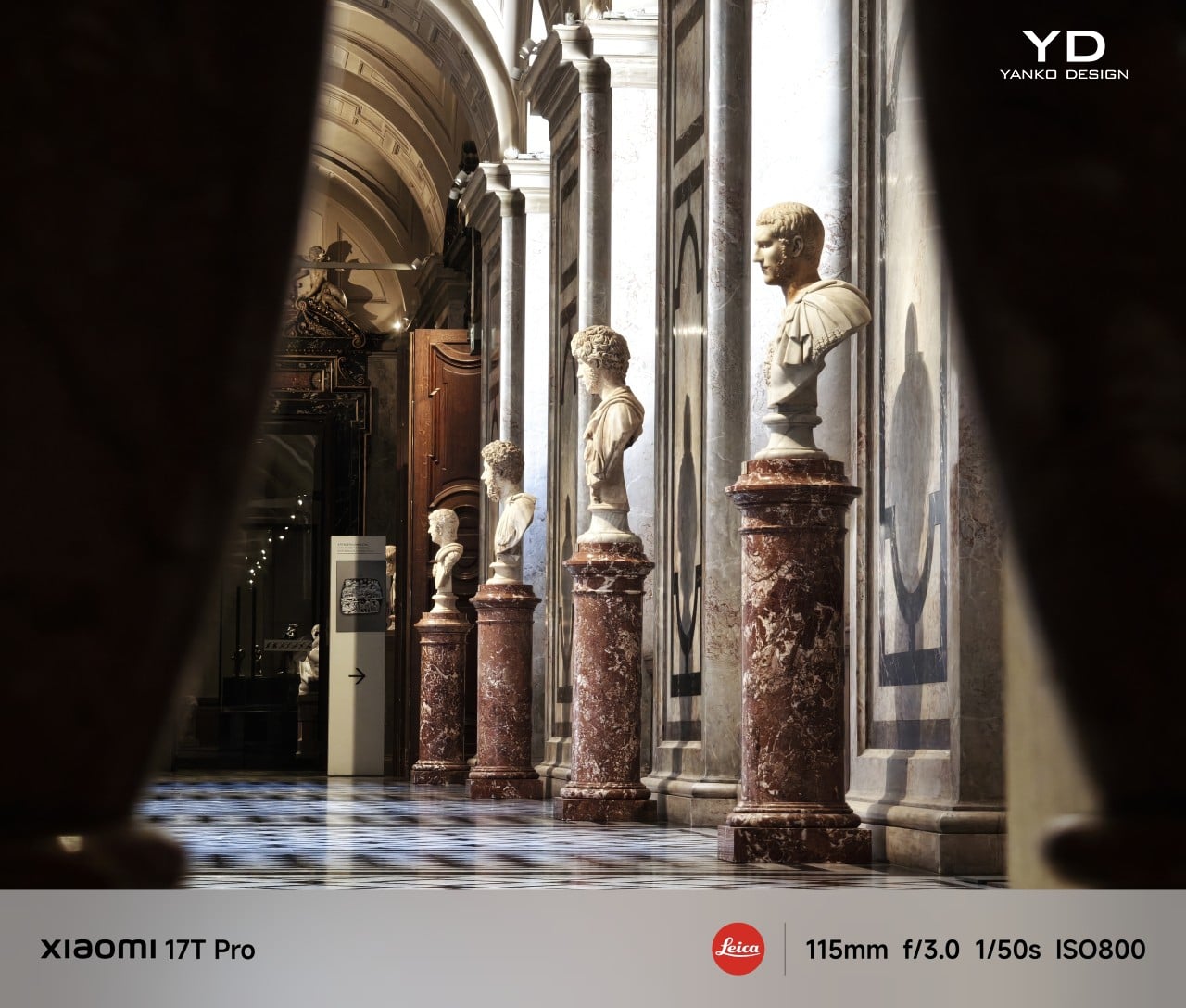
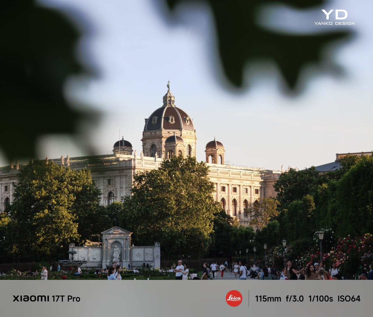
The 115mm-equivalent telephoto camera with its f/3.0 aperture is really the star of the show. It delivers shots with strong detail, good exposure, and a wide dynamic range, while color stays fairly consistent with the main camera. Even in low light or more difficult lighting conditions, it manages to hold onto detail impressively well. The telemacro mode is less convincing, though. It is not especially sharp, and with a minimum focus distance of 30cm, it does not let you get quite as close to the subject as I would have liked.

0.6x Ultra-wide, Leica Vibrant with Film Positive filter

5x Telephoto, Leica Authentic

5x Telephoto, Leica Authentic

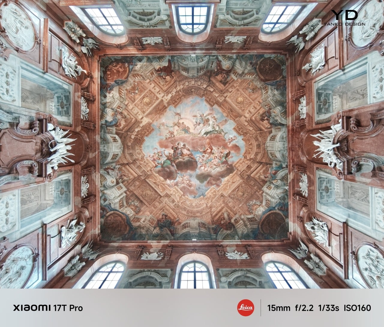
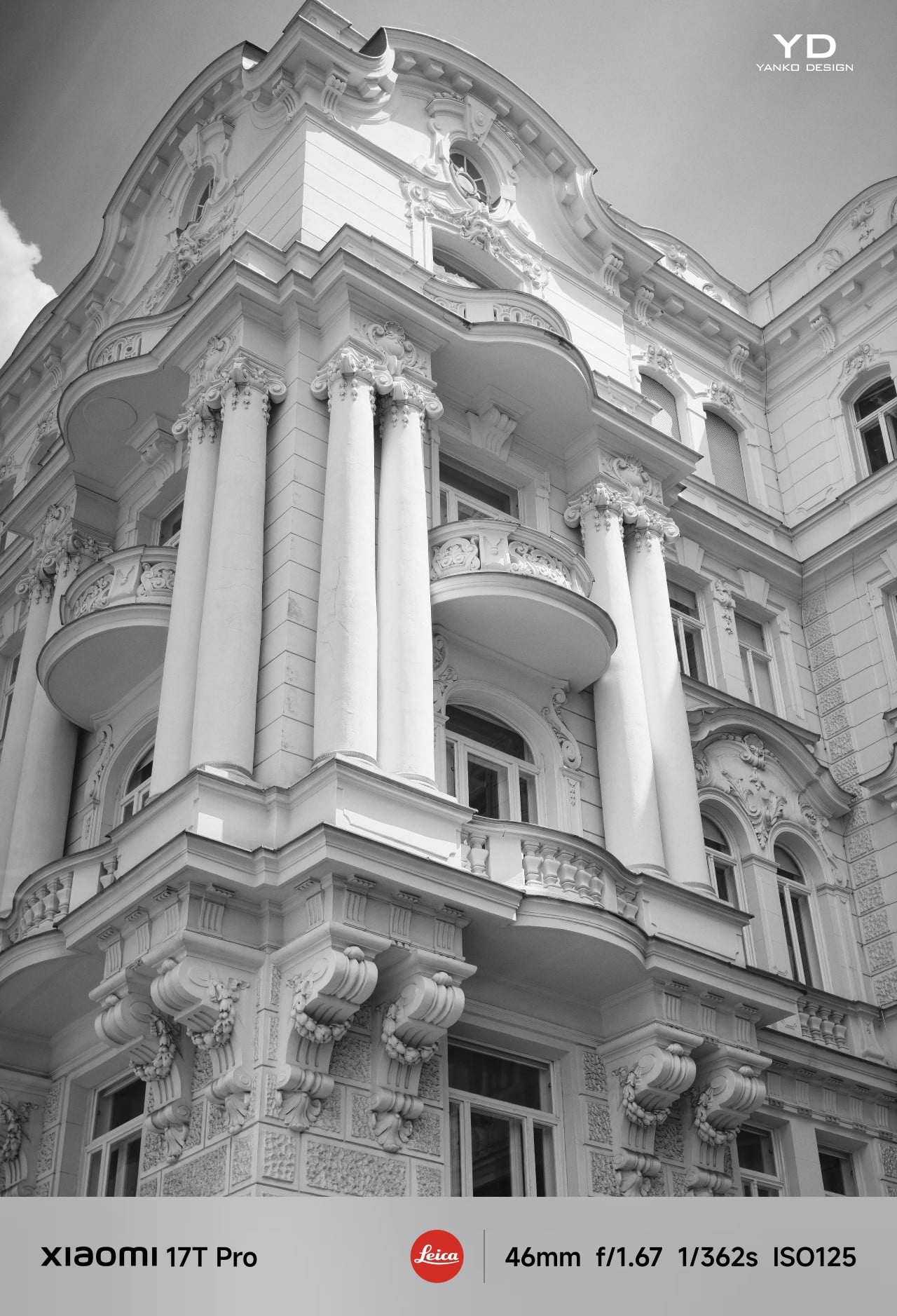
The 15mm-equivalent ultra-wide camera with its f/2.2 aperture and 120-degree field of view is the weakest of the three rear cameras, but it still delivers solid results. Detail can look a bit softer compared to the main and telephoto cameras, though dynamic range remains good, and the overall output is still perfectly usable. It may not be the standout lens in the system, but it does its job well enough for most casual wide shots.

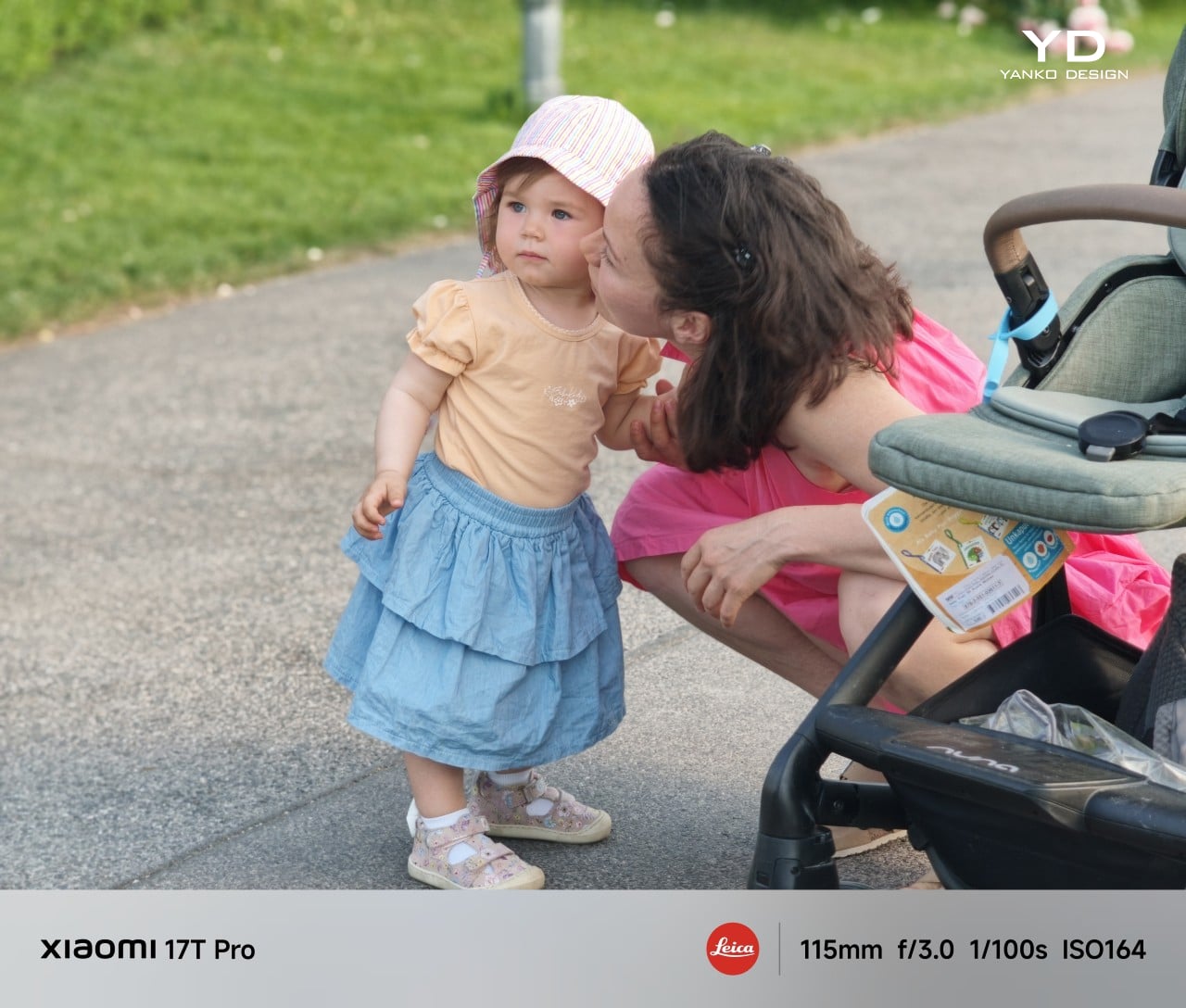
Portrait mode is another strong point. You can choose between Master Portrait and Leica Portrait, and both styles deliver attractive results with natural-looking background blur. Subject isolation is consistently well judged, which helps portraits look polished without feeling overly artificial.

2x Main, Master Portrait

5x Telephoto, Master Portrait

5x Telephoto, Master Portrait

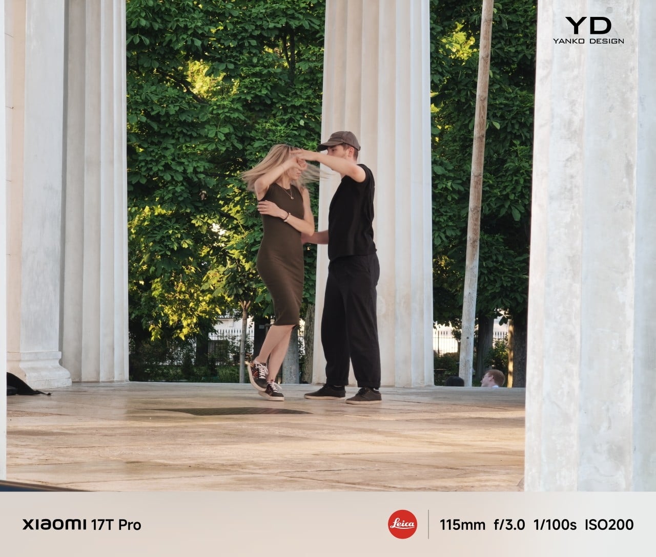
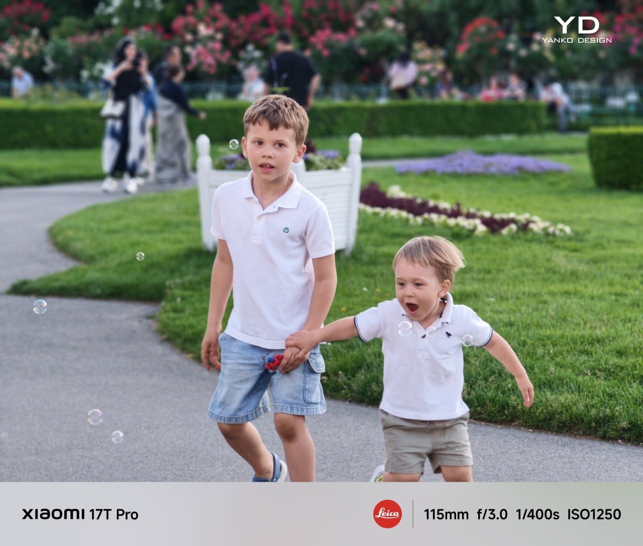
One of the more playful additions is Leica Live Moment, which lets you capture live motion photos with Leica color tone. I usually turn off live motion photos on most phones because the still image quality often takes a hit, and the moving portion can end up looking blurry. With the 17T Pro, though, I could clearly see the appeal.

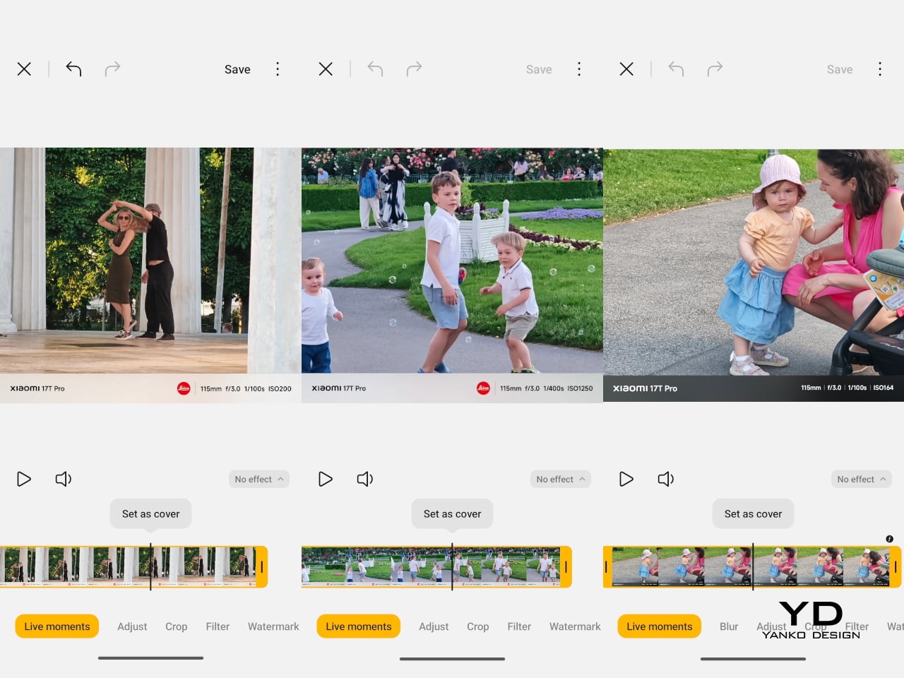
It adds a little more story and spontaneity to the image, and the fact that it is available even in Portrait mode makes it more versatile than I expected. I tried it with kids, pets, a couple dancing, and an approaching train, all of which felt like good examples of where the feature makes sense. In those moments, it preserved a bit of movement and atmosphere that a still image alone would not fully capture. You do need to keep the phone fairly still; the motion portion can end up showing too much camera movement. Even so, when it works, it is a genuinely fun feature.

2x Main, Leica Vibrant with B&W Filter

Video is another area where the 17T Pro feels well-equipped. The main camera can record up to 8K at 30fps or 4K at 120fps. The telephoto and ultra-wide cameras are capped at 4K at 60fps, while the front camera tops out at 4K at 30fps. Xiaomi also lets you shoot in Log with all rear cameras, and there is a Movie mode that adds cinematic background blur for a more stylized look. Video quality has been very good across different lighting conditions on both the main and telephoto cameras, with wide dynamic range, solid exposure, and a generally polished result.

Battery size is one of the biggest improvements over the previous model. With its 7,000mAh silicon-carbon battery, the 17T Pro gives a reassuring sense of stamina that matches its large size, and it has felt great in day-to-day use. Even with a full day of heavy camera use, the phone was able to last the entire day, and with lighter use, it can easily stretch beyond that. It supports 100W wired charge, 55W wireless HyperCharge, and 22.5W wired reverse charge.

Sustainability

The Xiaomi 17T Pro makes a reasonable case for longevity through both durability and software support. It comes with an IP68 rating, Corning Gorilla Glass 7i on both the display and back panel, and a high-strength aluminum frame. Those details may not define sustainability on their own, but they do suggest a phone built to hold up well over time.

Xiaomi is also promising 5 generations of Android upgrades and 6 years of security patches, which gives the 17T Pro a longer life beyond the hardware itself. That matters because one of the most practical forms of sustainability is simply keeping a phone useful for longer. The 17T Pro may not radically change the sustainability conversation, but it does feel like a device designed with longevity in mind.

Value

The Xiaomi 17T Pro comes in three configurations: 12GB + 256GB, 12GB + 512GB, and 12GB + 1TB, with prices starting at 899 euros. That is 100 euros more than the 15T Pro, which is a noticeable jump for the series. It does make the 17T Pro feel a little less aggressively priced than its predecessor.

Still, the increase does not feel entirely surprising given the recent rise in memory prices. Xiaomi is also unlikely to be the only brand adjusting prices in 2026. With its larger 7,000mAh battery, refined design, strong telephoto camera, and solid software support, the 17T Pro still feels like a well-rounded flagship that offers good value overall.

Verdict

The Xiaomi 17T Pro does not try to reinvent what made the T series appealing, and that is exactly why it works. Instead, it takes the core strengths of the 15T Pro, including the restrained design, strong camera system, and flagship-like everyday performance, and refines them in ways that feel practical rather than flashy. The result is a phone that feels more mature than dramatic, but also more complete.

What stands out most is how balanced the overall package feels. The telephoto camera is genuinely excellent, the battery life is a major step up, and the design still has a quiet confidence that helps the phone stand out without trying too hard. There are a few compromises, of course. The ultra-wide camera is merely good rather than great, the fingerprint sensor sits lower than it should, and the higher starting price means the 17T Pro no longer feels quite as aggressively positioned as earlier T Pro devices.

Even so, Xiaomi has refined the right things. The 17T Pro feels like a phone that understands its own appeal and leans into it with confidence. It is not chasing attention with gimmicks or trying to prove itself through excess. Instead, it delivers the kind of thoughtful, well-rounded flagship experience that becomes more convincing the longer you use it, and that is what makes it easy to recommend.

The post Xiaomi 17 Pro Review: Refined in All the Right Places first appeared on Yanko Design.

REDMAGIC 11S Pro Review: Gaming Phone That Shows Its Worth, Literally

PROS:


  • Distinctive flat and boxy design with visible liquid cooling

  • Top-tier performance

  • Has rare 3.5mm headphone jack

  • Large battery with 80W wired and wireless charging

CONS:


  • No telephoto camera

  • No formal IP dust resistance rating

RATINGS:

AESTHETICS
ERGONOMICS
PERFORMANCE
SUSTAINABILITY / REPAIRABILITY
VALUE FOR MONEY

EDITOR'S QUOTE:

The REDMAGIC 11S Pro proves that a gaming phone doesn't have to apologize for what it is.

Most premium smartphones are converging toward the same design language: a glass sandwich, a growing camera island, and a polished finish that looks good in press photos but feels indistinguishable from everything else on the shelf. The harder question has always been whether a phone can look genuinely different without feeling like a novelty, which gaming phones have always struggled to answer.

REDMAGIC has been building gaming-first phones since 2018, and the 11S Pro is the brand’s most coherent statement yet. It doesn’t try to disguise its identity with a mainstream-friendly exterior. Instead, it leans into its engineering, turning the cooling system and gaming hardware into the visual story. But does that actually work in its favor? We spend time with it if it’s truly a deliberate choice or just an accident.

Designer: REDMAGIC

Aesthetics

The first thing that stands out about the REDMAGIC 11S Pro is that it doesn’t look like anything else. The transparent rear in the Nightfreeze colorway exposes the internal structure, giving the phone a graphic, almost industrial quality. A large circular motif sits centered on the back, and blue accents run through the design with enough restraint to feel technical rather than theatrical.

The flat back makes an immediate impression. Without a protruding camera module, the rear reads as a unified composition. The camera cluster sits quietly in the upper corner, which keeps the visual hierarchy centered on the cooling hardware and transparent body rather than the lens arrangement. It’s a deliberate order of priority that gaming phones rarely manage to get right.

Of course, the real standout is that the visible liquid cooling system isn’t decorative at all. The AquaCore’s structure shows through the transparent body, meaning the design and engineering are the same thing. Most phones hide their thermal management entirely, but the 11S Pro treats it as something worth showing, giving the phone an architectural confidence that’s hard to ignore.

The Nightfreeze black colorway reads quietly, which is a little surprising for a gaming phone. The RGB lighting strip adds presence without being overbearing, and the blue accents feel more mature than typical gamer aesthetics. It’s a design that rewards a closer look rather than demanding attention from across the room, setting it apart from most flagships chasing the same polished minimalism.

Ergonomics

Holding the 11S Pro makes clear it’s a substantial phone, though not in a way that feels unintentional. The weight reflects the 7,500mAh battery and the active cooling system tucked inside, and the flat sides with squared-off edges create a secure, confident grip. It doesn’t try to disappear in the hand the way ultra-thin phones do, which feels appropriate given what’s inside.

In landscape orientation, which is where the 11S Pro truly comes into its own, the balance improves noticeably. The flat rear makes it easy to steady the device during long sessions, and the 520Hz capacitive shoulder triggers sit exactly where the fingers fall. If you’ve played competitive titles without a controller nearby, those triggers aren’t a nice addition. They’re a genuine advantage.

Performance

Under the hood, the REDMAGIC 11S Pro runs on the Snapdragon 8 Elite Gen 5 Leading Version, Qualcomm’s highest-binned variant of the chip, paired with the brand’s own RedCore R4 co-processor. Storage configurations go up to 16 GB of RAM, and the full package includes a 144 Hz AMOLED display and the AquaCore active cooling system, keeping performance from overreaching its own thermal limits.

The performance story here isn’t really about peak benchmark numbers. It’s about whether the phone can maintain that output through a two-hour ranked session or a streaming marathon without throttling back to catch its breath. In testing, the 11S Pro handles sustained workloads with a composure that most phones struggle to match, frame rates staying consistent, and the device never getting uncomfortably warm.

That’s largely down to the AquaCore cooling system, which combines a 13,116mm² vapor chamber, a built-in fan spinning at up to 24,000 RPM, and a liquid metal thermal layer. The fan operates below 30dB, so it’s audible but not distracting. What matters most is that the thermal management works as claimed, keeping temperatures controlled even through extended, back-to-back gaming sessions.

The 6.85-inch BOE X10 AMOLED panel is easy to understate. At a 2,688×1,216 resolution with a 95.3% screen-to-body ratio and a peak brightness of 1,800 nits, the display holds up in virtually any lighting condition. Paired with shoulder triggers and a retained 3.5mm headphone jack, the complete control package covers every input a serious mobile gamer could reasonably ask for.

Battery life is where the REDMAGIC 11S Pro makes a strong case beyond gaming. The 7,500mAh cell supports both 80W wired and 80W wireless fast charging, and endurance in mixed usage stretches comfortably into the following day. In FPS gaming at full frame rates, testing ran for several hours before significant drain, making the phone practical well outside a dedicated desk setup.

The cameras are capable, without being the main attraction here. The 50MP primary sensor with optical image stabilization delivers dependable photos in most conditions, and the 50MP wide-angle lens handles everyday shooting well enough. Low-light results are solid rather than exceptional, which is perfectly respectable for a phone that’s investing this heavily in sustained performance, active cooling, and battery endurance.

Sustainability

The REDMAGIC 11S Pro isn’t marketed as a sustainability story, and it doesn’t need to be. The aluminum alloy frame, Corning Gorilla Glass protection, and IPX8 water resistance contribute to a phone built to survive more than just a few drops. A dust-resistant design alongside full water resistance means the device holds up under conditions where most flagships would start showing wear considerably sooner.

There’s a longer-term argument here, too. Better thermal management means the internals aren’t running at temperatures that accelerate degradation. A 7,500mAh battery means fewer charge cycles per year compared to smaller cells. Combined with robust construction, the 11S Pro has a credible case for lasting beyond the typical two-year upgrade cycle, which is its own kind of sustainability without the marketing language.

Value

It’s worth considering what comes with the REDMAGIC 11S Pro as a complete package. The Snapdragon 8 Elite Gen 5 Leading Version sits at the top of the current chip hierarchy. The 7,500mAh battery with dual-mode 80W fast charging is a meaningful inclusion. Add a 144 Hz display, active cooling, shoulder triggers, a 3.5mm jack, and NFC, and the list leaves very little out.

Most premium phones ask buyers to make trade-offs: a thinner profile at the cost of battery life, a camera upgrade at the cost of gaming performance, or a mainstream look at the cost of personality. The 11S Pro doesn’t follow that logic. The transparent design and visible cooling system aren’t decorative flourishes. They’re central to what makes the phone feel worth its position.

Buyers looking for a camera-centric flagship would feel better served elsewhere. But for anyone drawn to gaming performance, long battery life, tactile controls, and a design grounded in its own hardware, the REDMAGIC 11S Pro makes a concentrated argument. The trade-offs are real but narrow, and the things it does well, it does with enough clarity that the package feels specialized without feeling limited.

Verdict

The REDMAGIC 11S Pro is a refinement of an idea that’s been building for years: that a gaming phone doesn’t have to apologize for what it is. The AquaCore cooling, the transparent body, the shoulder triggers, and the sustained performance all point in the same direction. It’s a phone that knows its priorities and has the engineering to back them up coherently.

It won’t be for everyone, and it doesn’t try to be. That clarity is actually what makes it interesting as a design object. Gaming flagships often struggle to find an identity that doesn’t feel borrowed from PC hardware aesthetics or overstyled past the point of reason. The 11S Pro avoids both traps, and that’s harder to pull off than it looks.

The post REDMAGIC 11S Pro Review: Gaming Phone That Shows Its Worth, Literally first appeared on Yanko Design.

Huion Note E Feels Like E-Ink Paper but Actually Draws in Color

Digital notebooks have been having a moment. E-Ink tablets like the reMarkable and the Kindle Scribe have made a compelling case for leaving the legal pad behind, offering a pen-on-paper feel without all the clutter. But E-Ink’s inherent limitations, from its monochrome display to sluggish refresh rates, have kept it from being the obvious choice for anyone who regularly works with color content.

Huion, best known for its pen tablets and pen displays, is stepping into this space with the Huion Note E, an 8.4-inch Android electronic notebook that takes a different approach entirely. Instead of E-Ink, it uses a soft-light color IPS display with AG nano-etching technology to mimic that familiar pen-on-paper feel, while also delivering the vibrant colors and responsiveness that E-Ink simply can’t offer.

Designer: Huion

The display itself is what sets the Note E apart. It’s 1920×1200 resolution and 270 PPI pixel density outperform most E-Ink screens in sharpness, while the 60Hz refresh rate means scrolling through PDFs doesn’t feel like watching paint dry. Anti-glare etched glass and full lamination bring the pen contact point closer to the pixels beneath, giving strokes a more immediate, grounded feel.

The battery-free PW510 stylus magnetically attaches to the Note E, which helps keep it from getting lost in a bag. It delivers 8,192 levels of pressure sensitivity with a report rate exceeding 400 PPS, fast enough to keep up with even the most impatient sketchers. Pressure and tilt are both recognized, making annotations, signatures, and quick sketches feel far more deliberate than tapping at glass.

The Note E runs Android 15 on a MediaTek Helio G99 chip with 6GB of RAM and 128GB of storage. That’s not a powerhouse and not even the latest specs, but it’s more than enough for the built-in HiPaint drawing app, PDF annotation, and everyday productivity tools from the Play Store. Think of it less as a tablet competing with an iPad and more as a focused digital workspace.

At 7.4mm thick and 348 grams, the Note E is slim enough to slip into a bag without adding noticeable weight, and its 8.4-inch footprint closely matches a standard A5 notebook. A 4,500mAh battery with 18W fast charging keeps it going through long reading and writing sessions, while the magnetic protective case doubles as a stand for more comfortable viewing angles.

Huion has also thought carefully about the software side. A customized launcher opens directly to notes and to-do lists, skipping the usual Android clutter that makes you forget what you sat down to do. Handwritten notes are searchable, PDFs can be annotated in color, and everything can be exported and shared. For project managers, students, and mobile creatives, it’s a pretty compelling combination.

The post Huion Note E Feels Like E-Ink Paper but Actually Draws in Color first appeared on Yanko Design.

Galaxy Z Fold 7 Hit 4.2mm by Killing the S Pen: Worth the Trade?

Foldables have spent the last two years chasing a simpler goal: to feel less like category experiments and more like normal premium phones that happen to open wider. Samsung pushed that idea hardest with the Galaxy Z Fold 7, officially measuring 4.2mm when unfolded and 215 grams in weight, making it the company’s slimmest and lightest book-style foldable yet, with thinness as the product’s defining promise.

That promise came with a quieter subtraction. Samsung removed S Pen support from the Galaxy Z Fold 7, cutting off a feature that had helped earlier Fold models feel connected to the company’s productivity-first identity. Nearly a year later, that choice carries more weight because the Fold 7 can now be judged as a finished design decision rather than a fresh flagship still riding its novelty.

Designer: Samsung

In practice, the Fold 7’s thinness changes behavior more than bragging rights. Reviews consistently described it as startlingly slim and easier to carry, suggesting Samsung had something more deliberate in mind than a good keynote number. The lighter frame, narrower pocket profile, and more usable 21:9 cover display all push toward the same goal: making the Fold feel less like a second device and more like your actual main one.

The missing stylus, though, changed the Fold 7’s identity as much as its feature list. On earlier Fold devices, pen support helped justify the large inner display as a workspace, somewhere to annotate documents, sketch ideas, and do precise work beyond just tapping through apps. The Galaxy Z Fold 7 doesn’t support S Pen in any form, which means the phone has let go of that precision-first promise entirely.

Outside reporting helps explain why Samsung made that call. T-Mobile’s comparison notes the company removed a layer from the inner display to help achieve the slimmer, lighter body, while others report Samsung cited low stylus adoption among Fold users to justify the cut. Even if that logic makes business sense, it still leaves the Fold 7 feeling like a foldable optimized for comfort over creative ambition.

Samsung also tried to reassure buyers that the thinner body wasn’t a weaker one. The Fold 7 uses a thicker Ultra-Thin Glass layer, a Grade 4 titanium lattice, new adhesive materials, and IP48 resistance, all meant to reinforce a slimmer chassis without making it feel fragile. Those details speak more clearly to Samsung’s engineering intent than to any definitive verdict on how the phone holds up over months of folding.

The rest of the hardware tells a similar story of selective advancement. Samsung paired the Fold 7 with Snapdragon 8 Elite for Galaxy and launched it on One UI 8 with Android 16, giving the device a solid performance base. The battery stayed at 4,400mAh, and the ultra-wide camera remained a 12MP unit alongside the more attention-grabbing 200MP main sensor. The phone moved forward, just not evenly.

That unevenness becomes more interesting when you consider where Samsung might be heading next. We’ve already covered early renders suggesting the Galaxy Z Fold 8 could bring back S Pen support and a bigger battery, at the cost of a thicker chassis. If those rumors hold, the Fold 7 starts to look less like the start of a permanent direction and more like a controlled experiment in subtraction.

Galaxy Z Fold8 Render

For buyers who want the most elegant Samsung foldable for everyday carry, the Fold 7 still makes a strong case. It’s the first Fold that genuinely reduced the physical friction of ownership without a compromise you’d notice daily. For former Note loyalists and pen-reliant users, though, the trade reads differently, because Samsung made the Fold 7 easier to live with by moving it away from the Fold line’s original ambition.

The post Galaxy Z Fold 7 Hit 4.2mm by Killing the S Pen: Worth the Trade? first appeared on Yanko Design.

OPPO Find X9 Ultra Review: An Exceptional Camera Phone That Gets Everything Else Right Too

PROS:


  • One of the best and most flexible camera systems on any phone today

  • Excellent battery life

  • Beautiful, camera-inspired design in the Tundra Umber

  • Feels like a complete flagship, not just a camera phone

CONS:


  • Heavy and not especially one-handed friendly

  • Lens switching in video could be smoother

RATINGS:

AESTHETICS
ERGONOMICS
PERFORMANCE
SUSTAINABILITY / REPAIRABILITY
VALUE FOR MONEY

EDITOR'S QUOTE:

The OPPO Find X9 Ultra proves that a camera-first phone does not have to feel like a compromise. It is one of the most complete and compelling flagships of the year so far.

The OPPO Find X9 Ultra is a true flagship with a clear camera-first identity, but what makes it stand out is how little it sacrifices elsewhere. OPPO has built this phone around photography, yet the rest of the package feels just as considered. The design is distinctive, the battery is huge, the performance is top-tier, and the software experience is polished enough to make the Find X9 Ultra feel like a genuine all-rounder rather than a specialist device.

Many camera-focused phones excel in one area while asking users to accept compromises in others, but the Find X9 Ultra aims to do more than that. It wants to be one of the best camera phones on the market while still delivering the kind of complete flagship experience people expect at this level. And for the most part, it succeeds. The OPPO Find X9 Ultra is not just a phone for photography enthusiasts. It is a premium smartphone that happens to put photography first, without forgetting everything else that makes a flagship great.

Designer: OPPO

Aesthetics

The OPPO Find X9 Ultra makes a strong first impression, shaped by two clearly distinct colorways that carry different design languages. Rather than simply offering the same phone in different shades, OPPO gives the device two visual personalities. One leans into classic camera-inspired warmth and tactile richness, while the other takes on a sharper, more expressive character.

That broader design story is rooted in photography. Tundra Umber is the more classic of the two, drawing inspiration from the Hasselblad X2D 100C Earth Explorer Edition while refining the camera-led design language OPPO established with its Ultra series. Its finely textured, eco-friendly vegan leather back is divided into broad vertical panels, giving it a structured, almost camera-body-like feel. A deep bronze-toned matte surround traces those panel divisions and the oversized circular camera housing before continuing into the side frame, helping the whole design feel cohesive.

The camera influence is visible throughout, from the horizontally aligned OPPO and Hasselblad logos to the orange detailing around the camera ring and Quick Button, both nods to Hasselblad’s iconic orange dot. Tundra Umber feels warm, tactile, and understated, with a sense of luxury rooted more in texture and material depth than in visual flash. Canyon Orange takes the opposite approach. Its aircraft-grade fiber back is finished with a sculpted pattern inspired by canyon formations, adding movement and depth to the surface.

Taken together, the two finishes make the Find X9 Ultra feel more thoughtfully designed than most ultra-premium smartphones. Instead of relying on superficial color variation, OPPO uses material, texture, and framing details to create two genuinely different expressions of the same flagship. That gives the device more character, and more importantly, gives buyers a real choice in how they want that character to be expressed.

Ergonomics

The OPPO Find X9 Ultra is unmistakably a large flagship. Measuring 163.16 × 76.97 mm and weighing 236 grams in Tundra Amber or 235 grams in Canyon Orange, it is a phone that feels substantial from the moment you pick it up. The two finishes also differ slightly in thickness, with Tundra Amber at 9.10 mm and Canyon Orange at 8.65 mm, giving each version a subtly different physical character.

Even so, the difference between the two finishes is worth noting, as it subtly changes how the phone feels in daily use. Tundra Amber is both slightly thicker and slightly heavier, and its eco-friendly vegan leather back gives it the more tactile and forgiving grip of the two. Despite the large camera housing, both versions feel balanced rather than top-heavy, and the oversized module can even serve as a natural resting point for the index finger during use.

Performance

The OPPO Find X9 Ultra brings the kind of hardware expected of a true flagship, but what matters most is how that translates into everyday use. For most people, performance is not about benchmark numbers. It is about whether a phone feels fast, fluid, and dependable, and the Find X9 Ultra appears built with very few compromises.

Powered by Qualcomm’s Snapdragon 8 Elite Gen 5, it ranks among the fastest Android phones of its generation. That means quick app launches, smooth multitasking, fast photo processing, and strong gaming performance, all delivered with the kind of effortless responsiveness buyers expect at this level. Offered in 12GB + 512GB and China-only 16GB + 1TB configurations, it also has the memory and storage headroom to remain smooth over time while supporting its demanding camera system without strain.

The Find X9 Ultra’s 6.82-inch AMOLED display is every bit as flagship as the rest of the hardware. With a sharp 3168 x 1440 resolution, a 120Hz LTPO refresh rate, and peak brightness of up to 2500 nits, it feels bright, crisp, and fluid in daily use. Whether you are scrolling, watching a video, or reviewing photos, it delivers the kind of polished visual experience you would expect from a phone in this class.

Portrait Mode

Macro Mode

The camera system, developed in continued partnership with Hasselblad, is where the Find X9 Ultra becomes genuinely distinctive. OPPO has upgraded the entire imaging setup and expanded it into what it now calls a penta-camera system. The rear array includes a 200MP main camera, a 200MP telephoto camera with 3x optical zoom, a 50MP periscope telephoto with 10x optical zoom, a 50MP ultra-wide camera, and a dedicated white balance sensor.

Ultrawide

Main, 1x

The 200MP main camera, built around a 1/1.2-inch Sony LYT-901 sensor with an f/1.5 aperture and OIS, produces images that are crisp, detailed, and rich in dynamic range, with color reproduction that remains pleasingly natural. The 200MP 3x telephoto camera is just as impressive. Using a large 1/1.28-inch OmniVision OV52A sensor with an f/2.2 aperture and OIS, it delivers similarly detailed results with strong dynamic range and balanced color.

Telephoto, 3x

Telephoto, 10x

The 50MP 10x periscope telephoto is the most technically fascinating part of the setup. Long-range zoom in a smartphone is always constrained by space, and OPPO addresses that challenge with its Quintuple Prism Reflection Periscope Structure, which bends light five times before it reaches the sensor. The result is serious optical reach within the tight confines of a smartphone body, making it one of the device’s most ambitious engineering features. Crucially, it is not just impressive in theory. It also captures excellent 10x shots, giving the Find X9 Ultra a level of versatility that few flagships can match.

300mm, Teleconverter

OPPO also offers an optional Hasselblad Earth Explorer Kit, which includes a Bluetooth camera grip case and a dedicated lens mount. Its standout feature is a 300mm lens attachment that extends the system to 13x optical zoom and up to 200x hybrid zoom. The setup is undeniably bulky, but in situations where extra reach really matters, whether for sports, concerts, detailed architectural photography, or other distant subjects, it can be genuinely worthwhile. Results at the optical end are impressive, while pushing further into hybrid zoom brings the familiar decline in image quality.

13x, Normal

13x, With Teleconverter

The 50MP front-facing camera also performs well, capturing detailed selfies with natural-looking skin tones. The 50MP ultra-wide camera is useful and generally capable, but it is the least convincing part of the rear setup, with images that can look a little softer than those from the main and telephoto cameras.

200x, Normal

200x, With Teleconverter

That flexibility extends beyond the hardware. Portrait mode offers seven focal lengths ranging from 1x to 10x, giving users far more freedom in how they frame subjects than most phones allow. More importantly, the Find X9 Ultra generally processes images with a natural touch, avoiding some of the heavy-handed contrast and tone shaping that still affect many smartphone cameras. For those who want an even more photography-focused look, Master Mode uses a different imaging pipeline that steps away from the aggressive tone mapping common to traditional smartphone processing.

Normal

Hasselblad Master Mode

OPPO also equips the Find X9 Ultra with a very capable video system. All cameras support recording at up to 4K 60fps with Dolby Vision, while the main and 3x telephoto cameras can go as high as 4K 120fps or 8K 30fps. Video quality is generally very good, with strong detail, solid stabilization, and an overall polished look. For users who want a more advanced workflow, Pro mode includes Log recording and support for importing custom LUTs, making the phone more flexible for grading and post-production.

That said, the experience is not flawless. Panning at 3x zoom or beyond can sometimes introduce a touch of jitter, and transitions between lenses could be smoother. These are relatively minor complaints in the context of such a flexible video system, but they are worth noting all the same.

Main, 1x, Night Mode

Telephoto, 3x, Night Mode

Telephoto, 10x, Night Mode

Battery life may be just as important to mainstream buyers as the camera system, and the Find X9 Ultra looks especially strong on that front. It comes with a massive 7050mAh silicon-carbon battery, a capacity that should comfortably support heavy use without the low-battery anxiety that still shadows some premium phones.

Charging is impressive too. With OPPO’s proprietary charger, the Find X9 Ultra supports 100W wired and 50W wireless charging, while USB-PD support allows for up to 55W wired charging with compatible third-party adapters. Reverse wired and reverse wireless charging are both available as well, rounding out a battery setup that feels as flexible as it is powerful.

Sustainability

Sustainability in a premium smartphone should be approached from multiple angles, and in the case of the Find X9 Ultra, durability is clearly where OPPO has placed the greatest emphasis. That does not tell the whole sustainability story, but it does give the phone a solid foundation in the areas that most directly affect long-term ownership. In practical terms, OPPO seems more focused on helping the device last longer than on building a broader environmental narrative around it.

It carries IP66, IP68, and IP69 ratings for dust and water resistance, uses Corning Gorilla Glass Victus 2 on the front, and has earned an SGS Premium Performance 5-Star drop-resistance certification. OPPO also backs the phone with five major OS updates and six years of security patches, which strengthens the case for keeping the device longer rather than replacing it early. At the same time, OPPO says far less about the broader environmental side of sustainability, so the Find X9 Ultra feels more convincing as a durable long-term device than as a flagship making a wider green statement.

Value

The Find X9 Ultra is priced like a true flagship, and in global markets, it leaves no doubt about that. The 12GB + 512GB version comes in at €1,699.99, or roughly $1,940, while the same configuration in China is priced at CNY 7,999, or about $1,180. That makes the global version undeniably expensive, while the China pricing feels strikingly aggressive by comparison.

What makes the phone interesting is that even at its global price, it still has a real value argument. The camera system is among the very best available today, the battery is exceptionally large for a premium flagship, the design feels distinctive, and the software experience is smooth and pleasant to live with. It is not cheap by any measure, but it does feel like a phone that gives you something memorable in return.

The catch is that this value depends on how much you care about what OPPO is doing differently. If photography, endurance, and design identity sit high on your list, the Find X9 Ultra feels easier to justify. If not, it becomes harder to ignore just how expensive the global model really is.

Verdict

The OPPO Find X9 Ultra stands out by knowing exactly what it wants to be. It is a camera-first flagship with one of the best imaging systems available today, backed by excellent battery life, polished software, and a design that feels more distinctive than most ultra-premium rivals.

There are still compromises. The ultra-wide camera is not quite on the same level as the rest of the setup; some video behavior could be smoother, and the global price is undeniably steep. Even so, for buyers who value photography and want a flagship with real personality, the Find X9 Ultra is one of the most compelling choices on the market.

The post OPPO Find X9 Ultra Review: An Exceptional Camera Phone That Gets Everything Else Right Too first appeared on Yanko Design.

Most Phone Cameras Flatter Your Shots, Sony Xperia 1 VIII Doesn’t

Smartphone photography has come a long way, but there’s always been a tension between what these cameras can do and what serious photographers actually want from them. Most flagships rely on heavy computational processing that smooths, brightens, and sharpens images into something generically appealing. For photographers who value accuracy over flattery and real control over automated guesswork, the gap between phone cameras and dedicated hardware hasn’t entirely closed.

Sony’s Xperia lineup has always tried to bridge that gap, offering manual controls and ZEISS optics where others defaulted to automation. The Xperia 1 VIII continues that approach while adding an AI Camera Assistant that draws on the company’s Alpha mirrorless camera heritage. It doesn’t take over the shooting process; it reads the scene and offers Creative Look suggestions, which the photographer can accept or ignore entirely.

Designer: Sony

The most significant hardware change is the telephoto camera, now carrying a 48MP sensor measuring 1/1.56 inches, four times larger than the Xperia 1 VII’s. A bigger sensor catches more light, which translates to sharper, cleaner shots when zooming in at dusk or across a crowded room, the kind of situations where previous phone telephoto cameras would typically struggle.

Picture trying to photograph a performer on a dimly lit stage from the back of the venue. On most phones, that means noise, blur, and a lot of guessing about which lens to reach for. The AI Camera Assistant analyzes the scene in real time and recommends the right telephoto setting, a tone profile that suits the mood, and the ideal bokeh depth. You just compose and shoot.

Under the hood, the Qualcomm Snapdragon 8 Elite Gen 5 advertises a roughly 20% performance boost over the previous generation, helping the phone stay responsive under demanding workloads. Paired with up to 16GB of RAM, storage options reaching 1TB, and a rare microSD slot supporting up to 2TB more, there’s no shortage of headroom for anyone accumulating large RAW files and 4K video footage.

The 6.5-inch LTPO OLED display uses Sony’s BRAVIA processing alongside both front and rear ambient light sensors to calibrate color for wherever you happen to be. It’s a feature borrowed from Sony’s television lineup, and it makes a real difference when reviewing footage outdoors. The 3.5mm headphone jack stays, and a Walkman-tuned circuit design improves wired audio quality noticeably beyond what most flagships manage.

Battery life is rated at two days, backed by a 5,000 mAh cell and a Processing Optimization mode that dials back power use during intensive tasks like navigation. Sony also commits to four years of battery health, a meaningful promise for a device at this price. Charging maxes out at 30 W wired and 15W wireless, with three color options: Graphite Black, Iolite Silver, and Garnet Red.

At £1,399 in the UK (roughly US$1,890), the Xperia 1 VIII isn’t an impulse buy, and Sony isn’t pitching it as one. It’s built for people who shoot deliberately, edit with intention, and want a phone that keeps pace with that mindset rather than working against it. For those who fit that profile, there aren’t many phones currently offering this level of thoughtful integration across camera, display, and audio.

The post Most Phone Cameras Flatter Your Shots, Sony Xperia 1 VIII Doesn’t first appeared on Yanko Design.

Galaxy S26 Ultra Buried the Note’s Boxy Soul, and Fans Are Split

The race to make flagship phones thinner, smoother, and more visually unified has become one of the defining stories in premium smartphone design. Hard angles and bold silhouettes that once gave each model its own character have been quietly traded for softer frames and tighter lineup coherence. It’s a direction that makes these phones easier to hold and sell, but not always easier to tell apart.

The Samsung Galaxy S26 Ultra, which hit shelves on March 11, 2026, fits squarely into that movement. Samsung pushed the chassis below 8mm for the first time on any Ultra, trimming it down to 7.9mm. Add to that a softer corner radius, an Armor Aluminum frame, and an anti-reflective Privacy Display, and it starts to feel like something more deliberate than a routine generational update.

Designer: Samsung

To understand why that matters, it helps to remember where the Ultra came from. When Samsung discontinued the Galaxy Note in 2021, it didn’t retire the design language that defined it. The Note’s boxy corners, flat sides, and upright proportions migrated into the Ultra line, giving those phones a distinctly tool-like character. The Ultra felt like a device built for serious use, and its shape made that clear.

Galaxy S25 Ultra

Galaxy S26 Ultra

The Galaxy S26 Ultra leaves most of that behind. Samsung rounded the corners, softened the edges, and made the phone look far more like the standard Galaxy S26 and S26+ than any Ultra model before it. That visual coherence is good design management, but it’s also the moment the Ultra stops looking distinctly like its own thing. It’s harder to spot in a lineup now.

Galaxy S25 Ultra

Those softer edges do make a real difference in how the phone sits in the hand over a long day. When you’re scrolling through a document or holding the device on a commute, the rounded frame distributes pressure more evenly across the palm. The 7.9mm chassis also disappears into a pocket more gracefully than its predecessor, which sounds minor until you realize how often you actually notice it.

Galaxy S26 Ultra

With the silhouette doing less visual heavy lifting, Samsung shifted the premium story into the surface itself. The Armor Aluminum frame carries the finish more evenly from back to edge, giving the phone a cleaner look that doesn’t need dramatic geometry to feel expensive. The anti-reflective Privacy Display adds a different kind of thoughtfulness, letting you check sensitive messages or browse in public without worrying about prying eyes.

What really puts the 7.9mm figure in perspective is the competition. The iPhone 17 Pro Max measures 8.75mm thick, and while a 0.85mm difference might not sound dramatic on its own, the context here matters quite a bit. Samsung is fitting a built-in S Pen into a phone that still comes in thinner than Apple’s stylus-free flagship, which is an engineering tradeoff worth acknowledging.

iPhone 17 Pro Max

What makes this shift more significant is what it says about Samsung’s intentions for the lineup as a whole. The Galaxy S26, S26+, and S26 Ultra now share the same curvature and visual language for the first time. That’s Samsung quietly admitting that the Ultra doesn’t need to look like a separate category; it’s a flagship, not a relic from a discontinued line.

Two months after launch, the Galaxy S26 Ultra’s design verdict has had time to settle, and the conversation is genuinely split. There’s something complete about how it all comes together now, smoother, thinner, and more coherent. The S Pen remains, but the body no longer insists on its Galaxy Note roots. Whether that reads as maturity or loss probably depends on how long you’ve been following the Ultra.

The post Galaxy S26 Ultra Buried the Note’s Boxy Soul, and Fans Are Split first appeared on Yanko Design.

Lenovo’s 8.8-Inch Gaming Tablet Packs a 9,000 mAh Battery for $850

Gaming tablets have always been stuck in an awkward spot between portability and raw power. The ones fast enough to handle demanding titles tend to be bulky and heavy, more like a compact laptop than a true handheld. And smaller tablets, for a long time, simply didn’t have the hardware to keep serious players happy, leaving enthusiasts perpetually torn between convenience and performance.

Lenovo’s Legion Tab Gen 5 is the latest attempt to close that gap, and it’s making a convincing case. The 8.8-inch Android gaming tablet packs specs that could make larger competitors nervous, all within a frame light enough to slip into a backpack. First unveiled at MWC Barcelona and now available in the US, it starts at $849.99, a price that signals just how seriously Lenovo is treating this space.

Designer: Lenovo

Under the hood sits Qualcomm’s Snapdragon 8 Elite Gen 5, the same chip you’d find in today’s flagship smartphones. The base model pairs it with 12 GB of LPDDR5T RAM and 256 GB of UFS 4.1 Pro storage, though it’s configurable up to 16 GB RAM and 512 GB storage. Lenovo’s AI Engine+ also runs in the background, dynamically optimizing frame rates, touch response, and haptic feedback as you play.

The screen all those frames render onto is equally impressive. Lenovo’s 8.8-inch PureSight Display runs at a 3K resolution of 3,040 × 1,904 pixels with a 165Hz refresh rate, covering 99% of the DCI-P3 color space with Dolby Vision support. Touch sampling reaches up to 480Hz, so inputs register almost instantly during a competitive match. TÜV Flicker Free and Low Blue Light certifications make extended sessions considerably easier on the eyes.

One of the most remarkable things about this tablet isn’t the chip or the display, it’s what’s powering everything. Lenovo managed to pack a 9,000 mAh battery into this 8.8-inch body, a significant leap over the previous generation, while keeping the whole package at just 360 grams. Add 68W fast charging and bypass charging support, which prevents battery degradation during extended sessions, and running this thing dry becomes genuinely difficult.

The audio hasn’t been shortchanged either. Dual superlinear 2712 speakers with Dolby Atmos certification handle the sound, backed by dual microphones, so voice chat holds its own during any session. Three color options are available: Eclipse Black, Glacier White, and a vibrant Surge green that was originally introduced as a FIFA edition. An RGB accent on the back adds a dose of personality without making the whole thing look gaudy.

At $849.99 starting, the Legion Tab Gen 5 is anything but an impulse buy for the base 12 GB RAM and 256 GB storage configuration. That’s a $300 jump over its predecessor, a hike partly blamed on the rising cost of memory, perhaps an indicator of things to come. There’s also no word yet on the accessories designed for its Chinese counterpart, which would probably help increase this pricey gaming tablet’s appeal.

The post Lenovo’s 8.8-Inch Gaming Tablet Packs a 9,000 mAh Battery for $850 first appeared on Yanko Design.

vivo X300 FE Review: The Compact Flagship That Earns Its Keep

PROS:


  • Compact, comfortable, and premium design

  • Powerful 50MP main and telephoto cameras

  • Large battery with fast wired and wireless charging

  • Long-term software support

CONS:


  • Mediocre 8MP ultra-wide camera

  • Uncommon horizontal camera design

  • A bit pricier than most "small flagships"

RATINGS:

AESTHETICS
ERGONOMICS
PERFORMANCE
SUSTAINABILITY / REPAIRABILITY
VALUE FOR MONEY

EDITOR'S QUOTE:

The vivo X300 FE proves that a compact phone doesn't have to feel like a lesser one.

Premium smartphones have been trending bigger, heavier, and more visually imposing for years. It’s reached the point where “flagship” is almost synonymous with large, and carrying one all day feels less like convenience and more like a commitment. The compact phone hasn’t disappeared, but finding one that doesn’t sacrifice performance, battery life, or camera quality in exchange for a smaller footprint has been genuinely difficult.

That’s the gap the vivo X300 FE is aiming to fill. It pairs a 6.31-inch flat display with a Snapdragon 8 Gen 5 chipset, a 6,500 mAh battery, and a ZEISS co-engineered camera system, all within a compact design that stays remarkably light for its class. On paper, it reads like a phone that shouldn’t be this compact. But does it actually work in practice? We give it a spin to find out.

Designer: vivo

Aesthetics

The X300 FE follows a flat-design language that’s become increasingly standard among more expensive flagships. There aren’t any curved glass edges or aggressively contoured surfaces, just a clean, rectangular form with ultra-narrow bezels, an aerospace-grade aluminum frame, and a front face that looks symmetrical and composed. The centered punch-hole is small and unobtrusive, and those slim borders give the display a neat, purposeful presence that doesn’t need theatrics to feel premium.

Our review unit came in white, which turns out to be a great choice for a phone this carefully considered. The matte rear panel uses vivo’s Metallic Sand AG glass treatment, giving it a soft, slightly chalky texture that resists fingerprints well and picks up ambient light in a way that shifts subtly between warm and cool tones. It doesn’t try to be eye-catching; it just looks well-made.

The flat aluminum frame wraps cleanly around the body, with edges that make it comfortable to grip without feeling sharp or slippery. The white model measures 8.10mm thick and weighs 192g, a hair more than the other colorways, but those differences don’t register in hand. What does register is the overall sense of a phone that’s been assembled with genuine attention to detail.

The camera module deserves its own mention. Rather than going for the oversized circular island that’s become visual shorthand for “serious camera phone,” vivo opted for a horizontal bar that spans the upper portion of the back. Three lenses are arranged neatly across it, with a ZEISS badge centered between them. It’s recognizable and distinctive without domineering the rest of the design. Admittedly, it’s going to be a divisive design, but it at least lets the vivo X300 FE easily stand out from the competition.

Ergonomics

At 150.83mm tall and 71.76mm wide, the X300 FE sits firmly in one-handed territory. It isn’t trying to be a miniature phone. It’s simply sized more sensibly than most flagships on the market. You can reach across the screen without adjusting your grip, slip it into a front pocket without thinking, and hold it for extended periods without the wrist fatigue bigger phones tend to bring.

The 192g weight for the white model falls in a range that feels present without being burdensome. There’s enough substance here to reinforce the premium feel of the materials, but not so much that you’re constantly aware of it. The 8.10mm profile isn’t exactly wafer-thin, though that’s a reasonable trade-off for a 6,500 mAh cell packed inside a frame this compact.

The flat-sided frame also contributes more to the ergonomic experience than it might seem. It gives your palm a stable, consistent surface to press against during typing and scrolling, which feels more controlled than on rounded-edge designs. The compact footprint, flat back, and balanced weight distribution all work together to make this a phone that feels designed around how it’s actually used.

Performance

The Snapdragon 8 Gen 5 inside doesn’t need much introduction. It’s a flagship-class mobile processor, and the X300 FE puts it to good use. The 12GB RAM, expandable with another 12GB taken from the generous 512GB storage, clearly marks it as a class above your typical mid-tier compact phone. It runs Origin OS 6, based on the current Android 16 release, embracing a more minimalist and flat aesthetic that perfectly matches the phone’s design.

Day-to-day tasks feel completely effortless, from switching between apps and browser tabs to occasional gaming sessions, and nothing about the experience suggests the compact body is in any way holding the hardware back. Thermals are pretty impressive, given the vivo X300 FE’s size, but its compact form factor might work against it when it comes to how you hold it during those long periods.

Thankfully, the display backs that up well. It’s a 6.31-inch LTPO AMOLED panel with an adaptive refresh rate of 1 to 120 Hz, a 1.5K resolution at 460 PPI, and a local peak brightness of 5,000 nits. The 2,160 Hz PWM dimming also makes prolonged reading and scrolling noticeably more comfortable on the eyes, a detail that matters far more than most spec sheets would have you believe.

Then there’s the battery, arguably the X300 FE’s most impressive engineering accomplishment. A 6,500 mAh cell in a phone this slim and light isn’t something you see every day, and in practice, that capacity means genuine all-day endurance with room to spare. The 90W wired and 40W wireless charging mean you’re rarely stuck waiting long when it runs low, at least with the appropriate chargers.

The camera system is led by a 50 MP ZEISS main camera and a 50 MP ZEISS super-telephoto camera, with an 8 MP ultra-wide rounding out the rear. The main and telephoto cameras handle portraits, street photography, and concert scenes with real confidence. An optional telephoto extender accessory also exists for those who want extended reach, though it’s firmly in niche territory.

The results are impressive, especially when starting to zoom in on subjects. Even without the telephoto extender, you can enjoy clear and detailed shots, even at night. The 8MP ultra-wide, though usable, is a bit of a letdown, but vivo had to cut some corners to bring down the price and differentiate this model from its more powerful and more expensive siblings. You do have a ton of settings to tweak to get your perfect shot, but even the defaults are good enough to make fleeting moments more memorable.

Sustainability

The X300 FE carries IP68 and IP69 dust and water resistance ratings, alongside an SGS five-star drop resistance certification, giving it a reassuring level of durability for daily use. It also carries an SGS five-star drop resistance certification, which gives it more formal durability credentials than most phones in its class. Together, those ratings make a convincing case for a phone built to survive daily life without requiring any particularly careful handling.

Software longevity is where the X300 FE makes its strongest long-term case. On that front, vivo is committing to five years of OS upgrades, seven years of security maintenance, and a five-year smooth experience promise. That support window is competitive with the best in the Android space, and it signals that this phone is meant to be genuinely used for years, not replaced the moment something newer comes along.

Value

At around €1,000, The X300 FE isn’t a budget phone, and it doesn’t try to be. It competes in the premium compact flagship space, where the particular combination it offers is harder to find than you’d expect. A current-generation chipset, a genuinely large battery, fast wired and wireless charging, ZEISS-branded imaging, and a durable premium build in a package that remains notably light for a flagship is a rare and coherent offering.

The person this phone is designed for isn’t shopping for the biggest or most spec’d-out device available. It’s someone who wants a phone that keeps pace with their life without dominating it, one that fits in a jacket pocket, lasts a full day, and still takes genuinely good photos. Frequent travelers, urban commuters, and anyone who’s tired of unwieldy flagships will feel right at home here.

Verdict

The vivo X300 FE is the kind of compact flagship that doesn’t feel like a compromise once you’re actually using it. The design is restrained and coherent, the battery is frankly impressive for the size, the chipset handles everything you throw at it, and the camera does its best work in exactly the situations most people find themselves in, out in the world rather than on a lab bench.

What the X300 FE offers is a phone that’s easy to carry, genuinely long-lasting, and capable enough for the photography and day-to-day demands you’ll actually encounter. It’s well built, well supported, and clearly designed with a specific kind of person in mind. That clarity of purpose is refreshing, and for the right buyer, it’s exactly what makes this phone worth serious consideration.

The post vivo X300 FE Review: The Compact Flagship That Earns Its Keep first appeared on Yanko Design.