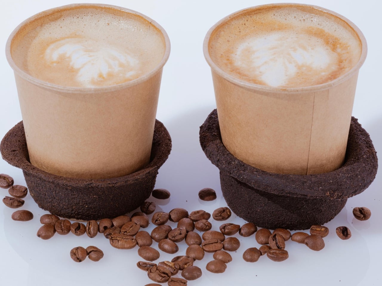
The Coffee Sleeve Reinvented From the Grounds Up

Every morning, millions of people grab a coffee to go and toss the paper sleeve into the trash without a second thought. It is a tiny object, easy to overlook. But that tiny object is part of a system that produces an estimated 16 billion disposable cups every year, sleeves included, and nearly none of it gets recycled. In the UK alone, cup sleeve recycling sits at roughly 2.8%, which is a polite way of saying almost everything ends up in a landfill.

That number has been sitting in the back of my mind ever since I came across GoBean, a design concept by Aranza V. Sanchez and Song Yeon Lee, two design students from Hochschule für Gestaltung Offenbach in Germany. The project recently earned a nomination for the Green Product Award, and when you look at what they have actually built, you understand why.

Designers: Aranza V. Sanchez & Song Yeon Lee
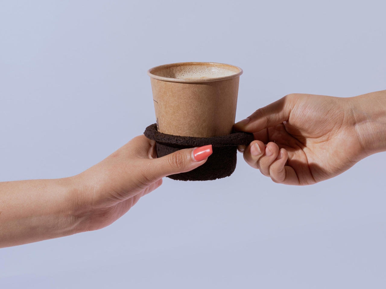
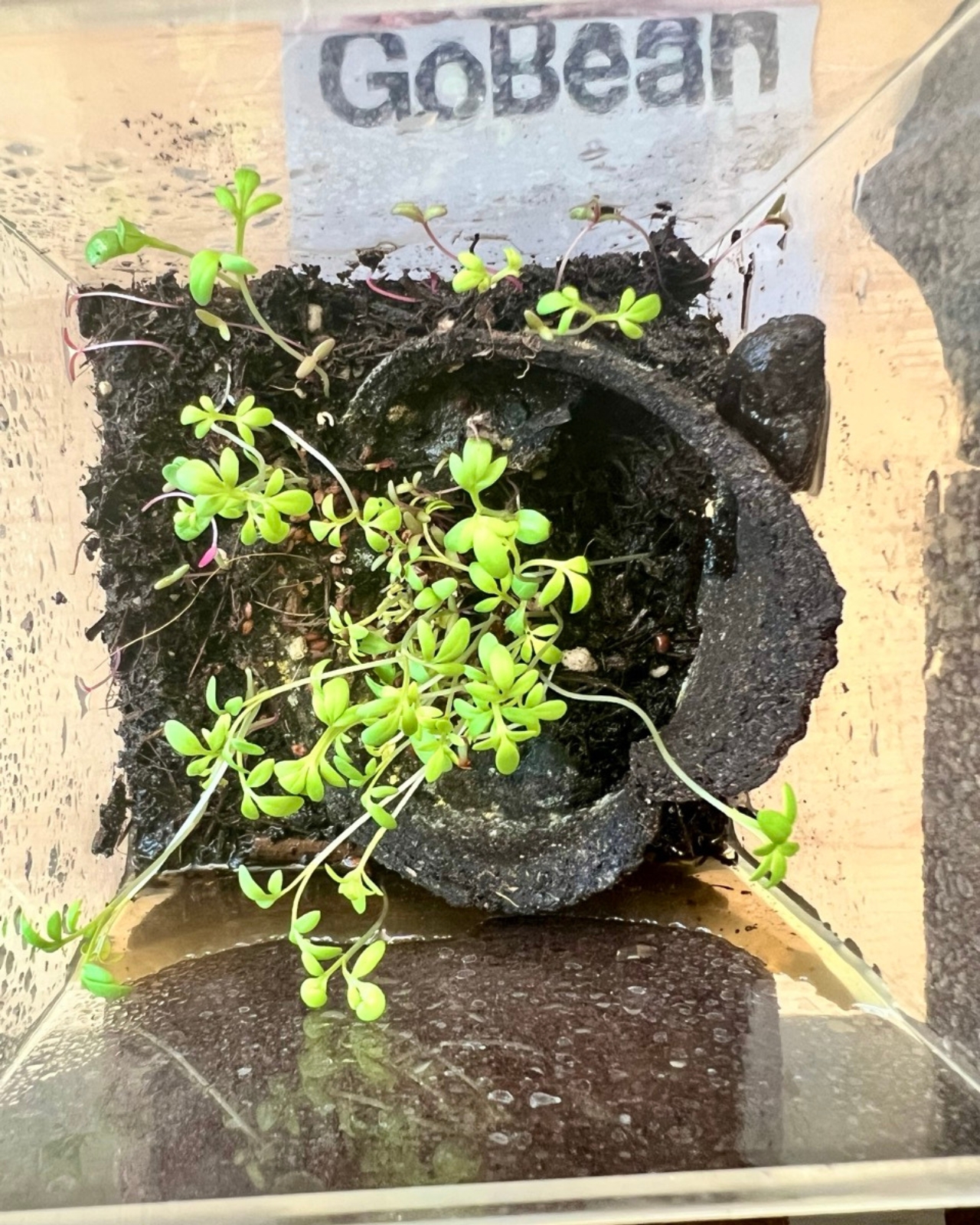
GoBean is a coffee cup sleeve made from coffee grounds. Not coffee-inspired, not coffee-colored. Actually made from the used, spent, leftover grounds that cafés collect and typically throw away. Combined with natural binders, the material becomes water and heat resistant, which matters quite a bit when your job is to wrap around a hot cup. It feels like a design idea so obvious that you wonder why it took this long to exist.
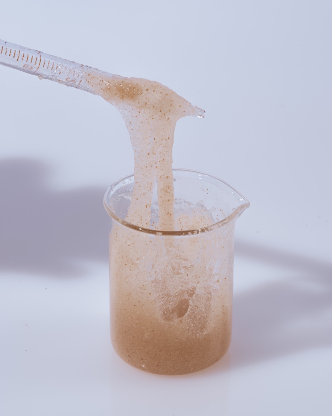
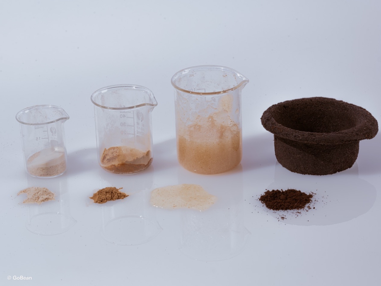
The material is 100% compostable and breaks down completely in about three weeks. If you would rather not compost it, you can plant it directly into soil. The sleeve, the thing that kept your fingers from burning on a Tuesday morning, becomes part of your herb garden by Friday. That circularity is not just a marketing point. It is genuinely elegant design logic.
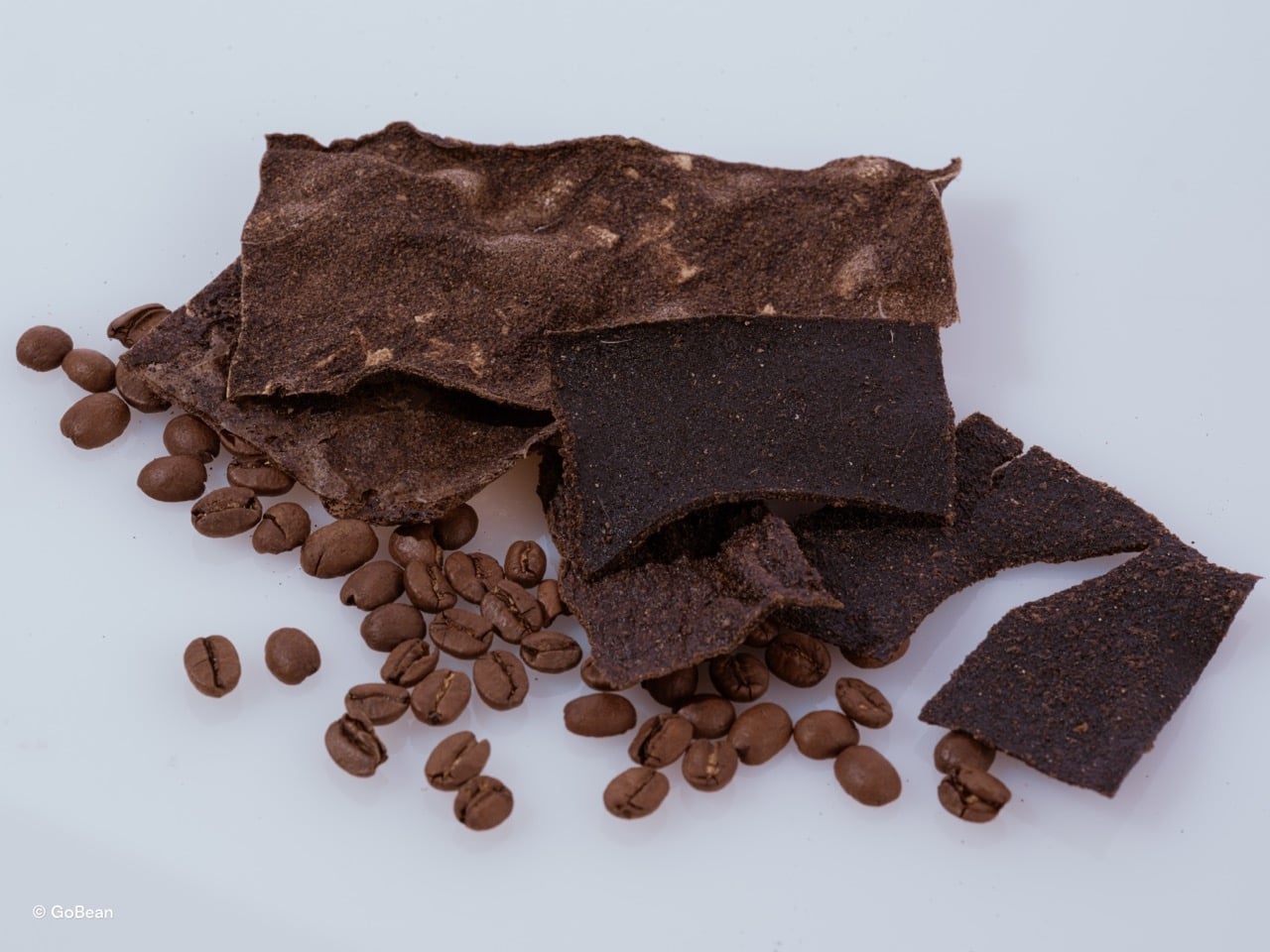
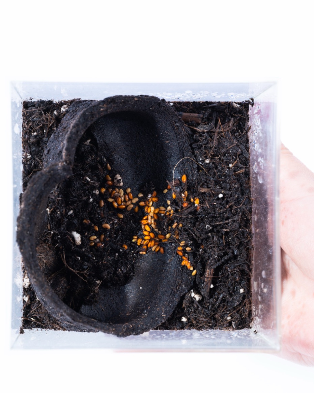
What makes GoBean feel more serious than a typical student concept is the business model built around it. The idea is that cafés supply their own spent coffee grounds as the raw material for production. This turns waste into a resource, gives cafés a reason to participate, and keeps the material loop local. Designers often get credited for solving the object, but solving the system is harder, and Sanchez and Lee are clearly thinking about both.
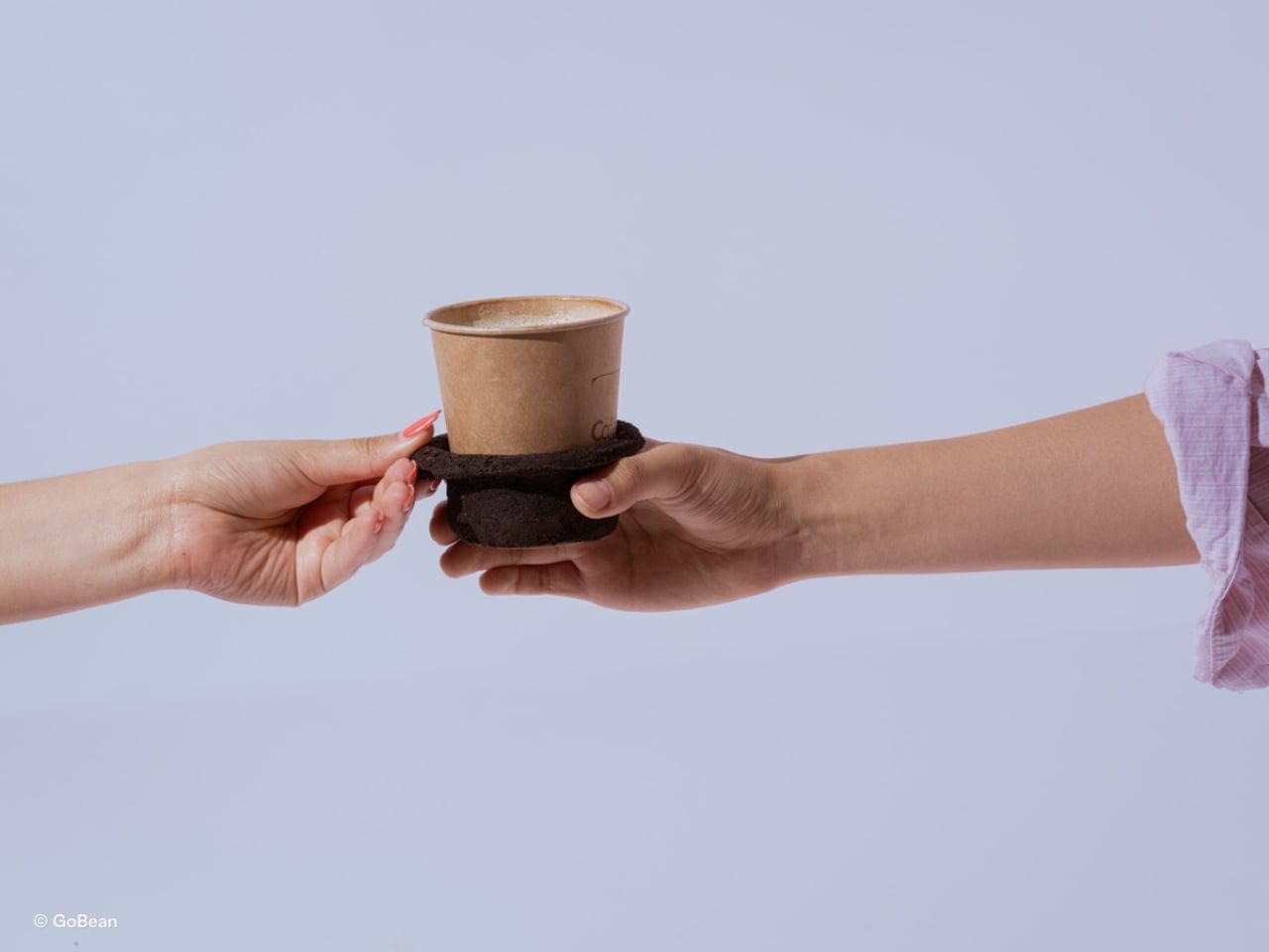
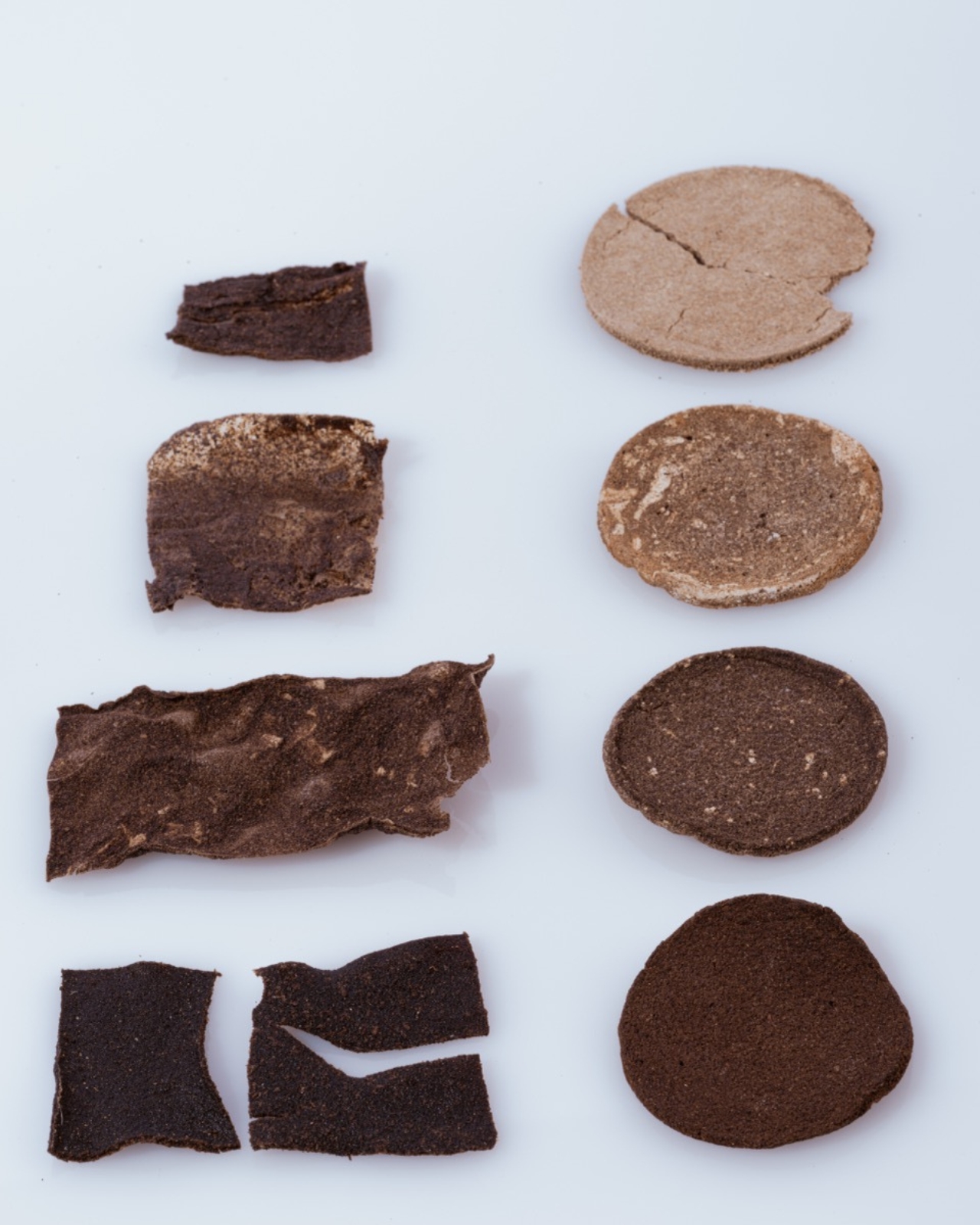
I will admit, I have a complicated relationship with sustainable packaging projects. A lot of them promise a lot and deliver something that either does not perform as well, costs too much, or requires consumer behavior change that just is not going to happen at scale. GoBean avoids most of those traps by meeting the product exactly where it already exists. The sleeve still looks like a sleeve, fits like a sleeve, works like a sleeve. The only difference is where it comes from and where it goes afterward.
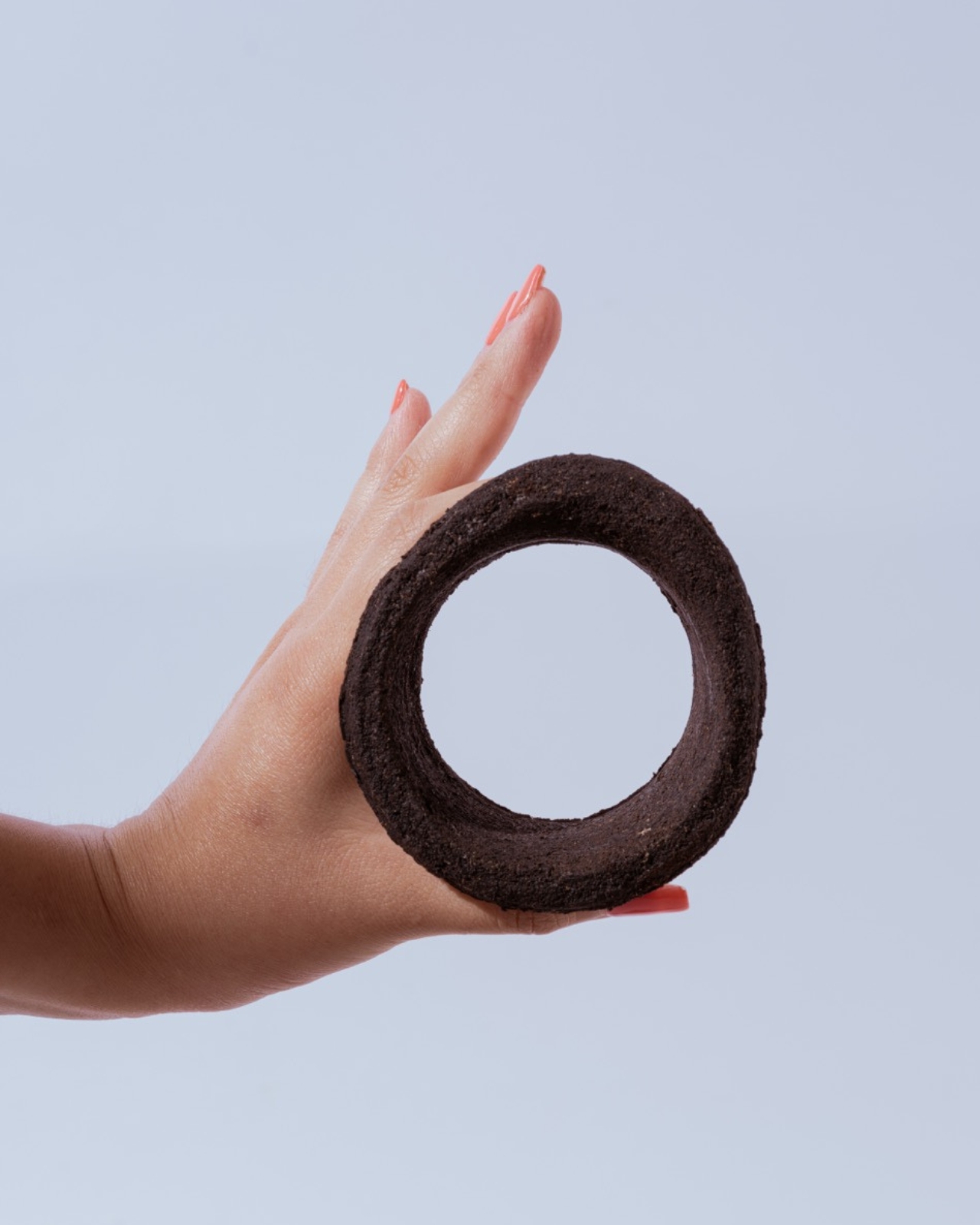
The Green Product Award tends to surface work that is genuinely trying to move the needle on material innovation rather than just putting a green label on something old. A nomination here carries a bit of weight, and GoBean fits the ethos of that kind of recognition.
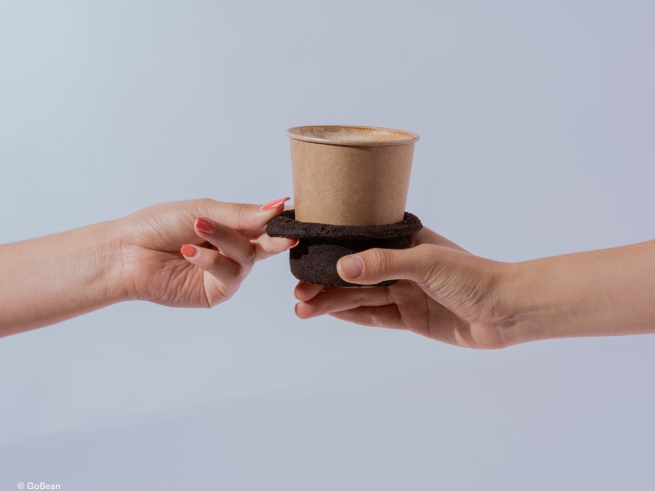
It is also worth noting that this is a concept still in development, not something you can order from a café supplier today. That distinction matters. Student projects are exactly where this kind of thinking should live, unencumbered by the commercial pressures that usually flatten ideas before they can fully form. Whether GoBean eventually makes it to mass production will depend on all the less exciting stuff: manufacturing cost, supply chain logistics, regulatory approvals. None of which are guaranteed.
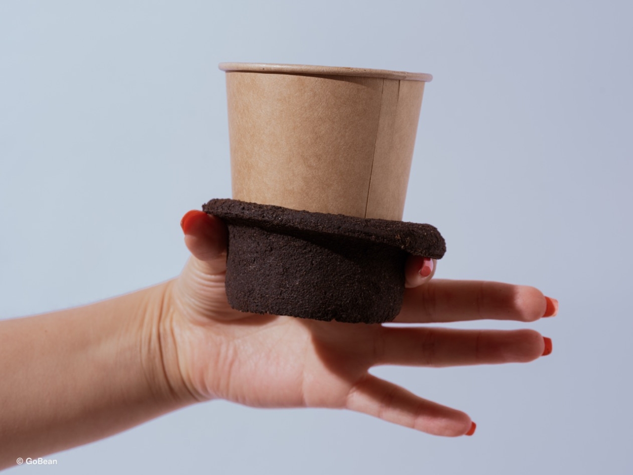
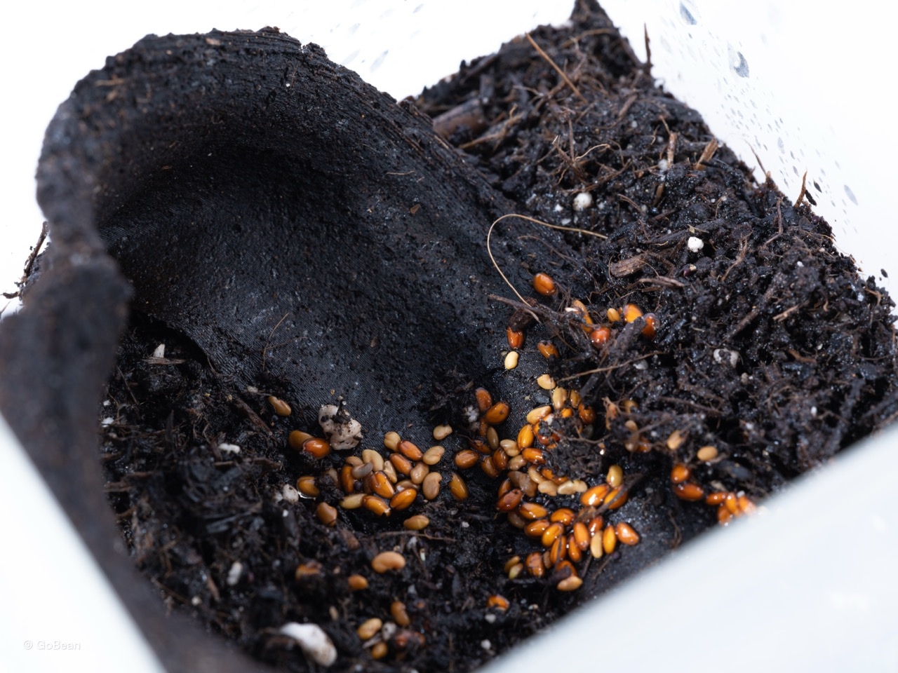
But as a vision of what disposable packaging could be, it is hard to argue with. The sleeve you use for ten minutes does not need to exist for a hundred years. That mismatch has always been the problem, and GoBean is one of the more elegant answers I have seen to it. Design does not always save the world, but sometimes it asks the right question. In this case, the question is simple: if your coffee sleeve is made from coffee grounds, has it ever really left the café?
The post The Coffee Sleeve Reinvented From the Grounds Up first appeared on Yanko Design.
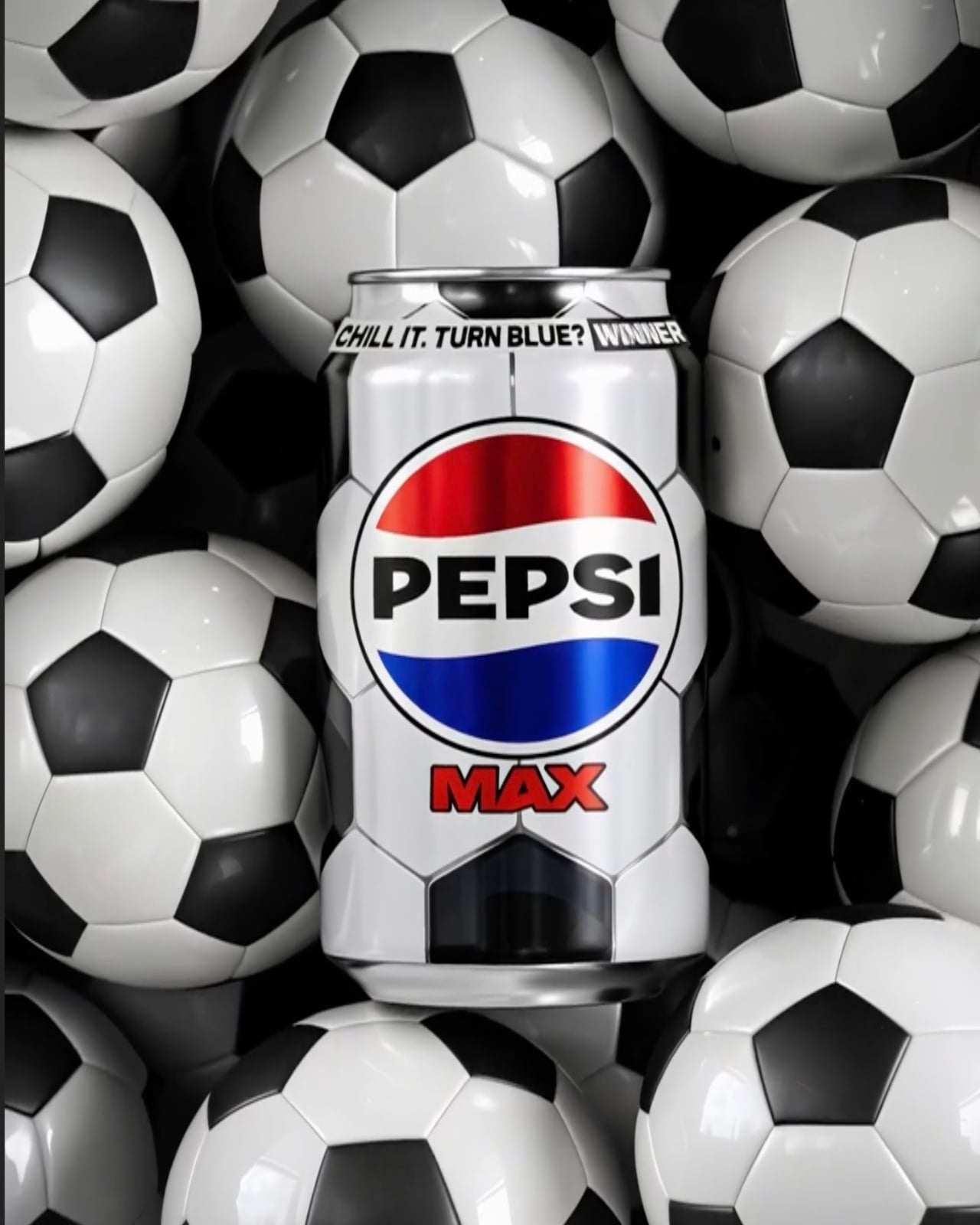
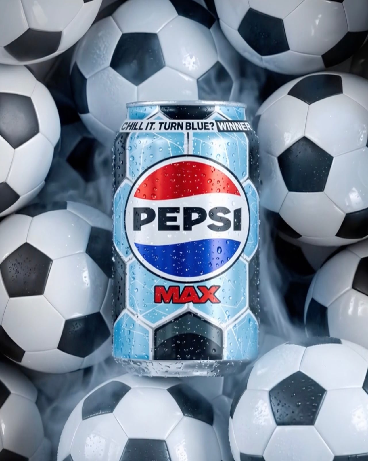
Pepsi Max’s New Can Turns Blue When It’s Cold Enough to Drink

Most of us don’t think twice about the can we grab from the fridge. You reach, you pop, you drink. But Pepsi Max is betting that at least some of us will stop, look twice, and maybe even squeal a little when the can in our hand starts changing colour right before our eyes.

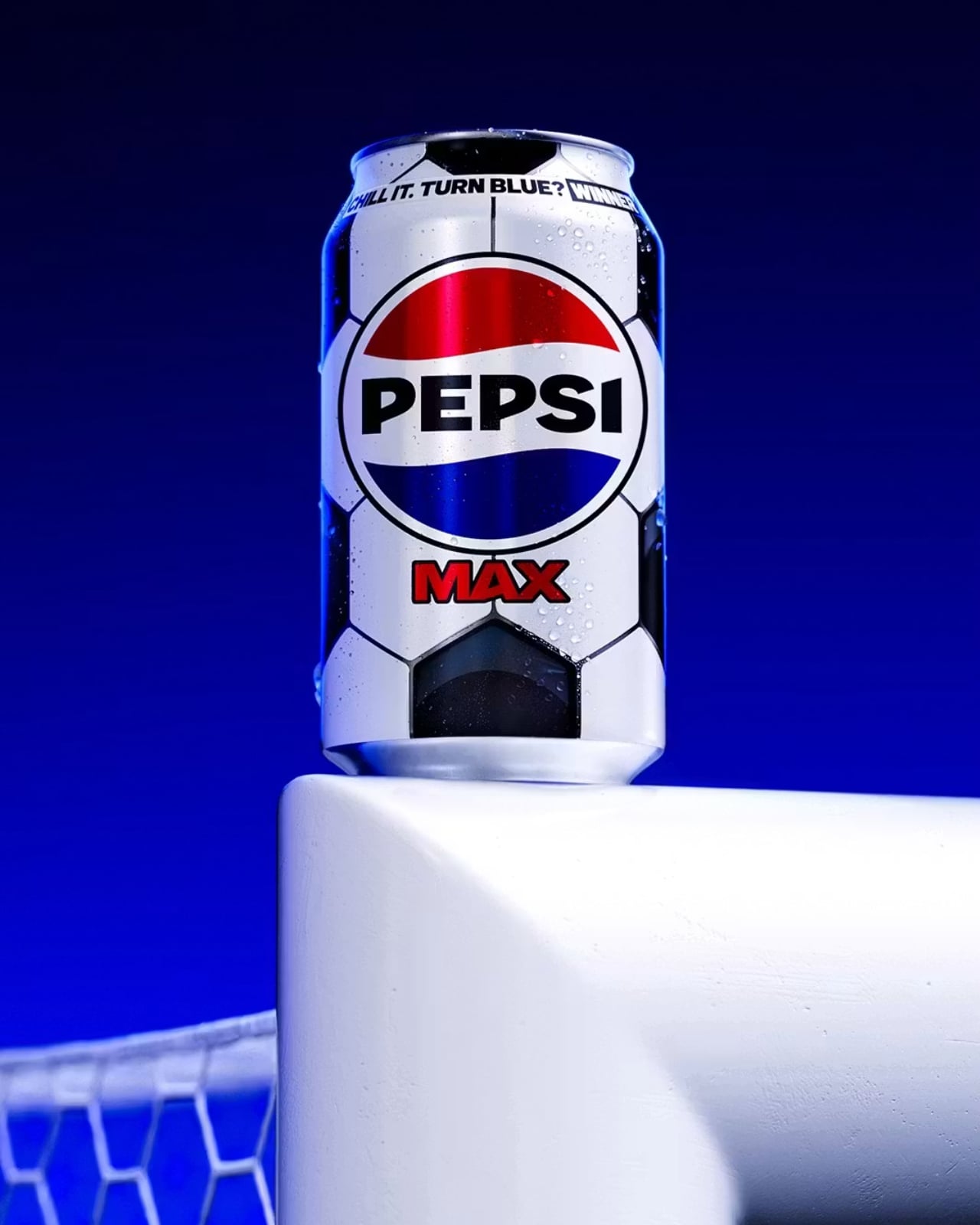
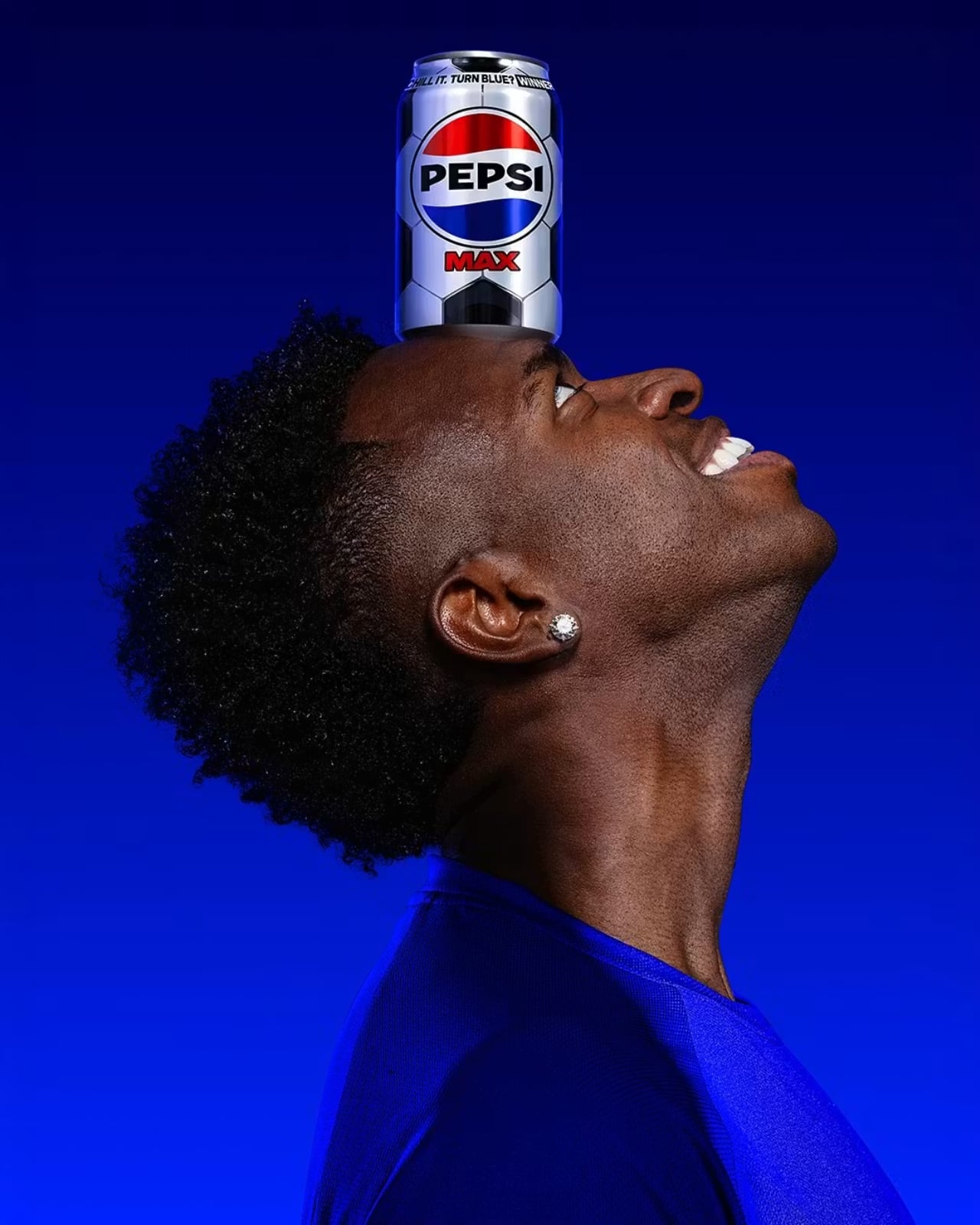
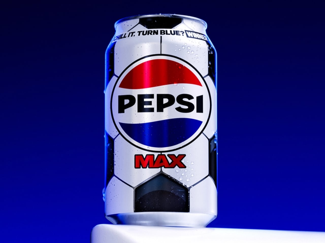
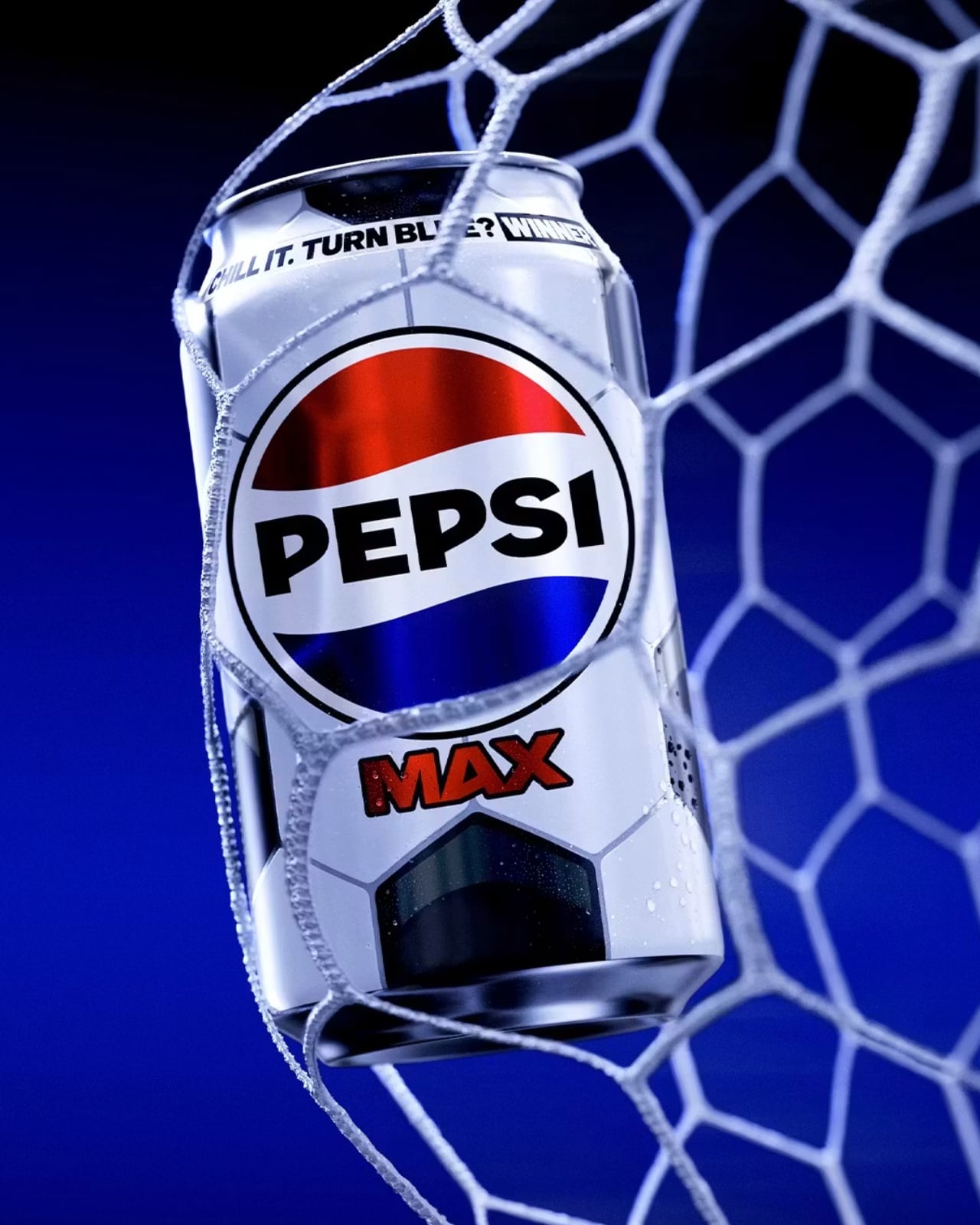
That’s the premise behind Pepsi Max’s new Perfect Chilled variant, launched as part of the brand’s wider Pepsi Football Nation campaign ahead of the 2026 FIFA World Cup. Out of 86 million football-themed cans hitting shelves across the UK, only 150,000 carry something extra: thermochromic ink that begins to shift at 12°C and turns a full, vivid blue at 8°C, the temperature Pepsi considers optimal for drinking. In other words, the can tells you when it’s ready.

Design: Pepsi

The design itself is clean and considered. The 330ml can wears the classic black-and-white pentagon pattern of a traditional football, a smart visual shorthand that doesn’t need any explanation. It’s immediately recognisable, seasonally relevant, and works beautifully with the colour-change mechanic. The graphic language is minimal without being plain, and the blue reveal against the black-and-white base is genuinely satisfying. When that blue kicks in, it’s not subtle. It’s the kind of visual shift that makes you want to show someone standing next to you.

The Perfect Chilled variant also doubles as a prize trigger. Finding one means you’re entered into a competition where prizes include £5,000 towards a home entertainment bundle, football tickets, Pepsi Football Nation merchandise, and vouchers. So the colour change does two things at once: it signals peak drinking temperature, and it reveals whether you’re holding a winner. That’s a neat piece of design thinking, making a single moment do a lot of heavy lifting without feeling gimmicky.

I’ll admit I have a soft spot for thermochromic packaging. It made waves in mainstream consumer consciousness back in the 2000s with Coors Light’s cold-activated mountains, and various brands have been picking it up ever since. But Pepsi’s version feels more purposeful than most. Rather than just being a party trick, the temperature cue here is tied to a genuine product promise: that Pepsi Max is best at 8°C, and the can will tell you when you’ve hit it. That’s functional design, not just fun design, and the difference matters.

The scarcity piece is where the campaign gets genuinely clever. At 150,000 Perfect Chilled cans out of 86 million, the odds aren’t outrageous, but they’re not guaranteed either. It creates just enough tension to make you actually look at the packaging, which is something brands have been desperately trying to achieve in the era of eyes-down, scroll-while-shopping retail behaviour. When your product can make someone pause on the way to the checkout, you’ve done something right.

Pepsi didn’t stop at the can, either. The campaign includes a browser extension for Chrome and Firefox that replaces the word “soccer” with “football” on any webpage, a nod to the ongoing, completely unresolvable debate that football fans clearly feel strongly enough about to install software over. It’s a small touch, but it speaks to the same sensibility running through the whole campaign: know your audience, and then give them something that feels made for them specifically.

Packaging rarely gets the cultural credit it deserves. It’s the thing you throw away, the design you never frame, the object that lives in your hand for about four minutes before it goes in the recycling. But at its best, it does what this Pepsi Max can does: it turns a routine moment into a small, unexpected experience. For a product that’s been on shelves since the 1990s, making a can feel exciting again is no small feat. And if the price of admission is putting your Pepsi in the fridge before a football match, well, you were probably doing that anyway.

The post Pepsi Max’s New Can Turns Blue When It’s Cold Enough to Drink first appeared on Yanko Design.
Starbucks built a Yeti cooler for your Venti Iced Lattes, but you can’t buy one yet

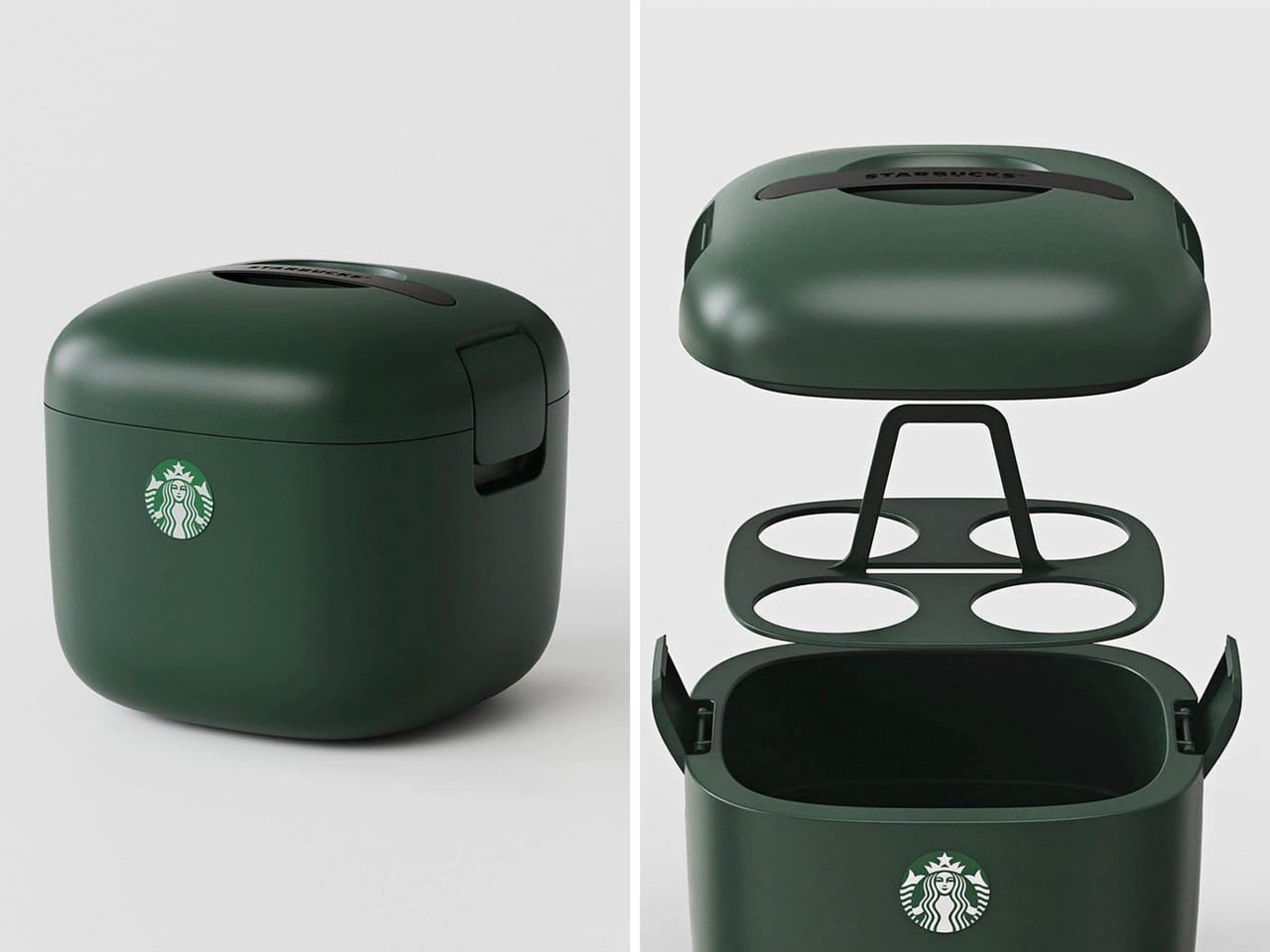
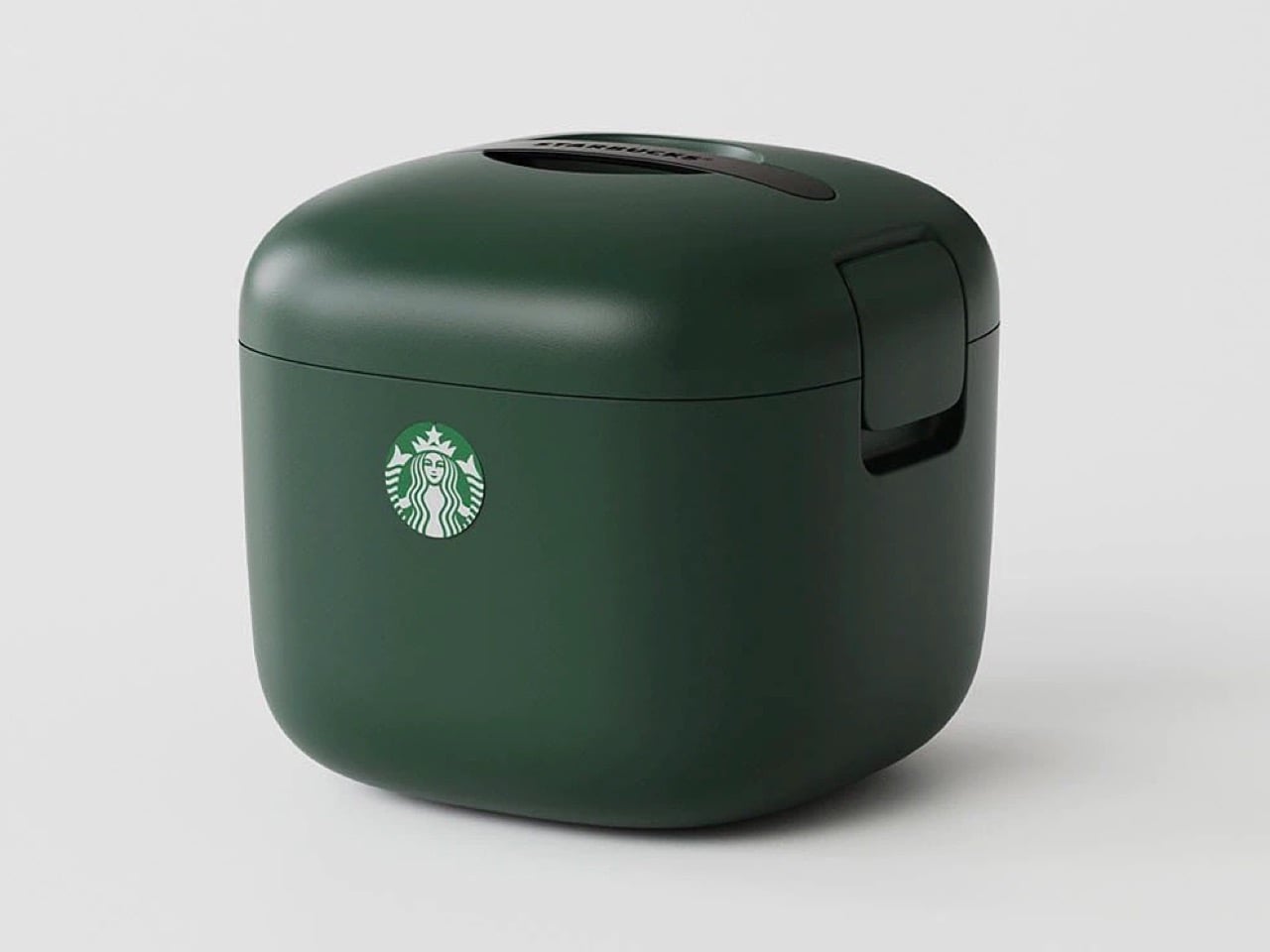
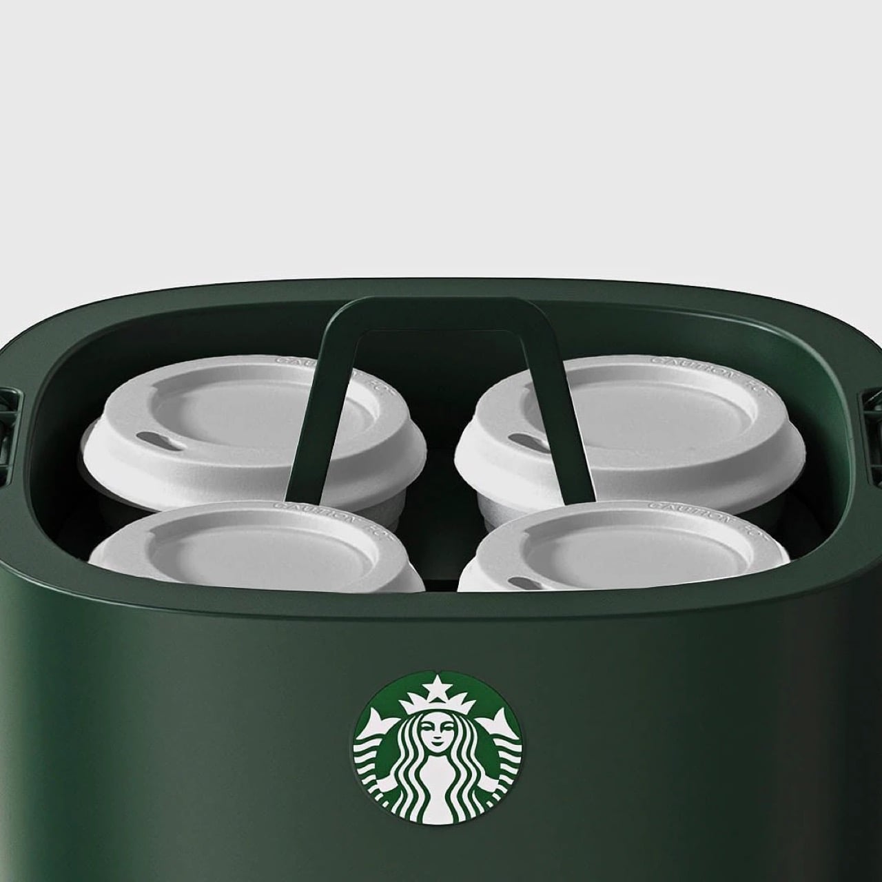
You know what’s ‘vertical integration’? Starbucks building its own cooler box for its own beverages. Meet the Yeti-alternative that’s designed not for your Budweisers, but for your venti iced lattes. It’s called the Starbucks Ice Box, and while it looks perfect from top to bottom, it has one problem: it’s only available in South Korea.

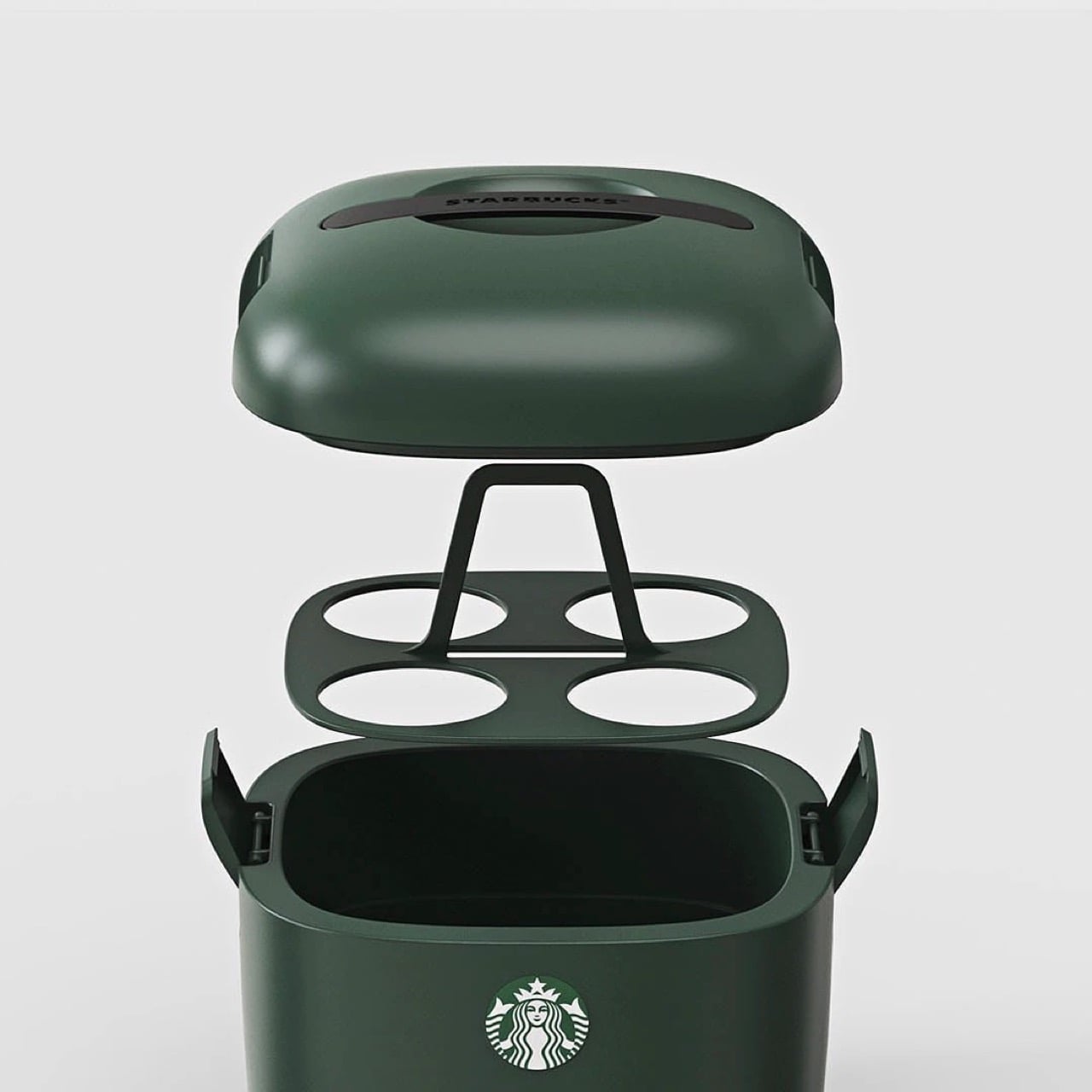
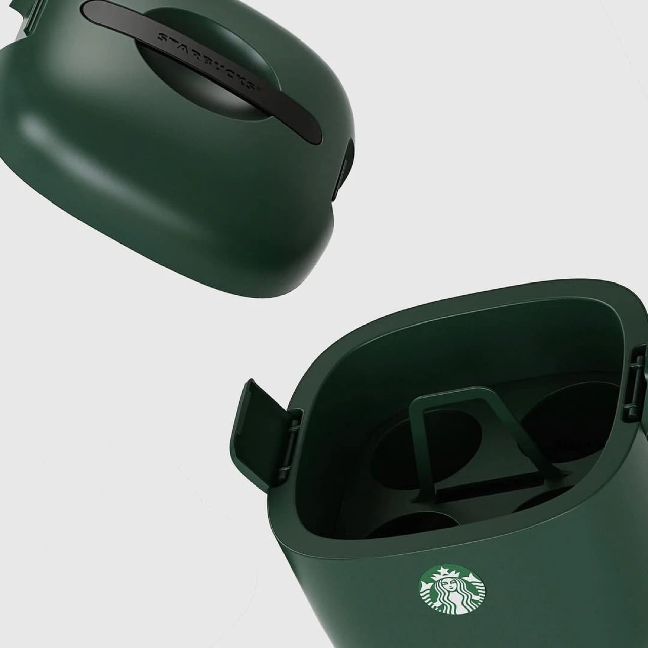
The design is deceptively simple but gets every detail right. Four individual cup slots keep drinks stable and separated, eliminating the float-and-tip chaos that happens when you throw tall cups into a standard cooler. A dedicated ice compartment sits at the bottom, isolated from the drinks themselves so you’re not fishing cups out of melted ice water an hour later. The domed lid has ventilation slots that allow air circulation without sacrificing insulation, and those side latches look substantial enough to actually keep everything secure when you hit a pothole. It’s wrapped in Starbucks’ forest green colorway, compact enough to fit behind a car seat or in a trunk corner, and clearly designed by people who have done the group coffee run enough times to know exactly where the pain points are. The proportions feel right in a way that general-purpose coolers never quite nail when you’re dealing with tall, narrow vessels.

Design: Starbucks Korea

This isn’t Starbucks’ first merch attempt. They’ve consistently pushed out loads of accessories over the years, mostly in eastern markets (like these TWS earbuds in collaboration with Samsung, and these $28 retro cameras that they debuted in China) although this one feels way more purposeful than any of their other launches. It’s something people will buy and use for years, rather than becoming just another collectible, and you know that if someone’s buying a Starbucks cooler, they’re a customer for life. Vertical integration for the win!

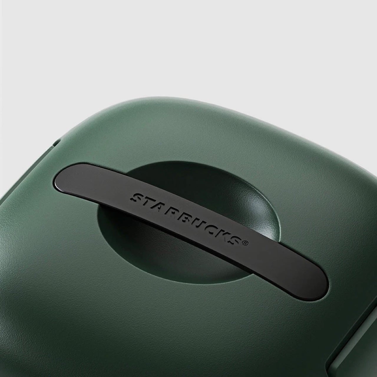
The design is as simple as it gets. The insulated walls keep the insides whatever temperature you want. Although built for iced drinks, you can put your hot beverages in too and have them piping even after hours. For iced drinks, you can also add ice packs into the cooler to chill them down further – just be careful they don’t drip or the cups could get soggy. A lift-out tray holds four venti drinks, because if you’re the kind to drink regulars, you probably wouldn’t be keeping them for hours. The clamp-lid ensures everything is locked in tight, and a Starbucks-branded handle sits flush against the top, giving the entire thing a gorgeously monolithic design.

The only place you can grab this right now is on obscure sites online. A Japanese website has it listed for ¥26,530 or $169 USD, not including shipping. If anyone in Starbucks’ global team is reading this, consider it your sign to manufacture this for the American and European audiences too, trust me, your annual turnover will thank you!

The post Starbucks built a Yeti cooler for your Venti Iced Lattes, but you can’t buy one yet first appeared on Yanko Design.
KitKat’s New Wrapper Actually Kills Your Phone Signal Completely

We’re already a third into 2026, and one “trend” that seems to be sticking is that this is the year when people intentionally go offline or analog to take a break from our increasingly digital lives. Hobbies like journaling, knitting, scrapbooking, baking, and board games have become a regular part of people’s personal schedules. More often than not, when we do these things, we keep our phones, or at least the internet, away. Some, though, may need more “drastic” measures just to make their phones quiet for a few hours every day.

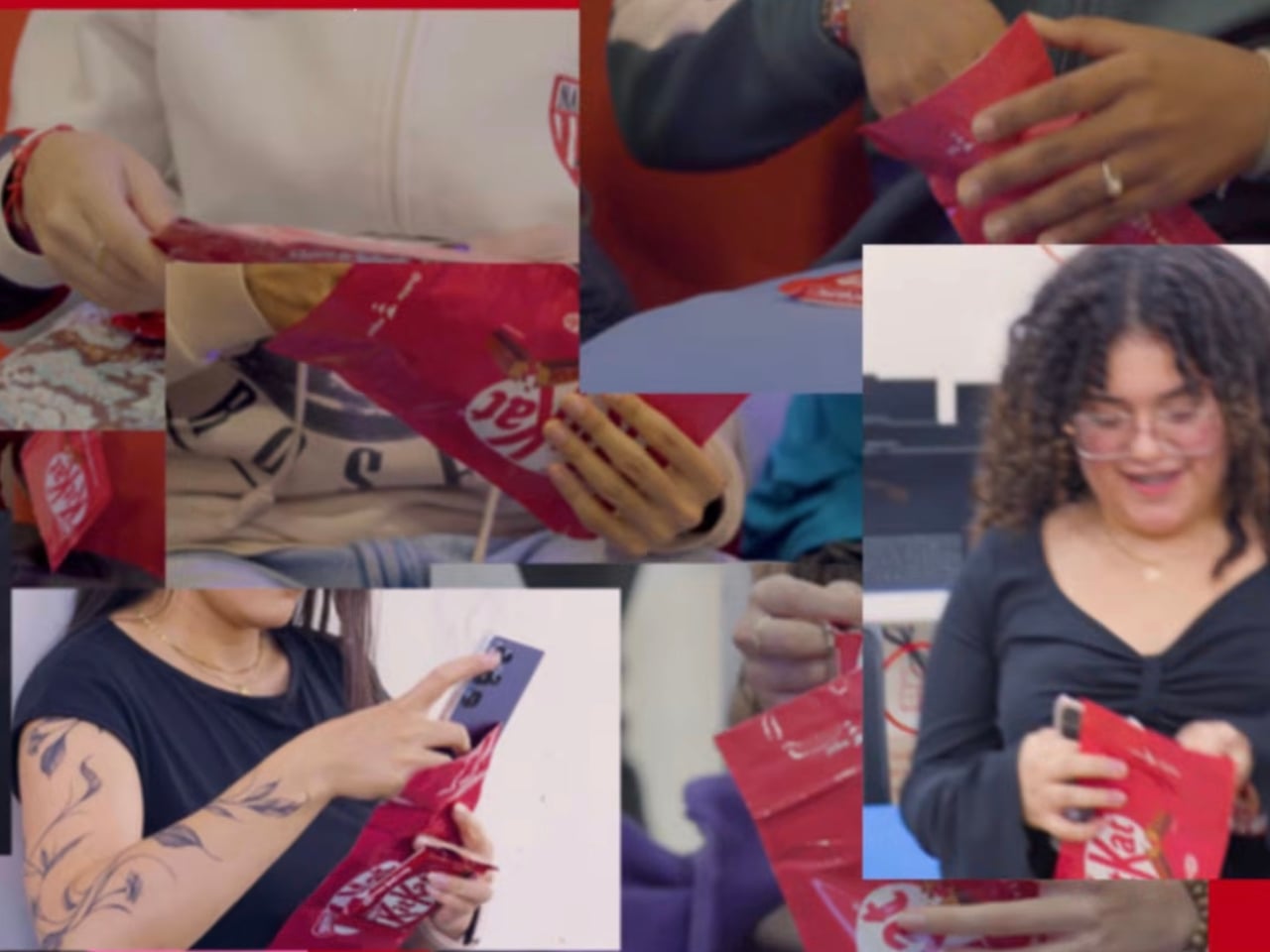
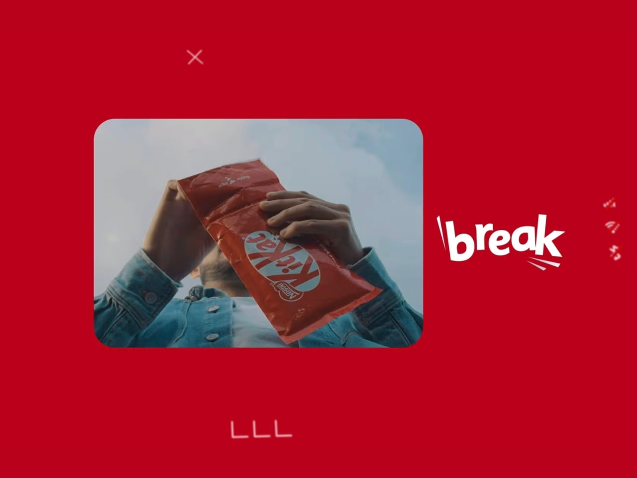
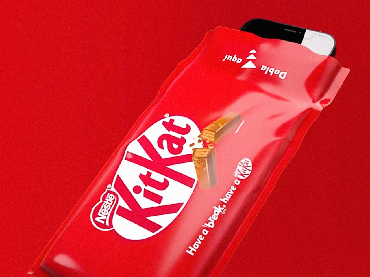
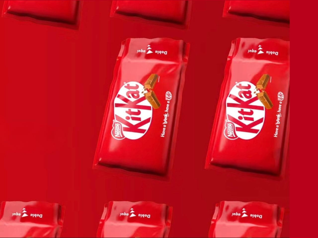
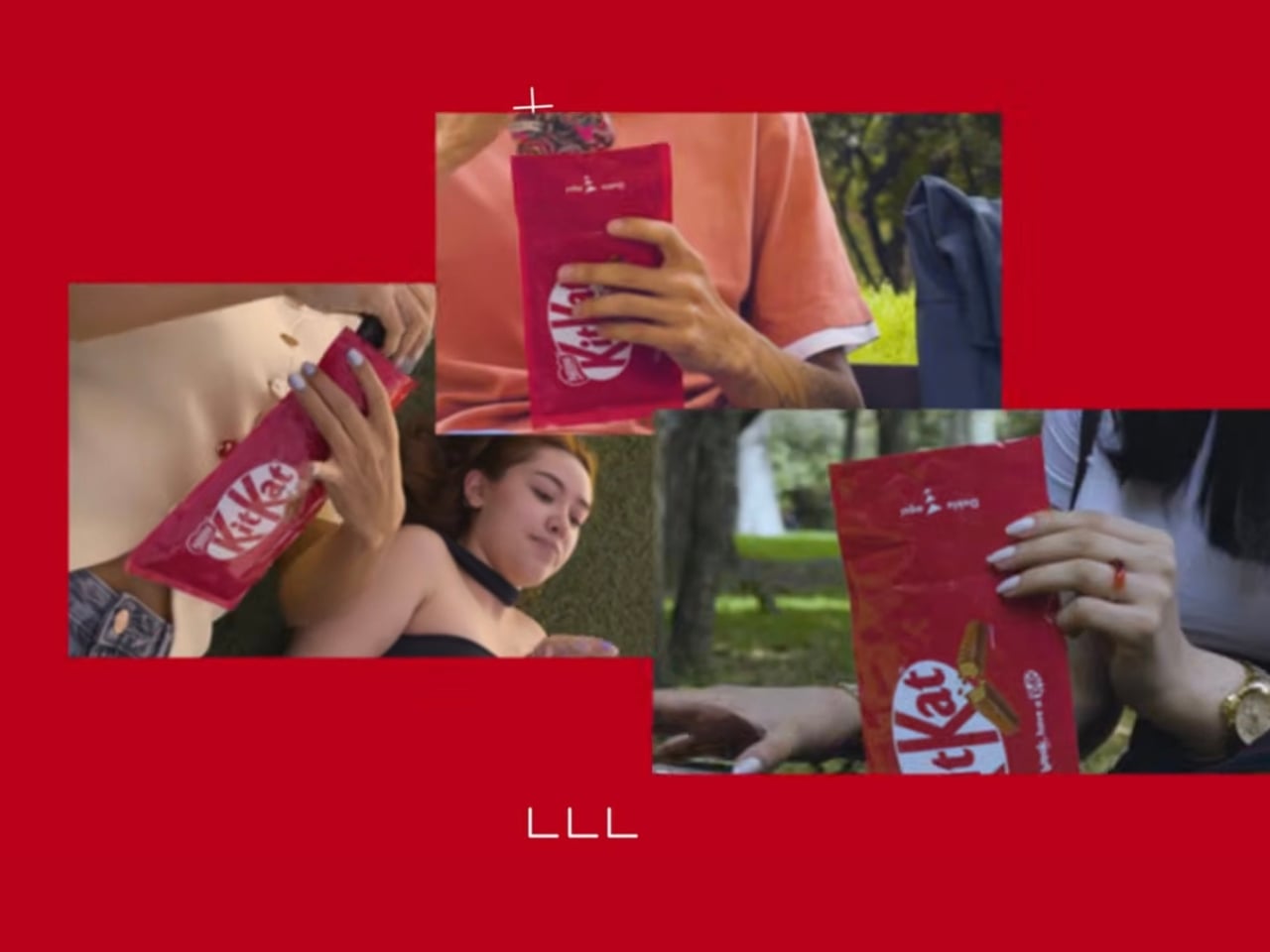
KitKat Panama, in collaboration with creative agency Ogilvy Colombia, is taking the brand’s iconic “Take a Break” slogan to a whole new level with a special concept called Break Mode. Instead of people just eating a KitKat as a way to take a break, they turned the chocolate’s packaging into an actual Faraday cage. Basically, once you put your phone into the empty packaging, all signals (calls, 4G/5G connectivity, Bluetooth, and GPS) are entirely and effectively blocked, turning your world offline and analog, at least until you take your phone out again.

Designer: KitKat Panama

How they did it was by adding multiple layers to the special packaging. The copper layer is the primary conductive material, while the polyester layers give it structural integrity. The polypropylene outer coating provides durability and everyday usability, while the precision-engineered sealing mechanism ensures that your signals are truly blocked.

This kind of technology was once reserved for medical labs and data centers but can now be found in this iconic red KitKat package (well, at least if you’re in Panama). There’s also a sustainability angle to it, as the packaging’s materials have an approximate one-year lifespan and can eventually be separated for responsible recycling.

The ritual that KitKat envisions is quite intentional: unwrap your KitKat fingers, slide your phone into the empty packaging, and fully immerse yourself in the moment. Your digital world goes quiet, and your break truly begins. It feels almost ceremonial in the best way. Kim Waigel, Marketing Director for Nestlé in Central America, summed it up well: “Break Mode goes beyond simply saying ‘Take a Break’; it empowers individuals with the physical tool to genuinely achieve it.”

The concept was introduced at some of Panama’s most high-traffic venues, including a major technology expo, a concert event, and even a university campus, bringing the experience directly to the people who arguably need a digital detox the most.

Now, before you start planning your offline hours around a KitKat wrapper, it’s worth noting that Break Mode’s commercial viability is still under evaluation. So it isn’t something you can grab off a shelf at your nearest convenience store, at least not yet. But honestly, the fact that this concept even exists feels like a sign of the times. In an era where we’ve normalized doom-scrolling and round-the-clock connectivity, simply putting your phone away has become a radical act. And leave it to a chocolate brand to make that feel like something worth celebrating.

Whether or not Break Mode ever makes it to mass market, it’s already doing its job, sparking a conversation about what it truly means to take a break in 2026. Because sometimes, the most powerful thing you can do for yourself isn’t downloading another wellness app. It’s slipping your phone into a KitKat wrapper and letting the silence do the rest.

The post KitKat’s New Wrapper Actually Kills Your Phone Signal Completely first appeared on Yanko Design.
Sway’s Compostable Bags Rethink Plastic as a Temporary Material

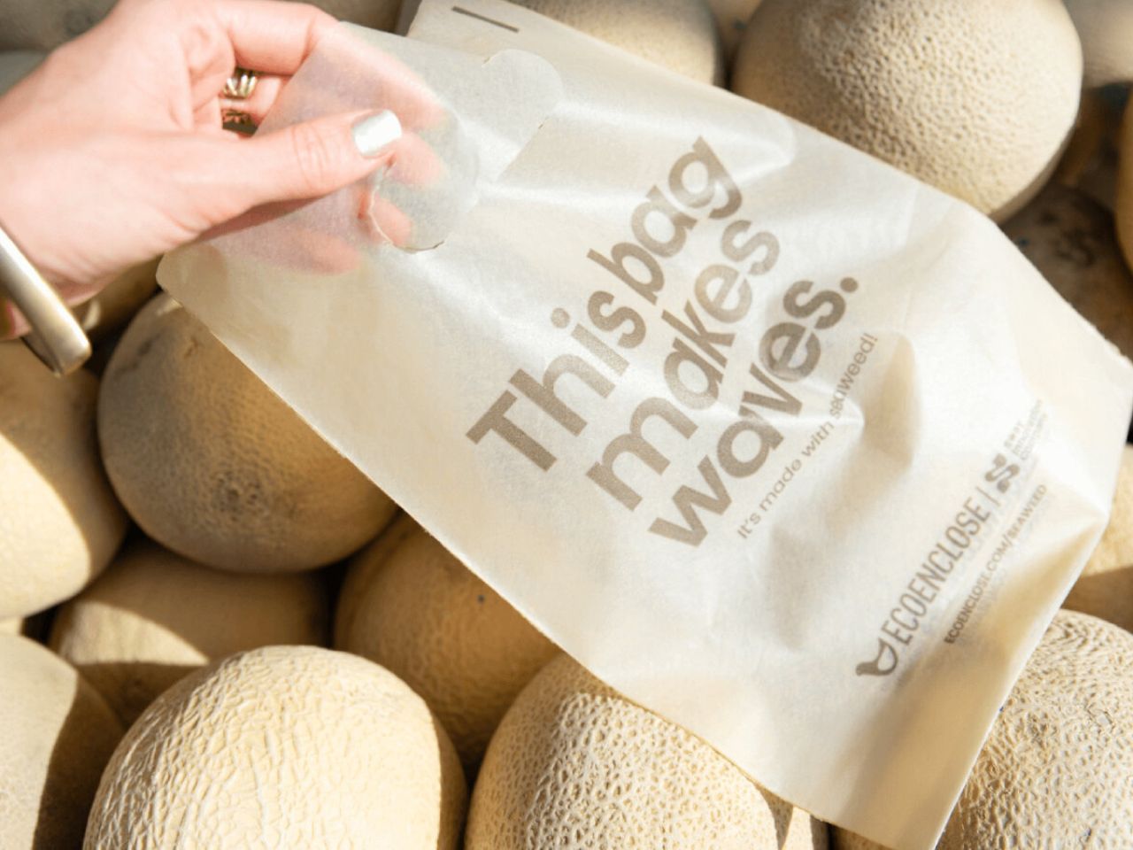
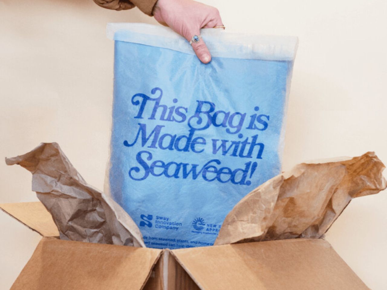
Sway continues to evolve its compostable plastic bags made from seaweed, offering a clear alternative to traditional plastic packaging that has long dominated retail and shipping. Instead of relying on petroleum-based materials that persist in landfills and oceans for decades, the team at Sway uses seaweed as a foundational input to create packaging that performs reliably during use and then safely returns to the soil. The result is a material that is designed to exist only for as long as it is needed, rather than becoming a permanent environmental burden.

According to the company, seaweed allows their bags to be stronger, easier to manufacture, more affordable at scale, and healthier for the environment overall. When these compostable plastic bags reach the end of their life, they are meant to break down naturally instead of fragmenting into microplastics. This means they do not linger in ecosystems or waterways, and instead decompose into soil that can support future growth.

Designer: Sway

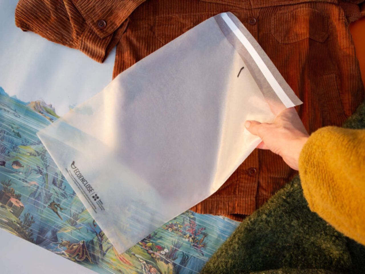
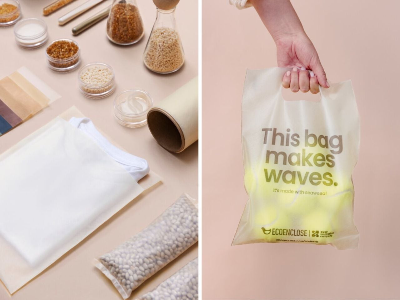
The current range includes polybags, die-cut handle bags, and flexible film wraps, all produced using the same seaweed-based material system. Visually, the bags have a smooth surface with a soft frosted texture. Their translucent exterior allows users to see what is inside, which adds both practicality and a subtle design appeal. The die-cut handle bags are ideal for everyday shopping and in-store use, while the polybags are designed for businesses that need a secure option for shipping products.

All of these formats are made from a blend of seaweed, plant-based materials, and compostable polymers. It is clear that this packaging line is designed for composting rather than recycling. After use, the bags can be placed in home compost systems or industrial compost facilities, where they break down into healthy soil without leaving behind toxic residue. If composting is not available, the team advises disposing of the bags in the trash. While this outcome is not ideal, the material still avoids the long term damage associated with conventional plastic.

At the same time, the emergence of materials like this highlights a larger question. If bioplastics and compostable packaging already exist, why are they still not common in everyday life? Much of the challenge lies in the systems surrounding packaging rather than the materials themselves. Manufacturing infrastructure, pricing models, and waste systems have been optimized for traditional plastic for decades. Compostable materials often require new production processes and clearer consumer understanding of disposal. Confusion between recycling and composting, limited access to compost facilities, and expectations shaped by plastic durability all slow widespread adoption. As a result, innovations like Sway’s tend to move faster than the infrastructure meant to support them.

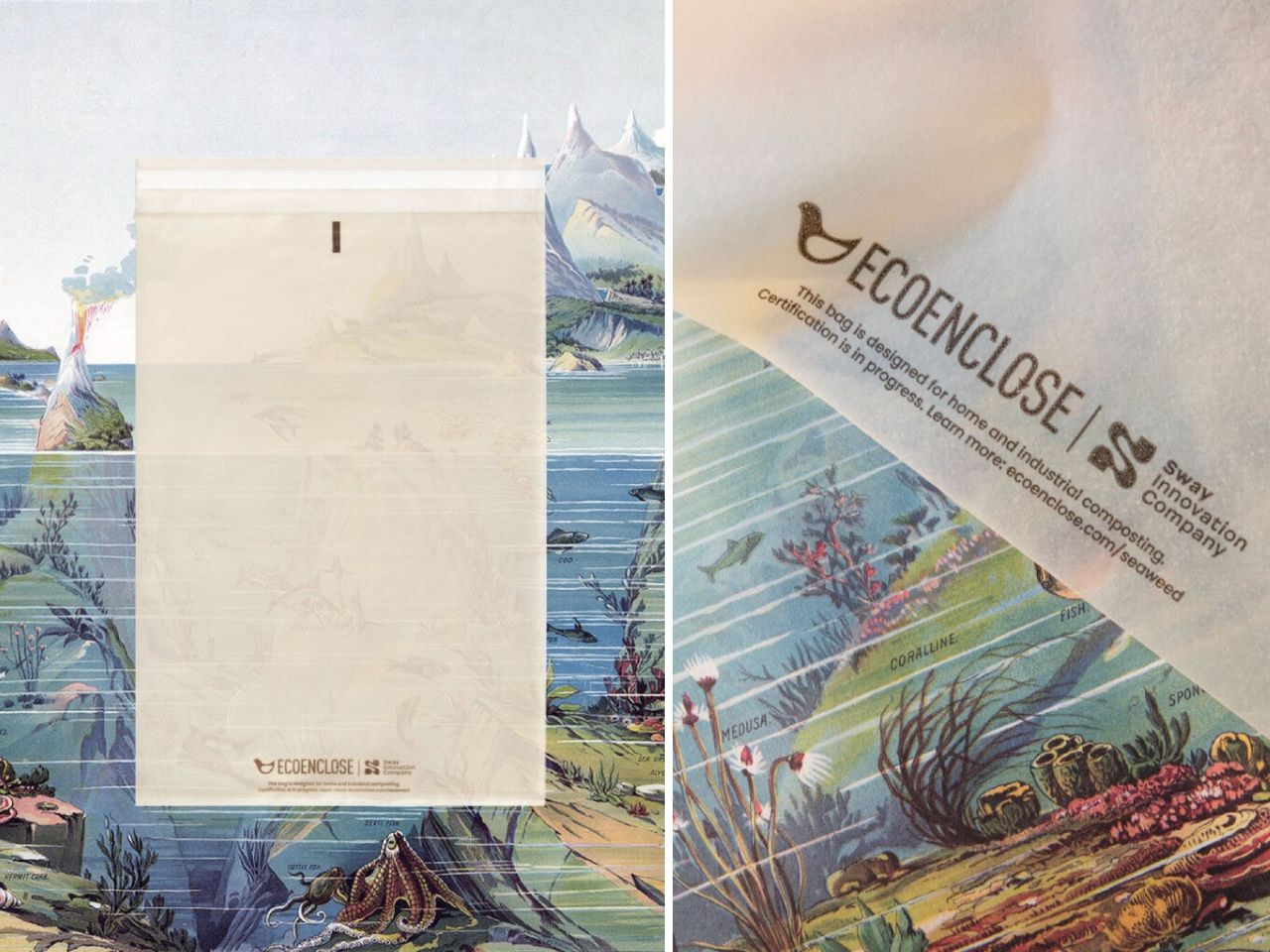
In January 2026, the Sway team shared that they had further improved their compostable plastic bags made from seaweed. Through processing changes, the material is now stronger, more refined in appearance, and available in higher volumes at a lower price point. The frosted design remains consistent, but the updated bags can carry heavier loads while still breaking down after use. Home compost certification for the newest versions is still in progress, while earlier versions have already received industrial compost certification from TUV Austria.

To expand access, Sway works with partners such as EcoEnclose to distribute the bags to businesses, small markets, and shipping operations. At the center of this effort is TPSea Flex, the company’s in-house material that blends seaweed, plant-based inputs, and compostable polymers. Together, these developments point toward a future where packaging serves its purpose and then steps aside, returning to the soil instead of remaining in landfills or oceans for generations.

The post Sway’s Compostable Bags Rethink Plastic as a Temporary Material first appeared on Yanko Design.
Sway’s Compostable Bags Rethink Plastic as a Temporary Material

Sway continues to evolve its compostable plastic bags made from seaweed, offering a clear alternative to traditional plastic packaging that has long dominated retail and shipping. Instead of relying on petroleum-based materials that persist in landfills and oceans for decades, the team at Sway uses seaweed as a foundational input to create packaging that performs reliably during use and then safely returns to the soil. The result is a material that is designed to exist only for as long as it is needed, rather than becoming a permanent environmental burden.

According to the company, seaweed allows their bags to be stronger, easier to manufacture, more affordable at scale, and healthier for the environment overall. When these compostable plastic bags reach the end of their life, they are meant to break down naturally instead of fragmenting into microplastics. This means they do not linger in ecosystems or waterways, and instead decompose into soil that can support future growth.

Designer: Sway

The current range includes polybags, die-cut handle bags, and flexible film wraps, all produced using the same seaweed-based material system. Visually, the bags have a smooth surface with a soft frosted texture. Their translucent exterior allows users to see what is inside, which adds both practicality and a subtle design appeal. The die-cut handle bags are ideal for everyday shopping and in-store use, while the polybags are designed for businesses that need a secure option for shipping products.

All of these formats are made from a blend of seaweed, plant-based materials, and compostable polymers. It is clear that this packaging line is designed for composting rather than recycling. After use, the bags can be placed in home compost systems or industrial compost facilities, where they break down into healthy soil without leaving behind toxic residue. If composting is not available, the team advises disposing of the bags in the trash. While this outcome is not ideal, the material still avoids the long term damage associated with conventional plastic.

At the same time, the emergence of materials like this highlights a larger question. If bioplastics and compostable packaging already exist, why are they still not common in everyday life? Much of the challenge lies in the systems surrounding packaging rather than the materials themselves. Manufacturing infrastructure, pricing models, and waste systems have been optimized for traditional plastic for decades. Compostable materials often require new production processes and clearer consumer understanding of disposal. Confusion between recycling and composting, limited access to compost facilities, and expectations shaped by plastic durability all slow widespread adoption. As a result, innovations like Sway’s tend to move faster than the infrastructure meant to support them.

In January 2026, the Sway team shared that they had further improved their compostable plastic bags made from seaweed. Through processing changes, the material is now stronger, more refined in appearance, and available in higher volumes at a lower price point. The frosted design remains consistent, but the updated bags can carry heavier loads while still breaking down after use. Home compost certification for the newest versions is still in progress, while earlier versions have already received industrial compost certification from TUV Austria.

To expand access, Sway works with partners such as EcoEnclose to distribute the bags to businesses, small markets, and shipping operations. At the center of this effort is TPSea Flex, the company’s in-house material that blends seaweed, plant-based inputs, and compostable polymers. Together, these developments point toward a future where packaging serves its purpose and then steps aside, returning to the soil instead of remaining in landfills or oceans for generations.

The post Sway’s Compostable Bags Rethink Plastic as a Temporary Material first appeared on Yanko Design.
Lotte E&C Just Turned 5 Eggs Into the Welcome Gift You’ll Use

There’s something refreshing about a company that doesn’t just slap their logo on a tote bag and call it customer appreciation. SWNA Office’s Earth’s Hatch kit for Lotte E&C proves that welcome gifts can be more than forgettable tchotchkes collecting dust in a drawer. This is design that actually thinks about the person receiving it, and what they might genuinely need in their daily life.

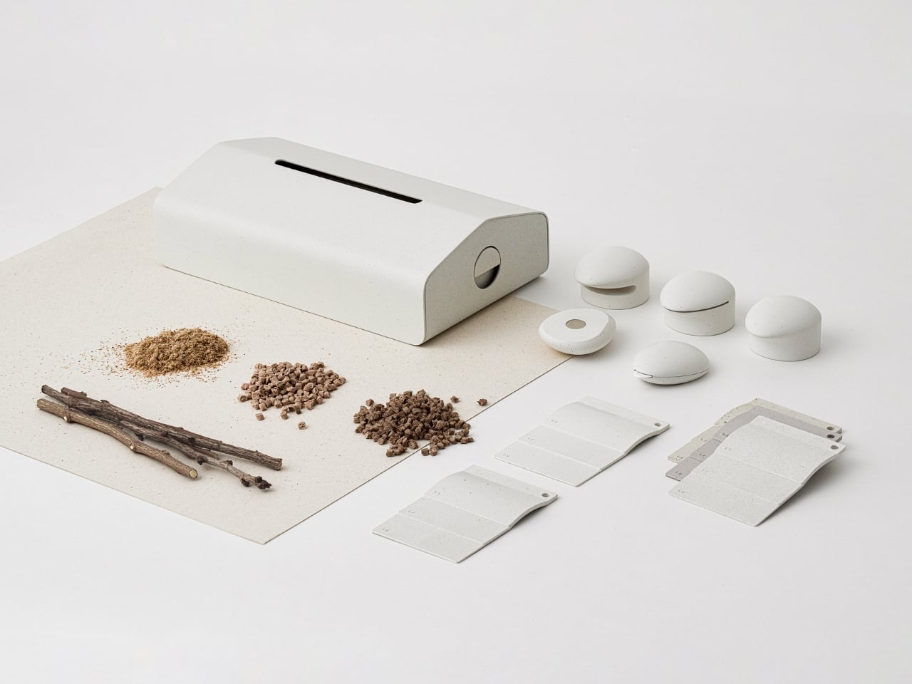
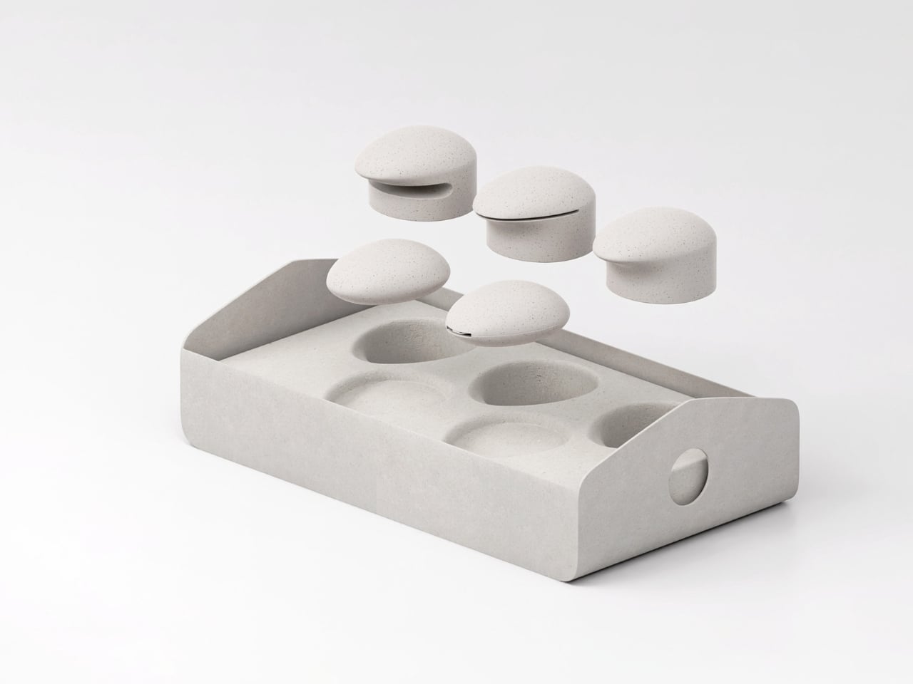
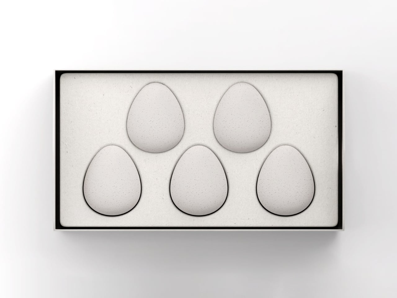
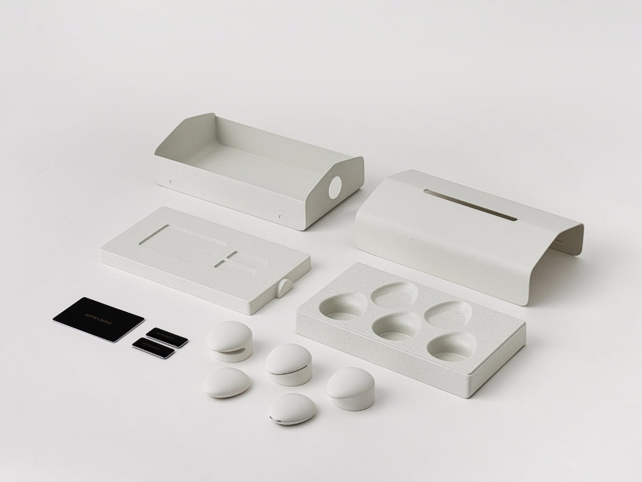
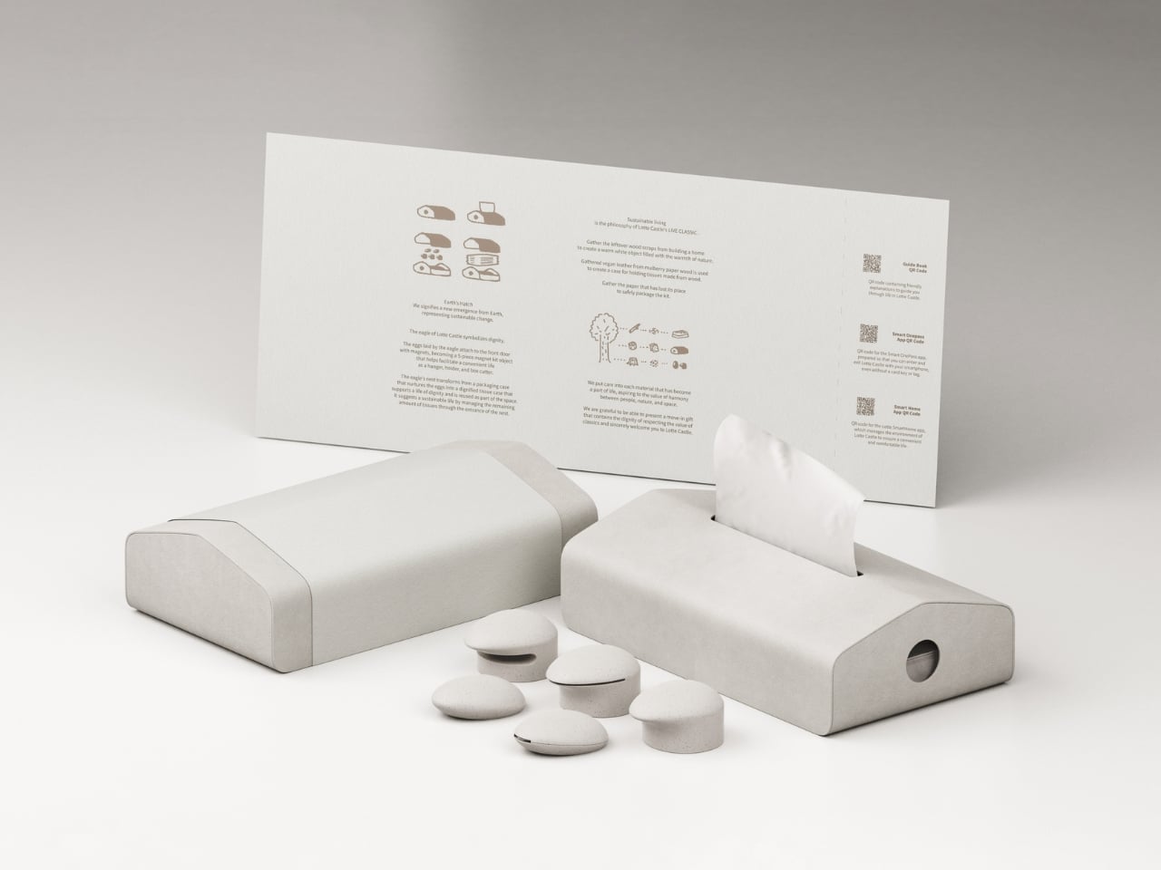
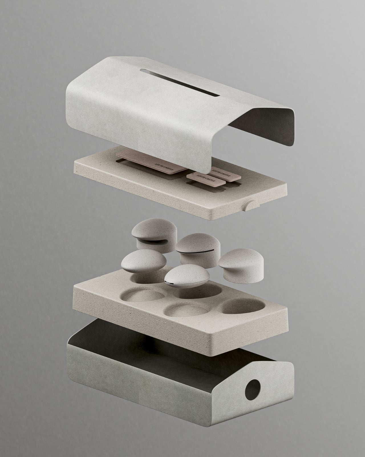
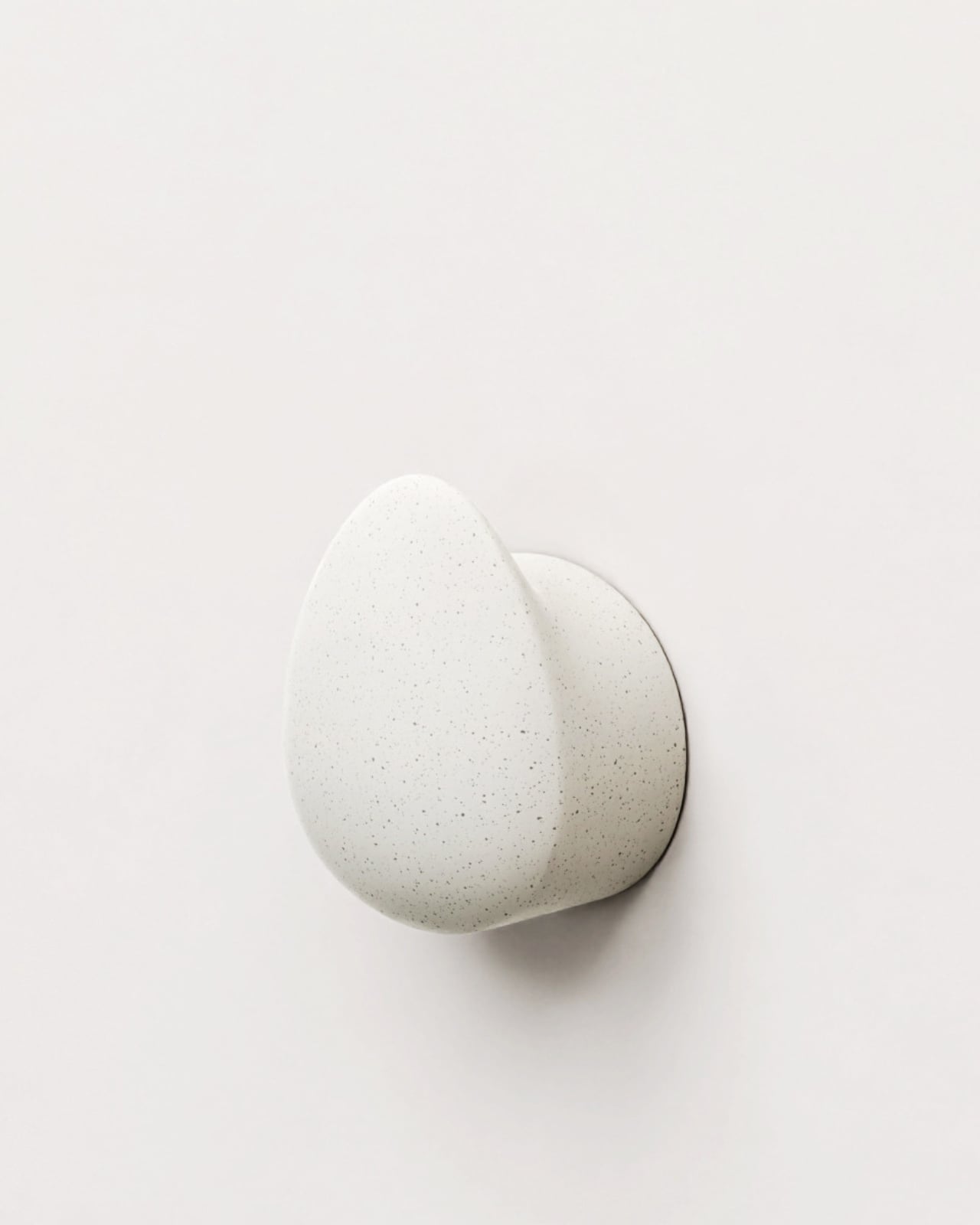
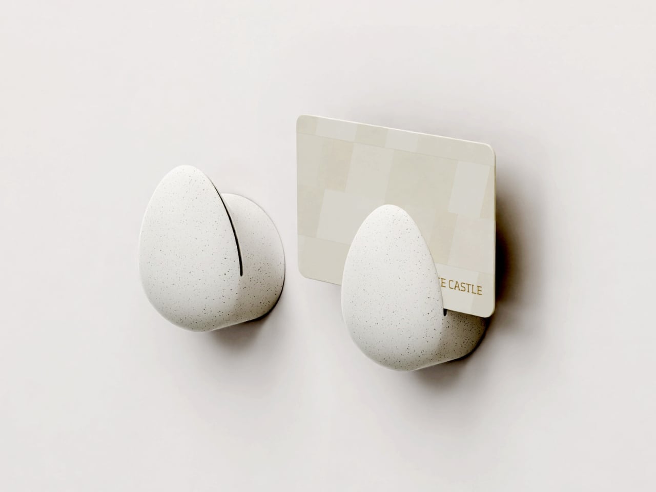
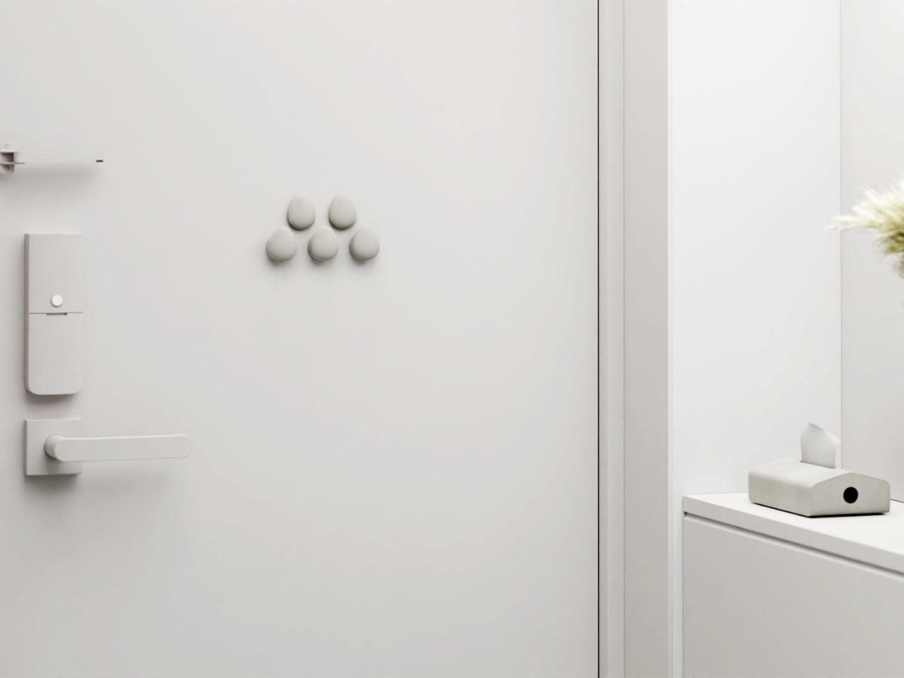
The kit arrives in a birdhouse-shaped package made from pulp paper, the kind that feels substantial in your hands. Strip away the paper band, and inside you’ll find five egg-shaped magnetic objects nestled in protective pulp packaging. The whole experience feels deliberate, like opening something that was designed to be opened, not just shipped.

Designer: SWNA Office

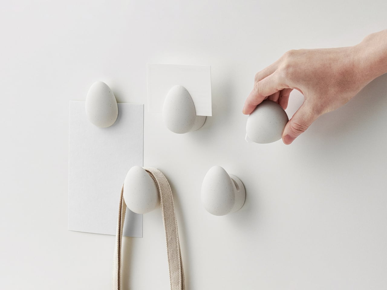
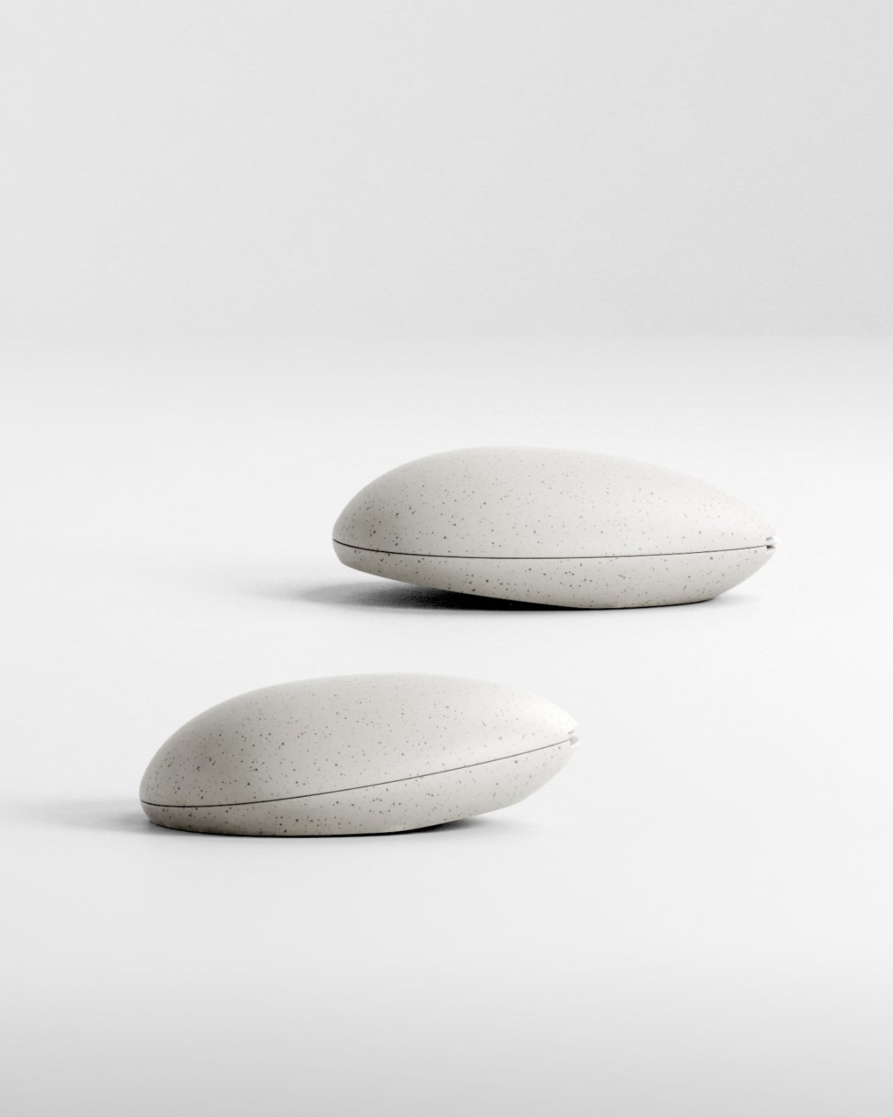
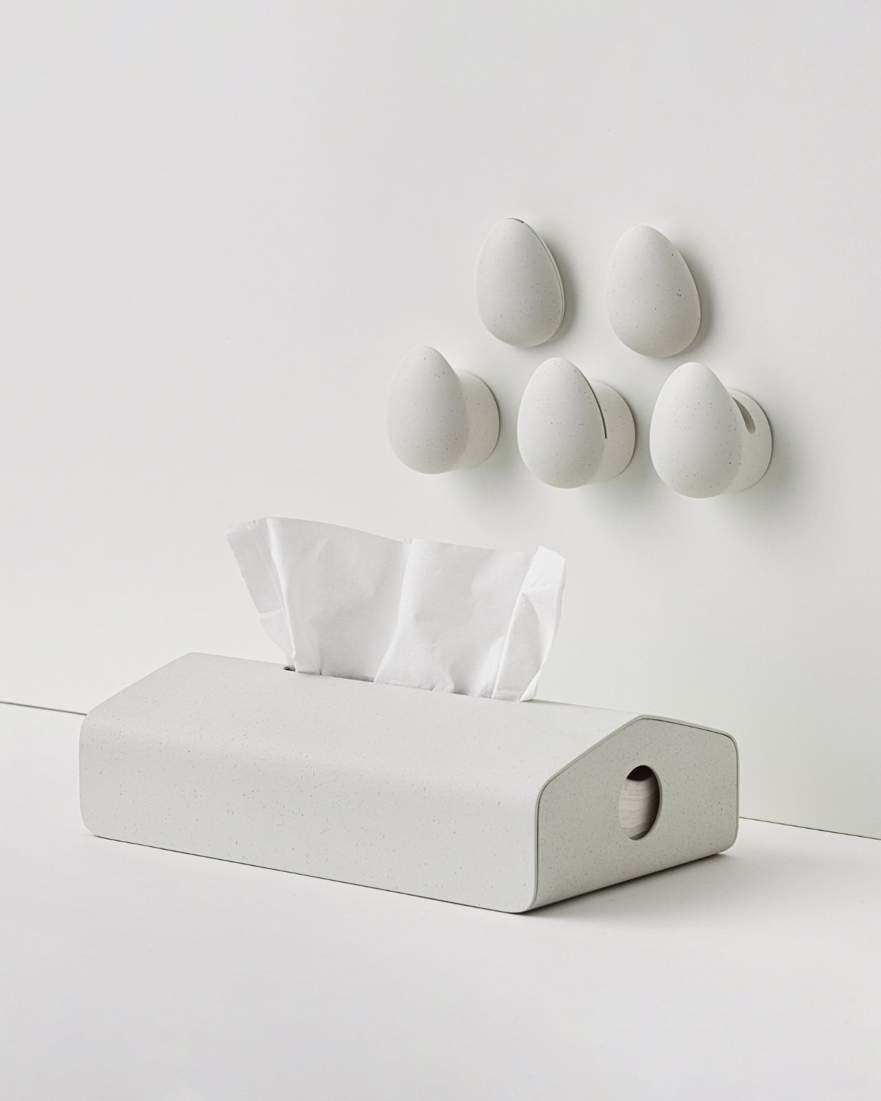
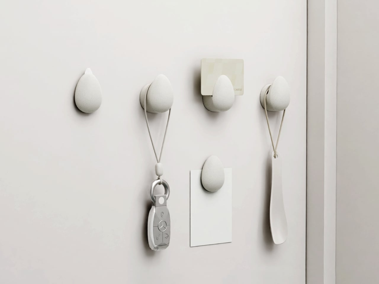
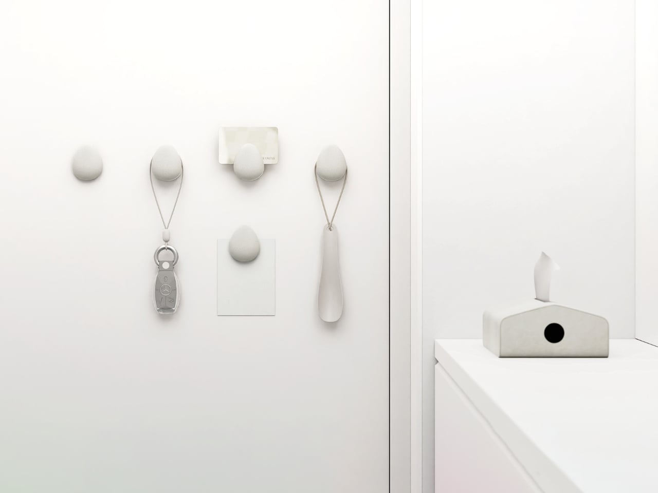
But here’s where it gets interesting. Those five eggs aren’t just decorative items you’ll stash away and forget. Each one serves a specific purpose at the threshold of your home, that chaotic zone where packages pile up and keys mysteriously vanish. One egg contains a ceramic-blade box cutter for safely slicing through Amazon deliveries. Others function as magnetic hooks and holders, perfect for hanging access cards, food waste sorting tags, car keys, or that shoehorn you’re always hunting for when you’re already late.

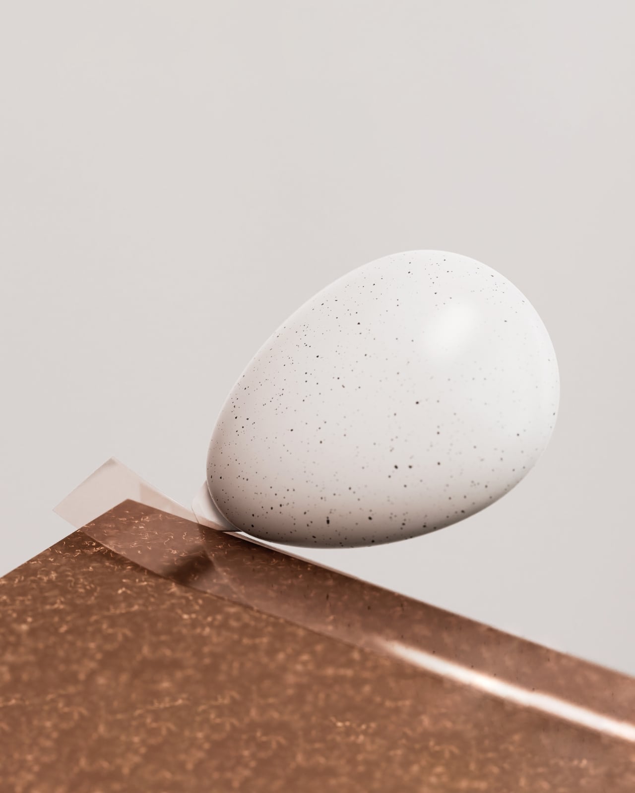
The egg shape itself is surprisingly smart from a user experience perspective. It’s soft and rounded, fitting comfortably in your palm. The scale feels just right, not so small that it’s fiddly, but not so large that it dominates your door. There’s a gentle familiarity to holding an egg, even one made from recycled plastic. It’s a form we all understand instinctively.

The birdhouse package transforms into a refillable tissue holder after you’ve unpacked everything. The circular opening on the side isn’t just aesthetic; it’s functional, letting you see at a glance when you’re running low. Made from vegan leather, it brings a soft contrast to the stone-like texture of the eggs. The eagle motif threading through both the eggs and the “nest” creates visual continuity that feels intentional rather than gimmicky.

What makes this project worth paying attention to is how it handles sustainability without being preachy. Sure, the eggs are made from recycled plastic and the case uses vegan leather, but the kit doesn’t stop at material choices. It’s designed to make eco-friendly living more manageable. That box cutter with the ceramic blade helps you break down boxes properly for recycling. The sorting tools encourage proper waste management. The kit isn’t just made sustainably; it helps you live more sustainably.

This is where corporate gifting usually fails. Most welcome packages are essentially branded advertising that recipients tolerate. Earth’s Hatch flips that script by centering utility. The magnetic feature is particularly clever because it solves a real problem. How many times have you frantically searched for your keys or access card? Now they have a dedicated spot right by your door, held by these smooth, tactile objects that are actually pleasant to interact with daily.

The name itself, Earth’s Hatch, captures what Lotte E&C seems to be going for with their “safe planet project.” It’s about emergence, about something new coming into being. The eagle egg symbolism reinforces that idea of potential and care. Eagles are protective of their eggs, just as we should be protective of the planet. It’s a bit poetic for a construction company, but that’s precisely what makes it memorable.

SWNA Office managed to create something that works on multiple levels. At first glance, it’s a beautiful object with its muted, speckled surface that photographs gorgeously in that minimalist product photography style we’ve all become accustomed to. But it doesn’t rely solely on aesthetics. The design holds up in actual use, which is rarer than it should be.

What this project really demonstrates is that thoughtful design can elevate even something as mundane as organizational tools and tissue holders. By connecting form, function, and meaning, Earth’s Hatch becomes more than a welcome kit. It’s a physical manifestation of a company’s values, something recipients will actually use and remember. That’s the kind of design that deserves attention.

The post Lotte E&C Just Turned 5 Eggs Into the Welcome Gift You’ll Use first appeared on Yanko Design.

This Tea Brand Just Turned Packaging Into a Playful Puzzle

There’s something oddly satisfying about counting things. Maybe it’s the same reason people find numbered lists so appealing, or why we instinctively organize our world into sequences. By-Enjoy Design seems to understand this perfectly with their OneToTea packaging for CHASHAN’s white tea pearls, turning what could have been just another tea box into something that feels almost like a playful puzzle.

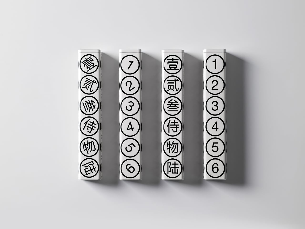
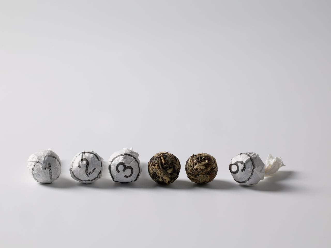
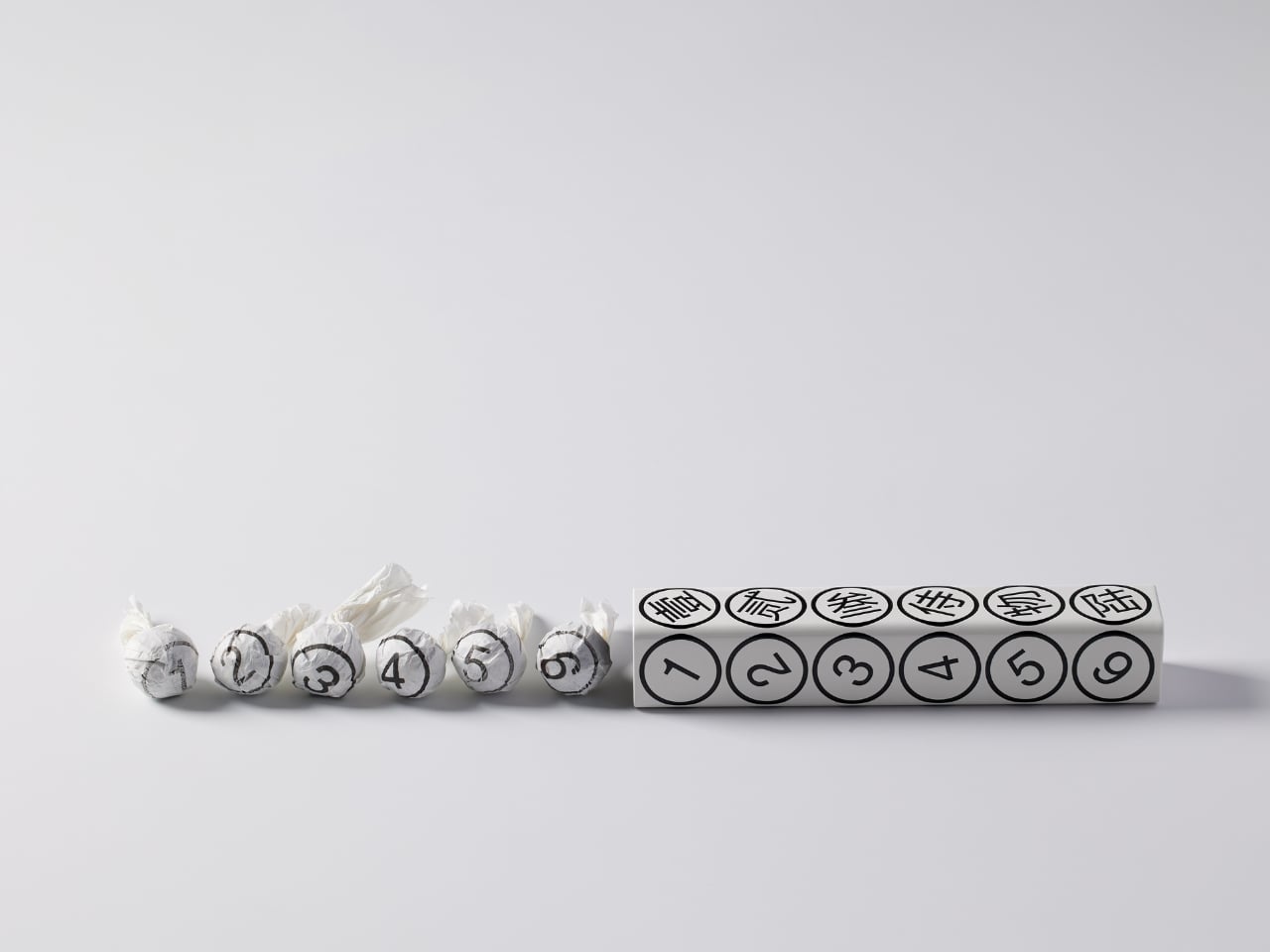
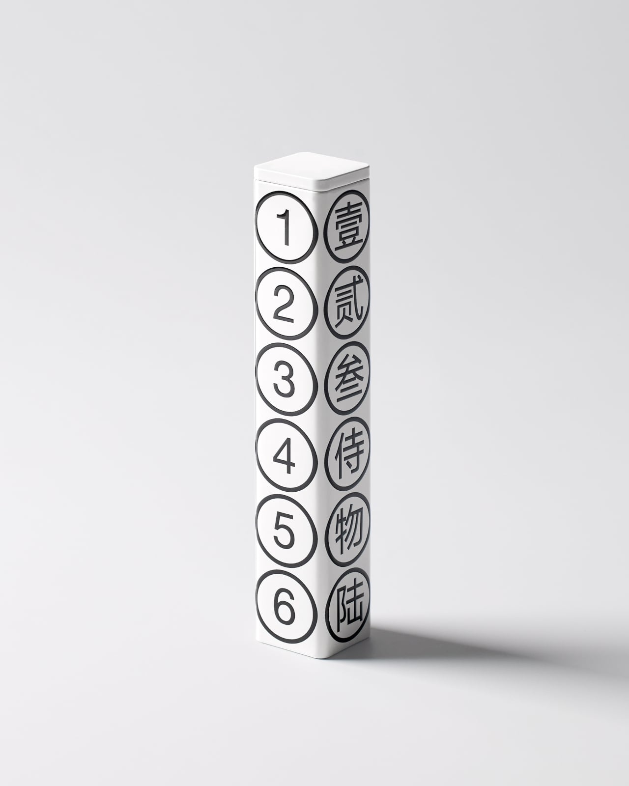
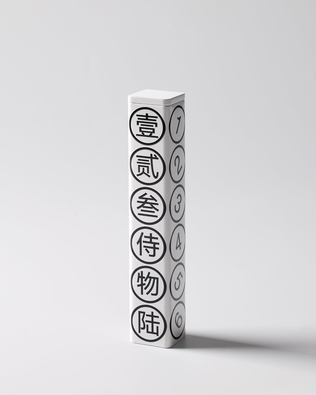
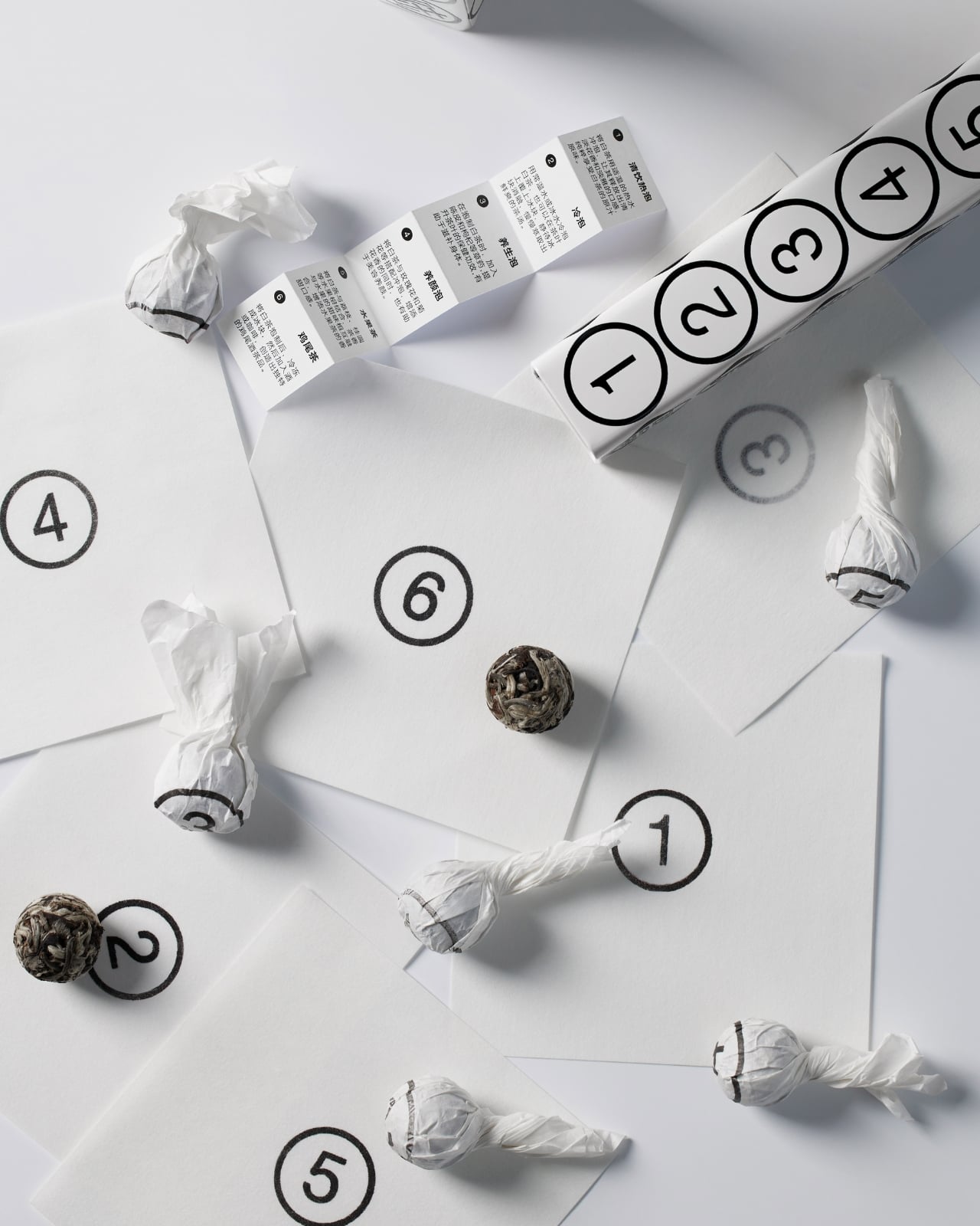
The concept is beautifully simple. Six white tea pearls, six numbers, one hexagonal tube. Each face of the package displays both a Chinese character and its corresponding Arabic numeral, from one through six. It’s the kind of design that makes you wonder why nobody thought of it sooner, which is usually the hallmark of really smart packaging.

Designer: By-Enjoy Design

What strikes me first is the restraint. The color palette is strictly monochrome, with black graphics on a pristine white background. No gradients, no metallic finishes, no desperate attempts to scream luxury through gold foiling or embossing. Instead, the design whispers sophistication through its geometric precision and typographic clarity. The circles containing each number create a rhythmic pattern down the length of the tube, making something as straightforward as counting feel deliberately composed.

But here’s where it gets interesting. The packaging doesn’t just look good sitting on a shelf. According to the designers, a gentle shake brings the whole thing to life, making it playful and dynamic. Imagine holding this tube and feeling those tea pearls shift inside, each one rolling to match its designated number. It transforms a static object into something tactile and interactive, which is pretty rare in the tea world where most packaging is designed to sit pretty and do nothing else.

The bilingual approach serves multiple purposes beyond just translation. The Chinese characters carry cultural weight and authenticity, grounding the product in tea’s traditional origins. The Arabic numerals provide universal accessibility, ensuring anyone can engage with the numbering system regardless of language. This dual identity feels especially relevant for contemporary Asian brands trying to speak to both local and global audiences without losing their cultural identity in the process.

Each tea pearl comes individually wrapped, and naturally, it bears the same number as its spot on the tube. This kind of consistency creates a complete experience rather than just packaging. You’re not randomly grabbing a tea pearl. You’re selecting number three, or saving number six for later. It gamifies the consumption process in a subtle way, adding a layer of intentionality to your tea ritual.

The hexagonal form itself deserves attention. It’s not the easiest shape to manufacture or ship, but it offers six equal faces for that perfect one-to-six display. It also stacks and arranges beautifully, as shown in the images where multiple tubes create their own geometric compositions. From a retail perspective, these tubes photograph incredibly well, which matters immensely in our Instagram-driven market where packaging needs to perform on screens as much as on shelves.

What really works here is how the design manages to be both minimal and maximal at once. Minimal in its aesthetic choices, with that stark black and white palette and clean typography. But maximal in its thoughtfulness, with every element serving both function and form. The numbers aren’t just decorative. They’re an organizational system, a design motif, a playful interaction, and a cultural bridge all at once.

This kind of packaging also taps into something collectors understand well. When design is this cohesive and clever, you don’t want to throw the box away. That tube becomes an object worth keeping, maybe for storing other small treasures or just displaying because it looks that good. It’s the opposite of disposable packaging, and that sustainability angle (even if unintentional) resonates with contemporary values around consumption and waste.

By-Enjoy Design has created something that works on multiple levels. It’s functional enough for everyday use, beautiful enough for gift-giving, clever enough to spark conversation, and simple enough that its brilliance doesn’t require explanation. Sometimes the best design solutions are the ones that make you smile because they just make sense.

The post This Tea Brand Just Turned Packaging Into a Playful Puzzle first appeared on Yanko Design.
This Lighthouse Calendar Turns Your Desk Into a Coastal Escape

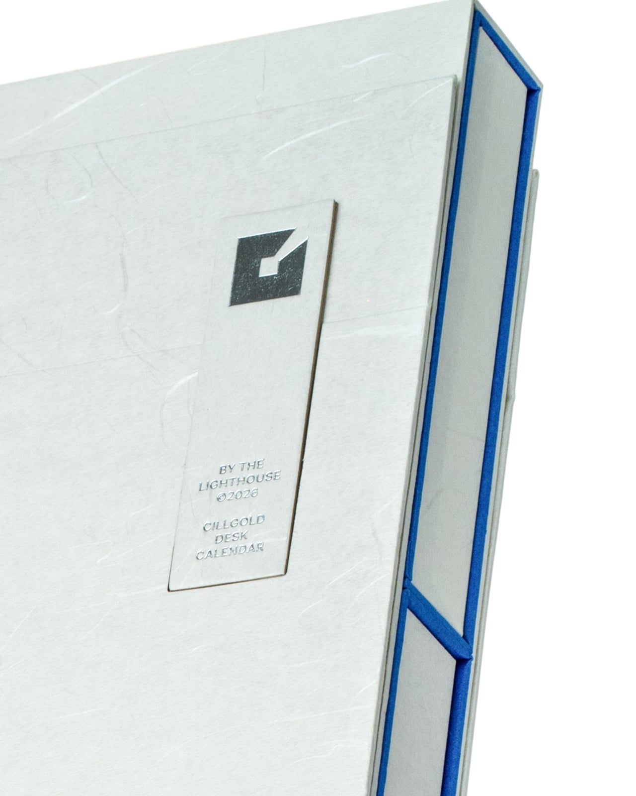
There’s something wonderfully audacious about a desk calendar that refuses to be just a desk calendar. Cillgold Agency’s “By the Lighthouse” for 2026 is exactly that kind of design rebel. Instead of being a forgettable square of paper you flip through mindlessly, it’s a miniature architectural statement that happens to tell you what day it is.

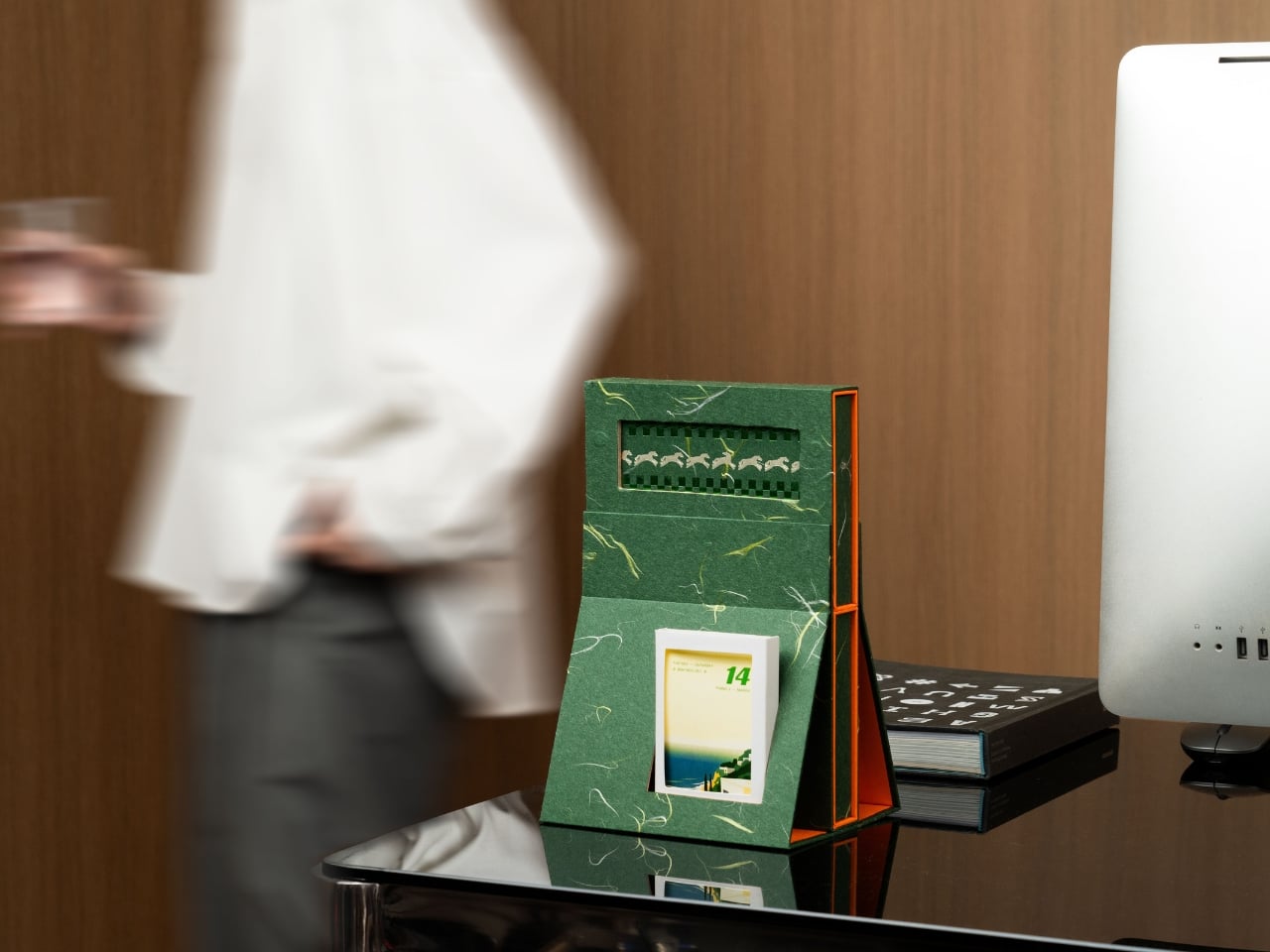
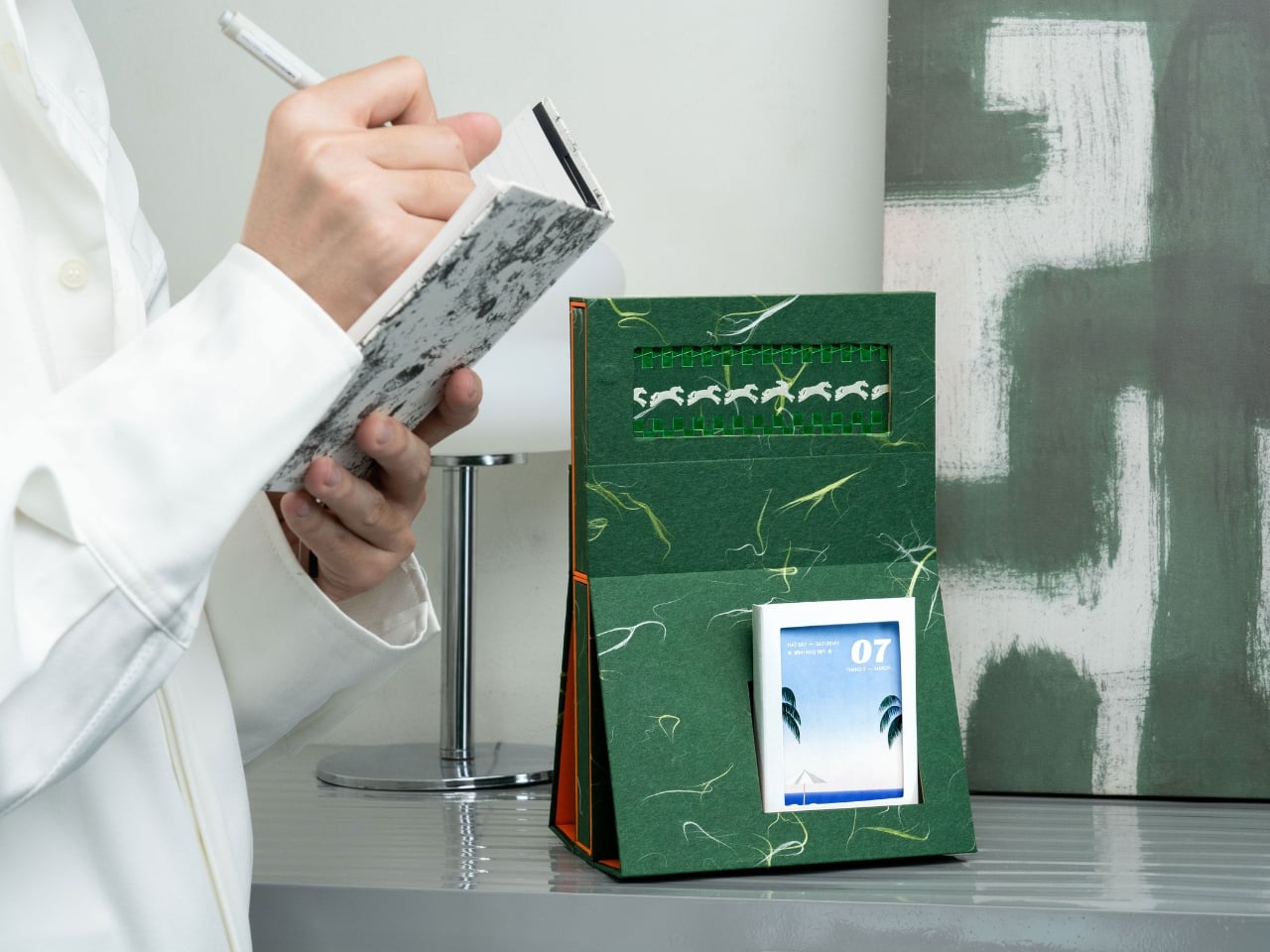
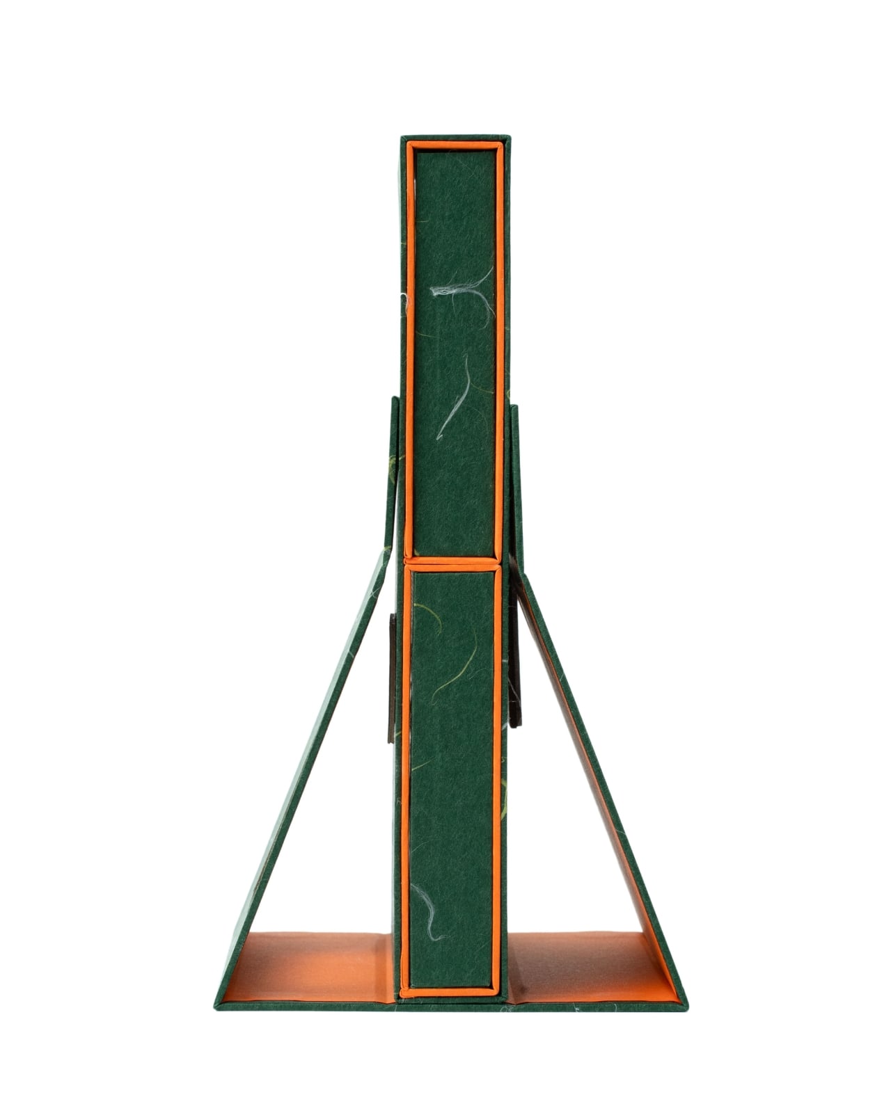
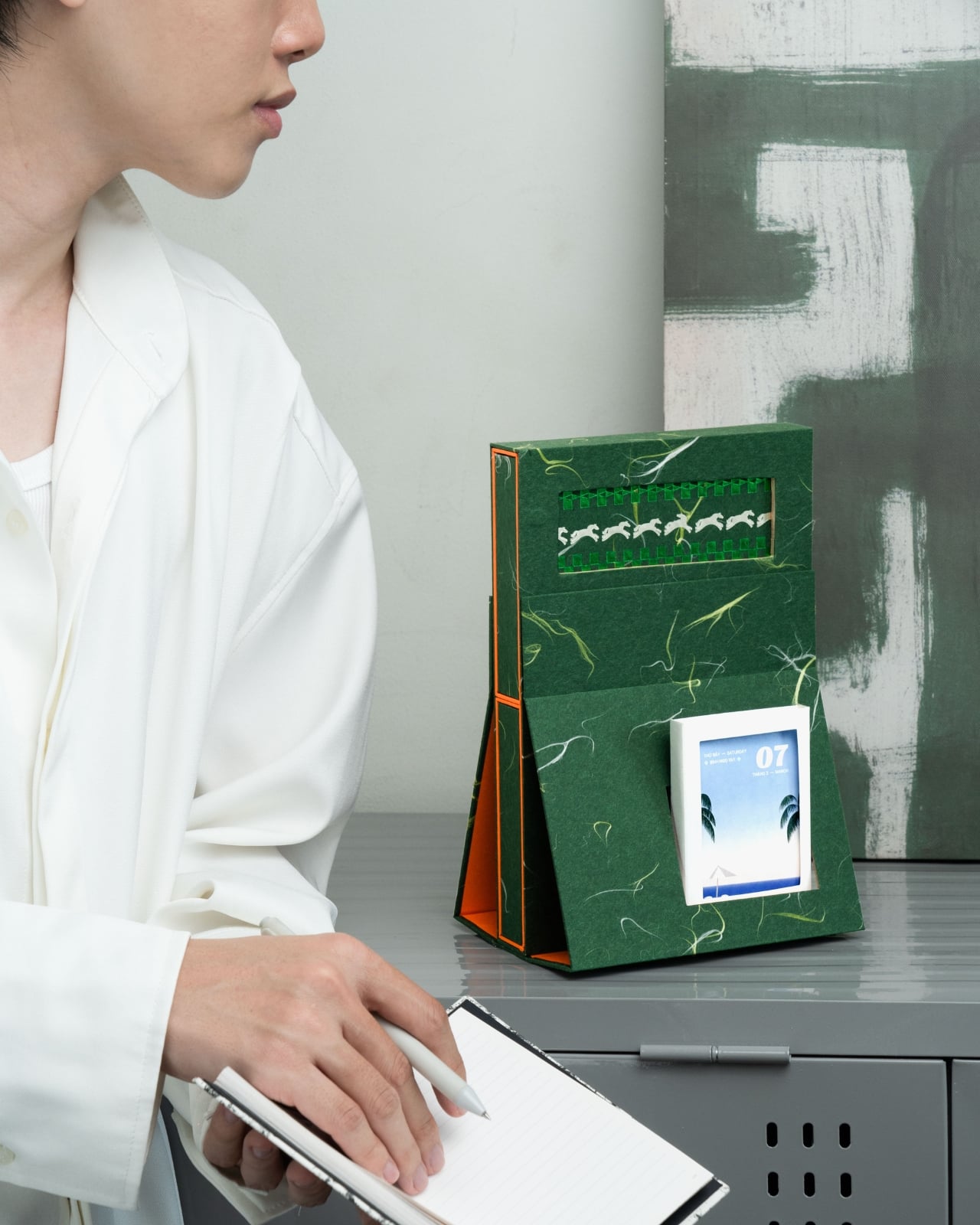
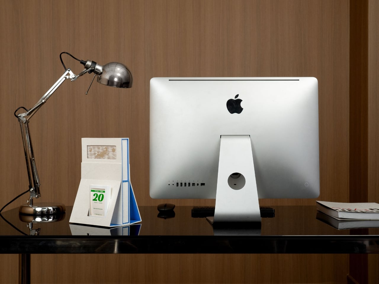
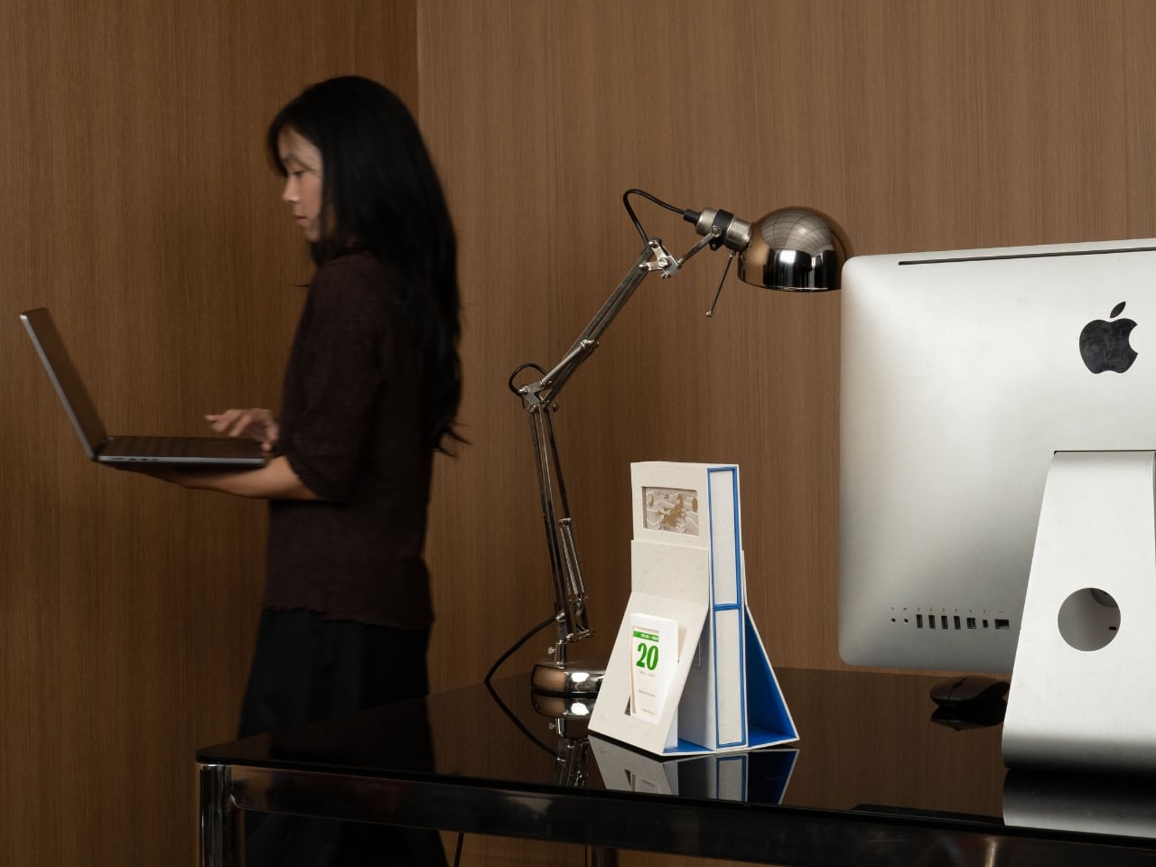
The piece stands tall on your desk like a proud beacon, mimicking the silhouette of an actual lighthouse with surprising accuracy. The structure tapers as it rises, supported by angular legs that give it a sense of purpose and stability. This isn’t some flimsy cardboard that’ll topple over when someone walks by too quickly. The design feels deliberate, substantial, like it’s actually guiding you through the year ahead.

Designer: Cillgold Agency

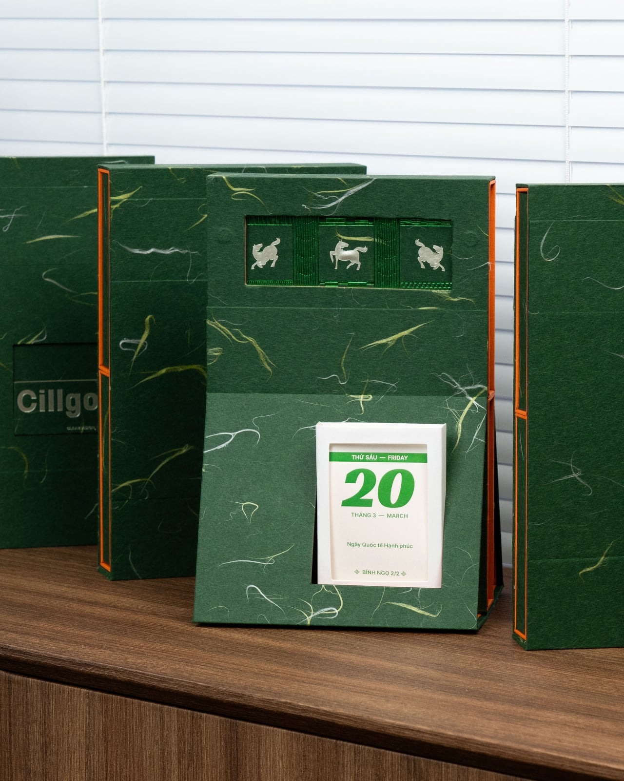
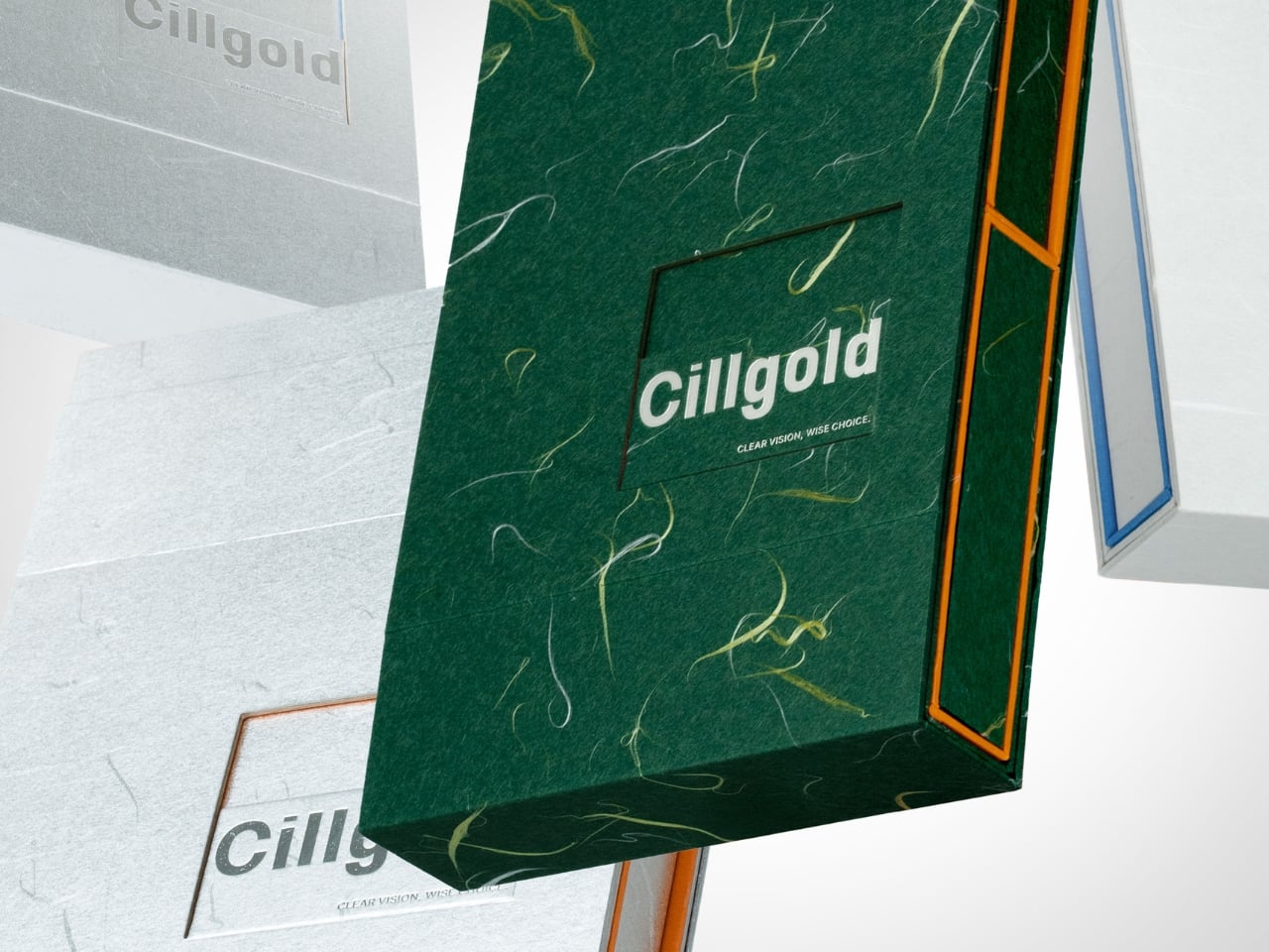
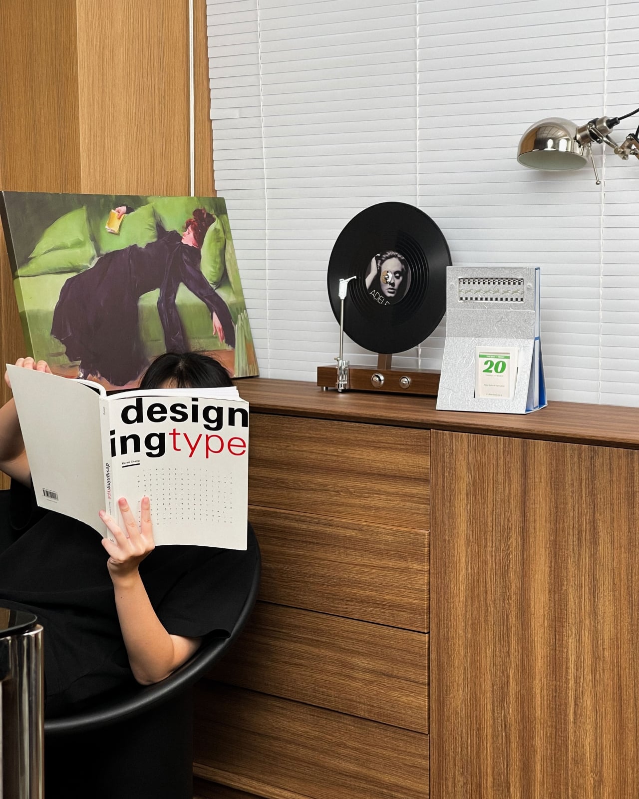
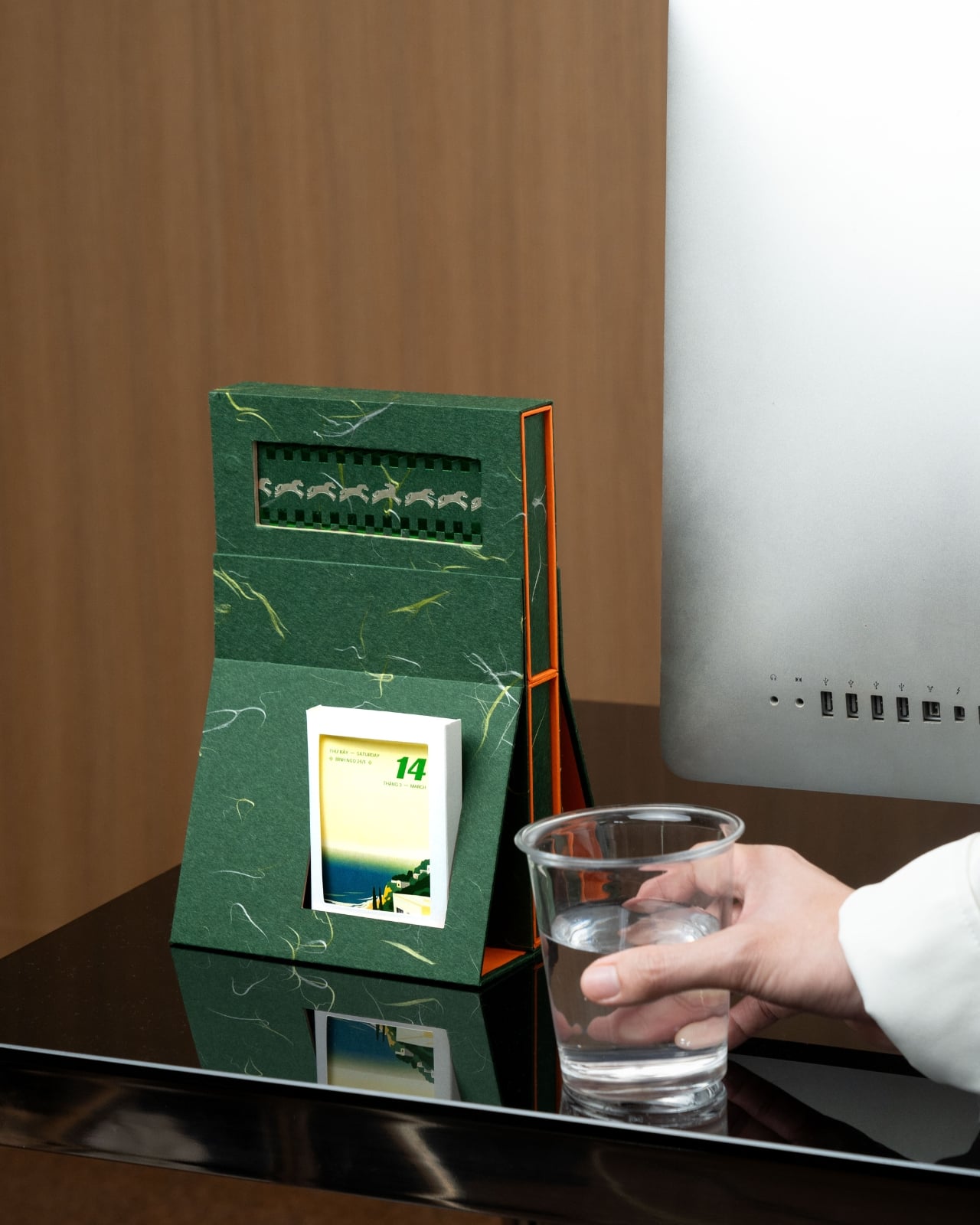
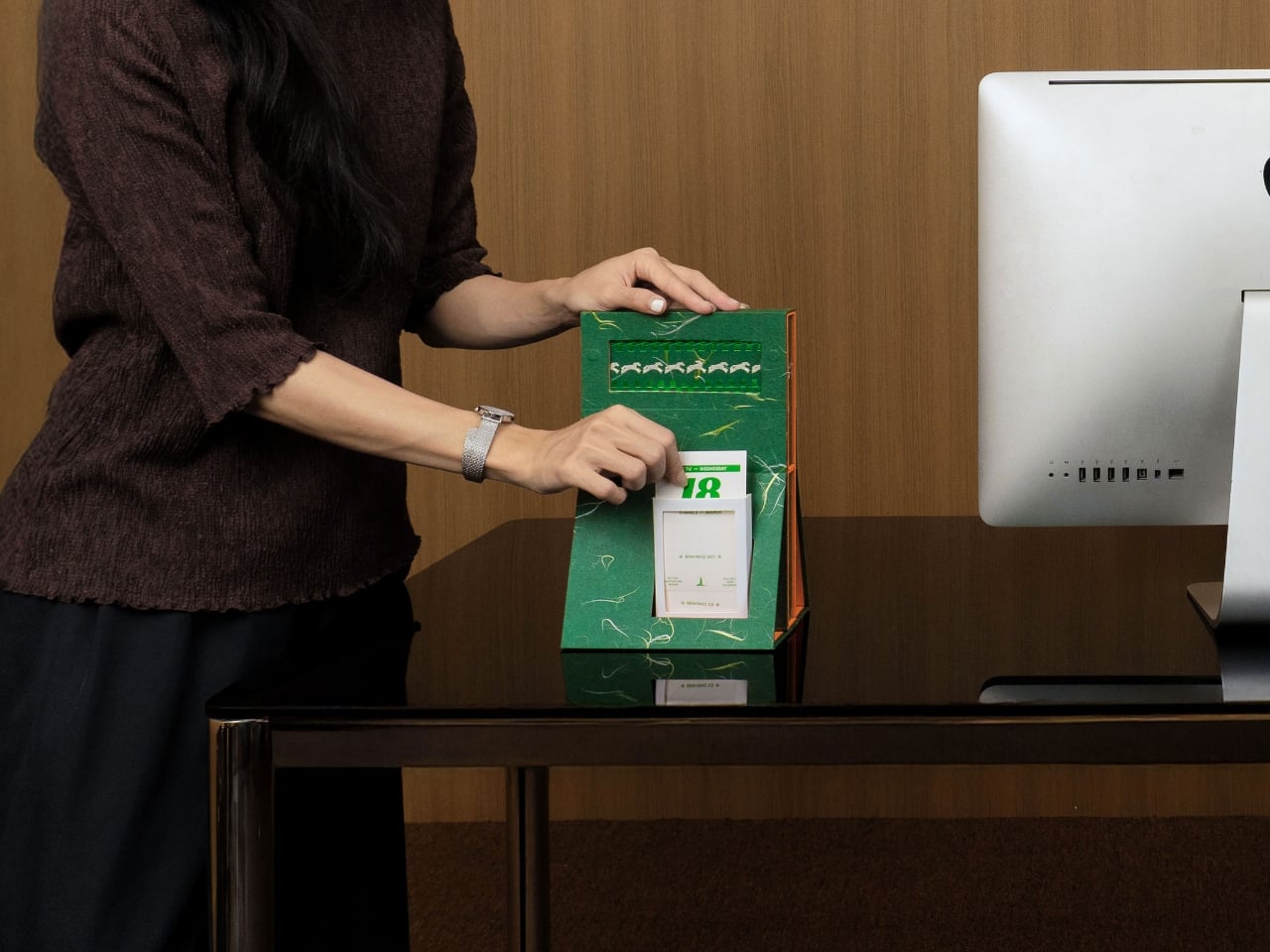
What really catches your eye is the material choice. The entire exterior is wrapped in this gorgeous deep green marbled paper with veins of gold running through it like captured lightning. It’s the kind of surface that makes you want to reach out and touch it, to trace those organic patterns with your fingertips. The marbling has a luxurious, almost geological quality, as if each calendar was carved from a block of precious stone rather than assembled from paper and cardboard.

Then there’s that pop of coral orange along the edges. It’s unexpected and bold, creating this beautiful contrast against the moody green. The orange trim follows the contours of the structure, outlining the lighthouse shape and drawing your eye upward. It’s a small detail that completely transforms the piece, adding warmth and energy to what could have been a somber color palette.

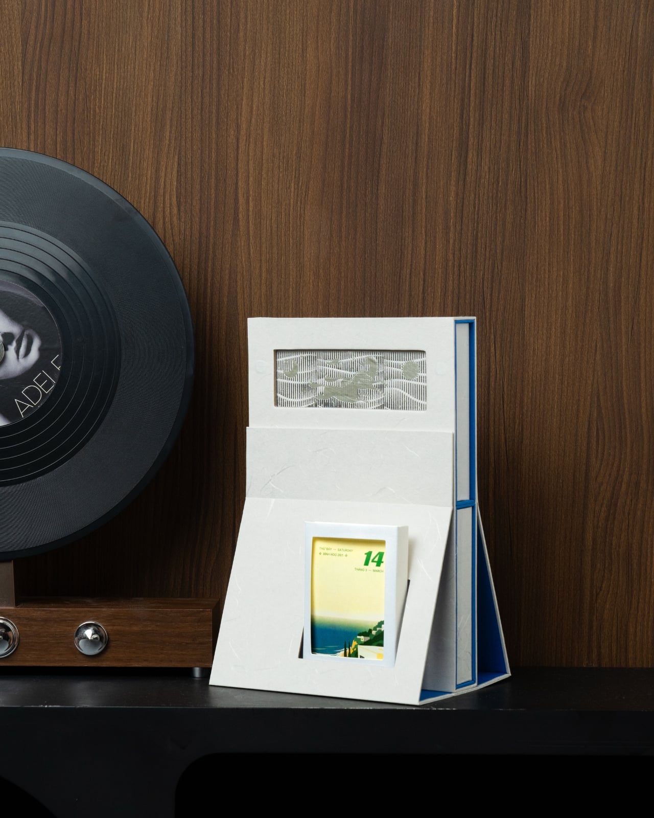
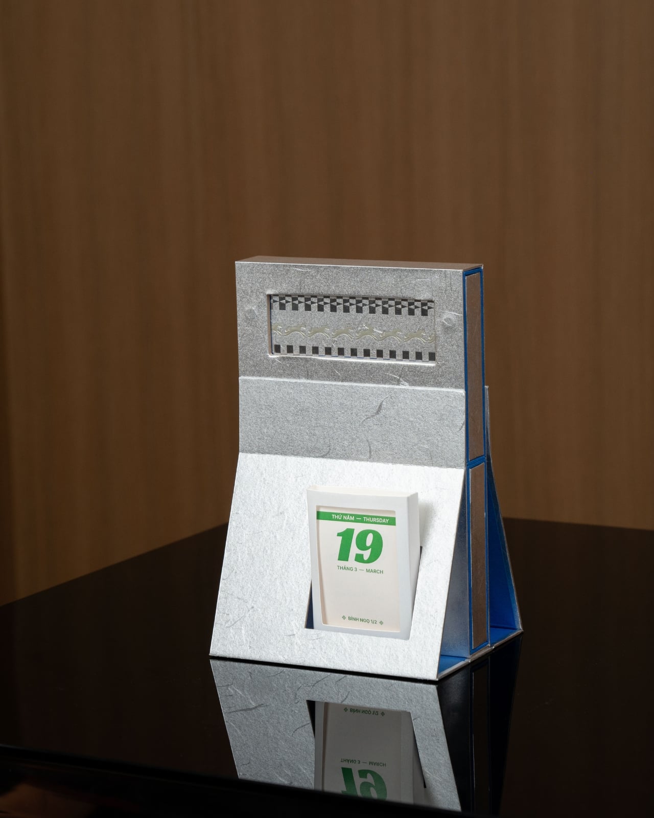
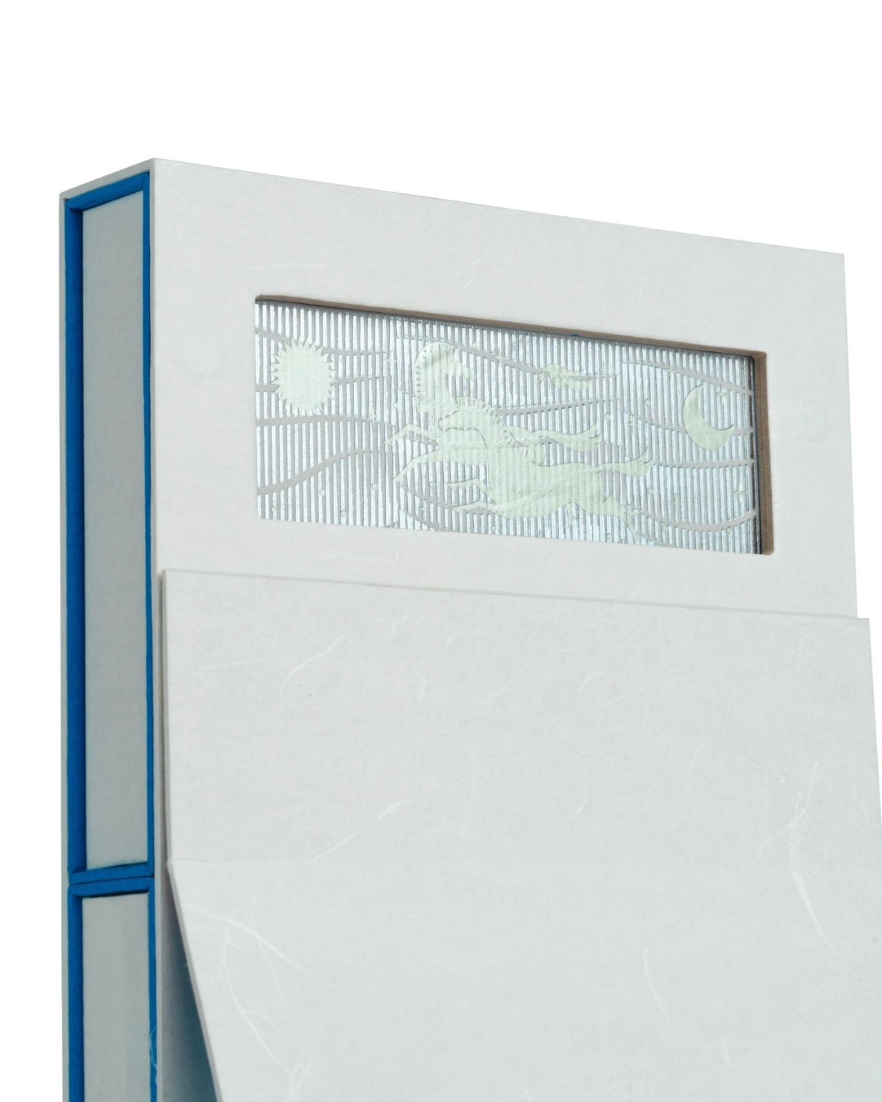
Near the top of the structure, there’s a rectangular cutout that reveals a row of white seagulls in flight, set against a ribbed green background. This little window is pure charm. It’s like peering through a lens into a coastal scene, a reminder of the lighthouse’s maritime purpose. The birds are simplified, almost pixelated in their rendering, which gives them a playful, graphic quality that bridges vintage and contemporary design sensibilities.

The actual calendar component sits in the lower portion of the structure, displaying date cards that feature their own coastal imagery. Each card shows serene beach scenes, lighthouses in the distance, palm trees swaying in ocean breezes. The photography has that dreamy, gradient quality that makes you want to book a seaside vacation immediately. Flipping through the days becomes a small daily ritual, revealing new vistas as the year unfolds.

What Cillgold Agency has really accomplished here is creating an object that lives in multiple categories at once. Yes, it’s functional. You can absolutely use it to track dates and plan your schedule. But it’s also decorative, sculptural, collectible. It’s the kind of thing that sparks conversations when people enter your workspace. “What is that?” they’ll ask, and you’ll get to explain that it’s a calendar, watching their faces light up with surprise and delight.

The design speaks to a larger trend in stationery and desk accessories where form and function merge into something more meaningful. We’re moving away from purely utilitarian objects and embracing pieces that bring joy, personality, and artistry to our everyday environments. Our workspaces shouldn’t be sterile or boring. They should reflect who we are and what we value.

From a collector’s perspective, this is absolutely a keeper. Once the year ends, you don’t toss it in the recycling bin. You might repurpose it, display it on a shelf, or store it carefully as an example of excellent paper craft and product design. Limited edition calendars like this often appreciate in value among design enthusiasts, but more importantly, they become personal artifacts, markers of a particular year and aesthetic moment.

The post This Lighthouse Calendar Turns Your Desk Into a Coastal Escape first appeared on Yanko Design.
Heinz Dipper Finally Gives Fries Their Own Little Ketchup Pocket

Eating fries away from a table means improvising a ketchup situation that usually goes wrong. Packets balance on dashboards, sauce gets smeared onto napkins, or you squeeze tiny dollops directly onto individual fries like you are frosting cupcakes. It is ridiculous that we perfected crinkle cuts and waffle fries but still treat the ketchup part like an afterthought whenever we leave the safety of a tray.

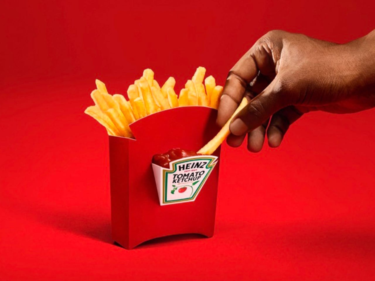
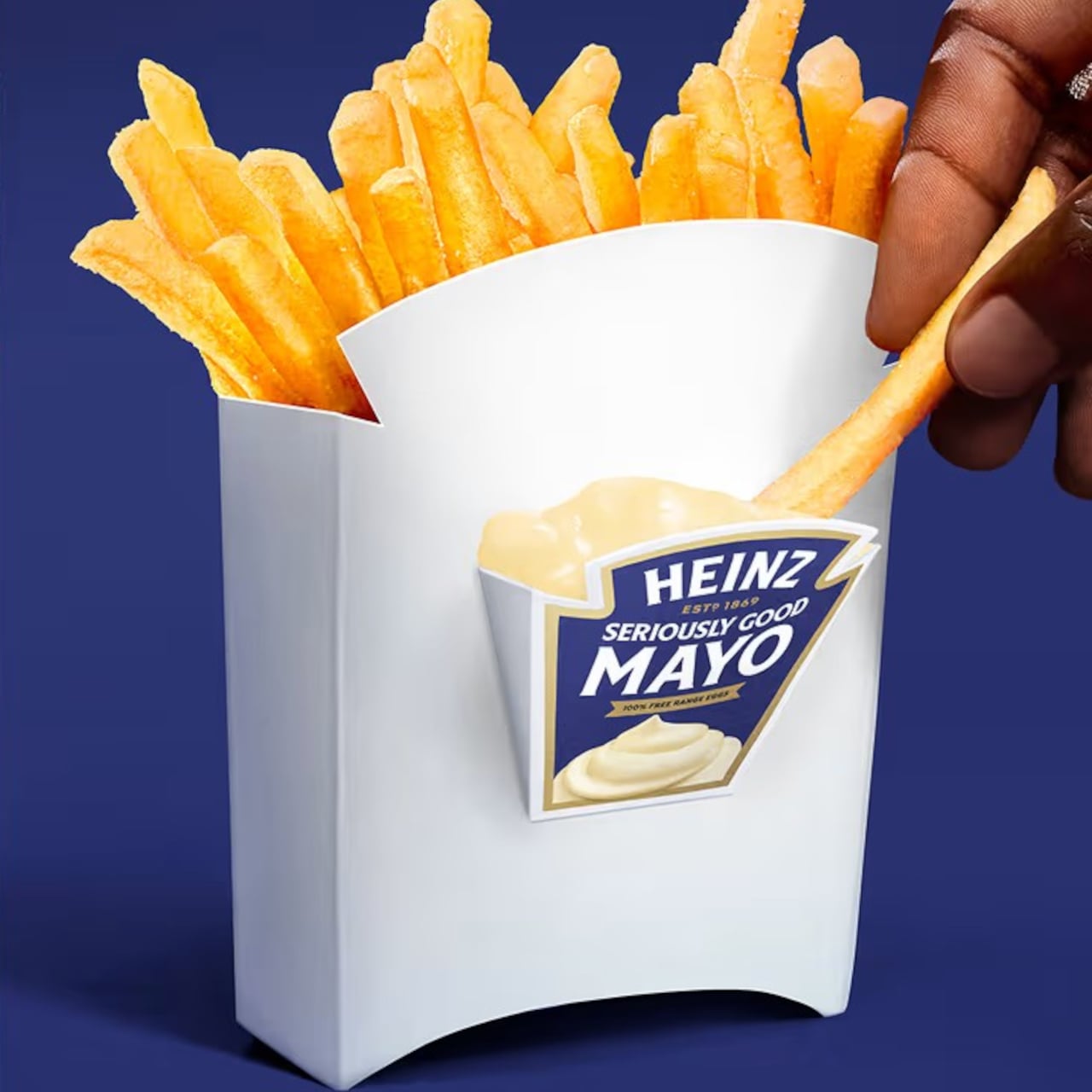
Heinz Dipper is what happens when someone finally looks at a fry box and asks, “What if this thing helped?” It is a patent-pending container with a built-in condiment compartment on the front, engineered for dipping on the go. The box holds fries like usual, but also carries a small pool of ketchup or mayo right where your thumb expects it to be.

Designer: Heinz

Picture a drive-thru run or a couch session. Instead of tearing packets and hunting for a flat surface, you grab the Dipper with one hand, dip with the other, and never wonder where the ketchup went. The fry box becomes a self-contained meal kit, making it harder to justify those ketchup stains on jeans, car seats, or suspiciously sticky armrests that no one wants to talk about.
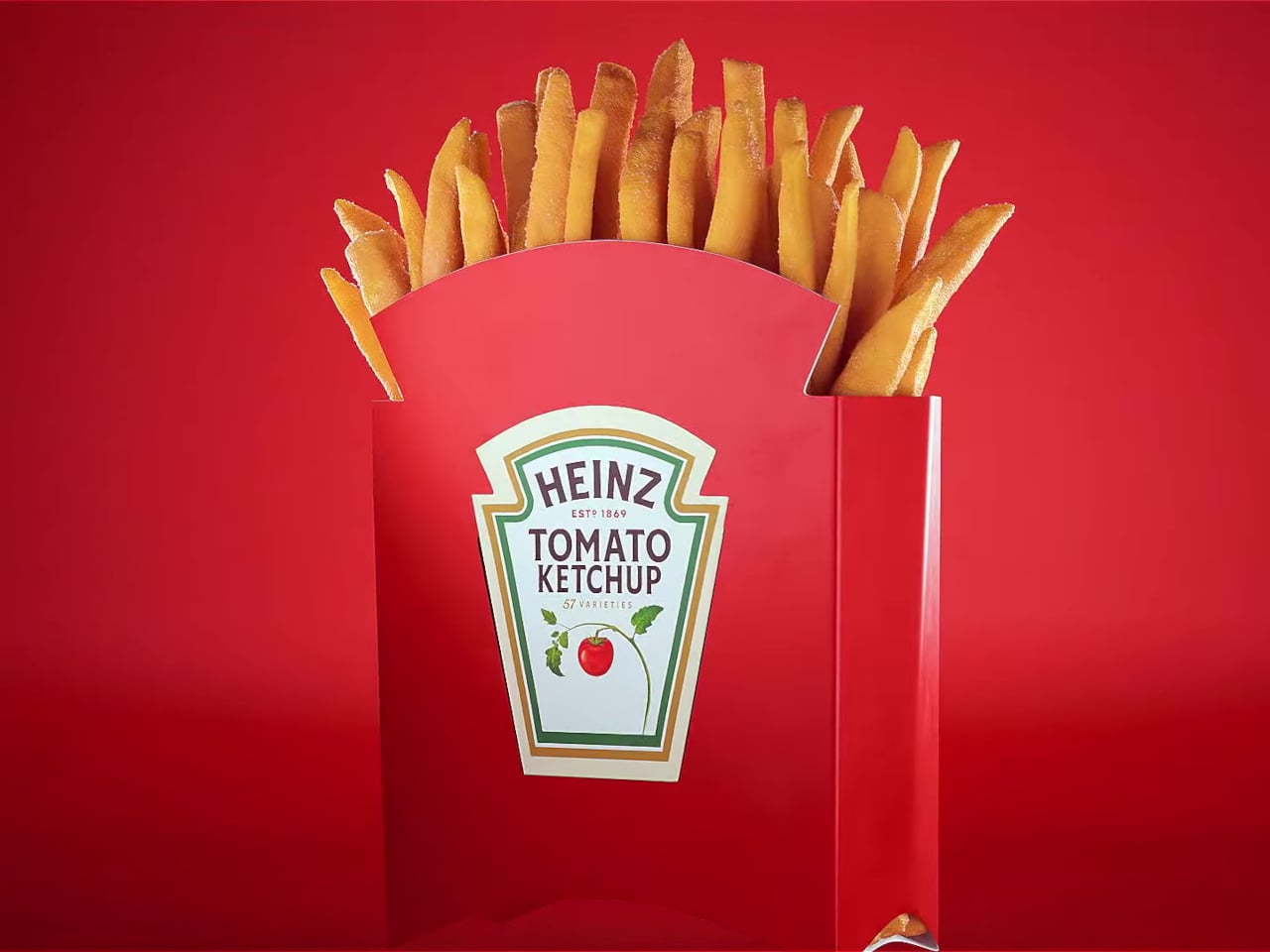
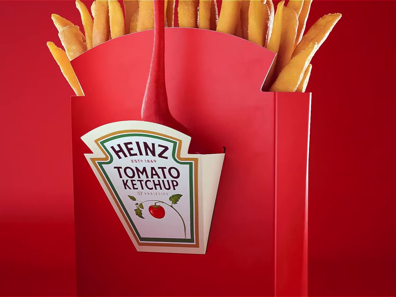
The design is basically a standard fry box with a foldable pocket on the front acting as a condiment well. That small structural change stabilizes the sauce, keeps it from sliding around, and puts it within the same footprint as the fries. No extra cups, no balancing acts, just a single object that understands fries and ketchup are a package deal, not two separate quests requiring three hands.

Heinz leans into its keystone icon here, turning the familiar label shape into both branding and a visual cue that says “dip here.” It is packaging as an interface, not just decoration. The Dipper teaches you how to use it without instructions, which is what good packaging should do when your other hand is busy steering, cheering, or trying to find the napkins you forgot to grab.

The brand cites research showing that most people have spilled ketchup while dipping on the go, and many have considered skipping sauce entirely because the packaging is so annoying. Those numbers validate that this is not a niche complaint; it is a shared embarrassment. The Dipper’s simple structure is less about reinventing fries and more about admitting we have been eating them awkwardly for years.

Heinz Dipper will not save the world, but it might save a few car interiors and shirts. It is a reminder that thoughtful design can live in cardboard geometry as much as in expensive gadgets, and that sometimes the most satisfying innovations are the ones that fix a tiny, greasy annoyance you did not realize everyone else was quietly suffering through as well.

The post Heinz Dipper Finally Gives Fries Their Own Little Ketchup Pocket first appeared on Yanko Design.