What If City Monuments Generated Power Instead of Just Looking Good?

Public art has long served as a cultural mirror, reflecting what a society chooses to honor. As climate change intensifies and cities face mounting pressure to decarbonize, questions about what our monuments should stand for are getting harder to ignore. Most renewable energy infrastructure stays invisible, buried in utility corridors or mounted on rooftops, rarely acknowledged as something worth celebrating in public spaces.

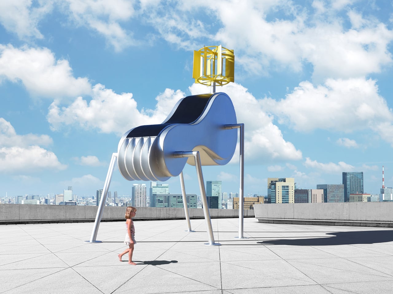
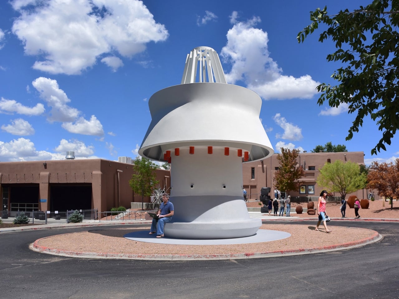
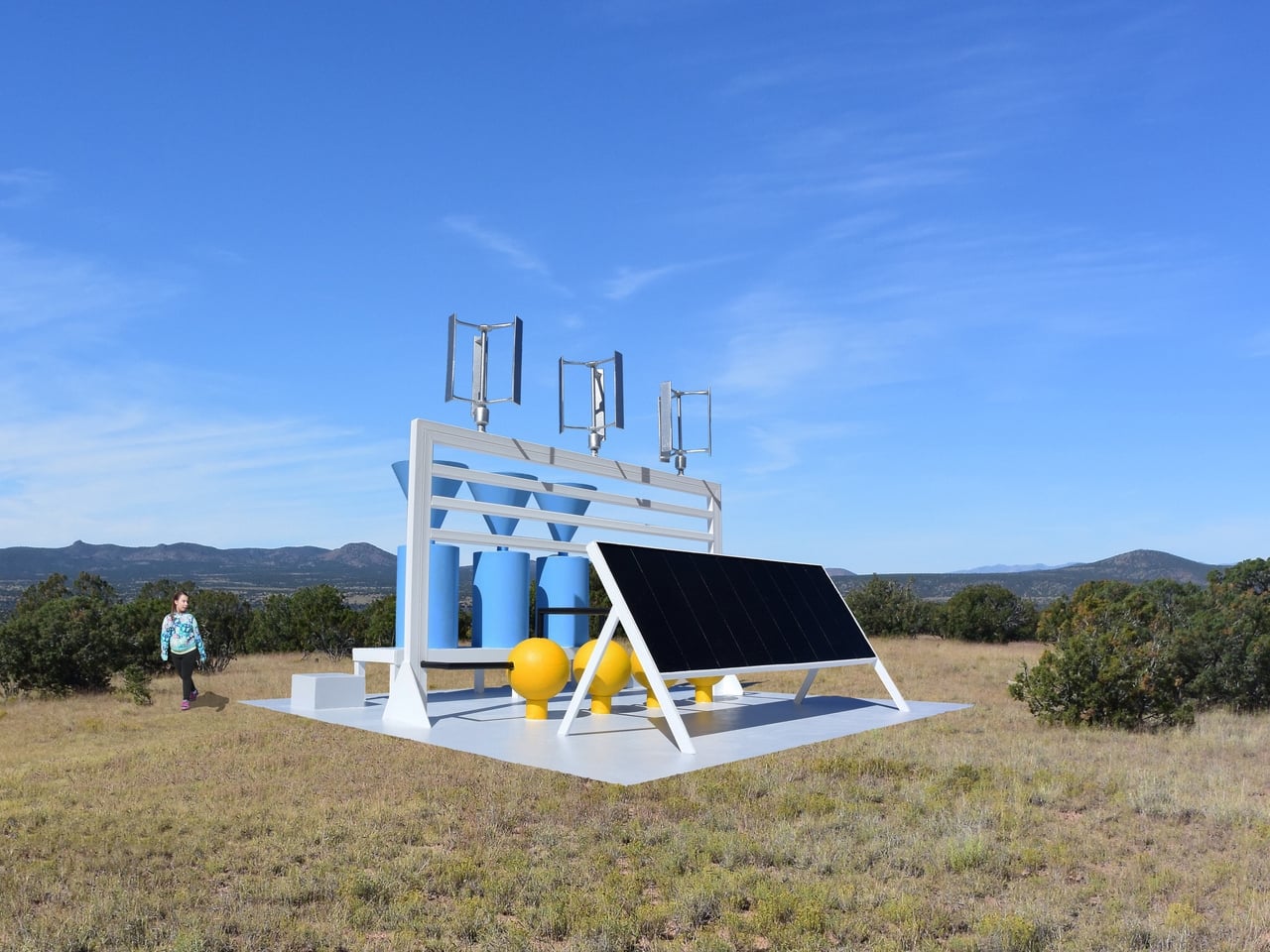
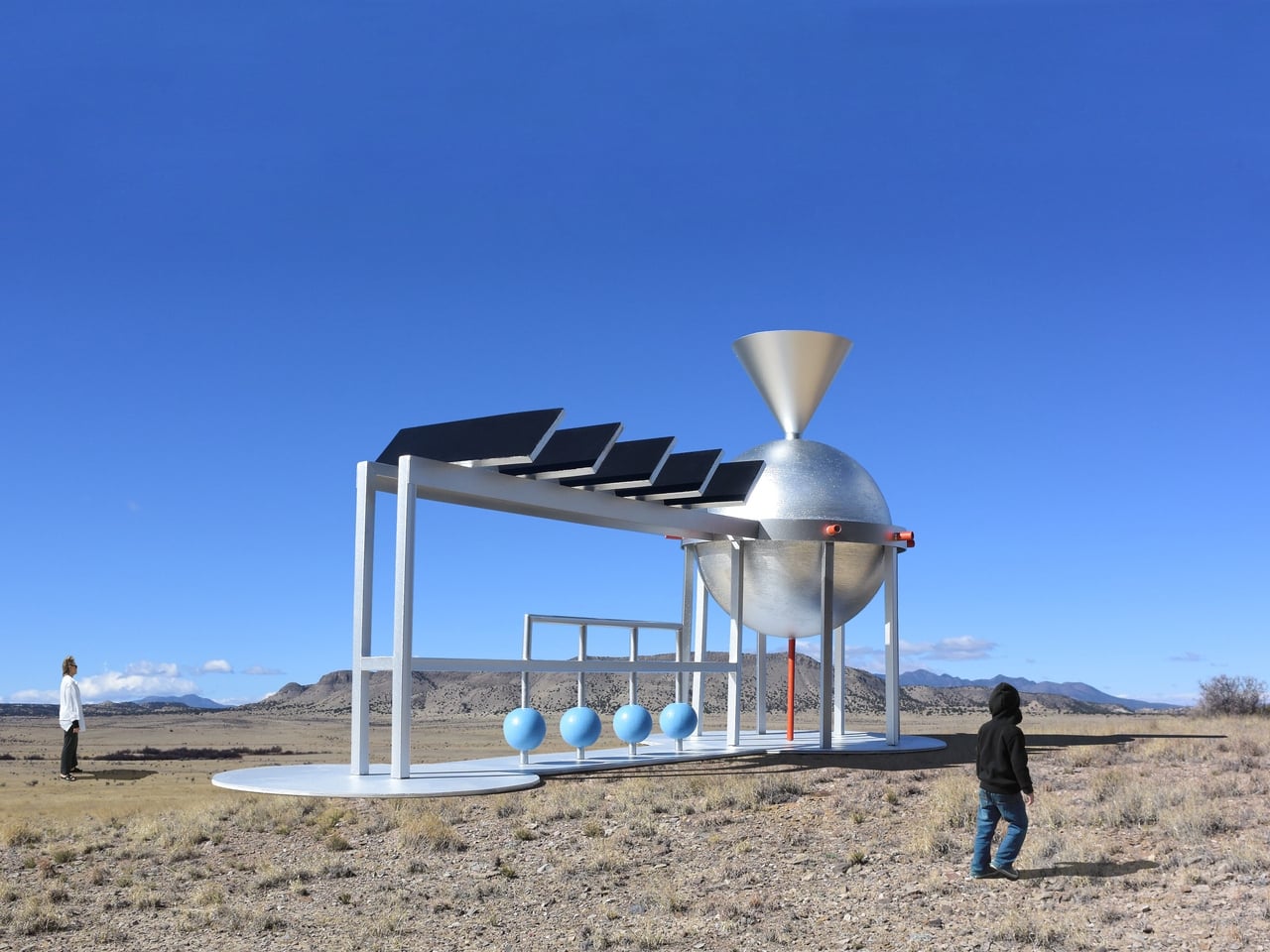
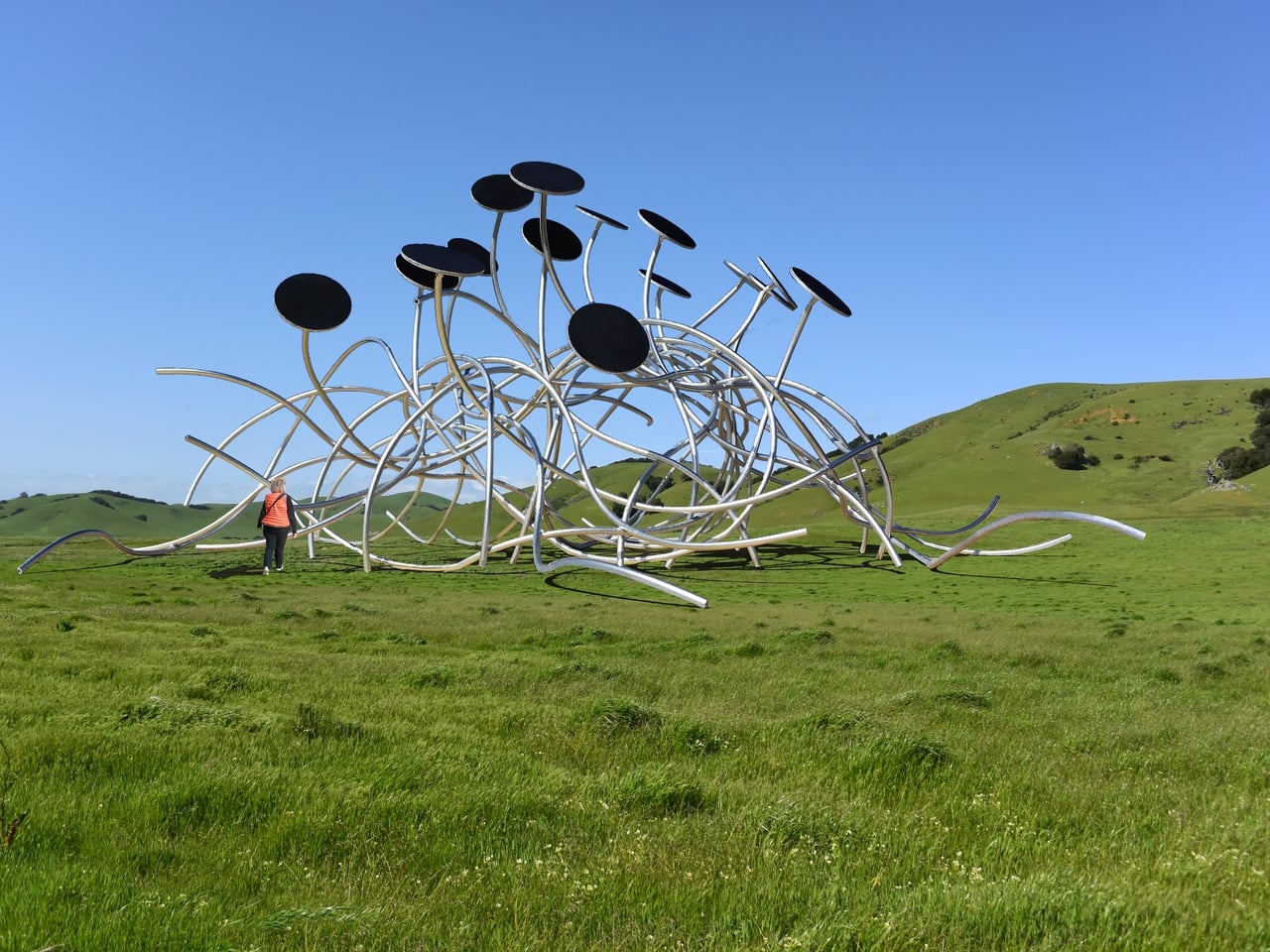
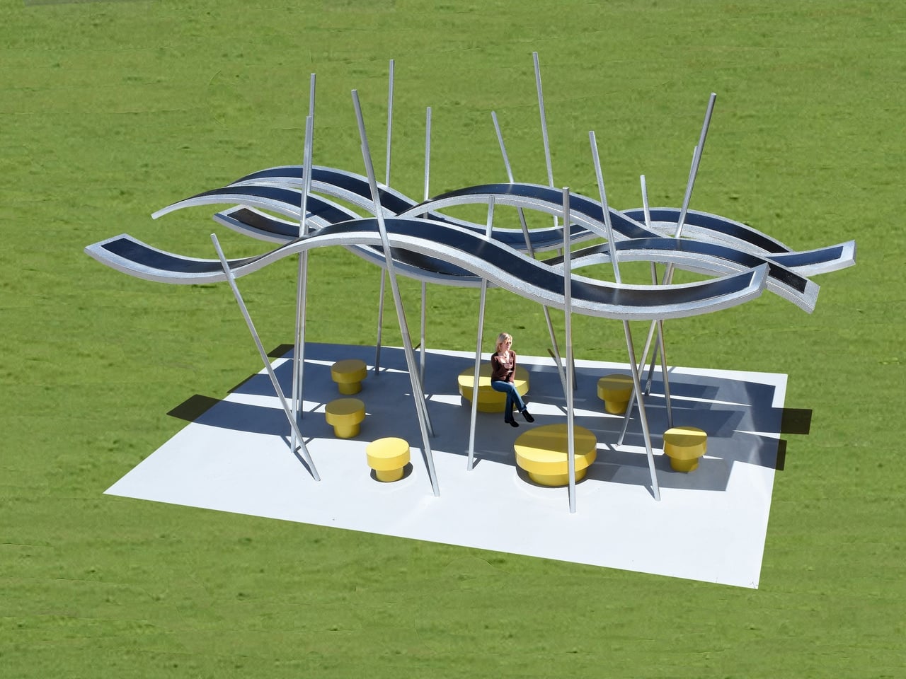
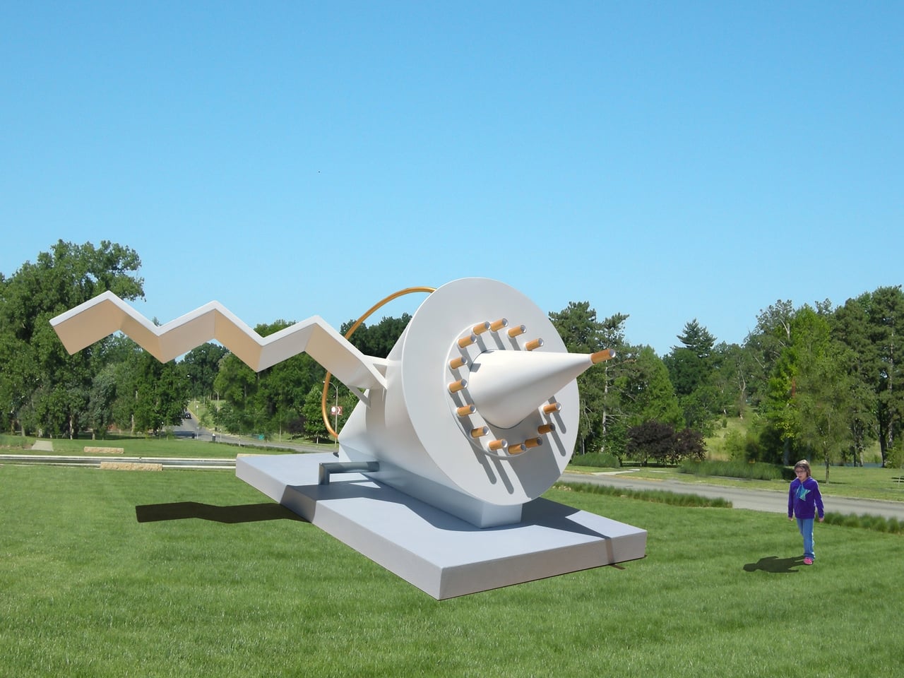
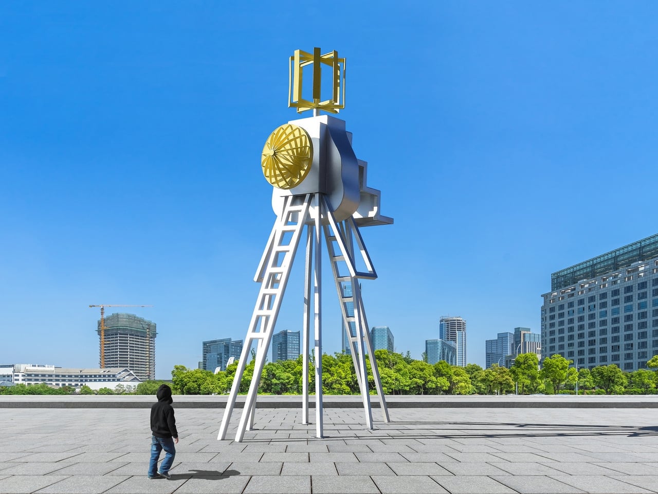
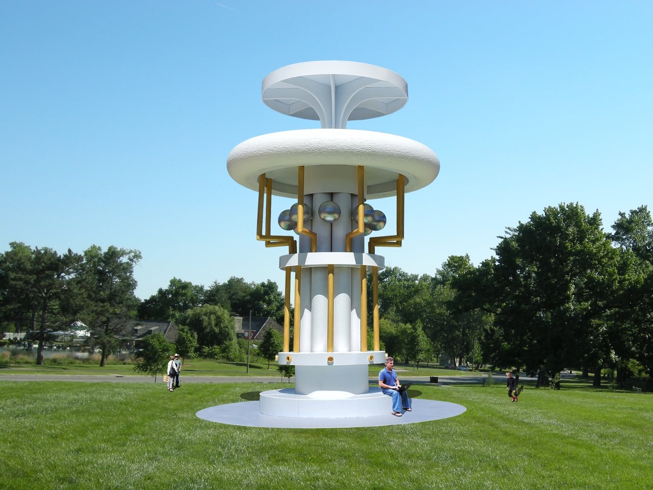
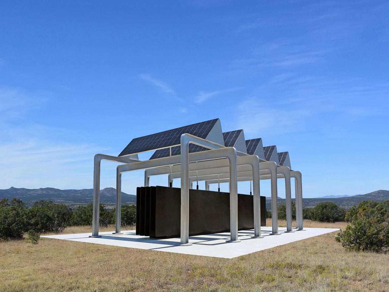
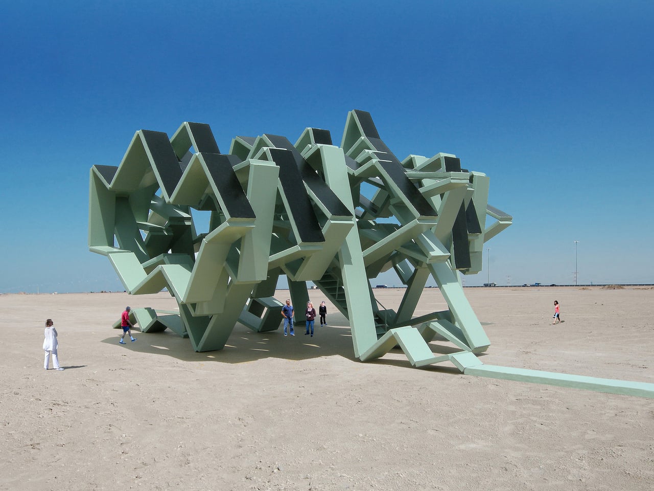
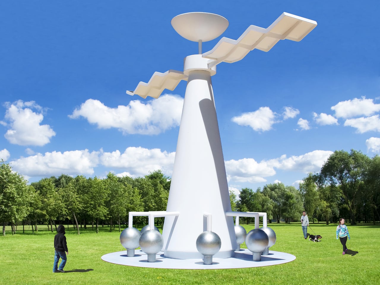
Santa Fe-based artist Michael Jantzen has spent years addressing exactly that through his Public Eco-Art Proposals. The series imagines a different kind of monument, one that doesn’t merely symbolize sustainability but actively practices it. Each proposal takes the form of a sculpture or pavilion that generates electricity from the sun or wind, collects rainwater, stores energy in batteries, and sometimes sends power into the local grid.

Designer: Michael Jantzen

Jantzen gives his work an aesthetic freedom that most utility-driven designs don’t have. Rather than concealing the mechanics, he treats solar panels, wind turbines, and structural frameworks as sculptural elements in their own right. The visual language is deliberately technological and mechanical, blurring the line between a functional energy structure and art worth stopping for.

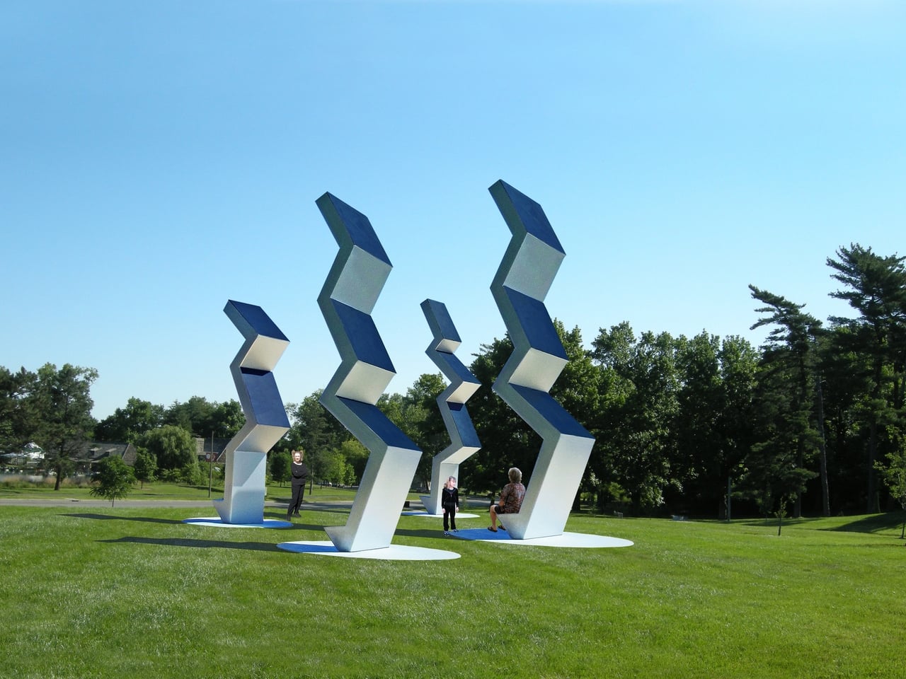
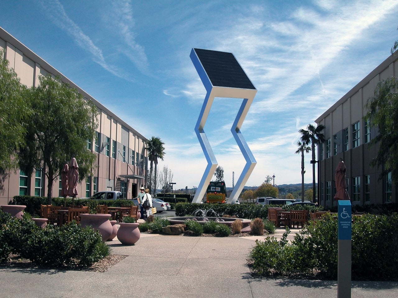
Walk through one of these proposed spaces, and you might find yourself beneath a pavilion whose curved solar canopy quietly feeds electricity back to the neighborhood. Or stop to look at a series of angular sculptures lined up across a park, their solar-panel tops tracking the light. What looks like a meditation on shape and form turns out to be a modest power station doing actual work.

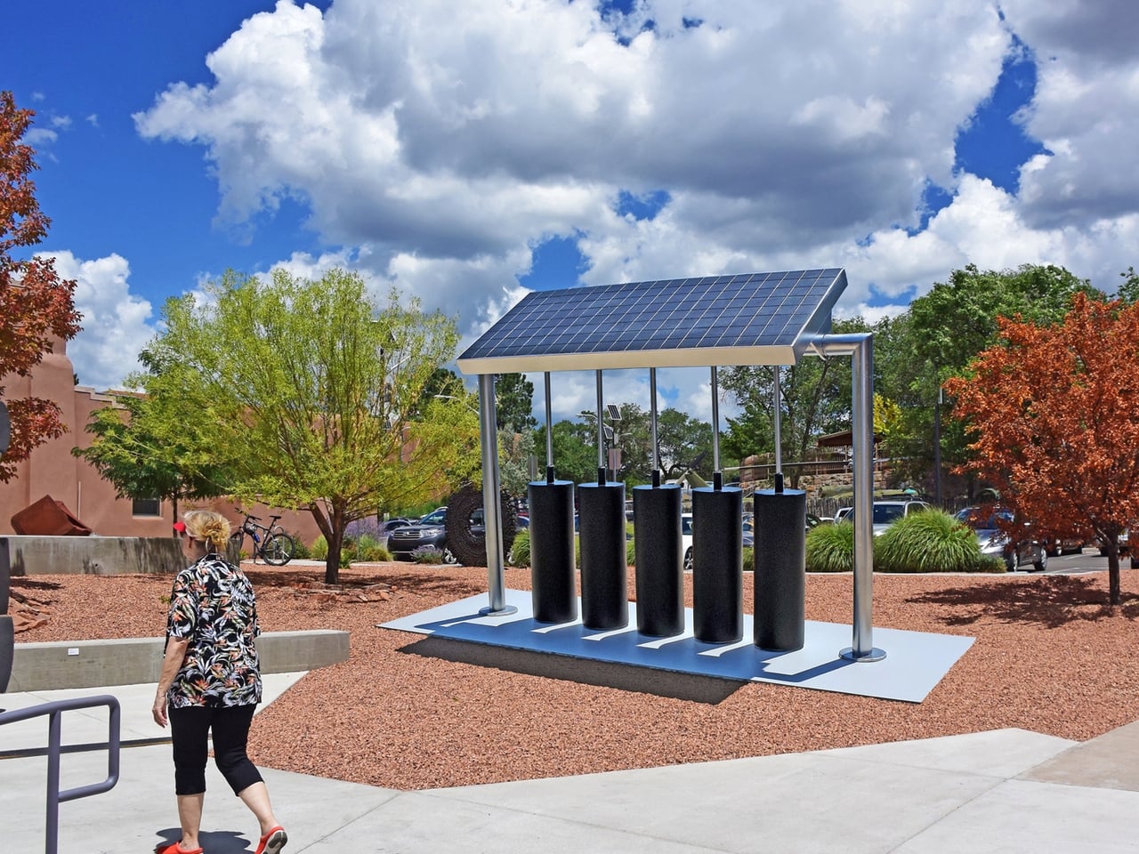
The proposals span a wide range of environments. Some are designed for open fields or public parks, while others imagine coastal settings with floating platforms supporting wind and water energy structures. A chevron-shaped sculpture with a solar panel at its angular peak stands in what appears to be a university courtyard. Another piece holds solar panels above cylindrical battery storage pods, blending the practical business of energy collection with an unexpectedly considered form.

This approach also reframes the relationship between art and urban infrastructure. Municipalities already commission sculptures for parks and plazas; so why shouldn’t those commissions do more? A solar-powered gathering space generates electricity, makes clean technology approachable, and sparks conversations among the millions of people who walk through it, most of whom would otherwise never engage with energy infrastructure at all.

Jantzen’s vision extends beyond any single installation. He imagines these structures placed in cities and parks worldwide, shifting how communities relate to the energy they consume by making that relationship visible and beautiful. For him, celebrating sustainability means building things worth caring about, giving clean energy a presence that people can gather around, the way they’ve always done with the landmarks that define a place.

The post What If City Monuments Generated Power Instead of Just Looking Good? first appeared on Yanko Design.

TRÆ Is the Timber Tower That Turns Waste Into Architecture

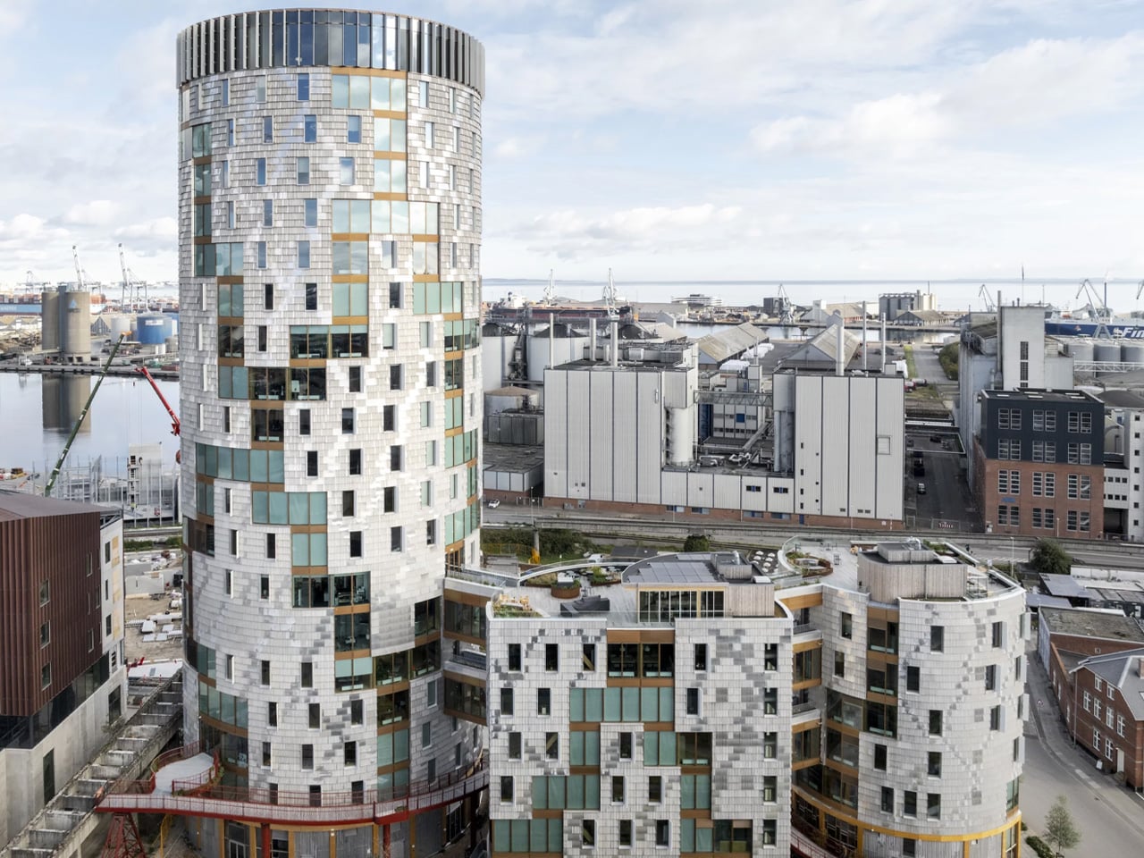
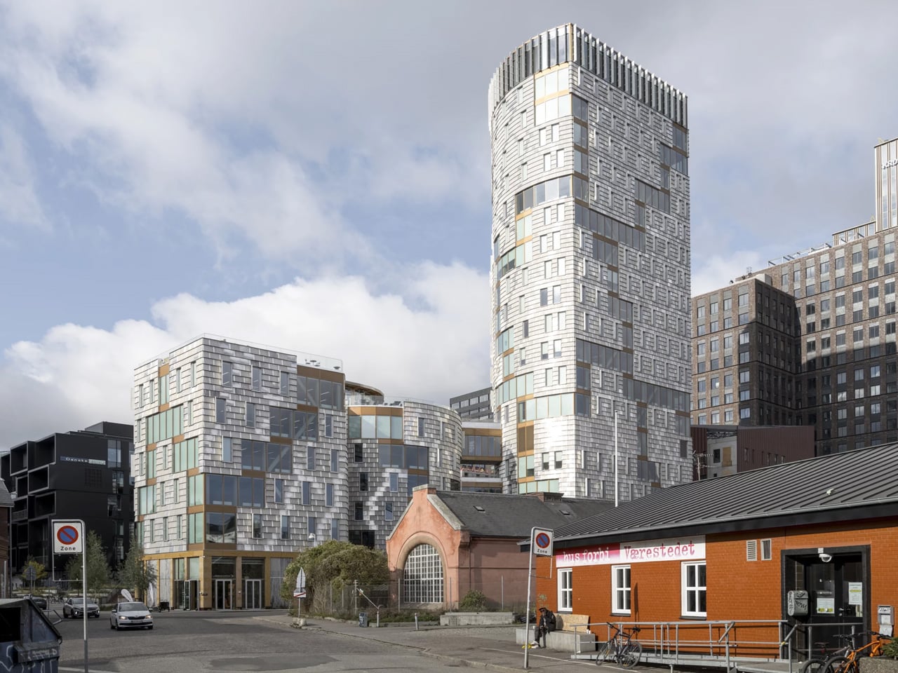
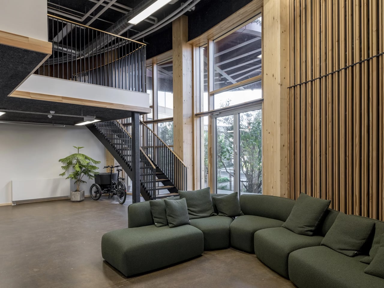
There’s a word in Danish, ‘træ’, that means three things at once: tree, timber, and three. It’s a fitting name for a building that refuses to be just one thing. Designed by Lendager and completed in Aarhus’ former industrial South Harbour, TRÆ stands 78 meters tall across three interconnected volumes, earning its place as Denmark’s tallest timber tower and the world’s first upcycle timber tower.

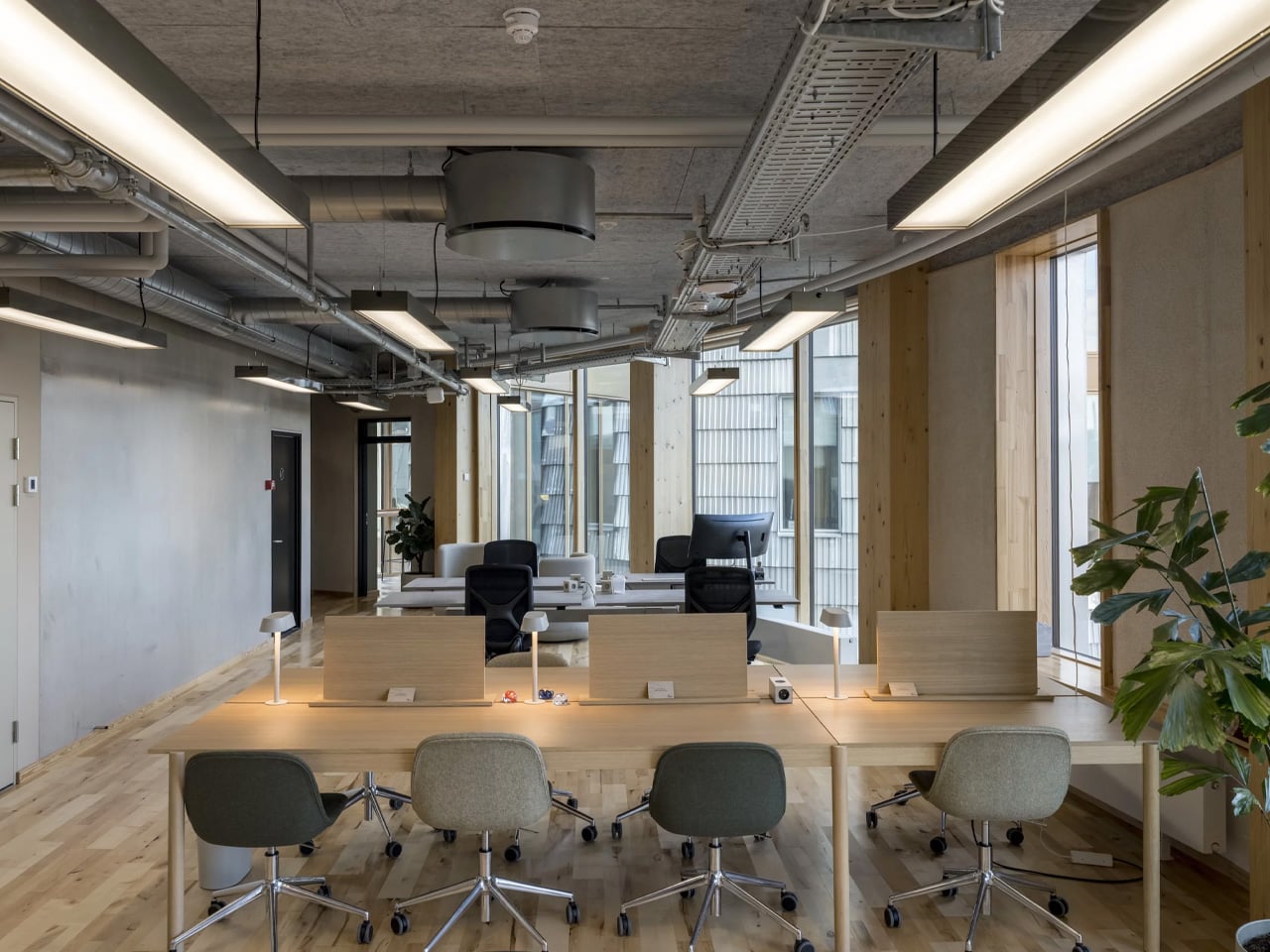
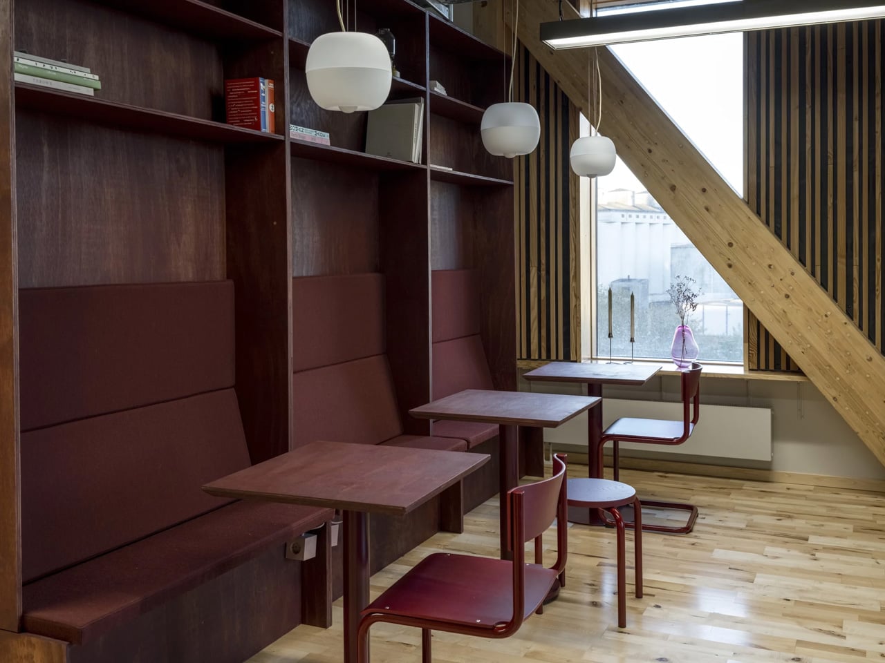
The ambition behind it is disarmingly simple: prove that a tower can be built from waste and wood without sacrificing safety, economy, or quality. What makes TRÆ remarkable isn’t just the height, it’s the conviction. The building operates within two material ecosystems simultaneously: the biogenic and the circular. Mass timber columns, cross bracing, and CLT floor slabs form the primary structure, with low-carbon concrete used only in the cores for fire safety and stability. Everything else is drawn from what already exists.

Designer: Lendager

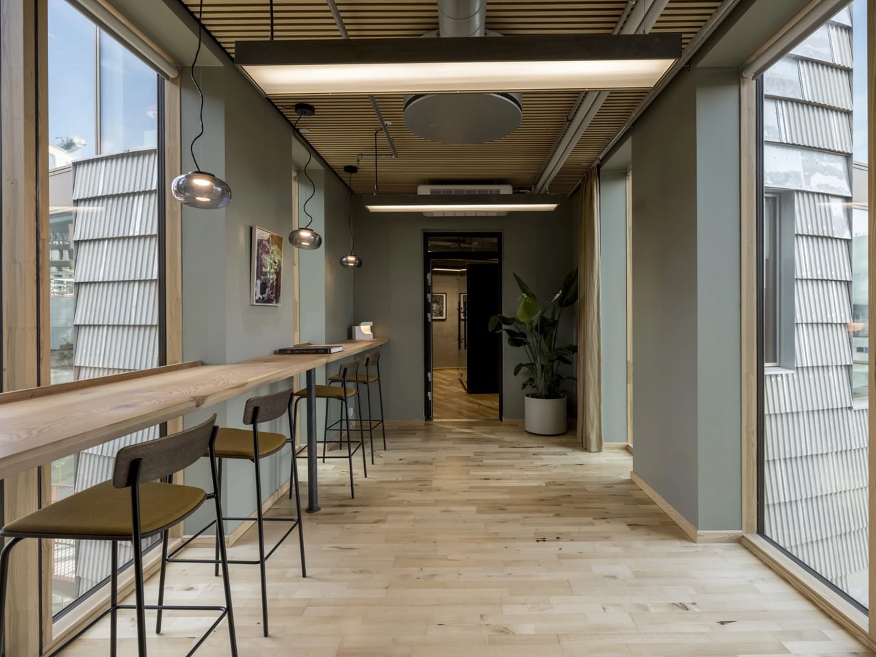
The façades are the project’s most striking argument. Salvaged aluminium sheets, arranged to evoke the texture of birch bark, mottled, imperfect, alive, clad the exterior in industrial leftovers that feel entirely intentional. Retired wind turbine blades, repurposed as solar shading, line the building’s south-facing elevations. A comparative analysis showed their estimated carbon footprint to be 27 times lower than conventional aluminium solar screens. The math is compelling. The aesthetic is better.

Measured against a conventional concrete benchmark, TRÆ achieved a 26 percent reduction in CO₂ emissions, 21 percent from the timber-led design and 5 percent from integrated reused materials. It’s a number that reshapes the conversation around tower construction, a typology long associated with emissions-heavy concrete and steel. The project doesn’t chase certification checklists. Instead, it follows a value-driven framework that prioritises measurable outcomes from the ground up.

The social dimension is just as deliberate. TRÆ houses a volunteer initiative providing daily meals to families in need, and involves homeless people in the building’s upkeep, folding existing social realities directly into the life of the building. An undulating pedestrian bridge, starting at street level, snakes upward to connect TRÆ to Aarhus’ new highline, threading the tower into the city rather than above it.

The Aarhus Architecture Awards jury awarded TRÆ Best Building in 2025, noting that it “does not necessarily adhere to a classic architectural or beauty ideal” but stands as “an energetic reckoning with well-tested solutions and zero-error culture.” That’s exactly the point. TRÆ isn’t trying to be perfect. It’s trying to be right.

The post TRÆ Is the Timber Tower That Turns Waste Into Architecture first appeared on Yanko Design.

Slide, Spiral, Learn: Bernard Tschumi Completes a Science Centre Built on Motion

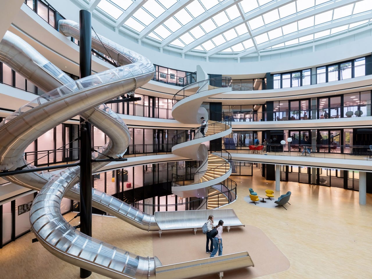
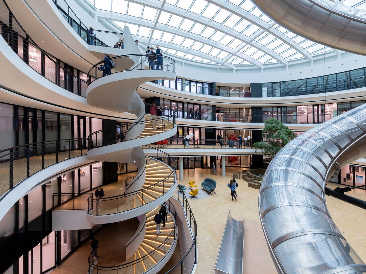
A science centre that asks students to slide between floors is either a gimmick or a statement. At Institut Le Rosey, it’s unmistakably the latter. Philo, the newly completed science and innovation centre by Bernard Tschumi Architects in Rolle, near Geneva, brings that idea to life with an architectural precision that feels entirely intentional.

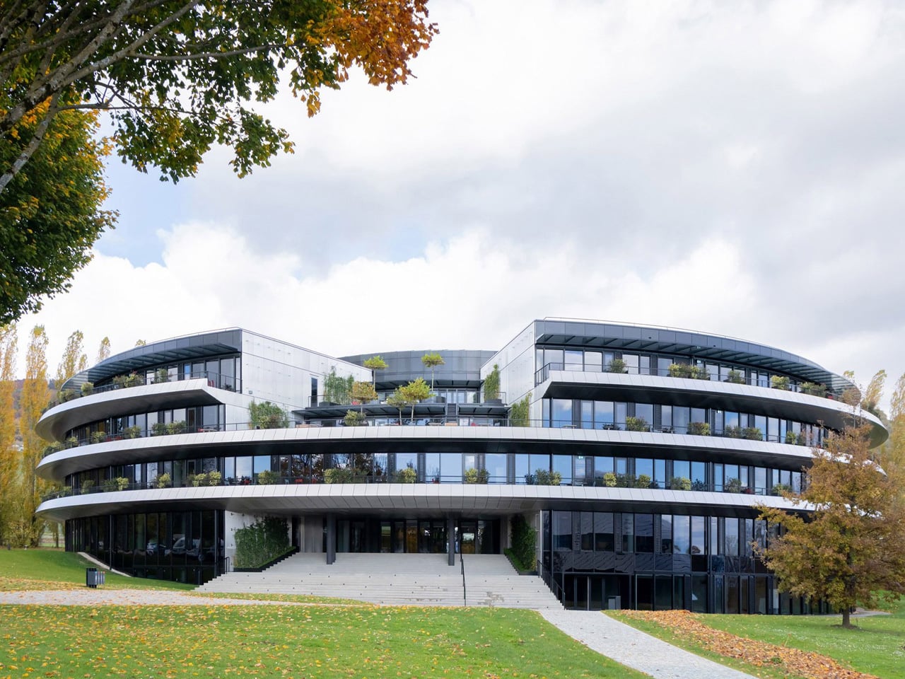
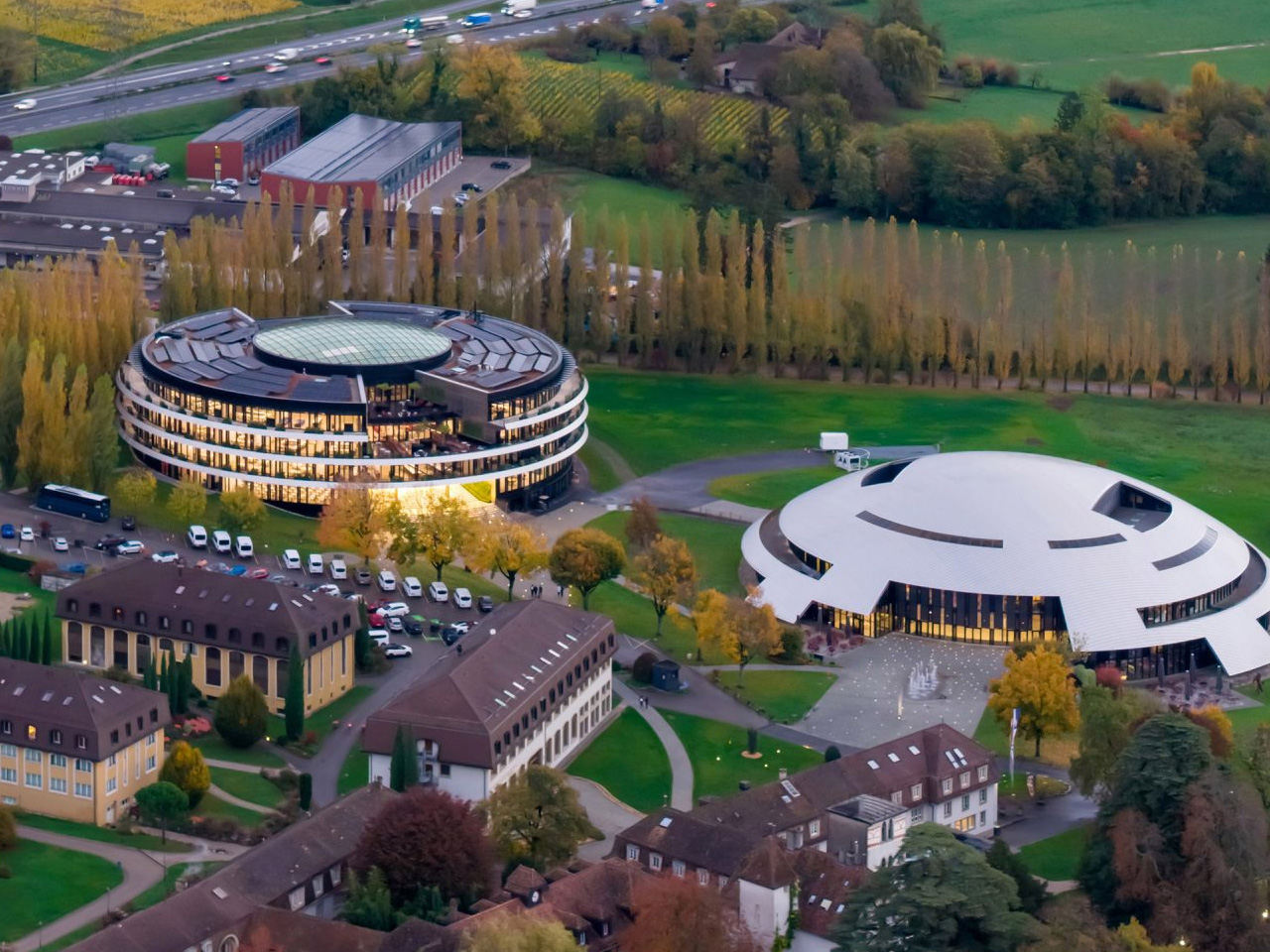
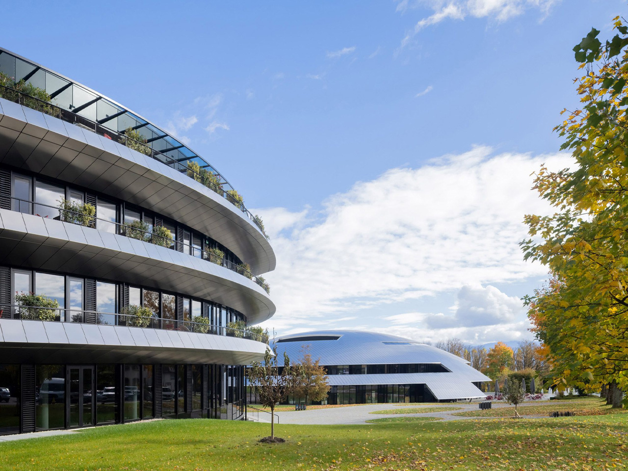
The building, which took shape between 2019 and 2025, sits on the campus of one of Switzerland’s most prestigious international boarding schools, right alongside Carnal Hall, the metal-domed music venue Tschumi completed for the same institution back in 2014. Where Carnal Hall curves inward with acoustic purpose, Philo opens up — a ring-shaped structure five storeys tall, wrapping itself around a grand central atrium that functions less like a corridor and more like a covered public square.

Designer: Bernard Tschumi Architects

That atrium is the building’s beating heart. Three concentric walkways surround it, and vertical and horizontal circulation paths cut through the space, generating constant movement. Helical slides thread through the interior alongside the sculptural spiral staircase, turning the everyday act of moving between floors into something worth doing. It sounds playful — and it is —, but it’s also deeply considered. Tschumi has spent decades arguing that architecture only comes alive through movement and event, and Philo reads like a direct translation of that thinking into built form.

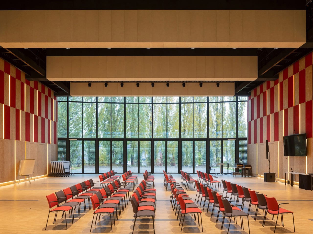
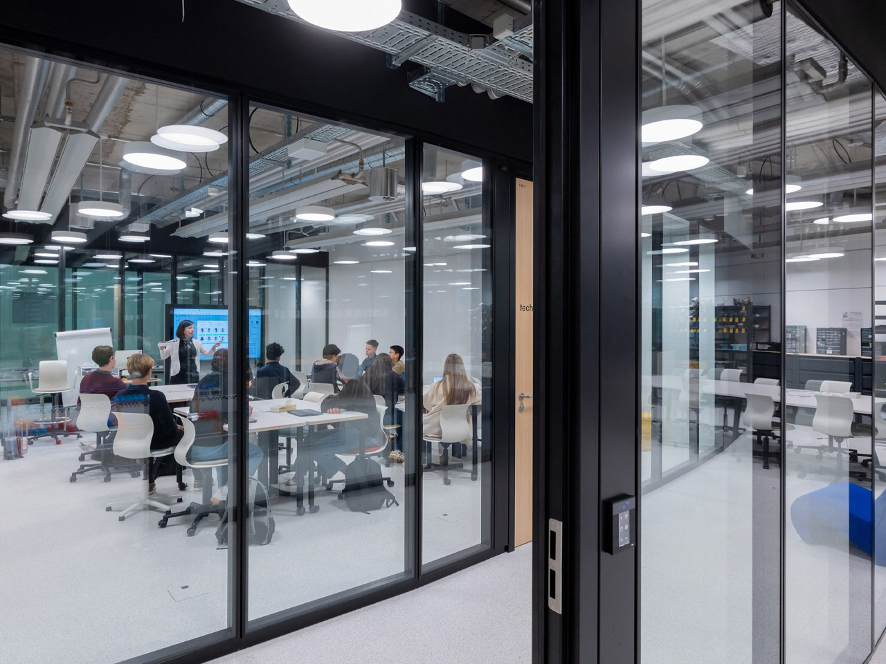
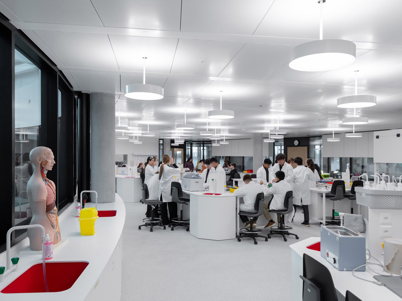
The programme inside is built around student innovation. Philo houses a Fabrication Lab, a Start-up Incubator Space, and a Pitch Room — a flexible rectangular space that can be reconfigured for presentations or performances. Classrooms and laboratories fill the remaining floors, all oriented around the central void. The result is a building that doesn’t separate learning from making, or thinking from doing. Every space feels connected, both literally and conceptually.

Externally, the ring form gives Philo a strong presence on campus without overpowering it. The circular geometry creates a clear dialogue with Carnal Hall’s dome, establishing a coherent architectural language across two very different building types. Aerial photography by Iwan Baan captures just how deliberately the two structures have been positioned — companions on a campus that now has a genuine architectural identity.

Philo isn’t trying to reinvent education. What it does, with impressive restraint, is create the conditions for a different kind of learning — one built on movement, collision, and chance encounter. For a studio whose founder once wrote that there is no architecture without events, it’s a building that lives up to the theory.

The post Slide, Spiral, Learn: Bernard Tschumi Completes a Science Centre Built on Motion first appeared on Yanko Design.

This House in Rural India Is Actually a Bridge — and It’s Covered in Scales

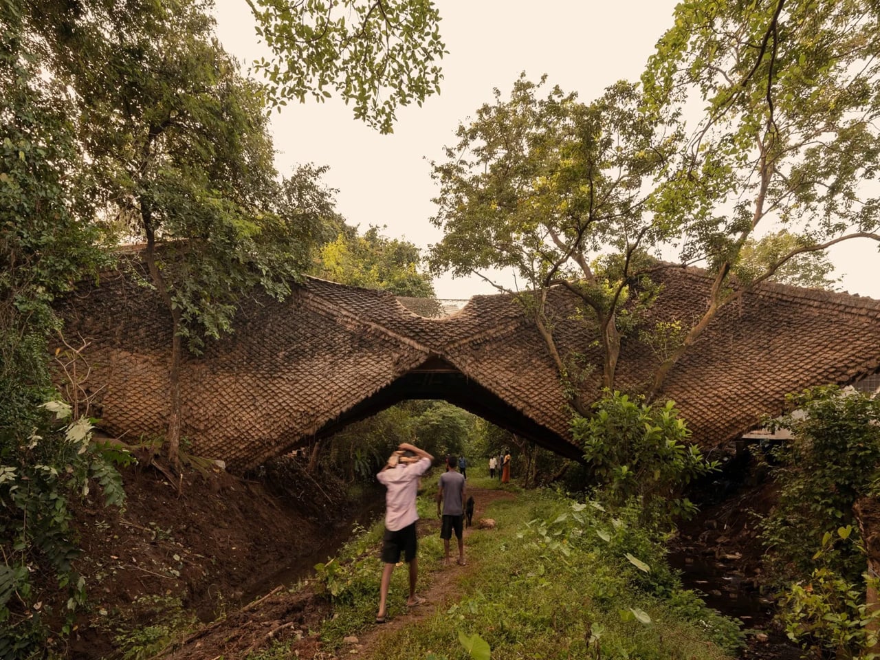
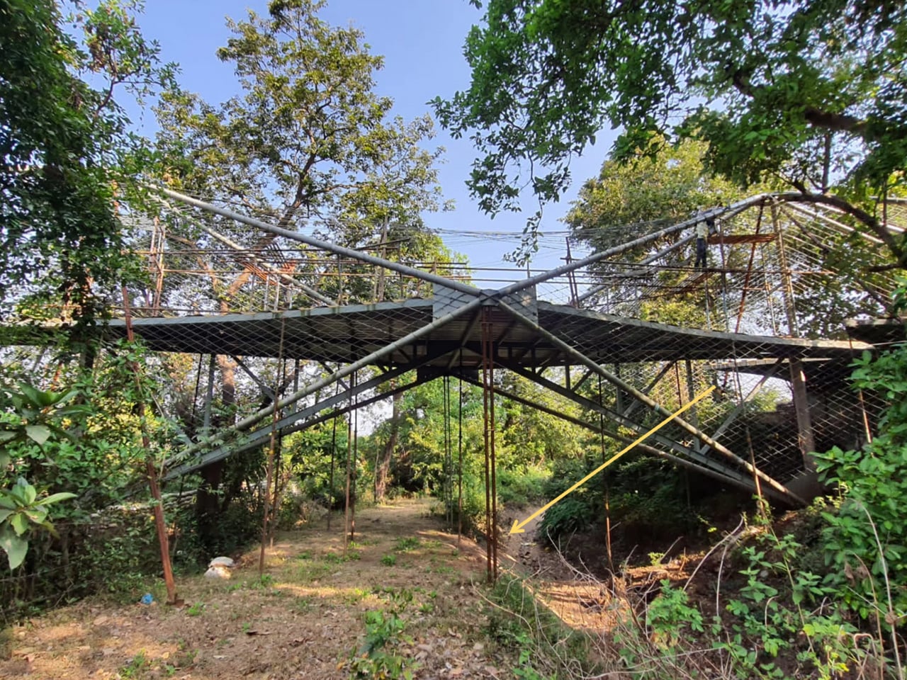
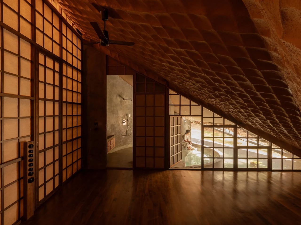
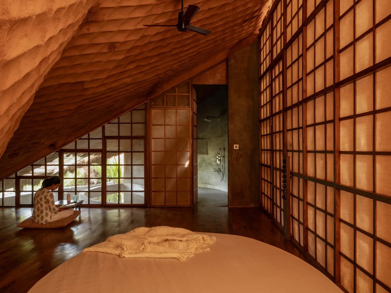
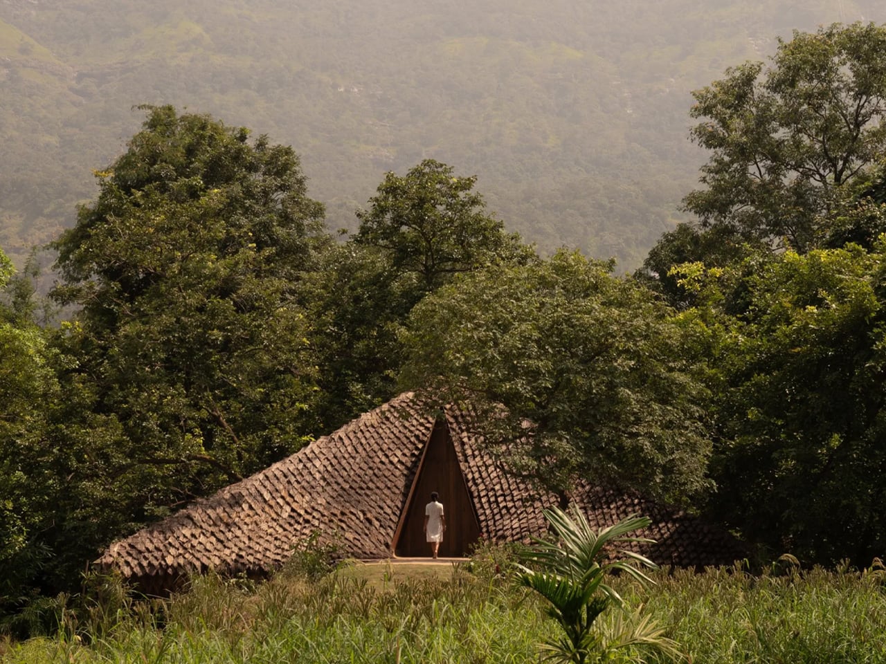
Most architects would see a seven-metre-deep gorge cutting through a site and call it a problem. Vinu Daniel and his studio, Wallmakers, looked at it and saw the house. The Bridge House in Karjat, Maharashtra, is exactly what its name promises — a weekend home that spans a 30-metre-wide spillway, with enough clearance below for diggers to pass through. Completed in 2025, the 4,500-square-foot structure sits across two parcels of land separated by two streams, and it does so with a quiet, almost organic confidence.

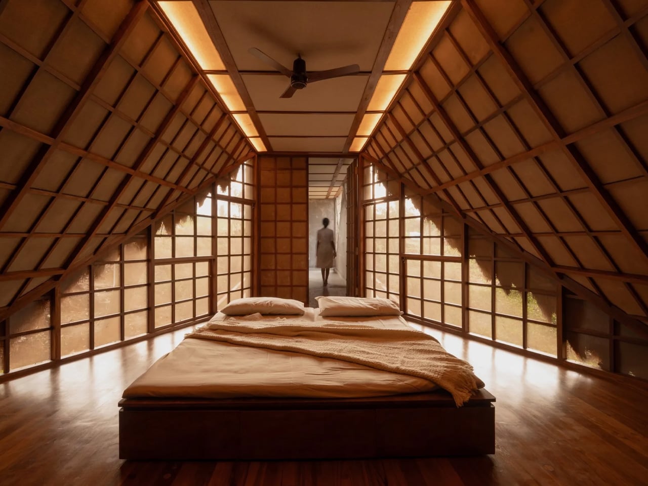
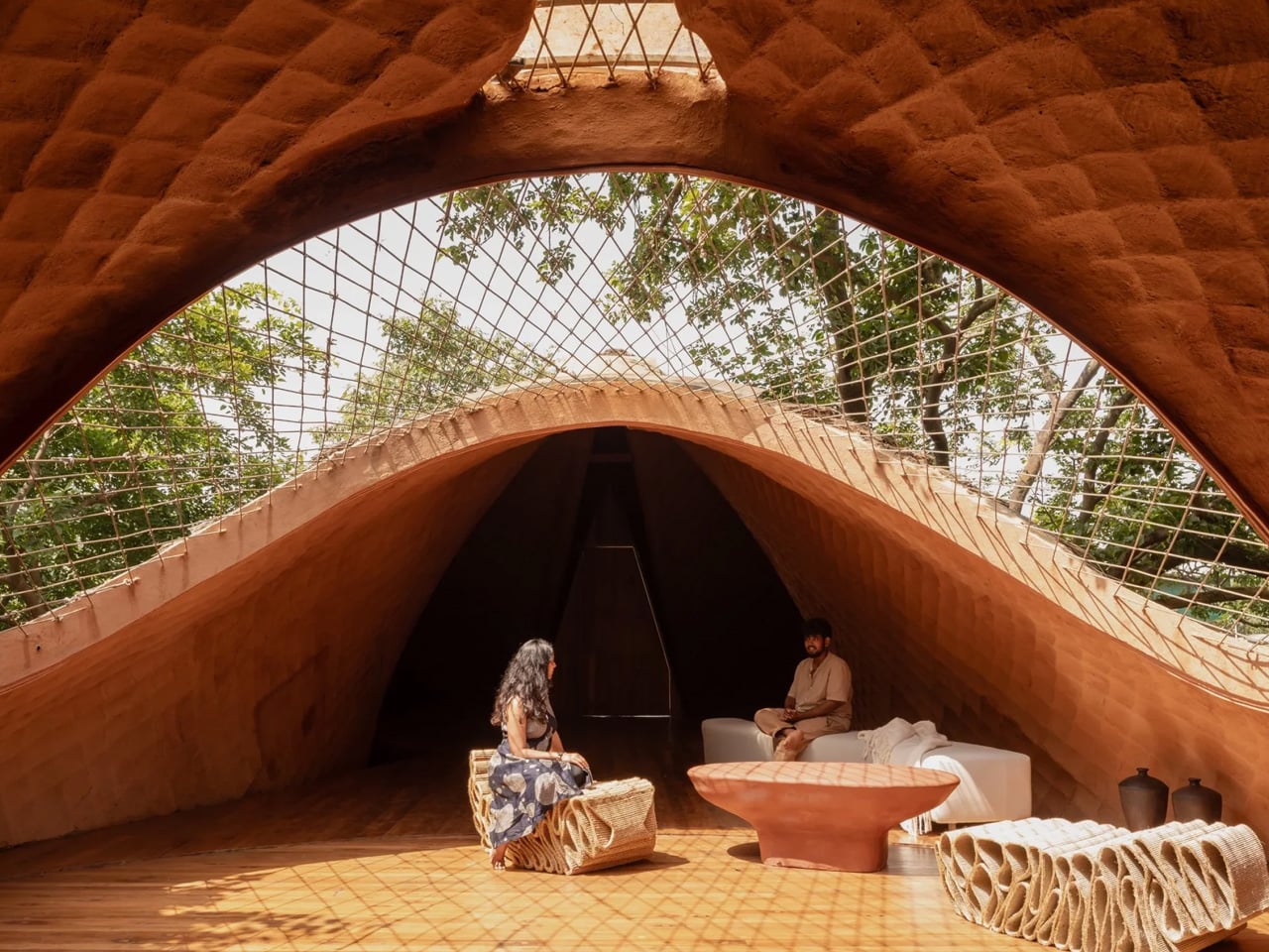
The structural logic is deceptively simple. Four hyperbolic parabolas form the spine of the suspension bridge, held together by minimal steel pipe and tendons working in tension. Over that skeleton, a grid of steel cables was laid out in a twisting hyperbolic paraboloid surface, then coated in a layer of mud — the same material Wallmakers has long treated as a primary architectural medium. The mud isn’t decorative. It provides the compressive strength that stabilises the entire bridge and acts as a barrier against the pests that typically undermine thatched construction.

Designer: Wallmakers

And then there’s the skin. The outer layer is local grass thatch, applied in overlapping scales that give the structure a texture closer to a living creature than a building. The resemblance to a pangolin is intentional. “Thatched roof construction, even though sustainable and thermally efficient, has been on the decline due to problems like pest invasion, lack of skilled labour, deforestation, and the hassle of constant reapplication,” Daniel noted. The mud-thatch composite here attempts to address exactly those failures — rethinking the material from the inside out rather than simply reviving a tradition.

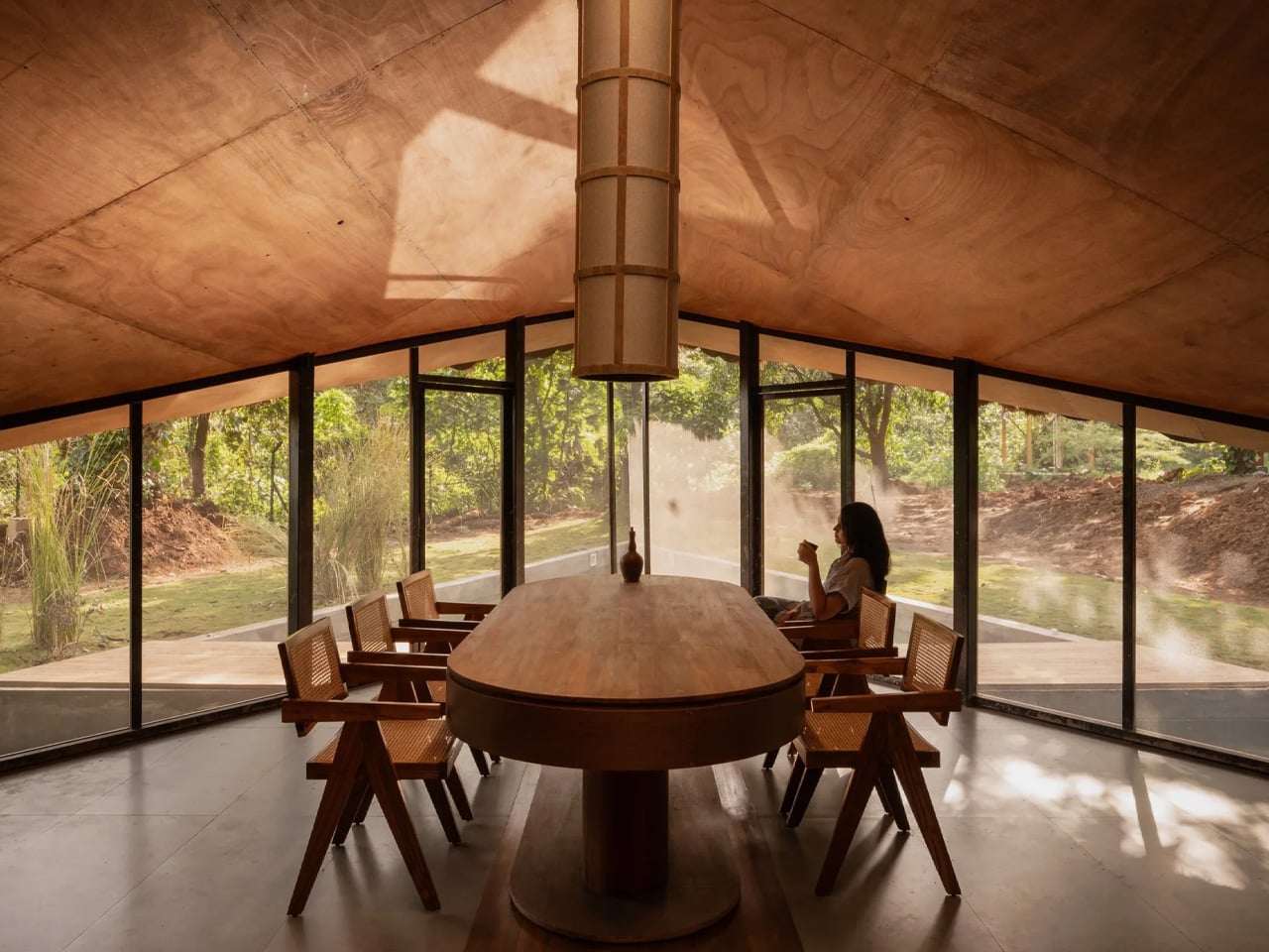
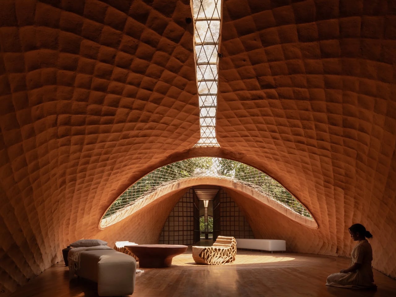
Getting materials to the site was its own challenge. The remote location in Karjat pushed the team toward using what was available locally, which ultimately shaped the entire material palette. The result is a building that feels pulled from the landscape rather than dropped into it. Translucent screens and raw mud surfaces define the interiors, keeping the atmosphere spare and tactile. The design team — Preksha Shah and Ramika Gupta — worked within tight constraints that only tightened the design thinking.

Bridge House is the kind of project that makes the site’s difficulties readable in the finished form. The gorge isn’t hidden; it’s the reason the house exists at all. That honesty — structural, material, spatial — is what makes Wallmakers’ work consistently worth paying attention to.

The post This House in Rural India Is Actually a Bridge — and It’s Covered in Scales first appeared on Yanko Design.

San Diego Is Getting One of the Most Ambitious Military Museums in America

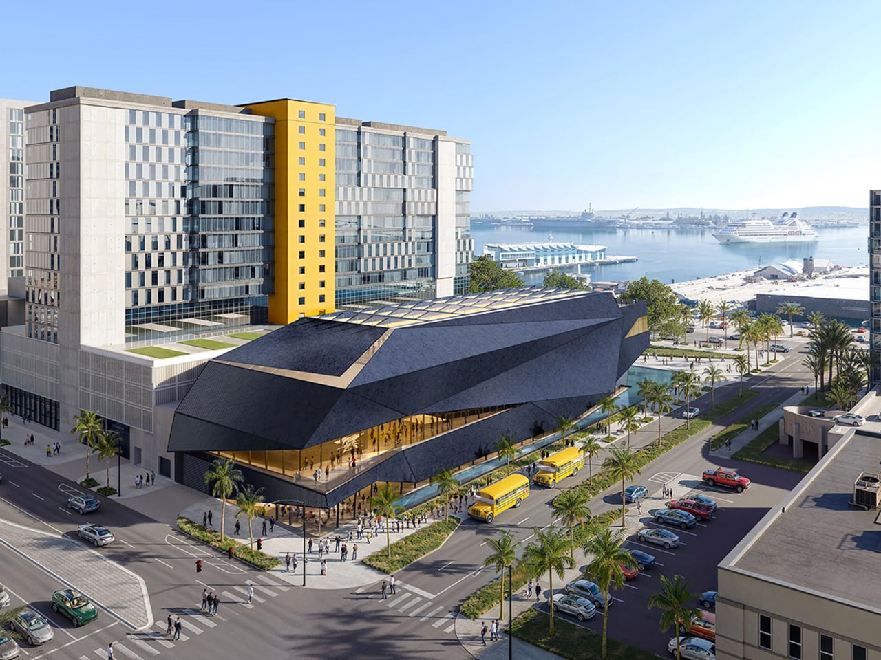
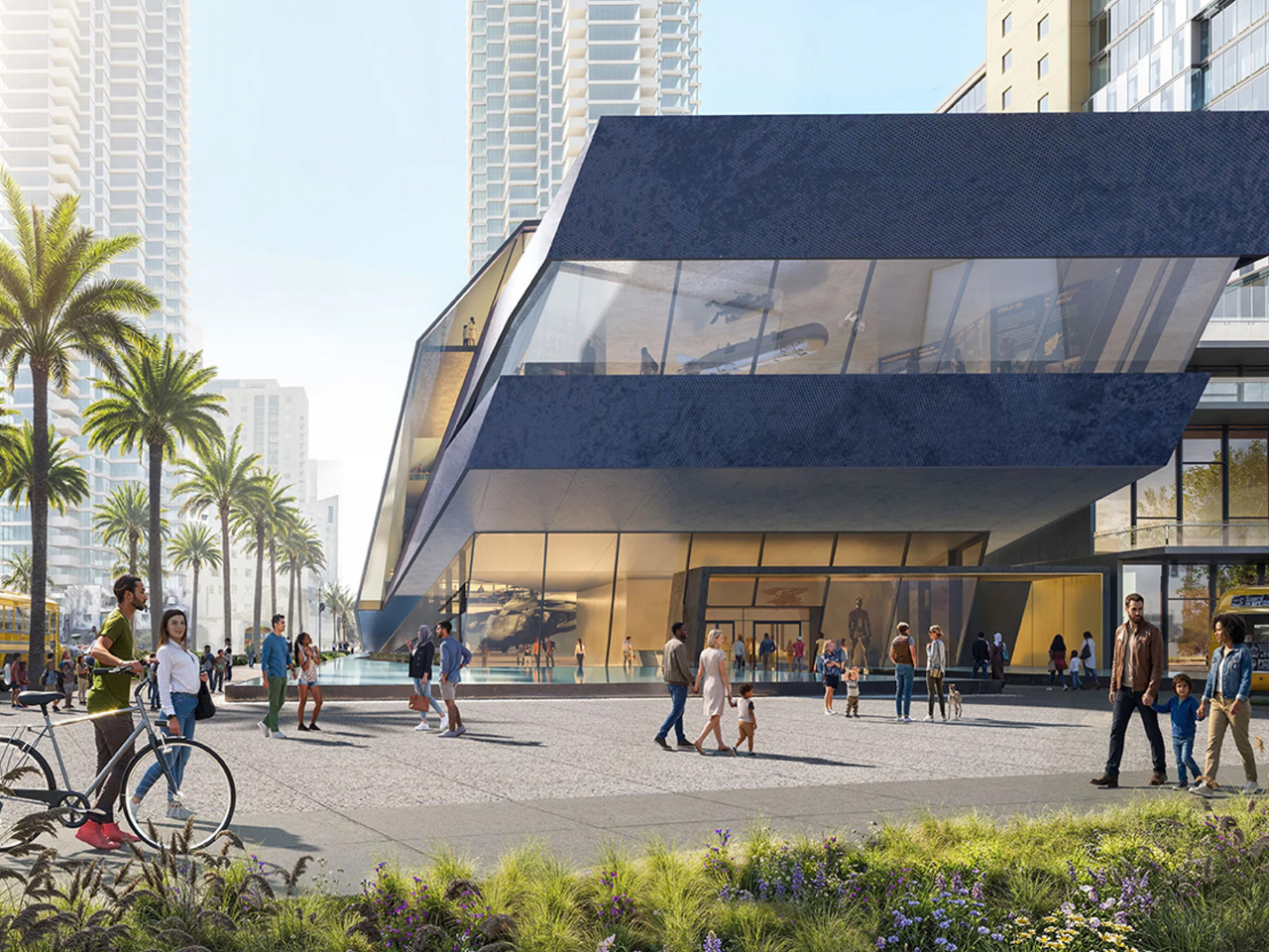
Contemporary angular building with a glass façade, as people walk and gather in a sunny plaza in front of it.

San Diego has always had a deep, unspoken bond with the U.S. Navy. The city is home to one of the largest military concentrations in the country, and just across the bay in Coronado, every Navy SEAL is forged. So when the Navy SEAL Museum San Diego opened its doors on October 4, 2025, at 1001 Kettner Blvd, steps from the Embarcadero, it felt less like a ribbon cutting and more like a homecoming. But that was just the beginning.

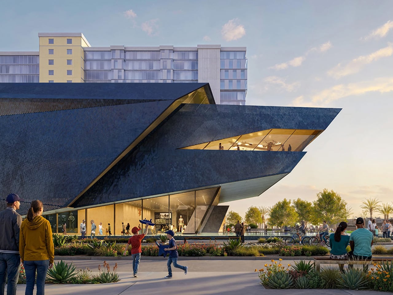
In April 2026, the Port of San Diego Board of Commissioners voted unanimously to advance an environmental review for a far more ambitious vision: a striking, $256 million, four-story, 85,000-square-foot flagship museum at 1220 Pacific Highway, positioned at the northern edge of Lane Field Park along Harbor Drive. The vote was unanimous, and the enthusiasm in the room was hard to miss. “I predict that this is going to be the No. 1 museum in San Diego,” said Commissioner Frank Urtasun. “That design that you came up with is unbelievable. I love it.”

Designer: ZGF Architects

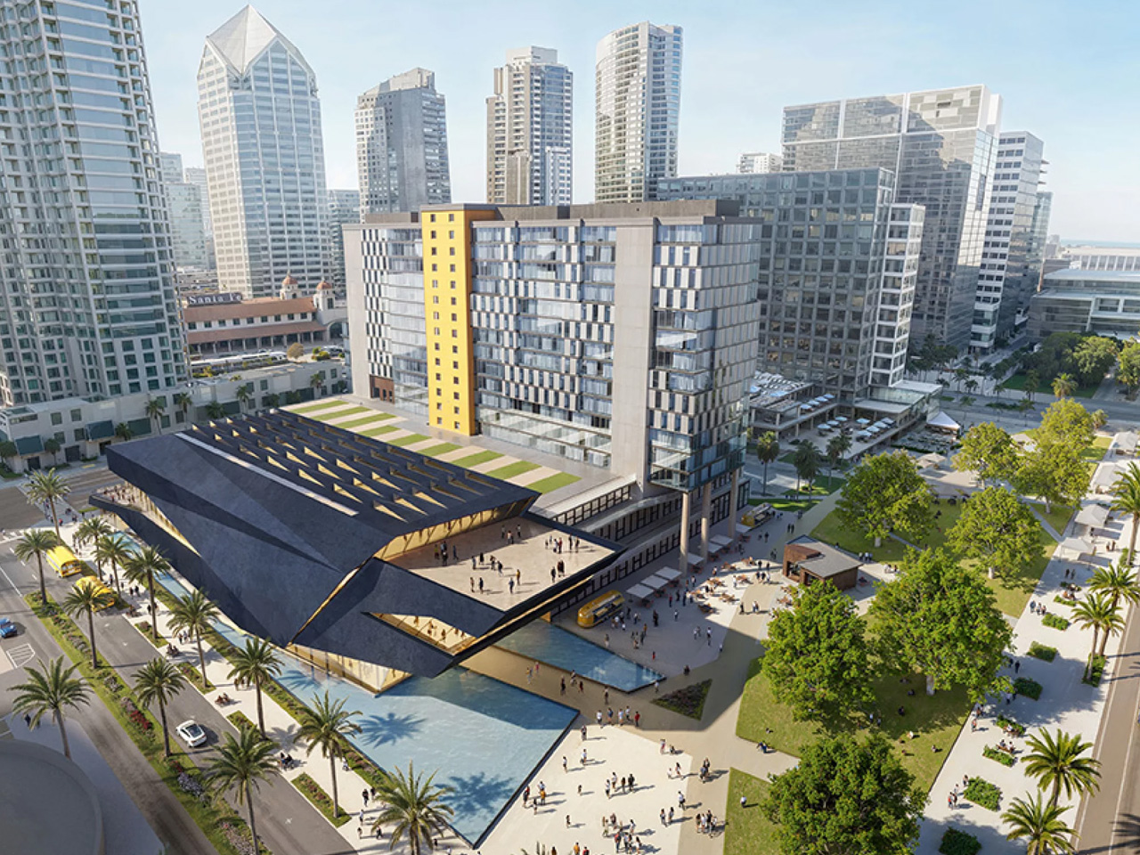
Modern waterfront complex with an angular dark-blue building, glass office tower with a yellow column, palm trees, and ships in the harbor.

The design, by US-based ZGF Architects, is nothing short of striking. The structure draws direct inspiration from stealth watercraft used by maritime special forces, with angular massing and faceted metal surfaces that give it the appearance of a futuristic ship cutting through open water. Perforated metallic panels will filter natural light into the interior, where immersive, technology-forward exhibits designed by Gallagher & Associates will bring the history of the SEALs to life across seven distinct galleries.

The proposed museum would also include a 2,500-square-foot theater, virtual reality environments, a youth education space, a café, retail, an event terrace overlooking San Diego Bay, and a new 150-foot public park that would complete Lane Field Park along Harbor Drive. The project is being developed in partnership with Hensel Phelps, which will oversee design, entitlement, construction, and completion.

The museum is part of the nonprofit UDT-SEAL Museum Association, the same organization behind the original Navy SEAL Museum in Fort Pierce, Florida, which has been operating since 1985. San Diego’s location was chosen deliberately, sitting just across the bay from Naval Special Warfare Command in Coronado, where all Navy SEALs train. The city draws more than 30 million visitors annually, placing it alongside cultural neighbors like the USS Midway Museum and the Maritime Museum of San Diego.

The California Environmental Quality Act review is expected to take roughly a year and a half before construction timelines are confirmed. But the direction is clear. San Diego is building something that honors the past and commands the waterfront for generations to come.

The post San Diego Is Getting One of the Most Ambitious Military Museums in America first appeared on Yanko Design.

This Tiny Home Has No Loft, No Stairs, and Honestly No Compromises

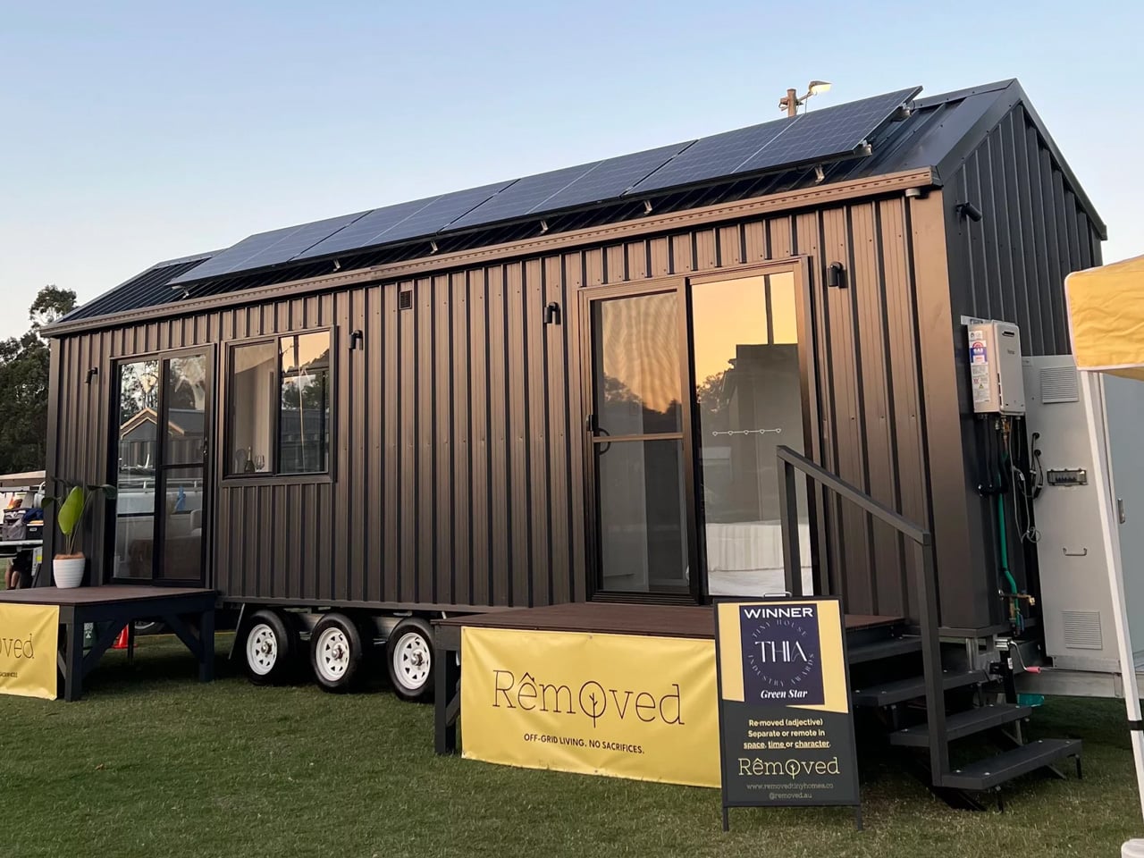
Most tiny homes play the same card — stack a loft above everything, make it work. Removed Tiny Homes had a different idea. Their flagship model, the Tallebudgera, skips the ladder entirely, landing on a single-floor layout that feels less like a workaround and more like a deliberate design choice. It’s a tiny home built for the way people actually want to live.

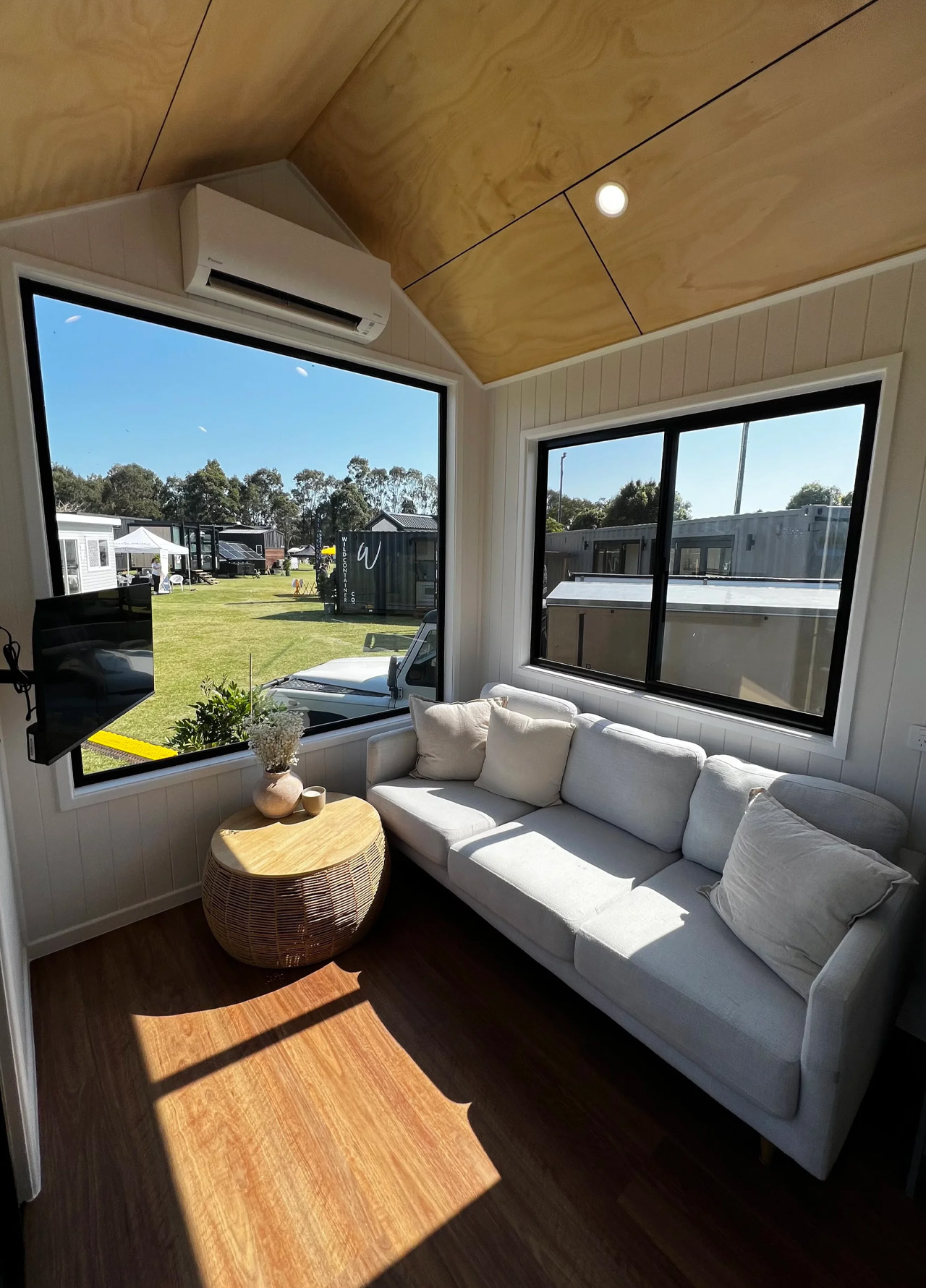
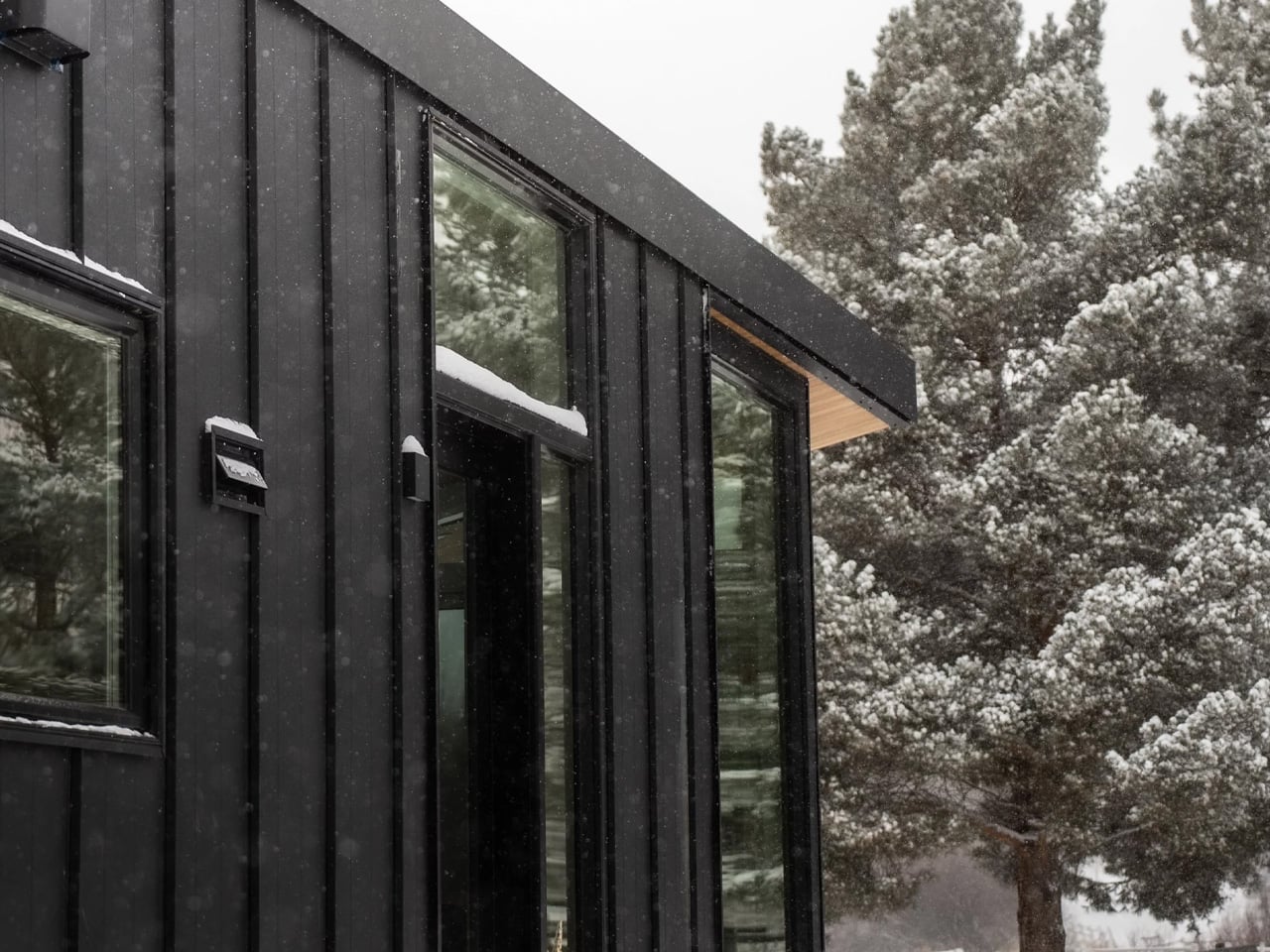
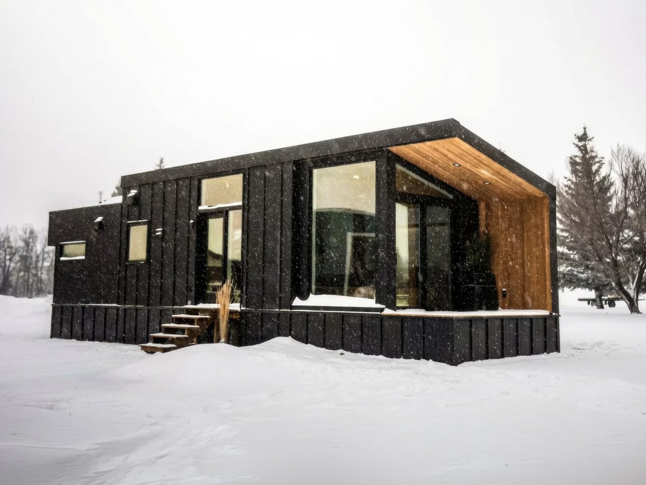
Named after a creek on Queensland’s Gold Coast, the Tallebudgera sits on a triple-axle trailer and wraps itself in Colorbond steel roofing and wall cladding, punctuated by plywood feature panels that give it warmth without trying too hard. A sliding glass door and a generous run of windows pull in natural light and airflow, making the interior feel far bigger than its footprint on paper. The 9.6 model measures 29.5 feet long and 7.8 feet wide — compact enough to travel, generous enough to live in.

Designer: Removed Tiny Homes

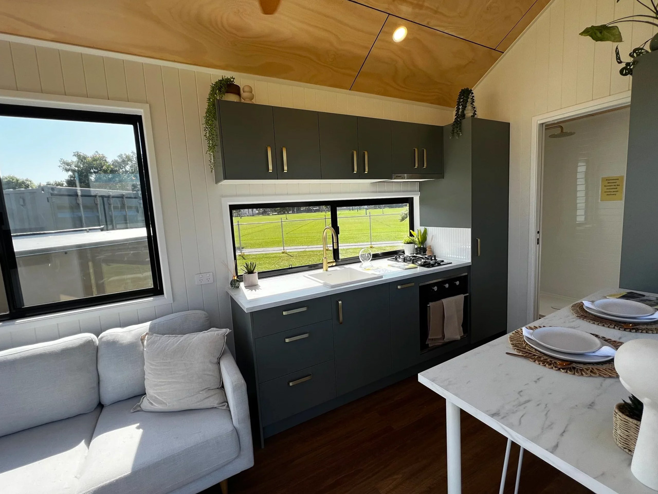
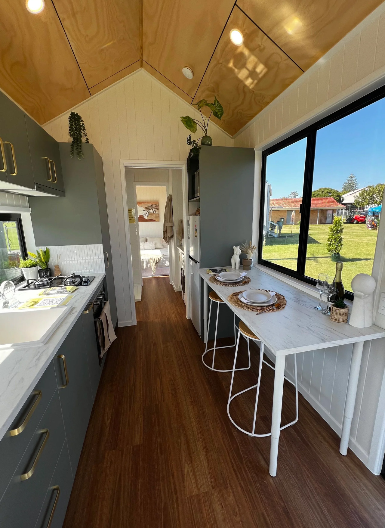
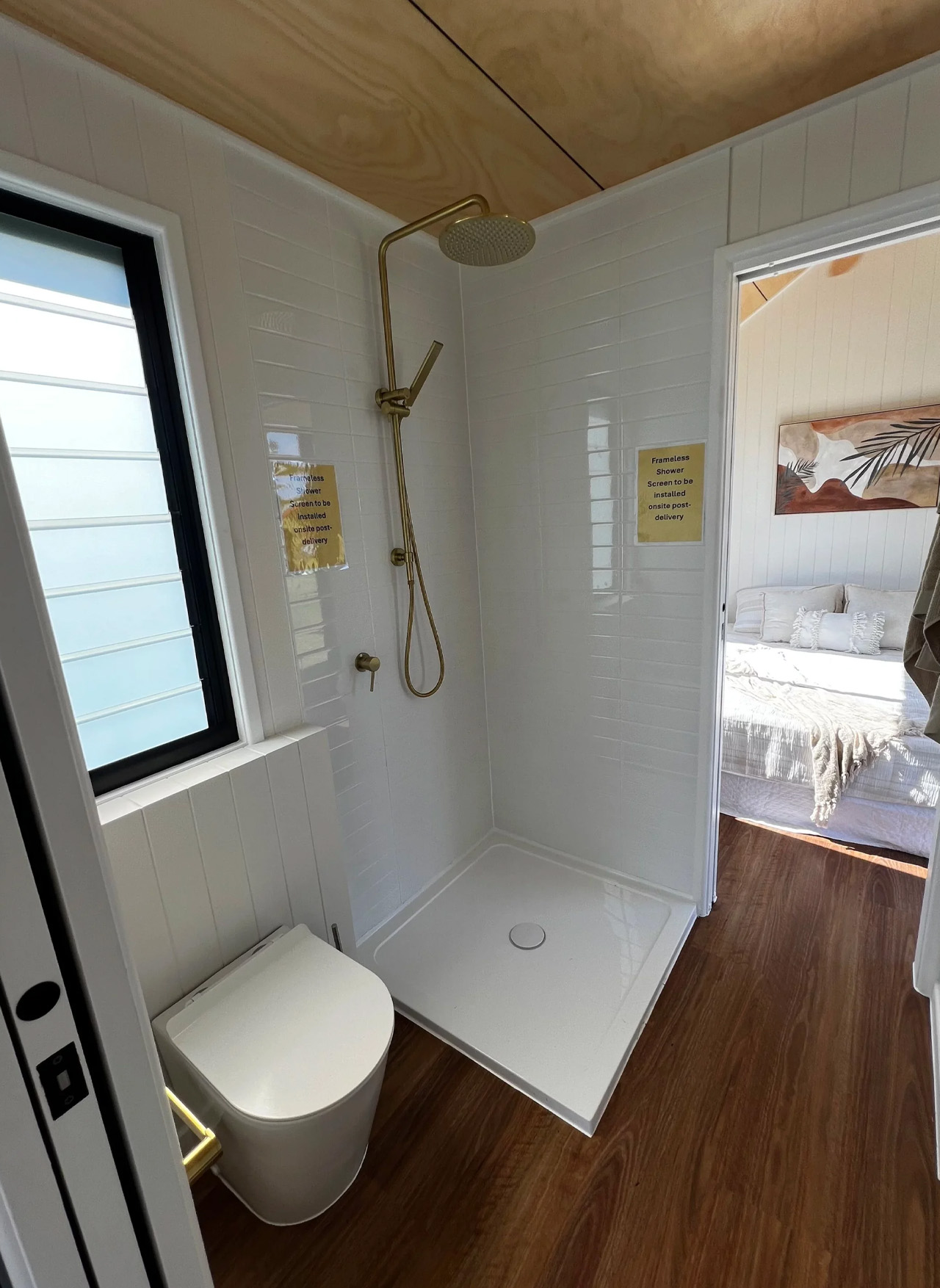
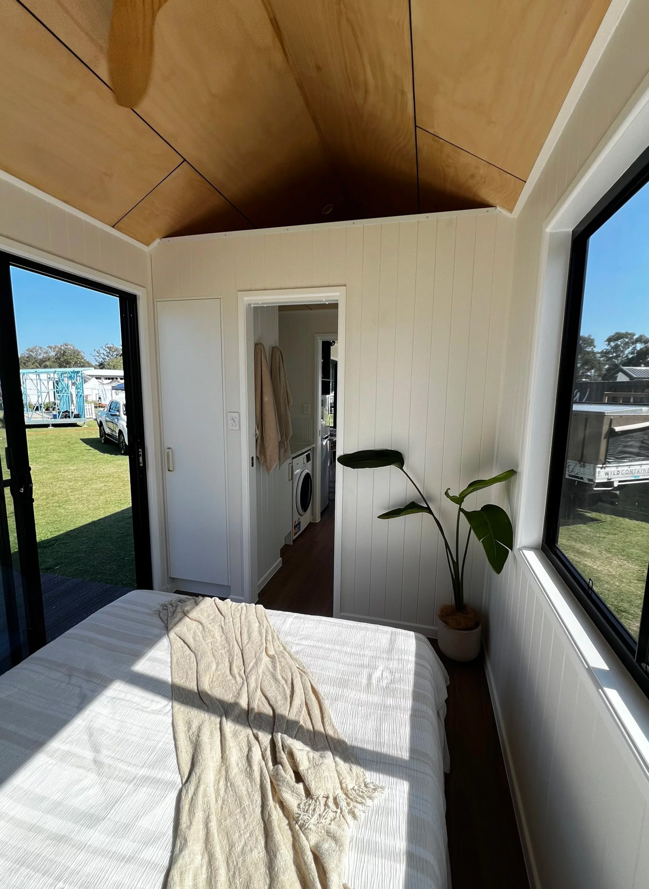
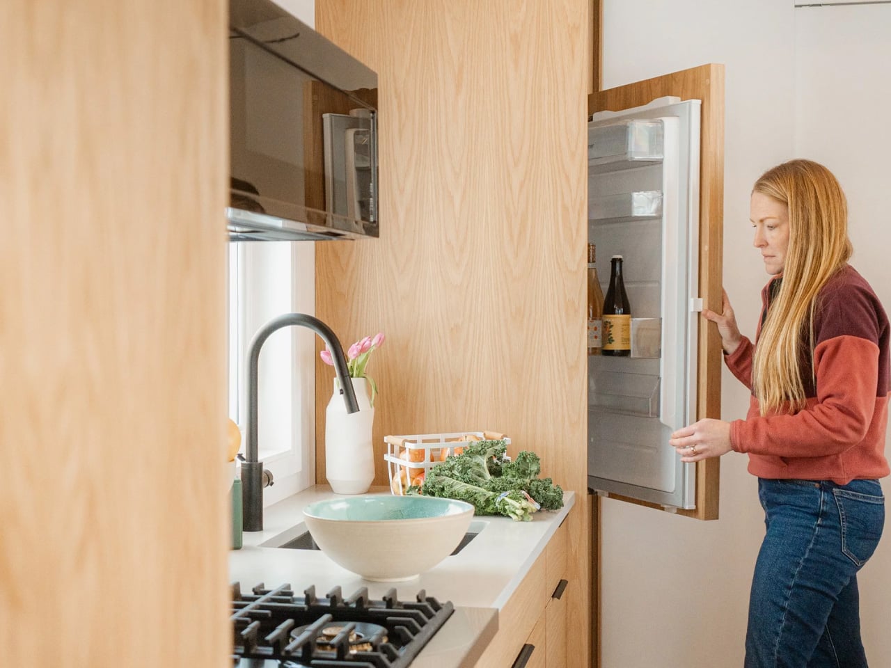
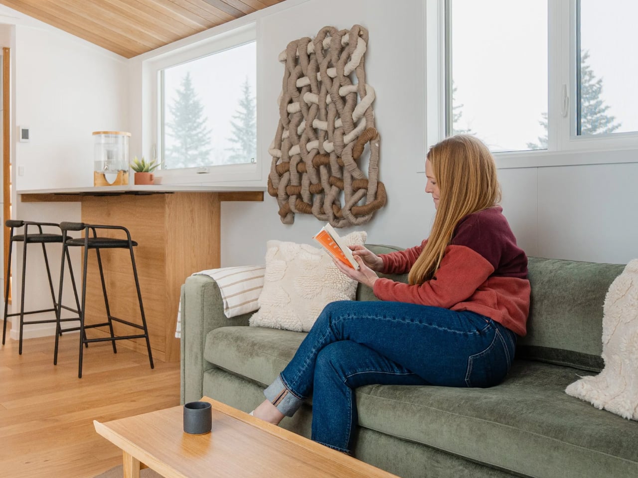
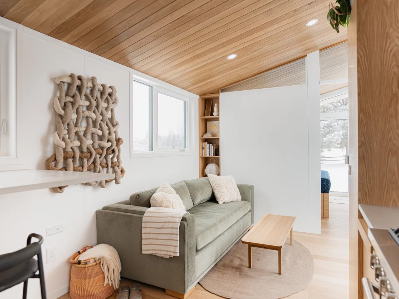
Step inside, and the interior doesn’t feel like a compromise. Tongue-and-groove wall panels pair with a plywood ceiling and vinyl flooring to build a palette that’s grounded and considered. The living area makes room for a full sofa and wall-mounted TV, while the kitchen rolls out a breakfast bar that doubles as a dining space — the kind of layout that makes a single room feel like two. There’s nothing gratuitous here. Every surface earns its place.

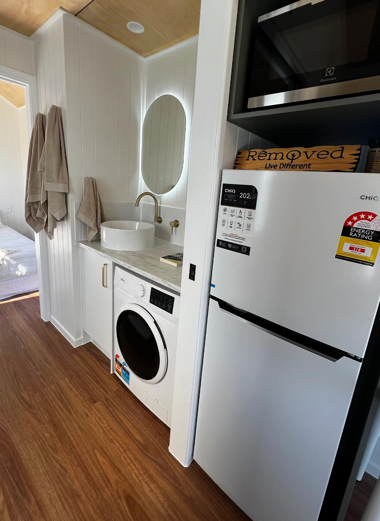
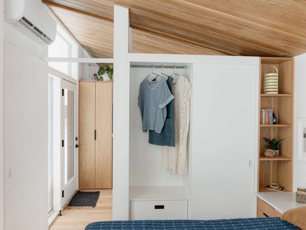
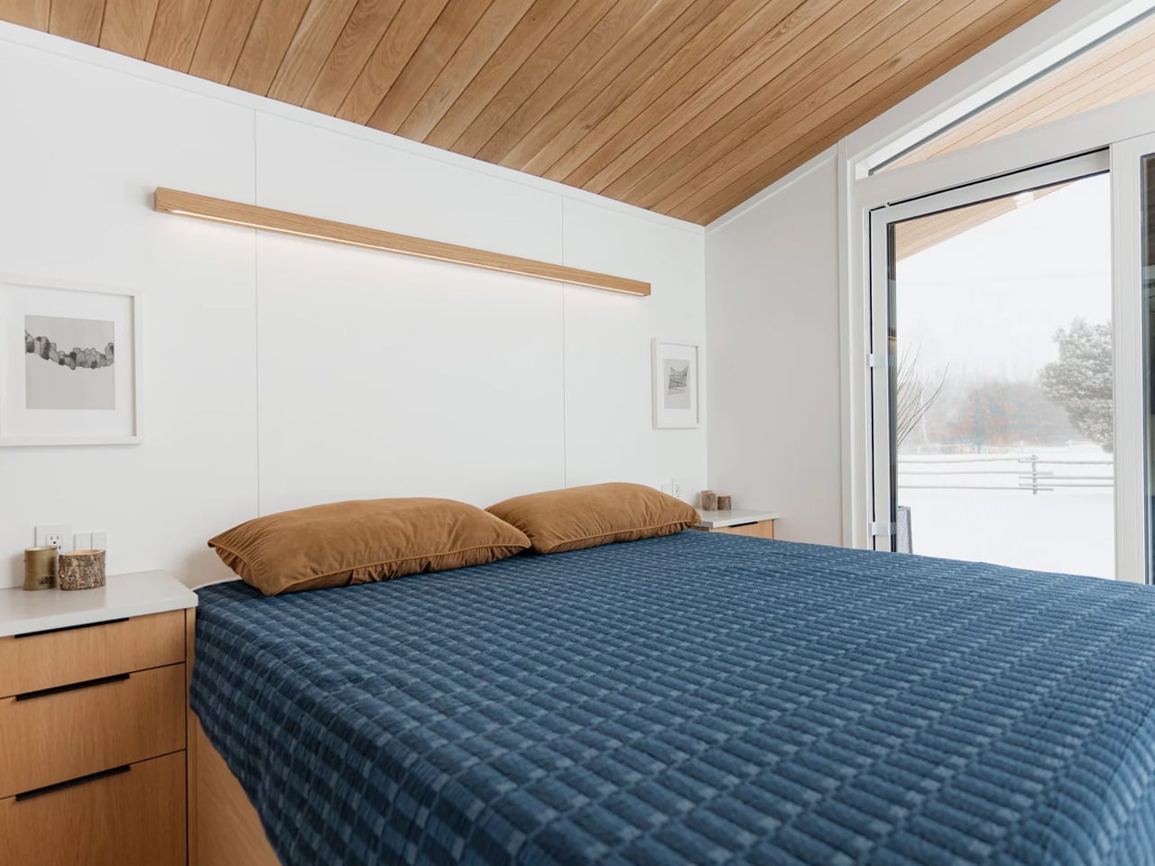
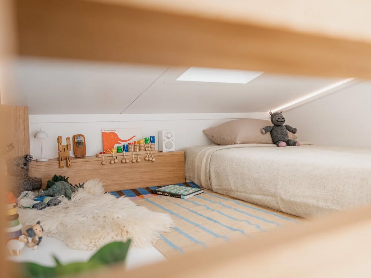
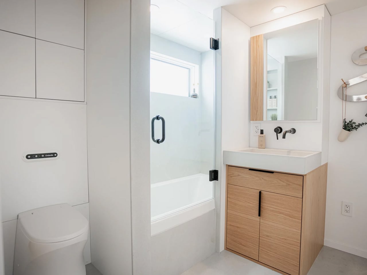
The bedroom is tucked at the rear, accessible either through the bathroom or via its own sliding door — a small planning decision that makes a real difference to how the space breathes. It sleeps two comfortably, with built-in wardrobes handling storage without eating into floor space. The bathroom itself comes with a full walk-in shower, and a dedicated laundry rounds out the amenities. This is a home that covers the basics without making you feel like you’ve settled.

The Tallebudgera 9.6 is priced at US$94,500. Removed Tiny Homes, based in Brisbane, builds each home to order and delivers across Australia, with a custom design package included at no extra cost. The model has already appeared at both the Hawkesbury Tiny Home Expo in Sydney and the Brisbane Tiny Home Expo, picking up attention from people who didn’t expect to be convinced. The Tallebudgera isn’t trying to be everything — it’s trying to be enough. And in a market full of novelty, that restraint might be its smartest feature.

The post This Tiny Home Has No Loft, No Stairs, and Honestly No Compromises first appeared on Yanko Design.

400 Square Feet, Two Private Bedrooms, and Zero Apologies — Meet the Halcyon Grand

There’s a version of small living that doesn’t ask you to give anything up. Fritz Tiny Homes has been chasing that idea since day one, and with the Halcyon Grand, they’ve come the closest to nailing it. It’s their largest model to date, 400 square feet of considered, unhurried design that feels less like a compromise and more like an upgrade.

The Halcyon Grand measures 44.5 by 10.5 feet and ships as a certified Park Model RV, meaning it lives on wheels but doesn’t feel like it. The main floor spans 350 square feet, with a 50-square-foot loft tucked above, a split that gives the home two genuinely private bedrooms without the usual tiny home trade-offs. The king master suite sits at one end, wrapped in floor-to-ceiling glass, a sliding patio door opening onto a covered deck, and a full wall wardrobe with storage built into the bed frame. The loft is its own world, a queen bedroom that closes off completely from the rest of the home, something Fritz says was a direct response to what their clients kept asking for.

Designer: Fritz Tiny Homes

The kitchen and dining area anchor the middle of the plan. There’s a table for four with integrated storage underneath, a full-sized kitchen designed to actually cook in, and a hall closet most apartments would envy. Fritz fitted the bathroom with 6’10” ceilings, reportedly inspired by their first Halcyon Grand client, who stands 6’7″, and the space comes standard with a soaker tub, with the option to upgrade to a custom concrete and glass walk-in shower. A washer/dryer combo is included, with room to swap in a full side-by-side unit if needed.

Throughout, the finishes lean into warmth: custom concrete tile, hardwood floors, timber detailing, dimmable LED lighting, and custom millwork that makes every inch feel intentional. Fritz Tiny Homes, the Alberta-based family company founded by craftsman Kevin Fritz and Heather Fritz, who sits on the National Tiny Home Builders Committee, has always built to a higher standard than the category typically demands, and the Grand is the clearest expression of that yet.

For those who’d rather skip the wheels, the Halcyon Grand is also available as the Modular Grand, engineered for permanent foundation placement and built to meet local building codes on both sides of the border. Pricing starts at $330,225 CAD (approximately $239,507 USD), with limited availability in 2026. This isn’t a tiny home that asks you to live small. It asks you to live better.

The post 400 Square Feet, Two Private Bedrooms, and Zero Apologies — Meet the Halcyon Grand first appeared on Yanko Design.

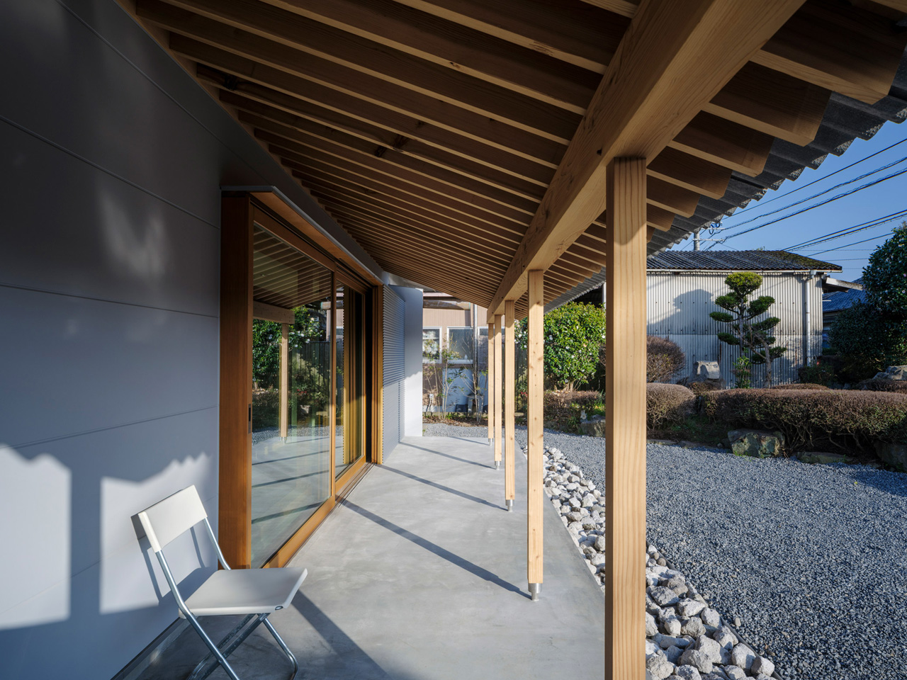
This Traditional Japanese Home Was Brought Back to Life by Opening It Up to Everything Around It

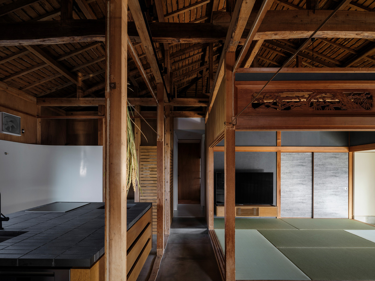
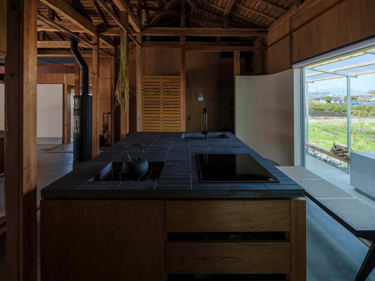
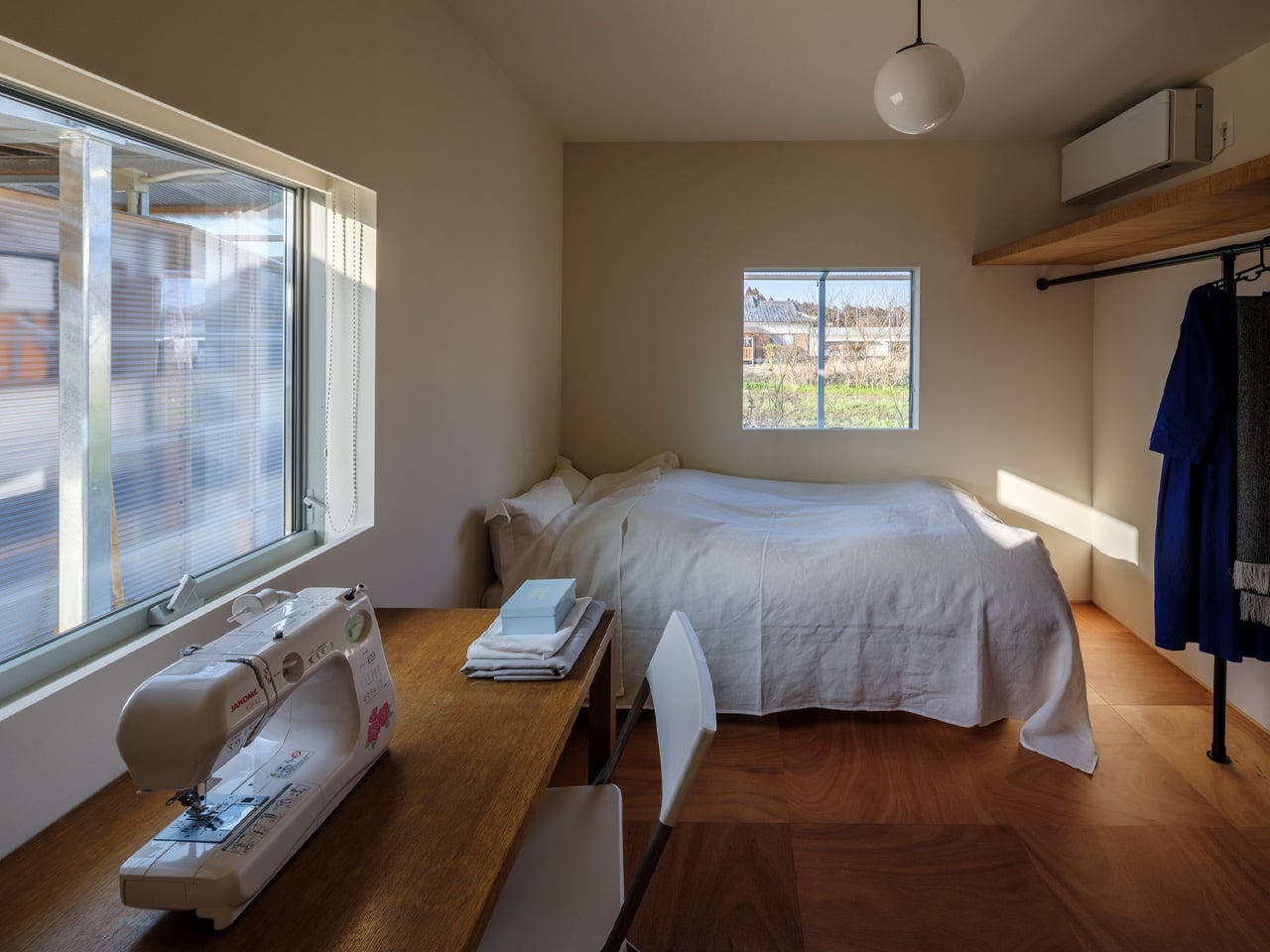
Returning home is a deeply intentional process. Not just to a place, but to a life — one shaped by memory, family, and the particular quality of light that falls through a familiar window. That is precisely the spirit YNAS brought to House in Miyakonojo, a renovation and extension of a traditional timber home in southern Japan that quietly redefines what it means to belong somewhere.

The project began with a couple who, after raising their children and shifting careers, chose to return to the wife’s ancestral home in Miyakonojo to live alongside her father. The house carried history in its bones — a traditional layout of rooms partitioned by sliding screens, arranged off a dark, L-shaped corridor that kept the living area, kitchen, dining room, and bedroom firmly separated from one another. It was a home that had turned inward, closing itself off from both the people inside and the landscape beyond its walls.

Designer: YNAS

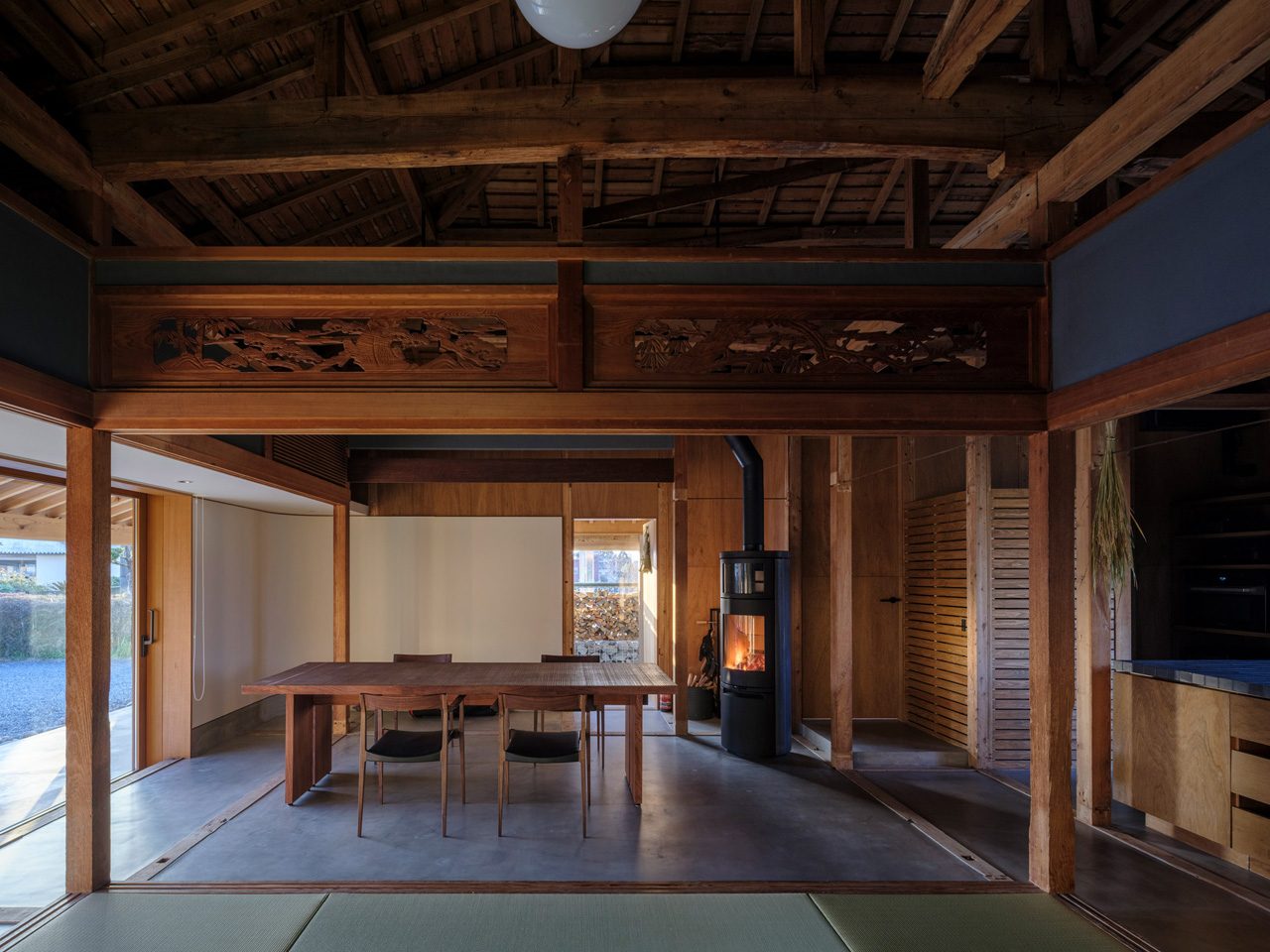
YNAS dismantled that introversion entirely. The studio opened up the cramped internal layout, dissolving the rigid partitions to let space breathe and flow the way a home shared between generations should. The transformation is not just structural — it’s philosophical. The design rejects the idea that privacy requires enclosure, leaning instead into a more generous, paradoxical logic: that openness itself can become a form of protection.

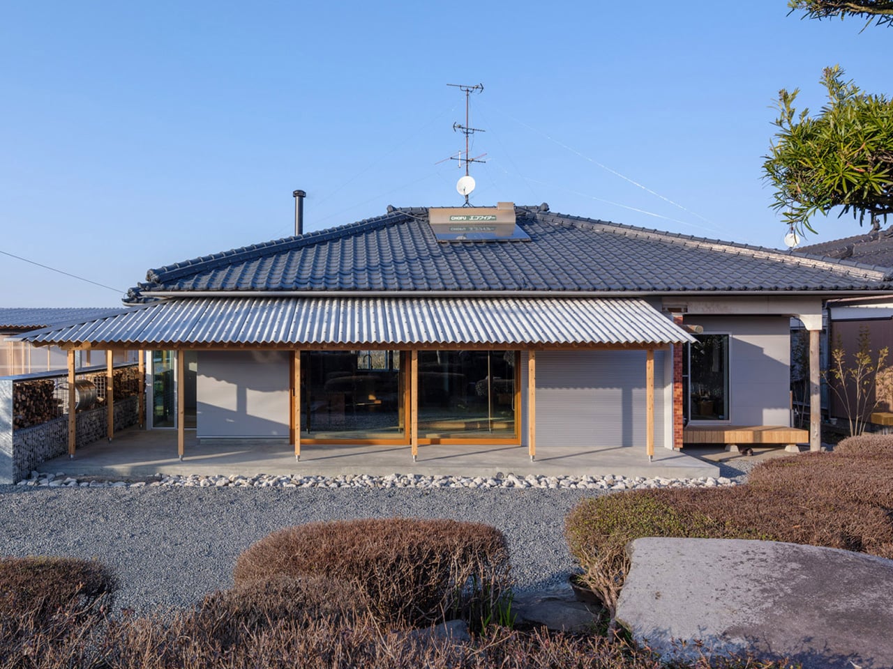
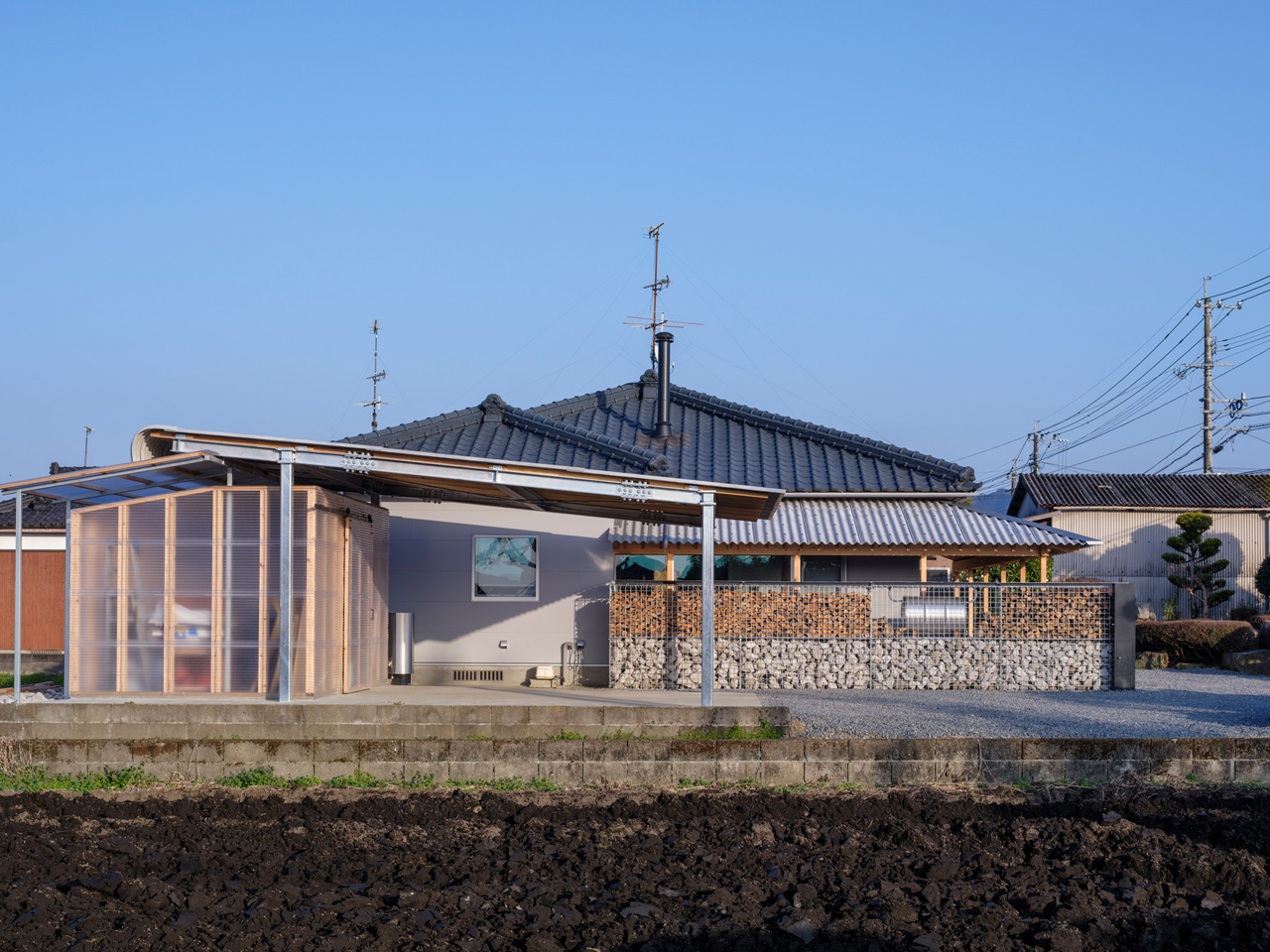
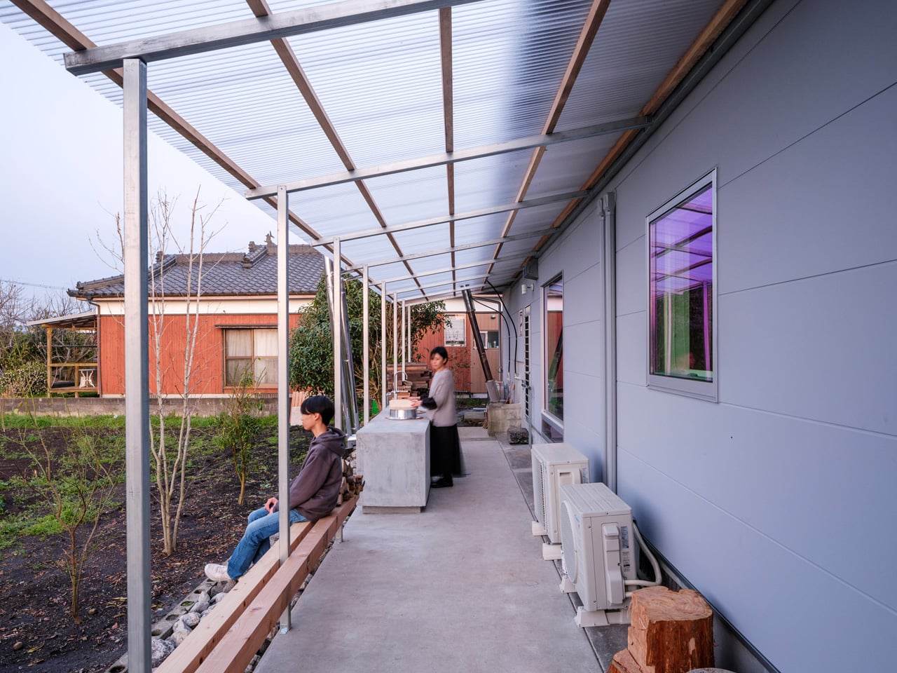
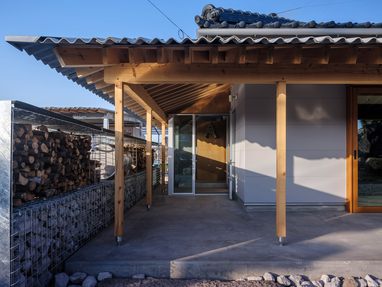
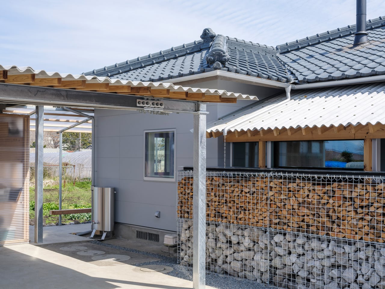
That thinking is most visible in the corrugated metal canopies YNAS added to the exterior. Timber-framed and industrial in material, they extend the home outward, creating covered outdoor spaces that blur the threshold between inside and out. An outdoor kitchen and a wood-fired bath become part of daily life, not luxuries tucked away from it. Neighbors might catch a distant glimpse of the family gathered outside, or notice smoke rising from the stove — and that, the studio argues, is the point.

“The house once again becomes a part of the landscape through the ‘signs of life’ it emits,” YNAS noted of the project. It’s a rare architectural position — one that treats visibility not as exposure but as community, as a soft signal that a home is lived in and loved.

The result is a house that honors its past without being imprisoned by it. The ancestral bones remain, but the rooms now open to each other, to the garden, to the sky. Corrugated metal and old timber sit side by side without apology. Three generations share space under a roof that has finally learned how to exhale. In Miyakonojo, YNAS has done something quietly radical: they’ve made a home feel, again, as it belongs to the world around it.

The post This Traditional Japanese Home Was Brought Back to Life by Opening It Up to Everything Around It first appeared on Yanko Design.

5 Homes With No Straight Lines That Look Like Nature Designed Them

For centuries, homes have been planned as practical machines, efficient, box-like structures built to shelter and protect. Straight lines, sharp corners, and predictable layouts defined comfort and order, where function quietly led and form followed.

Today, residential design is moving beyond rigid geometry and purely utilitarian thinking. Sculpted homes reimagine architecture as an intentional artistic gesture. Curved walls, fluid volumes, and organic transitions guide light, movement, and emotion.

Instead of simply occupying a structure, various factors can be taken into consideration to experience space as something immersive and expressive, where daily living unfolds within a carefully shaped work of art.

1. The Fluidity of Form

Sculpted architecture begins by dissolving the rigid grid that has long defined residential design. Instead of right angles and boxed rooms, you encounter soft transitions and continuous surfaces. Materials like poured concrete and advanced 3D-printed polymers allow architects to shape seamless curves that echo the movement of water or the contours of wind-carved dunes. Structure and surface merge into one fluid gesture.

This fluidity changes how you experience space. Rooms feel interconnected and not compartmentalized, and movement becomes intuitive. Curved forms reduce visual tension, creating a subtle psychological calm. The home feels less assembled and more naturally formed, as though it has grown into its surroundings.
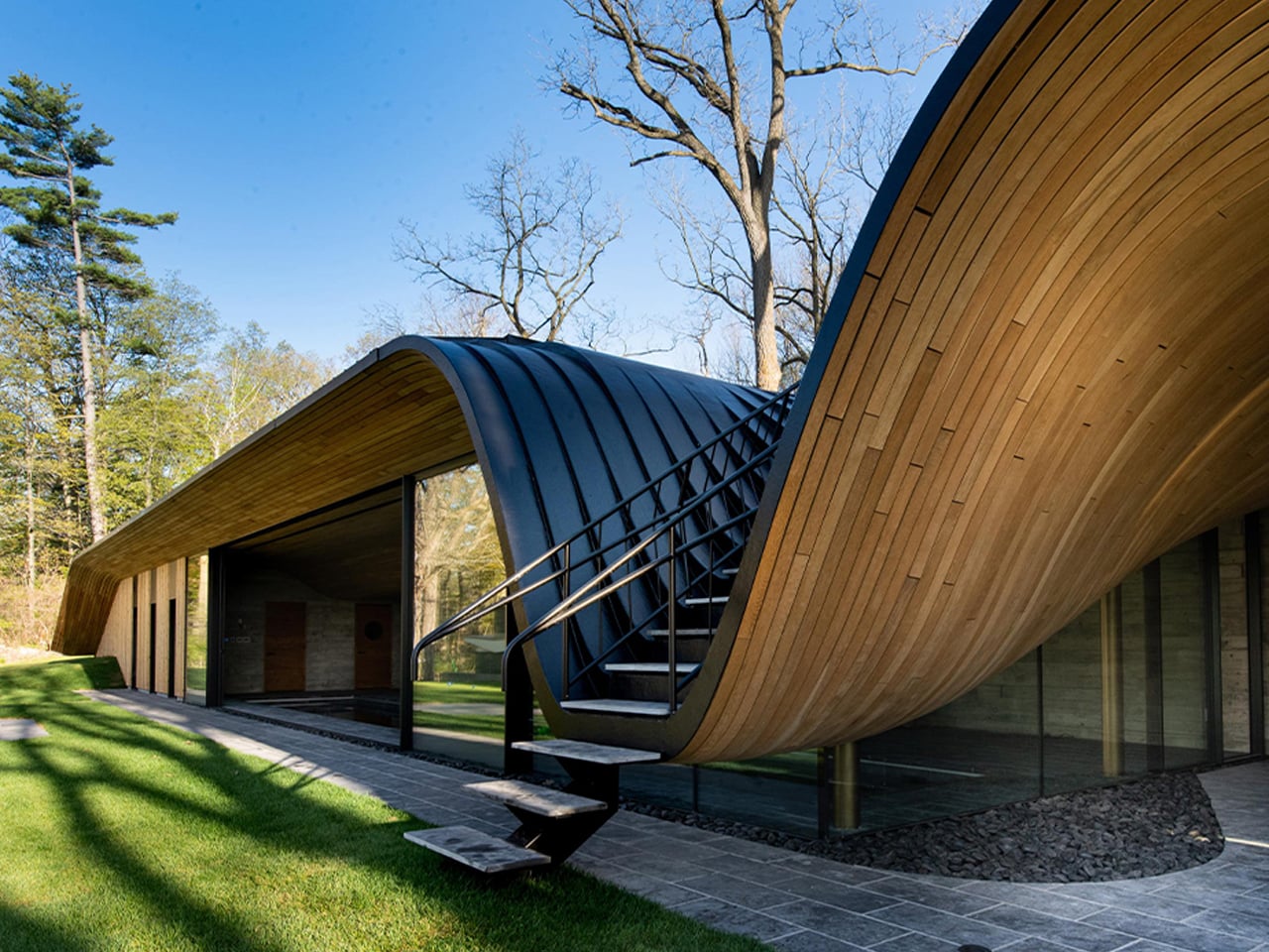
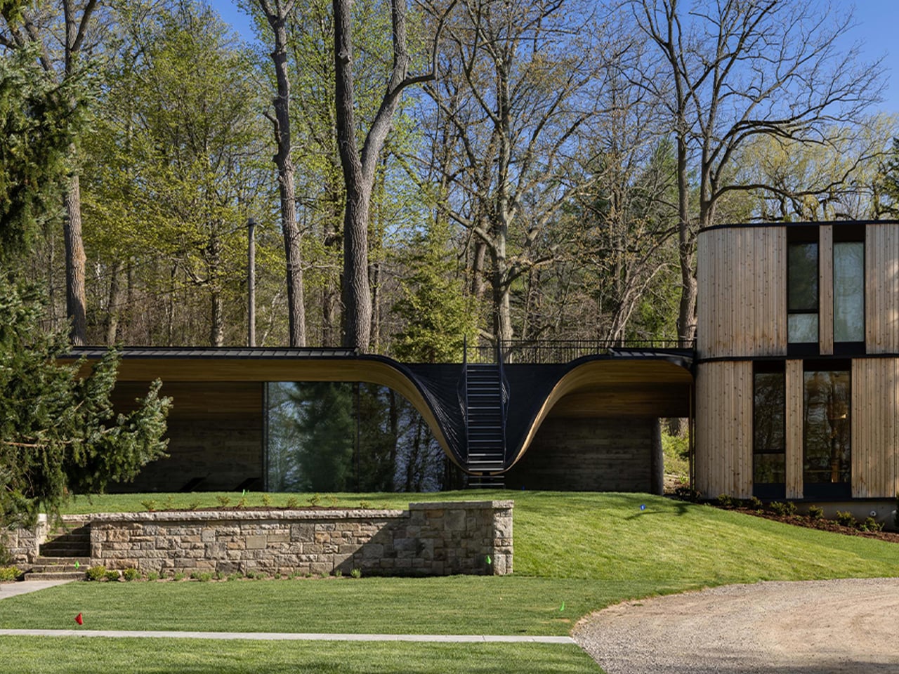
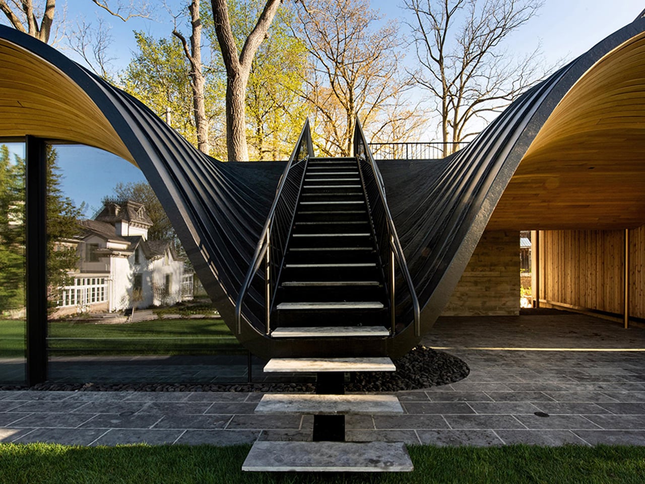
Rising from the ashes of a historic guesthouse lost to fire, Fold House by PARTISANS reimagines memory through movement and form. Set into a scenic hillside in Ontario, the two-storey residence appears to fold effortlessly into the land, echoing its natural contours. Sculpted in wood and steel, the structure flows around a central swimming pool, which is a reflective heart that poetically replaces loss with serenity. At the lower edge of the slope, a tranquil pool pavilion unfolds behind an expansive sliding glass façade, dissolving boundaries between interior and landscape.
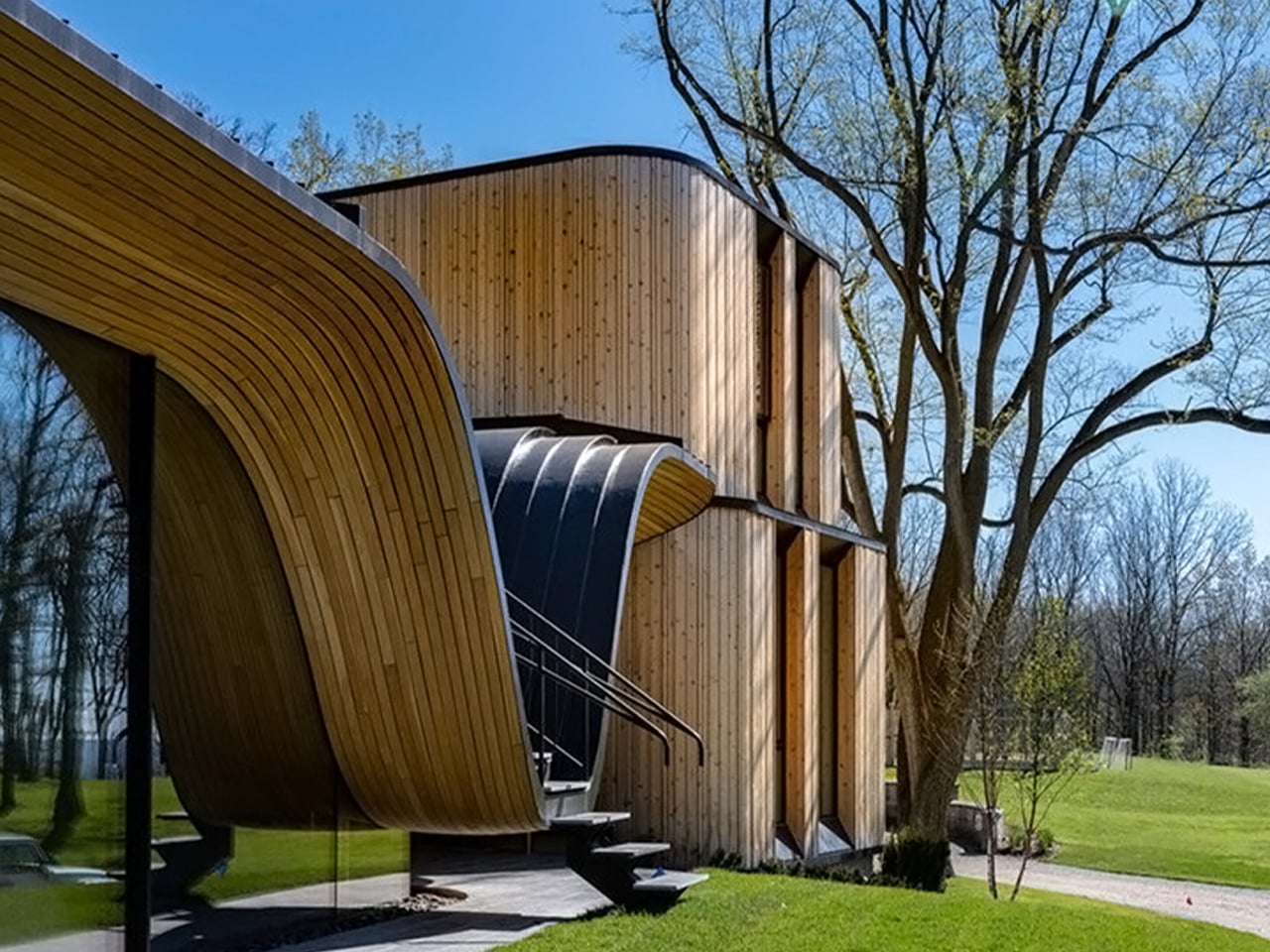
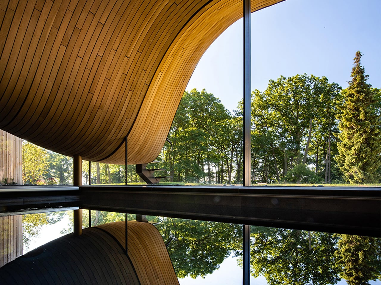
The home’s defining gesture is its wave-like roof, a sweeping green canopy that ripples across the structure like an architectural ribbon. This fluid form conceals a powerful steel beam that enables a dramatic cantilever, creating the illusion of a floating pavilion. The wave dips gracefully to cradle an external staircase, mirrored inside as a gentle curve in the white oak ceiling. Even the compression-bent wood façade reinforces the home’s sculptural softness, celebrating craftsmanship through seamless, organic lines.

2. Choreographing the Sun

In a sculpted home, light is treated as a building material rather than an afterthought. Windows become carefully placed voids, positioned to guide the sun’s path across walls and floors. Deep recesses, angled openings, and unexpected skylights allow architects to shape brightness with precision, controlling glare while enhancing depth and texture within the space.

As daylight shifts, interiors transform. Shadows lengthen, soften, and retreat, creating a rhythm that marks the passage of time. The home begins to feel dynamic, almost responsive. Instead of static illumination, you experience a space that evolves hour by hour, where light continually redraws the architectural form.
Futuristic white villa with curved architecture on a hillside, glass walls, and a pool overlooking mountains and scrubby terrain.

Futuristic white two-story house with curved rooflines, glass walls, and an outdoor pool, set beside a hillside and palm trees.

Modern white two-story house with curved overhangs, glass walls, and a pool overlooking a sunny landscape.

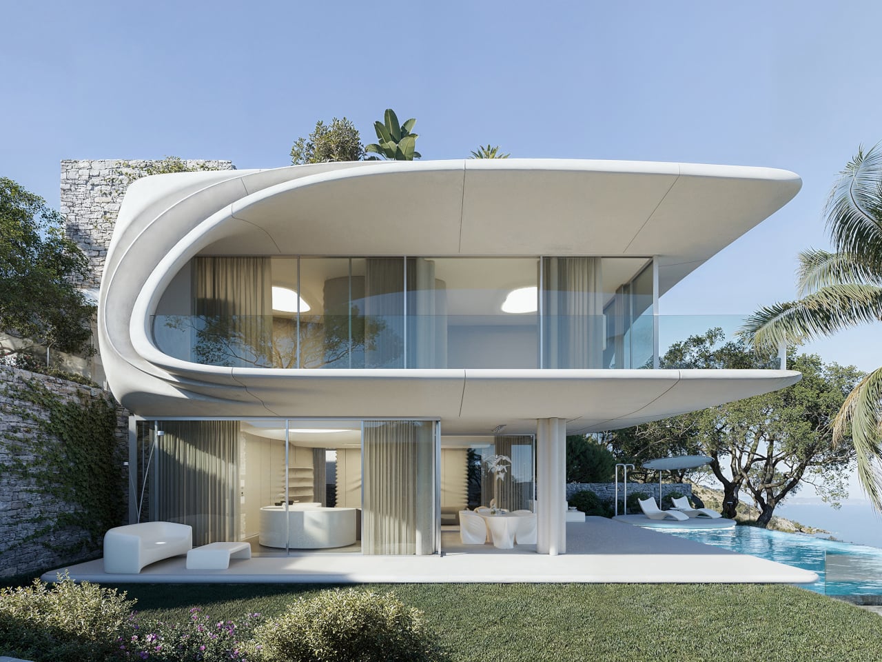
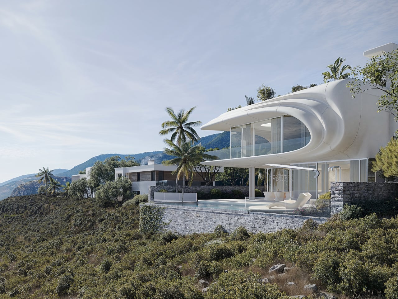
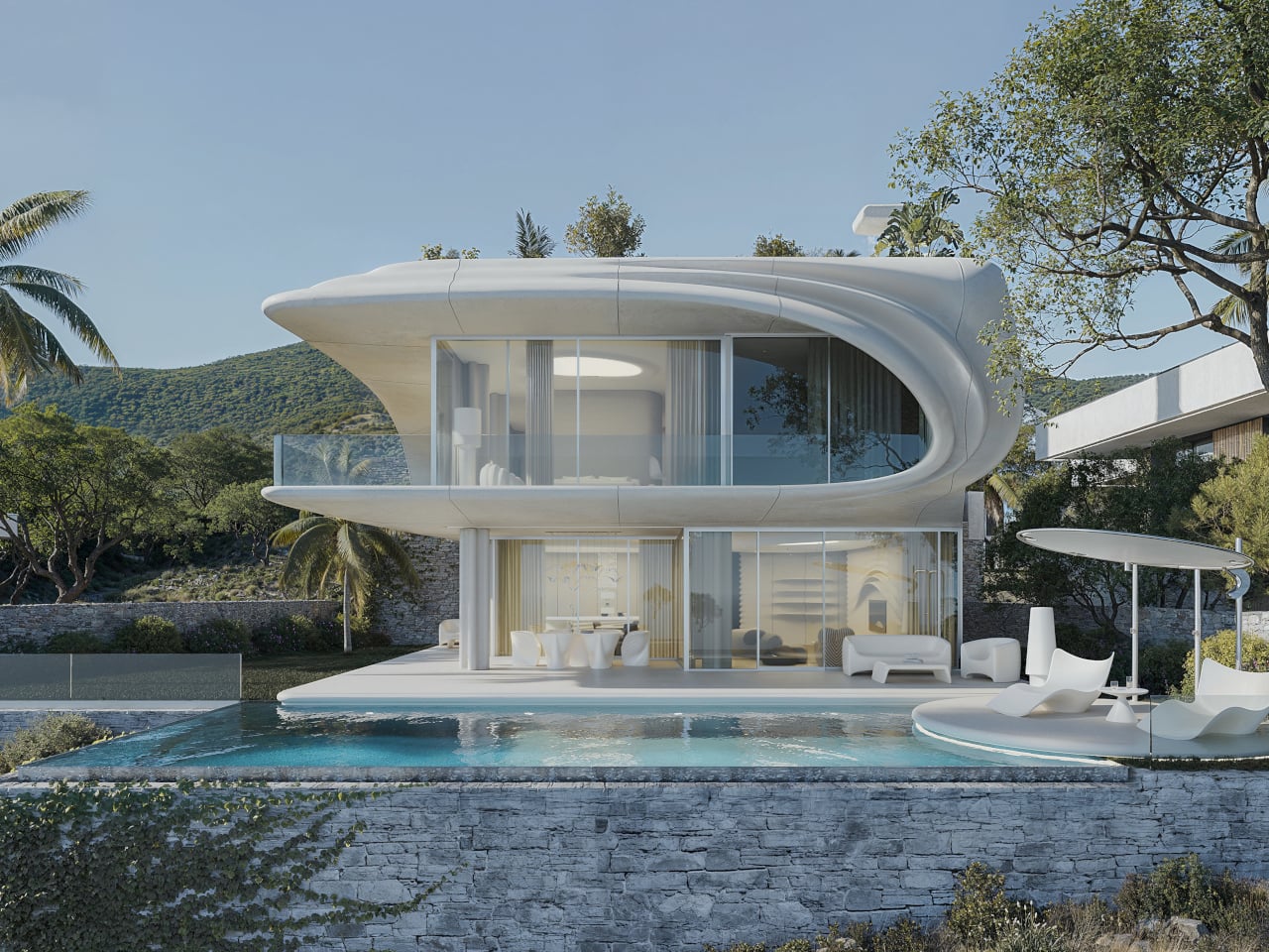
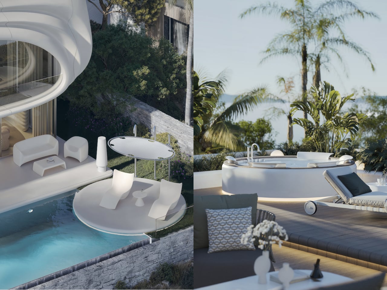
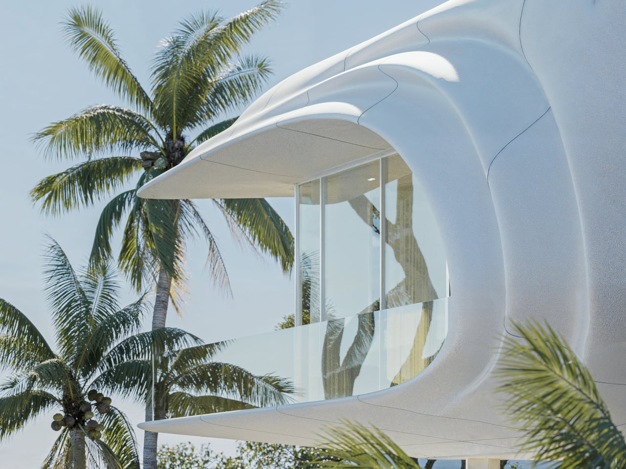
Perched on the hills above Marbella, PERLA is designed to choreograph sunlight as carefully as form. Conceived by STIPFOLD, the residence uses its sweeping, wave-like shell to frame and filter the Mediterranean light, and not simply open up to it. The dramatic overhang created by the curling upper floor casts measured shade across the terrace and glazing below, tempering the intensity of southern exposure while still allowing daylight to penetrate deep into the interiors. The white fibre concrete exterior amplifies brightness, reflecting light across its curved surfaces and subtly shifting in tone throughout the day.
Split-screen luxury outdoor terrace: left shows white seating around a small circular pool; right shows a hot tub with lounge chairs and palm trees by the sea.

Futuristic white curved building with a glass balcony, set among tropical palm trees under a blue sky.

Contemporary open‑plan living room with curved cream sofas, round coffee tables, and sculptural seating; large windows and palm trees visible outside.

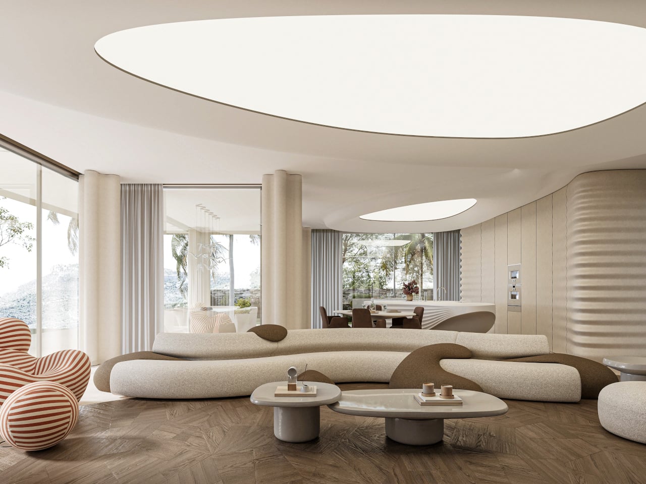
Inside, sunlight becomes a moving element within the architecture. Curved beige fibre concrete walls and gently undulating ceilings catch light differently as it travels across the rooms, creating soft gradients instead of harsh contrasts. The restrained palette of sand, white, and pale timber enhances this effect, allowing daylight to glide uninterrupted across surfaces. Rather than relying on ornament, the 400 m² home uses geometry to shape how light enters, diffuses, and settles while turning the interior into a calm, sun-washed environment that evolves from morning glare to evening glow.

3. The Beauty of the Exposed Frame

In sculpted homes, structure is not concealed behind layers of finish but is intentionally revealed. Dramatic cantilevers extend outward over slopes or water, creating a sense of suspension and boldness. Raw steel beams, concrete cores, and solid stone piers remain visible, allowing you to understand how the building carries its own weight.

You see the forces at play, the balance, the counterweight, and the support. The home communicates its logic openly, transforming engineering into visual poetry. Strength becomes part of the design language, where the exposed skeleton enhances stability and beauty.
Modern white concrete house with a curved ramp and terraced garden surrounded by trees.

Curved concrete walkway beside a narrow reflective canal leads to a modern terraced garden with trees and lawn.

Night view of a modern concrete house with a curved roof and large glass walls revealing a warmly lit living space inside.

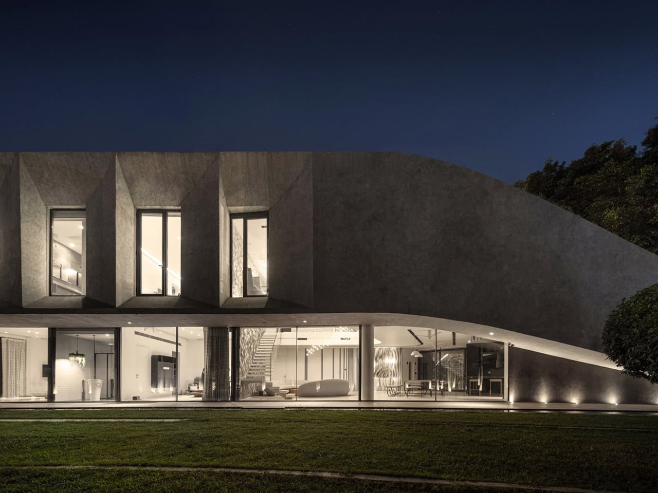
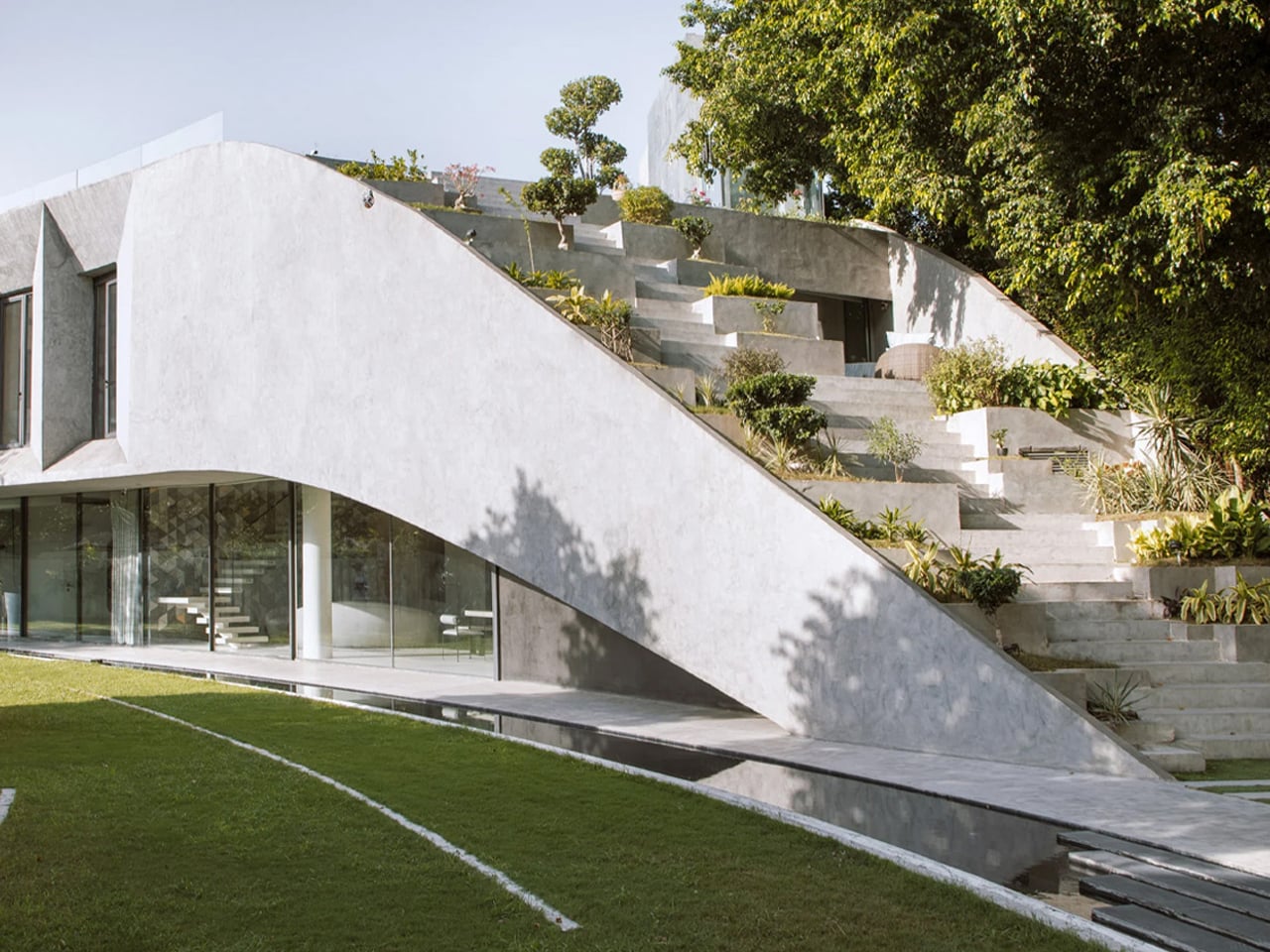
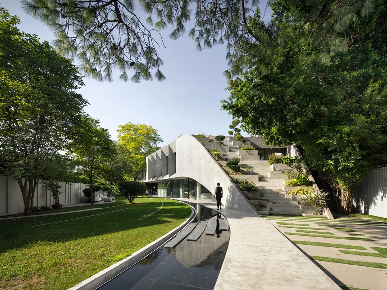
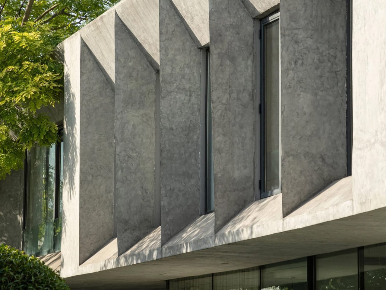
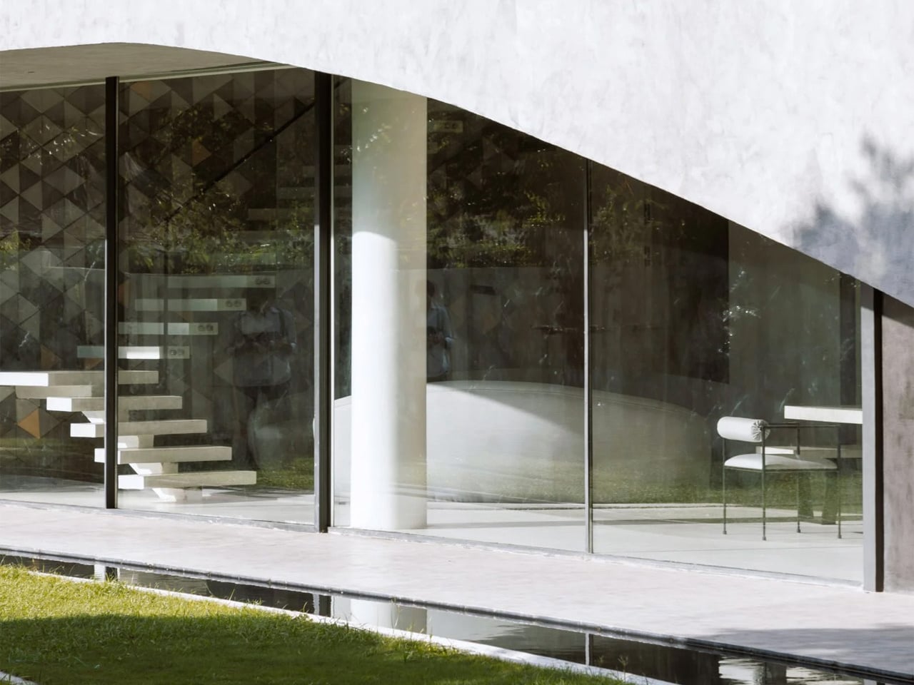
Tucked within the dense urban fabric of New Delhi, Villa KD45 is a striking concrete residence defined by its sweeping terraced roof that rises gently from the landscaped ground like a soft wave. Designed by Studio Symbiosis for a large joint family, the home occupies an angular plot bordered by neighboring villas on three sides. Its sculptural form and layered green roof give it a bold, almost brutalist presence while reinforcing a strong connection to nature. Conceived as an antidote to the growing divide between urban living and the natural environment, the house integrates generous gardens and carefully preserves the mature trees on site, which influenced its placement along the northeast edge of the property.
Modern concrete building with angled vertical bays and tall narrow windows, shaded by a tree on the left.

Modern glass-walled room with a white floating staircase and a minimalist chair, reflecting trees outside.

Open-plan dining area with a long marble table and modern chairs, glass walls overlook a green yard, geometric wall behind a curved sofa.

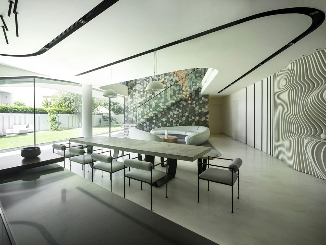
The cascading roof doubles as a stepped terrace dotted with concrete planters and landscaped pockets that overlook a nearby park. To combat Delhi’s intense summer heat, the ground floor is partially lowered while the upper level cantilevers outward to create shade. Angled window recesses reduce heat gain, and rooftop planting further cools the structure. Inside, a double-height kitchen, dining, and living area forms the heart of the home, opening to the garden through sliding doors. A sculptural floating staircase leads to a mezzanine with a glass balustrade, while a tucked-away swing seat overlooking the tree canopy offers a quiet retreat within the bustling city.

4. Designing Through Mono-Materiality

Additionally, in sculpted homes, material is not just a finish, as it becomes the guiding concept. Designers increasingly embrace mono-materiality, selecting one dominant substance such as rammed earth, white plaster, bamboo, or raw cedar, allowing it to define the exterior and interior surfaces. Walls, ceilings, and built-in elements emerge from the same tactile language, creating visual continuity and structural clarity.

This approach produces a deeply immersive atmosphere. The transition between the façade and the interior dissolves, and even the furniture feels integrated rather than added. You experience a cohesive environment where texture, tone, and temperature remain consistent, fostering calm, focus, and a quietly meditative sense of unity.
Whimsical bamboo treehouse with a woven lattice dome, string lights, and a cozy circular seating area in a garden.

Woven bamboo treehouse with glowing lights, cathedral-like pods perched above a cozy seating area in a jungle setting.

Two intricate bamboo pod structures on stilts in a forest garden, connected by a walkway with string lights. The lattice domes resemble lotus petals and blend with greenery.

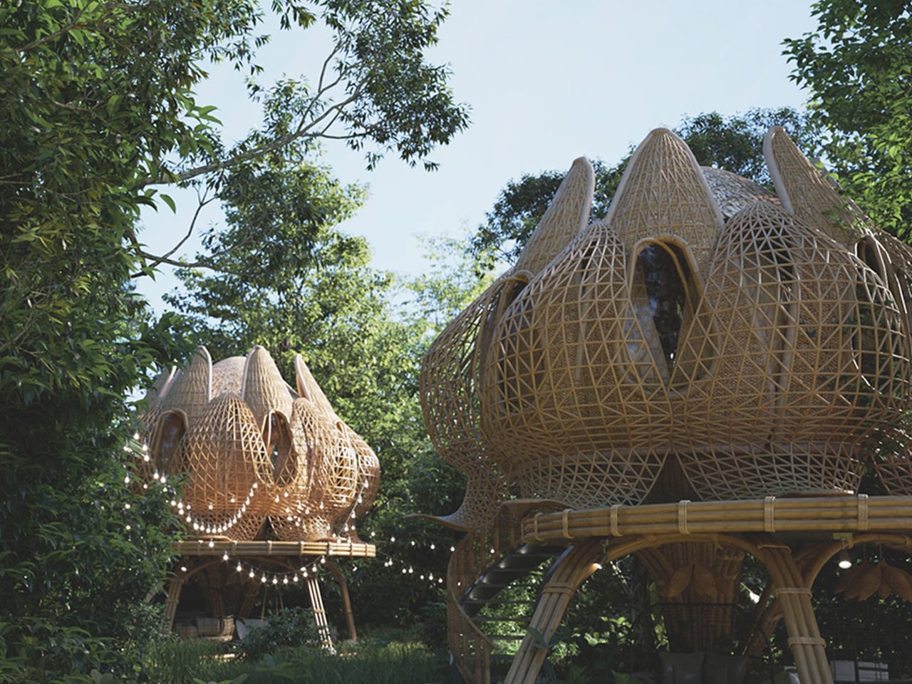
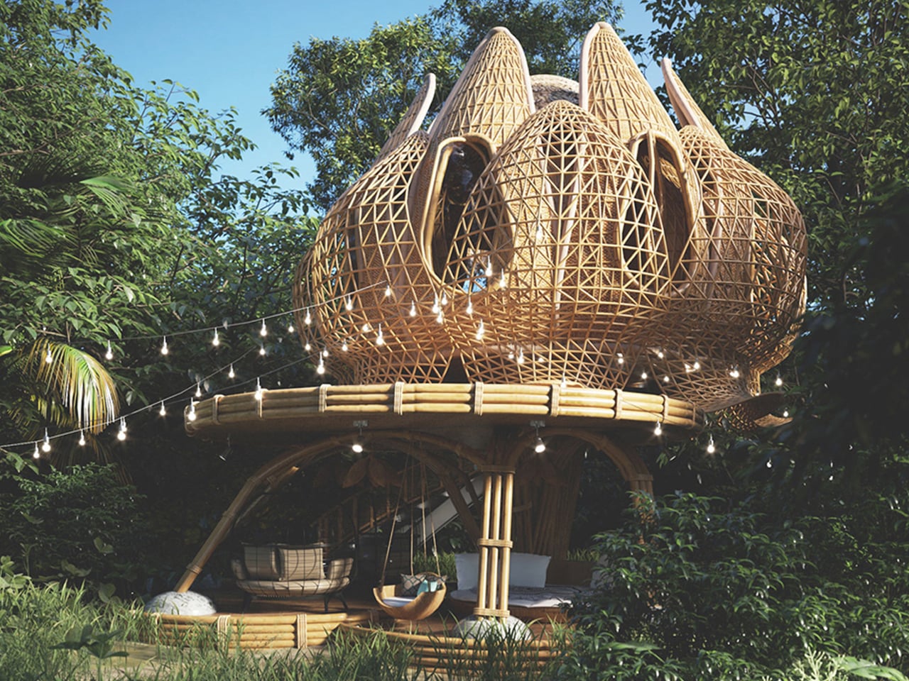
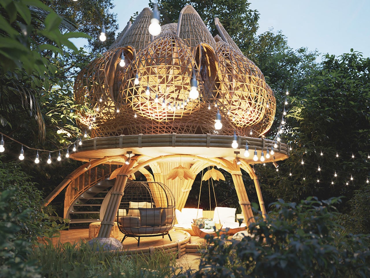
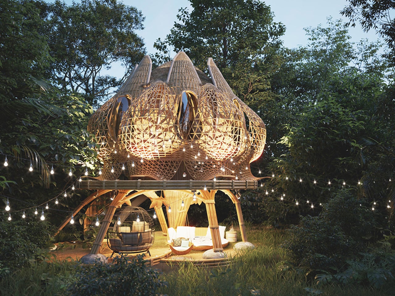
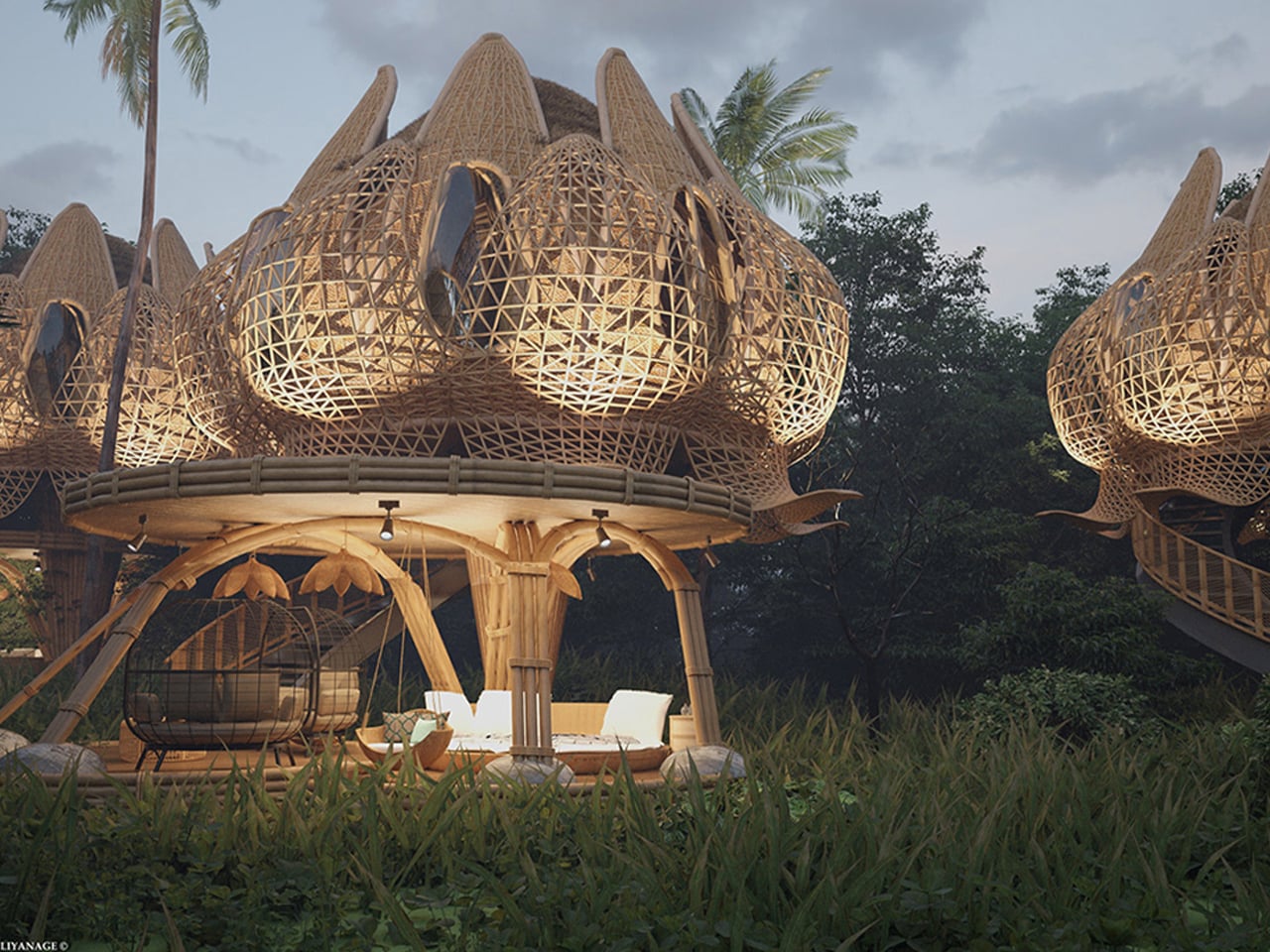
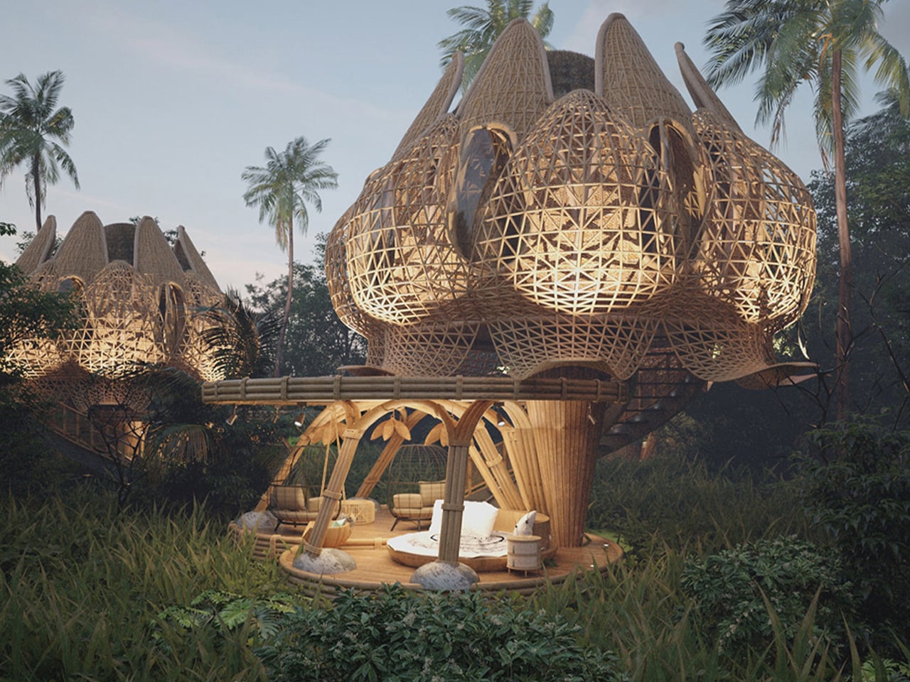
Designed by Thilina Liyanage, the Hideout Lotus Bamboo Villa is a conceptual retreat that explores bamboo as its primary and defining material. The entire structure, right from its elevated pillars to its intricate exterior skin, is imagined almost entirely in bamboo, celebrating the material’s strength, flexibility, and textural richness. Raised above the ground on clustered bamboo shafts, the single-storey villa creates a shaded communal deck below while supporting a lotus-inspired living space above. Even the sculptural form, resembling layered petals, is articulated through carefully interwoven bamboo elements.
Lattice bamboo structures shaped like giant lotus petals with a seating area beneath, part of a resort or eco-architecture setting.

Large bamboo treehouse with intricate lattice domes and a wooden lounge area in a tropical setting.

Whimsical bamboo treehouse with a lattice dome and string lights in a lush garden.

The upper volume is wrapped in a continuous bamboo lattice that acts as a façade and filter, softening views while maintaining ventilation. Flooring, structural members, screens, and detailing follow a unified bamboo language, creating cohesion across every surface. The curved edges of the villa extend like petals formed from bent and layered bamboo strips, demonstrating the material’s adaptability to fluid geometries.

5. Architecture in Dialogue with Nature

Sculpted homes emerge from a deep dialogue with their environment. The architecture responds to the land’s contours and character rather than overriding them with imposed geometry. A structure may be carved into limestone, anchored along a hillside, or wrapped in reflective surfaces that echo the surrounding forest. The architecture becomes a lens through which you experience terrain, light, and horizon.

This relationship is reciprocal. The house enhances views, channels breezes, and frames seasonal change, while the landscape lends character and emotional depth. Together, they form a balanced composition where built form and natural context strengthen one another.
Contemporary curved concrete villas with greenery on a hillside and a large outdoor pool with white loungers in the foreground at a resort.

Person standing at the edge of an infinity pool, gazing toward the sea, with modern curved concrete architecture in the background.

Architectural hillside villa with curved concrete arches, glass doors, and a poolside deck with white lounge chairs under a blue sky.

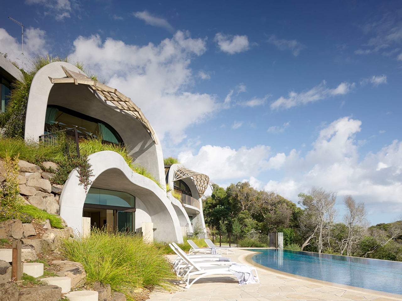
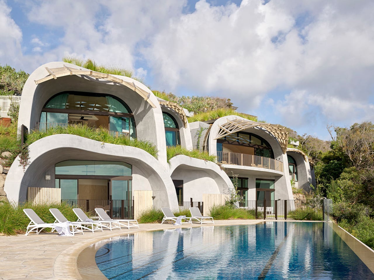
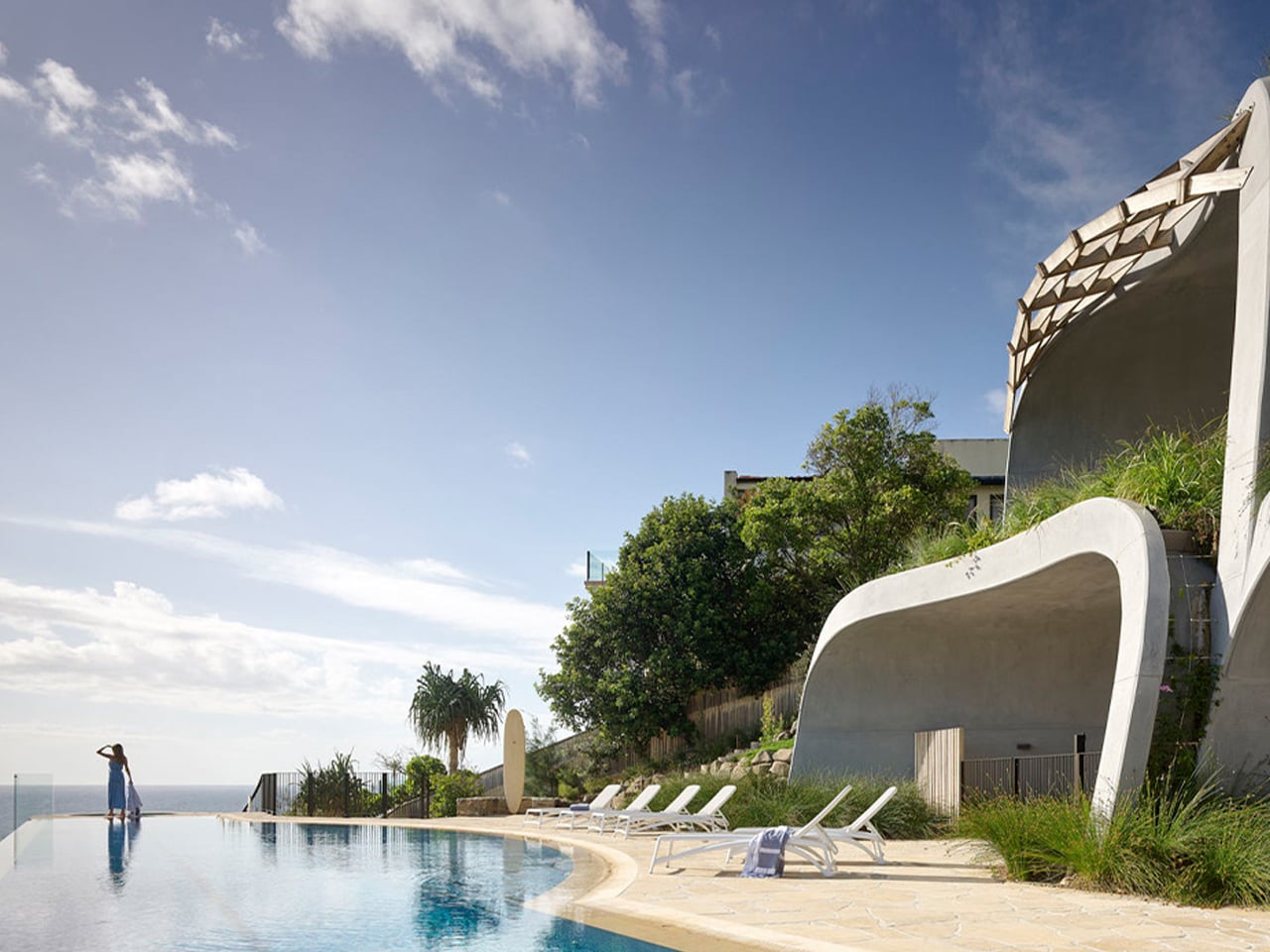
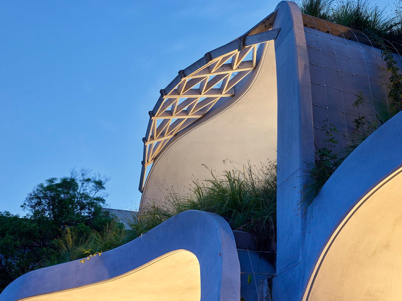
Set within the sandhills south of Noosa National Park, Domik House by Noel Robinson Architects is conceived as an extension of its coastal landscape. The residence rises through a series of stacked domes softened by lush green roofs, allowing the architecture to merge with the surrounding dunes and vegetation visually. Instead of sharp angles, the sculptural curves echo natural landforms, helping the structure settle gently into its environment while preserving the character of the site.
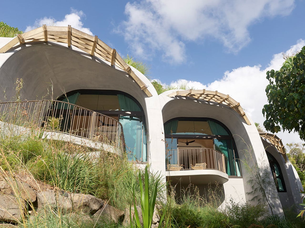
Curved modern hillside house with large glass doors, balconies, and a wooden pergola on top, surrounded by tall grasses and rocks.

Curved blue concrete wall with a lattice window, illuminated by warm lights at twilight.

Top-down view of a modern spiral staircase with black treads and a glass railing, forming a circular pattern in a white space.

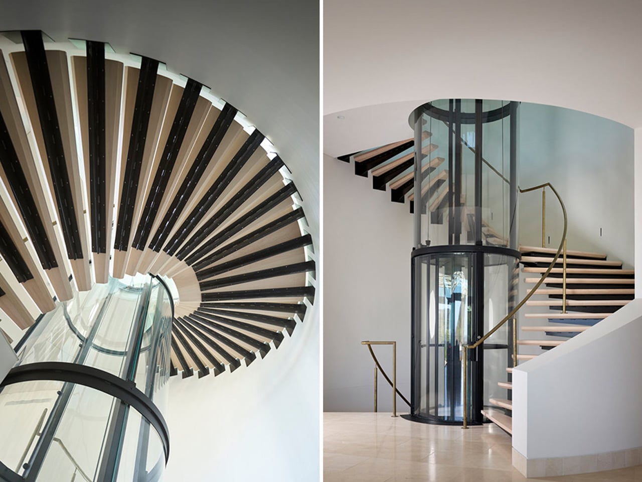
The integration extends beyond form into performance and materiality. Expansive openings encourage cross-ventilation and invite ocean breezes deep into the interiors. Rooftop solar panels with battery storage generate renewable energy on-site, while harvested rainwater is reused within the property. Hempcrete internal walls provide natural insulation and acoustic comfort, reinforcing the home’s low-impact approach. Concrete arches reduce structural bulk, enabling open, airy interiors that remain visually and physically connected to the outdoors, ensuring the house feels embedded within its landscape.

Sculpted homes redefine domestic living by merging engineering precision with artistic intent. Through fluid forms, exposed structure, and deep contextual sensitivity, they transform shelter into experience. When you embrace curve, light, and landscape, home becomes more than protection; it becomes a daily source of inspiration, reflection, and emotional renewal.

The post 5 Homes With No Straight Lines That Look Like Nature Designed Them first appeared on Yanko Design.
Studio Carraldo Built a Maze Out of a Gen Z Joke

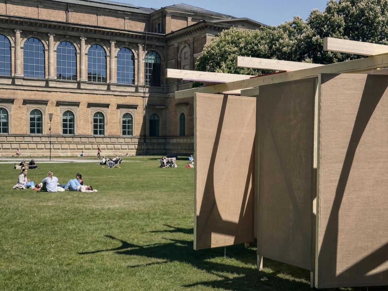
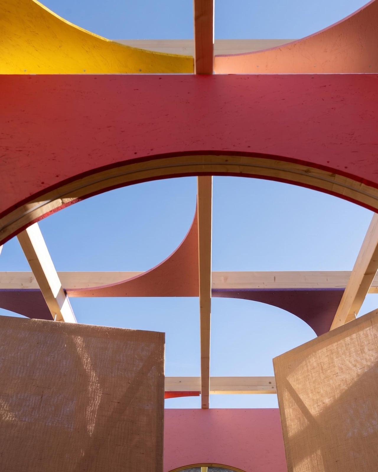
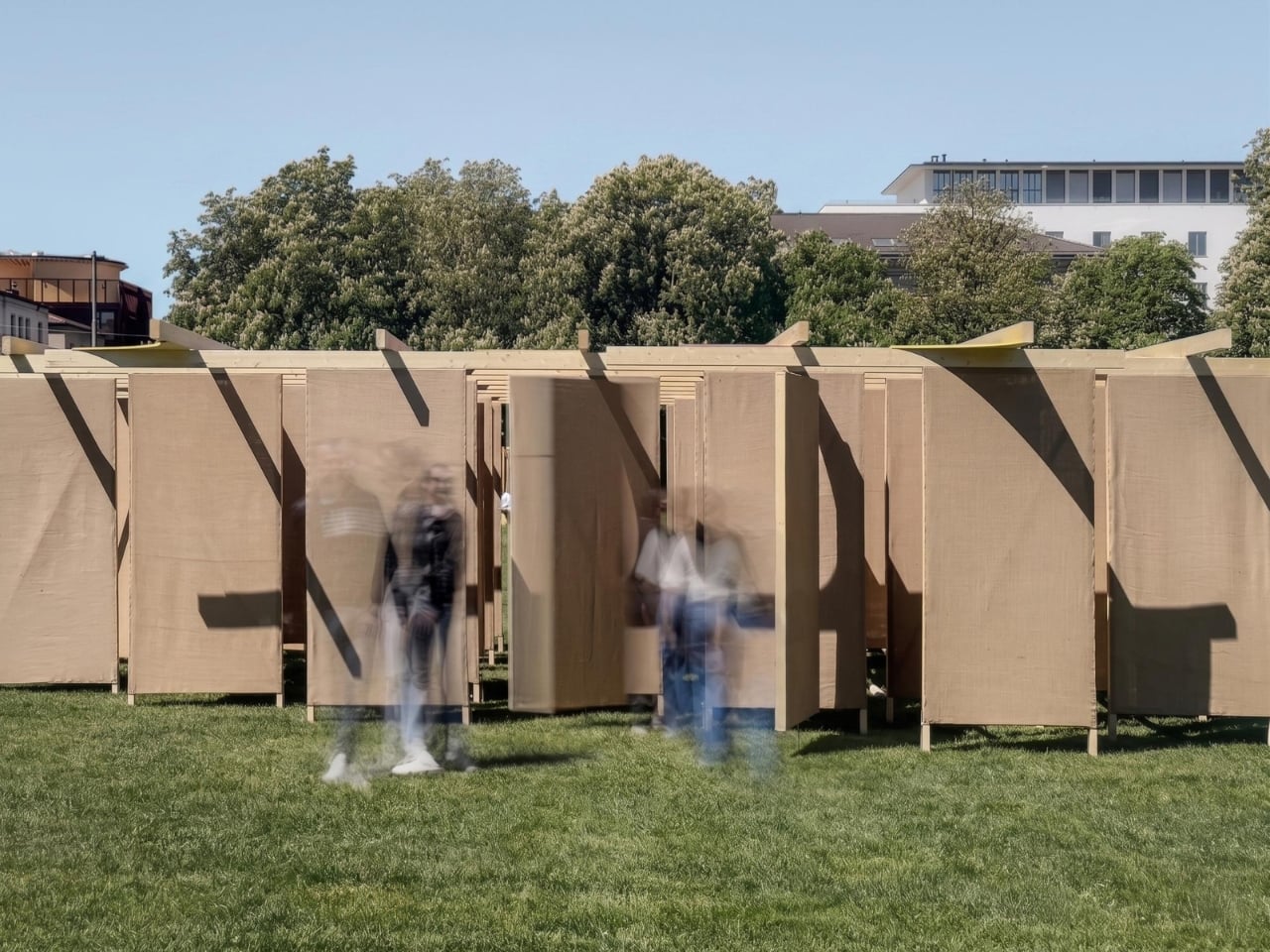
When a design installation borrows its name from a Gen Z slang term, you might expect something shallow. Something Instagram-first, substance-optional. DELULU, the jute fabric labyrinth created by Studio Carraldo for Munich Creative Business Week 2026, is not that. It takes a word that’s been used mostly for self-deprecating humor and stretches it into something genuinely thoughtful. Something worth walking through, both literally and figuratively.

The word “delulu,” for the uninitiated, is short for “delusional.” It’s the kind of slang that appears in captions and comment sections, usually to describe someone (often the speaker themselves) who’s holding out hope that doesn’t quite line up with reality. It’s got humor to it, but underneath the joke is something real: the experience of being a young person navigating a world that feels increasingly difficult to make sense of, shaped by climate anxiety, economic uncertainty, and the relentless noise of digital life.

Designer: Studio Carraldo

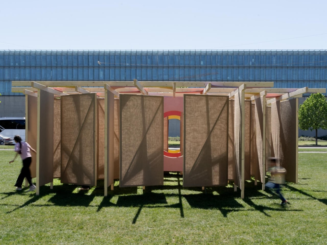
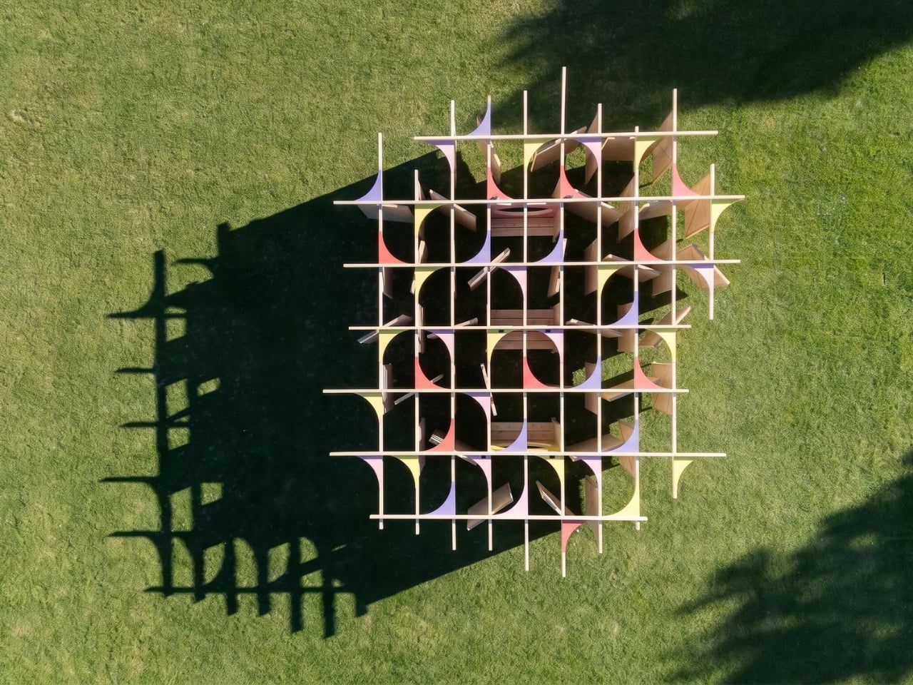
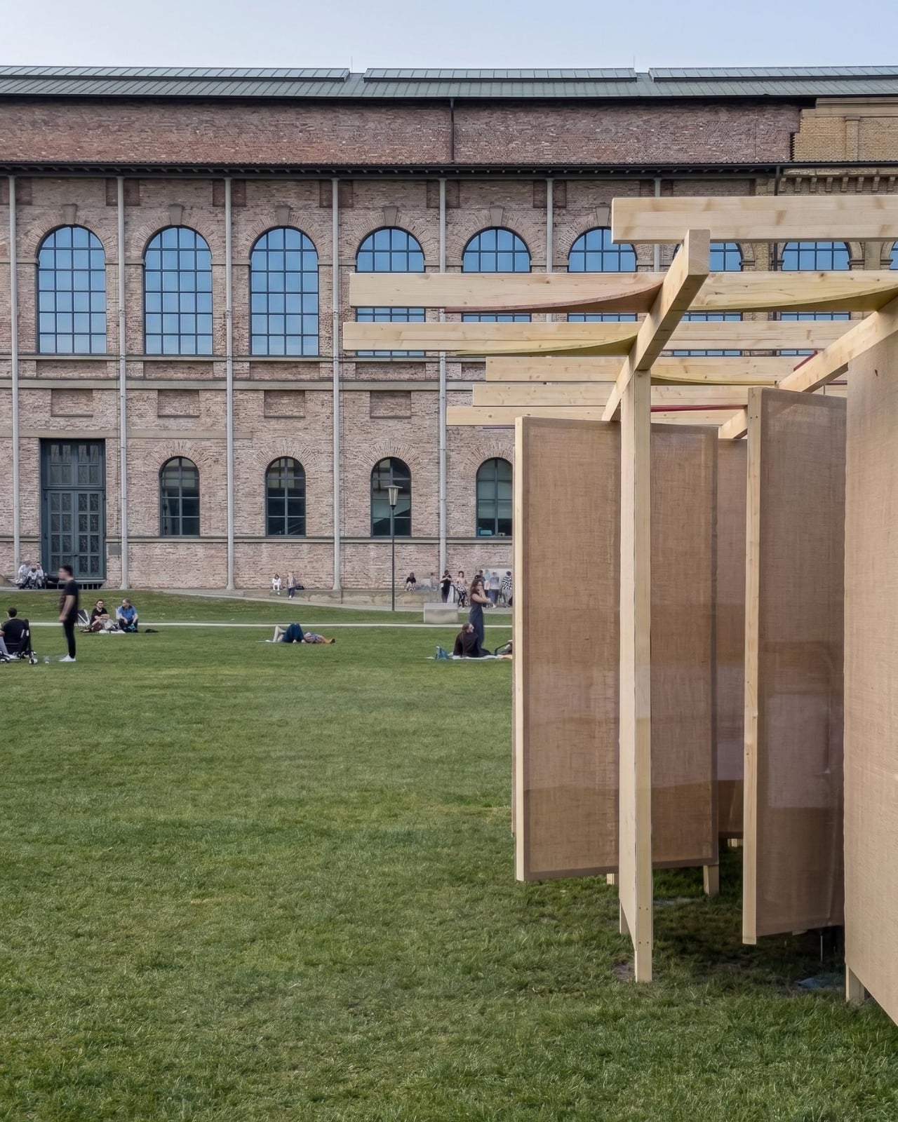
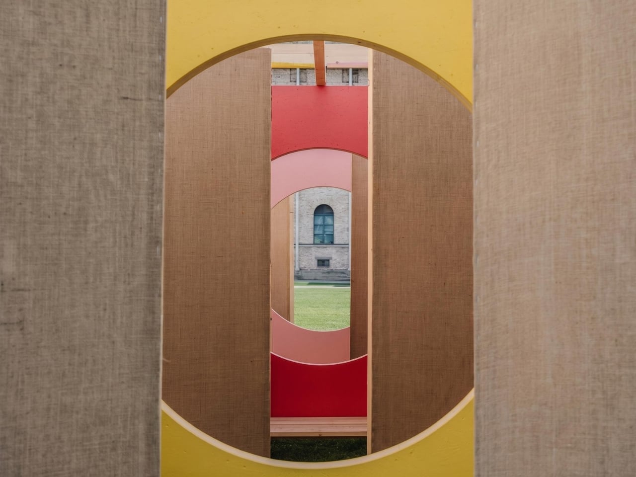
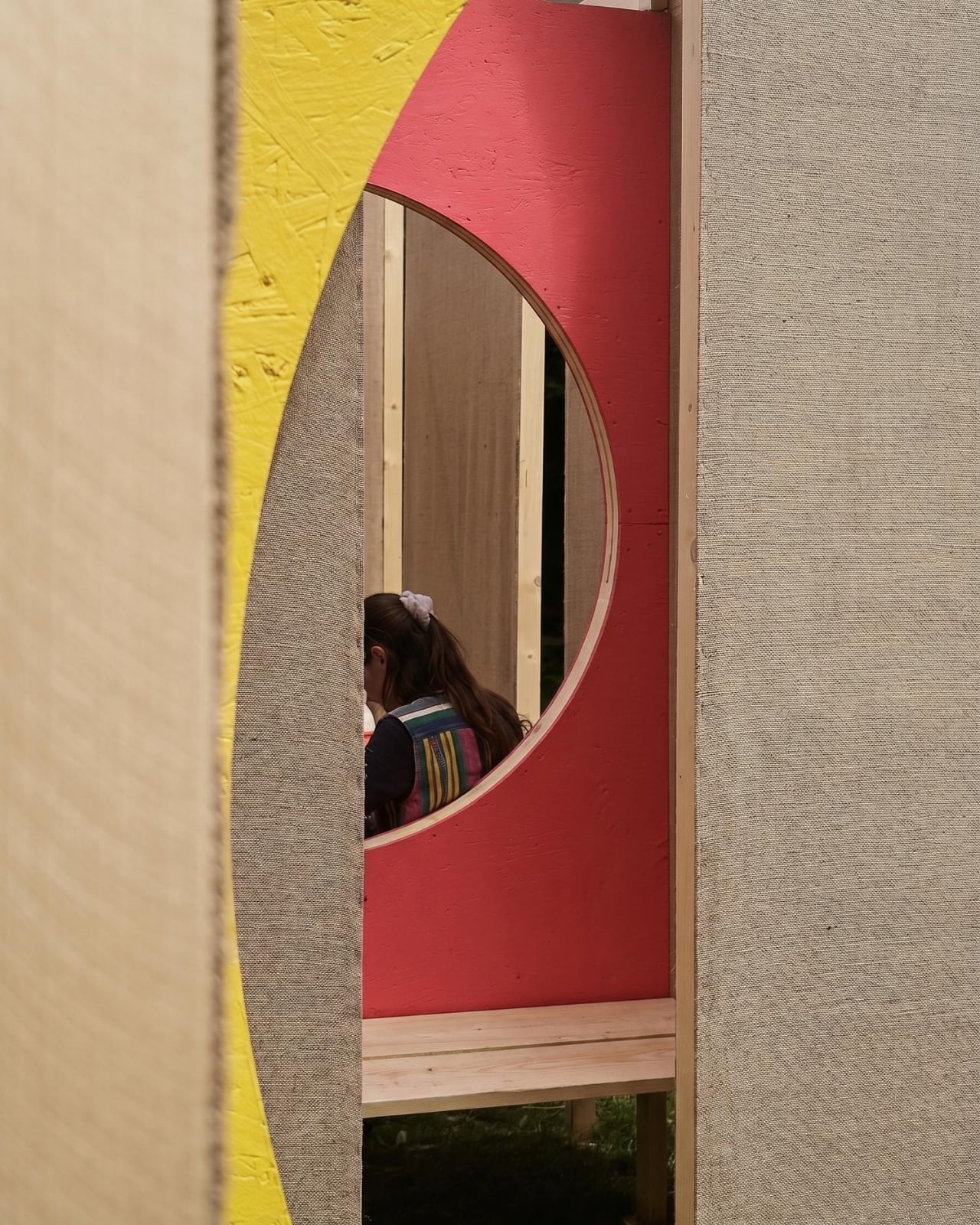
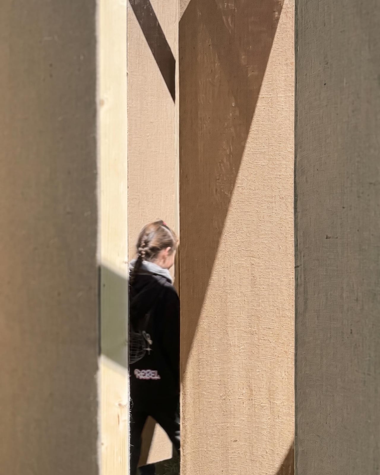
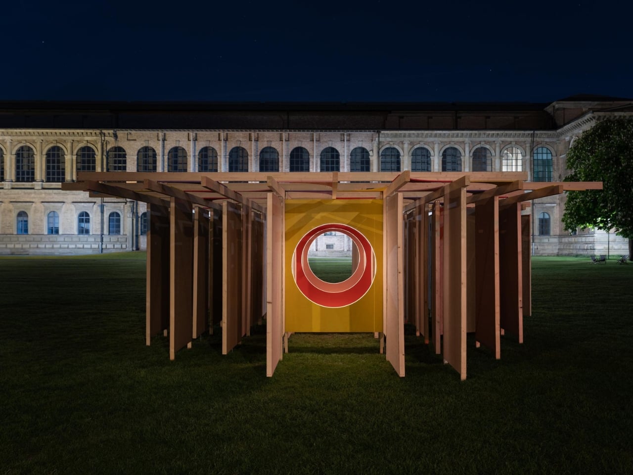
Studio Carraldo took that emotional texture and built a room out of it. Literally. DELULU is a walkable labyrinth constructed with jute fabric walls that shift, creating pathways that are never fully fixed. Visitors move through the space not knowing where the next turn leads, alternating between moments of solitude and unexpected encounters with other people. The whole experience sits somewhere between play and unease, which, when you think about it, is a pretty accurate description of where a lot of us are right now.

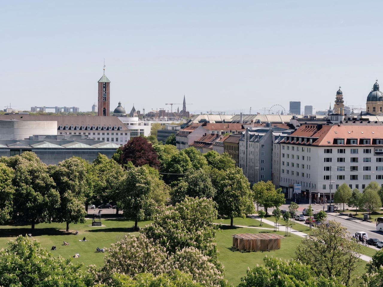
The installation was presented on the south lawn of the Alte Pinakothek during mcbw 2026, which ran under the theme “Playground of Possibilities.” That theme and DELULU make a good pair. The labyrinth isn’t a puzzle to be solved. It’s an experience to be had, and getting disoriented is built into the design on purpose. Studio Carraldo frames that disorientation not as a failure but as a creative opening, a moment where visitors stop navigating on autopilot and start paying attention.
The conceptual backbone here draws on philosopher Timothy Morton’s idea of “hyperobjects,” phenomena so enormous and distributed that they’re essentially impossible to fully comprehend. Climate change is the canonical example. So is the internet. So is the feeling of collective dread that settles over many of us when we try to think clearly about the future. DELULU acknowledges that these things are too big to hold and asks what we do with ourselves inside that impossibility. The answer the installation seems to lean toward is: play. Not as avoidance, but as a way through.
That reframing matters. The word “delulu” works as slang partly because it acknowledges the absurdity of hoping hard in difficult circumstances while also refusing to give that hope up entirely. It’s coping, yes, but it’s coping with a kind of style and self-awareness. Studio Carraldo seems to find genuine value in that instinct, and the installation treats it with more respect than most commentary on Gen Z’s coping mechanisms bothers to.

From a design perspective, the material choice of jute feels deliberate. It’s tactile, warm, and unpretentious. It doesn’t try to be sleek or futuristic. The walls don’t feel like technology. They feel like something you could touch and lean against, which makes the disorientation easier to sit with. A maze built from cold steel or glass would feel like a trap. One built from jute feels more like a shifting conversation.

The question the installation keeps circling, per Studio Carraldo’s own framing, is what it means to design responsibly when the context around you is uncertain and constantly changing. It’s a question the field is wrestling with broadly right now. DELULU doesn’t answer it. It does something more useful: it makes the question feel like a space you can actually inhabit for a while, wander around in, and maybe even enjoy. For a piece of work named after a word that started as an internet joke, that’s no small thing.

The post Studio Carraldo Built a Maze Out of a Gen Z Joke first appeared on Yanko Design.