This $20 Pen Finally Fixed the Problem Every Notebook User Accepts

Even though I have tons of pens in my collection, there are still times I find myself without one outside of my home. Whether it’s because I left my pen case at my desk or I changed bags and didn’t have the usual suspects in my bag pockets, it can be annoying to be without one when I need to write on my planner or journal. Obviously, the best thing would be to have a pen semi-permanently attached to a notebook, but there aren’t a lot of great options out there.

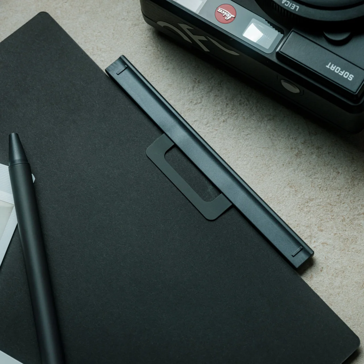
The Inseparable Notebook Pen is for people like me who can be a bit forgetful when it comes to bringing pens wherever I go. As its name suggests, it’s a pen that attaches itself to whatever notebook you’re currently using or bringing with you on the go. This way you will be able to jot down your to-do lists, thoughts and feelings, grocery lists, or brain dumps whenever you need it since your notebook always has a pen clinging to it.

Click Here to Buy Now: $19.95

The pen is encased in a magnetic case with a clip that is securely attached to your notebook. There is a plastic clip that you can put on your notebook before attaching the magnetic clip to protect the cover or paper from creasing. It’s such a simple but elegant piece of craftsmanship that lets the pen be a seamless part of your notebook and your productivity or journaling (or both) needs. It also makes you wonder why there aren’t more similar products in the market, since it’s such a thoughtful solution.
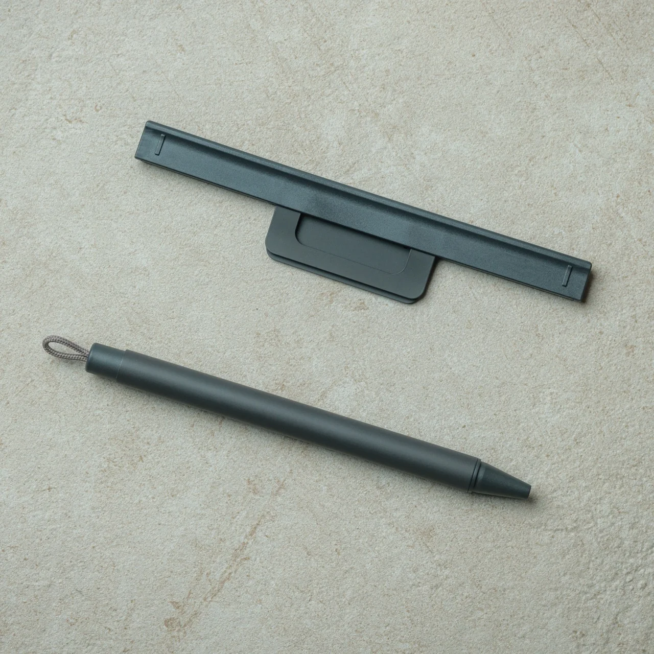
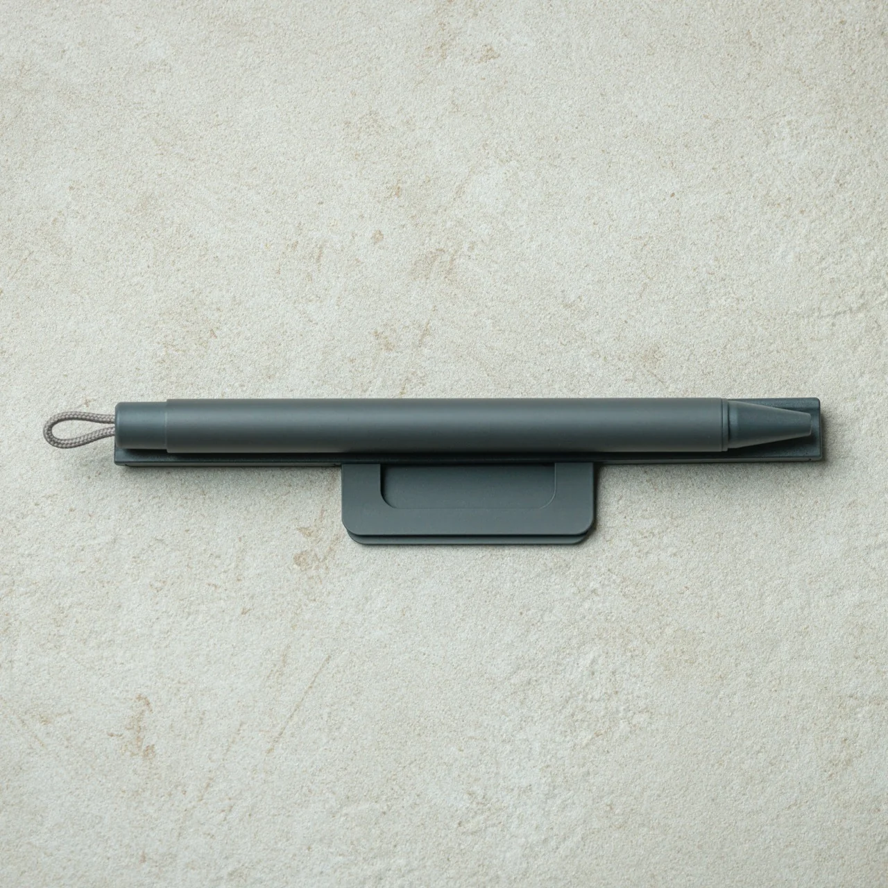
Design-wise, it’s very minimalist and sleek with a timeless aesthetic that should be able to match your notebook, whether it’s a business planner or a cute journal. The magnetic case also has a built-in silencer that makes attaching and detaching the pen an even more seamless and quiet experience for those who prefer it that way (although I personally like hearing the satisfying click when I’m dealing with my pens). It comes in several colors: black, white, blue, and orange.

What I also appreciate is how the three-part system comes together so intuitively. You have the plastic protector, the metal magnetic clip, and the pen itself, three components that work in perfect harmony. The protector goes on first to shield your notebook cover from any potential wear, the metal clip snaps securely over it, and the pen just stays put. Firmly. It also works on practically any notebook, whether soft- or hard-bound, which gives it a universal appeal that stationery lovers and collectors will definitely appreciate.
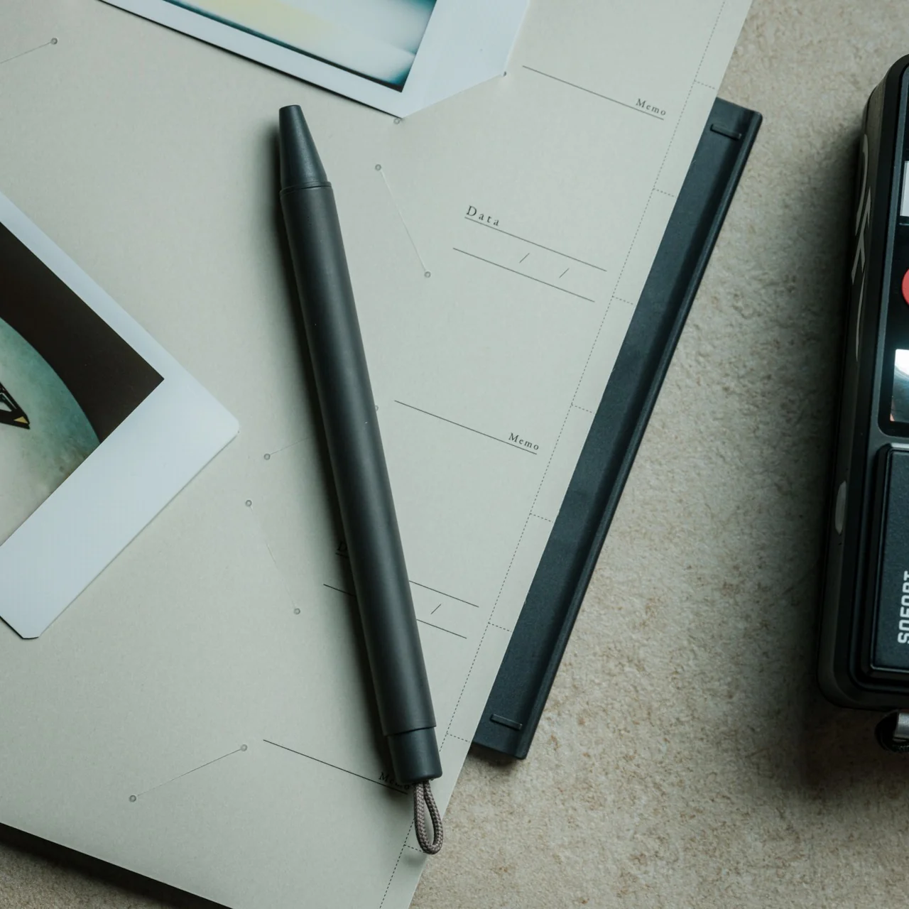
It’s a bit like how the Apple Pencil sits on the side of an iPad, always there, always ready, just waiting to be grabbed the moment inspiration strikes. The big difference? This one doesn’t need charging, and it works with any notebook you already own and love. For those of us who like our tools to be as low-maintenance as possible, that’s already a win.
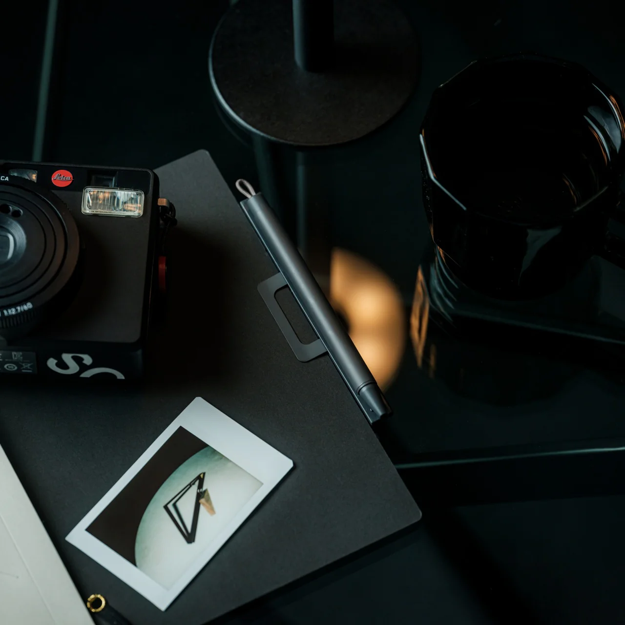
As a pen collector, I’ll admit I initially wondered whether a ballpoint refill would do such a beautifully designed system full justice. But the more I think about it, the more I realize the Inseparable Notebook Pen isn’t really competing in the fine-writing category. It’s solving a practical, everyday problem with incredible elegance. And honestly? For something priced at under $20, the writing experience is smooth, reliable, and more than adequate for daily note-taking.
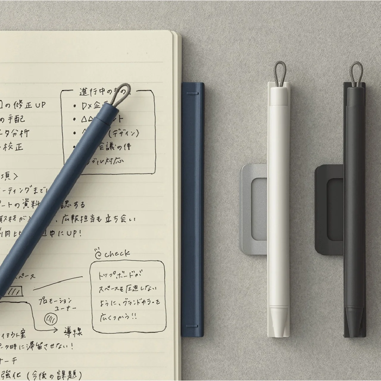
If you’re someone who journals daily, hauls a planner everywhere you go, or simply wants to stop the endless search for a stray pen (we’ve all been there), the Inseparable Notebook Pen is absolutely worth adding to your everyday carry. At just $19.95, it’s one of those rare finds that’s clever, beautifully designed, and genuinely useful all at once. It may be a small thing, but making sure your pen and your notebook are always, inseparably, together? That’s exactly the kind of thoughtful problem-solving we love to see in the stationery world.

The post This $20 Pen Finally Fixed the Problem Every Notebook User Accepts first appeared on Yanko Design.

A 24K Gold Game Boy From Supreme Is FW26’s Wildest Drop

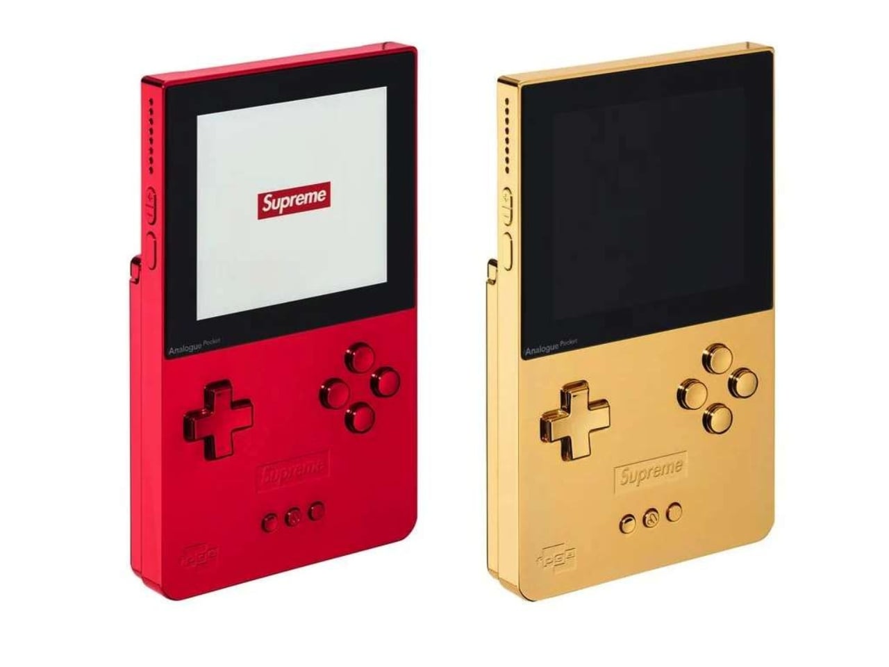
The Analogue Pocket has always been the kind of device that makes you look twice. It plays original Game Boy, Game Boy Color, and Game Boy Advance cartridges on modern hardware, which is already a compelling pitch for anyone who grew up with a brick-sized handheld stuffed in their backpack. Supreme’s Fall/Winter 2026 collaboration with Analogue goes further than that. It’s turning a piece of retro gaming hardware into a genuine collector’s object, and the result is genuinely hard to walk past.

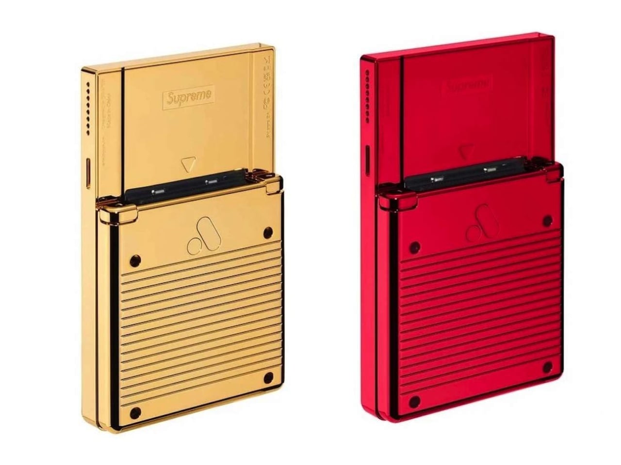
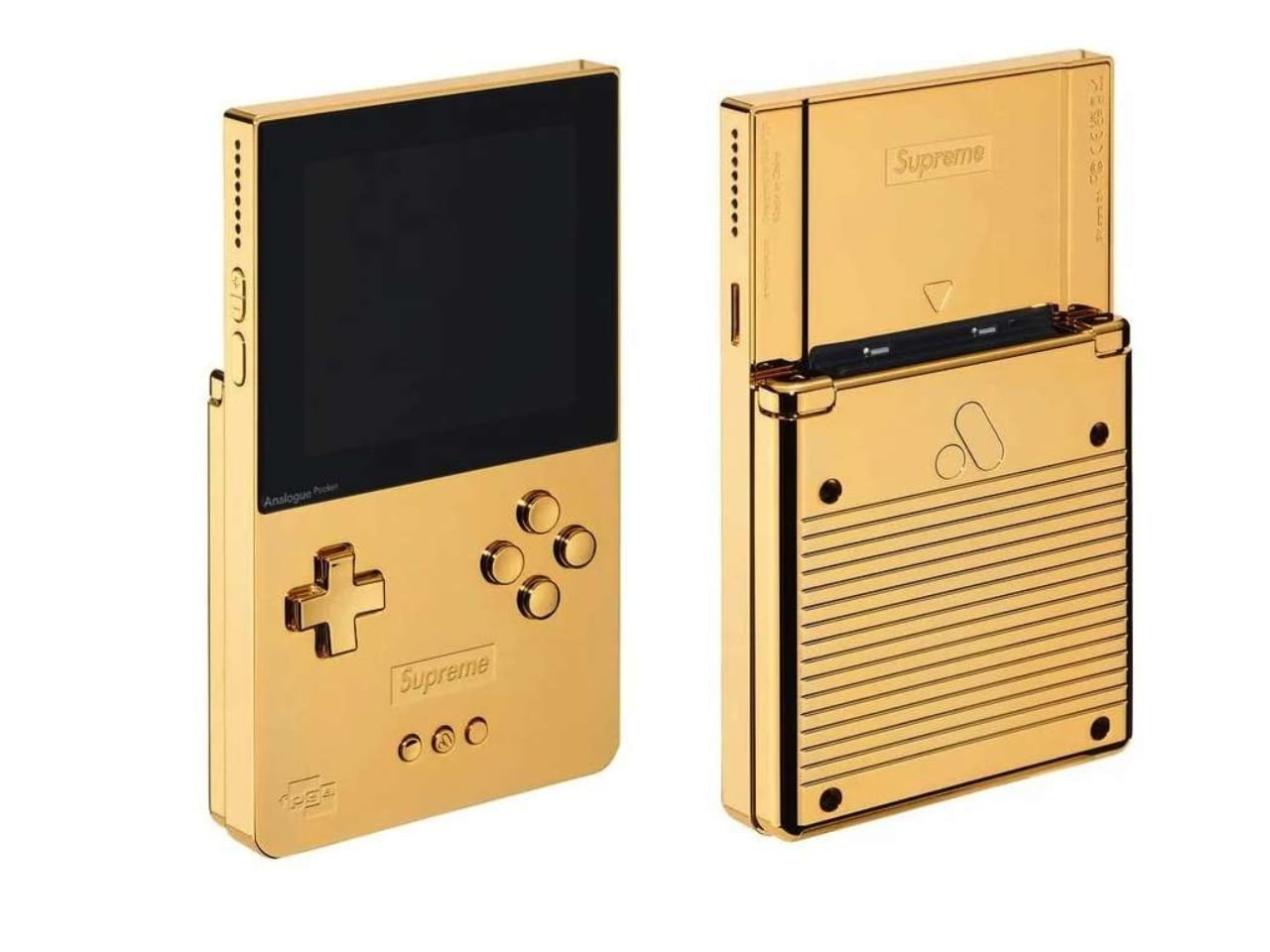
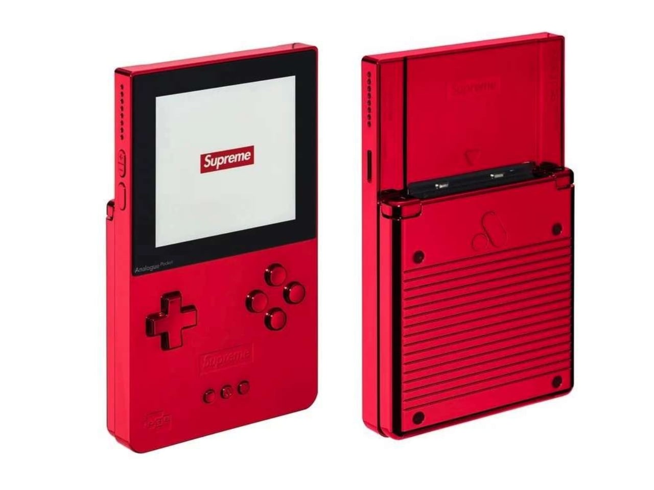
For FW26, Supreme is releasing two limited edition versions of the Analogue Pocket: one in glossy red, the brand’s unmistakable signature colorway, and one finished in 24K gold-plated aluminum. Both versions sit in a unibody aluminum shell with Supreme branding debossed on the front and back, along with a custom logo LCD display. They measure 3.5″ x 5.75″, which is compact enough to hold in one hand and striking enough to stop a room.

Designer: Supreme x Analogue

A quick note on what the Analogue Pocket actually is, because context matters here. This is not a generic emulator. It plays original cartridges, meaning if you’ve been holding onto your copy of Pokémon Gold since 1999, you can slot it right in and go. The device supports over 2,780 Game Boy, Game Boy Color, and Game Boy Advance titles, and also works with cartridge adapters for other handheld systems. It has a built-in synthesizer and sequencer, a MicroSD card reader, and modern internals running the whole operation. The Analogue Pocket was a well-regarded piece of hardware long before Supreme got near it.

That distinction matters, because it’s what makes this collaboration feel earned rather than arbitrary. Supreme has a long and occasionally theatrical history of taking functional objects and turning them into cultural moments through branding alone. The archive includes bricks, crowbars, and fire extinguishers, and somehow it all makes sense in retrospect. But when the base product is genuinely good on its own, the collaboration lands differently. The Analogue Pocket had its own dedicated following before this. Supreme is amplifying that into the fashion and streetwear conversation, and the resulting object speaks to both audiences without alienating either.

The gold version is the obvious showstopper here. A 24K gold-plated handheld is, objectively, an extremely specific thing to produce. It is not subtle, and it is not trying to be. The red version, while less theatrical, carries its own appeal. Supreme’s red is one of the most recognizable colors in contemporary design, and seeing it applied to the clean lines of the Analogue Pocket’s aluminum body feels surprisingly considered rather than purely cosmetic. Both finishes have the kind of presence that makes you hesitate before putting fingerprints on them, which raises a personal question worth sitting with: are you buying this to play, or to display?

The answer is probably both, and that’s the genuinely interesting tension at the heart of any collaboration like this. Retro gaming has shifted from a hobby into a full cultural moment, one where the hardware carries as much meaning as the software. People frame limited edition consoles. They display cartridge collections. They treat the objects of their gaming childhoods as artifacts worth preserving and presenting. The Supreme Analogue Pocket belongs in that space, and that’s not a criticism. It’s an observation about how the culture has evolved.

Pricing and availability details haven’t been fully confirmed, but the device will be available exclusively through Supreme, which is predictable in the best way. Supreme drops being what they are, demand will not be a problem and availability will be. Whether you land one or spend the afternoon refreshing a browser tab is largely a matter of timing.

For now, the Supreme x Analogue Pocket reads as one of the more coherent streetwear collaborations in recent memory. It doesn’t feel like branding for branding’s sake. It feels like two brands that actually have something meaningful to say to each other, and the result is a handheld that lands at the exact crossroads of nostalgia, craft, and cultural currency.

The post A 24K Gold Game Boy From Supreme Is FW26’s Wildest Drop first appeared on Yanko Design.

This Bulgarian Bank Branch Looks Like You’re Sitting Inside a Crystal

Walls, generally speaking, have one job. Stand there, hold up the ceiling, maybe hide some plumbing, and stay out of everyone’s way. DA Architects looked at that job description for the DSK Bank flagship branch in Sofia and decided it was criminally boring. So instead of a wall, they built a single continuous folded surface in punchy olive green that runs the length of the branch and somehow moonlights as a bench, a desk, an ATM housing, a screen bezel, and a light fixture, all without changing material once.

The trick is genuinely clever once you notice it. Every fold in that green ribbon is doing structural or functional work, not just decorative flexing, and the surrounding white louvers exist mostly to give the whole thing a clean edge to disappear into. Sit inside one of those angular little niches and you are basically perched inside a piece of the wall itself. It is origami logic applied to interior architecture, and it turns a routine bank visit into something closer to sitting inside a crystal.

Designer: DA Architects

The branch sits inside The Mall on Tsarigradsko Shose in Sofia, and it was built out between October 2016 and early 2017 as the pilot for a much bigger idea. DA Architects had won a competition to redesign DSK’s entire branch network, and this space was the proof of concept, the one location that had to sell an entire bank on going full geometry. At roughly 270 square metres, it is not a massive footprint, but the design punches well above it by refusing to waste a single wall surface on doing nothing.

Old-school bank branches keep everything locked in the center, tellers, machines, security, and make customers orbit around the edges like they cannot be trusted too close to the cash. DA Architects flipped that completely, pushing every functional unit, screen, and device to the periphery and leaving the entire core of the room open. It is the kind of move that only makes sense once you realize digital banking already killed the old security logic, most people just never bothered to redesign the room to match.

The material choices back up the concept instead of just decorating it. MDF louvers and mirror-polished stainless furniture handle the hard surfaces, while the green strip itself splits into solid panels where devices are built in and softer upholstered ones where people actually sit, a small distinction that keeps the whole thing from feeling like one giant showroom prop. Behind the louvers and green niches, the studio tucked away cabling and services, so the geometry reads as intentional rather than as a skin bolted over a normal room.

Tucked at the back is a private consultation room sealed off by a switchable glass wall, milky one second, fully transparent the next, once you run current through it. It is a small gesture buried at the end of a much louder design, but it says a lot about the studio’s instincts. They know exactly when to let geometry do the talking, and exactly when to go quiet.

The post This Bulgarian Bank Branch Looks Like You’re Sitting Inside a Crystal first appeared on Yanko Design.

Your Dead Computer’s CD-ROM Drive Can Become a Real Audio Player Thanks To This Upcycled Project

Every household has one drawer nobody wants to open. It’s full of cables that match nothing, a phone charger for a handset you haven’t owned in a quarter century, and somewhere near the bottom, a beige CD-ROM drive that hasn’t spun a disc in about the same amount of time. We keep this stuff out of guilt, not usefulness. Throwing away hardware that still technically works feels like a small betrayal, so it just sits there gathering dust and doing nothing for anyone.

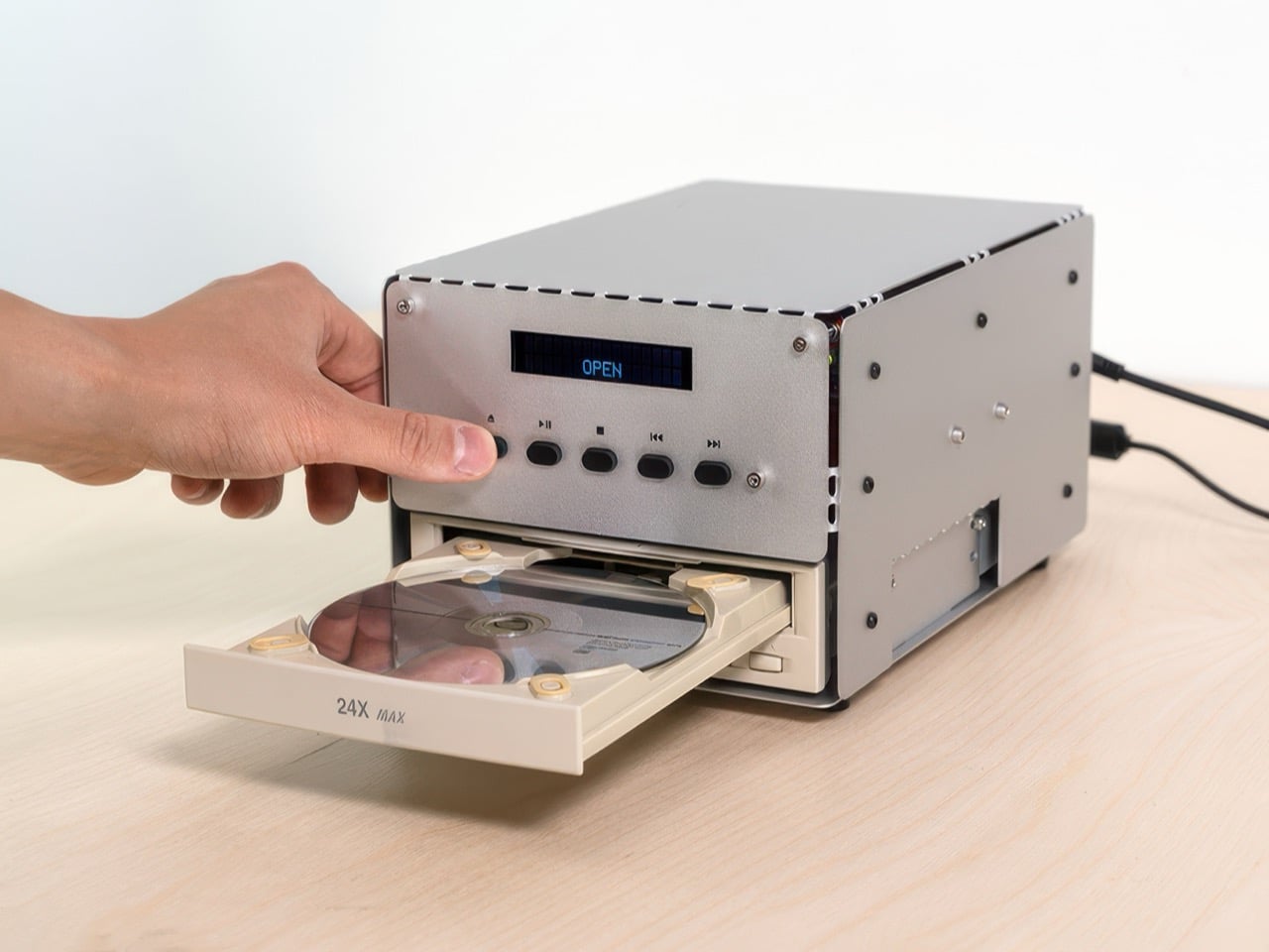
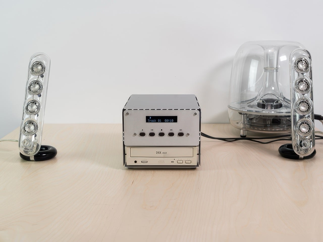
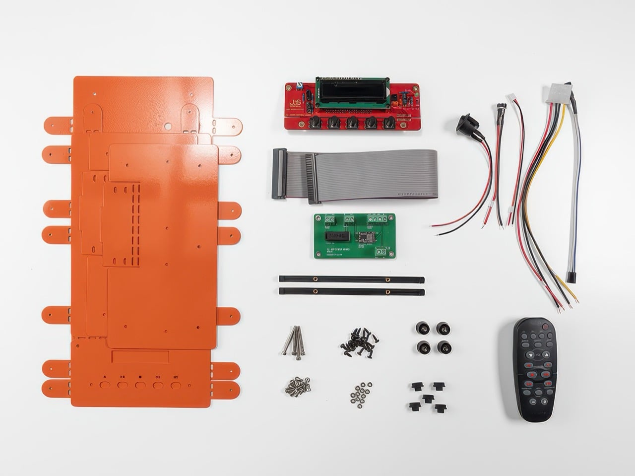
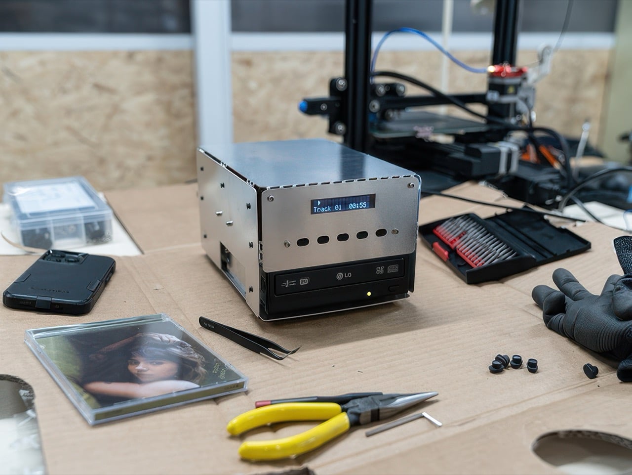
Korean studio das_POD looked at that exact drawer and decided the guilt was solvable. Their answer is CD-ROM PLAYER 01, a build-it-yourself audio kit that turns your dead PC’s optical drive into an actual, functioning CD player again. You supply the drive, they supply a laser-cut aluminum shell, a control board, and instructions that skip the soldering iron entirely. The result looks intentional on the outside and slightly chaotic on the inside, which is probably the most honest metaphor for building your own tech that I’ve come across all year.

Designer: das_POD – Seong Heum Na

Nobody hands you a finished object here. The kit ships with laser-cut aluminum panels, an IDE controller board, a power PCB, a remote, and a bag of cables and hardware, but the actual CD-ROM drive isn’t included. You go find one yourself, from an old tower in the garage, a recycling center, or das_POD’s own stash of refurbished drives running $10 to $40. Assembly needs nothing more exotic than a multi-bit screwdriver, takes somewhere between 30 and 60 minutes, and every completed unit ends up looking slightly different depending on which drive you fed it.

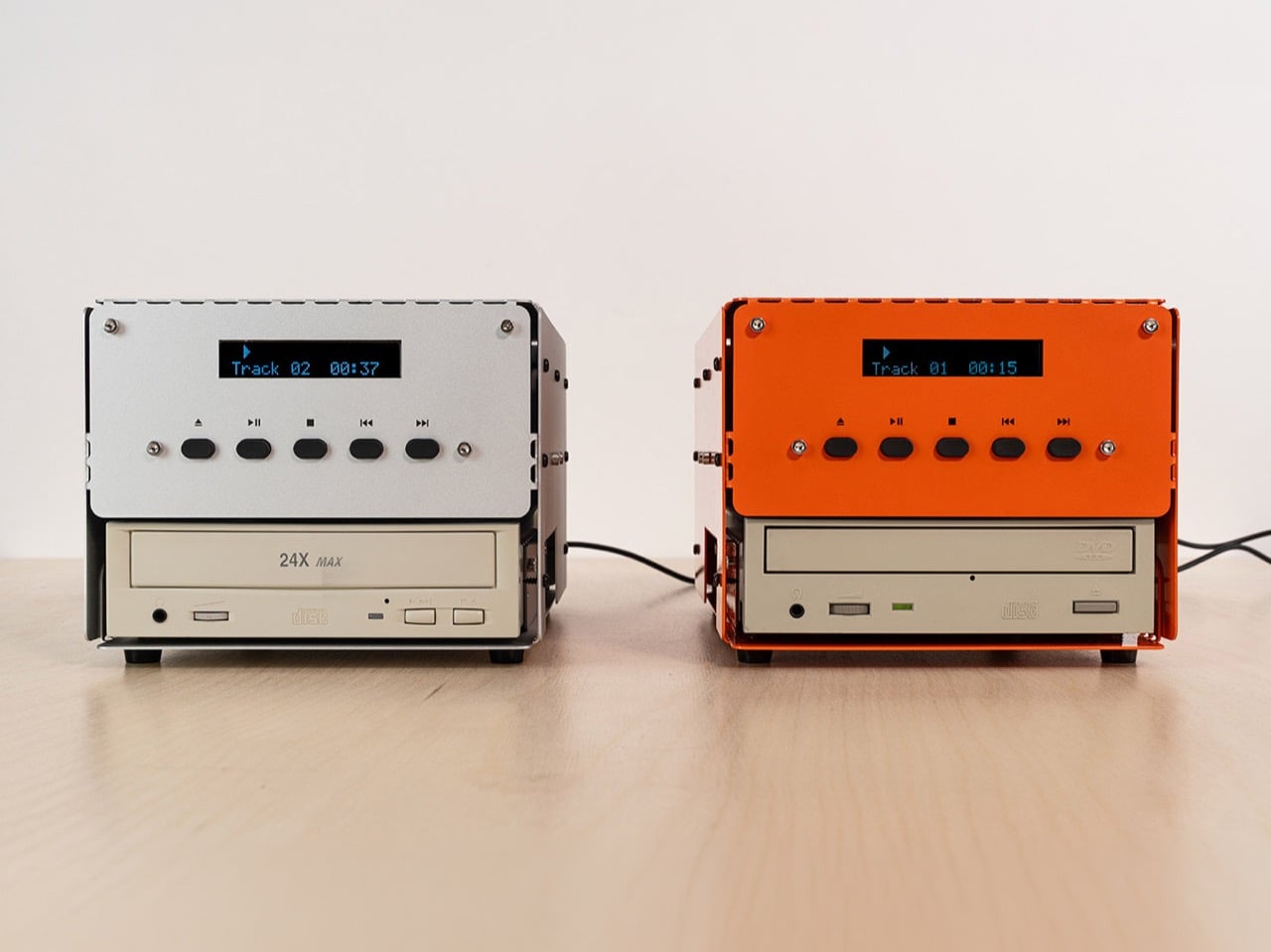
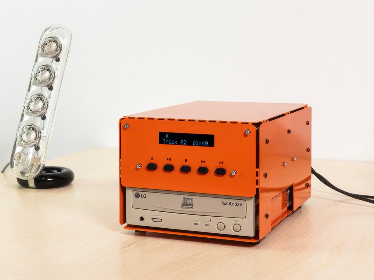
The design decisions live in what das_POD chose to control and what it deliberately left alone. The enclosure comes in three finishes: a shot-blasted semi-gloss anodized version at $220, and matte black or orange powder coat, both at $190. The front panel keeps it simple, a small dot-matrix display for track number and time, five buttons for eject, play, stop, and skip. None of that hides the drive itself, which juts out below the panel wearing whatever branding it came with. That contrast, polished metal above, scuffed beige plastic below, is doing all the storytelling here.

We wrote about Teenage Engineering’s computer-2 last year, a PC case built from one folded sheet of plastic that the company gave away for free, purely to prove a case didn’t need to cost anything. das_POD is running the exact same playbook in reverse. Same bring-your-own-hardware logic, same flat-pack, screw-light assembly, except here you’re paying $190 to $220 for the shell and providing the part that actually plays music. One company treats the enclosure as a marketing stunt. The other treats it as the entire product. Neither is wrong, but it’s a funny thing to watch happen twice in one year.

There’s a built-in expiration date worth naming honestly. CD-ROM PLAYER 01 only works with older IDE drives, not the SATA ones from the last fifteen years, because IDE drives carried their own analog audio output, and that’s what makes the whole circuit work without extra decoding hardware. Which means the supply of compatible drives only shrinks from here. Kind of poetic for a project built entirely around giving old junk a second act.

The post Your Dead Computer’s CD-ROM Drive Can Become a Real Audio Player Thanks To This Upcycled Project first appeared on Yanko Design.