PROS:
- Distinctive design that still feels recognizably Nothing
- Large 120Hz AMOLED display is good for the price
- Solid all–day battery life
CONS:
- No telephoto camera
- Noticeable bezel
RATINGS:
SUSTAINABILITY / REPAIRABILITY
EDITOR'S QUOTE:
Not especially thrilling, but thoughtfully balanced, the Nothing Phone (4b) is an affordable phone that knows its priorities.
It’s no secret that rising memory prices have become a major challenge for tech companies of every size. Some brands have responded by simply raising prices. Others have had to rethink their product strategy entirely. You know the situation is serious when a company decides not to release a successor to one of its most popular series because it cannot build a phone that feels good enough for its target audience at the right price.
With no CMF phone upgrade arriving this year, the Nothing Phone (4b) becomes the company’s new affordable entry point. Rather than pushing ahead with a compromised CMF successor in a difficult market, Nothing has brought that mission back under its main label. It is an entry-level phone by positioning, but one that still tries to carry the visual character and brand personality that make a Nothing device feel distinct. Of course, affordability in a market like this never comes without tradeoffs. The question is whether Nothing has chosen the right ones. Has it cut back in ways most users can accept, while still delivering a phone that feels stylish, capable, and true to the brand?
Designer: Nothing
Aesthetics
Nothing has built its reputation on a strong and instantly recognizable design identity. That identity first emerged with the Nothing Ear (1), the company’s debut wireless earbuds, whose transparent look immediately gave the brand a distinct visual signature. When Nothing later expanded into smartphones, it introduced the Glyph design as a new defining element of its phone lineup. Since then, the company’s design language has continued to evolve, sometimes through refinement, sometimes through experimentation, but never by standing still.
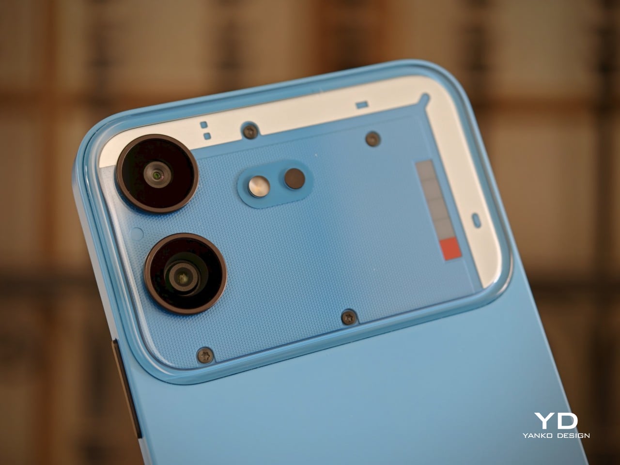
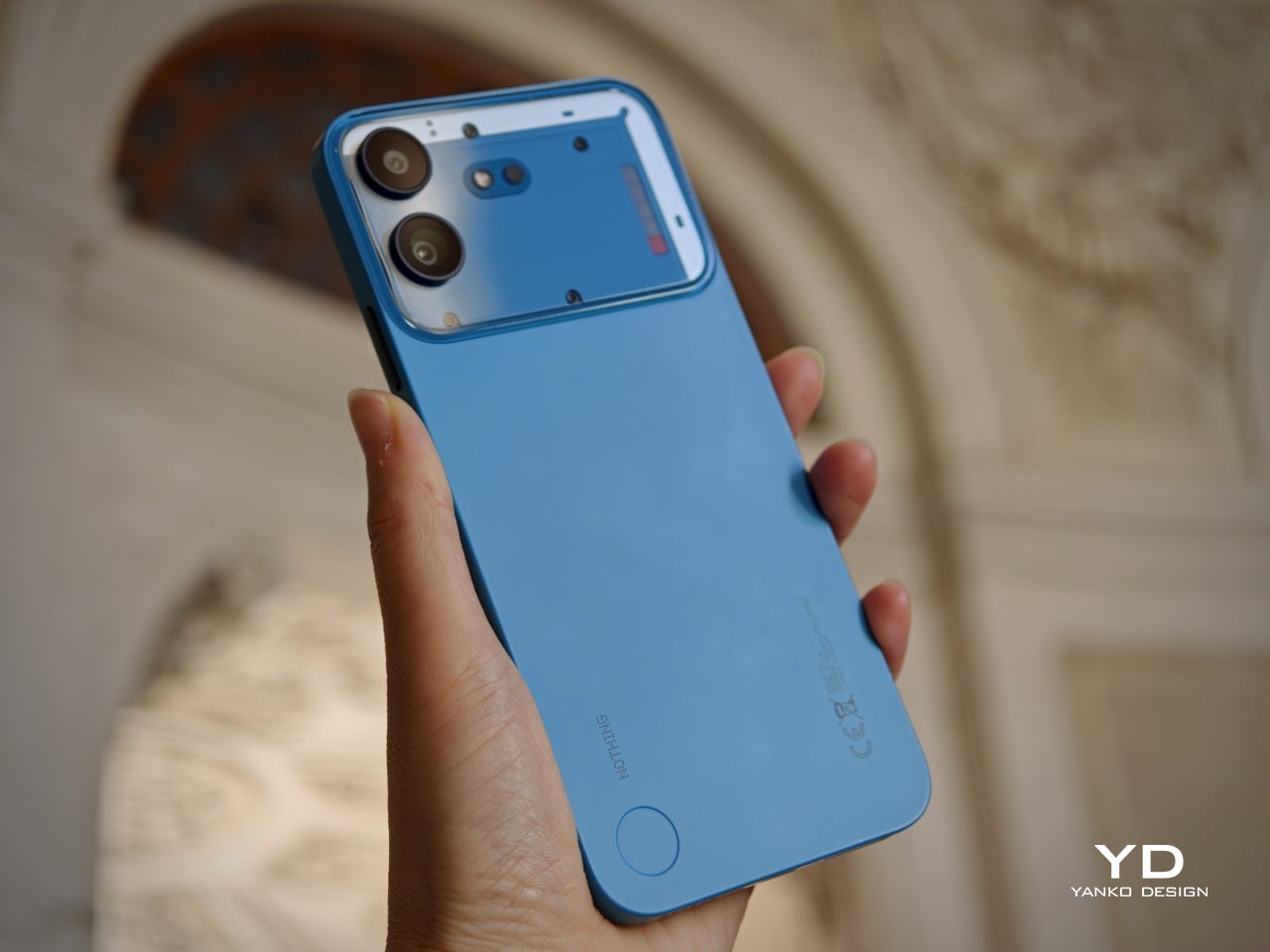
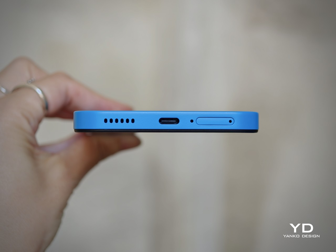
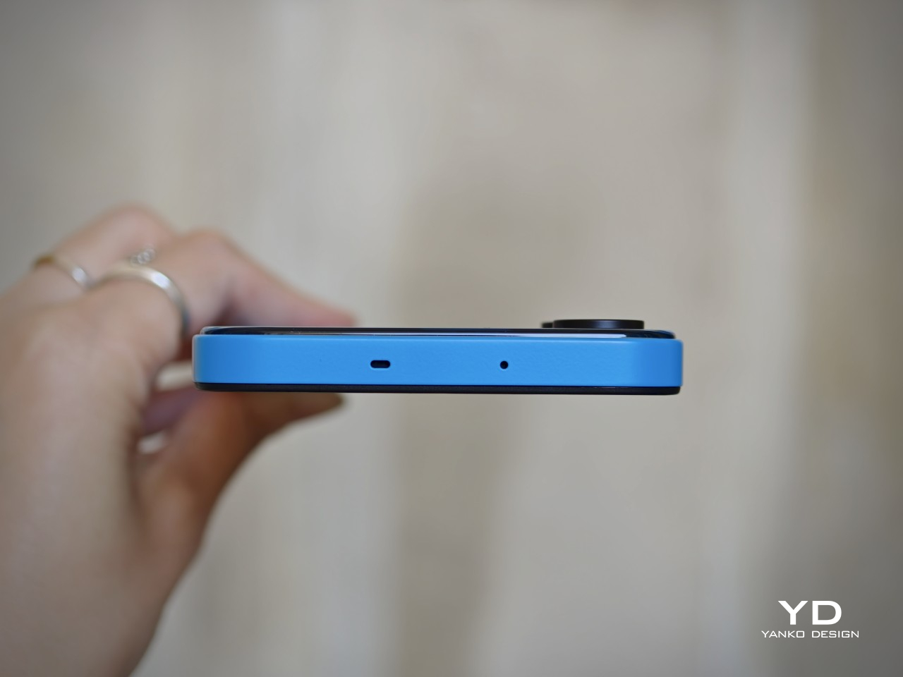
At a glance, the Phone (4b) still feels part of that family. It carries over familiar cues such as exposed screw details, geometric panel treatment, and a transparent-inspired camera bump that gives the rear a sense of structure rather than mere decoration. The phone is offered in White, Black, and Blue, and its unibody design helps the overall form feel more cohesive. All three colorways use black buttons, which create a subtle contrast, especially on the lighter finishes. The rear itself has a dual-tone look, with a more solid lower section and a transparent-inspired camera bump above it. On that bump, two vertically stacked cameras sit alongside the flash and a Glyph Bar that echoes the Phone (4a).
It is not as fun or as visually exciting as some other Nothing phones, especially the earlier ones. The design feels more restrained, with less of the playful boldness that once made the brand’s devices feel genuinely surprising. Even so, for a budget phone, Nothing has balanced design ambition and cost control well, preserving enough character to keep the Phone (4b) from fading into the background.
Ergonomics
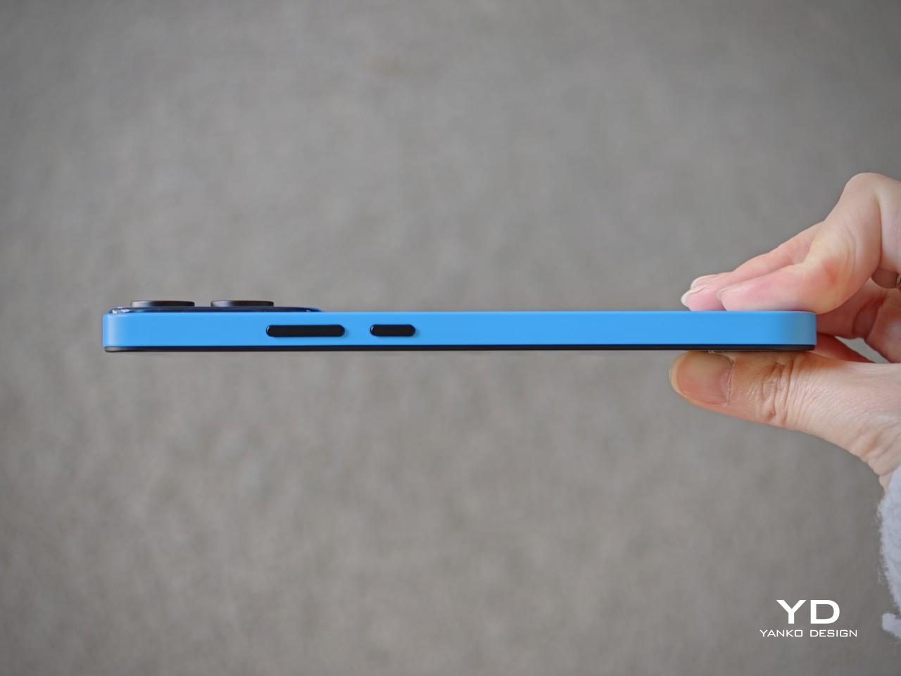
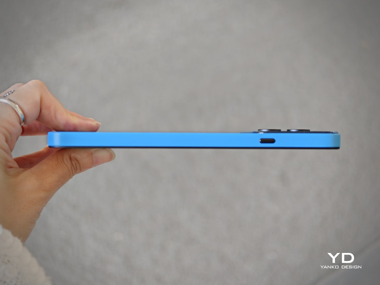
Measuring 164.4 x 78.2 x 8.6 mm and weighing 210 g, the Nothing Phone (4b) is very much a modern big-screen budget phone. Its unibody construction helps it feel solid and cohesive in the hand, and the weight distribution is even enough that it does not come across as awkward or top-heavy. The matte texture is a nice touch visually and helps the phone avoid looking overly glossy, though it does not completely translate into a secure grip.
For me, the biggest issue is the width. At 78.2 mm, it is just a bit too wide to handle comfortably with one hand, especially when trying to reach across the display for interface elements or app icons. The handling can also feel a little slippery at times, so simple actions such as pulling down menus or tapping controls near the opposite edge can require a grip adjustment. As a result, the Phone (4b) feels more natural in two-handed use than in quick one-handed moments.
The fingerprint scanner placement does not help much either. It sits near the bottom of the display, which makes the unlock motion feel less seamless than it should. Once the phone is unlocked, your thumb is already positioned too low, so moving directly into navigation feels less natural than it would with a scanner placed slightly higher. It is a small ergonomic detail, but one that becomes easier to notice in everyday use.
Performance
The Nothing Phone (4b) is powered by the Snapdragon 6 Gen 4, paired with 8GB of RAM and either 128GB or 256GB of storage. That places it firmly in the lower mid-range rather than the true bargain-bin tier, and in daily use, that positioning feels about right. This is not a phone that tries to impress with raw speed or benchmark theatrics. Instead, it aims for a level of performance that feels dependable enough for the people most likely to buy it.
In everyday tasks, the Phone (4b) holds up well. Navigating the interface, switching between common apps, browsing the web, replying to messages, and scrolling through social media all feel smooth enough that the phone rarely calls attention to its limitations. Gaming is where its limits become clearer. Casual titles should run without much trouble, and lighter 3D games are likely to be perfectly playable, but this is not a device built for demanding graphics or long sessions at high settings. Heavier games will almost certainly require reduced visual quality to maintain consistency, and even then, this is not the sort of phone that feels eager to push beyond its class.
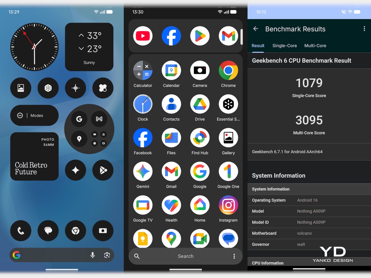
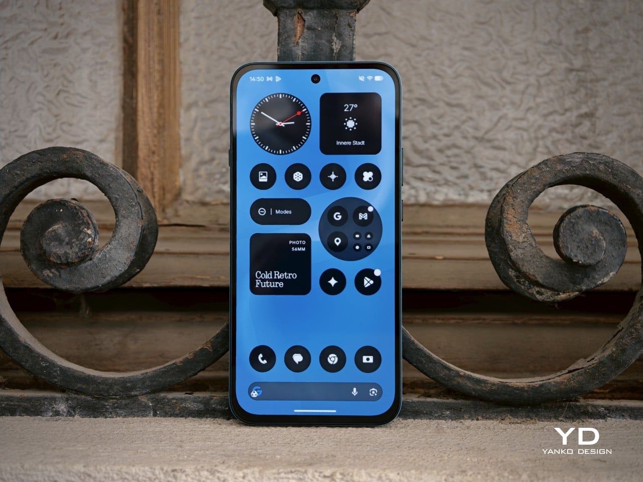
The software experience plays a big role in making the Phone (4b) feel more polished than its hardware might otherwise suggest. Nothing’s interface has generally been one of the company’s strengths, and that remains true here. Notably, Nothing has not held back too much on software features, with AI tools and Essential Space both making their way to the Phone (4b). The software is also relatively clean, with only a small amount of pre-installed bloatware, something that remains surprisingly rare at this end of the market.
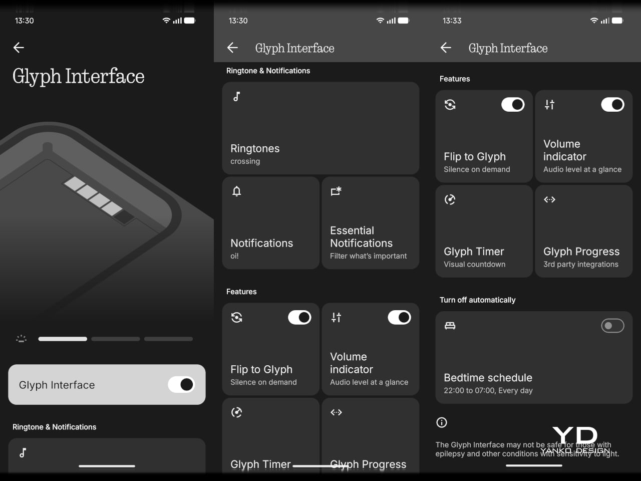
The Glyph interface is still here, though in reduced form as the rear Glyph Bar rather than the fuller system found on more expensive Nothing phones. It supports practical functions such as timers, charging progress, notifications, recording indicators, and one of my personal favorites, the camera countdown, so it is more than just a visual gimmick. Still, this pared-down implementation feels more like a modest nod to Nothing’s identity than a feature that adds much excitement to the experience.
The Phone (4b) features a large 6.77-inch AMOLED display with a 1080 x 2344 resolution, a pixel density of 381ppi, and a 120Hz refresh rate. Nothing also claims a peak brightness of 2,000 nits and 1,300 nits in outdoor brightness mode. It is a solid display package for the segment, offering the kind of size and fluidity that most users will immediately appreciate in daily use.
Visually, the panel does not do much to surprise. The bezels are relatively thick all around, with a more noticeable chin at the bottom, so it lacks the sleek edge-to-edge impression of more expensive phones. Even so, this is still a good screen for the price. The AMOLED panel gives the Phone (4b) the contrast and richness you would hope for, while the 120Hz refresh rate helps the interface feel smoother and more modern.

Main Camera, 2x

Main Camera, 1x
The speaker quality follows a similar pattern. It is still not especially impressive, but it is better than merely acceptable. The stereo speaker setup gives the Phone (4b) a more balanced audio presentation, and the sound avoids becoming muddy. It is not a standout for richness or power, but for everyday listening, the result is solid for the class.

Main Camera 2x (B&W Film Filter), Main Camera 2x (Normal)

Main Camera 2x (Portrait Mode)
The camera system is another area where expectations need to stay grounded. On the back, the Phone (4b) pairs a 50MP main camera, using a 1/2.76-inch sensor with an f/1.8 aperture and OIS, with an 8MP ultra-wide camera that uses a 1/4-inch sensor and an f/2.2 aperture. Up front, there is a 16MP selfie camera. This is a fairly typical camera setup for the segment, with the main sensor doing most of the meaningful work.

Ultra-wide 0.6x

Main Camera 1x
In good daylight, the results are generally solid. The main camera captures decent detail, pleasing contrast, and images that are more than good enough for social sharing. The phone can zoom up to 10x, but image quality starts to fall off noticeably beyond 2x, so that upper range is more there for flexibility than for genuinely reliable output. Low-light performance is also fairly good overall, though white balance can become a little wonky in certain scenes. For video, the main camera can record at up to 4K 30fps, while the ultra-wide and front-facing cameras are limited to 1080p, with the former capped at 30fps and the latter able to reach 60fps.

Main Camera 2x

Main Camera 5x

Main Camera 10x
Battery life should be one of the Phone (4b)’s more dependable strengths. The global version packs a 5,200mAh battery, and when paired with a relatively modest chipset and efficient software, the phone is clearly tuned for endurance rather than excess. In my use, it lasted a full day easily, which is exactly what most buyers in this category will want. Charging is less exciting. Wired charging tops out at 33W, which is not especially fast by current standards, but the inclusion of 5.5W reverse wired charging is still a welcome extra.
Sustainability
Sustainability is rarely a major talking point in the smartphone market, which is why Nothing deserves credit here. The company puts details such as the Phone (4b)’s carbon footprint and packaging composition directly on the product page instead of burying them elsewhere. That kind of transparency is still uncommon, and it makes the sustainability effort feel more concrete.
There is also a practical side to the story. The Phone (4b) has an IP64 rating for dust and splash resistance, while its unibody construction should help with structural strength. Software support is solid, with three years of Android updates and six years of security patches.
Nothing lists the Phone (4b)’s carbon footprint at 54.7 kg CO₂e, and says more than 99 percent of the packaging is plastic-free, excluding the PET-paper composite label. These are not the kind of details most buyers will focus on first, but they are useful to have. More importantly, this level of disclosure is worth praising and reflects a company that is at least willing to treat environmental responsibility as part of the product conversation.
Value
At £299, or about $400, the Nothing Phone (4b) is not trying to be the absolute cheapest option. Instead, it aims to offer a more polished and distinctive experience than many budget phones at this price. That gives it a slightly different kind of value proposition.
That mostly works in its favor. You get a recognizably Nothing design, a large 120Hz AMOLED display, clean software, stereo speakers, solid battery life, and dependable everyday performance. The phone is not without compromises, especially in its chipset choice and the lack of a telephoto camera.
The Phone (4b) may not be the obvious bargain pick, but it still offers solid value. It feels less like a phone built to win on one headline feature and more like one shaped by careful compromise. For buyers who want an affordable phone with personality and few major weaknesses, it makes a convincing case for itself.
Verdict
The Nothing Phone (4b) is a sensible response to a difficult market. Rather than forcing out a compromised CMF successor, Nothing has created a new affordable entry point under its main brand. The result is a phone that feels carefully judged rather than boldly ambitious.
It is not an especially exciting device, and some compromises are easy to notice. The chin bezel, modest chipset, and limited camera versatility all remind you where costs have been kept in check. Even the Glyph Bar feels more like a restrained nod to Nothing’s identity than a standout feature.
Still, the Phone (4b) gets the fundamentals right. It offers a good display, clean software, solid battery life, stereo speakers, dependable everyday performance, and a design that still feels recognizably Nothing. For buyers who want an affordable phone with personality and few major weaknesses, it makes a convincing case for itself.
The post Nothing Phone (4b): Not Exciting, But Hard to Fault first appeared on Yanko Design.