10 Rumored iPhone 18 Pro Max Upgrades You Need to Know

10 Rumored iPhone 18 Pro Max Upgrades You Need to Know

Apple’s highly anticipated iPhone 18 Pro and Pro Max models are set to push the boundaries of smartphone technology. With advancements in display technology, processing power, battery life, and camera capabilities, these devices promise to deliver a premium experience for users. Expected to launch in September 2026, the iPhone 18 Pro Max is designed to […]

The post 10 Rumored iPhone 18 Pro Max Upgrades You Need to Know appeared first on Geeky Gadgets.

Posted in Uncategorized

Bixdo Glossonic Brush Air (W30) Review: The Toothbrush That Replaces Your Whitening Strips

PROS:


  • Striking design with ambient light effect when docked

  • 120-day battery life greatly simplifies portability

  • Effective whitening process combined with brushing

CONS:


  • Handle might be too large for some hands

  • Very limited color options

RATINGS:

AESTHETICS
ERGONOMICS
PERFORMANCE
SUSTAINABILITY / REPAIRABILITY
VALUE FOR MONEY

EDITOR'S QUOTE:

By making the whitening happen in the background, the Bixdo Glossonic Brush Air (W30) electric toothbrush doesn't overhaul a bathroom routine so much as quietly upgrade it.
award-icon

At-home teeth whitening has never been more accessible, yet most people can’t stick with it. Whitening strips take 30 to 45 minutes and often cause sensitivity. Whitening toothpastes rely on mild abrasives that can wear down enamel over time. Professional treatments work well, but they’re expensive and require appointments that take time out of your schedule. The category has a compliance problem that no stronger formula or new packaging seems to fix.

The Bixdo Glossonic Brush Air (W30) takes an entirely different approach. Rather than adding another product to the routine, it builds whitening into the process of brushing, something most people already do twice a day. Paired with a Bixdo’s whitening toothpaste and blue light technology, it turns a daily habit into a gradual brightening system that doesn’t ask much of the person using it.

Designer: Bixdo

Click Here to Buy Now: $139.99.

Aesthetics

Most electric toothbrushes lean into a clinical aesthetic. The Bixdo W30 departs from that with a sleek, lacquered silhouette in deep navy blue fading into a frosted white at the base, a gradient that’s genuinely eye-catching for a toothbrush. That finish gives it a quality closer to personal-care hardware than a dental appliance, and it’s the kind of object you’d actually want on a vanity rather than stashed under the sink.

The Bixdo W30 charges via a USB-C port built into the base of the handle, which is a small but telling design choice. It keeps the whole package clean and self-contained, with no proprietary dock or cradle to misplace. For a bathroom counter that’s already busy, that kind of restraint matters. It’s the kind of detail that doesn’t announce itself but would be noticeably annoying if it were handled differently.

The brush head is where the design gets interesting. The filaments are made from translucent material specifically to channel blue light from inside the handle outward to the tooth surface, supporting the Bixdo whitening system directly at the point of contact. The effect is genuinely dramatic: when active, the entire head blazes with a vivid blue glow, making the whitening feel tangible rather than abstract.

Ergonomics

Picking up the Bixdo Glossonic Brush Air (W30), the weight feels deliberate, and the glossy finish stays comfortable without feeling slippery. A single oval button sits below a small embedded display on the handle face, keeping the interface minimal and uncluttered. The display shows mode icons and labels clearly at a glance. The form is easy to grip, whether the brush is used straight on or at an angle for back teeth.

A single press of the button gets the brushing started, and the display confirms the active mode at a glance. The brush sends a brief vibration every 30 seconds as a prompt to shift to the next brushing zone, a useful nudge that keeps the routine thorough rather than habitual. When the session ends, the screen shows a brushing result to indicate how the session went.

Performance

The cleaning side of the Bixdo W30 isn’t an afterthought. Its sonic brushing action drives a thorough clean across the tooth surface and into the spaces between teeth, putting it on level ground with mainstream premium electric toothbrushes in terms of mechanical cleaning power. Teeth feel noticeably cleaner and smoother after each session, and it performs that way consistently, before the whitening layer even factors in.

The whitening mechanism is built around the Bixdo whitening system, where the blue light works together with the PAP-based whitening toothpaste and light-guiding brush head to address everyday surface stains. Many devices use blue light, but how those elements are designed to work together determines whether it actually does anything useful. The Bixdo W30 is built around that coordination rather than around any single feature.

The system pairs with a PAP-based whitening toothpaste specifically designed for everyday whitening care. Unlike many whitening products that rely on hydrogen peroxide and are intended for occasional high-intensity use, the PAP-based formula fits naturally into a twice-daily brushing routine. It’s the kind of formulation that makes sense for something meant to be used consistently, day after day, rather than as an occasional treatment.

There are four brushing modes: DAILY, DIAMOND, and GENTLE, which all activate the blue light in three-minute sessions at varying intensities, and GUM CARE, a two-minute vibration-only option for users with sensitive teeth and gums. Results build gradually with consistent use, which suits the broader logic of a product designed to work within a daily routine rather than deliver a single dramatic result.

Battery life is another standout. The Bixdo W30 is rated for 120 days on a single charge, which means charging it roughly twice a year at most. For anyone who travels regularly, this essentially eliminates the charger from the packing list entirely. The brush is also IPX7 waterproof, so rinsing it off or using it in the shower isn’t a problem.

Sustainability

The 120-day battery life has an environmental dimension worth noting. Most electric toothbrushes get charged weekly or more often, adding up to dozens of charge cycles a year that slowly degrade the battery’s overall capacity. The W30’s extended battery means fewer cycles, less energy consumed over time, and a device that’s more likely to stay in good working condition longer before the battery becomes an issue.

The brush head is designed to be replaced at least every three months, in line with standard dental guidance, which gives the routine a clear and easy-to-follow maintenance rhythm. That’s a more sustainable ownership model than replacing the full device. The refill toothpaste and replacement-head model together mean the handle stays in service rather than becoming disposable hardware when something wears out.

Value

The Bixdo W30 sits at the premium end of the consumer toothbrush market. But its intended comparison isn’t other electric toothbrushes. It’s meant to replace a combination of products: a capable electric brush and a separate whitening system. Professional in-office treatments run anywhere from $350 to $1,200 per session, and most people need more than one session a year to maintain results.

Compared to whitening strips, the math becomes even more interesting. A pack of good-quality strips can run $40 to $60, lasts a couple of weeks, and needs to be repurchased on a regular cycle. The Glossonic Brush Air’s ongoing cost is the companion PAP toothpaste, a reasonable daily-use repurchase for something doing double duty as both toothpaste and whitening treatment. As a consolidated system, that recurring expense starts to look quite reasonable.

Most whitening products separate plaque removal and whitening into two different steps. The Bixdo W30 brings both together, with brushing handling the mechanical clean while the blue light, PAP-based toothpaste, and light-guiding brush head work as part of the Bixdo whitening system. The toothpaste refill is the only recurring cost once the brush is in hand, which is a straightforward trade-off for a product that effectively replaces two separate categories.

Verdict

After extended use, the Bixdo W30 comes across as a product that’s been thought through rather than simply assembled. The results are gradual, building up like good skincare, and no increased sensitivity was experienced throughout the testing period. Teeth look noticeably brighter after two to three weeks of consistent daily use, particularly along the edges where stain buildup from coffee tends to accumulate first.

For regular coffee or tea drinkers who’ve struggled to stay consistent with strips, the Bixdo Glossonic Brush Air (W30) is genuinely worth considering. It doesn’t overhaul a bathroom routine so much as quietly upgrade it, one session at a time. The whitening happens in the background while the brush does its cleaning job, which is a pretty elegant way to address a problem most people have quietly given up on.

Click Here to Buy Now: $139.99.

The post Bixdo Glossonic Brush Air (W30) Review: The Toothbrush That Replaces Your Whitening Strips first appeared on Yanko Design.

This Clear Acrylic CD Player Turns Your Music Collection Into Kinetic Art

The iMac G3’s translucent Bondi Blue shell sold 800,000 units in its first five months, which was Apple’s way of proving that exposing a computer’s internal geometry could be its single most compelling feature. Nothing put a transparent back on a phone in 2022 and made every other Android’s solid slab look like it had something to hide. Skeleton mechanical watches have been charging a premium for visible gear trains for centuries. Teenage Engineering turned exposed PCBs into a full aesthetic identity. The pattern is clear enough: when mechanisms are beautiful, hiding them is just a waste. CD sales have been quietly growing for four years now, physical music is back in force, and the SYITREN RM1 arrives to give CD players the transparent treatment they probably always deserved.

The RM1 houses its full CD mechanism inside a dual-layer ultra-clear acrylic frame, with precision metal corner pillars and the disc, optical pickup, and PCB all visible from the front. SYITREN, founded in 2017 and recognized by the MUSE, London, French, IDA, and A’ Design Awards, designed it with the CD’s own iridescence as a feature rather than a side effect. You press a disc onto the transport and suddenly there’s a spinning, light-catching object on your desk or wall that is also playing music. Audio routes out via Bluetooth 5.3 or 3.5mm AUX, with SYITREN leaving the speaker out entirely and trusting you to own one already. It measures 260 x 260 x 42mm, weighs 0.9kg, and starts at $89.

Designer: SYITREN

Click Here to Buy Now: $99 $179 (45% off) Hurry, 62 of 1200 units left!

Dual-layer acrylic panels sandwich the CD mechanism between them, and the precision metal corner pillars at each corner read as structural jewelry rather than hardware fasteners. As the disc spins, its iridescent surface catches ambient light through the panels and scatters it differently depending on the label design, the printing, and the reflective surface underneath. Some discs glow gold under warm room lighting, others catch cool blue from overhead. A disc with a dense printed label plays completely differently as a visual object than a silver-surface one, which means every album in your collection has a slightly different personality in this frame.

A warm-yellow 2×8 LED matrix, visible through the acrylic from the front, shows track number, animated visuals, and volume level alongside a linear progress bar. The amber glow against the spinning disc creates what SYITREN calls a “visual rhythm,” and it’s a phrase that actually earns its keep here. Warm lighting and a slowly rotating disc at the center of a room does something to the quality of an evening that a Spotify queue on a phone simply cannot. It’s a mood object as much as an audio component. The choice of warm yellow over a cooler white or blue LED tone is clearly deliberate, positioning the RM1 alongside lamps and wood furniture rather than making it look like something pulled from a server rack.

SYITREN’s decision to ship the RM1 without a built-in speaker is both a nod to the Discman-meets-headphones culture, but also just fair common-sense engineering. Squeezing a driver into a 42mm-thick transparent frame would have produced tinny, directionally compromised sound that undermined everything else about the product. Instead, the RM1 connects to your existing speakers or headphones via Bluetooth 5.3 at a 10-meter range with a 95 dB SNR, or through a 3.5mm AUX jack for wired setups. For anyone who already owns a decent Bluetooth speaker or a bookshelf stereo, this approach makes the RM1 a source component and a visual object, which is exactly what it should be. It’s the same logic that drives high-end audio separates: source, amplification, and output each handled by the component built specifically for that job.

A built-in 16-bit DAC and 24-bit DSP sit at the core of the RM1’s signal chain, sampling at 8-48 kHz with a CD audio SNR of ≥85 dB and total harmonic distortion plus noise below 0.1 percent. Dynamic range lands at ≥70 dB, which is a respectable figure for a consumer portable at this price. Supported formats include standard audio CDs, MP3 discs, and WMA discs, which covers everything from your 2004 burned collection to freshly pressed albums. Playback modes offer repeat one, sequential play, and shuffle, with a remote control included in the box. The battery is an 18650 cell rated at 2000mAh, charging via USB-C in one to two hours and delivering six to eight hours of continuous playback.

Wall-mounting a CD player requires solving a problem that horizontal-tray consumer units have never had to worry about. CD optical pickups are designed to track a horizontally spinning disc, and tilting the whole assembly vertically introduces vibration and skip risks that would make most standard mechanisms unreliable on a wall. SYITREN addressed this with a 40-second anti-shock buffer for standard audio CDs and a 120-second buffer for MP3 discs, pre-reading and caching audio data so that ambient vibration or minor disturbances can’t interrupt playback. The optical pickup itself was also specifically engineered for vertical operation. Most people who buy the RM1 will probably never think about any of this, which is precisely where engineering and design blur together in the best way.

The RM1 ships with both a wall-mount system and a detachable desk stand, making the placement decision entirely yours and entirely reversible. Hung against a wall between picture frames, it reads as a kinetic art piece during playback and a minimal geometric object when the disc isn’t loaded. On a desk or shelf, the angled stand positions the disc facing you directly, turning the player into the kind of object your eye keeps returning to from across the room. SYITREN’s own imagery places it in apartments, studios, cafes, and living rooms, and the transparent form factor genuinely holds up across all of those contexts. At 0.9kg and 42mm deep, it’s also considerably lighter and thinner than photographs tend to suggest.

The RM1 starts at $99 and is available through SYITREN’s campaign, with the N200 Bluetooth speaker bundled together for a price of $139. The 18650 cell charges via USB-C in one to two hours and delivers up to eight hours of continuous playback, so the unit is genuinely portable if you want to move it between rooms. SYITREN doesn’t publish a formal warranty term in its current materials, so confirm those details directly before purchasing. The company has been manufacturing and shipping audio hardware since 2017, with distribution across more than 15 US retail cities and five global markets. At $99, the RM1 is the most considered CD player I’ve seen that treats the format as something worth displaying, and for anyone sitting on a collection of discs that hasn’t been played in years, that’s a genuinely compelling reason to dust them off.

Click Here to Buy Now: $99 $179 (45% off) Hurry, 62 of 1200 units left!

The post This Clear Acrylic CD Player Turns Your Music Collection Into Kinetic Art first appeared on Yanko Design.
The Navy Chair That Refused to Be Replaced

The Emeco Navy Officer Swivel Chair walked into the present carrying about 75 years of history on its brushed aluminum frame. That kind of backstory could easily become a liability for a piece of furniture. Heavy with nostalgia, locked into a moment, impossible to separate from its origins. But in the hands of Jasper Morrison, that history became the entire point.

The original Navy Officer Chair appeared in 1948, and the reason it exists is genuinely worth knowing. When US Navy officers were being redeployed from warships to land-based facilities, the standard-issue 1006 Navy Chair no longer fit the context. Officers wanted something with more comfort and ease. So Emeco, the Pennsylvania-based manufacturer already producing those iconic military chairs, made one a bit bigger, a bit softer. It worked. It lasted. And now, more than seven decades later, it’s still here.

Designer: Jasper Morrison

Jasper Morrison updated the collection and gave it new life, bringing it into the present without disconnecting it from what made it durable in the first place. Morrison is the British designer known for his “Super Normal” philosophy, a concept he developed alongside Naoto Fukasawa that argues the best objects are the ones that don’t demand attention. Not invisible, but not performative either. He’s described the role of the designer as being not to invent form but to adapt objects “through hard analysis, or, more satisfyingly, intuition and chance.” The Navy Officer chair is a clean example of that thinking applied to something with real bones.

The Emeco-Morrison collaboration has a particular origin worth knowing. Emeco’s CEO Gregg Buchbinder first encountered Morrison’s “Super Normal” exhibition in Tokyo and recognized something in the philosophy that matched what his company had been quietly doing for decades. The partnership produced the 1 Inch, Alfi, and eventually the full Navy Officer range, all built around what both parties describe as a shared appreciation for “the invisible qualities of simplicity.” That phrase is doing a lot of work, and it earns it.

The Navy Officer Swivel Chair in hand-brushed aluminum with Kvadrat Hallingdal upholstery is the specific version that keeps pulling me back. The aluminum frame is 80% recycled material, built by hand in Hanover, Pennsylvania, through a 77-step manufacturing process that Emeco has been refining since the company launched in 1944. The Hallingdal textile is one of Kvadrat’s most enduring fabrics, valued for its texture and longevity. Together, these materials don’t compete with each other. They simply coexist, which is harder to achieve than it sounds.

My honest take is that this is the kind of chair that makes a lot of contemporary furniture look a little anxious by comparison. The industry has been running hard at curves, maximalist color, and statement-making proportions for the past few years, and watching some of that work age in real time is not always flattering. The Navy Officer just sits there, doing what a chair should do, looking like it will still be doing the same thing in another 75 years. That isn’t restraint for its own sake. That’s confidence.

Morrison has talked about his admiration for anonymous objects, the ones “free of their author’s ego.” The irony is that he’s one of the most recognized designers alive, but you can feel that impulse in the Navy Officer anyway. The hand-brushed finish doesn’t perform. The silhouette is familiar without being derivative. The five-star swivel base and the upholstered seat and back simply take care of the person using them. It’s furniture that has decided it doesn’t need to be the most interesting thing in the room.

Emeco backs the aluminum frame with a lifetime warranty. Given that the original design has already cleared 75 years, that feels less like a product promise and more like a reasonable assessment of the math. Some objects earn their place in a room. The Navy Officer Swivel Chair has been earning it since long before most of us had anything to say about it.

The post The Navy Chair That Refused to Be Replaced first appeared on Yanko Design.

Bevel Is Set to Become the Tallest Mass Timber Office Building in North America

When Waugh Thistleton Architects and Mithun sat down to design Bevel, the brief was as clear as it was ambitious: build an office tower in Bellevue, Washington, that challenges how North America thinks about commercial construction. The result is a 12-storey, 55-meter mass timber building developed by Skanska that, upon completion in August 2026, will claim the title of the tallest mass timber commercial office building on the continent.

That distinction matters. While tall timber has appeared in multifamily housing and student accommodations across North America, no commercial office building has yet pushed through the boundaries of Type IVB construction code. Bevel does exactly that, and in doing so, it draws a new line in the sand for what sustainable workplace design can look like at scale.

Designer: Waugh Thistleton Architects and Mithun

The building’s structural logic is unapologetic about what it’s made of. Mass timber columns, beams, and ceilings are left fully exposed throughout every office floor and across the ground-floor public areas. There’s no cladding to soften or conceal the material — the timber is the experience. Paired with full-height perimeter windows and floor-to-ceiling glazing in the lobby, the building pulls natural light and the Pacific Northwest landscape into nearly every corner of its 18,580 square meters.

Biophilic design threads through the project at every scale. The ground floor opens into a nature-infused lobby, native landscaping wraps the site, and the streetscape around Bevel expands with wider sidewalks and improved pedestrian connections that weave the building into Bellevue’s downtown grid. It’s a rare office project that considers what it does to the city around it, not just the tenants inside it.

Given the region’s seismic demands, Bevel’s mass timber sits above grade while a steel core and lateral system handle structural resilience, and a concrete parking structure anchors the base below grade. It’s a practical acknowledgment of the Pacific Northwest’s geology — not a compromise, but a considered hybrid that makes the timber possible at this height.

The certifications Bevel is targeting reflect the full breadth of that ambition: LEED v4 Platinum, Fitwel 2-Star, and Salmon-Safe. Stormwater capture and reuse systems, full electrification, and biodiversity-focused site design round out a sustainability stack that positions the building for long-term performance rather than just a headline at opening.


This is also the first collaboration between London-based Waugh Thistleton and West Coast firm Mithun — two studios whose combined research in mass timber and workplace design across two continents makes Bevel feel like a genuinely global answer to a very local question: what should the next generation of office buildings be built from? The answer, it turns out, is wood.

The post Bevel Is Set to Become the Tallest Mass Timber Office Building in North America first appeared on Yanko Design.

Someone Built Lana Del Rey’s Ultraviolence Album Art as a Monochrome LEGO Diorama

There was a solid decade there where every other Tumblr blog, VSCO caption, and breakup playlist owed a spiritual debt to one woman in a bikini top and a fringe crop, staring off into the California haze like she’d just been dumped by a guy named Jim who drove a vintage Mercedes and never called back. That’s Ultraviolence in a nutshell. Lana Del Rey’s third album didn’t just soundtrack a generation’s melancholy, it basically invented the aesthetic language for it (moody filters, palm trees, cursive fonts, the works). Ten years later, the album still feels like its own little universe, and apparently one LEGO builder agreed hard enough to spend an unreasonable number of grey and black bricks recreating it.

That builder is ErfinderEdlerBenny, and their LEGO Ideas submission called simply “Ultraviolence, Lana Del Rey” takes the album’s iconic black and white cover art and turns it into a full physical diorama, vintage car, palm trees, wrought iron gate, and all. No color anywhere. Just a wall of grayscale brick that somehow captures a very specific kind of heartbreak. It’s the kind of tribute that only makes sense if you’ve actually sat with the record, and honestly, that’s exactly the point.

Designer: ErfinderEdlerBenny

Zoom into the left side of the build and you land in a smaller vignette pulled straight from the “Ultraviolence” music video, the one where Lana wears a white dress and veil that reads somewhere between bridal and funeral, which, fair, tracks with a song about a relationship that hits like a kiss and also just hits. A wrought iron gate, a gnarled black tree, and a scattering of butterflies (some black, some ghostly white) surround the minifigure, and the whole corner has a quiet, almost gothic hush to it that a lot of official LEGO sets wouldn’t dare attempt. It’s a small scene, but it carries a surprising amount of mood for something built entirely out of grey bricks.

The right side flips that mood toward the ocean, borrowing imagery from the “West Coast” video instead, think hilly landscape silhouettes and a Ferris wheel motif tucked among a pair of tall black palm trees. It’s a clever way to fold a second song into a diorama technically named after the album’s title track, and it gives the whole build a sense of narrative pacing you don’t usually get from a static display piece. Two songs, two moods, one connected scene, and somehow it never feels cluttered or like it’s trying to do too much at once.

Piecing an entire album’s visual identity into LEGO form is no small feat, especially when you’re deliberately working without color as a crutch. Most builders lean on bright palettes to sell mood and depth. ErfinderEdlerBenny does the opposite, using texture, shading, and clever part choices (that basketball net style foliage, those stacked grey slopes for the skyline) to create contrast entirely through shape and shadow. It’s a genuinely tricky design problem, and the fact that it still reads clearly as “sad LA girl in a vintage car” from across a room says a lot about the execution.

As of writing, the project sits at 284 supporters with 422 days left to hit its first milestone of 1,000, so there’s plenty of runway left for the Lana faithful to show up. If you’ve ever screamed “West Coast” a little too loudly on a road trip, or know exactly which era of your life is tied to this record, this is the kind of tribute worth backing. You can head to the LEGO Ideas page and cast your vote. My one wish is that they somehow rig the sun piece to glow, because nothing says Ultraviolence quite like brooding in monochrome komorebi.

The post Someone Built Lana Del Rey’s Ultraviolence Album Art as a Monochrome LEGO Diorama first appeared on Yanko Design.

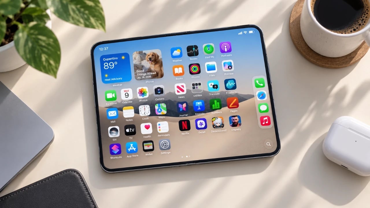
iPhone Ultra lands September 18 at $2,000 and kills the visible crease

Every foldable phone you have ever held has a crease in the middle of the display, and that crease has been the category’s most embarrassing open secret since 2019. Samsung has refined it, minimized it, and shot their devices in lighting specifically designed to hide it. Google’s Pixel Fold was a little better. The Honor Magic and Xiaomi Mix Fold each took their own runs at the problem. Seven years of collective engineering effort from the Android ecosystem later, the crease is still there, still catchable in certain light, still the thing reviewers mention in paragraph three of every foldable review. Apple has now looked at all of that and said, with characteristic confidence, that the iPhone Ultra has no visible crease.

Leaks from Fixed Focus Digital and Weibo sources describe a liquid-metal hinge from Apple’s Liquidmetal Technologies contract, but no publication has explained the actual engineering mechanism in any detail. The hinge manages bend geometry at the fold axis, paired with a display stack built to lie flat when open, eliminating the optical crease. Apple is announcing this at a September 8 or 9 keynote, with the device going on sale September 18 at a confirmed price above $2,000. That price is Ming-Chi Kuo’s floor, with his ceiling at $2,500. The design decisions behind the crease claim, the Touch ID placement, and the unusual 4:3 aspect ratio of the 7.8-inch inner panel add up to a product making several unusual bets simultaneously.

Designer: Apple

The liquid-metal hinge is the piece nobody has properly dissected yet, which is strange given how central the crease claim is to Apple’s entire design argument. Liquidmetal alloys are amorphous metallic glasses, meaning they lack the crystalline grain structure that causes conventional metals to deform plastically under repeated stress. A teardrop-shaped hinge cavity distributes the bend radius across a longer arc than a flat-fold design would, which is how Samsung has incrementally reduced crease visibility across Galaxy Z Fold generations. Apple’s version reportedly goes further, with the Liquidmetal alloy’s higher elastic recovery meaning the hinge springs back to a genuinely flat resting position. The inner display layer stack is engineered to match that geometry, reducing the optical ridge that ambient light catches and reads visually as a crease.

Touch ID came back on the side button, and it came back on Apple’s most expensive phone ever, inverting everything the fingerprint sensor stood for over the past several years. Since Face ID debuted on the iPhone X in 2017, Touch ID has been associated with the affordable tier: the SE, the iPad Air power button, the devices Apple built for people watching the price. The iPhone Ultra flips that because the physics left no alternative. The Face ID sensor stack requires a structured light projector, an infrared camera, and a flood illuminator, none of which fit inside a chassis measuring 4.8mm when open. The side-button Touch ID solution is actually more elegant for a dual-display device: one biometric input, two screen states, no awkward sensor positioning on either panel.

At 7.8 inches with a 4:3 aspect ratio, the inner display reads closer to an iPad mini than your average foldable. The Galaxy Z Fold 8 uses a 7.6-inch 22:9 inner panel, tall and narrow, better suited to scrolling than to content consumption. Apple’s near-square format is a deliberate software bet: iOS 27 developer betas already contain “foldState” and “angleDegrees” APIs, along with WWDC-previewed “app adaptability” tools designed for variable aspect ratios. The A20 Pro chip on a 2nm process, paired with 12GB of RAM, has the headroom to run genuinely iPad-grade app layouts on the open panel. Apple is essentially arguing that a foldable phone gets actually useful when its inner display is wide enough to run two apps side by side without either one feeling like a column.

Two thousand dollars is, give or take, what a MacBook Pro costs, and Apple is asking that for a phone. The design argument for that price sits across the four decisions above: a crease claim no Android foldable has credibly made, a liquid-metal hinge that actually supports it, a Touch ID side button that solves biometrics at 4.8mm, and a 4:3 inner display with the software infrastructure to back up the form factor. Supply at launch will be extremely limited, with Weibo leakers suggesting it could take three to five months for Apple to hit its 10 million unit production target. The September 18 on-sale date will be the easy part. Getting your hands on one before the holidays is the less certain proposition.

The post iPhone Ultra lands September 18 at $2,000 and kills the visible crease first appeared on Yanko Design.